🔥 Would you like to save this?
If you ever want to mess with the mind of a paint salesperson at a paint store or a home center, just go in and ask them how many different colors of white there are.
In order to come up with the very specific design ideas, we create most designs with the assistance of state-of-the-art AI interior design software. Also, assume links that take you off the site are affiliate links such as links to Amazon. this means we may earn a commission if you buy something.
Unfortunately, if you are like me, you will probably get the one guy who is not only a joker but also wants to be an artist and is enrolled at the Art Institution of Los Angeles and answers, “52.” The truth is that white is the color that is perceived when the human eye is confronted with all of the different wavelengths of light.
This is, of course, in total contradiction to those who insist that white is the absence of any light.
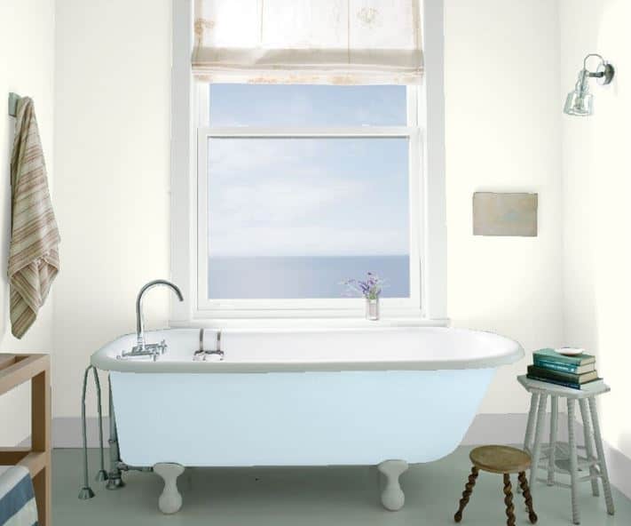
What all this portends is that when you go into a home center with the intent of buying paint for your primary bathroom, you are well-prepared, since if white really is what you want to use to paint your bathroom, after reading this article the number of viable options is cut in half. With that as our goal, let’s look at those 25 best options.
Related: White Paint Options Family Room | White Paint Options Kids Bedroom | White Paint Options Basement | White Paint Options Dining Room | White Paint Options Primary Bedroom | White Paint Options Living Room | White Paint Options Guest Bedroom | Red Paint Options Primary Bathroom | Blue Paint Options Primary Bathroom | Gray Paint Options Primary Bathroom | Beige Paint Options Primary Bathroom | Green Paint Options Primary Bathroom
Cloud Nine
Source: Benjamin Moore
When I was a kid, and my mother was asked what color she wanted to paint the walls of the primary bedroom, she always responded with one word: bone.
I heard the word bone more often than I ever heard the word white but, of course, by the time I was a teenager, the word bone had been etched into my mind to the point where white never stood a chance.
That’s probably why when I started interviewing interior designers and painters what the top color of choice was for primary bedrooms, their first choice was “Cloud Nine” by Benjamin Moore. When I inquired further into where bone would fit into their list, I was told that Cloud Nine had a pretty much-replaced bone in the modern vernacular, so Cloud Nine it was.
For anyone whose mind has been corrupted by their mother like mine there is hope since, according to the designers and painters I have spoken to, Cloud Nine is a perfect shade to contrast virtually any other color.
This stands in contrast to a brighter shade of white since the starkness of anything whiter will only put those who see it off. In fact, any brighter shade of white almost never enters the mind of a designer.
Snow Day
Source: Clare
If you have ever entered a room and found that the walls were such a stark shade of white that you almost became sterile, you will look forward to seeing Snow Day. Snow Day is basically white, but a little cooler than stark white.
You will find it nice to know that Snow Day has been an award winner many times in color competitions. And designers like it because it is such a nice contrast to white.
Pure White
Source: Sherwin-Williams
If you are like so many other people with white being the color you paint so many different rooms, you are probably well aware that picking just the right shade of white for your bedroom is no easy task.
After all, really, white is the difference between Snow Day and Pure White, until you get to the paint center and start comparing them? Then there’s the issue of the light you happen to be standing under and so many other considerations.
Unfortunately, what this often boils down to is that one white is different from another only because some advertising copywriter says they are. The good news in this is that with some colors there are differences because the makers say there are, and in this case, how do you argue with such a reputable maker as Sherwin-Williams?
White Dove
Source: Benjamin Moore
Benjamin Moore is another company that when they say the color is different from another, you tend to listen. That’s the case with White Dove, another variable that many very reputable designers are taking careful note of, especially when it comes to colors they used to paint primary bathrooms.
Whether you want the paint to just cover a room or you want to compliment a more feminine color, White Dove will do the trick.
White Dove is just the color to mix with virtually any other, whether they be a fabric or an accessory. White Dove is a shade of white that will serve as an undertone for any other color you choose to use in your home.
Simply White
Source: Benjamin Moore
The next time you happen to be in your bathroom and pour out an amount of your favorite popular hand cream, look at it closely. Chances are good that it will be of the same color as Benjamin Moore’s Simply White. Simply White is white, but with a touch of warmth that few other white paints manage to capture.
It’s the same kind of white that is crisp and cozy, like the froth on a latte. That’s why many designers use Simply White on different rooms of their homes, including primary bedrooms. You probably won’t find a color scheme that collides with Simply White,
Chantilly Lace
Source: Benjamin Moore
Do you remember those old dollies that your aunt used to make and lay all over her house? Chantilly Lace is the same color as those old dollies. In fact, it doesn’t take long looking at this color before you start reminiscing about those days of old.
Chantilly Lace is a color that many designers use to complement many finishes and textures. It’s little wonder that so many memories come flooding back whenever you see that color. It’s warm and cool at the same time.
Chalk White
Source: Benjamin Moore
Chalk White is another shade by Benjamin Moore that brings back such fond memories of, well, school chalk. Literally. Remember those days after school when you got to clean the erasers and you happen to make more marks on the blackboard than you did cleaning of any kind?
Chalk white is a nice grey-toned white that blends nicely with practically any other color. If you talk to practically any designer, chances are good that at some time in the discussion of painting primary bathrooms, the conversation will eventually turn to chalk white, and for good reason.
Snow Leopard
Source: Portola Paints
Do you remember the first time you looked at a picture of an animal in the arctic? Did you notice that all those animals that were supposedly white, weren’t really white? Instead, they were kind of a yellowish-milky color? That’s precisely what you get when you see Snow Leopard.
Another good description of Snow Leopard is “white with depth, but without other discernable tints.” If you want to paint a primary bathroom white, but with some warmth, Snow Leopard is an excellent choice.
Navajo White
Source: Benjamin Moore
Remember the last time you purchased a vanilla cone, but you let it melt on a table or in a dish? You have the idea of Navajo White. It’s white, but with soul.
Bancroft White
Source: Benjamin Moore
Besides saying that Bancroft White is a great color, it’s hard to actually describe why someone would feel like that. It simply translates well with whatever you are using it on. That’s all.
Whisper
Source: Dunn Edwards
I must admit that I have a weakness for paint names that have a whimsical name. For that reason, I have to carry a bent for Whisper. Whisper is a cool, calm color that is a shade that is easy to find in nature. Can’t figure that out? Just wait. It will whisper to you.
Design Studio White
Source: Ralph Lauren
When you look at this color you really have to wonder if Ralph Lauren really does paint his studio in this. That aside, Design Studio White is a flattering combination of white with a touch of forest green, a mix that is natural for many people, especially the outdoors people in the audience. Many designers like it, but that’s up to you.
Cloud White

🔥 Would you like to save this?
🔥 Would you like to save this?
Source: Benjamin Moore
When you first see this color, it’s a little difficult to figure out why they call it Cloud White, since it’s more a white I associate with the moon. Maybe it’s the cheese. I don’t know, but it does have a nice soft ethereal tone to it. It has a timeless shad of white that seems to accentuate or pare down, whichever you want to accomplish.
Extra White
Source: Sherwin-Williams
Despite what its name implies, Extra White isn’t the dazzling white that most people might consider when they think of the name.
Instead, Extra White is just a nice subdued white that would go well in practically any room of your house if you are looking to paint a primary bathroom you might want to be careful since it is slightly addicting. You might end up using Extra White on your whole house.
Frost
Source: Behr
Frost is just what its name implies, just a nice frosty white that would be perfect to complement practically any bathroom decor.
Dune White
Source: Benjamin Moore
You might do well to steer clear of Dune White since so many designers seem to be attracted to any color that has so little pigment, but Dune White has captured the imaginations of so many designers that it’s hard to ignore for any list of candidates for primary bathrooms.
On the contrary, Dune White is a nice flattering color for inside or out. It’s a nice color to have in full light, but if you turn the dinner dimmer down, everyone will think that you have painted your bathroom in pure white.
Wevet No. 273
Source: Farrow & Ball
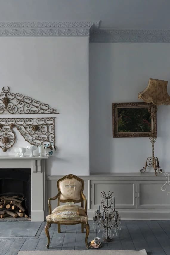
When you think of paint, chances are good that Farrow & Ball isn’t a company whose name comes immediately to mind, but if you are in the market for a nice color to paint your primary bathroom, you would behoove yourself to consider Wevet No. 273.
This one is a nice cool color with a hue of gray. It always looks brilliant, but it also mixed with practically anything you have in the vicinity.
Super White
Source: Benjamin Moore
Super White is a really nice color, especially in a room like a primary bathroom. It doesn’t slap you in the face, but it is still nice enough to get your attention. It’s crisp, and it seems to brighten everything it crosses right up.
Crisp Linen
Source: Benjamin Moore
If you are looking for white paint for your primary bathroom, but you are looking for a nice undertone, you should seriously consider Crisp Linen.
Calm
Source: Benjamin Moore
Sometimes copywriters pick a name that simply knocks a product out of the park. That’s the case with Calm by Benjamin Moore. So often, white is used to warm things up, but in the case of Calm, things get cool really quickly when this one is splashed across a wall.
Calm gives any room it is in an almost historic look. If you want a warm, lived-in look, this is the one for you.
White Diamond
Source: Benjamin Moore
Nearly everyone paints a room for what it does to that room, and White Diamond is no different. In fact, if you are looking for a paint that makes the whole room look bigger, this is one you should seriously consider.
This color is a true white, but it’s deceptive, because with other colors it also tends to take on those colors, so you have to be careful. You might want to otherwise call this the perfect cool white.
China White
Source: Pratt and Lambert Paints
Despite having the same name, this China White is not the same as the product that uses the same name produced by Benjamin Moore. Both are nice colors, but this one is a little warmer than that, and it is gathering a devoted following by designers everywhere. This one is a warm white, but with a whisp of grey.
China White
Source: Benjamin Moore
When you think of this color you will probably think of honey mustard dressing, because that’s what this color has a vague resemblance to. This China White has a slight yellow tint to it. Regardless of how you look at it, it’s still white, but with a little more warmth to it.
All White
Source: Farrow & Ball
Did you ever have a friend who was nothing special, but was still nice to have around? That’s precisely the feeling you will get when you paint a wall with All White. This is a nice friendly color that is perfect for your primary bathroom. You might be so impressed with this one that you will get carried away and paint your whole interior with it.
Cotton

🔥 Would you like to save this?
🔥 Would you like to save this?
Source: C2 Paint
This is another color that you might get so infatuated with that you will get carried away. Cotton is kind of a shy color, which makes everything else in a room pop while it remains in the background. This one is perfect if you decide that you want other things features in a room while Cotton remains in the background.
Honeymilk
Source: Valspar Paint
This is another color that you will probably end up doing over what so many other designers doing–covering everything they can with it. This is a cool white with a hint of grey or beige in it. Whatever you call it, it’s a winner.


