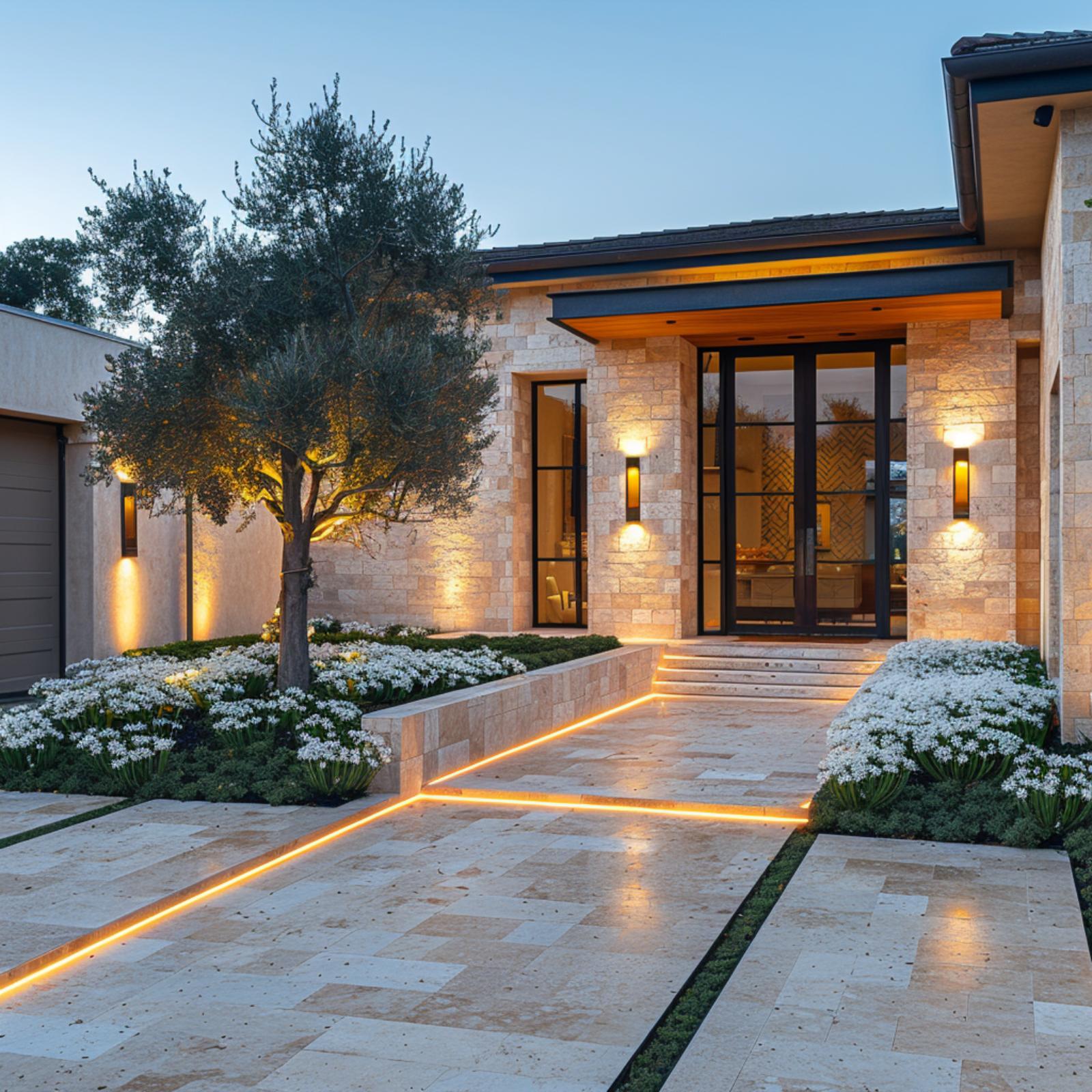
Ah, the primary bathroom. It’s where we go in the morning to prepare for the day. Usually, it’s also the last place we go in the evening before going to sleep. So, let’s explore how grey paint colors for a bathroom enhance this vital space.

🔥 Would you like to save this?
Exploring the Best Grey Paint Colors for Bathrooms
I value serenity and the primary bathroom’s role as a sanctuary. So, when updating it, I consider choosing grey paint colors for my bathroom, especially when I aim for a tranquil atmosphere.
In order to come up with the very specific design ideas, we create most designs with the assistance of state-of-the-art AI interior design software. Also, assume links that take you off the site are affiliate links such as links to Amazon. this means we may earn a commission if you buy something.
Gray is a wonderfully reserved color known for its neutralness between black and white. It offers a solid and stable appearance. When we surround ourselves with gray, it provides a sense of calmness and composure.
Below are 25 of the best currently available options for our primary bathroom update. It’s all about the best gray paint color options for bathrooms. Gray, often created using blue, green, and pink hues, adds a light element to bathrooms. They make the resulting paint color visually engaging while maintaining the color gray’s natural calmness.
| Paint Color | Brand | Undertones | Pros | Cons |
| Revere Pewter (HC-172) | Benjamin Moore | Faint green undertone | Soothing, complements designs | Limited brightness, may feel smaller or darker |
| Chill | Clare | Faint green undertone, bright | Bright and invigorating, enhances cleanliness | Overall brightness may be overwhelming |
| Silverpoint (SW 7653) | Sherwin-Williams | Subtle taupe undertones | Versatile, harmonizes with diverse flooring | Not ideal for small spaces, may be too traditional |
| Cornforth White (No. 228) | Farrow & Ball | Decidedly gray, neutral base | Reliable classic choice | Depending on lighting, may lack boldness |
| Repose Gray (SW 7015) | Sherwin-Williams | Extraordinary undertones, cozy gray | Timeless appeal, well-lit environment | Limited contrast, may feel confined |
| Balboa Mist (OC-27) | Benjamin Moore | Light mist, pink and purple undertones | Serene atmosphere | Limited contrast |
| Useful Gray (SW 7050) | Sherwin-Williams | Yellow and green undertones | Versatile, complements natural wood | Limited contrast, depends on existing elements |
| Pavement (C2-988) | C2 Paint | Soft gray with blue undertones | Attractive, contributes to a refined aesthetic | Limited contrast, limited availability |
| Stone Harbor (2111-50) | Benjamin Moore | Brown-gray base, violet hues | Warmth and sophistication | Limited contrast, sensitive to lighting |
| Stonington Gray (HC-170) | Benjamin Moore | Blue and green undertones | Natural and modern look | Limited warmth, less traditional gray |
| Magnetic Gray (SW 7058) | Sherwin-Williams | Darker gray, silvery blue, and green undertones | Darker elegance, effective with light wood | Limited warmth, challenging to match with specific colors |
| Dorian Gray (SW 7017) | Sherwin-Williams | Darker shade, contrasts lighter elements | Striking contrast, ideal for accents and cabinetry | Potential overwhelming effect, less versatile |
| Jailhouse Rock (C2-950) | C2 Paint | Darkest gray, charcoal hue | Bold and dramatic, complements natural elements | Challenging for smaller bathrooms, requires thoughtful pairing |
| Shoreline (1471) | Benjamin Moore | Cool gray with opal appearance | Versatile cool appearance, contemporary feel | Cool gray may not provide a cozy ambiance |
| Gull Wing Gray (2134-50) | Benjamin Moore | Medium gray, foggy appearance | Strong color profile, suitable for accent walls | Medium tone limitations, potential color perception issue |
| Argent (1322) | Pratt and Lambert | Gray with heavy light blue undertones | Refreshing and tranquil atmosphere | Potential color confusion, limited traditional gray appeal |
| Skimming Stone (No. 241) | Farrow & Ball | Gray with yellow and light beige undertones | Unique undertones, stunning with white appliances | Undertones may not appeal to everyone, limited use in small spaces |
| Gravity Gray (15126401) | KILZ | Light gray, silvery blue undertone | Affordable, neutral, and versatile aesthetic | May not showcase full potential in insufficient lighting |
| Irish Mist (790C-1) | Behr | Very light, airy, blue-based gray | Reflects light in low-light spaces, warm appearance | May look washed out in well-lit spaces, limited depth |
| Deep Space (2125-20) | Benjamin Moore | Dark gray, less severe than black | Bold and impactful, suitable for contemporary designs | Overwhelming in small or dimly lit spaces, limited versatility |
| Mizzle (No. 266) | Farrow & Ball | Light gray with green undertones | Versatile in style, comfortable and cozy feel | Too subdued for some tastes, limited boldness in design |
| Down Pipe (No. 26) | Farrow & Ball | Dark lead gray with blue hues | Sophisticated and elegant, versatile as trim or accent | May make small spaces feel constricted |
| Sheer Mist (N-C9) | Clark and Kensington | Light and relaxed, classic gray | Bright and airy feel, classic appeal | Potential lack of depth, may show dirt and stains |
| Silver Half Dollar (2121-40) | Benjamin Moore | Gray with strong blue undertones | Fresh and crisp appearance, timeless elegance | Limited warmth, bold contrast challenges |
| Stone Hearth (CC-490) | Benjamin Moore | Gray with heavy beige undertones | Compatible with various styles, adaptable to light conditions | Heavy beige undertones may cause confusion, limited dramatic impact |
1. Revere Pewter (HC-172)

Source: Benjamin Moore
This light, warm gray paint color has a very faint green undertone. Despite its subtlety, it still exudes a calm, picturesque quality. Revere Pewter is an excellent choice for those who want a warmer color and don’t want an extraordinarily bright one.
This paint has an LRV of 55, meaning it neither absorbs nor reflects much light. Thus, it’s preferred in primary bathrooms with at least one natural light source.
Pros
- This color contributes to a soothing and comfortable atmosphere in bathrooms.
- It can complement traditional and modern design elements.
Cons
- Limited brightness
- The lack of high reflectance may make the space feel smaller or darker
2. Chill

Source: Clare
Clare’s Chill is also a gray paint with faint green undertones. Here, however, the paint is overall brighter. On the wall is a better reflection of both natural and artificial lights. As its name suggests, this is a great paint color in a primary bathroom designed and used foremost for relaxing or rejuvenating — such as long hot showers after a long day.
Pros
- Bright and invigorating
- It can also enhance the perception of cleanliness and spaciousness.
Cons
- The overall brightness of Chill may be overwhelming for some individuals.
- Tend to highlight imperfections on walls or surfaces.
3. Silverpoint (SW 7653)

Source: Sherwin-Williams
Silverpoint is an incredibly versatile paint color. After I use it in our primary bathroom, I want to continue using it elsewhere in our home.
This shade of gray has gorgeous yet subtle taupe undertones. The color is light enough to work with dark hardwood and stone floorings. Still, it’s warm enough to pair well with light and even white tiling.
Pros
- It’s advantageous for homeowners with diverse bathroom flooring materials, as the paint color can harmonize the elements.
- The warm nature of Silverpoint allows it to pair well with dark flooring and light and white tiling.
Cons
- It’s not ideal for small spaces as it may not provide the cozy or intimate atmosphere desired
- This color may only suit some decor styles as it may be too traditional or subdued.
4. Cornforth White (No. 228)

Source: Farrow & Ball
Its name may fool us, yet this is a gray through and through. In fact, Cornforth White is likely a more decidedly gray shade than many others on this list. It’s named after the late John Cornforth, a revered architectural historian. This paint color offers a solid neutral and is an excellent pair with brown or red tiling.
Pros
- A reliable choice for those seeking a classic and straightforward gray tone
- Solid neutral base
- Compatible with brown or red tiling
Cons
- Dependent on lighting conditions
- May lack boldness
5. Repose Gray (SW 7015)

Source: Sherwin-Williams
For many years, this was one of Sherwin-Williams’ best-selling colors. It’s a unique color due to its many extraordinary undertones. Brown, taupe, and the slightest hint of purple create this cozy gray.
Although many people won’t notice the purple hue, they will appreciate how peaceful it looks and feels. These are all great qualities for a primary bathroom.
Pros
- This color’s timeless appeal means it’s less likely to go out of style.
- It can help maximize the brightness in a bathroom, creating a welcoming and well-lit environment.
Cons
- Limited contrast
- Its coziness could make the room feel more confined.
6. Balboa Mist (OC-27)

Source: Benjamin Moore
As its name suggests, this gray is like a light, soft mist featuring the smallest pink and purple undertones. The undertones make the paint color an exceptionally great choice for those with wooden furnishings.
It includes pairing with cherry-toned cabinetry and frames. A primary bathroom with such a design will exude a serene atmosphere.
Pros
- Its light and soft mist-like quality contributes to a serene and calming atmosphere.
- Excellent choice for bathrooms with wooden furnishings.
- More light-reflective, helping to brighten up the bathroom space.
Cons
- Limited contrast
- Sensitivity to lighting – it may look different under various lighting conditions.
7. Useful Gray (SW 7050)

Source: Sherwin-Williams
True to its name, Useful Gray is a useful gray paint color. We can easily use it throughout our home. Its yellow and green undertones make it a great choice when combined with natural wood or terracotta flooring. This color is among the warmest shades of gray on this list.
Pros
- Versatility throughout the home
- Complements natural wood and terracotta flooring
- Timeless appeal
Cons
- Limited contrast
- Dependence on existing elements
8. Pavement (C2-988)

Source: C2 Paint
While C2 might have found a more appealing name for such an attractive color, this is still a fantastic choice of paint color for a primary bathroom. Pavement by C2 is a very soft gray with just the slightest touch of blue sourced from rare, finely ground artesian pigments.
This color’s ability to nicely reflect soft white and yellow lights makes it a fine choice in a smaller space like the primary bathroom. It will give off a more refined and yet inviting aesthetic.
Pros
- Attractive color
- This subtle undertone can contribute to a serene atmosphere in the bathroom.
- It’s a color that contributes to a refined and inviting aesthetic.
Cons
- Limited contrast
- Sensitivity to lighting
- Limited availability
9. Stone Harbor (2111-50)

Source: Benjamin Moore
Thanks to its well-balanced appearance, Stone Harbor is one of Benjamin Moore’s most popular neutral colors. This gray paint color has a brown-gray base in which violet hues are added. The result is a pint color that boasts the warmth of the brown with a cool violet shine.
I recommend using warm-temperature lighting when painting a primary bathroom with Stone Harbor. It accentuates its warmer properties.
Pros
- Well-balanced appearance
- The combination of a brown-gray base and violet hues offers warmth and a relaxed, sophisticated undertone, adding depth and character to the bathroom.
Cons
- Limited contrast
- The addition of violet hues may make this color sensitive to lighting conditions.
10. Stonington Gray (HC-170)

Source: Benjamin Moore
This is another one of the company’s most popular neutral paint colors. However, instead of mixing in brown, this gray features a mix of blue and green undertones that create a more natural-looking gray.
This Stonington Gray pair accentuates the porcelain white of a bathtub, toilet, and sink. Many designers who want a more modern impression will choose this paint color.
Pros
- Natural and modern look
- Its mix of blue and green undertones can contribute to a brighter and more open feel in the bathroom.
Cons
- Limited warmth
- Less traditional gray
11. Magnetic Gray (SW 7058)

Source: Sherwin-Williams
Magnetic Gray is generally known as a darker gray. However, pair it with the right natural and artificial light, and we’ll bring out the silvery blue and green undertones it’s mixed with.
This gray paint is excellent for a matching primary bedroom and bathroom set. It’s especially effective with light natural wood or white flooring and furnishings.
Pros
- Darker elegance
- Effective pairing with light wood and white
Cons
- Limited warmth
- Challenging to match with specific colors
12. Dorian Gray (SW 7017)

🔥 Would you like to save this?
Source: Sherwin-Williams
This gray paint color is a darker shade than most on our list. It will provide a nice complementing contrast to whiter items within a room.
For such reason, Dorian Gray is probably best used not for painting the entirety of a bathroom’s walls. Instead, we can use it either as an accent color or for use on cabinetry.
For example, we could use white tiles to cover the lower two-thirds of our bathroom walls. Then, we could use the Dorian Gray paint color, perfect for the top third tile.
Pros
- It offers a striking contrast to lighter elements in the bathroom.
- Ideal for accents and cabinetry
- Creative two-tone design
Cons
- Potential overwhelming effect
- Less versatile than lighter grays
13. Jailhouse Rock (C2-950)

Source: C2 Paint
This is perhaps the darkest gray on our list. While it won’t mesh well with many primary bathrooms, we’ll love this color if we can complement it with natural wood paneling, accents, or light marble.
Jailhouse Rock is more of a charcoal hue that nicely reflects warm lighting. It creates a very sophisticated and refined atmosphere.
Pros
- It provides a bold and dramatic look
- Complements natural elements
- Sophisticated and refined atmosphere
Cons
- Challenging for smaller bathrooms
- Requires thoughtful pairing with specific elements like natural wood or light marble
14. Shoreline (1471)

Source: Benjamin Moore
On the screen, this color is a very cool blue that may look bluer, yet it actually gives off a more opal appearance. It’s a very cool looking and feeling gray. This coolness makes it a versatile paint color, a good choice for primary bathroom designs.
Pros
- Versatile cool appearance
- Contemporary and cool feeling
Cons
- Potential color perception issue
- Cool gray may not provide a cozy bathroom ambiance.
15. Gull Wing Gray (2134-50)

Source: Benjamin Moore
They say the Florida sky inspired Benjamin Moore’s Gull Wing Gray paint color. However, it seems more reminiscent of a foggy autumn morning in Maine. This color is more of a medium gray, making for a strong color profile. I might consider doing an accent wall with this paint color or using a lighter gray as an accent with it.
Pros
- Strong color profile
- It’s well-suited for creating an accent wall, adding depth and interest to the bathroom design
Cons
- Medium tone limitations
- Its potential ambiguity could affect users’ confidence in choosing the color for their bathroom.
16. Argent (1322)

Source: Pratt and Lambert
This paint color has such heavy light blue undertones that I’ve almost mistaken it for a blue paint color. However, it’s a gray through and through. For those who hate mornings and need something to inspire them to wake up and prepare for the day, it’s the perfect color for their primary bathroom.
Pros
- Unique light blue undertones can provide a refreshing and tranquil atmosphere in the bathroom.
- This color contributes to a serene and positive environment, ideal for starting the day on a bright note.
Cons
- Potential color confusion
- Limited traditional gray appeal
17. Skimming Stone (No. 241)

Source: Farrow & Ball
This unique shade of gray has a lot of yellow and light beige undertones, giving it a very soft and hot look. Skimming Stone is highly versatile, making it an excellent choice for a darker gray and blue primary bathroom.
This color can create a stunning look when paired with classic white bathroom appliances. It’s another paint color many homeowners might use in their primary bathroom and bedroom.
Pros
- Unique undertones
- Stunning with white appliances
Cons
- The yellow and light beige undertones may not appeal to everyone.
- Limited use in small spaces
18. Gravity Gray (15126401)

Source: KILZ
This affordable paint color is a light gray. It’s a good choice for those who like the look and feel of white walls yet want something with just a tad more punch.
When applied in a primary bathroom with soft natural light, this paint will reflect a lovely silvery blue undertone. It goes well with minimalist interior designs.
Pros
- Affordable paint color
- Offers a neutral and versatile aesthetic
- Compatible with minimalist designs
Cons
- In spaces with insufficient lighting, the color may not showcase its full potential
- Potential for washed-out appearance
19. Irish Mist (790C-1)

Source: Behr
Have close to zero or essentially zero natural light? Then, it’s essential to use a very light color so the wall reflects light. In such primary bathrooms, Behr’s Irish Mist is the perfect pick. This paint color is light, airy, and warmer than others, with more blue-based grays on our list.
Pros
- Reflects light in low-light spaces
- Airy and warm appearance
Cons
- It may look washed out in well-lit spaces
- Limited depth
20. Deep Space (2125-20)

Source: Benjamin Moore
This color is a bit of a misnomer, as when people think of space, they generally imagine a large swath of black darkness lit only by the stars. Yet, this gray is certainly not that. Benjamin Moore’s Deep Space boasts a significantly less severe color than black, although just as strong and impactful.
This bold color is ideal for contemporary designs. It’s for primary bathrooms with ample natural light, or use mirrors smartly to create an open space.
Pros
- Bold and impactful aesthetic
- A suitable alternative for those who want a dark color scheme without the heaviness that black can sometimes convey
- Contemporary design compatibility
Cons
- Overwhelming in small or dimly lit spaces
- Limited versatility in decor
21. Mizzle (No. 266)

Source: Farrow & Ball
Part gray, part green, Mizzle is a beautiful light shade that makes a primary bathroom feel softer. It exudes a sense of comfort and contentment. For those who want a more country-esque or rural home look, this shade is an absolute contender on their shopping list.
Pros
- Versatility in style
- Comfortable and cozy feel
Cons
- It may be too subdued for some tastes
- Limited boldness in design
22. Down Pipe (No. 26)

Source: Farrow & Ball
This darker lead gray is created with strong blue hues, giving it a complex and standout finish. It best excels in a primary bathroom as a trim color or is used on an accent wall or cabinetry. This will result in an almost sexy, sophisticated appearance.
Pros
- Sophisticated and elegant look
- Versatility as trim or accent color
- Creates a sexy aesthetic
Cons
- It may make small spaces feel constricted
- Dependence on ample lighting
23. Sheer Mist (N-C9)

Source: Clark and Kensington
This paint color is an excellent choice for those who appreciate the bright simplicity of white yet want something more fun. Sheer Mist lives up to its name: It is light and relaxed. I consider using this shade in my primary bathroom when I want something close to a classic gray without outstanding undertones.
Pros
- Bright and airy feel
- Classic appeal
Cons
- Potential lack of depth
- It may show dirt and stains
24. Silver Half Dollar (2121-40)

🔥 Would you like to save this?
Source: Benjamin Moore
This gray color has strong blue undertones, giving it a more sky-like appearance. It’s a great paint color for those looking for something fresh and crisp.
Benjamin Moore’s Silver Half Dollar paint color contrasts nicely with bold colors and other grays. It is particularly well-suited for cooling down an overly bright primary bathroom.
Pros
- Fresh and crisp appearance
- Cooling effect
- Timeless elegance
Cons
- Limited warmth
- Bold contrast challenges
25. Stone Hearth (CC-490)

Source: Benjamin Moore
This color of gray paint is prevalent and often gets confused as being beige due to its heavy beige undertones. Stone Hearth is one of those paint colors that can drastically change shade depending on the size and light of a space.
With ample light, we can achieve the paint’s optimal mid-tone depth in a primary bathroom. This complements various furnishings thanks to its attractive neutral tone.
Pros
- Compatible with various design styles
- Adaptable to light conditions
- Its heavy beige undertones can introduce warmth to the bathroom.
Cons
- The prevalence of heavy beige undertones may lead to confusion, with some mistaking it for beige rather than gray.
- Limited dramatic impact
Frequently Asked Questions
What Color of Grey Is Good for a Bathroom?
Light to medium shades are often advisable when choosing a grey color for a bathroom. Light greys can create a clean and airy feel, making the space seem more extensive and inviting.
What Is the Most Popular Color of Grey Paint?
Determining the most popular color of grey paint can be subjective and dependent on current design trends. However, shades like “Revere Pewter” by Benjamin Moore have gained widespread popularity for their versatility and ability to complement various decor styles.
Also, if a shade of grey is used in a celebrity’s bathroom, it’s not uncommon for that color to have a bump in popularity.
What Is the Best Color to Paint Bathroom Walls?
The best color to paint bathroom walls depends on personal preferences and the desired atmosphere. Light and neutral colors work well in bathrooms, creating a sense of cleanliness and tranquility.
Shades like light blue, beige, or pale green can bring a refreshing and spa-like feel to the space, contributing to a relaxing bathroom environment.
Conclusion
The primary bathroom is crucial in our daily routines, serving as a morning preparation space and a night retreat. Choosing the right grey paint colors for our bathroom can enhance its atmosphere, transforming it into a haven of style and serenity.