🔥 Would you like to save this?
Your primary bathroom is a place where you go to wash away the cares of the world for a little while. Well, maybe a long while after you lock the door behind you and put your phone on do not disturb. The room needs to be a place for relaxing and you need a wall color that soothes, not challenges.
In order to come up with the very specific design ideas, we create most designs with the assistance of state-of-the-art AI interior design software. Also, assume links that take you off the site are affiliate links such as links to Amazon. this means we may earn a commission if you buy something.
Let’s take a look at the color beige as a color to enrobe the walls of your primary bathroom and give it the calm hush you desire. But first, do you think of monotony when you think of the color beige? Maybe it evokes the image of a purgatorial waiting room at the doctor’s office.
Even the word sounds dull and uninspiring. Yet the color exists for a reason: It’s the perfect neutral for almost any setting you can think of.
Beige falls into the background, doesn’t overwhelm the decor, and lets you showcase the personal touches you put into your primary bathroom. The color is on the warm side and doesn’t overpower the senses at all. In fact, it can be considered a calming color and can add to your sense of comfort when spending time in your primary bath.
Here’s a look at the best beige paint color options for primary bathrooms and what makes them work so well:
Related: Beige Paint Options Family Room | Beige Paint Options Basement | Beige Paint Options Kids Bedroom | Beige Paint Options Dining Room | Beige Paint Options Primary Bedroom | Beige Paint Options Living Room | Beige Paint Options Guest Bedroom
Dhurrie Beige (SW 7524)

Source: Sherwin-Williams
The dictionary defines the word dhurrie as “a heavy cotton rug of Indian origin”. Indeed, you’ll find that the dhurrie frequently features this tone of beige as part of its pattern. This paint is perfect for matching with the dhurrie rug you’ve picked out as a bath mat.
You’ll have your walls matching your rug with one fell swoop of the paint brush.
Pavilion Beige (SW 7512)

Source: Sherwin-Williams
Does your primary bathroom get too much light? Pavilion Beige from Sherwin-Williams will tone it down and keep you from being blinded by the light in the morning. It’s not the most reflective of colors and that’s a good thing when you’re trying to get yourself together in the morning.
You’ll be able to go about your business without squinting because this comfortable shade of beige absorbs the light so you don’t have to pull a curtain.
Balanced Beige (SW 7037)

Source: Sherwin-Williams
Sherwn-Williams meant it when they named this color Balanced Beige. It’s neither light nor dark, it’s not bright or dull, and it’s most definitely smack dab in the middle of the beige range. It’s so perfectly balanced that you can add just about any other neutral color to the palette and never make a bad match.
Bungalow Beige (SW 7511)
Source: Sherwin-Williams
Bungalow Beige by Sherwin-Williams is a light and airy number that makes one think of a vintage bungalow with its original paint before wear and tear took its toll. The hidden secret of this particular beige is the fact that you can dress it up or dress it down with bright coppers or dingy whites that aren’t quite eggshell. It’s up to you which way you want to go, if you want to go any which way at all.
Blush Beige (170E-2)

Source: Behr
Looking for a lot of pink in your beige? Then Blush Beige by Behr is for you. This soft color brings warmth to the primary bathroom and evokes the feeling of a fresh spring day after a rainstorm that set the roses to blooming. It’s delicate without being fragile and creates a feminine tone in the primary bathroom.
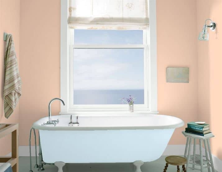
Peach Beige (260A-3)

Source: Behr
Feel peachy as a princess in your primary bathroom with Peach Beige from Behr. You’ll find yourself looking at this color and thinking that it’s most definitely peach beige. It’s kind of intense, even for a color with beige in the name.
You might find yourself powering through your daily ablutions when surrounded by this empowering color.
Spiced Beige (PPL-61)

Source: Behr
Spiced Beige by Behr is as about as spicy as beige will ever get. The color features a little yellow, a little pink, and a lot of light tan in its DNA. You’ll notice this color, but you won’t be challenged by its heat even though it’s spicy.
Coastal Beige (PPU-13)

Source: Behr
Did you ever visit the beach and wished you could bring it home with you? Now you can with Coastal Beige by Behr. This light beige evokes the feeling of sand between your toes without the discomfort.
It’s smooth and reflective just like the sand after the waves crashed and drew back. The color can transport you to your fantasy vacation spot if you let it take you there.
Sentimental Beige (YL-W13)

Source: Behr
Is it ever possible to be sentimental over beige? That’s a tough call, but Behr does deliver the perfect neutral tone in this Sentimental Beige paint color. What makes this paint a good choice for the primary bathroom is the fact that it doesn’t challenge the eye and doesn’t overwhelm, well, anything.
It’s the purest tone for a complimentary backdrop color
Light Rosebeige (190E-1)

Source: Behr
Light Rosebeige by Behr has a sweet softness about itself that almost makes you want to smile. It’s a delicate, almost porcelain shade that brings up the light in the room, but that could also be due to its high light reflective value. This is one of those beige colors that is almost impossible to not like because it’s so pretty.
Porch Swing Beige (PPF-21)

Source: Behr
When looking for the flattest of beige colors to give your walls as neutral an appearance as possible, you’ll find Porch Swing Beige by Behr fits your needs perfectly. The walls of your primary bathroom will feel like the color is barely there and very unobtrusive. You’ll know there’s paint on the wall because you’re not looking at drywall.
French Beige (MQ3-10)

Source: Behr
The word beige is a French word that describes the color of wool as it’s freshly shorn from the sheep. French Beige from Behr perfectly captures the color of fresh wool, but leaves out the dirt and twigs that are fond of getting caught in a sheep’s wooly coat. You get to enjoy the smooth, soft tan color on the walls of your primary bathroom while dreaming of visiting the Haute-Vienne in France to see the herds of sheep that reside there.
Barely Beige (1066)

🔥 Would you like to save this?
Source: Benjamin Moore
Benjamin Moore does not exaggerate when they say this color is Barely Beige. It really is that light and barely-there as a beige. In fact, the color is just a little darker and richer than eggshells.
It’s perfect if you’re seeking a color that’s not eggshell, but not really beige, either. There’s a little bit of peach and yellow in the color to keep it warm without challenging the eye or the room decor.
Beach House Beige (1083)

Source: Benjamin Moore
Beach House Beige lets you go back to the days of your youth when you stayed at that beach house with the clapboard walls and a kitchen straight out of 1930. You know, the one with the sink that took forever to drain? Bring those memories of times gone by with this sandy brown beige that traps the warmth of the sun and let your mind wander back to those wonderful days.
Just Beige (2095-50)

Source: Benjamin Moore
Yes, Virginia, this is Just Beige as Benjamin Moore has named it. It’s one of those beiges that’s not very inspiring, but isn’t that the point of beige? To be background or backdrop for the furnishings and plumbing in your primary bathroom?
If that’s your goal, look no further than Just Beige. It’s slightly complex in terms of the contributing colors, but not to the point of distraction. And that’s what you want in a beige.
Desert Light (1004)

Source: Benjamin Moore
There’s something magical about the sea of sand that is the desert as the sun rises. The sunlight reflects just enough to give the sand a distinct beige color before making it shine yellow-white for the rest of the day. Desert Light by Benjamin Moore captures that exact moment and lets you paint it on your walls, trapping that moment in time forever.
Lady Finger (1045)

Source: Benjamin Moore
No, not a Lady’s Finger, Lady Finger. You know, like the sponge cake confection that supposedly looks like a lady’s finger? This particular shade of beige has a strong tan tone that is reminiscent of a piece of sweet cake that’s just emerged from the oven.
The best thing about this paint is that you don’t have to do any baking in your primary bathroom to get that look.
Mystic Beige (2162-60)

Source: Benjamin Moore
It’s a bit understandable to be skeptical at the thought that beige could ever be mystical, but Benjamin Moore did just that with Mystic Beige, part of the Color Preview collection. This is a highly saturated beige on the lighter end of the color range. It’s got a high light reflection value that keeps up with the color saturation and intensity.
Just make sure you’re looking for some mystery to paint on your primary bathroom walls.
Shaker Beige (HC-45)

Source: Benjamin Moore
Benjamin Moore’s Shaker Beige color fits in well with the austerity of the Shakers, a group of people who lived a simple lifestyle long before the Amish showed up. The color looks like someone decided to pour a little coffee into their milk and called it a day, a color that the Shakers were probably fond of due to its neutrality. This classically neutral beige will hide a multitude of sins while inviting you to stay in your primary bathroom for a while.
Brookline Beige (HC-47)

Source: Benjamin Moore
Brookline is a brown shade of beige that’s somewhat down in tone. You’ll find that it’s a color that’s not going to inspire you to dance around your bathroom, but you will find that it makes you want to get comfortable and relax in the tub with a glass of wine. There’s a splash of red in the mix to give the color a bit of intensity and it might even pair well with a glass of merlot.
Sheraton Beige (HC-57)

Source: Benjamin Moore
You’d be forgiven for thinking that Sheraton Beige gets its name from being used in the hotel chain of the same name. Benjamin Moore created this color for the 1976 Bicentennial and is part of their Historical Collection. It’s a light and warm color that soothes and relaxes but stands out just enough to let you know it’s there on your walls and making your primary bathroom look good.
Beigewood (1007)

Source: Benjamin Moore
Beigewood is the perfect name for this color due to its uncanny color match to a piece of driftwood. But instead of the drab of the driftwood, the Beigewood from Benjamin Moore’s Classic Color Collection makes the primary bath feel warm and cozy. Don’t forget to pick up some driftwood to add as decor in the bathroom to connect everything together.
Golden Beige (100)

Source: Benjamin Moore
This soft, slightly peachy beige is one of those neutrals that you’ll find yourself loving because it’s neutral, then find yourself not paying a lot of attention to it because the color is that neutral. Don’t let yourself skip over this color, though. It’s great for pairing with milk chocolate and terra cotta colors for a bit of a kick.
It’s also perfect as a backdrop color that allows other objects in the room to become more prominent and not get lost in the wall color.
Apricot Beige (1205)
Source: Benjamin Moore
Apricot Beige by Benjamin Moore is part of the Classic Color Collection and it’s easy to see why. It’s bright, it’s pleasant, and you wouldn’t initially view it as being beige. Mind you, the color does evoke images of the 1950s and it’s probably been around for that long.
But if you have a home full of Mid-Century Modern Furniture, and you’ve brought that style into the primary bathroom, you’ll be right at home with this paint selection.
Almond Beige (2101-40)

🔥 Would you like to save this?
Source: Benjamin Moore
Almond Beige by Benjamin Moore is, as its name suggests, a nutty flavor of beige. The color has a depth to it that makes the room feel intimate without losing its feeling of space. It has a touch of red to add some heat so you don’t have to add sriracha to your almonds. Unless you want to, that is.