🔥 Would you like to save this?
Welcome to our main kitchen colors article which is a cornerstone article featured on our main kitchen remodel page. For photos, see our massive kitchen design ideas gallery here.
In order to come up with the very specific design ideas, we create most designs with the assistance of state-of-the-art AI interior design software. Also, assume links that take you off the site are affiliate links such as links to Amazon. this means we may earn a commission if you buy something.
The kitchen color decisions you must make include:
- Wall color;
- Floor color;
- Backsplash color(s);
- Appliance finish; and
- Cabinet finish.
All of these elements make up the color scheme of the kitchen. Compare that complexity with a bedroom, which really only has walls, floor, ceiling and furniture.
Given all the color decisions you must make, what are good colors for a kitchen?
You’re in luck. We’ve analyzed over 1.7 million kitchens. Below we set out the percentages of the different colors for each design aspect of the kitchen. Obviously, what’s popular isn’t necessarily best, but it does provide some guidance as to what’s commonly used.
Kitchen Color Analysis
1. Top Kitchen Colors
First, we set out, based on popularity, the top kitchen colors.
Generally, and not surprisingly, white and brown (i.e. wood tone) are the most popular kitchen colors across most design features within a kitchen.
a. Overall Kitchen Color
- Most popular: Brown
- 2nd most popular: White
- 3rd most popular: Gray
b. Floor
- Most popular: Brown
- 2nd most popular: Beige
- 3rd most popular: White
c. Backsplash
- Most popular: White
- 2nd most popular: Beige
- 3rd most popular: Gray
d. Appliances
- Most popular: Stainless Steel
- 2nd most popular: Panel
- 3rd most popular: Black
e. Cabinets
- Most popular: White
- 2nd most popular: Medium Wood
- 3rd most popular: Dark Wood
2. Least Popular Kitchen Colors
Pink is the least popular kitchen color. Here’s the breakdown.
a. Overall
- Least popular: Pink
- 2nd least popular: Violet
- 3rd least popular: Turquoise
b. Floor
- Least popular: Pink
- 2nd least popular: Purple
- 3rd least popular: Turquoise
c. Backsplash
- Most least popular: Pink
- 2nd least popular: Orange
- 3rd least popular: Yellow
d. Appliances
- Most least popular: Color
- 2nd least popular: White
- 3rd least popular: Black
e. Cabinets
- Most least popular: Purple
- 2nd least popular: Turquoise
- 3rd least popular: Orange
26 Colors Compared in the Same Kitchen
The second part of our kitchen color analysis compares 26 colors for the kitchen. What we did is take a kitchen photo and changed the wall color so that you can get a quick glimpse of how different colors look compared to one another.


🔥 Would you like to save this?


🔥 Would you like to save this?

Kitchen Color Examples
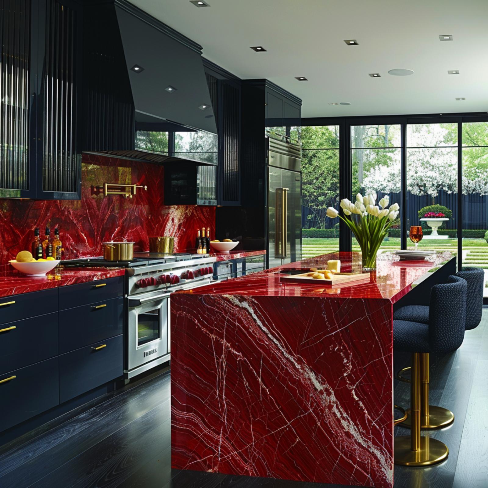
1. Red

Red is a prominent choice for a kitchen color thanks to how it uses an intense tone all the way through. Red has a loud look to it but it is best suited for areas where white and black are mixed together. It blends in well with the colors but you have to get enough of those two to make it easier for the surface to look better. It can be dark or light in its tone too but you should choose a choice that is attractive enough to add a good look.

See all red kitchens here.
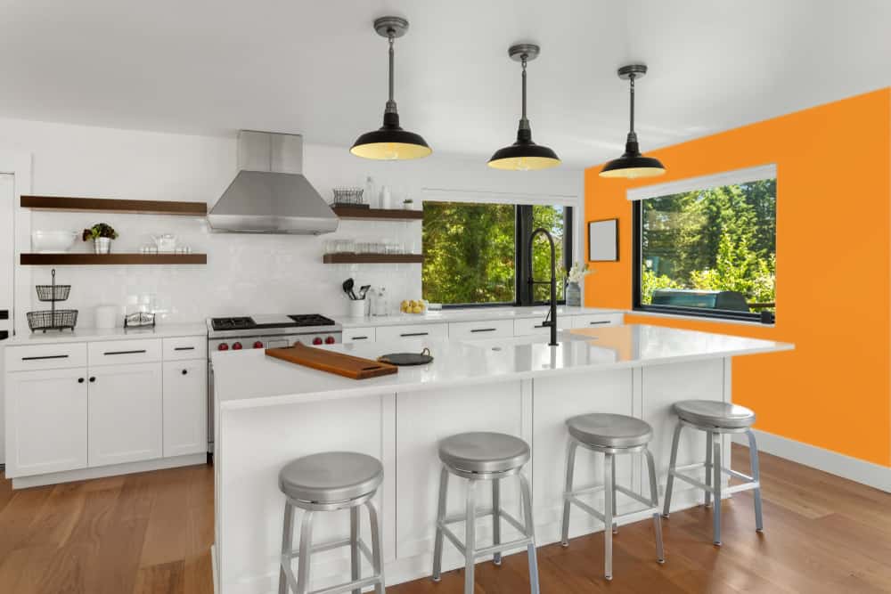
2. Orange


When aiming to get a retro-inspired kitchen, orange is a color that stands out. It has a bright look with an upbeat style to it. It can blend in with white tones and most metals. You must watch for how light gets into a kitchen with orange items though. You don’t want those colors to be too intense or to bear with lots of light getting in a spot. Also, you should clean off any stains as quickly as possible as they can tarnish an intense orange tone.
See all orange kitchens here.
3. Wood Tone


A wood tone look should add a homely and comfortable look to a space. It does well with many off-white colors, particularly countertops. A wood tone look does not have to entail materials that are completely wood. Laminate veneer materials may be applied to give off a wood-like style that comes complete with wood stress marks. Make sure any wood materials that you actually get are sealed off properly so there won’t be any problems with stains or water getting into pores.
4. Yellow


🔥 Would you like to save this?
On the surface, yellow has a casual look to its design. But yellow is also a color that stands out more for how it includes an intense look all the way through. Yellow is bright and stunning with a strong appearance that gives off a look of vibrancy. It can work well in rooms that have windows as the strong yellow tone will make the sunlight even more energetic. It is a comfortable color that can go well with white walls although you can add a few darker surfaces here and there to create a better overall look.
But like with any other bright color, yellow can still stain easily. You have to be careful when using any yellow surface as it might not be appropriate in spots where stains can develop quickly.
See yellow kitchens here.
5. Green


We all want to go green these days. With a green kitchen, you can do just that. A green kitchen will come with a nice tone that isn’t too dark or light. You can alter the green to create a lighter lime tone or you can use a darker forest shade depending on what you might prefer. When you choose a good color, you will establish a fine look that adds a relaxed style to any kitchen. It can also be used with other white materials in an area.
See all green kitchens here.
6. Turquoise


Blue can be a bit of an intense color in some cases. Turquoise is an option to have if you’re trying to find something a little nicer in tone. Turquoise is a combination of blue and green. It offers a look similar to what you’d see in an ocean setting. The lighter color will remind you of the beauty of the ocean. This can be used well with other light materials but it can be even better if you use it alongside wood or rope accents. It can also be used along ceramic bodies.
7. Blue


Blue materials can be organized in any space in your home. A blue surface will provide you with an attractive look that features a deep tone that makes a larger room look a little smaller. You can also use a light blue color if you want to make a small kitchen larger. Blue is very versatile but you should try and pair it with white materials around your kitchen if possible. White colors around the kitchen can add to an attractive and enticing look all around if chosen right.
See all blue kitchens here.
8. Purple


When it comes to kitchens, purple is a rather unpopular color. This is because most people don’t associate purple with kitchens. Still, it can offer a grand eggplant tone that creates a striking approach to your kitchen if used right. You should see how the purple tone mixes in with metals around your kitchen.
See all purple kitchens here.
9. Pink


Pink is another color that is not as popular. Still, it could be used in a retro-inspired kitchen. It is especially great in spaces where plenty of light can be found all around here. Pink can make any small kitchen a little larger. You can even get something nice with a few metal appliances mixed in around the space. This is a comfortable and attractive choice that you are bound to enjoy having.
See all pink kitchens here.
10. Black


Black has become a very popular color for kitchens thanks to how it comes with a more intense look than what most other options have. Black has a deep style that is unique and fine to use in many spots. You can use black especially in a larger kitchen to help make it a little smaller. It keeps such a kitchen from being far too cavernous in terms of how it feels. Your black surface will also fit in well with white tones all around the floors and walls as it creates a contrast that takes the two extremes and puts them together. This adds a wonderful style when chosen right.
See all black kitchens here.
11. Gray


Gray is a good choice to have if you don’t want something that is too dark or light. Some people think that gray is a dull color but it’s actually something that creates a stronger look in your kitchen if used well enough. Gray can be paired with several metallic accents all over the kitchen. It can also fit in well with white walls and countertops. Gray especially offers a classy tone that ages well although it is a color that needs to be cleaned and dusted regularly. This is so the surface will not be too hard to handle in any case.
See all gray kitchens here.
12. White


While many colors that you have read about are often best when paired with other colors, white is an exception. You could add white to any space that you want without having to add far too many other colors in a spot. You can even use a white floor to go with a white series of walls, cabinets, and other points.
White is a strong option for how it expands upon the size of a room. It is ideal for cramped kitchens as it adds a new dimension where the room feels a little longer or wider. Also, light shines off of white materials rather well to create a stronger tone all the way through.
But you will have to watch for how you are maintaining a white surface. It is very easy for white surfaces to develop noticeable stains. You especially have to clean them off regularly. Don’t forget to also seal your surfaces or add glossy finishes so they can allow light to shine quite well around a surface.
See all white kitchens here.
13. Beige


Beige is a good choice if you want something that is light like white but not as bright or vibrant. Beige is a mix between white and brown. It can be used on all parts of a kitchen at a given time although you could always add some plain white materials and even some metallic items all around the kitchen.
Beige has an aged look that adds a sense of refinement to your kitchen. It can stain quickly like white though so make sure you clean it regularly and carefully so it looks clean without risking added damage.
See all beige kitchens here.
14. Brown
Brown is the last of the colors to take a look at. Brown is noted for being a deeper color. It has a quality look that adds class to any kitchen. It can also come in a light or dark tone depending on the kind of paint you use. Of course, brown can also be used if you have straight wood materials to use.


Brown mixes well with off-white tones around your kitchen. It can also shrink down a larger kitchen so it does not look too intimidating. Because it is so dark in its tone, brown will also be easier to handle without worrying about stains being all that visible. It is still best for you to get it cleaned off though.
All of these colors are entertaining and attractive to have. Still, you have to look at what you will find through many kitchen service providers. Some colors are a little more popular than others. The last few colors that you read about actually dominate the kitchen world in terms of what’s hot.
See all brown kitchens here.
Kitchen Color Combinations and Other Color Considerations
1. White Kitchen with Dark Island


Dark accent brings contemporary drama and sophistication. When used in a kitchen, white walls or cabinetry can be its perfect match.
2. White Kitchen with White Island Design


A white island can be paired with a white kitchen almost perfectly. Just add a good accent that will compliment greatly with the white theme.
3. Natural Wood Kitchen with White Island


If you have a wood-themed kitchen, putting in a white island can be a great choice. Just be sure to use good lighting that will compliment your kitchen theme.
4. Natural Wood Kitchen with Matching Island


Another way to make your dark-themed kitchen look so handsome is to match the theme with the island.
5. Dark Kitchen Design


A dark kitchen design can look good if paired with the right colors. Although it is already perfect together with the white color, you can still try different colors like gray, blue or dark brown.
Check out our gallery of 52 dark kitchens.
Adding splashes of color:
While many kitchens have a dominant color scheme (i.e. white or natural wood), many incorporate splashes of color. Methods of doing so include:
- Back splashes
- Tile flooring
- Walls (there is often very little wall surface area because of the space cabinets take up, so painting walls red, yellow or green actually adds a small splash of color and doesn’t overwhelm the kitchen in bright colors).
- Island/eat-in counter stools
- Curtains
- light fixtures
- Floor runners/mats
6. Great example of how a back splash can really dress up a kitchen


Another important aspect of designing a kitchen is to create a backsplash that would not only protect your kitchen walls from stains but would also help to lighten or darken the accent or theme of the space. Try to use both and see how a backsplash can really dress up a kitchen.
7. Great Example of a White Kitchen with Splashes of Color


Adding different colors to a kitchen is only for those who love to see many and different tones in a room. It’s not a very popular choice but when designed correctly, it can be beautiful as two-toned kitchens.
8. Example of a Kitchen Incorporating Green Cabinets in the Design


Adding a shade of green in a kitchen is a popular choice. It can be added to your cabinetry, kitchen counters or center island and is perfect to be paired with white, gray or blue.
Main types of wood used in kitchens:
Wood is used for cabinets, islands, paneling, pantries, flooring and ceilings. Some kitchens are literally all wood. Most kitchens incorporate some wood. FYI – in this case I’m referring to a natural wood appearance and not painted wood.
Popular types of wood used for kitchen cabinets (hardwood):
- Alder
- Cherry
- Maple
- Oak
Stainless Steel:
While few residential kitchens embrace stainless steel extensively, many incorporate stainless steel elements such as appliances, some counter top space, sinks, light fixtures, and fixtures.
9. Kitchen with Stainless Steel Counters (Looks Good)


Stainless steel countertops on kitchens are not that popular like the granite and marble countertops, but this metallic material does not only look good, but it is also extremely durable. This is why many industrial style kitchens or restaurants prefer to use this countertop for their kitchen.
Most Popular Kitchen Colors
Close to 870,000 different kitchens were analyzed in terms of the colors that they use. The results are as follows in terms of which colors are the most popular for use in kitchens.
| Color | Percentage |
| Red | 1.2 |
| Orange | 1.9 |
| Wood Tone | 2.9 |
| Yellow | 0.8 |
| Green | 1.3 |
| Turquoise | 4.6 |
| Blue | 0.8 |
| Purple | 0.7 |
| Pink | 0.1 |
| Black | 7.3 |
| Gray | 11.6 |
| White | 18.3 |
| Beige | 9.9 |
| Brown | 38.6 |
Overall, neutral colors are among the most popular options for you to have. Brown is especially popular for how it offers a more relaxed style all the way around. You can choose from any particular color that you want so feel free to look around to see what options are right for your use.
Most Popular Colors By Style
1. Contemporary
| Color | Percentage |
| Brown | 31.7 |
| White | 24.3 |
| Gray | 13.1 |
| Beige | 11.2 |
| Black | 8.5 |
| Red | 1.5 |
| Blue | 1.2 |
| Other | 8.5 |
2. Eclectic
| Color | Percentage |
| Brown | 52 |
| White | 22.6 |
| Black | 11.8 |
| Gray | 6.5 |
| Beige | 5 |
| Wood tone | 0.4 |
| Green | 0.3 |
| Red | 0.3 |
| Other | 1.1 |
3. Modern
| Color | Percentage |
| Brown | 29.2 |
| White | 22.8 |
| Black | 13.9 |
| Gray | 9.2 |
| Beige | 8 |
| Wood tone | 4.2 |
| Green | 3 |
| Red | 2.5 |
| Other | 7.2 |
4. Traditional
| Color | Percentage |
| Brown | 47.7 |
| Beige | 10.5 |
| White | 10.2 |
| Gray | 10 |
| Black | 8.5 |
| Wood tone | 4.7 |
| Orange | 4 |
| Red | 3.5 |
| Other | 0.9 |
5. Asian
| Color | Percentage |
| Brown | 66.5 |
| Black | 12.5 |
| Wood tone | 5.5 |
| Beige | 5.2 |
| White | 2.3 |
| Orange | 2.1 |
| Other | 5.9 |
6. Beach Style
| Color | Percentage |
| Brown | 22.3 |
| White | 20 |
| Gray | 15.6 |
| Beige | 11 |
| Turquoise | 8.9 |
| Wood tone | 7.2 |
| Other | 15 |
7. Craftsman
| Color | Percentage |
| Brown | 52.3 |
| Beige | 9.5 |
| White | 9.1 |
| Gray | 9 |
| Wood tone | 8.2 |
| Black | 7 |
| Orange | 3.5 |
| Other | 2.5 |
8. Farmhouse
| Color | Percentage |
| Brown | 35.6 |
| White | 17.6 |
| Beige | 12.3 |
| Gray | 9.6 |
| Black | 9 |
| Wood tone | 4.6 |
| Orange | 4.1 |
| Red | 3.5 |
| Other | 3.7 |
9. Industrial
| Color | Percentage |
| Brown | 68 |
| Beige | 11.3 |
| White | 9.2 |
| Black | 4.2 |
| Gray | 3.1 |
| Orange | 0.6 |
| Blue | 0.5 |
| Other | 3.1 |
10. Mediterranean
| Color | Percentage |
| Brown | 56 |
| Beige | 12.1 |
| White | 7.7 |
| Black | 7.1 |
| Gray | 4.9 |
| Red | 1.1 |
| Green | 1.1 |
| Wood tone1.1 | 1.1 |
| Orange | 1 |
| Others | 7.9 |
11. Midcentury
| Color | Percentage |
| Brown | 45 |
| White | 31.2 |
| Black | 6.5 |
| Wood tone | 6 |
| Gray | 3.2 |
| Orange | 2 |
| Other | 6.1 |
12. Rustic
| Color | Percentage |
| Brown | 69.5 |
| Wood tone | 8.2 |
| Black | 8 |
| Gray | 6.2 |
| White | 4.1 |
| Orange | 2 |
| Beige | 1.2 |
| Red | 0.8 |
13. Scandinavian
| Color | Percentage |
| White | 51 |
| Brown | 16.1 |
| Beige | 10.4 |
| Gray | 8 |
| Black | 2.6 |
| Other | 11.9 |
14. Shabby-Chic Style
| Color | Percentage |
| Brown | 36.3 |
| White | 22.7 |
| Beige | 22.7 |
| Gray | 10.1 |
| Black | 5.3 |
| Other | 2.9 |
15. Southwestern
| Color | Percentage |
| Brown | 69.9 |
| Wood tone | 8.6 |
| White | 8.2 |
| Beige | 7.1 |
| Black | 3.5 |
| Other | 5.7 |
16. Transitional
| Color | Percentage |
| Brown | 41 |
| White | 25.2 |
| Beige | 9.8 |
| Gray | 9 |
| Black | 4.9 |
| Wood tone | 3.1 |
| Orange | 2.2 |
| Red | 1 |
| Other | 3.8 |
17. Tropical
| Color | Percentage |
| Brown | 56 |
| White | 14.6 |
| Gray | 13.9 |
| White | 10.5 |
| Black | 3.2 |
| Wood tone | 0.4 |
| Other | 1.4 |
18. Victorian
| Color | Percentage |
| Brown | 38 |
| White | 22 |
| Beige | 15.4 |
| Gray | 9.4 |
| Black | 4.8 |
| Wood tone | 2.5 |
| Red | 1.6 |
| Orange | 1.4 |
| Other | 4.9 |