🔥 Would you like to save this?
There was a moment in the ’90s when the master bathroom became the ultimate flex. Brass faucets. Jetted tubs. Corian in almond. If your bathroom had any of these, you were doing well, and you wanted every guest to know it. The decade had a very specific vision of luxury, and it involved sea-foam green fixtures, glass block walls, and a sunken tub situation that took up half the room. See how many of these you remember.
The Jetted Whirlpool Tub That Was the Entire Point of the Bathroom
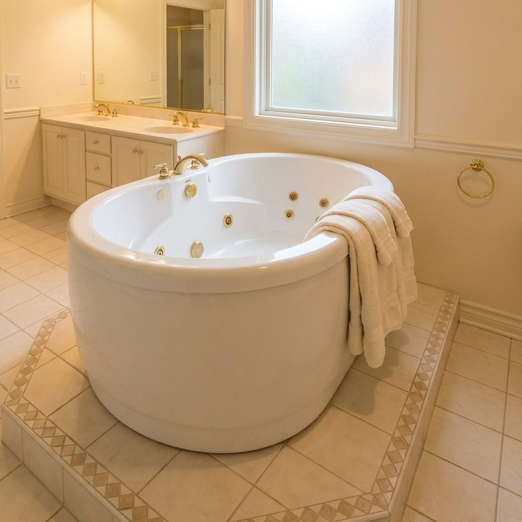
Nothing said we made it quite like a jetted whirlpool tub sitting center-stage in the master bath, positioned so you could see it the moment you opened the door. It was the room’s reason for existing. The jets hummed loud enough to hear from the hallway, and the tub itself was always white, always oversized, always slightly theatrical.
In order to come up with the very specific design ideas, we create most designs with the assistance of state-of-the-art AI interior design software. Also, assume links that take you off the site are affiliate links such as links to Amazon. this means we may earn a commission if you buy something.
Filling it took about twenty minutes and half your hot water heater. Actually using it happened maybe four times a year. But it was there, and that was the whole point. These days it turns up in real estate listings as a liability, but back then a modern bathroom inspiration didn’t get much bolder.
The Corner Whirlpool Tub That Commanded Its Own Corner of the Universe
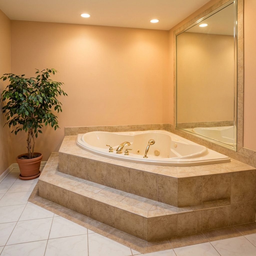
Tucked into the corner of the master bath like it owned the place, the corner whirlpool tub was the architectural flex of its time. It came standard with a tiled surround, a couple of steps to climb up into it, and at least one mirrored surface nearby to make the whole setup feel even more spa-like.
Builders loved these because they fit neatly into a corner without eating the whole floor plan. Homeowners loved them because they looked expensive in listing photos. The angled shape, the wraparound deck, the matching tile that continued from floor to tub wall, it was a very specific kind of luxury that made every bathroom feel like a hotel suite from a 1994 travel magazine.
The Sunken Bathtub Set Into a Raised Tile Deck
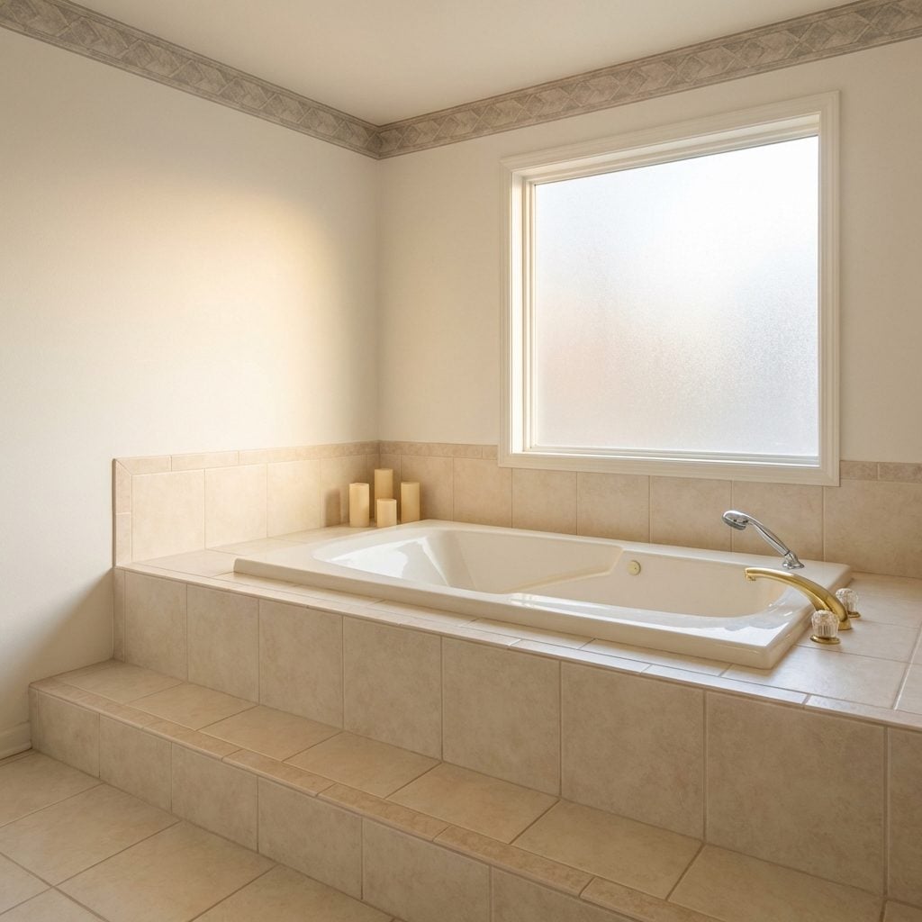
You had to earn this bath. Step up onto the platform, then step down into the tub itself, a sunken soaking basin dropped into a broad tiled deck that wrapped around it like a stage. The deck was always ceramic tile, always in a neutral: bone, almond, or a sandy beige that matched the rest of the room exactly.
The drama of it was undeniable. Candles could line the deck rim. A glass of wine had a perch. The whole setup communicated leisure in a way that a standard alcove tub simply couldn’t. By the early 2000s it started feeling high-maintenance, all those grout lines, all that surface area to clean, but for one shining decade, the tiled tub deck was the height of home luxury.
The Separate Shower With a Glass Block Wall as Its Statement Feature
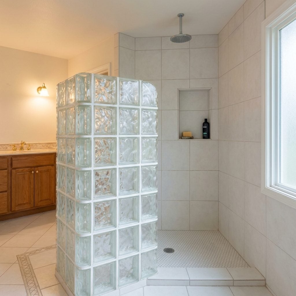
Glass block had no business being as cool as we thought it was, and yet here we are. The separate shower enclosure with a full or partial glass block wall was the design calling card of every upscale bathroom renovation from about 1989 to 1999. The blocks let light through while keeping things private, frosted but glowing, structural but decorative.
Architects and builders loved the way glass block caught light, especially morning sun. It would scatter across the shower floor in soft, diffused squares. The grout between the blocks was always white. The blocks themselves were always the standard 8×8 wavy or rippled pattern. It looked modern, almost industrial, and it signaled that whoever designed this bathroom had taste, or at least had watched enough home design TV to fake it convincingly.
Glass Block Shower Walls That Filled the Whole Room With Soft Light
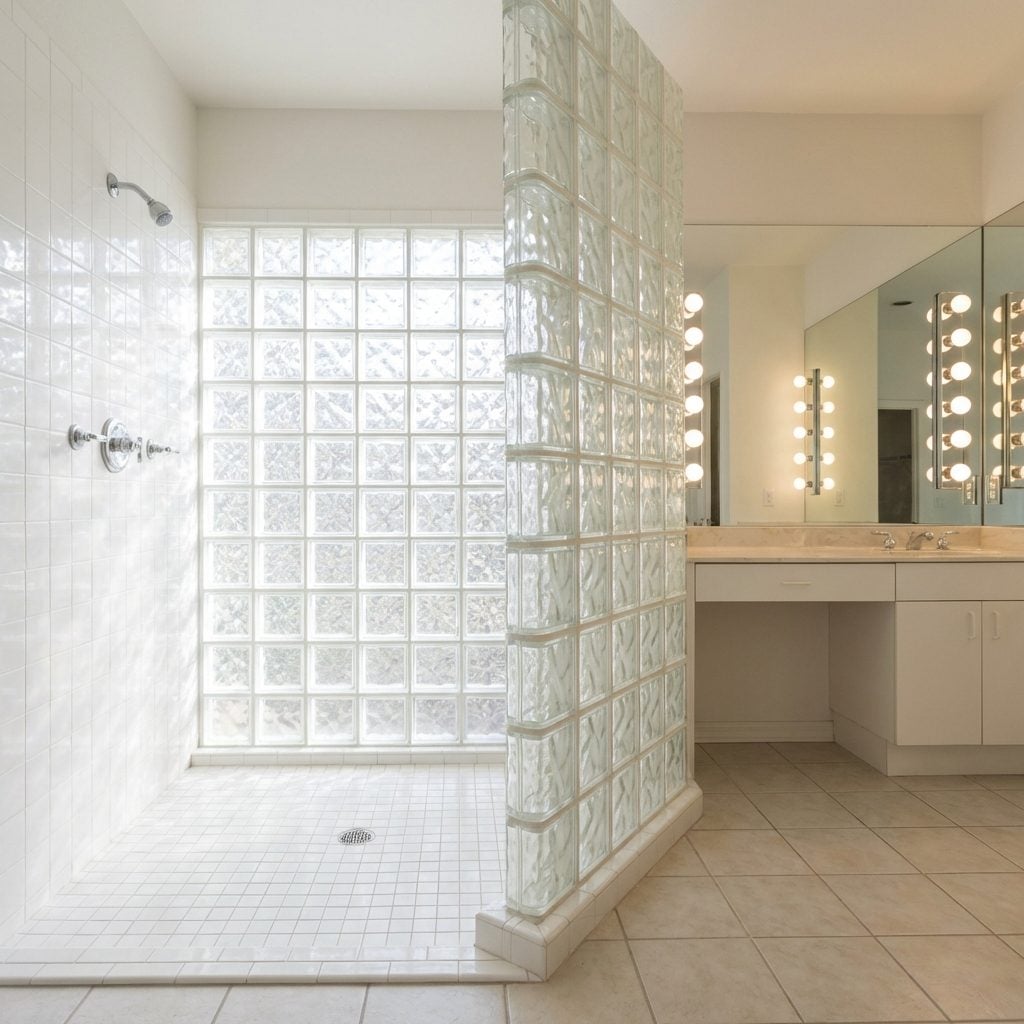
Some design trends age poorly. Glass block aged like a fine wine, then curdled. When builders used glass block to construct entire shower walls, floor to ceiling, corner to corner, it was genuinely impressive. The whole bathroom felt brighter. The whole shower felt less like a wet closet and more like a light installation.
The 1990s version came in three flavors: the full wall of standard wavy blocks, the curved corner configuration that showed off actual masonry skill, and the partial privacy wall that left the top open. All three felt luxurious at the time. Today, glass block reads as deeply dated, which is exactly what makes it such a perfect time capsule of the era.
The Brass-Framed Glass Shower Enclosure With That Particular Gleam
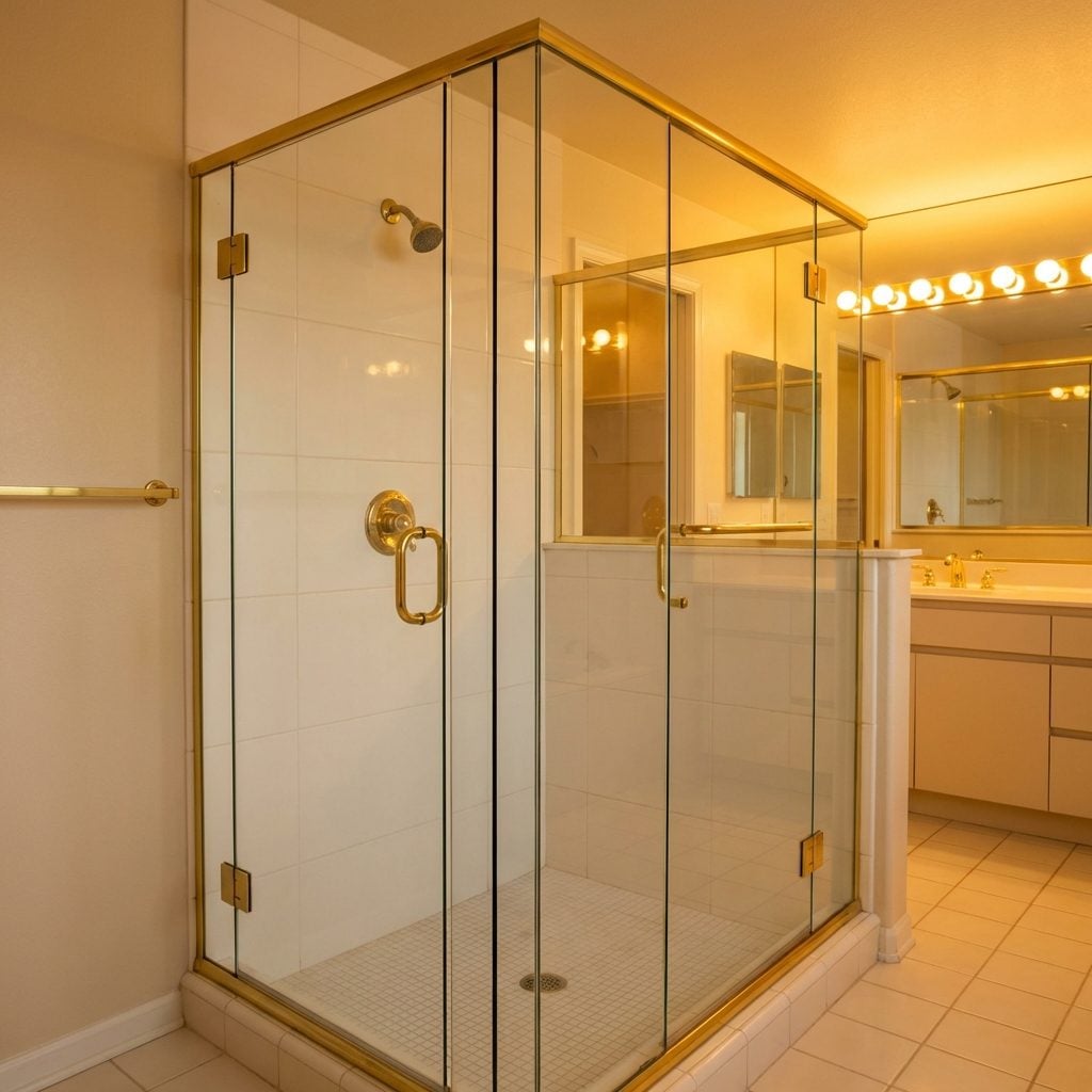
Brass hardware in the 1990s wasn’t the muted antique brass making its comeback now, it was shiny, it was proud, and it was on every shower door frame in America. The standard frameless-adjacent enclosure featured thin brass channels running along the top, bottom, and center seam of the glass panels, with matching brass handles and hinges.
It caught the light beautifully when it was new and cleaned. It showed water spots within twenty-four hours of installation. Keeping it looking the way it did in the showroom was a part-time job. But that gleam against clear glass and white tile was genuinely handsome, and it made even a modest bathroom feel finished in a way that the chrome that replaced it somehow never quite matched.
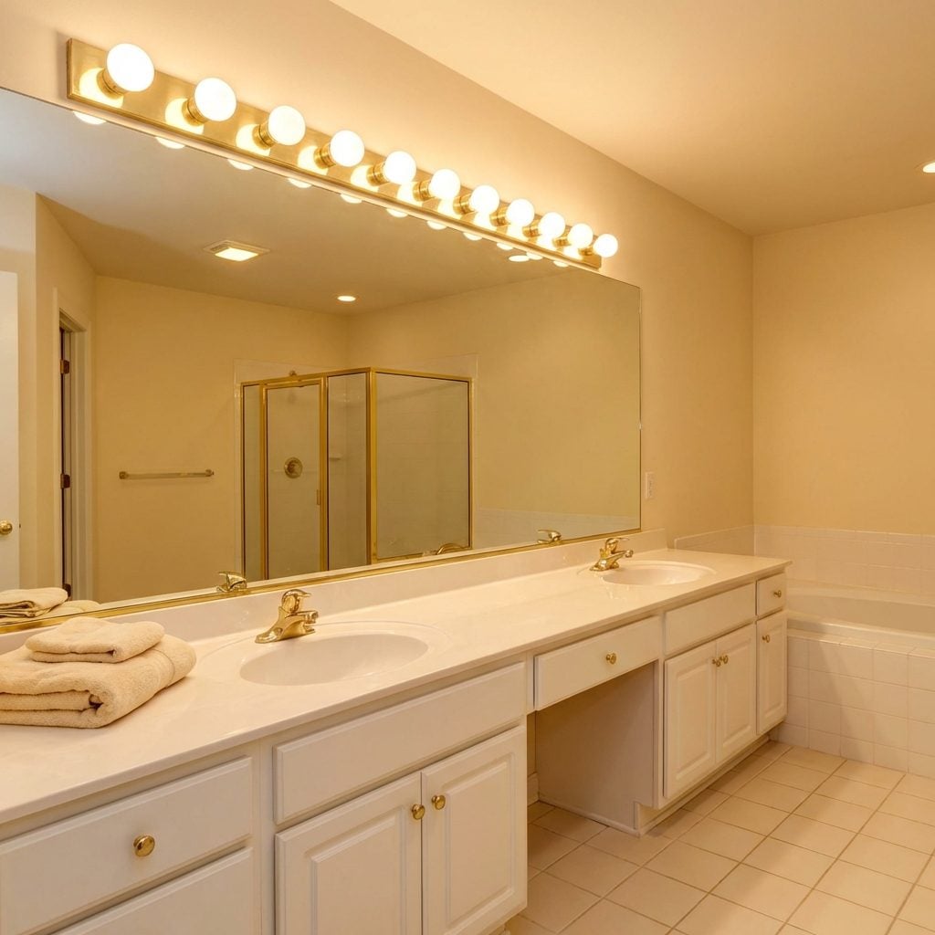
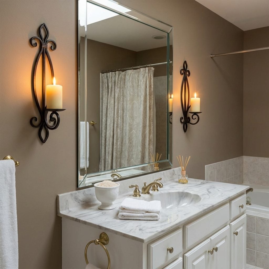
The Double Vanity With a Countertop Wide Enough to Park a Car On
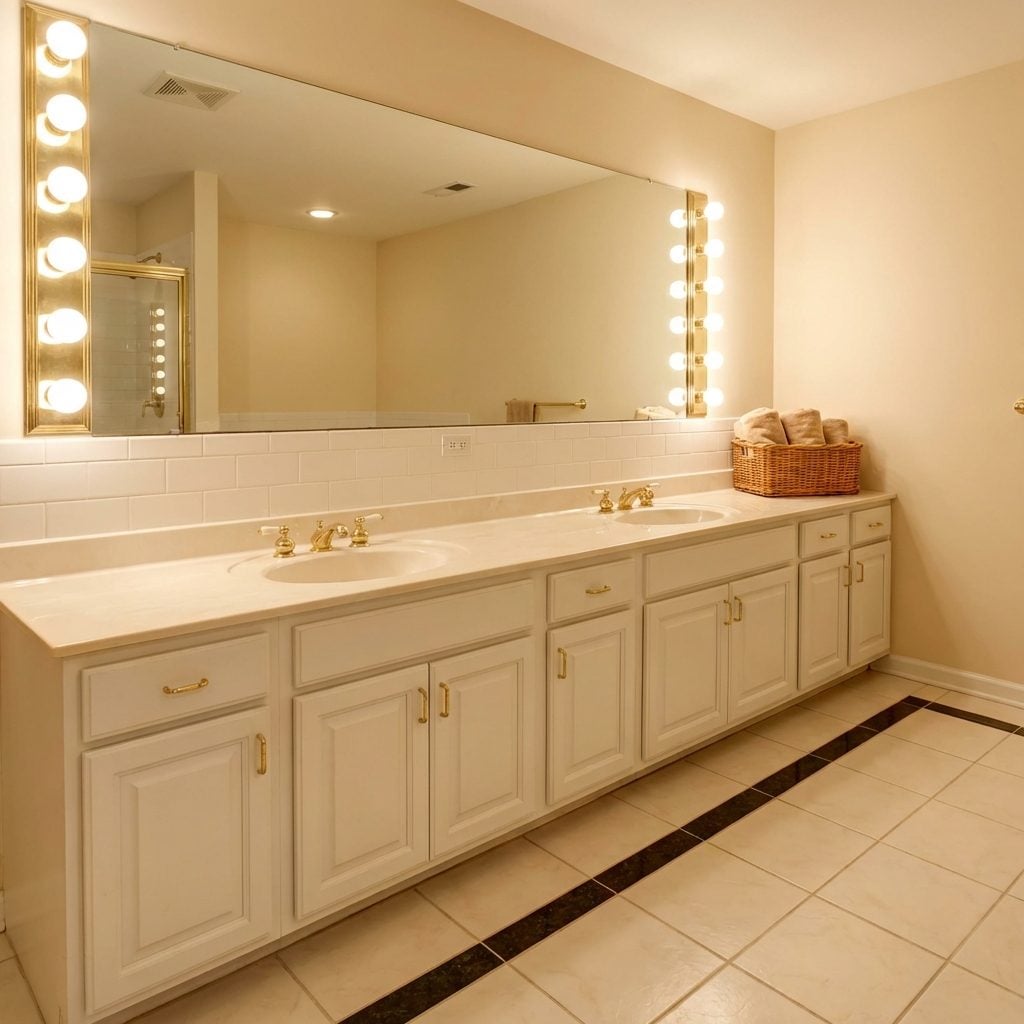
This was the dream: two sinks, side by side, set into a counter so wide it practically had its own zip code. The double vanity arrived in the 1990s as the ultimate symbol of a grown-up master bath, the thing that separated a real primary suite from a room that just had a tub in it.
The counter would be cultured marble or Corian, always in white or almond, and it ran the full length of the wall, sometimes six feet, sometimes eight. Each sink had its own faucet in matching brass or brushed nickel. Below, two sets of cabinet doors with recessed panel detail hid all the things couples politely pretend they don’t store under the sink.
The modern bathroom inspiration crowd has since replaced all of this with floating vanities and vessel sinks, but something about the sheer counter space of the 1990s double vanity was quietly practical in a way that never gets enough credit.
The Cultured Marble Vanity Top With the Sink Molded Right In
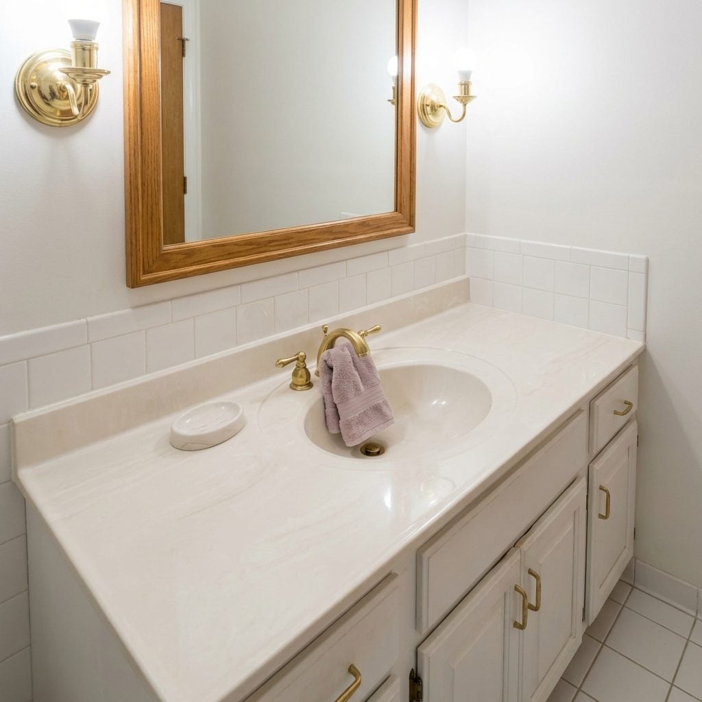
That sink didn’t have a seam because the sink and the counter were one continuous piece of cultured marble, cast together in a mold like they were born that way. No caulk line. No grout. Just one smooth, slightly luminous surface in white, almond, or occasionally a veined faux-marble pattern that was trying very hard.
It was genuinely clever engineering for its time, no gap for water to seep under, no separate fixture to install. The problem was it scratched. And once it scratched, it kept scratching, and eventually the whole piece looked tired in a way that no amount of cleaning could fix. But for that first year in a new house, the cultured marble vanity top felt like something a hotel would have.
The Corian Countertop in Almond, Biscuit, or Some Other Color Named After Baked Goods

Corian came out of DuPont’s labs in 1967 but it didn’t fully arrive until the 1980s and 90s, when it became the countertop of choice for anyone who considered themselves a serious homeowner. And the colors. The colors were named with such earnest domesticity: Almond. Biscuit. Cameo White. Designer White. Bone.
The promise of Corian was that it was solid all the way through, you could sand out a scratch, theoretically, which meant it would last forever. It had a matte, slightly chalky texture that felt expensive even if it looked a little like solidified cream of wheat. A tiny bathroom design could feel significantly more polished with one of these counters running wall to wall.
The Soft Peach or Mint Green Countertop That Seemed Perfectly Normal at the Time
There was a whole palette of countertop colors in the late 1980s and early 1990s that we accepted completely without question. Peach. Mint green. A particular shade of mauve that didn’t quite have a name. Rose. Seafoam. These weren’t accent colors, they were the main event, running wall to wall across vanity tops, sometimes matching the toilet and the sink in a full coordinated suite.
Walking into a bathroom done entirely in peach felt normal. It felt like someone’s grandmother’s house, or like a nice hotel in 1991, or like the inside of a Mary Kay compact scaled up to room size. The bright bathroom design sensibility of today finds this baffling, but there was something genuinely cheerful about a bathroom that committed fully to a warm, rosy hue.
The Wall-to-Wall Vanity Mirror That Made the Room Feel Twice as Big
Before medicine cabinets went recessed and framed mirrors came back into fashion, there was the full wall mirror: a single sheet of plate glass mounted flush above the vanity, running the entire width of the counter from one wall to the other. No frame. No gap. Just mirror, edge to edge.
It was practical and it was impressive. It made even a small bathroom feel significantly larger, doubled every light source in the room, and let two people get ready side by side without jostling for reflection space. The Hollywood-style light bar ran across the top of it, and the whole setup had a theatrical quality, like a dressing room backstage, which was exactly the fantasy.
“The wall-to-wall mirror didn’t just reflect the room. It completed it.”
The Oak-Framed Mirror Above the Vanity That Matched Absolutely Everything
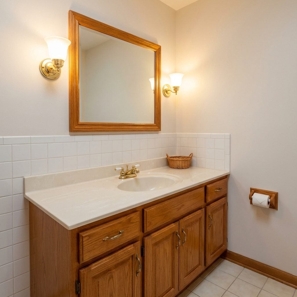
Honey oak. Not walnut, not cherry, not the whitewashed version that came later. The warm, slightly orange-toned honey oak that coordinated with the cabinet doors below, the toilet paper holder on the wall, and often the towel bar as well. The mirror frame was typically about two inches wide, simple profile, and it looked like it came as a set, because it usually did.
The oak bathroom suite was the builder-grade luxury of its era. You’d find it in new construction from 1988 right through to about 2003, at which point it was suddenly, universally considered dated. Today it’s cycling back as people discover that warm wood tones in bathrooms are actually quite nice, though the new version is white oak, not honey, because of course it is.
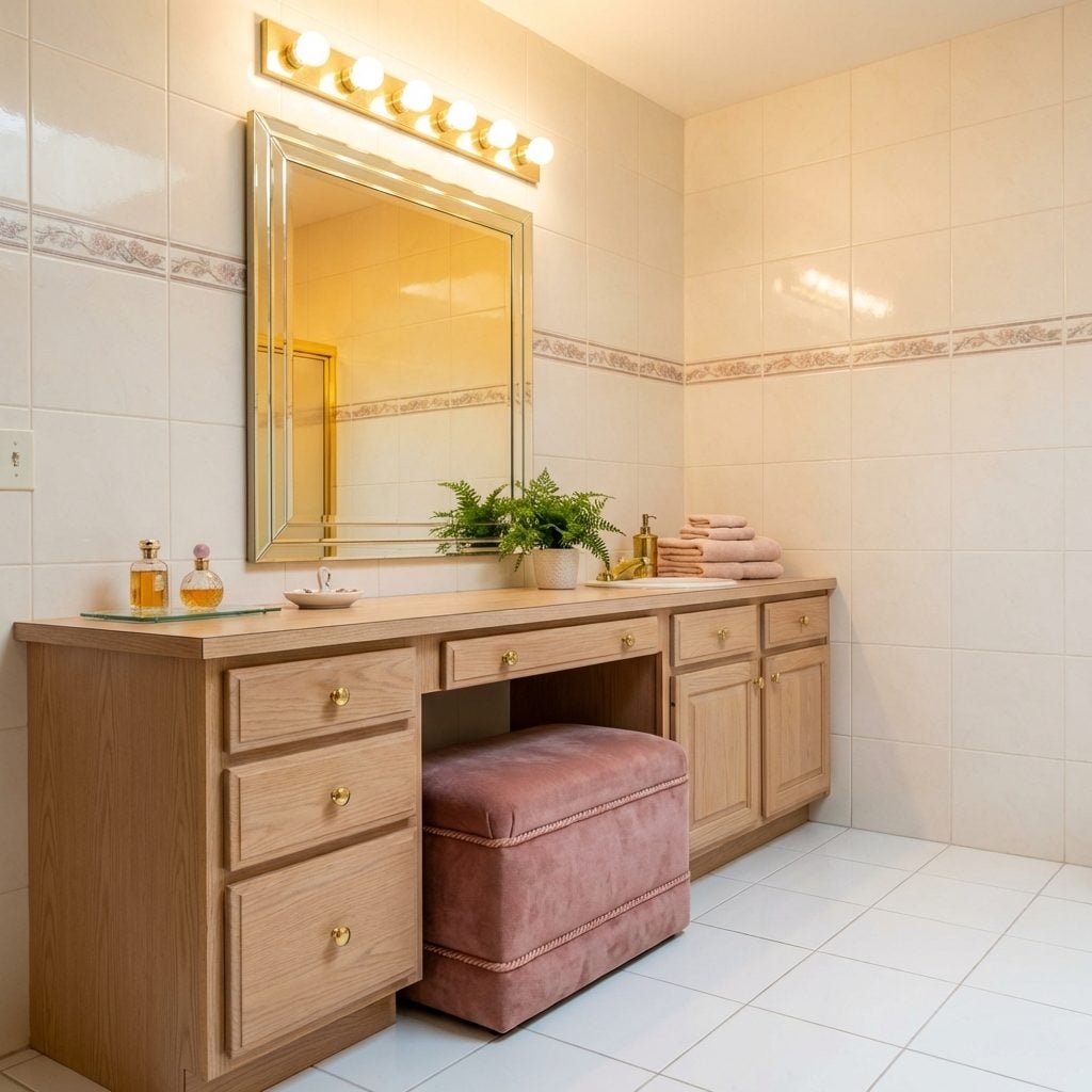
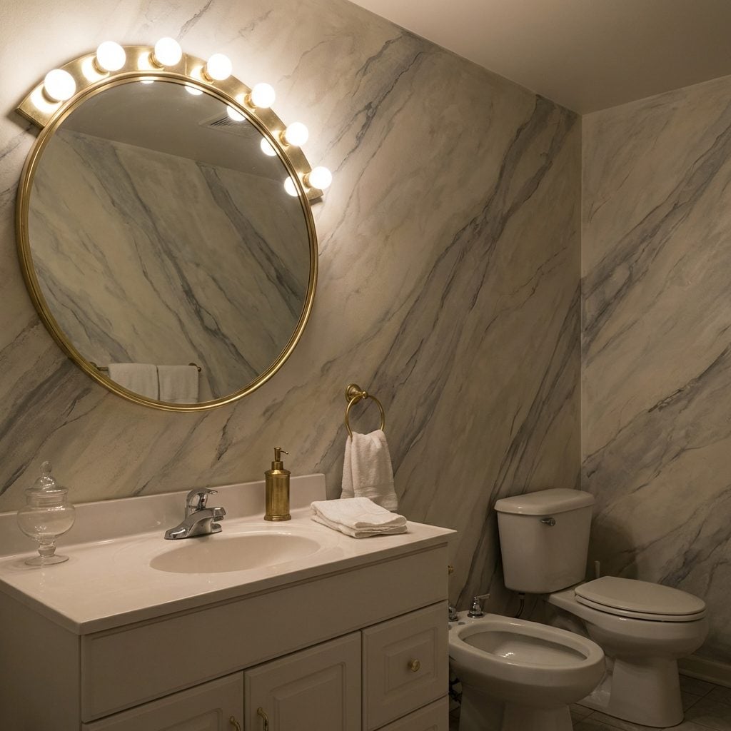
The Hollywood Bulb Strip Above the Vanity

🔥 Would you like to save this?
Those big, round vanity bulbs arranged in a neat row above the mirror were the definitive signal that someone took their bathroom seriously. Not just a bathroom, a dressing room. The warm, even light they cast eliminated every shadow, which was the whole point. In the ’90s, this was what movie stars had, and now you could too.
The bulbs were usually frosted, sometimes globe-shaped, and they hummed just barely enough that you noticed the silence when they were off. Getting ready under that light felt like a rehearsal for something important. Every morning routine suddenly had production value.
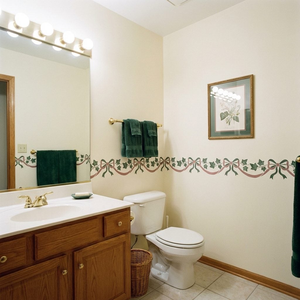
Track Lighting or Recessed Cans (Very Big Deal at the Time)
Recessed can lighting in a bathroom was proof that someone had called an actual electrician and said the words “I want a plan.” Track lighting was its slightly flashier cousin, the one that swiveled and could be aimed at the mirror like a spotlight. Either way, you were not dealing with a basic overhead fixture on a pull chain anymore.
The cans were usually brass-ringed or plain white, installed in a perfectly spaced row across the ceiling. They made the bathroom feel like a magazine spread, or at least what a magazine spread looked like before everyone had internet access and real expectations. A lot of bathroom remodels started and ended with these fixtures and called it done.
The Built-In Makeup Vanity with Its Own Lighted Mirror

This was the room within the room. A dedicated makeup station built directly into the wall or tucked into a corner alcove, with a mirror that had its own lighting built into the frame. Not a portable mirror, not a magnifying mirror on a telescoping arm. A permanent lighted mirror. Framed, wired, and going nowhere.
The vanity surface was usually a slick laminate in cream, white, or a muted rose, with a row of shallow drawers below for brushes and compacts. If the house had this, the master bathroom was the crown jewel of the whole floor plan. It said: someone in this house takes beauty seriously, and the architecture agrees.
Built-In Vanity Seating That Made You Feel Like Old Hollywood
Not a chair you pulled up. Built-in seating. A padded bench or pull-out stool that was architecturally part of the vanity itself, upholstered in something coordinated, dusty rose, cream, sometimes a small floral print with a coordinating welt cord. The kind of detail that said this bathroom was designed, not just installed.
It was low enough that you sat at mirror height, which was the whole point. You could spend twenty minutes doing your makeup and your back wouldn’t hurt. The practicality was almost secondary to the symbolism: a seat at the vanity meant you had a vanity worth sitting at.
“A seat at the vanity meant you had a vanity worth sitting at.”
The Recessed Medicine Cabinet That Flush-Mounted Into the Wall
Forget the surface-mount box that jutted out from the wall like an afterthought. The recessed medicine cabinet sat flush, mirrored front and all, completely integrated into the tile or drywall surround. You didn’t know it was a cabinet until someone opened it. That reveal felt like a design magic trick every single time.
In ’90s upscale builds, these usually had beveled mirror edges and interior shelves in adjustable brushed metal or white coated wire. If you were really lucky, there were two of them side by side over a double vanity. The symmetry alone was satisfying enough to qualify as decor. Modern modern bathroom inspiration has circled back to the recessed format, though the styling is considerably cleaner.
Gold-Plated Fixtures and Accessories (Yes, All of It)
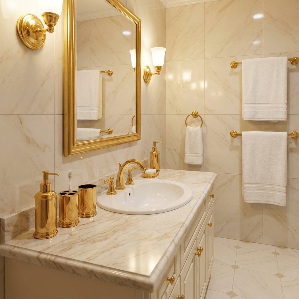
Brass was standard-issue ’90s luxury. Gold-plated was something else entirely. Gold-plated faucets, gold-plated soap dispenser, gold-plated towel bars with a slight heft to them that regular hardware didn’t have. If you were visiting someone’s house and walked into a bathroom with full gold-plated fixtures, you immediately recalibrated your estimate of what they were earning.
The accessories usually came as a matched set in a box: toothbrush holder, soap dish, tumbler, lotion dispenser, tissue box cover. All gold. All shiny. All arranged on the counter like a trophy case. Some sets came with subtle etching or a faint rope-twist texture on the band. It was aspirational in the most literal sense. You aspired to it. And if you had it, you protected it.
The Heated Towel Rack That Made Everything Feel European
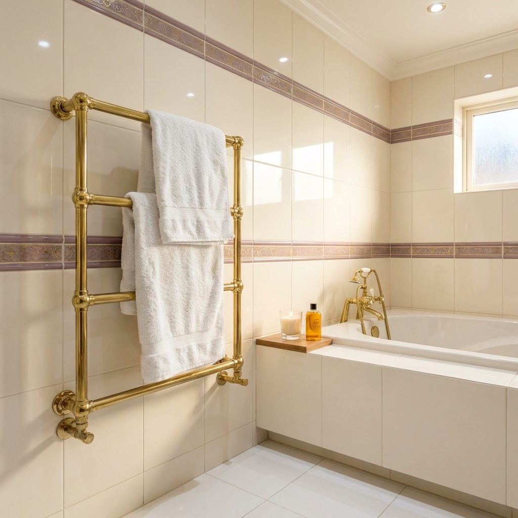
A warm towel pulled from a heated rack was the single most civilized thing a ’90s bathroom could offer. The rack was usually chrome or brass, mounted on the wall near the tub or shower, and it ran hot enough that a damp towel dried completely between uses. Which meant your towel was always dry. Which, if you think about it, most towels were not.
These came in ladder styles, bar styles, or a combination, and the better ones were hard-wired into the wall rather than plugged in. Hard-wired meant it was permanent. Permanent meant it was part of the house. Part of the house meant it showed up in the real estate listing. A heated towel bar in a bright bathroom design still lands the same way today.
The Bidet That Nobody Talked About at Parties (But Everyone Noticed)
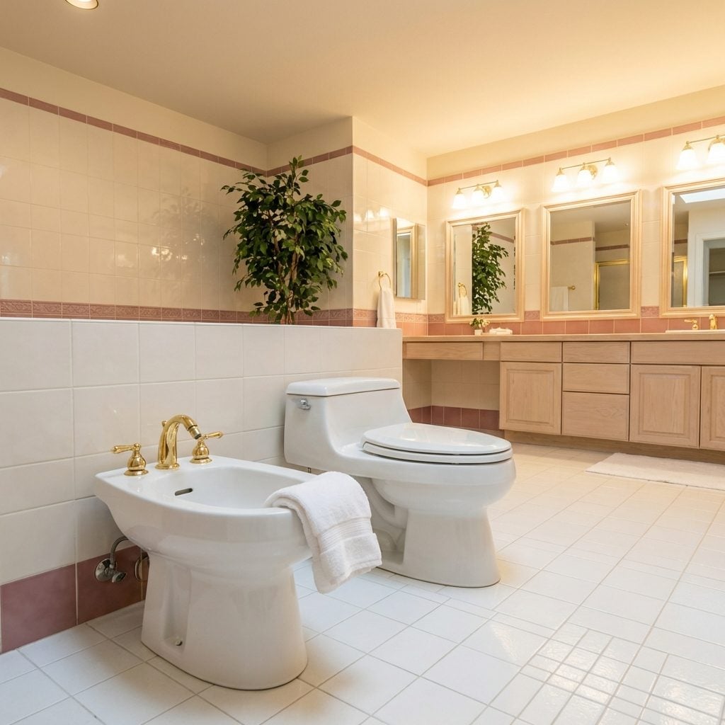
Having a bidet in a ’90s American home bathroom was, in terms of signaling, roughly equivalent to having a second refrigerator in the garage: it said you had space to spare and you’d done some traveling. It sat beside the toilet, porcelain, low to the ground, with its own set of faucet handles, and most American guests spent a full fifteen seconds figuring out what it was before they were too embarrassed to ask.
The irony is that much of the developed world considers a bidet basic plumbing. In the U.S., through most of the ’90s, it was pure luxury signaling. The COVID paper shortage of 2020 did more to normalize bidets in American bathrooms than thirty years of interior design magazines ever managed.
The Telephone Mounted Directly Into the Bathroom Wall
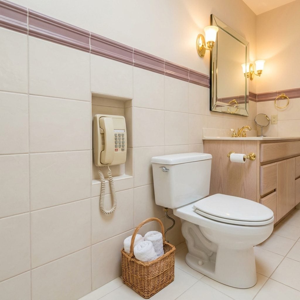
A phone in the bathroom was one of the most nakedly aspirational things a ’90s home builder could include, and they knew it. It was listed in the spec sheet. It was mentioned during the walkthrough. It was the detail that made buyers pause and say, quietly, “Oh, they thought of everything.”
Usually a wall-mount with a coiled cord in cream or white, sometimes a trim-line model in a recessed niche with its own little door. The logic was simple: you might be in the bath when someone called, and you should not miss that call, because in 1993 missing a call meant missing it entirely. No voicemail on every plan, no cell in your pocket. The bathroom phone was genuinely useful, for about eight years.
Built-In Linen Cabinets Floor-to-Ceiling Along One Full Wall
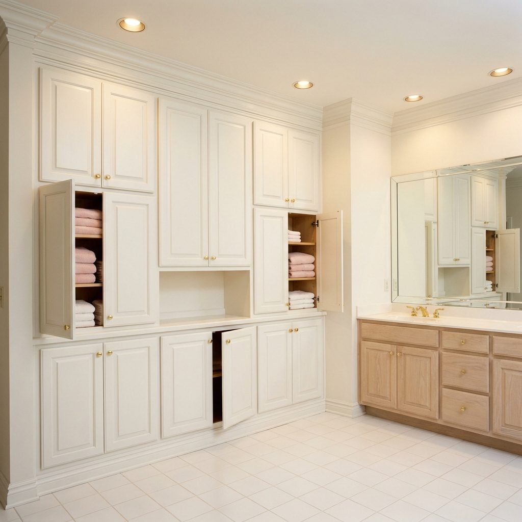
Not a standalone armoire. Not a shelf unit from a big box store. A built-in linen cabinet, framed and trimmed and painted to match the room, with raised-panel doors and interior shelves that went all the way to the ceiling. This was cabinetry. This was a commitment. The doors had small brass or ceramic knobs and stayed perfectly aligned because the carpenter had installed them correctly, not because you’d adjusted them seventeen times over six years.
The shelves held folded towels in coordinating colors, stacks of washcloths, maybe a wicker basket for extra soap. A bonus room decor strategy that’s actually still useful: built-ins give you storage that doesn’t read as clutter. In a ’90s master bath, floor-to-ceiling linen storage was a flex, plain and simple.
The Built-In Hamper Cabinet with a Flip-Top Lid
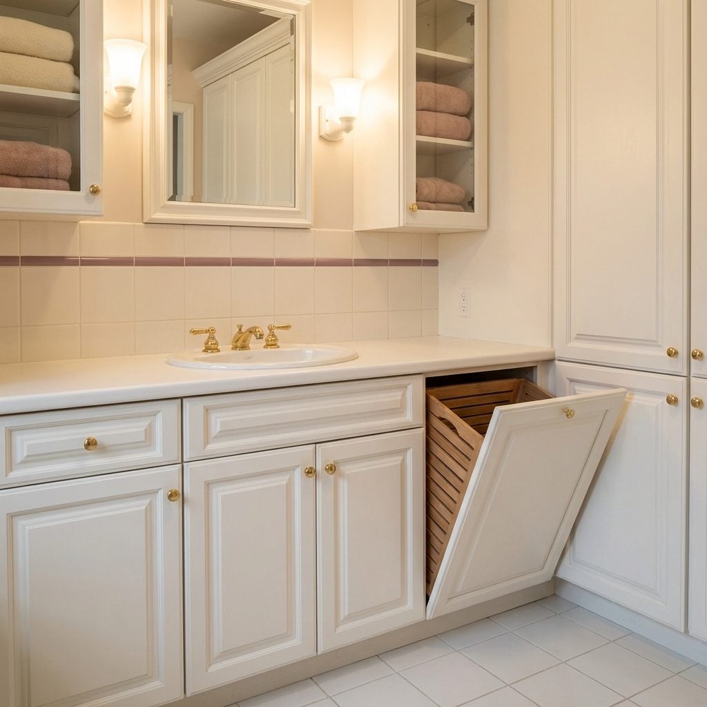
Hidden inside a cabinet that looked exactly like every other cabinet in the bathroom, the built-in hamper had a hinged lid that lifted up to reveal a lined or slatted interior for dirty laundry. The lid was usually the same raised-panel construction as the door fronts beside it, with the same hardware. From the outside, you couldn’t tell it apart from the cabinet holding the toilet paper rolls.
This was the ’90s version of concealed storage, and it worked beautifully. No laundry basket on the floor. No pile accumulating behind the door. Just a clean, continuous run of cabinetry with a secret, and a bathroom that looked pulled-together regardless of what was hiding inside. It’s the kind of thoughtful detail that modern tiny bathroom design still struggles to replicate in small footprints.
The Over-the-Toilet Storage Unit That Made Every Bathroom Feel ‘Organized’
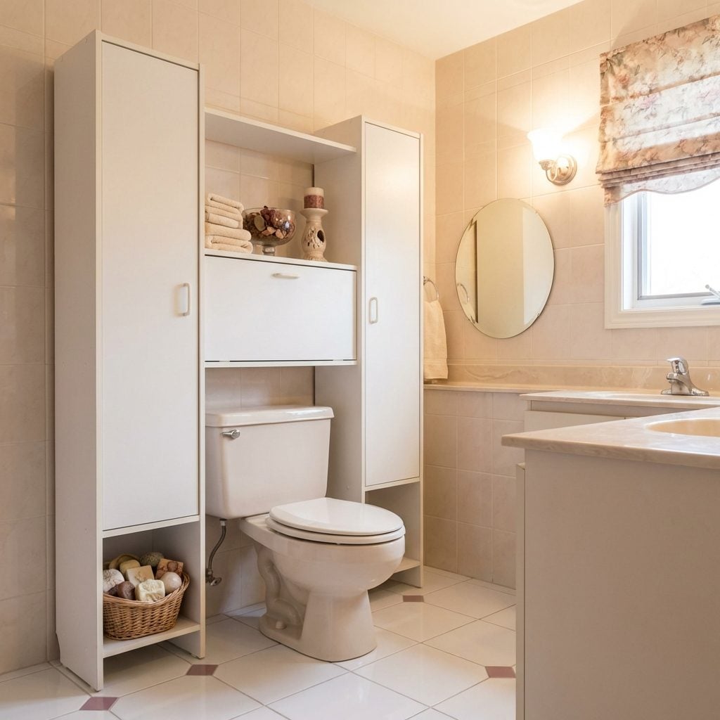
It came in white laminate or oak veneer, stood about five feet tall, and straddled the toilet tank like it owned the place. Two side legs, a top shelf, maybe a little cabinet with a magnetic door that never quite closed flush. Every bathroom in America had one, and every one of them held the exact same things: a spare roll of toilet paper, a dusty potpourri sachet, and one decorative soap that was never, ever to be used.
The genius of it was that it required zero installation. You just… placed it there. No studs, no drill, no contractor. It was the IKEA flatpack of bathroom storage before IKEA flatpacks were everywhere. They quietly disappeared sometime around 2005 when open shelving and pedestal sinks took over, but for one glorious decade, they were the universal signal that someone had their home together.
The Recessed Shower Niche That Felt Like a Five-Star Hotel Feature
🔥 Would you like to save this?
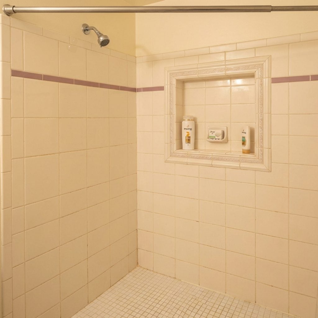
Before the word ‘niche’ became a personality type on LinkedIn, it was a literal shelf built into your shower wall, and having one meant your bathroom was serious. Not a plastic caddy hanging from the showerhead. Not a wire rack suctioned to the wall. An actual recess in the tile, usually positioned at shoulder height, often lined in the same ceramic as the surround, holding your shampoo bottles like they were on display at a boutique.
The ’90s version typically had a single shelf, just deep enough for a Pantene bottle and a bar of Dove. Sometimes there was a subtle border tile framing it. That tiny detail alone signaled a builder who was paying attention, which is probably why it became the thing realtors pointed to first.
Built-In Soap Dishes and Toothbrush Holders Mortared Right Into the Wall
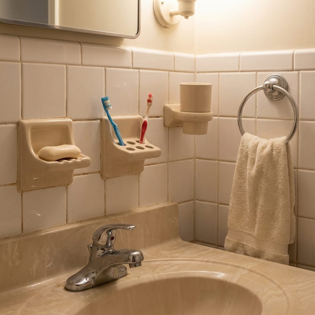
These were not accessories. These were architecture. A ceramic soap dish, matching toothbrush holder, and sometimes a cup holder, all set directly into the tile at the time of installation, grouted in place like they were load-bearing. Usually in white or almond, always matching the tile, always positioned at a height that made sense for exactly one person’s arm length and nobody else’s.
The toothbrush holder had four holes, because apparently every family in the ’90s had four people with perfect dental hygiene. The soap dish had that little ridged bottom that never actually drained properly, so the soap sat in a puddle of chalky white water until it dissolved into a soft gray lump.
When people started remodeling in the 2010s, these were the things that required an actual tile saw and a fair amount of profanity to remove. They weren’t going anywhere without a fight.
Frosted Glass Windows That Let In Light Without the Neighborhood Show
Frosted glass in a bathroom window was genuinely clever and, in the right house, genuinely beautiful. That soft diffused light coming through the pebbled or reeded glass in the morning, no blinds required, no awkward positioning, just a warm glow landing on the tile while you got ready for the day.
Most of these were casement or single-hung windows with factory-frosted panes, often framed in white-painted wood that was perpetually damp and starting to peel at the corners. The privacy worked perfectly unless you stood directly against the glass, which nobody figured out until a specific unfortunate evening.
The Frosted Glass Pocket Door That Absolutely Never Stayed on Its Track
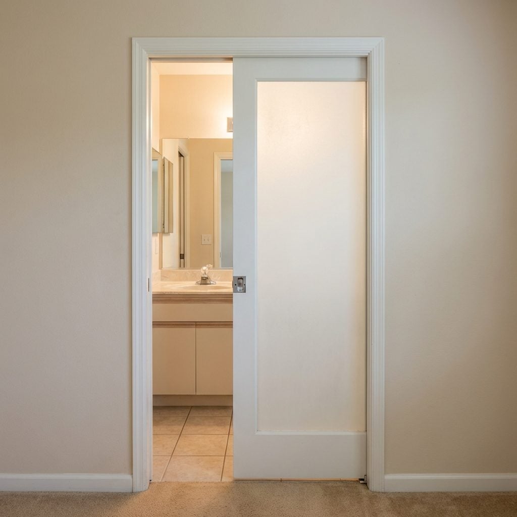
This was peak ’90s luxury: a pocket door with a frosted glass panel that disappeared into the wall when open, giving you that airy, semi-open feel when guests arrived, or actual privacy when you needed it. The hardware was typically chrome or brushed nickel, and the door itself had that satisfying weight when it slid properly.
The problem was the track. Within two years, the thing would jump the bottom rail and require a specific jiggling technique that every member of the household had memorized. You never fixed it, you just learned to accommodate it.
A Skylight Directly Above the Tub or Shower (Because Natural Light Is Free)
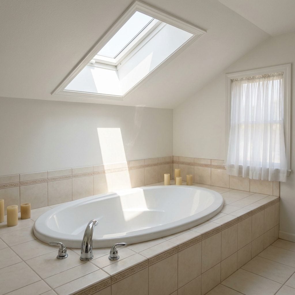
There was something genuinely transcendent about having a skylight over your bathtub. You’d lie back in the water and look straight up at a patch of blue sky or a slow-moving cloud, and for a moment the bathroom stopped being a bathroom and became something closer to a spa.
The ’90s version was usually a fixed curb-mounted skylight with a white-painted wood shaft that funneled the light down through the ceiling. On sunny days it was perfect. On rainy days, the sound of the drops hitting the glazing was its own kind of luxury. On winter mornings, there was condensation, a slow drip onto the tile, and the dawning realization that the flashing might need attention.
For homes with a media room or bonus space above, the structural requirements made a skylight tricky, which is partly why they appeared more often in single-story ranch homes and master suites. When they worked, though, nothing beat them.
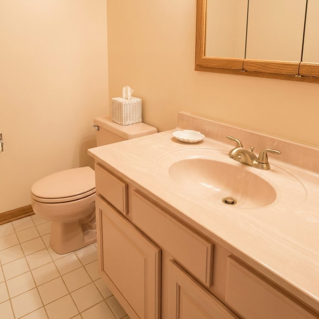
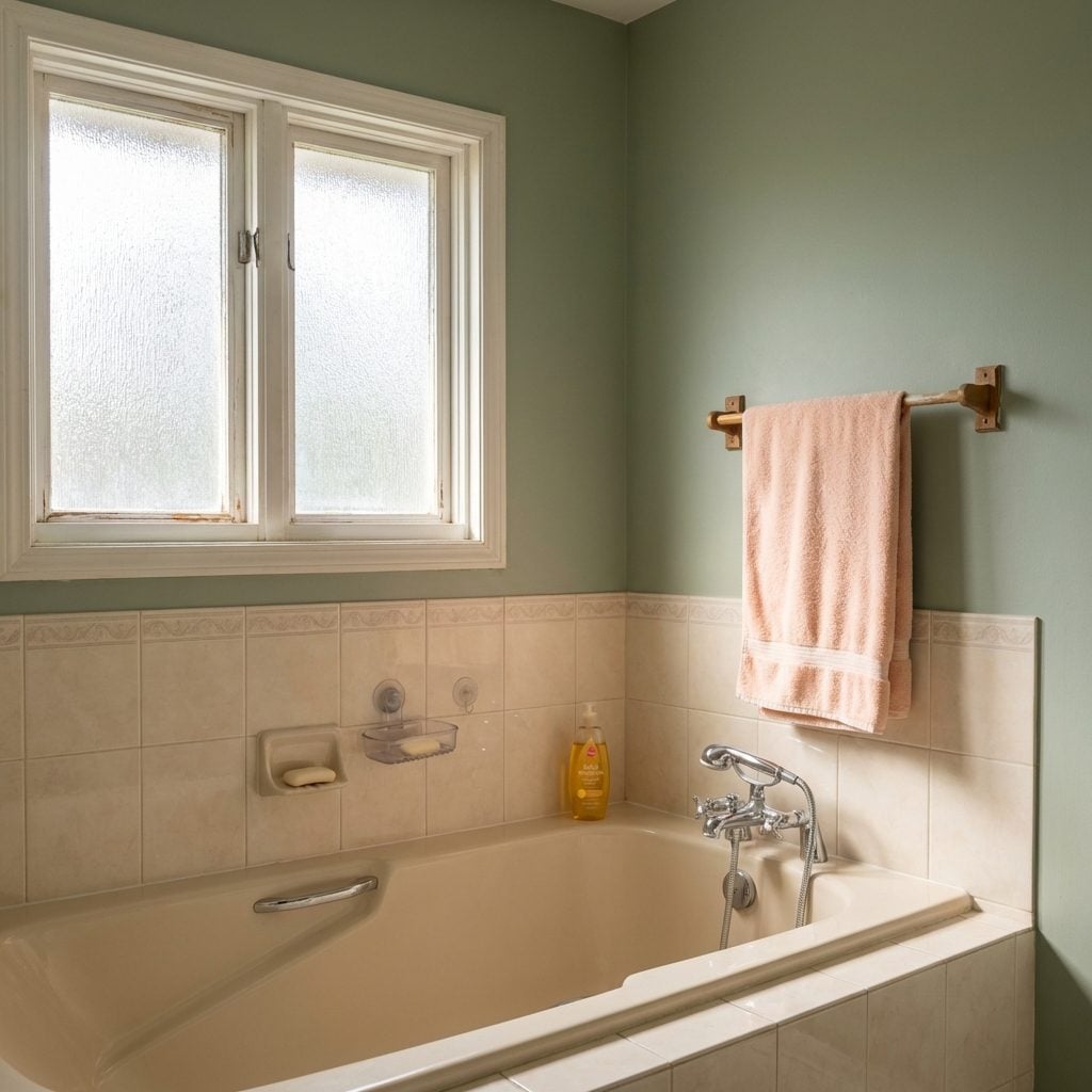
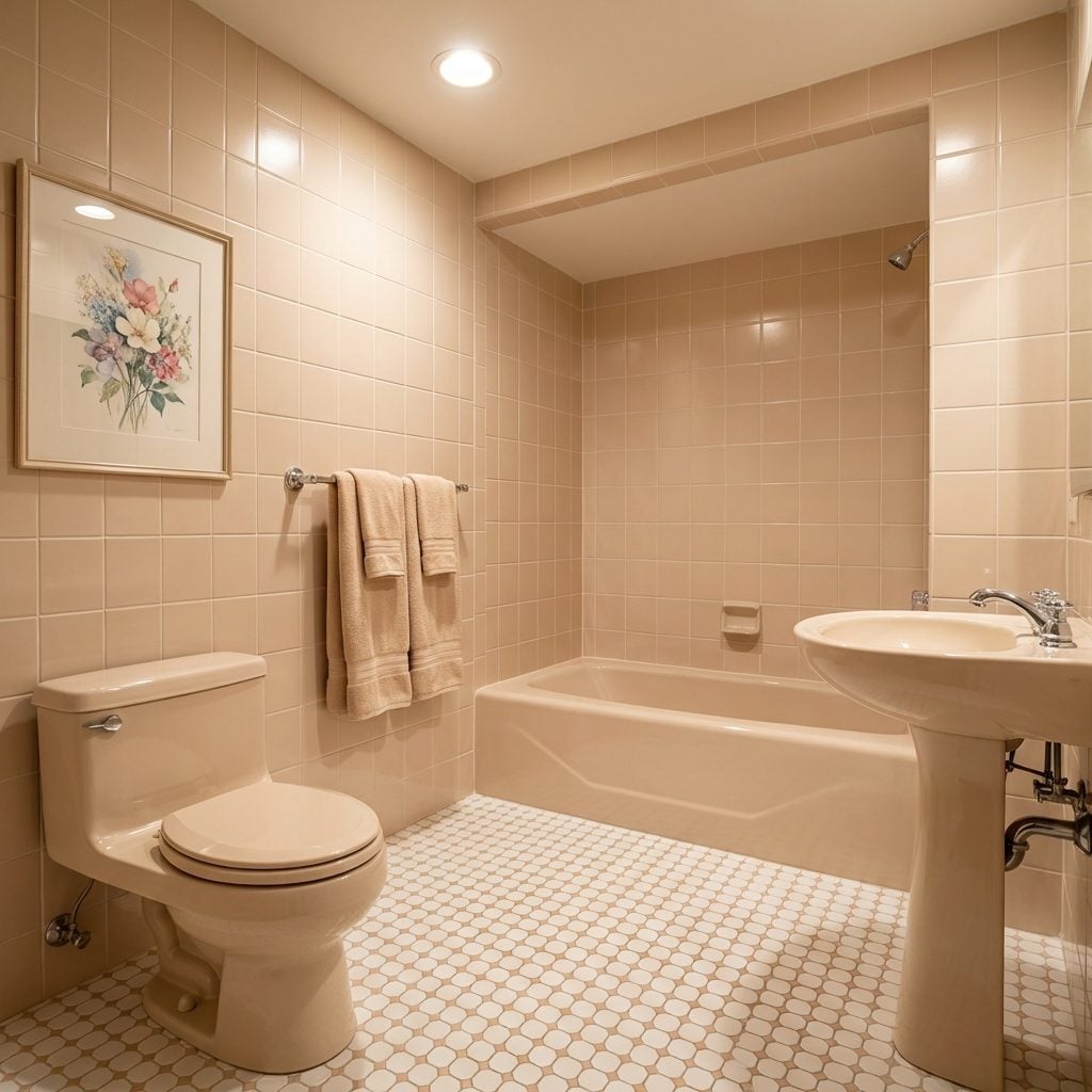
Pastel-Colored Fixtures in Mauve, Almond, and Mint That Were Absolutely Not Negotiable
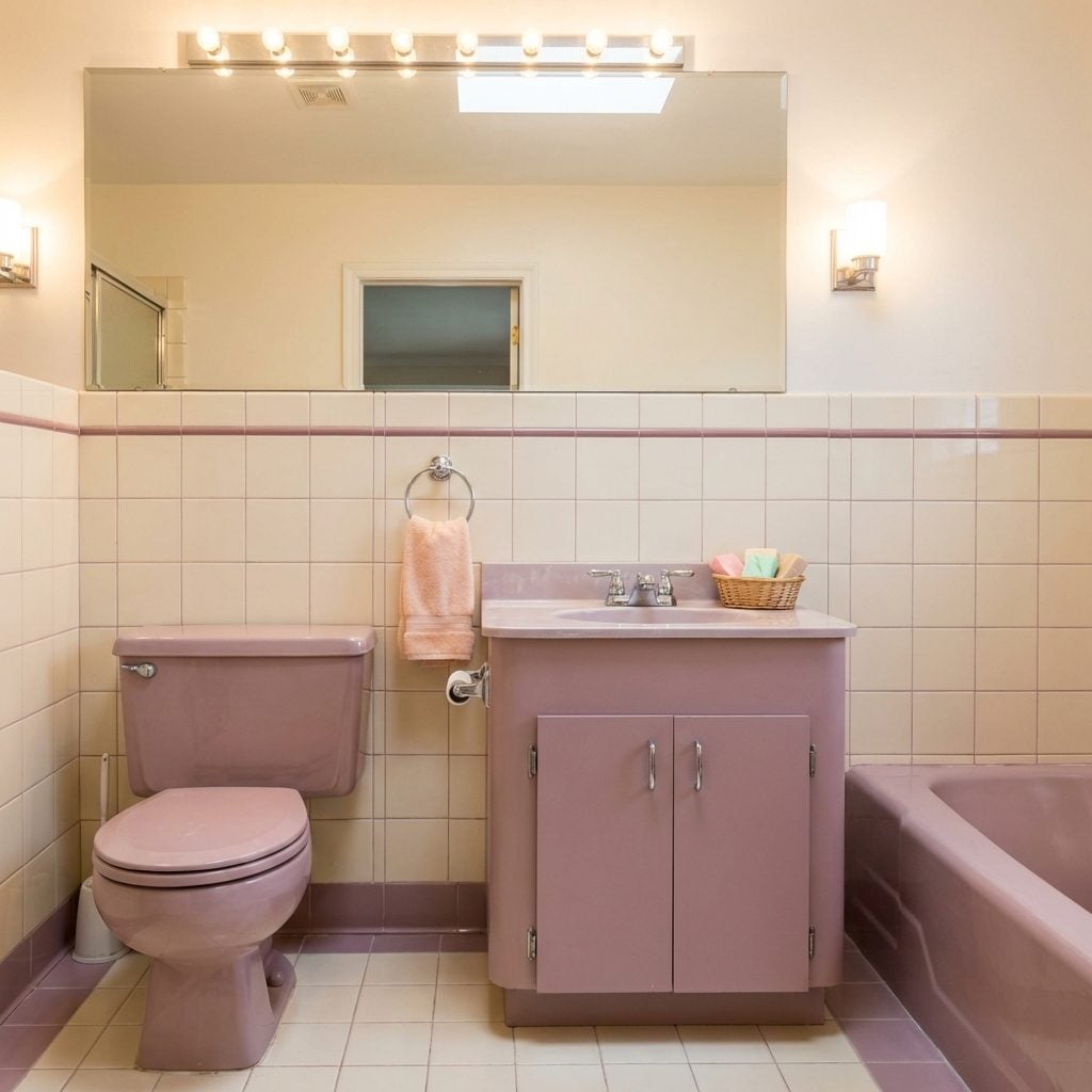
In 1993, you did not choose white fixtures. White was boring. White was what your grandparents had. You chose mauve. Or almond. Or if you were feeling adventurous, a mint green that the catalog called ‘sage’ but was really just mint. The toilet, the sink, and the tub all came in matching colorways, ordered together from the same supplier, and the coordination was the whole point.
The almond fixtures aged the best. Mauve aged in a way that’s difficult to describe kindly. And mint, which seemed so fresh and modern in 1991, somehow became the defining visual shorthand for ‘this bathroom needs to be completely gutted’ by 2002.
‘Almond was aspirational. Mauve was a commitment. Mint was a declaration of personality that you’d eventually have to apologize for.’
The Full Matching Toilet-Sink-Tub Color Set, All Three in Perfect Agreement
Coordinated fixtures were a status thing. Not just having nice fixtures, but having the same color running across all three major pieces in the room simultaneously. It meant the bathroom was designed, not assembled. The toilet tank, the pedestal or vanity sink, and the tub all in the same factory-matched bisque or dusty rose, all ordered together, all installed in one proud weekend.
This was the mediterranean dining room approach applied to bathrooms: everything speaks the same visual language. Manufacturers like American Standard and Kohler leaned hard into this in the late ’80s and early ’90s, offering entire fixture suites in a dozen colorways.
The coordination unraveled when one piece needed replacing. A cracked toilet seat, a chipped sink. You’d call the showroom, discover the color had been discontinued in 1997, and spend the next fifteen years trying to explain to houseguests why the toilet didn’t quite match.
Peach or Seafoam Green Tile Running Floor to Ceiling Without an Apology
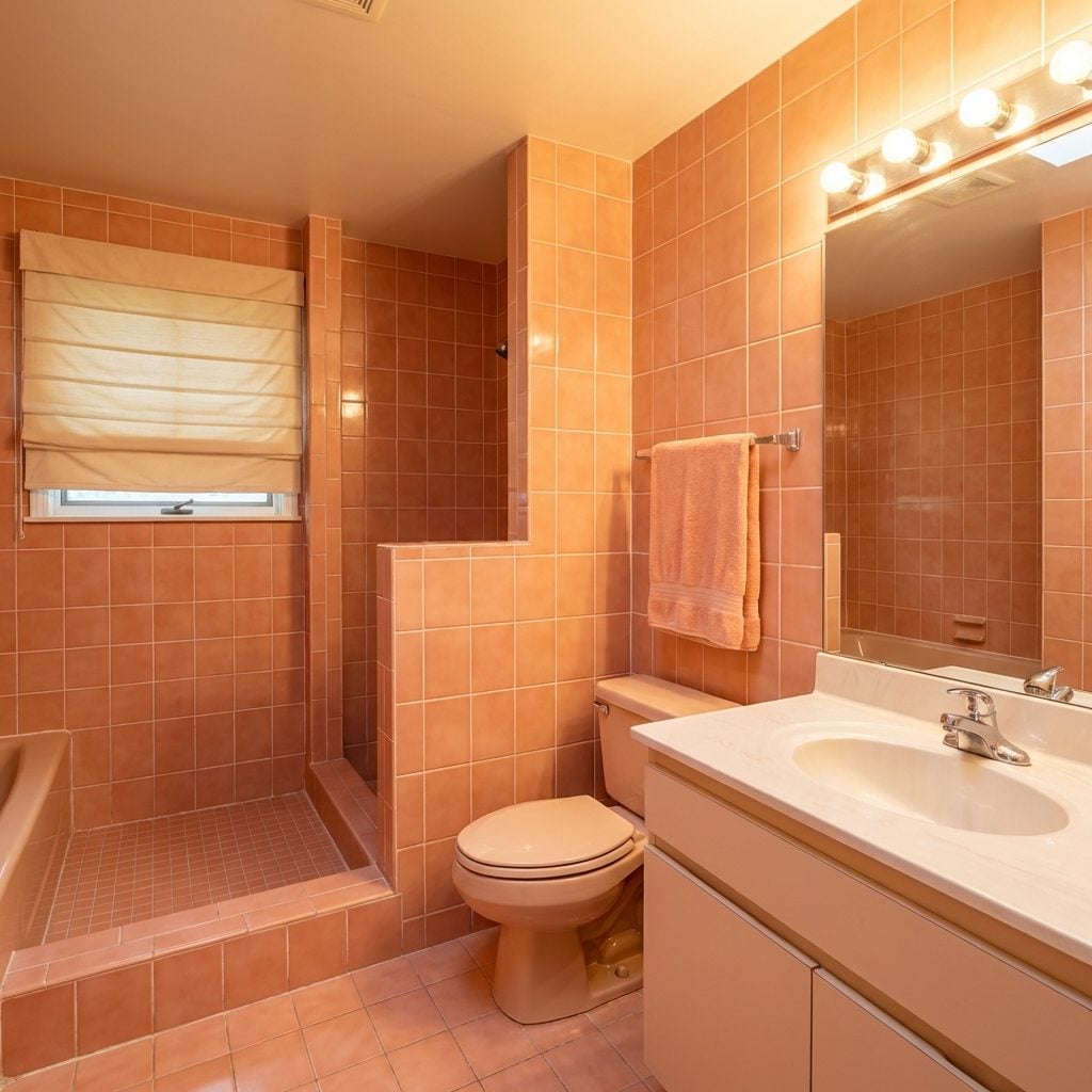
Not an accent. Not a backsplash. Floor. To. Ceiling. Peach ceramic tile on every wall surface, surrounding the tub, climbing the shower, crossing the floor, occasionally wrapping around the outside of the vanity base for no reason other than commitment. It was a total decorating philosophy, not a choice you made lightly.
Seafoam green was slightly more forgiving, mostly because it photographed better in those glossy home magazine layouts that were everywhere in 1989. Peach was bolder, warmer, and has since become the single most reliable indicator that a bathroom hasn’t been touched since the first Bush administration.
For current bright bathroom design inspiration, the contrast with these era originals is almost architectural. Both approaches commit fully to their vision. One just commits to 4×4 peach ceramic.
High-Gloss Ceramic Tile Floors That Showed Every Single Water Drop
Reflective, shiny, and incredibly unforgiving, the high-gloss ceramic bathroom floor was the ’90s answer to marble. It looked great in the showroom under fluorescent lighting, and slightly less great on the third morning after mopping when the water spots were already back.
The most common version was a large-format white or off-white gloss tile laid in a grid, sometimes with a contrasting black or mauve border tile running the perimeter. It photographed brilliantly. It was also a slip hazard in wet feet territory that nobody discussed openly, which is why you always had that thin woven rug in front of the tub that was perpetually damp.
Tumbled Travertine Tile Floors That Whispered ‘We Renovated in 2001’
🔥 Would you like to save this?
Tumbled travertine was the pivot. It was what happened when homeowners got tired of the high-gloss ceramic era and wanted something that felt European, ancient, and expensive without being marble. The rough-edged, matte, variably-colored stone tile appeared in bathrooms across the country starting around 1998 and peaked somewhere around 2004. Every bathroom redesign in that window has it.
The texture was part of the appeal: uneven edges, small natural pits in the surface, a palette of warm beiges and creams that looked incredible paired with a vessel sink and brushed nickel fixtures. It also collected soap residue in every little divot, which you discovered approximately one week after installation.
For tiny bathroom design projects today, travertine still comes up as a reference point, mostly because that warm beige palette ages more gracefully than almost anything the ’90s produced.
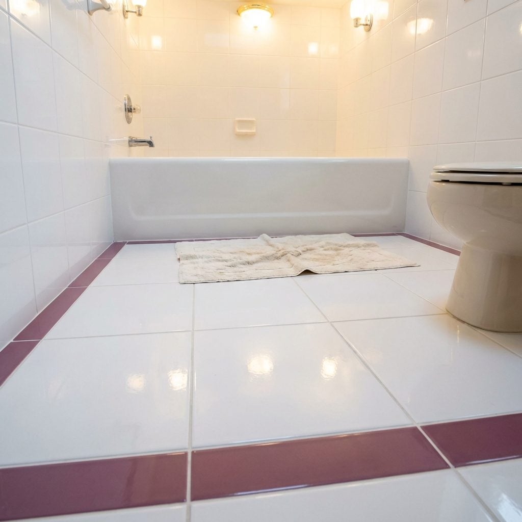
Decorative Tile Borders and Accent Strips That Tied the Whole Room Together
A single horizontal band of decorative tile running at shoulder height around the entire bathroom. That was the move. It could be a listello strip in a contrasting color, a hand-painted floral border, a Greek key in black and white, or a row of small accent tiles with little raised geometric patterns. Whatever the design, its job was to break up the expanse of field tile and signal that someone had made a deliberate choice.
The most common version in the early ’90s was a simple 2-inch border in a complementary color, usually positioned right at the point where the lower tile field ended. By mid-decade, the designs got more elaborate: rope borders, rope-and-bead combos, hand-painted Mediterranean motifs, and the infamous rust living room-inspired terracotta accent strips that made their way into bathrooms as the decade leaned warmer.
These borders are now the hardest things to match when a single tile breaks. The style number was discontinued. The manufacturer is gone. You will grout over it and pretend it was intentional.
Diagonal Tile Layouts That Said ‘We Did Not Go with the Default’
Setting ceramic tile on a 45-degree angle was the ’90s version of a statement floor. It cost more in labor, it required more cuts at every wall, and that was entirely the point. The diamond orientation made a small powder room feel dynamic, and a larger master bath feel genuinely luxurious, at least by the standards of 1994.
Builders used it to justify upgraded packages. Designers used it to fill out tiny bathroom design footprints without adding square footage. The grout lines, usually bright white against ivory or beige tile, created a visual grid that somehow made everything feel more intentional. We all thought it was timeless. It was not. But for a solid decade, it was the floor.
Decorator Wallpaper with a Coordinating Border Strip Running the Perimeter
The border was non-negotiable. You picked your wallpaper, maybe a small floral, maybe a tiny geometric stripe in mauve and sage, and then you found the matching border, which went exactly 12 inches from the ceiling and wrapped the entire room like a gift. The two were sold as a set. The design concept was coordination. The actual effect was a room that felt like it had been gift-wrapped by a very earnest person at Sherwin-Williams.
In the ’90s, this was considered finishing a room. Pattern-on-pattern wasn’t chaotic, it was complete. Waverly and Laura Ashley owned this category entirely, and their sample books were thick as dictionaries. When people eventually steamed those borders off in the 2000s, it took half the wall with it.
Faux Marble Painted Walls Done by Someone Who Watched One VHS Tutorial
Somewhere between 1991 and 1997, every household with a bathroom renovation budget and access to a Bob Ross tape decided to try faux marble. The technique involved a feathering brush, two or three shades of gray or green paint, and a lot of confidence. When it worked, it genuinely looked like veined stone. When it didn’t, which was most of the time, it looked like someone had gotten dizzy with a sponge.
The aspirational reference point was always Italian marble. The actual result was more “community theater set.” Still, for a bright bathroom design that couldn’t afford real stone, it was a genuine attempt at luxury. A few of those rooms actually looked pretty great. We should probably say that more often.
The Stenciled Border Running Exactly at Chair Rail Height
If you didn’t wallpaper, you stenciled. A repeating pattern of ivy leaves, ribbon swags, or tiny roosters (inexplicably) marched around the bathroom at exactly the height where a chair rail might have been, whether there was actual molding there or not. The paint colors were almost always two shades from the same family: hunter green and cream, dusty rose and ivory, navy and soft gold.
Stenciling kits were everywhere. The stencil itself was a sheet of acetate, usually purchased at a craft store and reused until it curled at the edges. Getting the repeat to line up at the corner was the test of a person’s character. Most people just moved the furniture to cover where it didn’t.
Wall-to-Wall Carpet in the Bathroom, Including Around the Toilet Base
Let’s just be honest about this one. We carpeted the bathroom. We carpeted all the way up to, and around, the base of the toilet. The carpet was usually a thick, plush cut pile in a color with a name like “desert sand” or “morning mist,” and it was warm underfoot and it held every ounce of humidity that room ever produced.
There was also the contour rug: a pre-cut carpet piece with a U-shaped notch designed specifically to hug the toilet base. That was a product that existed and was sold in stores and purchased by actual humans. At the time, it felt cozy. In retrospect, it is difficult to explain to anyone under 35 why this seemed fine.
The Matching Fabric Shower Curtain and Window Valance Set
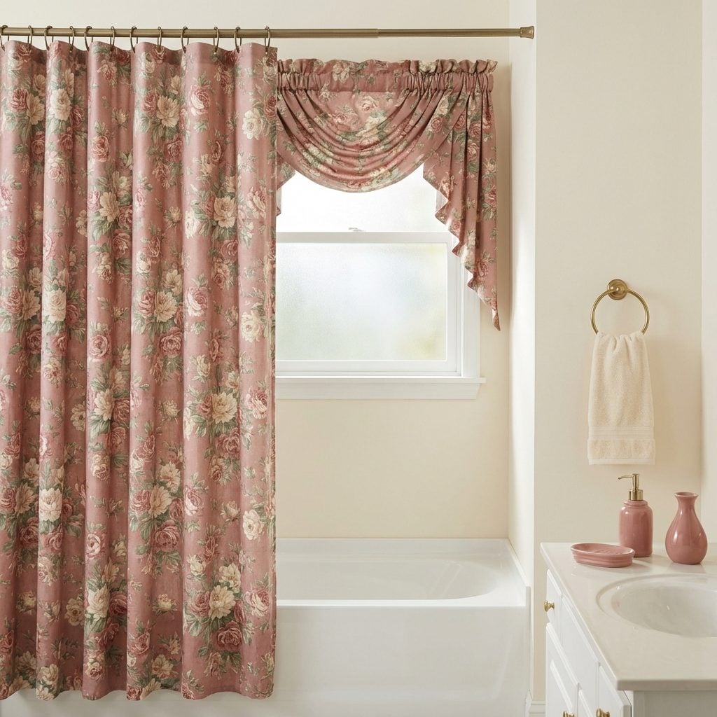
Coordination was a religion in the ’90s bathroom, and the shower curtain-to-window-valance pipeline was its most devout expression. The fabric was always the same: a cotton-poly blend printed with cabbage roses, toile scenes, seashells, or a country check pattern. The valance hung in a soft swag over the frosted window above the tub. The shower curtain, using the same fabric, lined up directly below it.
The effect was intentional and complete, like a dressed room from a Waverly catalog come to life. It said: someone made decisions here. Someone chose this. Matching curtain rings in antique brass finished the look. If you wanted to go full luxury tier, you added a fabric-covered toilet tank lid to match. Some people did exactly that, and they were right to do it.
Built-In Candle Sconces Flanking the Bathroom Mirror Like a Vanity for a Period Film
Real candles. On the wall. In the bathroom. Flanking the mirror on either side at exactly eye level, usually in wrought iron holders or brass wall-mount sconces that held a taper or a pillar. In the ’90s, this was considered romantic. It was also, technically, a fire hazard that we just accepted as ambiance.
The sconces were almost always sold as a pair, often alongside a coordinating set of accessories, the soap dish, the toothbrush holder, the tissue box cover, in the same finish. Candles in the bathroom were tied to the whole “spa ritual” movement that hit the mainstream in the mid-’90s, driven by bath products from The Body Shop and a cultural moment where self-care had just discovered it had a name. This is where modern bathroom inspiration eventually diverged, but the sconces were peak aspiration for their era.
The Pedestal Sink with an Ornate Column Base That Meant Business
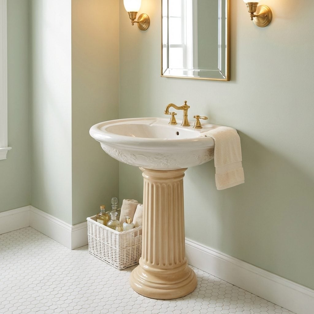
Not all pedestal sinks are equal, and the ’90s knew this. The budget version was a plain white column, smooth and utilitarian. But the high-end version, the one in the master bath of the nicest house on the street, had an ornate fluted column base with a rolled lip at the top, sometimes with embossed detailing, finished in a slightly warm bone white that manufacturers called “biscuit.”
These sinks were the vanity equivalent of a formal suit. They made a bathroom look like a set from a Merchant Ivory film, which was the point. The trade-off was zero storage underneath, but in ’90s design, looking important outranked practicality. Every toiletry and cleaning product lived in a wicker basket tucked slightly behind the column where no one could see it.
The Console Sink with Chrome Legs and That Little Shelf Underneath for Display Towels
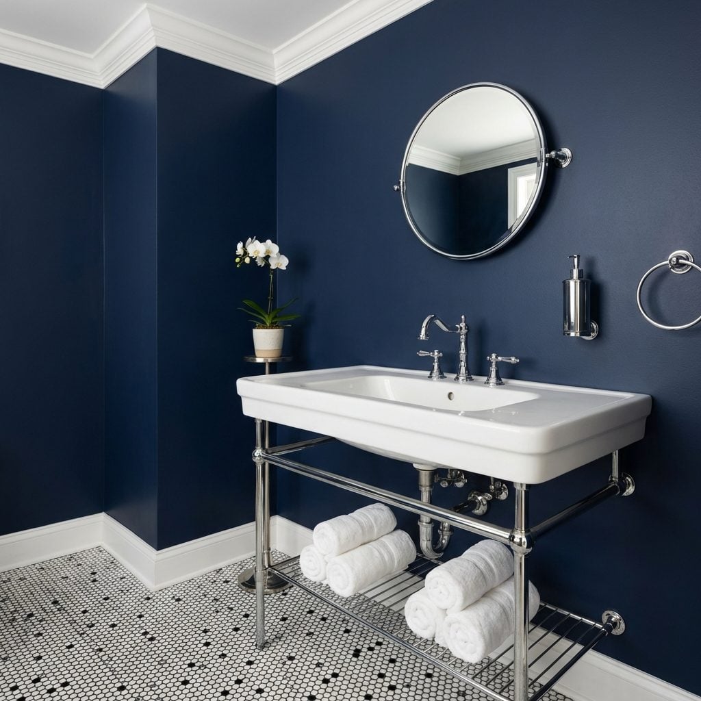
The console sink was the pedestal sink’s more architectural sibling, and it had a specific devotee: the homeowner who had discovered shelter magazines and was trying to bring a slightly European sensibility into a suburban bathroom. Four chrome legs. A wide, flat porcelain basin. And a lower shelf, sometimes chrome wire, sometimes a second shelf of wood or marble, where you stacked a set of neatly rolled white towels that absolutely no one was allowed to actually use.
This sink worked perfectly in a modern bathroom context or a period-style powder room because it exposed everything below it with total confidence. If the plumbing was attractive, this sink showed it off. If it wasn’t, you bought a chrome P-trap cover and hoped for the best.
The Seashell and Starfish Motif That Colonized Every Surface of the Bathroom
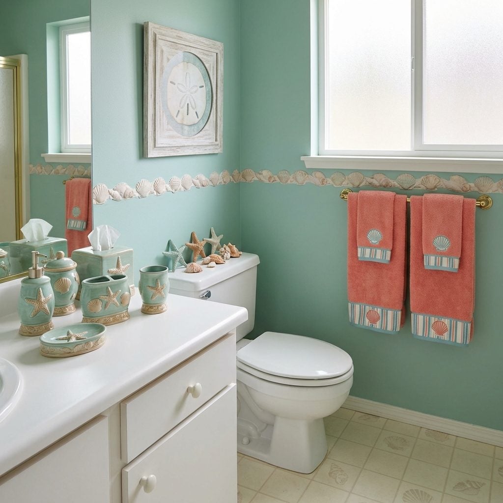
Starfish on the soap dish. Seashell embossed on the tissue box cover. A framed print of sand dollars above the toilet. A hand towel with a nautical border. Ceramic seashell figurines arranged on the back of the toilet tank like a very specific collection. If your family went to the beach even once in the early 1990s, some version of this was coming home with you.
The coastal family room aesthetic hadn’t been codified yet, so the seashell bathroom existed as its own unselfconscious category: not coastal, not nautical, just… beachy. The accessories came in sets of six, sold at Bed Bath & Beyond and TJ Maxx, in seafoam green, sandy beige, and coral. They smelled faintly of potpourri.