🔥 Would you like to save this?
You’re redoing your guest room, and the first thing on your mind is paint color. You want to go with gray. It’s the most popular neutral paint color, but what things should you consider before painting the walls?
In order to come up with the very specific design ideas, we create most designs with the assistance of state-of-the-art AI interior design software. Also, assume links that take you off the site are affiliate links such as links to Amazon. this means we may earn a commission if you buy something.
We understand it’s a bit of a bore staring at paint color strips. You just want to choose one and begin painting. Don’t let your eyes cross just yet. We have some ideas which paint color to choose.
The first consideration is which direction the room faces. If it faces north or east, then you’ll want warm shades of gray to offset the coolness of the direction. Warm shades of gray incorporate more blue in them.
If the room faces south or west, then you’ll need cooler shades of gray to offset the warmth coming in the windows. Cooler shades of gray contain a bit of white or beige to tone it down. Now take a look at your flooring.
Is the guest room carpeted in a neutral shade? Is the flooring hard wood, and is it a rich dark stain or a lighter stain? You’ll want the paint color to complement the flooring instead of clashing with it.
We recommend warm shades of gray with neutral carpet depending, of course, on the direction the room faces. Rich, dark wood floors benefit from the contrast of cool shades of gray. A lighter stain would go well with a darker shade of paint, of course depending on the direction the room faces.
However, dark shades of gray complement dark wood stains nicely. At the end of the day, it’s which choice feels best to you. The last consideration is the personality of the room.
Since it’s a guest room, it might not be playfully decorated like it would be for a child’s room. Alternatively, some homeowners give their guest rooms a personality of their own using paint and decorations. This can turn the room into pictures you’ve seen of a five star hotel or a traditional room.
Are there decorations morphing the room into a safari room? Perhaps the room would like to look like a cottage or a European room. The shade of paint you choose should complement the décor you choose to imbue the personality of the room.
Related: Gray Paint Option Family Room | Gray Paint Option Primary Bathroom | Gray Paint Options Kids Bedroom | Gray Paint Options Dining Room | Gray Paint Options Primary Bedroom | Gray Paint Options Living Room
North And East Facing Guest Rooms
Warm Shades Of Gray
Attitude Gray (SW 7060)

Source: Sherwin-Williams
It isn’t too light nor is it too dark. It’s a matte shade that pairs well with lighter as well as darker stained wood floors. It will make neutral colored carpet pop.
If the trim in the room is painted white, this shade of gray will wow your guests. This paint color would look good in a whimsical room, a traditional one, or it would look good in a cottage room.
Laurel Woods (SW 7749)
Source: Sherwin-Williams
It is dark enough to make the room warm despite a cold winter day. Also a matte finish, this shade goes well even with darker wood floor stains and will highlight lighter stained wood or carpet. It’s an elegant shade to match the personality of your room.
Suede Gray (PPU18-17)

Source: Behr
It is a little on the lighter side, but this could simply be the difference between brands. It’s still warm enough to offset the coolness of north and east-facing rooms. It’s matte finish complements both dark and light stained wood floors as well as neutral-colored carpets.
It makes a great contrast to white trim.
Orion Gray (N510-6)

Source: Behr
It is darker than Suede Gray but still short of the color of asphalt. Its matte finish makes the white trim of the room and the floors pop.
Kendall Charcoal (HC-166)

Source: Benjamin Moore
Kendall Charcoal is a deep rich gray in a matte finish. It’s a medium kind of color, one that pairs well with dark hard wood finishes and neutral colored carpets. It would look smashing up against white trim.
Steel Wool (2121-20)

Source: Benjamin Moore
Steel Wool must have your eyes swimming in gray right now, but look a little closer. This shade is warm without overpowering your room. It, too, is a matte finish for your dark or light wood floors or your neutral carpet.
It would look very nice against white trim.
Tip: Beige and yellow based warm gray colors bounce light around instead of absorbing it. Blue based gray paint is a little different, and you’ll need wall sconces to make the paint pop.
South And West Facing Rooms
Cool Shades Of Gray
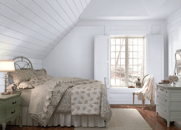
Nebulous White (SW 7063)

Source: Sherwin-Williams
This shade is close enough to white that you almost can’t tell the difference. You can almost feel the chill in the air. This would look especially pretty in an eggshell finish.
It’s just different enough from white trim to tell the difference, but you might want to paint the trim a darker color for the contrast. This would look wonderful against rich dark wood floors.
Drift Of Mist (SW 9166)

Source: Sherwin-Williams
This cool shade of gray has the barest hint of beige in it, giving it an interesting snap. Although it’s a matte finish, it would look good in an eggshell finish, too. The hint of beige picks up the tones in rich dark hard wood floors.
This shade, too, would benefit from a tad darker shade of gray on trim.
Shiny Luster (N500-1)

Source: Behr
This shade is as close to white as you can get and still have some color. When you click on the link, you’ll notice they painted the trim a slightly darker shade of gray. Both play off the neutral colored carpet quite nicely.
You can feel the coolness by just looking at the picture.
French Silver (PPU18-5)

Source: Behr
This is a little more substantial shade of gray. You’ll notice the almost blue tone of the shade, but it’s still gray. If you’ll click on the link, you’ll see that they painted the trim a darker gray.
Notice the neutral carpet, and how the color makes the dark wood accents richer.
Gray Owl (2137-60)

Source: Benjamin Moore
This cool light shade of gray will make your guest room feel many degrees cooler in their south or west facing directions. It looks like it might contain a tiny bit of blue, but the gray is definitely cool. It will play well with neutral carpet or wood floors and wood accents in the room.
Silver Satin (856)

Source: Benjamin Moore
A little touch of white gives gray paint a silver sheen. This paint color is cool without overpowering the room. It goes well with dark hard woods and neutral carpets.
It would look great with a darker gray trim paint.
Tip: If you’re worried the coolness of the paint shade will make your guests feel not warmed, then add warmth to the room with wood accents like chairs and tables. You can also paint the trim in warmer colors like darker shades of gray or a popping shade of blue.
Shades Of Gray Paint Going Well With Flooring
When choosing paint colors in guest rooms with dark hard wood floors, you want to choose on the warm but lighter side. If you wanted a cave, you’d have moved into another house, yes? These shades of gray pair well with warm hard wood floors (and they don’t look too shabby against neutral carpet.)
Warm Paint Colors
African Gray (SW 9162)

🔥 Would you like to save this?
Source: Sherwin-Williams
Sherwin-Williams pictures a living room painted in this warm but not too dark shade of gray. Your guest room will be necessarily smaller, but you will see how this shade will work with dark wood floors. Their picture shows lots of white trim, white furnishings, and white curtains.
This might be a good idea for your guest room in regard to highlighting the trim, perhaps a chair, and bed linens.
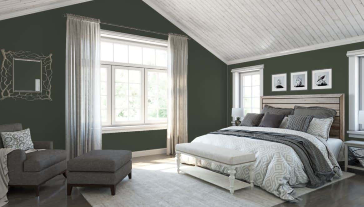
Illusive Green (SW 9164)

Source: Sherwin-Williams
Don’t worry; it isn’t green. It is warm, however, and just a touch lighter than African Gray. Same white furnishings and trim, but it stands out against the wood floor beautifully.
Pencil Point (PPU18-02)

Source: Behr
Now, this is an interesting picture in that the room is painted warmly, but they contrasted the trim with a lighter gray and the windows with another color altogether. However, you can see that the warmth plays off the neutrality of the carpet very well, as well as bringing out the warm tones of the wood in the furnishings.
Intellectual (PPU18-19)

Source: Behr
There doesn’t appear to be too much difference between Intellectual and Pencil Point. If you want a darker shade, just add a touch of dark blue or black. You can see the same room in the picture furnished in white with lighter gray trim.
You can also see the warmth of the wood against the gray tone. Your guest room will look amazing using these colors.
City Shadow (CSP-60)

Source: Benjamin Moore
There’s quite a difference between brands’ shades of gray paint. City Shadow is deep but not so dark as to overpower a guest room. It would pair well with white or pale gray trim, deep stained wood floors, and any color decorations and linens you prefer.
Gotham (CSP-385)

Source: Benjamin Moore
With its undertones of taupe and white, this shade of gray manages to pull off gray with extra warmth. If you want a deeper shade of gray, though, toss in a tad of black, but it might almost delete the taupe undetones. Even as is, it should pick up the warm dark wood shades and really pop with white or light gray trim.
Cool Paint Colors
Gray Screen (SW 7071)

Source: Sherwin-Williams
This cool shade of gray is just enough to give the walls of your guest room color, but it reflects enough light to offset the warmth of the southern and western direction the room faces. It shows up enough against light to medium to dark hardwood floors.
Online (SW 7072)

Source: Sherwin-Williams
This shade of cool gray is a little darker than Gray Screen, but still cool. It provides your guest room with contrast against light to medium to dark wood floors.
Evaporation (N450-1)

Source: Behr
This is another cool shade of gray that’s just darker than white but still reflective of light. If you’ll look at the picture in the link, the only hard wood you see is dark. If this shade of cool gray is anything like the others listed, then it should pair very well with light to medium to dark hard woods.
Blueberry Whip (S550-1)
Source: Behr
You might expect this cool shade of gray to have blue undertones, but it comes across as a little darker than white but still reflective of light. The furnishings and flooring in the pictures never changes, but you can see the color stands out against the dark wood of the furniture. It could do the same against light to medium hard wood floors.
Ally’s Earring (CSP-125)

Source: Benjamin Moore
If you saw this cool shade of gray on a paint sample in a store, you would think it looked greige or gray and beige. This might be so, although ultimately it comes down to opinion. This cool gray shade plays well off any stain of hard wood floors from light to medium to dark.
Penthouse (CSP35)

Source: Benjamin Moore
This cool shade of gray paint is just this side of white. Your guest room will look lovely with this shade reflective of the light; it will go well with light to medium to dark stains on hard wood floors.
Personality
Do you fill rooms with candles? Are you a yachtsman and fill your rooms with marine pictures? How about hunters who decorate their rooms with antlers and paintings of animals?
Perhaps you are whimsical and prefer happy decorations like puppy figurines or china dolls.
Cyberspace (SW 7076)

🔥 Would you like to save this?
Source: Sherwin-Williams
No matter what the trim looks like or the carpet or hardwood floors, what makes a room comfortable is its personality. However you decorate your guest room, make sure it has the perfect backdrop. Cyberspace makes the perfect background for your decorations.