🔥 Would you like to save this?
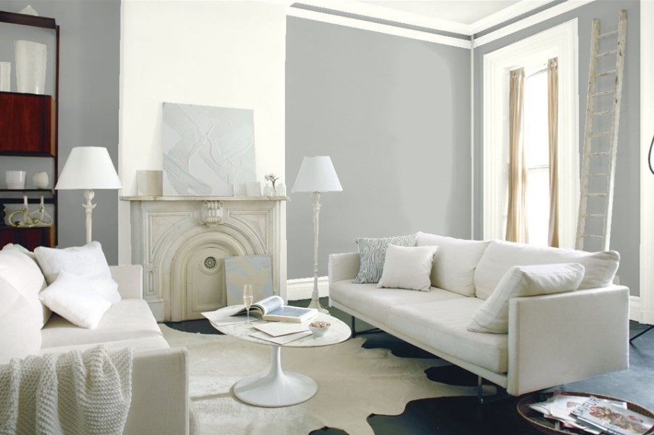
Gray has officially taken over as the interior paint color of choice. Paint sellers report about half of their top-selling colors are grays, and designers agree it’s the color all their clients want.
In order to come up with the very specific design ideas, we create most designs with the assistance of state-of-the-art AI interior design software. Also, assume links that take you off the site are affiliate links such as links to Amazon. this means we may earn a commission if you buy something.
At first, you might wonder why. Gray? The Oxford Dictionary defines the adjective as “dull and nondescript.” When we’re sad, we say we’re having “a gray day.” For gray to be the #1 color people want in their homes seems a little incongruent.
But when you look at gray’s effect on the look and feel of home interiors, it makes perfect sense. Gray is understated. At its most basic level, it has no color of its own. In reality, all gray paints have undertones of one color or another — but they’re undertones, which means they’re quiet, subtle.
Gray brings softness and tranquility to a home. Today, as we are increasingly inundated with stimuli — from screens, headphones, advertising, traffic, and busyness — it makes sense that we crave a bit of quiet, a bit less color rather than more.
Through its very grayness, gray brings out the beauty in a room and the people living within it. It recedes, leaving shadows that highlight the room’s architecture. It changes with the light, leaving us to notice nature.
It whispers rather than shouts, giving us a quiet space in which to reconnect with ourselves and perhaps our loved ones. It’s the perfect color for homes —and for living rooms in particular.
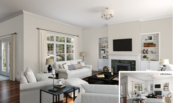
Which Gray is Right for Your Living Room?
With over 100 shades of gray paint to choose from, it’s hard to know where to begin with gray living room ideas. This guide will walk you through some of the most popular grays for living rooms, with notes on the unique characteristics of each.
Gray and Light
One thing to know about gray is, if you don’t have a lot of light in your living room, it will make the room seem darker. Artificial light is fine. Just make sure you do light the gray living room — unless, of course, you like it dark.
Greige
No discussion of gray paint colors would be complete without addressing “greige.” Greige simply means gray with beige undertones. Many of the most popular gray paint hues fall into this category.
This may be because people are still trying to wean themselves off beige, which was the most popular neutral throughout the 1990s and 2000s, or because greige is so versatile.
Light Grays
Gray Screen SW 7071

Source: Sherwin-Williams
This cool gray is Sherwin-Williams’ best-selling color. While it’s a light gray, it’s the darkest one. It’s a true gray, which makes it exceptionally neutral. And it reflects more than half the light in a room, helping prevent darkness.
This color looks fantastic paired with dark or medium brown floors. It also coordinates well with whites and other shades of gray, including greenish grays. To me, this is one of the best grays for creating a calm, quiet space.
Metropolitan AF-690
Source: Benjamin Moore
It’s no wonder this hue is Benjamin Moore’s 2019 Color of the Year. This silvery gray shade looks good in any light, plays well with all styles of architecture, and serves as the perfect backdrop for furnishings of virtually any color.
If you’ve ever painted an entire room only to discover that the color just doesn’t “go” with something about the space, you know how important this is for your home decor.
At the same time, Metropolitan is anything but “safe” in the “boring” sense of the word. It’s understated in a glamorous way – like a Chanel suit. And soothing, like soft classical music. In a word, it’s elegant.
Metropolitan looks heavenly with soft pinks and blush tones and pairs well with deep, dramatic colors like navy blue and hunter green. For a full array of coordinating colors, look to Benjamin Moore’s Color Trends 2019 Palette.
Passive SW 7064

Source: Sherwin-Williams
A light and airy gray, this color enhances the architecture of your living room with its soft shadows. Sage green and creamy whites are nice complements. I’m not sure the name was a great choice. I mean, who’s going to want to admit “Passive” is their color? But it is a wonderful shade for living room walls.
Similar to Metropolitan, it conveys elegance. And like all light grays, it makes your space seem larger and more open. You can really breathe in a room painted this color. White furniture and trim enhance this effect.
Silver Chain 1472

Source: Benjamin Moore
There’s a reason Benjamin Moore keeps including Silver Chain in their collections of favorites. Interior decorators and homeowners alike love this soft gray color. For one, it’s extraordinarily versatile, matching equally well with traditional and modern decor.
Also, it’s low chroma, making it close to a true neutral gray. True neutrals are less likely to read warm or cool or to clash with other colors in a space. Silver Chain is stunning with white accents and trim, and also coordinates well with bold colors like burgundy and black.
Revere Pewter HC-172

Source: Benjamin Moore
This popular color is a great one to go with if you’re not 100% sold on gray. It is almost, but not quite, what some call a greige. This color is almost magical in its ability to keep a room light even when it doesn’t get much natural light.
It’s illuminating and also soothing in its softness and richness. Revere Pewter goes especially well with wood furniture.
Gossamer Veil SW 9165

Source: Sherwin-Williams
Gossamer Veil is a light gray with a balanced mix of warm and cool undertones. It is higher chroma than Silver Chain, meaning it is less of a “true gray.” Because it is so close to perfectly balanced, temperature-wise, and not purely neutral, this color is more chameleon-like than some other light grays.
It changes dramatically based on the colors you pair it with, as well as the light in your room, so make sure this shade is right for you before painting your entire living room. Designers love Gossamer Veil because of the freshness it brings and often pair it with white trim or molding for a particularly crisp look.
Classic Gray 1548

Source: Benjamin Moore
One of Benjamin Moore’s most popular colors, Classic Gray is both warmer and more pigmented than Gossamer Veil, but it’s still light. In northern-facing light during the day, this color reads gray.
In the evening, with artificial light, it looks more beige. Furniture, window treatments, and rugs dominated by cooler tones look much better with this color than do those with warmer undertones.
Graytint 1611

Source: Benjamin Moore
Graytint provides the ideal backdrop for antiques. Yellow and coral accents also play well. If you prefer a more serene atmosphere, go with accents of white and other grays, which also coordinate beautifully. If I had to describe this color in one word, it would be “classy.”
Horizon Gray 2141-50

Source: Benjamin Moore
This gray with green undertones has a “barely there” feel for the interior design. That’s precisely what many want in a gray. Another virtue of this color is that it doesn’t change much when you apply it but stays true to the sample.
It coordinates well with other soft tones like whites, beiges, and grays to produce a calming effect. Another pairing that works with this color is bold black trim and accents, with hints of other deep, dark saturated colors. This makes for a modern look, bursting with energy and strength.
Gray Owl 2137-60

Source: Benjamin Moore
This is one of Benjamin Moore’s most popular grays. My favorite thing about it is how beautiful it looks in the morning light. It’s close to a true gray but does have subtle green undertones and, in bright light, can look a little blue.
Moonshine 2140-60

Source: Benjamin Moore
I love this color because it goes with everything. It’s a good color for living rooms with average to low light because, in very bright light, it looks almost white. When paired with white trim, it creates a room that is the epitome of light and airy.
Silver Drop 790C-2

Source: Behr
Because of its warm undertones and because it’s almost the ultimate neutral (white), it looks great with every color. Because it’s not white, it also looks terrific paired with white accents and furnishings.
Depending on the light in your room, this color may look lean more toward true gray or greige. Either way, it’s bright and uplifting without being stark.
Irish Mist 790C-1

🔥 Would you like to save this?
Source: Behr
A tad more beige than Silver Drop, this color has an almost magical ability to lighten a dark room, making it ideal for living rooms without a lot of natural light. If your room is already very light, Irish Mist will show up much lighter on your walls than on color samples.
Medium Grays
Thunder AF-685

Source: Benjamin Moore
This is my favorite medium gray. It’s very neutral, walking the line between warm and cool, as well as between dark and light. Its undertones are subtle and vary between greige and purple.
Thunder looks stunning with dark gray and cream, with pops of yellow and red. You can also pair it with white woodwork for a more conventional look.
Warm Medium Grays
Grays with warm undertones like red, orange, and yellow add a bit of coziness to gray living room ideas.
Agreeable Gray SW 7029
Source: Sherwin-Williams
Sometimes described as a “putty” color, this light, warm gray with taupe undertones go well with blue and green furniture and accents. The color pairs well with many colors, which makes it a great choice if you don’t want to buy all new furnishings.
It also goes well with most flooring types. (Maybe this is how it got its name?) Complementary accent/trim colors include whites, blues, and greens. In north-facing rooms, Agreeable Gray will appear more gray than greige.
Worldly Gray SW 7043

Source: Sherwin-Williams
This gray is a tad darker than Agreeable Gray, with a bit more green in it. It has also had a lot of brown undertones. Depending on your light, this color can look more like beige or gray. The word people use more than any other to describe Worldly Gray is “soft.” It looks great with white and other light, soft colors.
Modern Gray SW 7632

Source: Sherwin-Williams
This designer’s favorite is a great choice because it coordinates well with every color, especially all shades of blue and some greens.
Pashmina AF-100

Source: Benjamin Moore
This gray-beige mix with green undertones creates a warm, inviting, intimate space. To me, it’s the ideal living room color, with its blend of warmth and neutrality.
Creamy Mushroom PPU5-13

Source: Behr
Behr has included this color in its nature-inspired 2020 Color Palette, which is anything but basic greige. They recommend this neutral be paired with warm yellows and browns, as well as sage green. I’m intrigued as this is truly a new way to use gray in decorating ideas.
Mindful Gray SW 7016

Source: Sherwin-Williams
Mindful Gray is a darker medium gray, with few discernible undertones. Though technically a warm gray, it reads pretty cool. It looks great with white trim and a variety of furnishing colors.
Cool Medium Grays
Cool grays tend to look darker than warm grays, so I usually prefer light cool or warm gray tones. There are a few cool medium grays I really like, though.
Online SW 7072

Source: Sherwin-Williams
This pairs well with blues, greens, and whites and looks stunning with different shades of wood. My favorite look is Online with white trim, contrasting sharply with dark wood floors. It’s crisp, clean, and, at the same time, a warm and comfortable tone.
Stonington Gray HC-170

Source: Benjamin Moore
Part of Benjamin Moore’s most popular color collection, this medium gray has cool undertones and can look bluish in northern-facing light. It goes really well with black and white décor, which is gaining popularity. Rooms painted this color look fresh — neither too light nor too dark — any time of day.
Sea Star 2123-30

Source: Benjamin Moore
Bold and saturated, Sea Star looks like a light teal with gray undertones. True to its name, it brings a distinctly tranquil, “oceany” feel to a living room.
Be careful with this hue, though, as it can make a space feel dark. The cure is sufficient lighting and light/bright accents. White trim is stunning with this color.
Dark Grays
Dark gray walls are not for everyone. But if you like a living room that feels like a cocoon, they’re perfect. Dark gray walls also make ideal backdrops for gallery walls and bold art collections, especially those including large pieces.
In living rooms, dark gray looks best balanced with lots of light colors. Wood, rugs, wall art, and furniture in light shades against dark gray walls, create a living room landscape with depth and interest.
Cheating Heart 1617

Source: Benjamin Moore
With its brown undertones, this dark gray brings warmth and coziness. Adding white and light-colored wood to the room creates a crisp, modern look.
Chelsea Gray HC-168

🔥 Would you like to save this?
Source: Benjamin Moore
This medium-dark gray manages to be warm without looking brown. In rooms with a lot of light, it can read slightly green. It’s particularly well-matched with natural materials like wood and sisal.
Related: Gray Paint Option Family Room | Gray Paint Options Kids Bedroom | Gray Paint Options Dining Room | Gray Paint Options Primary Bedroom | Gray Paint Options Kitchen | Gray Paint Options Guest Bedroom | Gray Paint Options Basement | Gray Paint Options Primary Bathroom | Orange and Grey Living Room Ideas | Green Paint Options Living Room | Beige Paint Options Living Room | White Paint Options Living Room | Blue Paint Options Living Room | Types of Paint Brushes | Red Paint Options Living Room