🔥 Would you like to save this?
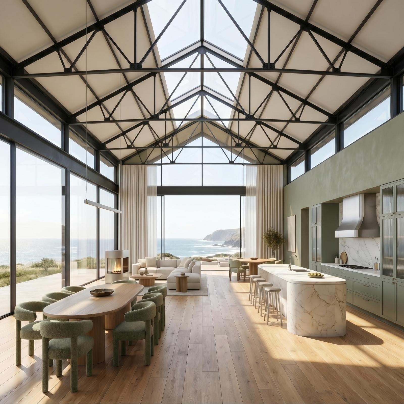
Green is soothing. It’s calming. It encourages creativity by ensuring that people don’t go off on emotional tangents. Green is not an energizing color for a family room, but if an atmosphere of peace and civility is your goal for your family room, green paint color options can help.
In order to come up with the very specific design ideas, we create most designs with the assistance of state-of-the-art AI interior design software. Also, assume links that take you off the site are affiliate links such as links to Amazon. this means we may earn a commission if you buy something.
Human beings can distinguish over 1,000,000 shades of green. Subtle notes of other colors in green paint color options influence mood, too. Green added to gray and white paints can also have meaningful effects on the way you feel in your family room, and how easily you can integrate furniture and other decorative objects into your design scheme.
That’s the reason some of our favorite “greens” aren’t labeled as green paint color choices by their manufacturers. They may have white, or gray, or blue meeting your eye, but green tones that influence your mood. Sometimes it is the green added to blue, gray, or white that has a beautiful effect that you would totally miss if you relied solely on the names the paint companies give their products.
Now let’s take a look at our 25 favorites.
Curio (MQ3-22)

Source: Behr
Do you want your family room to be a place for quiet conversations? Then choose Behr Curio MQ3-22. This almost-gray shade of green or almost-green shade of gray has a mysterious feeling that is great for intimate conversations or reading stories to children. Or it can be used as an accent color for either green or white.
You may also like: Blue Paint Family Rooms
Halls of Ivy (HDC-AC-20)

Source: Behr
Here is a lively, eye-catching green that gives any family room an upbeat, happy feeling. It is a good complete to whites tinted with green like Behr Light Mint 480C-1 if your furniture is upholstered with textured fabric. Or it’s fine for giving your family a cozy feeling if used all by itself.
You may also like: White Paint Family Rooms
Jungle Camouflage (N350-4)

Source: Behr
Behr Jungle Camouflage N350-4 is a paint that lives up to its name. It provides a subdued background for your choices in family room furniture and decoration. Its finish allows light to disperse between objects of furniture and wall hangings to give your family room a relaxed feeling.
It is a perfect match for olive-green accents and a great backdrop for all your other color choices. You may also like: Beige Paint Family Rooms
Light Mint (480C-1)

Source: Behr
Behr Light Mint 480C-1 is a good complement to textile art. It is the perfect backdrop for crocheted objects, and it works well with mantles and headboards. It’s a dreamy color that brings out colors in houseplants with its peachy and purple undertones.
Behr Light Mint 480C-1 comes in a high-gloss enamel. You may also like: Gray Paint Family Rooms
Amazon Moss (2037-10)

Source: Benjamin Moore
Do you have a pool table in your family room? Here is a wall paint in billiard table green. It catches your attention but then gives any family room a cooling and restful feeling. It’s also a good background color if your houseplants thrive in low light.
You may also like: Red Paint Family Rooms
Antique Jade (465)

Source: Benjamin Moore
Benjamin Moore Antique Jade 465 brings the greens of a forest setting into your family room. If your home is adjacent to a wooded area, it brings the same active vibe you feel in the woods into your family room. It creates a nice contrast for brightly colored furnishing while toning down the atmosphere of the room.
And it’s a great choice if your home doubles as a bed and breakfast, keeping guests calm and patient. You may also like: Green Interior Designs
Avocado (2145-10)

Source: Benjamin Moore
Avocado is “in.” But it’s also an echo of the decorating styles popular in the 1960s and 1970s. It can be a retro color that reminds families of happier times, or it can be a great way to bring stone and wood into your decorating scheme. Avocado green also blends with forest tones or offers a nice contrast to furniture with white upholstery.
You may also like: Green Paint Guest Bedroom
Chantilly Lace (OC-65)

Source: Benjamin Moore
At first glance, Benjamin Moore Chantilly Lace OC 65 looks like a crisp white. But it’s really a white with green and gray undertones that captures sunlight from windows and skylights without the yellow tones that can cause family interactions to become overheated. It’s not the greatest choice if your furniture is upholstered in gray or green, but it works with all other color schemes.
You may also like: Green Paint Kids Bedroom
Gray Owl (2137-60)

Source: Benjamin Moore
Benjamin Moore Gray Owl 2137-60 is a gray with green undertones that is great for painting trim around a larger greenfield, like a wall panel or a trophy case. It brings out greens and blues and golds and gives the whole room a calmer feeling.
You may also like: Green Paint Bathrooms
Limesicle (2145-50)

Source: Benjamin Moore
Benjamin Moore Limesicle 2145-50 plays wells with other colors. Its celery-green dusky tone is a nice contrast to pale greens and also to darker and deeper greens.
You may also like: Green Paint Dining Rooms
Green Thumb (CSP-870)

Source: Benjamin Moore
Looking for green that brightens up gray furniture or windows that mostly reveal gray skies? This new color from Benjamin Moore is a grassy green with gray undertones, rather than a savannah green with khaki or golden undertones.
It is an earthy green rather than a sunny green, but it still gives your family room a warm feeling. Benjamin Moore Green Thumb CSP-870 also blends well with creams, autumn reds, and buttery yellows. It complements an olive green such as Benjamin Moore Spanish Olive 1509.
Mediterranean Teal (2123-10)

Source: Benjamin Moore
Some interior decorating magazines refer to Benjamin Moore Mediterranean Teal 2213 as a “romantic” color. The green in Mediterranean teal comes out in bright light, but goes into hiding in low-light situations. The best uses of this shade are for painting furniture, paneling, or cabinets. This a paint you use when you want your choices in interior décor to complement your choice in paint, rather than the other way around. It’s also a great choice for small family rooms. It makes them seem bigger.
Moonshine (OC-56)

🔥 Would you like to save this?
Source: Benjamin Moore
Are you a fan of chameleons? Some interior decorators describe Benjamin Moore Moonshine OC 56 as chameleon colored because its green and blue undertones appear and disappear throughout the day, depending on how the sunlight hits the surfaces on which it has been painted.
Benjamin Moore Moonshine OC 56 is never a boring color because you are never quite sure what color it is going to be next. Its dominant shades change with sunlight and with the direction from which it is viewed. There are no purple undertones in Benjamin Moore Moonshine OC 56.
Peaceful Garden (CSP-830)

Source: Benjamin Moore
Benjamin Moore Peaceful Garden CSP-820 is a green that provides a deep contrast to neutral shades, such as white, black, and beige, but also to jewel tones when it is applied to ceilings and paneling. It brings out shapes in furniture and accent items that other shades of green do not so your family room is never boring. It is beautifully painted in an eggshell finish or with solid marbleized colors. It blends well with charcoal gray and black accents.
Salamander (2050-10)

Source: Benjamin Moore
Benjamin Moore Salamander 2050-10 is a favorite of interior decorators seeking to add depth and space to family rooms. It combines green, blue, and brown tones in a dark paint color that goes well with gold trim. This is a paint color for a sleek look, so it pairs well with minimalist décor. It is not the color you use if your family room is filled with trophies and photos and souvenirs from family trips.
Seafoam Green (2039-60)

Source: Benjamin Moore
Does your family like to curl up with good books? Benjamin Moore Seafoam Green 2039-60 creates a space conducive to reading and other intellectual pursuits. It’s also a good color for families in which one parent has to catch up on paperwork while the rest of the family is involved with some other quiet pursuit, but everybody wants to be in the same room. Choose accent pieces in sea green or turquoise to take advantage of this color on your walls.
Spanish Olive (1509)

Source: Benjamin Moore
Benjamin Moore Spanish Olive 1509 is a neutral shade that works on walls but that is a little too dark for ceilings in all but the most brightly lit family rooms. It evokes memories of walks in the woods and stories around the campfire with its woody, smokey feel. It’s a good tone for bringing together wood tones with whites and greens.
Soft Fern (2144-40)

Source: Benjamin Moore
Benjamin Moore Soft Fern 2144-40 is a neutral complement to warm colors such as yellow, red, and orange. This green contains tones of jade and emerald and malachite, which can be used to draw the eyes to furniture, photos, paintings, and wall art. Using Soft Fern as an accent color or trim against darker walls can give your family room an upscale vibe with its soothing but intense green color.
Stonington Gray (HC 170)

Source: Benjamin Moore
Remember, we told you that some of the most effective shades of green don’t come with “green” in their names. Benjamin Moore’s Stonington Gray HC 170 combines gray and green so any area where it is used as trim looks further away than the surfaces around it.
This makes Stonington Gray extremely useful for making a small family room feel larger. This shade tends to clash with dark blues and dark greens, and it tends to be sleep-inducing. If your family room is also a place for naptime, it is a great selection!
You may also like: Green Paint Living Room
Electric Lime (SW 6921)

Source: Sherwin-Williams
Some interior decorators describe Sherwin-Williams Electric Lime 6921 as grassy without becoming a doctor’s waiting room green. It is bright enough to be cheerful and to catch the sunlight. It’s dark enough that your family room will still feel cozy. And it can be a beautiful frame for drapes, curtains, and window treatments if your house gets full sun.
Fleur de Sel (SW 7666)

Source: Sherwin-Williams
Frosty White (SW 6196)

Source: Sherwin-Williams
Spare White (SW 6203)

Source: Sherwin-Williams
Do you need to enhance the lighting in your family room while giving it a cooling, calming, creative feel? These three “whites” with green and blue tones, Sherwin Williams Fleur de Sel SW 7666, Sherwin Williams Frosty White SW 6196, and Sherwin Williams Spare White SW 6203, could be exactly what you need. A “pure” white is too tense for a family room, but these white and green combinations are great for combining reflectivity with calm energy.
Green Bay (SW 6481)

Source: Sherwin-Williams
Many interior decorators choose Green Bay SW 6481 to tie together other hues of green on upholstery, carpet, or painted wood. This shade of green evokes feelings of being safe in a primeval forest, secure and calm. Sherwin-Williams catalogs Green Bay SW 6481 with its blue paints, but most interior design experts regard its primary color component as green.
Hazel (SW 6471)

🔥 Would you like to save this?
Source: Sherwin-Williams
Sherwin Williams Hazel SW 6471 is another soothing green that makes small family rooms seem larger. It’s not a color for a lively family room. Its bluish-green tones are expansive but not excessively energizing. Sherwin-Williams Hazel SW 6471 is a nice contrast to either brighter or darker floors and ceilings. It makes furniture and accessories stand out.
Passive (SW 7064)

Source: Sherwin-Williams
Sherwin-Williams Passive SW 7064 is in vogue in all the home decorating magazines, but it’s a color that defies easy categorization. It would be fair to call it a shade of paint that is subdued, dignified green. Or maybe it is a light, cheery, fresh gray.
Or maybe you catch the blue and purple notes. Sherwin-Willimas describes Passive SW 7064 as “neutral.” Whatever we should call this paint color, it is great from blending green, purple, gray, and blue. The green isn’t overpowering, but it is there in soothing and calming measures.
You may also like: Green Paint Primary Bedrooms
Softened Green (SW 6177)

Source: Sherwin-Williams
Sherwin-Williams Softened Green SW 6177 is a pale shade of grayish-green that is best for painting ceilings and floors. It can be paired with brighter greens for contrast. The pale green on the ceiling will make your family room seem brighter, while the darker greens on the walls will focus attention on a TV screen or a trophy wall. Softened Green is calming but still energetic. It is a color for calm shared activities.