🔥 Would you like to save this?
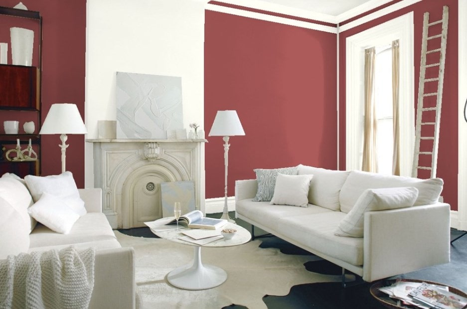
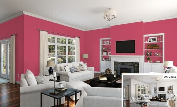
Living rooms are often the forgotten sitting rooms in the home that are only used when company comes. Time to take the living room back and make a big, bold statement. Using a color such as red can enliven what is often considered the stuffiest part of the house.
In order to come up with the very specific design ideas, we create most designs with the assistance of state-of-the-art AI interior design software. Also, assume links that take you off the site are affiliate links such as links to Amazon. this means we may earn a commission if you buy something.
When it comes to living rooms, I never thought that red would be the right color for them. Okay, so I’m wrong here. Red is an exceptional color for living rooms provided that you understand that it is a bold choice and makes a statement. For someone like me who grew up with antique white rooms, the concept of going with red in a living room sounds almost scandalous. But you can choose your paint, be bold, and add some daring color to your life. Let’s look at some of the best red paint color options. Here are our top 25 reds for the year.
Related: Red Paint Options Family Room | Red Paint Options Primary Bathroom | Red Paint Options Kids Bedroom | Red Paint Options Dining Room | Red paint Options Primary Bedroom | Red Paint Options Kitchen | Red Paint Options Guest Bedroom | Red Paint Options Basement | Green Paint Options Living Room | Beige Paint Options Living Room | Gray Paint Options Living Room | Blue Paint Options Living Room | Types of Paint Brushes | White Paint Options Living Room
Sun-dried Tomato

Source: Benjamin Moore
Okay, for the living room is a dining room color: that being sun-dried tomatoes. This color is deep, with a blue cast to it, that still manages to pull off a lovely warm feel. So what if your family and guests start eating pizza and spaghetti in your living room? This is a delicious color.
Alizarin

Source: Benjamin Moore
Alizarin is part of the Century collection by Benjamin Moore. This is a rich red with blue hints that one designer claims look like raspberries in nature. I think it looks closer to a plum. It has a very old feel to it, while at the same time provides an exciting and unexpected color for your living room. A definitely bold statement that looks greats.
Related: Red Kitchen Ideas | Red Houses | Red Brick Houses
Exotic Red

Source: Benjamin Moore
Have you ever wanted your living room to match your lipstick? Well, Exotic Red might just be the color for you. Sexy and bold, the red is underscored with black to just add a little depth to it. Be someone’s femme fatale with this color in your living room and enjoy the bold statements this color makes to your living room. It’ll be tough to outdo this color’s boldness.
Bull’s Eye Red

Source: Benjamin Moore
Intense is one way to describe Bull’s Eye Red by Benjamin Moore. Better for accents, but will work for walls, especially if you’re into archery but can’t hit the broadside of a barn. You might hit your target if you paint your living room walls with this. Still, the yellow undertones make this bright and cheery and it pairs well with yellows.
Red Mahogany

Source: Benjamin Moore
Red Mahogany is part of the Century collection by Benjamin Moore. This color really is evocative of rich, red mahogany wood and has soothing darkness that extends the color almost, but not quite, into purple. It will definitely make any living room look upscale, although if you’re still decorating with your parents’ old couch, you might want to ditch it for something more tasteful.
Moroccan Red

Source: Benjamin Moore
Moroccan Red actually reminded one designer of her favorite lipstick. This is an orange-hued color rather than the more purplish reds and definitely makes a bold statement that is still timeless in its look. I think the color is evocative of a desert sunset, myself. Definitely colorful but at the same time not as bright as some of the more classic reds. A delightful red that will still brighten any room.
Classic Burgundy

Source: Benjamin Moore
You can’t go wrong with a classic, which is why Classic Burgundy made the list here. The color is a deep, wine red that has notes of blue in it for depth. It looks great all on its own or as accents to your room. A bonus feature is if your guests splash red wine on your walls, you won’t see it. Seriously though, this is an aristocratic color that makes a bold statement.
Bricktone Red
Source: Benjamin Moore
Bricktone Red is a warm, popular color by Benjamin Moore that is evocative of a fireplace’s bricks. You can bring that same cozy warmness into your living room, even if you don’t have a fireplace. Considered a dramatic color, it definitely will bring color into your stuffiest living rooms. So, pull up a wingback chair and cozy up to the thermostat on the wall with a big cup of hot chocolate, even if it’s 100 degrees out because you’re definitely warm and cozy here.
Raspberry Truffle

Source: Benjamin Moore
Don’t blame me if your guests start licking the walls when you paint your living room in Raspberry Truffle. Evocative of raspberries in delicious chocolate, this color is a fave with homeowners and designers. And little wonder. It looks yummy enough to eat. It works for interiors and exteriors as well, so you might as well have a raspberry truffle house with all of the beauty and none of the calories.
Real Red

Source: Sherwin-Williams
Apparently all the reds I’ve talked about here are fake reds because this is Real Red. And yes, it is very, very red. It puts Bull’s-Eye Red to shame when it comes to redness. So, if you’re looking for a fire engine red, this color is pretty much where it is at.
Sierra Redwood

Source: Sherwin-Williams
If you love nature and love pottery, you’ll love the Sierra Redwood color by Sherwin-Williams. This red is in the Pottery Collection by Sherwin-Williams and is more toward the orange/brown shade. It is evocative of nature, bringing an almost brown hue to your walls. It pairs well with yellows, whites, and browns for a more natural look that still provides a bold statement.
Coral Bells

Source: Sherwin-Williams
I’ve never seen bells on coral, but apparently Sherwin-Williams has. Coral Bells is evocative of the red-orange coral you see in coral reefs. This is a warm color that would go well with an ocean or seaside motif and adds just the right amount of color to any living room. You don’t have to go deep-sea diving to see this coral. It’s right on your walls.
Carriage Door

🔥 Would you like to save this?
Source: Sherwin-Williams
Another color in the Pottery Collection by Sherwin-Williams, this red has distinctive blue undertones that give it a deeper, more rose color, while still being evocative of terracotta. What that all means, I have no idea — I just made that up. Seriously, this is a lovely shade that will make your living room stand out.
Juneberry

Source: Sherwin-Williams
Juneberry by Sherwin-Williams is a hot new color in their Colormix® Color Forecast 2020: Primary Palette. They predict this color is going to trend in 2020, which means we’ll be seeing more of it. Juneberry, despite the name, isn’t the deep purple of Juneberries, but rather a deep rose with a lot of blue undertones to make it sophisticated. Definitely a winning color and sure to please.
Eros Pink
Source: Sherwin-Williams
Eros Pink by Sherwin-Williams is more toward the red spectrum than pink and is another color in their Colormix® Color Forecast 2020: Primary Palette. It might remind you of some lipsticks you’ve seen as a lighter red with blue undertones. Named for the Greek god of love, this color will definitely win your heart when you see it.
Show Stopper

Source: Sherwin-Williams
If you’re looking for a show stopper, check out the Show Stopper red color by Sherwin-Williams. A lighter version of red with blue undertones, it will definitely impress your guests with its bold look and statement. It will definitely draw attention to your walls in your living room so your guests won’t notice you haven’t gotten your carpets cleaned yet.
Tanager

Source: Sherwin-Williams
Another amazing color by Sherwin-Williams, Tanager is evocative of the bright birds you see in the springtime. A deep red with warm tones, it’ll fit as naturally in your living room as a tanager fits in the wild. This color coordinates well with dusky blues and beige-whites for those who are looking to remodel their living rooms. Your guests will sing your praises like a songbird that will be music to your ears when you invite them over.
Awning Red

Source: Behr
Awning Red by Behr is a lovely and versatile color that is sure to wow your guests. A little more subdued than other reds, it still adds the boldness and warmth that only the red colors can bring to your home. This color would look good with greens, blues, teals, and browns. It also looks great with neutral colors. Not to mention red awnings, because, well, it’s awning red.
Bolero

Source: Behr
If you love the song, Bolero, you’ll certainly love the color. This red goes great with turquoise, teal, and green, although it is unlikely to make your parents’ old ratty green couch look any better. It has a warmness and depth that complements the cooler green colors naturally. Highly compatible with cooler colors, it isn’t as jarring as some of the brighter reds.
Cherry Cola

Source: Behr
If cherry cola is a favorite drink of yours, chances are you’ll love Cherry Cola by Behr. The color is a rich dusky rose that has brown undertones and enough red to make a bold statement. It can complement yellows, reds, purples, and lighter colors such as beiges. Definitely a favorite color to choose and one you won’t tire of anytime soon.
Raspberry Crush

Source: Behr
Raspberry Crush by Behr almost blends toward purple when it comes to reds, with enough blue to make it definitely remarkable. Light enough to pop and make a statement, this is a fun red that you’ll enjoy looking at for years to come. Not as bright as other reds, it can work with red, blue, and even yellow colors.
Glitterati

Source: Behr
Glitterati, as the name suggests, is a bold reddish pink with enough pop to make a statement and stand out from the crowd. Your guests will applaud over the color which goes with reds, teals, and beiges easily. Definitely a show stopper when it comes to colors, you’ll love the look of Glitterati.
Love Poem

Source: Behr
You’ll fall in love with Love Poem by Behr. This color is a lighter, softer red that goes with beige, teal, green, and rose. This red is for those who want a tinge of purple in their color scheme without overwhelming the color scheme. It will be hard for your guests to not fall in love with your living room with this bold but gentle color. The color falls somewhere around a dusky rose with enough blue undertones to add depth to the color, itself. You’ll swoon for Behr’s Love Poem.
Pompeian Red

Source: Behr
You’ll think you’re nearby Vesuvius with the explosive color of Pompeian Red by Behr. Its terracotta color looks great with cooler colors like blue, teal, and olive, while at the same time capable of standing with flesh tones. It reminds me of a lot of pottery colors that tend towards the brick red. Both a very natural and yet sophisticated color, it will make your living room stand out. And you won’t even need a volcanic eruption nor a way to unearth the true beauty of your living room.
Vermilion

🔥 Would you like to save this?
Source: Behr
Despite the name, Vermilion, the color of Vermilion by Behr looks to me to be more of a flesh tone than a true red. It has a darker, dusky color that is reminiscent of a rose. It pairs easily with flesh colors, slate blues, turquoise, and greens. Its color is bold enough to love for its statement but is mute enough so it doesn’t overwhelm the viewer. You’ll love the color of Vermilion because it allows you to enjoy the red color palette without looking like your walls are bleeding.
Related: Virtual House Paint Visualizer Options | Types of Paint Brushes | Red Bathroom Ideas | Red Bedroom Ideas