🔥 Would you like to save this?
The screen door had a particular slap to it. That hollow aluminum bang, followed by the hiss of the pneumatic closer, was the unofficial soundtrack of every summer evening between 1960 and 1969. You could smell the warm concrete, the geraniums baking in their urns, and somewhere down the block, a charcoal grill doing its thing.
The 1960s front porch wasn’t grand. It was a concrete stoop, a metal glider, a coach light with amber glass. But every single detail carried the optimism of a country building outward into the suburbs. Here’s what you’d find if you walked up that flagstone path.
In order to come up with the very specific design ideas, we create most designs with the assistance of state-of-the-art AI interior design software. Also, assume links that take you off the site are affiliate links such as links to Amazon. this means we may earn a commission if you buy something.
The Aluminum Awning With Scalloped Edges That Announced the Decade From the Street
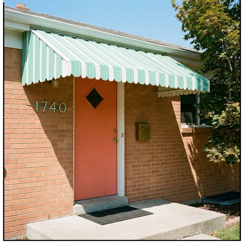
Nothing said “1960s” louder than a striped aluminum awning bolted above the front stoop. Mint green and white. Coral and cream. Sometimes a daring turquoise. The scalloped edges looked like something off a carnival ride, and the rain hitting that thin metal was the most specific sound of a particular American childhood.
These weren’t decorative afterthoughts. Families ordered them from Sears or local hardware stores, and installation meant drilling directly into the brick or siding. The aluminum kept the front hall cooler by a solid ten degrees before central air became standard, so the aluminum door awning was genuinely functional. A miniature piece of engineering that happened to look like a piece of candy.
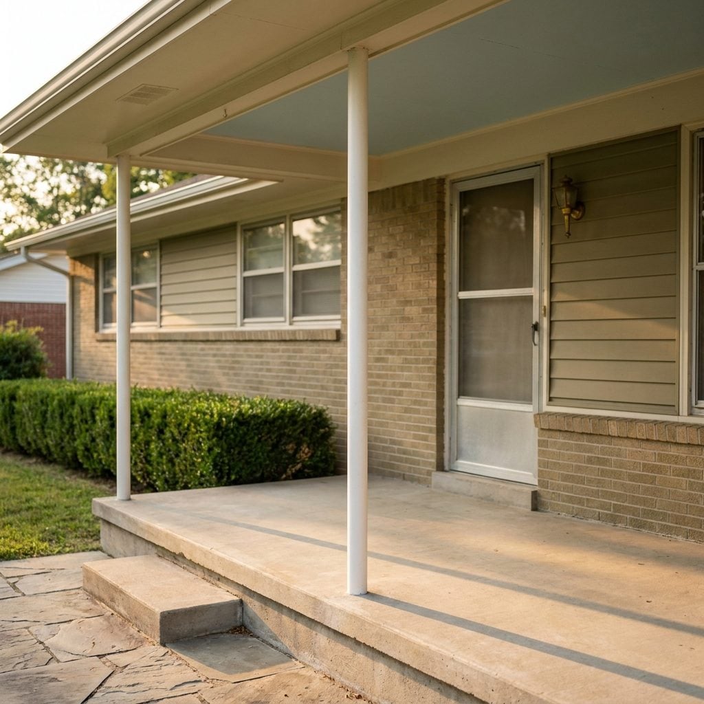
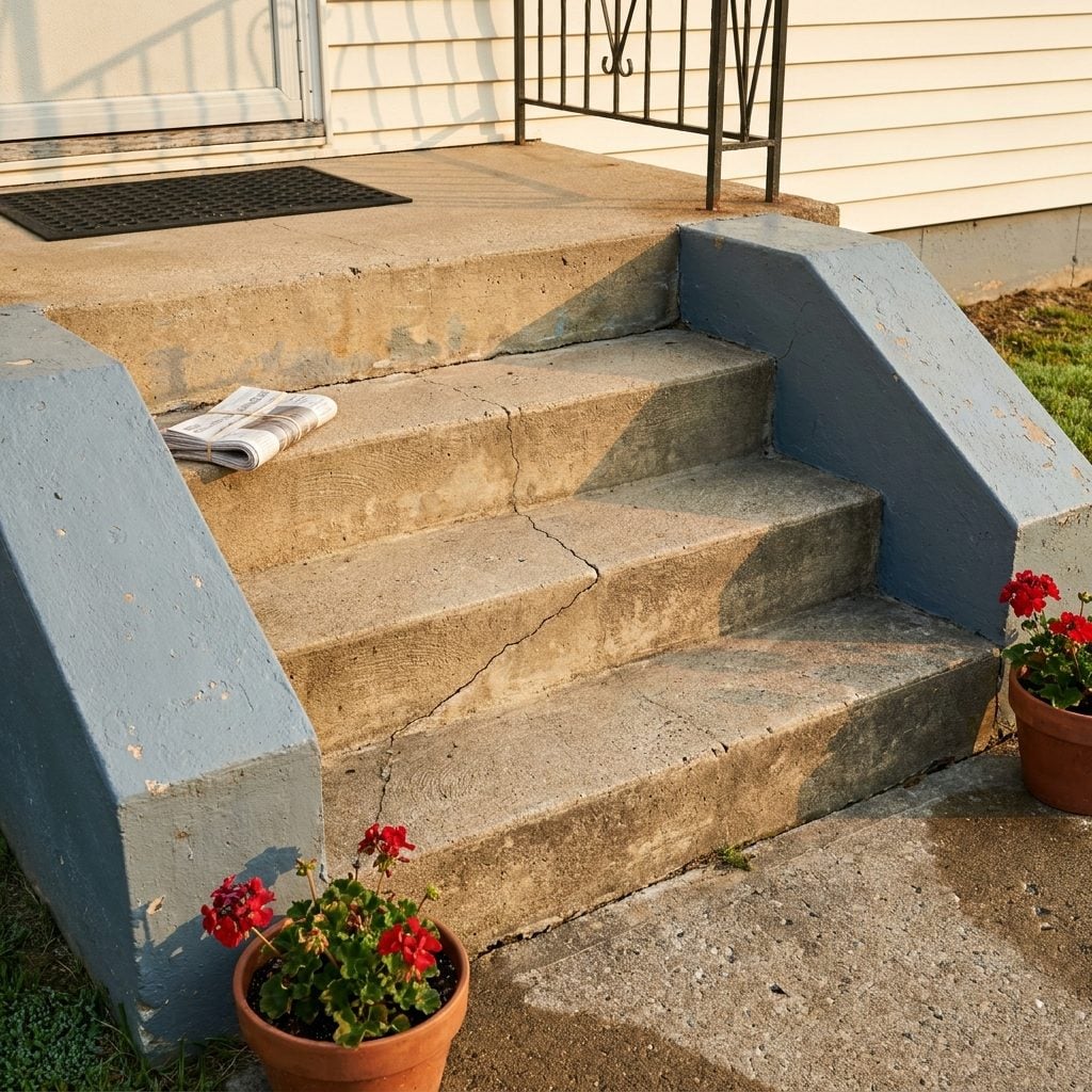
That Tiny Concrete Stoop Where You Could Barely Fit Two People Standing
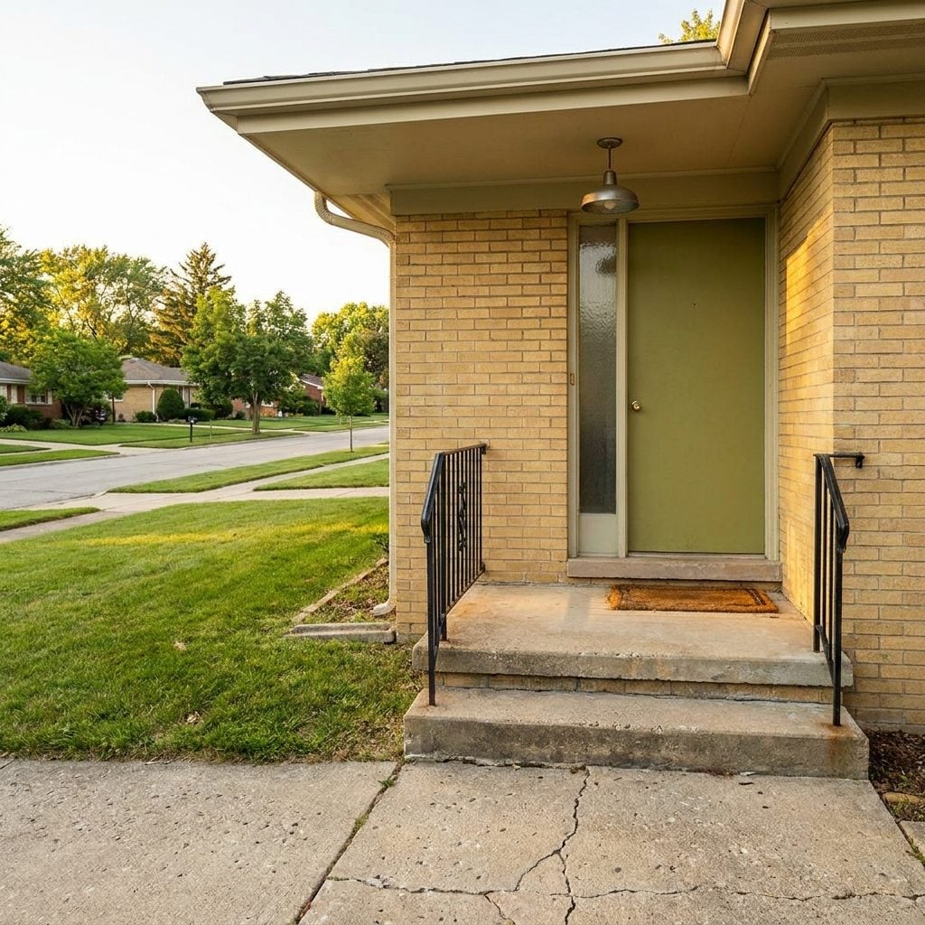
Calling it a “porch” was generous. It was a slab. Three feet by four feet if you were lucky, just wide enough for the Avon lady and whoever answered the door to both exist without one of them backing down the steps. But every conversation happened there. Every goodbye lingered on that little square of concrete.
Builders in the late ’50s and early ’60s started shrinking front porches as part of broader home trends that pushed living space to the backyard patio instead. The front stoop became purely transitional, a threshold rather than a destination. Yet somehow, those tiny platforms accumulated more life than rooms ten times their size. Neighbors stopped by. Kids sat on the steps eating popsicles. The mailman handed you packages face to face.
Concrete Slab Porch Floors That Replaced Every Creaking Board Your Parents Grew Up With
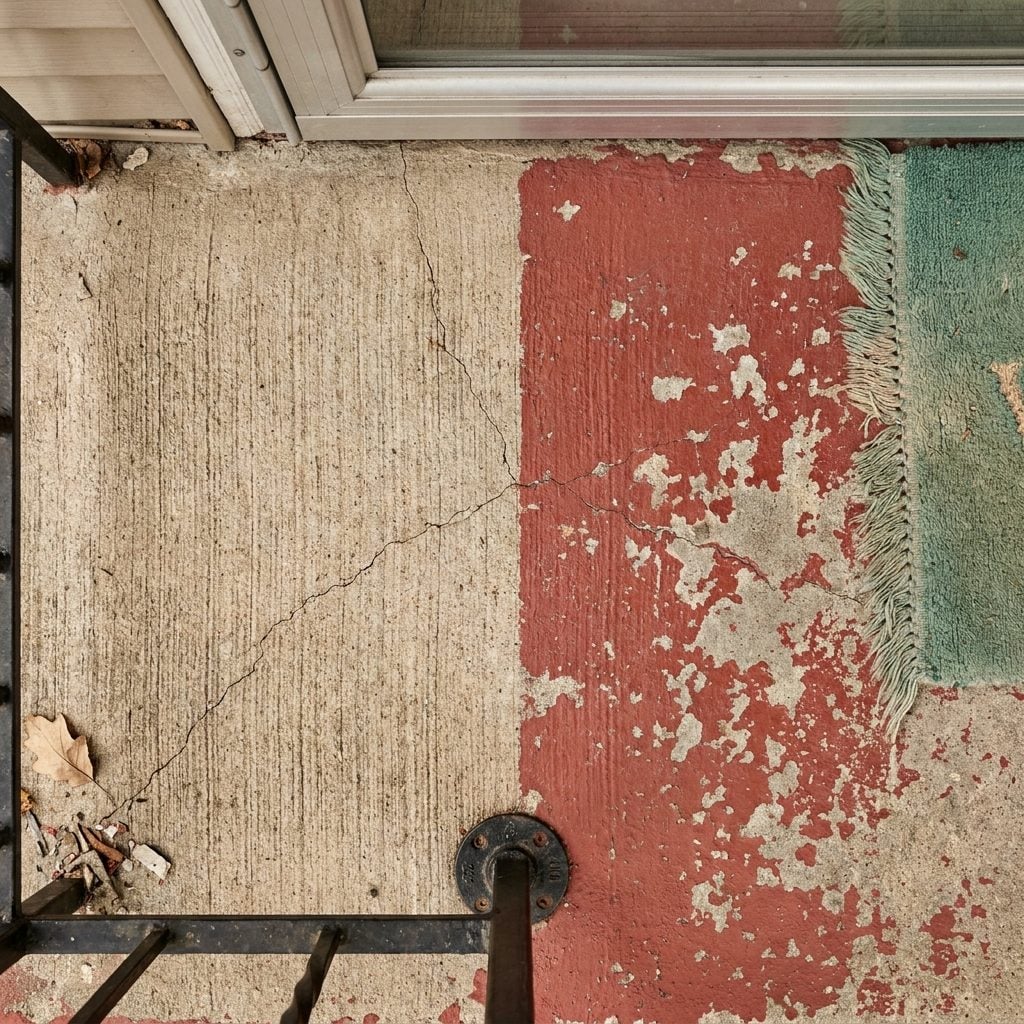
The wood was gone. No more repainting, no more warped boards catching your sandal, no more spongey spots that made your mother nervous. By the early ’60s, poured concrete had become the default porch floor for new construction, and it felt like progress.
The surface was always slightly rough, that broom-finished texture that scraped your knees when you fell but gave decent grip in rain. Some homeowners painted theirs barn red or battleship grey. Others left the concrete bare and let it develop its own geography of stains and hairline cracks over the years. A dropped flowerpot left a permanent mark. So did a rusty grill. The concrete remembered everything.
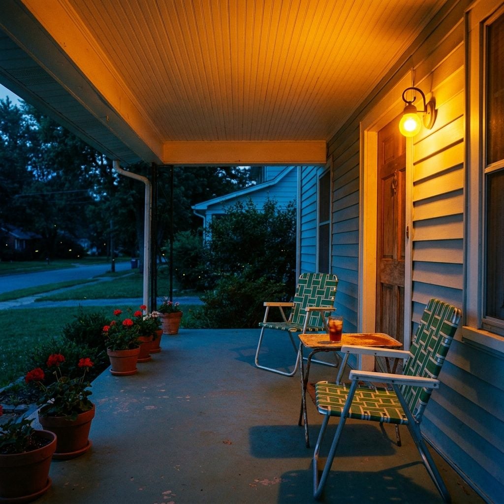
Metal Glider Benches With Floral Vinyl Cushions That Squeaked With Every Push
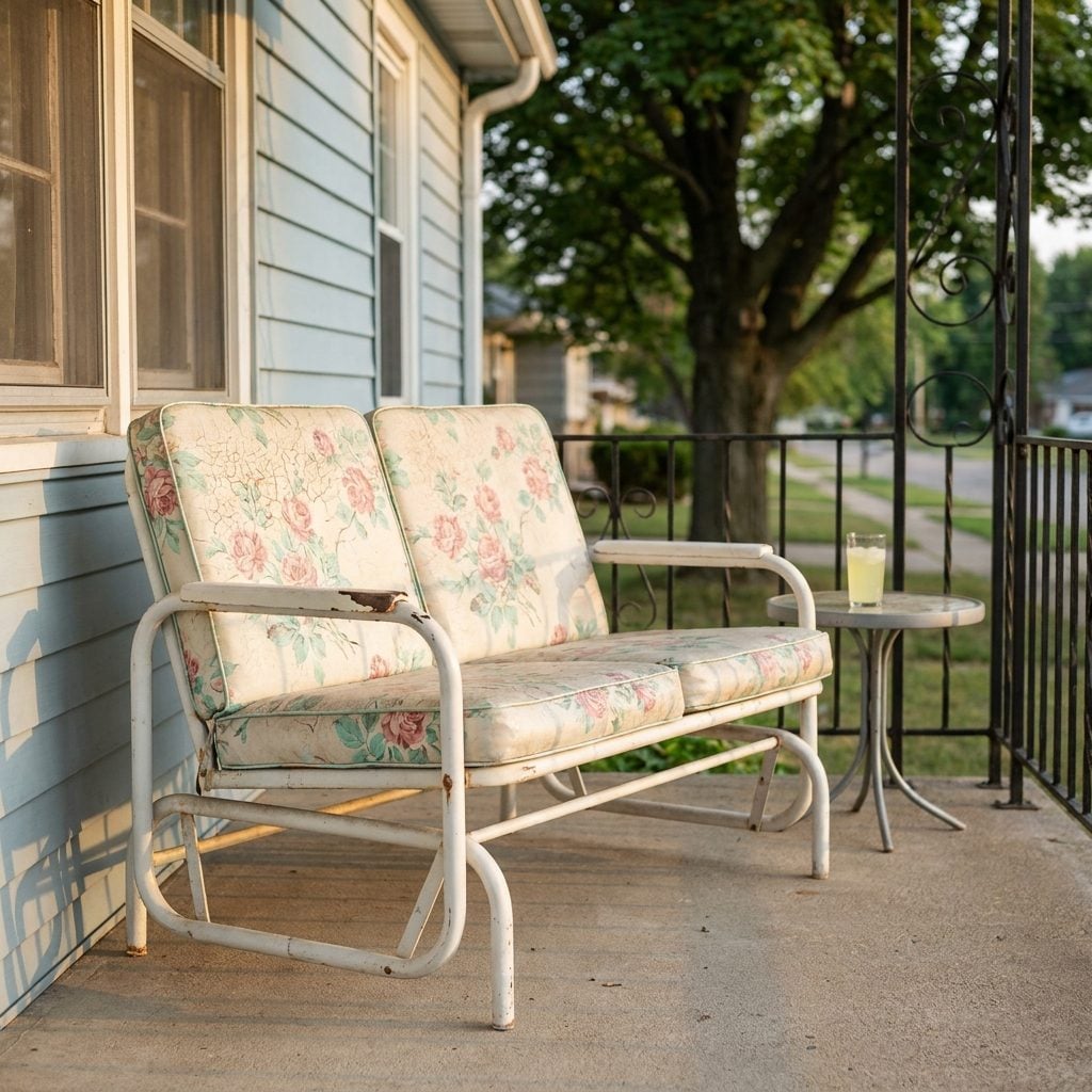
You heard it before you saw it. That rhythmic metal-on-metal squeak, two notes alternating as someone gently rocked back and forth on the porch glider. The sound carried down the block on summer evenings.
The frames were tubular steel, usually white or pale green, and the cushions were always vinyl. Floral patterns in pink and mint. Sometimes a wild orange daisy print. The metal porch glider vinyl stuck to bare legs on hot days with a sensation you can probably still feel if you think about it for two seconds. Peeling yourself off that cushion left temporary grid marks on the backs of your thighs.
These gliders were heavy. Moving one required two adults and a plan. Most stayed in the same spot for a decade or more, wearing faint arc marks into the porch floor from the constant motion.
Wrought Iron Patio Chairs With Frames So Thin They Looked Like Line Drawings
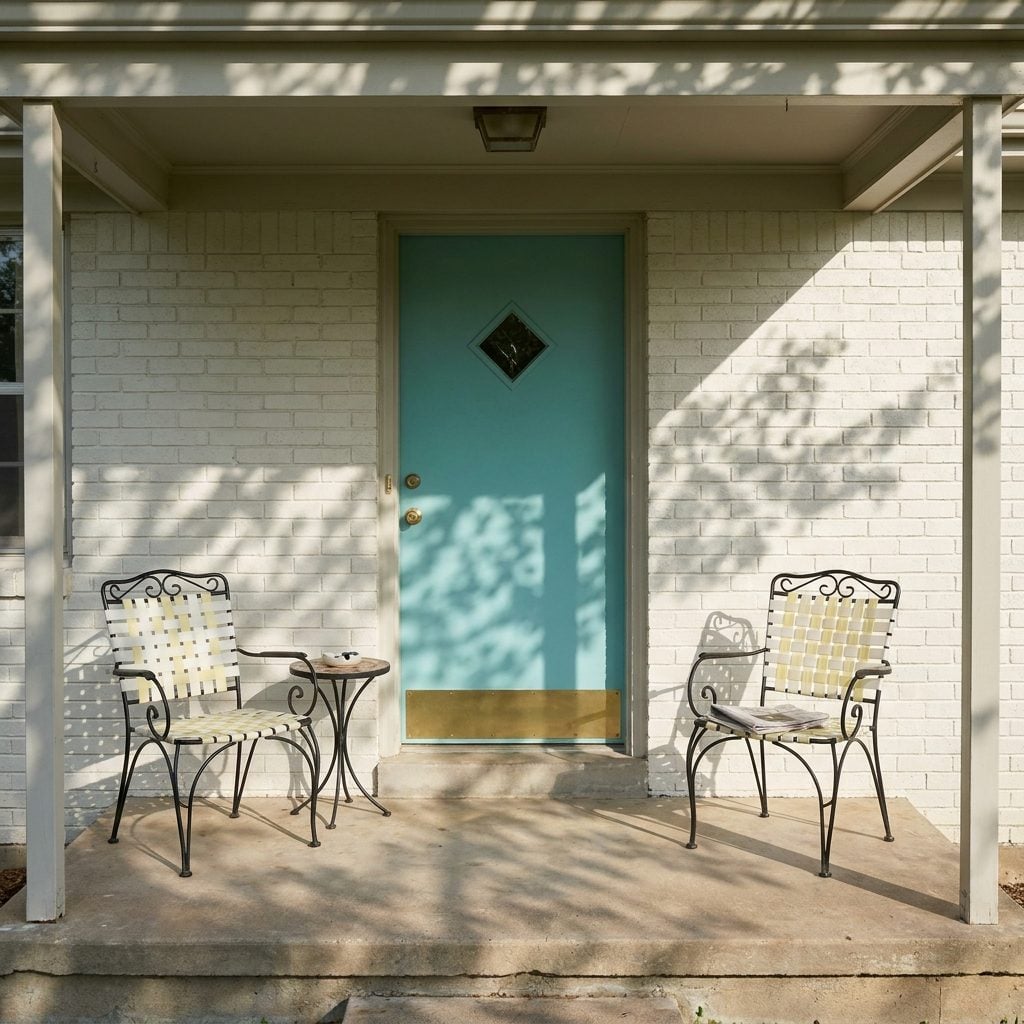
Delicate is not the word you’d use for most 1960s furniture, but these chairs were the exception. Thin iron rod frames bent into shapes that looked almost like calligraphy, with seats made of either woven plastic webbing or thin vinyl cushions in white, yellow, or coral. They weighed almost nothing. A strong wind could send one skating across the porch.
Everybody had at least two, flanking the front door like sentries that couldn’t actually stop anything. The crosshatch pattern of the webbed seats left a waffle imprint on the back of your legs, a companion tattoo to the one the glider cushion gave you.
Indoor-Outdoor Green Carpeting Over Concrete, Because Apparently Porches Needed Wall-to-Wall Too
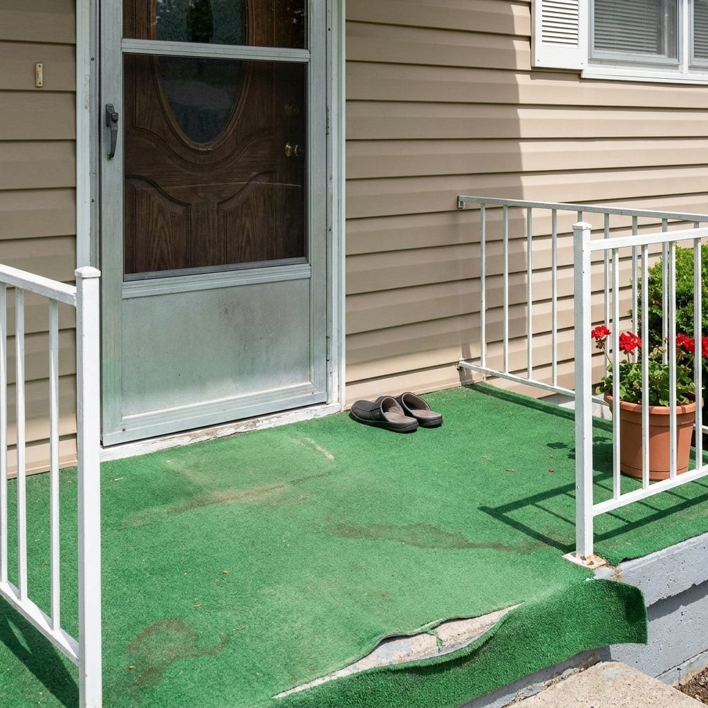
Someone, at some point, decided bare concrete was too honest. The solution: a thin layer of synthetic green carpet glued directly to the porch slab, turning every front stoop into something that looked vaguely like a putting green.
The color was always the same. An institutional green that existed nowhere in actual nature. The texture felt like a Brillo pad under bare feet. Rain soaked it and it stayed damp for days, developing a particular musty smell that became as much a part of summer as cut grass. It curled at the edges where the adhesive gave up, creating little trip hazards that everyone just stepped over.
The stuff was nearly indestructible, though. You’d find it on porches well into the 1990s, faded to a ghostly sage but still clinging on.
Decorative Breeze Block Walls With Geometric Cutouts That Let Air Through but Kept the Neighbors Guessing
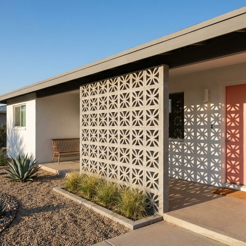
Half wall, half sculpture. Breeze blocks were the architectural detail that made a 1960s porch feel like it belonged to someone who’d been to Palm Springs, even if the house was in suburban Ohio. The blocks came in a dozen geometric patterns: stacked diamonds, interlocking circles, starburst grids, pinwheel squares. Light passed through them in shifting patterns all day long, painting the porch floor with shapes that moved with the sun.
They served a real purpose too. Privacy without claustrophobia. Airflow without full exposure. A breeze block wall along one side of a carport or porch entry gave you something to lean against while still technically being outdoors.
Built-In Brick Planter Boxes Flanking the Front Door Like Tiny Fortresses
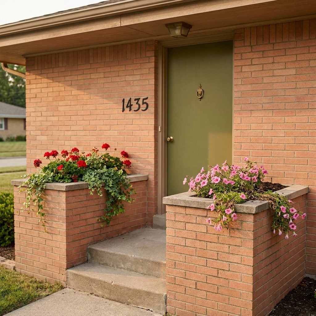
They were permanent. Structural. Mortared right into the house facade as if the builder was daring you to ever change your mind about where the geraniums went. These brick planter boxes showed up on either side of the front stoop in nearly every subdivision built between 1958 and 1967, matching the house brick exactly, usually about knee height and just deep enough to hold a layer of soil and whatever annuals were on sale at the garden center that spring.
By August, the petunias were always leggy and half-dead. By October, the boxes held nothing but dry soil and a few cigarette butts someone thought were hidden. Come spring, the cycle repeated.
Concrete Urn Planters Filled With Geraniums, the Official Flower of Every Porch in America
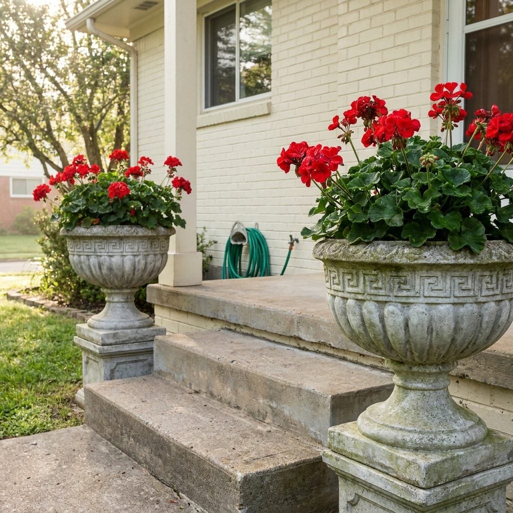
The urn was always the same shape. Pedestal base, fluted bowl, maybe a Greek key detail pressed into the concrete. Roughly the weight of a small boulder. Once placed at the bottom of the porch steps, it stayed there through every season, accumulating mineral stains and a thin film of green algae on the north-facing side.
Red geraniums. Always red geraniums. Sometimes white petunias if someone was feeling rebellious. The concrete urn planter and its red geranium occupant were the universal signal that someone cared about the front of their house just enough. Not too much. Just enough.
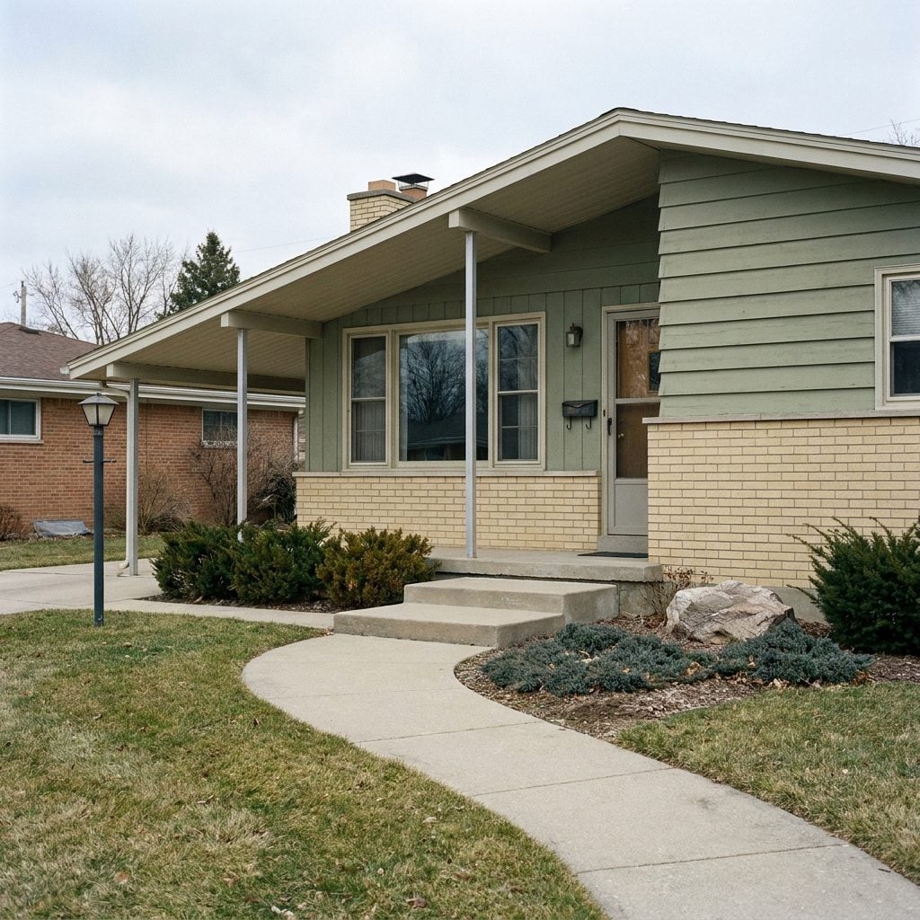
Flagstone “Crazy Paving” Walkways That Turned the Trip to the Front Door Into an Adventure
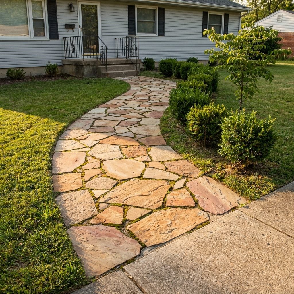
No two pieces matched. That was the whole appeal, or at least the justification. Irregular slabs of flagstone fitted together like a puzzle someone gave up on halfway through, with grass or moss growing in the gaps between. Walking to the front door in the dark meant trusting your feet to find the next stable surface.
The stones were usually a warm tan or rust color, sometimes with a pinkish hue. They wound from the public sidewalk to the light front porch in a path that was rarely straight, because straight lines were apparently too boring for 1960s landscape taste. A slight curve. A gentle meander. As if the fifteen-foot walk from curb to door needed to be a scenic route.
That Low-Profile Roof Overhang That Made the Whole House Hug the Ground
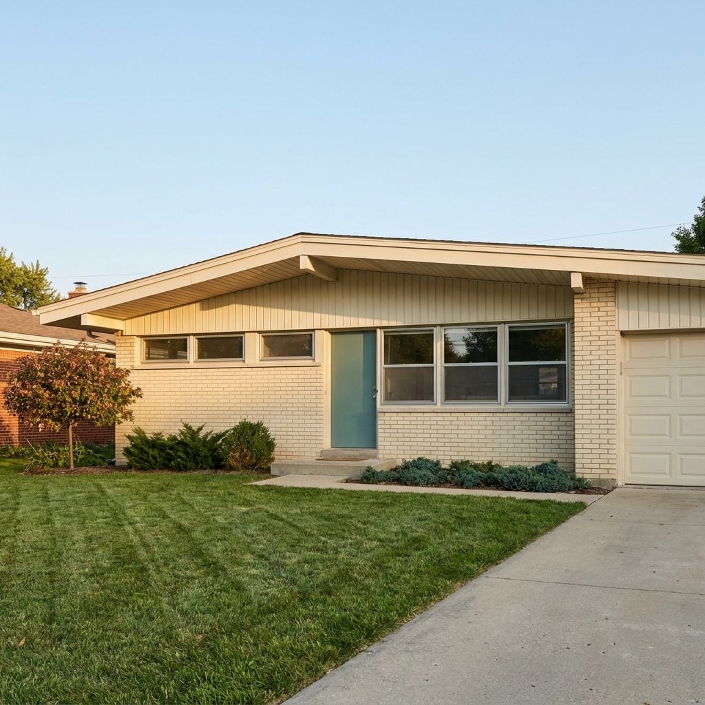
Ranch houses didn’t reach for the sky. They spread out. And the roof overhang above the porch was the punctuation mark at the end of that sentence: a thin, horizontal plane extending just far enough past the facade to cast a narrow band of shadow across the top of the front wall. Not deep enough to truly shelter you from rain. Deep enough to suggest shelter, which was apparently sufficient.
The overhangs were usually finished with simple fascia board and exposed rafter tails, or a clean aluminum soffit in white or beige. They emphasized the horizontal lines that made ranch houses look wider and lower than they actually were. Stand at the curb and your eye followed that roofline from one end of the house to the other without interruption. It was the architectural equivalent of a long, steady exhale.
Those Slender Steel Porch Posts That Made Every Ranch House Look Like It Was Floating
They were impossibly thin. Two or three inches of hollow steel or aluminum holding up an entire porch roof, painted white or left in raw brushed metal that caught the afternoon sun. After decades of chunky colonial columns and thick Craftsman timbers, these posts felt almost reckless in their confidence. Like the house itself was saying, “I don’t need all that.”
Most had a simple square or round profile with a flat base plate bolted straight into the concrete slab. No capitals, no fluting, no ornamentation at all. Just a clean vertical line connecting ground to soffit. You’d find them on ranch homes and split-levels across every suburb in America, and they gave the whole porch a wide-open, almost carport-like feel that was completely intentional.
The bold minimalism came straight from mid-century architecture’s obsession with exposed structure and honest materials. These posts weren’t hiding behind anything, and that was the whole point.
Asymmetrical Porch Layouts With Steps That Never Quite Landed Where You Expected
🔥 Would you like to save this?
Nothing lined up, and that was the whole idea. The front door sat off-center. The steps angled in from the side rather than marching straight up the middle. The porch roof extended further over one end than the other. If your parents bought a house between 1958 and 1968, there’s a solid chance the approach to the front door involved at least one unexpected turn.
This wasn’t sloppy design. Architects and builders were deliberately breaking away from the centered, symmetrical facades that had dominated American homes for generations. The offset entry created visual interest on otherwise long, low ranch facades. It also served a practical purpose: angled steps could direct foot traffic away from picture windows or toward a carport.
Screened-In Porches Built for Mosquito Defense, Not Instagram
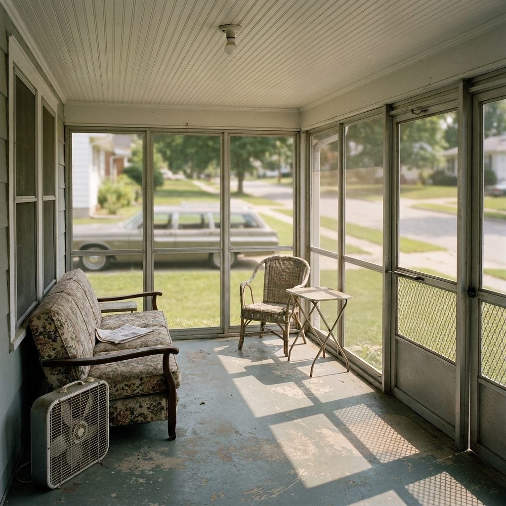
Nobody was staging cocktail parties out there. The screened-in porch of the 1960s was a utility room that happened to have fresh air. Aluminum-framed screen panels snapped into a simple track system. The floor was painted concrete or indoor-outdoor carpet in a shade of green that doesn’t exist in nature anymore. Furniture was whatever had been retired from the living room two seasons ago.
But here’s the thing: families actually used these spaces constantly. Kids did homework out there on humid September evenings. Dads read the paper after dinner. The screens kept out the bugs while letting in every sound from the neighborhood. You could hear the Hendersons’ sprinkler, a radio from three houses down, someone’s screen door slapping shut.
These weren’t designed to be beautiful. They were designed to be lived in, and they were.
The Aluminum Storm Door With That Iconic “Z” Brace You Could Spot From the Street
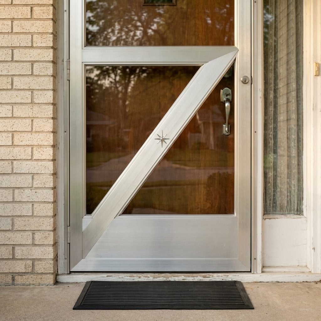
Every third house on the block had one. A full-view aluminum storm door with a bold diagonal brace cutting from one corner to the other, forming a sharp Z pattern against the glass. Some had starburst medallions or diamond cutouts punched into the aluminum at the intersections. The hardware was always a pistol-grip handle in brushed aluminum that felt ice-cold in January and scalding in July.
These doors served a genuine purpose. They protected the wooden front door from weather, added an insulating air gap, and let you open the inner door for ventilation while keeping the storm glass or a screen insert in place. But the Z brace? That was pure style.
Screen Doors With Scrollwork So Fancy They Had the Family Initial Right in the Middle
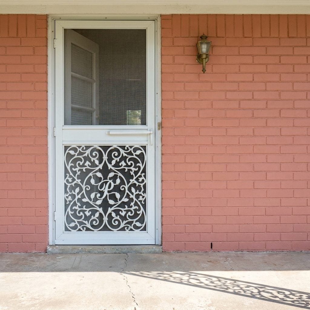
This was suburban personalization before house numbers got decorative. A screen door made of lightweight aluminum tubing with ornate scrollwork filling the lower panel, and right there in the center, a cursive letter: the family’s last initial, usually in a script that would make a wedding invitation jealous.
The scrollwork was purely decorative aluminum wire bent into leaf and vine patterns, all finished in white or sometimes black enamel. These doors announced two things simultaneously: “We care about how our house looks” and “The Petersons live here.” The spring-loaded closer on these doors produced a sound that defined summer. That long metallic creak followed by a sharp snap was the soundtrack of every kid leaving for a bike ride.
Louvered Jalousie Windows Flanking the Front Door Like Glass Venetian Blinds
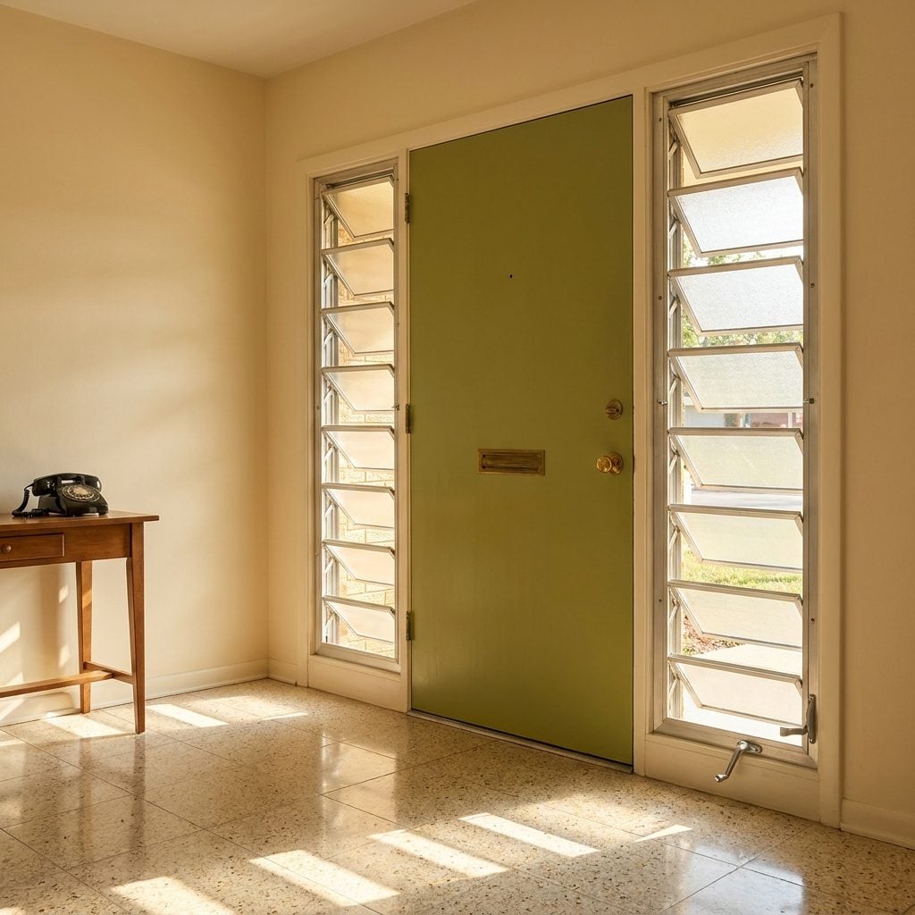
Glass slats, maybe three inches wide each, stacked horizontally in an aluminum frame and operated by a small crank handle. Jalousie windows appeared everywhere in 1960s homes, but their favorite spot was right beside the front door, where they let you control airflow without sacrificing privacy. Crank them open an inch and you got a breeze. Crank them shut and the overlapping glass formed a translucent wall.
They were wildly popular in warm climates. Florida, Texas, and Southern California builders installed them by the millions. The problem nobody talked about? They leaked air like a screen. Every gap between those glass louvers was a tiny highway for drafts, dust, and humidity. By the late 1970s, energy consciousness killed them off in most of the country. But for one glorious decade, they were the coolest windows on the block.
Front Doors in Colors So Bold Your Realtor Would Flinch Today
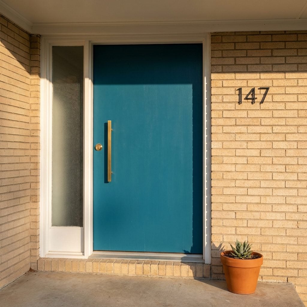
Aqua. Mustard. Avocado. Burnt orange. These weren’t accent walls. These were front doors, and they announced themselves without apology.
The 1960s color palette for exterior doors was pulled straight from the same universe that gave us harvest gold refrigerators and turquoise countertops. Homeowners painted their front doors in saturated, confident hues that would make a modern farmhouse devotee quietly hyperventilate. And the bolder the color, the more it worked against those neutral brick and wood-tone facades that dominated suburban construction.
What’s interesting is how much these doors communicated about personality. A neighborhood full of beige and brown houses suddenly had one home with a door the color of a swimming pool. You remembered that house. You gave directions by it. “Turn left at the house with the turquoise door.” Today’s home trends have circled back to bold entry colors, but nothing quite matches the unapologetic punch of a 1960s original.
Carriage-Style Coach Lights With Amber Glass That Made Every House Feel Like a Colonial
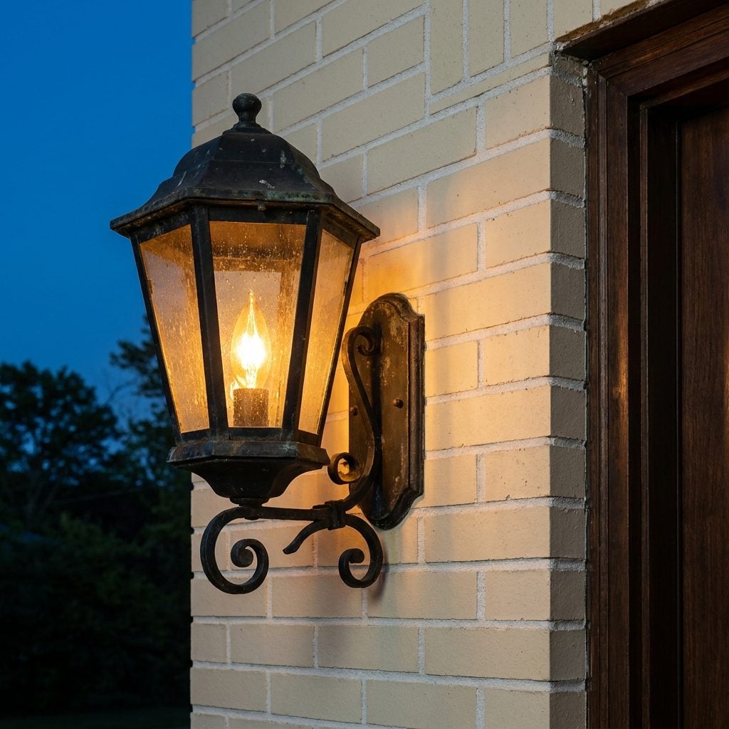
Even if your house was a flat-roofed, slab-on-grade ranch built in 1963, it probably had a pair of lantern-style coach lights flanking the front door as if George Washington might ride up any minute. Black wrought iron frames. Amber or seeded glass panels. A single flame-shaped bulb inside that cast the warmest, most forgiving light known to residential architecture.
These fixtures were everywhere because they threaded a psychological needle perfectly. They read as “traditional” and “established” on houses that were, in truth, brand new tract homes. The amber glass softened the porch light to a honeyed glow that made even aluminum siding look dignified after dark.
Porch Lights That Looked Like They Belonged on a Space Station
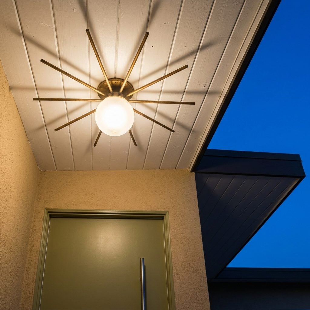
On the other end of the spectrum from coach lights, plenty of 1960s homes went full Space Age with their porch fixtures. Starburst designs with radiating metal spikes. Sputnik-inspired globes on angular brackets. Saucer-shaped flush mounts that looked like tiny UFOs hovering against the soffit. If the Space Race was on TV every night, it was also happening above your front door.
These fixtures tended to show up on the more architecturally adventurous homes. Split-levels with butterfly roofs. A-frames. Eichler-style developments in California. The fixture said something specific: this household watched Walter Cronkite cover the Gemini missions and thought, yes, that energy belongs on our porch. You can still light front porch spaces with atomic-era reproductions today, though the originals carry a particular handmade quality that’s hard to replicate.
Push-Button Doorbells With Glowing Nameplates That Told You Exactly Who Lived There
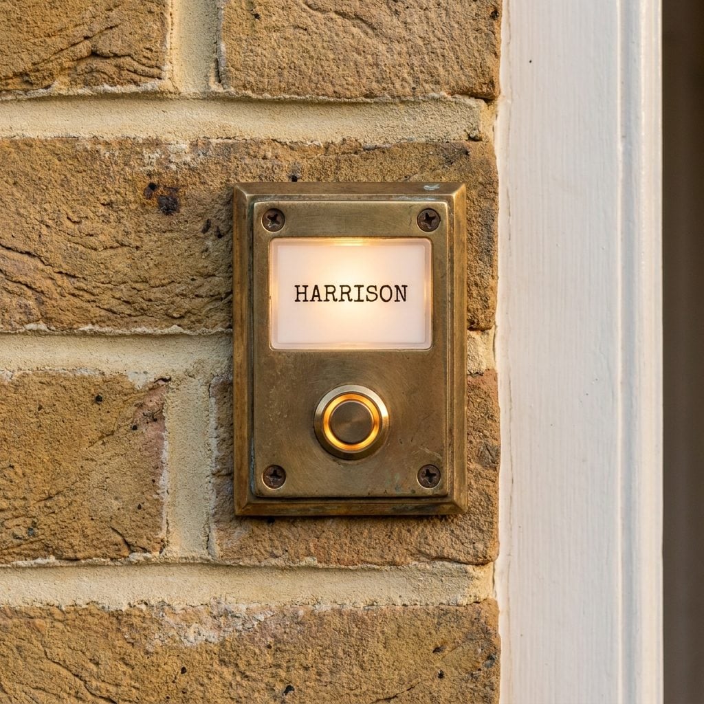
A small rectangular box, maybe two inches by four, mounted at eye level beside the front door. Brushed aluminum or brass surround. A translucent plastic window with the family name typed or hand-lettered on a paper insert, backlit by a tiny incandescent bulb. And below it, a single illuminated push button, usually amber or white, that made a satisfying click before the chime sounded inside.
These were standard issue from doorbell manufacturers like NuTone and Broan throughout the decade. The nameplate insert was the personal touch. Some families typed theirs neatly on a typewriter. Others used press-on lettering. A few ambitious homeowners hand-lettered theirs in careful script.
The interior chime unit was its own design object, usually a rectangular wooden box mounted in the hallway with two metal tone bars visible behind a decorative grille. That two-note “ding-dong” is hardwired into every brain that grew up in that era.
That Wall-Mounted Metal Mailbox Right Beside the Door, Always in Black
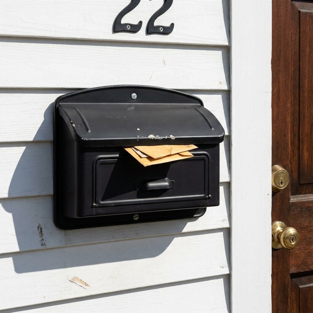
Black. It was always black. A simple pressed-steel box with a curved lid, mounted to the wall three feet from the front door handle. Sometimes it had a small red flag on the side, sometimes just a slot on top and a hinged front panel that dropped open. The mailman walked right up to your porch, slid the letters through the slot, and moved on to the next house.
What we forget is how much daily life centered on this little box. Bills arrived. Letters from relatives arrived. The Sears catalog arrived, and it barely fit. Kids checked it after school hoping for birthday cards with dollar bills tucked inside.
The Wrought Iron Mailbox-and-Lamp-Post Combo That Stood Guard at the End of Every Driveway
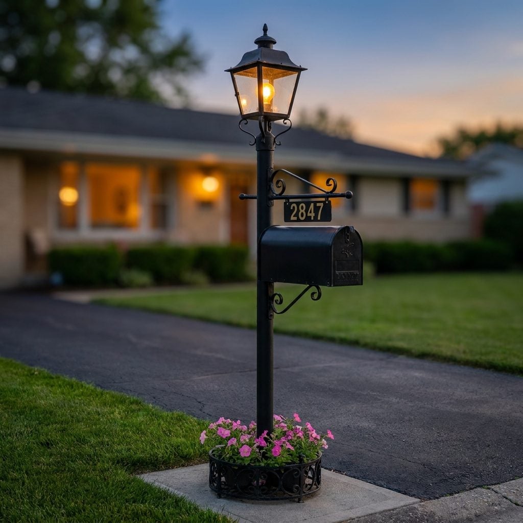
If the wall-mounted mailbox was practical, this was its theatrical cousin. A black wrought iron post planted at the end of the driveway or the edge of the front walk, combining a lantern on top with a mailbox hanging from a decorative bracket below. Some had a small planter ring at the base for petunias. The whole assembly stood about five feet tall and weighed a ton.
These combination posts turned a utilitarian object into a front-yard landmark. The lantern on top usually had amber or clear glass panels in a colonial style, with a single bulb on a dusk-to-dawn photocell that clicked on automatically as the sky darkened. The mailbox below was a standard-size rural box, painted black to match, sometimes with the house number in adhesive gold digits.
Neighborhoods where every third house had one of these created a particular streetscape that felt both orderly and welcoming. They were the suburban equivalent of a cottage porch renovation detail: a small touch that anchored the whole property. Walking past them at night, that row of amber glows leading down the street, each one marking a family’s driveway, felt like the neighborhood itself was breathing.
Those Brass House Numbers in That Sharp, No-Nonsense Sans-Serif Font
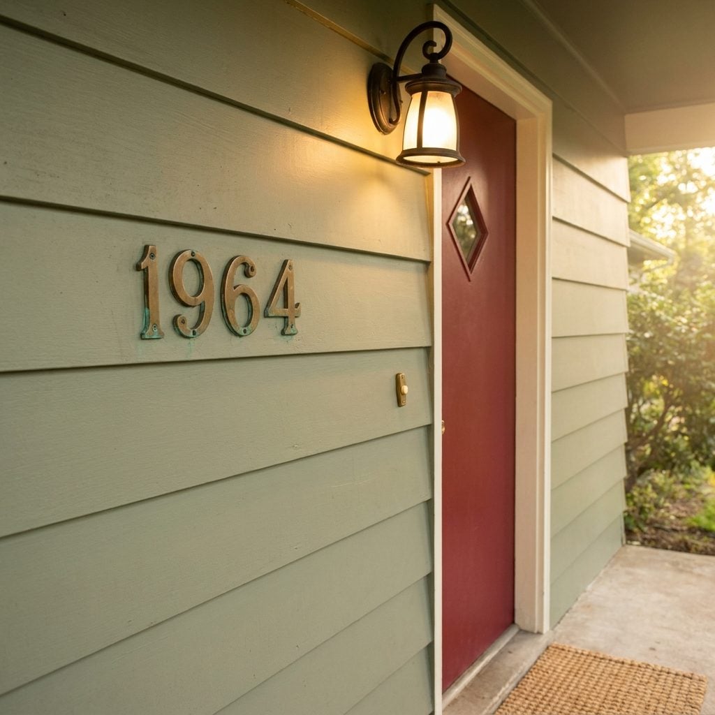
You could spot them from the street. Four inches tall, screwed right into the siding or the wooden trim beside the door, gleaming like little declarations of identity. Not the curly Victorian script your great-aunt had. These were clean. Modern. Confident. The kind of numbers that said “we read Sunset magazine and we know what’s coming.”
Most were a brushed or polished brass, though some ambitious homeowners went with a satin finish. They picked up the afternoon sun in a way that made finding the house almost unnecessary. You just followed the glint. And every single one of them eventually developed that greenish patina around the screw holes that nobody ever bothered to polish away.
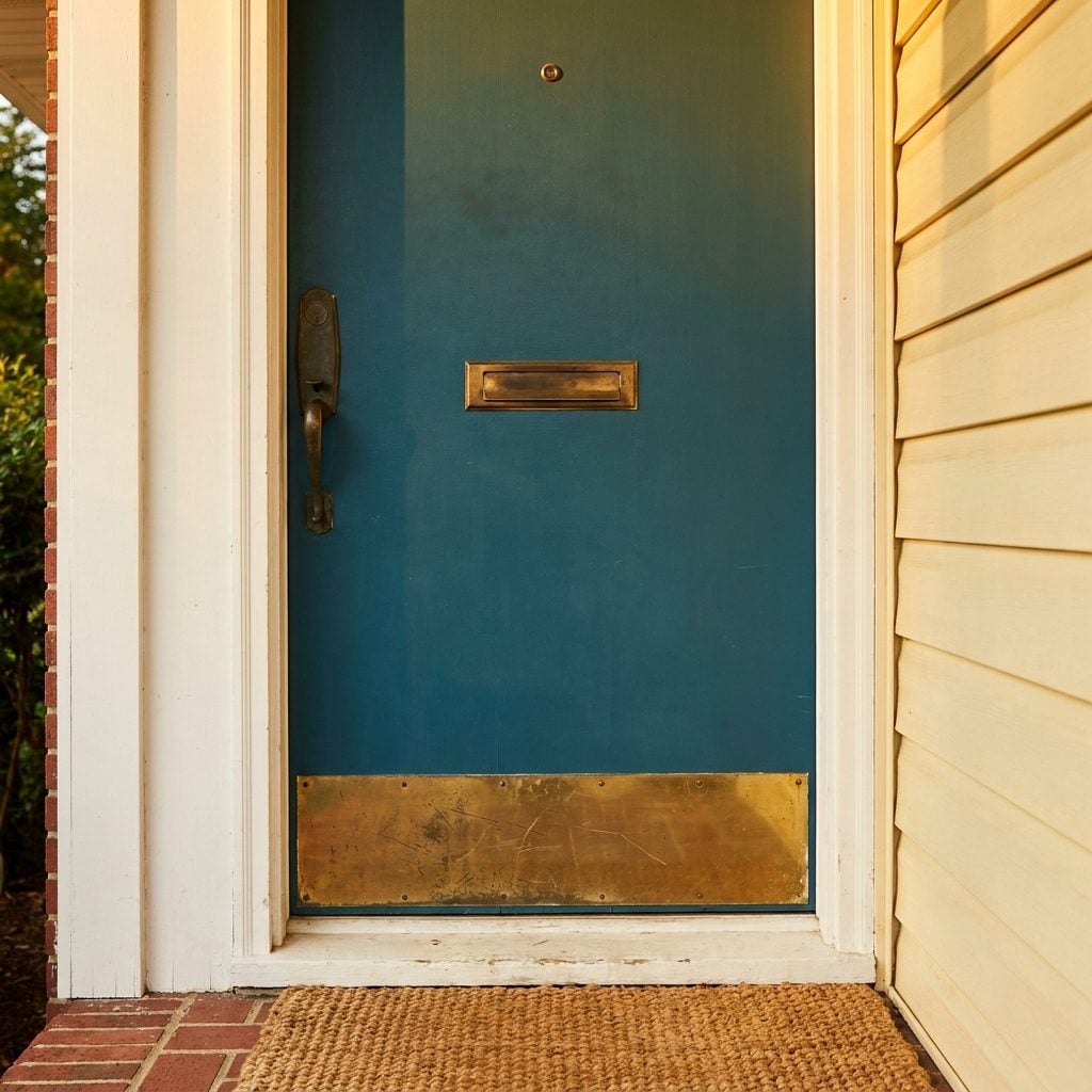
The Brass Kick Plate on the Front Door That Took a Beating and Still Looked Good
🔥 Would you like to save this?
Eight inches of brass bolted to the bottom of the front door, and it earned every scratch. Grocery bags, muddy boots, tricycle wheels, the dog’s nose. That brass kick plate absorbed a decade of daily life and somehow looked better for it.
The smart ones came with a brushed finish so the scuffs blended in. The ambitious homeowners chose mirror-polished brass and then spent Saturday mornings with Brasso and a rag, buffing it back to a shine that lasted exactly until Monday. Either way, it matched the house numbers, the mail slot, and the porch light. Brass was the connective tissue of the 1960s front door, tying every piece of hardware into one cohesive statement that quietly said: we care about this house.
Short Privacy Walls That Carved Out a Little World on the Porch
Half-wall. That’s all it took. Three feet of brick or concrete block running along one side of the porch, sometimes both, just tall enough to block the view from the neighbor’s driveway but short enough to wave at someone walking by. It created this perfect illusion of a room that wasn’t quite a room.
Some were topped with a flat concrete cap that became the unofficial drink-resting surface of every summer evening. Others got a coat of paint to match the house trim. The really committed homeowners planted low shrubs right against the outside face, which eventually grew tall enough to defeat the whole purpose.
What made them work was the psychology. You felt enclosed without feeling boxed in. The porch became a threshold between public and private life, a place where you could sit in your undershirt with coffee and still technically be “outside” without the whole street watching.
Boxy Concrete Steps With Solid Sidewalls That Meant Business
No railing. No open risers. Just a solid block of concrete rising from the walkway to the porch like a small monument to postwar confidence. These steps were poured in place by the builder, and they would outlast everything else about the house.
The sidewalls were the key detail. Solid slabs of concrete running along each edge, sometimes six inches thick, sometimes more. They gave kids a surface to sit on, gave parents a place to set the mail, and gave the whole entry a squared-off geometric look that felt intentionally modern even if the builder was just saving money on railing materials. You’d find them painted grey, sometimes a dull red, and almost always with a crack running diagonally across one of the treads by the time the house was fifteen years old.
The Milk Delivery Box Tucked Beside the Front Door
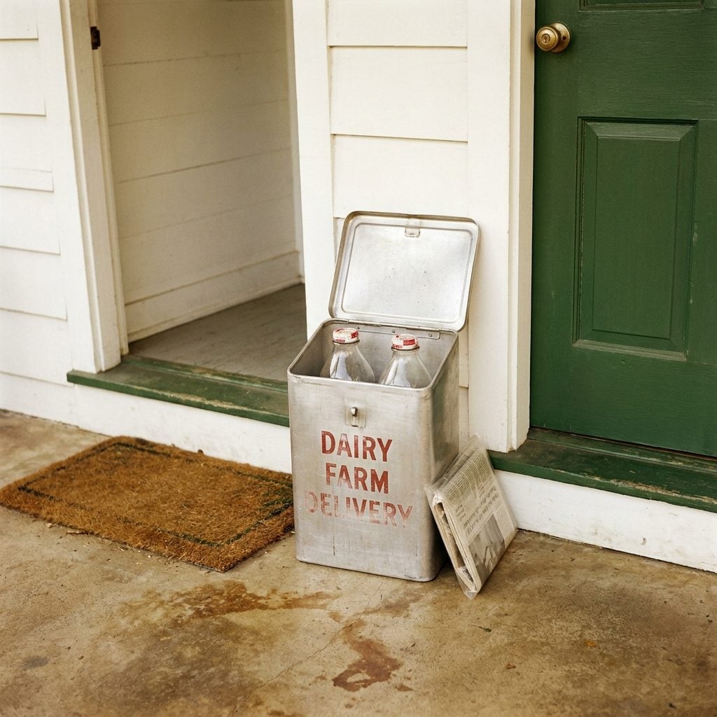
Small, insulated, and almost always either aluminum or painted wood with a hinged lid. It sat to one side of the front door like a miniature chest, waiting for the milkman’s predawn visit. You’d hear the clink of glass bottles if you were up early enough.
By the mid-sixties, home delivery was already fading in most suburbs, but the boxes lingered. Some families repurposed them for package deliveries or newspapers. Others just left them in place, lids slightly ajar, a relic of a routine that had quietly ended. The really old ones had the dairy’s name stenciled on the side in blocky red letters, fading a little more each summer.
Hanging Macramé Plant Holders With Ferns Spilling Over the Edges
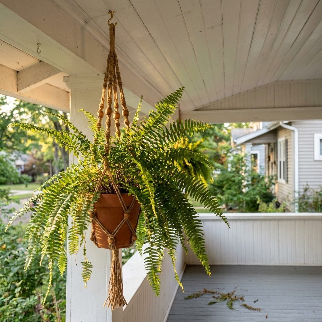
Knotted jute, a ceramic pot, and a Boston fern doing its absolute best to take over the porch ceiling. That was the formula. The macramé holder hung from a simple brass hook screwed into the overhang, and it swayed just enough in the breeze to make the whole porch feel alive.
Spider plants were the other go-to, those long runners dangling down past the last row of knots like the plant was trying to escape. The jute would darken over time from water drips and humidity, developing that earthy smell that mixed with whatever was blooming in the yard. Every few months the whole assembly had to come down so someone could sweep up the pile of dried fronds underneath it.
Simple Wooden Storage Benches That Hid Everything From Galoshes to Garden Gloves
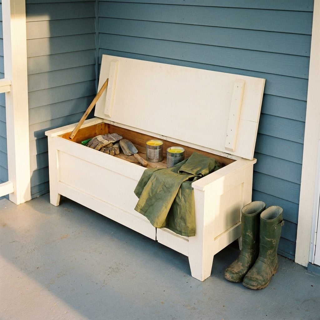
Flat seat, hinged lid, no cushion. Built from pine or plywood and painted to match the porch trim. It looked like nothing special until you lifted that lid and found the entire seasonal history of the household: work gloves, a trowel, a can of WD-40, three tennis balls for the dog, citronella candles from two summers ago.
The beauty of the wooden storage bench was its dual purpose. Guests sat on it. Kids used it as a stage. And nobody ever had to know about the chaos inside. It was the porch’s best-kept secret, a lesson in practical design that the current home trends keep trying to reinvent with fancier materials and worse hinges.
Cast Iron Boot Scrapers Mounted at the Base of the Steps
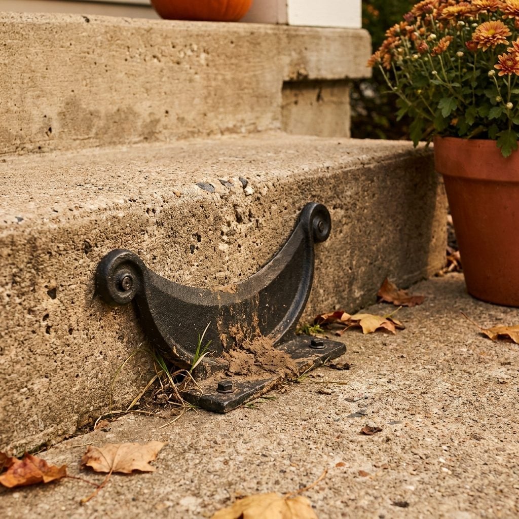
A blade of cast iron bolted to the concrete, maybe six inches tall, shaped like a flat crescent or sometimes an ornamental scroll. That’s it. That was the whole device. And it was one of the most practical objects ever placed on an American porch.
You’d drag your sole across it before stepping inside, leaving a little ridge of mud and grass clippings on either side. Nobody told you to use it. You just did. It was porch law. The ones shaped like dachshunds or little lions were the fancy versions, but most were plain black iron crescents that had been there since the house was built and would be there long after the current owners were gone.
The Decorative Wagon Wheel Leaning Against the Porch Post Like It Belonged There
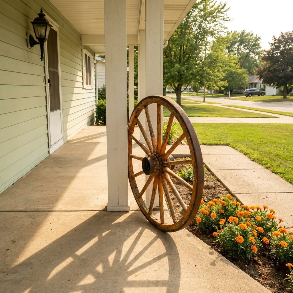
It didn’t belong there. Nobody on that street had ever driven a wagon. But there it was, a full-size wooden wagon wheel with iron rim, leaning casually against the porch column or propped beside the front steps like the family had just unhitched the team.
This was the 1960s suburban homeowner’s way of saying “we have a connection to the land” from a house built on what had been a cornfield three years earlier. Sometimes it got a coat of shellac. Sometimes it stayed weathered. The truly committed surrounded it with marigolds or placed a lantern in the hub. It was pure theater, and everyone on the block participated without irony.
The wagon wheel was the original “live laugh love” sign. Zero function, maximum sentiment.
Yellow Bug Light Bulbs That Turned Every Summer Porch Into a Warm Amber Cave
The moment those went in, you knew summer had officially started. Standard incandescent bulb, coated in that thick yellow film, screwed into the porch fixture sometime around Memorial Day and left there until September. The light it cast was this deep amber gold that made everyone look slightly jaundiced but kept the moths at bay. Mostly.
You could light a front porch a dozen ways, but the yellow bug bulb was the only option that doubled as an insect management strategy. The science was debatable. The vibe was not. That amber wash over the concrete, the metal chairs, the potted geraniums: it turned every porch into a stage set for conversation, card games, and watching fireflies drift across the lawn.
Minimal Ornamentation and Clean Lines That Quietly Said “The Future Lives Here”
🔥 Would you like to save this?
Gone were the turned spindles, the gingerbread trim, the fussy brackets of earlier decades. The 1960s porch was a study in restraint. Flat overhangs. Square columns. Simple metal railings with thin vertical bars, painted black or white, doing their job without drawing attention.
This wasn’t accidental. The entire postwar building philosophy had pivoted toward efficiency and geometric clarity. Builders stripped away ornamental detail because it cost time and money, but the result looked intentional. It looked designed. A modern porch makeover today often chases the exact same principle: let the shape do the talking.
The cleanest examples had nothing but a flat concrete slab, two slim steel posts holding up a flat roof overhang, and a single light fixture. That was the whole porch. And it worked.
Wrought Iron Railings With Scrollwork That Made Every Ranch House Feel Like It Had a Story
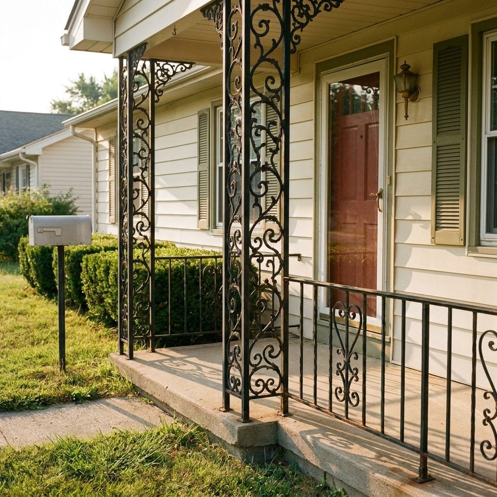
You could trace those swirls with your finger as a kid and never get bored. The wrought iron railing that replaced grandpa’s thick wooden porch posts was supposed to look modern, but the scrollwork gave it this Old World quality nobody planned on. Every neighborhood had slightly different patterns, grape leaves on one house, S-curves on the next, like each builder was riffing on the same jazz standard.
The iron was almost always painted black, though some adventurous homeowners went white or forest green. Within a few years, rust would bloom at every joint. Dad would sand it down on a Saturday morning, repaint it, and the whole cycle would start again the following spring. That rhythmic maintenance was part of the deal. The railings were thin enough to see through, which was the whole point. Open. Airy. Nothing to hide behind.
Seasonal Storm Windows and Screens You Could Hear Being Swapped Out Every Spring and Fall
Twice a year, the ritual. Dad on a ladder, aluminum frames stacked against the porch railing, someone inside holding the window while he worked the clips. The storm windows went up in October. The screens replaced them in April. The whole neighborhood did it on the same weekend, like synchronized seasonal maintenance.
Those aluminum combination frames were always visible from the porch, a second skin over every window. Triple-track models were the fancy version, letting you slide the glass panel up and the screen down without removing anything. But plenty of houses still had the old-fashioned kind that had to be physically swapped, each one labeled with a grease pencil on the frame so you knew which window it fit.
The screens gave the house a soft, slightly hazy look from outside. And inside, they turned every breeze into a sound. That particular white-noise hum of air moving through aluminum mesh on a July night: nothing else sounds quite like it.
The TV Antenna Rising Above the Roofline Like a Suburban Crown
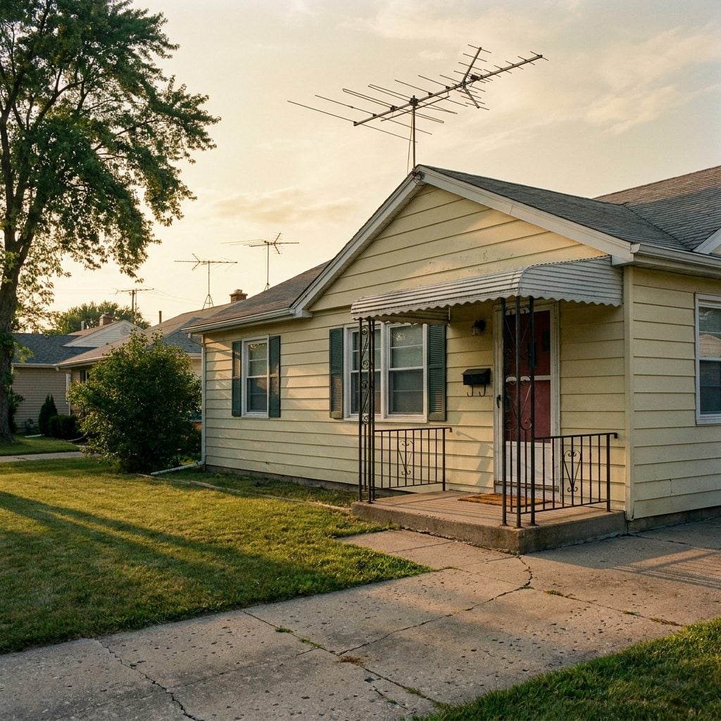
You didn’t even have to step onto the porch to know this one. Every roofline in the neighborhood bristled with them: those skeletal aluminum antennas pointing toward some invisible signal in the sky, each one slightly different in size and angle, like every house was trying to tune into its own private frequency.
From the porch, you’d look up and down the street and see dozens of them. They were the visual proof that a family lived there, that someone inside was watching Ed Sullivan or Walter Cronkite. A bare roofline meant a vacant house or, worse, someone who hadn’t caught up with the times. The antenna was the flag you flew to say you belonged.
Wind storms would knock them crooked, and suddenly Dad had a Saturday project. He’d be up on the roof with a wrench while someone inside shouted through the window about whether the picture had cleared up yet. That call-and-response ritual, the person on the roof versus the person watching the screen, played out on every block in America.