🔥 Would you like to save this?
Dark paint in a small bathroom shouldn’t work. Every conventional decorating rule says it makes tight spaces feel smaller, heavier, and harder to breathe in. And yet here we are. The reality is that dark walls can actually sharpen a small bathroom rather than shrink it. When the boundaries of a room recede visually, the eye stops measuring the space and starts reading it as a whole. That shift is subtle but real, and it’s why designers keep reaching for charcoal, navy, forest green, and near-black finishes even in bathrooms with barely enough room to turn around. Tile choice, lighting, and fixture finish do most of the heavy lifting once the dark color is on the wall. The 27 designs ahead show the full range of what’s possible, from moody and minimal to dark walls paired with warm wood accents that somehow don’t feel oppressive.
In order to come up with the very specific design ideas, we create most designs with the assistance of state-of-the-art AI interior design software. Also, assume links that take you off the site are affiliate links such as links to Amazon. this means we may earn a commission if you buy something.
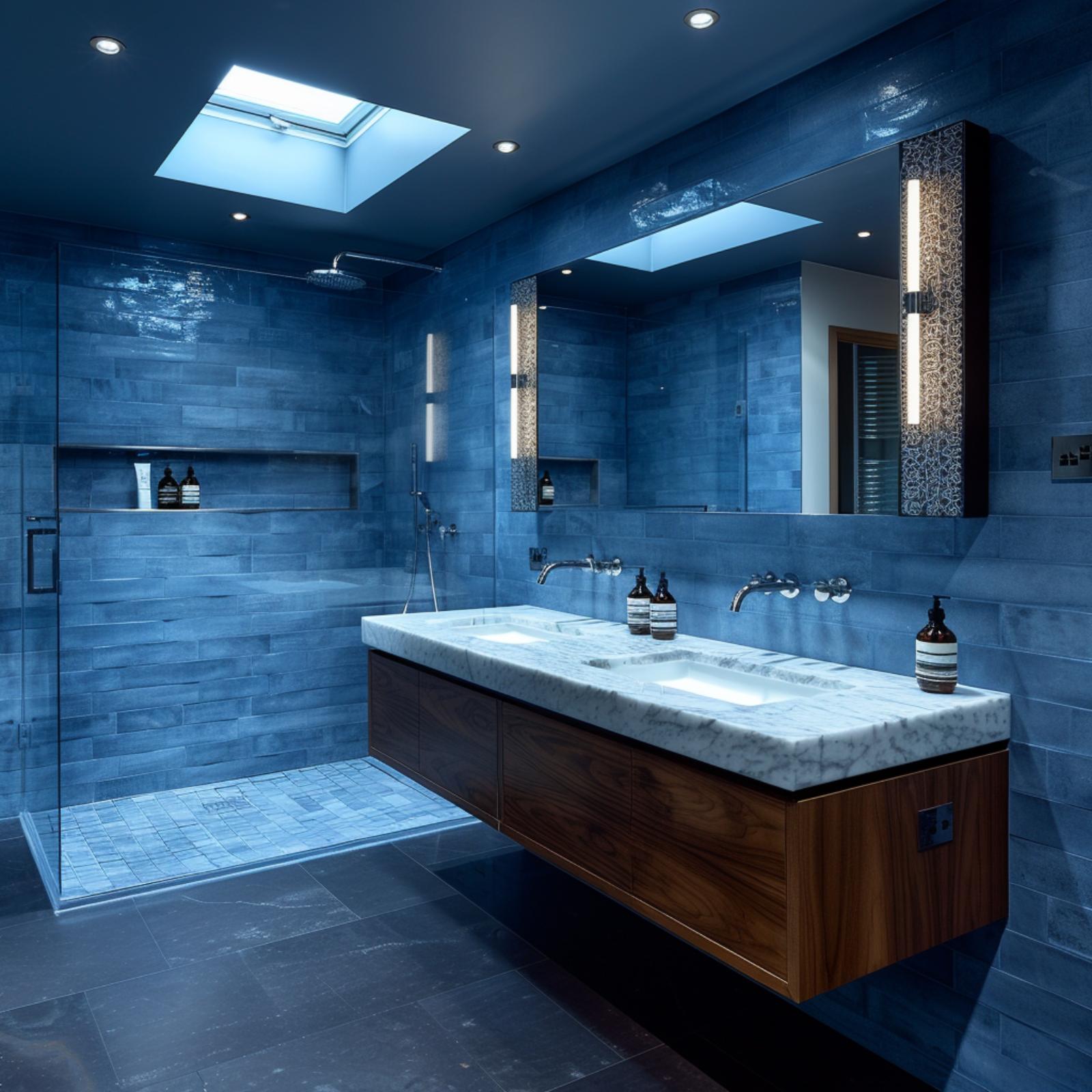
Dark Teal Walls, a Skylight, and Zero Apologies for Going Bold
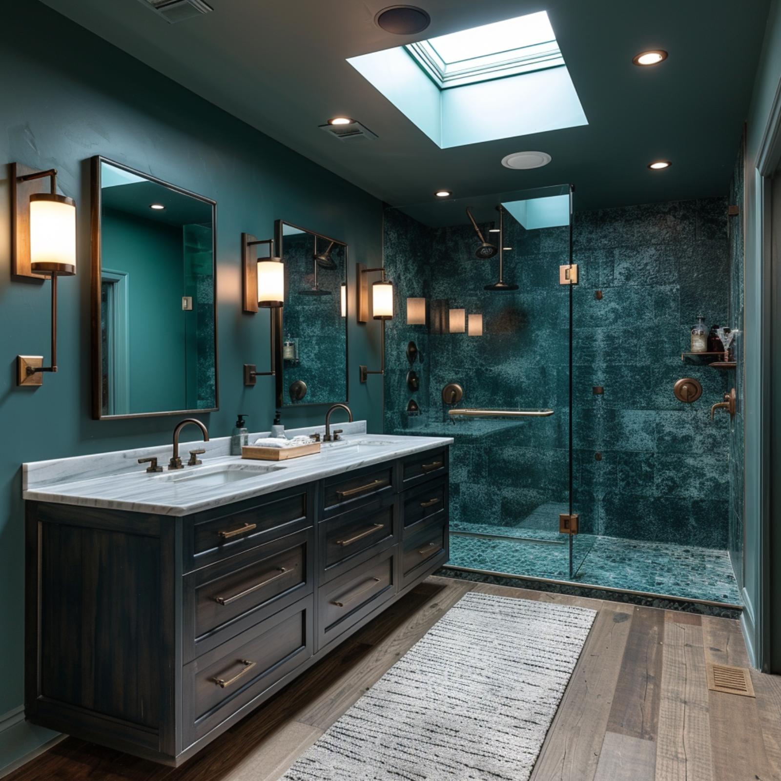
Deep teal plaster walls wrap every surface here, and far from closing the room in, they pull the eye straight back to a frameless glass shower tiled floor-to-ceiling in a mottled blue-green glaze. The double vanity sits in dark-stained wood with brass bar pulls, topped in Carrara marble. Overhead, a skylight cuts through the ceiling and floods the space with natural light that the dark walls actually catch and hold.
Forest Mural, Freestanding Tub, Dark Green Walls — and It All Works
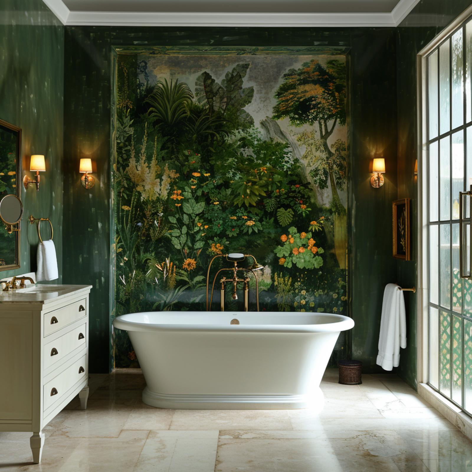
Hunter green lacquered walls set the tone here, and the botanical mural anchors the entire room without competing with the architecture. It runs floor to near-ceiling behind the freestanding soaking tub, packed with orange blooms, tropical foliage, and what reads like a classical garden painting preserved behind glass. The brass floor-mount tub filler pulls the gold from the mural’s warm tones without trying too hard.
The cream vanity with cup-pull hardware grounds the left wall, and the travertine tile floor keeps things from feeling cave-like. Flanking sconces with fabric shades cast warm pools of light on either side of the mural. Honestly, the window saving this room isn’t the glass door panel on the right. It’s the mural itself, which somehow reads as a second source of light.
Emerald Walls, Brass Hardware, and a Floating Vanity That Earns Its Place
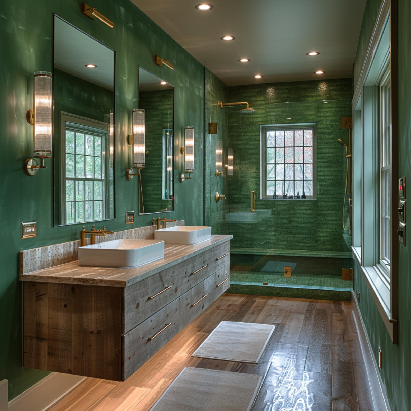
Rich emerald covers every wall and spills into the shower enclosure, where rippled green tile shifts texture without shifting color. The brass fixtures don’t fight it. They hold their own against all that saturation, and the pairing feels considered rather than cautious.
The floating vanity does something unexpected here. Reclaimed-style wood with visible grain keeps the space from reading as cold, and the vessel sinks sit on what looks like a granite-topped counter with warm veining. Cylinder sconces flank two frameless mirrors, adding enough light that the dark walls never feel like they’re closing in.
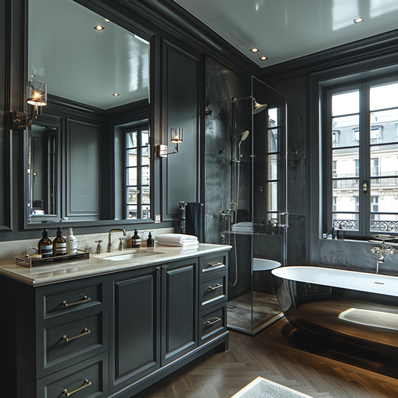
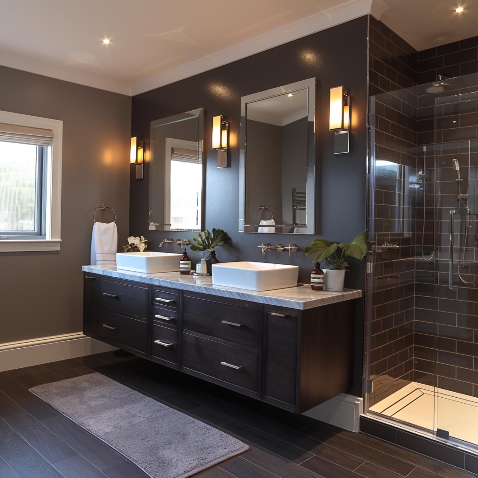
Charcoal Tile, Walnut Cabinetry, and Dark Paint That Doesn’t Shrink the Room
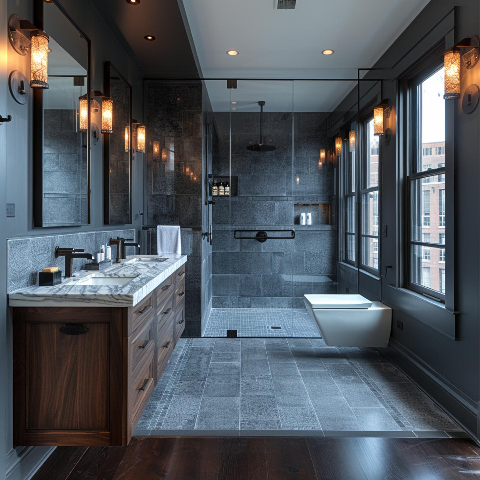
Slate-toned granite tiles climb floor to ceiling inside the walk-in shower, and the wall-mounted toilet keeps the sightline clear enough that the room reads larger than it is. Walnut cabinetry with matte black pulls anchors the vanity, topped with veined white marble. Pendant lanterns do the heavy lifting on warmth.
Olive Walls, LED-Lit Shelving, and a Mosaic Shower That Pulls Its Weight
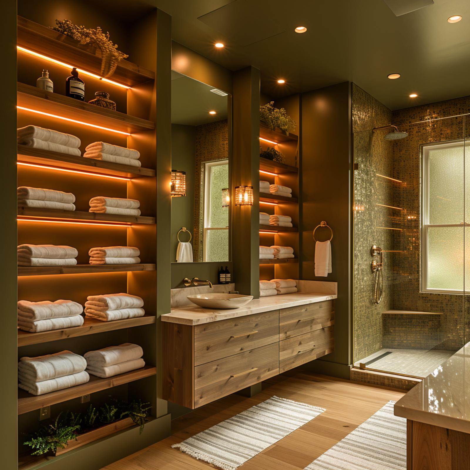
Warm amber LED strips line each shelf in the built-in tower flanking the vanity, and that single choice keeps the olive-painted walls from reading dark at all. The floating vanity is knotty cedar or pine, paired with a vessel sink on what looks like a honed marble slab. Gold mosaic tile covers the shower surround floor to ceiling. It’s a lot of texture, but the wood flooring and striped cotton rug pull the room back to something livable.
Warm amber LED strips line each shelf in the built-in tower flanking the vanity, and that single choice keeps the olive-painted walls from reading dark at all.
Burgundy Walls, a Brass Soaking Tub, and the Confidence to Commit
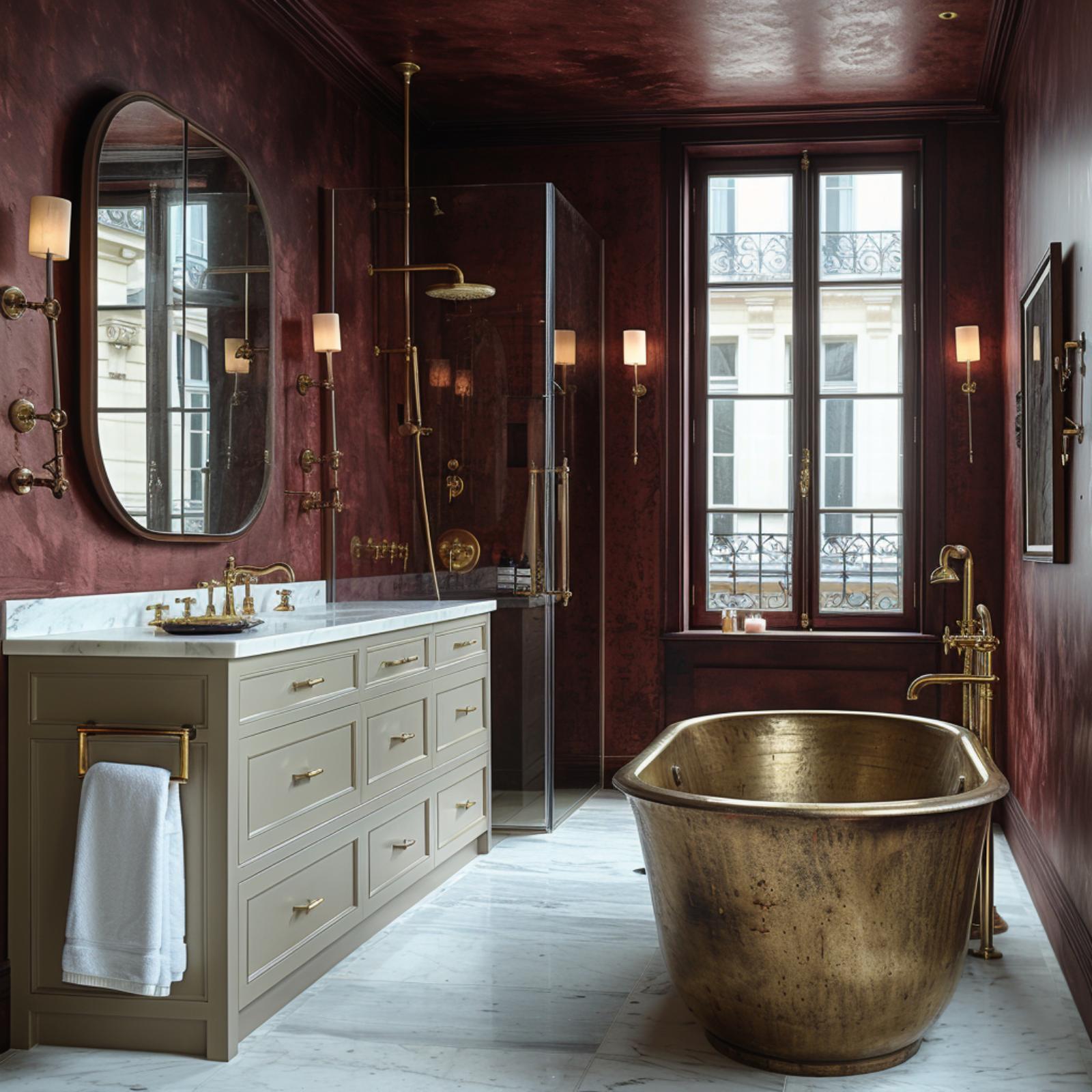
Oxblood plaster walls run floor to ceiling, including across the ceiling itself, which is either audacious or exactly right. The monochrome approach is what keeps the room from feeling heavy. Brass fixtures throughout, from the floor-mount tub filler to the wall sconces, read warm against that dark crimson rather than cold.
The freestanding tub is hammered brass, not painted or clad. It’s a material choice that earns attention without competing with anything else. A cream vanity with marble countertop and unlacquered brass pulls gives the eye somewhere quieter to land.
- Ceiling paint in the same color as the walls removes the visual “lid” that shrinks small rooms
- Warm-toned brass reflects the wall color rather than contrasting against it, reducing visual fragmentation
- A single neutral vanity anchors the space without interrupting the dark envelope
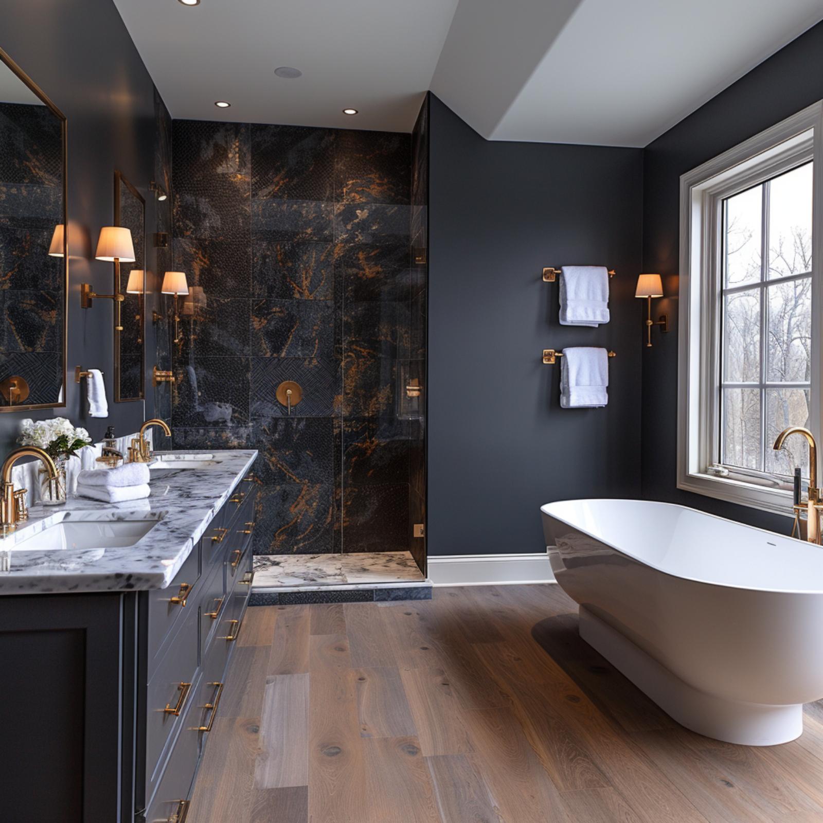
Midnight Marble, Brass Fixtures, and Dark Paint That Actually Opens the Room
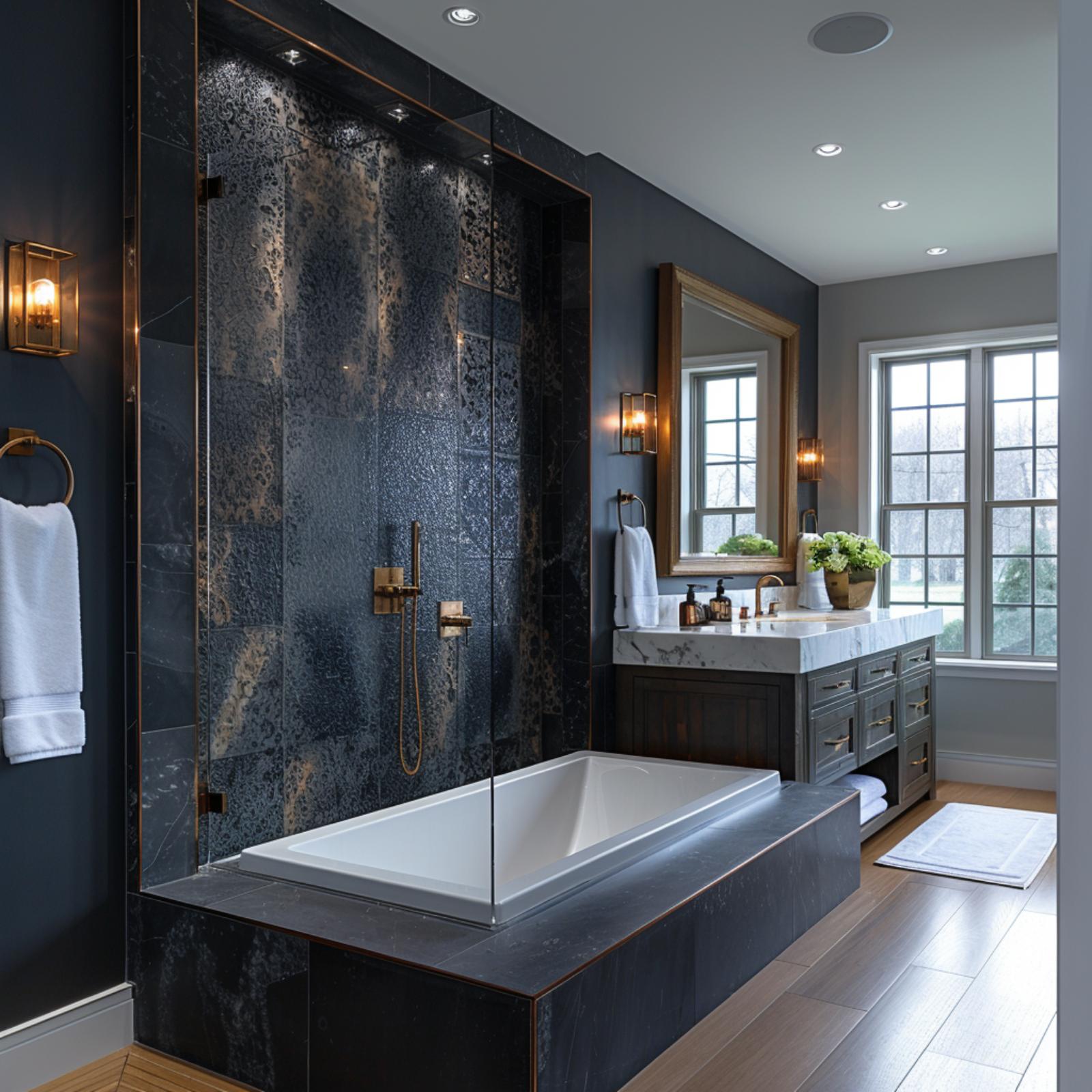
Charcoal blue walls recede just enough to let the patterned shower tile command attention, its oxidized bronze-and-black surface reading almost like hammered metal at this scale. The soaking tub sits on a raised slate surround, grounded rather than boxed-in. Brushed brass hardware ties the vanity, sconces, and shower controls together without feeling overdone.
Budget Tip: The dark patterned tile behind the shower is doing a lot of visual work, and a budget-friendly version exists in porcelain. Many manufacturers produce ceramic tiles that mimic oxidized metal finishes at a fraction of the cost of natural stone or custom glazed options.
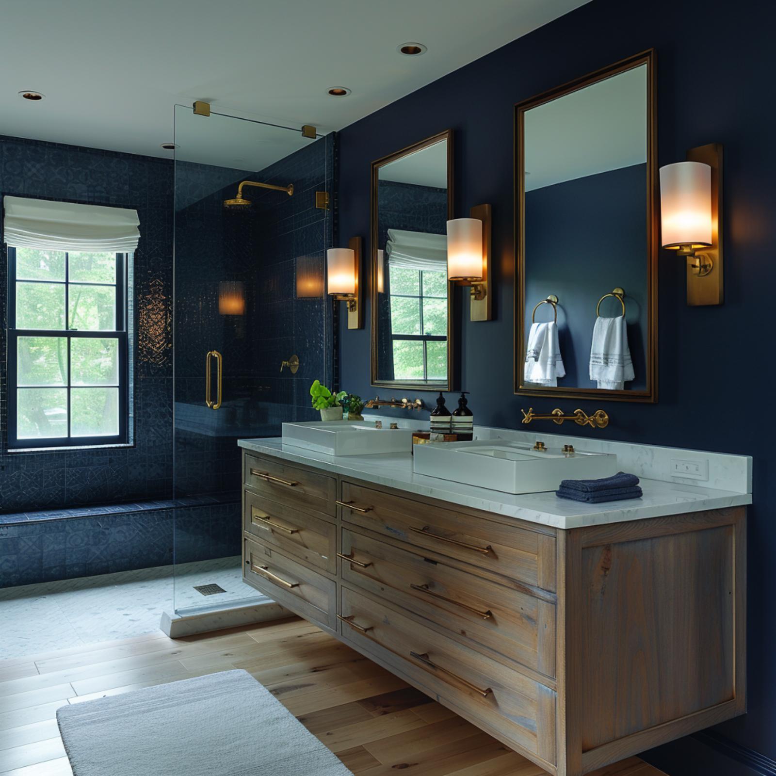
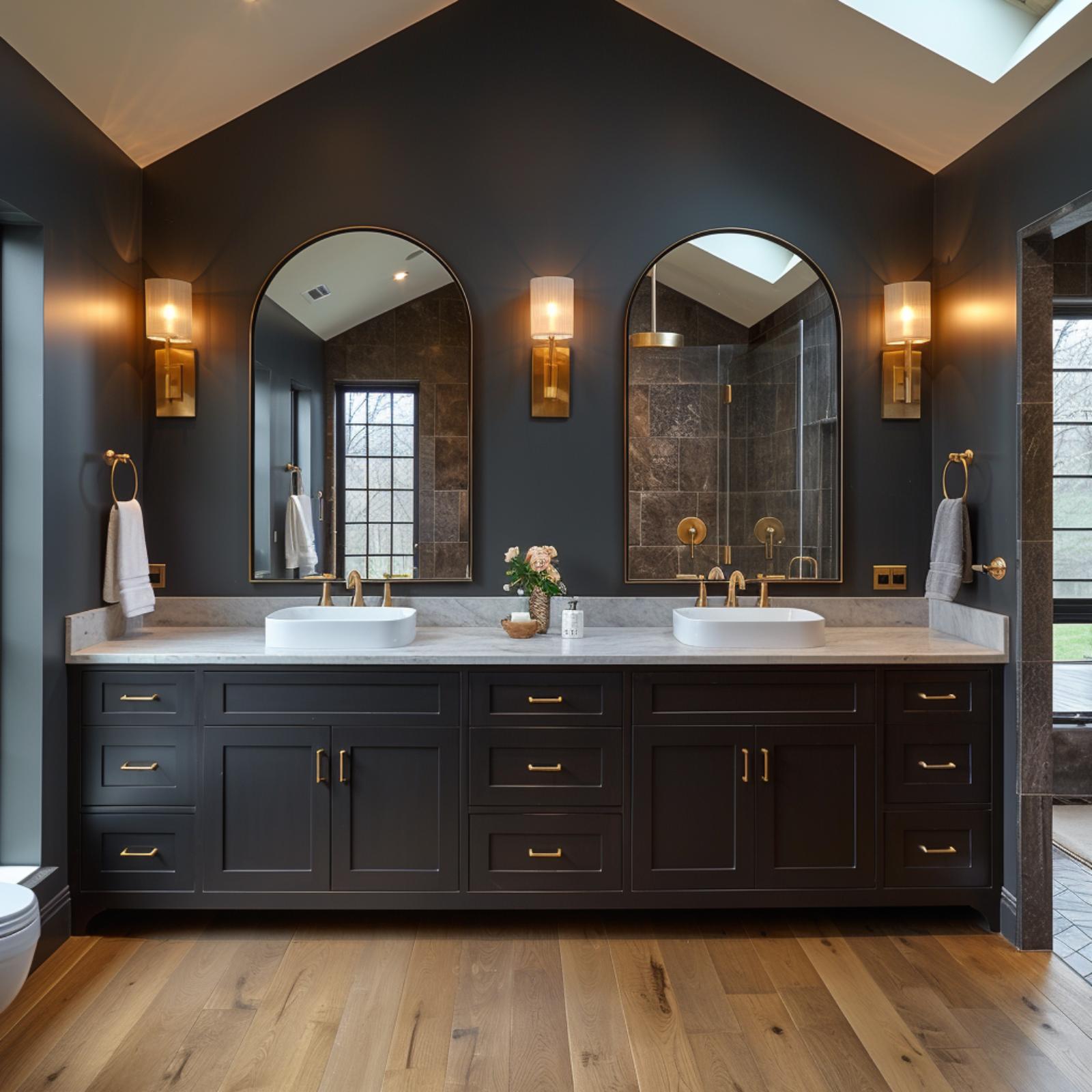
Navy Walls, Backlit Mirrors, and Brass That Knows Exactly What It’s Doing
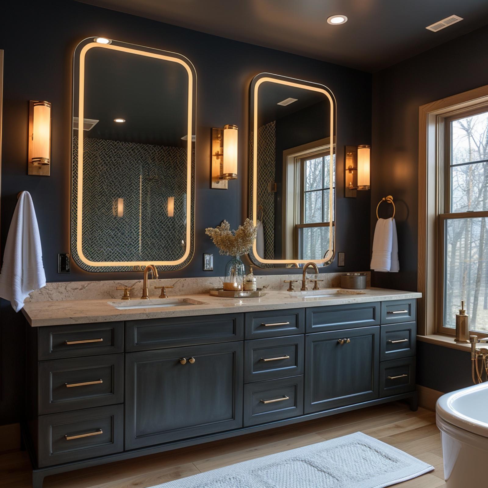
Navy paint this dark could easily make a bathroom feel like a storage closet. Here, it doesn’t. Two LED-backlit mirrors with rounded-rectangle frames do the heavy lifting, bouncing warm light across a marble countertop that reads almost luminous against the cabinet color below. The vanity itself is a slate-blue shaker style with brass pulls, and the mix of bar handles and round knobs across the same unit is an oddly appealing choice that most designers would have standardized away.
Between the sinks, a vase of dried florals sits on a tray, which is a small detail but one that keeps the counter from feeling like a showroom. Natural light from the window on the right adds a second light source that no fixture can fully replicate. The soaking tub peeking in at the edge confirms this is a larger master bath, but the design principles here scale down without losing much.
Worth Knowing: Backlit mirrors serve a practical purpose beyond ambiance because they reduce the harsh shadows that standard overhead lighting casts on faces. If you’re choosing between a backlit mirror and a sconce placement, consider that backlit options often eliminate the need for additional vanity lighting entirely, which can simplify both the wiring and the visual clutter on dark walls.
Jade Marble Walls, a Soaking Tub, and Gold Hardware That Doesn’t Overplay Its Hand
Polished jade-veined marble wraps every wall floor to ceiling, and somehow it doesn’t feel oppressive. The white freestanding tub sits low and wide against that backdrop, grounding the room rather than competing with it. Brass sconces with fabric shades keep the light soft, which matters here because high-contrast spaces like this can turn harsh fast.
The dark walnut vanity with its inset panel doors and brushed brass pulls earns its spot on the left wall. White marble countertop, vessel sink, a small plant. Nothing fussy. The floor tiles stay light, and that contrast between the pale floor and the deep walls is probably doing more spatial work than anything else in the room.
Why the Vanity Wood Tone Is the Right Call Here
Dark walnut against green marble reads as intentional in a way that painted cabinetry wouldn’t. A white or gray vanity would flatten the contrast and make the room feel like two separate design decisions that happened to share a space. The warmth in the walnut picks up the amber veining in the marble, which is subtle but consistent. It’s the kind of detail that you don’t consciously register but would definitely notice if it were missing.
Where the last design leaned on gold hardware for warmth, this one finds it through wood.
Teal Walls, a Floating Walnut Vanity, and Vessel Sinks That Don’t Overcomplicate Things
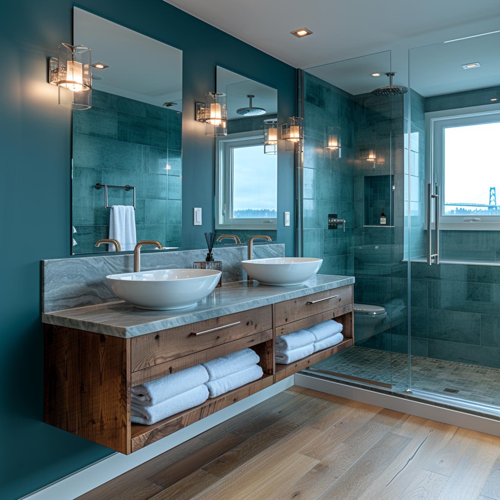
Teal does something unexpected here: it doesn’t close the room down. The large-format tile in the shower carries the same blue-green tone as the painted walls, which keeps the eye moving rather than stopping at a boundary. Vessel sinks on a marble countertop sit above a floating vanity in what reads as reclaimed or knotty wood, and the open shelving below storing folded white towels is both practical and visually grounding. Brass faucets pull warmth into a palette that could have felt cold without them.
Royal blue shifts the conversation entirely, proving dark paint doesn’t have to whisper.
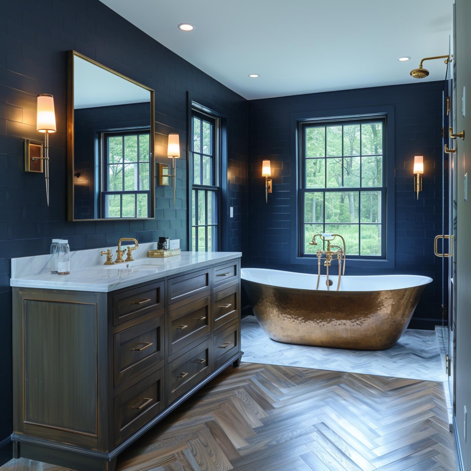
Royal Blue Walls, a Copper Soaking Tub, and Wood Floors That Anchor It All
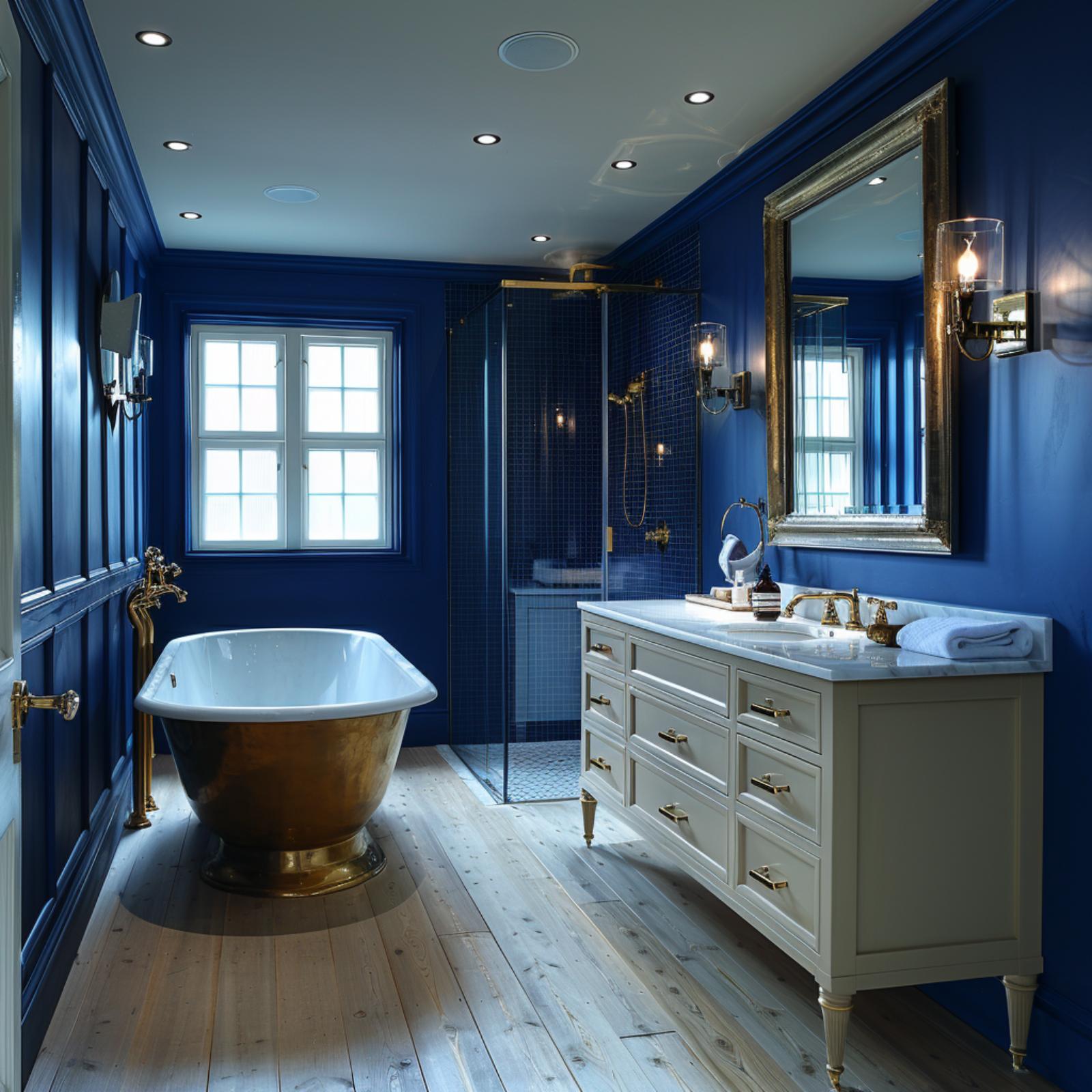
Cobalt blue lacquered walls cover every surface floor to ceiling, and somehow the room doesn’t collapse inward. Credit goes to the wide-plank pine floors, which pull enough warmth upward to keep the space from feeling like a cave. The freestanding tub is copper on the outside, white on the inside, and it’s the kind of contrast that earns attention without demanding it. Wall sconces flank an ornate gold-framed mirror above a cream vanity with marble countertop, and that pairing does a lot to soften what could’ve been an overwhelming amount of blue.
Slate Walls, Gold Hardware, and a Freestanding Tub That Earns the Window
Dark graphite walls meet black-and-copper marble tile inside the shower, and the contrast actually pulls the eye deeper into the room. The white soaking tub sits close to the window, which is doing the real spatial work here. Oak plank floors keep it grounded.
Try This: If you’re drawn to this look but worried about resale, pair dark walls with wood floors rather than dark tile floors. The warmth from the wood signals “luxury” rather than “cave,” which tends to read better to buyers who don’t share your design instincts.
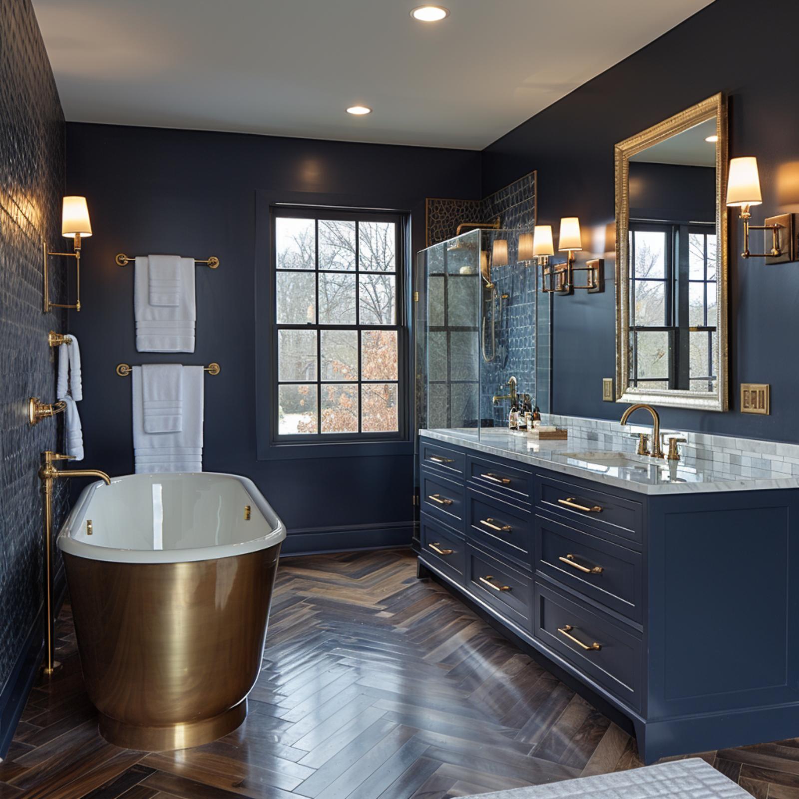
Gold Tub, Navy Walls, and Herringbone Wood That Holds the Room Together
🔥 Would you like to save this?
Brass does a lot of the work here. The freestanding soaking tub has a full brushed-gold exterior, which reads almost sculptural against the deep navy walls and the herringbone wood floor beneath it. That floor pattern is the quiet anchor of the whole room.
The double vanity repeats the navy in painted cabinetry with brass pulls, topped in what appears to be white marble. Wall sconces flank the mirror on both sides, keeping light even across the counter. The glass shower panel lets the blue mosaic tile behind it stay visible without closing off the space.
Designer’s Secret: Freestanding tubs with metallic exteriors, like the brass-finished model here, are typically achieved through powder coating or a plated acrylic shell rather than solid metal. If you love the look but not the price, some brands offer fiberglass versions with a copper or gold finish that are nearly indistinguishable at a glance. The savings can go directly toward the floor.
Barrel Vault Ceiling, Bronze Soaking Tub, and Blue Zellige That Goes Wall to Ceiling
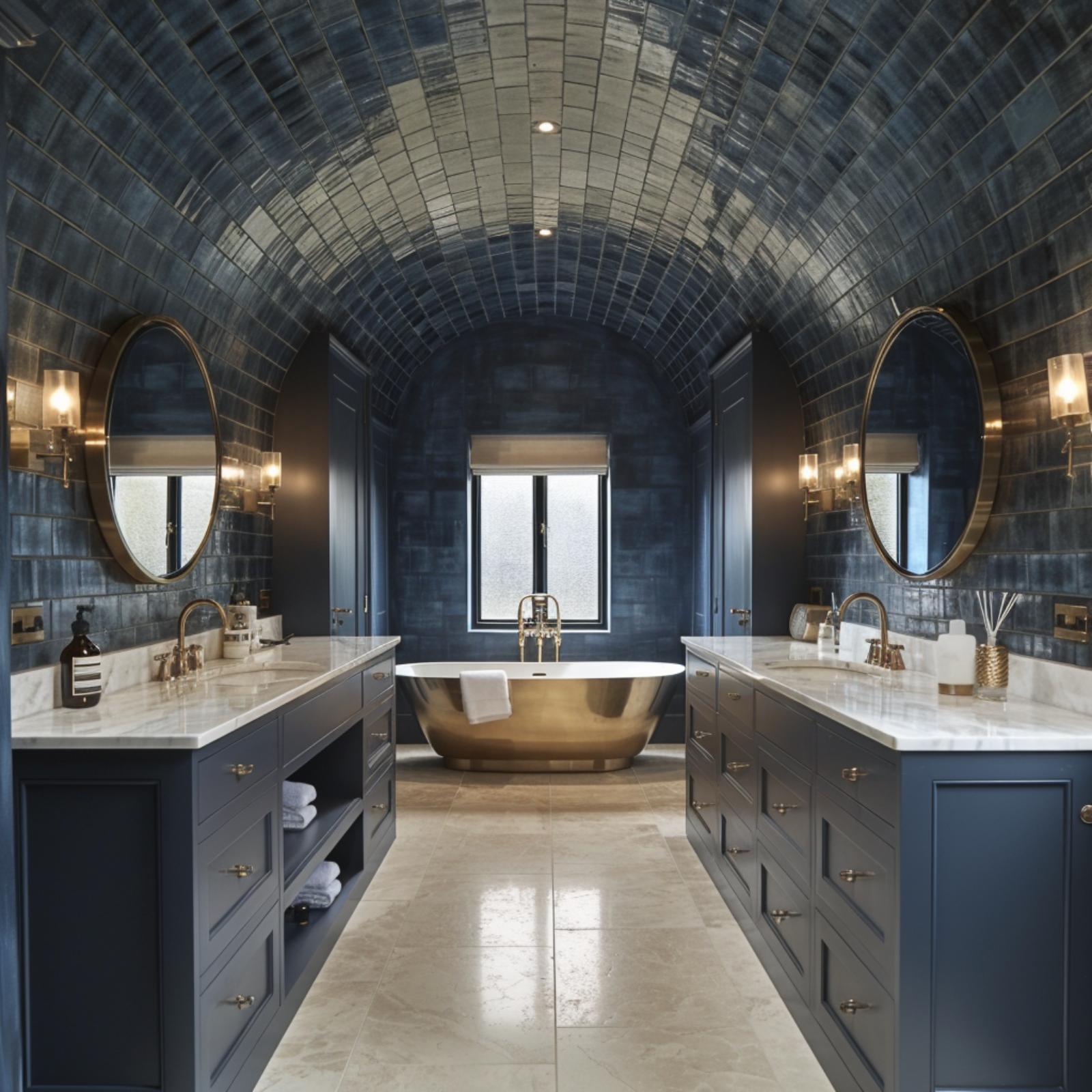
Few architectural moves earn their keep like a barrel vault tiled entirely in hand-glazed zellige, and here the blue-gray variation runs uninterrupted from floor to crown. The bronze freestanding tub pulls focus without fighting the room. Dual vanities in slate-blue cabinetry with marble countertops keep things grounded.
Did You Know: Zellige tile’s irregular surface isn’t a flaw, it’s how the material catches light differently throughout the day, which makes it particularly effective in rooms without abundant natural light. The handmade variation in each piece means no two installations ever look identical. That unpredictability is part of why designers keep returning to it for dramatic ceiling applications.
Hammered Bronze Tub, Navy Subway Tile, and a Herringbone Floor That Refuses to Be Ignored
Midnight blue subway tile climbs every wall here, and rather than closing the room in, it gives the space a cohesive skin that reads almost like a single material. The hammered bronze freestanding tub pulls focus, and the brass floor-mount filler beside it matches the sconces and mirror frame without feeling coordinated to death. Herringbone wood-look tile on the floor shifts the room’s weight downward in the best way.
By The Numbers: Herringbone floor patterns have seen a significant resurgence in bathroom design over the past several years, and wood-look porcelain versions have made the layout far more practical in wet environments than real hardwood ever could be. The format also works harder in smaller rooms because the angled lines draw the eye outward toward the walls rather than stopping it at your feet, which creates a subtle sense of expanded width without changing a single dimension.
Slate Vanity, Herringbone Parquet, and a Freestanding Tub Framed by Parisian Windows
Gunmetal cabinetry with brass pulls meets a marble countertop, and the contrast does most of the heavy lifting here.
History Corner: The dark paneled bathroom has roots in 19th-century Haussmann-era Parisian apartments, where deep lacquered millwork was a mark of bourgeois refinement. Those interiors typically featured tall wainscoting and ornate molding profiles, both of which reappear here in updated form. The style fell out of favor mid-century before resurging alongside broader interest in maximalist and moody residential design.
Blue Zellige, a Skylight, and Walnut That Stops the Room From Going Too Serious
Glossy blue zellige runs floor to ceiling on every wall, and the skylight positioned directly above the shower does something recessed lighting can’t: it pulls natural light into the wettest part of the room. The wall-mounted chrome faucets sit unusually high above the double sink, which keeps the marble vanity top clean and uncluttered.
The floating walnut cabinet underneath grounds the whole scheme. Without it, all that reflective blue tile would read cold. The dark slate floor tiles add a second layer of depth without competing with the walls.
Color Story: Blue zellige varies in shade from tile to tile because it’s fired in small batches, so two walls covered in the “same” color will never look identical under different light conditions. That variation is what gives this bathroom its depth rather than the paint or the fixtures. Pairing it with warm wood is one of the more reliable ways to prevent the look from tipping into monochromatic.
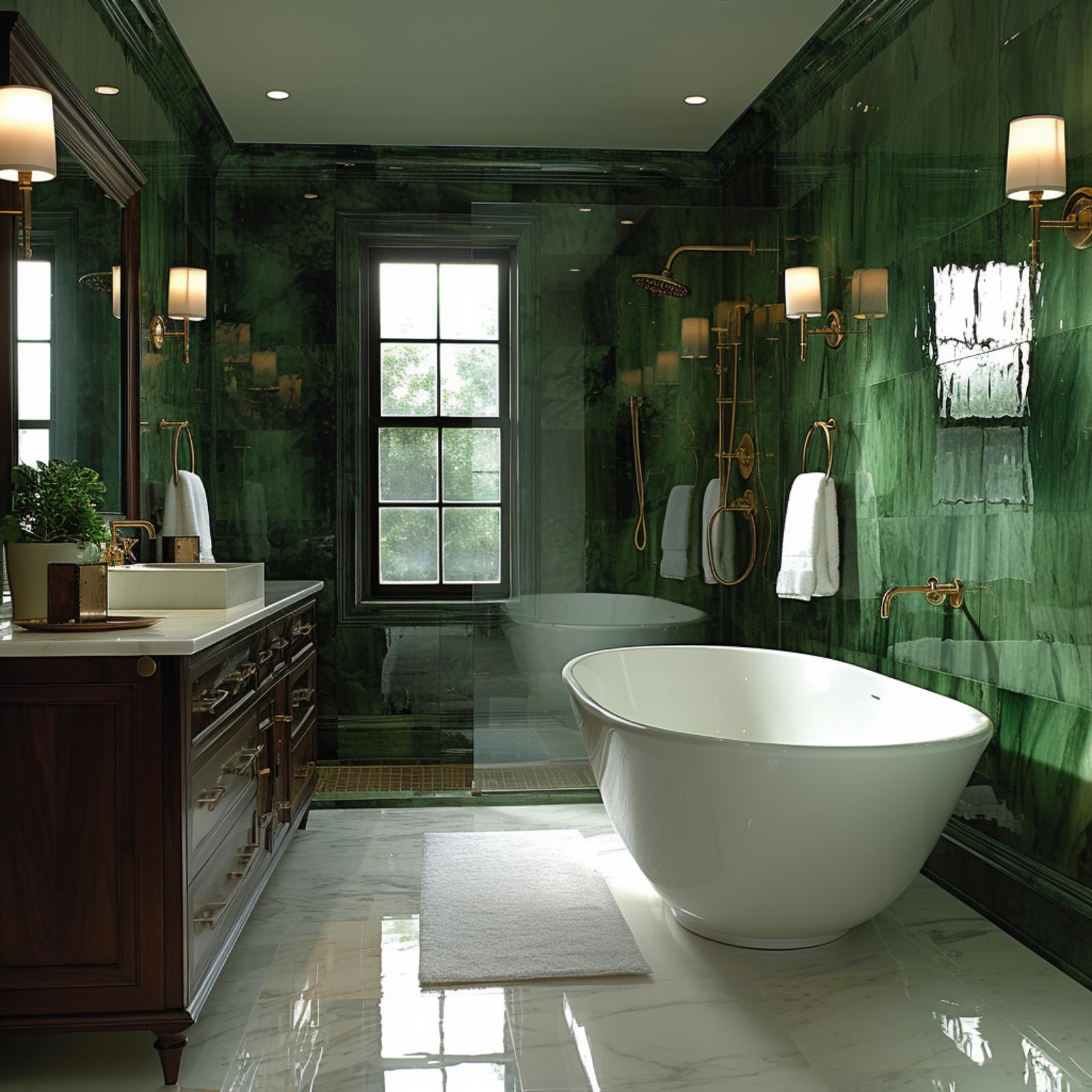
Emerald Marble Walls, a Freestanding Tub, and Gold That Knows When to Stop
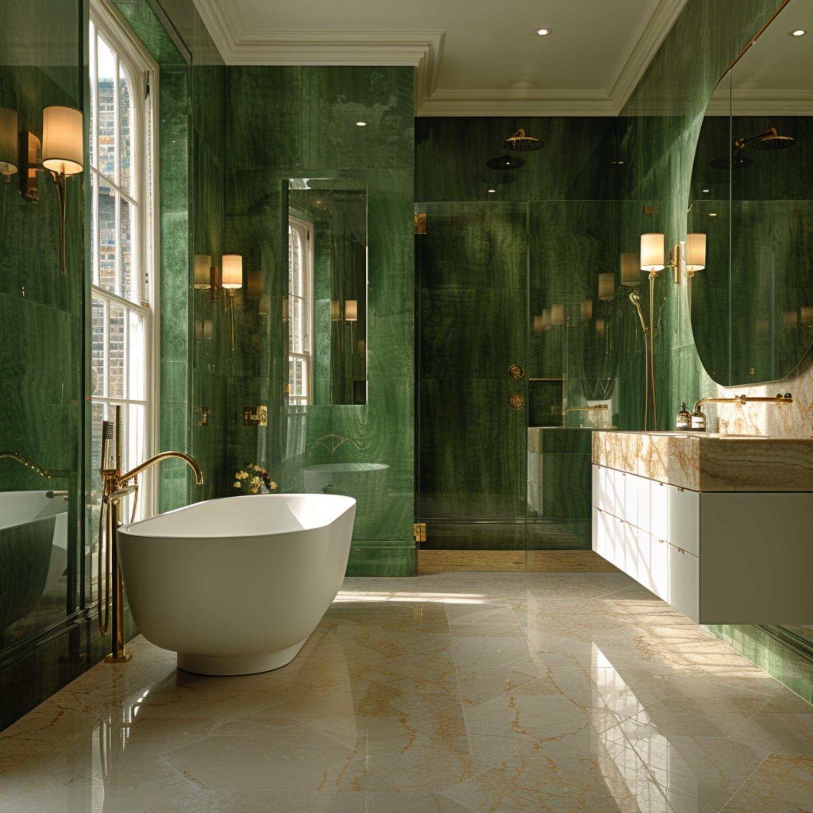
Green marble this saturated should feel oppressive, but it doesn’t.
The walls are floor-to-ceiling verde marble with a high polish that throws light around the room rather than absorbing it, which is exactly why the space reads as open despite being wrapped in a deep, moody color. A white freestanding tub sits on cream-veined marble floors, and that contrast does most of the heavy lifting. Gold fixtures at the tub and vanity are restrained, never clustered. The floating vanity keeps the floor visible, and visible floor is one of the simplest ways to add perceived square footage without touching a single wall.
Plum Zellige, a Chrome Soaking Tub, and Oak Vanity That Keeps Things Grounded
Plum-toned zellige covers every wall floor to ceiling, and the effect is less moody cave, more velvet-wrapped jewel box. Natural light from the sash window does real work here, keeping the space from collapsing into itself.
The freestanding tub has a chrome exterior paired with a white interior, which reads almost sculptural against the stone floor tiles. An oak vanity with a Carrara marble top provides the room’s only warm break from all that deep color.
Common Mistake: Pairing a dark wall treatment with a light natural stone floor, like the travertine visible here, is one of the more reliable ways to prevent a dark bathroom from feeling oppressive. The floor reflects light upward, which counteracts the absorption happening on the walls. Skipping that contrast and going dark on both surfaces is where rooms start to feel genuinely claustrophobic.
Navy Walls, a Wood Vanity, and Brass Fixtures That Pull Every Element Into Alignment
Navy takes up almost every vertical surface here, and yet the room doesn’t feel closed in. That’s largely because of the wood-plank flooring and the natural-finish vanity cabinet, which read warm against the cool, deep wall color. The white quartz countertop keeps things crisp without going cold.
Wall-mounted brass faucets sit noticeably high on the backsplash, which is a detail worth stealing if counter clutter is a problem. Two rectangular mirrors with brass frames hang at matched heights, flanked by cylindrical sconce shades that give off a warm, diffused glow rather than direct light. The patterned tile inside the shower reads almost black from this angle, which makes the glass enclosure feel like a room within a room.
Style Tip: Wall-mounted faucets require in-wall plumbing rough-in, so they’re best specified during new construction or a full renovation rather than added later. If you’re renovating with this look in mind, confirm with your plumber early because the valve body needs to be set before tile goes up. Getting that wrong is an expensive correction.
Olive Green Vanity, Marble Vessel Sinks, and Brass That Ties the Whole Room Together
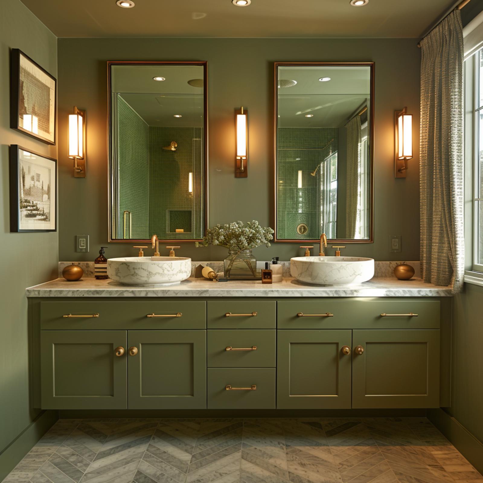
Sage-painted cabinetry at this scale could easily read as heavy, but the marble countertop and white vessel sinks pull enough light back into the space to keep things balanced. Brass bar pulls and round knob hardware run consistently across every drawer and door, and that kind of repetition matters more than people expect. It’s what keeps a busy vanity from feeling cluttered.
The herringbone floor deserves attention too. Mixing gray and warm-toned tiles in that pattern creates movement underfoot without competing with the wall color above. Sconces flanking each mirror are doing the real lighting work here. Centered overhead recessed lights alone would flatten every face that stands in front of those mirrors.
Crimson Lacquer, a Marble Console, and Gold That Refuses to Apologize
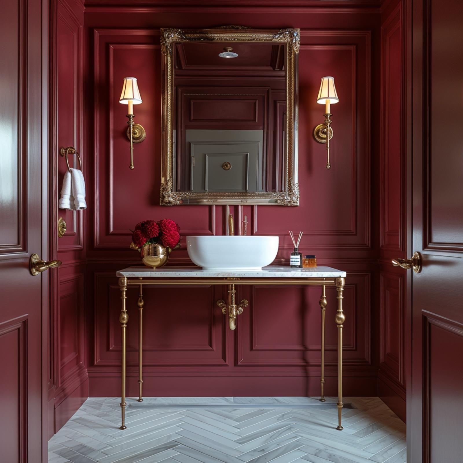
Painted in a deep crimson that reads almost burgundy, every surface here including the doors, paneling, and ceiling gets the same treatment, which is exactly why it works. Monochromatic rooms don’t fragment the eye. Instead, they let architectural detail read clearly, and the layered raised paneling on these walls is worth the attention it gets.
The console vanity has brass legs and a white marble top, and that combination against the red is genuinely arresting. Vessel sink, ornate gold mirror frame, brass sconces with fabric shades — none of it fights for dominance because the wall color already claimed the room. One small note: the herringbone marble floor in pale grey is doing the heaviest lifting here, quietly preventing the space from feeling enclosed.
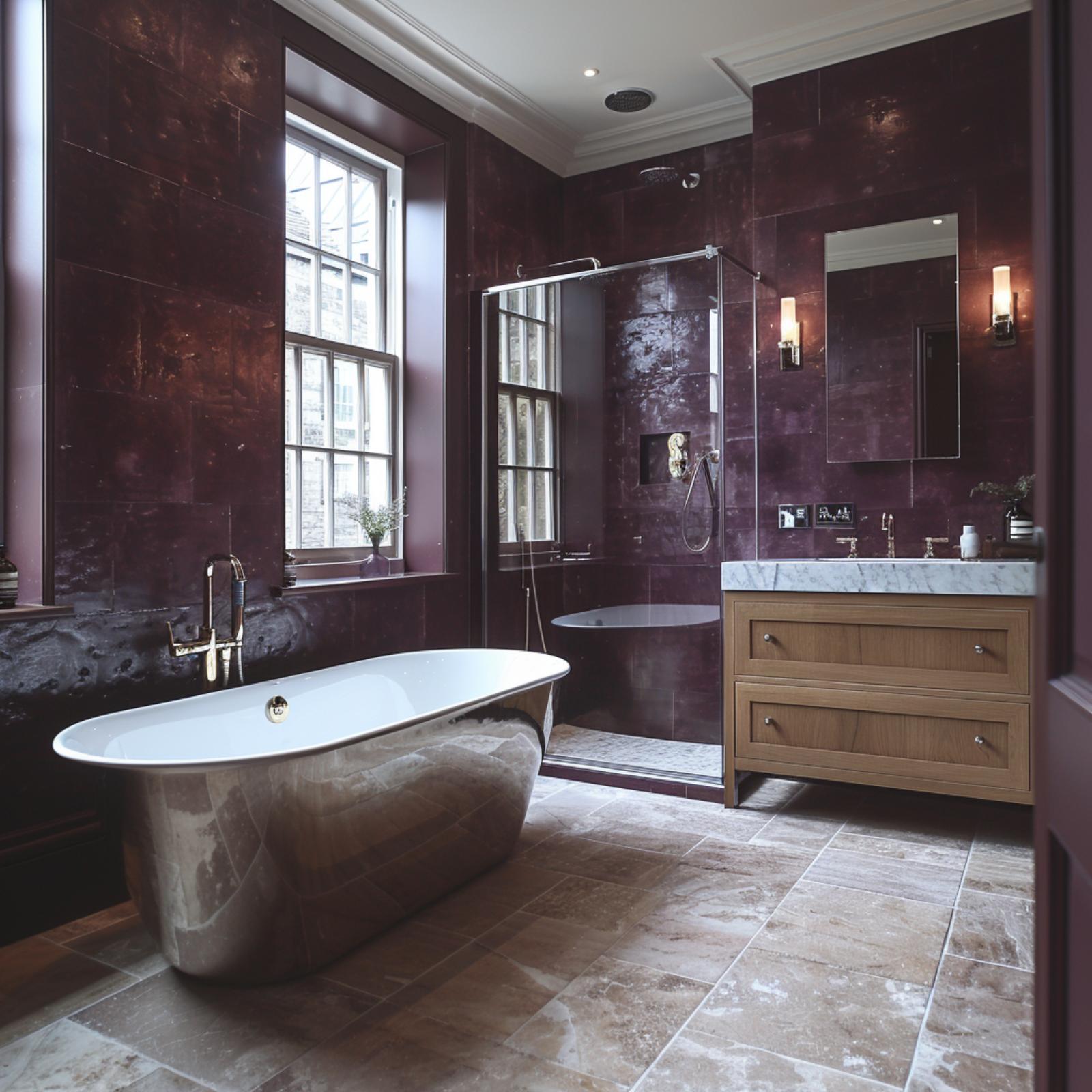
Burgundy Wall Panels, a Patinated Copper Tub, and Cream Cabinetry That Earns Its Place
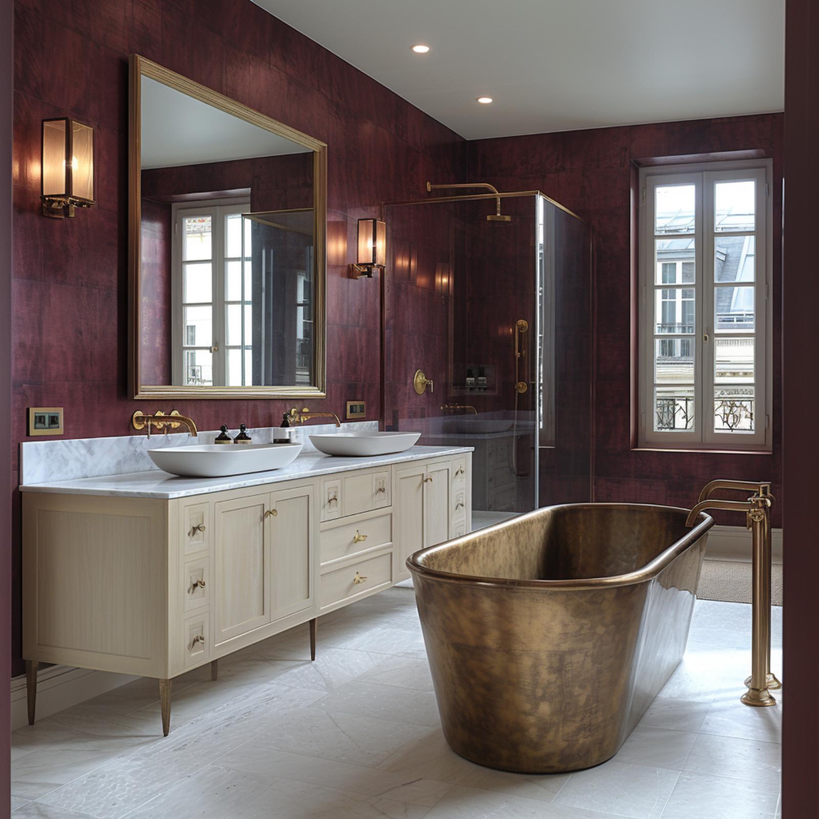
Dark oxblood wall paneling covers every surface here, yet the marble countertop and cream vanity keep it from closing in. That copper soaking tub does the heavy lifting on drama, so nothing else needs to.
Charcoal Walls, Vessel Sinks, and a Walk-In Shower Tiled Floor to Ceiling
Warm charcoal walls push the glass-enclosed shower into sharper focus, and the dark subway tile inside it runs all the way to the ceiling without interruption. That vertical continuity is doing real work here: it makes the shower feel taller than it probably is. The floating vanity in espresso wood keeps the floor visible, which reads as square footage even when it isn’t.
Two vessel sinks sit on a marble-look countertop, and the wall-mount faucets between them avoid cluttering the surface. Pendant sconces flank each mirror rather than centering above them, which distributes light more evenly across both sides of the face. Small detail, big payoff.
Concrete Walls, Marble Vanity Top, and Globe Sconces That Justify Every Design Choice
🔥 Would you like to save this?
Charcoal concrete-look wall panels set a tone that the white floating vanity and Carrara marble countertop immediately push back against. Black matte wall-mount faucets keep the hardware consistent. Globe sconces on black stems do the real lighting work here, since ceiling-only light in a room this dark would flatten everything.
Slate Walls, Arched Brass Mirrors, and Oak Floors That Refuse to Let It Feel Heavy
Vaulted ceilings change the math on dark paint. What would read as oppressive at eight feet becomes something else entirely when the walls angle upward toward a skylight, and that’s exactly what’s happening here. The slate-blue walls draw the eye up rather than in, and the natural oak floors keep the whole thing from tipping into cave territory.
Two arched mirrors with brass frames sit above vessel sinks on a marble countertop, and the proportions matter more than they might seem. Arched mirrors add vertical movement without requiring any structural work, which makes them one of the more practical ways to counter low-ceiling anxiety in a dark bathroom. The gold sconces flanking each mirror are doing double duty: task lighting and visual anchoring. Cabinet hardware in brushed brass pulls the metalwork together across the full length of the vanity without making it feel overdone.
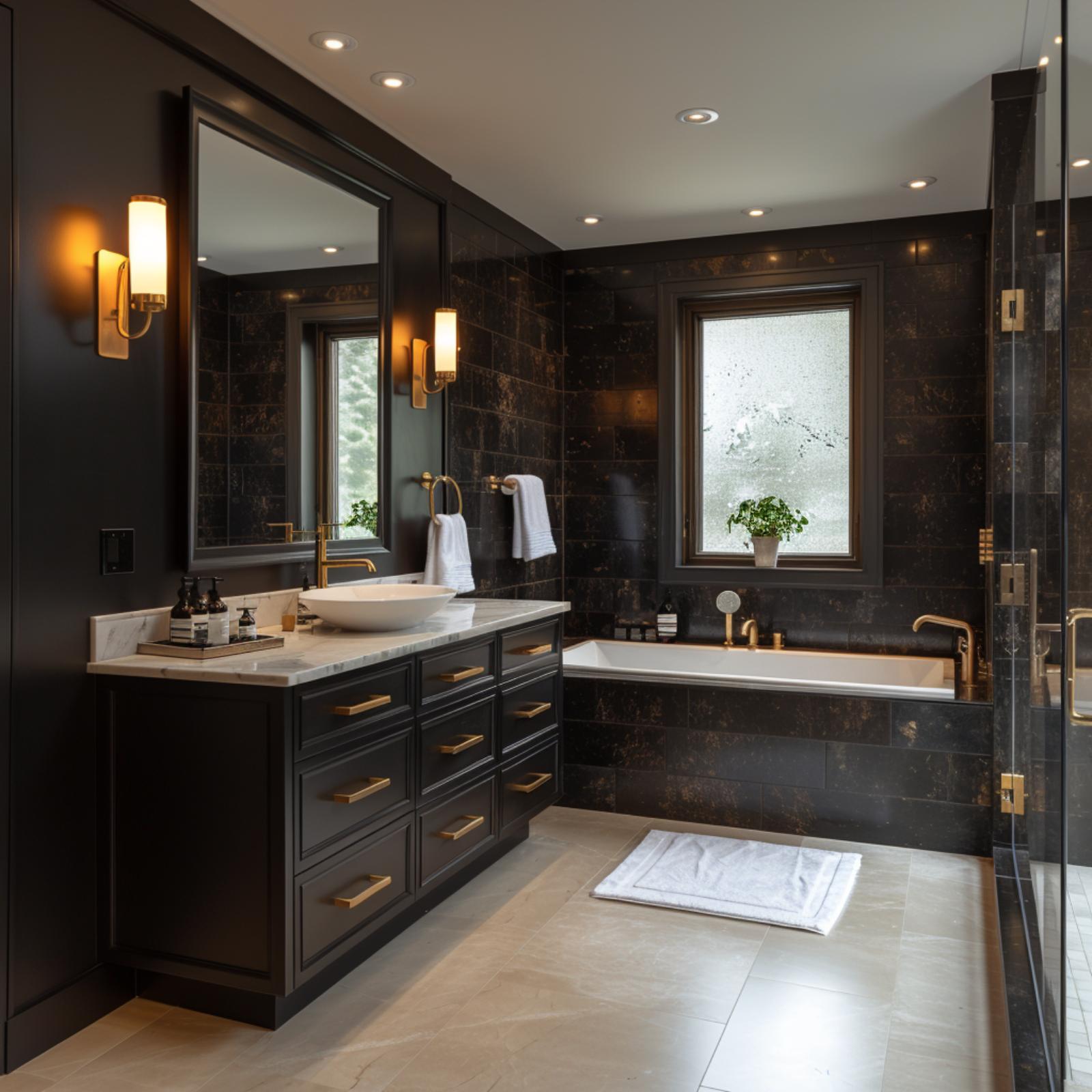
Dark Marble Walls, Brass Hardware, and a Vanity That Means Business
Black marble tile covers every wall surface from floor to ceiling, and it doesn’t apologize for that ambition. Brass pulls on the charcoal vanity cabinetry tie directly to the sconce hardware and the soaking tub faucet, so the metal reads as intentional rather than accumulated. The vessel sink sits on a marble slab countertop that’s lighter than the wall tile, and that contrast is doing real work here.
Recessed ceiling lights keep the overhead plane clean, while the wall sconces handle the warmer, closer light that a bathroom actually needs. It’s worth paying attention to how the frosted window above the tub gets preserved rather than covered, because natural light against dark tile is what keeps this from feeling like a cave. A white bath mat on the stone floor is a small detail, but rooms this dark need that kind of reset somewhere near the ground.