🔥 Would you like to save this?
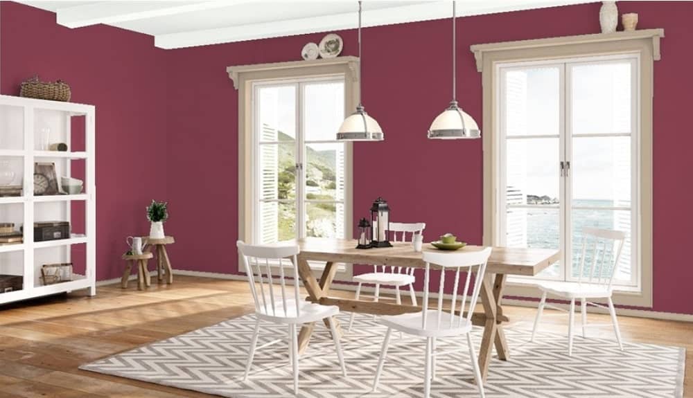
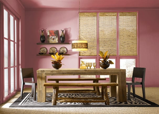
Many dining rooms play it safe and stick with neutral colors. Let’s face it – that can get pretty boring. Unless you’re planning on selling your home soon, experimenting with some bold colors that show your personality is a great idea. Red paint colors provide many opportunities to set a certain mood in your dining room.
In order to come up with the very specific design ideas, we create most designs with the assistance of state-of-the-art AI interior design software. Also, assume links that take you off the site are affiliate links such as links to Amazon. this means we may earn a commission if you buy something.
It can be a very bold and in-your-face experience, an adventure into retro styling, or a stately affair. When I walk into a dining room that features red as one of its prominent colors, it transports me to a sophisticated and high-energy space where I can enjoy many amazing conversations over the dinner table. Here are the best red paint color options for dining rooms from Benjamin Moore, Behr, and Sherwin-Williams.
1. Red (2000-10)

Source: Benjamin Moore
The name of this paint might not be all that exciting, but the color itself is the epitome of the shade that comes to mind when someone says red. It’s brilliant and bold, and adds a rich color to the dining room. It’s an excellent balance of making an impression without seeming too over-the-top and would work equally well for full dining room painting coverage, accenting, or as a feature wall or ceiling. Pair this vibrant color with black and white for a luxury finish.
2. Rapture (CC-66)

Source: Benjamin Moore
You enjoy things in moderation, whether they are your favorite food or your paint colors. Rapture is a red shade that can best be described as “medium red. ” It’s a more muted color that nevertheless has a distinct and impactful hue without dominating the entire room. This wall color can work well if you feel overwhelmed with a bold red for a full-room paint.
3. Mediterranean Spice (1337)

Source: Benjamin Moore
Taking a vacation to the Mediterranean is as much a delight for the eyes as anything else. This paint color is a deep and enchanting hue that sits perfectly between red and pink. It’s got broad appeal with a vibrant saturation and could easily be carried into other areas of your home as well.
4. Hot Tamale (CSP-1155)

Source: Benjamin Moore
What’s better for a dining room than a paint color named after literal food? In addition to being thematically appropriate for this part of the house, it’s also a well-balanced red that is vibrant without being overwhelming. If you want to go for a red in a smaller space, this is an appealing choice for a wall color. The brightness helps your room look larger than it is, so it’s perfect for cramped dining rooms or those small dining nooks in townhomes.
5. Rosy Blush (2086-30)

Source: Benjamin Moore
Are you the kind of person that drinks La Croix as your sparkling water of choice? Much like La Croix has a fruit flavor that is a barely-there suggestion of what’s on the label, Rosy Blush has the slightest touch of red for a subtle effect for your dining room. If the rest of your house has a light and airy interior design style, this color choice is the best red for the job.
6. Paper Lantern (CSP-1150)

Source: Benjamin Moore
This red shade is veering more towards the orange side of the spectrum, with a burnt orange appearance that makes a statement without screaming it at the top of its lungs. If you’re not sure whether you would enjoy adding red to your dining room, this is a relatively safe warm color to start off with.
7. Santa’s Suit (1336)

Source: Benjamin Moore
Look outside. Is it months past Christmas, and your decorations are still out in the yard? Do you start planning your end-of-year holidays in July? Does someone have to drag you kicking and screaming away from the Christmas tree before it can come down for the year? Yeah, this color is for you.
This is a muted and classic red that looks like Santa’s Suit if it’s been covered with a slight dusting of snow. It might not come with presents, but it does help to promote the same holiday cheer energy in your dining room every day of the year. Plus, it makes the perfect backdrop for your Christmas card photos.
8. Cranberry Cocktail (2083-20)
Source: Benjamin Moore
You might not be able to drink this type of cranberry cocktail, but it does brighten up a room with a red shade that’s leaning toward the purple end of the spectrum. If you love the concept of a red dining room but find that the ones closer to the primary shade are too much for your liking, this paint color gives you a statement effect without being too much space. The berry influences are apparent, and it would work particularly well in a dining room that gets a lot of natural light.
9. Royal Flush (2076-20)

Source: Benjamin Moore
Fuchsia is fun to introduce into a more casual dining room, especially if you have a lot of laid-back get-togethers or host big family gatherings. Royal Flush is just starting to dive into the purple end of the spectrum, so it still has plenty of red to delight the senses and add energy to the room.
10. Million Dollar Red (2003-10)

Source: Benjamin Moore
This paint might be called Million Dollar Red, but thankfully that’s not how much it actually costs unless you’re trying to paint an entire city’s worth of dining rooms in it, at least. It’s a rich and luxurious red that would not look out of place in a formal dining room that is filled with rich mahogany furniture, fine china, and exceptional decor. Get the high-end look without selling your soul for overpriced real estate.
11. No More Drama (P140-7)

Source: Behr
Everyone could do with less drama in their lives in the age of social media. If you’re in love with the idea of a red dining room but you don’t want to add too much drama, you’re getting the perfect mix with this paint color. It’s a great introduction to red for your walls, and it’s a classic style that you won’t feel like painting over in a decade or so.
12. Timeless Ruby (HDC-CL-01)

Source: Behr
Everyone likes to talk about diamonds as the be-all, end-all gemstone, but have they ever looked at a ruby? It’s got a lot more going for it than some colorless piece of carbon, with a deep and enchanting hue that commands attention no matter how you use it. This darker red also contrasts nicely with other rich and vibrant hues, making it a great option for either the hero of the dining room or the sidekick.
13. Red Pepper (PPU2-02)

🔥 Would you like to save this?
Source: Behr
Here’s another thematically appropriate red for those of you who love that sort of thing. Don’t be fooled by the name, however. This color is what red pepper flakes look like when mixed with black peppercorns. You get a warm, orange-leaning red that is an unexpectedly great color for the dining room. If you need to liven up a smaller space or one that feels too cold compared to the rest of the home, this is the paint color for your dining area.
14. Whip Lash (P150-6)

Source: Behr
Some lipstick colors are enough to give everyone around you whiplash as they do a double-take to see who that bold person is walking by. This color has much the same effect, with a bold and bright red that’s slightly more muted than your typical primary color, red. By taking that one step back from a pure red shade, it manages to retain the big impact without searing your eyes.
15. Lingonberry Punch (M150-6)
Source: Behr
The name says lingonberry punch, but it’s also a good representative of a salmon color. This pink-leaning red is a soft and laid-back shade that grows on you the longer that you’re around it.
16. Stiletto Love (P160-7)

Source: Behr
There’s red, and then there’s Stiletto Love red. This is an intimate and sensual color that turns a drab dining room into the most romantic and intoxicating space you’ve ever experienced. If you have a bookshelf full of romance books, stock in a rose florist, and a closet of candles, you can have your perfect candlelit dinner every night.
17. Intrigue (P160-6)

Source: Behr
What color dining room does a retired spy have after a long life of daring adventures? Intrigue, of course! This bright red will lead your dinner guests to wonder what kind of secrets you’re hiding. Are you living a double life? Are you a jet setter spending all your time exploring uninhabited parts of the world? Maybe you’re the rarest person of all – someone that bought their own Netflix account instead of sharing one with family, friends, and a handful of exes.
18. Sugar Beet (M130-7)

Source: Behr
Sugar, spice, and everything nice is in this paint color. Take red, and add a few generous shakes of purple, and you end up with Sugar Beet! It is very close to matching an actual beet’s color, so if you’re a fan of that rich and complex hue, you’re going to love this one as part of your color scheme.
19. Fire Cracker (PPU2-16)

Source: Behr
Tone red down a notch and then add some orange, and you end up with a delightfully complex red that is leaning towards burnt orange but is not quite there. It’s a toned-down addition to your dining room that will do great at being a full-room paint color. It’s not quite strong enough to be a good candidate for a dining room feature wall, however.
20. Positive Red (SW 6871)

Source: Sherwin-Williams
This versatile red shade is bright, cheery, and packs plenty of the promised positivity. This vibrant color is a fantastic hue to choose if your dining room set leans more modern, with crisp, white lines.
21. Real Red (SW 6868)

Source: Sherwin-Williams
Sherwin-Williams wants to make sure that no one has any confusion that this is the most real red they offer. While it’s relatively close in shade to Positive Red, it has a bit more vibrancy that takes the rich color to another level of boldness. You’ll want a strong contrasting or neutral color to balance it out so it doesn’t dominate the entire room, or opt for restricting it to a feature red wall.
22. Heartthrob (SW 6866)

Source: Sherwin-Williams
Think about how your high school crush made you feel back in the day. That color looks at how romance feels. Heartthrob is another red shade that is perfectly suited for a dining room that sees its fair share of romantic dinners, with plenty of passion in the air.
23. Radish (SW 6861)

Source: Sherwin-Williams
Radish continues to deliver on the food-related reds that Sherwin-Williams has in droves, and I’m certainly not complaining about it as a color choice. This deeper red has a strong pink influence, which creates a well-balanced color that works as a splash or contrast element for an accent wall or ceiling.
You can have a lot of fun with this whimsical color for red accents without it becoming too much. You may want to avoid it for a smaller dining room, however, as it might make those rooms seem smaller than they actually are.
24. Cherries Jubilee (SW 6862)

Source: Sherwin-Williams
Much like a burst of delicious cherry milkshake, Cherries Jubilee is a bright and refreshing choice for red walls in your dining room. It has a fair share of pink in it, lightening the color and making it more relaxed compared to deeper shades of red for room color.
25. Show Stopper (SW 7588)

🔥 Would you like to save this?
Source: Sherwin-Williams
Your dinner parties are known throughout your friend and family circles as must-attend events, you have a reputation for being an excellent host, and you have tastes that you refuse to compromise on. Show Stopper is the right red for your dining room, my friend.
It’s bright, bold, and filled with personality, much like yourself. You get the perfect backdrop for your primary meal plans and perfectly concocted cocktails, and it keeps the energy flowing to give everyone a second wind late into the night.