🔥 Would you like to save this?
Push open that swinging door and you’re hit with it immediately: the faint hum of a Frigidaire, the smell of percolating coffee, the squeak of vinyl chair legs on speckled linoleum. The 1950s American kitchen wasn’t just a room where food got made. It was the physical proof that the future had arrived, and it came in mint green. Every detail was deliberate, optimistic, and just slightly wild by today’s standards. Here are 35 of them.
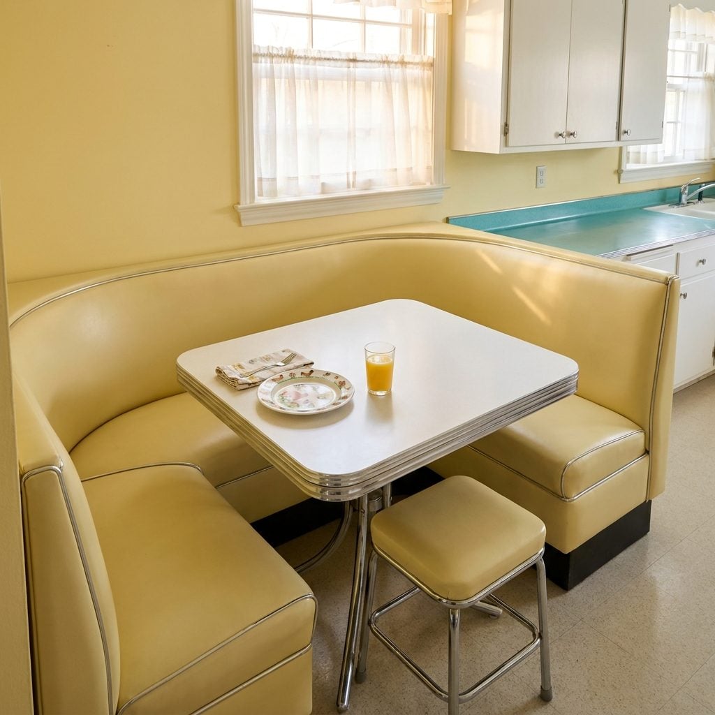
The Chrome-Trimmed Dinette Set With Vinyl Chairs That Stuck to Your Legs in Summer
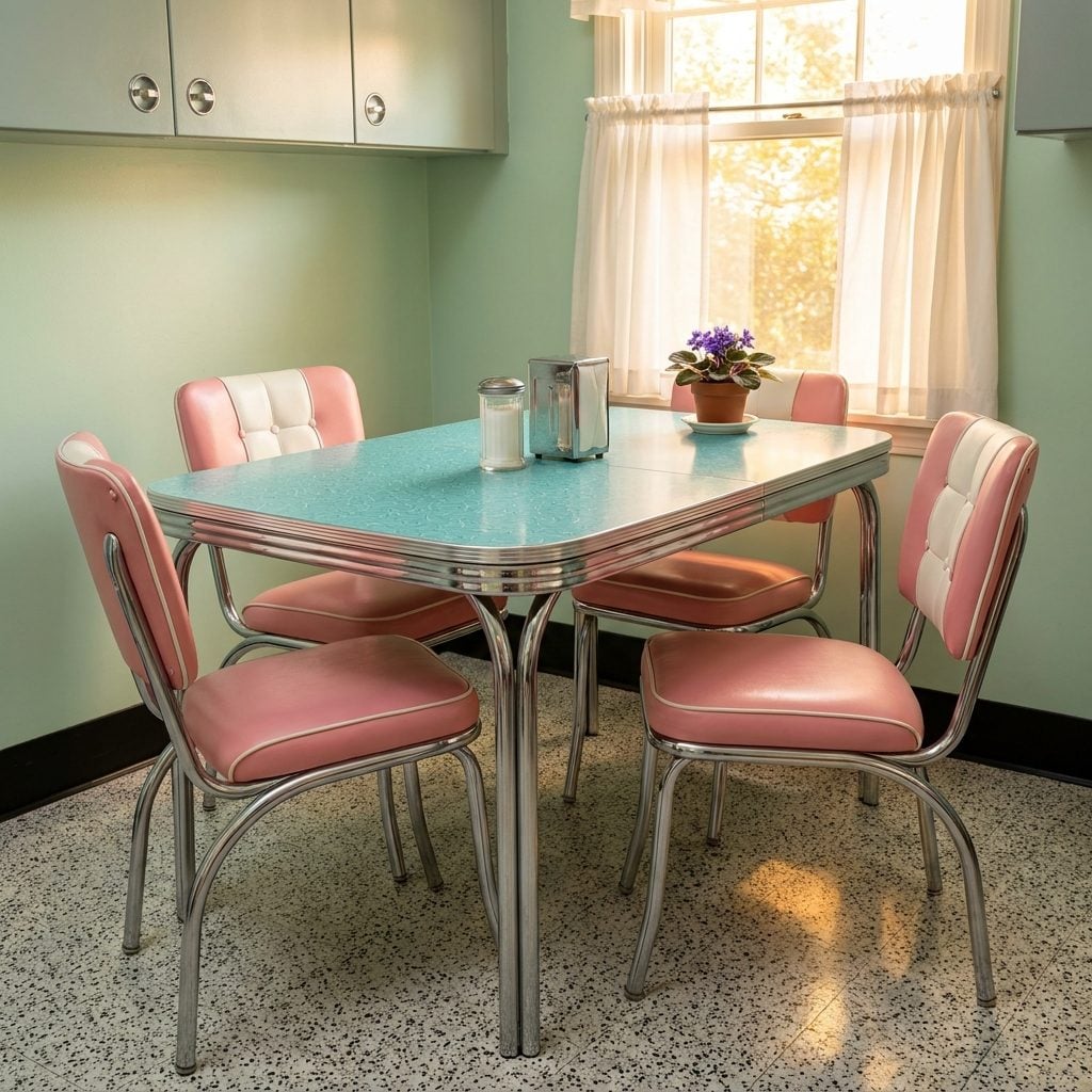
You knew exactly where this set came from: Sears, Montgomery Ward, or the local furniture store that smelled like carpet glue and ambition. The table had a Formica top, speckled gray or boomerang-print, and chrome legs that your mother wiped down with a damp cloth every single Sunday. The chairs were vinyl, usually in a shade that matched the kitchen walls, and they made a sound when you stood up in shorts that no child ever wanted to explain.
In order to come up with the very specific design ideas, we create most designs with the assistance of state-of-the-art AI interior design software. Also, assume links that take you off the site are affiliate links such as links to Amazon. this means we may earn a commission if you buy something.
This was the command center of daily family life. Homework happened here. Arguments happened here. The same four chairs, slightly wobbly by 1962, hosted every birthday breakfast and every “we need to talk” conversation your parents ever had.
The chrome dinette set was the American kitchen table at its most democratic, mass-produced, cheerful, and built for a life that was mostly ordinary and occasionally everything.
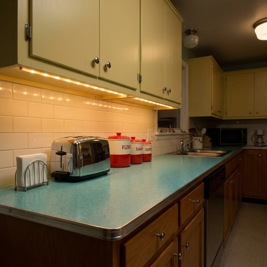
Formica Countertops With Boomerang and Atomic Patterns That Were Aggressively Modern
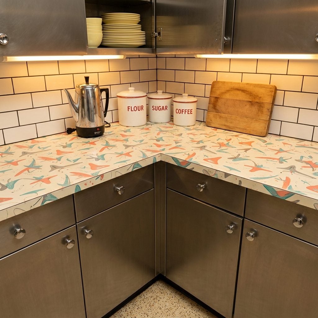
Those weren’t random squiggles. They were boomerangs, and they were absolutely intentional. The boomerang-and-starburst patterns that covered every 1950s Formica countertop were a direct visual translation of the atomic age, scientists were splitting atoms, NASA was preparing to launch things into space, and kitchen counter designers responded by covering your food prep surface in abstract physics.
The most iconic colorway was “Skylark” by Formica: a cream background with coral, grey, and teal boomerangs scattered across it like confetti after a very scientific celebration. This material was revolutionary in actual practical terms, heat-resistant, wipe-clean, virtually indestructible by the standards of the day. It just also happened to look like the future, which was the whole point.
Steel Kitchen Cabinets by Youngstown and St. Charles That Never Warped, Ever
Wood cabinets felt old. Steel cabinets felt like the future. Youngstown Kitchens and St. Charles Manufacturing built entire modular kitchen systems from enameled steel, smooth, cold to the touch, impervious to grease and steam in a way that painted wood simply wasn’t. They came in colors: white, grey, yellow, sometimes two-toned with a contrasting interior. Open a door and the hinges made a satisfying, precise click that no flat-pack cabinet has ever replicated.
These were sold as complete systems, a genuinely radical idea at the time. You didn’t just buy cabinets, you bought a kitchen, designed by engineers, delivered in crates, and installed over a weekend by someone’s uncle. The dream of the built-in, considered kitchen started here, decades before the modern kitchen renovation became an entire television genre.
Checkerboard and Speckled Linoleum Flooring That Was Basically Indestructible
Every spill, every dragged chair leg, every dropped cast iron pot, the linoleum took it. Black and white checkerboard was the showiest version, found in the kitchens of families who considered themselves design-forward. Speckled variants came in grey-and-white, turquoise-and-cream, or that particular brownish-green combination that looked great in 1954 and baffling by 1971. Either way, it was a single continuous sheet that ran wall to wall with no seams, no grout lines to scrub, no complicated maintenance.
The smell of freshly waxed linoleum on a Saturday morning is a specific sense memory that hits people who grew up in 1950s households immediately and without warning. Someone always buffed it by hand. It always looked better than it had any right to.
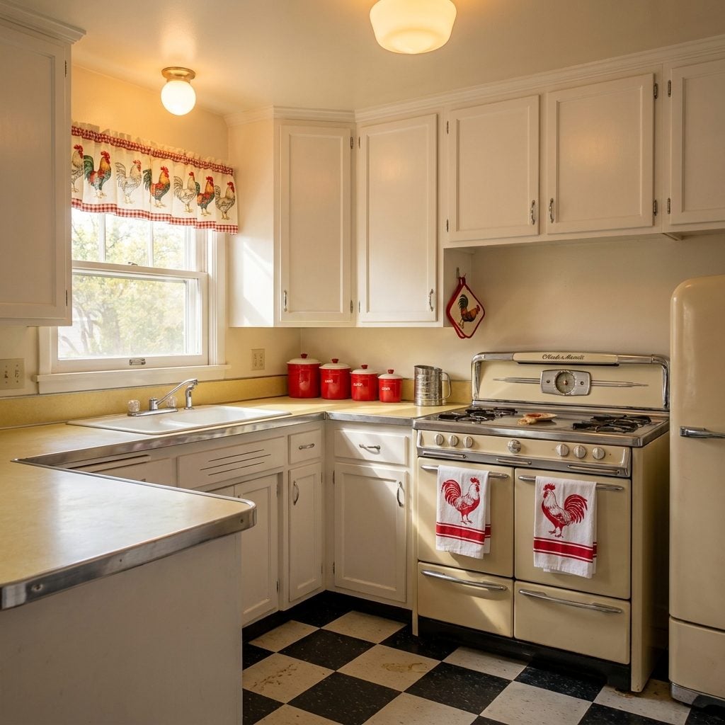
The Built-In Wall Oven That Made You Feel Like You Were Cooking in a Space Station
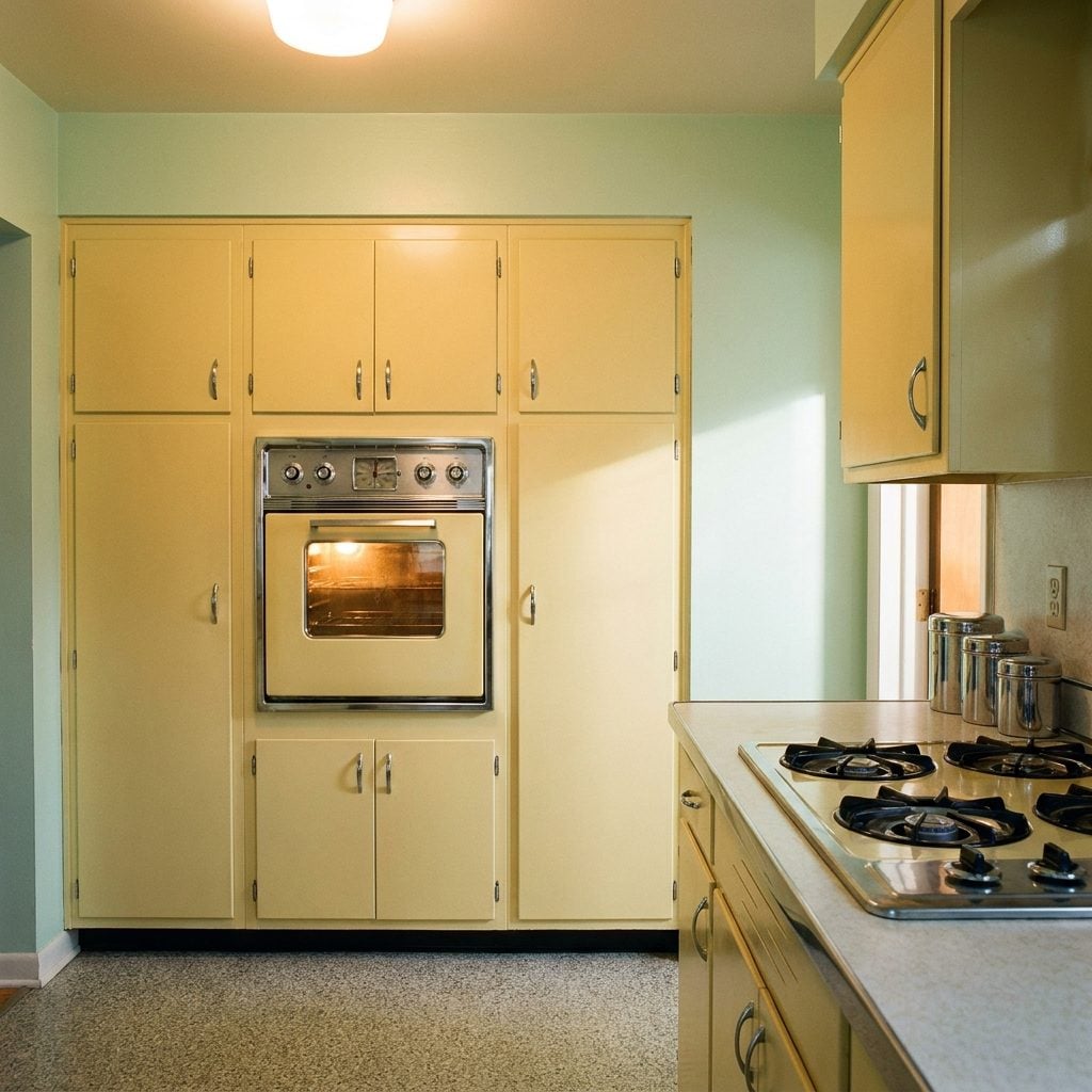
Separating the oven from the cooktop was a genuinely radical design move in the 1950s, and American appliance manufacturers knew it. The wall oven was marketed as the ergonomic future: no more bending down to check on a roast, no more crouching with oven mitts. Instead, the oven sat at eye level, built flush into a dedicated cabinet panel, usually flanked by storage on either side. It looked less like a kitchen appliance and more like mission control.
GE’s wall ovens often featured a clock-timer on the face plate and a window lit from inside with a warm amber glow. Combined with a separate drop-in range top on the counter, the whole arrangement suggested a kitchen designed by someone who had recently read about industrial kitchens and wanted their ranch house to feel similarly professional. It was the home inspiration of its day, functional aspiration made physical.
Rounded “Shoebox” Refrigerators by Frigidaire, GE, and Kelvinator That Hummed Through the Night
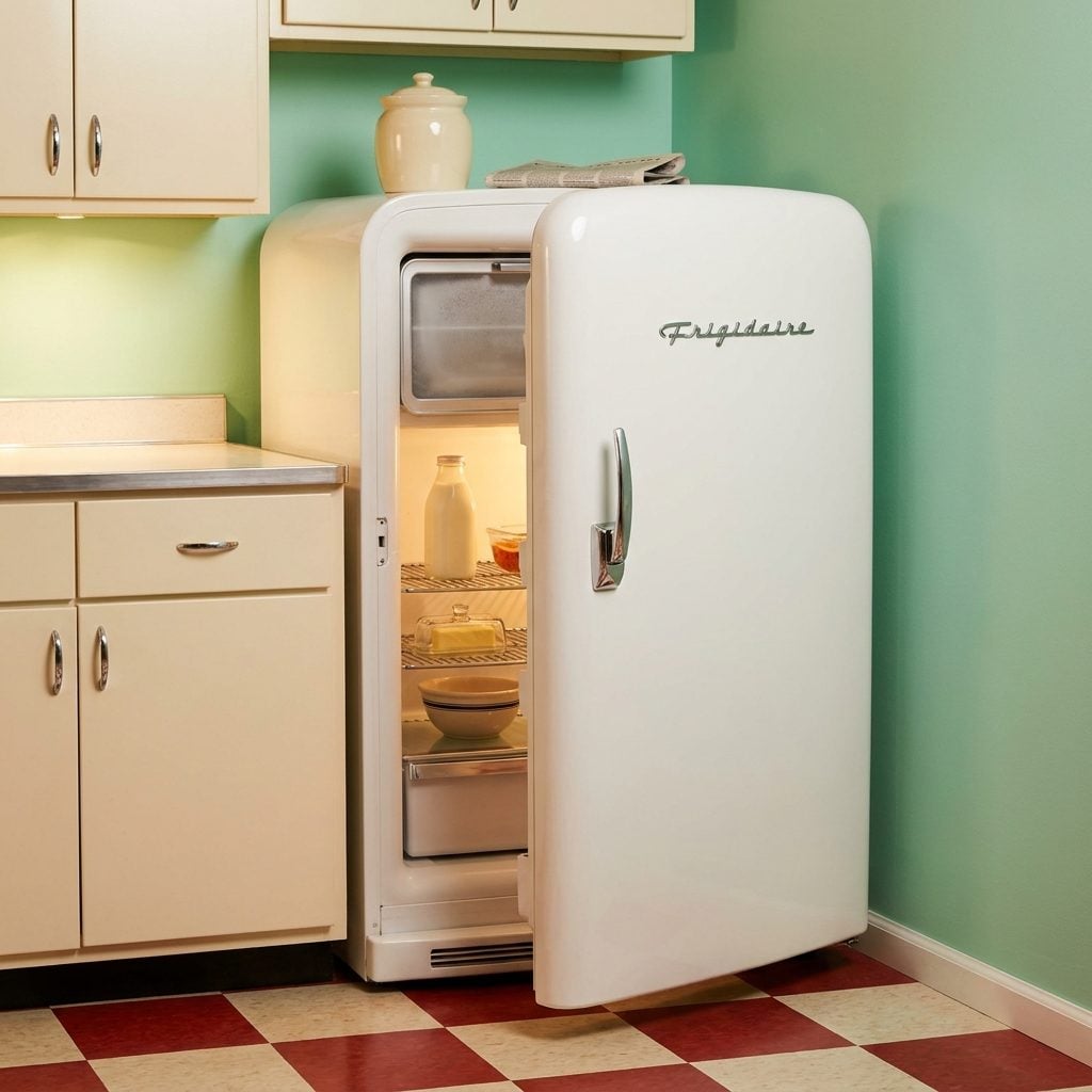
You could hear it from the hallway. A low, steady hum, mechanical, reassuring, the sound of food staying cold through the night. The rounded shoebox refrigerators of the 1950s had a particular silhouette: slightly barrel-chested at the top, tapering toward the base, with a chrome handle that required a real deliberate pull to open the thick rubber-sealed door. Frigidaire’s models came in gleaming white porcelain with a chrome Frigidaire script badge on the front that looked like it belonged on a Buick.
Inside: a small freezer compartment that frosted over within weeks into a solid ice cave requiring an annual defrosting session involving boiling water and a butter knife. Below that, wire shelves, a butter keeper in the door, and a vegetable crisper at the bottom that everyone used and nobody cleaned often enough.
Pastel-Colored Appliances That Made Pink and Turquoise Feel Completely Rational
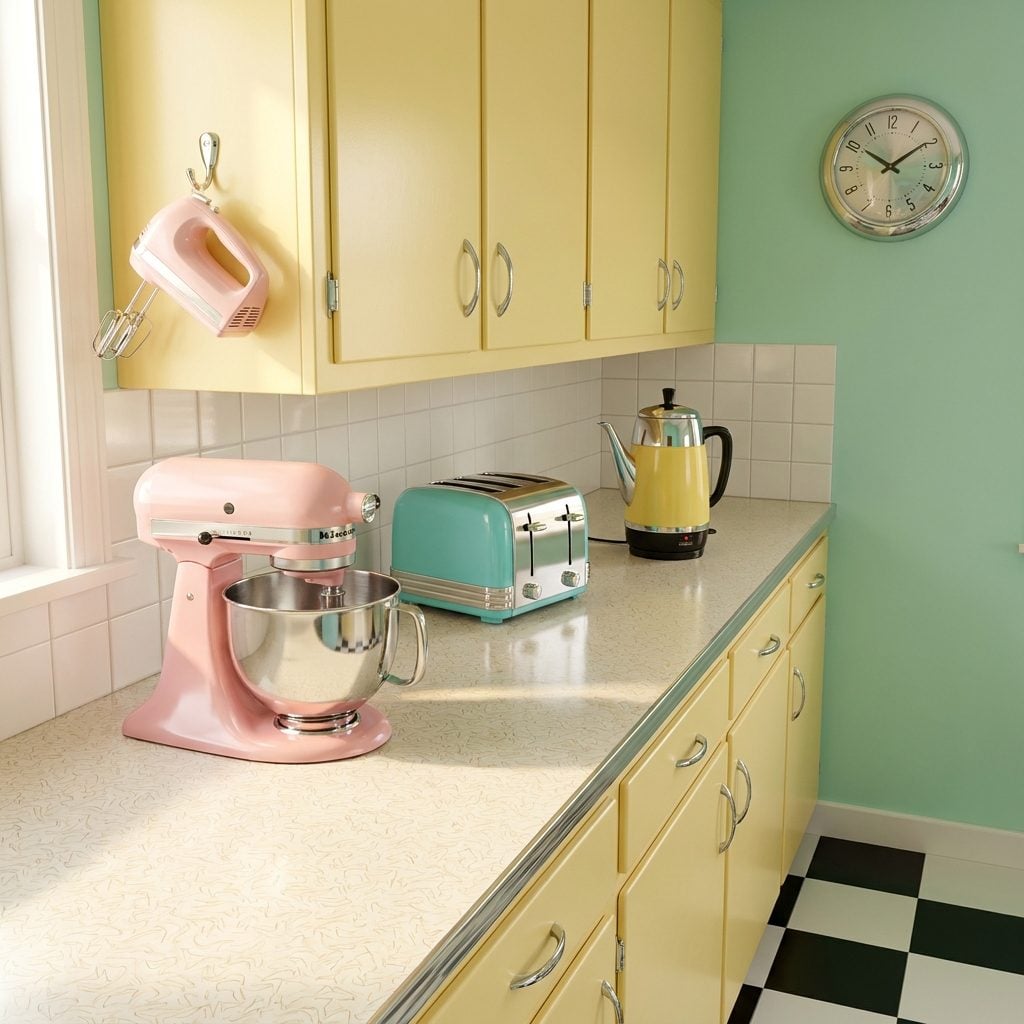
Nobody questioned why the toaster was pink. That was just the toaster. It matched the mixer, which matched the hand beaters, which matched the wall color. The pastel appliance moment of the 1950s was the result of manufacturers suddenly realizing that color was a purchase motivator, and that housewives, the explicit target audience of every appliance ad of the era, responded to appliances that felt like they belonged in a coordinated room rather than a utility closet.
Sunbeam’s pink Mixmaster. General Electric’s turquoise wall clock. Toastmaster’s yellow two-slice toaster. These weren’t just appliances; they were décor objects that happened to make toast. Some households matched everything meticulously. Others ended up with a turquoise toaster, a pink mixer, and a yellow percolator, which created a sort of cheerful chaos that somehow worked.
The Pull-Out Breadboard Hidden Inside the Cabinetry Like a Secret
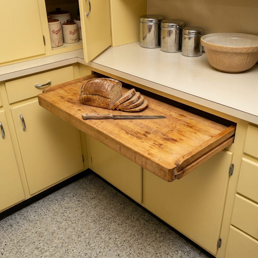
Slide it out, use it, slide it back. The built-in pull-out breadboard was a small piece of practical genius that practically every steel kitchen cabinet system included, and that almost no modern kitchen bothers with. Usually made from butcher-block maple or birch, it lived in a dedicated slot just below the counter level, sometimes in the kitchen, sometimes in a separate baking area, and pulled out on wooden runners to create an instant secondary work surface at the exact moment you needed one.
By the 1980s it had been quietly retired, replaced by the idea that more counter space was always better than cleverly managed counter space. Every person who grew up in a house with one of these immediately misses it when they try to bread a chicken cutlet with no room to work.
The Double-Bowl Enameled Cast Iron Sink With Drainboards on Both Sides
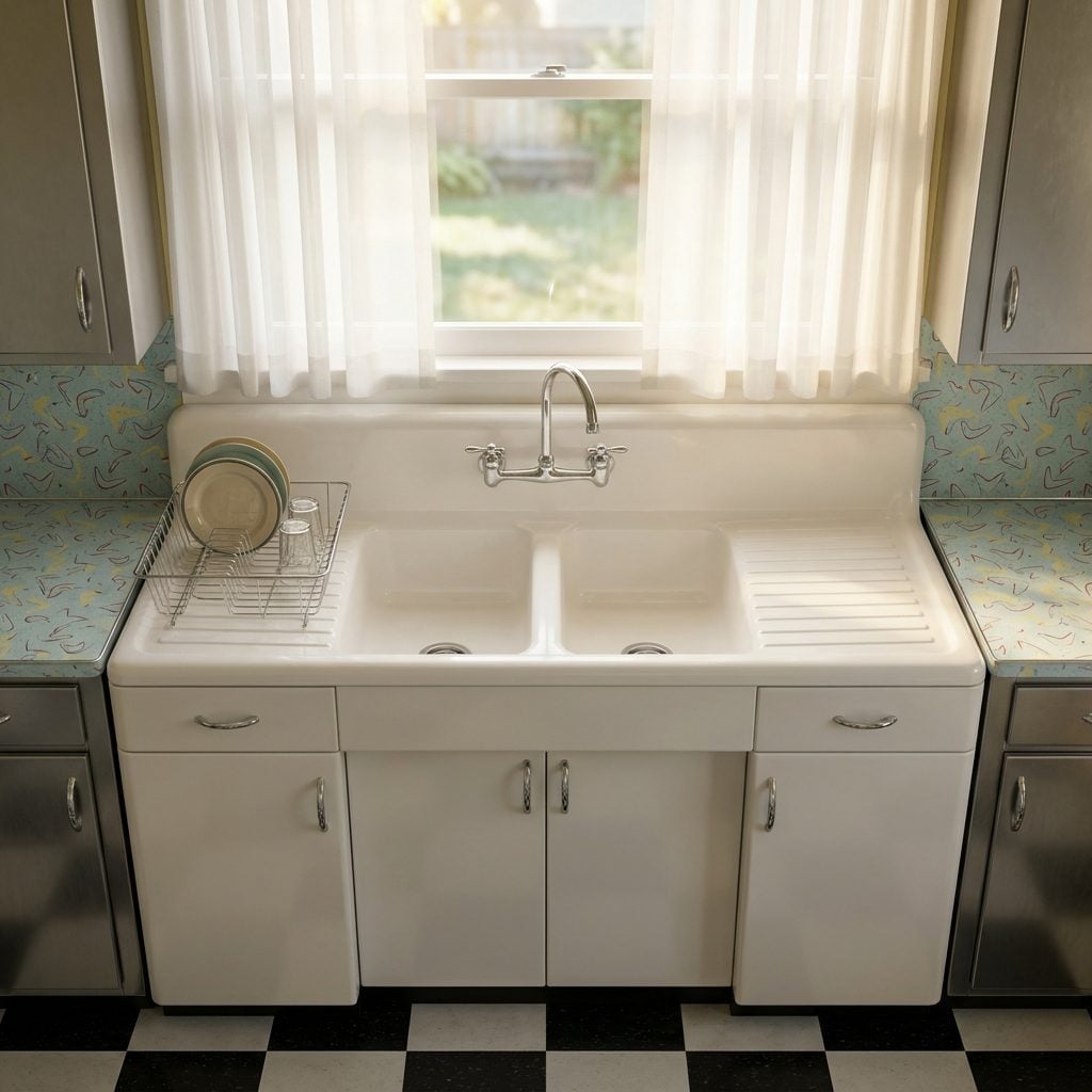
This sink was built like a piece of infrastructure. A double bowl in white or ivory cast iron with a baked-on enamel finish, flanked by an integrated drainboard on each side, sometimes just one, that was part of the same continuous casting. No separate drying rack cluttering the counter. No separate dish rack that fell over. The drainboard was just there, sloped at a precise angle, because someone had thought this through.
The sound of dishes stacking in a cast iron sink is entirely different from any other surface. It has weight and resonance. Running water in these sinks had a particular quality, fuller, somehow more deliberate. They weighed 200-plus pounds installed, which is why so many of them are still in place in houses that have been renovated around them three times over.
The Wall-Mounted Rotary Telephone in the Exact Same Color as the Kitchen
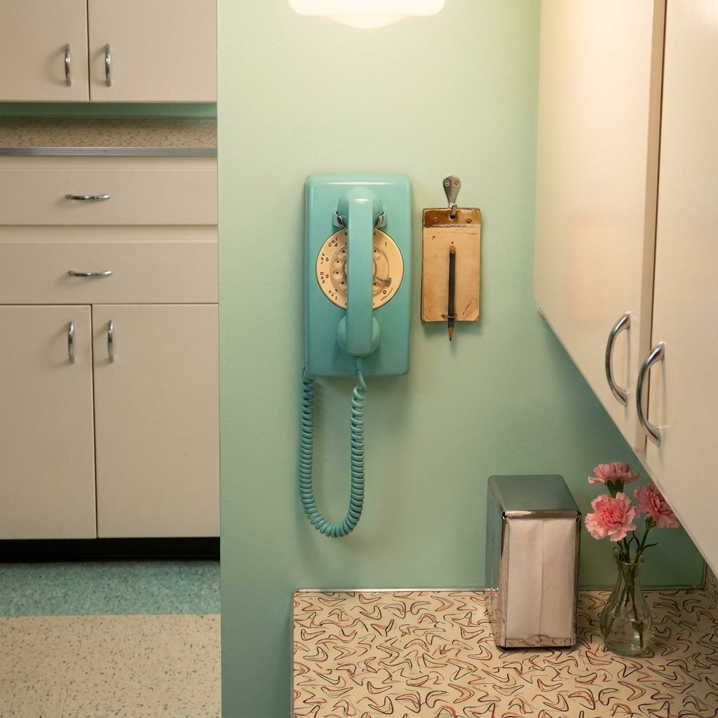
The telephone in the 1950s kitchen was not an afterthought. It was coordinated. When a homeowner ordered a kitchen in turquoise, the telephone was turquoise. Pink kitchen, pink phone. These were Western Electric or Bell System rotary models, usually the Model 500 or the wall-mount variant, available through the phone company in a range of colors specifically chosen to match the postwar kitchen palette. You didn’t own the phone, you rented it from the phone company for a monthly fee, but it was still going to match your Formica.
The rotary dial had a precise mechanical resistance to it, and dialing a number with a lot of nines in it was genuinely time-consuming. The phone hung on the wall near the dinette, usually with a notepad and pencil on a hook beside it. This was the original kitchen command center, before the kitchen command center was something people talked about in remodeling magazines.
The Metal Step-On Trash Can That Lived in the Corner and Absolutely Knew It
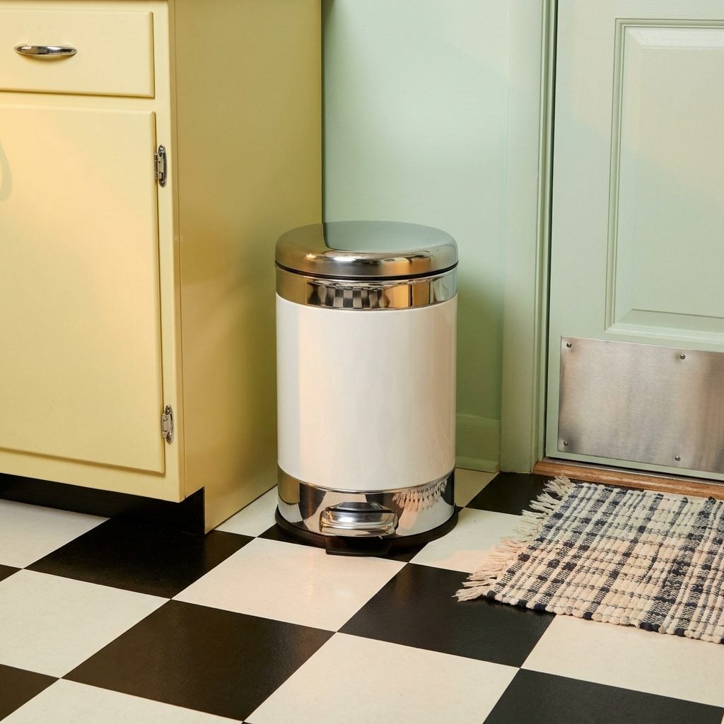
Chrome or painted steel, with a foot pedal at the base and a swing-open lid that moved with a specific pneumatic resistance, not fast, not slow, exactly correct. The metal step-on trash can was designed to feel like a quality object, and in the context of a 1950s kitchen full of chrome and enameled steel, it actually was one. Cromptom’s and Revere both made widely distributed versions. Many came in white or two-tone to match the kitchen.
The lid closing sound was its own kind of punctuation, a soft, pressurized thunk that signaled the end of something. End of cooking, end of cleaning, end of the argument about whose turn it was to take it out. It lived in the corner near the back door, usually, with a slight odor that no amount of baking soda ever fully addressed. The plastic swing-top that replaced it in the 1970s was lighter, cheaper, and categorically less satisfying in every possible way.
Atomic-Age Wallpaper Covered in Starbursts, Boomerangs, and Molecular Motifs
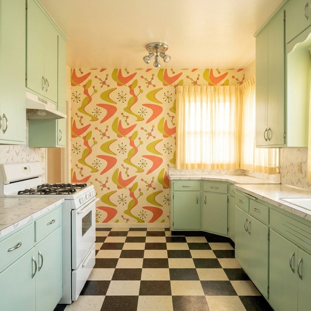
The wallpaper of the 1950s kitchen was not subtle. It was a full-throated commitment to the space age, boomerang shapes in coral and chartreuse, molecular chain patterns in teal and black, starbursts radiating across a cream background like someone spilled the periodic table and thought it looked great. And honestly? It did.
Most of it went up in a single accent wall above a half-wainscot, or sometimes floor-to-ceiling in a breakfast area. The pattern repeat was enormous. Hanging it was a project. The paste smelled for a week.
What’s strange is how optimistic all that geometry felt. The atomic age was genuinely terrifying, but in the kitchen it got translated into cheerful abstraction, as if to say: science is happening, and it is charming. You can find echoes of it in any red kitchen reboot from the last decade.
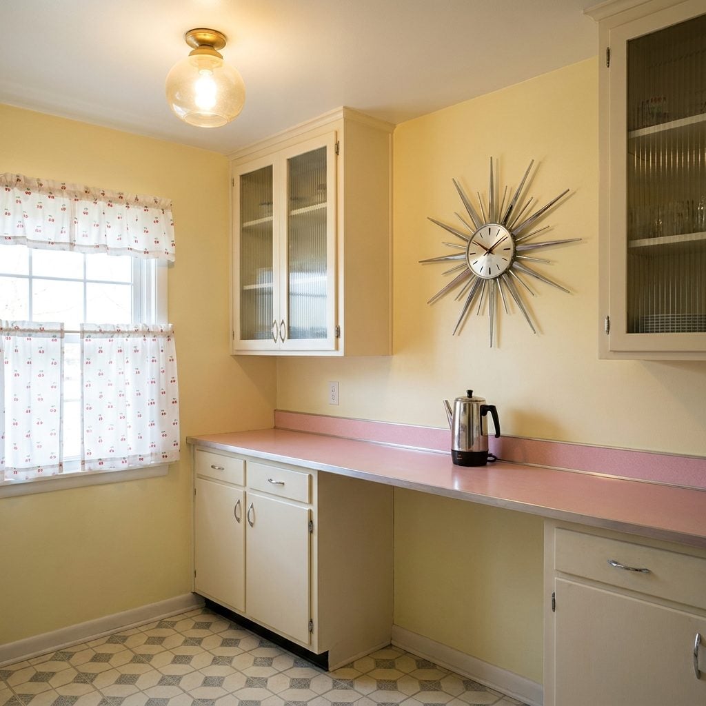
The Starburst Wall Clock in Chrome or Brass That Every Kitchen Had in Some Form
🔥 Would you like to save this?
Long, thin rays spiking outward from a small clock face at the center. Sometimes chrome. Sometimes brass. Sometimes a mix of both, with alternating long and short spokes at odd angles, like an asteroid had stopped mid-explosion and agreed to tell time. The starburst clock showed up in kitchens, living rooms, and dens, but it was most at home in the kitchen, hung between the cabinets and the window, roughly at eye level.
The hands were always thin and pointed. The numbers were usually minimalist dashes. And no matter how big the rays spread, sometimes two feet across, the actual clock mechanism was the size of a hockey puck. It kept decent time, and it looked like something from the future, which in 1957 was exactly the point.
Cafe Curtains or Ruffled Priscilla Curtains Hung Over the Kitchen Sink Window
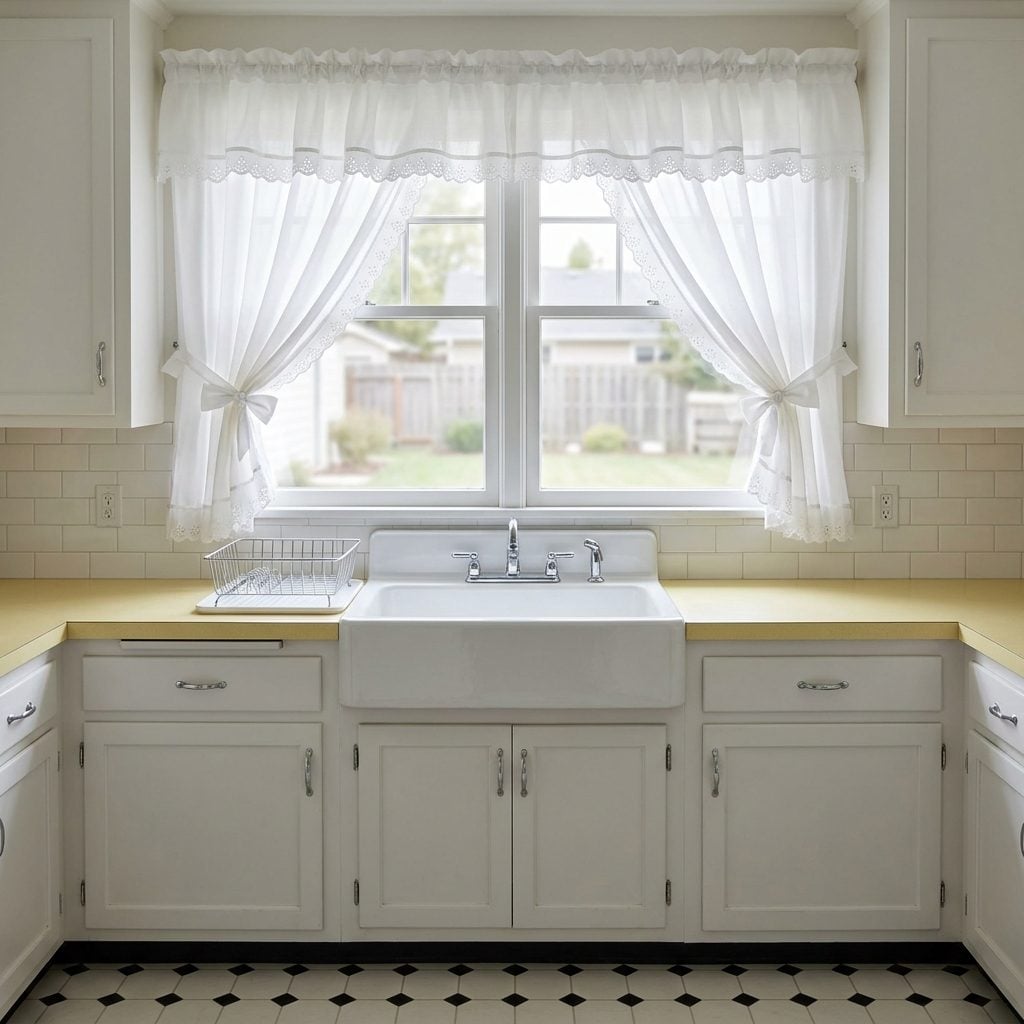
These were non-negotiable. Every kitchen sink window in America had something on it, either a short cafe curtain hung on a brass tension rod at exactly the midpoint of the glass, or a full set of ruffled Priscilla curtains in white cotton with an eyelet trim that had been ironed within an inch of their life. The Priscillas were particularly serious: two panels that crossed in the middle and tied back at the sides, with a ruffled valance across the top.
The cafe curtain was more modern, more casual. It let the light in from the top while keeping things private at sink-level, where you stood for twenty minutes washing dishes and staring out at the backyard. Both styles came in sheer cotton or a lightweight gingham. Both needed to be taken down, washed, starched, and re-hung on a semi-regular basis. Nobody questioned this.
Fluorescent Ceiling Panels That Turned the Whole Kitchen Into a Giant Lightbox
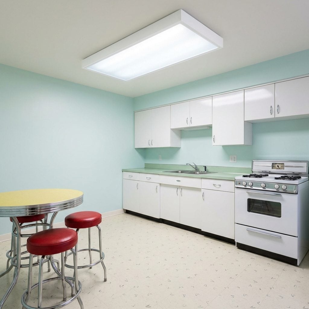
At some point in the mid-1950s, someone decided that the kitchen should be as brightly lit as a hospital corridor. The solution was the flush fluorescent ceiling panel: a recessed or surface-mounted fixture with a translucent white plastic diffuser that spread cool, flat, shadowless light into every corner of the room. Some were large single panels. Some were installed in pairs. In more ambitious builds, the entire kitchen ceiling was a dropped luminous grid of frosted panels.
The light had a faint hum you stopped hearing after the first week. It made everything look slightly clinical, but also absolutely clean, which was the whole idea. The 1950s kitchen was meant to be efficient, hygienic, and modern. Fluorescent panels delivered all three, and cost almost nothing to run. We didn’t think about color temperature then. We just thought it was bright.
Swing-Arm and Mid-Century Pendant Fixtures That Made the Kitchen Feel Designed
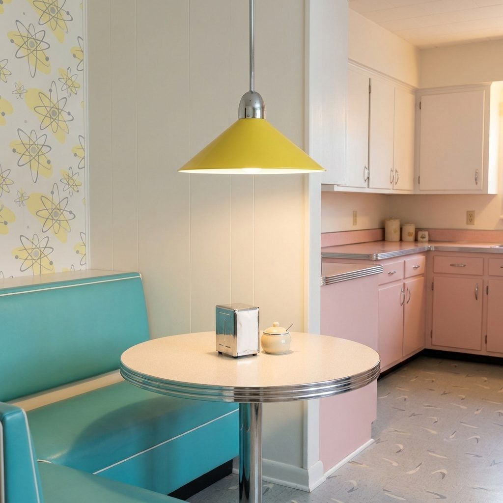
Not every 1950s kitchen relied on overhead fluorescents. In the nicer builds, the ones photographed for Ladies Home Journal and Better Homes and Gardens, there were pendant fixtures. A cone-shaped metal shade in canary yellow or turquoise, hung on a stem or a short chain above the breakfast nook. A swing-arm wall sconce with a conical shade near the range. These fixtures were designed, in the way that 1950s objects were designed: with an obvious point of view, a confident shape, and no apology for the color.
The cone pendant over a table was the era’s version of what we now call statement lighting. It said: someone thought about this room. It directed warm incandescent light downward in a tight pool and left the rest of the kitchen to the fluorescents. The contrast worked.
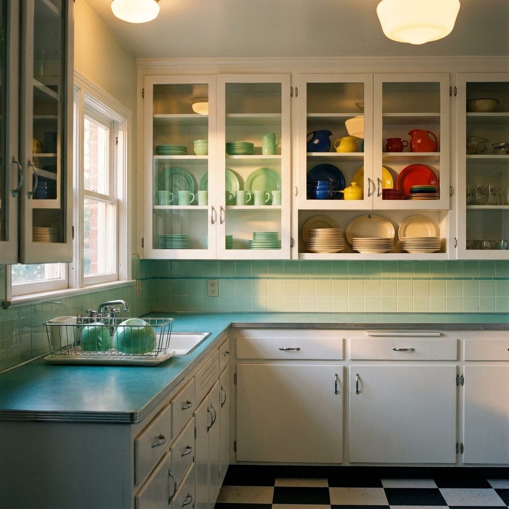
Upper Cabinets With Ribbed or Sliding Glass Doors That Showed Off the Good Dishes
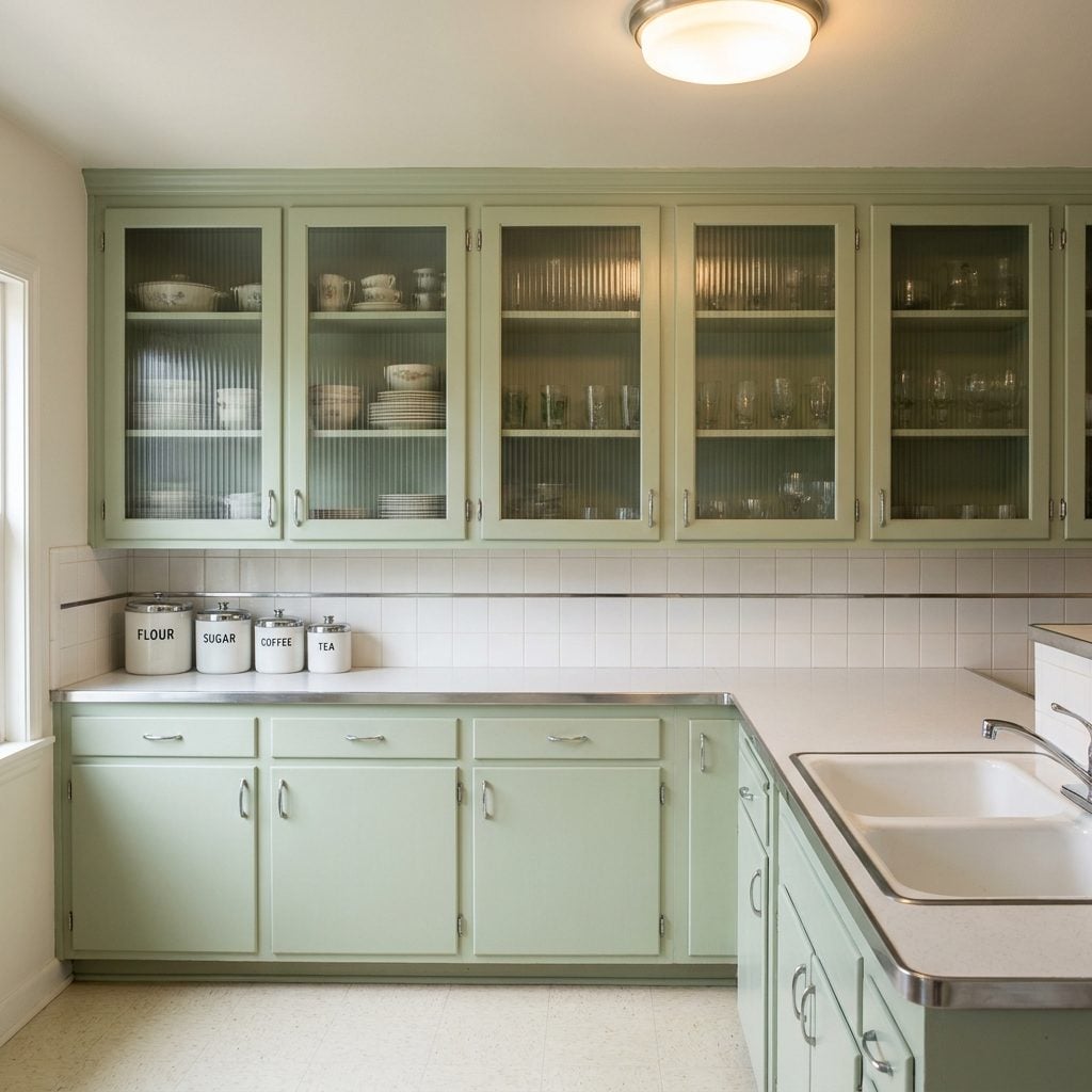
Some of those upper cabinets had glass doors, not the simple single-pane kind, but doors with ribbed or reeded glass panels set into a painted wood frame, or sliding glass tracks that let you open the cabinet without swinging a door into anyone. The ribbed glass was translucent but not transparent, which meant the silhouettes of your dishes and glasses were visible but not perfectly clear. This was a feature, not a limitation.
It created a sense that there was something worth seeing inside, without requiring the commitment of actual open shelving. The good china was technically on display while technically still protected. A very 1950s solution: the appearance of openness with the comfort of enclosure.
Under-Cabinet Lighting Strips That Felt Genuinely Futuristic in 1955
Before under-cabinet lighting became the default feature of every remodeled kitchen, it was a selling point. Builders advertised it in brochures. The strips were incandescent or early fluorescent, mounted to the underside of the upper cabinets, and they threw a warm wash of light directly onto the countertop work surface below, which was a genuinely practical idea dressed up as a luxury amenity.
In a kitchen where the overhead fluorescent panel was doing most of the work, the under-cabinet strip added warmth and direction. It made the counter feel like a stage. It was also the thing that looked most like the kitchen of the future, and in 1955, looking like the future was its own reward.
Freestanding Metal Cabinets With Enameled Finishes in Pastels or Industrial Grey
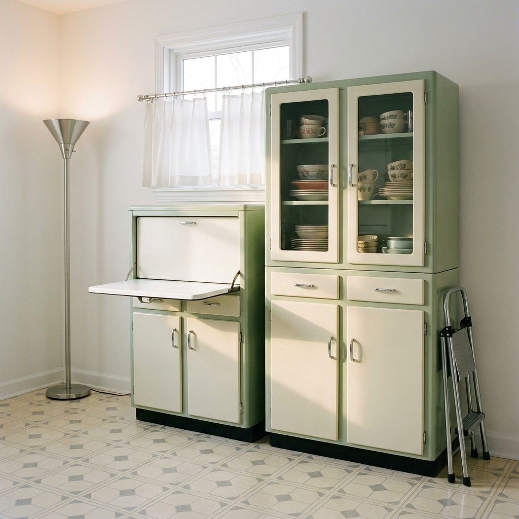
Before built-in cabinetry became the universal standard, a lot of American kitchens made do with freestanding metal cabinets, and some of them were genuinely beautiful. Steel construction with a smooth enamel finish in pale green, soft yellow, two-tone cream-and-grey, or the kind of robin’s egg blue that you only see now in old Kodachrome slides. The doors had a satisfying metallic click. The drawers slid on stamped steel tracks.
Sellers and Hoosier-style cabinets had been around since the 1920s, but the postwar version was sleeker, flatter, more modern-looking. Some had a fold-down work surface. Some had a built-in flour sifter or a pull-out cutting board still coated in the original enamel. Finding a complete set in working condition today is like finding a very heavy piece of history in someone’s garage, which is usually exactly where they turn up.
Separate Cooktop and Wall Oven Combos That Were the Ultimate Mid-Century Kitchen Upgrade
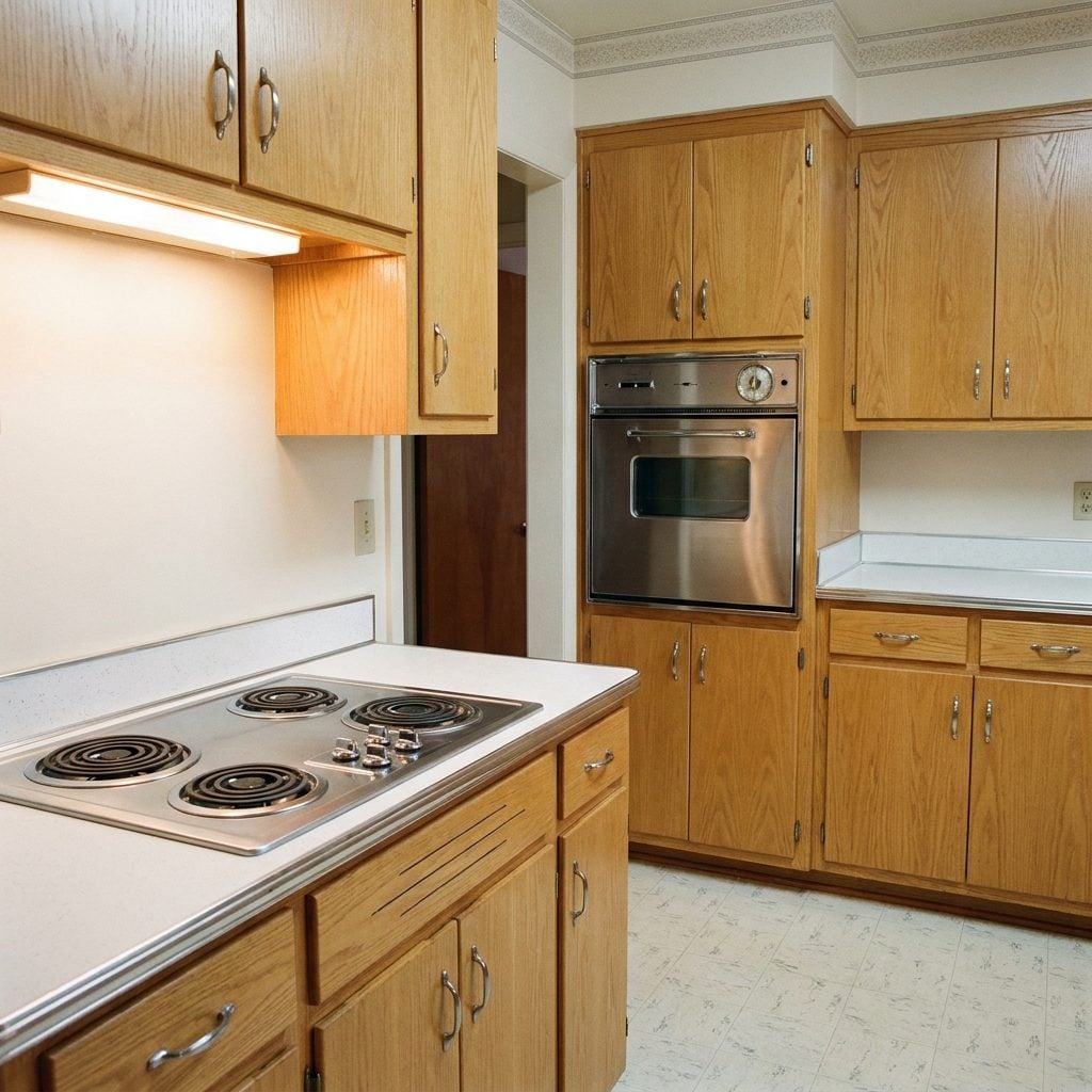
By the late 1950s, the truly modern kitchen separated its cooking functions. The cooktop, a flat, built-in unit set directly into the countertop, sat on one run of counter, while the wall oven was mounted at eye level in a dedicated tall cabinet on another wall entirely. This arrangement required more square footage and more cabinetry, which meant it showed up mainly in the more expensive custom builds and the showroom kitchens that appeared in Better Homes and Gardens spreads.
The appeal was partly practical (bending to check a floor-level oven is actually terrible) and partly pure aesthetics, a built-in cooktop flush with the counter looked clean in a way that a freestanding range simply couldn’t. It was also a visible signal of investment. A wall oven in 1958 said: this family planned ahead, and they had the budget to do it. The layout became the template for high-end kitchen design for the next sixty years.
Decorative Laminate Backsplashes in Bold Boomerang and Atomic Patterns
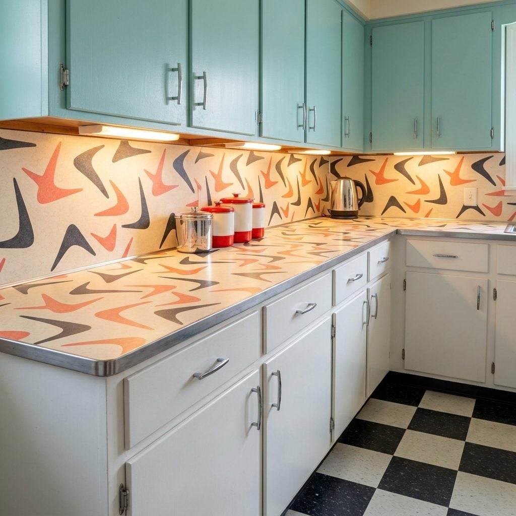
Before ceramic tile became the default, plenty of 1950s kitchens had laminate backsplashes, not plain white, but Formica or Micarta in the same bold patterns as the countertops: boomerangs, starbursts, small geometric diamonds, or that particular woodgrain print that fooled absolutely nobody but looked great anyway. The backsplash and countertop were often matched, creating a continuous sweep of pattern from counter surface to wall.
Boomerang pattern in charcoal on white. Starbursts in gold on cream. Diamonds in coral and teal on a pale grey ground. The color combinations were confident in the way that only postwar optimism could produce, a deliberate rejection of wartime austerity through the medium of kitchen surfaces.
A lot of it has been ripped out. The pieces that survive, sometimes found under layers of later tile during a home makeover, are time capsules under the drywall. Original boomerang Formica in good condition is genuinely collectible now, which is a sentence nobody expected to write in 1960.
Built-In Flour Sifters and Sugar Bins Hidden Inside the Cabinets
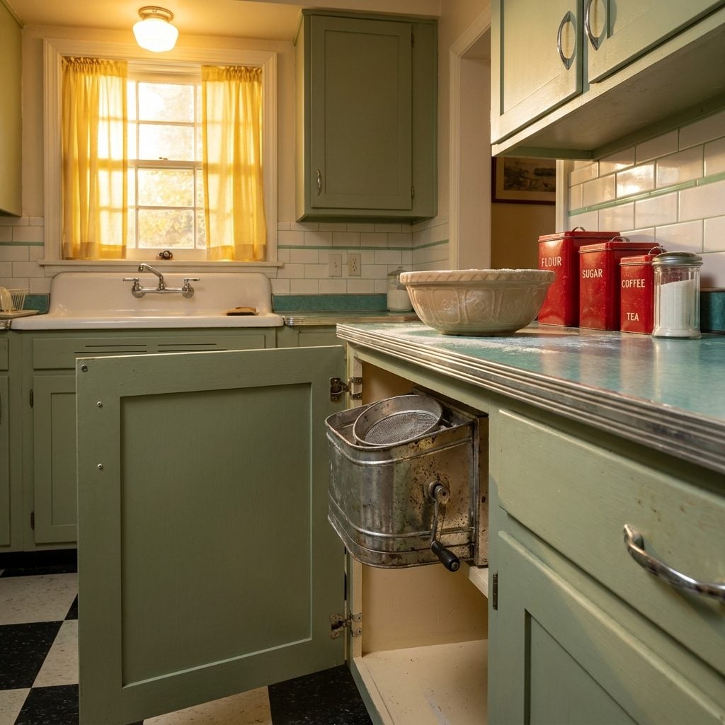
Pull open the right cabinet door and there it was: a little hinged metal bin with a sliding sifter screen at the bottom, mounted right into the cabinet frame. You’d crank the handle and flour would cascade into the bowl below like it was the most sophisticated thing in the world. These were built into new postwar kitchens as a sign of progress, of a home that had thought everything through.
Nobody really explains to you when you’re a kid that this is special. You just watch your mom use it and assume every kitchen works this way. When you eventually move into an apartment with bare plywood shelves, the absence is genuinely disorienting.
The Color-Coordinated Canister Sets That Lived on Every Counter
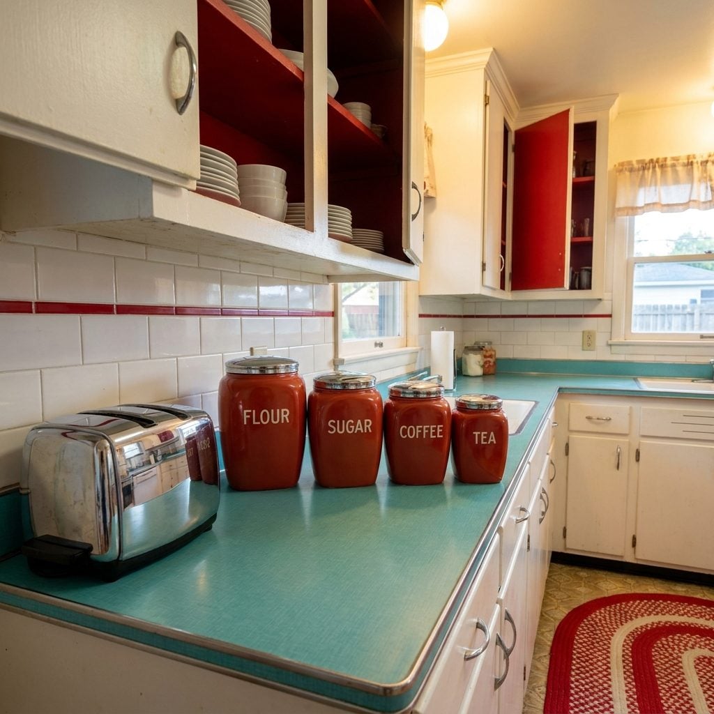
Four canisters, descending in size, labeled in flowing script: FLOUR, SUGAR, COFFEE, TEA. They sat on the counter like a little family, matching lids, matching trim, usually in red or yellow or a cheerful robin’s egg blue. Some were tin with decals of Dutch windmills or rolling farm scenes. Some were ceramic with hand-painted strawberries. All of them were perfectly coordinated in a way the rest of life usually wasn’t.
The coffee canister always smelled the best. The flour canister always had a ghost-ring of white powder around its base no matter how many times you wiped it down. These sets showed up in every bridal shower gift guide of the era, the shorthand for “you’re ready to have a real kitchen now.”
Pyrex Mixing Bowls in Colors That Are Now Worth a Small Fortune

The nesting set lived in the lower cabinet, and getting to the smallest bowl meant removing all the others in descending order like some kind of domestic archaeology. Primary Yellow. Turquoise. Red. White. Sometimes the “Cinderella” oval ones with the pouring spouts and the little handles. Pyrex from this era had a particular heft to it, dense, satisfying, cold to the touch even at room temperature.
They went from oven to table without complaint. They got stacked wrong, dropped on linoleum floors, run through cycles of dish soap that slowly muted their colors. And most of them survived anyway, which is why they now sell for genuinely alarming prices at antique malls and weekend flea markets. The ones that held your grandmother’s brownie batter are now called “vintage collectibles.”
The Sunbeam Mixmaster Sitting on the Counter Like It Owned the Place
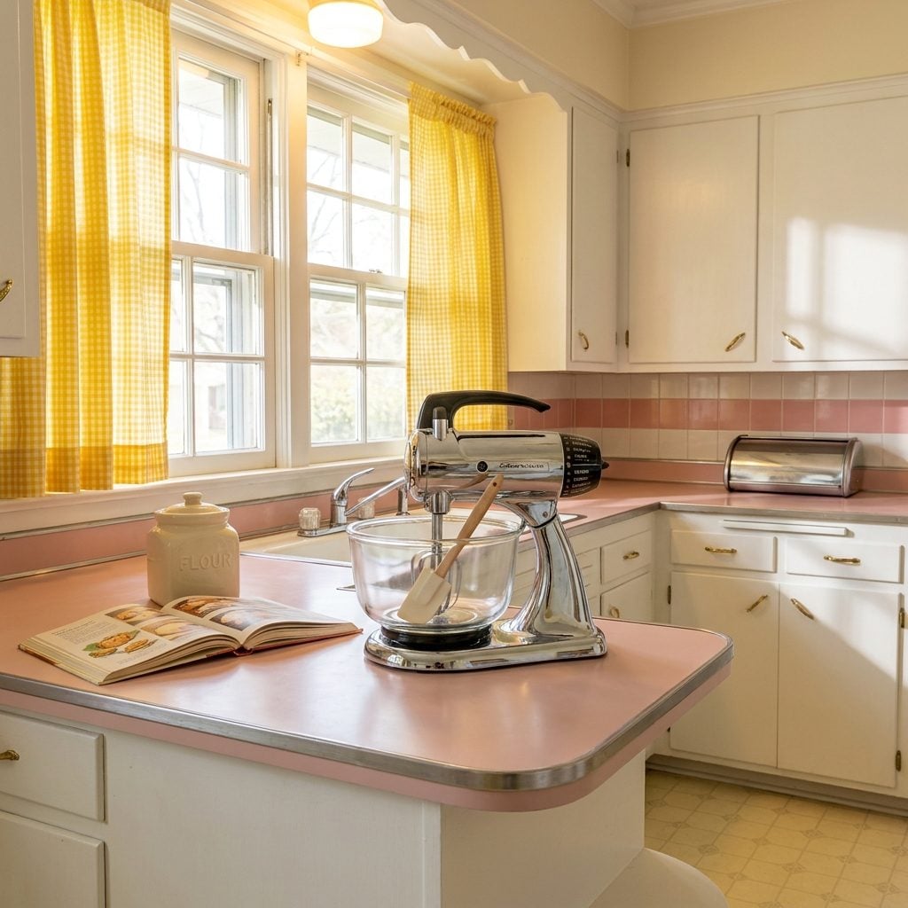
🔥 Would you like to save this?
It did not live in a cabinet. The Sunbeam Mixmaster stood on the counter permanently, its chrome body catching the kitchen light, its two rotating beaters locked into position and ready. This was a major appliance in a small package, and it was displayed accordingly.
The speed dial went from 1 to 12, and somewhere around speed 8 the whole machine would start to walk across the counter unless you held it. The bowl was a heavy glass Sunbeam-branded piece that locked in with a quarter-turn. Cake batter, whipped cream, mashed potatoes, the Mixmaster did everything and made a sound like a small plane warming up.
For home inspiration from this era, the Mixmaster is practically shorthand for the whole decade: modern, optimistic, chrome-finished, and slightly louder than necessary.
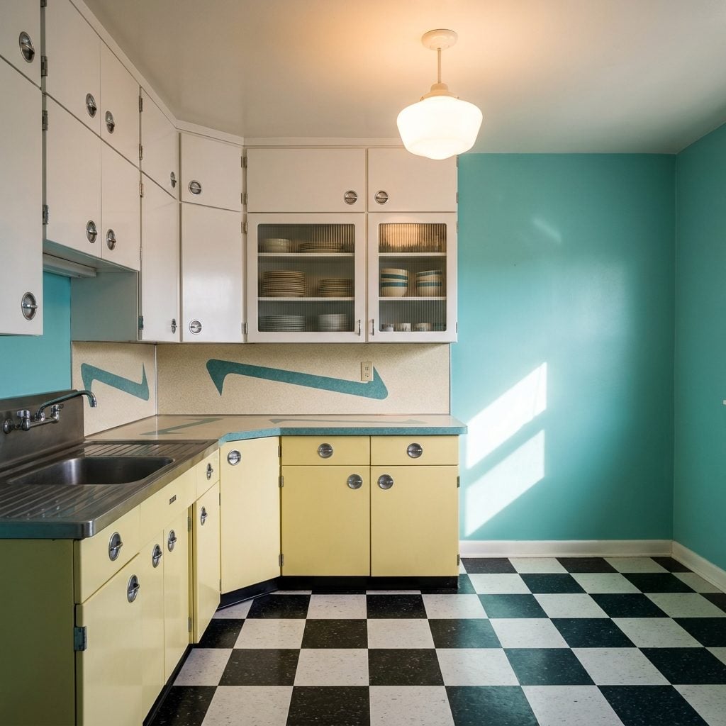
The Pastel Kitchen That Made Every Morning Feel Like a Confection

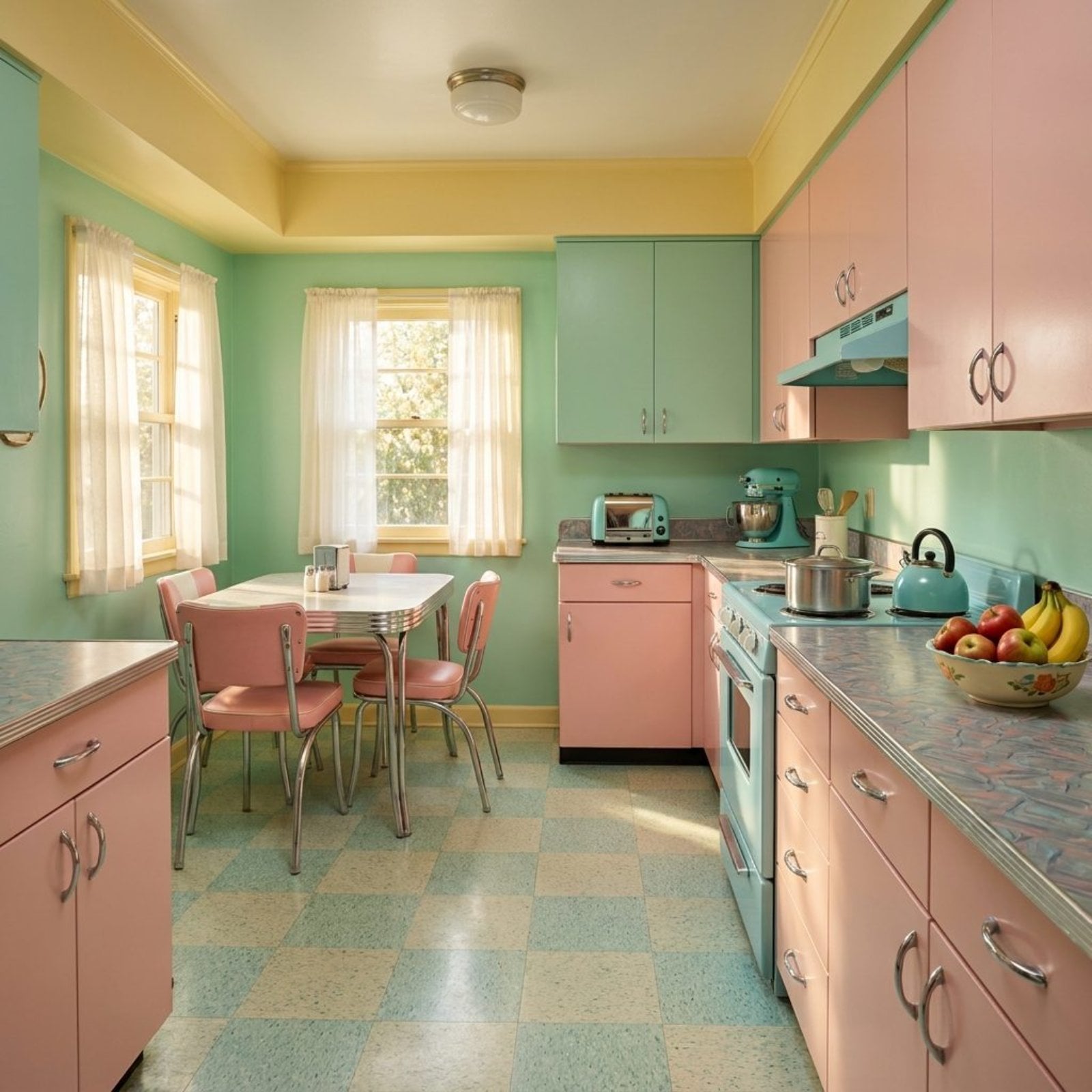
Mint green walls. Pink cabinets. Turquoise appliances against buttery yellow trim. The 1950s American kitchen didn’t just feed a family, it made a color statement that would have scandalized any minimalist alive today. These weren’t timid accent choices. This was the whole room, floor to ceiling, committed to a palette that felt optimistic in the way only postwar America could manage.
Manufacturers leaned hard into color as a selling point. Ads promised that a turquoise kitchen would make cooking feel less like labor and more like leisure. For red kitchen lovers of a later era, this was the pastel-soaked predecessor, just as bold, just slightly softer. Whether the promise held up at 6am on a Tuesday is another matter.
The Electric Percolator That Started Every Single Morning
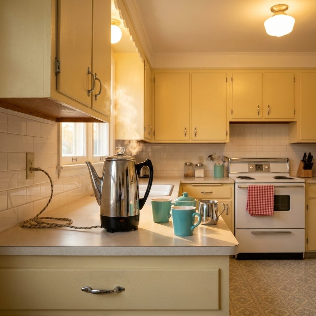
You could hear it before you could see it. That rhythmic bubble-and-gurgle from the kitchen, pock, pock, pock-pock-pock, building toward a full rolling boil while the coffee darkened in the glass knob on top. The percolator was chrome or speckled aluminum, it sat on the counter or on the stovetop, and the smell of it brewing was the official signal that the day had begun.
Nobody worried about optimal extraction temperatures. You plugged it in, measured in the grounds, and let it do its thing. The coffee was strong and slightly bitter and perfect. And when company came, the percolator ran a second pot without anyone thinking twice about it.
Jadeite, Fiestaware, and Melamine: The Dishware That Defined a Table
Jadeite was the quiet one, that pale, milky, opaque green glass that showed up in diners and home kitchens alike, plates and mugs and mixing bowls all in the same muted sage. Fiestaware was the opposite: saturated, deliberate color in stacked concentric rings, a different shade for every place setting if you wanted. Mixing colors at the table was actually the intended move, cobalt next to yellow next to red.
And then there was melamine, the plastic that pretended it wasn’t. Melmac plates had a ceramic look and feel, but you could drop them on the kitchen floor and they’d bounce. Families with small children gravitated toward it hard.
All three coexisted in 1950s kitchens, sometimes on the same shelf, representing three different ideas of what “nice dishes” meant. A red kitchen with a full set of red Fiestaware was a deliberate, committed aesthetic choice, and it was everywhere.
Tupperware and the House Parties That Sold It
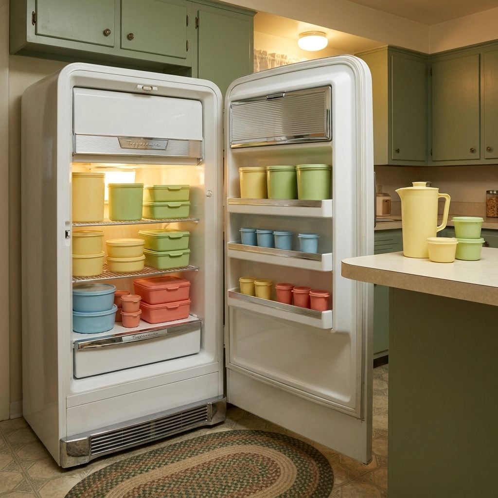
The containers themselves were almost secondary. Tupperware in the 1950s was a social event, you got invited to a neighbor’s house, sat in her living room with the other women on the block, and watched a demonstration of the burping seal. That satisfying little exhale when you pressed the lid down and then lifted the tab to release the air seal was genuinely novel. Air-tight storage was not a given before this.
The colors were the original pantry aesthetic: pale pastel celery green, butter yellow, powder blue, coral pink. Stacked in the fridge or lined up on a shelf, they made food storage look considered.
“The Tupperware party was the original multi-level marketing structure, and it made Brownie Wise, the woman who invented the model, the first woman on the cover of Business Week.”
Paper Towel Holders Mounted Under the Cabinet, Right Where You Needed Them
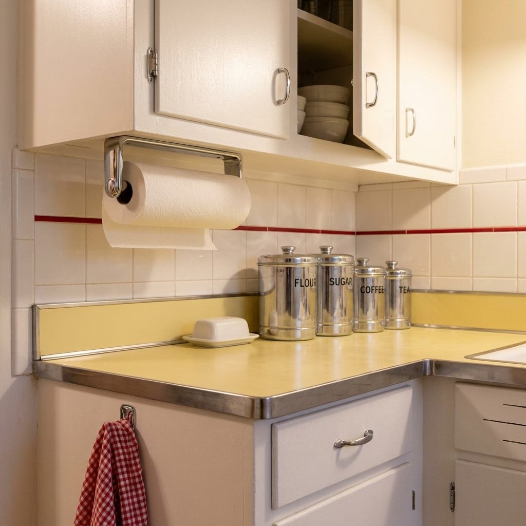
The paper towel roll mounted directly to the underside of the upper cabinet was a postwar kitchen innovation that felt almost shockingly convenient. One hand, one tear, done. No reaching across the counter to a freestanding holder that would slide around every time you pulled.
The holders were chrome or white-painted metal, and they mounted with two screws into the cabinet bottom. The paper towels themselves, Bounty launched in 1965, so in the early 1950s you were working with Scott or Zee, were thinner and less absorbent than what we have now, but nobody knew what they were missing.
Open Shelves and Glass-Front Cabinets Showing Off the Good Dishes
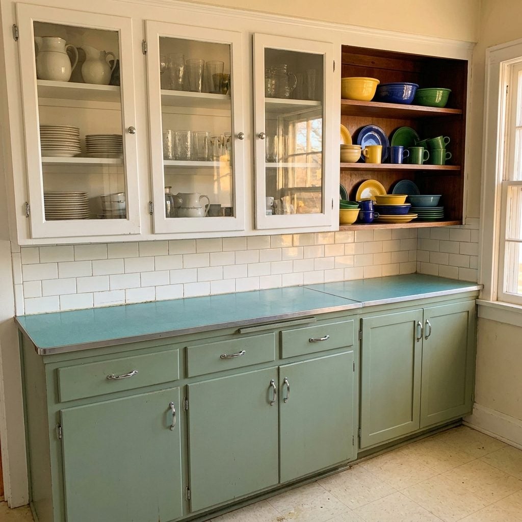
The glass-front cabinet was the 1950s version of the display case, and it was unapologetically about showing off. Stacked plates, nested bowls, rows of matching glasses, all of it visible through those small paned doors. Kitchens that had open shelving rather than doors took it a step further: everything was on view all the time, which meant everything had to look right all the time.
This is also, quietly, a psychological strategy. Visible storage makes a kitchen feel larger and more personal. Design researchers now have a name for this, “legible storage”, but in the 1950s it was just what you did because the cabinets came that way and the Fiestaware deserved to be seen.
The Metal Step Stool With a Vinyl Seat Folded Into the Corner
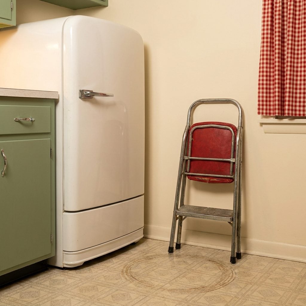
Every 1950s kitchen had a corner that belonged to the step stool. Folded flat, it leaned against the wall or tucked between the refrigerator and the cabinet, two chrome legs and a hinged vinyl step in yellow or red or green. You pulled it out to reach the high shelves, and the rubber feet left little oval dents in the linoleum after years in the same spot.
Some of them doubled as a seat, a one-step stool that, when fully unfolded, gave you a small padded platform to perch on while the percolator finished. The vinyl upholstery matched nothing and everything. They lasted decades, and a lot of them are still out there, folded into corners in garages and back pantries, unchanged.
Booster Seats Built Right Into the Kitchen Furniture
In homes with built-in breakfast nooks, that U-shaped banquette situation fitted into a corner with a table bolted to the wall, some manufacturers sold coordinating high chairs or booster stools designed to match the upholstery exactly. Same vinyl, same chrome legs, same color trim. The kid’s seat matched the grown-up seats. It was a small thing, but it telegraphed something: this child belongs at this table, in this kitchen, in this house.
The standalone wooden high chairs of the era had fold-down trays and a little footrest, and they painted them to match the kitchen too. Pale yellow to go with the yellow cabinets. Red to match the canisters. Nobody thought of it as “design”, they just wanted everything to go together.
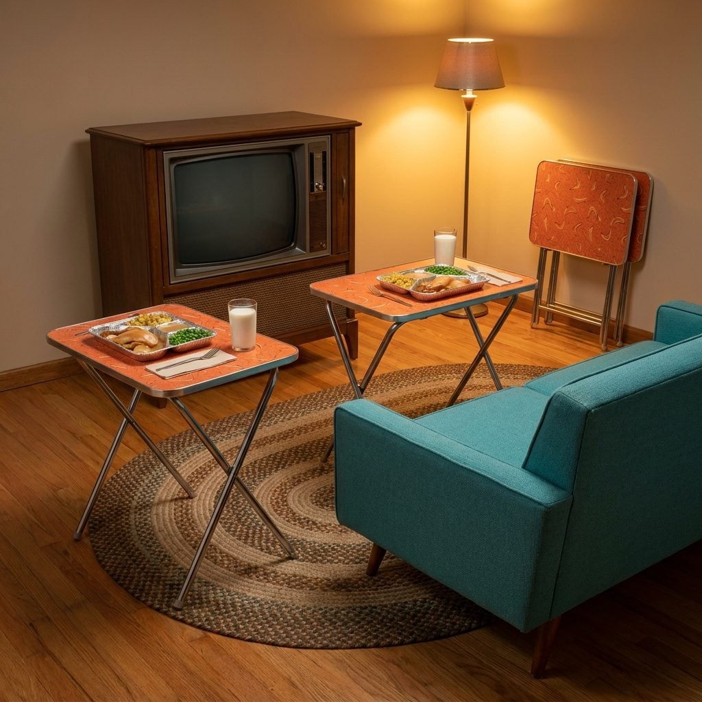
TV Dinners and the Folding Tray Tables That Made the Living Room the New Kitchen
🔥 Would you like to save this?
Swanson launched the TV dinner in 1953 and sold 10 million of them in the first year, which tells you everything about how ready America was to eat in front of the television. The aluminum tray compartmentalized everything: turkey and gravy in the main section, cornbread dressing to one side, peas in the third little pod. You slid it into the oven at 425, waited 25 minutes, and carried it on a folding tray table to the living room.
The tray tables themselves were a small domestic revolution. Lightweight tubular chrome legs, a patterned laminate top, fruit motifs, Asian-inspired bamboo prints, abstract boomerang shapes, and they folded flat for storage against the wall in a matched set of four. The whole family could eat in front of the Philco without anyone having to set the dining room table.
The home makeover that the TV dinner truly enabled wasn’t in the kitchen, it was in the living room, which quietly became the main eating space for a generation of American families.
Brightly Patterned Dish Towels and the Whole Coordinated Linen Set Nobody Could Bear to Actually Use
They hung from the oven handle in a perfect fan, stiff with starch, printed with cherries or roosters or Pennsylvania Dutch hex flowers in colors so saturated they practically buzzed. Red and white. Yellow and white. Sometimes a green that had no business being that green.
The joke was that nobody actually dried dishes with them. The good towels were for company, displayed like bunting. The real workhorse was a cut-up flour sack tucked under the sink. But the matched set, the dish towels, the pot holders, maybe a little half-apron in the same print, those were the kitchen’s way of saying someone cared. Someone had a vision for this room. It was domestic theater, and the linens were the costume.