🔥 Would you like to save this?
That oversized crystal chandelier in the foyer isn’t fooling anyone. There’s a specific kind of house that screams “I just got paid and I need you to know about it” from the moment you pull into the driveway. It’s not about how much things cost. It’s about how hard everything is working to prove something. New money energy shows up in the finishes, the furniture placement, the sheer volume of marble in rooms that didn’t ask for it. Some of these signs are subtle. Most of them aren’t. And if you’re being honest with yourself, your house might be guilty of at least a few.
Waterfall Marble on Surfaces That Have Never Once Asked for It
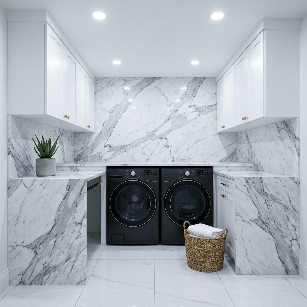
Waterfall edges on a kitchen island? Sure, fine, it’s a legitimate design choice. Waterfall marble on the laundry room folding counter? On a hallway console? On the side panel of a bathroom vanity that faces a wall nobody ever looks at? That’s new money energy running unchecked.
In order to come up with the very specific design ideas, we create most designs with the assistance of state-of-the-art AI interior design software. Also, assume links that take you off the site are affiliate links such as links to Amazon. this means we may earn a commission if you buy something.
The waterfall treatment works because it showcases veining in a continuous flow. But when every horizontal surface in the house gets the same treatment, the effect flattens out. It stops reading as intentional and starts reading as a bulk order from the stone yard. There are signs your kitchen is prioritizing cost signaling over actual good design, and wall-to-wall waterfall edges in rooms where laminate would genuinely perform better is one of the loudest.
A Chandelier Hanging Above a Toilet Like It’s the Throne Room at Versailles
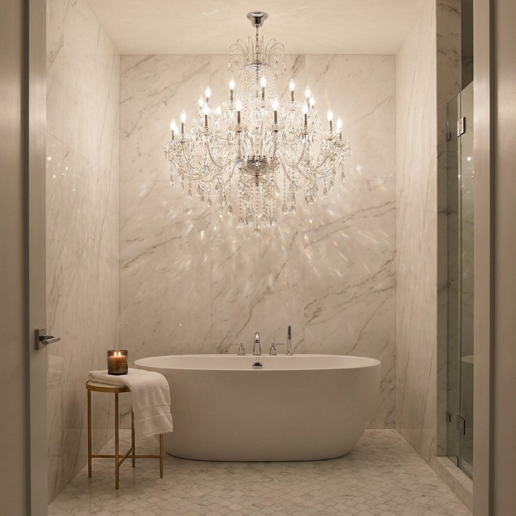
Nothing says “I have money and I will make sure you know it” quite like crystal hanging where steam collects. A chandelier above a soaking tub has become the Instagram bathroom’s calling card, and honestly, I understand the appeal on a visceral level. You want to feel fancy while you’re in the bath. I get it.
But a crystal chandelier in a nine-by-twelve bathroom is fighting a losing battle with humidity, scale, and common sense. The crystals collect moisture. The proportions are almost always wrong because bathroom ceilings aren’t ballroom ceilings. And the maintenance? Nobody who installs one of these thinks about the maintenance.
The dead giveaway is when the chandelier costs more than the plumbing fixtures it’s hanging next to. Old money puts the budget into the bones. New money puts it into the thing you photograph.
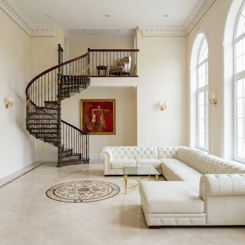
Two Staircases in a House Where Nobody’s Hosting a Debutante Ball
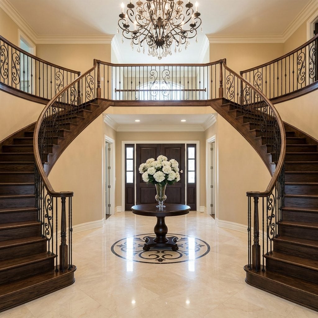
Double staircases belong in three places: French chateaux, plantation houses from the 1800s, and the final scene of a telenovela. They do not, strictly speaking, belong in a five-bedroom suburban build in a cul-de-sac off the interstate. And yet.
The dual staircase announces itself the moment you walk through the front door, which is always a double door with sidelights and a transom, naturally. Two sweeping curves of wrought iron balusters frame the foyer like parentheses around a sentence that didn’t need them. The problem isn’t aesthetic; some double staircases are genuinely well-proportioned. The problem is that the second staircase almost always leads to the same hallway. You’ve spent an extra forty thousand dollars on a different route to the same place.
Following certain home trends is fine. Duplicating structural elements purely for symmetry in the foyer photo is something else entirely.
Decorative Columns Holding Up Absolutely Nothing but an Ego

The columns aren’t structural. We all know they aren’t structural. The builder knows. The homeowner knows. The delivery driver who pulls into the circular driveway every Tuesday knows. These columns are holding up a pediment the size of a beach umbrella, and they’re doing it with the gravitas of a Corinthian order that was originally designed to support a marble temple.
I will die on this hill: decorative columns on a house that was built in 2019 with stucco and stone veneer are the single loudest new money signifier in residential architecture. It’s a costume. The house is wearing a costume.
The Wine Fridge That’s Bigger Than the Fridge You Actually Need to Survive

A 24-bottle under-counter wine cooler? Reasonable. Even useful if you actually drink wine with any regularity. But when the wine storage unit is a full-height, dual-zone, 150-bottle monument to Cabernet with its own ambient lighting and it’s sitting next to a standard 36-inch refrigerator, the proportions tell a story.
The story is: I want you to know I buy wine. Often. In volume.
Real wine collectors, the ones with cellars that actually matter, keep their bottles in temperature-controlled rooms away from light and vibration. They don’t backlight them in a scandinavian home bar setup next to a brass bar cart. The display wine fridge is a performance. It’s the vinous equivalent of leaving a designer shopping bag on the counter where guests can see it.
A Home Cinema Room That’s Basically a Very Expensive Dust Collector
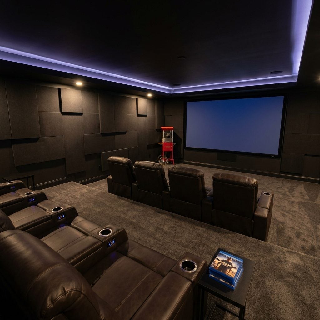
Twelve leather theater recliners with built-in cup holders, a 120-inch screen, acoustic paneling, a vintage-style popcorn machine in the corner, and the faint smell of a room that hasn’t had its door opened since March.
The home cinema is the crown jewel of new money investments that sound incredible in theory. The pitch writes itself: movie nights, game days, a private screening room right in your own basement. And then real life happens. The kids watch TikTok on their phones. You fall asleep twenty minutes into anything after 8 PM. Your partner prefers the couch upstairs because that’s where the dog sits. The popcorn machine gets used once, leaves a residue that’s annoying to clean, and becomes a decorative sculpture.
I say this as someone who once seriously priced out projector systems for a room I would have used exactly never. The fantasy is powerful. The 4K projector doesn’t care.
Gold Taps in Every Bathroom, Including the One Nobody Has Ever Used
One bathroom with brushed gold faucets? That can look genuinely sharp, especially in a powder room with dark walls and good lighting. Every bathroom in the house? Including the third-floor guest bath that hasn’t seen a guest since the housewarming party? That’s a commitment to a metal finish that borders on ideology.
The new money gold tap situation operates on a simple principle: if it looked good in one room, it will look five times as good in five rooms. This math does not hold up. Consistency is a design virtue up to a point, but past that point, it stops feeling cohesive and starts feeling like a spec sheet. “Gold fixtures throughout” is a line from a real estate listing. It’s not a design philosophy.
The Grand Piano Nobody Has Ever Played, Positioned Exactly Where You Can’t Miss It
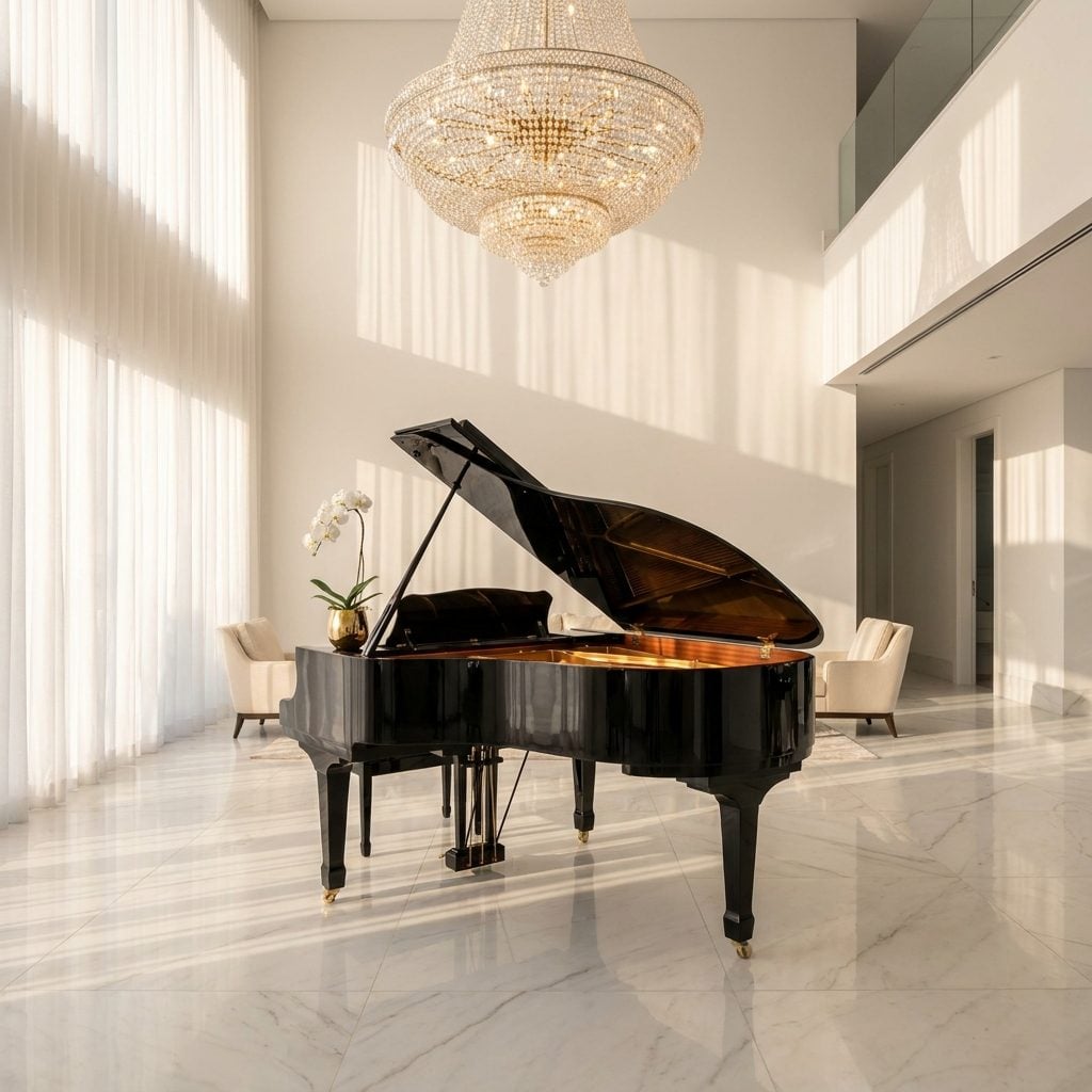
There it is. A full black grand piano taking up roughly the square footage of a studio apartment, gleaming under a chandelier, and not a single fingerprint on the keys. No sheet music. No bench wear. No half-finished Chopin nocturne propped against the music stand. Just a very expensive piece of furniture pretending to be a personality trait.
The tell isn’t owning a grand piano. Plenty of people play. The tell is the placement: dead center in the foyer or living room, angled so every guest sees it before they see a couch. It’s furniture as announcement. I’ve been in homes where the piano bench still had the plastic wrap on it, and honestly, I respected the honesty of that more than the gold-framed “concert” photos on the wall.
Old money pianos live in side rooms, slightly out of tune, with dog-eared Gershwin books and a sticky middle C. New money pianos live on a stage.
A Coffee Machine That Cost More Than Your First Car
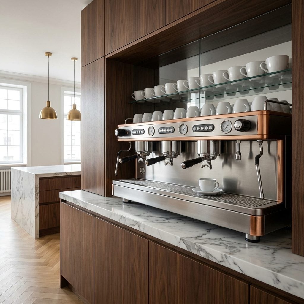
If the espresso machine requires its own dedicated electrical circuit and a YouTube tutorial to operate, you’re in new money territory. I’m not talking about a nice Breville on the counter. I’m talking about a commercial espresso machine built into custom cabinetry, with pressure gauges that look like they belong on a submarine.
The irony is thick: these machines sit in kitchens where the owner mostly drinks drip coffee, or worse, sends the housekeeper to grab a latte from the place down the road. The machine exists as proof that you could pull a perfect shot if you wanted to. You just don’t want to right now. Or ever, apparently.
The Indoor Water Feature That Sounds Like a Broken Toilet but Cost $40,000

Nobody asked for this. Not the architect, not the interior designer, not a single guest who now has to shout over the sound of trickling water during dinner conversation. And yet here it stands: a floor-to-ceiling slate water wall in the living room, gently reminding everyone that money was spent.
Indoor fountains are the new money equivalent of a peacock fanning its tail. They serve no function. They add humidity to rooms that don’t need it. They require maintenance that nobody anticipated. But they look like something you’d see in a hotel lobby, and that’s the whole point: new money loves recreating commercial luxury at home, as if living inside a W Hotel is the peak of residential design.
The psychology here is fascinating. Research on conspicuous consumption suggests that people who’ve recently acquired wealth tend to signal it through features that code as “resort” or “boutique hotel” rather than features that code as “home.” A water feature says “I’ve arrived.” A well-worn reading chair says “I’ve been here a while.”
A Spiral Staircase That Leads to a Room You’d Never Actually Need to Visit
Where does it go? A loft with a single chair? A rooftop terrace the size of a bathroom? A reading nook that gets used as overflow storage for holiday decorations? The spiral staircase in a new money home is almost never about connecting two essential floors. It’s about the spiral itself.
These staircases are gorgeous pieces of metalwork, I’ll give them that. Wrought iron with gold balusters, sweeping mahogany handrails, the works. But form crushed function a long time ago here. Try carrying a laundry basket up one of these. Try navigating it at 2 a.m. after a glass of wine. The spiral staircase is architectural theater, and the audience is whoever walks through the front door.
A Floor-to-Ceiling Library Where Every Spine Looks Suspiciously Uncracked
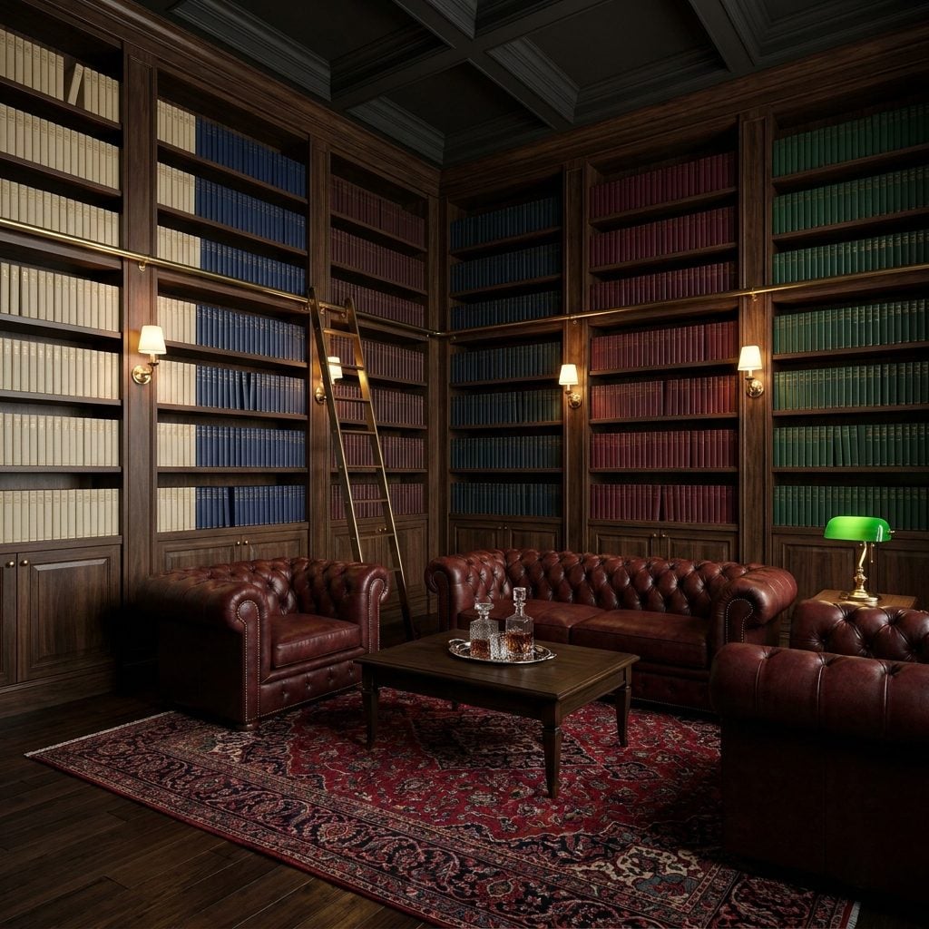
Color-coordinated spines are the giveaway. Cream fading to navy fading to burgundy, a perfect gradient across three walls, and every single book looks like it just came out of the box. No creased covers. No Post-it notes sticking out at odd angles. No paperback someone clearly read in the bathtub.
A real reader’s library is a mess. It has three copies of the same novel because you forgot you already owned it. It has a stack on the floor next to the chair because the shelves ran out of room two years ago. The oxblood leather Chesterfield has a permanent indent where someone actually sits.
New money libraries are purchased by the linear foot. That’s a real thing: decorators buy books in bulk, sorted by color and height, sold specifically to fill shelves. The books become wallpaper. And look, I get it. A wall of books is one of the most visually satisfying things in interior design. But there’s something a little hollow about a library that’s never given anyone a paper cut.
Framed Magazine Covers of the Homeowner Hanging in the Homeowner’s Own House
This one’s almost too on the nose. A dedicated gallery wall in the hallway, six matching gold frames with individual brass picture lights, each illuminating a magazine cover or press feature. It’s a shrine, and the deity is the person who owns the house.
Old money hides its press. It gets tucked in a drawer or maybe pinned to a corkboard in the study next to a takeout menu. New money frames it, lights it, and positions it so you pass it on the way to the bathroom.
Your Initials Carved Into the Front Gate Like You’re a Renaissance Duke

🔥 Would you like to save this?
Monogrammed towels? Fine. Monogrammed stationery? Classic. Monogrammed wrought iron entry gates with your initials in gold leaf? That’s new money talking, and it’s not whispering.
The impulse to brand your property like a medieval coat of arms reveals something specific about the relationship between identity and real estate. For new money, the home isn’t just where you live. It’s proof of who you’ve become. Carving your initials into the gate is the residential equivalent of wearing a name-brand logo on the outside of your clothing. You want people to know this belongs to someone, and that someone has a name worth remembering.
I’ll be honest: I find this one weirdly endearing compared to some of the other signs on this list. At least it’s direct. No pretending the gate is about “security” or “privacy.” Those wrought iron gates with the golden monogram are saying exactly what they mean. Following various home trends is one thing, but literally putting your stamp on the property takes a certain kind of confidence.
Two Stone Lions Guarding a Driveway That Leads to a Three-Bedroom House

Nothing says “I just closed on this property and I’m going to make sure you know it” quite like a pair of stone sentinels guarding the approach. Lions are the popular choice. Occasionally you’ll see eagles, or those vaguely Grecian figures holding urns, but the lion is the undisputed champion of the new money driveway.
The real comedy is the scale mismatch. A pair of four-foot stone lion statues on pedestals, a circular driveway with a fountain, Italian cypress trees lining the approach, and then… a perfectly nice three-bedroom house at the end of it. The entrance promised Versailles. The house delivered Toll Brothers. And I’m not knocking Toll Brothers. I’m knocking the lions.
The Pool Has Its Own Waterfall, and It’s Louder Than the Conversation
There’s a difference between a pool and a production. A lap pool tucked behind a hedge says one thing. A pool with a multi-tiered waterfall that sounds like a small hydroelectric dam says something else entirely. You can’t hold a conversation within fifteen feet of it, but that’s not really the point, is it?
The rock work is always faux. I don’t mean that as a dig, just an observation. Real boulders would cost a fortune to move, and new money is shrewd about spending where it shows versus where it doesn’t. The cascade usually has colored LED lighting embedded in it, cycling through blue and purple at night like the world’s most expensive screensaver.
Here’s what gives it away: the waterfall is always dramatically oversized relative to the pool. A modest 20-by-40 pool with a waterfall that belongs on a resort in Cancun. The ratio is the tell.
The Garage Floor Is Warmer Than Most People’s Living Rooms
Underfloor heating in a bathroom? Civilized. Underfloor heating in a kitchen? Smart, even. Underfloor heating in the garage? That’s new money talking, and it’s not whispering.
I’ll be honest: I didn’t know this was a thing until I walked into someone’s garage barefoot (long story) and the polished epoxy flooring was warm. Not ambient-temperature warm. Actively, intentionally heated. The thermostat on the wall was set to 72 degrees. In the garage. Where cars drip slush.
The logic, if you dig into it, is about protecting luxury vehicles from temperature swings. But let’s call it what it is: a flex disguised as practicality. Old money lets the garage be cold. New money makes the garage a lounge.
There’s a Full Bar in the Living Room and Nobody Seems to Find That Unusual

A bar cart is charming. A wet bar in the basement is practical. A full bar built into the living room wall, complete with sink, tap, and backlit shelving? That’s a statement about how you expect Tuesday evenings to go.
The telltale details: the counter is always stone, usually black granite or a dark-veined marble. The stools are never casual. They’re upholstered in leather with brass bar stool frames, the kind you’d find at a boutique hotel. And the shelving behind always has that amber backlighting that makes every bottle look like it costs three figures. If you’re curious about how home bars fit into different aesthetics, the scandinavian home bar approach takes the opposite route entirely.
The Ceiling Has a Mural, and Yes, That Might Be the Homeowner’s Face in It
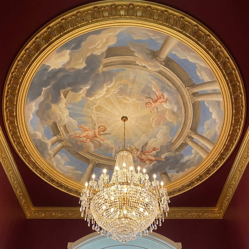
Ceilings are supposed to be forgotten. That’s the whole point. They’re the quiet fifth wall, painted white and left alone. So when you walk into a foyer and look up to find a full Renaissance-style mural with clouds, cherubs, and dramatically rendered family members ascending toward gilded sunbeams, you know you’ve crossed a threshold.
The gold leaf crown molding framing these compositions is always excessive, always ornate. The chandelier hanging from the center competes with the artwork for attention, and somehow both lose.
I say this with genuine respect for the craftsmanship involved: commissioning a ceiling mural takes real commitment and real money. But there’s a line between art patronage and vanity, and putting your own likeness on the ceiling of your house is firmly on one side of it. Old money hangs portraits in hallways where guests might miss them. New money puts them overhead where looking away isn’t an option.
The Panic Room Comes Up in Conversation Like It’s a Pantry
“Oh, the panic room is just past the second closet on the left.” Said like they’re giving directions to the powder room.
The casual mention is the sign. Not the room itself. Plenty of homes in certain price brackets have reinforced safe rooms. But old money doesn’t talk about them because the entire point is discretion. New money brings it up during the house tour, right between the wine cellar and the home theater, like it’s another amenity. Which, to be fair, it kind of is.
The Curtains Weigh More Than Your First Car
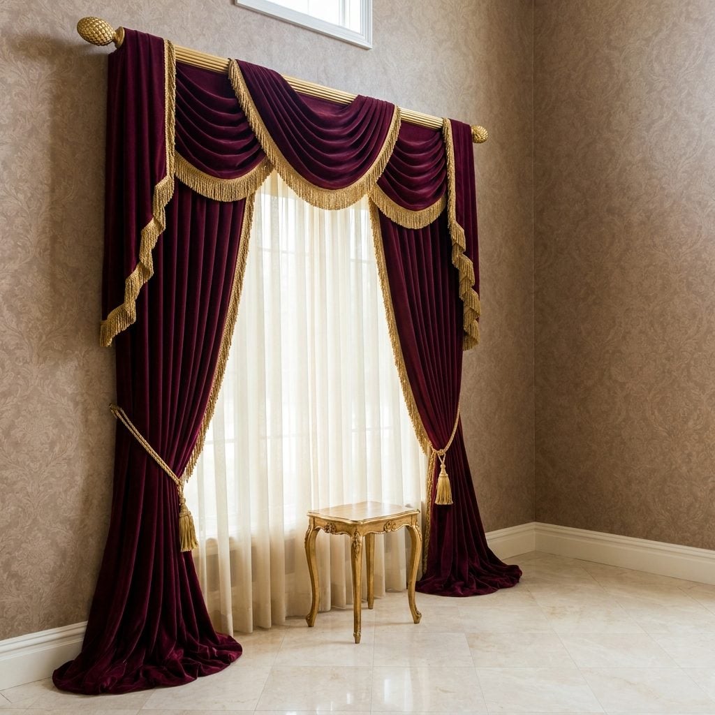
These aren’t curtains. These are events. We’re talking burgundy velvet drapes that puddle on the floor like they’re melting, hung from gold curtain rods thick enough to do pull-ups on. The bullion fringe alone probably cost more than a decent area rug.
Three ways to spot the new money curtain:
- They pool on the floor by at least six inches, creating fabric puddles that the cleaning crew has to rearrange weekly.
- There are tasseled rope tiebacks that look like they were borrowed from a theater.
- The fabric is so heavy that the curtain rod required structural reinforcement to install.
Old money uses linen. Faded linen, sometimes. The weight and drama of the fabric is inversely proportional to how many generations the money has been around. That’s not a rule I read somewhere. It’s just something I’ve noticed over the years, and I will die on this hill.
The Crystal Decanters Are Full, the Glasses Are Spotless, and Nobody’s Drinking

The crystal whiskey decanters are always full. Always. And here’s what nobody says out loud: decanting spirits into crystal is purely decorative. Wine benefits from decanting. Whiskey does not. It just looks expensive sitting in cut crystal on a walnut sideboard, which is the entire point.
The matching lowball glasses next to them are the real giveaway. They’re spotless, unchipped, arranged with the precision of a store display. Nobody has picked one up in a hurry on a Friday night. Nobody has left a ring on the wood. The setup exists to be looked at, and that’s fine, but it’s a museum exhibit disguised as hospitality. Real drinkers keep their good stuff in the cabinet and their everyday bottle on the counter with the cap half-twisted.
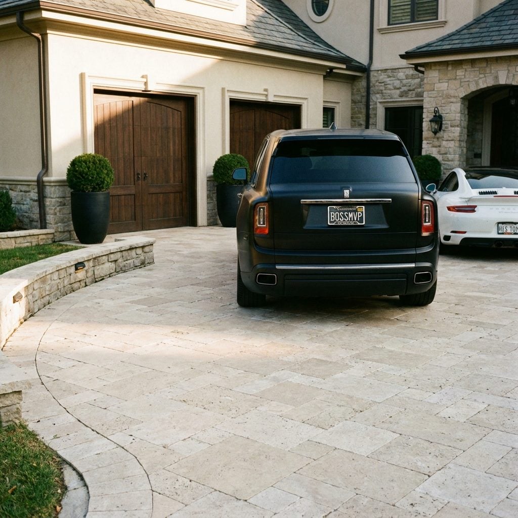
The Driveway Has Three Identical SUVs and They’re All the Same Shade of Black
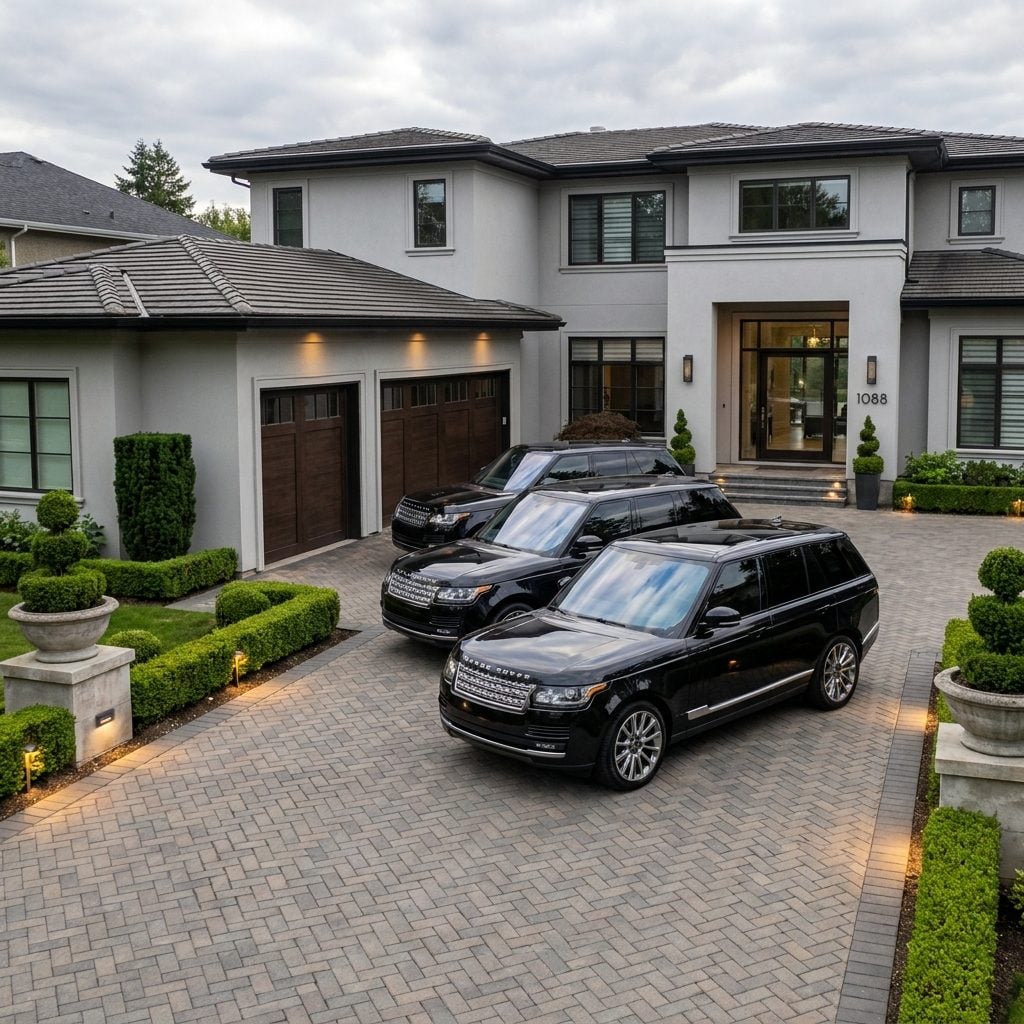
One black luxury SUV is a car. Two is a coincidence. Three, parked in formation on a herringbone paver driveway? That’s a fleet, and it’s sending a message.
The matching is the key detail. Not just the same brand, but the same color, the same trim level, the same tinted windows. It reads like someone placed a bulk order, which, honestly, they probably did. Some dealerships offer fleet discounts, and new money knows a deal when it sees one, even at six figures per vehicle.
Current home trends lean toward integrated garages and motor courts designed specifically for this kind of display. The driveway itself becomes a showroom. But here’s my favorite part: at least one of these vehicles has fewer than 2,000 miles on it and gets driven exclusively to pick up dry cleaning. It’s a very expensive errand runner in a matching uniform.
The Koi Pond That Greets You Before the Front Door Does

There’s a difference between a garden pond tucked beside a mature willow tree and a koi pond installed dead center in your approach to the house, complete with underwater lighting and a footbridge that serves zero functional purpose. The first says “I enjoy nature.” The second says “I enjoy making sure you know I can afford living sculptures that eat specialty pellets.”
New money koi ponds always share a few tells: the water is suspiciously clear, the fish are color-coordinated, and there’s almost always a fountain element that sounds like a hotel lobby. The pond isn’t tucked away. It’s positioned so every delivery driver, every guest, every passing neighbor has to acknowledge it before they can ring the bell.
I’m not saying koi ponds are bad. I’m saying if your fish have better real estate than half the apartments in my zip code, we’re in a specific territory.
Every Surface Has Recessed Lighting, Including Surfaces That Should Not Have Recessed Lighting
Recessed lighting is fine. Recessed lighting in your ceiling, your staircase, your toe kicks, under your cabinets, inside your closets, along the underside of your floating shelves, embedded in your bathroom mirror, and somehow also in the risers of your pool steps? That’s a lighting plan drawn up by someone who was told “yes” too many times in a row.
The new money approach to lighting treats darkness as a personal failing. Every corner must glow. Every surface must announce itself. The electricity bill alone could fund a small renovation.
The Walk-In Wardrobe That Makes Your Actual Bedroom Feel Like a Hallway

If your closet has its own chandelier, its own island, and its own climate control, it’s not a closet anymore. It’s a room that happens to store clothes. And that distinction matters.
Old money keeps a modest wardrobe of very good pieces in a cedar-lined closet that smells like their grandmother’s house. New money builds a 400-square-foot velvet-lined jewelry drawer system with a crystal chandelier overhead and a blush velvet ottoman for sitting while contemplating which of 60 nearly identical white sneakers to wear. The shoes are displayed like museum artifacts. The hangers are all matching. There’s usually a full-length trifold mirror that could double as a department store fitting room.
I’ll admit the organization is satisfying to look at. But the moment your closet is bigger than the bedroom it’s attached to, the priorities have tilted in a very specific direction.
Every Car in the Driveway Wears a Vanity Plate Like a Name Tag at a Networking Event
One vanity plate is a personality. A fleet of them is a press release.
New money energy doesn’t just buy a luxury vehicle. It names it. “BOSSMOM.” “HIS TOY.” “WERK1T.” Every car in the household becomes a rolling mission statement, parked in formation on a driveway that looks like it was pressure-washed that morning. The plate frames are always custom chrome. The registration stickers are always suspiciously current.
There’s something almost endearing about the commitment to personal branding, even in a parking context. But the cumulative effect of pulling up to a house where every vehicle introduces itself is… a lot. It’s the automotive equivalent of a monogrammed bathrobe you wear to answer the door.
The Wine Cellar Where Not a Single Bottle Was Chosen by the Person Who Owns It

🔥 Would you like to save this?
A wine cellar tells you a lot about someone. If the bottles are dusty, mismatched, and crammed in with a few gaps where favorites used to be, that’s a person who actually drinks wine. If every single bottle is label-forward, organized by Bordeaux sub-region, and there’s a leather-bound journal tracking acquisitions, a sommelier built this collection on retainer.
The consultant cellar has a particular energy. Nothing is there by accident. Nothing was grabbed on impulse during a trip to Napa because the tasting room had good crackers. It’s investment-grade wine stored at precisely the right temperature, and the owner might not be able to tell you what half of it tastes like.
Furniture That Exists Purely to Be Looked at and Never, Under Any Circumstances, Sat Upon

You know the room. You’ve been in the room. You were immediately told, gently or not, that this room is “just for show.”
The ivory damask chairs have never held a human body. The cream velvet sofa cushions still have factory-crisp edges. The silk pillows are arranged with the precision of someone who owns a level. There might as well be actual velvet ropes. Sometimes there kind of are, in the form of a stern comment from the homeowner or a decorative chain draped across a doorway.
This is furniture as sculpture, and it’s one of the loudest new money signals there is. Old money sits on everything because they’ve had the same sofa for 30 years and it already has a wine stain from 1997. New money buys a $14,000 settee and then redirects all human traffic to the media room. The signs your kitchen is more about appearance than function follow the same logic: when the space exists to impress rather than to live in, the energy shifts from home to showroom.
The Driveway Is So Expansive It Needs a GPS Pin, Not an Address

If a pizza delivery driver needs to call you for directions once they’re already on your property, your driveway has crossed a threshold.
The new money driveway isn’t just a place to park. It’s an arrival experience. There’s a gate. Then a long approach flanked by identical trees. Then a roundabout with a fountain that nobody asked for but everyone has to drive around. Then a fork: one path to the main entrance, another to the guest parking area, a third to the garage wing. Your driveway has wings.
The Kitchen Island That Could Comfortably Seat a Rowing Team
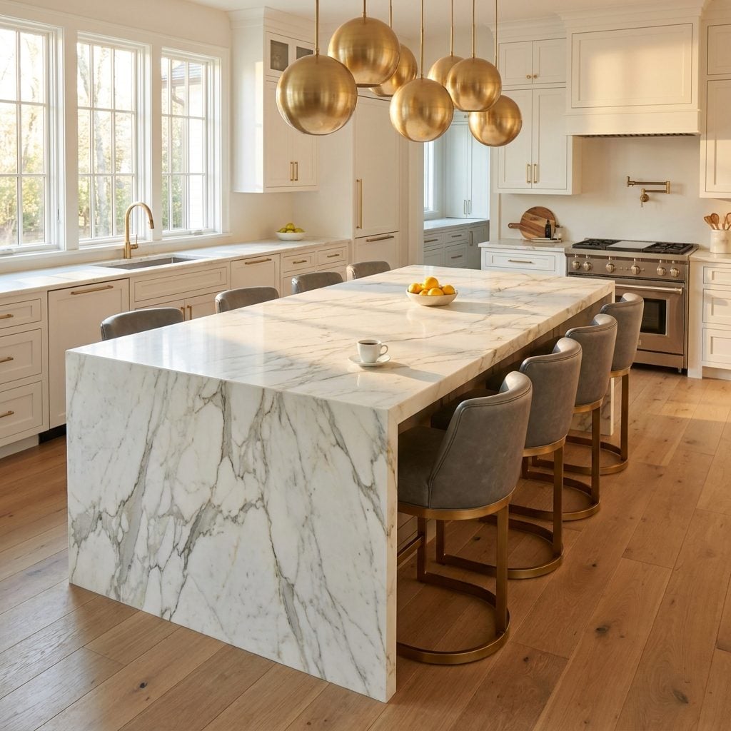
You could land a helicopter on it. You could host a poker tournament. You could, theoretically, prepare food on it, but the prep sink at one end is so far from the cooktop at the other that you’d need a Fitbit just to track your steps during dinner prep.
Oversized kitchen islands have become the defining flex of new money interiors. The logic seems to be: if a six-foot island is nice, a twelve-foot island must be twice as nice. But there’s a point where a marble kitchen island stops being functional and starts being a monument. I’ve seen homes where the island literally prevents two people from passing each other on opposite sides. That’s not a layout. That’s a bottleneck with Calacatta cladding.
The real tell? When there are more leather bar stools around the island than meals cooked on it per week. If your island has its own zip code but your spice rack holds exactly four jars, we know where the priorities landed.
The Hedges Are Shaped Like Something Your Landscaper Needed an Art Degree to Attempt

Regular hedges say “someone maintains this property.” Hedges sculpted into rearing stallions flanking your front walk say something else entirely.
Topiary is one of those home trends that reveals the exact temperature of someone’s ambition. A neatly trimmed boxwood sphere? Tasteful. A six-foot family crest rendered in living greenery? That’s a landscaper who charges by the hour and a homeowner who never asked them to stop. The commitment to maintaining these shapes is genuinely intense. One missed trimming and your majestic lion starts looking like a lumpy dog.
What really clinches the new money diagnosis is the placement. These aren’t hidden in a private garden where the homeowner quietly enjoys them. They’re positioned at the entrance, facing the street, doing PR work for the household 24 hours a day.
The Bedroom Chandelier That Hangs Directly Over the Bed Like a Crystal Guillotine
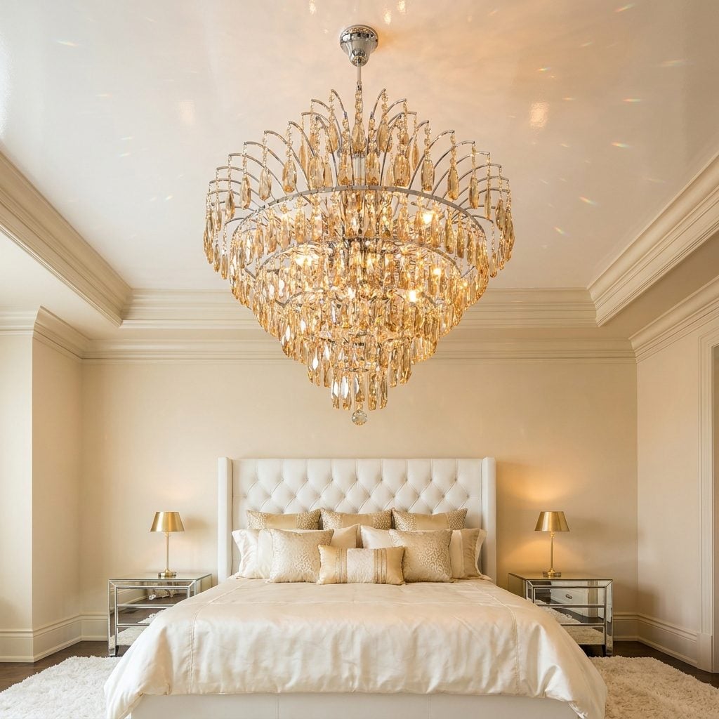
I’ll be honest: I spent an embarrassing amount of time thinking a bedroom chandelier was the height of sophistication. Then I actually slept under one for a weekend at a friend’s place and spent the entire night mildly terrified it would come loose during an earthquake. That primal unease? It’s kind of the whole problem.
A chandelier in a bedroom isn’t inherently bad. Plenty of older homes have modest pendant fixtures that look perfectly at home above a bed. The new money version is different. It’s a crystal chandelier sized for a ballroom, crammed into a fourteen-by-sixteen-foot room, dripping with prisms that throw tiny rainbows across ivory silk sheets at two in the afternoon. The fixture alone probably cost more than the mattress beneath it.
The real tell is function. Nobody needs seventy-two bulbs of ambient light to fall asleep. The chandelier isn’t there for the person in the bed. It’s there for the person who walks in and sees the bed.
Every Cushion, Throw, and Rug Is Screaming a Designer’s Name at You

Here’s the difference between owning luxury and performing it: someone with old money might have a Hermès blanket folded quietly in a cedar chest they inherited. Someone with new money has that same brand’s logo repeated across every monogram throw pillow, a logo print throw blanket, and a rug that basically turns the living room floor into a billboard.
The logos aren’t hidden in the weave. They’re the entire point. You can read the brand from across the room, which is exactly the intention. It’s decor that functions as a receipt.
There’s a Secret Second Kitchen Hiding Behind the One You’re Allowed to See
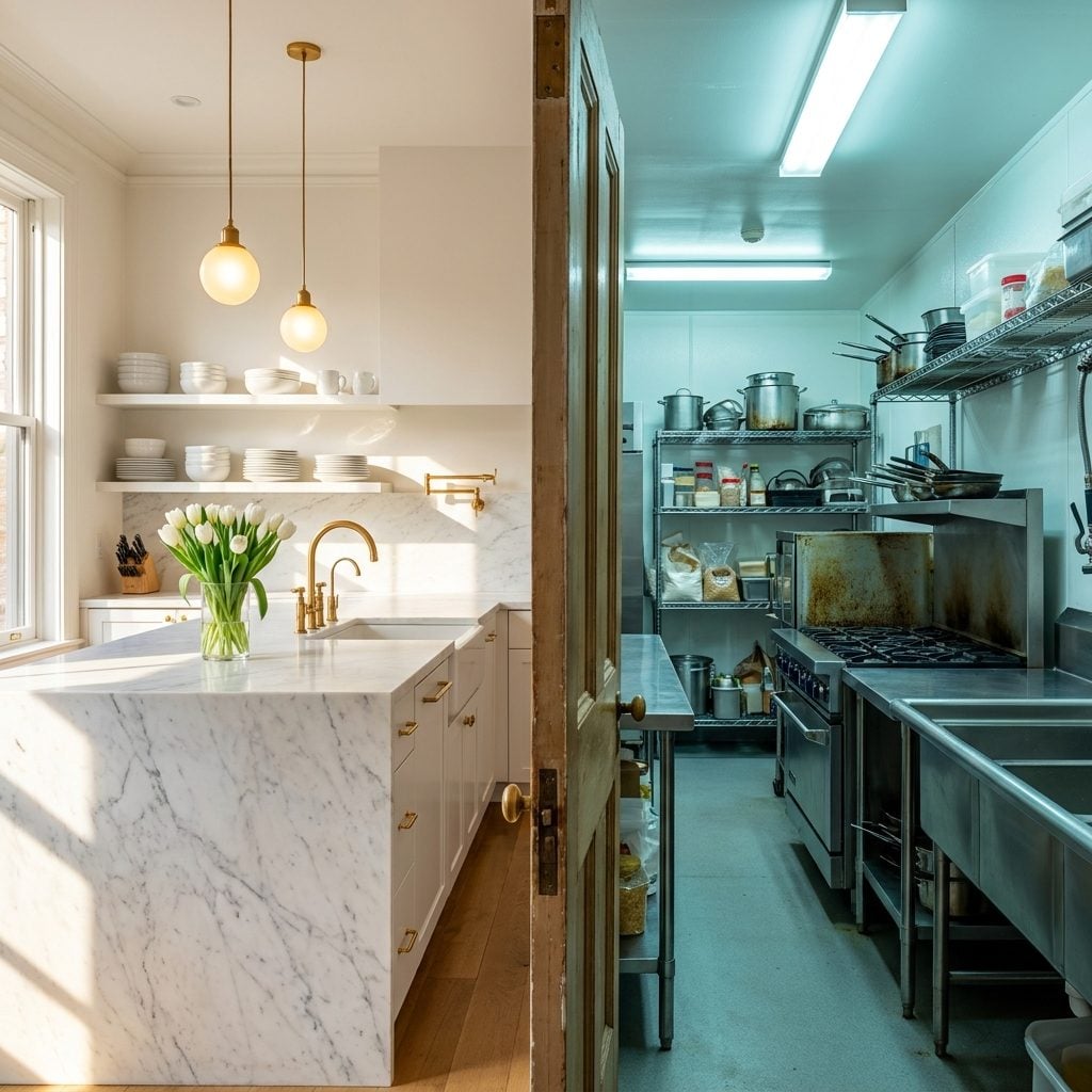
The main kitchen has a white marble waterfall island you could land a small plane on. There are no appliances on the counter. No toaster, no knife block, no evidence that food has ever been prepared here. And that’s because it hasn’t.
The actual cooking happens in a second kitchen tucked behind a door, complete with commercial-grade equipment, grease guards, and fluorescent lighting that makes everything look vaguely institutional. This is sometimes called a “caterer’s kitchen” or “prep kitchen,” and while they genuinely make sense in homes that host large events, the new money version exists for a different reason: the real kitchen is too pretty to use.
I’ve seen this setup where the homeowner admitted they’d never once turned on the range in the front kitchen. Not once. The signs your kitchen is more about performance than cooking start right here, with a room that’s essentially a museum exhibit about the concept of food preparation.
The Grand Entryway Wrote a Check the Rest of the House Can’t Cash
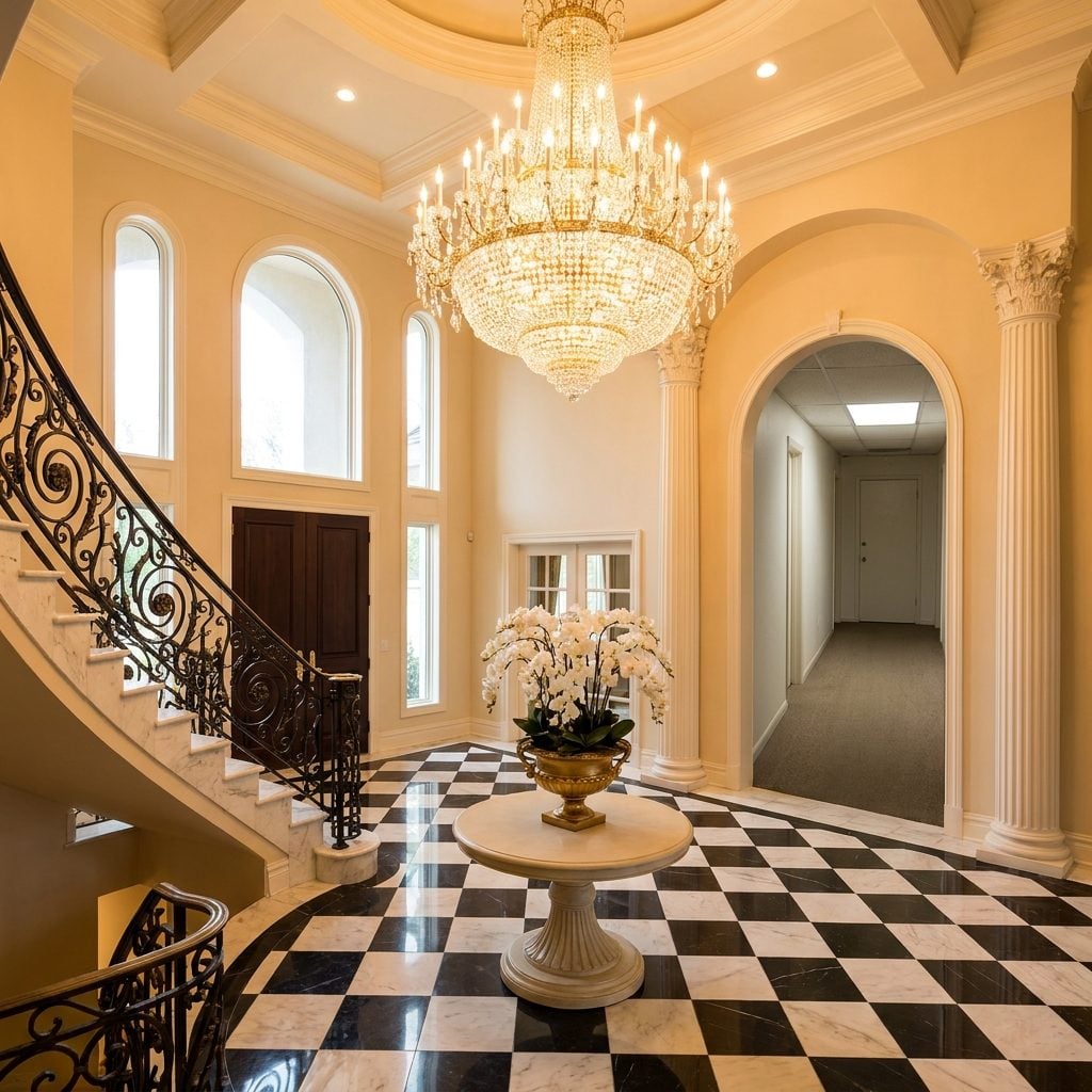
You walk through a pair of towering double doors into a two-story foyer with a curved marble staircase, wrought iron stair railings, and a chandelier the size of a Smart car. You think: okay, this is going to be something.
Then you turn the corner into a hallway with eight-foot ceilings, beige carpet, and hollow-core doors, and you realize the budget ran out about fifteen feet past the threshold.
This is maybe the most telling sign on the entire list. The entry is where guests form their first impression, so that’s where the money goes. It’s a storefront. And like a lot of storefronts, what’s behind the display window doesn’t quite match the promise. The columns, the checkered marble floor tile, the pedestal table with orchids arranged like a hotel lobby: all of it stops the moment the audience is no longer standing right there.
Every Single Room Has a “Main Character” and They’re All Yelling Over Each Other

🔥 Would you like to save this?
A room needs one focal point. Maybe two if you’re skilled and the space is large enough. What it does not need is a red velvet Chesterfield sofa, a zebra-print rug, a neon abstract painting, a gold sunburst mirror, a sculptural chrome floor lamp, and a live-edge coffee table all fighting for your eye at the same volume.
But that’s the new money instinct: every item purchased individually because it looked impressive in a showroom, then placed together in a room where they cancel each other out. It’s the design equivalent of five people talking at once at dinner. Nobody’s wrong, exactly, but nobody’s being heard either. The missing ingredient is restraint, and restraint is hard to buy.
A Dining Table That Seats Twenty in a Household Where Nobody Cooks
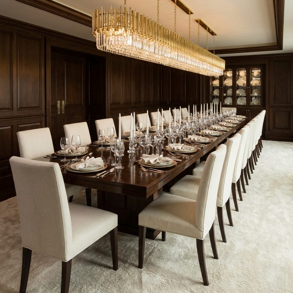
Twenty chairs. A single family of four. The math never works, but that’s not the point.
The point is the dark walnut dining table stretching the full length of the room like a boardroom conference setup, every place set with charger plates and unburned taper candles and crystal candle holders nobody has ever actually lit. The china cabinet at the far wall holds matching sets that have never touched dishwater. I will die on this hill: a dining room that never hosts a dinner is just a furniture warehouse with good lighting.
Celebrity Photos Greet You at the Door Like a Résumé Pinned to the Wall
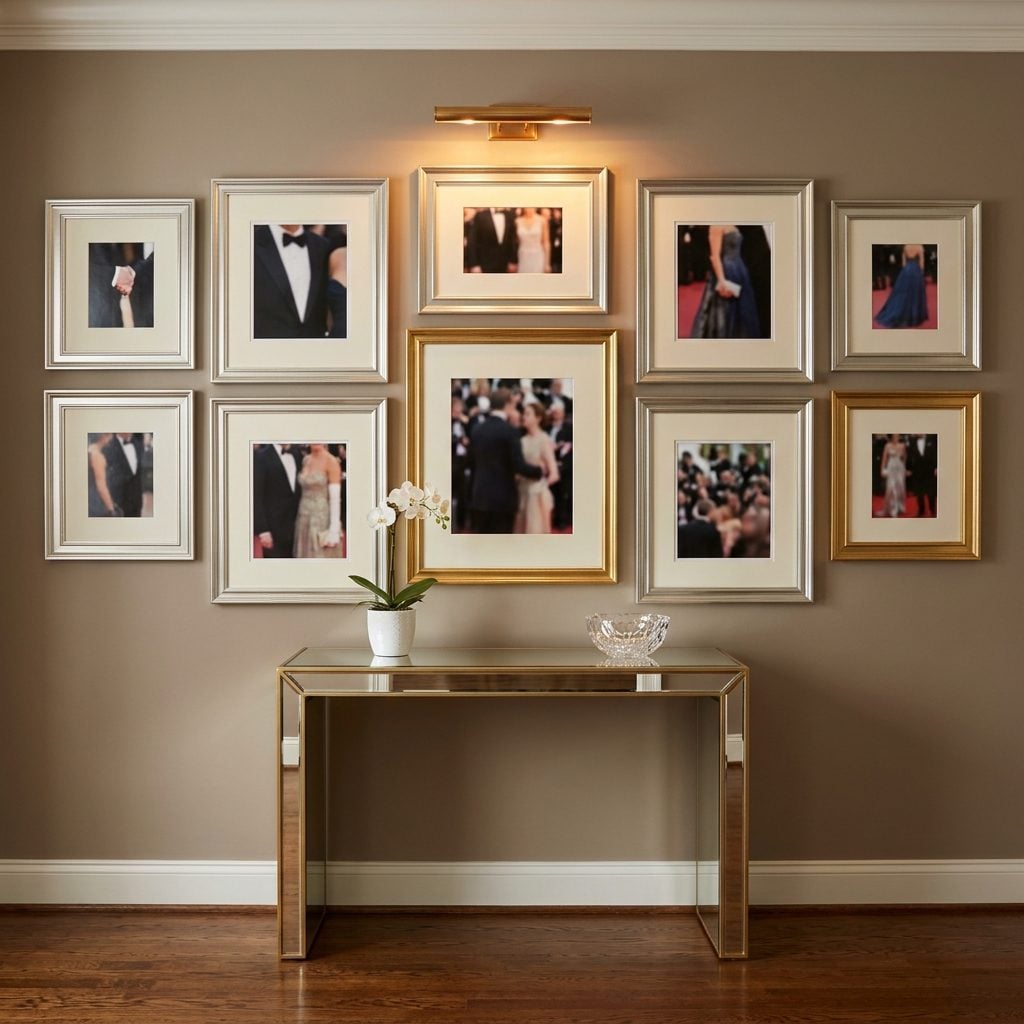
Nothing says “please ask me about this” quite like a gallery wall of event photos positioned exactly where your guests can’t miss them on the way in. The mirrored console table beneath, the brass picture light aimed at the center frame, the deliberate placement at eye level in the foyer rather than, say, a private hallway or office: it’s all orchestrated.
Old money tends to tuck personal photos into dens and libraries, mixed in with family snapshots spanning generations. New money puts the highlight reel right at the door.
You Can Feel the House Holding Its Breath, Waiting for You to Be Impressed

This is the hardest sign to photograph but the easiest to feel. You walk into the room and something is off. Not ugly, not cheap, not poorly maintained. Just… effortful. Every surface decorated. Every throw folded at the same angle. Books arranged by spine color on shelves where nothing has ever been pulled out and actually read.
The house is performing. And you can tell because it makes you want to perform back. You feel like you should compliment something. You feel like that’s why you were invited.
Homes that have settled into real comfort have dead zones. A corner where nothing interesting happens. A shelf with a gap where something fell and nobody replaced it. A couch cushion permanently dented from one person’s preferred spot. The absence of those imperfections is the loudest sign of all. When a space has been styled to eliminate every trace of actual living, what’s left is a stage set. And stage sets, no matter how expensive the props, always feel slightly hollow when you’re standing on them.
The Cigar Room Nobody Actually Smokes In (But Everyone Gets a Tour Of)
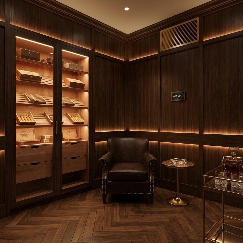
The tell: the ashtray is always clean. Not “recently emptied” clean — factory clean. The kind of clean that means this room exists so someone can gesture toward it during a house tour and say “and this is my cigar room” with a practiced casualness that fools absolutely no one.
A dedicated, climate-controlled cigar lounge with cedar humidor cabinets, custom ventilation, and a brass bar cart loaded with untouched crystal is one of those rooms that announces itself. The humidity sensors, the walnut paneling, the leather club chair still stiff from the showroom — all of it costs real money. And broadcasting that cost is the whole function of the space.
Actual cigar enthusiasts tend to smoke on patios, in garages, in dens that smell like decades of accumulated ash. The room gives itself away when it smells like cedar and leather conditioner instead of, well, cigars. I say this as someone who once spent an embarrassing amount on a wine fridge that held exactly twelve bottles for three years before admitting I don’t drink enough wine to justify a dedicated appliance. We all have our version of this room.
Abstract Art the Size of a Garage Door That Was Clearly Purchased by the Square Foot

The canvas is enormous. What it communicates is: “I had a big wall.”
There’s a specific genre of abstract art that exists almost exclusively in new money homes, and you know it the instant you walk in. Aggressive gold-and-charcoal brushstrokes on a white field, sized to fill a wall the way primer covers drywall. It doesn’t provoke thought or reference anything — it coordinates with the sofa. That’s how you know a decorator flipping through a catalog picked it rather than someone who stood in a gallery and felt something land.
Size isn’t the giveaway, though. Plenty of collected art is large. What gives it away is that the piece has zero relationship to anything else in the room, on the shelves, or in the owner’s actual life. It’s an oversized abstract canvas doing the same job as wallpaper, hung above a white lacquer credenza with two identical matte black decorative spheres spaced equidistant apart.
Old money walls have oil paintings of somebody’s dog from 1987 hung beside a framed concert poster. The mix tells a story. A single oversized abstract that matches the throw pillows tells a different one, and it reads: “I had a budget line item for art.” Your kitchen can broadcast the same vibe, but nothing matches the volume of a six-foot canvas shouting nothing.
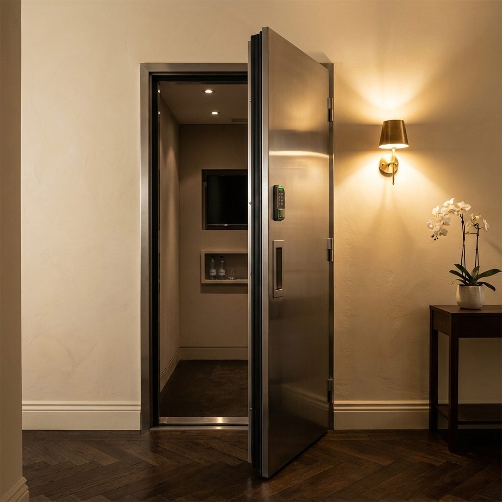
A Residential Elevator in a Two-Story House Where the Stairs Are Ten Feet Away
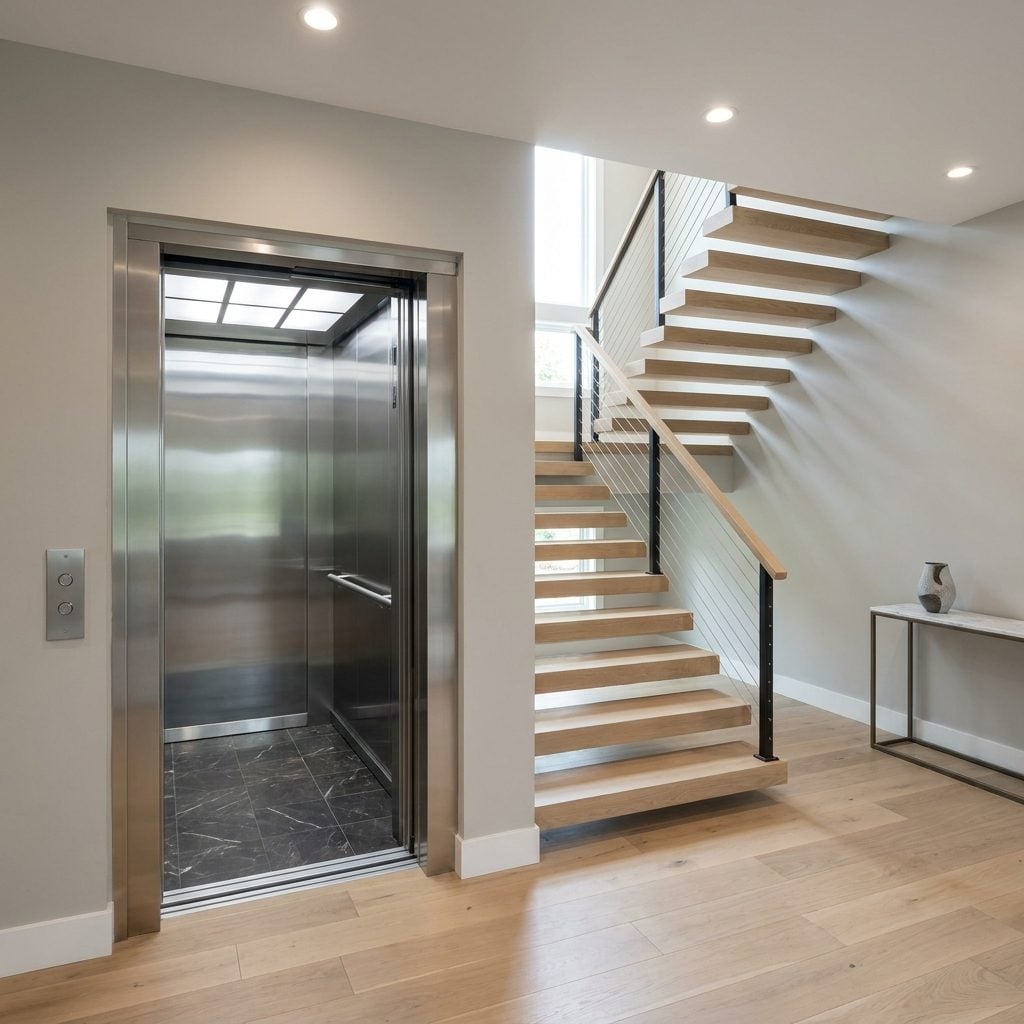
Two floors. A residential elevator. And a perfectly good staircase literally right there.
Elevators make complete sense in three-story homes, for accessibility needs, or for aging in place — nobody’s arguing with practical planning. But there’s a specific version of this where a home has nine steps between the main floor and the bedroom level, and someone still spent a small fortune punching a shaft through both floors to install a residential home elevator with a brushed nickel cab and marble tile floor. Meanwhile the staircase next to it, with its white oak stair treads and cable railing, goes largely unused except by guests who feel weird about riding someone’s personal elevator for a single flight.
The Real Cost Isn’t the Elevator
It’s the square footage it devours. An elevator shaft in a modest two-story home steals space from closets, hallways, or rooms that could actually earn their keep — the mechanical room, the pit, the overhead clearance requirements, all carved from a floor plan that never needed any of it. Following home trends is one thing. Dropping an elevator into a house with twelve stairs is less about convenience and more about the kind of feature list that impresses people scrolling a real estate listing who will never set foot inside.