🔥 Would you like to save this?
There was a very specific feeling that came over you the first time you walked into someone’s newly renovated ’90s kitchen. The mauve countertops. The oak cabinets. The brass fixtures catching the light from the halogen pucks. The faint smell of Corian and ambition. Whoever owned this kitchen had arrived. Design magazines called it timeless. Contractors called it top-of-the-line. We called it the most beautiful room we’d ever seen. Here are 41 things we were absolutely, completely, one hundred percent right about.
The Mauve or Dusty Rose Countertop That Said ‘We Have Taste’
Nobody questioned it. A countertop the color of a dried carnation was considered the height of sophistication, and every kitchen renovation magazine from 1991 to 1996 had at least one full-page spread to prove it. The pinkish-mauve laminate gleamed under fluorescent tubes, paired beautifully with almond appliances and oak cabinets, and felt impossibly chic in a way that is now genuinely difficult to explain.
In order to come up with the very specific design ideas, we create most designs with the assistance of state-of-the-art AI interior design software. Also, assume links that take you off the site are affiliate links such as links to Amazon. this means we may earn a commission if you buy something.
It disappeared almost overnight when stainless steel and granite arrived and made everything pink look dated. But for one shining decade, your mom’s mauve countertop was the red kitchen decor equivalent of bold, just softer and far more pastel.
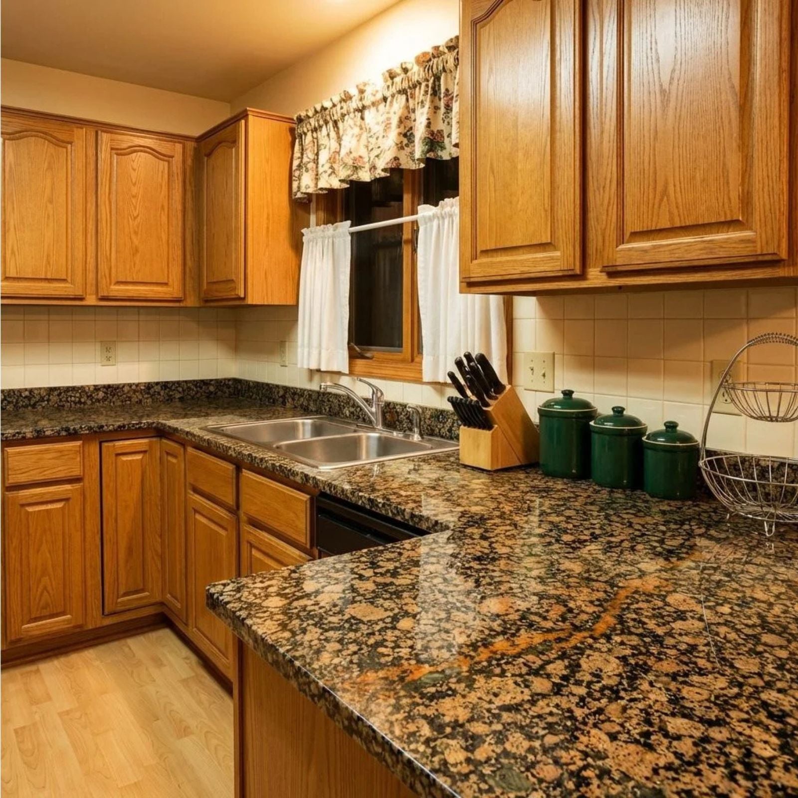
Granite Countertops with That Wild, Speckled Pattern Nobody Would Pick Today
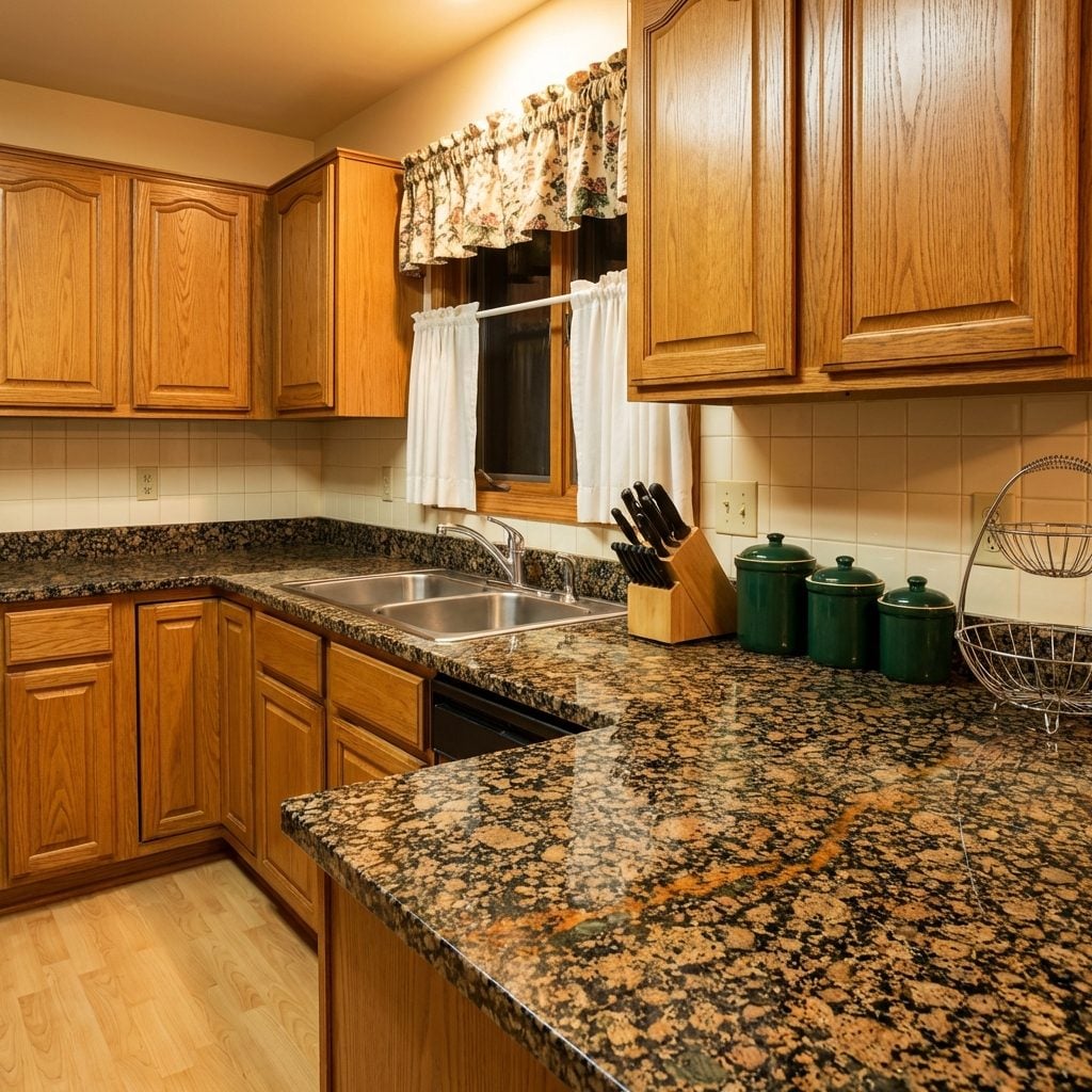
You know exactly which granite we mean. Not the quiet, elegant slabs designers specify now. The busy kind, tan and black and rust-orange and forest green all swirling together in a pattern that looked like a terrazzo floor designed by a geological survey. It was called something like “Venetian Gold” or “Santa Cecilia” and it was on every kitchen in every new build from roughly 1994 to 2004.
Getting granite countertops at all was the flex. The pattern was secondary, granite meant real stone, and real stone meant you had arrived. The speckling was so visually busy that crumbs and spills were genuinely invisible, which was, in hindsight, a practical genius move.
Ceramic Tile Countertops with Those Little Decorative Border Tiles
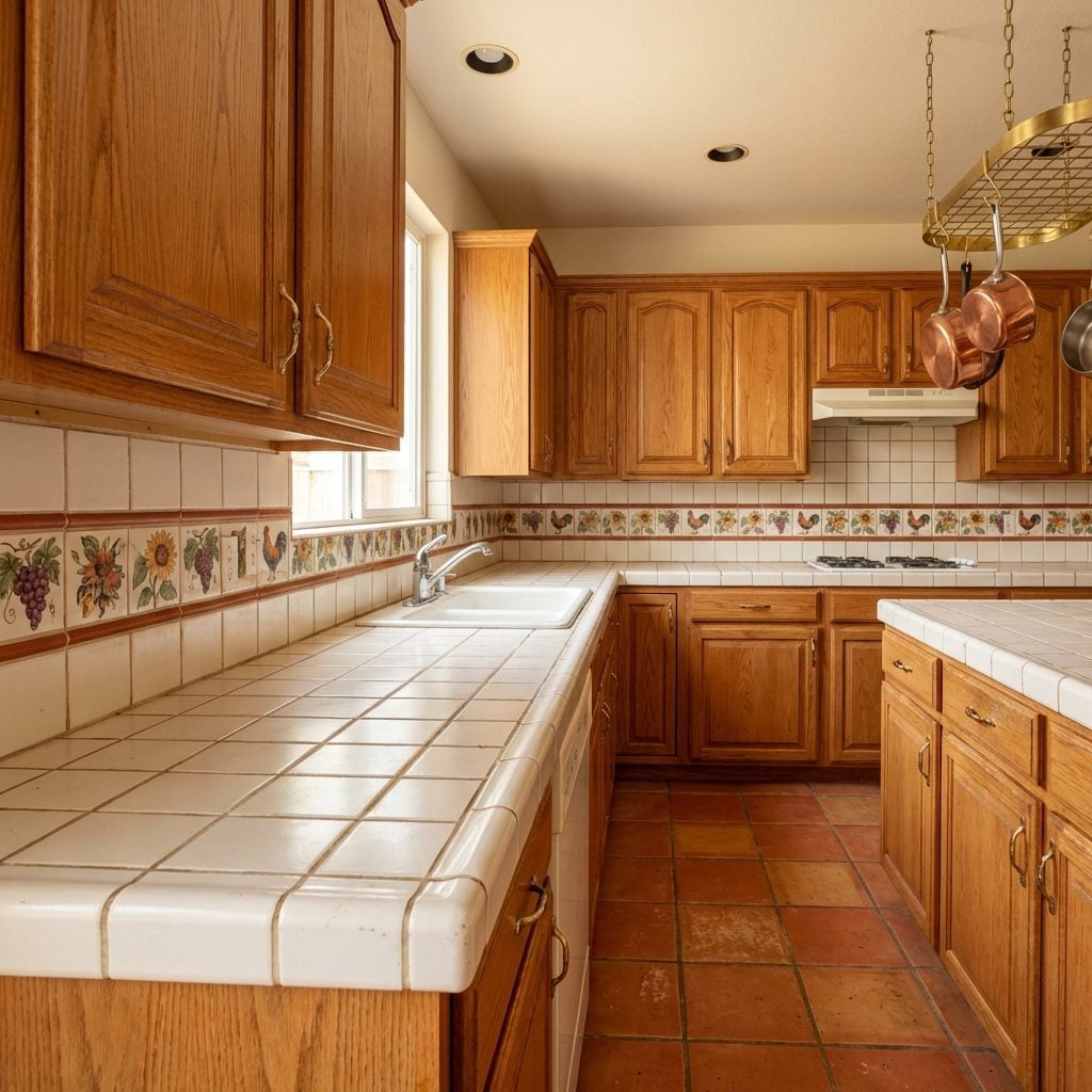
Somewhere in the 1990s, a very enthusiastic tile company started making four-inch accent tiles with hand-painted roosters, sunflowers, grape clusters, and Tuscan urns on them, and American homeowners went absolutely feral for them. These decorative inserts got grouted right into the ceramic tile countertop, usually running as a border along the backsplash or edging the counter lip, turning an ordinary kitchen surface into what felt like a mural.
The grout was always white to start. It did not stay white. That particular design truth was universal.
The Butcher Block Section Right Next to the Sink That Everyone Used for Everything Except Butchering
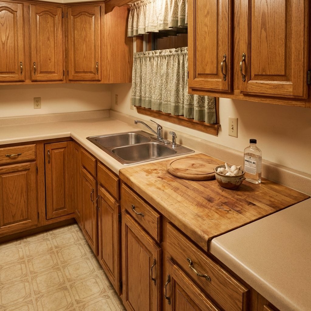
It was always a small section, maybe eighteen inches wide, inserted beside the sink or at the end of a run of laminate countertops. A little island of warmth in an otherwise synthetic kitchen. The butcher block section was supposed to be a dedicated prep surface, but what it actually became was the mail pile, the homework station, and the place where keys got lost for three days.
The wood was usually maple, oiled annually by exactly one enthusiastic weekend in early spring and then ignored for the remaining eleven months. The knife scars and water rings that accumulated over the years were considered character. They absolutely were.
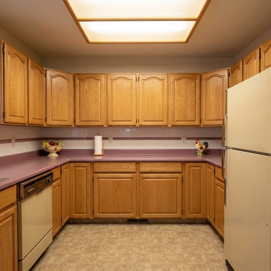
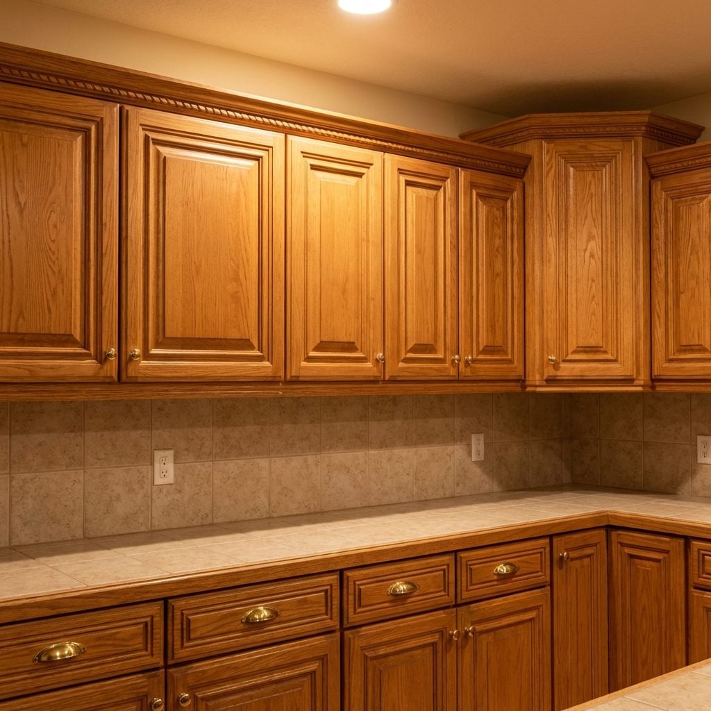
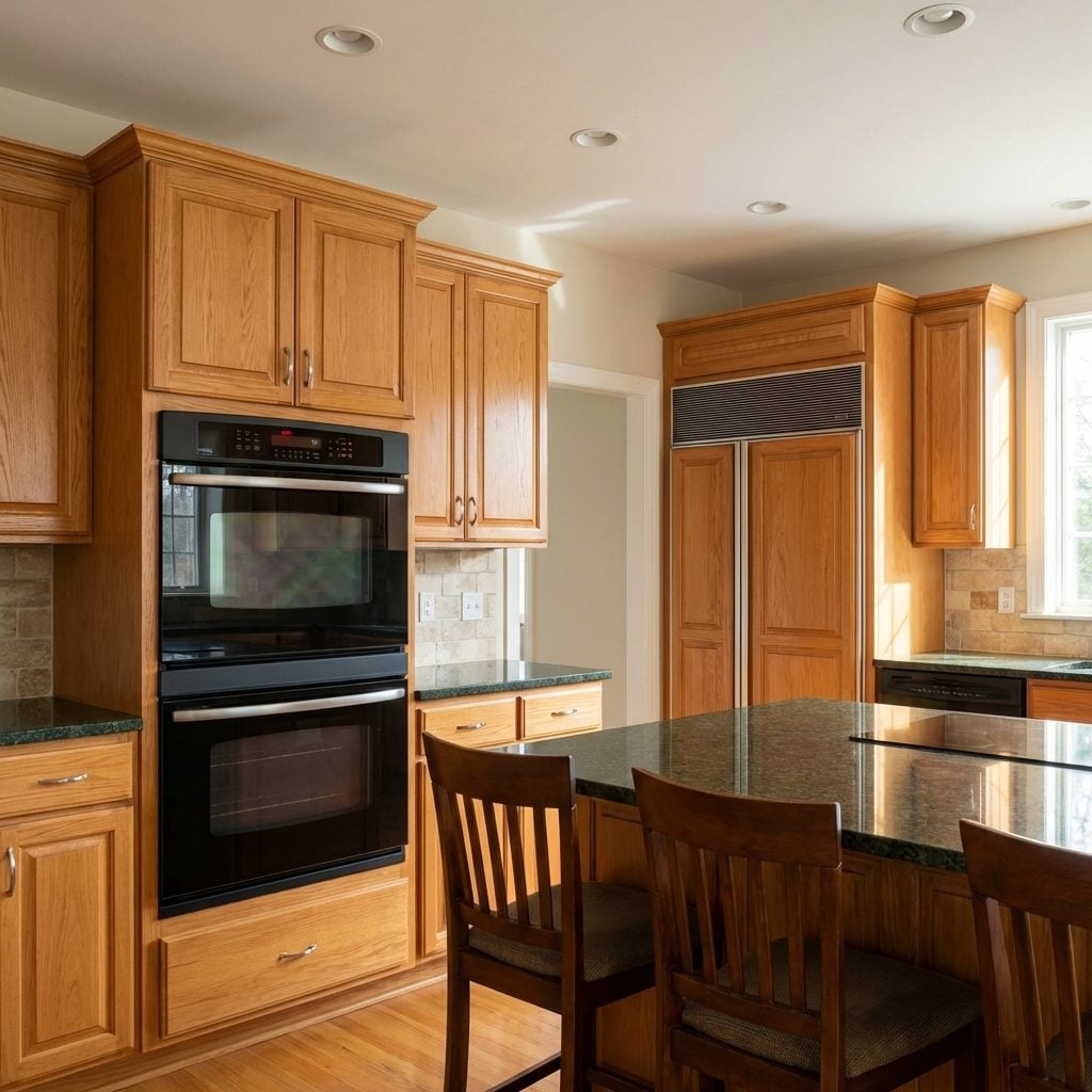
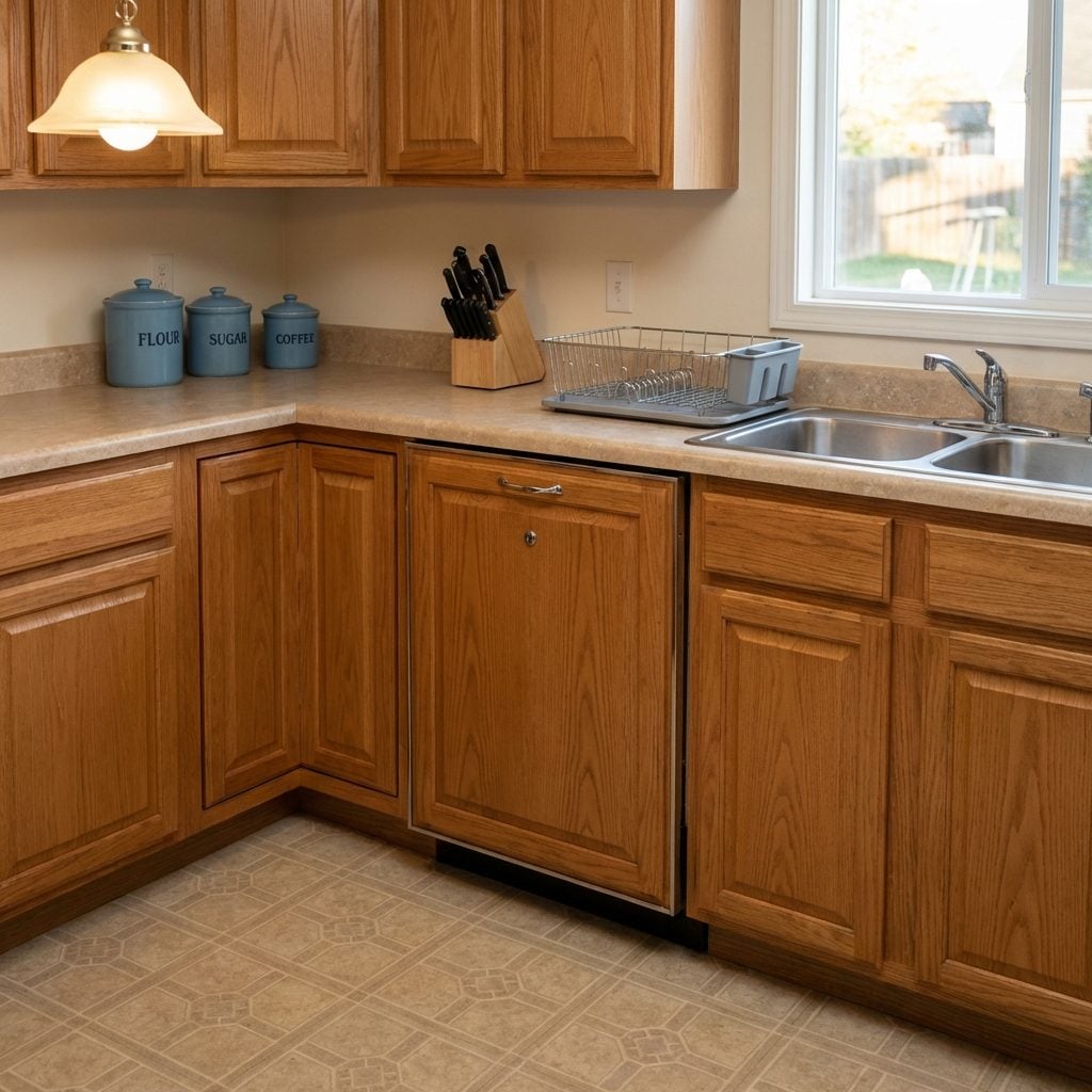
Solid Oak Cabinets with Raised Panel Doors: The Default Setting of Every ’90s Kitchen
If you close your eyes and picture a kitchen from 1993, those are solid oak raised-panel cabinets. Every subdivision, every townhouse complex, every mid-range new build in the country shipped with them standard. The wood grain was golden and pronounced, the finish was satin, and the raised panel in the center of each door caught the light in a way that genuinely felt special the first time you saw it.
They were built to last, which is both their legacy and their problem, millions of them are still out there, perfectly functional, mildly resented by homeowners who now want white shaker cabinets but can’t bring themselves to rip out something so structurally sound.
Oak Cabinet Fronts with Ornate Routed Details That Took Themselves Very Seriously
Some of those routed edges had three separate profiles running in parallel. A cove, a bead, and a chamfer, stacked like a tiny architectural frieze on the face of a kitchen cabinet. The detail said: this is not a standard cabinet. This cabinet has opinions about woodworking tradition.
In fairness, the craftsmanship was often genuinely impressive. Cabinet makers in the 1980s and ’90s were competing on decorative complexity in a way that has since been completely abandoned in favor of flat-front minimalism. You could run your finger along those routed channels and feel every deliberate decision.
What nobody anticipated was how those channels would collect cooking grease. Every groove was essentially a miniature trough for airborne bacon fat, and cleaning them required a toothpick or a Q-tip. A small price, everyone agreed, for craftsman kitchen decor at its most earnest.
The Soffit Above the Cabinets That Became an Involuntary Display Shelf
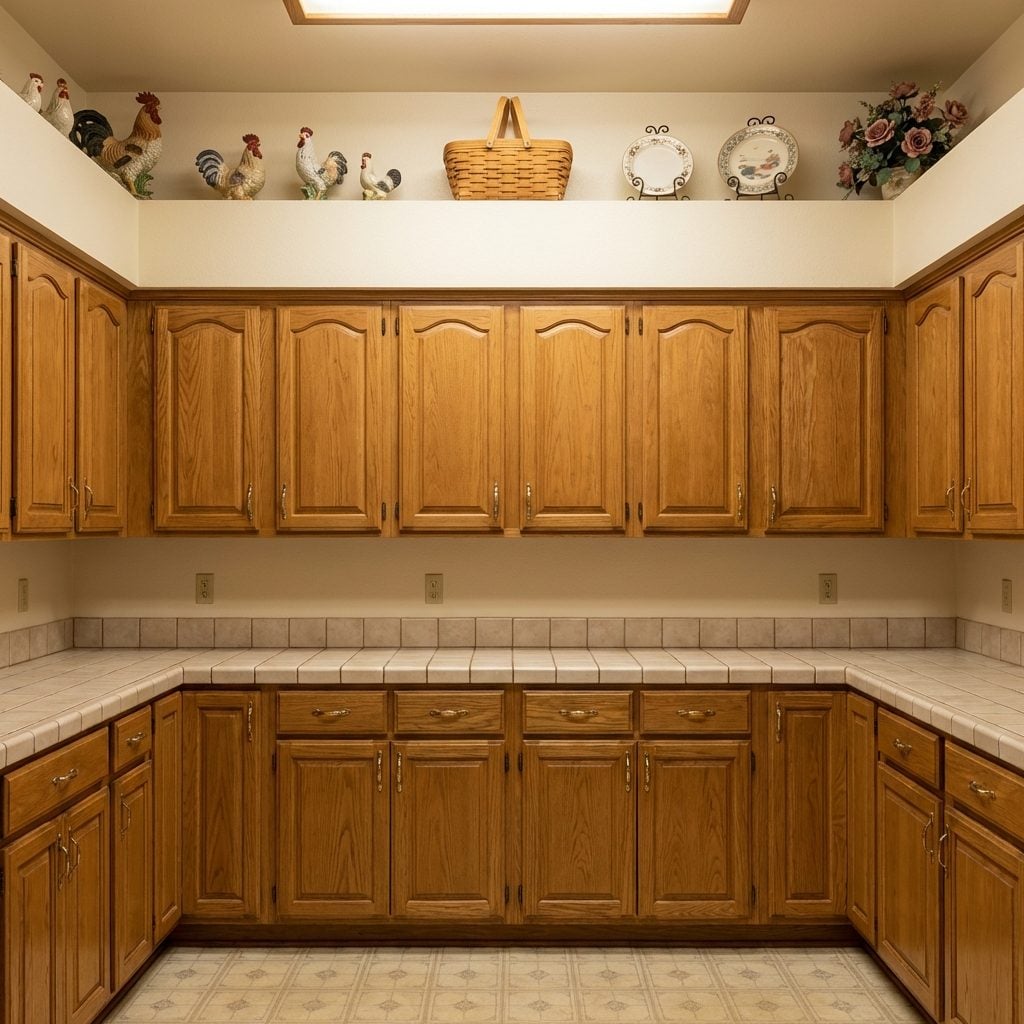
The soffit, that boxed-in space between the top of the cabinets and the ceiling, was never supposed to be a design feature. Builders installed it to hide ductwork and plumbing. But by the early ’90s, every design show and kitchen magazine had declared it the perfect home for a rotating collection of country geese, Longaberger baskets, ceramic roosters, decorative plates on little wire stands, and the occasional dusty silk flower arrangement.
Up there, twelve feet in the air, those collectibles sat in total silence, slowly accumulating a film of cooking grease that nobody ever fully addressed. Cleaning them required a step stool and a commitment to the task that most people found overwhelming. They just got rotated seasonally instead, pumpkins at Thanksgiving, a small artificial wreath at Christmas, the geese with their little seasonal outfits every other month.
Glass-Front Display Cabinets with Little Interior Lights That Made Your Dishes Feel Famous
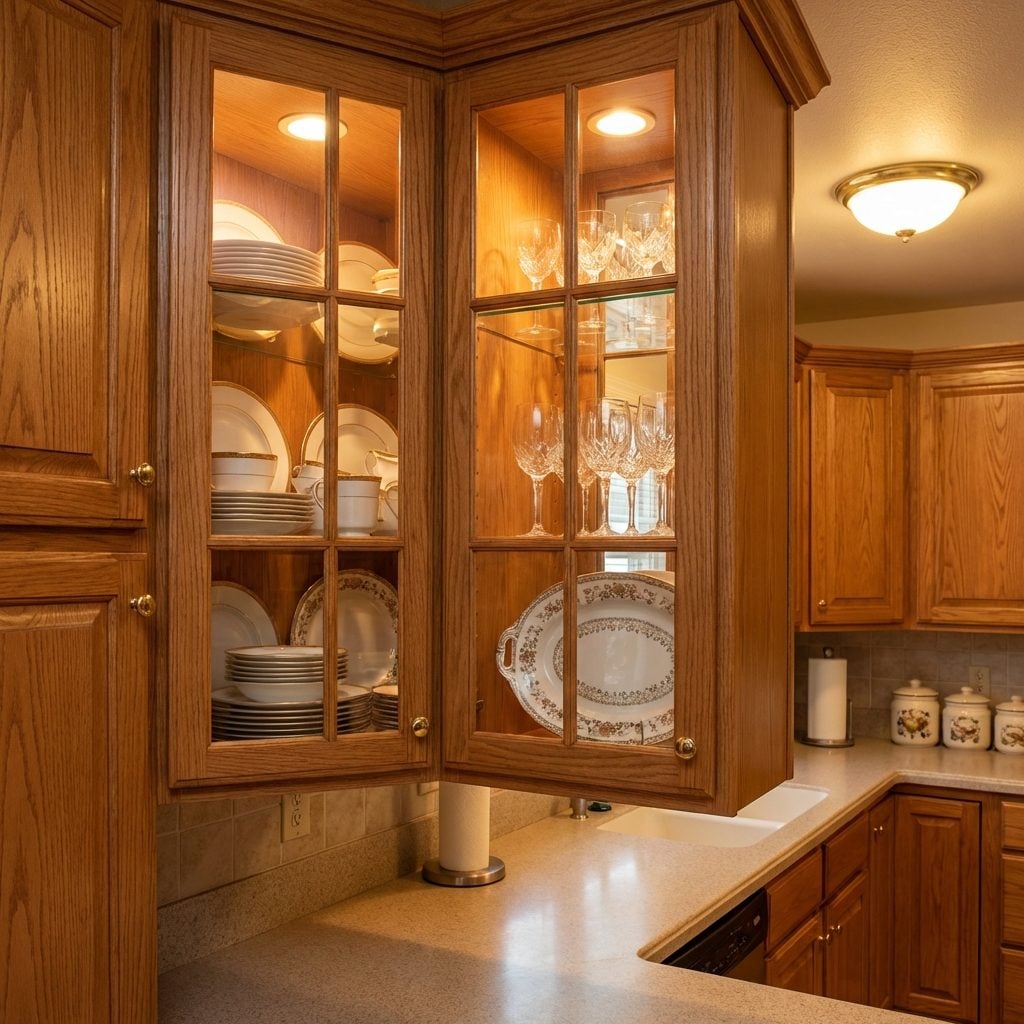
Upgrading one or two upper cabinets to glass-front with interior lighting was the move. Not all of them, just two flanking the window, or the pair above the main counter run. Behind those glass panels lived the good china, the crystal stemware, and the Williams-Sonoma items that were too pretty to use but too expensive to hide.
The interior light was usually a tiny strip of incandescent rope lighting or a pair of halogen puck lights, and the glow they cast made a set of Lenox china look like it was being presented at an auction house. It was theatrical in the best possible way.
The Lazy Susan Corner Cabinet That Held Everything and Surrendered Nothing Willingly
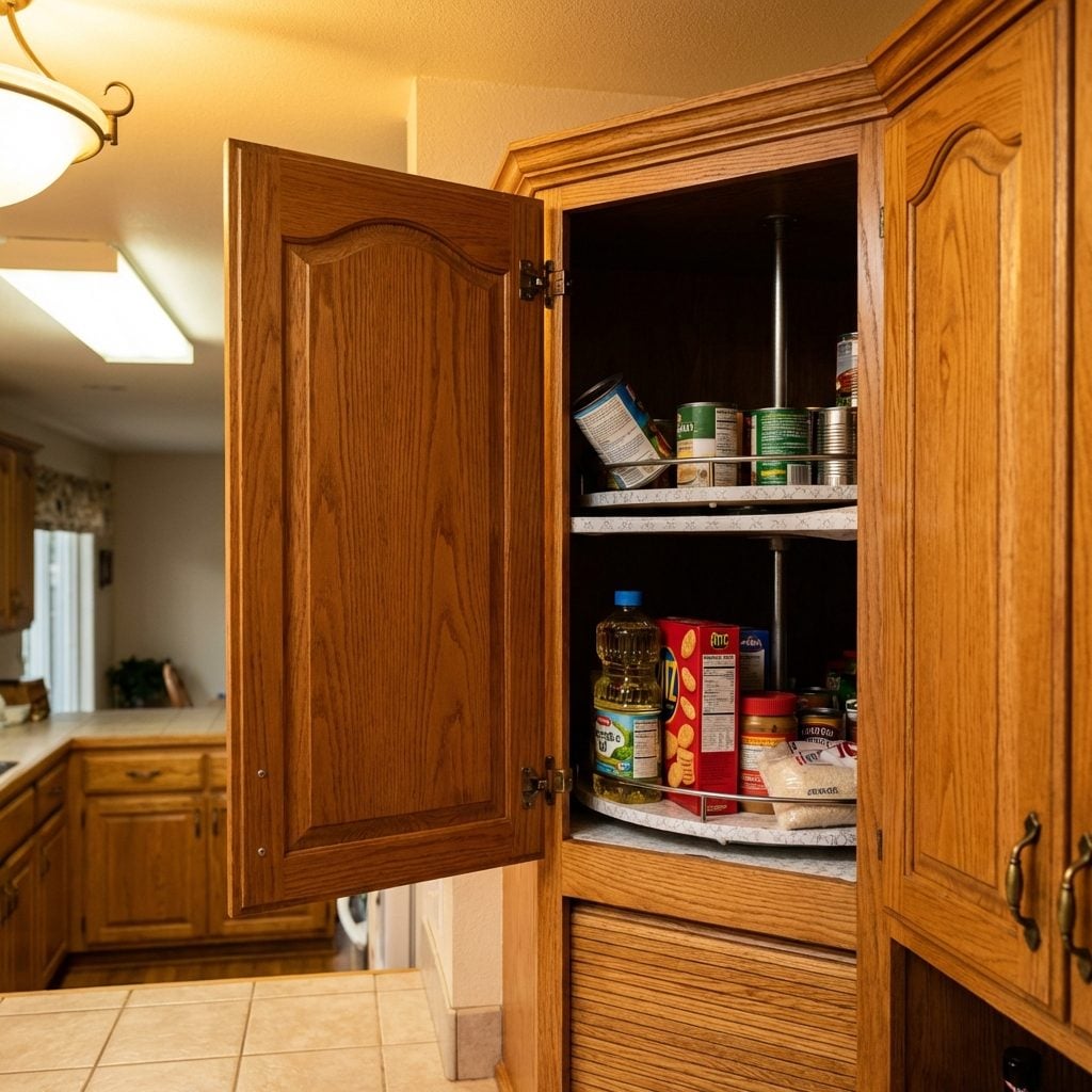
Somewhere in the deep corner of every ’90s kitchen lived a Lazy Susan cabinet, and somewhere on the back half of its rotating shelf lived a can of cream of mushroom soup from 2003 that nobody could reach without getting on their knees and physically spinning the thing until it completed a full revolution and surrendered its contents.
The concept was brilliant in theory: a corner cabinet that rotated so nothing got lost in the dead zone. In practice, items migrated to the back quadrant and stayed there for years. The Susan itself usually had a slight wobble, a tendency to stop rotating mid-spin, and a lip that was just shallow enough to let round objects roll off during a full rotation.
Beloved anyway. Because the alternative was a fixed corner cabinet with a twelve-inch door opening and a three-foot-deep interior, and nobody wanted that either.
The Pull-Out Pantry with Full-Extension Shelves That Made You Feel Like a Professional
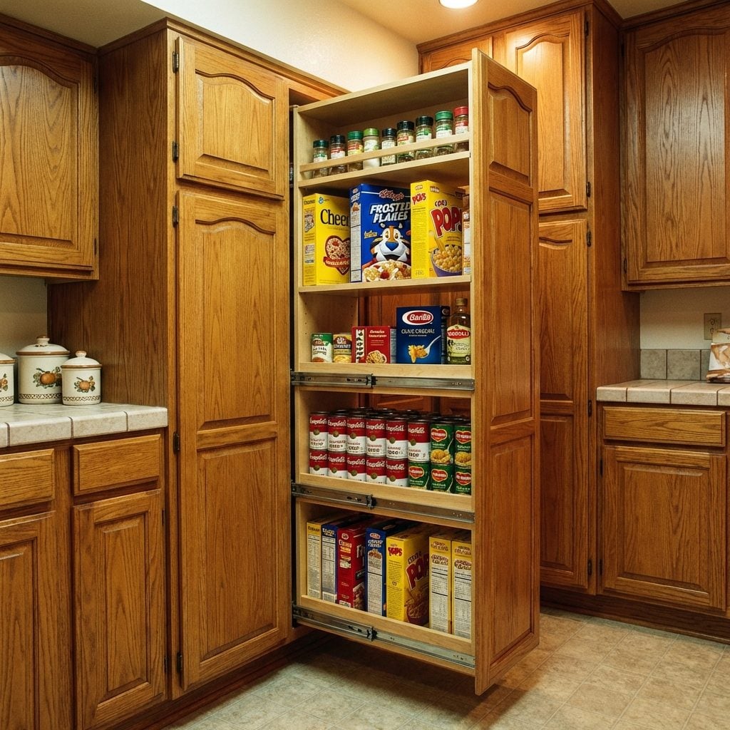
This was a legitimate upgrade that earned its reputation. A tall, narrow cabinet next to the refrigerator or at the end of a cabinet run, fitted with full-extension pull-out shelves that slid out completely so you could see everything stored on them from front to back. No more crouching and squinting into dark cabinet depths. No more mystery items at the back of the shelf.
When you pulled that pantry open for the first time, the shelves gliding out smooth and fully loaded, you understood what people meant by functional luxury. The mechanism felt satisfying in the way that well-engineered things do, a gentle resistance, then a clean release, then everything right there in front of you.
The Walk-In Pantry with Its Own Light Switch That Felt Like a Whole Room
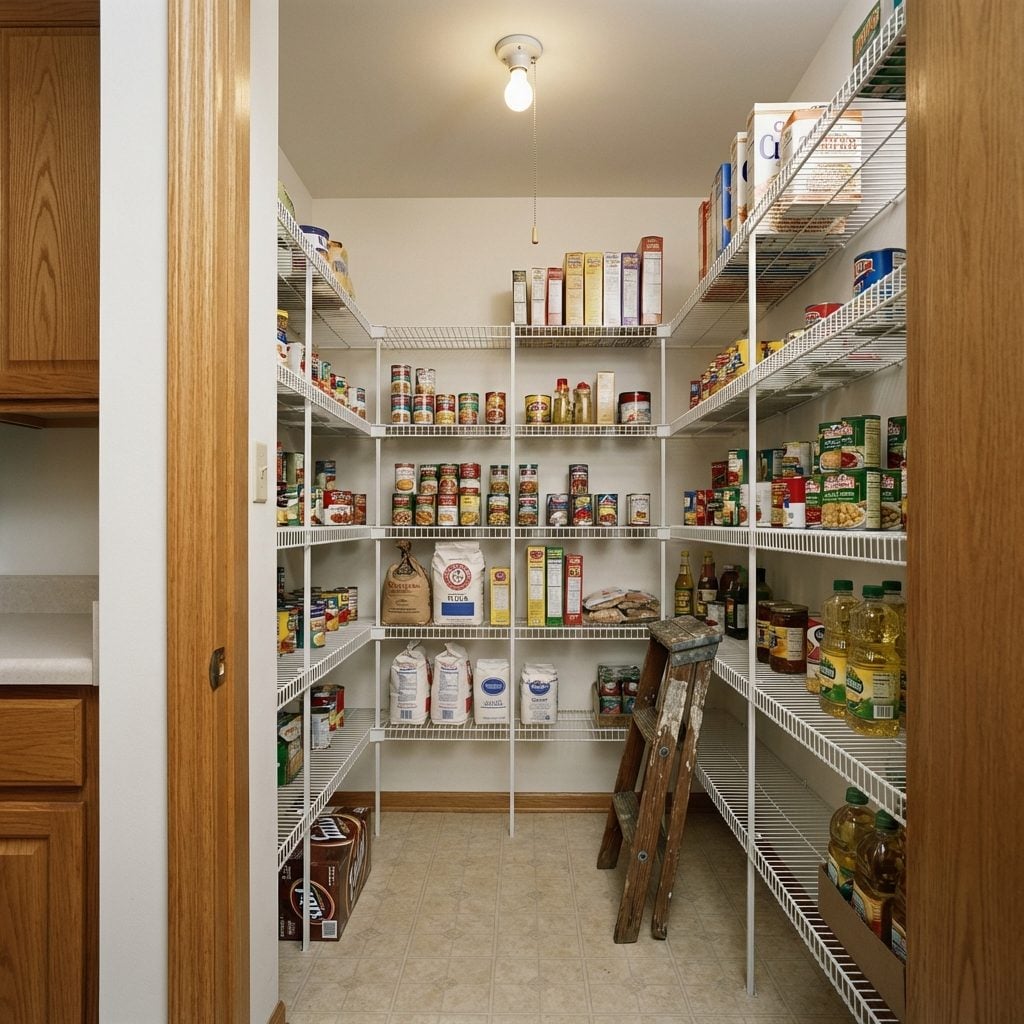
A walk-in pantry was not a kitchen feature in the 1990s. It was a personality trait. If your house had one, you mentioned it on the tour even when you weren’t giving a tour. You walked guests past the laundry room, past the half bath, and then paused at the pantry door with the quiet confidence of someone about to reveal something important.
Inside: wire shelving units on three walls, a single bare bulb on a pull chain or a basic flush-mount light, and enough square footage to take three full steps before turning around. The shelves held industrial-sized cans from a Costco membership, six varieties of canned soup, a fifteen-pound bag of flour, and a case of Diet Coke that was supposed to be for guests.
The walk-in pantry meant you had enough space to stock for a minor emergency, enough organization to actually find things, and enough kitchen budget to build a dedicated room just for storing groceries. It was, in the domestic logic of the era, the ultimate sign that you had made it.
The Built-In Desk Nook With Phone Cradle and Cookbook Shelf
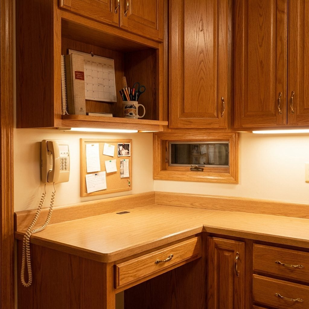
Every ’90s kitchen remodel included this, tucked into a corner between the pantry and the garage door: a built-in desk nook with a phone mounted directly to the wall, a little shelf for the Joy of Cooking and the church directory, and a drawer stuffed with takeout menus, coupons, and dead pens. The countertop was always a slightly different laminate than the rest of the kitchen, for reasons nobody questioned.
This was the family command center before smartphones existed. Homework got done here. Permission slips got signed here. The cord of the wall phone got so twisted that you had to hold the receiver at a 45-degree angle just to hear. And the cookbook shelf almost never held cookbooks, it held the school calendar, a broken calculator, and a candle from 1994.
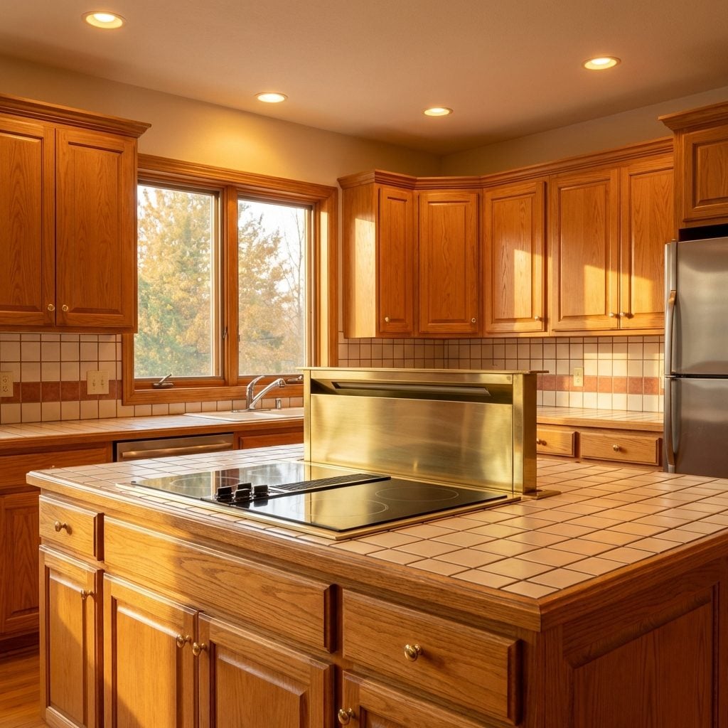
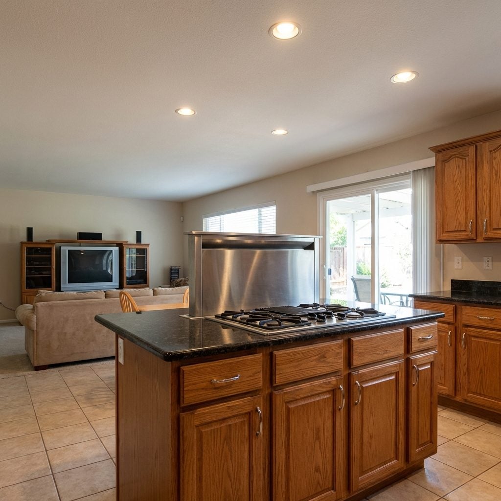
The Kitchen Island With a Built-In Cooktop (and Nowhere Near Enough Ventilation)
🔥 Would you like to save this?
The island cooktop was the crown jewel of the ’90s kitchen renovation. The idea was pure glamour: you could stand at your island, face your guests in the adjacent family room, and cook like you were hosting your own cooking show. The reality was that your entire open-plan first floor smelled like sauteed onions for three days.
Most of these islands were oversized hunks of custom cabinetry in honey oak or painted white, topped with either a butcher block section or a tile surface with dark grout that was impossible to clean. The downdraft vent was almost always insufficient. But none of that mattered, because it looked like something out of Better Homes and Gardens, and that was entirely the point.
The Ceiling-Hung Pot Rack Over the Island That Held Every Pan You Owned
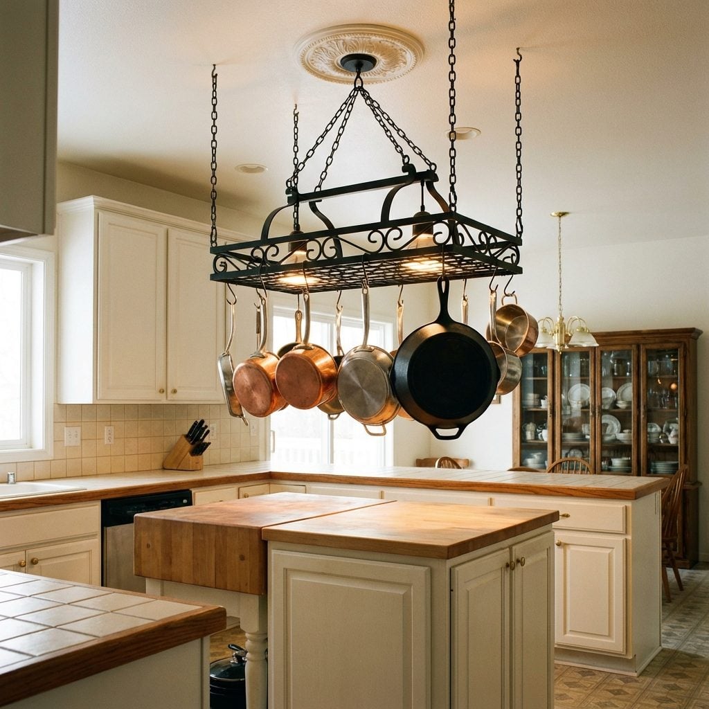
Iron, wrought or otherwise, suspended from the ceiling on four chains, this was the ultimate signal that a kitchen was serious. The pot rack over the island said: we cook here, we have real cookware, and we want you to know it the second you walk in.
In practice, the pots closest to the ceiling never came down. There was always one skillet so high up that you needed a step stool, and it developed a light film of kitchen grease that nobody ever addressed. The rack itself was almost always black wrought iron, sometimes with a row of S-hooks that rattled when someone walked heavily on the second floor.
For a similar look in a modern space, a craftsman kitchen decor approach handles exposed cookware beautifully without the chains. But honestly? The chain version had a drama that nothing else has matched.
The Breakfast Bar With a Raised Tier (Where No Adult Could Comfortably Sit)
The raised-tier breakfast bar was the ’90s answer to the question nobody asked: what if the kitchen island also had a wall nobody could see over? The standard layout was a main island surface at counter height for prep, with a raised bar section on the family room side, about six inches higher, that was supposed to create a casual dining spot for the kids.
The stools required were almost always too tall for any adult to get into gracefully, and the bar height put everyone’s chin approximately at plate level. The structural overhang meant your knees were always fighting the cabinet face below.
None of that mattered. The two-tier island looked incredible in the listing photos, and every single family who had one showed it off at dinner parties like it was a design breakthrough.
The Wine Rack Built Into the Island or Cabinetry (For People Who Were Very Serious About Wine Now)
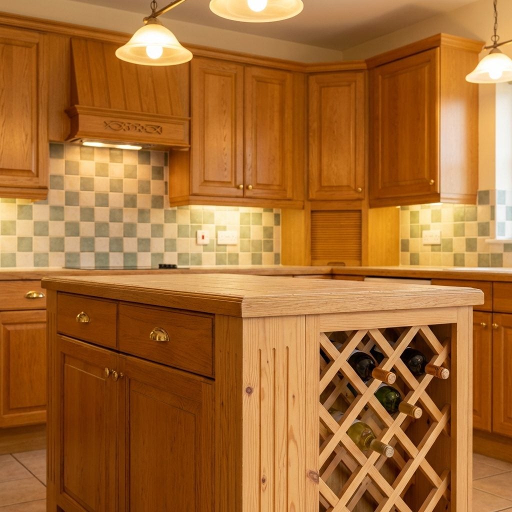
Sometime around 1993, America decided it was a wine country, and kitchen designers responded accordingly. The built-in wine rack appeared in islands, in upper cabinet corners, in little angled niches beside the refrigerator, anywhere there was a triangular void that could be fitted with diagonal wooden slots to hold eight to twelve bottles at a jaunty angle.
The wood was always either natural pine or the same honey oak as the rest of the cabinetry. The bottles stored in it were almost never moved. The whole unit was a signal, aspirational, specific, slightly European, that said we appreciate the finer things, even if the finer things were mostly a Kendall-Jackson Chardonnay from a promotional wine gift set.
The Appliance Garage With a Tambour Door That Rattled Every Time You Opened It
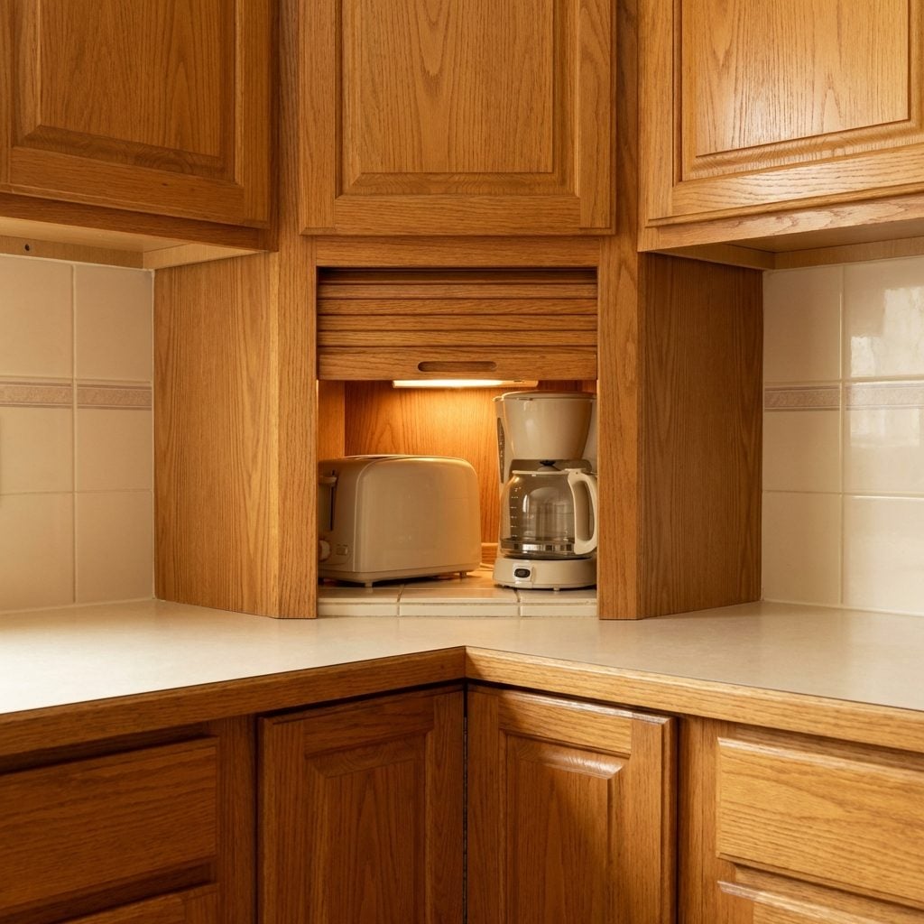
You could hear it from the living room: that wooden slatted door rolling up on its track with a sound like a tiny freight train, revealing the toaster and the coffee maker sitting permanently on a tile shelf inside their own little closet. The appliance garage was a genuinely useful idea, countertop clutter, hidden, but the tambour door hardware almost always wore out within five years, so the door would stick halfway or come off its track entirely and just live propped against the wall behind the bread box.
The inside of every appliance garage smelled like old toast and motor heat. The tile shelf was always impossible to clean because of the cords crammed in the back. But when it worked, it really worked, and every guest who saw it for the first time wanted one in their kitchen too.
The Built-In Bread Box That Everyone Filled With Everything Except Bread
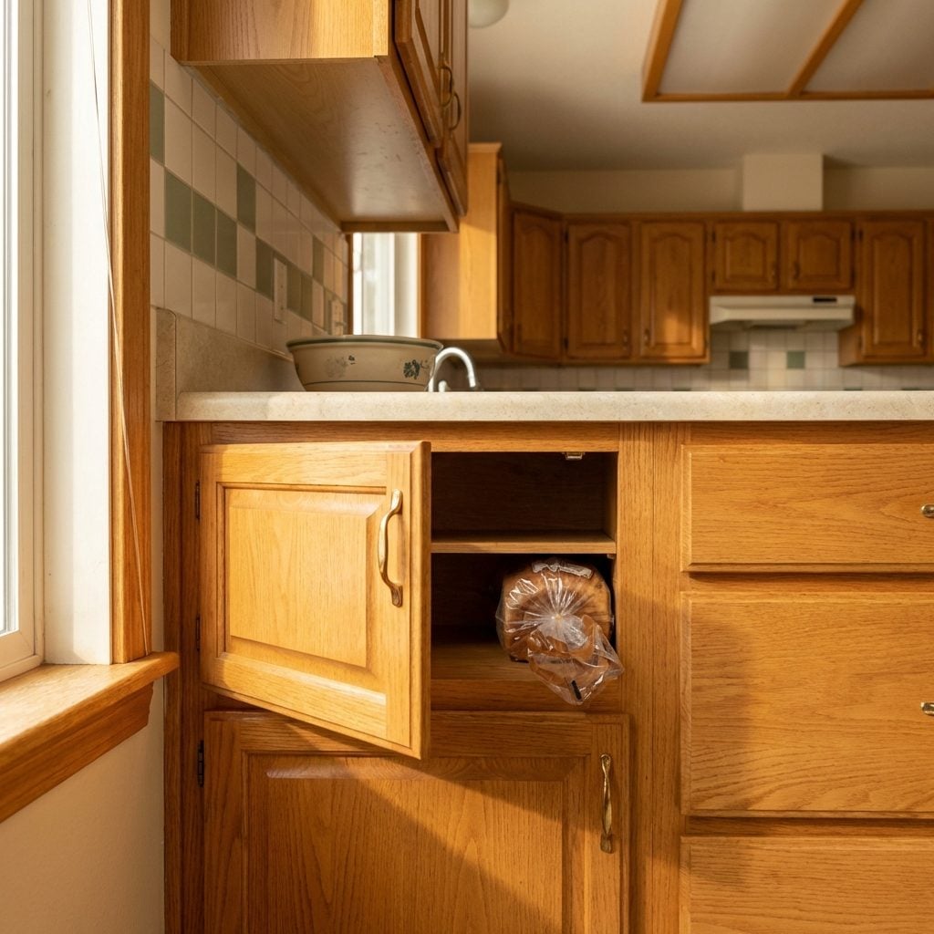
Recessed into the lower cabinetry run, finished in matching oak or painted white, with a small hinged door, the built-in bread box was a charming relic of a time when people genuinely thought bread storage was a design challenge worth engineering into cabinetry. Inside: one loaf of Wonder Bread, horizontally, which fit perfectly if the bag wasn’t too puffed up.
By the second year, it held twist ties, a broken watch battery, the manual for the microwave, and a bag of stale dinner rolls from Easter. Still, there it was, built into the kitchen forever, a small door at counter height that said something about the optimism of 1990s kitchen planning.
The Sub-Zero Refrigerator With Cabinet Panels That Made It Disappear Into the Wall
If your parents had a panel-matched Sub-Zero, you knew it. They told you. At dinner parties, someone always opened the wrong cabinet door reaching for the refrigerator and made the exact face that the homeowner was hoping for.
The flush-panel Sub-Zero was the prestige car of ’90s kitchen appliances. The brand name was whispered, not spoken. The fact that a refrigerator could be disguised as cabinetry felt genuinely futuristic in 1995, and the compressor hum was so quiet compared to the builder-grade Whirlpool next door that it felt almost rude.
These things lasted twenty-five years. Some of them are still running. That was part of the flex.
The Mauve or Forest Green Refrigerator That Someone Thought Would Age Well
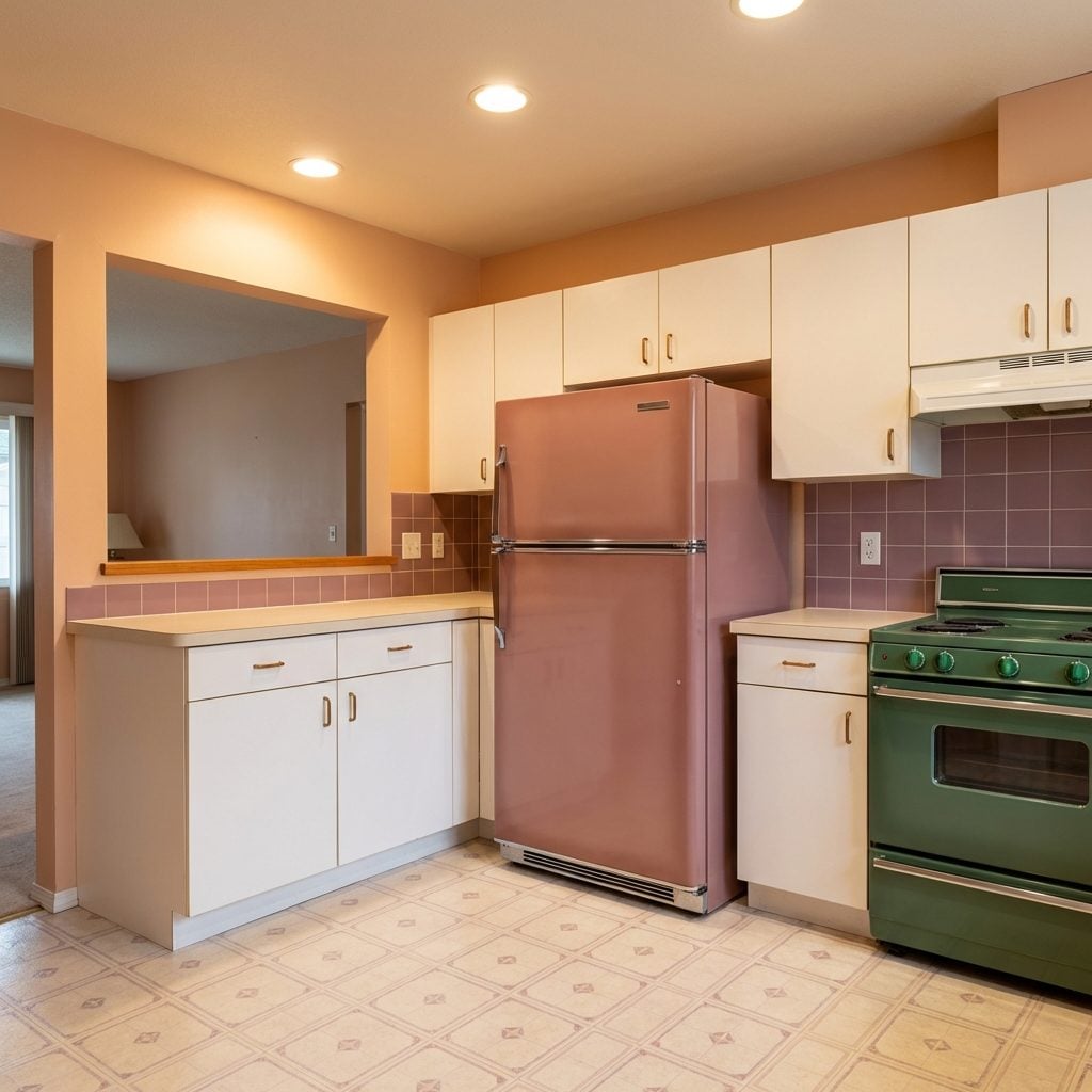
Mauve. The word alone is enough. If you saw a mauve refrigerator standing in a kitchen in 1991, it looked current, even chic, color appliances were a mid-market alternative to the all-white suite, and the options included mauve, sage green, forest green, and a particular shade of slate blue that didn’t have a name anyone agreed on.
Every single one of these colors became impossible to match within eighteen months as the palette shifted. You’d replace the dishwasher and suddenly have to choose between a mismatched almond and hunting the earth for a manufacturer still selling forest green. Most of them just lived with the mismatch. Some of these refrigerators were still running in 2005, mauve and immovable, in kitchens that had otherwise been fully renovated around them.
The Built-In Microwave Mounted Above the Range
This was the detail that separated the remodeled kitchen from the merely updated one. If you had a microwave mounted flush above your range, recessed into cabinetry with its own ventilation grille, you had arrived. No more sitting on the counter eating up prime real estate next to the toaster. This was architecture. This was intention.
The thing hummed with a particular authority from up there. You had to reach slightly too high to press the buttons, the door opened toward your face, and the turntable rattled if you forgot to center the bowl. None of that mattered. It looked incredible, and that was the whole point.
Double Wall Ovens That Made You Feel Like a Michelin Star Chef
Nobody needed two ovens. That was completely beside the point.
The double wall oven was the kitchen equivalent of a walk-in closet: you justified it with practical reasons (Thanksgiving! The roast and the pie at different temperatures!) but the real reason was that it looked like a professional kitchen had moved into your house. Built flush into a column of cabinetry, usually in bisque or almond, with sleek black-glass doors and chrome handles, it commanded an entire wall. The contemporary kitchen of the 1990s was built around this thing.
You used the bottom oven maybe four times a year. The top one handled everything. The bottom became unofficial storage for sheet pans you’d forgotten you owned.
The Warming Drawer Nobody Knew How to Use
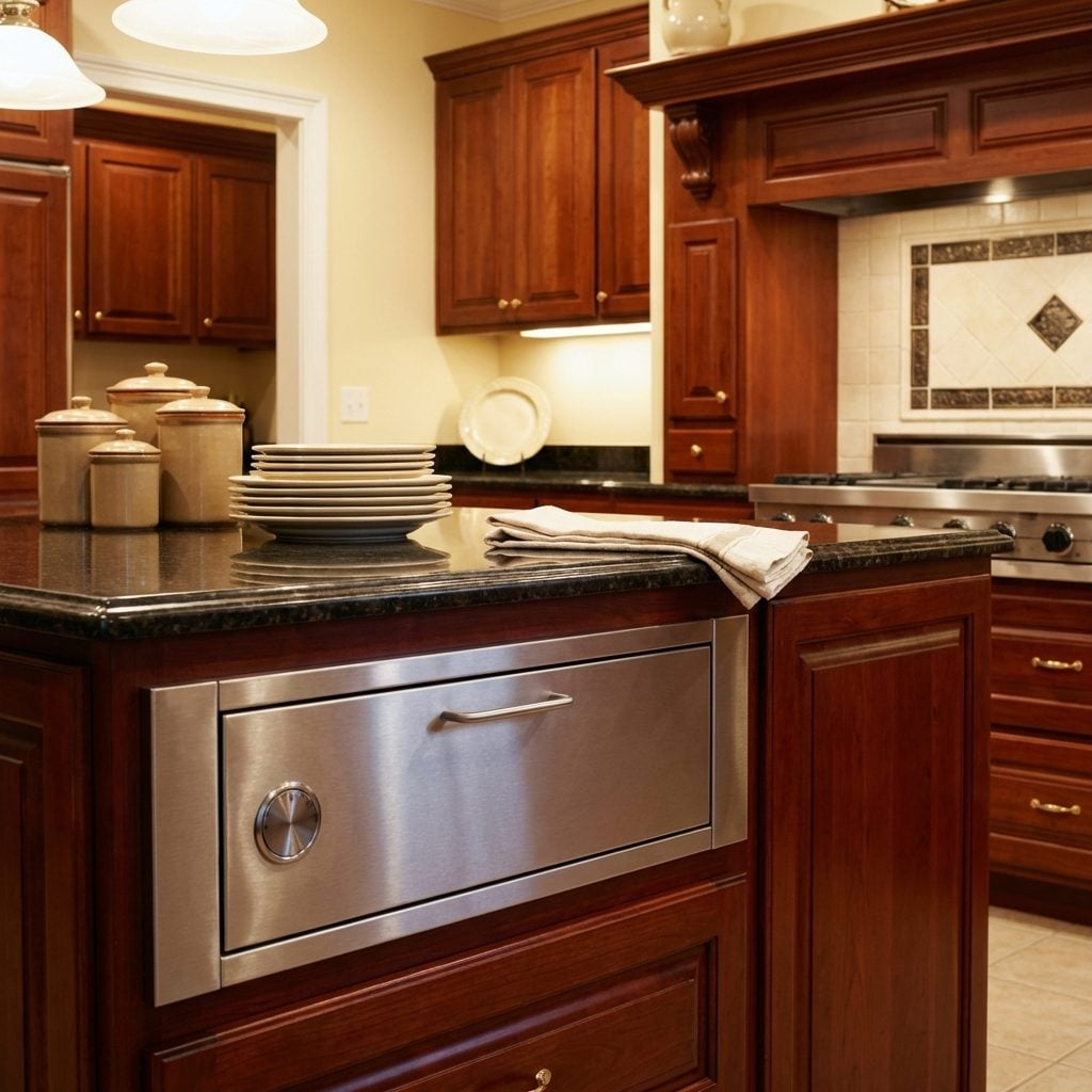
Somewhere below the double wall ovens or tucked under the island, there was a slim stainless drawer with a single dial and three settings: Low, Medium, High. It was called a warming drawer, and it came with the kitchen, and you explained it to every single guest who asked what it was.
In theory: you finished cooking, plates went in the warming drawer, everyone sat, food arrived hot. In practice: you forgot it was on, discovered petrified rolls three hours later, and eventually stored rarely-used platters in it because the drawer was exactly the right height for a serving tray.
The Trash Compactor Wedged Under the Counter
It sounded like a car being crushed. You’d drop your cereal box in, press the button, listen to the whirring compression cycle, and feel like you were running a small industrial operation from your kitchen. The trash compactor was sold to American homeowners in the 1980s and 1990s as the logical next step after the dishwasher: appliances solving problems, domestic life perfected.
The door had a key lock (a key lock, on the trash can), a charcoal filter that needed replacing, and special compactor bags that cost significantly more than regular bags. When it worked, it was satisfying. When it jammed on a soup can, it took two adults and a manual to fix.
Downdraft Ventilation That Disappeared Into the Cooktop
🔥 Would you like to save this?
The dream was a kitchen with no hood. No bulky cabinet mounted above the range, no range hood jutting out, nothing blocking the sightline from the cooking surface to the open living area beyond. The downdraft system made that possible, and in the 1990s it felt like the future.
A panel would rise from behind the cooktop burners at the push of a button, pulling smoke and steam downward through the counter and out through ductwork under the floor. It worked reasonably well on low simmer. High-heat searing was a different story. The smoke alarm usually joined the conversation before the downdraft vent could catch up.
JennAir made the most famous version, and for a decade, that name was basically shorthand for the whole concept.
The Under-Sink Reverse Osmosis System With the Tiny Dedicated Faucet
If you grew up in a house with a reverse osmosis filtration system, you already know the faucet. The small, separate, slightly precious chrome spigot that sat next to the main faucet, mounted in its own drilled hole in the sink deck, dispensed water so pure it tasted like nothing. Which was the whole point.
Under the cabinet was a cluster of canisters, tubing, and a membrane housing that looked like it belonged in a laboratory. The filters needed changing every six months, and someone always forgot, and then someone else would mention it for the next three months until it got done.
The Deep Double-Basin Stainless Steel Sink (With the Divider Ridge)
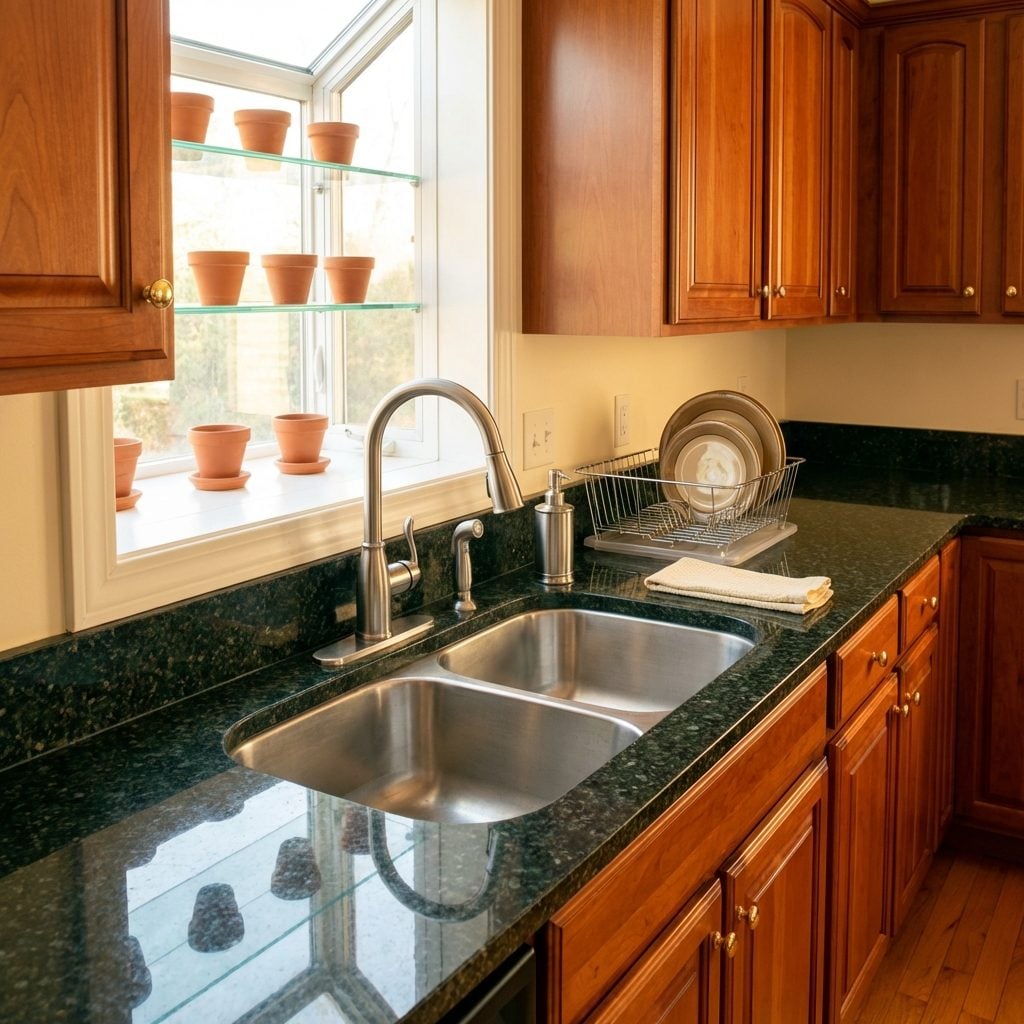
Every serious 1990s kitchen had one. The double-basin stainless sink, usually 33 inches wide, 9 inches deep on each side, with that raised center divider that meant you could never wash a large roasting pan flat. But it gleamed. Under the window, with a tall arc faucet and a built-in sprayer, it looked like a professional kitchen had moved in.
Stainless steel in residential kitchens felt industrial and expensive in a way that white porcelain no longer did. This was the transition moment, the decade when professional-grade appliances started infiltrating home cooking. The deep double-basin stainless sink was the first signal.
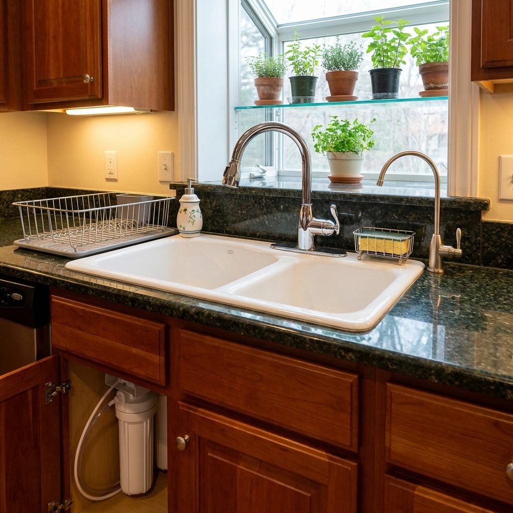
The Greenhouse Window Above the Sink
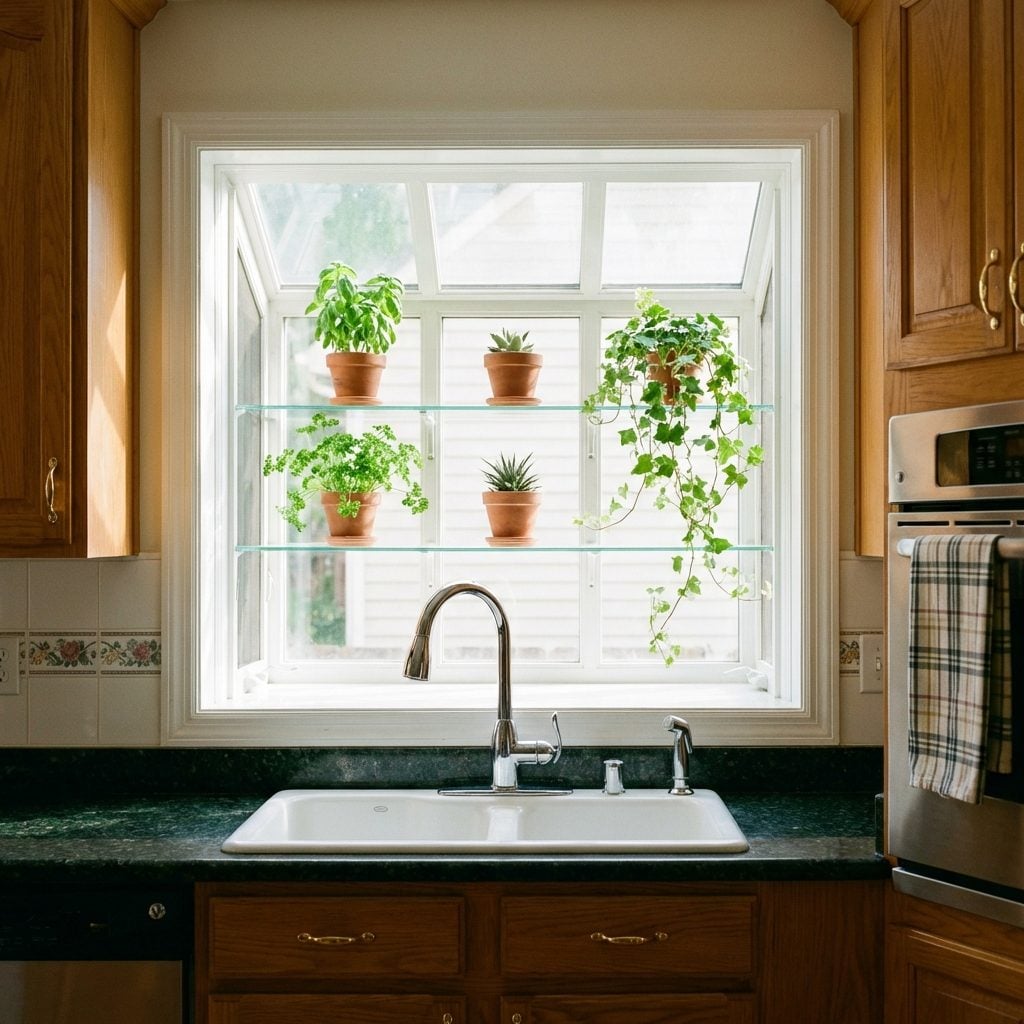
It jutted out beyond the exterior wall of the house, a small glass bay built just for the kitchen window, with two angled side panes, a glass shelf at mid-height, and the distinct promise that you would absolutely be growing herbs in here. Everyone’s grandmother had one before it was a trend. By the 1990s, it was standard in any kitchen that took itself seriously.
The glass shelf held terracotta pots of basil that mostly survived, a small cactus that definitely survived, and one African violet that never bloomed after the first week. In winter, condensation fogged the glass and frost collected at the corners. None of that mattered because the light in the morning, streaming through three panes of glass onto a stainless sink, was genuinely beautiful.
The greenhouse window was the 1990s kitchen’s one undeniably poetic feature. Everything else was about performance. That window was about hope.
The Indoor Herb Garden Window Insert With the Grow Light
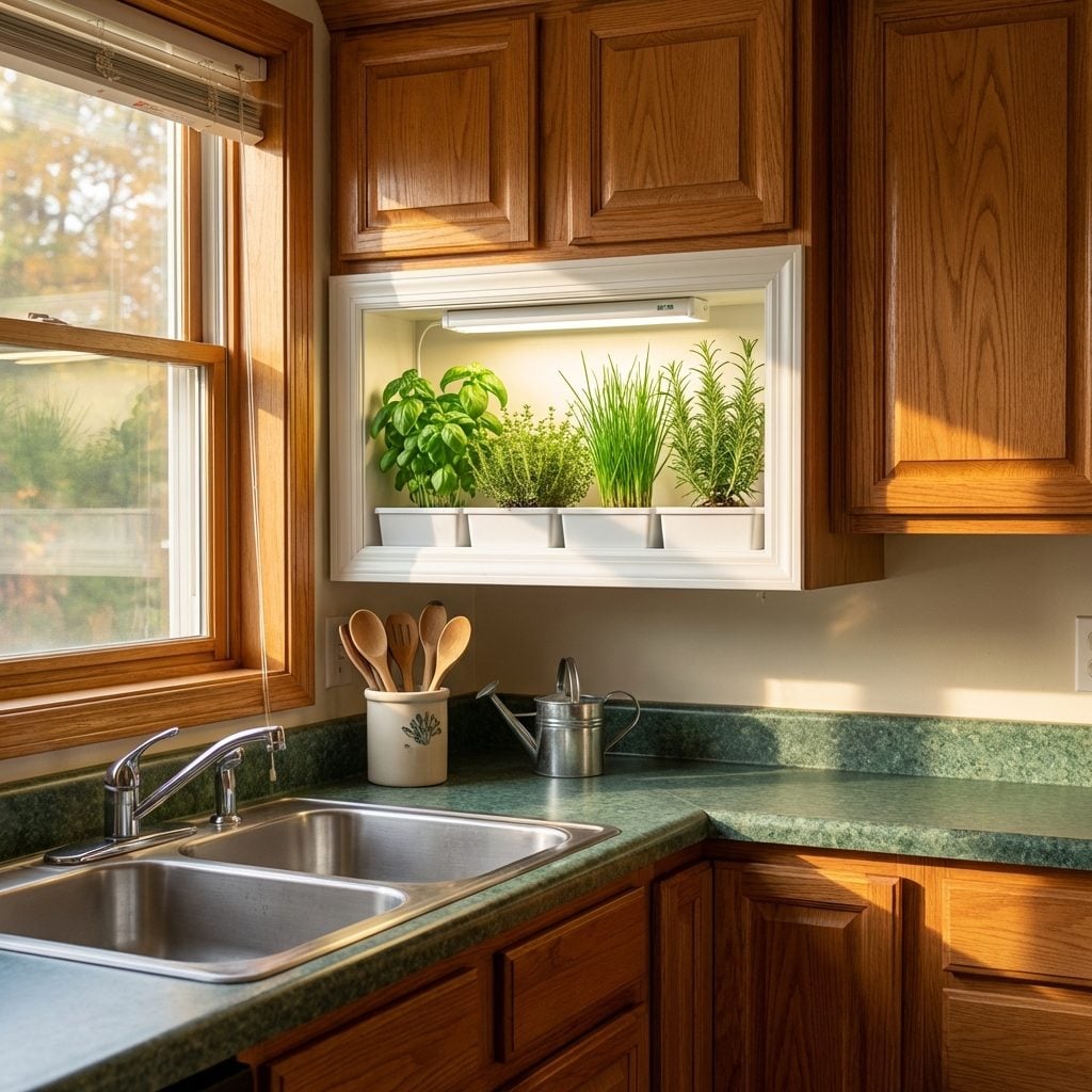
One step beyond the greenhouse window, for those who were truly committed to the bit, was the dedicated herb garden insert. A recessed frame built into the window or wall above the sink, lined with a waterproof tray, fitted with a small fluorescent grow light on a timer. A placard in the back sometimes identified each compartment: Basil. Chives. Thyme. Rosemary.
It looked like something from a craftsman kitchen decor catalog, and in the mid-1990s that was extremely high praise. The grow light buzzed faintly. The tray collected mineral deposits from watering. The herbs were fragrant and abundant for exactly three weeks before someone forgot to water them.
The Intercom System With the AM/FM Radio Built Right In
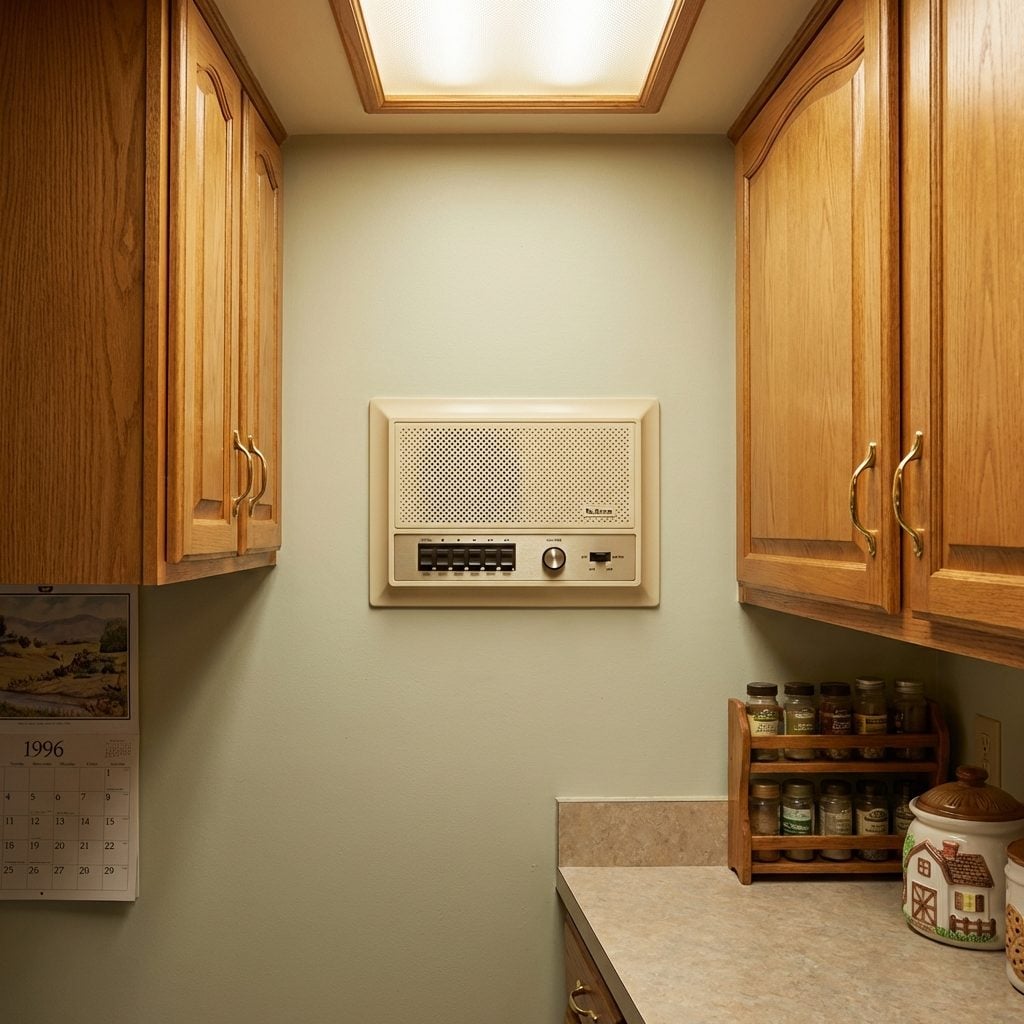
Mounted flush in the wall between the cabinetry, usually at eye level somewhere near the kitchen entrance, the home intercom was a beige or almond rectangle with a speaker grille, a row of buttons labeled with room names (MASTER / KID 1 / KID 2 / GARAGE), a volume knob, and a band selector switch for AM/FM. It was all-in-one household communication technology for the pre-cell phone family.
You’d press the button, hear a beep, and announce dinner. Or you’d turn the radio on and the tinny speaker would play the local Top 40 station while you did the dishes. Nutone made the most common version, and if you grew up in a 1980s or 1990s suburb, that cream-colored panel is burned into your memory.
When the house eventually sold and the new owners renovated, these were almost always the first things pulled from the wall. The wiring they left behind still runs through walls in millions of houses today.
Brass Faucets and Cabinet Hardware Everywhere
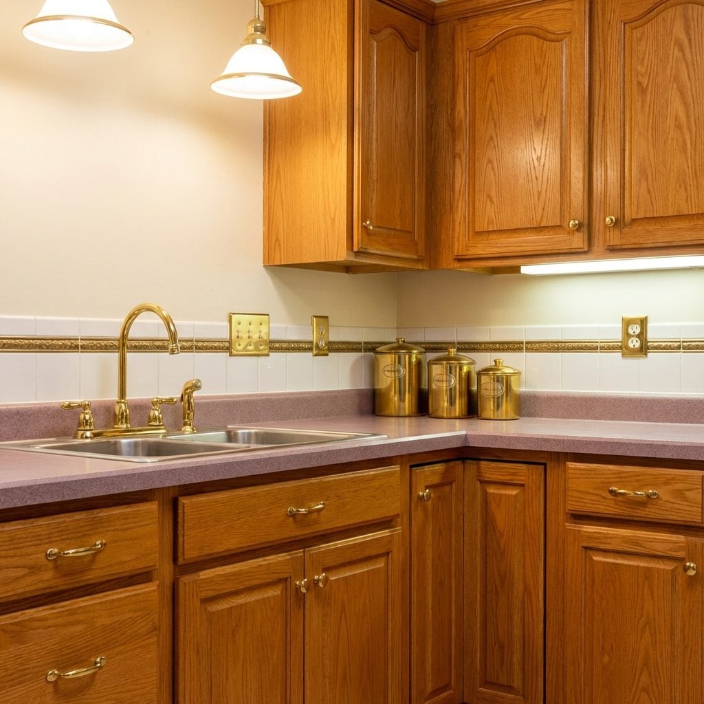
Not polished nickel. Not oil-rubbed bronze. Not matte black. Brass. The warm, slightly yellow, lacquered-to-a-shine brass that lived on every faucet, every cabinet knob, every drawer pull, every light switch plate in kitchens from roughly 1985 through 1999.
It coordinated with the honey oak cabinetry, the mauve or hunter green accents, the speckled laminate countertops. Everything matched because everything was brass. The faucet arched in a traditional swan-neck shape, the cabinet knobs were round and slightly faceted, and the drawer pulls were simple bar shapes with little posts. It was a complete and internally consistent aesthetic.
When brushed nickel took over around 2000 and homeowners started ripping out all the brass, they were throwing away something that’s spent the last decade coming back. Unlacquered brass is everywhere in high-end kitchens right now, just without the lacquer.
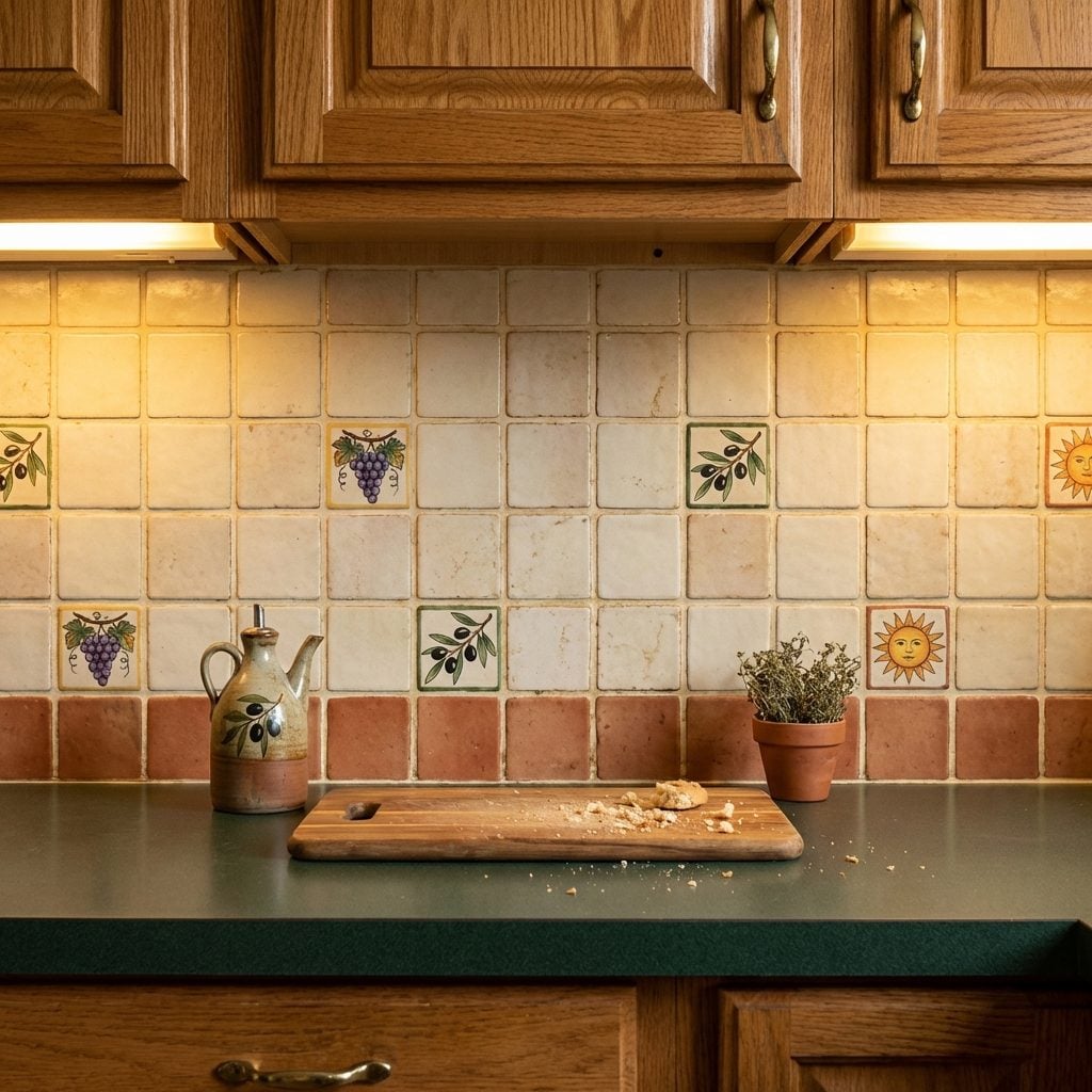
Tumbled Marble Backsplash With the Grout Lines You Could Never Keep Clean
Tumbled marble was the backsplash of 1990s aspirational kitchen design, and if you had it, you knew it. Each tile arrived already worn at the edges, slightly irregular, with a soft matte finish that felt expensive in a way smooth ceramic never quite managed. The installation usually ran from countertop to underside of cabinet, sometimes extending to a full wall behind the range.
The palette was creamy beige, ivory, soft gold, and pale grey, often in a 4×4 or 3×3 inch format with tight grout lines in a slightly darker sand color. Which brings us to the grout. The grout was a constant project. Tumbled marble is porous. Olive oil, tomato sauce, coffee, the general ambient grease of a functioning kitchen, all of it found the grout and stayed there.
Sealing the stone twice a year was non-negotiable, which means it was negotiated constantly. The backsplash still looked beautiful. A red kitchen with tumbled marble behind the range was the peak 1990s luxury combination, and honestly, looking back, it held up better than most trends from that decade.
The Ceramic Tile Backsplash With Decorative Inserts Nobody Could Stop Touching
Every few tiles, there was one with a hand-painted grape cluster, a rooster, or a little sun with a face on it. Those decorative inserts cost extra, and you knew it because whoever installed them made sure the conversation came up at every dinner party. The grout was always either blinding white (for the first two weeks) or a shade of gray that no amount of scrubbing could fix.
The ceramic tile backsplash felt like the most European thing a suburban kitchen could achieve. Italian countryside energy, aggressively. It replaced the painted drywall that came before it, and for a solid decade, it was the universal signal that a kitchen had been properly renovated.
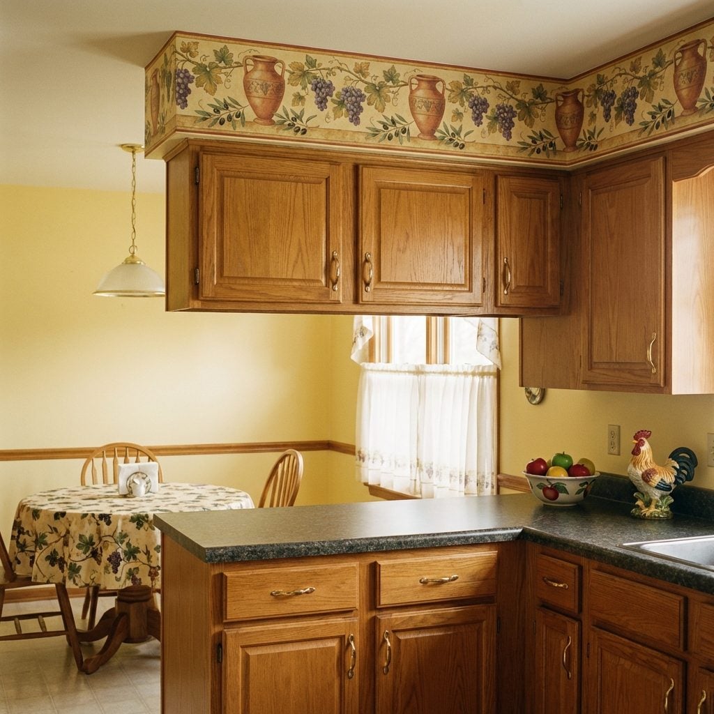
The Wallpaper Border That Turned Every Kitchen Into a Tuscan Vineyard
🔥 Would you like to save this?
It ran right along the top of the wall, just below the ceiling, a four-inch strip of grapes and vines or maybe sunflowers and terracotta urns that somehow tied the whole room together. Or at least that was the idea. The border was usually applied over painted walls, which meant removing it a decade later required a heat gun, a scraper, a lot of patience, and some genuine emotional reckoning.
Tuscan kitchen borders were peak ’90s aspiration: the idea that your kitchen, the one with the linoleum floor and the refrigerator with the ice maker that sort of worked, could feel like a farmhouse outside Florence. The fruit-and-vine version was especially popular, and you could find it at any home improvement store for about twelve dollars a roll. For a brief, glorious moment, everyone’s kitchen was basically a rustic outdoor kitchen in spirit, if not in practice.
Faux Finish Walls Done in Sponging or Ragging That Made Your Kitchen Look Vaguely Ancient
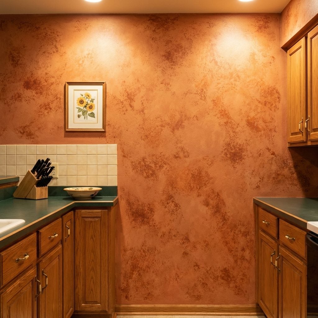
The technique was called sponging, and it involved taking a natural sea sponge, dabbing it in a slightly darker paint color, and pressing it repeatedly across a base coat until the wall looked like it had been imported from a Venetian palazzo. Or at least that was the vision. The result was often more “damp cave” than “Italian villa,” but in the right light, with the right curtains, it absolutely worked.
Ragging was the other method: literally dragging a bunched-up rag through wet glaze to create a subtle texture. Both techniques were covered in detail in every home decorating magazine from 1991 to 1998, and countless homeowners attempted them over a weekend with a YouTube-free level of confidence. The colors were always earthy: terracotta over cream, sage over white, goldenrod over beige. This was craftsman kitchen decor before that phrase existed.
Quarry Tile Floors That Looked Great in the Showroom and Murdered Your Feet by Noon
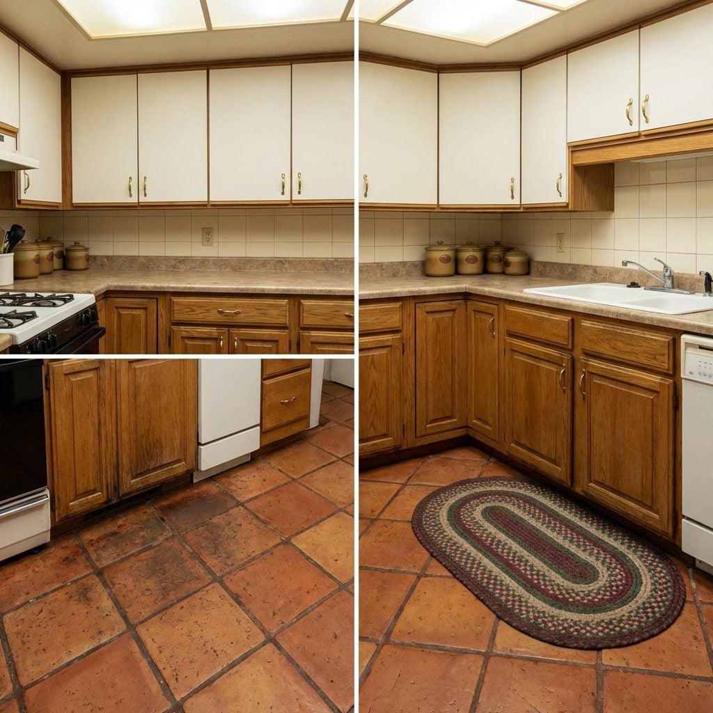
Quarry tile was the serious choice. Unglazed terracotta-colored clay tile, usually in an 8×8 or 12×12 format, laid in a grid or sometimes on the diagonal for maximum sophistication. It was earthy, it was durable, it was extremely European in theory. It was also completely unforgiving to stand on for longer than twenty minutes.
The grout between those tiles was a particular shade of reddish brown that absorbed every cooking spill and footprint with absolute commitment. No amount of sealing fully saved it. And in winter, that floor was cold in a way that made you question every decision that led to this moment. Still, it looked genuinely handsome in a kitchen with cream walls and oak cabinets, the kind of floor that photographed well and felt like the foundation of a rust kitchen aesthetic decades before that was a named thing.
Recessed Can Lighting on a Dimmer: The First Time a Kitchen Felt Grown-Up
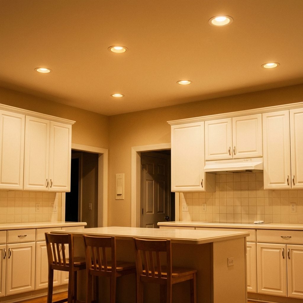
When recessed can lights showed up in a kitchen, you knew the budget had been real. Six to eight cans evenly spaced across the ceiling, clean white trim rings flush with the drywall, connected to a dimmer switch that let you take the kitchen from “prep dinner” brightness down to “dinner party ambiance” with a single slider. This was genuinely exciting.
The dimmer itself was a specific tactile pleasure: a long vertical slider on a wall plate, usually in ivory or almond, that moved with a satisfying resistance. Turning a kitchen into a contemporary kitchen space that could shift its mood based on occasion felt radical. Before this, kitchens were just lit or not lit. The dimmer introduced the idea that a kitchen could have atmosphere.
Halogen Puck Lights Under the Cabinets That Got Hot Enough to Warm Soup
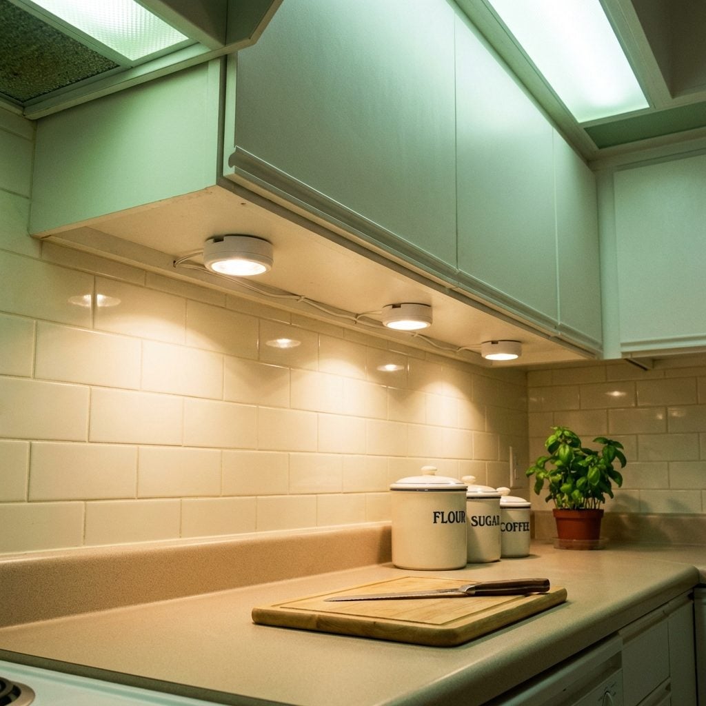
Small, round, about the size of a hockey puck. They screwed into the underside of the upper cabinets in a little plastic housing, often connected by a thin wire that was carefully tucked behind the cabinet face. When you switched them on, the under-cabinet area lit up in a warm pool of halogen light that made the countertop look like a stage set. Very professional. Very new. Also, slightly dangerous if you left them on for four hours and then touched one.
The halogen puck ran hot, and that was just part of the deal. You learned not to store anything that could melt directly below them. The halogen puck light was eventually replaced by LED tape lighting, which runs cool, uses less power, and produces none of the same ambient drama. Some things are just better now. This is one of them.
The Decorative Wood Range Hood Surround That Made the Stove Feel Like a Fireplace
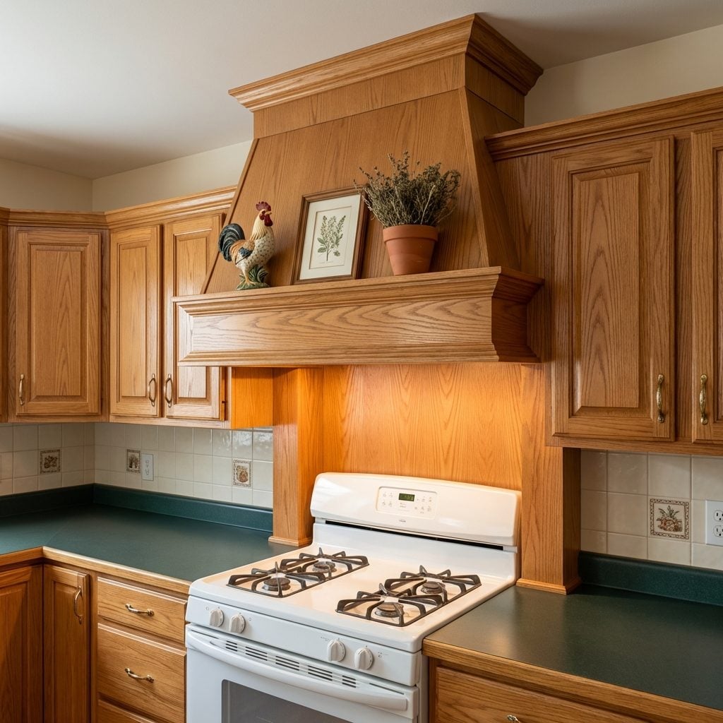
It wasn’t just a range hood. It was a moment. The decorative wood surround turned a standard vent hood into a built-in architectural feature, usually finished in the same stained oak as the rest of the cabinets, with a stepped crown moulding detail at the top and sometimes a little shelf for a ceramic rooster or a small framed print of Tuscany. The whole assembly climbed from the stovetop to the ceiling and made that wall the undeniable focal point of the kitchen.
This was the kitchen equivalent of a fireplace mantel, and it was treated with the same reverence. People decorated the shelf seasonally. The wood was always stained, not painted, because painted wood on a range hood surround felt wrong in a way nobody could fully articulate. The wood range hood surround is genuinely having a moment again today, this time in white-painted shaker with brass straps, but the ’90s oak version had a particular warmth that the newer iterations are still chasing.
The Skylight That Was Supposed to Fix Everything
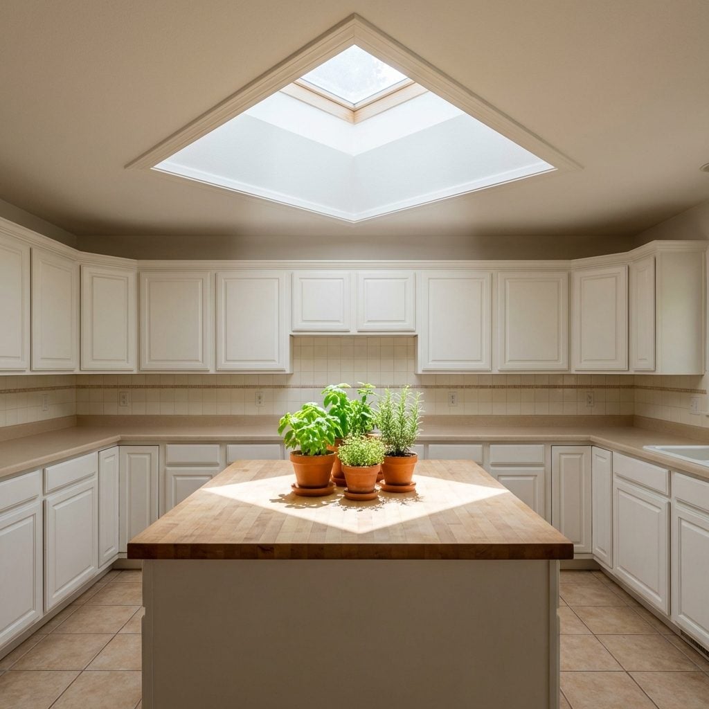
Every kitchen renovation magazine from 1988 to 1999 included at least one skylight. It was the solution to dark kitchens, small kitchens, kitchens that felt like they were missing something. Cut a hole in the roof, add a fixed or venting Velux unit, and suddenly the room had a column of natural light falling straight down like something theatrical.
The reality was slightly more complex. Skylights leaked sometimes. They let in intense direct sun in summer that made the kitchen into a greenhouse by two in the afternoon. And cleaning them required a ladder, a squeegee, and a commitment that faded fast. But on a gray November morning with rain ticking against the glass overhead and the kitchen warm and lit from above, a skylight did exactly what it promised. It made the room feel like something special.
The Tray Ceiling With Crown Moulding That Said ‘We Did Not Cut Corners’
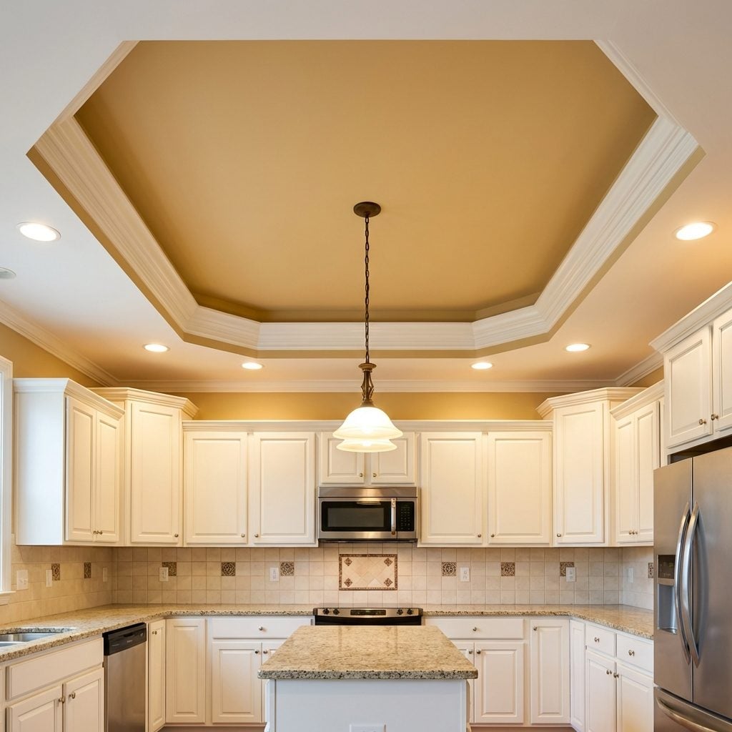
A tray ceiling in a kitchen in 1996 was a flex. The recessed center section, stepped up six or eight inches from the surrounding perimeter, finished with crown moulding at the transition and sometimes painted a slightly different color in the center panel, maybe a warm gold or a soft blue. It communicated intention. Somebody stood in a room that had a flat ceiling and decided it should be more.
The crown moulding itself was often a relatively simple profile, but the combination of the stepped ceiling and the moulding at the break made even a modest kitchen feel like it had arrived somewhere. Recessed can lights were typically set into the perimeter, below the tray, which meant the center of the ceiling stayed clean while the light sources sat at a lower plane. It was, genuinely, good design logic dressed up in period-appropriate clothing.
Those kitchens always felt more serious than the ones without it. The tray ceiling was the architectural equivalent of a firm handshake.