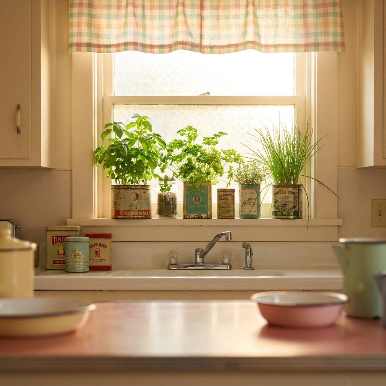
🔥 Would you like to save this?
Counter space is the one thing every home cook wishes they had more of, and cabinet storage is a close second. These 35 before and after kitchen transformations prove that the same square footage can work dramatically harder with smarter planning, bolder material choices, and a willingness to gut the builder-grade basics that have been quietly failing homeowners for decades. From cramped galley kitchens drowning in oak to sprawling layouts with zero usable surfaces, each redesign here solves a real storage problem while looking like it belongs in a design magazine.
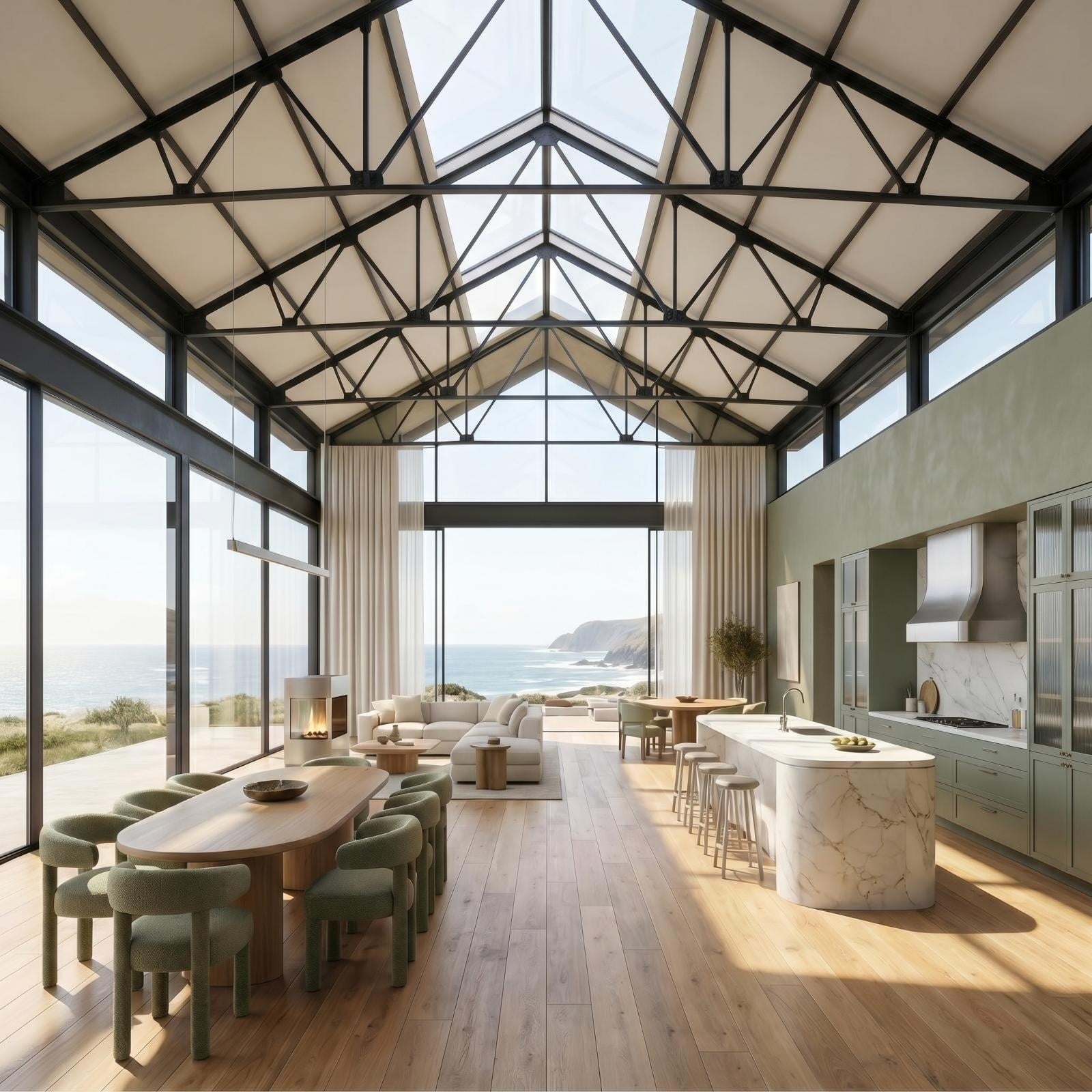
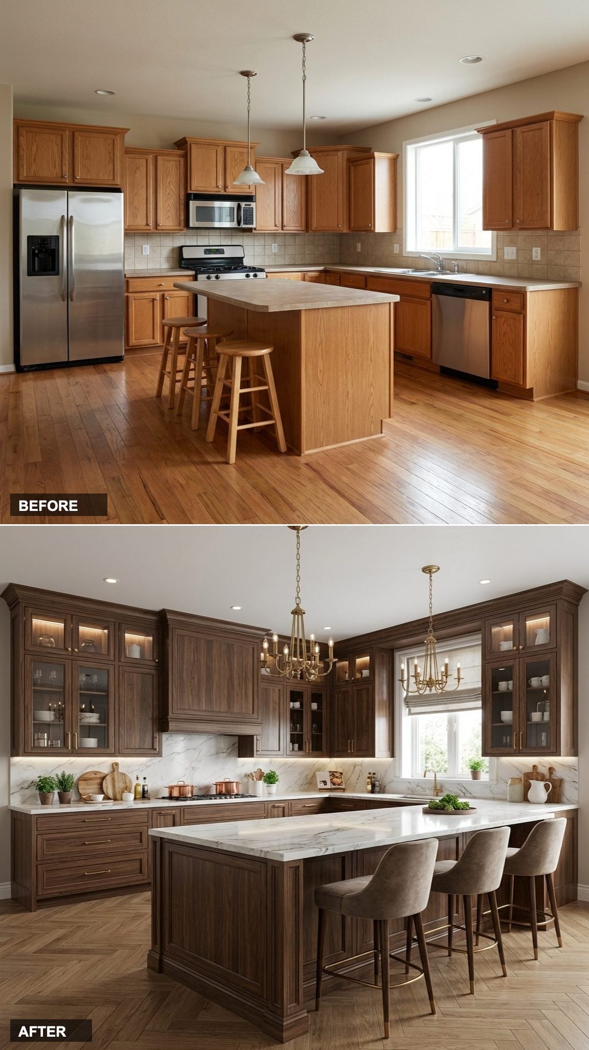
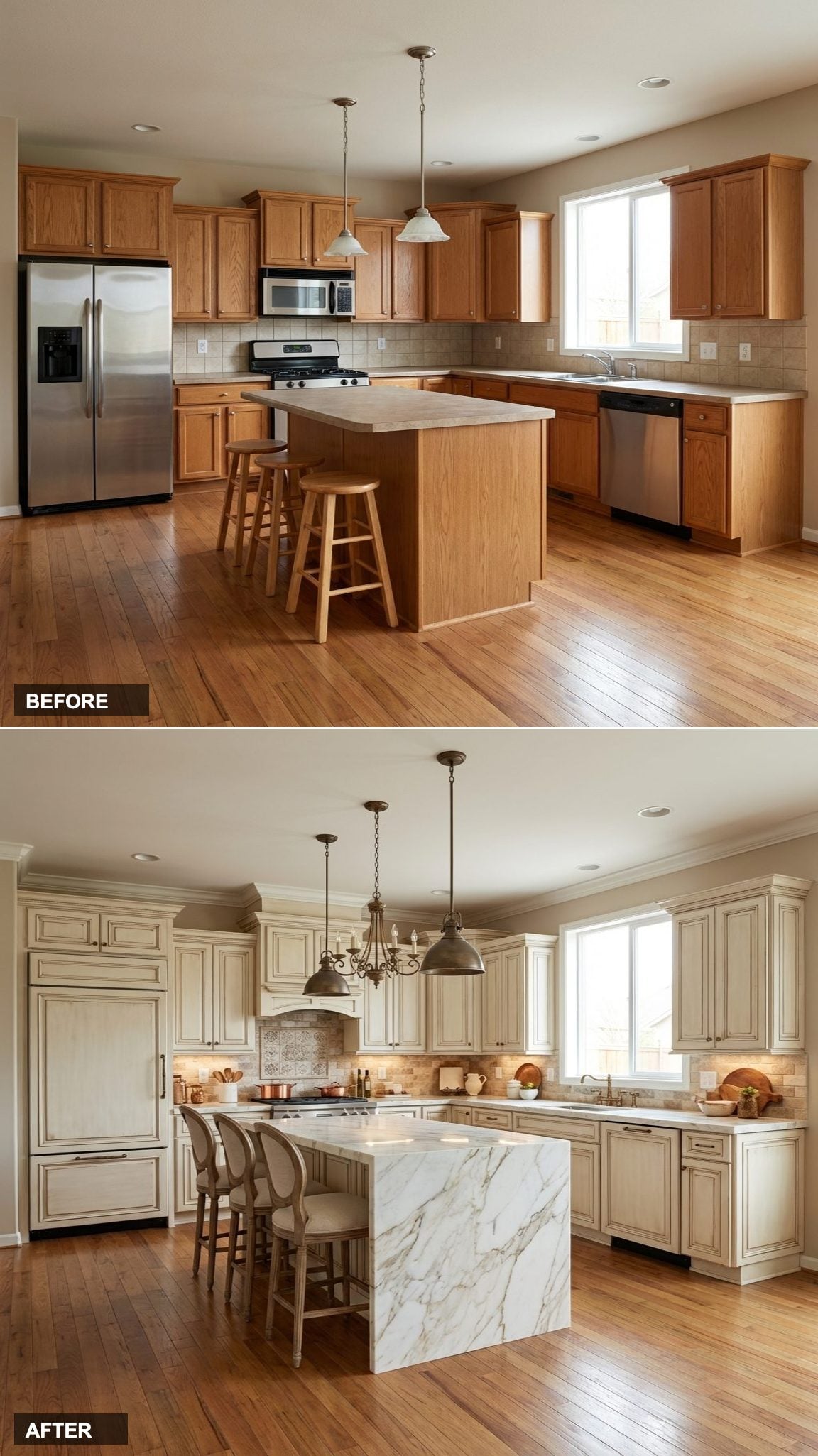
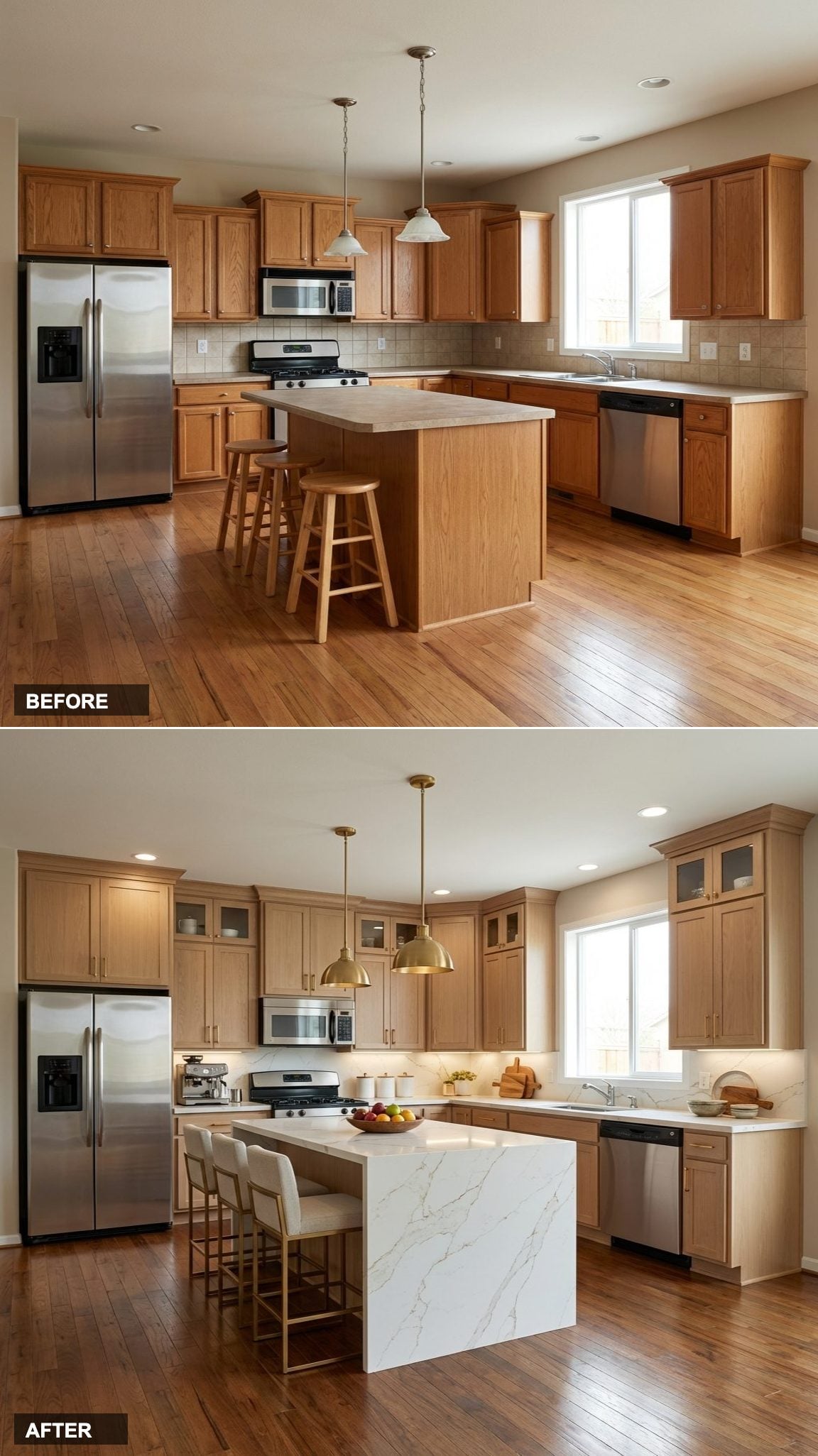
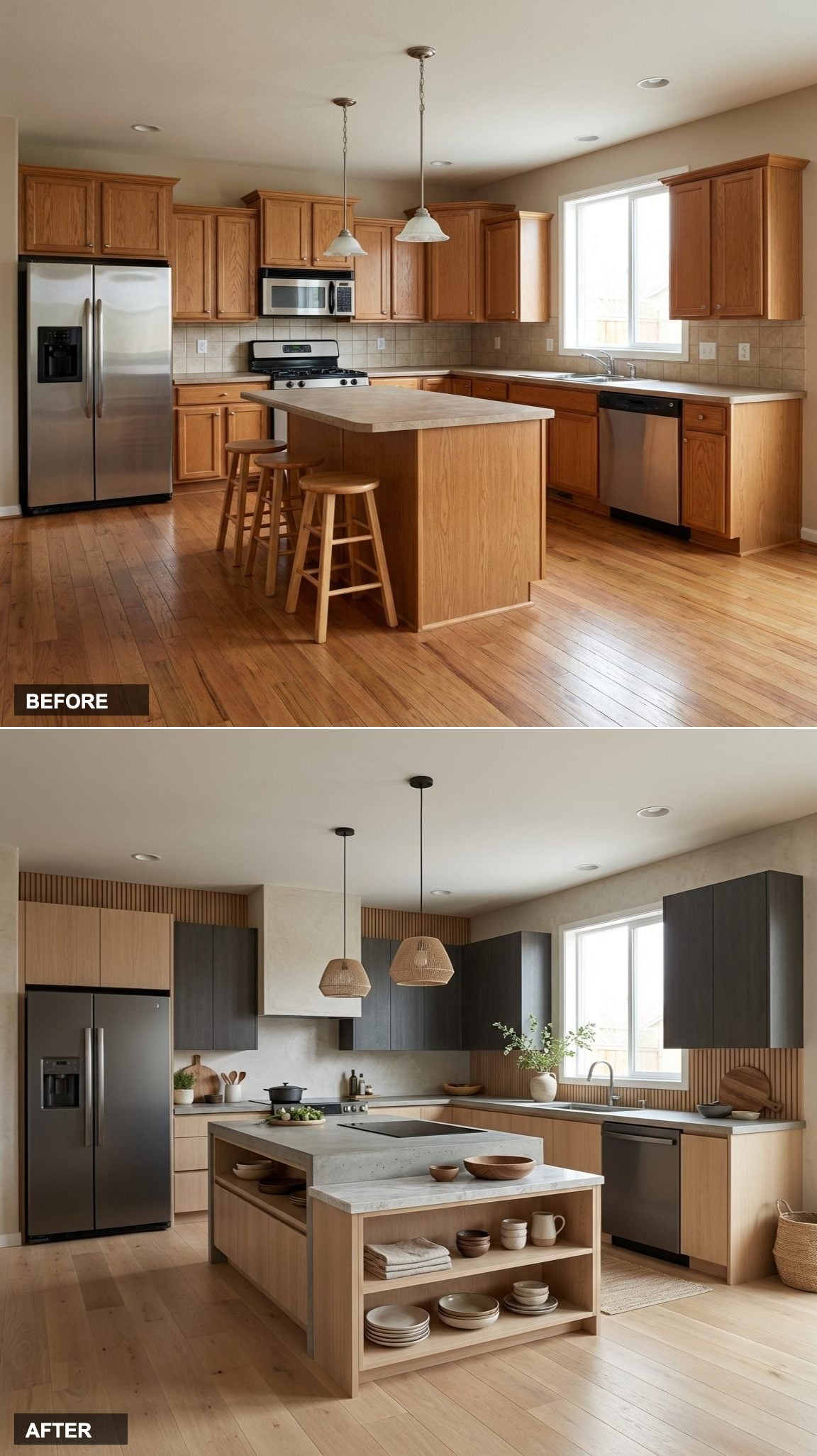
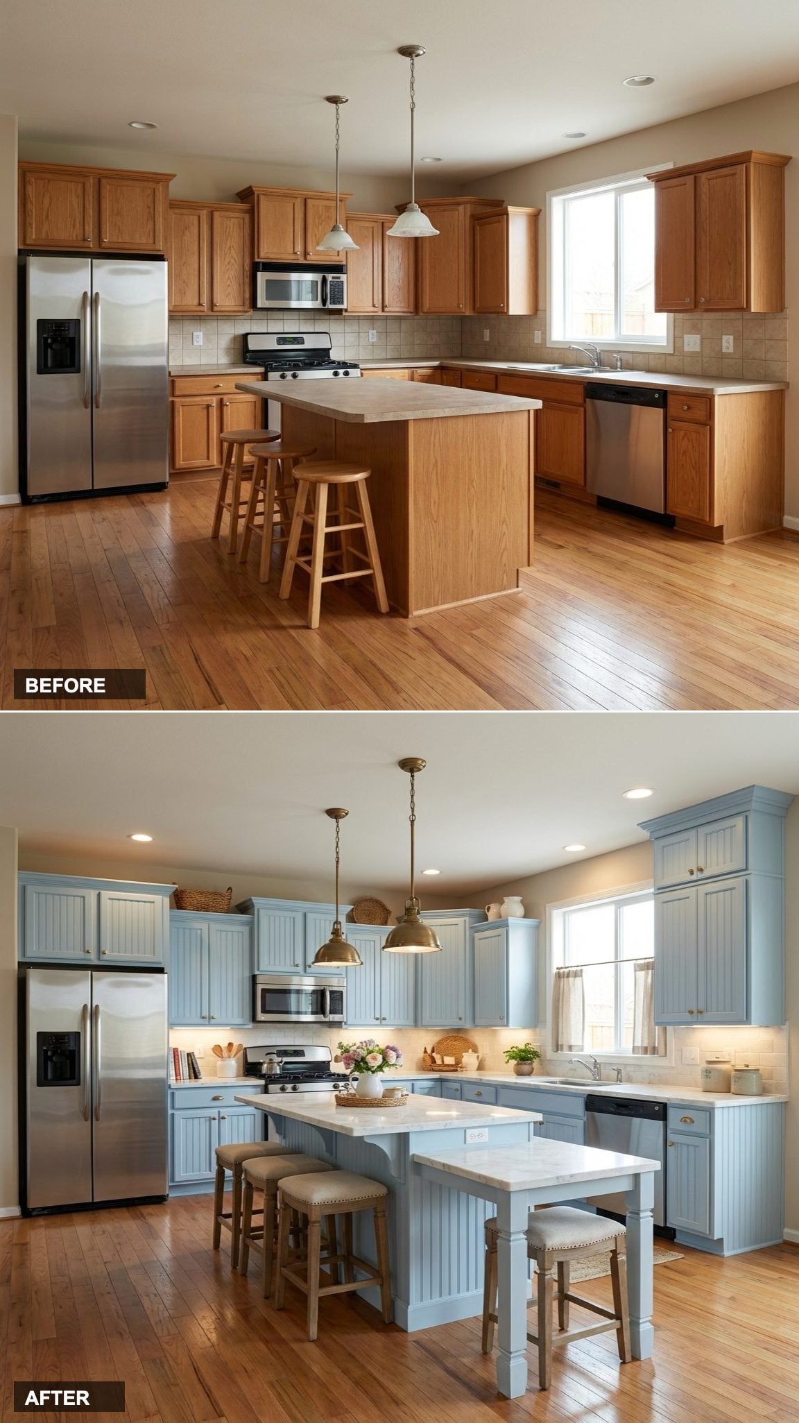
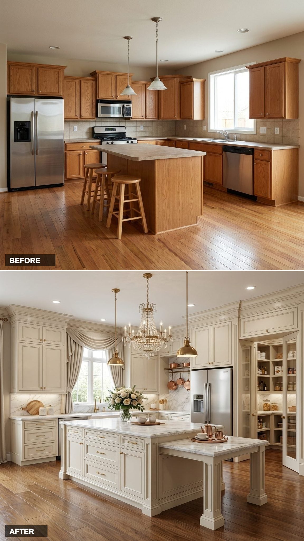
From Cramped Corner Chaos to Sleek White Shaker Command Center
The single biggest storage killer in this before kitchen isn’t the oak cabinets or the beige laminate counters, it’s the complete absence of upper cabinet runs. Dead corner space, no pull-out drawers, and a peninsula that blocks natural flow. The fix here was surgical: full-height white shaker cabinets running wall-to-wall, soft-close drawers replacing lower doors, and a waterfall quartz island that nearly doubles usable prep surface.
In order to come up with the very specific design ideas, we create most designs with the assistance of state-of-the-art AI interior design software. Also, assume links that take you off the site are affiliate links such as links to Amazon. this means we may earn a commission if you buy something.
Quartz wins the longevity argument every time. Scratch-resistant, non-porous, and maintenance-light, it’s the one counter upgrade that pays back in daily ease rather than just aesthetics.
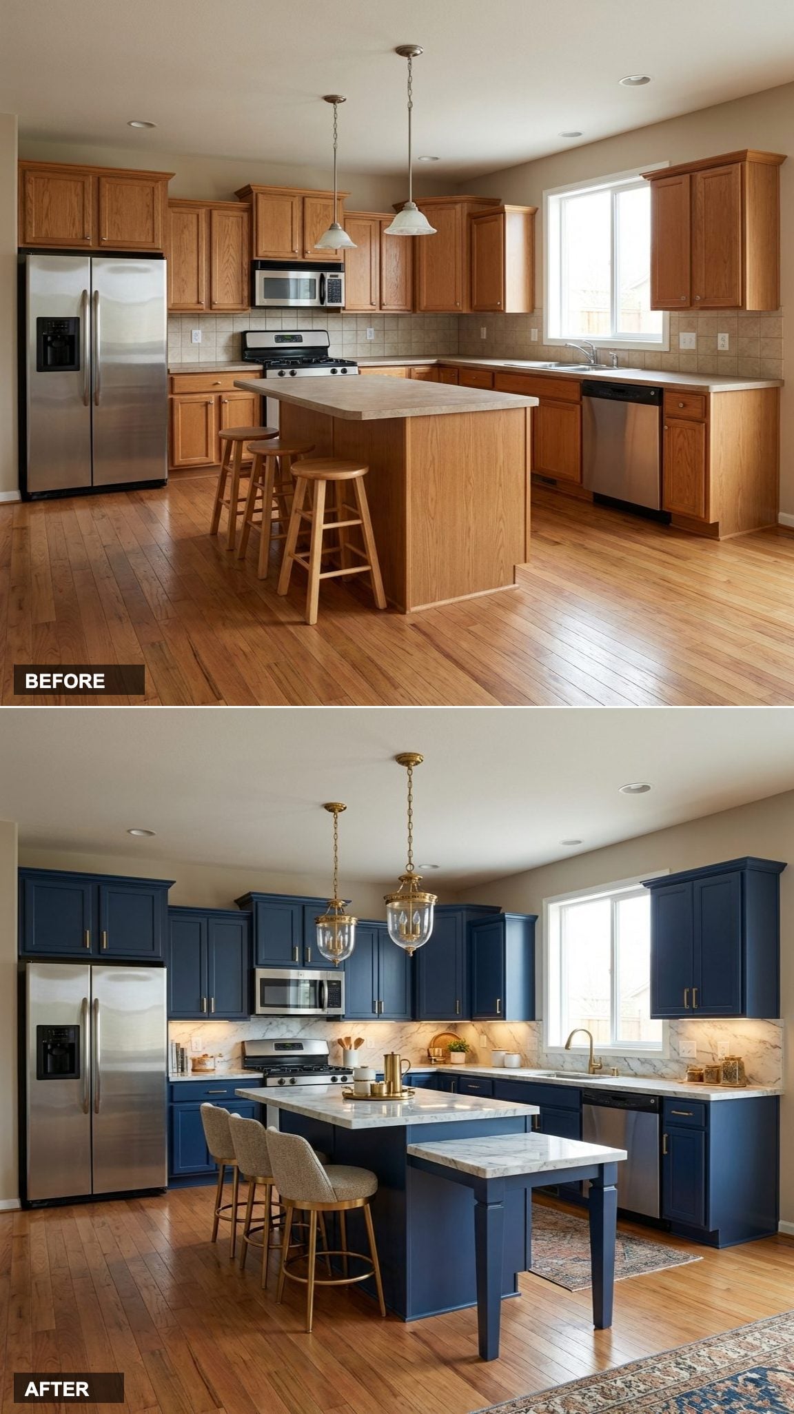
Builder-Grade Oak Tomb to Dramatic Navy and Brass Galley Powerhouse
Navy lower cabinets absorb visual noise so the eye reads counter space first, not clutter. This galley kitchen transformation leans hard into the power of two-tone cabinetry. Crisp white uppers keep the ceiling feeling high, while deep navy lowers in a shaker profile give the room an anchored, intentional quality that oak laminate could never fake.
The real storage win is the addition of a full-height pantry cabinet flanking the range, paired with pull-out spice racks and drawer organizers inside every base unit. Counter space expands not just physically but perceptually, when storage is off the counter, the surface reads as larger.
Fluorescent-Lit Food Cave to Warm Walnut and Concrete Open-Plan Kitchen
That single overhead fluorescent tube is doing the room a disservice in more ways than one. Harsh, flat light flattens the depth of every surface, makes cabinets look cheaper than they are, and actively discourages time spent cooking. For open kitchen inspiration, this redesign removes the soffit entirely, adds a run of walnut floating shelves above the upper cabinet line, and brings in a concrete-look porcelain counter that reads industrial but warms up under the new pendant lighting.
Dead Corner Space to a Custom L-Shape Kitchen with Hidden Appliance Garage
Corners are the most wasted real estate in any kitchen. The standard lazy-susan solution eats cabinet wall space and delivers poor access, things disappear into the back and never return. This redesign attacks the corner problem directly with a blind corner pull-out cabinet system and an appliance garage tucked at counter level, keeping the toaster, coffee maker, and stand mixer completely hidden behind a tambour door.
Laminate Wasteland to a Two-Tone Green and Cream Kitchen with Waterfall Island
The 1990s kitchen asked surfaces to disappear. This redesign asks them to do actual work.
Sage green flat-front lower cabinets pair with warm cream uppers in a combination that design psychology associates with calm productivity, not coincidentally the quality most home cooks report wanting in their kitchen. The real functional leap is the new 10-foot waterfall island in honed Calacatta marble, which adds four feet of uninterrupted prep surface, a marble waterfall kitchen island with seating for three, and three deep drawers underneath for pots and pan storage.
Popcorn Ceiling Nightmare to a Scandi-Minimalist Kitchen with Flush Storage Wall
Popcorn ceilings and Scandinavian minimalism are cosmically incompatible. The entire design logic of a clean, Scandi-influenced kitchen depends on reading the room as one continuous plane, the moment a bumpy, textured ceiling interrupts that read, the illusion collapses. This overhaul skims the ceiling flat, adds floor-to-ceiling handle-free cabinetry in warm birch, and installs a flush storage wall that completely hides the refrigerator, pantry, and oven behind matching flat panels.
The result is the visual equivalent of a deep breath. Counter space feels doubled because nothing is competing for attention. For those drawn to this aesthetic, exploring japandi studio design principles is a useful parallel, the storage logic translates almost directly to kitchen planning.
Pinched U-Shape to a Chef-Grade Kitchen with Open Shelving and Pot Rail
The U-shaped layout should theoretically be the most storage-efficient floor plan in a kitchen. In practice, the builder-grade version, three short runs of base cabinets with no vertical storage above, wastes the upper half of every wall. This redesign keeps the U but extends everything vertically, adding floating open walnut kitchen shelves above the perimeter counter, a ceiling-mounted stainless pot rack over the prep zone, and a continuous 12-inch-deep upper cabinet run to maximize storage without crowding sight lines.
Useless Peninsula Turned Into a High-Function Prep Island with Built-In Cutting Board
A peninsula attached to a wall on one end is half an island doing the work of a quarter of one.
The original layout had a short peninsula jutting off the cabinet run, just enough surface to confuse traffic flow and not enough to actually prep a meal on. The redesign converts that footprint into a freestanding island with a flush-mounted end-grain maple cutting board surface on one side, three deep pull-out drawer cabinets underneath, and a full overhang on the opposite side for bar seating. The counter total nearly triples.
Counter space isn’t just about square footage, it’s about where the space sits relative to the stove, sink, and refrigerator.
Forgotten Breakfast Nook to a Banquette Pantry Alcove with Hidden Cabinet Storage
Most kitchens this size have a breakfast nook that nobody actually uses for breakfast. It’s a spatial afterthought, a corner carved out for a table and chairs that end up as a second staging area for mail, bags, and things that don’t have a real home. This redesign converts that footprint into a built-in banquette with full storage underneath, flanked by a pair of floor-to-ceiling white pantry cabinets on either side. The result adds over 40 cubic feet of kitchen storage while actually giving the eating area more function than it ever had as a loose nook.
Low-Ceiling Box to a Dramatic Black and Gold Kitchen with Vertical Cabinet Drama
Vertical lines read as height, this is an optical rule of architecture that works just as reliably in a small kitchen as it does in a cathedral. Flat cabinet doors with no vertical detail actively compress a low ceiling. Replacing them with tall, narrow shaker panels running the full height of the room, paired with a lean unlacquered brass cabinet hardware bar pull on every door, draws the eye upward before it lands on anything else.
The matte black cabinet finish here is doing something specific: it kills the visual noise of a busy kitchen. When cabinets recede, countertops advance, and suddenly the same amount of counter space looks considerably more generous than it did under oak. The dark outdoor kitchen trend has been proving this for years.
Wasted Blank Wall to a Floor-to-Ceiling Custom Pantry Wall with Glass Display Cabinets
There is almost always one wall in a kitchen that is doing nothing. No cabinets. No counter. Just painted drywall with maybe a clock on it, or a printed recipe hanging in a frame. This redesign identifies that wall and converts it into a full pantry storage system: deep base cabinets with interior dividers for trays and cutting boards, a mid-height counter for a dedicated coffee and appliance station, and glass-front upper cabinets for dish display.
- Base cabinets with vertical tray dividers hold cutting boards, baking sheets, and platters upright, no more digging.
- The appliance counter at mid-height keeps the toaster and coffee maker plugged in and accessible without crowding the main prep zone.
- Glass-front uppers display dishware without dust collection, giving the wall a purposeful but open quality.
Orphaned Awkward Layout to a Transitional Kitchen with Double Islands and Smart Storage
Two islands is not excess, it’s strategy.
This redesign is for the kitchen that has enough floor space but distributes it poorly: too much aisle, too little counter, cabinets clustered on one wall while the rest of the room sits empty. A prep island near the range and a serving/bar island closer to the dining space each serve a distinct function, which means neither ever becomes the catch-all clutter surface that single islands tend to attract. For deeper context on the design decisions behind this layout style, the principles in transitional pantry design apply directly to how transitional kitchens balance storage with visual flow.
The before room has enough square footage to make this work, the only thing missing is the decision to use it intentionally. Every deep drawer under those islands holds what three upper cabinet doors could hold, and the waterfall quartz islands create clean visual anchors that make the wide-open room feel designed rather than accidental.
From Choppy Galley Gloom to Bright White Handleless Storage Wall
🔥 Would you like to save this?
The original galley’s biggest crime wasn’t the oak cabinets or the laminate, it was the visual chop. Every cabinet door a separate event, every handle a tiny interruption, the eye had nowhere to rest. Removing hardware entirely and running floor-to-ceiling handleless cabinetry in warm white creates one unbroken plane that makes the same square footage read twice as large.
The push-to-open mechanism on each white handleless cabinet is the silent hero here. No pulls to catch your sleeve, no hardware to clean around, and the continuous vertical line draws the ceiling up visually even before the under-cabinet LED strip lighting does its part.
Dated Drop Ceiling to Industrial Open-Beam Loft Kitchen with Black Steel Storage
Popcorn ceilings and fluorescent box lights are a combination that makes even new kitchens feel like 1987. Stripping both back to expose raw structural beams, or installing faux beams where the structure won’t cooperate, immediately rewires the whole mood of the room.
Pairing exposed beams with matte black open shelving on one wall and deep graphite Shaker-style base cabinets below creates a kitchen that looks genuinely industrial without feeling cold. The matte black open shelving doubles usable display storage while keeping everything visible and accessible, a real functional win for a storage-focused redesign. For more ideas in this direction, the dark outdoor kitchen gallery is worth a long look.
Builder Box to Scandinavian Pale Oak and Stone Island Storage Sanctuary
Most builder kitchens waste the center of the room entirely, an empty expanse of vinyl floor that contributes nothing. Dropping a pale oak kitchen island into that void instantly multiplies counter prep space and adds a whole drawer bank that the perimeter cabinets couldn’t provide.
The Scandinavian version of this move is particularly sharp: natural oak veneer on the island base, honed limestone counters in a warm grey, and upper perimeter cabinets replaced with open oak shelving at two heights. The result reads calm rather than cluttered, and the limestone countertop surface brings an organic texture that no laminate can fake.
Wasted Corner Cabinets to Full-Width Scullery Wall with Deep Pull-Out Pantry
Corner cabinets are the bermuda triangle of kitchen storage. The lazy Susan was a noble attempt, but half the shelf is always unreachable. This redesign eliminates the corner problem entirely by reconfiguring the layout so one full wall becomes a dedicated scullery-style storage run with deep pull-out pantry cabinet towers flanking the refrigerator.
- Each pull-out column holds three times more than a standard corner cabinet at full depth.
- The scullery wall is finished in a contrasting color to the main kitchen, a deep navy against warm white perimeter, creating a visual destination that makes the storage feel intentional, not desperate.
- A built-in navy Shaker cabinet valance above ties the whole wall together without a soffit gap.
Cramped Kitchen Corridor to Moody Jewel-Toned Galley with Maximized Overhead Storage
The galley kitchen’s worst habit is stopping the upper cabinets at the standard 18-inch depth and leaving a foot of dead air above. Running cabinets all the way to the ceiling, even with a library ladder on a brass rail, recovers an enormous amount of storage that most kitchens simply surrender to dust.
In a jewel-toned palette, this move becomes genuinely theatrical. Deep emerald green cabinets stacked to a ten-foot ceiling, lit from above by a continuous brass rail library ladder detail, turn a utilitarian storage problem into a design feature worth showing off.
Open-Plan Afterthought to Defined Kitchen Zone with Full-Height Cabinet Divider Wall
Open-plan kitchens sold a dream of connection but often delivered a reality of visual chaos: the cooking mess is now everyone’s problem. This redesign draws a definitive boundary by building a full-height cabinet tower divider between the kitchen and living area, with cabinets accessible from the kitchen side and built-in shelving on the living room face.
The divider wall earns its keep from both sides, which is the key to justifying the footprint. A pass-through counter at bar height built into the top of the cabinet run keeps sightlines open while creating a proper social ledge. This is the kind of layout change that makes for compelling open kitchen inspiration, proof that boundaries can actually improve flow.
Forgettable White Box to Warm Terracotta Mediterranean Kitchen with Arched Niches
Most builder kitchens are essentially white boxes with cabinets glued to the walls. The architecture itself contributes nothing. Adding arched niches carved into the backsplash wall, real plaster-finished cutouts that function as open spice shelving, gives the room a structural personality it never had.
Terracotta zellige tile across the backsplash and into the arched recesses turns those niches into collectors’ items. The terracotta zellige tile‘s handmade surface variation catches light differently at every angle, making the room feel genuinely alive from morning to evening. Cream plaster-finish lower cabinets and a hammered brass faucet close out the Mediterranean picture without needing a single piece of art on the walls.
Skipped-Over Breakfast Nook to Built-In Banquette with Under-Seat Cabinet Storage

The forgotten corner breakfast nook is one of the most consistently wasted zones in a dated kitchen. A round table, two mismatched chairs, and a window valance that hasn’t moved since 1998. Converting it into a fully built-in L-shaped banquette with hinged built-in banquette bench seating recovers every cubic inch below the cushions as hidden storage.
No-Island Kitchen to Waterfall Quartz Island with Integrated Appliance Garage

The appliance garage is the most underused cabinet idea in residential design. Tucking the toaster, blender, and espresso machine into a tambour-door cabinet at counter height means the counter surface stays permanently clear, and that clarity is the real counter-space gain, even before a single inch of new surface area is added.
Building this feature into one end of a new waterfall quartz island is the sharpest execution of the concept. The island gains both prep surface and hidden appliance storage while the tambour door rolls away entirely when needed. The tambour door cabinet front in stainless steel becomes a textural detail rather than something to apologize for.
Bare Walls Between Cabinets to Full Backsplash-to-Ceiling Tile Statement
Most dated kitchens have a four-inch backsplash at best, a ribbon of tile that barely covers the gap between counter and cabinet. Running tile all the way from countertop to ceiling, without stopping at the bottom of the upper cabinets, is one of those changes that costs relatively little but reads as a complete room reinvention.
The graphic version, large-format black and white cement tile in a bold geometric pattern stacked floor to ceiling on the cooking wall, turns what was dead drywall into a focal point that anchors the entire kitchen. The floating upper cabinet that hangs in front of it in contrasting warm walnut becomes almost sculptural. For anyone weighing next steps, exploring a transitional pantry design alongside this approach produces a particularly cohesive whole-home result.
Single-Wall Kitchen to Pantry-Closet-Converted Storage Powerhouse

Every kitchen with an adjacent closet, coat closet, linen cupboard, broom cabinet, is sitting on untapped potential. Converting that adjacent space into a proper walk-in pantry with floor-to-ceiling adjustable shelving on three walls doesn’t add a single square foot to the kitchen footprint, but it offloads so much bulk storage that the main kitchen cabinets can focus entirely on daily-use items.
- Adjustable white pantry shelving on all three interior walls holds more than a dozen standard base cabinets worth of goods.
- A glass-paned or open-arched pantry door makes the storage visible as a design element rather than a hidden utility.
- Internal LED strip lighting triggered by the door opening turns every pantry visit into a moment of satisfying organization.
Useless Soffit Space to Full-Extension Deep-Drawer Cabinet Run with Toe-Kick Lighting

The soffit, that boxy drywall filler above standard-height upper cabinets, is one of the most common sources of lost kitchen storage in homes built between 1975 and 2005. It exists for no good reason other than to cover the gap between a 30-inch upper cabinet and an 8-foot ceiling.
Removing the soffit and replacing standard 30-inch uppers with 42-inch full-height cabinets is a Saturday demo project that recovers storage equivalent to adding an entirely new row of cabinetry. In this version, the extended cabinets are finished in a deep sage with recessed toe-kick LED lighting at floor level, which does something interesting: it lifts the whole cabinet run visually, making it appear to float above the floor. A sage green Shaker cabinet in that extended height reads much more custom than the same design at standard height.
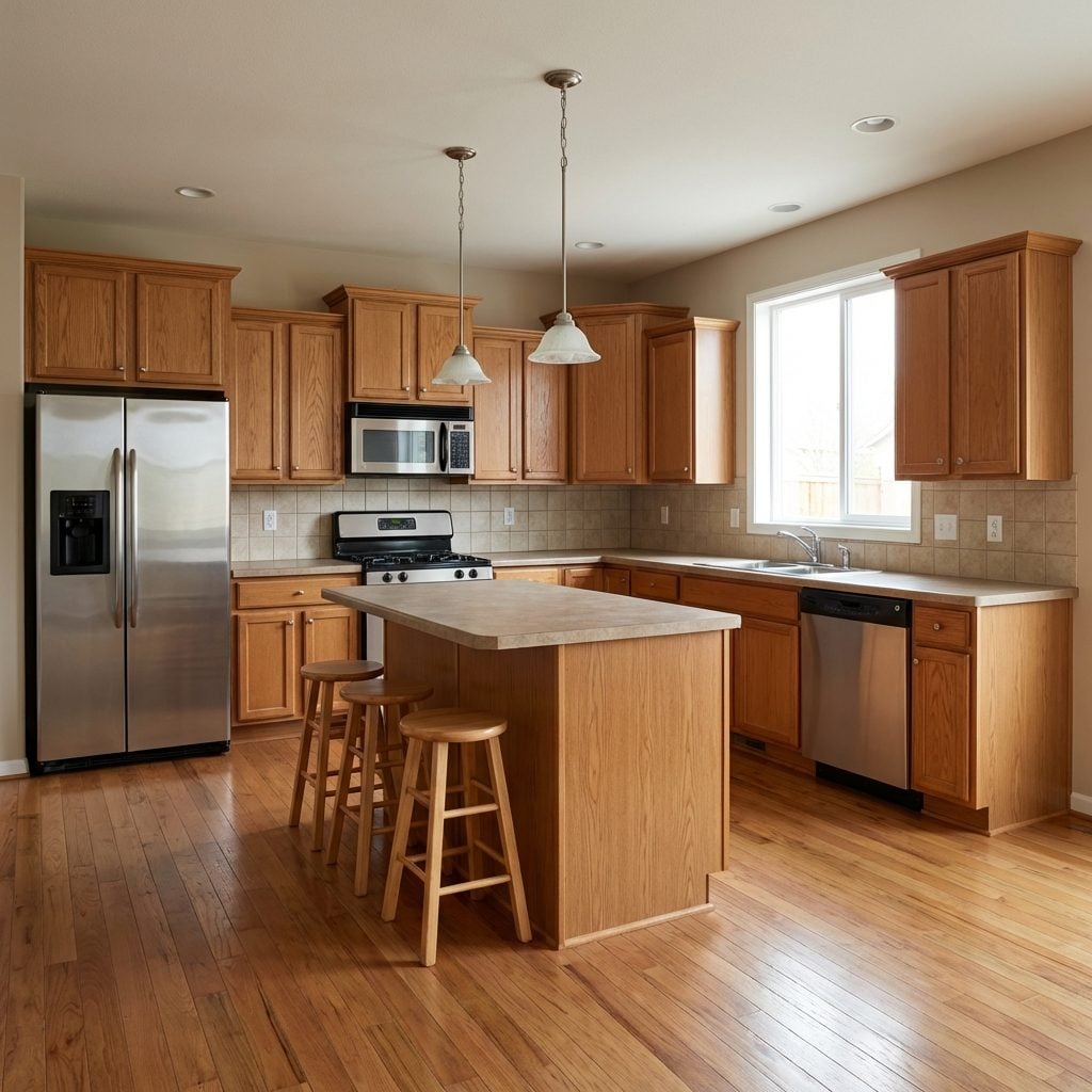
Counter space is disappearing in kitchens across the country, and the culprit is often an oversized island that made sense on a showroom floor but not in daily use.
A dated kitchen with a poorly placed island can eat up square footage without offering real storage or prep room. Reconfiguring that space, rather than gutting the entire room, has become one of the more practical moves homeowners are making. The right changes pull double duty: they add drawer and cabinet storage while opening up surfaces that actually get used.
The before-and-after examples below show exactly how that shift happens, room by room.
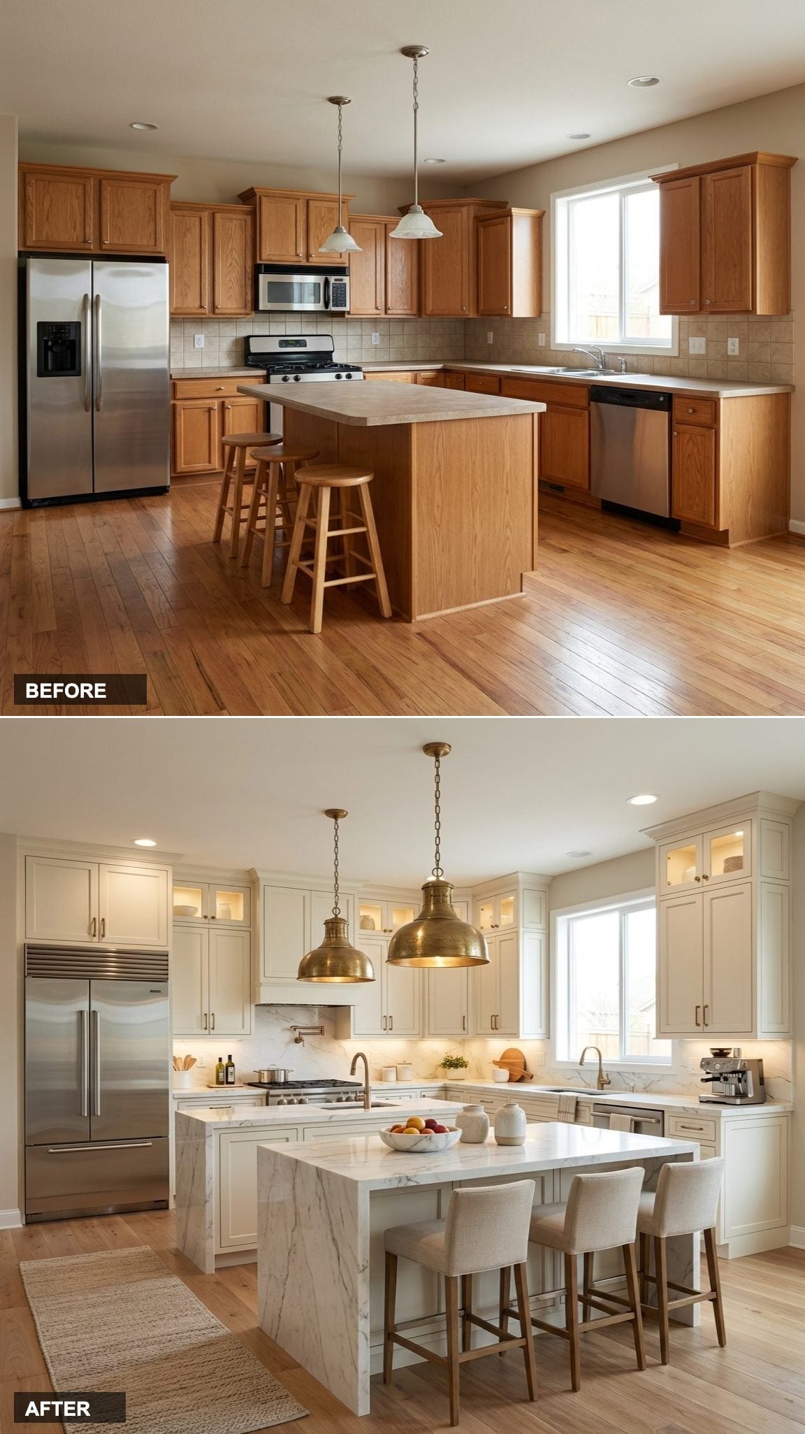
Oak Cabinets Out, Slate Gray Shaker Panels and Marble Waterfall Island In
🔥 Would you like to save this?
Honey oak cabinets and a plain wood-paneled island gave way to flat-front gray shaker cabinets with under-cabinet LED strip lighting and a full-height marble waterfall countertop on the island.
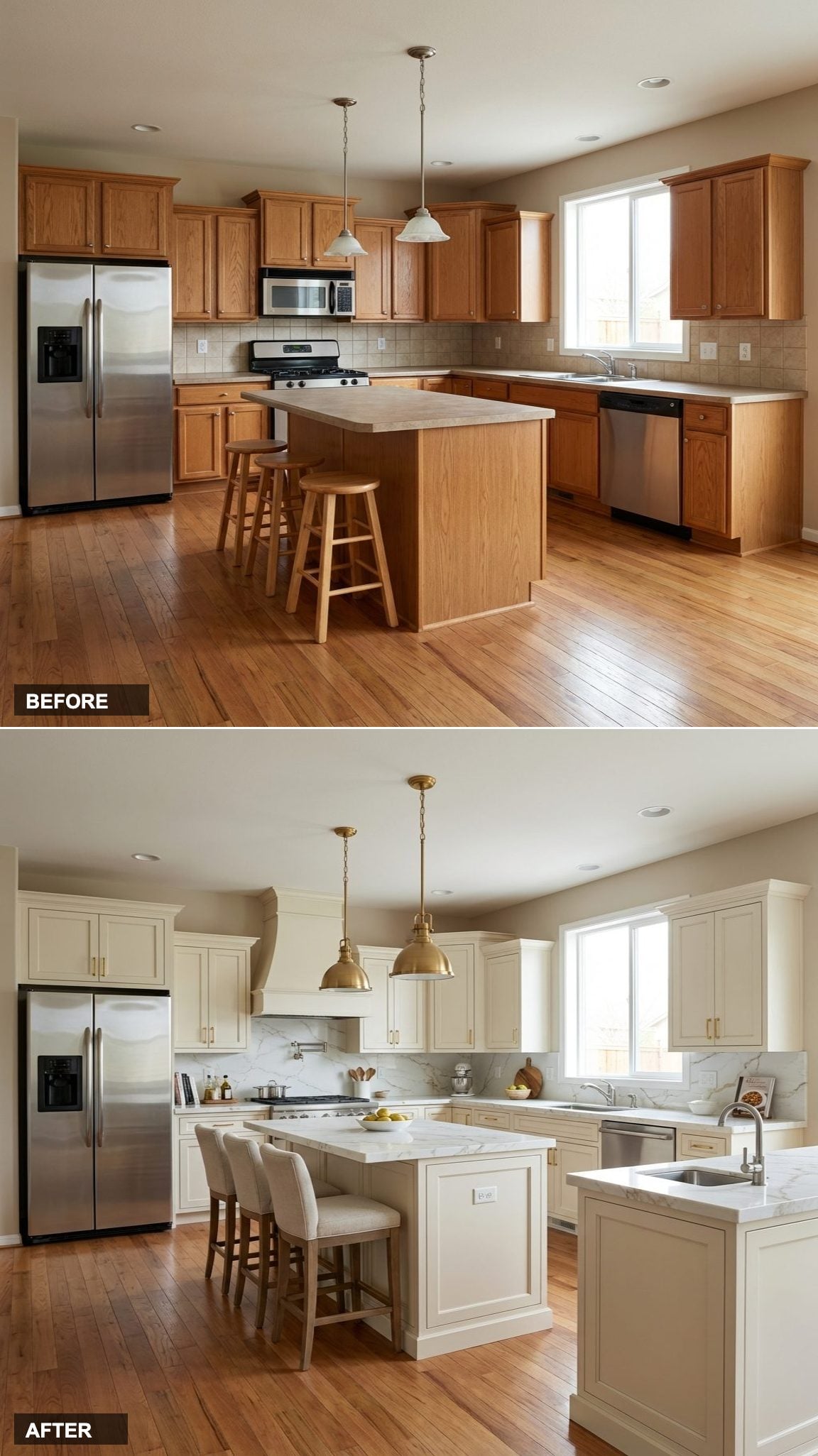
Walnut Flat-Front Cabinets and Waterfall Quartz Replace Oak and Builder-Grade Basics

Dark walnut flat-front cabinetry now runs floor to ceiling, replacing the raised-panel oak boxes that once made the space feel dated and low. Brass bar pulls run vertically on the uppers and horizontally on the lowers, a small detail that adds visual rhythm across the wall. Exposed wood ceiling beams echo the cabinet tone without matching it exactly.
The island received the most dramatic overhaul. White marble-look quartz with soft grey veining wraps the countertop and cascades down both sides as a full waterfall panel. Upholstered bar chairs in oatmeal fabric replaced the simple wooden stools. A wine cooler column now anchors the far left of the run, where the refrigerator once stood.
Cream Shaker Cabinets and Marble-Clad Island Replace Warm Oak in One Kitchen Overhaul

Flat-panel oak cabinets and basic laminate countertops gave way to cream shaker-style cabinetry fitted with brushed gold bar pulls. The rectangular island became a curved marble-waterfall centerpiece, its white-and-gray veining carrying through to the backsplash tile above the range. Porcelain floor tile in an oversized format replaced the strip hardwood, brightening the lower half of the room considerably.
Pendant lighting saw the biggest single shift. Two simple cone fixtures were swapped for a crystal drum chandelier centered over the island, paired with a glass cylinder pendant near the window. Under-cabinet lighting now washes the backsplash in warm white, a detail the original kitchen lacked entirely.
Editor’s Note: The curved island base wrapped in book-matched marble slab is the detail worth studying closest. Achieving that continuous veining pattern across a curved surface requires precise templating before fabrication. It adds cost but produces a result that no paint color or hardware swap can replicate.
Slate-Front Cabinets and Marble Island Cladding Replace Honey Oak in a Full Kitchen Gut

Walnut upper cabinets run floor-to-ceiling here, paired with matte slate gray lower panels and integrated appliances that disappear into the cabinetry line. The island gets the most dramatic treatment: waterfall marble cladding on two exposed sides, with veining that continues from countertop to base in a single unbroken drop.
Recessed LED strip lighting runs the full perimeter of a dropped soffit, washing the upper cabinets in warm ambient light without a single surface-mounted fixture in sight. The wood-look plank flooring shifts from light oak to a deeper walnut tone, anchoring the space without competing with the marble.
Did You Know: Integrated appliances, where oven and refrigerator panels match the surrounding cabinetry finish, can add 10 to 15 percent to appliance installation costs but significantly improve perceived square footage by reducing visual clutter. The effect works best in kitchens where cabinet depth is consistent across every run. Designers often recommend committing to integrated units before finalizing cabinet layouts, since standard-depth cabinets rarely accommodate panel-ready models without adjustment.
Woven Rattan Pendants and Subway Tile Give Oak Cabinets a Second Life

Swapping the backsplash did more work here than any cabinet replacement could.
White subway tile replaced the dated beige ceramic, running straight to the upper cabinets and making the warm oak grain read as intentional rather than leftover. Open floating shelves on the right wall hold copper cookware and woven baskets, pulling natural texture into a zone that previously had no visual interest. Three oversized rattan pendant lights hang at staggered heights above the island, shifting the whole room’s character without touching a single cabinet door.
A jute runner grounds the hardwood floor beneath the island, and the original wood stools stay. The island itself gained a marble-look quartz top, while a separate peninsula with a veined grey surface extends seating with leather counter chairs on black metal bases. Warm LED strip lighting along the top of the cabinetry adds depth the original recessed fixtures never achieved.
Oak Stools and Beige Tile Out, Floating Marble Island and LED Valance Lighting In

Brushed brass hardware pulls the eye across flat-front walnut-veneer cabinet faces that extend floor to ceiling, eliminating the bulky crown molding gap from the original build. The island waterfall uses book-matched white marble with gray veining on both the countertop and vertical side panel. Three organic-form pendant lights in a matte stone finish hang low over the island where simple wood bar stools once sat.
In The Details: Under-cabinet LED strip lighting, positioned behind a recessed valance rather than surface-mounted beneath the cabinet base, casts an even wash across the marble backslab without visible hardware. That detail alone shifts how the countertop reads at night, turning a work surface into something closer to a display. Routing the wiring inside the cabinet frame during rough-in keeps the finished wall completely clean.
Ornate Carved Cabinets and Crystal Chandeliers Replace Oak in a French-Inspired Overhaul

Cream glazed cabinetry with raised-panel doors and hand-carved acanthus leaf corbels replaced the original honey-toned oak boxes entirely. Gold-toned hardware, a custom range hood clad in brass and marble, and a Calacatta marble backsplash running wall to wall pull the period detailing into every corner of the room.
Two beaded empire chandeliers hang from the ceiling on brass chains, replacing the simple pendant lights above the island. The island itself grew substantially, gaining a thick marble top with visible veining and an ornamental base that mirrors the cabinet millwork. Taupe silk-blend drapes frame the window where bare white trim once sat.
Try This: Glazed cabinet finishes, where a darker tinted wash is applied over a base paint color then partially wiped away, require a topcoat sealer to prevent the glaze from yellowing or lifting near the stove. Oil-based glazes tend to hold up better in high-heat zones than water-based versions. Ask the painter for a small sample panel before committing to the full cabinet run.
Shifting from dramatic cabinet overhauls, this update shows what paint and new surfaces alone can accomplish.
Oak Gets a Two-Tone Edit With Wicker Pendants and Quartz Island Cladding

Rather than gutting the original oak cabinetry entirely, the lower perimeter cabinets keep their honey-toned wood grain while upper cabinets along the sink wall receive a coat of bright white paint, creating a two-tone split that reads as intentional contrast. The island base follows the same white finish, now clad in what appears to be a quartz surface with a low-sheen, speckled white pattern. Three woven rattan dome pendants replace the dated glass bell fixtures overhead. Woven seagrass counter stools swap out the plain wood versions, and subway tile in a stacked vertical pattern replaces the original beige field tile backsplash.
Matte Black Upper Cabinets and Quartz Waterfall Island Replace Oak in a Bold Two-Tone Redo

Brass dome pendants hang above a marble-veined quartz island that wraps its face panel in the same slab material, while walnut lower cabinets ground the matte black uppers with warmth.
Two-Tone Walnut and Ivory Cabinets Swap Out Oak With a Marble Island Upgrade
🔥 Would you like to save this?
Painted ivory uppers with glass-front panels and gold cup pulls sit above dark walnut lower cabinets, replacing the original honey-toned oak on every wall. The island grows in both footprint and presence, now clad in marble with a thick slab top showing gray veining across a white field. A brass candelabra chandelier with exposed bulbs hangs where plain pendant shades once did, pulling the gold hardware together across the space. Dark-stained hardwood flooring replaces the original light oak planks, grounding the two-tone cabinet palette without competing with the marble surface above.
Charcoal Shaker Panels and Marble Island Cladding Pull a Dated Oak Kitchen Into Sharp Focus

Open shelving replaces upper cabinets along the right wall, with each shelf edge backlit by recessed LED strips that cast light onto stainless cookware and potted herbs. The island gets the most dramatic treatment: full-height marble cladding with bold gray veining runs floor to countertop on all four sides, turning what was a plain oak box into a architectural anchor.
A ring pendant in matte black metal hangs centered above the island, replacing the two builder-grade dome pendants from before. The dark hardwood floor reads almost espresso against the white marble, a contrast the original light oak planks never could have supported.
Popcorn Ceiling and All to a Scullery-Inspired Prep Kitchen

The ceiling is doing more damage than any cabinet. Popcorn texture reads as institutional rather than residential, and a single smooth skim coat changes the entire quality of light in the room. Combined with open shelving in blackened steel and a deep fireclay farmhouse sink, this redesign converts a passable cooking space into something that feels like a dedicated working kitchen, organized around function first, aesthetics second.
From Forgettable to Full Drama: A Black and Brass Maximalist Reboot
Not every kitchen needs to be calm. Some rooms earn their keep by being memorable, the kind of space that stops a first-time visitor mid-sentence. This version commits to black cabinets floor to ceiling, antique brass hardware, and a backsplash in deep emerald green zellige. The contrast is intentional, theatrical, and completely unambiguous about its own point of view.
The Counter-Clutter Cure: A Hidden-Storage Scandinavian Redesign

Research in environmental psychology consistently links visual clutter with elevated cortisol, and nowhere is this more measurable than in a kitchen, where toasters, paper towels, and rogue spice jars colonize every available inch of counter space. Scandinavian design sidesteps the problem by hiding everything: deep drawers replace lower cabinets, appliance garages sit behind tambour doors, and the counter reads as one clean plane from end to end.
Checkerboard Vinyl to Terracotta Tuscany in One Flooring Swap

The floor is doing more than most people realize. That tan-and-brown vinyl checkerboard tiles the entire room in a pattern that says “gas station restroom” before a single fixture has been evaluated. Ripping it out and laying handmade terracotta hex tiles resets the room’s entire personality, warmer, older, more particular.
Paired with sage green lower cabinets and a simple whitewash on the uppers, the terracotta does the kind of work that paint alone can never quite achieve. It anchors everything above it with warmth and gives the room a sense of age that builder finishes desperately lack.
Dated Drop-In Sink to a Statement Unlacquered Brass Kitchen

There’s a reason unlacquered brass has spent the last several years migrating from boutique hotels into residential kitchens: it ages. It develops a patina that no finish can replicate, and it turns an ordinary plumbing fixture into something that looks like it has a history. The white drop-in sink it’s replacing here had no personality and no future.
The rest of this redesign keeps things warm and textural, cream limewash cabinet doors, a plaster range hood, unlacquered brass throughout, to give the brass something to breathe against. Saturating everything in cool grey or white would cancel it out; warmth is what lets it sing.
Builder Grade Beige to Warm Organic Modern
Warm organic modern is having a serious moment, and this transformation shows exactly why. The laminate counters and raised-panel oak doors get replaced with live-edge walnut open shelving and travertine countertops that bring a sense of slow, deliberate materiality. The palette shifts from flat beige to layered warm neutrals: raw linen, warm plaster white, and toasty terracotta tile underfoot.
Oak Overload Gets a Parisian Bistro Makeover

Think zinc countertops, deep charcoal subway tiles stacked in a running bond, and cabinet fronts painted in a dusty French navy. The zinc countertop alone shifts the entire room’s mood, it patinas over time, making the kitchen feel like it’s been quietly accumulating character for decades rather than sitting in a 1993 subdivision.
For open kitchen inspiration that also tackles the layout side of this equation, it’s worth seeing how a open kitchen inspiration project paired bold color with a smarter footprint. The bistro approach does the same here, the clutter problem solves itself when your shelving is curated and visible.
From Forgettable to Jewel-Tone Maximalist Eclectic

Not every kitchen wants to disappear into its surroundings. This redesign chooses the opposite direction entirely: deep peacock teal on the lower cabinets, canary yellow on an accent island, and a hand-painted Moroccan tile backsplash that reads like a textile pattern translated into ceramic. The Moroccan tile backsplash alone brings more visual energy than an entire renovation’s worth of white subway tile.
Every Surface Was Wrong, Now It’s a Sleek Coastal Californian

Coastal Californian design is less about nautical ropes and more about what happens when Malibu sunlight hits a room full of bleached wood, white plaster, and warm natural stone. The aged oak gets bleached and refinished into a driftwood-toned flat-front cabinet with no upper cabinets at all, just open white plaster shelves and a high window that floods the counter with natural light.
The countertop shift matters enormously here: a leathered quartzite in a pale cream with organic movement replaces the flat laminate, and the new brushed nickel gooseneck faucet at the deep farmhouse sink keeps the mood light without going chrome-cold.
Cramped Corner Kitchen Reborn as an Airy Open Concept

Removing the peninsula that jutted awkwardly into the walkway was the move that changed everything. What had been a pinch-point that forced single-file traffic became a true gathering zone with breathing room on all sides. For anyone exploring open kitchen inspiration, this is the proof that square footage matters less than flow.
From Popcorn Ceiling Relic to French Countryside Perfection

Some rooms have a personality buried under decades of beige, this one had a French farmhouse waiting to get out.
The popcorn ceiling came down first, revealing clean flat plaster that a warm cream paint turned into something that felt genuinely old-world. Unlacquered brass cabinet hardware aged naturally over the first few months, and the fireclay farmhouse sink became the visual anchor the whole room had been missing.
Beige Box Becomes a Jewel-Toned Maximalist Statement

Not every kitchen cure is about going cleaner. This one went the opposite direction, and it worked because the chaos was replaced with intentional richness rather than more clutter. Deep emerald cabinetry, a zellige tile backsplash in burnt amber, and antique brass faucet and fixtures gave every surface a reason to exist.
The psychology here is real: our brains read intentional contrast as sophisticated, while random clutter reads as stress. Same number of visual elements, completely different emotional response.
Dated Laminate Disaster to Japandi-Inspired Calm

The entire visual noise of the original kitchen came from one source: too many competing materials with no relationship to each other. The beige laminate, the oak grain, the white appliances, the brass knobs, nothing agreed. The fix was to reduce the material palette to three: matte white, warm oak, and matte black. Clean japandi studio design principles applied to a kitchen produce this exact result.
Brass Knob Builder Kitchen to Sleek All-Black Modern

Committing to all-black cabinetry takes nerve, but the payoff is a kitchen that reads as a deliberate design statement rather than a default decision. Matte black flat-front cabinets with matte black hardware read as seamless, almost monolithic. The white quartz counter and white quartz countertop provide the only light break in the room, and that restraint is exactly what makes it work.
White Appliance Graveyard to Warm Terracotta Mediterranean

The white appliances were the least of this kitchen’s problems. The real issue was a total lack of warmth, every surface reflected light flatly, with no depth, no texture, nothing to hold the eye. Terracotta plastered walls, a saltillo tile floor, and hand-painted ceramic tile backsplash changed the thermal feel of the whole room before a single cabinet was touched.
- Texture first: rough plaster and handmade tile absorb light instead of bouncing it, creating warmth instantly
- Warm undertones in the floor set the base note for every other material decision
- Iron and copper fixtures carry the artisan quality through to the details
Dark Outdoor Entertaining Zone Carved Out of a Dead Corner

This corner of the kitchen had been losing the clutter battle for years, the space where appliances piled up and mail went to die. Treating it as a dedicated prep and entertaining zone, with a dark outdoor kitchen aesthetic brought inside, gave it a clear identity and cleared the rest of the counters by default.
Black cabinetry, a slate countertop, and a built-in wine fridge turned dead square footage into the most-used corner of the house.
Coil Range Kitchen Becomes a Soft Green Cottage Dream

Sage green kitchens have a staying power that most trend colors don’t, because they’re rooted in the natural world rather than the fashion cycle. The soft sage green cabinets here replaced the oak without any structural changes, and the difference is something close to arriving somewhere you’ve never been but already like.
Cream bead-board upper cabinets balance the green below without competing, and a butcher block countertop keeps the warmth grounded.
“The best kitchen redesigns don’t shout. They just make you stay longer.”
Chaos Behind Closed Doors: The Storage-First Redesign That Fixed Everything

When the Real Problem Isn’t the Surface
Every item on the cluttered counters in the before was there for the same reason: nowhere better to put it. The redesign prioritized cabinet interior storage over almost everything else, deep drawers with drawer organizer inserts, pull-out pantry columns beside the fridge, and a full appliance garage behind a tambour door cabinet at counter height. The counter became empty by design, not by discipline.
This is the move that AI-generated design boards almost never include, because it’s invisible in an image. But it’s what separates a kitchen that looks clean in photos from one that actually stays clean.