🔥 Would you like to save this?
Walk into a 1960s American kitchen and your senses got hit from every direction. The hum of a percolator, the squeak of a Lazy Susan, the particular smell of contact paper warming in a drawer. Avocado green as far as the eye could see. These kitchens were bold, slightly chaotic, and completely confident about every single choice. Somehow it all made sense at the time. Here are 40 details that defined the decade’s kitchens, and yes, every single one felt perfectly normal.
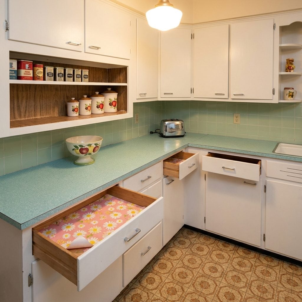
Formica in Boomerang, Gold-Fleck, and Speckled Patterns That Nobody Would Dare Put in a Kitchen Today
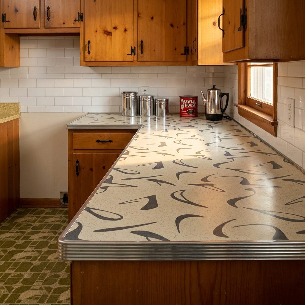
Run your hand across a 1960s Formica countertop and it felt like the future. The surface was hard, shiny, practically indestructible, and printed with patterns that made absolutely no attempt to imitate natural materials. Boomerang patterns, those free-form curved shapes in cream, teal, and charcoal, were everywhere. So were gold-fleck laminates that caught the kitchen light and threw tiny sparks back at you. Speckled surfaces in brown and tan were marketed as easy to clean, which was true, but also as fashionable, which is debatable.
In order to come up with the very specific design ideas, we create most designs with the assistance of state-of-the-art AI interior design software. Also, assume links that take you off the site are affiliate links such as links to Amazon. this means we may earn a commission if you buy something.
Formica Corporation and Westinghouse’s Micarta brand competed fiercely through the decade, releasing new patterns annually like fashion collections. For a modern kitchen makeover, designers now sometimes source original Formica patterns as novelty backsplashes. Back then, the boomerang was just your kitchen counter, edged in a thin chrome strip that lifted slightly at the corners after fifteen years.
Patterned Linoleum Floors in Bold Geometrics That Were Basically Abstract Art You Walked On
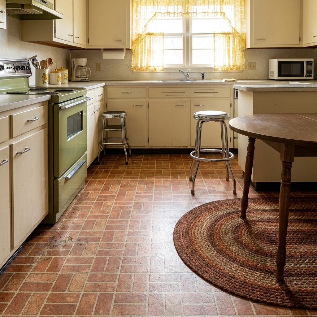
The 1960s kitchen floor was never subtle. Faux brick patterns in terracotta and cream were enormously popular, creating the illusion of a country cottage even in a split-level ranch house in Akron. Geometric patterns, diamonds, hexagons, checkerboard in olive and white, covered millions of kitchens, installed in sheets that your mother mopped weekly with a bucket of Pine-Sol and a string mop that smelled of institutional cleanliness.
Armstrong was the dominant brand, and their catalogs read like a graphic design portfolio. The vinyl composition tiles and sheet linoleum of this era were thick, slightly spongy underfoot, and would yellow over time in the corners near the refrigerator where the sun never reached. They also recorded every dropped fork and slid chair in tiny surface scratches that accumulated into a kind of domestic autobiography.
Push-Button Electric Ranges With Chrome Controls That Made Cooking Feel Like Operating a Spaceship
Nothing about the Frigidaire Flair or the GE Americana said “make spaghetti.” They said “launch sequence.” The push-button electric range, dominant from roughly 1959 through the mid-1960s, replaced rotary knobs with a row of chrome or colored buttons set into a raised console at the back of the cooktop. You pressed a button for low, medium, medium-high, or high, a binary commitment that did not allow for nuance.
The Frigidaire Flair came with a pull-out drawer oven mounted below the cooktop, which was deeply confusing to everyone who used it for the first time. The cooktop surface itself was often a smooth glass-like material in white or light grey, with the coil elements sitting flush. These ranges were sold as the peak of modernity and they genuinely looked it, part kitchen appliance, part Mission Control console for a suburban moon launch.
Built-In Wall Ovens Installed Separately from the Cooktop, Because in 1965, That Was a Status Symbol
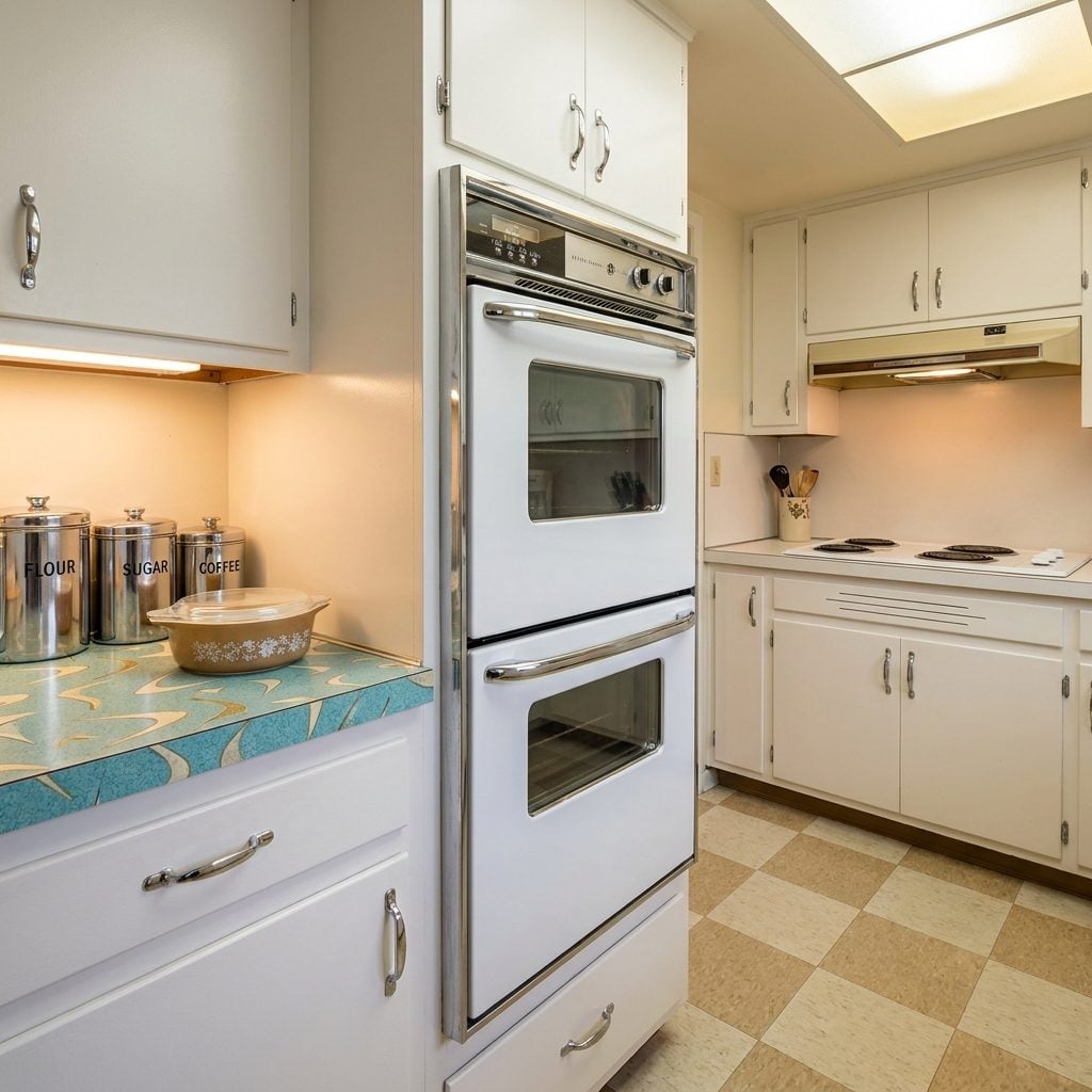
If you had a built-in wall oven in 1965, the neighborhood knew about it. The cooktop was over there, in the counter. The oven was over here, set into the wall at eye level, its glass door slightly convex and trimmed in chrome. This separation was the kitchen equivalent of a formal dining room, it announced that this was a serious house, inhabited by serious people who had thought carefully about workflow.
General Electric’s wall oven units were enormous sellers, often finished in white with chrome handles, and sometimes in harvest gold or avocado. The eye-level placement was genuinely more ergonomic, which nobody really mentioned at the time because the point was prestige, not practicality. Many came with a second smaller oven stacked above or below, and the double-wall-oven configuration was the absolute peak of domestic ambition.
For anyone exploring a country kitchen renovation today, the built-in wall oven remains a coveted feature, still associated, seventy years later, with a kitchen that means business.
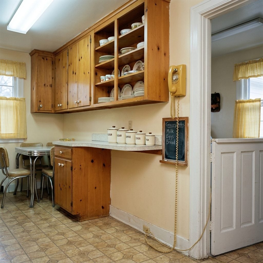
Knotty Pine Cabinets With Visible Grain and Black Iron Hardware That Made Every Kitchen Look Like a Ski Lodge
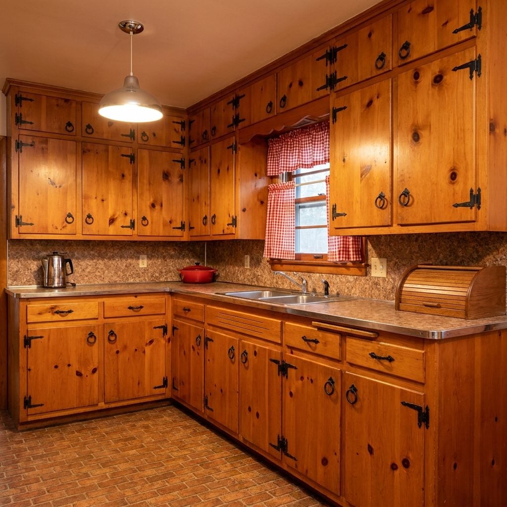
Knotty pine cabinets were wildly popular through the late 1950s and into the early 1960s, carrying a rustic warmth into kitchens that were otherwise very committed to chrome and Formica. The pine grain was visible, sometimes finished with a light honey stain, sometimes left nearly natural, with dark knots every few inches that gave the wood an almost cartoon-like cheerfulness. The hardware was always black wrought iron, strap hinges, small ring pulls, or simple bar handles that reinforced the vaguely colonial-meets-mountain-cabin aesthetic.
These kitchens felt warm in a way that the sleek appliance-forward kitchens of the same era did not. The pine absorbed cooking smells and became, over decades, a kind of olfactory archive of every Sunday dinner that had ever happened in the room. By the mid-1960s, knotty pine was beginning to feel dated as the space-age look took over, and by the 1970s it was being painted over with abandon.
The Lazy Susan Corner Cabinet That Maximized Storage and Minimized the Items You’d Ever Actually Find Again
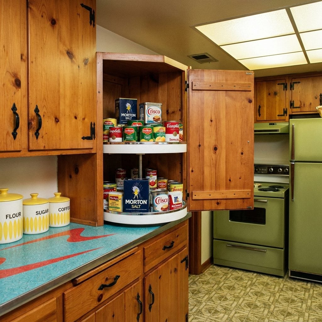
Whoever designed the corner cabinet Lazy Susan was solving a real problem: the dead zone of a kitchen corner where nothing was reachable without a flashlight and a willingness to kneel. The rotating circular shelves were a genuine engineering solution. In practice, things went into the Lazy Susan and entered a kind of domestic purgatory, spinning just past your fingertips, canned goods from 1967 accumulating behind the cream of tartar and the jar of cocktail onions nobody remembered buying.
They were often made of white-painted pressed wood with a chrome rim edging, and they squeaked. Every single one squeaked. The squeak was the sound of someone looking for something they had definitely put in there and could not account for. The home design community has fully rehabilitated the Lazy Susan concept in recent years, but the 1960s original operated on pure organizational optimism.
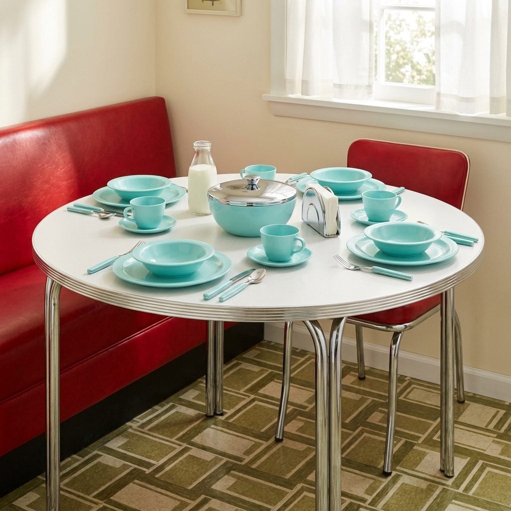
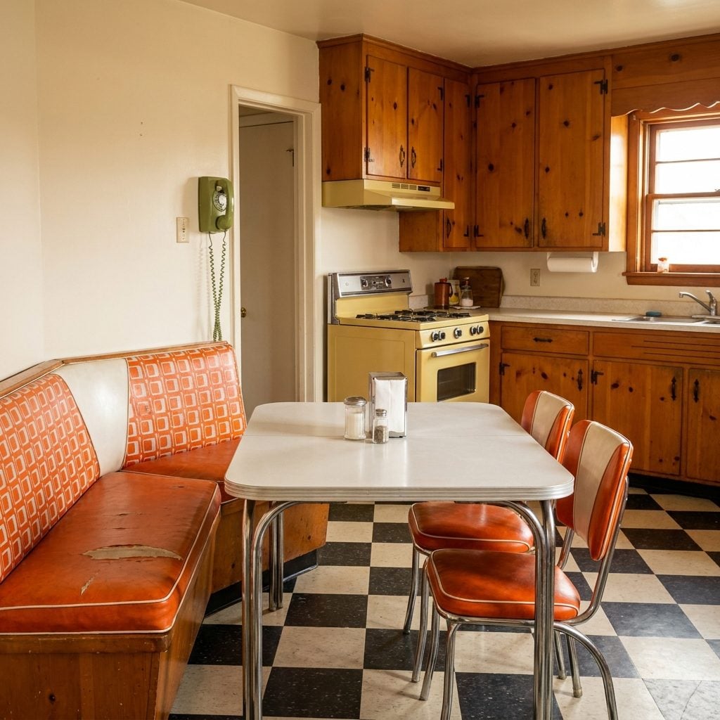
Breakfast Nooks with Built-In Upholstered Banquettes That Nobody Ever Left Voluntarily on a Saturday Morning
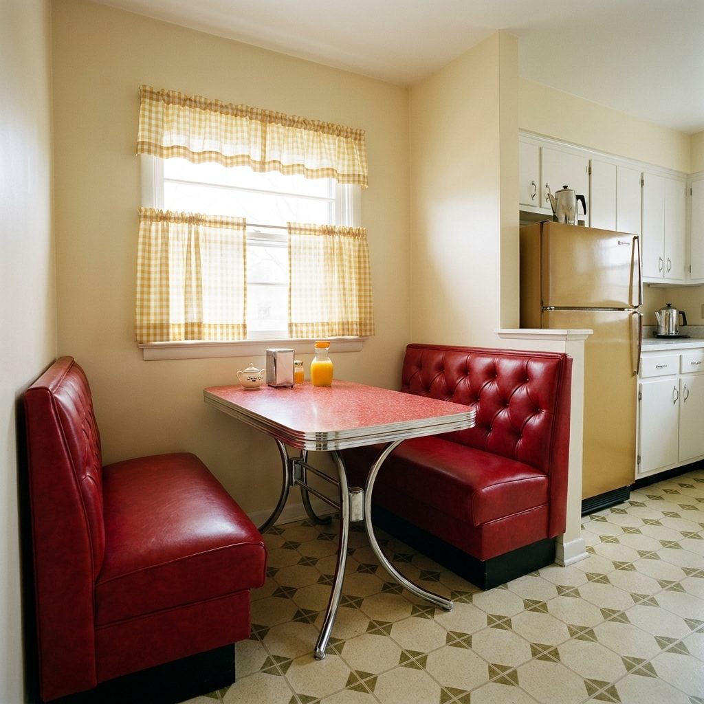
Built into a kitchen corner or jutting out beneath a picture window, the breakfast nook banquette was one of the genuinely good ideas of mid-century domestic design. Two L-shaped benches, upholstered in a durable vinyl or nubby fabric, usually in a cheerful color like yellow, red, or turquoise, flanking a fixed table with a chrome-edged Formica top. The seats were wide enough to sit cross-legged, which children did constantly and adults tolerated.
Saturday mornings happened in the breakfast nook. Cereal bowls. The newspaper in sections. The percolator going on the counter behind you. The window beside the nook usually looked out onto the backyard, and the light in the morning was the kind that made everything feel slightly better than it actually was.
The built-in banquette created something the open-plan kitchen of later decades quietly eliminated: a contained, specific place for a meal that wasn’t a formal dining room and wasn’t just the counter. It was the most honest room in the house, and it smelled like toast.
Pass-Through Windows Between the Kitchen and Living Room That Made the Cook Feel Like a Short-Order Staff Member
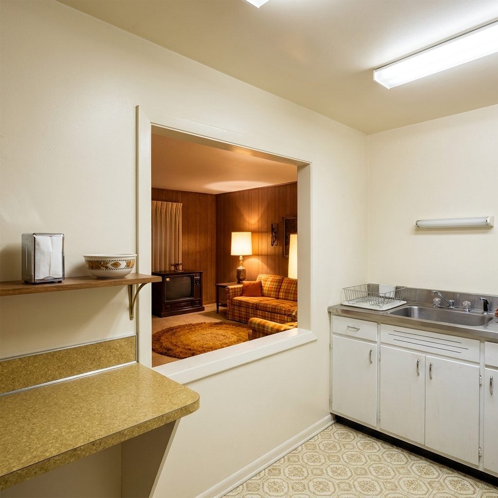
The pass-through was the 1960s solution to a social problem: the kitchen was separate from the living room (open-plan hadn’t fully taken over yet), but the person cooking should not be completely isolated from whatever was happening at the party. The solution was a rectangular opening cut into the shared wall, usually at counter height, sometimes with a small shelf on the living-room side, occasionally with a drop-down panel that folded flat to become a bar ledge.
Thanksgiving dinner came through the pass-through in stages. So did cocktails, when adults were entertaining and children were stationed in the kitchen to hand plates through. The opening was never quite large enough to be fully social but always too large to ignore, a permanent architectural reminder that someone was in the kitchen doing the work.
Pyrex Casserole Dishes in Butterprint, Gooseberry, and Snowflake Patterns That Went From Oven to Table to Legend
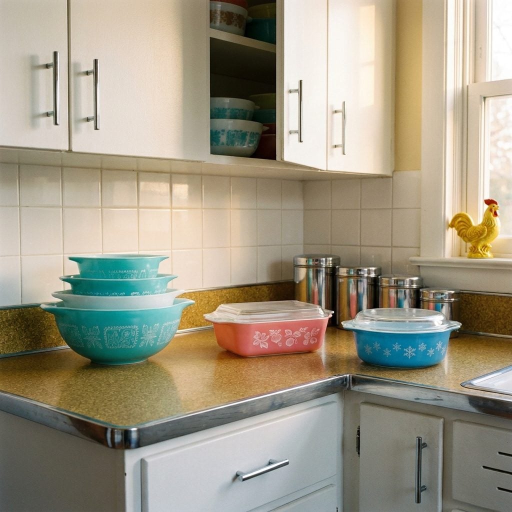
A 1960s kitchen without at least three Pyrex casserole dishes was not a kitchen anyone had heard of. The Butterprint pattern, a repeating motif of roosters and wheat in turquoise on white, or white on turquoise, was everywhere. Gooseberry, with its pink berries on white or white on pink, was right behind it. Snowflake Blue showed up on refrigerator dishes, the flat-bottomed containers with lids that lived in the fridge between leftovers.
Pyrex came in nested sets, four bowls, graduated in size, that stacked inside each other. They went from the oven to the table without a second dish, which was the whole point. They stacked, they stored, they heated, they froze. They were designed by Corning engineers for actual use and they survive in American kitchens in quantities that suggest they are essentially indestructible.
You can find them at every estate sale in the country, stacked in cardboard boxes for a dollar each. They look exactly the same as they did in 1962. The casserole smells are gone, but the pattern is perfect.
Melmac Melamine Dinnerware in Coordinated Pastel Sets That Were Marketed as Unbreakable (They Were Almost Right)
Melmac was the brand name that became a category. Melamine dinnerware, hard plastic plates, bowls, cups, and saucers in sets of eight coordinated in pastel yellow, mint green, pink, or turquoise, took over the American kitchen table in the late 1950s and held on firmly through the 1960s. The pitch was purely practical: it would not break. Drop it on the linoleum, it bounced. Children could use it without consequence.
The surface had a slight matte softness, not quite ceramic, and it absorbed coffee stains over time in a way that no amount of dish soap entirely reversed. The cups developed a brown interior ring. The plates got surface scratches from forks that accumulated into a crosshatch that caught the light at certain angles.
Sets came in nested stacks inside illustrated boxes, often marketed specifically to young families setting up their first warm kitchen in a new suburb. Coordinated with the Formica and the curtains, a full pastel Melmac service felt genuinely modern. Today, estate sale Melmac in original colors, especially the turquoise, is actively collected and commands real affection from people who ate off it as children and from people who simply like the color.
Copper Jell-O Molds Hung on the Wall Like Fine Art
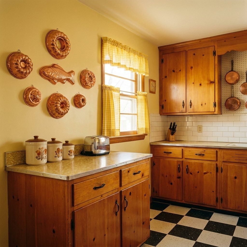
They caught the light from the overhead fluorescent fixture and gleamed like tiny trophies. Rows of copper Jell-O molds, fish-shaped, ring-shaped, fluted like a Sunday hat, hung in careful arrangements above the counter or along the wall beside the stove. Nobody questioned it. This was decor. This was ambition.
The molds themselves were rarely used for actual Jell-O. They existed in that peculiar mid-century category of things that are both functional and beautiful and therefore must be displayed. If you grew up in a kitchen like this, you probably traced your fingers along the ridges while your mom talked on the phone. That copper warmth still lives somewhere in muscle memory.
The Electric Percolator That Bubbled and Gurgled Like a Living Thing
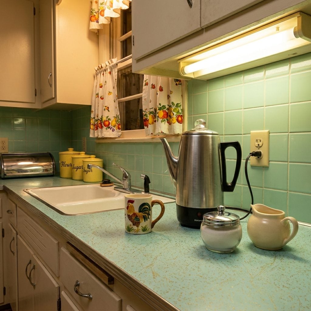
You heard it before you smelled it. That rhythmic, percussive blooping from the counter, the glass knob on top filling with dark coffee and going clear again, over and over, in a hypnotic cycle. The electric percolator was the heartbeat of the 1960s kitchen morning.
Brands like Sunbeam, Presto, and West Bend made percolators in brushed aluminum and chrome that sat permanently on the counter, plugged in and ready, because drip machines hadn’t taken over yet. The coffee it produced was strong enough to resurface a driveway. Everyone drank it anyway, usually from a ceramic mug with a painted rooster on the side.
The Wall-Mounted Rotary Phone With That Coiled Cord Going Everywhere
🔥 Would you like to save this?
It was olive green, or harvest gold, or occasionally a daring shade of avocado, and it was bolted to the kitchen wall like an appliance, because it basically was one. The rotary phone’s coiled cord was always at least six feet long, stretched to its limit, because whoever was on the call had inevitably wandered toward the stove.
This was the original multitasking station. You could stir soup, set the table, and referee a sibling argument, all while cradling the receiver between your ear and shoulder. The satisfying click-whirr of the rotary dial is one of the most distinct sounds of 1960s domestic life, a sound that younger generations have literally never heard in context.
Chrome-Legged Formica Dinette Sets With Vinyl Chairs That Stuck to Your Legs in Summer
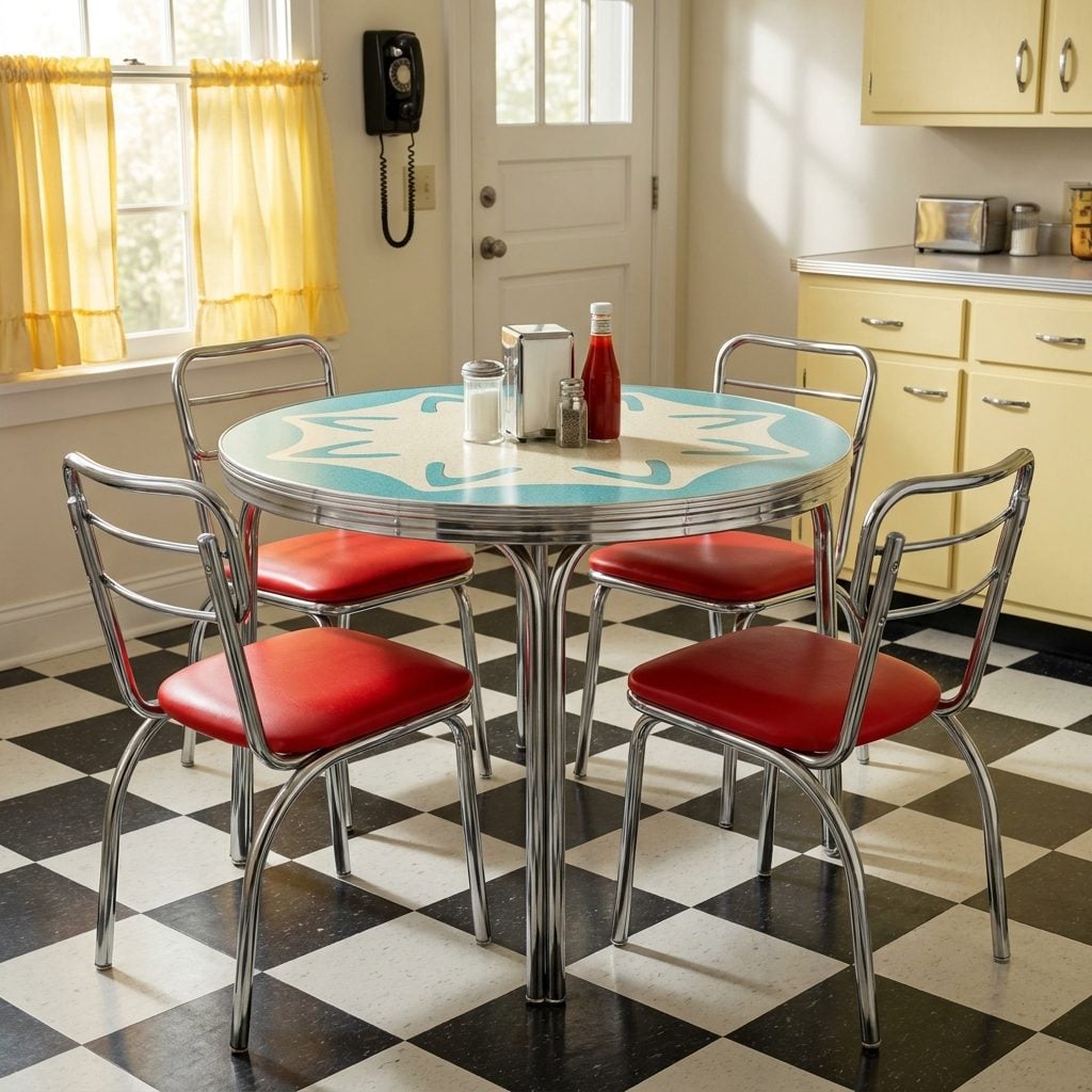
The table was either speckled grey, boomerang-pattern turquoise, or a shade of gold that doesn’t appear in any modern paint deck. The chairs matched in red or yellow vinyl, with chrome frames that wobbled just slightly on the linoleum. This was the nerve center of American family life from roughly 1955 to 1972.
Breakfast happened here. Arguments happened here. Homework got done here while someone made dinner three feet away. The vinyl seats were freezing in January and genuinely adhesive in August, peeling your bare legs off the chair was a universal summer experience that no amount of nostalgia can fully romanticize.
Manufacturers like Chromcraft and American Standard pumped these sets out in every color imaginable to match the new kitchen home design palettes of the postwar era. A matching set was a point of real domestic pride.
The Atomic Starburst Clock That Made Every Kitchen Wall Feel Like a Sci-Fi Set
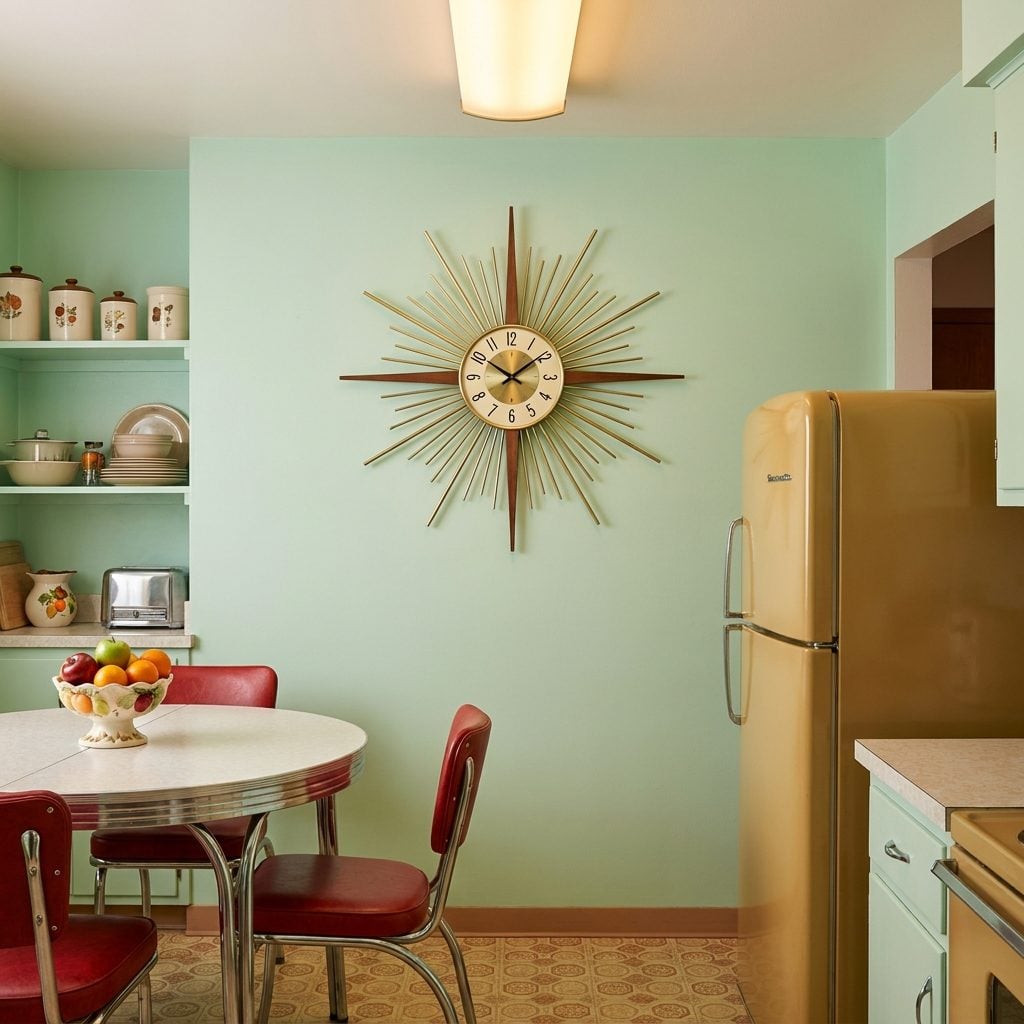
Every 1960s kitchen had one, and somehow it always looked exactly right. The atomic starburst wall clock, brass or gold-toned rods radiating outward from a small clock face like a sun exploding in slow motion, was peak Space Age optimism translated into home decor. It told the time. It also announced, very clearly, that this family believed in the future.
Styles ranged from simple 12-point rays to elaborate multi-tiered starbursts with enameled tips in black or white. The Howard Miller versions became collector’s items. The drugstore versions fell apart within a year. Either way, everyone had one hanging in a prominent spot, often above the doorway or centered over the dinette table, where it presided over meals like a chrome deity.
The Pegboard Wall That Turned Every Kitchen Into a Hardware Store
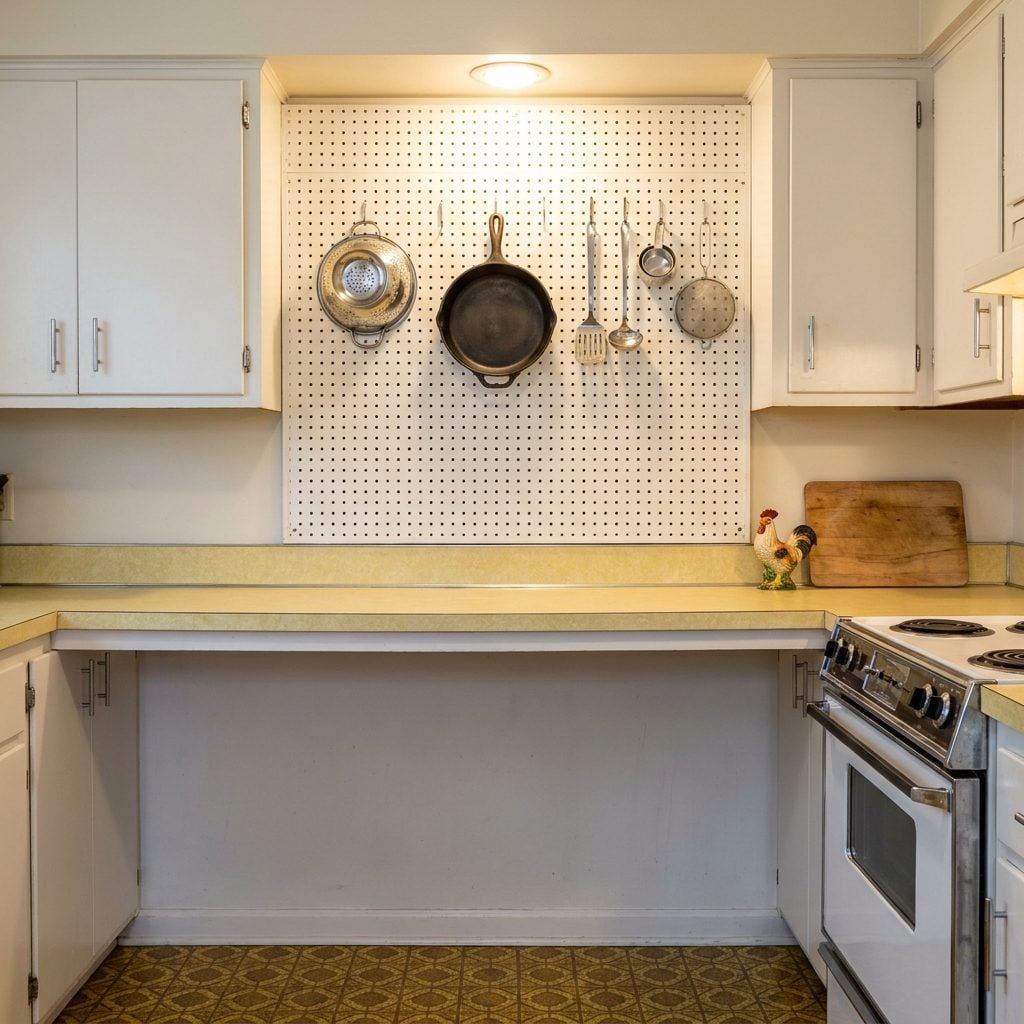
Painted white, cream, or occasionally a bold primary color, the pegboard panel was the 1960s kitchen’s answer to organization, and it worked, honestly. Rows of metal hooks held colanders, ladles, spatulas, and pots in neat formation, everything visible and within arm’s reach. Julia Child famously had one in her Cambridge kitchen, which gave the whole concept a kind of aspirational legitimacy.
The real tell was the ghost outlines. Every pegboard eventually developed faint shadowed circles and silhouettes where pots had hung for years, and those outlines remained even if you rearranged everything. It was like a map of every meal ever cooked in that room.
The Built-In Kitchen Intercom That Made Every Mom Sound Like Air Traffic Control
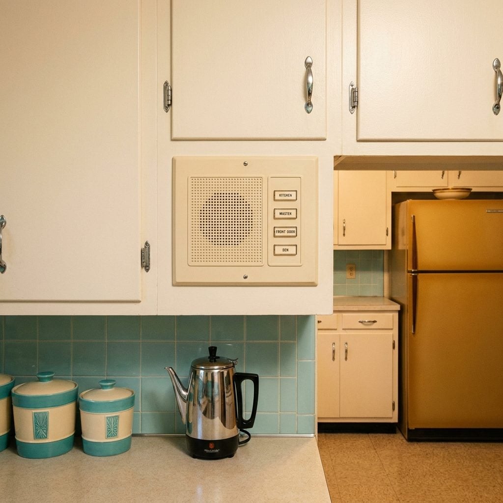
Mounted flush into the cabinet or wall beside the refrigerator, the kitchen intercom panel had a speaker grille, a row of labeled buttons, LIVING ROOM, BEDROOM 1, BEDROOM 2, GARAGE, and a satisfying click-talk-release interaction that felt genuinely futuristic in 1963. Brands like Nutone and Aiphone wired these systems into new construction suburban homes throughout the decade.
In theory, you pressed the button and summoned your child from upstairs without raising your voice. In practice, the bedrooms were always on the same setting, nobody ever remembered to press the talk button, and half the system stopped working within three years. The panel stayed on the wall for decades anyway, labeled and inert, a monument to optimism about domestic technology.
The Single-Door Fridge With a Freezer Box That Turned Into a Ice Cave Every Three Months
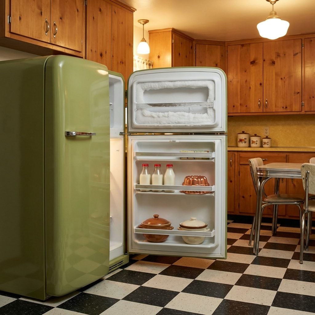
That little freezer compartment at the top, barely the size of a shoebox, accumulated ice like it was training for something. You’d open the refrigerator door, and there it was: a solid block of white frost that had overtaken everything, crushing the frozen peas and entombing the ice cube trays in a solid glacier. The door to the compartment sometimes couldn’t even close anymore.
Defrosting the fridge was a genuine household event. You put towels on the floor, set a pot of hot water inside, and waited. Sometimes you used a butter knife to chip, which every appliance manual in existence specifically warned against. The modern kitchen makeover era of frost-free refrigerators must have felt like a miracle to anyone who lived through this.
Metal Ice Cube Trays With the Pull-Lever That Either Worked Perfectly or Snapped Off in Your Hand
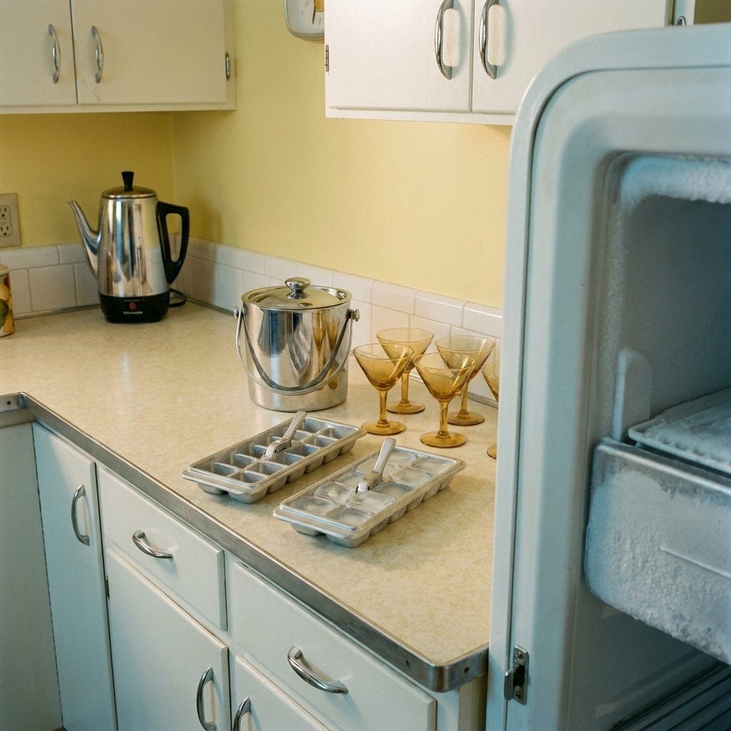
Cold, slightly sticky, and deeply satisfying when the lever actually worked, the aluminum ice cube tray with the central pull handle was standard issue in every American kitchen freezer from the 1940s through the late 1960s. You filled it at the sink, carried it level across the kitchen like a tray of liquid land mines, and slid it into the freezer to wait.
Releasing the cubes required gripping the lever and pulling it toward you in one firm motion. If the tray was properly frozen, it worked in a deeply gratifying way, the ice cracking free in a single satisfying thwack. If you pulled too hard, the lever mechanism separated from the tray entirely, which happened more than the manufacturers ever acknowledged.
‘The ice cube tray lever was either the most satisfying thing in the kitchen or the most infuriating. There was no middle ground.’
Contact Paper in Floral or Faux Wood That Lined Every Drawer and Cabinet Shelf
Sticky on one side, slightly waxy on the other, and printed in a pattern that aged from cheerful to haunting over the course of a decade, contact paper was everywhere inside 1960s kitchen cabinetry. You peeled it back to find it underneath, layered sometimes two or three sheets deep, each generation of homeowner having simply covered the last one’s choice rather than removing it.
The floral prints came in pink and yellow. The faux wood grain prints were slightly uncanny, a pattern that resembled no actual wood species found in nature. And the application process, involving a ruler, a hair dryer, and eighteen attempts to get it bubble-free, was a rite of domestic passage that united homemakers across every American suburb.
S&H Green Stamp Books Stuffed Into the Junk Drawer Like Currency
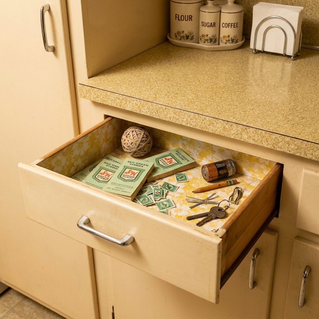
Sperry and Hutchinson Green Stamps came with grocery purchases, gas fill-ups, and hardware store visits, little green perforated stamps that you licked and pressed into cardboard booklets, page by careful page. When a booklet was full, you saved it. When you had enough booklets, you redeemed them for merchandise from the S&H catalog: a toaster, a blender, a lamp, a set of dishes.
The kitchen junk drawer was always their home. Loose stamps that had escaped their booklets gathered at the back alongside rubber bands, a dead flashlight battery, a twist tie, and approximately one key that opened nothing anyone could identify. At peak popularity in the early 1960s, S&H was printing three times more stamps than the U.S. Postal Service.
Ceramic Cookie Jars Shaped Like Bears, Barns, or Whatever the Painter Was Feeling That Day
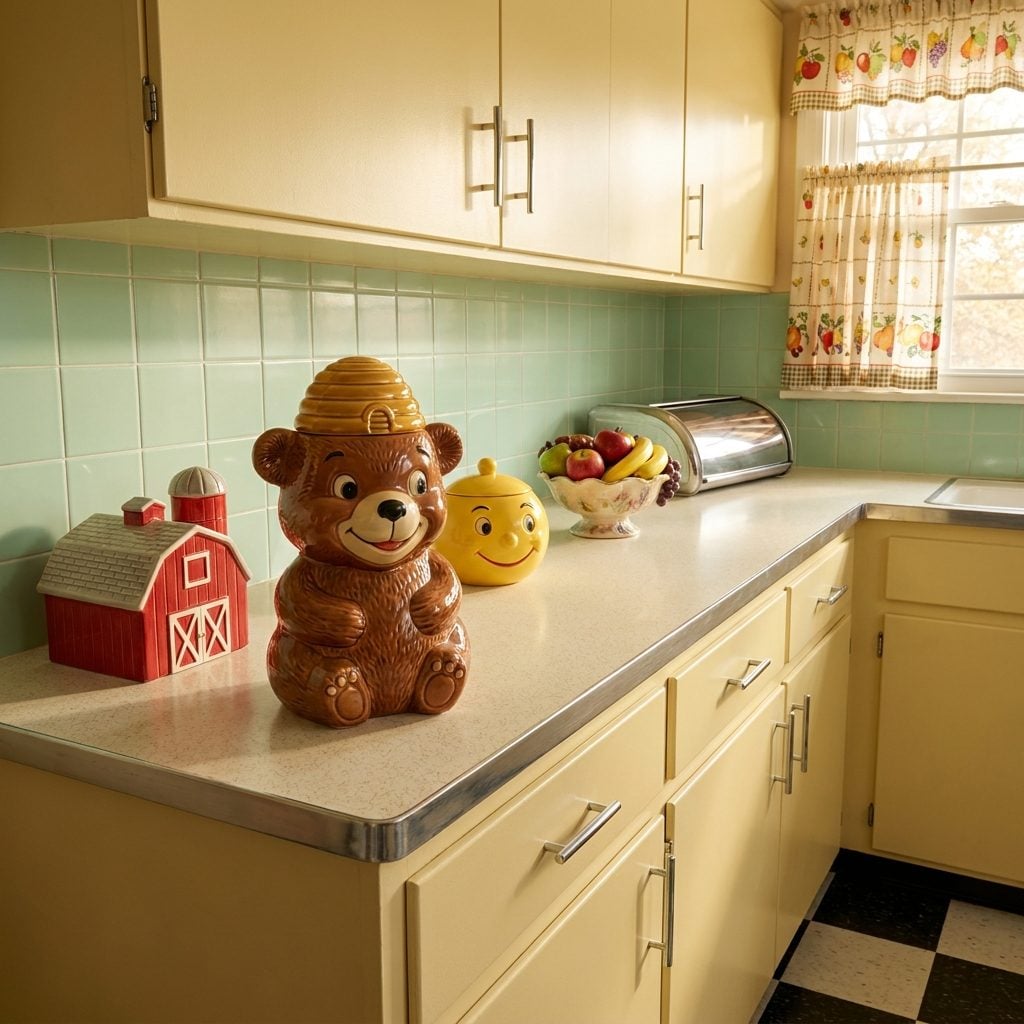
They sat on the counter near the stove or at the end of a cabinet run, painted in glossy colors, wearing ceramic smiles, and holding Chips Ahoy or homemade snickerdoodles inside their hollow bellies. The ceramic cookie jar was a 1960s kitchen institution, part storage, part decoration, part personality statement about the household.
The shapes were extraordinarily diverse. A smiling brown bear with a beehive lid. A red barn with a silo handle. A fat ceramic tomato. A grinning chef in a toque. A yellow school bus. Some were produced by major potteries like McCoy or American Bisque and are now worth real money on the collector’s circuit. Others came from the import bin at the five-and-dime and started flaking paint within six months.
What they all had in common: that specific ceramic clunk the lid made when you lifted it and set it down. That sound, in a 1960s kitchen, meant someone was about to get a cookie or get caught trying.
Swag Lamps That Hung Dangerously Low Over the Kitchen Table
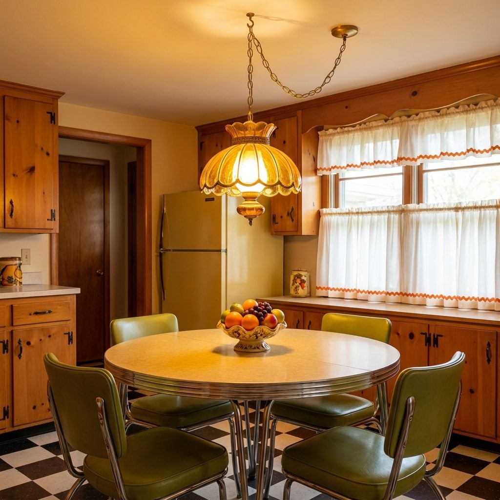
You ducked every single time you stood up too fast. The swag lamp, that hooked, chain-hung pendant with its amber glass shade or macramé-wrapped body, dangled right at forehead level above the kitchen table, and nobody thought twice about it. It cast a warm, honeyed circle of light onto the formica surface below, making every weeknight dinner feel vaguely atmospheric.
They came in harvest gold, burnt orange, even a deep avocado green that somehow worked. The chain hooks went straight into drywall anchors with absolutely no structural reinforcement, and they swayed when anyone walked past. A swag lamp over the table was the 1960s version of a warm kitchen centerpiece, and honestly, it delivered.
Under-Cabinet Fluorescent Strips That Made Your Counter Look Like a TV Studio
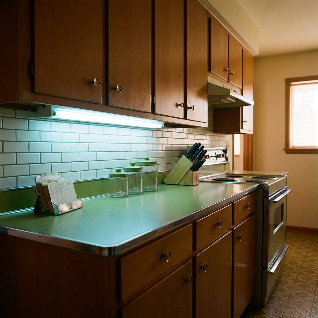
That thin, buzzing tube of cool white light screwed under the upper cabinet was someone’s idea of a modern kitchen upgrade, and it spread to every suburb in America within about four years. It flickered for the first three seconds every morning. It hummed just loudly enough that you noticed it when the house was quiet.
What it did do, genuinely: it made chopping vegetables and reading recipe cards so much easier. Before it, you were squinting at the counter in the shadow of your own body. The fluorescent strip changed that. Most were bare tubes with no diffuser, just raw buzzing light, and the cool blue-white tone made everyone look mildly unwell, but the counter looked spectacular.
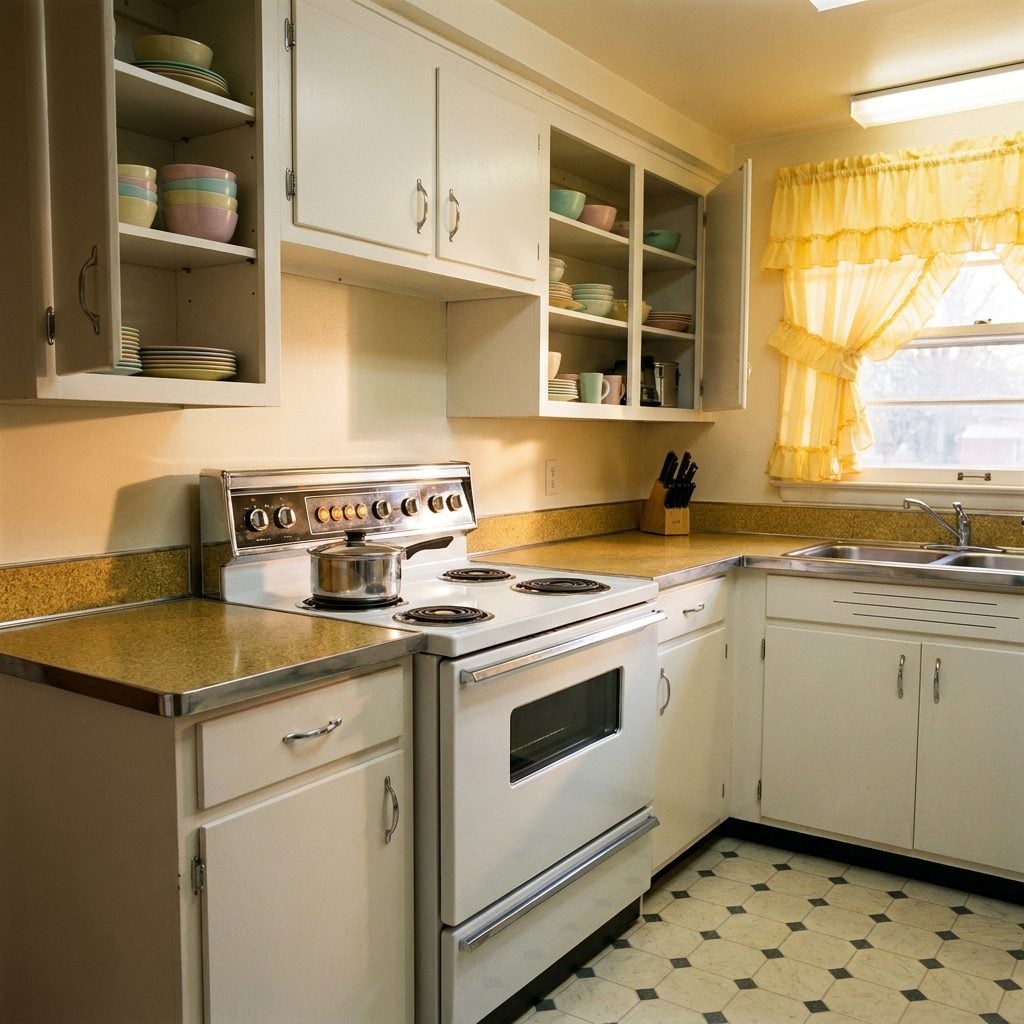
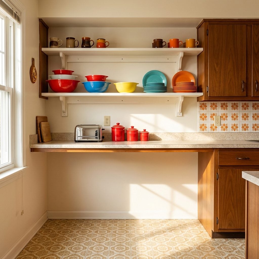
Open Shelves Stacked High with Color-Matched Dishware Nobody Was Allowed to Actually Use
🔥 Would you like to save this?
The good dishes lived on the open shelves, and they were purely decorative. Every 1960s kitchen had a run of open wooden shelving, usually above the counter or flanking the window, stacked with matched sets of Pyrex bowls in primary colors, stoneware mugs in earthy glazes, or those cheerful Fiestaware plates in tangerine and turquoise. They looked like a magazine photo. They were not for Tuesday night dinner.
The everyday dishes were in the closed cabinets below. The open shelf display was the kitchen’s personality, color-coded, carefully arranged, and reordered every time something got washed and put back slightly wrong. Think of it as the 1960s homeowner’s version of home design expression, contained entirely within a 36-inch shelf span.
Glass-Front Cabinets with Sliding Doors That Always Jumped the Track
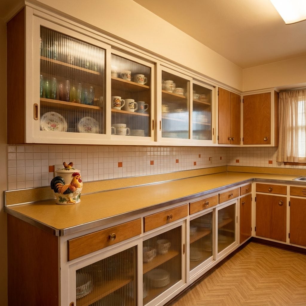
Somewhere between open shelving and proper closed cabinetry, the glass-front sliding door cabinet was the compromise that defined the 1960s kitchen aesthetic. Two small panes of textured or ribbed glass slid in grooved wooden tracks, and at least one of them always hopped loose if you pulled too fast. You learned to lift slightly and push at the same time. It became muscle memory.
The ribbed glass gave everything inside a soft, diffused look, so even your mismatched everyday glasses and that one mug from a Florida tourist trap looked vaguely intentional. The hardware was minimal, usually just a small finger groove routed into the bottom of each panel. Very Danish Modern. Very optimistic about the quality of its own track system.
Walnut-Toned Wood Panel Accent Walls That Made the Kitchen Feel Like a Ski Lodge
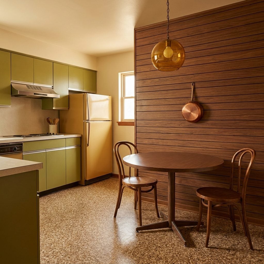
At some point in the early 1960s, a designer decided that one kitchen wall should be paneled in warm walnut-tone wood, either actual thin wood veneer sheets or the more economical 4×8 panels with a printed wood grain, and that decision rippled across every new subdivision build in America. It was the accent wall before accent walls were a concept.
Usually it was the wall behind the eating area, or the one opposite the window. The warm brown tones were genuinely handsome against avocado appliances and harvest gold fixtures. Paired with a hanging copper pot or two, the effect was almost intentional. It disappeared fast in the 1970s when everyone repainted everything in stark white, but for one golden decade it made kitchens feel genuinely cozy.
Wallpaper With Lemons, Roosters, or Geometric Shapes That Absolutely Covered Every Inch
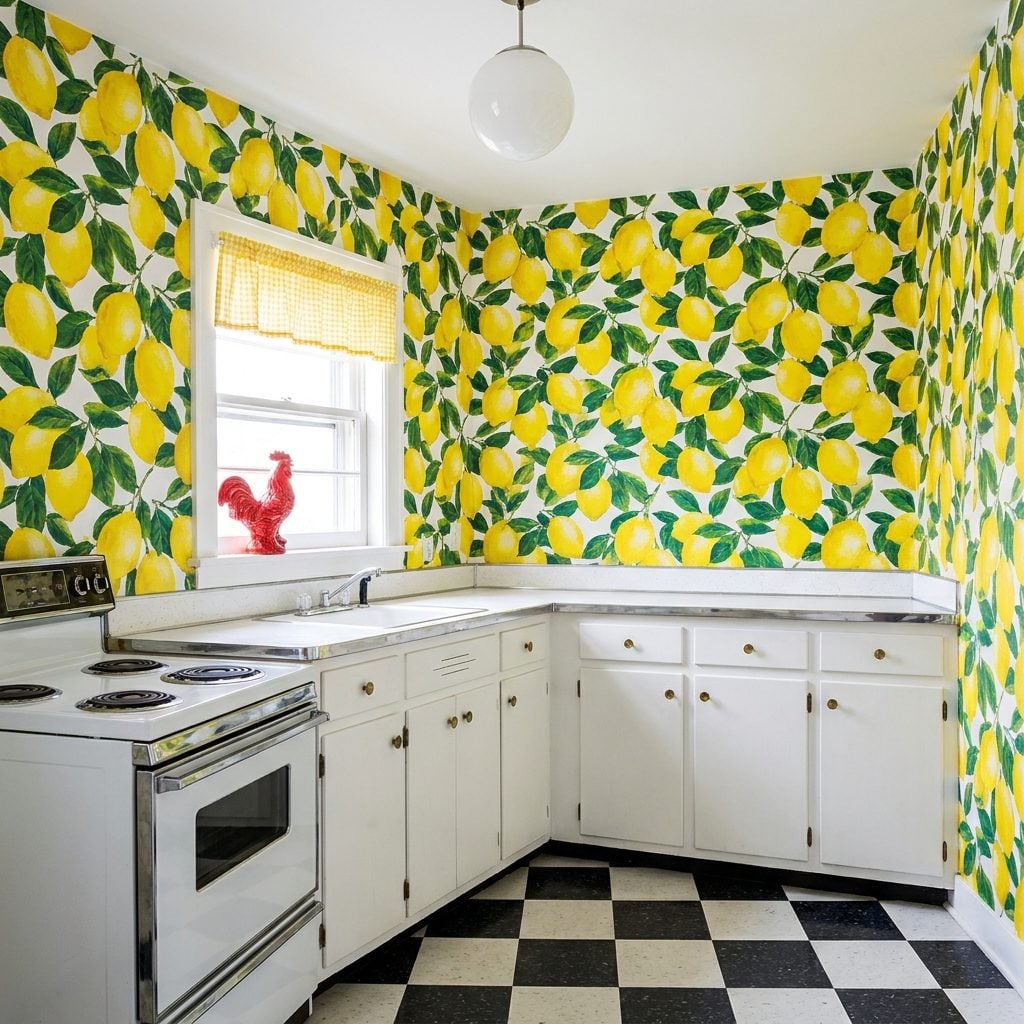
It wasn’t just an accent, it was floor-to-ceiling, corner-to-corner, every wall including the one behind the refrigerator that nobody could see. The 1960s kitchen wallpaper came in patterns that had absolutely no chill: giant Meyer lemons with leaves, strutting roosters in red and black, op-art diamond grids in yellow and white, or those climbing vine patterns with oversized stylized flowers. It was confident in a way modern modern kitchen makeover design rarely is.
The paper was usually vinyl-coated by mid-decade, which meant you could wipe the grease splatter off with a damp cloth. The pattern scale was often enormous, a single rooster might span 18 inches. Removing it thirty years later took two weekends and a steamer you rented from the hardware store, and it still left paper backing on the drywall. Every. Single. Time.
The Built-In Breadbox That Came Standard and Held Exactly 1.5 Loaves
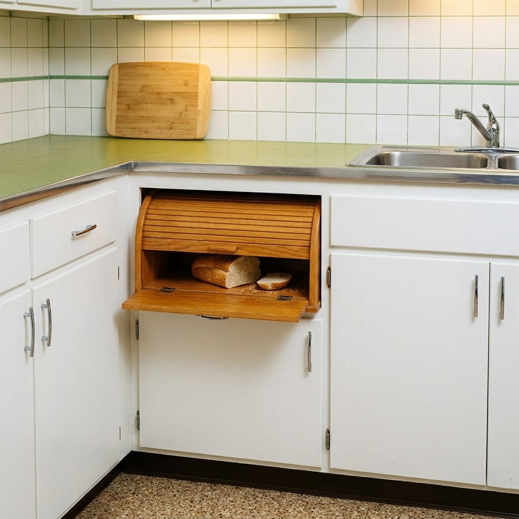
Right there in the lower cabinetry, between the lazy Susan corner and the drawer with all the mystery utensils, was the built-in breadbox: a small compartment with a roll-top or hinged door, usually lined in a contrasting laminate or bare wood interior. It was never quite big enough for two full loaves of Wonder Bread plus the dinner rolls, but it kept things off the counter and that was the whole point.
The roll-top version was the fancier option. The tambour slats would stick in summer humidity and you’d have to bang it twice to get it open. The hinged door version was more reliable but felt somehow less prestigious. Either way, there was always a bread twist-tie and a stray crumb situation happening inside that nobody addressed until a full cabinet cleanout.
Pull-Out Cutting Boards Hiding Right There in the Counter, If You Remembered They Existed
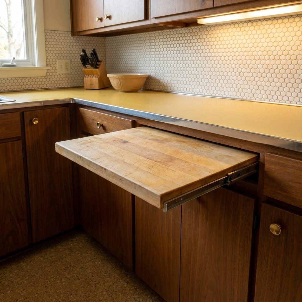
It was the most satisfying drawer in the whole kitchen, and half the time people forgot it was there. The pull-out cutting board was a thin slab of solid maple or birch, fitted into a dedicated slot just below the main countertop level, designed to pull out smooth on a wooden track and give you an extra prep surface exactly when you needed one. In theory, it was brilliant.
In practice, it lived in a permanent state of slight warp from years of moisture exposure, it stained from every beet and berry that ever touched it, and the track got sticky in humidity. But the concept was so genuinely smart, integrated into the cabinetry, out of the way, appearing like a magic trick, that it’s one of the few 1960s kitchen features worth revisiting in a country kitchen renovation.
Early Dishwashers That Sounded Like a Cement Mixer and Took Three Hours to Run
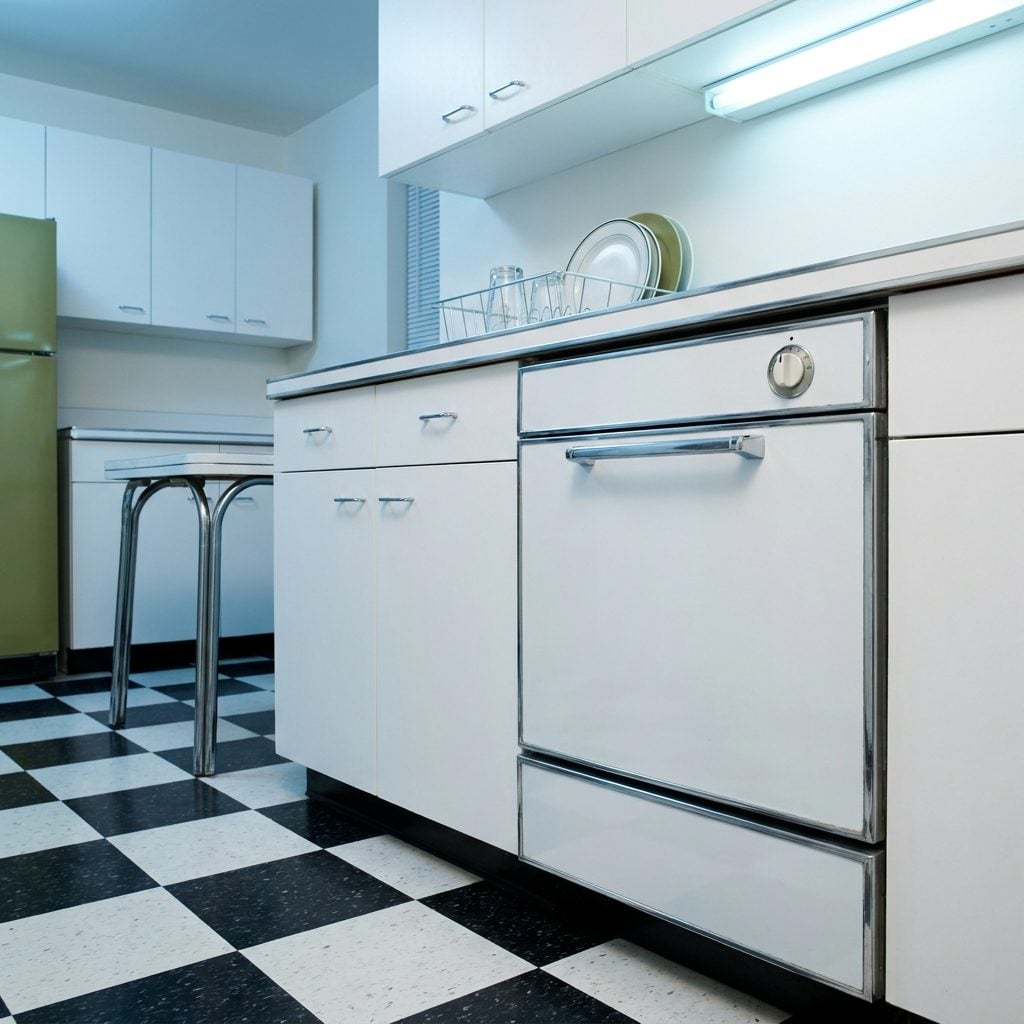
The front-loading dishwasher arrived in the American kitchen like a rumbling promise of modernity. It had a thick chrome handle across the door, a control panel with a rotary dial, and a run cycle that produced a low, grinding mechanical drone that you could hear from the living room, and from upstairs, and possibly from the neighbors’ yard. You ran it at night and hoped for the best.
Early models didn’t dry dishes so much as steam-bake them. The inside of the door would drip when you opened it prematurely. There was always one glass that came out with a cloudy mineral deposit no matter how much Cascade you used. But it was the dishwasher. Having one meant you were doing well. You told guests about it.
Brightly Colored Small Appliances That Made the Counter Look Like a Candy Store
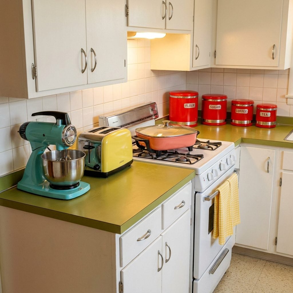
Turquoise stand mixer. Canary yellow toaster. Coral pink electric skillet. The 1960s small appliance manufacturers made a collective decision that countertop appliances should be bold, and American homeowners leaned in completely. Sunbeam, Mixmaster, General Electric, Toastmaster, they all came in the full color spectrum, and the result was a counter that looked like a display case at a soda fountain.
These weren’t hidden in cabinets. They stayed out, all of them, plugged into the one outlet strip behind the counter that was almost certainly overloaded. The colors were chosen to match the kitchen palette, which meant someone spent real time deciding whether their mixer should be harvest gold or persimmon. It was an aesthetic commitment. It was also genuinely cheerful in a way that stainless steel will never replicate.
Sliding Patio Doors That Made the Backyard Feel Like a Second Room
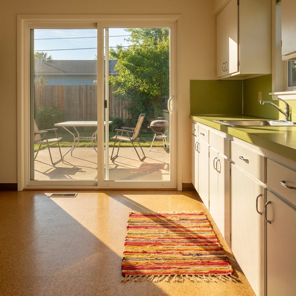
The sliding glass patio door was genuinely revolutionary when it arrived in postwar American home design. By the mid-1960s, it was standard in any kitchen or family room that backed up to a yard, and it changed how people thought about inside and outside as connected spaces. You could watch the kids in the backyard while standing at the sink. You could carry a casserole dish directly to the picnic table without taking a single step on grass first.
The frames were aluminum, powder-coated white or a brushed silver, and the track filled with dirt inside of one month. The door required a firm yank to open and a specific amount of force to lock properly. A broomstick in the track was the security system. If you had this door, you probably also had a boho outdoor kitchen setup on the patio, folding table, hibachi grill, a set of plastic tumblers in the same colors as the indoor appliances.
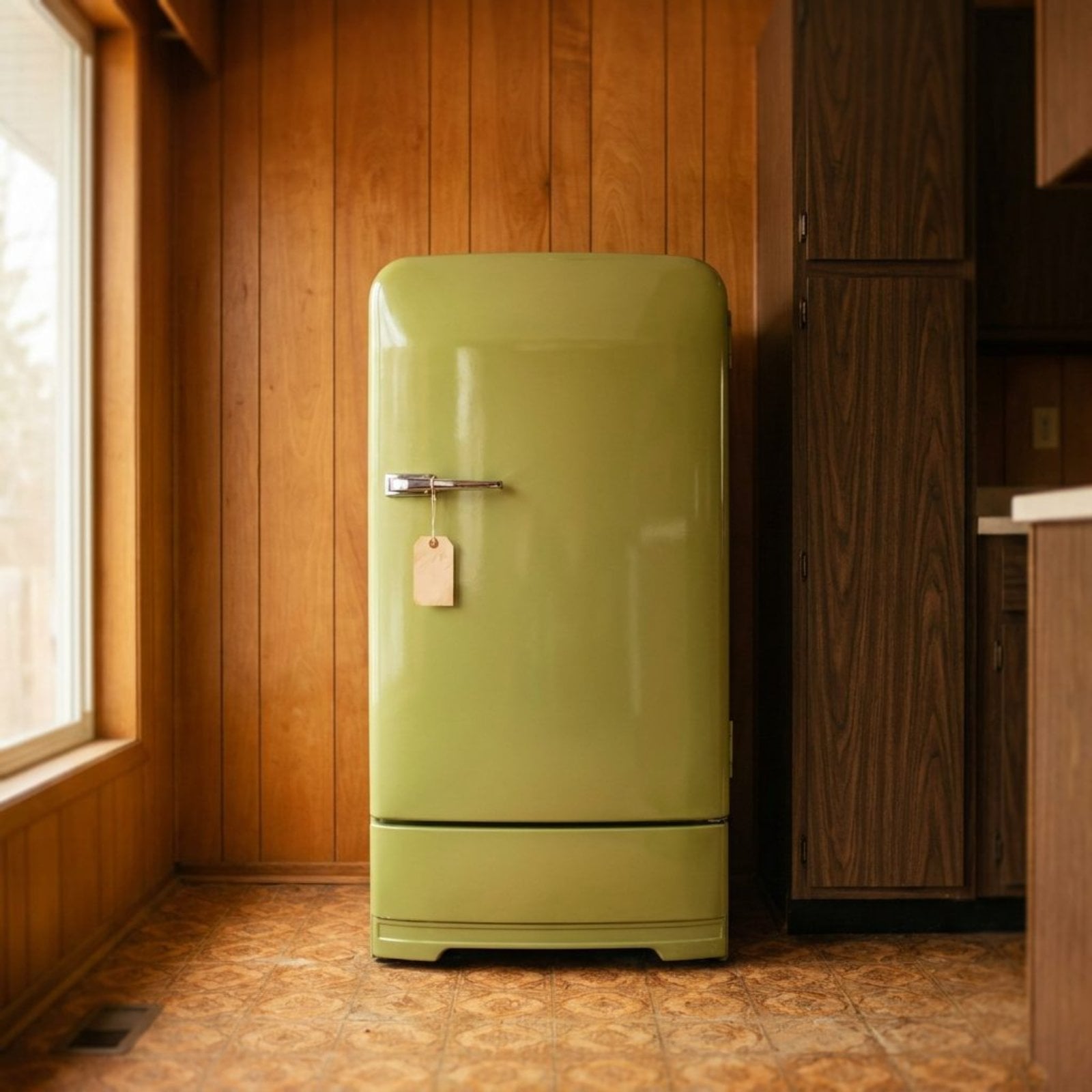
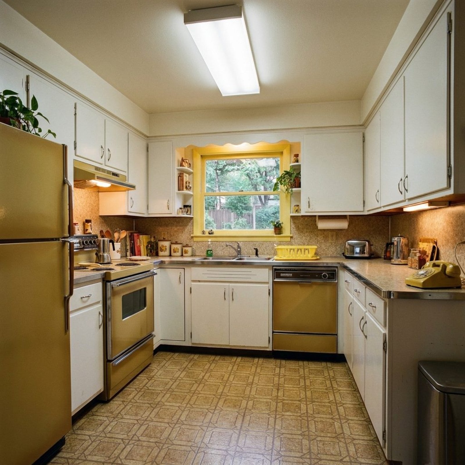
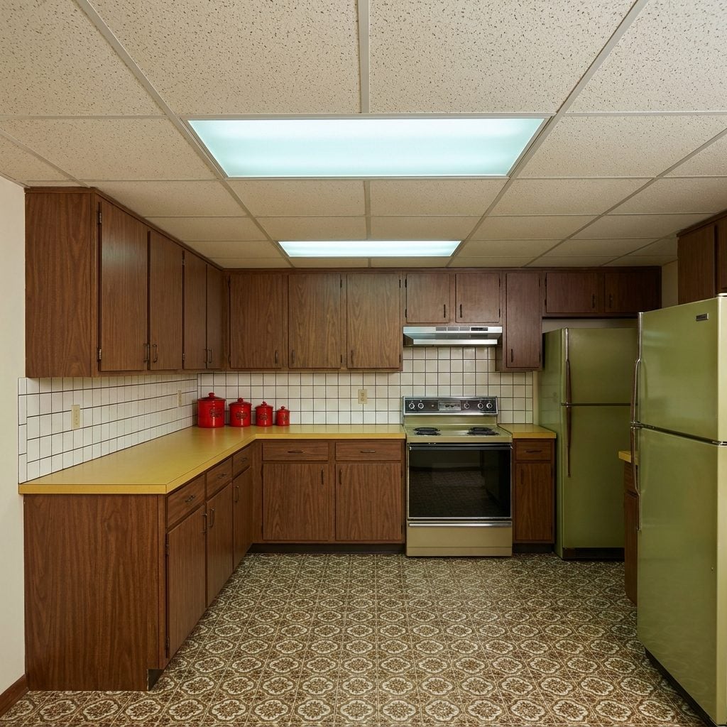
Harvest Gold, Avocado Green, and Coppertone: The Holy Trinity of 1960s Kitchen Color

🔥 Would you like to save this?
You didn’t choose a refrigerator color in 1963, you chose a lifestyle. Harvest gold said you were optimistic. Avocado green said you were sophisticated. Coppertone said you had arrived. These weren’t accent colors; they were the entire kitchen. The fridge, the stove, the dishwasher, the toaster, all of it matchy-matchy in one of these three shades, because coordination was a virtue and white appliances were for people who hadn’t thought it through.
The avocado green trend in particular lasted well into the 1970s, which is remarkable considering it is the color of a vegetable. No one questioned this. It simply was the kitchen, the same way the kitchen simply smelled like percolated coffee and dish soap. A vintage avocado green appliance today reads as camp. Back then, it read as taste.
Drop Ceilings with Acoustic Tiles That Turned Your Kitchen Into a 1960s Office
Someone, at some point in the early 1960s, decided that the same ceiling tile system used in office buildings and school cafeterias would work beautifully in a residential kitchen. And so the suspended grid ceiling, a metal track system holding 2×4 panels of fibrous acoustic tile in speckled white or cream, arrived in kitchens across America, usually during a remodel that also included new linoleum and that one coat of harvest gold paint.
The practical logic was real enough: it hid old plaster, added a layer of insulation, and the tiles could theoretically absorb cooking noise. What it also did was drop the ceiling height to about seven and a half feet, give the room a slightly institutional quality, and create a nesting zone for every spider in a five-block radius above those tiles. Opening one panel to fix a leak revealed an ecosystem. You put it back and never thought about it again.
Vinyl Seat Cushions in Patterns That Were Absolutely Not Subtle
Wipe-down vinyl in a kitchen chair cushion was the height of practical thinking in 1960s home design. The material made total sense, sticky fingers, spilled Tang, spaghetti sauce, and the patterns made absolutely no apology for themselves. Atomic starbursts, oversized daisies, bold geometrics in tangerine and avocado, sometimes a harlequin diamond repeat that almost vibrated if you stared at it too long.
Every kitchen set came with four matching chairs and a banquette that ran along one wall, all upholstered in the same cheerful, slightly sticky vinyl. By year three, the corners were starting to crack and someone had patched one cushion with electrical tape. Nobody questioned it. It was just the kitchen.
The Room Divider That Pretended to Separate the Kitchen From Everything Else
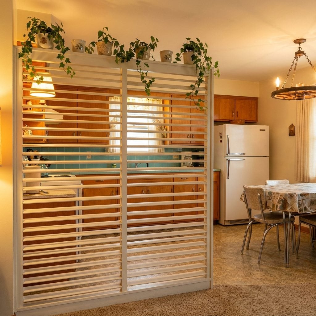
Open-plan living was just starting to catch on in the early 1960s, and nobody quite knew what to do with the awkward zone between the kitchen and the dining room. Enter the decorative room divider: a low partition, sometimes louvered wood, sometimes a wrought iron screen, sometimes a simple half-wall topped with a row of ceramic planters that were supposed to look intentional.
It didn’t fully separate anything. You could absolutely hear everything happening in the kitchen from the living room sofa, and the smell of fried chicken traveled freely past the divider at all times. But it gave the illusion of distinct spaces, and in 1963, that was enough.
The Hanging Pot Rack That Made Every Kitchen Feel Like a French Bistro (It Did Not)
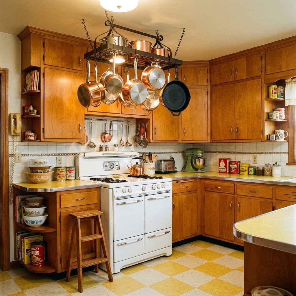
Somewhere in the mid-1960s, someone decided that storing pots directly above the stove was both practical and chic. The hanging pot rack arrived in American kitchens as a slightly aspirational object, a wrought iron or chrome rail bolted to the ceiling or mounted on the wall, holding a collection of copper-bottomed Revere Ware and whatever else wouldn’t fit in the lower cabinets.
In reality, the pots gathered a fine layer of grease on their exterior within about two weeks of installation. Reaching for the big stock pot required a small step stool. And the whole arrangement clanged like a wind chime every time someone opened the back door. Still, it looked purposeful in a way that felt very continental, and that counted for something.
The Massive Stainless Steel Sink With a Built-In Drainboard That Took Up Half the Counter
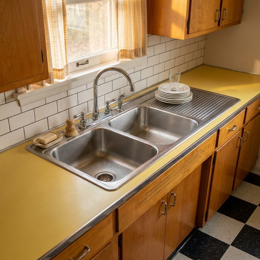
This sink did not blend in. It announced itself. A deep double-basin stainless steel unit with a wide ribbed drainboard cast right into one side, it occupied a significant portion of the counter and reflected the overhead light in a way that made the whole kitchen feel like a diner galley.
The drainboard was the key detail. Dishes went there to air-dry in a specific order that every household developed on its own. Glasses first, then plates stacked at a slight lean, then the pots balanced at the outer edge. It was a modern kitchen makeover in miniature, all function, no sentiment. The dishwasher made it obsolete within a decade, but for a long while, that drainboard was the most hardworking surface in the house.