🔥 Would you like to save this?
Somewhere around 2005, a quiet consensus took hold: serious kitchens were white. White cabinets, white counters, white subway tile, white on white on white until the whole room hummed like a blank page. It worked for a while — bright photographs sold houses and Pinterest boards rewarded the look. But the cost was enormous. An entire generation of homeowners ripped out perfectly good oak and cherry because wood grain suddenly read as “before.” What if that collective agreement had never formed? What might kitchens actually look like right now?
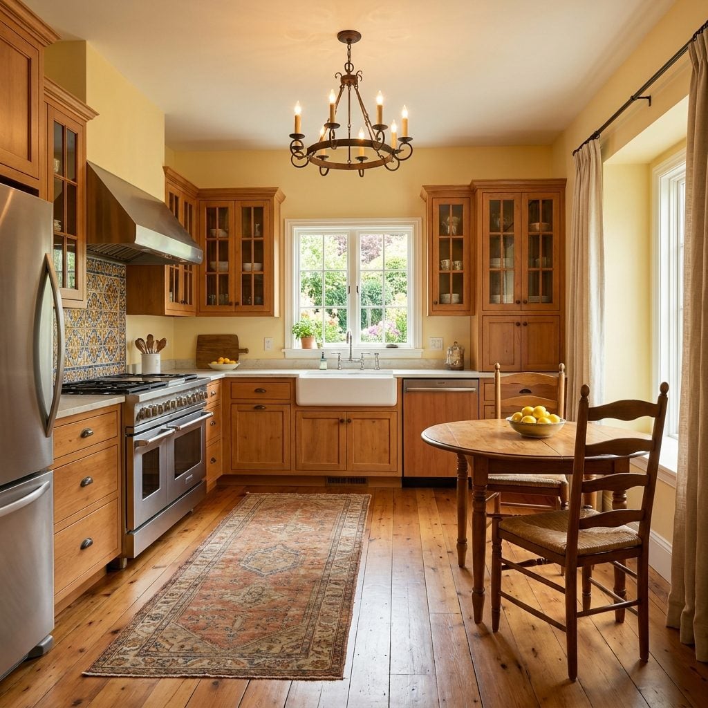
Natural Wood Cabinets Might Have Retained Luxury Status Instead of Spending Years Looking ‘Dated’
Think about the sheer volume of perfectly functional cherry, maple, and oak kitchens that got torn out between 2008 and 2018. Millions of them. The wood wasn’t damaged or falling apart — it just stopped photographing well on Zillow. That’s a wild realization: an entire material category lost its perceived value because it couldn’t perform in flat, bright listing photos.
In order to come up with the very specific design ideas, we create most designs with the assistance of state-of-the-art AI interior design software. Also, assume links that take you off the site are affiliate links such as links to Amazon. this means we may earn a commission if you buy something.
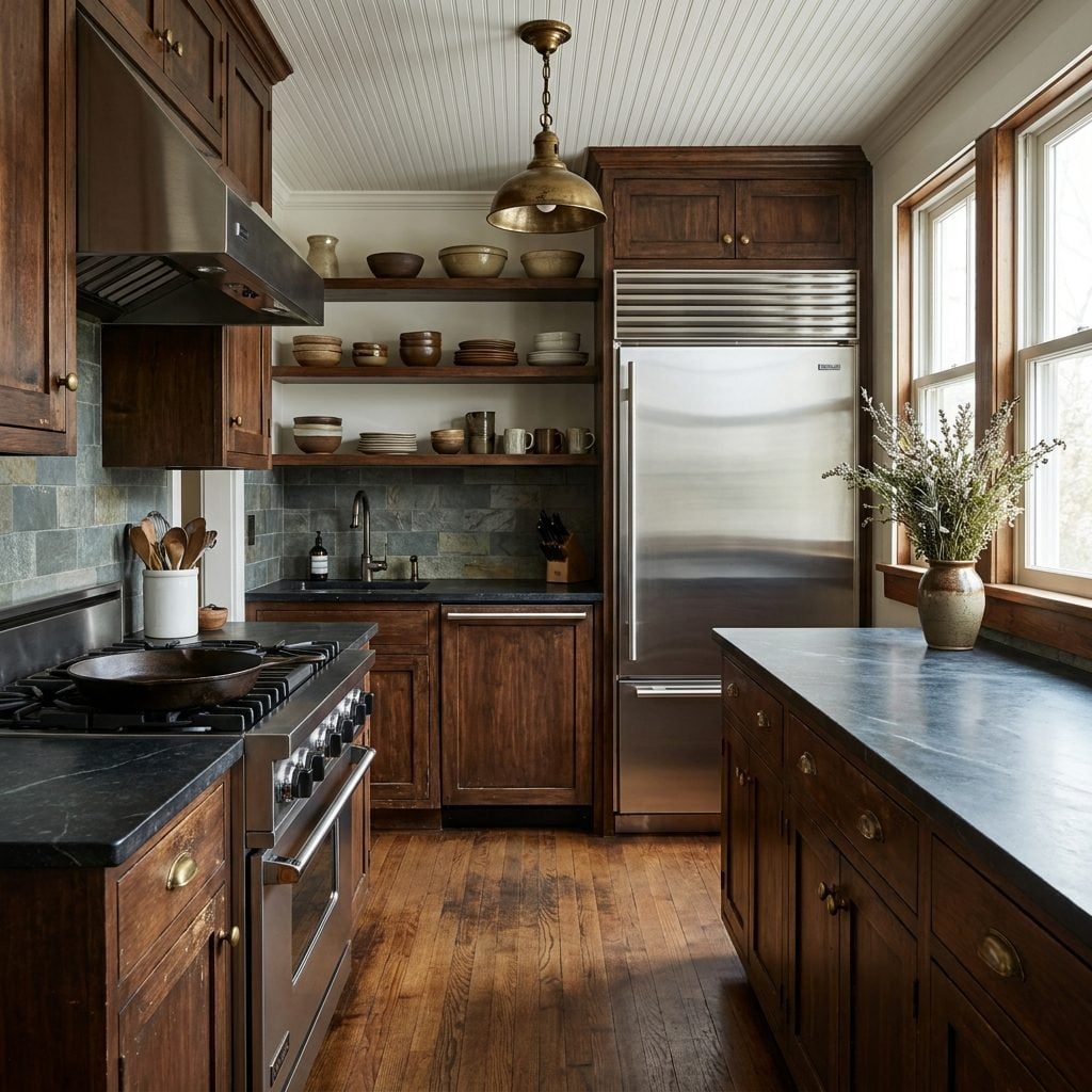
Had white never taken over, natural wood grain would have kept evolving the way it always had. Cabinet makers would have pushed toward more refined finishes, mixed species, experimented with rift-sawn oak and fumed treatments. Natural wood kitchen cabinets would be where luxury lived, not where “outdated” lived. And the irony stings: in 2025, designers are falling over themselves to bring wood back. The material never changed. Our collective anxiety about it did.
Builder-Grade Homes Across America Would Likely Show Far More Kitchen Color Variety Today
What the all-white trend did to the low and mid end of the market: it flattened everything. National builders — the ones putting up hundreds of houses a year in subdivisions outside Phoenix and Charlotte and Nashville — settled on the same white-shaker-gray-quartz formula because it was safe, it photographed clean, and it offended nobody.
Without that default, builders would have needed to actually think about kitchen palettes. Model homes might have offered sage green alongside cream, butter yellow, or warm putty as standard options. Neighborhoods wouldn’t all blur together in that blank-canvas sameness, and the difference between your kitchen and your neighbor’s wouldn’t just come down to a special-ordered backsplash tile. Color variety would have been baked in from the start.
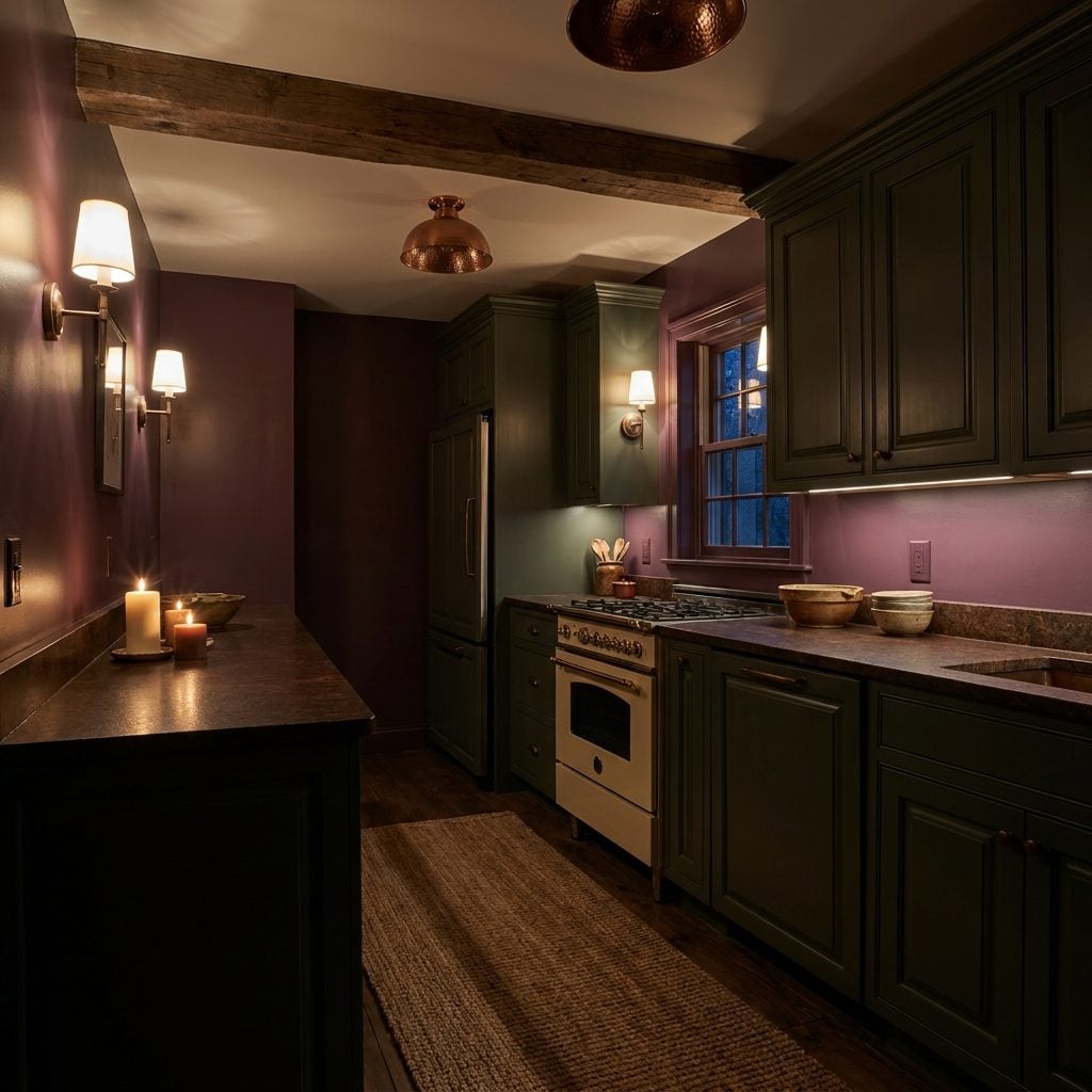
Warm Kitchens Might Have Stayed Fashionable Without the Long Reign of Cool Whites and Grays
Cool was king for nearly fifteen years. Cool white paint, cool gray grout, cool marble with blue-gray veining, cool LED lighting. The whole palette shifted toward a clinical register that, honestly, made a lot of kitchens feel like they were waiting for a photoshoot rather than dinner.
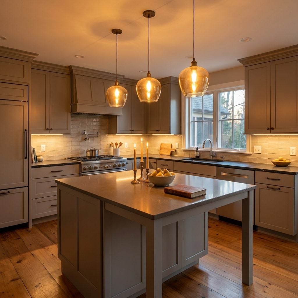
Warmth never stopped being what people actually crave in a cooking space. There’s real psychology behind it — warm tones signal nourishment, safety, gathering. The color temperature of candlelight and firelight and bread crust. Without the all-white interruption, brass kitchen pendant lights and warm-toned cabinets and copper farmhouse sinks would have continued evolving rather than vanishing for a decade and returning under the label “warm minimalism.” We’d have skipped that entire era of kitchens that seemed to want you to keep your voice down.
Homeowners Might Renovate Less Often If Kitchens Aged Visually More Slowly
White kitchens age badly in one specific way: they don’t develop patina. They just get dirty. Yellowed grout. Discolored caulk. That faint gray shadow on white painted cabinets near the stove where grease vapor settled over years. None of these are charming signs of a well-used kitchen. They’re just decline.
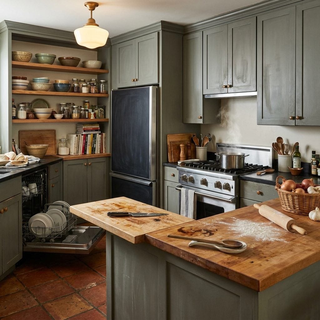
Natural materials age differently. Soapstone countertops darken into something richer. Brass hardware develops character that designers literally pay to fake. Oiled wood deepens. In a world without the white-kitchen standard, homeowners might have grown comfortable with kitchens that got better looking over time instead of worse, and the renovation cycle might have stretched considerably — because the room wasn’t fighting against its own aging process.
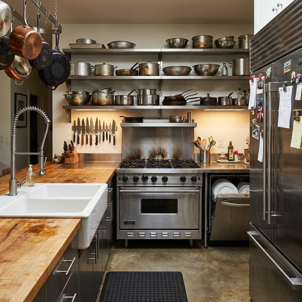
Stainless Steel Appliances Might Never Have Become So Dominant
Stainless steel became the default partly because it was the only finish that didn’t clash with all-white cabinetry. Black appliances looked too stark against it. Bisque read as old. White-on-white appliances disappeared into the room but left it feeling like a hospital supply closet. Stainless landed in the safe middle: neutral, vaguely professional, acceptable.
Remove the white mandate and appliance manufacturers suddenly have a reason to offer real variety. Colored ranges never needed to be a luxury-only option — matte black ranges, forest green refrigerators, cream-colored dishwasher panels could have been standard catalog offerings years ago, not specialty orders. Instead, the appliance industry followed the cabinet industry’s lead toward monochrome. And we all paid for it with fingerprint-smeared stainless that needed wiping constantly.
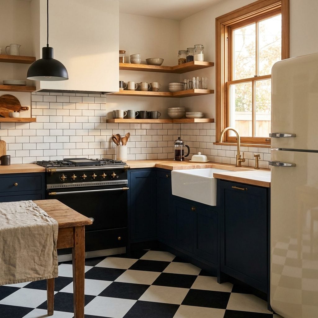
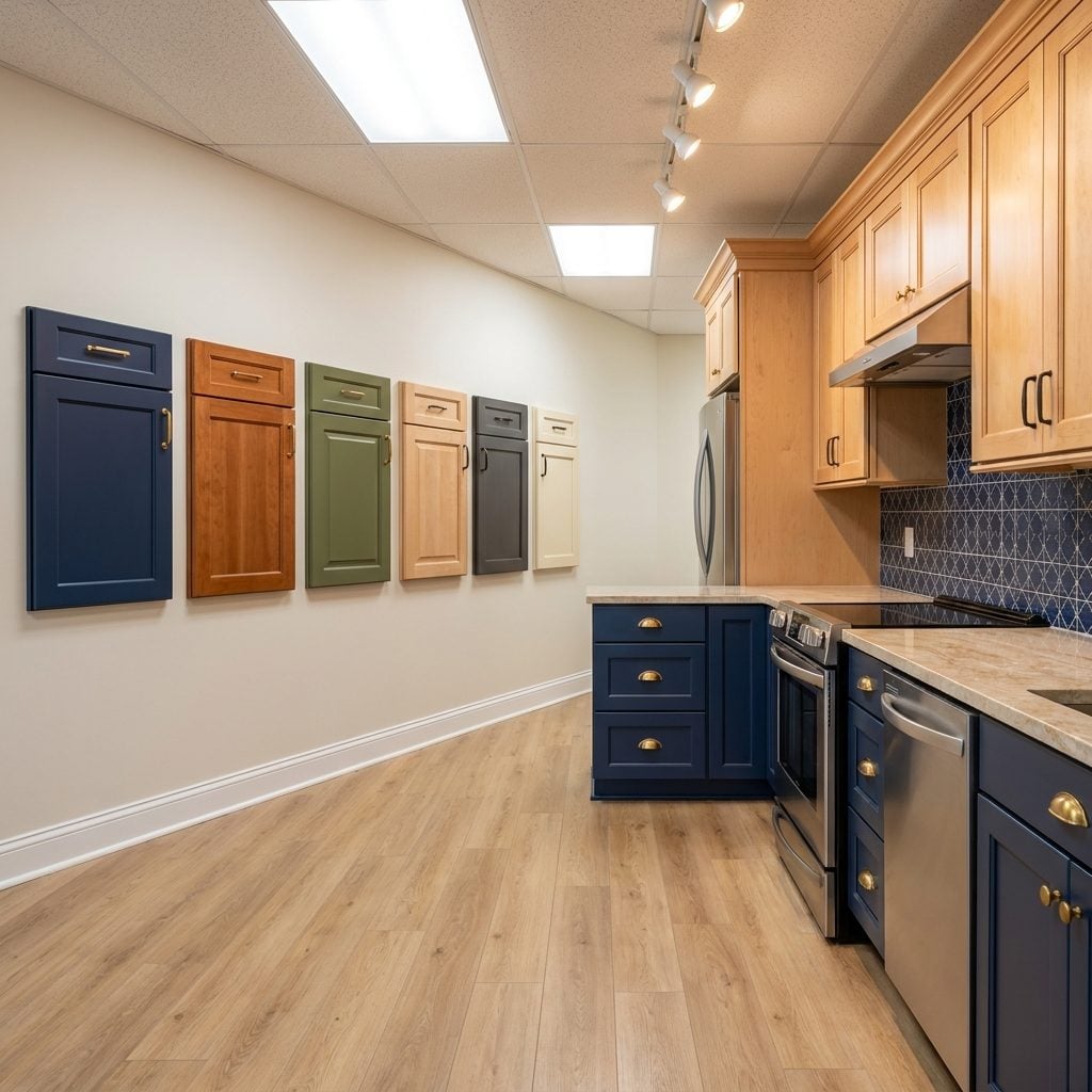
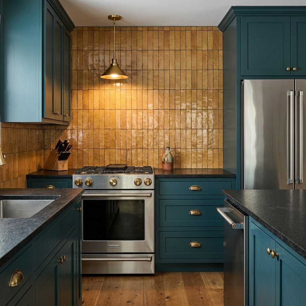
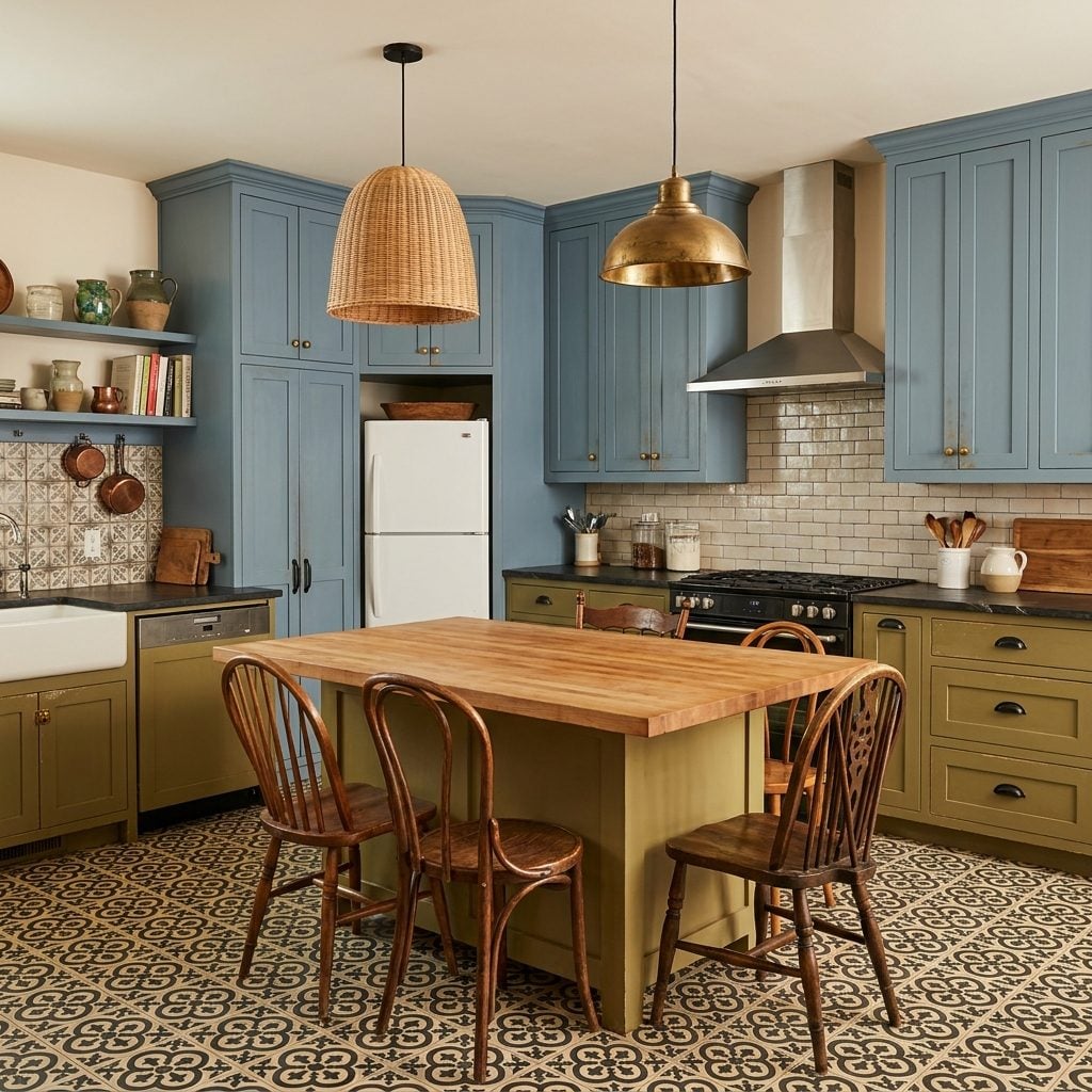
Dark Green, Burgundy, Navy, and Cream Cabinetry Could Have Become Mainstream Much Earlier
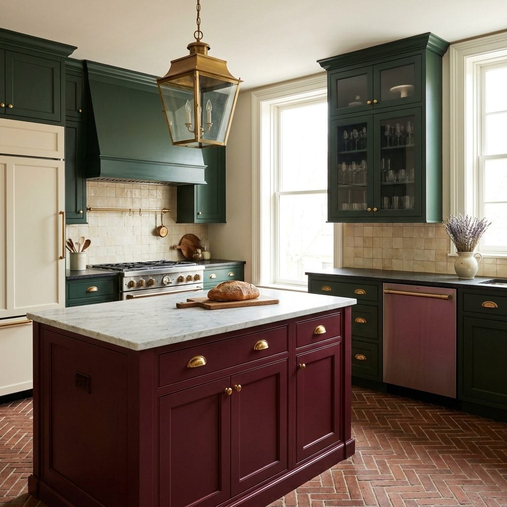
These colors are having a moment right now. Every design magazine, every renovation show, every Instagram account worth following is pushing dark green kitchen cabinets and deep navy islands and burgundy range hoods. Feels very fresh. Very 2025.
Except none of these colors are new. They’re old — centuries of precedent in European kitchens, Victorian pantries, early American keeping rooms. We just skipped them for fifteen years. Had the white wave never hit, the natural progression from honey oak in the 1990s would have moved toward richer painted finishes. Dark green and navy would have arrived by 2010 at the latest. Nobody would be treating burgundy painted cabinetry like a radical act. It would just be a Tuesday.
People Might Worry Less About Fingerprints, Smudges, and Keeping Kitchens ‘Photo Ready’
I genuinely believe the all-white kitchen made people neurotic about their own homes. Not a little — a lot.
White Carrara marble stains if you look at it while holding a lemon. White painted cabinets show every greasy handprint near the pulls. White grout telegraphs a single splash of tomato sauce from across the room. The material palette demanded vigilance, and kitchens became spaces to maintain rather than spaces to cook in. That anxiety rippled outward, too — the rise of the “staging” mentality, where people style their own kitchens for photos before friends come over, clearing every appliance off the counter like they’re trying to sell the place.
A darker, warmer, more textured kitchen forgives you. It doesn’t punish you for making dinner.
Kitchen Lighting Trends Might Lean Softer and Warmer Instead of Ultra-Bright Daylight Tones
White rooms need bright light to look right. Dim a white kitchen and it looks gray — dingy, even. So the lighting industry followed the cabinetry trend: high color temperatures became standard recommendations, LED strips went everywhere, recessed cans dropped in every few feet, all to make white surfaces pop.
Strip away that mandate and amber glass pendant lights with warm bulbs and even candlelight-temperature fixtures might have held their ground. Kitchens in darker, richer tones actually look their best in warm light — the shadows become part of the design instead of a problem to solve. We might have ended up with kitchens that felt more like dinner and less like a dental exam. Which, frankly, seems like a worthwhile trade.
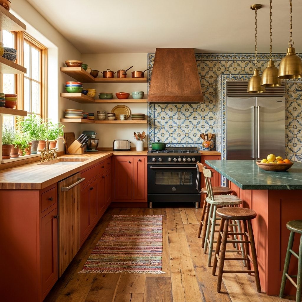
Natural Stone With Heavier Movement and Color Variation Might Have Remained More Popular
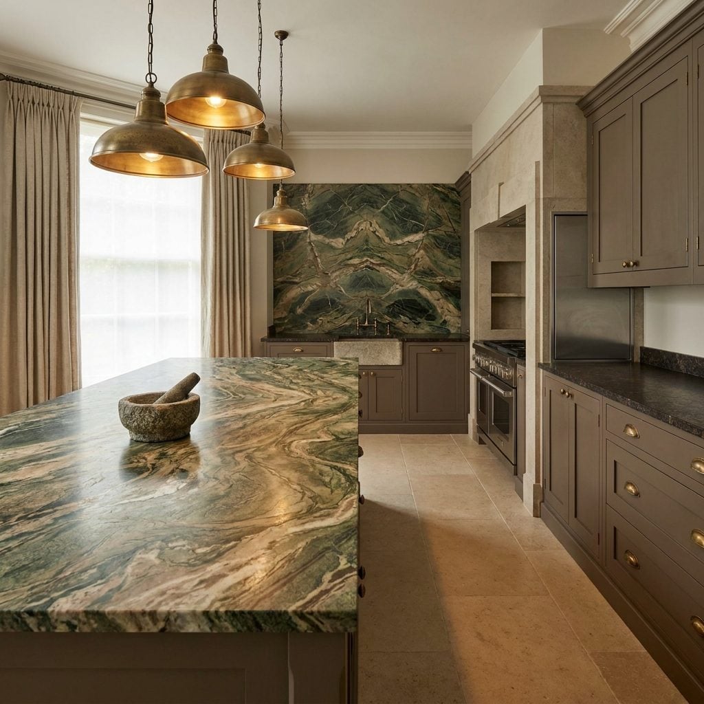
The white kitchen didn’t just prefer white stone — it preferred quiet stone. Calacatta with restrained veining. Quartz engineered to mimic marble without the drama. Anything too colorful, too veiny, too geological got dismissed as “busy.”
Stone is supposed to be busy, though. A slab of granite with bold movement, a piece of soapstone with greenish-black depth, a quartzite shot through with copper and rust veining — these are million-year-old geological events sitting in your kitchen. Why would you want them to whisper?
Without white’s dominance, stone yards might have kept selling the wild slabs as their premium pieces instead of pushing them to the bargain corner. The hierarchy that valued “clean” over “character” might never have taken root at all.
Designers Might Emphasize Texture and Craftsmanship More Than Brightness
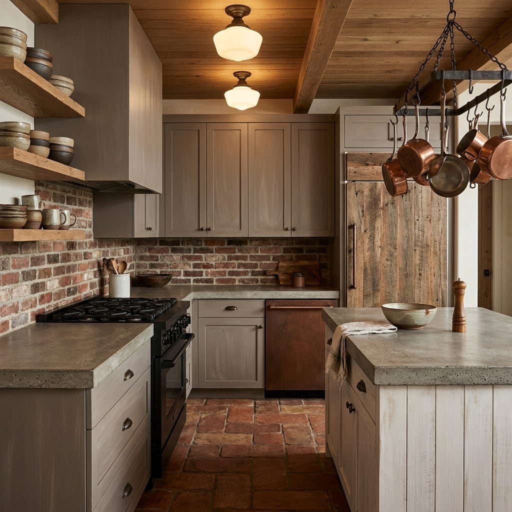
Flat white surfaces have no texture. That’s the selling point, and that’s the problem — a white painted cabinet, a polished white quartz counter, a white ceramic subway tile are all smooth, uniform, and photographically simple. Brightness becomes a value in itself, and texture drops out of the conversation.
Now imagine the alternate timeline where handmade ceramic tile with finger marks and glaze variation was the aspirational backsplash, not an exception. Where honed concrete countertops with trowel marks were a standard option. Where the conversation around kitchen quality centered on how things felt under your hands rather than how they performed in a photograph.
Craftsmanship thrives when imperfection is tolerated. The all-white era had almost no tolerance for imperfection, and I think we lost something real. Some of the most compelling kitchens being designed right now are basically apologies for fifteen years of smoothness: industrial den design principles filtered through domesticity, rough materials given center stage, handmade finishes celebrated for their irregularity. We’re catching up to where we could have been all along.
Paint Companies Might Market Entirely Different ‘Safe’ Kitchen Colors Today
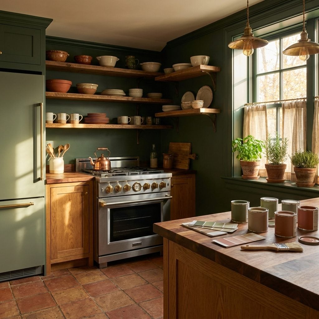
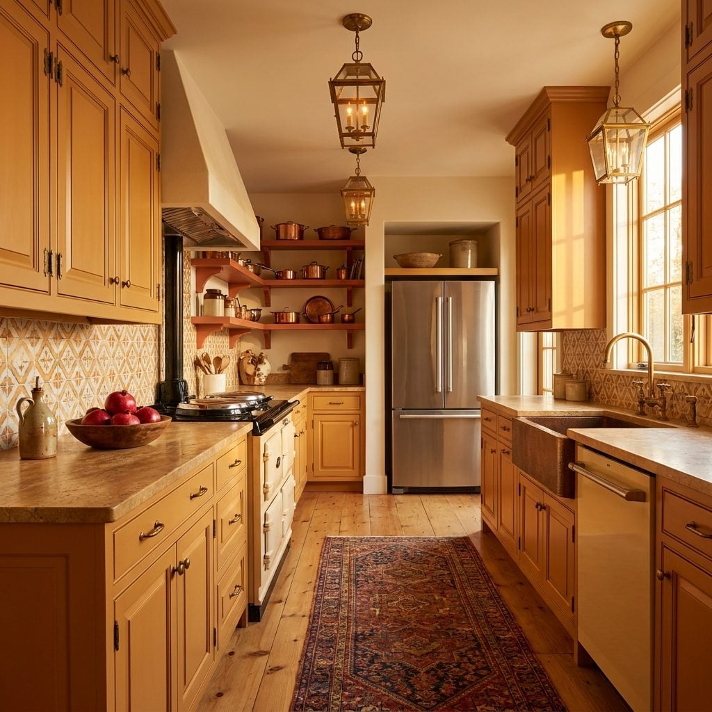
Imagine walking into a Benjamin Moore store and seeing “Kitchen Sage” or “Hearth Terracotta” promoted as the go-to safe bet instead of “Simply White” and “Chantilly Lace.” That’s probably the world we’d live in. Without the all-white wave flattening the color conversation for two decades, paint companies would have built their marketing engines around warm neutrals, soft greens, and muted earth tones as the default “you can’t go wrong” palette.
The psychology here is fascinating. White became shorthand for “clean” and “modern” in kitchens specifically because it was repeated so relentlessly that it trained an entire generation’s expectations. Strip that conditioning away, and the safe color becomes whatever your culture and region already associated with kitchens: warm yellows in the South, deep reds in Italian-American neighborhoods, that particular dusty blue every Cape Cod cottage seemed to favor.
Paint companies wouldn’t need to convince anyone that color is “brave.” Color would just be… normal.
Open Shelving May Never Have Exploded Without Bright White Backdrops Making Everything Look Cleaner
Here’s the quiet truth about open shelving: it only works visually when the wall behind it is a crisp, bright white. That blankness turns your mismatched mugs and half-empty spice jars into a curated display. Without the all-white backdrop trend normalizing those clean, gallery-like walls, open shelving would have stayed where it belonged: in restaurant kitchens and tiny apartments where there literally wasn’t room for upper cabinets.
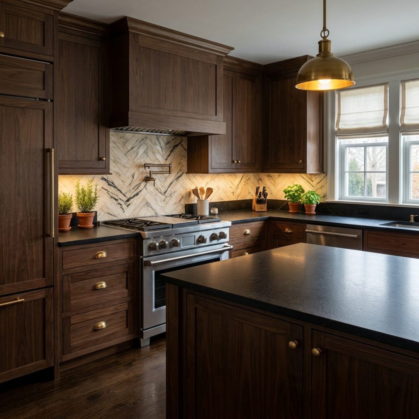
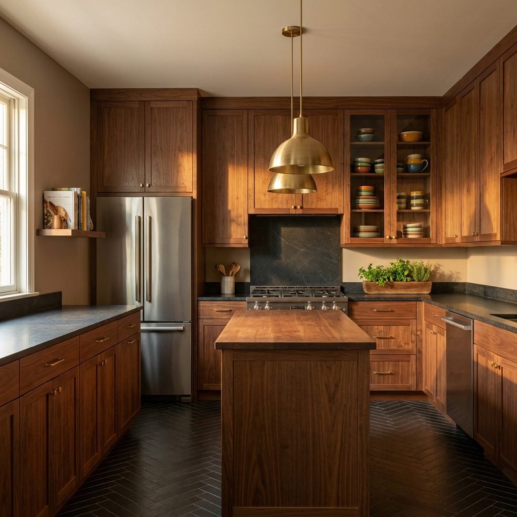
Against a dark green or warm wood wall, open shelves look cluttered fast. And designers know this. The whole appeal was the contrast between the bright emptiness and the objects sitting on it. Take away the white, and suddenly closed cabinetry in beautiful walnut kitchen cabinets or painted wood stays the dominant choice. Glass-front doors might have had a bigger moment instead, offering that peek inside without the dust and grease problem nobody on Pinterest wants to talk about.
Kitchen Remodel Budgets Might Be Smaller Because Fewer Homeowners Would Feel Pressure to ‘Modernize’
🔥 Would you like to save this?
The all-white kitchen didn’t just change aesthetics. It changed economics. Once white became the visual standard for a “done” kitchen, anything that wasn’t white started looking outdated overnight. Perfectly functional honey oak cabinets from 1998? Suddenly embarrassing. Dark granite counters installed in 2005? Dated. The white trend essentially moved the goalpost on what counted as a renovated kitchen, and the price tag moved with it.
Without that pressure, more homeowners might have done what generations before them did: replaced hardware, added a coat of paint, swapped out a light fixture, and called it good. A $3,000 refresh instead of a $35,000 gut job. The kitchen renovation industry as we know it, with its $50 billion annual market, owes a genuine debt to the cultural anxiety that white kitchens created. If your cabinets were fine but not white, you felt behind.
Spec Builders Might Offer Far More Cabinet Finish Options Instead of Default White Packages
Walk into any new subdivision built after 2012 and the kitchen options board tells the story: White Shaker. Antique White Shaker. Off-White Shaker. Maybe, if the builder felt adventurous, a gray Shaker. That’s it. That’s the menu.
Without the all-white default, spec builders would have been forced to actually compete on kitchen design, offering four or five genuinely different cabinet finishes as standard packages. Transitional pantry design principles might have crept into production homes earlier, with mixed-finish kitchens becoming a builder standard rather than a custom upgrade. Navy lowers with maple uppers. Olive painted doors with brass hardware. Cherry wood making a quiet comeback.
The irony is that defaulting to white saved builders money on decision-making infrastructure, not on materials. White cabinets don’t cost less. They just eliminated the conversation.
Instagram and Pinterest Kitchen Photography Would Probably Look Dramatically Different
The entire visual language of “aspirational kitchen” on social media was built on white. Bright, airy, overexposed, minimal. That look dominated feeds because white kitchens photograph effortlessly in natural light, and the algorithm rewarded images that felt clean and scrollable. Photographers didn’t need professional lighting rigs. They needed a white kitchen and a window.
Strip that away and the content creation playbook changes completely. Moody, warm kitchens with copper pot racks and deep-colored walls require actual skill to photograph well. The casual iPhone-on-the-counter shot doesn’t pop the same way against terracotta. Food bloggers might have invested more in lighting equipment. Interior design influencers might have developed genuinely different aesthetics instead of the same white-and-marble template with minor variations.
Pinterest’s entire kitchen category would read more like a European travel blog than an IKEA showroom.
Real Estate Listing Photos Might Emphasize Coziness Instead of Brightness and Openness
“Light and bright” became the holy grail of real estate photography sometime around 2010, and it hasn’t loosened its grip since. Listing agents started coaching sellers to paint everything white before photos because it made rooms look bigger on screen. The kitchen, naturally, took the hardest hit.
In an alternate timeline without the white kitchen obsession, listing descriptions might read differently. “Warm and inviting kitchen with original character” instead of “bright, updated kitchen with modern finishes.” Agents might stage with a pot of something simmering on the stove rather than an empty marble countertop with a single orchid. The whole emotional pitch of home-selling could center on comfort rather than blankness, on a kitchen that looks like someone actually cooks there.
Kitchen Trends Could Vary More Regionally Rather Than Feeling Nationally Standardized
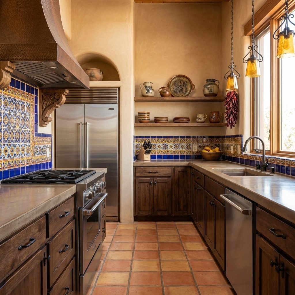
Before the internet flattened everything, kitchens in Santa Fe looked nothing like kitchens in Connecticut, and nobody thought twice about it. Talavera tile and mesquite wood in the Southwest. Painted beadboard and soapstone in New England. Knotty pine and ceramic roosters in the rural Midwest. Regional materials, regional craftspeople, regional taste.
The all-white trend was one of the first truly national kitchen aesthetics, spread by social media at a speed that local building traditions couldn’t compete with. A craftsman courtyard design in Portland and a colonial revival in Georgia ended up with the same white Shaker cabinets and white quartz countertops. Without that homogenizing force, we might still be able to guess what state someone lives in just by looking at their kitchen.
More Homeowners Might Keep Heirloom Furniture Pieces in Kitchens Instead of Replacing Everything at Once
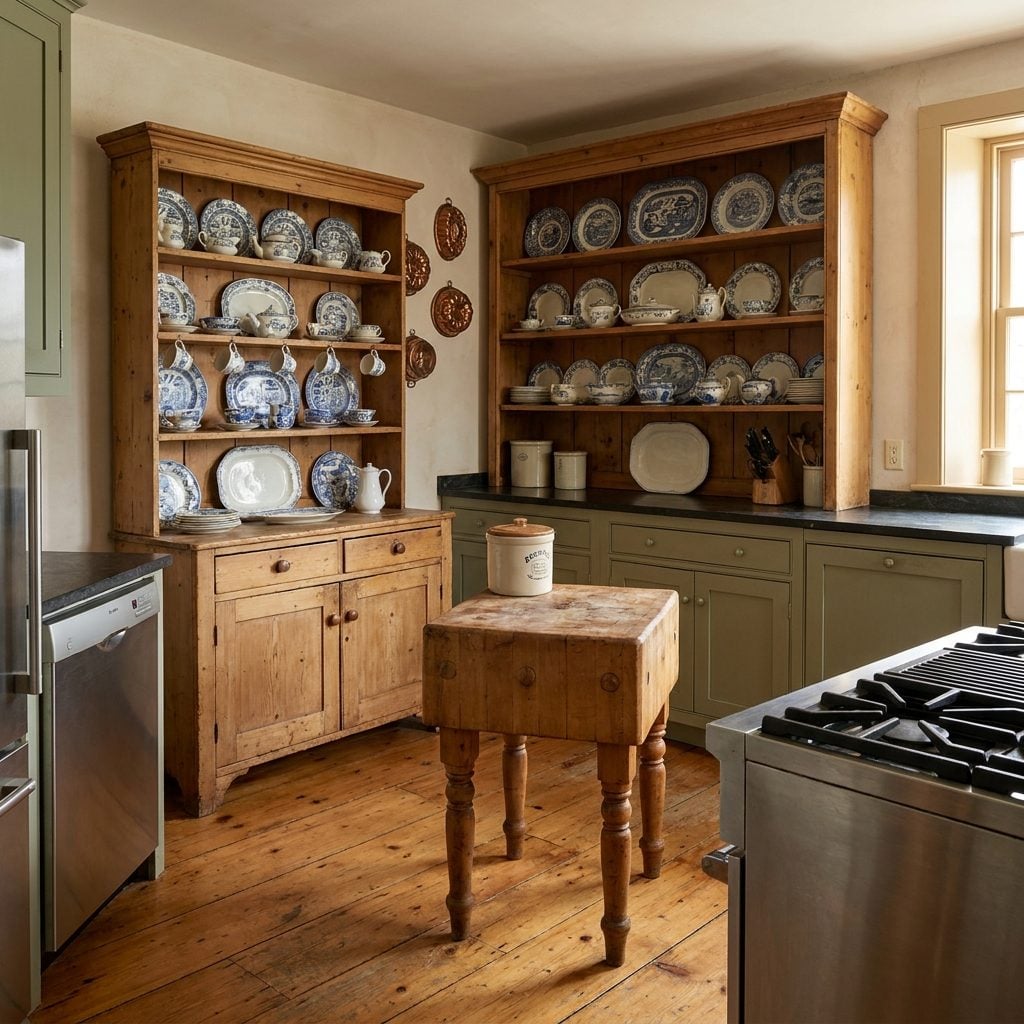
Grandmother’s pine hutch didn’t stand a chance against the all-white renovation. That Welsh dresser she brought over from the old country? Out. The solid maple butcher block island your parents got as a wedding gift in 1974? Gone. When white became the standard, it demanded totality. You couldn’t keep one warm wood piece in a white kitchen without it looking like a mistake.
And that’s a genuine loss. European kitchens have always mixed eras and pieces, treating the kitchen more like a living room that happens to have a stove in it. An antique pine hutch next to modern appliances isn’t a design crime in France or England. It’s just how kitchens work. Without the all-white mandate demanding visual unity above all else, American kitchens might have held onto those pieces, and our kitchens would carry actual history instead of just looking historically inspired.
White Quartz Countertops Might Not Have Become Such a Default Luxury Signal
White quartz didn’t become popular because it’s the best countertop material. I’ll say that plainly. It became popular because it matched the white kitchen.
Engineered quartz in general is a solid product. Durable, low-maintenance, consistent. But the specific dominance of Calacatta-look white quartz, that marble-mimicking surface with gray veining that now occupies roughly half of all new kitchen installations, exists because the all-white kitchen needed a countertop that kept the bright, seamless look going without the maintenance headaches of actual marble.
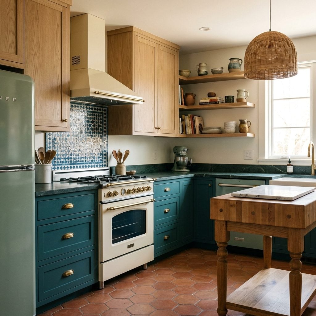
Without the white kitchen trend, countertop diversity stays intact. Soapstone holds its market share. Green marble countertops and rich granites in warm browns and blacks remain desirable. Butcher block stays a legitimate choice rather than something people apologize for. The countertop market fragments in the best possible way, with material choice driven by texture and function rather than by the need to match a predetermined color scheme.
Glossy Subway Tile Might Never Have Reached Near-Universal Status
Subway tile is over a hundred years old. It spent most of that century in actual subways and behind commercial kitchen equipment, which is where it belongs. The residential explosion of glossy white 3×6 subway tile maps almost perfectly onto the all-white kitchen trend because the two needed each other. White cabinets needed a backsplash that didn’t compete. Subway tile needed a context where its plainness read as minimalist rather than institutional.
Without that symbiosis, the backsplash conversation stays wide open. Hand-glazed zellige tile with its irregular surfaces and warm tones might have had its moment a decade earlier. Patterned cement tile, already common in Mediterranean and Latin American kitchens, could have crossed over sooner. Even good old-fashioned painted plaster backsplashes, standard in European country kitchens, might have gained traction.
Subway tile wouldn’t disappear entirely. But it wouldn’t be the beige Honda Civic of backsplash choices either.
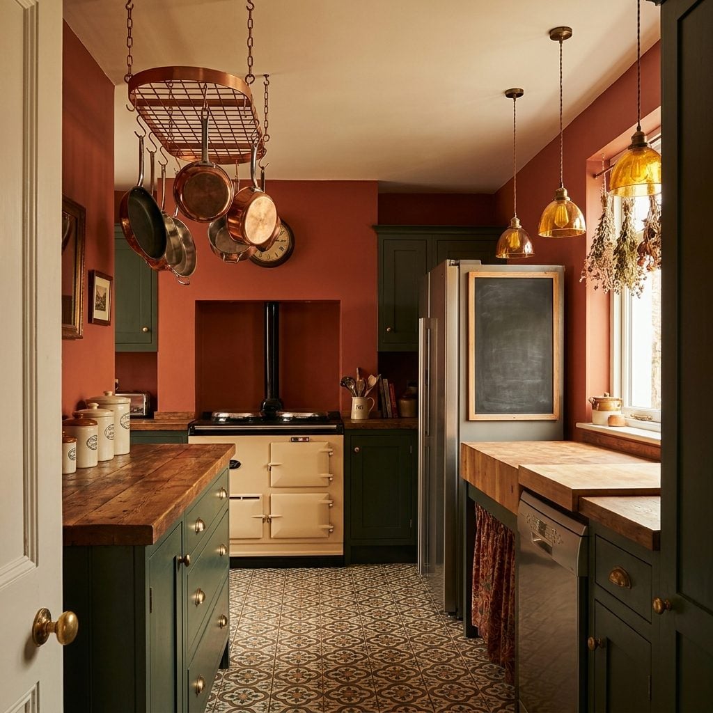
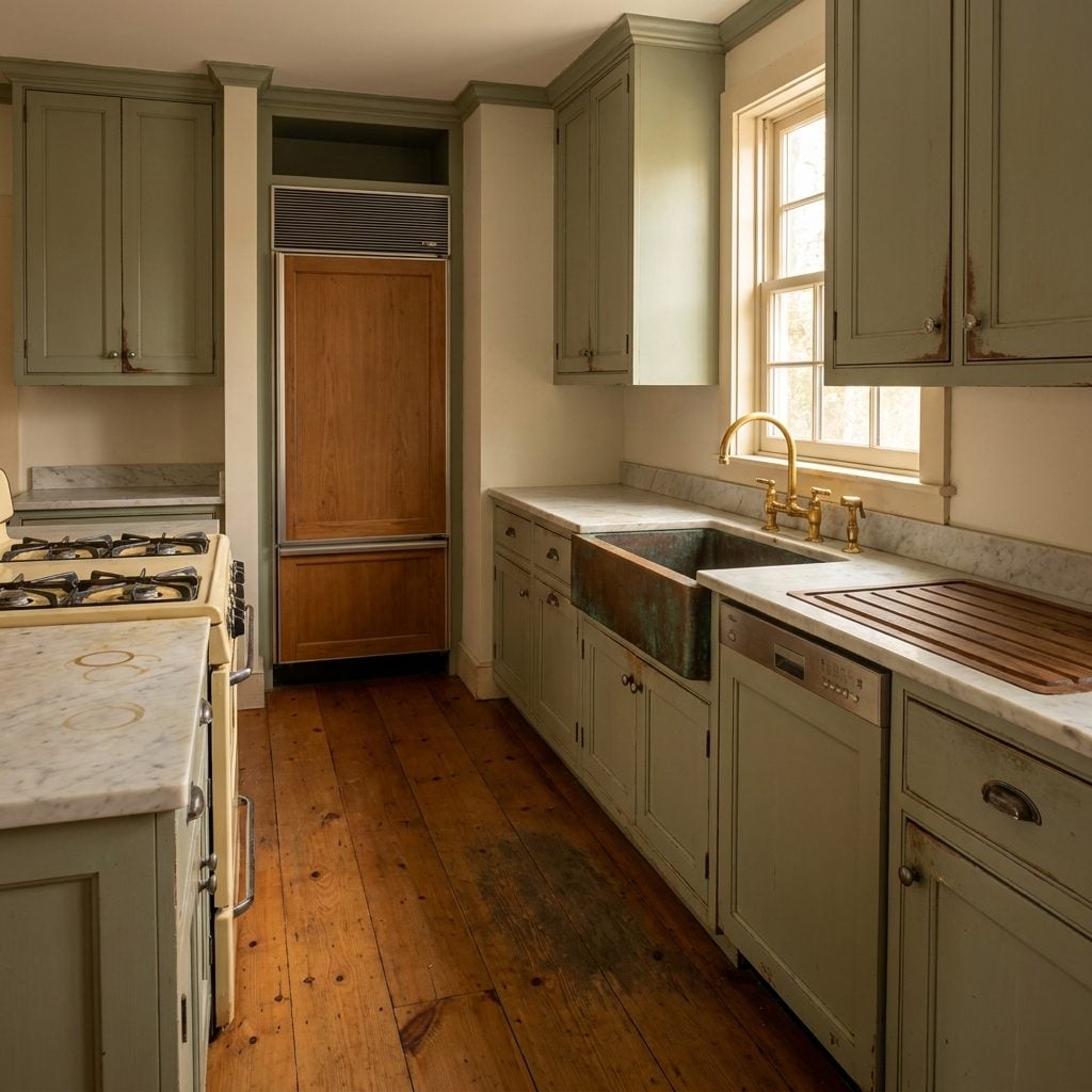
Warm Metals Like Brass and Copper Might Never Have Disappeared for That Awkward Decade
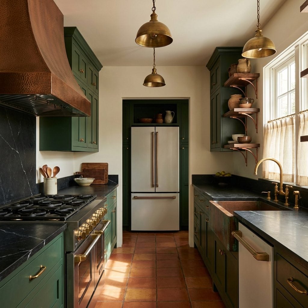
Brass hardware didn’t just go out of style in the late ’90s. It was actively banished. The all-white kitchen needed brushed nickel and chrome to complete its clean, aspirational look, and warm metals got coded as dated overnight. Entire aisles of brass cabinet pulls vanished from hardware stores.
Without that purge, brass and copper would have had a natural evolution instead of a forced exile and dramatic comeback. Manufacturers would have kept developing new finishes, unlacquered options, and mixed-metal pairings through the 2000s. We wouldn’t have lost fifteen years of craftsmanship refinement. The “return of brass” trend pieces that flooded design blogs around 2015 simply wouldn’t exist, because brass never would have left.
And here’s the thing that stings a little: the brass hardware from the ’80s and ’90s that everyone ripped out? A lot of it was solid, well-made stuff. What replaced it was often cheaper hollow nickel pulls. We downgraded and called it progress.
Kitchen Design Magazines Would Showcase a Much Wilder Visual Range
Flip through any shelter magazine from 2005 to 2018 and count how many kitchen features are white or near-white. It’s staggering. Editors weren’t stupid; they knew what drove engagement and what real estate agents wanted to see. White kitchens photograph beautifully, they appeal broadly, and they don’t alienate anyone. So that’s what filled the pages.
Remove that gravitational pull and magazine spreads would have been forced to find beauty in variety. A teal and wood kitchen in Portland. A black-walled galley kitchen in Brooklyn. A sun-faded yellow Provençal number in someone’s Connecticut farmhouse. The visual vocabulary of “dream kitchen” would be ten times wider. Design editors might have developed sharper eyes for what makes a specific kitchen work rather than defaulting to the same Carrara-and-Shaker formula issue after issue.
“Light and Bright” Might Never Become Real Estate’s Favorite Meaningless Phrase
“Light and bright” is not a design descriptor. It’s a real estate incantation. Say it three times in a listing and the open house attendance doubles. But that phrase only gained its near-religious power because white kitchens trained an entire generation of buyers to equate brightness with value and darkness with “needs updating.”
Without that conditioning, a kitchen with walnut butcher block countertops and deep green walls wouldn’t need defending. A realtor could describe it as “warm” or “rich” and mean it as a compliment. The tyranny of perceived resale value has flattened more kitchens than any single design trend. People paint over gorgeous wood, rip out character, and spend $40,000 making their kitchen look like everyone else’s kitchen, all because “light and bright” became code for “this will sell.”
Kitchens as Working Spaces, Not Status Symbols
The white kitchen turned cooking spaces into the most photographed room in the house. That’s not inherently bad, but it shifted priorities in a specific direction. Suddenly a kitchen’s first job was to look good on camera, and its second job was to actually help you cook dinner.
In a world where visual uniformity never took hold, kitchens might have continued evolving along the lines of function. Better task lighting instead of prettier pendant lights. Deeper countertops for actual meal prep instead of slim profiles that look sleeker. Pot racks staying on the ceiling where they’re useful instead of being replaced by hidden storage that requires bending into a cabinet every time you need a skillet. I’ll admit I find something deeply appealing about a kitchen that looks like someone actually cooks in it, knife marks and all.
Natural Aging and Patina Might Feel Like Character Instead of a Problem
🔥 Would you like to save this?
White surfaces are unforgiving. A single coffee ring on white marble countertop becomes a crisis. A chip in white subway tile screams from across the room. The all-white kitchen created an expectation of perfection that turned normal wear into visible failure, and that’s a weird relationship to have with a room where you literally spill things daily.
Without that standard, a copper farmhouse sink developing patina would be a feature. Paint wearing through on cabinet edges near the handles would tell a story about which drawers you open most. Butcher block would age like a favorite leather jacket. There’s a Japanese concept, wabi-sabi, that finds beauty in imperfection and impermanence. It’s hard to practice wabi-sabi in a room where every surface is supposed to stay pristine white forever.
Kitchens Might Evolve Slowly Over Decades Rather Than Getting Gutted Every 15 Years
The gut renovation cycle we’ve normalized is, historically speaking, insane. Kitchens built in the 1940s and ’50s lasted decades with minor updates. A new faucet here, a coat of paint there, maybe new flooring when the old stuff finally gave up. Then the all-white trend established a look so specific and so complete that partial updates felt pointless. You couldn’t just paint your oak cabinets white; you needed new counters to match, new hardware to match those, a new backsplash, new lighting. It was all or nothing.
Without that pressure toward total visual coherence, kitchens could have kept evolving the way houses used to: a piece at a time, each layer reflecting a different moment in the family’s life. A kitchen with its original tile floor, second-generation cabinets, and brand-new appliances tells a richer story than one installed wholesale from a showroom.
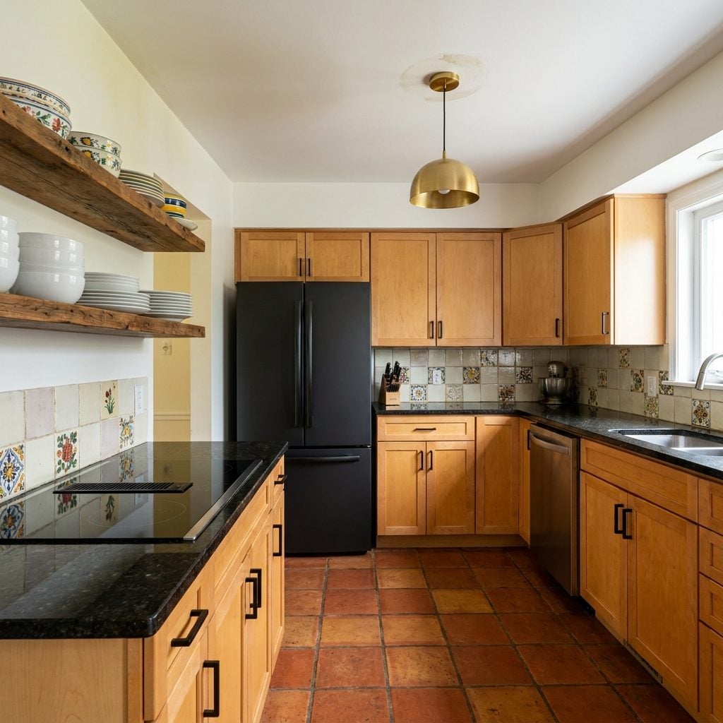
Colorful Dishware and Small Appliances Might Stay on Display Instead of Getting Hidden Away
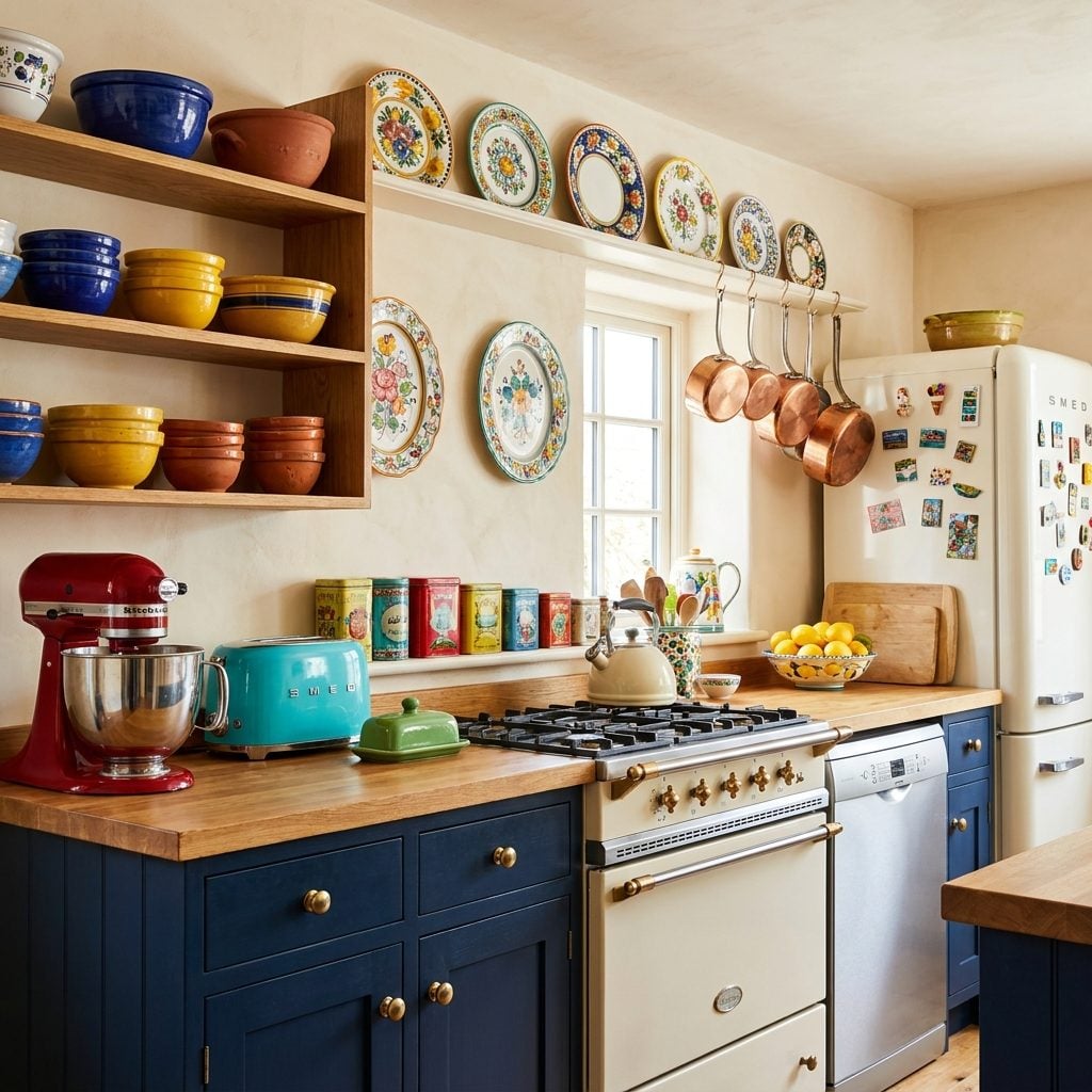
Remember when a red KitchenAid mixer just… lived on the counter? When your grandmother’s yellow Pyrex mixing bowls sat on open shelves because that’s where bowls go? The white kitchen turned every colorful object into visual clutter. Suddenly you needed to hide your toaster in a “toaster garage” and store your mismatched mugs behind cabinet doors so they wouldn’t disrupt the monochrome calm.
That shift killed a particular kind of kitchen personality. The kind where you could walk in and know immediately that someone who loves to cook Italian food lives here, because their collection of hand-painted ceramic pasta bowls is right there on the shelf. Color on the counter isn’t clutter. It’s evidence of a life being lived.
The Pressure to Perfectly Coordinate Everything Could Be Dramatically Lower
The all-white kitchen made matching into a moral imperative. Your backsplash had to “go with” your counters, which had to “flow into” your cabinets, which had to “complement” your hardware. Design consultations became coordination exercises where the goal was elimination of contrast. I once watched someone agonize for forty minutes over whether their white subway tile was warm white or cool white relative to their cabinet paint. Forty minutes.
In an alternate timeline where visual uniformity was never the goal, mismatched kitchens could just be… kitchens. Brass pulls on one cabinet, iron on another. A butcher block island next to granite perimeter counters. Not because you’re going for “eclectic” (another word that mostly means “I’m giving you permission to not match”) but because those are the materials you chose for different functional reasons, and nobody expects a kitchen to look like a showroom.
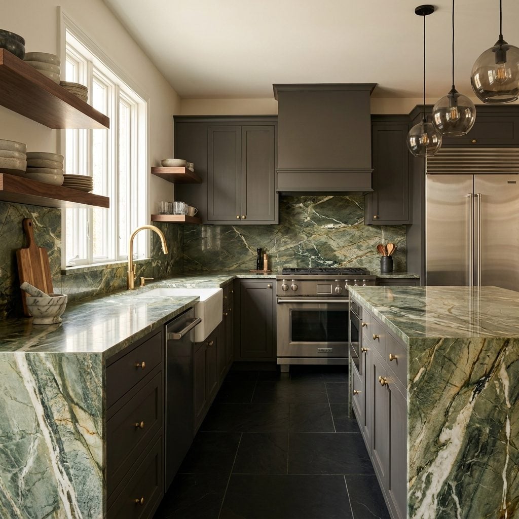
Dark Countertops Might Still Dominate High-End Kitchen Design

Black granite was the prestige countertop for a reason. It hid stains. It felt substantial. It grounded a room. Then white Carrara marble (and its quartz imitators) took over, and suddenly every luxury kitchen looked like an operating theater.
The irony is thick: the countertop material that became the status signifier of the white kitchen era is objectively worse for cooking. Marble stains, etches, and scratches. It requires constant sealing and gentle handling. Meanwhile, dark honed black granite and soapstone just sit there, absorbing whatever you throw at them, looking better with every year. In a timeline without the white kitchen, dark countertops would have kept evolving. We might have leathered finishes, volcanic stone options, and rich dark composite materials that nobody ever developed because the market was chasing white.
Kitchen Trends Might Move Slower Without Social Media’s Love Affair With White Rooms
White kitchens are the most photogenic rooms on the internet, and that’s not a coincidence. White surfaces bounce light evenly, eliminate distracting shadows, and make spaces look larger on a phone screen. Instagram, Pinterest, and real estate listing photos all reward the same optical trick. A dark green kitchen with copper fixtures might look magnificent in person, but in a 4-inch square on your phone it reads as a dim rectangle.
This created a feedback loop that accelerated trends unnaturally fast. White kitchens got more likes, so more people built them, so more content featured them, so more people wanted them. Without that photographic advantage, kitchen trends might move at the pace they did in the ’60s and ’70s: regional, gradual, and shaped by what people actually enjoyed living in rather than what performed best as content. And honestly? That sounds like a healthier relationship with a room.
Homeowners Might Actually Take Design Risks Because There’d Be No One “Safe” Look to Hide Behind
Any dominant trend does quiet, corrosive damage: it turns personal taste into something that feels dangerous. Shelter magazines, HGTV reveals, real estate listings — they all pushed the same white-cabinet, white-quartz, subway-tile formula for years, and millions of homeowners who might have gone with something interesting talked themselves out of it. “What about resale?” became the universal permission slip to do nothing original.
Strip away that gravitational pull toward one look, and kitchens get weirder. Better weird. Someone picks deep forest green cabinets because they love the color, not because a Pinterest board declared it was “having a moment.” A copper range hood stops being a “statement piece” and becomes, you know, the hood they wanted.
Resale anxiety wouldn’t disappear. But without a single dominant aesthetic propped up as the perceived safe bet, you’d actually have to sit with the question: what do I like? That discomfort — genuine choice, no cheat sheet — is where good design starts. Most people never get there.
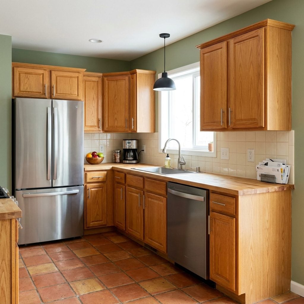
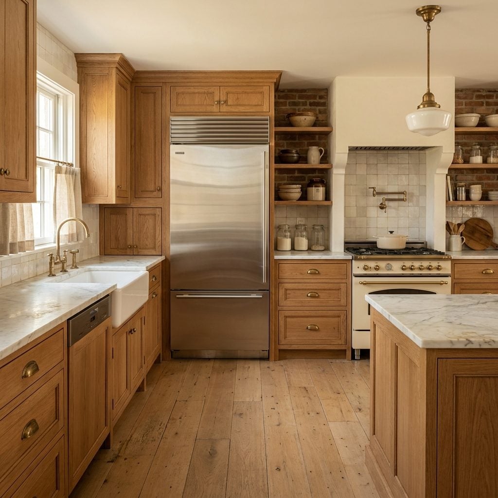
Many 1990s and Early 2000s Kitchens Might Still Feel Stylish Today Instead of “Instantly Dated”

Consider what we collectively decided was “dated” in the 2010s. Cherry cabinets. Warm granite. Tuscan-toned backsplashes. Kitchens with actual color. Nobody rejected those rooms because they were poorly designed — we rejected them because they weren’t white.
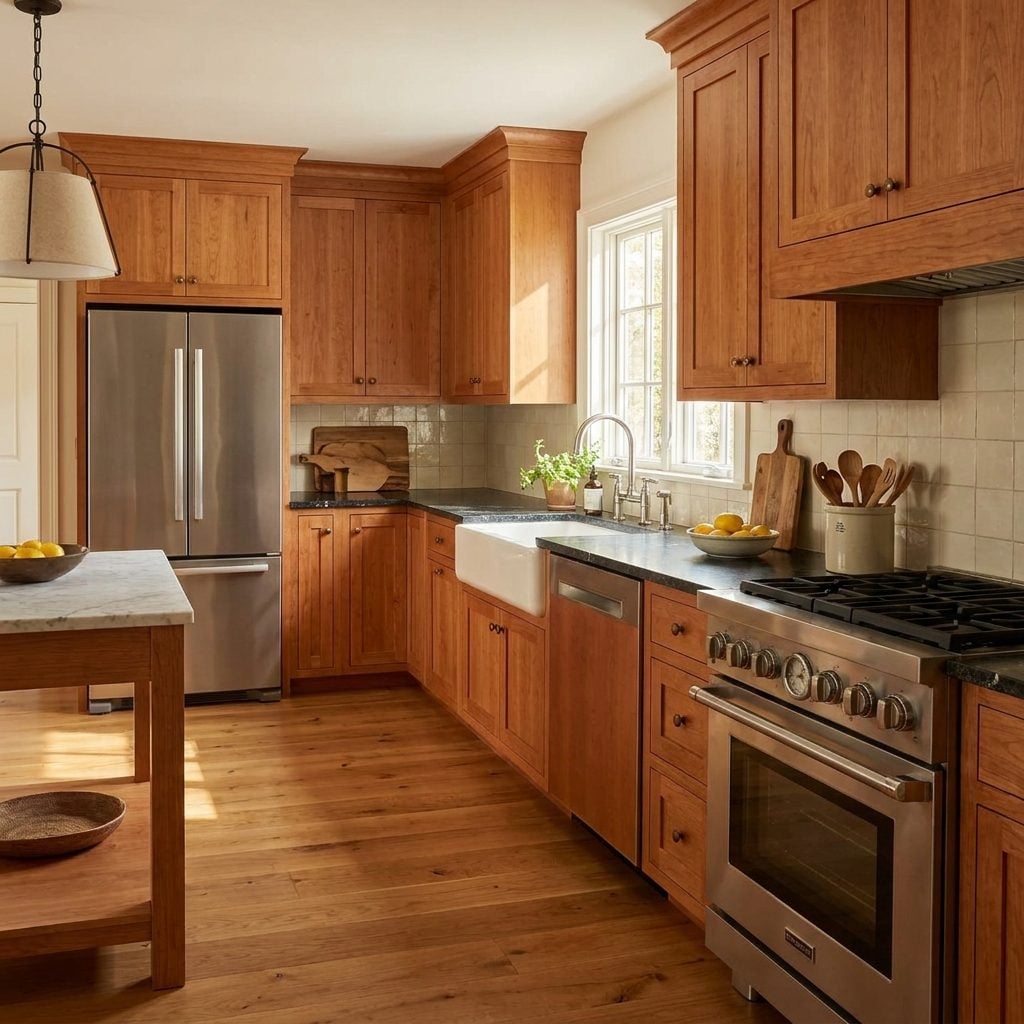
The all-white trend forced a binary: white kitchen equals modern, anything else equals old. Brutal framing. Also kind of dumb? A well-proportioned kitchen with cherry wood cabinets and green granite countertops from 2001 wasn’t ugly — it just wasn’t participating in the reigning monoculture. Without that monoculture, those kitchens keep aging gracefully: the wood develops character, the stone holds up, and the warm tones still play well with everything from a brushed nickel pull to a cast iron pan left on the burner.
I say this as someone who once called a perfectly good maple kitchen “so 90s” like it was a slur. That kitchen was fine. More than fine, honestly. The kitchen was never the problem.
The Phrase “Timeless Kitchen” Might Mean Something Completely Different Today
“Timeless” Became Code for “White”
Somewhere around 2012, “timeless” stopped meaning “built to outlast changing tastes” and started meaning “white Shaker cabinets, quartz counters, subway tile.” The word got hijacked. Designers deployed it. Real estate agents leaned on it. Homeowners parroted it back. But labeling one specific aesthetic “timeless” while that aesthetic is actively cresting in popularity is — come on — a contradiction nobody wanted to poke at too hard.
Without the all-white era, “timeless” might have kept its original meaning: quality materials, honest construction, proportions that don’t lean on a color trend to feel right. An unlacquered brass pull that develops patina. Honed marble showing its age instead of pretending it doesn’t have one. Oak cabinets with grain you can actually see and feel. The conversation shifts from color palette to material integrity — a fundamentally different design question. You see echoes of this thinking in transitional pantry design, where staying power comes from balance rather than chasing a single wave.
A truly timeless kitchen wouldn’t photograph identically across decades. It would just keep working in all of them — scuffed, patinated, a little unphotogenic, still beautiful.