🔥 Would you like to save this?
Japandi kitchens get accused of being cold. Too quiet, too restrained, too much like a showroom nobody actually cooks in. That’s a fair concern. The style blends Japanese minimalism with Scandinavian functionality, and on paper, that sounds like a recipe for a space that looks great in photos and feels uncomfortable by Tuesday morning. But a growing number of designers are finding that the warmth was always there. It just lives in the grain of a wood shelf, the weight of a ceramic bowl, the way natural light lands on a matte countertop. The 33 designs ahead show exactly how that plays out in real kitchens, and a few of them will probably change the way readers think about what “minimal” can actually feel like.
In order to come up with the very specific design ideas, we create most designs with the assistance of state-of-the-art AI interior design software. Also, assume links that take you off the site are affiliate links such as links to Amazon. this means we may earn a commission if you buy something.
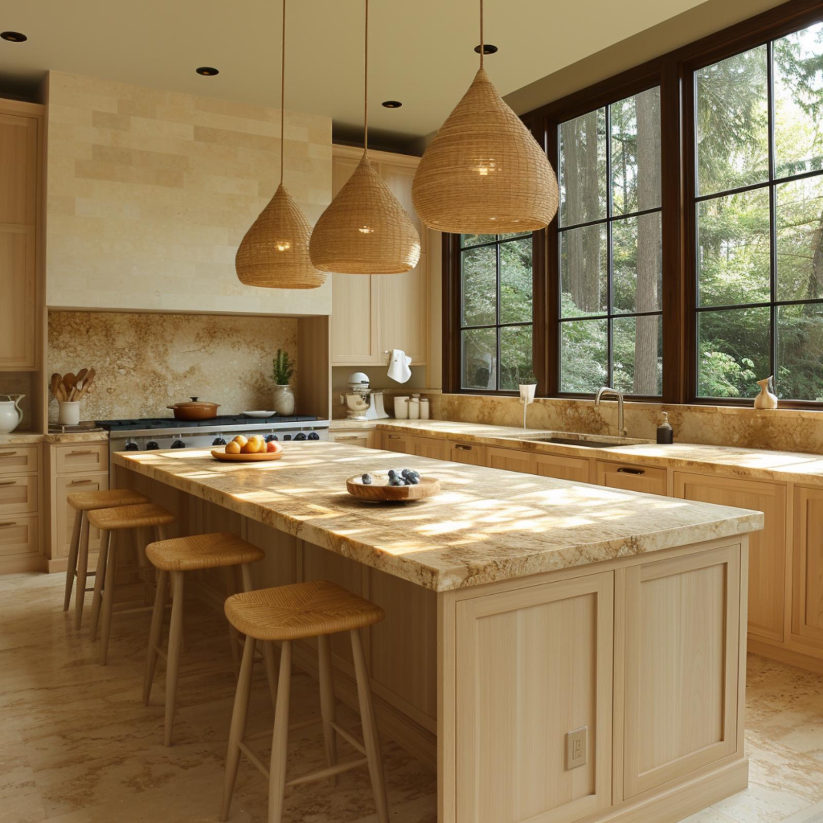
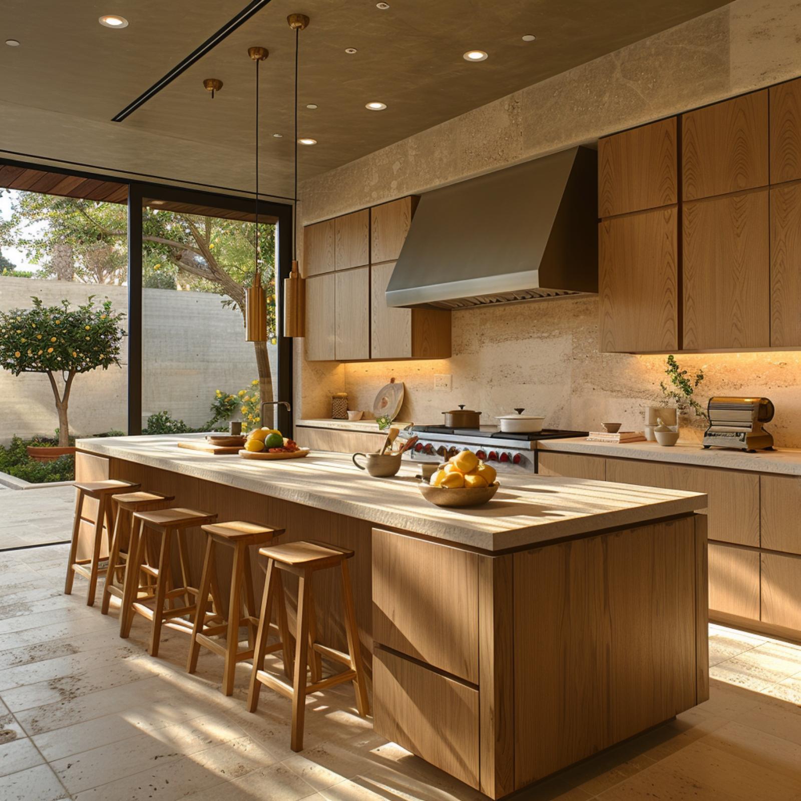
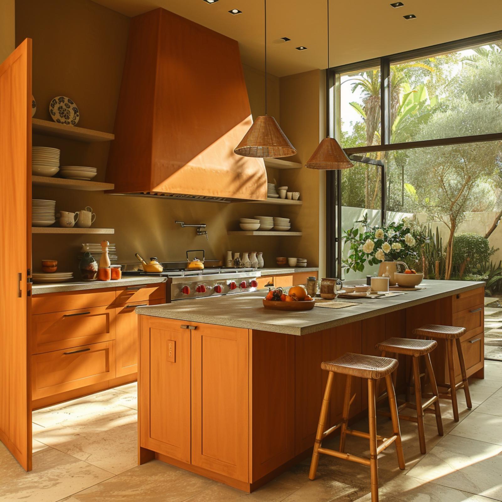
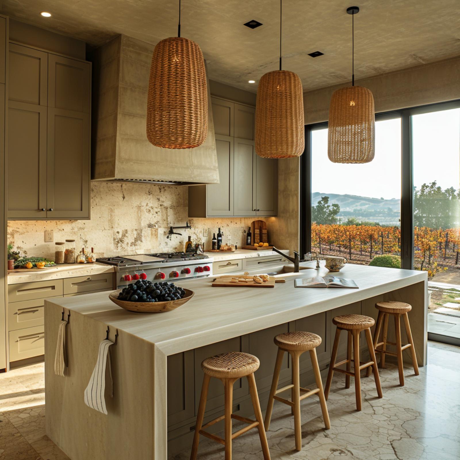
Waterfall Travertine and Woven Rattan Make Warmth Feel Structural, Not Decorative
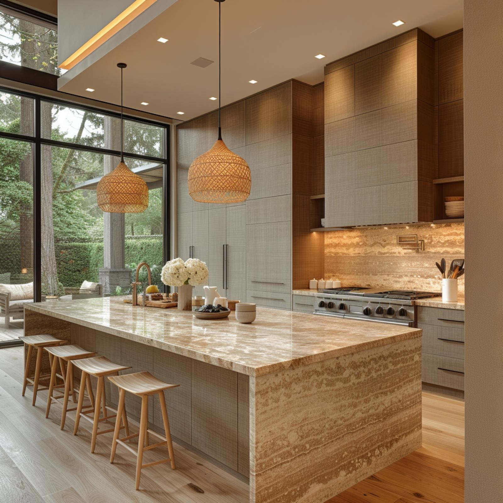
The island’s waterfall travertine panel does most of the emotional work here, its amber-veined face warmer than the gray linen-textured cabinetry above. Rattan pendants soften what could’ve been a cold room.
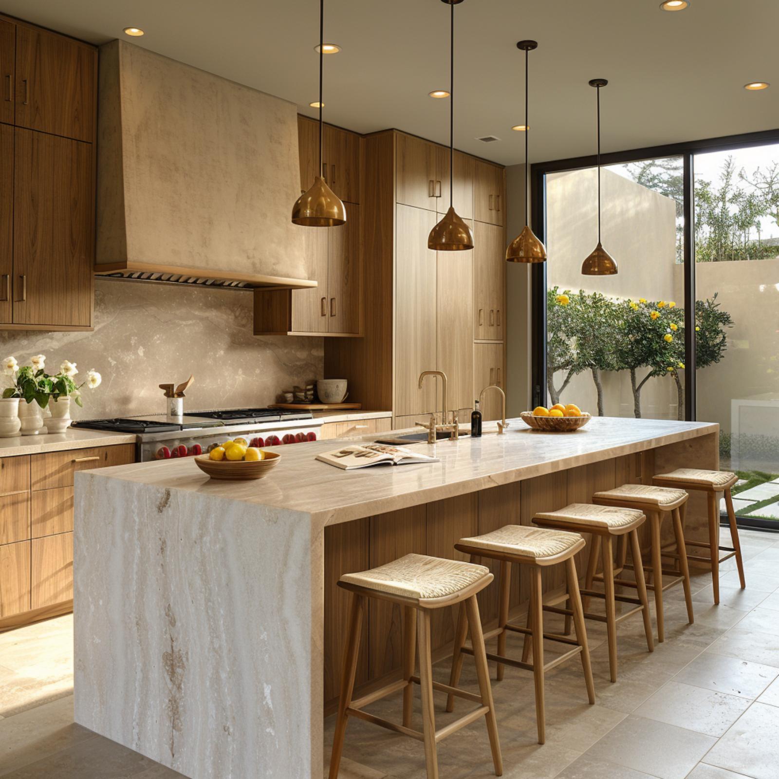
Brushed Brass Pendants Over Travertine Prove Japandi Doesn’t Run Cold
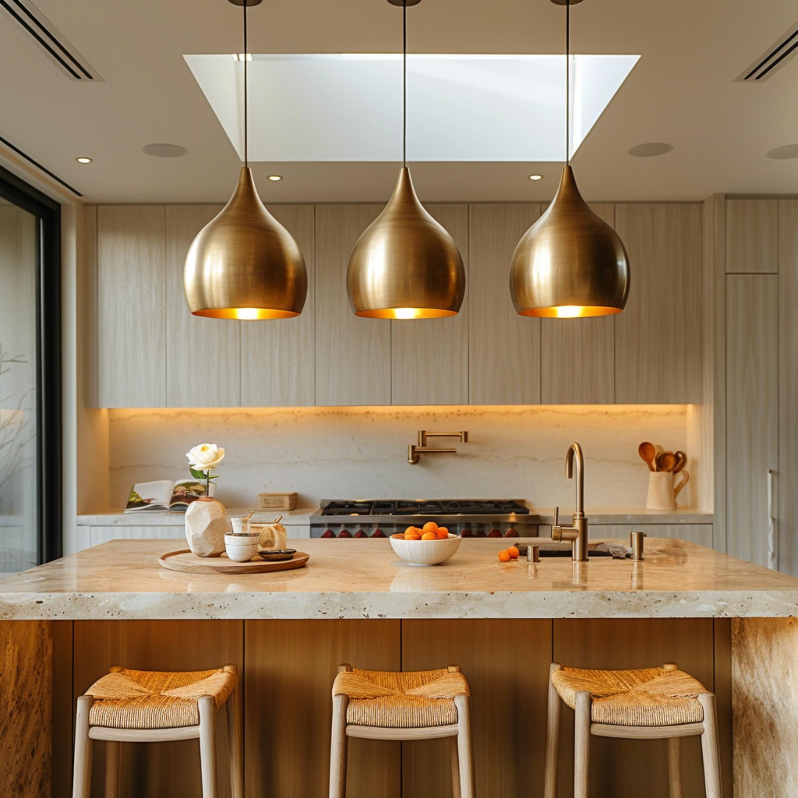
Three teardrop brass pendants cast warm gold light onto a travertine island that’s thick enough to feel substantial. Rush-seat barstools keep it from tipping into formality.
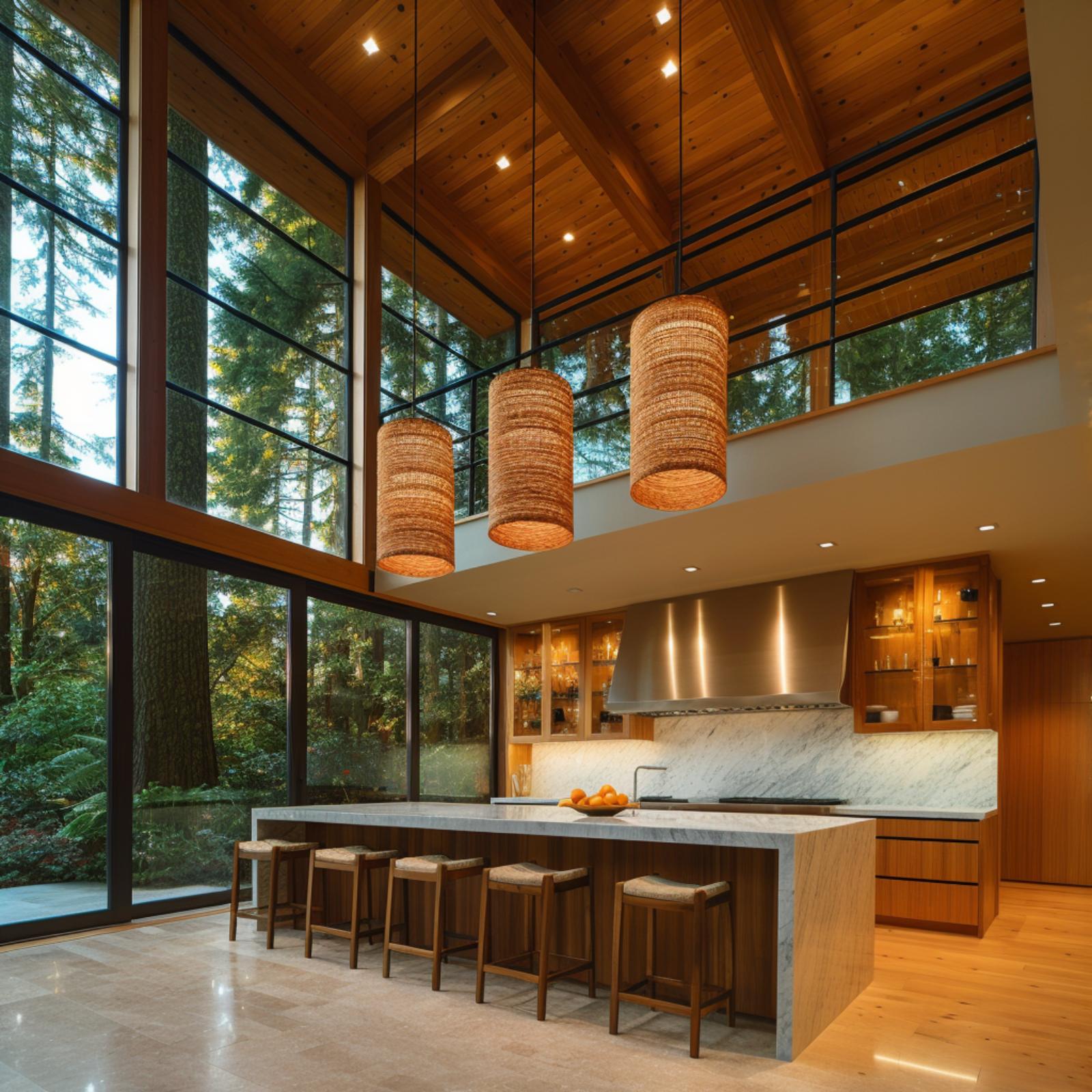
Aged Brass Pendants and a Skylight Do the Warming Work Here
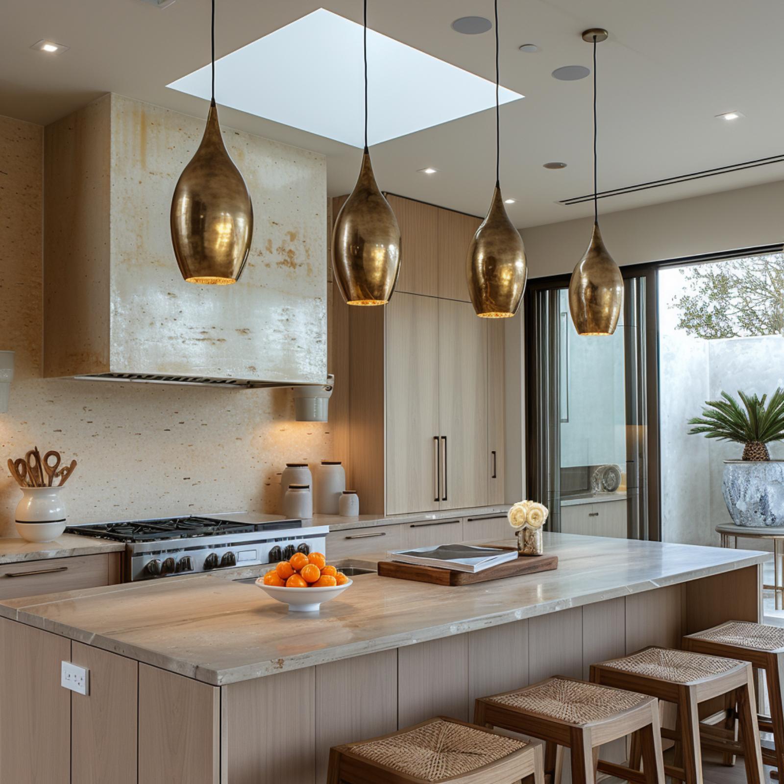
Four teardrop pendants in oxidized brass hang at staggered heights above a marble island, and that patina carries more warmth than any paint color could. Light oak cabinetry and rattan barstools keep it grounded. The skylight does the rest.
Marble Runs Floor to Ceiling Here, and Somehow It Still Feels Lived-In
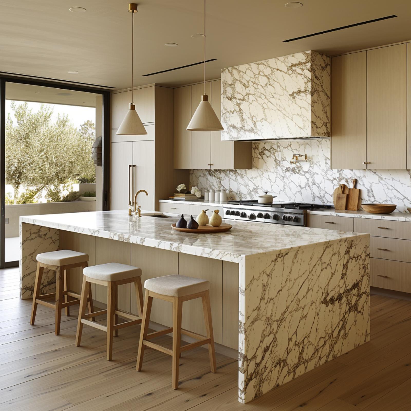
Calacatta-style marble with gold and gray veining covers the island waterfall, backsplash, and range hood cladding as one continuous material story. It’s a lot. But wide-plank white oak floors and linen-upholstered backless stools keep it grounded enough for Tuesday night dinner.
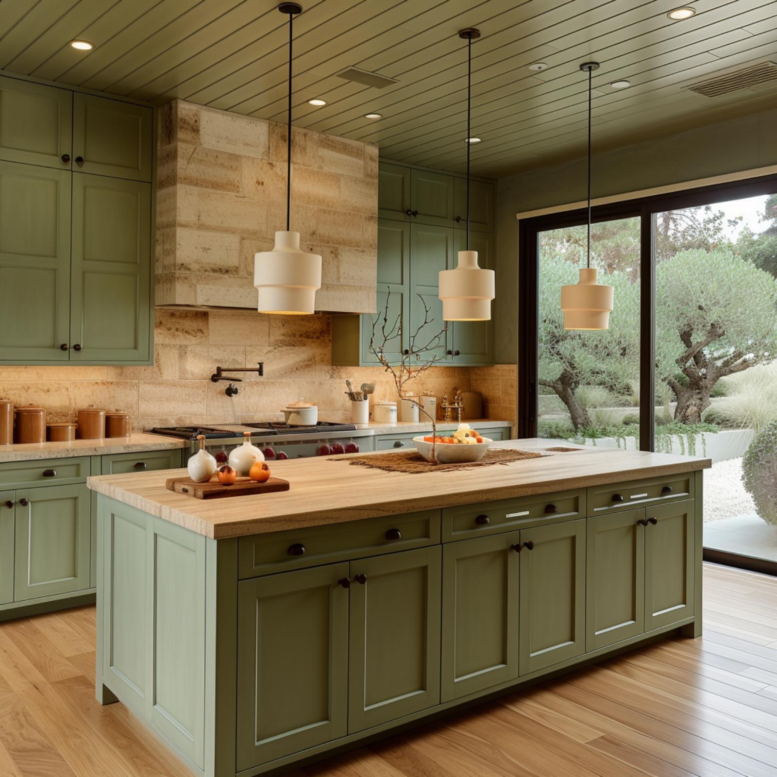
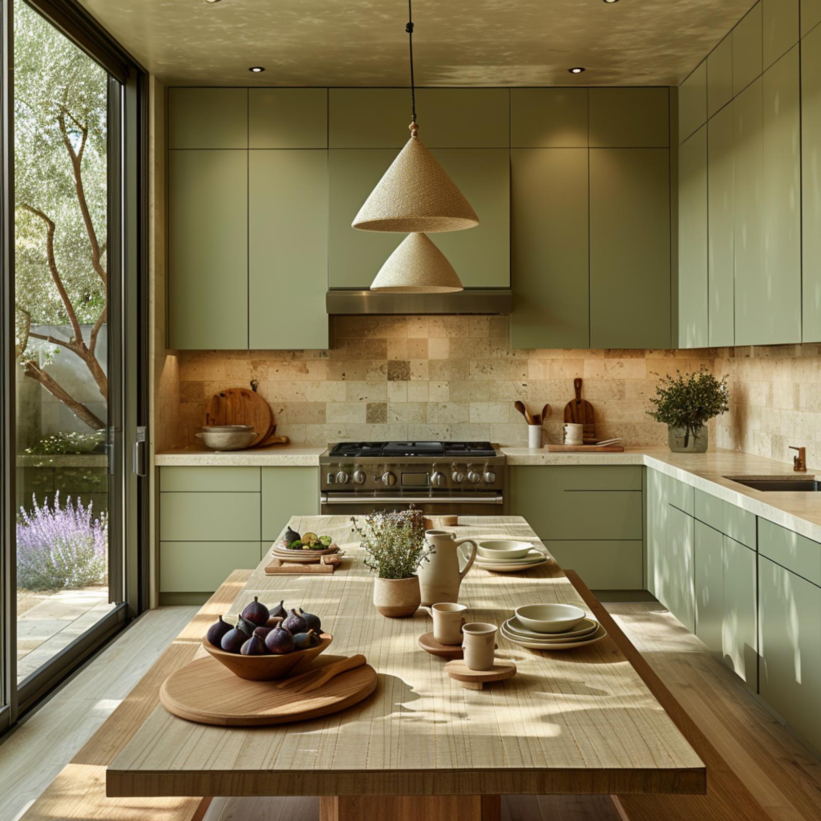
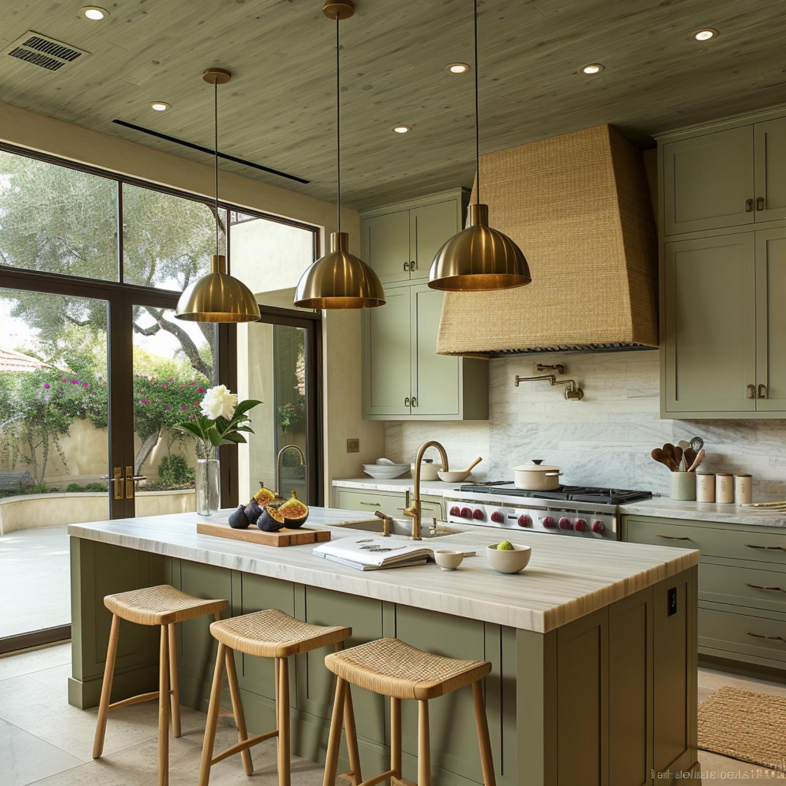
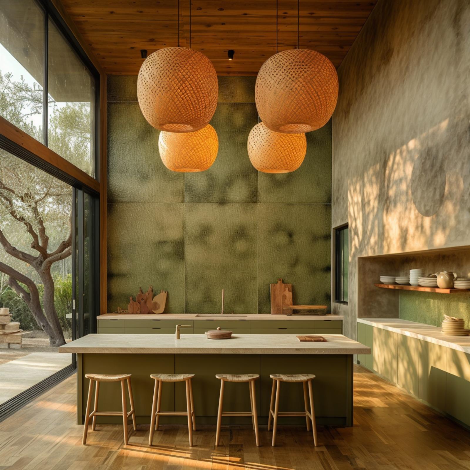
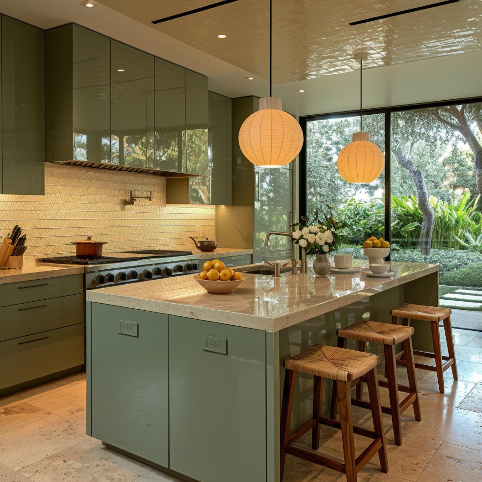
Olive Cabinetry and Globe Pendants Make a Case for Color in Japandi Design
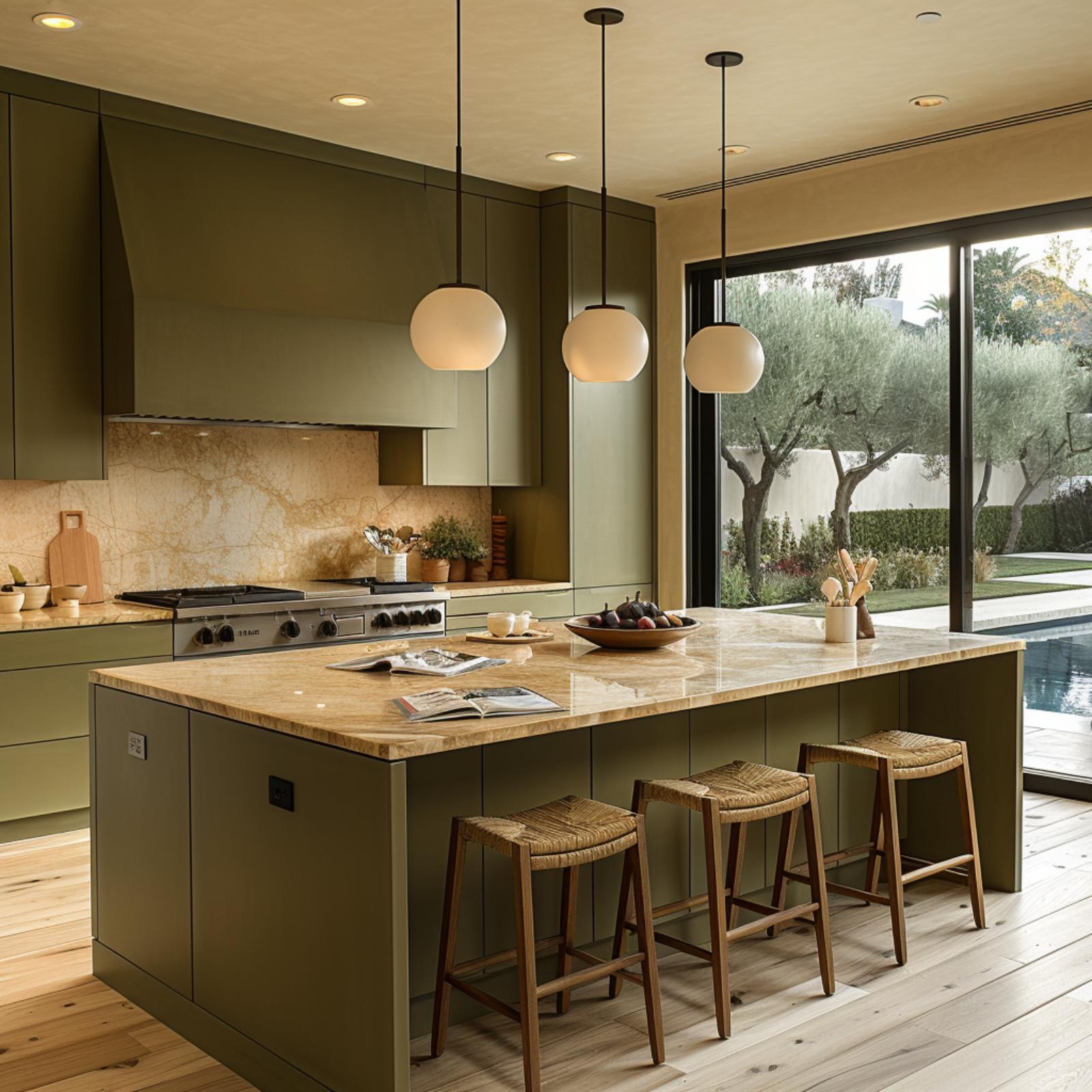
Muted olive runs from the lowers to the uppers without a break, and that continuity is doing a lot of heavy lifting here. Paired with a honey-veined stone countertop on both the island and the perimeter, the palette reads warm before anything else does.
Three globe pendants in frosted white hang at staggered heights above the island, casting soft pools of light onto an open magazine and a bowl of figs. The woven rattan stools ground the whole composition. Light oak flooring keeps it from ever feeling serious.
Why It Works: Olive cabinetry sits in a chromatic sweet spot between green and brown, which means it absorbs warm light rather than deflecting it. The stone countertop reinforces that warmth with its amber veining, so the kitchen reads cohesive rather than color-blocked. It’s a palette that actually ages well with a family using it daily.
Dark Wood Ceilings and Paper Lanterns Prove Japandi Can Run Warm
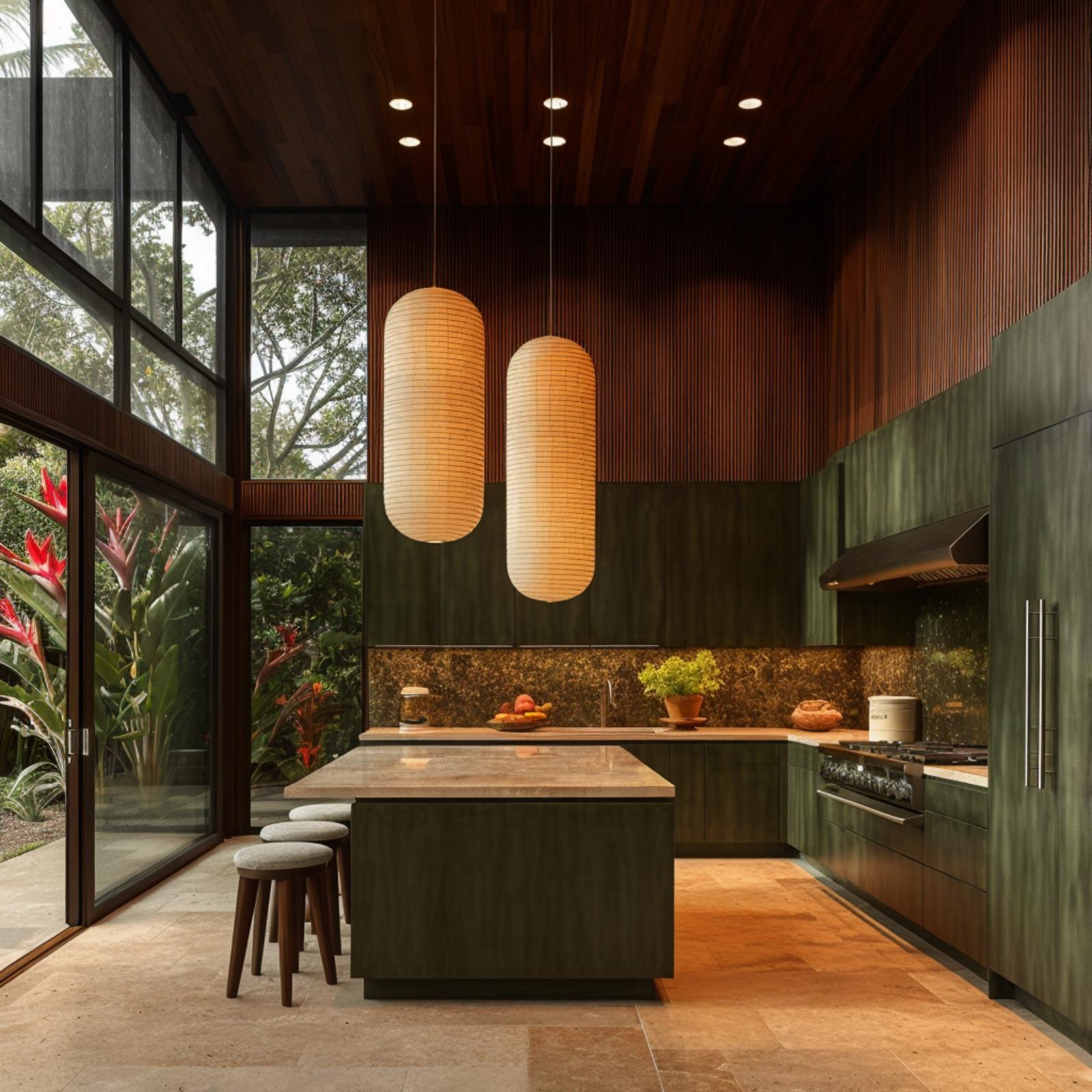
Slate-green cabinetry wraps the perimeter here, and it reads warmer than expected because the wood-slat ceiling pulls so much amber into the room. Two capsule-shaped rice paper pendants hang low over the island, and their glow lands directly on a stone countertop that picks up gold and rust undertones.
Outside, tropical foliage presses against floor-to-ceiling glazing. That view adds color the kitchen itself doesn’t need to supply. The stools are soft grey concrete rounds, keeping seating casual enough that this doesn’t feel like a showroom.
Style Math: Forest green and dark walnut read cool in isolation, but layered together under warm artificial light they pull in opposite directions and meet somewhere decidedly comfortable. Rice paper pendants are doing real work here since they diffuse light broadly rather than casting it in a focused beam, which means fewer harsh shadows across prep surfaces. For families who cook at night, that distinction matters more than most design guides admit.
Where the last kitchen leaned on ceiling drama, this one puts its warmth at counter height.
Sage Cabinets and Travertine Stone Work Together So the Room Doesn’t Have To
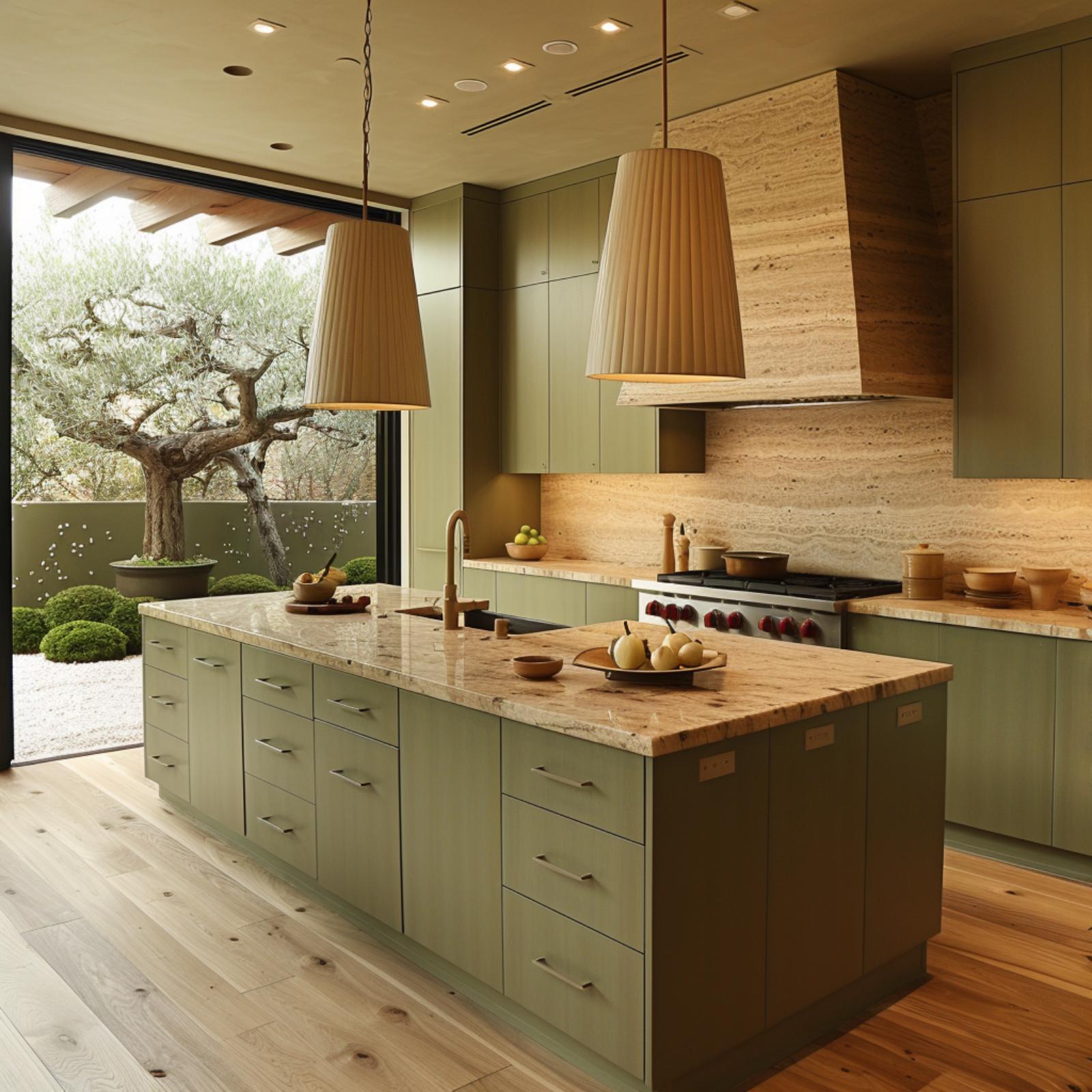
Sage-green flat-front cabinetry runs the full perimeter here, and it’s doing something specific: the matte finish holds light rather than bouncing it, so the warm veining in the travertine backsplash and hood cladding reads as the dominant note in the room. Two pleated fabric pendants hang low over the island, their conical shade diffusing light downward onto a granite-top surface with amber and cream movement. Wide-plank white oak flooring anchors it all. The large-format sliding door doesn’t compete; it just frames an olive tree outside, and somehow that connection makes the interior feel less composed, more lived-in.
Olive Cabinets and Butcher Block Prove Warm Materials Don’t Need to Match
Butcher block on a shaker-style island does something stone can’t: it shows wear graciously, and that lived-in quality reads as warmth before anyone even sits down. Olive-painted cabinetry runs wall-to-wall, but the travertine hood surround keeps it from feeling monotonous. Cylindrical pendants in an off-white ceramic finish hang at staggered intervals, which gives the ceiling line visual rhythm without competing with the wood tones below.
- Butcher block absorbs cooking oils over time, deepening in color rather than degrading
- Travertine’s natural veining introduces organic contrast that painted surfaces alone can’t provide
- Matching pendant finishes to the hood material ties vertical elements together without matching hardware colors exactly
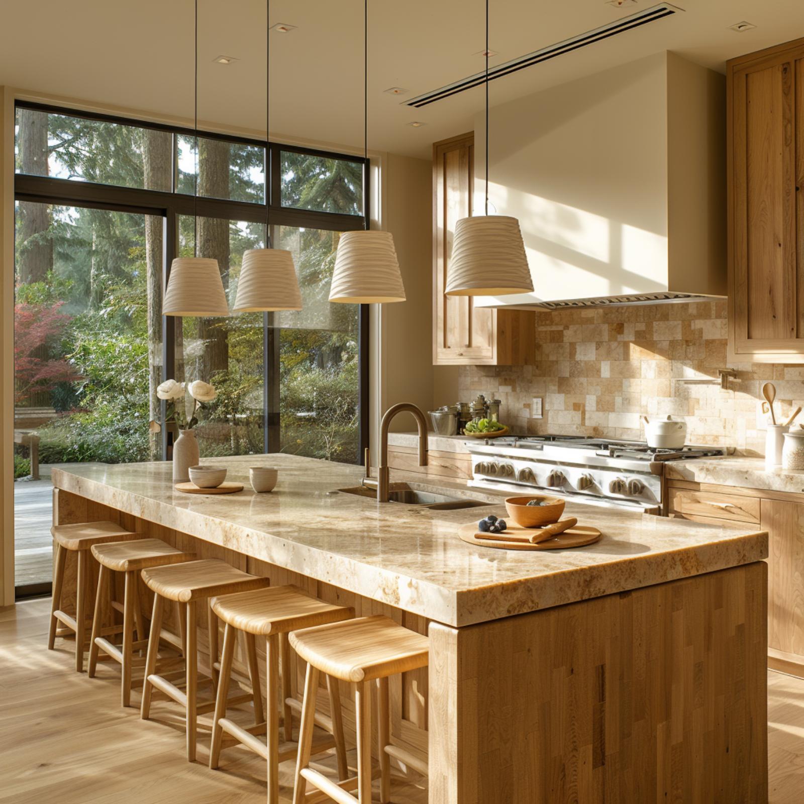
Light Wood and Rattan Pendants Make the Case That Warmth Is a Material Choice
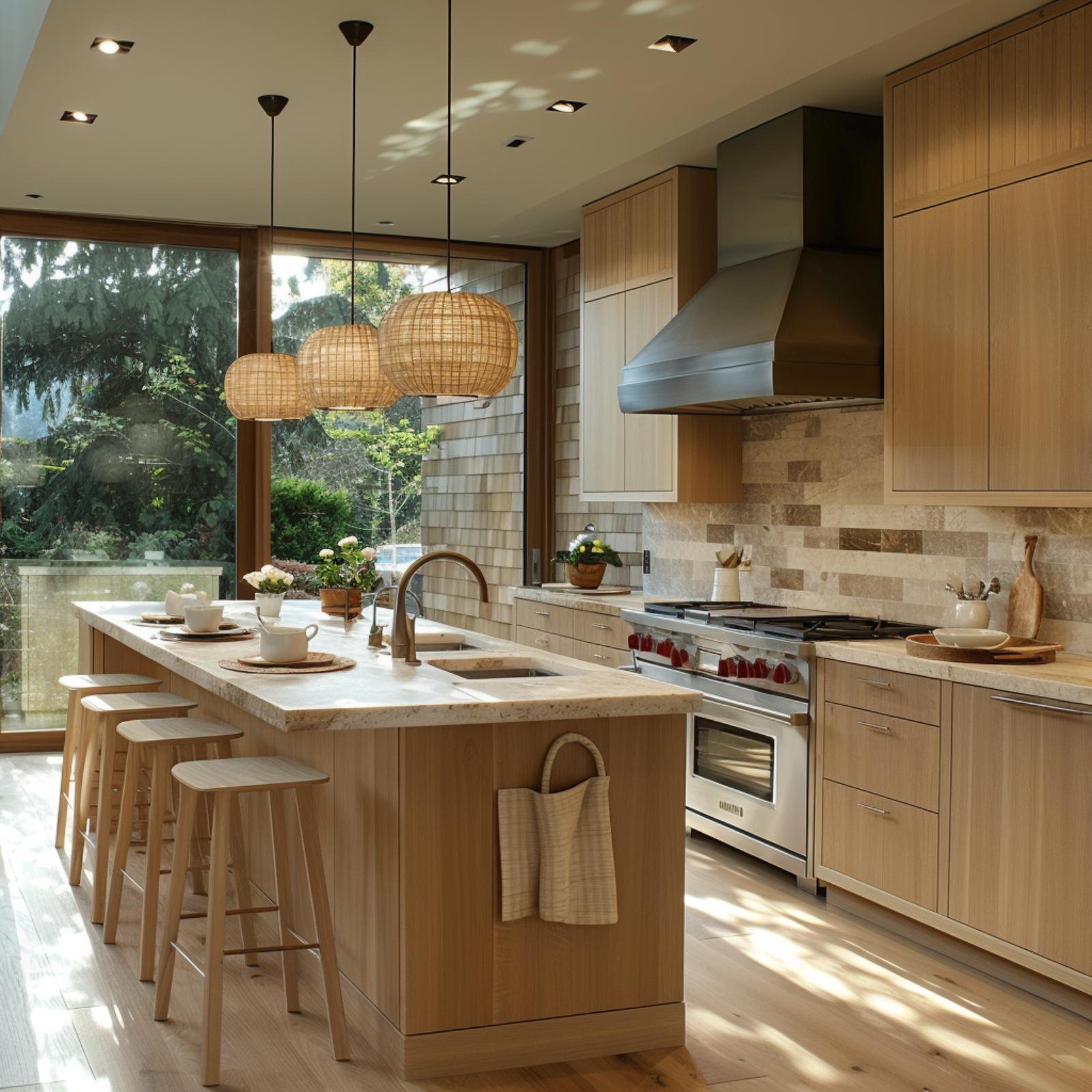
Rift-cut cabinetry in a pale, almost-blonde oak does something specific here: it reads warm without reading yellow. That distinction matters. Yellow-toned wood dates quickly; this grain stays calm under the natural light pouring through the floor-to-ceiling sliding doors.
Three rattan globe pendants hang above the island at slightly staggered sizes, and that minor variation keeps them from feeling like a catalog purchase. The travertine backsplash runs in a staggered brick pattern with visible veining, which gives the cooking wall texture without competing with the hood. A woven basket hangs off the island end panel. Small detail, but it signals that someone actually uses this kitchen.
Common Mistake: Homeowners often choose pendant lights for their look and forget to account for their spread. Rattan and woven shades diffuse light beautifully but cast less downward illumination than metal or glass alternatives. Over a working island, pairing them with recessed task lighting underneath the upper cabinets keeps the surface functional, not just atmospheric.
Paper Lanterns and Pale Maple Make Warmth Look Inevitable
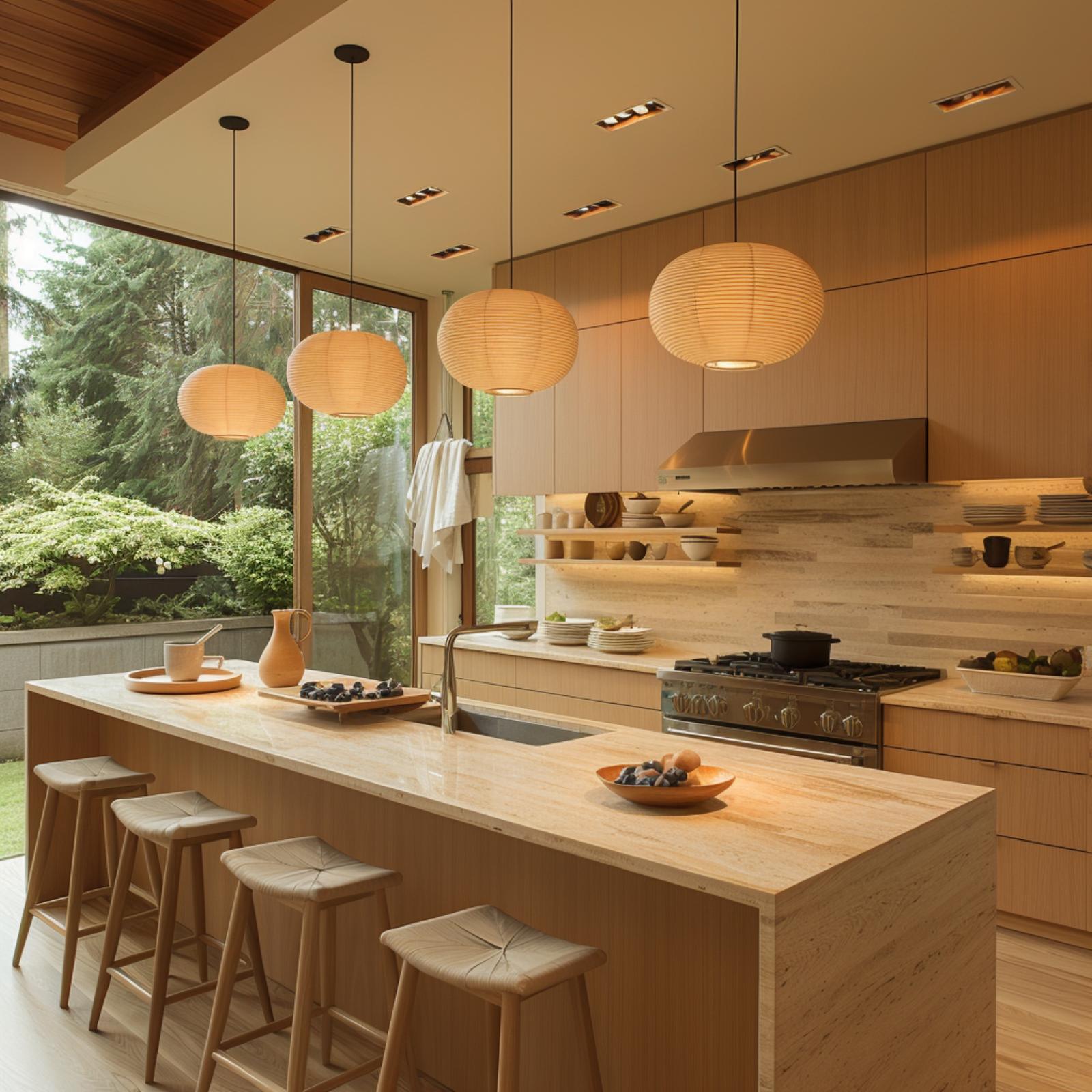
When every surface shares the same honey-gold register, the room stops feeling designed and starts feeling inevitable.
Three paper lantern pendants hang at staggered heights over a marble island, and their diffused glow soaks into the flat-grain maple cabinetry without a single harsh shadow. The countertop reads almost like travertine, warm and softly veined, which keeps the island from feeling like furniture dropped into the room.
Open shelving along the back wall does something the upper cabinets can’t: it breaks the wood-on-wood repetition just enough to let the ceramics and bowls read as part of the palette rather than clutter.
Woven Rattan Pendants and Forest-View Windows Make Warmth Feel Earned Here
Sunlight cuts across the island’s travertine top in sharp diagonal bands, which does more warming work than any fixture could. Three rattan pendants hang at staggered heights, and their woven shades scatter light rather than direct it. The pale maple cabinetry reads almost cream under natural light, keeping the palette cohesive without feeling matched.
Did You Know: Travertine is porous by nature, which makes it one of the few stone countertop materials that visually softens as light moves across it rather than reflecting it back. That quality makes it especially compatible with natural fiber elements like rattan, since both materials share an organic, slightly imperfect surface texture.
Woven Pendants and Sage Cabinetry Earn Their Warmth the Hard Way
Two cone-shaped rattan pendants hang at different heights over a butcher-block island, and that slight asymmetry keeps the room from feeling too composed. The sage cabinetry runs floor to ceiling with no hardware visible, which should read cold. It doesn’t, because the travertine backsplash does the opposite of reflecting light.
A wooden bowl of figs, stacked ceramic plates, and a small herb arrangement sit on the island without looking staged. The floor-to-ceiling glass pulls in a mature tree and lavender ground cover, and that outside green connects with the cabinetry in a way that feels accidental and right.
Pro Tip: Flat-front cabinetry with no hardware is a hallmark of Japandi design, but it only stays warm if the surrounding materials carry enough texture to compensate. In this kitchen, the travertine backsplash and rattan pendants do exactly that. If you’re going hardware-free, budget more for surface texture elsewhere in the room.
Where the last kitchen leaned on texture, this one puts its faith in depth of tone.
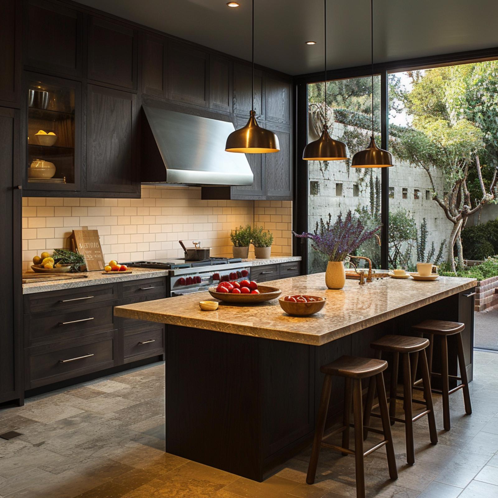
Dark Cabinets and Copper Pendants Prove Warmth Doesn’t Need Light Wood
🔥 Would you like to save this?
Espresso-stained shaker cabinets run floor to ceiling here, and they shouldn’t work as well as they do. What saves them is the countertop: a gold-veined granite with enough amber and sienna in it to pull heat straight out of the overhead copper pendants. Those pendants aren’t decorative afterthoughts. Their interiors are burnished gold, which means the light they cast skews warm before it even hits the surface below.
The subway tile backsplash is cream, not white. That distinction matters more than it sounds. True white would have pushed back against the dark cabinetry and created contrast. Cream absorbs instead. Paired with the natural wood bar stools and two bowls of red produce on the island, the room reads as a working kitchen that happens to be beautiful, not a showroom pretending otherwise.
Warm Burl Wood and Woven Pendants Ask Whether Japandi Even Needs to Be Cool
Burl-faced cabinetry runs the full perimeter here, and it’s doing something most Japandi kitchens deliberately avoid: it radiates warmth before a single light turns on. The island countertop appears to be a honed stone or thick concrete slab in a tone close to the cabinets, which keeps the whole composition from fracturing visually. Woven pendant shades hang low over the island, and their cylindrical form echoes the recessed range hood above the range. It’s a repetition that feels accidental but isn’t.
The bar stools are worth pausing on. Woven seats on blackened metal frames sit right at the intersection of organic and industrial, and they prevent the room from reading as too soft. A floor-to-ceiling window frames scrubby hillside vegetation beyond, which pulls the warm interior palette into unexpected contrast with the cooler exterior.
Trend Alert: Burl wood has historically been treated as a luxury accent material, appearing on furniture details rather than full cabinet runs. Applying it across an entire kitchen is a newer direction, one that trades the typical Japandi restraint for something richer without fully abandoning the minimal form. It rewards rooms with strong natural light, which keeps the figured grain from feeling heavy.
Travertine Backsplash and Brass Pendants Make Warmth Look Like a Default Setting
Quartersawn oak cabinetry runs flat-front across the full wall with no hardware, and it would risk feeling cold if the travertine backsplash weren’t doing so much work. That stone’s natural veining catches the under-cabinet lighting and holds it differently than polished surfaces would. Four slab-style barstools line the island without crowding it. The brass pendant fixtures are slim enough that they don’t dominate, but the metal finish ties directly to the warm undertone already present in the wood grain.
Ask Yourself: Before committing to handleless cabinetry across a full wall, consider whether your backsplash material carries enough visual texture to compensate. Travertine works here because its surface variation reads as warmth rather than pattern. A flat stone with similar tones wouldn’t deliver the same result.
Walnut Grain and Travertine Slab Make a Case That Warmth Was Never Optional
Flat-front walnut cabinetry runs the full perimeter here, and the grain does most of the work. It’s warm without trying to be decorative. The island’s travertine slab, with its cream and sand veining, picks up on that same register rather than contrasting against it.
Four woven counter stools line the island, and the brass pendant cluster overhead ties the metal tones together without overpowering the wood. The view through the full-height window keeps the room honest.
Material Matters: Travertine and wood grain share a quality that polished stone and painted cabinetry don’t — both show natural variation that reads differently depending on where light hits them throughout the day. That variability is what prevents a warm, monochromatic palette from feeling flat. Rooms built on consistent texture rather than consistent color tend to hold attention longer.
Brass Pendants and a Woven Range Hood Make Warmth Feel Structural, Not Decorative
Olive-green cabinetry runs the full perimeter here, but it’s the range hood that does the unexpected work. Wrapped in what appears to be woven seagrass or jute, it reads more like furniture than ventilation. That’s a deliberate material choice, and it pulls the brass dome pendants into its orbit rather than competing with them.
The marble island countertop stays cool and pale, which gives all that warm material somewhere to breathe. Rattan counter stools reinforce the natural fiber story without overdoing it. The result doesn’t feel assembled. It feels grown.
Why the Range Hood Material Changes Everything in This Kitchen
Most range hoods in Japandi-adjacent kitchens default to plaster, painted wood, or stainless steel. A woven fiber cladding is unusual enough that it shifts how the eye reads the whole cooking zone. Because the hood sits at eye level and commands the back wall, its texture registers before the backsplash or the cabinetry hardware does. Pair that with brass fixtures throughout and the kitchen stops feeling restrained. It feels considered in a way that plaster hoods, however elegant, rarely achieve.
Sage Cabinets and a Waterfall Marble Island Settle the Warmth Question Early
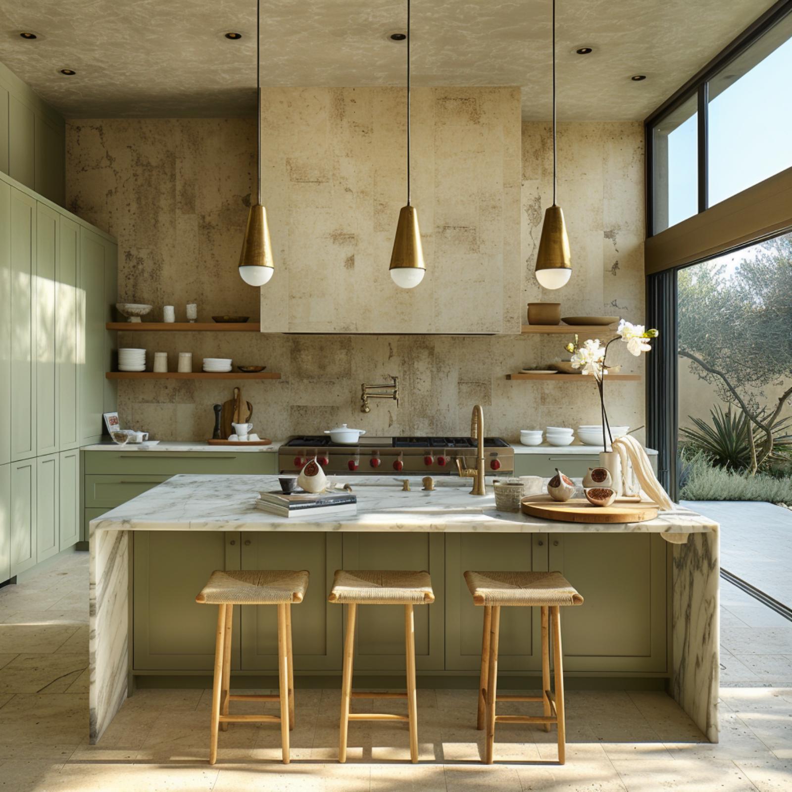
Brass pendant lights with matte white tips hang over a marble waterfall island, and it’s the contrast between those two finishes that keeps the whole kitchen from reading cold. The sage cabinetry sits low and quiet while travertine-clad walls do the heavy lifting on texture. Three woven rush stools pull the natural material count just high enough to feel lived-in.
It’s the contrast between brass and matte white that keeps the whole kitchen from reading cold.
Woven Rattan Pendants and a Double-Height Forest Wall Make Warmth Hard to Argue Against
Cedar planks on the vaulted ceiling do most of the heavy lifting here, pulling amber tones down into a space that could easily have felt cold given all that glass. The three woven pendants hang low enough over the island to actually warm the countertop, not just decorate the ceiling. Walnut cabinetry and a marble backsplash share the wall without competing.
Worth Knowing: Cedar ceilings absorb and re-emit warm light differently than painted drywall because the grain and resin variations scatter it rather than bounce it back flat. In double-height spaces with significant glazing, that ceiling material can do more to set the room’s warmth than any pendant choice. It’s one of the few decisions that pays off both day and night.
Woven Pendants and Olive Cabinetry Make the Warmth Question Feel Already Answered
Four woven bamboo pendants hang in stacked pairs, and the doubling isn’t decorative excess. It’s a practical decision: the lower globe in each pair drops light closer to the island surface, while the upper one fills the volume of the tall ceiling. The island cabinetry is olive, the countertop a pale stone, and the combination keeps the eye moving rather than settling.
The wood plank ceiling and the floor-to-ceiling view of an old olive tree outside do most of the heavy lifting. Natural light arrives already filtered through foliage, which means it hits the green tile backsplash warm rather than cool. Four wood stools line the island without fuss. Nothing here is competing.
Color Story: Olive and warm bamboo sit close enough on the color spectrum that they reinforce rather than contrast each other, which pulls the whole room toward amber without a single warm-toned paint color on the walls. That kind of passive color coordination is harder to achieve than it looks. Most kitchens get there through accessories; this one gets there through structure.
Slate-Blue Cabinetry and a Glowing Onyx Backsplash Make Warmth Feel Geological
Slate-blue flat-front cabinetry runs floor to ceiling without hardware, and it could easily read cold. What stops it is the backlit onyx backsplash, which glows amber where under-cabinet lighting passes through the stone’s natural veining. Onyx is translucent in a way most countertop materials aren’t, and that single property changes the whole room’s temperature.
The island works hard too. Its stone panel shows the same blue-grey as the cabinetry, grounding the space vertically, while the wood surface on top pulls toward warmth. Woven rattan pendants do their usual diffusion work overhead. But honestly, the onyx does most of the heavy lifting here. Without it, this kitchen would be beautiful and very, very cool.
Rice Paper Pendants and Blonde Wood Dare Warmth to Stay Put
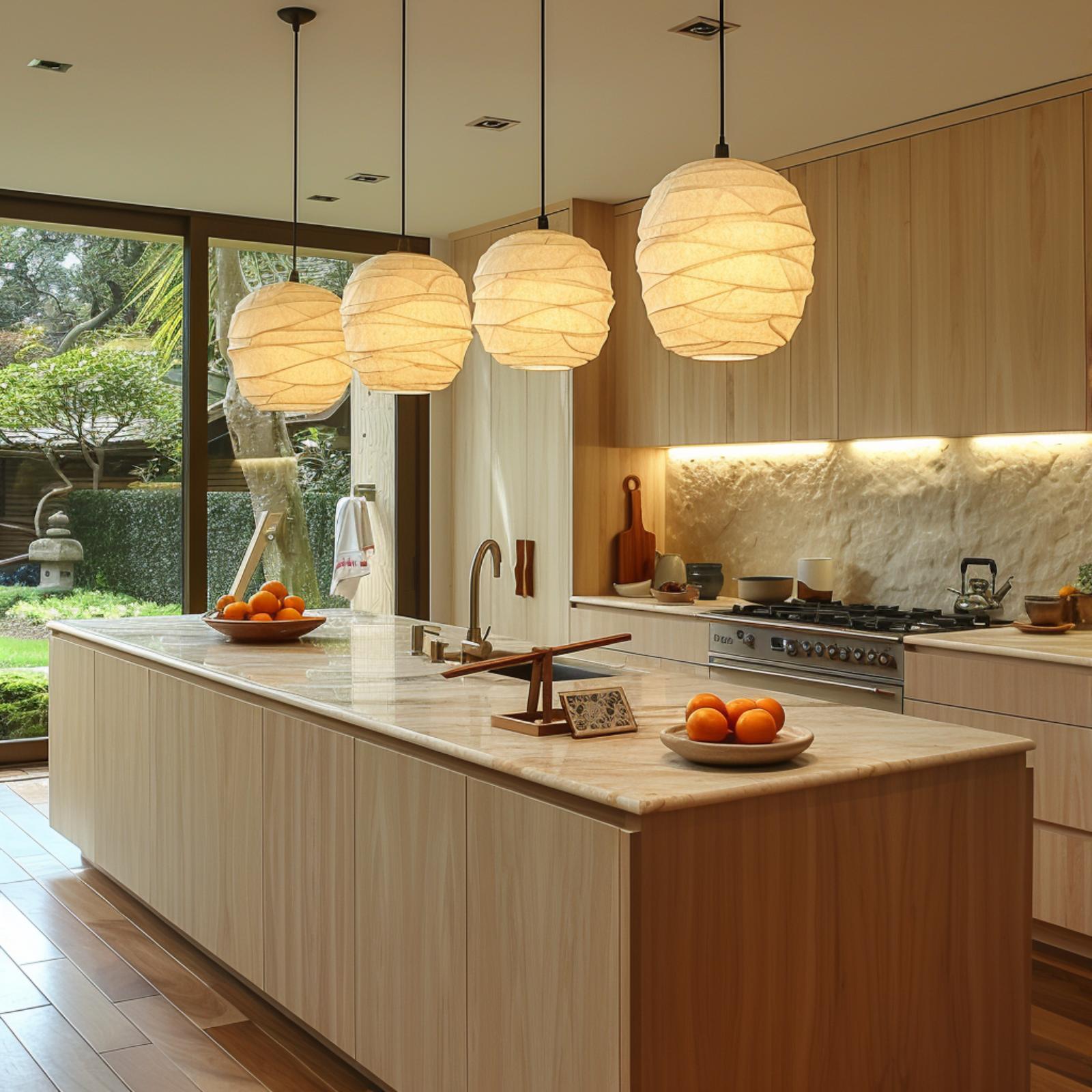
Three globe pendants wrapped in layered rice paper hang over a light ash island with a marble countertop, and the combination shouldn’t work as well as it does. Rice paper diffuses light broadly rather than directing it, which means the whole island surface picks up warmth rather than a single bright spot. The oranges in the wood bowls aren’t accidental styling either. Against blonde cabinetry this pale, a hit of saturated color does more work than any finish could.
Blonde Oak and Quarried Stone Make the Warmth Argument Without Raising Their Voice
Pale oak runs everywhere here: cabinet faces, island base, bar stools, floor. That kind of tonal consistency could easily read flat, but the quarried countertop saves it. The island surface has the veining and golden pooling of travertine or a similar sedimentary stone, and it catches the afternoon light coming through those floor-to-ceiling windows differently at every angle.
The pendant shades are ribbed linen or ceramic, close enough to the wall tone that they don’t compete. What actually holds the warmth together is the backsplash: a stacked, tumbled-edge tile in sandy beige that keeps the cooking zone from feeling clinical. Soft, but not sleepy.
Rope Pendants and a Tiled Hood Make the Warmth Argument Structurally
Two cone-shaped pendants hang from rope rather than cord or chain, and that single material choice does more work than it might seem. Rope reads as tactile before it reads as decorative, which matters in a kitchen where almost every other surface is flat or polished.
The marble island carries veining that skews warm rather than cool, leaning toward gold and brown rather than gray. Paired with upholstered stools in a natural linen tone and a range hood clad in stacked travertine tile, the room builds warmth through repetition of similar undertones rather than contrast. Nothing here is fighting for attention. And honestly, that restraint is harder to pull off than it looks.
Olive Cabinetry and Rattan Pendants Pull the Outdoors In Without Losing the Kitchen
🔥 Would you like to save this?
Sliding glass panels open the full width of the room here, which could easily drain warmth right out of the space. It doesn’t. The matte olive cabinetry holds its depth even against the grey exterior light, and the two rattan pendants do the heavy lifting after dark, casting amber pools across a stone-topped island that reads closer to travertine than quartz.
Four woven stools in natural wood and rope sit at the island without competing with anything. That restraint is where Japandi earns its keep.
Quartzite Counters and Woven Pendants Make the Case Without Saying a Word
Four globe pendants in a speckled, sand-colored ceramic hang over the island, and their warm interior glow does something useful: it turns the quartzite countertop from beige-neutral to amber. That shift matters more than the material itself.
The island’s thick stone edge is the room’s clearest commitment. Quartzite with that much natural variation doesn’t need contrast to feel alive. Light-grain flat-front cabinetry and a pot filler in brushed brass keep the palette from drifting cool, while rush-seat stools at the bar end add just enough texture to hold the room together.
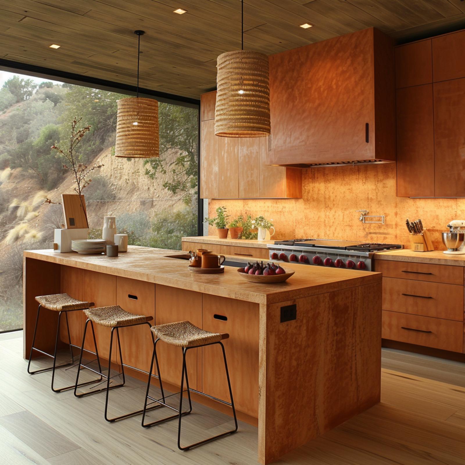
Marigold Cabinetry and Rattan Pendants Make Warmth Feel Like the Default Setting
Marigold-stained shaker cabinets run the full perimeter here, and that color choice does more work than most. It’s close enough to natural wood that it reads organic rather than painted, yet saturated enough to hold its own against the concrete countertops without looking washed out. The range hood, finished in the same warm terracotta tone as the upper cabinets, anchors the cooking wall so the ventilation doesn’t feel like an interruption.
Rattan pendant shades hang over the island, and their open weave scatters light rather than directing it downward in a hard cone. Floor-to-ceiling glazing floods the right wall with afternoon sun, and the bamboo bar stools pull that outdoor warmth inside. Concrete counters are typically the coldest surface in a Japandi kitchen. Here, they’re outnumbered.
Warm Wood Tones and an Open Garden Wall Make the Cold Minimalism Charge Hard to File
Honey-toned cabinetry runs the full length of the kitchen here, and it’s doing more work than it might seem. The wood reads closer to teak than oak, with enough grain variation that flat-front doors don’t feel sterile. Woven pendant lights hang low over the island, and because their shades are conical rather than bowl-shaped, they push light downward in a concentrated pool rather than scattering it across the ceiling.
The concrete-look countertop on the island is the one material that could have cooled everything down. It doesn’t, partly because the warm light flooding in from the folding garden doors shifts its undertone toward sand. Those doors matter more than the pendant selection, honestly. No amount of rattan diffuses light the way a fully open southern exposure does at midday.
Sage Cabinetry and Paper Lanterns Make a Strong Case for Warm Minimalism
Rice paper globe pendants hang low over a quartz island that’s doing real work here, with a bowl of oranges sitting on it like punctuation. The sage-to-olive gradient between the island and upper cabinets is subtle but deliberate, and it keeps the room from reading as a single flat note.
What actually holds the warmth is the backsplash. That geometric relief tile in warm cream catches the under-cabinet light and scatters it rather than reflecting it clean, which means the kitchen never goes cold even after the sun drops behind the tree line visible through the full-height glass wall.
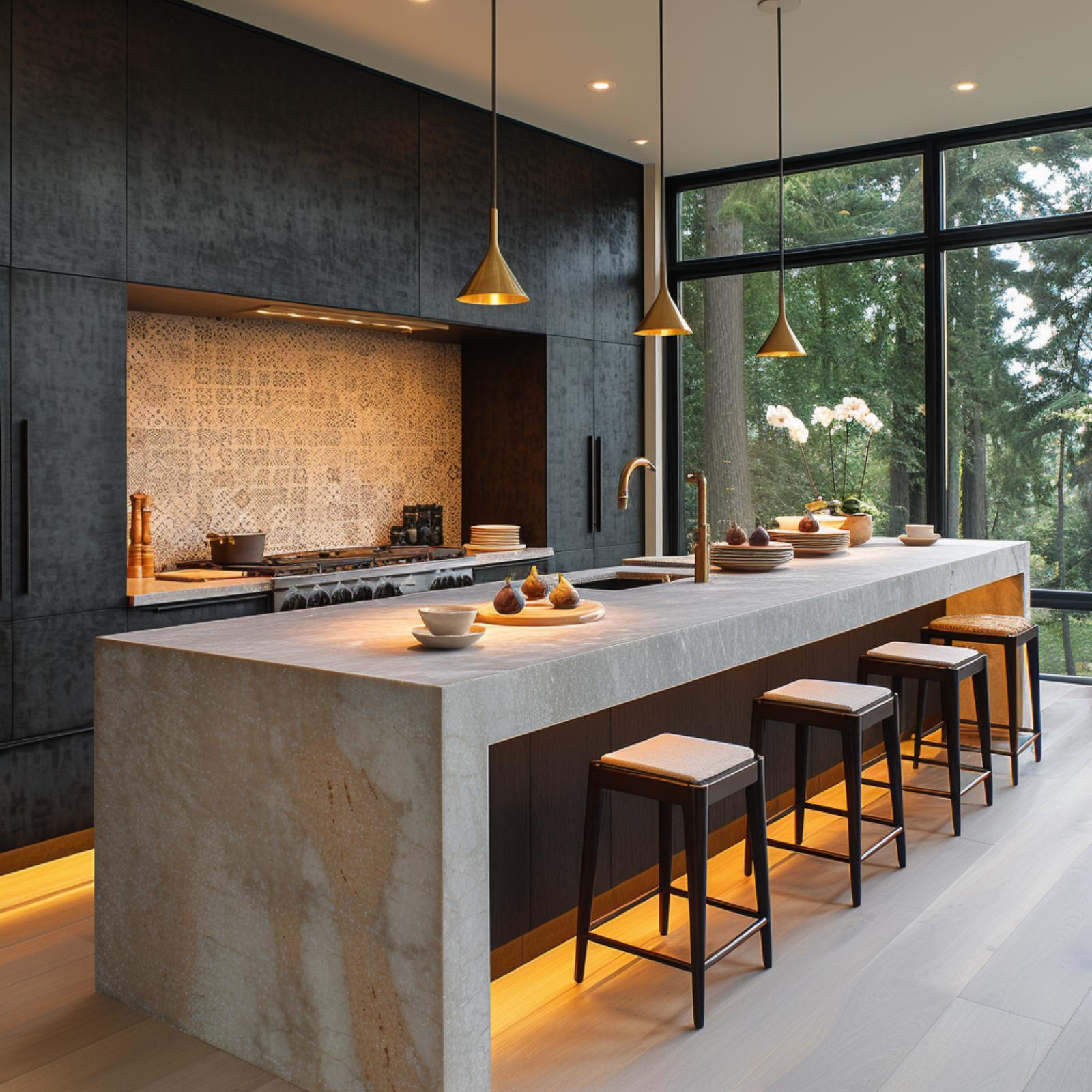
Woven Rattan, Exposed Brick, and Tall Glass Make Warmth Feel Architectural
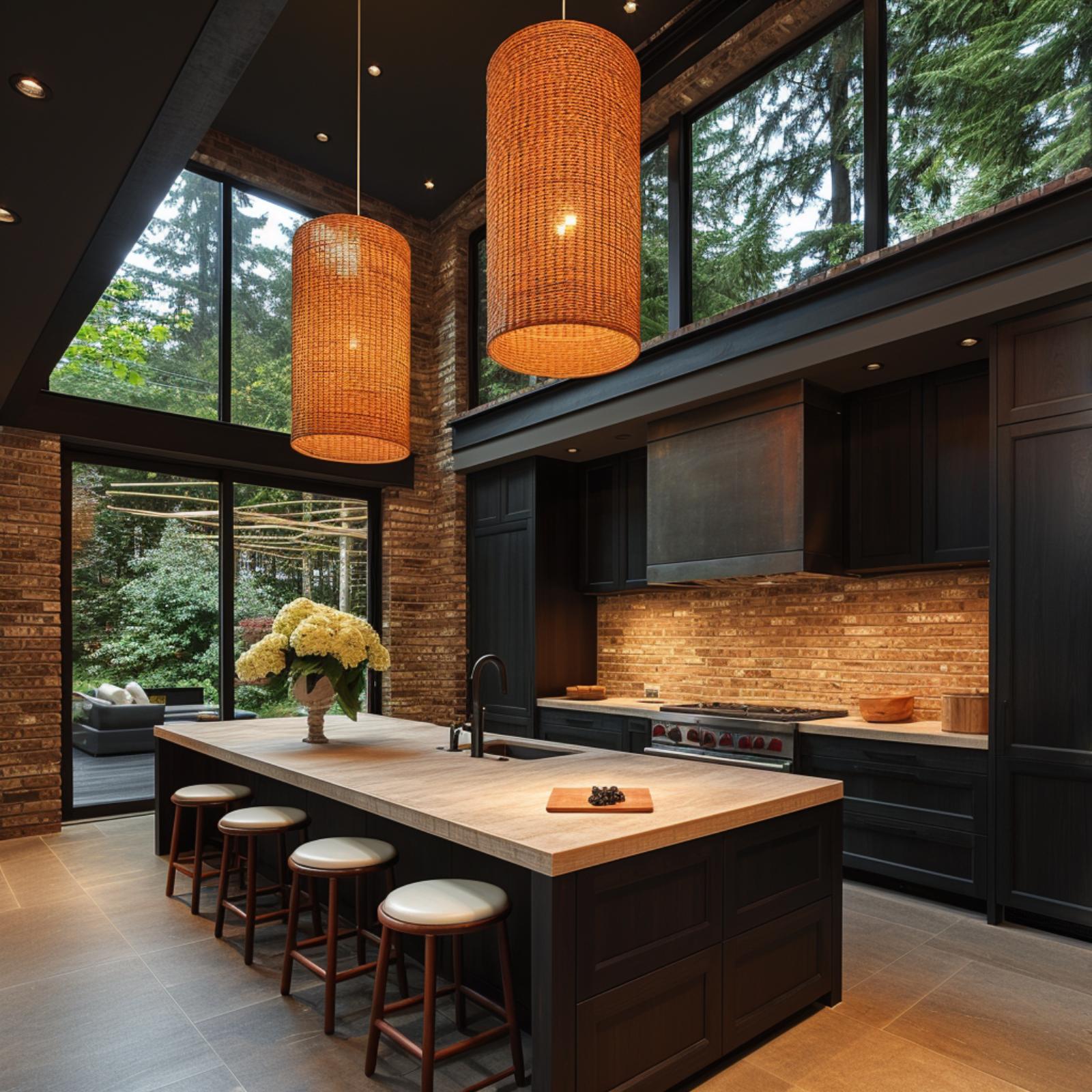
Cylindrical rattan pendants hung at staggered heights do most of the emotional work here, casting amber light across a wood-topped island that seats four on leather-cushioned stools. The exposed brick backsplash isn’t decorative trim; it runs the full wall behind dark matte cabinetry, which means warmth isn’t borrowed from accessories. It’s structural.
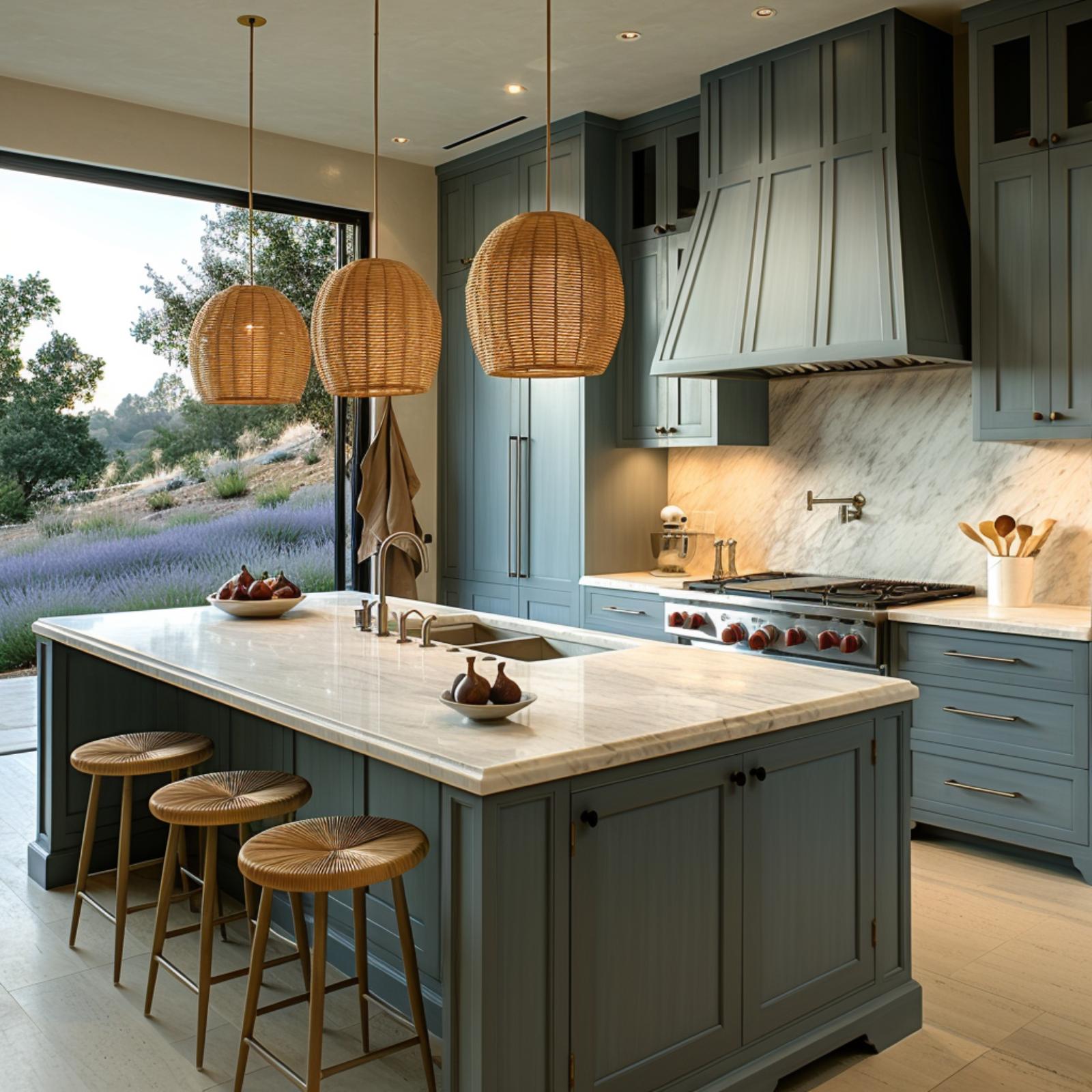
Woven Pendants and a Vineyard View Make Warmth Feel Inevitable
Sage-green cabinetry with shaker-style doors sets a quiet, neutral foundation, but the wicker pendant lights do the heavier lifting. Their barrel shape and open weave cast light outward and downward at the same time, which means the island below stays lit without feeling clinical.
The real surprise is outside. Autumn vineyard rows visible through the floor-to-ceiling window flood the room with orange and amber tones that bounce off the light stone countertop. No design choice made that happen. And yet it earns its place as one of the strongest warm accents in the room.
Brass Pendants and Forest Glass Make the Warmth Do Double Duty
Dark charcoal cabinetry at this scale could easily read cold, but under-island uplighting in amber shifts the whole room’s baseline temperature before anything else gets a chance to weigh in. The pendant trio does real work here: brass cone shades cast a concentrated downward glow that lands directly on the stone island, which has enough natural veining to scatter that light rather than mirror it back.
Floor-to-ceiling glazing brings in a wall of Pacific Northwest fir, and that living green backdrop is doing more than providing a view. It gives the dark cabinetry something to push against, which keeps the space from collapsing inward. The patterned backsplash tile, just visible behind the cooktop, is the one element most people would overlook and probably shouldn’t. It’s the room’s only real surface texture, and without it, all that matte black would have nowhere to breathe.
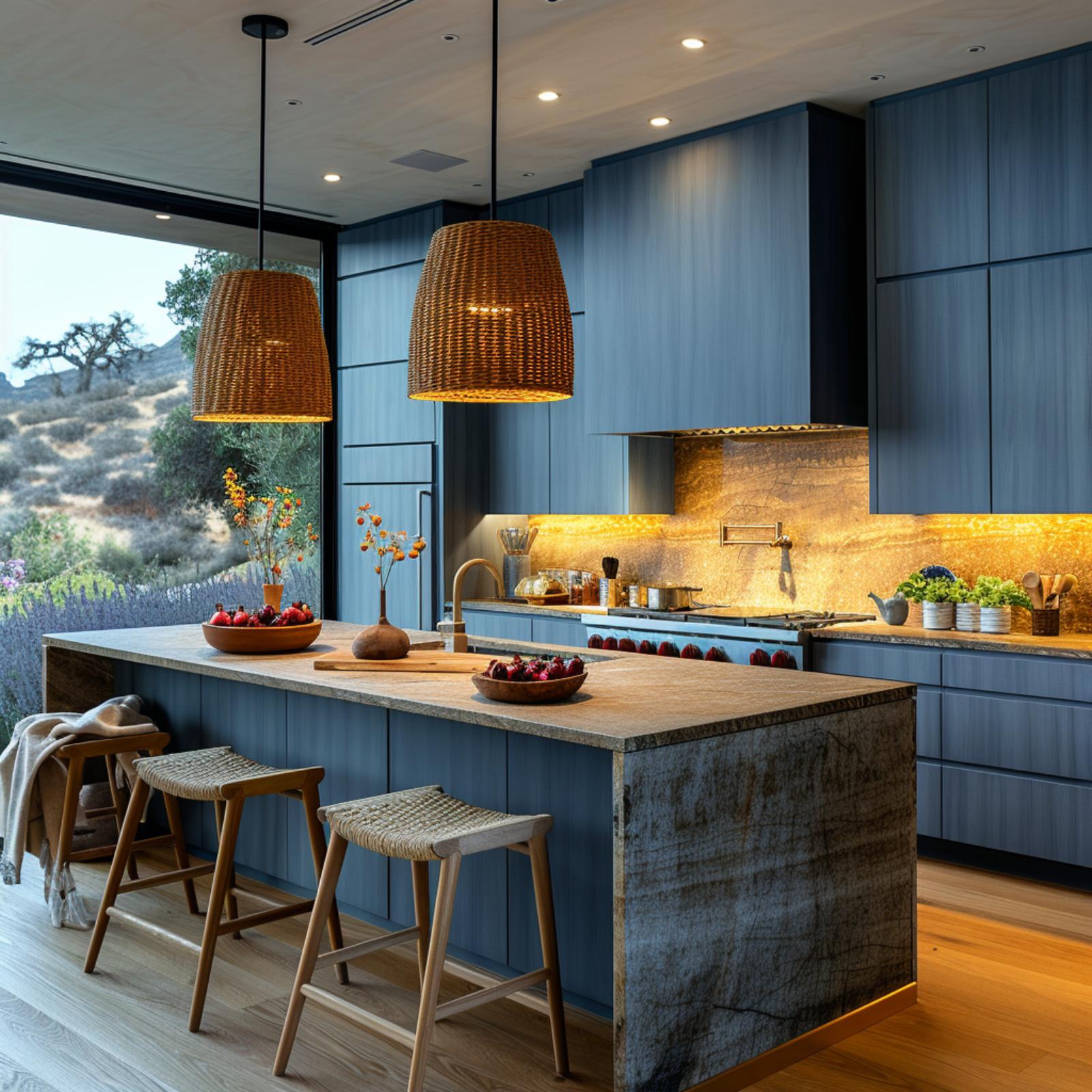
Slate-Blue Cabinetry and Wicker Pendants Win the Warmth Debate at Dusk
Three globe pendants in woven wicker do the heavy lifting here, casting diffused amber light across marble counters that might otherwise read cold. The slate-blue cabinetry keeps its warmth because of what sits beside it: rattan stools, wood utensils, and a direct sightline to lavender fields outside.