Designing my guest bedroom is a delightful endeavor. However, choosing the perfect blue color for the bedroom is pivotal. Beyond aesthetics, it’s about creating an atmosphere that resonates with the desired mood. Here, I list twenty-five blues, from serene to vibrant tones. Join me as I discover the perfect bluish shade for the guest bedroom.
Finding the Perfect Blue Color for a Bedroom for Guests
Exploring bluish bliss is like creating a cozy guest bedroom. This palette goes beyond just picking colors; it’s like painting a picture of my style. Moving from soft tones to bright shades, it promises a change that turns my guest bedroom into a calm and lively space.
In order to come up with the very specific design ideas, we create most designs with the assistance of state-of-the-art AI interior design software. Also, assume links that take you off the site are affiliate links such as links to Amazon. this means we may earn a commission if you buy something.

🔥 Would you like to save this?
In this collection, each color tells a story. These colors aren’t just paints; they’re friends, making my space a blend of peace and energy.
Crafting this calming yet lively palette isn’t just about looks; it’s about making a vibe that sticks with my guests. The colors in this guest bedroom palette aren’t just on the walls; they join together to tell a story of comfort, style, and a stay my guests won’t forget.
| Color Name | Brand | Short Description | Versatility | Ideal Themes/Atmosphere |
| 1.Luxe Lilac | Behr | Subtle spring lilac for a calming wake-up; pairs well with greens and yellows. | Versatile | Tranquil, Springtime |
| 2. Monologue | Behr | Versatile lilac with a classic, nostalgic touch | Versatile | Classic, Nostalgic |
| 3. Simply Blue | Behr | Dazzling, versatile sky-blue capturing sunrise and sunset radiance. | Highly Versatile | Lively, Sunrise/Sunset |
| 4. Coastal Vista | Behr | Dark, coastal blue for a non-tropical beach vibe | Moderately Versatile | Coastal, Overcast/Rainy Days |
| 5. Alpha Blue | Behr | Bold and playful bluish, perfect for lively guest rooms or beachside retreats | Limited Versatility | Playful, Bold |
| 6. Peaceful River | Behr | Energetic river-inspired pastel for a carefree vibe | Moderately Versatile | Fun, Relaxing |
| 7. Deep River | Behr | Vibrant aquatic bluish shade for underwater themes pairs well with modernist furniture. | Highly Versatile | Underwater, Modern |
| 8. Tidal | Behr | Mature, understated bluish shade for Autumn themes complements antique furniture. | Highly Versatile | Autumnal, Antique |
| 9. Brittany Blue | Behr | Versatile, robust, and subtle blue, suitable for classic or modern looks. | Highly Versatile | Classic, Modern |
| 10. Rhodes | Behr | Imaginative sky-blue reminiscent of childhood clouds. | Highly Versatile | Whimsical, Imaginative |
| 11. Waterfall | Sherwin-Williams | Versatile turquoise-infused freshwater tone | Highly Versatile | Fresh, Breezy |
| 12. Tame Teal | Sherwin-Williams | Perfectly balanced subdued teal for a comfortable guest room | Limited Versatility | Subdued, Comfortable |
| 13. Surfin’ | Sherwin-Williams | Playful, summertime bluish shade for a relaxed vibe and lively decor | Limited Versatility | Summertime, Playful |
| 14. Uncertain Gray | Sherwin-Williams | Chic gray-blue, perfect for a 1960s aesthetic | Highly Versatile | Modernist, Tasteful |
| 15. Faded Flaxflower | Sherwin-Williams | Relaxing summer vibe with cool yellow and gray undertones | Highly Versatile | Calm, Laid-back |
| 16. Dark Night | Sherwin-Williams | Dramatic and cozy, almost black in specific lighting | Limited Versatility | Bold Statement, Cozy |
| 17. Come Sail Away | Benjamin Moore | Elegant sea-themed bluish for minimalist or maximalist rooms | Highly Versatile | Elegant, Sea-themed |
| 18. Poseidon | Benjamin Moore | Aqua-blue: best for committed underwater theme decor | Limited Versatility | Aquatic, Commitment |
| 19. Flora | Benjamin Moore | Bluish nostalgic art deco, classic yet unimposing | Highly Versatile | Nostalgic, Art Deco |
| 20. Whispering Spring | Benjamin Moore | Whisper of Springtime, versatile for changing decor | Highly Versatile | Soft, Changing |
| 21. Moonmist | Sherwin-Williams | Easy-going bluish with a hint of gray, versatile for a stylish atmosphere. | Highly Versatile | Gentle, Sophisticated |
| 22. Freshwater | Sherwin-Williams | Intense, theme-committing color, perfect for initiating decor decisions | Limited Versatility | Intense, Committed |
| 23. Outerspace | Sherwin-Williams | Versatile intense grayish-bluish mix | Highly Versatile | Versatile, Outer Space |
| 24. Glimmer | Sherwin-Williams | Barely blue, adding sophistication to light-color themes | Limited Versatility | Subtle, Sophisticated |
| 25. Still Water | Sherwin-Williams | Medium-dark grayish-bluish mix for a darker guest room with Topsail trim and dark earth tones | Highly Versatile | Darker, Coordinated |
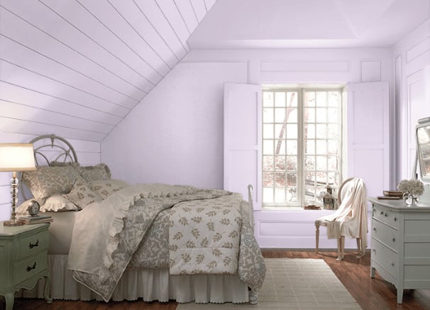
1. Luxe Lilac (N560-3)

Source: Behr
A gentle, understated lilac color that brings to mind the spring season. It’s just a nice color to wake up to. My guests can sleep on the floor and still wake up in a good mood if this is the first thing they see. Pair with some live plants and gentle greens, purples, and yellows to capture that sense of April and May.
2. Monologue (M570-2)
Source: Behr
An even subtler take on lilac, it’s leaning slightly towards grayish-purple for a classic, nostalgic look. Here, I get that nice springtime vibe, yet the stone-like feel lends some versatility that I won’t get with most lilacs. It suits a Springtime look yet can match summer or winter decor just as well.
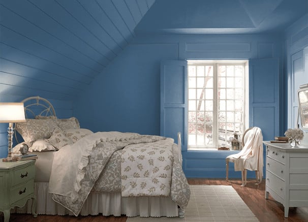
3. Simply Blue (PPU15-16)

Source: Behr
A light, sky blue color, it’s one of the most versatile blues on this list. The way it captures light is dazzling. When I have a sunrise-facing or sunset-facing window, it makes those reds and oranges sing. It’s worth waking up early to see how the sunrise plays on these walls, even for a “not morning person.”
4. Coastal Vista (PPU14-06)

Source: Behr
A somber, oceanic blue, Coastal Vista brings to mind the beautiful northwestern ocean coastlines of Washington, Portland, and Northern California. Beachy, yet not tropical, it’s the kind of oceanic hue that looks better on overcast and rainy days.
It’s a heavy bluish shade than most on this list, yet not dreary. The blend of Coastal Vista’s beachy charm and the depth of navy blue assures an inviting and refined guest room.
5. Alpha Blue (M520-5)

Source: Behr
It’s a vibrant, playful, not garish or tacky shade of color blue. When I want a fun ambiance, I go for this shade. It works just as well in a guest room as in a pool house or resort hotel by the beach.
This is not the most versatile color. However, when I want to go bold with my guest room, I can’t think of a better shade than this.
6. Peaceful River (P500-5)

Source: Behr
It’s another fun shade of color blue. This brilliant, pastel shade brings to mind what else: peaceful rivers. I remember the best camping trips I had as a kid, hours spent fishing or rafting on lazy lakes and rivers.
This shade captures that feeling perfectly, fun yet relaxing. Loud, yet undemanding. Something about this shade makes me want to leave my worries behind.
7. Deep River (P500-6)

Source: Behr
Deep River manages to appear both deep and bright at the same time. I’d choose the same color for the backdrop when painting an underwater scene. This is a great option when I’m looking for something vibrant without distraction.
Deep River suggests an aquatic theme for my decor. However, I can neatly pair it with modernist furniture or a mix-and-match approach to the color scheme.
8. Tidal (M510-6)
Source: Behr
It’s a mature, understated, yet not dreary shade of color blue. Tidal proves that I can incorporate a little bluish shade into an Autumn-inspired theme. It’s a great shade to pair with antique furniture and wood tones.
9. Brittany Blue (M510-4)

Source: Behr
A versatile, subtle shade that combines the best of all blues. It’s a mature, tasteful shade, not dull or too severe.
This color is a good choice when still deciding on the decor. Whether going with a classic or modern look, wanting to do pure bluish, or mixing it up with some reds and whites, it won’t disappoint.
10. Rhodes (P510-3)

Source: Behr
Rhodes is the color I see in my head when I remember being a child and looking up at the clouds, picking out shapes. This is not exactly the color of a real sky; it’s the sky I see in my imagination.
11. Waterfall (SW 6750)

Source: Sherwin-Williams
It’s a freshwater-inspired tone with just the faintest hint of turquoise. Waterfall offers a neat, versatile shade and lends a breezy summertime vibe to any decor.
Waterfall is the bluish color I’ll see on Hawaiian shirts, yet not the tacky ones. It’s strictly silk-and-cotton stuff, the sort of Hawaiian shirts I could just as well wear to a business meeting as a beach party.
12. Tame Teal (SW 6757)

🔥 Would you like to save this?
Source: Sherwin-Williams
Tame Teal is just what the name promises. Teal is a beautiful inchyra blue color, although not the most versatile. When doing Miami-influenced art deco, I can’t ask for anything better than a lovely bold color of teal. However, for a guest room, it can be a bit much.
Tame Teal takes classic teal and cranks it down a notch like Blue Danube. So I can enjoy that beautiful inchyra blue without feeling overwhelmed by it. This color puts teal back on the menu for my painting interiors.
13. Surfin’ (SW 9048)

Source: Sherwin-Williams
A playful name for a lively color, this is about as summertime as it gets. This is the color of the Beach Boys’s songs, pool parties, and long weekends spent on the beach.
I’d recommend playful decor to match the vibe when going with Surfin. Maybe a framed movie poster for Endless Summer II and some tiki items? This is the color I want when I like my guests to really loosen up and enjoy “getting away from it all.”
14. Uncertain Gray (SW 6234)

Source: Sherwin-Williams
Uncertain Gray is a tasteful choice when I’m looking for gray with just a hint of blue hues. It’s an elegant, mid-tone gray that blends well with almost anything, the best match with a modernist design approach.
The keyword here would be Metropolitan. It’s great for a guest room, especially suited for a Madison Avenue boardroom circa 1964.
15. Faded Flaxflower (SW 9146)

Source: Sherwin-Williams
Faded Flaxflower is like a calm summer breeze in color. It’s a gentle bluish shade with a touch of cool yellow and gray hidden inside. This color makes my space feel fresh and laid-back, creating a soothing atmosphere. When I want a unique and relaxing vibe, Faded Flaxflower is the way to go.
16. Dark Night (SW 6237)

Source: Sherwin-Williams
Now, here’s a color that could be more versatile. Dark Night isn’t for just any guest room. However, this color makes it when I want to make a bold statement. In specific lighting, Dark Night looks almost black. Yet, it’s still cozy and inviting.
17. Come Sail Away (846)

Source: Benjamin Moore
A pale, breezy, light blue, this Benjamin Moore blue Danube is the color of elegance and taste. It resembles the finer things in life and understatement done big. I’d recommend this shade for minimalist or maximalist rooms where the calming essence extends seamlessly from the accent wall to the ceiling.
I’ll cut back on the furniture and keep things simple for a beautiful Edward Hopperesque sparseness. Alternatively, I can take advantage of the superficial appearance of the walls to pack my shelves with sea-themed knick-knacks.
18. Poseidon (664)

Source: Benjamin Moore
This color by Benjamin Moore is a very The Little Mermaid sort of color. Any bluish shade will lend itself to an aquatic theme; Poseidon demands it.
This shade may be a bit much if uncommitted to fish tanks, scuba gear, and miniature submarines decorating the room. However, when I like the whole underwater vibe, I couldn’t ask for a more fitting shade.
19. Flora (AF-470)

Source: Benjamin Moore
Flora by Benjamin Moore is an almost granite-like shade of blue paint colors with just a hint of aqua-green. It’s a nostalgic shade perfect for an art deco project. This is the color of old New York or classic Hollywood upscale restaurants and ballrooms. Classic and extensive, yet not imposing.
20. Whispering Spring (2136-70)

Source: Benjamin Moore
Whispering Spring by Benjamin Moore is one of the most accurately named blues on this list. The bluish shade is so soft I’d almost mistake it for white if I didn’t have any white nearby to compare it to.
This shade has just the faintest whisper of Springtime. It’s like a blanket of snow gently graced by the April sun through parting clouds.
21. Moonmist (SW 9144)

Source: Sherwin-Williams
I can compare this color to an Easter egg with a single layer of bluish dye. Moonmist is a very gentle, easy-going bluish shade. It has the slightest hint of gray just peeking in to give it a touch of complexity.
Moonmist is a light, versatile shade sophisticated enough to make even an empty room look stylish and tasteful. This would be a good choice when I plan to change the decor. I want to keep my options open.
22. Freshwater (SW 6774)

Source: Sherwin-Williams
Freshwater is an intense color, yet not overpowering. File this one under “Not all that versatile.” I need to commit to it when using a color like Freshwater. When I struggle to pick out a theme for my decor, I start by painting my accent wall with this color and then go from there.
23. Outerspace (SW 6251)

Source: Sherwin-Williams
With a name like Outerspace, I imagine some deep purple or almost-black blue bedroom. The shade is intense, although not that pitch-black night sky the name suggests. It’s more like the lighter spots in the Milky Way.
Outerspace is a grayish color with a strong bluish presence. Surprisingly, it’s flexible, whether I want to go with the outer space theme or want a tasteful, grayish shade of blue to offset my oak dresser and rolltop desk.
24. Glimmer (SW 6476)

🔥 Would you like to save this?
Source: Sherwin-Williams
This is my shade when I want to go subtle bluish, like, over-the-top, quiet, modest to the extreme. It’s an almost-white shade.
This versatile color loses its potential on decor where I might as well use white. My expert advice is only to use this to add just a hint of sophistication and complexity to a guest room with a natural light-color theme. Pair it with white furniture and light-gray sheets for a simple, clean sort of look.
25. Still Water (SW 6223)

Source: Sherwin-Williams
It’s a medium-dark, grayish, and bluish combination that looks colorful. This is a good option for a darker shade, yet I don’t want my guest room to look oppressive.
The color lends to lighter blues, with the Sherwin-Williams website suggesting a Topsail trim (SW 6217). To that, I’d add that it also goes well with dark earth tones.
Frequently Asked Questions
Is the Color Blue Good for the Bedroom?
Blue is an excellent choice for a bedroom, as it’s known to promote a sense of calm and relaxation. Its soothing qualities make it a popular and timeless option for creating a tranquil bedroom environment.
What Is the Most Relaxing Blue Color for the Bedroom?
The most relaxing blue paint color for a bedroom often depends on personal preference. Still, lighter shades such as soft blues, pale aquas, or muted periwinkles are considered serene and conducive to a restful atmosphere. These hues can evoke a sense of calm and promote a peaceful sleep environment.
What Is the Best Color for the Bedroom?
Determining the best color for a bedroom depends on individual taste and the desired mood. While many find bluish shades calming, other popular choices include soft neutrals like light grays, warm beiges, or gentle greens. The key is selecting a color that resonates with our personal style.
Conclusion
Embark on a vibrant journey through these best bluish paint options for guest bedrooms. Each shade contributes to a harmonious blend of tranquility and liveliness. Explore and discover the perfect blue color for the bedroom, crafting a space that resonates with serenity and style.