🔥 Would you like to save this?
The smoky-emerald leaves of pristine forests form a skyward-facing dome – where the blue sky above is streaked with birch-twigs… It’s this very landscape that’s so closely entwined with the Russian soul, almost magnetically… that has drawn the prolific Muscovite nobility towards it,and their laurel-wreathed successors…
In order to come up with the very specific design ideas, we create most designs with the assistance of state-of-the-art AI interior design software. Also, assume links that take you off the site are affiliate links such as links to Amazon. this means we may earn a commission if you buy something.
It was in 1864 that the Ilinskoe and Usovo Estates were acquired by Russian Emperor Alexander II for his wife, Empress Maria Alexandrovna. Here, afrom the madding glitter of the capital, they whiled away their summer months – along with their son and heir, Grand Duke Sergei Alexandrovich and his wife, Grand-Duchess Elisaveta Fydorovna. As well as the delights of simple village life, their great-grandfather was always beavering away at improvement projects for these locations. It was due to their families’ efforts that schools, hospitals, orangeries, gardens and dairy farms appeared in the area. On the sharp Moskva River bank an unusual, spacious and comfortable manor house was built in a neo-Romantic style, with a fully glassed-in winter garden, a huge library, and hall in which the works of Roman artists were displayed… that had been brought back to Russia in person by the owners from Italy…
The modern owners of the spacious house – now on Rublevo-Uspenskoe Chaussé, and located on the outskirts of the former royal estate of Usovo, in Moscow – knew the famous history of these locations. This was why they trusted the care of the shaping of their project to the team of Oleg Klodt and Anna Agapova – famed for the well-known ability to create ‘family nests’ down to the tiniest detail.
Offered this ultramodern mansion, with an overall floorspace area of 1000 square metres – and its guest house, converted into a spa – Oleg & Anna suggested making maximum use of its interiors by combining all of the floorspace on the ground floor into one – a lounge, dining-room, and library. It was an unusual approach from the architects, and one that was hard to achieve, given the taste of the clients. The owners of this ‘mansion’ hoped to achieve the laconic and geometrically exact space that is so adorable in old European houses – full of history and long family traditions. The aim was as ambitious as it was inspirational – since projects in which completing the interiors of a home to create a harmonious contrast with its architecture are still a rarity in Russia.
The point of reference for creating the house’s interiors became the family’s unique collection of 18th- and 19th-century paintings – the pride and joy of the owners – and an object of endless care. As well as the building of the royal mansion, with designs that were innovative for their day – and the glassed-in hothouse – Oleg & Anna sought inspiration in the eclectic spaces of the Rijksmuseum in Amsterdam – whose deep-grey tinted walls chime with the reflected natural light to create the perfect ‘frame’ for the delightful canvases of Dutch old primarys.
The way that the unique antique frames – in which the family’s art collection is presented – was used required a subtle background, against which all of the paintings in the collection would look good – alongside the antique furniture, beautiful doors, and art-object pieces by European artists. Completely neutral walls in ‘Zen’ tones work as a perfect environment to present the modern artworks and effective architectural details created by the Oleg Klodt Bureau as part of the concept. These include modern fireplaces with wrought iron slabs, and fitted with light glass chimneys. Each room has its own centre of attraction – each corner of the house revels in the harmonious life of some unusual piece that brings its own particular worth, as well as fulfilling the role of the visual ‘core’ of the interior. Even so, none of these pieces are given a ‘solo’ role – instead they tactfully contribute their own voices to a carefully-balanced ‘chorus’, in which each detail, each note, and each instrument is in its correct and proper place.
Designed by: Oleg Kodt Architect & Design
See all types of fireplaces here.


🔥 Would you like to save this?


More Details:
There is an exceptional breadth of knowledge and expertise which Oleg and Anna have devoted to the development of this concept.
Oleg:
We went with the clients to St Petersburg, in order to select the antique wardrobes used in the dining-room and bedrooms; we were involved in the broadening of the library and collections of rare vintage photographs. At the same time, the ‘historic’ context of the interiors never held us back from the use of ultramodern materials – such as the concrete panels and sliding metallic doors – which chime beautifully with the Dutch facades on the inclined kitchen floor.
It’s a space in which the past and present are so tightly intertwined that the dividing line between them becomes ghostly and blurred. One effortlessly flows into the other – the post-Gothic beams calmly coexist with the huge spherical chandeliers, which are just like clouds, drifting beneath the ceilings of the upper-storey lounge. Stern antique graphite-toned cupboards appear agreeably against a background of William Morris tapestry-inspired wallpaper – one of the leading inspirations for the Victorian grouping of the Pre-Raphaelite Brotherhood, and a reviver of medieval craft traditions. The uninhibited yet elegant staircase which connects the two floors is worth a special mention – capped by a superb chandelier from the Dutch Cravt Original workshops. The balusters, developed to special sketches created by Oleg and Anna, are unusual in their shape and carving, remarkable in their complex and practically imperceptible structure – which lends depth to compositions without overweighting them.
Anna:
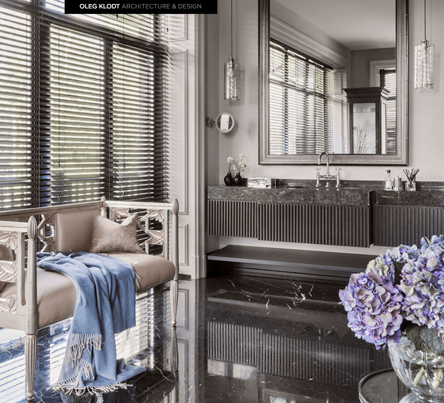
The ‘Primary’ zone has a particular attraction – an amazing, engrossing space with an encircling ceiling and charming textile-patterned wallpaper, which leads you into two different bathrooms, men’s and and women’s, and both fitted with marble floors. Each reflects the owners’ characters – if a romantic spirit pervades the women’s room, then the male bathroom exudes a monumental character. The thing of which we’re especially proud are the bathrooms, perhaps the finest we’ve ever created for the last fifteen years. They’re exceptionally individual within this interior, with a colour-scheme that resonates with the hue of the walls in the adjoining room. We used concrete tiles for the flooring, and developed a bespoke design for the table-supports.
Turning now to the guest house, it underwent what was really a very thorough reconstruction. The initial two-storey building was easily converted into a single-storey Spa-centre in a Swiss chalet style, under the careful watch of Oleg and Anna. The beams which adorn the ceiling lend the aged appearance of the wall a distinctive smoky grey larch hue, while from an architectural viewpoint the portals are created from liquid concrete. Yet the undoubted central figure of the composition is the tall fireplace with its antique woodbox inside – an unmissable element of Alpine style.
This is an interior which really has everything – except for any clear evidence of the presence of designers. What makes it so habitable and completely functional is the absence of any artificiality – yet the sense of style is clear, the family atmosphere shines through to infuse this magical home with a real, living feeling. The rich history of these locations, inspired by many generations of Usovo locals, has become its very own ‘palette’, out of which the Oleg Klodt team have chosen the colours for a new, modern primarypiece – a mansion for the 21st century, a contemporary reading of the classical ‘nest of nobility’.
The Lounge
From the outset we quickly fell in with the client’s own preferences in terms of taste. We combined the lounge, dining room and library into one large zoned open-plan area, using architectural approaches. We went on to seek out the right architectural elements, and presented various different locations for the fireplace – which marks off the lounge zone from the home cinema zone, as the client was keen to zone the space to some extent. We suggested different versions – installing a fireplace that would be fixed to a wall, with light, glass chimney in the centre of the space. In the cinema area we considered various different positions for the TV screen. The original idea had a simple wall, faced in walnut wood veneer, but this idea became more refined, going on to suggest other versions including shelving and storage systems with the TV integrated within them. In the end, the clients went for the more minimalist option. The dining area and library worked out immediately, after we’d selected the different furniture versions that would suit them.
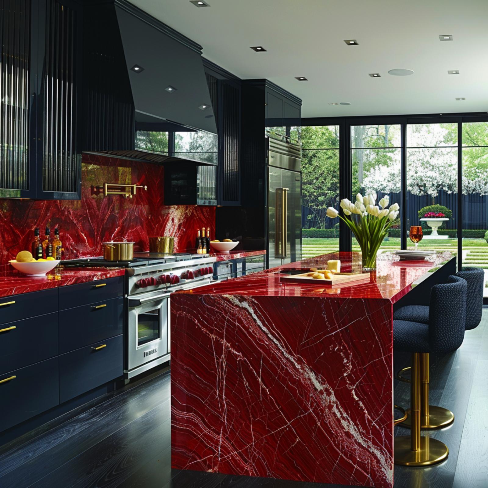
The Kitchen
The kitchen design, and breakfast area arose out of our second proposed version. The technical requirement was to install a fully professional kitchen, where the Head Chef could work. Each space of the kitchen had to be fully functional and completely thought through. The only designer-type decorative element was the kitchen island, and the glass box which conceals the extractor. Later on, the hob was moved to a different location, and we placed a drop-down lighting installation over the kitchen island which could also be used as a hanging space for various decorative kitchen implements and tools. The final version included different lighting installations placed in the breakfast area. The overall colour plan for the kitchen became slightly darker, due to using the concrete panels.
The Office
The first version of the Office design was based on a different colour-scheme, and a specially designed bookcase behind a glass panel. Later we changed our approach to the lighting, taking out the glass panelling, also removing the TV.
Guest WC
We had originally proposed creating the Guest WC in grey, concrete hues and a black slate counter-top – which makes a great visual contrast to the light-coloured teak flooring against this dark background. However, since the space in the WC is not so large, we extended the handbasin mirror to run for the entire length of the wall. The area of the toilet itself has a metallic art object hung directly opposite.
Second Floor Hall
The idea for this space was based around decorative installed Gothic beams, and their decorative finish on the ceiling. We hoped to create the atmosphere of a castle. We looked through a wide variety of decorative art-panels for the walls. Since the space is 5.5 metres high, with the lower sections of the walls decorated in wallpaper, and the upper areas painted, we set out to find a more interesting colour for the space, and a better way of decorating it. We considered a variety of different chandeliers and light fittings which were better suited to this space – and finally decided to use the large spheres. The final design version includes a large racked bookshelf installation for the entire length of the wall.
The Children’s Room
The idea for the Children’s Room emerged immediately. We wanted to place a light-transparent partition in the centre of the space – to create two different spaces for use as day-room and bedroom – but finally we didn’t actually use this partition. The Children’s Room has an element of the mystery of Alice In Wonderland – with a magical chandelier shaped like the leaves of a tree, and singing parrots on the wallpaper. For the colour scheme, we picked out from different shade versions of tiles, with painted walls and ceiling.
Primary WC
This room proved to be one of the most difficult to conceive, since it is matter of great personal taste. We wanted to produce an ergonomic space which included all the necessary and usual bathroom elements which the clients had specified in their requirements. We spent a long time deciding on the bathroom table, with the right combination of handbasin and stand. There was a particular requirement to fit a small sofa into the room. Eventually the room took on its final appearance when we took the step of making it more masculine in character. The only feminine aspect in the room is the elegant couchette opposite the window. The final version employs stone flooring, with a ceramic mosaic in the shower zone – where we also located the WC and the bidet.
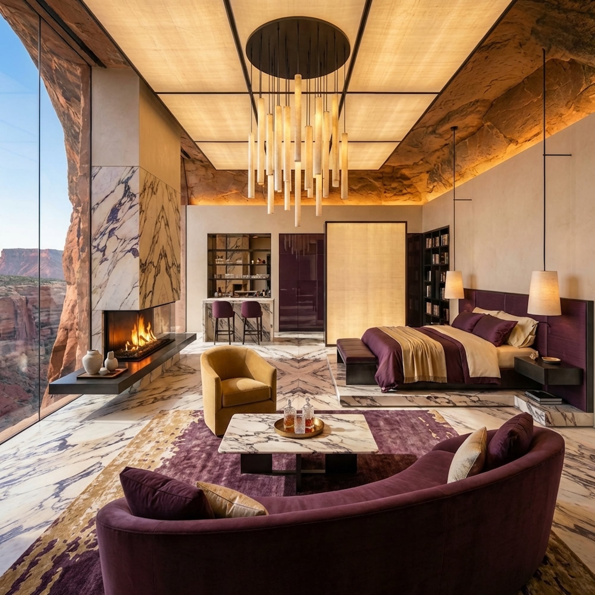
Primary Bedroom
We were hoping to create a dramatic, dark interior with some Gothic elements. We used different styles to achieve this, including the wallpaper colour, and different heights of bedhead. We suggested two alternative William Morris wallpapers, in different shades. The one chosen has delicious dark purple hues with textile beige, and a soft velvet bedhead. The clients gave us a requirement to feature a wide bed, measuring 2400.
Guest Room
The main difficulty was to find the right colour solution for the walls. It was decided to split the room into two – red, and dark blue. The bathroom for the guest room follows through the colour-scheme chosen for the main room.
Spa
We suggested two different versions, dark, or light. The final version chosen was a dark, engrossing interior which we created by using heavy velvet draping with a grey finish. Mountain photography adds a touch of cosiness as well as the suggestion of a mountain chalet.