🔥 Would you like to save this?
Mixed exterior cladding can make a house look custom, expensive, and completely considered. Or, with one bad transition, the whole façade starts looking like someone changed their mind halfway through the build.
In order to come up with the very specific design ideas, we create most designs with the assistance of state-of-the-art AI interior design software. Also, assume links that take you off the site are affiliate links such as links to Amazon. this means we may earn a commission if you buy something.
That is the risk. Brick, wood, metal, stone, board-and-batten, and horizontal siding all bring texture and weight, but they also bring ego. Every material wants a reason to be there. When the proportions work, the house gets depth a single finish rarely delivers. When the placement feels random, curb appeal turns into a group project nobody supervised.
The best designs in this collection understand restraint. They use contrast to frame an entry, ground a lower level, sharpen a roofline, or break up a large wall without making the exterior look overworked. Others push harder, letting multiple materials compete for attention and daring the result to hold together.
These 38 homes show exactly how thin the line can get between layered and busy, polished and patched together, confident and confused.
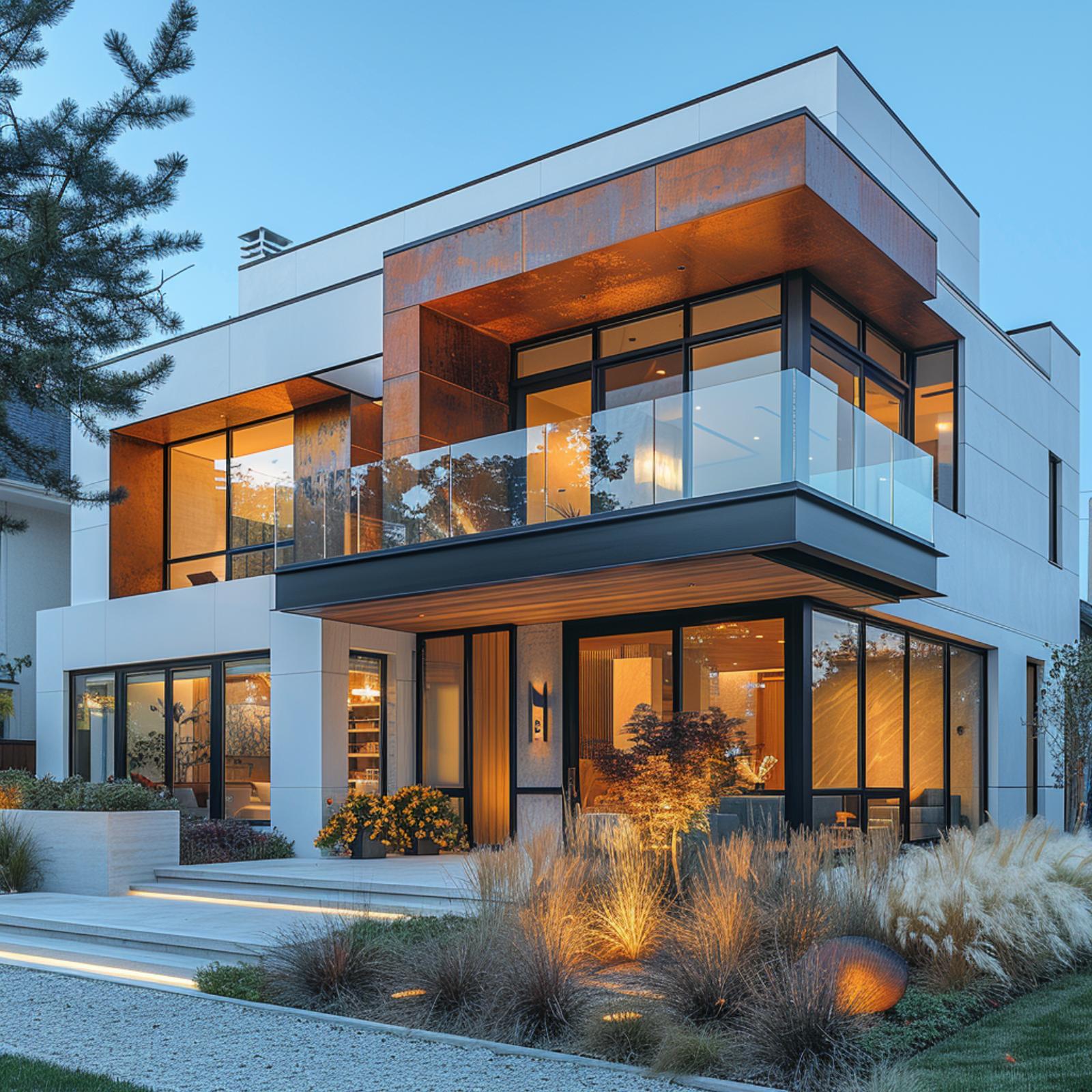
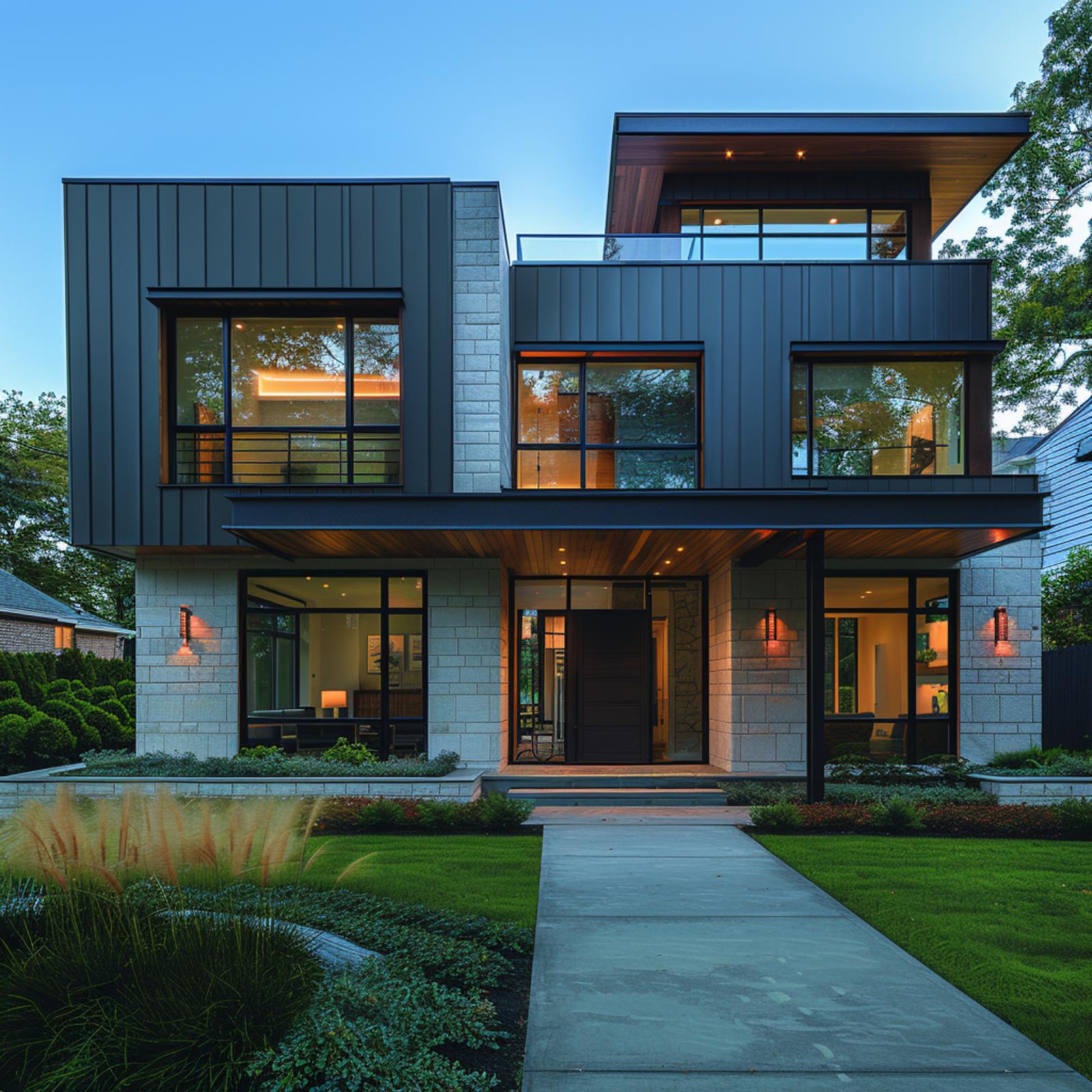
White Stucco and Linear Cladding Give This Boxy Facade Its Bite
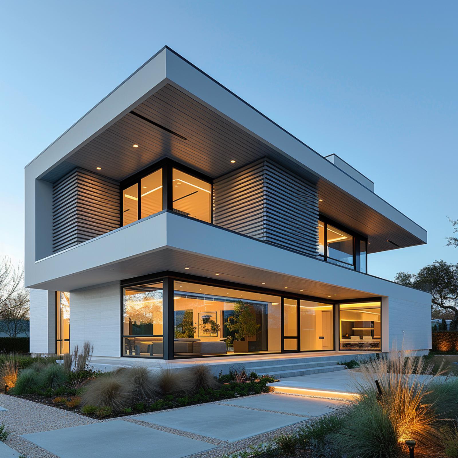
Crisp white stucco wraps the broad cantilevered frames, giving the house its sharp, gallery-like outline. Inside those deep overhangs, narrow horizontal cladding runs across the upper volume and structural piers, adding texture where the architecture could have gone blank and clinical.
The black window frames do the necessary graphic work, especially against the warm interior glow at dusk. Wood-toned soffits soften the hard geometry, while the low ornamental grasses and pale concrete slabs keep the landscape just restrained enough to let the mixed cladding carry the whole front elevation.
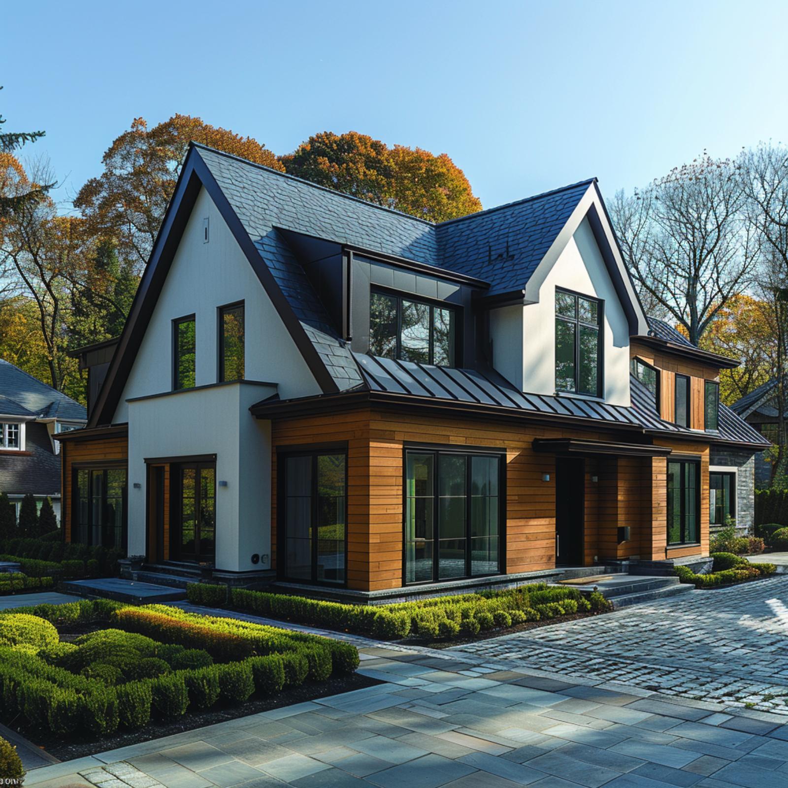
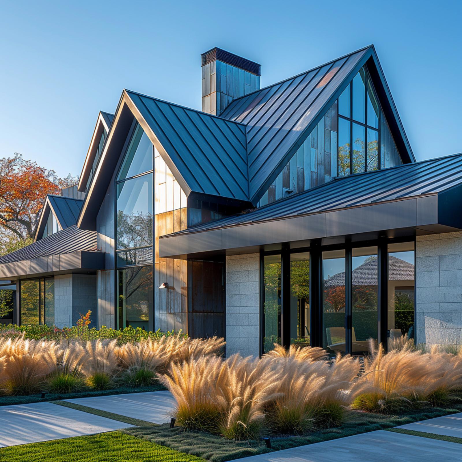
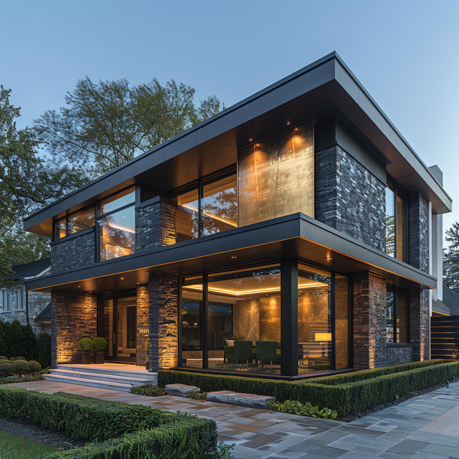
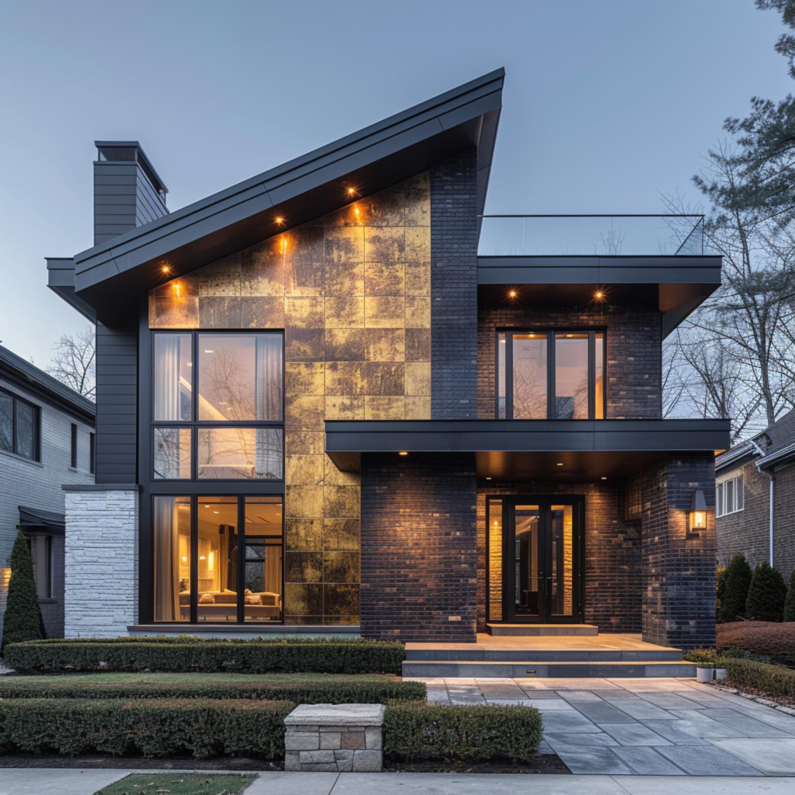
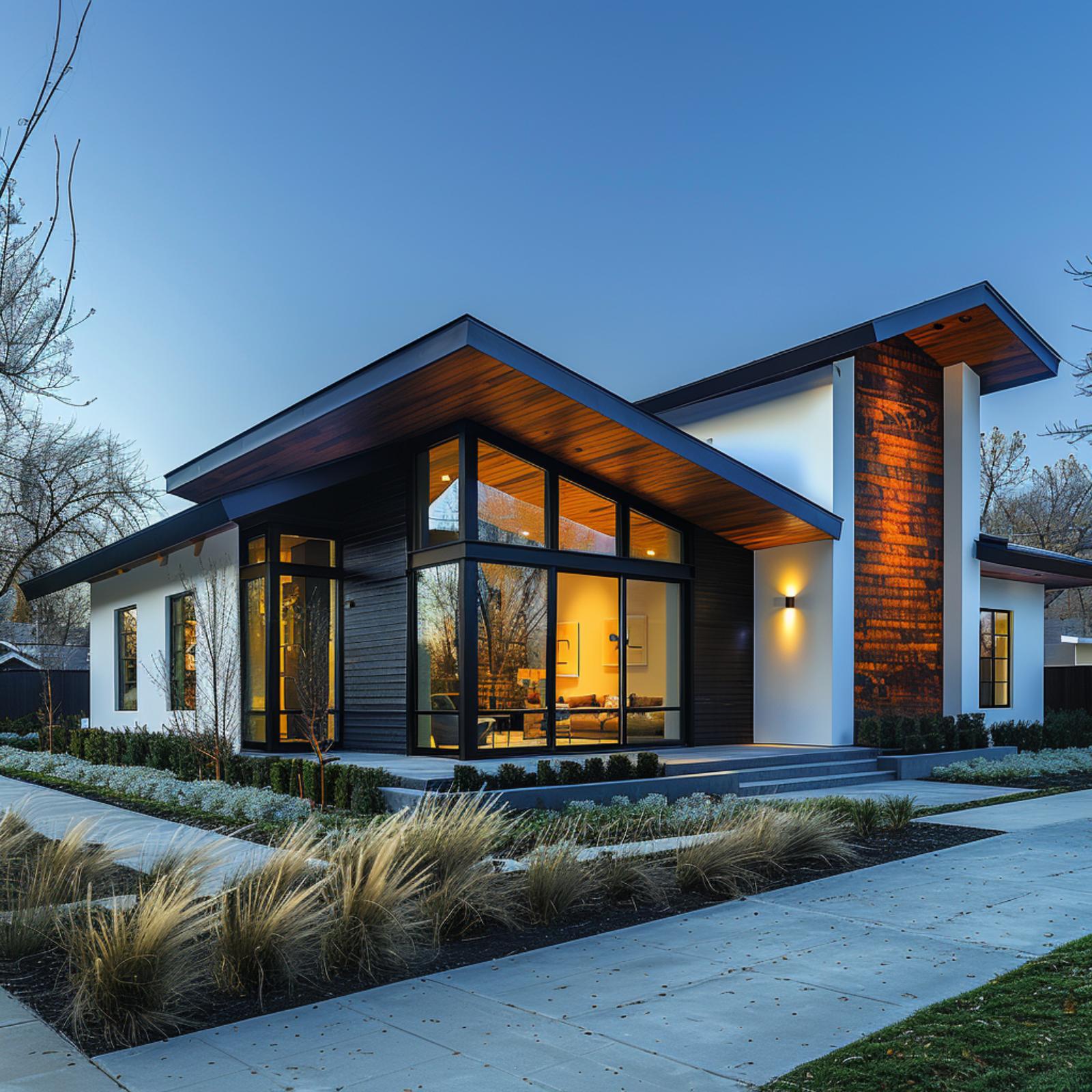
Cedar Battens and Dark Brick Prove Contrast Can Anchor a Facade
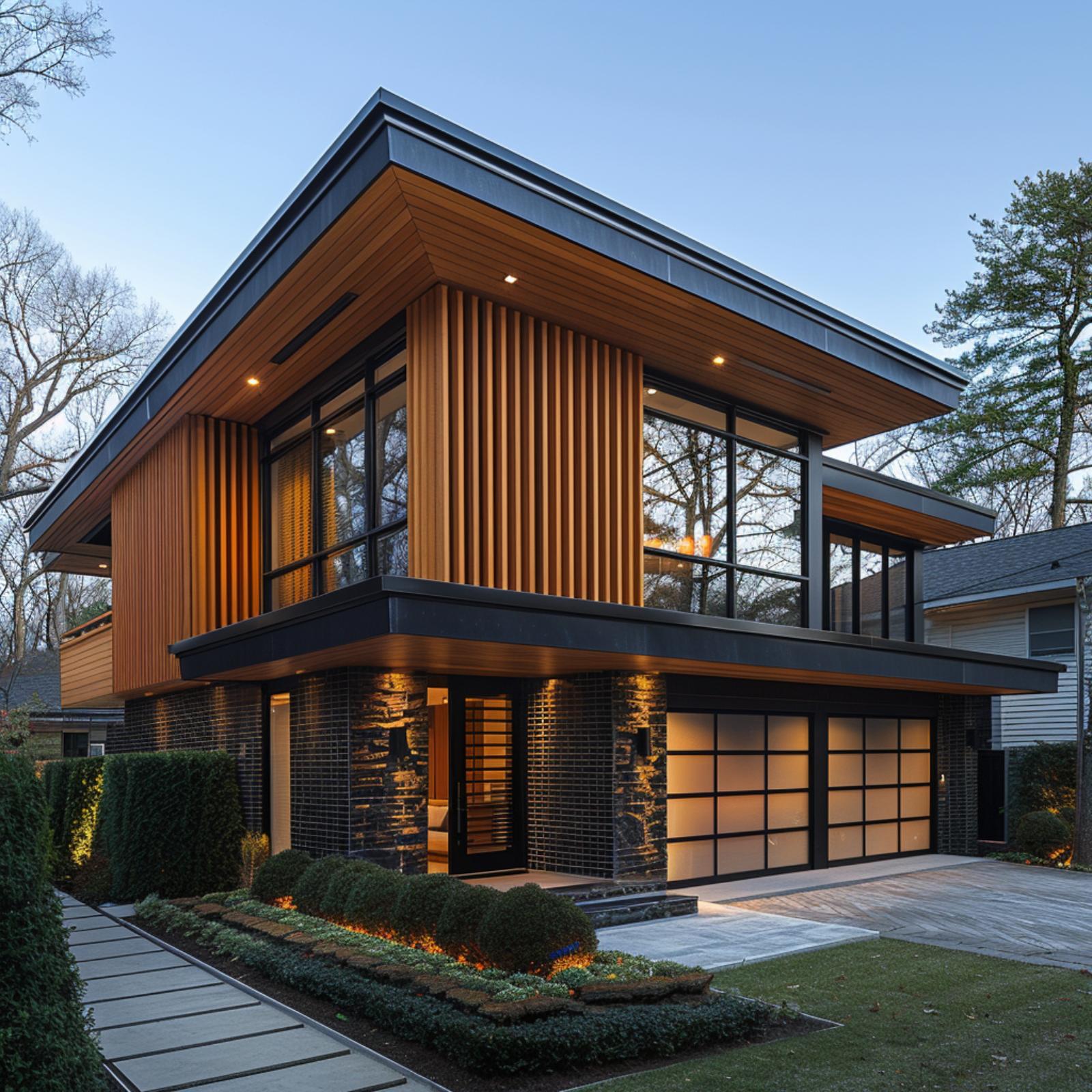
Vertical cedar battens on the upper story do a lot of work here, drawing the eye upward while softening what could have been a cold facade. Below, dark charcoal brick grounds the structure. The translucent frosted glass garage doors glow from within, which keeps the lower level from reading as a visual dead zone.
Cedar, Charcoal Steel, and Stacked Stone Compete for Attention — and Nobody Loses
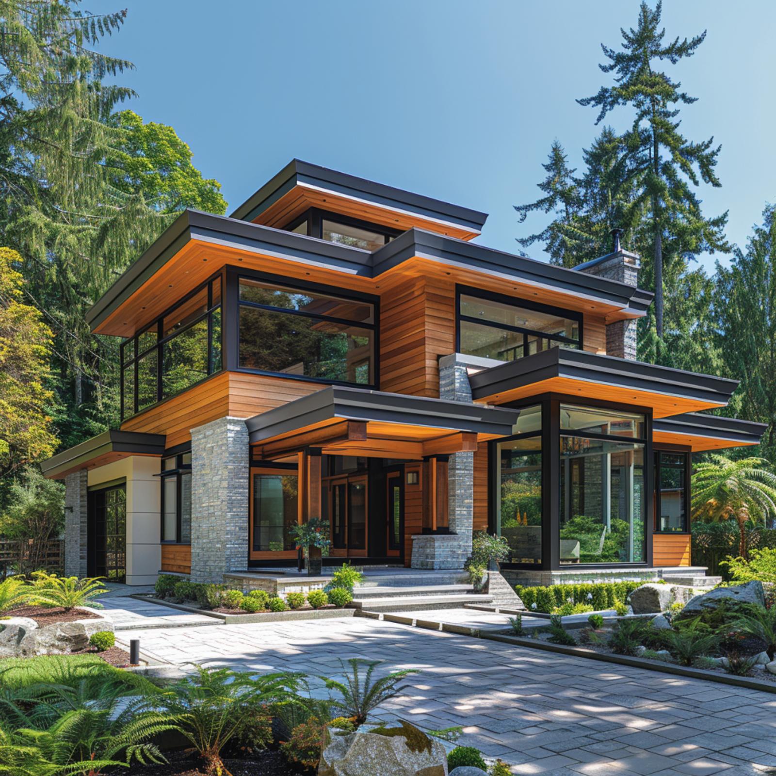
Warm cedar horizontal cladding runs across both floors, interrupted by courses of light gray ashlar stone that anchor the base and chimney column. Dark charcoal steel frames the oversized windows and defines the cantilevered roof overhangs, whose soffits are finished in the same cedar tone. It’s that soffit detail that holds everything together. The paver driveway below picks up the gray from the stone, keeping the ground plane from fighting the facade above.
White Stucco, Cedar Planks, and a Metal Roof That Actually Earns Its Place
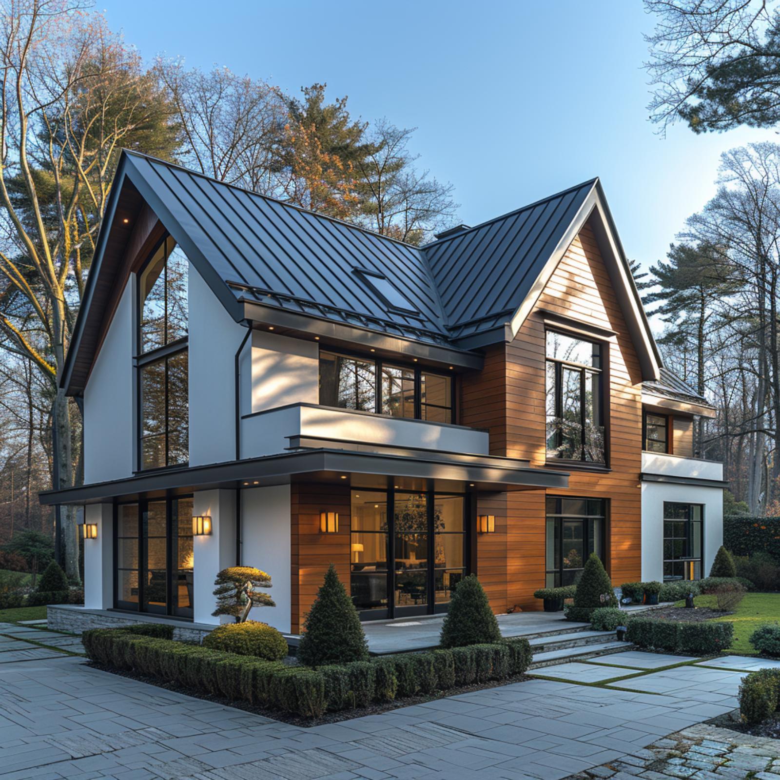
Few combinations age as well as horizontal cedar cladding paired against white stucco, and this facade leans hard into that pairing. The cedar reads as a true medium-tone wood, not the orange-stained shortcut seen on lesser builds. Floor-to-ceiling glazing with charcoal frames runs nearly the full width of the ground level, letting the interior warmth spill outward at dusk.
Above it all, a standing-seam metal roof in gunmetal gray pulls the palette together without competing. The dual-gable form gives the roofline real structure. Out front, a bonsai anchors a low boxwood border that keeps the hardscape from feeling cold. The stone paver driveway, laid in a grid pattern with grass joints, does a lot of quiet work here.
In The Details: The standing-seam roof uses raised ribs running vertically from ridge to eave, a profile that sheds water fast and develops a patina unevenly over time, which only improves it. Cedar cladding at this exposure level will need re-sealing every few years, but the color payoff between treatments justifies the upkeep. The grass-jointed paver grid out front is a detail most contractors skip, and it’s the kind of thing neighbors notice before they can name why.
White Brick, Horizontal Lap Siding, and Glass That Earns Every Square Foot
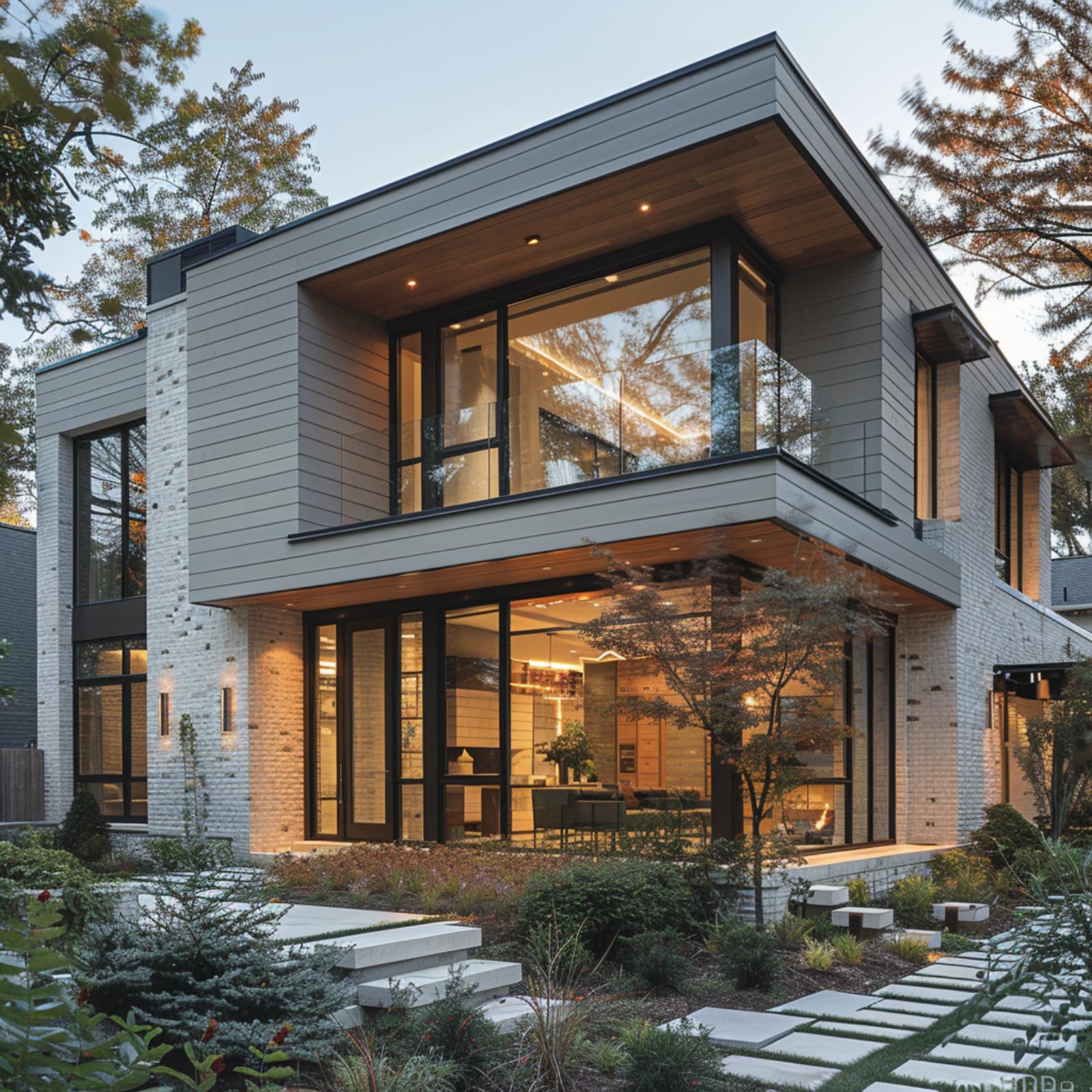
Painted white brick anchors the ground floor with texture that flat cladding can’t fake. Above it, horizontal lap siding in a cool gray pulls the eye upward toward a flat roofline where wood soffit panels glow amber under recessed lighting. The two materials don’t fight. They just occupy different registers.
What ties it together is the glazing. Floor-to-ceiling black-framed glass runs nearly the full width of both floors, and the interior warmth bleeding through at dusk makes the facade look almost inhabited from the outside in. Floating concrete steppers cut through the landscaping at irregular intervals, and a Japanese maple placed just off-center keeps the whole composition from feeling too controlled.
The interior warmth bleeding through at dusk makes the facade look almost inhabited from the outside in.
Slate Stone, Red Brick, and Board-and-Batten Refuse to Agree — and It Works
Multicolored slate cladding anchors the garage wing while red brick takes over at ground level on the right, and neither material pretends the other isn’t there. Board-and-batten in matte charcoal runs up both gable faces, tying the roofline together. It’s a loud combination that somehow doesn’t argue with itself.
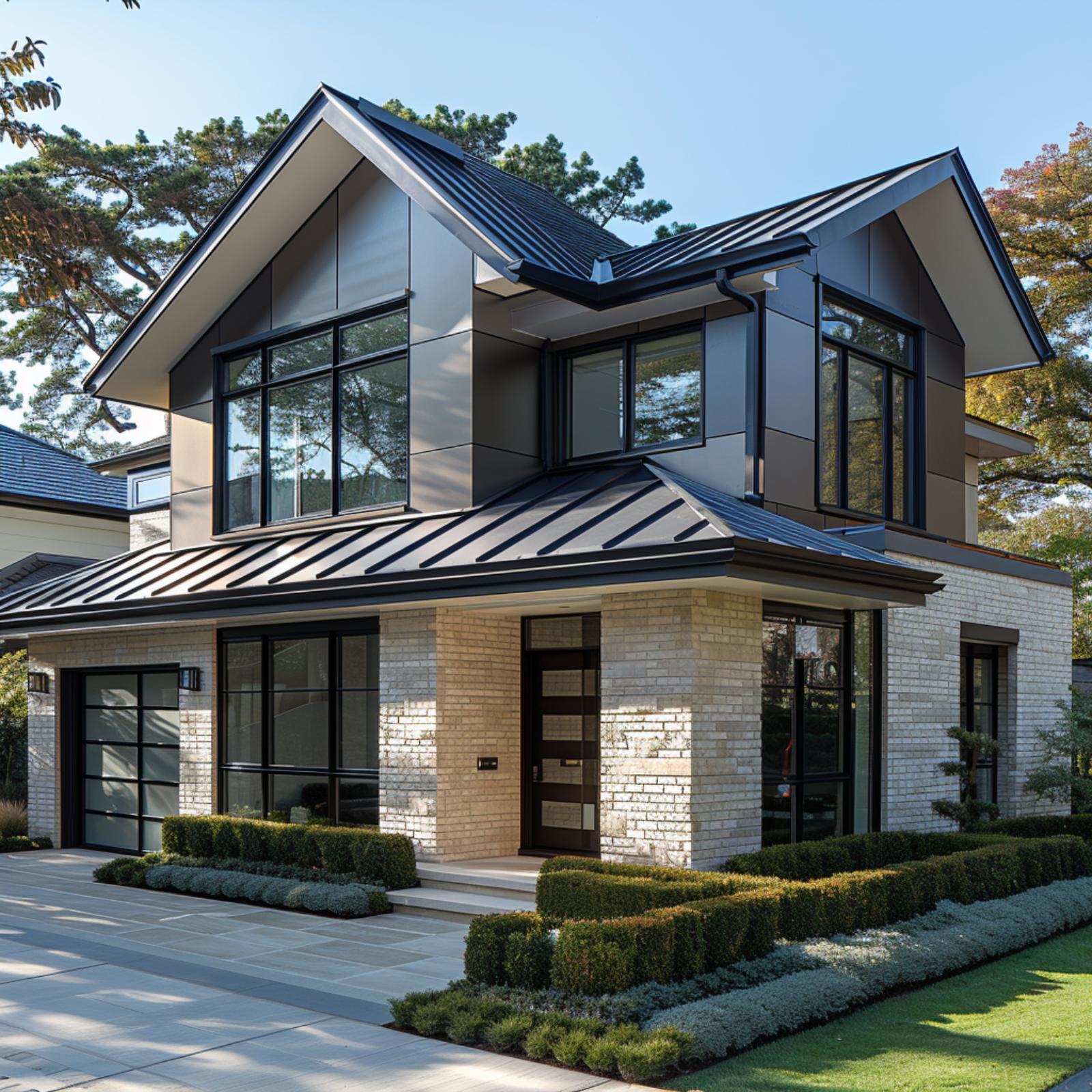
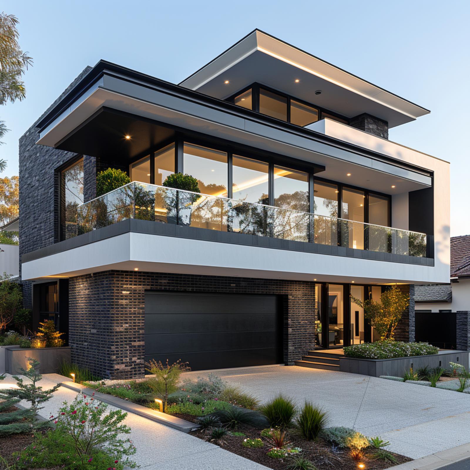
Gray Stone and Black Steel Frame a House That Knows Exactly What It’s Doing
Recessed soffit lighting under the wood-clad overhangs does the heavy lifting here, casting a glow that makes the gray ashlar stone read warmer at dusk than it would in daylight.
Why That Cantilevered Overhang Changes Everything
The upper-floor overhang extends far enough to create a covered threshold without a formal porch, a detail that blurs the line between interior and exterior. Wood soffit panels run parallel to the facade, and the recessed fixtures are spaced to avoid clustering near the glass, which keeps the illumination even rather than dramatic. It’s a practical decision that also happens to look deliberate.
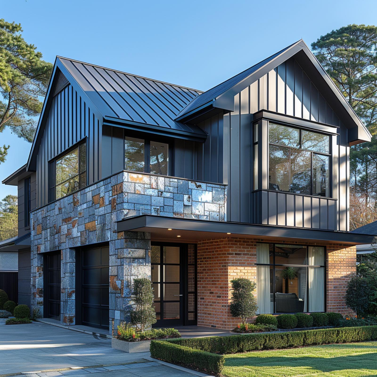
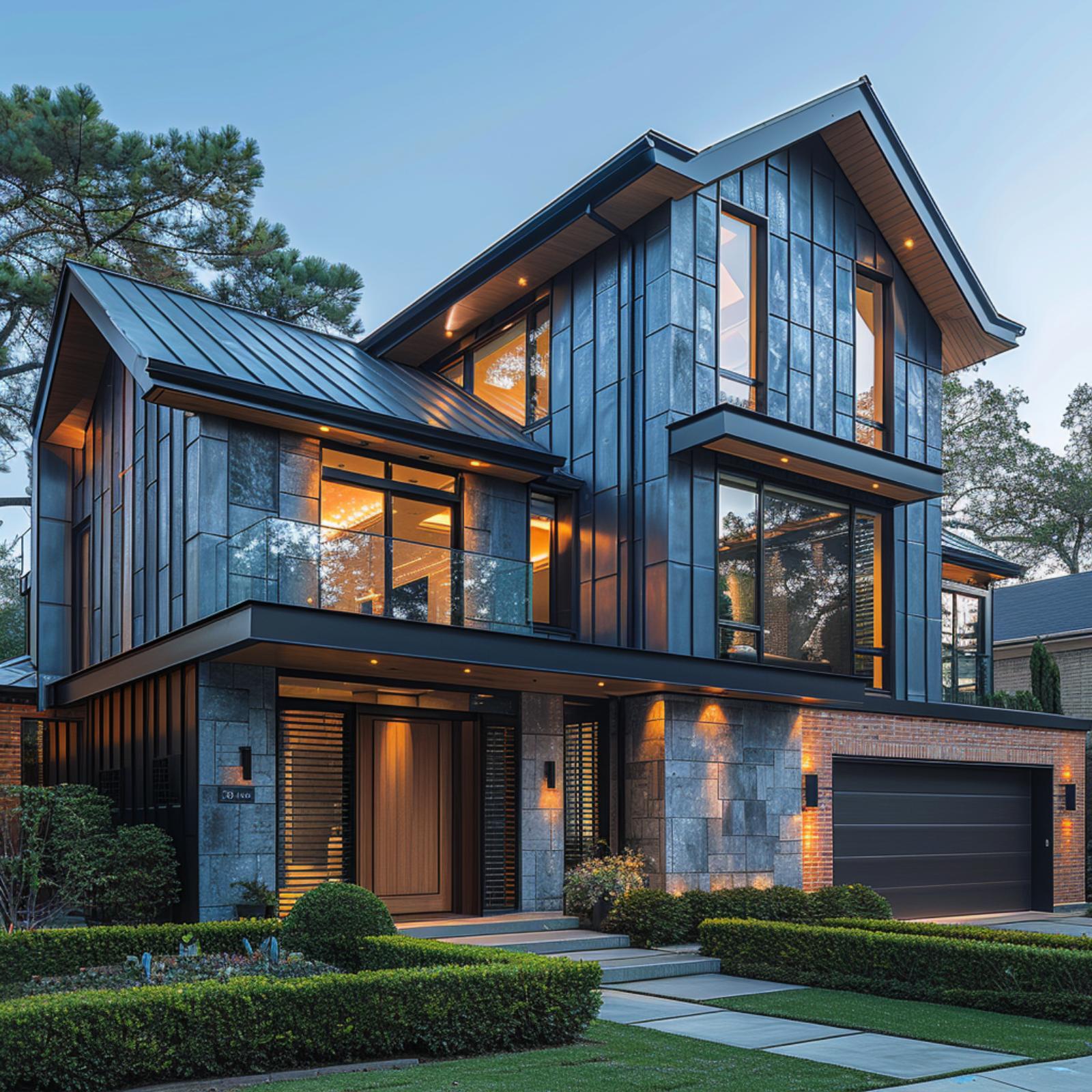
Stone Base, Brick Upper, Black Garage Doors — Three Materials That Earned Each Other
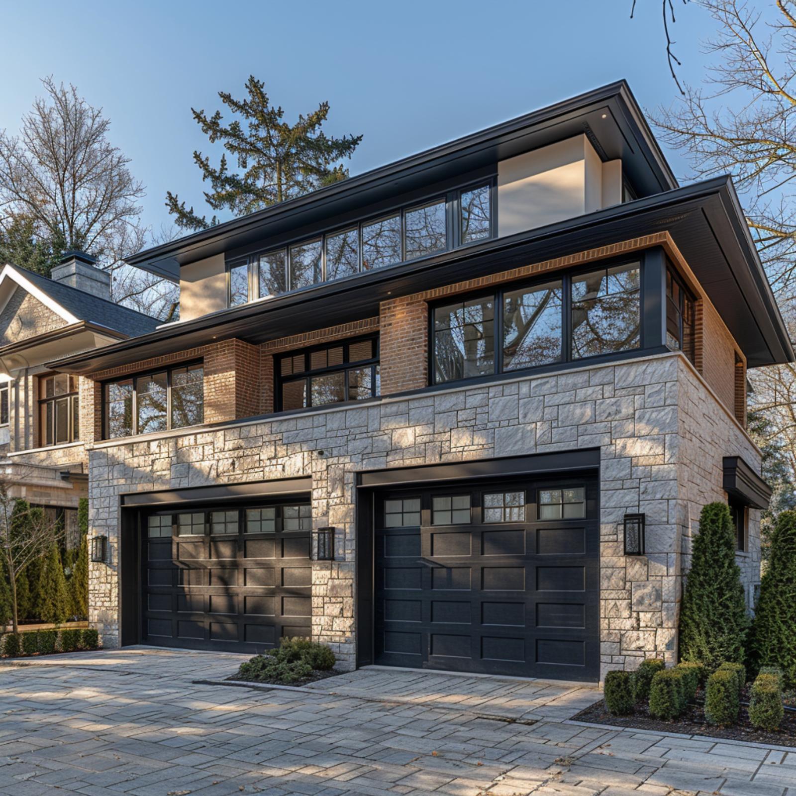
Rough-cut granite cladding anchors the ground floor with a texture that reads almost geological up close, while red brick takes over above the garage line and pulls the palette toward something warmer without going soft. Two matte black panel doors with divided-light glass inserts sit flush in that stone base like punctuation. Up top, floor-to-ceiling windows with black steel frames don’t compete with the masonry — they just let it breathe.
The Psychology Behind This: Humans tend to perceive heavier materials at the base of a structure as inherently stable, a response rooted in how we read physical weight in the real world. Placing rough stone low and lighter brick above it plays directly into that instinct, making the facade feel grounded rather than arbitrary. It’s the same reason castle walls were thick at the bottom — the brain expects it.
Concrete, Vertical Cedar, and Black Steel Frames — Who’s Really Running This Facade?
Board-formed concrete anchors the right wing while vertical cedar cladding pulls the eye left, and neither material apologizes for competing. Gravel beds planted with ornamental grasses replace lawn entirely. It’s a low-maintenance front yard that actually looks intentional.
Stone, Steel, Brick, and Glass on One Facade — Four Materials That Refuse to Fight
Blue-gray stone panels dominate the upper floors, but it’s the contrast with red brick at the garage base that gives this facade its tension. Large black-framed windows pull warm interior light through at dusk, and the standing-seam metal roof ties the cooler tones together overhead.
Pro Tip: Mixing three or more cladding materials works best when one material covers the majority of the facade and the others appear in clearly defined zones rather than scattered patches. Here, stone handles the dominant coverage while brick anchors only the lower right section, keeping the composition readable at a glance.
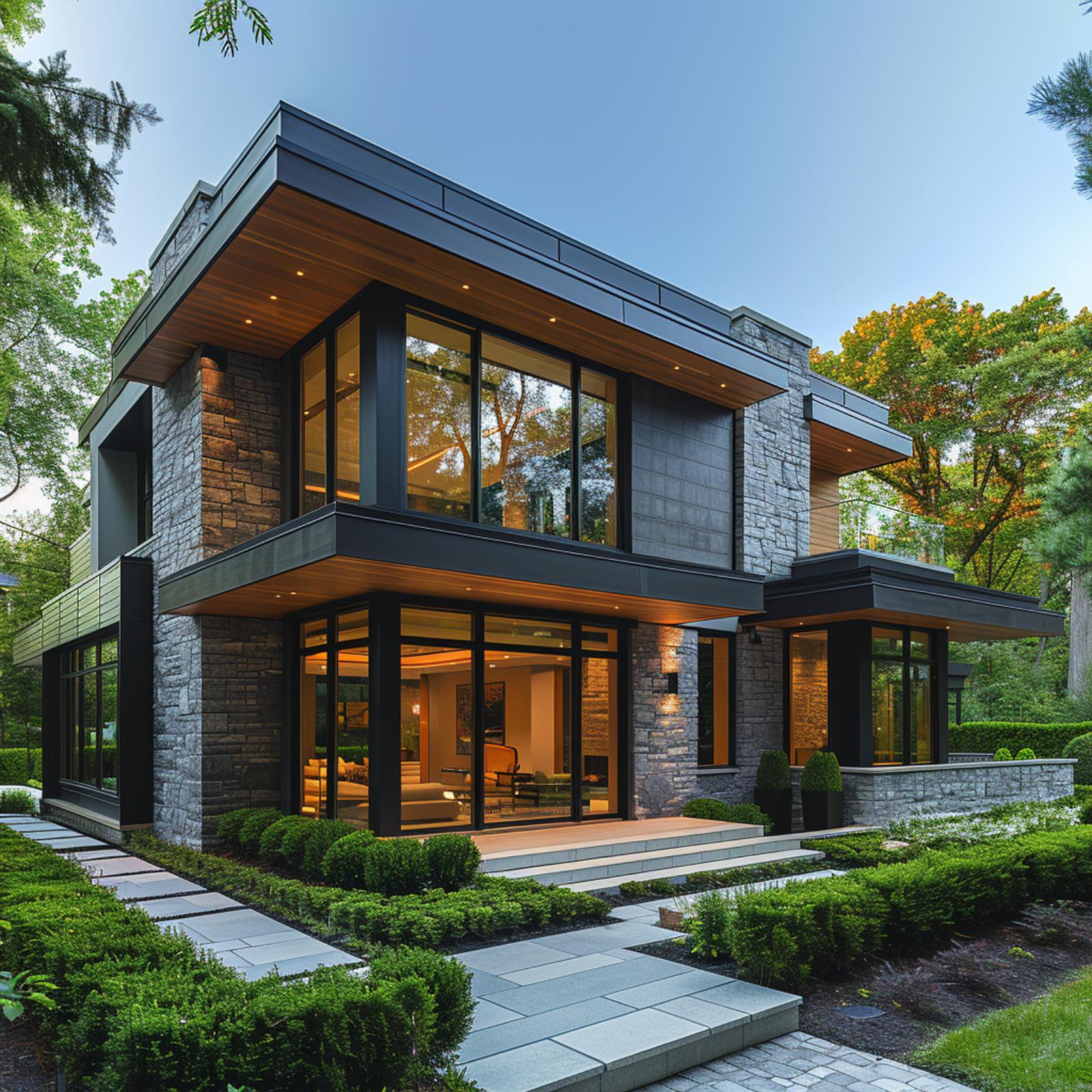
Stone, Glass, and Wood Soffit Pull Off What Most Facades Won’t Even Attempt
Split-face granite wraps the base and corner columns while black steel framing organizes the floor-to-ceiling glazing above, and a cedar-clad soffit bridges both without apologizing for the contrast. It works because the stone does the heavy lifting and the wood stays contained to one plane.
A cedar-clad soffit bridges both without apologizing for the contrast.
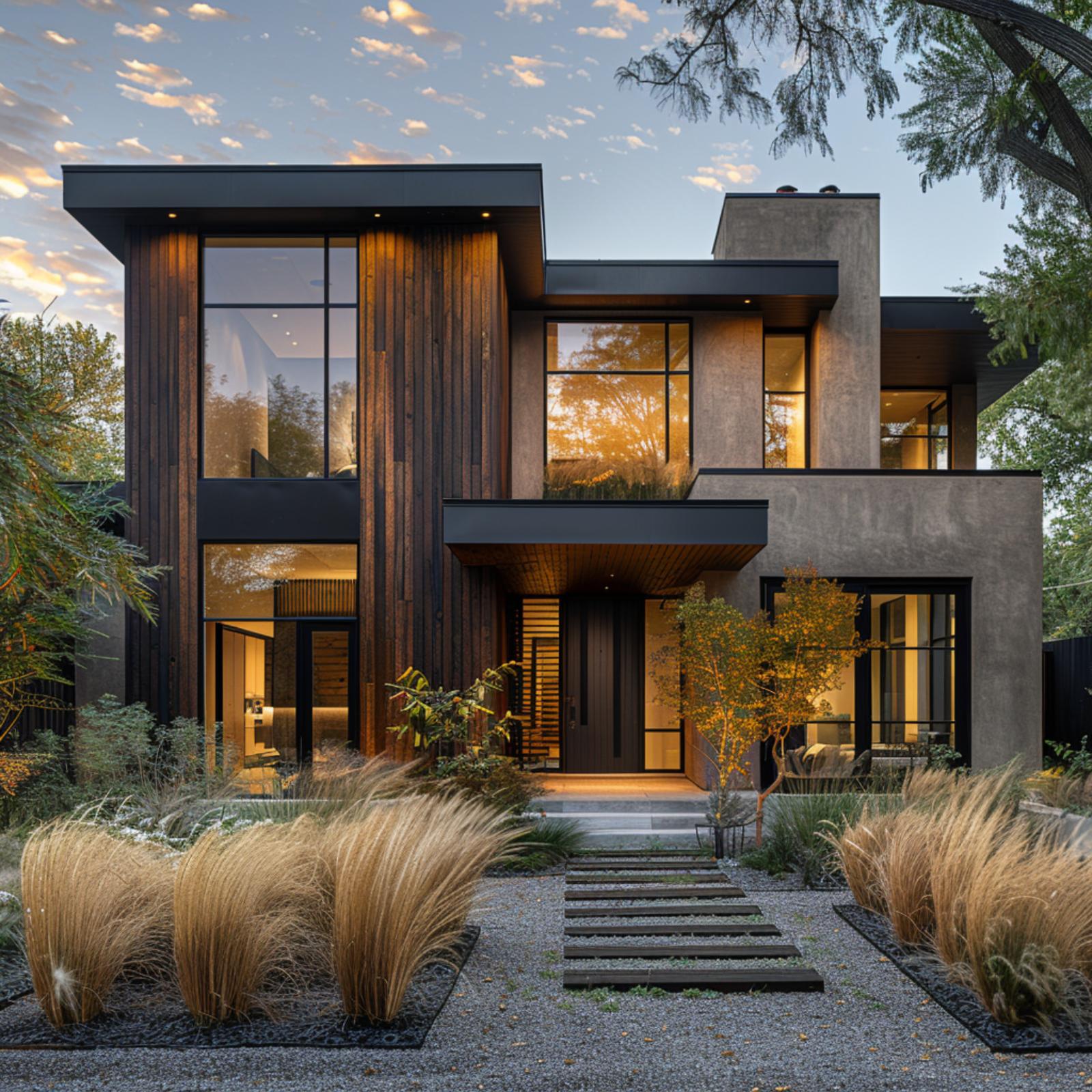
Stucco, Cedar, and Standing-Seam Metal Walk Into a Facade — Nobody Loses
White stucco claims the upper story while cedar planks wrap the ground-floor volume in a warm honey tone, and the contrast between the two doesn’t feel accidental. A bronze standing-seam metal roof ties both materials together without matching either one exactly. That’s the quiet move here. Large black-framed sliding doors anchor the cedar zone and keep the palette from reading too rustic.
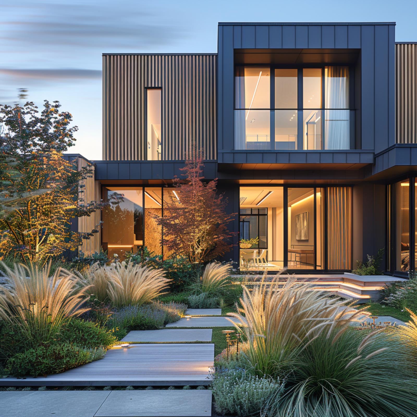
Dark Metal Cladding, Warm Wood Accents, and Ornamental Grasses That Actually Belong Here
🔥 Would you like to save this?
Vertical ribbed metal panels in a deep charcoal-slate finish cover the upper volume, while natural wood slat cladding wraps the lower and interior-facing surfaces. The contrast isn’t decorative. It’s structural logic made visible.
Large-format sliding glass doors reveal a warmly lit interior at dusk, and the garden path uses wide concrete steppers set flush into the lawn, flanked by fountain grass and Japanese maple. Neither the planting nor the architecture is trying to win.
Designer’s Secret: Mixing a dark metal exterior with warm wood requires keeping the wood concentrated in recessed or sheltered zones, where it reads as an intentional reveal rather than a patchwork afterthought. Natural light does most of the editorial work here, and the dusk timing in photographs like this one is no accident since it’s when warm interior glow and cool exterior materials create the sharpest contrast. Photographers and developers both know it.
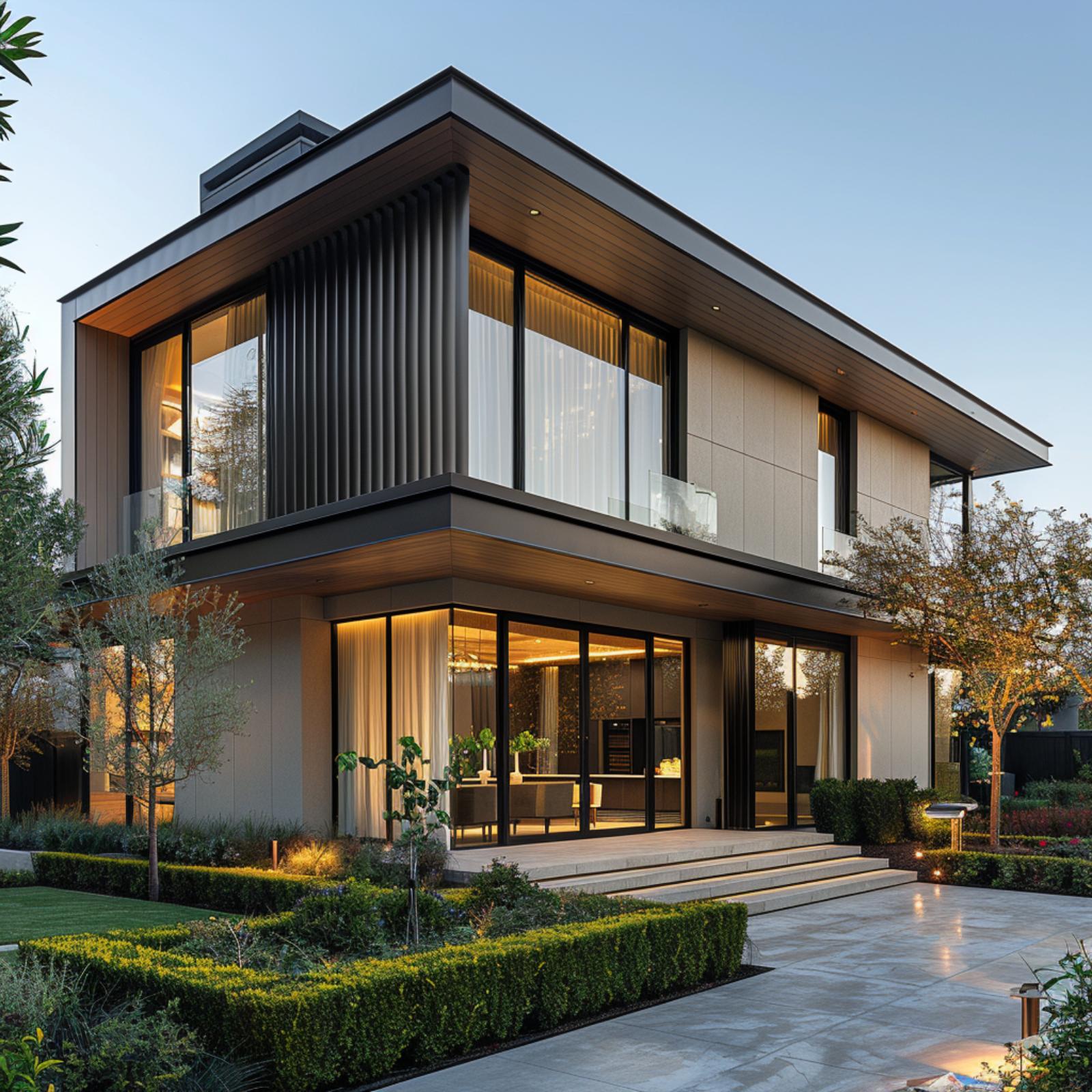
Pale Brick, Dark Metal Panels, and a Standing-Seam Roof That Ties Both Together
Cream brick anchors the ground floor with texture, while dark gray metal cladding takes over above it. The transition between the two is clean and deliberate. Large black-framed windows reinforce the metal’s tone without competing with it.
Try This: When combining light masonry with dark metal cladding, keep the color contrast sharp rather than softening it with a mid-tone third material. A muddy middle value between the two will flatten the whole facade. Let the contrast do the work.
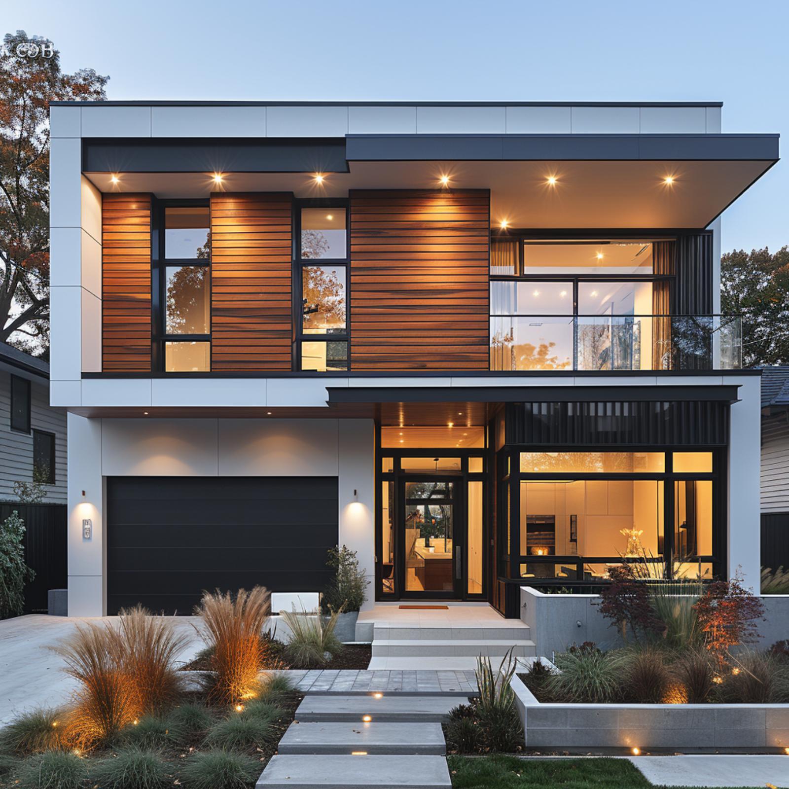
Stucco, Cedar Slat Cladding, and Standing-Seam Metal Pull Three Directions at Once
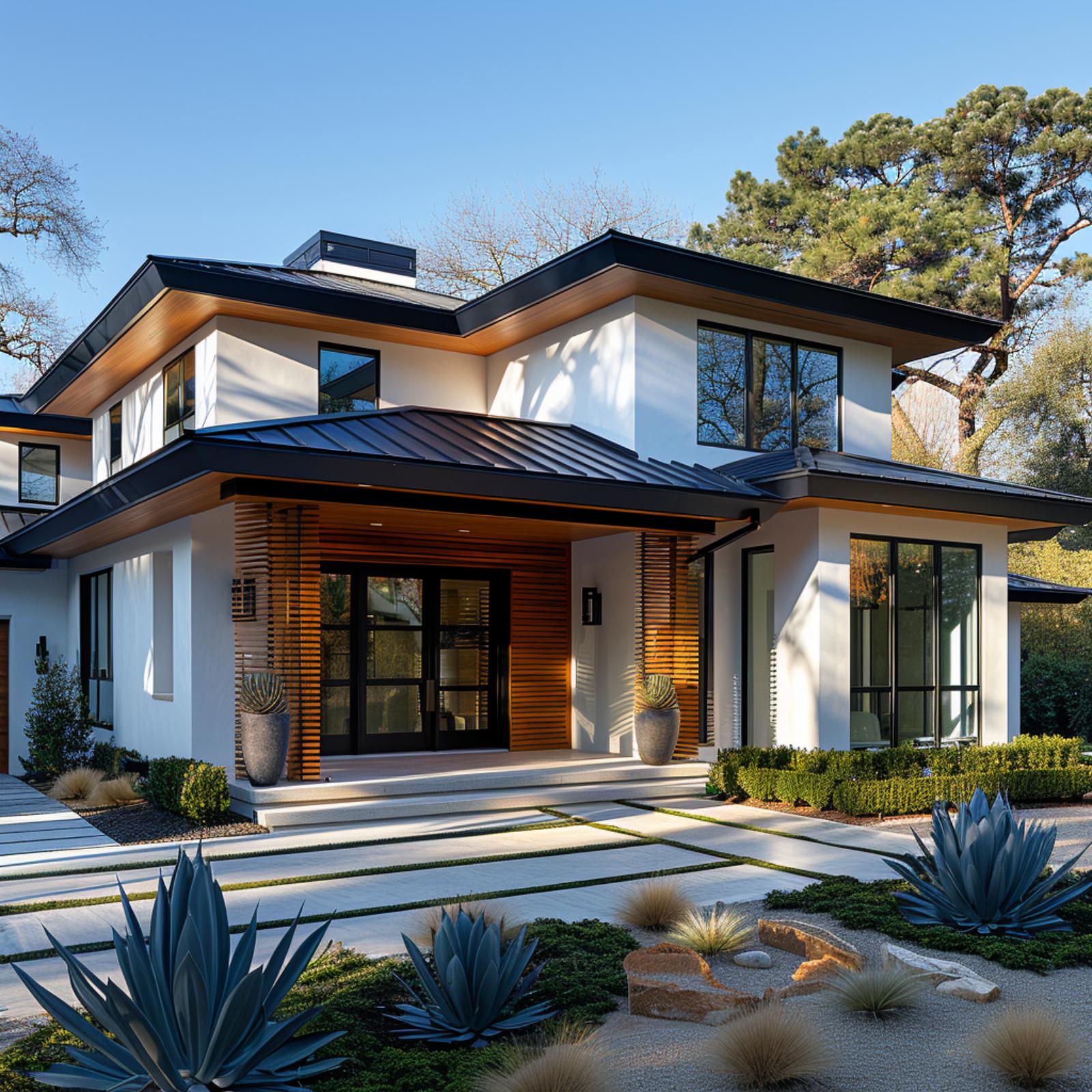
Smooth white stucco covers most of the facade, giving the eye a place to rest before the cedar slat panels flanking the entry pull attention inward. Those horizontal wood strips aren’t decorative trim. They’re load-bearing visually, framing the recessed entry portal so it reads as a destination rather than just a door.
The standing-seam metal roof in matte charcoal carries its weight across both levels, and the matching black window frames keep the palette from drifting. What sells it is the restraint at ground level: blue agave, ornamental grasses, and boulders in place of turf. The xeriscape planting doesn’t just complement the materials palette, it reinforces the same logic the facade already established. Less filler, more intention.
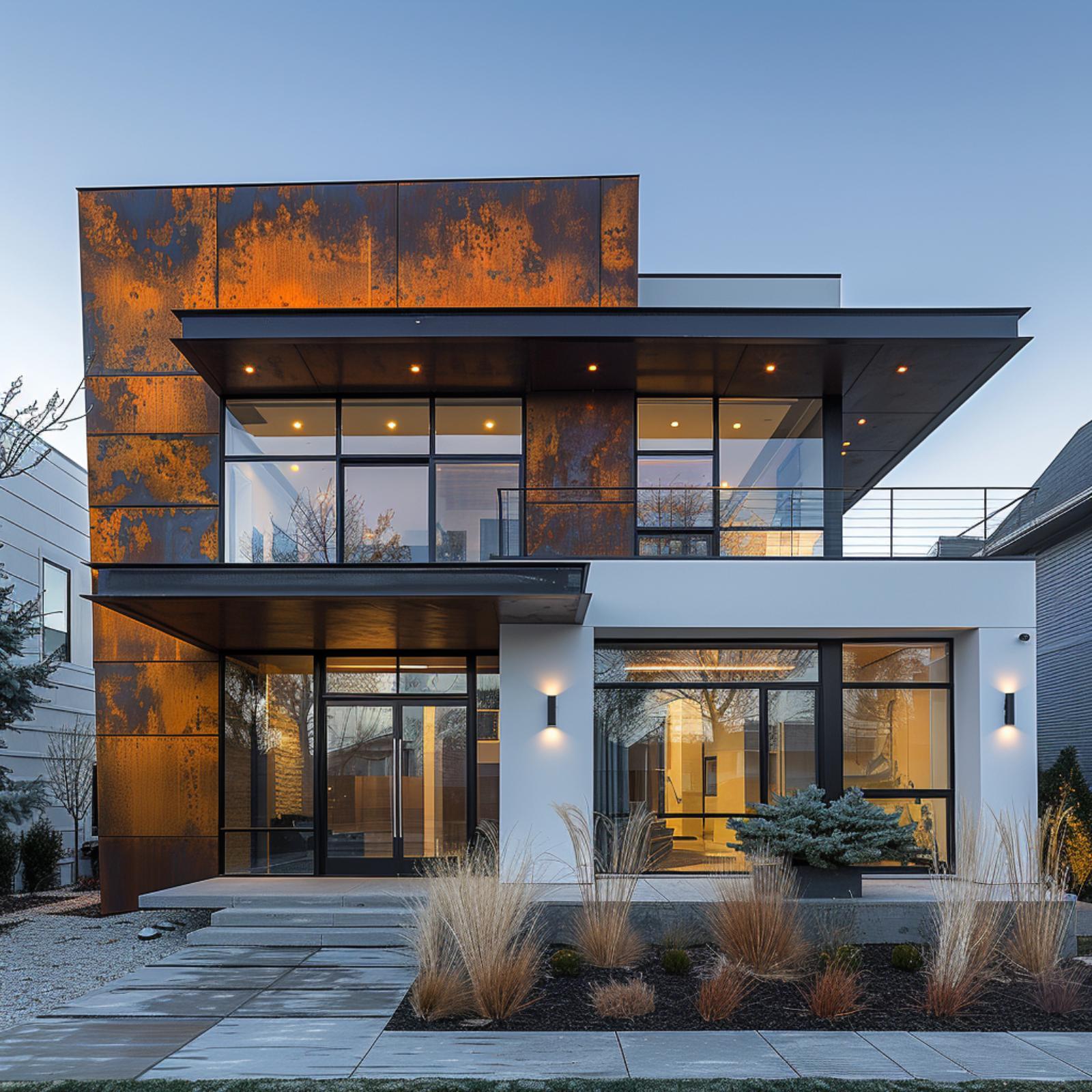
Corten Steel and White Panel Find Common Ground, Then Refuse to Settle
Corten steel panels dominate the second-floor overhang here, their oxidized amber surface reading almost warm against the flat white composite cladding below. That contrast shouldn’t work as well as it does. What keeps it from tipping into chaos is the black aluminum framing running consistently across every window and door opening, holding the palette together without calling attention to itself.
Ground-level landscaping does real work on this facade. Ornamental grasses and a Japanese maple lit from below pull the rust tones from the corten down to grade, so the material story doesn’t just live above eye level.
- Glass balcony railings on the upper level preserve sightlines without adding a third solid material to an already busy facade
- Concentrated warm interior lighting visible through the floor-to-ceiling glazing adds depth that flat cladding alone can’t provide
- Wood soffit material tucked under the entry canopy bridges corten and white without appearing on the facade itself, keeping the mix legible
Stone, Cedar, and Standing-Seam Metal Pull a Facade in Three Directions — and Win
Natural fieldstone wraps the columns and lower facade in irregular courses of warm gray, while honey-toned cedar cladding fills the gable faces and soffit zones above. The dark navy standing-seam metal roof ties both materials together without flattening the contrast between them. It’s a combination that could easily read as busy, but the proportions are doing serious work here.
The black-framed floor-to-ceiling windows keep the palette grounded rather than scattered. Ornamental grasses and low clumping shrubs in the foreground soften the hard geometry of the concrete step pathway without competing with the facade.
Did You Know: Standing-seam metal roofing can last two to three times longer than asphalt shingles, which makes the higher upfront cost easier to justify on a facade where the roof is this visible. The color you choose at installation also matters more than most homeowners expect, since darker tones absorb significantly more heat than lighter ones. On a design like this, where navy reads almost black against a clear sky, that thermal consideration is worth factoring into the energy profile of the home.
Where the last facade kept its materials in clean horizontal bands, this one stacks them vertically.
Dark Brick, Marble Panels, and Gray Metal Prove Three Can Share a Facade
Charcoal running-bond brick covers most of the facade, which is the right call. It gives the marble accent panels and pale limestone corner columns somewhere to land without competing for dominance. Those backlit marble slabs flanking the entry aren’t decorative afterthoughts. They’re structural-looking elements that pull warm amber light through their veining at dusk, which changes the whole mood of the front elevation.
The flat cantilevered overhangs at each floor line are clad in dark metal and do most of the compositional work here, separating the facade into readable tiers. Uplighting at the base hits the marble hard enough to show texture. Don’t underestimate what that one detail does for a facade after dark. It’s genuinely difficult to make three materials this different read as a single coherent exterior, but keeping the brick as the constant and treating everything else as punctuation gets it there.
Cedar Slat, Concrete Panel, and Glass Pull a Two-Story Facade Into One Argument
Horizontal cedar slat cladding does the heavy lifting here, wrapping both the garage door surround and the upper-floor corners in warm, consistent grain that keeps the facade from fracturing into unrelated parts. The concrete panels stay cool and flat between them. That contrast is the whole point.
Large fixed-glass windows on both floors let the materiality breathe without competing. What grounds it is the landscaping: ornamental grasses in dried-gold tones echo the cedar almost exactly, so the palette doesn’t stop at the foundation line. It continues into the yard.
Limestone, Dark Metal, and Floor-to-Ceiling Glass Pull Off Something Genuinely Difficult
Cut limestone panels anchor the facade at ground level, their matte gray-beige surface holding the weight of two steep gabled peaks above. Those peaks are clad in standing-seam metal with a dark graphite finish, and the ribs run at opposing angles where the gables meet, creating a chevron effect that’s hard to ignore.
Floor-to-ceiling glass fills the gable ends completely, reflecting the autumn trees and sky rather than competing with either cladding material. It’s a smart move. Glass doesn’t ask to be noticed the way stone or metal does, so it gives the eye permission to rest between two strong textures.
Quick Fix: When two opaque cladding materials share a facade, adding glass between them can reduce visual tension without softening the contrast you actually want to keep. Glass reads as neutral because it borrows whatever color surrounds it. Place it where the two materials would otherwise collide directly.
White Stucco, Warm Wood Soffit, and Corten Panels Walk Into a Facade Together
Rust-toned metal panels anchor the entry level, sitting beneath a wood-lined soffit that wraps the upper floor overhang in warm cedar tones. White stucco fills the upper volume, keeping the composition from feeling too heavy at the top. Black-framed floor-to-ceiling glass runs across both stories, and that consistent framing is what holds everything together.
The landscaping earns its place here. Ornamental grasses and Japanese maples with amber fall color echo the rust of the metal panels, so the planting feels coordinated without being obvious about it. Concrete stepping stones lead to wide entry stairs without competing for attention.
Why It Works: Repeating a material’s color in the planting palette is one of the quieter tricks in residential design. It doesn’t require matching anything exactly, just pulling a tone that already lives on the facade and letting it reappear at ground level. Done right, the yard starts to feel like part of the building rather than something placed in front of it.
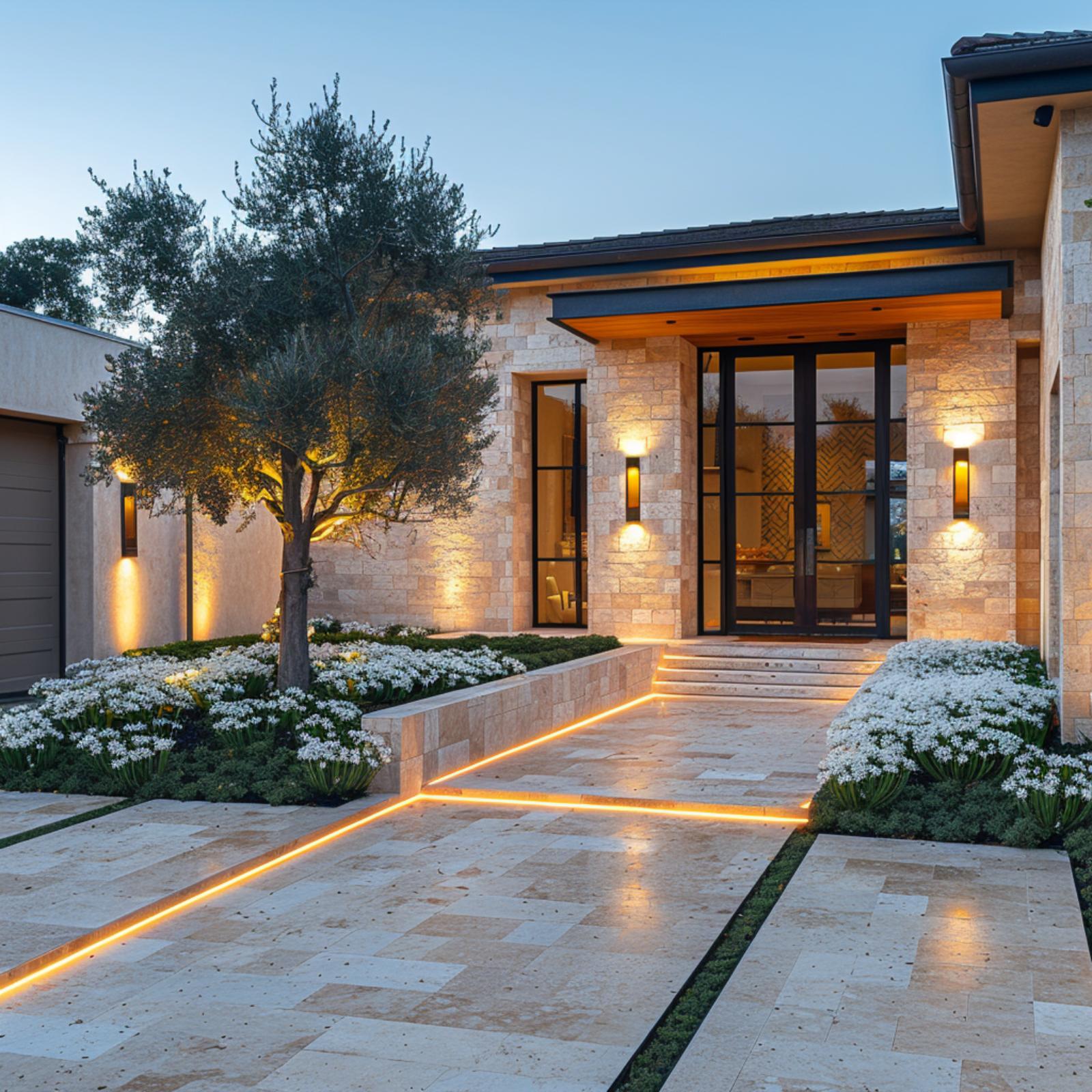
Dark Stone, Curved Metal, and Cedar Soffit Pull Off a Facade That Shouldn’t Work
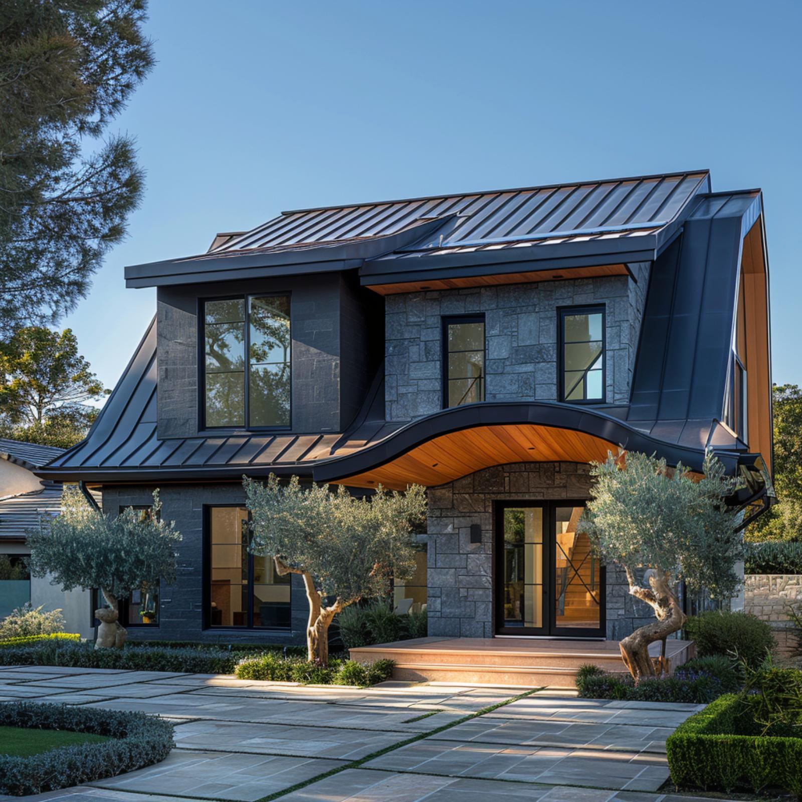
Gray split-face stone runs floor to roofline on most of the facade, giving the design its weight before anything else registers. What catches you is the curved metal canopy sweeping over the entry, its dark standing-seam profile bending down and around in a move most builders wouldn’t attempt. Warm cedar planking lines the underside of that canopy, and it reads warmer against the stone precisely because it’s sheltered. Mature olive trees in the foreground don’t match anything exactly, but their silver-green foliage picks up the cool gray of the stone.
Common Mistake: Homeowners often choose a curved architectural element and then select cladding materials too similar in tone, hoping the shape carries the design on its own. When the materials don’t contrast, the curve loses its impact and reads as a structural quirk rather than a deliberate choice. Let the materials do some of the work so the form doesn’t have to do all of it.
Marble Panel, White Board-and-Batten, and Floor-to-Ceiling Glass Refuse to Pick a Lane
Dark veined marble cladding anchors the ground floor left corner with enough visual weight to hold the whole facade steady. From there, white vertical board-and-batten takes over the upper story, and the shift feels earned rather than arbitrary. Black-framed floor-to-ceiling glazing runs the full width of the second level, and the warm amber interior light bleeding through at dusk does a lot of the heavy lifting.
The landscaping pulls its weight too. Tightly clipped boxwood hedges in geometric rows echo the facade’s hard edges without competing with them. It’s a disciplined front yard, and that discipline keeps three very different cladding materials from reading as chaos.
Ask Yourself: Before committing to a multi-material facade, consider whether each material has its own defined zone or whether they’re bleeding into each other at the edges. Blurred transitions tend to look unresolved rather than intentional. Clean termination lines between cladding types are where the design either holds together or falls apart.
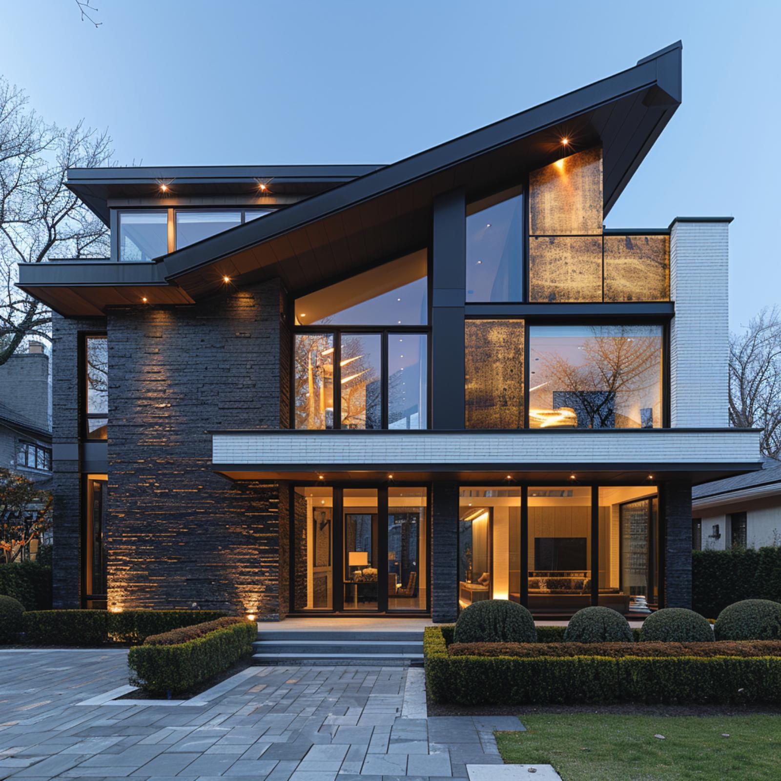
Slate Stone, Bronze Panel, and Floor-to-Ceiling Glass Bet on Three Materials and Collect
Warm-amber bronze cladding anchors the corner mass between two runs of floor-to-ceiling glass, and it’s doing real work keeping the facade from reading as flat. The slate stack below it is dark and rough; the bronze above is smooth and reflective. That contrast in texture does more than color ever could.
Why the Recessed Ceiling Detail at the Overhang Changes Everything
Look at the underside of both cantilevered overhangs. They’re finished in a warm wood tone, and the recessed lighting in that soffit throws amber light down onto the slate face below. It’s a detail you’d never see from a photograph taken in daylight, but at dusk it’s what makes the stone glow rather than disappear into shadow. Builders often treat soffit finishes as an afterthought; here it’s clearly a considered choice that ties the bronze panels to the interior warmth visible through the glass.
Flat Roof, Wood Soffit, and Floor-to-Ceiling Glass Prove Restraint Has a Breaking Point
🔥 Would you like to save this?
Beige panel cladding covers most of the facade, which gives the wood soffit and ceiling details room to read as accents rather than competitors. Black aluminum frames the glazing on both floors, and that consistency is doing more structural work than it looks like. The ground-floor interior glows through sheer curtains, making the house feel occupied rather than staged. Clipped hedges and low plantings keep the foreground quiet.
By The Numbers: Glass that spans full floor height typically requires structural framing concealed within the wall assembly rather than at the window perimeter, which changes how surrounding cladding materials need to be detailed at their edges. On facades where glazing meets two different opaque materials, those edge transitions are where most installation costs accumulate. Getting them wrong is far more visible than getting them right.
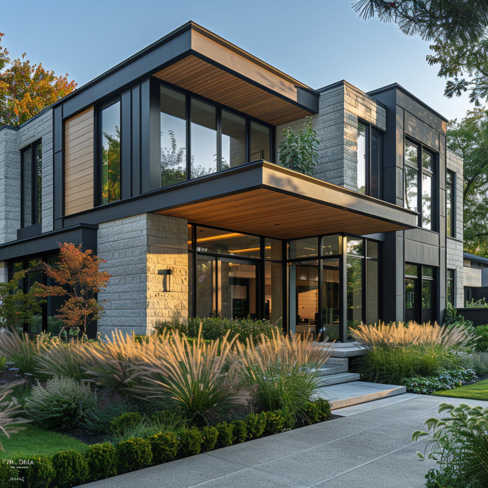
Three Stories, Three Materials, One Facade That Actually Knows What It’s Doing
White stucco, light-stack stone, and floor-to-ceiling glass with black steel framing divide this three-story exterior into zones that each material genuinely owns. The stone column anchors the right side with vertical mass. Glass does the rest.
Editor’s Note: When black steel frames glass across multiple floors, the framing itself becomes a visible grid that ties upper and lower levels together visually. Designers sometimes overlook this and treat the steel as purely structural, but its rhythm across the facade is doing real organizational work. Getting that grid spacing consistent across floors matters more than most clients expect during the planning phase.
Metal Panel, Cedar Soffit, and Olive Trees Walk a Facade Nobody Expected to Work
Polished steel-look vertical cladding covers the left volume of this two-story facade, its reflective surface picking up sky tone and shifting slightly depending on where you’re standing. Cedar planks run horizontally across the soffit overhangs and wrap the entry volume on the right, and the contrast between those two finishes is sharper in person than it probably looked on a mood board. A wood-slatted pivot door anchors the entry without competing with either material.
What holds the composition together isn’t any single cladding choice. It’s the black steel window frames running consistently across both volumes, creating a grid that reads the same whether you’re looking left or right. The low-water planting does quiet work too: rounded shrubs and olive trees echo the silver-green of the metal panels closely enough that the facade doesn’t feel dropped into the yard so much as grown out of it.
Oxidized Metal Panels, Dark Brick, and a Glass Wall Refuse to Compete
Aged brass-toned cladding panels cover the upper facade’s dominant face, their patchy oxidized finish giving the surface a texture that looks earned rather than applied. Below, dark charcoal brick takes over without apology. Recessed spotlights under the cantilevered soffit do the connecting work quietly.
Charcoal Brick, White Render, and Glass Balustrades Refuse to Settle for Two Materials
Charcoal brick anchors the ground floor with a texture that reads almost matte at a distance, then breaks into individual coursing up close. Above it, white render takes over cleanly, and the shift between the two materials is sharp enough that neither one bleeds into the other.
What keeps it from feeling like two separate houses is the glass. A full-width balustrade runs across the first-floor terrace, and because it’s frameless except for the slim steel cap rail, it lets the render and brick stay in conversation rather than getting cut off. The black window frames echo the brick’s tone without matching it exactly, which is a quieter move than it sounds.
Zinc Panel, Vertical Metal Cladding, and Floor-to-Ceiling Glass Earn Every Square Foot
Matte zinc panels cover the majority of this two-story facade, with vertical seam cladding running the full height of the upper volume and a lighter silver-gray composite panel breaking the mass on one side. Neither material competes for dominance because their zones are clean and unambiguous. The amber glow from the interior pushing through the floor-to-ceiling glazing at both levels does something the cladding alone can’t: it makes the building feel inhabited rather than posed.
A continuous LED strip runs along the underside of the second-floor overhang, casting a warm horizontal line across the entry. That single detail does more compositional work than it has any right to. Clipped boxwood hedging at the base keeps the foreground tight and lets the facade read without distraction.
Reclaimed Wood, White Render, and Floor-to-Ceiling Glass Pick a Fight and Win
Reclaimed vertical siding covers the left-facing gable in deep amber and burnt sienna tones, its surface weathered enough to show real character without looking neglected. Black steel framing holds the clerestory glazing overhead, and that grid carries down through the entry sidelights without interruption. It’s a detail that ties the upper glass wall to the front door rather than treating them as separate decisions.
The right side shifts to smooth white render, which keeps the facade from reading as all-rustic. What makes it work is the hard edge where the two materials meet at the roofline. No transitional trim, no blending. Just a clean break that lets each material stay itself.
Corten Steel, White Render, and Floor-to-Ceiling Glass Pick Sides and Stick to Them
Oxidized corten panels dominate the left volume, their rust-and-black patina doing the heavy visual work while white render holds the right side flat and clean. The pairing shouldn’t feel this resolved. But the black-framed glazing running across both volumes is what keeps it honest, refusing to let either material claim the whole facade.
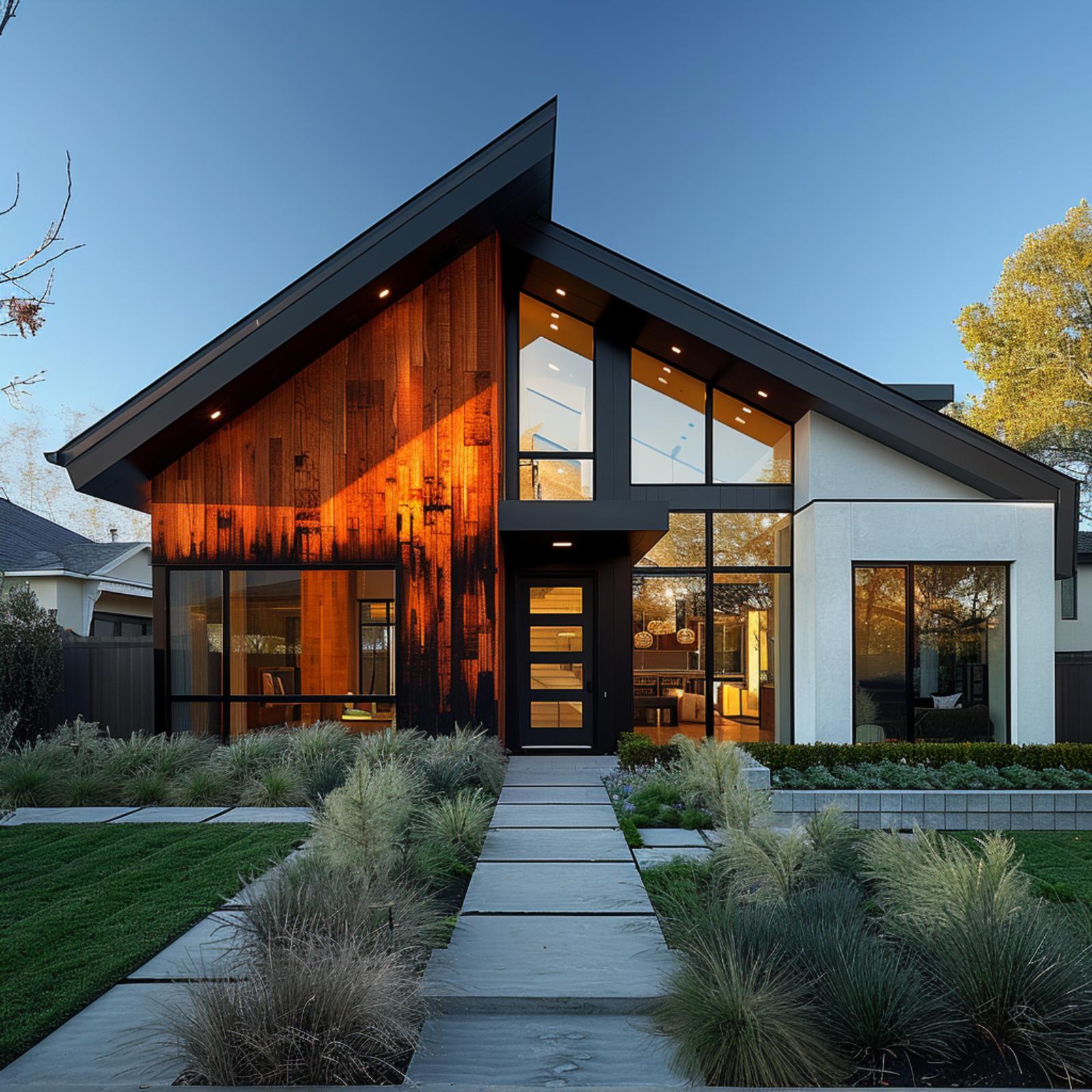
Rusted Cedar, White Render, and Black Steel Frames Walk Into a Facade and Sort It Out
Cedar siding finished to a deep rust-orange anchors the entry tower, and the intensity of that color is exactly what keeps the rest of the facade from drifting. Black steel frames floor-to-ceiling glass across the main volume, and the wood soffit overhead pulls those two materials into the same conversation without forcing them to match.
Tongue-and-groove cedar on the ceiling plane above the entry does something useful here: it gives the eye a warm surface to land on before it hits the glass. The ornamental grasses in front mirror the cedar’s bronze tones closely enough that the planting bed doesn’t feel like an afterthought. It’s a small move, but it lands.
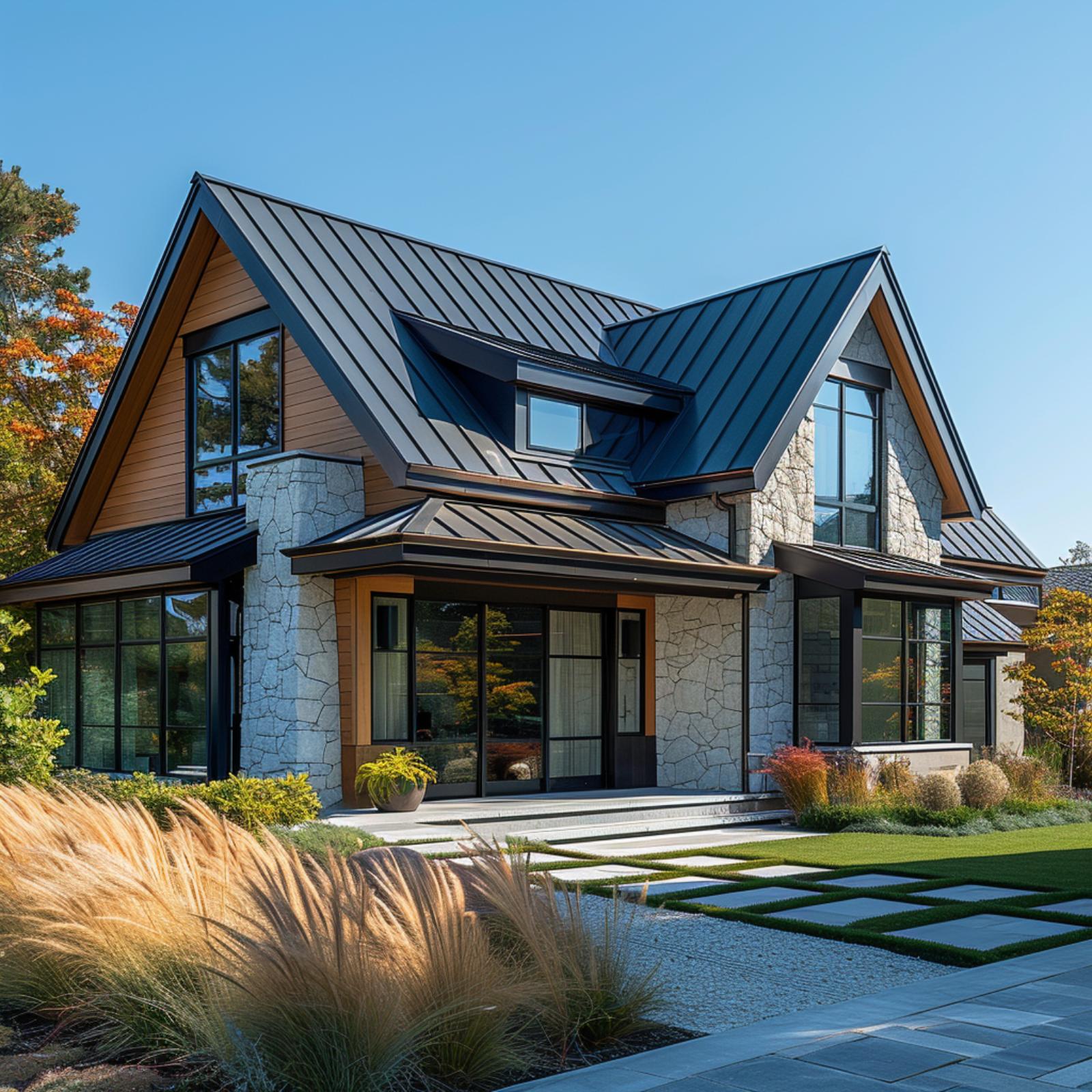
Dark Tile, Cedar Cladding, and White Stucco Arrange Themselves and Actually Agree
🔥 Would you like to save this?
Dark flat-profile roof tile sets the tone here, and the cedar siding earns its place by staying contained to the upper-right volume and the entry soffit rather than spreading across the facade. That discipline is what keeps three materials from competing. Stepped concrete pavers and blue-green agave plantings echo the roof’s cool undertone without matching it exactly.
Slate Brick, Glass, and White Masonry Walk Onto One Facade and Divide the Work
Slate-toned brick covers the left volume top to bottom, and it earns that dominance by staying consistent rather than trying to do too much. The stacked horizontal coursing reads almost like layered stone from a distance, which is a different visual register than the white masonry column on the right side. Between them, floor-to-ceiling glass panels span both levels, lit from within at dusk so the interior living space becomes part of the composition.
What holds it together is the roof geometry. That asymmetric angular overhang cuts across the top of the facade at a sharp pitch, and because it’s clad in the same dark tone as the steel frames, it pulls both volumes under one gesture without flattening them. The rounded boxwood shrubs at grade feel almost too tidy for a facade this angular. But they work.
Limestone, Dark Metal Panel, and Cedar Soffit Settle the Argument Before You Notice One
Light limestone block anchors the ground floor, and the dark vertical metal cladding above it doesn’t soften the contrast at all. That sharpness is the point. Warm cedar wraps the entry soffit and the uppermost overhang, giving both levels a moment of heat without asking the metal to do anything it isn’t built for.
Horizontal Cedar, White Panel, and Black Steel Frames Walk a Two-Story Facade Into Focus
Warm cedar cladding runs in tight horizontal boards across the upper level, lit from above by recessed soffit lights that pull the grain forward at dusk. White panel cladding anchors the corners and ground-floor surround, keeping the composition from tipping too far into warmth. Black steel frames the entry glazing and balcony rail without apology.
What makes it hold together is the lighting doing quiet structural work. Ground-level path lights echo the soffit fixtures above, so the eye moves up and down the facade rather than stopping at the garage door. That vertical movement across a horizontal-dominant material is harder to achieve than it looks.
Dark Brick at Ground, White Render Above, and Glass Connecting Both Without Apology
Black brick anchors the ground floor with enough visual weight that the white render above it reads as a natural lift rather than a contrast forced on the facade. The glass balustrade on the second-floor balcony keeps that transition honest. It doesn’t interrupt it.