🔥 Would you like to save this?
A fence does more work than most people give it credit for. It’s the first thing visible from the street, the line that defines where a property begins and ends, and the backdrop against which every plant, path, and facade is unconsciously judged. Get it wrong and even a well-kept yard looks unfinished. Get it right and the whole property reads as intentional — like someone actually thought about how the pieces connect rather than picking a fence from a catalog and hoping nobody notices.
In order to come up with the very specific design ideas, we create most designs with the assistance of state-of-the-art AI interior design software. Also, assume links that take you off the site are affiliate links such as links to Amazon. this means we may earn a commission if you buy something.
This collection pulls together 39 designs worth studying. A few work in almost any setting. Most don’t, and knowing which is which is the point.
39. Dark Brick, Horizontal Slats, and a Gate That Actually Earns Its Place
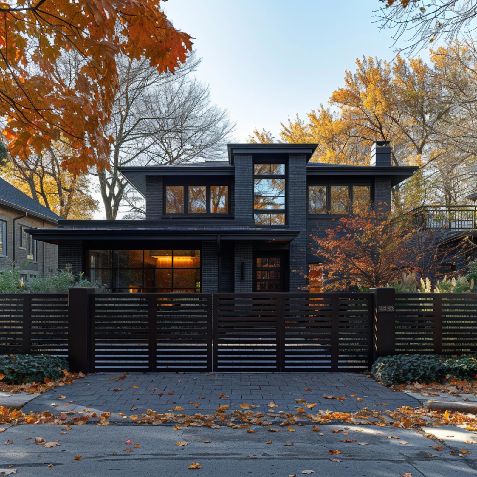
Painted or dark-fired brick covers the entire facade in near-black, and the horizontal slatted gate picks up that same tone without repeating the texture. That decision, matching value without matching material, is what keeps the front of the property from feeling busy. The gate itself spans nearly the full driveway width, with evenly spaced metal slats and a center split that reads more architectural than utilitarian.
The two-story structure has wide black-framed windows that reflect the surrounding autumn canopy back at you, which is probably its best seasonal trick. Fallen leaves on the paver driveway look less like yard work and more like staging. It’s a rare case where the fence doesn’t just mark a boundary. It frames the whole composition.
38. Warm Brick, Horizontal Slats, and One Gate That Pulls Everything Into Focus
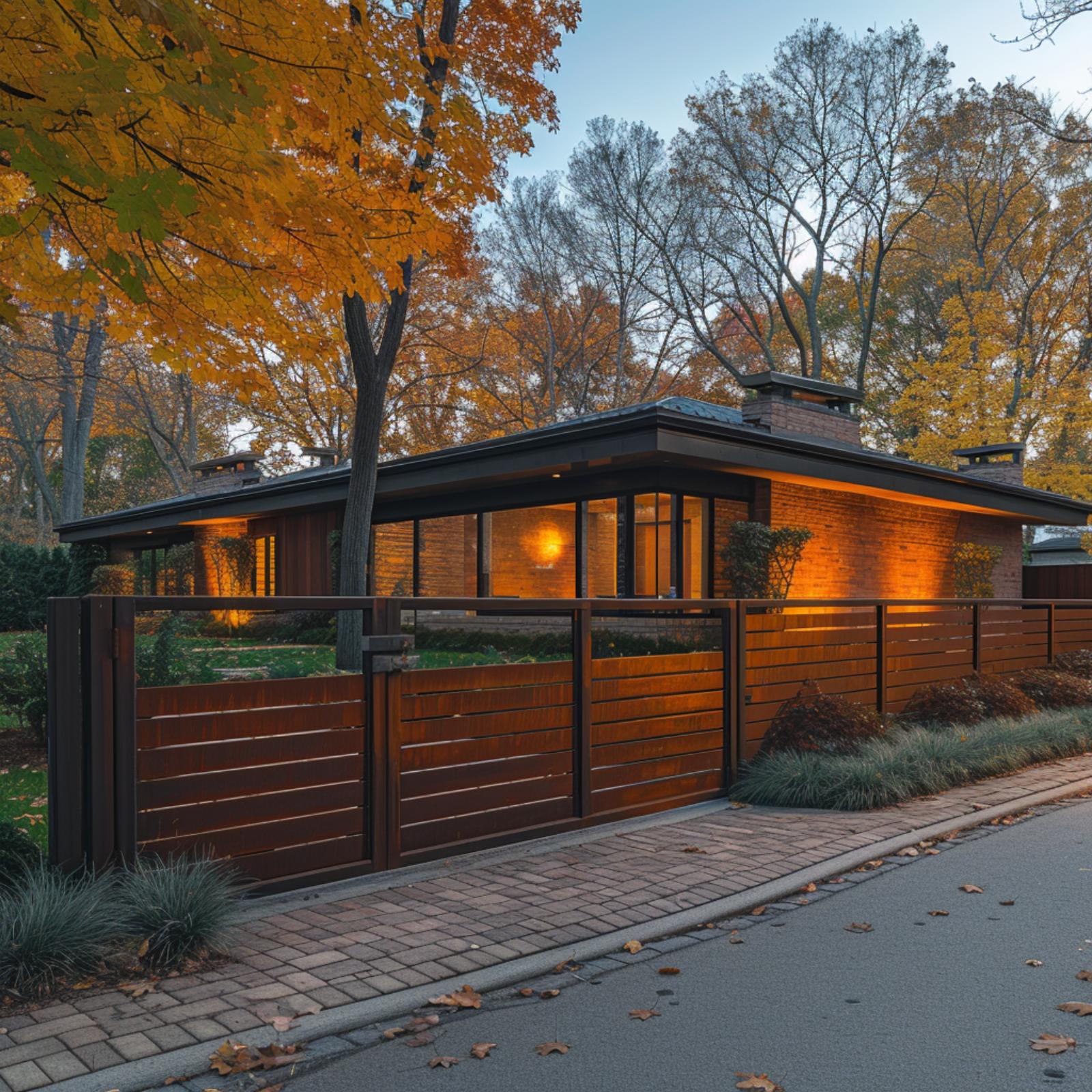
Walnut-toned horizontal slats on the fence and gate echo the brick’s burnt-orange warmth so closely that the boundary between structure and enclosure almost disappears. It’s a low-slung Usonian-influenced house, and the flat roofline demands exactly this kind of fence. Anything taller would’ve killed the proportions entirely.
37. Matte Black Steel Fence Aligns with Home’s Strong Horizontal Lines
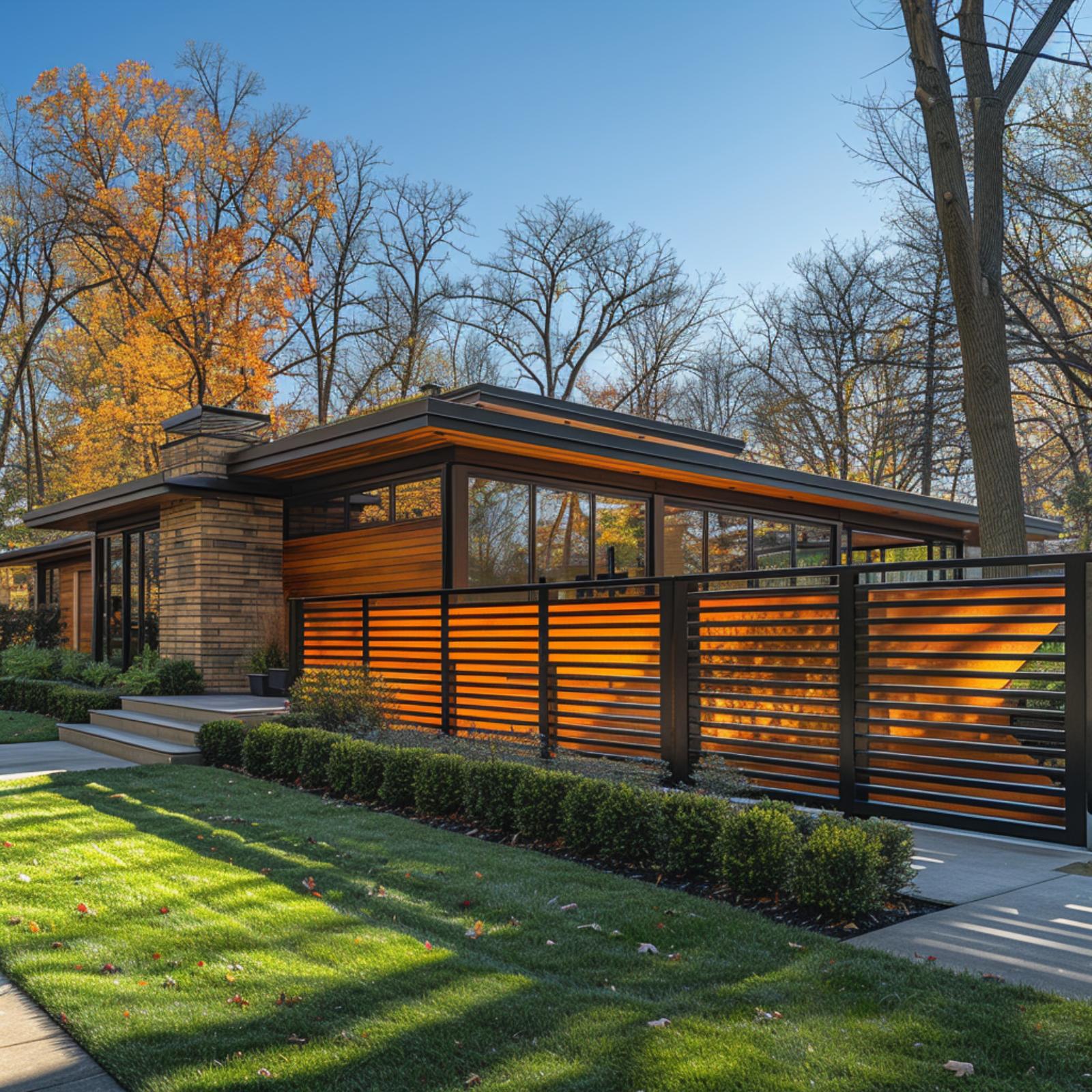
Horizontal matte black steel slats run the full width of the front yard, set within a matching steel frame and subtly backlit to produce that warm amber glow. The effect echoes the tone of the wood soffit above without actually repeating the material, creating a layered composition of light, shadow, and reflection. Set in front of a continuous clerestory window band, the fence aligns with the home’s strong horizontal lines rather than competing with them, turning the frontage into a cohesive architectural system rather than a separate boundary.
36. White Columns, Black Iron, and the Fence That Finally Makes It All Click
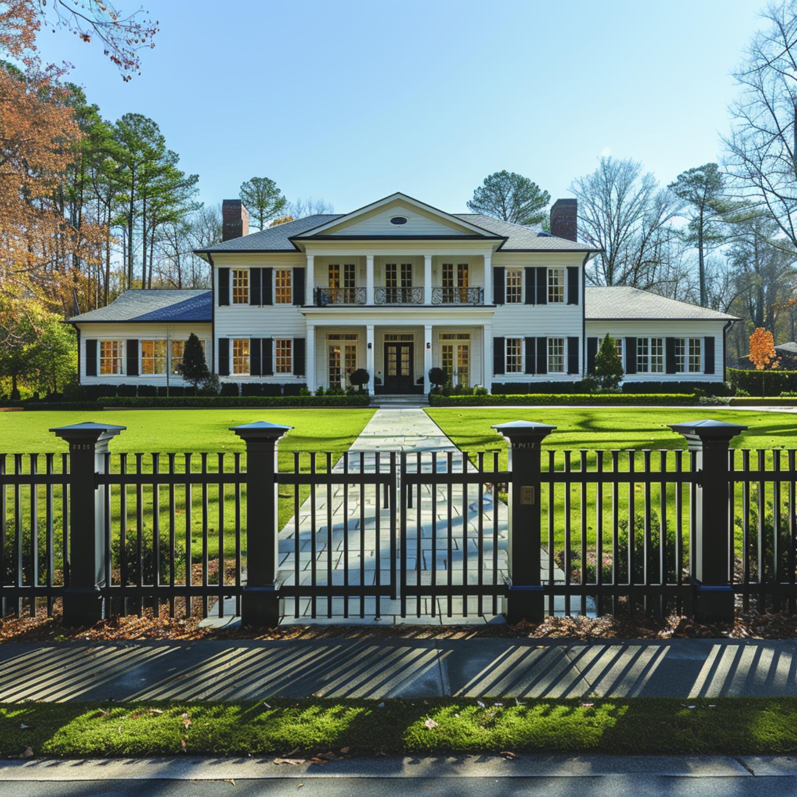
Black iron pickets with capped square posts frame a white clapboard Colonial that would feel exposed without them. The gate centers perfectly on a bluestone walkway, and that alignment does more work than it looks like it should. Symmetry confirmed.
Style Math: The iron fence borrows its vertical rhythm from the columns behind it, so your eye reads the whole property as one composition rather than a house sitting behind a barrier. That’s the move. When the fence shares a material language with the architecture, it stops being a boundary and starts being part of the facade.
Stone and iron have their moment, but wood paired with steel makes an entirely different argument.
35. Cedar, Steel, and a Front Fence That Actually Unifies the Whole Property
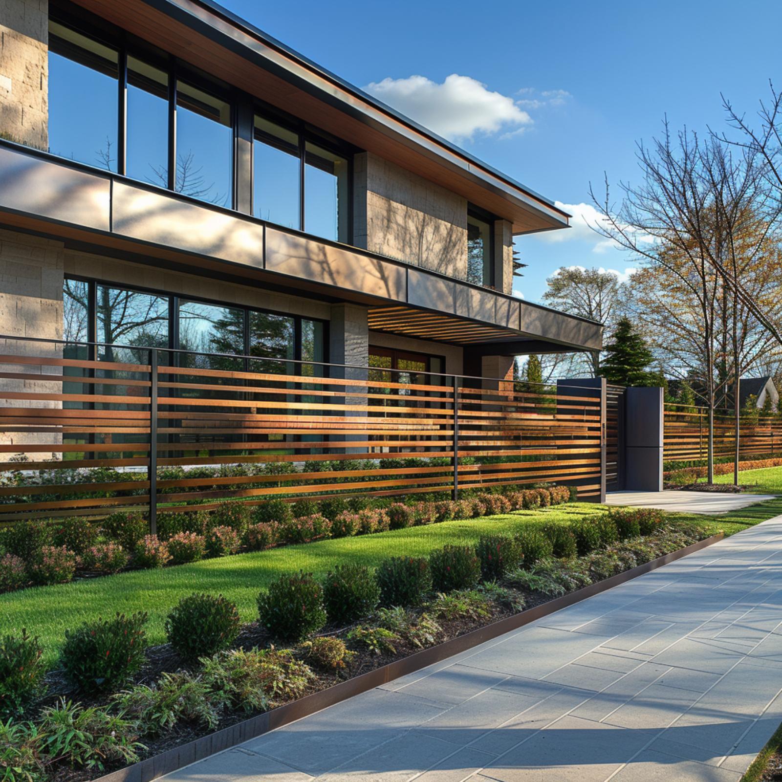
Warm cedar slats run horizontally through a steel frame, and the effect is less “fence” and more architectural extension of the house itself. The wood tone pulls directly from the soffit cladding overhead, so the boundary feels connected rather than tacked on. A dark matte steel post anchors the gate column, and it’s the same finish used on the window frames above. That’s not a coincidence; it’s what keeps the eye moving upward instead of stopping at the perimeter.
The landscaping in front earns its place too. Low clipped shrubs alternate with ground cover in a rhythm that mirrors the slat spacing. The result is a front elevation that reads as a single considered composition, from the pavement edge to the roofline.
34. Cedar Siding, Fern Beds, and the Gate That Locks the Whole Look In
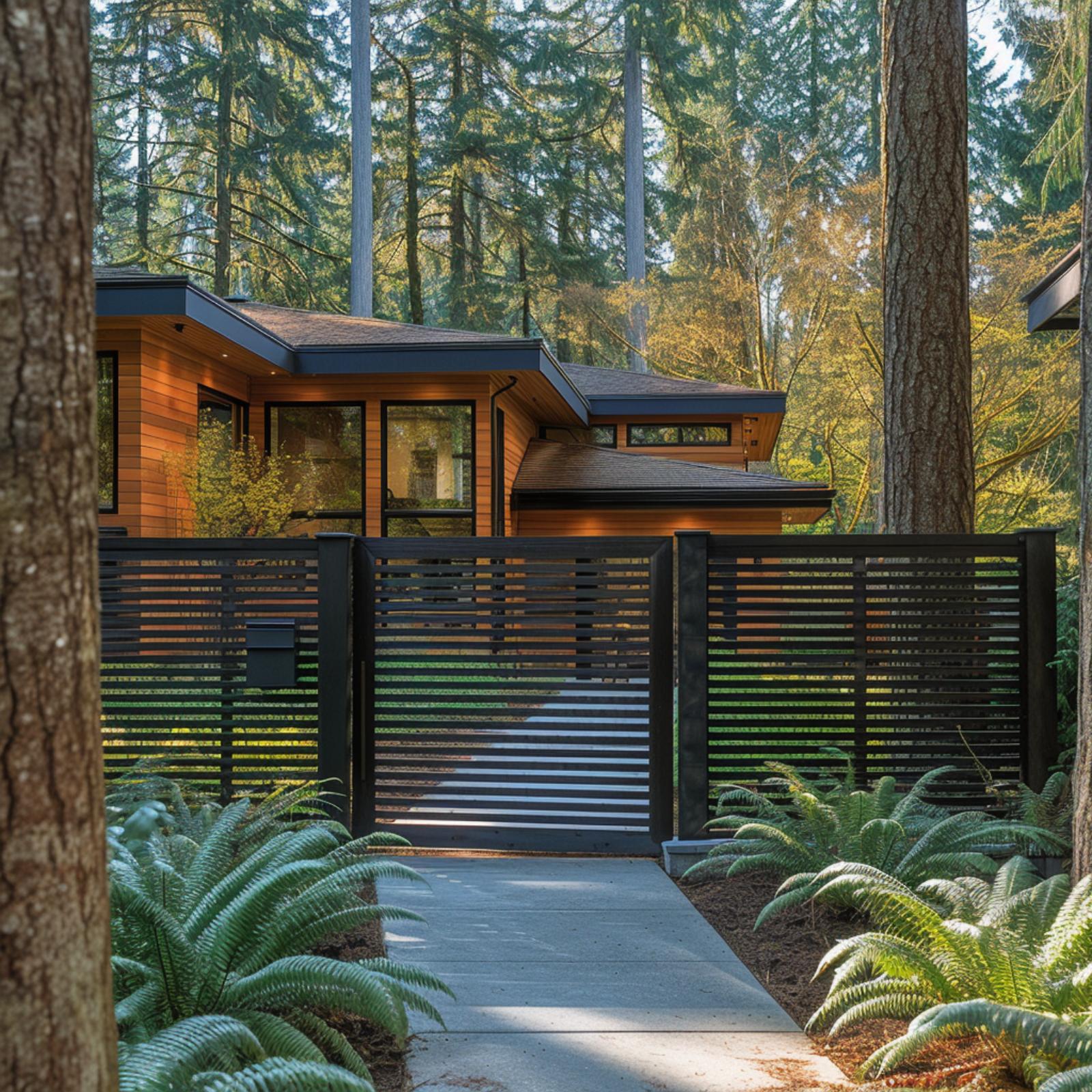
Tall firs frame a cedar-clad house, and the fence pulls its color directly from that siding. Dark steel posts anchor horizontal slats at a spacing tight enough for privacy but open enough to let the greenery behind read through. And those fern beds aren’t incidental. They soften the concrete path just enough that the gate doesn’t feel like a barrier.
Style Tip: When a fence and a house share the same tonal family, the property reads as intentional rather than assembled over time. Cedar and dark steel work here because both materials weather in ways that suit a forested setting. If you’re choosing fence color, pull from your cladding before you look at any paint chart.
33. Vertical Cedar Slats, a Curved Fence Line, and One Property That Finally Reads as Whole
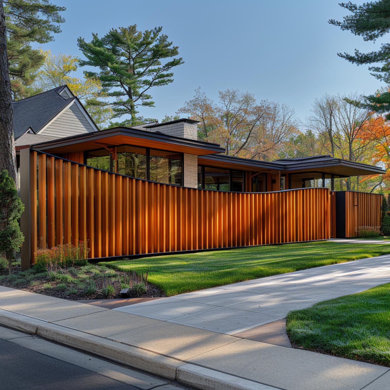
Redwood-toned vertical slats curve gently along the property line, and that arc does more work than it looks like. It softens what would otherwise be a rigid street-facing wall while echoing the low horizontal roofline of the mid-century ranch behind it. Steel top and bottom rails keep the warm wood grounded. It’s a fence that doesn’t compete with the house.
That arc does more work than it looks like, softening what would otherwise be a rigid street-facing wall.
32. Corten Steel, Black-Eyed Susans, and a Fence That Makes the Whole Street Stop
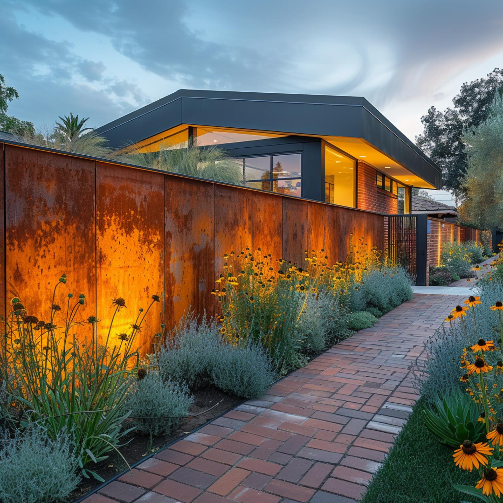
Corten steel does something most fence materials won’t: it ages into its own color story. Here, those rust-orange panels pick up the warm interior light spilling through the clerestory windows above, so the fence and the house read as one object rather than two separate decisions. The brick pathway running alongside it has the same earthy red undertones, which doesn’t feel accidental.
What ties it together is restraint. The plantings stay low enough that the steel reads as a continuous plane, and the black-eyed Susans planted along the base mirror the amber glow without competing with it. The dark metal roofline above anchors everything. It’s a fence doing genuinely architectural work.
Budget Tip: Corten steel costs more upfront than wood or vinyl, but it requires no painting, staining, or sealing over its lifetime. The weathered patina it develops is the finish, so ongoing maintenance costs stay much lower than most people expect.
Not every bold property statement relies on drama alone — sometimes restraint does more work.
31. Dark Siding, Lavender Rows, and a Fence That Finally Makes the Property Cohere
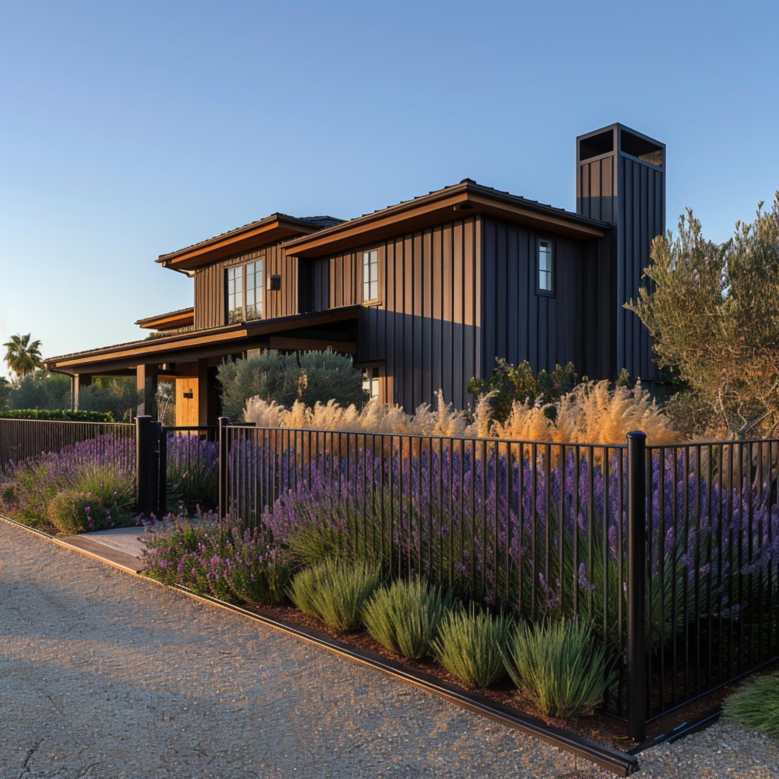
Vertical board-and-batten cladding in near-black anchors the house, but it’s the iron fence that keeps the whole composition from falling apart. Lavender planted in dense rows runs the full length of the fence line, and the purple blooms read almost like upholstery against the dark metal. That pairing isn’t accidental. When fence color and siding share the same depth of tone, plantings between them don’t compete, they complete. The ornamental grasses catching late-afternoon light add warmth without softening the property’s sharp geometry. It holds together.
30. Ridged Cedar, Steel Frames, and a Fence That Makes the Whole Property Make Sense
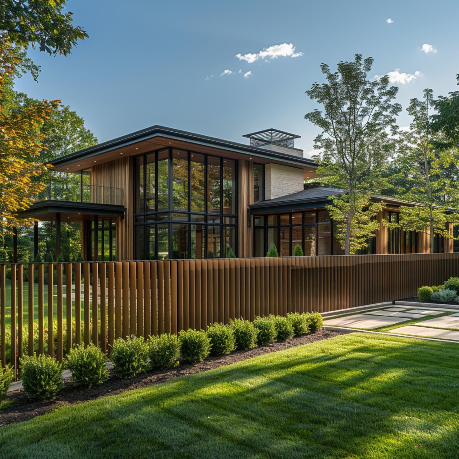
Rounded cedar slats run the full length of the front boundary, their warm amber tone pulling directly from the wood cladding on the house behind them. That repetition is doing real work. It’s what makes a two-story glass-and-steel facade feel grounded rather than dropped onto the lot.
Neatly clipped boxwood rounds line the base of the fence in a single row, giving the planting bed a clean edge without competing for attention. The stone pathway alongside it uses wide, spaced pavers that let grass breathe between them, keeping the hardscape light.
Ask Yourself: Before settling on a fence material, hold a sample against your house’s exterior cladding in natural light. If the tones clash at that scale, they’ll clash at full scale too. Your fence doesn’t need to match exactly, but it should feel like it belongs to the same family.
29. Illuminated Louvers, Stone Columns, and a Fence That Rewrites the Front of the Property
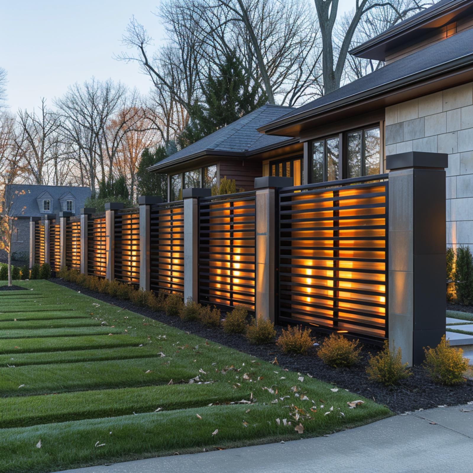
Glowing from within at dusk, this louvered fence earns every bit of attention it gets. Warm amber light pushes through dark horizontal slats mounted between stone-clad columns, and the effect reads less like security fencing and more like architectural intention.
What makes it work is restraint elsewhere. Black mulch beds, low shrubs, and parallel grass strips keep the foreground quiet so the fence can carry the moment. The columns match the house’s stone cladding exactly, which means the boundary between fence and building nearly disappears. It all holds together.
Worth Knowing: Integrated lighting built into or behind fence panels eliminates the need for separate ground-mounted uplights, which can shift, flood, or get buried by mulch over time. If you’re building a fence with this kind of illuminated detail, wiring it during construction costs far less than retrofitting later. A licensed electrician can also help you choose the right color temperature so the light flatters your exterior cladding rather than fighting it.
28. Stone, Cedar Slats, and a Front Fence That Makes the Whole Street Make Sense
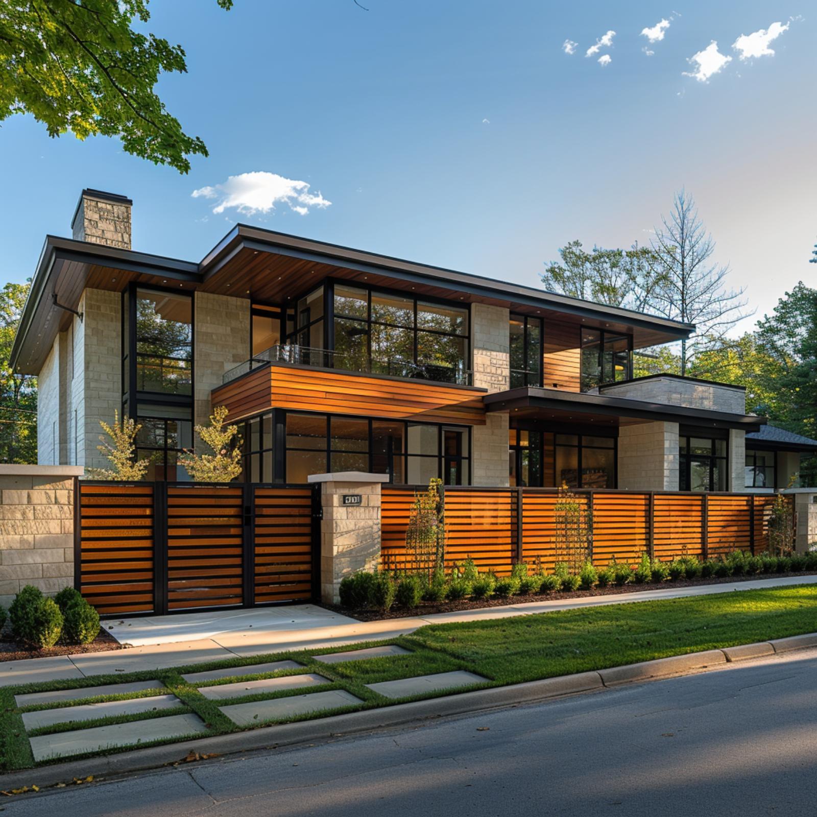
Limestone cladding, wood-ceiling soffits, and floor-to-ceiling steel-framed windows give this house a lot of competing voices. The horizontal fence pulls them into agreement. Its warm cedar slats echo the wood soffit overhead and the horizontal banding that wraps the second floor, so the fence doesn’t feel like an add-on. It feels like part of the original drawing.
The gate placement matters here. Centered on the driveway entry with stone pillar caps that match the house cladding exactly, it creates a formal arrival moment without any ornamental fussiness. Low boxwood plantings run the length of the fence base, grounding the whole composition without distracting from it.
Why the Steel Frame Around the Cedar Slats Isn’t Just Decorative
Dark steel channels border every fence panel and the gate, matching the window mullions on the house almost exactly. That repetition isn’t accidental. When a fence borrows its framing material directly from the building’s window system, the property reads as a single object rather than a house with a fence in front of it. Replicating that effect on an existing home means sourcing fence steel that matches your window frame finish before you buy a single slat.
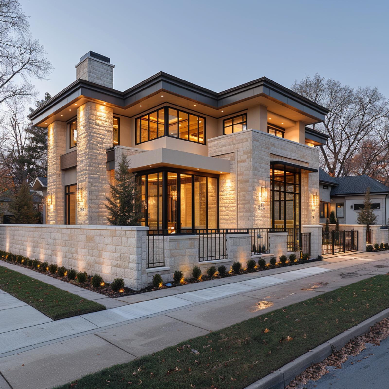
27. Stone Walls, Iron Rails, and a Fence That Pulls Every Element Into Focus
🔥 Would you like to save this?
Cut limestone cladding covers both the house and the perimeter wall below it, and that material continuity is doing most of the work here. The wrought iron railing inserts a rhythm of vertical lines that echo the window mullions above, so nothing reads as an afterthought. Warm amber uplighting washes the stone at ground level, making the fence wall feel like a base rather than a barrier.
Why It Works: Repeating one exterior material across both the house facade and the boundary wall is one of the most reliable ways to make a property feel composed rather than constructed in phases. It doesn’t require matching everything, just anchoring the dominant material so the eye has a consistent thread to follow.
26. Prairie Lines, Warm Wood, and a Fence That Makes the Whole Block Rethink Its Curb
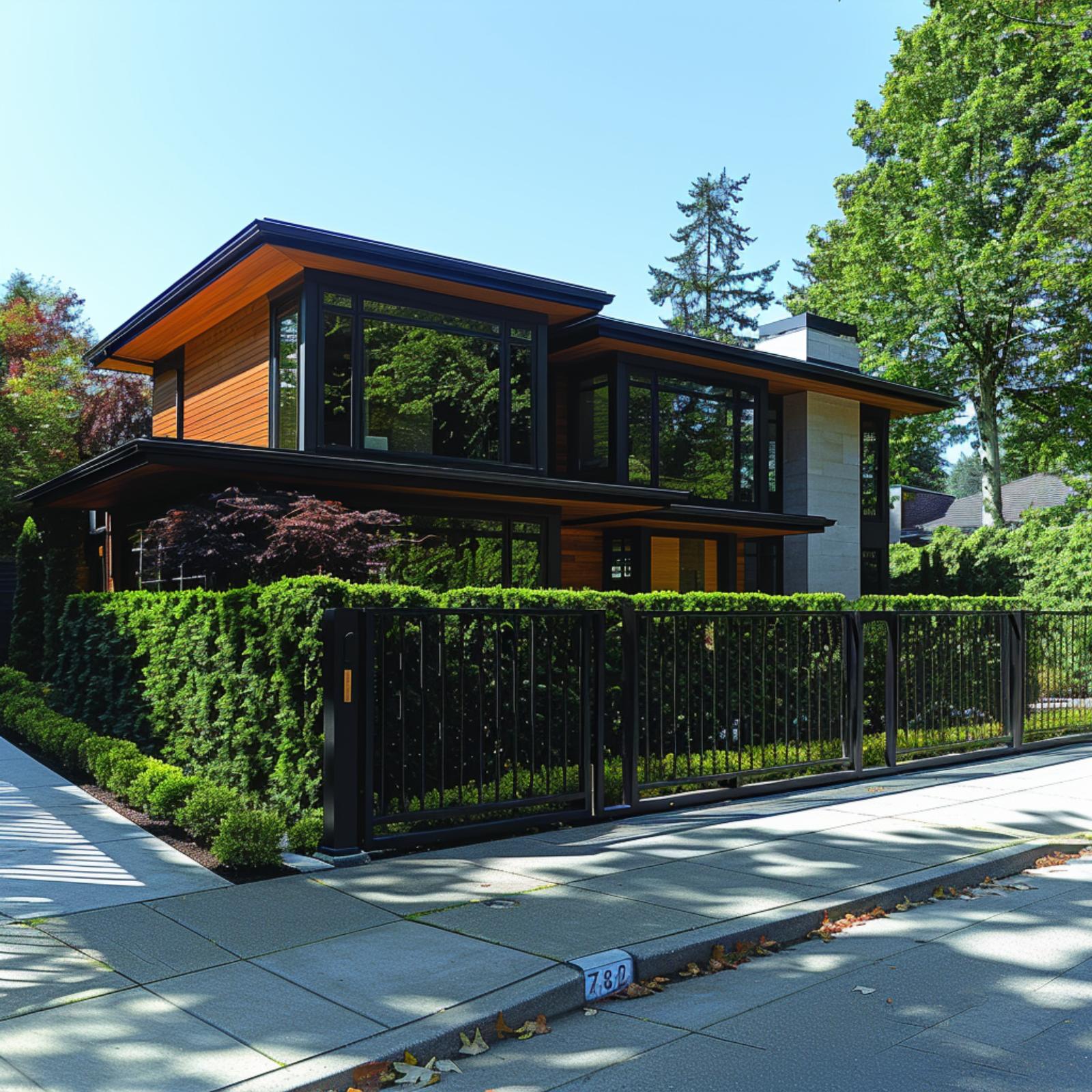
Few fences do this much work.
Iron verticals run the full width of the property, and their spacing echoes the window mullions on the second floor so precisely that the fence reads less like a boundary and more like a continuation of the architecture. The cedar cladding on the upper story is warm, almost amber in this light, and the matte black of the gate frame pulls from the same finish on the roof fascia. That repetition is what locks it. Clipped boxwood hedging runs the interior length of the fence line, softening what could’ve been a stark industrial edge without competing with the house’s geometry. House number 780 sits flush with the curb in plain stone, and even that small detail feels coordinated. Nothing here looks added after the fact.
25. Black Iron, White Cladding, and a Fence That Makes the Property Read as One
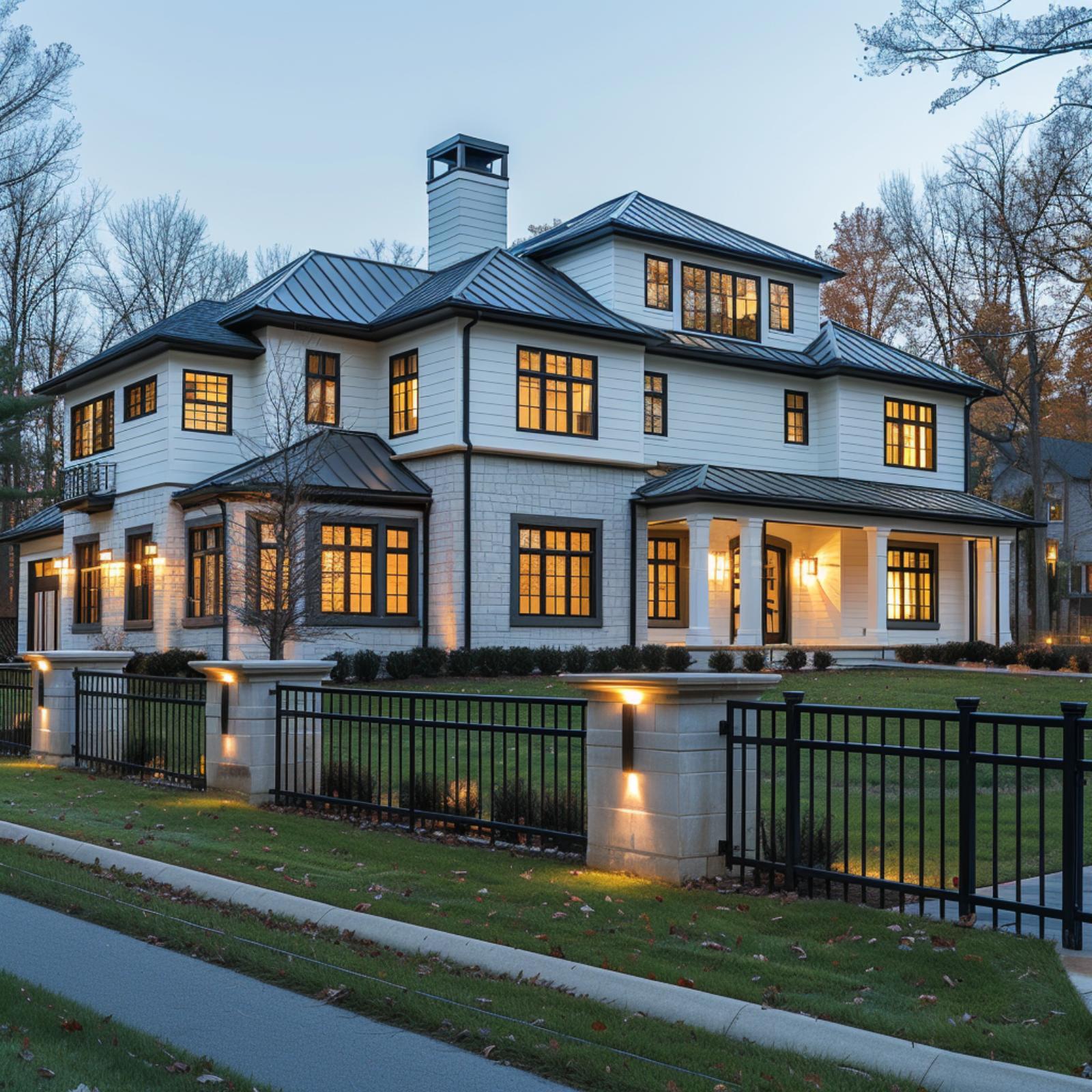
Painted white lap siding on the upper floors meets white-painted brick on the lower level, and that tonal consistency across two different materials is already doing serious work. The black iron fence picks up the window trim color exactly, so the boundary line doesn’t compete with the house.
It anchors the whole composition instead. Stone pier columns with recessed wall sconces connect the fence to the architecture behind it, giving the property a front edge that feels finished rather than just enclosed.
- Matching fence color to window trim creates a visual thread that pulls the eye across the full facade
- Stone piers with built-in lighting turn a perimeter fence into an architectural feature rather than a property line
- Using the same finish tone at ground level and roofline keeps the eye moving vertically rather than stopping at the fence
24. Square-Grid Steel, Warm Cedar, and a Gate That Makes the Property Read as Finished
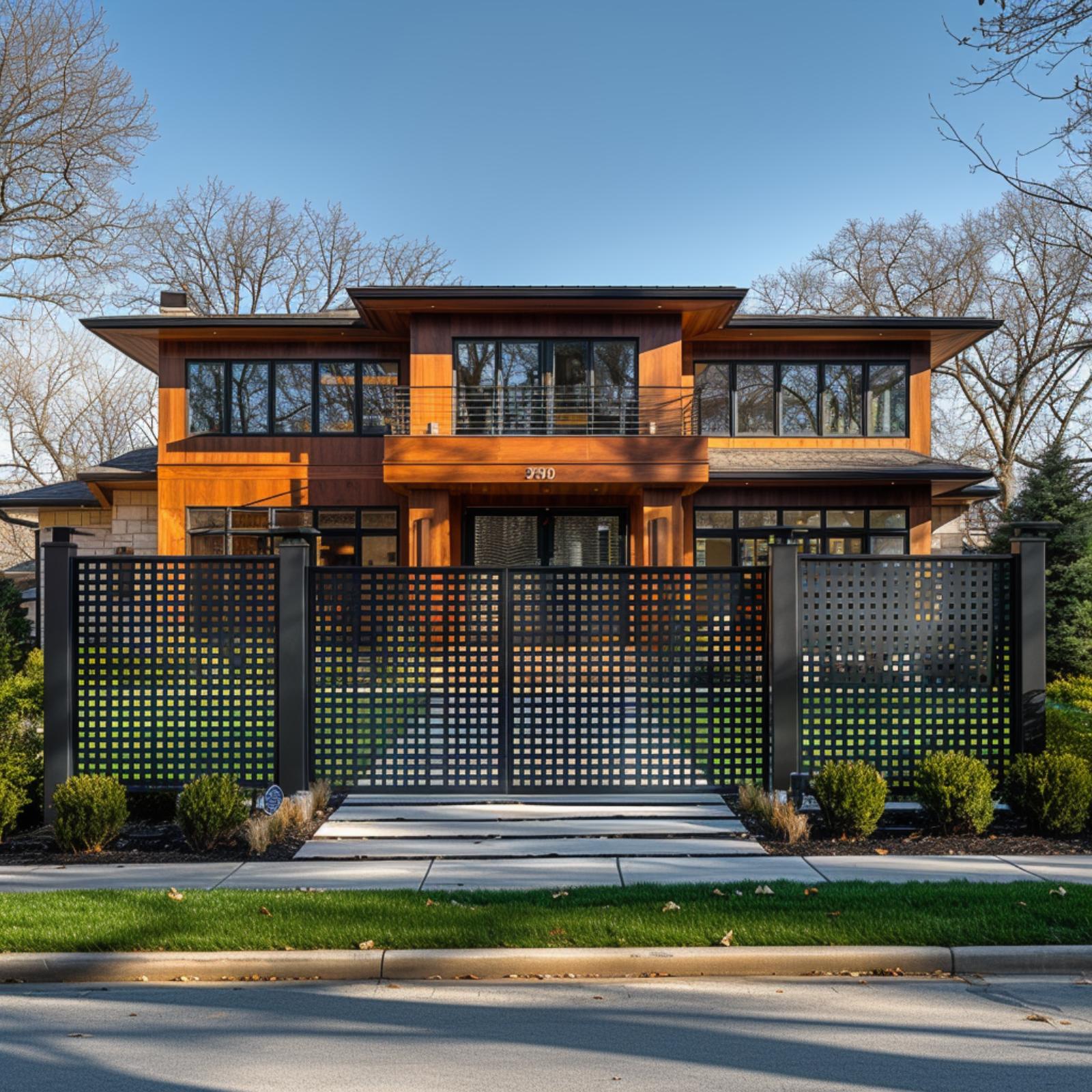
Darkened steel panels cut into a square-grid pattern run the full width of the property, bookended by square column posts that mirror the gate’s geometry exactly. That repetition is doing real work. The fence doesn’t contrast with the house behind it so much as echo it, pulling the warm cedar cladding and black window frames down to street level where a visitor can actually engage with them.
The driveway approach runs through the center gate on a clean concrete pad, and low boxwood plantings on either side keep the entry grounded without competing. What holds it all together is tonal discipline: the dark steel reads as an extension of the black window frames two stories up, so the property doesn’t feel like a house behind a fence. It feels like one thing.
Pro Tip: Square-grid fence panels tend to feel heavier visually than vertical slat or horizontal rail designs because the pattern has no dominant directional line to guide the eye through it. If your house already has strong horizontal banding, a grid panel can actually counterbalance that and add visual weight at street level where it’s needed most. Scale the grid opening size to your gate width so the pattern doesn’t look compressed at the edges.
23. Black Rail Fencing, a Gravel Drive, and One Property That Reads as Complete
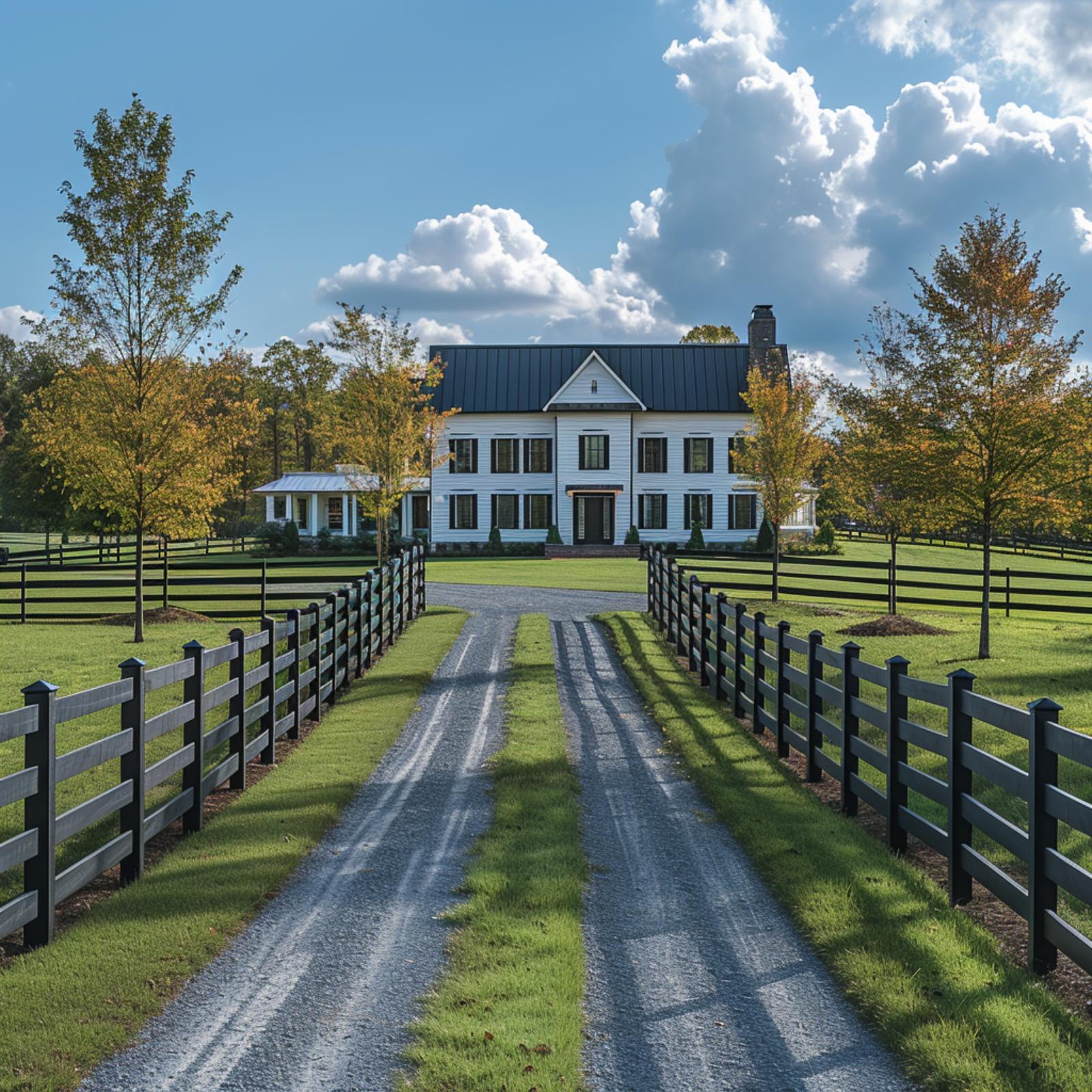
Flanking a gravel drive with matching black three-rail fencing creates a corridor that pulls the eye straight to the white clapboard house. It works because the fence color echoes the dark metal roof exactly.
Quick Fix: When a fence and a roofline share the same finish, the property stops looking like it was built in phases and starts looking like it was planned. Black-painted wood rail fencing achieves that connection for far less than wrought iron. It’s one of the cheapest ways to borrow visual authority from a much more expensive architectural element.
22. White Board-and-Batten, a Metal Roof, and Stone Walls That Make the Whole Drive Feel Designed
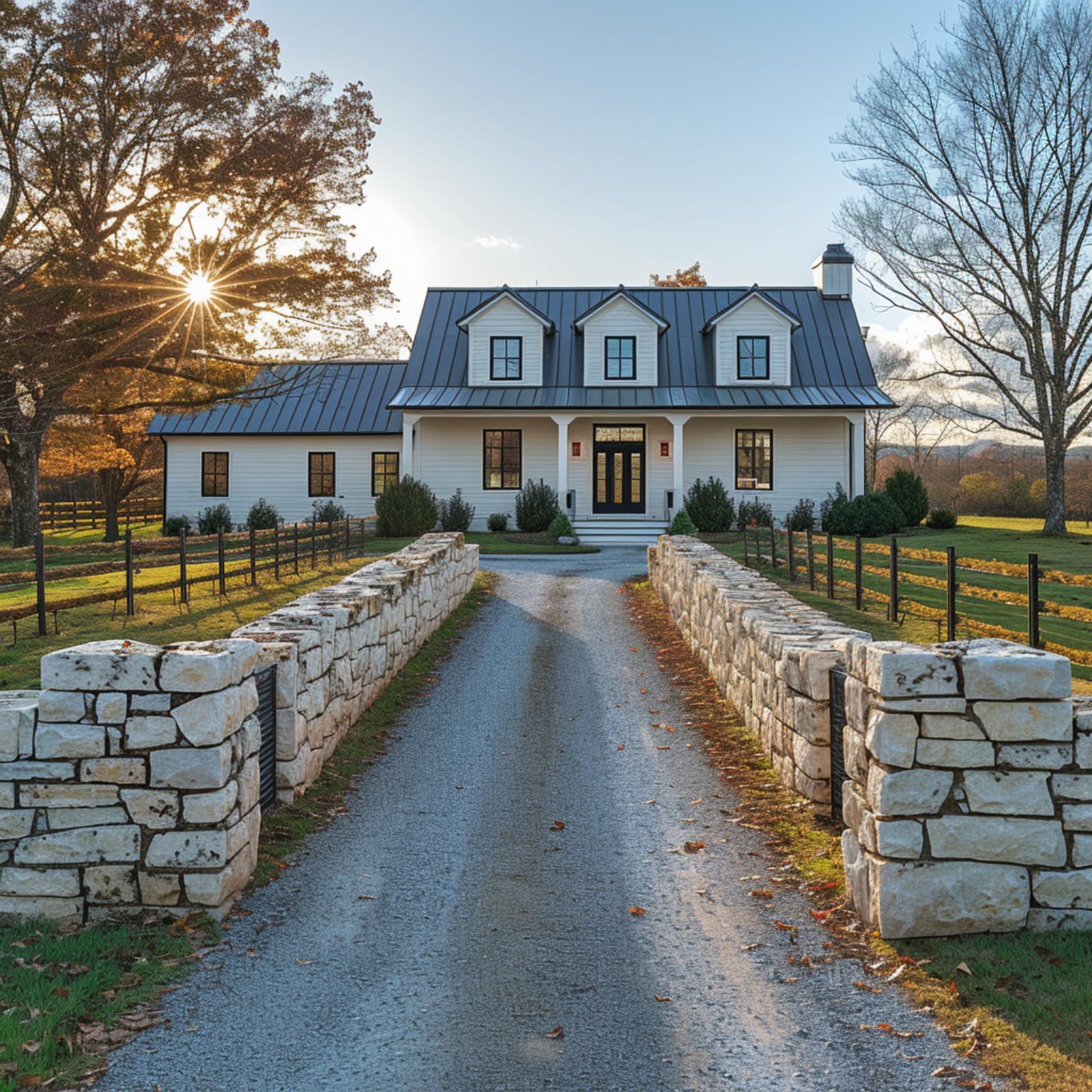
What’s doing the heavy lifting here isn’t the house. It’s the stone entry walls flanking the gravel drive, built from rough-cut limestone blocks stacked with visible mortar joints, that establish the property’s character before a visitor gets anywhere near the front door. They share the same pale, cool tone as the white board-and-batten siding, so the connection feels inevitable rather than planned.
From there, the standing-seam metal roof in charcoal picks up the black steel rail fencing running along both sides of the property. Two materials, repeated across four distinct elements. That kind of repetition is what makes a property read as a single composition rather than a house someone added a fence to later.
Material Matters: Gravel driveways pair especially well with stone boundary walls because both materials share an informal, unfinished texture that makes the combination feel cohesive without requiring precision edging or decorative borders. Where a poured concrete drive can make stone walls feel mismatched in formality, gravel keeps everything at the same register. It also handles drainage better than solid paving on rural or semi-rural properties with natural grade changes.
21. Natural Stone, Black Steel, and a Gate That Makes the Property Feel Inevitable
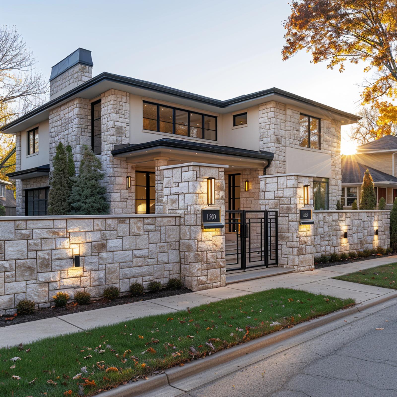
Warm limestone cladding runs from the house facade straight into the boundary wall without interruption, so the gate isn’t an entrance so much as a continuation. Wall-mounted uplights cast a focused glow across the coursed stone at dusk, doing the work quietly.
Designer’s Secret: When your fence material matches the house cladding at the foundation level, the boundary wall reads as an extension of the structure rather than a separate addition. That continuity is harder to fake with paint or veneer, which is why starting with the same stone or masonry pays off over time.
20. Floating Stone Steps, Prairie Rooflines, and a Retaining Wall That Makes It All Cohere
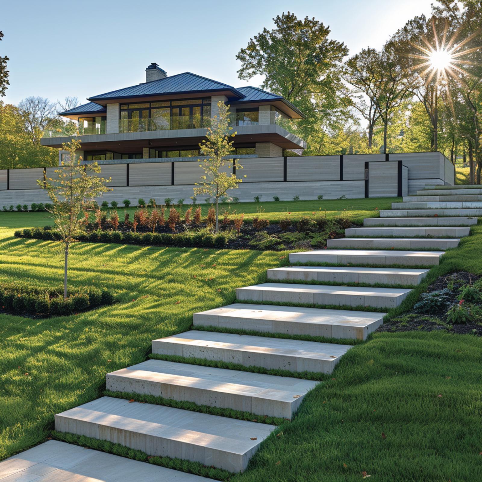
Broad concrete steps rise through a manicured slope in a design that’s doing more work than it looks like. Each tread floats just above the grass plane, and that gap keeps the whole staircase from reading as heavy infrastructure. The retaining wall behind uses the same pale stone finish as the steps, so the boundary reads as part of the architecture rather than a separate civil project.
The house above carries a standing-seam metal roof and deep horizontal overhangs that echo the layered geometry below. Nothing competes. The planting beds follow the same horizontal logic, and the young trees are spaced to reinforce the lines already established by the wall.
Try This: When your hardscape and retaining walls share the same material as your primary steps, the eye reads the grade change as intentional design rather than a problem that got solved. It’s worth testing this with samples held side by side before committing to a contractor, since tone shifts dramatically between a fabricator’s showroom and outdoor afternoon light. Consistency at the boundary is what makes the whole property feel planned from a single set of decisions.
19. Coquina Stone, Warm Cedar Soffits, and a Boundary Wall That Completes the Picture
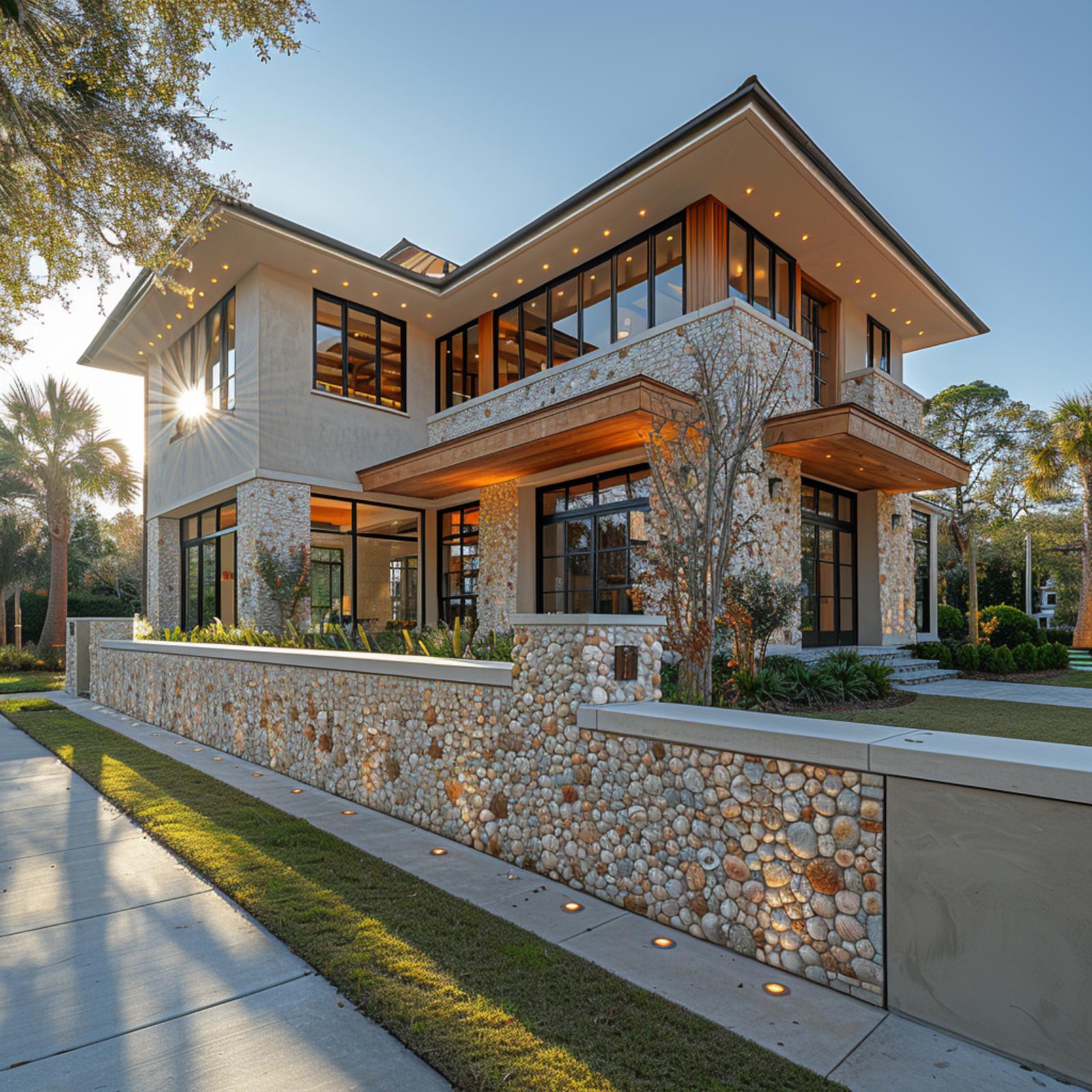
Every once in a while, a fence does so much work that the house couldn’t look finished without it.
Here, the boundary wall is clad in the same coquina-style river stone as the home’s columns and facade panels, so the property reads as a single object rather than a structure with a fence added later. The warm cedar soffits on the second-floor overhang pull the amber tones out of the stone, and those same tones run straight down through the wall to grade level. Ground-mounted uplights are embedded directly into the base of the retaining wall, which keeps the lighting flush and controlled rather than scattered across the lawn.
Matching your fence material to your foundation cladding is one of the simplest moves available, and it’s also one of the most overlooked. Most homeowners pick boundary materials separately from exterior finishes. The result is a property that looks assembled. This one doesn’t.
18. Coquina Retaining Wall, Terra Cotta Tile, and One Boundary That Ties It All Together
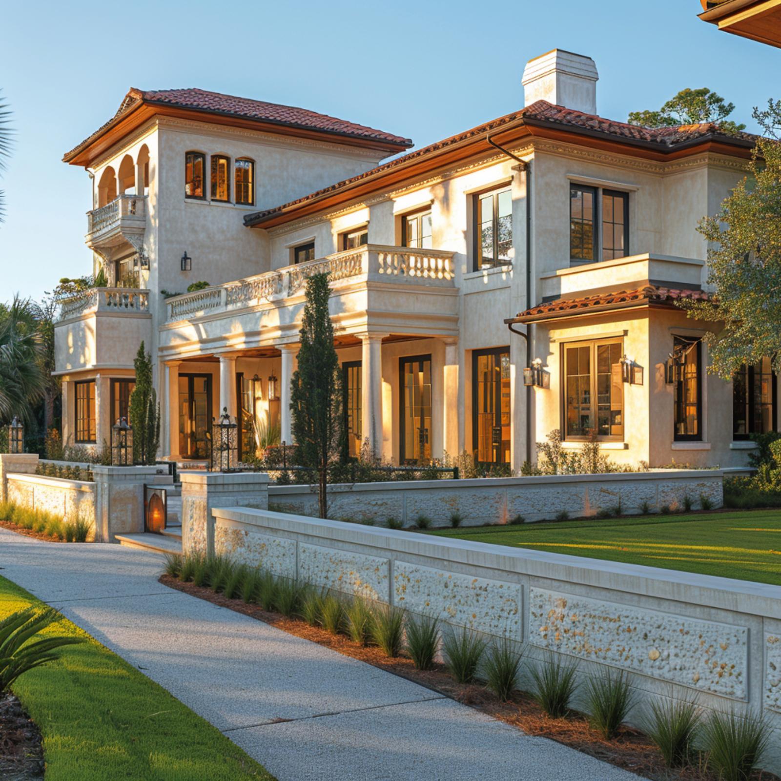
That fossil-flecked coquina retaining wall does most of the heavy lifting here. It shares the same cream-and-gold tonal range as the stucco facade above it, so the grade change reads as part of the architecture rather than a landscaping afterthought.
17. Limestone Block, Black Steel Gate, and a Fence That Makes the Property Feel Resolved
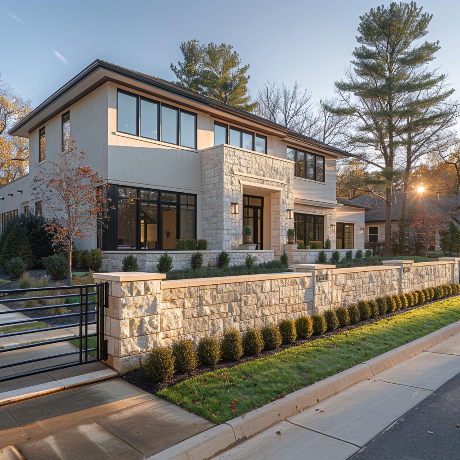
Matching the limestone coursework on the house facade, the boundary wall doesn’t read as an addition. It reads as a foundation. Trimmed boxwood planted along the street side of the wall keeps sightlines clean without softening the geometry too much.
16. Stone Columns, Black Steel Rails, and a Fence Line That Makes the Property Feel Whole
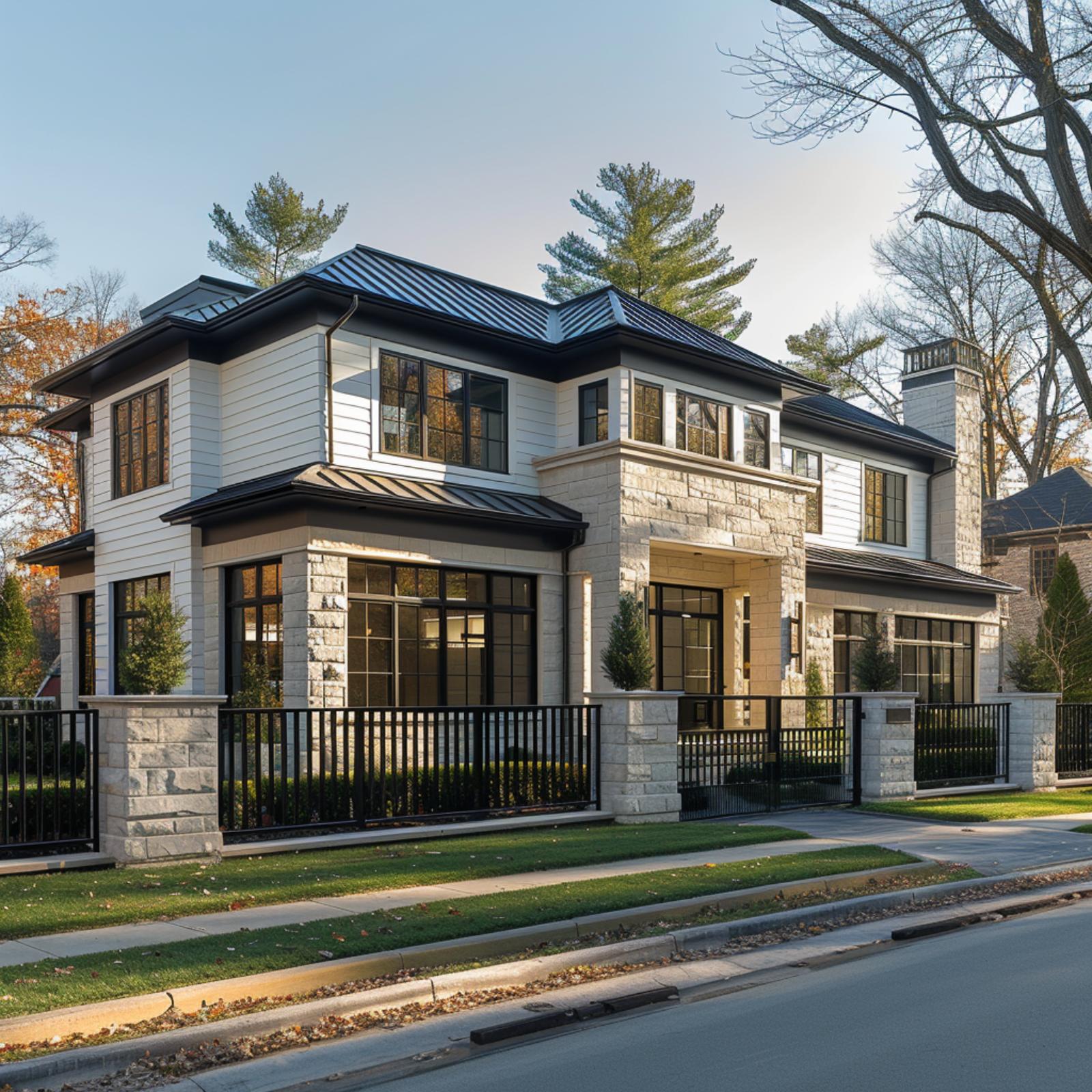
Limestone block columns anchor the perimeter fence at regular intervals, and the black steel rail panels between them borrow that same rhythm from the house’s window mullions above. Nothing here was decided separately. The fence line doesn’t just define the boundary; it completes the composition.
What’s easy to miss is how the fence height was calibrated. Tall enough to signal a private residence, low enough that the full facade reads from the street. That balance is harder to achieve than it looks, and most properties never get there.
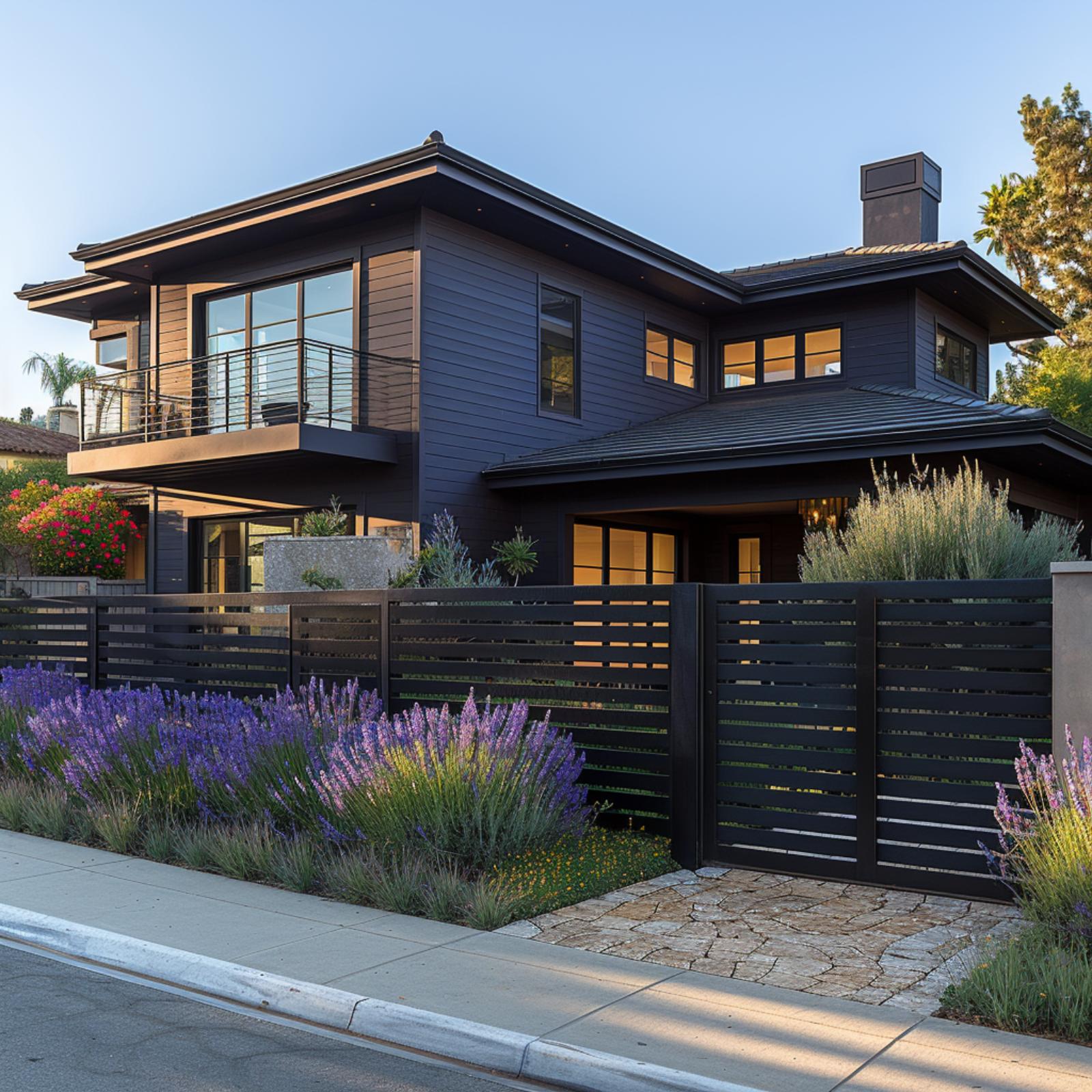
15. Dark Siding, Lavender, and a Horizontal Fence That Makes the Whole Street Facade Click
🔥 Would you like to save this?
Few front yards earn the word “resolved,” but this one does. Charcoal horizontal-slat fencing runs the full width of the property, its panel rhythm pulling together a two-story dark-clad exterior with a stone-paved driveway entry and a gate that sits flush with the fence line rather than announcing itself as a separate element.
The planting does real work here. Dense lavender and purple salvia soften the fence’s lower rail without hiding it, and because the blooms echo the cool undertones in the siding, nothing fights. Warm light glowing through the upper-floor windows keeps the dark palette from reading as severe. It’s a small but important balance: every element borrows from the same tonal register, so the boundary wall doesn’t feel added. It feels built-in.
14. Horizontal Steel Rails, Cedar Soffits, and a Fence That Makes Ocean Views Feel Earned
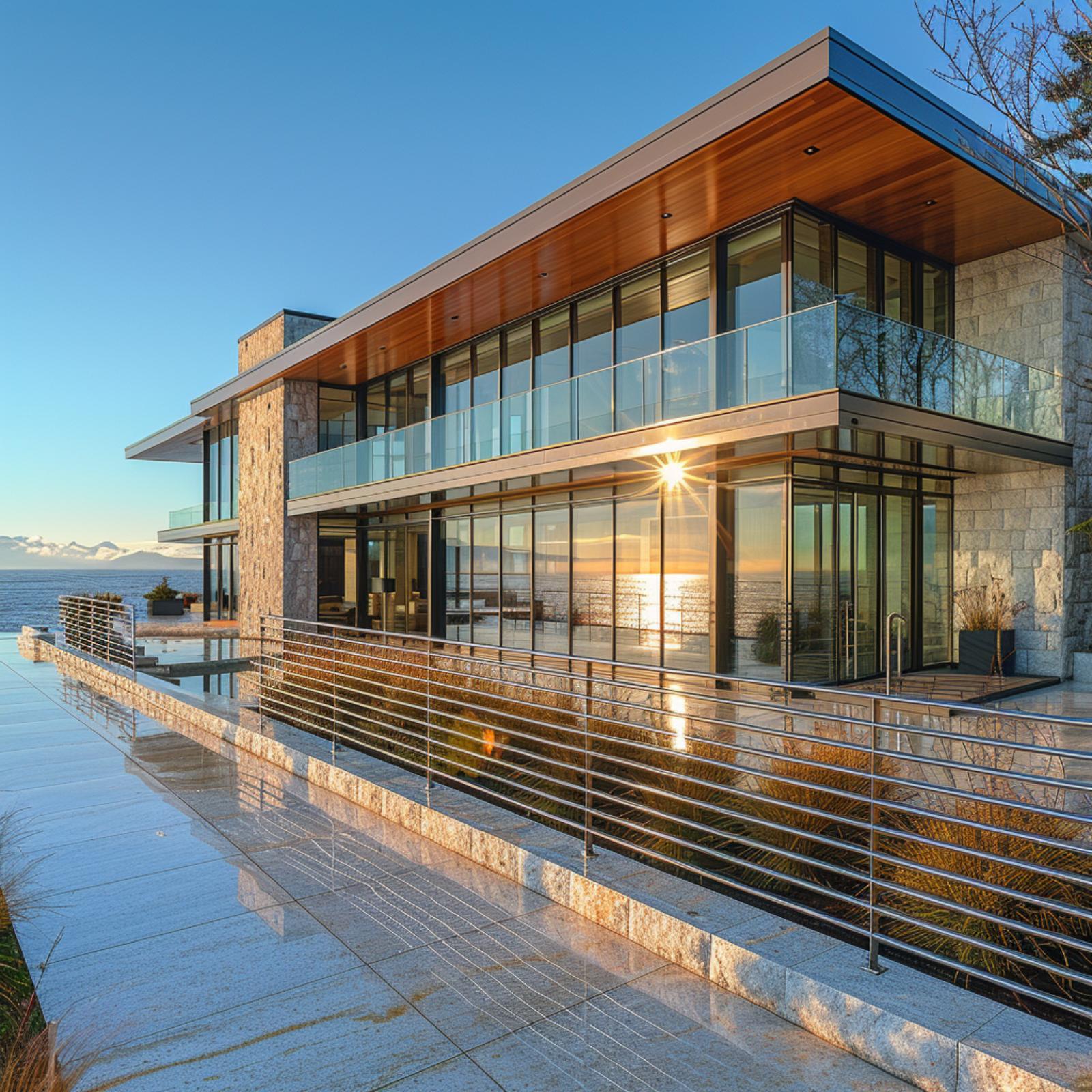
Stone cladding covers two full stories here, and the horizontal steel rail fence at the lower terrace borrows that same rectilinear logic without copying it directly. The rails run parallel to the water on the horizon, which means your eye doesn’t just rest on the fence — it travels through it toward the view beyond. That’s a compositional trick worth stealing.
Cedar soffits on the overhanging roof introduce warmth against all that glass and stone. The fence doesn’t try to match the cedar, but its polished steel finish picks up the sun’s reflection off the water and holds it for a moment. Glass balcony panels on the upper level keep the boundary transparent where the view matters most. Each material does its job at a different elevation, and the property reads as considered from every angle.
13. Cedar Cladding, Black Steel Frames, and a Fence That Makes the Lot Feel Finished
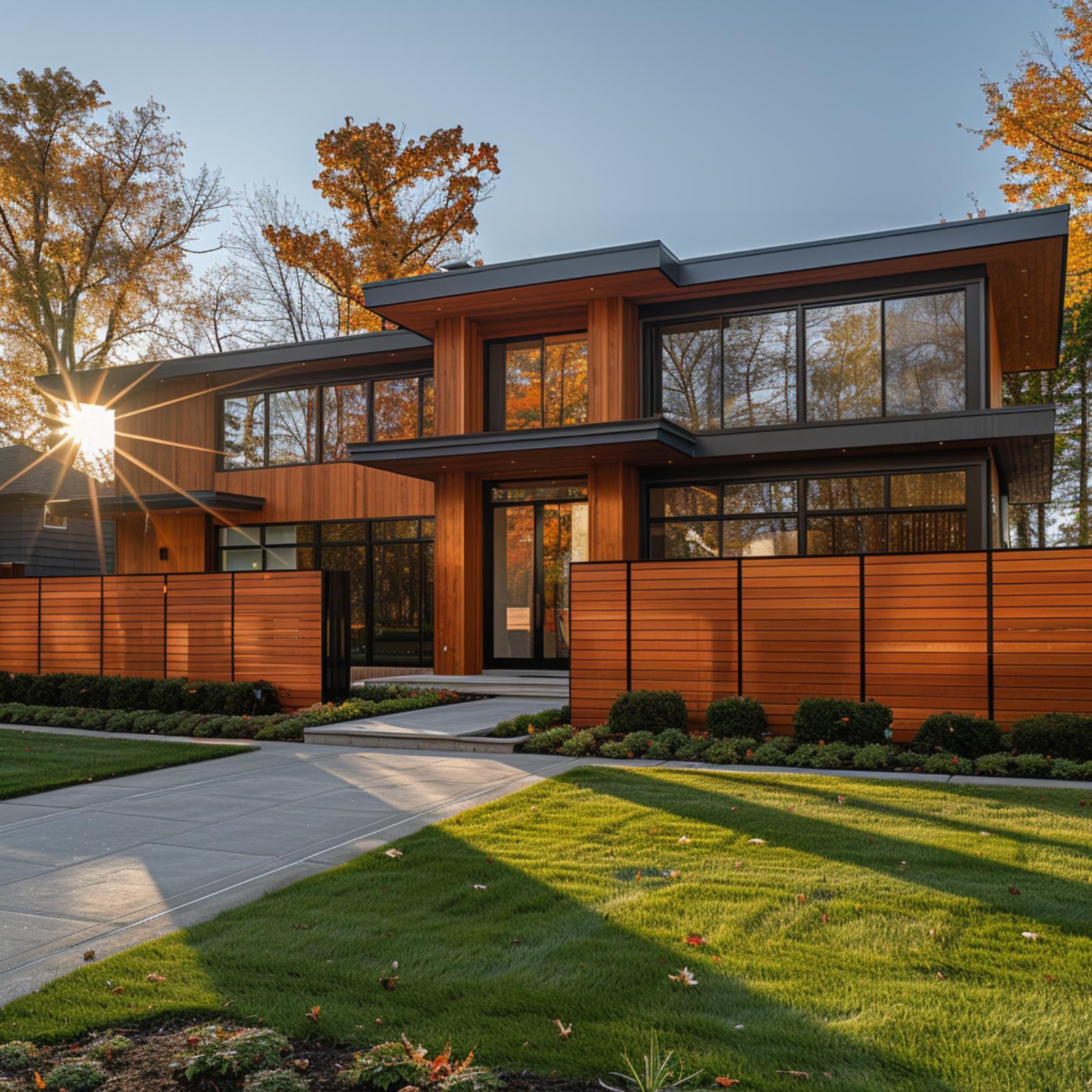
Horizontal cedar slat fencing runs the full width of the property, and because it shares the same warm reddish-brown tone as the house cladding above it, the boundary doesn’t read as separate. It reads as ground floor.
12. Redwood Cladding, Dark Steel Posts, and a Gate That Makes the Property Feel Composed
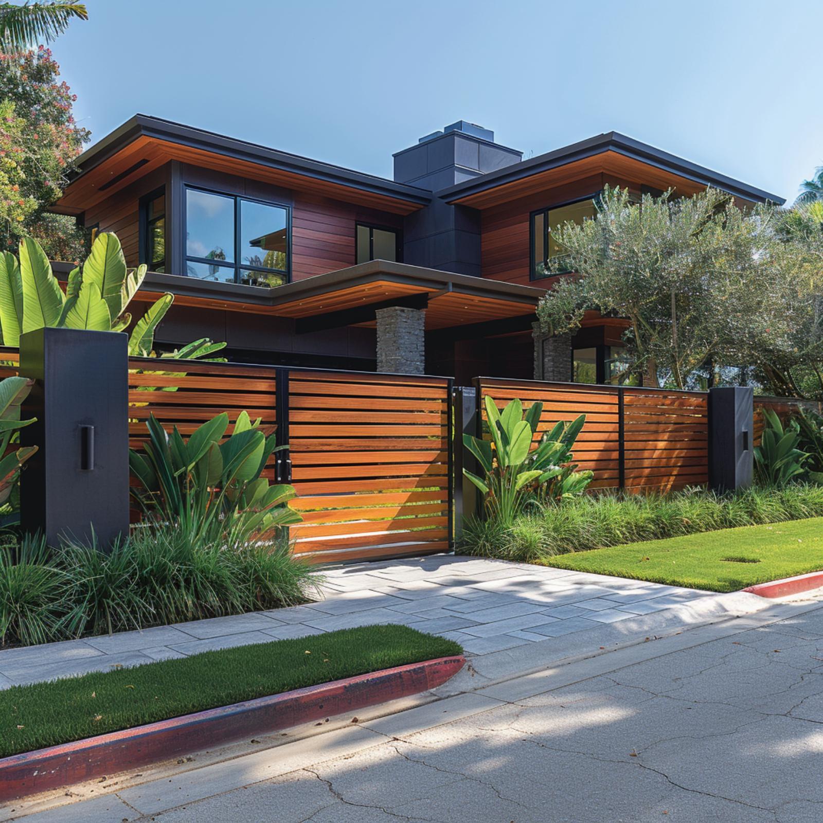
Cedar or redwood horizontal slats mounted between charcoal steel posts create a fence that doesn’t fight the house behind it. It echoes it. The warm reddish-brown tone of the slats picks up the vertical cladding on the facade, so the boundary reads less like a perimeter and more like an extension of the building itself.
Gaps between the slats let light pass without sacrificing privacy, which is a harder balance to achieve than it looks. The dark steel posts anchor the composition at the street without demanding attention. Lush bird-of-paradise plantings soften both sides of the gate, so the whole entry feels less like a security measure and more like an arrival sequence.
11. Bird of Paradise, Dark Wood Slats, and a Fence That Makes Tropical Feel Considered
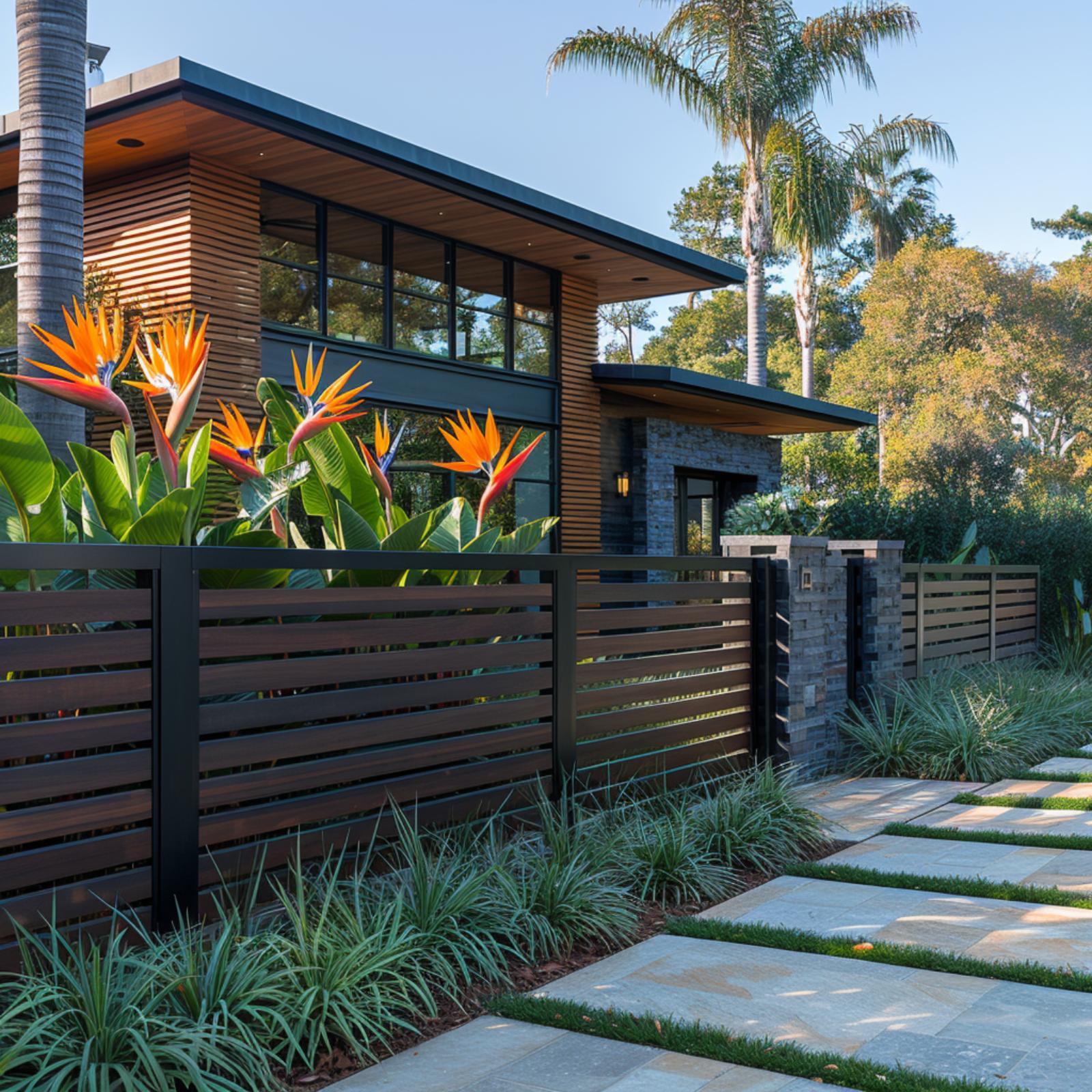
Dark walnut-toned horizontal slats carry the same finish as the cedar cladding on the house above, so the fence reads as part of the structure rather than a separate afterthought. Bird of paradise blooms pull the orange out of the wood grain. It works because the palette does.
10. Warm Cedar, Limestone Columns, and a Perimeter Wall That Makes the Lot Read as One
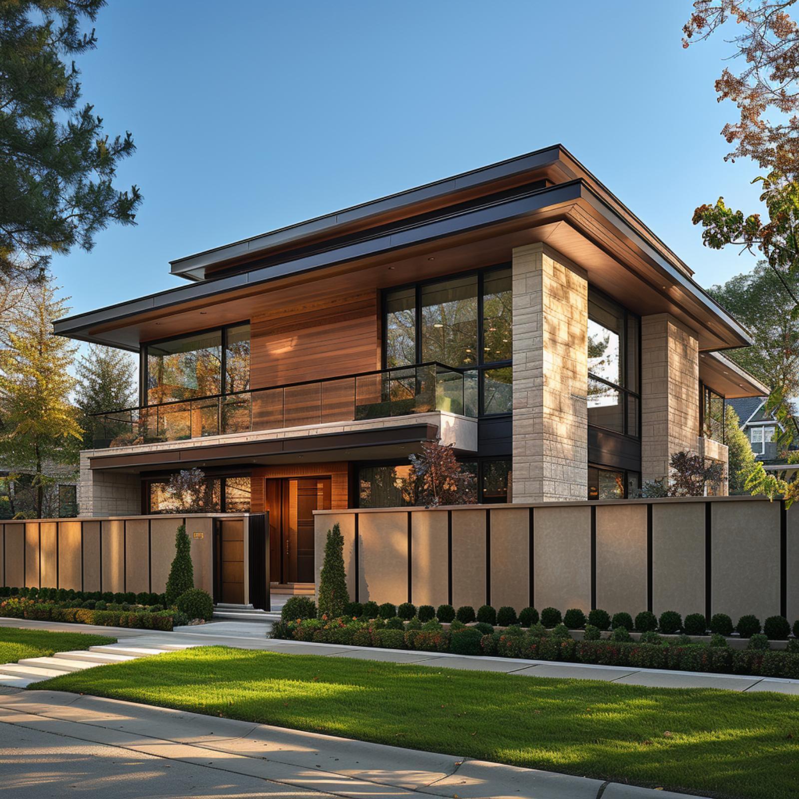
Vertical dark steel mullions repeat across the perimeter wall, the upper balcony rail, and the window frames, so the eye moves from street to roofline without interruption. The limestone columns anchor both the fence line and the upper story, giving the boundary wall credibility it wouldn’t have on its own.
Repetition is doing the real work here. When a single material shows up at the fence, the facade, and the cornice overhang, the property stops feeling like it was assembled and starts feeling like it was drawn that way from the start.
9. Painted Brick, Wrought Iron, and a Gate That Makes the Whole Lot Read as Planned
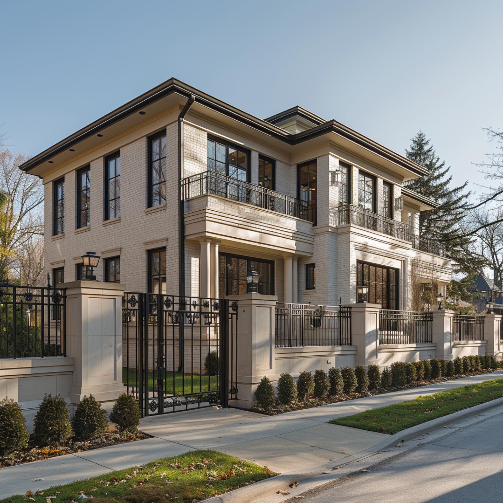
White-painted brick ties the perimeter wall directly to the facade, so the gate doesn’t feel added on. That wrought iron, with its decorative scroll detailing at the latch panel, picks up the dark bronze window frames running across both floors. The result is a property that looks designed from the curb outward, not the other way around.
8. Gabion Walls, Fieldstone Columns, and a Fence That Makes the Whole Site Feel Native
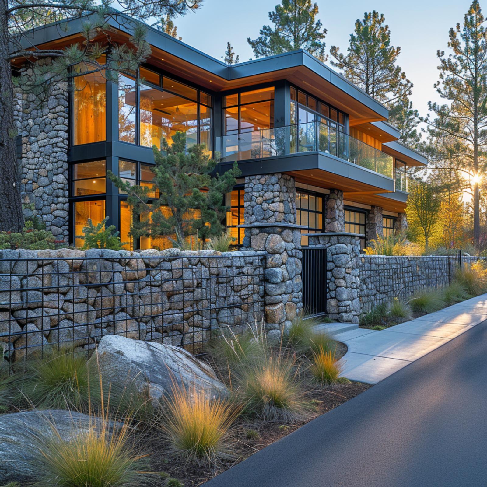
Gabion wire-cage construction runs the full perimeter here, filled with the same rounded granite used in the columns flanking the entry, so the boundary wall doesn’t feel added on. It feels quarried from the same source as the house itself.
7. Red Brick, Hydrangeas, and a Dark Steel Fence That Makes Everything Click
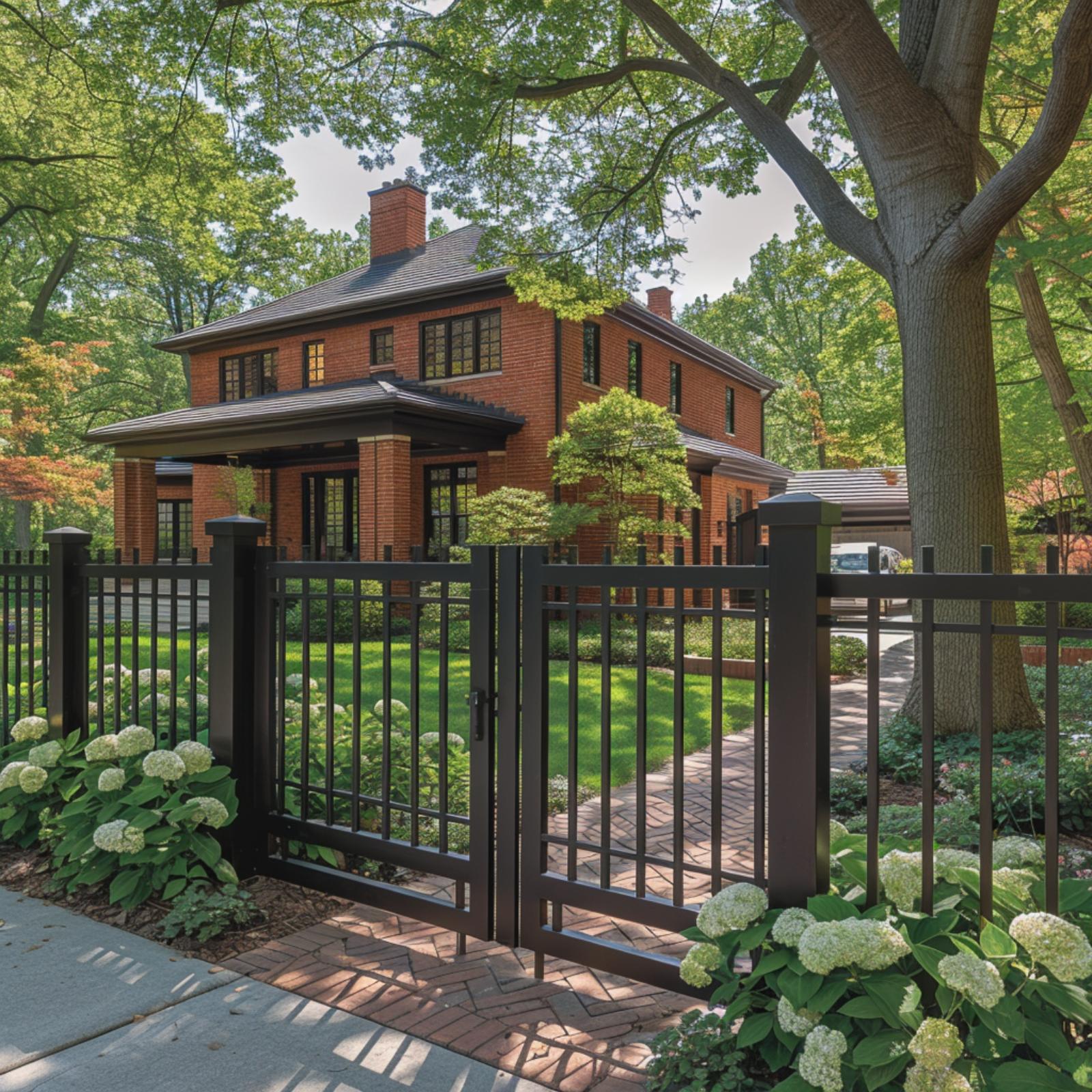
Painted black aluminum rails and square-topped posts echo the dark window frames on the brick facade, so the boundary reads as part of the architecture. Annabelle hydrangeas soften the base without competing. It works because the fence doesn’t try to disappear.
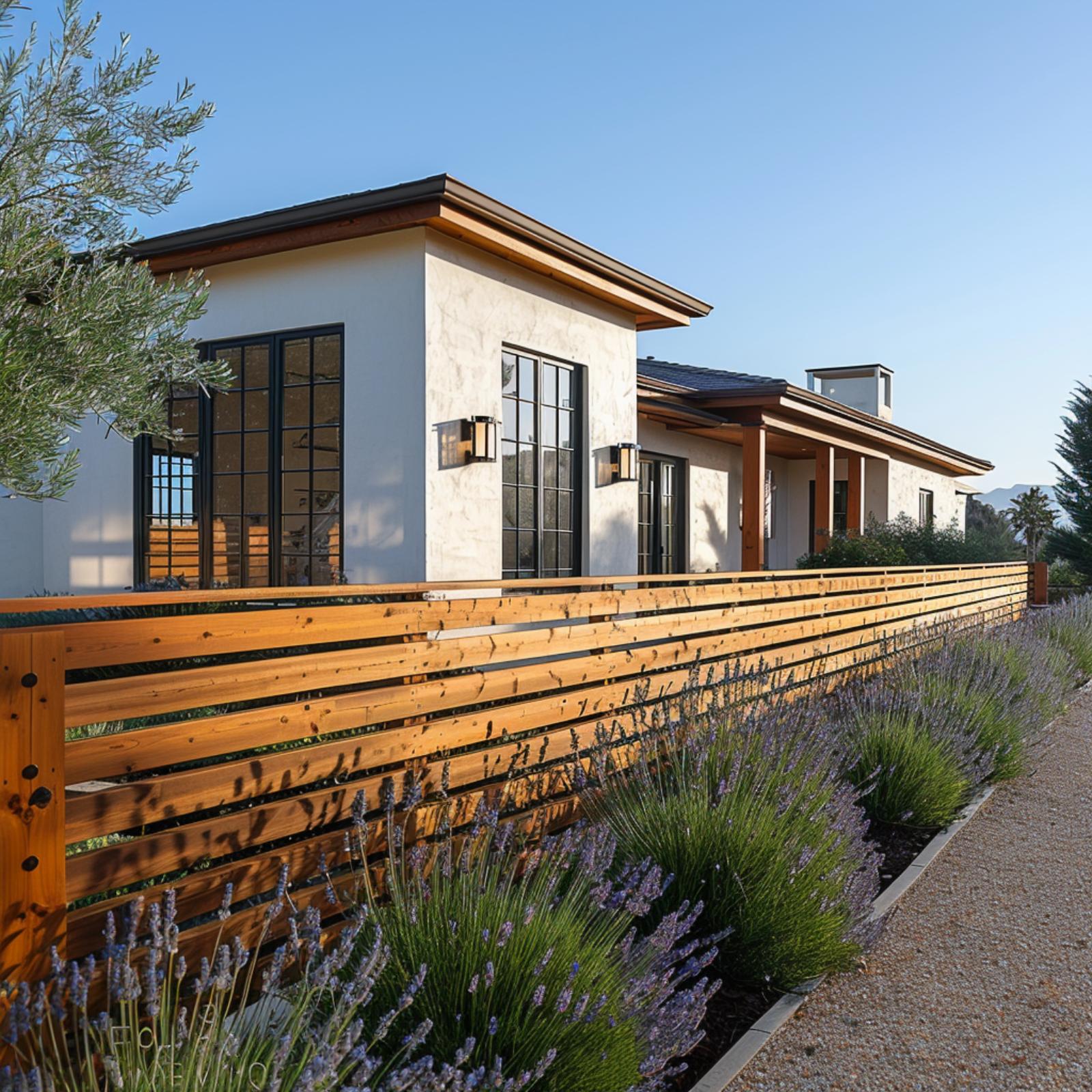
6. Warm Cedar Rails, Lavender, and a Fence That Earns Its Place in the Design
🔥 Would you like to save this?
Stucco walls in a soft warm white meet cedar fence boards stained to match the roof’s wood fascia, and that tonal connection is what makes the whole property feel resolved. The lavender planted along the fence base does quiet work, softening the transition between gravel path and timber rail. It’s a pairing that’s fragrant and practical, since lavender needs almost no water once established. Black steel wall sconces on the facade echo the dark hardware bolting the fence panels together, so nothing reads as accidental.
5. Weathered Wood, Agave, and a Corten Wall That Makes Desert Modern Click
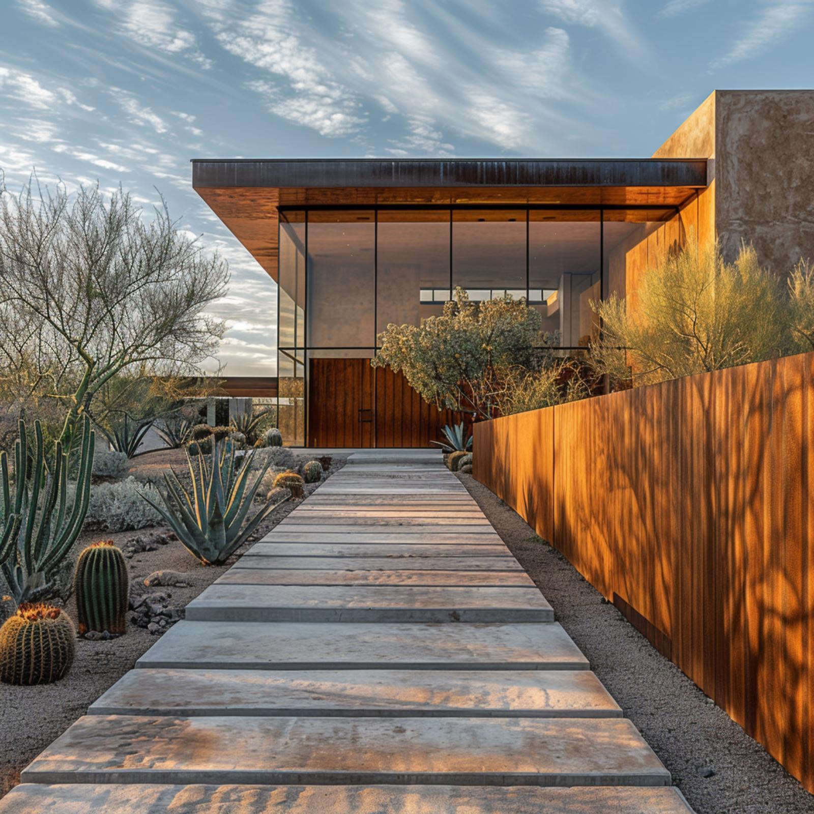
Corten steel doesn’t just frame this entry, it pulls the whole property into a single warm register. The wall’s rust-orange patina echoes the wood soffit overhead, so the fence reads less like a boundary and more like part of the structure. Concrete pavers run straight to a glass-and-steel entry pavilion, with barrel cactus and blue agave flanking both sides.
4. Limestone Columns, a Cedar Gate, and a Perimeter Wall That Locks the Whole Property In
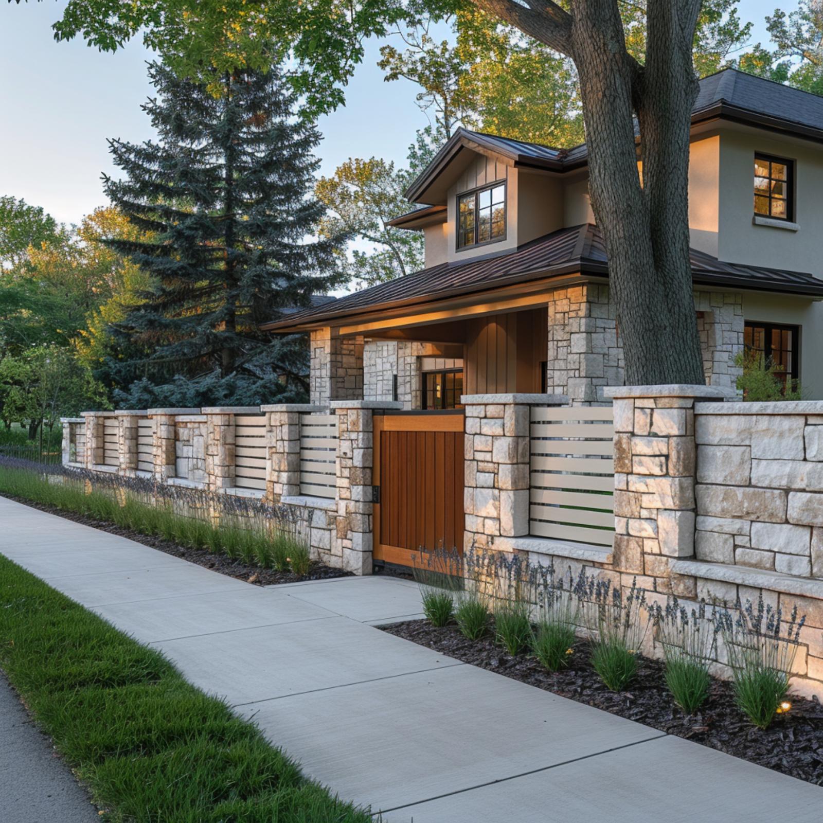
Natural cut-limestone piers anchor the wall at regular intervals, and the horizontal white panels between them echo the house’s board-and-batten siding just visible behind. That repetition is doing real work. The warm cedar gate pulls the wood tones from the entry canopy down to street level, so nothing feels dropped in. Lavender planted along the base softens what could read as a fortress.
3. Frosted Glass Panels, Bronze Steel Frames, and a Gate That Finally Answers the House
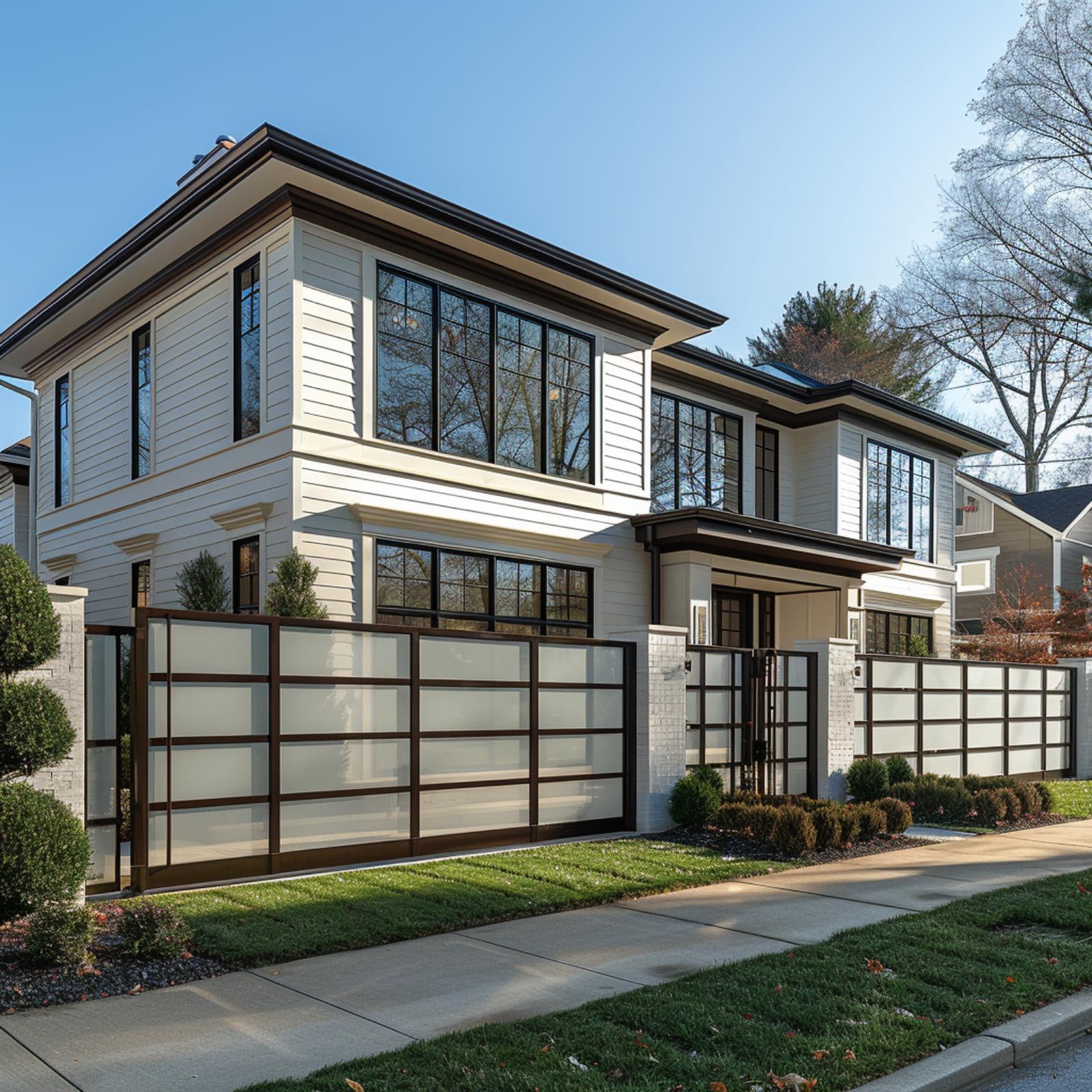
Few fences do this much work. The frosted glass panels set in bronze-toned steel frames pull directly from the house’s dark window grid above, so the boundary wall reads like a continuation of the facade rather than a separate afterthought bolted to the property line. That repetition of grid pattern, from the upper-floor windows down to the perimeter, is what makes the whole exterior feel resolved.
The white brick columns anchor each end of the gate run and tie back to the foundation cladding on the house itself. Scale matters here too. The fence sits tall enough to provide privacy without competing with the two-story volume behind it. Get that height relationship wrong, and even the best materials won’t save the composition.
2. Limestone Block, a Dark Steel Gate, and a Boundary Wall That Makes the Lot Whole
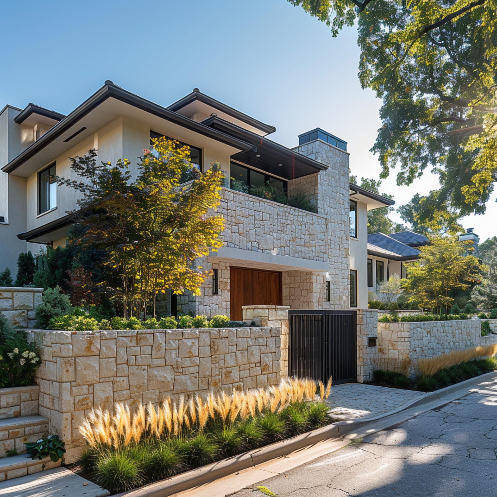
Matching the fence material to the house’s stone cladding is one move that’s hard to argue with, and here it pays off completely. The same cream-gold limestone runs from the two-story facade down into the perimeter wall without interruption. Ornamental grasses planted along the base soften what would otherwise read as fortress-heavy massing.
1. Prairie Style Grid Panels, Brick Columns, and a Fence That Completes the Whole Picture
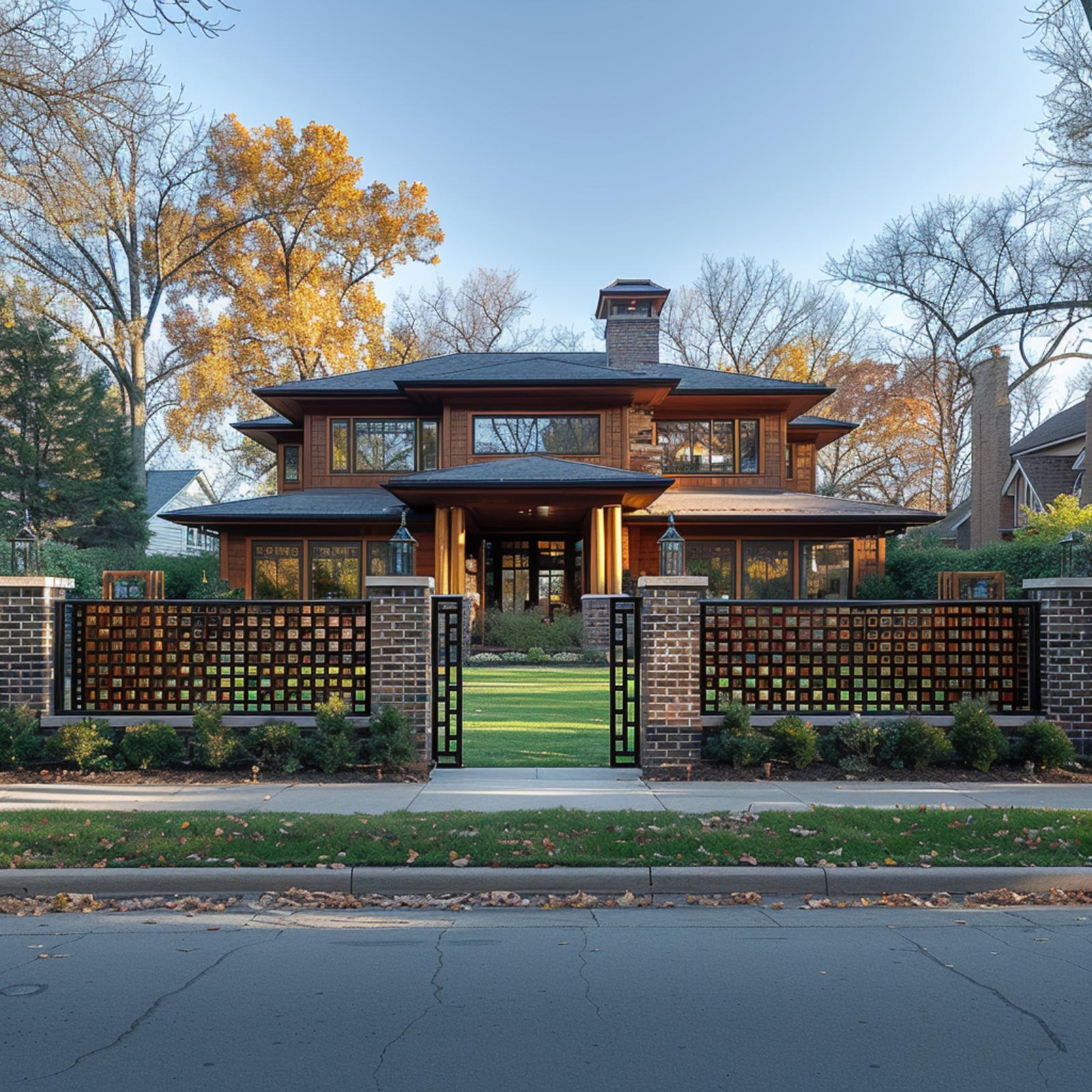
Square grid panels with amber-toned glass inserts mirror the Prairie-style geometry of the house behind them, so the fence doesn’t feel added on. It feels original. Brick columns anchor each bay, and their warm red tone pulls directly from the exterior cladding, giving the perimeter wall and the facade a shared material logic that’s hard to fake with paint or cladding alone.