
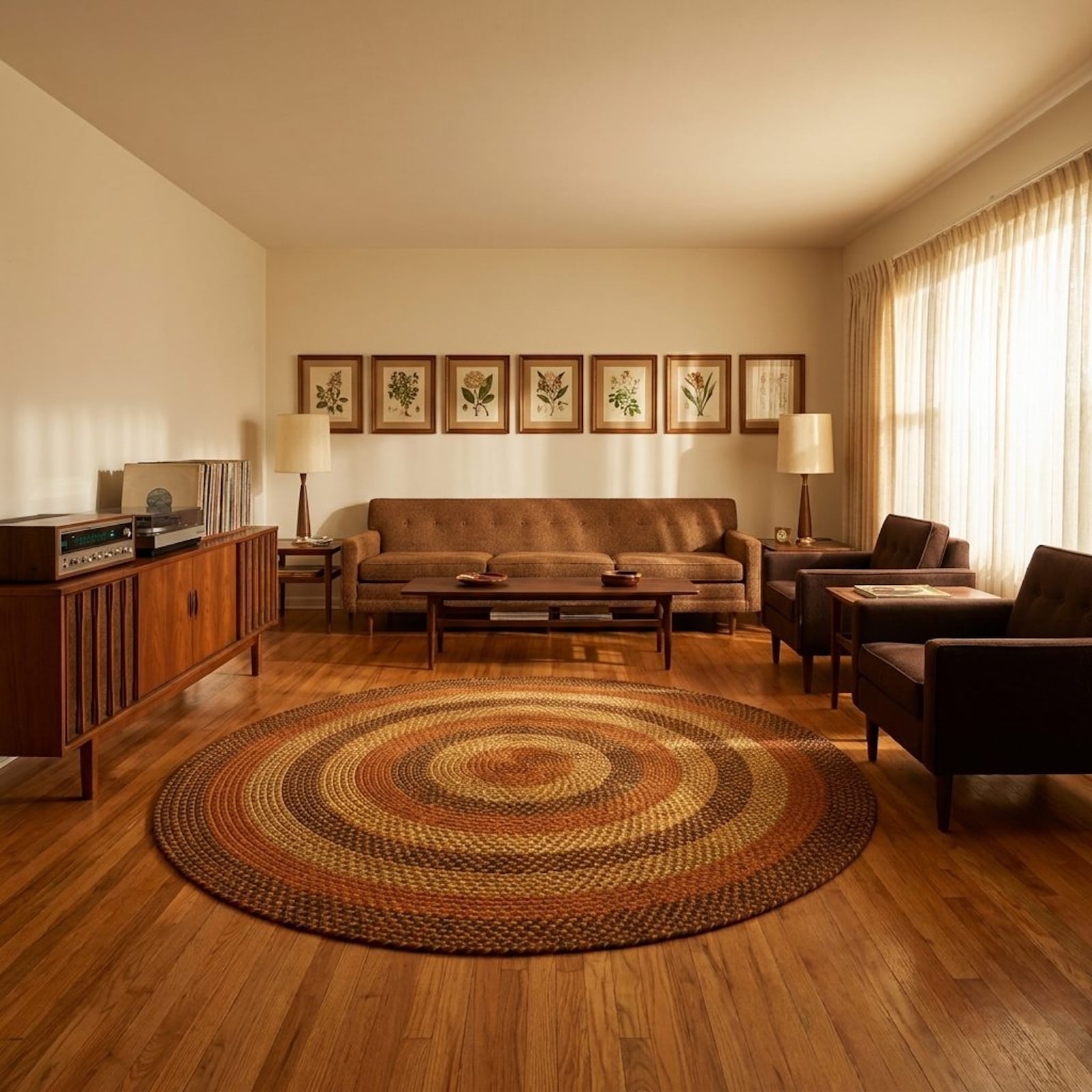
🔥 Would you like to save this?
Walk into a house built in 1973 and something shifts. Your shoulders drop. The room seems to know where people are supposed to sit, where conversation should land, and how long the evening might last.
In order to come up with the very specific design ideas, we create most designs with the assistance of state-of-the-art AI interior design software. Also, assume links that take you off the site are affiliate links such as links to Amazon. this means we may earn a commission if you buy something.
Now walk into a new-build living room — recessed lighting, blank white walls, enough open space to host a shareholder meeting. Impressive, maybe. Expensive, probably. Warm? Not always. The older rooms people still remember were not accidents. Lower light, better corners, real texture, closer furniture — and a sense of shelter that modern design keeps mistaking for clutter.
The Ceiling Height That Tricks Your Brain Into Feeling Held
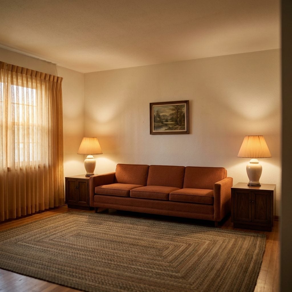
Most living rooms built before 1980 had ceilings between eight and nine feet. Not soaring. Not cathedral. Just close enough overhead that the room registered as shelter rather than spectacle.
There’s a reason that felt right. Researchers call it the Cathedral Effect: high ceilings push your brain toward abstract, expansive thinking, while lower ceilings pull you toward detail-oriented, grounded cognition. Source That sounds neutral on paper, but the lived experience is anything but. A ten-foot ceiling says think. An eight-foot ceiling says stay. The older rooms didn’t ask you to perform. They asked you to sit down.
It goes deeper than cognition. Neuroimaging studies have found that enclosed rooms activate the anterior midcingulate cortex, a region connected to the amygdala and involved in fear processing. Source That sounds bad, but the activation is mild in a properly proportioned room. It reads as awareness, not alarm. Your brain knows something is above you. It registers the boundary and relaxes into it.
Modern open-concept homes pushed ceilings to ten, twelve, fourteen feet. The rooms photograph well. They also feel like lobbies. The older small family room with the eight-foot ceiling never won any architecture awards. But you fell asleep on the couch there. That counts for something.
Why Your Nervous System Treats Carpet Like a Safety Signal
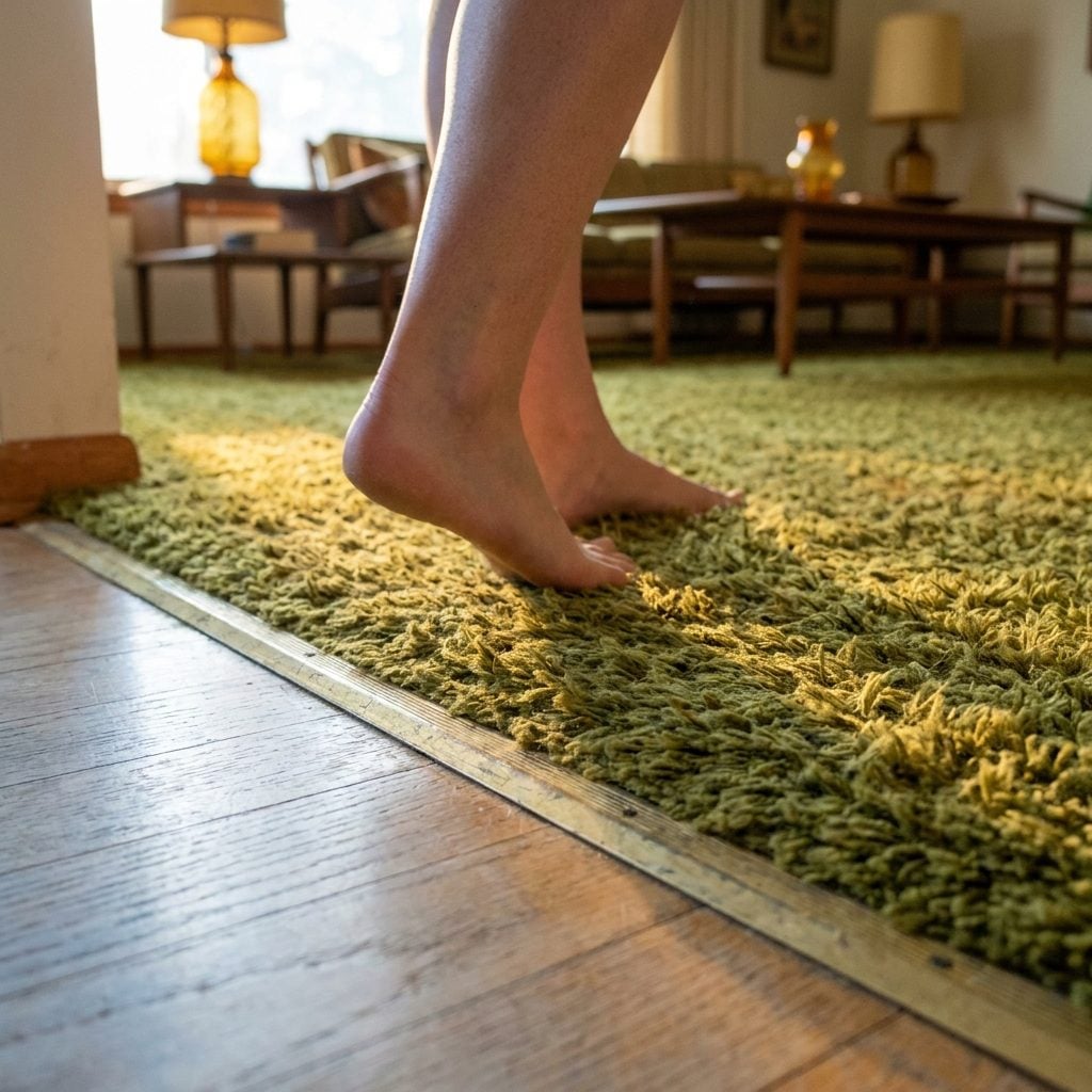
Walk from a hardwood hallway onto deep-pile carpet and pay attention to what happens in your shoulders. They drop. Not because you decided to relax. Because your body decided for you.
Hard surfaces reflect sound. Every footstep, every creak, every shift of a chair leg sends acoustic information bouncing back at you. Your nervous system reads that as activity, alertness, possible threat. Carpet absorbs those vibrations. It softens the room’s acoustic signature so completely that your brain downgrades the environment from “public” to “private” almost instantly. Source
Then there’s the tactile layer. Soft surfaces activate the parasympathetic nervous system, the branch responsible for rest and digestion. Source Environmental psychologists call the response a “nesting instinct,” linking deep-pile carpet to primal memories of grass and moss underfoot. You don’t think about it. You feel it through the soles of your feet and the information travels straight to the part of your brain that decides whether to settle in or stay alert.
Pre-1980 living rooms were almost universally carpeted. Wall to wall, usually in harvest gold or olive green or some brown that had no name. The trend toward hardwood and tile and polished concrete removed the carpet and, with it, the acoustic blanket that told your body this room is safe. The modern floor looks clean. The old floor felt like home. Those are different accomplishments.
The Exact Shade of Gold That Unlocks a Memory You Can’t Name
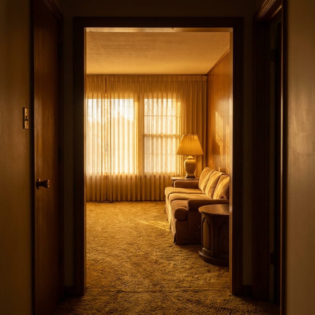
Not yellow. Not ochre. Not brass. There’s a specific warm gold, the color of late-afternoon sun through a curtain that hasn’t been replaced since 1974, that hits a part of the brain no other color can reach.
Color is stored in the brain alongside spatial, temporal, and emotional memory. Encountering a specific hue later doesn’t just recall a visual. It reactivates the full encoded experience. Source And the most powerful nostalgic palettes aren’t broad categories. They’re precise positions in hue, saturation, and lightness. “Kodak yellow” is a specific warm chrome yellow, not just yellow. The harvest gold of a 1970s kitchen is a specific amber, not just gold.
That precision matters. When a retro design uses technically incorrect palette combinations for the era it claims to reference, the brain registers cognitive dissonance instead of nostalgia. Close but wrong is worse than not trying at all. Source
The pre-1980 light living room didn’t use gold as an accent. Gold was the atmosphere. Gold curtains, gold carpet, gold lamplight bouncing off wood-grain paneling until the whole room looked like it was holding a sunset hostage. You don’t remember a specific room. You remember a feeling. The gold was the delivery system.
Why Rooms With Too Many Right Angles Make You Want to Leave
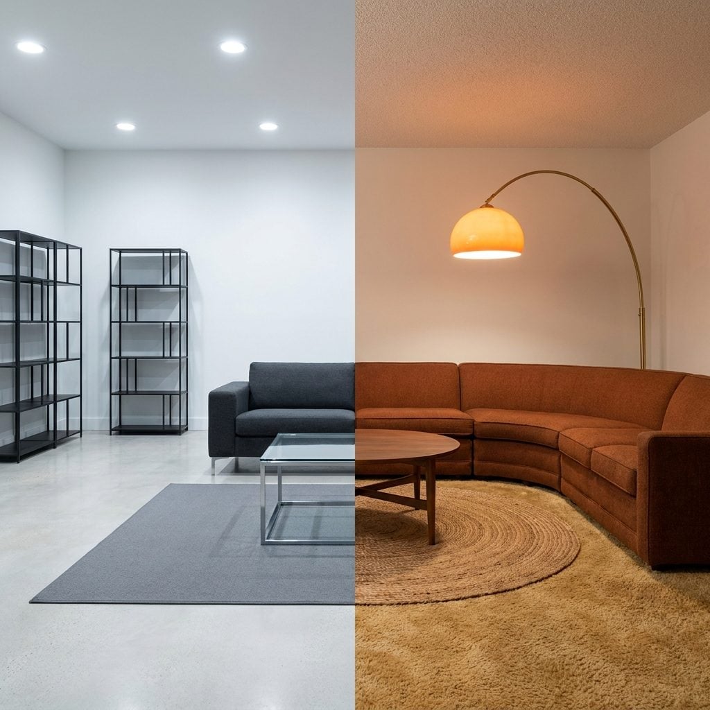
You’ve been in the room. Everything is square. Square couch. Square coffee table. Square rug on a square floor. Square art on a square wall. The room is technically fine. You want to leave anyway and you can’t articulate why.
The why has been sitting in neuroscience journals for years. Research published in the British Journal of Psychology confirmed that people consistently prefer curved shapes over angular ones and found greater bilateral activation in the amygdala when subjects viewed sharp-angled objects compared to curved ones. The amygdala flags threats. Sharp angles mimic the geometry of claws, thorns, and teeth. Source
This isn’t learned. It’s inherited. Studies at the Zanvyl Krieger Mind/Brain Institute found that people overwhelmingly prefer shapes with gentle curves, and brain imaging confirmed these shapes produce stronger, more positive neural responses. Source The preference shows up in infants as young as one week old. Source
Pre-1980 living rooms had round coffee tables. Arched doorways. Curved lampshades. Circular area rugs. Rounded sofa arms. The rooms weren’t designed with neuroscience in mind. They were designed by people who hadn’t yet decided that everything needed to look like a geometry textbook. Modern interiors love the right angle because it photographs well. Your amygdala has a different opinion.
The Wood Paneling Effect Your Therapist Would Understand
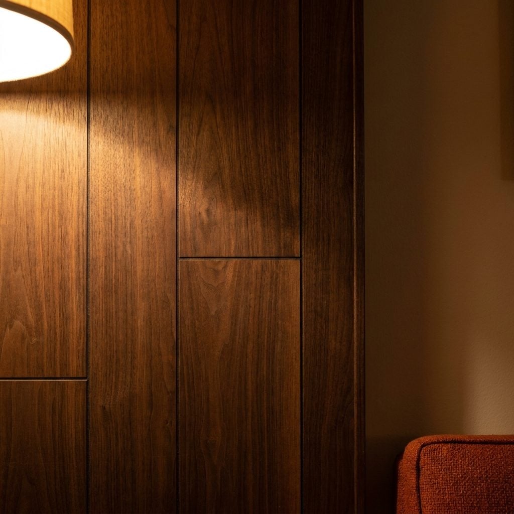
Wood paneling has spent three decades as a punch line. The first thing every renovation show host does is rip it out. Paint over it. Replace it with drywall and a coat of agreeable gray. And the room immediately loses something nobody can name.
What it loses is biophilic resonance. The grain in wood paneling is a fractal pattern, irregular but self-similar, the same geometry you find in tree bark, river tributaries, and mountain ridges. Your visual cortex processes these patterns with less effort than it processes uniform surfaces. The brain reads natural patterns as “familiar terrain” and reduces its vigilance accordingly.
Wood also carries warmth. Not metaphorical warmth. Actual thermal warmth. Wood panels absorb and slowly re-emit ambient heat, keeping surface temperatures closer to skin temperature than drywall or plaster. The room feels warmer because it is warmer, at the surface, in the way that matters to the body sitting six feet away.
Then there’s color. That dark walnut paneling everyone painted over? It was functioning as a visual enclosure, pulling the walls closer, shrinking the perceived volume of the room toward the intimate end of the spectrum. The same spectrum that ceiling-height researchers identified as the zone where people relax, talk, and feel safe. Every sheet of paneling removed and every wall painted white pushed the room one step further from den and one step closer to gallery.
The Reason a Sunken Living Room Feels Like a Hug From Architecture
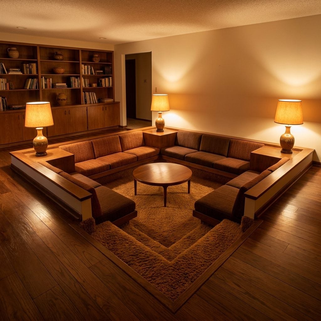
Step down into a conversation pit and something shifts before you even sit. The floor drops six inches or twelve. The rest of the house rises around you. And your body reads the geometry as one clear signal: you are inside something.
Environmental psychology calls this prospect-and-refuge theory. Humans feel safest in spaces that offer a broad view of their surroundings (prospect) while positioning themselves within a sheltered, enclosed space (refuge). A sunken living room delivers the refuge half with architectural force. The step down creates a boundary without walls. You can see the rest of the room. The rest of the room can’t quite reach you.
Sunken living rooms were popular from the 1950s through the late 1970s, designed to create distinct social zones within open floor plans. Source The lowered floor made everyone sit closer to the ground. Eye lines dropped. Voices softened. The acoustics changed because sound bounced differently off the stepped perimeter. Conversations in a sitting room decor arrangement like this ran deeper, lasted longer. The architecture wasn’t background. It was participating.
The conversation pit disappeared because it was a liability. Trip hazards. Accessibility concerns. Code complications. All real. But the feeling it produced was also real, and we haven’t found a replacement for it. A flat, open floor plan is democratic. A sunken room is an invitation.
Why Asymmetrical Furniture Layouts Feel More Honest Than Staged Ones
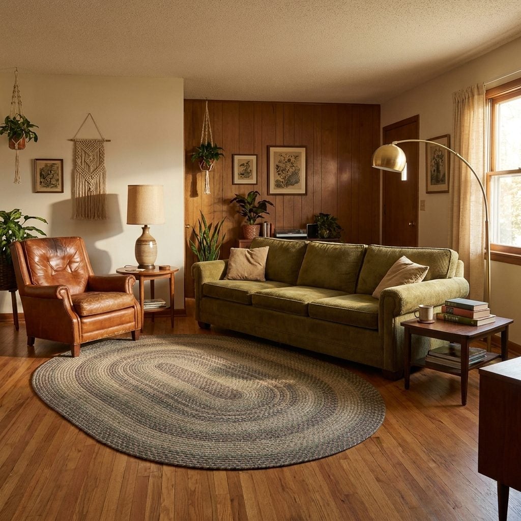
You know the living room. Two matching sofas facing each other across a glass coffee table, equidistant from the fireplace, flanked by identical end tables with identical lamps. It looks like a page from a catalog. It feels like nobody lives there.
Symmetry in design communicates control, order, formality. Pre-1980 living rooms didn’t operate that way. The couch went against the long wall because that’s where it fit. The recliner sat at an angle because Dad needed to see the television and the front door at the same time. The piano took the corner because it wouldn’t go anywhere else. The layout wasn’t designed. It was negotiated, over years, by actual humans living actual lives in the room.
That irregularity reads as authenticity. Your brain is finely calibrated to detect staged environments, and perfectly symmetrical rooms trigger the same low-level unease as a too-perfect smile. Something is off. Something is being performed. The asymmetrical room doesn’t perform. It confesses. It says people have been here, they’ve moved things around, and the room adapted.
I got this wrong for years, trying to make rooms look balanced. Matched. Ordered. The rooms that people actually wanted to spend time in were always the ones that looked a little off, a little improvised. The ones that looked like an argument someone won.
The Lamp Trick That Makes a Room Feel Like It Has a Pulse
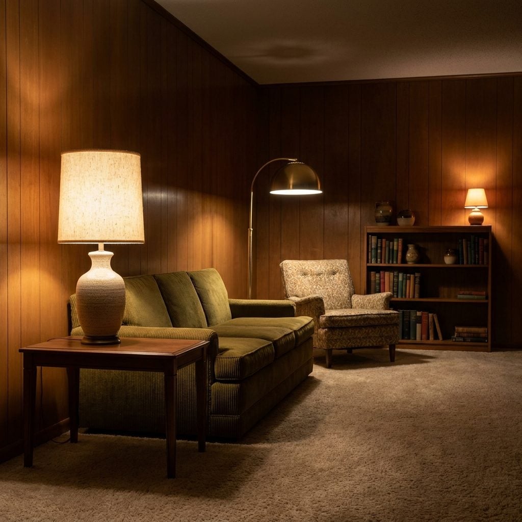
One overhead light does one thing: it announces that the room is on. It fills every corner evenly, flattens every shadow, and turns the space into a container for whatever you need to do. Functional. Institutional. Dead.
Pre-1980 living rooms rarely had recessed cans or flush-mount ceiling fixtures as the primary light source. They had lamps. Table lamps. Floor lamps. Sometimes a swag lamp hanging from a chain in the corner. Three, four, five individual light sources scattered across the room at different heights, each casting its own warm circle with its own soft edge. The room didn’t have light. It had pools of light, and the darkness between them mattered as much as the brightness inside them.
That layering does something to your nervous system. A single overhead source reads as surveillance. Multiple low sources at varied heights read as campfire. Your brain is wired to associate scattered warm light with safety, shelter, evening gathering. It’s the lighting pattern that existed for a hundred thousand years before anyone invented the flush-mount LED panel.
The trick isn’t complicated. Kill the overhead. Turn on three lamps at different heights. Put one on the end table, one on the floor behind a chair, one on a bookshelf across the room. The room develops geography. It has warm zones and cool zones, bright spots and gentle shadows. It breathes. It pulses. It feels, for the first time in the history of that ceiling fixture, like a place where something could happen after dark.
Why Built-In Shelves Trigger a Nesting Instinct No Floating Shelf Can Match
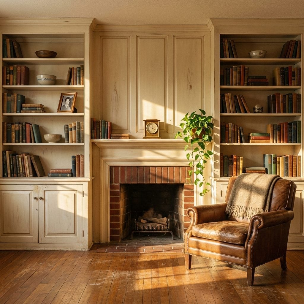
A floating shelf holds things. A built-in holds you.
That’s not poetry. It’s closer to biology. The nesting instinct, as documented in (Source), is the deep drive to prepare and control one’s environment, especially during times of stress or transition. It shows up as organizing, arranging, surrounding yourself with your own things in a space that feels fixed and permanent. Built-in shelving activates this instinct in a way that freestanding furniture simply can’t, because the shelves aren’t in the room. They are the room. They became part of the architecture the day they were installed, and your brain reads that difference instantly.
Pre-1980 living rooms were full of them. Floor-to-ceiling cabinetry flanking a fireplace. Recessed bookshelves in the hallway. Glass-fronted cases built into the dining room wall. Every one of those features said: this house was made for a life to fill it. They offered enclosure on three sides, which (Source). Safe from behind. Open in front. Contained but not trapped.
Modern homes traded all of that for clean walls and a handful of metal brackets. The floating shelf is minimal. It’s easy. It’s also psychologically rootless, a surface that belongs to nobody and nowhere. You can take it down in ten minutes with a drill. And somewhere in the back of your skull, you know that. A built-in says permanence. A floating shelf says rental.
The Texture Ratio That Separates Cozy From Cold and Nobody Talks About It
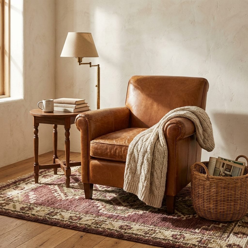
Count the textures in the room you’re sitting in right now. Go ahead. Walls, floor, furniture, anything your hand could touch. If you land on three or fewer, the room probably feels like a lobby. If you land on eight or more, it probably feels like a grandmother’s house in the best possible way.
There’s a sweet spot in there, and pre-1980 light living room design hit it almost by accident. Those rooms stacked textures without thinking about it: plaster walls with visible grain, wool area rugs over hardwood, velvet on the sofa, leather on the chair, a knit throw on the armrest, ceramic on the mantel, brass on the lamp. Seven, eight, nine different surface qualities in a single sightline. Your eye never ran out of places to land. Your hand never ran out of things to reach for.
Modern rooms do the opposite. Flat drywall, laminate floor, polyester upholstery, glass coffee table. Three textures if you’re generous. Four on a good day. The brain processes this kind of surface uniformity as institutional. Hospitals are smooth. Airports are smooth. Offices are smooth. Research on interior design psychology confirms that soft materials like wool and linen signal safety and rest, while hard, uniform surfaces signal alertness. A room with one dominant texture tells your nervous system to stay ready. A room with many tells it to stand down.
Why Closed Floor Plans Activate the Same Brain Region as a Campfire
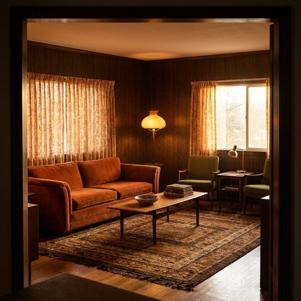
Open-concept living is the biggest lie modern architecture ever sold you. Somewhere around 1990, a wall came down between the kitchen and the living room, and we all applauded. More light. More flow. More togetherness. Except it didn’t feel like togetherness. It felt like standing in a cafeteria.
The living rooms people remember from the 1960s and 1970s had walls. Four of them, often with a single defined entry. And according to (Source), that’s not just nostalgia talking. Prospect-refuge theory, first outlined by geographer Jay Appleton in 1975, posits that humans gravitate toward spaces that balance open views with protective enclosure. A small family room with defined boundaries gives your nervous system the “refuge” half of that equation. Your back is protected. The space has edges. You can see the door without being exposed to the entire house.
That’s not a style preference. It’s a survival instinct wearing a cardigan.
The Psychological Trap of Matching Everything to Everything
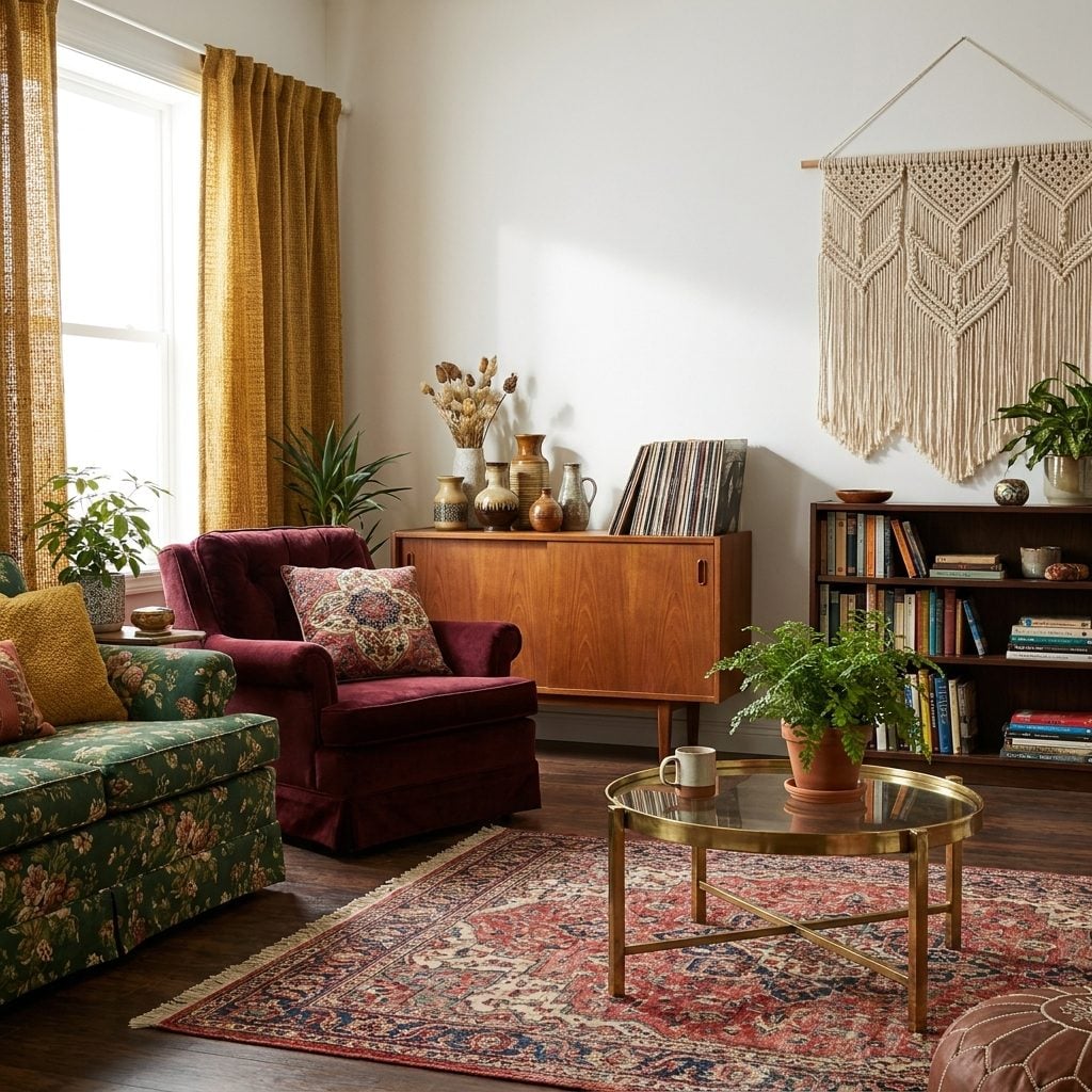
Walk into a living room from a 2019 home tour. Greige walls, greige sofa, greige rug, greige throw pillows. The linen throw pillows match the curtains match the candle match the coffee table book. Everything coordinates. Nothing conflicts. And nothing sticks in your memory for longer than thirty seconds.
Now picture your grandmother’s den. A floral couch next to a plaid armchair. A brass table lamp from one decade, a wooden clock from another. None of it matched. All of it worked.
There’s a reason. According to (Source), interior environments that communicate both coherence and complexity generate the strongest positive emotional responses. Coherence without complexity reads as sterile. Your brain processes it instantly, finds nothing to explore, and moves on. The rooms we love demand a second look. A third. They reward attention because each object arrived on its own terms, not as part of a set.
Why Rooms With Visible Wear Feel More Trustworthy Than New Ones
🔥 Would you like to save this?
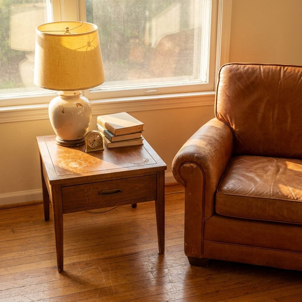
A scratch on a hardwood floor tells you someone lived there before you and it held up. A faded patch on a velvet armchair where the arm sat for twenty years says this is the spot. Come sit. The wear is the proof.
The Japanese philosophy of wabi-sabi names what your nervous system already knows. (Source) points out that perfectionism fuels chronic stress, while accepting visible imperfection shifts perception from judgment to appreciation. That’s a psychological toggle, not a decorating opinion. The rooms built before 1980 weren’t trying to look new. They aged in place. The wood darkened. The upholstery softened. And every year that passed added a layer of evidence that the room was safe to trust.
New rooms don’t have that yet. They have potential. Potential is a promise. Wear is a receipt.
The Color Temperature That Modern Lighting Got Catastrophically Wrong
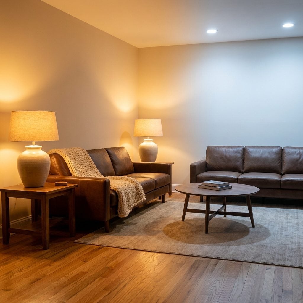
Every living room built before 1980 was lit by incandescent bulbs. Every single one. That means every memory you have of a warm room, a warm conversation, a warm holiday in somebody’s living room happened under light measured at roughly 2700 Kelvin. Amber. Golden. The color of a candle, a sunset, a fire.
Then we switched to LEDs. And the first generation shipped at 4000K to 5000K. Cool white. Clinical. The color of a dentist’s office, a hospital corridor, a gas station at 2 a.m. According to (Source), lighting color temperature directly affects emotional response, with warm light below 3000K consistently linked to relaxation and comfort.
We gutted the warmth of an entire generation’s living rooms in the name of energy efficiency. The bulbs lasted longer. The rooms didn’t.
Why Your Brain Reads a Brick Fireplace as the Center of Civilization
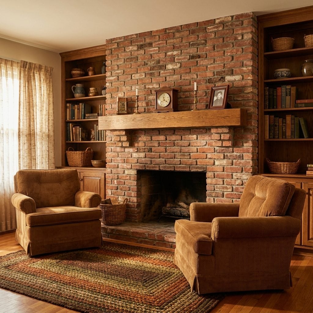
Humans controlled fire around 400,000 years ago. That’s not trivia. That’s the origin story of every living room you’ve ever sat in.
(Source) makes the case that the hearth has always been more than functional. It’s a narrative tool that “communicates emotional depth and cultural continuity.” In ancient settlements, the hearth’s placement dictated how rooms were organized, who sat where, and where stories got told. The fireplace didn’t go in the living room. The living room formed around the fireplace.
A 2014 study by anthropologist Christopher Lynn, published in the journal Evolutionary Psychology, found that watching a fire with sound lowered blood pressure in participants. The relaxation response was measurable. And a brick fireplace mantel in a 1970s living room taps directly into that wiring. It doesn’t even need a fire burning. The shape alone, the dark opening, the mantel acting as a frame, tells a brain that’s 400 millennia old: this is the safe place. Sit down.
The Reason Patterned Wallpaper Calms You Down Instead of Overwhelming You
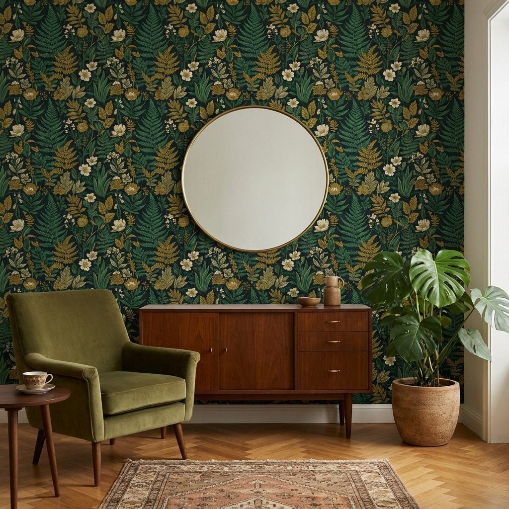
This one trips people up. The modern instinct says pattern equals noise. Too busy, too much, too distracting. Paint it white. Keep it clean. Let the room breathe.
But the rooms that actually made people exhale, the dens and parlors of the 1950s through the 1970s, were covered in pattern. Florals. Geometrics. Damask. And they didn’t overwhelm. They settled.
Why Repetition Reads as Safety
The Kaplans’ environmental preference framework, foundational in landscape and interior psychology, identifies four qualities that make an environment feel right: coherence, legibility, complexity, and mystery. Patterned wallpaper hits three of those four. The repeat gives coherence and legibility. Your brain detects the rhythm quickly and relaxes because there’s no threat hiding in the visual noise. The pattern itself adds complexity, which keeps the room from reading as empty or cold. It’s a form of visual white noise. The eyes have something to rest on without having to solve anything.
Plain walls demand you furnish them. Patterned walls furnish themselves. That’s one less decision your brain has to make every time you walk in.
Why Furniture That Touches the Wall Feels Safer Than Furniture That Floats
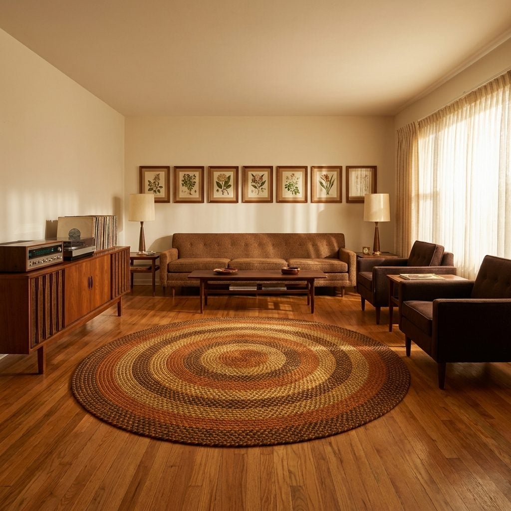
You’ve seen the designer living room. The modern linen sofa is pulled three feet from the wall. An accent chair floats in the center. The coffee table hovers between them like an island that forgot its continent. It photographs well. It doesn’t feel like anything.
Pre-1980 rooms pushed furniture to the edges. The sofa went against the wall. The armchairs flanked the fireplace. The TV console sat flat against the plaster. And there’s a psychological reason that arrangement registered as safe.
Back-to-wall positioning is a documented comfort behavior in humans. The same instinct that makes you choose the booth over the center table at a restaurant applies to your sitting room decor. When a sofa is against a wall, nobody can approach from behind. The open floor in the center of the room becomes readable, scannable, safe. Floating furniture looks intentional in a magazine spread. But in real life, at 10 p.m. with the lights dimmed and a noise from the kitchen, the sofa against the wall is the one your body trusts.
The Curtain Weight That Tells Your Subconscious the Room Is Finished
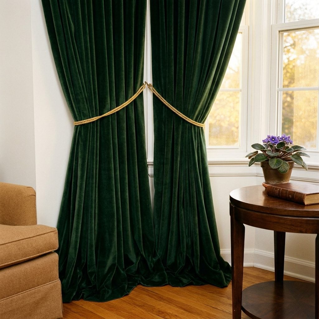
I got this wrong for years. I thought curtains were about light control. Block the sun or don’t. Sheer or blackout. Pick one. But the curtains in the rooms we remember, the living rooms that felt complete the way a sentence feels complete with a period, those curtains weren’t doing a job. They were making a statement your brain reads before you consciously notice it.
Heavy velvet drapes that pool slightly on the floor. Lined brocade curtain panels that don’t move when the door opens. That weight is a signal. It says: this room is permanent. This room is insulated from the outside. This room is not temporary, not transitional, not a rental waiting for the next tenant.
Modern rooms replaced those heavy curtains with roller shades. With bare windows. With linen panels so thin the breeze moves them. And the rooms feel provisional. Like stage sets. The heavy curtain is a frame. Without a frame, you’re not looking at a picture. You’re looking at an unfinished wall with a view attached to it.
Why a Room Full of Mixed Decades Feels Alive and a Room From One Era Feels Dead
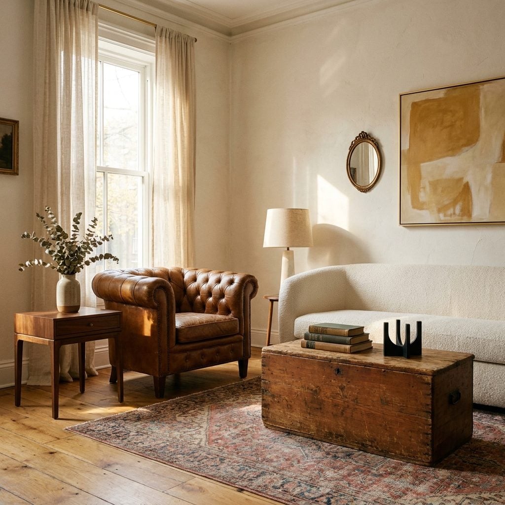
You’ve walked into the room that looks like it was ordered from a single catalog page. Everything matches. The wood tones are identical. The metal finishes coordinate. And something about it makes you want to leave.
Then there’s the other room. The one with a mid-century lamp sitting on a Victorian side table next to a sofa from 2016. Nothing coordinates. Everything works. That room makes you sit down and stay. The difference isn’t taste. It’s time, layered visibly into the objects around you.
Spaces that mix eras feel “layered, meaningful, and timeless rather than fleetingly fashionable.” That’s not just an aesthetic observation. It’s a psychological one. Most people have an emotional connection to the looks they were exposed to early on, and the colors, textures, and layouts from those periods became ingrained as homey and inviting. A room that spans multiple decades activates multiple layers of memory at once. The brass pull on a 1940s dresser fires one circuit. The clean lines of a modern coffee table fires another. Your brain reads the variety as evidence of a life lived over time, not a room purchased in one afternoon.
Rooms decorated from a single era don’t give the brain that same complexity. They read as a statement, not a story. And humans are wired for story. A light living room filled with pieces from three different decades tells your subconscious that someone real lives here, someone with a past and a present, someone who kept the things that mattered and let go of the things that didn’t. Antique furniture, as one analysis puts it, “is structural to the emotional intelligence of a space.”
The single-era room can’t compete with that. It’s a sentence. The mixed-decade room is a conversation, and your brain doesn’t want the conversation to end.
The Bottom Line
The reason pre-1980 living rooms feel like home isn’t nostalgia, it’s that they were designed around the human body and nervous system, not around visual aesthetics for a photograph no one had to take. Lower ceilings, warm textures, soft light, enclosed spaces: every design choice signaled safety to a brain that still runs on ancient hardware. The next time a room makes you feel nothing, don’t blame yourself, look at what the room stopped offering you, and put one thing back.












