🔥 Would you like to save this?
The refrigerator was the color of a Cadillac. Not white. Turquoise, maybe, or a soft buttery yellow, humming in the corner like it had somewhere to be. Cabinets went mint, counters went coral, telephones went avocado, and nobody seemed particularly worried that the toaster might clash.
Somewhere along the way, we scrubbed much of that out. Kitchens went pale, then quieter, then the color of a decision nobody wanted to make. But from the midcentury years through the 1990s, kitchens had opinions. They wore color like a favorite dress, changed personalities every decade, and occasionally committed so hard that even the wall phone joined in. These are the shades and combinations that made those rooms impossible to confuse with anybody else’s.
In order to come up with the very specific design ideas, we create most designs with the assistance of state-of-the-art AI interior design software. Also, assume links that take you off the site are affiliate links such as links to Amazon. this means we may earn a commission if you buy something.
36. Pale Pink Kitchens Put a First Lady’s Favorite Color Into the National Conversation
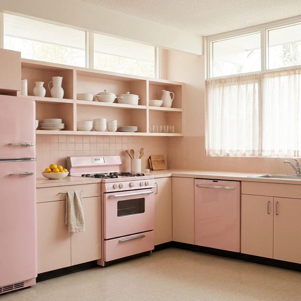
Pink had already established itself in postwar bathrooms when it wandered confidently into the kitchen. Mamie Eisenhower’s famous enthusiasm for the color helped give pink an unusually public moment, and manufacturers were more than happy to offer appliances and fixtures that joined the party.
The smartest rooms rarely left pink alone. Gray counters, chrome trim, white walls, or dark flooring supplied enough resistance to stop the palette from dissolving into confectionery. Pink brought the personality. Everything around it kept a straight face.
35. Butter-Yellow Cabinets Made the Room Feel Like the Lights Were Already On
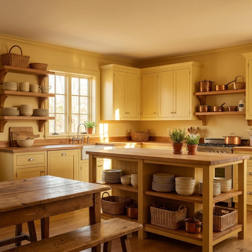
Butter yellow was the friendly yellow. Not lemon, not mustard, just a soft creamy shade that looked as though somebody had mixed sunlight with milk and rolled it onto the cabinets.
It did not literally reflect more light than a good white paint, but it changed the character of the light that was there. White could feel crisp; butter yellow made the same room feel warmer. In a north-facing kitchen on a gray afternoon, that difference mattered even if the physics stayed stubbornly neutral.
34. Mint Green Kitchens Came With a Satisfying Metallic Clang
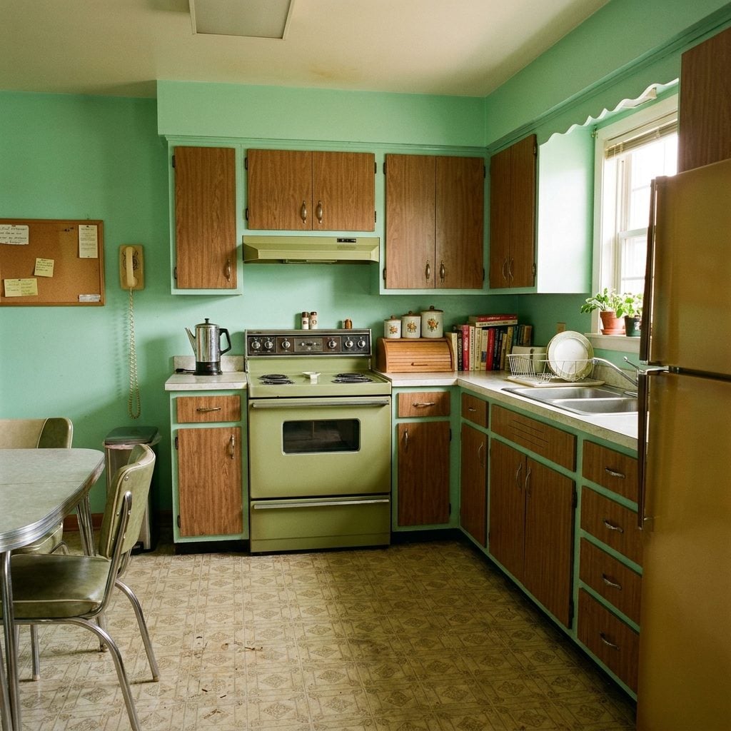
Mint looked especially good on the steel cabinetry that became a midcentury kitchen signature. Slam one of those doors and you got a cool metallic report no modern soft-close hinge will ever reproduce.
Wood cabinets wore mint too, but glossy painted metal gave the color its sharpest personality. Add a red canister, a checked valance, or cherry-red chair vinyl and the room suddenly had a pulse. Mint supplied the calm field; red was the exclamation mark.
33. Robin’s-Egg Blue Was Turquoise After It Lowered Its Voice
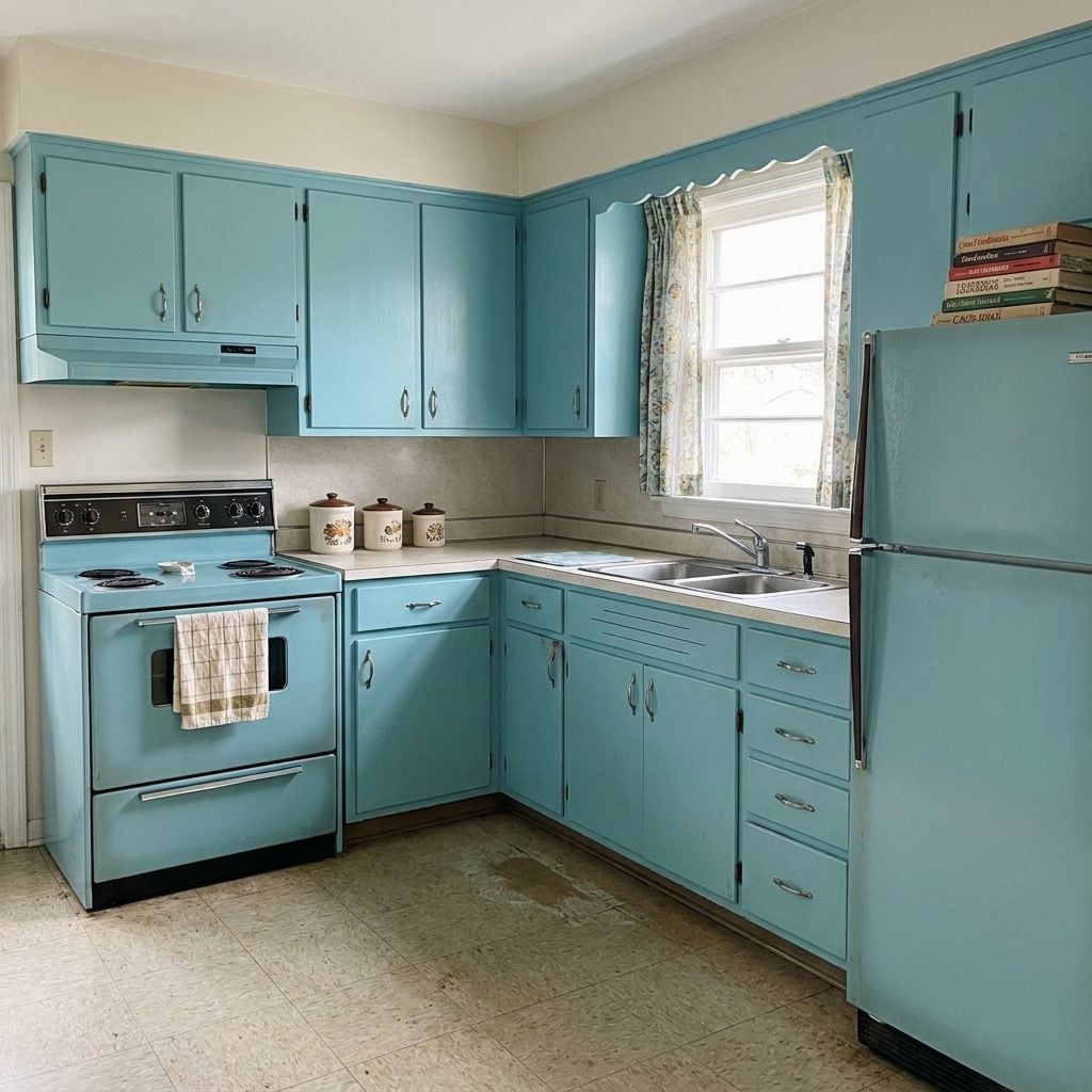
Robin’s-egg blue was turquoise’s chalkier, quieter cousin: the color of a spring morning before anybody had opened the curtains all the way. Painted cabinetry, appliances, and walls all took a turn wearing it.
White counters and daylight kept the shade crisp. Chrome sharpened it. Warm wood softened it. The color could swing almost cool or surprisingly cozy depending on what surrounded it, which is probably why pale blue keeps finding its way back into interiors under new names.
A muted blue can do the same balancing act in other rooms too; even a restrained gray entryway changes personality once a cooler blue note enters the mix.
32. Coral and Salmon Knew Better Than to Take Over the Whole Room
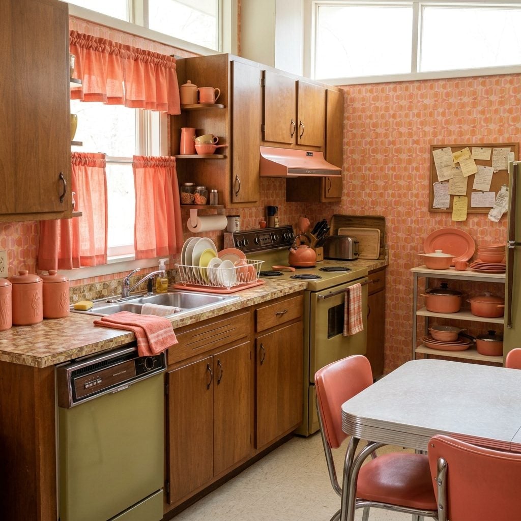
Coral usually entered through the side door: chair seats, canisters, trim, curtains, maybe the towel hanging from the oven handle. That was enough.
Against cream cabinetry, coral made beige look deliberate instead of default. Add brass or gold-toned metal and the little flashes of pink-orange warmed the whole room without requiring anyone to order a salmon refrigerator.
31. Red-and-White Kitchens Turned Breakfast Into Graphic Design
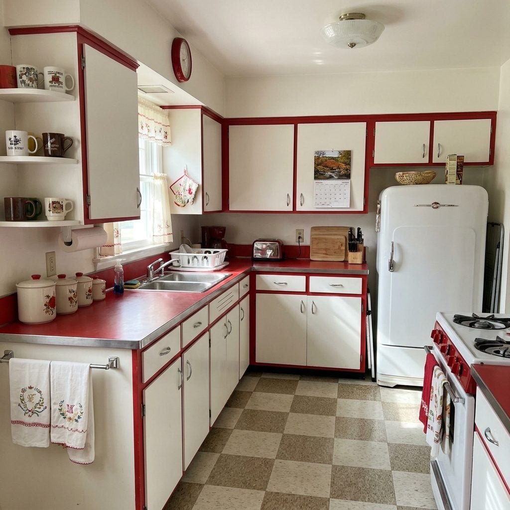
Cherry red against white never really vanished because the combination is almost impossible to misunderstand. Add chrome and checkerboard flooring and the kitchen starts looking like a piece of graphic design you can make pancakes in.
The best versions kept the architecture pale and let red live on things that could theoretically move: chairs, curtains, canisters, clocks, trim. That gave the color enormous presence without requiring every cabinet door to shout.
Unlike many shades in this gallery, red and white never needed to wait for a revival. It simply changed costumes and kept going.
30. Turquoise and Yellow Kitchens Looked Like Summer Refused to End
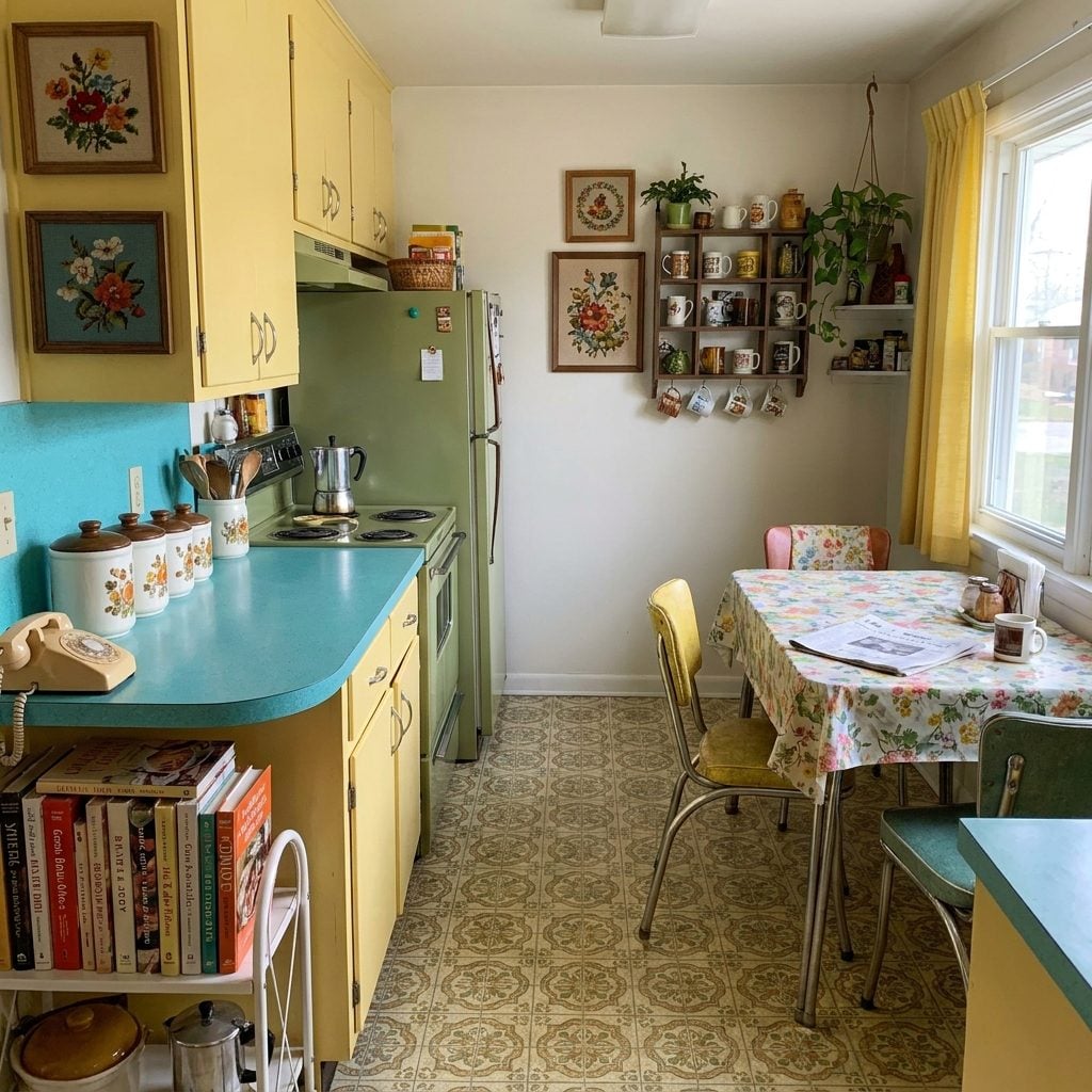
Turquoise and yellow together had no interest in subtlety. One was cool, one was warm, and both seemed convinced the kitchen should feel like June even in February.
Cabinets might carry the turquoise while counters, curtains, or accessories handled the yellow. Chrome slipped between them like a referee who secretly wanted the fight to continue.
29. Seafoam Green Grew Up, Added Brass, and Drifted Toward the 1970s
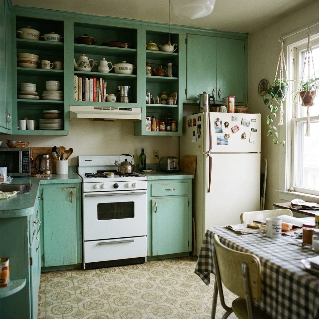
Seafoam was mint after somebody dimmed the lights. Grayer, more muted, a little less soda fountain and a little more paneled den.
Warm surroundings changed everything. Faux-brass pulls, gold flooring, wood-tone counters, and tan walls dragged the green away from clinical territory and toward the earthy palettes that were waiting just around the corner. Look long enough and modern sage is already lurking in there.
28. Sunny Yellow Appliances Came Before Harvest Gold Went Earthy
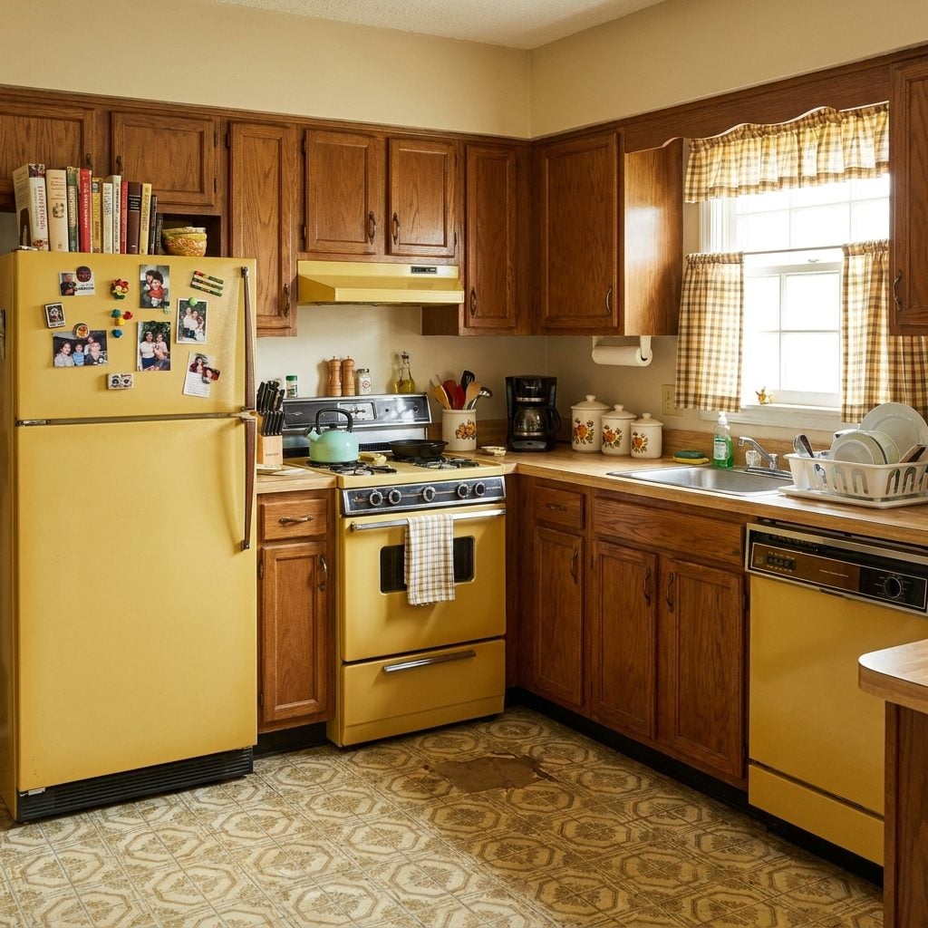
A yellow refrigerator makes one thing clear immediately: the appliance is not trying to disappear into the cabinetry. Midcentury manufacturers offered cheerful yellows before the darker, browner Harvest Gold shades became one of the defining appliance finishes of the late 1960s and 1970s.
Walnut tones and brown counters made the transition easy. Bright yellow could carry the optimism of the earlier decade; deepen it toward honey and mustard and suddenly the same basic color family belonged comfortably beside paneling and butcher block.
A small kitchen can still steal the basic idea: let one appliance carry the color while the larger surfaces stay quieter.
27. Avocado Green Arrived and Refused to Behave Like an Accent
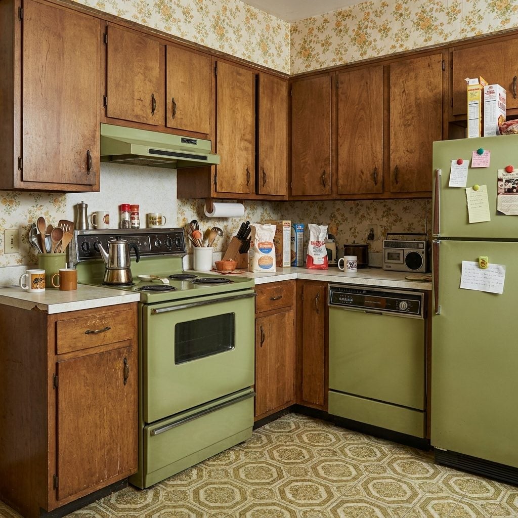
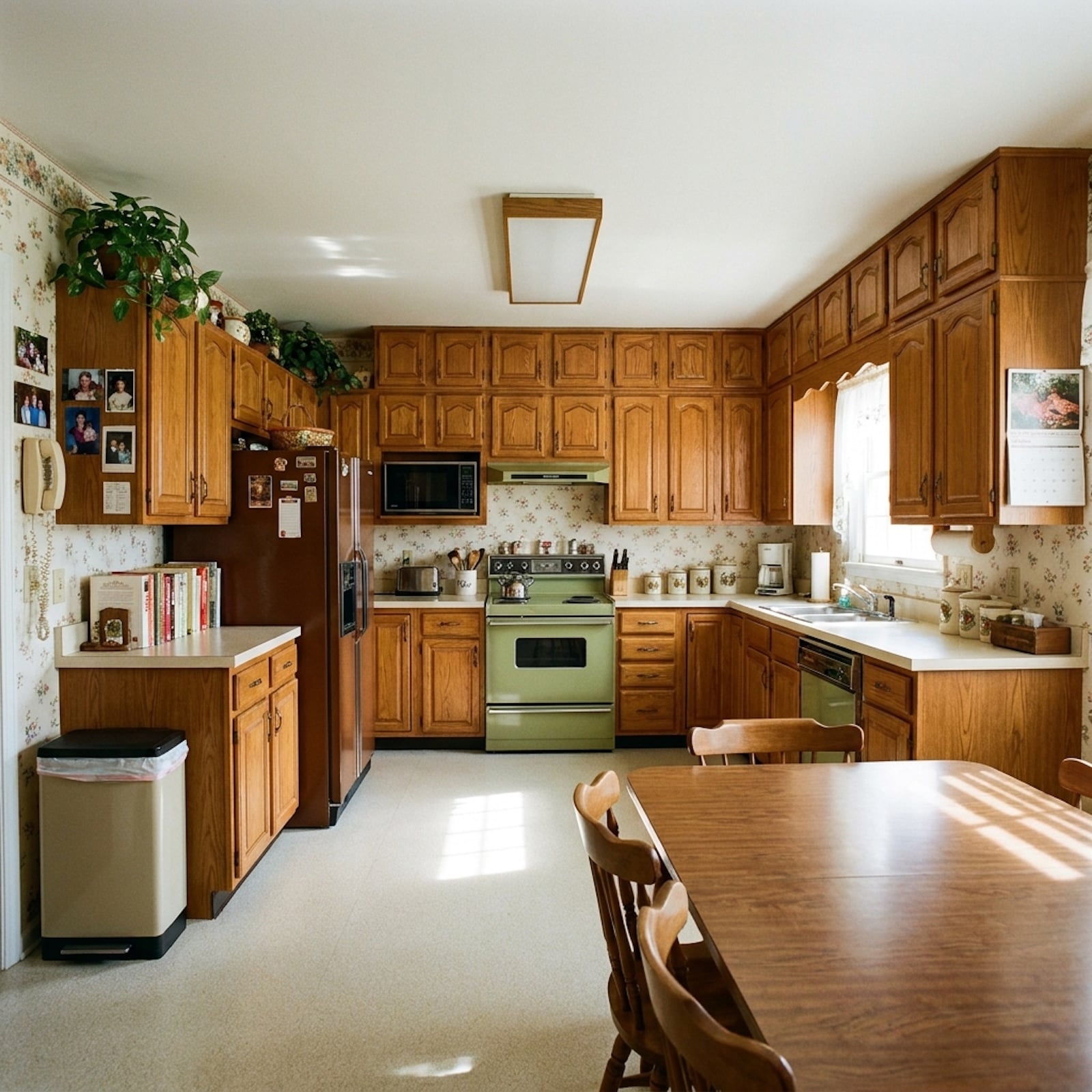
Avocado green may be the most instantly recognizable kitchen color of the 1970s. Refrigerators wore it. Ranges wore it. Countertops wore it. If the household was deeply committed, the wall phone joined the uniform.
The brown surrounding it mattered. Walnut, butcher block, bronze glass, and brass pulled avocado toward moss and bark instead of letting it hover in artificial green territory. The room wanted to look earthy even when half of it was laminate.
26. Burnt Orange Cabinets Made Every Dinner Look Like Golden Hour
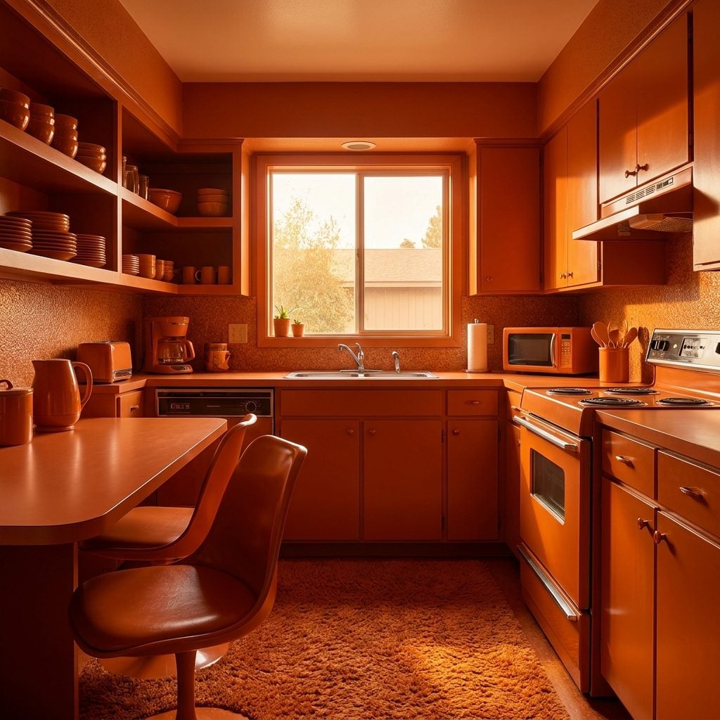
Burnt orange did not dabble. Once admitted to a kitchen, it tended to spread: cabinets, vinyl chairs, dishes, towels, wallpaper, sometimes all before lunch.
Terracotta, cream, walnut, and amber glass stopped the room from becoming one uninterrupted orange blast. A stained-glass pendant over the dinette could make the whole palette glow at night, when brown and rust suddenly looked less dated and more like somebody had bottled sunset.
25. Harvest Gold Appliances Made the Refrigerator Part of the Furniture
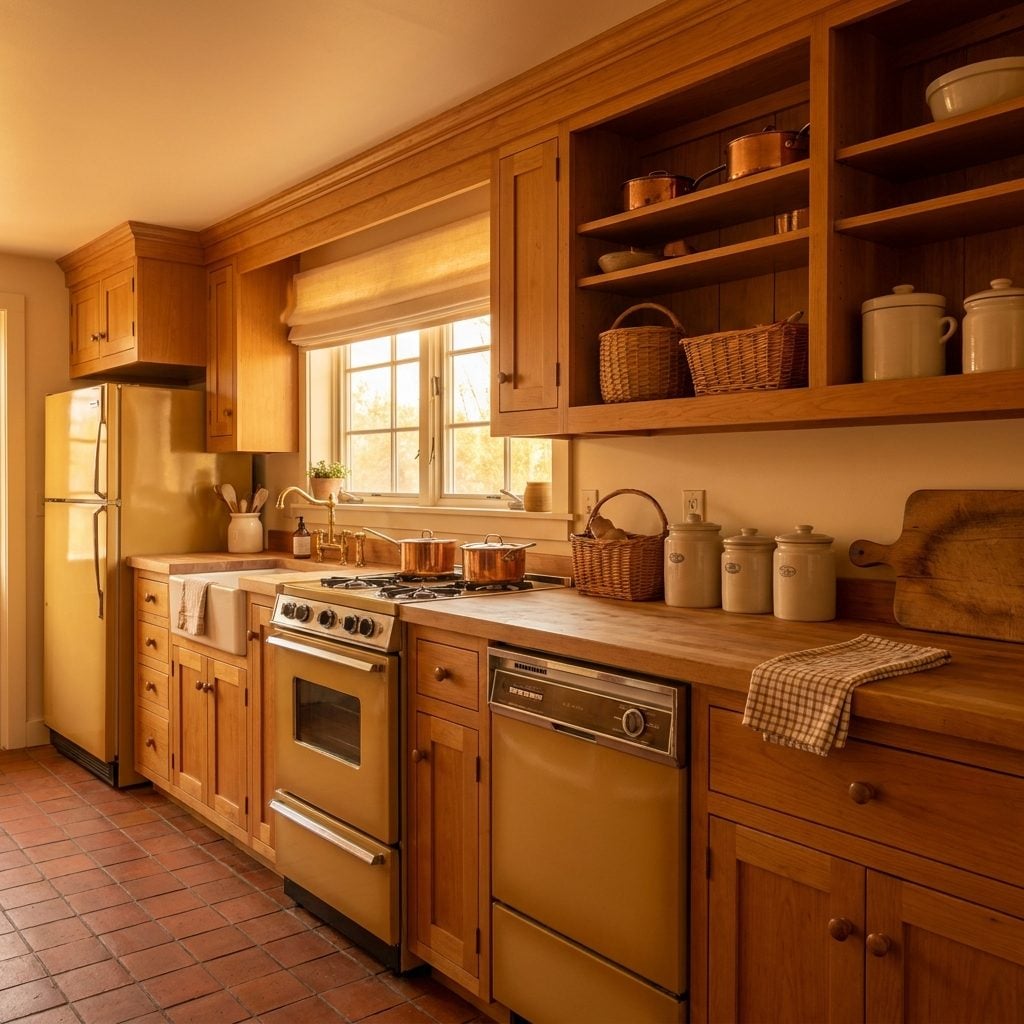
Harvest Gold sat somewhere between mustard, honey, and ochre, dark enough to live comfortably beside walnut cabinetry and warm enough to make a refrigerator seem less like a white machine dropped into the room.
Major appliance manufacturers pushed colorful coordinated kitchens hard in this period. Once the range, refrigerator, dishwasher, and vent hood could all arrive in the same gold finish, buying appliances started to look suspiciously like buying a bedroom suite.
24. Rust and Copper Put the Shine Where the Cabinets Couldn’t
🔥 Would you like to save this?
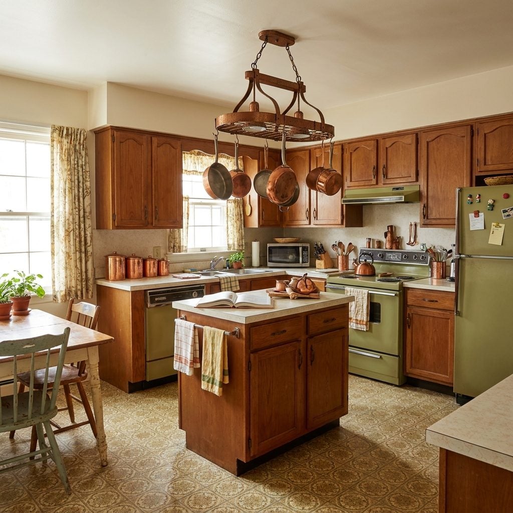
Copper cookware wasn’t merely cookware. It hung on walls in graduated rows, flashed from pot racks, and occasionally appeared as a collection of molds whose relationship with actual gelatin had ended years earlier.
Rust-colored tile, curtains, counters, and upholstery made the metal look brighter by comparison. Compared with a full avocado kitchen, this was almost restraint: keep the room earthy, then let polished copper catch every available sliver of afternoon light.
23. Olive Green and Brown Took the Volume Down Without Turning Beige
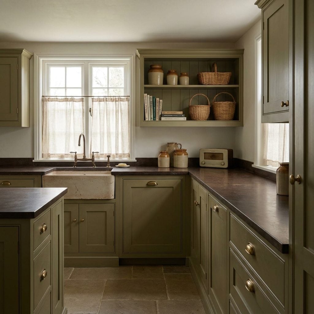
Olive and brown belonged to people who thought avocado was getting a little theatrical. The green was darker and dustier, the brown steadier, and the entire room looked as though it had been mixed from moss, bark, and dried leaves.
That made the palette visually quieter without abandoning color. Today’s sage-and-wood kitchens are not identical, but the family resemblance is hard to miss.
By the 1980s, these deep earth tones were beginning to look like holdouts from another era. For a while, though, they were among the warmest rooms in the house.
22. Orange, Gold, and Brown Turned the Kitchen Into a Geometry Lesson
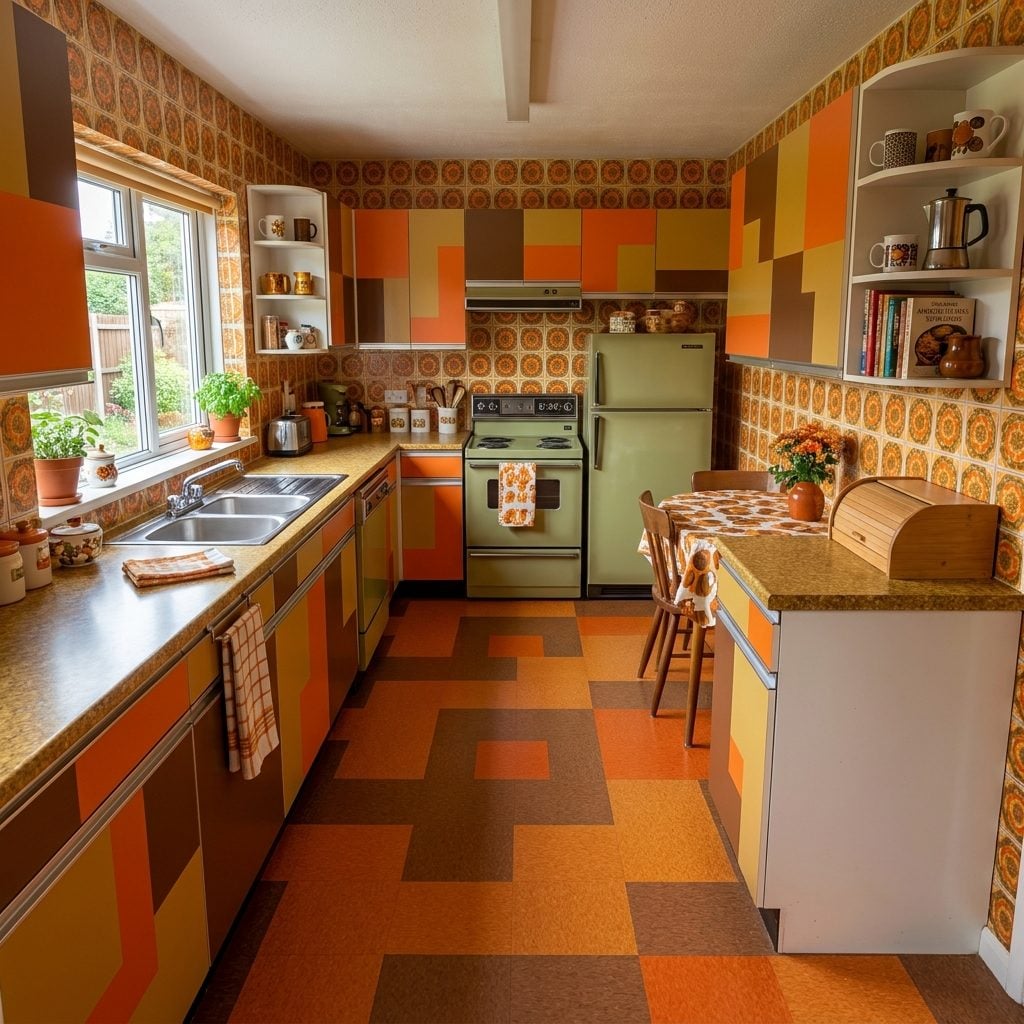
At some point, plain color apparently stopped being sufficient. Wallpaper filled with overlapping circles, floors broke into grids, and backsplashes started looking as though somebody had given graph paper a liquor license.
Orange argued with gold while walnut and dark tile tried to keep order. The surprising part is that the rooms often held together precisely because nobody hedged. Bold pattern, bold color, dark wood. Beige was not invited to mediate.
21. Mustard Yellow Was What Happened When Cheerful Yellow Got Serious
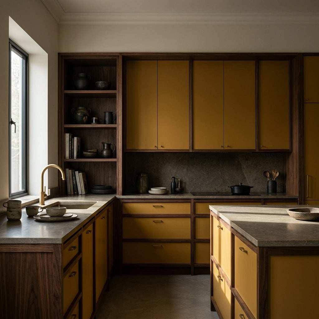
Mustard had brown and ochre in its voice. It could still brighten a kitchen, but nobody was going to mistake it for the yellow in a nursery.
Dark wood, cream, rust, and brass brought out its earthy side. Against those materials, mustard looked less like a primary color and more like something pulled from leather, spice, or dried grass.
20. Chocolate-Brown Kitchens Went Dark Before Dark Kitchens Were Cool Again
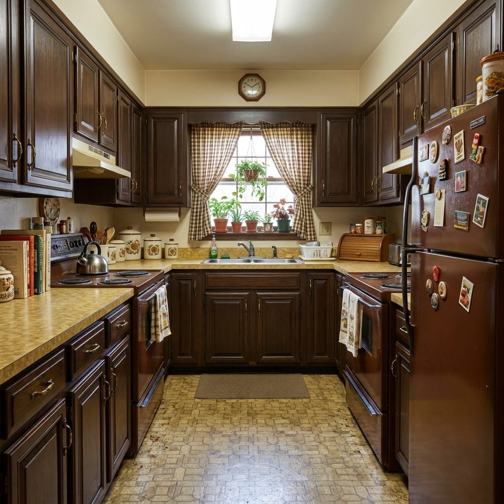
Full chocolate brown was the tuxedo end of the earth-tone years. Cabinets, appliances, and paneling could all go dark, leaving cream counters and brass to stop the room from disappearing into itself.
The brass pot rack was practically jewelry. Copper pans flashed against deep wood, and suddenly the palette that later generations dismissed as gloomy looked suspiciously close to the walnut-and-brass revival happening again.
Some of the best glam kitchen decor still leans on the same equation: deep wood, warm metal, controlled light.
19. Pumpkin Orange and Brown Made October a Permanent Interior Design Style
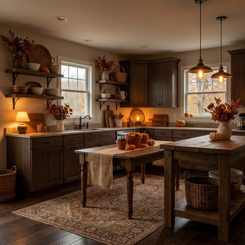
Pumpkin and brown was avocado’s autumn cousin: the kind of kitchen where a pot of chili looked inevitable even when nobody had bought beans.
Wallpaper covered whole walls because accent walls had not yet arrived to rescue the timid. Brown supplied depth; pumpkin supplied heat. The result could make a room feel smaller and more enveloping, which some kitchens wore extremely well.
18. Avocado, Gold, and Brown Became the Three-Piece Suit of the 1970s
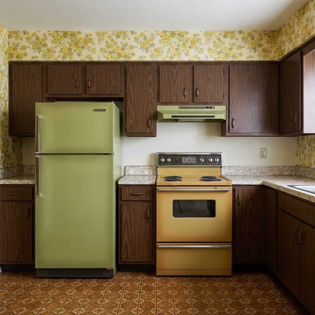
Avocado did not have to work alone. Pair it with Harvest Gold and enough brown wood grain and you had one of the most recognizable coordinated palettes of the decade.
The refrigerator might take the green, the countertop the gold, and the cabinets the brown. Or the assignments could rotate. What mattered was that the room operated as a system, with appliances suddenly participating in interior decoration rather than pretending to be invisible equipment.
17. Powder Blue Was the 1980s Opening a Window After All That Avocado
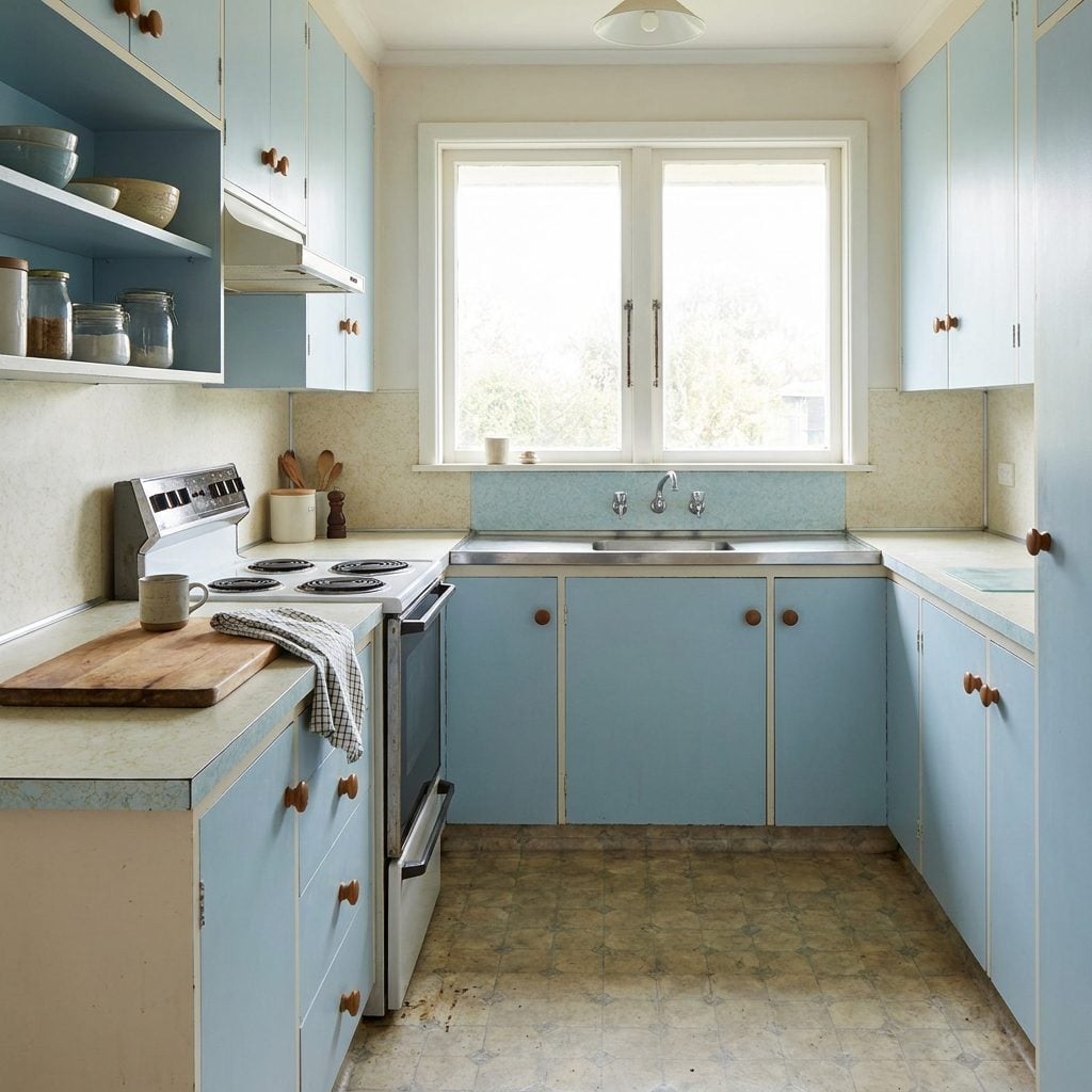
After the density of 1970s earth tones, powder blue felt almost weightless. White tile, wicker stools, blue-and-white stripes, and pale painted surfaces let kitchens breathe again.
The combination was cool but not clinical. One darker navy accent could give all that pale blue enough structure to stop it floating away. Today’s coastal kitchens may use cleaner lines, but grandmother already had the color chart.
16. Country Blue Brought Ceramic Geese With It
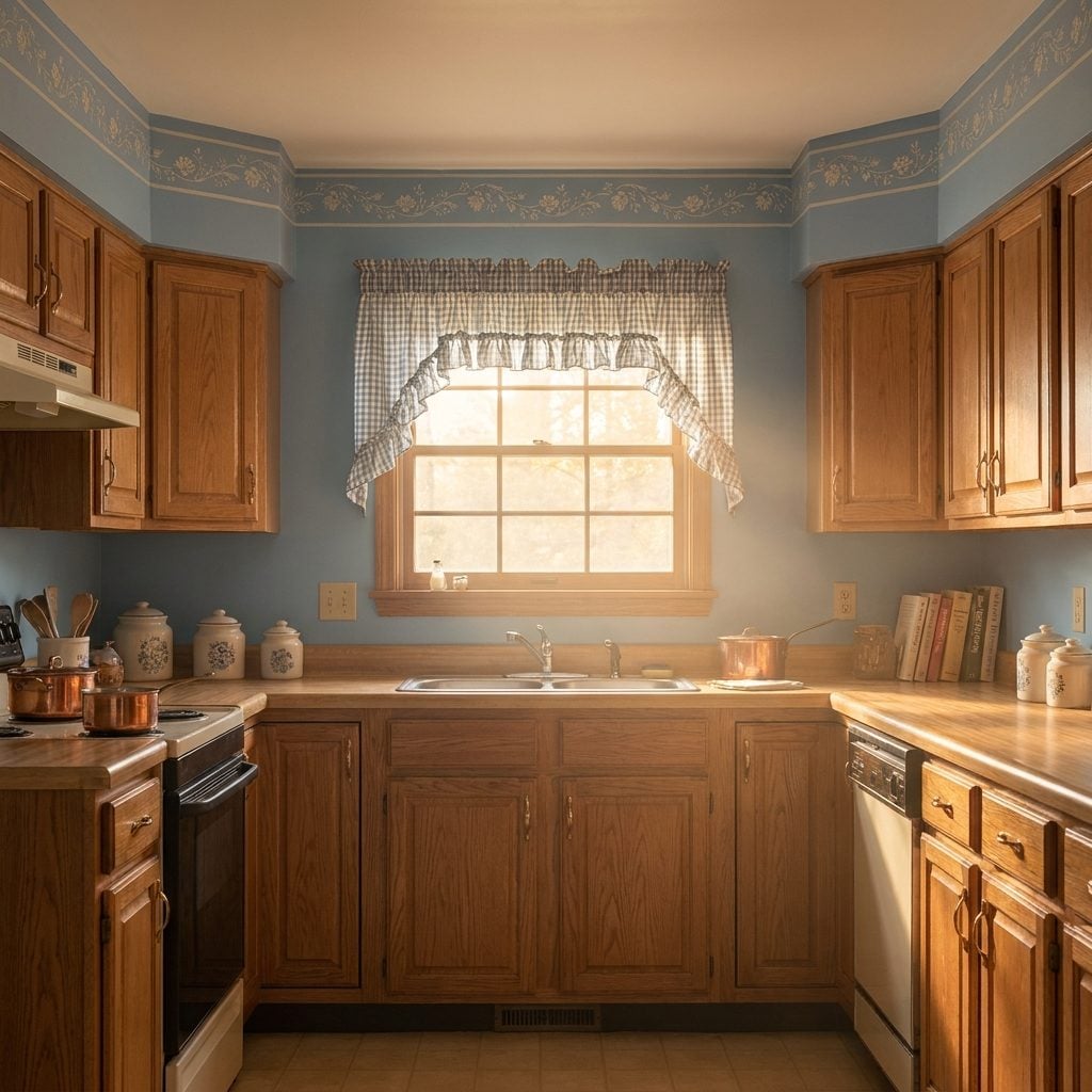
Country blue was the sound of the 1980s exhaling. Not navy, not baby blue, but that chalky slate-and-sky shade that appeared on cabinet fronts, wallpaper borders, gingham curtains, wooden knobs, and roughly nine hundred ceramic geese.
The goal was instant ancestry. A suburban kitchen built six years earlier could acquire stenciled hearts, dried flowers, a crock by the stove, and the emotional history of a farmhouse that had allegedly survived six generations.
15. Peach and Cream Made Every Hour Look Suspiciously Like Sunrise
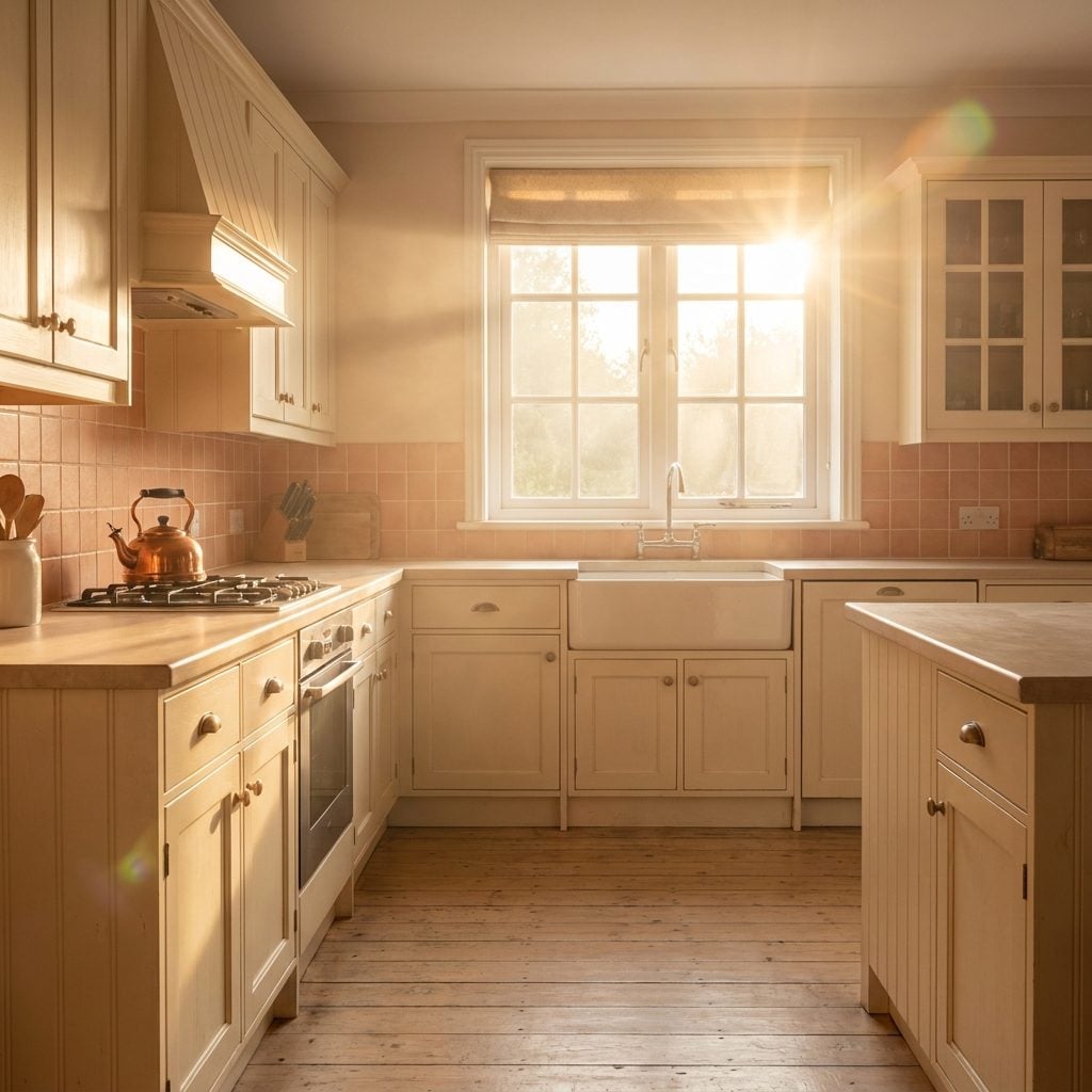
Peach and cream kitchens seemed to glow even after dark. Peach supplied warmth without the force of orange; cream softened the contrast until the room looked permanently lit from inside.
The combination could handle brass, pale wood, floral fabric, and patterned wallpaper without becoming as cool and formal as mauve-and-gray schemes. It was gentle color with absolutely no intention of disappearing.
14. Peach and Mint Pastels Colonized the 1980s One Wallpaper Border at a Time
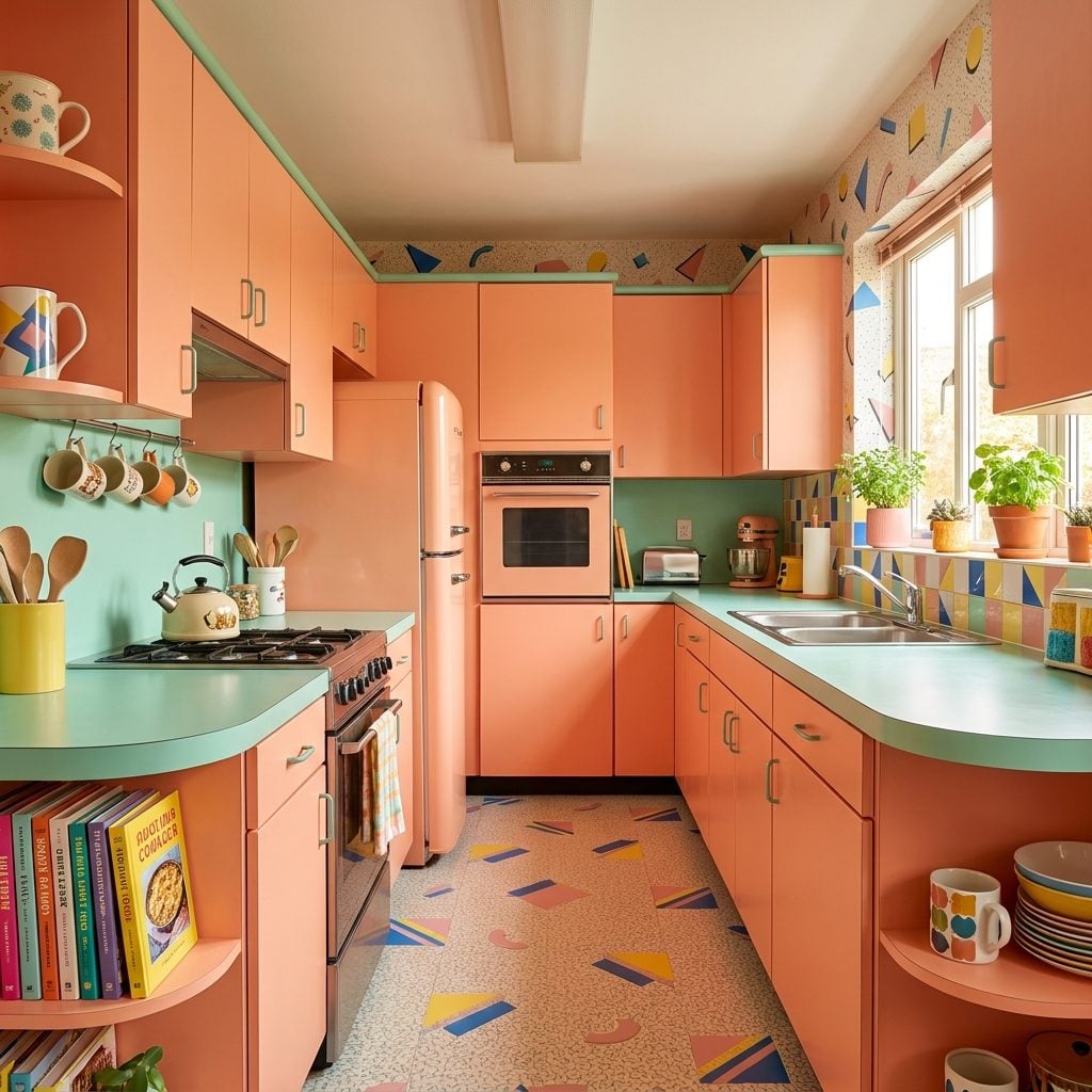
Peach and mint did not whisper. They colonized. Countertop laminate went salmon, cabinet paint went sage-mint, and a border of ducks, flamingos, fruit, or mysterious baskets ran a ceremonial lap around the ceiling.
The colors balanced each other better than memory gives them credit for. Peach brought warmth; mint pulled the palette cooler. Neither needed to become particularly dark, which helped the entire room keep that soft-focus 1980s haze.
13. Dusty Rose and Mauve Were Pink After It Got a Mortgage
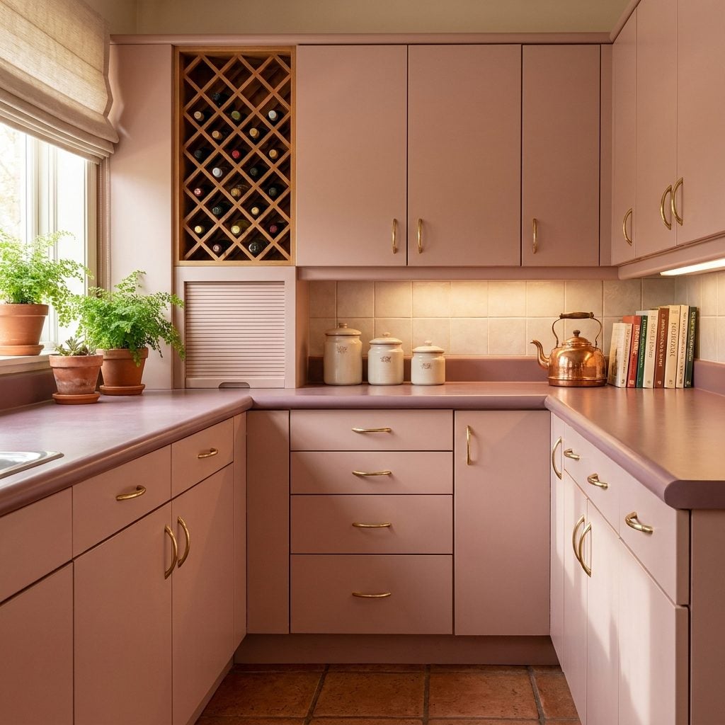
Mauve was the color of moving up in the world. The family room had a sectional now. There was probably a wine rack. Dusty rose came right along with it, turning up on cabinet fronts, laminate, wallpaper, and ceramic canisters with wooden lids.
Add dove gray and brushed brass and the palette became surprisingly formal. This was pink that paid a mortgage.
By the mid-1990s, mauve was already acquiring the dangerous label of “dated.” Then people spent years painting over it. Give the cycle enough time and somebody will eventually call the survivors heritage.
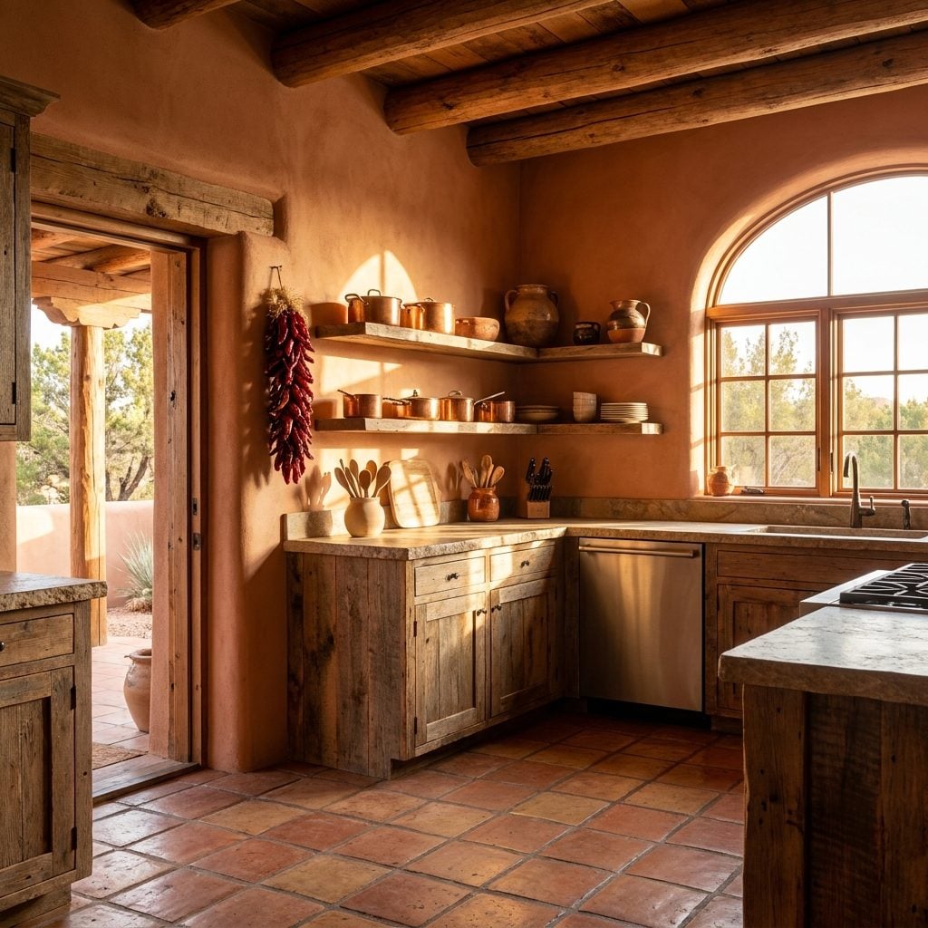
12. Southwestern Terracotta Brought the Desert Into the Kitchen
🔥 Would you like to save this?
You could almost smell these kitchens before you saw them: cumin, warm clay tile, wood, and whatever was hanging from the ristra by the window.
Saltillo-style floors supplied canyon orange, knotty pine brought warmth, copper developed its own changing surface, and turquoise arrived in tile or pottery like a patch of desert sky. The palette felt coherent because every color seemed to belong to the same landscape.
People built entire rooms around one Talavera tile they brought home from vacation. Hard to blame them.
11. Burgundy and Dusty Rose Put Formalwear on the Kitchen
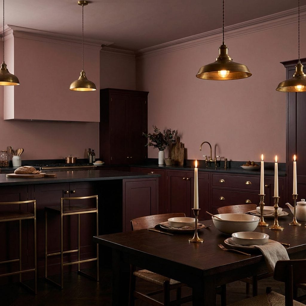
This was dusty rose with ambition. Pale pink stayed above while the lower cabinets went deep wine-dark burgundy, and suddenly the kitchen looked ready to host people who used cloth napkins on weekdays.
Brass hardware stitched the two tones together. The contrast borrowed the logic of a good outfit: lighter color where you wanted air, darker color where you wanted weight, one metal repeated throughout so nobody suspected the room had been dressed in separate departments.
10. Country Blue and Honey Oak Invented the Suburban Farmhouse Long Before Pinterest
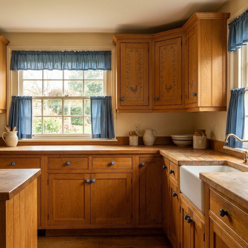
Honey oak cabinets, country blue walls, gingham at the window, a rooster on the shelf. A whole aesthetic assembled one Country Sampler magazine at a time.
The orange warmth of oak gave blue something to push against, which kept the room from becoming either aggressively golden or chilly. Hand-painted floral tiles and a border of blue posies could then march around the ceiling with complete confidence.
9. Hunter Green and Brass Was the Power Suit of the 1990s Kitchen
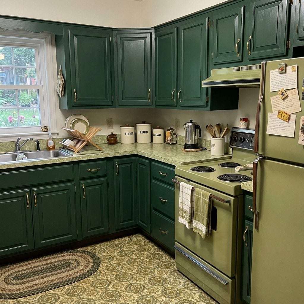
Hunter green had a little English club in its posture. Deep cabinets, cream counters, brass hardware, maybe a checkerboard floor: the room wanted you to know the avocado years were safely behind it.
This was the cabinet color for the family with a boat, or at least a convincing willingness to discuss boats over dinner. Brass mattered because it gave the dark cabinetry flashes of warmth rather than leaving the whole room to absorb the evening.
8. Forest Green and Natural Oak Made a Very 1990s Peace Treaty
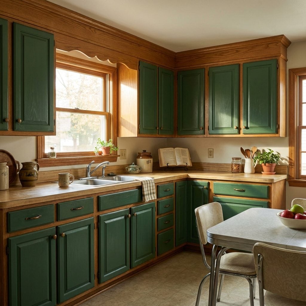
Here was the deal: you wanted green cabinetry, but the honey oak the builder installed three years earlier was not going anywhere. So both stayed.
Green on one bank, oak on another, brass knobs mediating the dispute. The warm orange cast of oak sits opposite green on the color wheel closely enough to create a naturally lively pairing, and the combination felt comfortably domestic rather than deliberately “designed.”
If you grew up around it, there is a decent chance an entire split-level has just materialized in your head.
7. Teal Accents Let the 1990s Have Color Without Marrying It
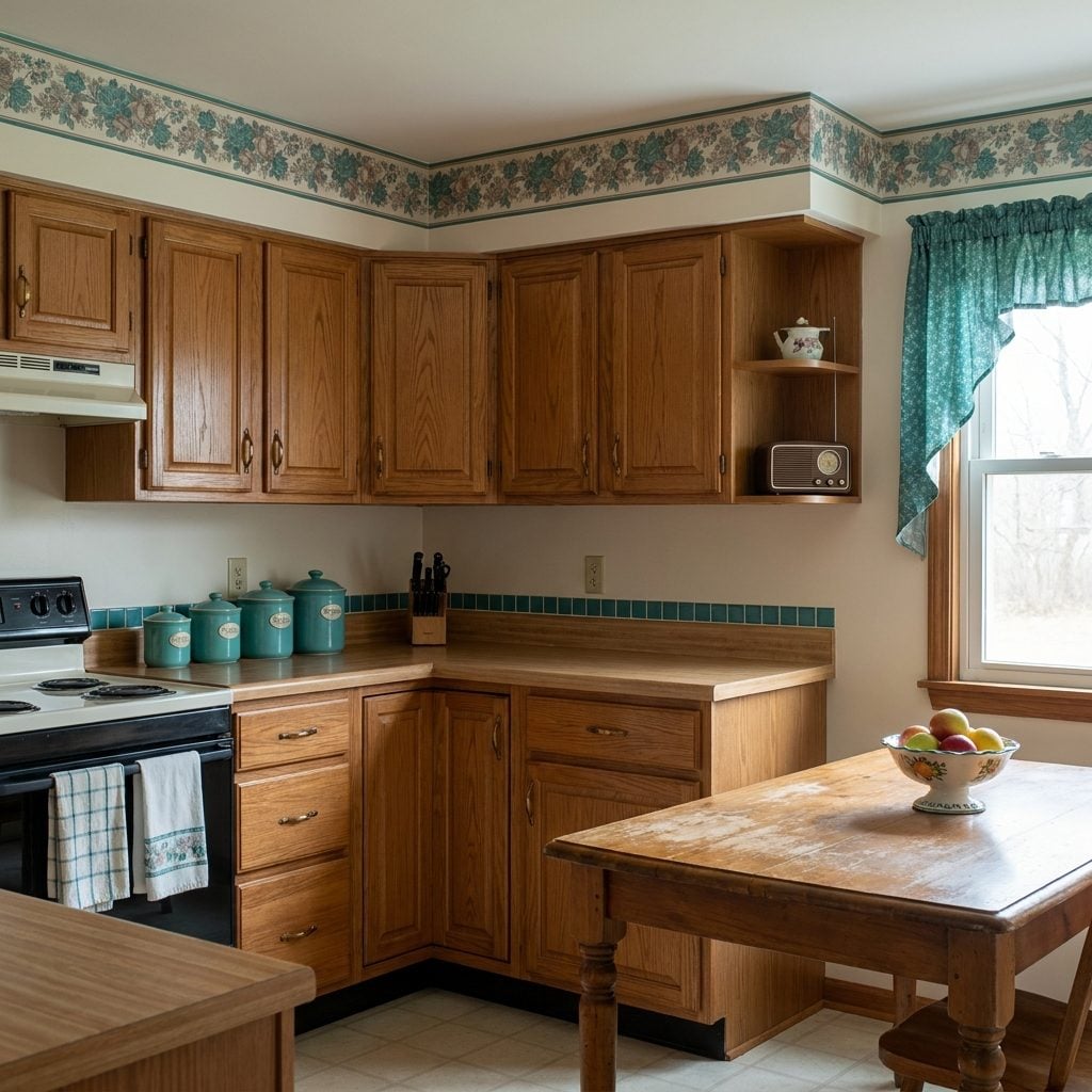
Teal was the 1990s flexing without signing a long-term contract. Ceramic canisters. Tile trim. A wallpaper border. Hand towels. Maybe one valance brave enough to pick up the theme.
Mauve frequently came along for the ride, producing a combination so specifically early-1990s that it can summon a fake-flower arrangement above the cabinets before you’ve even finished saying the words.
6. Burgundy and Hunter Green Turned Plaid Into a Kitchen Neutral
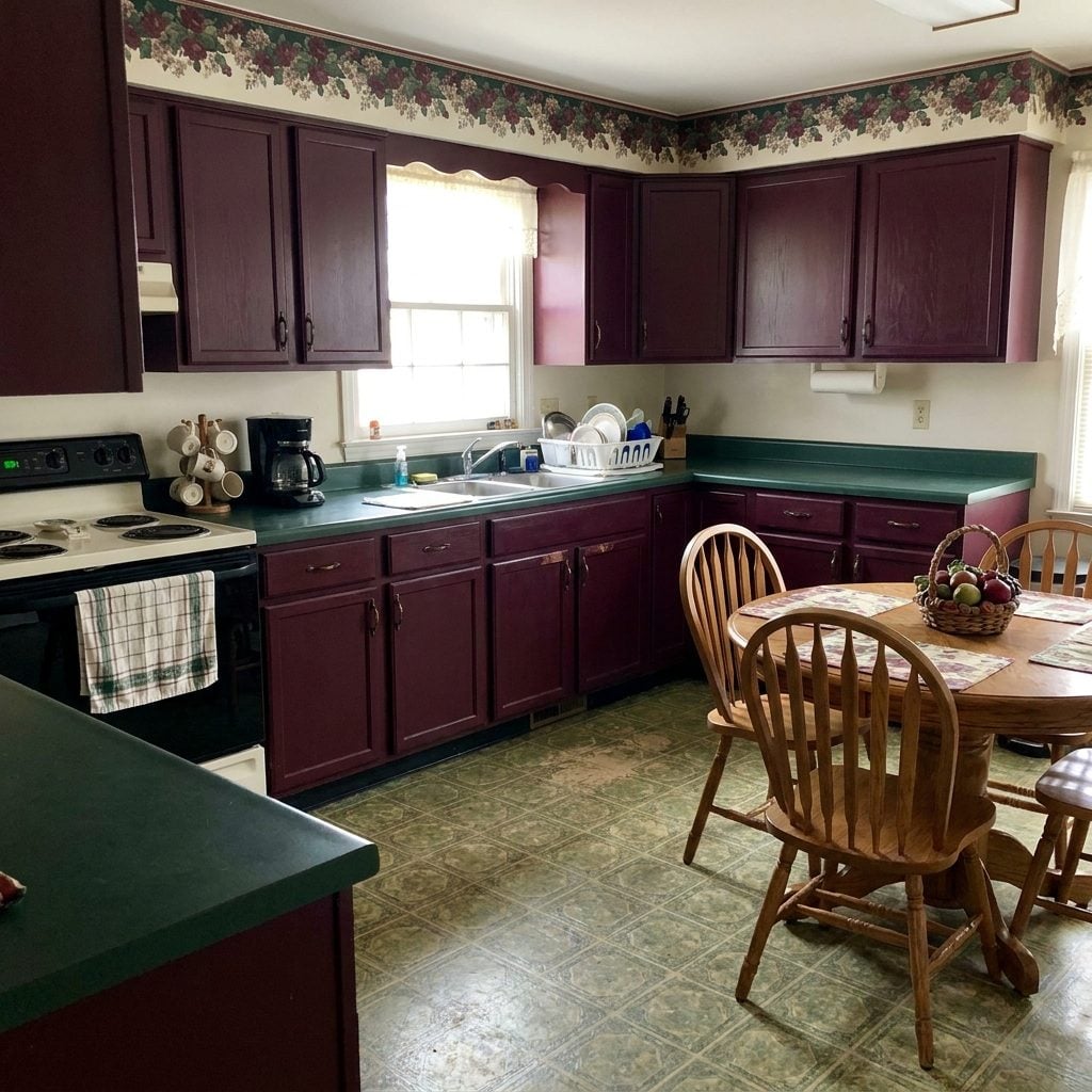
Burgundy and hunter green was the country-club end of the decade. Serious colors, plenty of oak, and enough plaid wallpaper to suggest somebody had recently returned from a hunting lodge whether or not anyone in the family hunted.
Unlike the polished hunter-green kitchens built around brass and cream, this version leaned rustic: valances, oak, checks, pottery, dried floral swags. The palette was dark, warm, and completely uninterested in looking larger for resale.
I have a soft spot for it. The room looked especially good at dinner, when all those deep colors stopped arguing with daylight and started absorbing the glow.
5. Forest Green, Burgundy, and Brass Took English-Country Drama All the Way
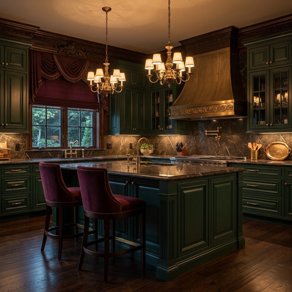
This was the dressier cousin of the plaid-and-oak kitchen. Forest green took the cabinets, burgundy occupied every available accent, and polished brass appeared on pulls, pot racks, lighting, and anything else willing to shine.
The grape-and-ivy border was nearly ceremonial. So was the dried grapevine above the cabinets, gathering dust in a place no ordinary human arm could reach.
The style drew from the broader 1990s appetite for English-country and traditional interiors: saturated colors, dark wood, brass, florals, checks, and the vague suggestion that somebody in the household owned riding boots.
4. Navy Blue and Natural Wood Quietly Outlived Most of Its Loud 1990s Neighbors
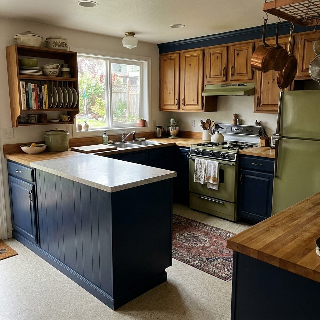
Navy and wood was the palette for people who wanted real color without turning the kitchen into a personality test. Deep blue lowers, warm oak above, butcher block between them collecting knife marks and evidence of actual cooking.
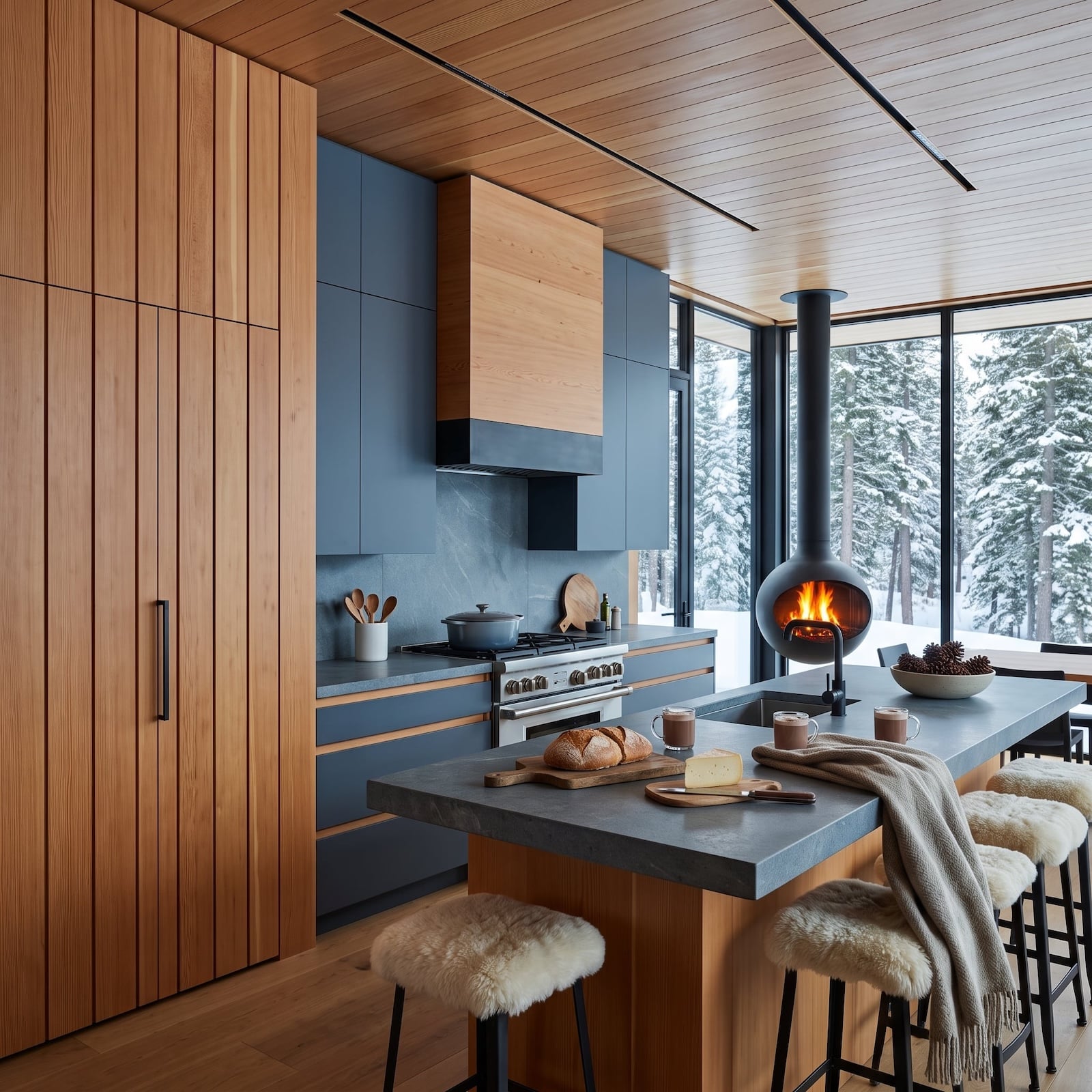
It aged better than many neighbors because the relationship was simple: navy supplied depth, wood supplied warmth. When designers eventually began looking for alternatives to the all-white kitchen, navy was one of the colors that felt familiar enough to trust again.
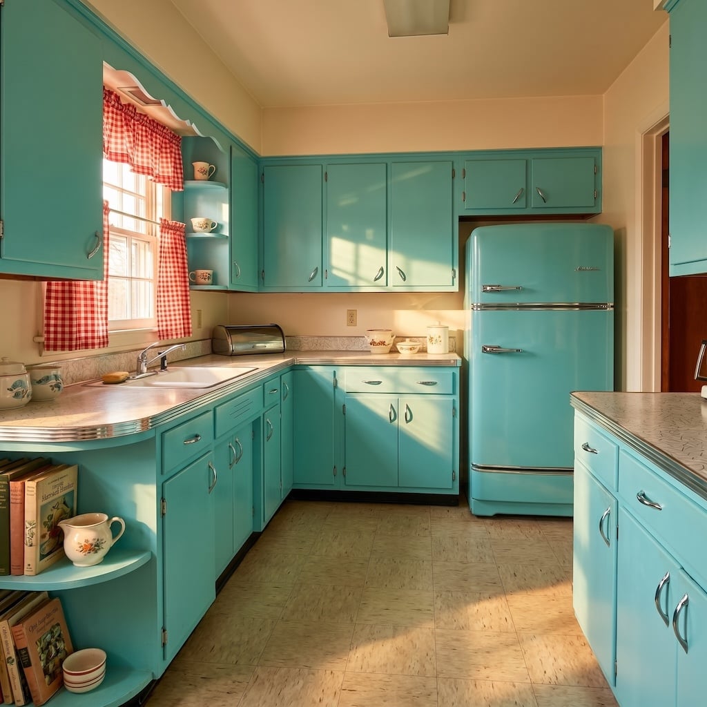
3. Turquoise and Aqua Return for One Last Blast of Midcentury Nerve
🔥 Would you like to save this?
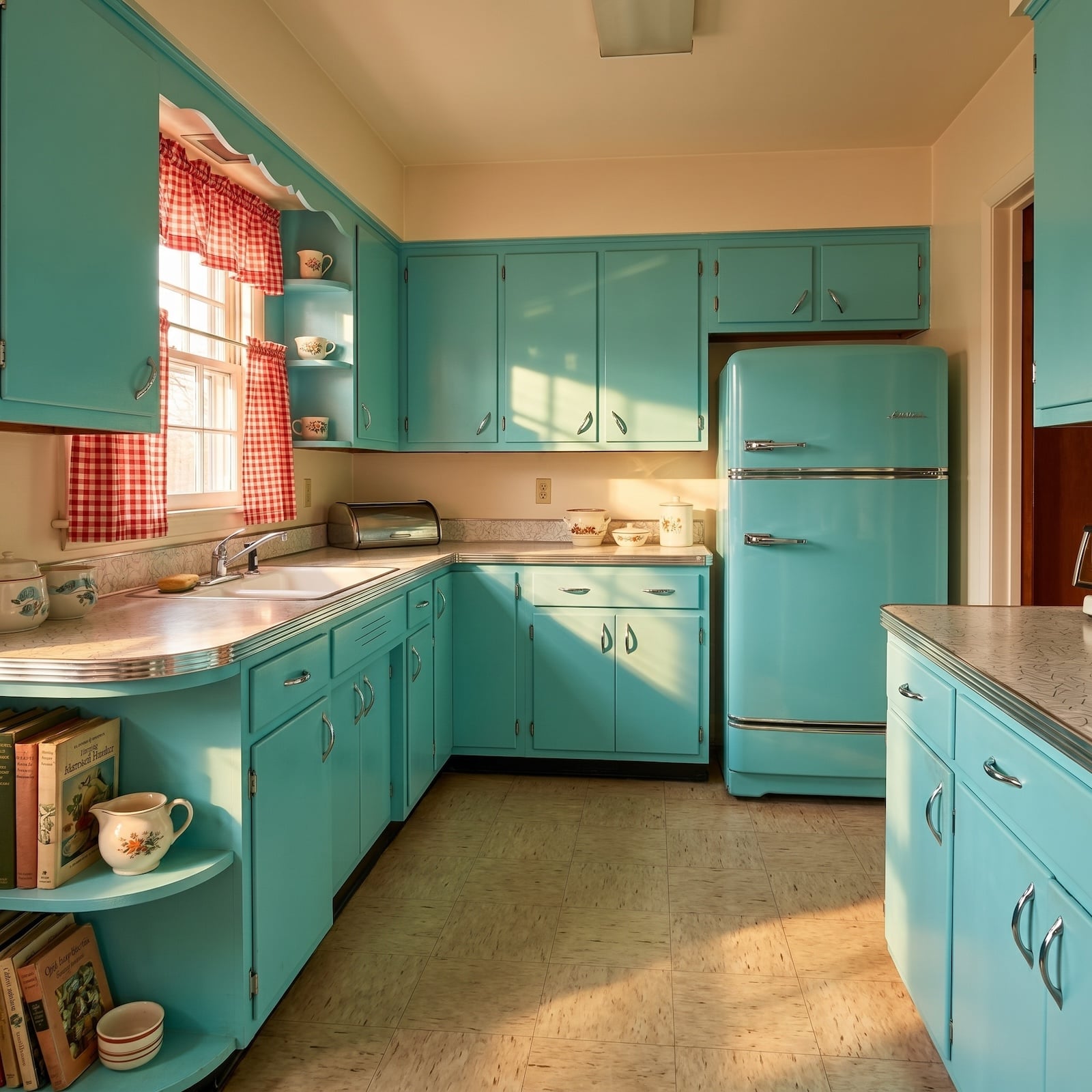
After all the avocado, mauve, hunter green, oak, brass, and careful 1990s compromise, turquoise looks almost indecently cheerful again. It ran across cabinet fronts, wrapped refrigerators, and resurfaced in dinette vinyl without once asking whether resale value approved.
Chrome was the accomplice. Cabinet pulls, chair frames, appliance trim, and table legs flashed between all that blue-green and gave the room the crisp machine-age edge that made turquoise feel less beach house and more Jet Age.
2. Pink and Gray Worked Before Gray Forgot How to Have Fun
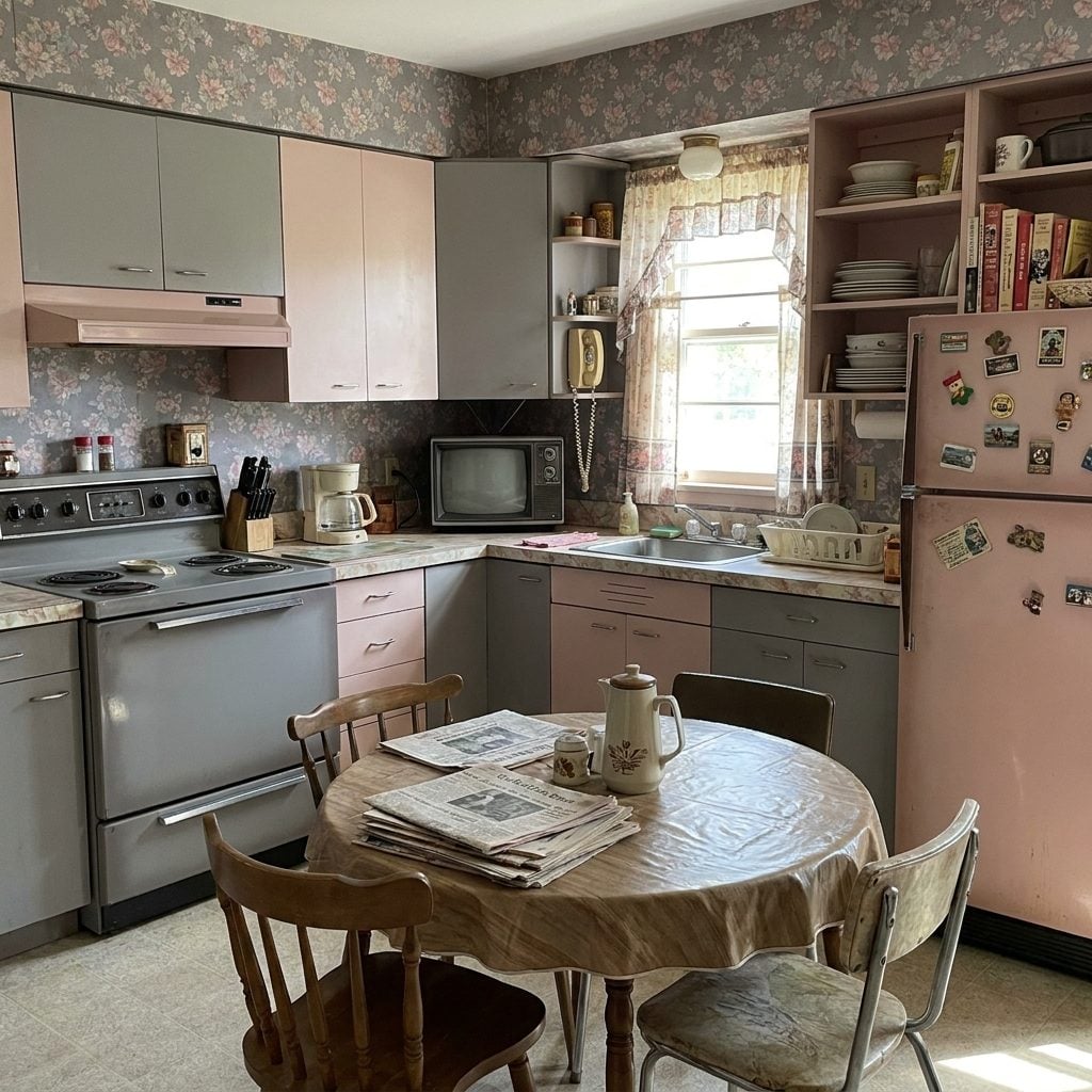
This is the more deliberate cousin of the earlier pale-pink kitchen. Here the relationship between the two colors is the story: pink cabinets or appliances against gray counters, tile, or walls, each preventing the other from becoming too much of itself.
Mamie Eisenhower helped make pink unusually visible in postwar American culture, but gray is what gave many pink kitchens their backbone. The same pairing still works because warm and cool keep trading places instead of allowing either side to dominate.
That balance is why even a contemporary gray entryway changes dramatically when a warmer color enters the scene.
Pink was the fun. Gray was the discipline. Together they made a kitchen that meant business and still smiled.
1. Dusty Blue and Mauve Were Already Drifting Toward the Neutral Era
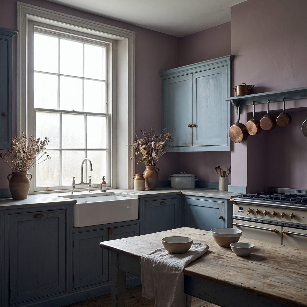
By the early 1990s, mauve had cooled down and picked up a blue partner. Brass was giving way in some rooms to cooler metals, saturated color was getting foggier, and the palettes that once announced themselves from the doorway were beginning to soften.
Dusty blue and mauve sat close enough in value and intensity that neither one had to fight for control. Low contrast, low drama. After avocado refrigerators, pumpkin wallpaper, turquoise cabinets, and burgundy everything, the kitchen was beginning to whisper.
Look closely and you can see where the whole story was heading. Pull more color out of these two and you land remarkably close to the grays that would eventually spread across cabinets, flooring, counters, walls, and renovation shows everywhere. Mauve was already halfway to neutral. It just hadn’t admitted it yet.