🔥 Would you like to save this?
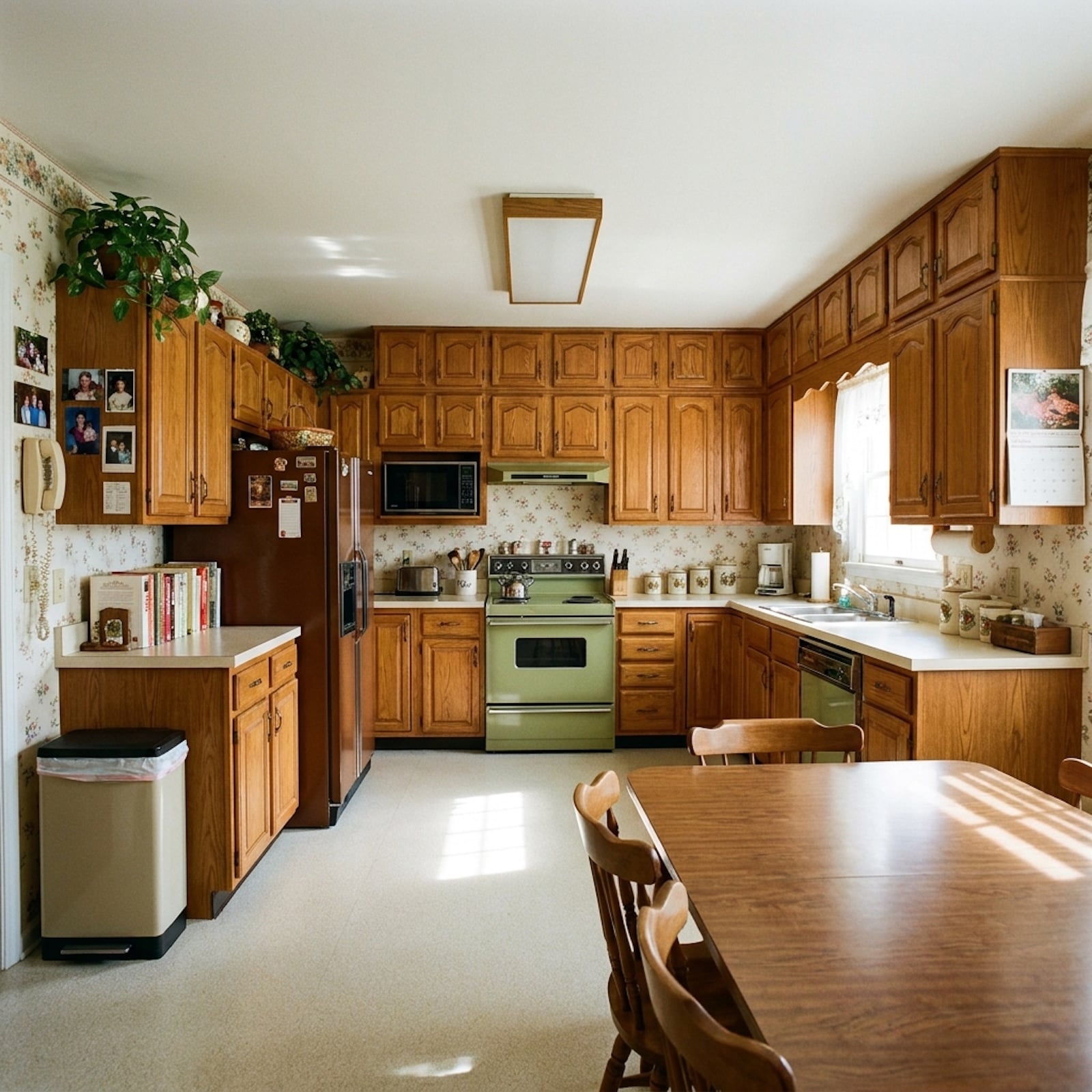
Honey oak caught the late-afternoon sun and turned an entire kitchen the color of weak tea. Polished brass winked from every door. Beige carpet ran uninterrupted until it met a strip of white ceramic tile, a mirrored closet, or a wall textured just enough to hide whatever the drywall crew didn’t want discussed. For years, that whole visual language became shorthand for one damning phrase: builder-grade.
Then we spent three decades replacing it. Oak became gray, gray became white, brass became nickel, carpet became hardwood, rooms lost their walls, and every television climbed onto a giant blank surface like an altar. Somewhere around the fourth round of “timeless” renovations, the old stuff started looking different. Not all of it. Some 1990s ideas deserve their retirement. But these 36 features make a surprisingly good case that cheap-looking and badly designed were never quite the same thing.
In order to come up with the very specific design ideas, we create most designs with the assistance of state-of-the-art AI interior design software. Also, assume links that take you off the site are affiliate links such as links to Amazon. this means we may earn a commission if you buy something.
36. Honey-Oak Kitchen Cabinets Were Warmer Than We Gave Them Credit For
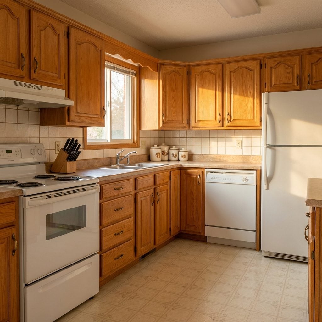
Nothing announces a 1990s kitchen faster than honey oak. Golden grain, arched or raised-panel doors, brass knobs, maybe a scalloped valance over the sink if somebody was feeling ambitious.
We painted over millions of these kitchens in white, then gray, then warmer white, before natural wood quietly walked back through the door wearing a much better stylist. The irony is hard to miss. Real oak has grain, depth, variation, and warmth that engineered finishes now work very hard to imitate. The cabinetry boxes and doors varied enormously in quality, but a well-built oak kitchen was never automatically disposable just because the stain had aged badly.
35. Mirrored Closet Doors Solved a Small-Bedroom Problem in One Giant Reflection
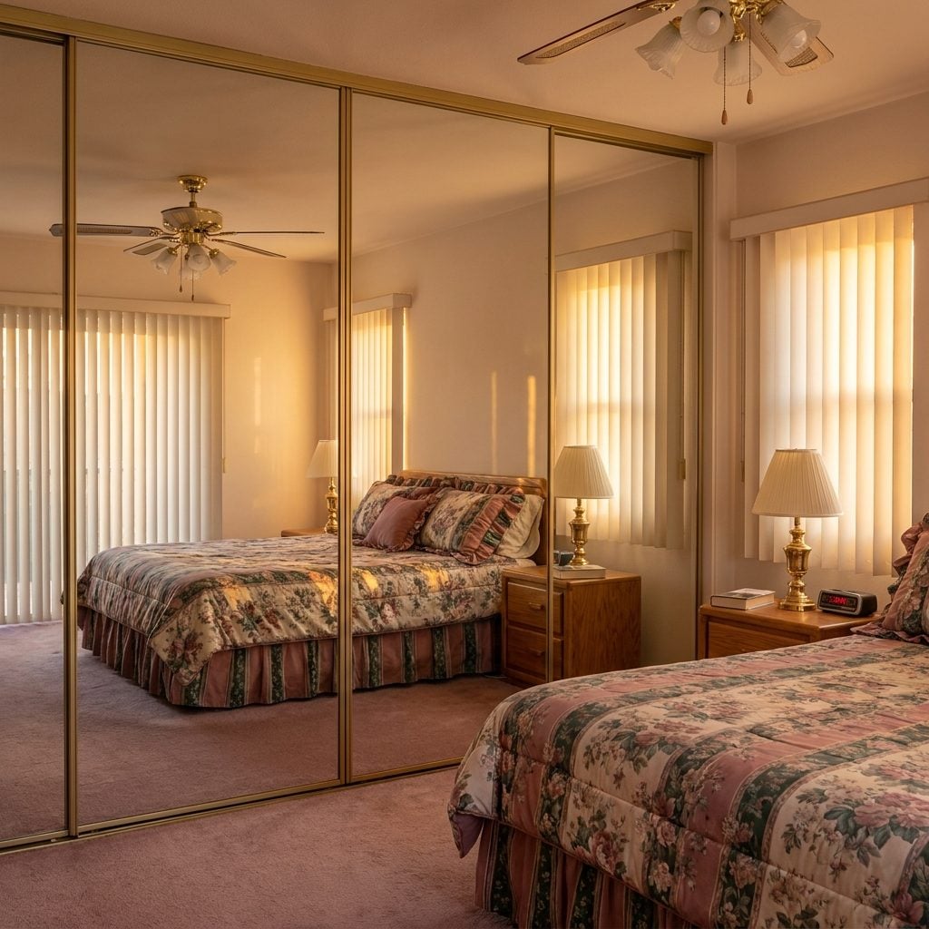
They doubled the room visually. That was the deal. One wall of mirror caught the window, repeated the furniture, and made a modest bedroom feel as though it had suddenly found another ten feet.
What dated the look wasn’t necessarily the mirror. It was the skinny brass track, the wobbling sliding panels, and the seam running down the middle. Designers still use oversized mirrors and mirrored walls to expand small spaces. The 1990s version understood the spatial trick perfectly; the hardware simply told on it.
The idea was ahead of the hardware. Same story on half this list.
34. Laminate Countertops Took Abuse Without Asking for a Maintenance Schedule
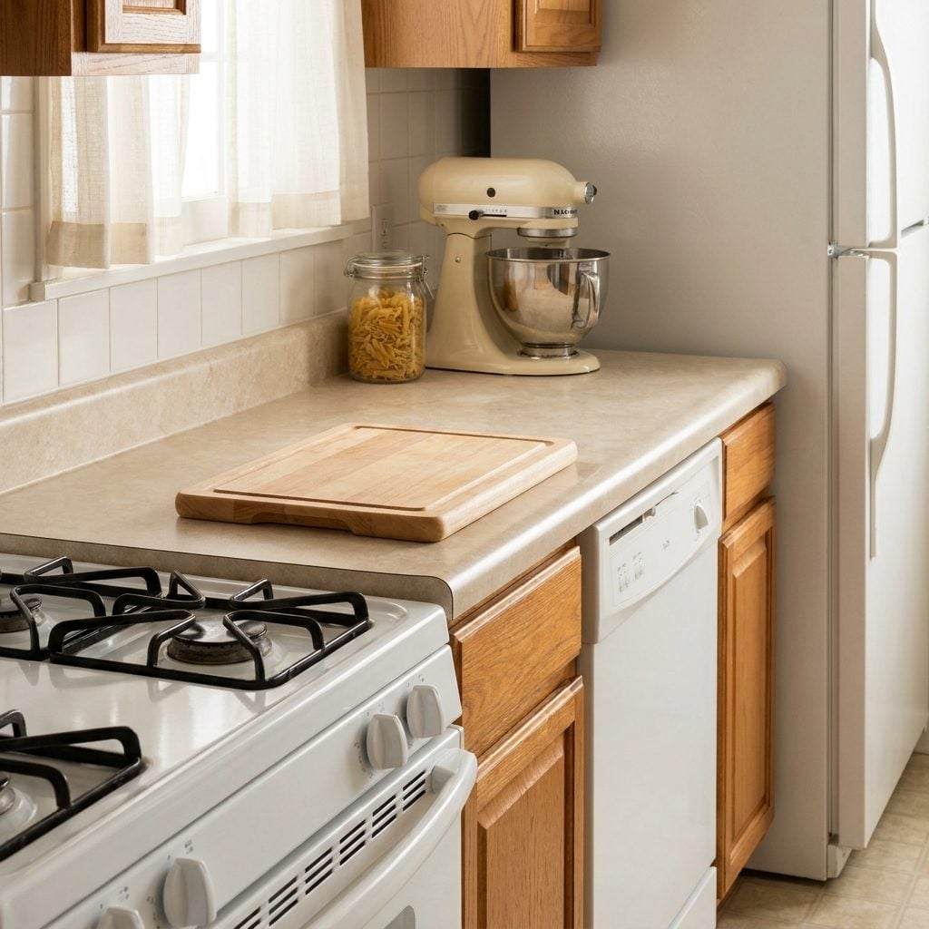
Laminate got treated like the great shame of the kitchen.
We aspired to granite, then quartz, then increasingly elaborate slabs with enough veining to require their own weather maps. Meanwhile, speckled almond laminate kept taking cereal spills, school projects, coffee mugs, and the occasional hot-pan scar without demanding sealer or a special bottle from the stone shop.
The rounded no-drip edge was genuinely clever. Spill something and the raised front helped keep liquid on the worktop instead of sending it immediately toward your socks. Modern laminate has better patterns, textures, and edge treatments, but the basic proposition hasn’t changed much: lots of usable counter for comparatively little money.
33. Six-Panel Doors Were So Ordinary We Forgot They Had Architecture
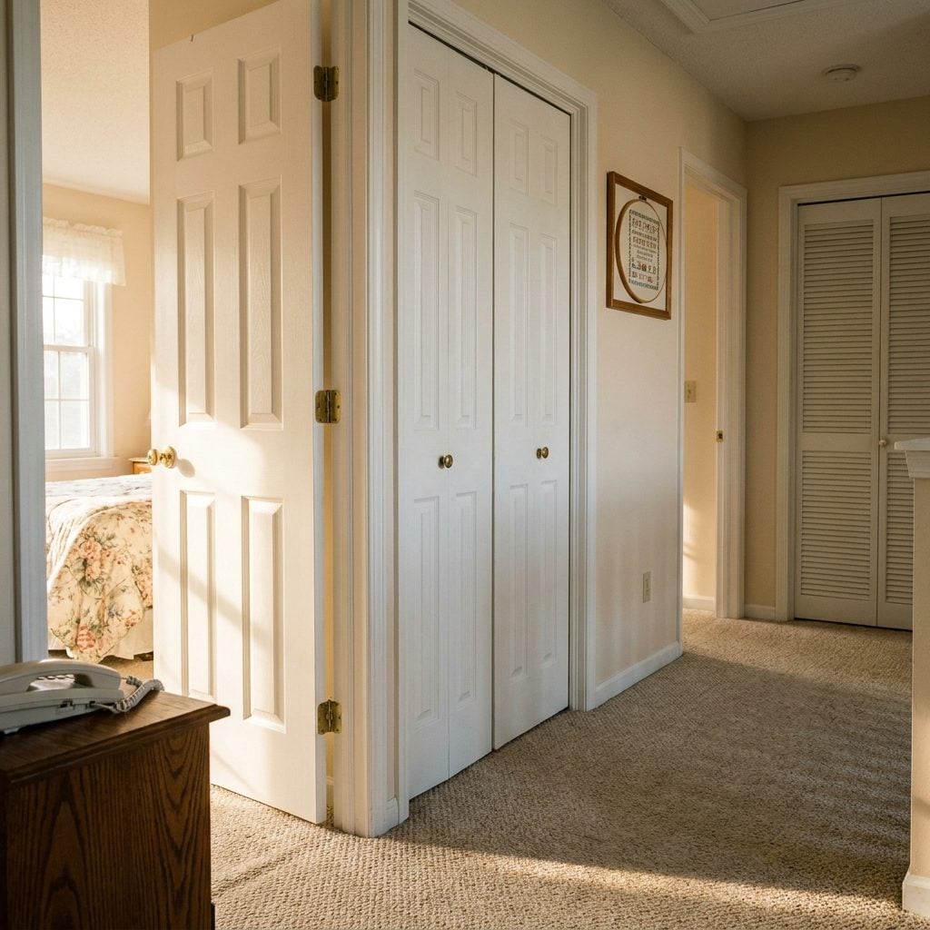
Six raised panels, builder-white paint, one on every bedroom, bathroom, and closet. We barely registered them until flat slabs and black statement doors arrived and made the old profile look suddenly busy.
But the six-panel door has one thing a perfectly flat slab doesn’t: shadow. Rails, stiles, and recessed panels break up the surface and give even an inexpensive door some visual depth. Paint the same profile charcoal, olive, or warm cream today and it can look surprisingly deliberate. The door didn’t change. The context did.
32. Beige Carpet Was Boring — and Extremely Good at Being Carpet
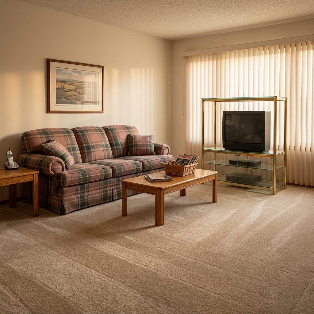
The vacuum lines were a whole personality.
Company coming? You vacuumed in careful rows so the pile showed those perfect stripes, and heaven help the child who walked across them before the guests arrived.
We tore carpet out for hardwood and rediscovered all the things carpet had been quietly doing: softening footsteps, warming bare feet, giving kids somewhere comfortable to sit, and absorbing some of the impact noise hard floors happily send through a house. Beige was not thrilling. Comfort doesn’t always photograph well.
31. The Built-In Kitchen Desk Was the Command Center Before We Had a Name for It
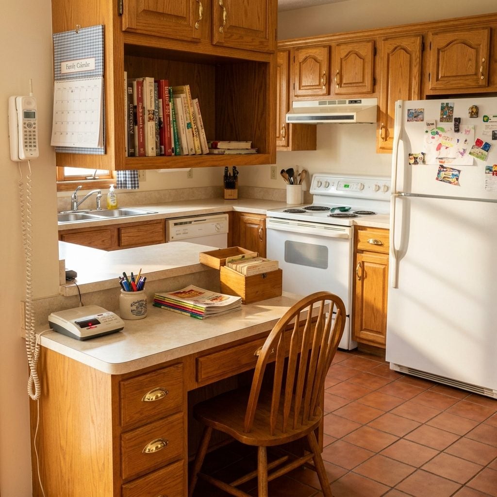
Every 1990s kitchen seemed to have a little kneehole desk squeezed between cabinets, usually with an overhead shelf, pencil drawer, phone jack, and enough countertop to balance a checkbook beside a pile of mail.
Open-plan renovations ripped many of them out in exchange for more uninterrupted cabinetry. Then laptops invaded the island, charging cables colonized the counter, and suddenly everyone wanted a family command center again. The old desk was basically a compact home office parked exactly where schedules, groceries, school forms, and phone calls actually happened.
30. Brass-and-Glass Chandeliers Knew a Foyer Was Supposed to Make an Entrance
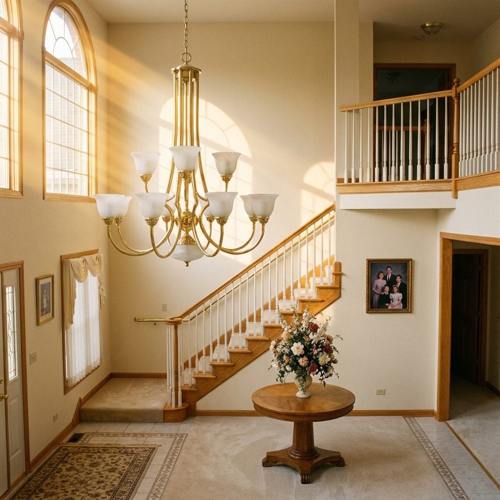
You knew the builder considered the foyer formal when a brass chandelier dropped from the second story with frosted glass cups pointing toward the ceiling. It was less lighting fixture than announcement.
Then came oil-rubbed bronze, black iron, oversized drum shades, and pendants large enough to require their own zip code. Warm metal eventually returned too, only with cleaner lines and less lacquer. The old chandelier’s proportions were often perfectly reasonable. It was the combination of shiny brass, frosted tulips, and twenty-foot entryways that pinned it to 1993.
29. Glass Block Gave Bathrooms Privacy Without Giving Up the Sun
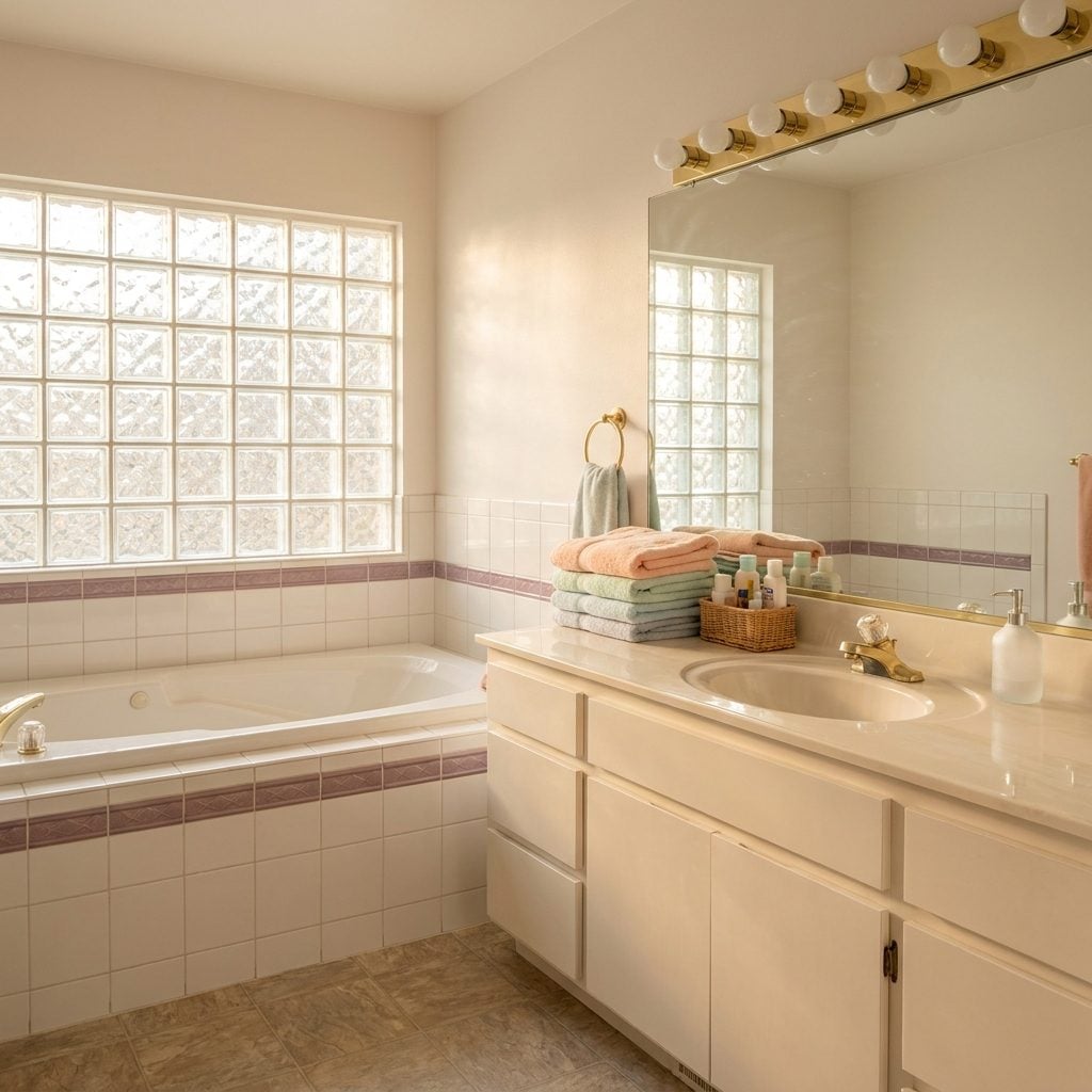
Privacy with no curtain. Daylight with no direct view. Glass block solved a difficult bathroom problem with almost suspicious efficiency.
Its downfall was visual association. Once enough suburban tubs sat beneath enough wavy blocks, the material became inseparable from the era. Functionally, though, textured glass can diffuse incoming light while obscuring the view through the opening — exactly what a bathroom window often needs to do.
28. Chair Rails Gave Dining Rooms a Line, a Scale, and Something to Push a Chair Against
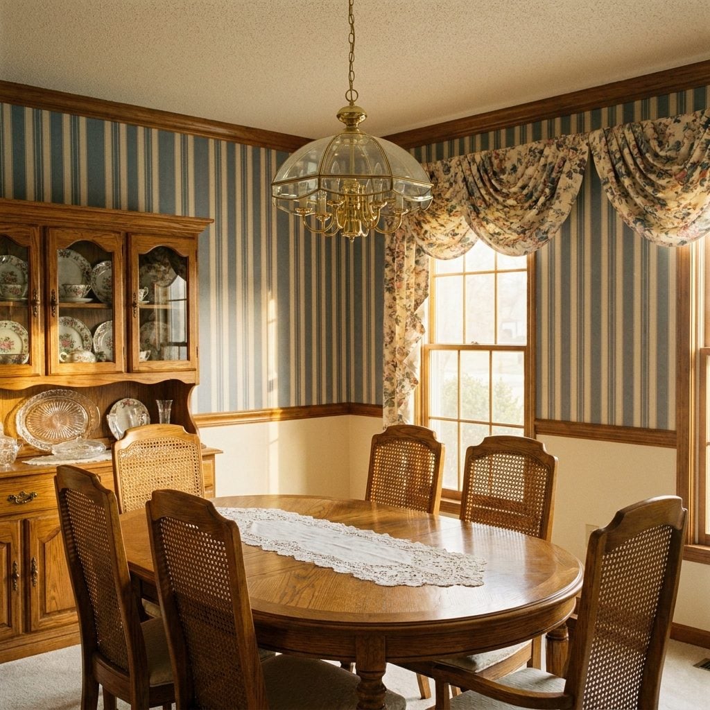
The chair rail split a dining-room wall in two — wallpaper above, paint or paneling below — while also protecting the wall where furniture could actually hit it. Practical first, decorative second.
We stripped thousands of them away in pursuit of blank walls, then spent serious money putting picture-frame molding, dado panels, and layered millwork back. A horizontal line can organize a tall wall and create two useful color zones. The idea never stopped working. It just lost the public-relations battle for a while.
27. Sheet Vinyl Was Quietly the Friendliest Kitchen Floor in the House
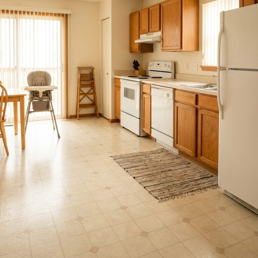
Nothing was ever easier on your feet.
Sheet vinyl gave kitchens a resilient surface that felt warmer and softer underfoot than ceramic tile. Dropped dishes still broke, obviously, but the floor had considerably more give than stone or porcelain.
It was inexpensive, easy to mop, and available in patterns designed to disguise everyday wear. Luxury vinyl arrived decades later with thicker construction, more convincing surfaces, and a much better name. The family resemblance is not subtle.
26. The Built-In Entertainment Center Was Right About One Thing: Give the Room a Center
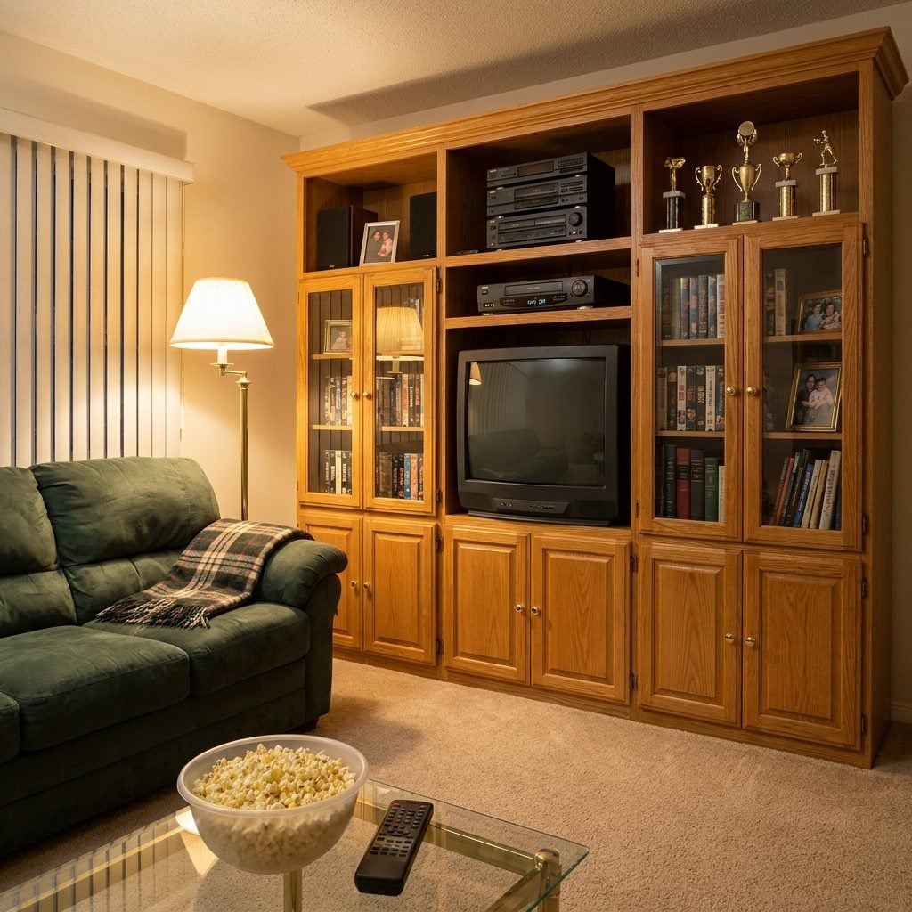
The giant center cavity doomed it. That opening was built around a television so deep it needed furniture behind it, and flat screens arrived almost overnight to make all that cabinetry look strangely hollow.
But the larger planning idea survived intact. Storage walls, media millwork, bookshelves around fireplaces, and cabinetry that conceals cords and equipment are everywhere again. The old entertainment center gave one wall a purpose and collected the visual clutter of the family room in one place.
25. Floral Wallpaper Wasn’t Afraid to Finish the Room
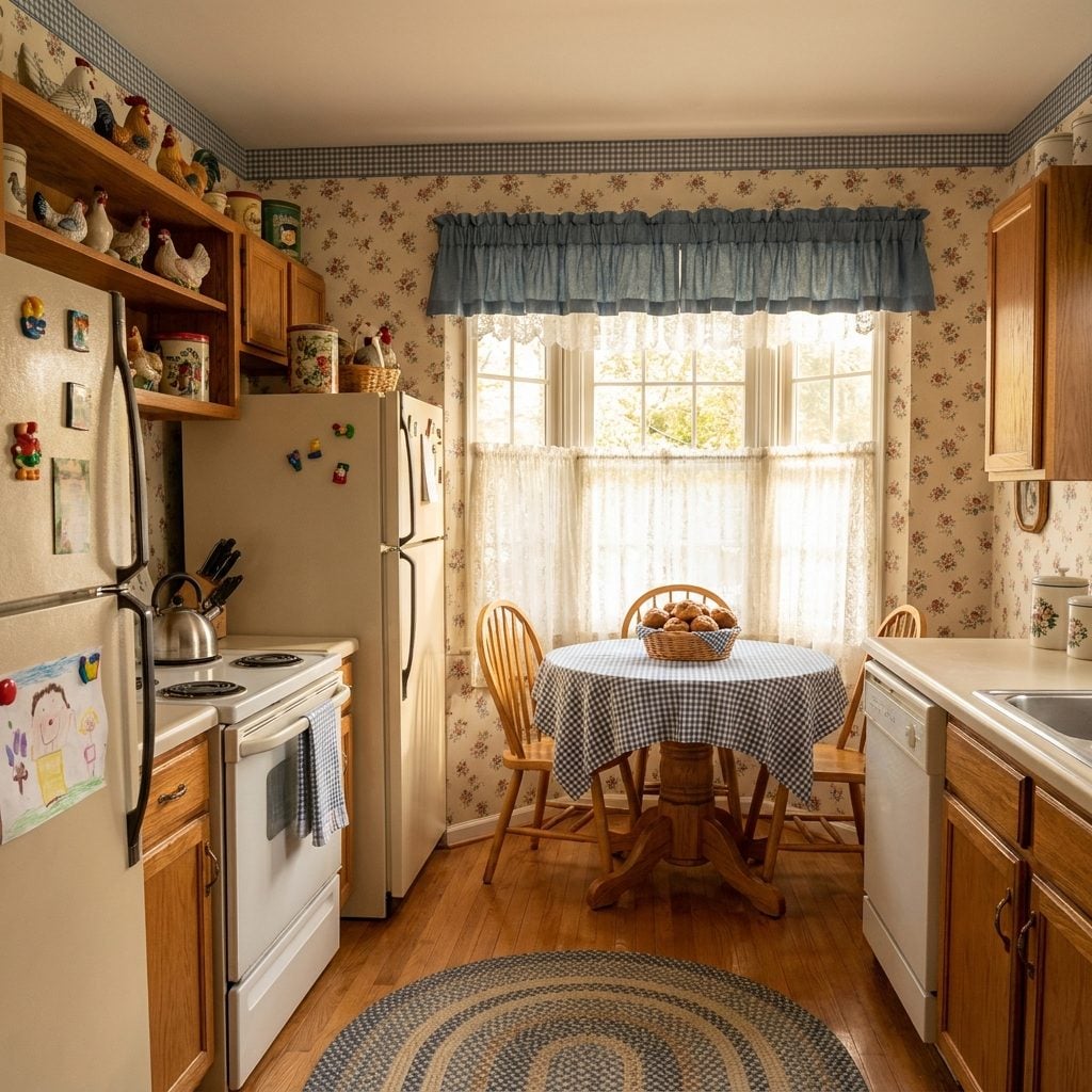
Roses on the walls, gingham somewhere nearby, maybe a rooster standing guard on top of the refrigerator. The country room was not interested in plausible deniability.
For years we treated all-over floral wallpaper as evidence that a renovation was urgently required. Then patterned rooms returned, botanical papers got deeper and stranger, and designers rediscovered the pleasure of committing to an atmosphere. What killed the old paper wasn’t only the flowers. Anyone who has spent a weekend steaming, scraping, and peeling three layers of wallpaper off drywall understands why white paint once looked like liberation.
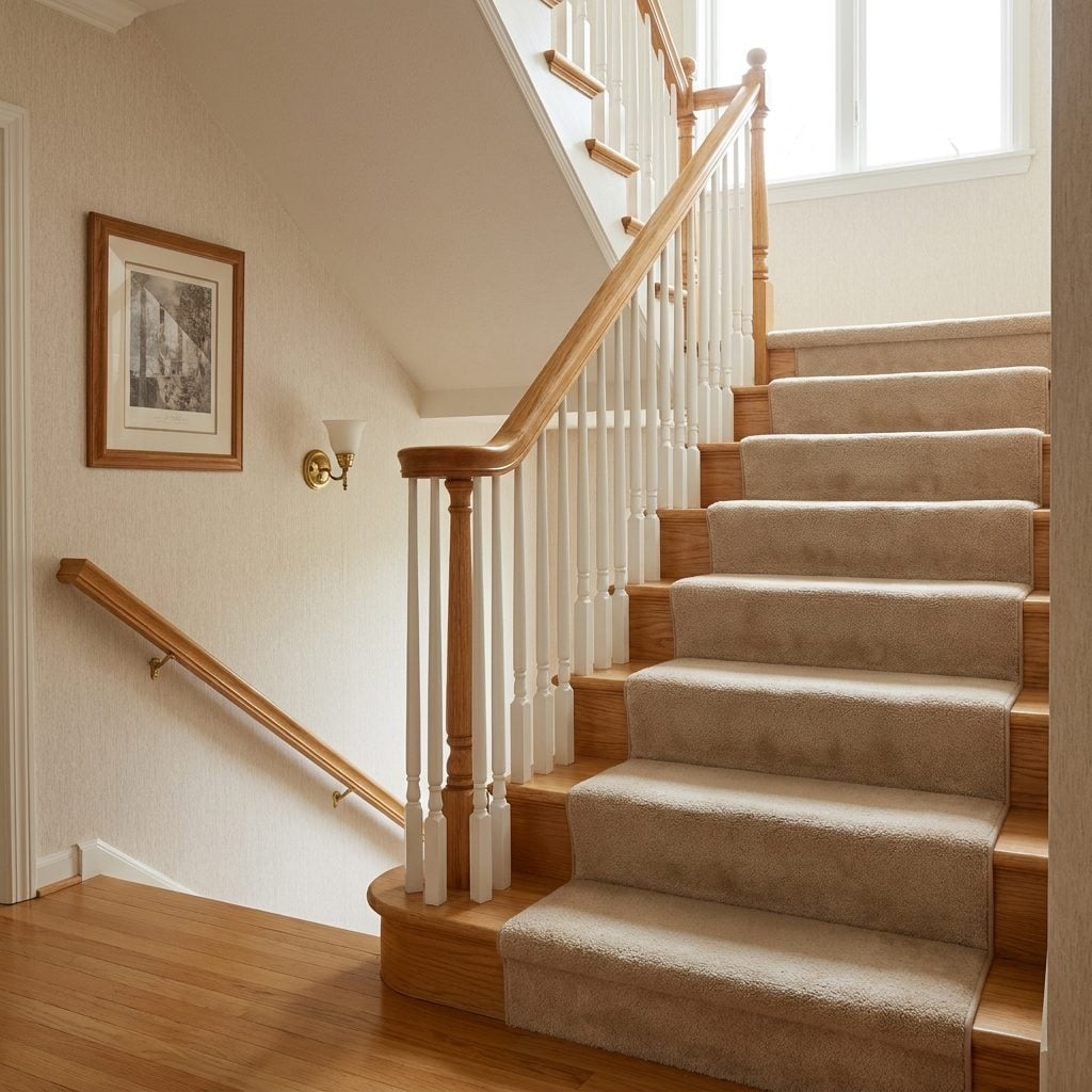
24. Carpeted Staircases Did More Than Hide Old Treads
🔥 Would you like to save this?
The stairs were softer, quieter, and far less theatrical about every footstep. Kids sat halfway up to listen to conversations they weren’t invited into, and laundry accumulated on one tread waiting for somebody to carry it the final twelve feet.
We stripped carpet from stairs for stained wood, then discovered how much noise bare treads send through a house. Runners returned almost immediately because apparently we wanted wood, but not quite all of the consequences of wood. Full circle, with decorative edging.
23. Cultured Marble Was Practical Genius Wearing Very Questionable Veining
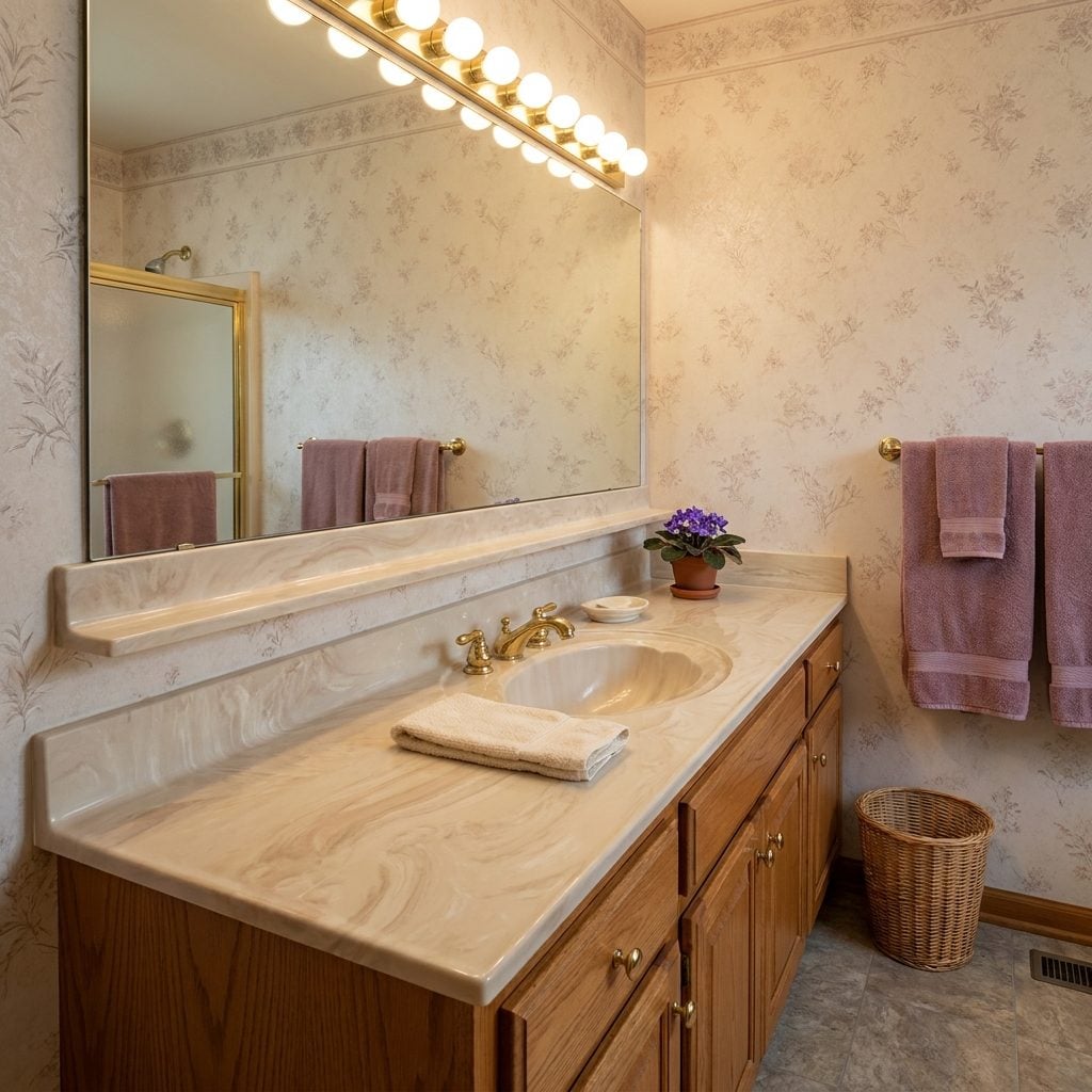
The sink, counter, and little backsplash lip arrived as one molded piece, usually decorated with swirls determined to convince nobody that actual marble had been involved.
The construction was much smarter than the finish. An integral basin removes the grime-catching rim around a drop-in sink and simplifies daily cleaning considerably. Modern solid-surface counters use the same seamless instinct with subtler colors and better detailing. We did not invent that convenience recently. We just stopped painting pretend geology all over it.
22. The Half Wall Gave Open Plans Something They Eventually Realized They Needed
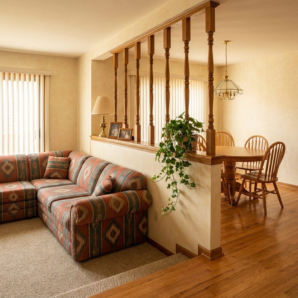
Half wall, pony wall, room divider — whatever you called it, the idea was the same. Keep sightlines open while making it perfectly obvious where one room ended and another began.
Open concept declared these obsolete and sent sledgehammers through them by the thousands. Then one enormous multipurpose room introduced a few new issues: television noise in the kitchen, kitchen noise in the living room, nowhere to hide dishes, and furniture floating in space without an obvious edge.
21. Butcher-Block-Look Laminate Delivered the Farmhouse Fantasy on a Normal Budget
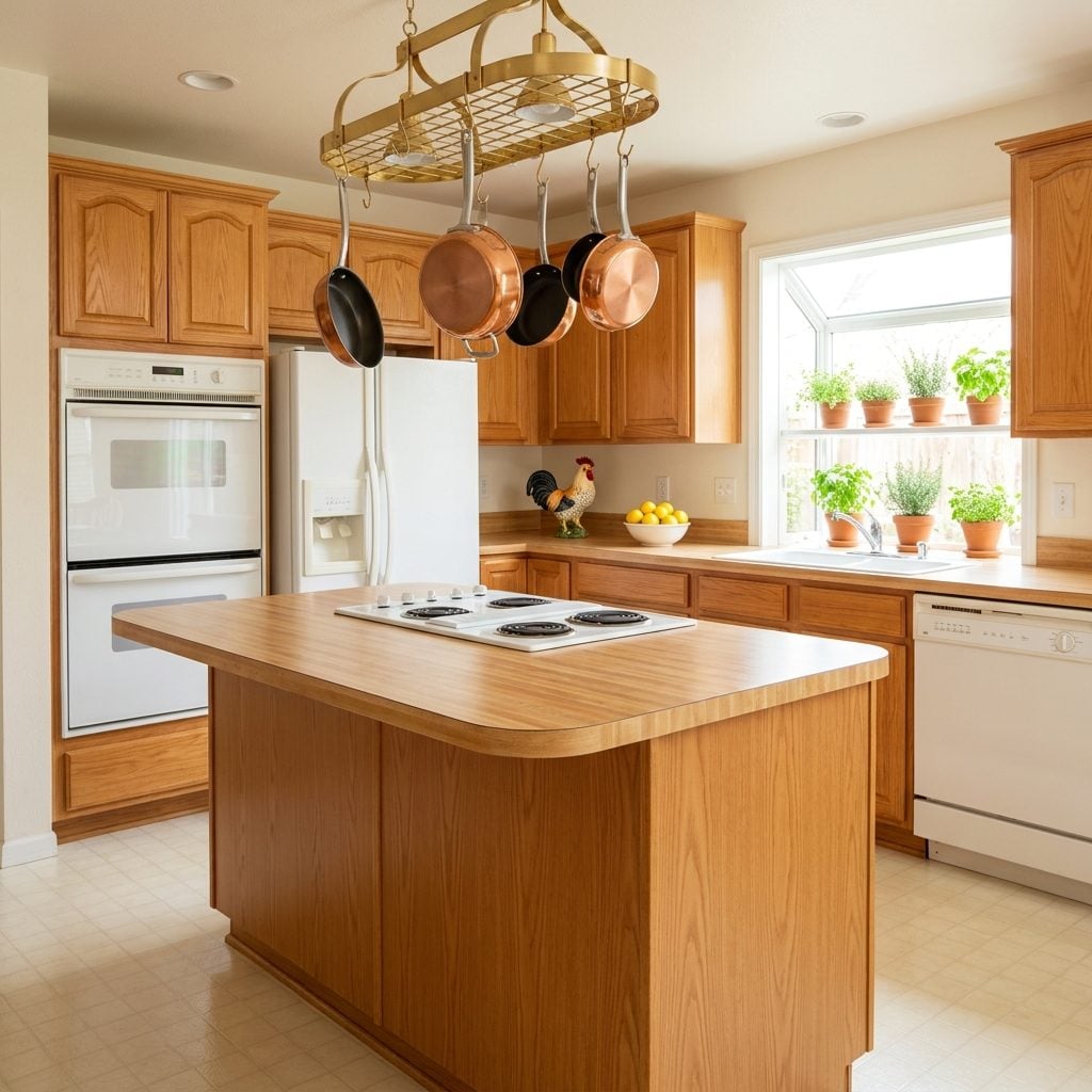
Nobody examining it from six inches away believed the printed maple seams were actual butcher block. From across the kitchen, though, it supplied something people wanted badly: warmth.
Real wood counters need ongoing care and can stain, dent, swell, or darken depending on species, finish, and use. The laminate version delivered the visual cue without behaving like wood. It was a shortcut, certainly. Sometimes shortcuts exist because the destination is popular.
20. Hollywood Vanity Lights Understood Faces Better Than a Ceiling Full of Spots
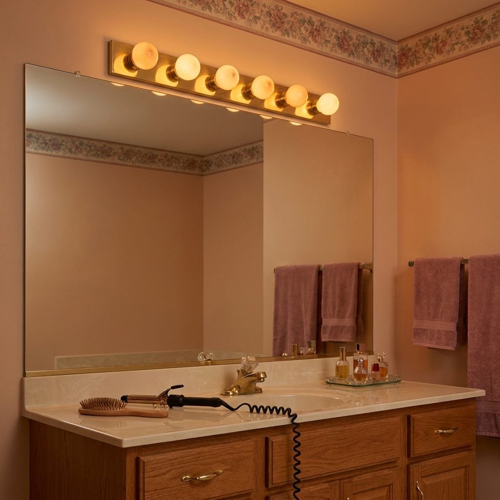
Six globe bulbs marching across a chrome or brass strip looked like somebody had stolen the fixture from a dressing room and bolted it above a suburban vanity.
Then recessed lighting took over bathrooms and reminded everyone what top-down light does to a face: it exaggerates shadows under brows, noses, and chins. Light near face level is useful precisely because it approaches from the direction you’re actually trying to see.
The old bar wasn’t subtle, but its instinct was excellent. Modern sconces, illuminated mirrors, and ring lights are all much prettier ways of admitting it had a point.
19. Colonial Trim Gave Blank Walls Somewhere to Stop
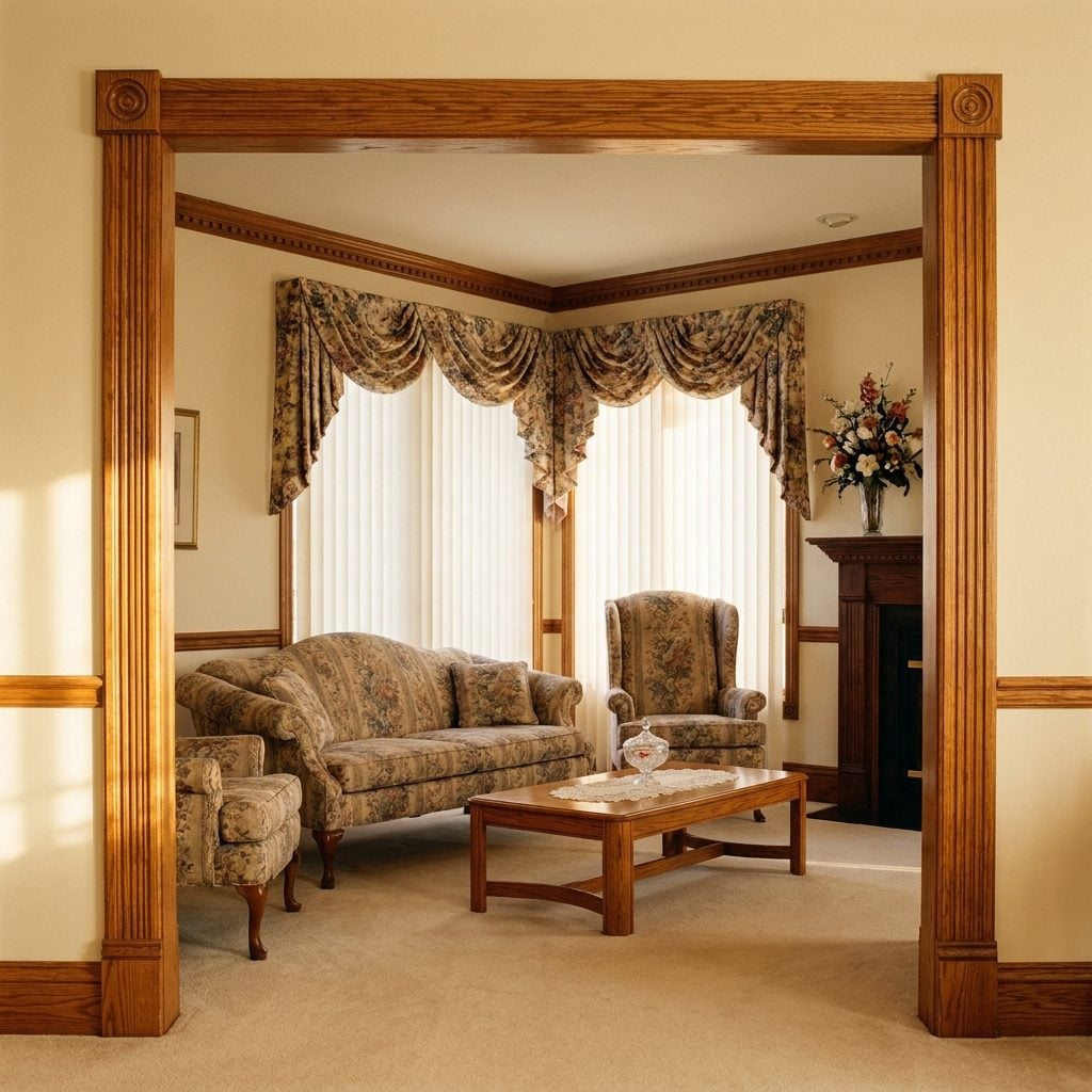
Fluted casings, rosette corner blocks, substantial baseboards — sometimes stained, sometimes painted white, almost always dismissed as fussy once minimal trim became the new ideal.
Yet trim performs a visual job even when nobody notices it. It marks the transition between wall, floor, window, and door and creates a shadow line around openings. A completely trimless room can be beautiful, but it requires precision. Traditional casing simply does the framing out loud.
Trim is the punctuation of a room. Strip it all away and the walls just run on and on.
18. Vertical Blinds Were Annoying, Noisy, and Surprisingly Logical
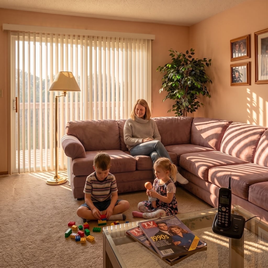
The sound returns immediately: plastic slats clattering down the track, one blade twisted backward, another hanging slightly lower because the vacuum had declared war on it.
They became ubiquitous on patio sliders because covering a huge moving glass door is genuinely awkward. Vertical vanes stack sideways, rotate for light control, and don’t have to rise nine feet into a roll above the opening.
The cheap vinyl versions yellowed and broke. Better fabrics and cleaner track systems don’t change the underlying geometry. Sometimes the embarrassing 1990s solution was responding to a problem that remains annoying today.
17. White Tile Countertops Were High-Maintenance at the Grout and Nearly Indifferent Everywhere Else
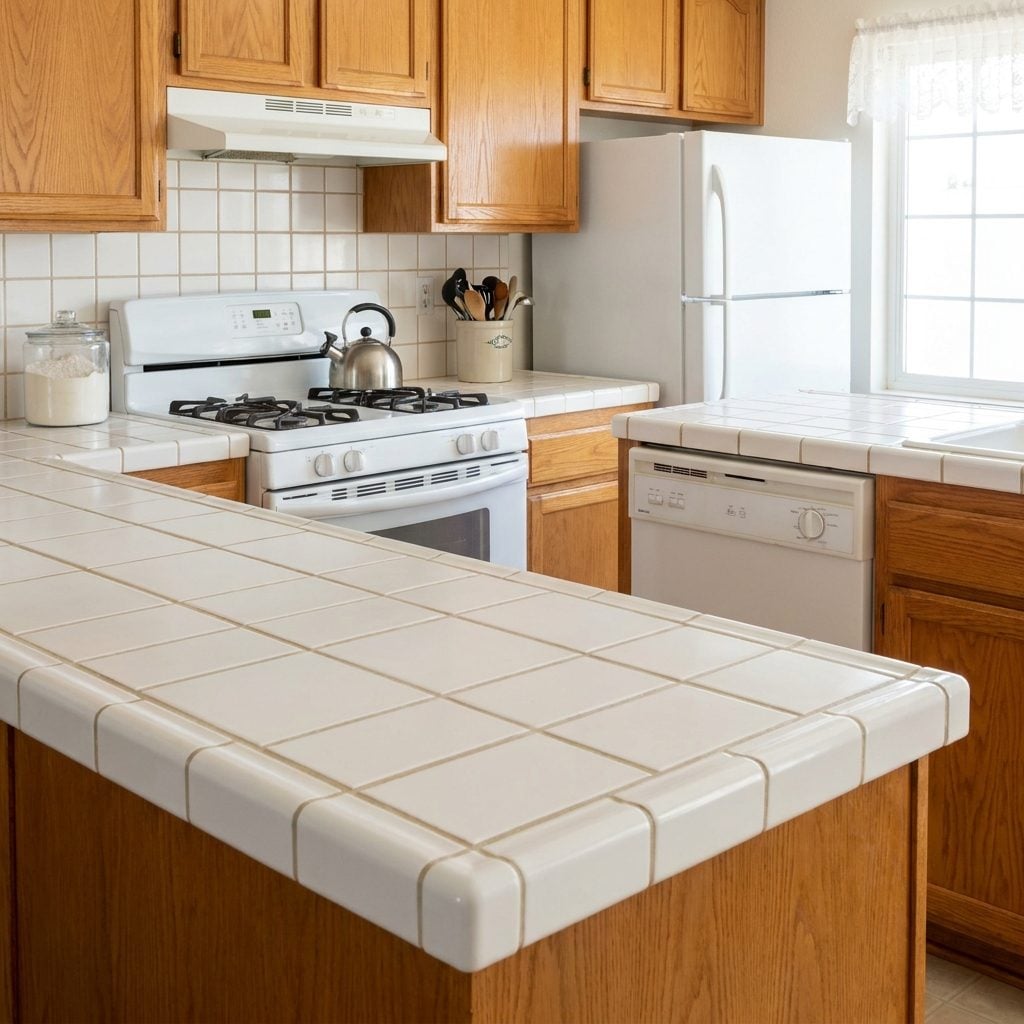
The grout lines are what everyone remembers. White four-inch squares looked immaculate on installation day and then spent years demonstrating exactly where spaghetti sauce had landed.
Coffee cups could wobble across the joints, dough found every seam, and the toothbrush assigned to grout duty lived a hard life. Yet ceramic tile itself is durable, heat-resistant, and individually replaceable when one piece cracks or chips.
Tiled counters have been resurfacing in larger grids and saturated glazes. Same fundamental material. Better color, better detailing, much better photographer.
16. Brass Door Knobs Made the Whole House Agree With Itself
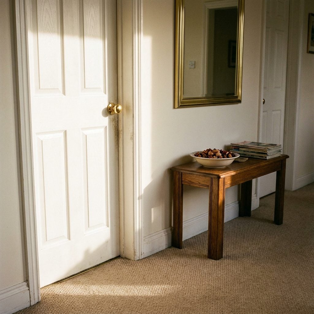
Every knob in the house matched, and that was the point.
Round polished brass appeared on bedroom doors, closets, bathrooms, and anywhere else the builder needed a latch. Once brushed nickel became respectable, those shiny gold spheres started flying into renovation dumpsters.
Now warm metals are common again in home decor, often with living finishes designed to darken and patinate over time. Brass did not need rehabilitation so much as a less aggressively shiny lacquer.
15. Popcorn Ceilings Hid an Astonishing Number of Sins Overhead
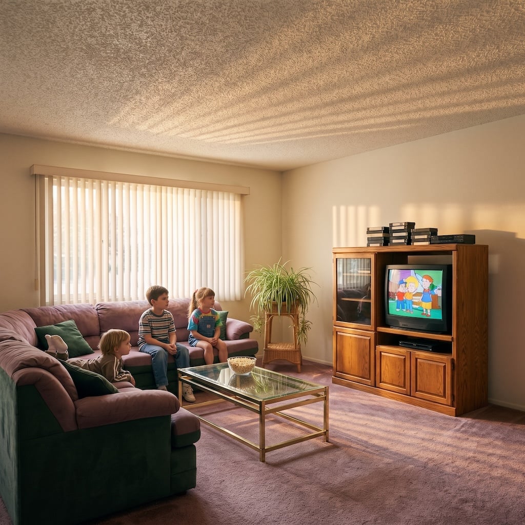
Renovation television turned popcorn ceilings into one of the first things a respectable homeowner was expected to destroy. Smooth ceilings became shorthand for updated, even when getting there exposed every taped seam and imperfect patch the texture had been concealing.
That was popcorn’s great practical talent. The spray created enough surface variation to hide small irregularities and could contribute some sound absorption inside a room. It was never a substitute for proper acoustic separation between floors, but it did more than simply look bumpy.
14. The Breakfast Bar Never Left — Only Its Laminate Jacket Did
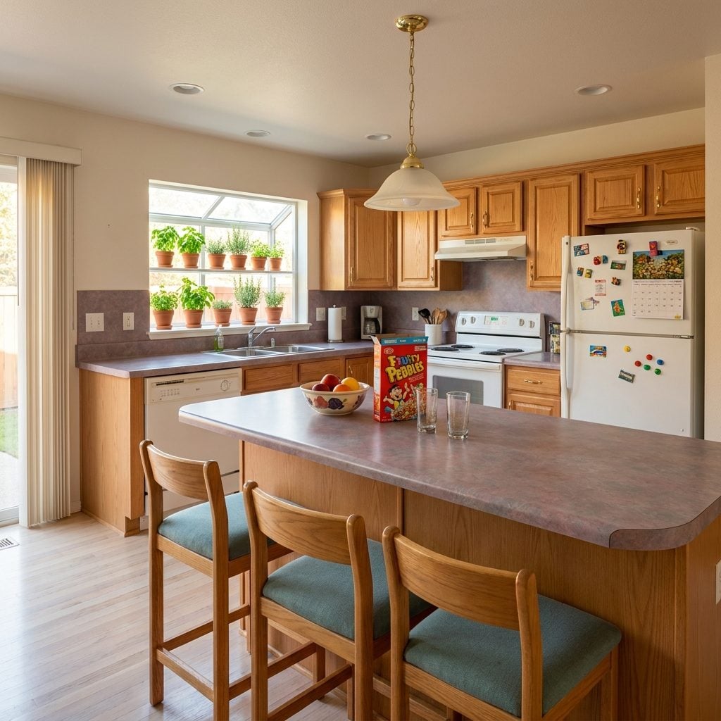
The rounded edge gives the era away. Mauve, almond, speckled gray, faux granite — whatever pattern sat on the counters usually wrapped right across the breakfast bar.
That ledge handled cereal before school, homework before dinner, coffee before work, and somebody leaning against it while pretending to help cook. Quartz eventually replaced the laminate, islands grew large enough to have their own weather systems, and stools got prettier. The household behavior barely changed.
13. Basic White Floor Tile Made Small Bathrooms Brighter Without Needing a Design Statement
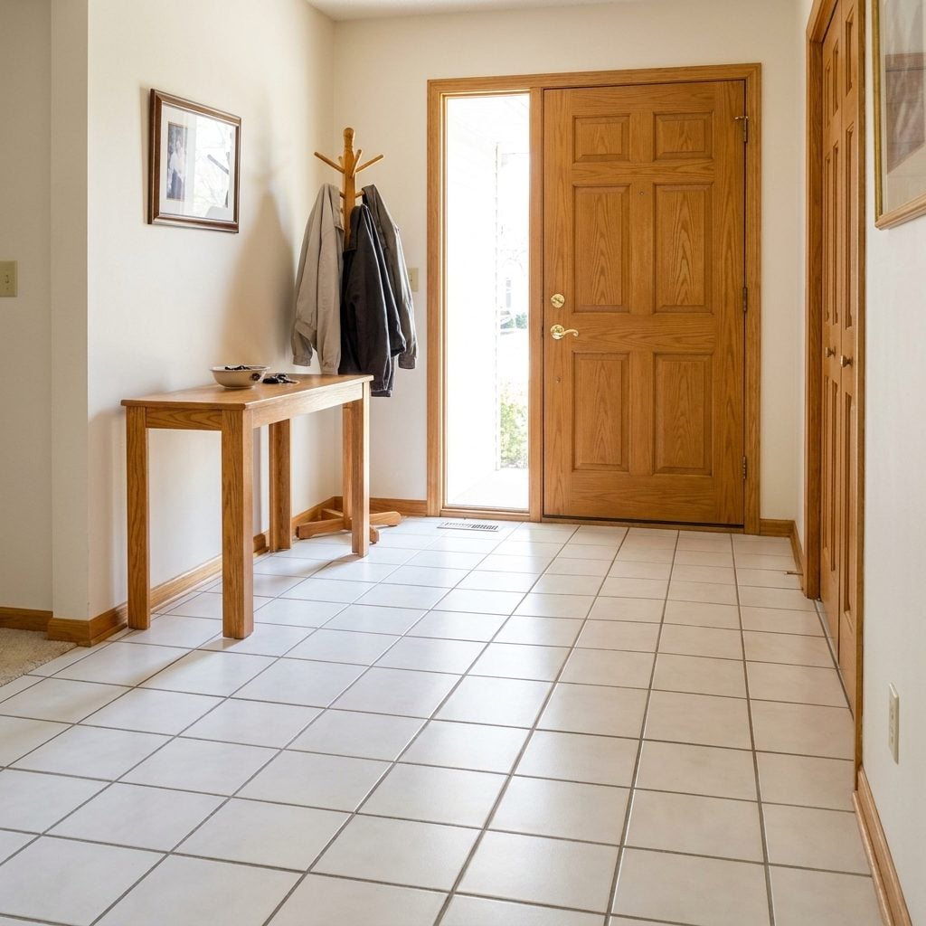
Cold in the morning, absolutely. You learned exactly where the tile began and delayed crossing it barefoot as long as possible.
Builders used white ceramic in entries and bathrooms because it was bright, durable, readily available, and visually simple. Tiles can chip or crack, particularly when the substrate moves, but the material itself was never as fragile as its later reputation suggested.
Large white and pale porcelain tiles dominate plenty of contemporary renovations. We changed the scale, tightened the grout joints, and somehow declared the entire idea new.
12. The TV Niche Tried to Keep Technology From Swallowing the Living Room
🔥 Would you like to save this?
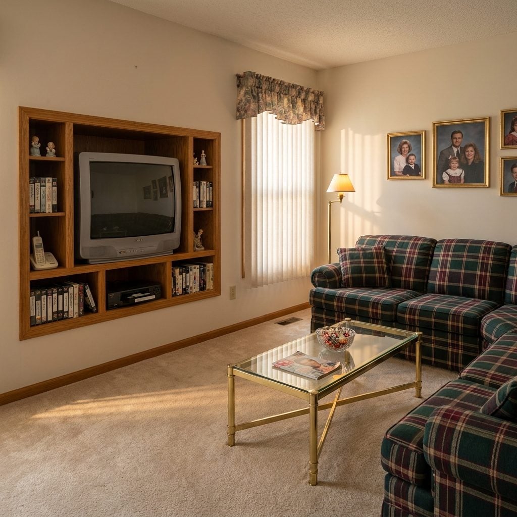
The fatal mistake was believing televisions would remain the same shape forever. A deep drywall recess perfectly sized to a tube TV became ridiculous the minute flat screens arrived.
But the niche understood something useful: technology doesn’t necessarily need to dominate the wall. Recessing the television kept it visually contained and gave adjacent cubbies somewhere to absorb tapes, remotes, speakers, and everything else attached to 1990s media.
Today we chase flush-mounted screens, hidden wiring, framed televisions, recessed soundbars, and cabinetry that makes electronics disappear. Apparently the hole in the wall was not the stupid part. Designing it around one exact television was.
11. Golden-Oak Bathroom Vanities Took More Abuse Than Their Reputation Did
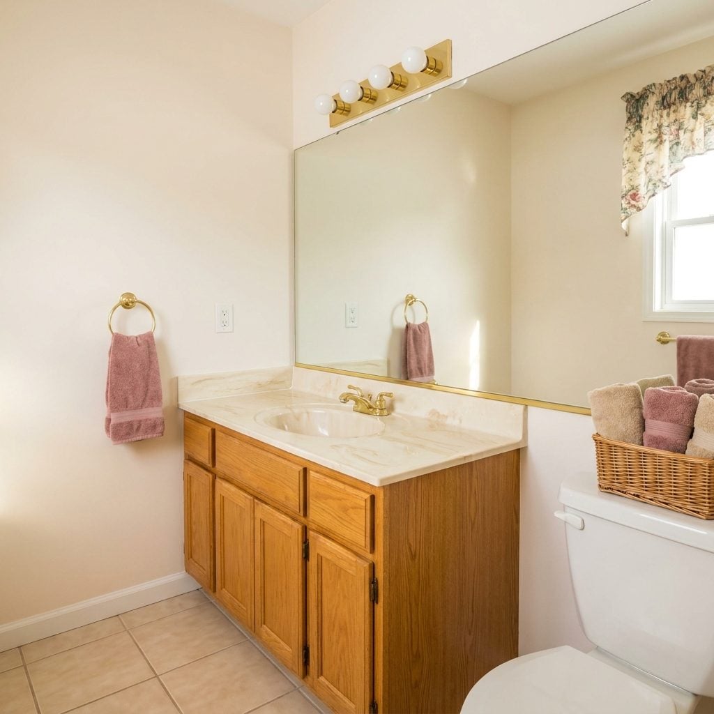
Golden oak below, cultured marble above, brass light bar overhead: the 1990s bathroom could assemble itself from memory.
“Builder-grade” eventually became an insult, but material quality varied far more than that label suggests. A well-built wood vanity could survive years of splashes and steam; a poorly sealed cabinet of any material can fail quickly in a damp bathroom.
The oak wasn’t automatically the mistake. The combination of orange stain, swirled countertop, polished brass, and enough warm bulbs to interrogate a suspect simply arrived as a package deal.
10. Mini Blinds Were Cheap Because the Material Was Cheap, Not Because the Idea Was Bad
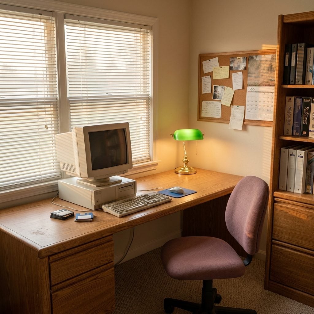
Thin aluminum slats bent permanently the first time somebody shoved them apart to see who had pulled into the driveway. One kink and the whole window looked wounded.
But the mechanism was remarkably capable for the money: adjustable light, privacy, compact stacking, no fabric pooling at the sill. Upgrade the material to wood or a more substantial composite, widen the slats, clean up the headrail, and the cheap mini blind suddenly has a much more respectable cousin.
9. Wallpaper Borders Were the Accent Wall Before Anyone Wanted an Accent Wall
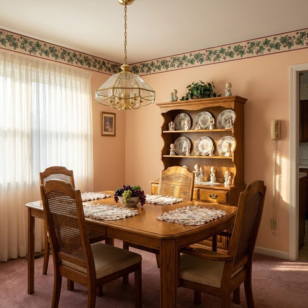
Ivy. Ducks. Teapots. Country hearts. A narrow strip of pattern near the ceiling told you everything you needed to know about the room before you saw the furniture.
Borders dated quickly because they were incredibly specific and incredibly common. Yet their underlying job was sensible: interrupt a large blank wall and add pattern without committing to full-wall paper.
Today’s accent walls, painted bands, mural panels, and concentrated decorative moments come from the same instinct. The duck motif is optional.
8. Polished-Brass Cabinet Hardware Wasn’t the Villain — the Total Package Was
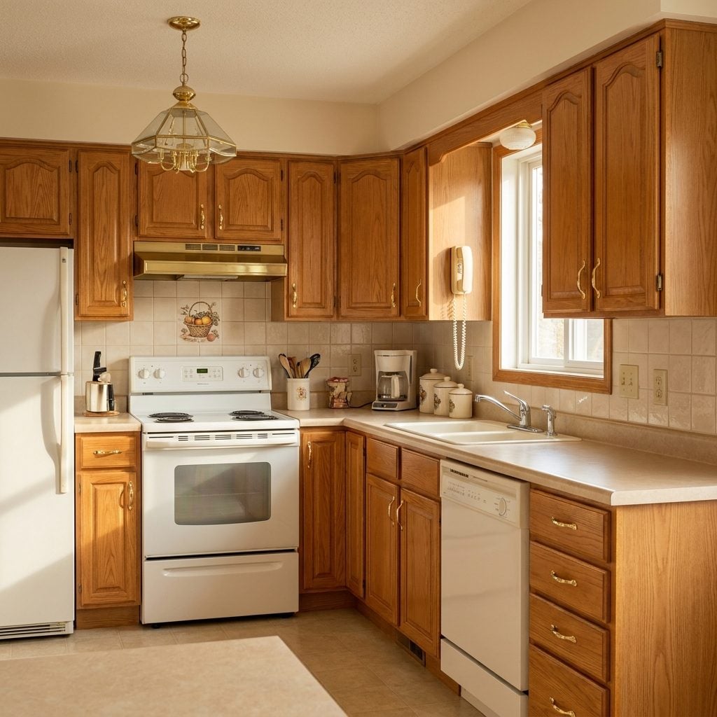
Gold knobs on golden oak against beige laminate created a level of coordinated warmth that eventually tipped into visual syrup.
Off came the brass. Nickel followed. Matte black had its turn. Then brass returned against navy, forest green, cream, and natural wood and suddenly looked sophisticated again.
7. One-Piece Fiberglass Surrounds Made a Very Strong Case Against Grout
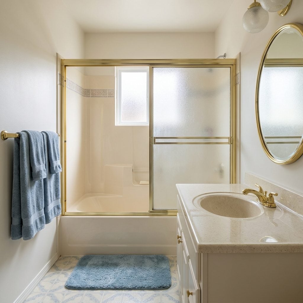
One molded surround. No field of grout lines. A couple of little soap shelves shaped for products nobody actually seemed to own.
Fiberglass looked inexpensive because it was inexpensive and because half the development had the same unit. Functionally, fewer joints in the wet area mean fewer grout lines to scrub and fewer tiled seams requiring maintenance. That doesn’t make the whole assembly incapable of leaking — plumbing penetrations, drains, doors, and perimeter seals still matter — but the basic simplicity is hard to argue with.
Modern solid-surface surrounds dress the same idea in better textures and significantly more expensive clothes.
6. Patterned Sheet Floors Hid Real Life Better Than Beige Ever Could
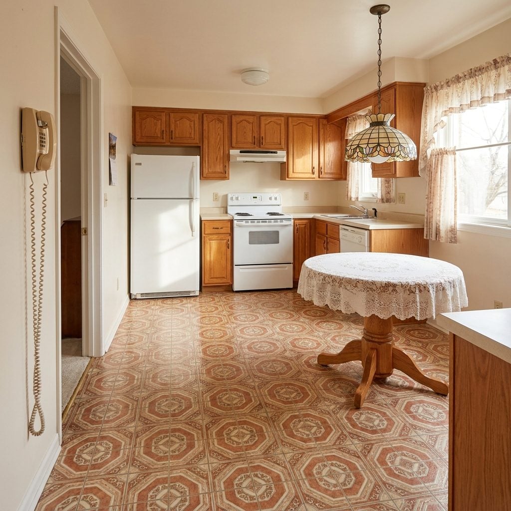
Terracotta hexagons, fake grout lines, diamonds, tiny borders — the pattern was doing a heroic amount of work while everyone mocked it for being busy.
That busyness had an advantage: crumbs, mud, scuffs, and daily family debris didn’t announce themselves from across the room. Solid pale flooring is beautifully calm until one raisin lands on it.
5. Brass Fireplace Doors Made Firelight Part of the Furniture
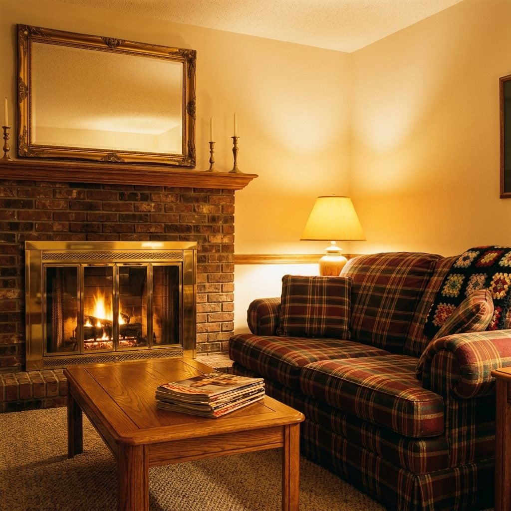
They squeaked, collected dust around the mesh curtain, and could get dangerously hot when the fire was roaring. Nobody misses cleaning them.
What does hold up is the visual effect. Warm brass around brick intensified the amber color already coming from the hearth and made the fireplace feel finished even when it was dark.
We replaced many of them with black metal or open hearths, which can look cleaner. The brass version simply understood that a fireplace was allowed to be the warmest-looking object in the room.
4. Textured Walls Were the Drywall Crew’s Great Negotiating Tool
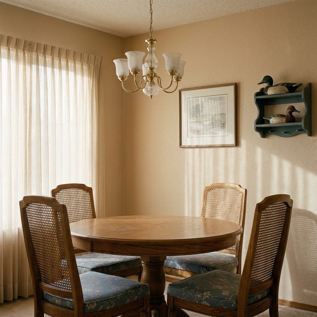
Orange peel, knockdown, sandy grit, troweled swirls — a wall didn’t have to be perfectly smooth to be considered finished.
Smooth walls became the luxury move, particularly under grazing light where every joint and repair is exposed. A high-level smooth drywall finish like those used in a polished Japandi home office demands careful preparation and finishing.
Texture was forgiving. It reduced the visibility of small surface inconsistencies and made later patches less conspicuous. Not every wall needs it, but a little tooth is not automatically a design emergency.
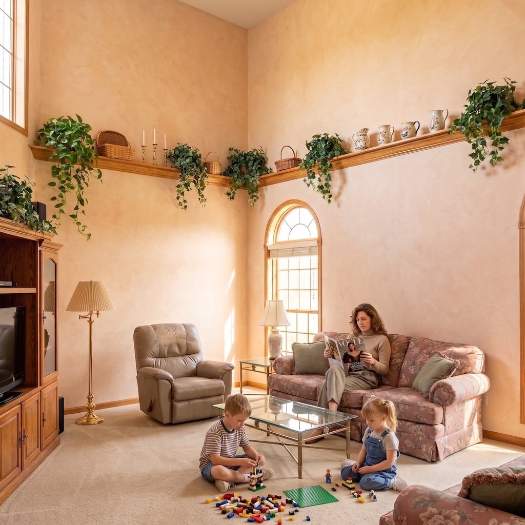
3. Plant Shelves Were Ridiculous Until We Started Putting Plants Up High Again
🔥 Would you like to save this?
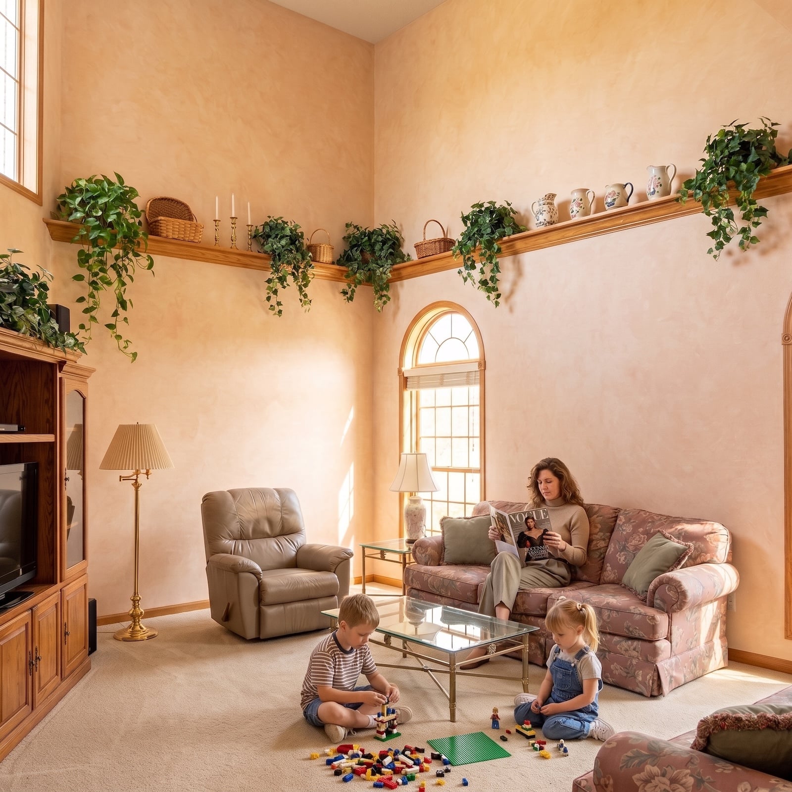
Twelve feet above the floor sat the ledge nobody could comfortably reach. Naturally, it held a fake ficus, three baskets, a ceramic pot, and enough silk ivy to supply a restaurant chain.
The accessibility was terrible. The impulse was less foolish. Tall rooms often need something to mediate between human-scale furniture and a huge blank upper wall, and trailing greenery can soften that transition.
We removed many of those ledges, then installed floating shelves, hanging planters, and accent wall displays to occupy the same vertical territory. Just keep the living plants somewhere you can actually water them.
2. Brass Bathroom Fixtures Were Waiting for the Rest of the Room to Catch Up
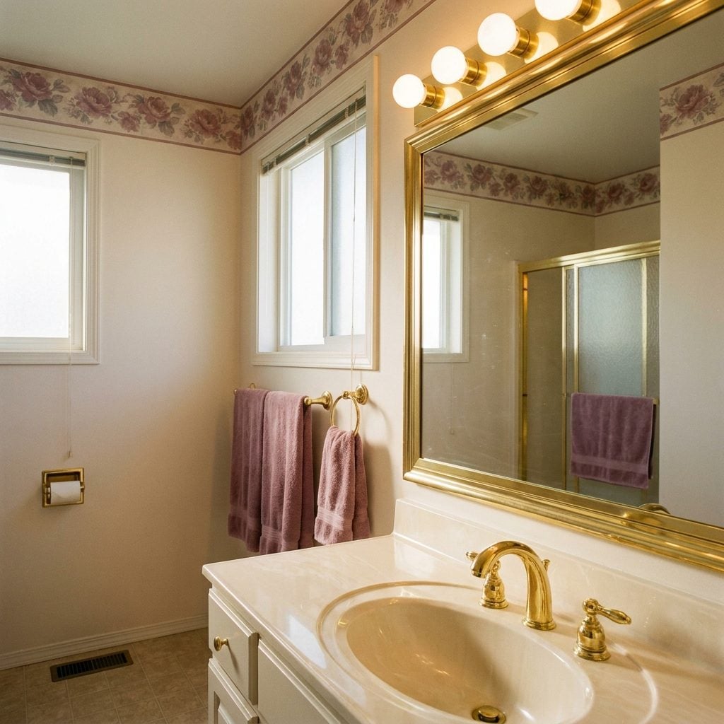
Polished gold faucet, cultured-marble counter, brass-framed mirror, and a strip of globe bulbs: the 1990s primary bath was warm enough to toast bread.
By the time brushed nickel arrived, brass was often the first thing removed during a home renovation. Then warmer metals returned in unlacquered, brushed, aged, and satin finishes.
The old faucet didn’t predict the future perfectly. It simply proved that a warm metal can feel luxurious when it isn’t forced to compete with six other yellow-brown surfaces.
1. Small, Named Rooms May Have Been the Most Underrated Feature of All
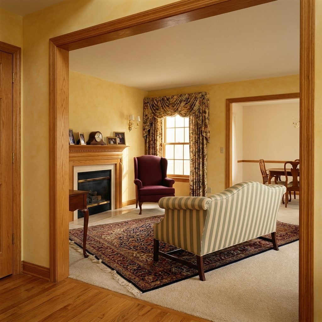
The house had rooms. Actual rooms. Dining room. Living room. Den. Kitchen. Some were underused, some had doors, and at least one formal room existed primarily to scare children away from the furniture.
Open concept knocked those boundaries down and gave us bigger sightlines, easier circulation, and kitchens connected to the rest of family life. It also gave us nowhere to hide one dirty pan, a Zoom meeting within earshot of the television, and a clear view of every activity happening everywhere at once.
A closable room offers something unfashionably useful: separation. It can become a Craftsman home office, a library, a playroom, a dining room, or simply somewhere to shut a door.