
🔥 Would you like to save this?
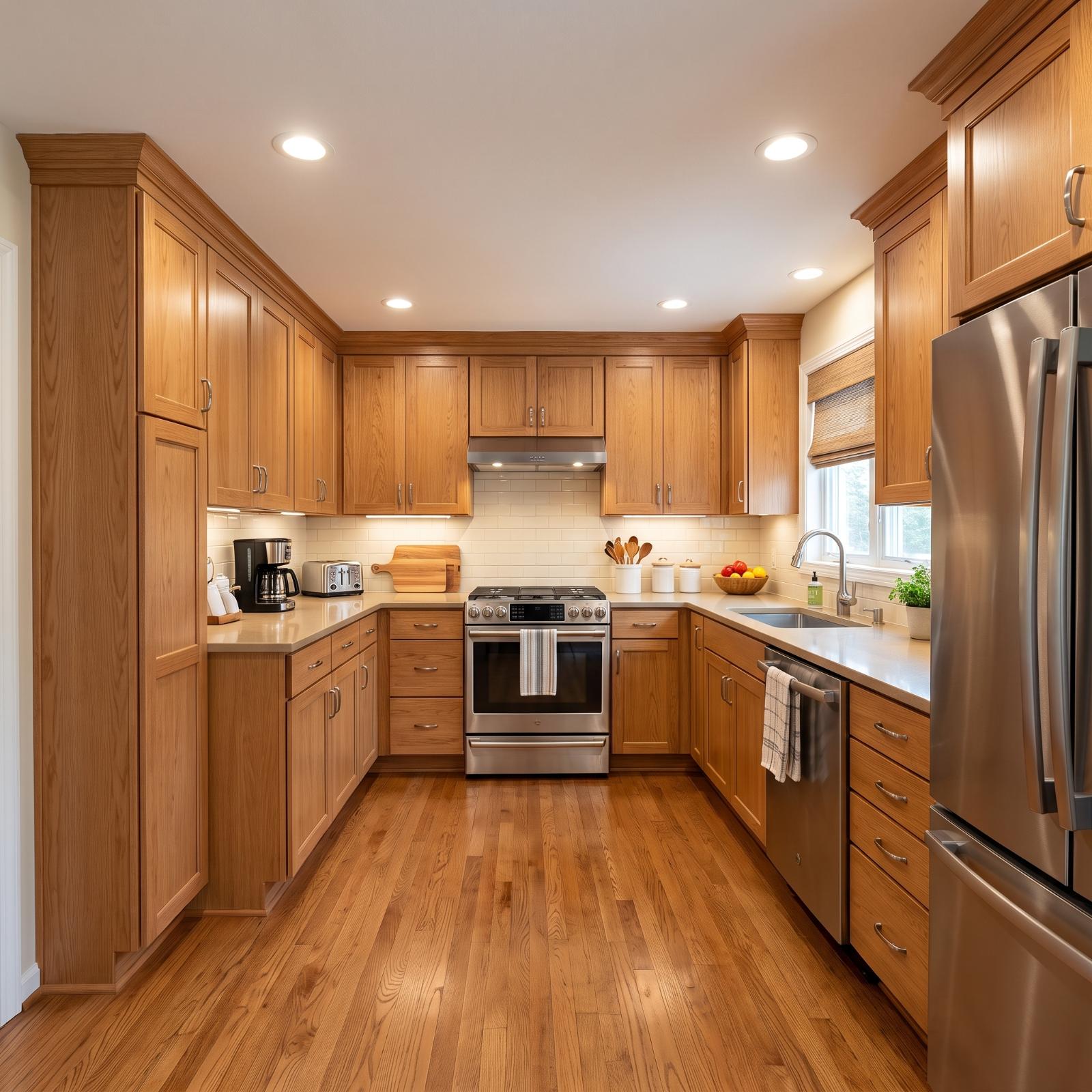
A kitchen island has become one of the most requested features in a remodel, and also one of the easiest to want in a room that may not have much floor space to spare. That was the problem behind this project: a compact kitchen, an island on the wish list, and a hard rule against moving walls.
In order to come up with the very specific design ideas, we create most designs with the assistance of state-of-the-art AI interior design software. Also, assume links that take you off the site are affiliate links such as links to Amazon. this means we may earn a commission if you buy something.
So instead of demolition, the answer was iteration. AI-generated design made it possible to test dozens of ways an island or peninsula might work within the same apparent footprint. White and navy transitional kitchens were the brief — a dependable pairing with plenty of room for variation — and the results ranged from barely-there furniture-style islands to darker centerpieces that reorganized the entire room.
Thirty-three versions came out of that brief. Some repeat the same basic ingredients, but the useful differences are in scale, storage, color placement, lighting, open shelving, texture, and the way each island relates to the surrounding cabinetry.
33. A Navy Island Gives the White Cabinetry a Strong Center
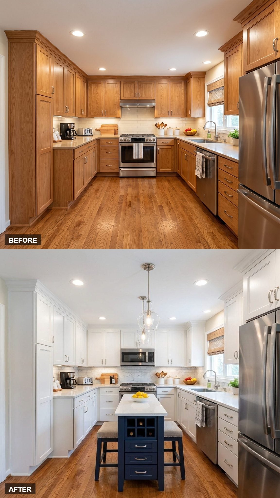
White shaker cabinetry forms a nearly continuous pale backdrop, which makes the navy island immediately legible as a separate piece rather than just another run of cabinets.
Wine-storage cubbies built into the island end add a functional detail without increasing its bulk. Above it, the silver-tone globe pendant keeps the ceiling simple enough that the island remains the strongest shape in the room.
32. Navy Lowers and Cream Uppers Split the Color at Counter Height
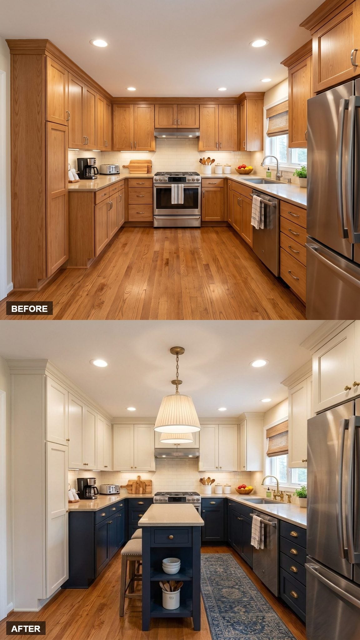
Navy lower cabinets paired with cream uppers create a clear horizontal divide, putting the darker color near the floor rather than carrying it all the way up the walls.
Brass cup pulls warm the navy, while the pair of pleated drum pendants introduce softer shapes above the compact island. The blue runner repeats the lower cabinet color at floor level, but its pattern keeps the repetition from feeling too exact.
31. A Navy Hood Turns the Range Wall Into Part of the Two-Tone Plan
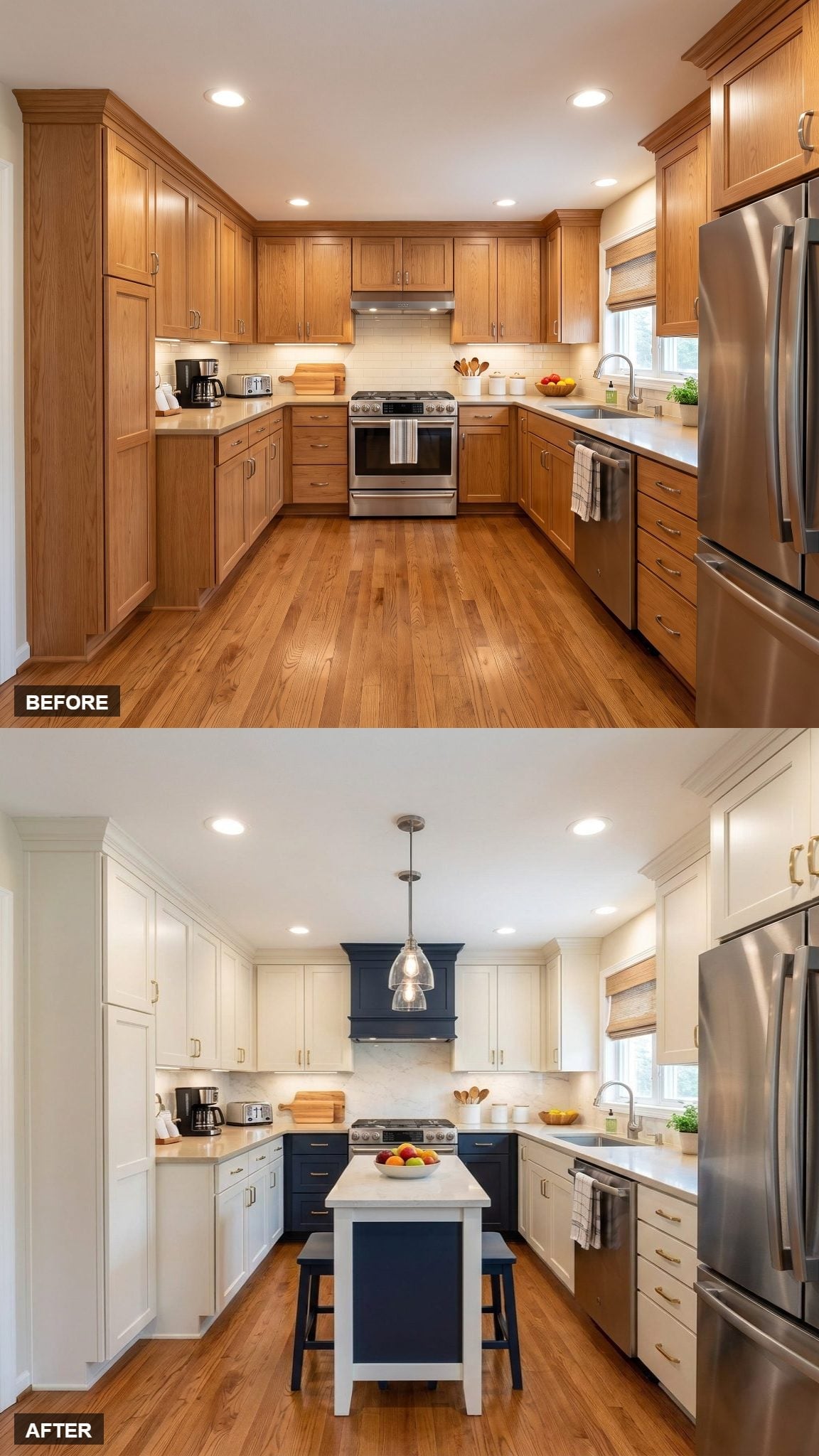
Off-white shaker cabinetry wraps the perimeter while navy appears on both the island and the hood surround. Repeating the dark color at two different heights gives the palette more structure than simply painting the island alone.
A single silver-tone globe pendant stays quiet above the center, while gold-toned pulls add a second warm note without turning the kitchen into a matched-metal exercise.
30. Two Lantern Pendants Give the Island More Presence Without Enlarging It
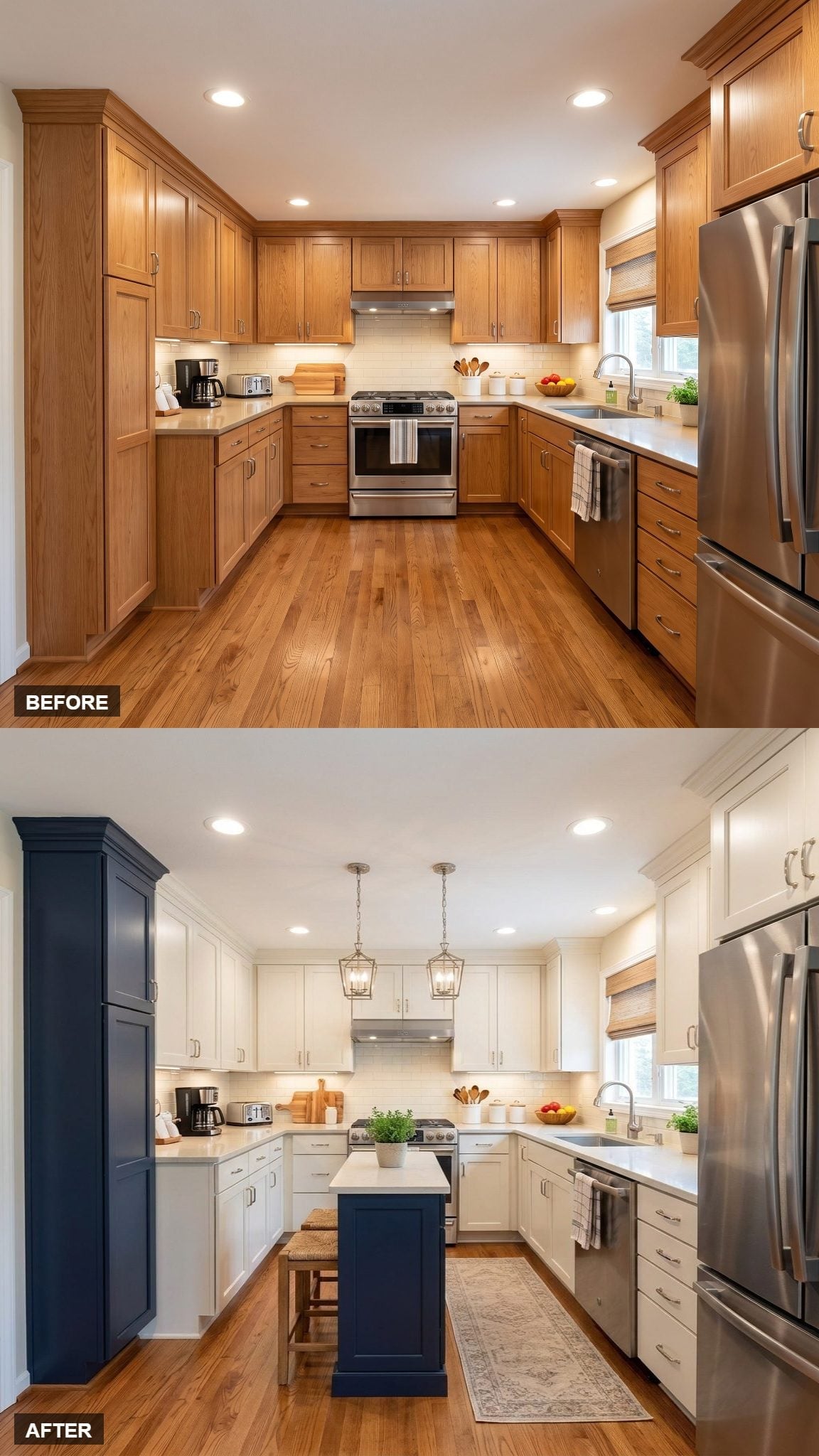
Two lantern pendants create a repeated line over the navy island, giving the center of the kitchen more presence without asking the island itself to become larger.
Woven rush stools slide beneath the overhang and introduce a warmer, rougher texture against all the painted cabinetry. A tall navy cabinet at the left repeats the island color vertically, spreading the dark tone beyond a single object.
Worth Knowing: Repeating an island color on one tall cabinet can help a two-tone scheme feel distributed through the room rather than confined to the center. It is a relatively simple way to connect separate cabinet zones without painting the entire perimeter dark.
29. One Oversized Lantern Makes a Small Island Feel More Like Furniture
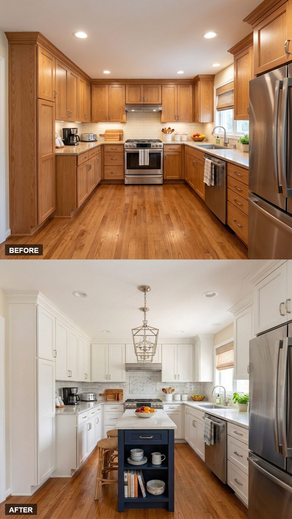
The navy island is compact, but the larger lantern pendant above gives it a stronger vertical presence. Rather than disappearing into the open floor area, the island now has a clear relationship with the ceiling.
White perimeter cabinetry keeps the dark center from becoming heavy, while the simple island shape leaves enough room for the light fixture to provide most of the character.
Ask Yourself: When choosing a pendant for an island, consider the island width, ceiling height, fixture diameter, sightlines, and how many lights you plan to use. The relationship between those dimensions matters more than simply choosing a fashionable fixture.
28. A Gold Pendant Warms Up an Otherwise Crisp Navy-and-White Scheme
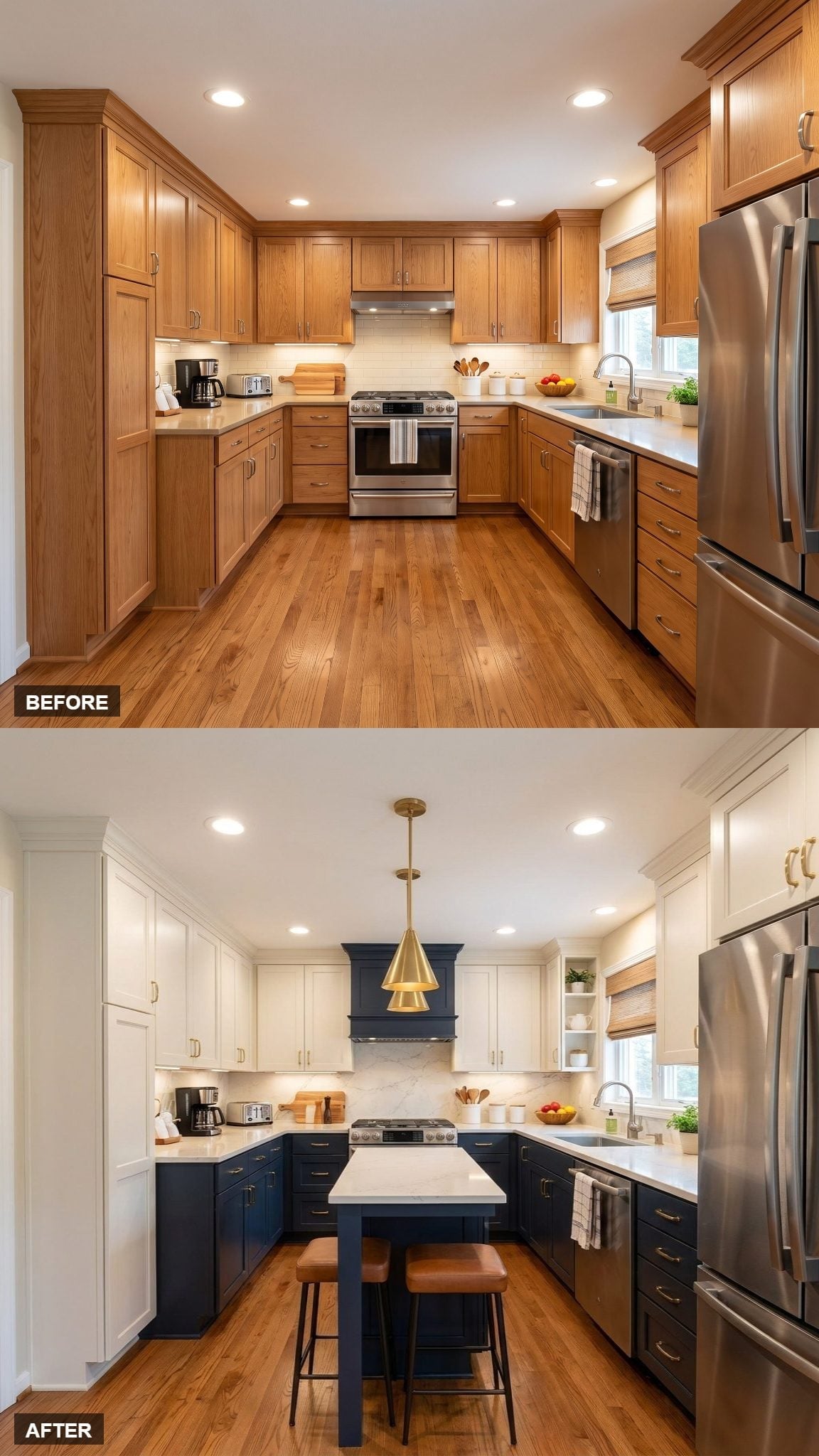
This version keeps the cabinet formula simple and lets the metal finish change the mood. Navy base cabinets and a pale upper half could easily lean cool, but the brass-toned pendant and hardware pull the palette warmer.
The effect is less about adding another feature than changing the temperature of the colors already there.
27. The Hood and Island Repeat Navy at Opposite Ends of the Sightline
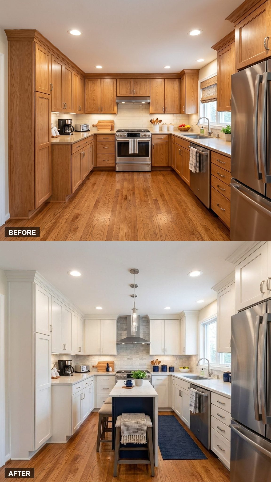
White shaker cabinets form the perimeter, while the dark island and matching hood create two separate navy anchors within the room.
Paired pendants occupy the space between them, so the ceiling, island, and range wall form a simple sequence rather than three unrelated focal points.
Material Note: If a natural-stone surface is part of the plan, quartzite is generally more resistant to scratching and etching than marble, though individual stones vary and many still benefit from sealing. An AI rendering can suggest the look of veined stone, but the actual material would need to be chosen separately.
26. Glass-Front Uppers Lighten the Cabinet Wall Around the Range
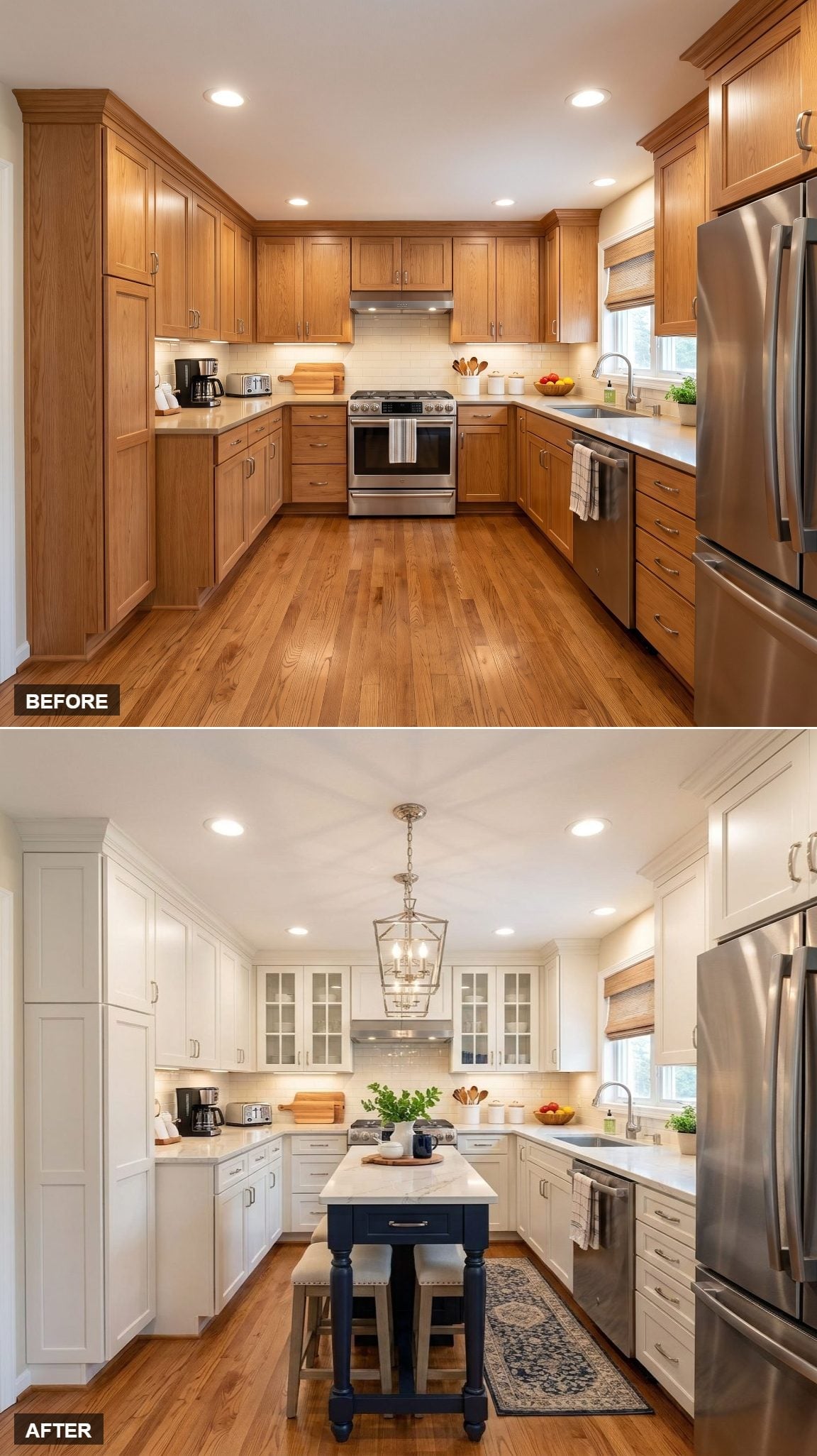
Glass-front cabinets flank the white range hood, interrupting what would otherwise be a solid run of painted doors. The effect is lighter without removing storage entirely.
The navy island sits on furniture-style legs rather than a solid plinth, which leaves small pockets of visible floor underneath and reinforces the idea of the island as a separate object.
Planning Note: Glass-front cabinets put both their contents and interior finish on display. Natural wood, painted interiors, wallpapered backs, or matching shelves can all work — the important part is deciding whether you want the inside of the cabinet to blend in or become another visible layer.
25. A Dark Countertop Makes the Navy Island Feel More Substantial
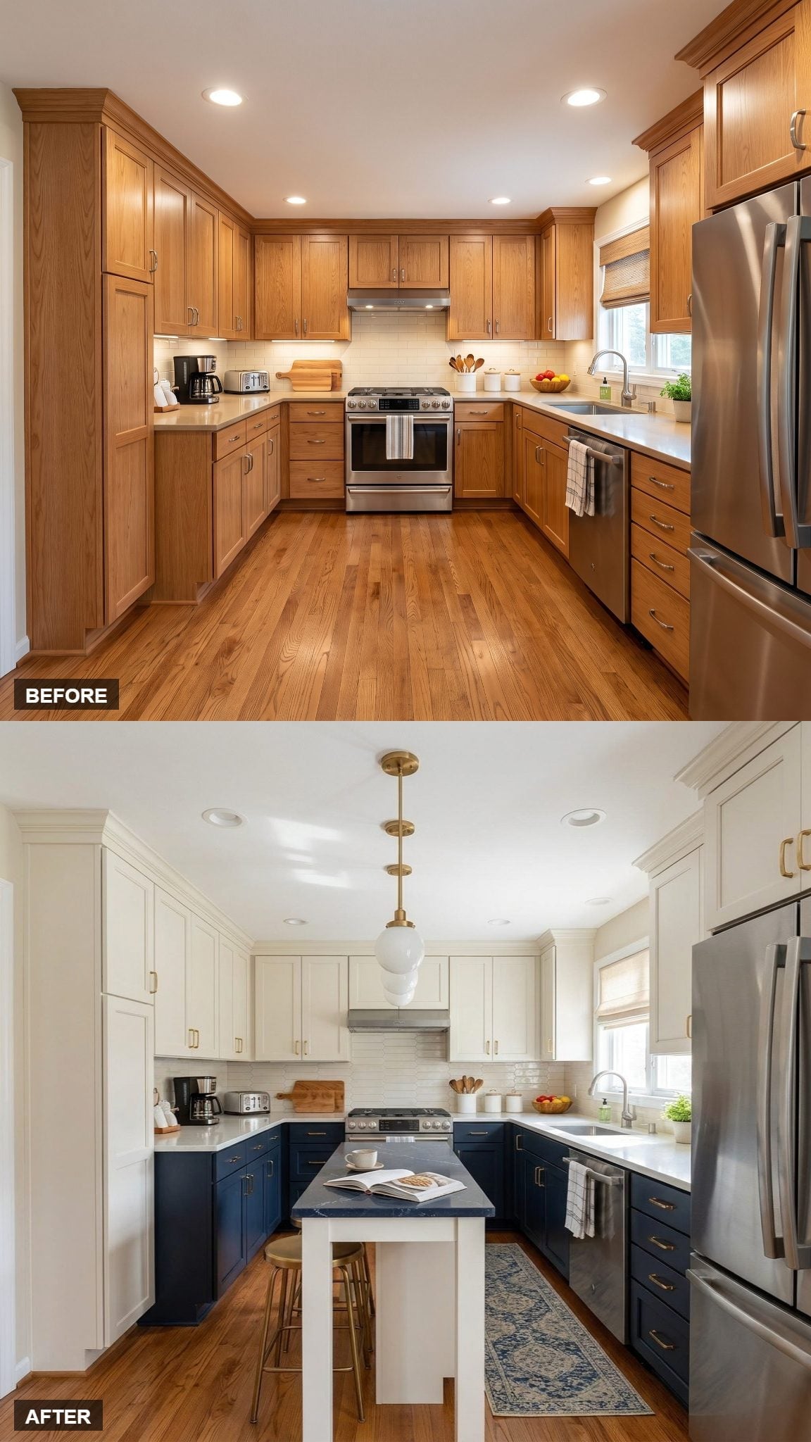
Instead of topping the navy base with another pale slab, this version keeps the island darker through the countertop as well.
That creates a denser block of color at the center of the kitchen, while the globe pendant and brass pulls provide smaller points of contrast. The island feels more substantial because its upper and lower surfaces belong to the same darker family.
24. Two Clear Globes Keep the Ceiling From Feeling Heavy
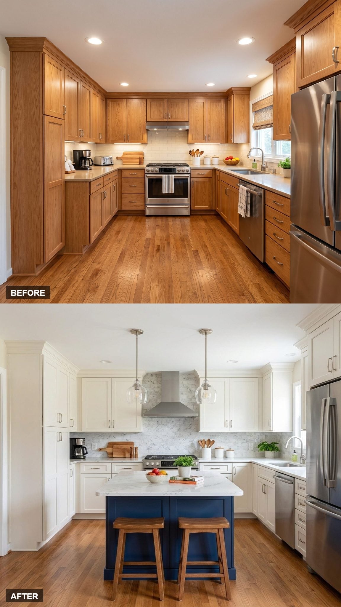
Two clear-glass globe pendants occupy the space above the island without creating two heavy opaque shapes across the ceiling.
Their transparency matters in a compact room: the fixtures are present, but most of what you see through them is still the kitchen beyond. The navy base carries the stronger weight below.
23. A White Island Reverses the Usual Navy-Center Formula
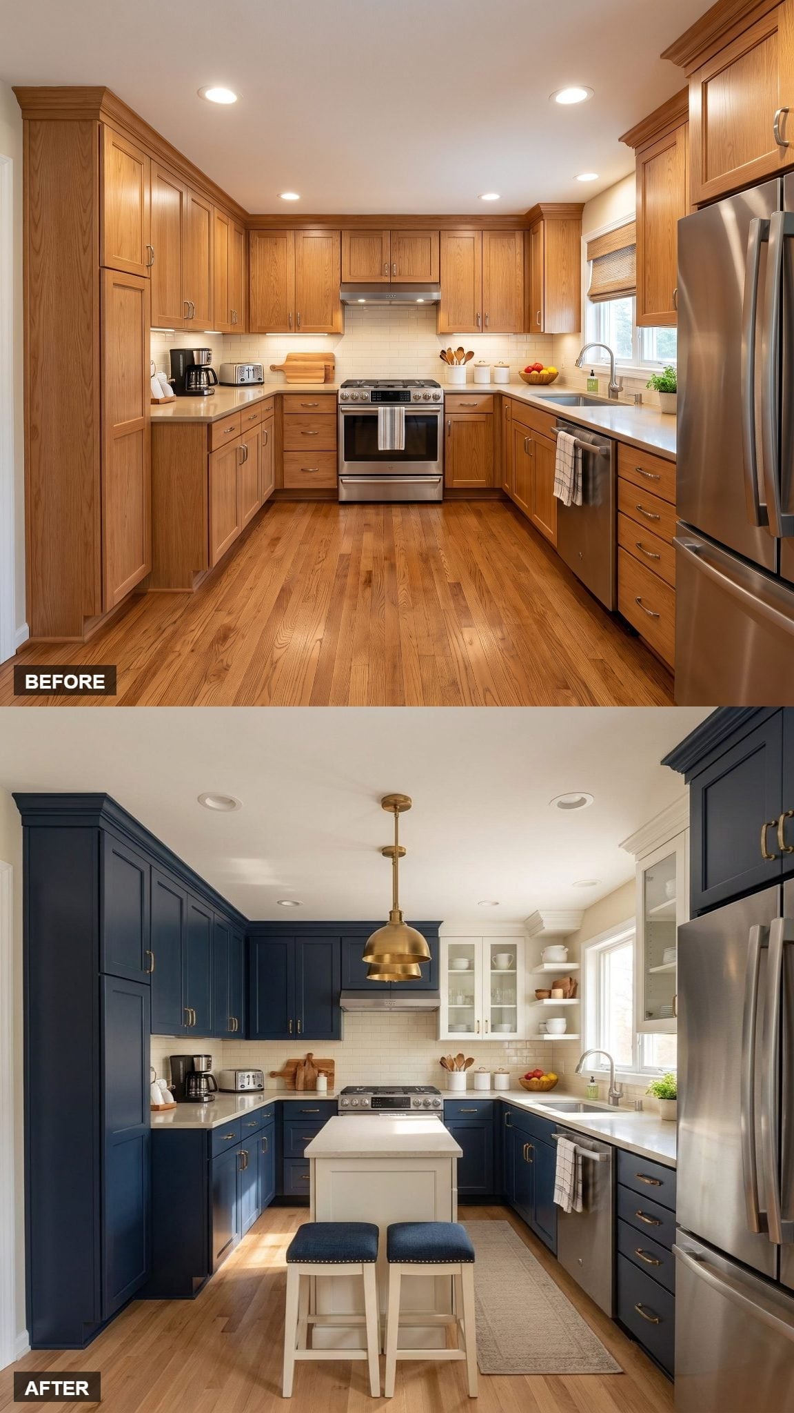
Here the perimeter cabinetry goes navy while the island turns white, reversing the color arrangement used in many of the other versions.
Navy upholstered stools repeat the perimeter color at the island without painting the island itself dark. Open shelving and glass-front cabinets near the window break up the heavier cabinetry and keep that corner lighter and more open.
Open-Shelf Reality: Anything stored on an open shelf becomes part of the room visually. Everyday dishes can work perfectly well, but a limited palette or repeated shapes will usually make the shelf feel calmer than a collection of unrelated packaging and containers.
22. A Butcher-Block Top Adds the Warmth the Navy Island Was Missing
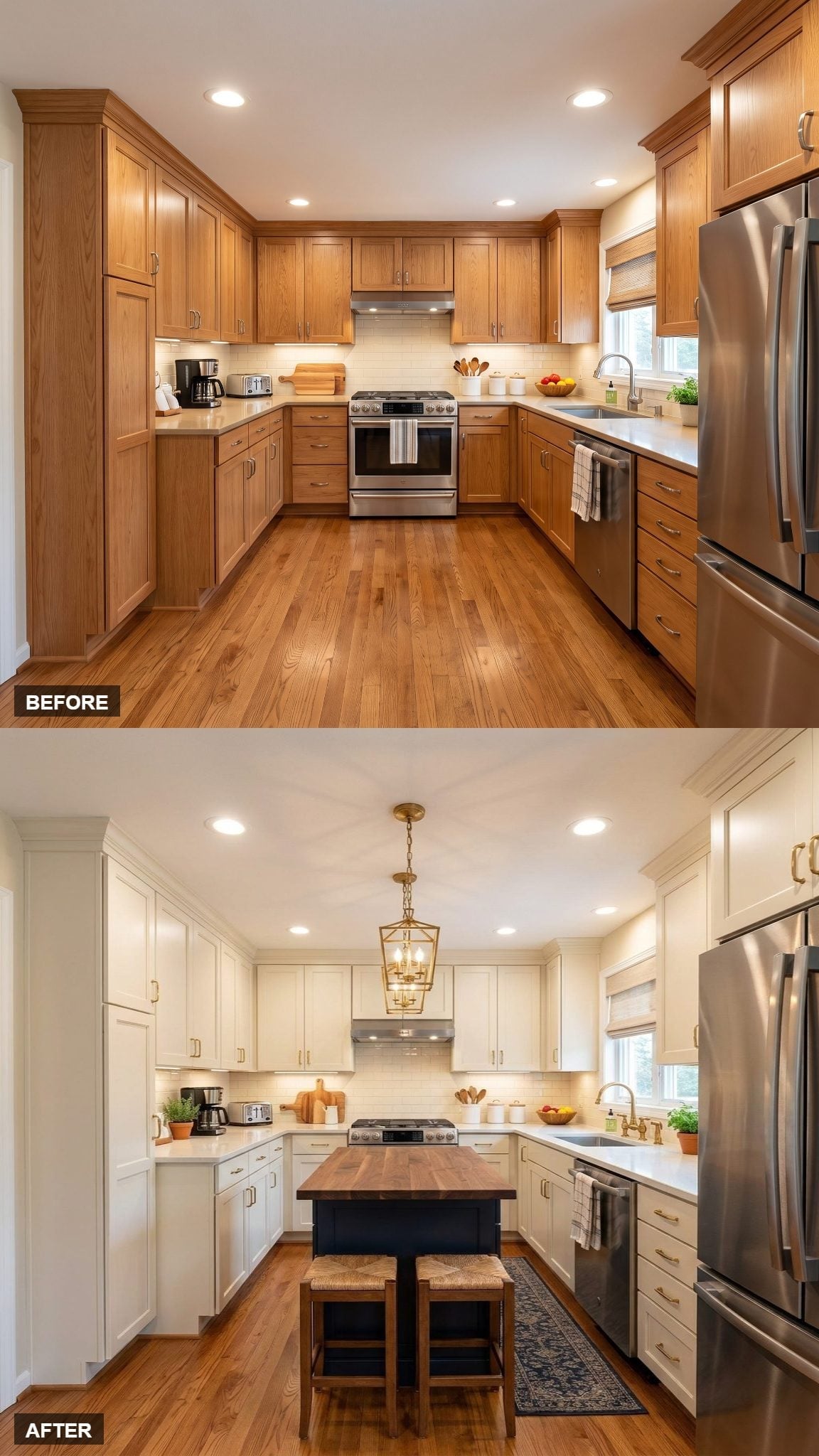
The navy island is topped with warm wood instead of another white surface, which immediately separates it from the pale counters around the perimeter.
That butcher-block look brings the wood floor and rush-seat stools into the same conversation. The brass lantern continues the warm notes overhead, while cream cabinetry gives all three materials a quiet backdrop.
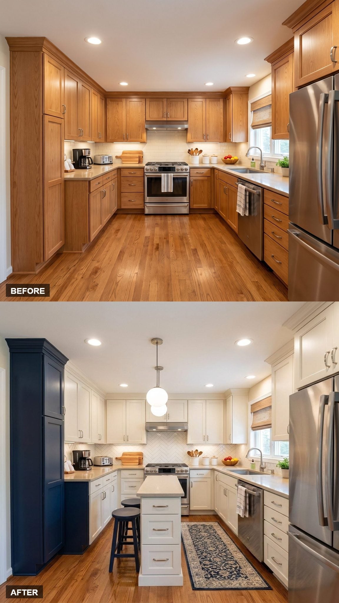
21. A Tall Navy Cabinet Carries the Island Color Up the Wall
🔥 Would you like to save this?
The navy treatment isn’t confined to the center here. A tall cabinet on the left repeats the dark color, giving the eye a second vertical block beyond the island area.
The remaining cabinetry stays white, so that repetition feels deliberate without turning the kitchen into a predominantly dark room. A double-globe fixture adds another paired shape above the island without asking the cabinetry to do more.
20. A Navy Runner Extends the Island Color Across the Floor
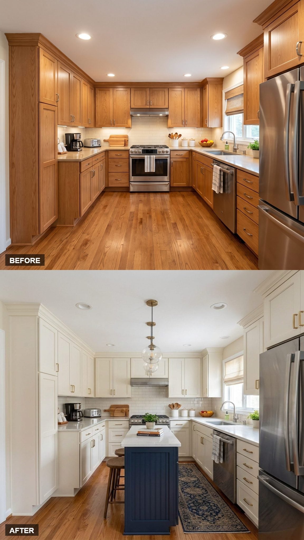
Ivory shaker cabinets keep the perimeter pale while the navy island creates the strongest color block at the center.
The runner carries that navy several feet away, extending the palette horizontally rather than adding another painted cabinet. Stainless appliances and a pale countertop keep the room from becoming too carefully matched.
19. Round Stools Make the Small Island Feel Less Boxy
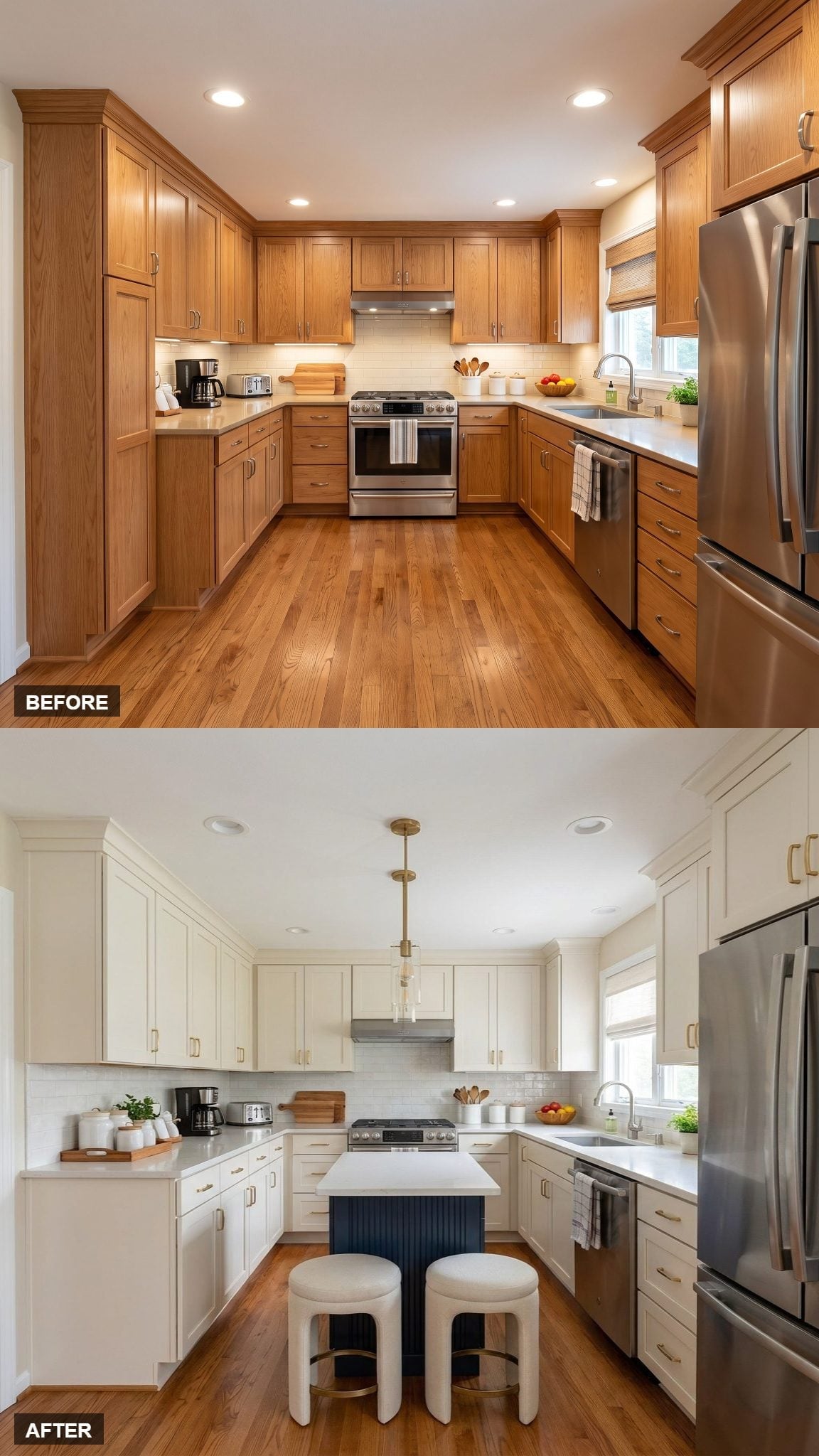
The island itself is a straightforward navy rectangle, so the pair of round upholstered stools matter more than they might at first appear.
Their curved seats interrupt the hard cabinet geometry and tuck beneath the pale countertop without adding another broad vertical surface. A brass-and-glass pendant repeats that softer shape overhead.
18. A White Island Separates Itself From the Navy Perimeter
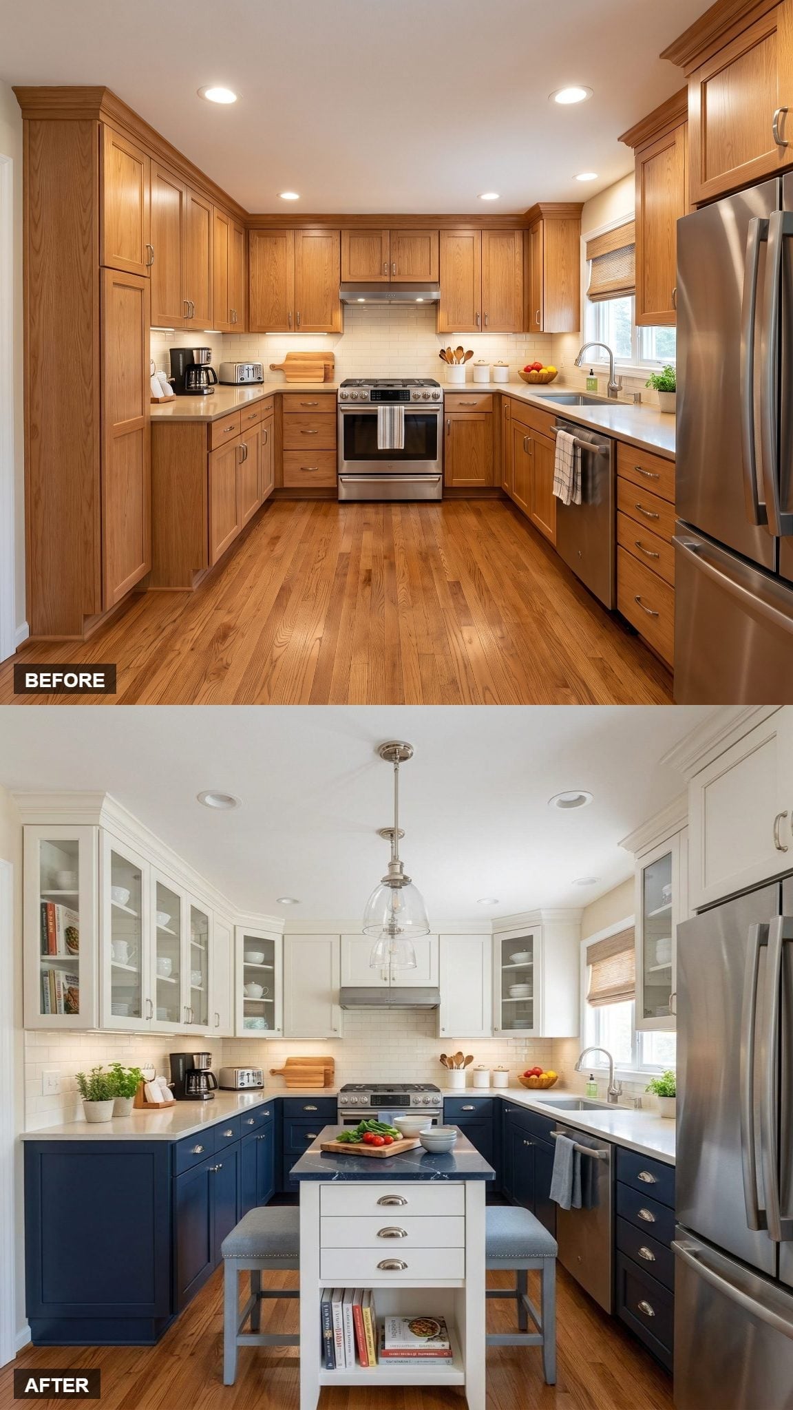
Navy lower cabinets wrap the perimeter, but the island belongs to the lighter half of the kitchen. Its white body connects to the white glass-front uppers instead of repeating the darker base cabinets.
That reversal keeps the center from becoming the heaviest object in the room. The bell-shaped silver-tone pendant adds one simple focal shape above it.
17. Concentrating Navy on the Island Creates One Clear Color Block
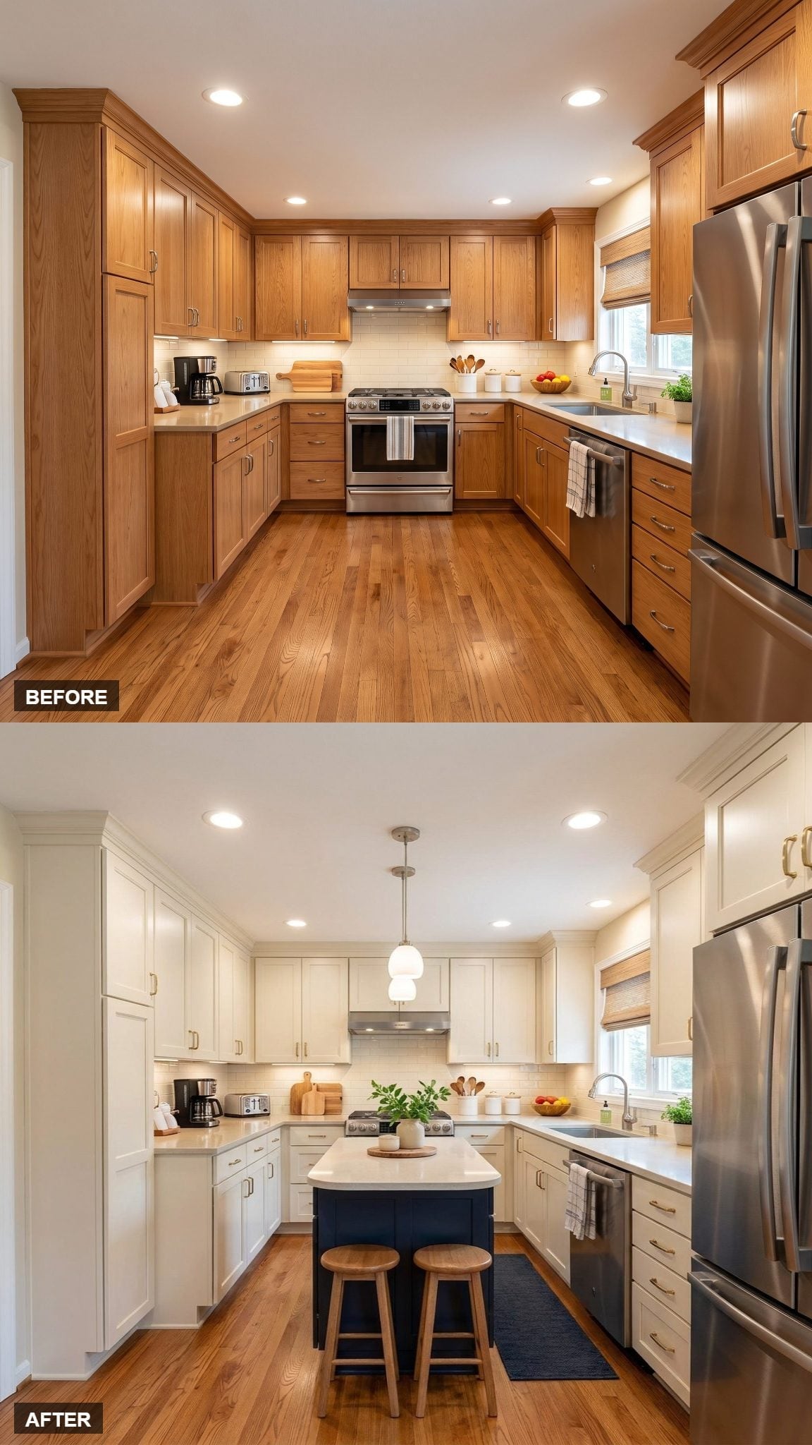
Soft white shaker cabinets surround a navy island that holds almost all of the dark color at the center.
That concentration produces a different effect from spreading navy across the lower perimeter. One approach creates a single focal block; the other creates a darker band around the room.
Why Keeping the Navy Concentrated Changes the Composition
Using navy only on the island makes the color feel more isolated and emphatic. Extending it onto perimeter cabinets would not necessarily be better or worse — it would simply distribute the weight differently and make the kitchen feel more enveloped by the darker tone.
16. Chrome and Navy Give This Version a Cooler Edge
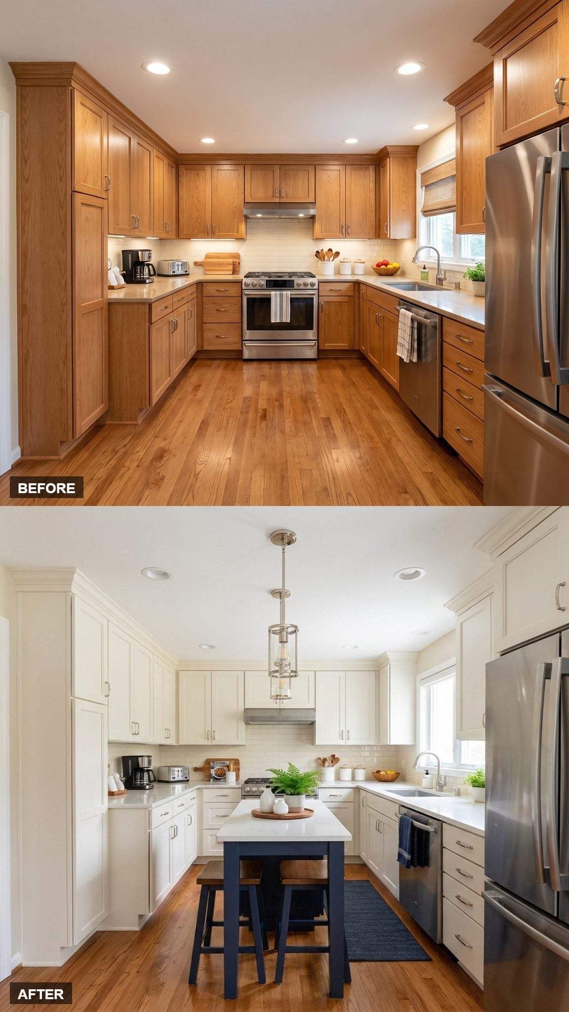
Most of the warmer versions rely on brass. Here, chrome and silver-tone finishes push the white-and-navy palette cooler.
The lantern pendant, pale cabinetry, and navy island sit against warm wood flooring, so the floor becomes the counterweight to all that cool color. A navy runner picks up the island tone without adding another dark cabinet.
15. Brass Hardware Creates a Continuous Detail Across Two Cabinet Colors
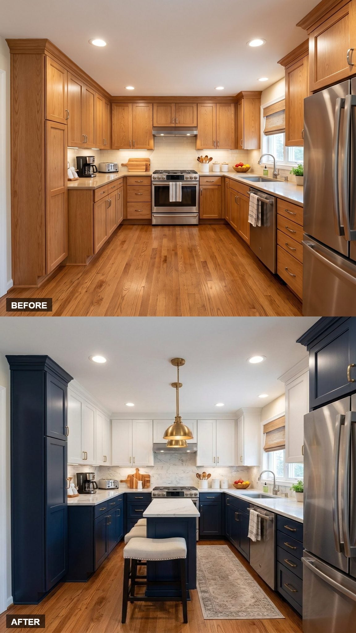
Navy base cabinets and white uppers divide the kitchen horizontally, while brass hardware appears across both colors.
That repeated metal finish is one way to connect separate cabinet tones without making them identical. A brass dome pendant carries the same warm finish above the counter line, while the compact white-topped island keeps the center lighter.
14. Fluted Panels Give the Navy Island Texture Instead of More Ornament
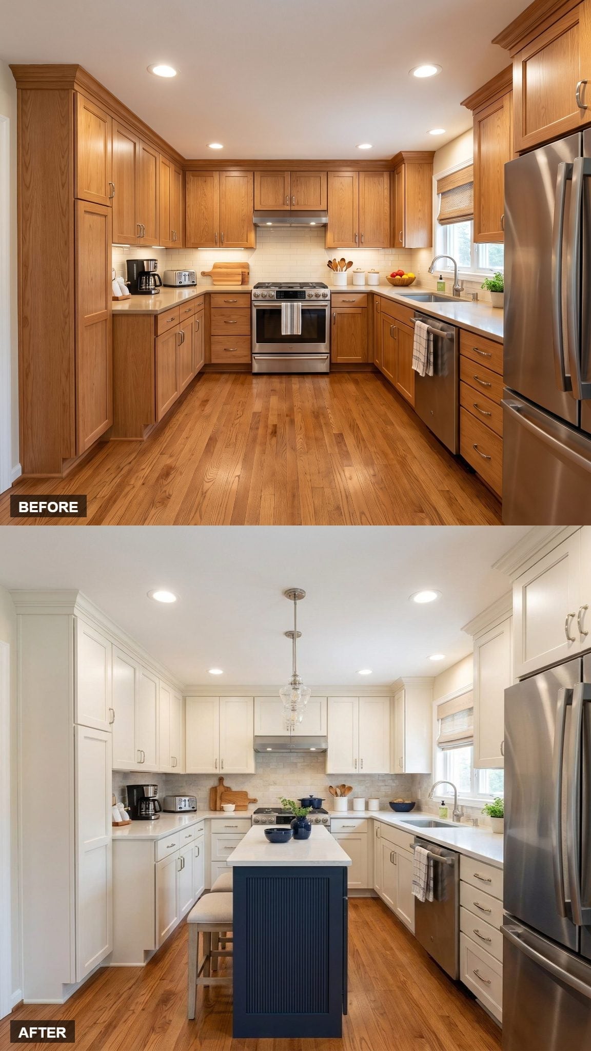
The most useful detail here isn’t the pendant. It’s the fluted treatment on the navy island base.
Vertical grooves catch light differently from a flat painted panel, giving the dark color depth without adding another pattern or hardware style. The marble-look backsplash introduces softer movement behind the range, while the wood floor keeps the white-and-navy combination from feeling stark.
13. Floating Wood Shelves Add a Warm Break in the White Cabinet Wall
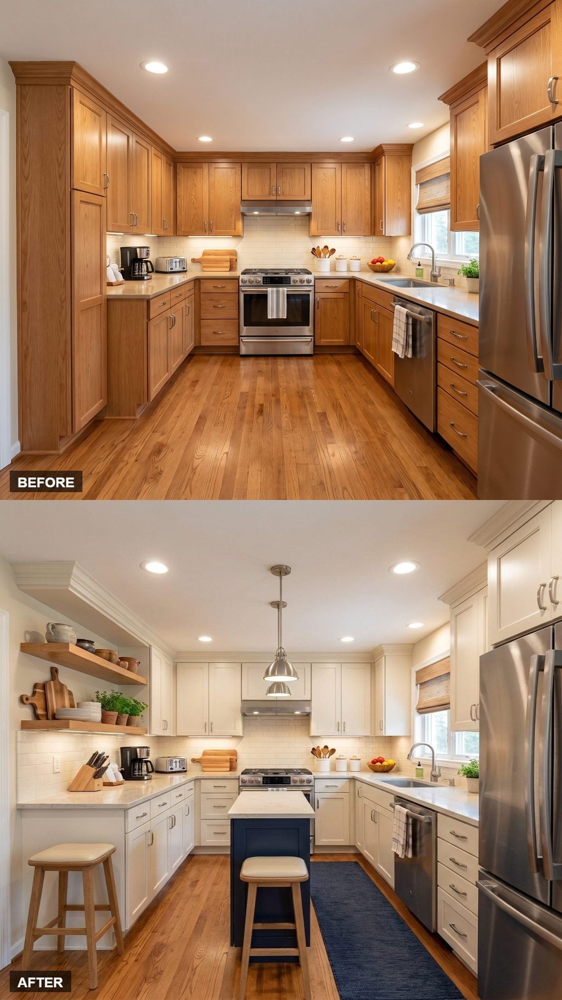
Floating wood shelves replace part of the mass of the upper cabinetry and introduce a natural material that isn’t repeated everywhere else.
Their warmth connects naturally with the flooring while the brushed-nickel hardware and pendant stay cooler. The navy island remains the strongest color statement, but it no longer has to provide all the interest by itself.
12. A Patterned Rug Adds Detail Beneath an Otherwise Restrained Island
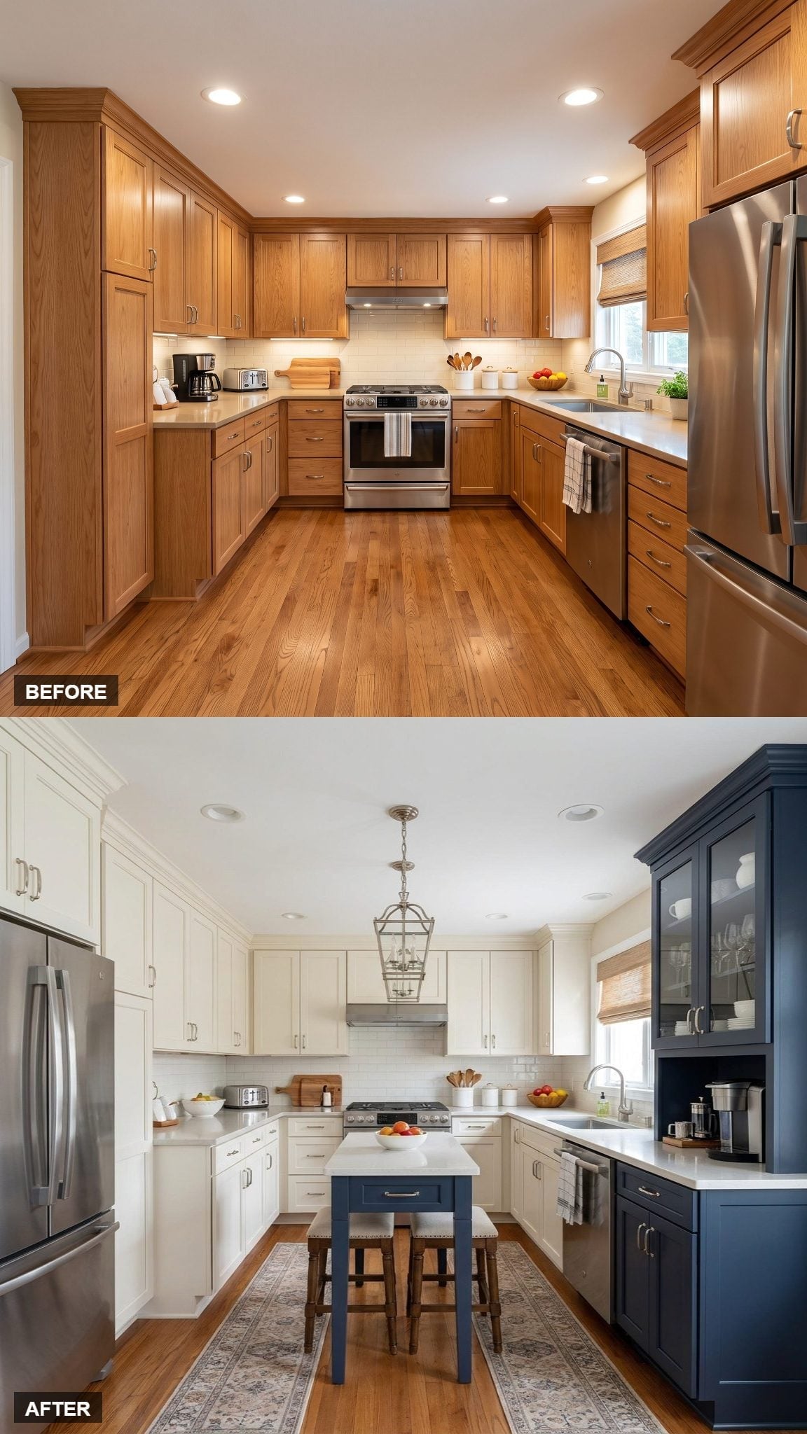
Navy and cream shaker cabinetry establishes the two-tone framework, while the island repeats the navy at the center.
The rug introduces pattern in the one place the cabinets do not. Rather than adding another decorative backsplash or colored wall, the room puts that extra detail underfoot and lets the cabinetry stay comparatively quiet.
11. A White Island Breaks Up a Perimeter of Navy Lower Cabinets
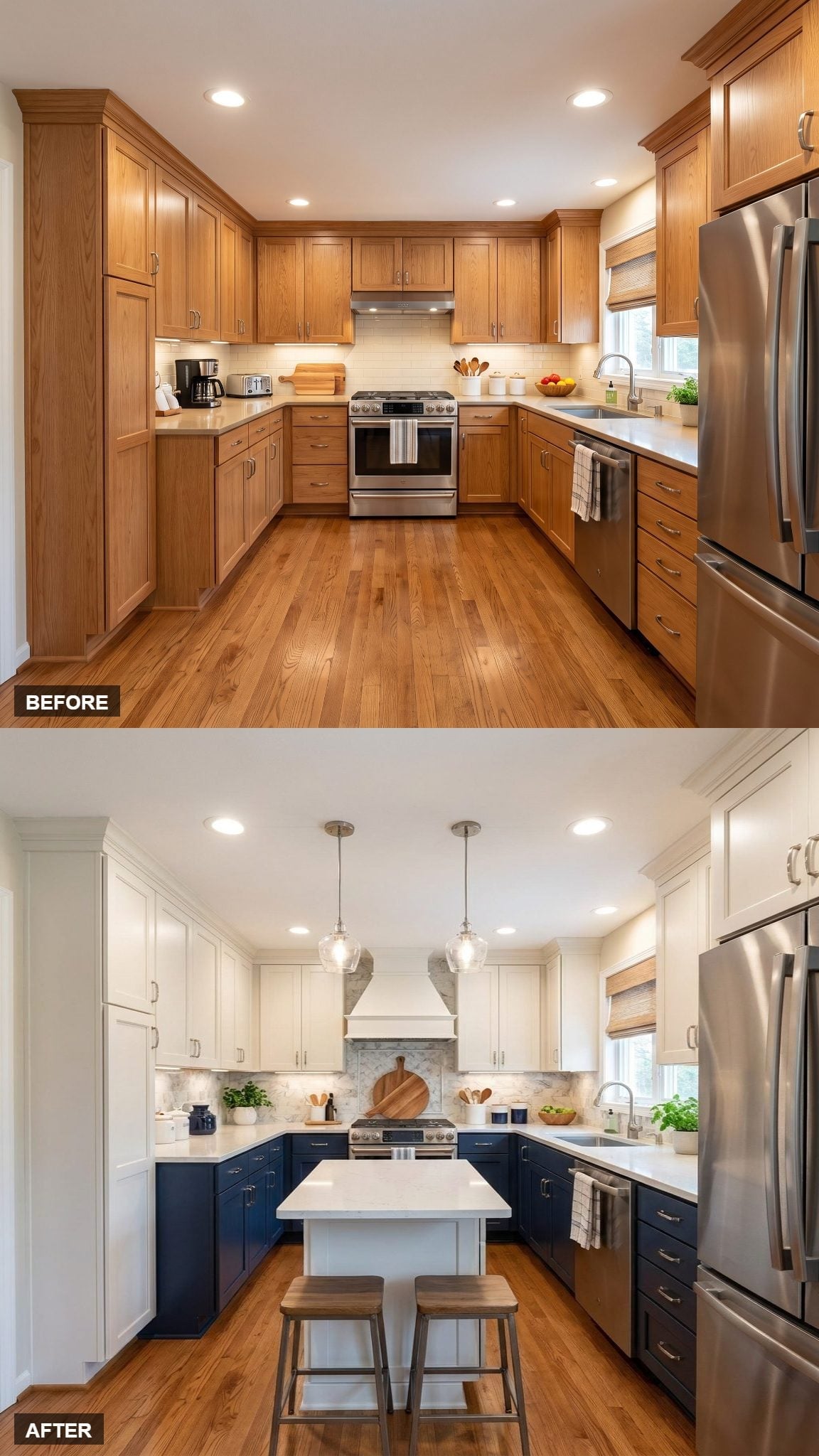
Navy base cabinets run around the perimeter while the island remains white, creating a pale interruption in the middle of the darker lower band.
Two clear-glass pendants add a repeated shape overhead without creating another opaque block. The white range hood connects to the uppers and island, while warm oak flooring and wood stools keep the palette from becoming entirely cool.
10. A Persian-Style Runner Adds Pattern Between Two Strong Color Blocks
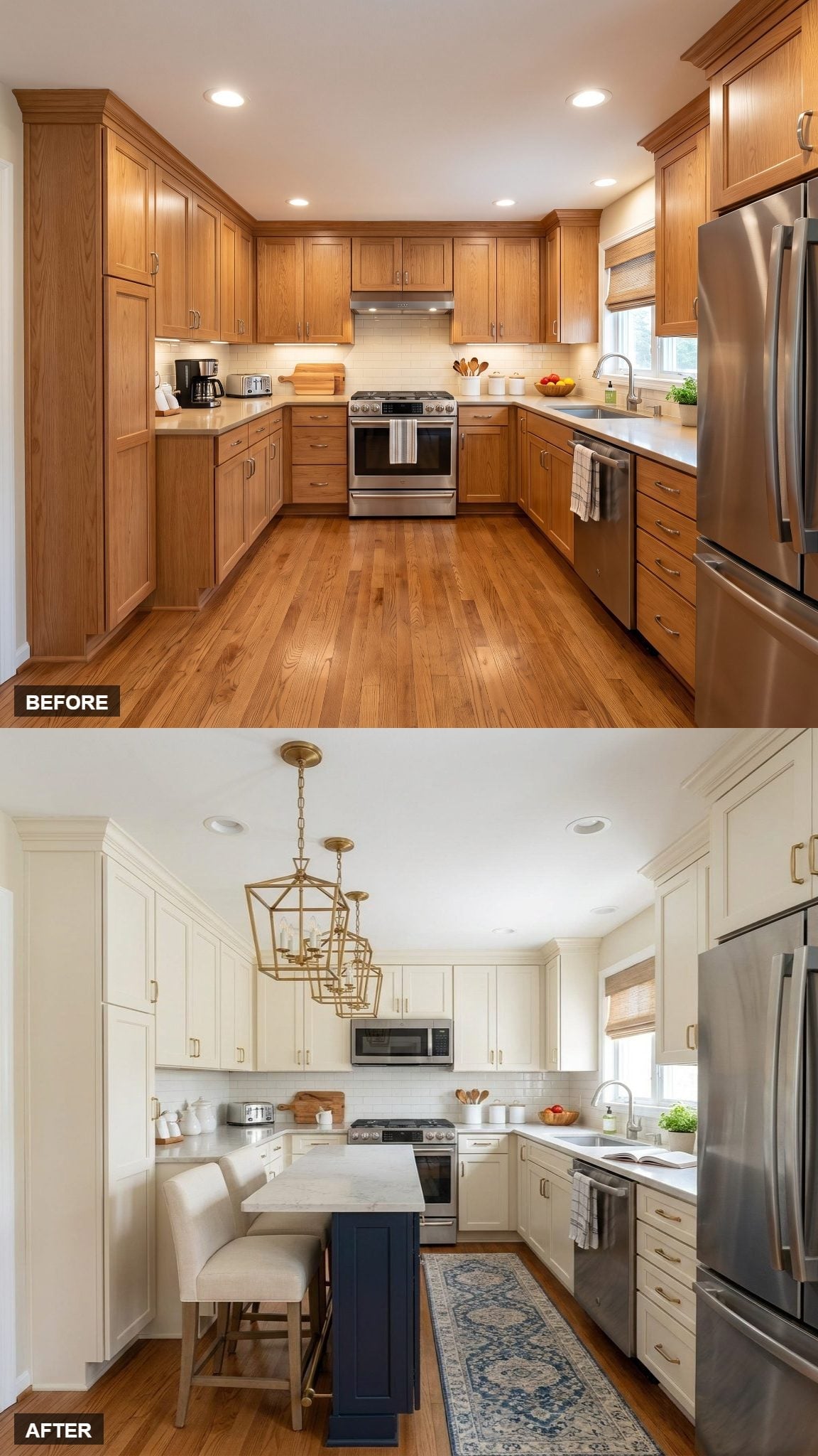
Paired brass lanterns sit above a navy island, while cream cabinetry forms the lighter perimeter.
The Persian-style runner adds a third layer between those two strong color areas. It breaks up the wood floor with pattern and gives the narrow walkway between island and cabinets a more defined identity.
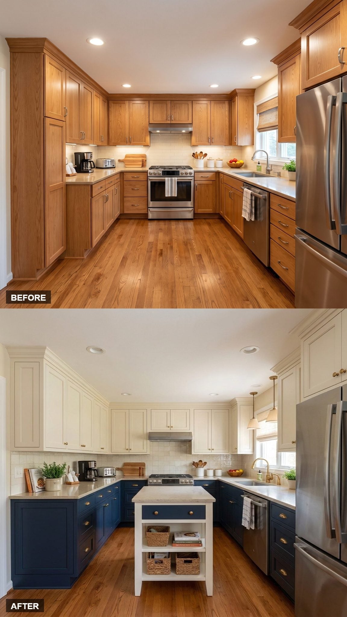
9. A Freestanding Island Makes the Center Feel Collected Rather Than Built In
🔥 Would you like to save this?
This island behaves more like a piece of furniture than conventional built-in cabinetry. White painted legs, a navy drawer, open shelving, and woven baskets give it several smaller components instead of one solid cabinet box.
That lighter construction is particularly useful in a compact kitchen because more of the floor and lower shelf remain visible. The mixed white-and-navy finish also connects it to both cabinet colors without copying either one completely.
8. Upholstered Stools Turn the Compact Island Into a Seating Zone
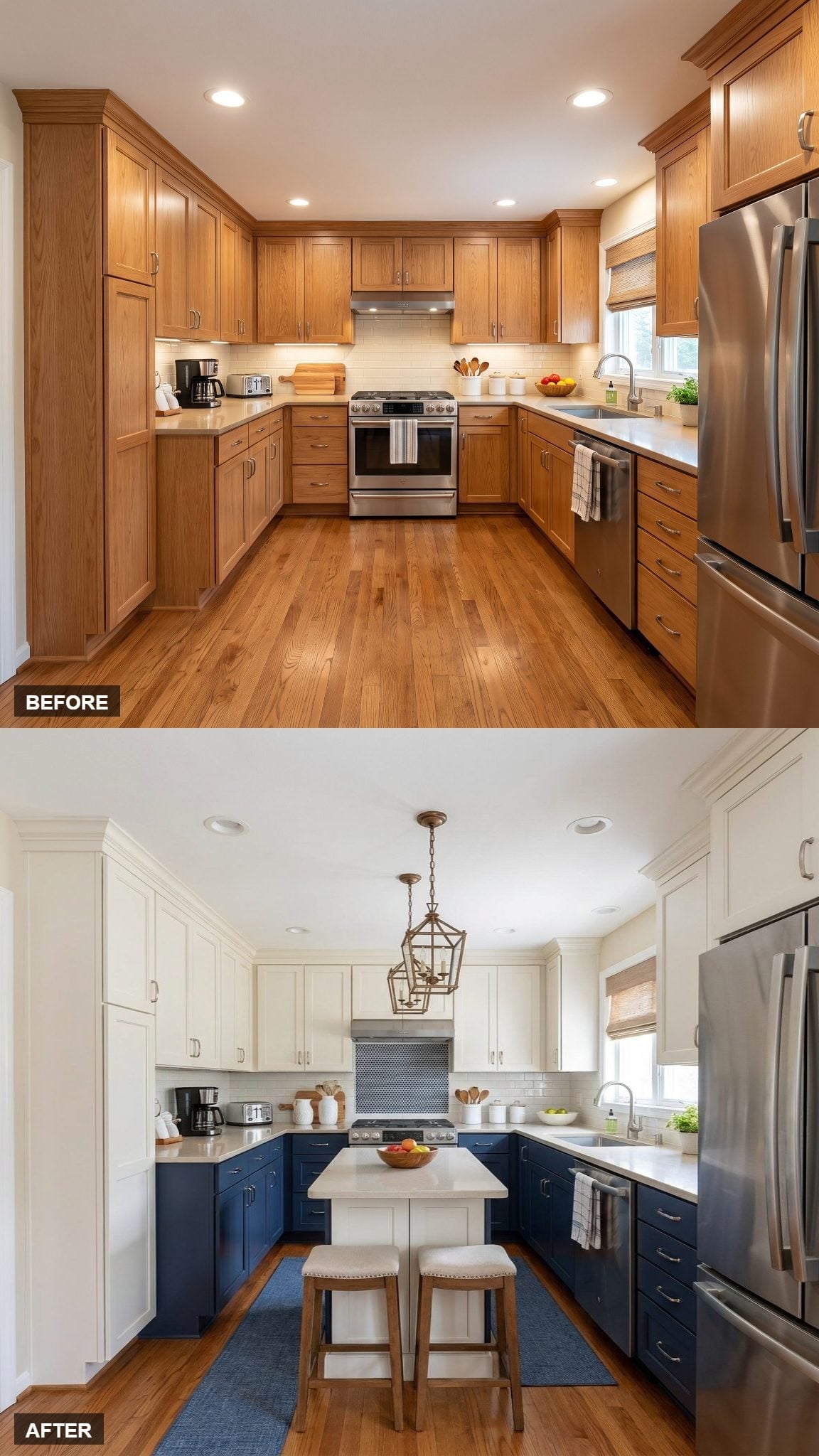
A pale island sits between navy lowers and cream uppers, but the upholstered stools are what make its purpose immediately clear.
They tuck beneath the overhang and turn the center into a casual seating area without requiring the island to look oversized. The image suggests a compact arrangement, though actual walkway clearance would need to be verified from room measurements rather than the rendering alone.
7. Open End Shelving Gives the Navy Island a Useful Side Face
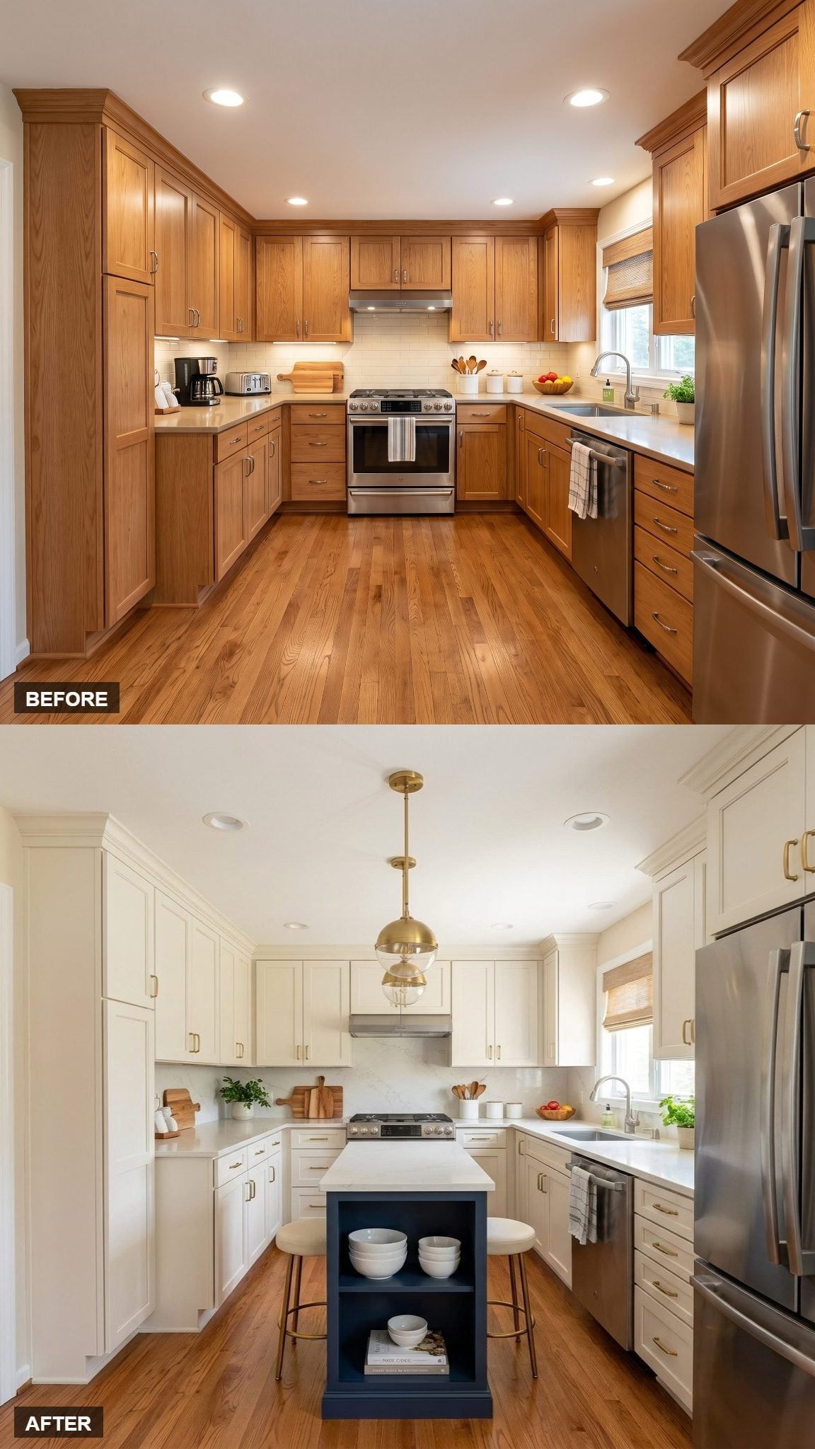
Instead of ending in a blank navy panel, this island uses open shelving at the end for bowls, books, or other frequently handled objects.
That turns a normally passive surface into visible storage without enlarging the island footprint. Cream shaker cabinetry stays light around it, while the aged-gold globe pendant echoes the warmer hardware.
6. Three Navy Zones Spread the Dark Color Beyond the Island
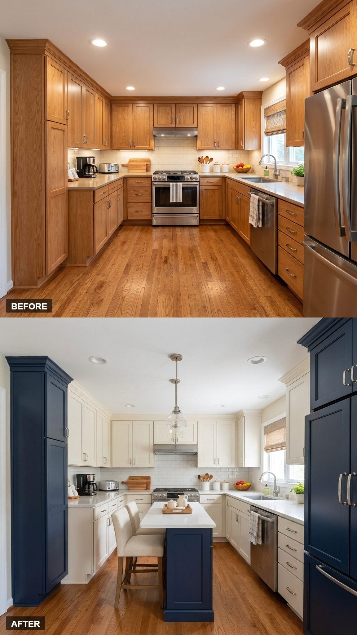
Navy appears on the island and on tall cabinet elements around the perimeter, so the dark color is no longer confined to one central block.
That repetition changes the rhythm of the room. Cream uppers still dominate the wall area, but navy now appears at several points, making the palette feel distributed rather than centered on a single feature.
The clear pendant stays light above the island, while upholstered stools give the center a clear seating edge.
5. A Butcher-Block Island Brings Wood Into the Middle of the Room
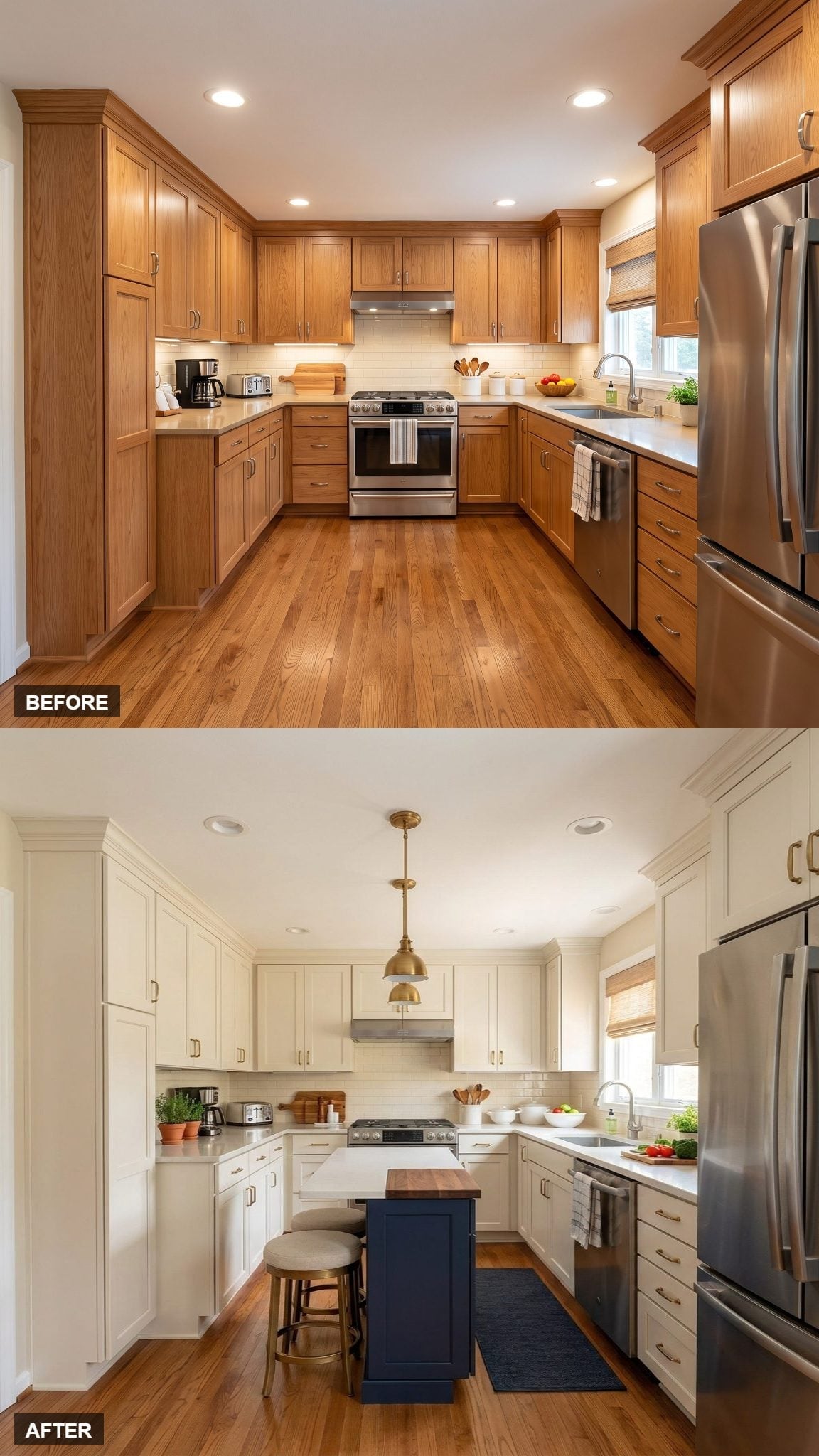
This second wood-topped island uses the butcher-block look less as contrast against brass and more as a bridge to the warmer details around the room.
The woven Roman shade, upholstered stools, and wood floor all sit comfortably beside that surface, keeping the navy-and-cream combination from becoming overly crisp.
A navy runner carries the dark color away from the island and toward the surrounding work zone without adding another painted cabinet.
4. A Schoolhouse Pendant Changes the Period Reference Without Changing the Palette
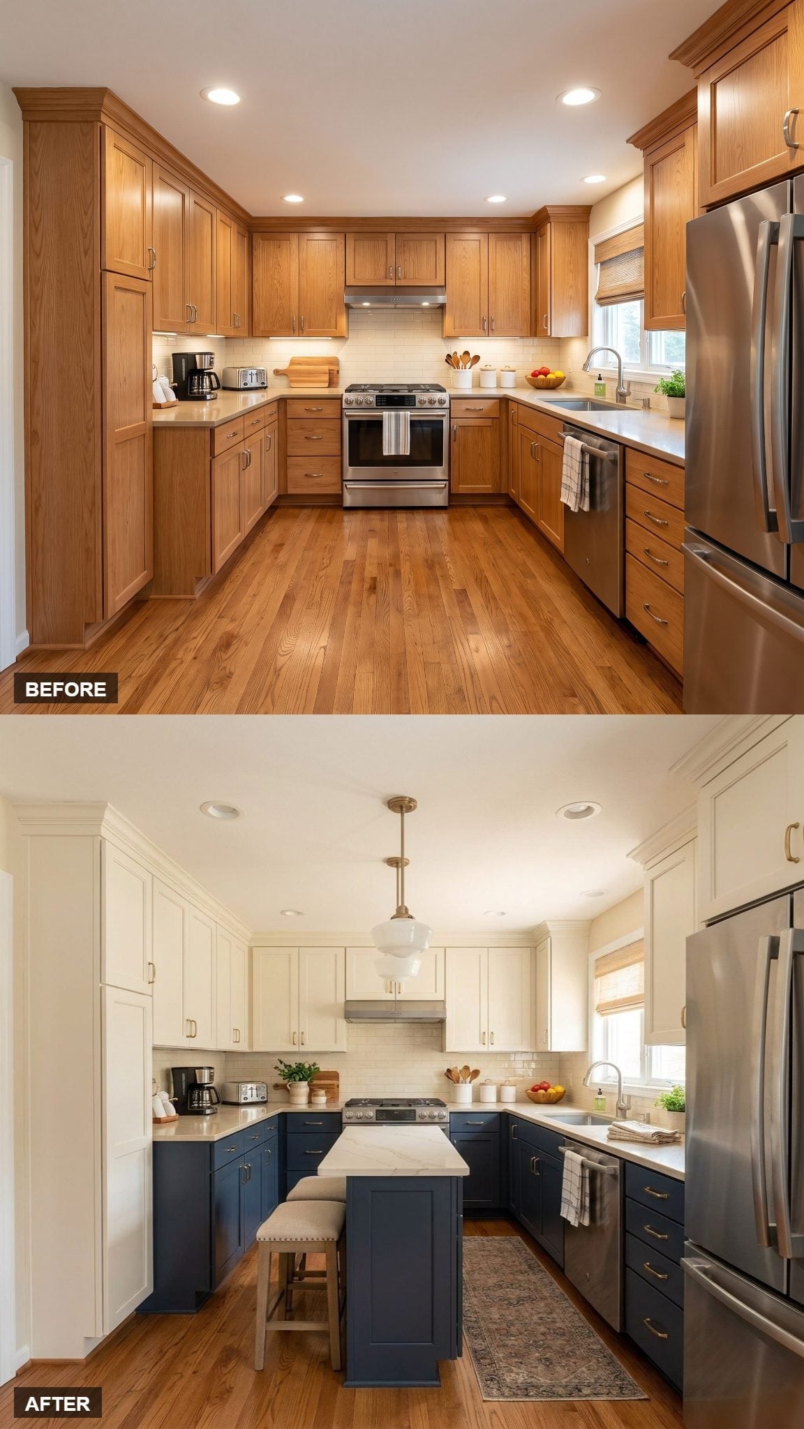
Cream shaker uppers sit above inky navy lowers, with the island repeating that darker base color.
What separates this version is the schoolhouse pendant. Its milk-glass shade introduces an older utilitarian reference than the globes and lanterns elsewhere in the gallery, giving the same transitional palette a slightly different character.
The counters have a pale veined-stone look, while brass pulls and warm wood flooring keep the dark cabinetry from feeling severe.
3. Turned Legs and Basket Storage Make the Island Feel Like a Worktable
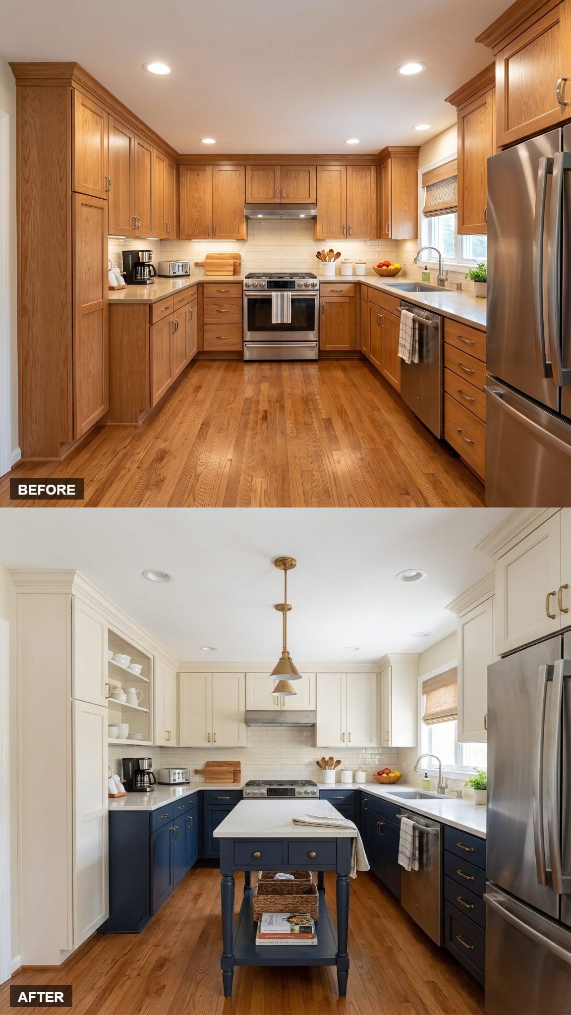
This freestanding island overlaps with the earlier furniture-style version, but its emphasis is different: turned legs, an open lower shelf, and woven baskets make it resemble a traditional kitchen worktable.
That open storage keeps the island from becoming another solid navy cabinet box. Cream uppers and open shelving lighten the wall area above, while the pale counter connects the island to the perimeter surfaces.
2. An Open-Bottom Island Leaves More of the Floor Visible
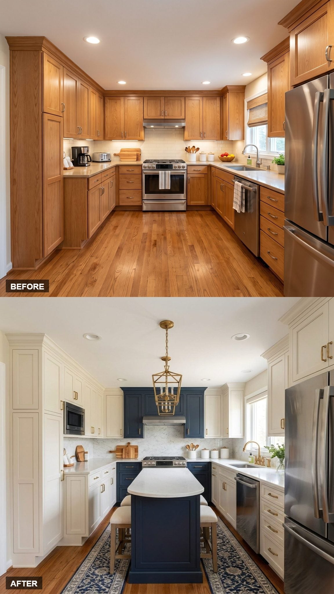
The navy island uses an open lower structure rather than filling every inch with cabinetry, allowing the wood floor to remain visible beneath it.
That distinction matters in a compact room. The island still introduces a strong dark center, but it doesn’t create an uninterrupted navy box from countertop to floor.
A matching navy hood surround repeats the color higher in the room, while the patterned rug adds a soft boundary around the seating area rather than pretending to be necessary for the layout to work.
1. One Lantern and a Navy Island Finish the Series With the Simplest Formula
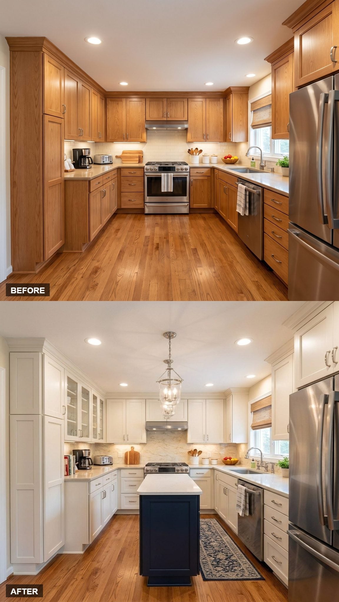
Silver-tone hardware runs across the white shaker cabinetry, while a navy island creates a single dark block at the center. Its pale countertop connects back to the perimeter rather than allowing the island to become completely separate.
The lantern above is proportioned to the island rather than trying to dominate the whole ceiling. A runner beneath adds pattern and helps define the central zone without changing the cabinetry at all.
Thirty-three variations later, the most useful lesson isn’t that every compact kitchen needs a navy island and a pendant. It’s that the same small footprint can feel surprisingly different depending on where the dark color goes, whether the island is solid or furniture-like, how much storage it carries, and which details are allowed to take the lead. Before building any of them, the dimensions and required clearances would still need to be checked in the actual room.












