🔥 Would you like to save this?
A kitchen can have expensive stone, beautiful cabinetry, immaculate joinery, and still get the fundamentals spectacularly wrong. A floor pattern with delusions of grandeur. A range hood auditioning for a cathedral. Upper cabinets colonizing every available inch of wall. Lighting that makes thousands of dollars’ worth of finishes look like yesterday’s dishwater. Money has been spent. Taste and proportion haven’t always kept up.
The temptation is to blame the entire room. Rip out the cabinets, replace the counters, start again. Yet a kitchen can be perfectly sound in its layout and thoroughly confused in its design. Beautiful materials clash, colors undermine one another, decorative details overwhelm the architecture, and the most expensive feature in the room ends up being the thing that spoils it.
In order to come up with the very specific design ideas, we create most designs with the assistance of state-of-the-art AI interior design software. Also, assume links that take you off the site are affiliate links such as links to Amazon. this means we may earn a commission if you buy something.
These 35 examples put the offending decisions under the microscope, from countertops with the wrong undertones to backsplashes that refuse to surrender the spotlight. Each reveals a problem worth recognizing before the renovation budget takes a beating. Sometimes the answer is subtraction. Sometimes it’s a better balance of color, texture, light, and proportion. And sometimes the smartest design decision is knowing when to leave well enough alone.
35. Faded Mint Cabinets Were Hiding the Best Material in the Kitchen
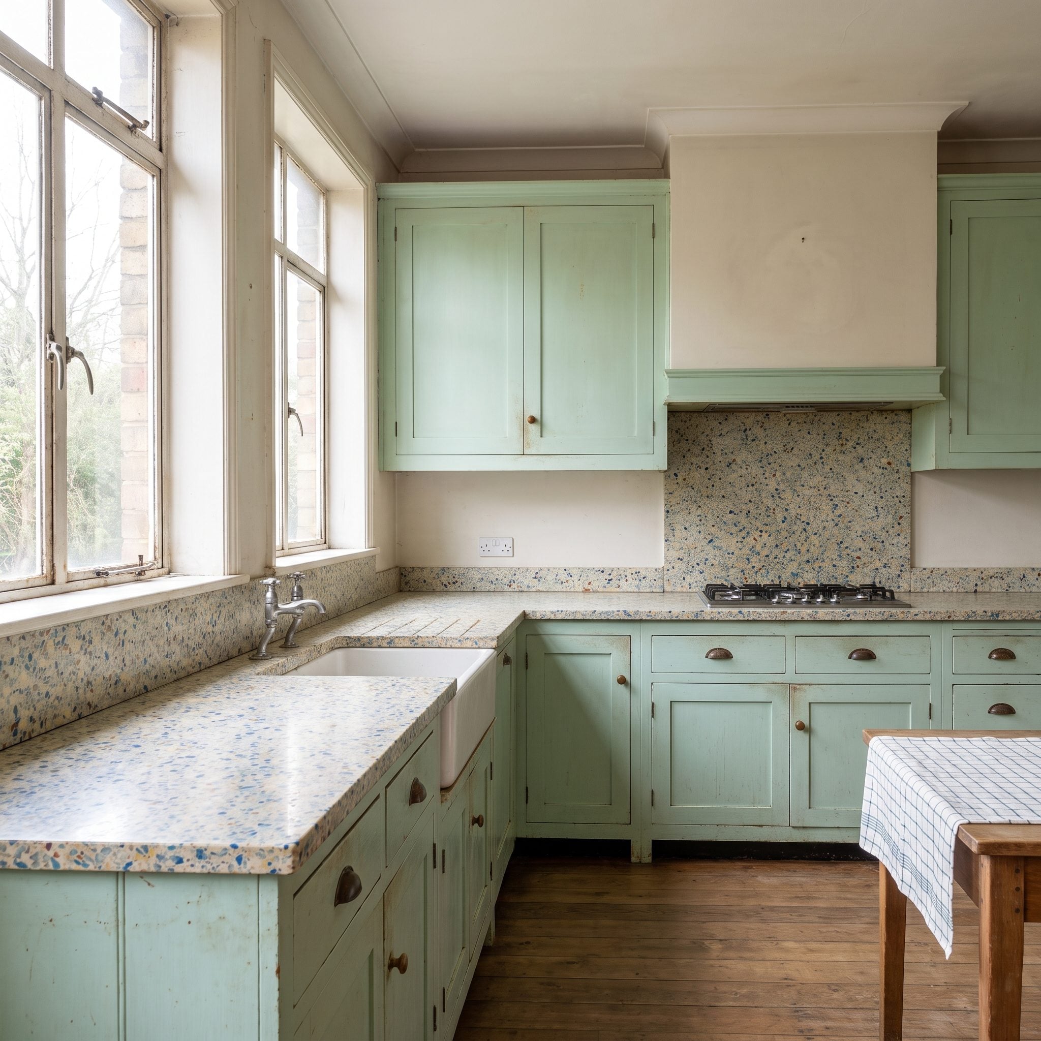
The terrazzo had everything going for it: delicate mineral flecks, a pale ground, and enough character to carry the room. Faded mint cabinetry offered almost no contrast. The countertops disappeared into a wash of similarly muted colors, leaving one of the kitchen’s most interesting materials looking strangely inconsequential.
Deep petrol-blue paint gives the cabinets an entirely different presence. Against that saturated backdrop, the terrazzo’s pale fragments become sharply visible. Brushed-aluminum pulls and restrained ceiling lighting support the palette without competing for attention. The stone becomes the attraction, its intricate pattern finally visible against a color strong enough to frame it.
34. The Ornamental Hood Was Trying to Become the Entire Kitchen
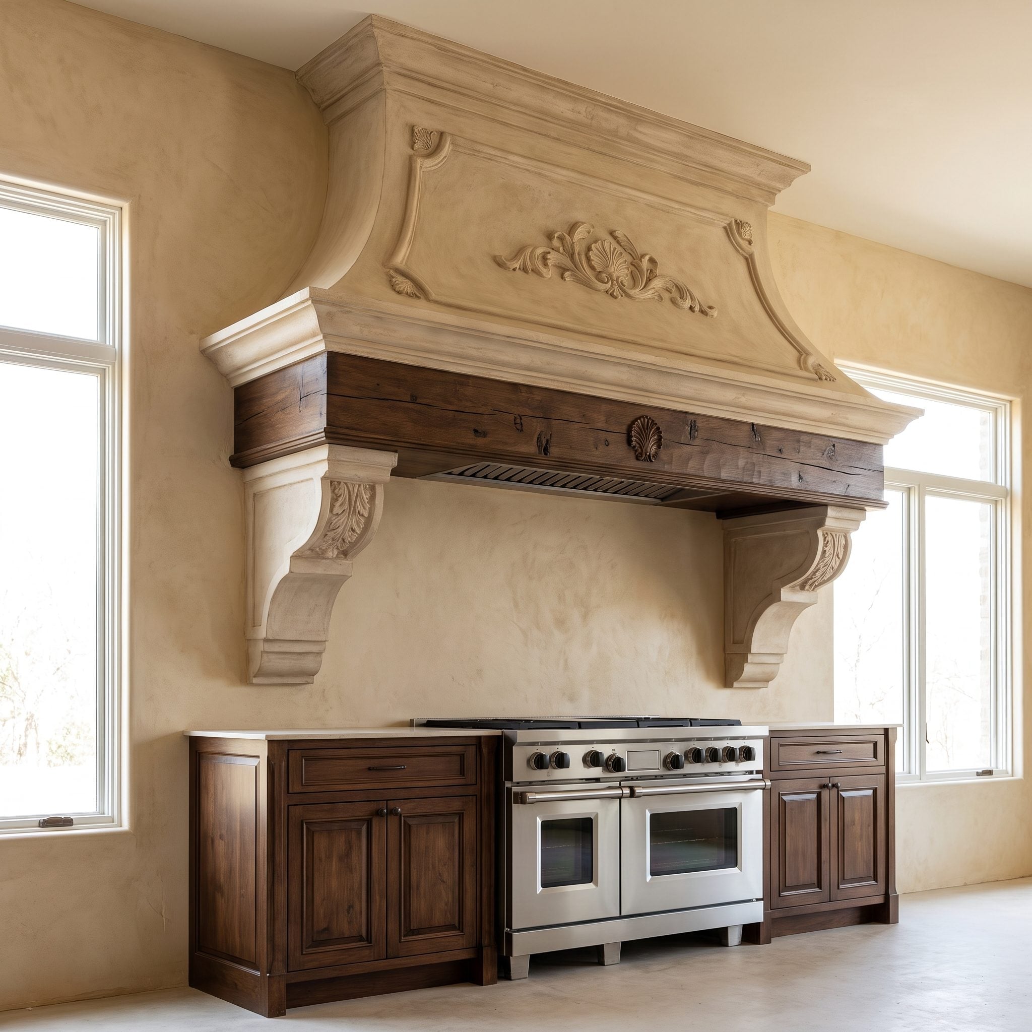
A perfectly respectable range wall was hiding behind that carved hood enclosure. Its oversized decorative profile crowded the upper cabinets and gave the cooking area the proportions of a fireplace mantel. The range needed ventilation, not an architectural monument.
A slim brushed-stainless canopy restores the balance, paired with plain pale-gray porcelain where the bordered backsplash once competed for attention. Simple stainless handles finish the muted-green cabinetry. The bulky enclosure disappears, the cabinet proportions become legible, and the range wall looks considerably more composed. The new hood gives the cooking area a clean architectural outline without demanding that the entire kitchen revolve around it.
33. Dark Cabinets Above, Cream Cabinets Below — What Happens When the Colors Trade Places?
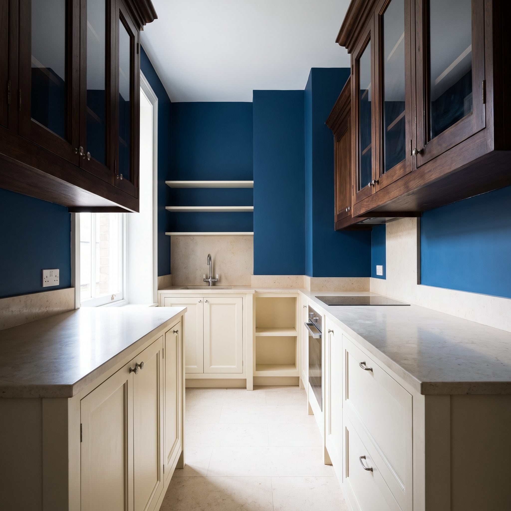
The dark upper cabinets pull attention toward the ceiling, while the cream lowers almost disappear beneath them. In this compact kitchen, the arrangement gives the upper walls an unusually dense appearance. The two-tone idea has potential; the distribution is doing it no favors.
Reversing the colors changes the visual balance without replacing the doors. Pale linen uppers brighten the wall plane, while deep cocoa lowers anchor the composition. Soft ivory backsplash tile, bronze hardware, and concealed task lighting complete the adjustment. The kitchen retains its contrast, but the darker color no longer dominates the upper half of the room.
32. Three Tiny Pendants Were No Match for an Eight-Foot Island
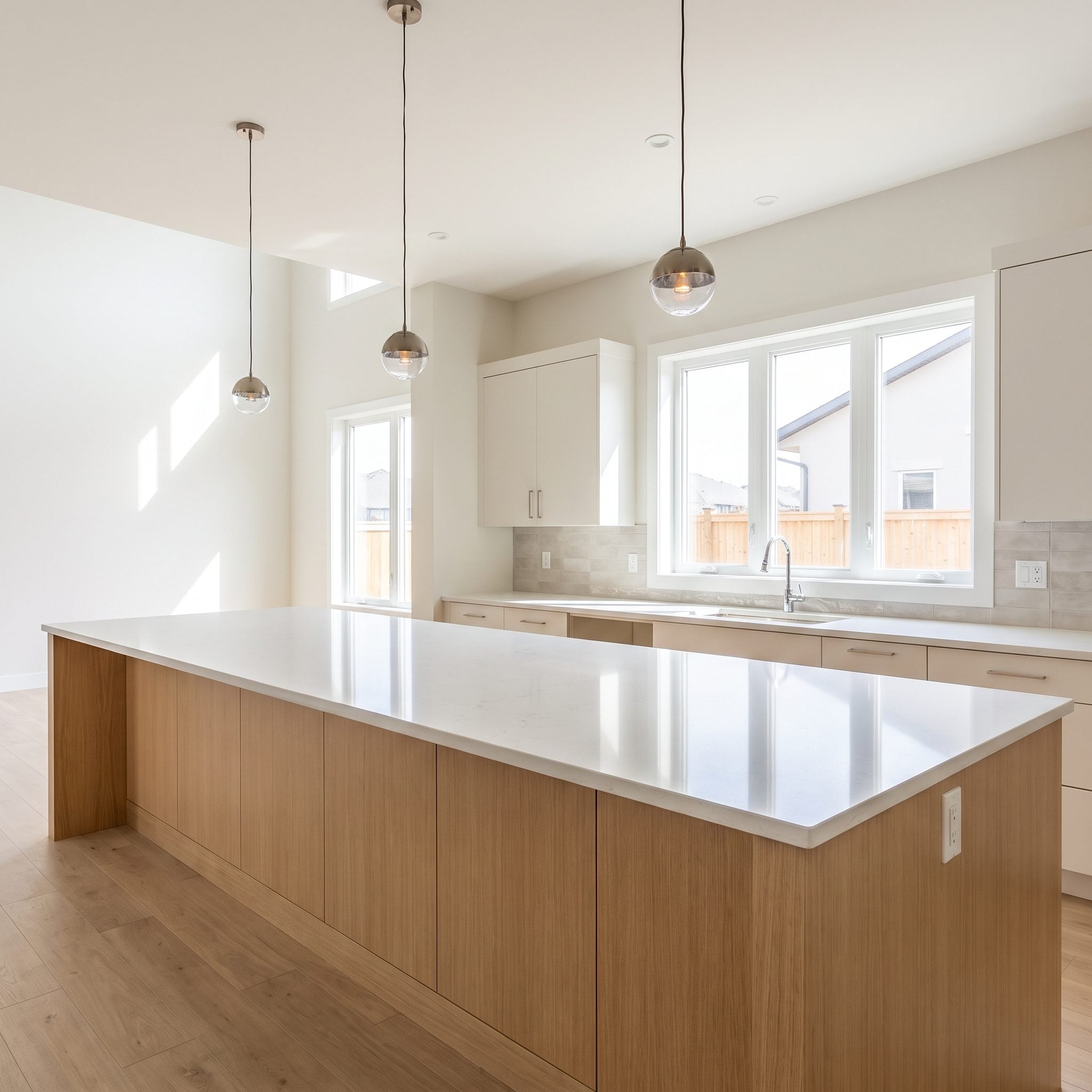
Three undersized pendants over a substantial walnut island look like three shirt buttons on an overcoat. Their small scale does little to reinforce the island’s length, and the arrangement leaves the room with an oddly disconnected centerpiece. The island is generous. The lighting seems reluctant to acknowledge it.
One slender bronze linear fixture follows the island’s long axis, giving the composition a clearer relationship between furniture and lighting. A quieter cream porcelain backsplash reduces competition behind it. The fixture’s proportions now suit the island, while its placement provides a more deliberate lighting arrangement.
31. Navy Cabinets Were Disappearing Into a Floor Almost as Dark as They Were
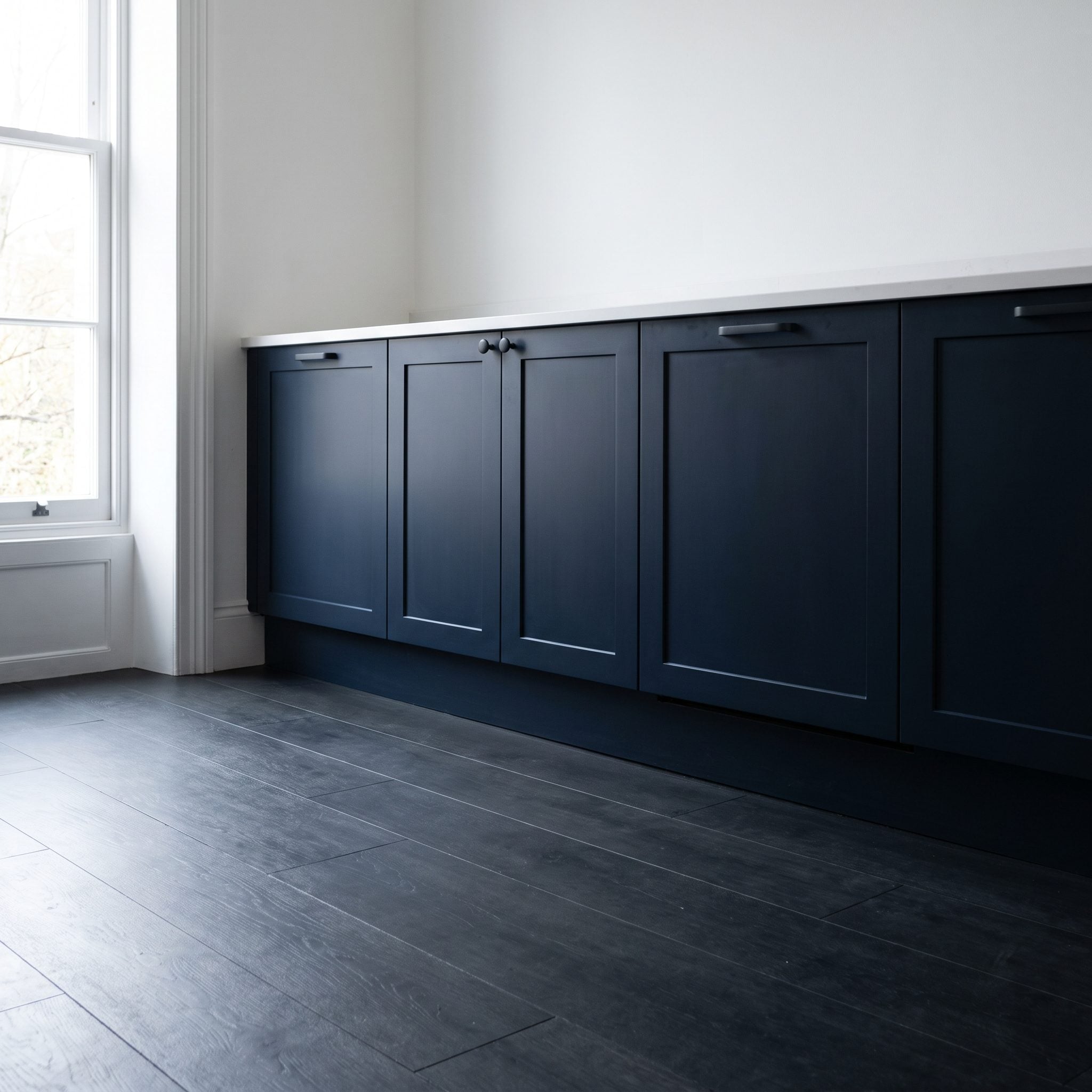
Deep navy cabinets against a nearly black floor can produce a handsome, enveloping interior. Here, the similar values caused the lower cabinets and flooring to merge into one heavy mass. Toe kicks disappeared, cabinet proportions became harder to read, and the floor offered little separation from the cabinetry above.
Warm-white terrazzo-look porcelain introduces a much lighter base, with fine navy and gray flecks linking it to the existing palette. Satin-chrome pulls and diffused opal lighting sharpen the finish. The brighter floor reveals the lower cabinet outlines and gives the navy a more deliberate presence. The cabinetry wasn’t too dark. Its surroundings weren’t giving it enough definition.
30. The Exposed Stainless Hood Was the Only Hard Edge in a Soft Mediterranean Kitchen
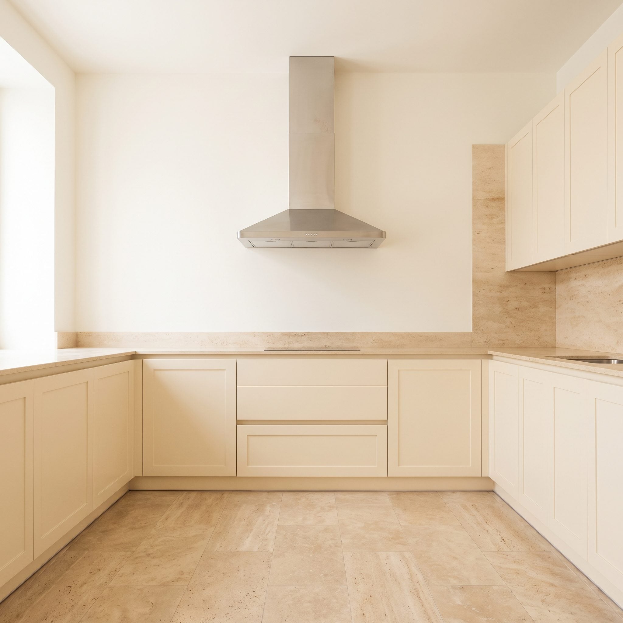
Cream cabinetry, warm stone, and softly sculpted surfaces establish a gentle Mediterranean character. The exposed stainless chimney hood introduces a sharply industrial note, interrupting the composition with a hard metallic outline. The appliance commands attention for reasons that have little to do with the room’s architecture.
A sculptural cream plaster enclosure integrates a properly specified ventilation insert into the surrounding design. Pale travertine-look porcelain and compact bronze handles reinforce the warmer material palette. The range wall acquires a convincing architectural centerpiece, with curves and finishes that belong to the same design language as the cabinetry.
29. A Walnut Kitchen Had One Problem: Its Backsplash Wouldn’t Stop Talking
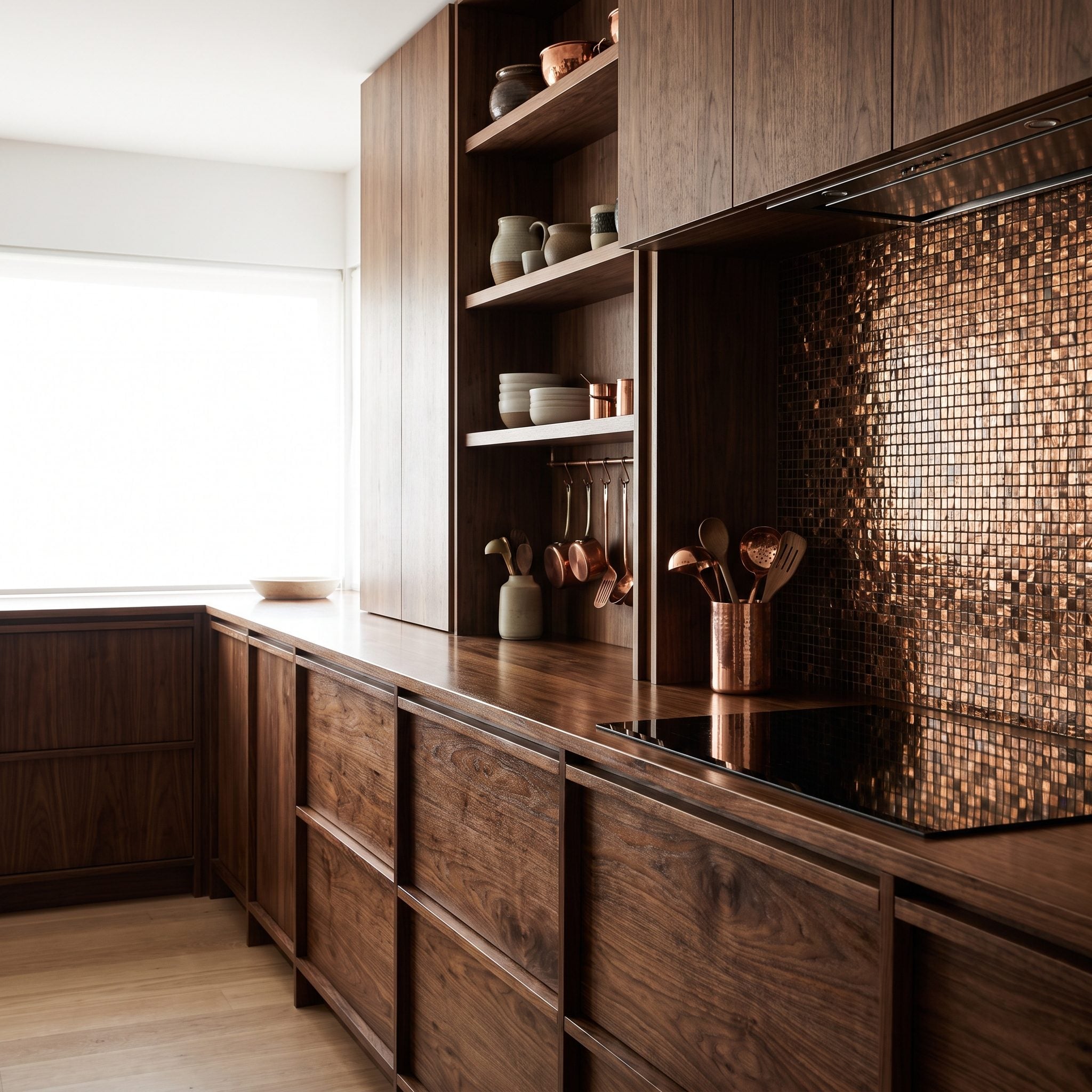
Rich walnut has its own pattern, warmth, and enough variation in the grain to reward a closer look. The brown-and-copper mosaic behind it supplied another dense field of small shapes. Hundreds of little squares were competing with one of the most beautiful natural patterns available to a kitchen.
Broad chalk-white porcelain panels replace the mosaic, allowing the walnut grain to establish the room’s rhythm. Mushroom-colored walls and dark-bronze handles reinforce the quieter composition. The wood becomes the decorative feature, with its color and grain providing all the visual complexity the room requires.
28. Pink-Beige Counters Were Making Olive Cabinets Look Muddy
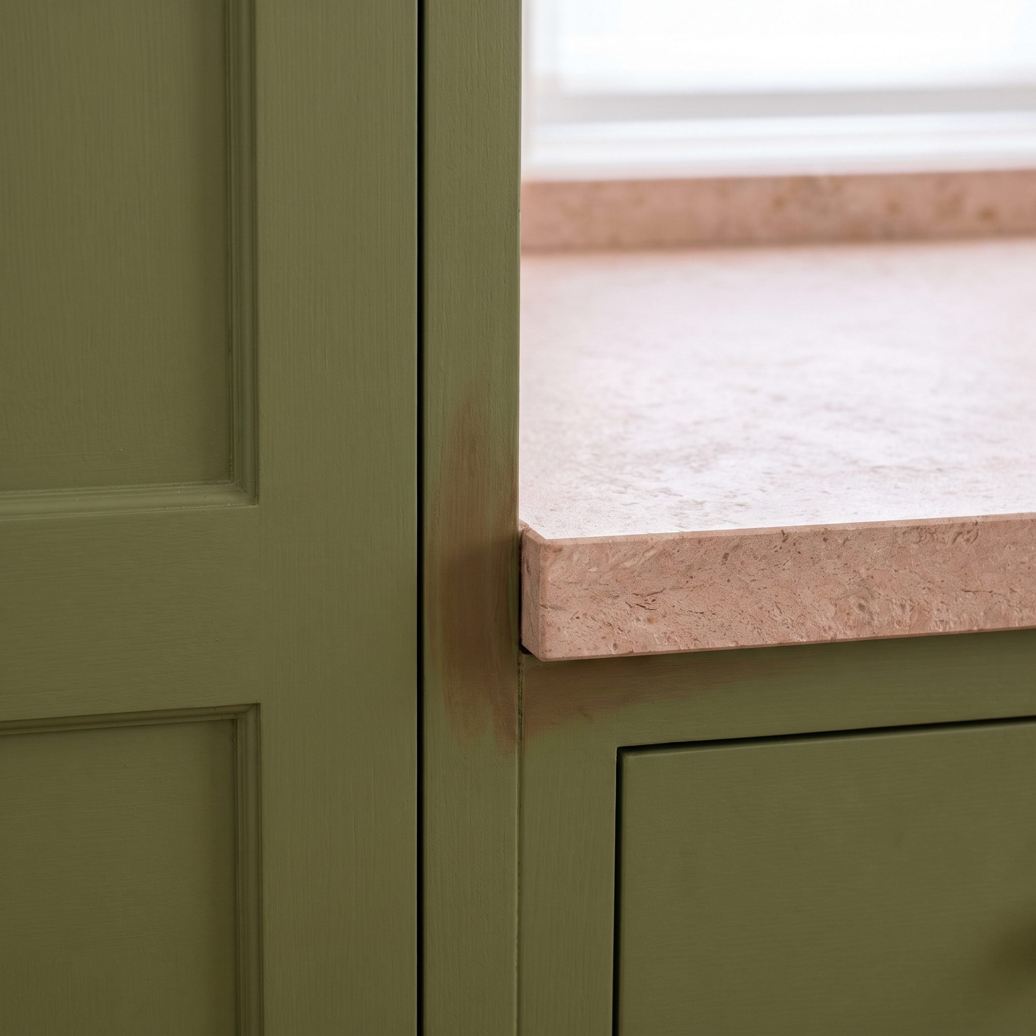
Olive green has a complicated relationship with neighboring colors. Pair it with the wrong pink-beige and the combination can lose the earthy richness that makes olive appealing. Here, the laminate countertops brought a competing undertone to the cabinetry, leaving both surfaces looking less convincing than they might have separately.
Honed charcoal soapstone establishes a deeper, cooler counterpoint to the olive. The warm wood floor and backsplash remain, while satin-pewter pulls and under-cabinet lighting complete the composition. The charcoal surface brings a welcome sense of depth, sharpening the olive cabinetry without sacrificing the kitchen’s warmth.
27. The Floor Pattern Was Shouting Over Gorgeous Quartzite
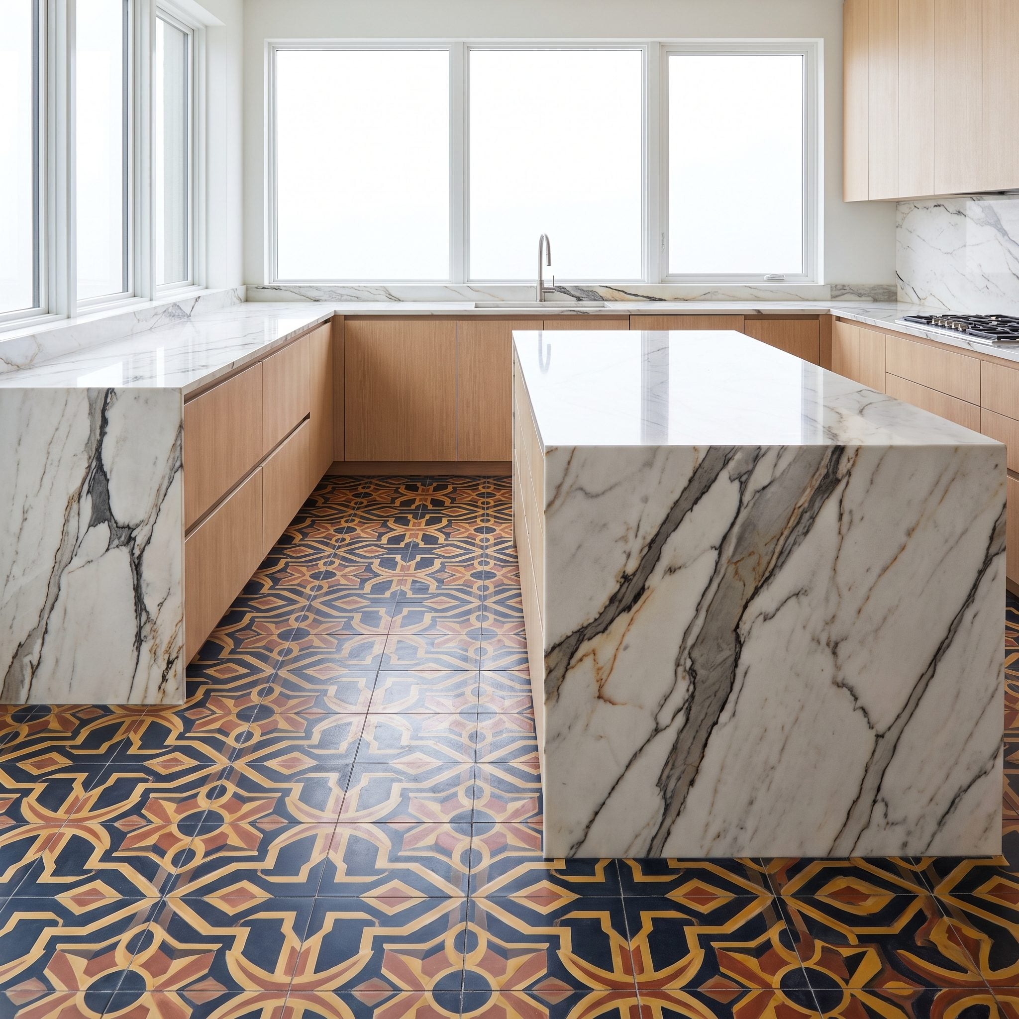
Beautiful quartzite doesn’t need a floor trying to outperform it. The stone’s expressive veining already gives the burgundy kitchen a compelling material feature. Busy patterned flooring introduced another assertive design element below, dividing attention between two surfaces that each demanded to be noticed.
Large matte pale-mauve-gray porcelain tiles create a quieter foundation while the cabinetry, countertops, and backsplash remain. The clear-glass pendants and brushed-nickel pulls sit within a more coherent composition. With the floor no longer introducing a competing pattern, the wine-colored quartzite veining becomes the obvious attraction.
26. A Four-Inch Backsplash Left the Navy Kitchen With an Awkward Gap
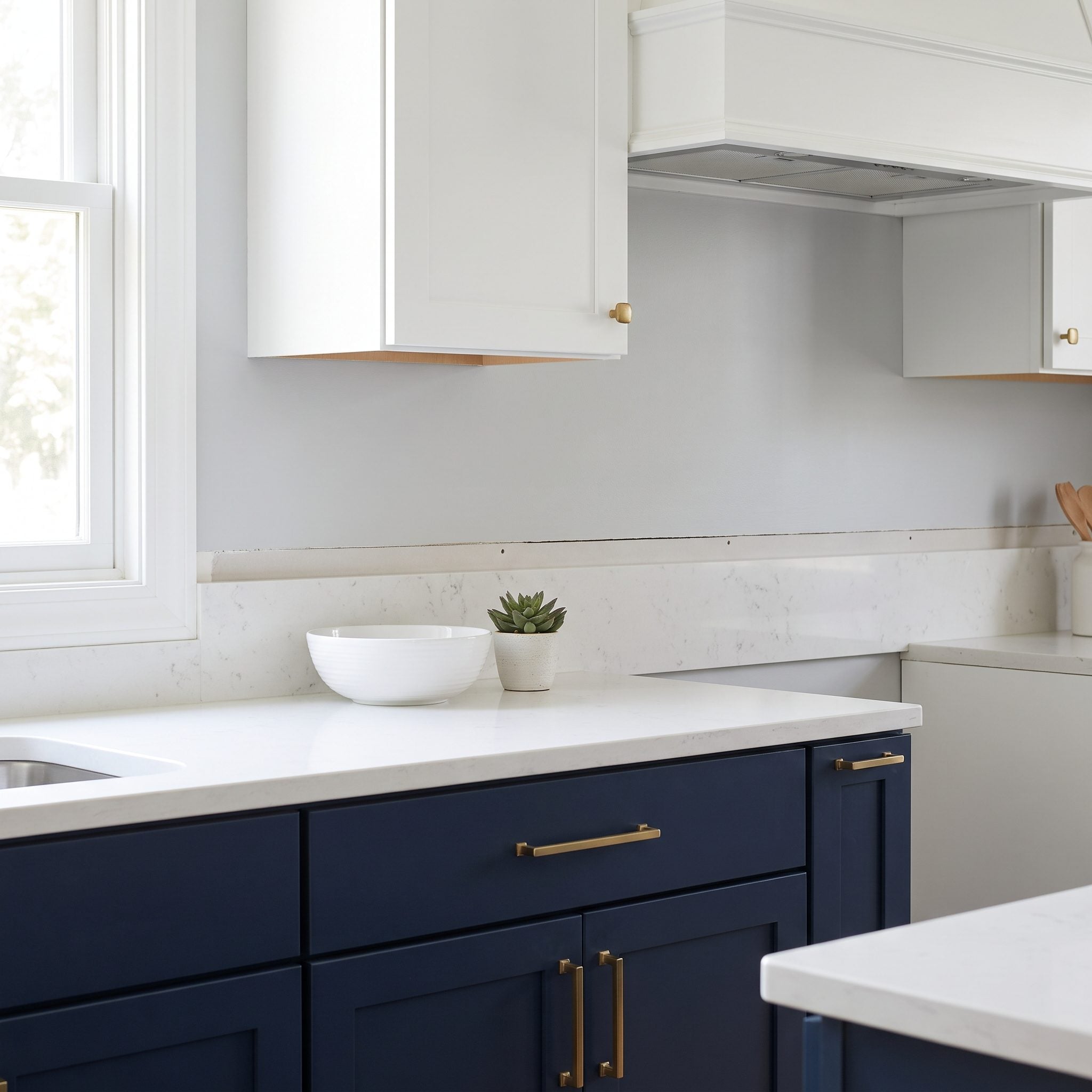
A short backsplash can be an elegant treatment, but this four-inch strip left a broad expanse of scuffed wall beneath the upper cabinets. The transition between white counters and navy cabinetry looked unresolved, with the backsplash contributing too little to the proportions of the wall.
Vertically stacked white ceramic tile extends to the cabinet undersides and continues around the hood. Subtle gray grout introduces a measured rhythm, while polished-nickel hardware provides a crisp finish. Countertop, wall, and upper cabinetry now read as a complete architectural composition rather than three disconnected bands.
25. Too Much Gloss Turned Every Surface Into a Competing Reflection
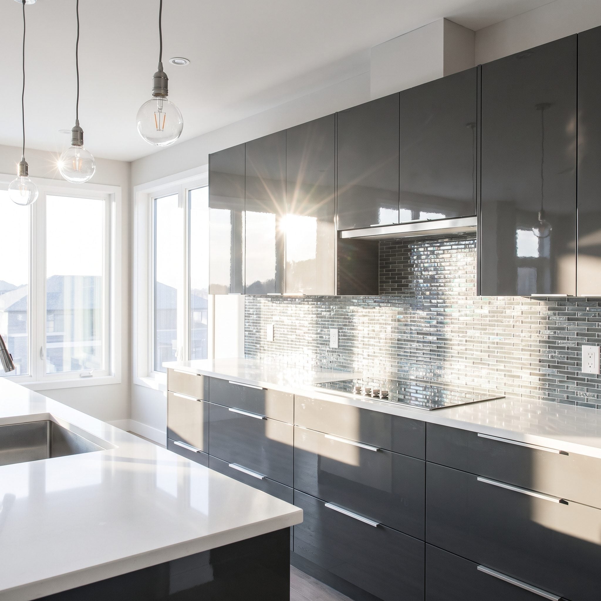
Glossy cabinets, polished counters, reflective mosaic tile, and exposed bulbs can produce a room with more glare than glamour. Every surface catches light differently, creating a restless collection of reflections. Shine stops being a finishing detail and becomes the dominant experience.
Satin warm-taupe cabinetry and matte ivory backsplash tile reduce the number of reflective surfaces, allowing the polished white counters to provide the principal sheen. The result retains luminosity without requiring every finish to sparkle. A few carefully chosen highlights are far more effective than a roomful of competing ones.
24. Thick Countertop Edges Were Giving Espresso Cabinets a Heavy Silhouette
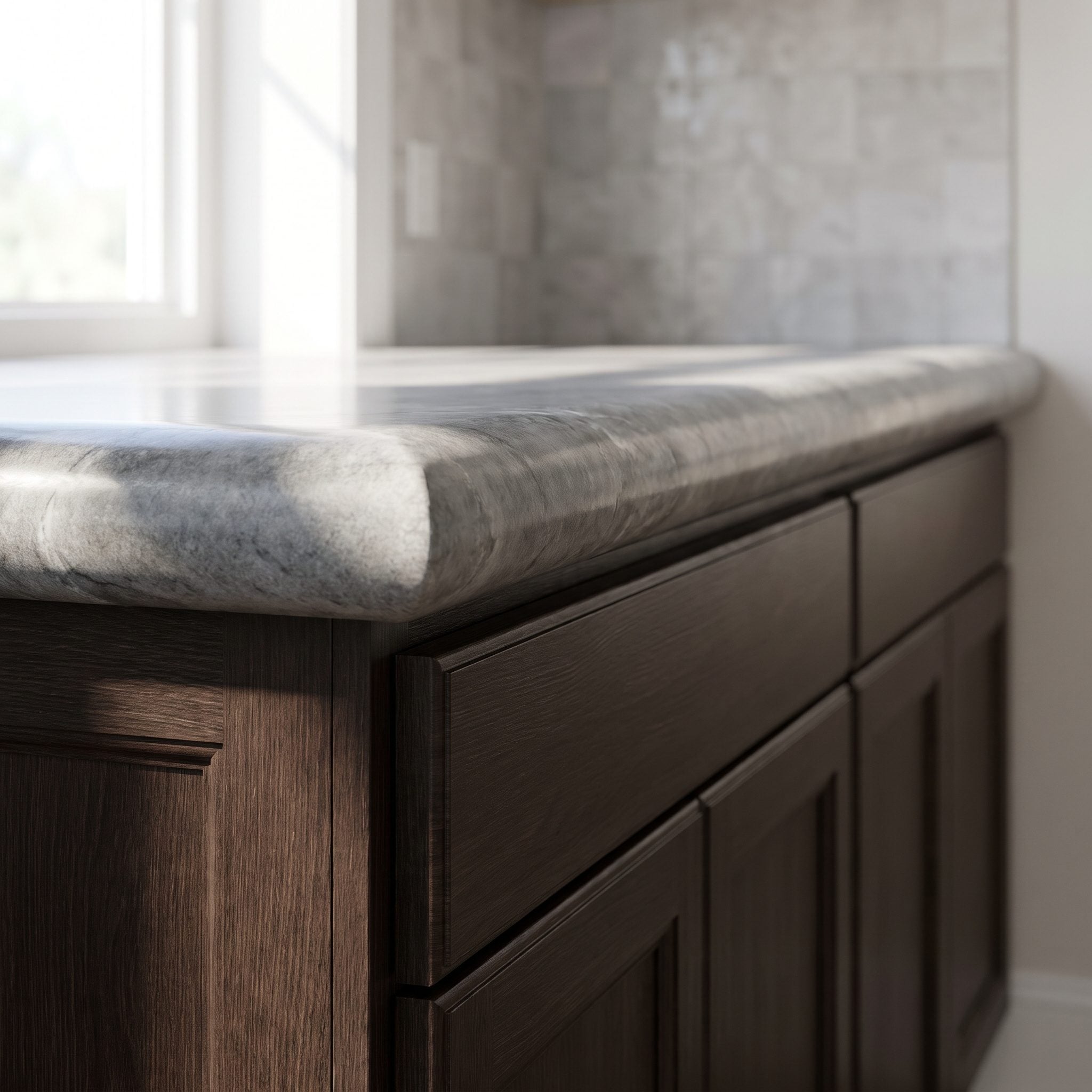
An unusually thick, rounded countertop edge gives this kitchen more ornament than its cabinet doors suggest. Add a decorative backsplash border above it, and two heavy horizontal bands begin to dominate the room. The espresso cabinetry becomes visually entangled with details that make the entire composition feel bulkier.
Warm-gray porcelain counters with a slimmer eased edge replace the oversized profile. Matching backsplash panels eliminate the decorative border, while small satin-steel pulls and a restrained ceiling fixture reinforce the cleaner geometry. The cabinetry retains its substantial dark finish, but the surrounding lines are considerably sharper.
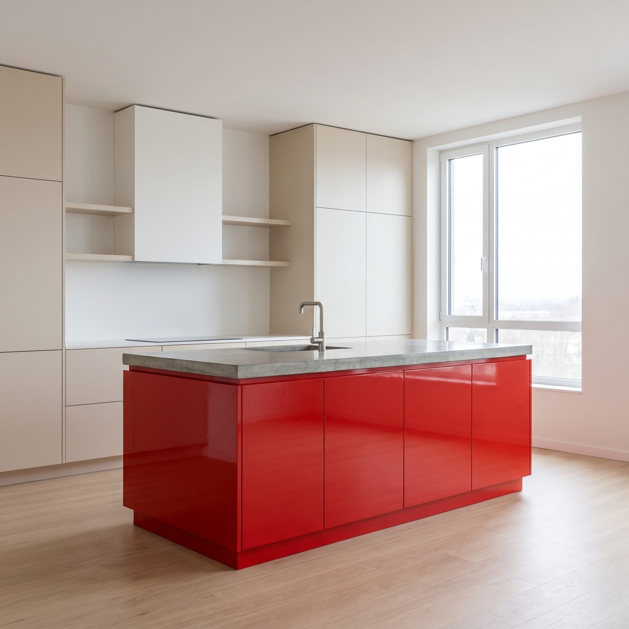
23. The Red Island Looked Like It Had Arrived From Another Kitchen
🔥 Would you like to save this?
A red island can be spectacular when the surrounding kitchen supports it. Here, the saturated color had little connection to the counters, flooring, or cabinetry. Instead of creating a deliberate focal point, the island seemed visually detached from the room it occupied.
Muted graphite paint, echoing tones in the countertop veining, gives the island a stronger relationship with its surroundings. Two smoked-glass pendants replace the mismatched fixtures, and brushed-steel hardware brings the finishes together. The island retains its identity without demanding an entirely separate color scheme.
22. Ornate Accessories Were Making Rich Cherry Cabinets Look Older Than They Needed To
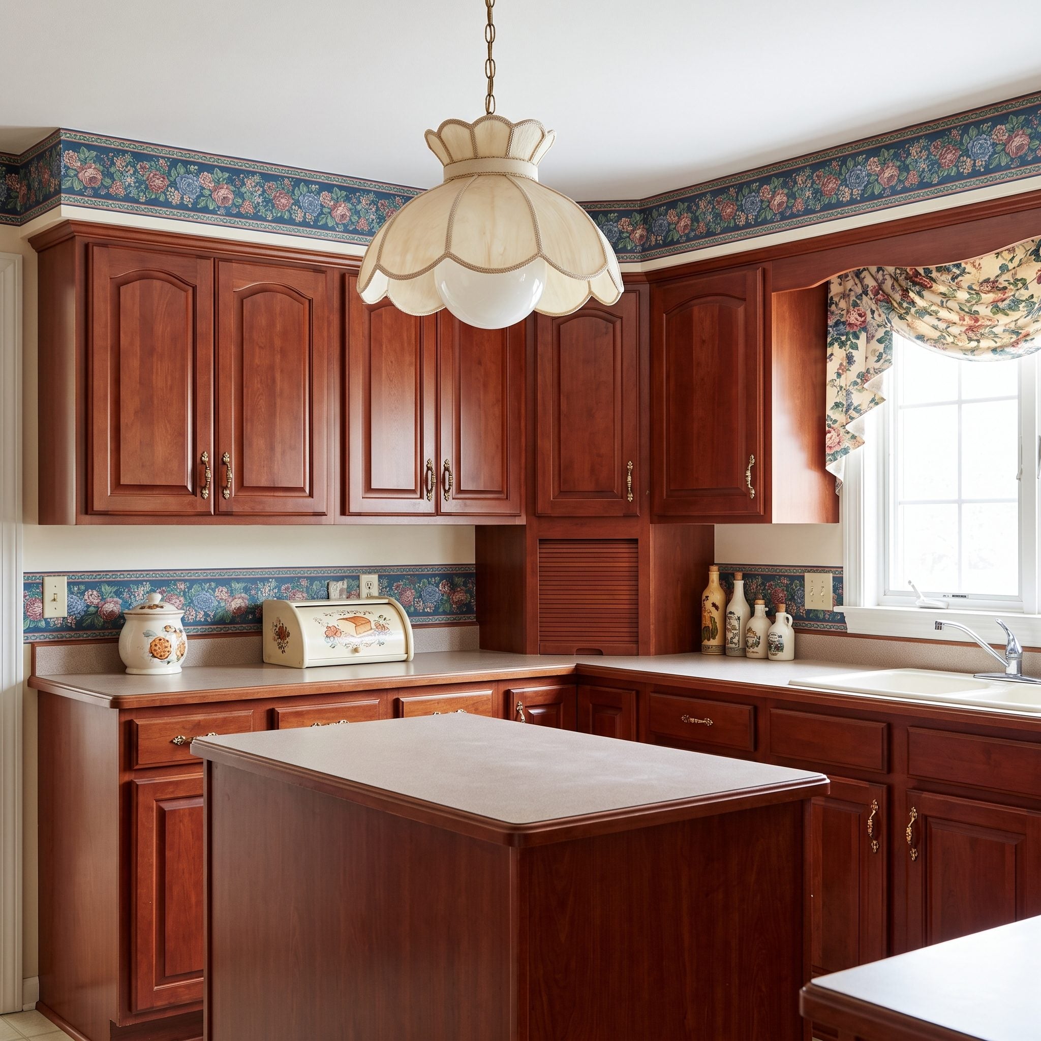
Cherry cabinetry brings warmth, depth, and distinctive grain. Floral backsplash borders, elaborate brass handles, and scalloped pendant shades pile on another layer of decoration. The kitchen’s traditional character becomes an accumulation of ornaments rather than a confident expression of its materials.
Warm-gray porcelain panels simplify the backsplash, slender brushed-nickel pulls replace the elaborate hardware, and cylindrical opal pendants introduce cleaner shapes overhead. Pale mushroom walls provide a softer background. The cherry remains the dominant material, now presented with considerably more restraint.
21. A Generous Horseshoe Kitchen Was Disappearing Beneath a Restless Floor
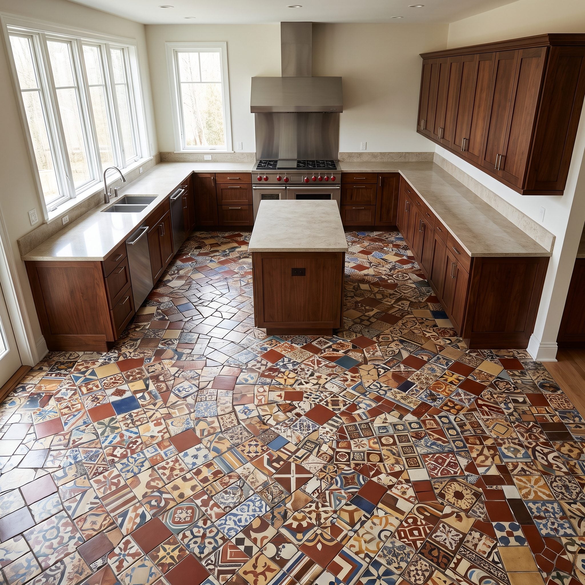
The horseshoe layout already offered generous circulation and a clear working arrangement. Small diagonal black-and-white floor tiles created a dense network of lines beneath the cabinetry, making the room look busier than its generous dimensions warranted.
Large matte warm-gray porcelain tiles, installed in a simple grid, create a more continuous ground plane. Sage cabinets, counters, and backsplash stay in place. With fewer joints and less directional pattern, the floor becomes a background rather than the main event. The room hasn’t gained an inch of space, but its existing dimensions are considerably easier to appreciate.
20. A Dark Backsplash Was Leaving the Worktops in the Shadows
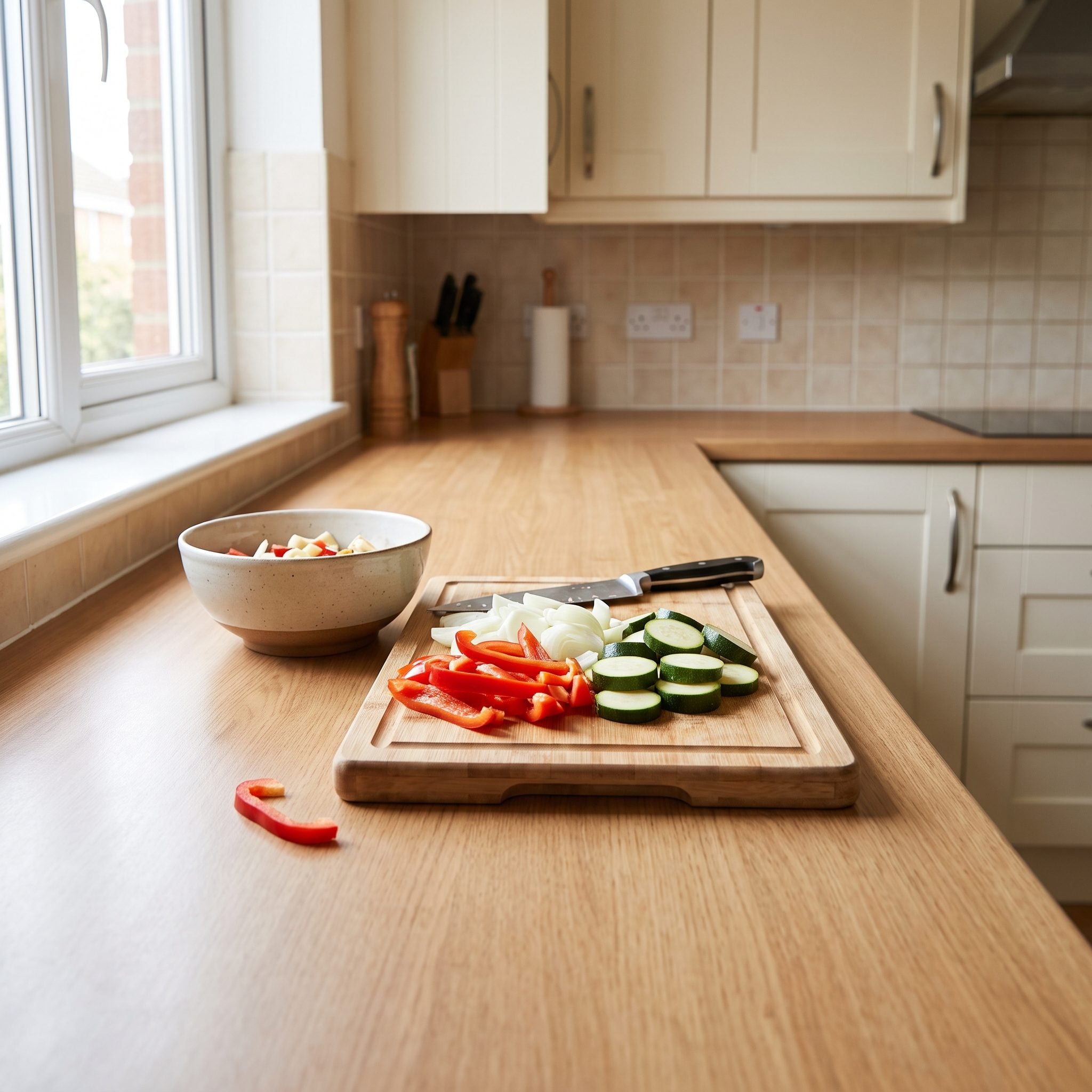
Beautiful walnut loses much of its appeal when the preparation surfaces are poorly lit. A dark-brown backsplash offered little reflected light, while ceiling fixtures positioned behind the main work zone created shadows where clear visibility mattered most. The room had handsome materials and an unconvincing lighting arrangement.
Satin almond-colored backsplash tile brightens the wall plane, and shielded under-cabinet strips direct light onto the worktops. Adjusted ceiling lighting provides a more useful general layer. The walnut retains its rich color, but food preparation no longer depends on overhead illumination alone. The practical improvement is every bit as important as the visual one.
19. Orange Floor Tiles Were Turning an Ivory-and-Charcoal Kitchen Peachy
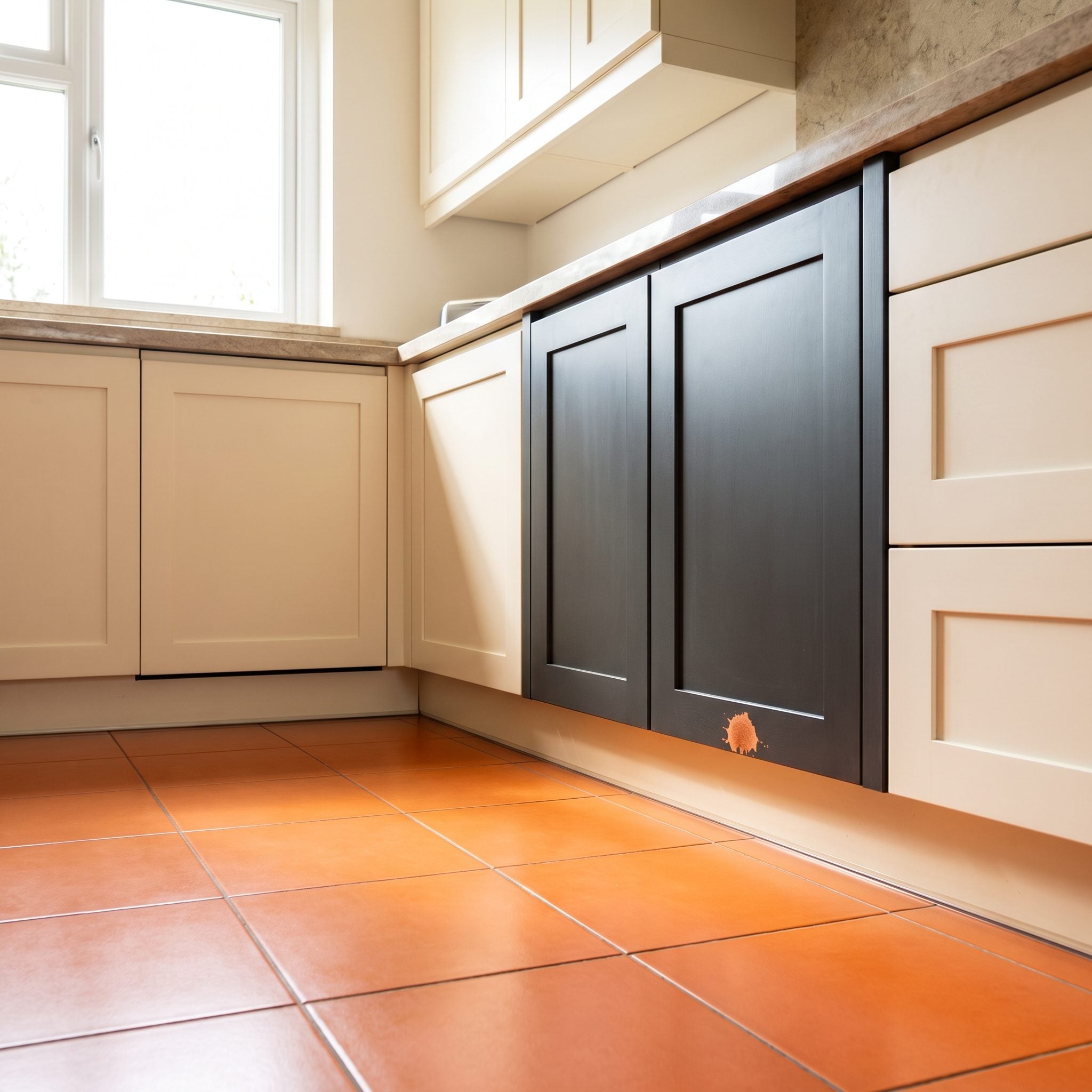
Ivory cabinetry and charcoal counters should have been a straightforward, sophisticated pairing. The orange-brown floor introduced a stronger warm undertone than either surface could comfortably accommodate. Against that saturated base, the ivory took on a peachier appearance, and the palette lost some of its intended clarity.
Large matte sand-colored porcelain with a limestone-like finish provides a gentler transition between the light cabinetry and dark countertops. Muted stone walls and compact charcoal pulls reinforce the arrangement. The new floor remains warm, but its quieter undertone no longer dominates the room.
18. Harsh Fluorescent Lighting Was Giving Good Finishes a Hospital-Corridor Glow
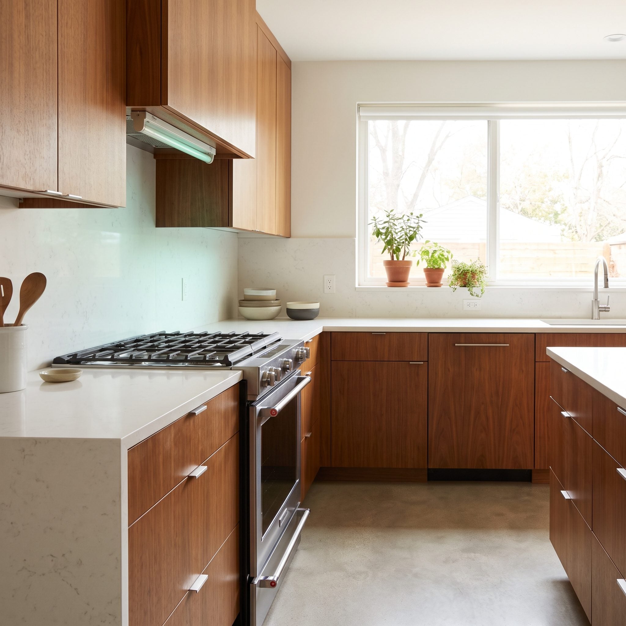
A glaring fluorescent ceiling box can make even respectable finishes look tired, particularly when its light is poorly distributed or renders colors unflatteringly. In this galley, the gray cabinets and white counters sat beneath a harsh overhead source that flattened the room’s appearance and emphasized its utilitarian character.
Diffused opal fixtures and continuous shielded task lighting create a more balanced scheme. Glossy pale-blue backsplash tile replaces the yellowed original, while a soft-white ceiling helps distribute the new light. The gray cabinetry remains, but the kitchen acquires a much more considered combination of ambient and working illumination.
17. Yellow Cabinets Were Drowning Out the Green Veining in the Quartzite
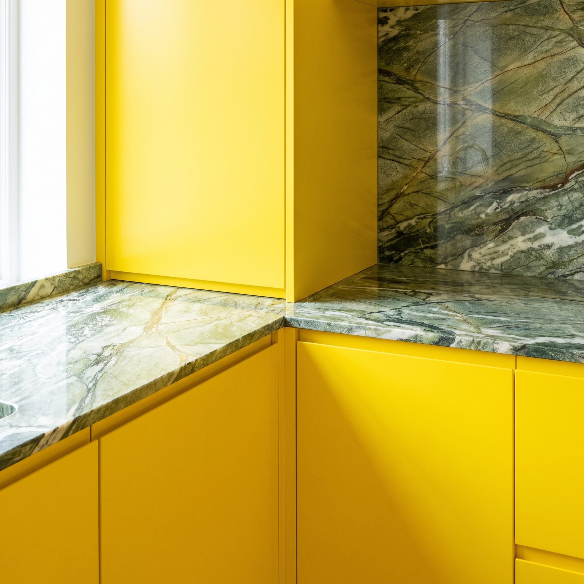
Green-veined quartzite is hardly a timid material, but bright-yellow cabinetry can overpower even an expressive stone. The competing colors made the countertops appear less integrated into the kitchen, as though two strong design decisions had been made independently and never reconciled.
Muted eucalyptus paint draws from the quartzite’s green veining, giving the cabinets a direct connection to the existing stone. Dark-pewter handles and soft-white ceiling fixtures keep the surrounding details restrained. The quartzite becomes the foundation of the color scheme rather than a surface struggling to coexist with it.
When the countertop is worth keeping, let its undertones help guide the cabinet color. A good material can establish the palette for the entire kitchen.
16. A Rough Faux-Stone Backsplash Was Picking a Fight With Sleek Graphite Cabinets
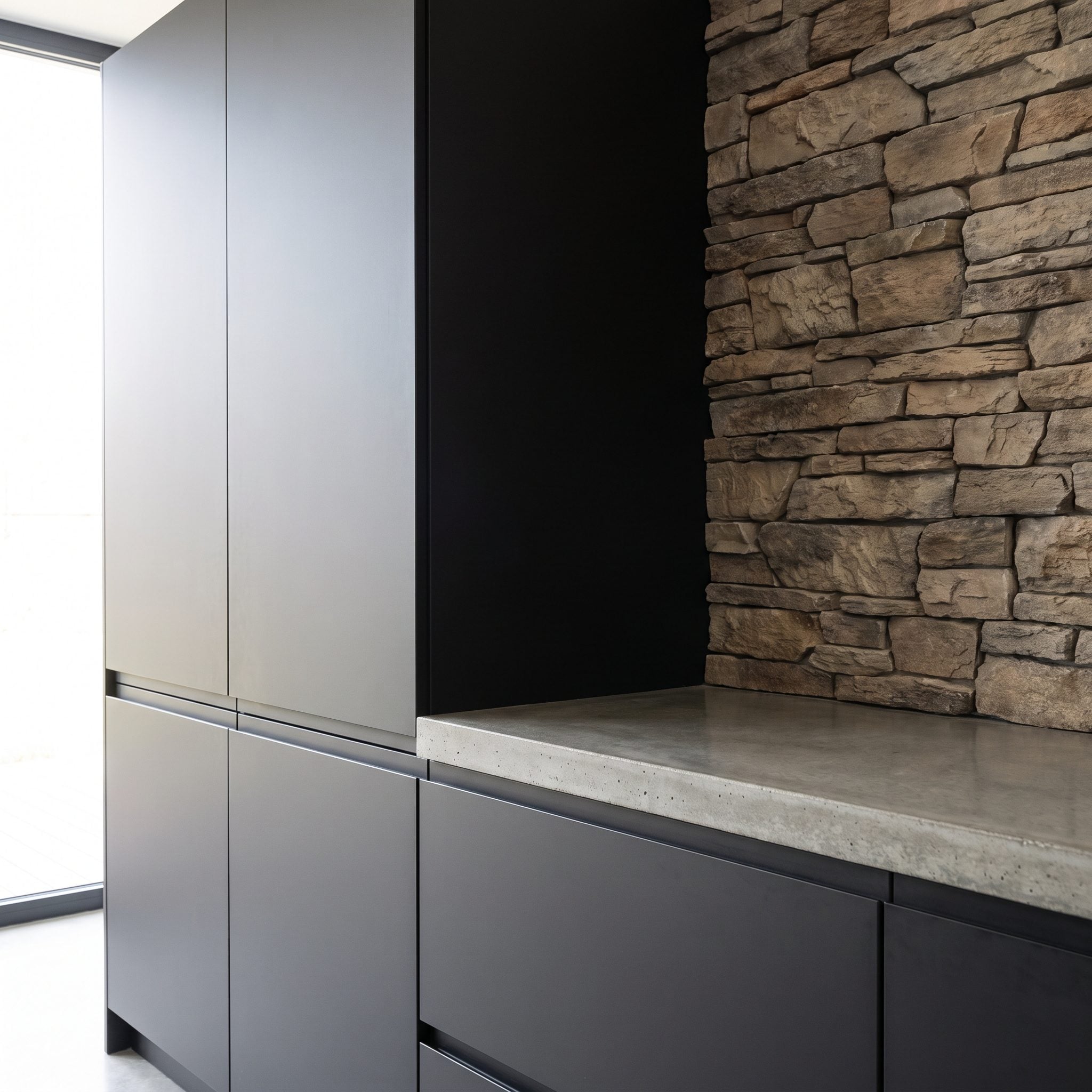
Flat-front graphite cabinetry is all about uninterrupted planes and precise edges. The chunky faux-stone backsplash introduced an entirely different design language: rough texture, irregular shapes, and pronounced relief. The combination offered two competing architectural personalities with very little connecting them.
Brushed-stainless backsplash panels bring the wall into closer alignment with the cabinetry’s contemporary geometry. Minimal stainless pulls and a slender linear ceiling fixture continue the restrained industrial character. The counters and cabinet footprint remain. Smooth surfaces, controlled texture, and metallic detail give the kitchen a coherent visual vocabulary.
15. Patchwork Flooring Was Cutting One Kitchen Into Three Different Rooms
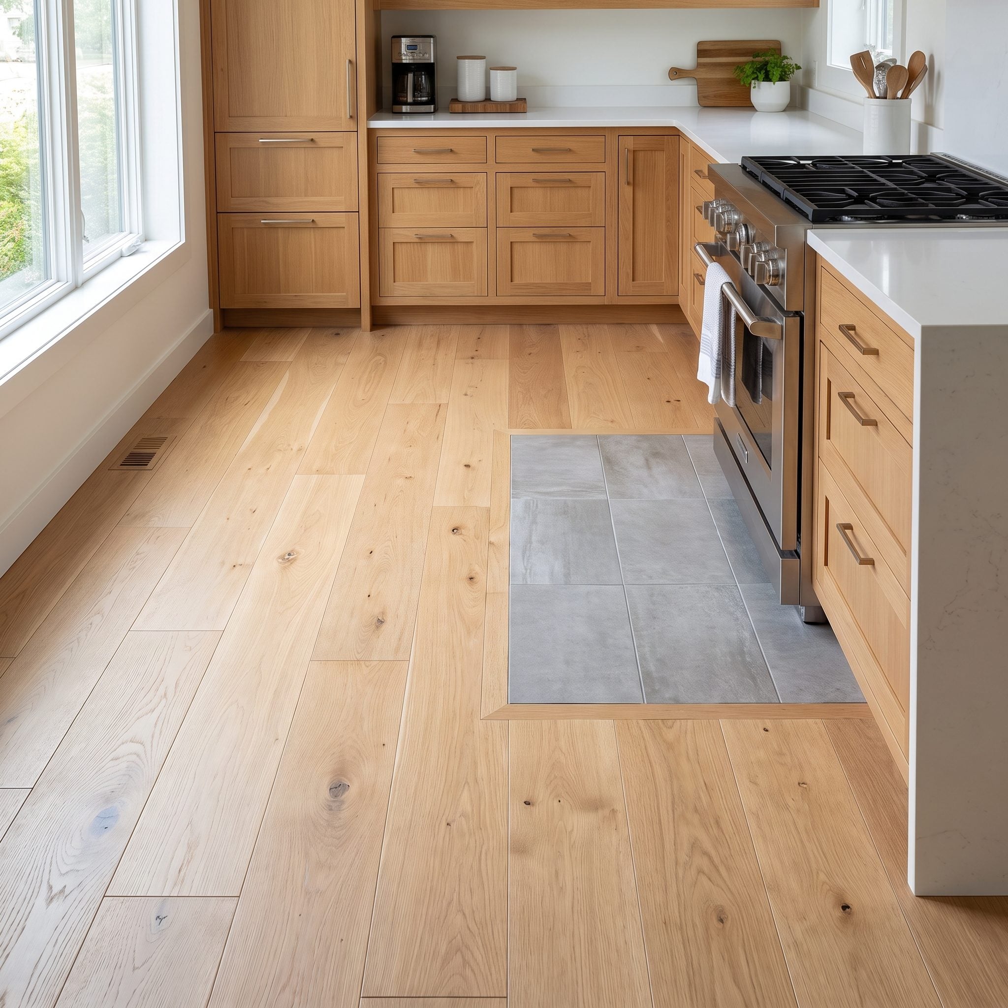
One section of tile meets another, then a patch of vinyl interrupts the sequence. The result is a kitchen divided by flooring transitions rather than walls. Each change of material creates another boundary, making the L-shaped layout feel more fragmented than its actual arrangement requires.
A continuous installation of pale oak-look porcelain removes those interruptions and gives the room a consistent foundation. Soft flax walls and a linen drum fixture reinforce the calmer finish. The uninterrupted flooring allows the kitchen to read as one continuous space, with the L-shaped cabinetry providing the structure rather than the seams beneath it. The footprint hasn’t changed. The unnecessary visual boundaries have disappeared.
14. A Bland White Kitchen Found Its Personality in Oxblood Tile
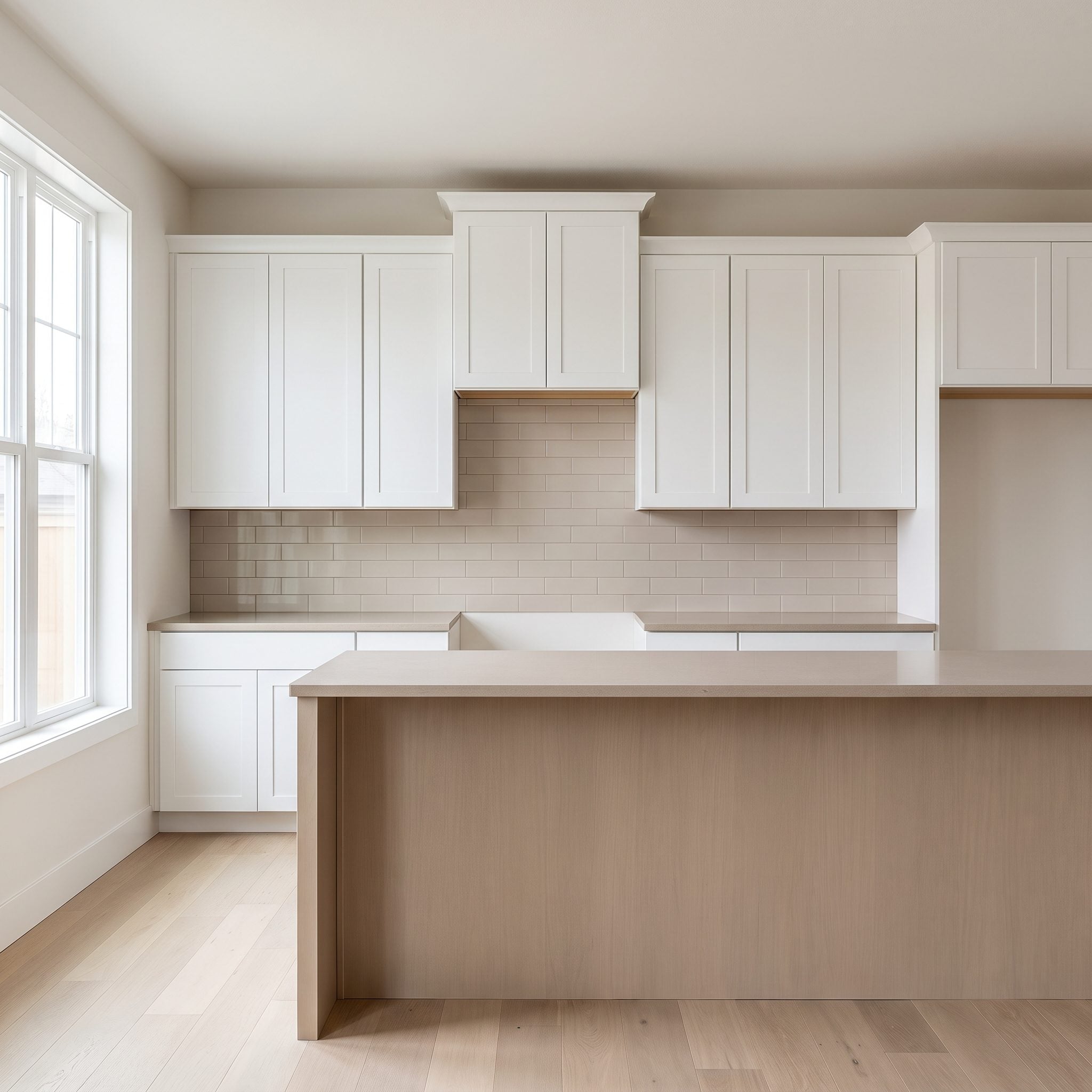
White cabinets, white quartz, gray flooring, beige backsplash. Nothing was particularly objectionable, but the collection offered little tension, depth, or memorable detail. The kitchen was so determined to remain neutral that its surfaces barely registered as separate design decisions.
Deep oxblood glazed square tile changes the atmosphere immediately. The saturated color gives the white cabinetry a dramatic backdrop, while matched grout keeps the tile pattern from becoming excessively busy. Brushed-nickel handles and even task lighting support the new focal surface. The cabinets remain untouched. The backsplash supplies the missing personality.
A backsplash can be the kitchen’s boldest material without forcing every other surface to compete. Sometimes one decisive color is enough.
13. An Ambered Finish Was Concealing the Quiet Beauty of Maple
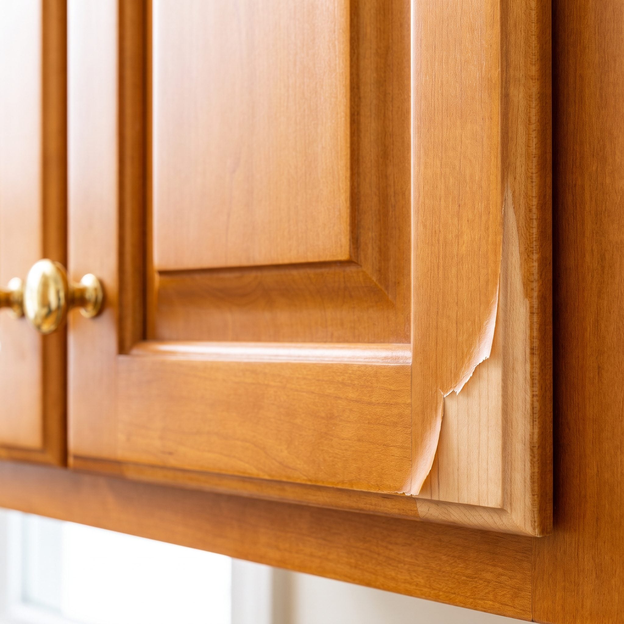
Maple’s relatively fine grain can be attractive without a heavy orange-yellow finish emphasizing every surface. In this kitchen, the ambered cabinetry dominated the palette, giving the wood a stronger golden cast than the charcoal counters and white backsplash needed.
A pale neutral refinish reveals a softer version of the maple, allowing its grain to remain visible without the saturated amber tone. Brushed-steel pulls and opal fixtures reinforce the more restrained finish. The charcoal counters and white backsplash gain a clearer relationship with the cabinetry. The wood remains central to the design, with its color brought under control.
12. A Copper Hood Looked Lonely Until the Rest of the Kitchen Caught Up
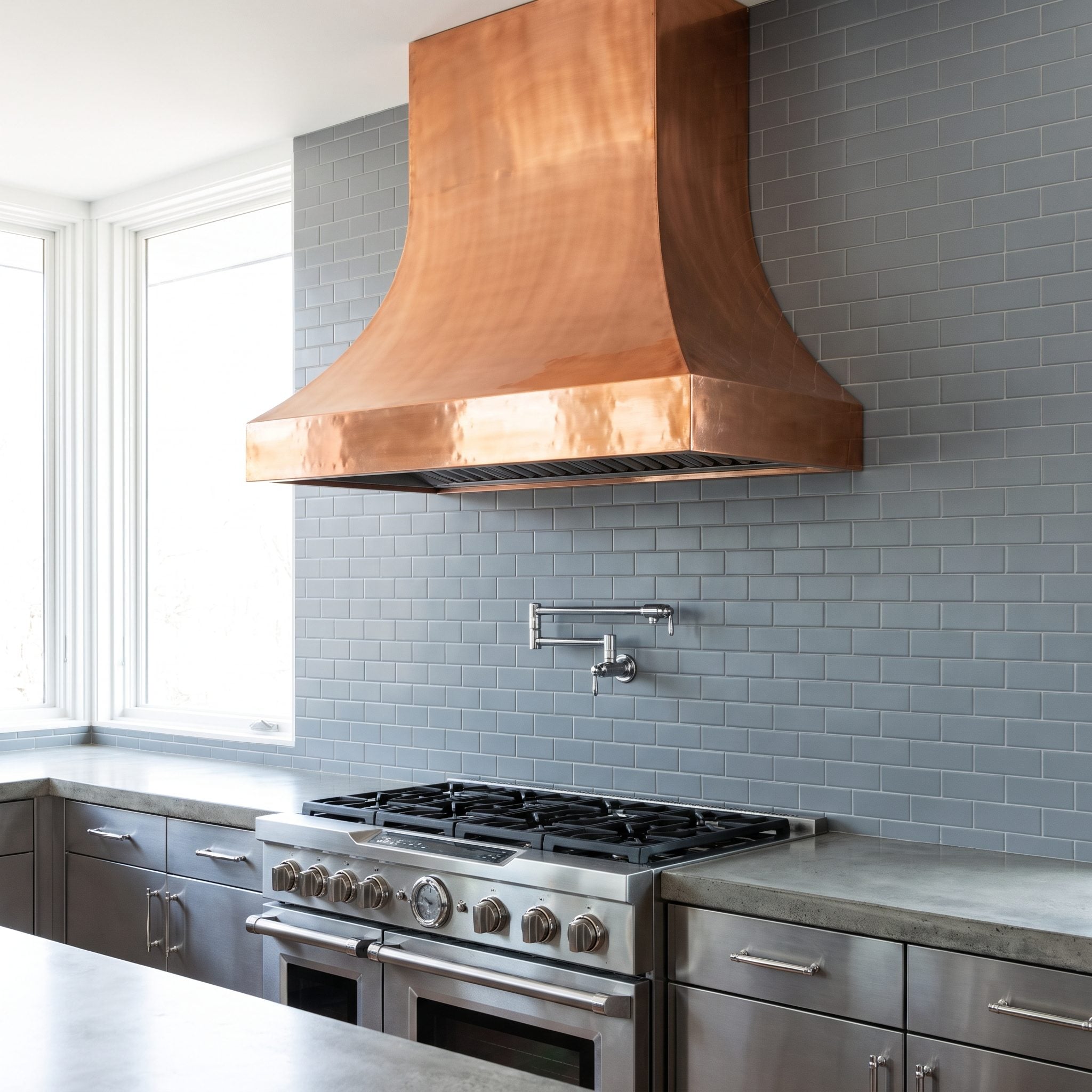
A copper range hood brings warmth, patina, and a distinctly architectural presence. Against cool-gray tile and chrome hardware, however, its reddish metallic finish appeared isolated from the rest of the palette. The hood was an attractive feature without enough visual connection to its surroundings.
Warm-ivory backsplash tile, understated copper pulls, soft parchment walls, and warmer task lighting create a setting that supports the hood. Cabinets, counters, flooring, and the copper centerpiece remain. A few carefully placed metallic echoes give the range wall a more convincing relationship with the rest of the kitchen.
11. A Black Backsplash Was Making a Compact Galley Feel Even Darker
🔥 Would you like to save this?
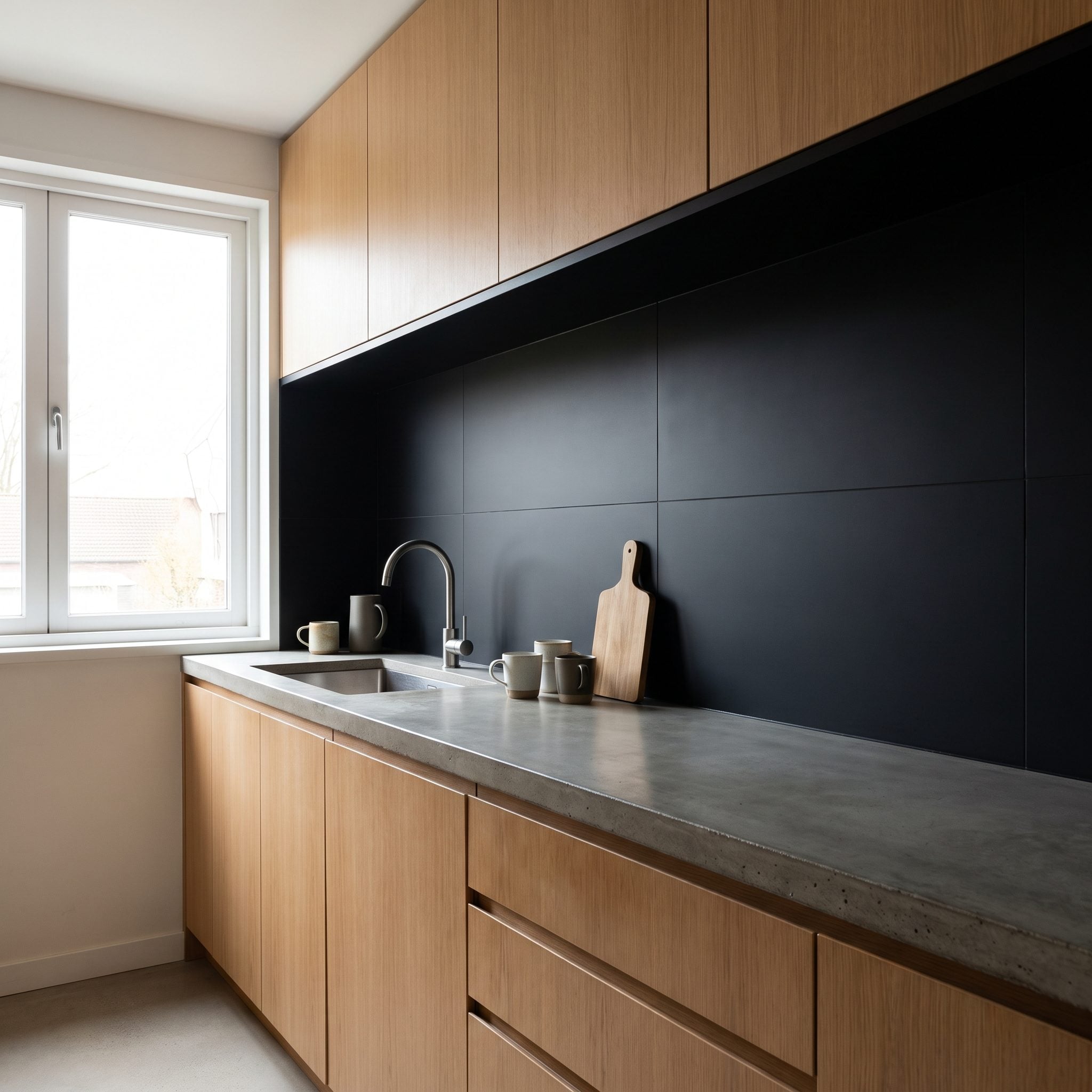
Black lower cabinets and oak uppers create an appealing contrast, but the matte-black backsplash added another broad dark surface between them. In a compact galley with limited natural light, that wall treatment reduced the amount of light reflected into the room and made the central working area feel heavier.
Glossy pale-celadon tile introduces a lighter, more reflective surface beneath the oak uppers. Shielded under-cabinet strips improve illumination at the counters, while the black lower cabinets retain their dramatic character. The brighter central wall gives the existing cabinet arrangement more depth and definition.
10. A Peninsula Painted Dark Green Was Dividing a Beige Kitchen in Two
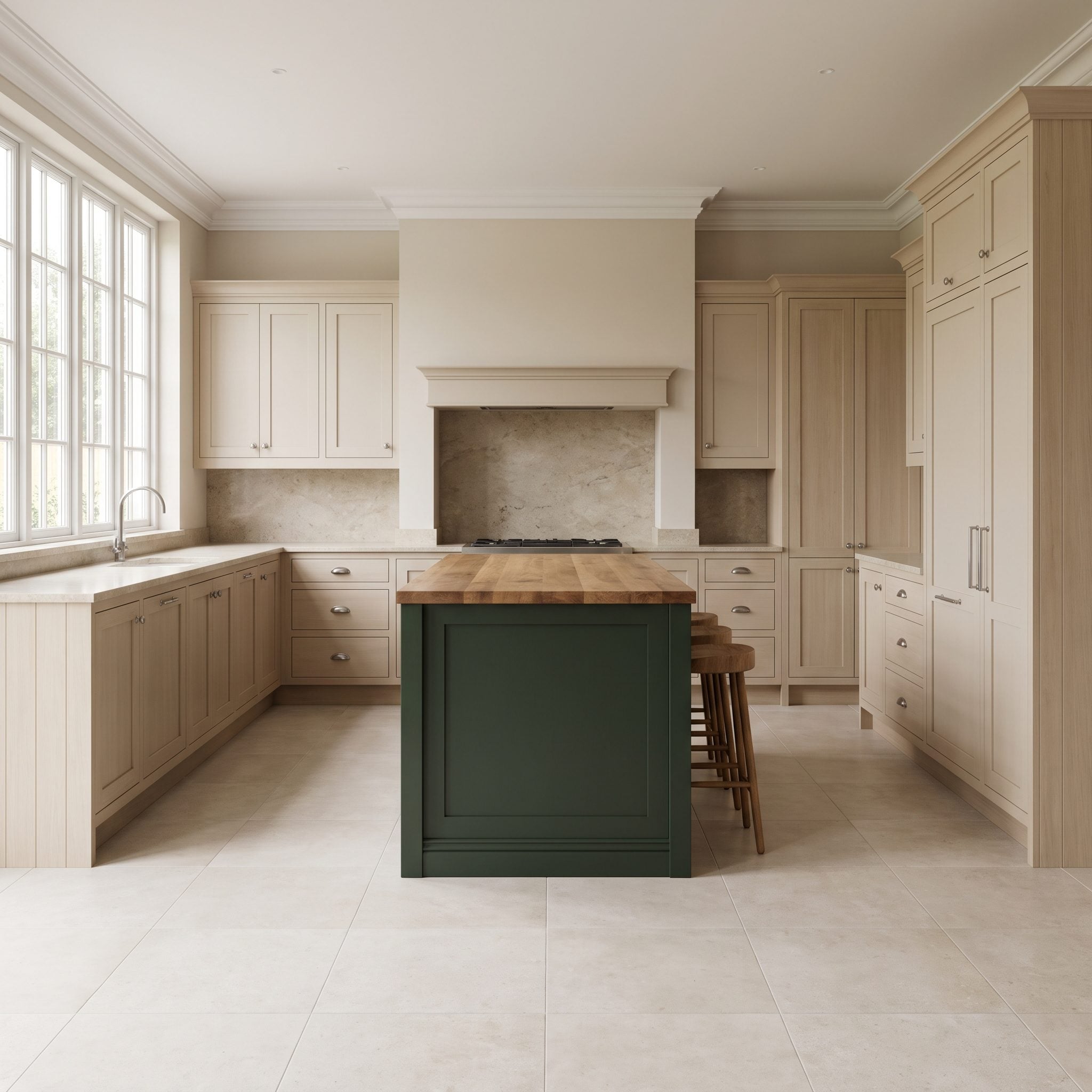
The dark-green peninsula creates a strong visual division across an otherwise beige kitchen. Instead of reinforcing a deliberate focal point, the color makes the peninsula appear disconnected from the surrounding cabinet runs. The room feels divided by a finish rather than organized by its layout.
Warm putty paint brings the perimeter and peninsula into one continuous palette. The white counters and neutral floor remain, while a muted amber-glass backsplash and dark-bronze pulls introduce depth. The peninsula now belongs to the main cabinet composition, giving the kitchen a more unified appearance without changing its footprint.
9. A Peach Backsplash and Stark Ceiling Were Undermining Warm Oak
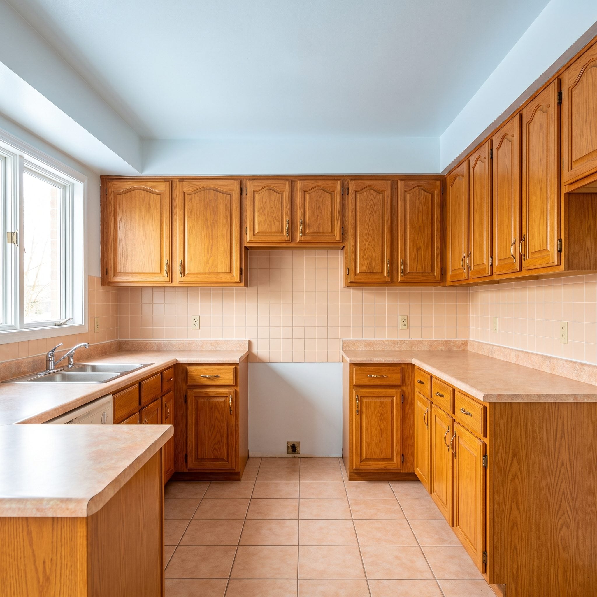
Oak cabinetry carries natural warmth, but the surrounding finishes weren’t helping it. A peach backsplash introduced another pronounced undertone, while a stark ceiling and harsh spotlights gave the upper half of the room a much colder character. The kitchen felt assembled from finishes with competing ideas about color temperature.
Matte sand porcelain replaces the peach tile, and pale warm-stone paint softens the ceiling. Shallow diffused fixtures and concealed under-cabinet strips provide a more balanced lighting scheme. The oak and sand-colored counters remain, but the palette now moves through related warm neutrals rather than lurching between peach, bright white, and wood.
8. Chipped Tile and Tarnished Knobs Were Making Good Birch Look Neglected
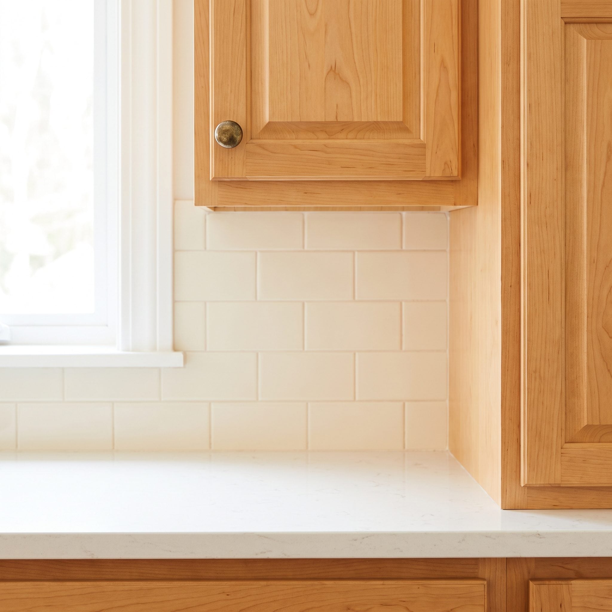
Honey birch cabinetry and gray counters form a workable foundation. The details around them were less convincing: chipped white backsplash tile, dull cabinet knobs, and dated pendant fixtures. Individually, each problem was modest. Together, they gave the kitchen a worn appearance that distracted from the cabinetry’s natural grain.
Soft-apricot ceramic tile introduces gentle color and glaze variation, satin-bronze pulls provide a warmer metallic finish, and two ribbed-glass pendants give the island a more considered lighting arrangement. The birch remains untouched. Three coordinated improvements remove the tired details that had been defining the room.
7. Two Beautiful Patterns Were Ruining Each Other’s Best Features
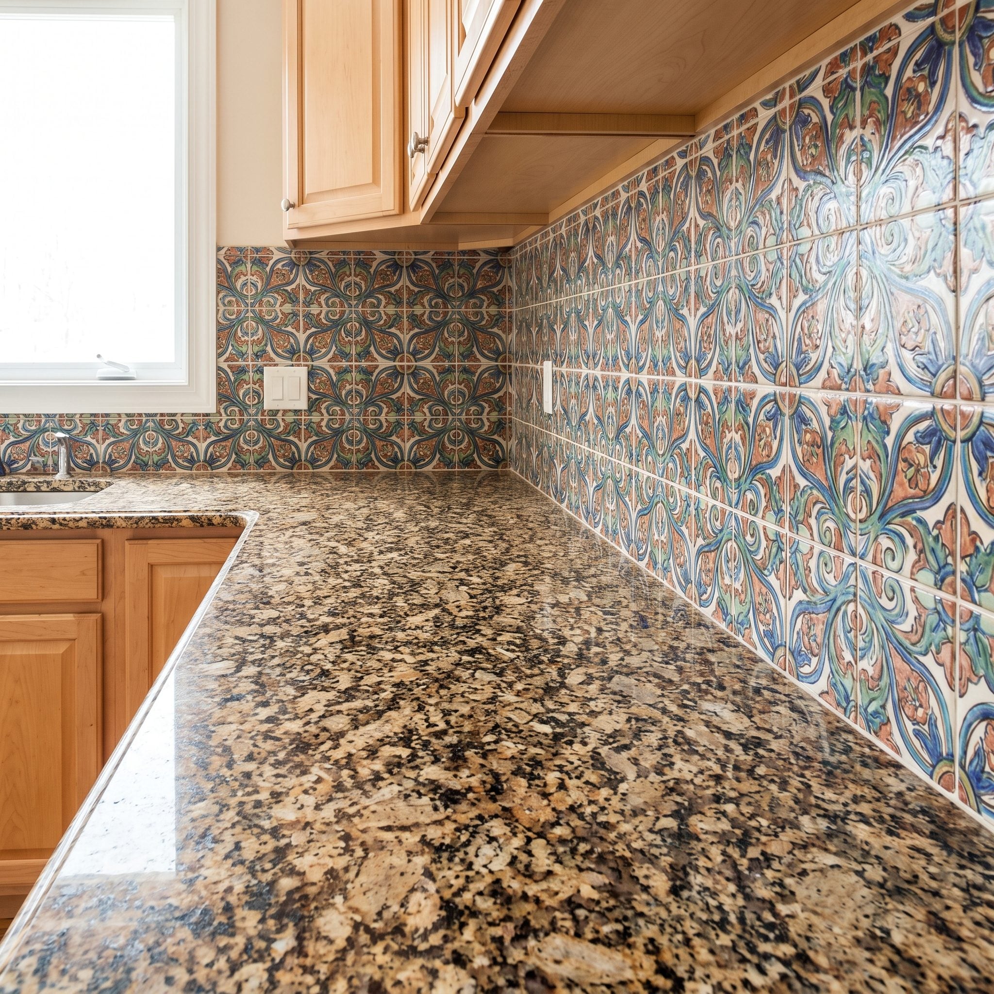
Expressive granite can make a kitchen memorable. An equally assertive backsplash can make it exhausting. Here, two dense patterns occupied adjacent surfaces, each introducing movement, color variation, and visual detail. Neither had sufficient space to establish itself as the dominant material.
Smooth porcelain in a warm-gray tone drawn from the granite’s quieter background replaces the competing backsplash. Concealed lighting, small satin-pewter handles, and an understated floor reinforce the calmer arrangement. The granite’s veining becomes the principal decorative feature, supported by materials that give it room to register.
6. The Range Wall Had Everything Except a Reason to Look at It
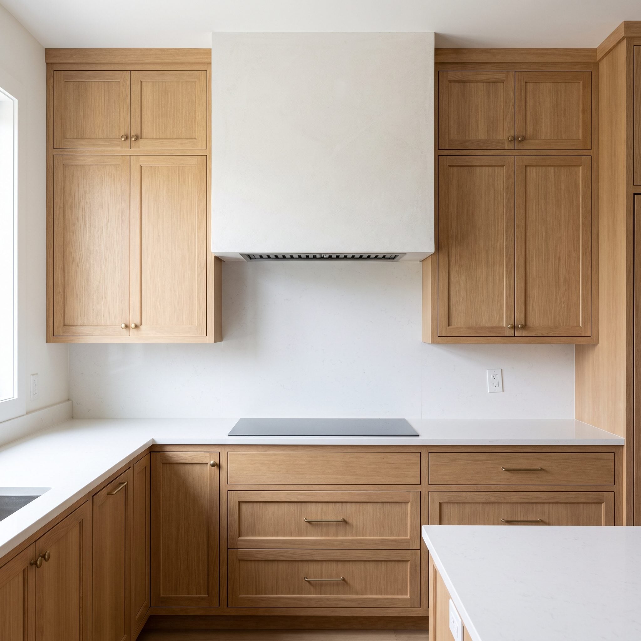
The taupe-and-white kitchen offered little visual distinction around its most prominent working wall. The cabinetry and quartz counters were restrained, and the backsplash continued that restraint so thoroughly that the range area barely registered as a separate composition.
Blue-gray marble-look porcelain introduces movement behind the range, framed by the existing upper cabinets. Quieter pale-gray tile fills the surrounding backsplash, while brushed-nickel cabinet knobs remain understated. The expressive tile occupies a contained zone, giving the kitchen a clear focal point without requiring the entire wall to become a feature.
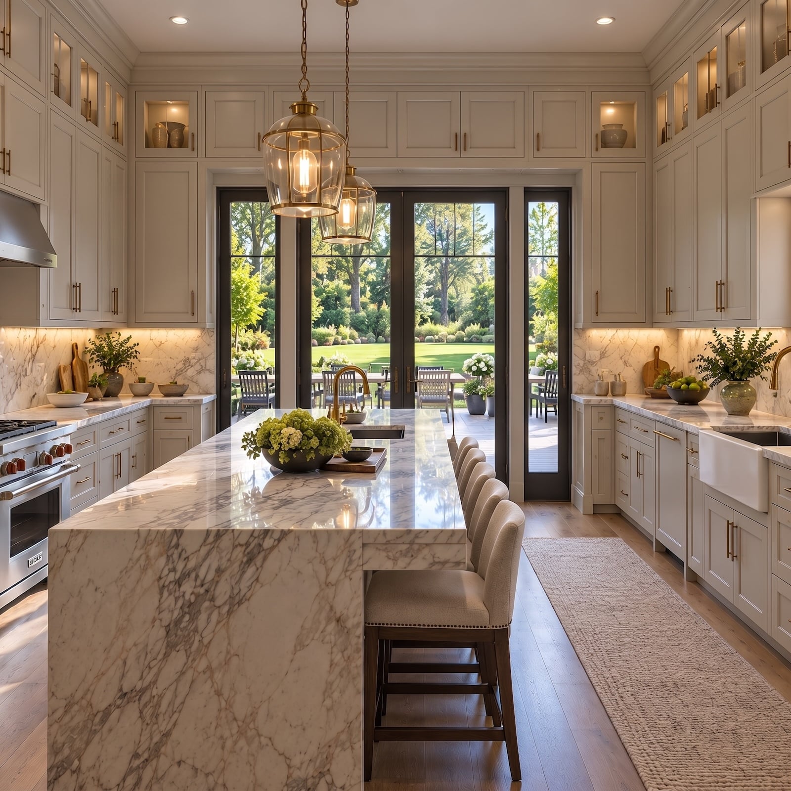
5. The Cabinets Took Every Inch of Wall. The Kitchen Lost Its Breathing Room.
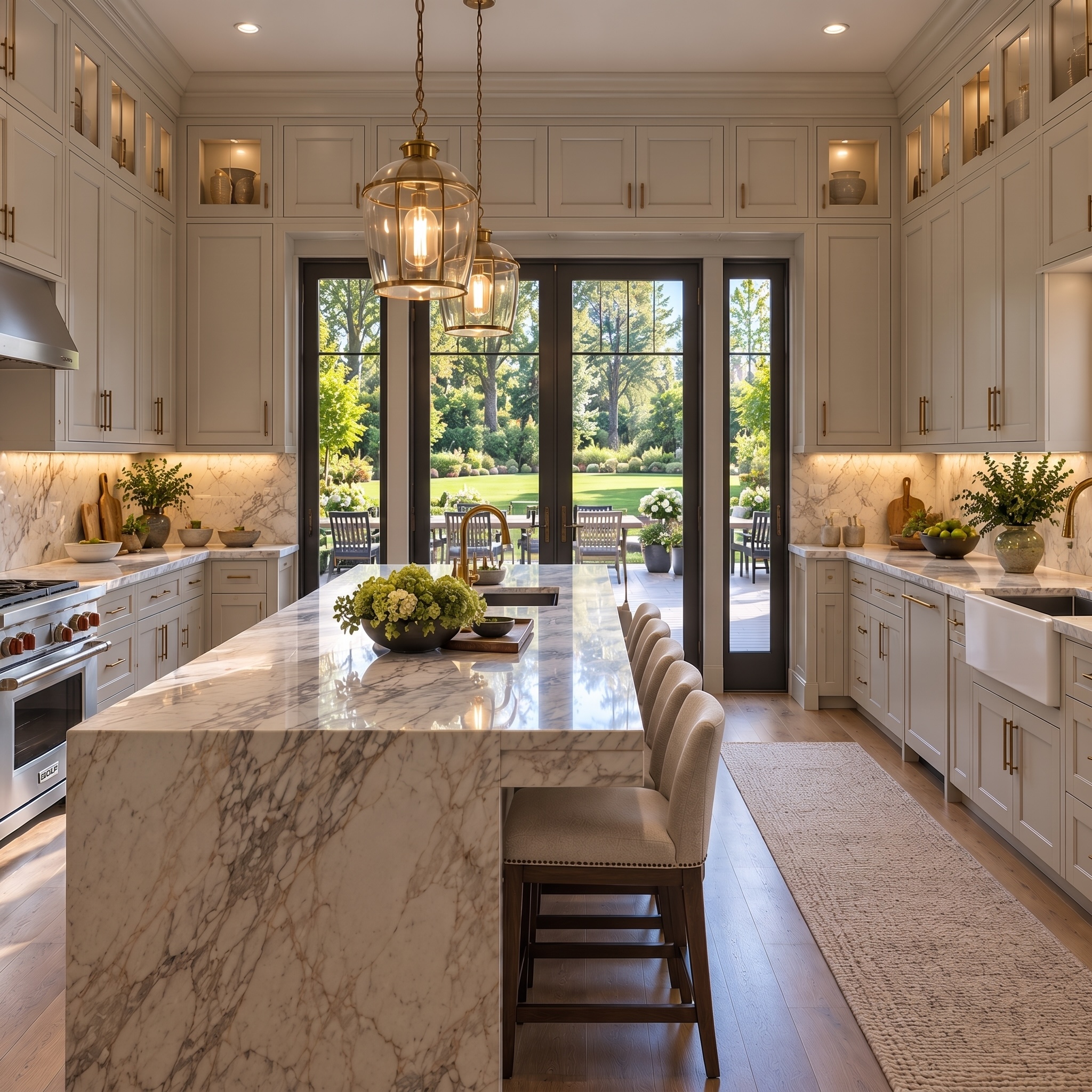
Every available stretch of wall has been recruited for storage. Solid upper cabinets form continuous bands above the worktops, glass-front display units extend toward the ceiling, and another substantial run occupies the space above the French doors. The cabinetry is beautifully finished, but its relentless repetition creates a dense architectural frame around an otherwise generous kitchen. More storage has become less visual space.
The marble waterfall island, cream joinery, brass fittings, and warm wood flooring already establish a luxurious interior. What the room lacks is restraint. Removing the cabinets above the doors and selectively reducing the adjacent upper units would interrupt the heavy wall-to-wall composition, introduce more negative space, and give the remaining cabinetry greater architectural presence. A storage assessment would determine which units could be eliminated without compromising function. The objective isn’t minimalism for its own sake. It’s a better balance between storage, proportion, and the space the kitchen occupies.
4. Gray Cabinets Didn’t Need Replacing. Their Surroundings Needed Warming Up
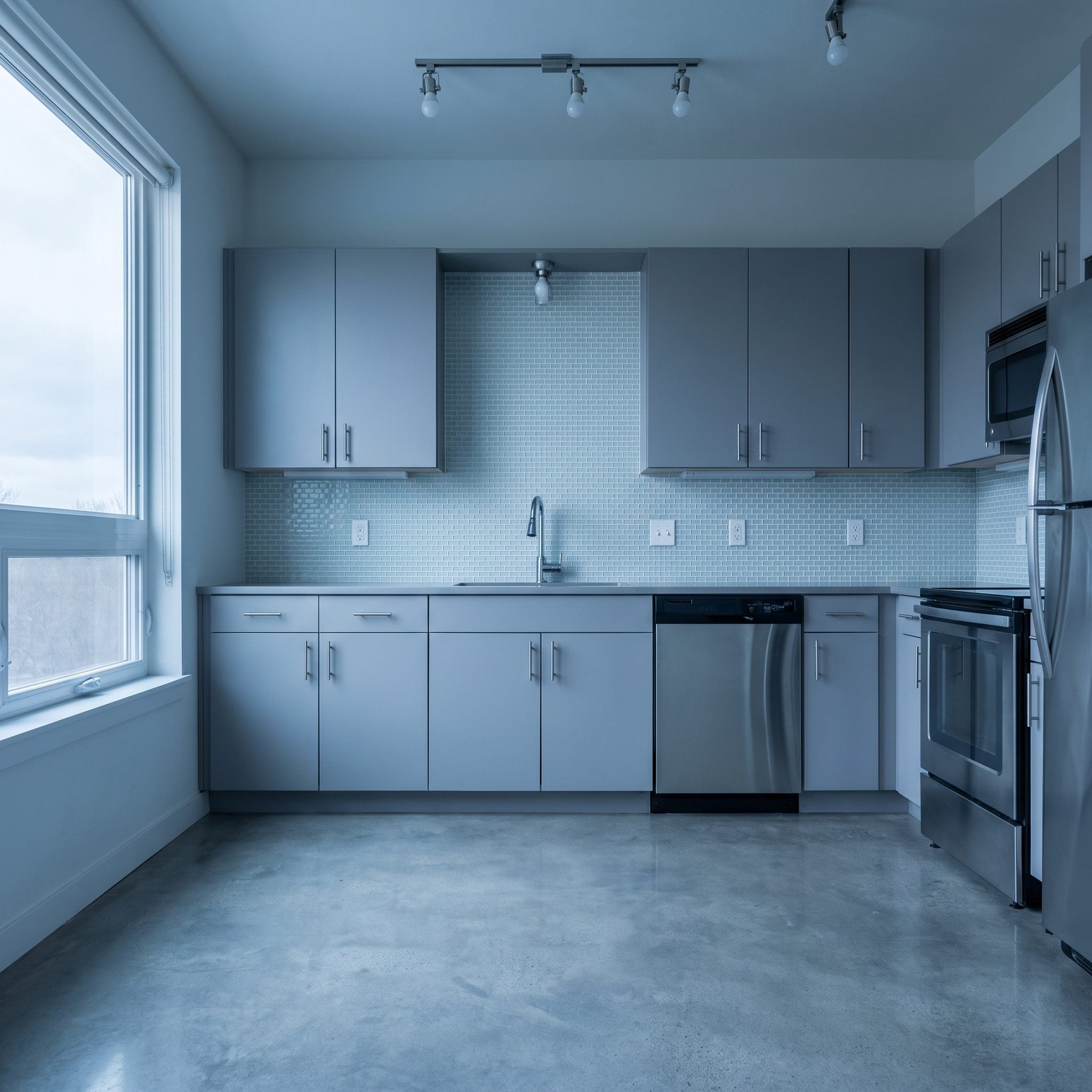
Gray cabinetry can feel elegant, understated, or severe depending on the colors and lighting around it. In this kitchen, icy blue tile, cool counters, and hard overhead illumination reinforced the gray’s colder qualities. The combination created a clinical atmosphere that the cabinet color alone didn’t explain.
Oatmeal porcelain replaces the blue backsplash, clay-beige walls introduce warmth, and brushed-copper pulls add a small metallic accent. Diffused lighting completes the adjustment. The gray cabinets remain the same color, but their relationship with the surrounding materials changes. The new palette has a much more comfortable balance of warm and cool finishes.
3. Yellow Walls Were Making White Cabinets Look Like They Needed Repainting
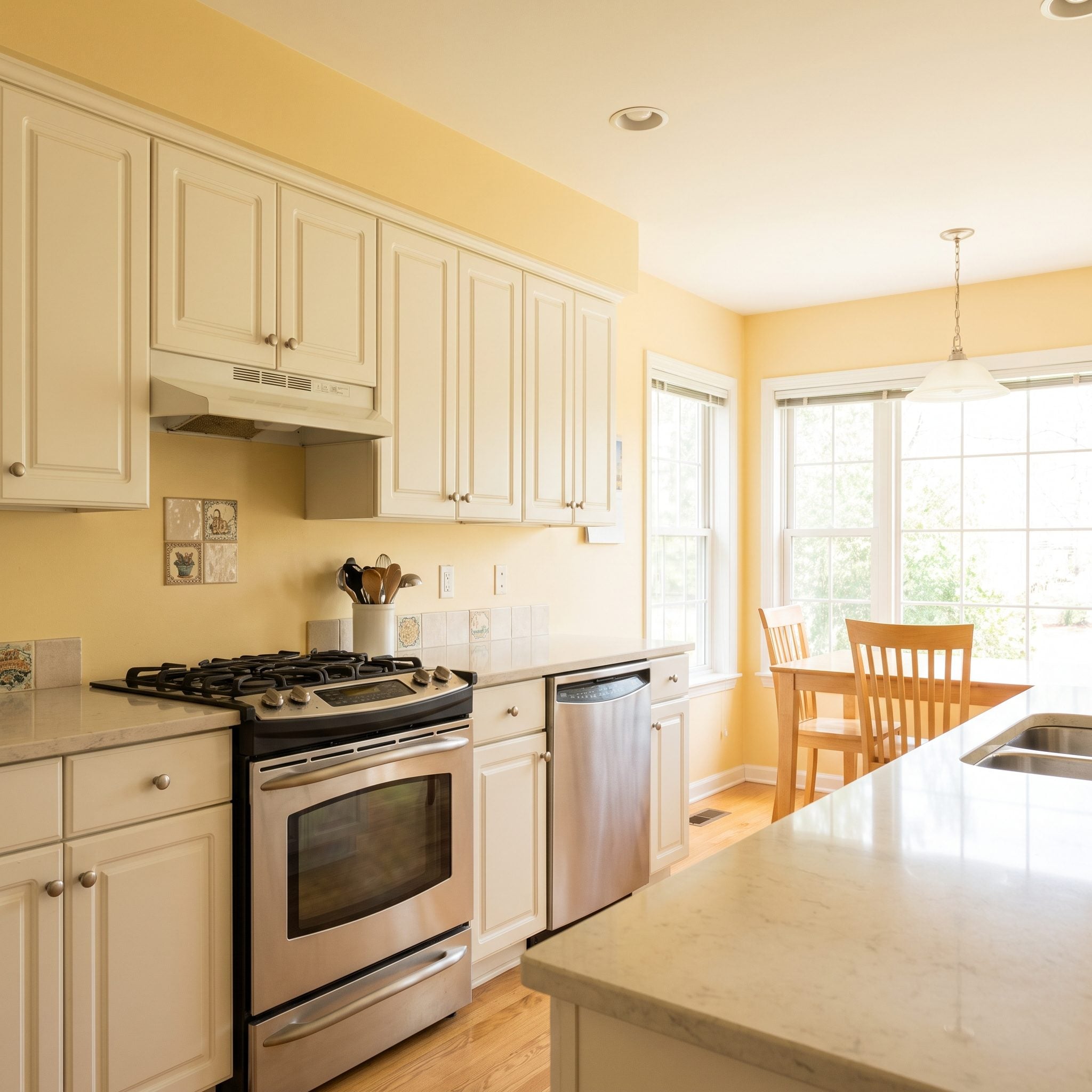
White is rarely perceived in isolation. Surround white cabinets with strong yellow walls and amber-toned lighting, and their color can appear warmer or less crisp than expected. The cabinets may be perfectly serviceable, yet the room develops a tired, yellowed appearance.
Muted blue-gray wall paint introduces a cooler neighboring color, while elongated soft-white backsplash tile and more consistent lighting help clarify the palette. Satin-nickel pulls provide a restrained finish. The cabinet doors haven’t changed, but their white now reads differently against the revised surroundings. It’s a color-context problem solved without a cabinet replacement.
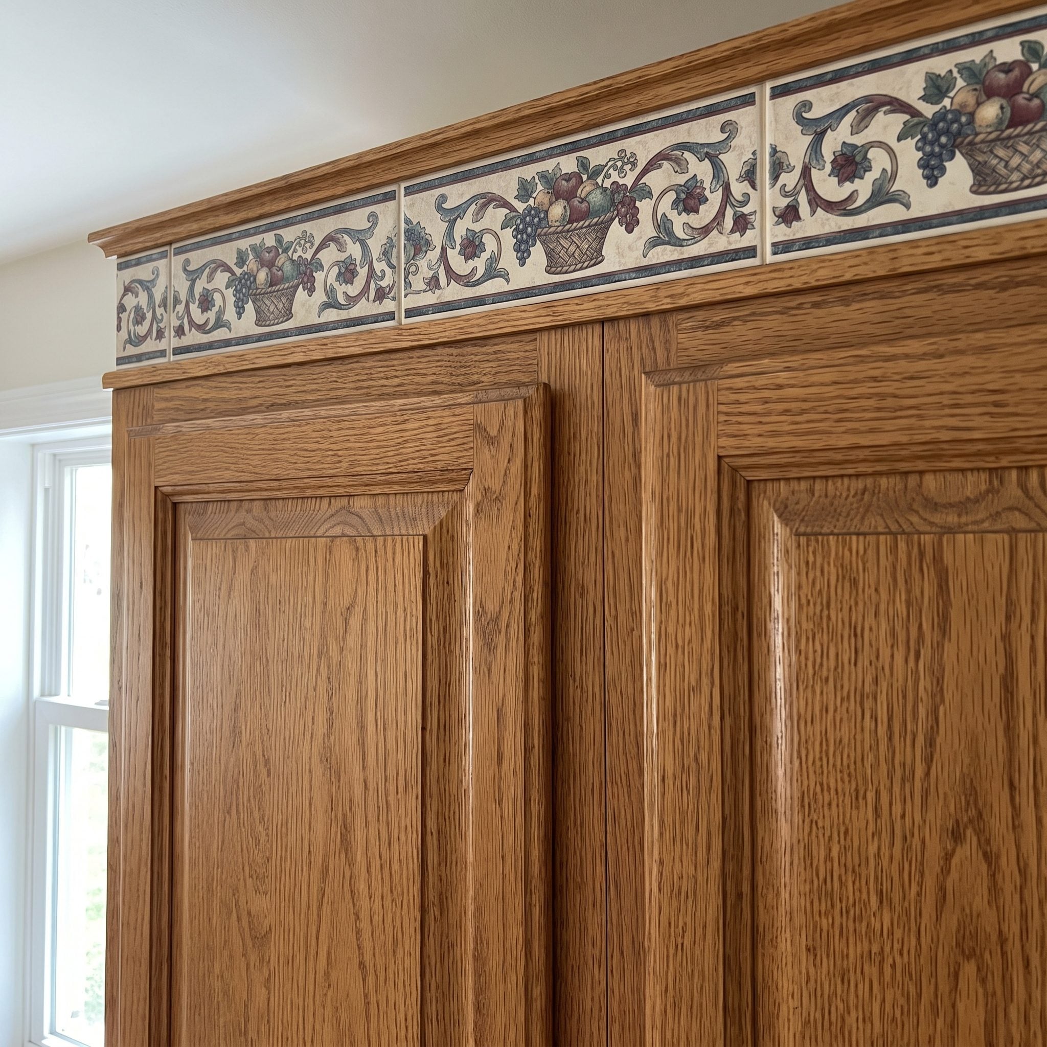
2. Decorative Tile Borders Were Dating Oak Cabinets That Still Had Plenty to Offer
🔥 Would you like to save this?
Oak has endured plenty of undeserved criticism, particularly when the real visual clutter comes from its surroundings. Diagonal accent strips, inset tile pictures, and multiple decorative borders give the backsplash a heavily ornamented character. Beside natural wood grain, those details produce an especially busy range wall.
Elongated matte off-white tiles run horizontally without borders or pictorial accents. A blackened-steel hood introduces a cleaner shape between the existing upper cabinets, and compact matching pulls finish the doors. The oak stays. The kitchen’s character becomes more architectural and less dependent on decorative flourishes, allowing the wood to look like a material choice rather than a period accessory.
1. Three Clashing Surfaces Were Hiding a Kitchen Layout That Already Worked
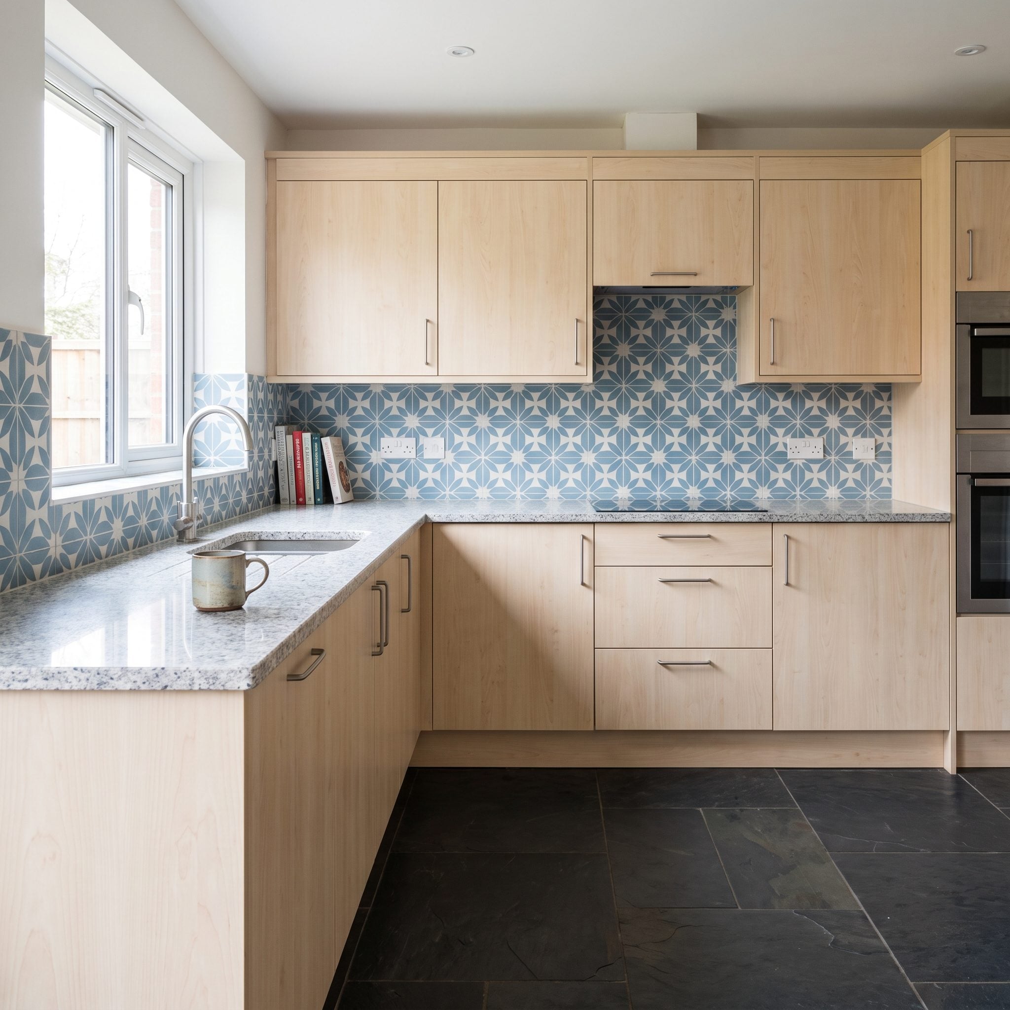
White perimeter cabinets, a walnut island, and a practical working arrangement offered the ingredients of a handsome kitchen. The finishes had other plans. Red-brown counters, a multicolored backsplash, and orange floor tile introduced three competing palettes, turning a coherent layout into a noisy collection of surfaces. The architecture wasn’t the obvious problem. The materials were talking over one another.
Warm-gray quartz replaces the counters, satin ivory porcelain simplifies the backsplash, and muted stone-look flooring creates a calmer foundation. The island remains in position, the cabinet arrangement stays intact, and the white-and-walnut combination becomes the central design idea. Three surface changes accomplish what a far more extensive renovation might have attempted: a kitchen that looks composed rather than conflicted. The sledgehammer never had a compelling argument.