
🔥 Would you like to save this?
How often does “safe” end up being the choice you regret most? A couple nearly defaulted to white cabinets — fine, familiar, and easy to live with. Then the AI-generated before-and-afters put deep burgundy into the same room and changed the argument completely.
In order to come up with the very specific design ideas, we create most designs with the assistance of state-of-the-art AI interior design software. Also, assume links that take you off the site are affiliate links such as links to Amazon. this means we may earn a commission if you buy something.
These 35 designs don’t treat burgundy as a token accent. Sometimes it stays below the counter line. Sometimes it climbs a pantry tower, takes over the island, colors the range hood, or appears on the range itself. White remains the constant, but the way the two colors divide the cabinetry changes from one kitchen to the next.
If they’d gone with plain white, nobody would have blamed them. But these are the combinations that made the safer choice suddenly look a little less interesting.
35. Burgundy Lowers, Cream Uppers, and a Softer Take on High Contrast
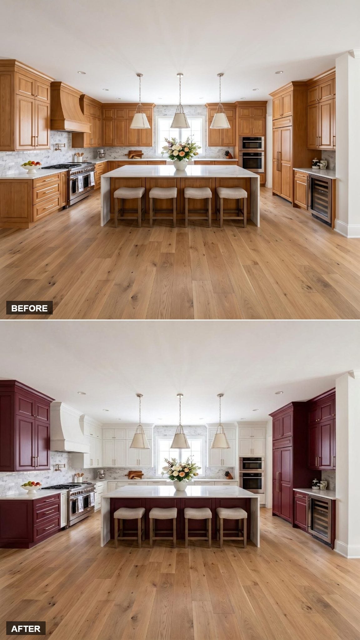
Deep burgundy covers the perimeter lowers and island base, while the upper cabinets shift toward cream rather than stark white. That softer upper color takes some of the edge off the contrast and lets the wine-red cabinetry feel rich rather than severe.
White quartz countertops draw a clean line between the two cabinet colors. The result is less about making burgundy behave and more about giving it enough pale surface around it to remain the obvious feature.
34. Cranberry Cabinets Meet a White Island Instead of the Other Way Around
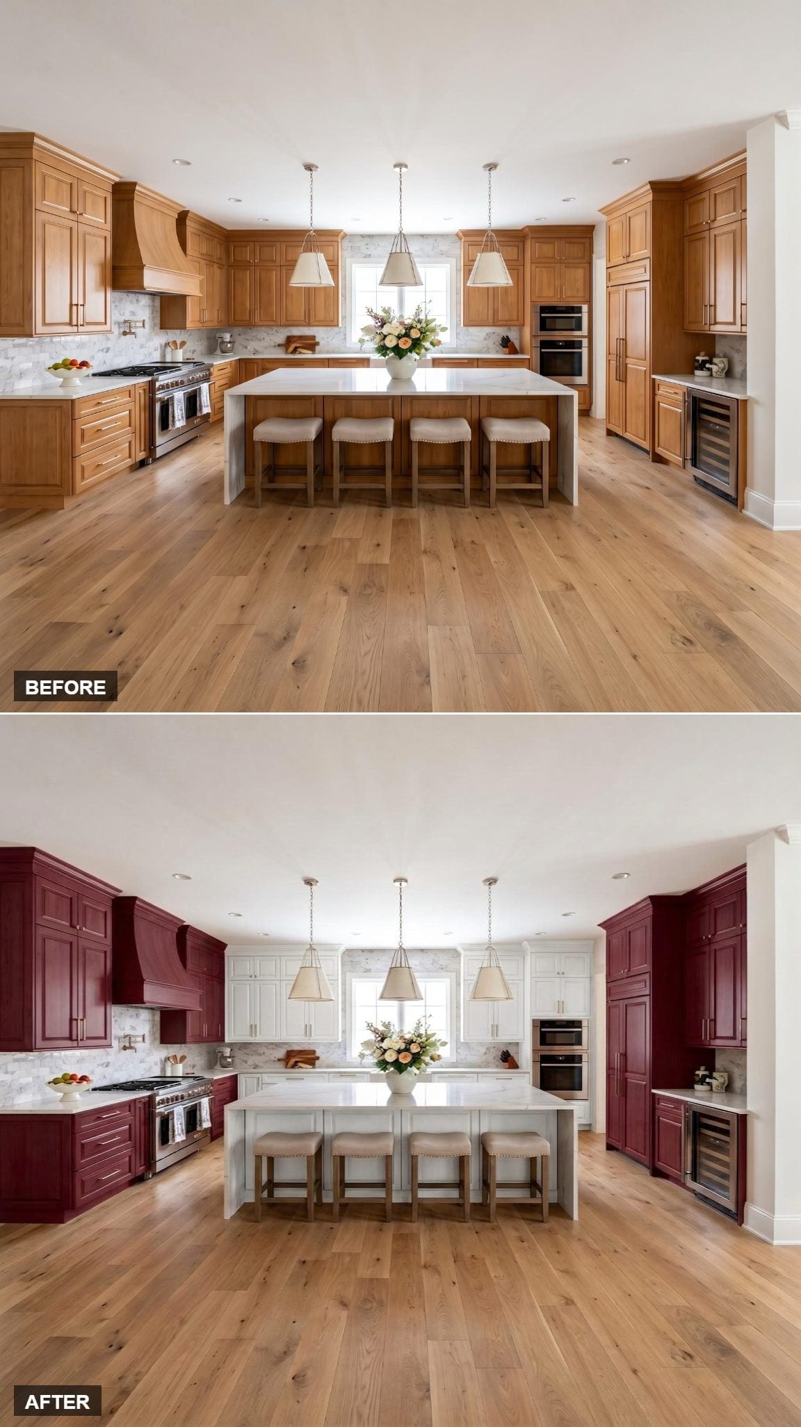
Rich cranberry-burgundy carries the perimeter cabinetry, while the island stays white. That reversal matters: instead of making the island the obvious color statement, the design lets the walls carry the darker tone and leaves the center of the room pale.
Wide-plank oak flooring adds warmth beneath both finishes. The white island reads almost like a pause in the middle of all that saturated cabinetry.
33. The Burgundy Range Hood Is What Makes This One Feel Committed
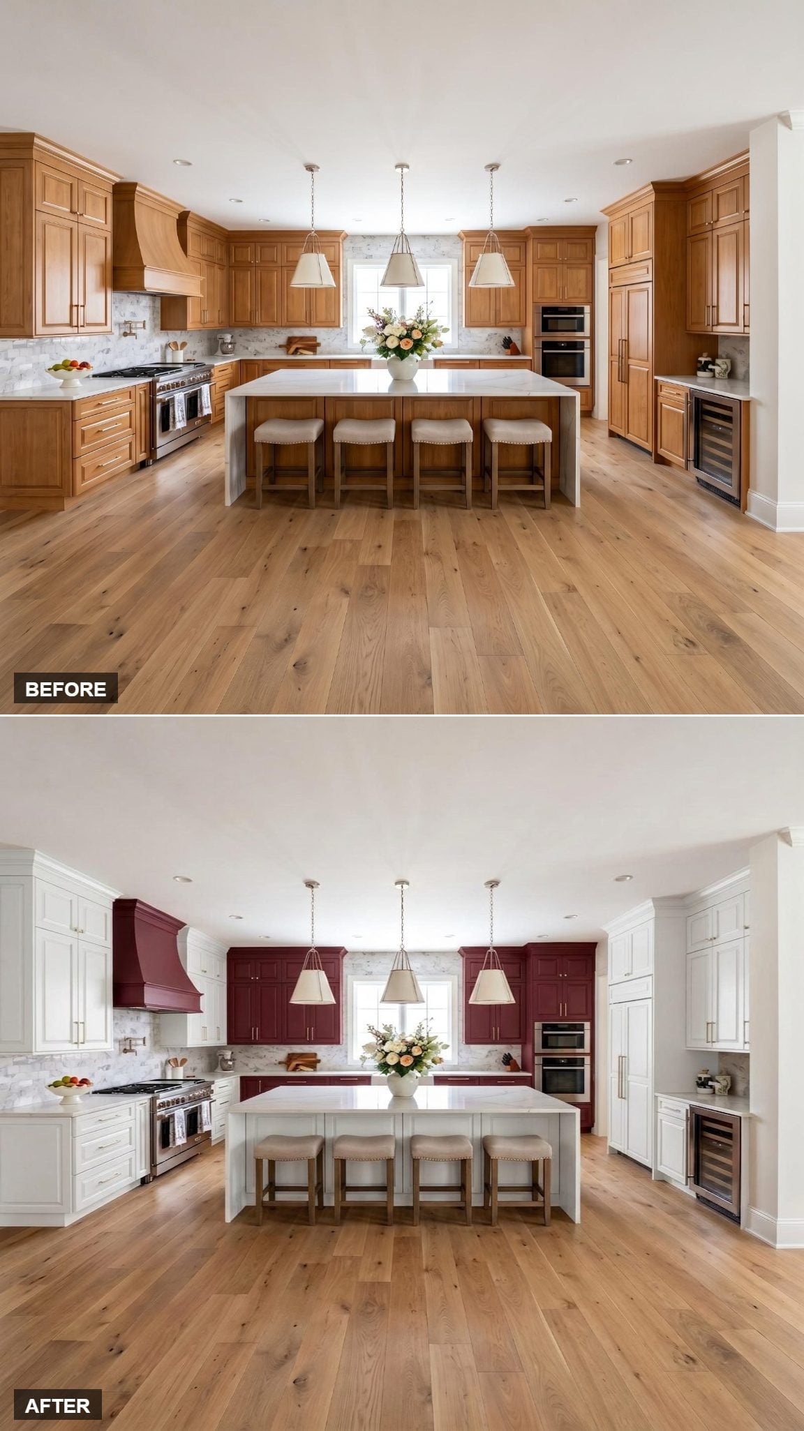
Crimson lower cabinets run beneath white uppers, but the range hood changes the composition. Painting it to match the lowers carries the burgundy upward at the cooking zone instead of trapping all the color below the countertop.
Without that repeat, the lower cabinets would do almost all the talking. The hood turns the range wall into the focal point.
32. White Uppers, Burgundy Base Cabinets, and a Better Reason to Keep the Island Dark
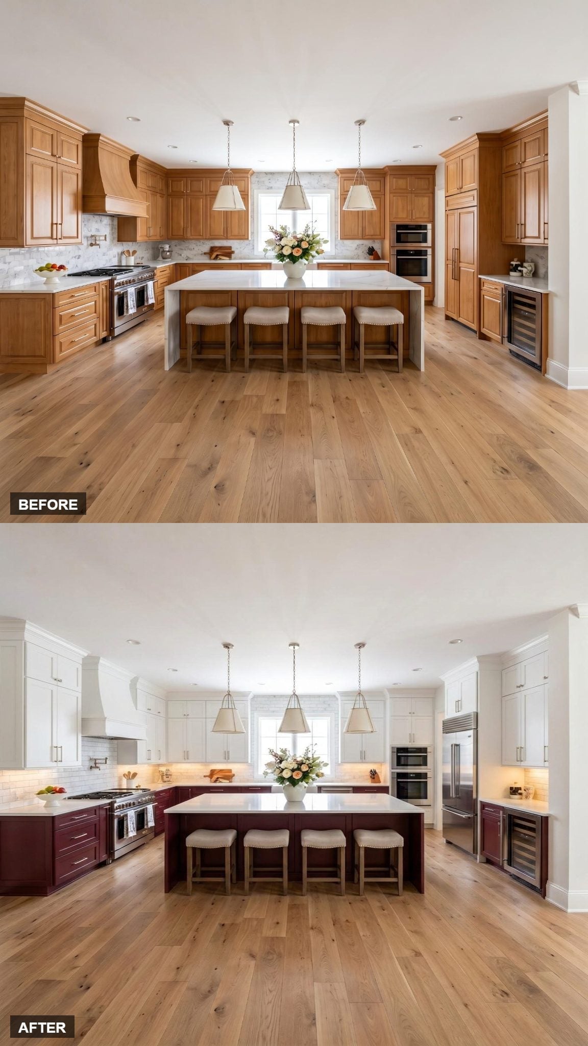
The strongest move here is repetition: the island picks up the same wine tone as the base cabinets.
White shaker uppers keep the upper run simple, while the burgundy continues across both the perimeter base cabinets and island. Warm wood flooring sits underneath the whole arrangement, and under-cabinet lighting adds another layer along the countertop line.
The color isn’t isolated to one decorative piece. It belongs to the cabinetry system.
31. Brass Cage Pendants Give the Burgundy Somewhere Warm to Go
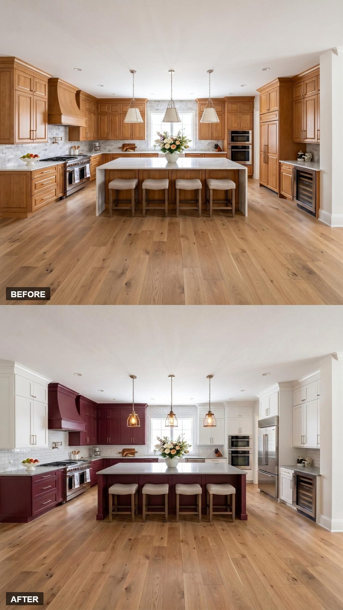
Burgundy appears on the island base and the lower cabinets flanking the range, while the uppers stay white. The color placement already creates a clear two-tone structure; the cage-style brass pendants add warmth above the island without introducing another painted surface.
White quartz runs across the island and perimeter, creating a sharp break above the darker cabinetry.
- Cage-style brass pendants connect naturally with the warm burgundy cabinetry
- White quartz creates a crisp horizontal break between pale and dark finishes
- Burgundy repeats on both the island and range-side lowers rather than appearing only once
30. Glass-Front Uppers Change the Upper-Lower Split
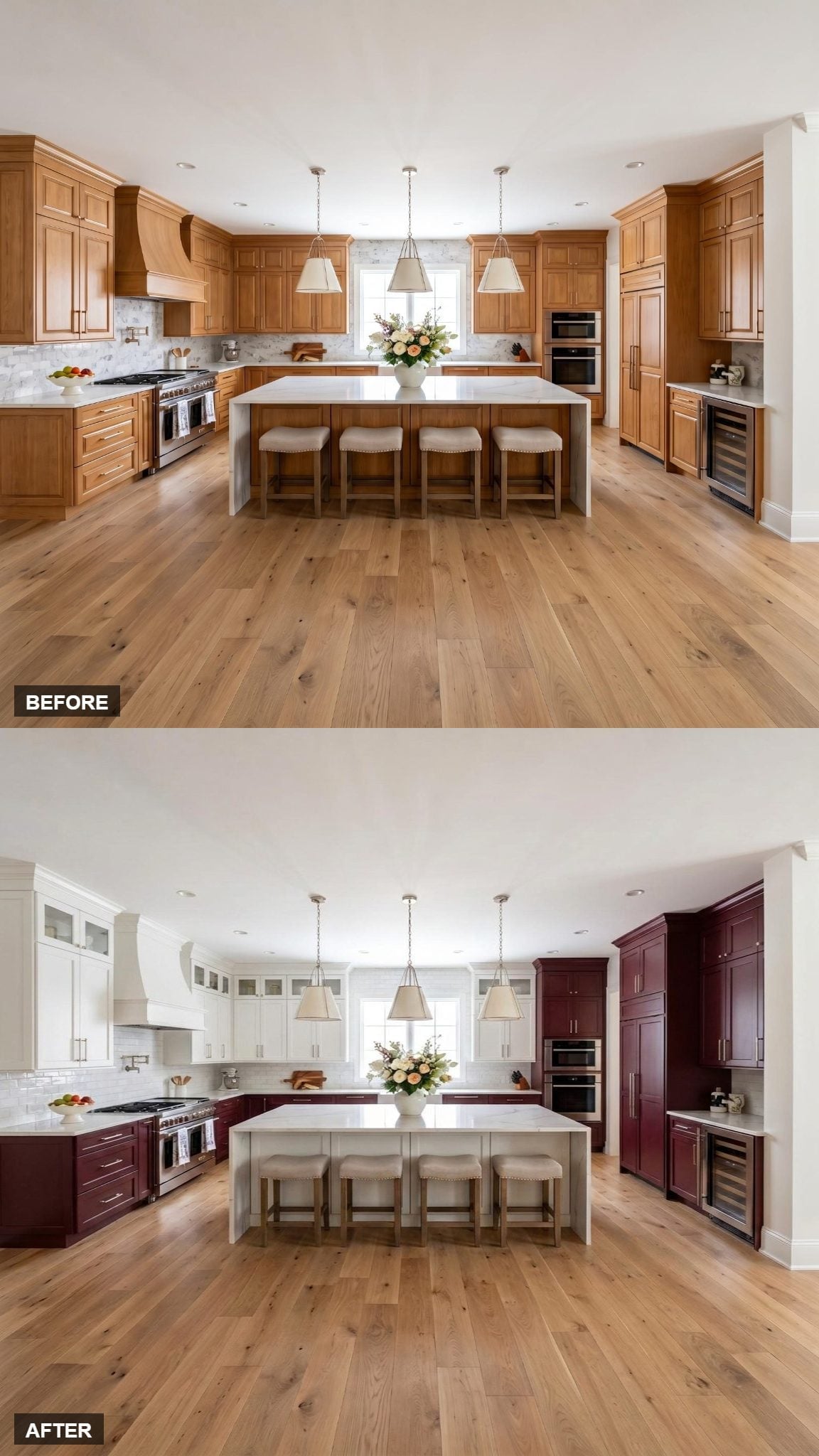
White upper cabinets with glass-panel inserts give this version another layer beyond the familiar white-over-burgundy split. The glass breaks up the upper run instead of leaving one uninterrupted block of painted doors.
Below, burgundy base cabinets carry the saturated color across the lower half of the kitchen.
Design Note: A two-tone layout can be divided in more ways than simply choosing two colors. Glass-front uppers, solid lowers, contrasting hardware, and the treatment of the hood all change how that split reads even when the basic palette stays the same.
29. Keeping the Burgundy Below Eye Level Lets the Tall White Cabinetry Take Over Above
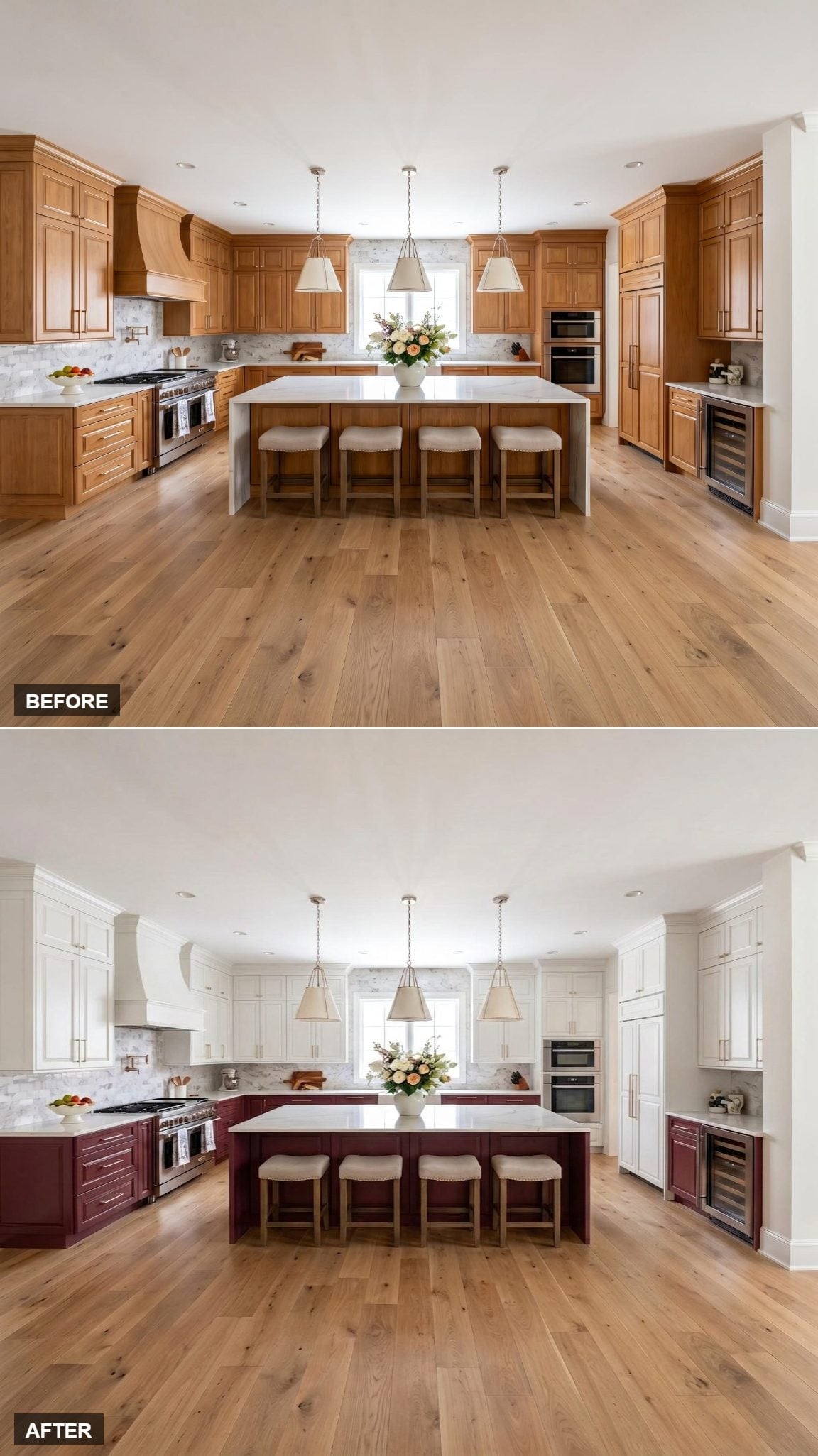
Burgundy stays on the lower cabinets and island, while the white perimeter cabinetry stretches nearly to the ceiling. That vertical run of white is the defining feature here; the darker paint never interrupts it.
Brushed nickel pulls repeat across both cabinet colors, and wide-plank hardwood flooring brings warmth into the lower half of the room without adding another strong finish.
28. White Takes the Perimeter While the Island Gets All the Color
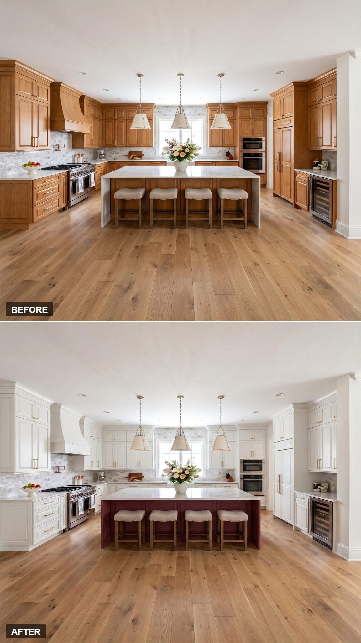
Crisp white cabinetry wraps the perimeter from wall to wall, leaving the burgundy island as the single painted counterpoint in the room.
A thick white countertop keeps the top of the island visually connected to the perimeter cabinetry, while linen-upholstered stools sit between the two tones. Three cone-shaped pendants center the composition overhead, and the marble-look backsplash continues the pale surfaces around the walls.
Color Note: Reserving the darkest cabinet color for the island is one of the simplest ways to make the island read as a separate piece of furniture rather than merely another run of cabinetry. Here the white countertop keeps it connected to everything around it.
27. A White Hood Keeps the Burgundy Strictly in the Lower Zone
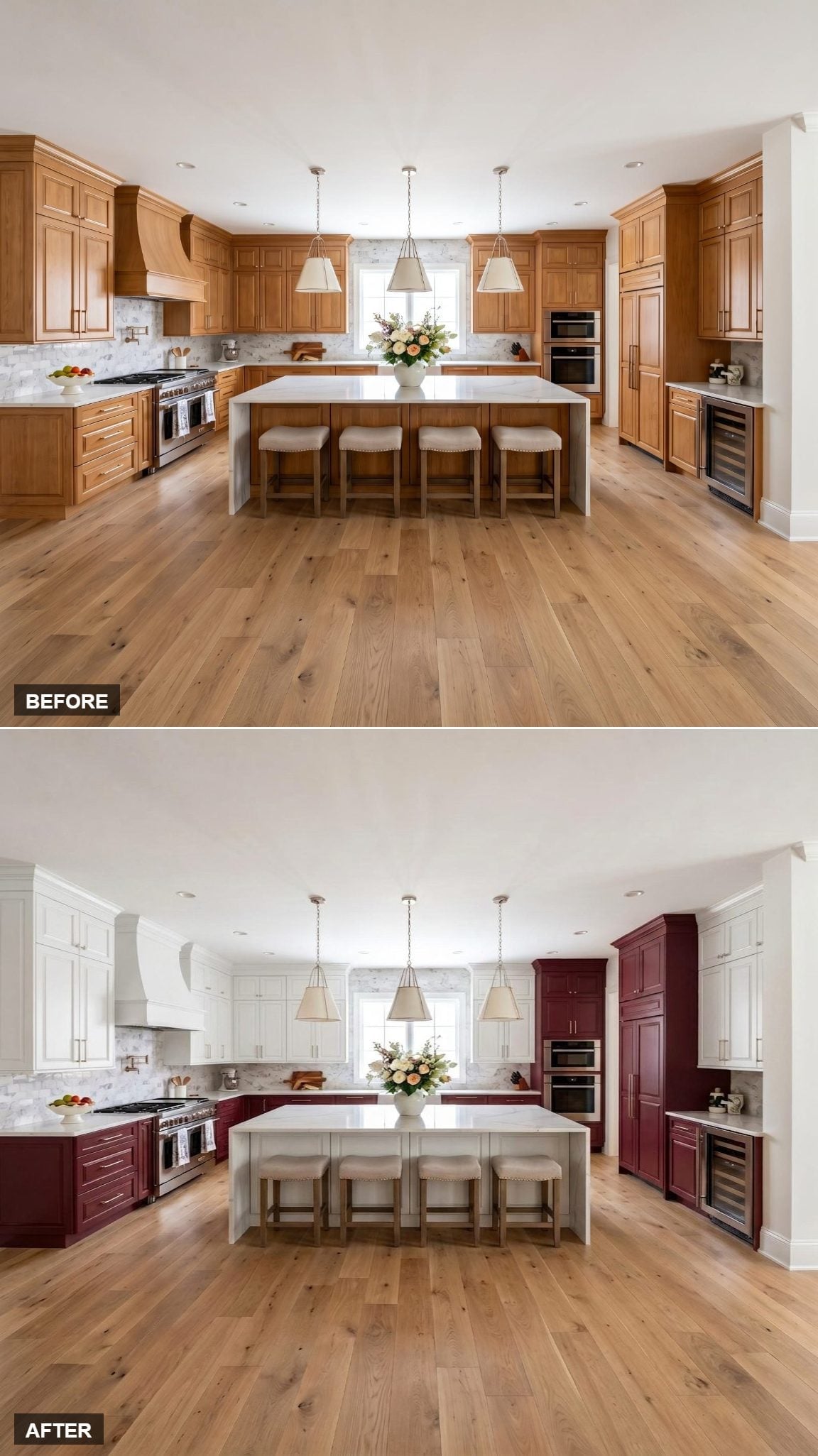
The burgundy runs continuously along the lower perimeter, while bright white shaker cabinets and a matching white hood control everything above the countertop.
That hood choice distinguishes this from the kitchens that carry burgundy upward over the range. Here the color division stays almost entirely horizontal.
Warm wide-plank oak flooring sits below the dark cabinetry and keeps the red from feeling disconnected from the rest of the room.
26. The Hood and Island Repeat the Same Burgundy Across Opposite Parts of the Room
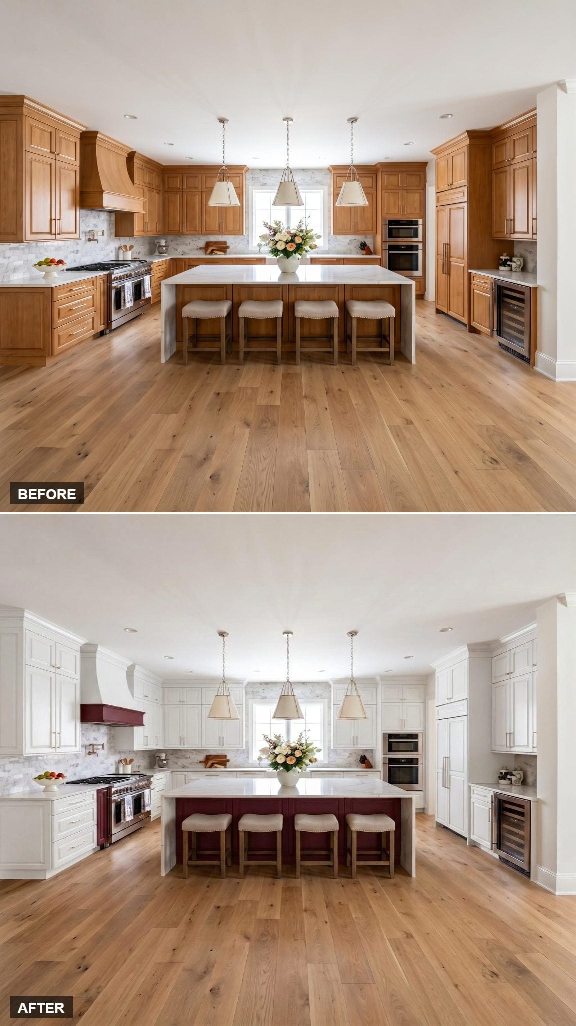
Merlot-toned paint appears on both the range hood and island base, creating two burgundy focal points instead of concentrating the color in one place.
White perimeter cabinets fill the space between them. Because the same color appears on two very different forms — one vertical over the range, one horizontal at the island — the repetition feels deliberate without becoming symmetrical.
Quick Fix: Matching an accent hood to an island base is a clean way to repeat a strong cabinet color without painting every cabinet. The repetition gives the two pieces an obvious relationship even though they sit in different parts of the room.
25. The Pantry Stack Carries Burgundy All the Way to the Ceiling
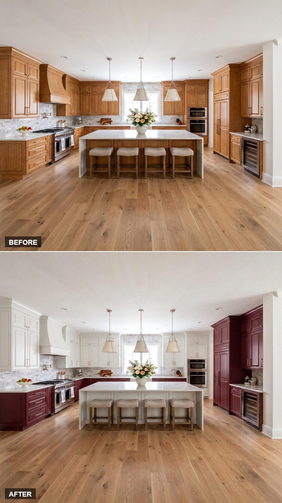
White uppers sit above burgundy lowers across the main cabinet run, but the tall pantry stack on the right breaks the horizontal rule and carries the darker color vertically.
The range hood stays white with the uppers, while the island shifts to a softer greige-white. Four linen-upholstered stools sit beneath the white quartz top, and three brushed-nickel cone pendants run overhead.
Practical Note: A two-tone kitchen also gives you the option of repainting one cabinet zone later without necessarily changing every door in the room. The visual split is already built into the design.
24. Two Separate Burgundy Zones Frame the Room
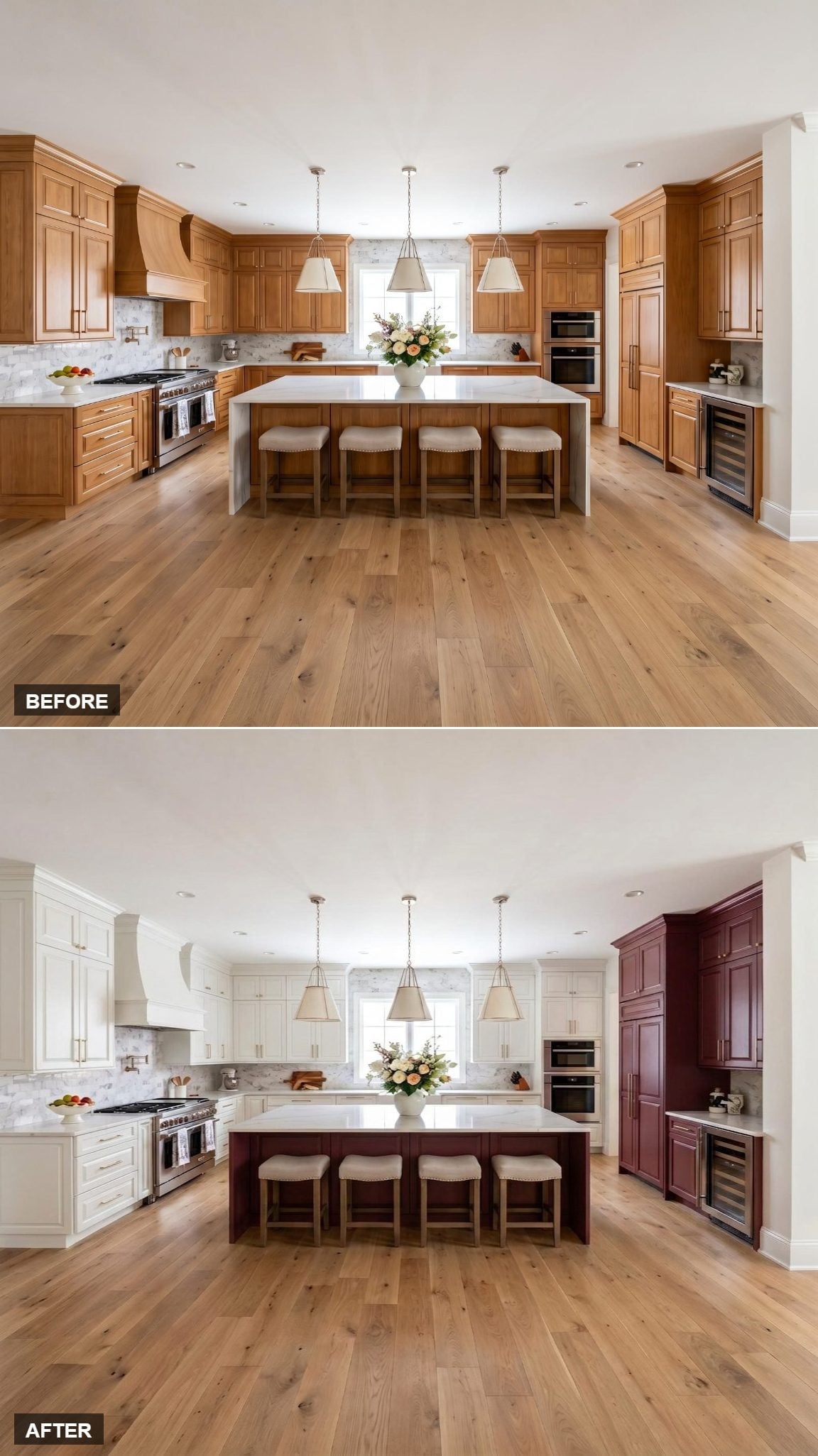
Rich burgundy wraps both the island base and the tall cabinet tower on the right, creating two separate areas of color rather than one continuous run.
White perimeter cabinets remain around the cooking zone, while the marble-look backsplash crosses behind them. Four linen-upholstered stools line the island beneath its white countertop.
Not every two-tone kitchen has to divide the colors evenly, and this one doesn’t try to.
23. The Corner Tower Turns a Horizontal Color Split Vertical
🔥 Would you like to save this?
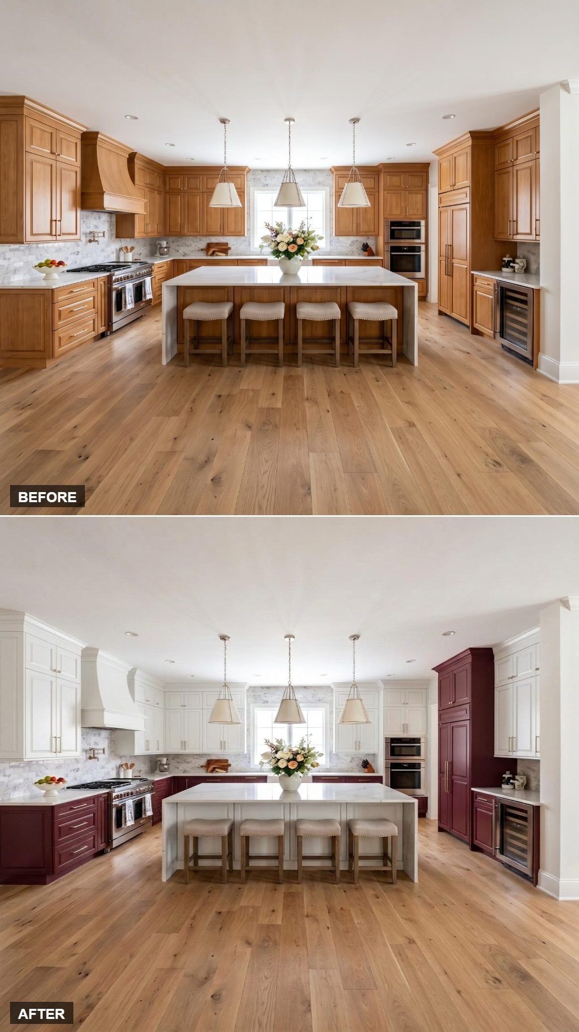
White upper cabinets run above burgundy base cabinets, and the hood stays white with the upper zone. Then the tall corner tower on the right takes the burgundy all the way up.
That single vertical section keeps the lower color from being confined to a stripe around the bottom of the room.
Wide-plank white oak flooring and a white quartz island top sit between the cabinet colors, while brushed gold hardware appears across both finishes.
22. Here the Hood Joins the Burgundy Instead of Disappearing Into the Uppers
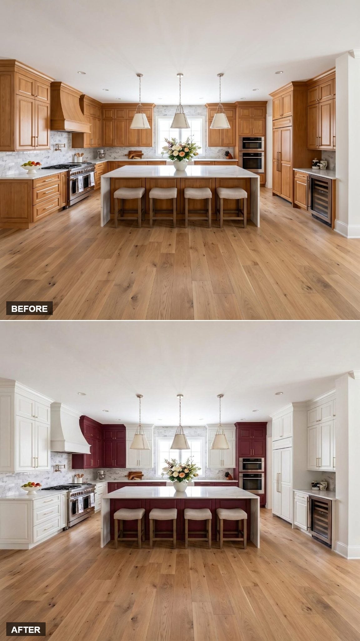
White upper cabinets provide the pale backdrop, while the lower cabinets, island, and range hood all take the same deep burgundy.
The hood is the important difference. Instead of blending into the upper cabinetry, it becomes part of the darker color family and pulls the eye directly toward the range.
Brushed gold hardware and neutral upholstered stools add warm accents without introducing another cabinet color.
Budget Tip: If a full repaint isn’t necessary, limiting a new color to selected cabinet zones — such as lowers, an island, or a hood — reduces the amount of cabinetry being refinished. Ask painters to itemize those areas separately so you can compare the options clearly.
21. The Burgundy Tower Keeps the Island From Looking Like a Lone Accent
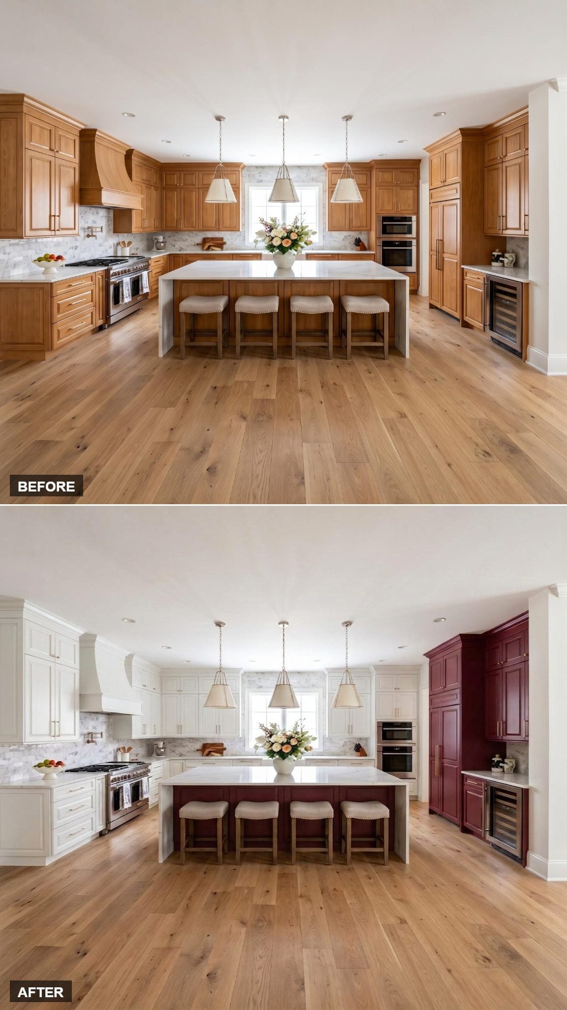
White covers the perimeter cabinets and hood, while burgundy is reserved for the island base and tall corner cabinet tower on the right.
That second burgundy element is what separates this from an ordinary white-kitchen-with-dark-island scheme. The tower repeats the color against the wall, so the island no longer carries the entire accent by itself.
Brushed nickel hardware continues across both finishes, and the white quartz top keeps the island connected to the pale perimeter.
20. A White Waterfall Island Changes the Usual Burgundy-Lower Formula
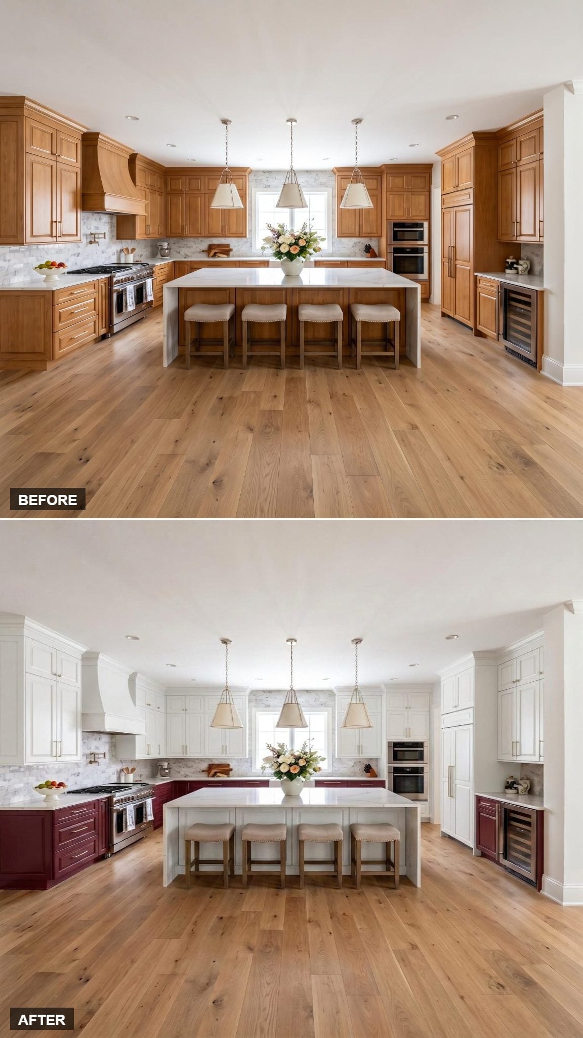
White upper cabinets and a matching hood sit over deep burgundy lowers, but the island refuses to repeat the darker cabinet color.
Instead, its white waterfall treatment keeps the center of the room tied to the countertop and backsplash rather than to the burgundy perimeter.
That choice leaves the darker paint around the walls and makes the island the palest major element in the room.
19. One Floor-to-Ceiling Burgundy Tower Is Enough to Change the Right Side
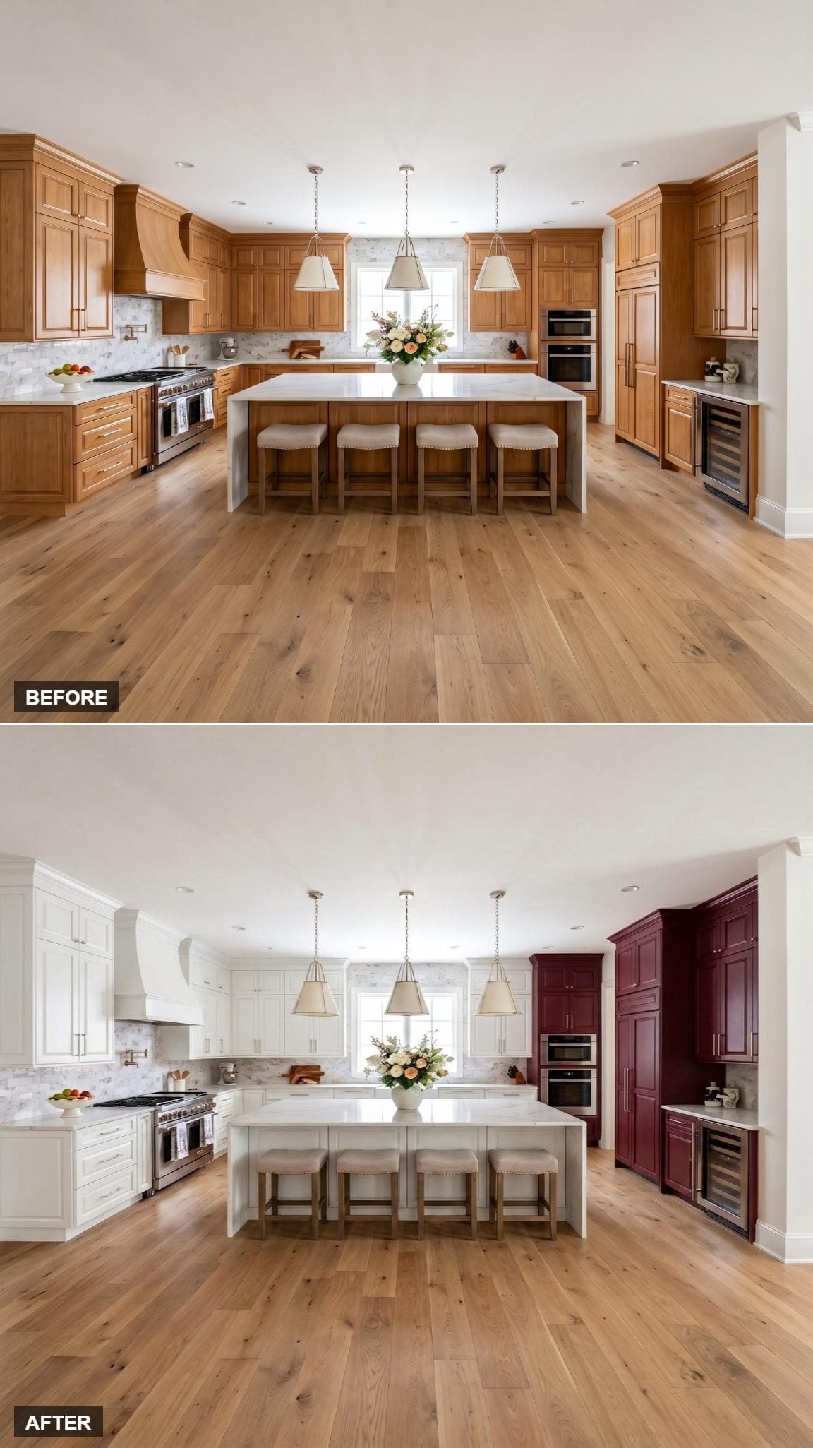
Most of the perimeter stays white with nickel hardware. Then the right-side tower runs floor to ceiling in deep burgundy.
There is no burgundy island here and no dark hood competing for attention. The color is concentrated almost entirely in one vertical cabinet mass, which makes this one of the cleaner asymmetrical versions in the group.
18. This One Divides Burgundy and White by Wall, Not by Cabinet Height
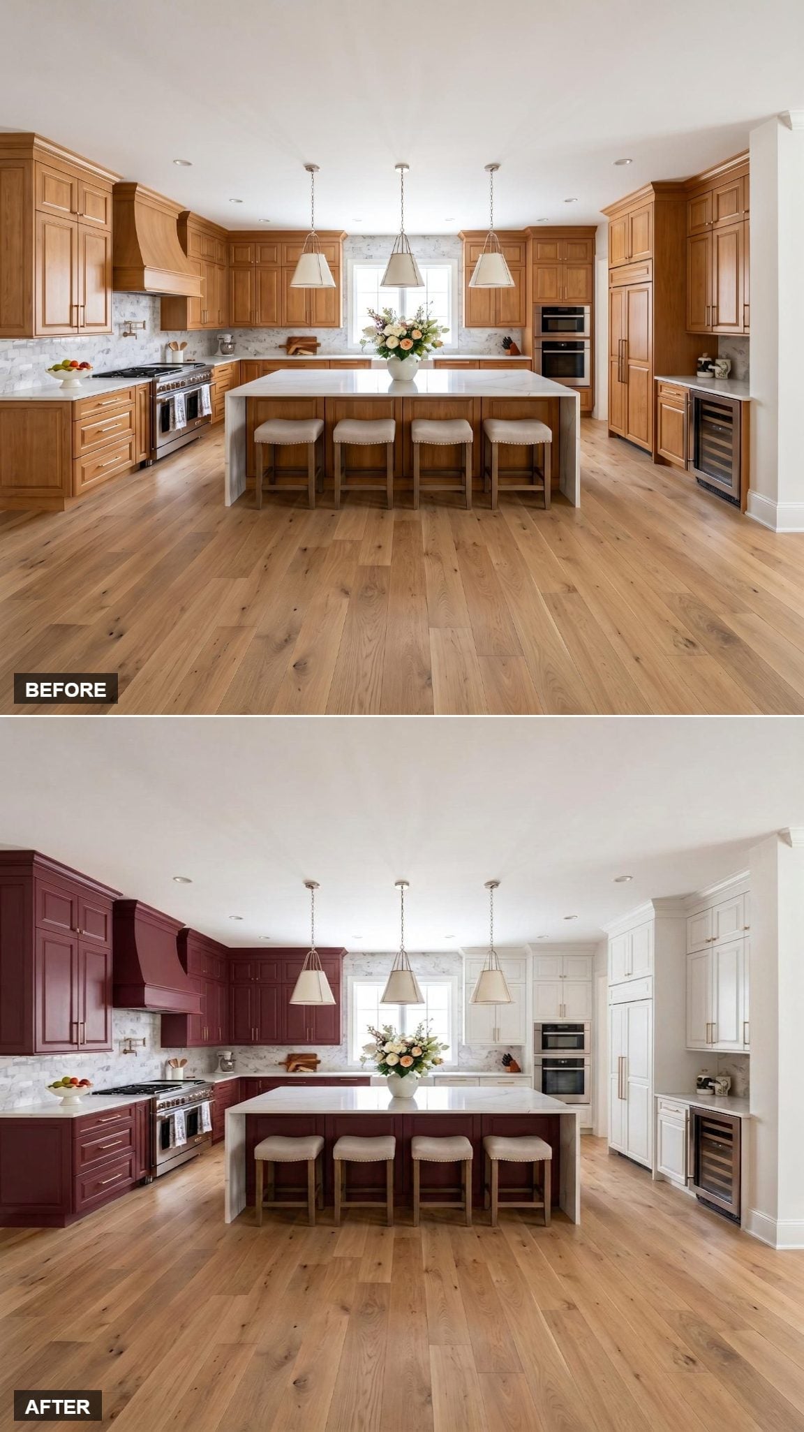
Deep burgundy wraps the cooking-zone cabinets and custom hood on the left, while crisp white cabinetry takes over on the right.
The shared raised-panel door profile is important because the color boundary is unusually bold. Both sides still speak the same architectural language even though the paint changes dramatically from one wall to the next.
The marble mosaic backsplash continues through both zones and gives the split a common background.
17. The Island Is the Only Burgundy Cabinetry in Sight
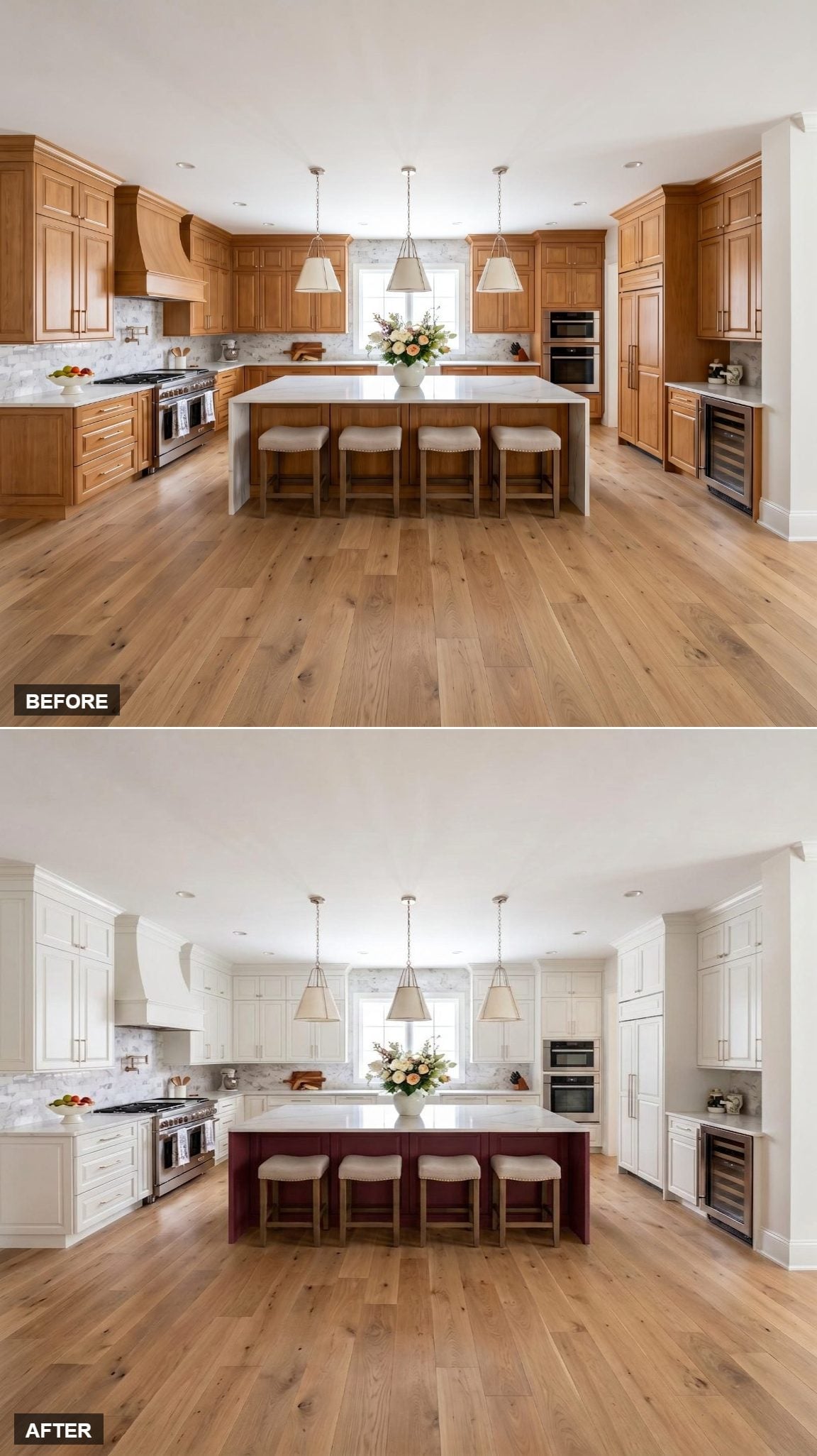
Crisp white cabinets cover the full perimeter, including the hood. Burgundy appears only on the island base.
That makes this one of the simplest versions of the palette: one large dark block in the center, surrounded by white cabinetry.
The marble-look backsplash, neutral upholstered stools, and brushed nickel hardware stay restrained enough that the island remains the unmistakable source of color.
16. Burgundy Moves Up Around the Window Instead of Staying Below the Countertop
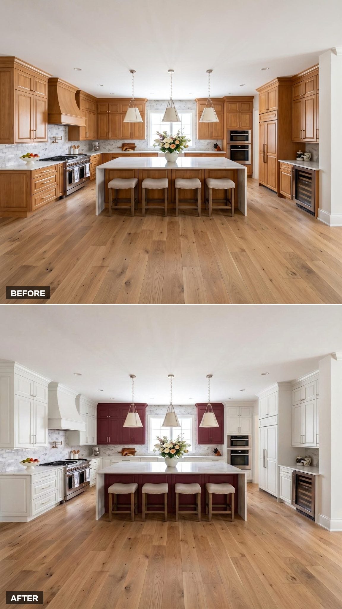
White perimeter cabinetry keeps most of the walls pale, but the island base and the upper cabinets flanking the window both go burgundy.
That window-wall placement is the useful distinction. The darker color isn’t confined to a base cabinet or tall tower; it appears above the counter in two smaller sections and repeats again at the island.
15. The Hood Stays White While Burgundy Wraps the Tower
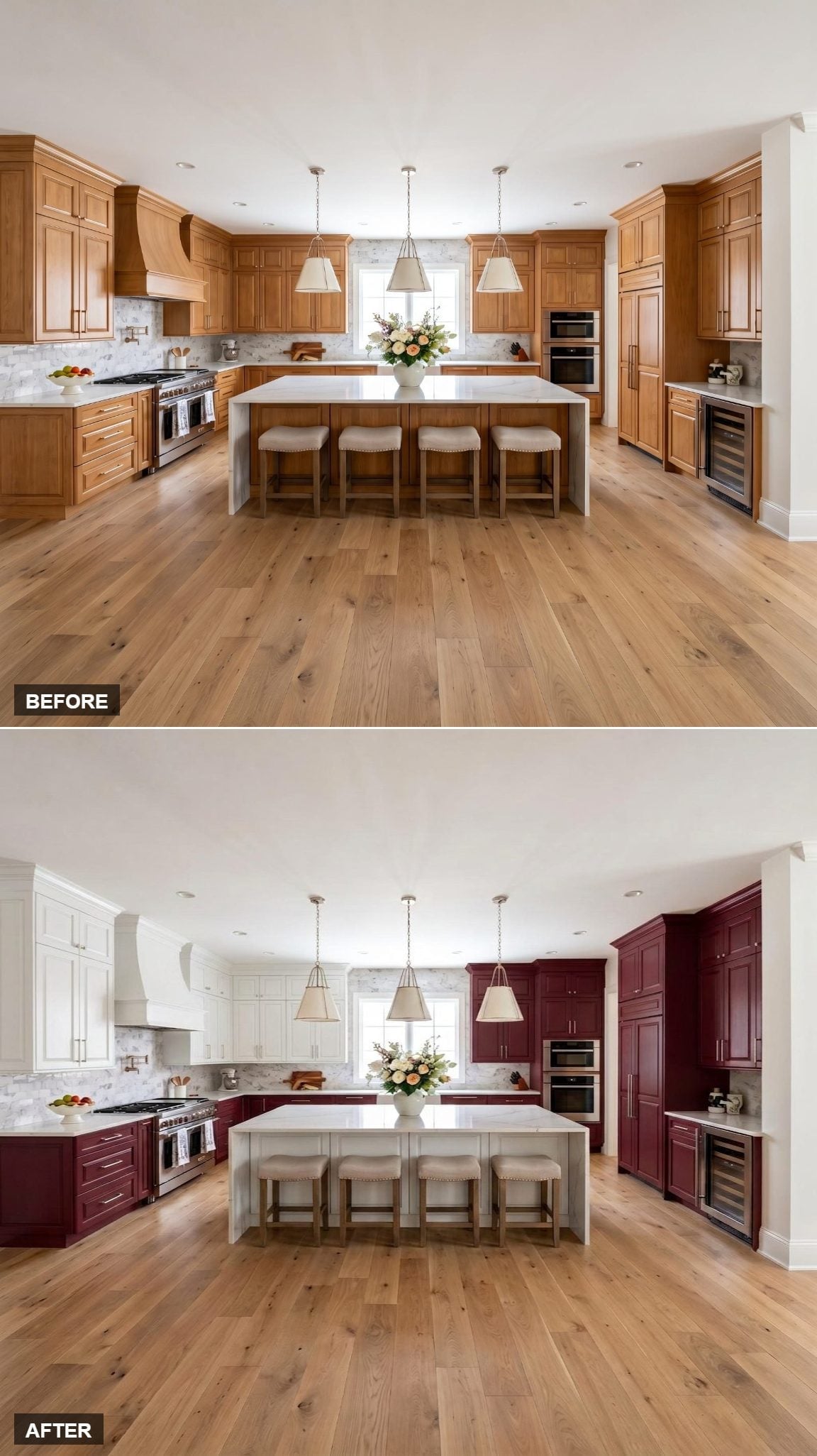
Soft white upper cabinets run across the perimeter while burgundy covers the lower cabinets and continues up the right-side tower.
The custom hood remains white, making it part of the upper cabinet zone rather than the darker cooking-area cabinetry below.
Brushed nickel hardware crosses both finishes, and wide-plank oak flooring adds warmth underneath the scheme.
14. The Wine-Fridge Wall Becomes Its Own Burgundy Zone
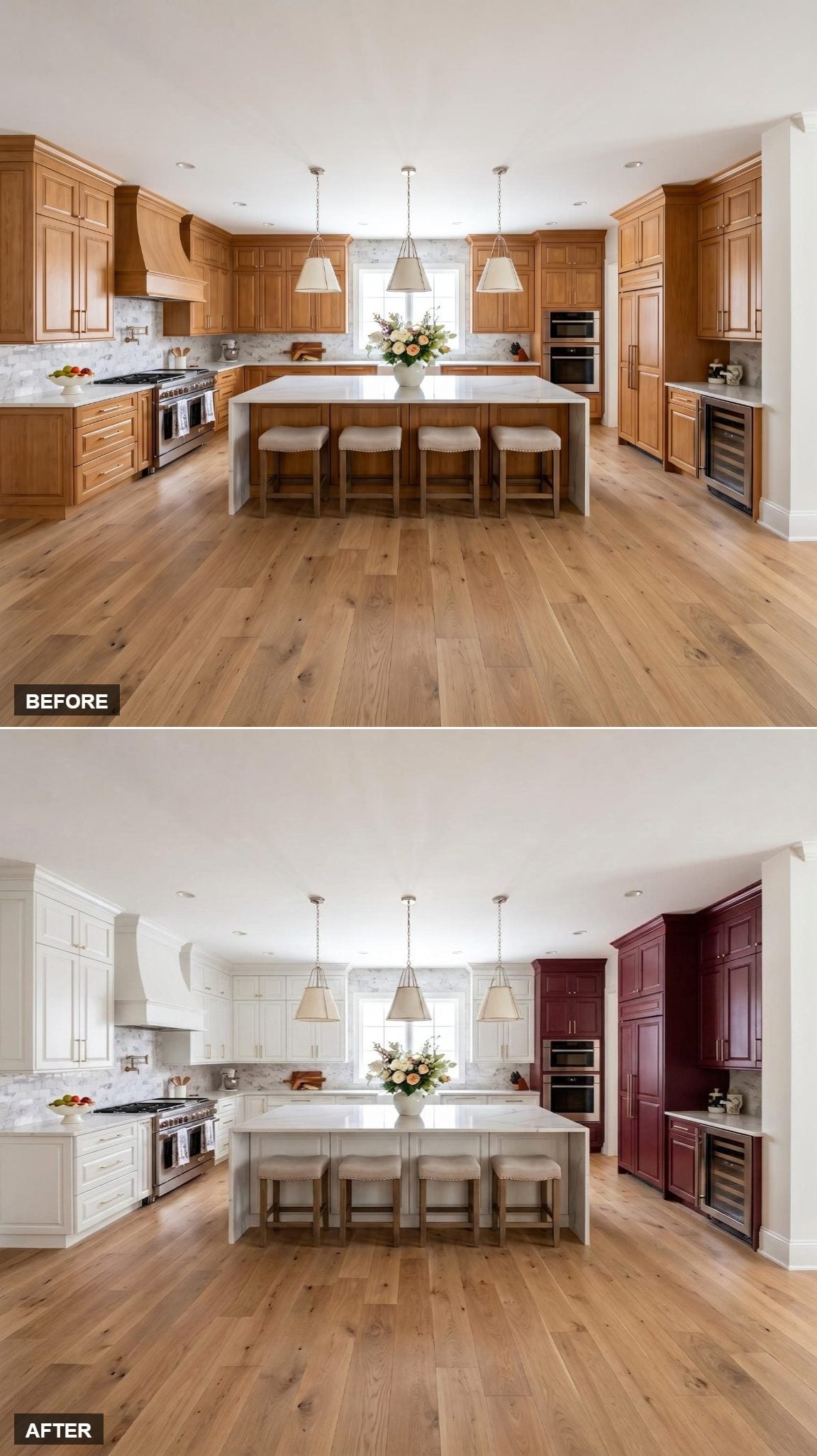
Floor-to-ceiling cabinetry in deep burgundy covers the right side, running through the tall storage towers and down around the wine-fridge cabinet.
The left side stays soft off-white, and the island follows a gray-white rather than repeating the burgundy.
That decision leaves the center pale and turns the wine-storage side into a separate visual zone instead of spreading the dark color around the room.
13. The Island Repeats the Burgundy From the Two Right-Side Towers
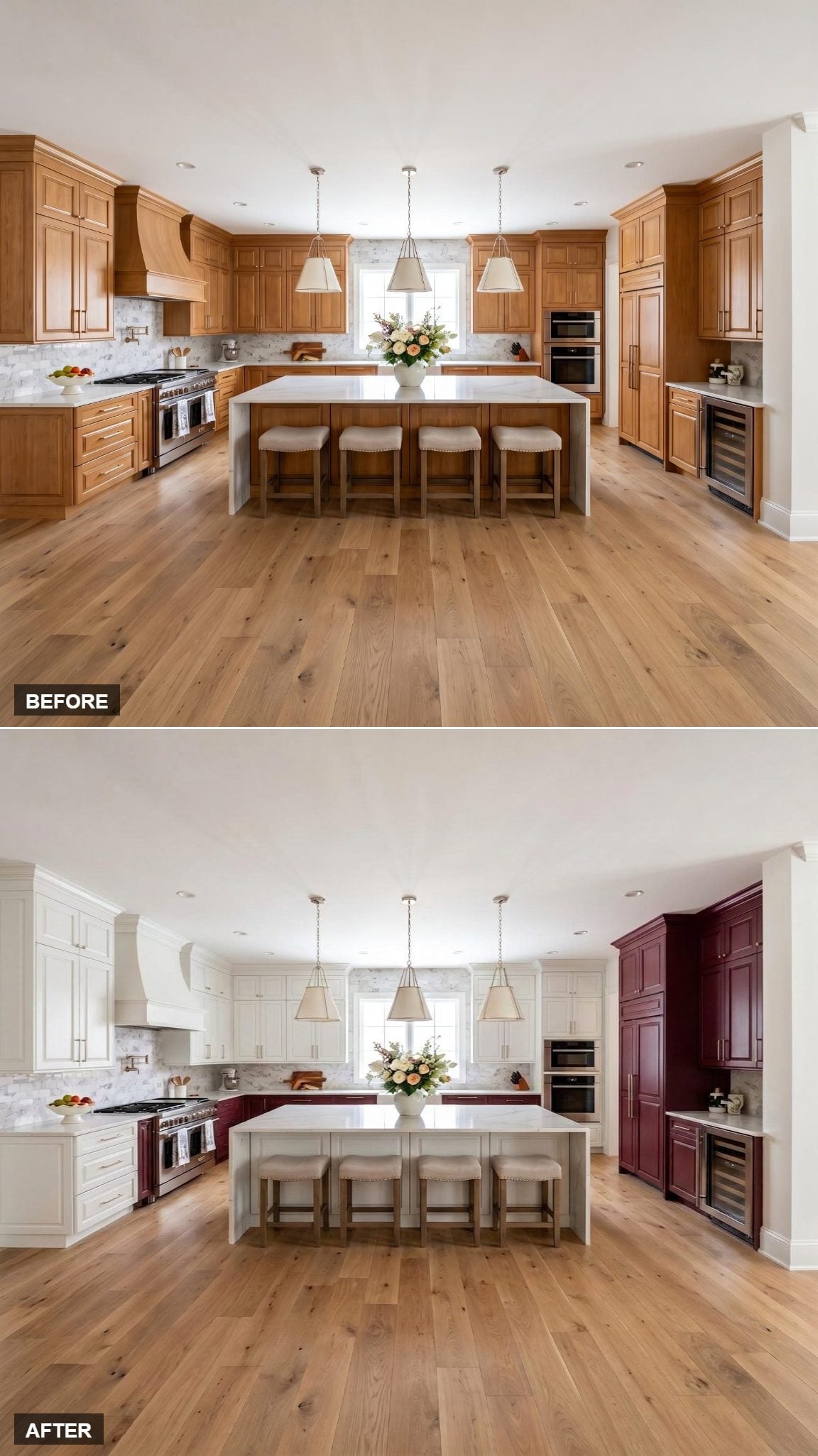
Two floor-to-ceiling burgundy towers occupy the right side while white cabinetry carries the remaining walls.
Unlike the previous version, the island base also picks up the burgundy. That repeat pulls the color out from the wall and into the center of the room without introducing another finish.
12. A Dark-Stained Island Pushes the Palette Toward Its Deepest End
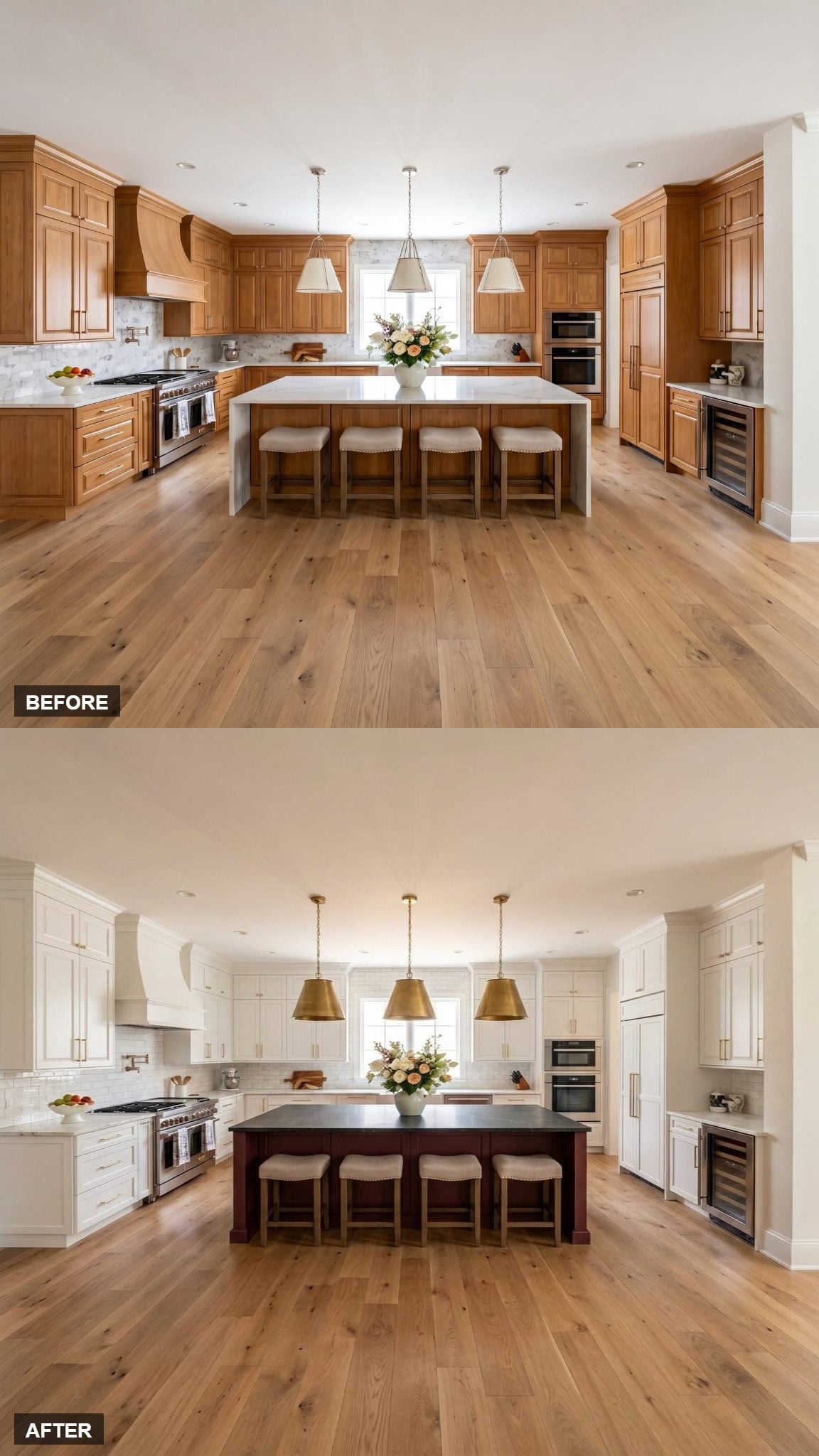
Gold drum pendants hang above a dark-stained island base that reads more like furniture than perimeter cabinetry.
White shaker cabinets run around the walls, leaving the island as the darkest surface in the room. The pendants echo the warmth of the island overhead and keep the center from feeling disconnected from the otherwise pale cabinetry.
11. Matte Black Hardware Gives This Burgundy-and-White Split a Harder Edge
🔥 Would you like to save this?
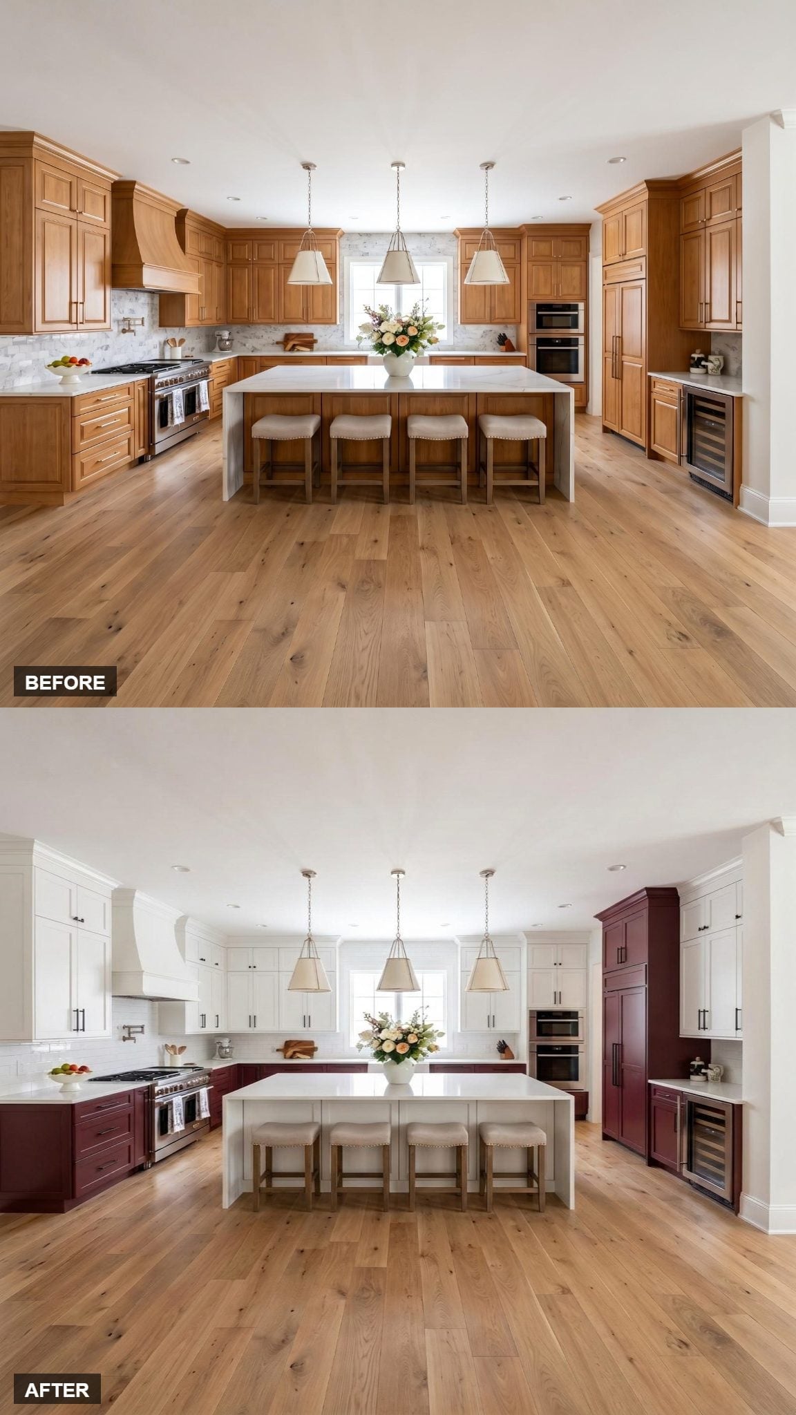
Matte black hardware crosses every cabinet door, creating a much stronger graphic line than the nickel and brass finishes used elsewhere in the gallery.
White uppers stretch across the perimeter, burgundy lowers cover the cooking zone, and the same burgundy continues into the tall corner tower. The hood stays white with the upper cabinets.
The island takes another route, staying white along its waterfall sides while aged-brass cone pendants hang above.
10. The Burgundy Is Confined to the Wine-Fridge Tower
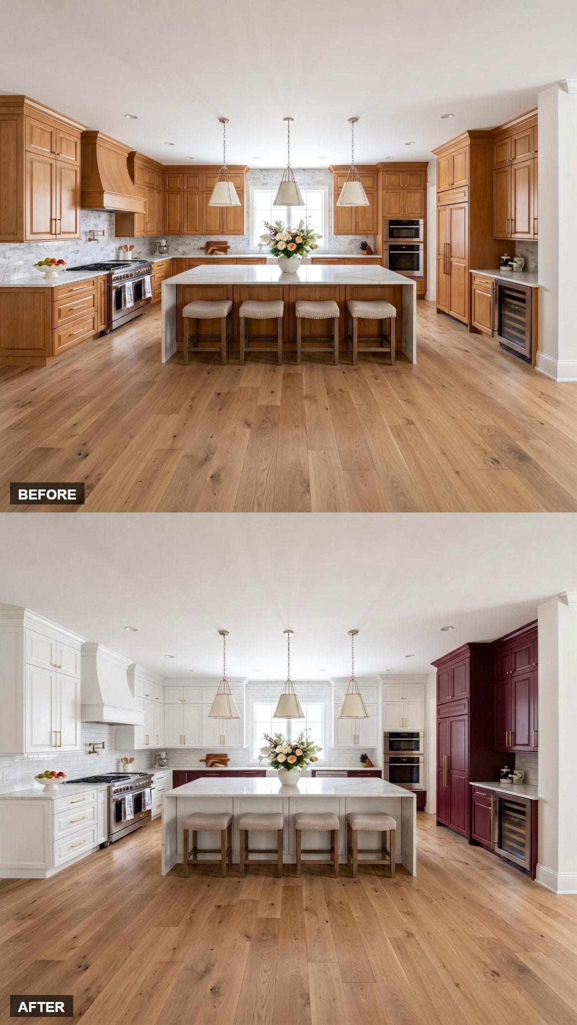
White cabinetry runs from the range wall through the island base, while the wide-plank oak floor supplies much of the room’s warmth. Brass hardware keeps the pale cabinetry from feeling stark.
The one major departure is the right-side tower. It runs floor to ceiling in muted burgundy around the wine-fridge zone, concentrating the color into a single architectural block.
9. Burgundy Towers and the Island Carry the Color Vertically and Horizontally
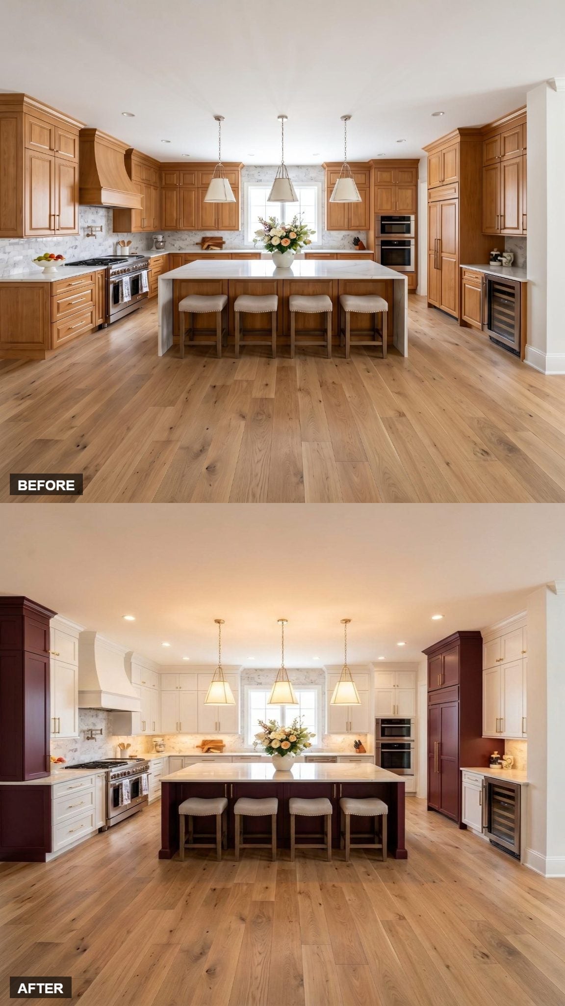
White shaker cabinets fill the upper perimeter, and the hood follows the same pale finish. Burgundy appears on the island base and the tall flanking cabinetry, giving the dark color both a central horizontal block and vertical presence at the edges.
Warm brass pendant lighting works with the gold cabinet hardware, pulling the metallic finish across the space without introducing another cabinet color.
8. The Herringbone Backsplash Adds Movement Without Adding Another Color
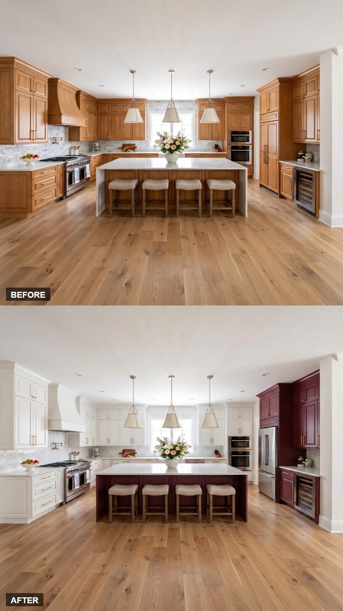
Burgundy appears on the island base and the built-in tower on the right, while white cabinetry controls the rest of the perimeter.
The herringbone backsplash behind the range is the detail that separates this version. It introduces pattern and directional movement while staying within the pale color family.
Brushed gold hardware repeats across both cabinet finishes, and aged-brass pendants continue the warm metal above the island.
7. Gold Hardware Warms Up a White Perimeter and Burgundy Island
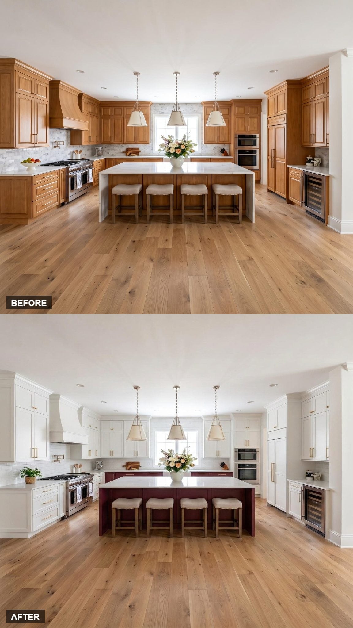
Bright white cabinets cover the perimeter and range hood, leaving the burgundy island as the central block of color.
Wide-plank white oak flooring brings visible grain beneath the pale cabinetry. Brushed gold hardware introduces warmth directly onto the white shaker doors and creates a visual link back toward the deep wine-colored island.
Three simple cone pendants keep the ceiling treatment restrained.
6. The Burgundy Range Changes the Entire Conversation
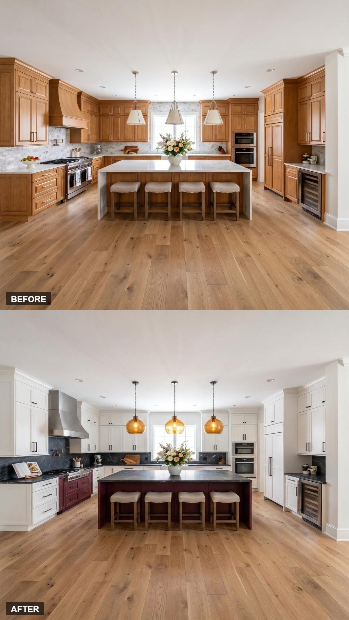
White shaker-style cabinets run the full perimeter, but the range itself takes the deep burgundy.
That single appliance gives the color a very different role from painted cabinetry. Dark soapstone countertops connect the range visually to the burgundy island base, while three amber glass pendants bring warm color overhead.
The strongest red in the room is no longer a cabinet door. It’s the range.
5. The Island Uses Burgundy Below and White Across the Waterfall Top
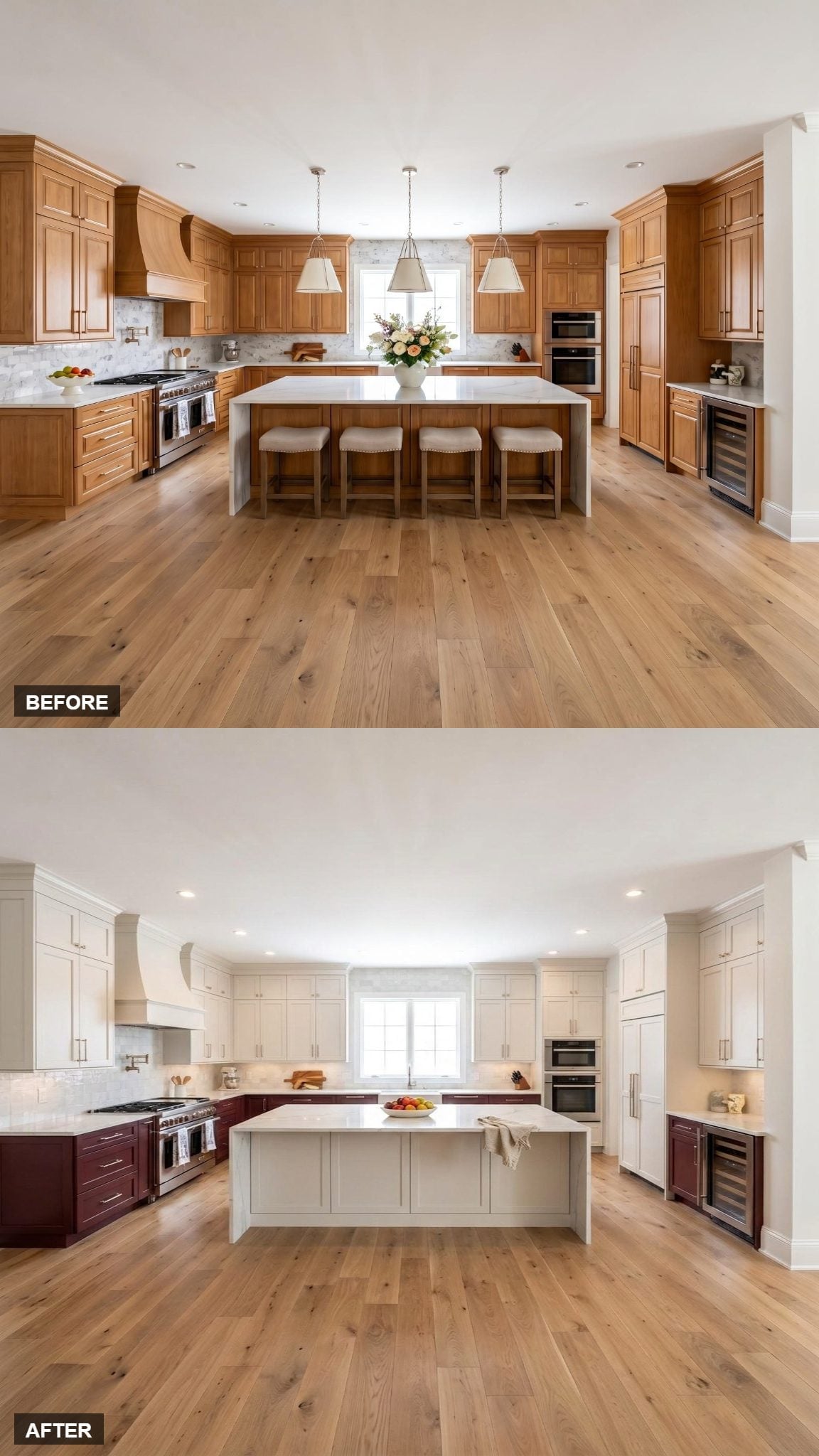
Soft white shaker uppers run across the perimeter while burgundy base cabinets cover the cooktop wall and built-in wine-fridge alcove.
The island repeats the burgundy on its painted panels but caps it with a white quartz waterfall top. That hard material change gives the island a clear horizontal division of its own.
Wide-plank white oak flooring and brushed nickel hardware remain consistent across both cabinet colors.
4. A Butcher Block Island Changes the Material Mix
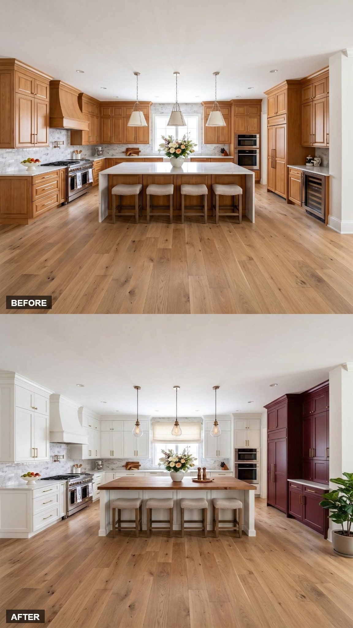
Four linen-upholstered stools line a butcher block island, bringing a large expanse of natural wood into a kitchen dominated by white shaker cabinetry.
Brass hardware warms the pale perimeter, while the right-side tower goes deep burgundy. Globe pendants in aged brass continue the metallic finish overhead.
Here the burgundy isn’t responsible for all the warmth. The butcher block carries plenty of that job on its own.
3. One Large Drum Pendant Leaves More Visual Space Around the Island
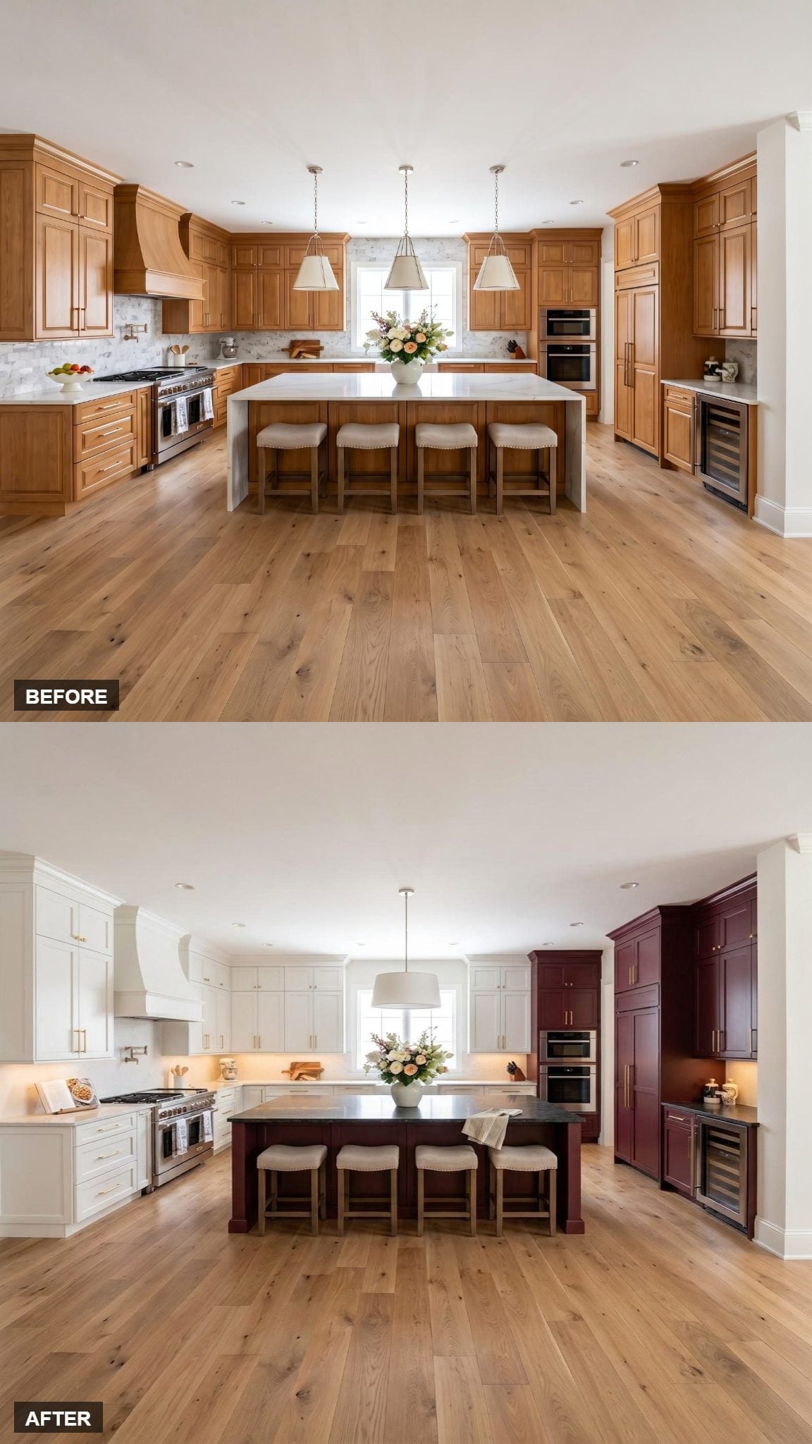
A single drum shade hangs centered over the island, giving the ceiling a much simpler focal point than a row of smaller fixtures would.
Below it, the dark countertop holds the center while the burgundy tower on the right supplies the strongest cabinet color. White perimeter cabinetry and a white hood occupy the rest of the walls.
Brass hardware appears on both cabinet colors, creating continuity across the split.
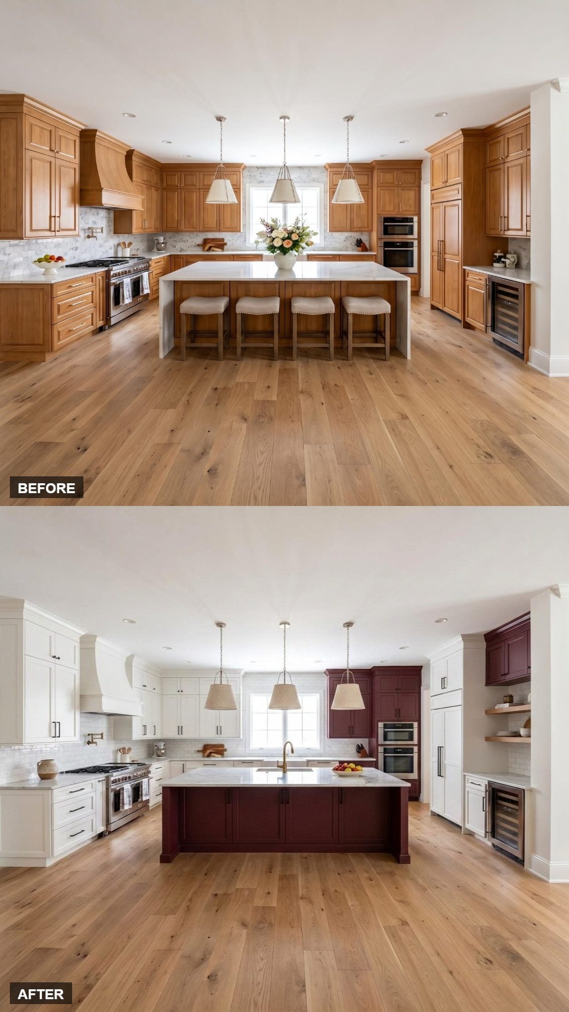
2. Two Burgundy Zones Keep the Asymmetry Under Control
🔥 Would you like to save this?
Dark burgundy appears on the island base and the upper-right cabinet run, creating two separated areas of color rather than one continuous band.
White perimeter cabinets use matte black hardware, and the range hood stays white with the cooking wall.
Because the burgundy appears in only two concentrated places, the asymmetrical layout remains easy to read.
1. Burgundy Towers Bookend the Room While the Island Stays Cream
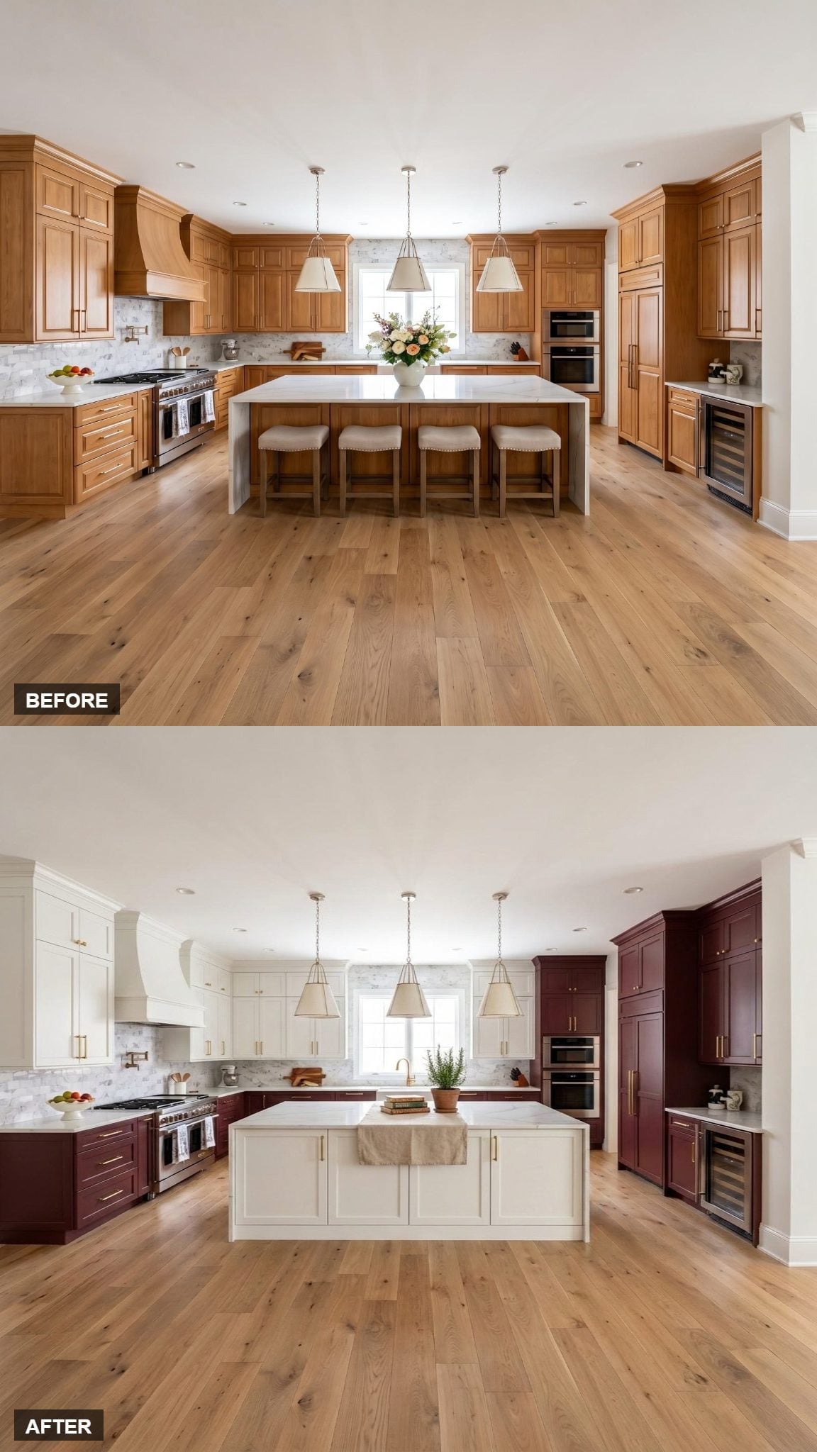
Burgundy towers sit at the outer edges while the upper cabinets remain white and the lower cabinetry goes deep. The island takes a quieter route in cream, topped with a farmhouse sink at the center.
Brass hardware runs through both cabinet colors, and gold-toned pendant lights repeat that metal overhead.
After so many versions that put burgundy directly on the island, this one ends by doing the opposite: the center stays pale while the deepest color moves outward to the surrounding cabinetry.












