
🔥 Would you like to save this?
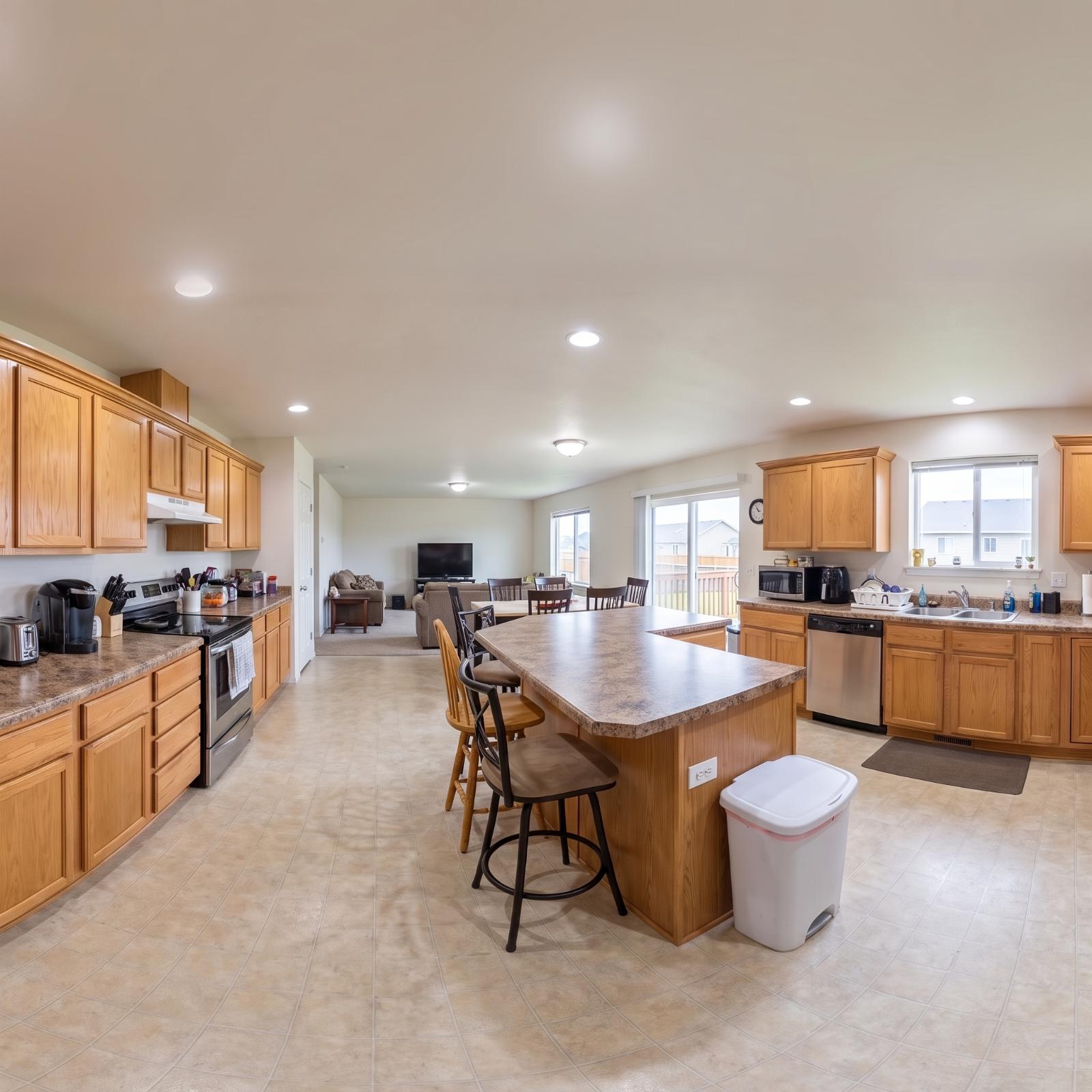
An open kitchen can have all the square footage in the world and still feel as if somebody forgot to finish drawing the room. The cabinets fade into the living area, the island floats somewhere in the middle, and every recessed light in the ceiling seems determined to illuminate the problem rather than solve it.
In order to come up with the very specific design ideas, we create most designs with the assistance of state-of-the-art AI interior design software. Also, assume links that take you off the site are affiliate links such as links to Amazon. this means we may earn a commission if you buy something.
That doesn’t mean the open kitchen is disappearing. The more interesting question is what happens when you keep the light, sightlines, and easy movement but give the kitchen some edges again. Sometimes that means a furniture-like island or cabinetry that reaches the ceiling. Elsewhere it’s a change in flooring, a darker wall of storage, open shelving, wainscoting, or lighting positioned to make one part of a large room feel deliberately different from the next.
These 33 before-and-after designs take that idea in very different directions. Some barely touch the footprint. Others change the character of the room completely. The fun is seeing how many ways there are to make an open kitchen feel like an actual kitchen again without putting it back behind a door.
33. Flat-Front Oak Cabinets Put the Wood Grain Front and Center
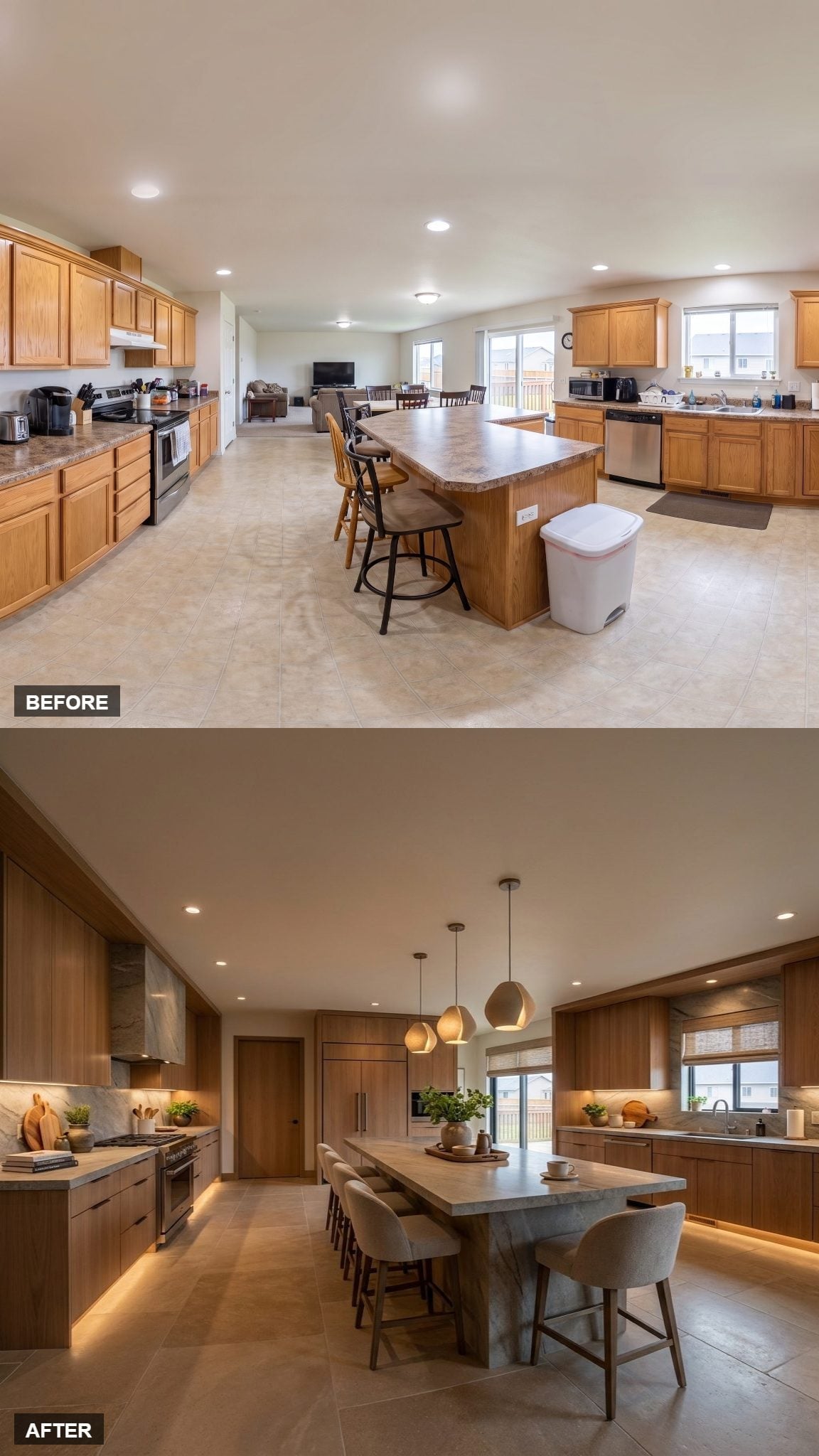
Flat-panel oak cabinets run floor to ceiling on both walls, leaving the grain visible under a natural finish rather than burying it beneath paint. The long island cuts through all that wood with a cool gray, concrete-look surface.
Five upholstered counter stools tuck beneath the overhang, turning a substantial block of cabinetry into usable seating rather than simply more prep space. Three pendants at slightly staggered heights loosen up the otherwise disciplined geometry, while under-cabinet lighting keeps the long perimeter from disappearing after dark.
32. Two Woven Pendants Give a Quiet Kitchen Something to Look At
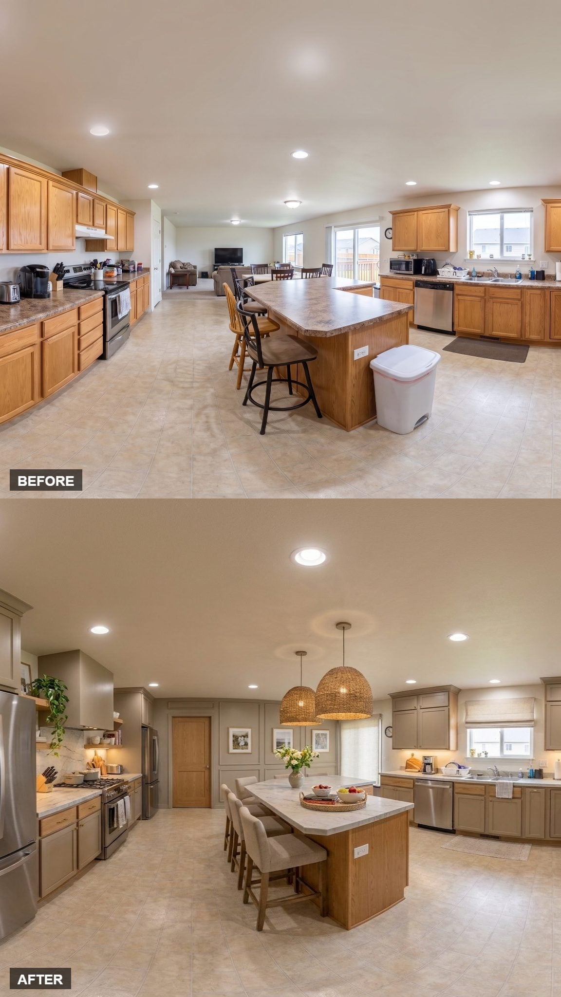
Greige-painted cabinetry keeps the perimeter subdued, while the light quartz island stays close enough in tone that nothing fights for attention.
Then the woven dome pendants arrive. Their size, texture, and darker edges create a focal point above the island without requiring another cabinet color or an elaborate backsplash. Upholstered stools complete the softer middle of the room.
31. Cream Cabinetry and Wainscoting Give the Walls More Architecture
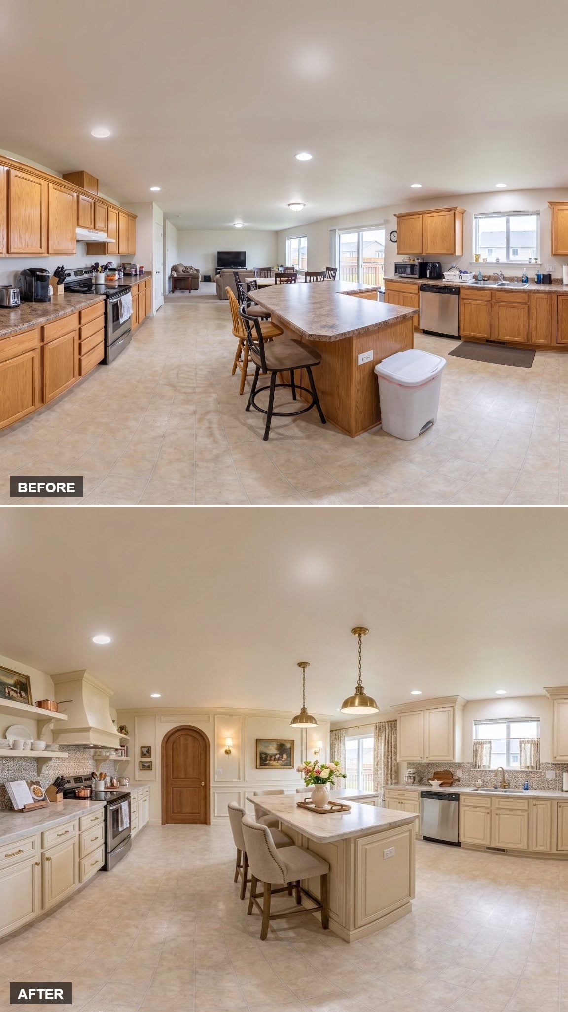
Cream raised-panel cabinetry gives both walls considerably more detail than a flat cabinet run would, while open shelving on the left breaks up the solid doors with stacks of white dishware.
The wainscoting extends that paneled language beyond the cabinets, which is what makes the kitchen feel connected to the surrounding architecture instead of simply parked inside a larger room. Two brass pendants add a sharper metallic note over the island.
30. Walnut Lowers and White Uppers Split the Kitchen Horizontally

Dark walnut cabinetry carries the lower perimeter while crisp white flat-front uppers keep the upper half pale. Rather than scattering the two finishes randomly, the kitchen gives each one a clear territory.
A thick marble-look quartz waterfall counter turns the island into the brightest large surface in the room. Four curved upholstered stools soften its edges, and geometric pendants add a little angular contrast overhead.
Warm taupe walls and Roman shades bridge the walnut and white without introducing another dominant color.
29. Open Shelves Give the Oak Cabinetry Room to Breathe
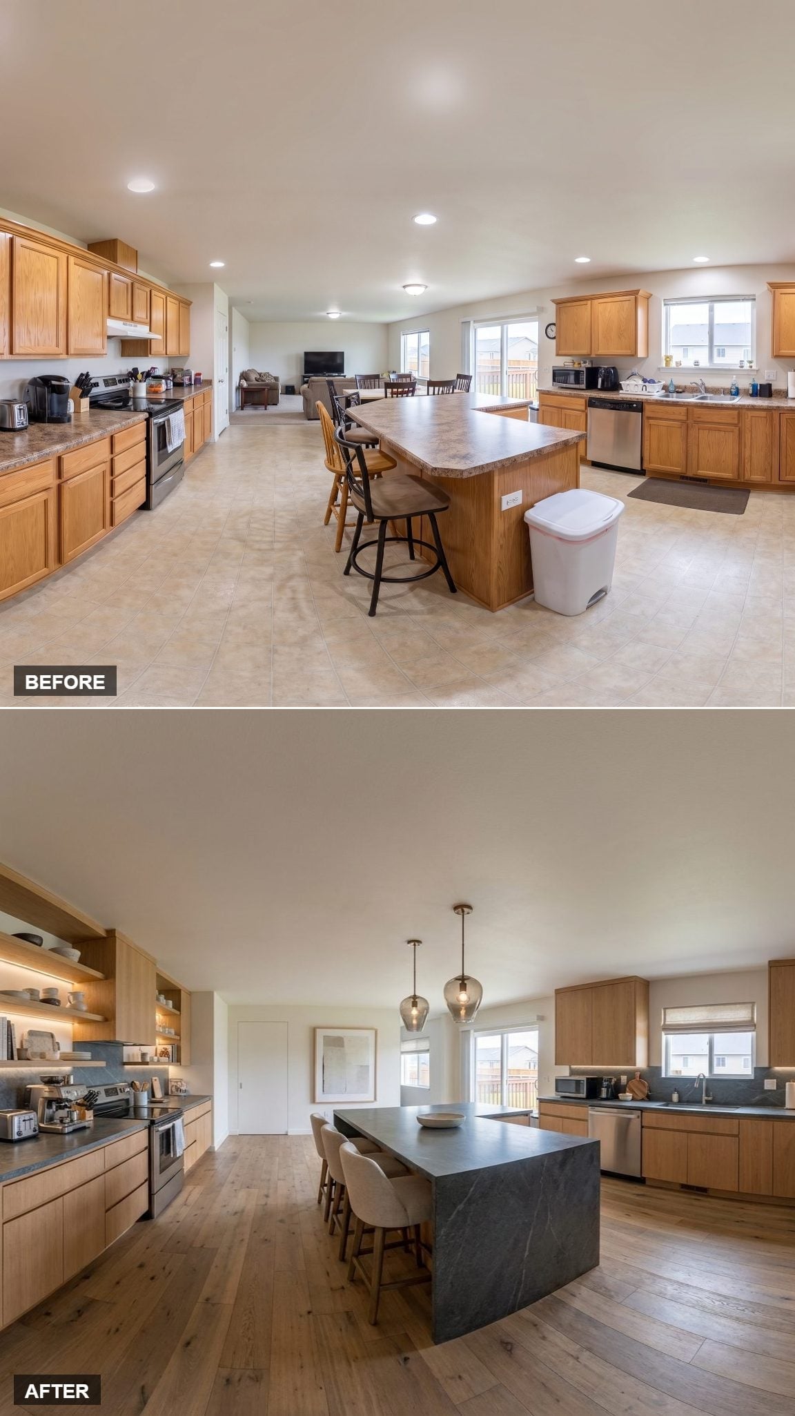
The dark countertop changes the character of this kitchen more than another row of upper cabinets ever could.
Light oak cabinetry runs around the room, but one wall stays comparatively open with illuminated shelves instead of a continuous bank of doors. That gap exposes more wall and gives the ceramics somewhere to become part of the room rather than disappear behind cabinetry.
The island uses a thick near-black surface with the soft, matte look of soapstone. Against the pale oak, it becomes a strong horizontal line through the center. Amber-tinted glass pendants and warm wood flooring keep the contrast from turning severe.
28. Knotty Wood and an Arched Door Push the Room Toward a Mediterranean Look
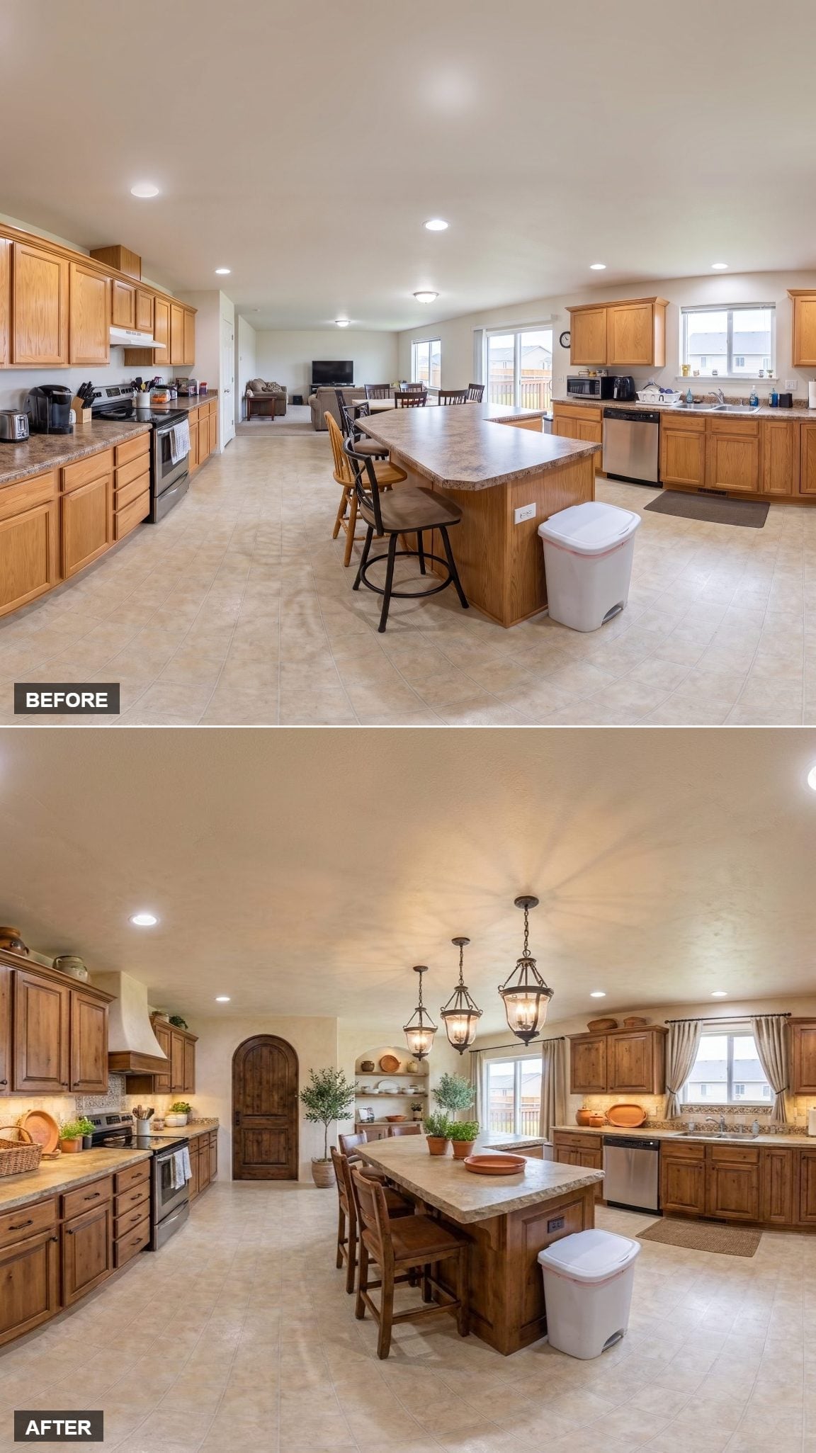
Knotty wood cabinetry with a deep warm stain gives this kitchen more texture than a smooth painted finish ever could. The grain, knots, and variation are part of the look rather than imperfections being disguised.
The arched interior doorway changes the architectural mood immediately, while three wrought-iron lanterns pick up that heavier, older-world character above the island. Nothing here is trying to look weightless, which is precisely why the combination holds together.
27. The Original Oak Looks Different Under Woven Light and White Quartz
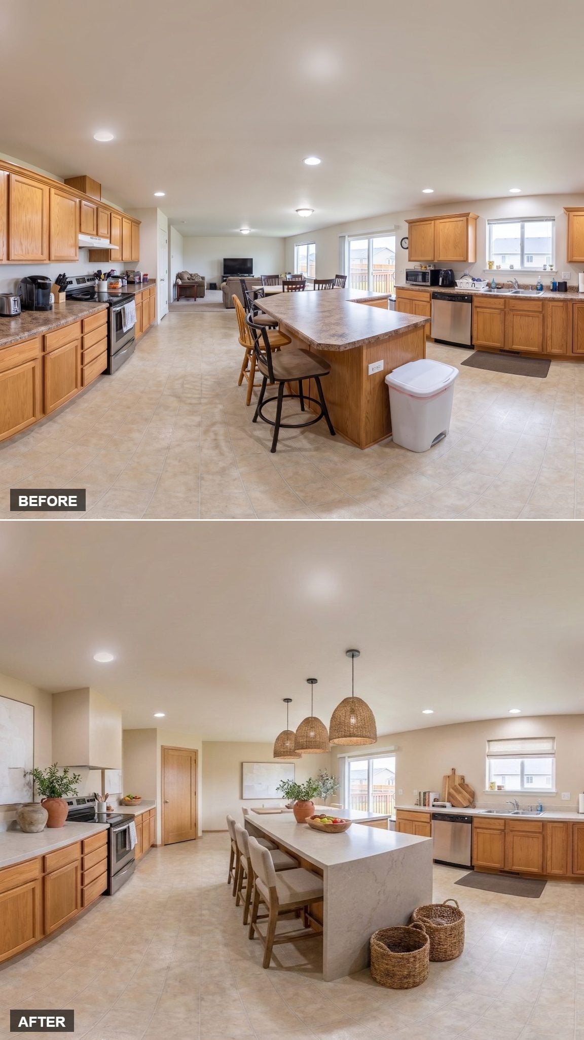
Oak cabinetry doesn’t automatically need paint to feel current. Here the wood remains a major part of the palette, but a long white quartz surface and three oversized rattan pendants change what surrounds it.
Natural-fabric stools sit quietly beneath the island, while woven baskets repeat the pendants at a smaller scale. The result depends less on replacing the oak than on giving it lighter surfaces and enough texture to look deliberate.
26. Cove Lighting Turns the Ceiling Into Part of the Design
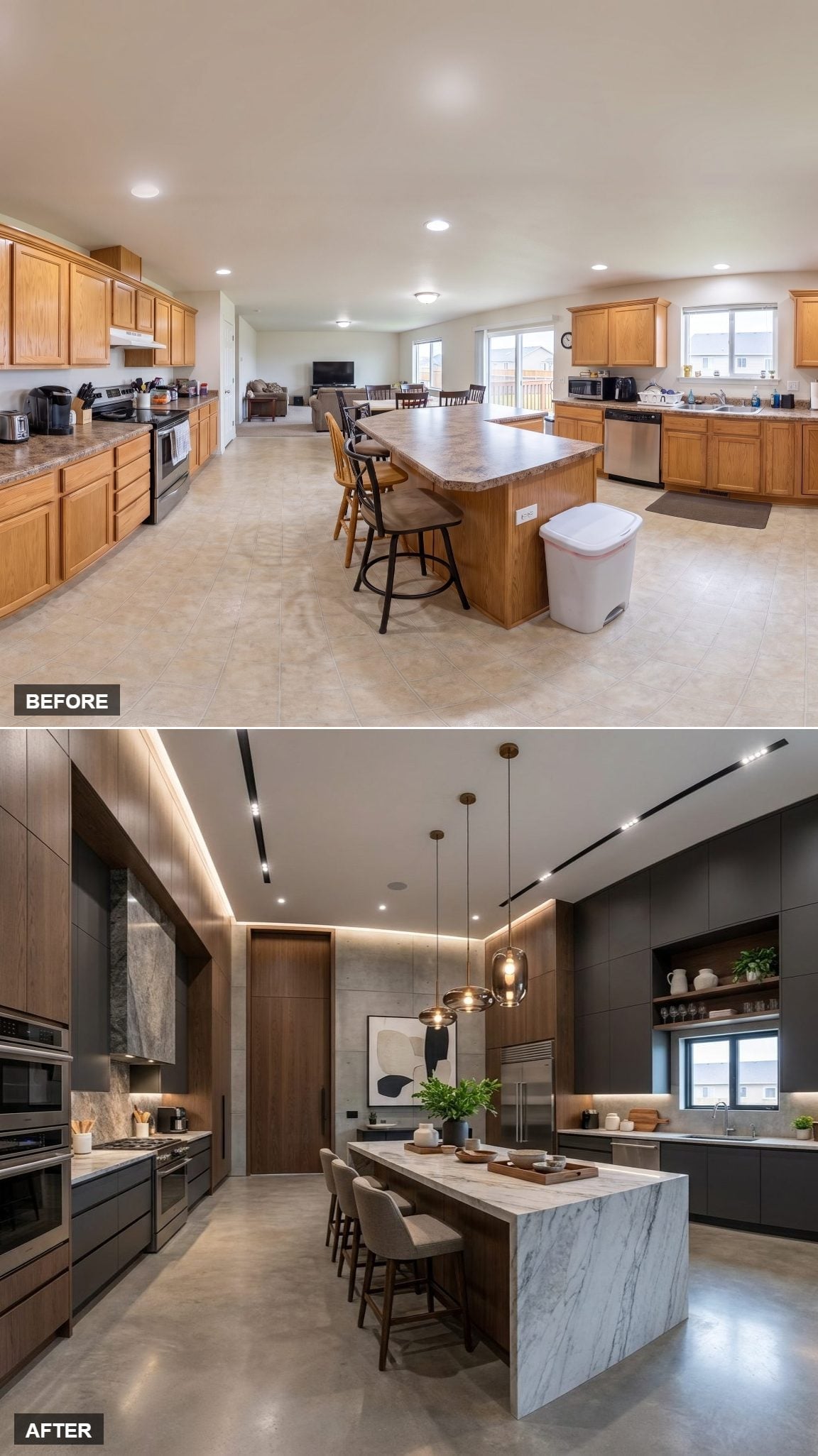
A continuous cove of warm light runs along the ceiling instead of leaving the entire lighting job to recessed cans. That illuminated edge gives the tall cabinetry a much more deliberate top line.
Charcoal flat-front cabinets alternate with walnut panels, keeping the darker palette from becoming one uninterrupted block. The marble-look island adds pronounced gray veining and waterfall ends, bringing pattern into a room otherwise built from broad, simple surfaces.
25. A Butcher Block Island Breaks Up All That Cream
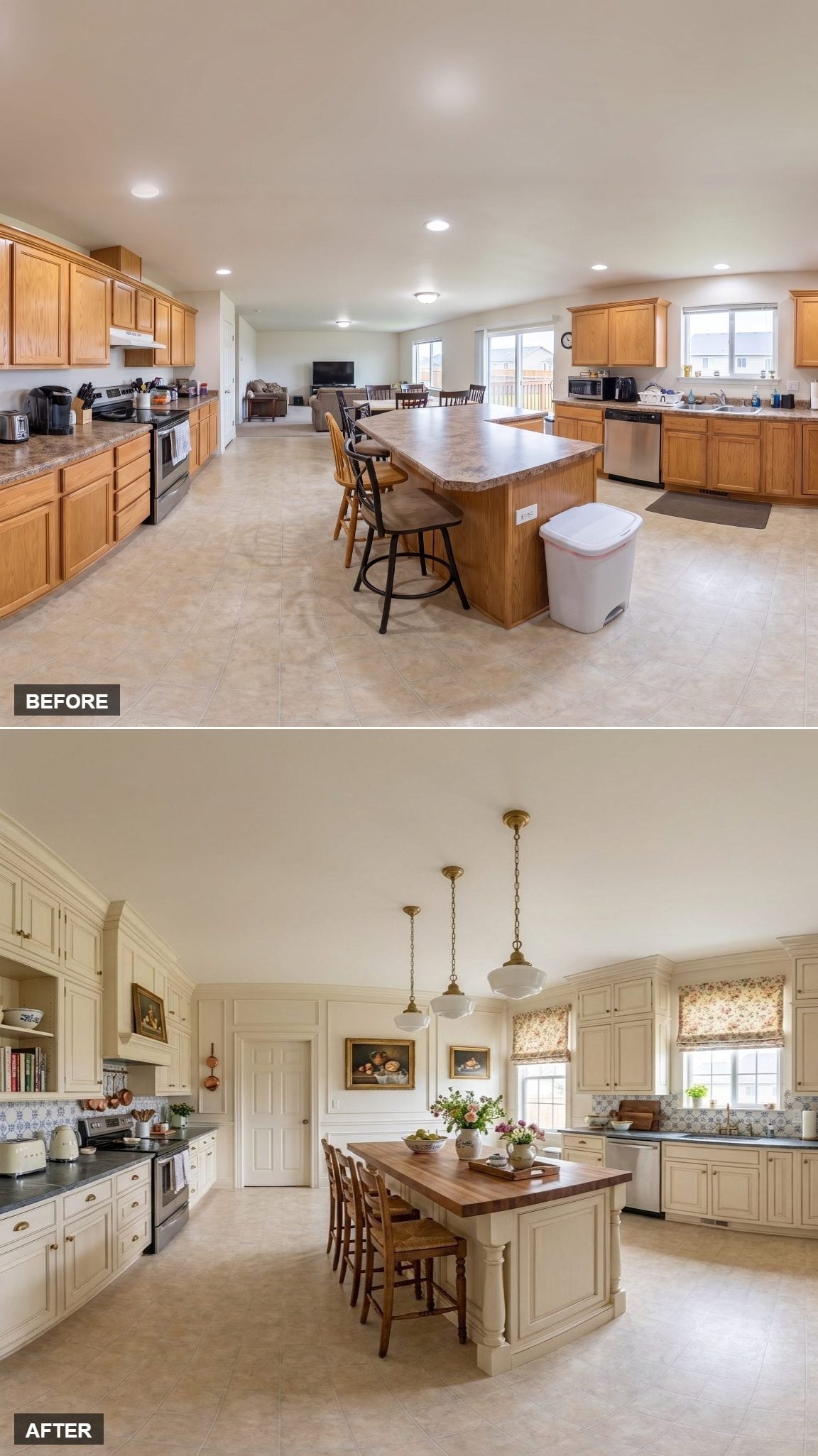
Cream raised-panel cabinetry fills the perimeter, with dark slate-toned counters keeping the pale paint from becoming sugary. The island takes a completely different material route with butcher block rather than another stretch of stone.
That wood surface is what gives the middle of the kitchen its strongest dose of warmth. Brass schoolhouse pendants, floral Roman shades, a patterned backsplash, and framed still-life art continue the more traditional direction without asking any one detail to carry the entire room.
Lighting Note: Pendants above an island can visually separate the work surface from a larger ceiling plane, especially when the fixtures are big enough to register from across the room. Here the cluster pulls attention toward the island and away from the open space beyond it.
24. Navy Cabinetry Gives the Kitchen Its Own Color Territory
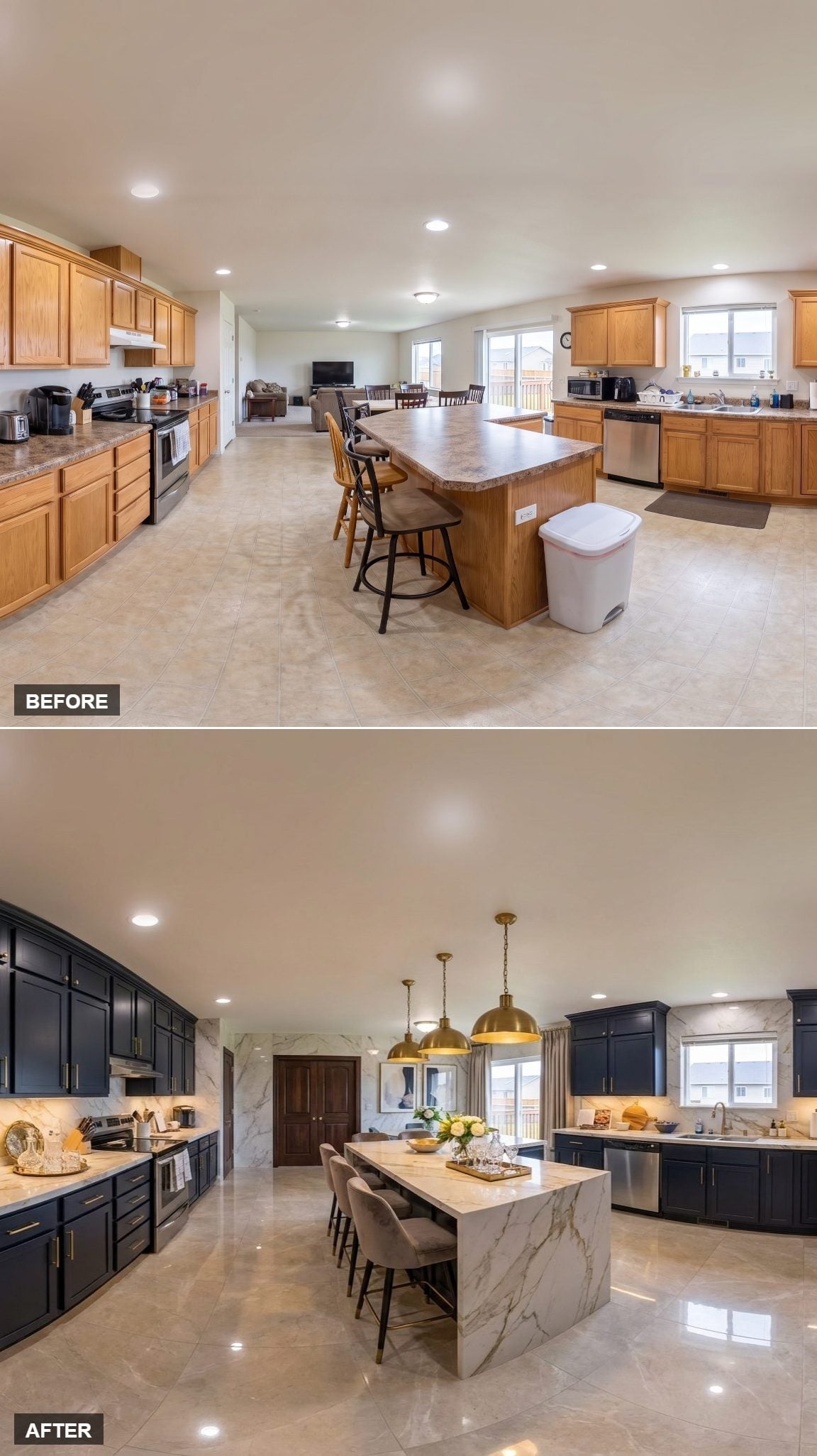
Deep navy cabinetry sets this kitchen apart from the lighter surfaces around it before any furniture or lighting enters the picture. The color is dense enough to make the cabinet run read almost as a single architectural block.
A marble-look island introduces a much paler surface through the center, while brass dome pendants bring warmth above it. Matching veining between the island and backsplash keeps the stone pattern from feeling like an isolated flourish.
23. Beadboard Doors Give the White Cabinetry Something to Say
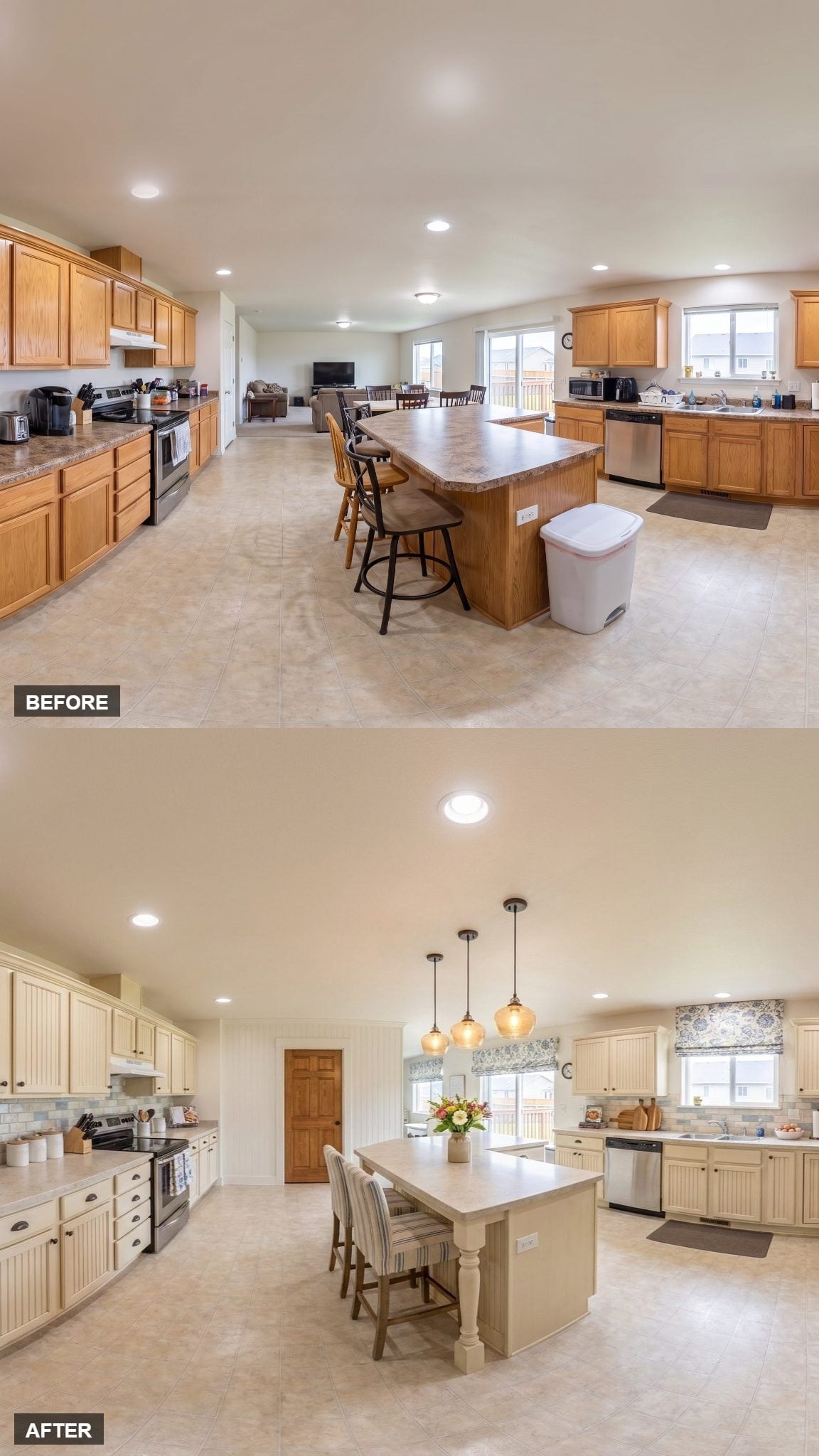
Antiqued white cabinetry could easily disappear against a pale room, but beadboard-panel detailing puts fine vertical texture across the doors. Matte black hardware makes those lines easier to read.
The island sits on visible legs instead of presenting one solid cabinet box, which gives the center a more furniture-like character. Amber glass pendants and floral Roman shades add warmer color without changing the restrained cabinet palette.
Design Note: Beadboard changes the cabinet doors through texture rather than color. Those narrow grooves keep a pale kitchen from turning into one smooth white blur.
22. Turned Wood Legs Make the Island Look More Like Furniture
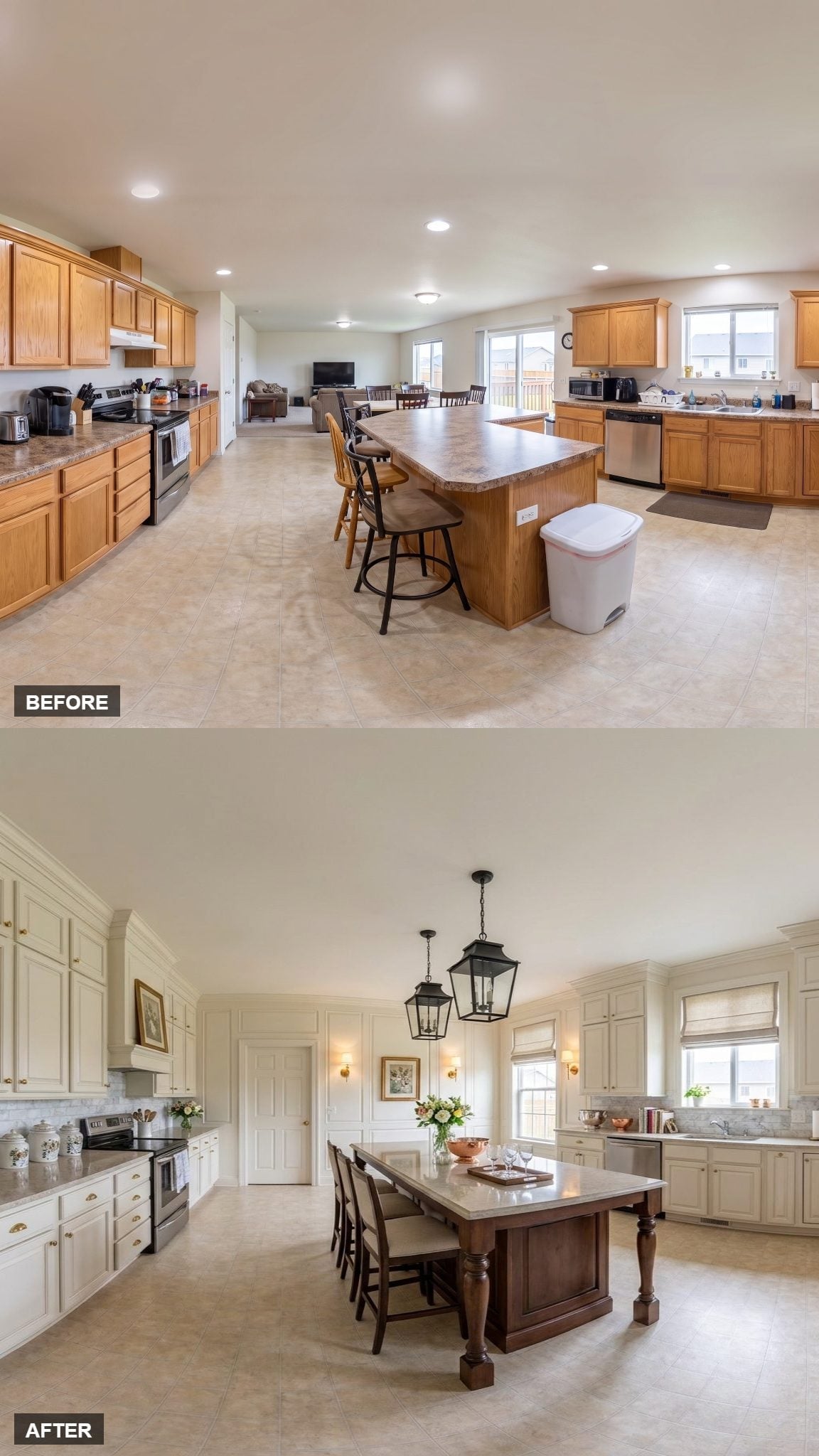
Raised-panel ivory cabinetry runs floor to ceiling, finished with crown molding that gives the upper edge a proper termination instead of stopping abruptly below the ceiling.
The more unusual move is at the island. Darker turned legs support the ends, making it resemble a substantial worktable inserted into the kitchen rather than another built-in cabinet box.
Two lantern pendants and a pair of wall sconces continue that furniture-room quality, while linen Roman shades keep the windows comparatively simple.
Where the previous kitchen leans cottage, this one pushes toward a more formal traditional look.
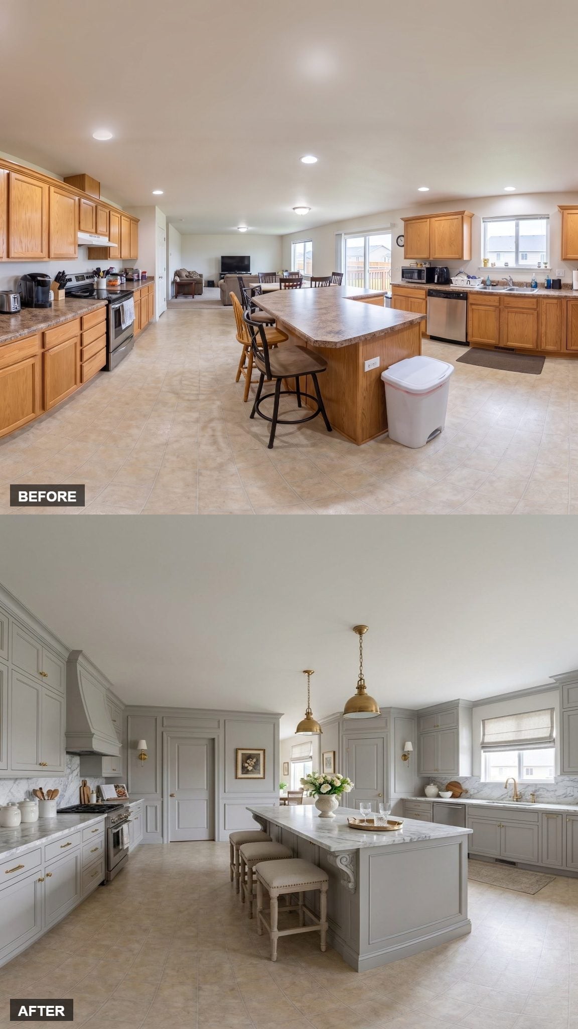
21. Inset Gray Cabinetry and Scroll Brackets Bring Back the Details
🔥 Would you like to save this?
Soft gray inset cabinets establish a more tailored look immediately because the doors sit within the face frames rather than over them. Brass hardware emphasizes each opening without overpowering the paint.
The island adds another traditional detail with scroll brackets beneath its thick marble top. A custom range hood gives the cooking wall its own centerpiece, while Roman shades and brass pendants repeat the softer finishes elsewhere.
20. The Patterned Floor Does What Another Accent Wall Couldn’t
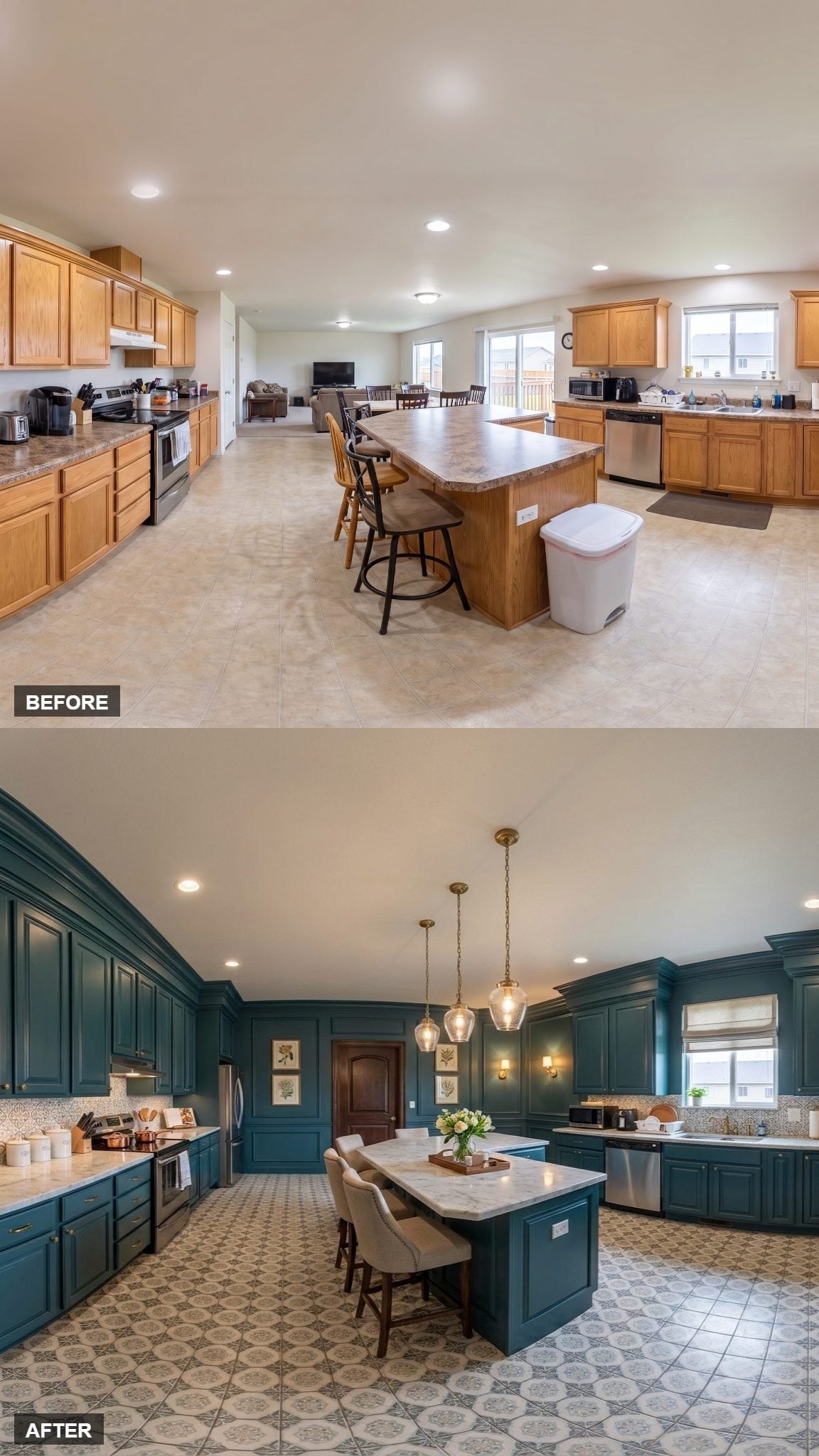
Deep teal cabinetry already gives this kitchen plenty of color, so adding another painted focal wall would have been redundant. Instead, the pattern moves underfoot.
The tile floor creates a defined field beneath the cabinets and island, making the kitchen readable from the floor up. Brass pendants and crown molding add warmer, more traditional details without competing with that graphic surface.
19. Espresso Cabinets Make White Subway Tile Look Sharper
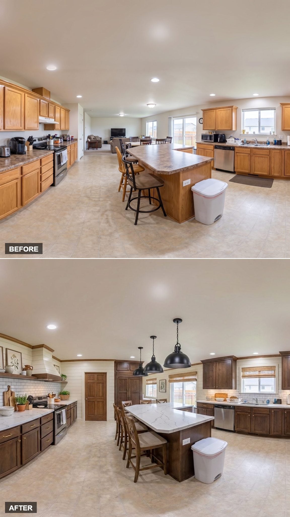
Espresso-stained cabinetry gives the perimeter a dark continuous frame, while the white subway backsplash becomes noticeably brighter by contrast.
A lightly veined quartz island sits between those extremes. Two matte-black industrial pendants continue the darker tone overhead without introducing another finish.
The ingredients are familiar. The high contrast is what makes them register.
18. A Hutch Wall Makes Storage Part of the Architecture
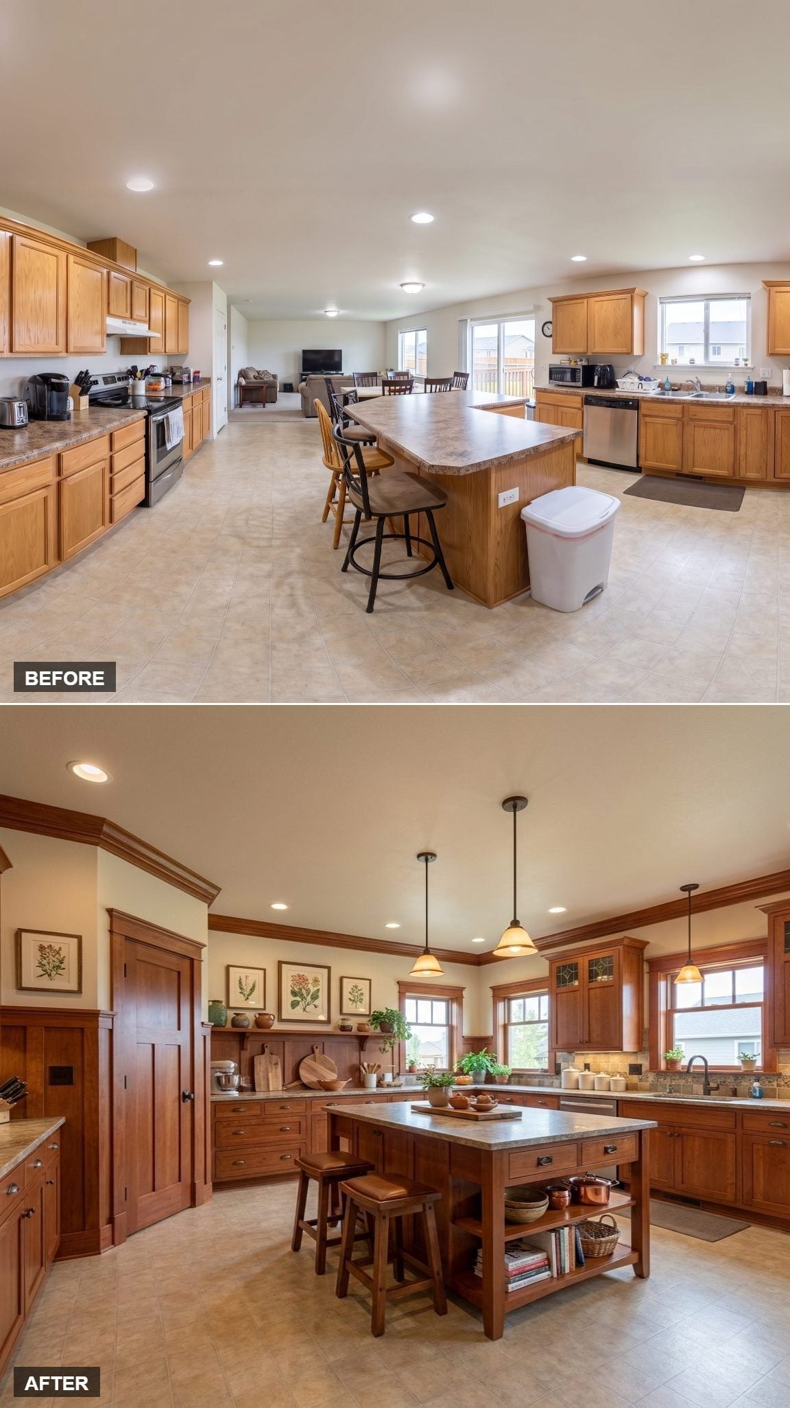
Dark cherry cabinetry with square Craftsman-style detailing gives the room substantial visual weight, but the hutch wall is the feature worth watching.
Open display shelves, pottery, and framed botanical prints turn that entire section into something closer to a built-in piece of furniture than ordinary kitchen storage. The island continues the idea with its own open shelving beneath the worktop.
Amber glass pendants add warm light, but the cabinetry itself carries most of the character.
Detail Note: Crown molding gives tall upper cabinets a stronger finish at the ceiling line. In a kitchen this traditional, that extra strip of detail keeps the cabinetry from looking as if it simply stopped.
17. Limewashed Walls Keep a Rustic Kitchen From Looking Too Polished
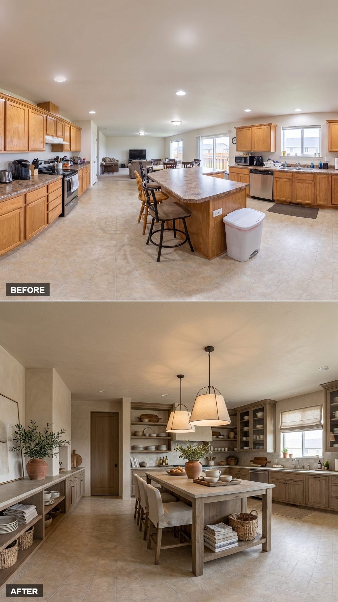
Weathered oak cabinetry and glass-front uppers establish the rustic direction, but the limewashed wall finish prevents the background from becoming perfectly smooth and pristine.
Open shelves hold ceramics and wood bowls, while the broad island uses raw-looking wood and an open lower shelf rather than another bank of cabinet doors. Linen shades, woven baskets, and terracotta pots stay within the same dry, natural palette.
Nothing here is particularly glossy, which is a large part of the appeal.
16. A White Island Cuts Through a Wall of Walnut
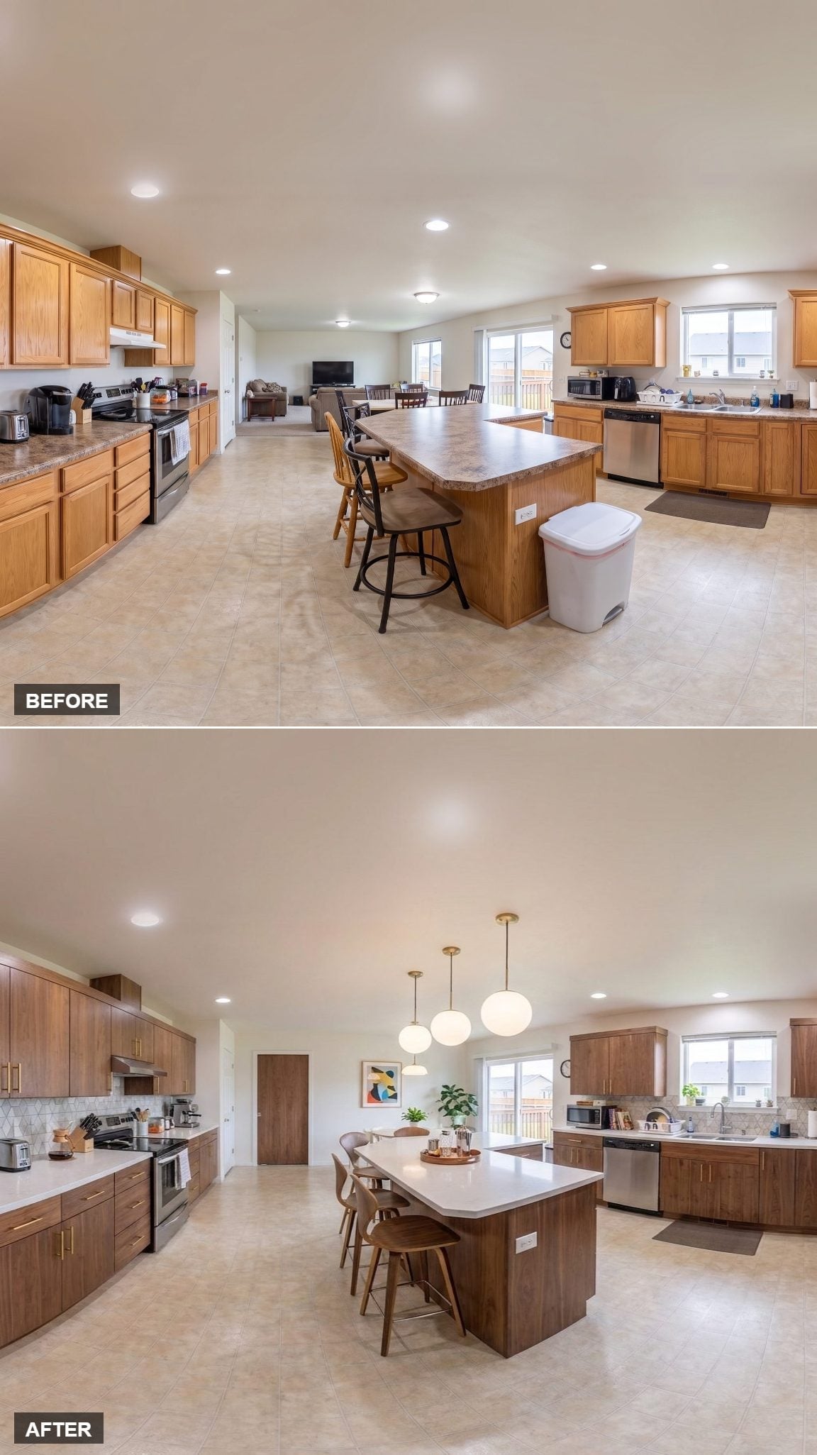
Walnut-toned flat-front cabinetry gives the perimeter a continuous band of warm wood, while the island refuses to match it.
Instead, the center stays bright with white quartz, creating a clean interruption between the darker cabinet walls. Brass globe pendants repeat the warmer notes overhead without turning the island itself into another wood surface.
15. Knotty Alder and Stacked Stone Double Down on Texture
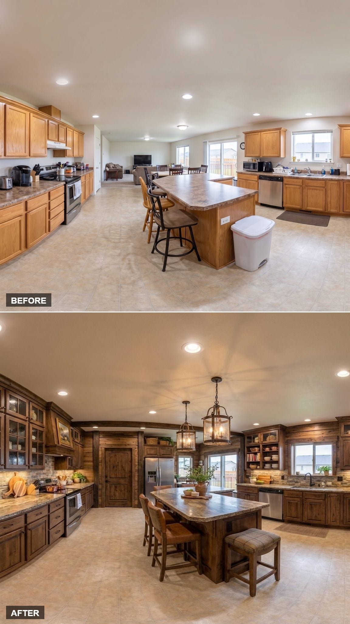
Knotty alder cabinetry runs around the room with the grain, knots, and tonal variation left fully visible. Glass-front uppers interrupt the heavier runs, while open shelving near the sink creates another break.
Behind the range, stacked-stone texture gives the wall a much rougher surface than ordinary tile. The island adds seating on more than one side, making it work less like a narrow prep counter and more like a large communal table.
Material Note: Knotty alder puts every knot and irregular streak of grain on display. Pair it with a rough stone backsplash and the room gets texture before a single decorative object arrives.
14. Navy Paint Turns the Cabinet Run Into One Strong Shape
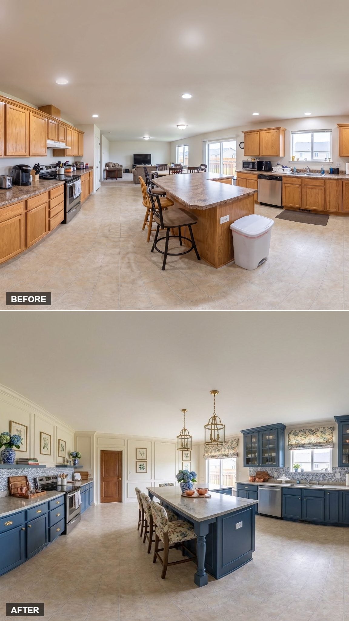
Deep navy covers both upper and lower cabinetry, allowing the full run to read as one coherent block rather than a collection of individual boxes.
Wainscoting continues the paneled treatment onto adjacent wall surfaces. Brass lanterns provide the sharpest contrast, while botanical prints and a floral Roman shade keep the dark blue from making the room overly formal.
13. LED Coves Draw a Second Outline Around the Kitchen
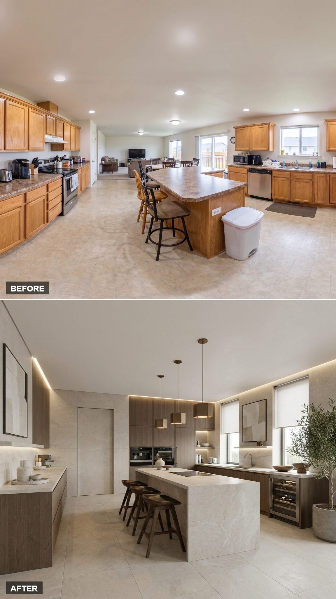
Warm walnut flat-front cabinets handle the perimeter, with one wall left free of uppers to keep the room from becoming a continuous wood box.
The ceiling provides the more unusual move. LED cove lighting traces two edges above the kitchen, creating a visible outline after dark that recessed fixtures alone would not produce.
The island adds another substantial stone-look surface, while matching walnut drum shades echo the cabinetry overhead. A built-in wine cooler slips into the perimeter storage without demanding attention.
12. Terracotta Tile Gives the Green Cabinets a Warmer Floor
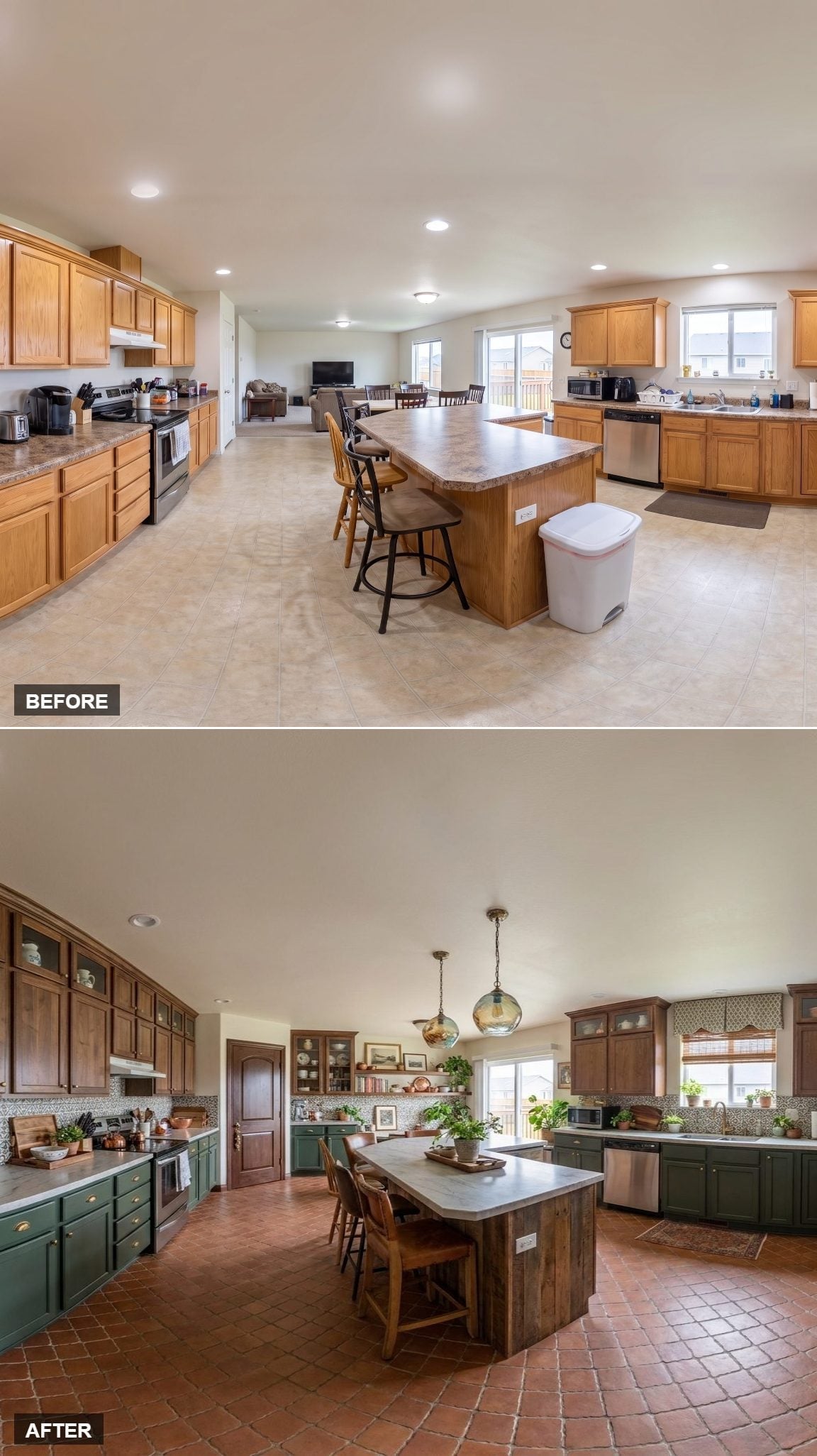
Hunter-green lowers sit beneath darker stained uppers, creating two distinct tones within the cabinetry itself.
The bigger change in atmosphere comes from the Saltillo-style terracotta floor. Its warm orange-brown color pushes back against the cooler green and keeps the room from becoming a study in dark finishes.
Amber glass pendants repeat that warmth above the island, linking the ceiling treatment to the tile below.
11. Dark Counters Keep Antiqued Cream Cabinetry From Going Too Sweet
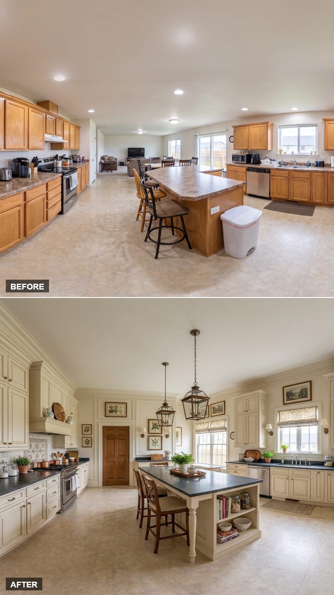
Antiqued cream cabinetry comes with raised panels, decorative pilasters, and enough architectural detailing to make the perimeter feel intentionally traditional.
Near-black counters with a soft soapstone-like finish put a much harder edge against all that pale paint. Instead of another light stone surface, the dark band gives the lower half of the room some visual resistance.
Two lantern pendants continue the traditional vocabulary without asking the ceiling to become the main event.
10. The Freestanding Wood Island Tells You Exactly Where the Kitchen Stops
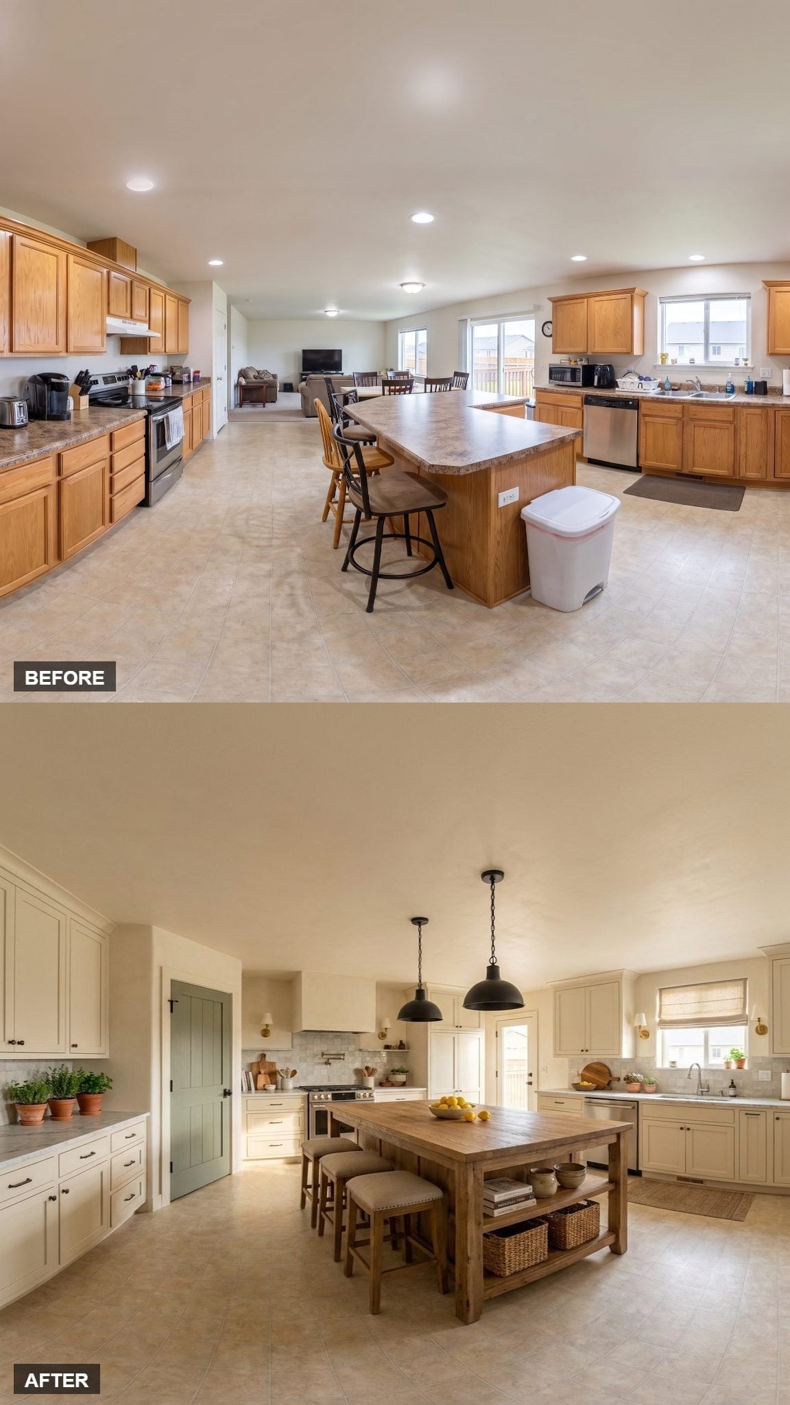
Soft cream cabinetry with black hardware keeps the perimeter quiet, while a sage-green door introduces one muted note of color at the edge.
The island is the real departure. Its aged wood, open lower shelf, and woven baskets make it look much closer to a large worktable than built-in cabinetry.
That furniture quality gives the center a natural stopping point without requiring a wall, railing, or change in ceiling height. Two black industrial pendants reinforce the darker wood rather than competing with it.
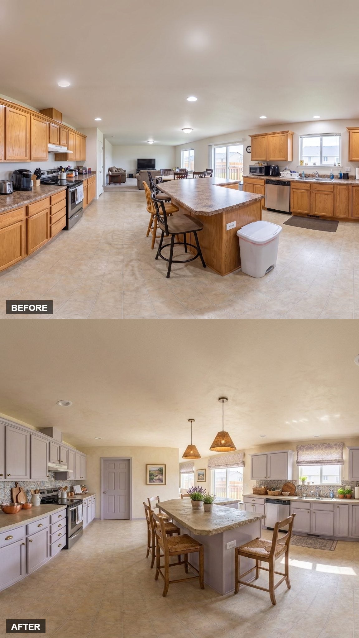
9. Gray-Lavender Cabinets Let the Floral Details Stay Soft
🔥 Would you like to save this?
The cabinet color lands somewhere between cool gray and muted lavender, giving the perimeter color without pushing it into anything particularly bold.
Two woven rattan pendants add coarse texture overhead, while soft floral Roman shades repeat the subdued palette at the windows. Neither pattern nor color is asked to become a major statement.
The result is quieter because the finishes sit close together rather than because any single element dominates.
8. Honey Oak Gets Better Company Instead of a Coat of Paint
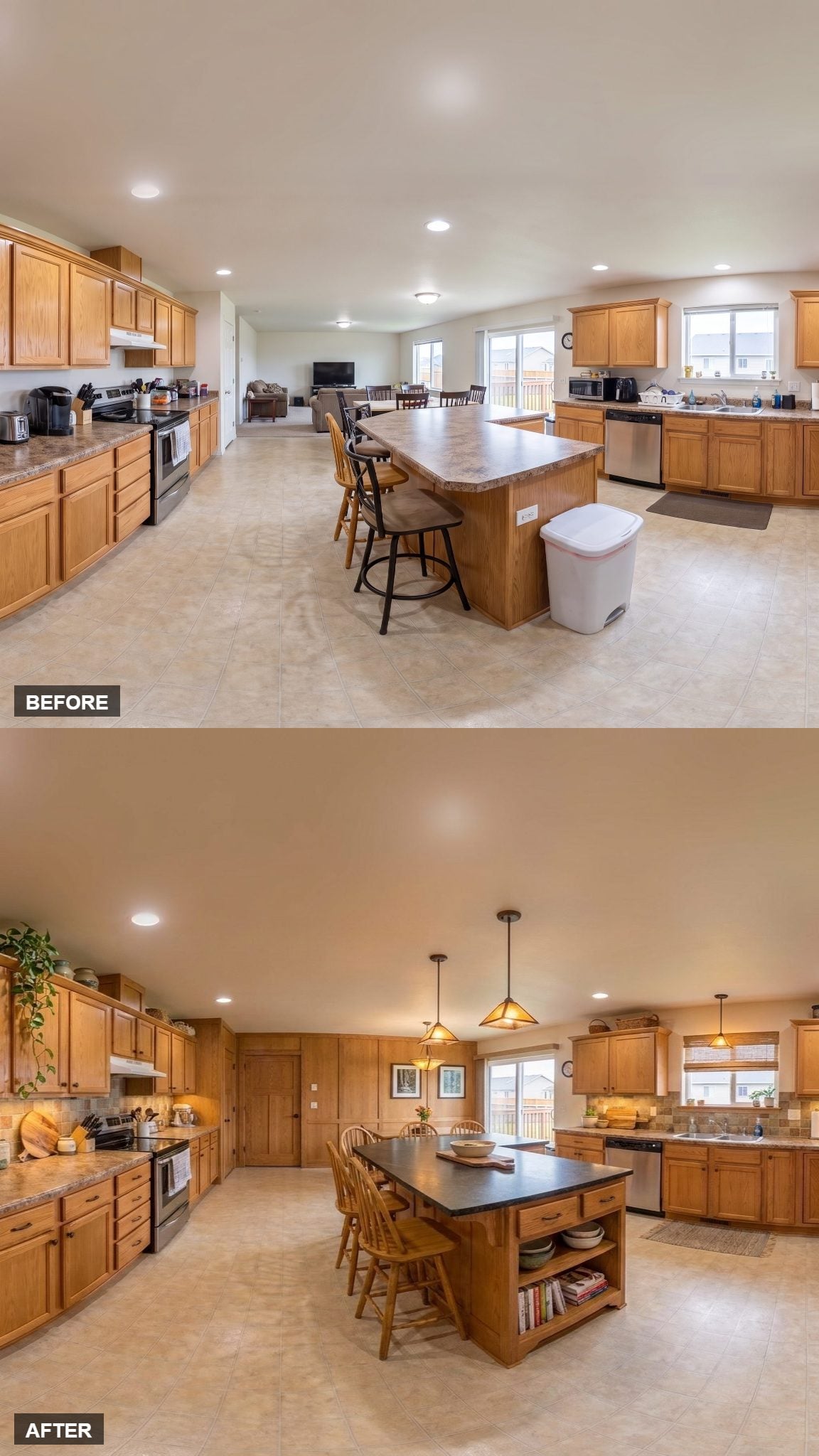
Three amber-glass pendants form a loose cluster above the island, adding warm light without fighting the existing honey oak.
The cabinet color stays, but darker slate-toned counters and a white subway backsplash give it much clearer contrast. Windsor-style chairs bring in another wood note with a lighter visual footprint than upholstered seating.
Open shelving at the island base gives cookbooks and display pieces a visible home instead of turning every inch into closed cabinetry. The oak isn’t pretending to be something else; the room around it simply became more selective.
7. A Detailed Range Hood Gives the Cream Cabinetry a Proper Center
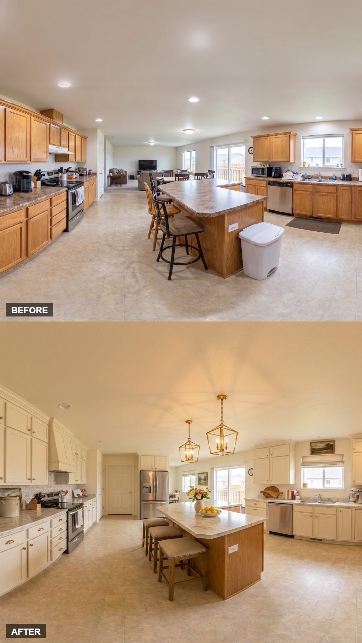
Cream raised-panel cabinetry runs floor to ceiling, but the range hood interrupts the long cabinet wall with crown detailing and a more architectural shape.
The marble-look island stays comparatively simple, with low-profile upholstered stools tucked beneath the top. Gold cage lanterns introduce a darker outline overhead.
Framed art, flowers, and a bowl of lemons keep the styling domestic rather than showroom-perfect.
6. Sage Cabinetry Carries Straight Into the Wainscoting
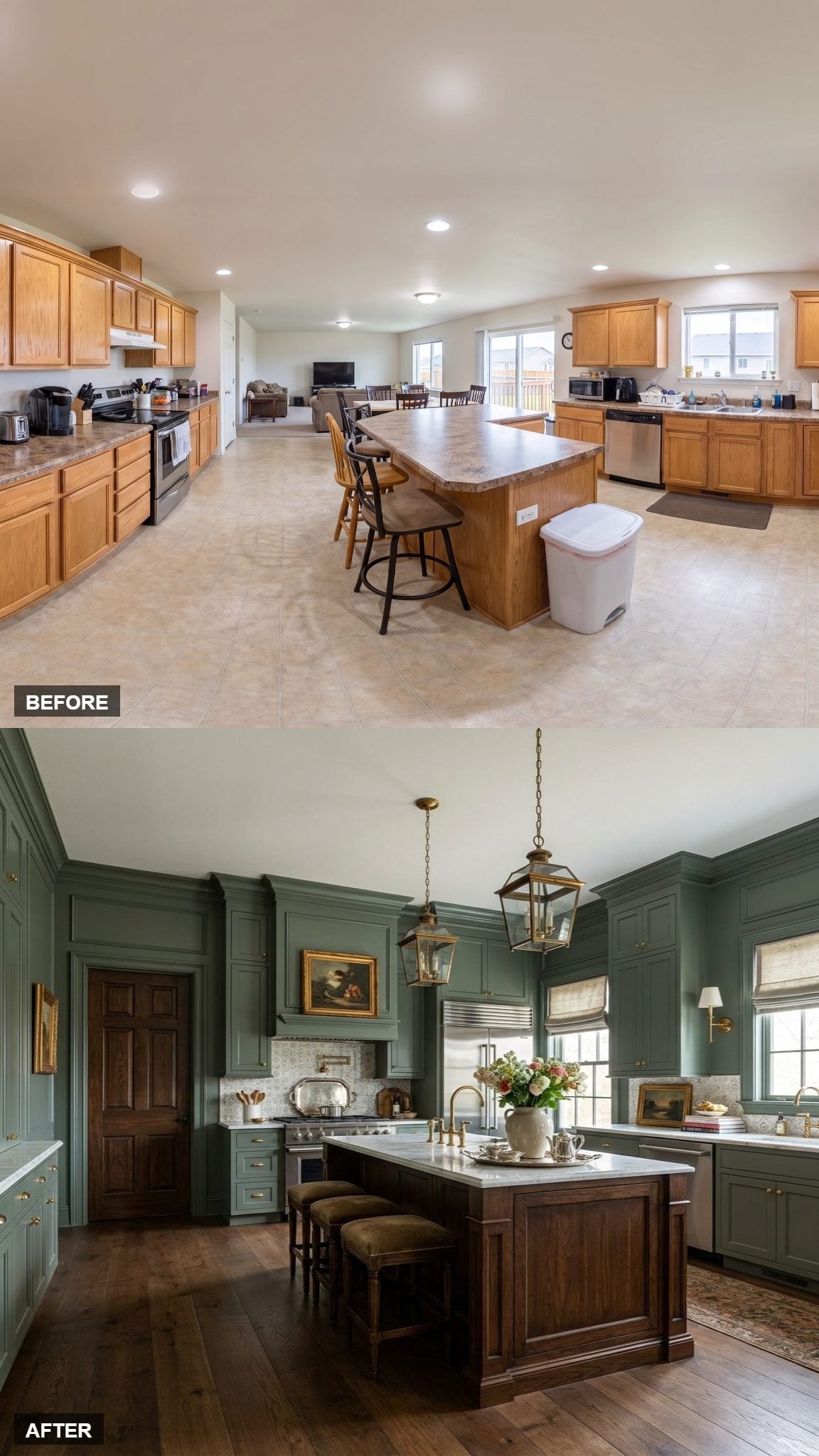
Sage green runs from the raised-panel cabinetry into matching wainscoting, letting the color move beyond the cabinet boxes and become part of the walls.
A dark walnut island creates the strongest contrast at the center, topped with pale marble and paired with brass-chain lanterns.
Wide-plank wood flooring adds another warm surface beneath it all, leaving the green to provide the room’s softer color rather than carrying the entire composition by itself.
5. Terracotta-Toned Lowers Give the Cream Uppers a Clear Counterpart
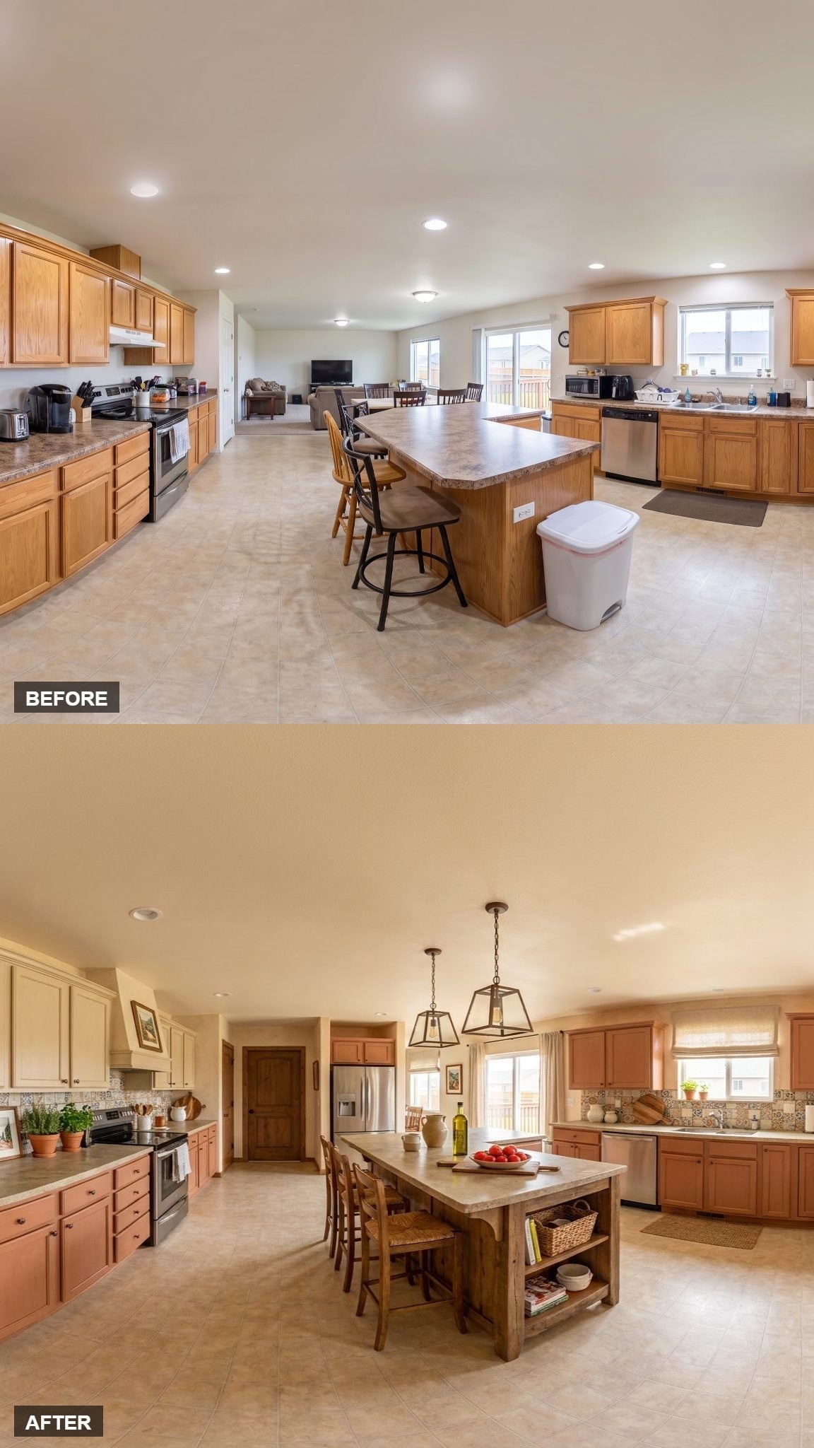
Cream upper cabinets stay pale while the lowers shift toward a warm terracotta-adjacent tone. That division gives the kitchen two distinct horizontal bands rather than one continuous cabinet color.
A mosaic backsplash crosses both walls and visually connects the sink and range sides. The island adds wood, stone, and open shelving instead of simply repeating one of the cabinet finishes.
Lantern pendants and Roman shades finish the room without having to explain where the boundaries are; the cabinetry already does that.
4. Blue-Gray Walls Make the White Shaker Cabinets Look Whiter
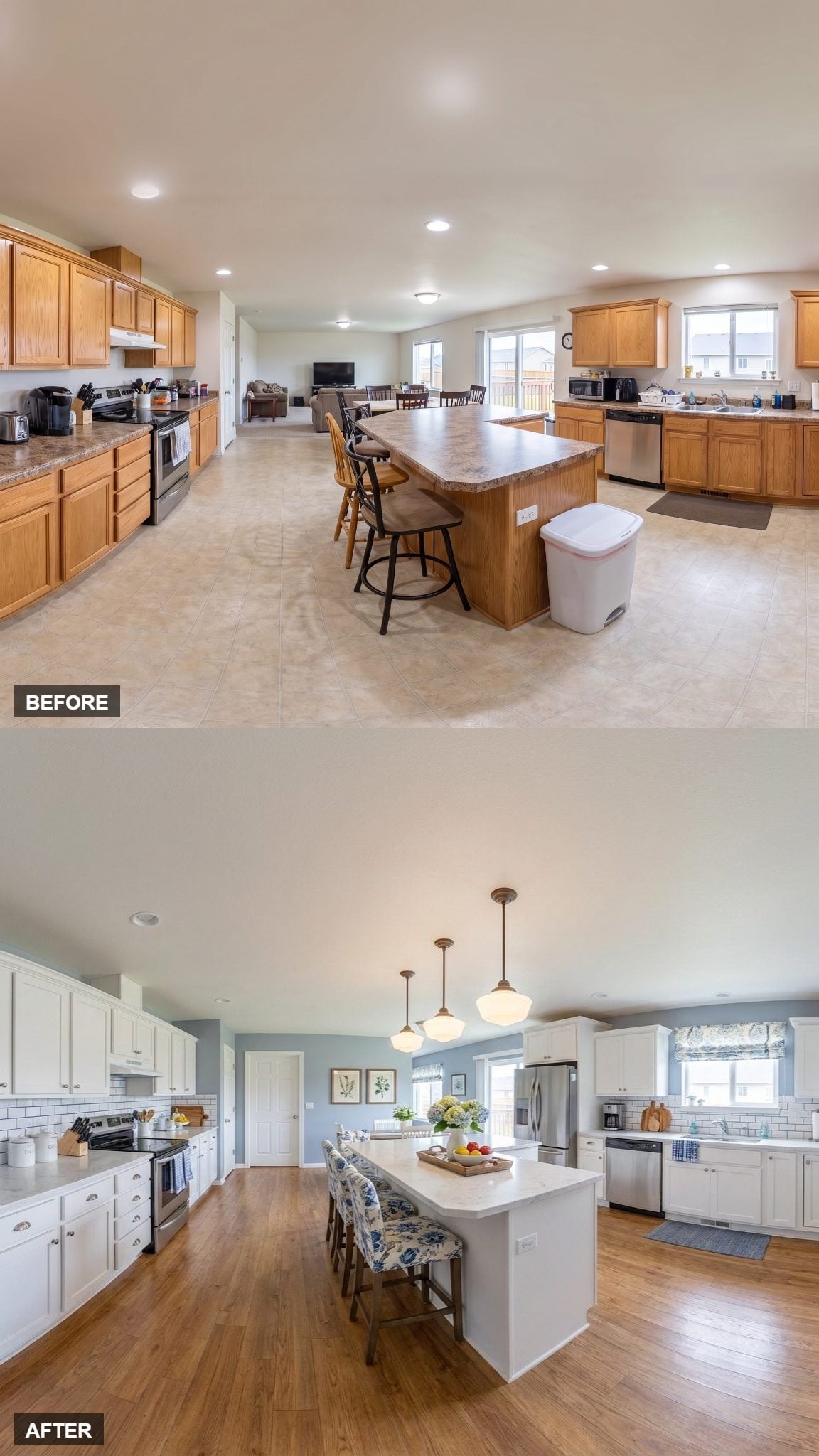
White shaker cabinetry and subway tile could easily flatten into one pale field. The blue-gray wall color prevents that by giving the cabinet edges something slightly darker to sit against.
Schoolhouse pendants bring brass and frosted glass above the island, while floral stools add a small hit of pattern at seating height.
The hardwood floor contributes warmth without requiring the cabinets themselves to move away from white. The success here is less about any dramatic feature than about giving pale cabinetry enough contrast to remain visible.
3. Gray-Green Cabinetry Gets a Pale Counterpoint at the Island
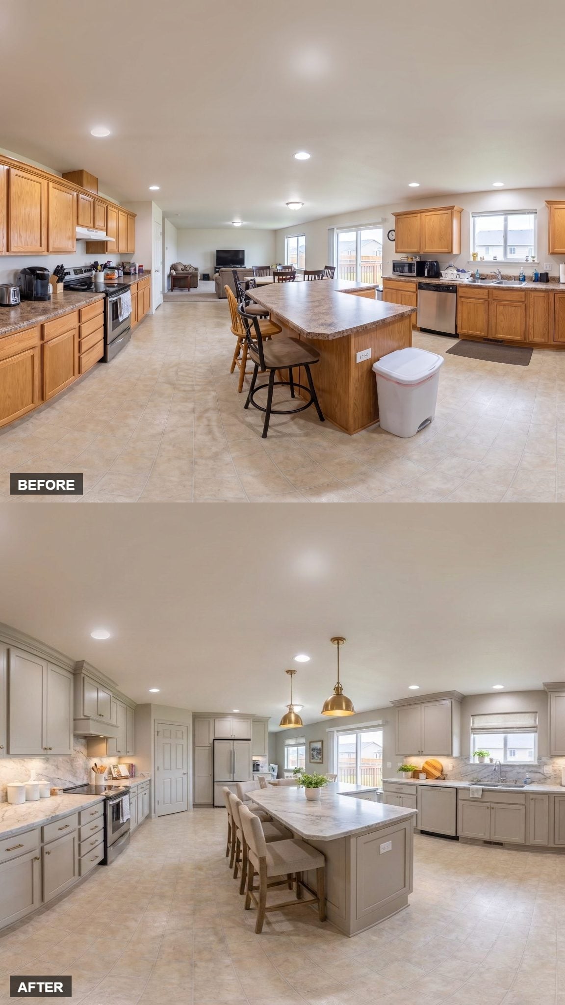
Gray-green shaker cabinets cover the perimeter, their muted finish shifting warmer or cooler depending on the light. Brushed brass hardware adds a clearer warm note against the paint.
The island gets a noticeably lighter quartz or marble-look surface, preventing the center from becoming another large dark mass. Neutral upholstered chairs and Roman shades stay deliberately quiet.
Industrial-style brass pendants repeat the hardware overhead, but the contrast between cabinet color and island top is what gives this version its strongest identity.
2. Copper Lanterns Warm Up Cream Cabinets and Charcoal Counters
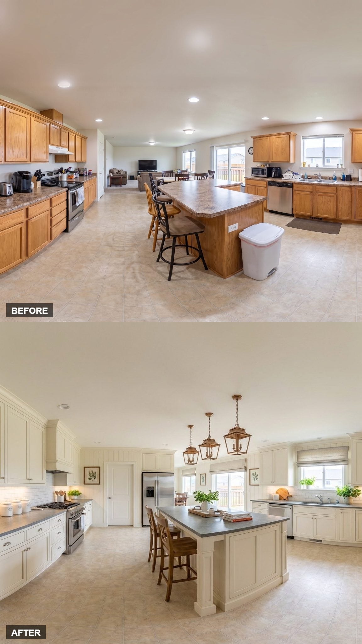
Off-white raised-panel cabinetry reaches high on the walls, giving this large kitchen a substantial amount of pale vertical surface.
The island answers with a charcoal slate-toned top, creating a dark horizontal band through the middle. Three copper lantern pendants introduce the warmest finish in the room and keep the cream-and-charcoal combination from feeling overly formal.
1. Muted Green Cabinets Finish the Gallery Without Another White Kitchen
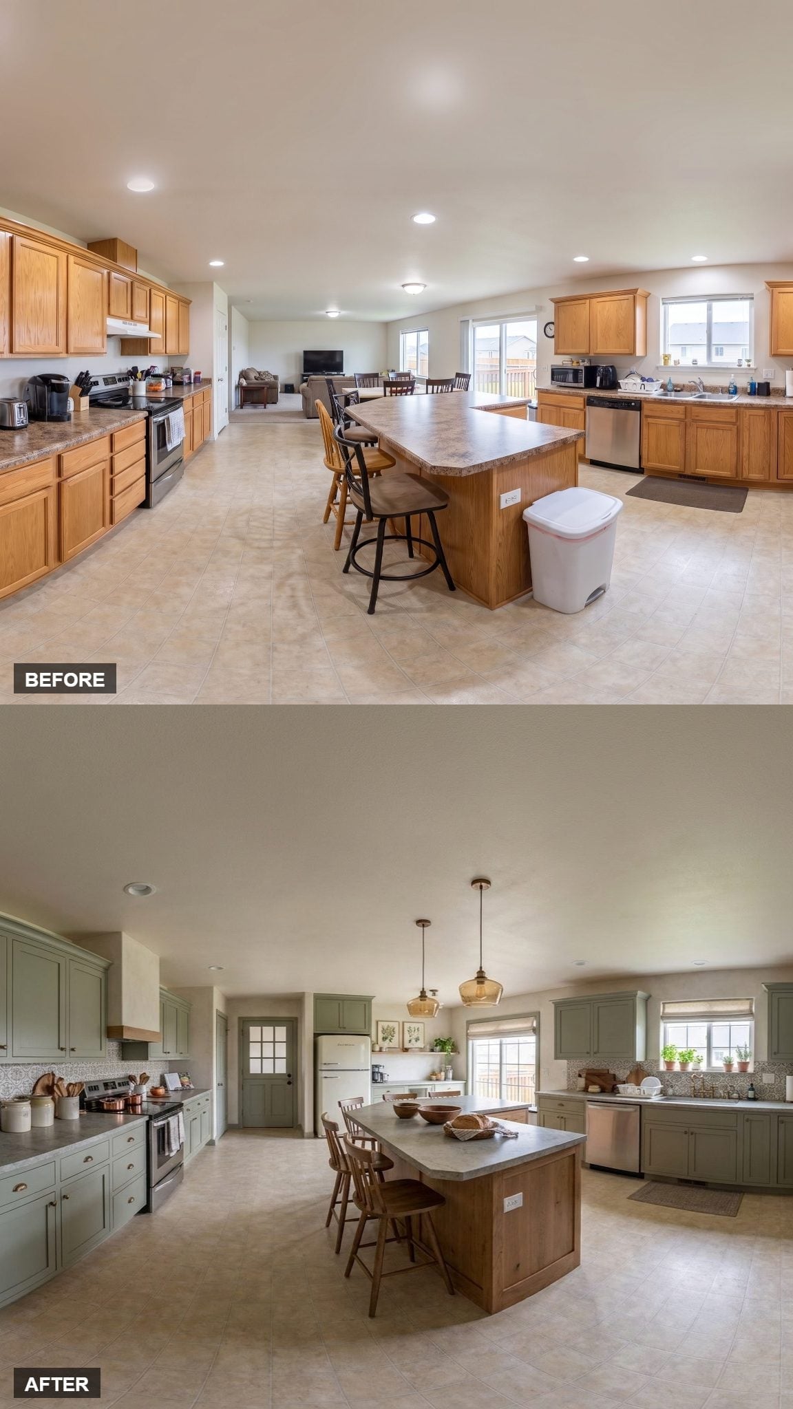
Muted gray-green cabinetry wraps the perimeter in a color strong enough to register without overwhelming the room. Concrete-look counters add a cooler mineral surface, while the wood-base island brings the palette back toward natural warmth.
Amber glass pendants repeat that warmth overhead, and a Roman shade filters the window without introducing much pattern. The refrigerator sits inside its own alcove beside a gridded interior door, giving that end of the kitchen a more built-in appearance.
After 32 versions of islands, pendants, cabinet colors, shelving, stone, paneling, and lighting, the larger point is fairly simple: an open room doesn’t need more stuff to feel defined. It needs enough contrast, structure, and repetition to make the kitchen read as its own place.












