🔥 Would you like to save this?
Trends move faster than renovations. By the time the dust settles on a six-month kitchen project, the thing everyone wanted when the plans were drawn can already feel dated, high-maintenance, or just plain annoying to live with. We’ve watched these choices play out in real homes for years. The same ones keep coming back to bite. Below are the renovation decisions designers quietly skip in their own houses, along with what they reach for instead.
48. Knocking Down Every Wall for the Fully Open Floor Plan
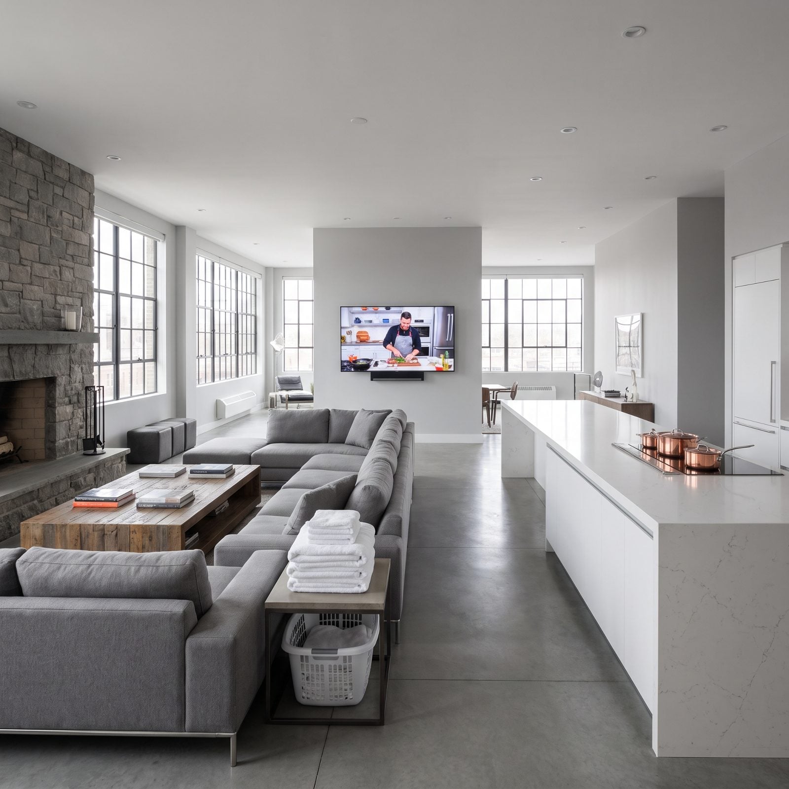
The dream was one big room where everyone gathers. The reality is a space with nowhere to hide. Cooking smells drift to the sofa while the TV competes with a running dishwasher, and there’s no door to close when someone needs quiet. Open plans also strip out the walls you actually needed for art, bookcases, and a corner to disappear into.
In order to come up with the very specific design ideas, we create most designs with the assistance of state-of-the-art AI interior design software. Also, assume links that take you off the site are affiliate links such as links to Amazon. this means we may earn a commission if you buy something.
So designers keep a few walls on purpose. A half wall, a wide cased opening, or a pair of pocket doors gives you flow without turning the whole floor into one echo chamber. You want sightlines, not a warehouse.
47. Building an Island So Big You Can’t Reach the Middle
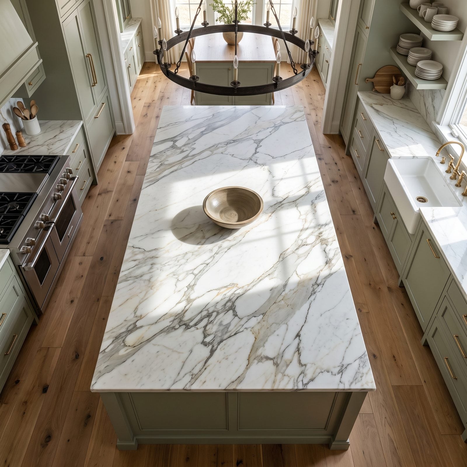
Everyone wants more counter space, so the island grows. Then it crosses about four feet deep and the middle becomes a dead zone you can’t wipe without climbing up top. Spills pool out of reach, dust gathers in the center, and you end up stretching across the quartz like you’re digging through a car trunk.
Keep an island reachable from at least one side, roughly three to three and a half feet deep for a single-level top. Craving more room? Go longer, not wider. Your spine will thank you every time you clean it.
46. Cramming Two Islands Into a Kitchen That Barely Fits One
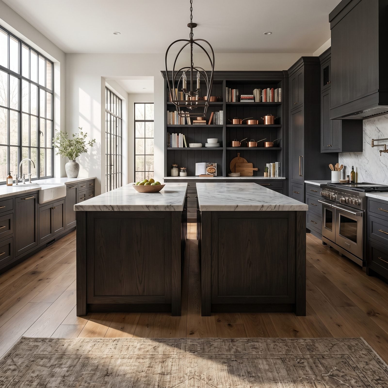
Twin islands look fantastic in a cavernous chef’s kitchen. In an average room, they turn the floor into a slalom course. The walkway between them shrinks below the clearance you actually need, and suddenly two people can’t be in the kitchen at once without a traffic jam.
One well-planned island beats two cramped ones every time. Give it a prep zone and a seating zone and call it done. If you genuinely need more, add a slim perimeter run instead of a second block in the middle.
45. Ripping Out Every Upper Cabinet for Open Shelving
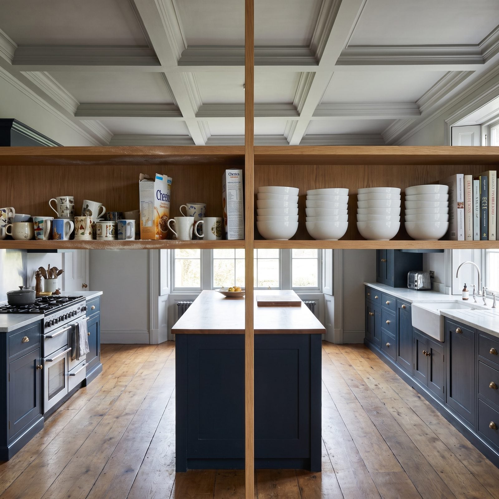
Open shelves photograph beautifully with eight matching ceramic bowls. Then you live there. A few months in, they hold cereal boxes, random mugs, and a fine coat of airborne grease you now have to wipe off everything you own. You lose a surprising amount of real storage too.
Keep the uppers where you cook and splatter. Use open shelving as an accent on one quiet wall, maybe flanking a window or a hood, never across the whole room. That minimalist hallway instinct rarely survives contact with actual cooking.
44. Choosing a Farmhouse Sink Without Thinking About the Ergonomics
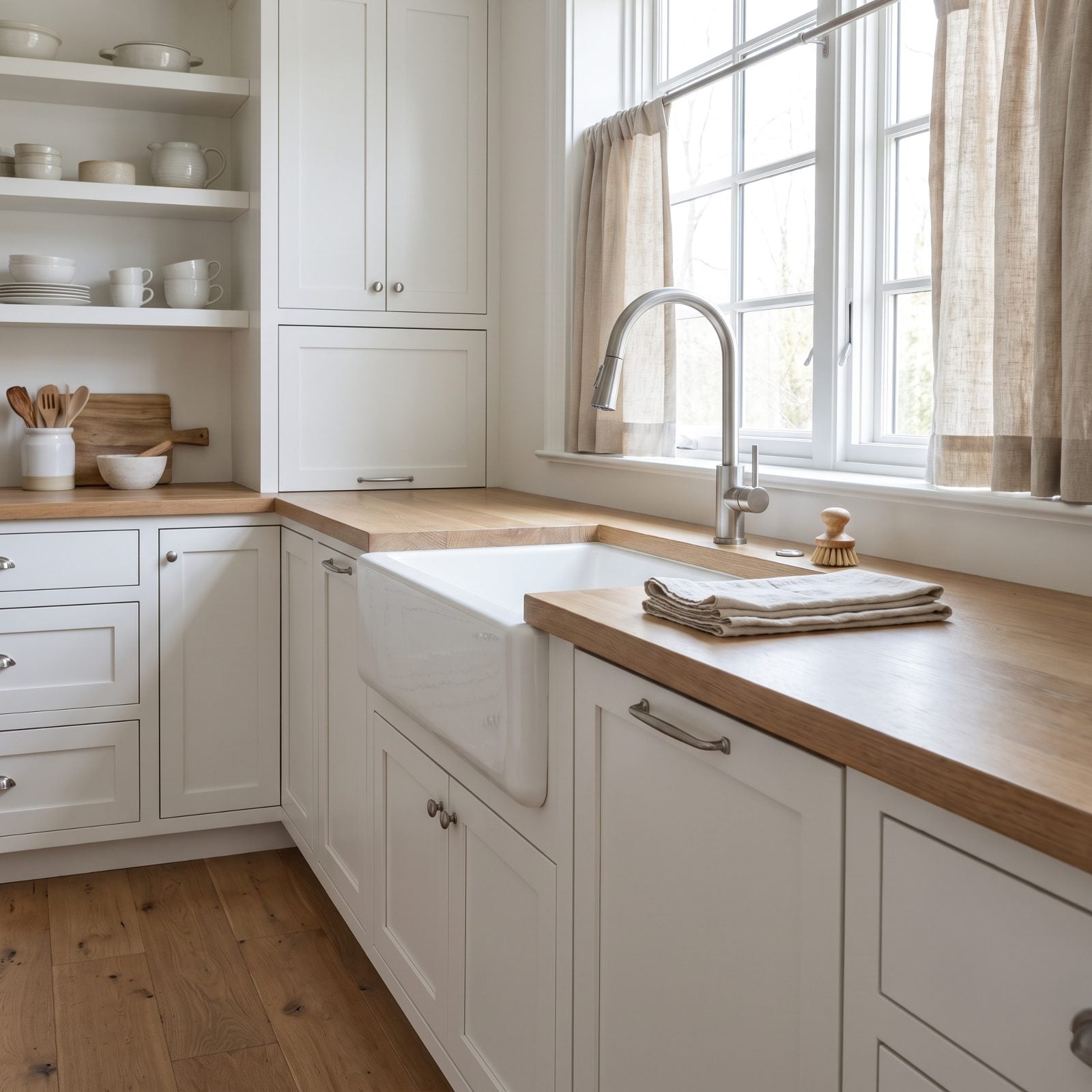
The apron-front sink is the darling of every farmhouse remodel, and it earns the love. But two things get glossed over in the showroom. Fireclay and enameled cast iron chip when you drop a heavy pot, and that exposed front apron means you lean over a deep basin, which wrecks your back during a sink full of dishes.
Want one anyway? A mid-sized stainless apron sink shrugs off dropped pans and sits a little shallower. A bottom grid saves both your dishes and the glaze.
43. Installing a Pot Filler You’ll Use Twice a Year
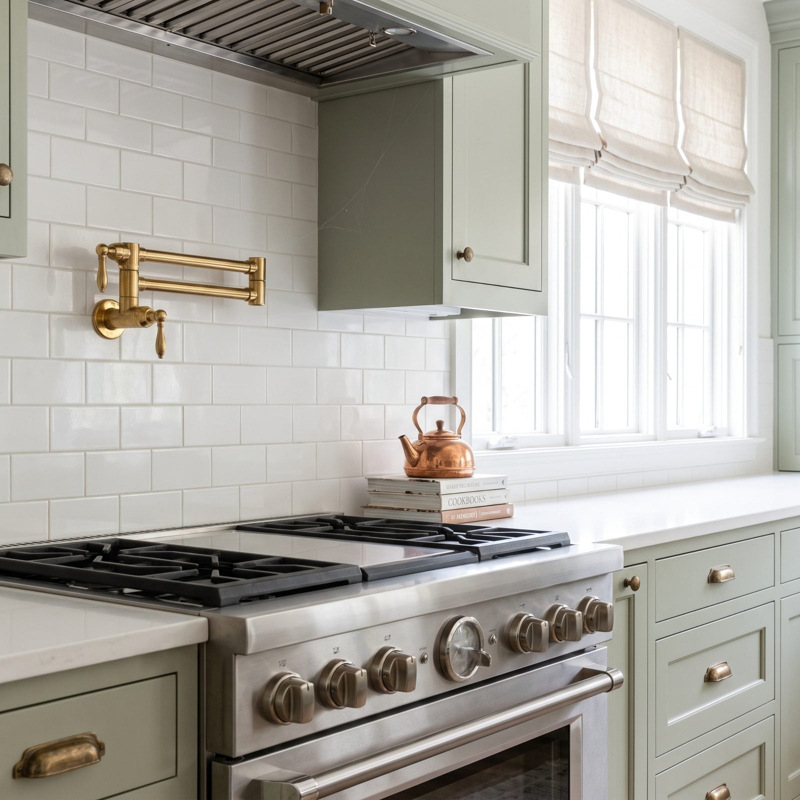
A faucet over the stove feels like luxury until you remember what it actually is. A second water line. Two more joints to fail. Mounted directly above the one appliance you least want water near. Most people fill a pot at the sink and carry it, and the pot filler just sits there collecting grease above the burners.
If the look matters to you, fine, but insist on quality internal valves and have your plumber run it properly. Otherwise skip it and put the money toward a range hood you’ll use every single day.
42. Parking the Microwave Directly Over the Range
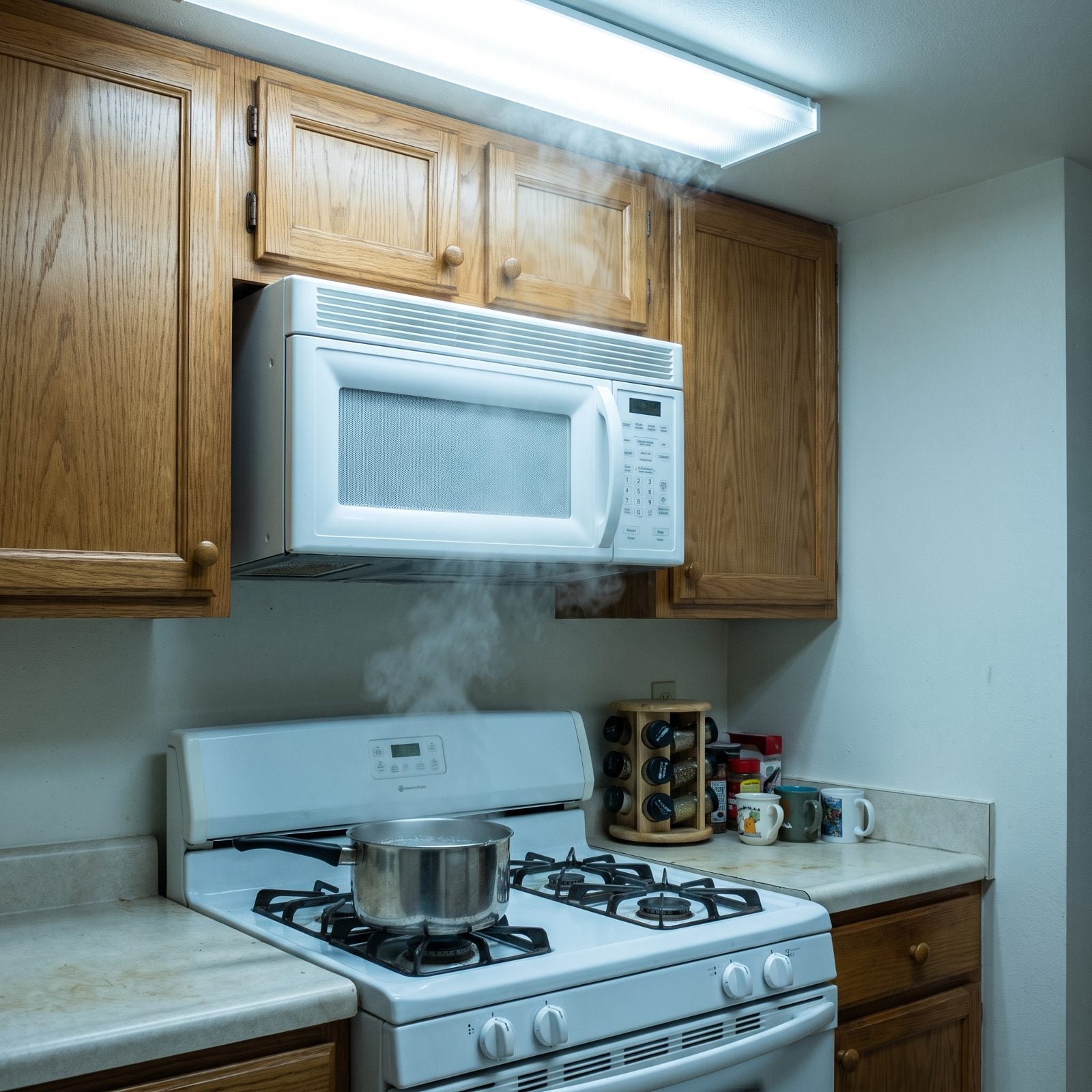
The over-the-range microwave is the builder-grade default, and it quietly does three jobs badly. That tiny built-in fan can’t vent a serious sear, you’re reaching over hot burners to grab a steaming bowl, and it crowds the one spot where a proper hood belongs.
Give the range a real vented hood and move the microwave into the island, a lower cabinet, or a drawer unit at counter height. Now the kids can reach it safely and your cooktop actually breathes.
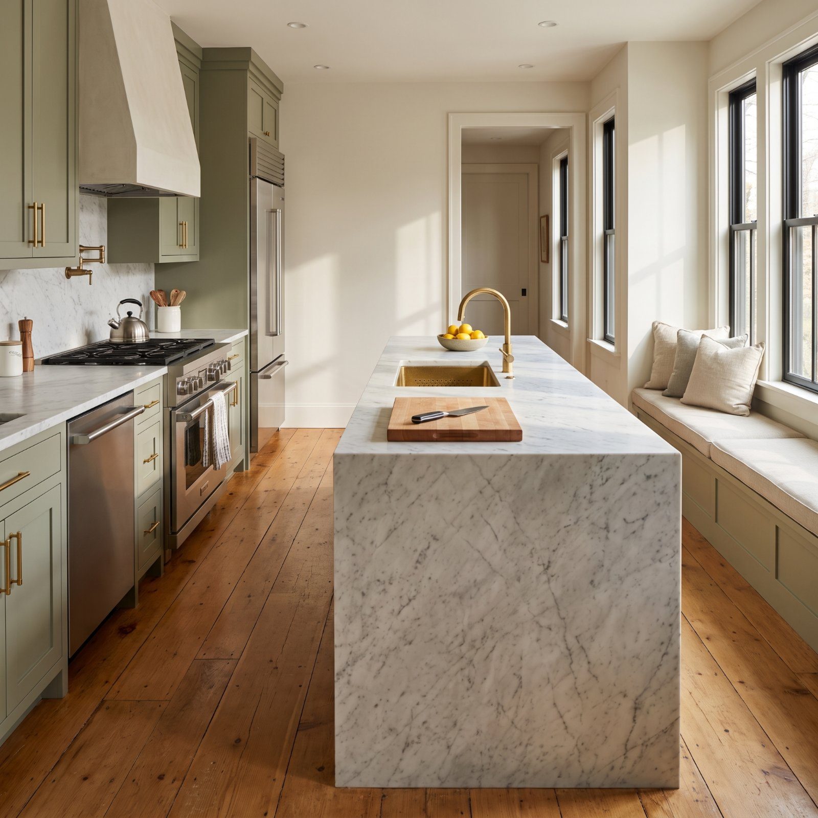
41. Wrapping a Waterfall Edge Around Every Island in Sight
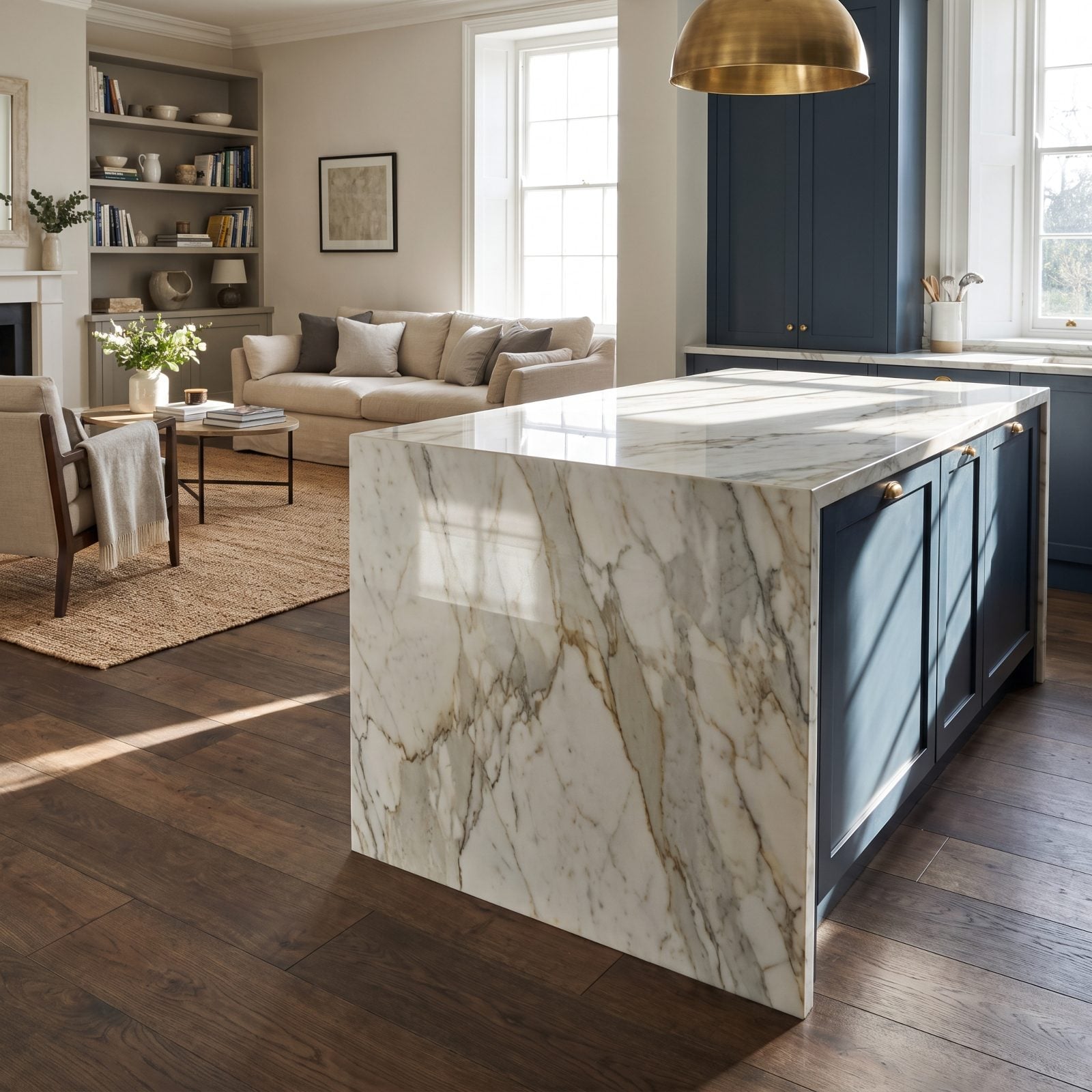
The waterfall edge, where stone cascades down the island sides to the floor, had a real moment. Trouble is, it’s expensive, it eats the leg room where stools and storage usually go, and it stamps a room with a very specific year.
A simple mitered or eased edge reads cleaner and ages better. Love the drama? Do one waterfall panel as a feature, not as a reflex on every island and bar in the house.
40. Going All-White With Zero Material Variation
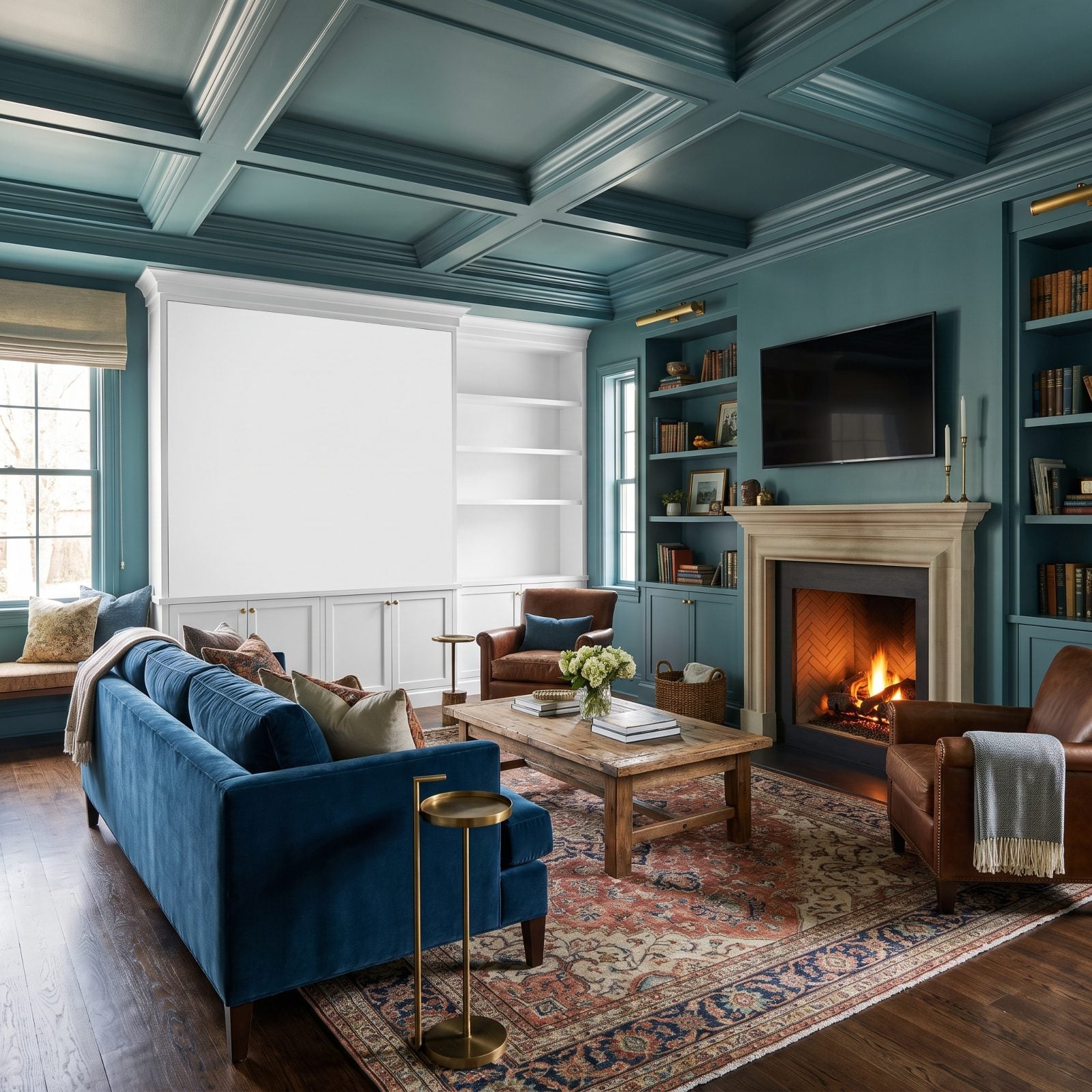
An all-white kitchen feels clean and safe, which is exactly why so many get built. But white on white on white, with no wood grain, no stone veining, no metal warmth, flattens into a room that feels more clinical than calm. It shows every fingerprint and coffee ring like it’s auditioning for a cleaning commercial.
Keep your white if you love it, then break it with one grounding material. A white oak island, honed marble veining, unlacquered brass pulls, a limewashed wall. Anything that gives the eye somewhere to land.
39. Letting Three Countertop Materials Fight in One Kitchen
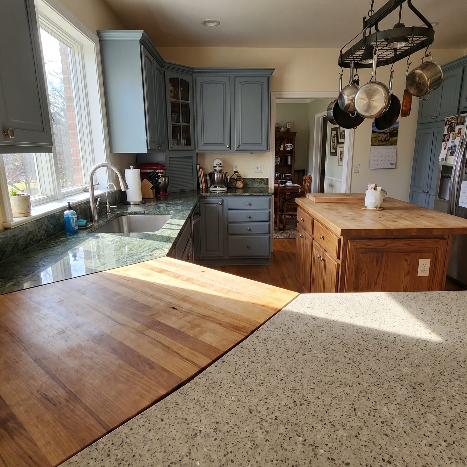
Mixing counter materials is smart in theory. One slab for the perimeter, a warmer top on the island, maybe wood by the baking zone. Push past two, though, and the eye starts tripping. Three busy stones in one room read as indecision, and every seam between them becomes a maintenance line with its own cleaning rules.
Limit yourself to two materials with a clear pecking order. One is the quiet workhorse, one is the moment. A calm perimeter quartz paired with a single veined marble island does more than three slabs ever will.
38. Putting Delicate Marble on a Kitchen Counter You Actually Cook On
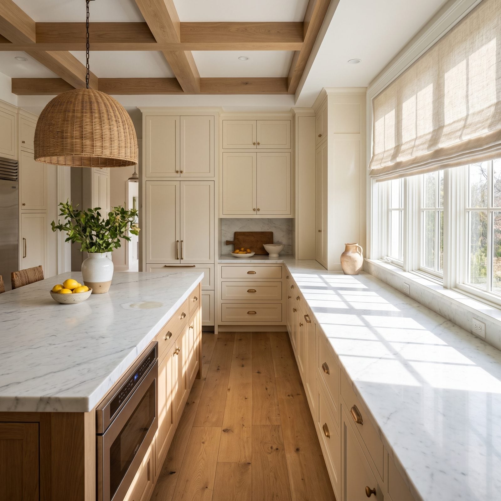
Carrara looks incredible on day one. Then you squeeze a lemon over fish, set a wine glass down while you plate, and six weeks later the counter by the range has a constellation of dull spots you can see from across the room. That’s etching. Acid eats the polish, and no amount of sealing stops it because sealer blocks stains, not chemistry.
If you cook, run quartzite instead. It photographs almost identically to marble but shrugs off lemon juice and tomato. Save the real stuff for a baking station or a powder room where nobody’s deglazing a pan. I got this wrong once and spent a year pretending the etch marks were “patina.” They weren’t.
37. Installing Concrete Countertops Without Making Peace With Cracks
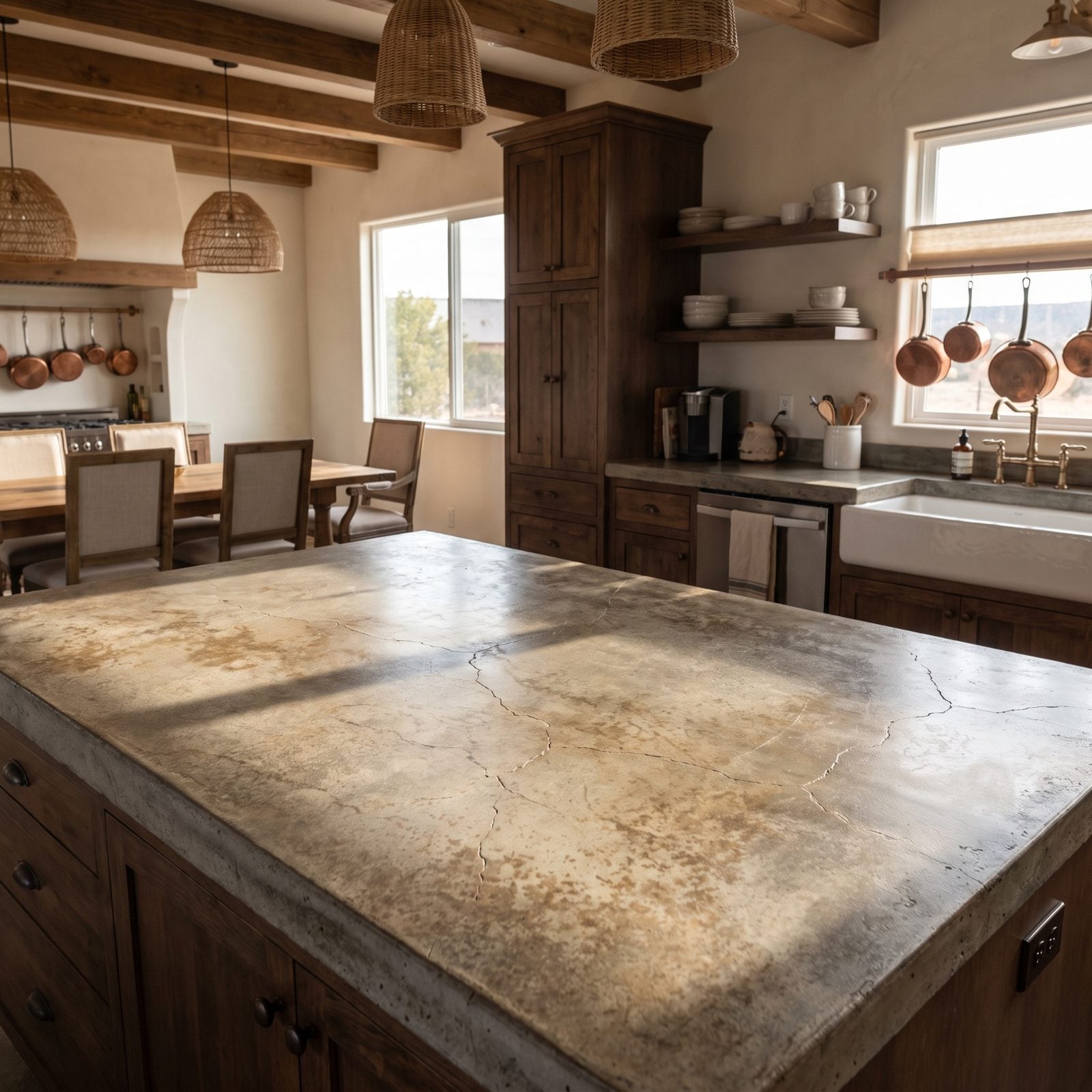
Concrete counters have a cult following and I get it. The weight, the handmade edge, the way they age like a cast-iron pan. But the moodboard leaves out one thing: concrete cracks. Hairline fissures as it cures, and sometimes more over the years. It also drinks water and wine unless you reseal it religiously, which means a dark ghost mark every time a glass sweats overnight.
If that texture matters to you, buy it knowing the cracks come with the territory, not against your will. Want the industrial look without the maintenance calendar? Honed black granite or a concrete-look porcelain slab gives you most of the mood and none of the resealing.
36. Wrapping Butcher Block Right Around the Splash Zone of the Sink
🔥 Would you like to save this?
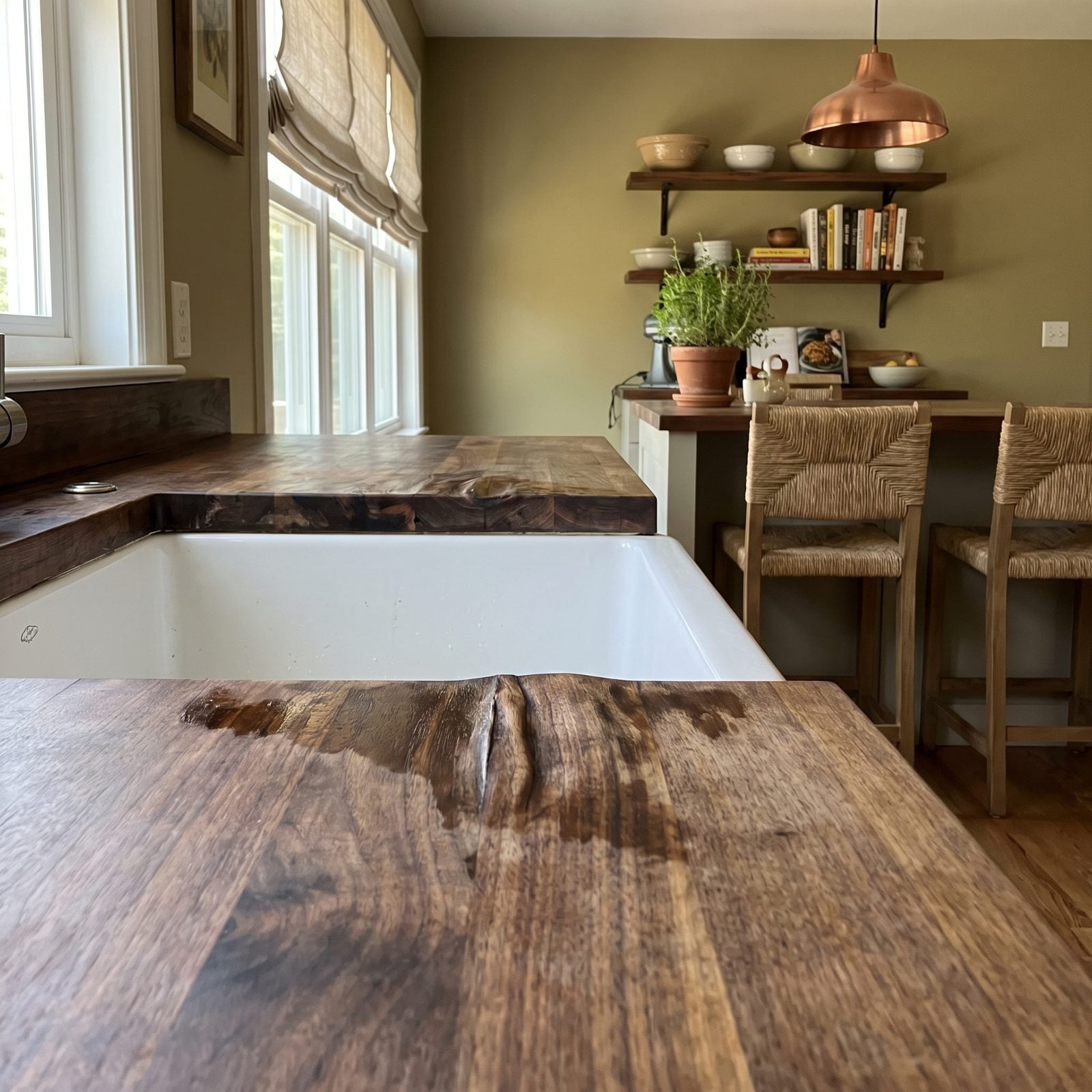
Butcher block around a sink is a slow-motion problem. Wood and standing water don’t negotiate. The area right behind the faucet goes gray, the seam swells, and within a year you’ve got a dark halo and a soft spot that a scrub brush only makes worse.
Love the warmth of wood? Use it on an island or a run far from the plumbing, and put quartz or stone in the wet zone. If you insist on wood by the sink, choose end-grain teak, oil it monthly, and never let water pool. Monthly. That’s the catch most people skip around three weeks in.
35. Rolling Gray Luxury Vinyl Plank Through Every Room in the House
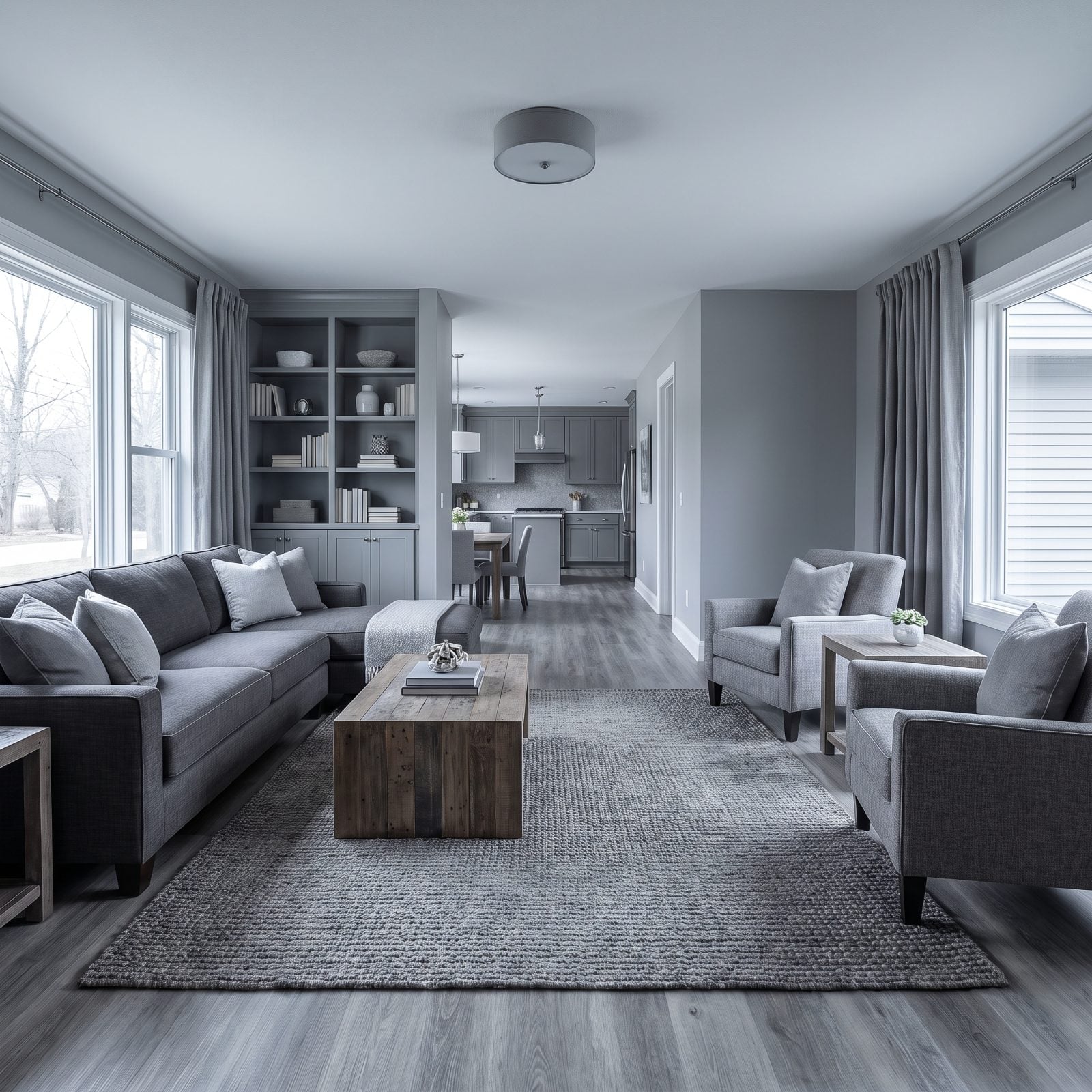
Gray LVP had a real moment, and that’s exactly the problem. It reads as 2016 the way beige tile reads as 1998. The cool undertone fights warm wood furniture, fades unevenly where the sun lands, and announces to anyone walking in the year you renovated.
Want the practicality of vinyl? Pick a warm, mid-tone oak or walnut look with a matte finish and real color variation plank to plank. It dates far slower because it’s copying something timeless instead of a trend. Longevity in flooring was never about the material. It’s about choosing a color you won’t resent in a decade.
34. Choosing Near-Black Hardwood That Shows Every Speck of Dust
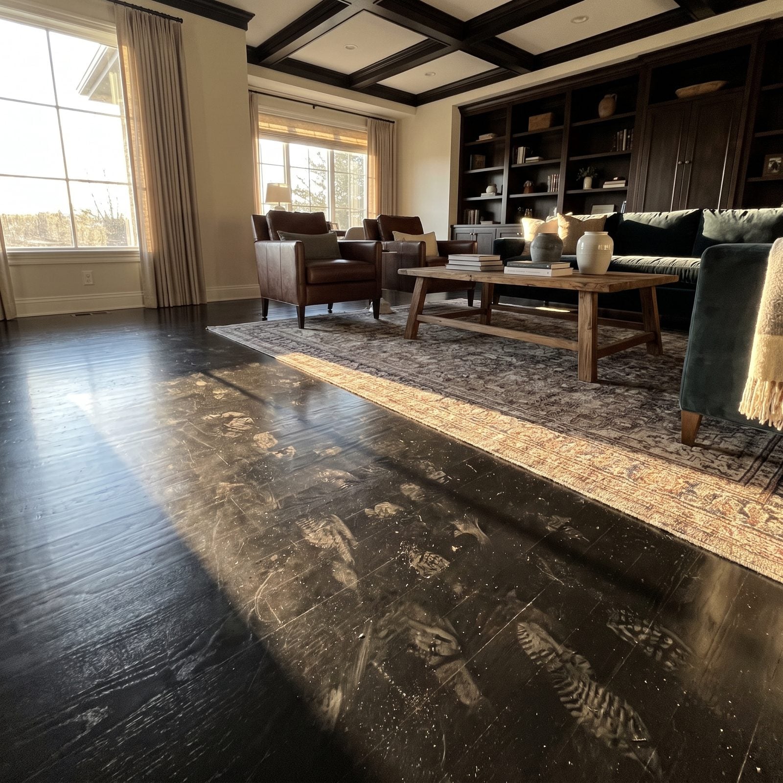
Dark hardwood looks like money in a showroom. In your actual house, in actual afternoon light, it shows every dust bunny, every footprint, every pale scratch from the dog’s nails. You’ll be dust-mopping daily and still feel like you’re losing.
Go a few shades warmer. A natural or medium oak hides debris and forgives scratches, because the raw wood underneath is a similar tone and doesn’t fight you when the sun comes in low. High-contrast flooring isn’t really a maintenance problem. It’s a maintenance personality trait, and you should know yours before you commit.
33. Laying Herringbone in Literally Every Room
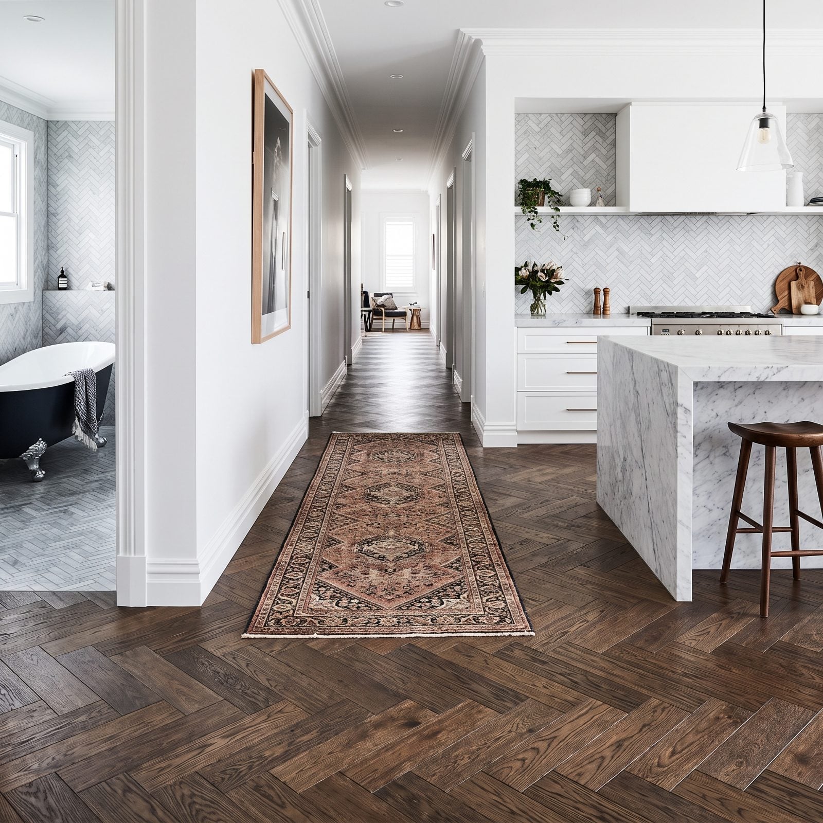
Herringbone is lovely. In one or two rooms. Run it through the entire house and the pattern stops being special and starts being noise, especially in narrow hallways where all those little angles make the space feel busier and shorter than it is.
Use it as a moment instead. A foyer, a dining room, a feature wall underfoot. Then switch to straight-plank in the bedrooms and corridors where you want the floor to recede. A great glam hallway renovation often works precisely because the floor stays quiet and lets the lighting and art carry the drama. Pattern earns its keep by being rare.
32. Running One Flooring Material Through Both Dry Rooms and Wet Ones
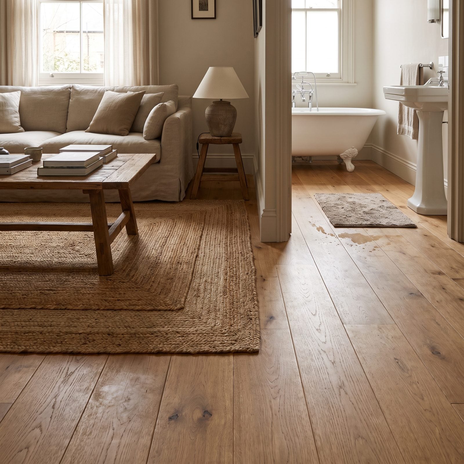
The continuous-floor look is seductive: one material flowing from the hall into the bathroom, no thresholds, very architectural. Then the planks by the shower cup, darken, and start to smell faintly of a damp basement. Wood and chronic moisture were never going to be friends.
You can keep the seamless feel without the rot. Use a porcelain plank tile that mimics your hardwood in the wet rooms and run the real wood everywhere else. Matched well, the eye reads it as one floor. The bathroom just happens to be the version that survives a dropped towel and a steamy shower.
31. Mounting a Floating Vanity With Nowhere to Put Anything
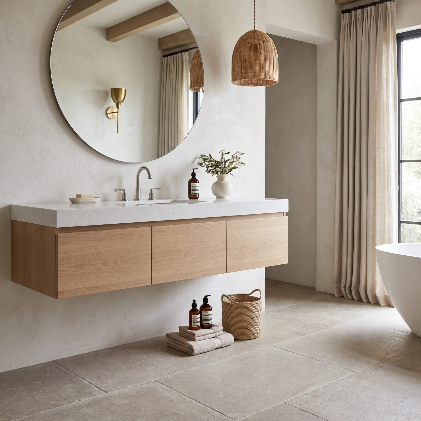
Floating vanities look airy and let you see more floor, which makes a small bath feel bigger. The catch is storage. A single shallow drawer swallows a toothbrush and a tube of toothpaste, and then everything else lives on the counter in a basket that defeats the clean look you paid for.
Going floating anyway? Spec the deepest body you can and add full-extension drawers with U-shaped cutouts around the plumbing to reclaim that lost space. In a family bath, honestly, a floor-standing vanity with real cabinets will serve you better every single morning.
30. Picking a Freestanding Tub With No Ledge to Set Anything On
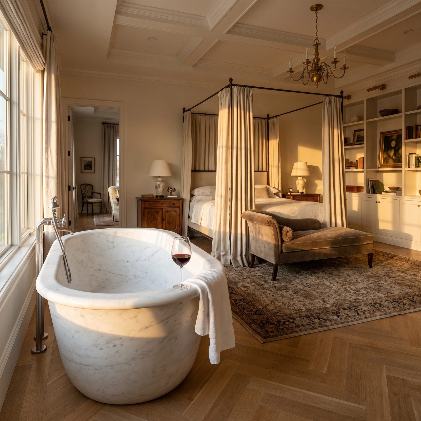
That sculptural freestanding tub is the hero shot of a thousand renovations. Here’s what the hero shot never shows: there’s nowhere to put your wine, your book, your phone, or the soap. The rim is a rounded sliver. So you end up with a little stool, a bath caddy, or a bottle of oil perched on the windowsill, one nudge away from the floor.
Before you fall for the silhouette, think about how you actually bathe. A tub with a flat deck, a wall niche beside it, or a wide filler ledge keeps the look and gives you somewhere to set the glass down. Beauty that won’t hold your tea is only half-designed.
29. Making a Rainfall Head the Only Water in the Whole Shower
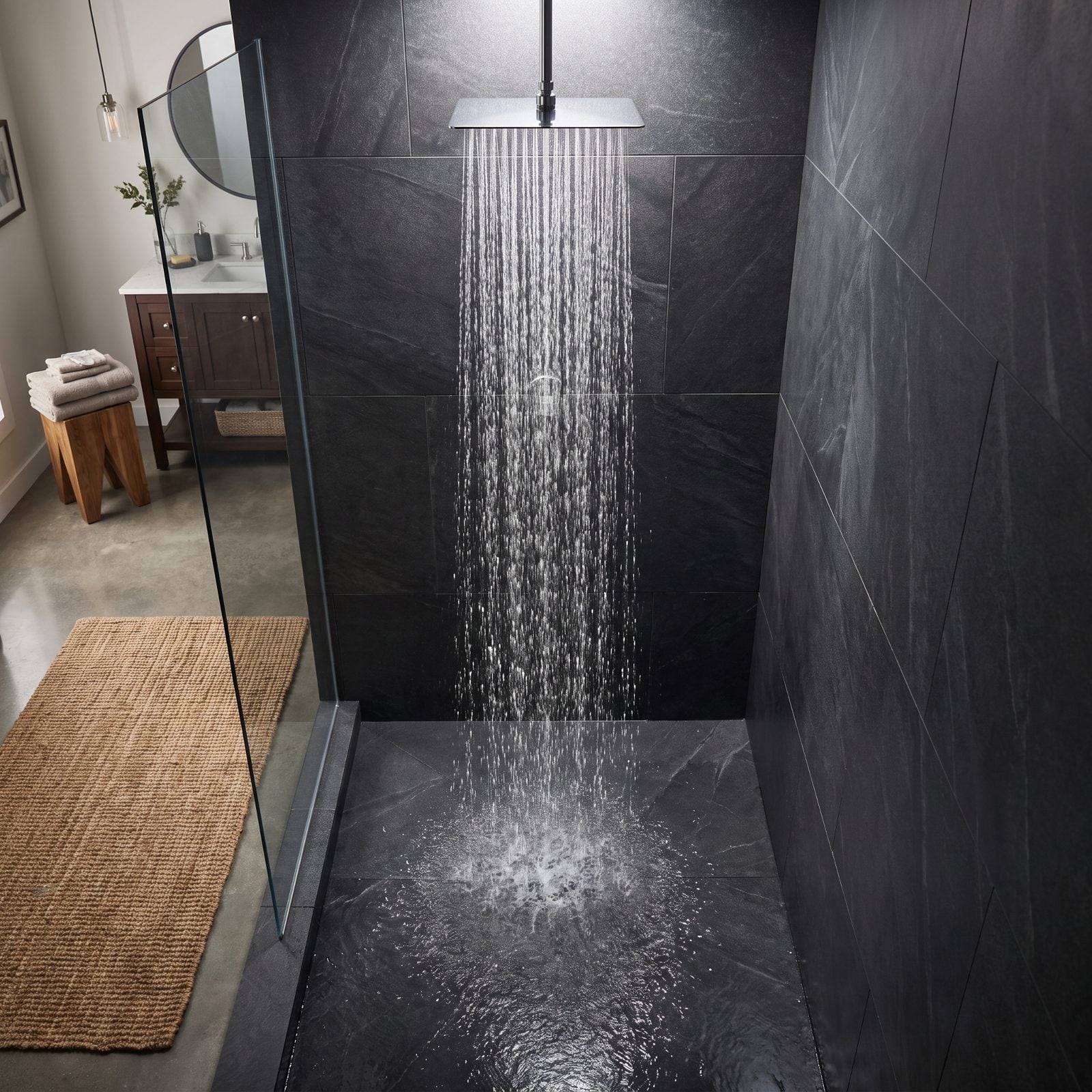
A ceiling rainfall head feels like standing in a warm summer storm. It also soaks your hair when you only wanted to rinse a razor, can’t reach the shower walls you’re trying to clean, and leaves you shivering because overhead water loses heat on the way down. Lovely for a long soak. Maddening as your only option.
Keep the rain head if you love it. Just pair it with a wall-mounted handheld on a slide bar. You get the drizzle when you want it and real control for washing, rinsing, and scrubbing the stall. One fixture is a mood. Two is a functioning shower.
28. Choosing Vessel Sinks That Collect a Water Ring You’ll Wipe Forever
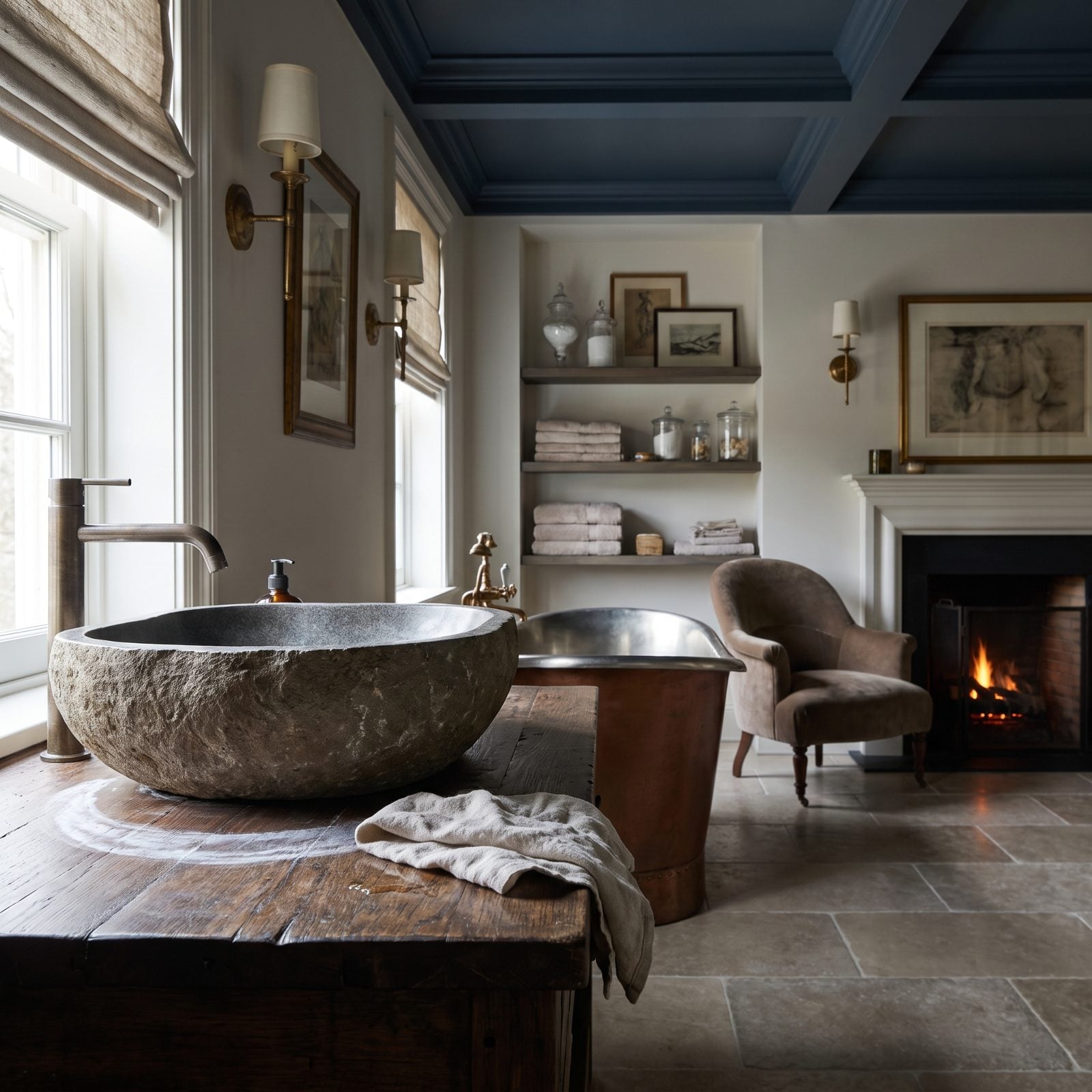
You know the vessel sink, that sculptural bowl perched on the counter like a trophy. It looks great the day the plumber leaves. Then life happens, and the seam where the bowl meets the stone turns into a thin moat of toothpaste water you can never quite reach.
The problem is geometry. A raised bowl creates a lip you have to clean around, under, and behind, and the tall faucet flings water onto the counter instead of into the drain. Six months in, there’s a grey ring that no spray touches.
Go with an undermount instead, or a low-profile semi-recessed bowl. You get the clean line down into the stone and one continuous wipe. No daily archaeology around the base.
27. Building a Doorless Walk-In Shower That Leaves the Rest of the Room Freezing
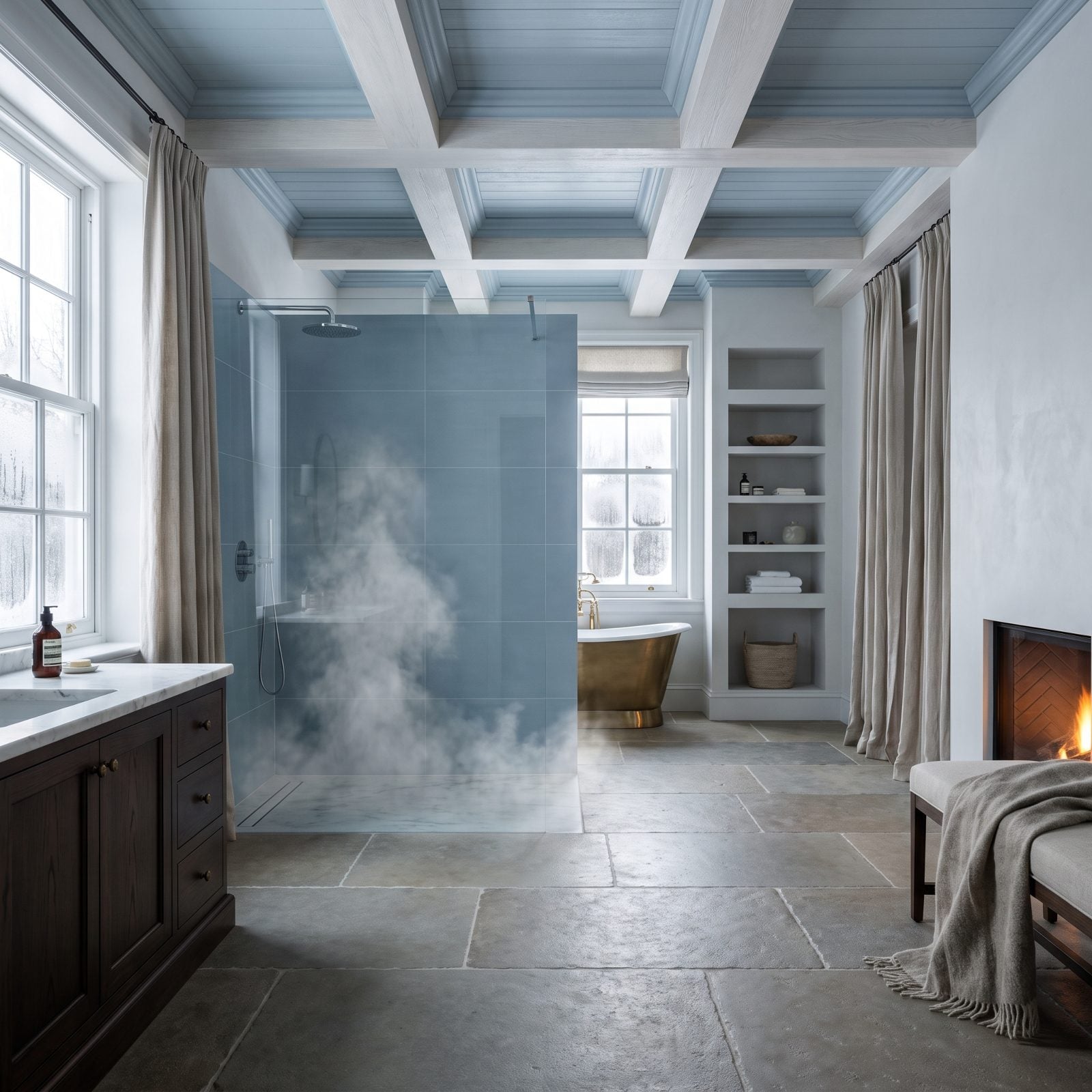
The doorless walk-in reads like a hotel spa in the photos. In a real house, in winter, it reads like a draft. Without an enclosure, warm steam escapes the second it forms, and the floor past the glass panel stays damp long after you’ve toweled off.
Comfort in a shower comes down mostly to trapped heat. Open it up and you lose the warmth, the steam that makes the space feel luxurious, and the dry zone where your towels live.
Want that minimalist, frameless look? Build the wet zone deep enough that spray stays contained, at least five feet of run before the opening, and add a heat lamp or in-floor heating. You keep the airy feel without the cold, damp aftermath.
26. Specifying Matte-Black Faucets in a Hard-Water House
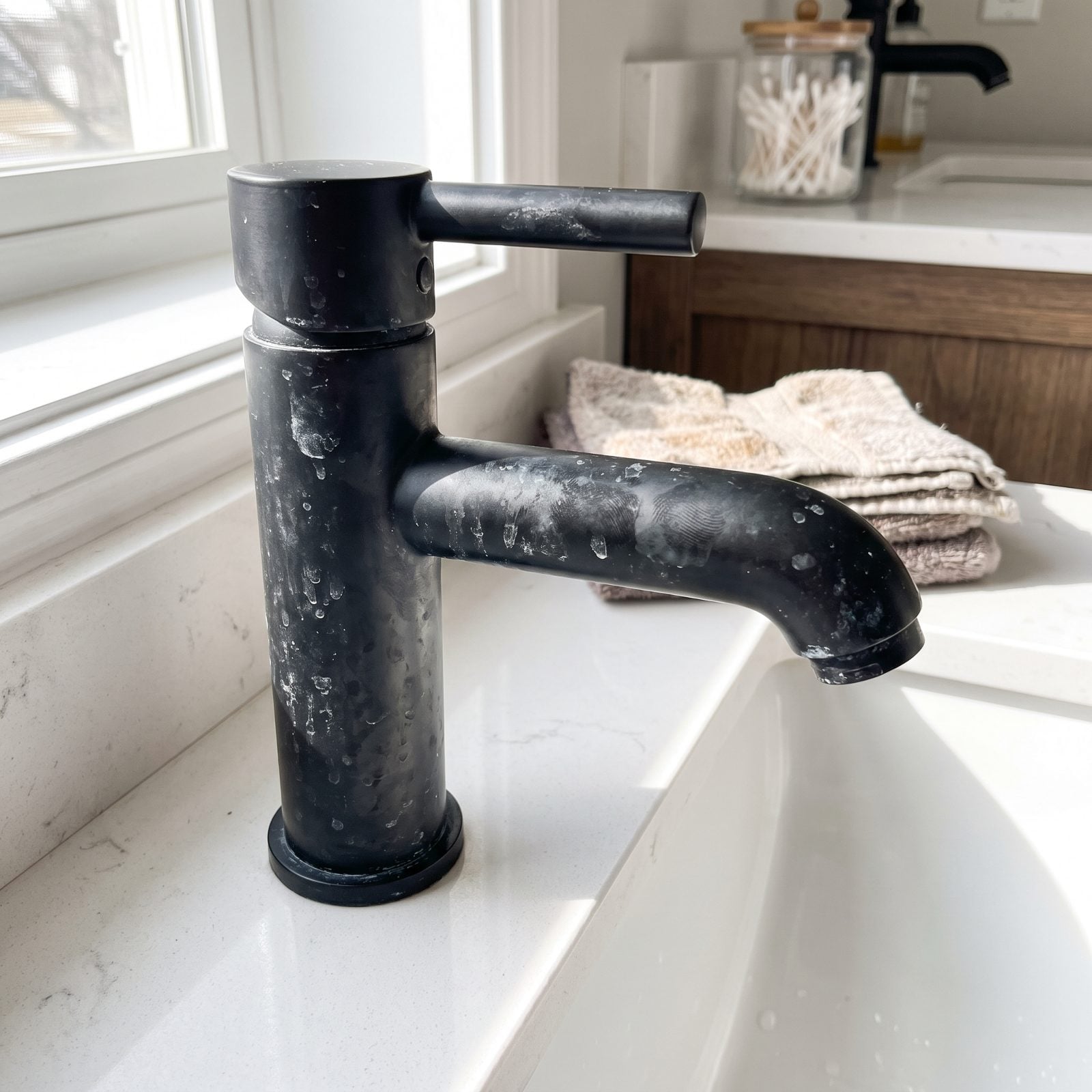
Matte black looks incredible for about a year. Then, if your water runs hard, those chalky mineral spots show up around the spout and handles, and a flat finish has nowhere to hide them. Chrome shrugs off hard water. Matte black broadcasts it.
The finish itself is the issue. A flat surface grabs minerals and the white deposits sit against the dark like salt on asphalt. Wipe it daily and you’ll stay ahead of it. Most people don’t wipe anything daily.
If your home sits on well water or a hard municipal supply, go with brushed nickel or a living brass that patinas gracefully. You get the warmth and the modernity without signing up for a daily squeegee routine.
25. Covering the Floor in Tiny Hexagon Tile and Signing Up for Endless Grout
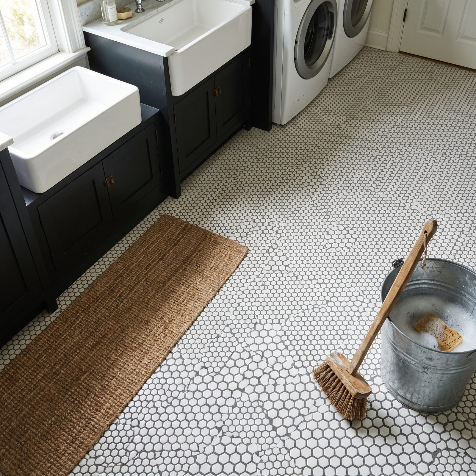
Penny rounds and tiny hexagons photograph like a dream. Then you live on them. All those little tiles mean mile after mile of grout line, and grout is the one material in your bathroom that absorbs everything, from soap scum to foot grime to the splash off the shower, and goes grey.
The high points by the toilet and vanity darken first. The tile stays bright, which makes the dingy grout even more obvious.
Want the vintage mosaic look without the maintenance tax? Size up slightly, a two-inch hex over a one-inch, use a dark grout from day one so dirt disappears into it, and seal the whole floor. Your knees and your scrub brush will thank you in five years.
24. Tiling Every Wall Floor to Ceiling Until the Room Echoes
🔥 Would you like to save this?
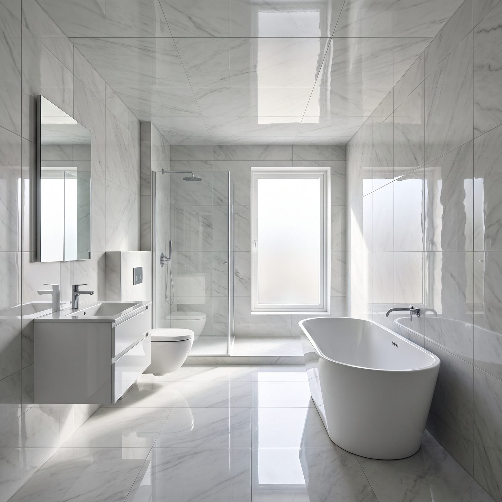
Full-height tile on every wall feels like a safe, waterproof choice. It also turns your bathroom into a sound chamber. Hard surfaces bounce noise, and a room wrapped entirely in glossy tile has nothing soft to catch it, so every drip and footstep rings.
It costs a fortune, too. And it dates fast, reading as a specific era the moment that era ends.
Tile the wet zones, the shower surround and a splash band behind the sink, then paint the rest in a bathroom-rated satin. Painted walls absorb sound, cost a fraction, and are the easiest thing in the house to repaint when you want a change. Mix hard and soft and the room feels like a room again.
23. Pouring a Shower Bench Too Shallow to Actually Sit On
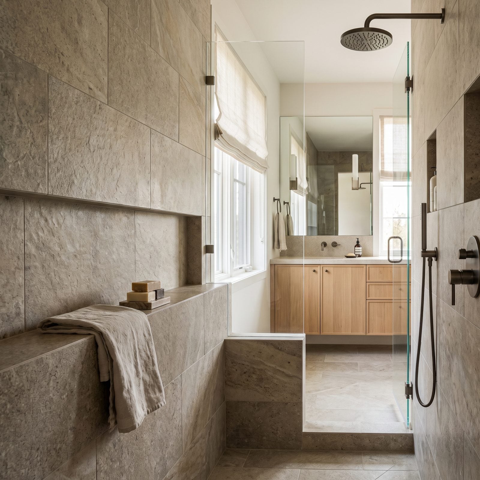
A shower bench you can’t sit on is just a shelf you paid tile labor for. It happens constantly. The bench gets squeezed in at the end, ends up ten inches deep, and becomes a parking spot for shampoo instead of the seat you wanted for shaving your legs, helping a kid, or aging in place.
Depth is the whole game. A usable bench needs at least 15 inches of seat depth and a height around 17 to 19 inches, same as a chair. Shallower than that and your thighs hang off the front.
Plan it into the shower dimensions from the start, not as an afterthought. A real bench is one of those features you don’t appreciate until the day you genuinely need it.
22. Ripping Out the Only Bathtub in a House Full of Kids
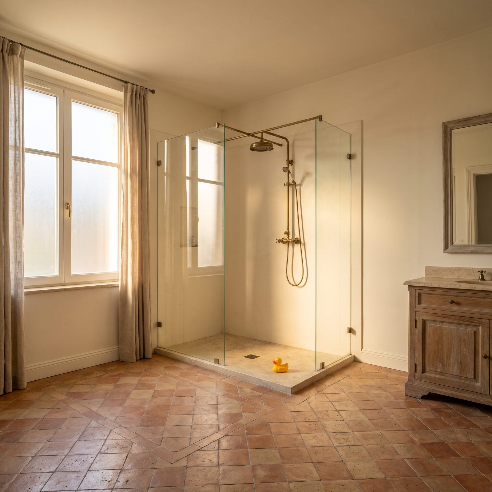
Tearing out the tub for a big glass shower is one of the most popular renovation moves going, and it’s the one that bites families later. Little kids get bathed, not showered, and a home with zero tubs is harder to sell to the next family who knows it.
Resale aside, you lose the one place in the house where you can actually decompress at the end of a long day.
Keep at least one tub somewhere, ideally in a shared or hall bath. A tub-shower combo in the kids’ bathroom handles the practical reality while your primary suite gets the spa shower you’re dreaming about. You don’t have to choose.
A house with no bathtub is a house that quietly narrowed its own buyer pool.
21. Hanging a Sliding Barn Door on a Room That Needs Real Privacy
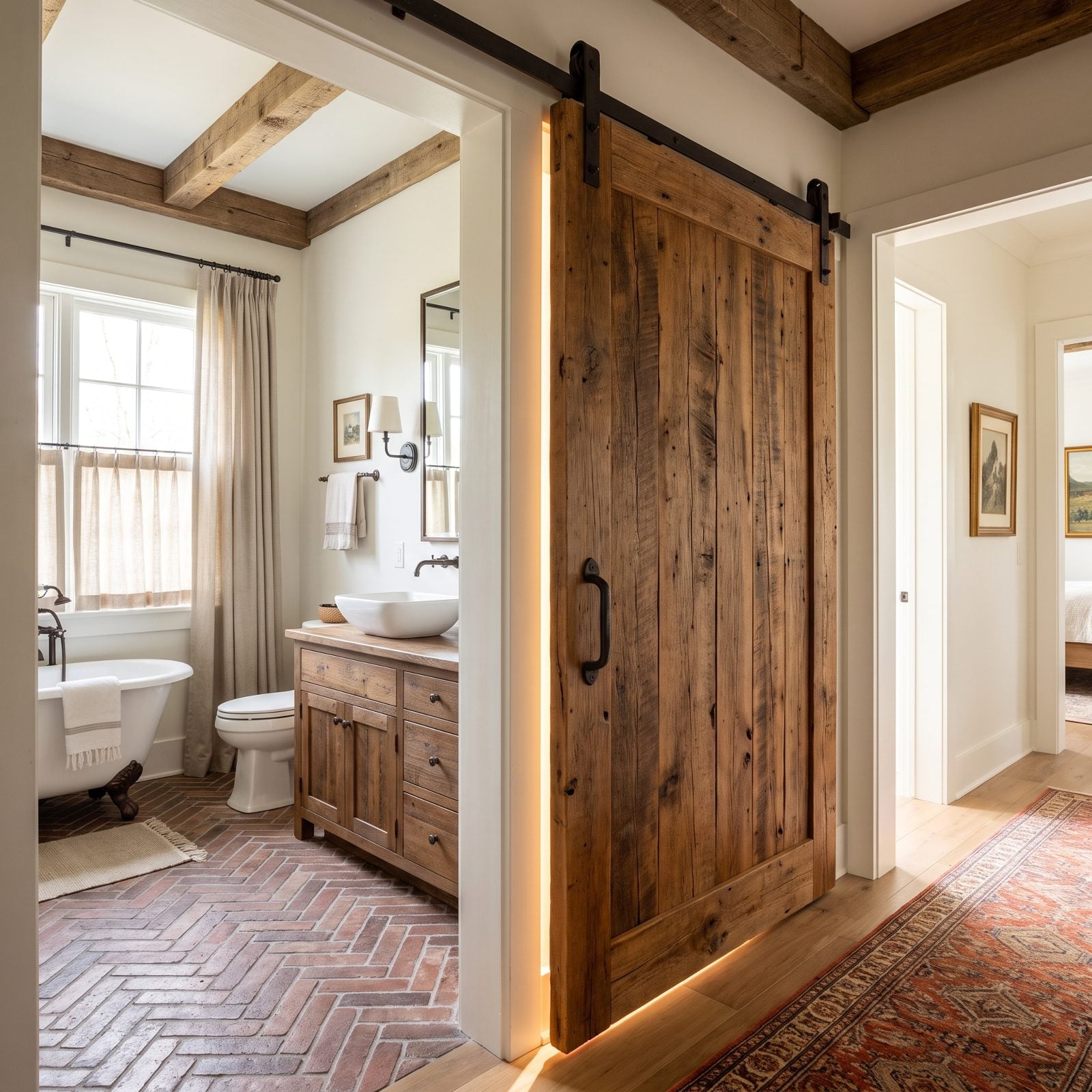
Barn doors look warm and architectural, and they’re a lifesaver where swing clearance is tight. But they do not seal. There’s always a gap along the edges where light, sound, and the thing nobody mentions, bathroom noise, travel freely.
For a pantry or an office, who cares. For a bathroom or a bedroom, that gap is the whole problem.
Put the barn door where privacy doesn’t matter and use a proper door, or a pocket door, where it does. A pocket door gives you the same space savings and actually latches shut. And if you’ve got your heart set on the sliding look near a bathroom, the right door in the right opening is exactly what a smart minimalist hallway design gets right.
20. Stealing the Bedroom’s Only Closet to Make the En Suite Bigger
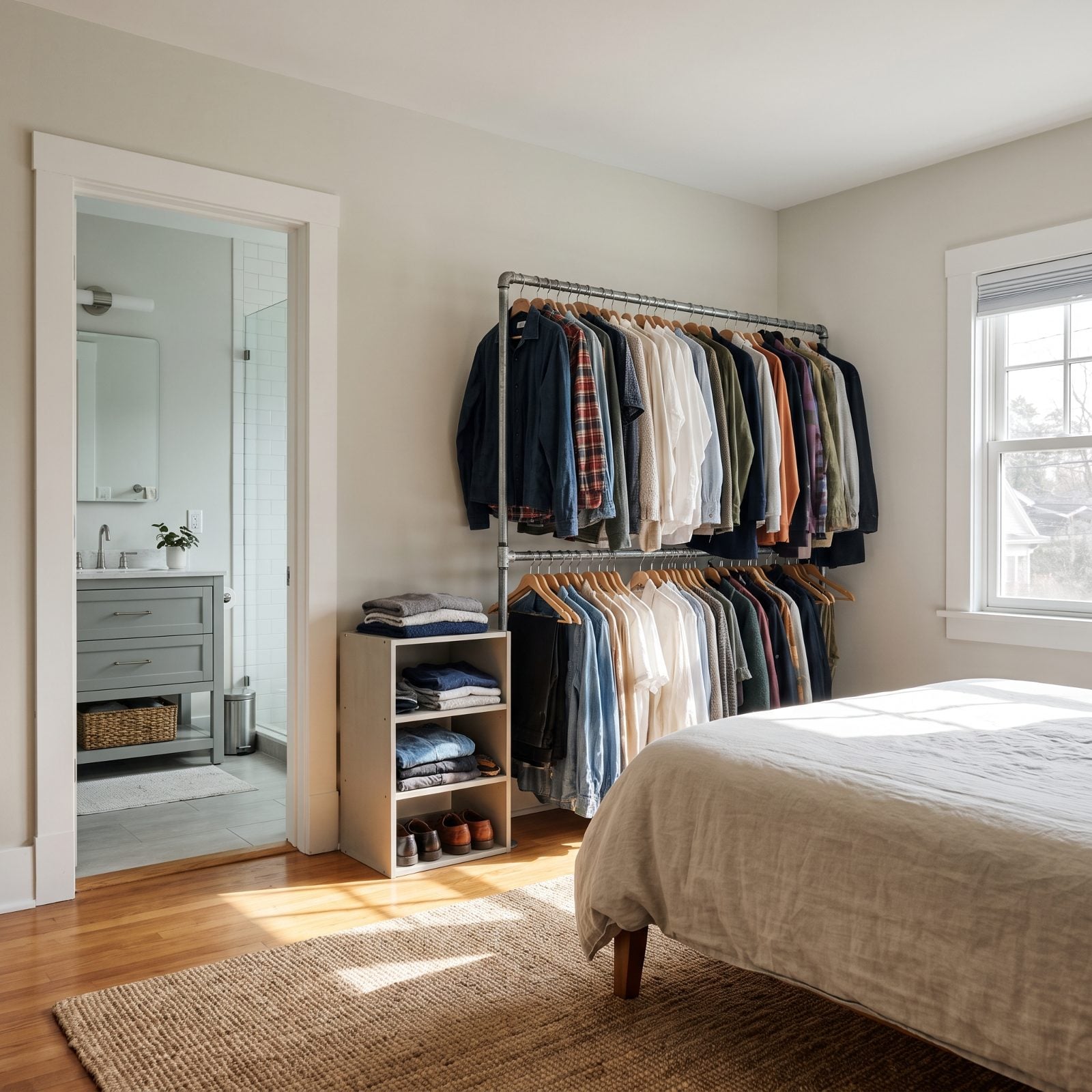
Knocking out the bedroom closet to grow the en suite feels brilliant until you’re living out of a freestanding rack in the corner. A bedroom without a closet isn’t legally a bedroom in a lot of places, and buyers notice immediately. You’ve traded storage you use every single day for a few extra square feet of tile.
Bigger bathroom, smaller life. The math rarely works.
If the en suite genuinely needs room, carve it from a hallway, a dead corner, or an oversized adjacent space, never from the room’s only closet. Keep the closet even if it means the shower stays a touch smaller. Daily function beats one luxurious feature almost every time.
19. Swapping to Black-Framed Windows on a House That Was Never Built for Them
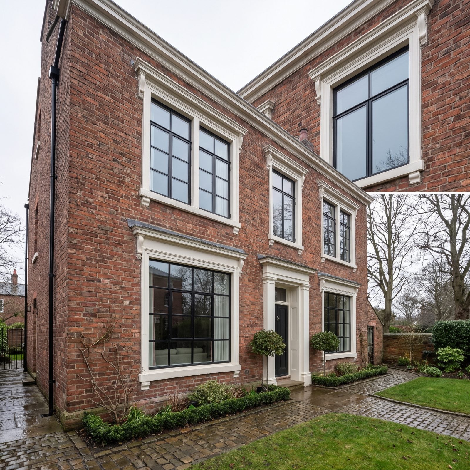
Black-framed windows are everywhere right now, and on the right house, something modern, industrial, a new build with clean lines, they’re perfect. Drop them into a traditional colonial or a soft cottage and the frames fight the architecture instead of flattering it. Those crisp black lines pull against warm millwork, and the whole thing looks slightly off even if you can’t name why.
Trends travel faster than architecture. A detail that’s hot today can read as a dated renovation the moment the trend cools, especially when it clashes with the bones of the house.
Match the window to the home’s era. On a traditional house, a warm bronze or a classic white frame ages far better. Let the architecture lead and the finishes follow, and the house will still look right in fifteen years.
18. Replacing Repairable Wood Windows With Short-Lived Vinyl Units
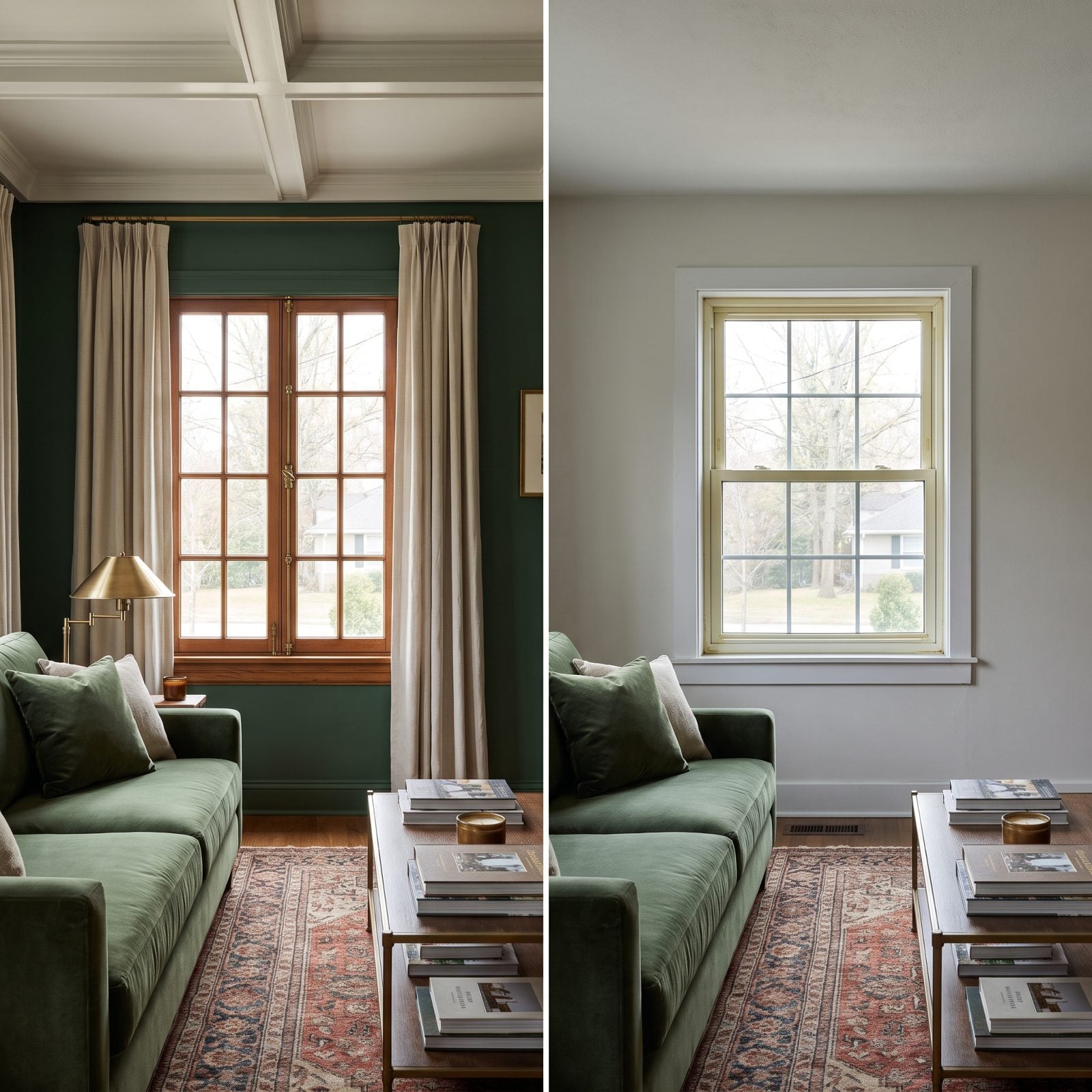
You’ve seen the pitch. The old wood windows stick and the paint’s peeling, so out they go and in come sleek white vinyl units that never need painting. Fair enough on paper.
Here’s the problem. Wood windows from before 1950 were built from old-growth timber that doesn’t exist anymore, and a stuck sash is a weekend repair, not a death sentence. Vinyl frames can’t be refinished, they warp under sun, and most of them fail within a couple of decades. The welded corners sit awkwardly in deep original openings too, leaving that telltale gap.
Repair the wood first. Re-glaze, re-cord the weights, add a storm window for efficiency. You keep the rustic porch renovation character and the glass that’ll outlive you.
17. Adding Decorative Board-and-Batten to Every Available Wall
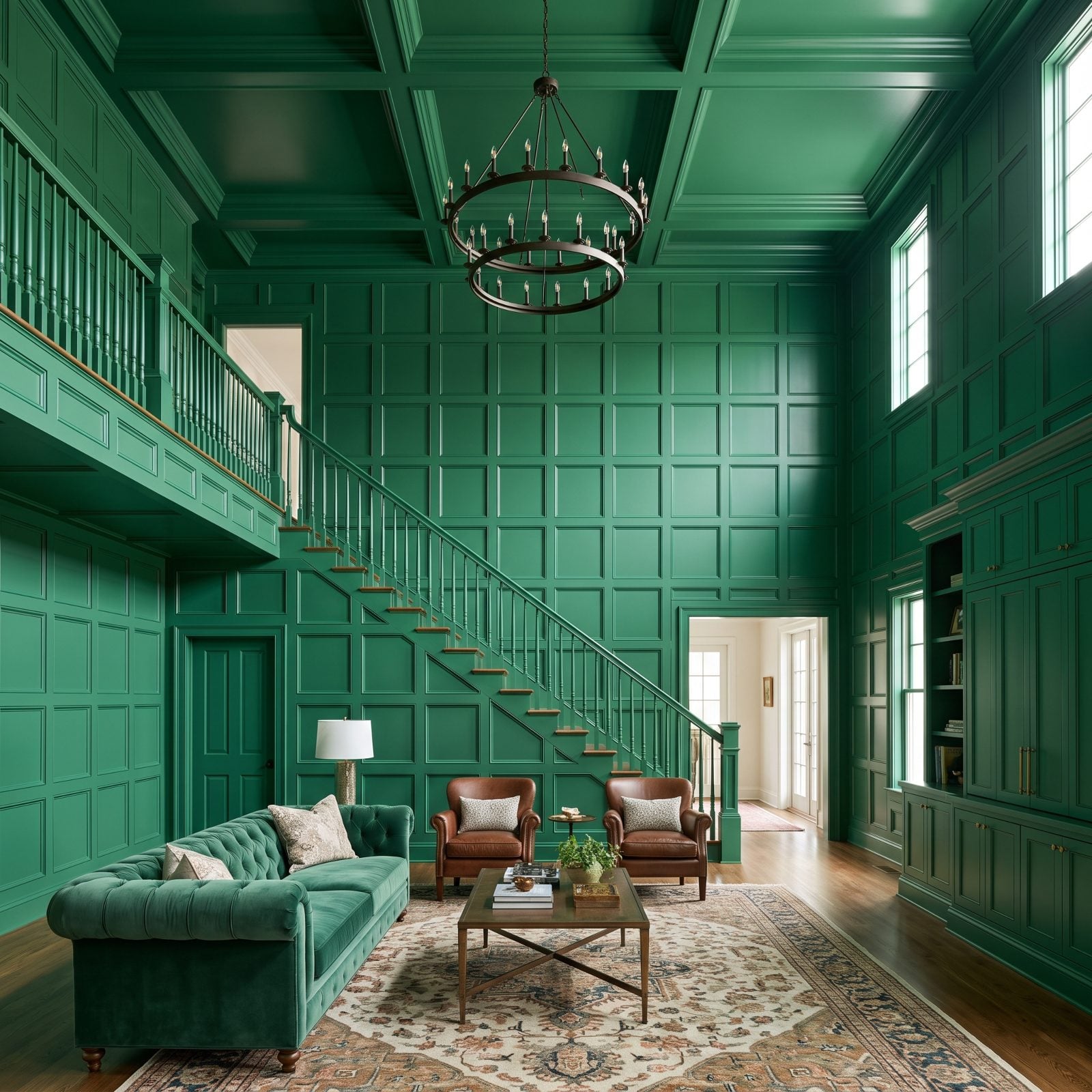
Board-and-batten is lovely. On one wall. Maybe two.
The trouble starts when it climbs the stairs, wraps the dining nook, lines the hallway, and marches into the powder room, until the whole house reads like a trim showroom where every wall is saying the same sentence at the same volume. The eye has nowhere to rest. Dust collects on every ledge, and repainting becomes a cutting-in nightmare around hundreds of battens.
So pick the walls that actually need some architecture. An entry, a stair, a dining room feature wall, and let the rest breathe. One room of paneling against plain walls looks intentional. Eight rooms of it looks like a sale on MDF.
16. Installing Trendy Wood-Slat Walls That Trap Dust
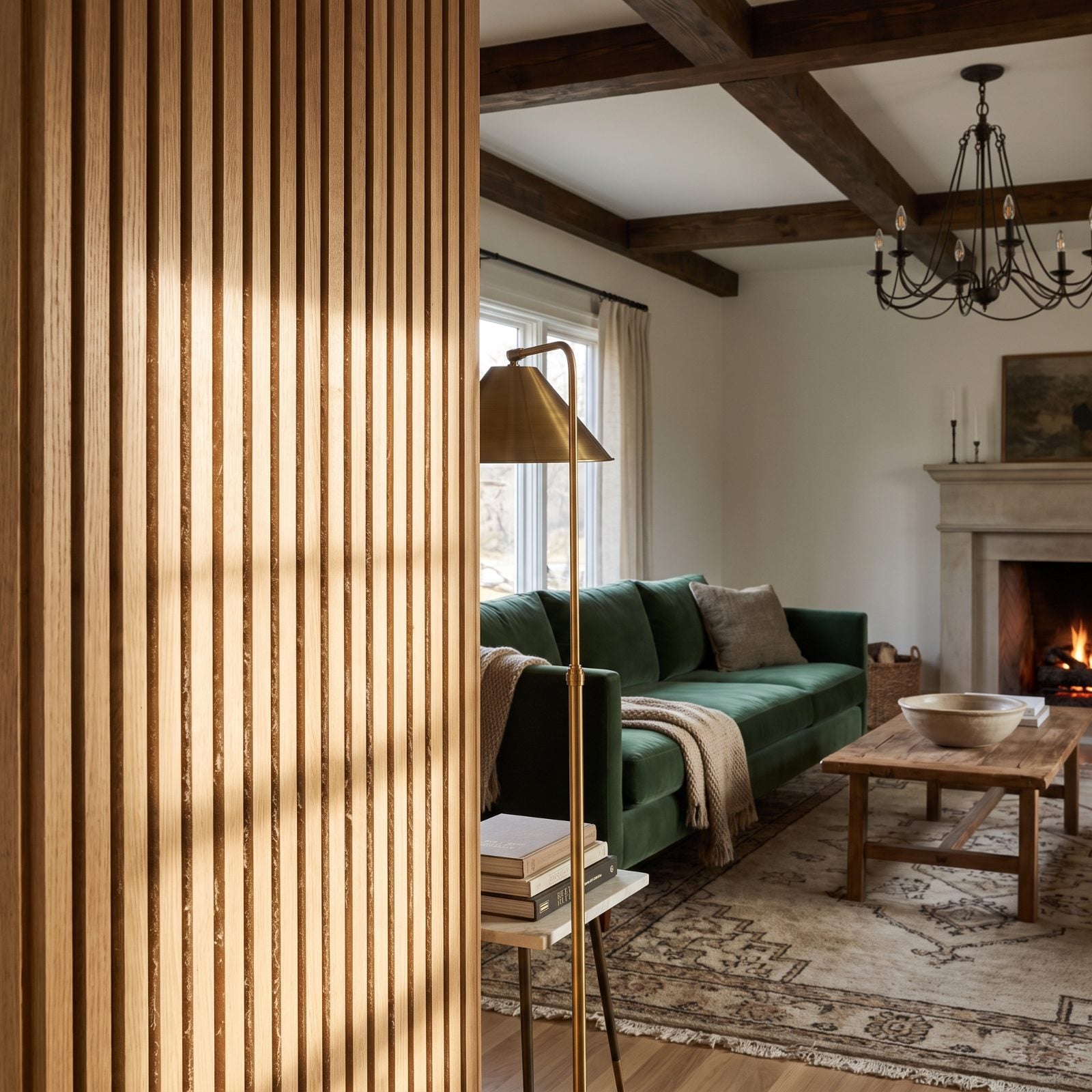
That white-oak slat wall over black felt looks incredible the day it goes up. Give it six months.
Every one of those grooves is a dust shelf, catching everything a flat wall would never hold, and you can’t run a cloth down them without going strip by strip. By spring the top edges have a gray film and the felt behind has started collecting lint. It photographs beautifully and lives terribly.
Love the look anyway? Then limit it to a feature the size of a headboard or a fireplace surround, somewhere high traffic dust won’t settle, and use sealed slats with gaps wide enough for a vacuum brush. Or fake the rhythm with a fluted plaster panel that wipes clean in one pass.
15. Choosing an Oversized Pivot Front Door With Weak Weather Sealing
🔥 Would you like to save this?
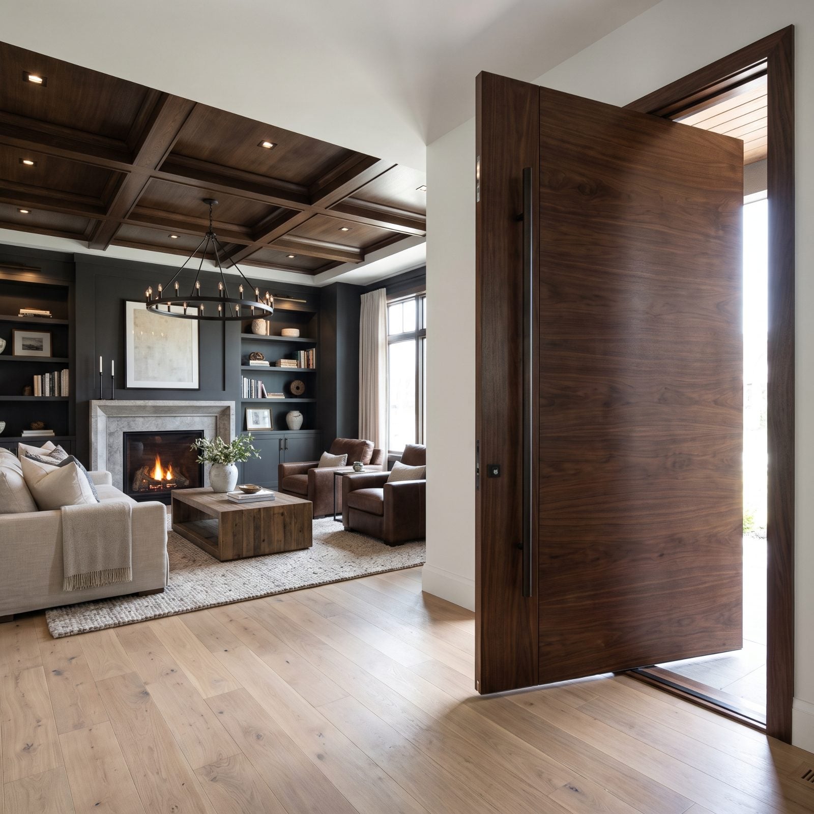
A nine-foot walnut pivot door makes an entrance. Nobody disputes that.
What the showroom skips is how hard a pivot is to seal. Standard weatherstripping is built for hinged doors that close tight against a jamb on three sides, but a pivot swings on a center point, so the gaps at the top, bottom, and strike edge are a known weakness. In a real climate that means drafts, energy loss, and sometimes water tracking across your minimalist hallway design floor after a storm.
Want the drama? Spend on a proper system door with an engineered pivot and a factory seal, not a slab a contractor hung on hardware. And test it against a hose before you sign off.
14. Using a Fully Glazed Front Door Without Planning for Privacy
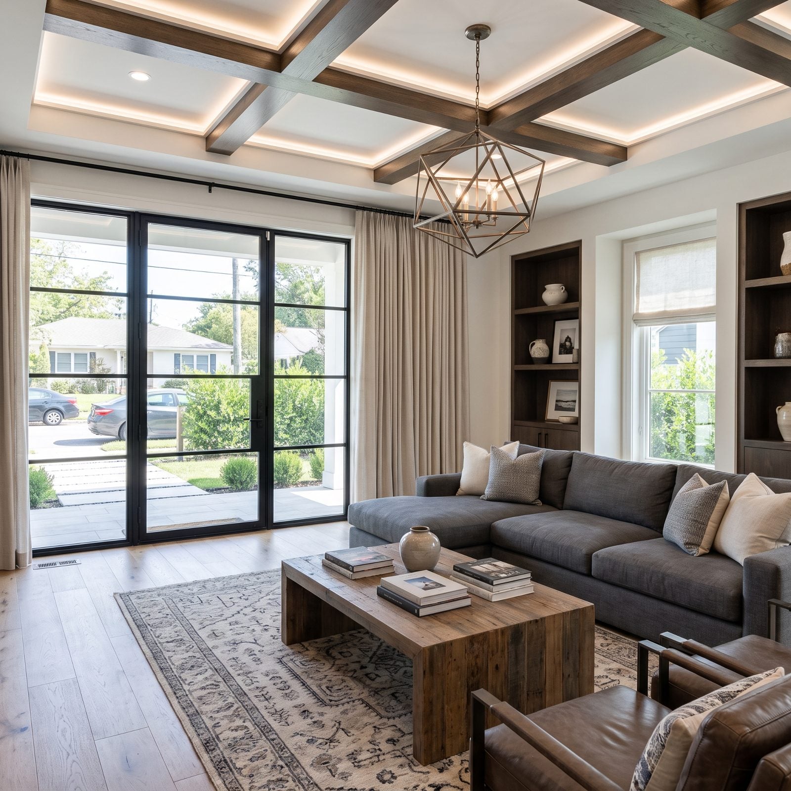
Full-glass steel doors are having a moment. One clean pane, black frame, all that light. I get the appeal.
But a clear door is a window anyone on the sidewalk can read. It puts your foyer, your keys, your sofa, and whoever’s home on display, and at night the glass turns into a lit stage with you in it. Light you wanted, privacy you forgot about.
Spec reeded, fluted, or seeded glass that scatters the view while keeping the brightness. Or pair clear glass with a sheer linen panel on a slim rod you can slide shut. You still get the glow without broadcasting the whole house to the street.
13. Installing Horizontal Cable Railings That Fight the Home’s Style
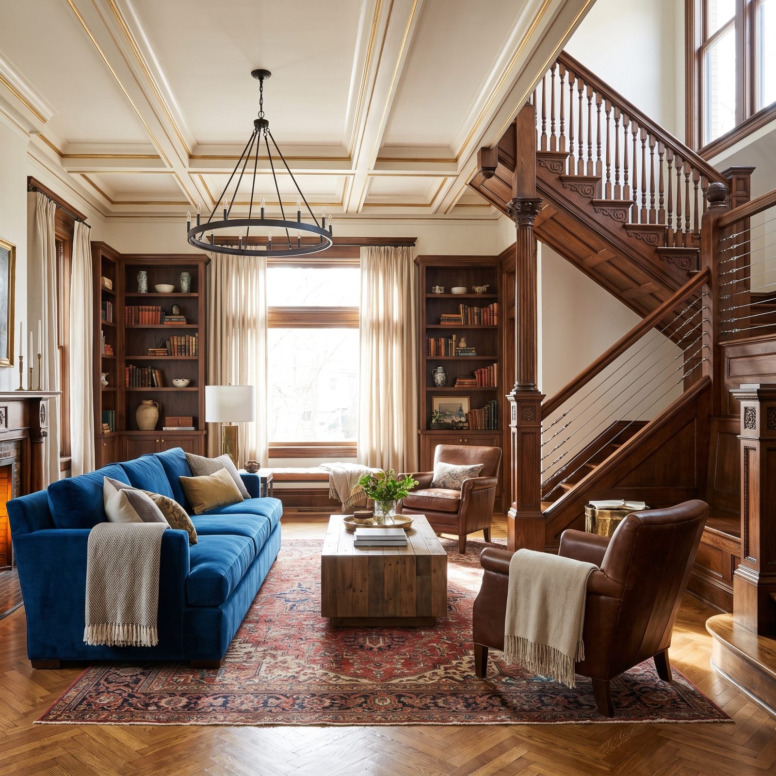
Cable railing belongs in a glass-and-steel house on a hillside. It looks sharp there.
Drop it into a traditional foyer with crown molding and a curved oak stair, though, and it starts an argument the room can’t win. The cold industrial lines read as a mistake next to turned newel posts and paneled walls. Cable also sags over time, needs re-tensioning, and in homes with kids it fails the exact safety test it was supposed to pass.
Match the railing to the bones of the house: painted wood balusters, iron scrollwork, or a simple square-stock metal rail. The best railing is the one you don’t notice because it belongs.
12. Filling Ceilings With Rigid Grids of Recessed Lights
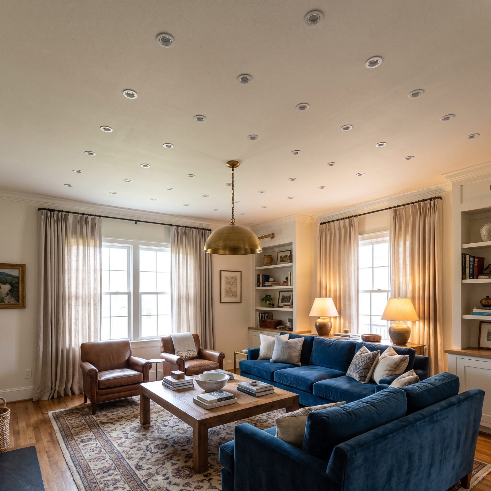
Builders love a recessed grid because it’s easy to spec and guarantees nobody complains the room is dark. The result is a ceiling that looks like an office drop tile, pocked with evenly spaced holes.
Flat, shadowless light flattens everything under it. Faces, food, art, all lit like a conference room. And once the grid’s in, you’ve committed to that one uniform wash forever.
Build light in layers instead. A few cans for general fill, then pendants over the island, sconces by the sofa, a lamp in the corner, all on separate dimmers. The room gains depth, mood, and the ability to shift from dinner-party warm to chop-vegetables bright.
11. Hanging Oversized Island Pendants That Block Sightlines
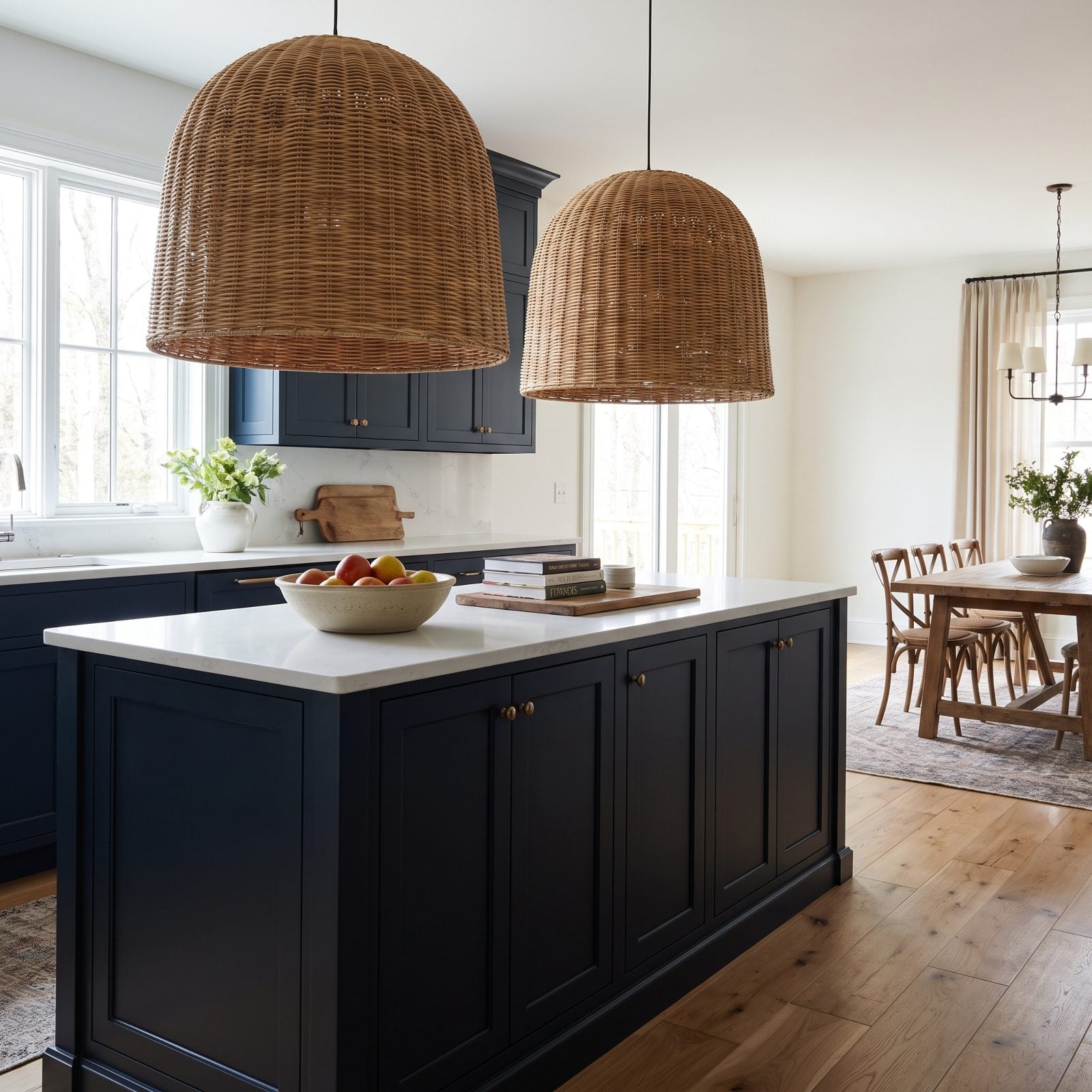
Big pendants are a trap. They look magazine-ready in a wide shot, so people size up, then hang them low to make a statement.
Now you’ve got two black domes floating at eye level, cutting the kitchen in half. You can’t see the person across the island, the window behind them disappears, and the whole open-plan point of the room is defeated by a light fixture.
Keep the bottom of any island pendant 30 to 36 inches above the counter, and size the fixture to roughly a third of the island length. If the island begs for drama, go tall and narrow, or three slim pendants instead of two fat ones. You want to see through the kitchen, not around it.
10. Automating Every Switch With Proprietary Smart-Home Hardware
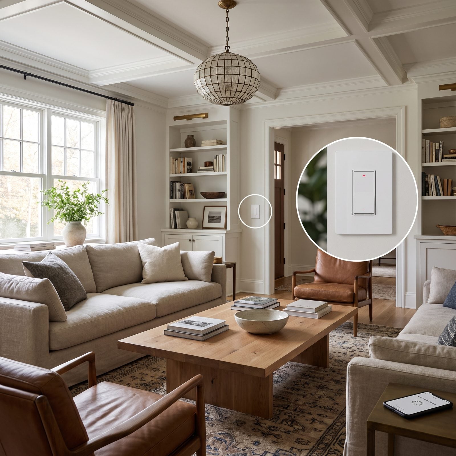
Smart lighting sounds like the future until the company gets acquired and your switches turn into wall decorations.
Proprietary systems lock you into one brand’s app, one brand’s hub, one brand’s willingness to keep the servers running. When a guest can’t turn on a light without your phone, something’s gone sideways. And ripping it out later means replacing every switch in the house, not just swapping a bulb.
Automate the handful of things you’ll actually use, a few scenes, the exterior lights, the thermostat, and build on an open standard like Matter or plain Z-Wave so any switch still works as a switch. The glam hallway renovation should still light up when the Wi-Fi is down.
9. Mounting the Television Above a High Fireplace Mantel
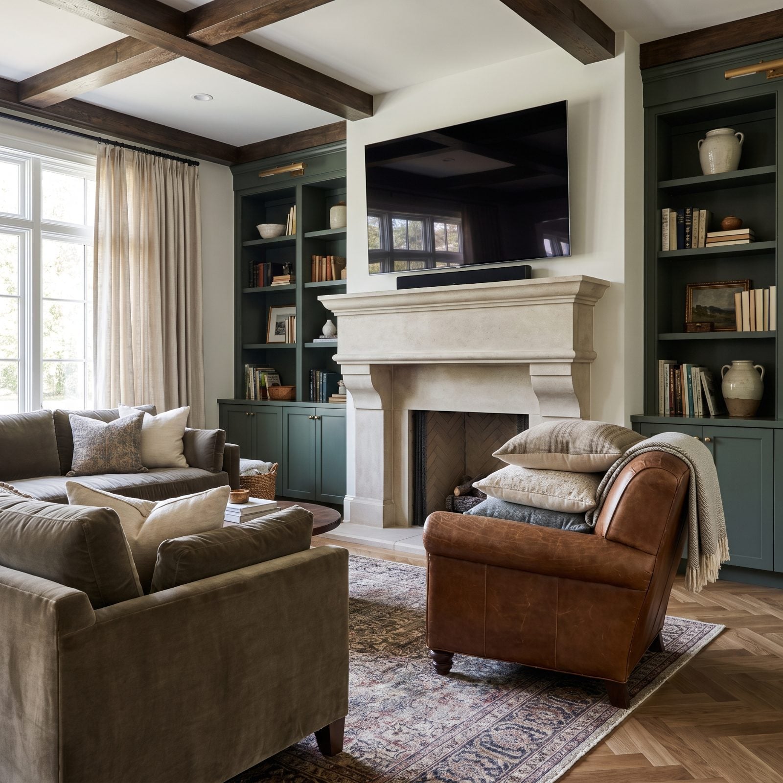
The TV-over-fireplace move is everywhere, and almost everywhere it’s too high.
Watch a movie from the sofa and you’re craning your neck up at a 40-degree angle for two hours. The ideal screen center sits around eye level when you’re seated, roughly 42 inches off the floor, and a mantel puts it closer to 60. Your neck knows the difference by the second episode.
Give the television its own wall at the right height. Or if the fireplace really is the only option, choose a lower-profile mantel with a tilting mount, or go with one of those art-mode screens that at least earns its spot when it’s off. The fireplace was never meant to hold both the fire and the Friday-night movie.
8. Installing a Long Linear Fireplace in a Traditional Room

That skinny ribbon of flame looks right at home in a concrete-and-glass loft. Drop it into a room with crown molding, a coffered ceiling, and paneled wainscoting, and it reads like a flat-screen that forgot to turn on. The horizontal sweep fights every vertical line the traditional bones are built on.
The problem isn’t the fireplace — it’s the conversation it refuses to have with the room. Traditional spaces want a focal point with weight, a mantel to anchor the eye.
Go with a firebox in classic proportions, a real surround, and a shelf you can set a clock on. If you still want the modern burn, pair a linen rolled-arm sofa with a gas insert tucked into a traditional opening and you get the flame without the argument.
7. Creating Fixed Built-Ins Sized for One Specific Screen
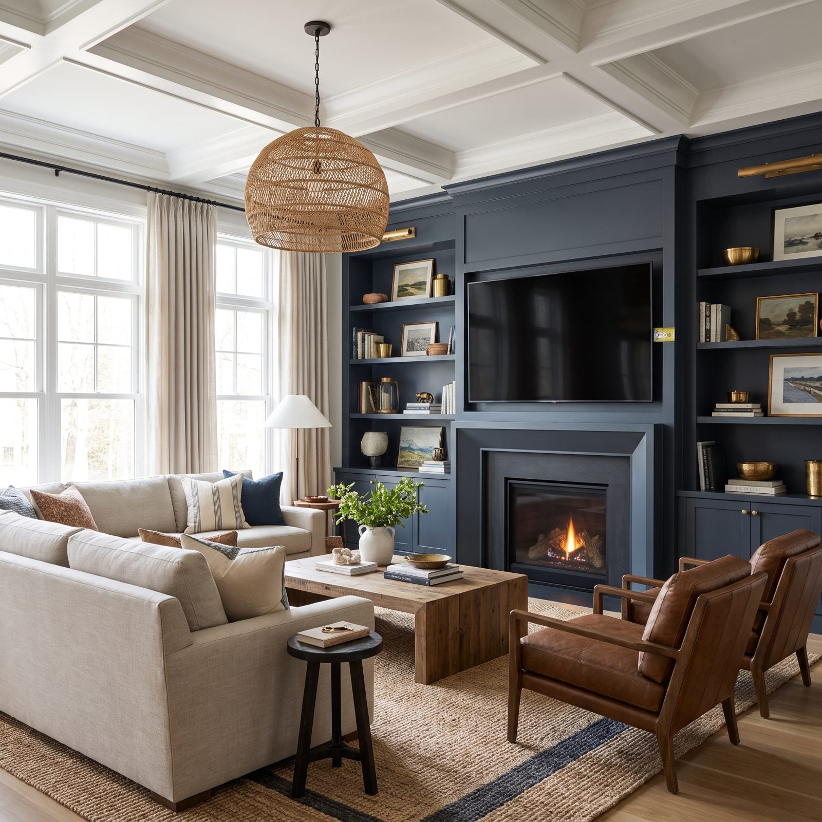
Building a niche that hugs your current TV feels clever right up until the day you upgrade. Screens creep an inch or two bigger every cycle, and that tight two-inch reveal becomes a wall you have to saw into. A built-in is permanent. A screen size is a rental.
So size the opening generously, leave a good margin of breathing room all around, and run power and cable through a removable panel instead of plaster. Plan for the televisions you haven’t bought yet, and your cabinetry will outlast three of them.
6. Putting an Upstairs Laundry Room Without a Drain Pan or Floor Drain
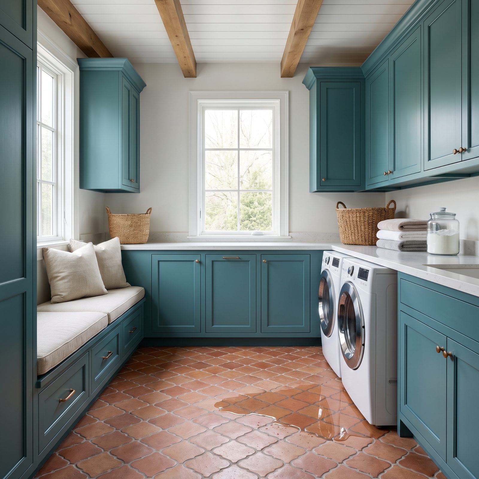
Upstairs laundry is a genuinely good idea — it puts the machines where the clothes already live. But I’ve watched too many ceilings come down because someone skipped the one detail you can’t add later without ripping up the floor.
A supply line fails, a hose slips, and water from a second-floor washer finds your kitchen in minutes. The convenience becomes a five-figure drywall job overnight.
Set the machine in a drain pan plumbed to a floor drain, add a water-sensing auto shutoff valve, and sleep easy. Call it cheap insurance against the single most expensive mistake on this list.
5. Using Only Open Cubbies in a Mudroom

Open cubbies photograph beautifully. In real life a mudroom is the busiest, grubbiest corner of the house, and open storage puts every scarf, helmet, and stray mitten on permanent display. Six months in, it looks like the inside of a lost-and-found bin.
Mix it up. Keep a couple of open hooks for grab-and-go, then hide the rest behind cabinet doors or inside baskets that slide into the cubbies. Clean lines up top, chaos out of sight.
4. Removing the Entry Closet to Make a Bigger Foyer
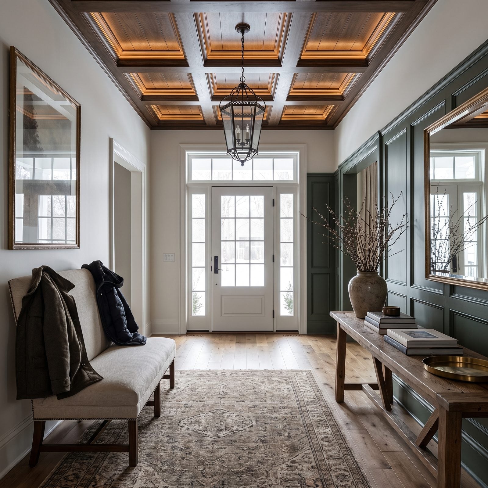
Knocking out the coat closet for a grander entrance is tempting. The foyer suddenly breathes. Then January arrives, and there’s nowhere to put the coats, the boots, the umbrella graveyard — and the whole airy effect collapses under a pile of outerwear draped over a console.
If the closet has to go, replace the function before you remove it. A built-in bench with concealed storage, or a bank of millwork with doors, keeps the open feel while giving the daily pile somewhere to disappear. For ideas on squeezing real storage into a tight entry, this minimalist hallway design shows how to keep the lines clean without losing the closet entirely.
3. Choosing a Very Dark Composite Deck That Bakes in Full Sun
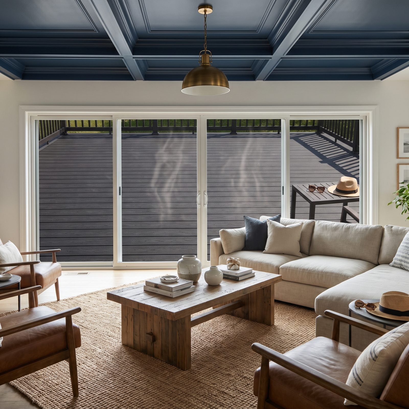
Dark composite boards look rich in the showroom under fluorescent light. Put them in full southern sun and they turn into a griddle. Composite soaks up and holds heat far more than wood does, and a near-black deck in July gets hot enough that bare feet last about two seconds before you’re hopping back inside.
The fix is boring and it works: go lighter. Greys, driftwood tones, and warm tans run noticeably cooler underfoot, and they hide pollen and dust better anyway. Save the espresso boards for a shaded porch, the way this rustic porch renovation keeps the deep color well out of direct sun.
2. Swapping Original Trim for Undersized Off-the-Shelf Molding
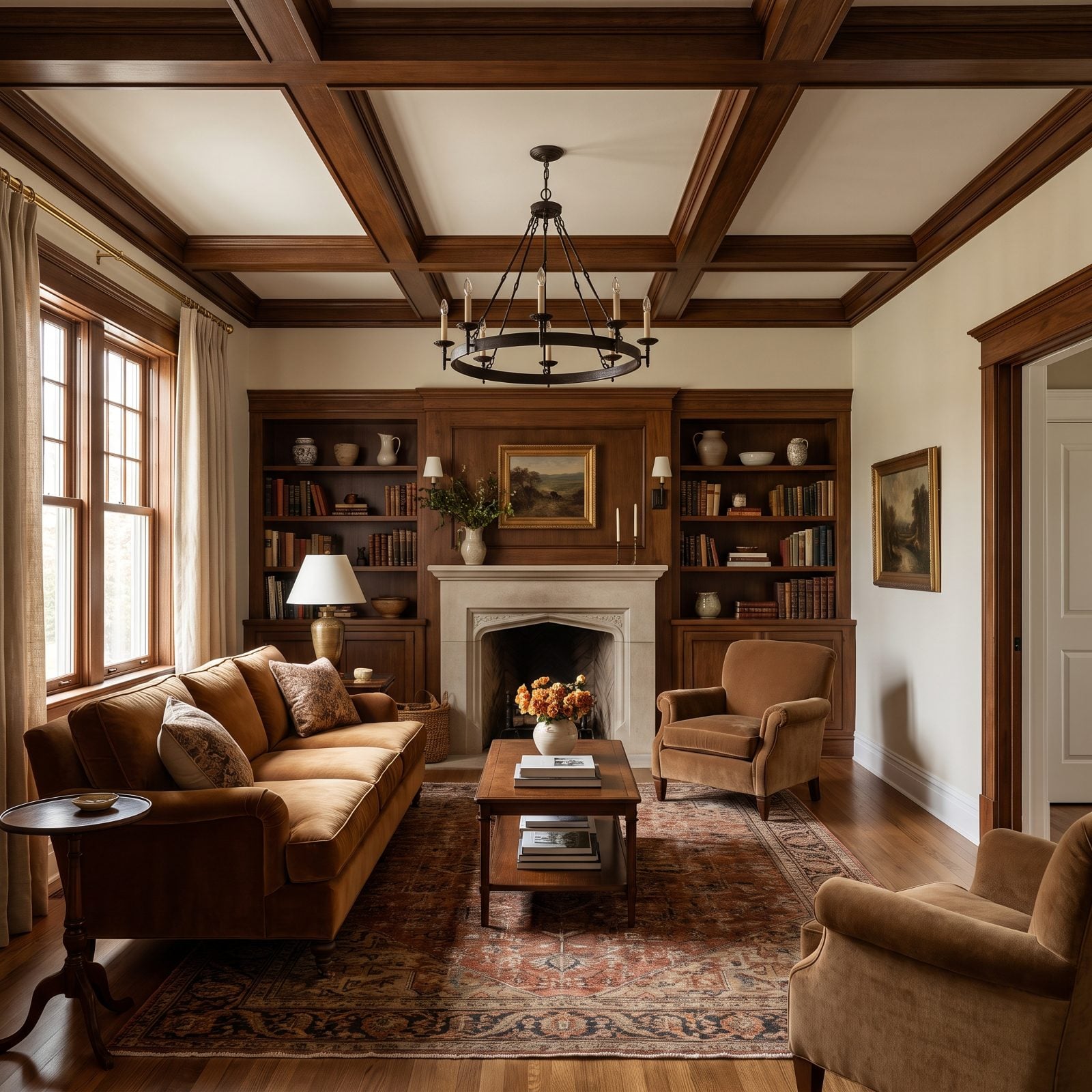
This one quietly guts the character of an older home, and most people never see it coming. The original trim in a 1920s or Craftsman house is wide, deep, and scaled to tall ceilings. Swap it for skinny two-and-a-quarter-inch ranch casing from the home center and the whole room shrinks. The walls lose their frame.
Trim is the punctuation of a house. Match the original profile at a millwork shop, or at the very least buy casing wide enough to hold its own against the baseboard. And I’ll die on this hill — cheap trim makes a good house look cheap faster than any paint color ever could.
1. Picking Oversized Tile Without Planning Cuts Around Fixtures
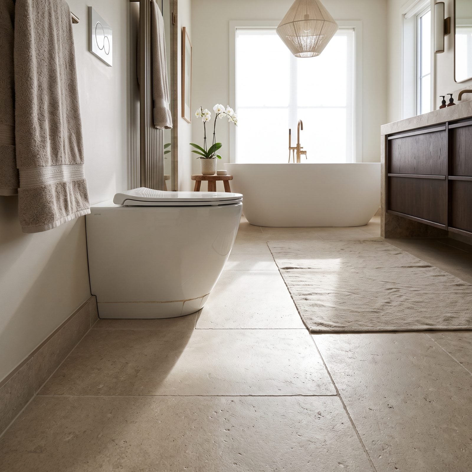
Large-format tile is having its moment, and for good reason — fewer grout lines, a calmer floor, more apparent space. But the magic only holds if someone plans the layout before the thinset goes down. Skip that step and you get a two-inch sliver wedged around the toilet base, grout lines dying into a fixture instead of flowing past it.
Have your installer dry-lay the whole floor first and set the layout so full tiles land where the eye goes and cuts hide at the edges. A good tile plan is invisible. That’s the whole trick.