🔥 Would you like to save this?
At some point, adding another throw pillow stops being a strategy. A room can have blankets, candles, and a basket in the corner and still feel like nobody has ever settled into it for longer than ten minutes.
In order to come up with the very specific design ideas, we create most designs with the assistance of state-of-the-art AI interior design software. Also, assume links that take you off the site are affiliate links such as links to Amazon. this means we may earn a commission if you buy something.
These 31 before-and-afters go considerably further. Lighting drops closer to eye level. Rugs spread out. Walls deepen from builder white into navy, ochre, terracotta, and cream. Hard-edged furniture gives way to velvet, leather, linen, plaid, florals, and wood with enough grain to be noticed. Some transformations hinge on one decisive move. Others pile on detail until the room develops an entirely different personality.
Thirty-one is a lot of ways to chase cozy. Apparently there was more than one answer.
31. Warm Light Changed the Room Before the Furniture Even Got a Chance
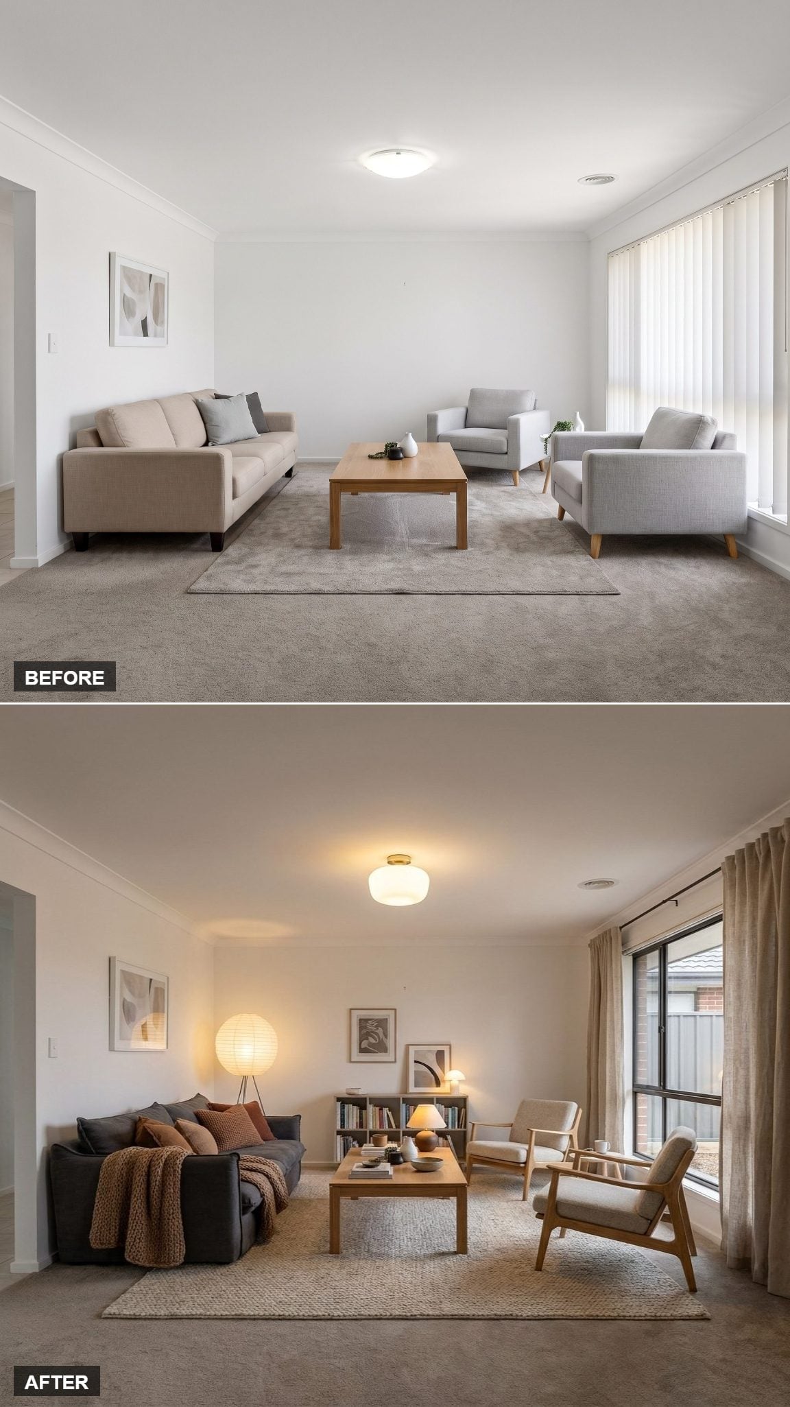
A paper globe floor lamp and ceramic table lamp bring light down into the seating zone instead of asking the ceiling fixture to handle the entire room. That shift alone makes the space feel less exposed.
The charcoal velvet sofa picks up rust and terracotta cushions, while a chunky knit throw adds texture without pretending to be decoration first and useful second. Oak-framed lounge chairs angle toward the coffee table rather than lining up obediently against a wall. The room starts behaving like somewhere people might actually talk.
30. Burgundy Velvet and Brass Gave the Walls Something Worth Framing
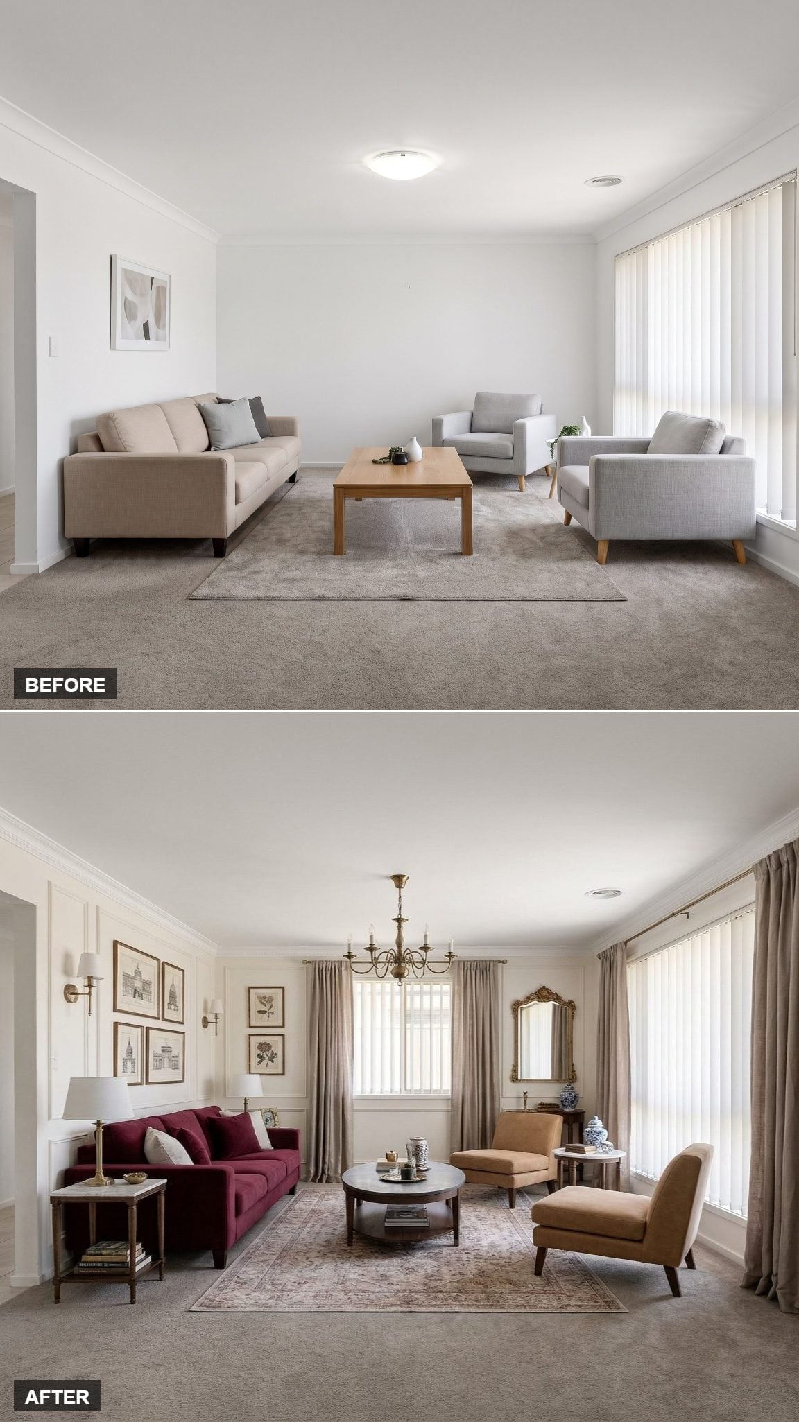
Deep burgundy velvet sets the direction, but the architectural trim is what gives the room backbone. Picture-frame molding runs around the walls, turning formerly blank surfaces into part of the design rather than empty space waiting for art.
An ornate gilt mirror, brass sconces, and a candelabra-style chandelier reinforce the traditional turn without forcing every object to match. Linen drapes soften the side window, and the faded floral rug keeps the polished metal and velvet from becoming too formal.
Nothing here is shy about what it wants to be.
29. Mid-Century Leather, Walnut, and One Very Persuasive Rust Rug
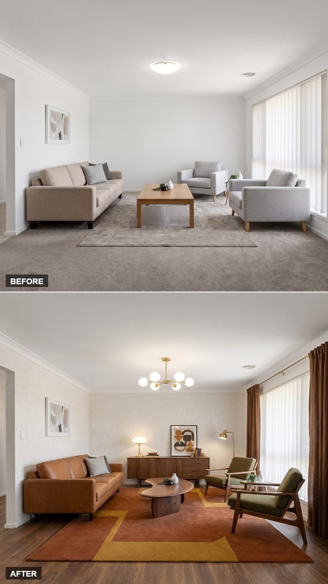
Cognac leather, an oval walnut coffee table, and green wood-frame chairs move the room firmly into mid-century territory. The brass Sputnik chandelier adds another period cue without turning the place into a showroom recreation.
Underneath, the rust-and-mustard rug gives the seating group a clear footprint. Without a fireplace or media console dictating orientation, that visual boundary helps the furniture feel deliberately gathered instead of loosely parked.
Why the Rug Earns Its Square Footage
The bold border creates a zone within the larger floor area and gives the eye somewhere to stop. Furniture placement already establishes the conversation area; the rug reinforces it and makes the arrangement feel finished.
28. Pink Velvet and Botanical Prints Took the Room Somewhere Decidedly Romantic
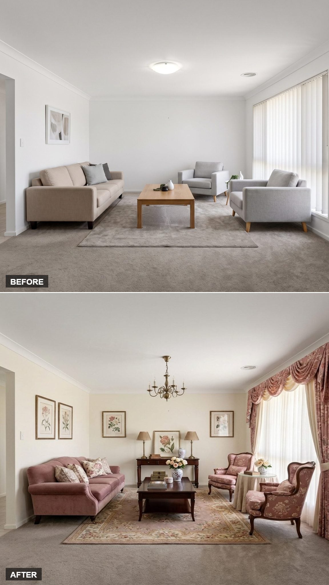
Dusty rose velvet on a rolled-arm sofa establishes the mood before the floral wingbacks even enter the conversation. A Persian-style rug in blush and cream keeps the palette soft without letting the furniture disappear into it.
The brass candle-style chandelier pushes the room further toward traditional romance, while rose damask curtains add enough fabric at the window to make the architecture feel dressed rather than merely covered.
Somewhere between a Victorian parlor and a very good dream seems about right.
27. Terracotta Plaster and Brown Leather Put Some Earth Under the Room
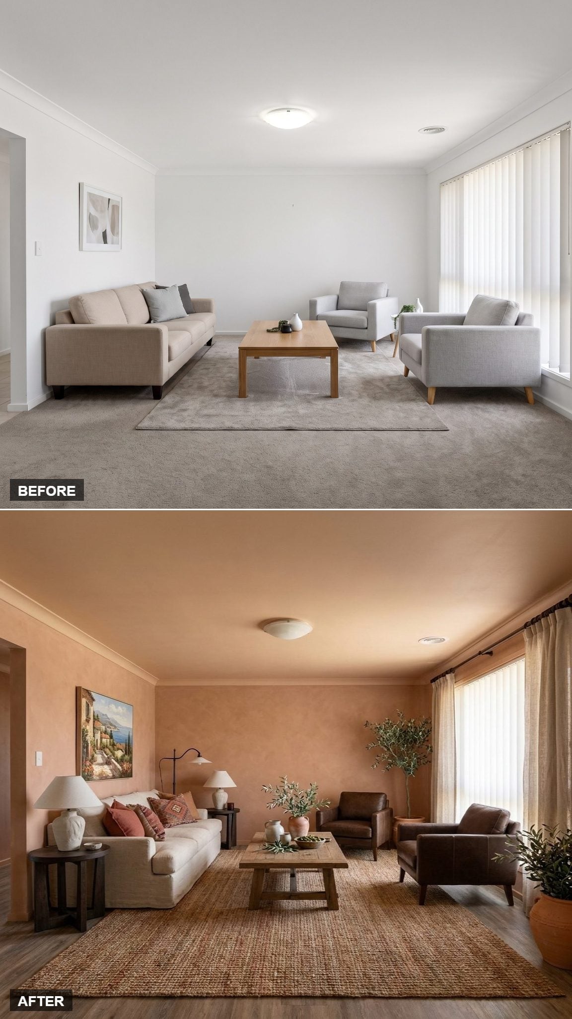
Terracotta-toned plaster immediately changes the temperature of the room. Brown leather armchairs pick up that earthy warmth without disappearing into it, while a natural jute rug gives the wood coffee table a rougher texture to work against.
Nothing relies on one dramatic focal point. The effect comes from several materials speaking the same warm language: leather, plaster, woven fiber, and wood. Cozy arrives here by accumulation rather than spectacle.
26. Navy Walls and a Chesterfield Turned an Ordinary Sitting Room Into a Library
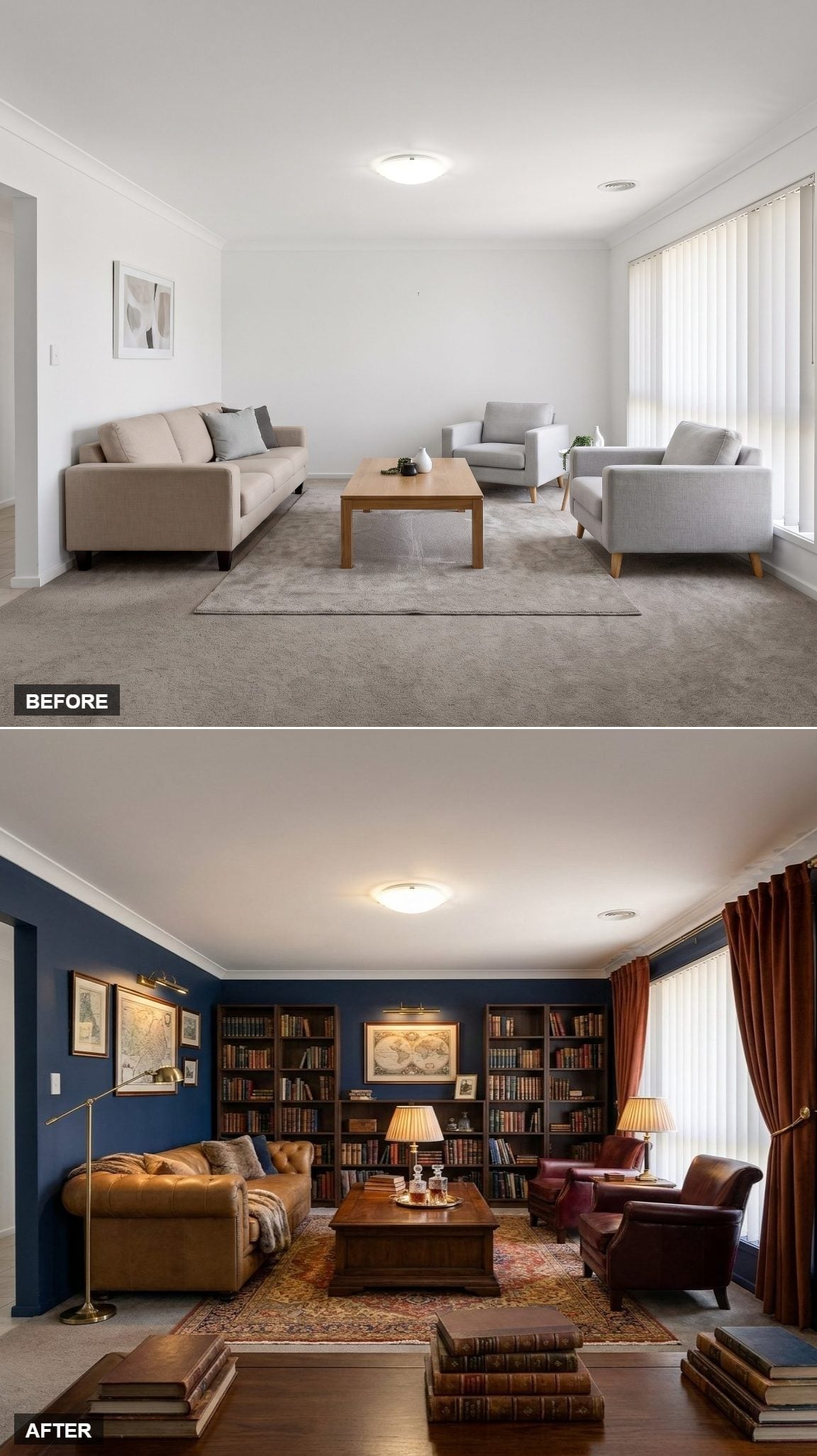
Deep navy wraps the walls and bookcases into one continuous envelope. Leather-bound books, antique-style maps, and brass picture lights give the shelving enough density that the room reads more like a private library than a generic living room with storage.
A caramel leather Chesterfield faces oxblood club chairs across a carved wood coffee table. Rust velvet drapes frame the window, while a Persian-style rug takes the darkest reds and blues and spreads them across the floor.
Even the books stacked near the shelves look like they have somewhere to be.
Did You Know: Dark wall colors reflect less light than pale ones, which can make a room feel more enclosed during the day. Layered lamps and warm-toned metal finishes can change that effect considerably after dark, when the walls become a backdrop for pools of lower, softer light.
25. Forest Green and Mission Oak Gave the Room the Soul of a Study
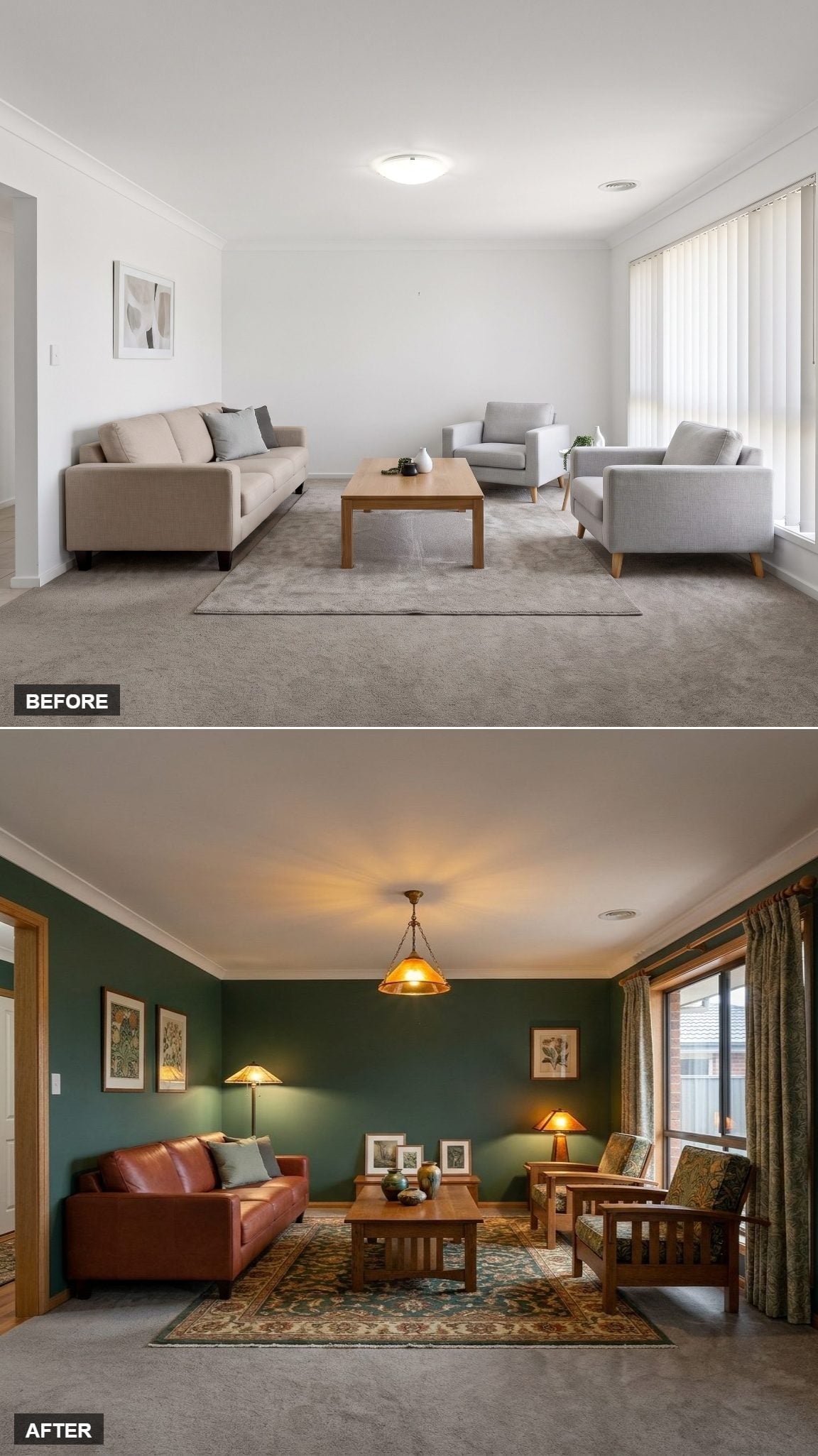
Forest green covers every wall, immediately pulling the room away from generic sitting-area territory. An amber-glass pendant adds a concentrated glow overhead while the darker walls keep the light from bouncing everywhere at once.
Mission-style oak chairs with slatted backs face a brown leather sofa across a Persian-style rug in teal and rust. Botanical prints lean casually near the baseboard, and patterned curtains bring softness to the wood-trimmed window.
The palette is deep, but the wood and textile pattern keep it from becoming a cave.
24. Beige Walls and Dark Leather Proved Neutral Didn’t Have to Mean Empty
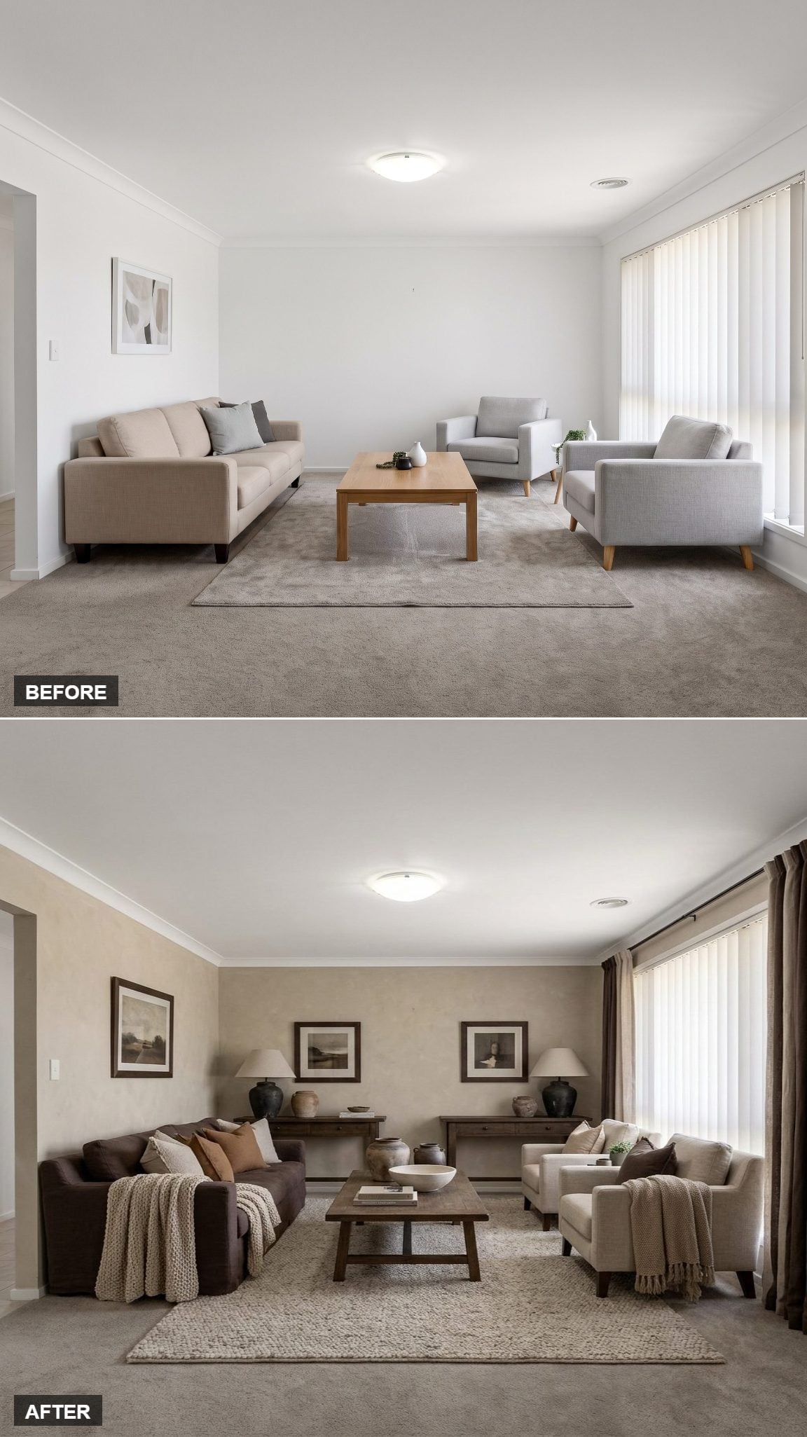
Textured beige walls establish a warmer baseline before the furniture gets involved. Two dark chocolate leather sofas face each other across a rustic wood coffee table, creating symmetry without turning the arrangement stiff.
A thick woven rug introduces another neutral texture underfoot, while three landscape prints give the back wall a simple rhythm. Matching lamps at opposite ends repeat the shape and light level without making the room feel staged for a catalog.
The result is calm, but not anonymous.
23. Teal Velvet and a Salon Wall Made the Room Look Collected Instead of Decorated
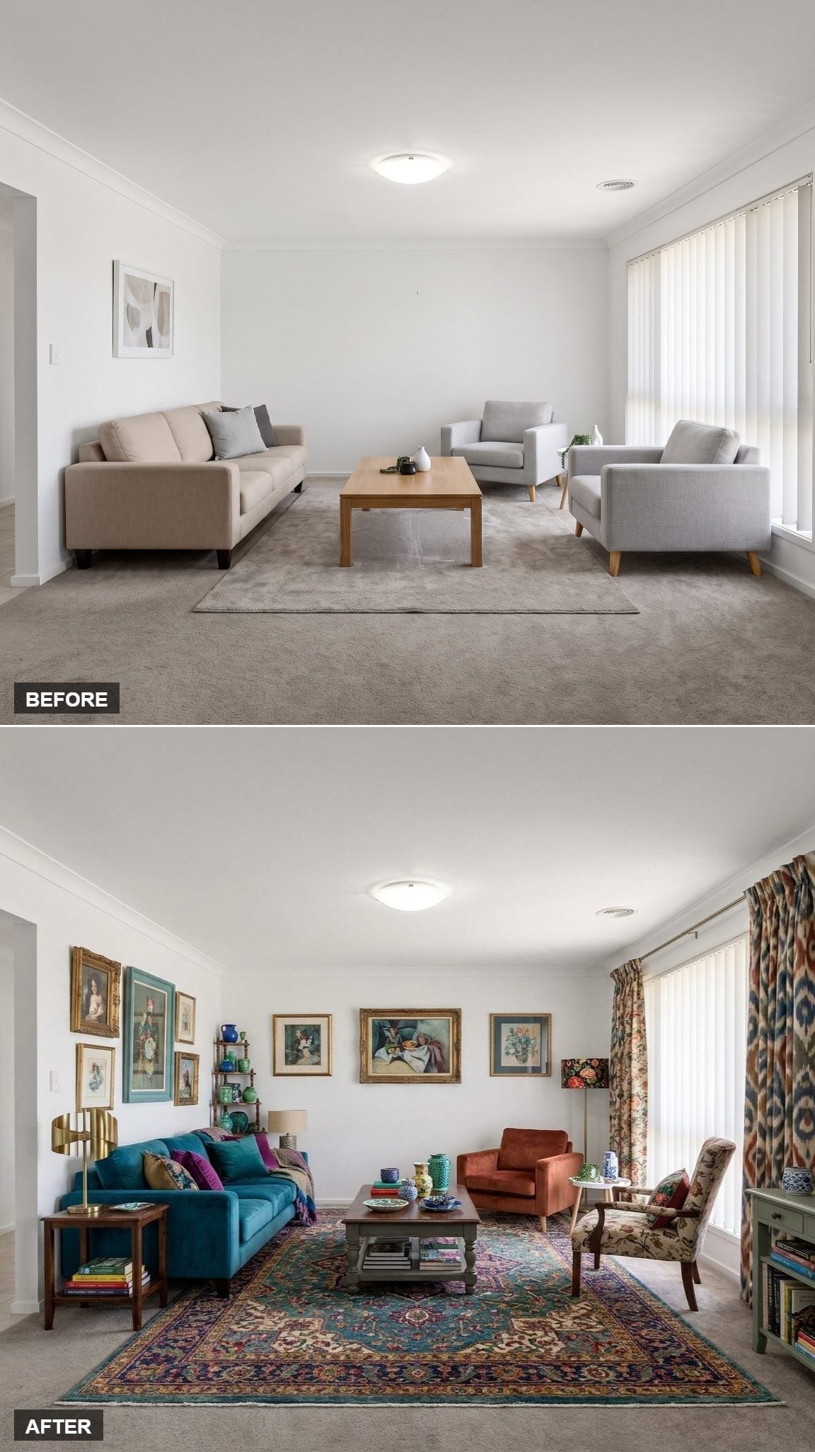
Gold-framed paintings climb across the wall in a loose salon arrangement, mixing portraiture and still life without insisting on perfect alignment. That controlled irregularity makes the display feel accumulated rather than purchased as a set.
The teal velvet sofa gets an unexpected partner in a rust linen chair, while a distressed painted coffee table loosens the formality. The Persian-style rug becomes the palette map, carrying enough teal, red, cream, and gold to justify almost everything sitting above it.
Floral curtains and a patterned accent chair add another layer without tipping the room into clutter.
History Corner: Dense salon-style art displays have roots in European gallery and exhibition traditions, where paintings were often hung closely from low on the wall toward the ceiling. In a home, the approach works best when the frames or subject matter share enough visual DNA to keep abundance from becoming noise.
22. Olive Velvet and Botanicals Turned the Room Into an Indoor Garden
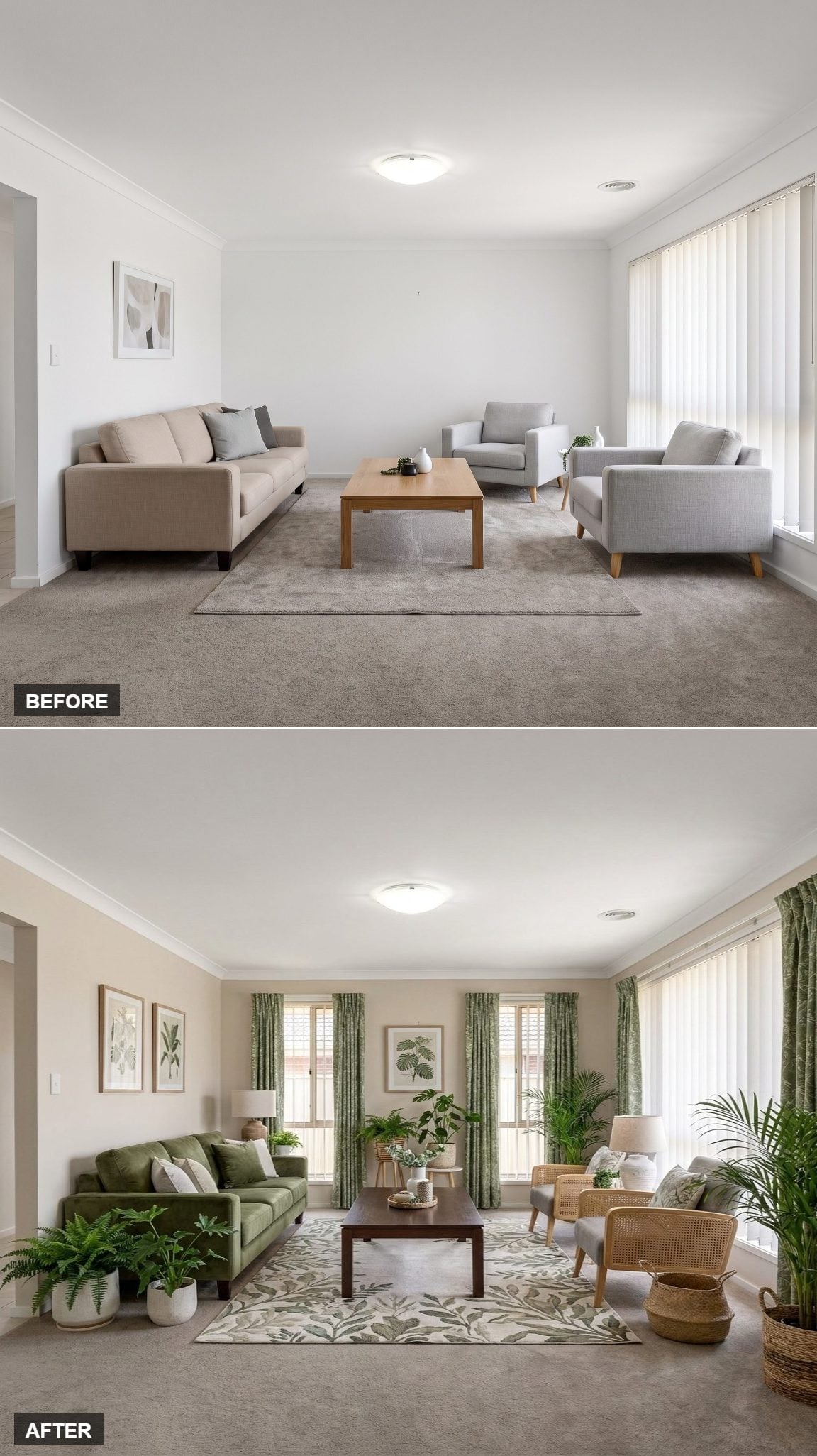
This room commits to green without relying on one lonely houseplant to make the case. An olive velvet sofa sits over a botanical rug in cream and sage, while rattan armchairs interrupt the color with warm natural fiber.
Leafy curtains frame both windows, botanical prints repeat the theme on the walls, and plants rise at different heights instead of forming a row along the floor.
The off-white walls keep the greenery from turning into camouflage. Cozy here comes from abundance, but disciplined abundance.
21. Leather, Plaid, and Deep Green Drapes Took the Room Straight to the Lodge
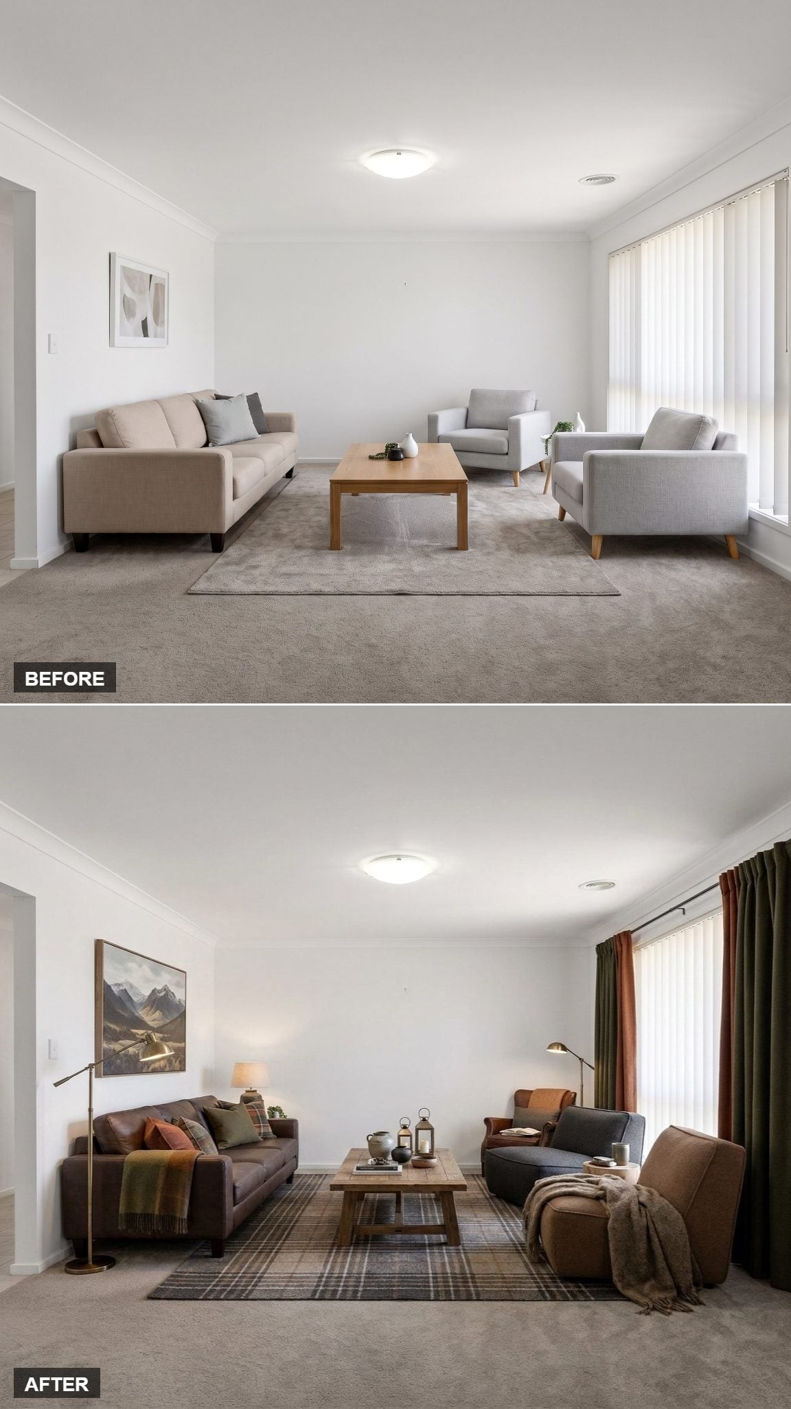
Charcoal leather sofas set a darker foundation, while the plaid wool rug introduces muted gray and brown without turning the floor into another solid block of color. Rust pillows and a casually draped blanket pick up the warmer notes.
Brass floor lamps on both sides bring light down closer to seated eye level. Layered lighting like this can make a room feel more dimensional than relying on one overhead source alone.
Deep green curtains add weight to the windows, and the landscape painting gives the whole arrangement a destination somewhere beyond the room itself.
20. Blue Linen and Paisley Chairs Made the Window Part of the Room Again
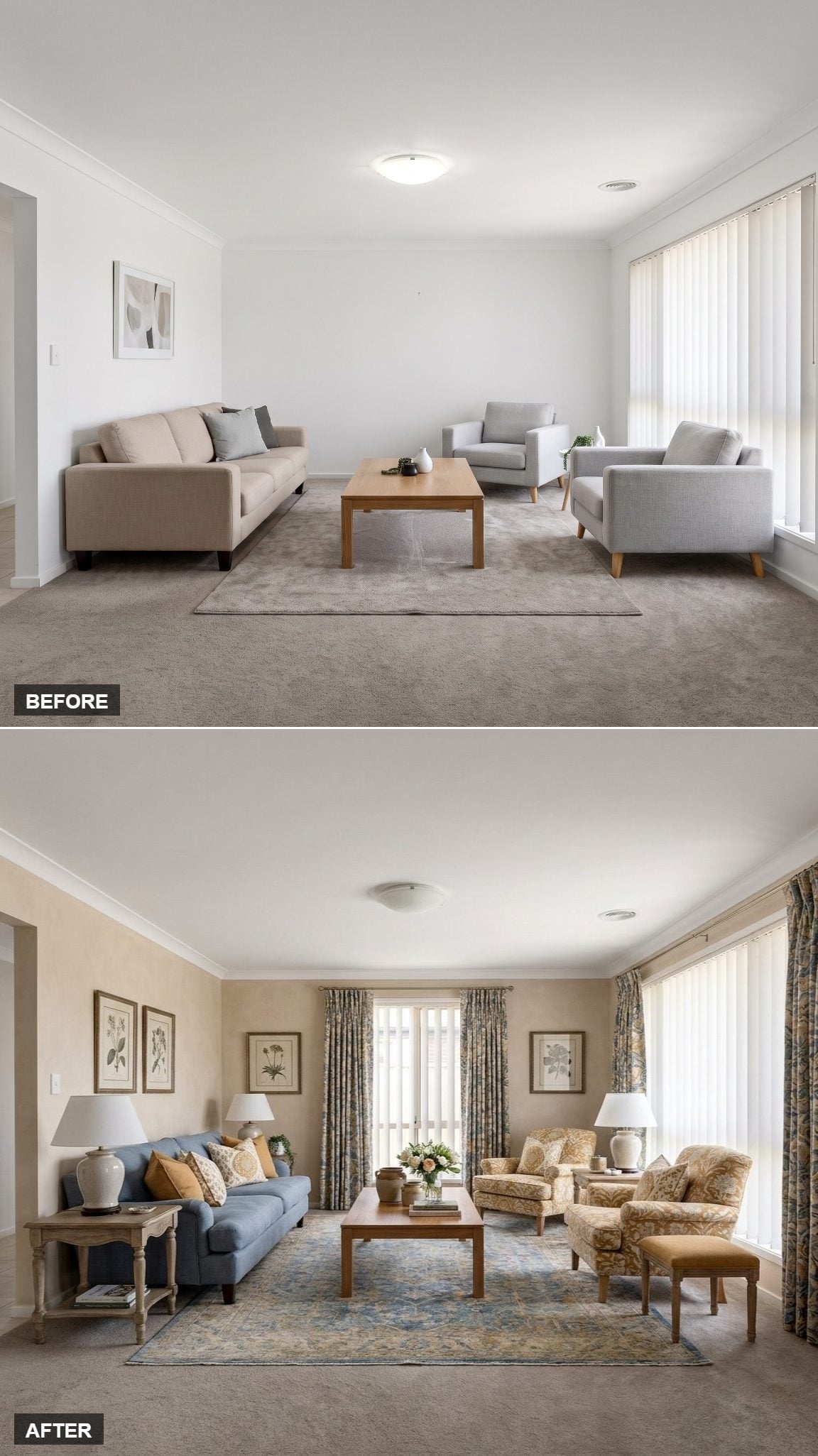
A blue linen sofa runs along the left wall, softened with mustard and cream cushions that echo the warm tones in the nearby botanical art.
The bigger transformation happens opposite it. Paisley armchairs and a matching ottoman introduce enough pattern to keep the blue from feeling too clean-cut, while floral drapes frame the window and make the vertical blinds feel secondary instead of dominant.
A patterned rug in muted blue and gold keeps all those prints speaking at roughly the same volume.
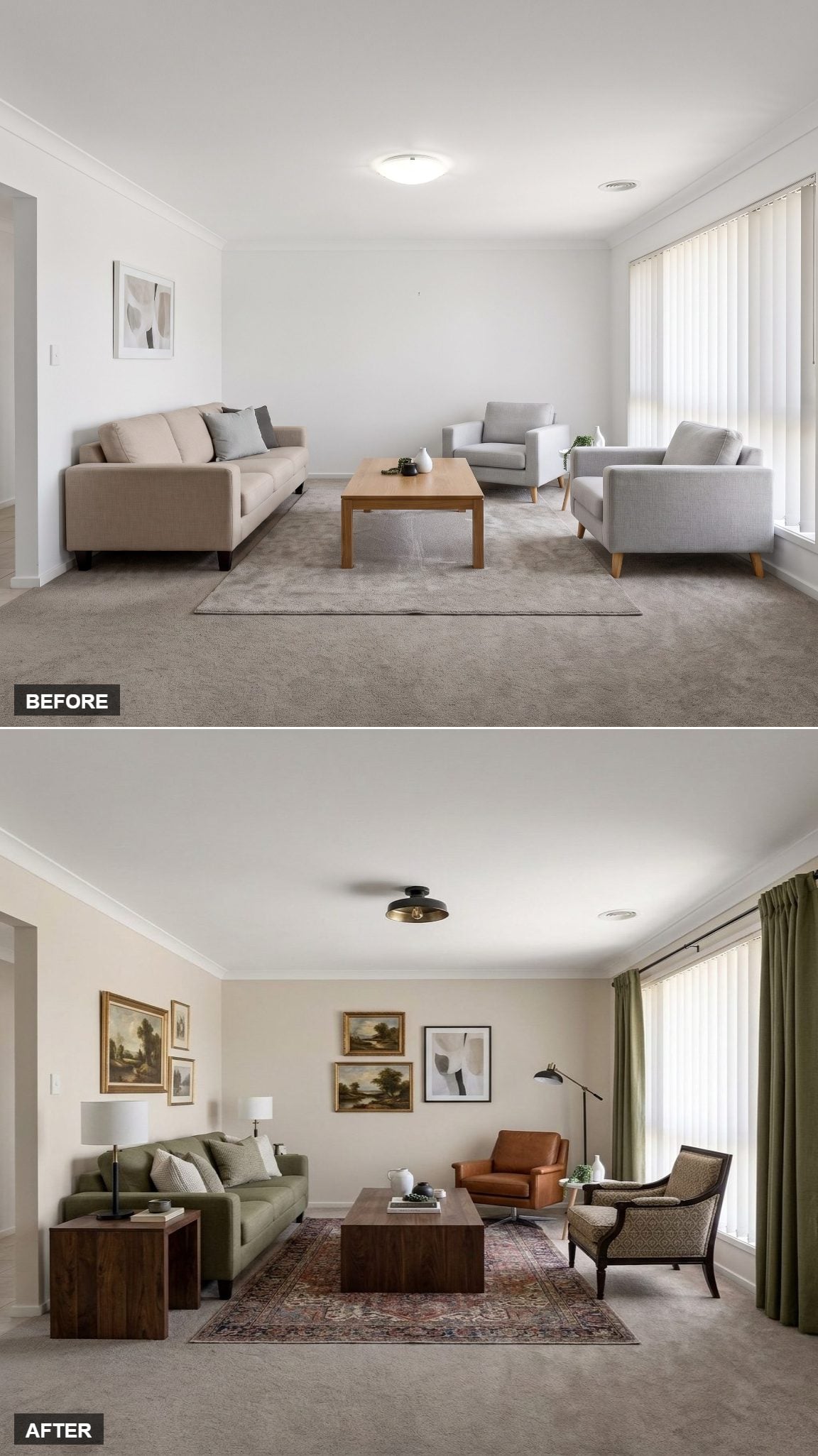
19. Olive Upholstery and Landscape Paintings Made Cream Walls Feel Deliberate
🔥 Would you like to save this?
Warm cream walls step back and let the furnishings carry the color. An olive sofa sits opposite a cognac leather chair that turns almost amber in the daylight, while the low walnut coffee table keeps the center visually quiet.
Landscape paintings cluster in mismatched gold frames rather than lining up in a perfect grid. Olive drapes pick up the sofa without matching it exactly, and a black dome fixture gives the ceiling one crisp, modern note against all that traditional color.
Small shifts, but the room suddenly knows what it is.
18. A Striped Rug Gave Navy and Burgundy Permission to Share a Room
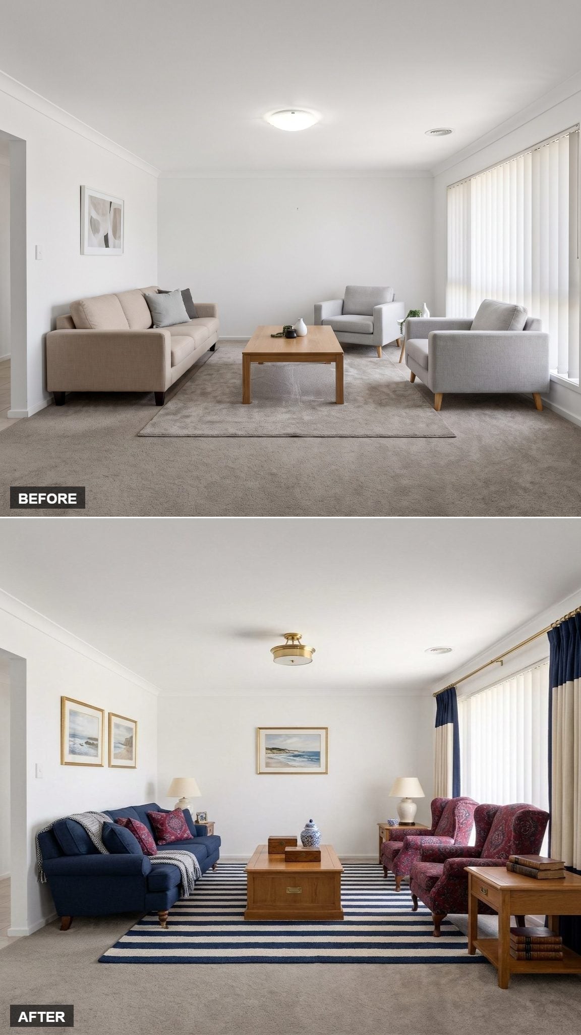
Gold-framed watercolors sit high on the walls, with a brass flush-mount overhead repeating that warmer metallic note. The navy sofa claims one side of the room while burgundy paisley wingbacks take the other.
Putting those colors together could have become muddy fast. The navy-and-white striped rug prevents that by adding a cleaner graphic pattern beneath them. Warm oak side tables and cream-shaded lamps finish the job without introducing another competing color.
This room works because somebody finally stopped trying to make every piece agree.
17. Exposed Beams and Florals Made the Room Feel Like It Had Been There for Years
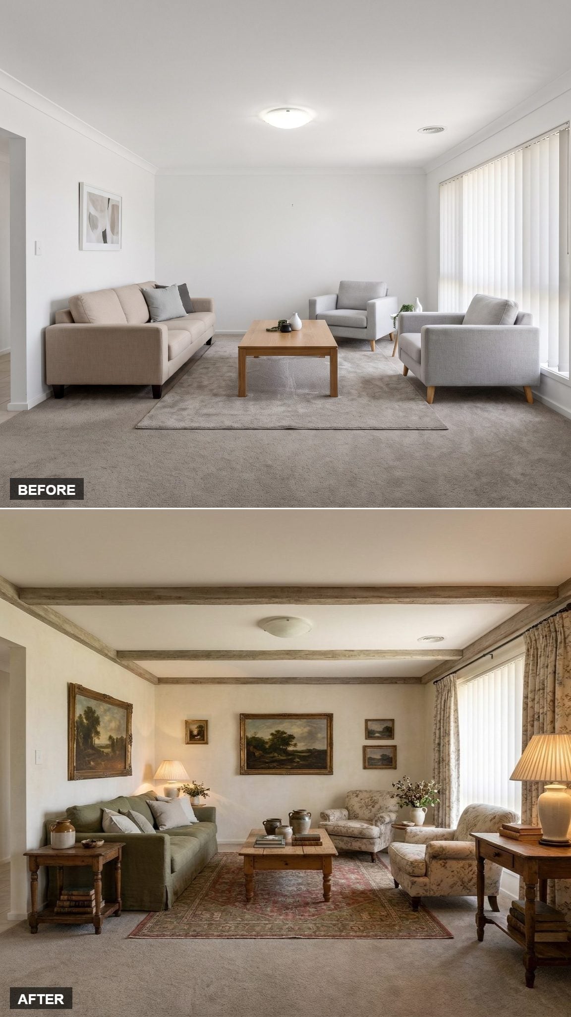
Weathered wood beams immediately age the room in the best possible way. Their rough texture gives the ceiling enough presence that everything beneath can afford to be softer.
A sage linen sofa sits beside a simple wood table topped with a ceramic jug and stacked books. Across from it, floral armchairs in cream and rose echo the botanical drapes without becoming a matched set.
Faded rug, clustered landscapes, warm lamp light — the room looks less newly installed and more as though different pieces arrived at different points in its life.
16. Paper Lanterns and Toasted Plaster Made Dark Furniture Feel Intentional
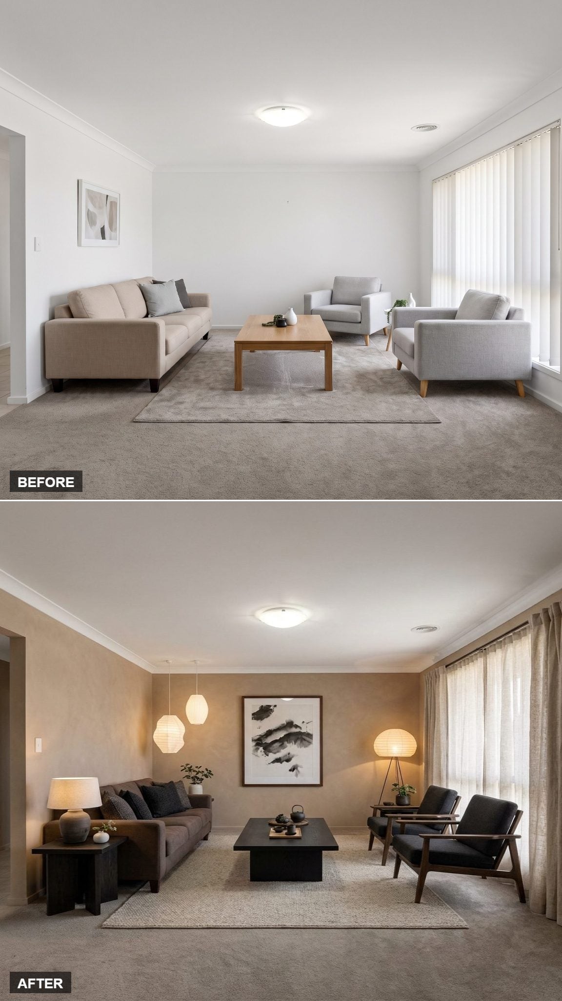
Venetian-plaster-style walls in toasted sand change the backdrop from flat to softly mottled. Against them, a charcoal sofa and low black coffee table feel deliberate rather than severe.
Near-black armchairs with exposed wood frames keep the dark palette from becoming one uninterrupted block. Paper lanterns overhead are the surprise: soft, lightweight forms floating above furniture with considerably more visual mass.
The contrast is enough. No extra ornament required.
15. Navy Walls and Jewel-Tone Velvet Refused to Pick a Safe Color
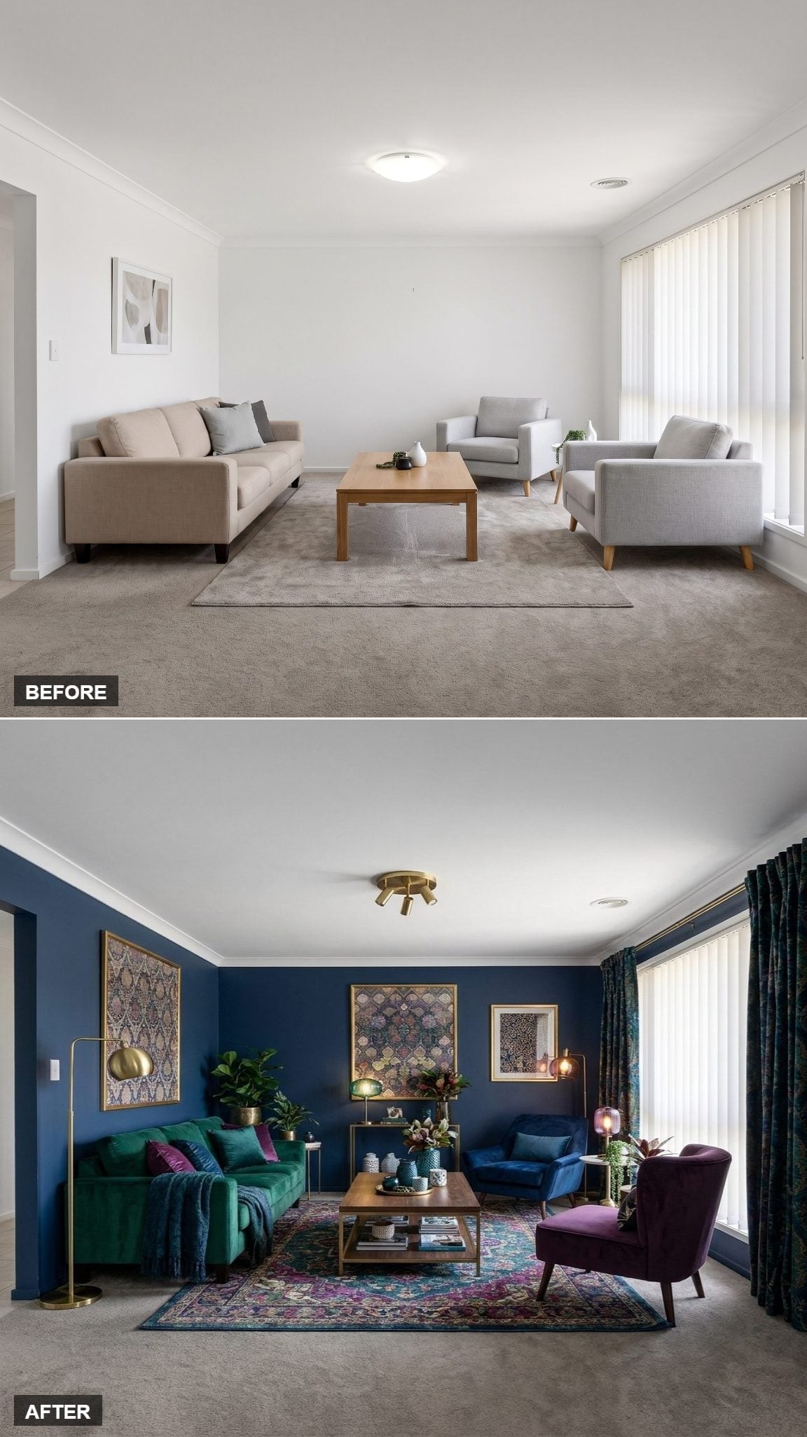
Deep navy wraps all four walls, creating a dark envelope around a green velvet sofa and purple accent chair. Neither piece tries to politely coordinate with the other, which is exactly why the combination has life.
Brass repeats through the arc lamp, coffee table frame, and ceiling fixture, giving the eye a familiar finish to follow. The patterned rug collects the jewel tones without copying them.
Dark curtains continue the wall color toward the window, keeping that bright opening from visually splitting the room in half.
14. Rust, Camel Bouclé, and Travertine Made Warmth the Entire Strategy
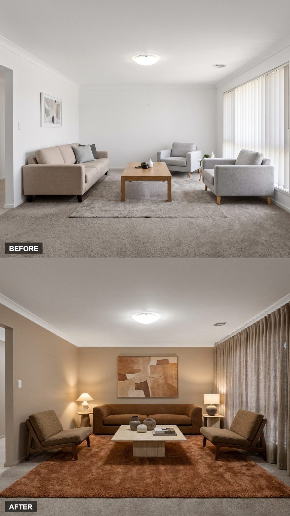
A rust-toned wool rug establishes the palette from the floor up. The camel bouclé sofa continues that warmth in a softer texture, while two angular wood-frame lounge chairs introduce darker lines around it.
Warm wall paint keeps the entire arrangement from floating against a stark background. Nothing needs to shout because every major surface is already leaning in the same direction.
Worth Knowing: Warm paint colors can appear richer or more saturated under warm artificial light than they do in daylight. Testing a large sample in both conditions is worth the trouble, especially in a living room used heavily after sunset.
13. Walnut Furniture Gave a Sand-Colored Room Some Necessary Weight
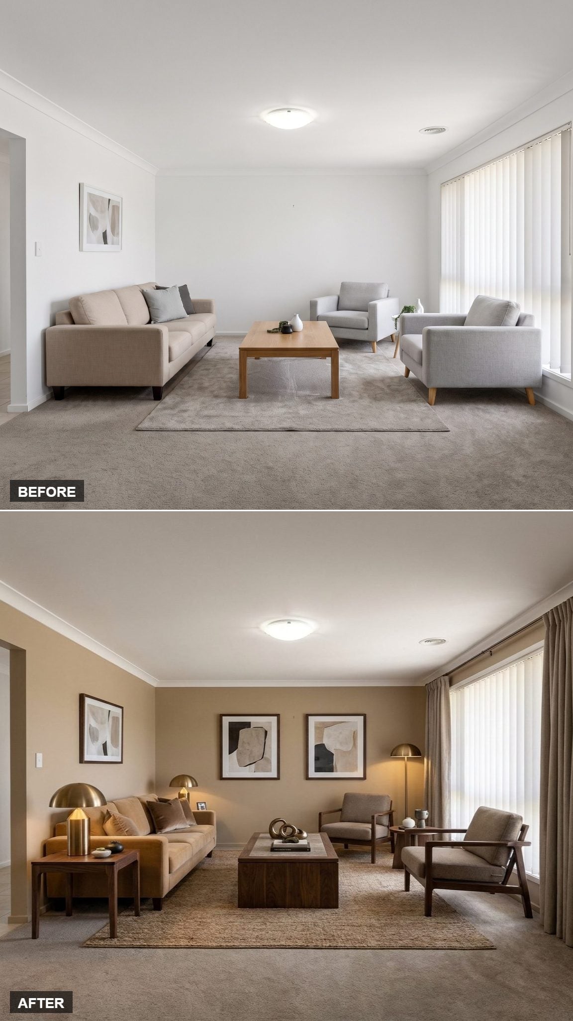
Sandy beige walls warm the background without becoming the main event. The real contrast comes from dark walnut furniture, particularly the substantial coffee table at center.
Open-arm chairs keep all that dark wood from closing in the seating area. Brass lamp finishes appear just often enough to register as a recurring detail rather than a theme.
This is what happens when a neutral room stops confusing pale with interesting.
In the Details: The dark furniture works because it is separated by open space, lighter upholstery, and a warmer wall color. Without those breaks, the same walnut could make the room feel much denser.
12. Rust and Mustard Turned a Quiet Room Into Something Almost Autumnal
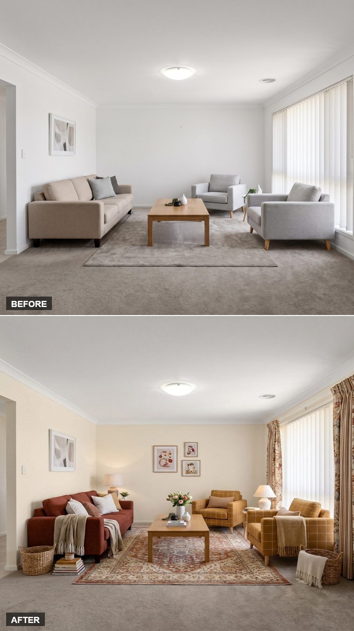
Soft cream walls give the rust sofa and mustard plaid armchairs enough breathing room to carry the entire color story.
A Persian-style rug introduces dusty rose through its medallion pattern, while floral curtains repeat the warm reds and ambers near the window. Wicker baskets bring in a rougher natural texture that keeps the upholstery from feeling overly polished.
The room doesn’t just look warmer. It looks like October decided to move in.
11. Brown Velvet and Chrome Brought the 1970s Back Without Asking Permission
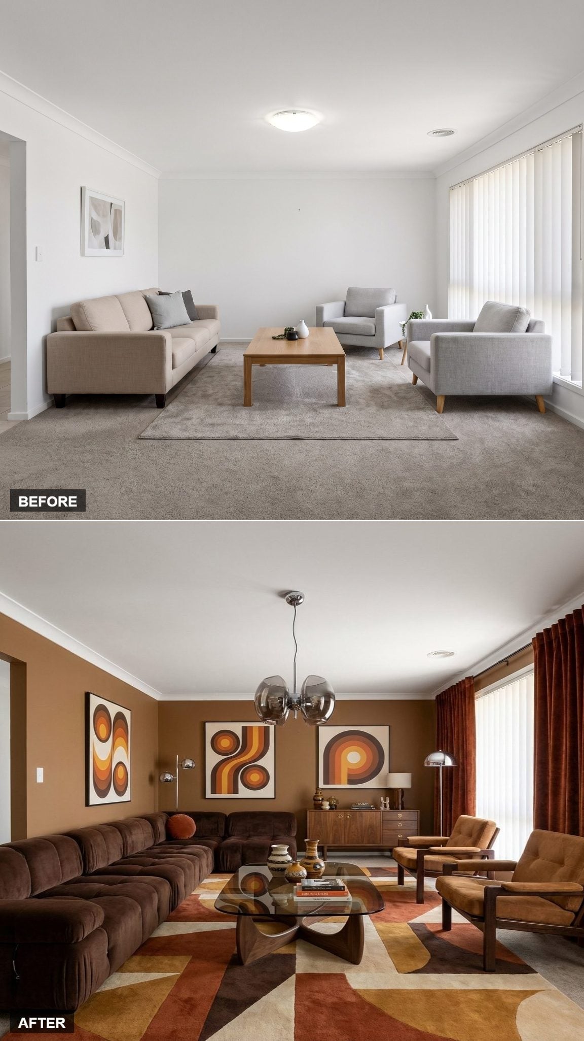
Chocolate velvet wraps an oversized modular sectional around the room in a low horseshoe. Three art panels on the caramel wall repeat looping motifs in burnt orange, rust, and cream, leaving very little doubt about which decade is being summoned.
A Noguchi-style glass coffee table keeps the middle visually lighter, while rust curtains add another saturated brown-orange note at the window.
Overhead, the chrome globe fixture introduces enough shine to keep the room from becoming one continuous earth tone.
10. Blue Denim and Cognac Leather Found Common Ground in the Rug
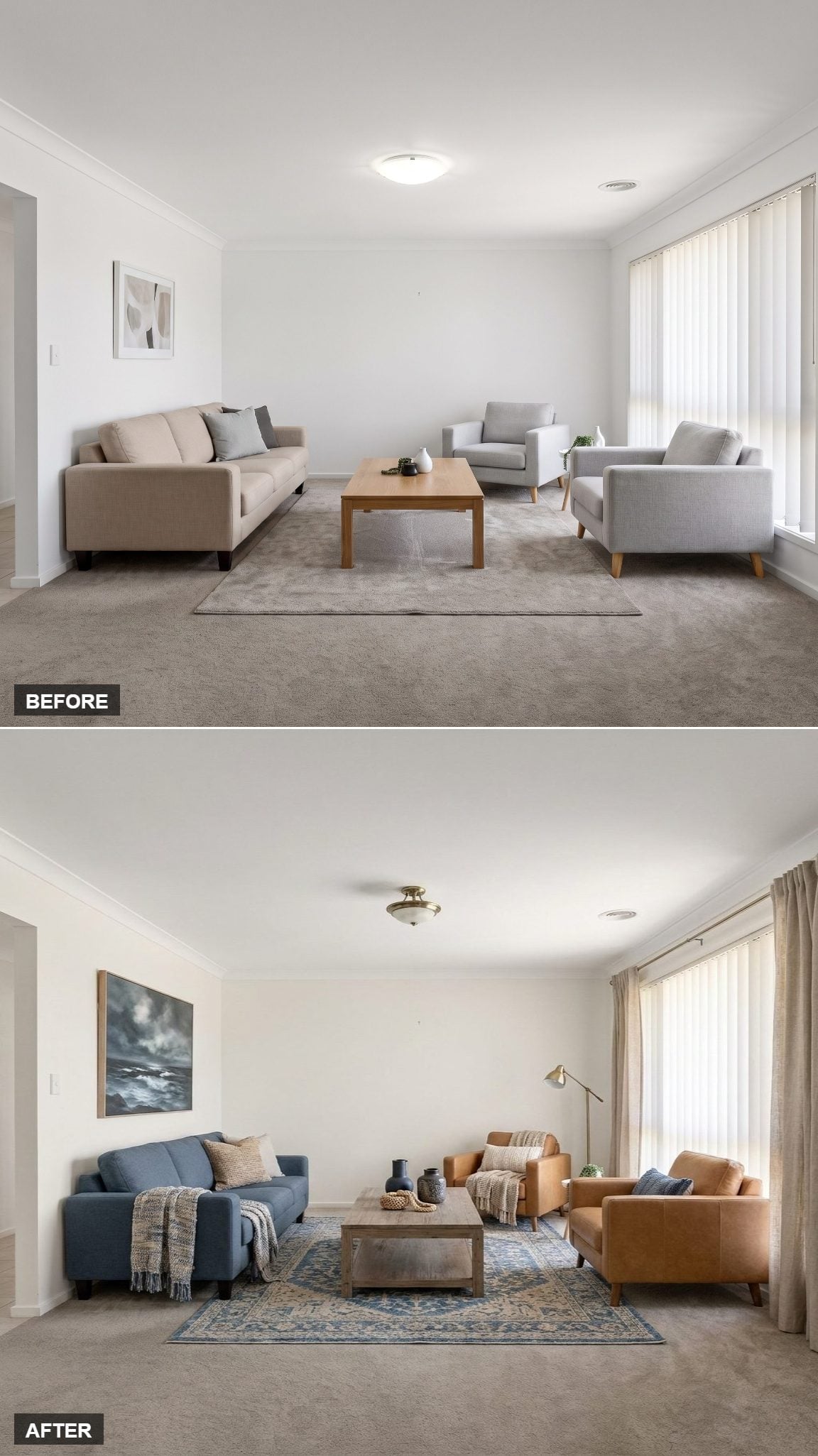
A blue denim sofa faces cognac leather armchairs across a wood-topped coffee table. The contrast is simple and strong: cool blue against warm brown.
The Persian-style rug underneath contains enough blue and ivory to connect the seating without matching either side outright. Near the window, linen drapes soften the light while a brass floor lamp introduces one small metallic note.
Throws and ceramic vessels keep the surfaces from looking freshly staged. Nothing needs to pretend it has been there for generations; it just needs to look usable now.
9. Cream Paneling and Plaid Chairs Gave the Architecture a Voice
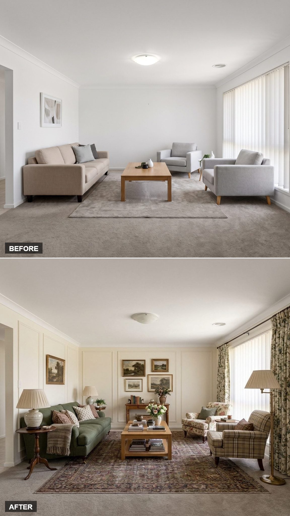
Wall molding panels do more here than another layer of accessories ever could. Warm cream paint emphasizes the trim just enough to give the room structure without turning every panel into a feature wall.
Against that quieter backdrop, a sage sofa and plaid armchairs finally have something architectural to push against. Landscape art adds another traditional note, while the restrained palette keeps the pattern from taking over.
This transformation is less about adding things and more about giving the things already in the room a better setting.
8. Plum Velvet and Cognac Leather Took Warmth in Two Different Directions
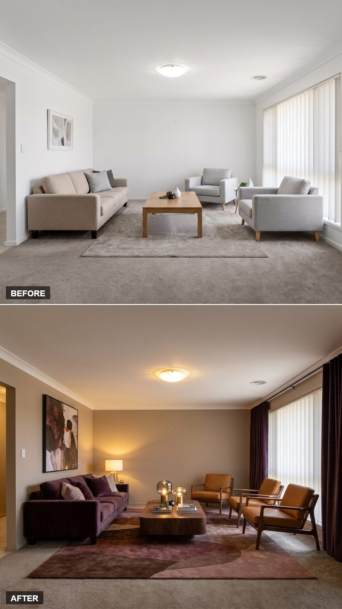
Dark plum velvet gives the sofa depth without pushing all the way into navy or black. Across from it, cognac leather armchairs introduce a warmer, brighter note through both color and open wood frames.
A round walnut table breaks up the harder geometry, while the mauve rug sits between plum and brown without simply repeating either one.
The palette is moody, but the cognac keeps it from brooding.
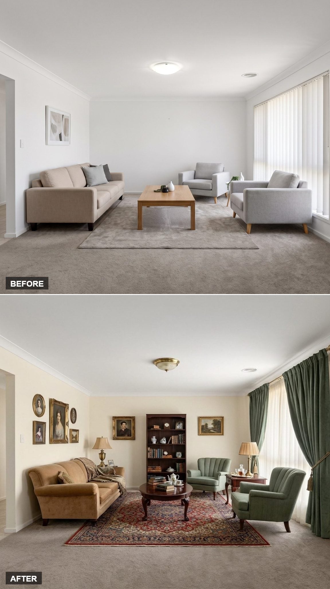
7. A Portrait Wall Made the Living Room Look Like It Had an Academic Past
🔥 Would you like to save this?
Oval portrait frames cluster across the cream wall in a way that immediately changes the room’s personality. Suddenly it feels less like a recently decorated living room and more like somewhere a retired art historian has been misplacing reading glasses for twenty years.
A dark mahogany bookcase gives the back wall enough mass to support the gallery, while gold-framed oils extend the collected look. Green velvet wingbacks add color without stealing attention from the portraits.
The Persian-style rug below makes sure the floor is participating too.
6. One Gallery Wall Pulled Blue Linen and Cognac Leather Into the Same Story
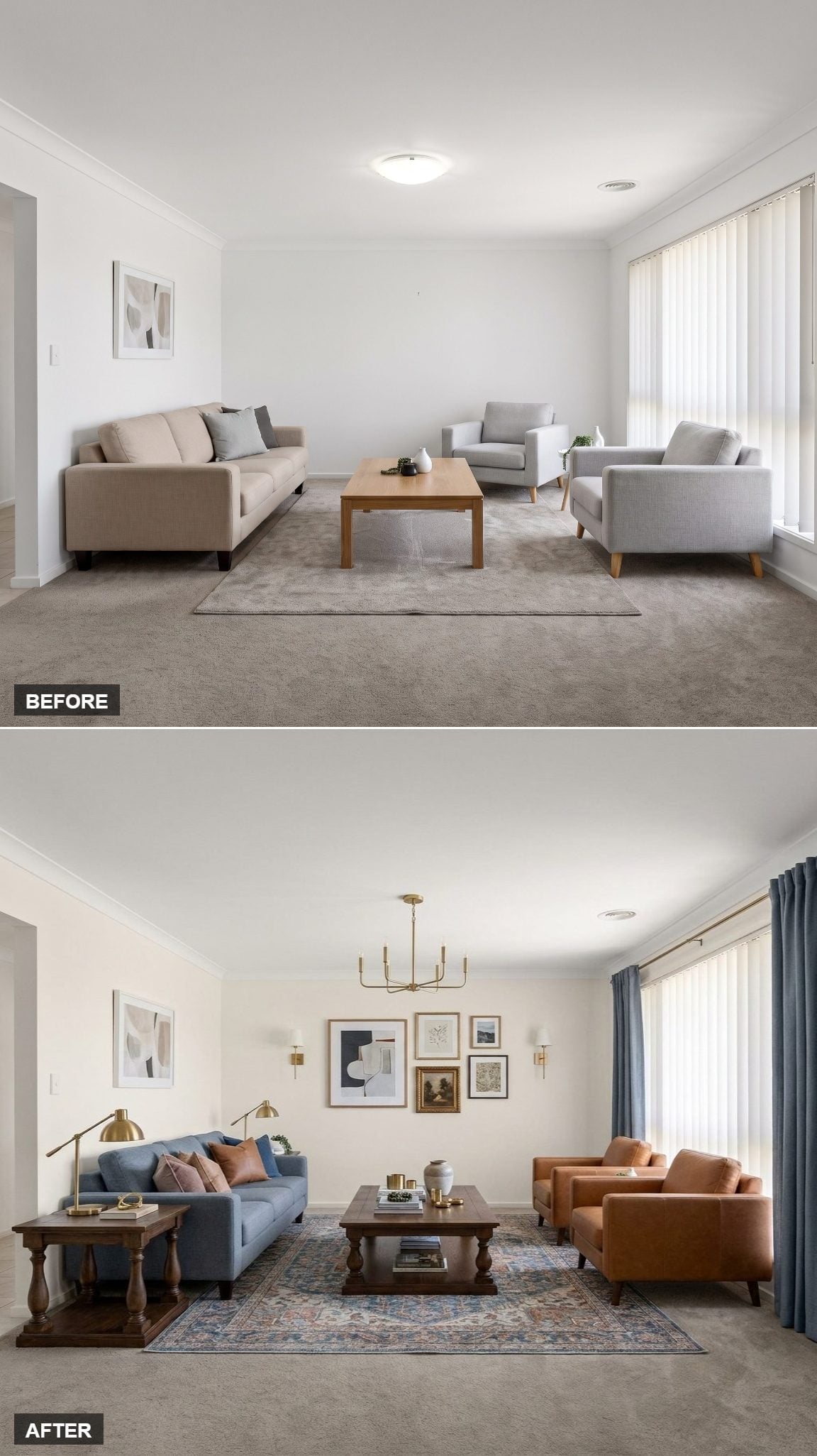
A blue linen sofa and cognac leather chairs establish the basic cool-warm contrast, but this version gets its personality from the wall rather than the seating.
Five frames gather abstract art, botanical imagery, and what appears to be an aged map into a loose composition. Brass sconces flank the group, and the chandelier repeats the same finish overhead.
A faded rug picks up blue and rust beneath the furniture, while navy drapes close the palette at the window. The room feels layered because the eye has somewhere to travel vertically, not just around the furniture.
5. Aged Plaster and Leather Let Texture Carry the Transformation
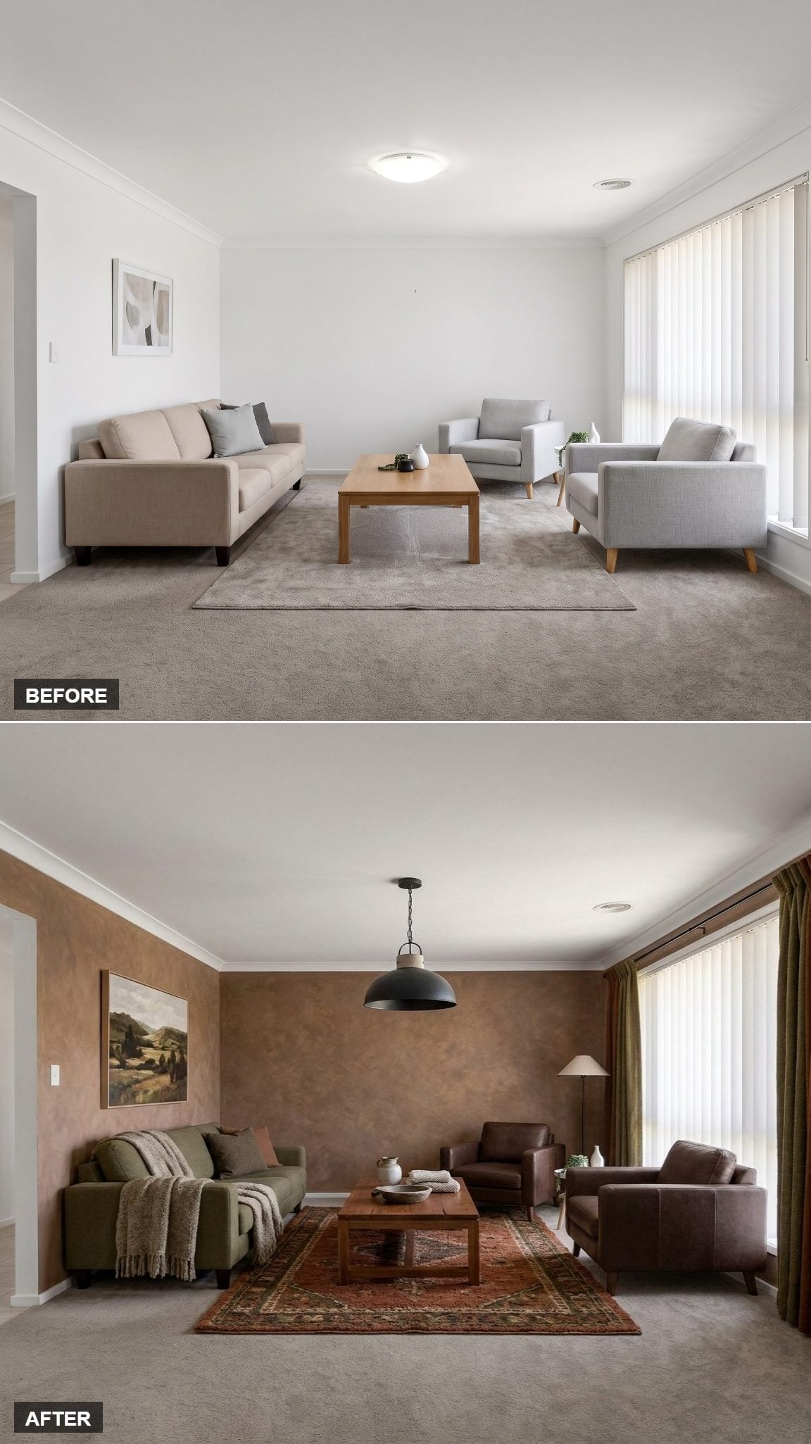
The most important move here isn’t another chair or accessory. It’s the wall surface. Warm terracotta-brown plaster gives the room mottling and depth that flat white paint could never provide in quite the same way.
Leather armchairs bring another naturally varied surface into the mix, while a Persian-style rug introduces pattern below. The pendant overhead gives the ceiling a focal point without competing with the quieter furniture.
When the walls already have texture, the rest of the room can stop auditioning.
4. Powder Blue Velvet and French-Style Armchairs Went Soft Without Going Sweet
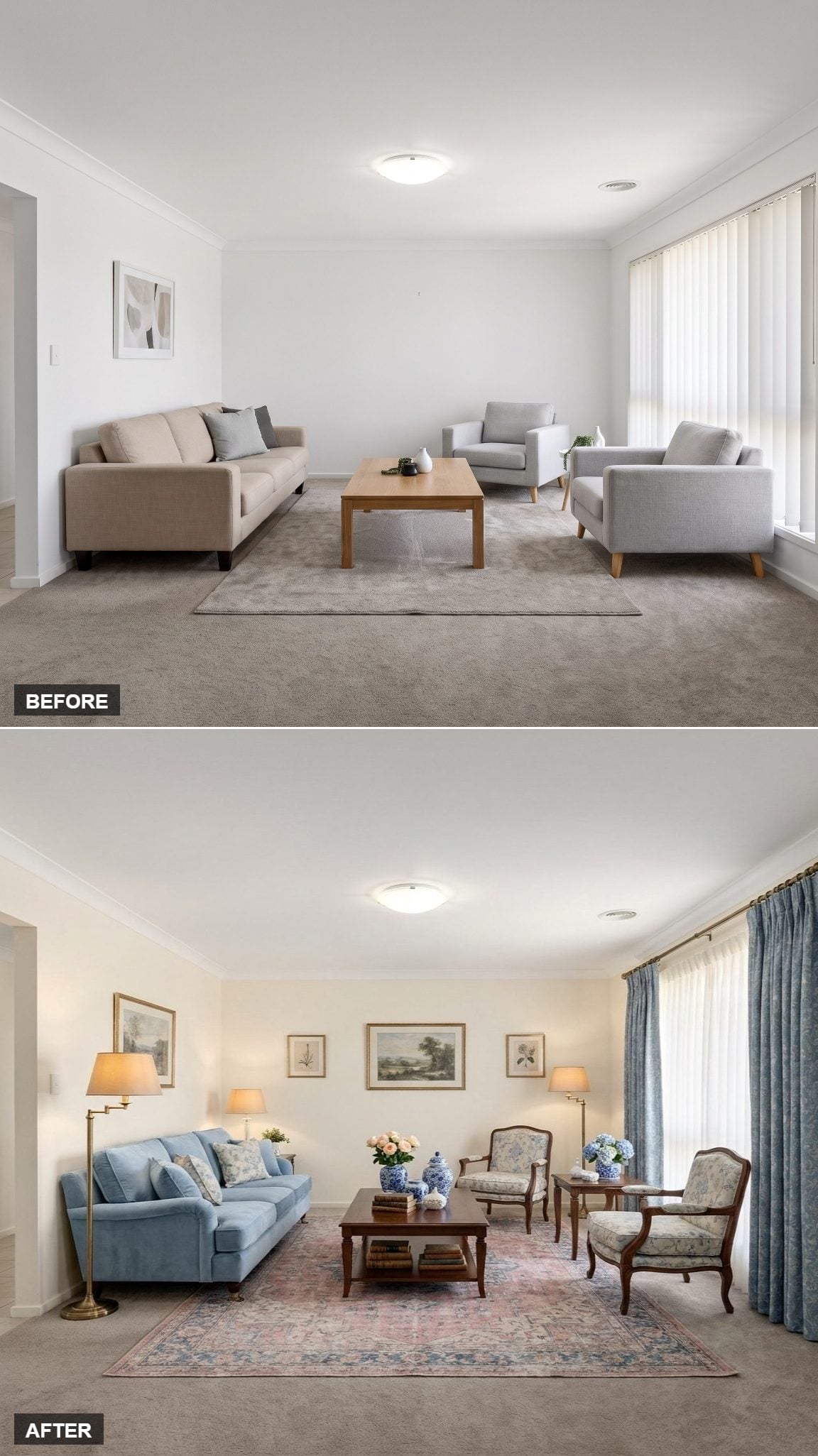
A powder blue velvet sofa sets a soft base, but the floral-upholstered French-style armchairs keep the room from becoming too pastel.
The dark walnut coffee table is crucial here. Its weight and color interrupt all that softness before it turns sugary. Blue linen drapes fall nearly to the floor, adding a little extra fabric at the window and making the opening feel more deliberate.
The trick isn’t softness everywhere. It’s softness with one or two pieces willing to push back.
3. Red Damask and a Blue Sofa Turned the Gallery Wall Into Part of the Furniture
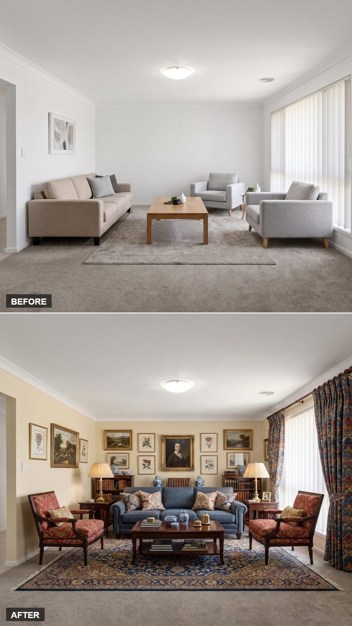
This gallery wall is denser and more formal than the earlier portrait arrangement. Botanicals, landscapes, and one central bust portrait crowd together until the wall becomes almost another textile in the room.
A blue rolled-arm sofa gives the red damask chairs a cooler counterweight. Floral curtains repeat the reds without copying the chair pattern, pushing the room toward deliberate traditionalism rather than generic nostalgia.
Old-fashioned works when it looks chosen.
2. Mustard Walls Made Mauve and Teal Look Like They Had Always Belonged Together
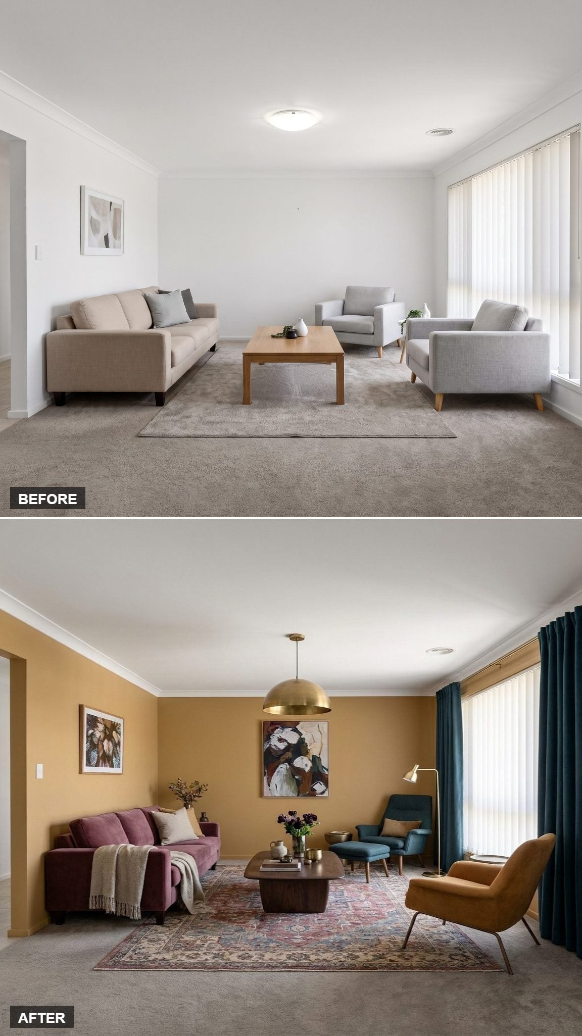
Warm ochre wraps every wall and immediately gives the mauve velvet sofa something richer to sit against. A Persian-style rug in dusty rose and sage extends the muted palette underfoot.
Then the teal armchair and ottoman arrive from the opposite side of the color wheel and wake everything up.
The brass dome pendant sits almost exactly between wall and upholstery in tone, giving the ceiling a visual reason to participate. Teal curtains fall generously at the window, repeating the chair color without turning it into a matching set.
1. Layered Artwork and Green Velvet Made the Sectional Feel Like Part of a Collection
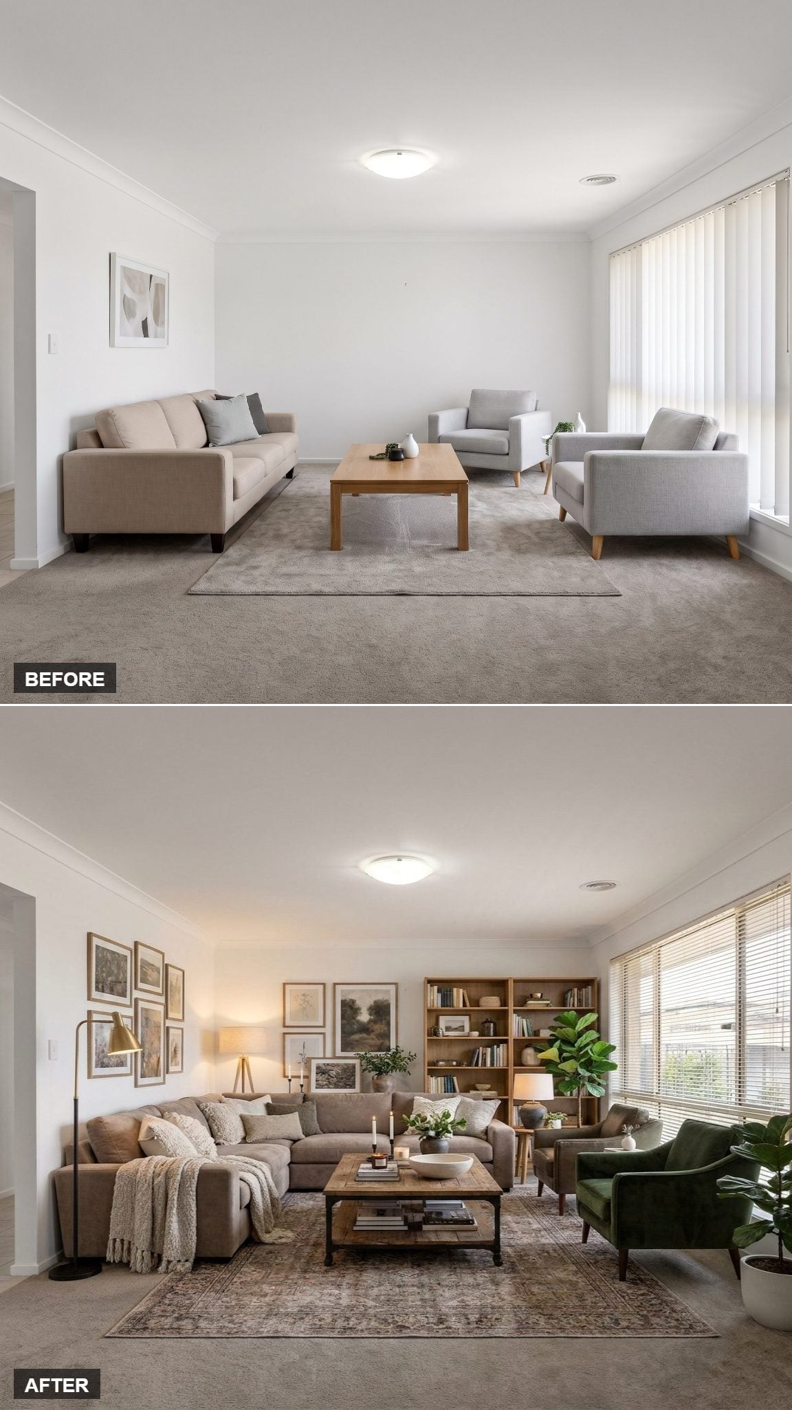
Nearly the entire back wall is covered in botanical and landscape prints, mixed in size and arranged without an obvious rigid grid. That looseness matters. A wall this full would feel institutional if every edge snapped into alignment.
The oversized L-shaped sectional gives the room enough seating mass to stand up to all that artwork. Two forest green velvet armchairs bring color into the foreground, while the rust-toned vintage-style rug spreads warmth underneath everything.
An open bookcase packed with books fills the final corner without pretending empty shelving is sophisticated.
The room ends the series exactly where it should: cozy not because one perfect object fixed it, but because almost every surface finally has something to contribute.