🔥 Would you like to save this?
Some people walk into a living room and see a sofa, a television, a coffee table, and maybe a blank wall asking for art. Serial organizers see categories, circulation, dead zones, visual noise, retrieval problems, and at least three places where a drawer should have been. They are not necessarily minimalists. Quite often they own more books, records, photographs, films, papers, collections, and obscure objects than anyone else in the room. The difference is that they want every one of those things to have an address.
In order to come up with the very specific design ideas, we create most designs with the assistance of state-of-the-art AI interior design software. Also, assume links that take you off the site are affiliate links such as links to Amazon. this means we may earn a commission if you buy something.
That instinct can produce far more interesting interiors than another exercise in tasteful decluttering. Once storage becomes part of the architecture, the room starts behaving differently. Full-height cabinetry can give a collection the scale of a wall finish. Flat files turn photography into an archive rather than a gallery-wall hobby. Record storage changes proportion because LPs demand their own dimensions. Sliding panels edit what is visible. Shallow drawers protect fragile material. Lighting stops being decoration and starts deciding what deserves attention. Even a coffee table can become infrastructure.
These 35 AI before-and-after concepts imagine what happens when that level of order is given real design ambition. Some are libraries, some are listening rooms, some are private archives, some border on miniature museums. There are card catalogs, specimen drawers, film collections, hidden compartments, labeled boxes, color-coded shelves, and enough custom millwork to make a label maker feel underdressed. The common thread is not tidiness. It is control: knowing what should be displayed, what should be protected, what needs to stay within reach, and what should disappear completely until the exact moment it is needed.
35. Navy Barn Doors Turn the Living Room Into an Archive You Can Actually Close
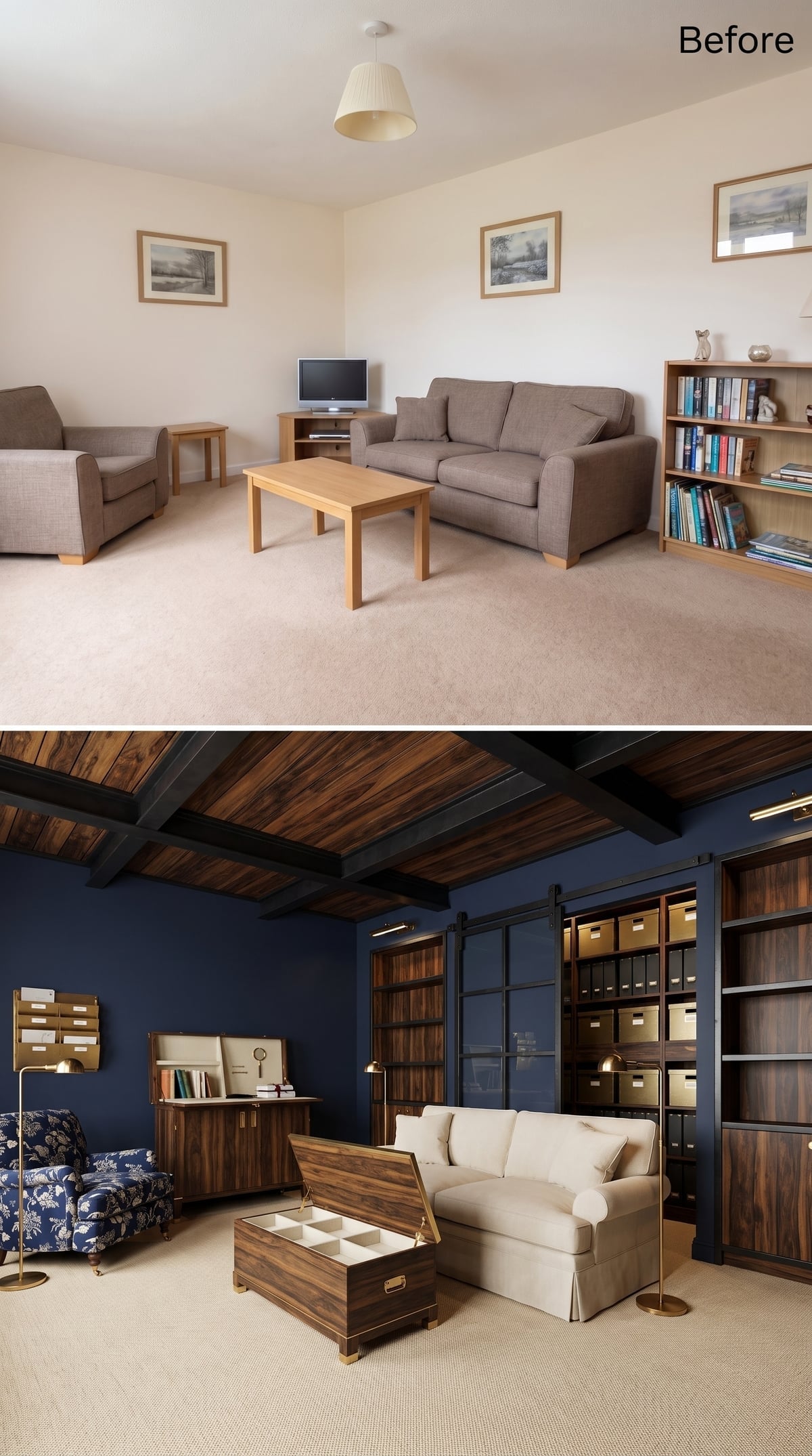
The first room does not apologize for having a filing system in the living room. It gives the filing system doors.
Deep navy wraps the walls and ceiling, letting the walnut-toned shelving read almost like freestanding furniture. Sliding barn doors cover sections filled with labeled boxes and binders, so the room can move from working archive to composed living space with one pull.
The campaign-style chest at center takes the same idea horizontally. Its interior is divided into small compartments, turning prime floor space into concealed storage rather than another surface waiting to accumulate clutter. A cream sofa and floral chair keep the room from feeling like records management with cushions.
34. Teal Cabinetry and Asymmetric Shelves Make Organization Look Almost Reckless
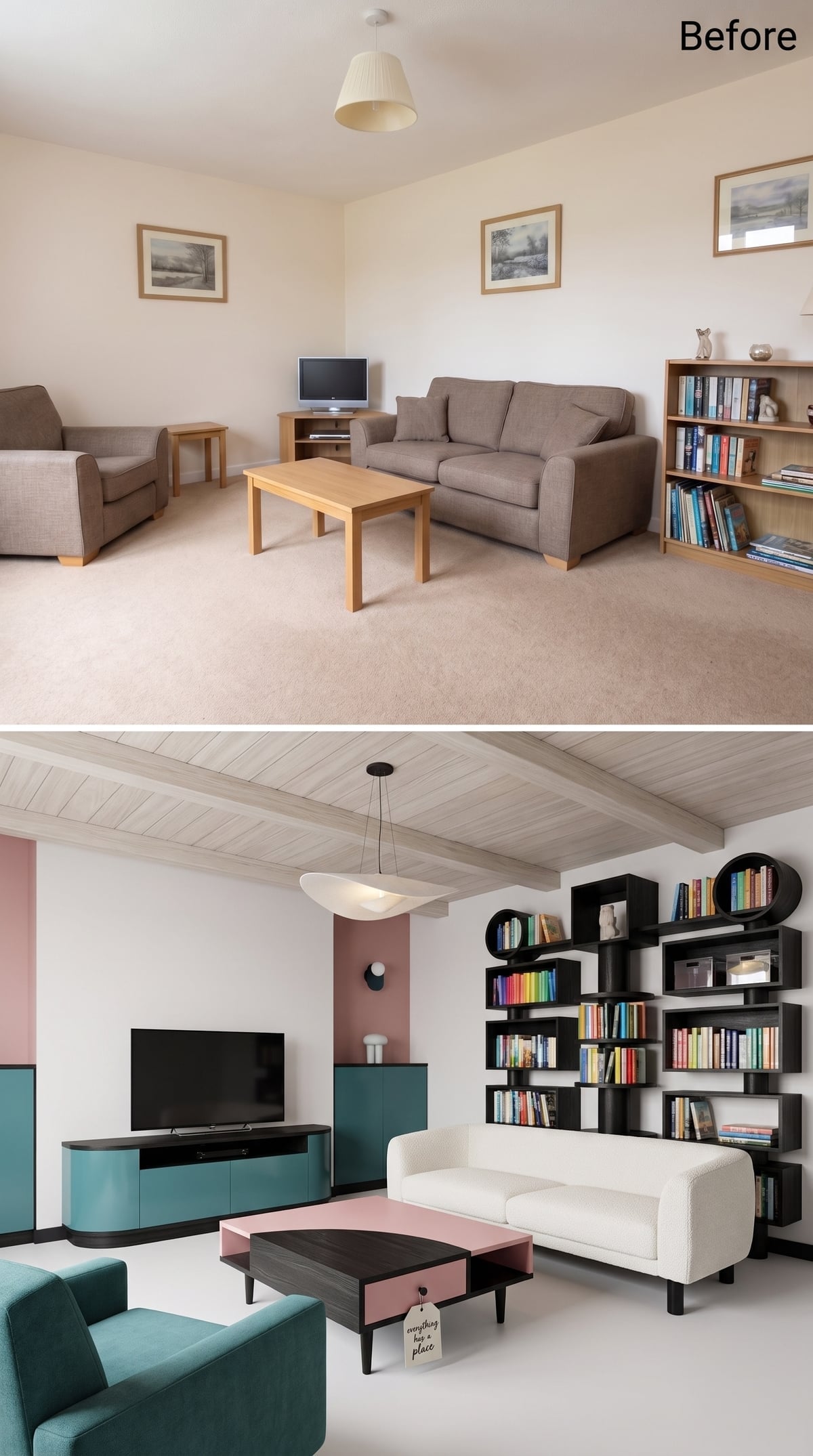
This is what happens when a storage wall refuses to behave like office furniture. Teal cabinet fronts establish a strong base around the television while staggered black shelving frames project outward at different depths.
Books are grouped by color, but the wall avoids becoming one enormous rectangular grid because the shelves shift in height and width. A circular display cabinet near the upper corner breaks the geometry altogether.
The dusty-rose and charcoal coffee table introduces another block of color at floor level. Organization is still the premise, but nobody said it had to whisper.
Why the Irregular Shelving Matters
Uniform shelving can create calm and order. Here, the goal is different. Varying the intervals creates a sequence of large and small display zones, so books, objects, and empty space can be composed rather than simply lined up. The circular cabinet adds one curve to an otherwise angular wall, which is enough to change the rhythm.
33. A Lift-Top Coffee Table Finally Gives the Middle of the Room a Job
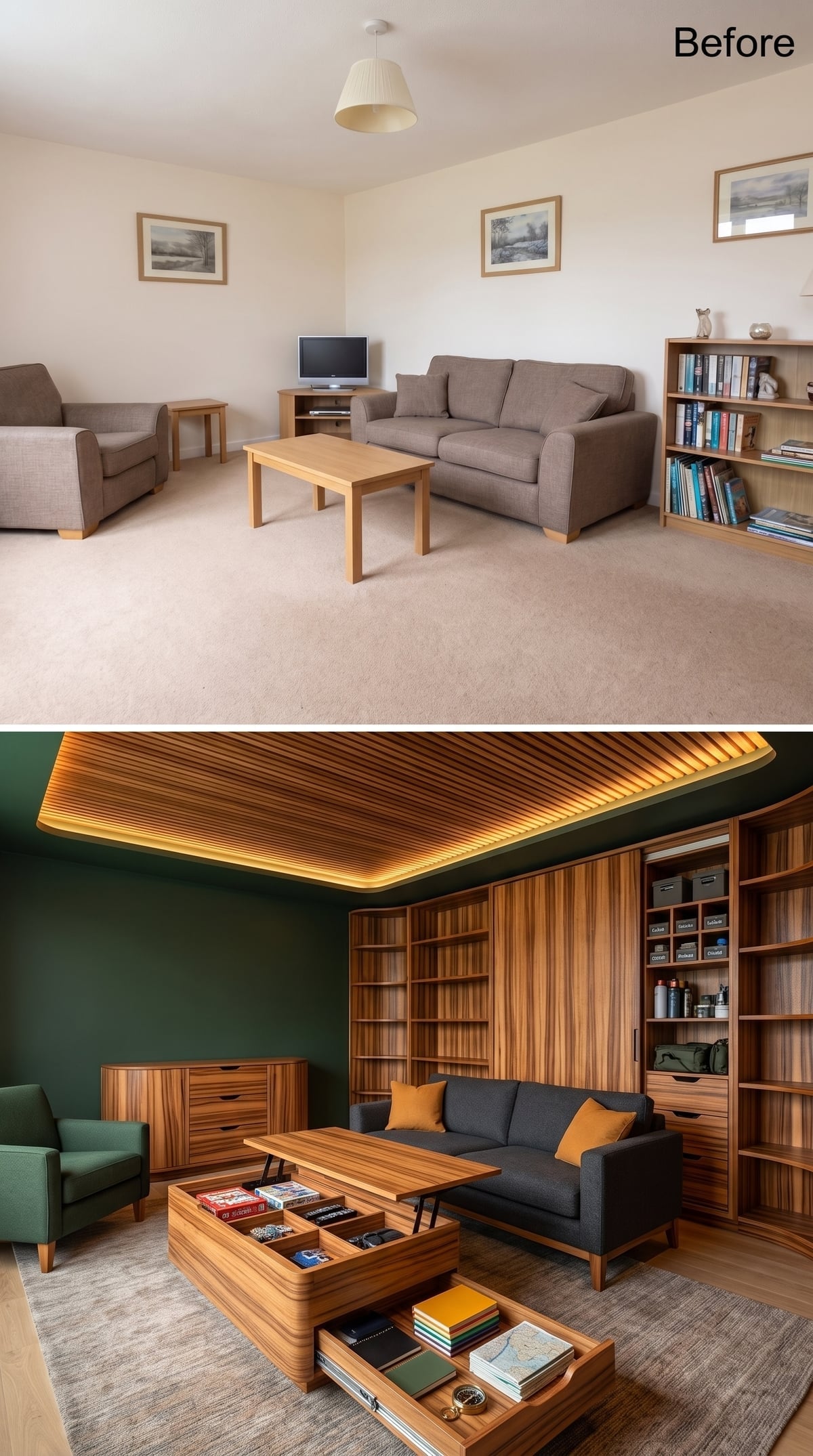
Dramatically striped wood covers the shelving, sideboard, and coffee table, while forest-green walls make all that grain look even richer.
But the organizational idea is under the coffee-table top. One section lifts and another slides, revealing compartments that can absorb the things living rooms generate every day: remotes, chargers, games, magazines, coasters, notebooks, and whatever else normally forms a small civilization beside the sofa.
Common Mistake: Storage planning often stops at the walls. Tables, benches, ottomans, and consoles occupy valuable floor area too, and pieces with concealed compartments can absorb everyday objects without adding another cabinet to the perimeter.
32. An Art Wall Gets Serious Once Flat Files Join the Gallery
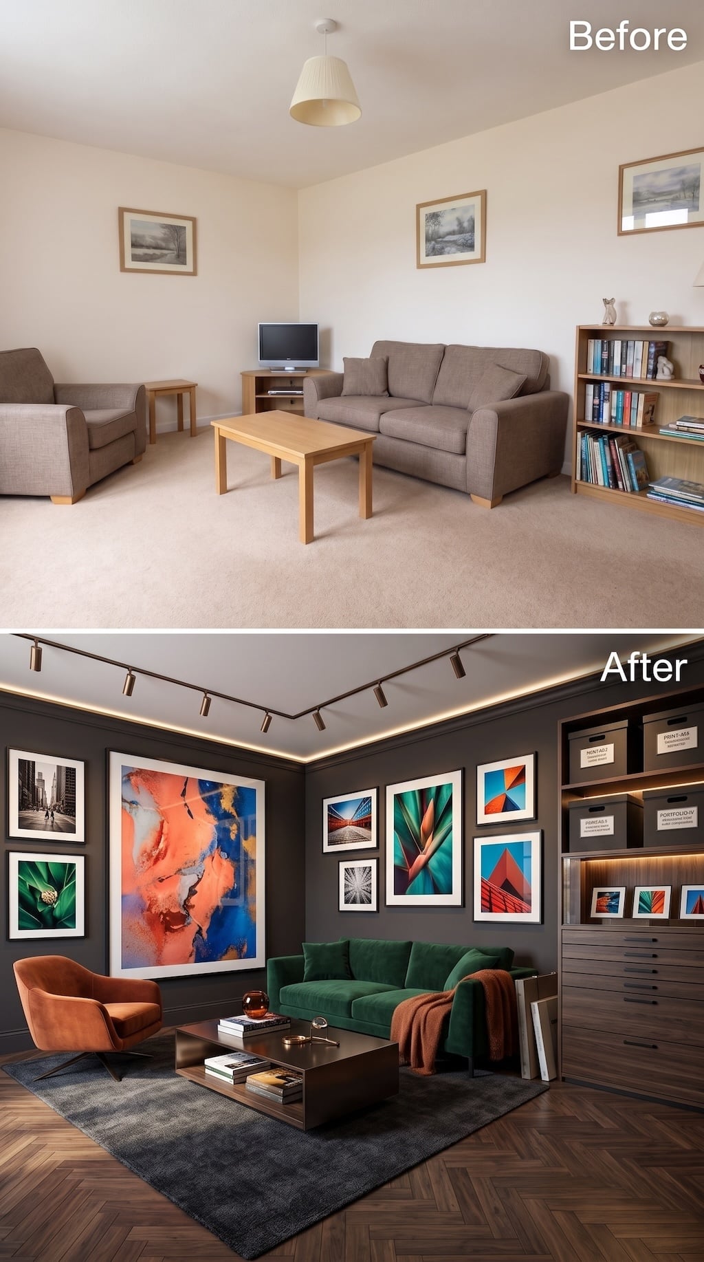
This room treats collecting art as something more complicated than finding enough nails. Charcoal walls turn the perimeter into a gallery field, allowing saturated photography and abstract work to hold its color without fighting bright drywall. Track lighting and a glowing ceiling edge add the sort of directional control a serious display wall benefits from.
The more interesting move is on the right. Deep drawers sit beneath open shelving and labeled archival boxes, creating storage for works that are not currently hanging. That changes the whole premise from “gallery wall” to collection management.
Emerald velvet and burnt-orange upholstery echo colors already present in the artwork, while the dark rug and herringbone floor keep the furniture visually subordinate. The art is not filling empty walls anymore. The room has been built around having more of it than can possibly be shown at once.
31. Coffered Ceilings and Dark Built-Ins Give Books the Architecture They Deserve
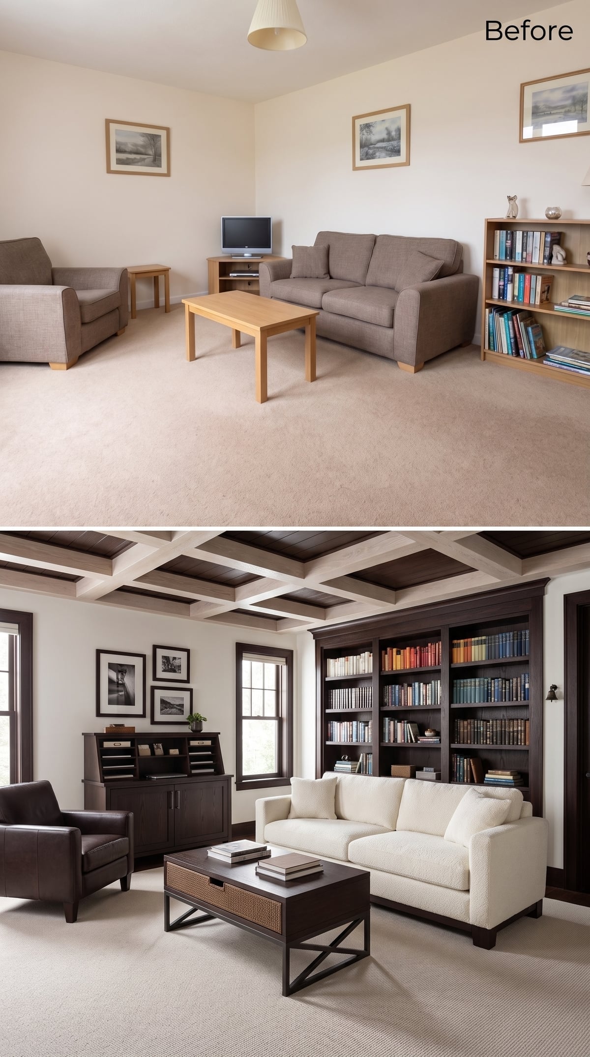
A dark-stained coffered ceiling changes the room before the shelving even enters the conversation. The grid gives the overhead plane depth and repetition, while a floor-to-ceiling bookcase brings the same espresso tone down the back wall.
Cream bouclé and dark leather keep the seating simple enough to live beside that much architectural wood. Rattan panels in the coffee table introduce a looser texture, preventing the room from turning into a study where everyone feels obliged to whisper.
30. Teal Walls and Pyramid Storage Turn a Dead Corner Into Command Central
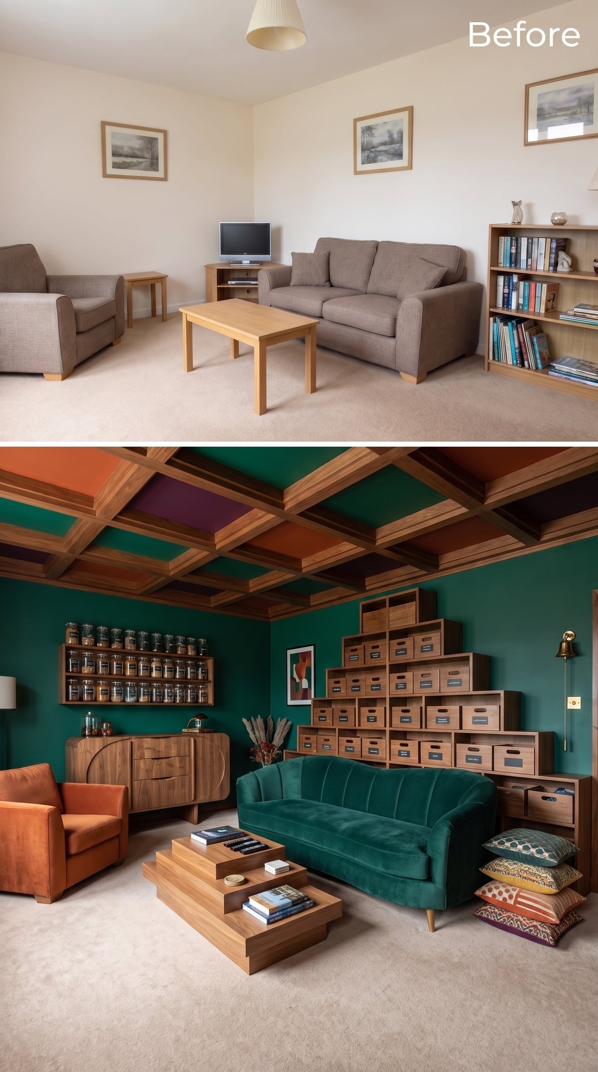
Stacked storage boxes climb one wall in a stepped formation, converting what would normally be leftover corner space into a highly visible sorting system.
The ceiling is almost as assertive: walnut-toned beams divide panels painted burnt orange, rust, and deep plum, while teal continues from wall to sofa below. The room has a lot of categories—of both objects and color—but repetition keeps them from becoming random.
- Labeled boxes keep broad categories visible without requiring a search through identical closed drawers.
- Small jars on open shelving reserve eye-level space for frequently reached items.
- Repeating teal between wall and upholstery turns storage and seating into parts of the same composition.
29. Dusty Rose Built-Ins Make Closed Storage Look Like Wall Paneling
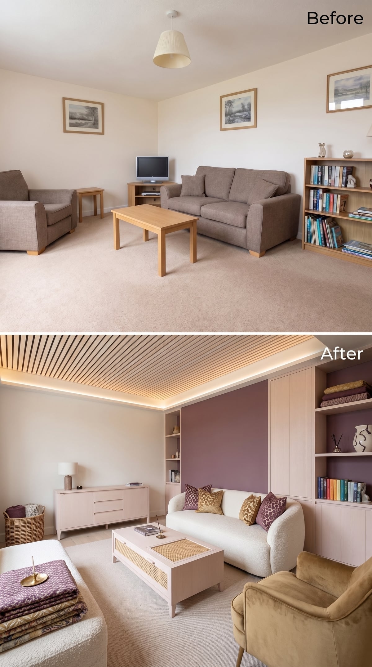
Dusty-rose cabinetry alternates open niches with tall closed panels, so the storage wall has places for display and places where visual evidence can simply vanish.
A mauve wall behind the system deepens the palette while a suspended wood-slat ceiling introduces another horizontal layer overhead. Warm concealed lighting catches the slats from behind, giving the ceiling more depth after dark.
Bouclé and gold velvet keep the seating within the same warm family without matching the cabinetry directly. For an organizer, the important detail is less romantic: some shelves are open, some are not. That distinction is doing half the room’s practical work.
28. A Film Collection Gets a Bright Room Instead of the Obligatory Black Box
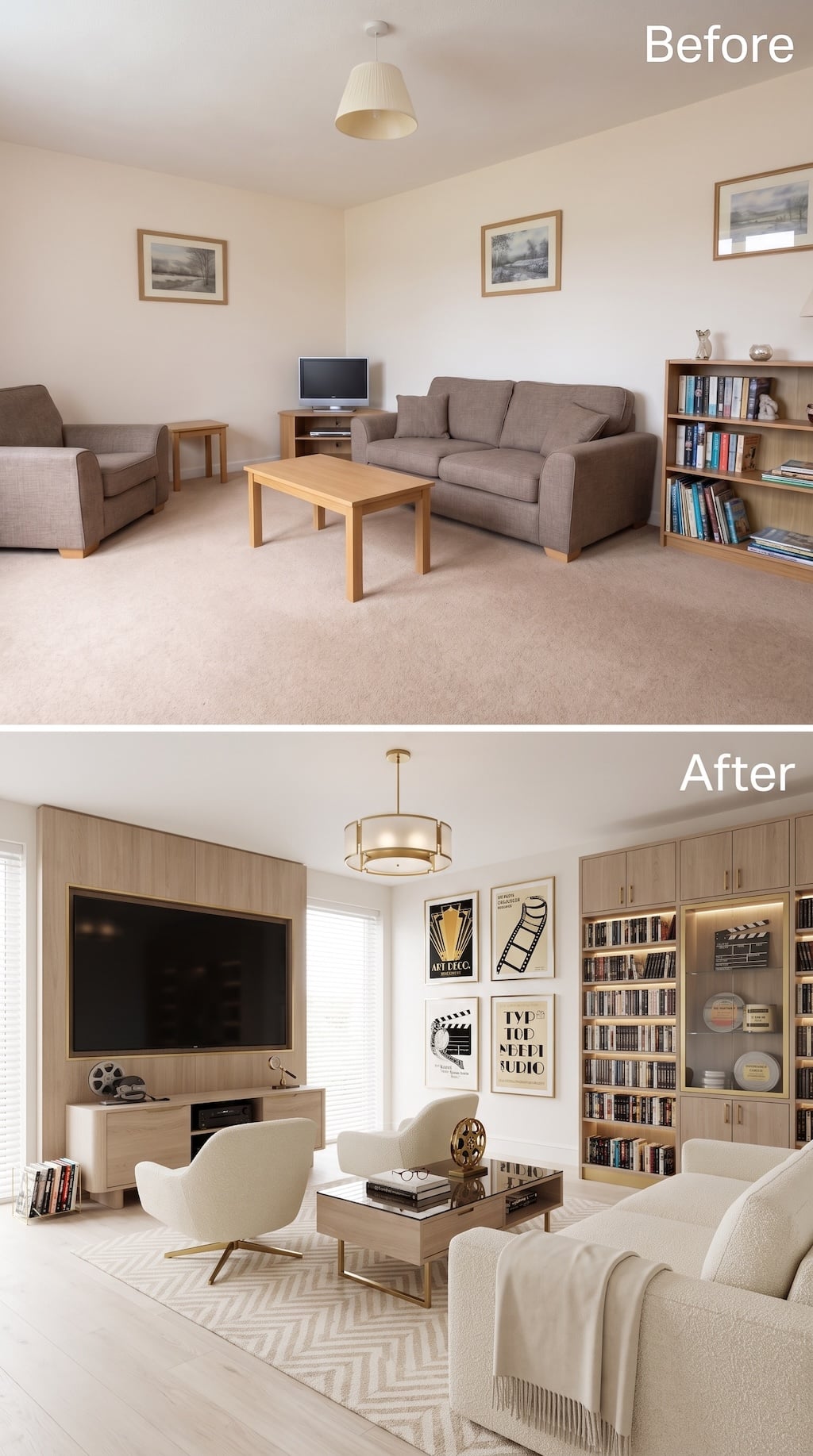
A cinephile room does not have to cosplay as a multiplex. This one stays pale, bright, and almost salon-like while still giving movies an unmistakable presence.
The television sits inside a broad light-wood surround with equipment stored below, while the opposite wall becomes a proper media library: rows of discs, closed cupboards, illuminated niches, and glass-front display space for film memorabilia. Posters and reel imagery take over the remaining wall without turning the room into a concession stand.
Cream upholstery and pale flooring deliberately lower the visual noise around the collection. The result is less “home theater” than private film library—a room where the screen matters, but so does everything that led to it.
27. Skylight Greenery Gives the Storage Wall Something Living to Compete With
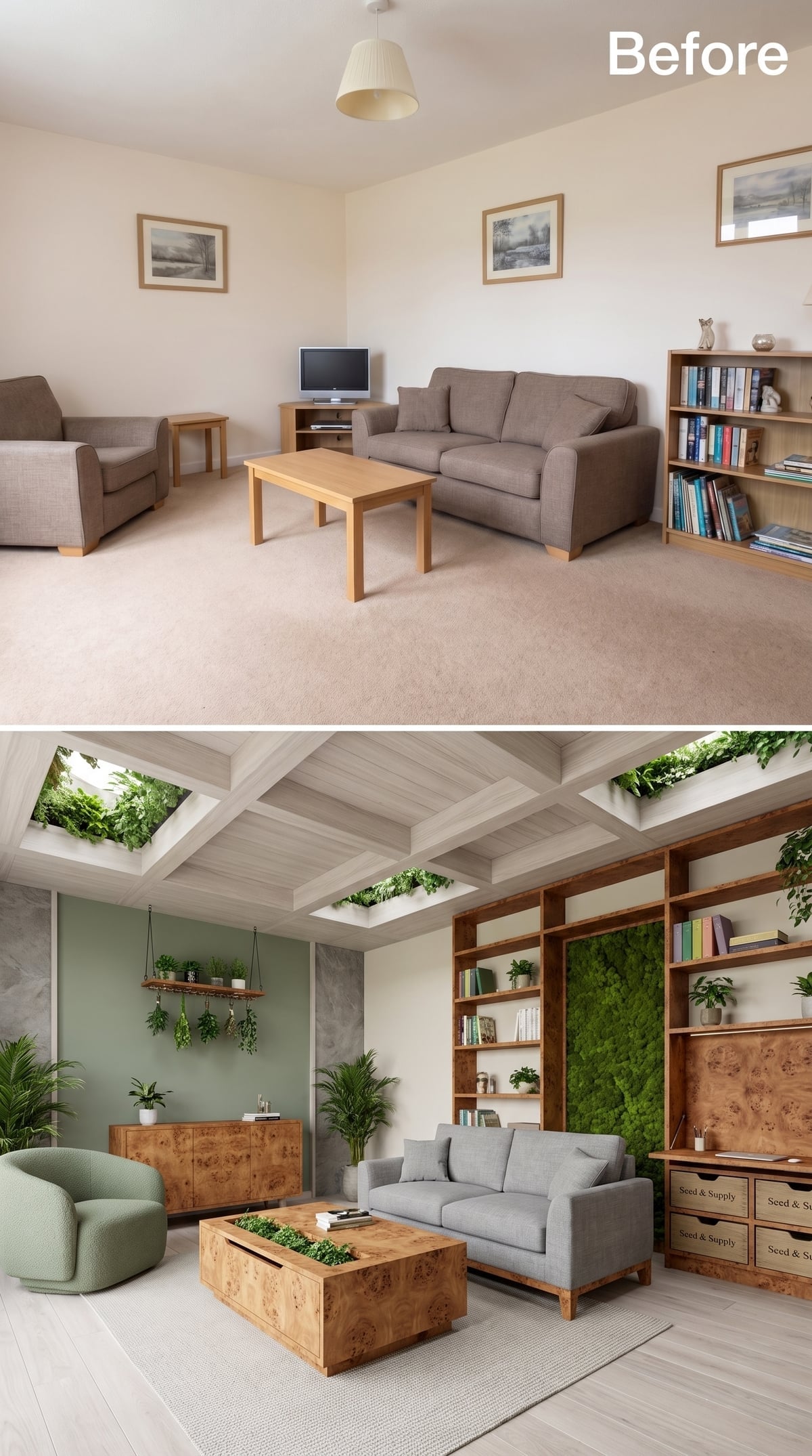
Not every storage-heavy room needs another timber ceiling. Here, greenery gathers around the skylight openings, bringing leaves into the brightest plane of the room instead.
A moss-like green panel interrupts the shelving wall below, providing a broad field of color between books and objects. If such a panel were made from preserved moss, it could provide the appearance of living material with far less care than an actual planted wall.
The contrast matters. Shelving is repetitive by nature; plants are not. Putting the two together loosens a room that might otherwise feel relentlessly categorized.
26. Toffee-Toned Cabinetry Knows Exactly What Should Stay Behind a Door
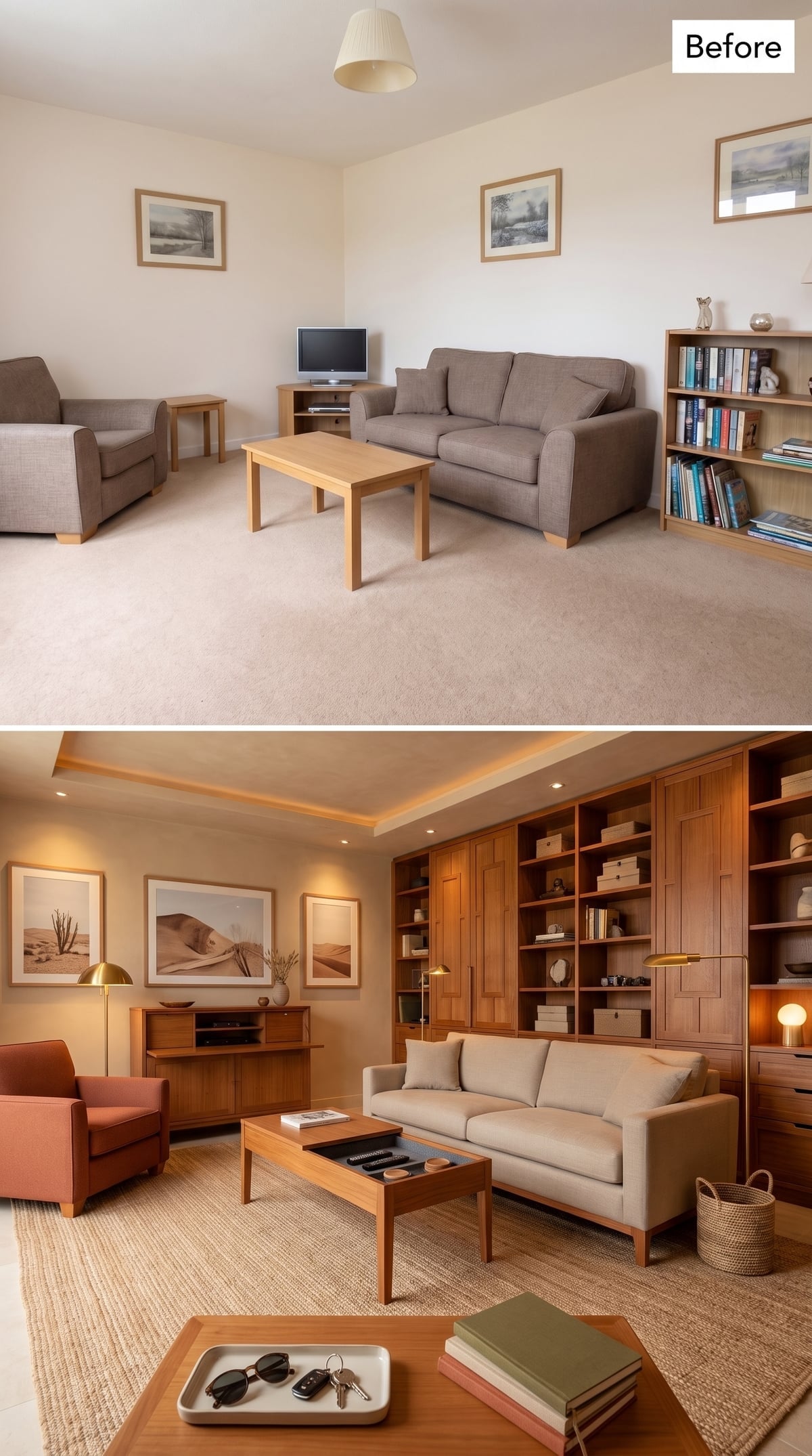
Warm cherry-toned cabinetry runs nearly the full length of the wall, but the useful decision is the mixture of formats. Open shelves hold books and objects; paneled lower sections absorb everything that looks better when nobody can see it.
A shallow tray ceiling and recessed perimeter lighting keep the room visually ordered without creating another dramatic focal point overhead. Linen upholstery, jute, terracotta, and brass soften the amount of wood.
Storage Principle: Open and closed storage solve different problems. Display shelves reward editing; doors forgive reality. Combining both on one wall lets frequently seen objects become part of the room while paperwork, cables, games, and miscellaneous supplies disappear below eye level.
25. Diamond Shelving Turns the Bookcase Into the Pattern
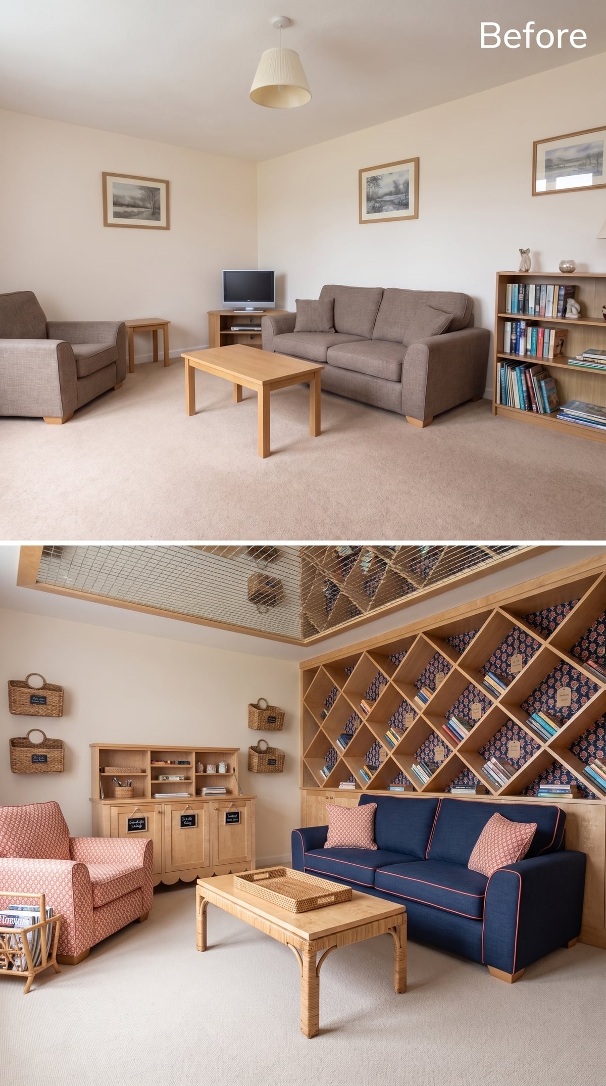
Diagonal shelving covers the far wall in a diamond grid, immediately changing how books and objects sit inside it. Instead of horizontal rows, every compartment becomes part of a larger geometric pattern.
Navy upholstery and coral piping pick up the colors behind the shelves, while wall-mounted wicker baskets give smaller objects their own place without introducing another cabinet. A rattan coffee table and warm wood sideboard prevent the room from becoming too graphic.
24. Oxblood Overhead Makes Illuminated Shelves Feel Almost Cinematic
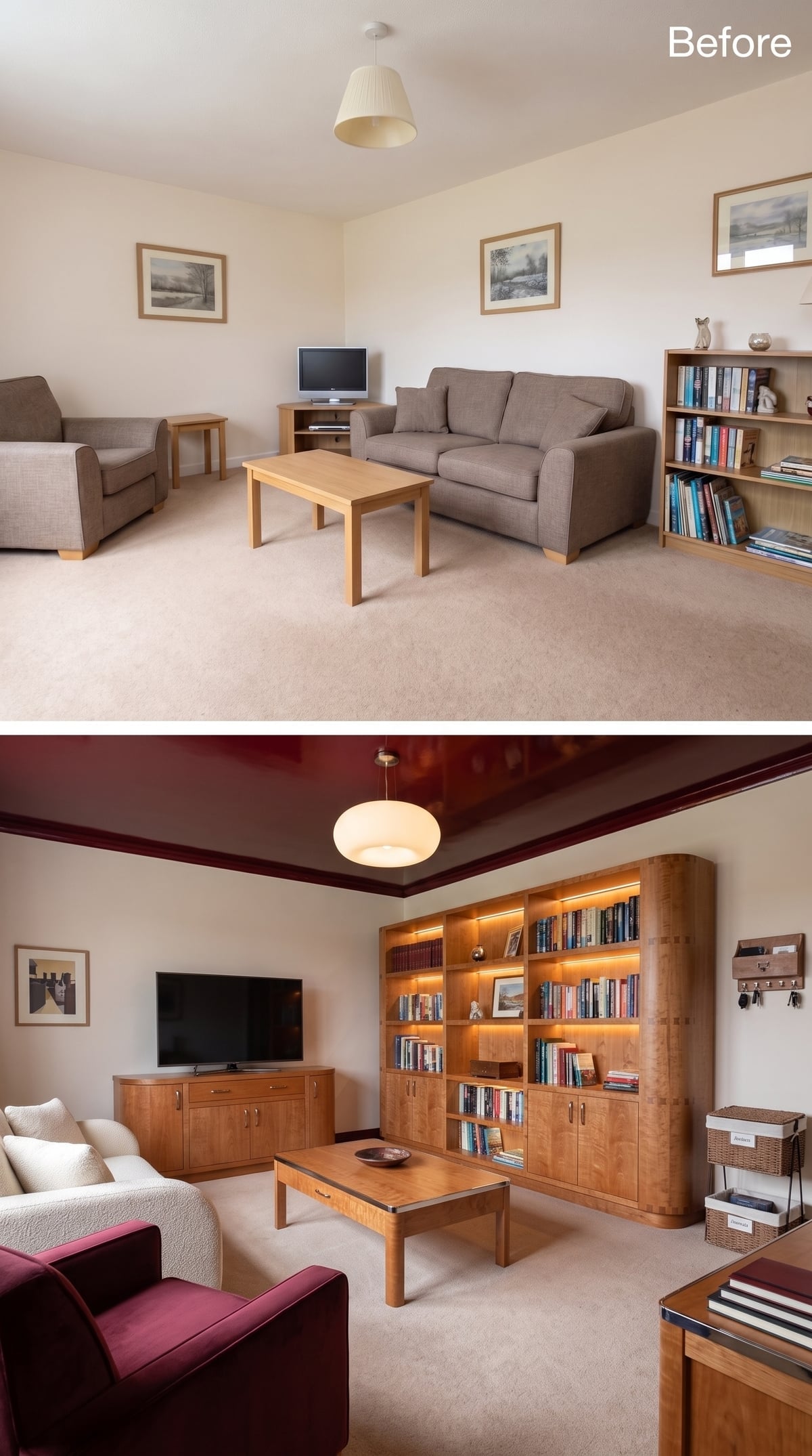
A high-gloss oxblood ceiling throws color onto a plane most rooms leave white. Below it, warm figured-wood shelving wraps the corner in a softer, lighter grain.
Integrated shelf lighting gives books and objects a glow of their own, separating the display wall from the general room lighting. Curved shelving corners are a small but important break from the usual box-on-box geometry.
Cream bouclé and burgundy upholstery echo the ceiling without competing with it.
Color Story: Oxblood and warm figured wood both carry strong red-brown notes, so the ceiling feels connected to the shelving rather than isolated from it. Cream walls provide a visual interval between those saturated surfaces.
23. A Record Collection Finally Gets Storage Designed for Records
🔥 Would you like to save this?
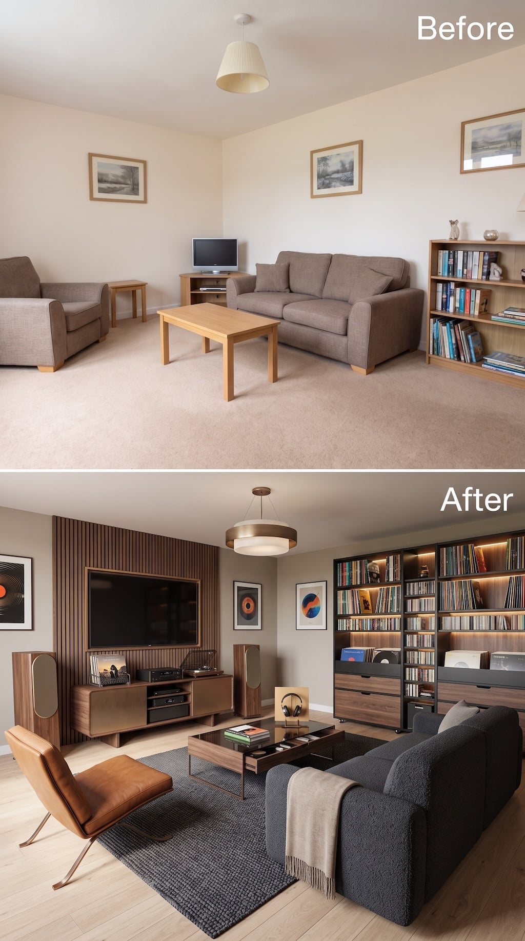
The crucial difference between a music-themed room and a listening room is whether the records have somewhere intelligent to live. Here, an entire wall is organized around vinyl, with tall shelving, illuminated upper bays, pull-out bins, and lower drawers handling a collection whose dimensions simply do not behave like books.
Across the room, vertical wood slats turn the television and audio wall into one continuous plane. A turntable and components sit on a low walnut console, with large speakers given actual breathing room instead of being squeezed beside a media cabinet.
Leather, charcoal upholstery, walnut, and a dark wool rug keep the palette serious without pushing it into nightclub territory. This one understands that the collection is not decoration surrounding the room. It is the reason for the room.
22. A Fold-Down Desk Hides Inside a Wall of Oak and Plaster
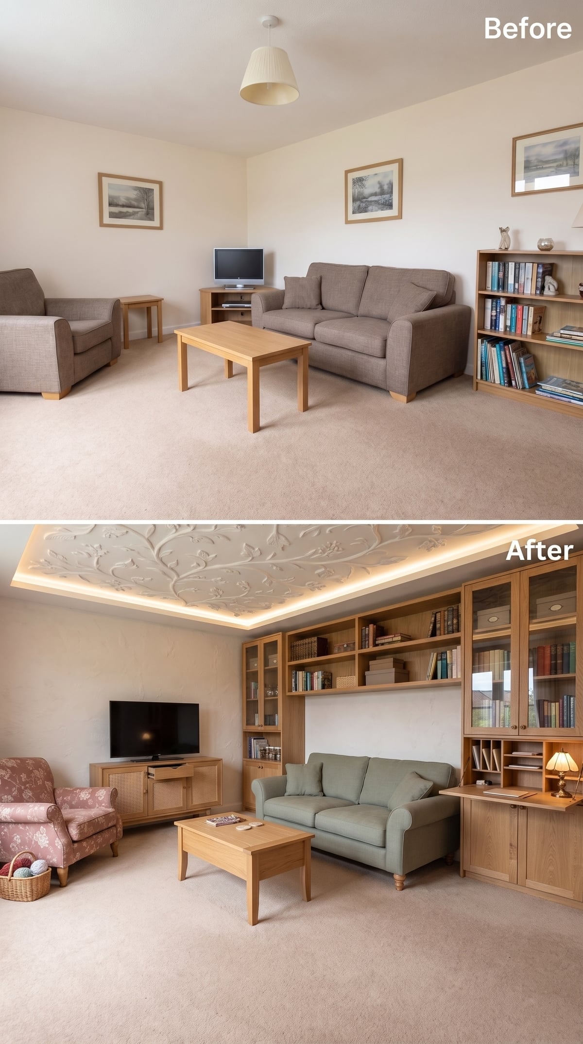
The ceiling gets the glamour: botanical plaster relief sits inside a raised panel washed by perimeter cove light.
The storage wall is more disciplined. Honey-toned oak combines glazed doors, open shelves, closed lower cabinetry, and a fold-down work surface tucked into one section. That tiny desk changes the room’s usefulness more than another decorative shelf ever could.
A cane-front media console handles the television side, while sage and dusty rose keep the upholstered pieces from disappearing into all that wood.
21. Slate Blue Makes Oak Storage Feel Calmer Than White Ever Could
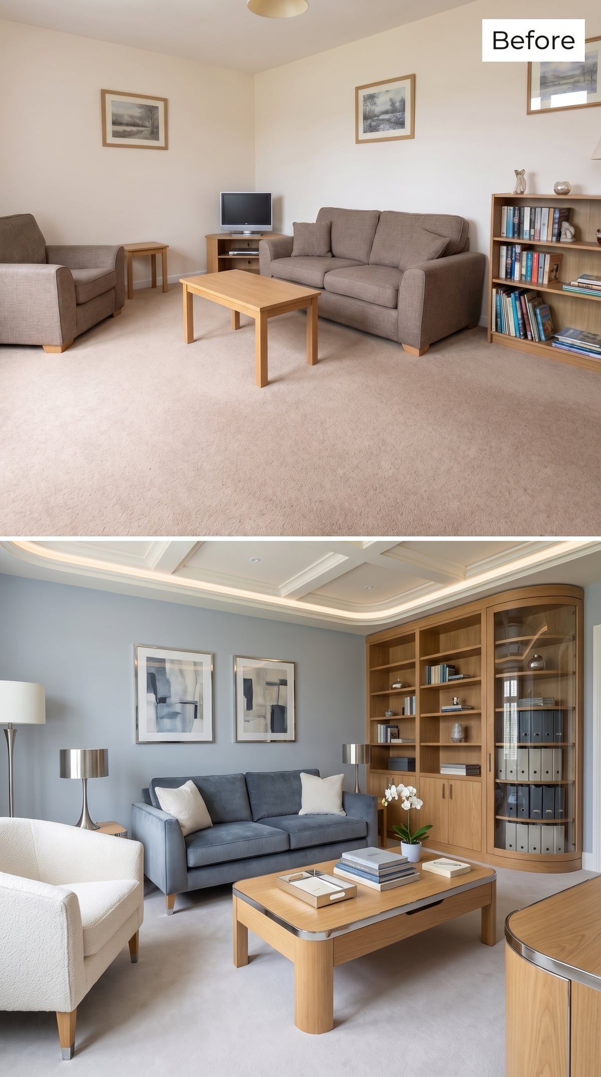
Slate-blue walls create a cooler field behind floor-to-ceiling oak cabinetry, making the wood appear warmer without introducing another material.
Open shelves sit above closed cabinets, while a curved glass-front section turns the corner into display rather than dead space. The low sofa, ivory bouclé chair, and simple oak table leave enough visual room for the built-in to remain the major element.
Cove lighting traces the ceiling edge quietly. In a room already organized around one enormous storage wall, the light does not need to become another object.
20. Navy Lacquer and Portholes Give Serious Storage a Slightly Nautical Alibi
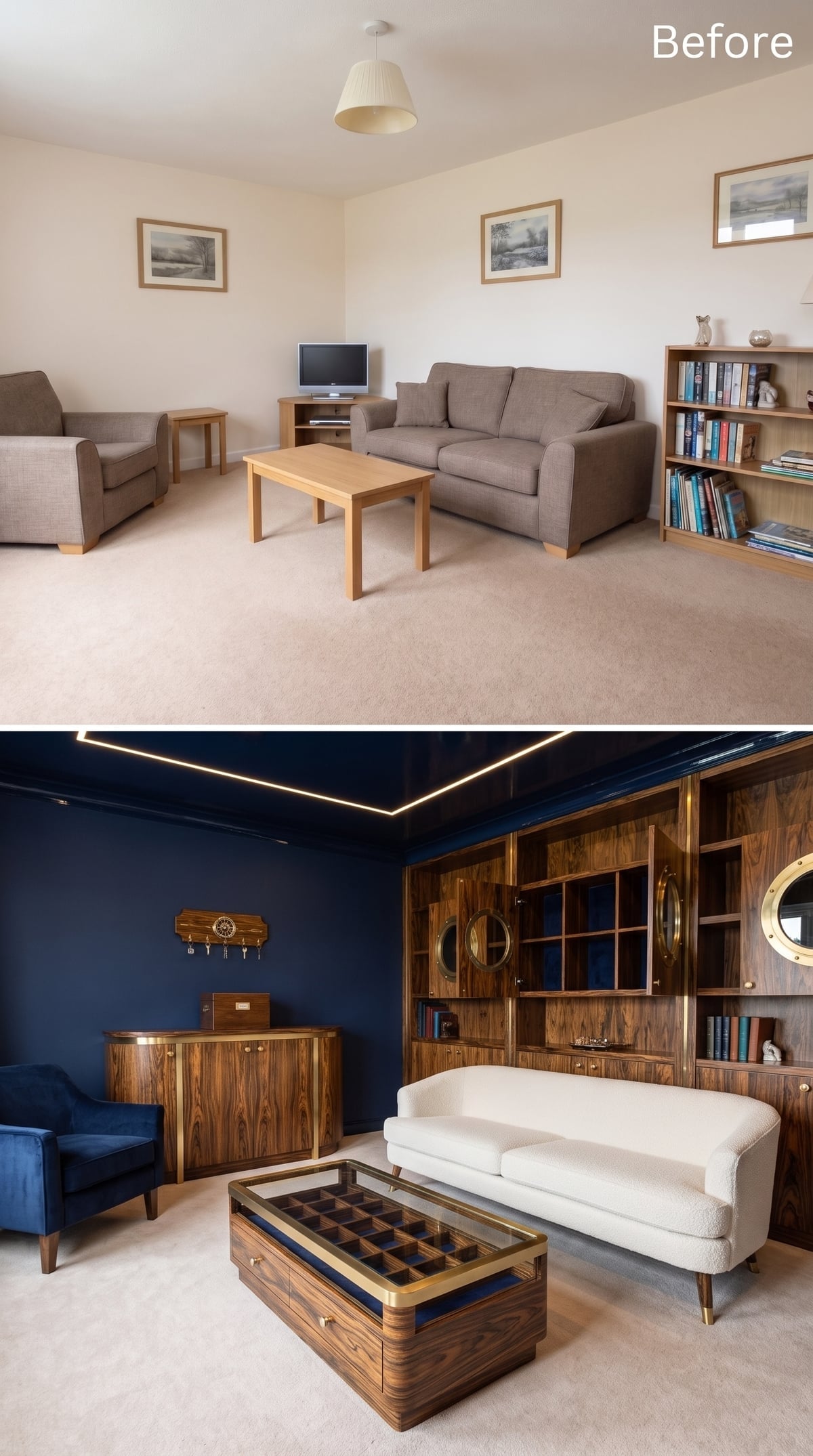
Deep navy covers the walls and continues across a glossy ceiling while perimeter LEDs trace a sharp line overhead.
The storage wall uses a dark, dramatically striped veneer whose grain functions almost like pattern. Brass porthole-style mirrors interrupt the shelving at intervals, pushing the room toward a nautical vocabulary without resorting to rope or model sailboats.
A glass-top display coffee table creates another kind of storage altogether: objects remain visible, but protected and contained beneath the surface.
19. A Butterfly Collection Turns Classification Into the Decorating Scheme
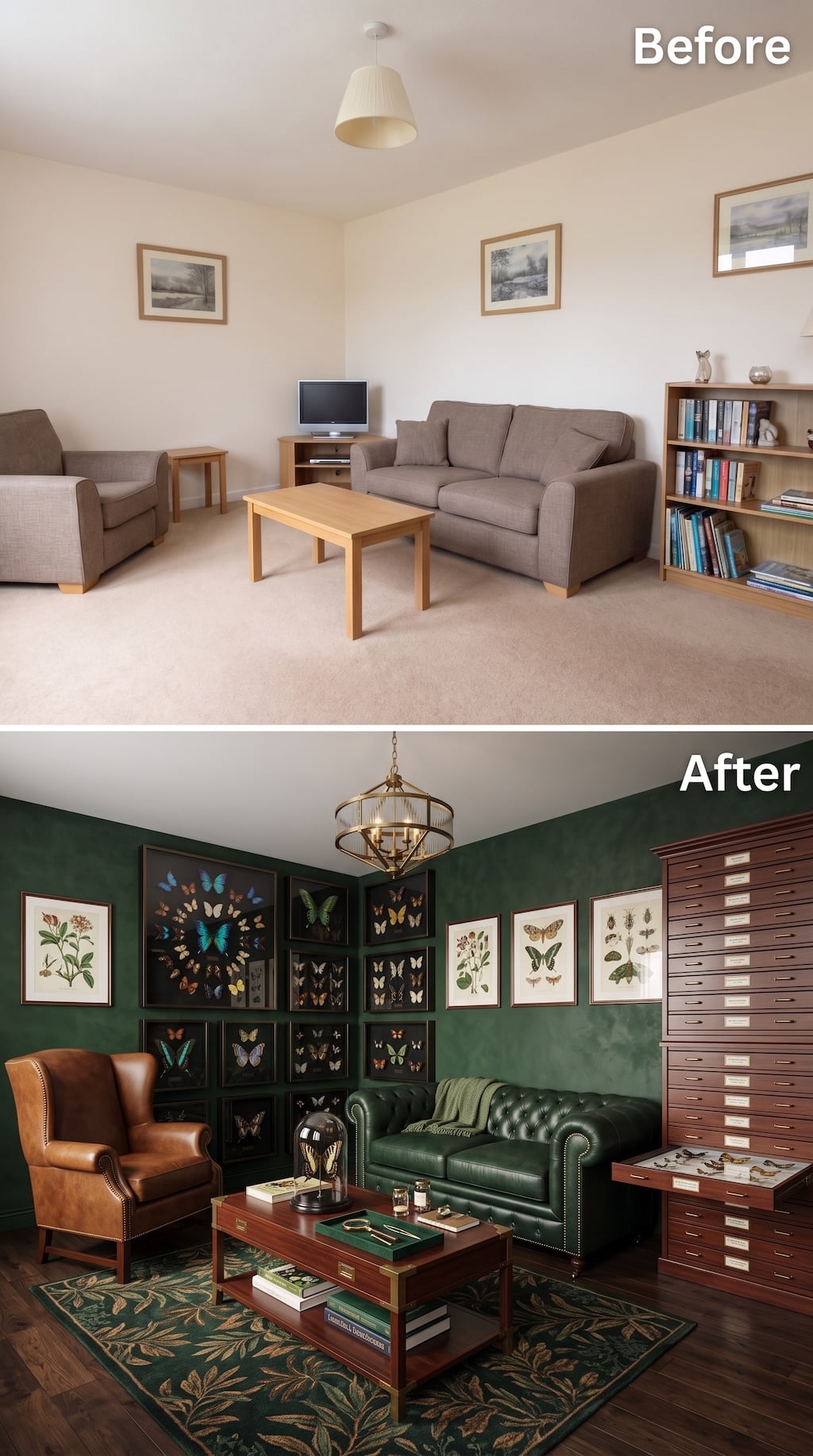
Few rooms make the relationship between collecting and organizing this explicit. Deep green walls become the background for framed butterfly specimens and botanical prints, while a towering bank of shallow labeled drawers suggests the less glamorous half of collecting: cataloging, protecting, and retrieving what cannot all be displayed at once.
The color story grows directly from the subject. Forest-green leather, tobacco-brown leather, dark wood, brass, and a leaf-patterned rug make the room feel closer to a natural-history study than a conventional living room.
The best detail may be the open specimen drawer near the bottom of the cabinet. Storage is not concealed here because the act of classification is part of the aesthetic. The room makes a case for organization as a form of curatorship rather than housekeeping.
18. Oak Cubbies Make the Storage Wall the Decoration Instead of Hiding It
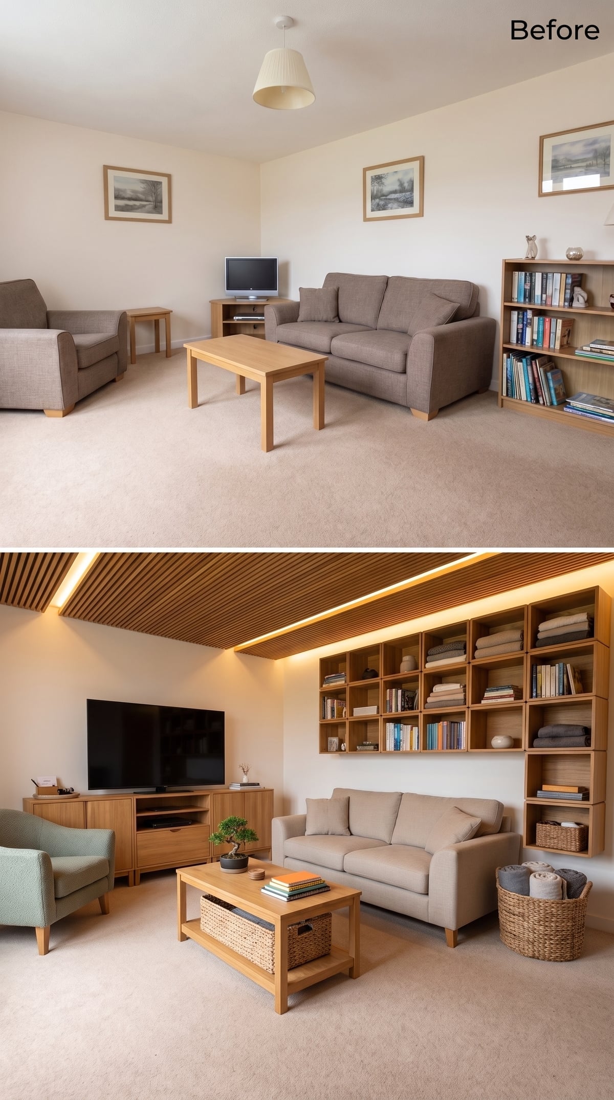
A wood-slat ceiling with recessed linear lighting brings warmth overhead, while modular oak cubbies occupy almost the entire back wall.
Books share the grid with folded textiles and woven baskets, making the shelving look less like a formal library and more like a carefully managed household inventory. Nothing is pretending not to be storage.
That honesty is the design move. Repeated materials and consistent container types keep a highly functional wall from looking like a utility closet with the doors removed.
17. Diagonal Walnut Beams Break the Shelf Wall Before It Can Become Predictable
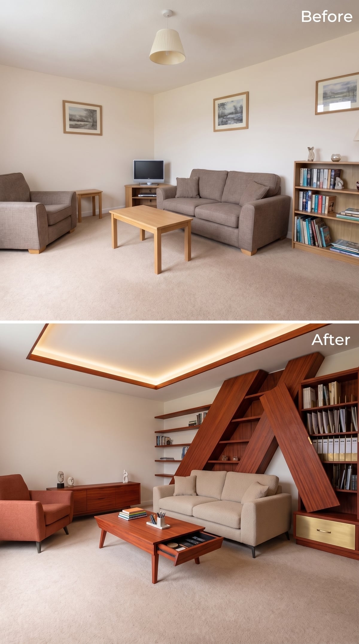
Dark walnut-toned beams cross the shelving wall diagonally, carving an irregular framework through what could otherwise have been another floor-to-ceiling grid.
Open shelving fills the spaces between those lines while cove lighting washes the ceiling above. At floor level, the coffee table hides a slim drawer that is nearly invisible until it is pulled open.
The room works at two scales: dramatic architecture on the wall, mundane clutter control at arm’s reach.
16. Forest Green Paneling Turns an Organizer’s Library Into a Private Club
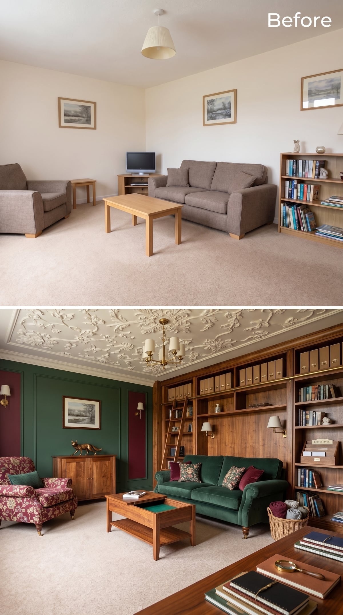
Forest-green paneling wraps two walls while a densely patterned plaster ceiling shifts the atmosphere toward a formal historic interior.
A walnut-toned library wall spans the room with a rolling ladder on a brass rail. Uniform kraft-colored boxes occupy the upper shelves, establishing a disciplined storage band above the looser arrangement of books and objects below.
Green velvet, burgundy, and floral upholstery give the seating enough richness to belong in the same room. The organizing trick is subtle: uniform containers handle repetition high up, while individuality is allowed closer to eye level.
15. Wood Slats and Concrete-Look Walls Give the Books a Harder Edge
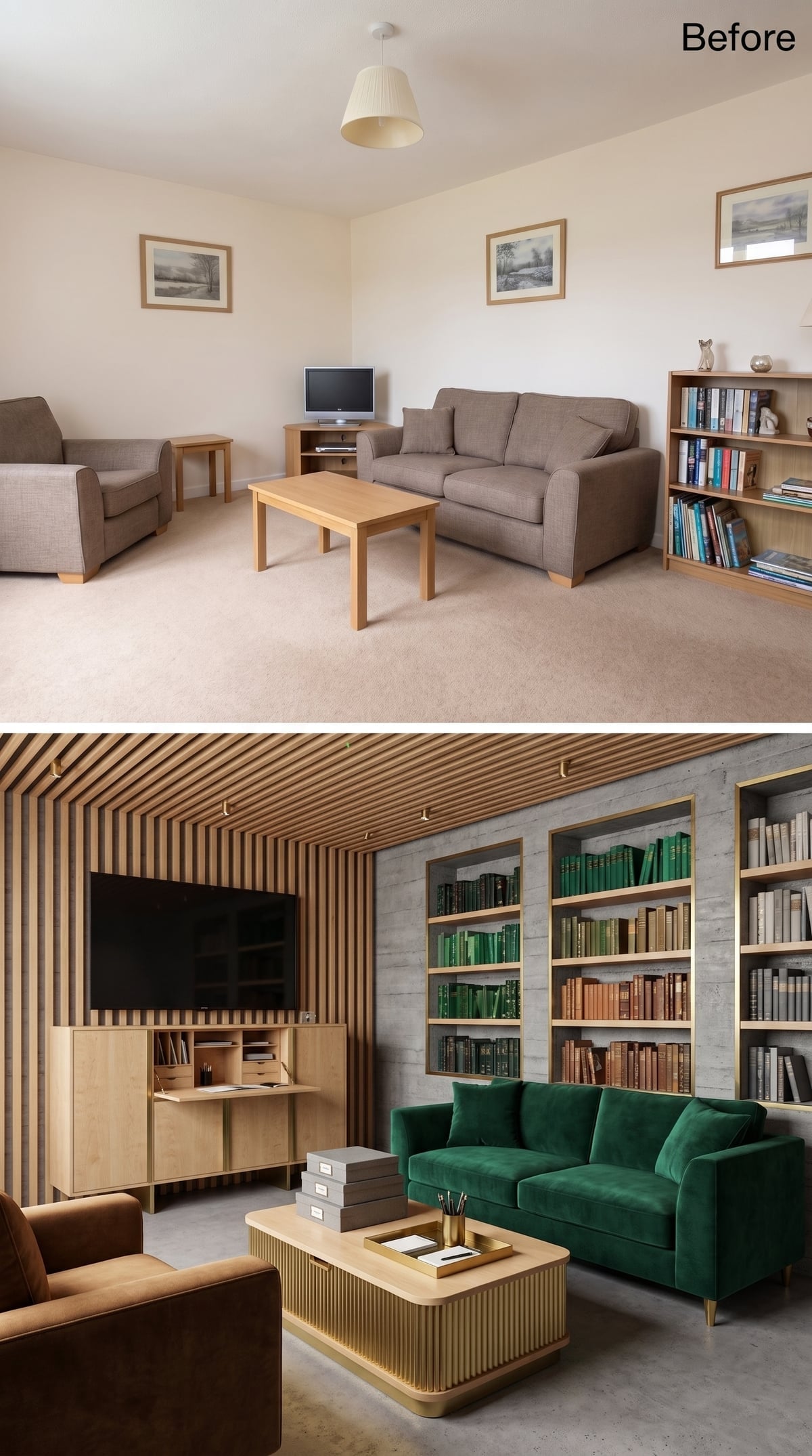
Vertical oak slats frame the television wall while concrete-look plaster cools the adjacent surfaces.
An emerald velvet sofa supplies the strongest color, and recessed shelving on the opposite wall gives books a more restrained background than the timber-heavy media side. Grouping some spines by color introduces order without requiring the entire collection to behave like a paint chart.
Try This: If a large book collection feels visually chaotic, grouping a portion of it by color can create broader blocks that the eye reads more easily. It is a styling choice, not an organizational law—alphabetical, topical, or author-based systems may be far more useful if retrieval matters more than appearance.
14. A Dark Cinema Room Organizes the Collection Around the Actual Act of Watching
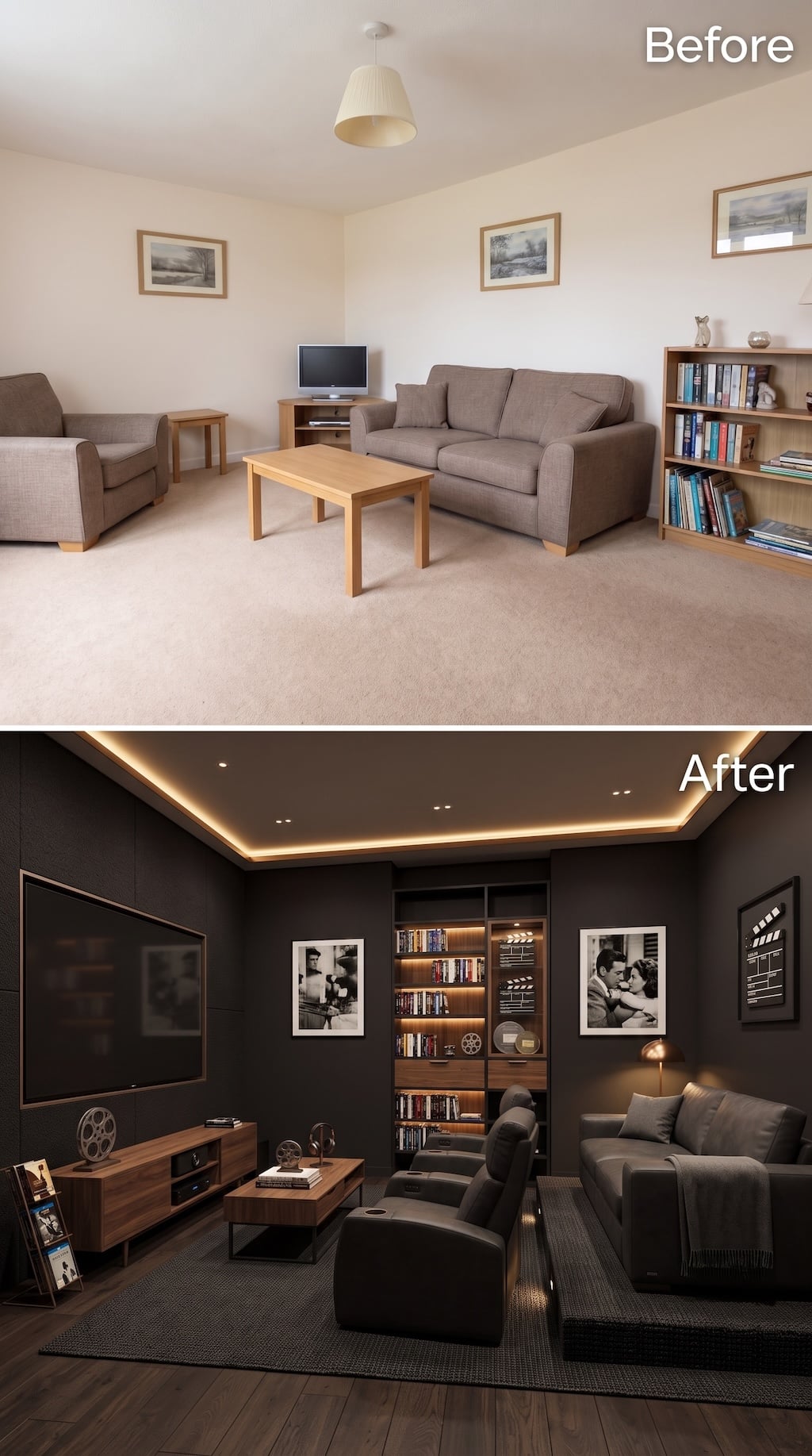
This is the other answer to the cinephile problem. Instead of keeping the living-room identity intact, the design lets movie watching take over.
Near-black walls and a dark ceiling strip away reflections around the screen, while recessed and perimeter lighting keep the room from becoming a cave between films. Reclining chairs face the television directly; the sofa becomes secondary seating instead of forcing every chair into a polite conversational circle.
A lit media cabinet at the back holds discs and memorabilia, while film reels, black-and-white stills, and a clapperboard make the collection legible without filling every wall. The organization follows use: screen first, seating second, archive behind it. That hierarchy is why the room feels purpose-built rather than merely themed.
13. Yellow Binders and One Mustard Chair Create a Line Across the Room
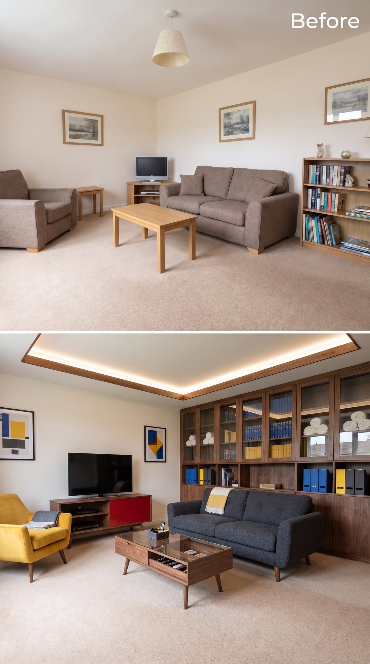
Walnut-toned cabinetry stretches across one wall, mixing glazed cupboards and open lower shelves. Blue and yellow binders repeat across the cubbies, making the filing system visually legible instead of disguising it.
Across the room, a mustard velvet chair picks up the yellow again. That repetition creates a visual connection between storage and seating without requiring them to sit side by side.
Color Rhythm: Repeating an accent color in separate areas can help the eye connect parts of a room that would otherwise feel unrelated. The effect here is less about making the space look larger than about making the storage and furniture feel deliberately connected.
12. Ornate Plaster and Striped Wood Put Craft Above and Storage Below
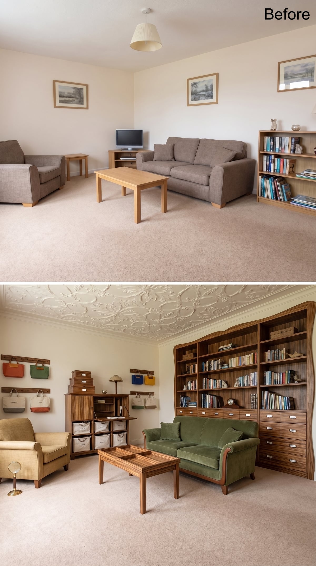
A ceiling covered in floral plaster relief turns the upper plane into ornament, while dramatically striped wood shelving takes control of the walls below.
The cabinetry curves at the corners rather than stopping at hard right angles, and a matching coffee table repeats the grain at floor level. Colorful tote bags hang openly from hooks on one side, a surprisingly casual storage move in such a formal room.
The green velvet sofa keeps the palette deep and saturated without trying to compete with the ceiling.
11. Concrete-Look Walls and Oak Slats Separate Mass From Warmth
🔥 Would you like to save this?
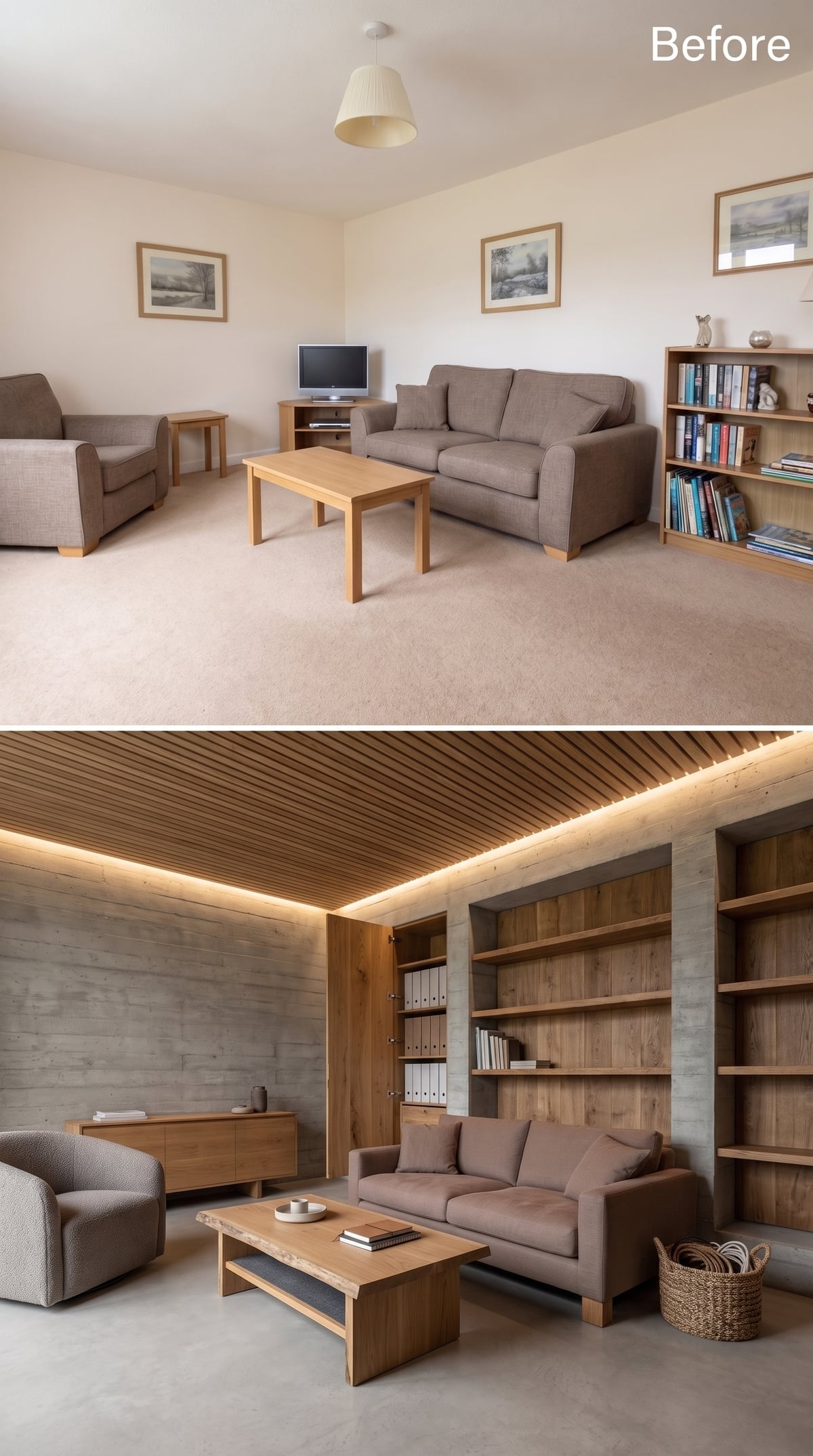
Board-formed-concrete-look walls create a monolithic backdrop while a slatted oak ceiling introduces warmth and a strong linear grain overhead.
Built-in raw-oak shelving wraps one side, with open storage balanced by closed cabinet doors. A woven basket handles the objects that have not yet earned a permanent category, which may be the most realistic detail in the room.
Material Contrast: The useful opposition here is monolithic versus linear, mineral-looking versus warm-grained. The wall surfaces feel massive; the ceiling slats feel directional. That difference supplies more visual tension than another painted accent wall would.
10. Black-and-White Ceiling Stripes Make the Storage Wall Look Almost Quiet
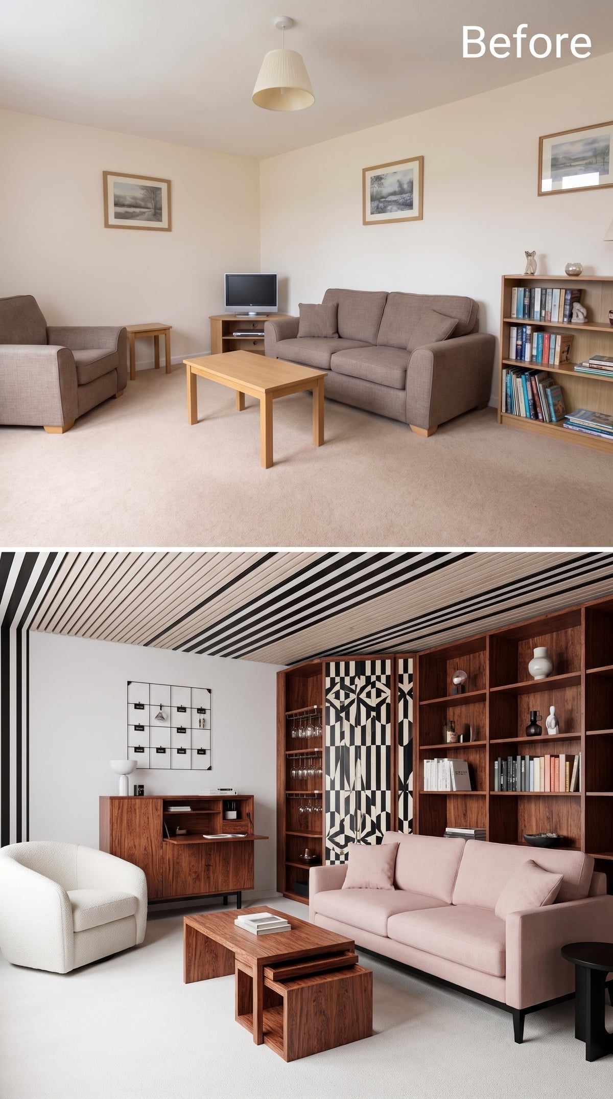
Diagonal black-and-white stripes cross the ceiling and immediately pull attention upward.
That leaves the walnut shelving below in the unusual position of being the restrained element. Books, ceramics, and a geometric panel occupy the wall, while figured-wood nesting tables repeat the timber tone in smaller doses across the seating area.
A blush sofa takes the edge off the graphic ceiling without neutralizing it. The room is heavily organized, but it does not look clinically organized.
9. A Brass Library Ladder Makes Vertical Storage Genuinely Reachable
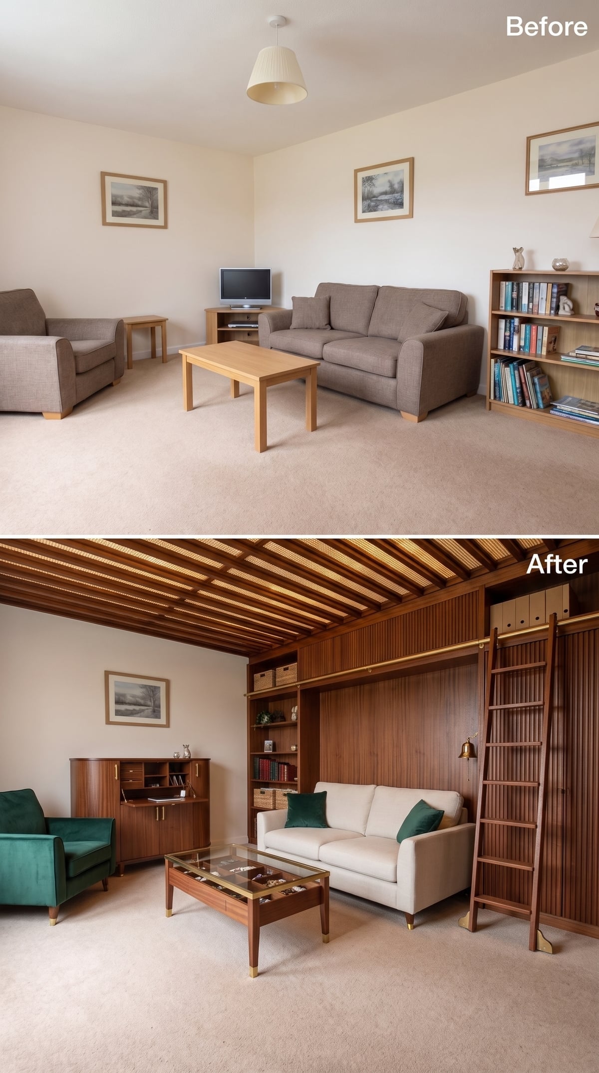
Floor-to-ceiling walnut-toned shelving is impressive until the top two feet become decorative dead space. The rolling ladder solves that problem and turns access hardware into part of the room.
Fluted cabinet fronts sit below the shelves, giving less photogenic objects somewhere to disappear. A glass-top display coffee table handles collectibles at seating height, creating another visible-storage zone without adding more to the walls.
Why It Works: High storage only becomes genuinely useful when it can be reached safely and conveniently. A rolling library ladder turns upper shelving from decorative capacity into working capacity while the brass rail gives the mechanism a deliberate architectural presence.
8. Oxblood Lacquer Returns, This Time With a Coffee Table Hiding the Evidence
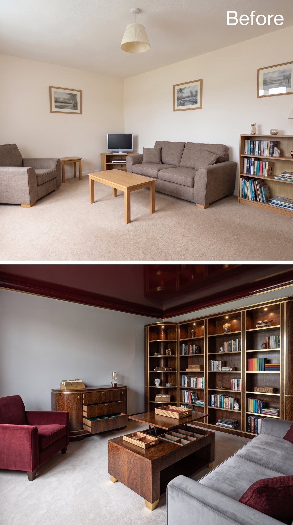
The ceiling goes full oxblood again, glossy enough to reflect a soft version of the room below.
Brass-trimmed shelving stretches across the rear wall, paired with warm figured walnut-like cabinetry and recessed shelf lighting. Unlike the earlier oxblood room, though, this one has a practical trick at the center: the coffee-table top lifts to reveal divided storage.
That makes the table more than a visual echo of the cabinetry. It is the nearest storage point to the sofa, exactly where the most frequently abandoned objects tend to accumulate.
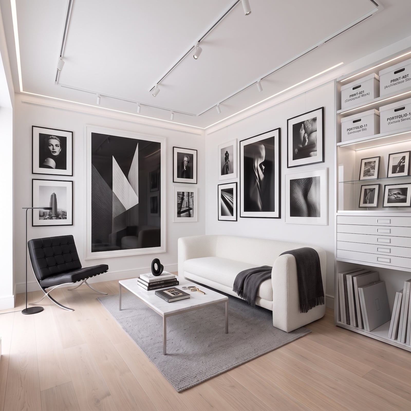
7. A Photography Archive Goes Nearly Monochrome So the Images Can Do the Talking
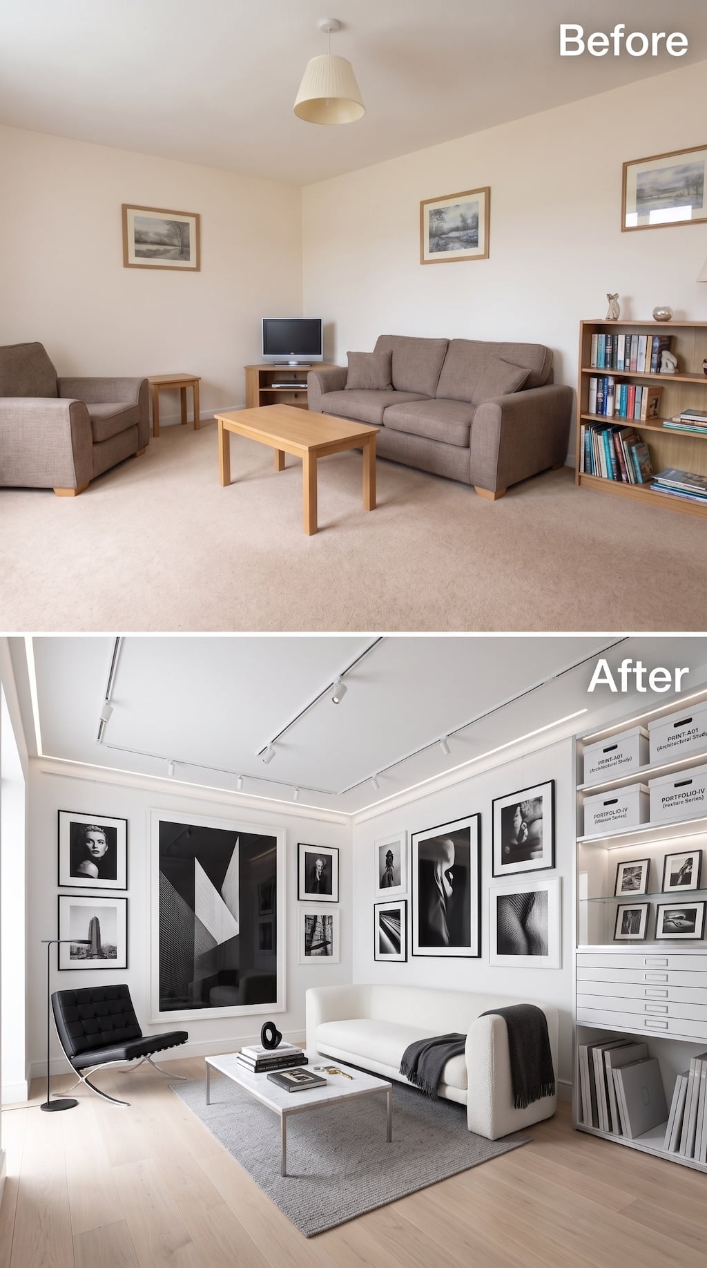
Where the earlier photography room went dark and saturated, this one nearly drains the room of color altogether. White walls, pale wood flooring, black frames, and a restrained gray rug create the visual equivalent of a mat board.
The collection takes over through scale rather than color. Large black-and-white photographs mix with smaller portraits and architectural studies, while track lighting allows individual works to be emphasized without turning the ceiling into a parade of decorative fixtures.
The storage wall is the intellectual center of the room: shallow flat-file drawers for prints, illuminated shelves for portfolios and archival boxes, and open lower bays for oversized material. Nothing about it mistakes displaying photographs for storing photographs. A serious collection needs both.
6. Oak Ceiling Beams Hide the Lighting Inside the Architecture
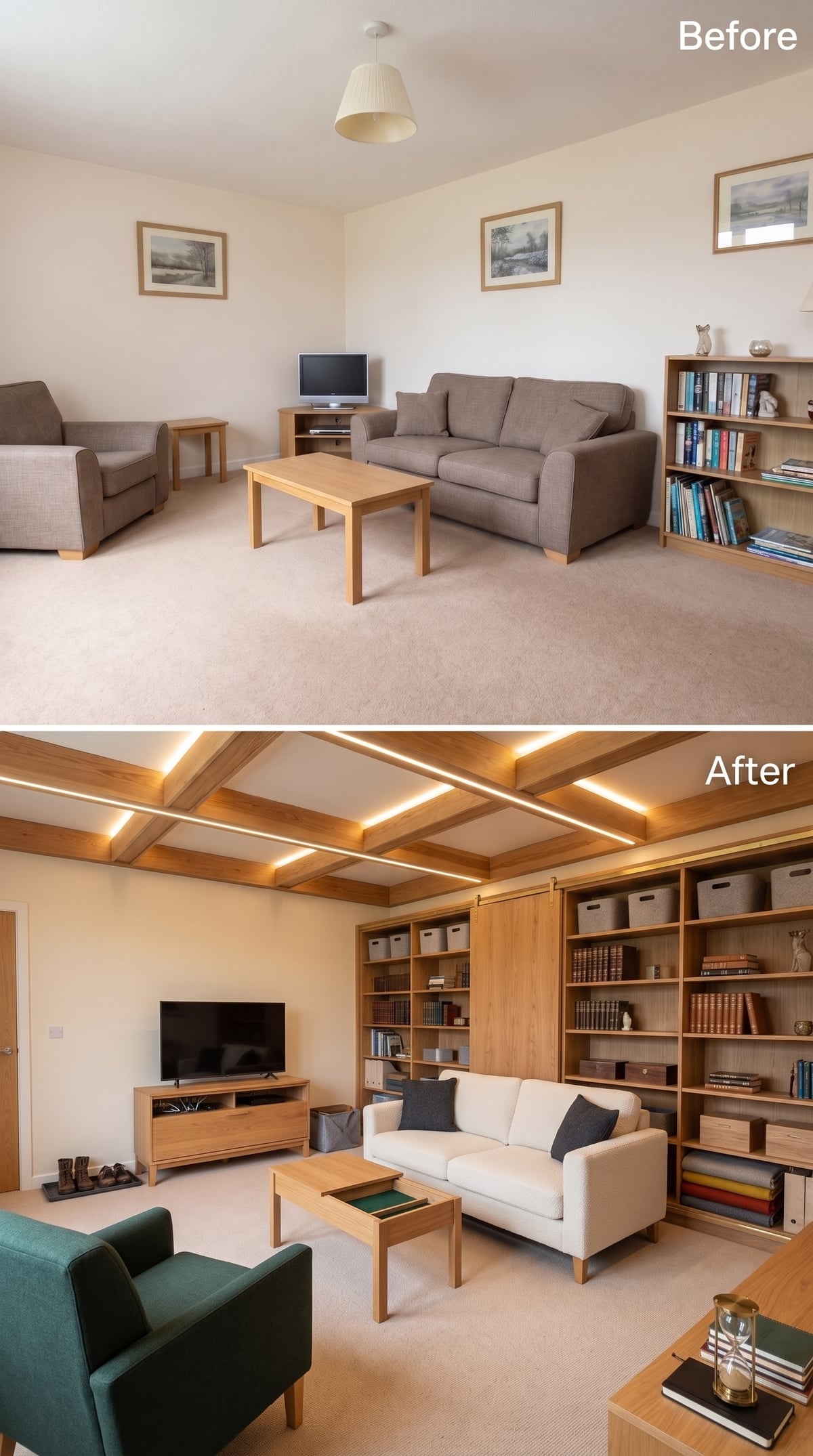
Oak beams cross the ceiling in a grid, with warm LED strips concealed along their inner edges. The light traces the architecture rather than hanging from it.
Below, oak shelving spans the room while a sliding panel closes off one portion without interrupting the overall line. White upholstery gives the eye somewhere cooler to rest, and a teal chair breaks the timber palette.
The coffee table appears to incorporate a lift-top or inset feature, another reminder that useful storage does not have to stay against the walls.
5. Plum Upholstery and Radiating Ceiling Beams Give Order a Softer Shape
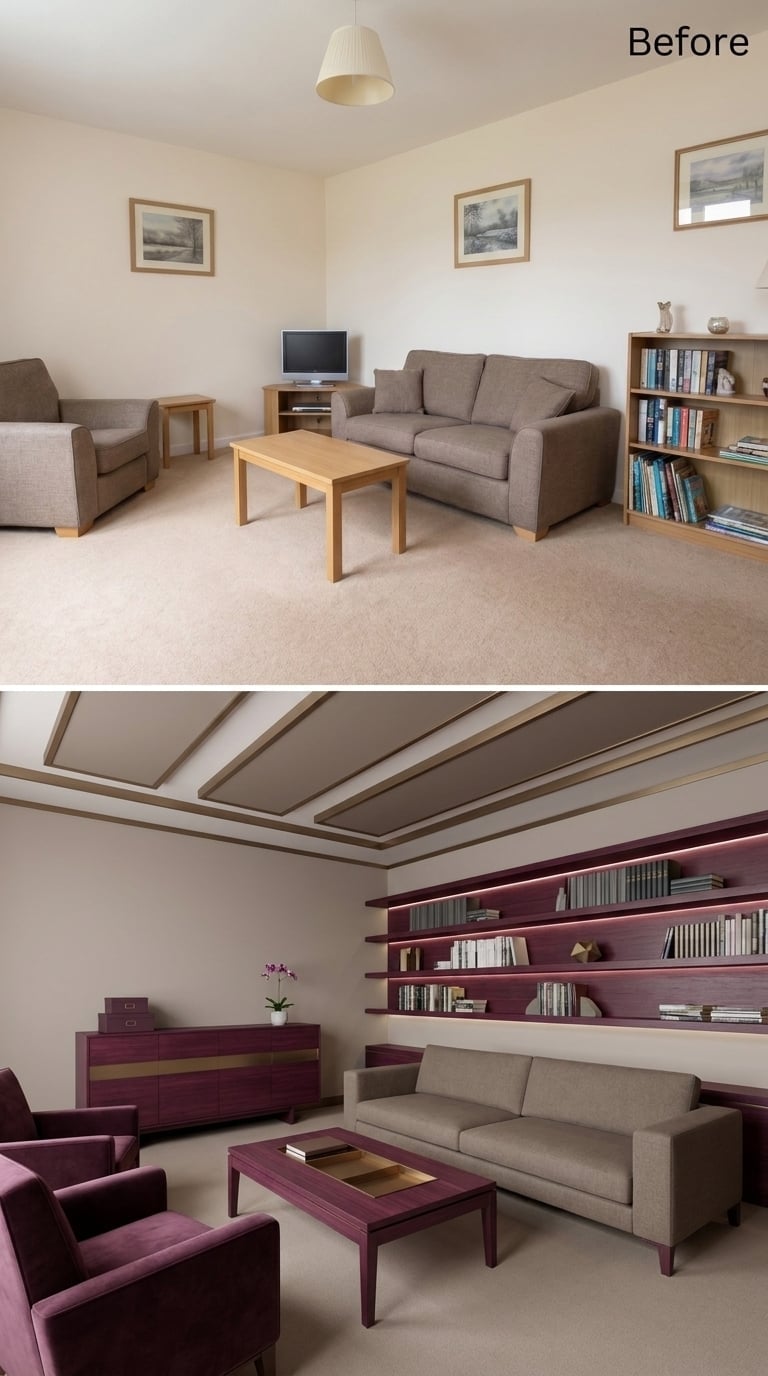
Muted plum repeats across the armchairs, coffee-table base, and the backing of the shelving wall.
Overhead, taupe beams radiate outward in a geometric pattern, giving the ceiling a focal point that is neither coffered nor slatted. The shelving itself stays relatively loose, with books given enough space that the wall feels curated rather than packed.
For a serial organizer, that empty shelf area may be the real luxury.
4. Burl-Patterned Wood and Labeled Files Bring the Office System Into the Living Room
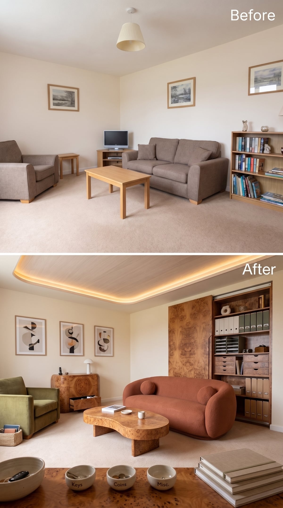
Indirect cove lighting runs around the ceiling while a terracotta bouclé sofa and olive chair keep the center of the room soft.
The organizational muscle sits along the side wall: labeled binders, open shelves, and stacked drawers give paperwork a permanent address instead of letting it migrate to the dining table. Burl-patterned wood repeats in several pieces, including the organic-shaped coffee table, tying the storage into the furniture rather than isolating it as office equipment.
Material Repeat: Using the same distinctive wood character at several scales can create continuity without requiring every piece to match exactly. Here, the repeated swirling grain makes filing storage, side cabinetry, and the coffee table feel related despite their different functions.
3. Crimson Walls Make the Library Feel Less Like Storage and More Like Atmosphere
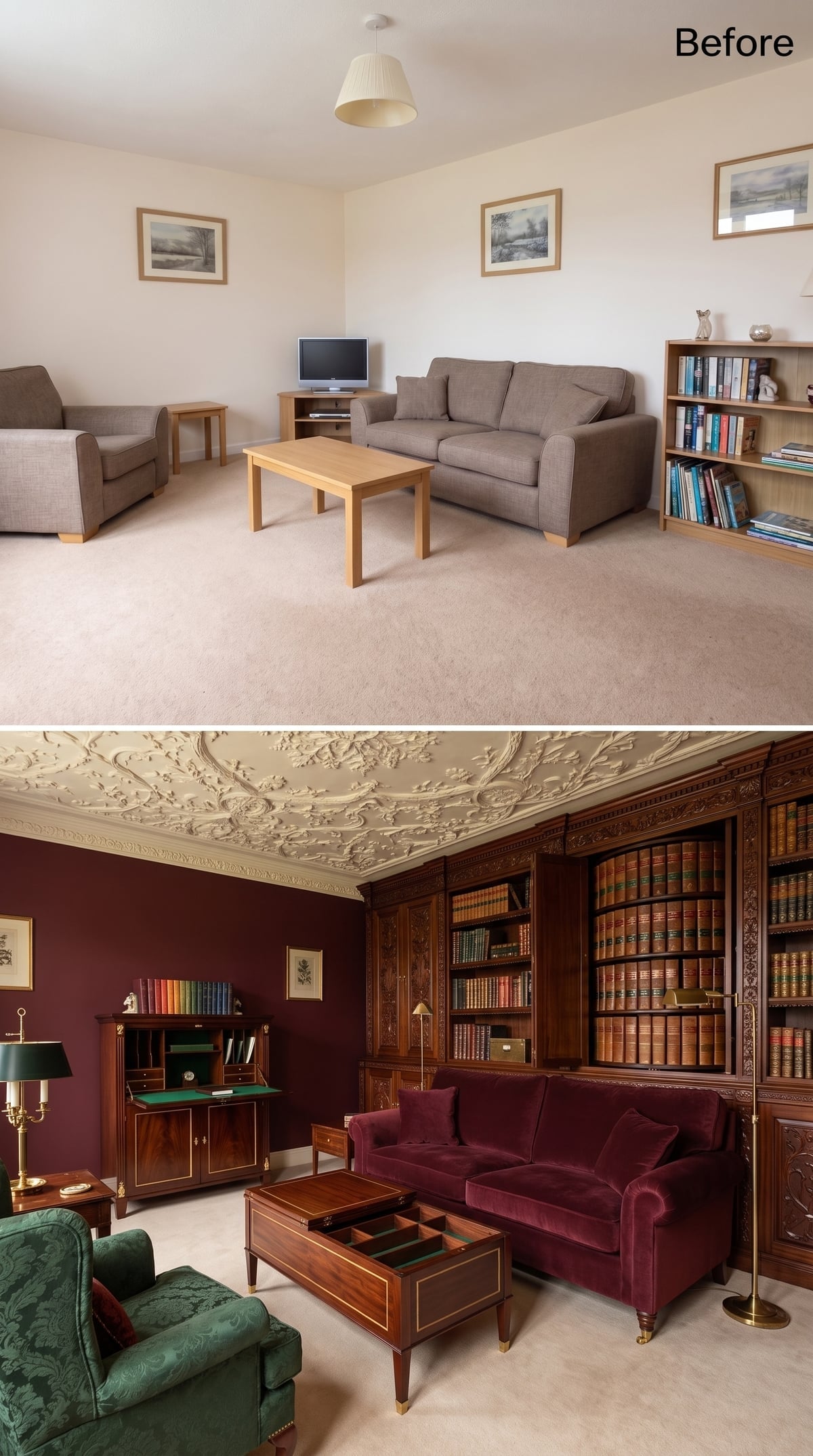
Deep crimson wraps the walls while burgundy velvet upholstery stays within the same saturated family. The result is immersive rather than contrast-driven.
Dark carved-wood shelving and leather-bound books deepen that effect, while an ornate plaster ceiling adds another layer of historic-looking detail overhead. Vertical shelving emphasizes the height of the wall, but the room does not pretend to be larger or lighter than it is. Density is part of the appeal.
2. An Oak Ceiling Grid Brings the Story Back to the Everyday TV Wall
🔥 Would you like to save this?
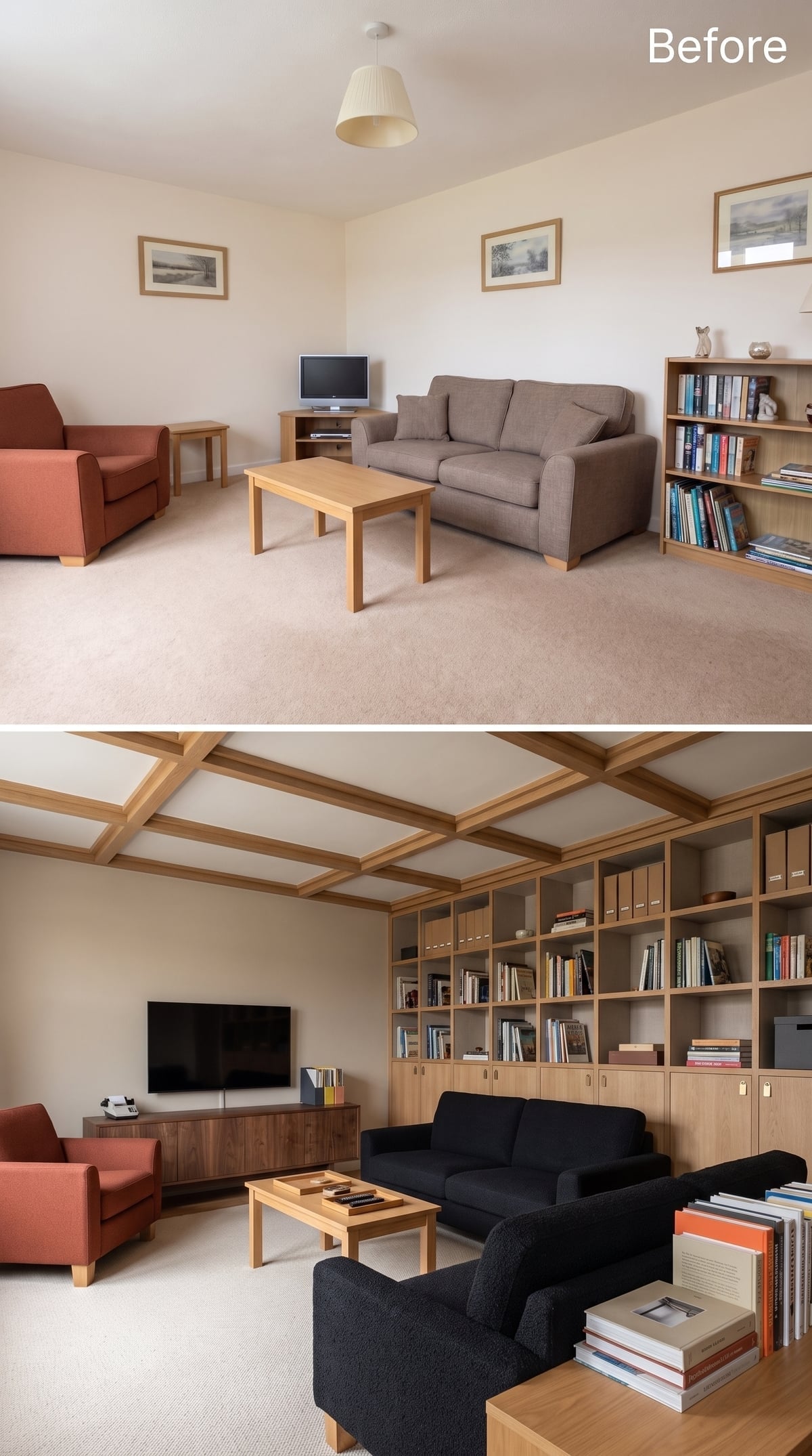
After lacquered ceilings, library ladders, diagonal beams, filing archives, record walls, and specimen drawers, this room returns to a problem almost everyone has: where the television, books, binders, and closed storage are supposed to coexist.
An oak ceiling grid adds architectural repetition overhead while built-ins span the wall below. Open cubbies take books and binders; cabinet doors along the base take the things nobody needs to admire.
Dark charcoal upholstery pushes the seating forward against all that warm timber. The room feels organized without becoming ceremonial, which is an important distinction.
1. Gold Trim, Botanical Panels, and a Card Catalog Wall Take Organization to Its Logical Extreme
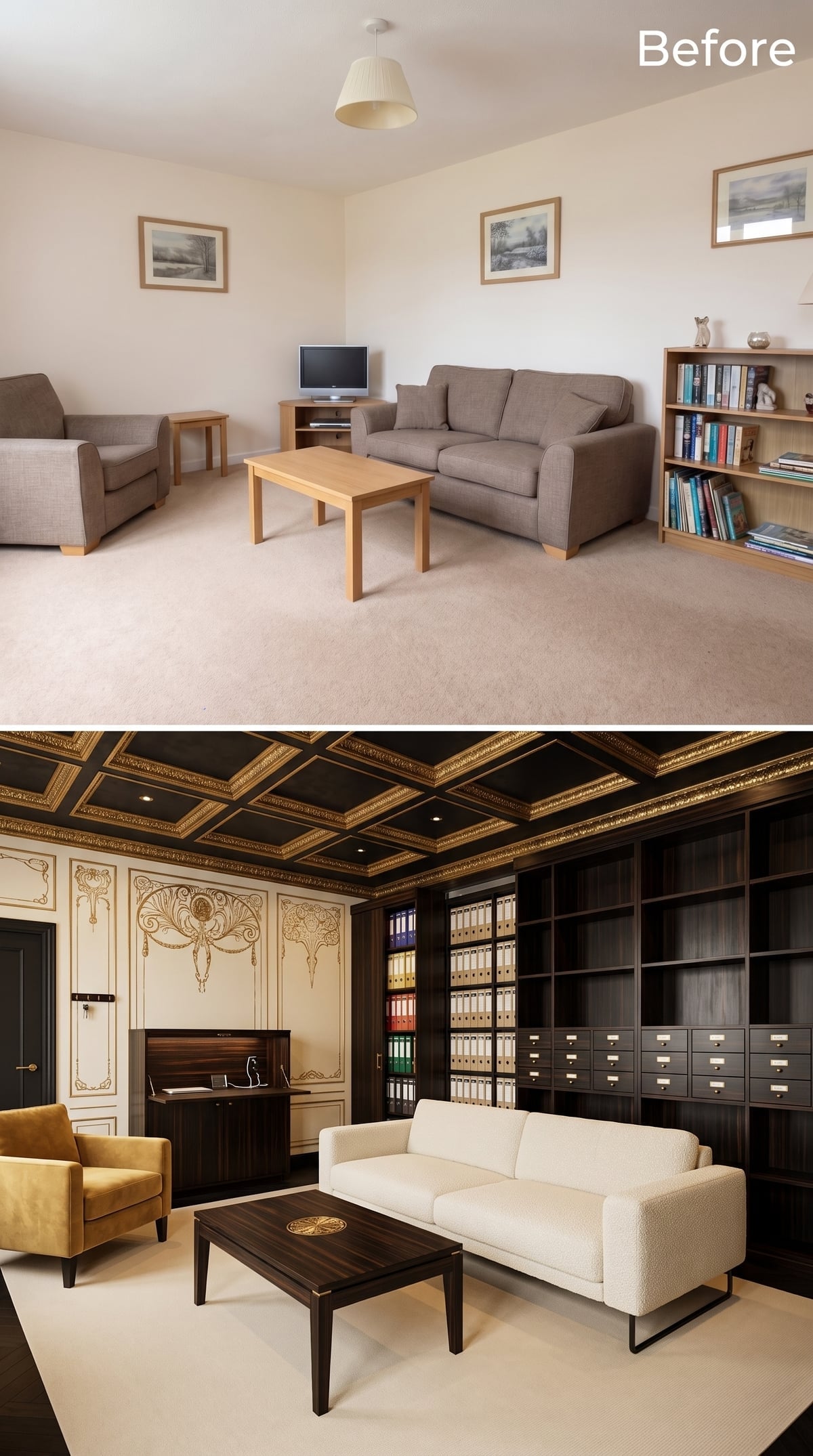
The final room refuses to choose between decoration and systems. Near-black coffered ceiling panels are edged in gold, while cream-and-gold wall decoration borrows from Art Nouveau-style botanical curves.
Then comes the storage wall: open shelves, color-coded binders, and row after row of card-catalog-style drawers with brass pulls. Every small compartment suggests a category waiting to happen.
A white bouclé sofa and mustard chair keep the seating visually distinct from all that dark wood. The coffee table returns to a striped ebony-style grain, linking the furniture back to the millwork without requiring another matching suite.
It is an extravagant ending, but the underlying idea is almost severe. Organization works best when visibility is intentional. Books can stay out because they are useful or beautiful. A record collection can become architecture. Photographs may need both walls and drawers. Specimens can turn classification into theater. Paperwork can disappear into a labeled cabinet. A coffee table can swallow the remote before guests arrive. None of those decisions requires minimalism; they require hierarchy.
That is what separates these 35 concepts from rooms that simply contain a lot of cabinetry. Good organization is not measured by how many shelves fit against the drywall. It is measured by how precisely the room understands the life happening inside it—and how effortless all those books, films, records, photographs, collections, cables, papers, and ordinary daily debris can look once every category has been given the architecture it deserves.