🔥 Would you like to save this?
Cabinet paint gets blamed for an astonishing number of kitchens that were never really paint problems. The white looks too blue. The greige suddenly turns pink. The green that looked magnificent on a sample door loses its nerve once the counters go in. Then another paint deck comes out, even though the real trouble may be stretching horizontally across half the room.
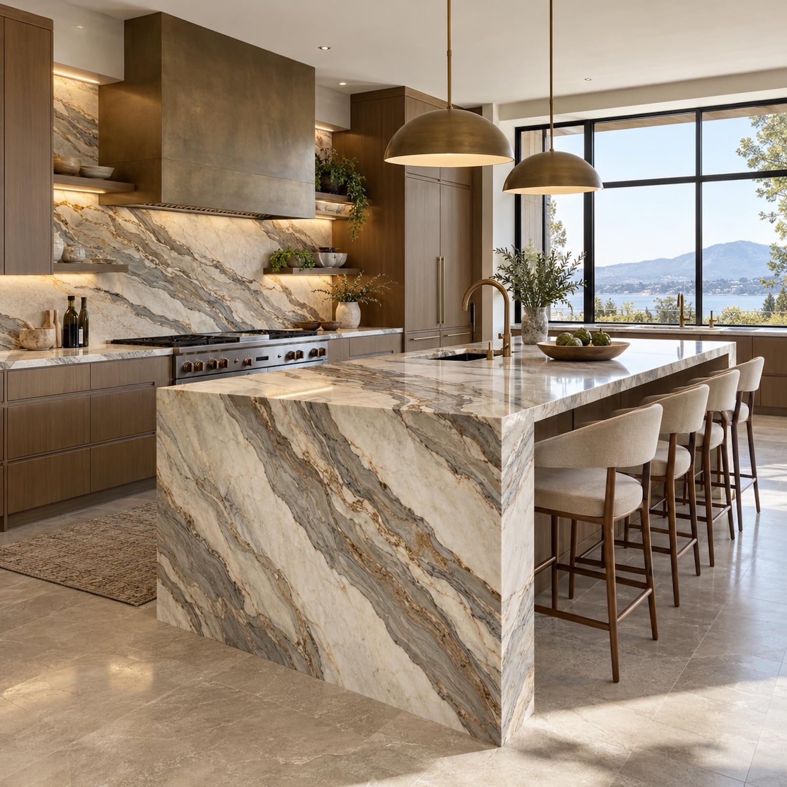
A countertop is not neutral scenery waiting for cabinetry to give it personality. Stone arrives with its own color story already embedded: cream, smoke, rust, violet, olive, gold, brown, blue-gray, sometimes several at once. Veining creates direction. A polished finish throws light and surrounding color back into the room. Honed stone softens that reflection. A waterfall edge turns the slab into architecture, and a thick mitered edge can make an island feel twice as visually substantial without adding an inch to its footprint.
In order to come up with the very specific design ideas, we create most designs with the assistance of state-of-the-art AI interior design software. Also, assume links that take you off the site are affiliate links such as links to Amazon. this means we may earn a commission if you buy something.
Then there are the surfaces that get ignored while everyone stares at cabinet samples. Flooring throws reflected color upward. Appliances occupy broad vertical blocks. Brass can look mellow beside one quartzite and startlingly yellow beside another. A large painted hood may carry as much visual weight as a bank of upper cabinets. Once those uppers disappear, wall color becomes architecture rather than background. Natural wood can warm a cool scheme without a drop of paint. Every finish is changing the finishes beside it.
That is why the order matters. Paint is extraordinarily flexible; stone, flooring, appliances, millwork, and tile are not. Choose the cabinet color first and every expensive material that follows has to flatter a decision that could have been changed for the price of a few sample pots. Choose the permanent surfaces first and the paint deck becomes useful rather than dangerous. The question stops being which green, white, navy, or greige looks best in isolation. It becomes which one makes the kitchen already taking shape look inevitable.
These 37 renovations follow that logic from undertone to edge profile, from daylight to hardware, from wall color to slab layout. Some pull a nearly invisible color from the stone. Others use contrast, restraint, mixed cabinetry, proportion, or carefully directed veining to decide where the eye should land. A few make the case for leaving good wood alone. The countertop does not always have to be the star, but it does have to be understood before the paintbrush starts making decisions for the rest of the room.
37. The Material Board That Catches Expensive Mistakes Before Installation
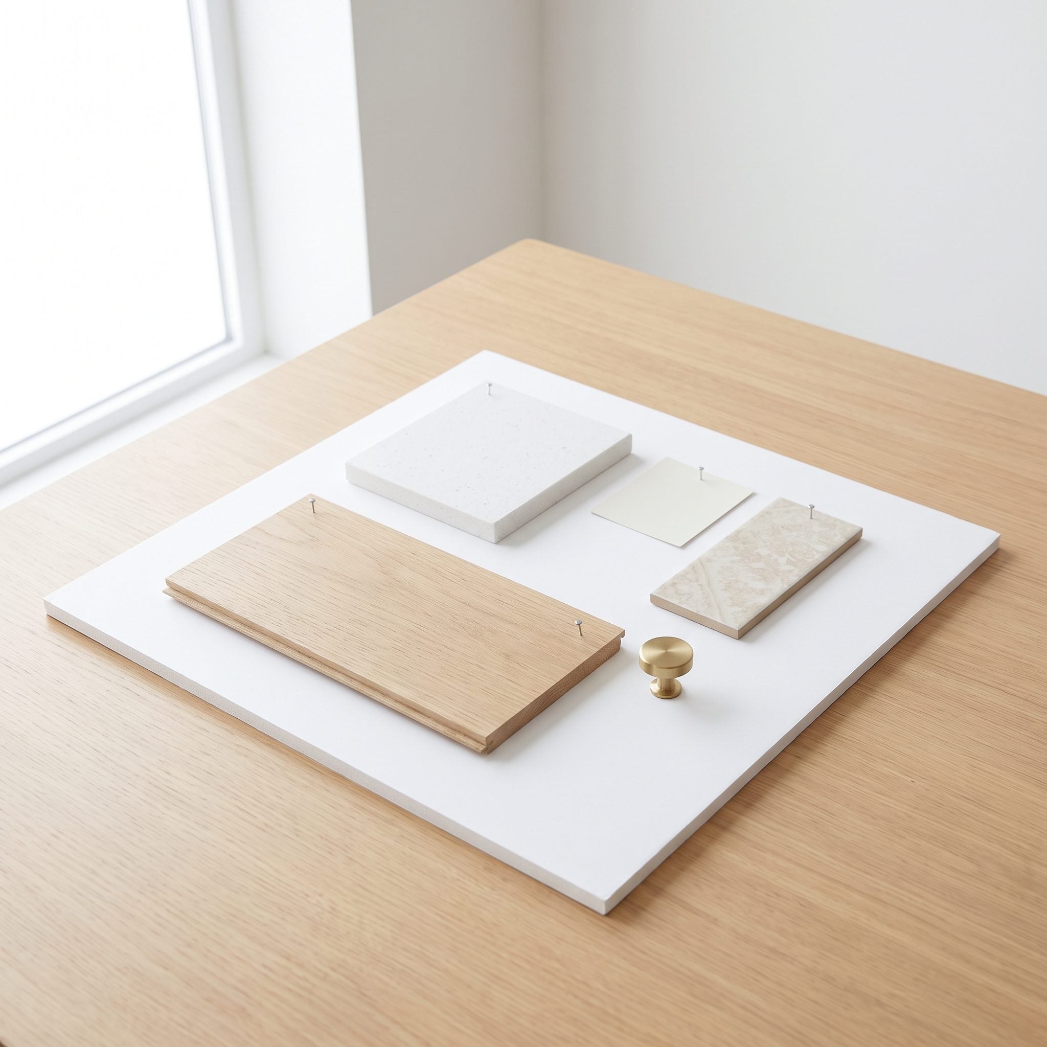
A sample board is a remarkably cheap way to discover that four individually beautiful finishes have no interest in living together. Quartz, cabinet finish, tile, metal, and paint all land on one surface where they can finally be judged as a group rather than as separate showroom crushes.
Here the quartz offcut sits beside the oak door and brass cabinet pull, with the paint chips filling in around them. The stone gets first position because it is the least flexible element. Everything easier to change has to earn its place beside it.
Try This: Keep physical samples together and move the board around the actual kitchen. Check it near the window, deeper in the room, and under the lights you use at night. Materials that looked identical in a showroom can separate quickly at home.
36. Pale Stone Disappears Until Dark Cabinetry Gives It an Edge
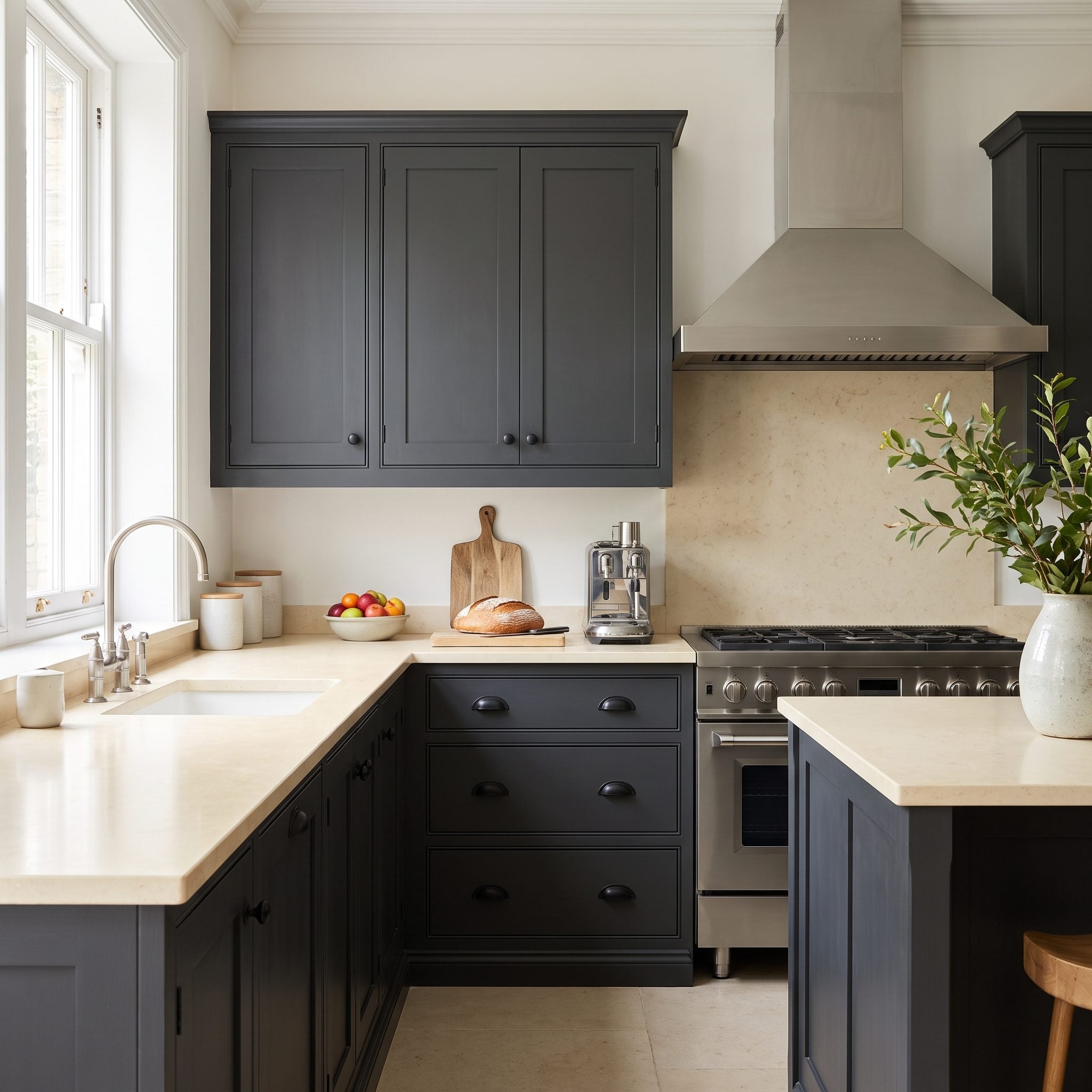
Pale stone over pale cabinetry can be beautifully restrained, but in this kitchen the countertop was disappearing into the surrounding surfaces. Charcoal below gives the white quartz a much sharper edge and makes the horizontal slab line part of the architecture.
The move is less about a rule that pale stone always needs contrast than about giving this particular slab enough separation to register. A full dark kitchen design can push that relationship even further when the room has enough light to support it.
35. A Tiny Countertop Sample Cannot Tell You What the Whole Slab Will Do
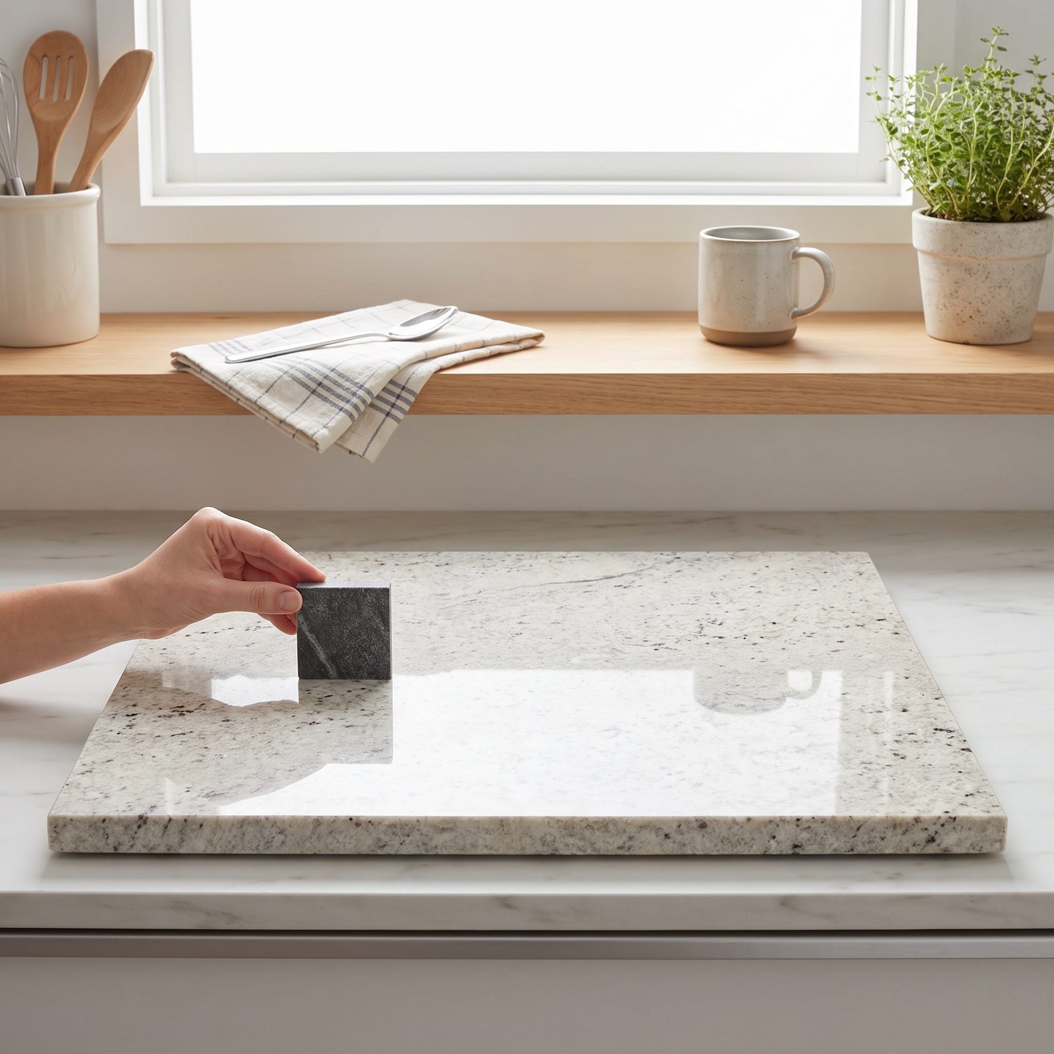
A small sample can show color and texture, but it cannot tell you what the rest of a heavily veined slab is planning to do. Natural stone can move from quiet to dramatic across a single piece, with veining that changes direction, density, and tone.
The whole slab matters before cabinet color is settled. Taupe appears in one area, cooler gray elsewhere, and the paint has to coexist with both rather than flattering only the prettiest six-inch section.
Worth Remembering: A countertop sample represents only a small portion of the final surface. With strongly patterned natural stone, viewing the actual slab is the best way to understand the full range of color and movement before coordinating the rest of the kitchen.
34. Deep Green Picks Up the Warmth Already Running Through the Stone
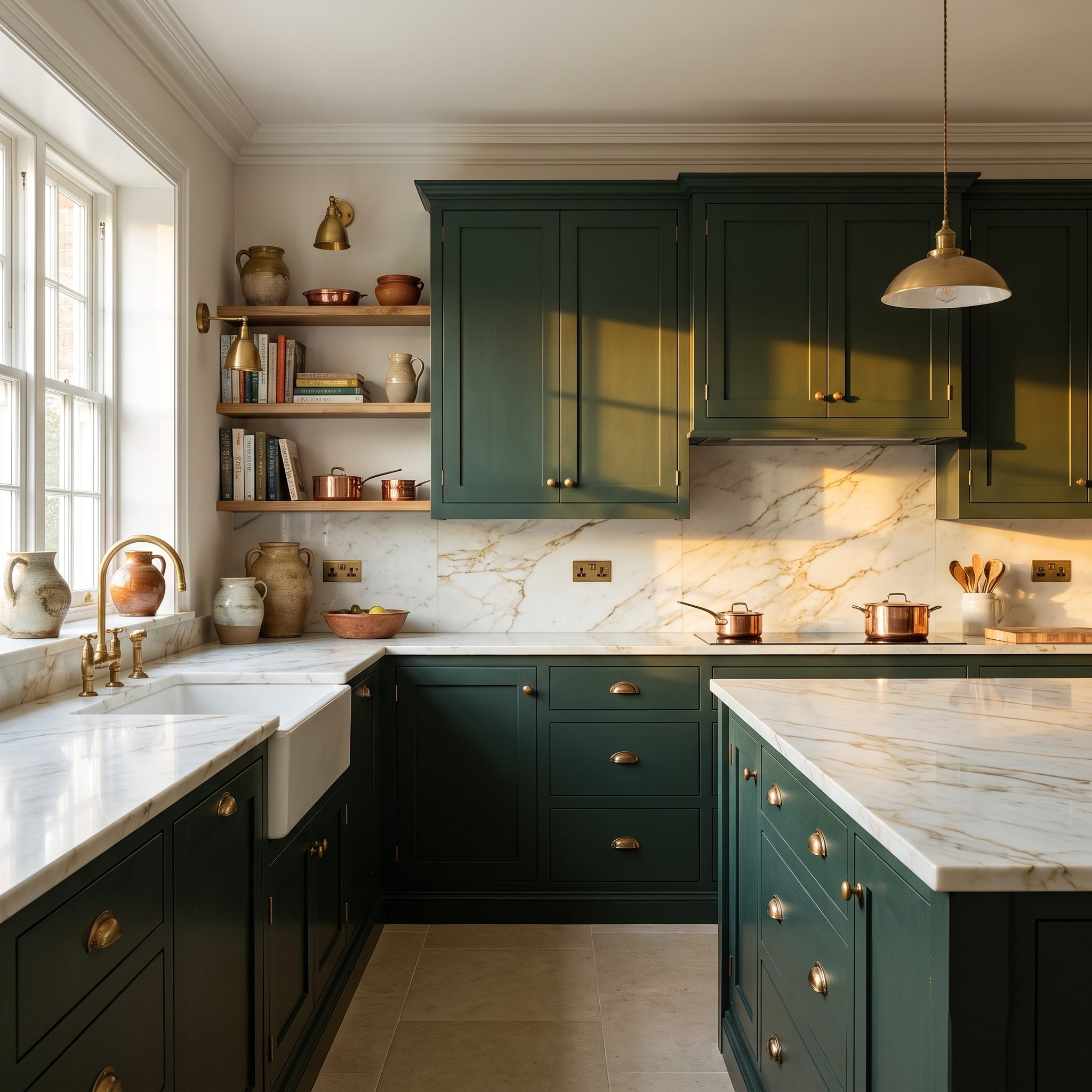
Deep green takes a completely different direction from another predictable neutral, and the gold running through this stone gives the color a warm counterpoint. The cabinetry is saturated, but the veining keeps sending little flashes of warmth back through the room.
Aged brass pulls sit naturally between those two materials, and a brass pendant light carries the same note overhead. Green does not require warm stone to work, but here that existing warmth is what makes the palette feel especially cohesive.
Color Detail: Deep green and warm gold create a richer combination than either would alone. The effect comes from repeating related warm notes across stone and metal rather than asking one finish to carry the entire room.
33. Warm White Works When the Stone Is Already Speaking Beige and Gold
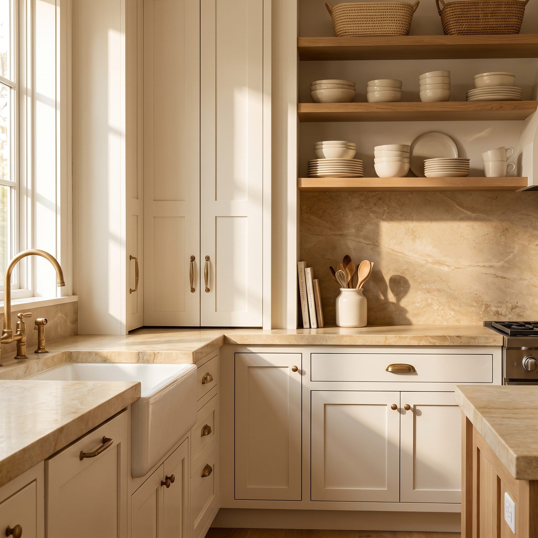
The stone carries beige and gold, so the cabinets went creamy rather than stark. Against those warmer undertones, the white still looks unmistakably white without making the countertop suddenly appear more yellow by comparison.
Warm whites sometimes get dismissed as dated because they are confused with old almond cabinetry. A good warm white is subtler than that. The unlacquered brass faucet and gold veining reinforce the warmth without pushing the room toward beige.
Style Tip: Compare several warm whites directly beside the stone. Check them again as the natural light changes, because a white that appears balanced at midday may shift noticeably later in the day.
32. Walnut Can Warm a Cool Stone Kitchen Without Repainting Anything
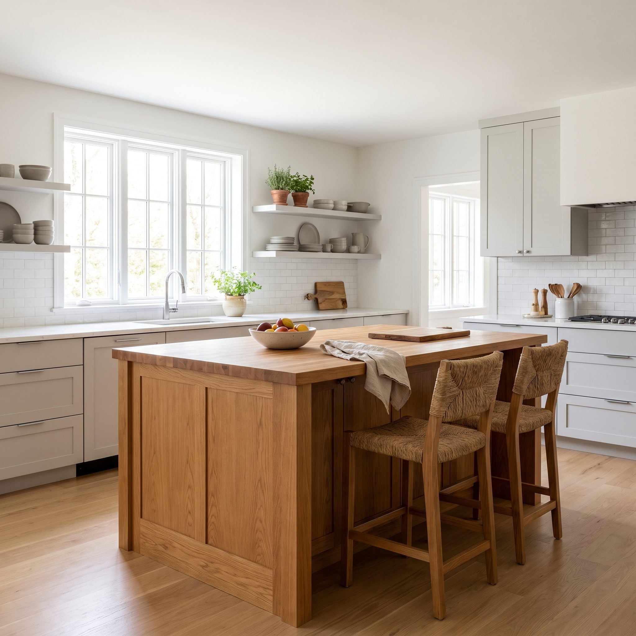
Cool gray stone with white cabinetry can become a little chilly when every major surface stays in the same temperature range. Instead of repainting the perimeter, this kitchen introduces walnut at the island.
The walnut is the thermostat for the room. Grain and natural warmth interrupt the white-and-gray scheme without making the kitchen rustic, while the stone keeps the wood looking crisp. Rattan counter stools extend that natural note. The same approach works especially well in open kitchen inspiration where the island needs to relate to furniture beyond the kitchen.
31. Cool Stone Gives Navy Cabinets a Completely Different Starting Point
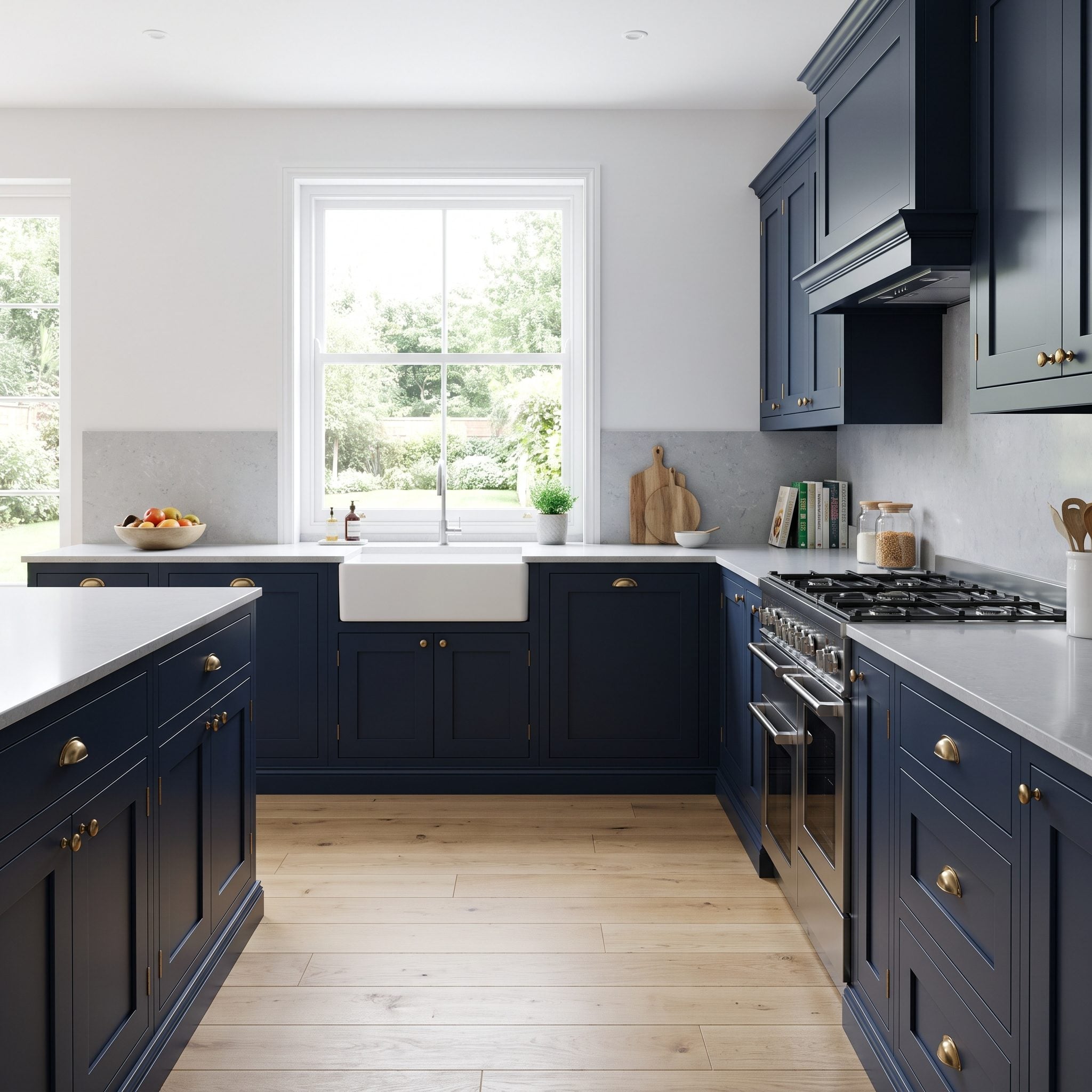
The countertop here stays firmly on the cool side: crisp gray veining, little visible gold, and none of the creamy warmth that might pull a blue cabinet in another direction. Navy therefore feels like an extension of the palette rather than a separate color event.
Chrome hardware reinforces that cooler framework. Brass could create an attractive contrast too, but polished silver keeps this particular scheme tighter and more monochromatic. The important decision was not that navy is universally right for cool stone; it was recognizing what this slab was already doing before choosing the paint.
30. Sometimes the New Countertop Is the Best Argument Against Painting the Wood
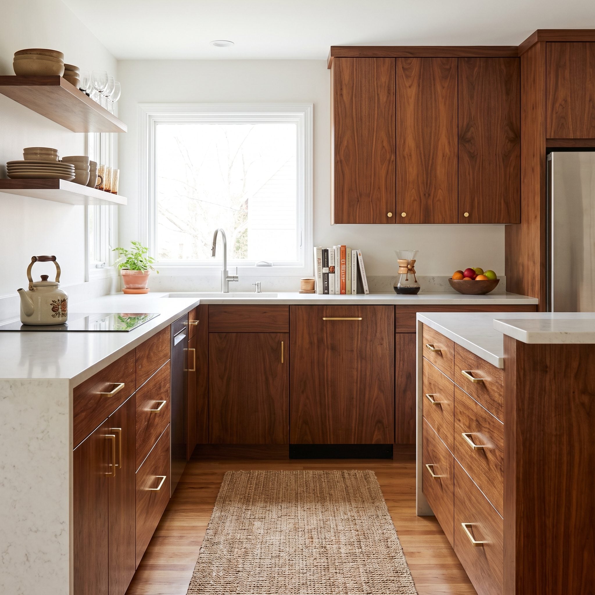
The wood looks like an obvious paint candidate until creamy quartz enters the palette. Suddenly the gold flecks in the surface begin relating to the grain, and what looked tired starts looking potentially useful again.
Stripping and refinishing the wood to a cleaner honey tone preserves a warmth that paint would remove. The gold in the quartz, honey in the grain, and brushed brass hardware build a three-part palette from materials already inclined to cooperate.
Editor’s Note: Solid wood should not be painted automatically just because it looks dated in isolation. A new countertop can change the context enough that refinishing becomes the stronger move.
29. Busy Granite Looks Different Beside a Softer Off-White
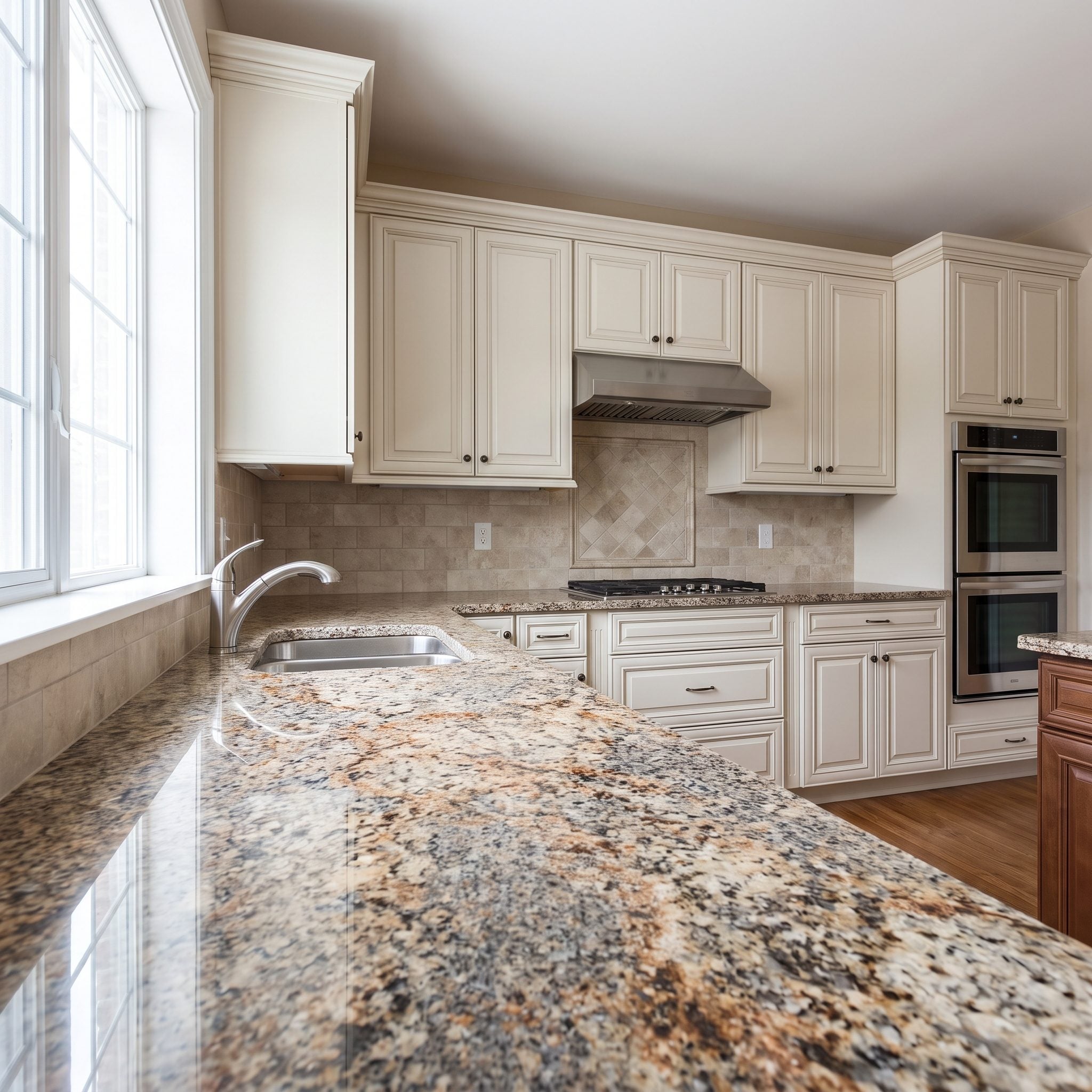
Busy granite is still sitting in plenty of kitchens, and replacing it is not always the priority. A stark white beside all those brown, cream, and gold flecks can exaggerate every bit of movement in the slab.
This softer off-white lowers the contrast and lets the granite settle into the room. Oil-rubbed bronze hardware picks up the darker notes in the stone, making an existing countertop feel far more integrated without pretending it has become a different material.
28. Mixed Cabinet Materials Go Far Beyond a Contrasting Island
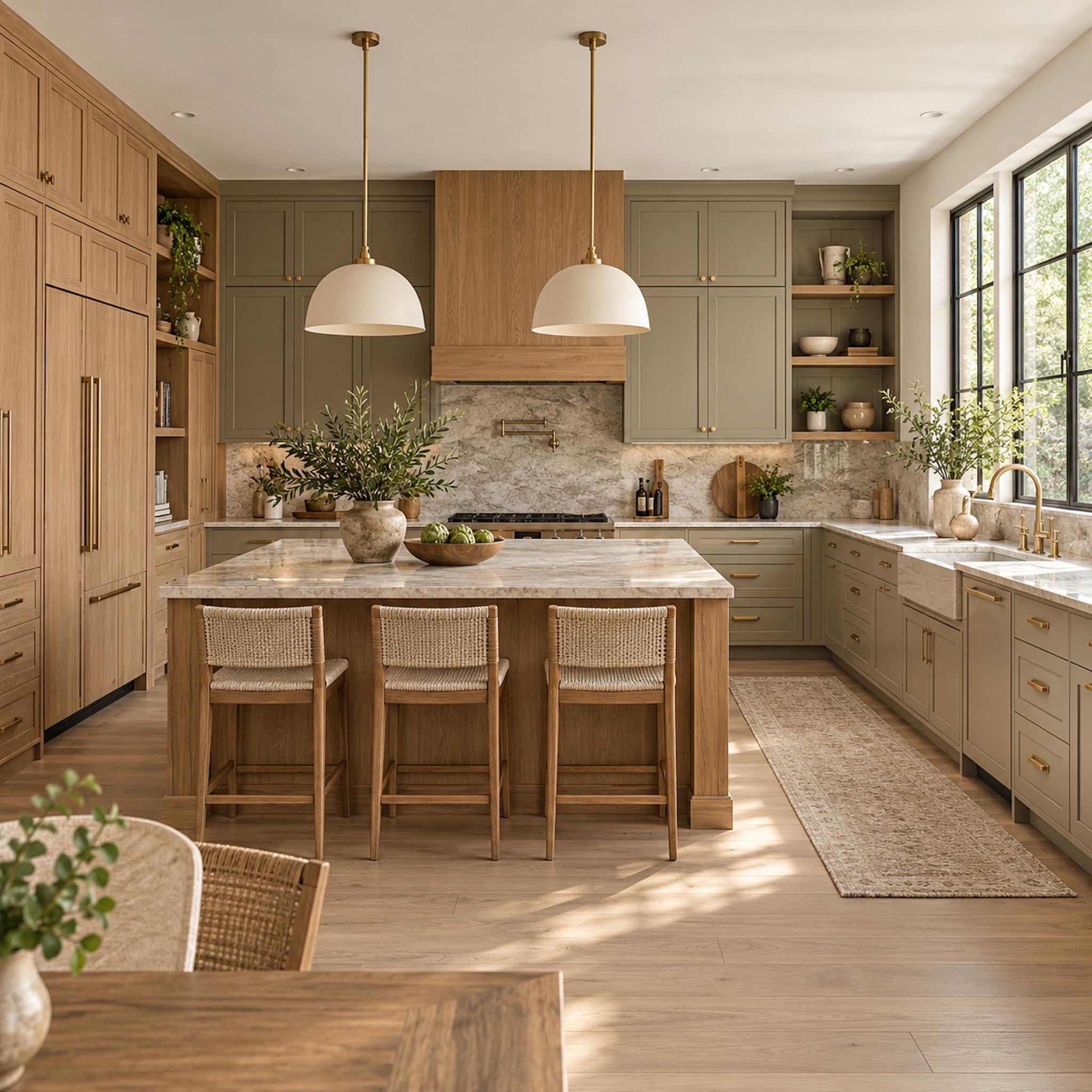
Two-tone kitchens often put every ounce of contrast on the island: one color around the perimeter, another in the middle, job finished. Here the material change is distributed through the architecture instead. Painted taupe cabinetry handles much of the working perimeter while natural oak appears in the tall storage, open shelving, hood surround, and island.
That distribution matters because wood now reads as part of the cabinet composition rather than as an accent object parked in the center. Pale stone crosses both materials and becomes the common horizontal element, while brass hardware gives painted and natural cabinetry one repeated detail.
Design Detail: Mixed cabinetry feels more architectural when the material changes correspond to functions or volumes — a tall storage bank, hood, island, pantry wall — instead of appearing as isolated patches of contrast.
27. Paint Samples Belong Beside the Countertop, Not Across the Room
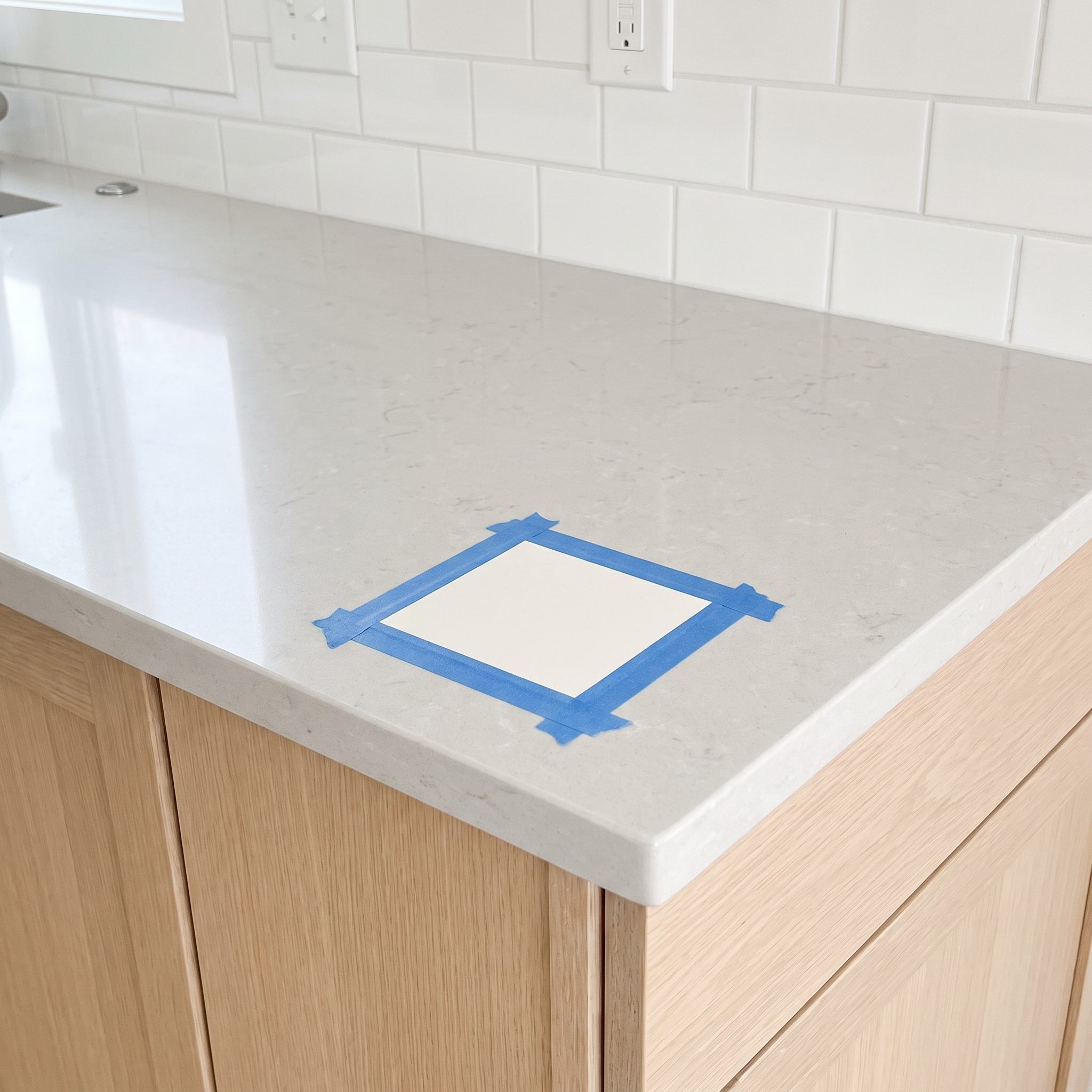
A paint chip floating on a white wall tells you surprisingly little about what that color will do beside stone. Undertones become much easier to see when the materials actually touch.
Here the swatches sit directly beneath the granite, where gold flecks pull one greige warmer and cooler gray areas change the way the dark green appears. Side-by-side comparison exposes relationships that distance tends to blur.
26. Bold Cabinets Work Better When the Countertop Knows When to Be Quiet
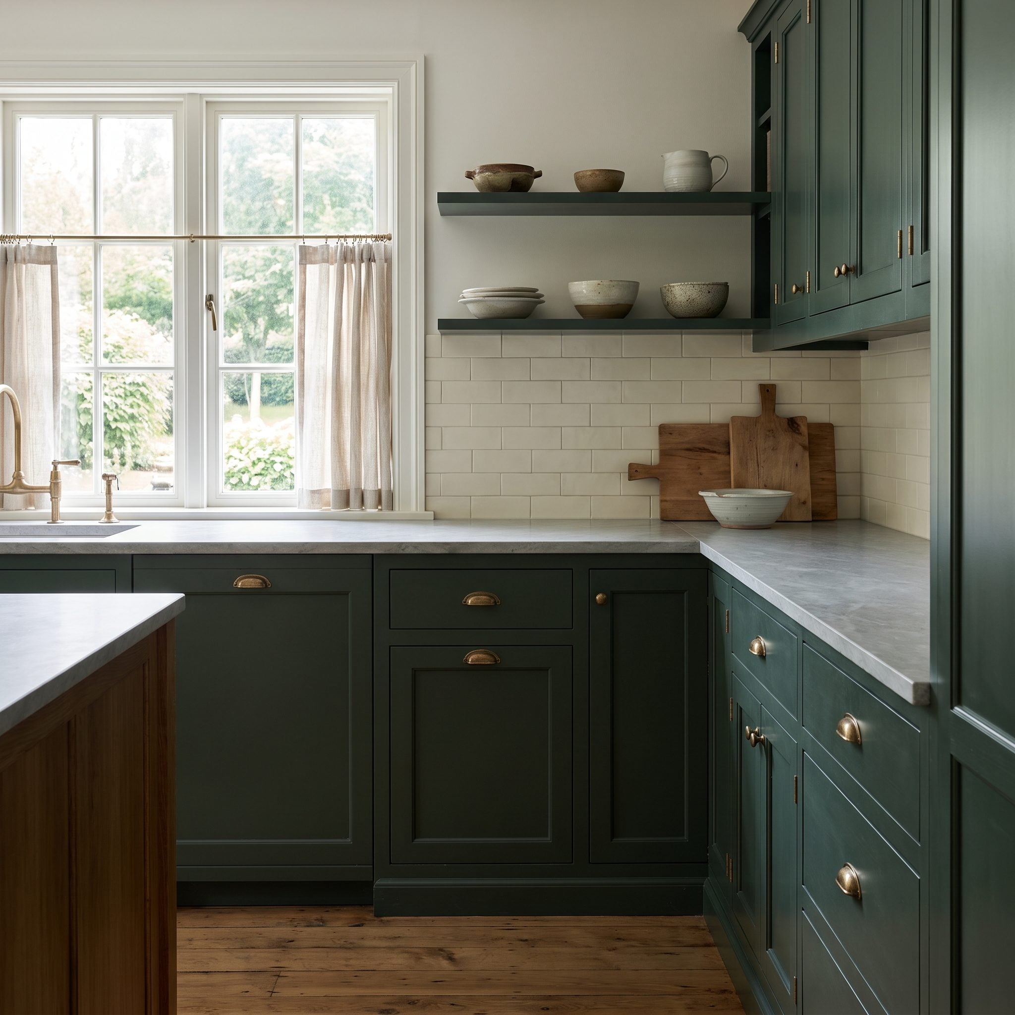
Forest green already gives this kitchen a strong identity, so the countertop takes the quieter role. Pale quartz with restrained gray veining provides enough variation to avoid looking blank without trying to become a second focal point.
The dark kitchen design gains most of its character from color, while brass hardware introduces warmth in smaller doses. The countertop is still important; it simply does not need to be the loudest surface.
Why It Works: Strong cabinet color and quiet stone create hierarchy. One defines the room from a distance while the other adds detail only when you get closer.
25. The Floor Gets a Vote in the Cabinet-Paint Decision
🔥 Would you like to save this?
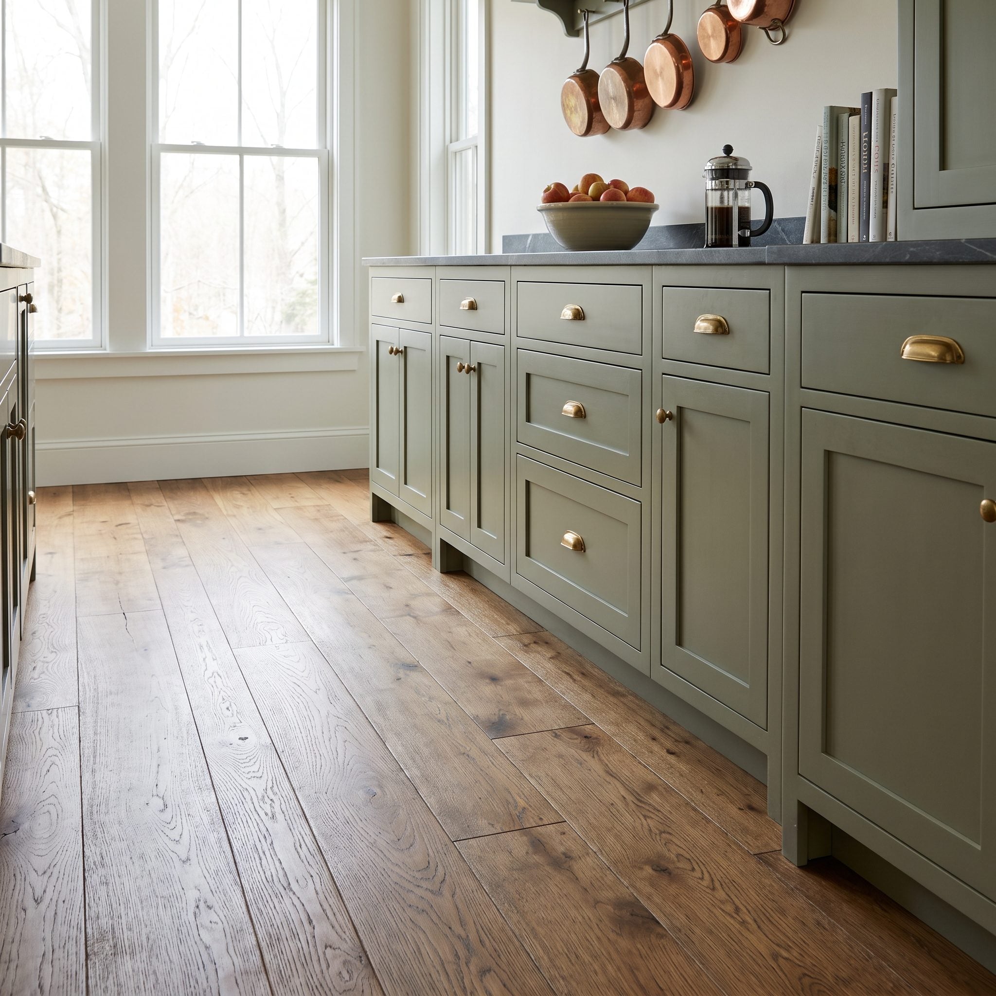
It is easy to stand at counter height comparing paint and stone while forgetting one of the largest visible surfaces in the kitchen. Flooring throws color and reflected light through the entire lower half of the room whether it is part of the renovation or not.
Putting floor, counter, and swatch into the same view changes the cabinet-color decision. Honey oak adds a strong warm note, so the final paint needs to relate to both the countertop and everything happening underfoot.
Three surfaces, one decision. Ignore one and the other two rarely rescue it.
24. When the Stone Is This Dramatic, the Cabinets Need to Recede
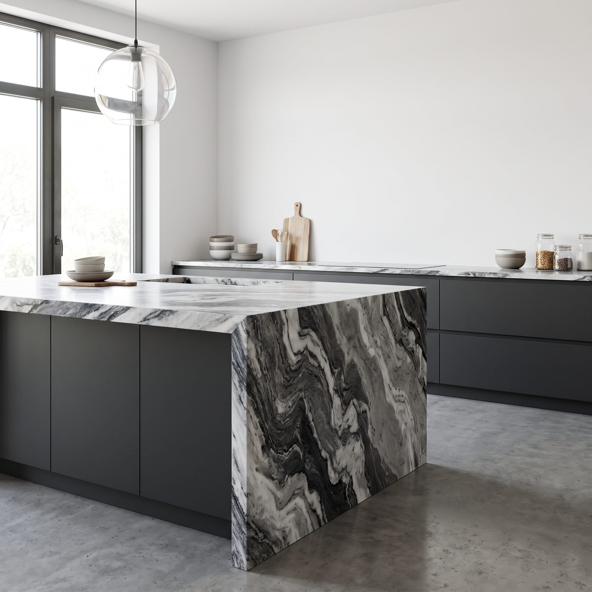
This marble does not need help attracting attention. Black-and-white veining tears across the waterfall island, so the cabinetry stays soft white, matte, and almost architectural around it.
The restraint is what makes the stone legible. Add another saturated cabinet color or heavily patterned backsplash and the veining becomes one event among several. Here the surrounding surfaces function more like a frame, giving the slab enough quiet space to be seen properly.
23. Natural Oak Gives Heavily Veined Stone Somewhere to Rest

The marble is already carrying most of the visual movement in this kitchen. Rather than adding another strong painted color, the cabinets stay oak and let their relatively regular grain provide a calmer backdrop.
Natural wood and heavily veined stone are both patterned materials, but their patterns behave differently. The stone is irregular and dramatic; the wood is repetitive and quieter. Matte black hardware gives the oak a sharper edge without competing with the slab.
Why It Works: A room can handle multiple materials when they do not all demand the same level of attention. Here the stone carries the drama while the oak contributes texture and warmth at a much lower volume.
22. Appliance Finish Can Change the Cabinet Color Around It
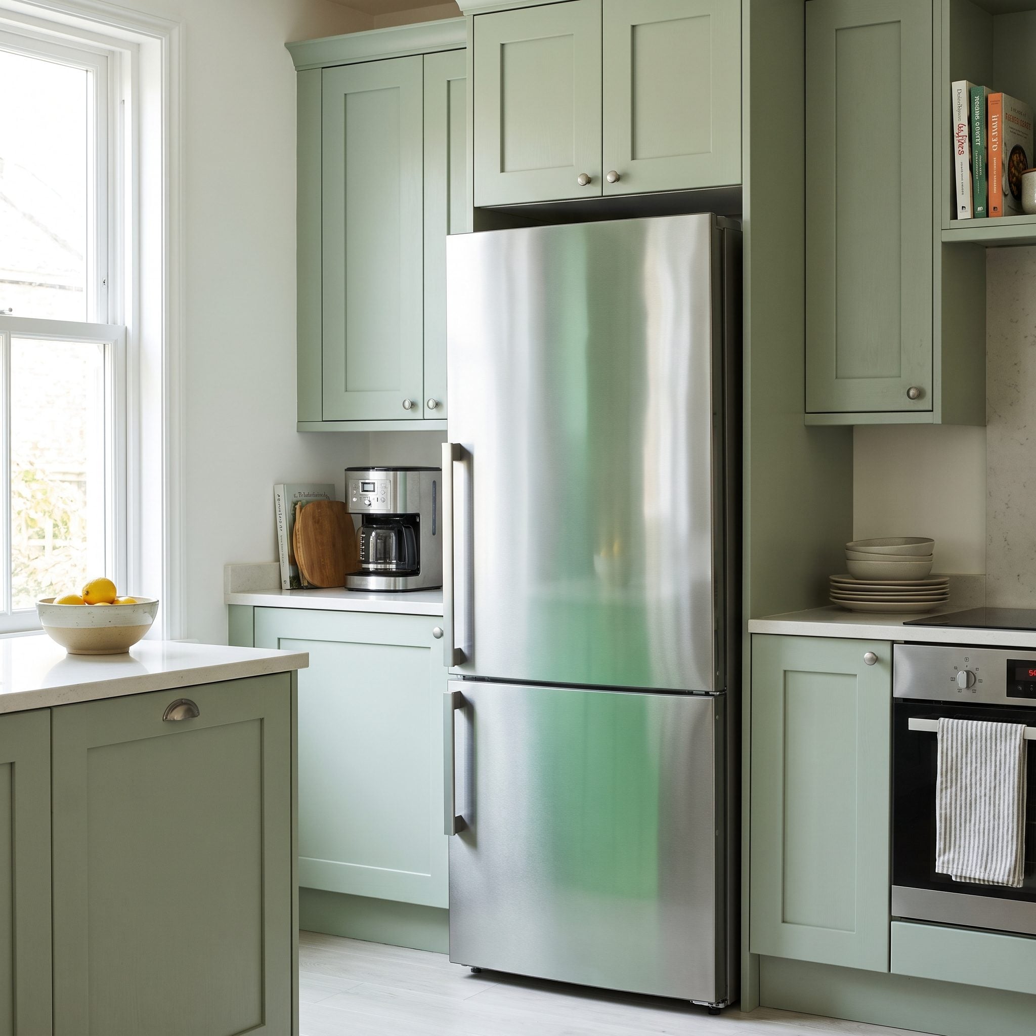
A cabinet color can look perfect in isolation and very different once a refrigerator, range, and dishwasher occupy a large stretch of the elevation. Appliances are too visually substantial to be treated as an afterthought.
With a black range and refrigerator already occupying large vertical blocks, slate blue becomes part of the same cool, dark framework rather than forcing the appliances against an unrelated palette. The result feels coordinated without trying to make the machines disappear.
Worth Remembering: A refrigerator and range occupy a substantial amount of visible vertical space in many kitchens. Their finish is part of the color scheme whether or not it appears on the paint board.
21. Wall Paint Becomes Architecture When the Upper Cabinets Disappear
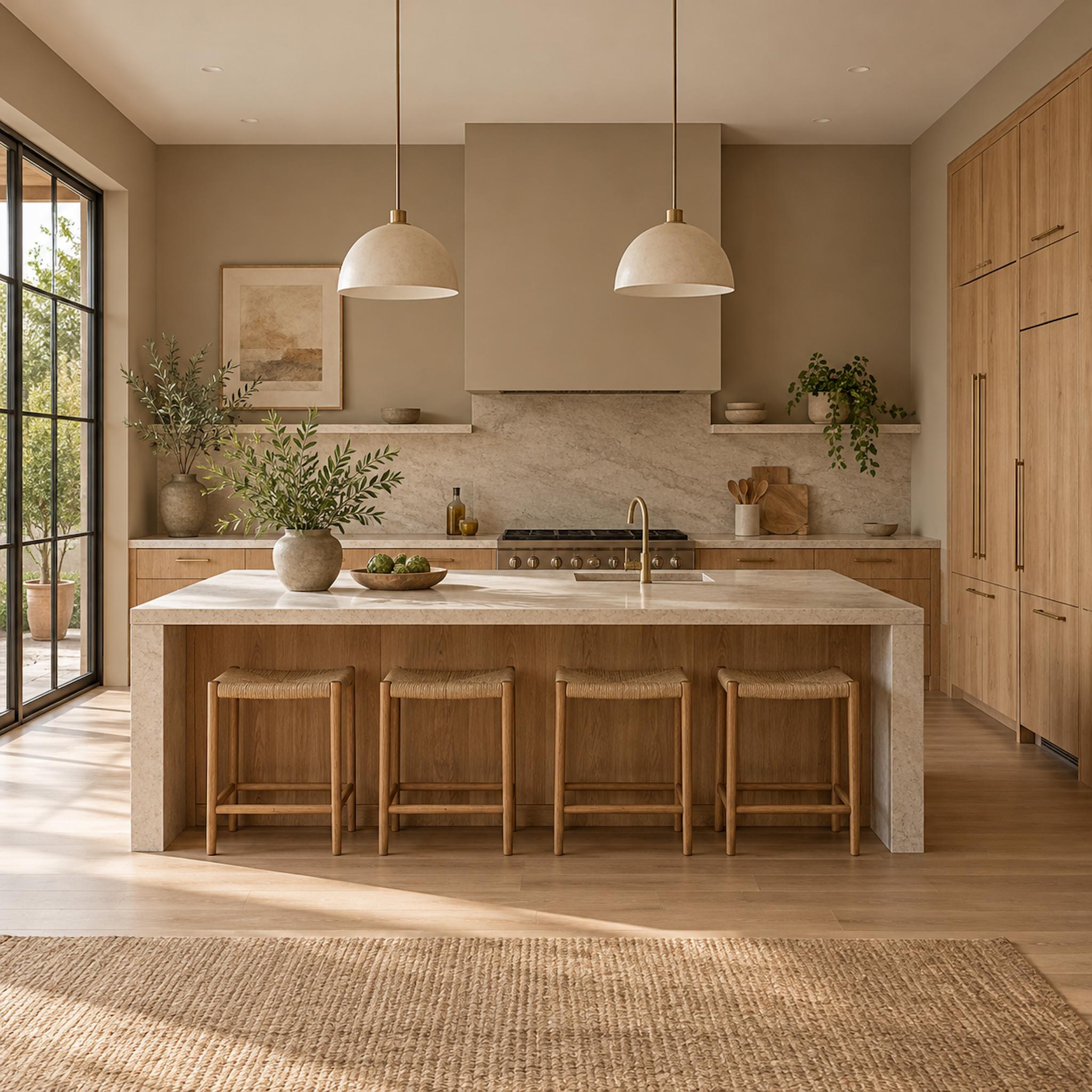
Remove a run of upper cabinets and wall paint suddenly stops being a sliver around the edges. In this kitchen it occupies broad uninterrupted planes around the range hood, open shelving, windows, and tall oak cabinetry. That much color has enough visual mass to alter how every nearby finish reads.
The warm mushroom tone sits close enough to the wood to keep the tall cabinetry connected, yet far enough from the pale stone to preserve a clean horizontal break at the backsplash and island. Painting these walls cool white would produce an entirely different relationship even if the cabinets and countertop never changed.
Why It Matters: Kitchens with fewer upper cabinets often expose much more wall area than traditional layouts. That wall becomes a major vertical material field and should be sampled beside the cabinetry and stone rather than chosen afterward.
20. Let the Countertop and Cabinets Settle the Backsplash Question
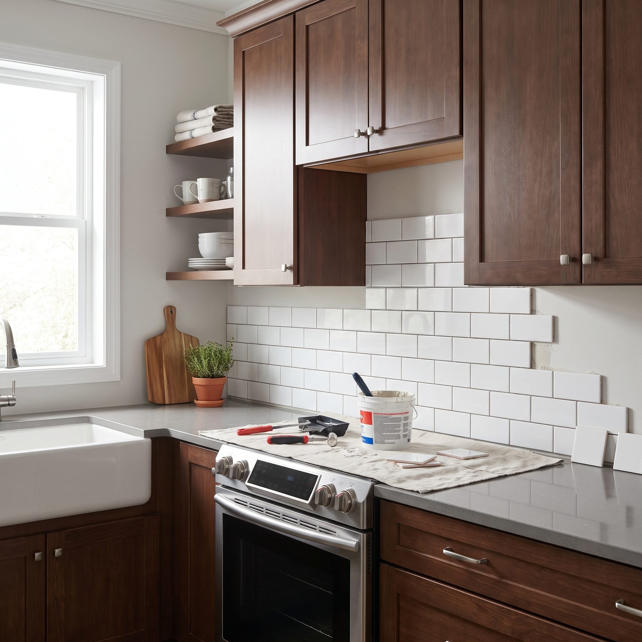
The backsplash is the last voice in this room, not the opening argument. Cabinets and countertop establish the dominant material relationship first; tile responds once that pairing is already clear.
This open kitchen inspiration settled on forest green cabinets and marble-look quartz before considering tile. White zellige and a brass faucet then have a much simpler job: support what is already working rather than rescue a disconnected palette.
19. Brass Has Undertones Too — Put It Beside the Stone Before Ordering
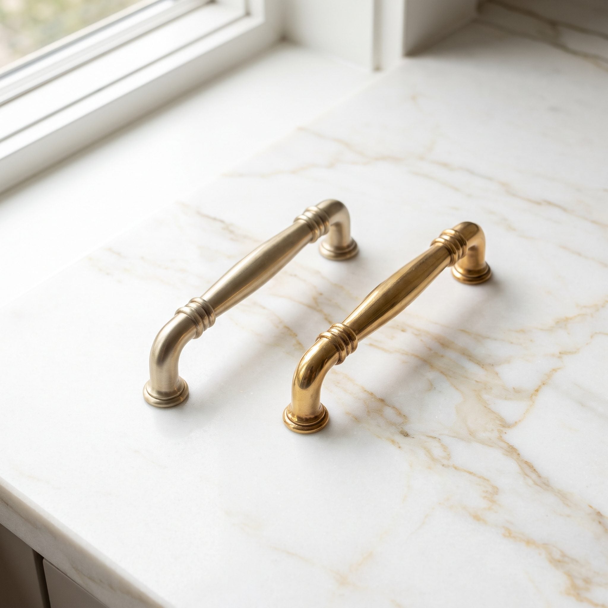
Brass is not one fixed color. Some finishes are brighter and yellower; others are muted, brown, rosy, or heavily aged. Stone varies just as much, which makes direct comparison far more useful than ordering from a product photo.
This quartzite carries golden-brown veining, so an antique brass finish repeats that warmth without looking overly polished. Setting an actual knob on the slab makes the relationship visible before dozens of identical pieces arrive in boxes.
18. The Range Hood Became a Color Block Between the Cabinets and Stone
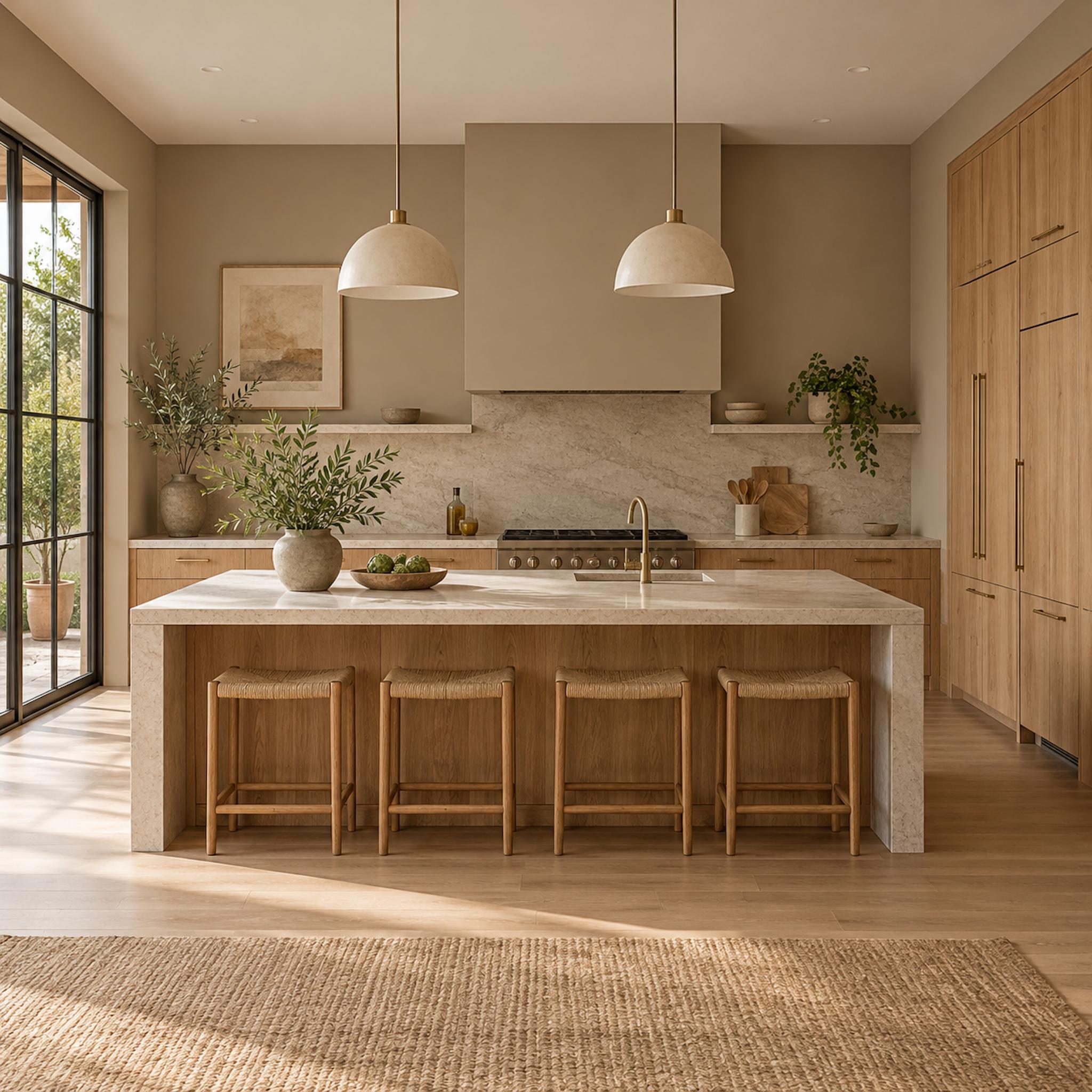
A large plastered or painted hood does not disappear just because it contains no storage. In this kitchen, the mushroom-taupe hood occupies enough wall area to become one of the dominant color blocks in the room, sitting directly above pale stone and beside much lighter cabinetry.
Matching it exactly to the cream cabinets would flatten the range wall; taking it dramatically darker would pull much more visual weight upward. The muted brown-gray gives the stone a warmer frame while relating back to the oak island across the room. Once a hood reaches this scale, its finish belongs on the material board with the cabinets, stone, flooring, and hardware.
Design Detail: Treat an oversized hood surround like cabinetry when testing color. Its vertical mass can change how the backsplash and countertop read even though it contains no storage at all.
17. Warm Oak Floors Can Turn Cool Cabinet Paint Even Cooler
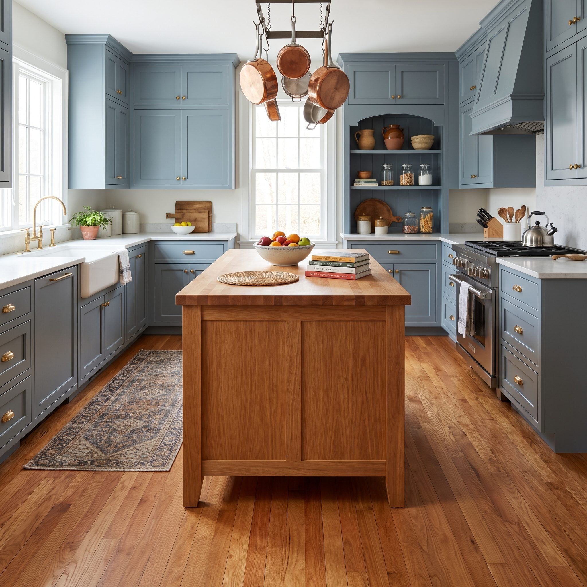
Warm red-toned oak can make a cool blue-gray cabinet look considerably cooler once the two sit together. Neither color is inherently wrong; the contrast simply becomes much stronger than it appears when each is viewed alone.
A shift toward warm greige changes that relationship. The move is subtle rather than theatrical, but it gives the floor and cabinets enough shared warmth to stop pulling in opposite directions.
Color Detail: Undertones become easiest to spot where two large surfaces meet. If a floor suddenly makes a cabinet sample look much bluer, pinker, greener, or yellower than expected, compare nearby warmer and cooler alternatives before committing.
16. Hardware Comes Last for a Reason
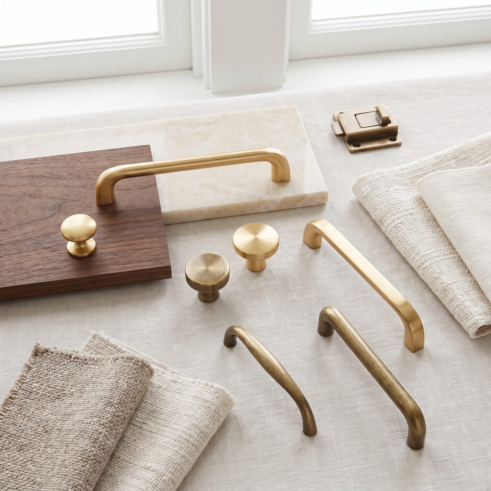
Hardware may be small, but dozens of repeated handles can shift the character of an entire kitchen. Choosing them after cabinet color, countertop, and backsplash gives the finish something concrete to respond to.
These brass cup pulls sit against greige and cream only after the big decisions are settled. Warm metal adds definition without forcing the room to reorganize itself around a handful of knobs.
Pro Tip: Buy one or two hardware finalists before ordering the full set and hold them against an actual cabinet door. Metal finishes that appear nearly identical online can look quite different beside a specific paint color.
15. A Contrasting Island Works Better After the Rest of the Palette Is Settled
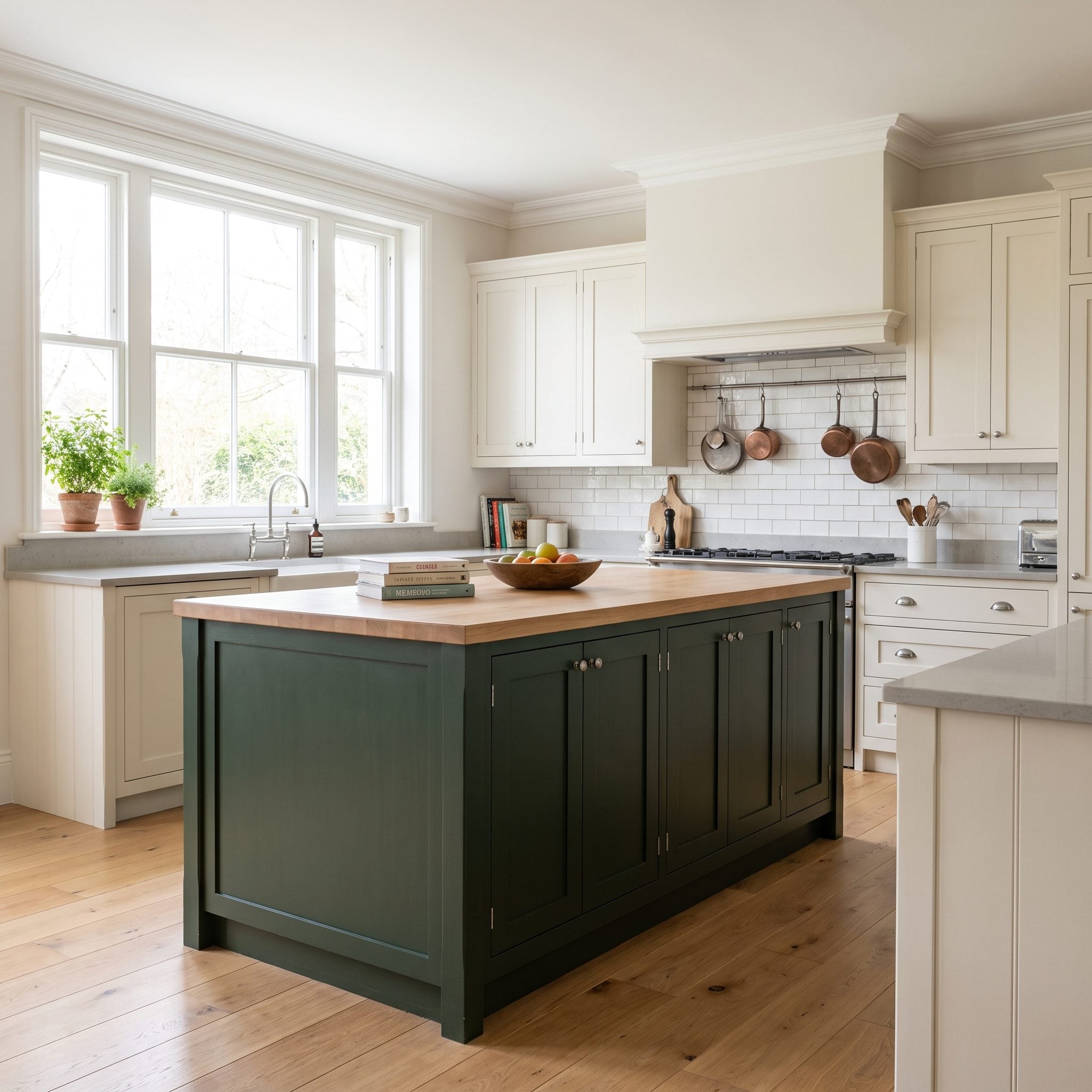
A contrasting island can give a kitchen a useful second color, but it works better when that color is chosen in response to the finished palette rather than invented in isolation.
Once the cream perimeter and white quartz are established, navy gives the island enough distinction without disconnecting it from the room. A walnut top warms the blue, while brass pendants repeat that warmth above. The open kitchen inspiration gallery shows how useful that island distinction can become when the kitchen shares sightlines with another room.
14. The Same Cabinet Color at 9 A.M., 3 P.M., and After Dark
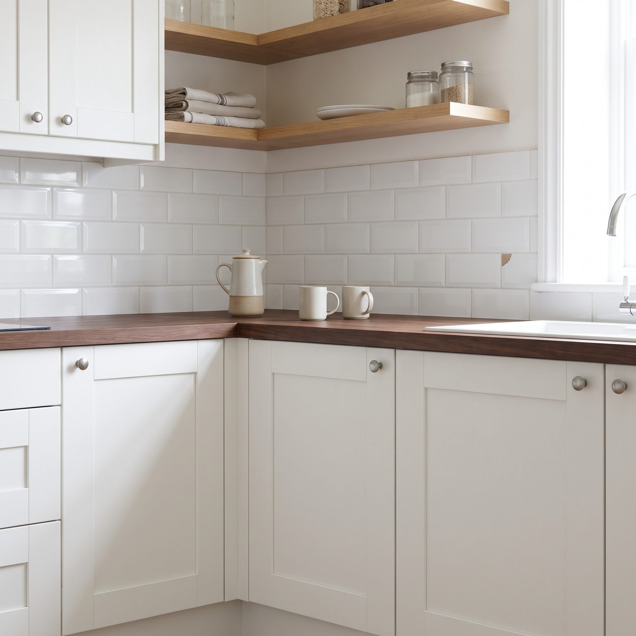
Daylight does not hold still. Its color and intensity change with window orientation, weather, season, time of day, and whatever surfaces are reflecting light back into the room.
Leaving the sage sample in place through the day reveals those changes. The color looks cooler under some conditions and warmer under others, which matters far more than whether it looked perfect during the ten minutes spent choosing it.
Why It Works: A cabinet color needs to survive the light the kitchen actually receives, not one ideal moment. Check finalists at several points during the day before ordering paint for an entire room.
13. A Busy Countertop Does Not Need a Busy Backsplash
🔥 Would you like to save this?
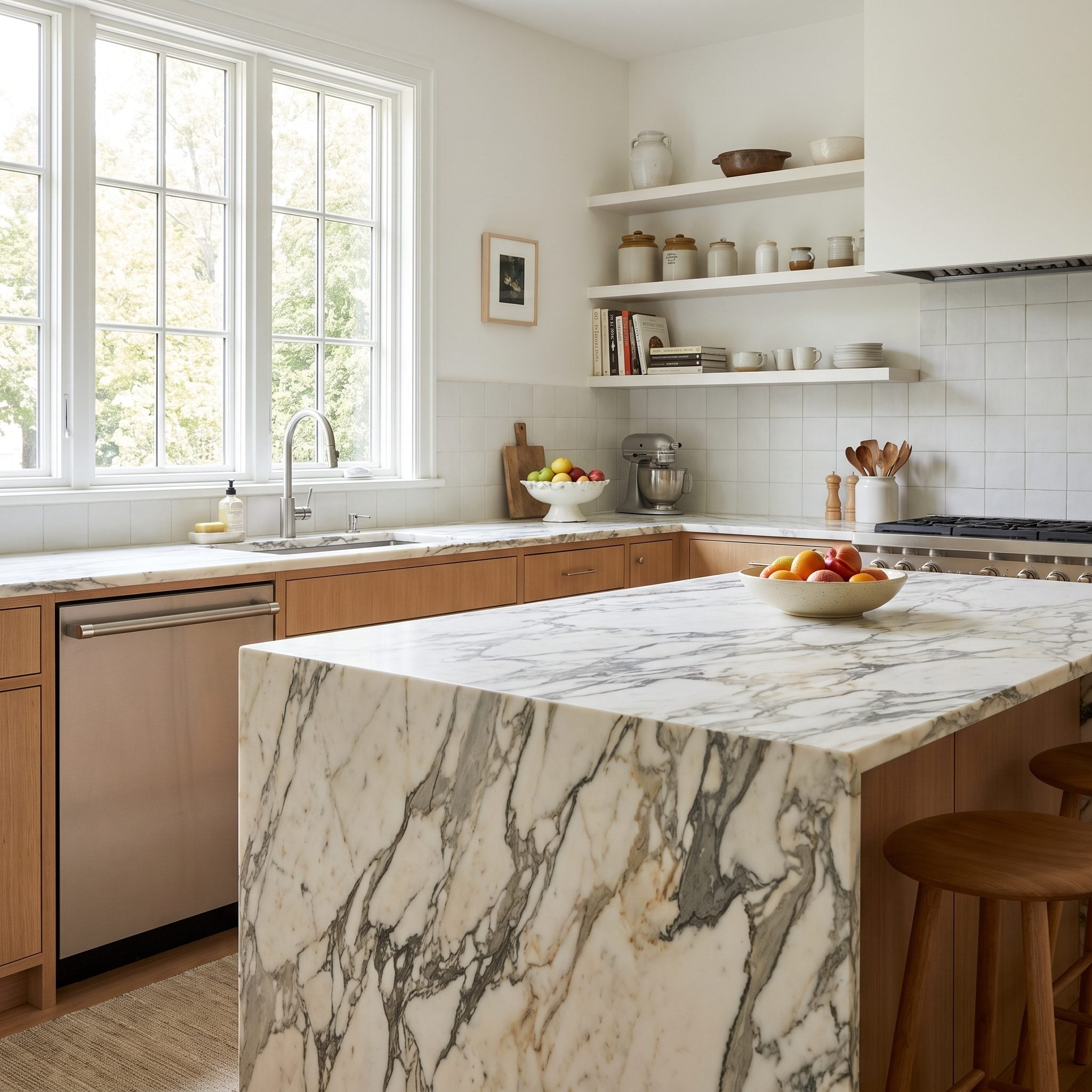
One loud thing per wall is not a law, but it is a useful warning when the countertop already has this much motion. Dramatic quartzite carries pattern, direction, and contrast before tile even enters the conversation.
Plain white subway tile gives that movement somewhere to stop. A second heavily patterned surface could work in the right room, but here restraint makes the countertop easier to appreciate rather than forcing two unrelated patterns into equal billing.
12. How Thick Can the Countertop Get Before the Cabinets Start Looking Too Small?
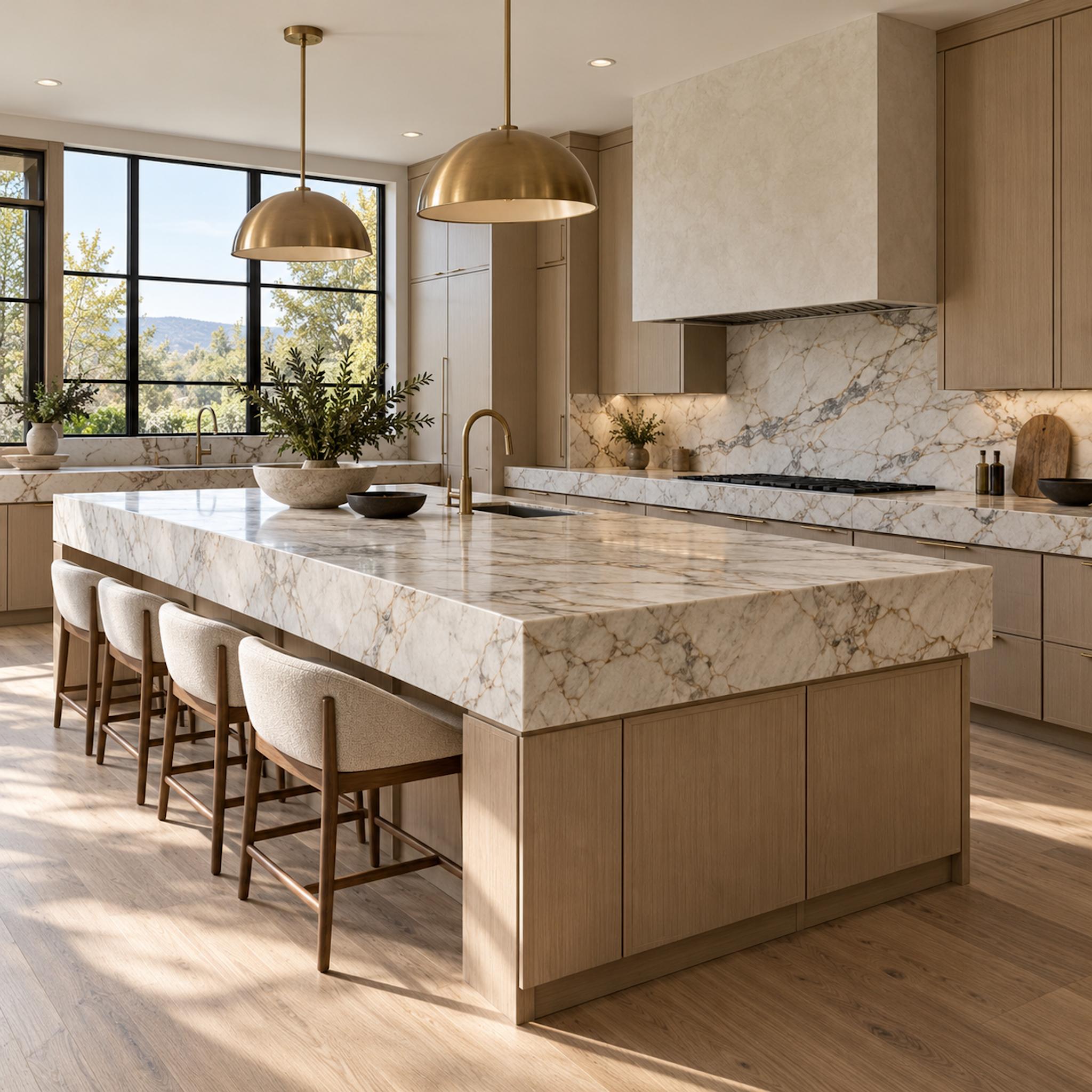
The edge of this island is doing almost as much visual work as the stone pattern. A deep mitered apron turns the countertop into a strong horizontal band, making the island feel lower, heavier, and more monolithic than the same slab would with a thin conventional edge.
That weight has to make sense against the cabinetry below it. Here broad flat wood fronts and a large island footprint are substantial enough to support the thick stone without looking crushed beneath it. Put the same oversized edge over delicate narrow doors or a much smaller island and the proportion could become top-heavy fast.
Design Detail: Countertop thickness is not simply an upgrade from thin to thick. Edge profile, cabinet scale, island length, overhang, and material pattern all determine whether a heavier slab looks architectural or merely oversized.
11. Five Whites, Five Different Undertones — Only One Works With the Stone
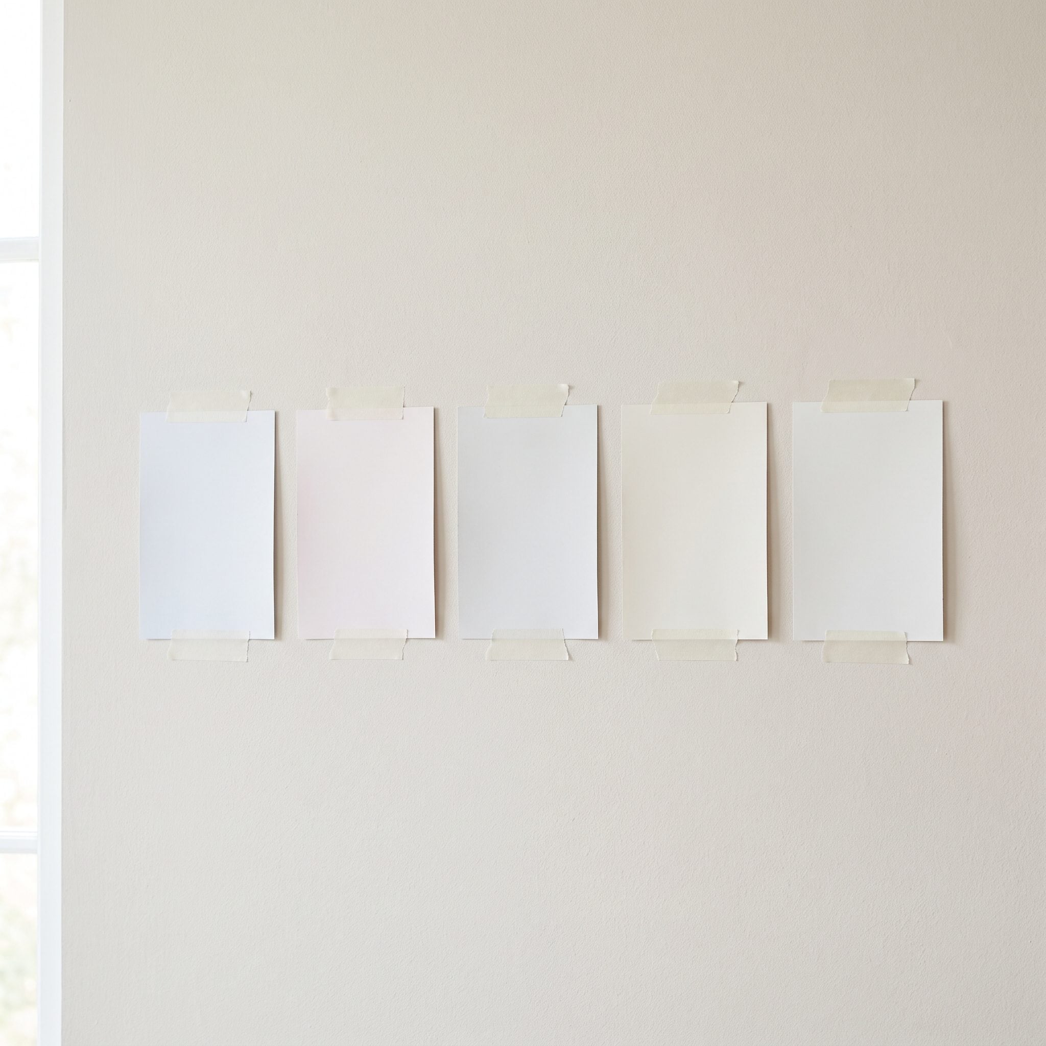
White only looks like one color until several versions are lined up beside each other. Then blue, yellow, pink, gray, and green undertones begin announcing themselves with surprising confidence.
Against quartz, those differences become even easier to see. The strongest choice is the white that stays quiet beside the stone — not necessarily the brightest sample in the deck, but the one that does not make either surface look strangely tinted.
The best white is not necessarily the whitest one. It is the one that makes sense beside the materials already in the room.
10. Repeat the Appliance Metal Elsewhere and Stainless Stops Looking Accidental
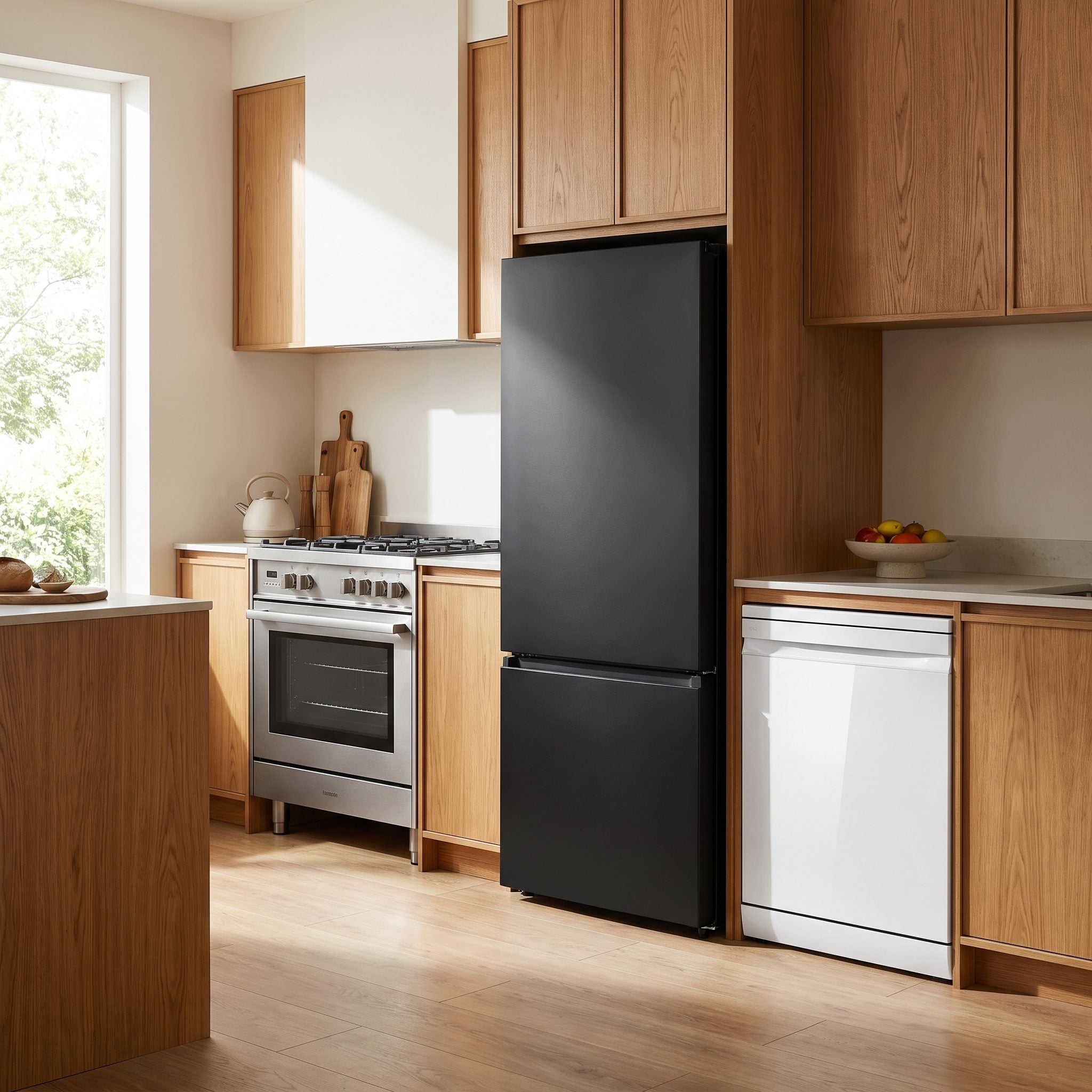
Stainless does not politely disappear once the cabinetry is installed. A refrigerator and range can introduce a broad field of cool silver into an otherwise warm kitchen, and leaving that metal completely isolated makes the contrast more noticeable.
Repeating the stainless finish through polished nickel pulls and a stainless faucet turns the appliance finish into part of the palette. The refrigerator and range become one instance of a recurring metal note rather than isolated industrial objects interrupting an otherwise warm-white room.
9. A Cabinet Door Tells You More Than a Two-Inch Paint Swatch
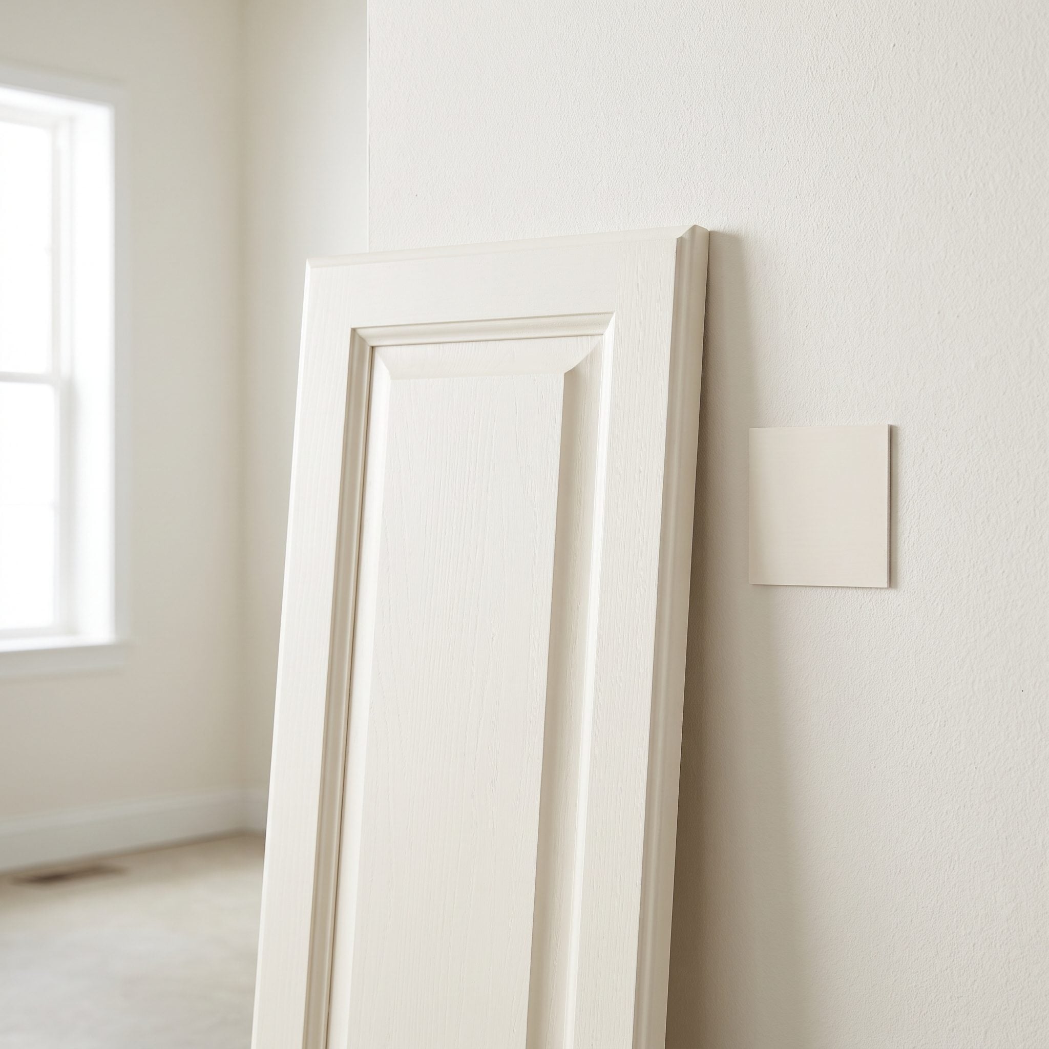
Cabinet paint is seen across flat rails, recessed panels, edges, and corners rather than one small patch of drywall. Substrate, sheen, angle, shadow, and reflected light all affect how the finished color appears.
Painting finalists onto a spare cabinet door makes it possible to move the samples around the kitchen. Near the window, beside the refrigerator, under an upper cabinet, and into the darker end of the room, the same color has to prove itself in every condition where it will eventually live.
A cabinet color has to work in the darkest corner as well as it works beside the window.
8. One Cabinet Color Gives a Busy Quartzite Room to Move
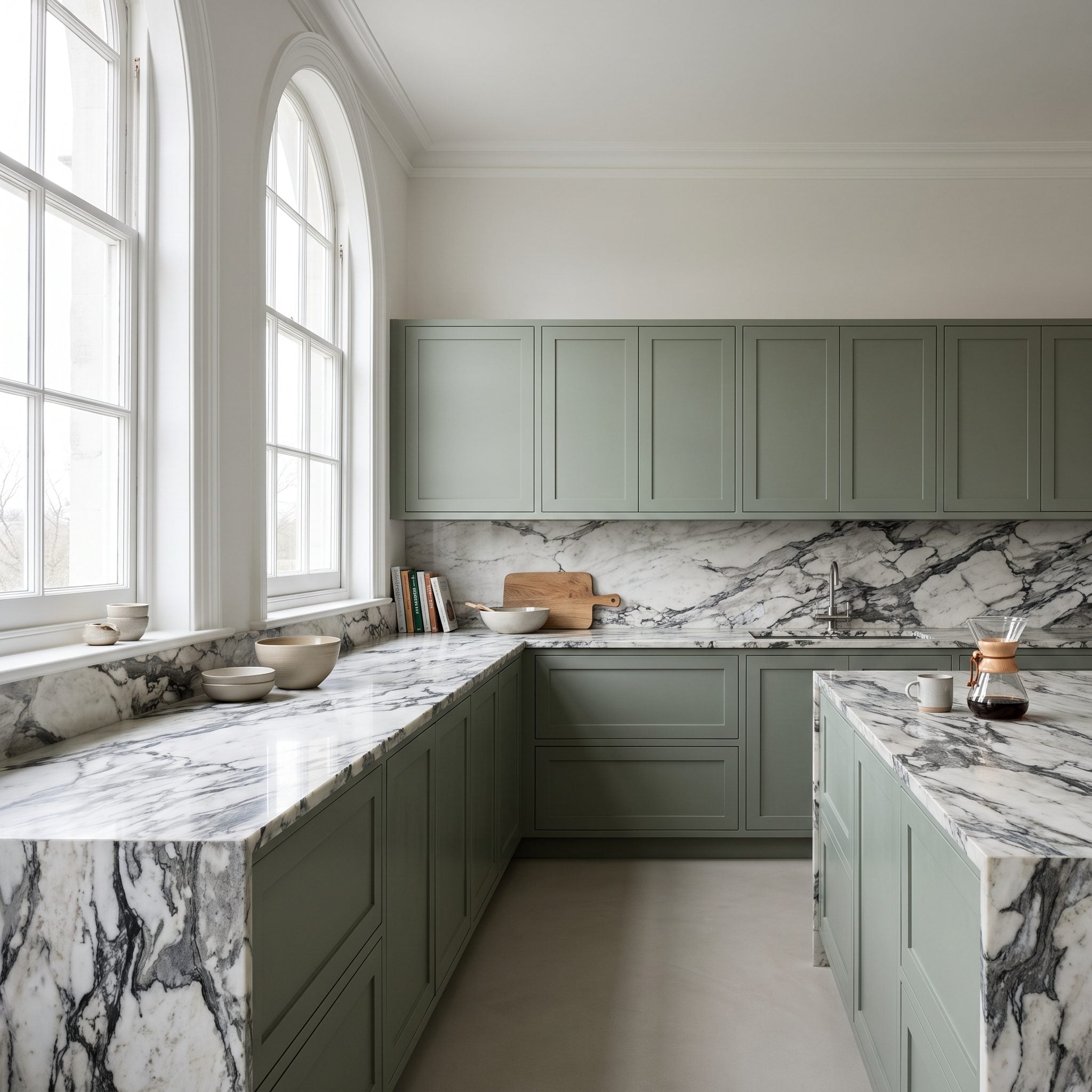
This quartzite already delivers cream, rust, veining, and plenty of movement. Adding a contrasting island would introduce another major division into a room that does not need one.
Warm greige continues across every cabinet instead, giving the stone a consistent backdrop from one end of the kitchen to the other. The result is not timid; it simply concentrates the drama in the material best equipped to carry it.
Why It Works: Repetition can be a form of restraint. Keeping the cabinetry consistent allows a highly varied countertop to remain the strongest visual element without the room becoming flat.
7. Before Repainting the Cabinets, Change the Light
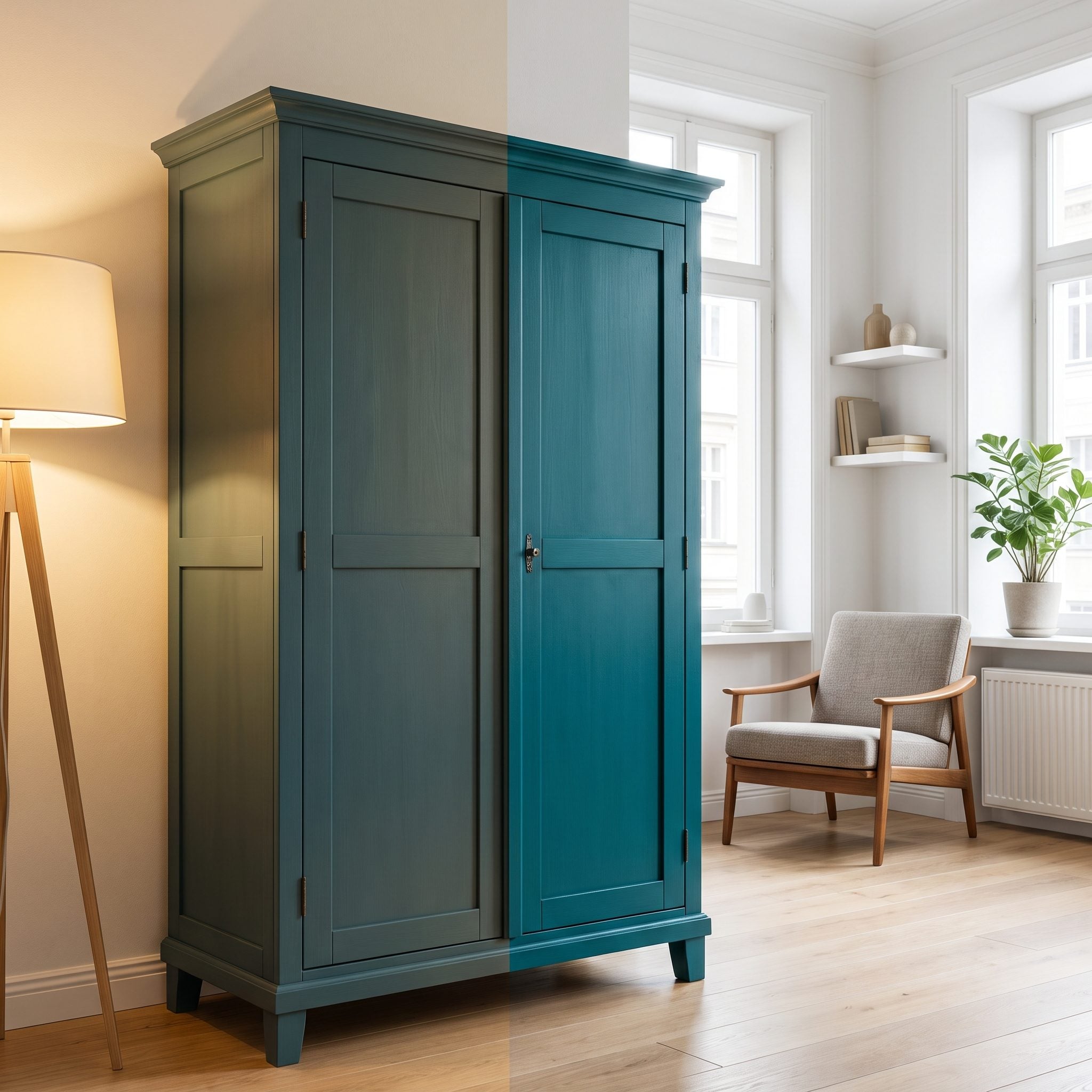
Sometimes the cabinet color is not the problem at all. A warm white under very cool lighting can appear dull or oddly gray, while a softer greige may lose much of its warmth under a harsh overhead source.
Before repainting, changing the lighting environment is worth testing. Warmer 2700K lamps and added under-cabinet light can substantially alter how an existing white appears after dark. That does not mean warmer bulbs rescue every bad paint choice, but lighting is a much cheaper variable to test before starting over.
Try This: Test a different color-temperature lamp in one prominent fixture before repainting an entire kitchen. If the cabinetry suddenly looks substantially better at night, lighting may be contributing more to the problem than the paint itself.
6. Why the Exact Paint Shade Waited Until the Slab Was Chosen
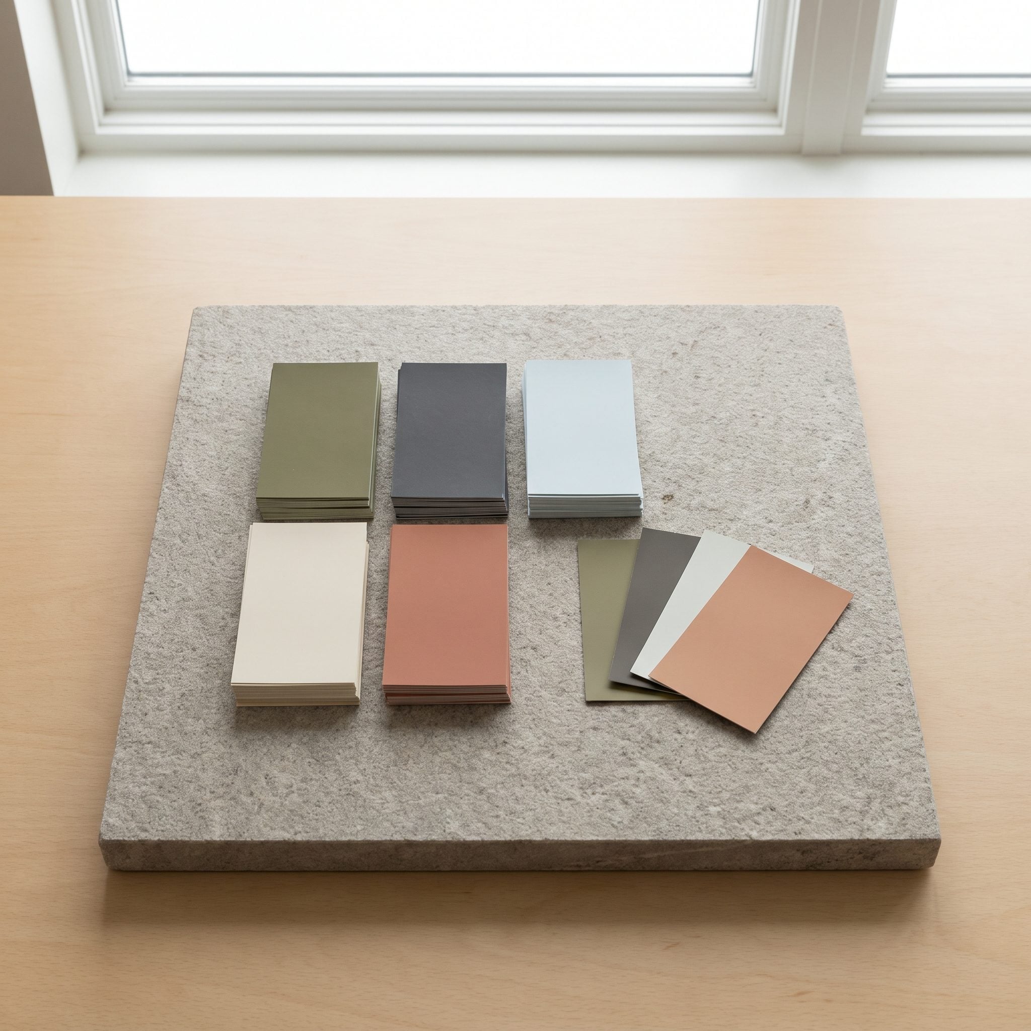
The important word here is exact. A general cabinet direction may already be decided — white, green, greige — but the final shade waits until the real slab reveals what its undertones are doing.
Stone has fixed characteristics that paint can accommodate far more easily than stone can accommodate paint. Once the slab is chosen, the cabinet samples can be judged against something real rather than against a catalog photograph or generic showroom chip. This cool kitchen makeover lets the more permanent material establish the target.
Pro Tip: Use a physical stone sample or offcut whenever possible when choosing paint. Photographs can shift color because of lighting, camera white balance, screens, and printing, making them unreliable for fine undertone matching.
5. Vein Direction Can Make or Break a Waterfall Island
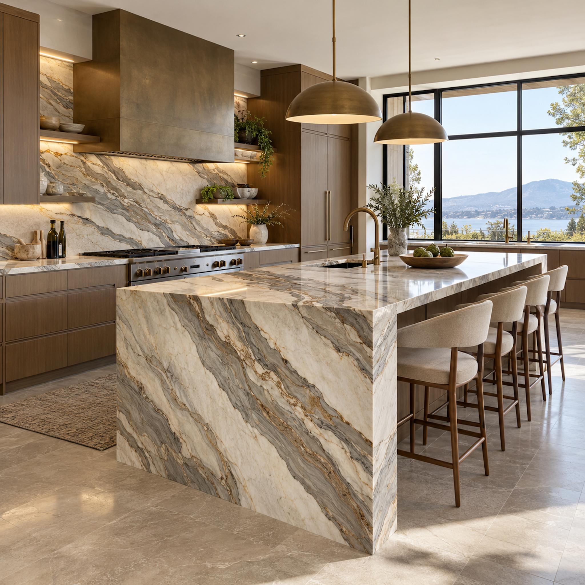
With strongly veined stone, slab selection is only half the decision. Where the fabricator places the templates determines which veins cross the island, which disappear into cutouts, and whether a waterfall end looks like a continuation of the countertop or an unrelated panel attached afterward.
This layout uses the diagonal movement as architecture. Broad gray-and-gold veins travel across the island and continue down the waterfall face, turning the corner into a deliberate visual event. The backsplash carries related movement without trying to duplicate the island exactly, so the room gets rhythm rather than a rigid matching exercise.
Before the Cut: Review slab photographs or a digital layout with the fabricator after templating. Sink and cooktop cutouts, seams, waterfall joints, and the direction of major veins can change the finished composition as much as the stone itself.
4. The Nighttime Test That Can Completely Change a Cabinet Color
🔥 Would you like to save this?
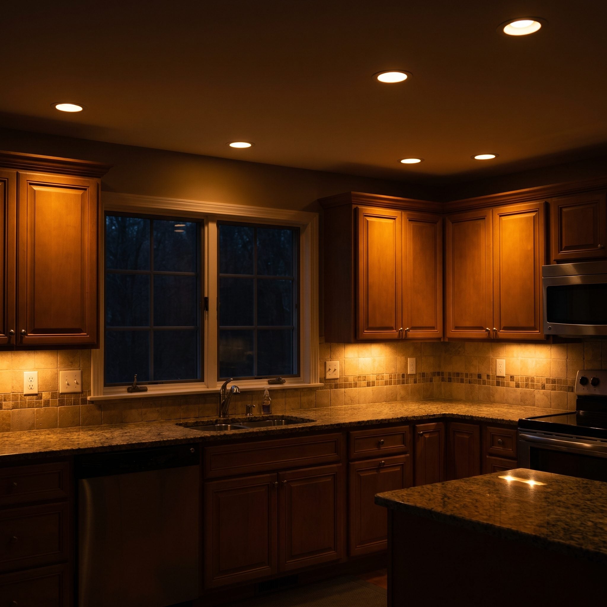
Daylight is only half the test. A kitchen used after sunset spends hours under recessed lights, pendants, task lighting, and under-cabinet LEDs, each of which can shift the way paint and stone appear.
This dark kitchen design checks the navy under its actual evening lighting before committing. Warm sources make colors appear warmer; cooler sources produce a crisper effect. Neither is universally better, but the paint needs to survive the lighting planned for the room.
Style Tip: Check the Kelvin rating of the lamps in the kitchen. Around 2700K is visibly warm, 3000K somewhat crisper, and 4000K cooler. Test cabinet samples under the temperature you actually intend to use.
3. When Bright White Makes a Cream Countertop Look Yellow
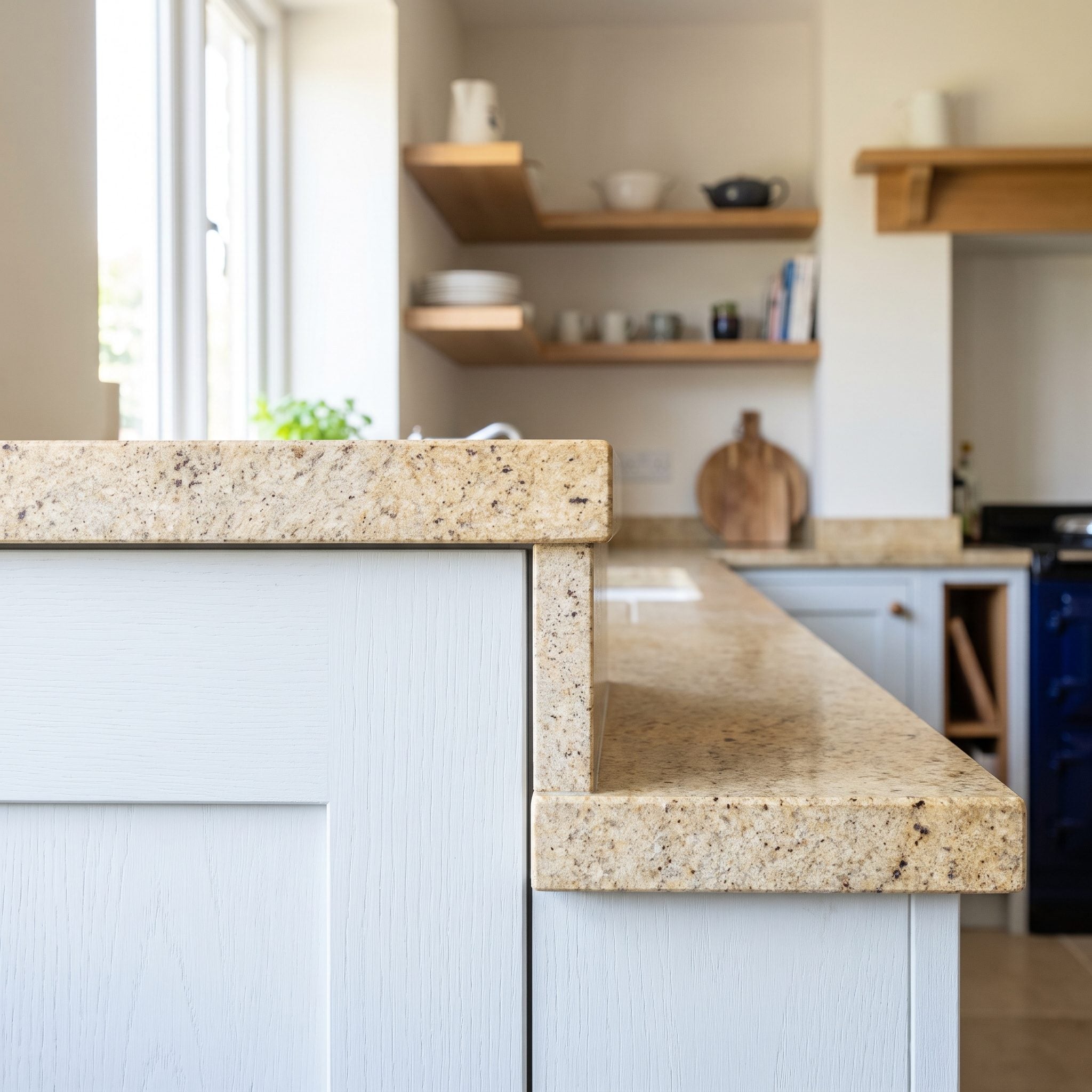
Put these two whites side by side and the mismatch becomes immediate. The cabinetry leans cool while the countertop carries cream and gold, making the cabinets appear grayer and the stone yellower than either looks on its own.
The mistake is not choosing white cabinetry. It is choosing the specific white without seeing it against the actual stone. A warmer white reduces that temperature contrast while preserving the bright kitchen the palette is trying to create.
2. Pulling Cabinet Color From the Countertop’s Quietest Undertone
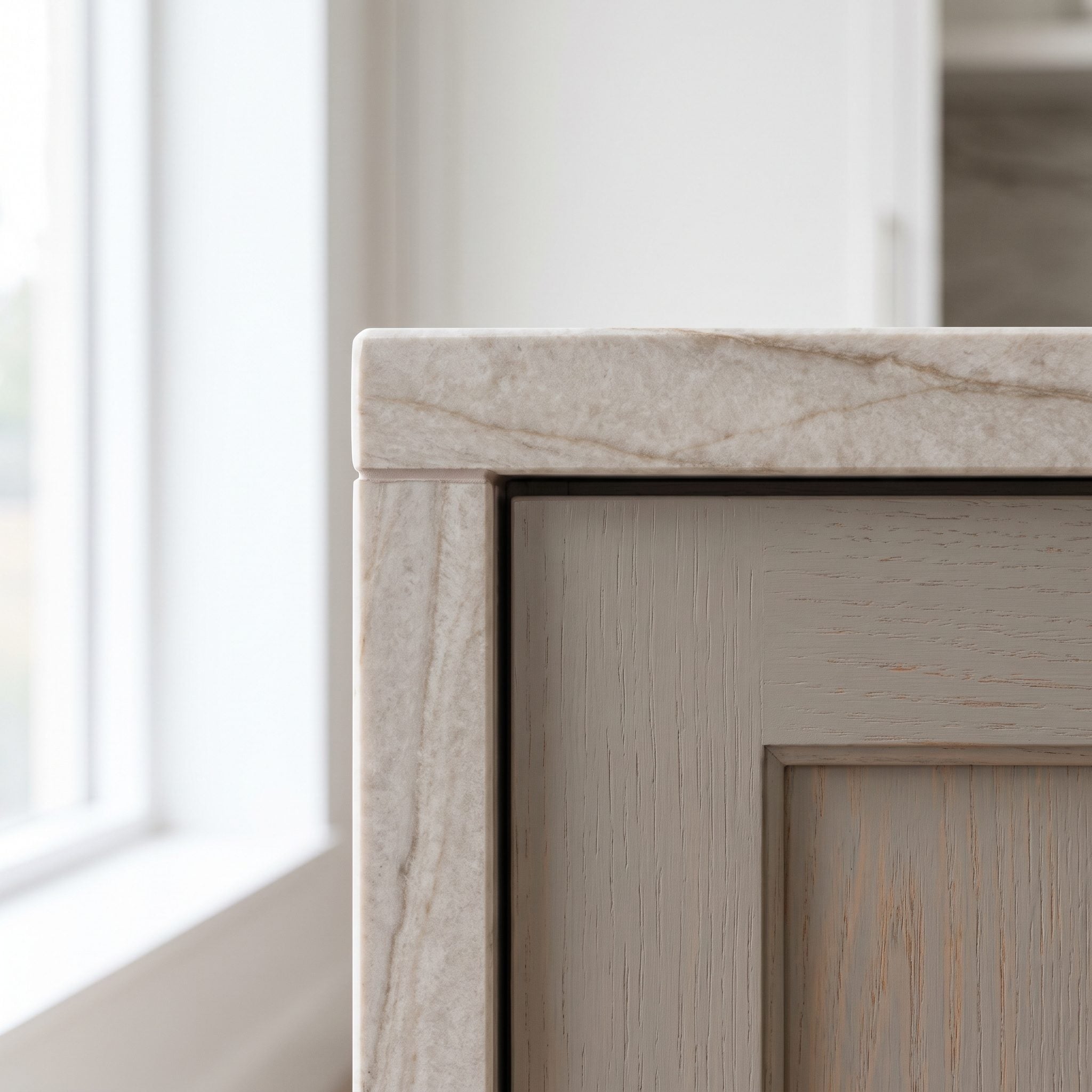
The greige cabinetry does not try to duplicate the quartzite. It picks up a quieter taupe thread already moving through the stone, giving the island and countertop enough connection to feel related without becoming monochromatic.
That distinction matters. Matching a secondary undertone rather than the dominant slab color creates continuity while preserving contrast between paint and stone. A brass bridge faucet and warm pulls reinforce the same side of the palette.
Why It Works: Cabinet paint does not need to copy the countertop. Repeating one of the slab’s quieter undertones is often enough to make the two materials feel connected while allowing each to remain distinct.
1. Permanent Surfaces First, Paint Last — The Order That Makes Everything Else Easier
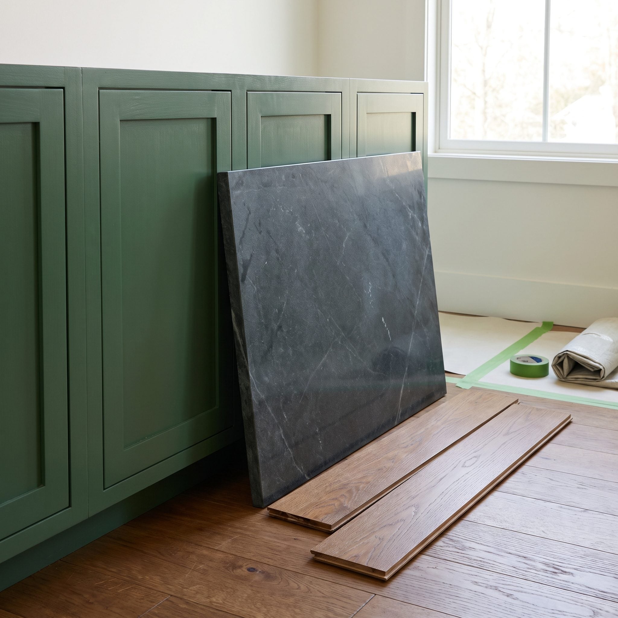
This final kitchen reduces the entire renovation argument to one sequence. The soapstone comes first. The oak flooring joins it. Only then does the cabinetry settle on a green that responds to the cool blue-green character visible in this particular slab.
Soapstone varies considerably from slab to slab, which is precisely the point. You do not choose paint based on what soapstone is supposed to look like; you choose it beside the piece that is actually going into the kitchen. The same logic applies to every dark kitchen design that depends on several undertones coexisting successfully.
Permanent surfaces establish the conditions. Paint gets the luxury of adapting to them.
Why It Works: Stone, tile, and flooring are expensive and difficult to swap once installed. Paint offers far more flexibility, so choosing it last turns color into a finishing decision rather than a constraint the rest of the renovation has to satisfy.