🔥 Would you like to save this?
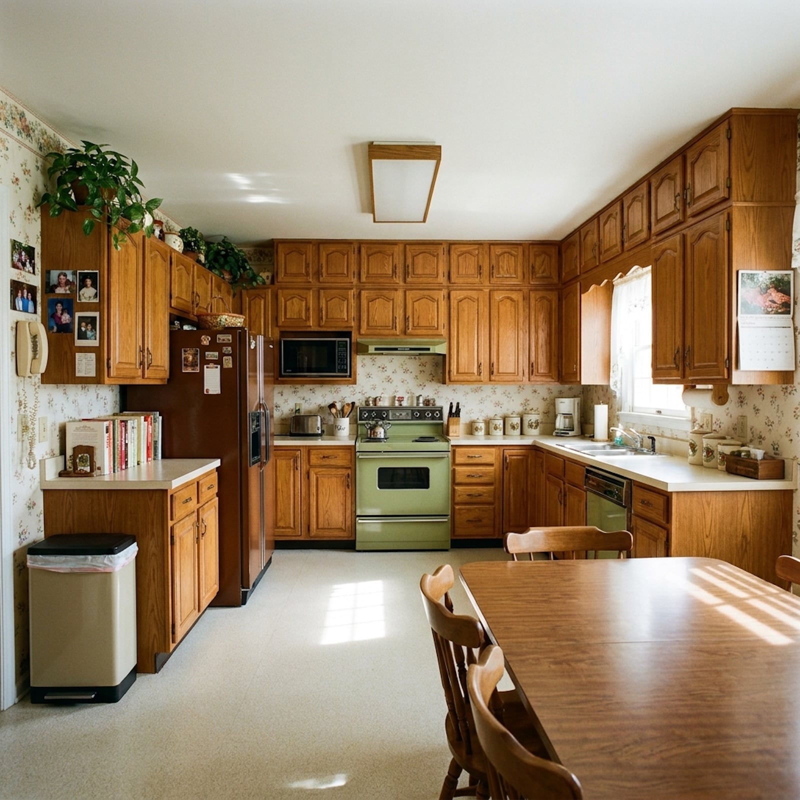
Some 1980s kitchens did not suffer from too little storage. They suffered from storage everywhere. Oak doors climbed to the ceiling, crowded windows, wrapped corners, filled soffits, and turned every available wall into another place to put something. The square footage could be generous and the room could still feel as though it were wearing a winter coat indoors.
In order to come up with the very specific design ideas, we create most designs with the assistance of state-of-the-art AI interior design software. Also, assume links that take you off the site are affiliate links such as links to Amazon. this means we may earn a commission if you buy something.
The more interesting renovation starts with a counterintuitive question: what can come out? A run of uppers disappears. A bulky peninsula might give way to an island with deeper drawers. Storage gets concentrated into a pantry wall instead of scattered across six smaller cabinet runs. Suddenly tile, windows, lighting, wood grain, and even the ceiling have room to register.
These 35 transformations take that idea in wildly different directions. Some become pale and almost monastic. Others answer all that newly liberated space with crimson tile, sage green, black marble, terracotta, cobalt blue, or enough brass to make restraint seem beside the point. The common thread is not a particular style. It is the decision to make every cabinet justify the space it occupies.
Less cabinetry does not have to mean less function. In the best of these kitchens, storage simply moves somewhere smarter — into full-height pantry banks, wide island drawers, appliance garages, open shelves, or carefully planned lower cabinets. The kitchen stops reading as a collection of boxes, and the architecture finally gets some space of its own.
35. Sage Walls, Fluted Oak, and a Skylight Change What Counts as Storage Space
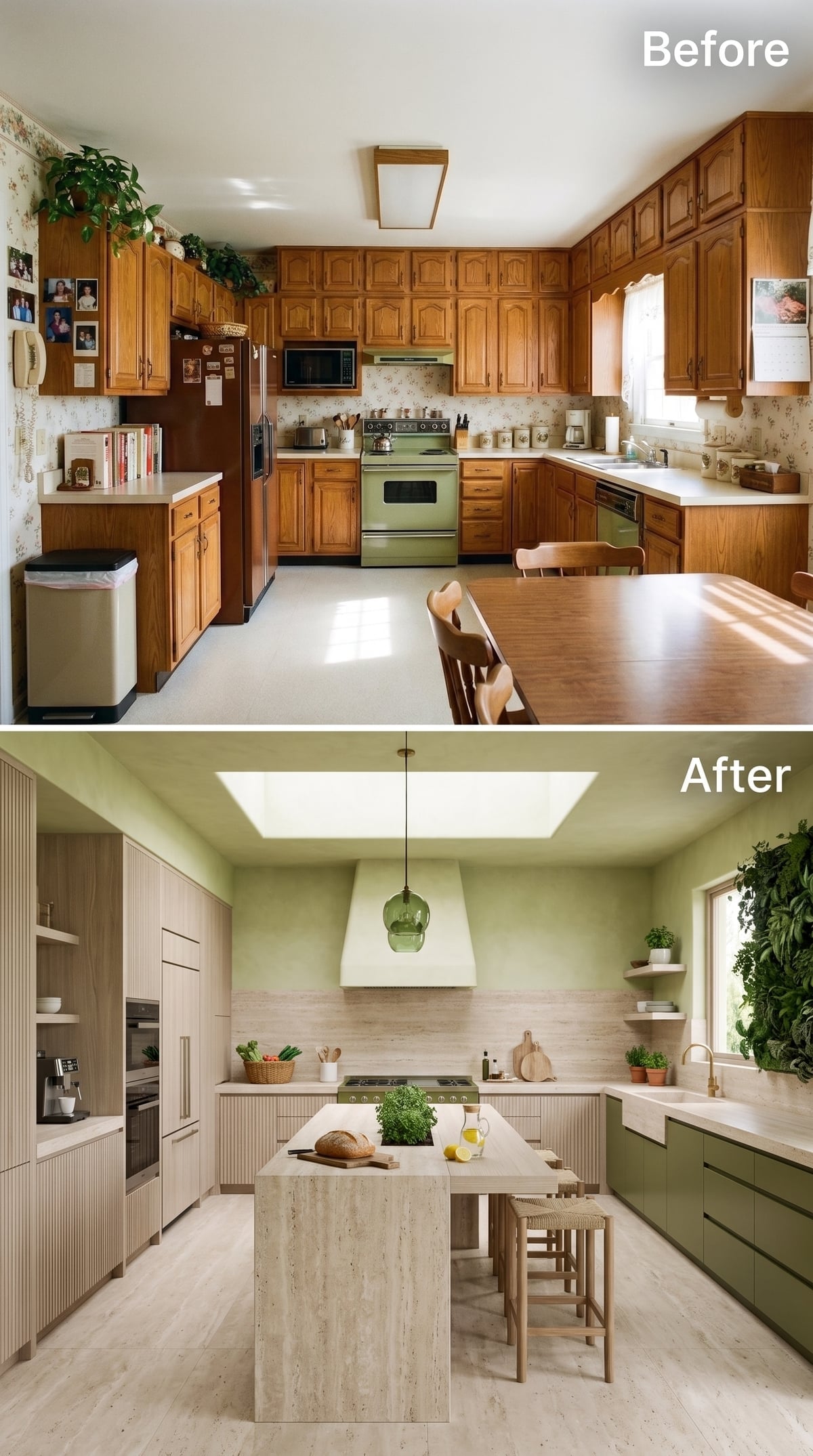
A skylight occupies overhead territory that cabinetry never could, pouring daylight onto a travertine island and immediately changing the hierarchy of the room. Sage-painted walls remain largely exposed, allowing the color to operate as an architectural surface rather than a thin strip squeezed between cupboards.
Storage stays substantial at floor level. Bleached fluted oak on one side and flat sage cabinetry on the other divide the lower runs into distinct zones, while open shelves near the window handle lighter everyday pieces. Travertine repeats at the island and backsplash, giving the two cabinet finishes something warm and continuous to share.
34. Flat-Front Oak and Micro-Cement Make the Old Cabinet Wall Disappear
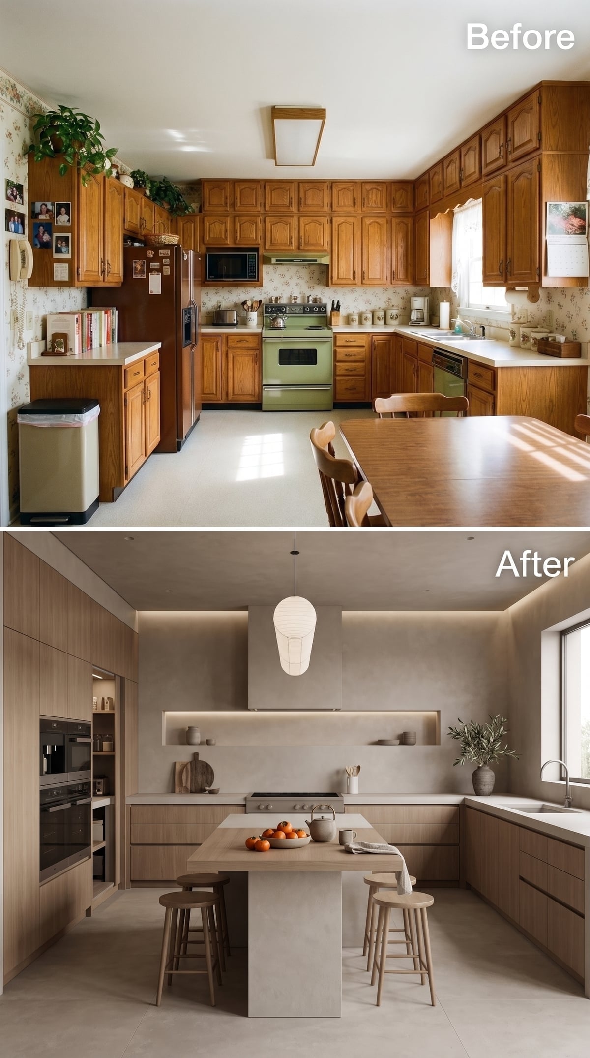
Flat-front oak veneer replaces the ornate raised-panel vocabulary associated with the original kitchen, turning storage into a quieter background surface. Recessed shelving within the micro-cement backsplash provides a place for essentials without projecting another row of boxes into the room.
The concrete-look island base gives the center more presence than the perimeter, reversing the old hierarchy in which cabinet doors commanded every wall. With fewer interruptions, the grain, plaster-like surfaces, and proportions carry the design instead.
33. Dusty Blue Cabinets and Pale Maple Show Where Storage Still Belongs
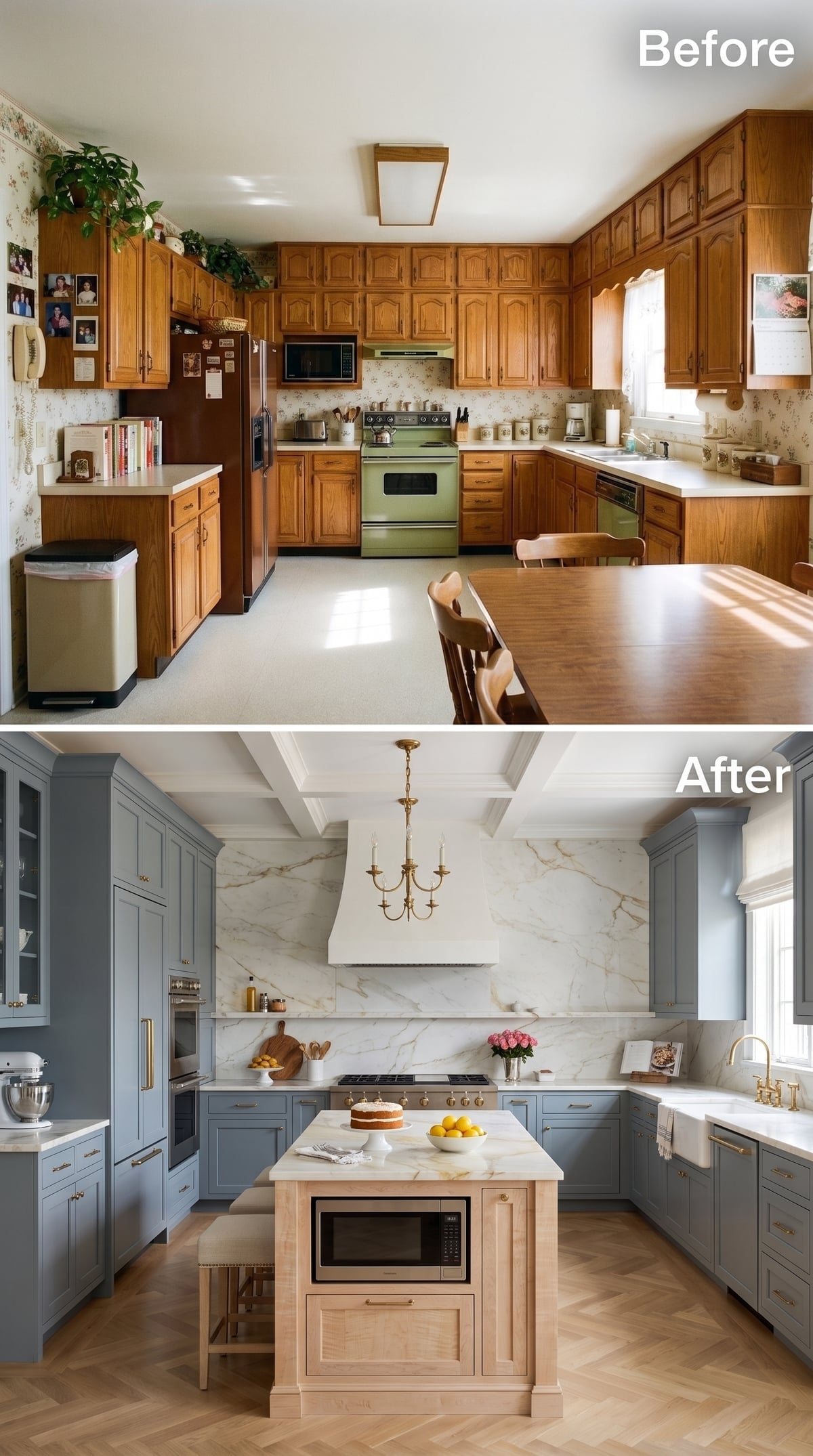
This transformation makes an important distinction: less cabinetry does not mean stripping a kitchen bare. Dusty blue Shaker cabinets remain generous, but the composition is controlled, with clear breaks between the cooler perimeter and the natural maple island.
Warm brass pulls sharpen the blue without making the room fussy. The pale island lightens the center and prevents the cabinetry from becoming one continuous block of color, proving that restraint can come from proportion as much as removal.
32. White Oak and Marble Let the Architecture Finish the Sentence
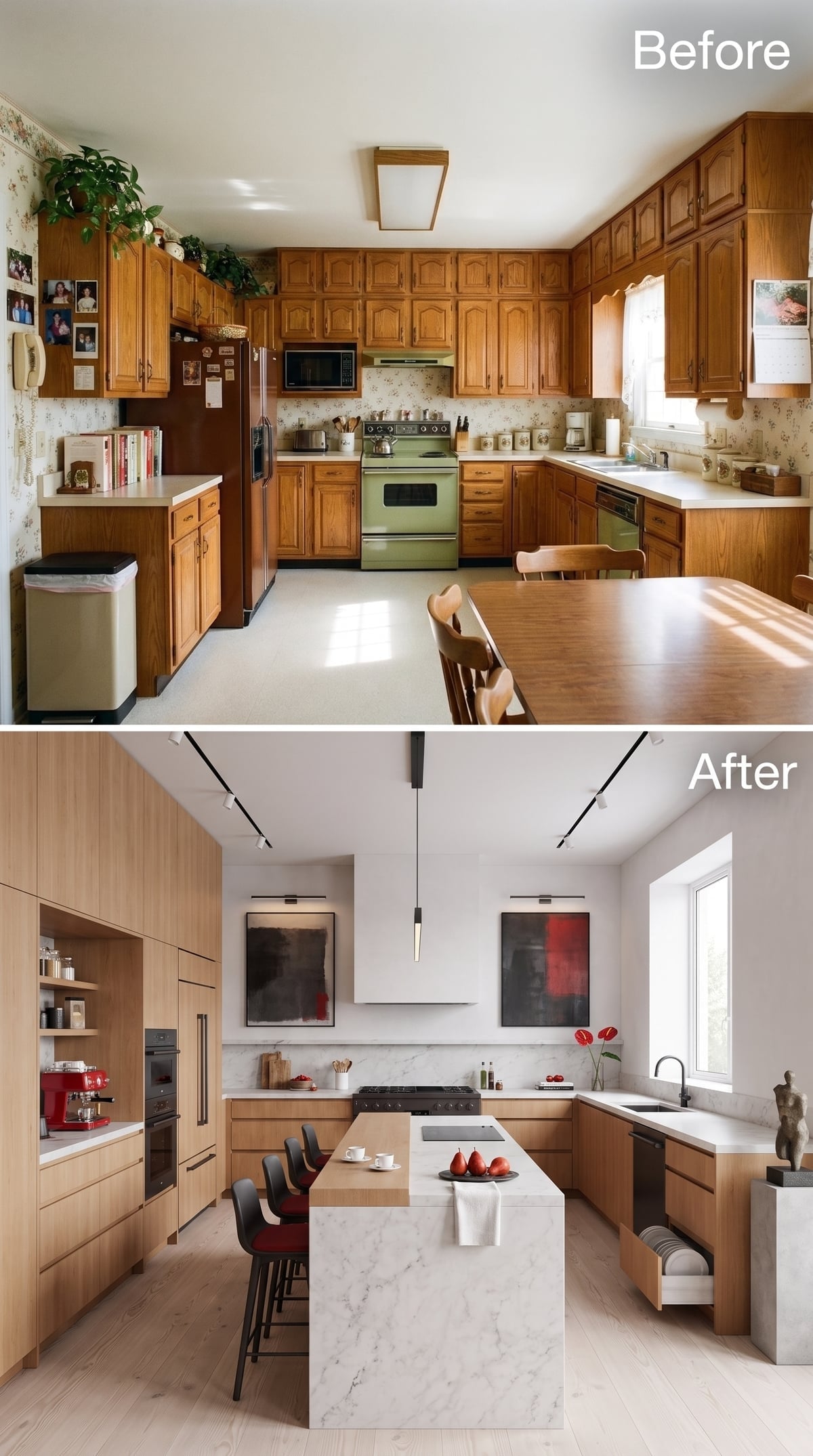
Flat-front white oak cabinetry reads almost like paneling because the hardware stays out of sight. Storage is concentrated into calm architectural blocks instead of being announced through dozens of individual doors and pulls.
The marble island becomes the principal material statement, while matte-black track lighting spreads illumination without competing for attention. Abstract artwork supplies the sharpest color hit — something that would have struggled for oxygen against another wall packed with upper cabinets.
Material Matters: Marble varies in porosity, and acidic spills can etch the surface. Honed finishes generally make that wear less conspicuous than highly polished ones. Resealing should be based on the stone and sealer rather than an automatic annual schedule.
31. Sage Tile and Rattan Pendants Replace a Cabinet Wall With Something Lighter
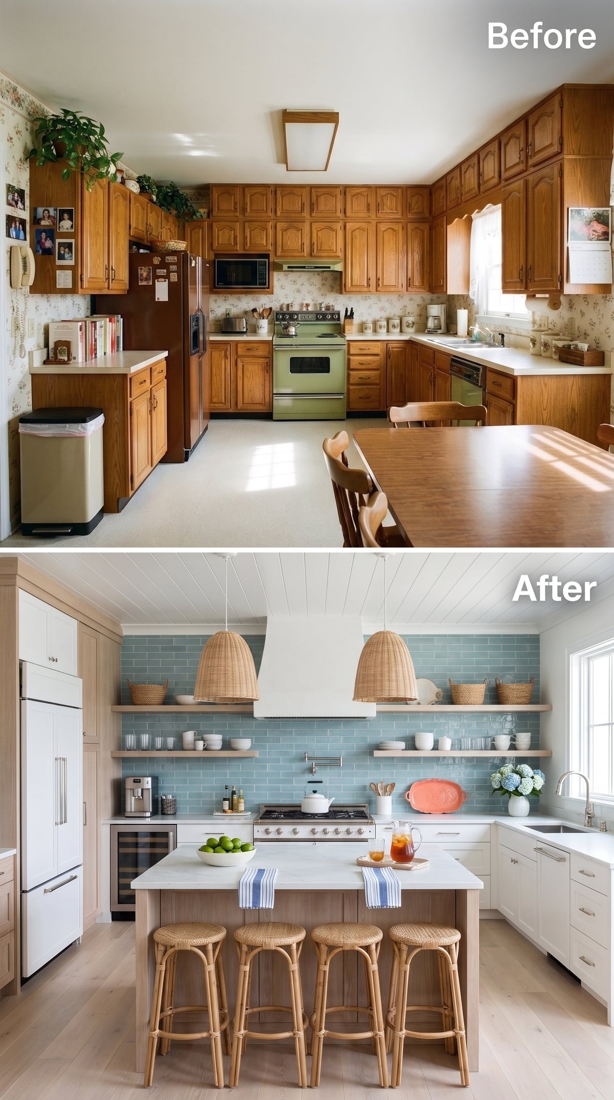
Pale blue-green subway tile stretches across the wall behind floating wood shelves, keeping everyday storage accessible without rebuilding the bulk of enclosed uppers. Far more of the wall remains visible, and the entire room feels less compressed because of it.
Rattan pendants bring a warmer, more porous texture overhead, balancing the cool tile below. Thin shelving, woven lighting, and solid base cabinetry each carry a different degree of visual density, which gives the kitchen rhythm instead of one uninterrupted band of millwork.
30. Butter Yellow Cabinets Warm the Room Without Filling Every Wall
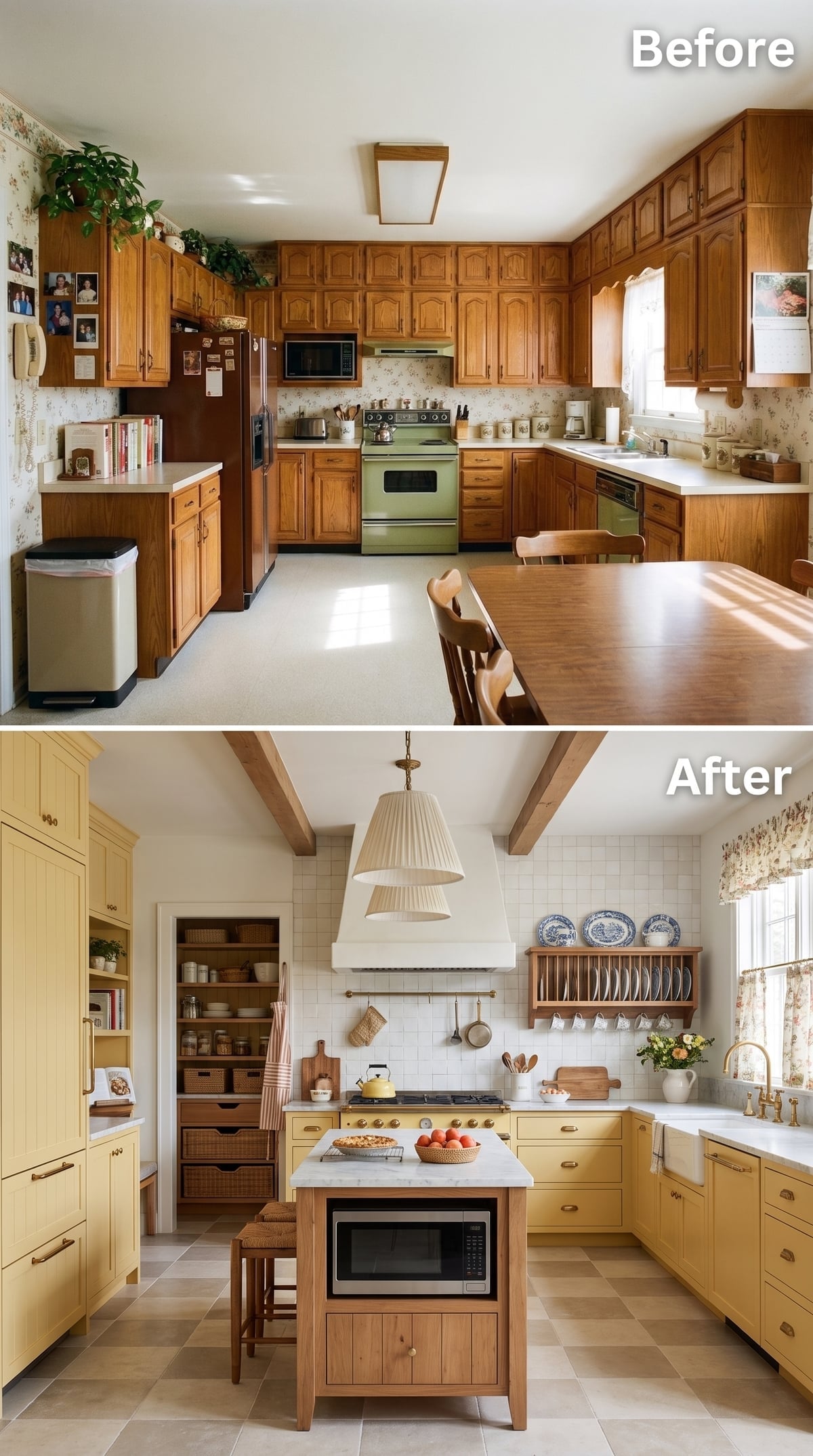
Soft butter yellow changes the mood immediately, but the more important shift happens above the counters. A plate rack and hanging mugs provide accessible storage while allowing white square tile to occupy enough uninterrupted surface to become part of the architecture.
Natural oak on the island and ceiling beams keeps the yellow grounded. A built-in microwave moves into the island base rather than claiming counter space, while a pleated white pendant gives the warm palette a crisp interruption overhead.
29. Dark Stone and Copper Give the Cooking Wall Back Its Depth
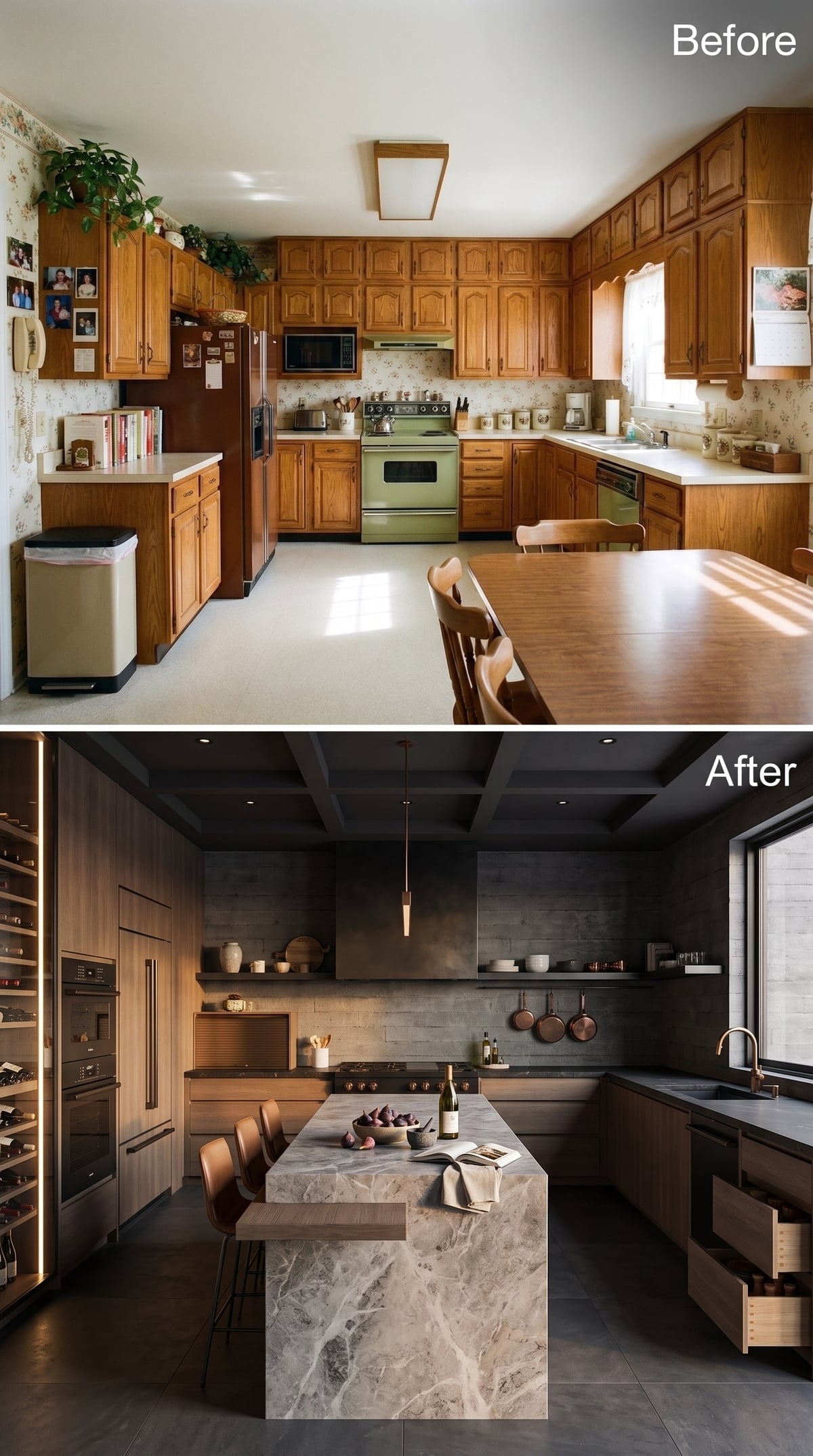
Veined stone wraps the island while charcoal tile rises behind the cooking zone. With enclosed uppers removed, those darker materials can stretch uninterrupted and create depth instead of turning the kitchen into a narrow tunnel of cabinetry.
Copper pendants and hanging cookware supply warmth that a heavier wood scheme might once have carried. Slim shelves keep frequently used pieces close without rebuilding the solid mass the renovation worked so hard to remove.
28. Blush Marble, Black Checks, and Brass Make the Empty Wall Space Count
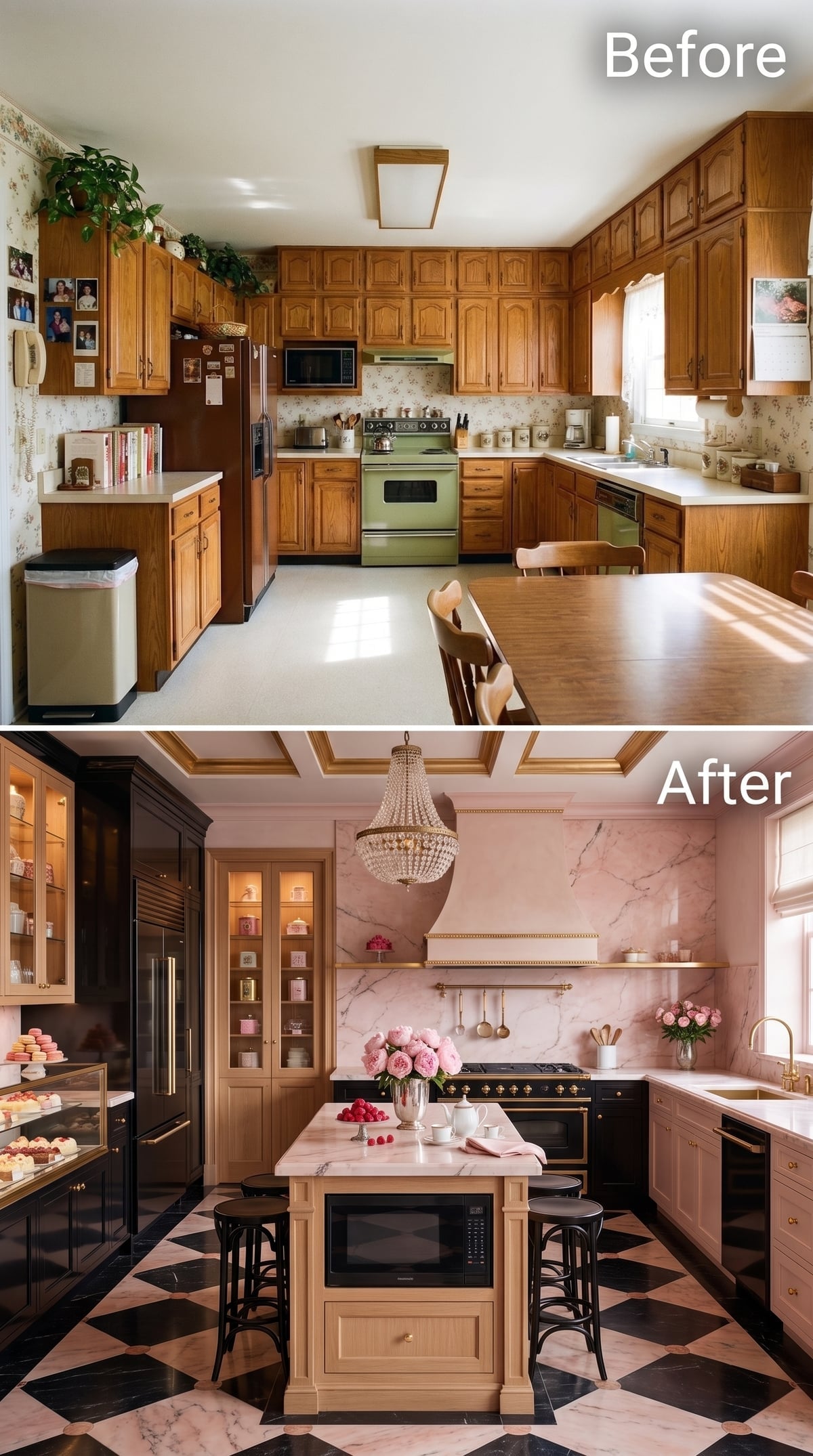
Blush-toned marble climbs behind the range in broad uninterrupted sheets, turning exposed wall into one of the room’s primary features. A brass-trimmed hood gives the stone a strong center without surrounding it with another regiment of cabinet doors.
The black-and-pink checkerboard floor adds a harder graphic note below, while a beaded chandelier brings sparkle overhead. Black and brass sharpen the blush tones rather than softening them, giving the palette enough contrast to feel deliberate.
27. Cherry Cabinetry and Craftsman Beams Let the Grain Do the Decorating
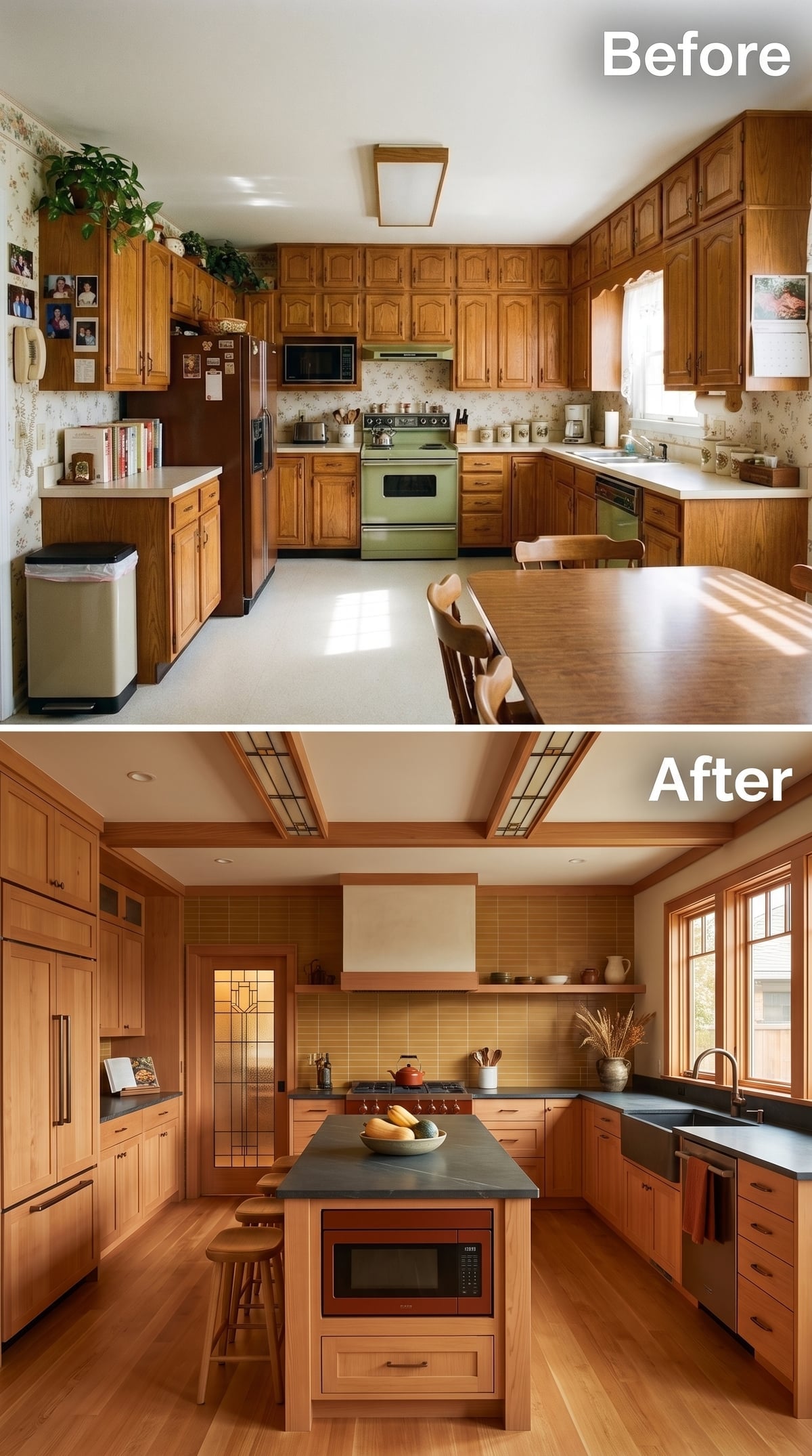
Natural cherry cabinetry carries much of the room, but open shelving above the range interrupts the wood before it becomes another solid wall. Exposed beams repeat the cabinetry’s warmth overhead, while yellow tile creates a brighter horizontal band through the middle.
The dark soapstone-look island top supplies contrast without introducing another busy material. Reducing cabinetry does not always mean reducing wood. Sometimes the improvement comes from giving the grain enough surrounding space to become visible again.
Material Note: Cherry naturally deepens in color with exposure to light, so its appearance changes over time. In a wood-forward kitchen, that gradual shift becomes part of the material character rather than something to disguise.
26. Crimson, Walnut, and Backlit Stone Put the Drama Somewhere Other Than the Cabinets
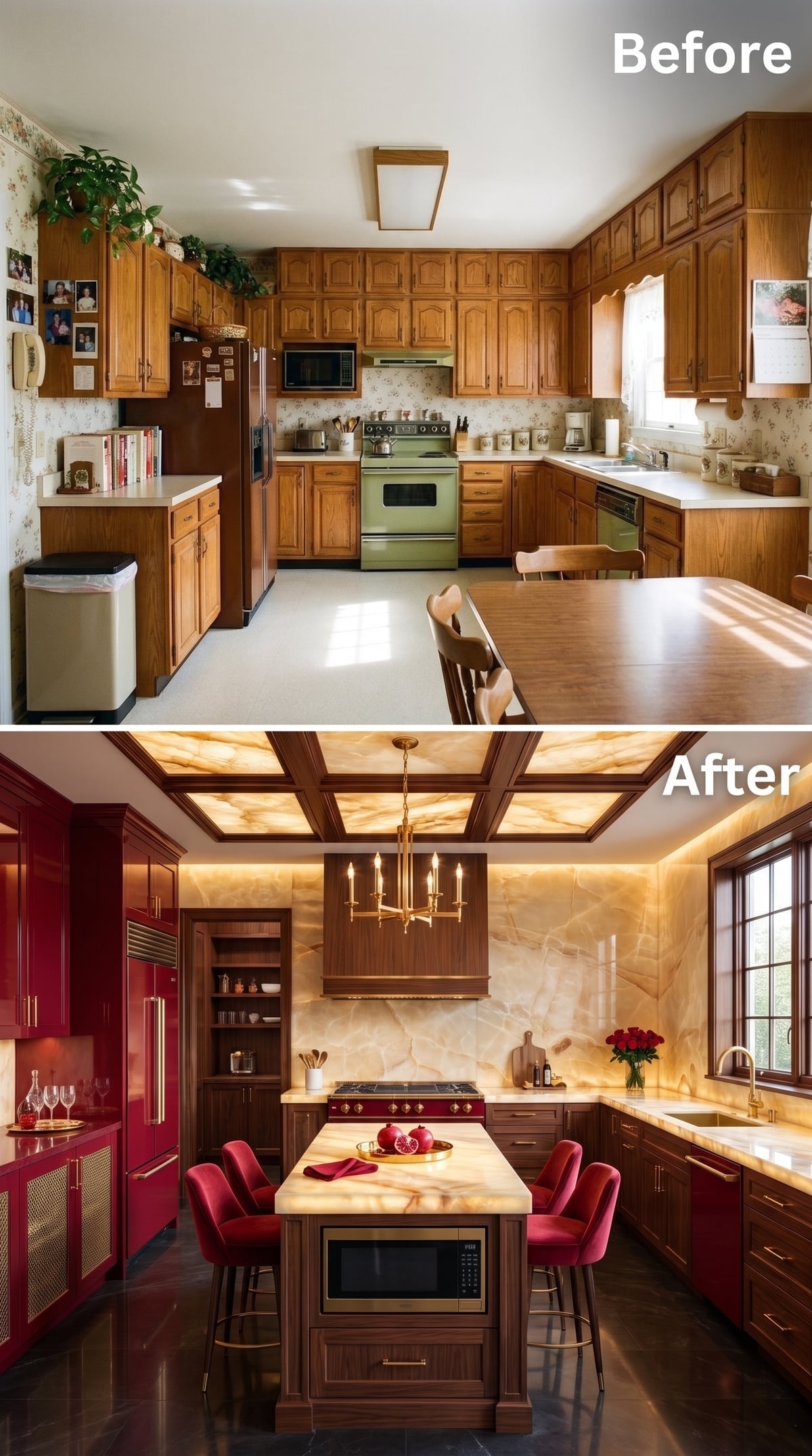
Backlit translucent stone panels transform the coffered ceiling into the brightest surface in the room. Walnut cabinetry stays comparatively simple around the perimeter, while crimson lacquered panels on the refrigerator wall bring a furniture-like burst of color.
The island repeats the veined material overhead, linking work surface and ceiling without asking the cabinetry to become more ornate. Red velvet stools and brass details add warmth, but the real spectacle has migrated away from the cabinet doors altogether.
25. Birch, Cobalt Blue, and a Grid Tile Wall Keep the Energy High and the Uppers Low
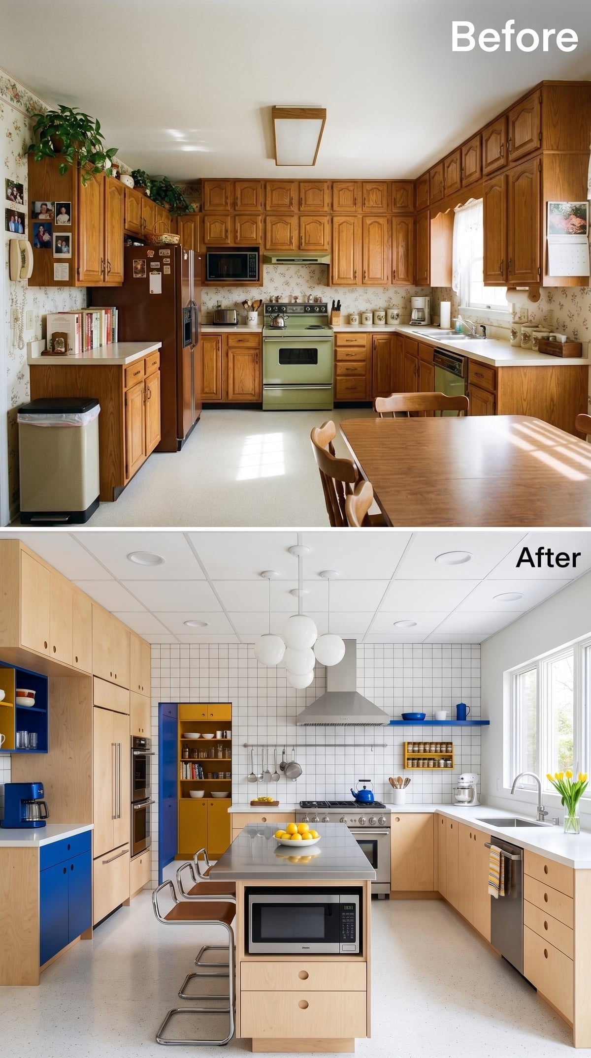
Light birch cabinetry keeps the larger storage surfaces visually quiet, leaving cobalt shelves and panel inserts to provide the sharper jolt of color. Grid tile spreads across the backsplash rather than disappearing beneath a conventional upper run.
A stainless island worktop gives the pale wood a harder industrial edge. The microwave slips into the base, while clustered globe pendants carry the activity upward. Storage remains useful without becoming the dominant surface treatment.
24. Rounded Oak, Sage Accents, and an Arched Pantry Soften the Whole Equation
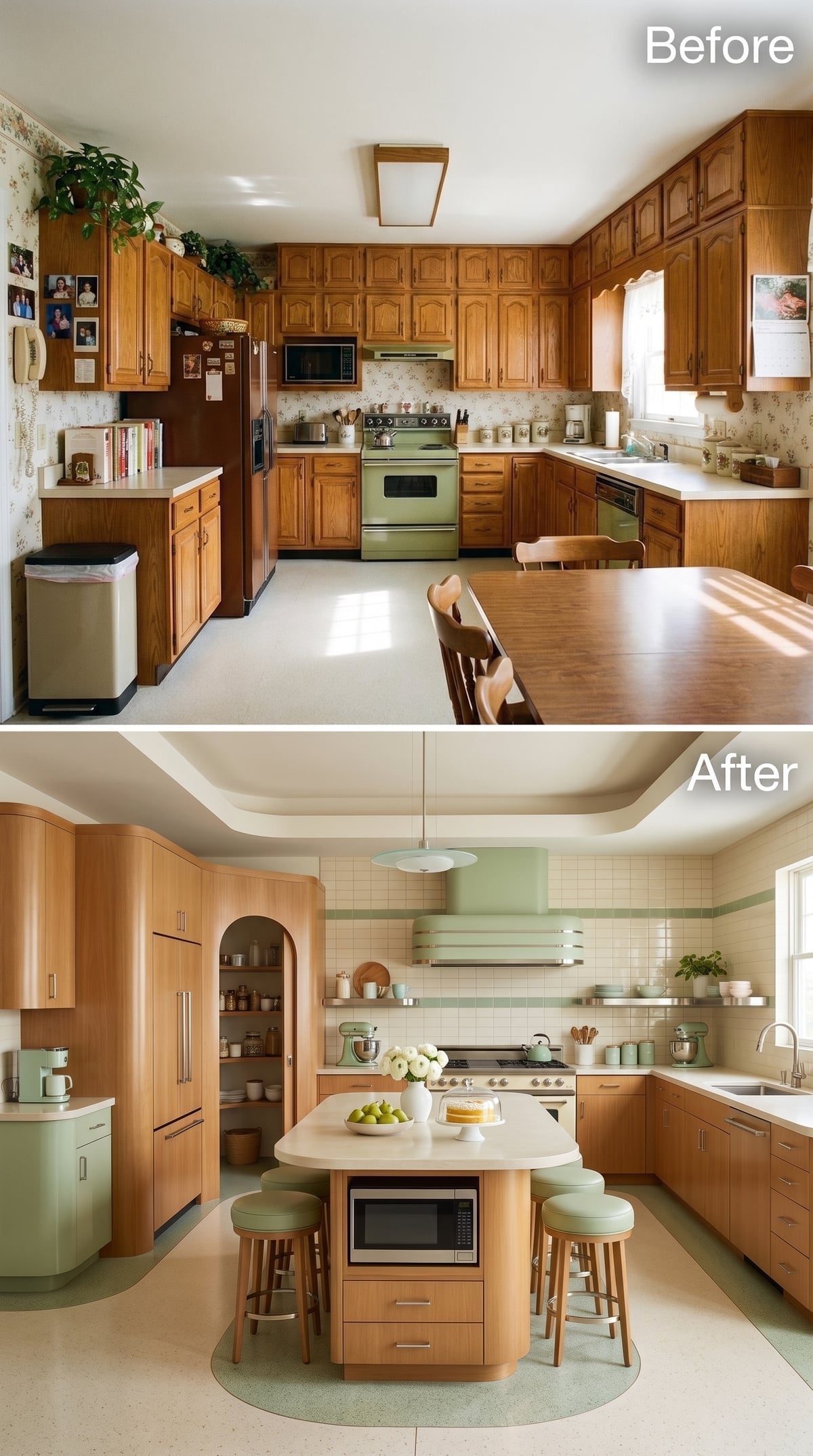
Oak gets a second life here, but almost none of the old bulk comes with it. Flat-panel doors in warm honey-toned wood replace ornate raised profiles, while rounded cabinet corners and an arched pantry niche loosen the geometry. Brushed-metal shelving interrupts the perimeter before the wood can become overwhelming.
The island carries a microwave, prep space, and seating without swallowing the center. Sage stools pick up the mint-colored hood, while cream tile with a narrow green stripe quietly holds the palette together.
Why the Arched Pantry Niche Matters
Instead of another solid cabinet wall, the open niche concentrates pantry goods in one defined zone. Its rounded top repeats the softened cabinetry elsewhere, making the subtraction look intentional rather than incomplete.
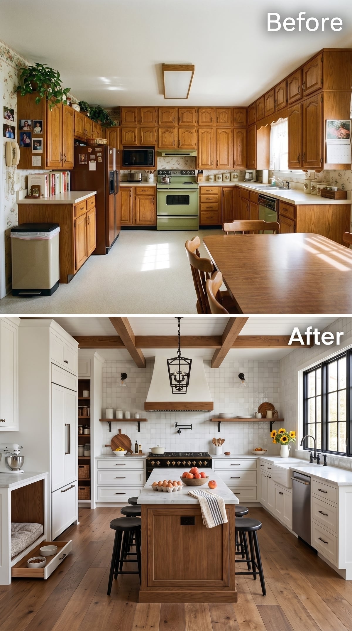
23. White Cabinetry and Exposed Beams Give the Walls Somewhere to Breathe
🔥 Would you like to save this?
Exposed oak beams cross above white Shaker cabinetry, giving the pale room structure without requiring more ornament at eye level. Walnut shelves flank the plaster range hood, leaving enough exposed surface for the cooking zone to register as a composition rather than another section of storage.
A wood island with a pale stone top brings warmth to the center, while black stools, hardware, lantern lighting, and the steel-framed window create a crisp dark thread. A low pull-out feeding station also uses base-cabinet space efficiently without introducing another permanent object onto the floor.
22. Teal, Rose Marble, and a Pressed-Metal Ceiling Give the Cabinets Competition
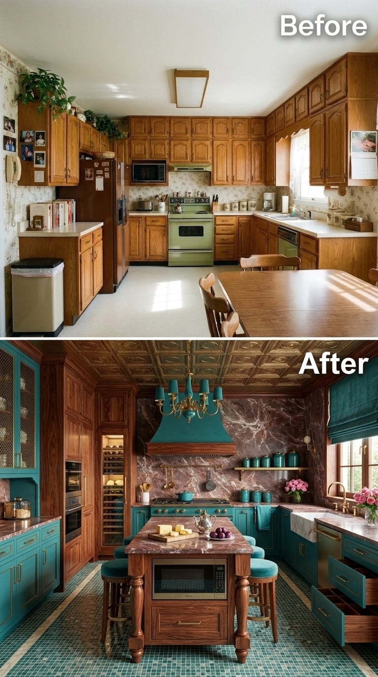
Teal cabinetry establishes the palette, but the rose-veined stone backsplash is what prevents the walls from feeling like leftover space. The island repeats the stone and introduces wood legs, while teal seating reconnects the center of the room to the perimeter.
An ornate pressed-metal ceiling and chandelier pull attention upward, giving the room a decorative plane that ceiling-high cabinetry would have smothered. Mosaic flooring completes the pattern-rich composition without demanding another layer of millwork.
21. Walnut and Terracotta Strip the Kitchen Back to Three Strong Materials
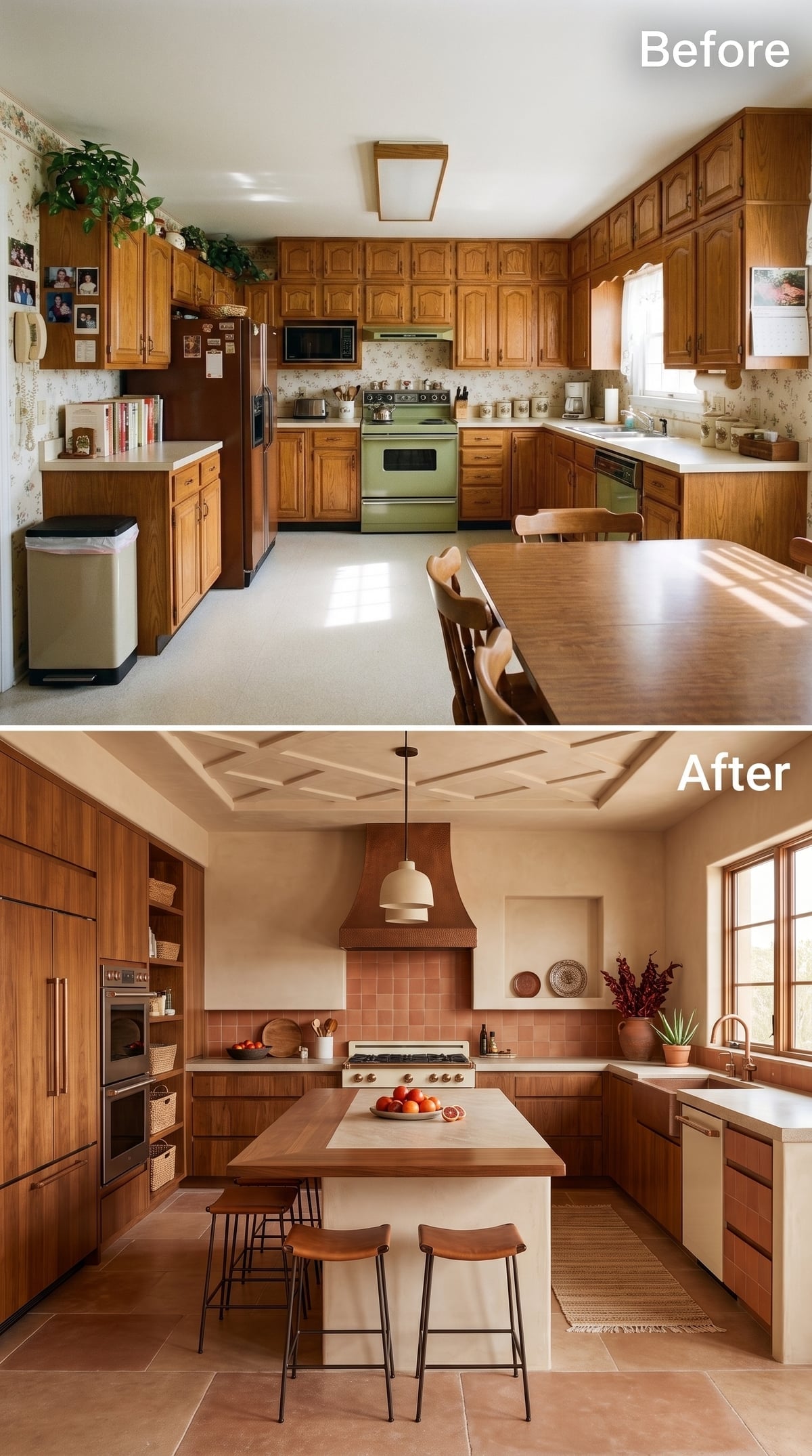
Flat-front walnut cabinetry keeps storage concentrated and visually quiet, while terracotta-colored square tile spreads across the cooking wall without a row of uppers cutting through it. The plaster hood projects just far enough to establish the range as a focal point.
The appeal comes from editing. Wood, warm tile, pale plaster, and restrained hardware repeat at full scale. Nothing needs an ornamental crown or another bank of doors to make the kitchen feel complete.
20. Chrome, Tangerine, and Walnut Turn Subtraction Into the Main Event
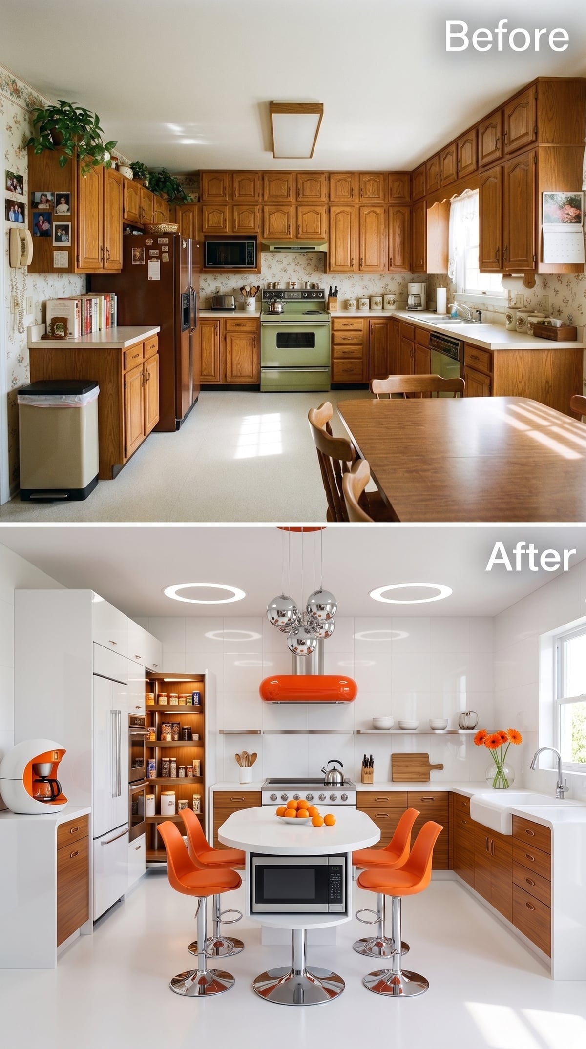
White gloss cabinetry stays low along the perimeter, leaving most of the upper walls exposed. Slim shelves carry everyday pieces without rebuilding the solid barrier that once crowded the room.
A circular island on a chrome pedestal doubles as a dining table. Tangerine seating and a matching range hood turn color into architecture, while walnut drawer fronts supply enough warmth to keep the white and metal surfaces from becoming clinical.
Color Story: Repeating tangerine in the hood and seating makes the color feel structural rather than incidental. Walnut below the counters supplies a warmer middle note between the white surfaces and polished chrome.
19. Navy Cabinets, Stainless Steel, and a Butcher Block Island Built for Work
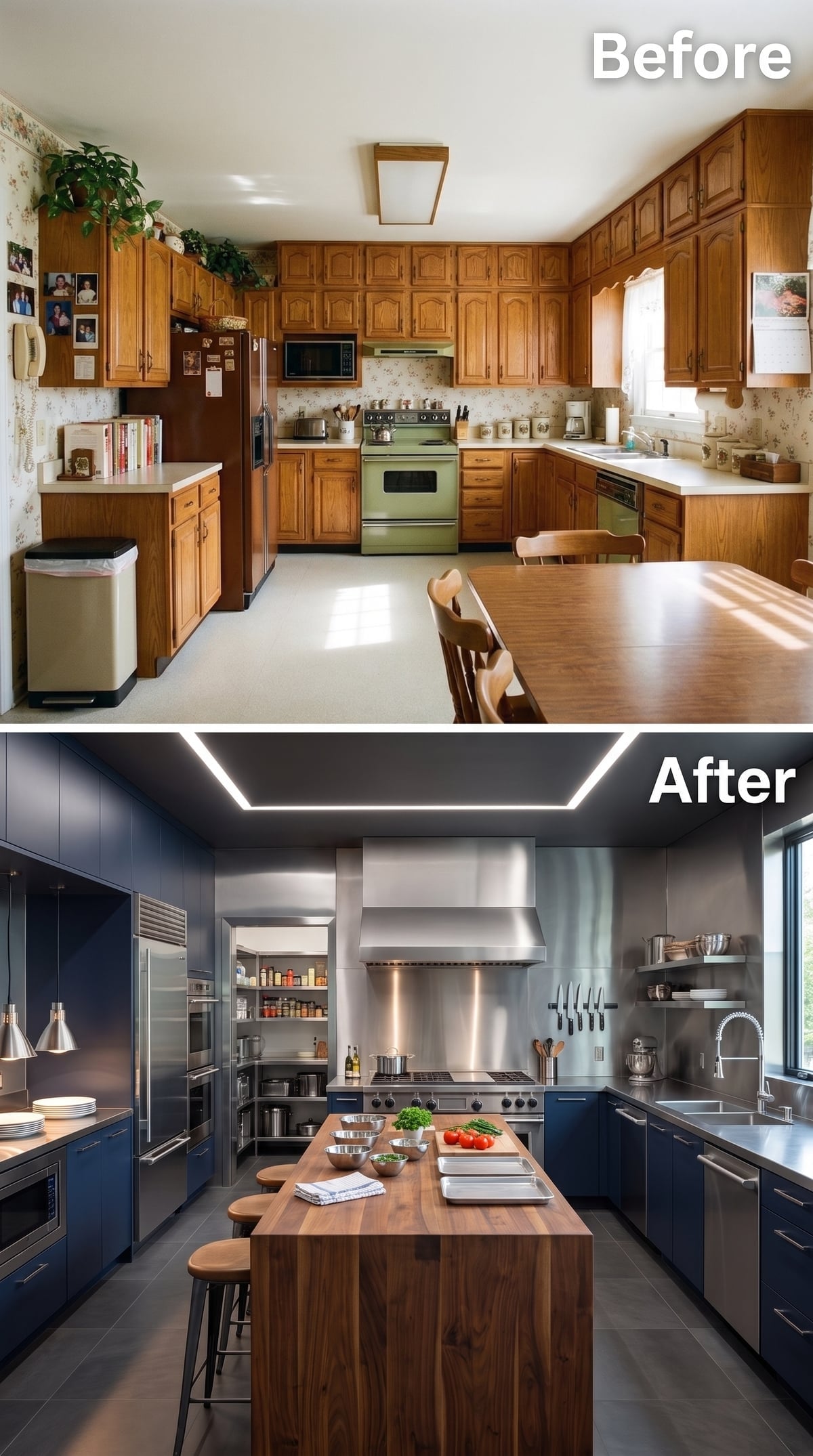
Dark navy cabinetry concentrates storage into strong vertical runs, while open shelving near the range leaves the stainless backsplash exposed. The cooking area feels more like a purposeful work zone than another decorative cabinet elevation.
A thick butcher-block island top brings warmth into the middle and provides a forgiving prep surface. Cove lighting softens the ceiling perimeter, while the professional-style hood, built-in refrigeration, and knife rail keep the emphasis firmly on cooking.
Material Note: Butcher block can cost less than many premium stone options, depending on wood species, thickness, and fabrication. It can also be refinished when wear appears, although care depends on the particular finish used.
18. Gray Cabinetry, Marble, and Fluted Oak Show How Little the Walls Need
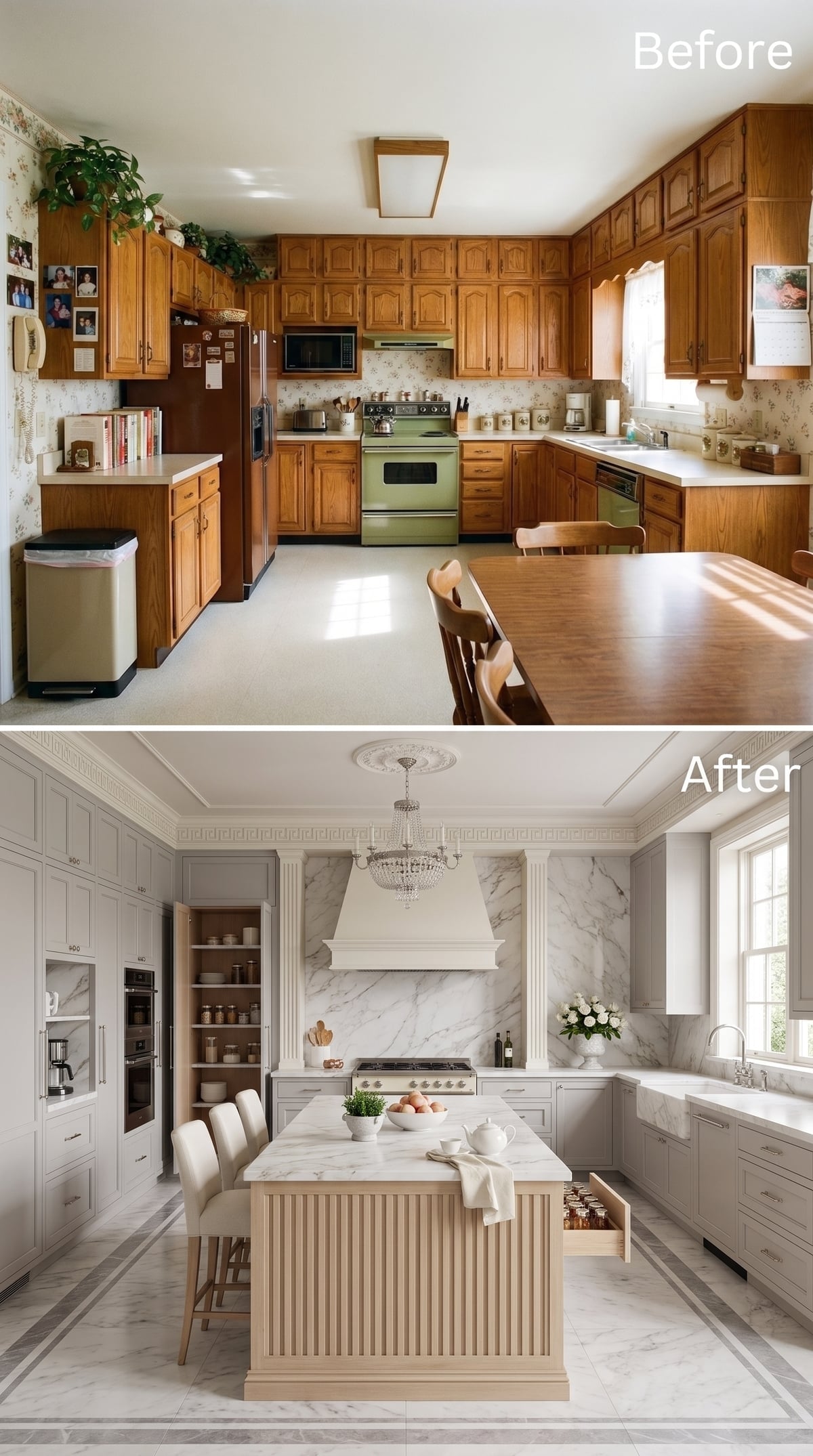
Gray perimeter cabinets stay low enough for large marble surfaces to remain visible around the range. The stone gets enough room to establish its own pattern rather than functioning as background between boxes.
A fluted oak island adds texture at the center, and the carved plaster hood provides a softer sculptural counterpoint above. Even the crystal chandelier and ceiling medallion work because the cabinetry is not competing to become the room’s most decorative feature.
17. Emerald Cabinets and White Marble Turn Saturation Into Structure
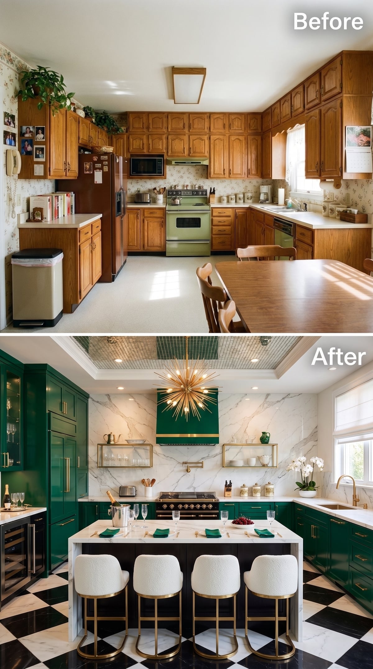
Emerald perimeter cabinetry makes a full commitment to color, but the range wall opens to broad slabs of white marble before the room can become a green box. Brass hardware and a matching band across the hood warm the saturated paint without introducing another dominant hue.
A black island base breaks from the perimeter, topped with pale stone and surrounded by light textured stools. The checkerboard floor adds another strong graphic surface below, making the open sections of wall essential pauses rather than unused space.
16. Sage Lower Cabinets and a Sculptural Hood Put the Surprise Overhead
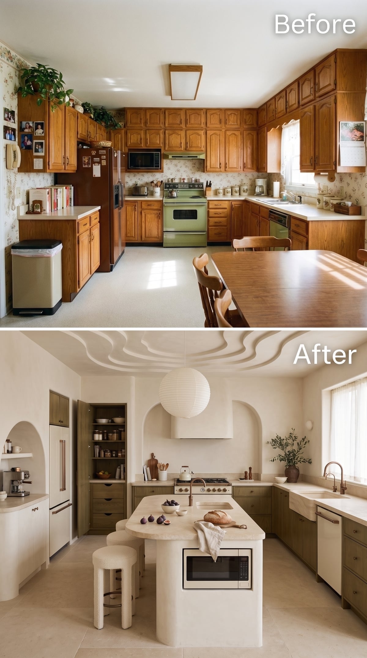
Olive-sage lower cabinets hug the perimeter beneath cream plaster walls, leaving the upper half unusually open. A broad arch frames the range hood and turns the cooking zone into architecture rather than another cabinet elevation.
The ceiling delivers the real departure. Layered, flowing plaster forms introduce curves overhead, making a conventional grid of uppers feel almost beside the point. Character comes from shape while the lower runs continue to provide the practical storage a working kitchen needs.
15. Walnut and Crimson Tile Show Exactly What Open Shelving Can Solve
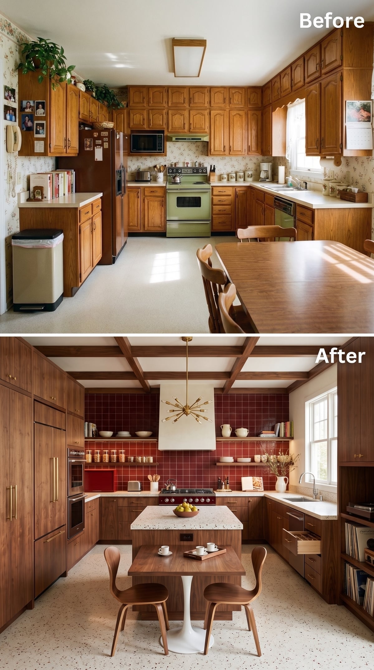
Burgundy tile rises behind open walnut shelves, giving the wall enough visual force to stand on its own. Enclosed uppers would have reduced that saturated surface to a narrow strip and made the dark wood considerably denser.
Flat-front lowers keep the grain clean, while a lighter terrazzo-look island top breaks the richness. A brass Sputnik fixture and bent-plywood chairs bring in a mid-century note without turning the room into a period reconstruction.
14. Slate, Warm Oak, and Leather Pulls Bring Furniture Details Into the Kitchen
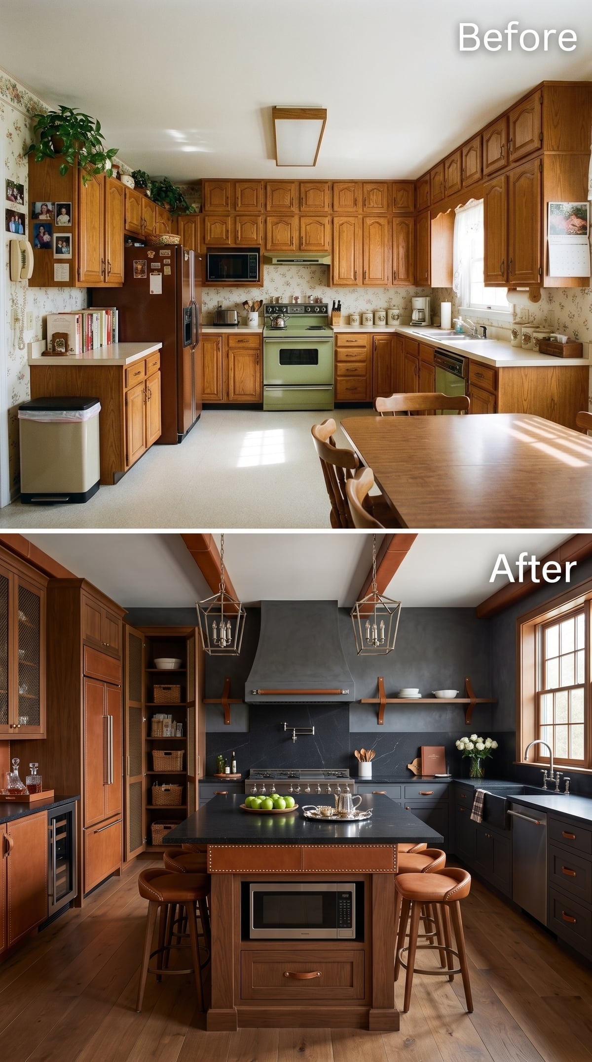
Leather-wrapped pulls on the island are unusual enough to register immediately against the restrained cabinetry around them. Dark slate-painted lowers run along the perimeter, while warm oak storage and open shelving keep the upper portion lighter.
Cognac stools repeat the leather tone at a larger scale, and lantern pendants bring a softer dining-room quality overhead. A handful of tactile materials do the decorative work that another layer of cabinets would only dilute.
13. Black Tile and Raw Wood Turn the Kitchen Into a Working Loft
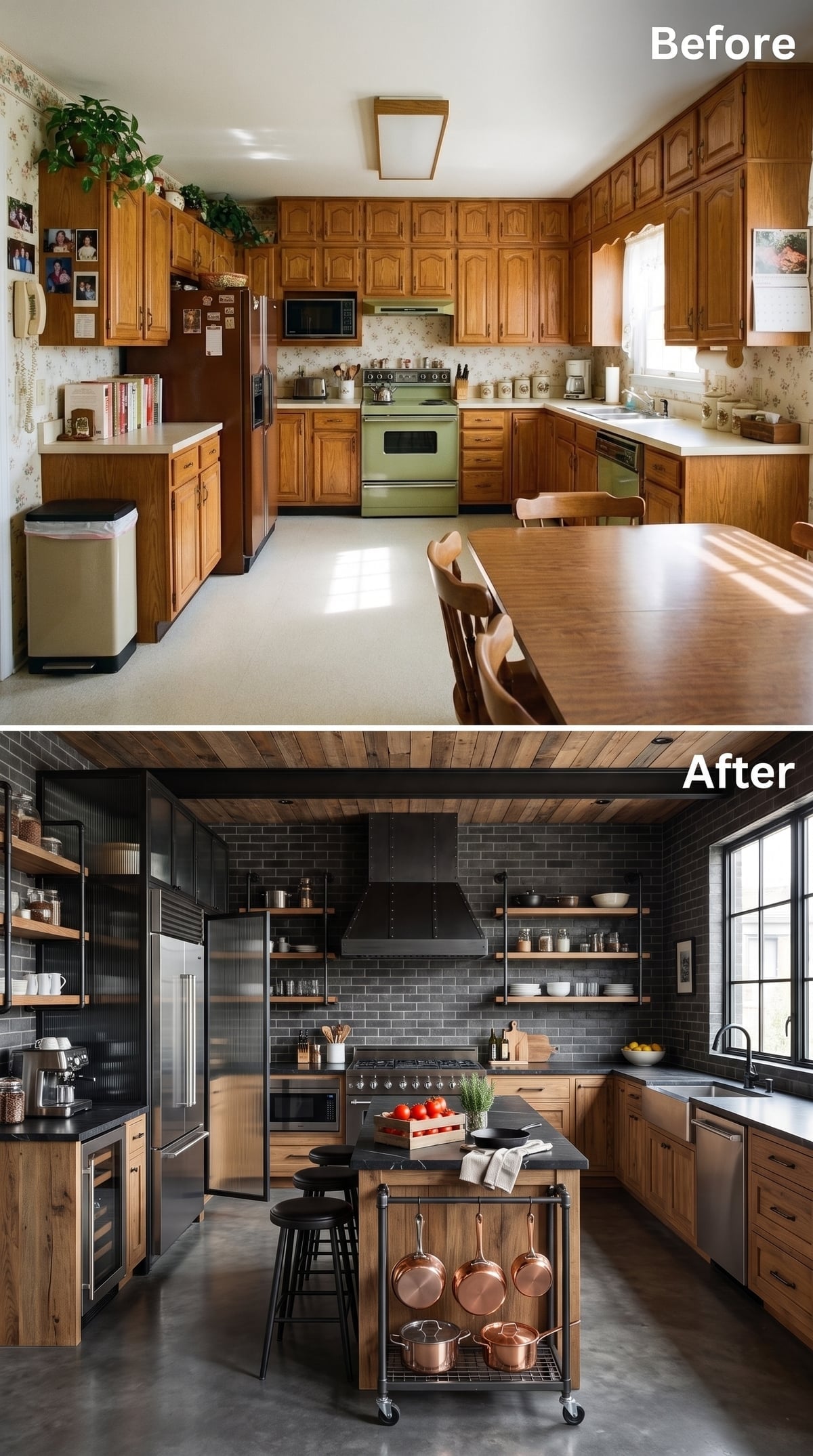
Dark tile covers the walls from counter to ceiling, but open wood shelves prevent the surface from becoming oppressive. Knotty oak lowers keep storage where it is easiest to reach, while the black backdrop remains visible enough to define the room.
The mobile island behaves more like a worktable than fitted cabinetry. Casters, exposed pipework, and a lower cookware rack give it flexibility, while concrete flooring and a matte-black hood continue the industrial language without crowding the composition.
Design Move: Open shelving does not automatically create order, but it encourages more deliberate editing. Against a dark backdrop like this one, keeping the shelves relatively spare also prevents the room from becoming visually dense.
12. Navy Lowers and Terracotta Tile Put the Weight Where It Belongs
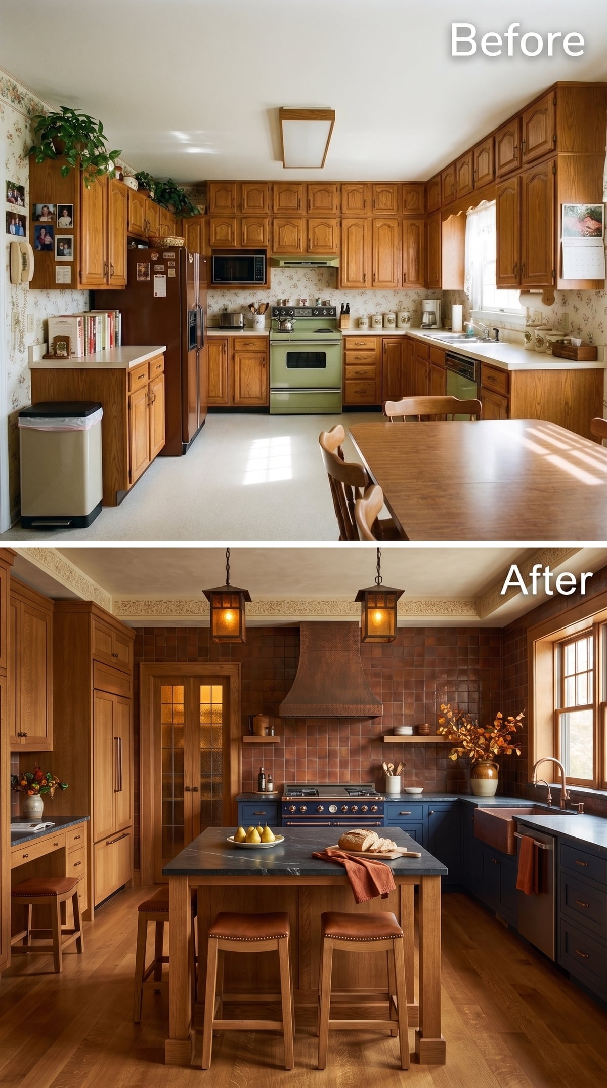
Navy base cabinets establish gravity near the floor, while lighter quarter-sawn oak storage appears in more measured sections above. Terracotta-colored tile remains visible around the range instead of being reduced to a narrow backsplash strip.
Warm glass lanterns continue the earthy palette without adding more millwork. The darker lowers create a firm base, while the lighter wood above prevents eye level from becoming overly dense.
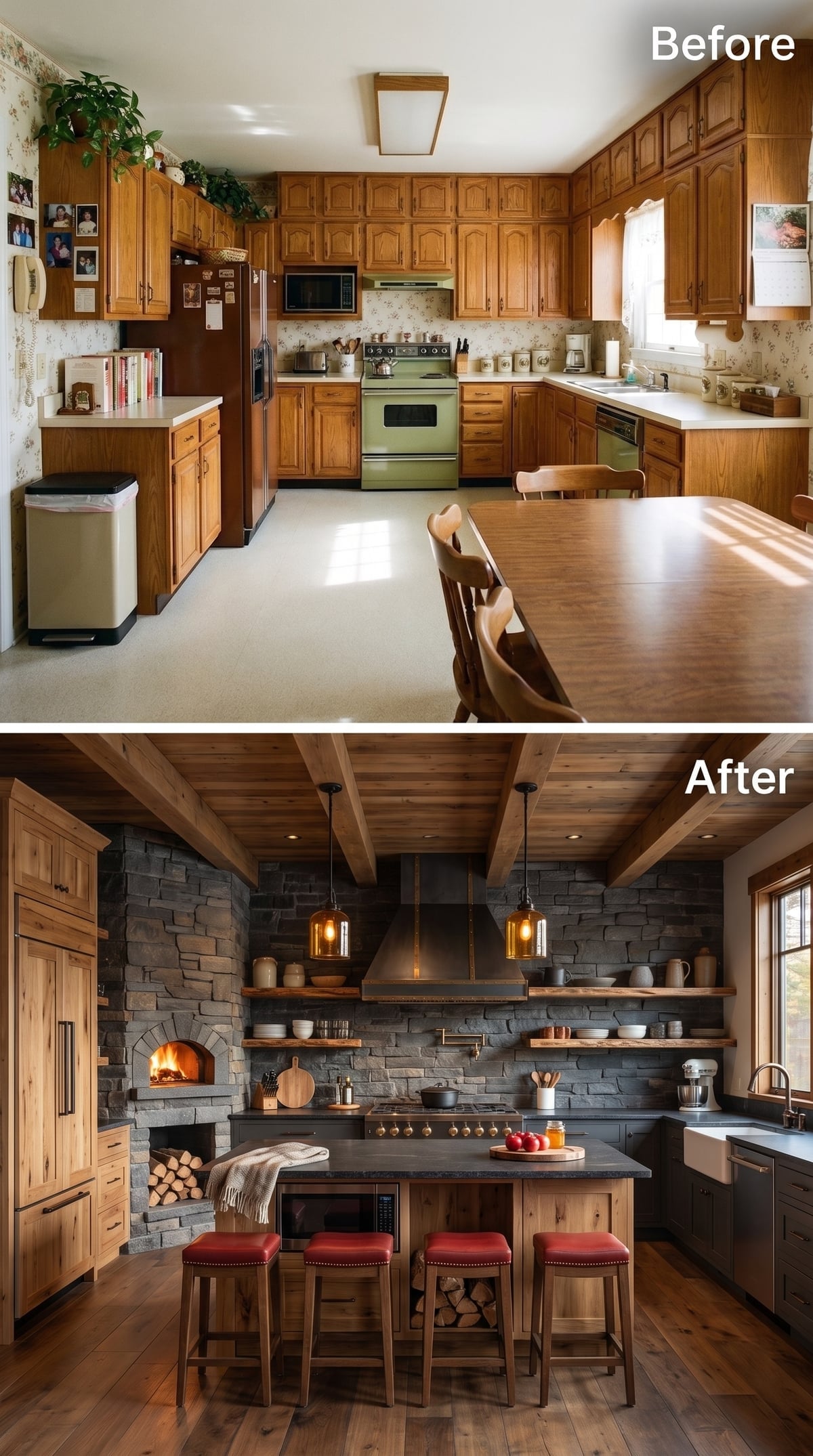
11. Stone Walls and Rough Beams Replace Cabinetry With Texture
🔥 Would you like to save this?
Stacked stone covers most of the wall surface, making conventional upper cabinets almost beside the point. Rough-hewn beams, floating wood shelves, and amber glass pendants bring warmth against the stone, while the darker island sits quietly at the center.
A built-in hearth-style oven becomes the visual focus of the cooking wall, with firewood stored beside it. The transformation feels less like a cabinet redesign than a decision to let the room’s materials become the decoration.
10. Red Cabinetry and Slate Surfaces Prove Fewer Doors Can Still Deliver Drama
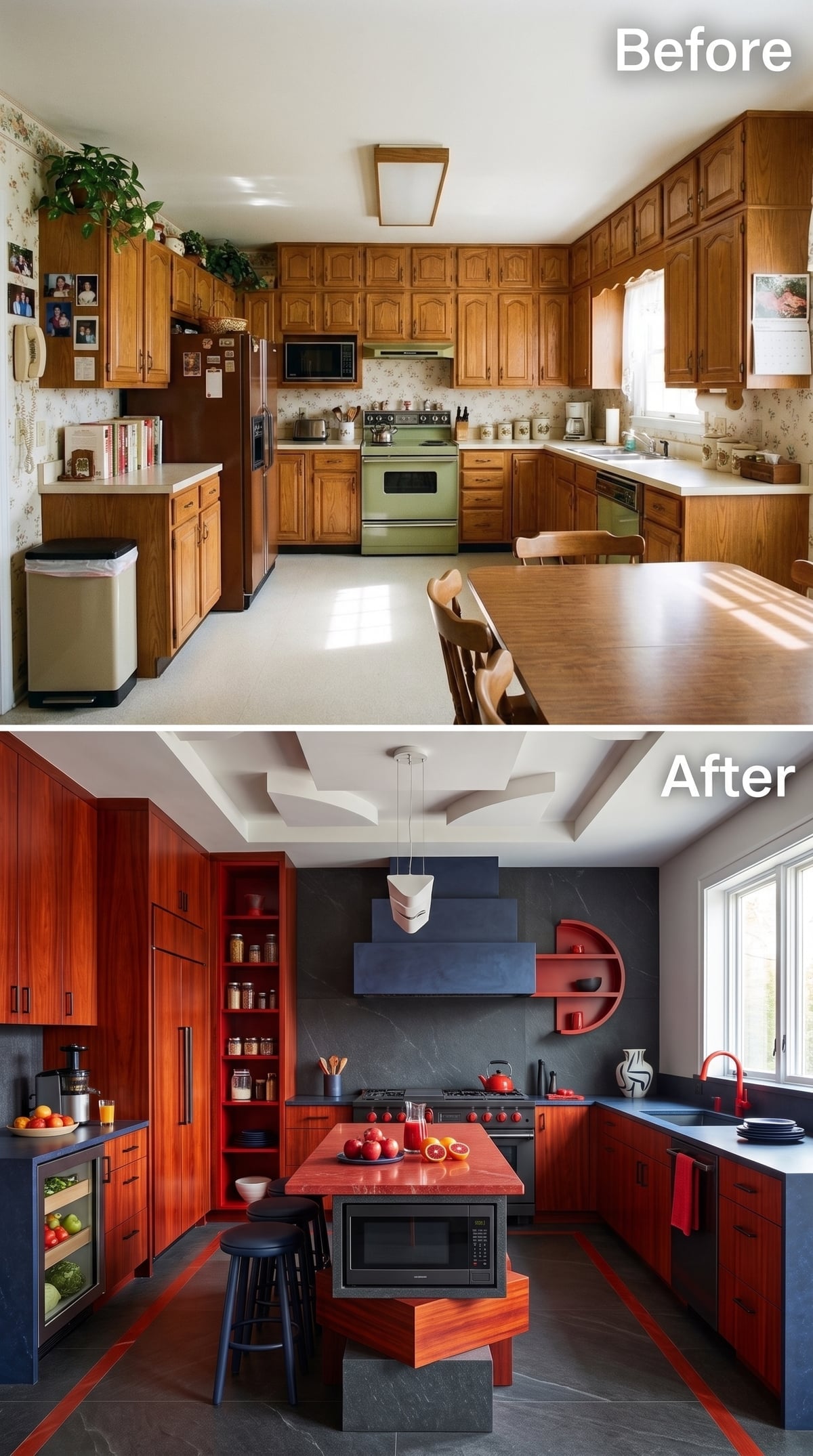
Rosewood-toned flat panels occupy one concentrated storage wall, but open shelving interrupts the run before the saturated color becomes too dense. The cabinetry can be bold because it does not have to cover every available surface.
A red stone-look island top pushes the palette farther, while a microwave recessed into the base preserves the work surface. Slate-gray counters and flooring give all that red a cooler background to work against.
9. Olive Cabinetry and Burl Wood Make the Island the Piece You Remember
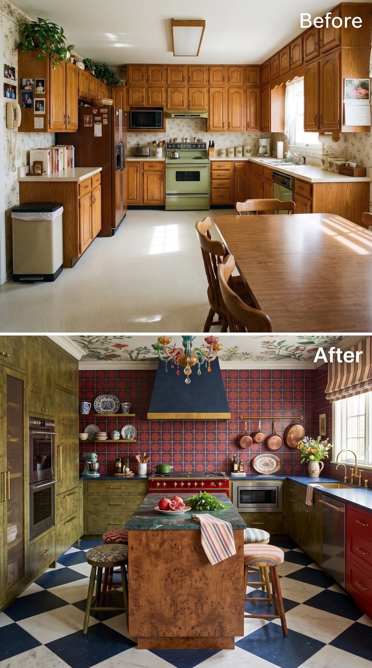
Olive cabinetry and brass hardware establish a muted perimeter, but the burl wood island supplies the material jolt. Its swirling grain introduces enough movement that simpler surrounding cabinets feel deliberate rather than underdesigned.
Red patterned tile climbs the backsplash wall, while a navy-and-white checkerboard floor introduces another pattern at a different scale. With those surfaces carrying so much character, another layer of uppers would only have diluted the effect.
8. Pale Ash Cabinetry and a Grid Ceiling Make Restraint Look Architectural
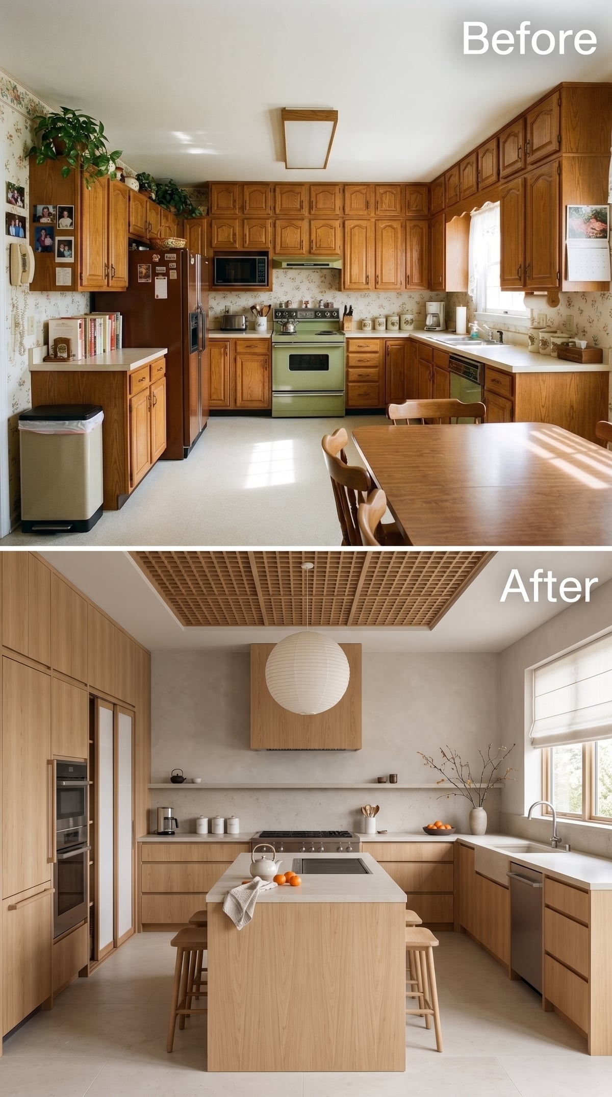
Light wood cabinetry concentrates storage into tall uninterrupted planes instead of scattering it across every wall. The grain behaves almost like paneling, allowing the millwork to recede into the architecture rather than announce every individual door.
A coffered wood grid gives the ceiling its own texture. The low, broad island carries the cooktop and keeps the work surface notably clear, while the sink wall remains sparse enough for light and negative space to matter.
7. Black Marble and Plum Millwork Take the Idea to Its Darkest Extreme

This is the gallery’s most theatrical detour. Black marble with gold veining covers the cooking wall, while a deep plum hood introduces furniture-like millwork without rebuilding the entire room in ornate cabinetry. Candle-style brass lighting adds warmth without attempting to make the palette bright.
Open shelving breaks the left side before it becomes another uninterrupted dark mass. Dusty mauve stools and a deep green island top introduce quieter color, while herringbone wood flooring supplies enough warmth to keep the room from becoming severe.
6. Navy, Toile, and Checkerboard Floors Turn Pattern Loose
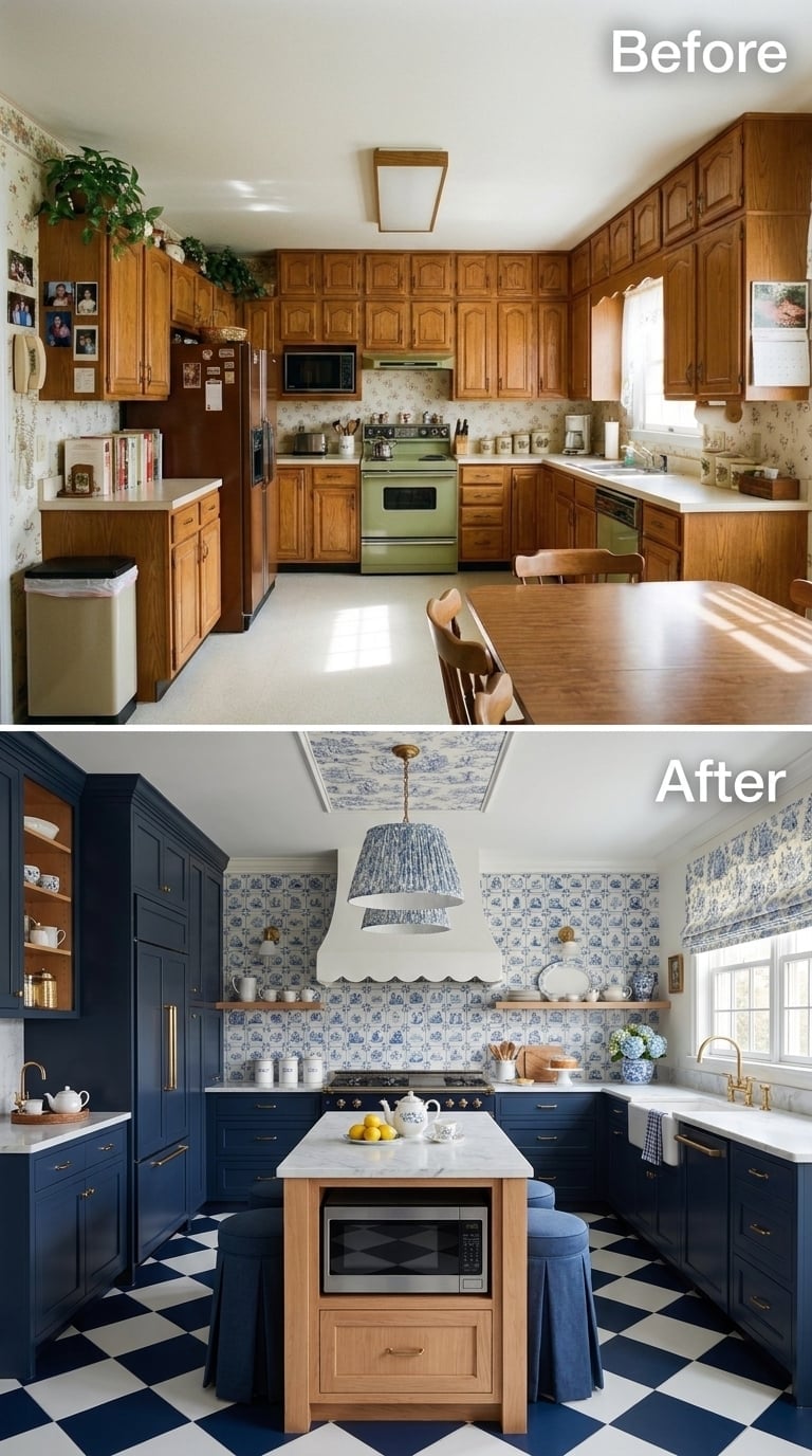
Navy Shaker cabinetry provides a solid base, but blue-and-white scenic tile takes over much of the backsplash and upper wall. Floating wood shelves leave enough of the pattern visible to establish the room’s character.
A scalloped hood adds another curve above the range, while the navy-and-white checkerboard floor repeats the color story in a bolder scale below. Toile began as a printed textile tradition, and its fine illustrative quality translates surprisingly well to tile when the surrounding cabinetry stays controlled.
5. A Slatted Ceiling and Open Shelves Make Warm Wood Feel Lighter
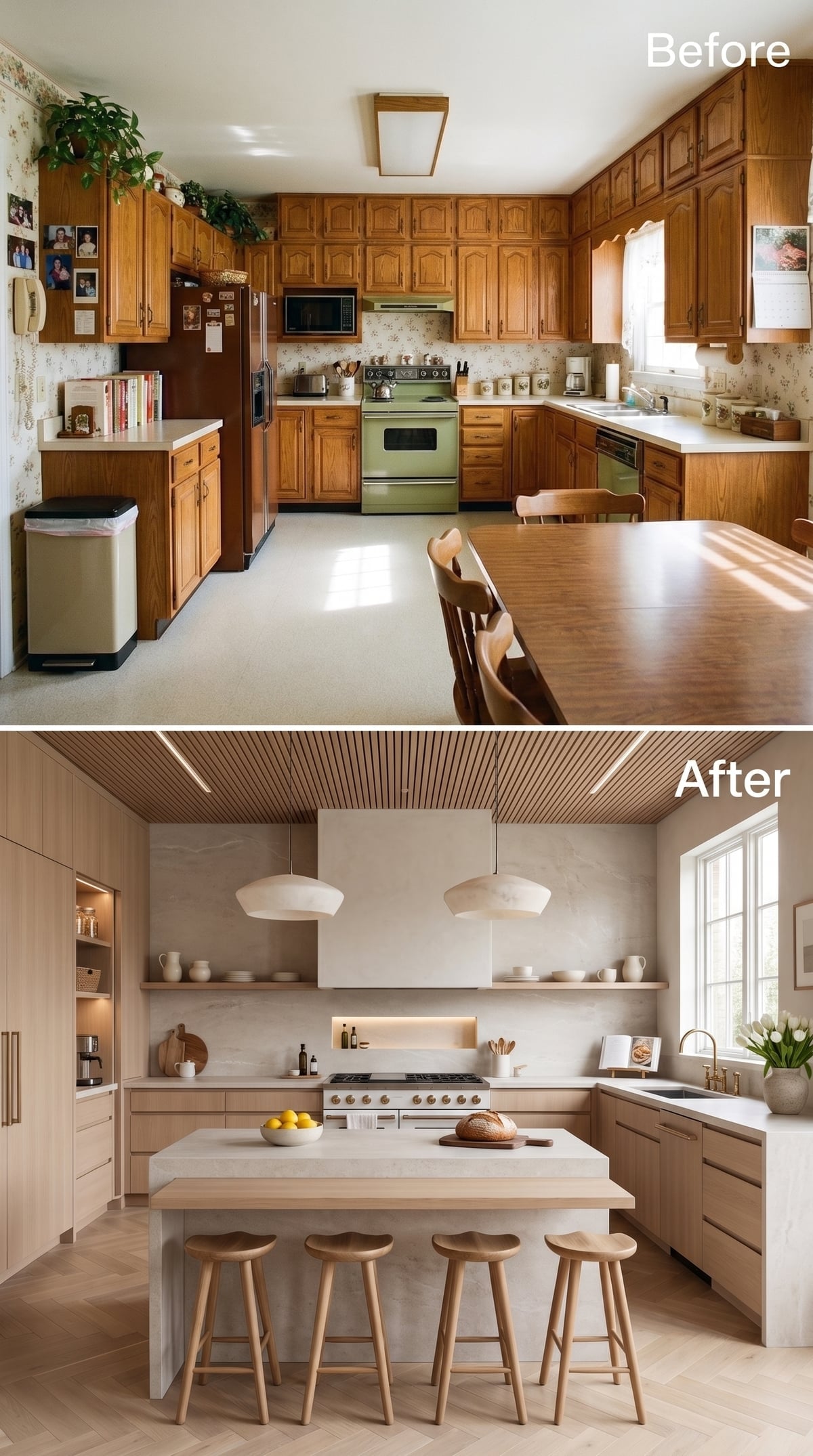
Warm wood veneer covers the lower cabinets and island, but the open walls above prevent the material from becoming overwhelming. Slim shelves near the range hold ceramics without recreating the solid cabinet band that once compressed the room.
A slatted wood ceiling carries the grain overhead and supplies architectural texture from another direction. Pale pendant shades and a plaster-finished hood soften the effect, while saddle-seat stools tuck neatly beneath the island.
4. Terracotta, Plaster, and Stone Turn Empty Wall Space Into the Main Ingredient
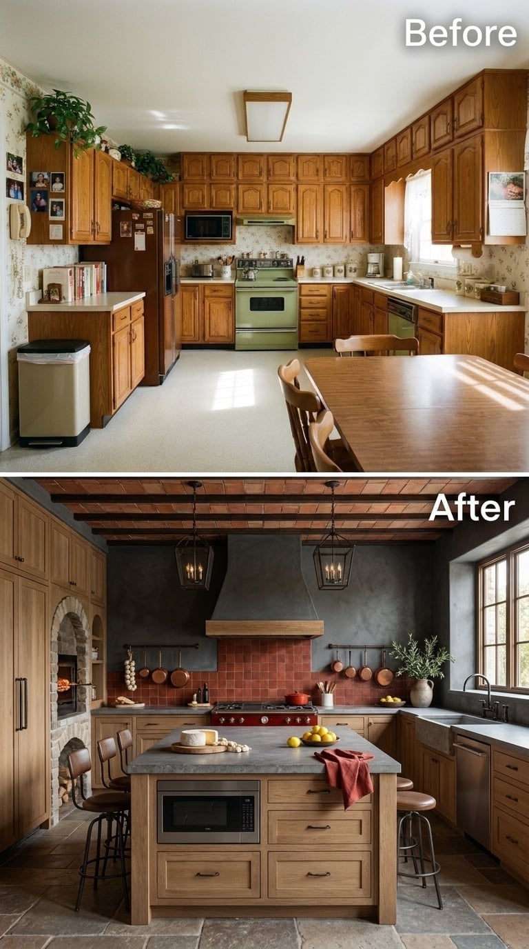
Cerused oak storage occupies one concentrated wall, leaving the range zone largely free of upper cabinets. A charcoal plaster hood rises against terracotta-colored square tile, while a rail below keeps cookware within reach without hiding the surface behind doors.
A concrete-look island carries additional storage and a microwave drawer. Lantern pendants, exposed beams, stone flooring, and an arched masonry opening give the kitchen an older, more grounded character. Those materials would lose much of their force if every wall were still covered in cabinetry.
Storage Strategy: A wall rail can move frequently used cookware out of cabinets and place it directly beside the range. The trade is visible storage, so the approach works best for pieces used often enough to justify staying on display.
3. Walnut Panels and Gray Marble Make Space by Refusing to Fill It
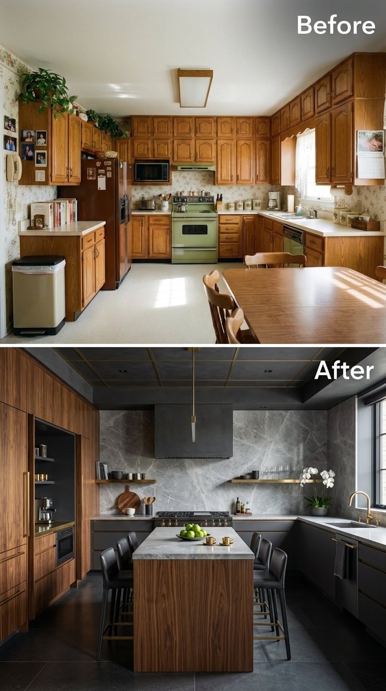
Warm walnut cabinetry rises in one disciplined storage block, allowing the rest of the kitchen to remain remarkably open. Gray marble spreads across the backsplash and hood surround in broad slabs, with no cabinet doors or grout lines interrupting the stone’s movement.
Brass appears sparingly in the hardware and pendant lighting, which is enough to warm the palette without turning the room metallic. The restraint is the design: some surfaces become more useful simply because nobody tried to turn them into storage.
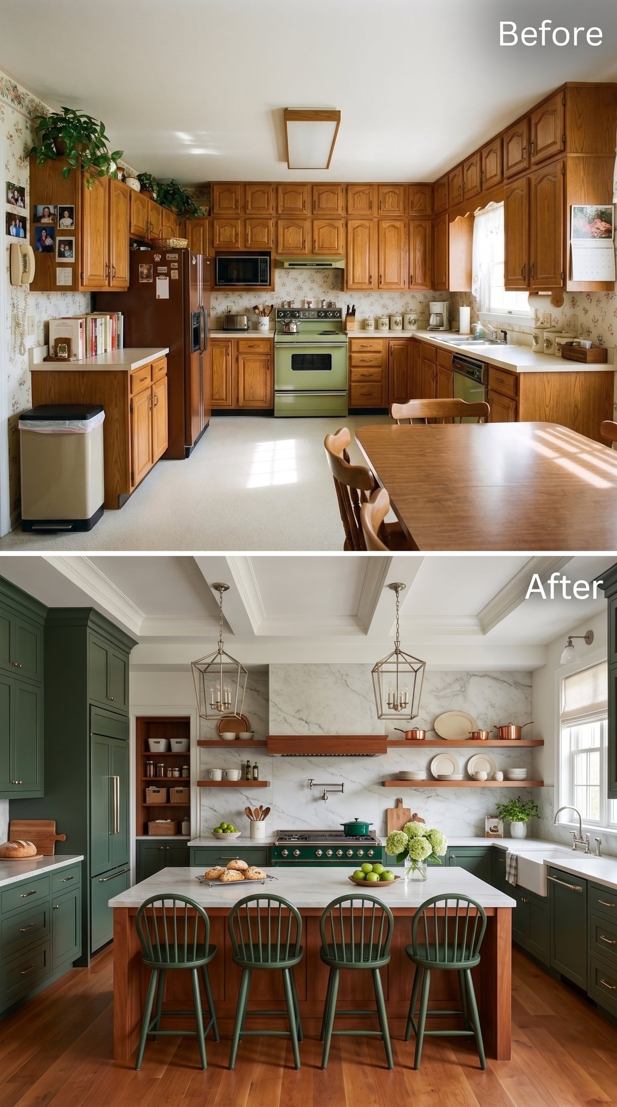
2. Forest Green, Walnut, and Marble Know Exactly Where Storage Should Stop
🔥 Would you like to save this?
Hunter green cabinetry brings strong color without overwhelming the perimeter. Brass hardware warms the saturated paint, while floating walnut shelves open the marble backsplash around the cooking zone instead of covering it with another bank of doors.
A thick pale island top, aged-brass lanterns, and green Windsor-style stools hold the palette together without forcing every element to match. Storage remains generous, but the room improves because cabinetry stops being the automatic response to every available inch.
1. Navy, Walnut, Marble, and a Ceiling That Finally Gets the Last Word
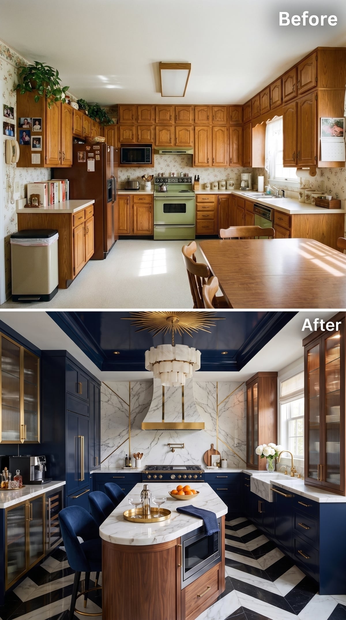
Gold sunburst millwork across the navy ceiling announces this kitchen before the cabinetry has a chance. That is precisely why the storage below stays comparatively disciplined. A curved walnut island introduces a softer shape at the center, while a microwave drawer disappears into its base.
The cooking wall takes the place of a traditional forest of uppers. Veined marble rises around the hood in broad panels, edged with brass geometric inlay, while black-and-white chevron flooring sends movement in the opposite direction. When every surface has something worth saying, cabinetry no longer has to say everything.