🔥 Would you like to save this?
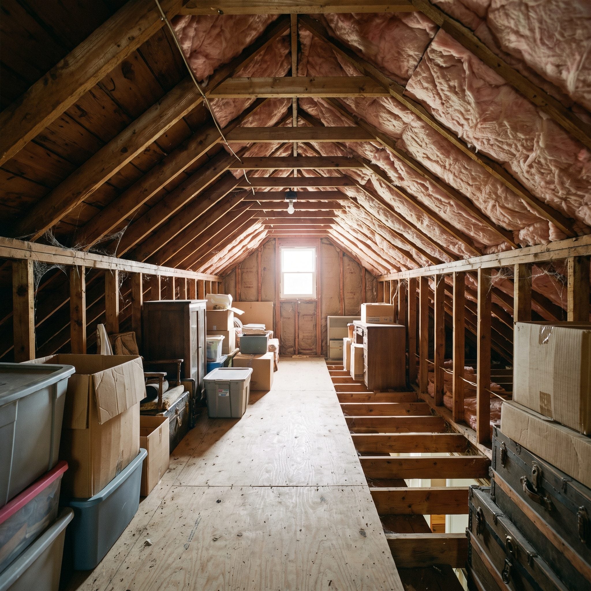
The insulation was still exposed—pink batting wedged between the rafters, one bare bulb dangling from a pull chain, loose plywood flexing under every careful step. This was supposed to become a bedroom, and baby number three was not especially interested in the construction schedule.
So they took a photo of the cramped, unfinished attic and handed the problem to AI. What came back was not one polite suggestion, but 26 ways to turn the darkest space in the house into the room everyone would suddenly want. The skylights got bigger, the awkward eaves found a purpose, and the bare rafters started looking less like a problem than an opportunity. These were the concepts that made them stop scrolling and start calling a contractor.
In order to come up with the very specific design ideas, we create most designs with the assistance of state-of-the-art AI interior design software. Also, assume links that take you off the site are affiliate links such as links to Amazon. this means we may earn a commission if you buy something.
26. Modern Neutral Nursery Bathed in Skylight and White Oak
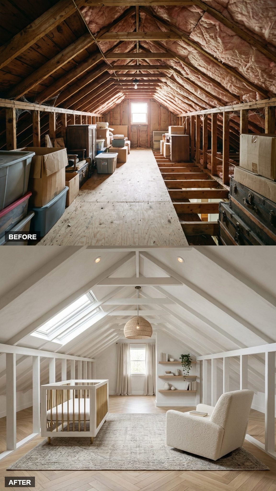
The old attic had exactly one dusty dormer to blame for its darkness. Adding a skylight transformed the room in a single move—no paint color could compete with real daylight. In a built version, its position, glazing, and shading would need to be planned so the crib avoids direct heat and glare.
White oak in a herringbone pattern warms the whole thing, so the plaster feels soft instead of clinical. A baby asleep under a shaft of morning light beats a bare bulb on a cord every day of the week.
25. Sky Nursery With a Vaulted Ceiling and Painted Clouds
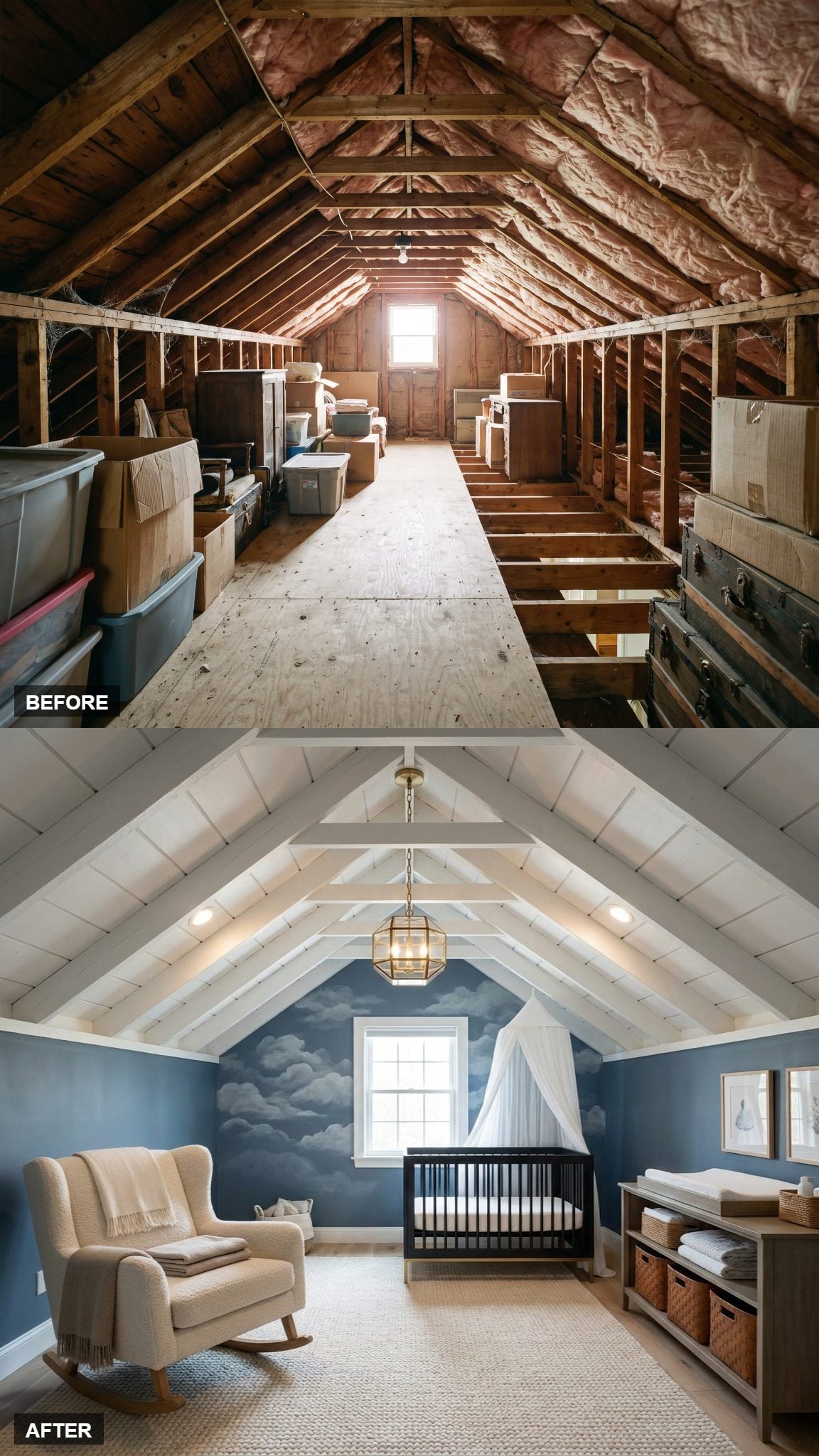
That deep dusty blue could have swallowed a low attic whole. It doesn’t, because the vaulted ceiling and its painted rafters give the color somewhere to climb instead of closing in.
The hand-painted cloud mural sounds twee on paper and feels charming in the finished room. A matte black crib with brass accents keeps the whole thing from tipping into theme-park territory.
What Our Readers Say
- In Home Stratosphere readers’ heart and thumbs-down votes, bedroom images with vaulted ceilings got hearts 59% of the time, compared with 52% for the other images in the same articles.
From Home Stratosphere reader polls and votes.
24. Nursery and Playroom With a Built-In Reading Nook
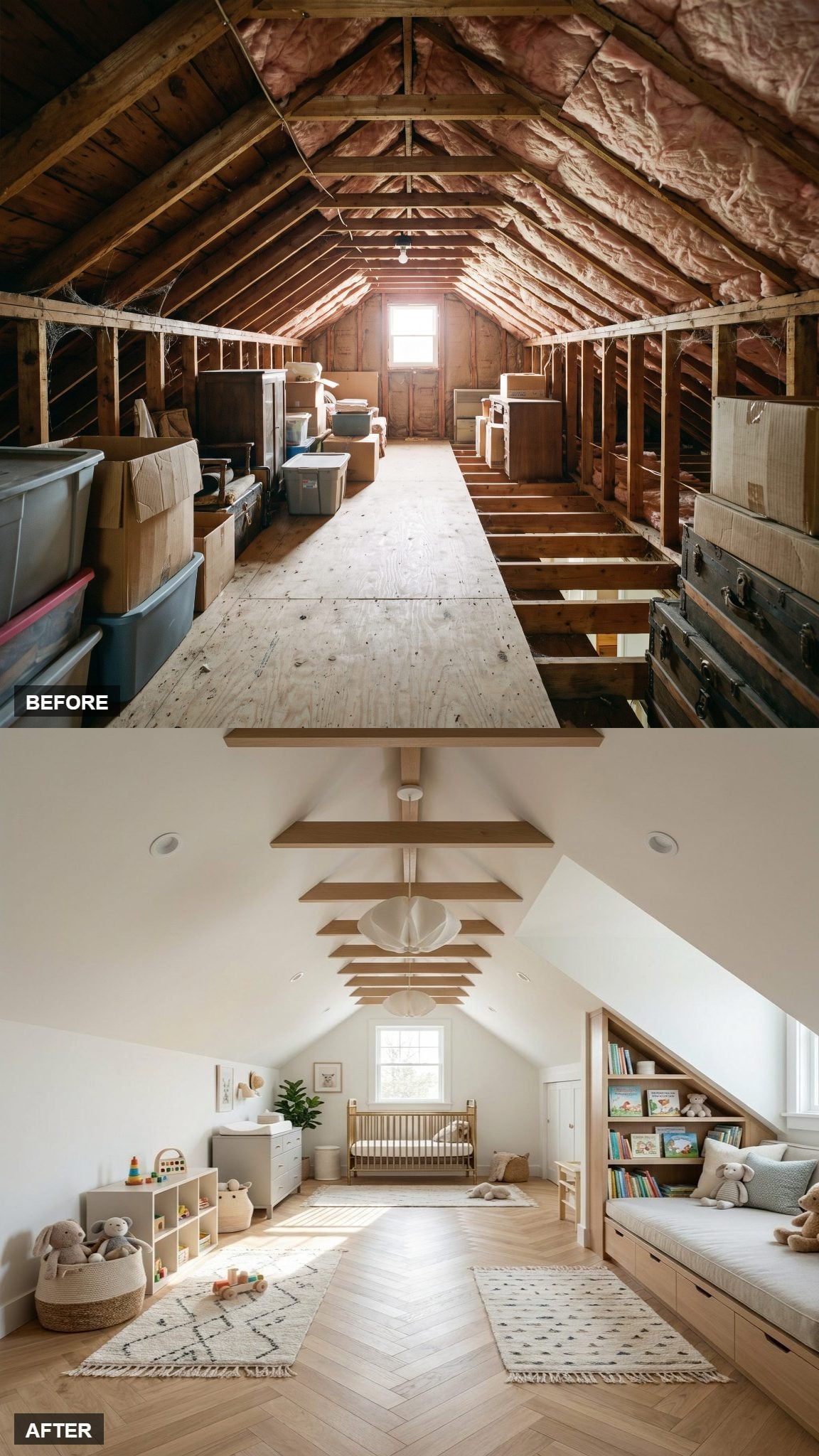
Low eaves are usually where good design goes to die. Here a cushioned reading nook drops right where grown-ups can’t stand up anyway—which is exactly the point, since it’s kid height by design.
Split the attic into a sleep end and a play end and the room grows with the kid. Herringbone oak running unbroken across both keeps it feeling like one space, not two rooms grafted together.
23. Blush Nursery With Botanical Wallpaper on the Ceiling
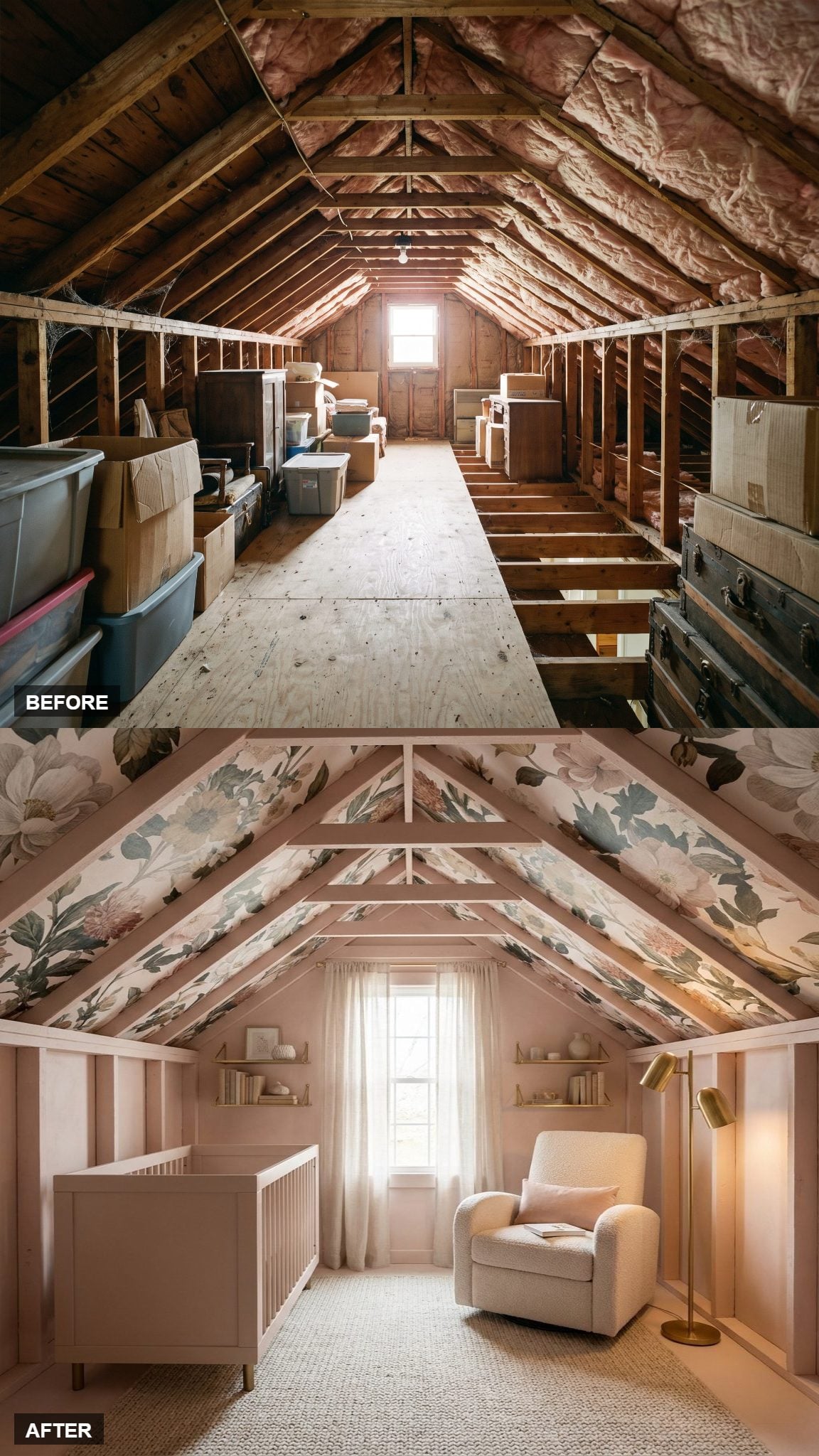
Wallpaper on the ceiling instead of the walls. Nobody expects it, and on sloped attic panels it turns the roofline into the reason you keep looking up.
Blush plaster below keeps the botanical print from shouting, while brushed gold and a brass floor lamp warm the pink so it never curdles into anything saccharine.
22. Botanical Nursery With a Floor-to-Ceiling Glass Atrium Window
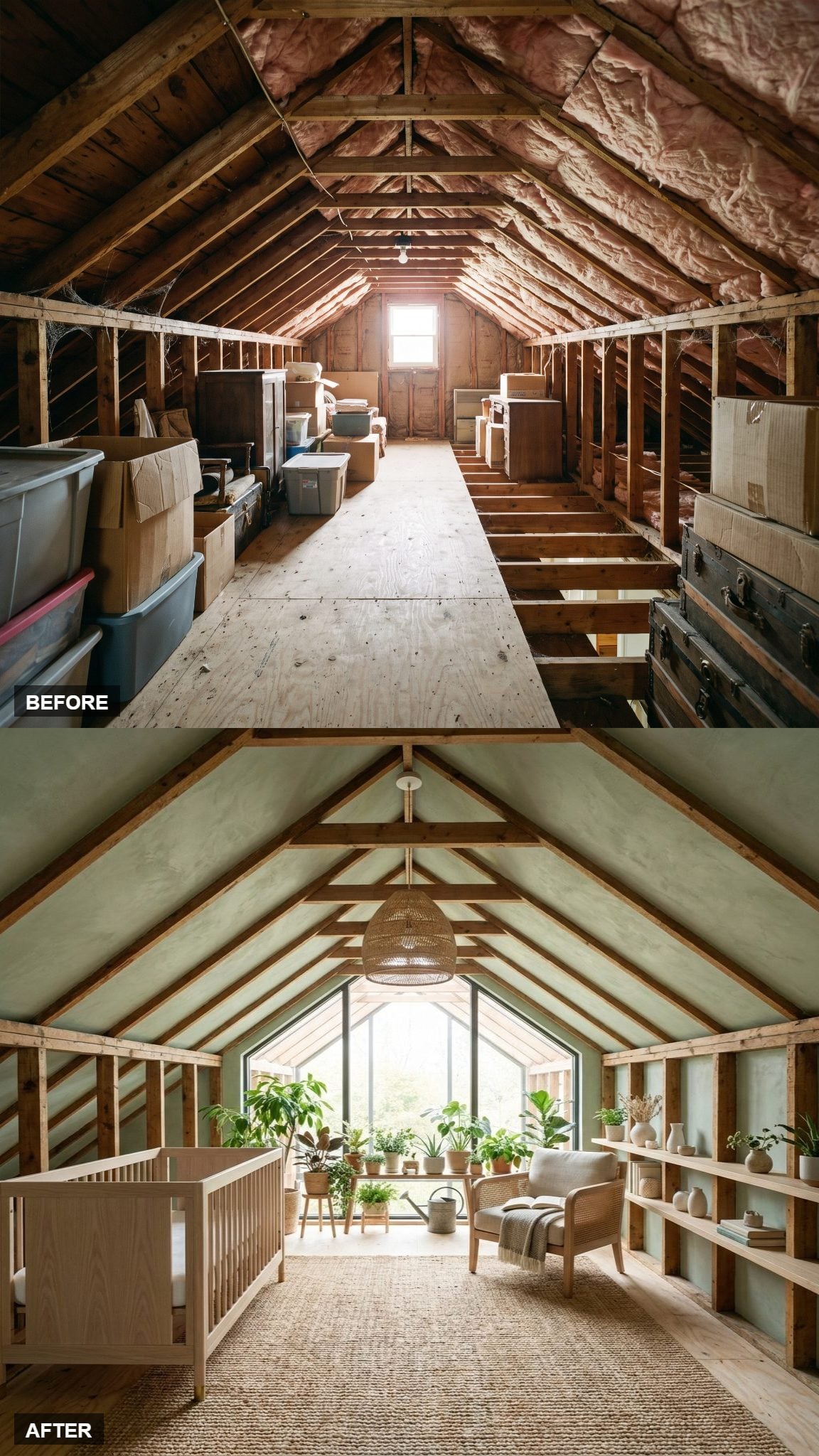
Replace the small dormer with a floor-to-ceiling glazed atrium concept and the room changes. It is a major structural move, but visually it makes the roofline the room’s defining feature. Light stops being rationed and starts pouring in, and the sage plaster drinks it up.
A wall of potted plants beneath the glass stitches the inside to the outside. The greenery isn’t decoration here. It’s the reason the room exists.
21. Coastal Nursery Under a Vaulted Shiplap Ceiling
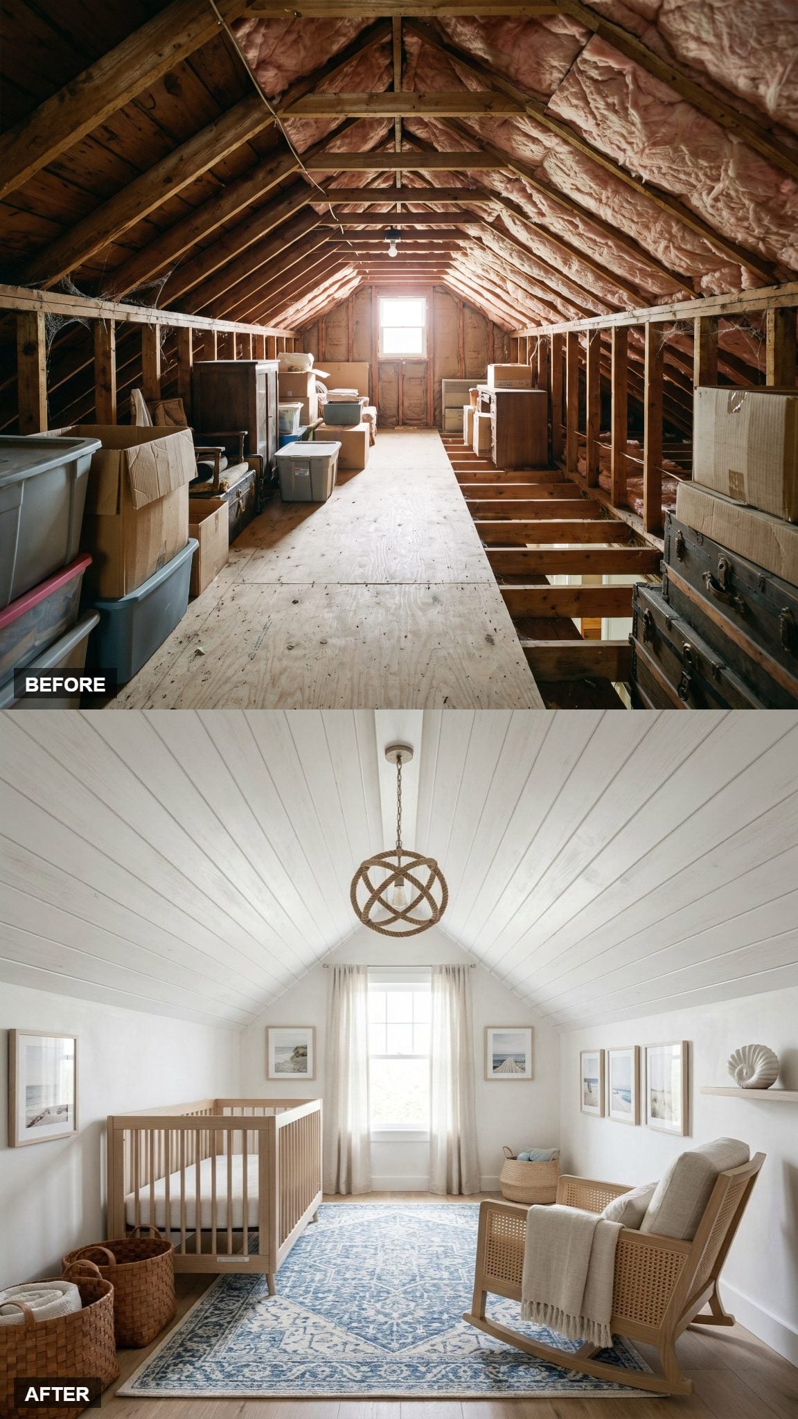
Whitewashed shiplap running up the vault gives the ceiling rhythm and stops the white from going flat—the whole difference between coastal and just blank.
A blue-and-white patterned rug and a rope pendant handle the coastal cues without a single seashell cliché. Keep it restrained and it’ll still look right in ten years.
Shiplap tends to land well with our readers: images featuring it got hearts 61% of the time, versus 53% for the other images in the same articles.
20. Bright Nursery With a Trio of Skylights and Butter-Yellow
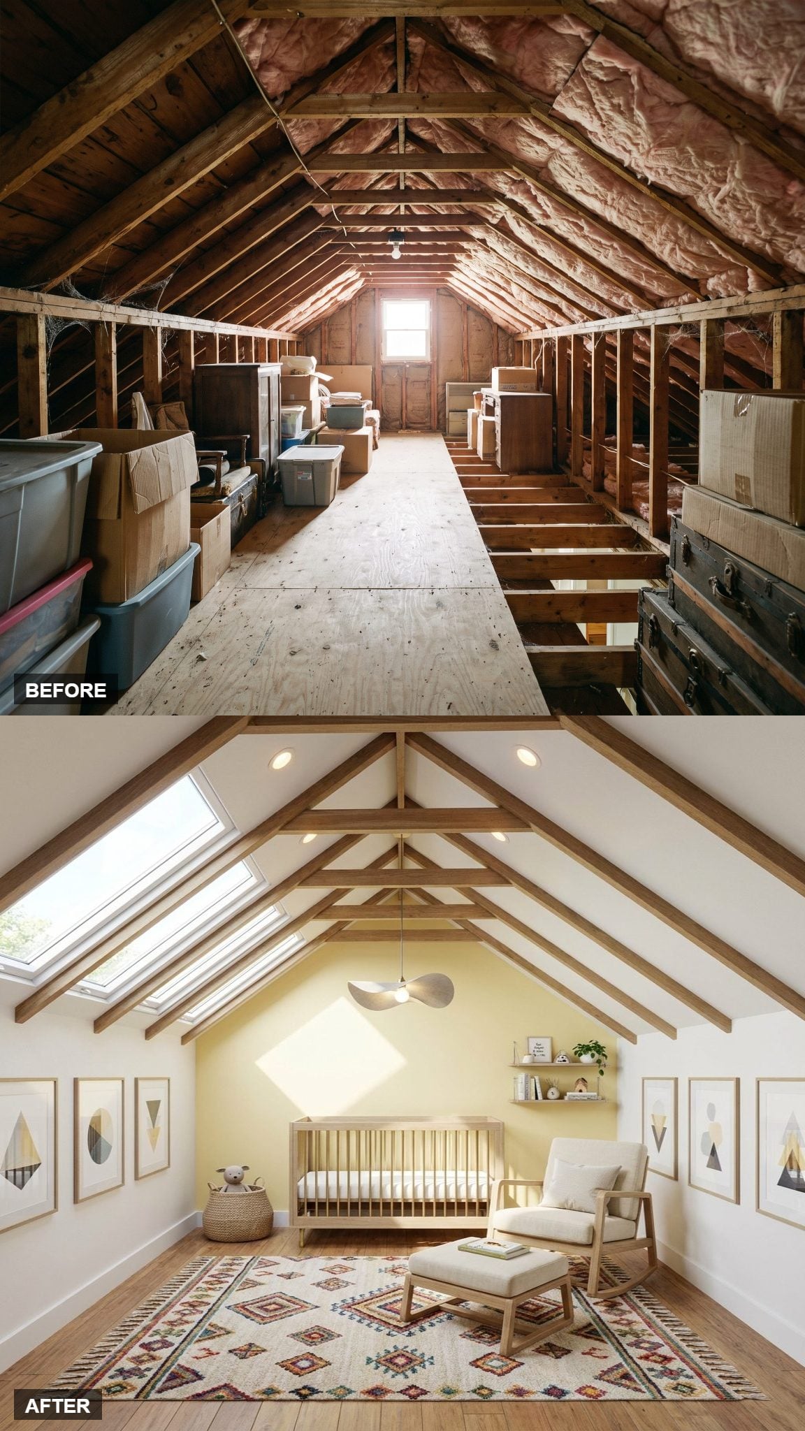
Three skylights in a row rather than one spread daylight across more of the room instead of concentrating it in a single opening. Major intervention. Big difference in how the room feels.
One butter-yellow wall against crisp white is all the color this space needs. Yellow feels like warmth and optimism without going sugary, and it plays beautifully off the geometric prints on the knee walls—the kind of pairing you’d never risk in a windowless room but that sings under all that daylight. After years of gray plywood and a bare bulb, this is the room that finally feels awake.
19. A Plastered Curved Archway Nook Reshapes an Awkward Eave
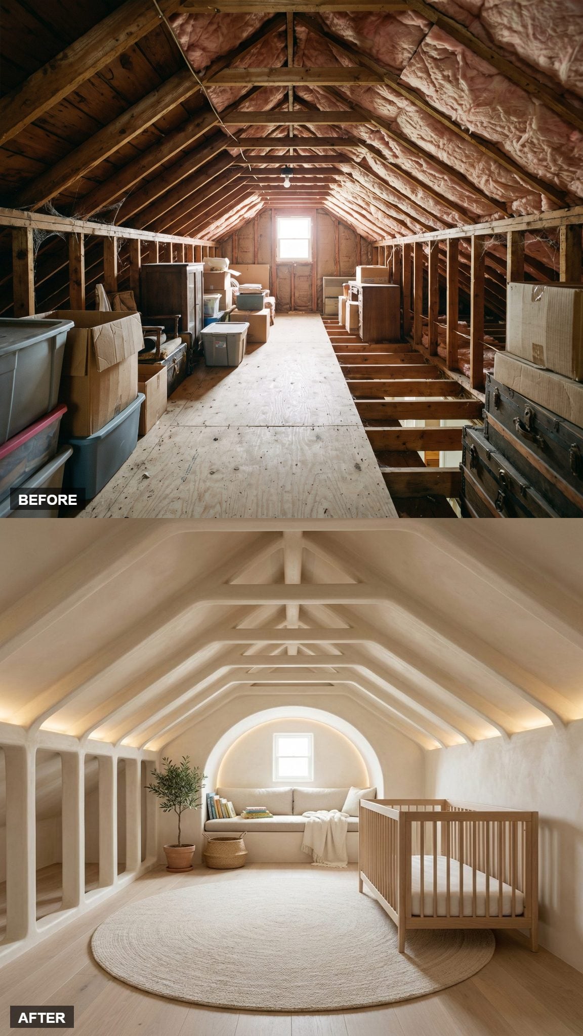
That curved archway does something the flat drywall corner never could. It softens the hard angle of the eave and gives the low corner a deliberate shape, turning wasted crawl space into a built-in seat.
The white-oak crib and warm limewash keep it calm rather than sweet. Nobody grows out of calm.
18. A Fluted White-Oak Feature Wall Draws the Eye Skyward
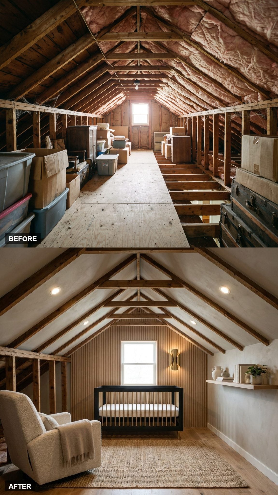
The fluted oak wall gives the room its upward rhythm. Vertical grooves continue onto the slope, emphasizing the attic’s full height instead of stopping at the knee wall.
Against soft greige plaster, the matte-black crib becomes the room’s strongest contrast. And a slim chrome sconce catches light off those ridges all day long.
17. A Smooth Plastered Barrel Vault Erases the Hard Attic Ridge
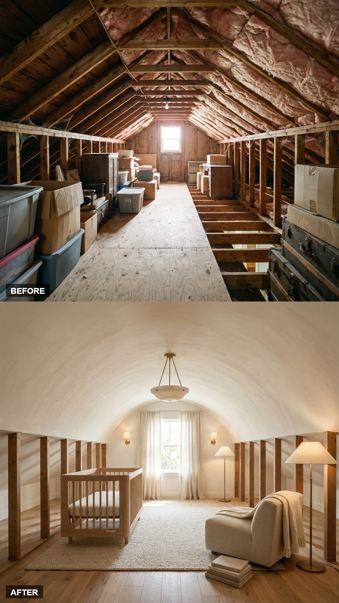
The before had that awful attic geometry: two flat slopes meeting in a hard ridge overhead, closing in like a tent. The barrel vault erases the ridge. Now the ceiling curves instead of pinching, and the room feels less compressed.
Everything else stays quiet on purpose—oatmeal wool, warm limewash, one alabaster pendant glowing at the peak. When the ceiling is the event, the furniture should shut up and let it happen.
16. A Full Walnut Wardrobe Wall Solves the Third-Baby Storage Problem
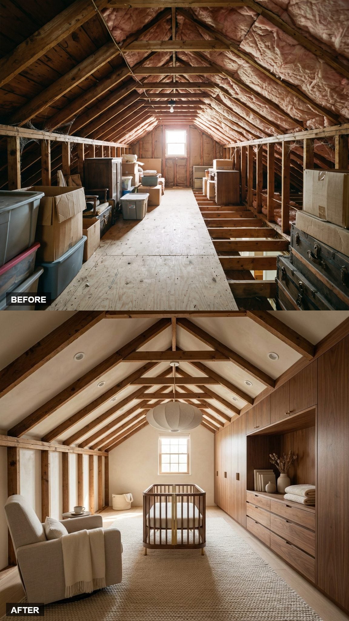
Third baby means storage stops being optional. Anyone managing small clothes, spare bedding, and baby gear should look at this one twice.
The walnut wardrobe swallows the awkward knee-wall and turns it into a run of closed doors, so all the chaos of small clothes and spare bedding vanishes behind flat wood. That center niche breaks up the length so the whole thing feels like furniture rather than a hallway of cabinets, and the warm cream plaster keeps the dark walnut from going heavy on you. It’s the kind of cream attic decor that stays sane through the toddler years.
15. A Dramatic Round Porthole Window Rewrites the Roofline
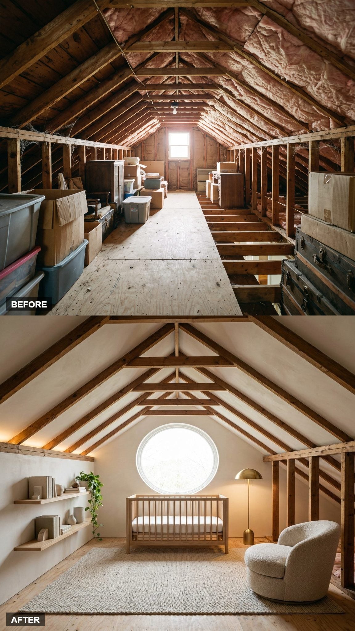
Cut a circle into a roofline full of straight lines and the room takes on a different character. That round window becomes the thing everyone looks at first, and it casts a soft disc of daylight across the crib wall.
Then the brass floor lamp takes over once the sun goes down. Fair warning: circular windows are pricey and a genuine pain to flash properly. Worth it here anyway.
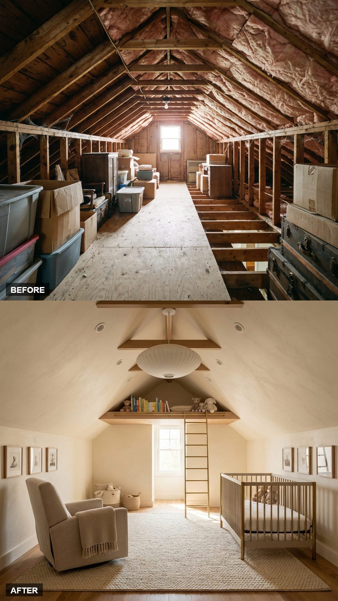
14. A Tucked-In Book Loft Turns Dead Roof Space Into Display Storage
🔥 Would you like to save this?
The highest point of the roof usually goes to waste. Here it becomes a raised display shelf for books, baskets, and keepsakes, reached by a slim library ladder in a dark bronze finish.
This concept is about storage rather than play space. In a real nursery, the ladder would need to be secured or removed when not in use, and the upper shelf would remain adult-access only until the room was redesigned for an older child.
13. A Plaster Medallion and Small Chandelier Give the Ceiling a Center of Gravity
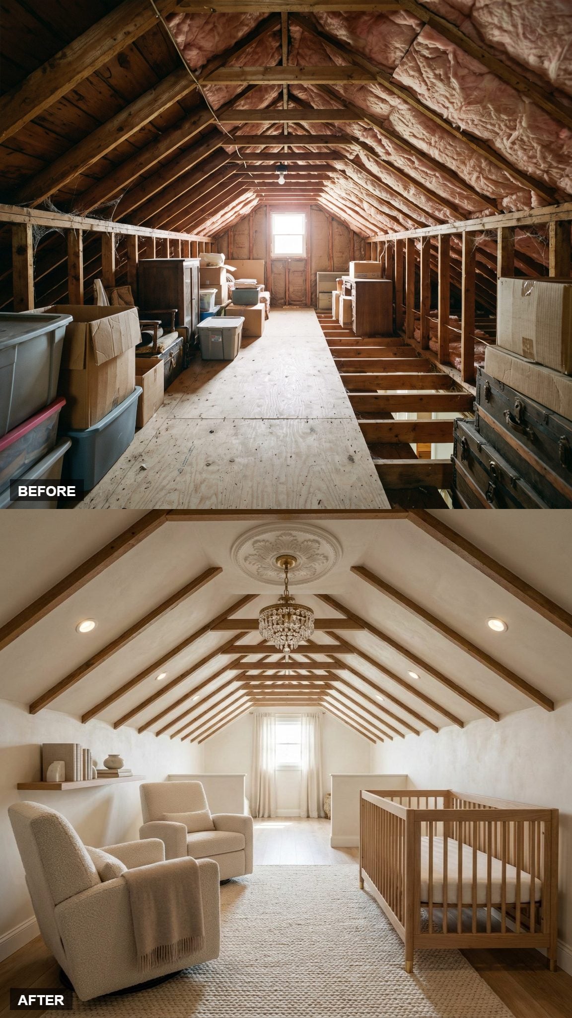
A little unexpected formality goes a long way in an attic. The crystal-and-brass chandelier and its plaster medallion hand the sloped ceiling a center of gravity it never had.
Restraint keeps it from tipping into fussy—ivory plaster, one bouclé glider, sheer linen at the window. At golden hour, the crystal chandelier throws tiny points of light across the walls, giving the ceiling movement without adding another pattern.
12. A Sunken Reading Pit Turns a Low Eave Into an Asset
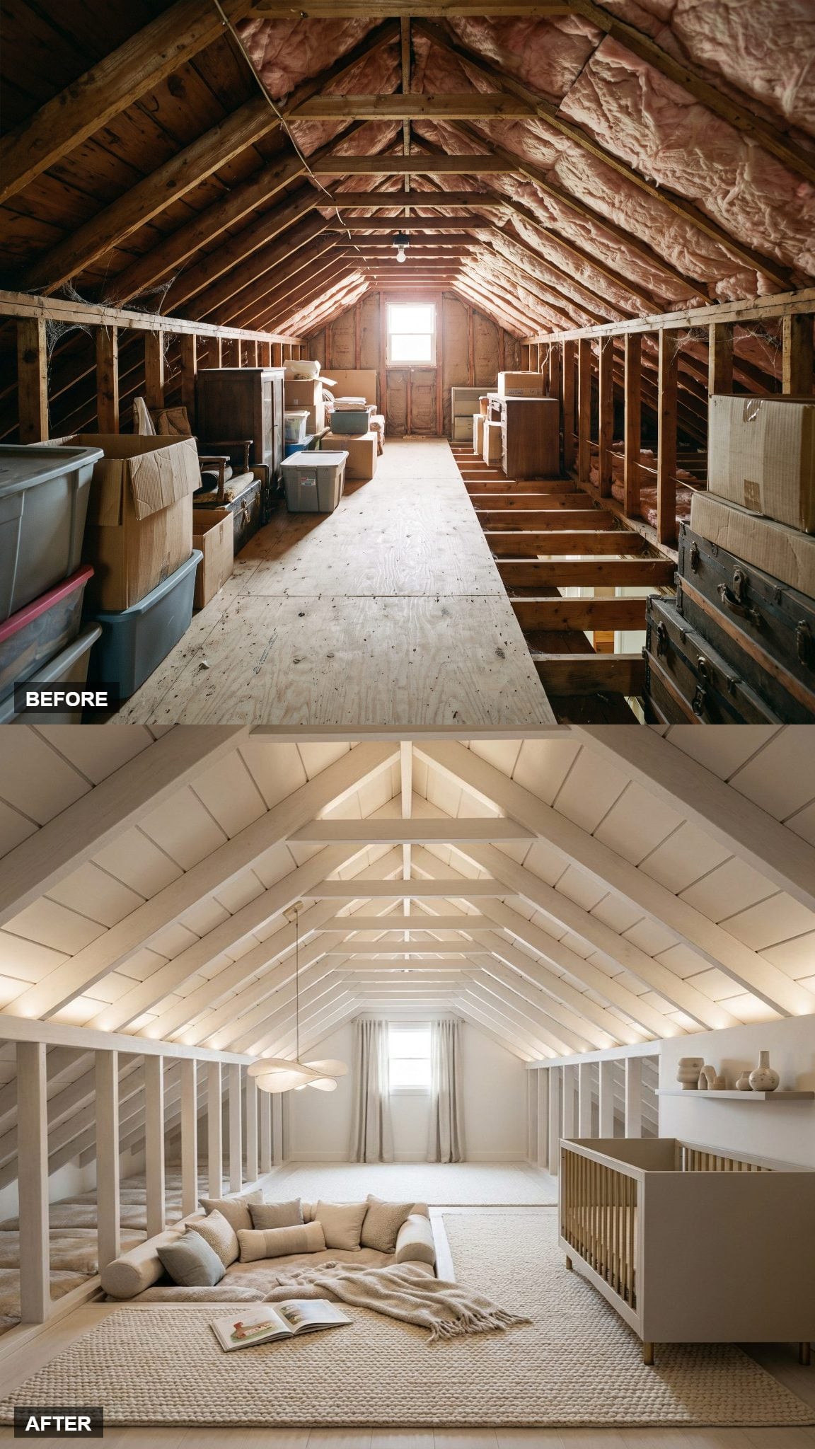
The sunken pit is a clever answer to a low eave. Instead of ducking under it, you drop the floor and sit below it, so the short ceiling stops being a limit and turns into a ceiling you actually want low.
Cushions and bolsters, a wool rug wrapping the edge, one open picture book. The low enclosure makes the nook feel separate while keeping the open room in view. A built version would depend on the floor structure, guard details, and a safe transition around the lowered edge.
11. A Historic-Inspired Sky and Star Mural Covers the Ceiling
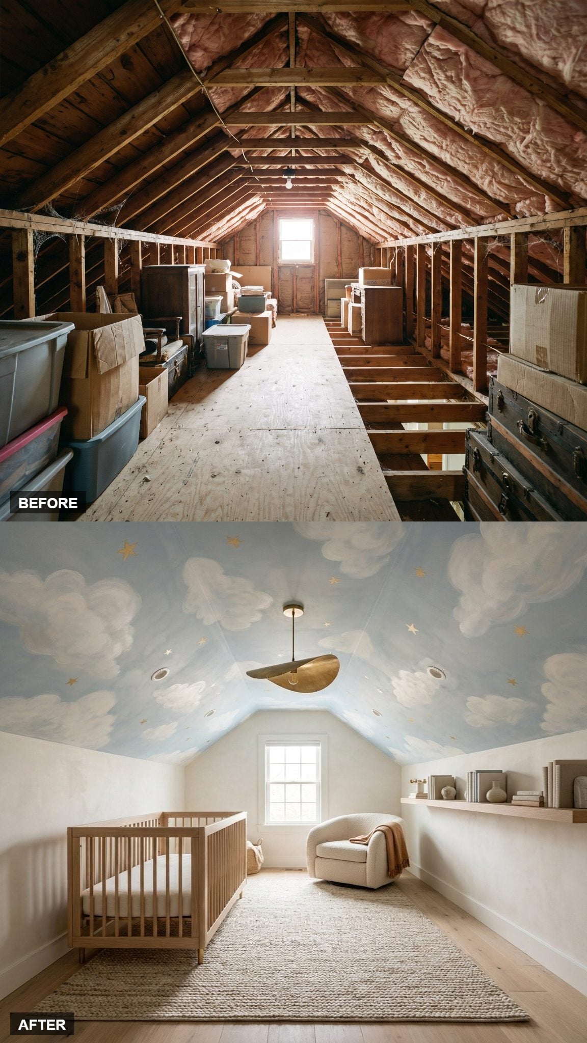
Unlike the simpler painted-cloud nursery earlier in the gallery, this version treats the ceiling like a mural. Soft clouds, stars, and a faded celestial palette give it the atmosphere of an old painted interior rather than a themed children’s room.
Keep it muted, not cartoonish, and it survives past the baby years. Warm white walls below let the painted sky stay the only pattern anywhere in the room.
10. A Cantilevered Window Bench Floats on Air Beneath the Dormer
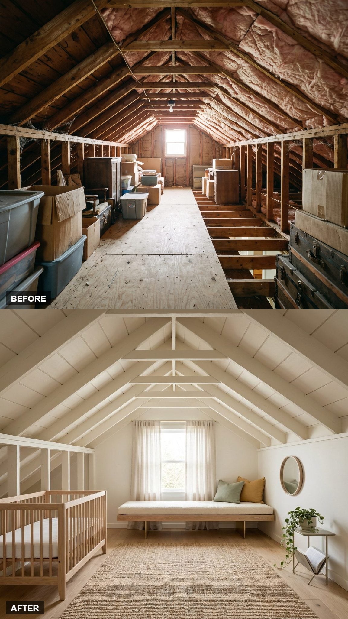
The bench looks impossible, and that’s the defining move. Hidden structural brackets with a brass-toned finish carry the white-oak seat so it appears to hover under the dormer, which keeps the low knee wall from feeling heavy. In an attic where every inch of floor matters, a seat that eats no visible footprint is the smartest move in the room.
The old space wasted its best asset. That dormer window was the only real source of light, and the before shot let a stuck pleated shade choke it—now it anchors a reading spot lit by soft daylight.
9. Cream Bouclé Ceiling Panels Wrap the Nursery in Upholstered Texture
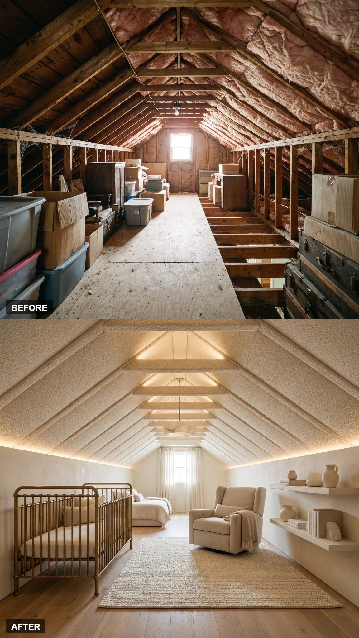
Fabric-covered ceiling panels create a soft, upholstered look and can help reduce some reflected sound when they are built over an appropriate acoustic backing. In a nursery, the full assembly would also need secure attachment, a suitable fire rating, and a surface that can be cleaned.
The cream-on-ivory palette does the quiet part. No contrast, nothing snags the eye, and that steep slope overhead feels soft instead of looming.
8. A Brass Inlay Herringbone Floor Medallion Marks the Crib Like an Address
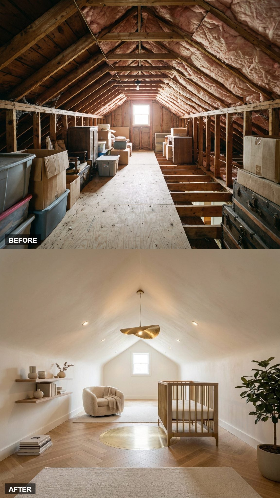
Most nurseries put the drama on the walls. This one puts it on the floor, where a brass medallion set into white-oak herringbone marks the crib like an address.
Honest longevity verdict: this outlasts every wallpaper trend by a decade. Herringbone oak was already established by the 1920s, and it’ll still feel intentional long after the crib becomes a toddler bed. The brass will develop a patina, which only makes it better.
7. Sculptural Plaster Niches Turn a Dead Knee Wall Into a Feature
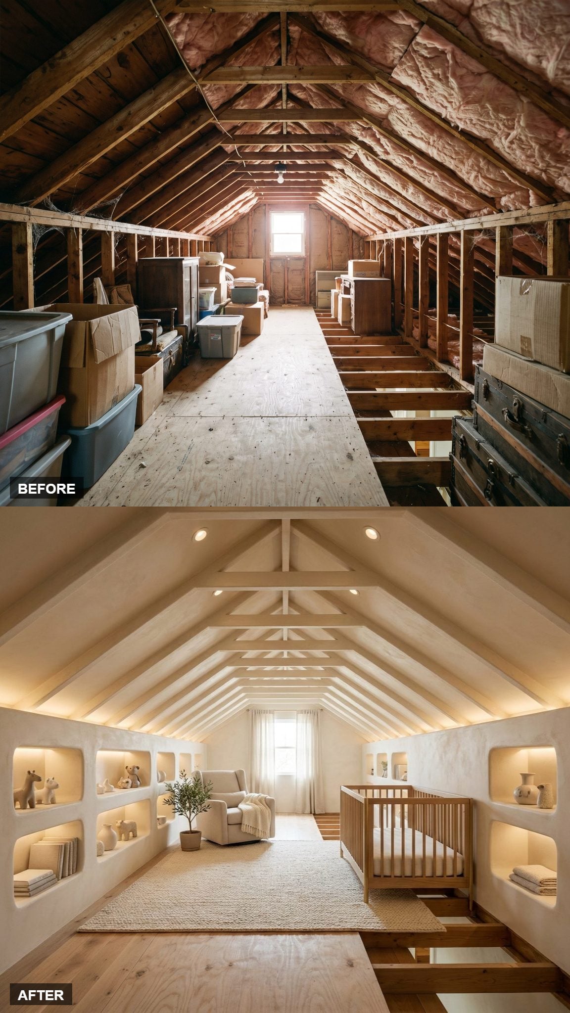
That awkward knee wall used to hold a cheap wire shelf drilled straight into the drywall. Now it holds sculpted plaster niches lit from inside, and the exact spot that felt like wasted dead space became the most sculptural surface in the room.
The sculpted niches turn storage into a feature worth staring at. The soft internal glow does the rest, casting the ceramics as objects instead of clutter. A little cream attic decor in the niches keeps the palette honest.
6. An Arched Mirror Wall Sends Dormer Light Back Across the Nursery
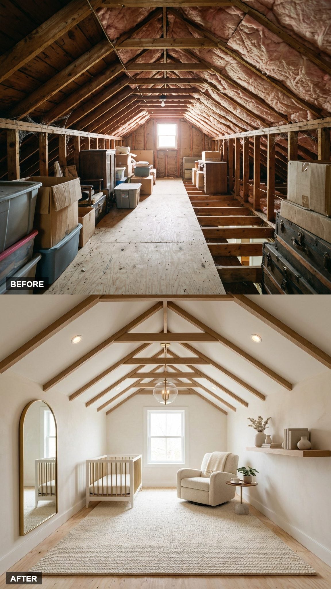
One large mirror changes the room’s sense of depth. The arched brass frame reflects daylight from the dormer back across the attic, making the former crawlspace feel brighter and more open.
5. A Suspended Ivory Linen Canopy Softens the Sloped Ceiling Into Folds
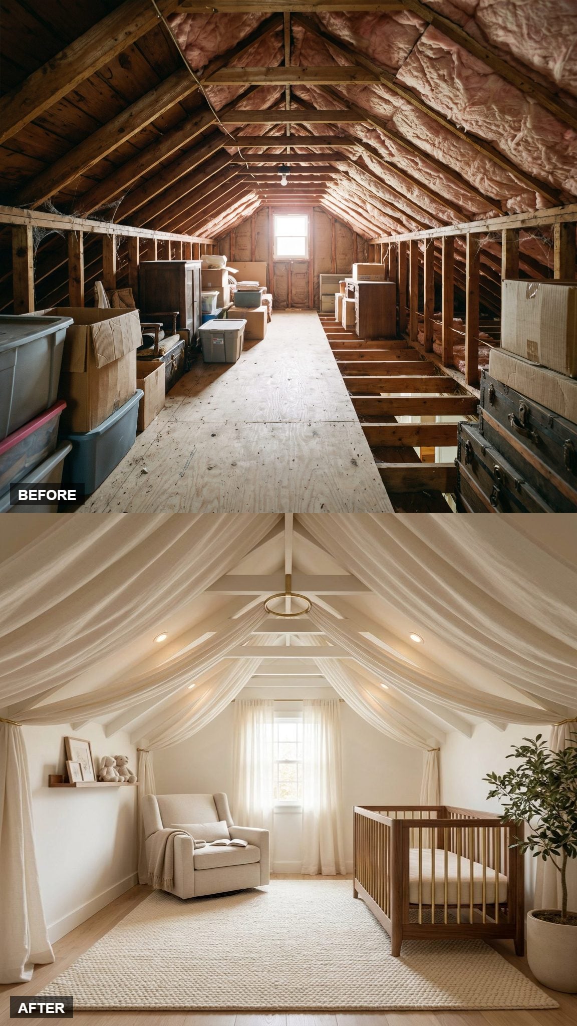
The linen drape softens the hard sloped ceiling into folds gathered at a single brass ring, giving the room the feeling of a carefully tailored tent. In a real nursery, any fabric canopy would need to remain well away from the crib and be secured so it could not be pulled down.
The tented-ceiling look can tip into costume-party territory fast, but the ivory-on-white restraint is what saves it here. No pattern, no color, just texture and shadow.
4. A Future Skylight Reading Perch Is Built In Now for Later
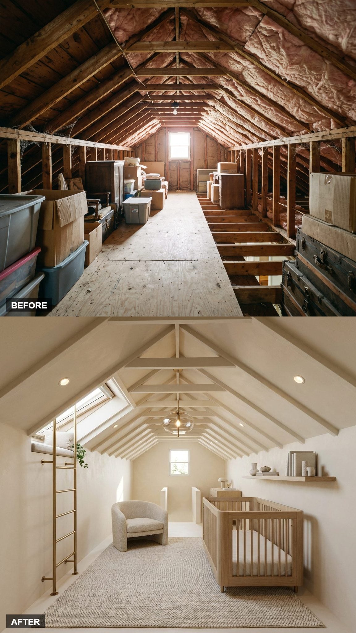
This concept looks beyond the nursery stage. The raised skylight perch occupies the tallest part of the roof, while the brass ladder and upper platform are treated as future features rather than something intended for a baby or toddler.
Once the room belongs to an older child, the perch could become a reading hideaway. Guardrails, controlled ladder access, safe headroom, and the child’s age would determine when it could actually be used.
3. Brass-Inlaid Ceiling Beams Flip the Room’s Sense of Height
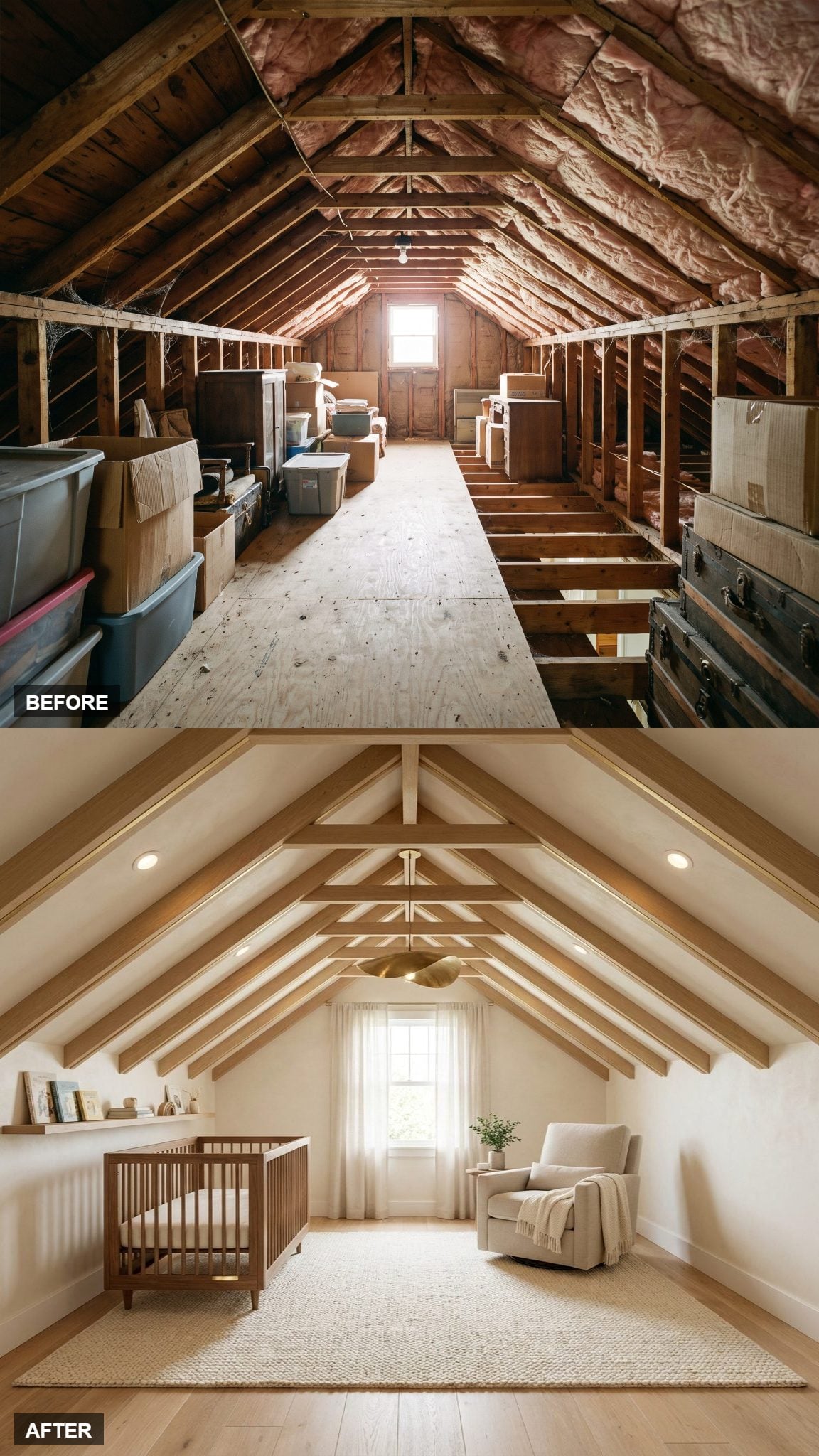
The dark-stained rafters from the before were the room’s biggest problem, pressing down and making a low ceiling feel lower. Refinishing them pale and adding narrow brass inlays along their length changes the whole effect. Now the beams draw the eye up and along instead of down.
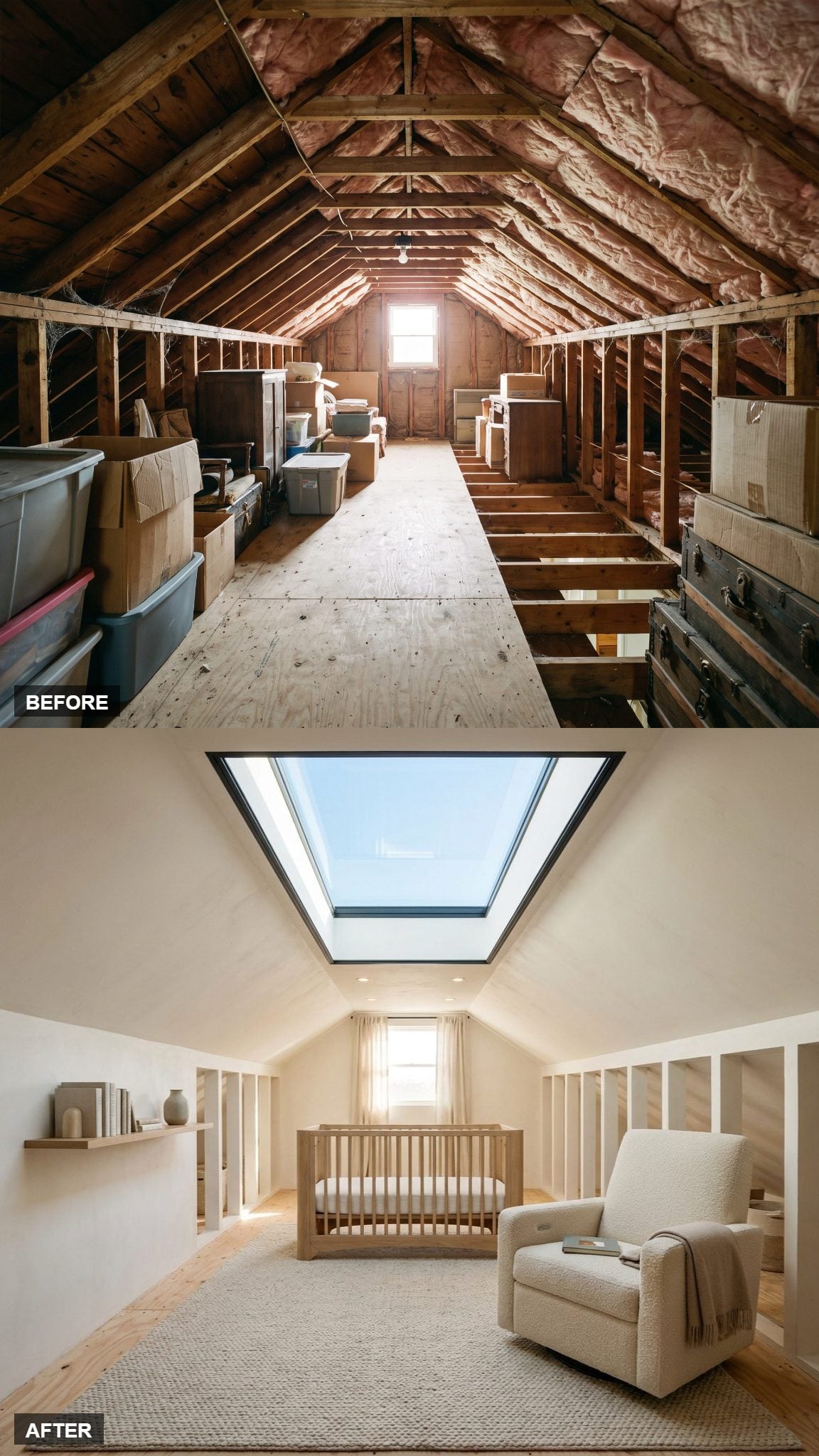
2. A Floating Glass Skybox Replaces One Broad Section of the Roof
🔥 Would you like to save this?
The old attic had a roof that pressed down on everyone under it—low, dark, a lid on the whole room. Replace part of the roof with a glazed skybox concept and the pressure lifts. The crib sits beneath a broad view of the sky, though a built version would require structural design, weatherproofing, shading, and careful temperature control.
Brushed-brass hardware on the white-oak crib catches the daylight coming straight down. The broad overhead opening washes the pale finishes more evenly than the original dormer alone could, and it makes the cream bouclé glider look like it wandered in from a gallery.
1. A Sculptural Freeform Plaster Ceiling Gives the Attic Its Own Shape
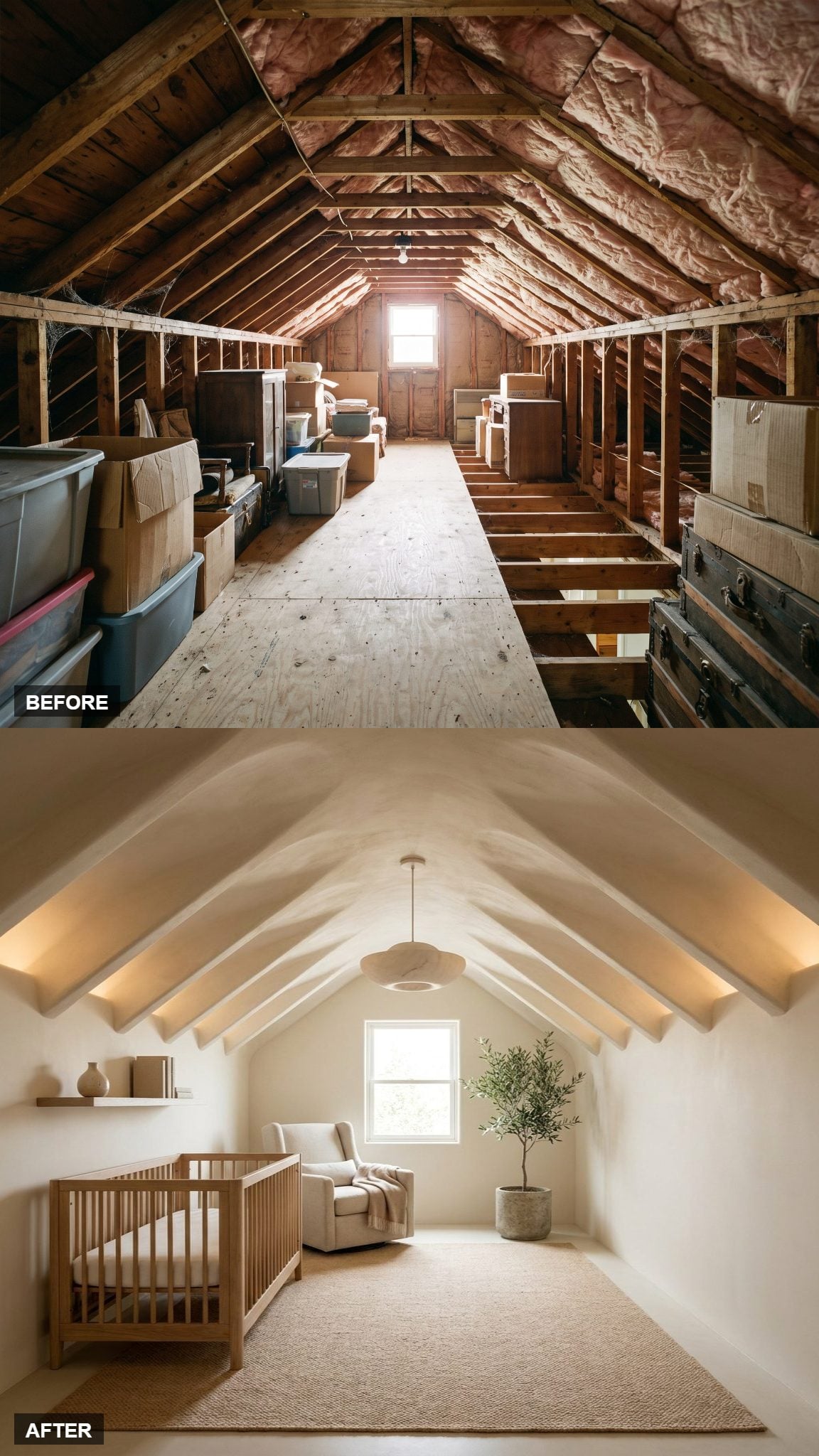
Flat drywall over an attic is the safe move. It’s also the forgettable one. Here the ceiling gets sculpted into slow plaster waves, so the room has a shape you actually notice the second you walk in.
Watch what the light does. As the sun moves, the shadows in those curves shift with it, and the room never looks the same at 8 a.m. as it does at 4 p.m. The alabaster pendant glows warm against the ivory instead of fighting it, while the white-oak crib and its brass hardware sit quiet underneath and let the ceiling do the talking.
Plaster like this has more permanence than a surface pattern because the form is built into the room itself. Whether it ages well will depend on the workmanship and how quietly the rest of the nursery is handled.