
🔥 Would you like to save this?
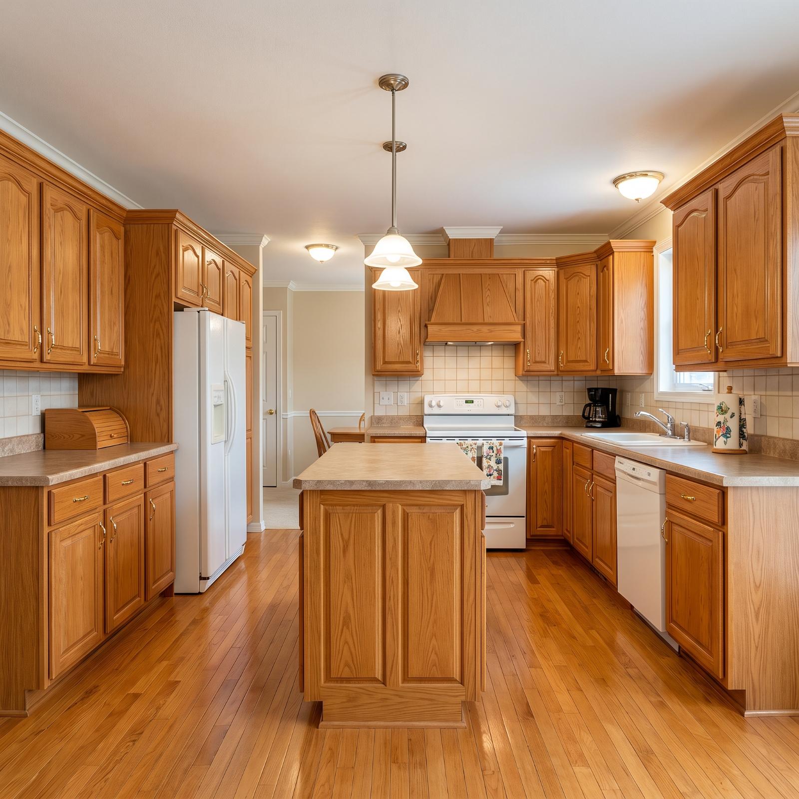
Oak cabinets weren’t the crime. The problem was the particular 1990s combination: honey-toned wood on nearly every vertical surface, counters and floors pulling warm in different directions, bulky cabinetry, and lighting that somehow made all of it look even more orange after sunset. The room had plenty of usable kitchen underneath the decade. You just had to find it.
In order to come up with the very specific design ideas, we create most designs with the assistance of state-of-the-art AI interior design software. Also, assume links that take you off the site are affiliate links such as links to Amazon. this means we may earn a commission if you buy something.
These 27 AI before-and-after concepts take very different routes out. Some paint the oak. Some replace it with walnut, cream, navy, black, or sage. A few keep the wood and prove the original material was never the enemy at all. Islands turn into furniture, slab doors replace raised panels, color gets considerably braver, and by the end the gallery comes almost all the way back to natural oak — only this time on purpose.
27. White Shaker Cabinets and a Navy Island Make the First Clean Break
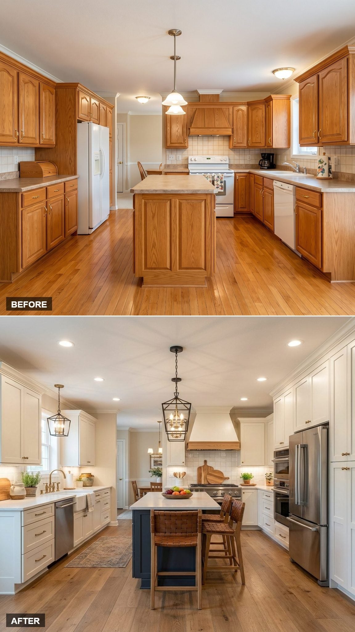
This is the familiar rescue plan, but there’s a reason it keeps showing up. Crisp white Shaker-style cabinetry strips away the old wall of honey-colored wood while a navy island gives the center of the room enough weight to keep all that white from floating away.
Brass-toned hardware links the two finishes, while a wood-accented range hood returns a small dose of warmth without reopening the oak floodgates. A subway-tile-look backsplash, pale stone-look counters, farmhouse-style sink, and black lantern pendants finish the shift. The important move isn’t any one trend. It’s finally giving the room a hierarchy.
26. The Oak Stays — and a Forest-Green Island Proves It Wasn’t the Problem
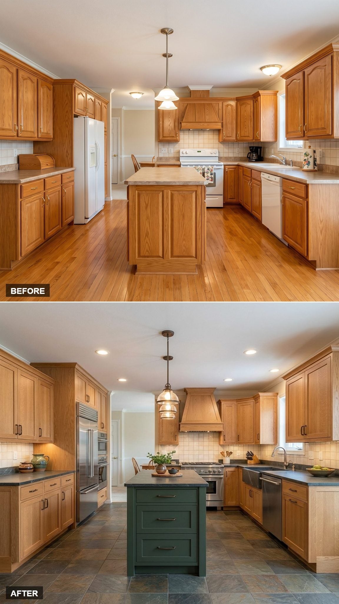
This is the concept the original kitchen needed to see. Instead of declaring war on every oak door, the cabinetry gets a lighter, more natural-looking finish and darker hardware that sharpens the outlines.
The island goes forest green, giving all that wood a color to push against. Charcoal soapstone-look counters and large-format slate-look flooring take the palette darker below, while a farmhouse-style sink and industrial pendant keep the room from becoming precious.
Worth Knowing: Soapstone is naturally dense and nonporous, and its appearance typically deepens with handling, oxidation, and optional mineral-oil or wax treatments. Minor surface scratches can often be blended or lightly sanded, although the finish should be treated consistently across the whole surface.
25. Cream Cabinets and a Terracotta Island Bring the Heat Back Differently
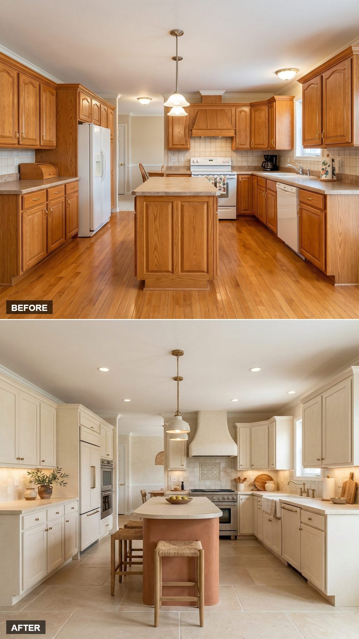
Warmth isn’t banished here. It simply stops arriving exclusively through yellow oak.
Cream cabinetry runs the perimeter while the island lands in an earthy terracotta-plaster look that immediately changes the room’s center of gravity. Natural-fiber stools and a pale stone-look counter soften the contrast, and brass pendants pick up the warmth without turning everything gold.
In the Details: Smooth plaster-look range hoods have become common in recent kitchen design because they let the ventilation surround merge visually with the wall or cabinetry. Tinted finishes can make the hood either disappear into the palette or become a sculptural focal point.
24. Walnut and Cream Split the Kitchen Into Two Different Personalities
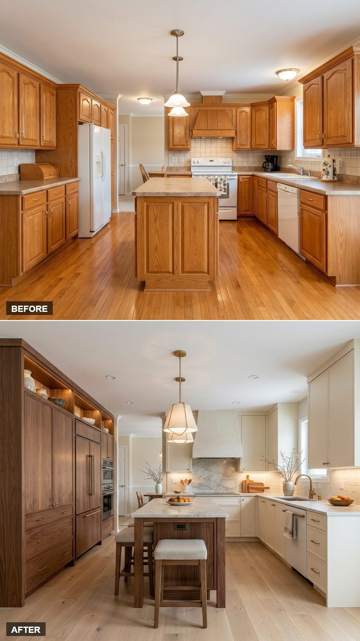
Two very different cabinet finishes share the same kitchen, and neither one has to surrender.
Tall walnut-look cabinetry gives the appliance wall real visual mass, while cream Shaker-style doors lighten the working side of the room. Between them, a walnut-toned island topped in strongly veined pale stone acts as the handshake. Geometric brass pendants and a smooth white hood keep the materials moving between traditional and contemporary without forcing the kitchen to choose one camp.
23. Black Cabinets and a Pale Maple Island Make the Contrast Do the Decorating
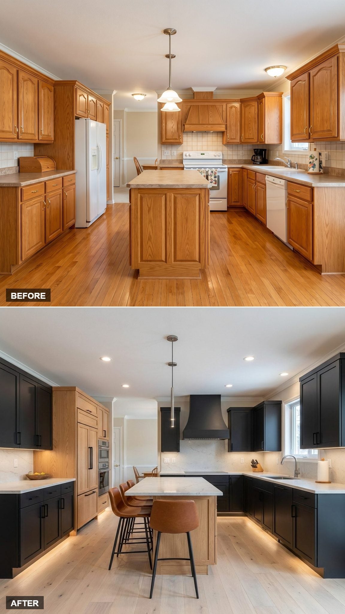
Matte-black perimeter cabinets are about as far from the original honey-oak effect as this gallery travels. Instead of trying to soften them with another painted color, the concept drops a natural maple-look island into the middle.
That pale wood is what keeps the black from taking over. Under-cabinet lighting matters just as much: it puts useful light directly on the work surfaces and prevents the dark cabinetry from turning the perimeter into one continuous shadow.
22. Forest Green Takes Over the Perimeter While Wood Moves to the Middle
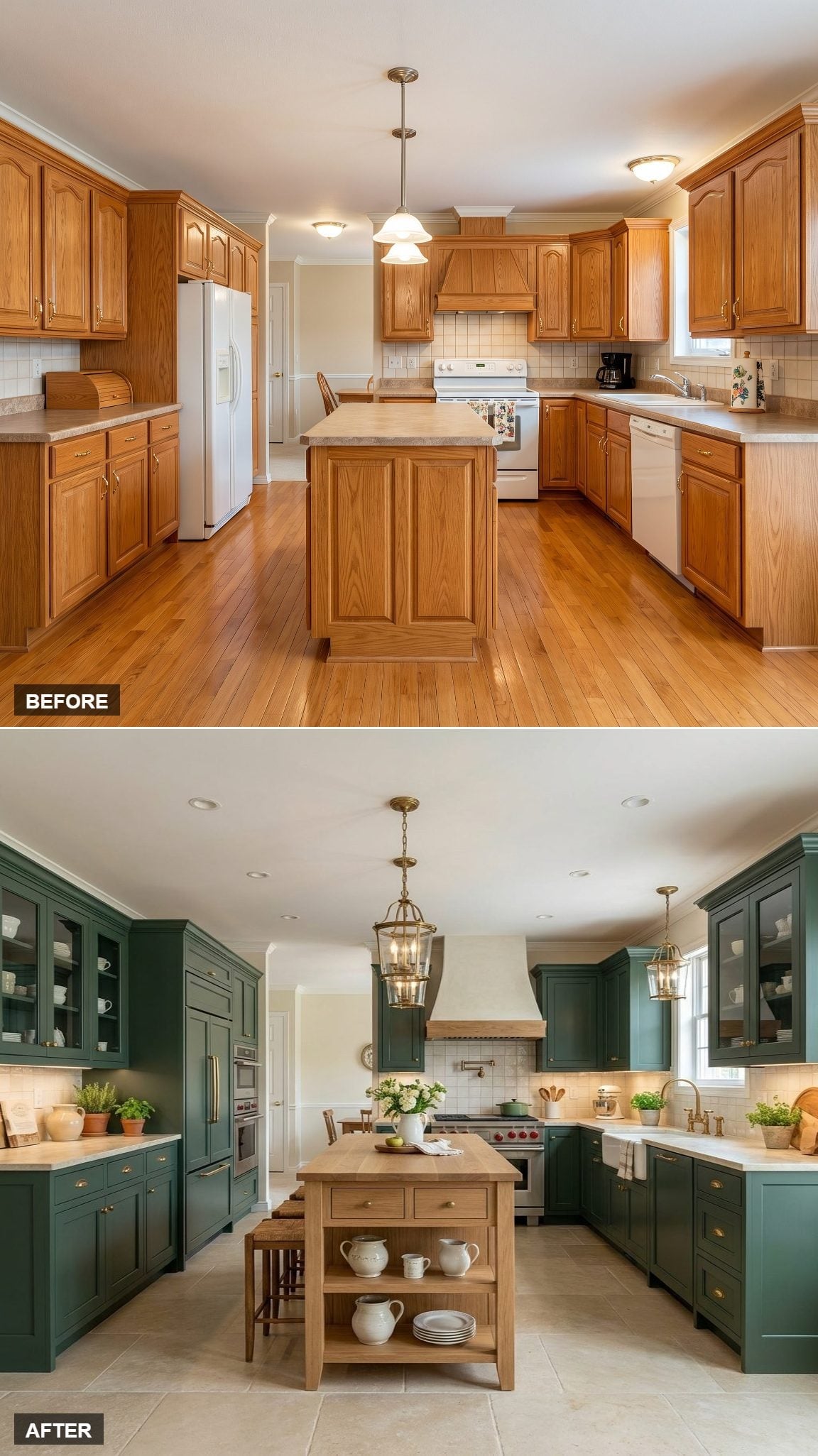
Deep hunter-green Shaker-style cabinetry wraps the room with enough confidence that white counters and glass-front uppers become relief rather than focal points.
The freestanding wood island is the clever interruption. Its warmer grain keeps the green from feeling overly formal, while brass cup pulls and a lantern pendant bridge painted cabinetry and natural wood. Instead of erasing the old kitchen’s warmth, this version relocates it.
21. Greige and Bleached Wood Strip the Kitchen Down to Its Quietest Version
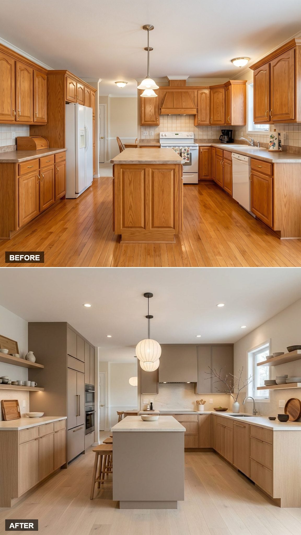
This one barely raises its voice. Greige flat-front cabinetry gives the room broad uninterrupted surfaces, while bleached-oak-look base units add grain without returning to the orange cast of the before.
Open shelving replaces some of the visual weight of conventional uppers, making the walls feel less packed. Even the island sits visually low and restrained. After several bolder color schemes, the absence of a statement becomes the statement.
20. Burgundy Lowers Turn the Cream-and-Wood Formula on Its Head
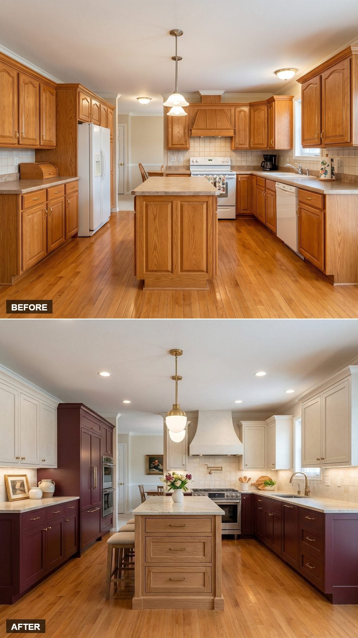
Deep burgundy lower cabinets run beneath cream uppers, and suddenly the safest room in the house has a pulse.
Brass hardware crosses both colors while a natural-oak-look island stays deliberately neutral in the center. A softly veined pale stone top keeps that wood from looking leftover, and the smooth plaster-look hood merges into the upper cabinetry rather than demanding another color.
The useful surprise is how well natural oak behaves once it isn’t responsible for every cabinet in sight.
19. Flat-Front White Oak Takes the Room Forward Without Losing the Wood
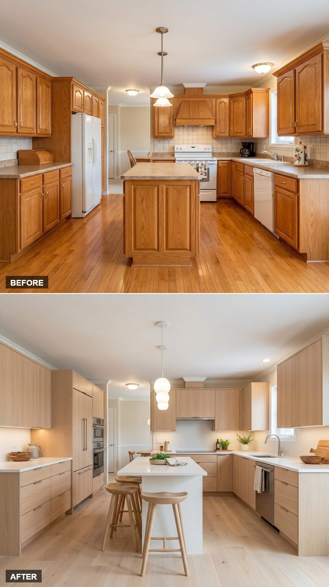
Pale white-oak-look slab fronts run almost uninterrupted from floor to ceiling, proving that a wood kitchen can feel completely different without changing species so much as changing tone, grain, and door style.
A white waterfall island cuts a clean horizontal block through all that vertical wood while simple barstools return the natural tone at floor level.
History Corner: Slab-front cabinetry became strongly associated with modernist and Scandinavian interiors during the mid-20th century, where simplified door faces allowed proportion and material to become the decoration. Pale oak finishes later offered an alternative to the more golden and reddish wood tones common in many late-20th-century kitchens.
18. Walnut Around the Walls and Sage at the Island Make an Unlikely Pair
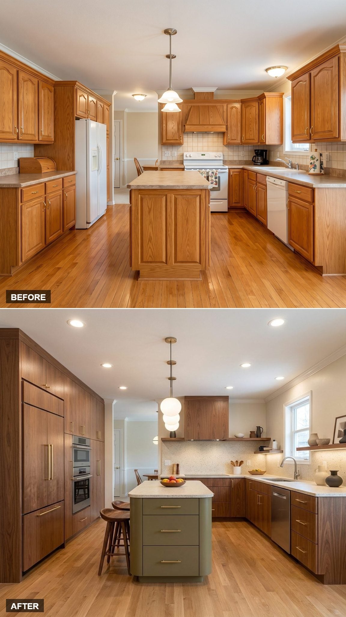
Flat-front walnut-look cabinetry wraps the perimeter, including a tall appliance wall that reads more like built-in furniture than a collection of kitchen boxes.
The island takes an entirely different route in muted sage with brass-toned pulls and a speckled pale counter. Globe pendants bring softness overhead, while open shelving near the window gives the eye somewhere to escape the dense run of cabinetry.
Sage at the island breaks up the walnut without pretending the two finishes need to match.
17. Cream, Reeded Wood, and Gold Make Texture More Important Than Color
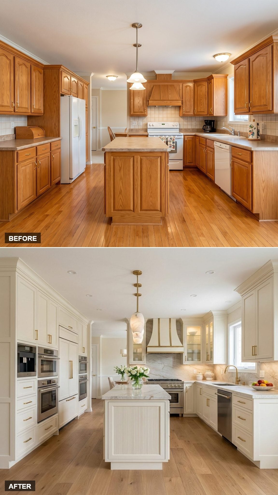
The palette barely moves, so the surfaces have to.
Cream Shaker-style cabinetry surrounds an island faced in reeded wood, where narrow vertical grooves prevent the neutral scheme from going flat. A veined marble-look top adds a second texture above it.
The range hood repeats the cream but picks up a brass-inlay look that connects with the brushed-gold hardware. Stainless appliances bring in one colder finish before the whole room gets too sweet.
16. Slate Blue Gives Traditional Cabinetry a Cooler Temperature
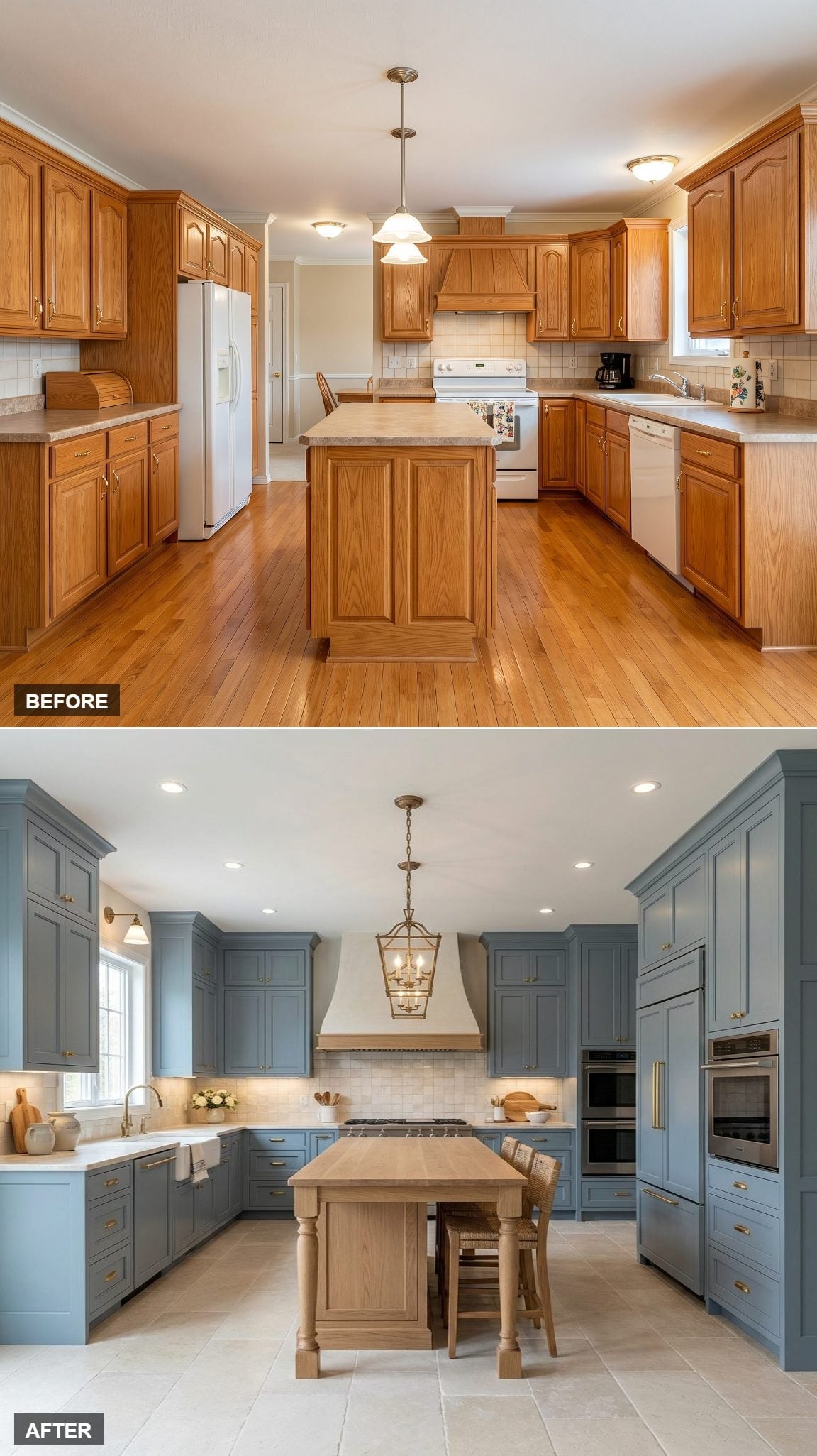
Muted slate-blue cabinetry covers most of the perimeter, but the color stays dusty enough to behave almost like a neutral.
A cream plaster-look hood lightens the range wall while a wood-topped island and woven stools move warmth to the center. Brass hardware threads through the blue without making the room overly dressy.
Layered lighting helps too: recessed fixtures handle the general illumination while under-cabinet light keeps the counters from disappearing beneath all those painted uppers.
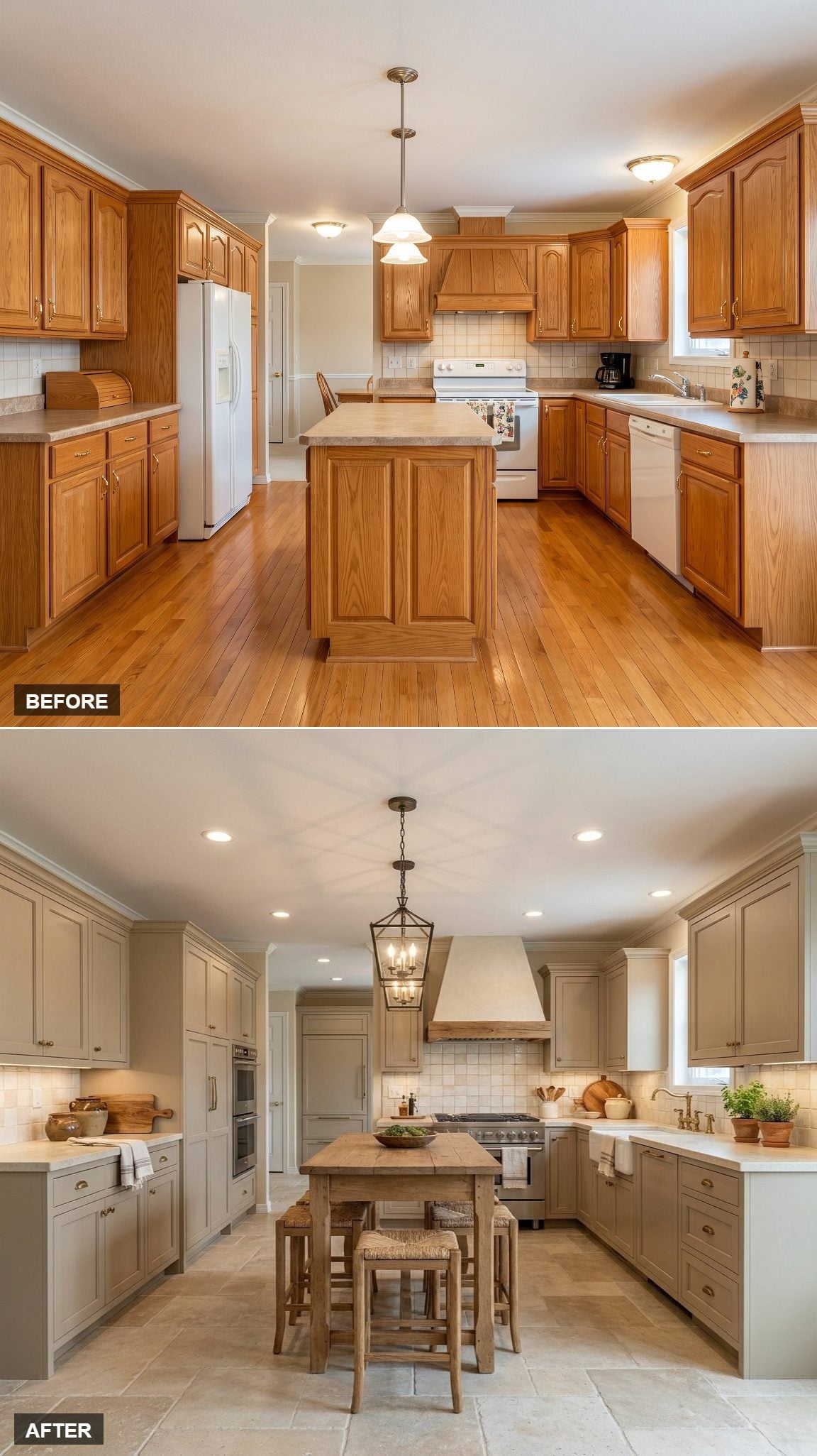
15. Greige Cabinets and a Worktable Island Make the Kitchen Feel Looser
🔥 Would you like to save this?
Greige Shaker-style cabinetry sets a quiet perimeter, but the real change is sitting in the middle: a freestanding reclaimed-wood-look table instead of a built-in island.
Rush-seat stools tuck beneath it and an aged-bronze lantern hangs above, making the center feel more like old furniture collected over time than cabinetry ordered by the linear foot. Stone-look flooring gives the whole combination enough weight to avoid drifting into farmhouse cosplay.
14. Dark Green and Natural White Oak Split the Room by Material
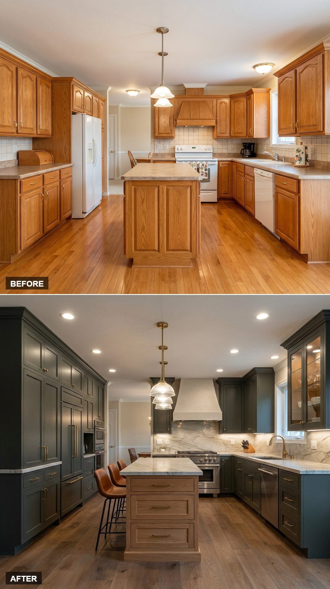
Charcoal-green Shaker-style cabinets make the perimeter recede while the island comes forward in pale natural wood.
That inversion is what separates this from the earlier forest-green version. Here the cabinetry creates the dark backdrop and the island supplies the light. Brass-toned hardware brings warmth to the green, while a marble-look backsplash introduces enough pale movement to keep the working wall from becoming one solid block.
13. White Cabinets and a Navy Island Return — This Time With Herringbone Underfoot
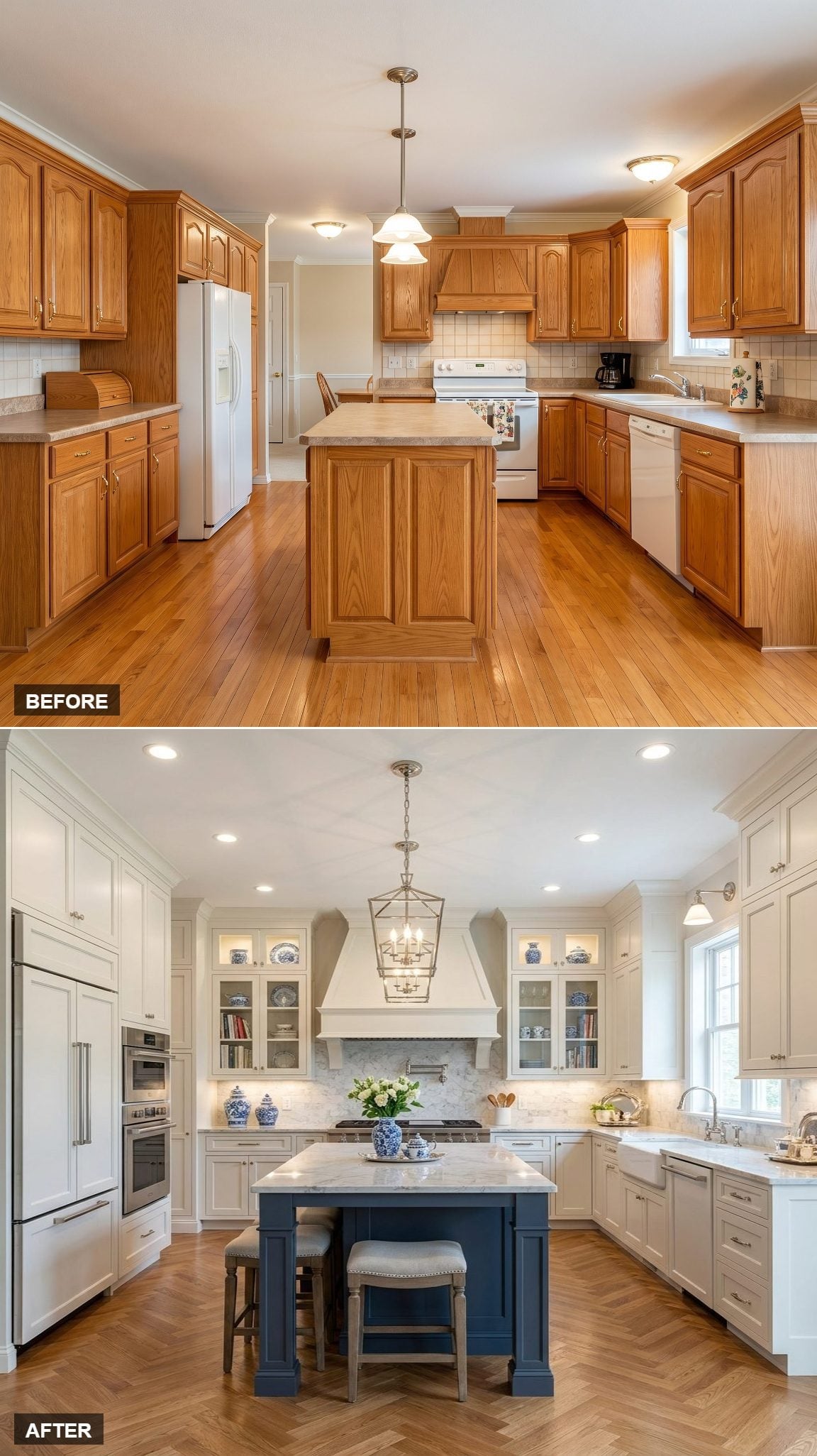
The white-and-navy combination comes back, but the floor changes the entire character.
Herringbone-pattern wood-look flooring introduces a formal rhythm below while glass-front uppers, interior lighting, and blue-and-white ceramics make display part of the design. A pale marble-look slab rises behind the range and lets the white hood nearly disappear against it.
The navy island is familiar by now. The surrounding architecture is what gives this version its own identity.
- Herringbone flooring introduces movement beneath otherwise orderly cabinetry.
- Glass-front uppers turn storage into controlled display.
- A slab-style backsplash gives the range wall one continuous surface instead of another grid.
12. Greige Shakers and a Butcher-Table Island Keep the Renovation From Feeling Too Finished
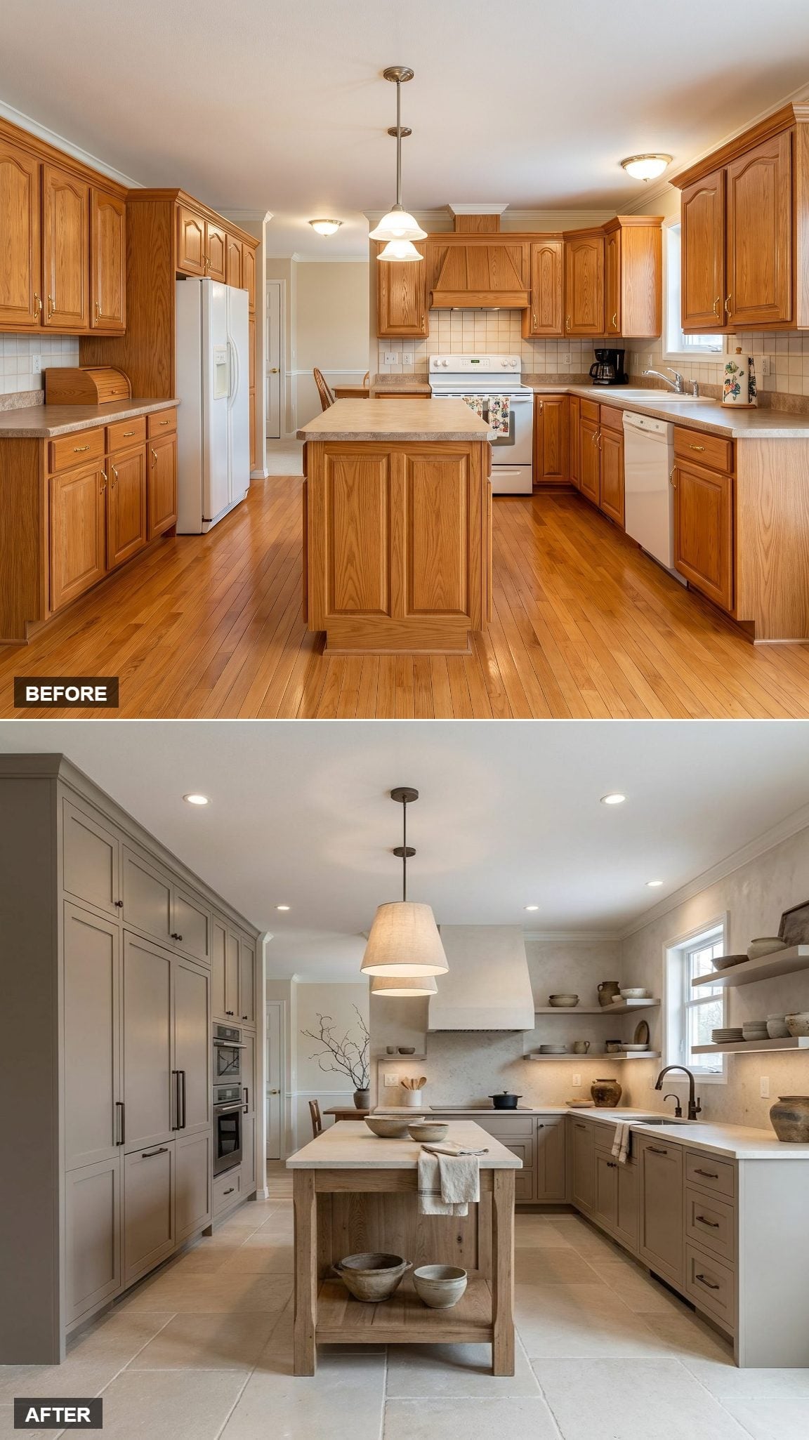
Gray-beige Shaker-style cabinetry rises on one side while open shelves take over near the window, immediately making the perimeter less enclosed.
The freestanding island is rougher and heavier than the earlier worktable version: raw-wood-look, butcher-block in attitude, and intentionally more utilitarian. Matte-black hardware keeps the cabinets from becoming too soft.
The effect is useful precisely because it doesn’t look like every component arrived on the same delivery truck.
11. Walnut Flat Fronts and a Waterfall Island Push the Kitchen Toward Modernism
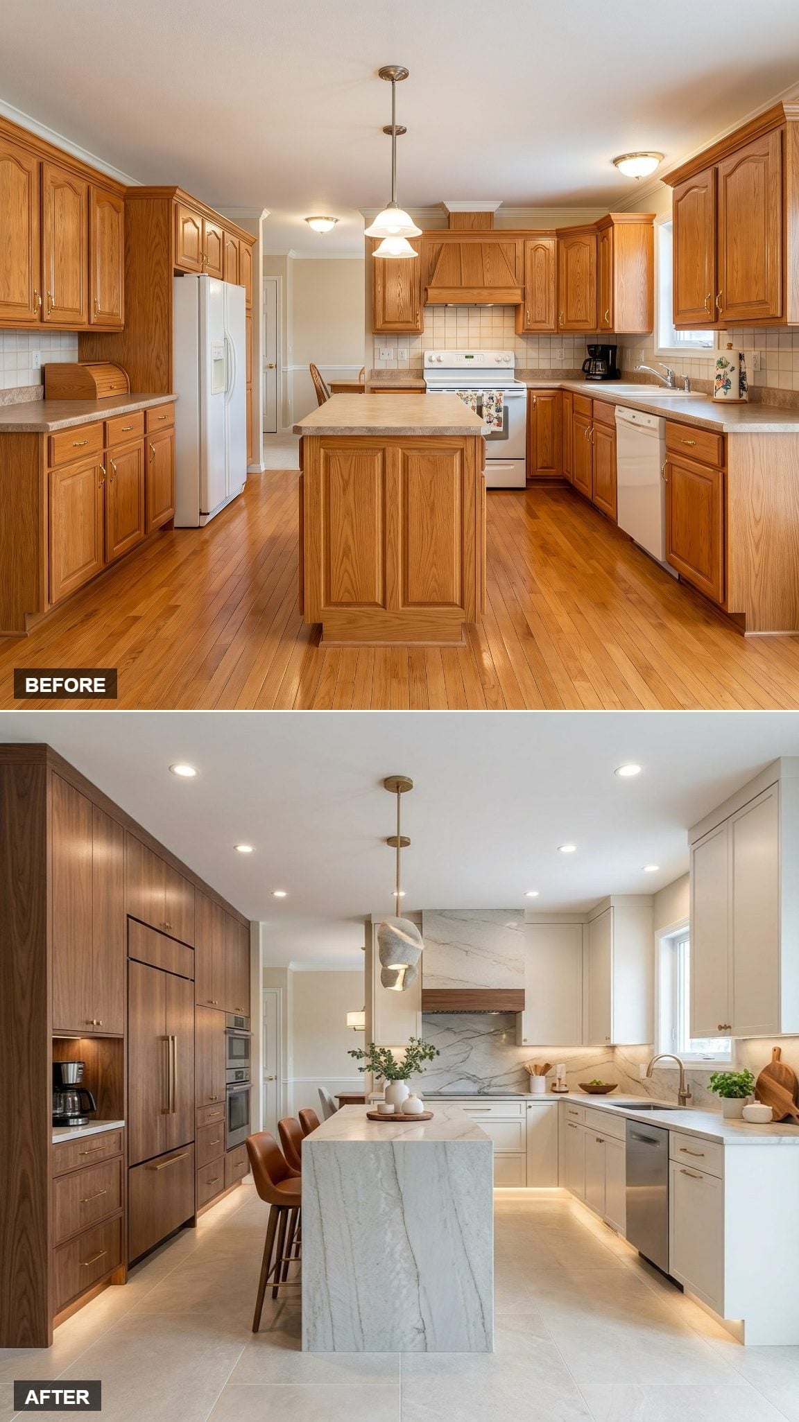
Dark walnut-look panels take over the tall cabinetry while pale lower cabinets give the perimeter a break.
A strongly veined stone-look waterfall island occupies the center as one continuous block, and recessed lighting keeps the ceiling nearly anonymous. Brass-toned hardware supplies just enough warmth to connect the pale stone back to the walnut.
Color Story: Dark wood and cool pale stone give the room its contrast without requiring a painted accent color. The stone’s veining keeps the island from looking sterile, while the walnut prevents the white surfaces from taking over.
10. Sage Lowers and Cream Uppers Divide the Color Exactly Where It Matters
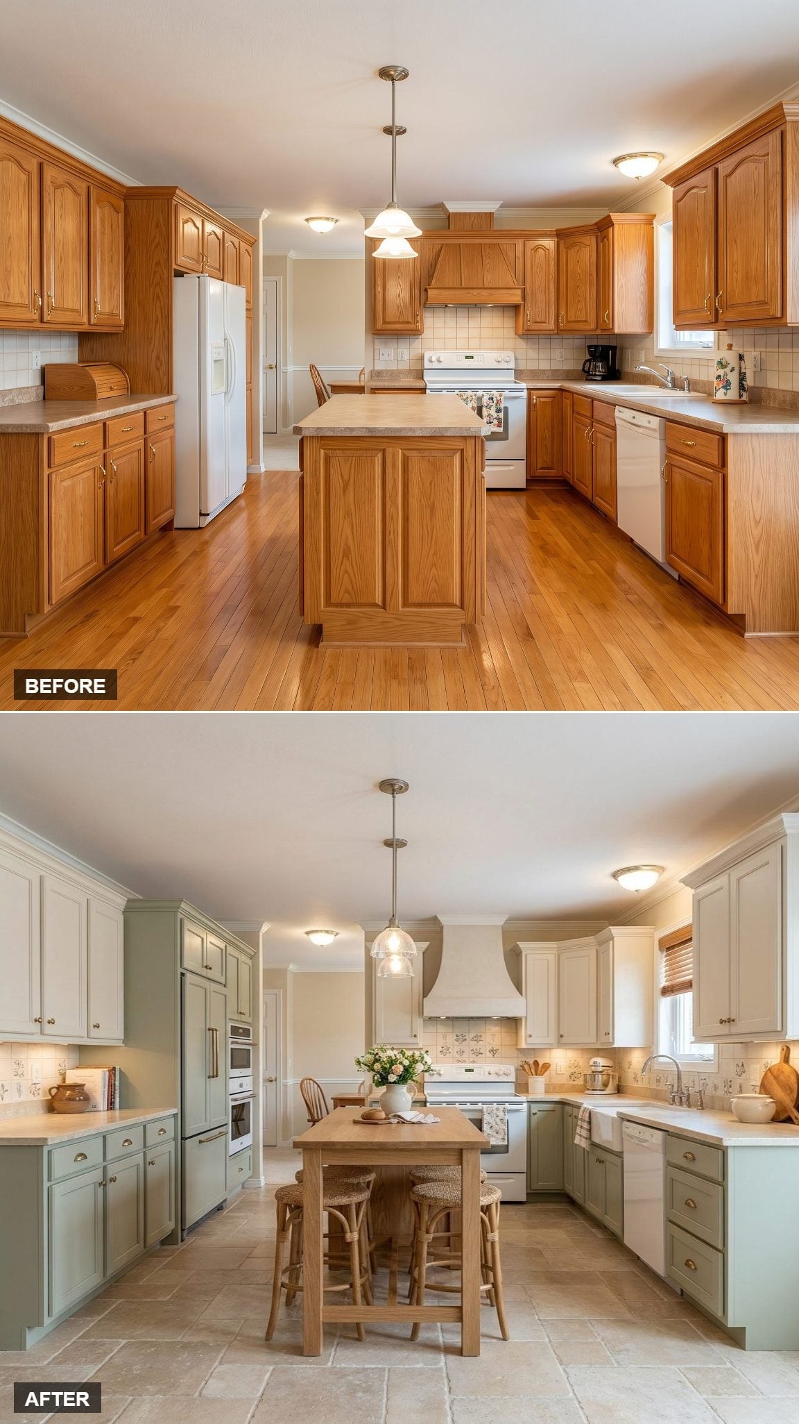
Sage occupies the lower cabinetry while cream moves overhead, making the room feel visually lighter as the eye rises.
Antique-brass-look hardware sits comfortably against both colors, while a butcher-block-look island brings natural wood back without asking it to match either side. Stone-look flooring keeps the palette earthy and quiet.
No waterfall slab. No showpiece chandelier. No argument with itself.
9. A Woven Pendant Gives the White-and-Blue Kitchen a More Casual Ending
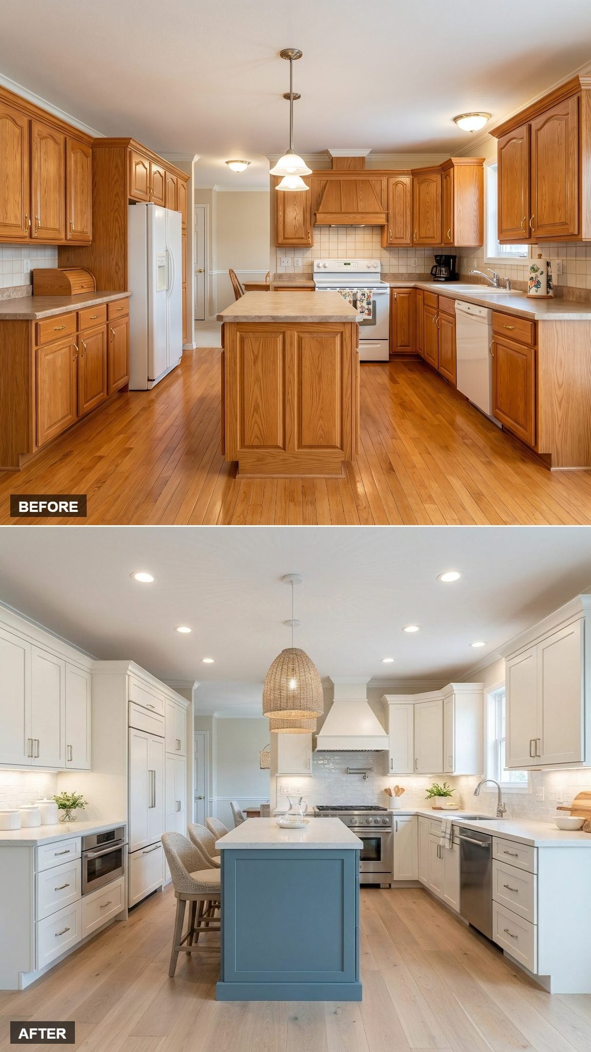
White Shaker-style cabinetry returns around a slate-blue island, but this time the lighting refuses to dress up.
A woven pendant hangs over the center and immediately takes some formality out of the familiar two-tone palette. That one softer, fibrous texture is enough to separate this version from the lantern-heavy white-and-navy kitchens elsewhere in the gallery.
8. Cream Cabinets and a Limed-Oak-Look Island Let Pattern Stay on the Floor
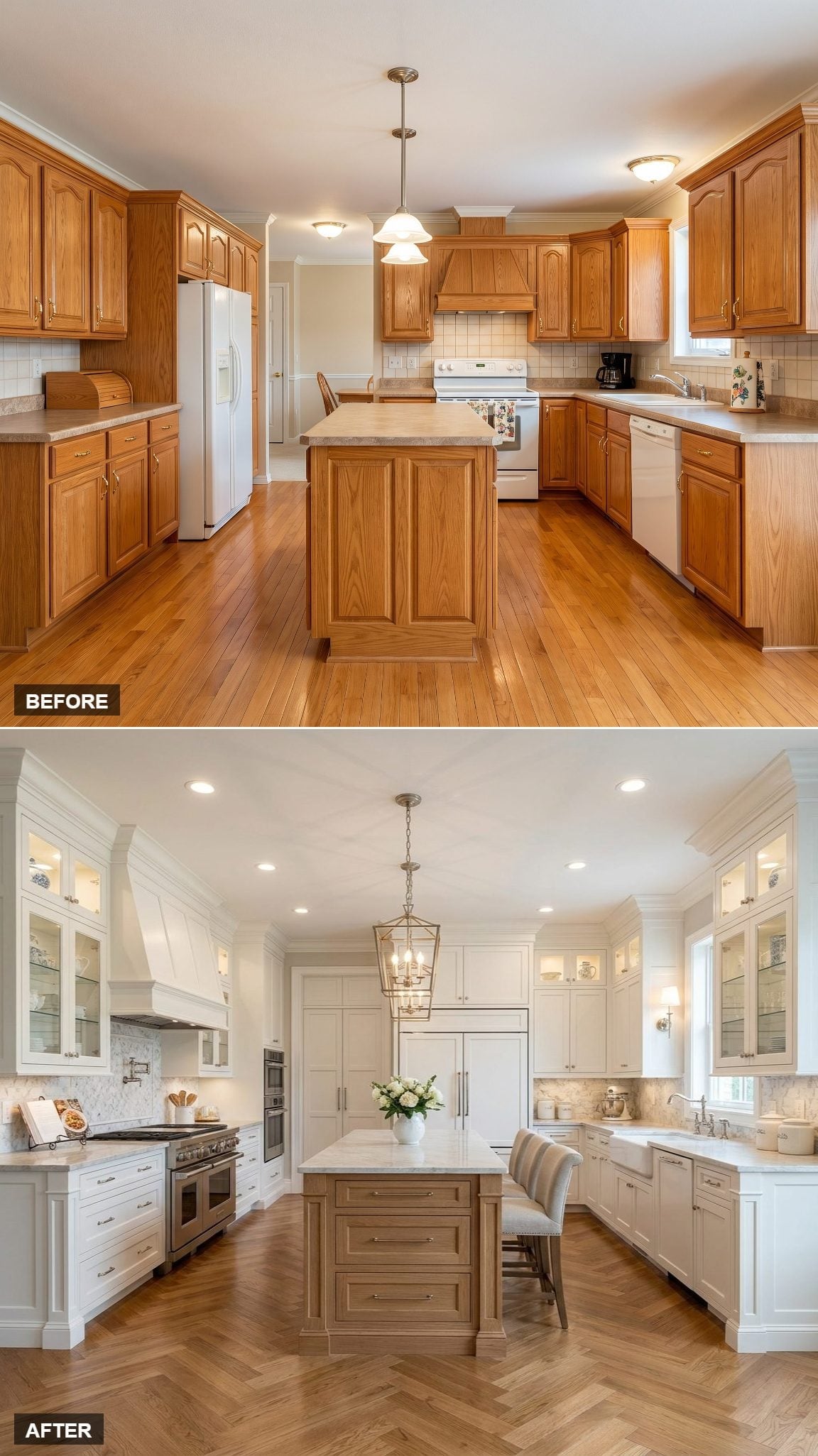
Herringbone flooring supplies nearly all the pattern this room needs.
Warm cream cabinetry rises to the ceiling while glass-front uppers create small breaks in the solid perimeter. At center, a limed-oak-look island topped with thick pale stone supplies a noticeably cooler wood tone than the original 1990s kitchen ever managed.
The result is traditional without looking embalmed in tradition.
7. Navy Takes the Walls While a White Island Opens Up the Middle
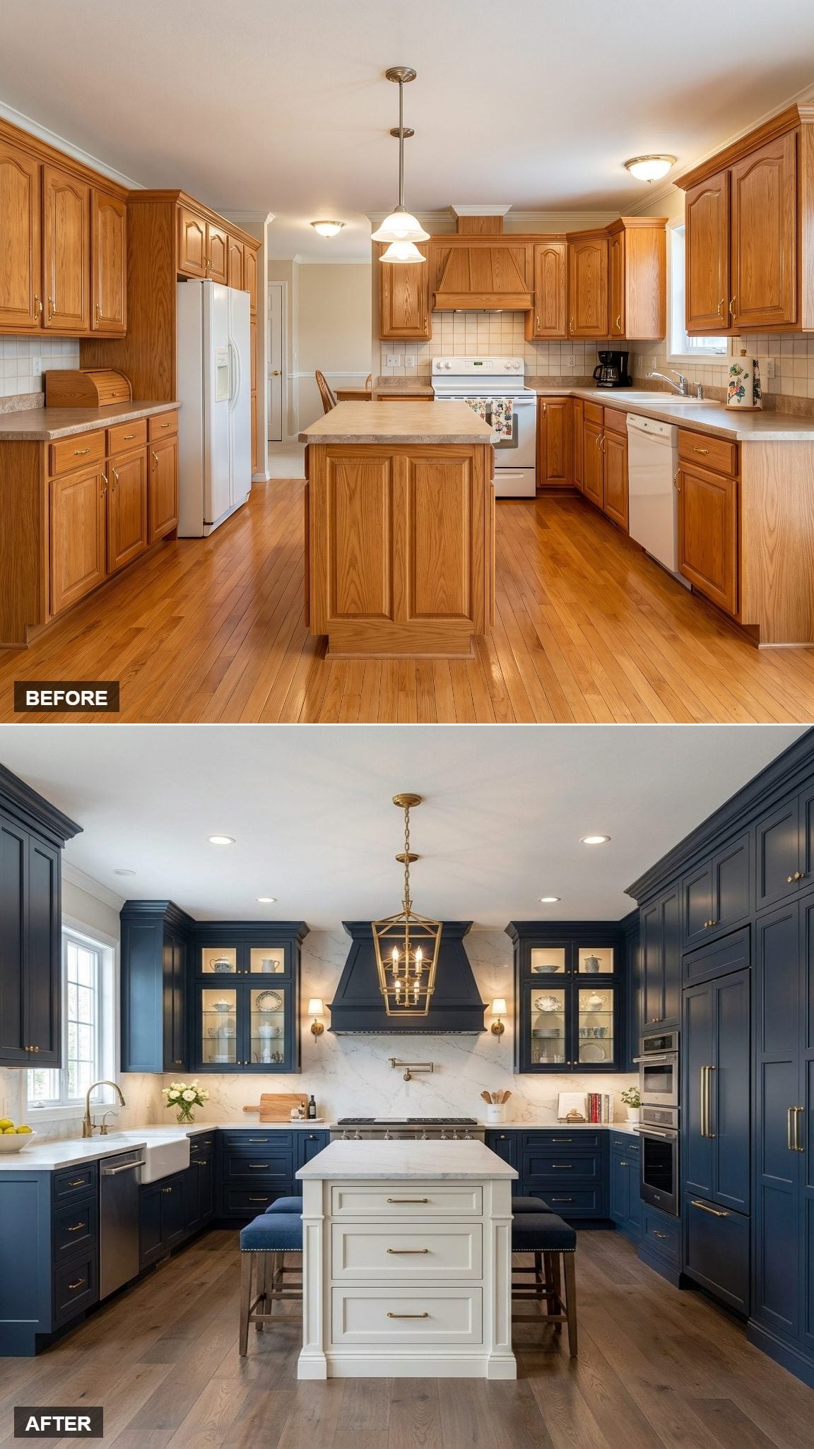
This version flips the usual formula. Instead of white around the perimeter and blue at the island, navy cabinetry wraps the room while the center turns bright white.
Glass-front uppers prevent the dark run from becoming too dense, and brass bar pulls appear on both finishes. A pale marble-look backsplash opens the range wall even further.
The reversal matters. Same colors, entirely different balance.
6. Cream, Blonde Wood, and Rattan Strip the Palette Back to Summer Weight
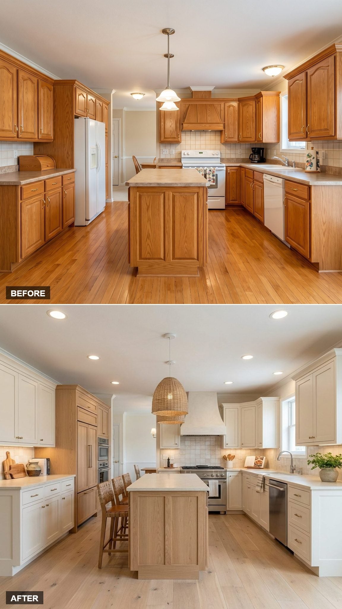
Cream perimeter cabinetry and a blonde-oak-look island keep the contrast deliberately low.
Recessed lighting clears the ceiling while a single woven rattan pendant remains over the island, giving the room one textured overhead element instead of a row of fixtures. A pale quartz-look top keeps the center visually light.
Nothing here is trying to be the dramatic makeover. That’s the appeal.
5. Navy Lowers, White Uppers, and Bleached Wood Give Three Finishes Clear Jobs
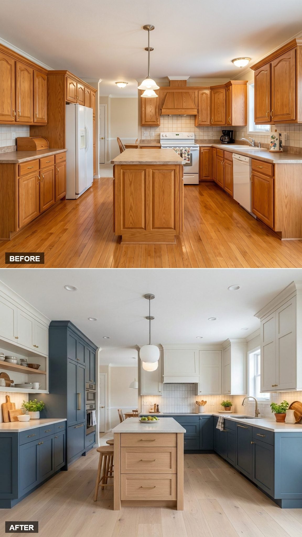
Slate-blue lower cabinetry gives the perimeter weight while white uppers lighten everything above the counter line.
The island refuses to join either team. Its bleached-oak-look finish introduces a third material, neutral enough to sit between blue and white without turning the room into a color-blocking exercise.
Matte-white globe pendants stay quiet overhead while brass pulls provide the small warm notes.
4. White Perimeter Cabinets and Walnut at the Island Bring Wood Back Selectively
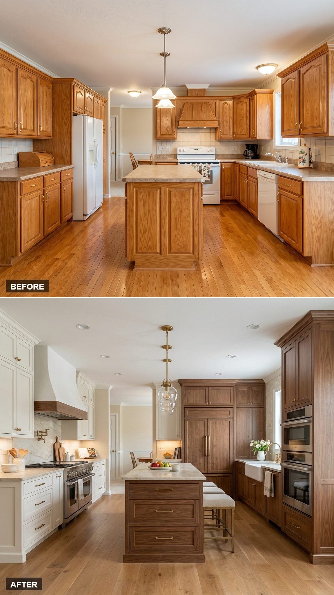
Cream-white Shaker-style cabinetry surrounds a walnut-toned island, returning dark wood to the kitchen in one controlled block instead of everywhere at once.
A wood-wrapped range hood repeats that island finish across the room, which makes the pairing feel architectural rather than decorative. Brass hardware sits between the two tones while a clear-glass globe pendant keeps the view above the island open.
The lesson is getting clearer: wood becomes much more interesting when it isn’t compulsory.
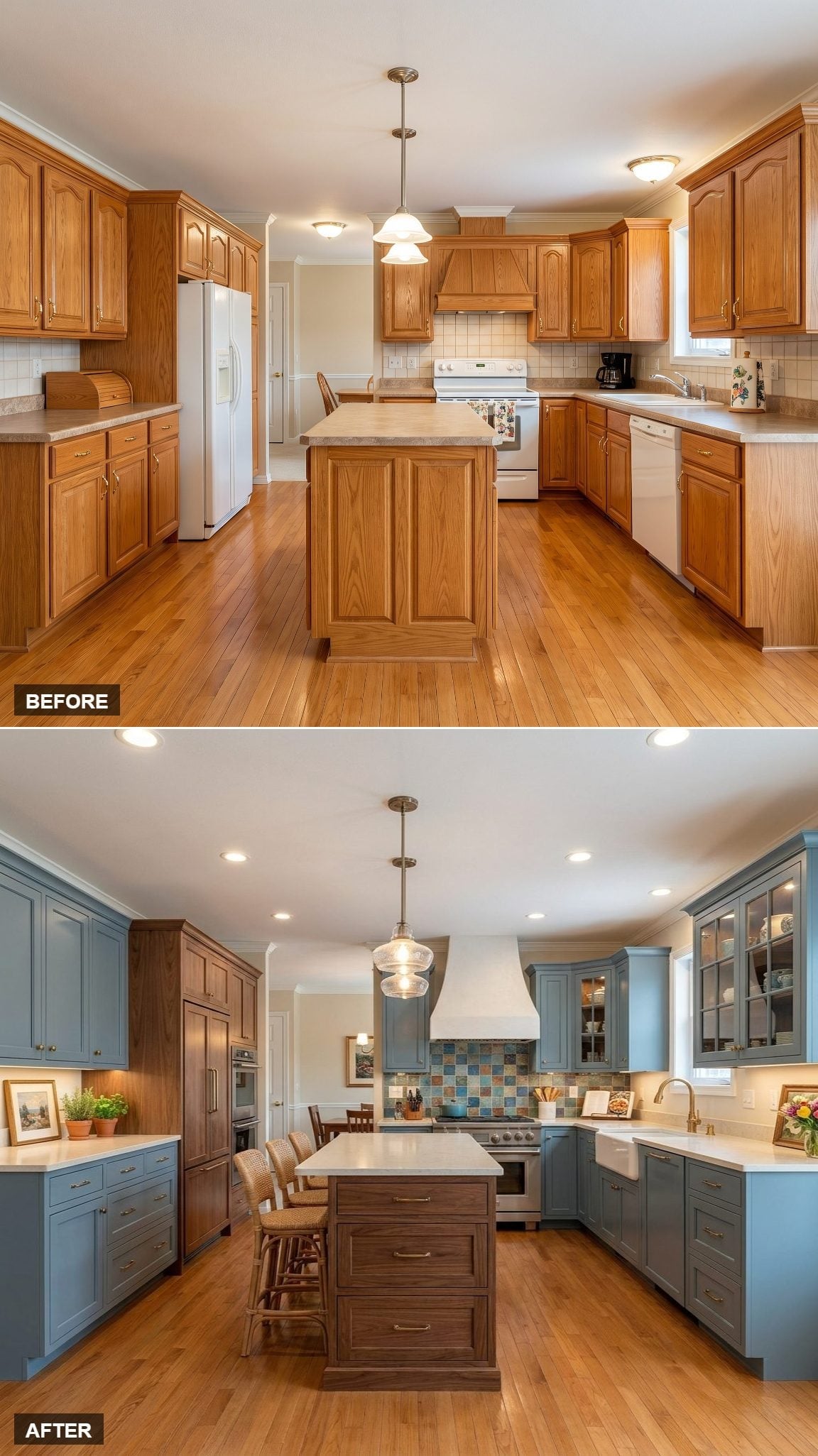
3. Slate Blue and a Wood Island Meet Somewhere Between Painted and Natural
🔥 Would you like to save this?
Blue-gray Shaker-style cabinetry wraps the perimeter while a darker wood-toned island holds the center.
A white hood brightens the cooking wall, and handmade-tile-look backsplash color provides a bridge between painted cabinets and wood without trying to duplicate either one. Brass-toned hardware repeats across both zones.
Pro Tip: Two-tone cabinetry works especially well when each finish has a clear territory. Here, painted perimeter cabinets establish the background and the wood island becomes the center. Repeating one hardware finish is a simple way to connect them, but contrast can work just as well when it is deliberate.
2. Walnut Uppers and Greige Lowers Make the Cabinetry Read Like Furniture
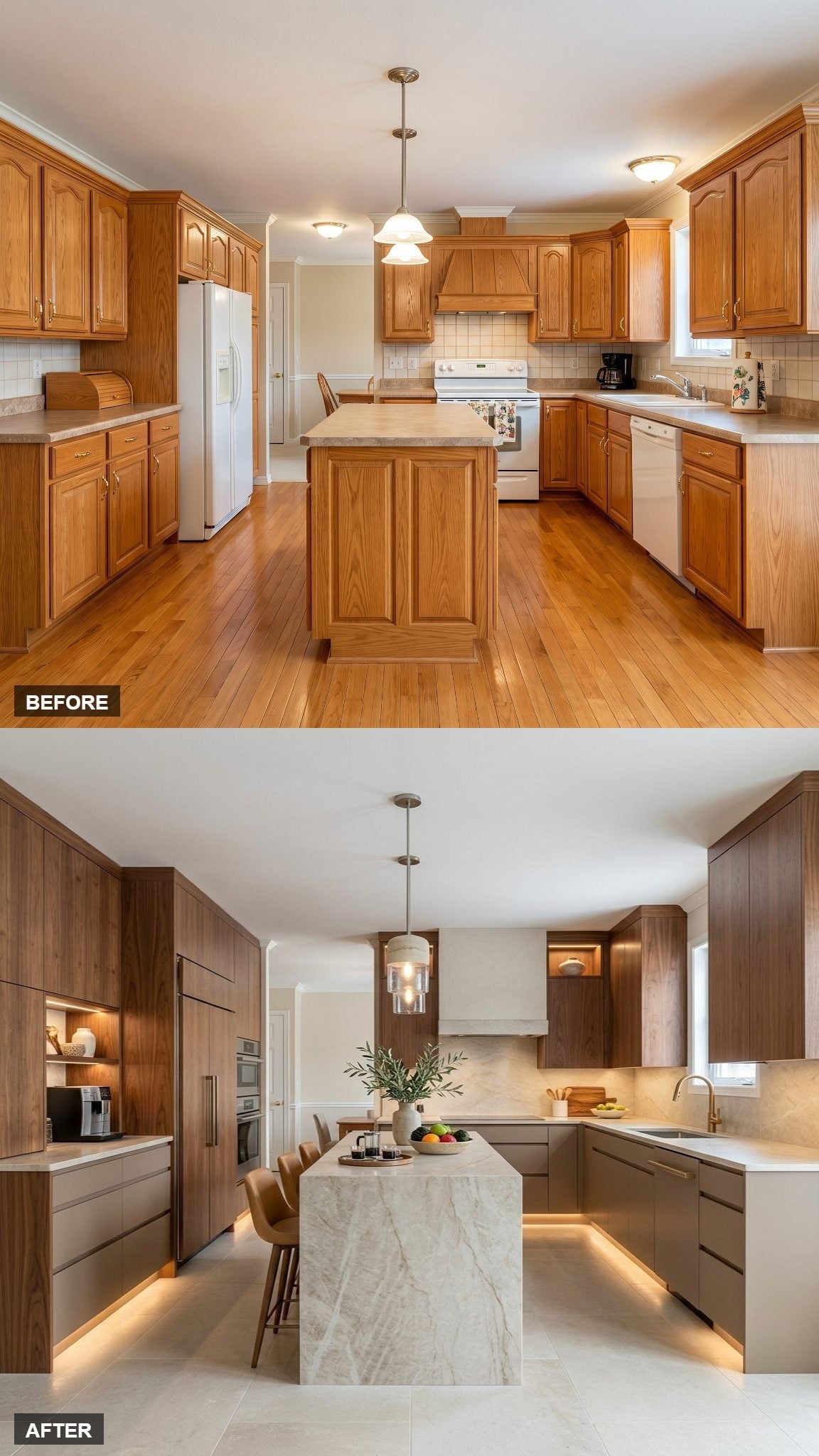
Flat-panel walnut-look cabinetry rises along the tall wall with continuous grain running across doors and appliance panels. Below the counter line, the finish shifts to greige with integrated pulls, changing not only the color but the visual weight.
Under-cabinet lighting traces the work surface while low toe-kick lighting adds a second layer near the floor.
The island becomes the room’s solid center: a cream stone-look waterfall slab with restrained veining, leather-seat stools, and one ribbed-glass pendant overhead. Nothing needs another flourish.
1. Natural Oak and Honed Soapstone Bring the Story Full Circle
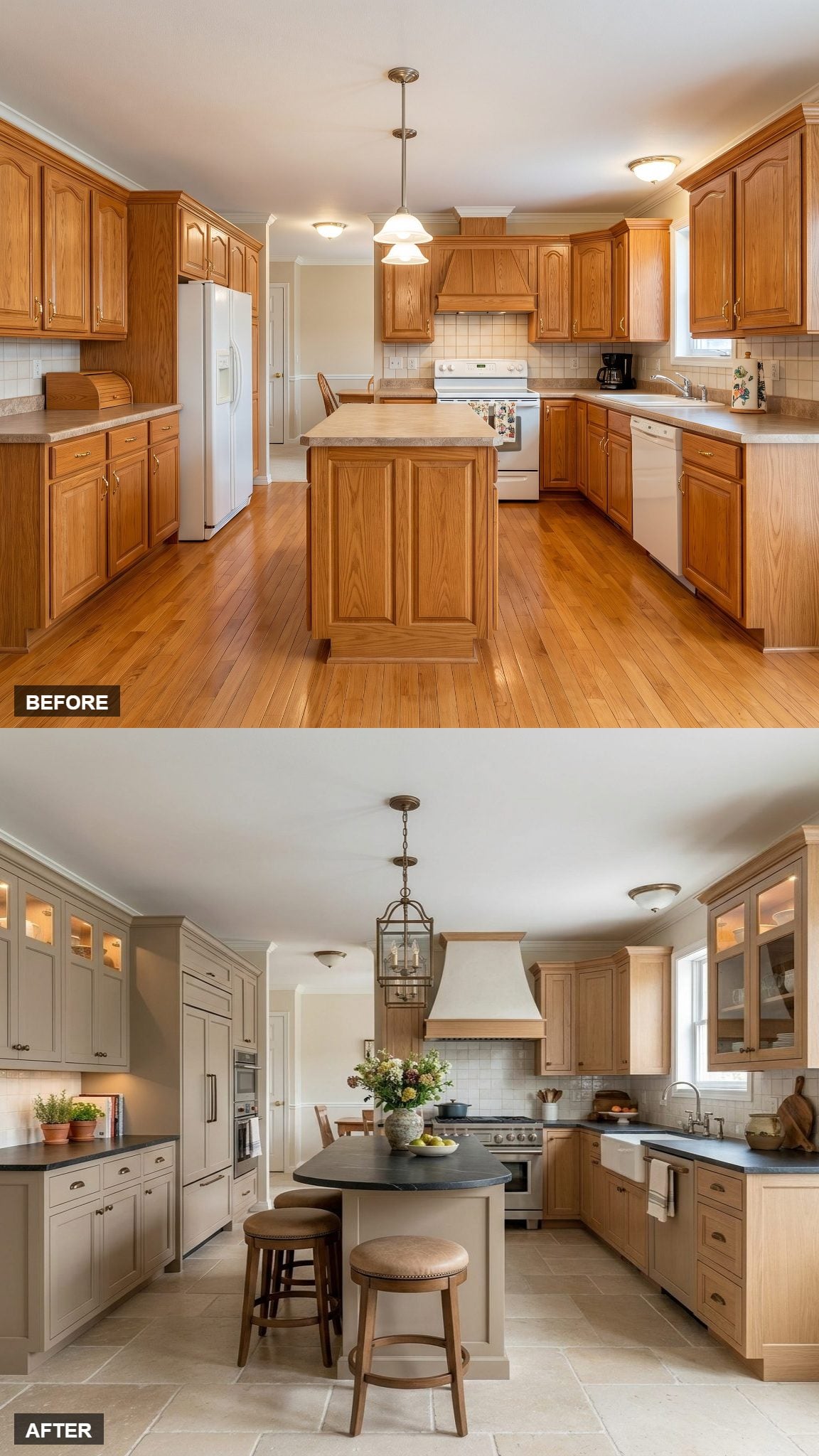
Natural-oak-look cabinetry wraps the range and sink walls while soft taupe built-ins rise on the opposite side. After 26 attempts to escape the oak kitchen, the final concept walks straight back to wood — just without the yellow cast, heavy detailing, and wall-to-wall sameness that made the original feel trapped in its decade.
Dark honed-soapstone-look counters give the pale grain something substantial to sit against. Glass-front uppers, integrated appliances, and a broad plaster-look hood make the cabinetry feel closer to furniture, while a farmhouse-style sink and professional-style range keep the working side visually serious.
At center, a softly curved island carries another dark stone surface above a warm neutral base. An aged-bronze-look lantern pendant drops over upholstered wood stools, and large-format stone-look flooring keeps everything grounded.
That may be the most useful ending of all 27 designs. The rescue was never really about getting rid of oak. It was about getting rid of the idea that oak had to be everywhere, in the same tone, doing the same job. Give the wood contrast, cleaner lines, better light, and something else in the room with a point of view, and suddenly 1995 stops being the first thing you see.












