🔥 Would you like to save this?
Some kitchens announce the money with marble and chandeliers. These do it with contrast. Crisp white cabinetry catches the light, walnut brings depth and grain, and the balance between the two can make the same room feel tailored, warm, architectural, or almost furniture-like.
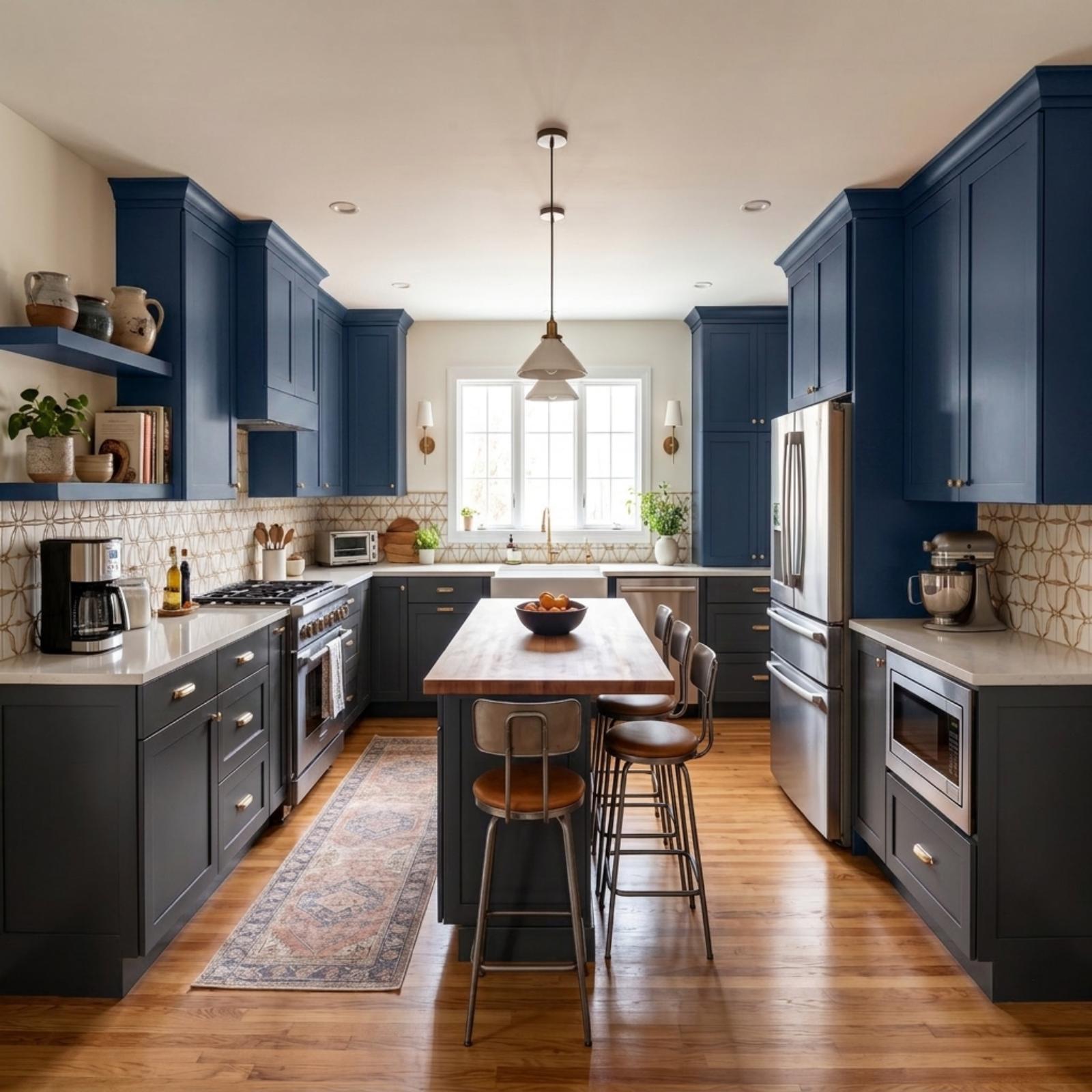
That range is the point of these 35 Before & Afters. The same kitchen starts each transformation, making every shift easy to clock — walnut framing, reeded islands, butcher block, open shelving, Shaker fronts, flat slabs, pale stone, herringbone floors, and enough variations on two materials to make the original navy room feel like a distant relative.
In order to come up with the very specific design ideas, we create most designs with the assistance of state-of-the-art AI interior design software. Also, assume links that take you off the site are affiliate links such as links to Amazon. this means we may earn a commission if you buy something.
35. Walnut Frames Everything, White Does the Heavy Lifting
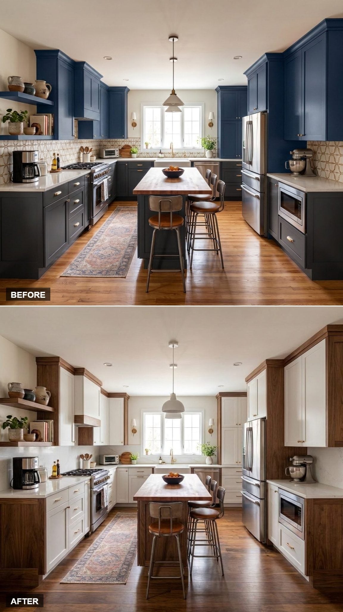
Instead of replacing one dark cabinet color with another broad field of wood, this version turns walnut into the outline. White door fronts occupy most of the visual territory while walnut wraps the cabinet bays, shelving, end panels, and island in darker lines.
That makes the wood feel architectural rather than merely decorative. The cabinetry suddenly has depth, the white stays expansive, and the walnut grain gets noticed precisely because it isn’t everywhere. Against the navy-heavy Before, the transformation is dramatic without requiring the palette to shout.
Worth Knowing: Framing pale cabinet fronts with darker wood creates depth without committing the entire room to wood cabinetry. The contrast emphasizes cabinet proportions while allowing the lighter panels to remain visually dominant.
34. Reeded Walnut Island, White Shaker Perimeter, and a Kitchen With a Real Focal Point
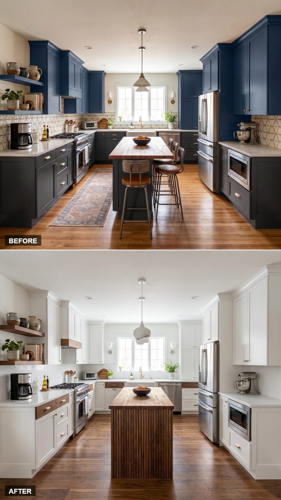
Here the walnut gets texture. Vertical reeding turns the island into the room’s most tactile object while white Shaker cabinetry settles into the background around it.
The grooves catch light differently across the face of the island, giving the wood shadow and movement that a flat panel wouldn’t have. Floating walnut shelves carry the material onto the wall without diluting the effect, and the sculptural white pendant keeps the ceiling every bit as edited as the cabinetry.
33. White Flat-Fronts, Walnut Shelf Edges, and the Case for Using Less Wood

This one nearly makes the walnut disappear. Flat white fronts take over the perimeter, while wood is reduced to shelf edges, the island top, and a narrow window detail.
The restraint gives those smaller wood elements more force. Instead of reading as another two-tone cabinet scheme, the kitchen becomes predominantly white with walnut acting as punctuation. The butcher block surface at center is enough to keep the room from becoming anonymous.
32. Reeded Walnut Lowers, Marble-Look Counters, and Texture Taking Over From Color
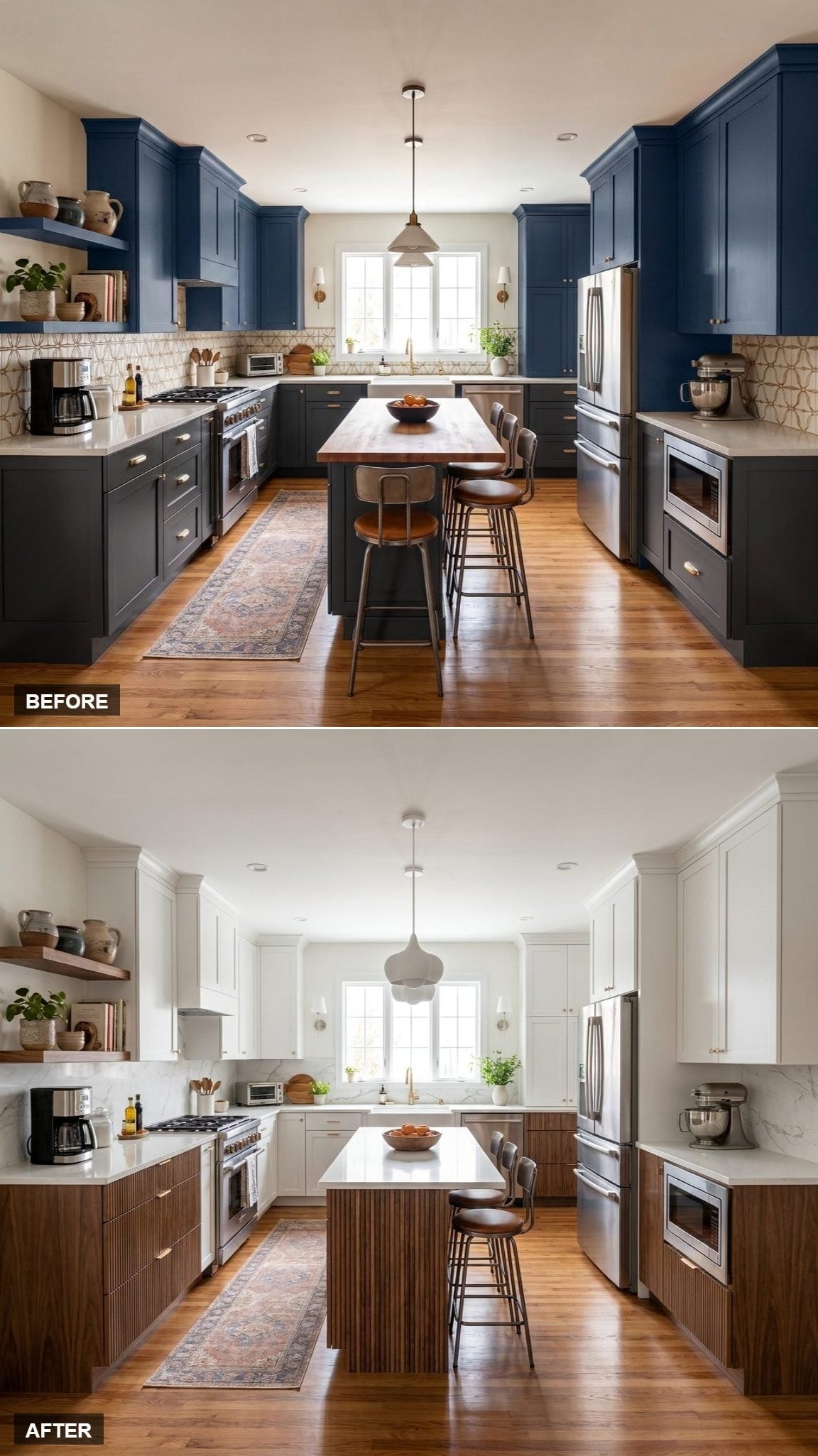
Fluted walnut across the lower cabinetry gives this version a completely different rhythm. The wood isn’t simply a darker color beneath white uppers; its vertical relief creates a moving pattern of shadow across the entire lower half.
Marble-look surfaces give that texture a smoother counterpoint. Pale stone, crisp cabinetry, and deeply grained wood stay inside a narrow color range, but the surfaces themselves keep the room visually active.
31. Walnut-Framed White Cabinets, Concrete-Bright Counters, and a Kitchen Drawn in Lines
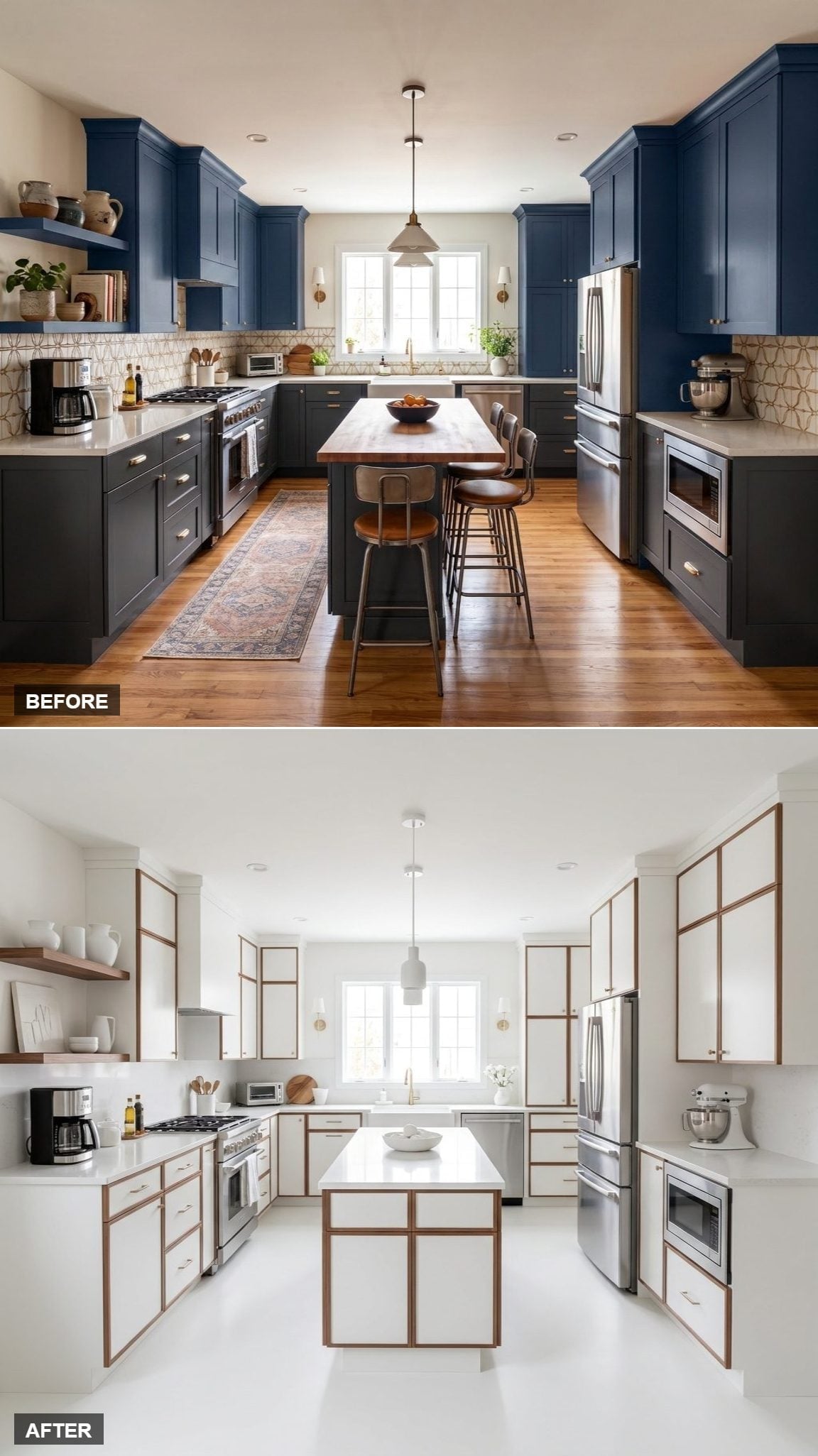
The framing idea gets even more graphic here. Walnut outlines white cabinet panels from floor to ceiling, turning the entire perimeter into a repeated grid of dark edges and pale centers.
The island carries the same language without stools interrupting the view, so its frame and bright surface read almost like a piece of furniture. Stainless appliances anchor the ends of the room while the pale floor and counters make the walnut lines look even sharper.
30. Painted Out, Brightened Up: Walnut Crown Molding Takes Over the Upper Edge
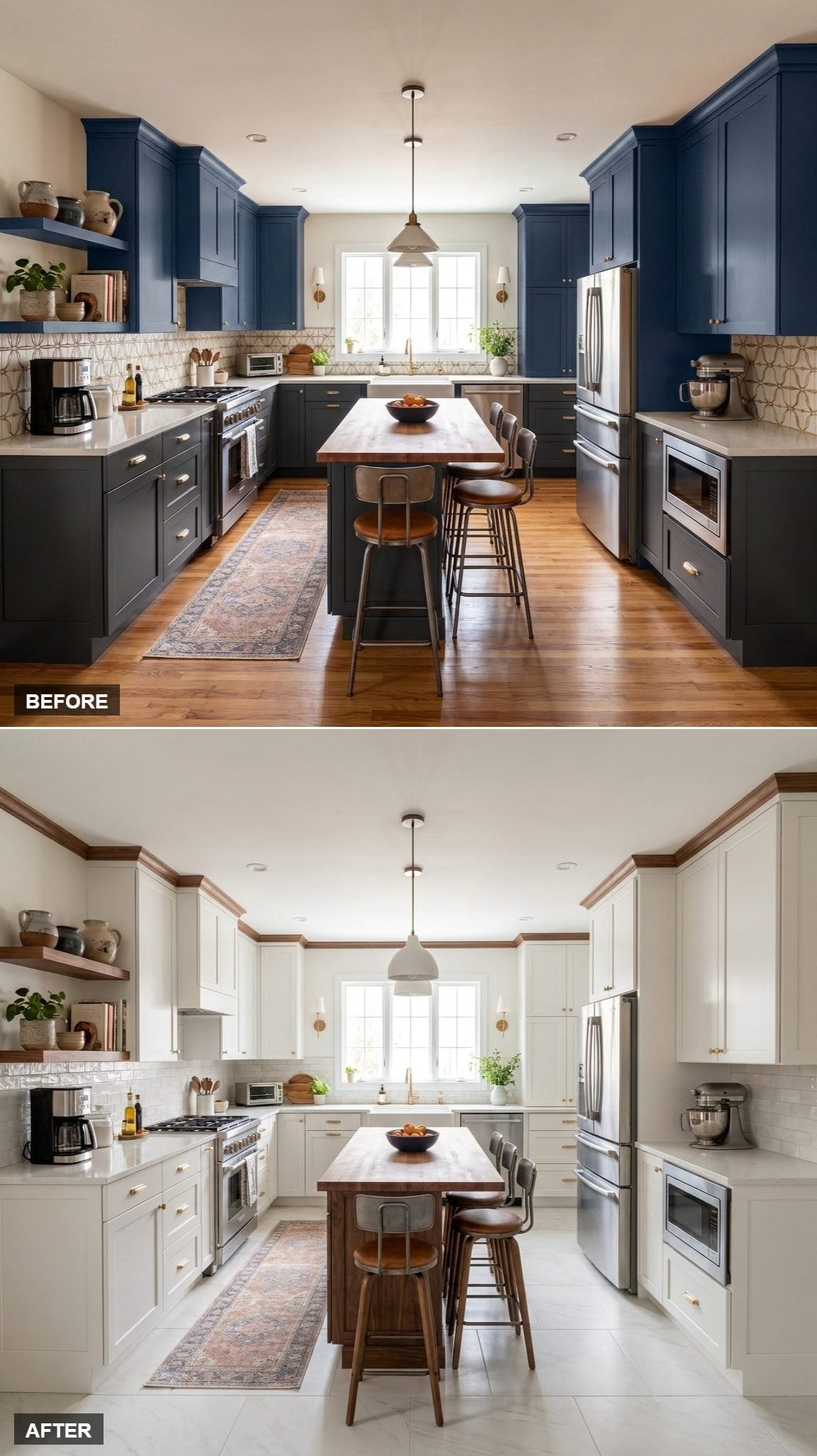
Most white-and-walnut kitchens put the wood below eye level. This one sends it upward. Walnut crown molding traces the top of off-white Shaker cabinetry, giving the ceiling line a darker, tailored edge.
Open shelf brackets repeat the tone farther down, while the butcher block island supplies one larger wood plane at the center. Gold hardware sits comfortably between the pale paint and deeper walnut without turning into a third competing idea.
- Walnut crown molding gives the upper cabinetry a stronger architectural finish
- Gold pulls bridge the temperature difference between pale paint and darker wood
- The lighter floor reflects more light than the darker flooring in the Before
29. Flat-Front White Perimeter, Walnut Island Base, and a Cleaner Modernist Read
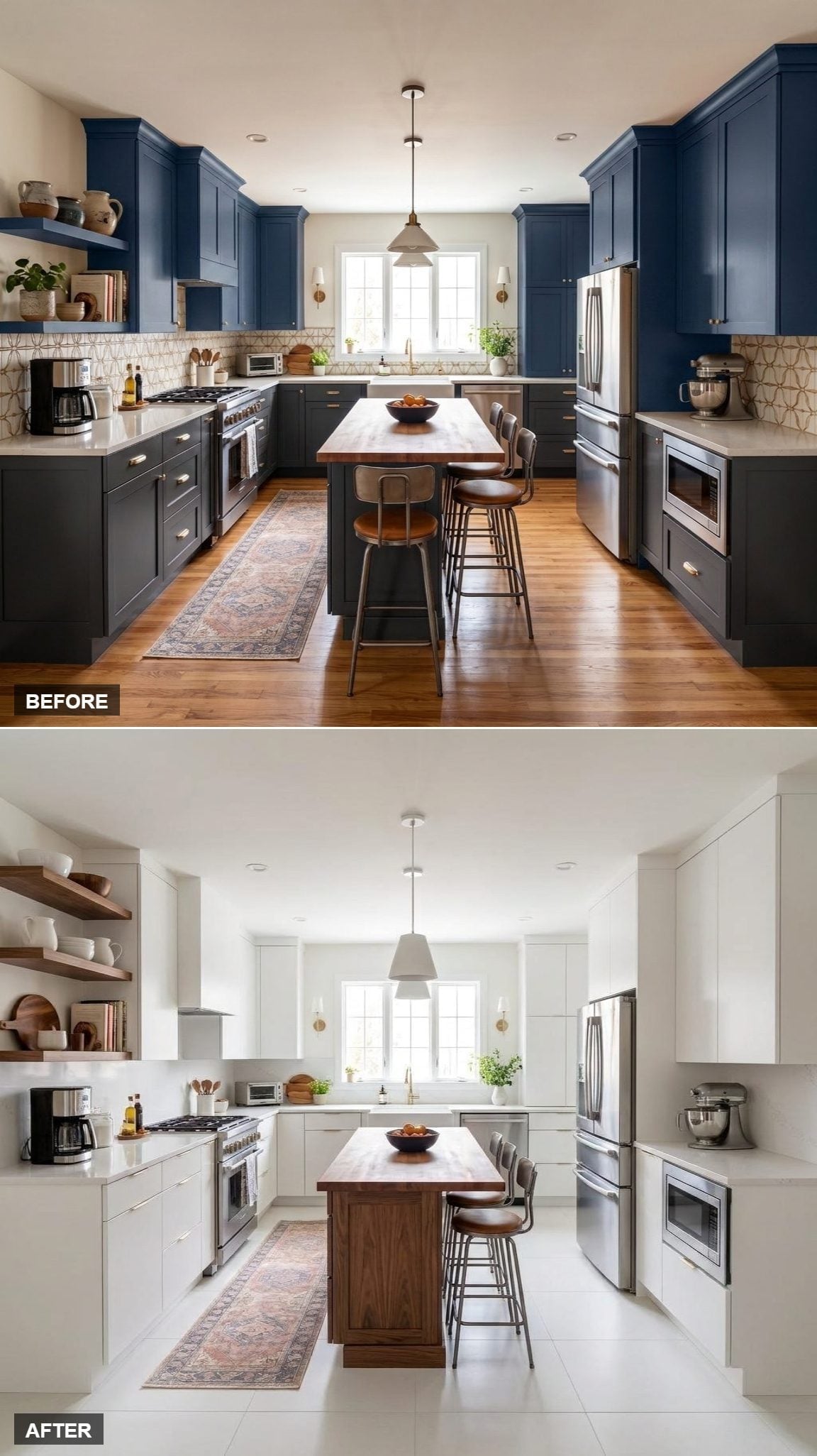
Lose the Shaker detailing and the same palette suddenly feels much more contemporary. Hardware-free white fronts flatten the perimeter into broad planes, leaving the stainless appliances and walnut island to register as distinct objects against them.
The wood is concentrated rather than scattered. Open shelves carry a little of it upward, but the island remains the substantial walnut block in the room. It’s a sharper, more architectural interpretation of white and wood.
28. Walnut Lowers, White Uppers, and a Backsplash That Finally Gets Some Attention
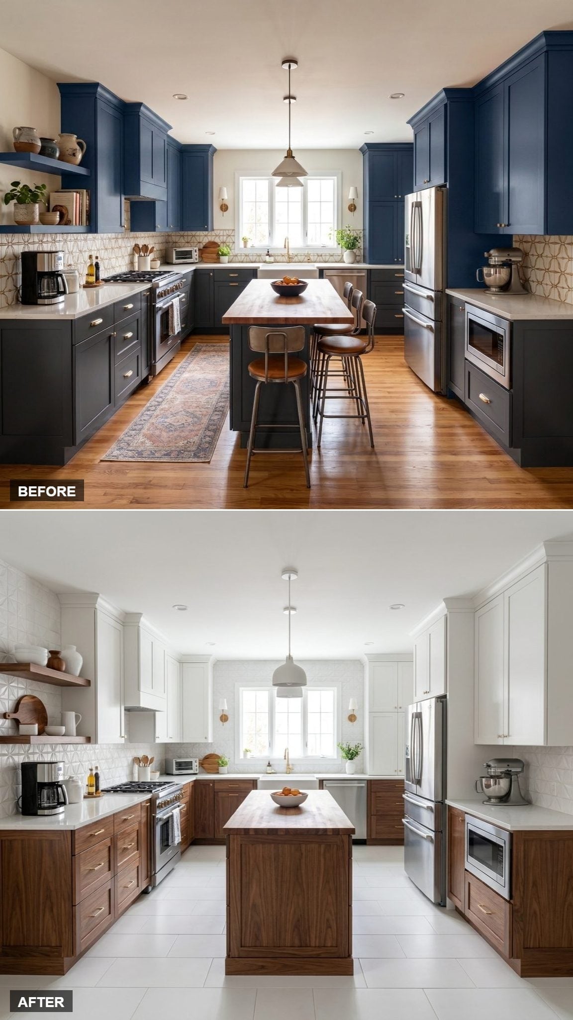
The cabinet colors are familiar, so the backsplash gets to change the conversation. A geometric white-on-white pattern brings texture to the middle of the room without introducing another hue.
Walnut base cabinets establish a dark horizontal band, white uppers dissolve more readily into the wall, and large-format pale floor tile adds another bright plane below. The butcher block island top brings the wood back to center without simply copying the lower cabinetry.
History Corner: Walnut has been used in American furniture and cabinetry for centuries, prized for its rich grain and workable density. Its strong association with mid-century furniture also helps explain why it can make a new kitchen feel both contemporary and strangely familiar.
27. Painted White Perimeter, Walnut Island Stools, and an Island That Reads Like Furniture
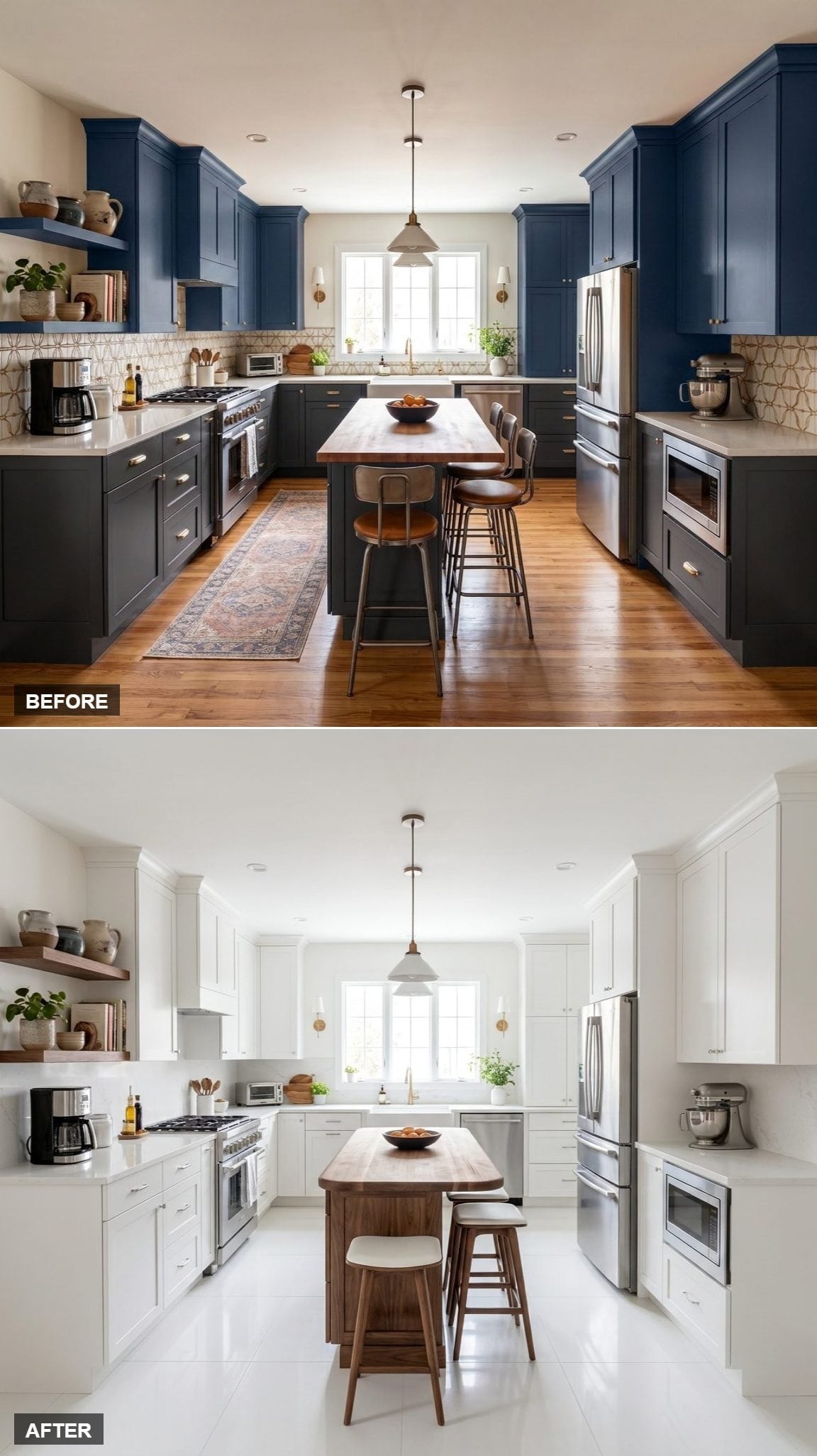
White cabinetry takes almost every wall, leaving the island to carry most of the warmth. Its butcher block top and mid-century stools make the center feel less like another bank of cabinets and more like a table that happened to become part of the kitchen.
Two simple pendants reinforce that furniture-like reading rather than turning the island into a showpiece. Open walnut shelving on the left completes the connection without adding another heavy wood mass.
26. Warm Walnut Accents, White Shaker Perimeter, and a Refrigerator Turned Into Architecture
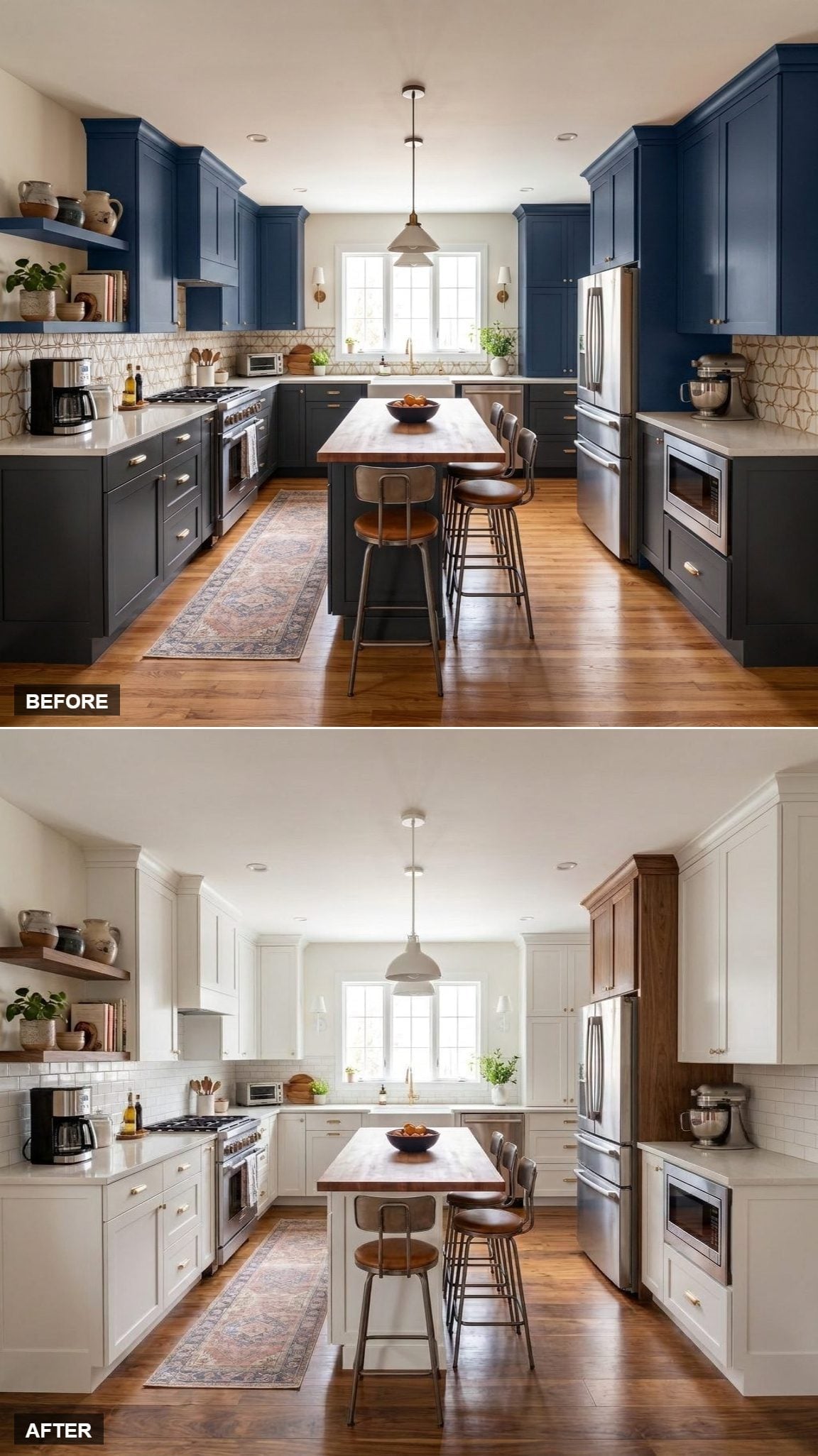
Walnut panels flanking the refrigerator give this redesign its strongest move. Instead of letting stainless steel interrupt a wall of white cabinetry, the darker wood gives the appliance its own architectural bay.
Open shelves repeat the tone across the room, while subway tile and creamy Shaker doors stay deliberately simple. Walnut appears at changes in depth and function, which makes it feel built into the architecture rather than scattered around as decoration.
25. White Uppers, Walnut Lowers, and a Floor That Changed Everything
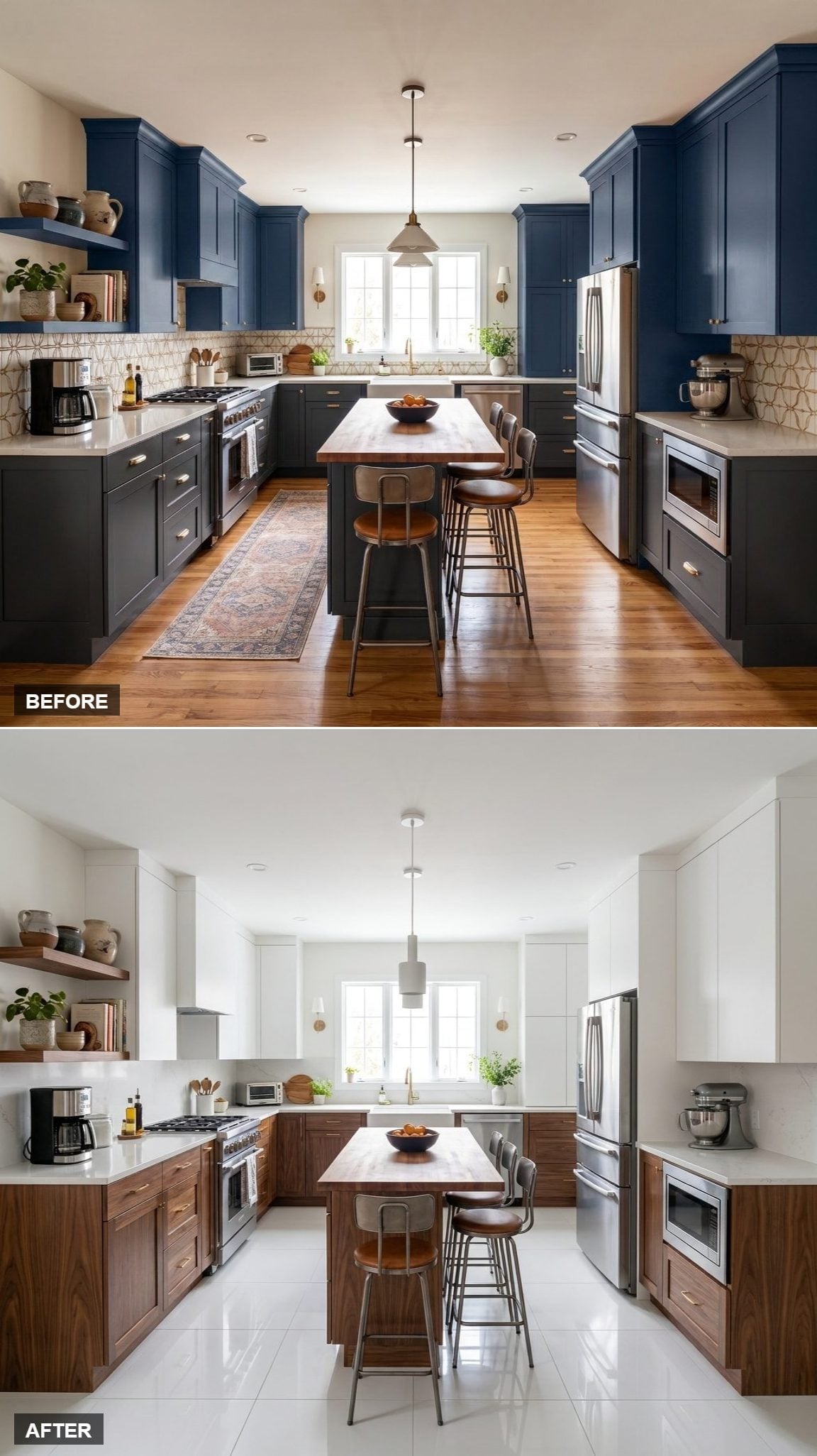
The cabinets aren’t the biggest transformation here. Pale, almost glossy floor tile replaces warm hardwood and changes the way light moves across the entire room.
Suddenly the walnut lowers can be darker without making the bottom half feel heavy. White cabinetry climbs to the ceiling, the island retains a wood surface, and the original stools provide one useful point of continuity. Same palette, dramatically cooler light.
24. White Shaker Doors, Open Walnut Shelving, and the Wall That Opened Up
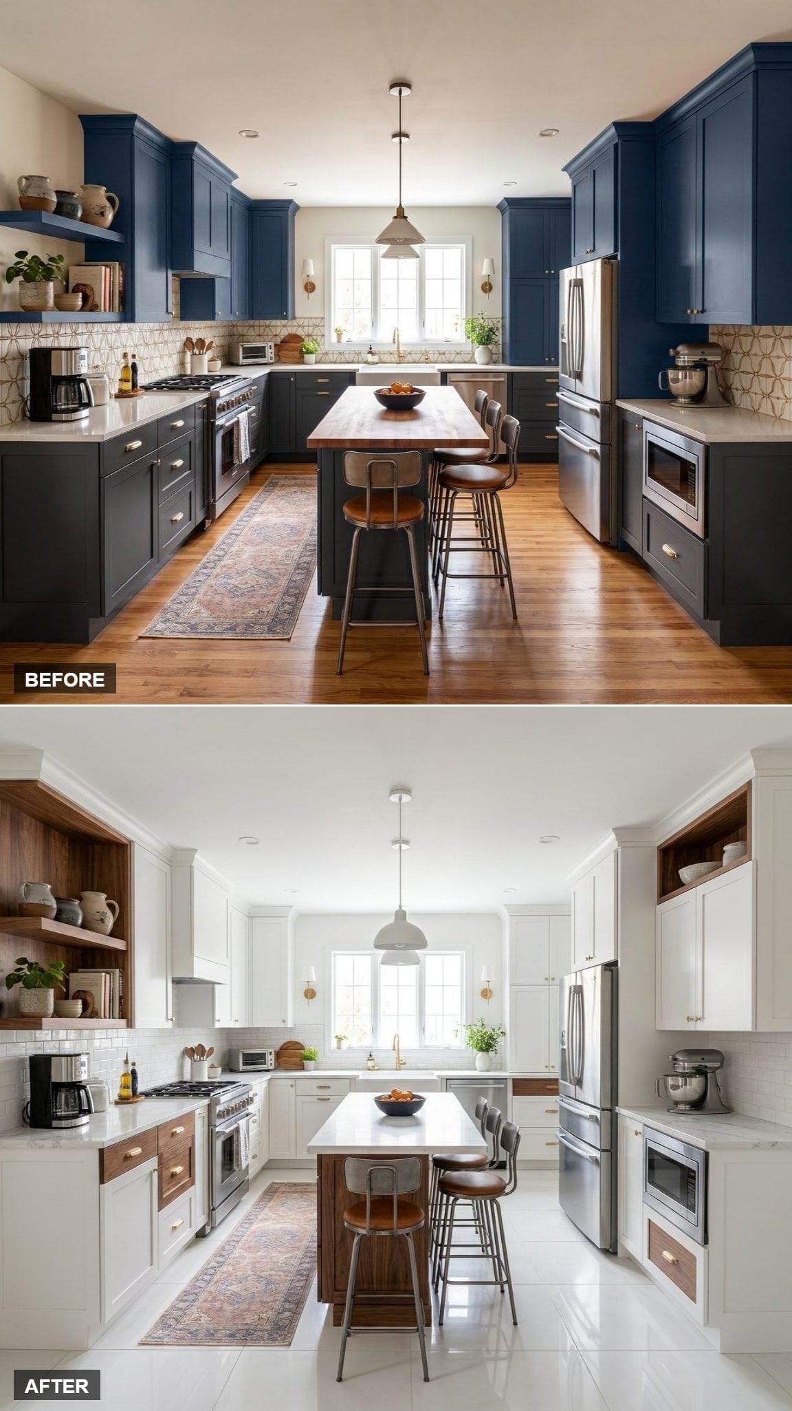
Not every improvement requires another cabinet. Open walnut shelving breaks the upper run on the left and gives ceramics, plants, and negative space a role in the composition.
Simple subway tile and white quartz fade behind it. Against a kitchen already packed with storage, that missing cabinet volume is part of the design. The wall looks useful without looking filled to capacity.
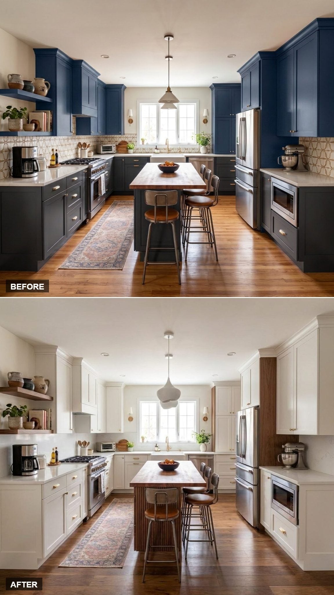
23. White Shaker Cabinetry, Reeded Walnut Island, and One Sculptural Move at Center
🔥 Would you like to save this?
This version concentrates almost everything interesting at the island. Vertical walnut reeding gives the central block enough texture to stand up to a perimeter of soft white Shaker cabinetry.
Above it, one sculptural matte-white pendant repeats the same strategy: a single strong object surrounded by comparatively quiet surfaces. The room reads immediately from the center outward.
22. White Cabinets, Walnut Warmth, and the Classic 2026 Version of the Look
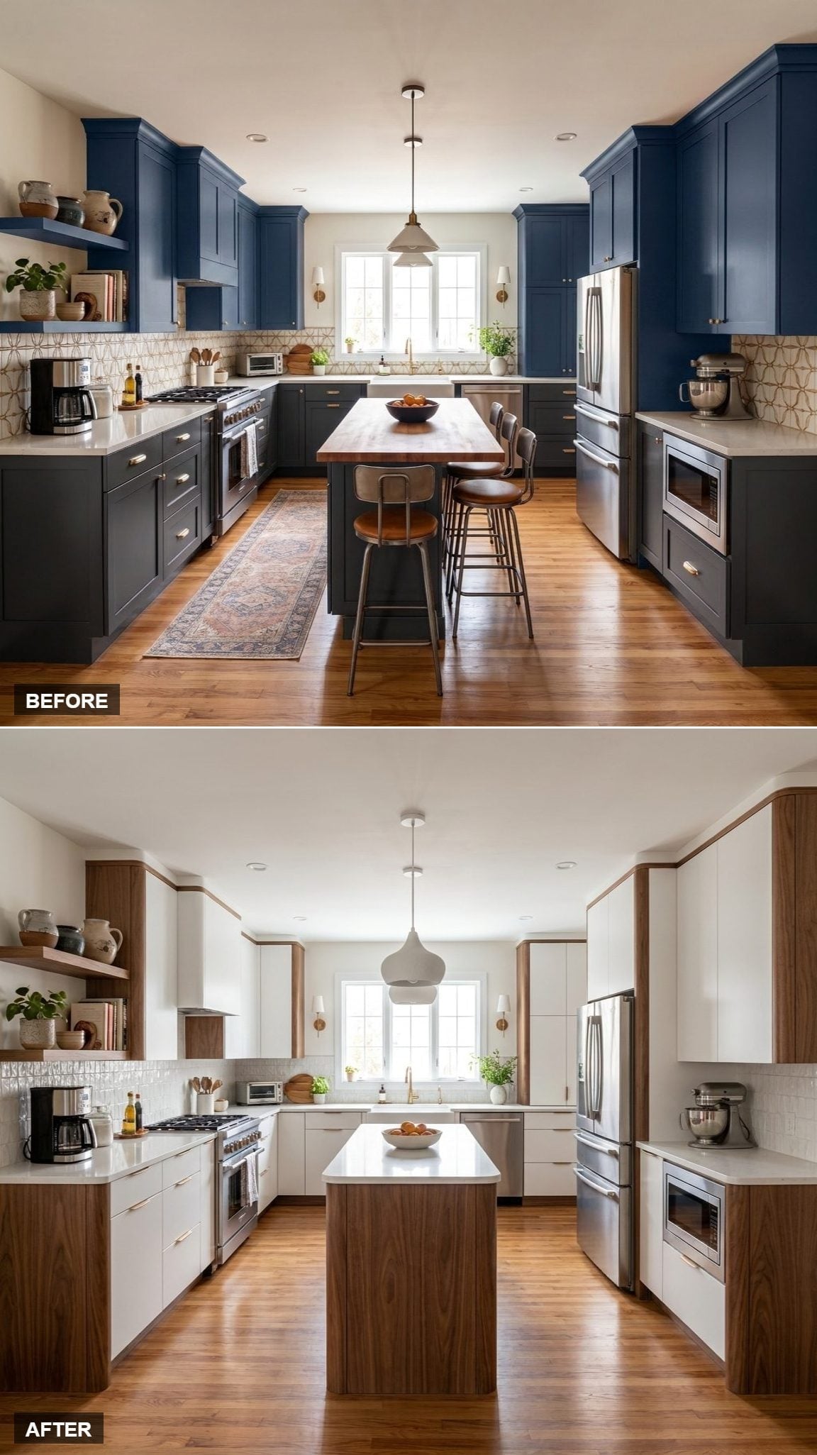
This is white and walnut in its most immediately recognizable form. Flat-front pale cabinetry handles most of the perimeter while vertical walnut panels break up the larger white surfaces. The island repeats the wood below a bright quartz top.
Floating shelves retain some of the Before’s lived-in character, and warm hardwood stays underfoot. Rather than erasing the original room, the redesign changes which materials command attention.
21. Lower Cabinets in Walnut, White Around Them, and Tall Pantry Towers Breaking the Rules
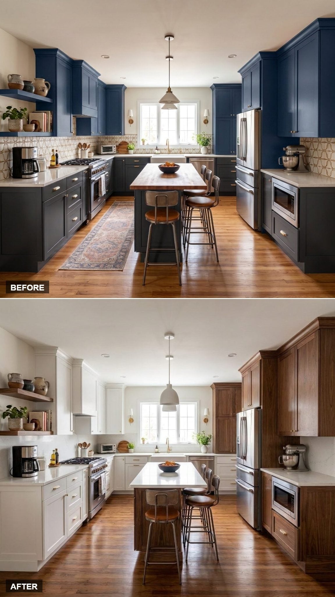
The tall walnut pantry elements save this from becoming another simple dark-below, light-above kitchen. Wood rises to full height at selected points while the rest of the perimeter remains bright.
That creates a more vertical rhythm: pale cabinetry, walnut tower, stainless appliance, another pale plane, then wood again at the island. The dark finish becomes a series of markers rather than one continuous stripe around the room.
20. Two-Tone Done Right: White Uppers, Walnut Lowers, and Pattern in the Middle
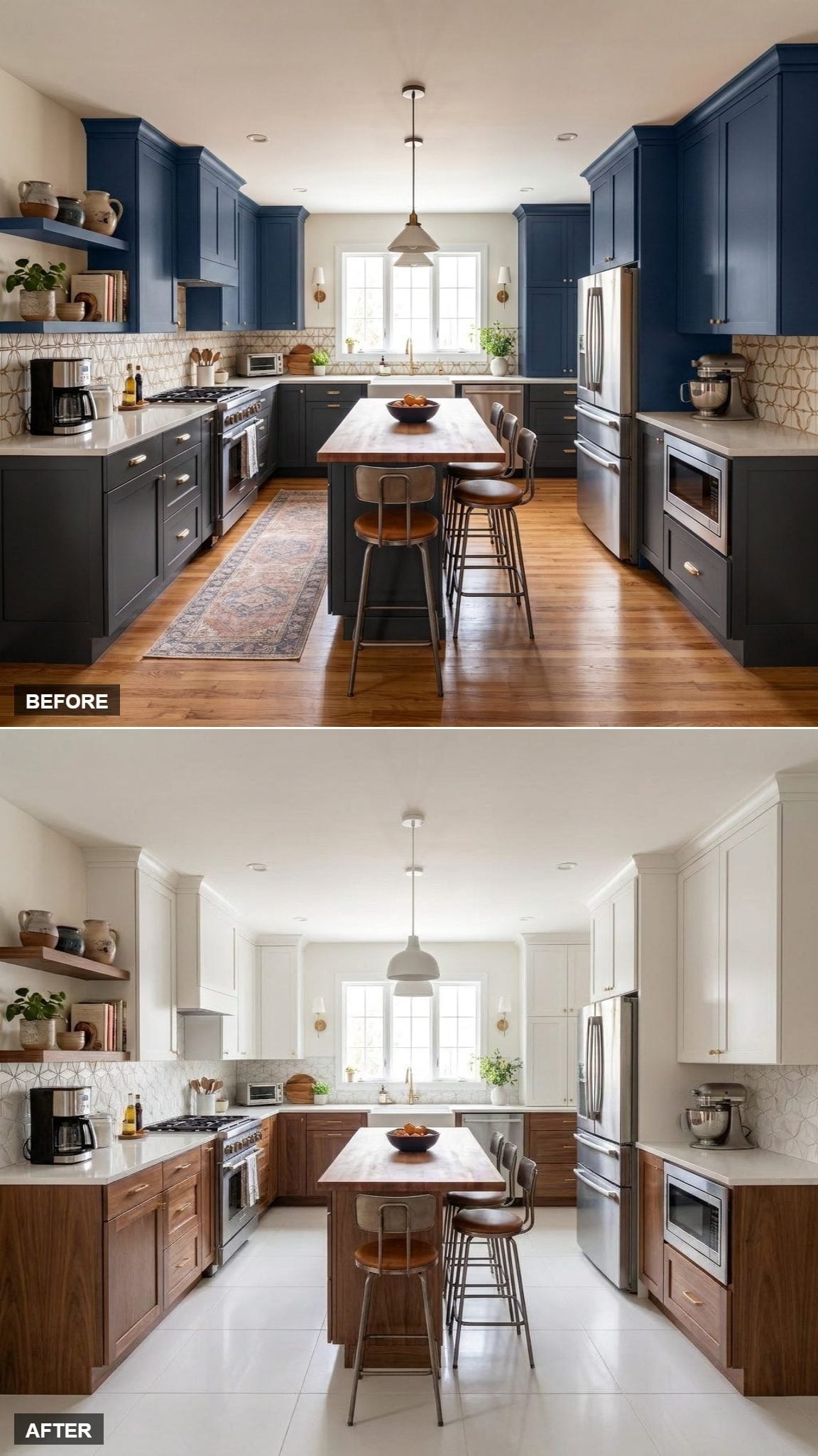
Here the kitchen works almost like a layer cake. Pale flooring sits below walnut cabinetry, patterned backsplash occupies the middle, and white Shaker doors take over above.
The geometric tile is what prevents the familiar two-tone formula from becoming predictable. Its repeating pattern gives the eye something to move across while the walnut grain supplies a looser natural pattern below.
19. Open Shelving, Walnut Island Base, and a Redesign Built Around the Window
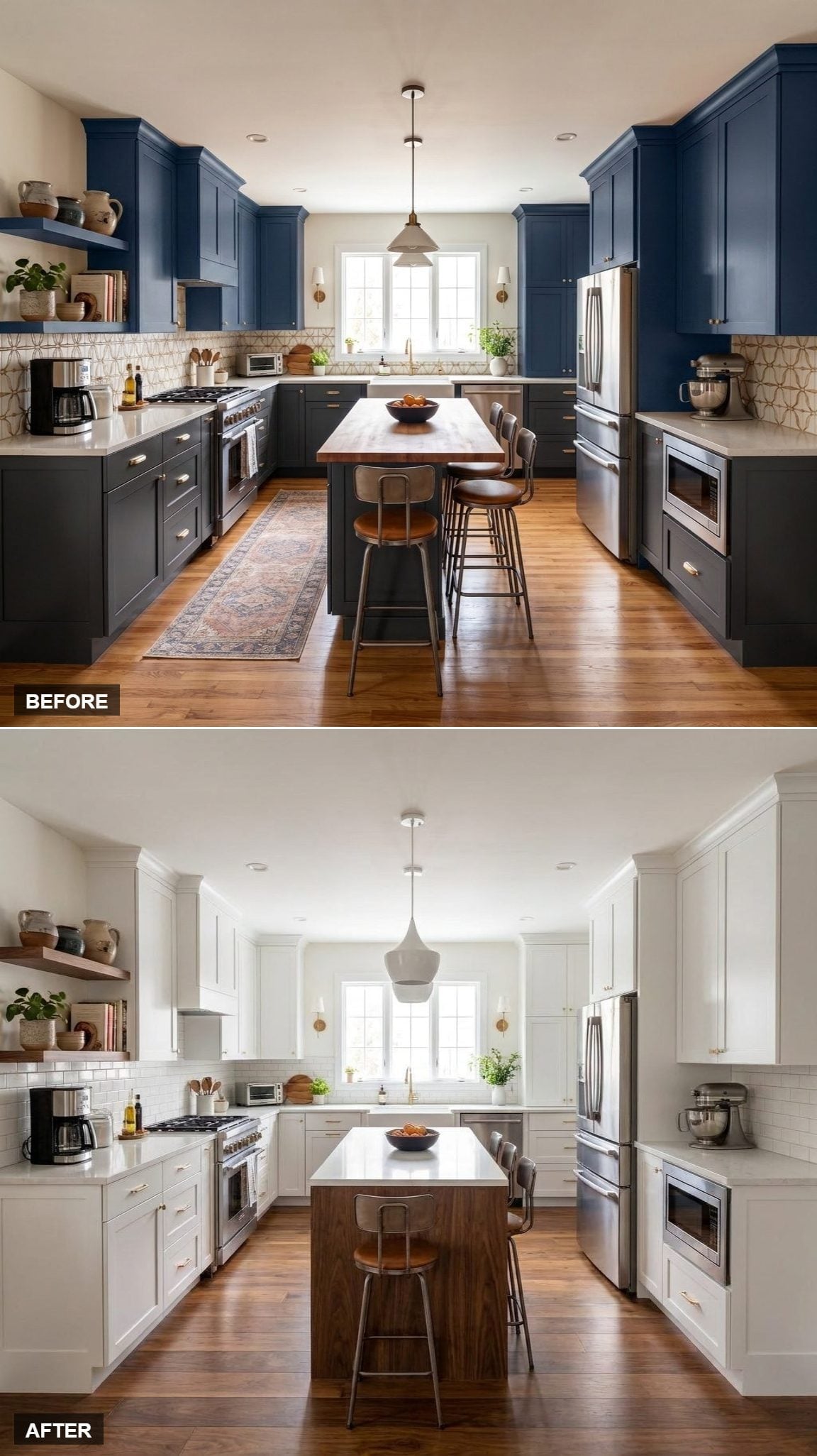
The rear window has always been the room’s natural destination, and this version finally behaves accordingly. Pale perimeter cabinetry recedes while the walnut island remains low enough to leave that sightline intact.
A single teardrop pendant occupies the center without creating a heavy canopy above the island. Floating shelves add depth on the left, but the brightest part of the composition remains exactly where daylight enters.
18. White Cabinets, Walnut Frames, and a Kitchen Drawn in Darker Lines
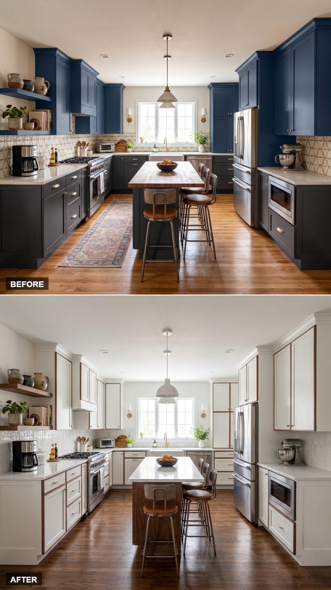
Thin walnut borders give every white cabinet front its own outline, creating a rhythm that’s more graphic than the usual white-upper/walnut-lower split.
The island follows with a dark base and bright surface, while open shelves let the frame color escape the cabinet grid. The wood isn’t providing bulk here. It’s providing definition.
17. White Takes the Lead, Walnut Meets a Herringbone Floor
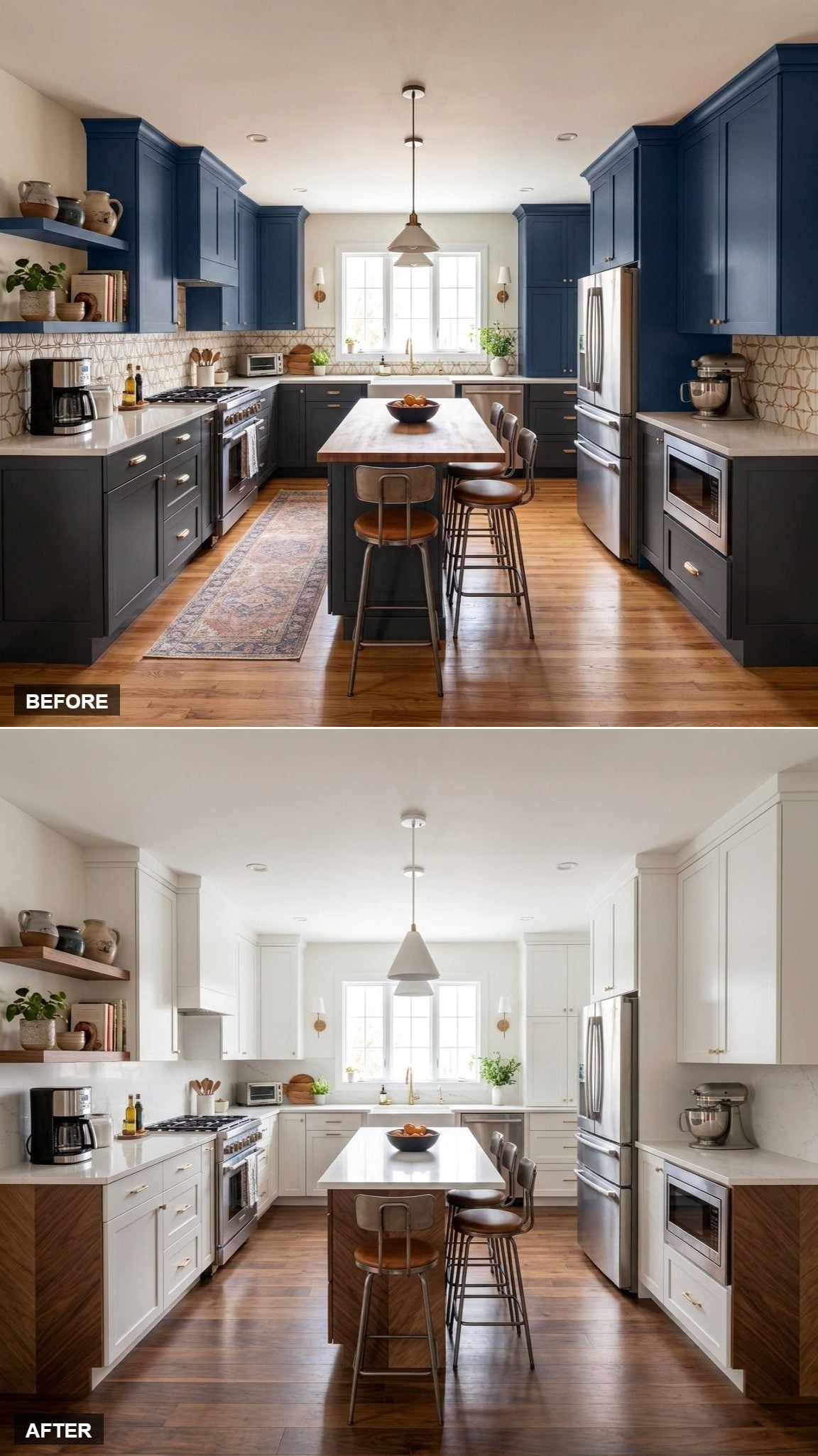
Herringbone flooring gives this version another grain direction to work with. Walnut lowers run horizontally around the room while the floor creates a more energetic zigzag beneath them.
White uppers keep all that wood from overwhelming the composition. At center, the walnut island base and pale quartz top act almost like a summary of the whole room: warm below, bright above.
Did You Know: Furniture made by Shaker communities became known for spare construction and an emphasis on utility. Today’s “Shaker-style” cabinet door is a modern design category inspired by that broader tradition rather than an unchanged historical kitchen detail.
16. White Shaker Cabinets, Butcher Block Island, and One Wood Surface Doing Plenty
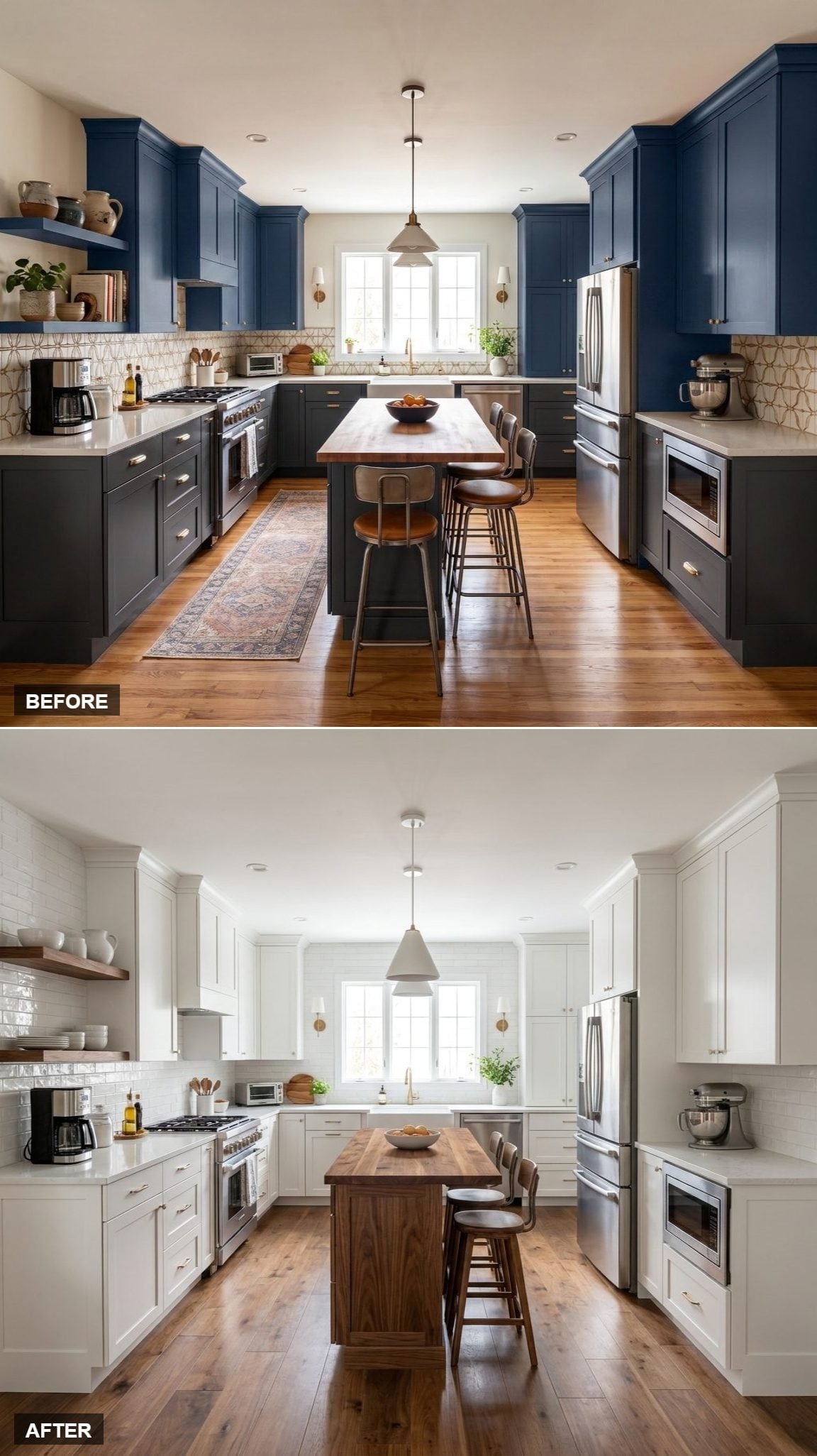
The walnut story here is almost entirely horizontal. White Shaker doors occupy the walls while the butcher block island top becomes the broad warm plane running through the center.
Brass sconces and gold hardware pick up some of that warmth without requiring another run of wood cabinetry. It’s proof that the palette doesn’t need to be divided fifty-fifty to register clearly.
Sometimes one well-placed wood surface can change the temperature of an entire white kitchen.
15. White Uppers, Walnut Lowers, and a Strong Line Around the Room
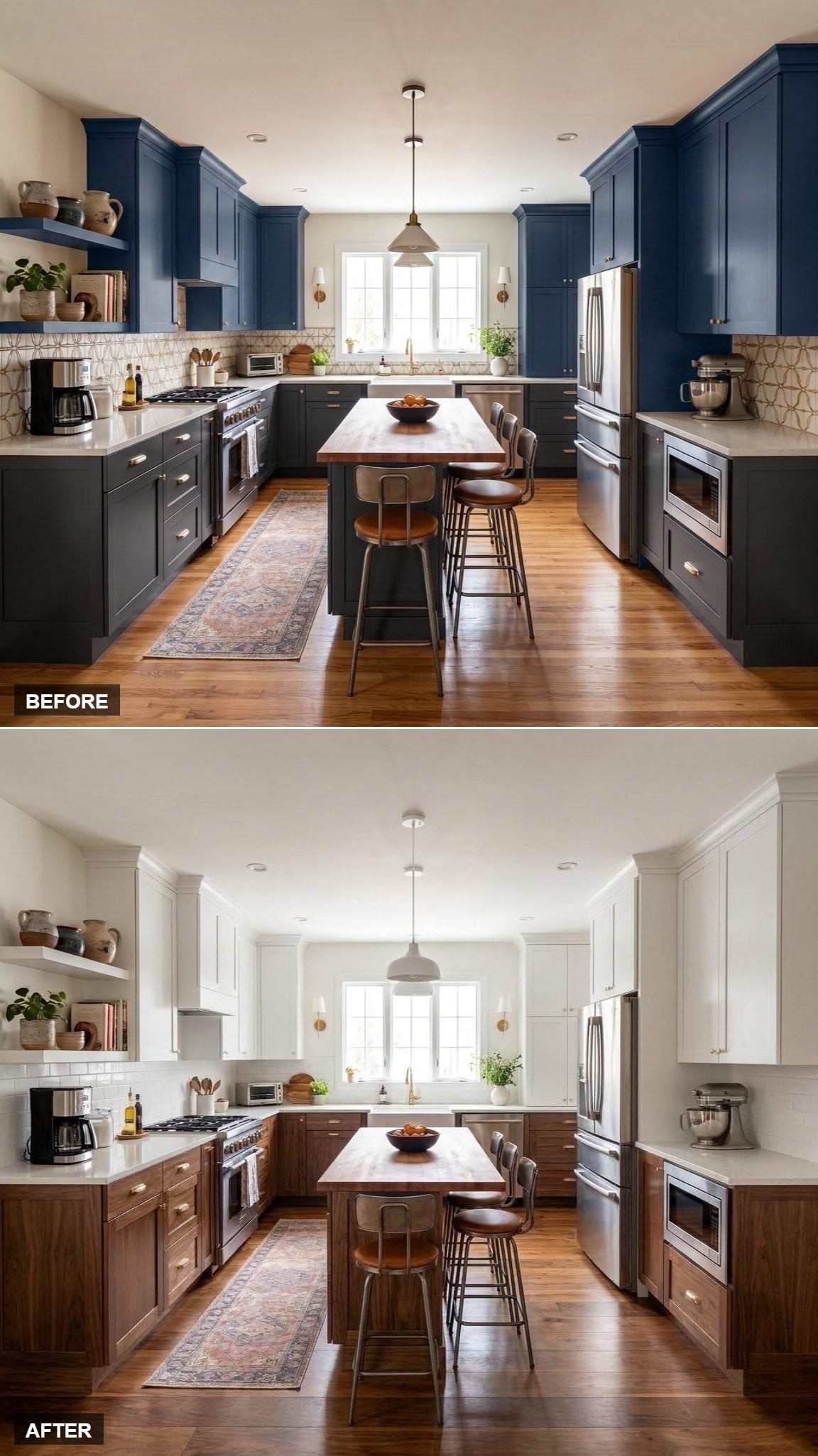
This version makes the countertop line the organizing principle. Walnut stops firmly below it; white begins above it; pale quartz marks the boundary between the two.
Gold hardware crosses both finishes so the split never becomes too rigid. Instead of chasing a dramatic focal point, the room relies on the repetition of one clear horizontal division from cabinet run to cabinet run.
14. White Shaker Perimeter, Walnut Open Shelving, and a Lighter Way to Add Storage
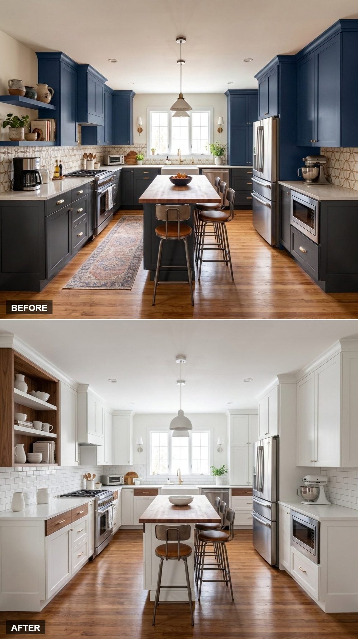
Open walnut shelving makes storage feel less architectural than another wall cabinet would. Ceramics can project beyond the shelf edges, shadows appear behind them, and the wall gets depth without another solid box.
The island surface repeats the same wood tone, while a few lower fronts distribute walnut farther around the room. Hardwood flooring adds another related grain without forcing an exact match.
13. Crown Molding, Walnut Lowers, and the More Traditional Side of White and Wood
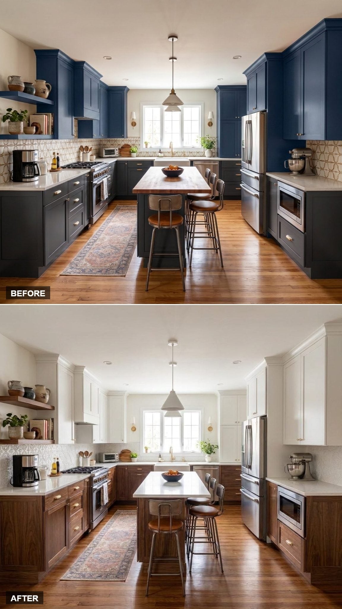
Shaker uppers and pronounced crown molding move this design toward the traditional end of the gallery. Walnut lowers prevent the detailing from drifting into another all-white transitional kitchen.
The runner, brass hardware, open shelving, and visible wood grain add smaller layers of pattern beneath the stronger cabinet geometry. It’s a useful reminder that white and walnut isn’t tied to one particular level of modernity.
Designer’s Note: Natural wood and painted cabinetry wear differently rather than one being universally tougher. Visible grain can disguise some minor scuffs particularly well, which can make wood a forgiving choice for heavily handled lower cabinetry.
12. White Flat-Fronts, Walnut Accents, and a Kitchen Edited Down to the Essentials
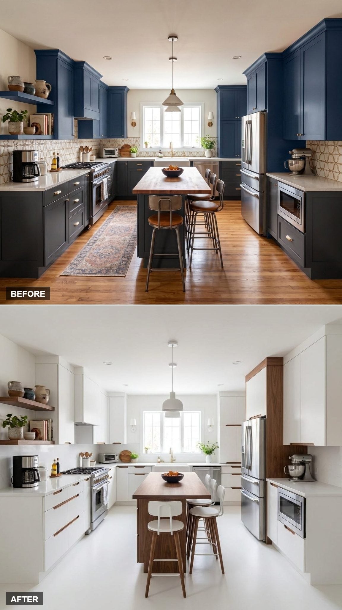
Handleless white cabinets create one of the smoothest perimeters in the gallery. Walnut appears only at the island, shelving, and tall pantry column beside the refrigerator.
Those interruptions become coordinates inside an otherwise nearly seamless white envelope. Even the molded white stools refuse to complicate the palette. The result feels edited rather than decorated.
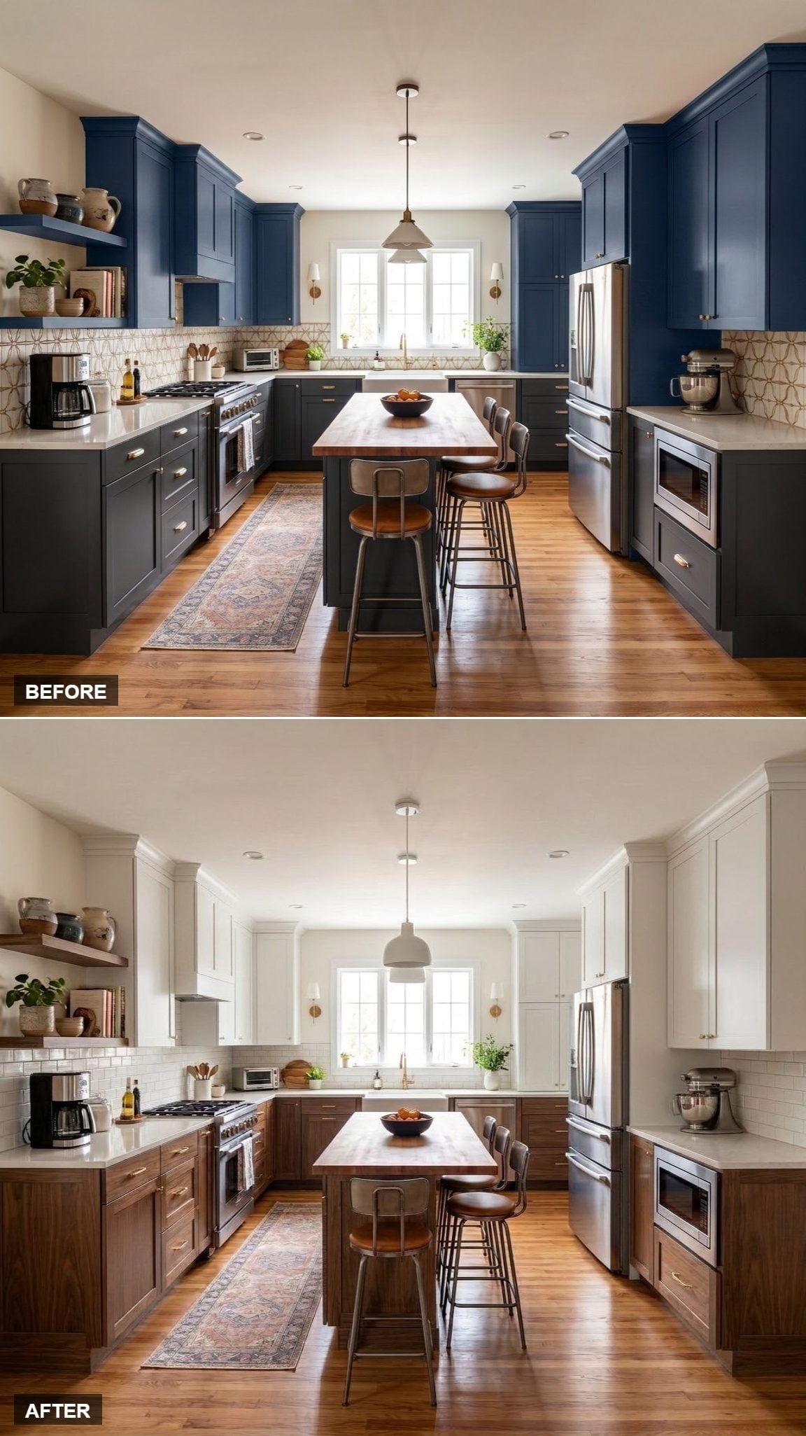
11. Walnut Lowers, White Uppers, and a Simpler Backdrop for the Grain
🔥 Would you like to save this?
Replacing the more animated backsplash with straightforward subway tile changes the balance here. The walnut grain becomes the busiest pattern in the room instead of competing with what is happening behind the countertops.
The island repeats the wood and adds butcher block above it, while two pendants introduce a little symmetry overhead. Simplifying one surface gives the remaining materials considerably more room to register.
10. White Upper Cabinets, Walnut Lowers, and the Purest Two-Tone Split
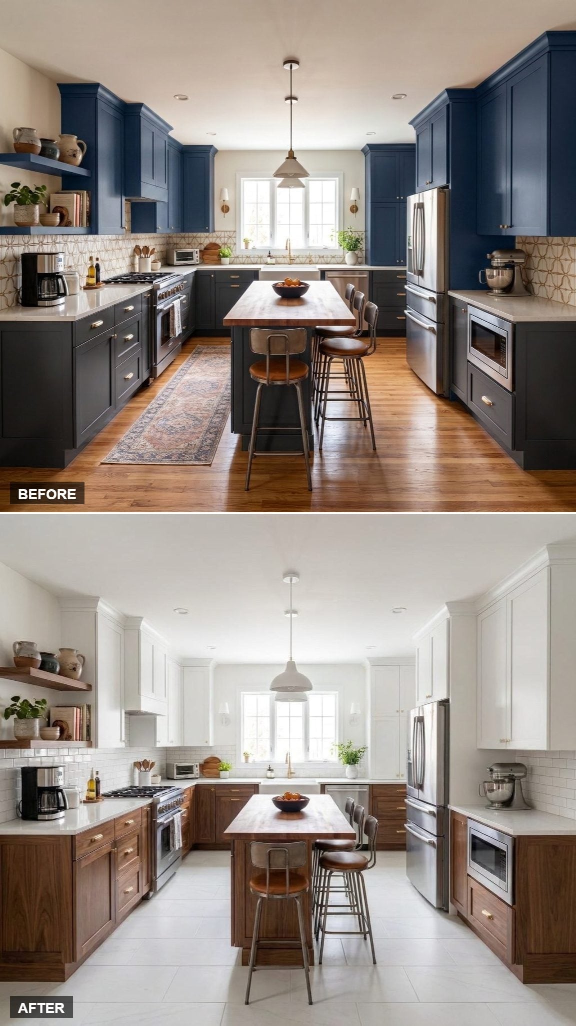
No tricks here: white above, walnut below. The division is unapologetically horizontal, allowing each material to occupy its own part of the room rather than weaving the finishes together.
White tile flooring extends the pale portion downward while gold hardware and a brass faucet bridge the temperature difference. Sometimes the most familiar interpretation survives because the proportions are right.
9. White Perimeter, Walnut Island Base, and a Runner Bringing the Color Back
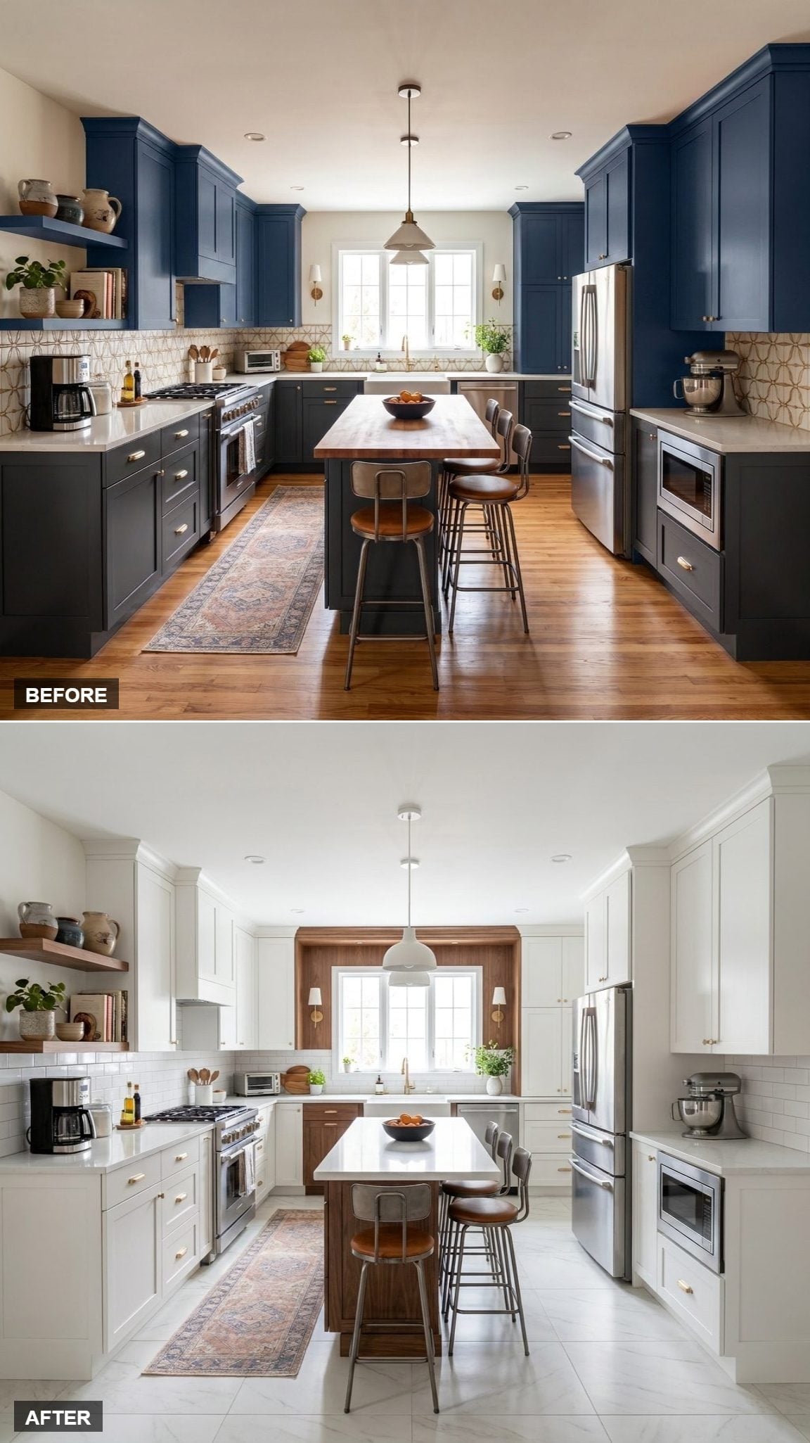
With white Shaker cabinetry surrounding the room and walnut concentrated at the island, the fixed surfaces stay unusually disciplined. Then the faded terracotta-and-navy runner breaks rank.
That textile restores a little irregularity and color without forcing either onto the cabinetry. Against white subway tile, quartz, and dark wood, it feels collected rather than coordinated.
8. White and Walnut Split the Cabinets, but Repetition Makes Them One Kitchen
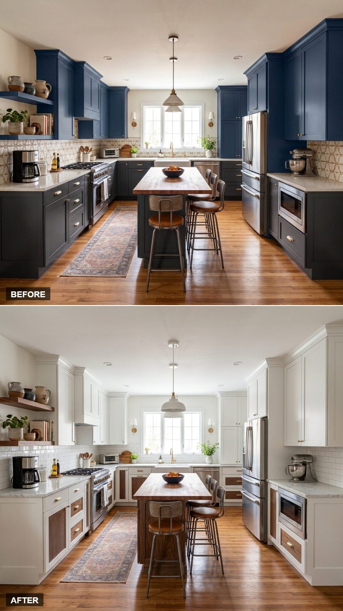
Bright white uppers and walnut lowers could easily look like two separate cabinet orders. Repetition elsewhere prevents that: walnut shelving appears on the left, butcher block occupies the island, and brass hardware moves across both finishes.
The eye keeps encountering the same materials in different places, so the upper/lower divide becomes only one part of the composition rather than the whole story.
7. Walnut Lowers, White Above, and Cabinetry That Stretches to the Ceiling
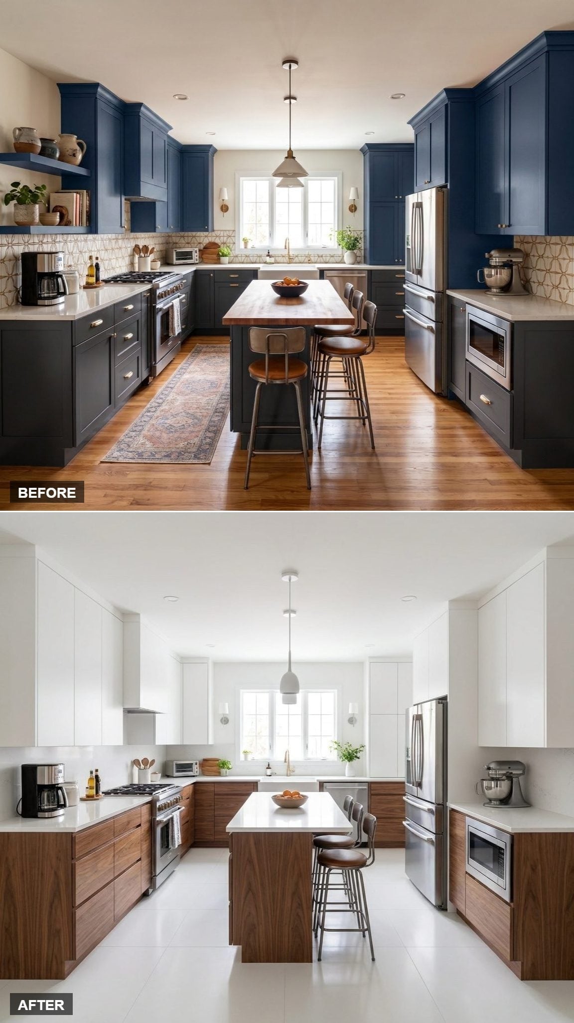
The strongest move happens overhead. White cabinetry runs cleanly to the ceiling, creating taller uninterrupted elevations than the dark Before.
Walnut lower cabinets form a dense base beneath that vertical white run, and the island repeats the division with wood below and quartz above. Nothing about the room’s actual height changed, but the cabinetry makes a convincing argument otherwise.
6. White Perimeter, Walnut Island Base, and a Schoolhouse Globe Changing the Mood
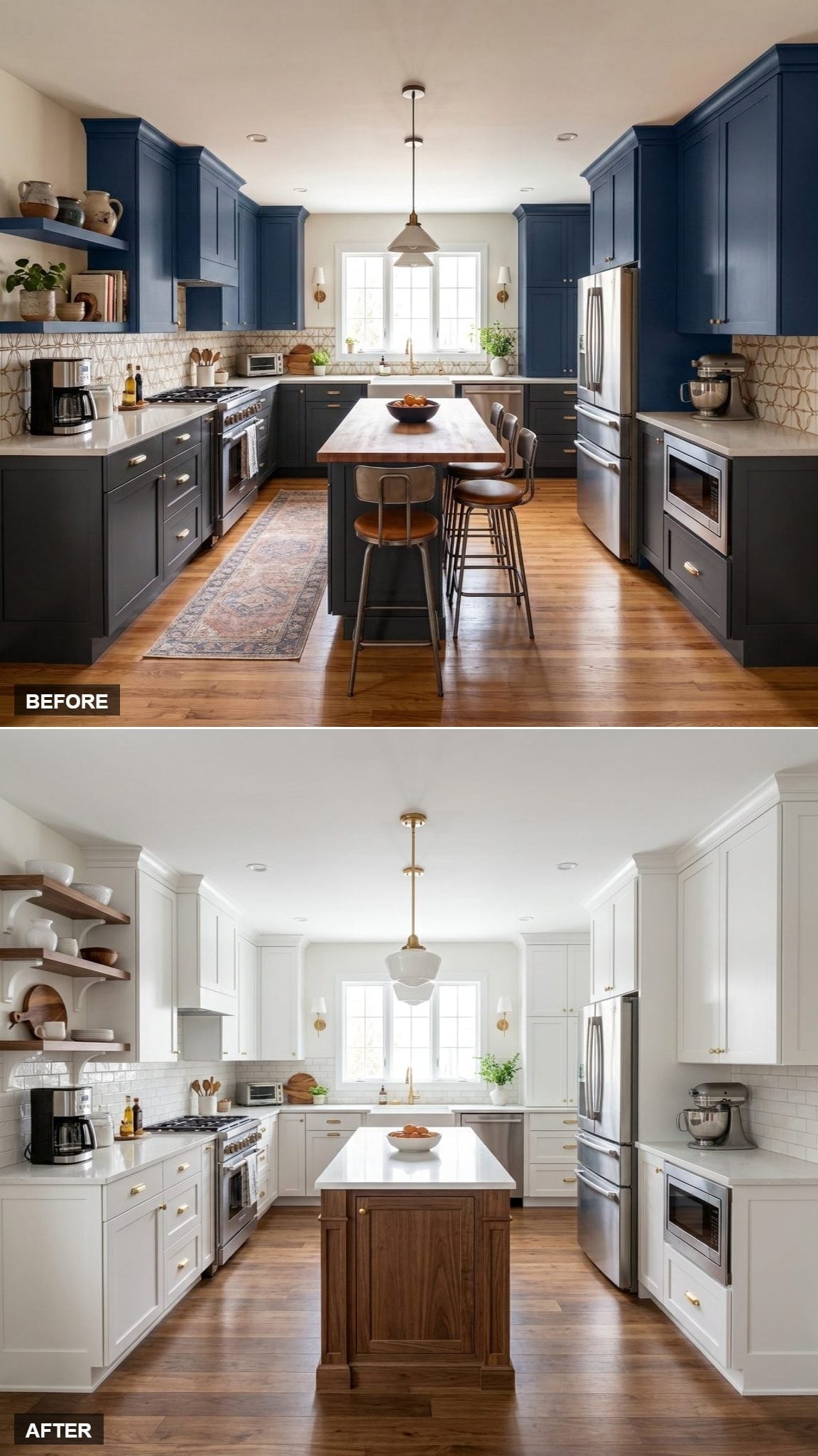
The broad material recipe may be contemporary, but the schoolhouse-style globe gives this version a slightly more traditional inflection. Its white shade and brass stem connect directly to the cabinetry and hardware without disappearing into either.
Walnut remains concentrated at the island and open shelving, leaving the fixture to supply much of the personality above counter height. Lighting can change the era a kitchen seems to belong to surprisingly quickly.
5. Walnut Lowers, White Uppers, and Open Shelving Breaking the Cabinet Wall
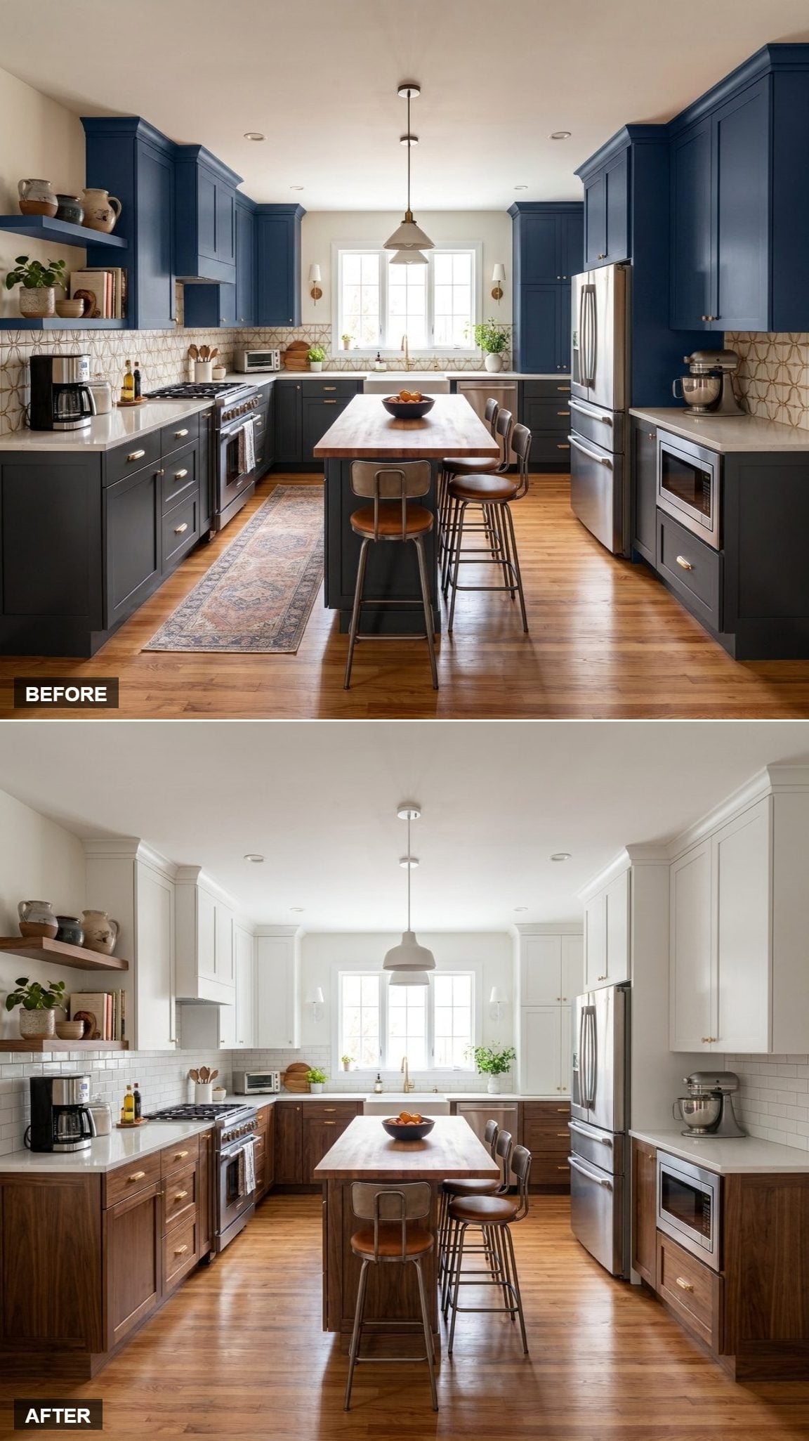
The familiar two-tone cabinet split gets interrupted on the left by open shelving. That pocket of shallower storage keeps the upper half from becoming one uninterrupted run of doors.
A butcher block island surface reinforces the walnut below, while subway tile leaves the middle register comparatively simple. The asymmetry gives this version a looser, more lived-in character than the fully enclosed designs.
4. Walnut and White Split the Work, With the Island Sitting Right in the Middle
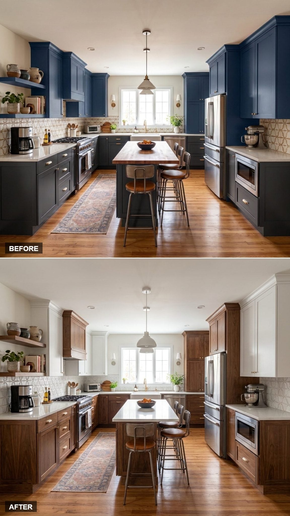
Dark walnut lowers and white uppers create two distinct horizontal zones, while the island borrows from both: wood underneath, pale surface above.
That makes the island the hinge rather than simply another cabinet block. Geometric backsplash tile adds enough pattern to keep the strict two-tone division from becoming too diagrammatic.
3. White Shaker Cabinets, Walnut Island Top, and Almost No Wood Required
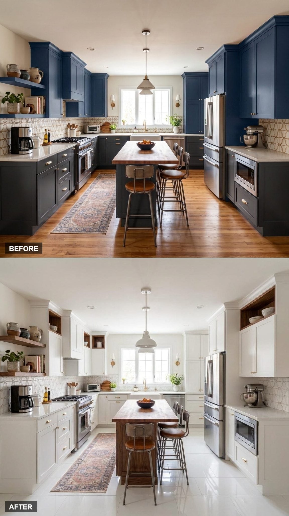
This may be the closest the series gets to an all-white kitchen. Floor-to-ceiling Shaker cabinetry occupies nearly every vertical plane, leaving the butcher block island top as the primary warm interruption.
That one surface gets noticed because nothing else is competing for the role. Instead of distributing walnut evenly around the room, this design saves almost all of its impact for the center.
2. Shaker White Perimeter, Walnut Island Base, and One Dark Block at Center
🔥 Would you like to save this?
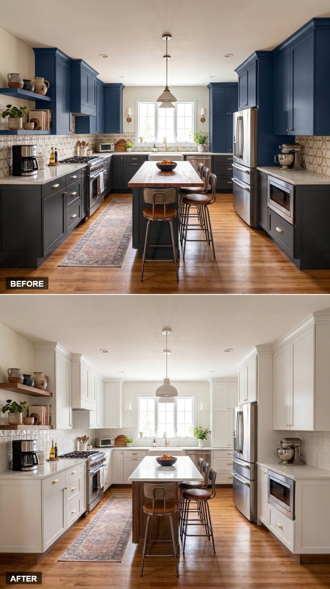
The outer walls go almost entirely white while walnut is assigned to the island. Rather than surrounding the room with contrast, the darker material becomes something you can literally walk around.
Matching shelves on the left prevent the island from becoming isolated, while a faded rug and matte-white pendant keep the rest of the composition relaxed. The central block has all the visual weight it needs.
1. Walnut Lowers, White Uppers, and a Final Return to the Classic Split
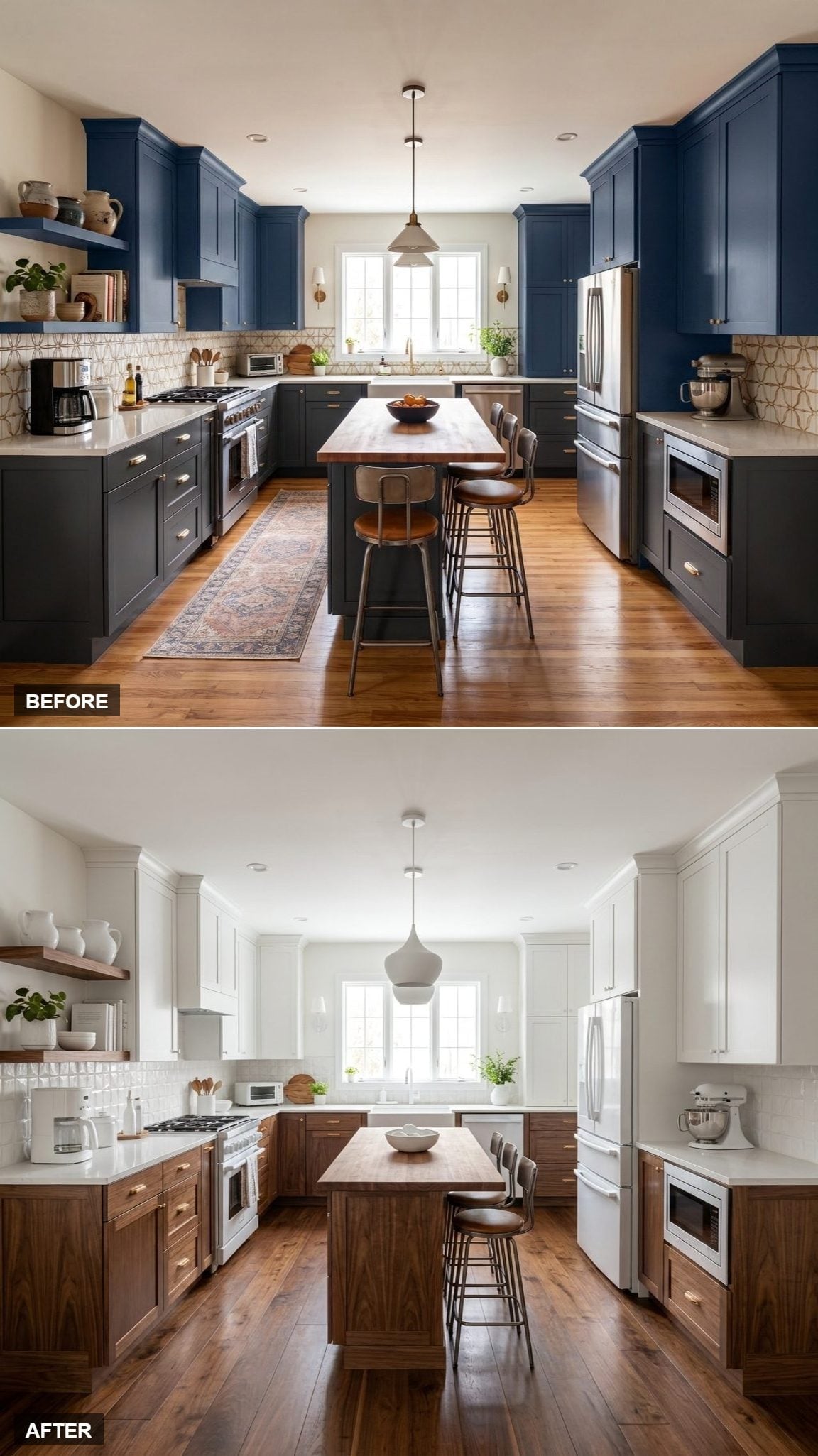
After reeding, framing, flat fronts, open shelving, pale floors, sparse wood accents, and island-focused schemes, the final kitchen circles back to the simplest version of the combination: walnut below, white above.
The lower cabinetry forms a continuous warm base, bright uppers carry the eye toward the ceiling, and gold hardware travels comfortably across both. A matte-white globe pendant stays centered over the island while walnut stools bring the wood tone right down to floor level.
That may be why white and walnut has so much staying power heading through 2026. The pairing doesn’t depend on one cabinet style or one rigid formula. Walnut can become texture, outline, furniture, architecture, flooring, shelving, or one beautifully placed surface; white can provide the backdrop, the contrast, or nearly the whole room.
Thirty-five versions later, the kitchen underneath is still recognizable. What keeps changing is the balance — how much wood, how much white, where the grain appears, where the eye lands first, and how traditional or contemporary the same two materials can become. That’s a lot of range from a palette that looks deceptively simple on paper.