🔥 Would you like to save this?
Blue and white is the only saturated palette that behaves like a neutral. That single fact explains almost everything about why it has dominated kitchen design for the better part of a decade, why it keeps outlasting the colours that were supposed to replace it, and why it remains the most reliable way to put real colour into a kitchen without gambling on it.
Below are twenty-five blue and white kitchens, grouped loosely from the deepest, darkest navy rooms through the lightest two-tone schemes, and finishing with four that abandon restraint altogether. What runs through all of them is a small set of decisions that repeat often enough to be worth naming.
In order to come up with the very specific design ideas, we create most designs with the assistance of state-of-the-art AI interior design software. Also, assume links that take you off the site are affiliate links such as links to Amazon. this means we may earn a commission if you buy something.
What the pattern actually looks like
Across every kitchen image on Home Stratosphere, readers save far more often than they react. That gap is the most useful thing we know about how people use these rooms, because a save is a statement of intent — someone expects to come back to it when they build their own — while a reaction is just a response in the moment.
Readers save a kitchen more than three times as often as they heart it
Of the kitchens below carry timber as a primary material
Loves barely outnumber dislikes — this palette divides people
Blue is bold without being a commitment. In most of the kitchens here, navy sits below the counter — on the island, on the base cabinets — with white, marble or timber above it. The colour is contained at waist height. That is precisely why people who would never paint an entire kitchen will happily paint an island, and it is why the arrangement survives a future sale in a way an all‑navy room does not.
Contrast is doing more work than colour. A dark base against a light counter holds its shape when an image is scaled down to thumbnail size. All-white kitchens dissolve at that scale; navy and white keeps a readable silhouette. It is the reason these rooms travel so far on Pinterest, and the reason a blue kitchen often photographs better than it looks in person.
Wood is doing the rescuing. Blue on its own reads cold, and these kitchens correct for it with striking consistency: timber appears in eleven of the twenty-five, marble in fourteen, and a warm metal — brass or gold — in twelve. The formula is not navy and white. It is navy, timber, and something warm in the light fittings.
Expect it to divide people. Loves and dislikes run almost level across our image data, and the maximalist rooms at the end of this list are where that split will be widest. A room that everybody mildly likes is usually a room nobody remembers.
25 blue and white kitchens
Deepest navy first · maximalists last
1. Gothic Chalet, Softened
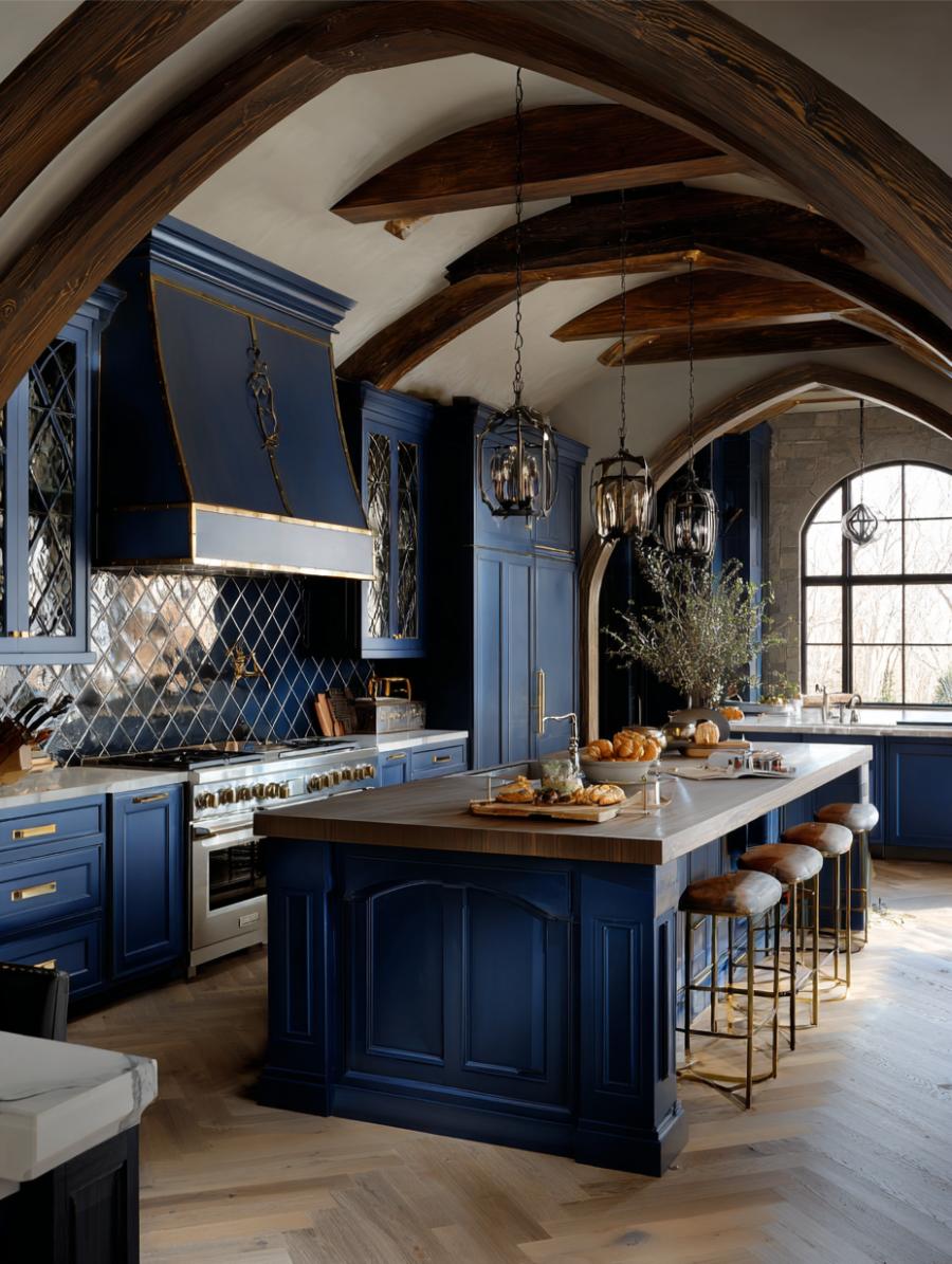
The look: Deep blue cabinetry · exposed beams · hand-glazed zellige backsplash
Deep blue cabinetry set against exposed beams and a patterned backsplash is the combination that reads as designed rather than decorated. The zellige is doing more work than it appears to: a hand-glazed tile has an irregular surface, so it catches light unevenly and gives the eye somewhere to rest in a room that is otherwise all flat colour and heavy timber.
That matters more in blue kitchens than in pale ones. Dark cabinetry tends to flatten into a single silhouette in photographs, and a textured backsplash is the cheapest way to put depth back into the middle distance. If you are working with a small budget and a dark palette, this is the one surface worth overspending on.
dramatic
stained wood
zellige
navy
brown
cream
AI render
2. The Timber Counterweight
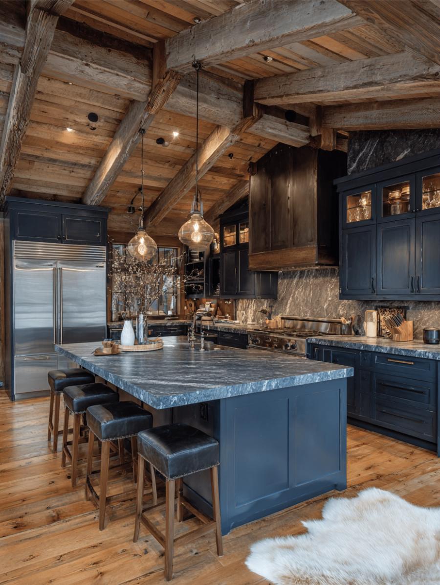
The look: Navy cabinetry · unfinished timber beams · marble island · pendant lighting
Navy goes cold on its own. Raw timber beams and a marble island are the correction, and it is the pairing this whole category returns to more than any other. Blue sits at the cool end of the spectrum and reflects very little warm light, so a room finished in navy and stone alone will photograph beautifully and feel unwelcoming to stand in.
Wood solves it because it brings both colour temperature and texture at once. Note that the beams here are unfinished rather than stained dark, which keeps them reading as structure rather than as another dark surface competing with the cabinets.
cozy
marble
stained wood
navy
brown
grey
Photograph
3. Alpine Lodge, After Dark
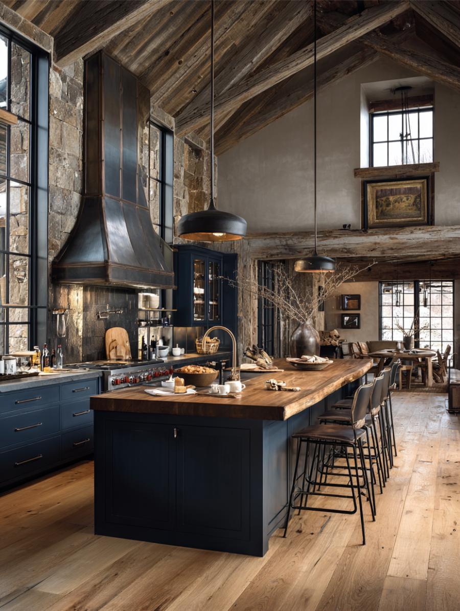
The look: Navy cabinetry · vaulted timber ceiling · black metal pendants · wood island
The darkest room in this list, and the one that best demonstrates why contrast, not colour, is the real engine of a blue kitchen. Black metal pendants over a wood island give a nearly black room three clearly separated planes: the vaulted ceiling above, the lit work surface in the middle, and the cabinetry below.
Strip any one of those out and the room collapses into a silhouette. This is the version of the look for a house with real ceiling height and real windows, and it is worth being honest that it does not translate to a standard eight-foot ceiling.
dramatic
black metal
stained wood
black
brown
gold
AI render
4. Live-Edge Against the Grid
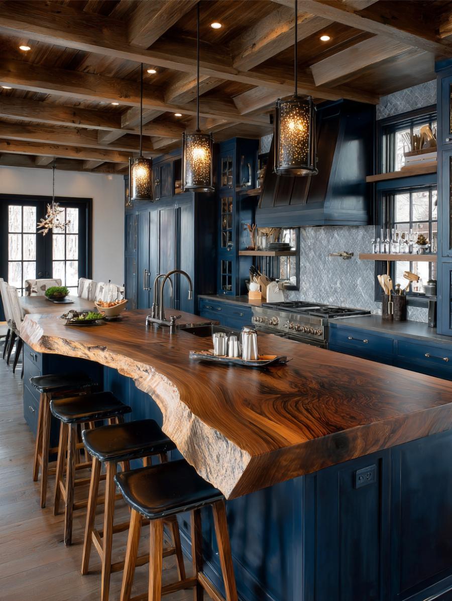
The look: Navy cabinetry · live-edge wood island · coffered wood ceiling
A coffered ceiling is rigid, repeating geometry. A live-edge island is the exact opposite: one irregular slab with a natural edge that no two of are alike. Putting them in the same room is the trick that makes an expensive kitchen look collected rather than ordered, and it is the single most repeated high-end move in this category.
It also photographs as a strong diagonal cutting across all those parallel ceiling lines, which is why images like this one travel so well on Pinterest. The composition is doing as much work as the materials.
dramatic
stained wood
marble
navy
brown
gold
AI render
5. Marble Over Matte
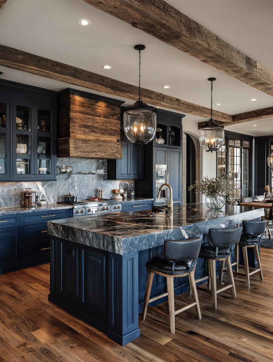
The look: Navy cabinetry · marble counters · exposed beams · island pendants
Navy cabinetry, marble counters, a beamed ceiling and pendants over the island. Nothing here is bespoke and everything is specifiable, which makes this the most reproducible room in the list — and the gap between aspirational and attainable is exactly where saves come from.
If you want one kitchen from this collection to hand a contractor, it is this one. Every element has a mid-market equivalent: quartz instead of marble, a painted shaker door instead of a custom profile, and faux beams that cost a fraction of structural timber.
dramatic
marble
black metal
navy
grey
brown
Photograph
6. Farmhouse Without the Cliché
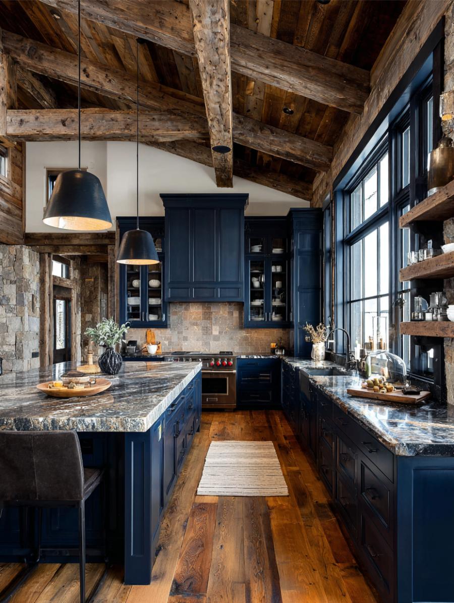
The look: Navy cabinetry · timber beams · marble countertops · farmhouse profile
Modern farmhouse gets dismissed as exhausted, and mostly that is fair. Swapping the expected white for navy resets it completely: same beams, same marble, same silhouette, entirely different register. It sidesteps the shiplap-and-barn-door fatigue that has been dragging the whole category down for several years.
This is the most useful thing blue does for a tired style. It is a colour change rather than a structural one, which means it is available to anyone already sitting in a farmhouse kitchen they have stopped loving.
dramatic
marble
stained wood
navy
brown
grey
AI render
7. Walnut and Navy
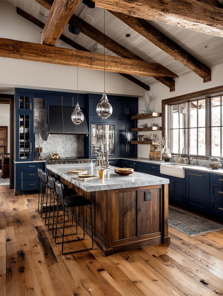
The look: Navy cabinetry · walnut island · marble countertops · exposed beams
Walnut is warmer and darker than oak, and it reads considerably richer against blue. This is the upgrade path for anyone who has already done the navy island and wants the room to feel less like a trend and more like a decision that was made once and will not need revisiting.
The cost difference is real but contained, because an island top is a small enough piece of timber that a premium species is affordable at that scale even when it would not be across a full run of cabinetry.
dramatic
marble
stained wood
navy
brown
white
Photograph
8. The White Counter Rule
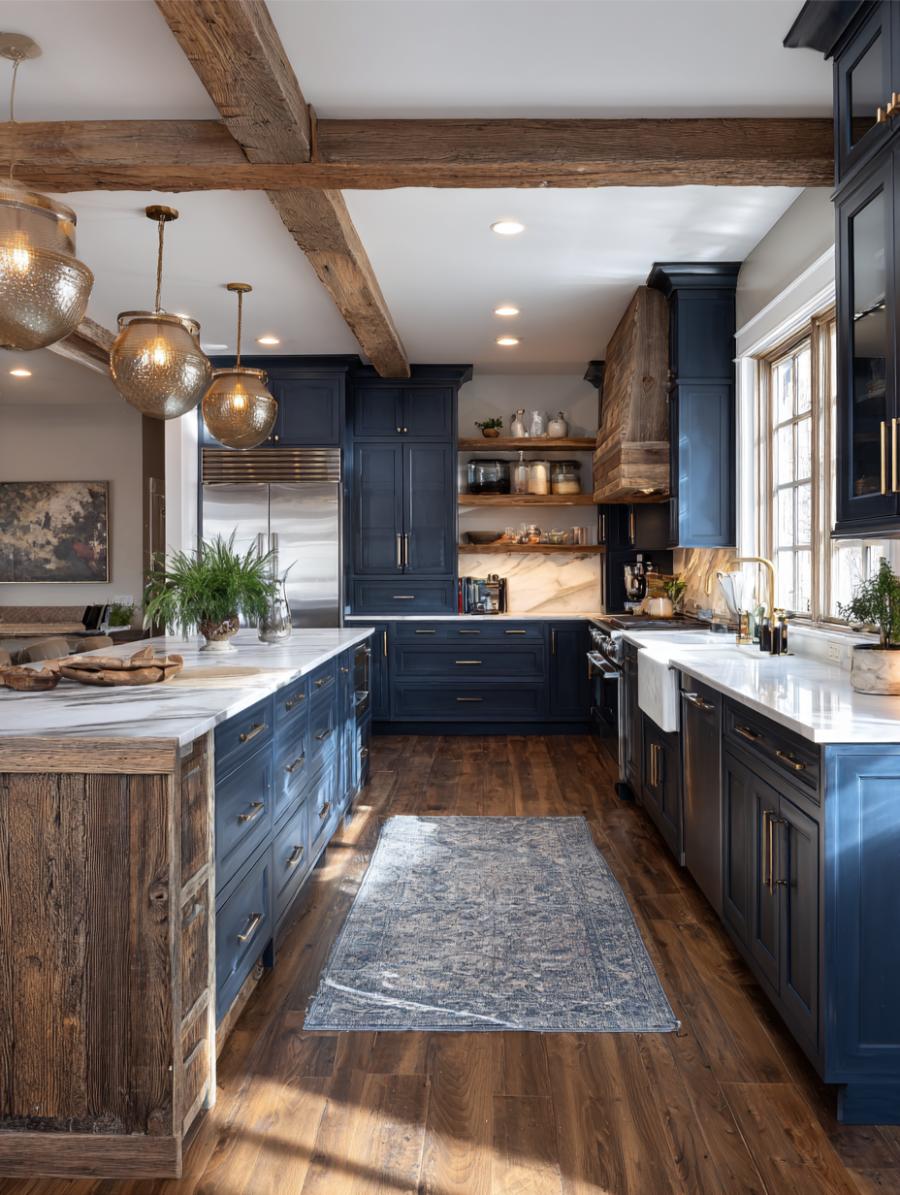
The look: Navy base cabinets · white countertops · exposed wood above
Navy on the base, white on the counter, wood above. It is the most conservative arrangement in this collection and probably the most useful one, because the colour is contained below eye level.
That containment is the whole reason people who would never paint an entire kitchen will happily paint an island. Everything above the counter stays light, so the room still reads bright from the doorway, and the blue registers as an accent rather than as a commitment. It is also the version most likely to survive a future sale without a repaint.
cozy
stained wood
painted cabinetry
navy
brown
white
AI render
9. Stone Walls, Blue Boxes
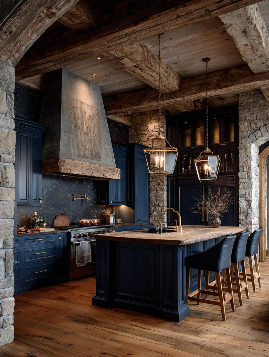
The look: Navy cabinetry · exposed stone walls · timber beams · island pendants
Stone and painted cabinetry is an unusual pairing, because stone carries its own colour temperature and usually fights anything applied over it. It works here because the palette stays deliberately narrow — navy, timber, stone, and nothing else asking for attention.
The rarity is the point. This is not a kitchen most people will build, but it is the frame they will send to an architect as a reference, which is its own kind of value.
dramatic
stained wood
stone
navy
brown
black
AI render
10. Marble-Clad Drama
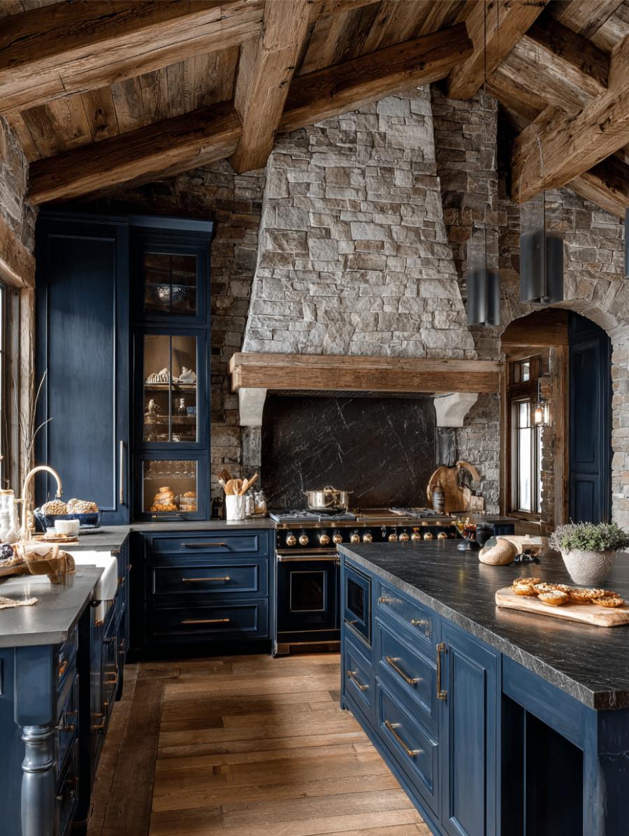
The look: Navy cabinetry · marble-clad fireplace · dark stone counters · exposed beams
A marble-clad fireplace inside a kitchen is a genuine flex, and the dark stone counters are what keep it from tipping over into showroom. Without them the marble would read as the only expensive thing in the room and the effect would be closer to a hotel lobby.
Expect this one to score high on saves and low on actual builds. That combination is the most reliable engagement pattern in the entire category, and it is worth understanding rather than dismissing: aspiration and intent are different signals.
dramatic
marble
black metal
navy
black
AI render
11. Gold on Midnight
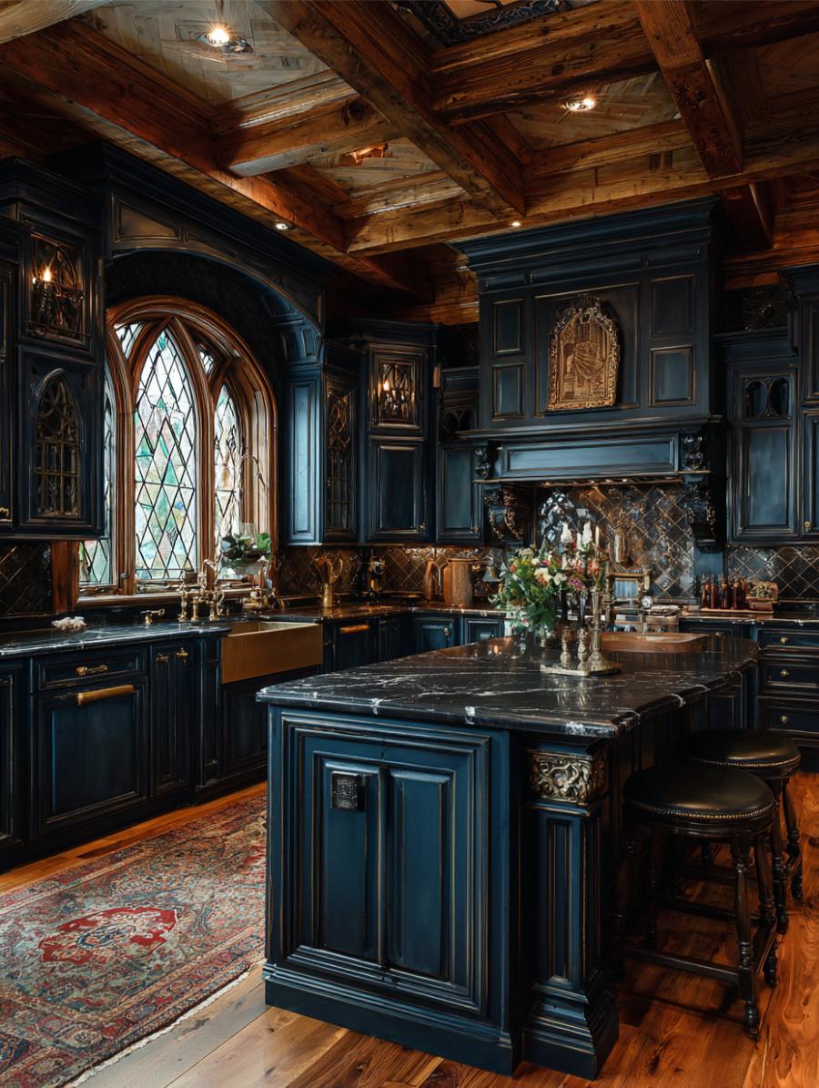
The look: Navy cabinetry · gold hardware and accents · exposed timber ceiling
Navy with gold is the palette that pushes furthest from builder-grade without ever becoming a costume. The Gothic ceiling treatment here would be far too much in almost any other colour, but blue absorbs ornament in a way that lighter finishes cannot — it holds the room together while the detail happens on top of it.
Brass and gold appear in six of the twenty-five kitchens on this list. It is not an accident. Warm metal is the standard correction for a cool palette, and it is a cheaper correction than timber.
dramatic
painted cabinetry
marble
navy
gold
brown
AI render
12. The Open-Plan Argument
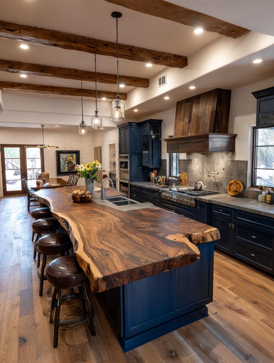
The look: Navy cabinetry · live-edge wood island · open sightline to dining
A live-edge island with a navy run behind it and the dining area beyond. This is less a kitchen photograph than a floor-plan argument, and it performs because it answers the question people actually arrive with: how does this connect to the rest of the house?
Kitchen images that show only the kitchen are answering a question about cabinetry. Images that show the room beyond are answering a question about living, which is a much larger audience.
airy
stained wood
painted cabinetry
brown
navy
white
Photograph
13. Stone Backsplash, Navy Island
🔥 Would you like to save this?
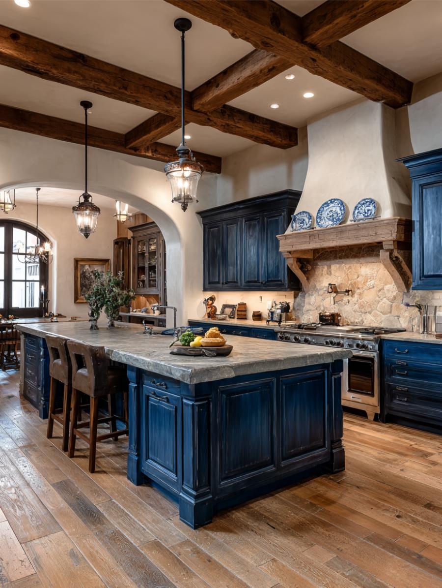
The look: Navy island · stone backsplash · exposed beams · open to dining
A navy island with a stone backsplash and a clear sightline through to the dining room. The formal register is unusual in this collection, which mostly runs rustic or contemporary, and formal blue kitchens are underrepresented relative to how well they photograph.
Stone behind a range is also the practical choice that happens to look expensive: it takes heat and grease better than most tile and it never dates in the way a patterned backsplash can.
formal
stone
stained wood
navy
cream
brown
AI render
14. Coastal Navy

The look: Navy cabinetry · marble island · brass fixtures · floor-to-ceiling glazing
One of the genuine photographs in this collection rather than a render, and the difference shows. Ocean light through floor-to-ceiling glass does something to navy that no rendering engine reproduces convincingly — the colour shifts through the day, going almost black in the morning and closer to slate by late afternoon.
Marble island, brass fixtures, and a view doing roughly half the design work. Worth noting that the blue in the room and the blue outside it are deliberately not matched; matching them would have flattened both.
airy
marble
brass
navy
white
gold
Photograph
15. Galley, Brass, Restraint
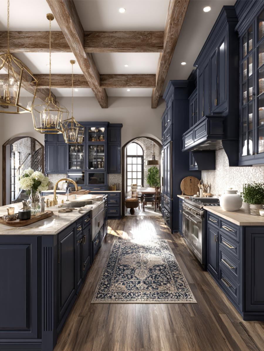
The look: Navy cabinetry · marble counters · brass fixtures · galley layout
Galley kitchens rarely trend. They are narrow, hard to photograph, and offer no island to build a composition around. This one works because brass fixtures and marble give a tight footprint some jewellery, which is the standard fix for a small kitchen that still needs to hold attention.
For anyone actually working in a galley, the transferable lesson is that the money goes on fittings and surfaces rather than on layout, because the layout is fixed.
formal
marble
brass
navy
cream
brown
AI render
16. Blue Against Green
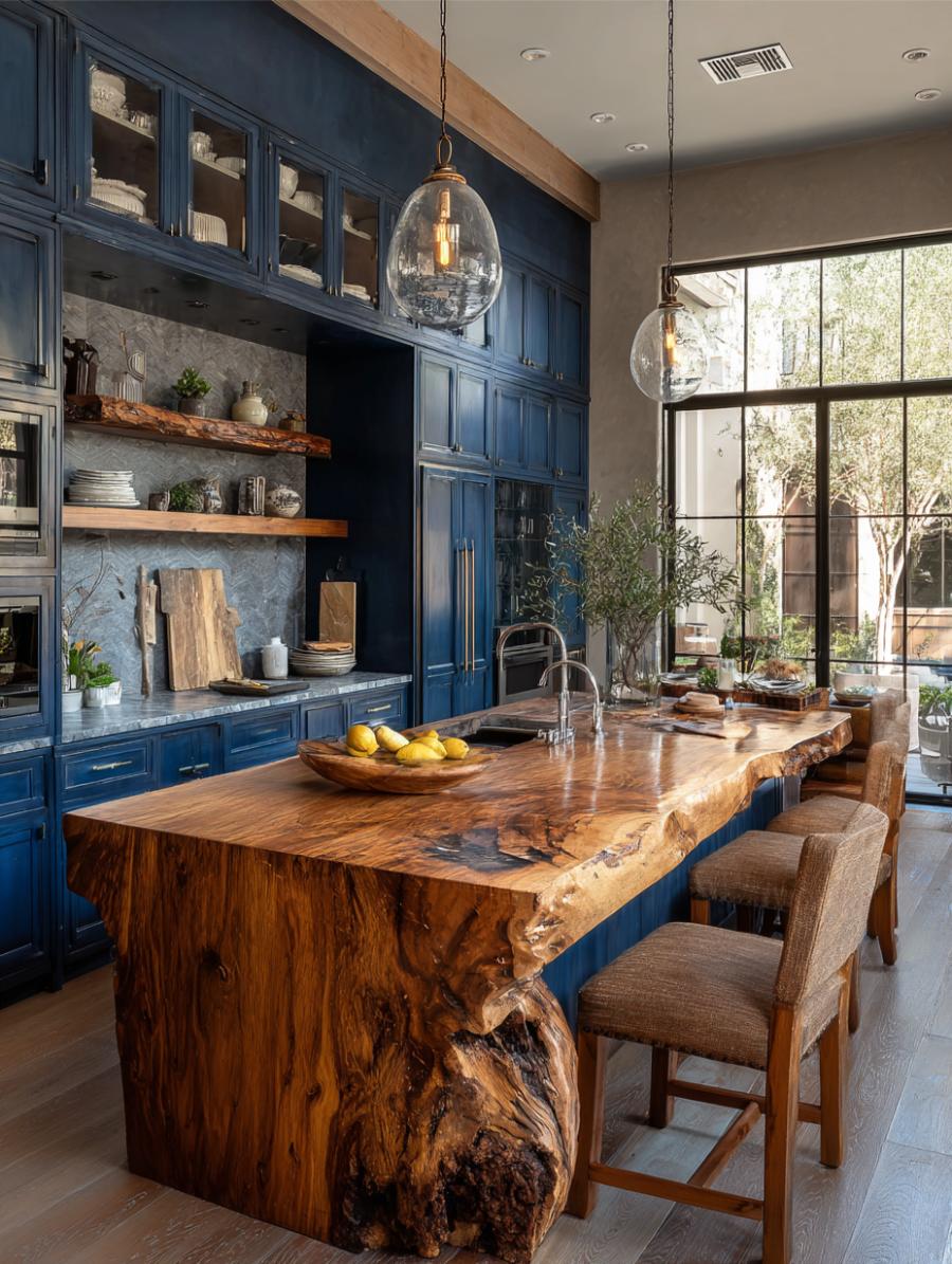
The look: Navy cabinetry · live-edge island · large windows to greenery
Navy cabinetry with a live-edge island and windows full of foliage. Blue and green is the pairing designers spent a decade carefully avoiding and have now completely rehabilitated, and the smartest version of it is this one, where the greenery is outside the window and the planting is doing the second colour for free.
It also means the palette changes with the seasons without anyone repainting anything, which is a genuinely underrated argument for siting a kitchen against a window rather than a wall.
dramatic
stained wood
black metal
navy
brown
cream
Photograph
17. The Two-Tone Standard
The look: White upper cabinets · navy base and island · stainless appliances
White uppers, navy island, stainless appliances. If this trend has a default form, this is it — and its ubiquity is an argument in its favour rather than against it. Low risk, high recognition, endlessly specifiable, and it works at almost any budget because the expensive part is paint.
This is also the arrangement most likely to be screenshotted and handed to a contractor, because there is nothing in it that requires explanation. Eight of the twenty-five kitchens here follow this basic structure in some form.
airy
painted cabinetry
black metal
navy
white
cream
AI render
18. White Waterfall, Blue Water

The look: White waterfall island · brass pendants · floor-to-ceiling ocean glazing
The inverse of the rule that governs most of this list: the room itself is white and the blue is entirely outside it. A waterfall island in white stone, brass pendants, and a wall of glass onto open water.
It earns its place because it demonstrates what blue is actually doing in all the other kitchens here. The colour reads as depth and distance, and a room that borrows it from a view needs far less of it on the cabinetry to achieve the same feeling.
airy
glass
brass
white
gold
blue
AI render
19. Beams Over an Open Plan
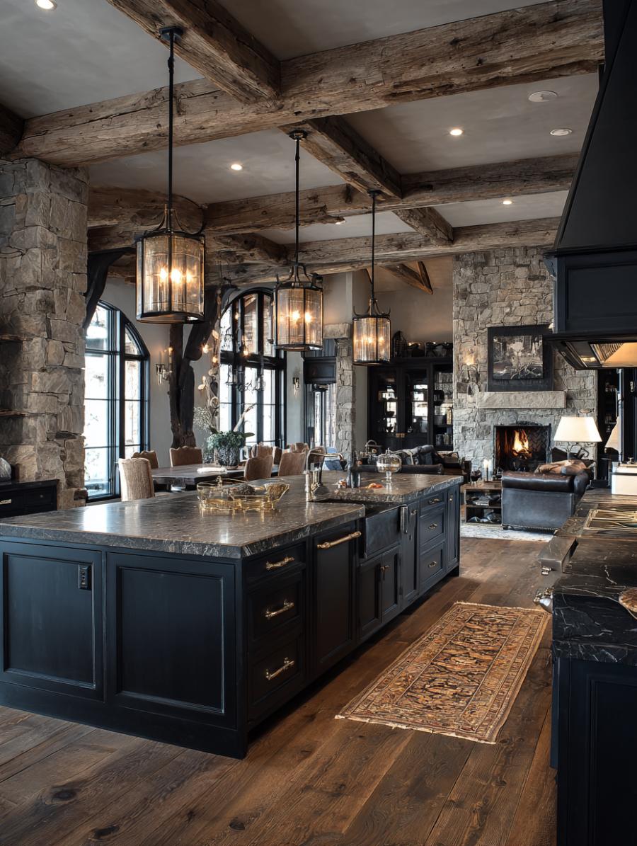
The look: Navy island · exposed timber beams · pendant lighting · open plan
A navy island anchoring an open plan, with timber overhead and a living area beyond. The pendants are doing structural work here rather than decorative work: they draw a horizontal line across the space that stops a high beamed ceiling from swallowing the room below it.
This is the most common mistake in open-plan kitchens with height, and the easiest to fix. Hang the lights lower than instinct suggests.
dramatic
black metal
stone
navy
brown
gold
Photograph
20. Zellige, In the Right Order
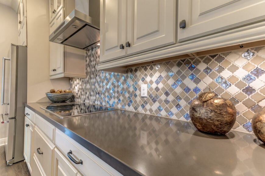
The look: White cabinetry · grey quartz counters · patterned blue zellige backsplash
White cabinetry, grey quartz, and a patterned blue zellige backsplash. This is blue-and-white run backwards, with blue as the accent rather than the field, and it is by a wide margin the cheapest version of the look to actually execute.
A backsplash is a few square metres. Cabinetry is the single largest line item in a kitchen renovation. If you want this palette and you are not replacing your cabinets, this is the entire answer.
airy
zellige
quartz
white
grey
blue
Photograph
21. Navy Island, Brass Light

The look: White perimeter cabinetry · navy island · marble counters · brass pendants
White perimeter, navy island, marble counters, brass pendants overhead. This is the most photographed arrangement in American kitchens at the moment, and the one most likely to end up printed out and taped inside a kitchen fitter’s folder.
Everything about it is deliberate and none of it is difficult. The perimeter stays light so the room reads bright, the island takes the colour so the risk is contained to one piece of joinery, and the brass warms a palette that would otherwise be entirely cool.
airy
marble
brass
white
cream
navy
Photograph
22. Royal Blue Lacquer
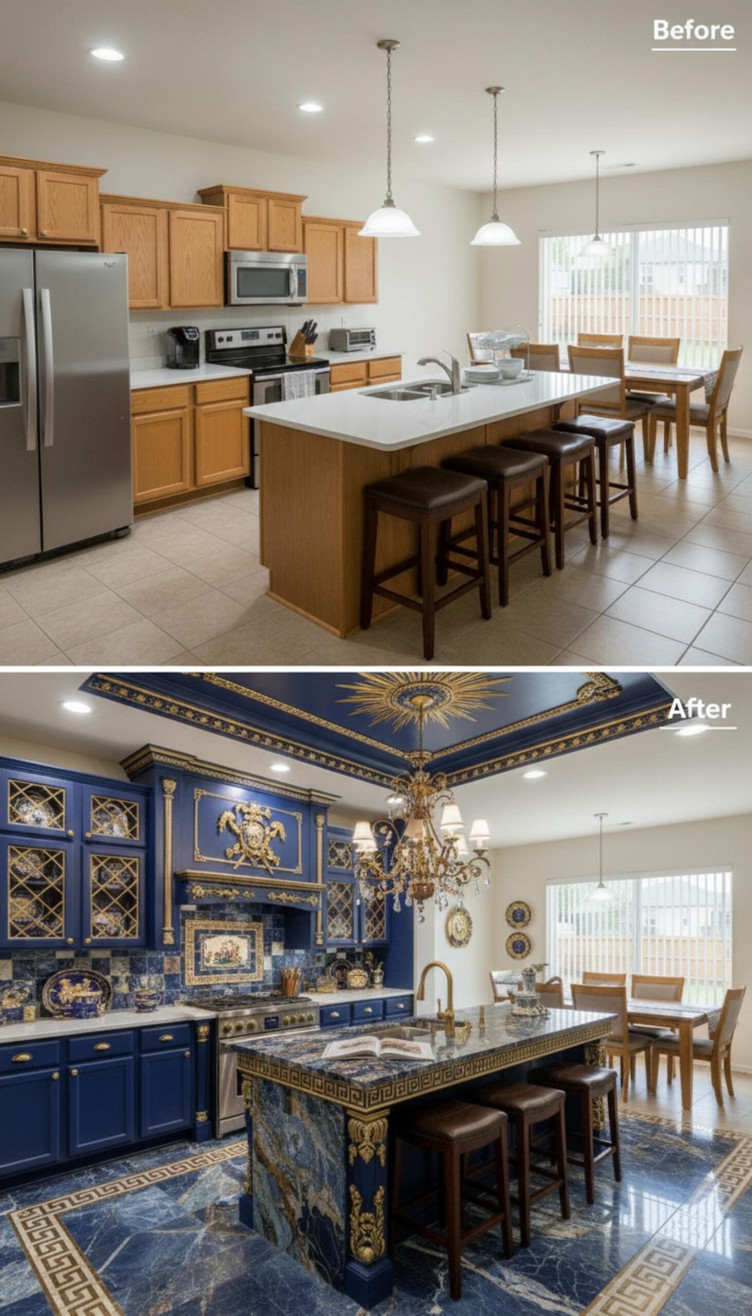
The look: Royal blue lacquered cabinetry · gold ceiling medallion · sodalite island
Lacquer rather than paint changes the entire material argument. A lacquered surface reflects, so the blue moves as you move through the room, going nearly black in shadow and vivid where the light hits it. Paint simply cannot do this, which is why the finish is worth the considerable premium it commands.
With a gold sunburst medallion overhead and a sodalite island beneath, this is the maximalist end of the category and it polarises hard. That is the correct response to it.
23. Chinoiserie and Green Marble
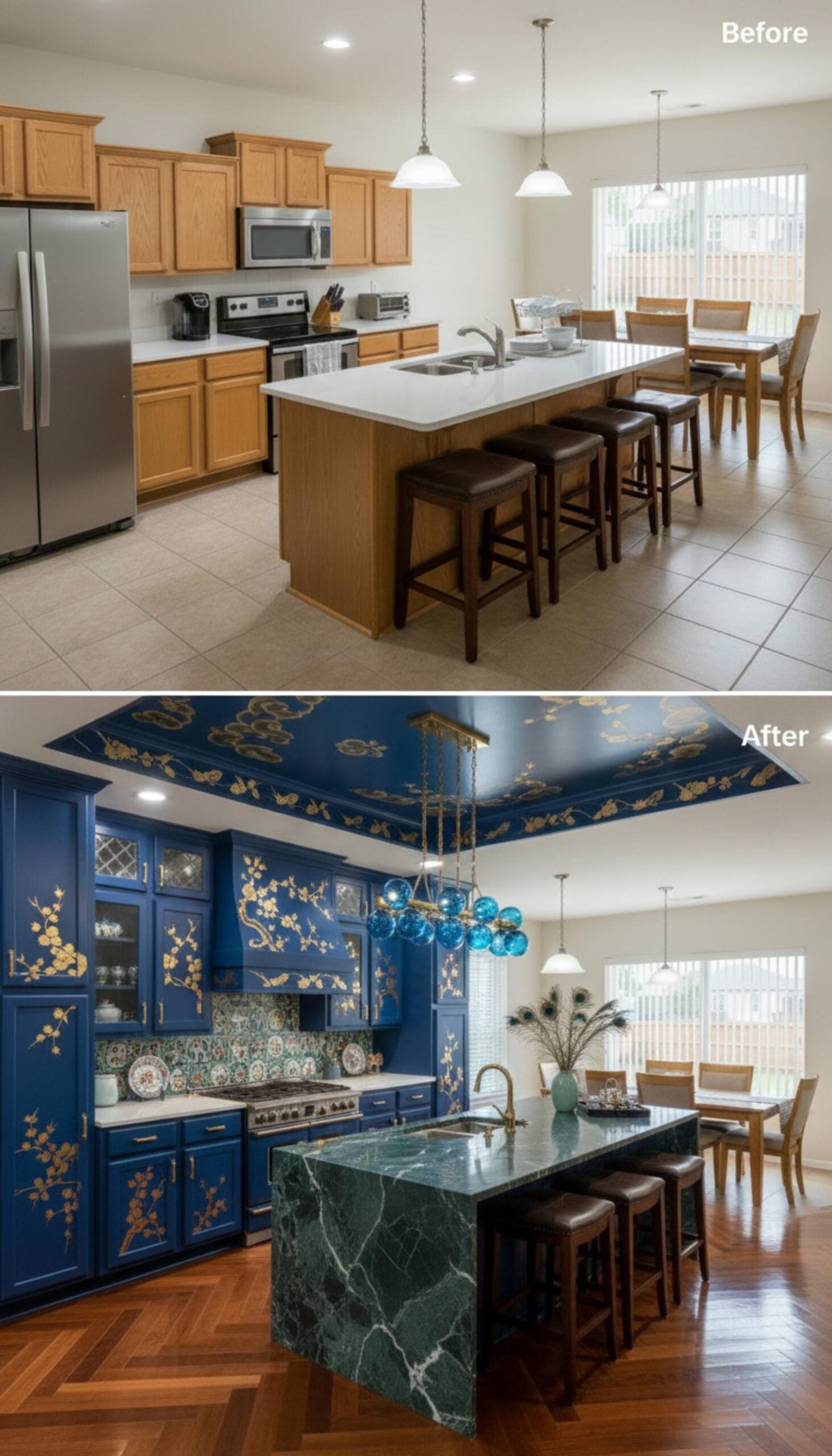
The look: Blue lacquered cabinetry · hand-painted chinoiserie · green marble waterfall island
Blue lacquer with hand-painted chinoiserie and a green marble waterfall island. Green against blue is the real risk in this room — they sit adjacent on the colour wheel and usually muddy each other — and it survives because the marble is a cool, grey-leaning green rather than anything warm.
Rooms like this earn hearts and dislikes in roughly equal measure. The images that split an audience are almost always the ones worth publishing.
24. Orange Against Blue
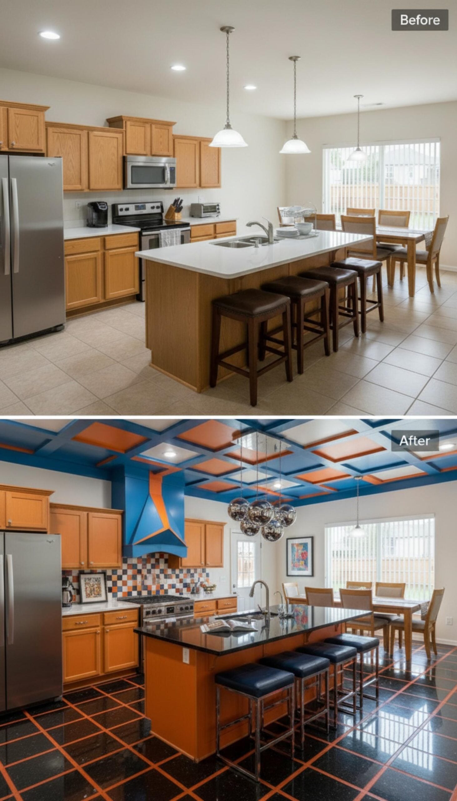
The look: Blue cabinetry · orange and blue coffered ceiling · integrated ceiling lighting
A coffered ceiling in orange and blue is a genuine colour manifesto, and complementary pairs are the highest-variance thing anyone can put in a kitchen. Directly opposite on the colour wheel means maximum contrast, which means maximum reaction in both directions.
The reason it holds together is restraint in placement. The orange is confined to the ceiling coffers and never appears at eye level, so the room reads as blue with an overhead surprise rather than as a two-colour scheme fighting itself.
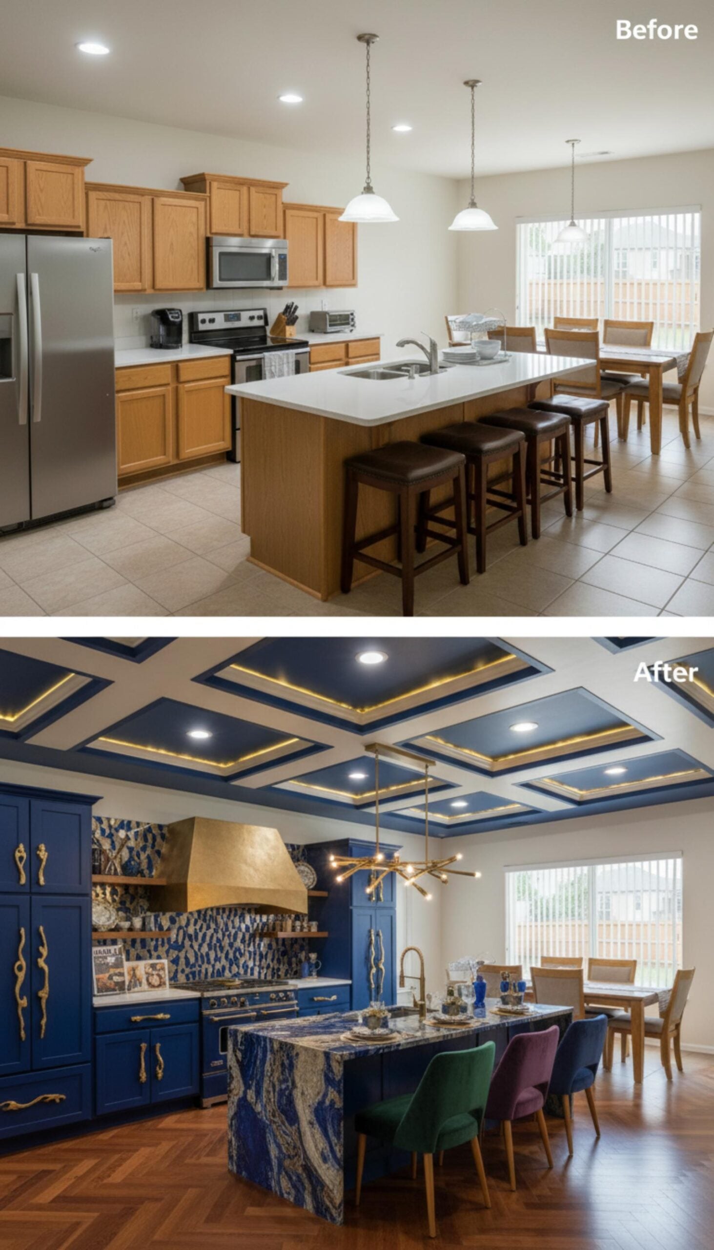
25. Sodalite and Gold
🔥 Would you like to save this?
The look: Sodalite blue island slab · gold range hood · internally lit coffered ceiling
A sodalite island slab under a gold range hood, with a coffered ceiling lit from within. Sodalite is a genuine blue stone with heavy white veining, and stone with real pattern is the current escape route from marble fatigue.
Blue stone is the version that photographs unmistakably. A white marble island in a navy kitchen is beautiful and looks like a hundred other navy kitchens; a sodalite slab looks like exactly one room. That is worth something in a category this crowded.
How to actually get the look
If you take one thing from the twenty-five rooms above, take the containment rule. Blue below the counter, light above it. It is the arrangement that appears most often here, it is the cheapest to execute, and it is the only version that reliably survives a change of owner without a repaint.
If your cabinets are staying, the backsplash is your entire budget. A patterned blue tile against white cabinetry gives you the palette for a few square metres rather than a full joinery replacement, and it is the single highest-return change available in this colour story.
And whatever else you do, put something warm in the room. Timber, brass, aged gold, an oak floor. Navy and white alone photographs beautifully and feels like a fridge. Every one of the rooms above that actually looks liveable has warmth somewhere in it, and almost always in more than one place.