🔥 Would you like to save this?
In the world of fashion and interior designs, trends that were super stylish at the time, but that make us cringe when we think of them now, have a way of making a comeback. I find myself shaking my head in utter disbelief when I think about them. Take bell bottom pants, for example.
In order to come up with the very specific design ideas, we create most designs with the assistance of state-of-the-art AI interior design software. Also, assume links that take you off the site are affiliate links such as links to Amazon. this means we may earn a commission if you buy something.
You would have been hard-pressed to find a pair of pants during the 1970s that didn’t have the distinctive flare at the bottom. Bootleg pants are today’s reincarnation of that dreadful style.
Earth tones may have been all the rage in the 1990s, but I can remember how prevalent they were in the 1970s. Harvest gold, avocado green, brown, and burnt sienna, and rust were everywhere – from appliances to the dreaded shag carpeting.
Related: Brown Foyer Ideas | Brown Living Room Ideas | Brown Dining Room Ideas | Brown Kitchen Ideas | Brown Bedroom Ideas | Brown Bathroom Ideas

I was lucky because I never had to deal with those colors in my parent’s house. But I wasn’t lucky because I had to deal with those colors in the apartments I rented. Burnt sienna and rust are beautiful crayon colors, but they’re not appealing colors for shag carpeting, or living room sofas or chairs.
But I clearly remember that my best high school friend’s mom embraced the earth tones of the 1970s like nobody’s business. Their kitchen was filled with avocado green appliances and harvest gold. And the rust or burnt sienna-colored shag carpet in the room where we hung out to watch television is etched into my memory – and not in a positive way.
The colors that characterized the 1990s weren’t as bold; they were more restrained, or as Pantone described it, “nuanced.” The 90s was the era during which rattan and wicker were in vogue. So clearly, earth tones were part of that aesthetic.
I’m a big plant fanatic, so I remember clearly how popular baskets were, and the fact that my friends thought I was super cool for putting my potted plants in baskets. But those baskets didn’t last long because every time I watered my plants, the water seeped out onto the bottom of the basket.

Pantone – the Experts Who Choose Colors for Interior Design Trends
Pantone, the company that’s regarded as the color authority, chooses one color that they designate as the color of the year. Their revelation serves as an inspiration for over ten million design professionals who rely on the company to come up with the motivation for each year’s trends in interior design, clothing design, textile design, graphic design, and paint color combinations every year.
For their celebration of 50 years of color, Pantone created an infographic that details the colors and their corresponding decades. That diagram also helps us understand the circumstances that prompted their color choices.
How the 1970s and 1990s Perceived Earth Tones
Earthy colors characterize the 1970s. And the recession brought about those earth tones. But so do did the environmental movement. The 70s may have been the first time that people recognized the importance of environmental consciousness.
And let’s not forget that the 1970s was also the era of disco music and the crowning of the disco king. The earthy colors of that era were avocado green, burnt sienna, carafe, which represented brown, harvest gold, rust, and Corsair – a shade of blue.
And color experts had their interpretation of earthy colors in the 1990s. Their choices were decidedly more nuanced with color names such as overcast, lead gray, oasis, super lemon, firecracker, and scuba blue. Those colors reflected the era’s connection with the nature of Zen, graffiti, and grunge, and Japanese Anime’s irreverence.
During the 1990s, wicker and rattan were super trendy. In keeping with the era’s connection with zen and nature, green was a favorite earth tone that helped connect plants (often in macrame hangers) with furniture – through the use of foliage prints on fabrics.
My Take on 1970s Earth Tones
I don’t have anything against either era’s perception of earth tones. In fact, I like the colors – on their own. My objection is the frequency with which you see the entire group of colors – especially those that represent the 1970s, together. Try to envision a room in which avocado green, burnt sienna, carafe, harvest gold, rust, and Corsair are all used.
A brown or burnt sienna colored shag carpet set against furniture that’s avocado green, harvest gold, or rust. Perhaps Corsair is thrown in there with accent pillows or drapes. Take a look at some movies from that era, and I’m confident that you’ll understand my beef.
I have to confess that I honestly prefer to keep things subdued in my home. I don’t object to splashes of color in the form of accents. But the earth tones of the 1970s make me feel like I’m surrounded by the colors of changing leaves on trees throughout New England. And I love those colors in their natural environment.
My Take on the 1990s “Nuanced” Colors
The colors that characterized the 1990s don’t scream at me in the way that the earth tones of the 1970s do. I suppose that’s because I don’t recall seeing them all used together. That’s not to say that no one did it. I don’t know why Pantone dubbed the khaki-like color “overcast.” Their term doesn’t conjure up a mental image of a gray sky. But I do see my parents raincoats.
My dad’s Burberry, and my mom’s London Fog and Burberry’s sitting in their closets. Lead gray strikes me as a practical color choice. My mom chose that color in a wool fabric to use to upholster the couch in our family room. My grandmother used it in her home, too. And she had her oversized living room chairs covered in an “overcast” colored fabric.
Oasis, Super Lemon, Firecracker, and Scuba Blue remind me of the colors of Fiestaware dishes. When I got married, I chose Fiestaware because I liked the simplicity of the design and the fun colors. I have plates, cups, saucers, and bowls that are the same color as Super Lemon and Firecracker (although Fiesta used different names.)
It may seem as though I’ve just spent a lot of time bashing earth tones. But I don’t think that’s what I’ve done. I’ve merely pointed out my objection to rooms where the design scheme incorporates all of the colors at once – primarily when the color extends to hideous shag carpeting. Does anyone actually LIKE shag carpeting anymore?
As a lover of all things related to interior design, I have to acknowledge that some of those earth tones were used in Mid-Century Design Schemes. And there’s something wonderfully timeless about Mid-Century architecture and design.
But Mid-Century design used a lot of wood, and the earth tones contrast nicely against the natural or stained color of the wood. I’ve never seen any Mid-Century room design that incorporated multiple earth tones simultaneously.
The Comeback of Earth Tones in 2019
The earth tones that are making a comeback in 2019 are far different than the colors that defined the interior design trends of the 1970s and 1990s. According to a story from Forbes in December of 2018, 2019 will see a phasing out of the monochromatic gray scheme that’s been the trend for the last several years.
The story quoted Lotta Lundaas of Norse Interiors who suggested that “Earth tones will dominate” in 2019. The exit of gray will pave the say for a new palette which will feature every imaginable hue of the color of sand, in addition to burnt gold, ochre, and terra cotta.
The Remodeling Futures Program at the Joint Center for Housing Studies at Harvard University released a report in October of 2018 regarding their projections as to how much U.S homeowners would spend on home remodeling through the third quarter of 2019. Their findings were reported in U.S. News.
The group estimates that homeowner expenditures on home remodeling would grow to $350 billion, which is up from the results for the same period in 2018, which was $331 billion. The researchers concluded that despite the estimated increase for 2019, their projections suggest that the growth rate of spending on remodeling is slower than that of previous years.
2019 Interior Design Trends to Watch
Enduring Styles
Interior design trends, unlike those of fashion, aren’t going out of style as fast. People don’t want to have to redecorate their homes every six months or year to keep up with the latest color trends in home design. For people who like to change things seasonally, swapping throw pillow covers or throw blankets is easy to do.

The Danish Concept of Hygge
The first time I heard the word Hygge was as I watched a House Hunters International Show on HGTV. I admit to watching HGTV – obsessively. It’s a great way to learn about my likes and dislikes and to get design ideas. Hygge is all about the desire to feel cozy and happy in your home.
And one of the reasons that Hygge speaks to people now is that everyone is desperate to see their homes as a retreat from everything that’s going on in the world around us. Home should feel like a security blanket. And earthy colors such as “pumpkin” create that sense of warmth.

Drawing Inspiration From Nature for Interior Colors
Green will be a dominant color in 2019. Why green? It’s a predominant color we find in nature. We’re not talking about avocado green here. We’re talking about the massive array of different shades of green. So if you love green, and you want to use it in an interior design concept, consider the natural light that comes into the room, and textures you may wish to include.
I can see how deep green velvet might look spectacular as the fabric on a sofa, a side chair, throw pillows, a throw pillow, a sofa, or a throw blanket. But I think it would be hideous as a wall color. Before you shoot me down for my unwillingness to consider dark green as a suitable wall color, consider this. Once you put that color on the walls of a room, you have to live with it.
So if you are positive that you would feel the warm fuzzies when you walk into a room with that color on the walls, or you’d get that same feeling spending hours hanging out in that room with your family, go for it.

Warming Up the Interpretation of Neutral Colors
With neutral colors moving towards a warmer, earthier aesthetic, it stands to reason that the use of natural items in a design plan would capture that vibe to a T. Look to things like the “natural” color of undyed wool, stone, live plants, burlap for drapes or wall hanging.
The idea behind bringing these warm, natural, and subdued colors into our homes is to create a stark contrast between the environment inside our homes and all of the unnatural influences that occupy so much of our lives.

I like the 21st century understanding of earth tones. I love the feeling that today’s interior design styles are geared more towards how people live than what the latest trend is. And I believe that it’s possible to create drop-dead gorgeous room designs using earth tones — when the concept makes sense.

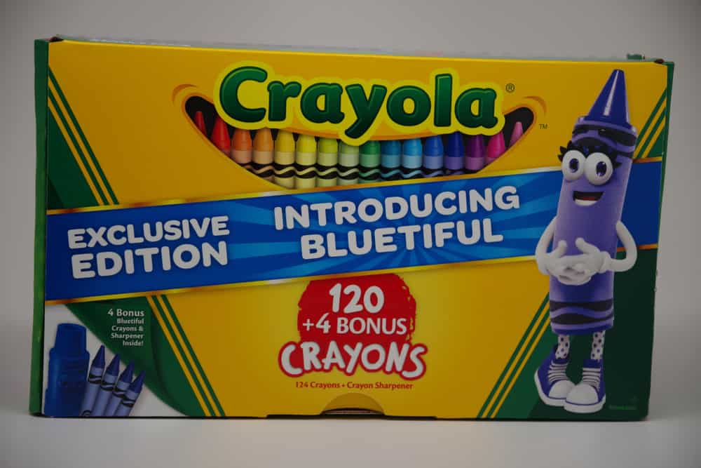
My beef with the use of earth tones in the 20th century (especially the 1970s), is the unsettling feeling I get because there is no sense of balance. There is no contrast between light and dark. Every room needs a focal point. When your color palette looks like the most hated colors from a box of 120 Crayola crayons, it’s impossible to feel like you can relax in the space.
The way to create a drop-dead gorgeous room using earth tones is to incorporate them as a feature element, not as the basis for your design. Any successful and aesthetically pleasing design plan requires a balanced color scheme.
The trick is knowing when and where to use the reimagined earth tones, and most of all when enough is enough. Thankfully, the comeback of earth tones is a re-envisioned one.