🔥 Would you like to save this?
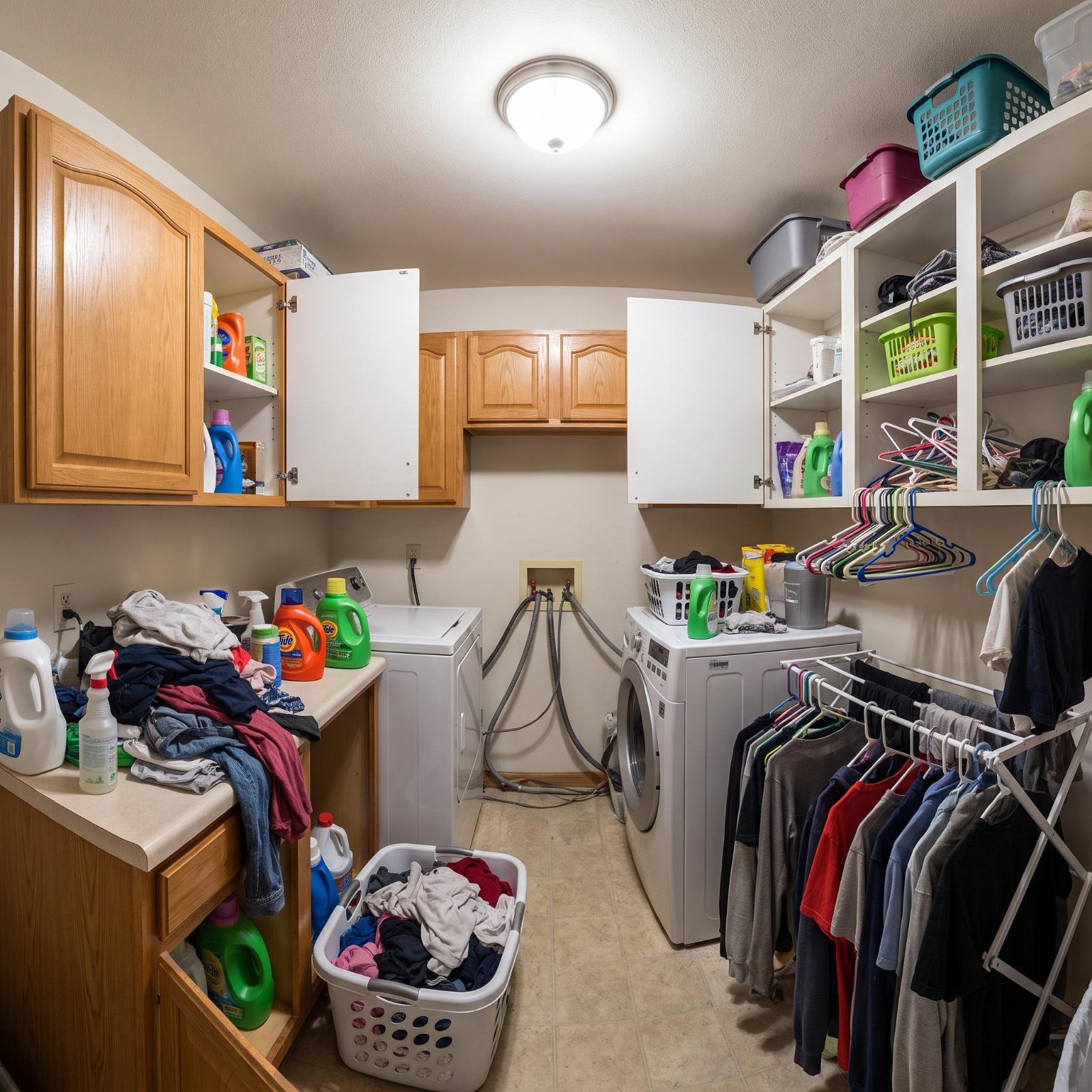
The mess isn’t really the laundry. It’s everything the room is forced to display while the laundry happens: detergent bottles, hanging shirts, exposed hookups, stray baskets, ironing boards, cleaning supplies, and the mysterious pile that has been waiting three weeks for somebody to decide what it is.
In order to come up with the very specific design ideas, we create most designs with the assistance of state-of-the-art AI interior design software. Also, assume links that take you off the site are affiliate links such as links to Amazon. this means we may earn a commission if you buy something.
What makes this collection worth paying attention to is the before state. These aren’t rooms that just needed a coat of paint. Some afters are storage-first fixes; others go much further with cabinetry, counters, lighting, sinks, and built-ins. What they share is a refusal to let every bottle, hanger, cord, and basket become part of the decor.
Thirty-five rooms. Thirty-five different attempts to give the mess somewhere to go — from full-height cabinets and hidden appliances to ceiling racks, folding counters, hampers, and drying stations.
35. Floor-to-Ceiling White Cabinetry Turned One Chaotic Laundry Room Into a Calm Workspace
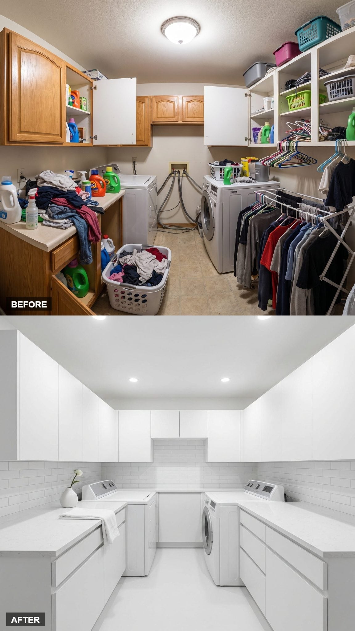
Flat-front white cabinets run wall-to-wall and straight up to the ceiling, eliminating every inch of dead space above. Subway tile in the same crisp white keeps the backsplash from competing with anything. Two sets of washers and dryers sit tucked beneath folding counters on both sides, making the U-shaped layout genuinely functional rather than just tidy-looking.
34. Closed Storage Took Over, and the Clutter Lost
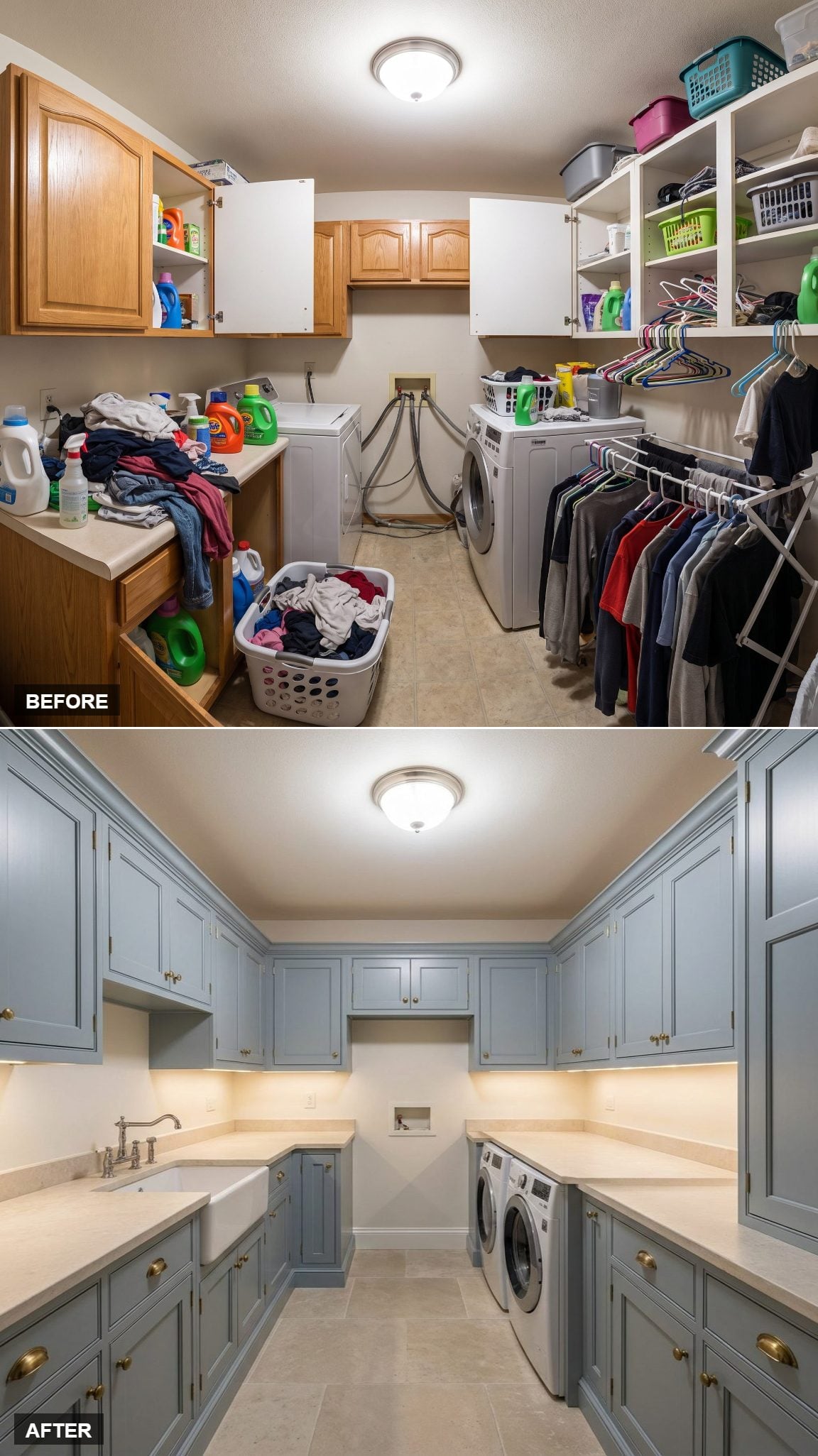
Open shelves, exposed hangers, laundry piles, detergent bottles, and visible hookups made the before feel permanently chaotic. The transformation gives everything a proper place, with floor-to-ceiling cabinetry concealing supplies and clothing while streamlined counters keep the work surfaces completely clear. Even the washer and dryer feel integrated into the design, creating the kind of spotless, visually quiet laundry room a perfectionist can actually relax in.
33. Hardware-Free White Cabinetry Made the Walls Nearly Disappear
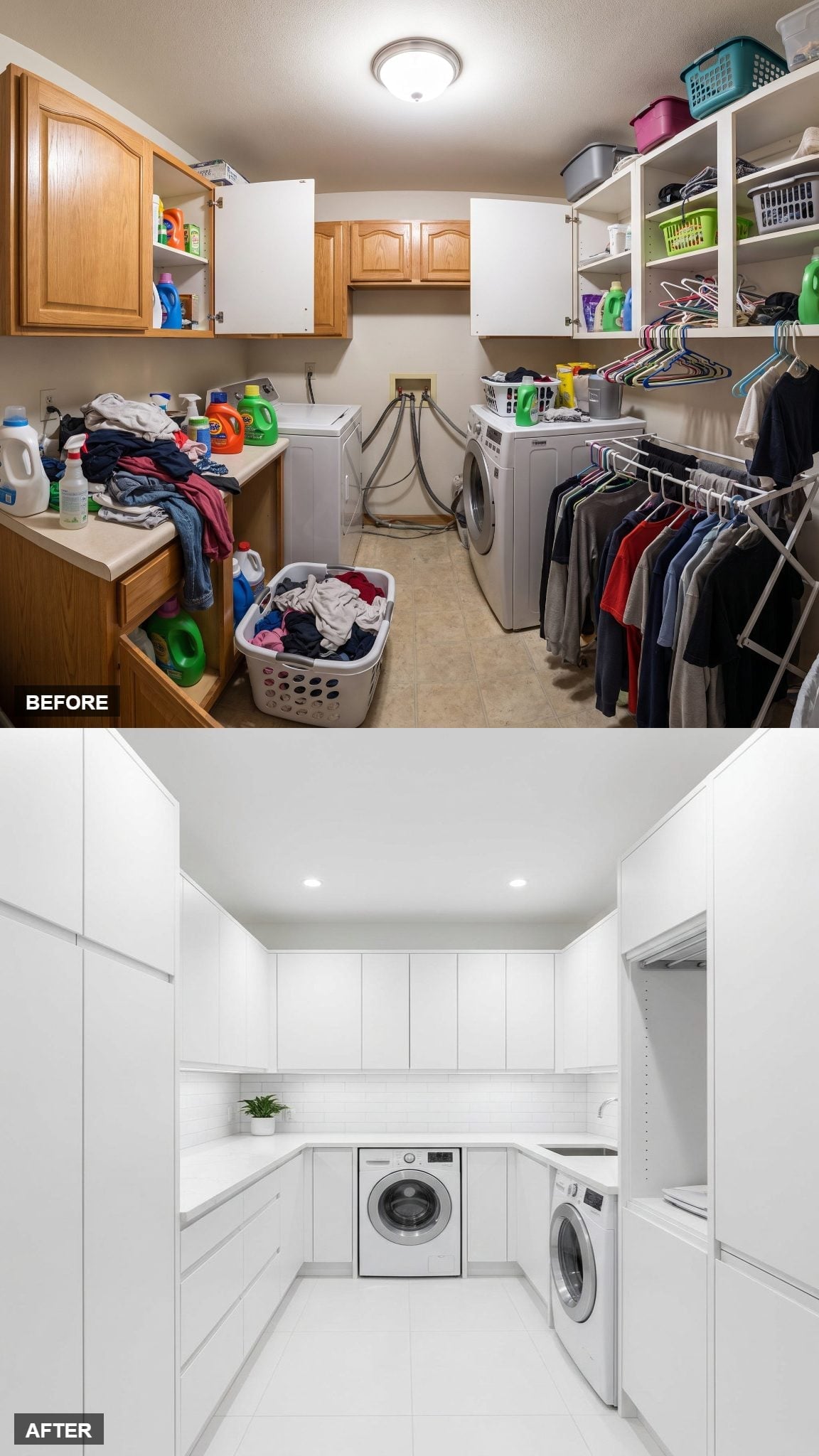
Every cabinet runs floor-to-ceiling in a flat matte white, with no hardware in sight. Pull-to-open doors keep the walls visually unbroken, which is harder to pull off than it sounds — every gap or misalignment reads immediately against a surface this uniform.
The washer and dryer sit side by side under a continuous countertop, built in rather than just pushed against a wall. A single small plant on the counter is the only thing that isn’t white. Recessed lighting replaced whatever was there before, keeping the ceiling plane cleaner and less interrupted.
32. A Built-In Ironing Board Eliminated One of Laundry’s Most Annoying Objects
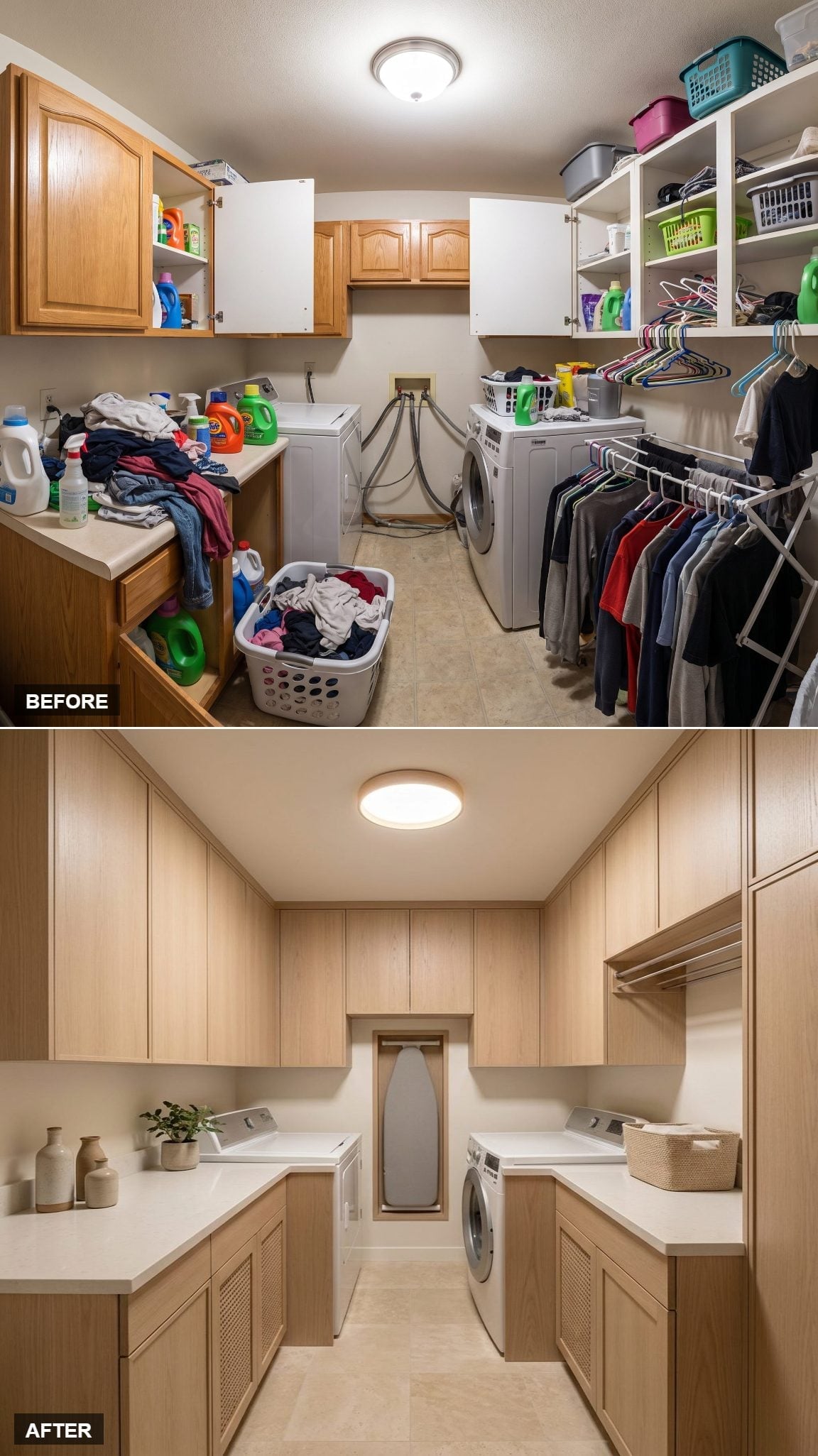
Light oak-toned cabinetry runs floor to ceiling on three sides, keeping the palette tight and the sightlines clean. The built-in ironing board is what earns this renovation its place on the list. Recessed flush into the cabinetry between the machines, it disappears completely when not in use — no freestanding board leaning against the wall, no awkward corner dedicated to storing it.
31. The Drying Rack Went to the Ceiling and Gave the Floor Back
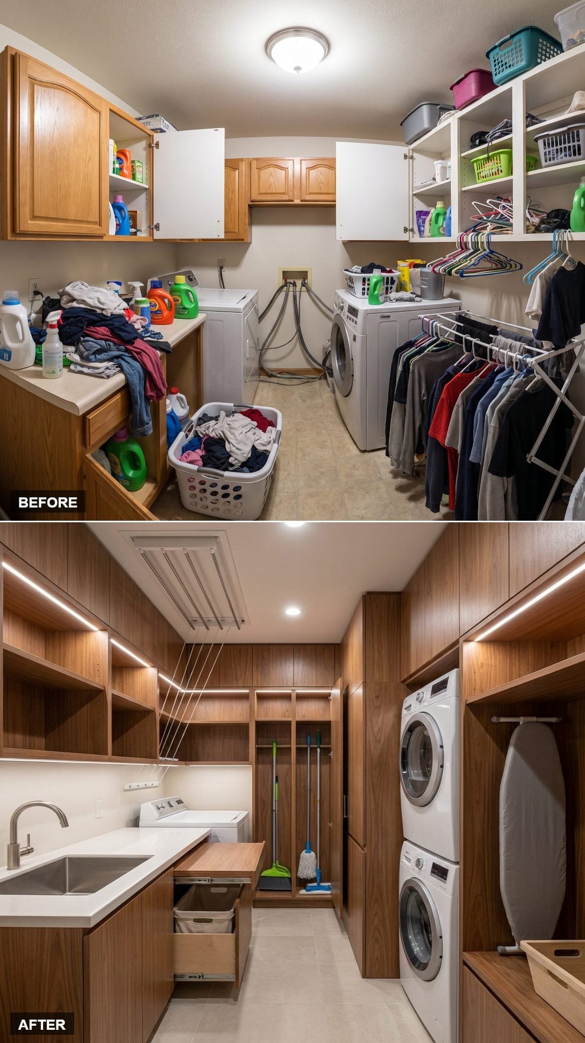
Walnut-toned flat-front cabinetry runs wall to wall, with LED strip lighting tucked under the upper shelves casting a glow that makes the space feel considered rather than utilitarian. Stacking the washer and dryer freed up enough floor space for a pull-out folding shelf and deep hamper drawers below. And that ceiling-mounted drying rack? Genuinely clever.
In the Details: Stacking compatible front-load machines can reclaim an appliance-width section of wall without changing the room’s footprint. The space that opens up along the wall can accommodate a full run of cabinetry or, as shown here, a dedicated cleaning station with vertical storage for mops and brooms. It’s a layout decision that changes how the whole room functions.
30. Walnut Cabinetry Made Room for a Drying Rack Instead of Hiding One in a Closet
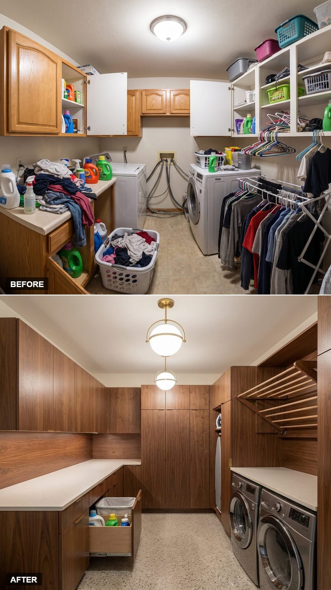
Warm walnut-look veneer runs wall to wall, giving the cabinetry a cohesion that reads more like furniture than utility storage. Pale white quartz keeps the wood grain from going dark, and a pull-out drawer beneath the counter hides the laundry basket entirely.
A brass globe pendant gives the practical room a decorative focal point. On the right wall, angled wooden drying slats are integrated directly into the cabinet structure. No freestanding rack, no clutter.
29. Cream Cabinetry Hid a Fold-Out Drying Rack in Plain Sight
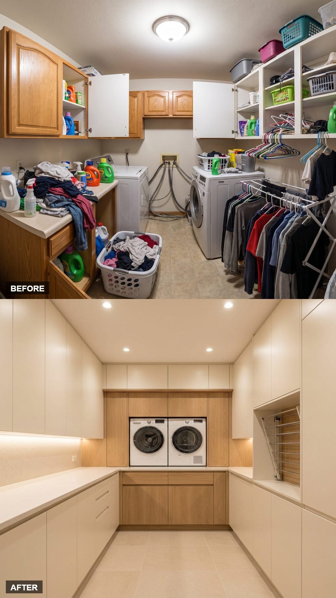
Cream flat-front cabinetry runs floor to ceiling on three sides, and the oak-toned veneer on the washer-dryer housing is what keeps it from feeling sterile — just enough grain to make the room feel like someone thought about it. Recessed lighting replaces the old flush-mount entirely. The fold-out drying rack built into the right wall is the detail that earns its keep.
28. Dusty Rose Cabinetry Hid Both the Drying Rack and the Hamper
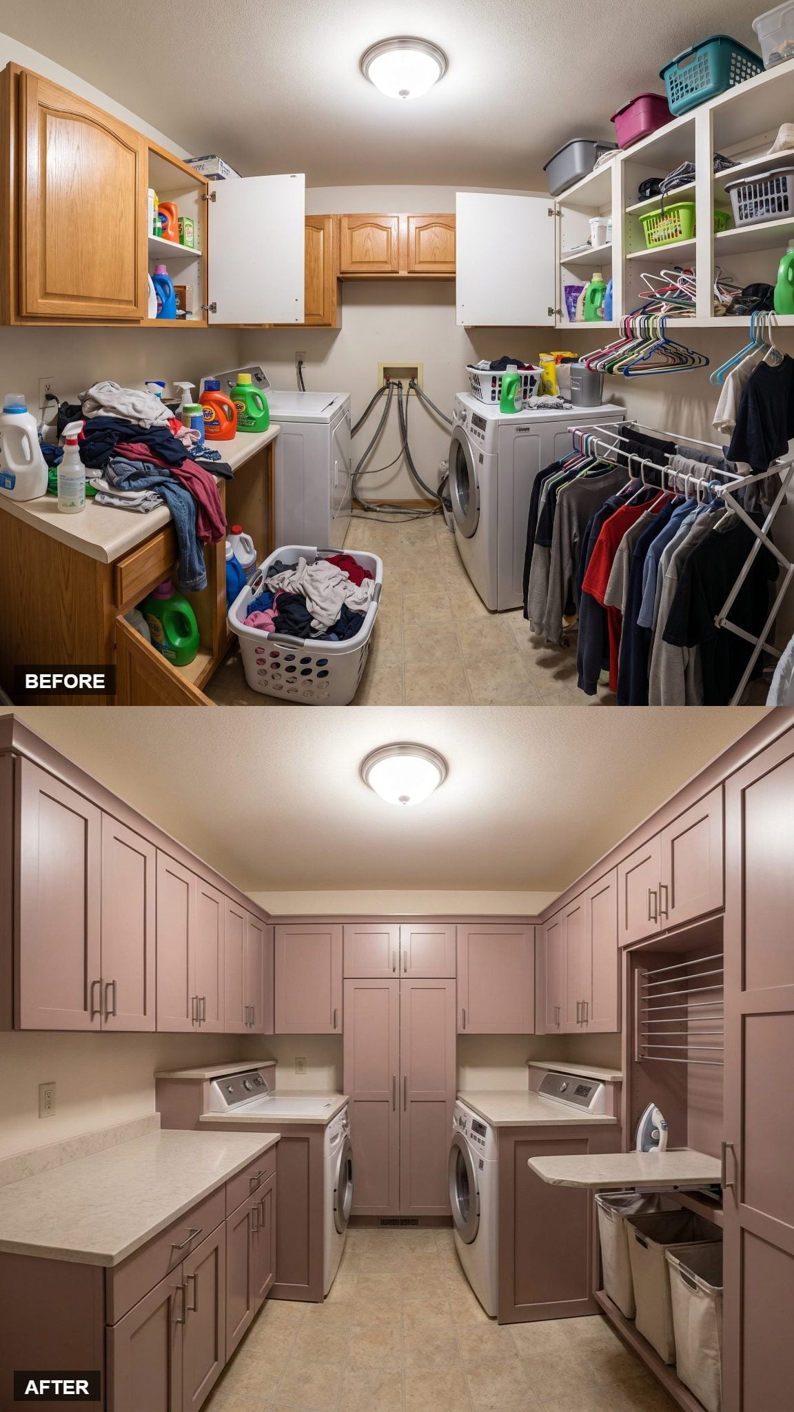
Shaker-style cabinetry in a muted dusty rose runs floor-to-ceiling on three walls, and the consistency does real work. No break in the finish, no open shelving interrupting the line. Hardware is brushed nickel — simple bar pulls, nothing decorative — and the light quartz countertops wrap continuously around the perimeter, giving the room serious folding real estate.
What distinguishes the after is the built-in drying rack recessed into the right wall and the pull-out hamper cabinet beside it. Both disappear into the cabinetry when not in use. The washers sit in their own alcove at center, framed by tall tower cabinets on either side — that framing decision is what keeps the appliances from visually taking over the room.
27. Powder-Blue Cabinetry Hid the Machines Behind Full-Height Doors
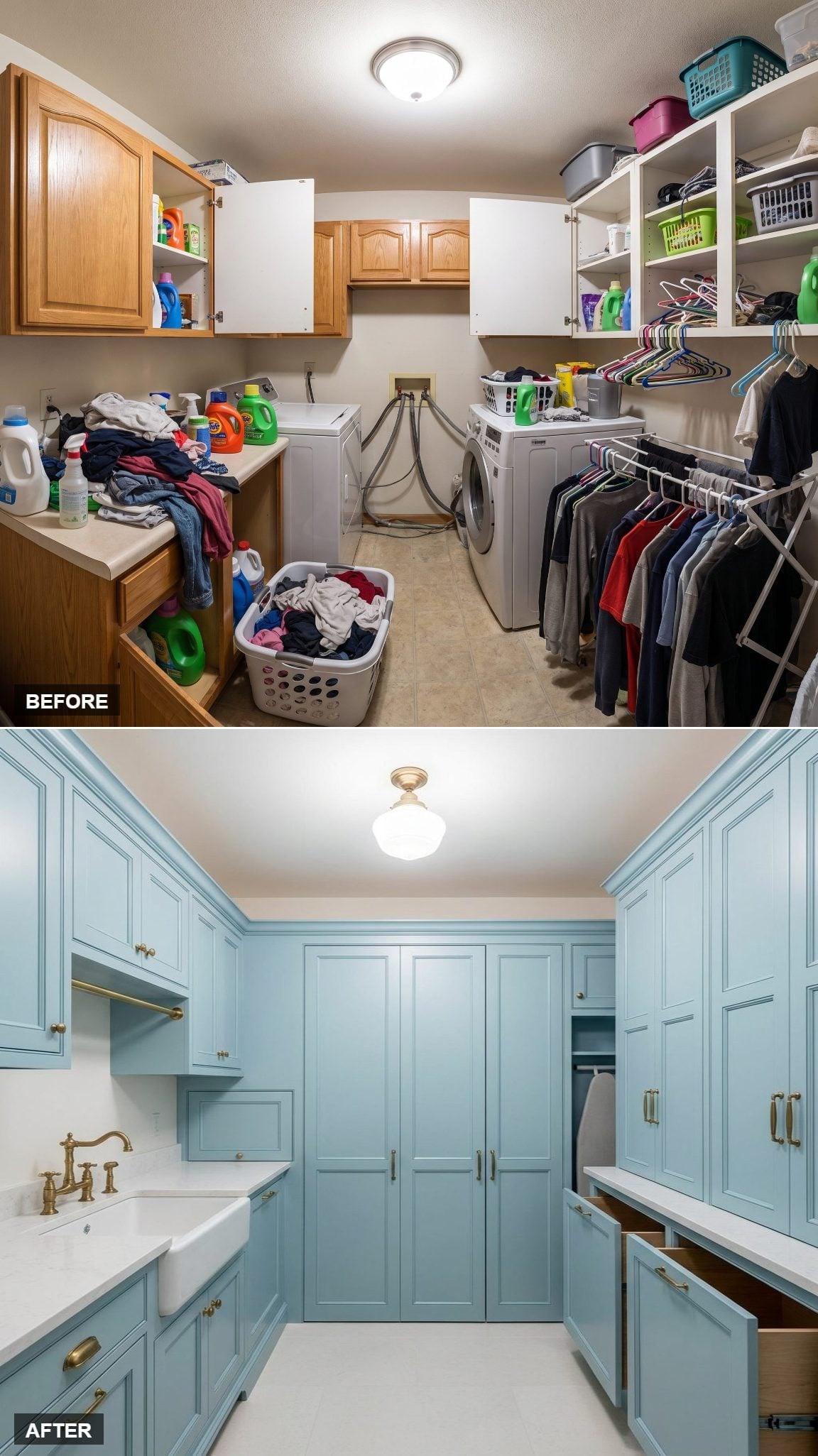
Soft blue cabinetry runs floor to ceiling on every wall, sitting right between duck egg and sky without tipping into either. Brass pulls and knobs add warmth without going precious. The tall pantry-style doors at center hide the washer and dryer entirely — quieter flex than it sounds, but effective.
A farmhouse sink with a bridge faucet anchors the left side, paired with white quartz countertops that keep the palette from feeling cold. Crown molding at the ceiling ties the cabinetry to the room’s architecture rather than letting it float. Pull-out drawers at the base suggest real storage planning went into this, not just visual tidiness.
Hiding the appliances behind full-height doors doesn’t just look cleaner — it changes how the whole room feels to be in.
26. Two Materials Were Enough to Bring This Room Under Control
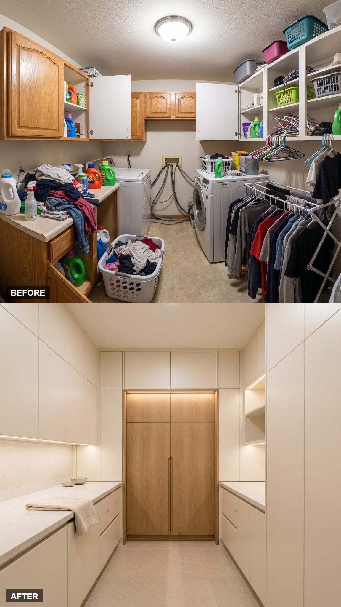
Two materials do almost all the work here. Flat white cabinetry runs wall-to-wall and ceiling-height on both sides, while a pair of tall oak-veneer doors anchors the far wall with warm, grain-forward contrast. Under-cabinet lighting runs the full length of both sides, keeping the countertops lit without a single visible fixture overhead.
What’s notable is how little hardware there is. Pulls are minimal, the shelving on the right side is recessed into the cabinetry rather than added onto it, and the countertops read as one unbroken surface. Nothing competes for attention. That kind of visual restraint takes real planning.
25. White Uppers and Walnut Bases Broke the Cabinet Wall Into Two Clear Layers
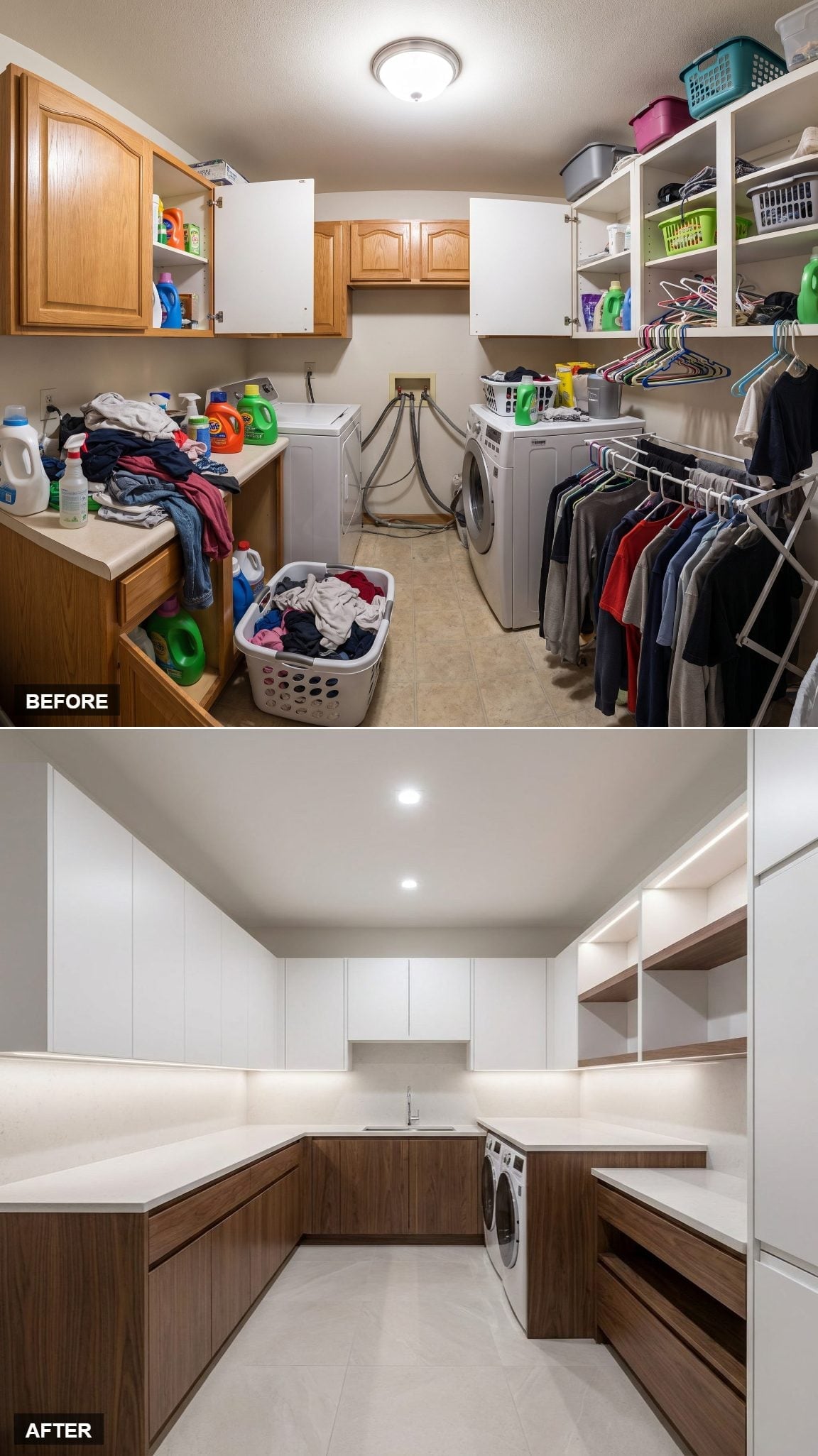
Matte white slab uppers run the full perimeter, and walnut-finish lower cabinetry grounds the room without competing. Under-cabinet LED strips keep the countertops lit without any ceiling fixture getting involved. The open shelving on the right wall sits flush with the cabinet line, so nothing breaks the rhythm.
White quartz countertops wrap the room in a U-shape, maximizing folding and sorting space on every side. A front-load washer is tucked under the counter on the right, and large-format porcelain floor tile keeps the base neutral. No hardware visible on any door. None needed.
History Corner: Laundry equipment spent decades in basements, utility areas, kitchens, and other work zones before dedicated finished laundry rooms became common in larger houses. As floor plans expanded, counters, closed storage, and better-located laundry spaces became increasingly practical rather than purely utilitarian extras.
24. Natural Oak Slab Cabinetry Let the Storage Read Like Furniture
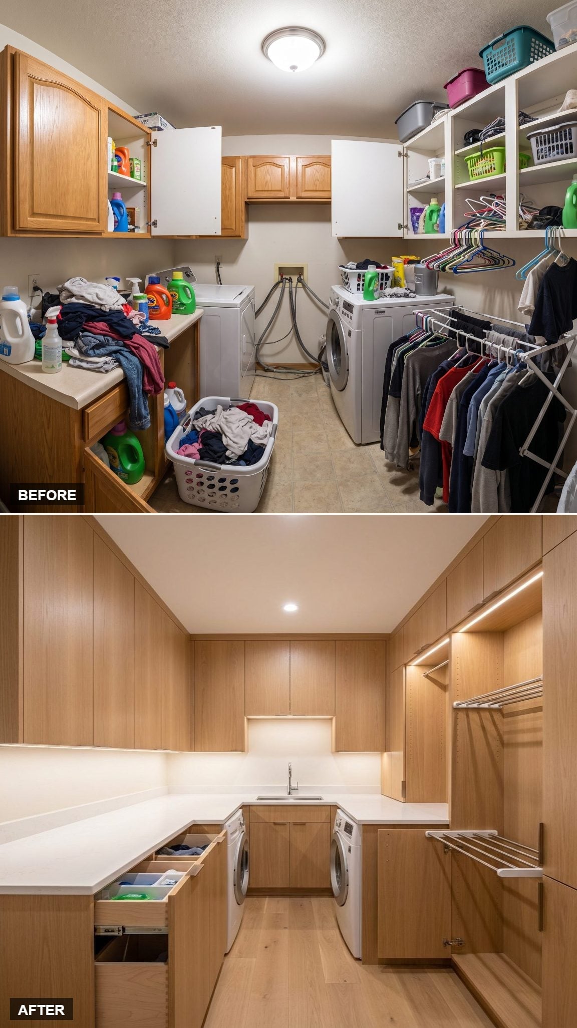
Oak-toned slab cabinetry runs counter to ceiling on three walls, unified by a white quartz countertop that wraps the entire perimeter. Under-cabinet LED strips wash the counter surface in warm light without a single visible fixture. A fold-down drying rack on the right wall keeps function honest without sacrificing the clean lines.
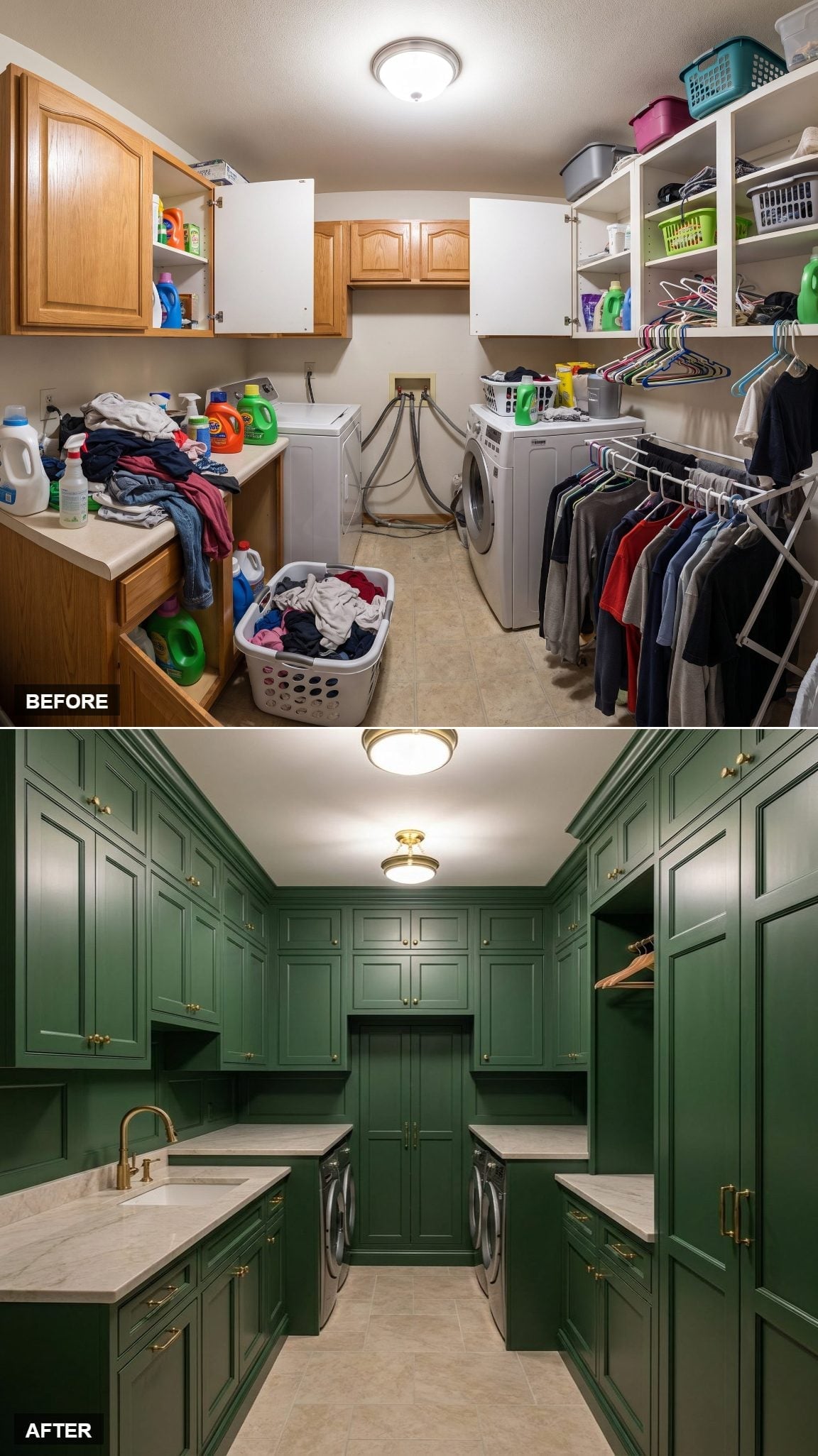
23. Hunter Green Cabinetry Let the Brass Hardware Join the Color Story
🔥 Would you like to save this?
Deep hunter green Shaker cabinetry runs floor to ceiling on both walls, with brass cup pulls and knobs that stay consistent across every door and drawer. The washer and dryer sit recessed beneath a pale stone-look countertop, tucked into the cabinetry line rather than sitting in front of it.
A utility sink with a brass gooseneck faucet occupies the left counter run, and two flush-mount fixtures with gold rims push warm light down the length of the room without competing with the cabinetry’s richness. The result reads more like a tailored study than a place where laundry gets sorted.
22. Walnut Slab Cabinetry Gave a Utility Room Some Visual Weight
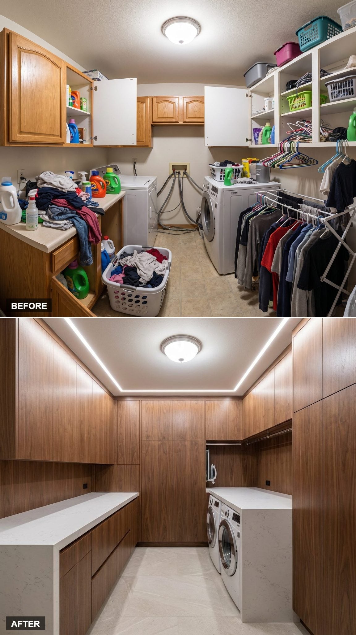
Medium-toned walnut-look veneer runs floor to ceiling on three walls, creating the kind of visual weight that makes a utility room feel intentional rather than incidental. No hardware anywhere. Cabinet faces stay completely flush, which keeps the wood grain the main event rather than a backdrop.
Integrated LED strip lighting traces the ceiling perimeter, casting a soft wash without competing with the flush-mount fixture centered overhead. White quartz countertops keep things legible, and the front-load washer sits tucked beneath them rather than freestanding. Light neutral tile flooring ties it together without demanding attention.
21. Knotty Wood Cabinetry Made the Utility Sink Feel Like Part of the Room
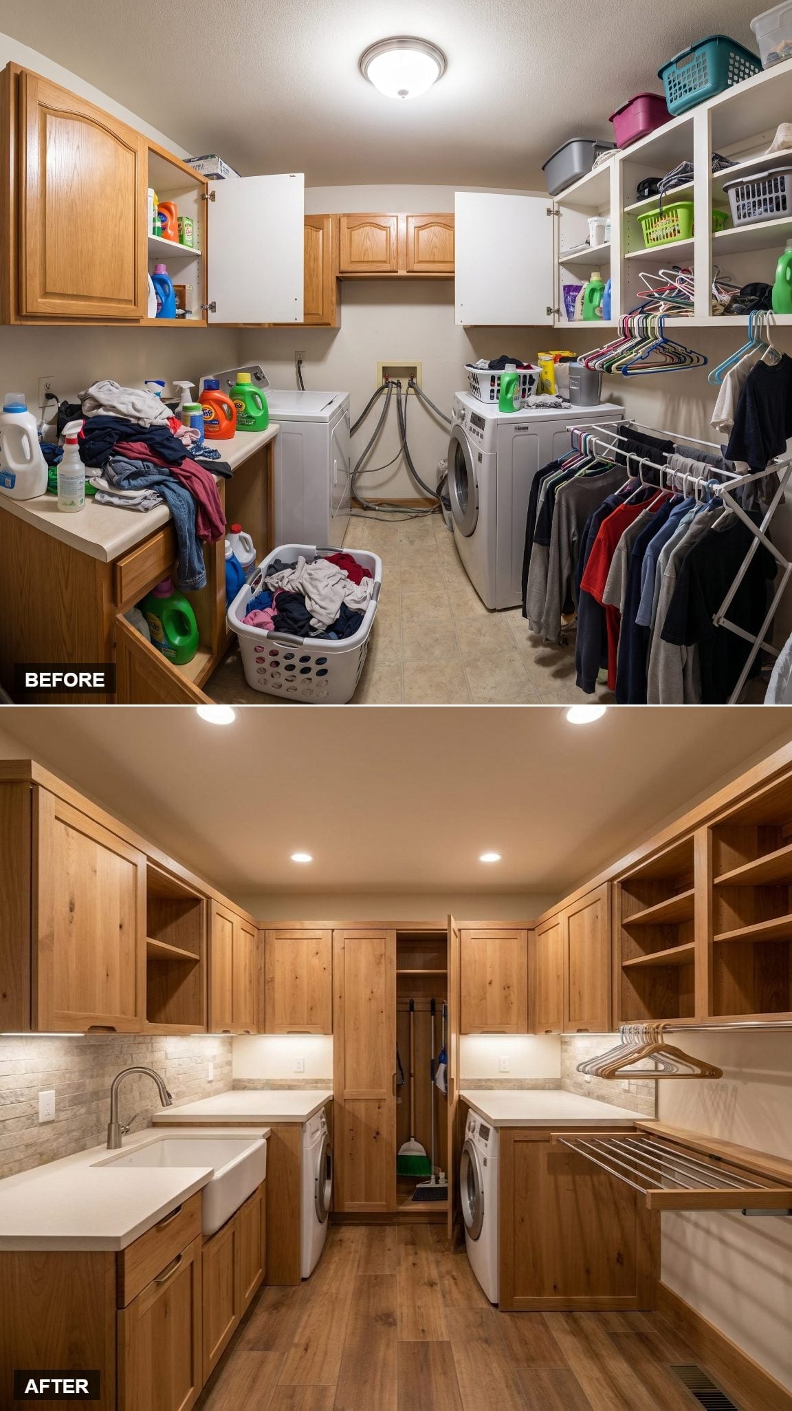
Knotty wood cabinetry brings grain and character that most cabinetry actively avoids, and here it reads as warmth rather than roughness. The apron-front sink sits flush into the quartz countertop on the left, recessed lighting replaces the old flush mount, and a dedicated hanging rod gets its own cabinet bay on the right. Organized without looking like it’s trying.
20. Rift-Sawn-Look Oak Made Repetition Work in This Room’s Favor
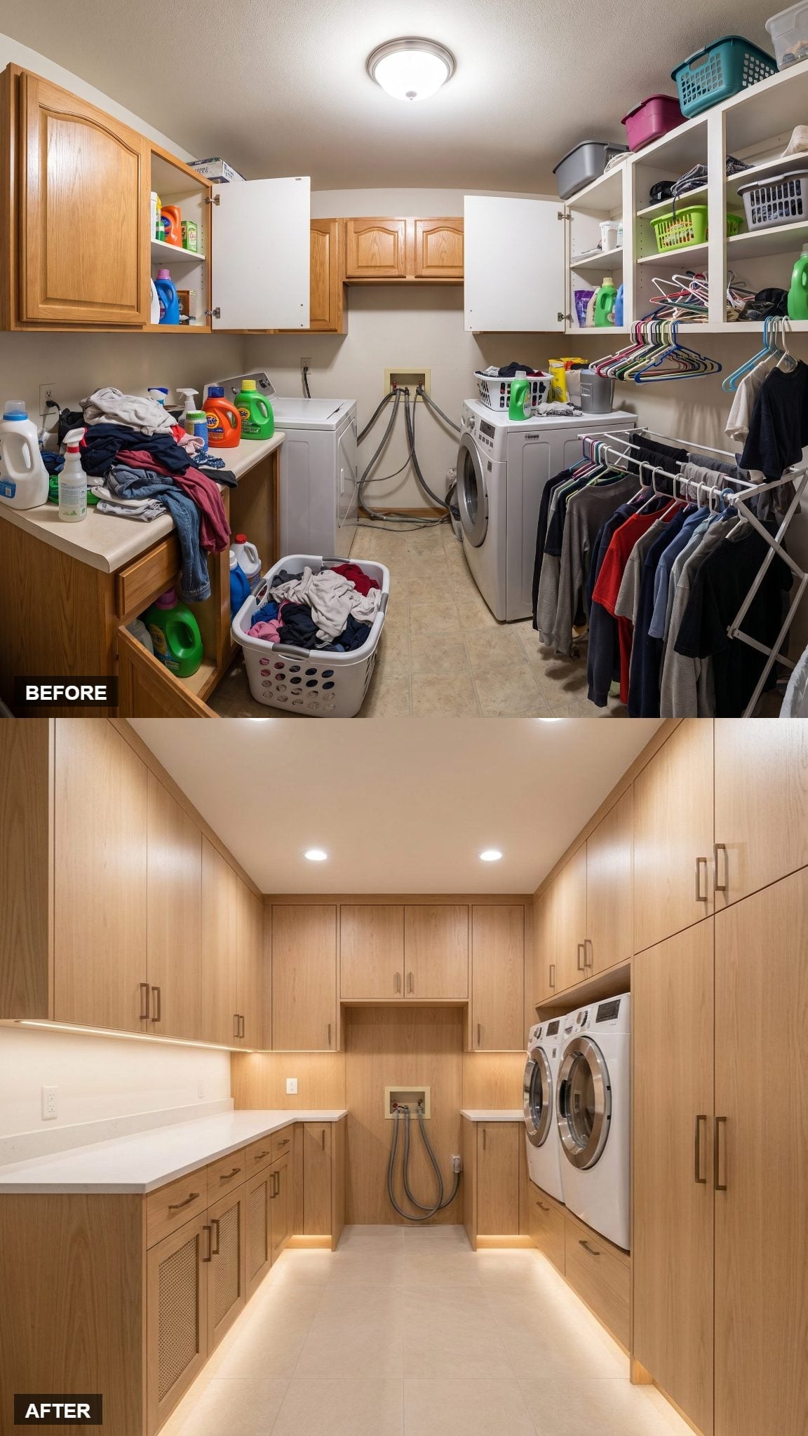
Oak cabinetry with a straight, consistent grain pattern runs the full height of every wall here, and the consistent grain direction keeps what could feel busy looking controlled instead. Recessed puck lights replace the old flush-mount fixture, and under-cabinet LED strips wash the white quartz countertops with just enough warmth to offset the wood’s restrained tone. The washer and dryer sit tucked into a dedicated alcove on the right, framed by tall cabinet towers on either side.
Hardware is minimal: brushed nickel bar pulls, nothing decorative. That restraint matters. When every surface is the same material at the same tone, anything that breaks the pattern tends to dominate the whole room — so keeping the hardware quiet was the right call.
19. White Oak-Toned Cabinetry Made the Laundry Room Feel Like Built-In Millwork
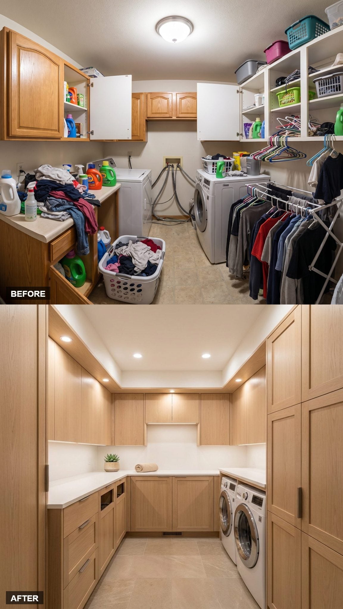
White-oak-toned cabinetry runs floor-to-ceiling on every wall, and the consistent grain and warm honey tone make the room feel more like built-in millwork than a utility space. Bar-pull hardware in a dark matte finish keeps things modern without trying too hard. The washer and dryer sit tucked under the counter on the right, nearly invisible.
A tray ceiling with recessed lighting adds architectural interest that nobody expects in a laundry room. A white countertop wraps the perimeter in an L-shape, giving real folding room. One small potted succulent sits center counter. It’s just enough.
18. Gray Shaker Cabinetry Used Symmetry Instead of Decoration
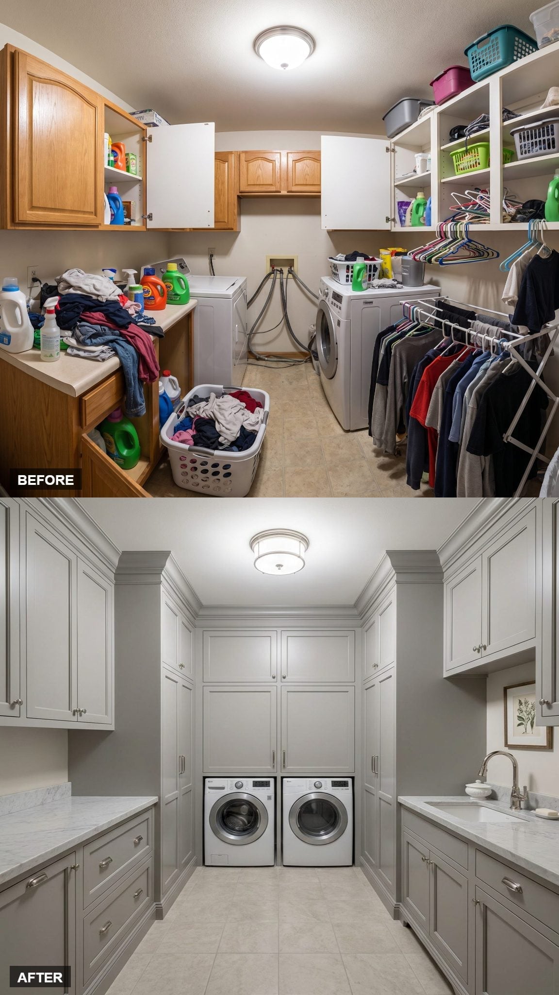
Floor-to-ceiling gray Shaker cabinets line every wall, and the crown molding detail at the top makes it feel more like a custom kitchen than a utility room. Quartz counters run the full length of both sides, and the front-load washer and dryer sit tucked neatly beneath a tall cabinet tower, keeping the back wall balanced and uncluttered.
- Crown molding connects the cabinetry to the ceiling without a visible gap
- Brushed nickel hardware stays consistent across every drawer and door
- The undermount sink on the right side keeps the counter edge visually cleaner than a drop-in rim would
17. A Center Tower Gave This Narrow Galley a Real Organizing Spine
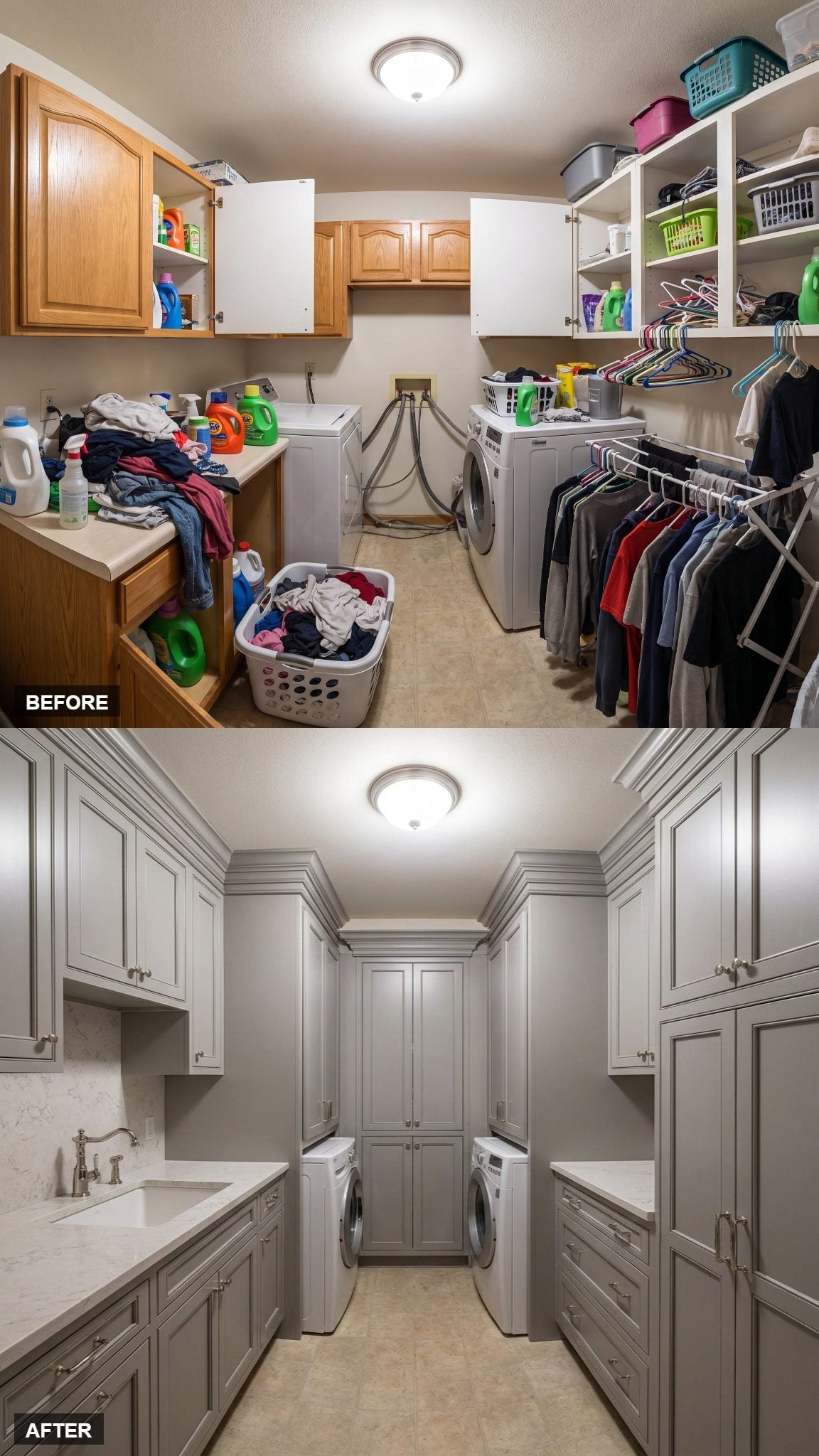
Gray raised-panel cabinetry runs the full length of both walls, topped with crown molding that gives the room a finished quality most laundry spaces never bother with. White quartz countertops line each side, and a utility sink with a bridge-style faucet in brushed nickel anchors the left wall. Hardware matches throughout: bin pulls and round knobs, both in satin nickel.
The real centerpiece is the tall tower cabinet centered between the washer and dryer. It reaches the ceiling and frames the machines without crowding them — architectural symmetry in a narrow galley layout, which is harder to pull off than it looks, and it works here because every cabinet line is consistent.
16. Shaker Cabinets and Dark Counters Gave the Work Zones Clear Edges
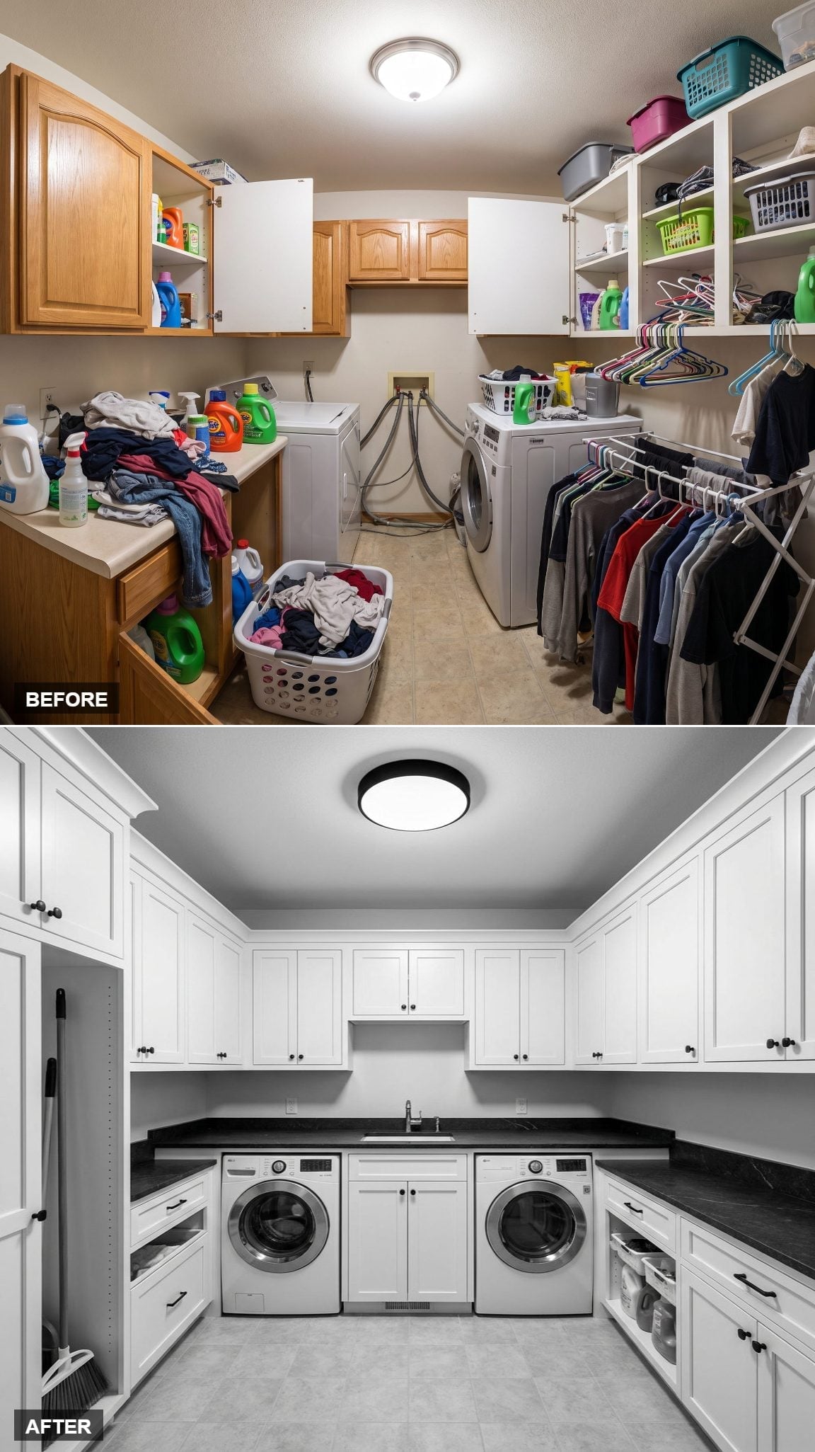
Painted Shaker cabinets run wall-to-wall and floor-to-ceiling, with matte black hardware giving every door and drawer the same visual language. Dark slab countertops establish a strong horizontal line through the room, while the two front-load machines sit beneath the counter on either side of a centered utility sink.
That machine-sink-machine arrangement is what gives this one its order. Instead of scattering the work zones around the perimeter, the back wall handles the wet work in one compact sequence while the surrounding cabinetry absorbs everything that would otherwise end up on display.
15. Taupe Slab Cabinetry Gave Detergent Its Own Lit Display Zone
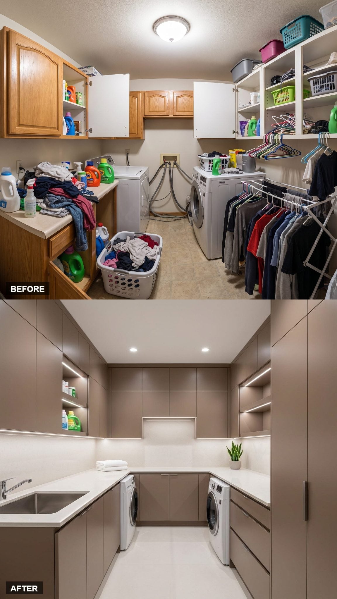
Warm greige cabinetry in a flat slab profile runs floor to ceiling on three sides, giving the room a cocoon-like quality that’s hard to fake with open shelving. Recessed LED strips light the open cubbies where detergent bottles actually belong, so the products are accessible but not on display. White quartz counters keep the whole thing grounded.
14. Greige Cabinetry Let the Lighting Define the Room Instead of the Hardware
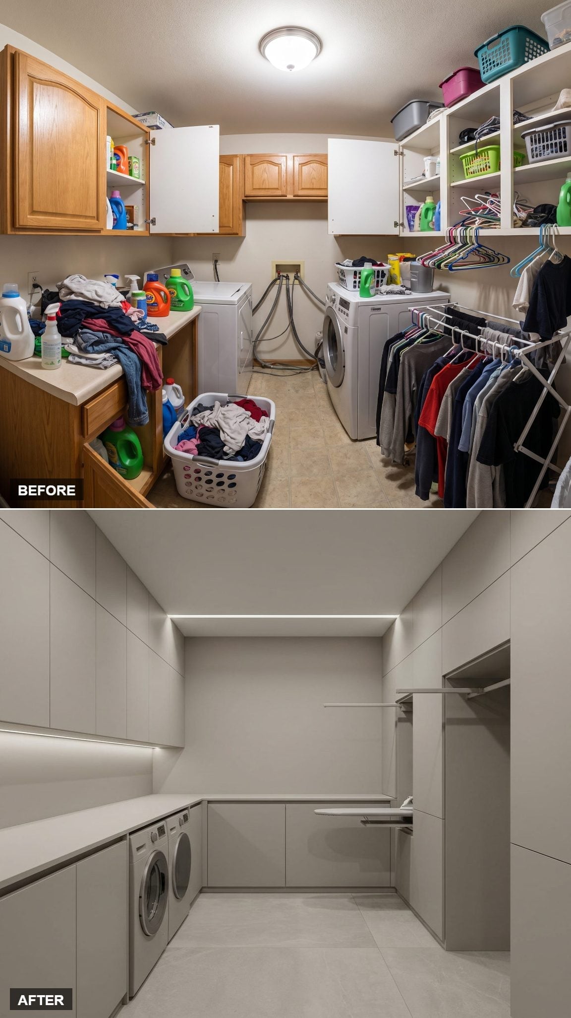
Handleless greige cabinetry runs the full perimeter, and the LED strip tucked into the upper cove spreads an even wash across the cabinet faces without putting a conspicuous fixture in the center of the ceiling. The restraint comes from keeping the cabinet faces, hardware, and lighting visually subdued.
13. Greige Cabinetry Turned the Back Wall Into the Only Place the Machines Needed to Be
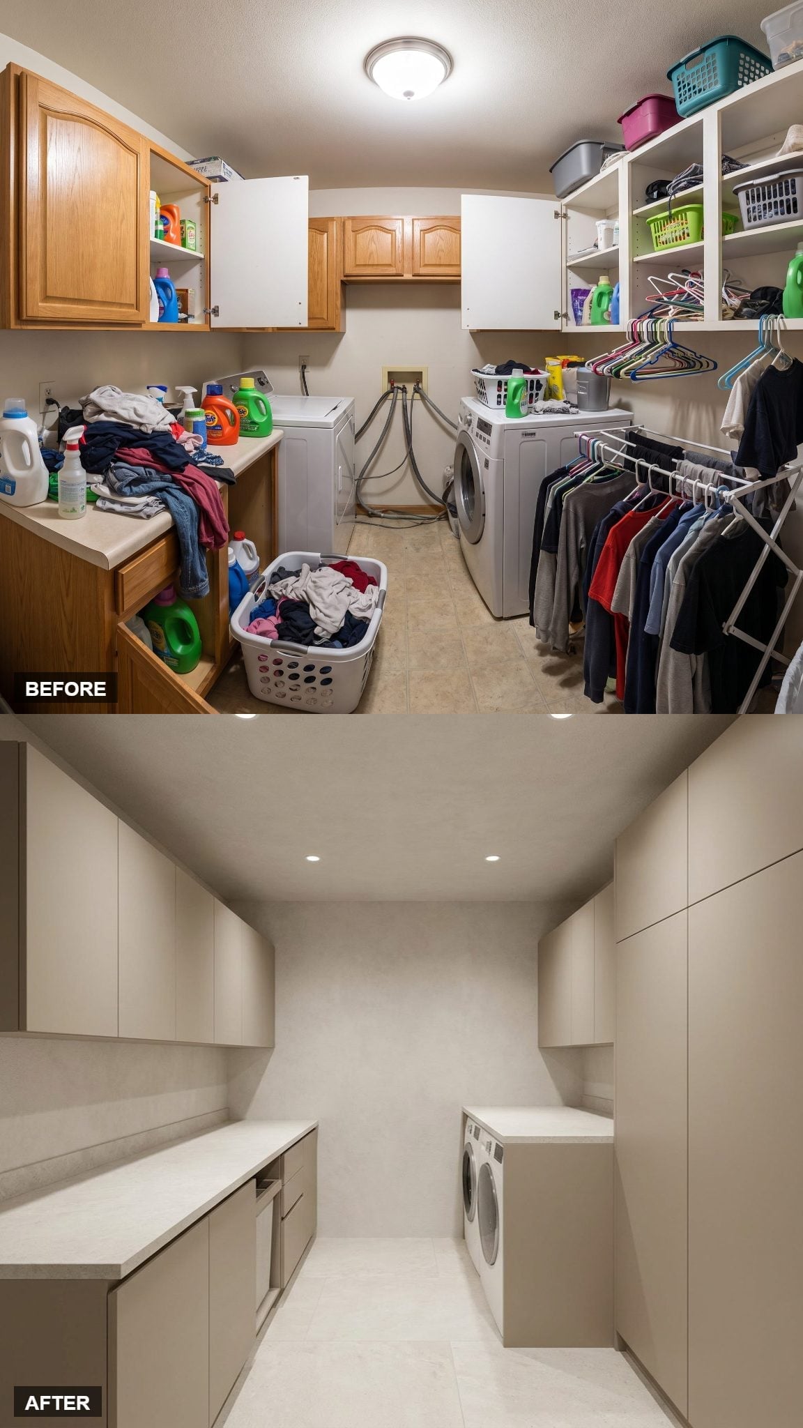
Flat-front cabinetry in a warm greige runs floor-to-ceiling on both sides, leaving no wall exposed and no surface unaccounted for. The only real contrast is the white quartz countertop. Recessed lighting keeps the ceiling uncluttered.
The washer and dryer sit side-by-side beneath a short run of counter on the back wall, tucked rather than featured. Frameless cabinet construction gives the room its compressed, almost gallery-like calm, and the absence of hardware pulls the whole thing further toward visual restraint.
12. Recessed Handles Let This Greige Room Stay Almost Completely Flush
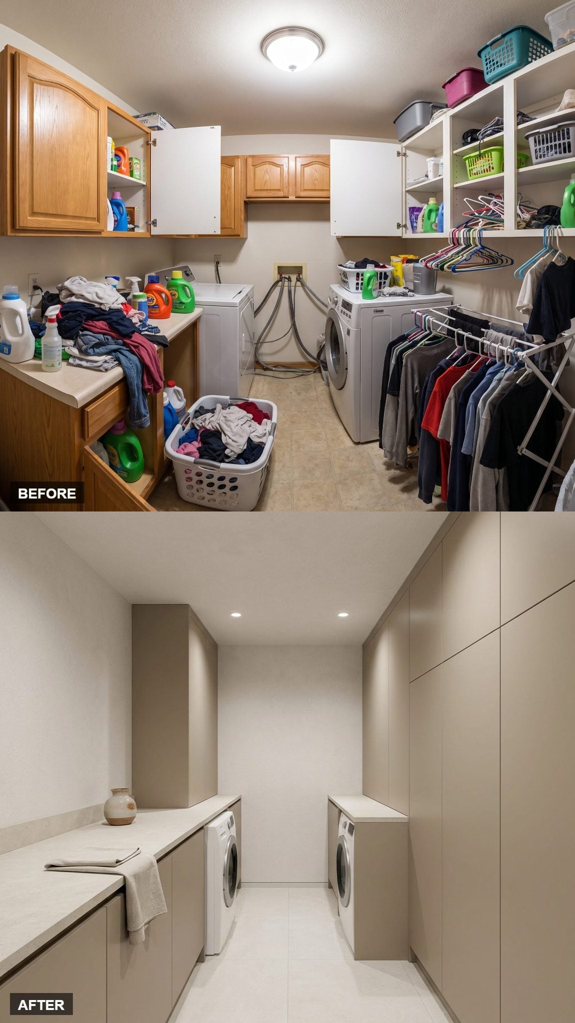
Warm greige cabinetry runs uninterrupted from floor to ceiling on both sides, with recessed handles keeping the facade completely hardware-free. The washer and dryer sit tucked beneath countertops that match the cabinet finish exactly, so nothing breaks the plane. That color continuity across uppers, lowers, and walls is what gives the room its low-contrast quality.
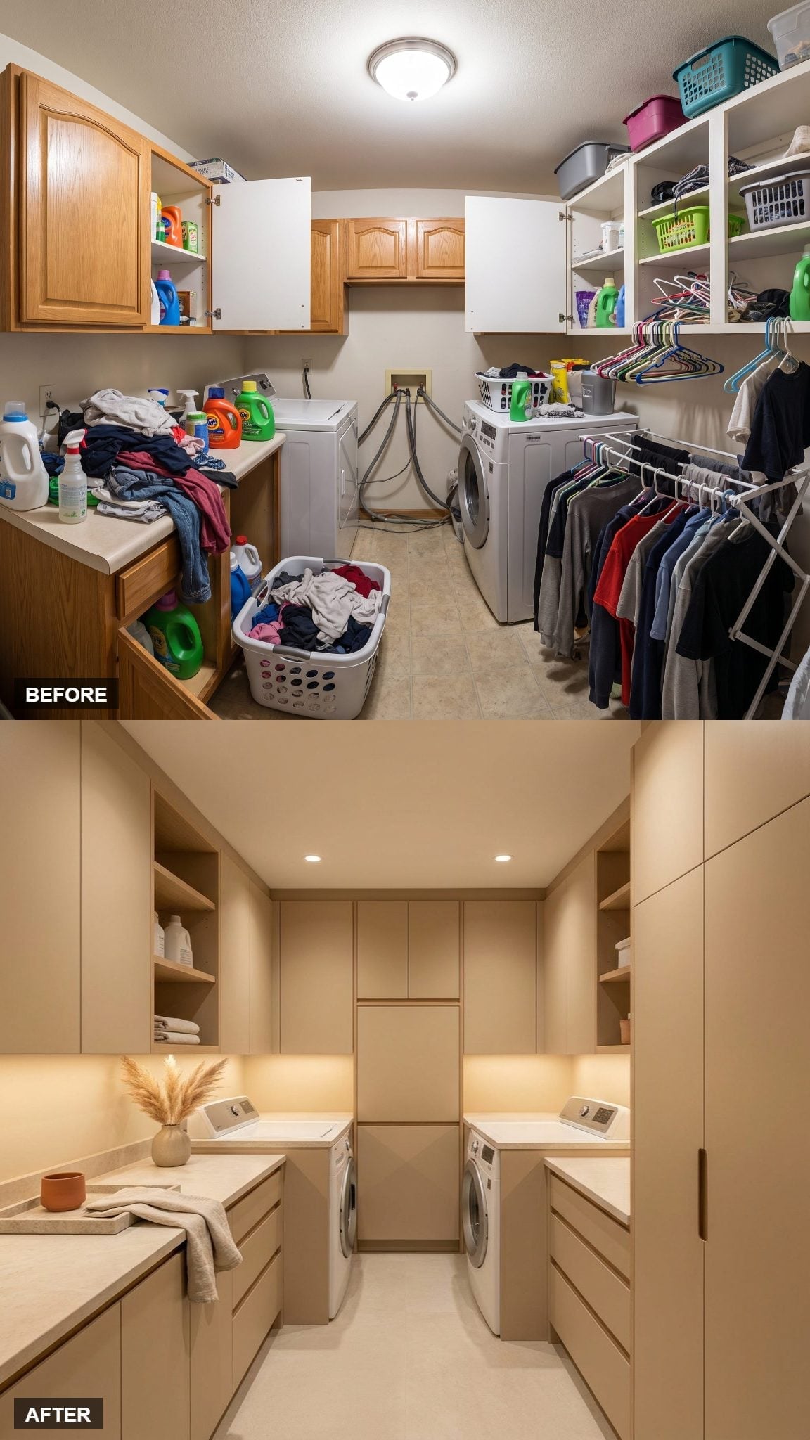
11. Open Niches Kept One Greige Laundry Room From Becoming a Wall of Doors
🔥 Would you like to save this?
Matte greige cabinetry runs from baseboard to ceiling on both sides, with open shelving built directly into the cabinet columns rather than added as an afterthought. Under-cabinet lighting carries more of the room than the recessed fixtures overhead — it keeps the countertops readable without flooding the space in harsh brightness.
The washer and dryer sit side by side, flanked by drawers below and tall cabinet towers at the far wall. No exposed plumbing, no visible cords. Just countertop, cabinet face, and shadow line. Quiet is the right word for it.
10. Cream Stone-Look Surfaces Made the Whole Room Read as One Volume
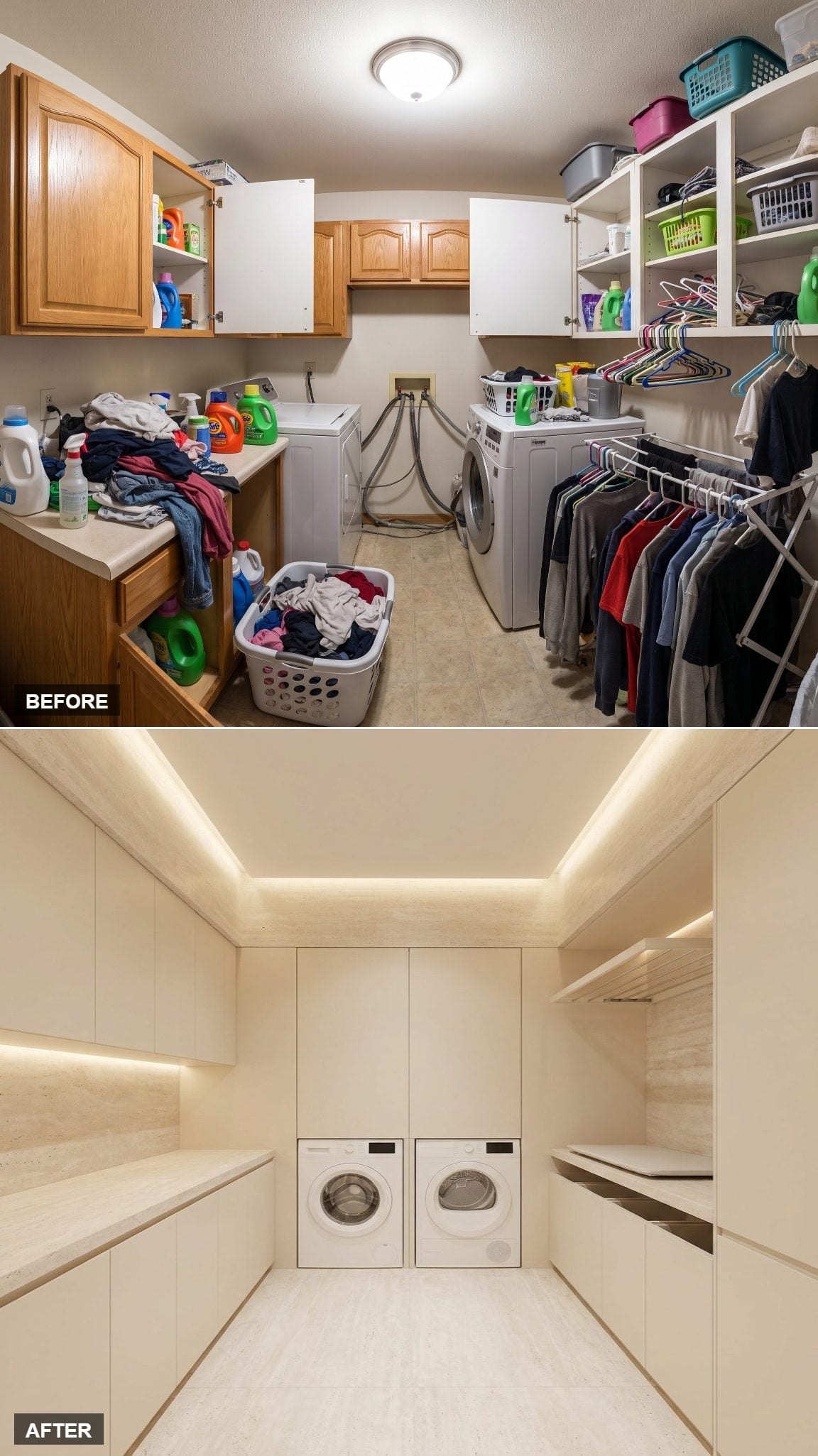
Cove lighting runs the full perimeter of the ceiling, casting a glow that makes the room feel quieter than it probably is. Every surface stays within the same creamy stone-like range — countertops, cabinet fronts, floor tile — so there are few hard visual breaks. The front-load washer and dryer sit recessed into the cabinetry rather than sitting out in the open. It’s a small decision that changes everything.
When the surfaces stay close in tone, edges and shadows do more of the visual work.
9. Charcoal Cabinetry Proved Visual Order Doesn’t Have to Be White
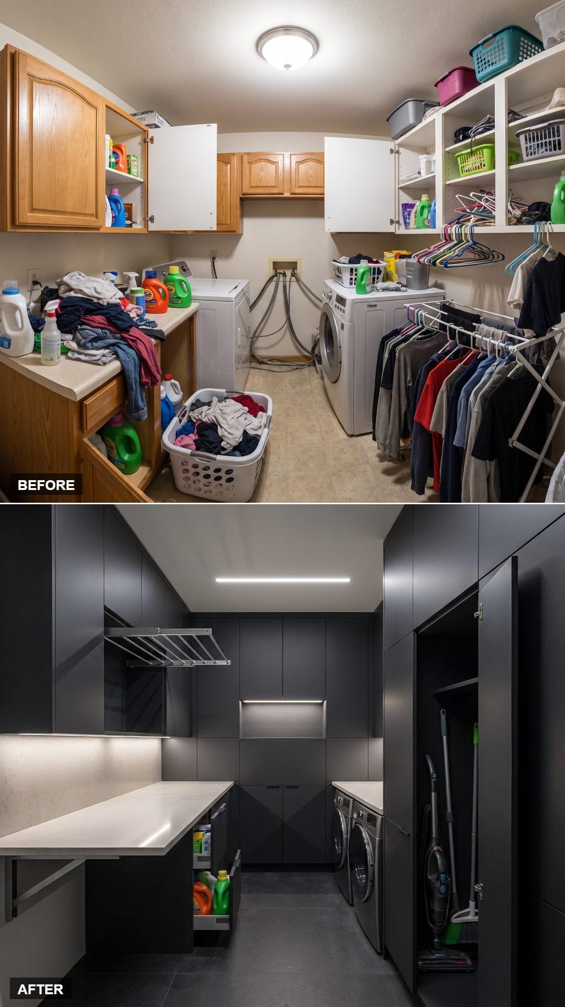
Floor-to-ceiling matte charcoal cabinetry runs both walls without interruption, and a single recessed linear LED strip handles the overhead lighting cleanly. Pull-out base drawers keep detergent bottles hidden but reachable. Controlled without feeling cold.
Color Story: Dark cabinetry puts more emphasis on contrast, so the light countertop becomes especially important as a working surface. Here, the pale quartz-look surface keeps the workspace readable without breaking the restrained palette.
8. White Shaker Cabinetry Turned the U-Shape Into the Organizing Idea
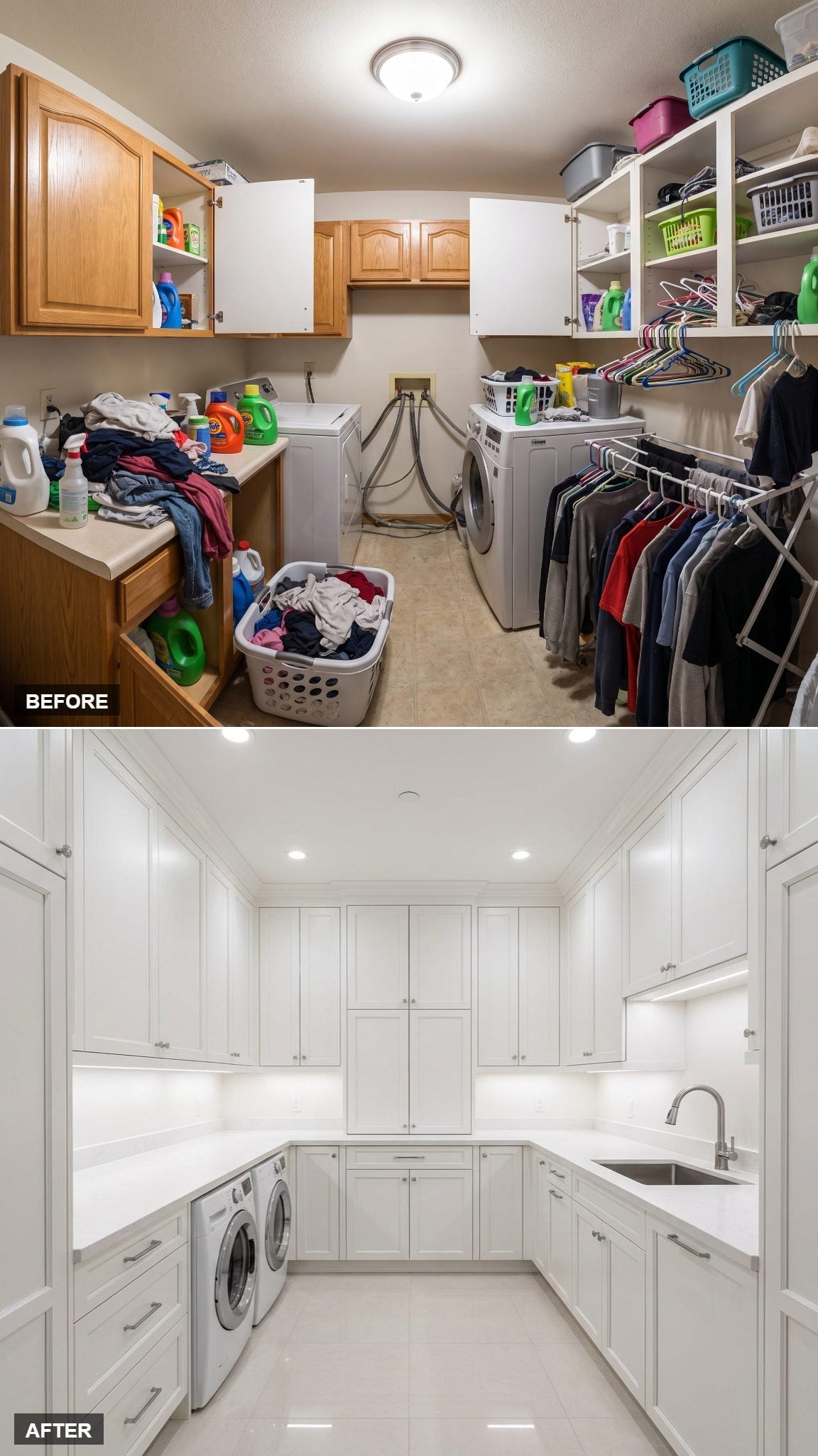
Every cabinet door is white shaker-style, running from counter height to the ceiling without interruption. Quartz countertops in a solid white finish span both walls, and under-cabinet lighting pulls the work surfaces forward so nothing disappears into shadow. Brushed nickel hardware stays consistent without competing with anything else in the room.
The layout is U-shaped, with the front-load washer and dryer tucked beneath the counter on the left wall and an undermount sink centered on the right run under its own cabinet bank. It’s a lot of white. It earns every inch of it.
7. Sage Blue Cabinetry Used Natural Wood Trim to Keep the Color Warm
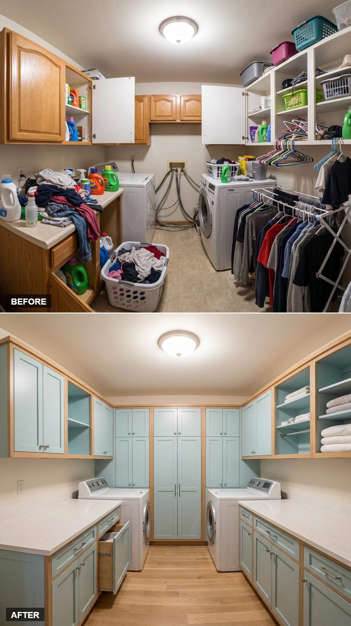
Soft sage-blue Shaker cabinets run the full perimeter, framed by natural wood trim that keeps the color from reading cold. Brushed nickel hardware stays consistent across every door and drawer, white quartz countertops run unbroken along both sides, and two laundry machines sit flanked by tall pantry-style cabinets at the center. The wood-toned floor pulls everything warmer than you’d expect from a utility room. It works because the layout is genuinely generous, not just organized.
Common Mistake: Mixing cabinet colors with trim in two different finishes is where a lot of laundry room renovations go sideways. Here, the sage doors and natural wood frame read as intentional because the pairing stays consistent on every cabinet. Pick one combination and commit to it throughout, or the room starts to feel like an unfinished sample board.
6. Steel Blue and a Lantern Pendant Took the Utility Edge Off
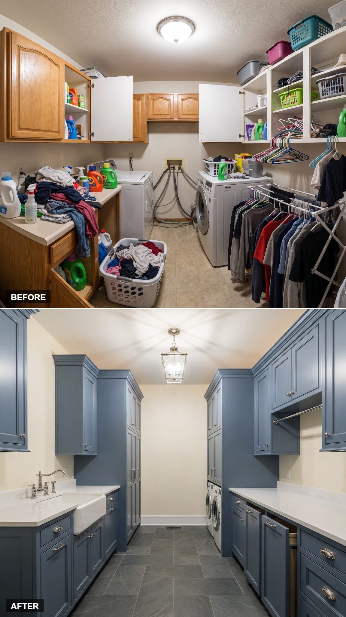
Slate-blue shaker cabinets run floor to ceiling on both sides, creating a corridor that feels more like a well-organized butler’s pantry than a utility room. Brushed nickel hardware runs throughout, which keeps the palette from reading too cool. White quartz countertops span the full length of both walls, and a farmhouse sink on the left has a bridge faucet that’s clearly not an afterthought.
The pendant changes the room’s tone more than its size suggests. A lantern-style fixture with a nickel frame hangs centered from the ceiling and shifts the room’s mood away from purely functional. Dark slate floor tile in a grid pattern grounds everything without competing. Front-load machines are tucked beneath the counters on the right side, nearly invisible — which is exactly what good cabinet planning looks like.
5. Duck-Egg Blue Cabinetry Needed One Patterned Strip to Wake Up
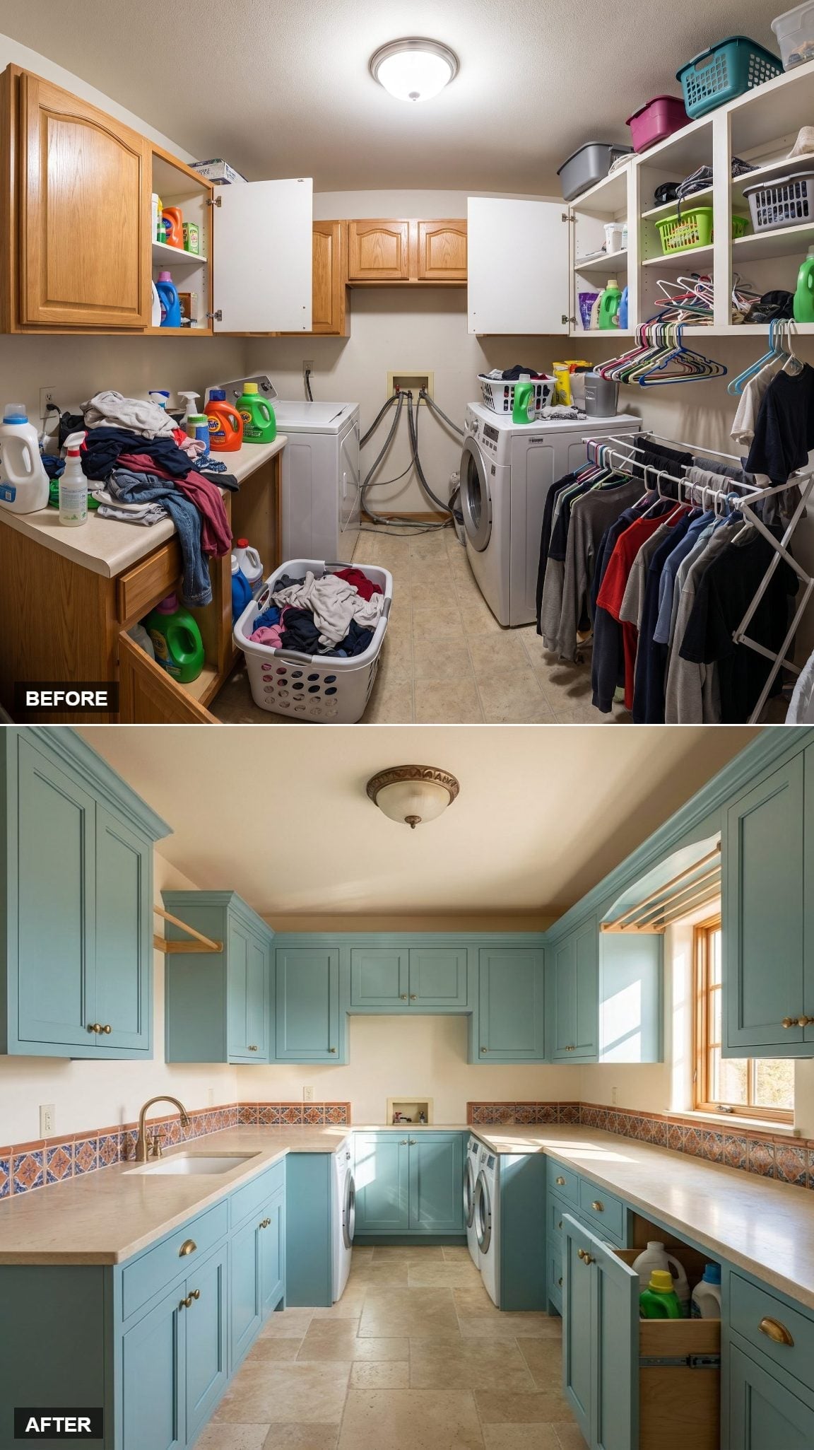
Painted in a muted duck-egg blue with brass cup pulls, the shaker cabinetry wraps three walls in a U-shape that puts folding counter space everywhere it’s needed. The Talavera-style tile border running between upper and lower cabinets carries real weight. It’s the detail that keeps the room from reading as just another painted-cabinet refresh — pull it out and you lose the whole personality of the space.
4. Wall-Mounted Drying Rods Cleared the Floor in One Move
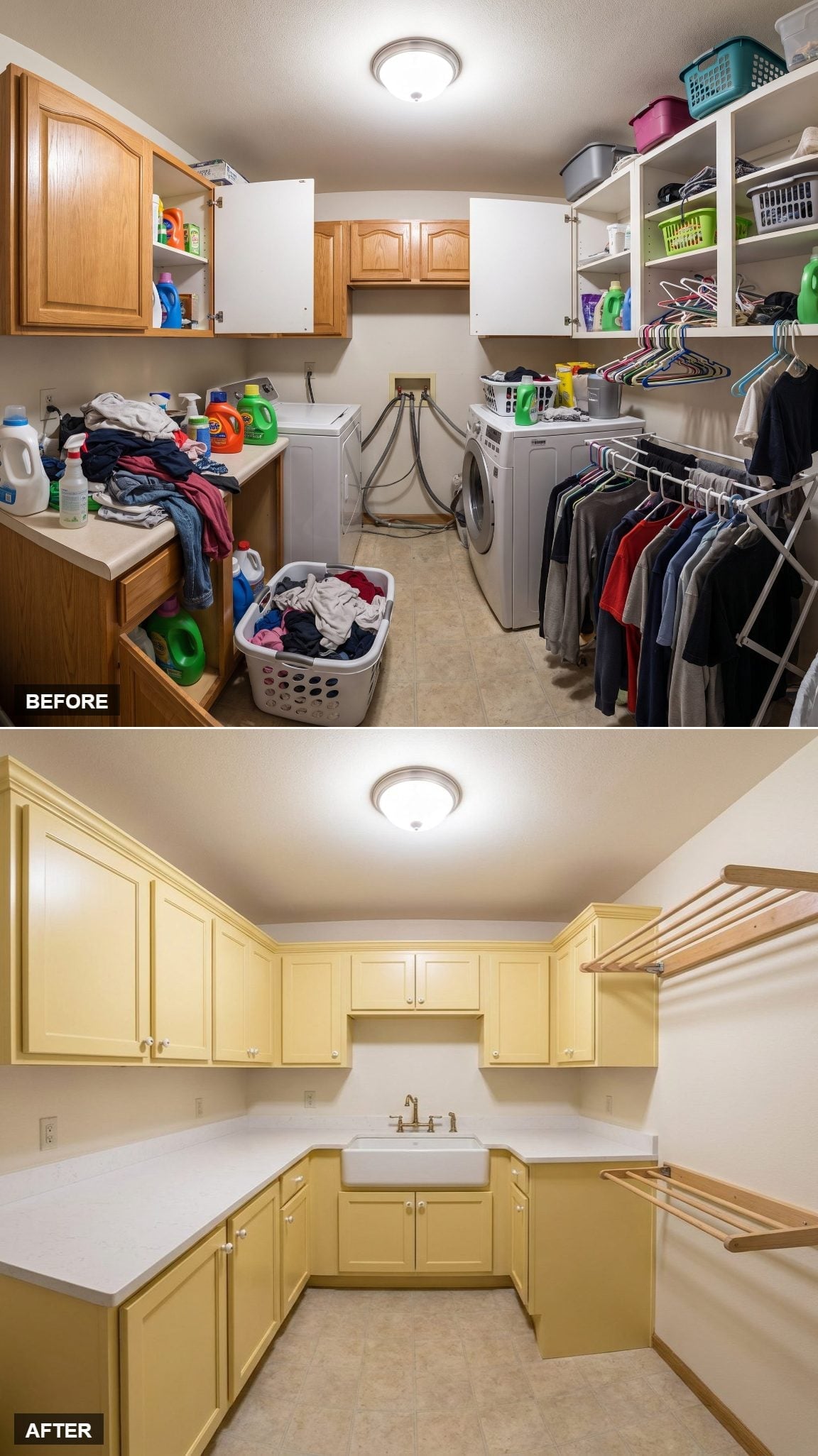
Butter-yellow shaker doors wrap three walls in an L-shape, keeping the layout organized without feeling institutional. The apron-front sink sits centered in the run, with brass fixtures that don’t fight the cabinet color. Wall-mounted drying rods on the right replace the freestanding rack clutter entirely — and that single swap changes how the room reads more than almost anything else here.
3. Cream Raised Panels Made the Laundry Room Feel Like a Finished Room
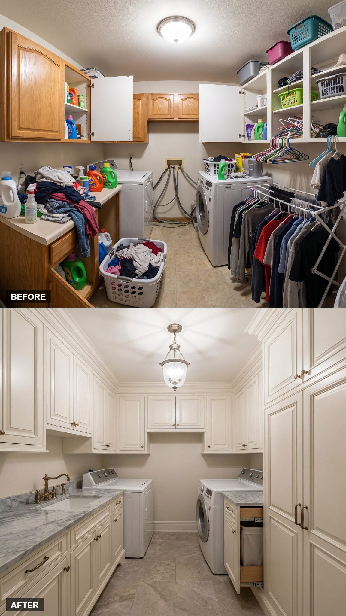
Raised-panel doors in an off-white finish run the full perimeter, with brass cup pulls that read traditional without tipping into fussy. Pale stone-look countertops on both sides give the room a material continuity that most laundry spaces never bother with. The pendant fixture centered overhead anchors the room in a way a flush-mount never could — it’s the difference between a room that feels finished and one that just feels done.
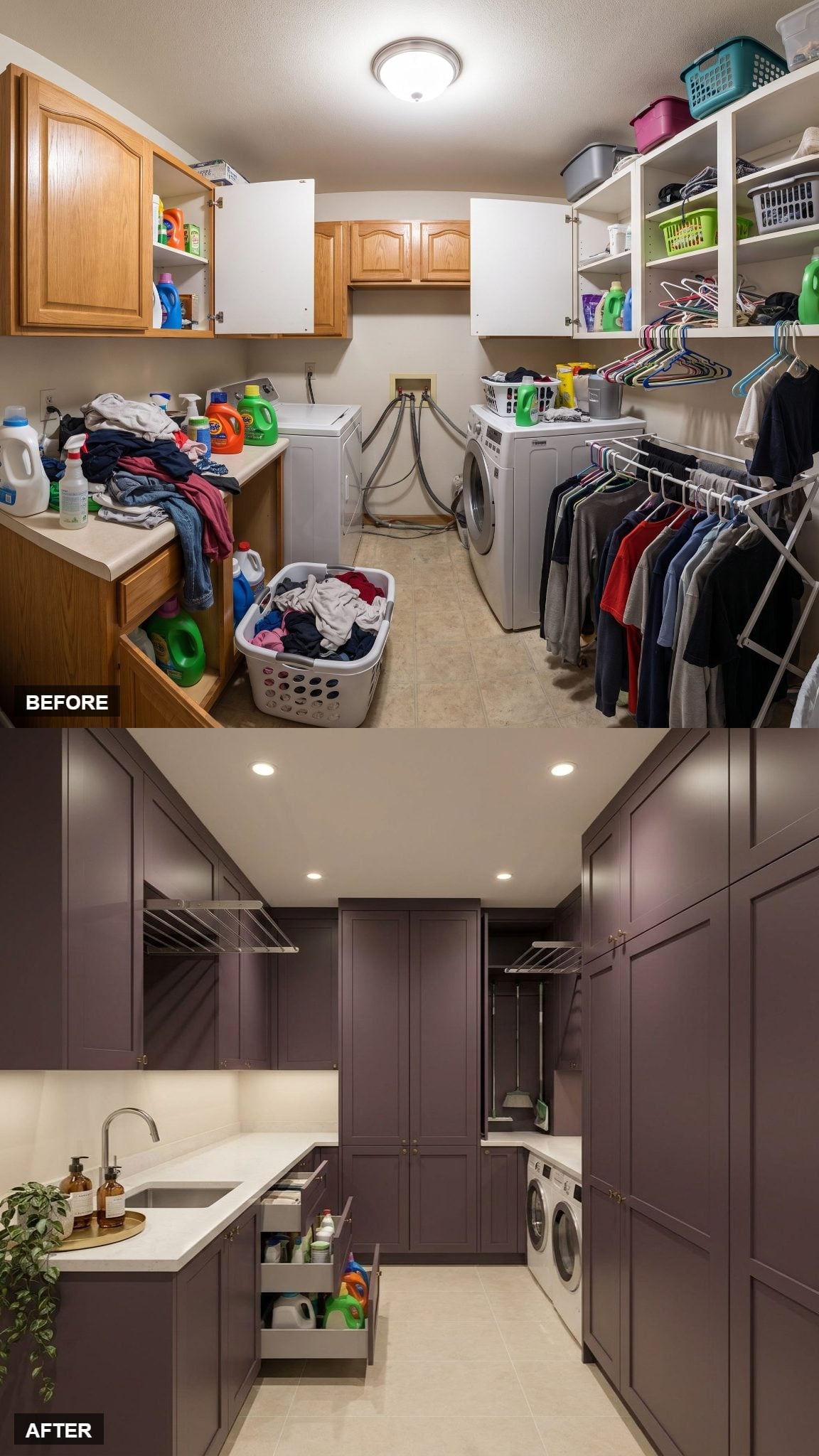
2. Deep Plum Cabinetry Proved a Laundry Room Didn’t Need to Play It Safe
🔥 Would you like to save this?
Deep plum Shaker doors run floor-to-ceiling on both walls, with a tall center tower anchoring the layout between the washer and dryer. Pull-out drawers keep detergent contained but reachable, while recessed lighting keeps the saturated color from turning the narrow room into a cave.
The center tower matters more than it first appears. It gives the back wall a strong vertical break and separates the machines instead of letting them read as one wide block of appliances. Against all that plum, the symmetry feels deliberate rather than severe.
1. Sage Gray and Brass Closed the Gallery on a Softer Note
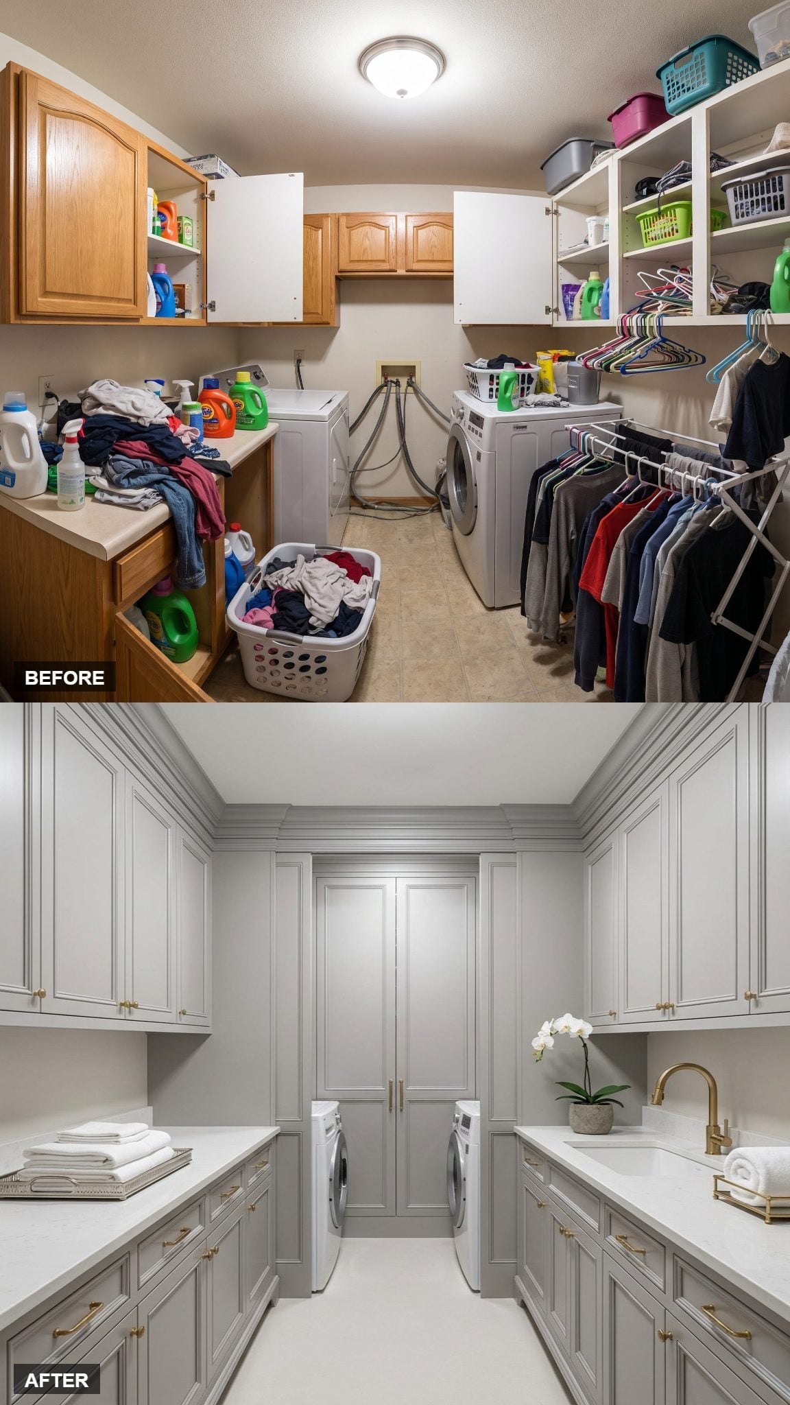
Floor-to-ceiling cabinetry in a cool sage gray runs the full length of both walls, with raised-panel doors and crown molding that push the room closer to a proper room than a utility space. Brass cup pulls and knob hardware appear throughout, and that single finish choice carries real weight — gold-toned hardware against gray cabinetry is one of those combinations that reads as deliberate rather than accidental.
The washer and dryer sit tucked between tall cabinet towers at the back wall, flanked by a center panel that keeps the appliances from visually dominating. White quartz countertops run along both sides, giving the room genuine folding and staging space. A potted orchid sits near the sink on the right side — which, honestly, might be the most optimistic thing anyone has ever placed in a laundry room.