🔥 Would you like to save this?
Most ceilings become white before anyone really decides they should be. Walls get samples taped to them. Cabinets get debated. Flooring gets carried from window to window at different times of day. Then somebody reaches for a can marked Ceiling White and the largest uninterrupted surface in the room quietly leaves the conversation.
In order to come up with the very specific design ideas, we create most designs with the assistance of state-of-the-art AI interior design software. Also, assume links that take you off the site are affiliate links such as links to Amazon. this means we may earn a commission if you buy something.
That is a strange bargain when you think about it. A ceiling can change how tall a room appears, sharpen the geometry of beams and coffers, warm up stone and wood, throw chandelier light back into a dining room, or turn an otherwise polite bedroom into something completely enveloping. It can carry paint, timber, brick, metallic finishes, or wallpaper. Yet we routinely spend months choosing everything underneath it and give the ceiling approximately four seconds.
These 32 examples take the opposite position. Some barely move beyond neutral. Others go straight for black lacquer, terracotta, wallpaper, aubergine, exposed brick, or a full green color drench. The point isn’t that every ceiling should shout. It’s that none of them has to disappear.
32. Glossy Black Overhead, and Suddenly the Dining Room Has Another Dimension
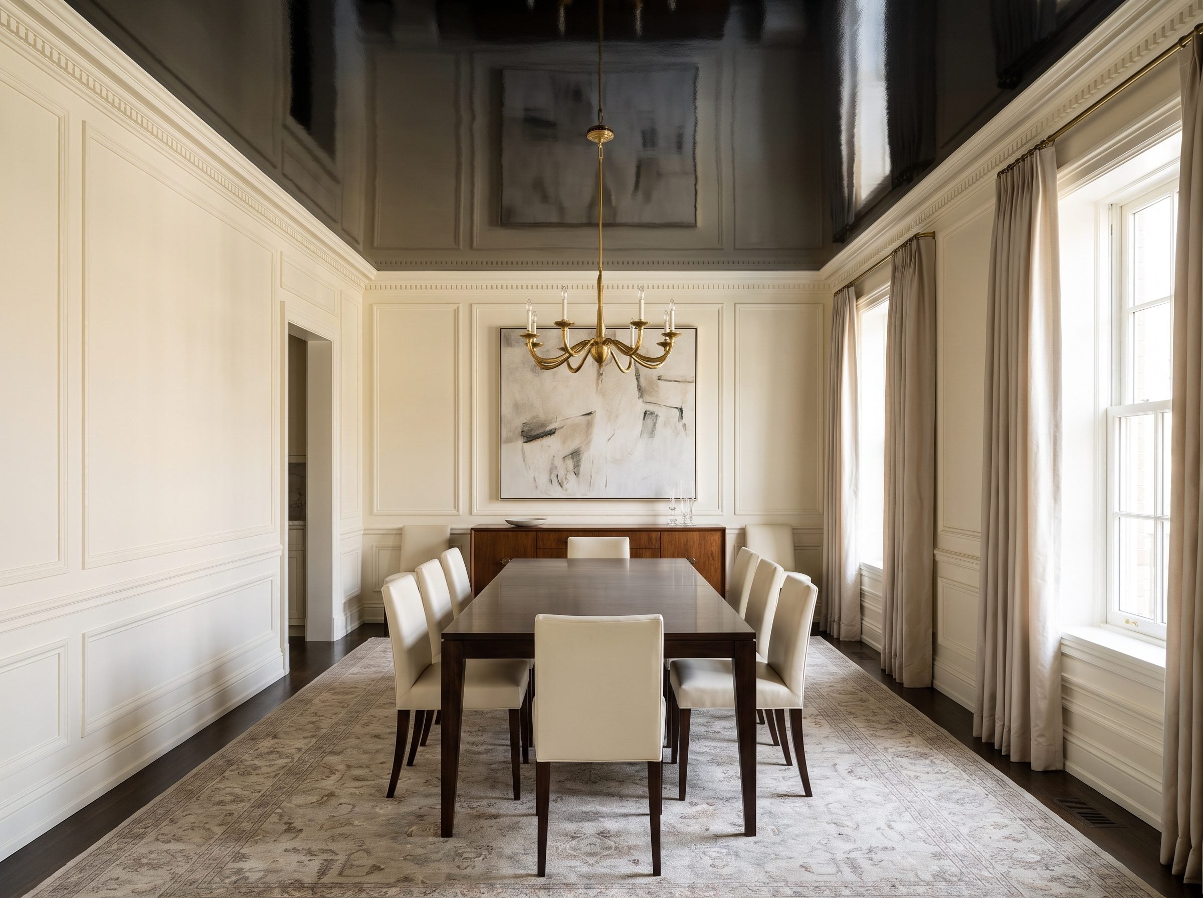
Black overhead sounds like the fastest route to a cave. High gloss changes the equation.
The dark surface still absorbs plenty of light, but its polished finish catches highlights sharply. Put a sculptural brass chandelier beneath it and the fixture suddenly has a second life in reflection: points of light, blurred brass, and movement appearing across a surface that matte paint would leave quiet.
Ivory walls, cream chairs, and walnut underneath keep the ceiling from consuming the room. The darkness stays overhead, where it reads less like missing light and more like another layer of architecture.
Black doesn’t have to make a ceiling disappear. With enough sheen, it can make you look at it twice.
The finish is doing as much work as the color here. Flat black would be restrained. Lacquer turns the same hue theatrical.
31. Terracotta Above a Mediterranean Kitchen Makes the Whole Room Feel Sun-Warmed
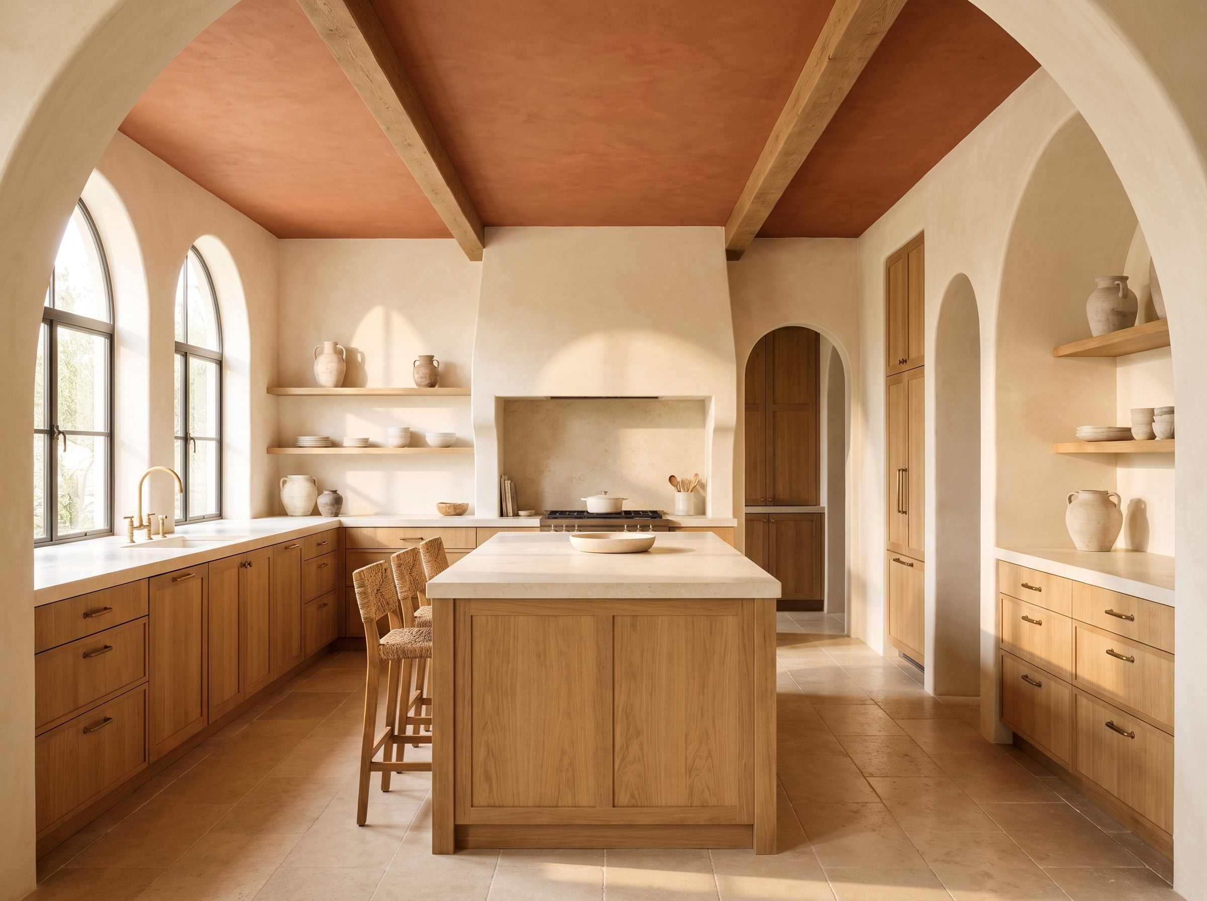
Terracotta doesn’t need a historical argument to justify itself. Put that mineral red-brown over limewashed cream walls and natural oak and the room immediately feels warmer.
Earth pigments based on iron oxides have been used for thousands of years, and clay surfaces have an equally long architectural history. That long material history is part of why terracotta sits so naturally beside plaster, wood, brass, and handmade ceramics: all of them carry variation rather than perfect machine-flat color.
An aged-brass faucet and a row of handmade ceramic bowls reinforce that quality without turning the room into a Mediterranean theme set.
The strongest terracotta color palettes keep some earth and dust in the color rather than pushing it toward bright orange.
30. Dusty Blue in a Traditional Bedroom Has History Without Looking Historical
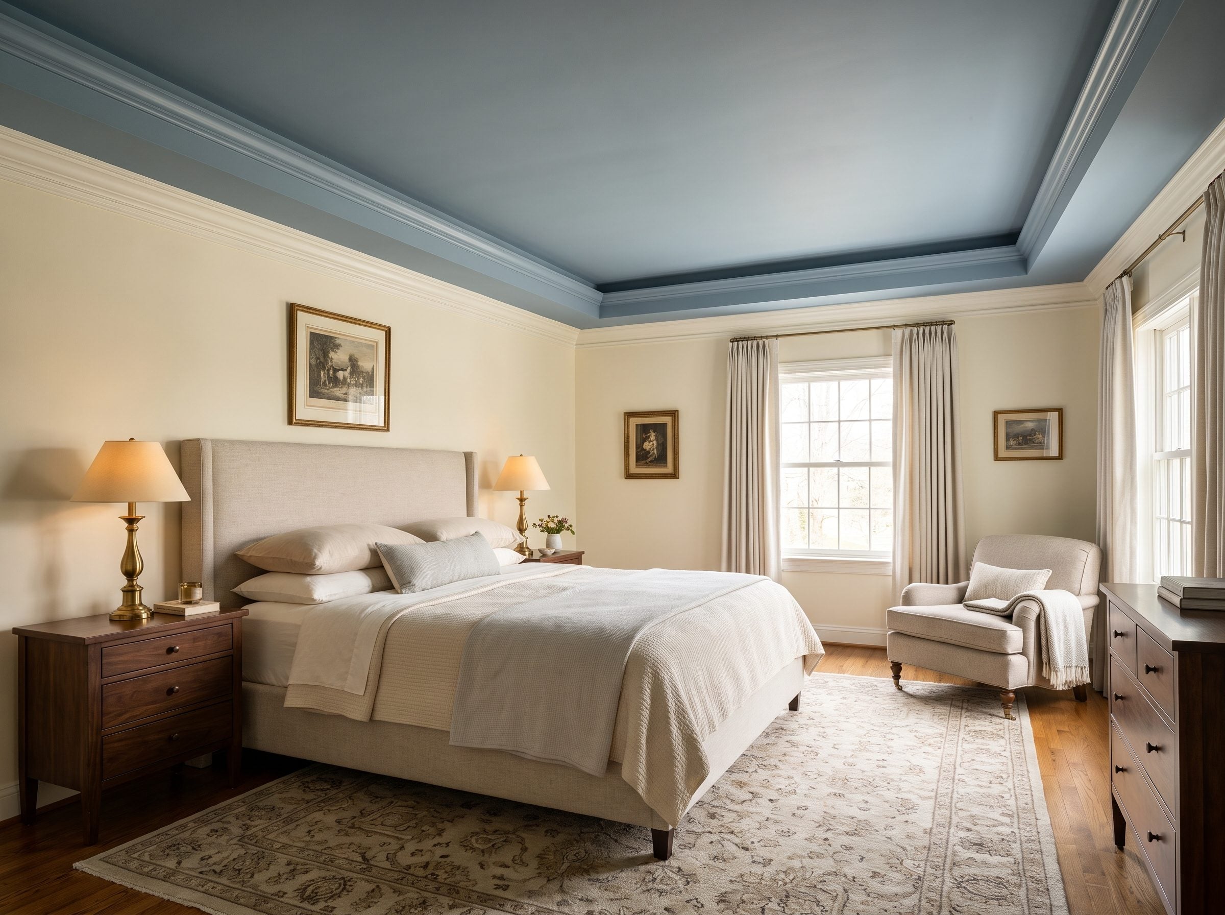
A dusty-blue ceiling can feel strangely familiar even in a newly decorated bedroom. The white crown molding helps: it frames the color as a deliberate plane rather than allowing blue to wash indiscriminately down the room.
Blue ceilings also have a genuine place in American architectural history. The best-known example is the tradition commonly called haint blue, associated particularly with Gullah Geechee culture in the Lowcountry. Folklore connected watery blue with protection from haints, or restless spirits, although the colors and recipes varied widely from place to place.
That history deserves to be treated as history rather than reduced to a paint trend.
In this bedroom, the design lesson is much simpler. The blue cools the upper plane while ivory walls, an oatmeal upholstered bed, walnut nightstands, and brass table lamps keep everything below warm.
The ceiling makes itself known without making the bedroom feel themed around a color.
29. Exposed Brick Overhead Is What Happens When the Structure Refuses to Be Background
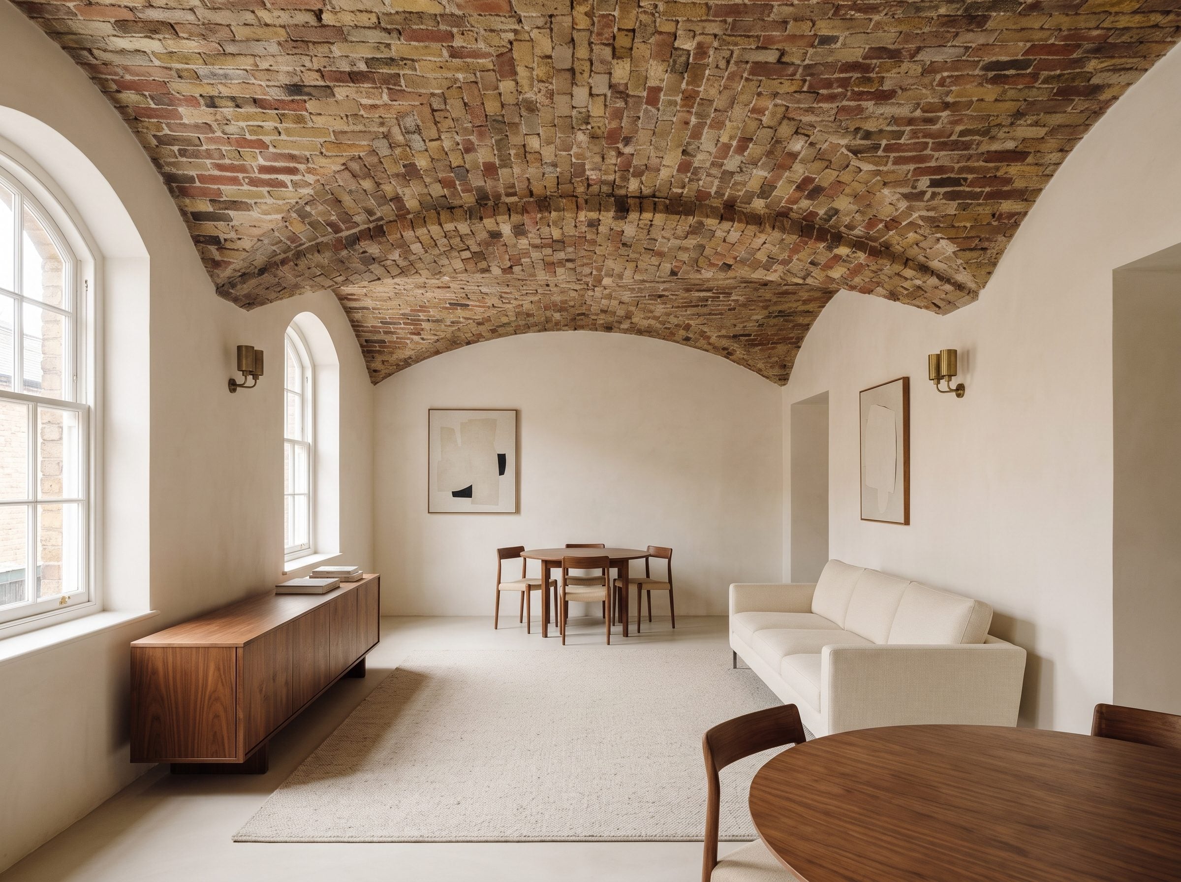
Paint has disappeared completely, and the gallery is better for it.
A brick or clay-tile vault turns the ceiling into structure, texture, pattern, and color at the same time. The joints lead the eye along the span while every tile catches light slightly differently.
Rafael Guastavino and his company made thin-tile vaulting famous across major American buildings in the late 19th and early 20th centuries, including highly visible public interiors where the tilework became part of the architectural experience rather than something to hide.
That doesn’t mean every brick ceiling is a Guastavino ceiling. It means there is a long precedent for letting masonry overhead remain visible when the construction itself is worth looking at.
Cream seating, walnut, brass, and wool below are enough. Anything busier would start competing with the room’s best surface.
28. Pale Blush Over an Elegant Bedroom Does Something White Can’t Quite Manage
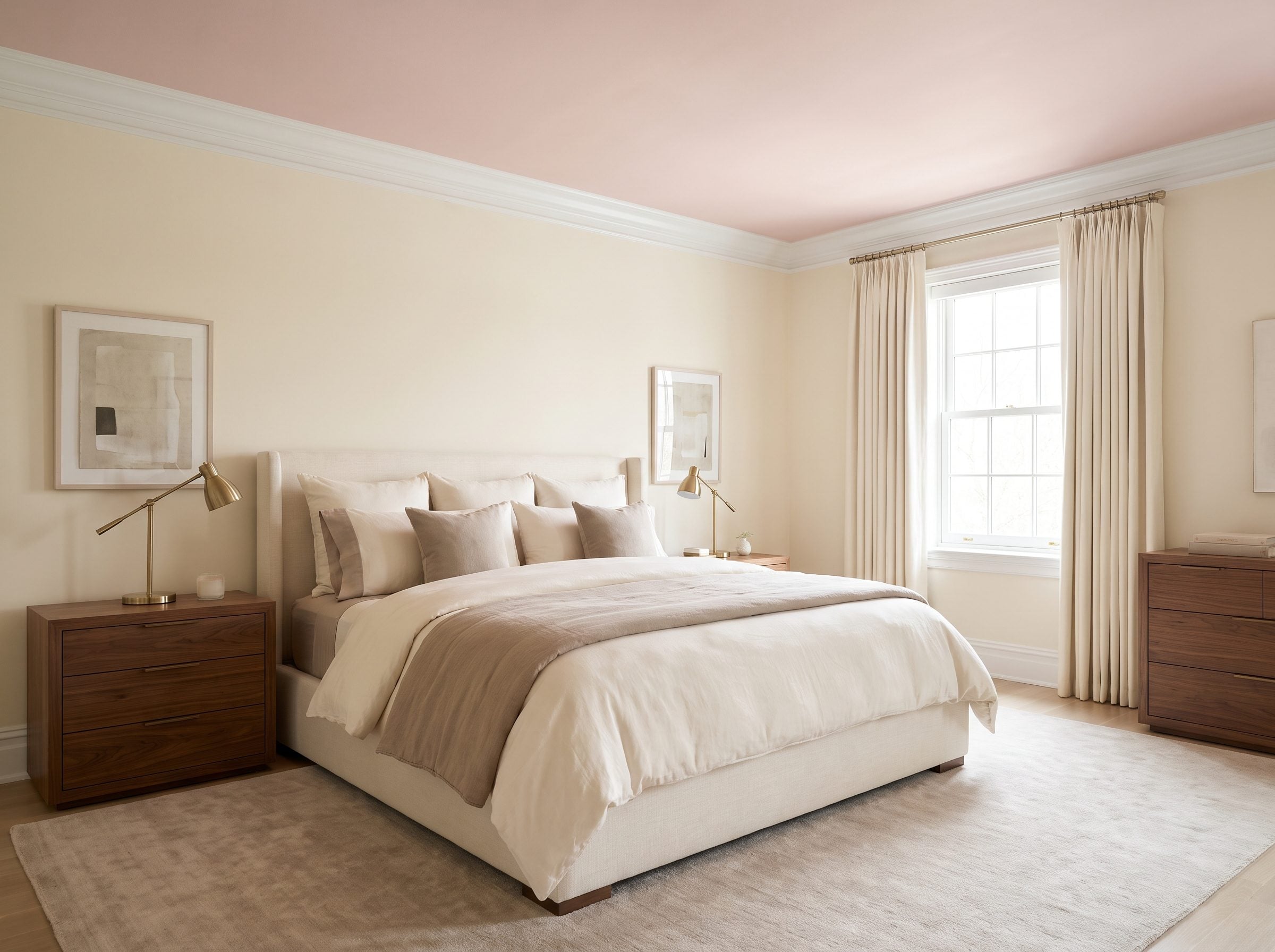
This isn’t pink in the birthday-cake sense. It’s pink with most of the sugar taken out.
A muted blush overhead reflects warmer-toned light than stark white, which can give the room—and faces within it—a softer cast depending on the lighting. That is a visual effect, not magic skincare, but it is noticeable enough to make blush useful in bedrooms and dressing spaces.
The trick is what sits below it. Walnut furniture, taupe and ivory bedding, cream curtains, and brushed brass prevent the ceiling from turning juvenile.
A dusty shade such as Farrow & Ball’s Setting Plaster occupies exactly that useful territory between pink and warm neutral. Crisp crown molding then draws a clear line around the ceiling and makes the choice look architectural.
27. Deep Blue Coffers Finally Give the Grid Something to Do
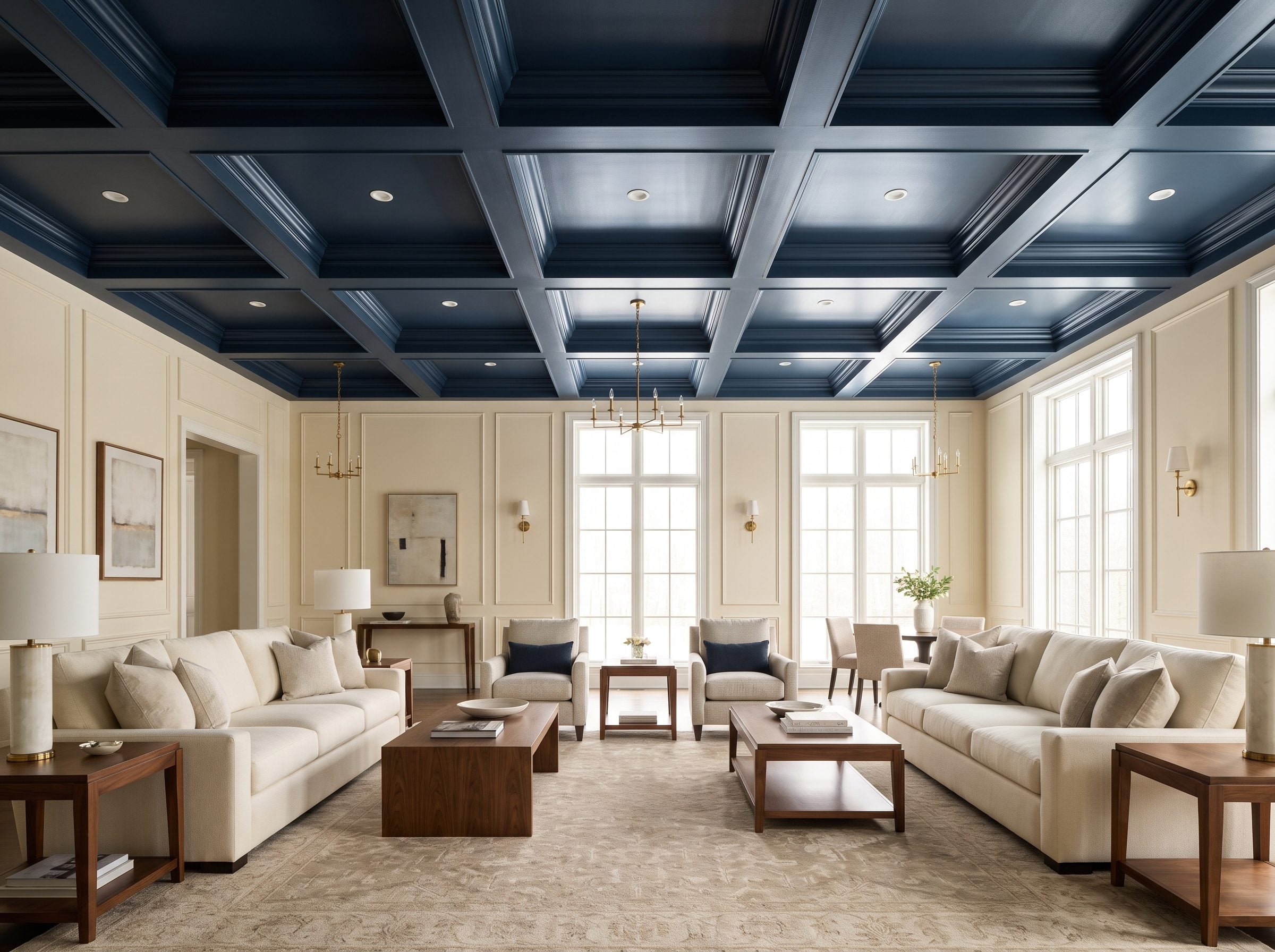
A coffered ceiling is already asking to be seen. Painting every recess and beam the same flat white can soften the shadows until a feature built in three dimensions starts behaving like wallpaper.
Deep blue reverses that.
The recessed fields read darker, the edges become sharper, and light skims across the grid instead of flattening it. Cream sofas and warm ivory walls below give all that ceiling architecture somewhere bright to land.
Coffering itself goes back to antiquity, when recessed ceiling panels could reduce weight while also becoming decorative surfaces. Later interiors pushed the ornamental possibilities much further with paint, carving, and gilding.
Brass rather than chrome keeps the cool blue from becoming icy. Add walnut underneath and the ceiling gets drama without dragging the rest of the room into it.
26. Warm Taupe Over Greige Walls Proves a Ceiling Can Change Without Making a Speech
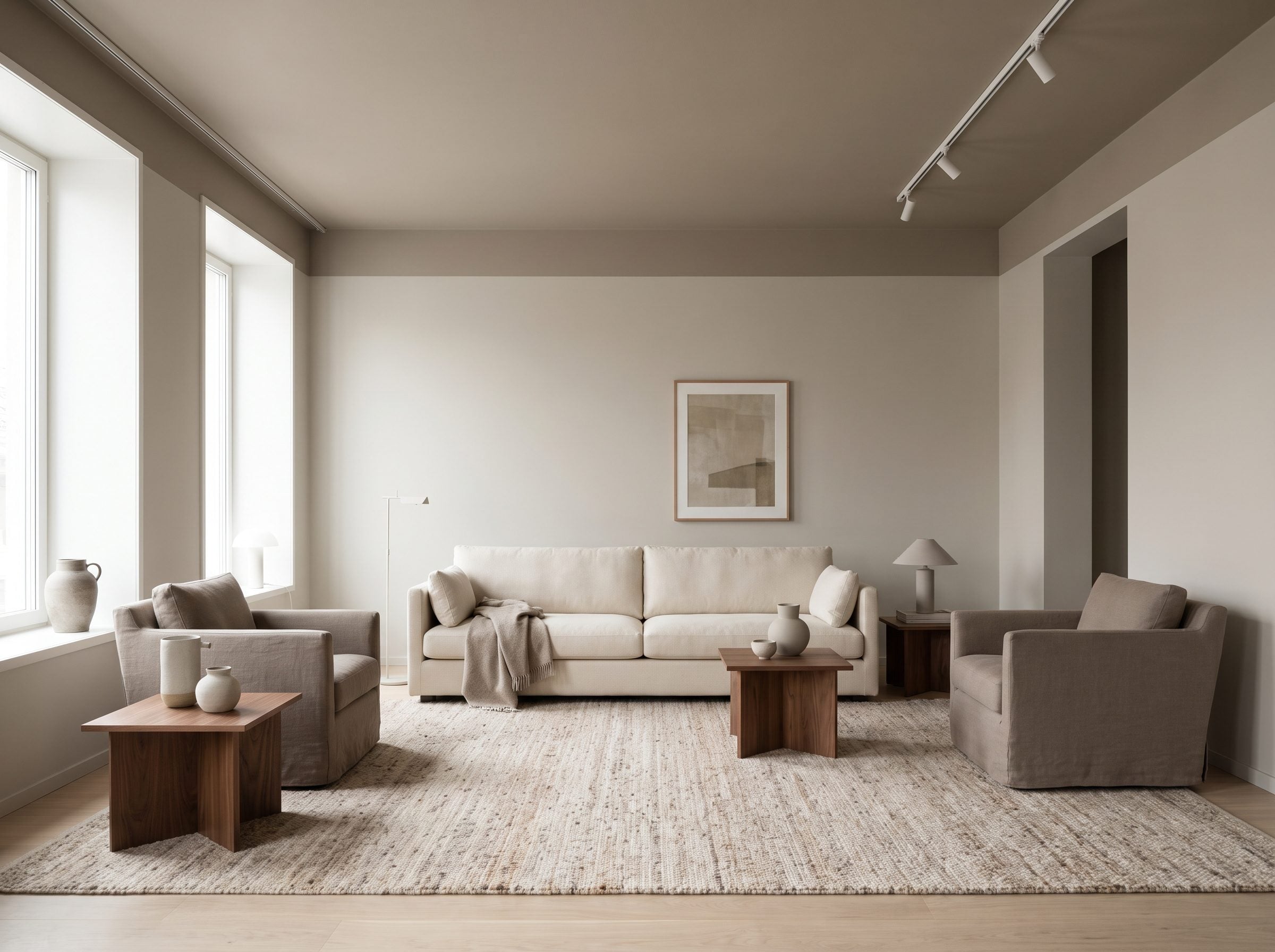
Not every ceiling needs black lacquer or brick vaulting. Sometimes the move is simply to stop pretending white is the only neutral available.
A warm taupe overhead, separated from greige walls by warm-white crown molding, creates a small but legible shift in value. Benjamin Moore lists Revere Pewter at an LRV of 55.05, a useful reminder that a midtone can still return considerable light without disappearing against white trim.
That tonal layering is what matters. A cream linen sofa, walnut side table, sculptural stone coffee table, and bronze accents give the room four different kinds of warm neutral instead of one enormous beige blur.
The same principle appears in many successful white sofa rooms: variation does more than contrast alone.
A ceiling doesn’t have to shout to stop being an afterthought.
25. Botanical Wallpaper on a Powder Room Ceiling Makes the Smallest Surface the Main Event
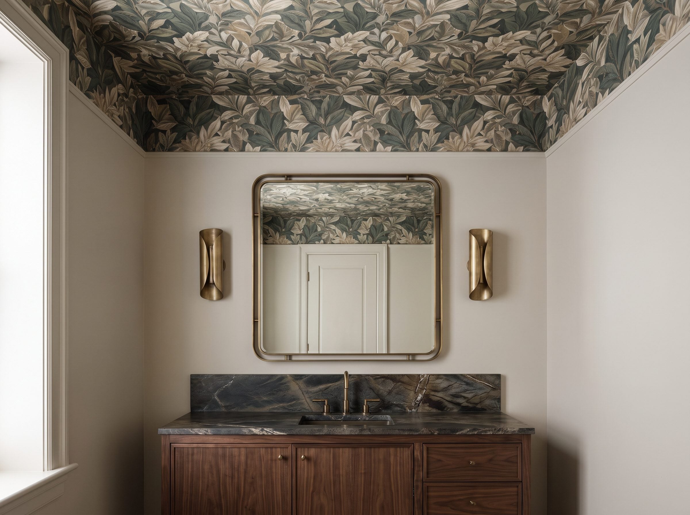
A powder room gives you one enormous advantage: not much acreage.
That makes the ceiling an unusually good place to use a pattern that would be exhausting across an entire living room. Muted greens, olive, taupe, and warm cream can turn a small overhead plane into something closer to a canopy.
Keep the walls restrained. Add a dark walnut vanity, stone with visible movement, and a pair of aged-brass sconces. Let the pattern carry the decorative load.
Exact wallpaper quantities depend on roll dimensions, pattern repeat, room size, and waste, so this isn’t automatically a two-roll project. The important thing is that a small powder-room ceiling asks you to commit to far less material than a major room.
A bold ceiling here can deliver more personality per square foot than many far more expensive changes.
24. Chocolate Brown Above Cream Walls Pulls a Tall Living Room Back Toward the Furniture
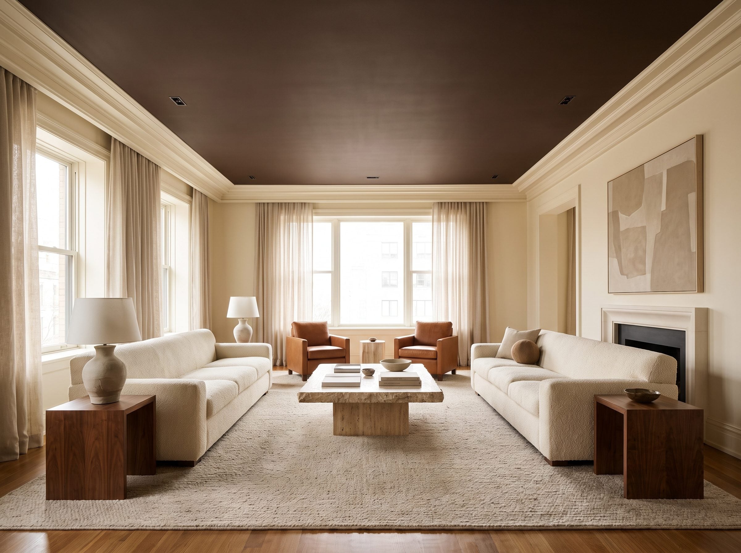
Brown overhead changes the room before you notice anything else has happened.
The darker value makes the ceiling feel visually closer than a bright white plane, while cream walls preserve plenty of brightness at eye level. The result is less about making the room physically smaller than making the seating group feel more contained.
Keep the walls light and chocolate becomes a ceiling, not a cave.
Matte works particularly well in this room because it lets the color remain deep without turning every recessed fixture into a reflected dot. That doesn’t make gloss wrong—it simply creates a completely different effect, as the black dining room already proved.
A cognac leather chair and travertine coffee table carry the warmth lower into the room.
23. Powder Blue Above a White Kitchen Keeps the Cabinets Crisp Without Adding More White
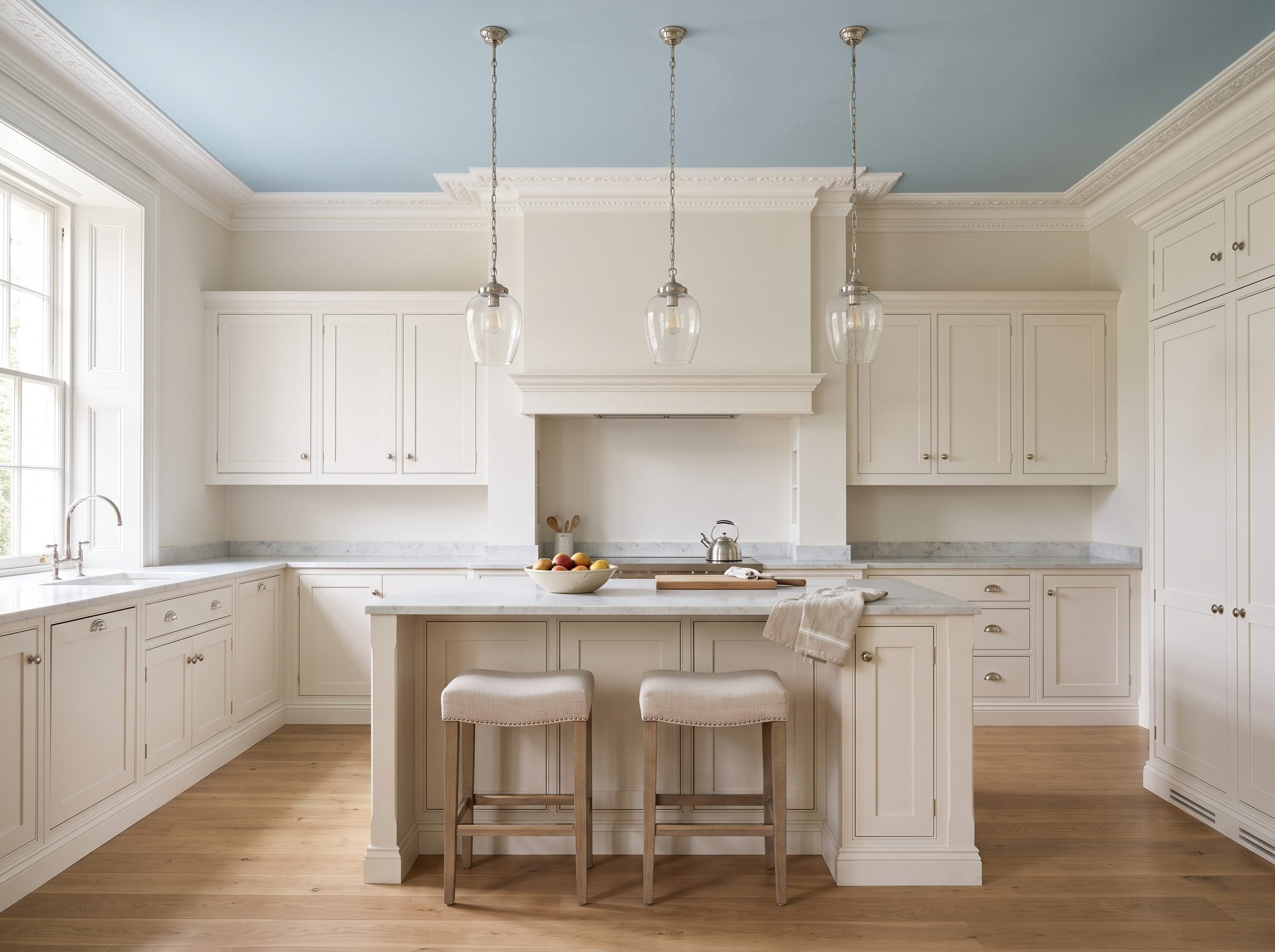
In a classic white kitchen, powder blue has a quieter job: keep all that white crisp without asking the ceiling to disappear.
A classic white kitchen keeps its bright cabinetry but gives the ceiling a different role. Powder blue is cool enough to separate cleanly from warm-white cabinets, yet pale enough that it doesn’t suddenly become the room’s loudest object.
White crown molding provides the border. Oak underfoot introduces warmth. Polished nickel continues the cooler side of the palette through nickel pendant lights, while a marble counter stool keeps the material story light.
The result still belongs comfortably within a traditional white kitchen. The ceiling simply prevents white from becoming the only idea in the room.
22. Walnut Overhead Gives This Contemporary Living Room a Roof You Can Actually Feel
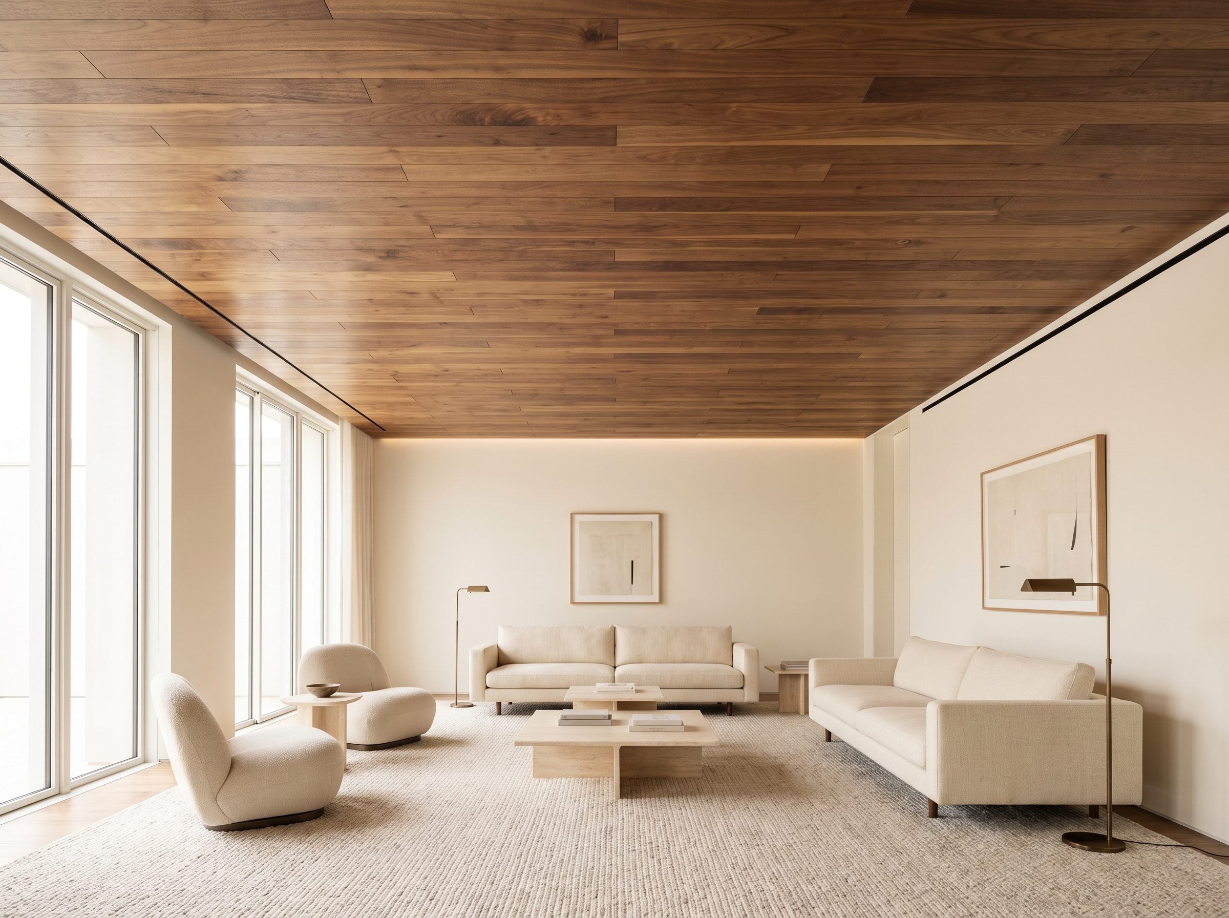
Walnut takes the wood-overhead idea in a darker, richer direction, and the difference is immediate.
The grain makes the ceiling visually active while the red-brown tone throws warmth against off-white walls, pale stone, and a cream sofa. Instead of trying to make the upper plane recede, this room allows it to feel substantial.
That doesn’t automatically make the room oppressive. Light walls and furniture preserve contrast, while the wood provides the strongest surface.
Dark wood overhead works best when the room below gives it light to push against.
If sound control matters, decorative slats alone aren’t enough; proper slatted acoustic systems rely on spacing, backing, and absorptive material behind the visible wood.
Visually, though, walnut needs no technical excuse. Grain, warmth, and repetition already give the ceiling more presence than another coat of paint could.
21. Mustard Ochre Over Walnut Makes an Ancient Pigment Feel Completely Current
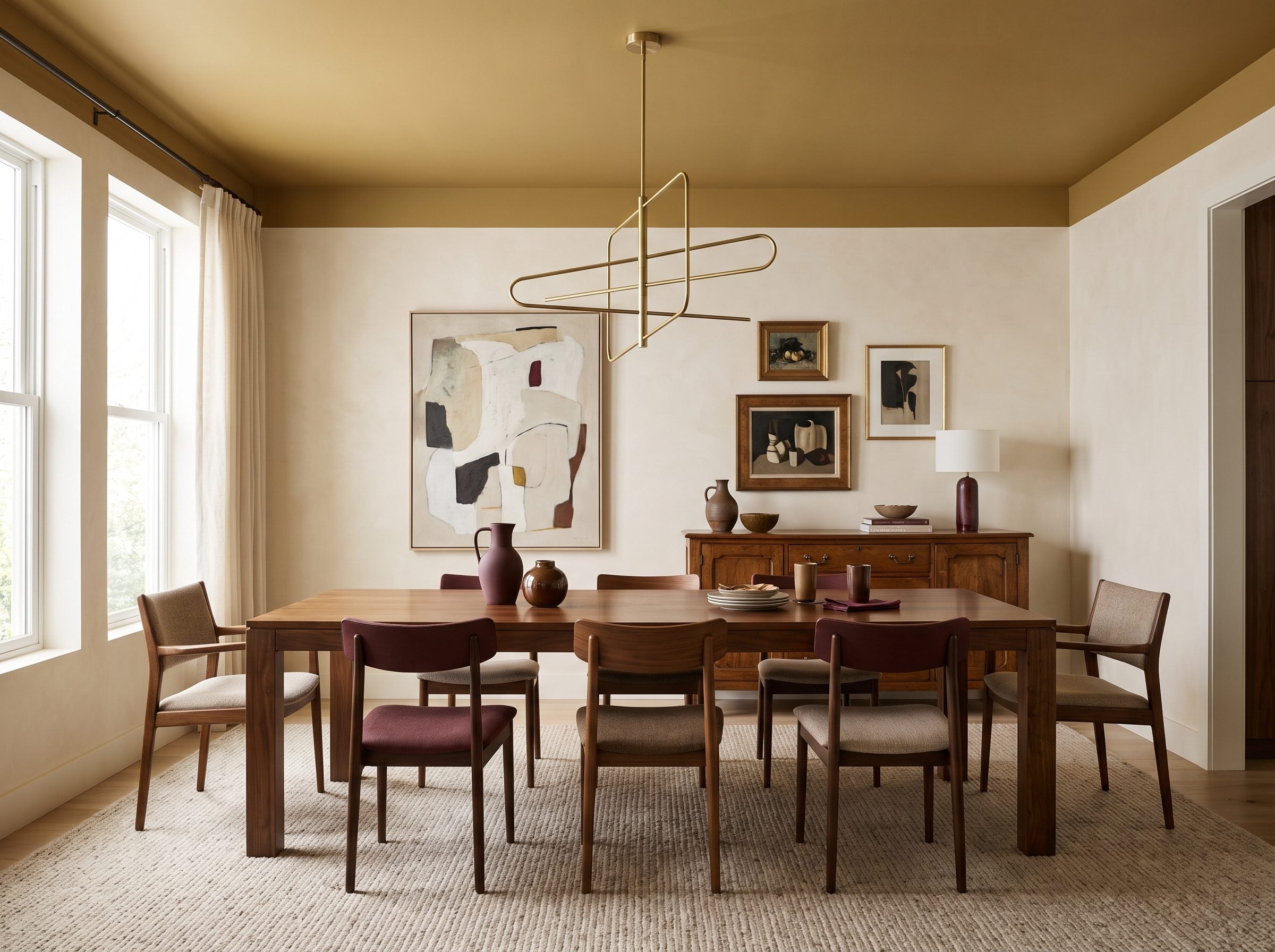
Ochre belongs to one of humanity’s oldest families of pigments. Archaeological sites including Blombos Cave preserve very early evidence of ochre processing, which is enough history without trying to crown one precise shade the first color humans ever used.
In this dining room, what matters is how naturally the pigment-like yellow sits beside brown.
A vintage walnut table pulls the ceiling toward amber. Cream plaster keeps it from becoming muddy. A brass pendant introduces another yellow-based material without exactly matching it.
At midday the ceiling reads mustard. In lower, warmer light it can move toward amber and ochre. That shift gives a fairly simple room more life than a neutral ceiling would.
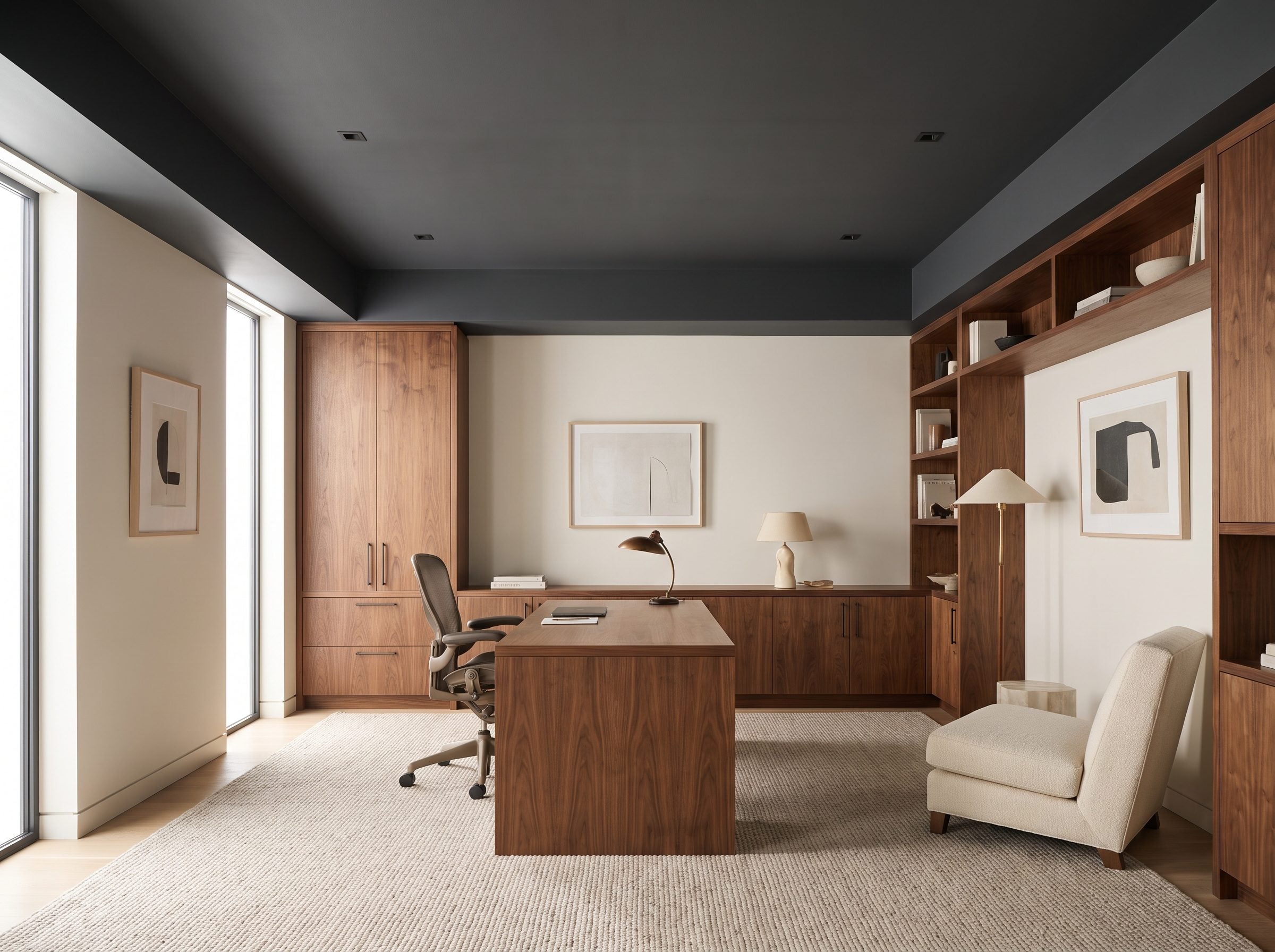
20. Charcoal in a Home Office Changes the Ceiling Line, Not Your Attention Span
🔥 Would you like to save this?
A dark ceiling can change how tall a room appears. That part has research behind it.
A 2010 study by Daniel Oberfeld, Heiko Hecht, and Matthias Gamer examined how ceiling lightness affected perceived room height and found that lighter ceilings tended to read as higher than darker ones. What the research supports is perceptual height, not better concentration. The design case for charcoal has to stand on its own—and here it does.
The charcoal ceiling visually lowers the upper boundary while walnut built-ins, off-white walls, a cream chair, and warm task lighting keep the room from becoming cold. The tension between dark gray and warm wood is enough.
19. Sky Blue Over a Sunroom Lets the Ceiling Borrow From the View
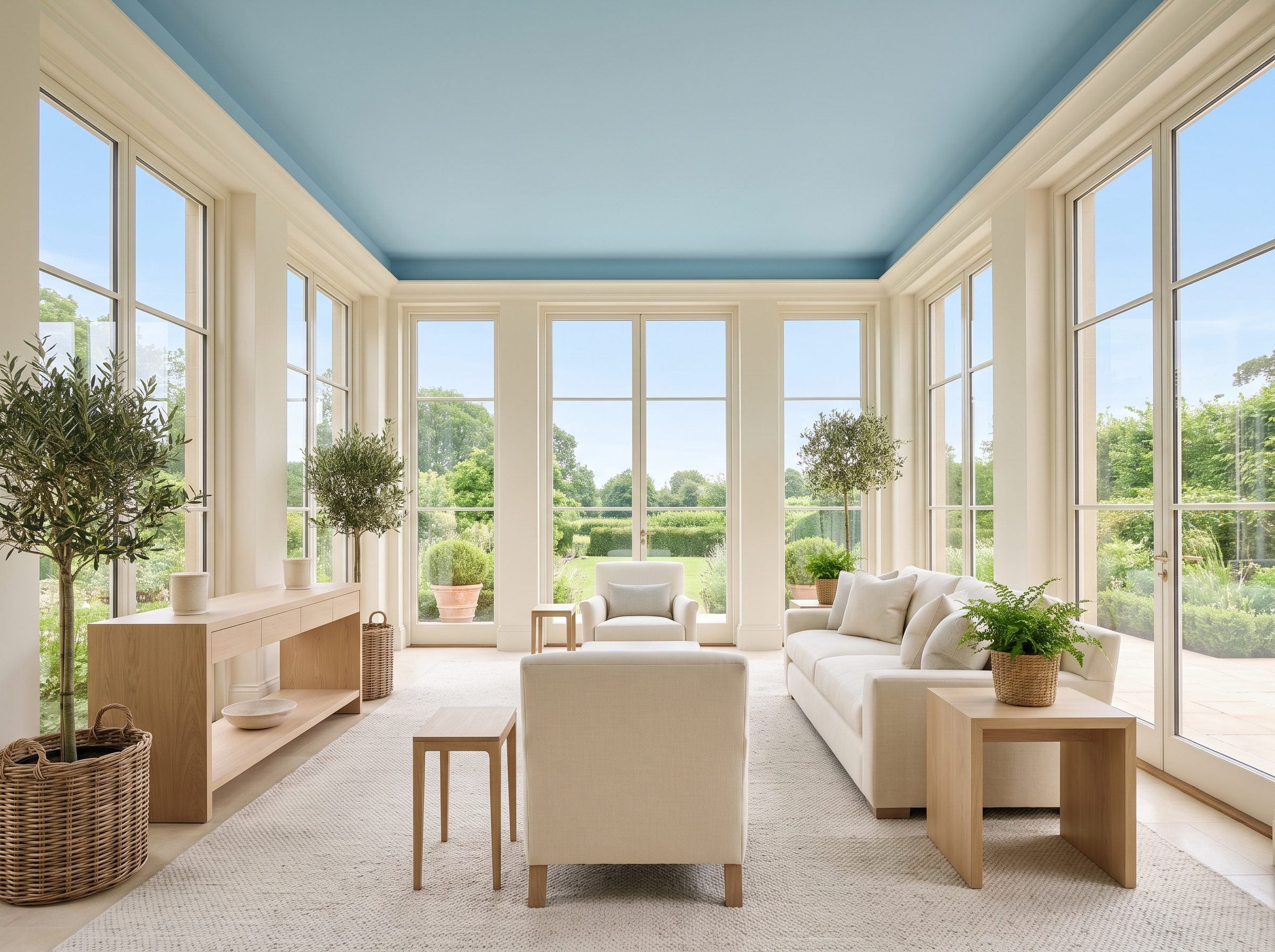
A sunroom already has more sky in it than most spaces. Painting the ceiling a soft blue simply continues that conversation.
Warm-white walls keep the room from drifting cool, while pale oak and a low-pile jute rug give the daylight something earthy to hit on the way down. A cream linen sofa stays quiet enough that the ceiling can register without competing with upholstery.
Here the color works for a simpler reason: it belongs to the daylight already pouring through the windows. The blue feels less like an added accent than an extension of what the room is already doing.
18. A Bronze Ceiling Turns Chandelier Light Into Part of the Finish
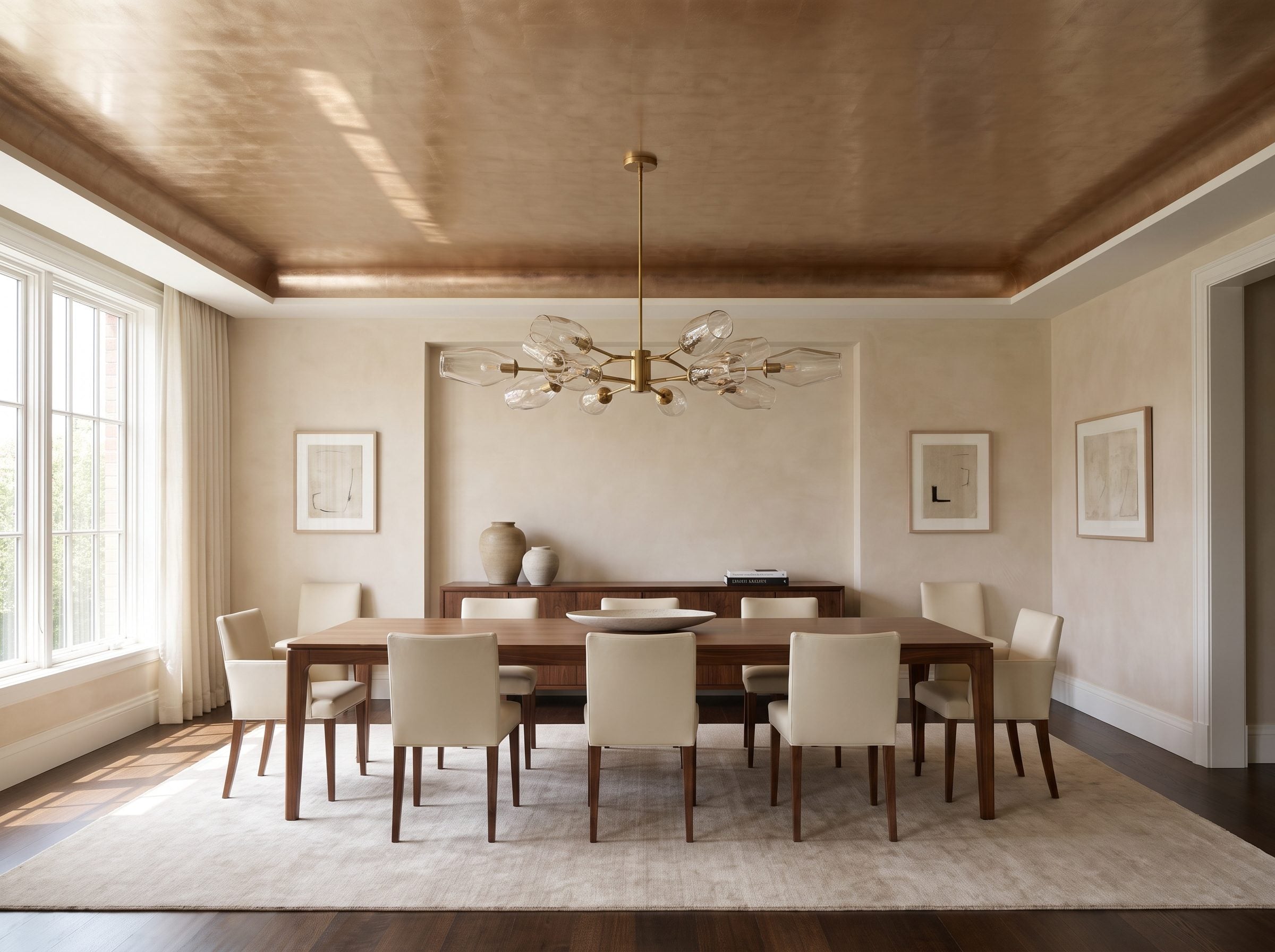
Metal overhead behaves differently from pigment because the room changes every time the light does.
A bronze-toned finish can glow directly around a chandelier, fall toward brown at the edges, then catch movement as people cross underneath. That uneven reflection is the appeal.
The safest route isn’t necessarily a perfectly mirrored metal plane. A broken metallic glaze, softly burnished treatment, or intentionally varied leaf can create the sense of metal without turning the room into a reflection chamber.
Walnut below gives bronze a natural ally. Cream chairs give it contrast. Brass lighting can sit nearby because the ceiling is brown enough to prevent the entire room from becoming one continuous yellow metal.
17. What Happens When the Walls, Trim, Shelves, and Ceiling All Go Green?
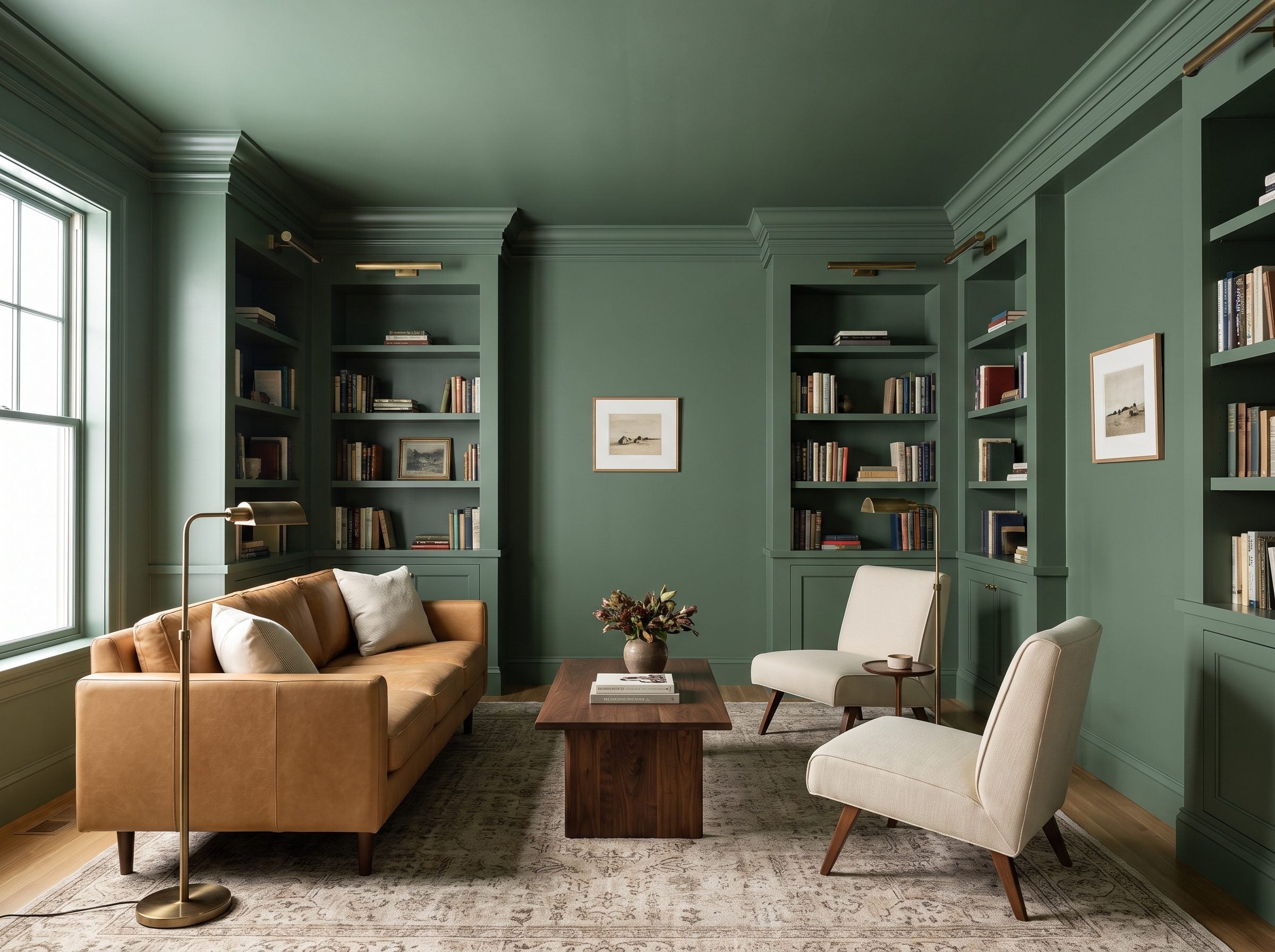
The ceiling doesn’t contrast with the room here. It disappears into it.
That is the logic behind color drenching: carry one hue across walls, trim, built-ins, and ceiling so the architectural seams become less visually insistent. Instead of a green box capped with white, the room reads as one continuous envelope.
Sheen keeps the architecture from vanishing completely. Matte across the larger surfaces and a slightly more reflective finish on millwork can make crown, shelving, and baseboards catch light without introducing a second color.
Then the furniture provides the break. A camel leather sofa, walnut table, and antique-brass reading lamps keep the green from becoming visually airless.
16. Deep Plum Over Mushroom Walls: How Much Height Does the Darkness Really Cost?
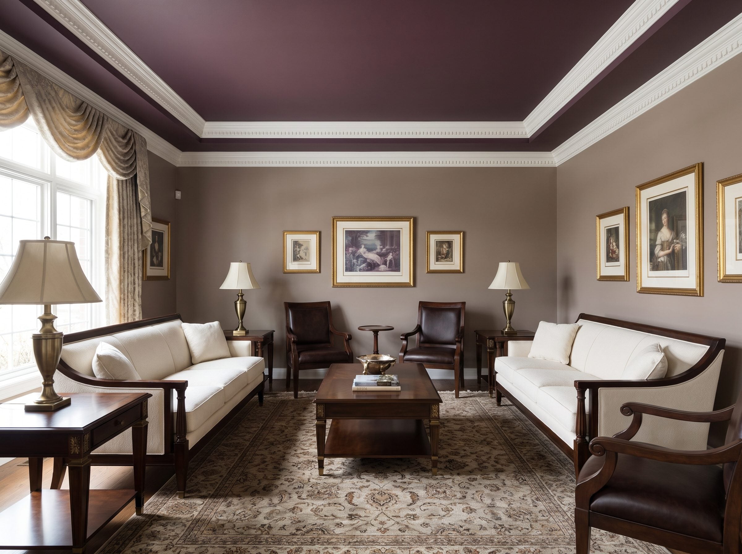
Dark ceilings do tend to look lower than light ones. What matters is that the perceptual effect is usually much less dramatic than the warnings suggest.
The Oberfeld, Hecht, and Gamer room-height research found a measurable relationship between ceiling lightness and perceived height, but it didn’t turn ordinary rooms into basements.
That leaves room for a color like plum.
Here the shade leans brown rather than electric purple, which helps it connect to walnut furniture and an aged-brass floor lamp. Mushroom walls and ivory seating keep the room bright where people actually sit.
A darker ceiling can change proportion without changing the architecture by a single inch.
Paint the crown in the wall color rather than carrying plum through it and you create a lighter transition between wall and ceiling. Small move. Significant difference.
15. Geometric Wallpaper Turns a Bedroom Ceiling Into Pattern Without Touching the Walls
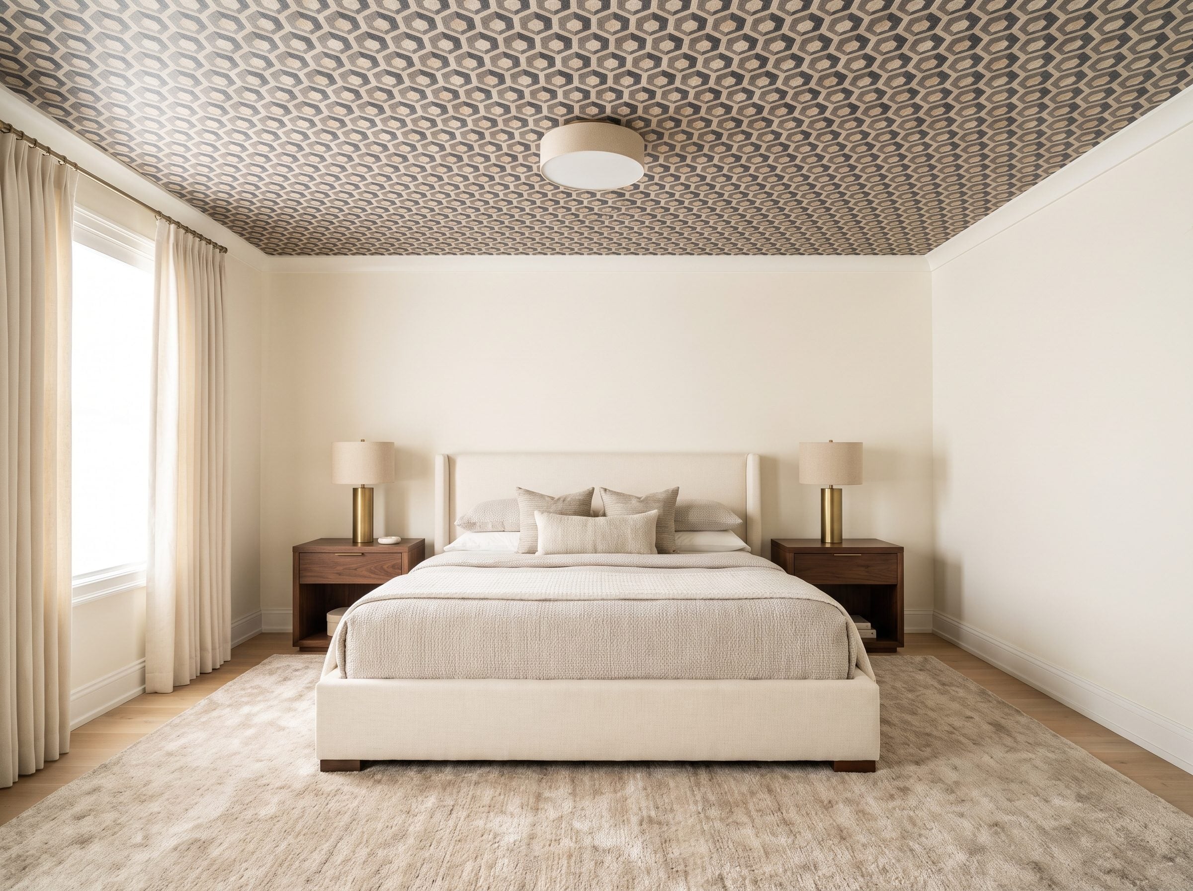
Patterned ceilings didn’t arrive with social media.
Embossed and printed wallcoverings were used extensively in late-19th-century interiors, including ceilings, where they could introduce relief and ornament without carved plaster. Anaglypta, introduced in the 1880s, became one well-known example of embossed decorative paper.
This bedroom translates the idea without trying to reproduce a Victorian room.
A small charcoal, taupe, and bronze repeat occupies the ceiling while ivory walls and a cream bed go almost silent below. Plain brass lamps, walnut nightstands, and an oatmeal wool rug provide enough warmth without adding more pattern.
The key is scale. A tight repeat can read almost like texture from across the room. A huge six-color motif would create an entirely different ceiling.
14. Soft Sage Makes a Bright Kitchen Feel Finished From the Island Up
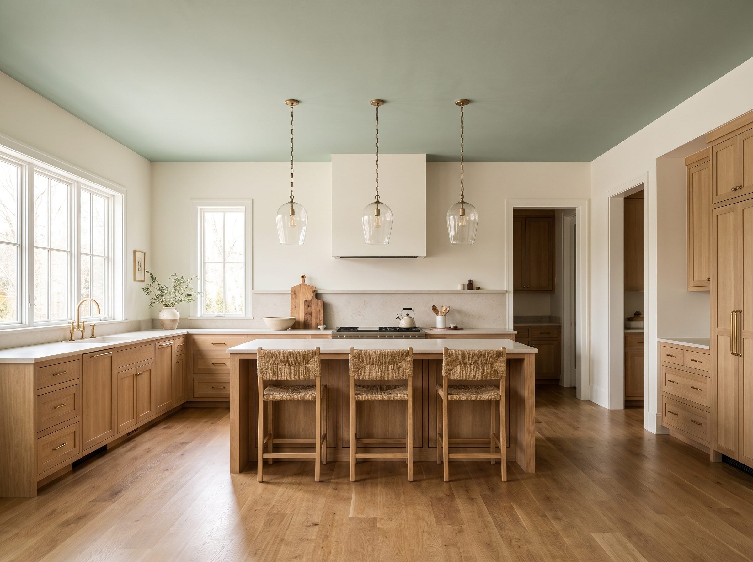
Sage is what you choose when you want the ceiling noticed but don’t want the room reorganized around it.
Above white oak and honed stone, the green introduces color without fighting either material. It also gives all the warm neutrals something cooler to lean against.
The mistake would be going so faint that the ceiling simply reads as slightly dirty white. Let the sage be visible in daylight. It can still be quiet.
Aged brass and woven texture then keep the palette from becoming botanical by default. The aged-brass hardware picks up warmth, while woven counter stools bring in texture lower down.
The ceiling doesn’t need to dominate the kitchen. It just needs to stop looking unrelated to it.
13. Aubergine Over Ivory Makes Purple Feel More Tailored Than Theatrical
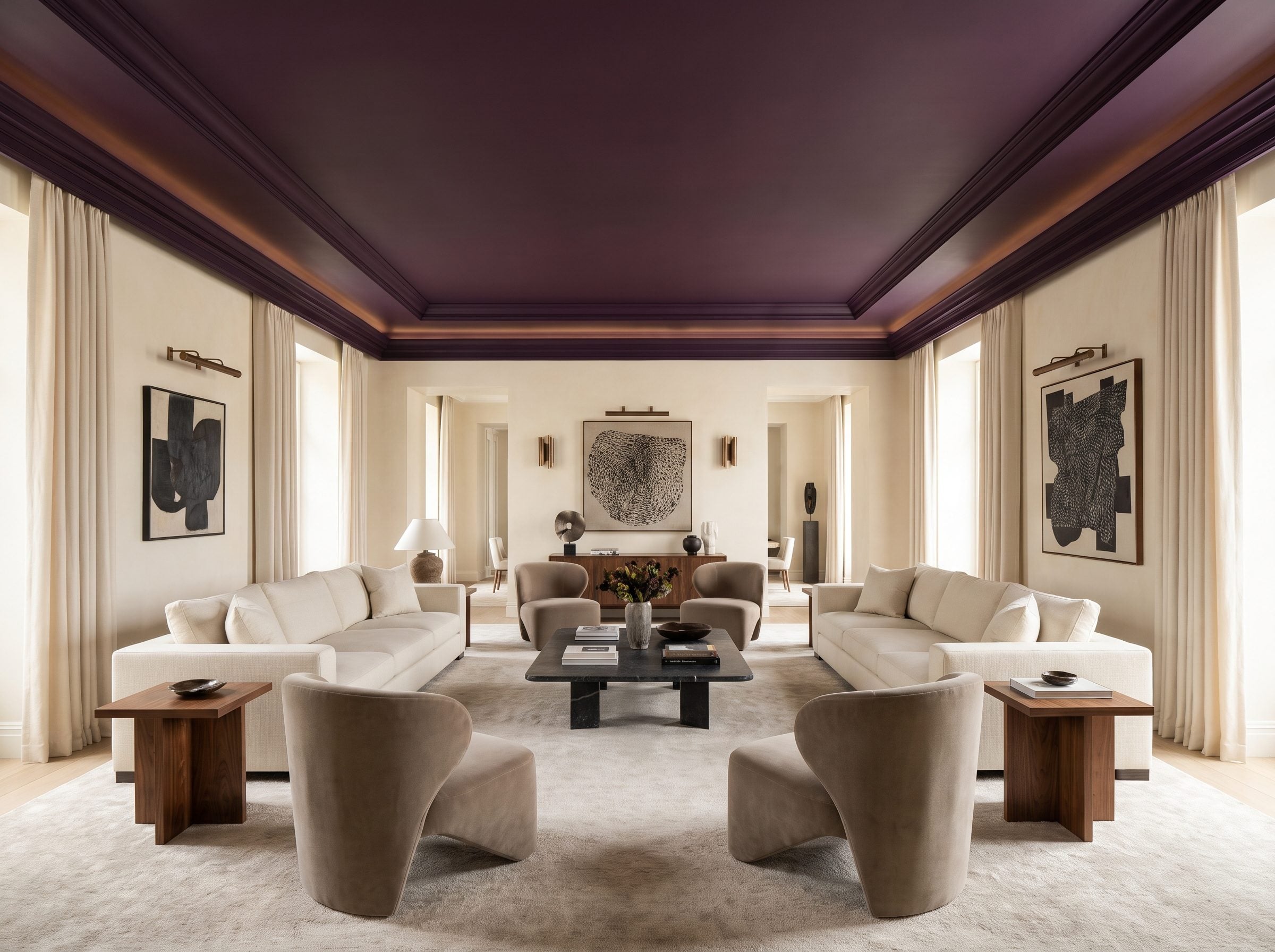
Purple arrives with cultural baggage, and some of that baggage is expensive.
Tyrian purple, produced historically from murex mollusks, became famously associated with rank, wealth, and imperial authority because the dye was extraordinarily labor-intensive and costly. That history belongs to textiles and dye—not to modern ceiling paint—but the association between deep purple and luxury has lasted remarkably well.
Aubergine is particularly useful because it carries enough brown and red to sit comfortably beside warm materials.
Ivory plaster and cream sofas keep the room from sinking. Warm bronze lighting pulls out the red in the purple rather than letting it turn nearly black.
Pair it with a large neutral white sofa arrangement and the ceiling stops feeling like a stunt.
12. Taupe Between Espresso Beams Makes the Ceiling Grid the Architecture
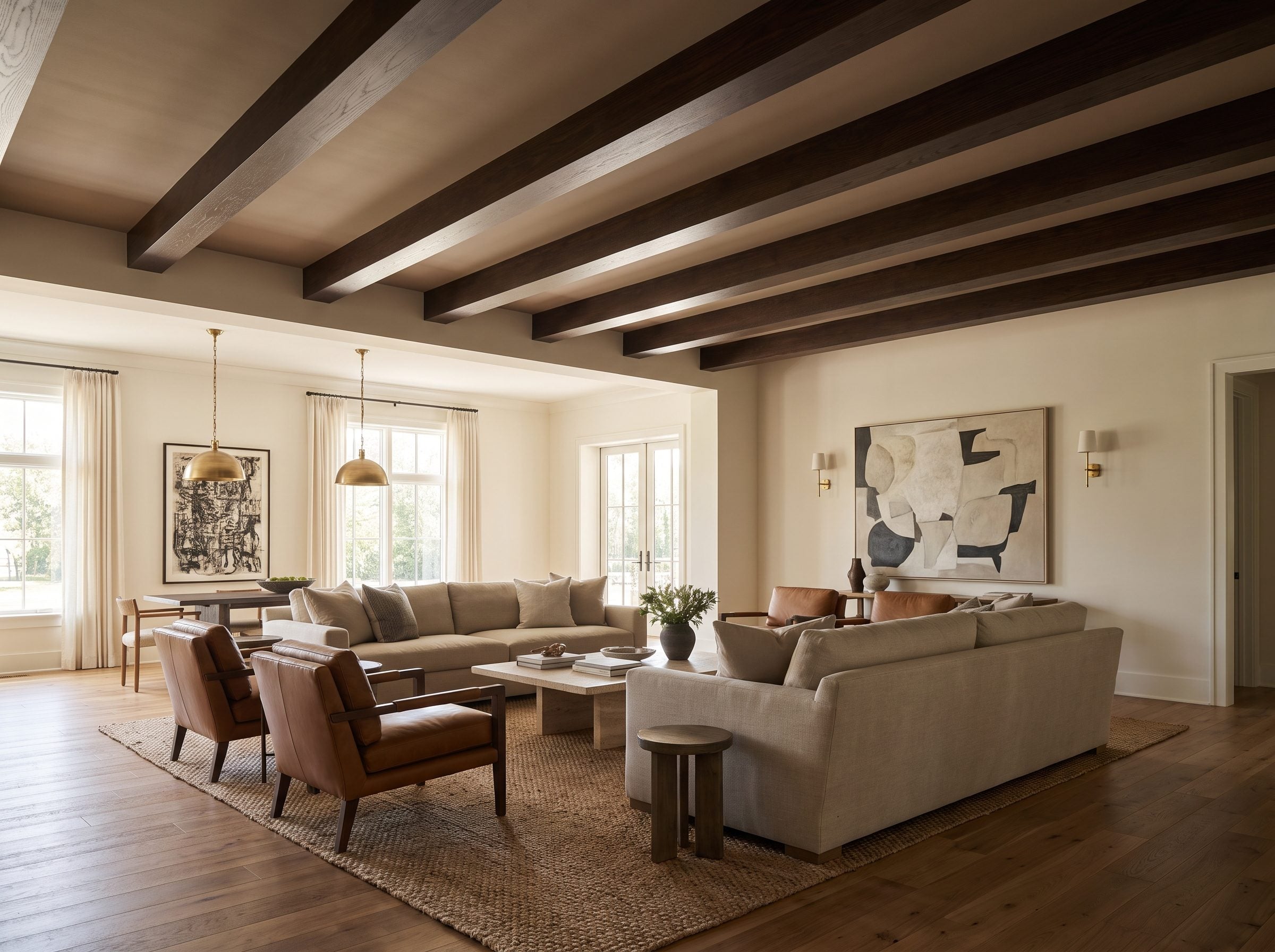
This ceiling doesn’t need a dramatic color because the beams already provide the drama.
Warm taupe fills the field while espresso-brown lines cross it at regular intervals, turning the upper plane into a measured grid. The contrast makes the beams legible from across the room without requiring black or navy overhead.
Exposed and decorative beams have appeared in architecture for centuries, sometimes because they were structural and sometimes because their visual rhythm was worth preserving or recreating.
The old lesson still works: once the ceiling has a grid, let the grid show.
Cream walls, oak floors, neutral upholstery, and cognac leather keep everything underneath warm. Even the familiar white sofa looks more grounded when it doesn’t have a blank white plane floating directly above it.
11. A Smoky Blue Bedroom Shows the Softer Side of Color Drenching
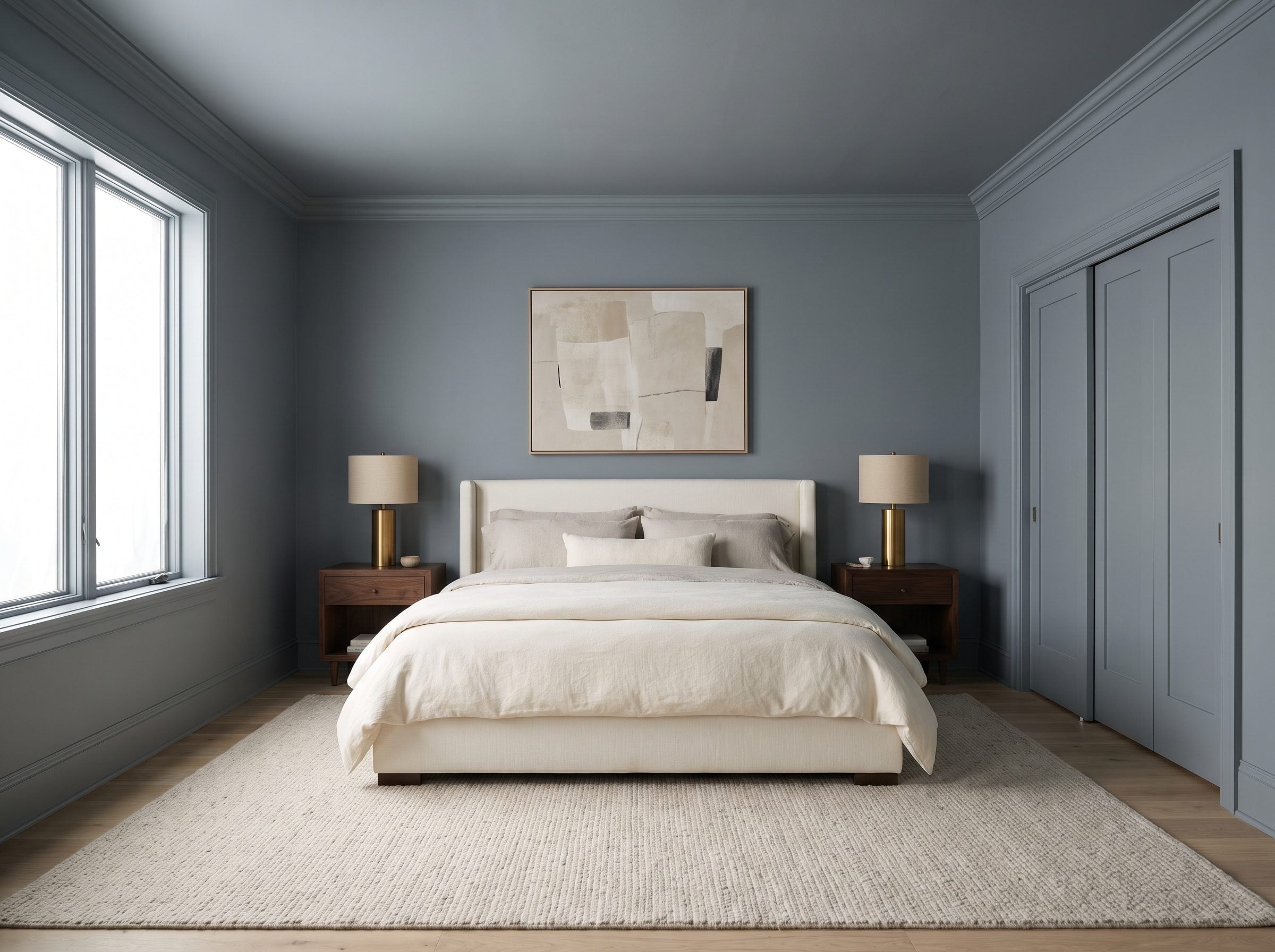
The green library used color drenching for drama. Smoky blue uses the same technique for quiet.
Walls, trim, door, crown molding, and ceiling all hold roughly the same gray-blue. Because the color doesn’t stop at the top of the wall, there is no bright band outlining the room’s exact perimeter.
The effect is entirely visual: fewer sharp transitions, more continuity.
Contrast moves to the furniture: an ivory upholstered bed, cream bedding, and walnut nightstands. They become much more prominent against a continuous blue shell than they would against four blue walls and one white ceiling.
Use different sheens if you want trim to remain legible. Same color does not have to mean same surface.
10. Emerald Over a Powder Room Is a Small-Space Gamble With Very Little Square Footage at Risk
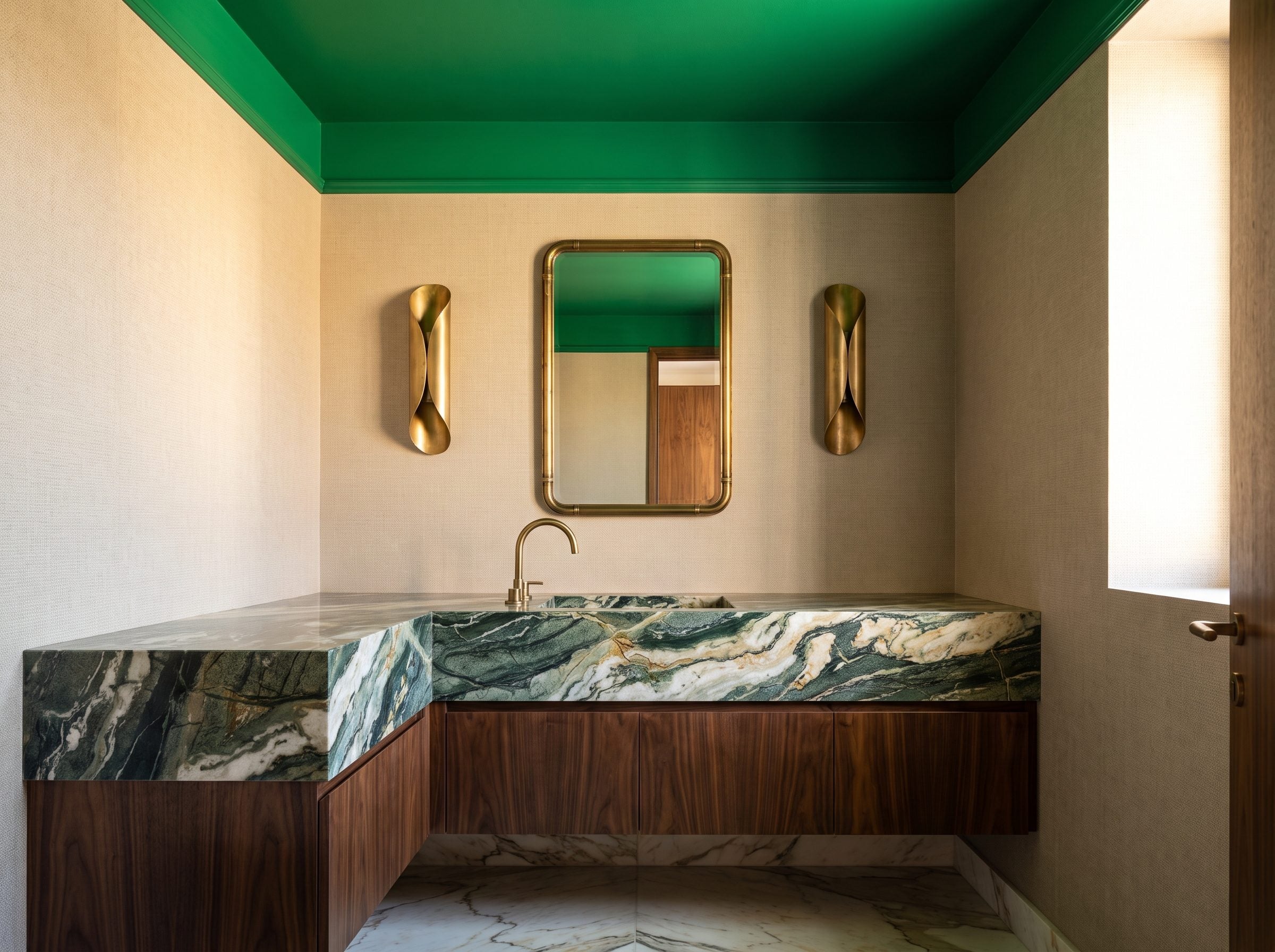
Powder rooms are unusually forgiving places to take a color further than you would elsewhere.
The ceiling is small. The visit is short. The room doesn’t need to coordinate with an entire day of living. That gives emerald enough room to be emerald.
Against greige walls and a marble vanity, the saturated green creates an obvious upper boundary. Add brass sconces and an aged brass faucet and the warm metal becomes brighter by comparison.
Semi-gloss can be effective here because the room is small and the reflected points of light become part of the jewel-box effect. Matte would create something moodier and quieter.
9. Olive Green Above Walnut Feels Older Than the Trend Cycle
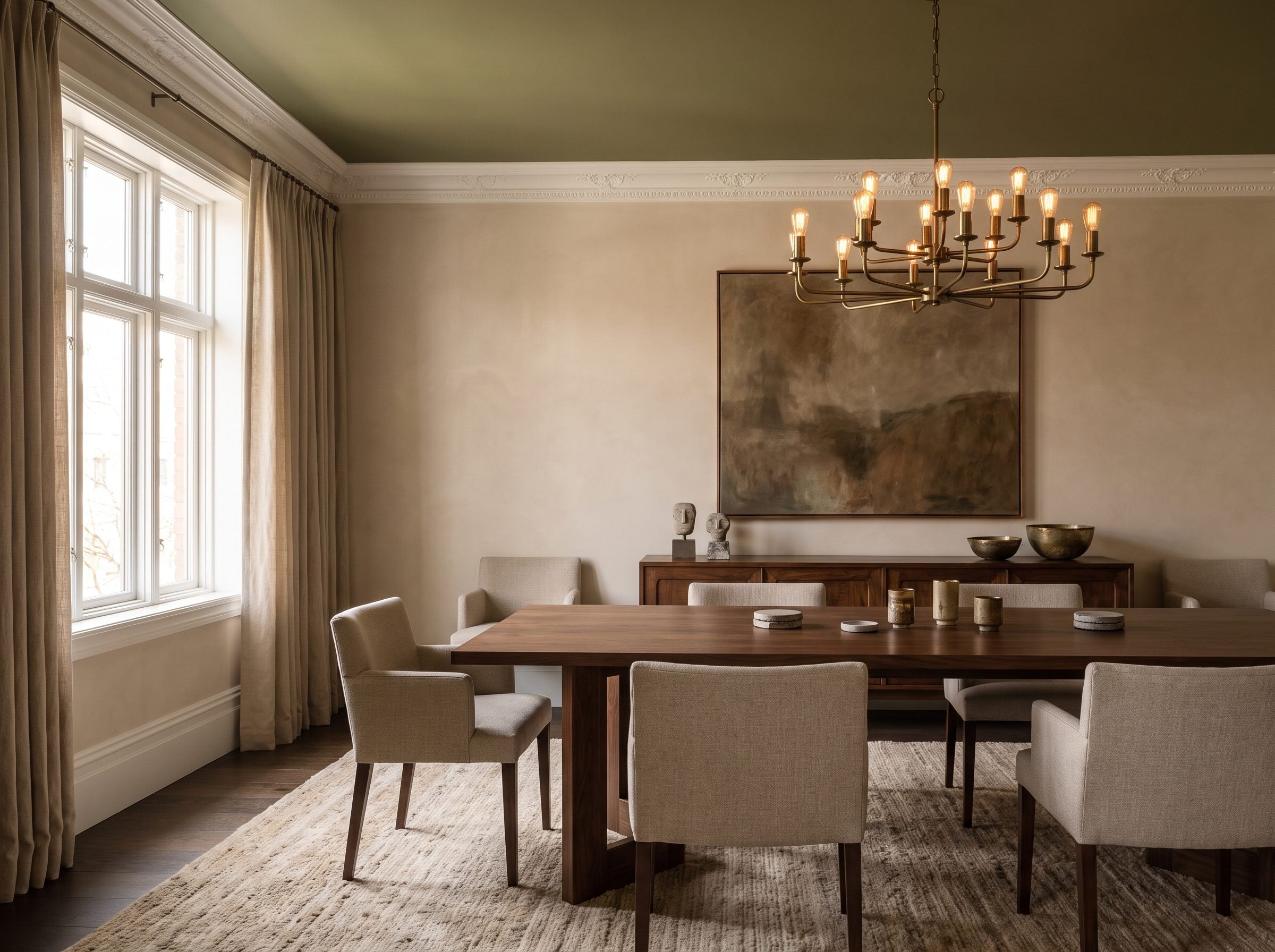
Olive lives in the useful territory between color and neutral.
It contains enough yellow and brown to work comfortably beside wood, which is why a walnut dining table doesn’t feel as though it is sitting under a completely separate palette.
Historic interiors provide plenty of precedents for muted greens, but this room doesn’t need to borrow authority from every Georgian townhouse and Arts and Crafts house that ever used one.
The evidence is right in front of us: olive overhead makes the walnut richer and the cream walls cleaner.
An aged-brass chandelier continues the warmth, while a vintage walnut sideboard repeats the darkest brown lower in the room.
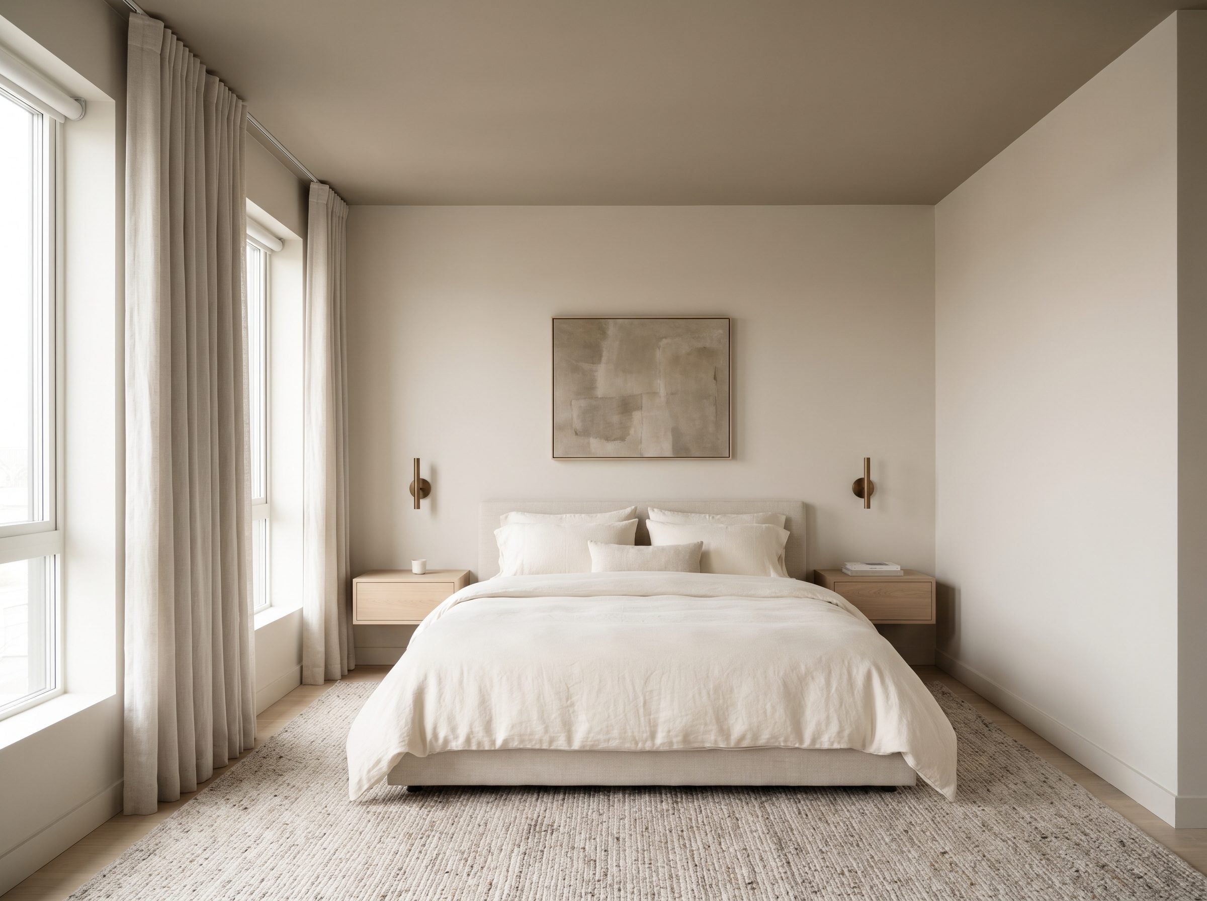
8. Warm Greige Over a Minimalist Bedroom Barely Changes the Color—and Changes the Room Anyway
🔥 Would you like to save this?
This is the quiet counterpoint to every ceiling in the gallery that demands courage.
Warm greige sits only a step deeper than the beige walls, so the effect is continuity rather than contrast. The ceiling remains visible, but it no longer becomes the brightest isolated plane in the room.
Pale oak, ivory bedding, bronze sconces, and a soft wool rug reinforce the low-contrast palette.
An old Houzz discussion about white ceilings captures how entrenched the default can feel, but this room makes the argument without any origin story: a ceiling can participate in a neutral palette without becoming a statement ceiling.
Sometimes the fifth wall only needs to move one shade before the whole room feels more considered.
7. Burgundy Above Ivory Gives a Formal Dining Room Its Evening Clothes
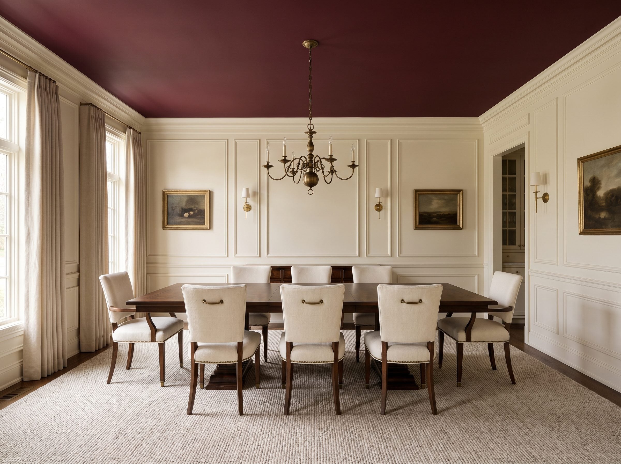
Burgundy gets dramatically easier the moment the walls go ivory.
That pale wall color gives the deep wine ceiling enough contrast to feel intentional rather than heavy. Walnut pulls the red-brown downward, and an antique brass chandelier puts warm light directly beneath the darkest surface.
Victorian interiors offer plenty of precedent for treating ceilings decoratively, and discussions such as this Houzz thread show how persistent the white-ceiling convention remains. Neither fact dictates what this room should do.
The room itself provides the answer. Deep burgundy overhead, cream upholstered chairs below, walnut through the middle.
That is enough tension for dinner.
6. Muted Gray-Lavender Is What Happens When Purple Stops Trying So Hard
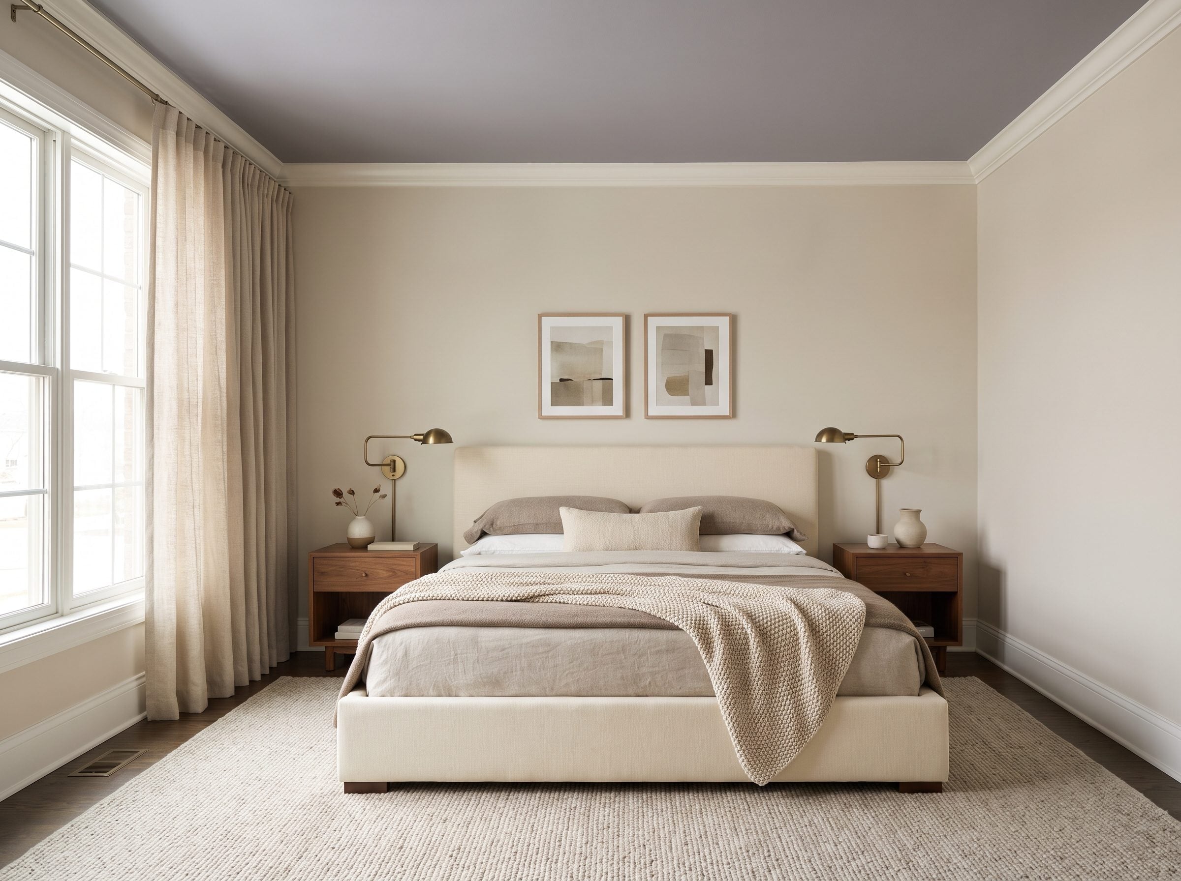
Lavender’s problem isn’t the color. It’s everything the color has been asked to represent.
Take out the candy sweetness, push in enough gray, and suddenly lavender starts resembling the sky after sunset more than a child’s bedroom.
Warm-white crown molding makes the ceiling’s edge precise. Taupe walls keep it grounded. An ivory upholstered bed, walnut nightstands, and aged-brass bedside lamps give the palette enough adult weight that nobody needs to explain the purple.
It simply creates a cool, muted ceiling over a warm neutral bedroom, and the contrast is unusually good.
5. Deep Teal Above a Bedroom Works Best When the Light Grazes It
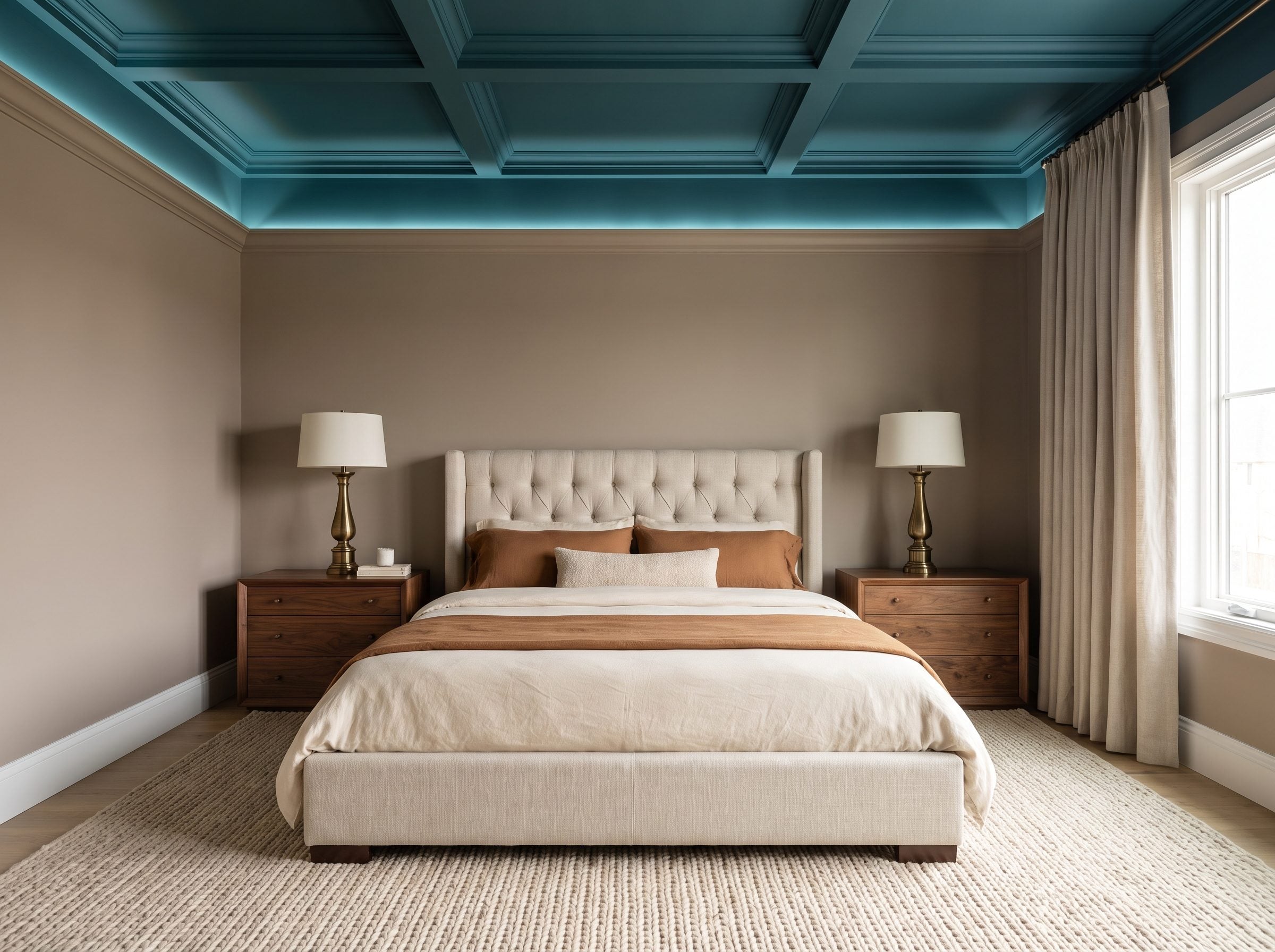
Teal overhead combines two things that are easy to get wrong: a dark value and a color that can collapse toward black when the lighting is flat.
The solution isn’t to abandon teal. It’s to give the surface light from the side.
Cove lighting or well-placed directional fixtures can skim across the ceiling and reveal the blue-green instead of reducing it to a dark hole. Taupe walls, a tall upholstered headboard, walnut nightstands, and an antique-brass table lamp keep warmth near eye level.
Muted tobacco and cream bedding gives the teal room to dominate.
The ceiling does feel visually closer than a white one. That can make a bedroom feel more contained. Sometimes enclosure is simply a design effect.
4. Forest Green Over a Library Lets the Books and Wood Keep Their Authority
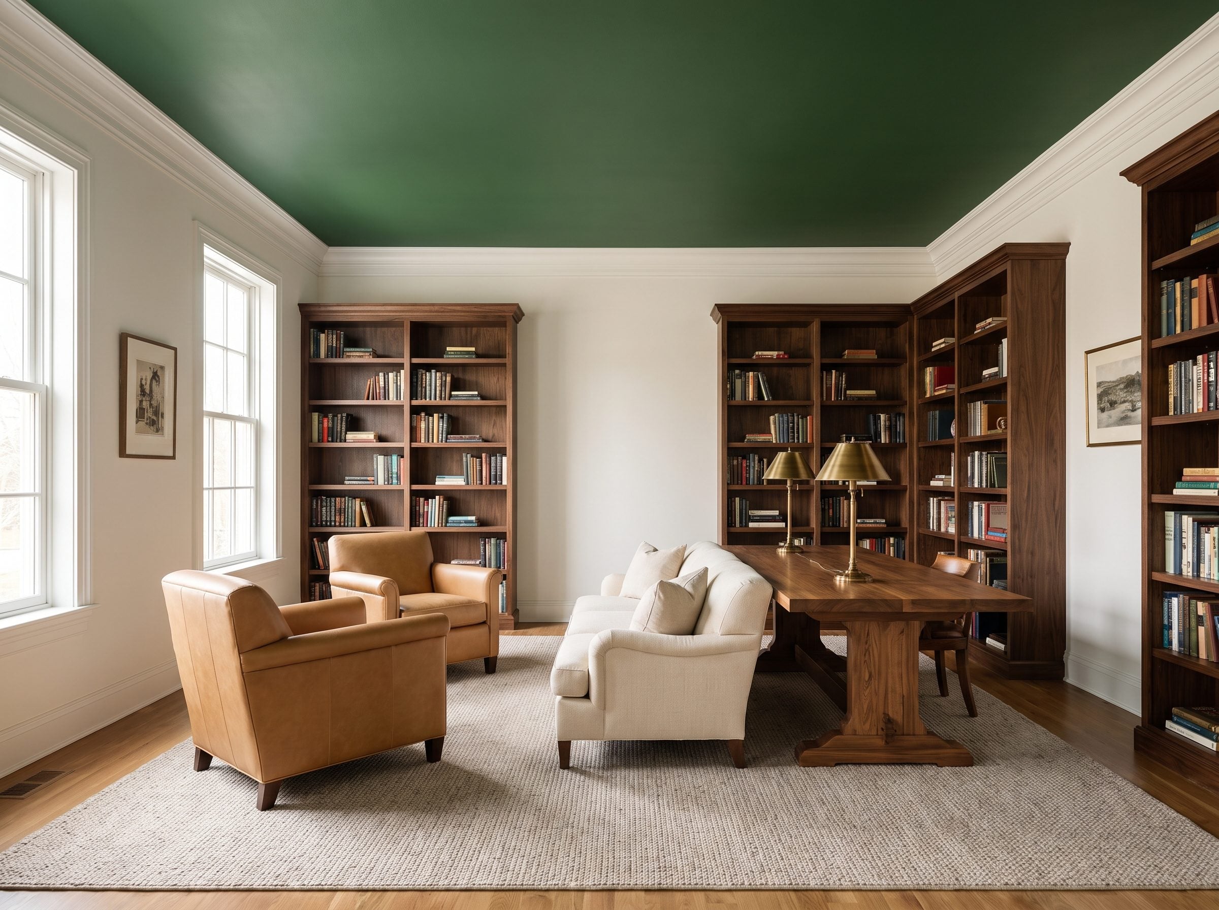
Libraries already contain more color than we give them credit for.
Book spines, wood grain, leather, brass, paper, and art create a dense band around the walls. A forest-green ceiling extends that richness overhead without forcing the shelving itself to match.
Set it against walnut bookcases, a camel leather reading chair, and antique-brass library lamps and the room picks up the atmosphere of older club and library interiors without pretending every historic reading room used the same palette.
A library ceiling doesn’t have to compete with the books. It can simply join their side of the room.
The white crown molding is useful precisely because it prevents green from swallowing the walls. One narrow line of light does a lot of negotiating.
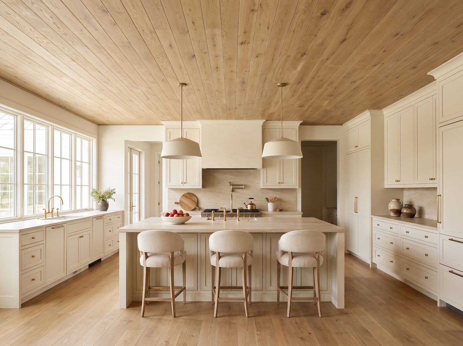
3. White Oak Planks Turn a Plain White Kitchen Into Something Built, Not Merely Painted
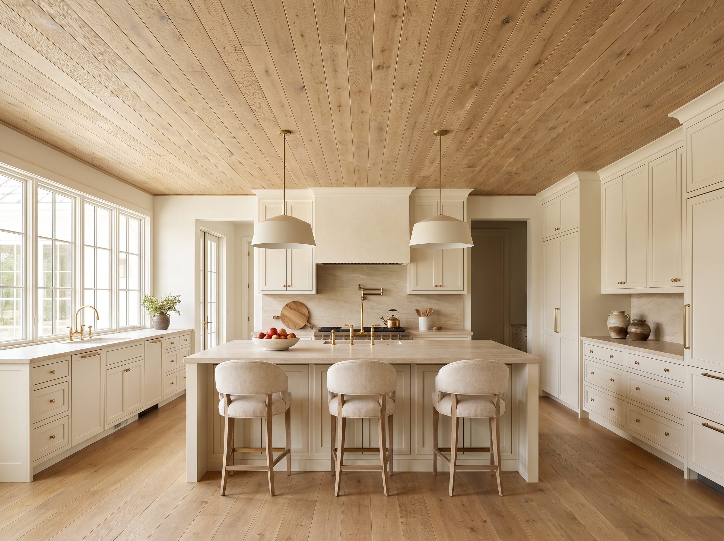
After the saturated greens and deep bedroom colors, pale oak feels almost weightless.
Running wood across the entire ceiling gives a white kitchen something its cabinets and quartz cannot provide on their own: grain, direction, and warmth on the largest plane in the room. Instead of white above white, the eye gets a clear upper boundary with actual material character.
The strongest version covers the whole plane rather than dropping one decorative rectangle over the island. Then a brass pendant reads like jewelry against wood, while an oak counter stool repeats the material lower down without turning the room into a lumberyard.
It is the same reason a good white kitchen usually needs texture somewhere. Here, all of that texture went up.
2. Burnt Orange Gives a Mid-Century Living Room Heat Without Turning It Into a Theme Set
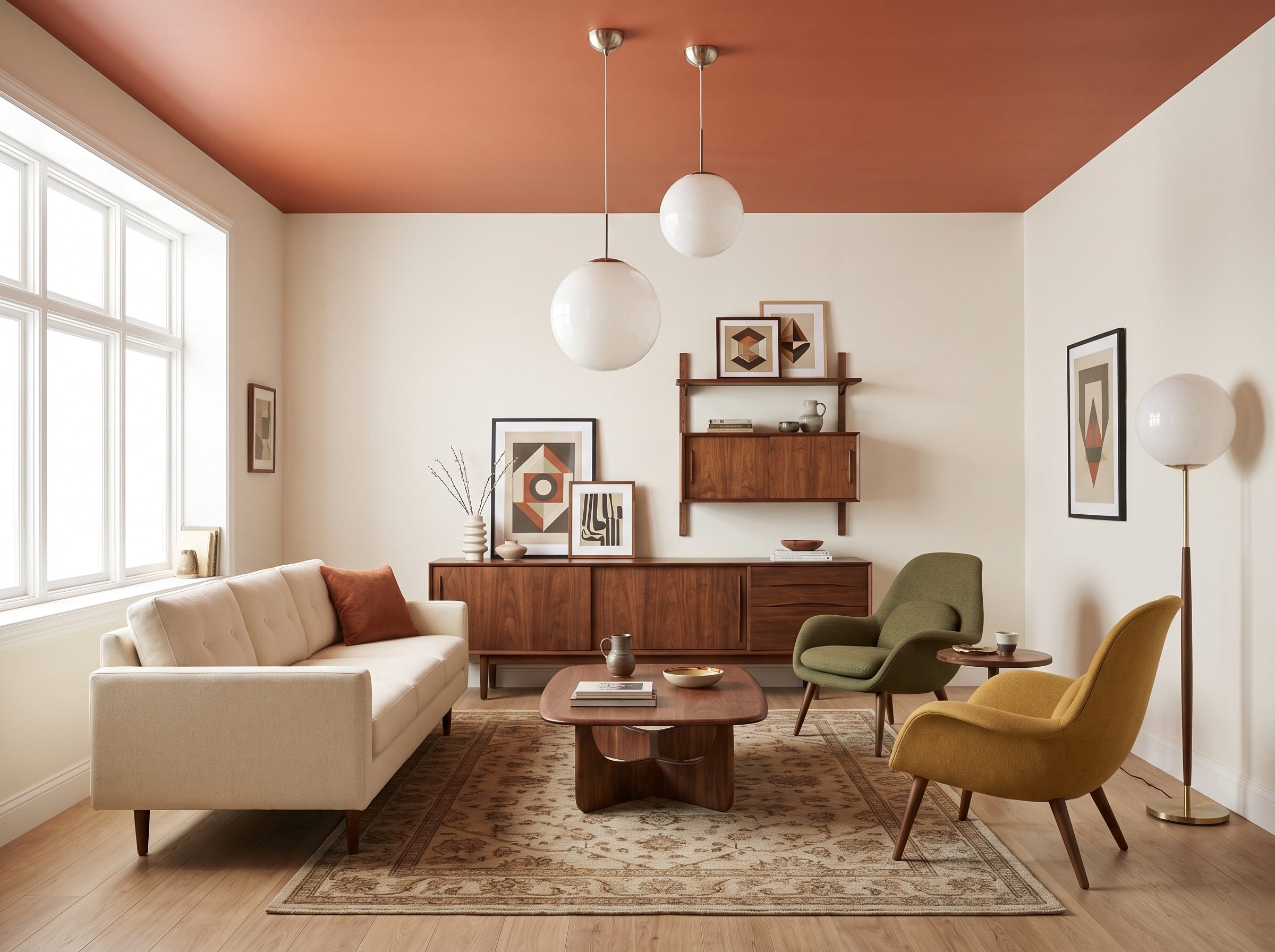
Burnt orange has enough mid-century association already. The room doesn’t need a sunburst clock, atomic wallpaper, or a single piece of furniture shaped like a boomerang.
Put the color overhead instead.
Off-white walls keep the perimeter bright. A cream sofa calms the middle. Walnut casegoods and chairs pick up the earthy side of the orange rather than its novelty.
The ceiling then becomes the period reference without turning everything beneath it into costume.
Muted orange overhead, walnut underneath, one globe fixture between them. Nothing else needs to explain the decade.
1. Deep Navy Over Camel and Walnut Is Where the Gallery Finally Lands
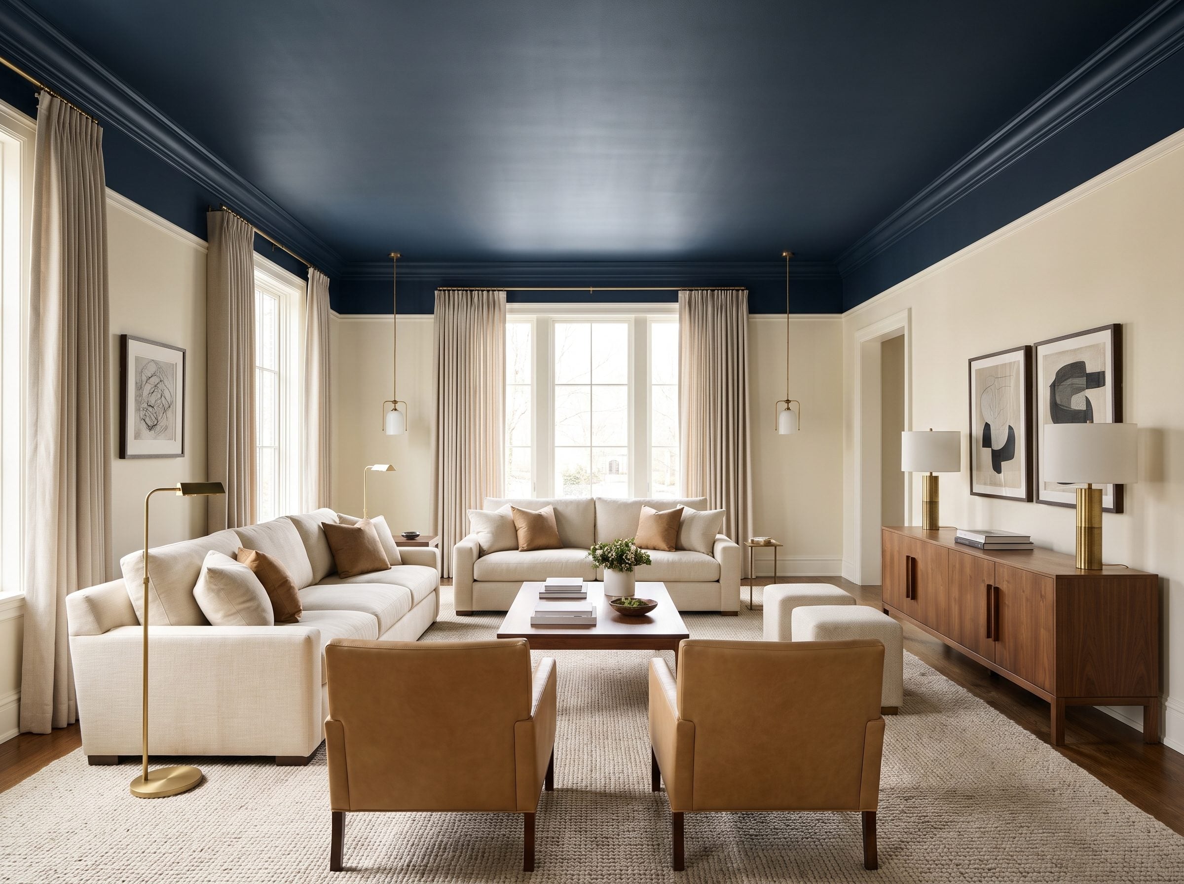
After brick, oak, wallpaper, metallic finishes, ochre, blush, green drenching, and enough blue to fill a weather map, navy almost feels restrained.
That is why it works as the last room.
The matte ceiling is undeniably dark, but ivory walls keep the vertical surfaces bright. Camel leather accent chairs and walnut below give the blue enough warmth to push against, while white crown molding draws a clean border around the whole move.
White is practical, familiar, reflective, inexpensive in many applications, and easy to coordinate. Those are real advantages.
Navy simply proves they are not obligations.
The ceiling was never required to disappear. We just got very used to seeing it do so.
Thirty-two rooms later, the interesting part isn’t that colored ceilings can work. It’s how radically different the same room can feel when the largest blank surface in it finally gets a decision of its own.