🔥 Would you like to save this?
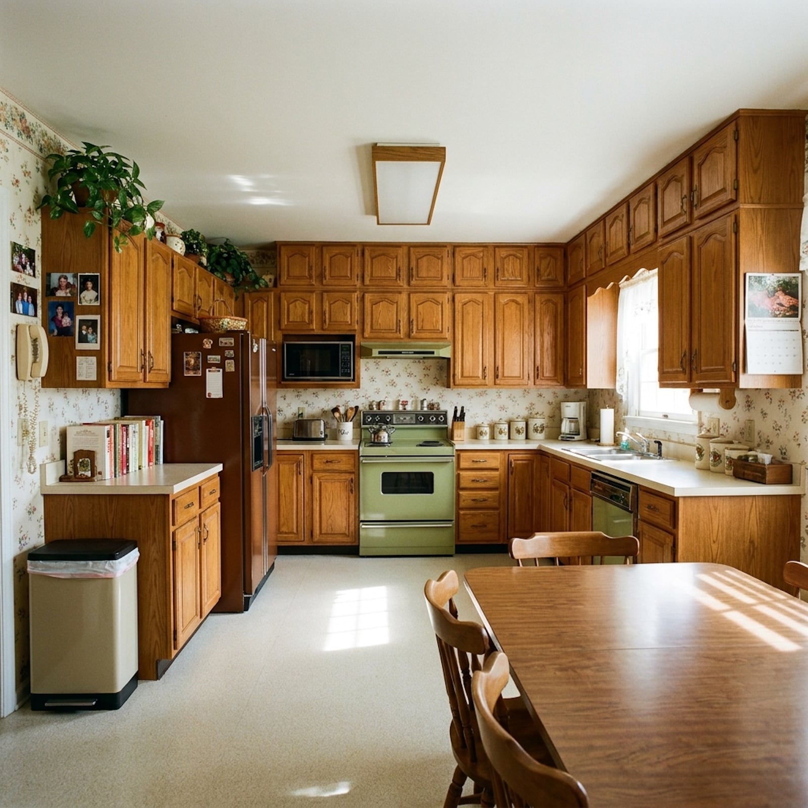
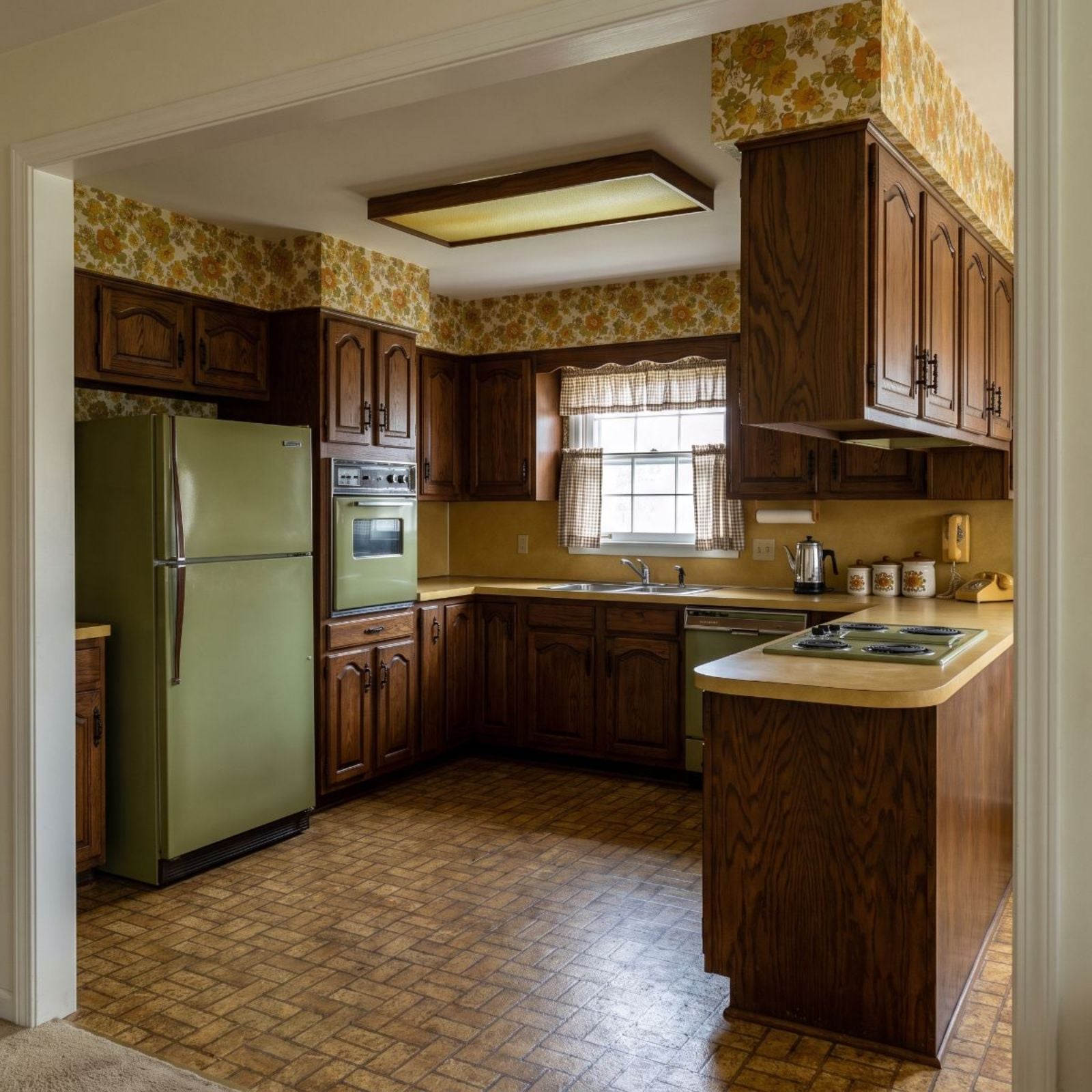
The avocado refrigerator is only the beginning. Add harvest-gold wallpaper, dark raised-panel cabinets, brown flooring, a fluorescent ceiling fixture, and enough woodgrain to make every surface compete with the next, and the original kitchen becomes a remarkably complete document of 1970s taste. Nothing about it needs an invented homeowner or renovation story to make the before image fascinating. The room already tells on its decade beautifully.
In order to come up with the very specific design ideas, we create most designs with the assistance of state-of-the-art AI interior design software. Also, assume links that take you off the site are affiliate links such as links to Amazon. this means we may earn a commission if you buy something.
For these 26 AI before-and-after design studies, that same dated kitchen becomes the starting point for radically different ideas rather than one supposed real-life renovation. One version keeps the green but makes it deeper and sharper. Another preserves walnut. Others wander through New Mexico, Provence, Santorini, medieval Europe, modern minimalism, coastal farmhouse, and several architectural fantasies that would require far more than a can of paint in the real world. The fun is seeing how many different futures can be drawn from the same stubborn avocado-and-harvest-gold past.
26. Forest Green and Walnut Give Avocado a Much Better Second Act
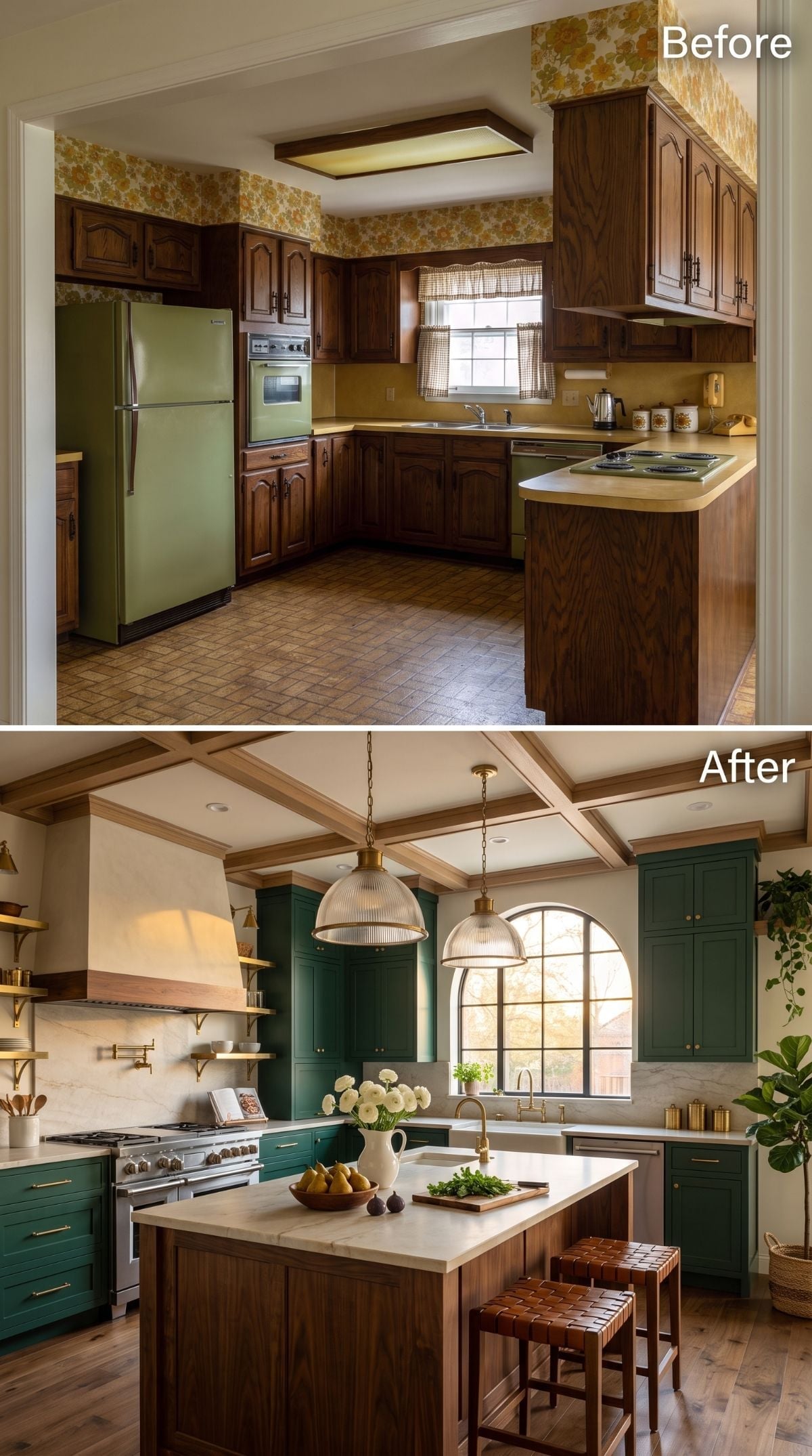
The original avocado refrigerator, floral harvest-gold border, and dark raised-panel cabinetry make the before image unmistakably 1970s. The AI after doesn’t run away from green so much as rehabilitate it: deep forest shaker cabinets return the color in a richer form, set against brass hardware, pale stone, and a substantial walnut island.
That walnut base matters because it keeps a thread of brown in the room without repeating the heavy cabinetry of the before. A marble slab backsplash, farmhouse sink, arched window, and wood-trimmed coffered ceiling push the concept well beyond a cosmetic update. The result feels less like erasing the decade than teaching two of its favorite colors some manners.
25. Blue-and-White Toile Takes the Kitchen Somewhere Nobody Expected
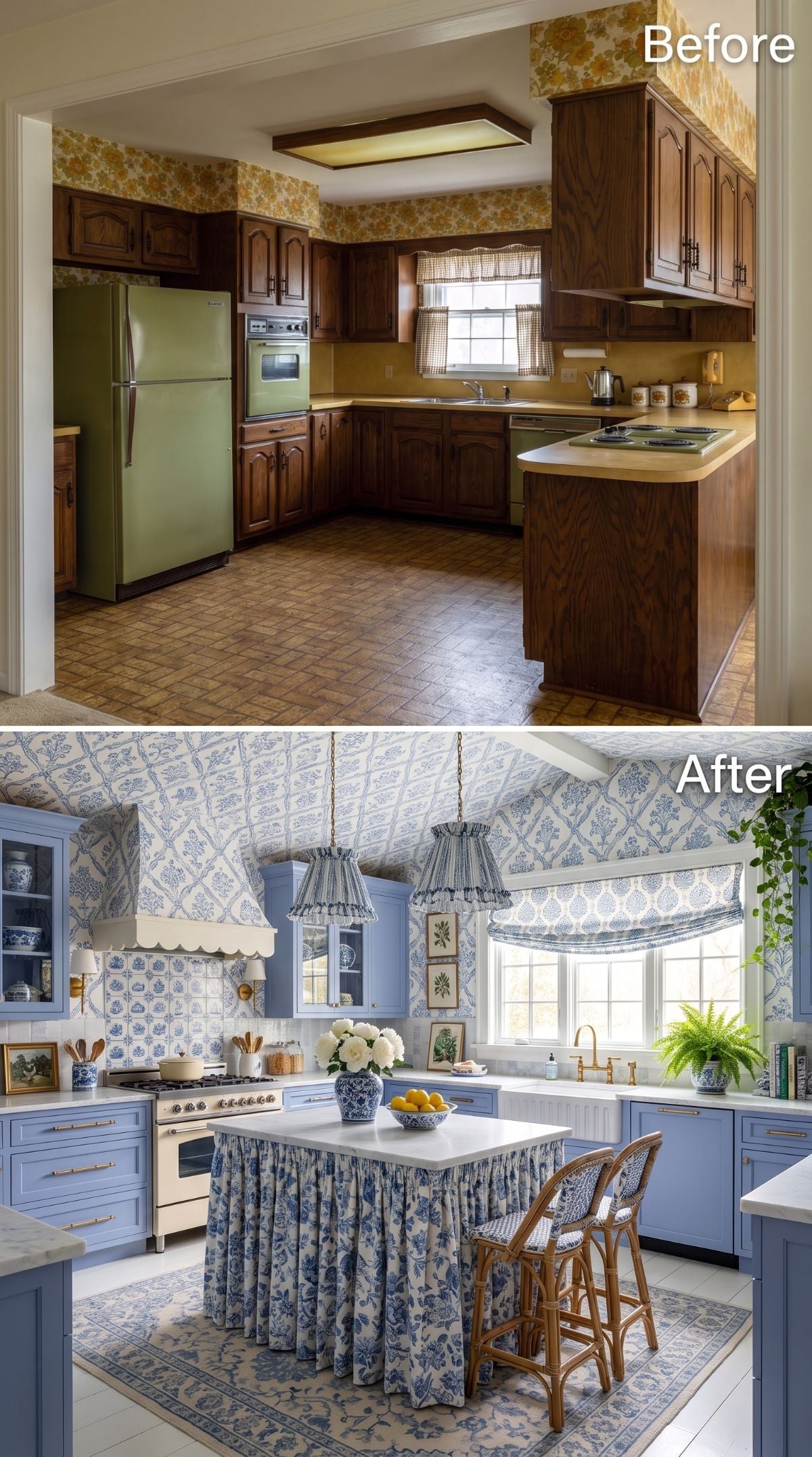
Periwinkle cabinetry and blue-and-white toile replace brown wood and harvest gold with almost comic decisiveness. The pattern doesn’t stop at one polite accent wall either; it climbs onto the ceiling, turning what could have been a conventional country kitchen into something much more committed.
The skirted island is the detail that makes the whole idea believable. Roman shades repeat the pattern, a brass bridge faucet adds warmth, and the pale blue cabinetry keeps all that toile from becoming visually frantic. There is absolutely nothing timid about it, which makes it a useful second stop after the comparatively restrained forest-green opener.
24. Adobe Tones and Viga-Inspired Beams Send the Kitchen Southwest
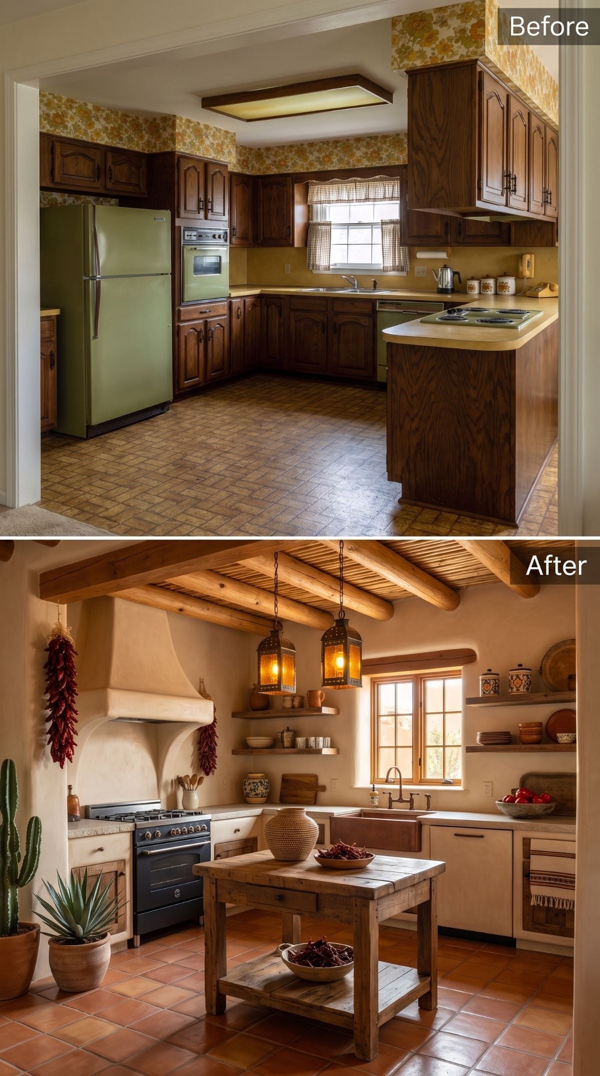
This concept trades the original brown-and-gold palette for a Southwestern vocabulary of sand-toned plaster, terracotta, open shelving, and a ceiling treatment inspired by traditional vigas and latillas. The shift is so complete that the old avocado appliances almost seem to belong to another climate.
A rougher butcher-block island keeps the center informal while amber-glass lanterns warm the plaster overhead. Dried chile ristras, terracotta flooring, and visible wood grain give the room a deliberately regional character without requiring the copy to pretend this AI image documents an actual New Mexico renovation.
Open-Shelf Reality Check: Open shelving removes the visual weight of cabinet doors, but it also removes their ability to hide everything. Limiting what stays visible by color, material, or daily usefulness is what keeps an open shelf from becoming exposed storage chaos.
23. Emerald Fluting and a Graphic Floor Turn Green Into the Main Event
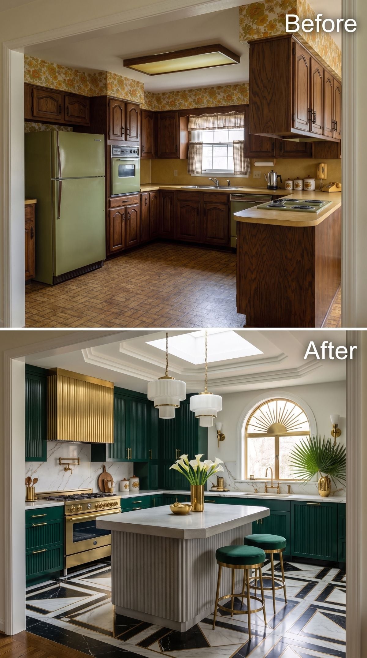
Here, green comes back with considerably more nerve. Deep hunter-green fluted cabinet fronts replace the ornate dark doors of the before, and brass hardware flashes against a pale marble backsplash without requiring another warm color to prop it up.
The black-and-white geometric floor keeps the cabinetry from monopolizing the room, while a skylight set into the coffered ceiling adds another strong graphic element overhead. This isn’t an attempt to make avocado fashionable again. It is a demonstration that the original color family was never necessarily the problem; the way it was distributed was.
Finish Note: Unlacquered brass changes as it ages, developing darker and more varied patina where it is handled. That evolving surface can look particularly good against deep green cabinetry, but owners who prefer perfectly consistent brass should choose a protected finish instead.
22. Walnut Survives the Makeover—and Suddenly Looks Like the Smart Choice
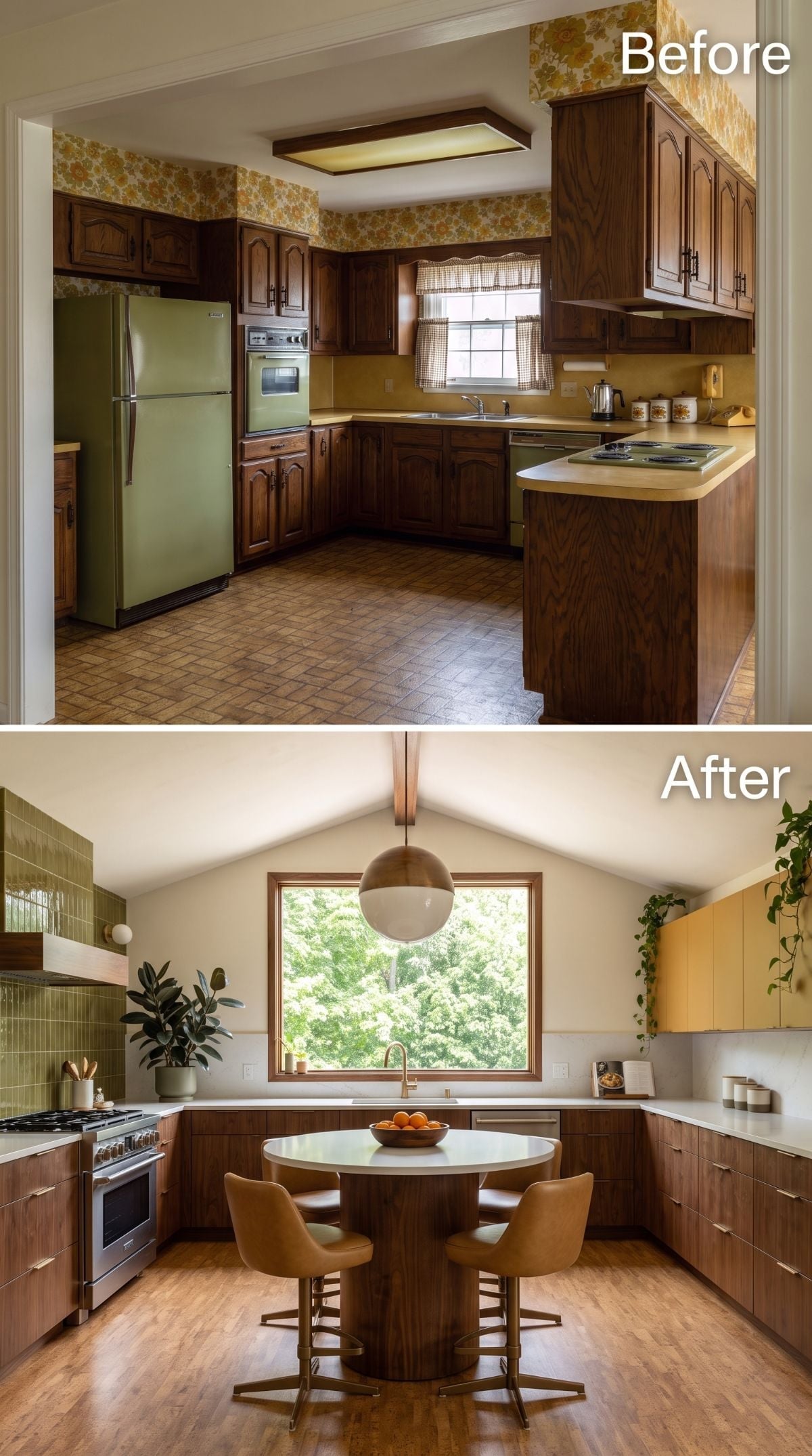
Not every solution needs to declare war on brown wood. This version keeps walnut in the vocabulary but changes its expression completely, replacing ornate raised panels with cleaner fronts and surrounding the wood with white quartz, green tile, and mustard upper cabinetry.
The round pedestal island is the surprise. Its circular footprint changes the rhythm of a U-shaped kitchen without adding another rectangular block to the center, while the green-and-mustard combination quietly acknowledges where the room started. Of all 28 concepts, this is one of the cleverest at preserving a little 1970s DNA instead of pretending none of it had value.
Layout Note: A round island can soften circulation where a rectangular island would leave prominent corners in the aisle. Whether it actually improves movement depends on the room’s dimensions and clearances, but the curved perimeter is worth considering in tighter plans.
21. Pale Blue Cabinetry Gives the Kitchen a Provençal Detour
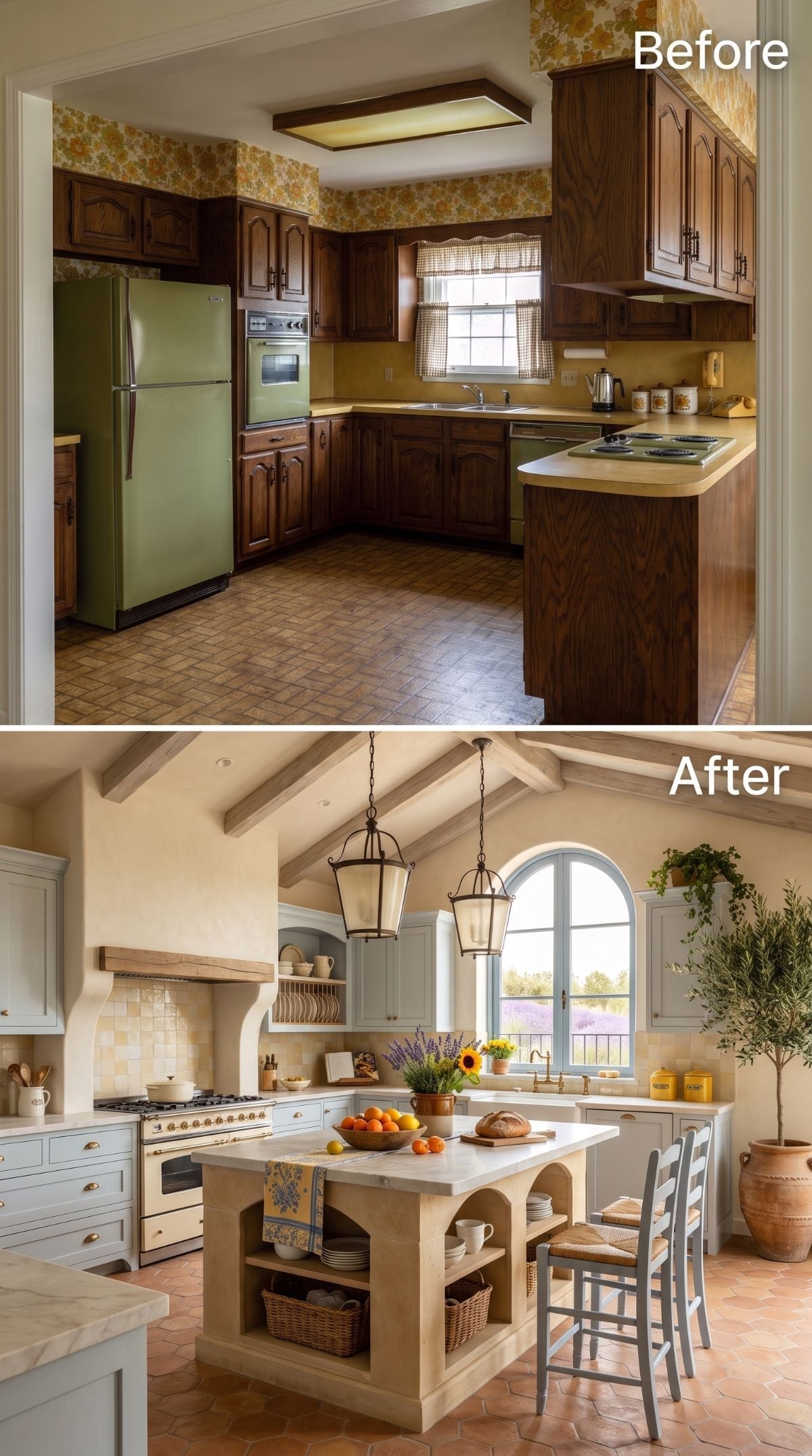
Terracotta flooring remains in the picture while nearly everything above it changes. Pale blue-gray cabinetry, whitewashed beams, brass pulls, an arched window, and lantern pendants create a southern-French farmhouse mood without relying on endless decorative accessories to announce it.
The pale stone island is the best part. Arched openings in its base keep baskets and dishes visible while repeating the curve of the window, and the substantial mass of the stone gives the center more presence than another painted cabinet box would have provided.
Style Note: The Provençal reference comes from the combination rather than any single feature: faded blue, terracotta, pale stone, exposed wood, iron-toned lighting, and gently arched forms. Keeping that palette restrained helps the idea feel architectural rather than themed.
20. Charcoal Cabinets Make the Skylight Earn Its Keep
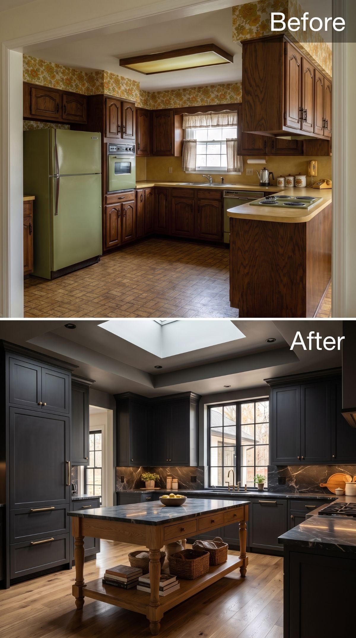
This after concept goes darker instead of chasing the usual white-kitchen escape route. Charcoal cabinetry runs against warm oak flooring, while gold-toned hardware keeps the near-monochrome cabinet wall from feeling severe.
The overhead opening is what lets the darker palette breathe. A skylight introduces daylight from a direction the original window never could, though the actual performance of any skylight depends on orientation, size, glazing, climate, and roof conditions. Here, visually, it gives the center of the room a brightness that makes the charcoal feel intentional rather than cave-like.
Daylight Note: Skylights and tubular daylighting devices can both bring light into parts of a kitchen that wall windows struggle to reach. Their output is not interchangeable, though; roof exposure, glazing area, tube dimensions, bends, and room depth all affect how much usable daylight reaches the counter.
19. A Medieval Great Hall Was Apparently One Possible Answer
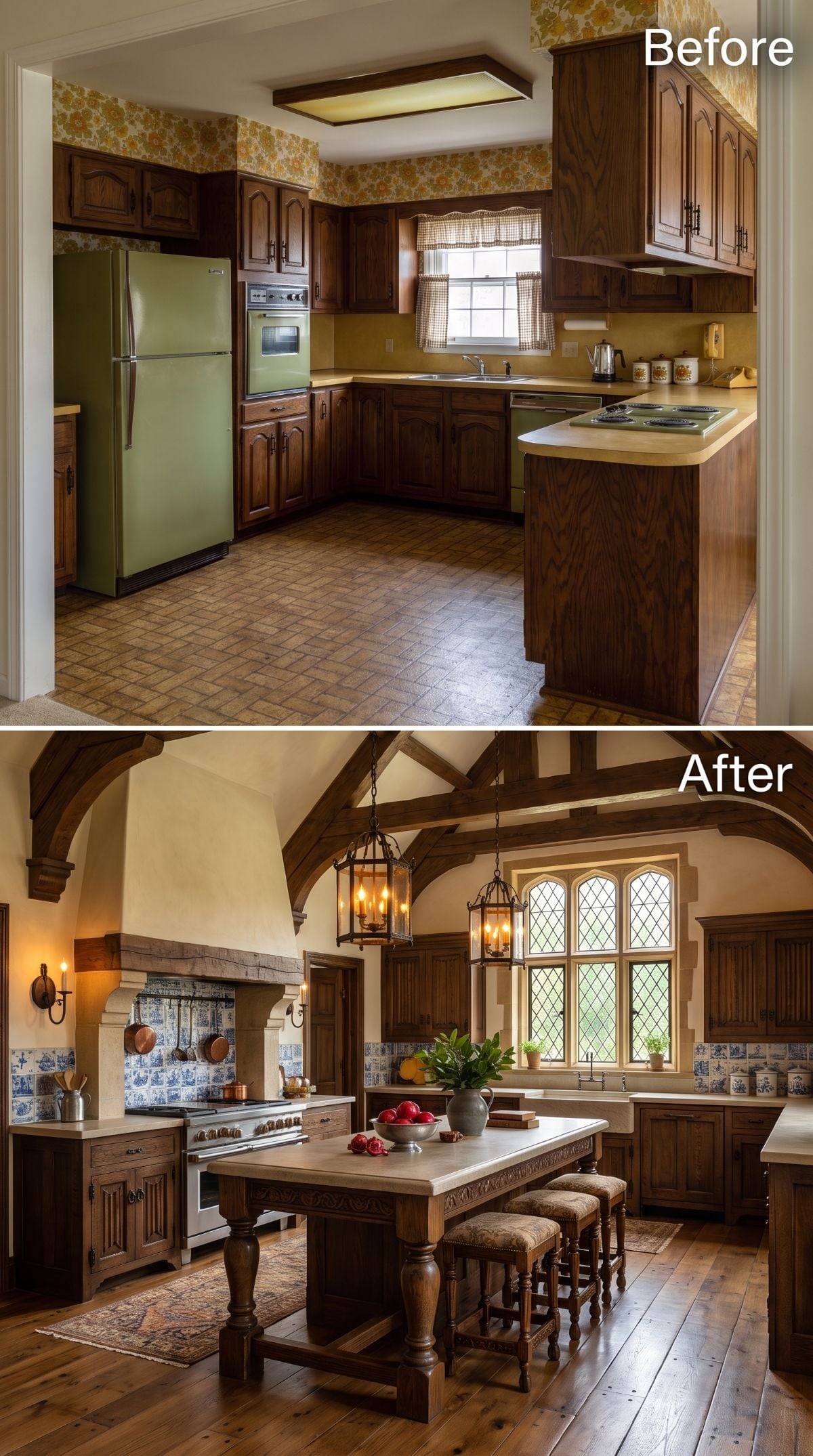
Exposed timber trusses and a pointed arch over the range take this version farther from suburban 1970s America than almost anything else in the set. Delft-inspired blue-and-white backsplash tile keeps the darker timber from swallowing the room, while broad oak flooring replaces the brown patterned floor of the before.
Lantern pendants with candelabra-style bulbs continue the historical mood without forcing suits of armor into the breakfast nook. The best part is the absurdity of the distance traveled: one minute avocado refrigerator, next minute minor baronial estate.
18. Flat-Front White Cabinets Strip the Room Down to Almost Nothing
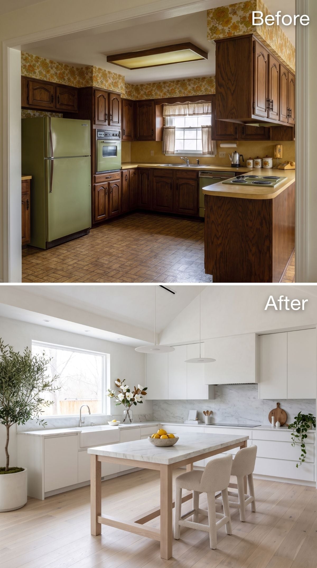
After several highly expressive concepts, this one practically lowers its voice. Flat-front white cabinetry runs floor to ceiling beside a pale marble backsplash and light oak island, replacing the floral border, dark wood, and green appliances with planes rather than ornament.
The real difference is the cabinet profile. Removing raised panels and visible decorative detail lets the stone veining and wood grain become the interesting surfaces. It is the cleanest rejection of the original aesthetic in the gallery, and that makes it useful even if you would never choose an all-white kitchen yourself.
Cabinet Note: Slab doors can be simpler to fabricate than detailed raised-panel doors, but that does not automatically make every flat-front kitchen cheaper. Material, finish, construction quality, hardware, and manufacturer matter enormously. Their real design advantage is visual simplicity.
17. Steel Trusses Push the Kitchen Into Industrial Territory
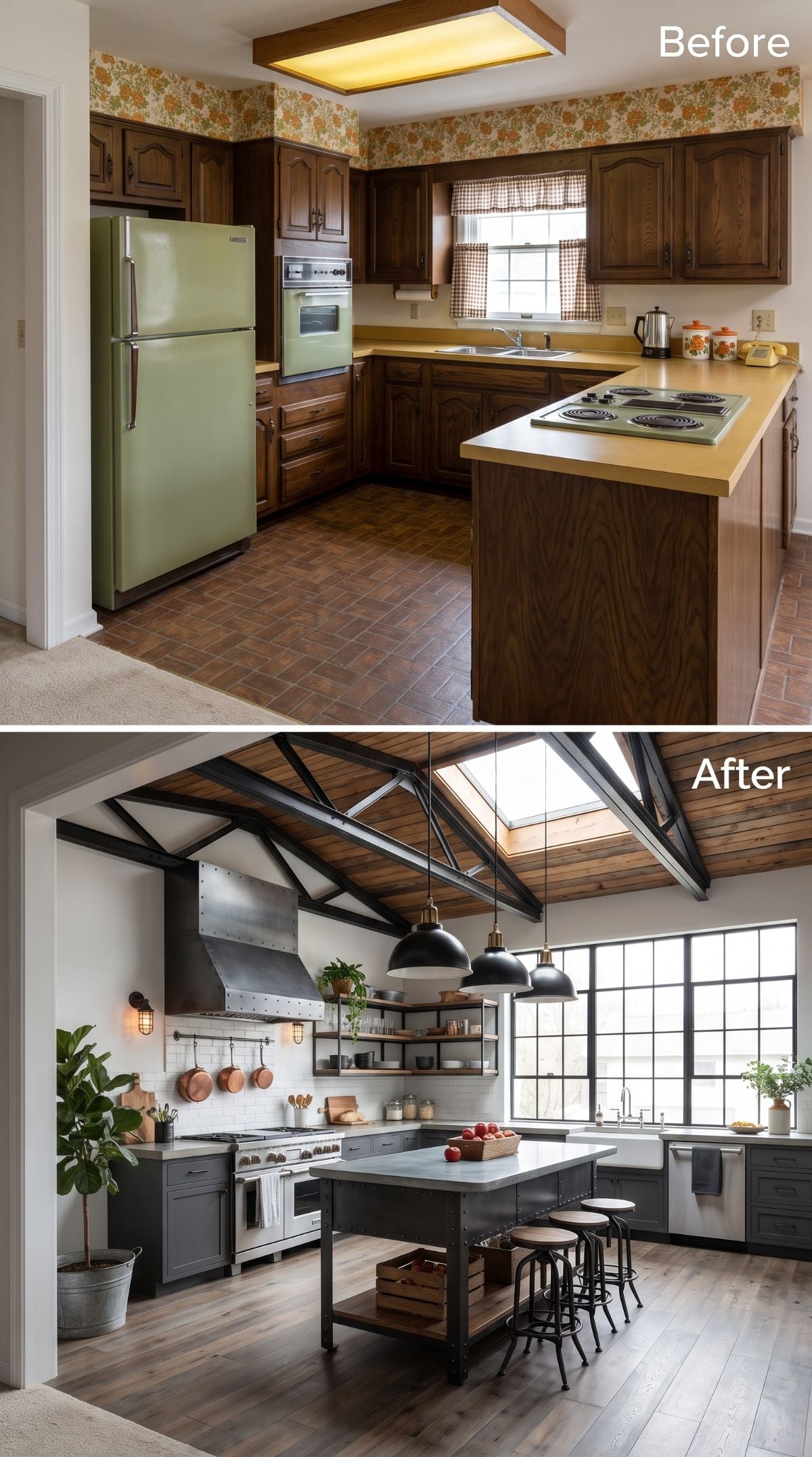
The AI after imagines exposed steel trusses crossing a vaulted shiplap ceiling, with a large skylight centered over the island. That is not a minor renovation trick; in a real house, changing ceiling and roof structure would require engineering based on the existing framing. As a design study, though, it gives the kitchen a completely different industrial vocabulary.
Gray-blue flat-front cabinets, a metal range hood, black grid windows, light wood flooring, and a zinc- or concrete-like island surface continue the harder-edged material story. Unlike the farmhouse versions elsewhere in the gallery, this ceiling isn’t there to make the room charming. It makes it tougher.
Reality Check: Exposed trusses can be part of a vaulted-ceiling design, but they are not a generic substitute for existing load-bearing construction. Any real version would need to be engineered around the house’s roof, spans, loads, and local code.
16. Sage Cabinets Make the 1970s Palette Feel Almost Foreshadowing
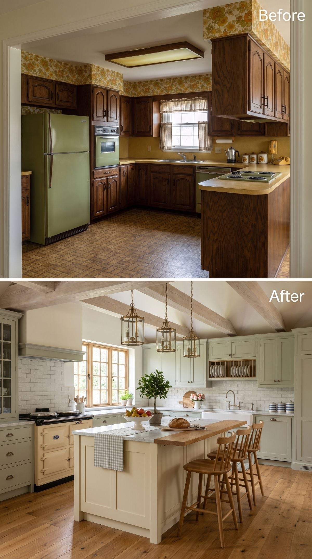
The original olive appliances and dark walnut make way for sage shaker cabinetry, white subway tile, exposed beams, and brass lantern pendants. The after is unquestionably more current, but the green ensures it still feels connected to the kitchen’s first life rather than dropped in from another house.
The island mixes stone and butcher block, giving the center two visibly different work surfaces. A plate rack above the sink lightens the upper cabinetry, natural stools warm the island edge, and a cream range sits more quietly within the palette than stainless steel would.
15. Santorini Whitewash Takes Harvest Gold Straight to the Aegean
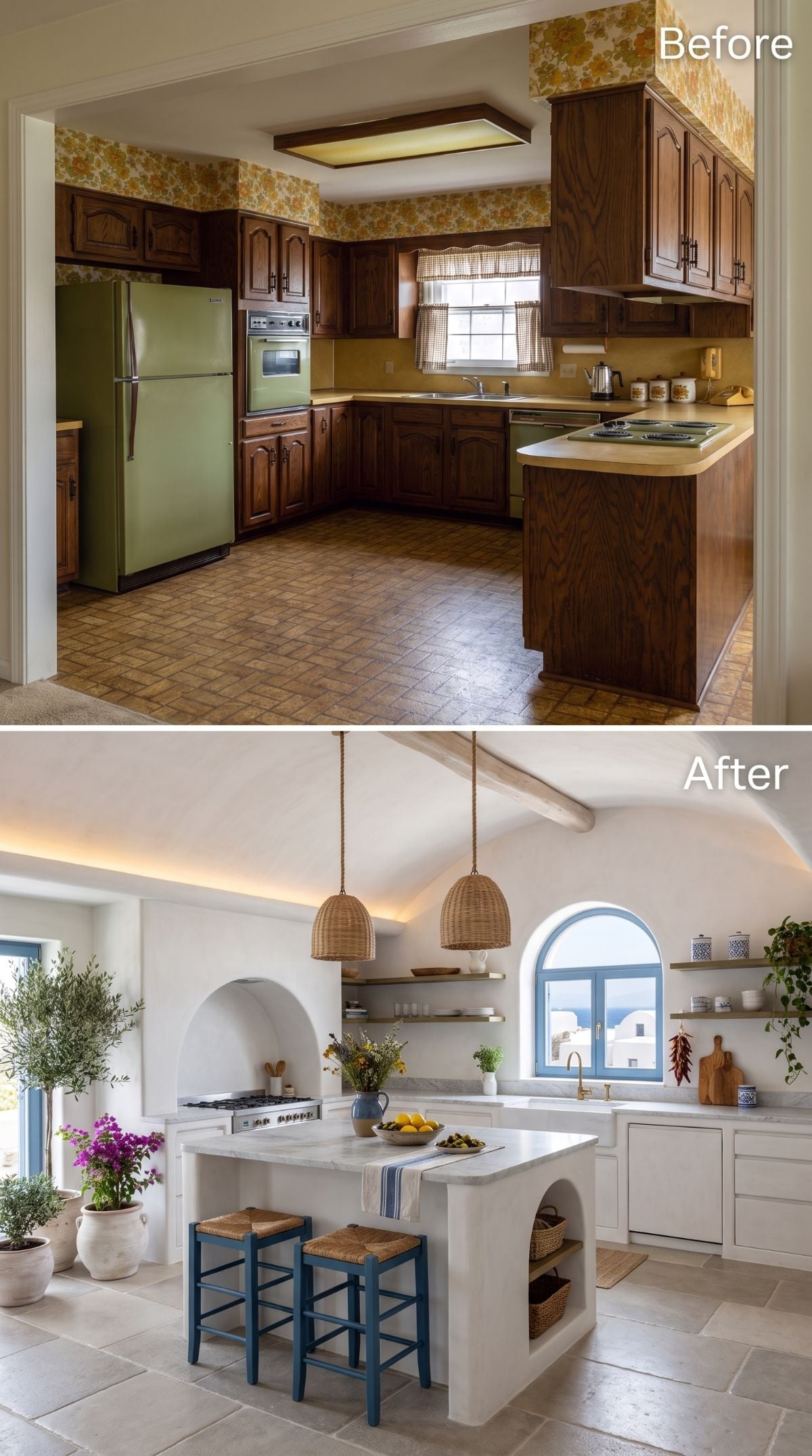
This version goes almost monochromatic: white plaster-like surfaces sweep from cabinetry to walls and into the vaulted ceiling, leaving the blue rush-seat stools to deliver the color the room needs.
Wicker pendants and the island’s arched openings keep all that white from becoming clinical. Cove lighting softens the ceiling, while the stools make the Santorini reference legible without turning every accessory cobalt blue. After the darker steel-truss and sage concepts, the brightness feels almost shocking.
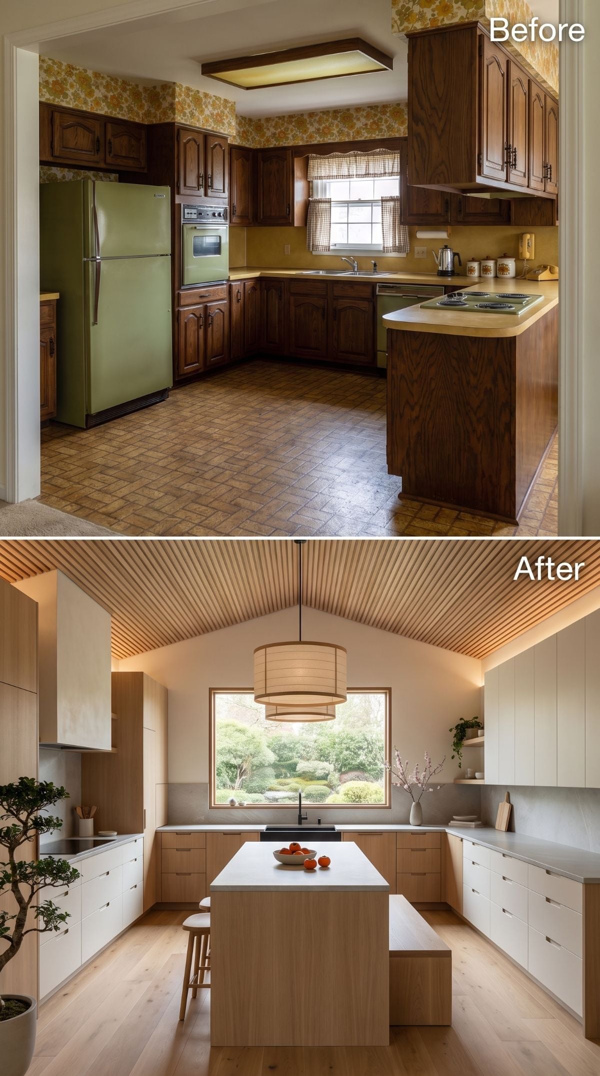
14. Slatted Oak Overhead Gives the Wood a New Place to Live
🔥 Would you like to save this?
Rift-cut oak cabinet faces replace the darker, more elaborate woodwork of the before, but the larger idea is redistribution. Instead of concentrating brown wood on every cabinet door, the after carries a lighter wood tone upward into the vaulted slatted ceiling.
Concealed lighting between the ceiling treatment and cream plaster adds depth after dark, while a simple drum pendant keeps the island from collecting yet another competing decorative fixture. White quartz gives the wood enough contrast to remain visible from floor to ceiling.
The old kitchen used wood as visual weight. This version spreads it out and lets the grain become texture.
13. Navy Cabinetry Makes the White Marble Look Brighter
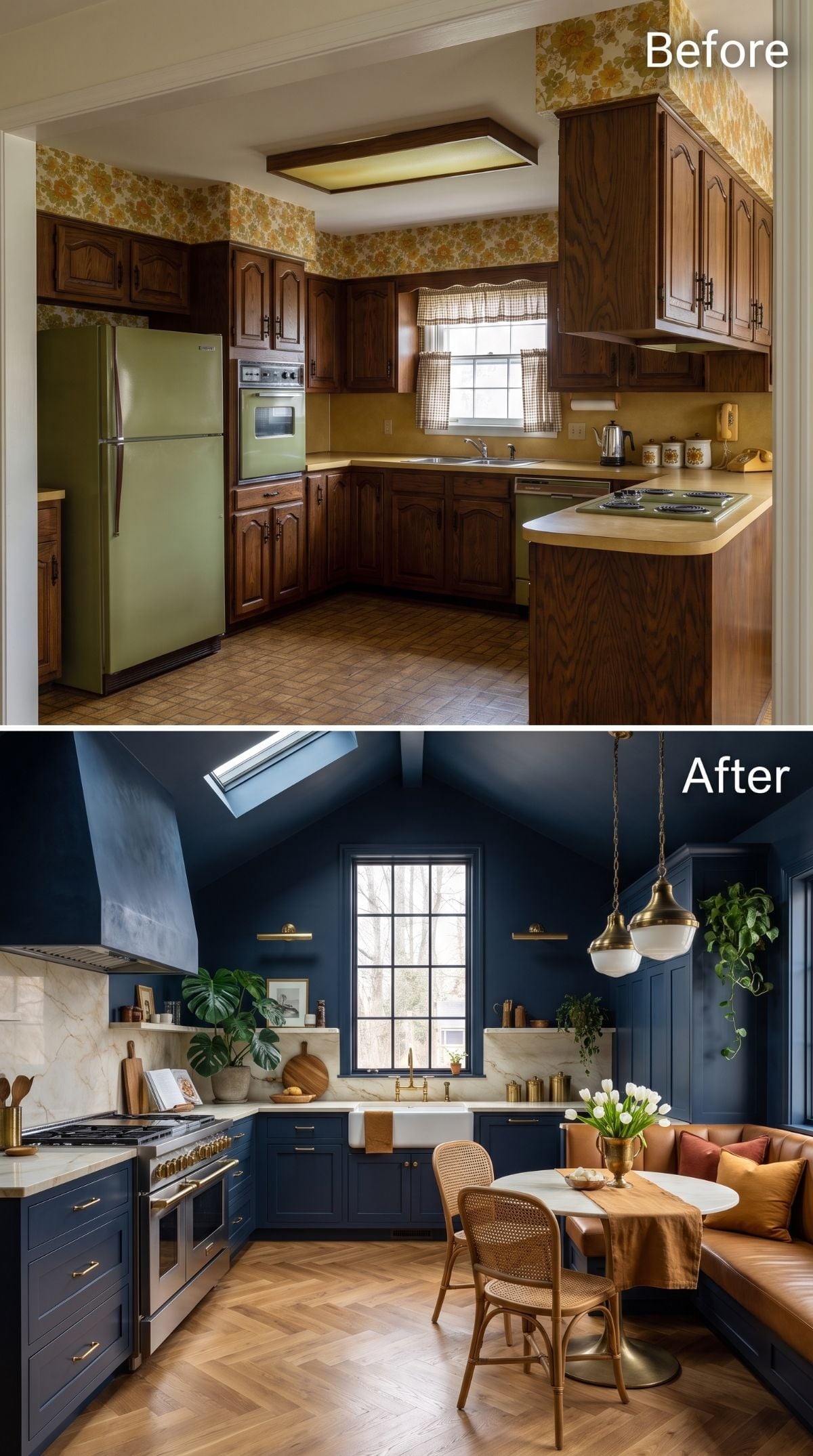
Navy shaker cabinets and brass pulls make a clean break from the original dark walnut while still giving the room plenty of color. White marble counters and a tall grid window sharpen the contrast, and a leather banquette introduces a warmer material away from the main cabinet run.
Navy is still a dark paint color, so it doesn’t magically solve a low-light kitchen. What it can do is feel less stark than pure black while retaining the depth of a dark cabinet scheme. Here, the large pale surfaces and generous apparent daylight keep that contrast from becoming oppressive.
Style Tip: Dark cabinetry becomes much easier to balance when substantial pale surfaces sit beside it. Counters, backsplash, flooring, wall color, and daylight all influence how heavy the finished room feels.
12. A Curved Island Softens the Coastal Farmhouse Formula
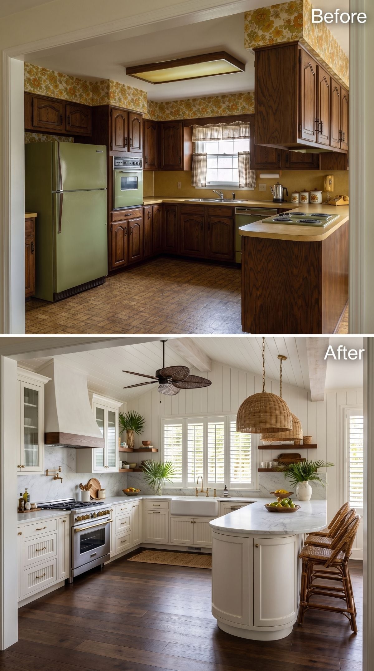
The rounded island edge is the smartest part of this concept. In a kitchen already full of straight cabinet runs, shiplap lines, beams, shelving, and floorboards, one large curve interrupts the geometry before the room becomes a grid.
Cream cabinetry, open walnut shelves, brass hardware, dark flooring, and woven lighting bring the coastal-farmhouse language around it. The rattan pendant and ceiling fan add plenty of texture overhead, while the curved island keeps the actual center of the room from feeling like another box.
Circulation Note: Rounded island ends can make tight turns feel less abrupt, but good circulation still comes down to actual aisle width. A graceful curve cannot compensate for inadequate clearance between island, range, refrigerator, and surrounding cabinets.
11. Tuscan Farmhouse Warmth Replaces the Brown With Better Brown
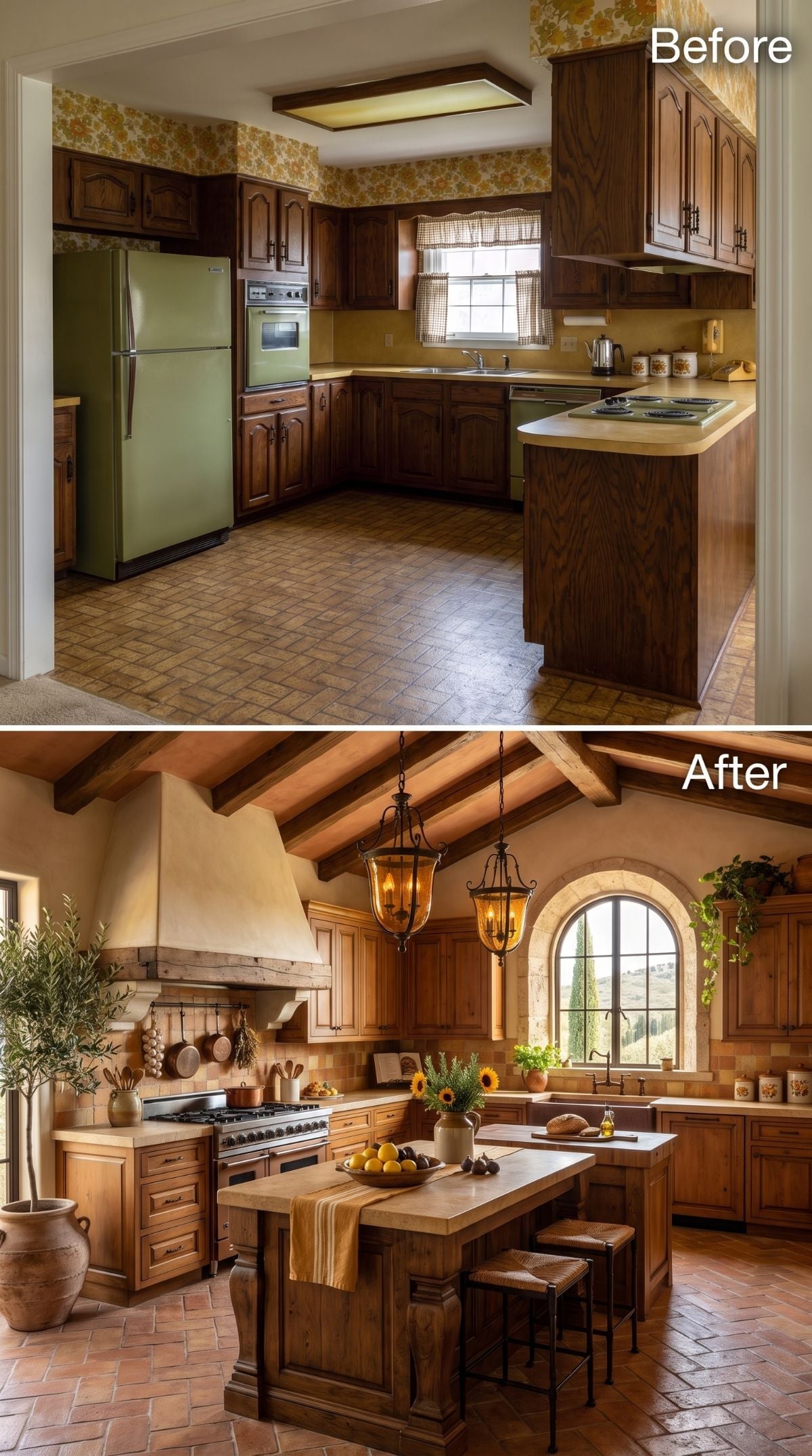
This AI version doesn’t reject earthy color; it changes the materials carrying it. Stucco-like walls, lighter knotty cabinetry, terracotta flooring, exposed beams, and a broad plaster hood replace the compressed brown-and-gold surfaces of the before with a much looser rustic palette.
A stone-trimmed arched window adds another heavy textural element, but the lighter cabinet wood prevents the room from becoming a cave of masonry and timber. The idea is deliberately Tuscan rather than merely “farmhouse,” and that specificity gives it more character than another round of white shaker cabinets.
Material Note: Plaster hoods, knotty woods, terracotta, and stone can all support this rustic language, but their cost and durability depend on construction, finish, installation, and material quality. None is automatically cheaper, tougher, or better for resale simply because it looks traditional.
10. White Shaker Cabinets and Blue-Gray Finally Give the Brick Floor Some Air
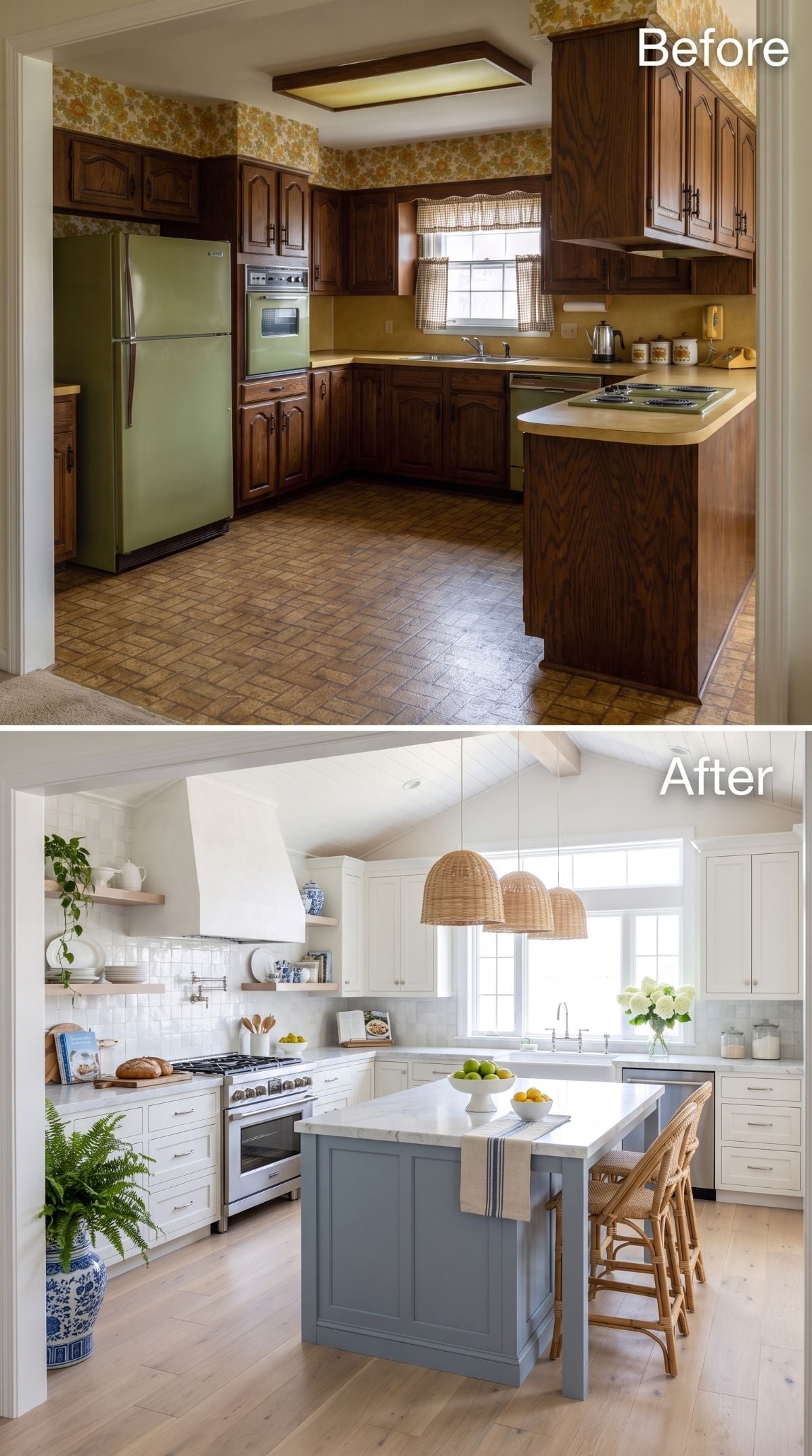
The before is one of the densest combinations in the set: dark carved cabinetry, amber floral wallpaper, olive appliances, a dropped fluorescent soffit, and brick-pattern flooring all asking for attention simultaneously.
The after gives the eye fewer jobs. White shaker cabinetry recedes, the blue-gray island establishes a clear center, pale flooring quiets the bottom of the room, and rattan pendants introduce texture without another strong color. The vaulted ceiling is dramatic, but the more useful lesson may be what happens when five competing brown and gold surfaces become three calmer materials.
Ask Yourself: A contrasting island can introduce color without committing every cabinet to it. Here, blue-gray gives the center more visual presence while the white perimeter cabinetry stays comparatively quiet.
9. Saltillo Tile and Wrought Iron Keep This Version Firmly on the Warm Side
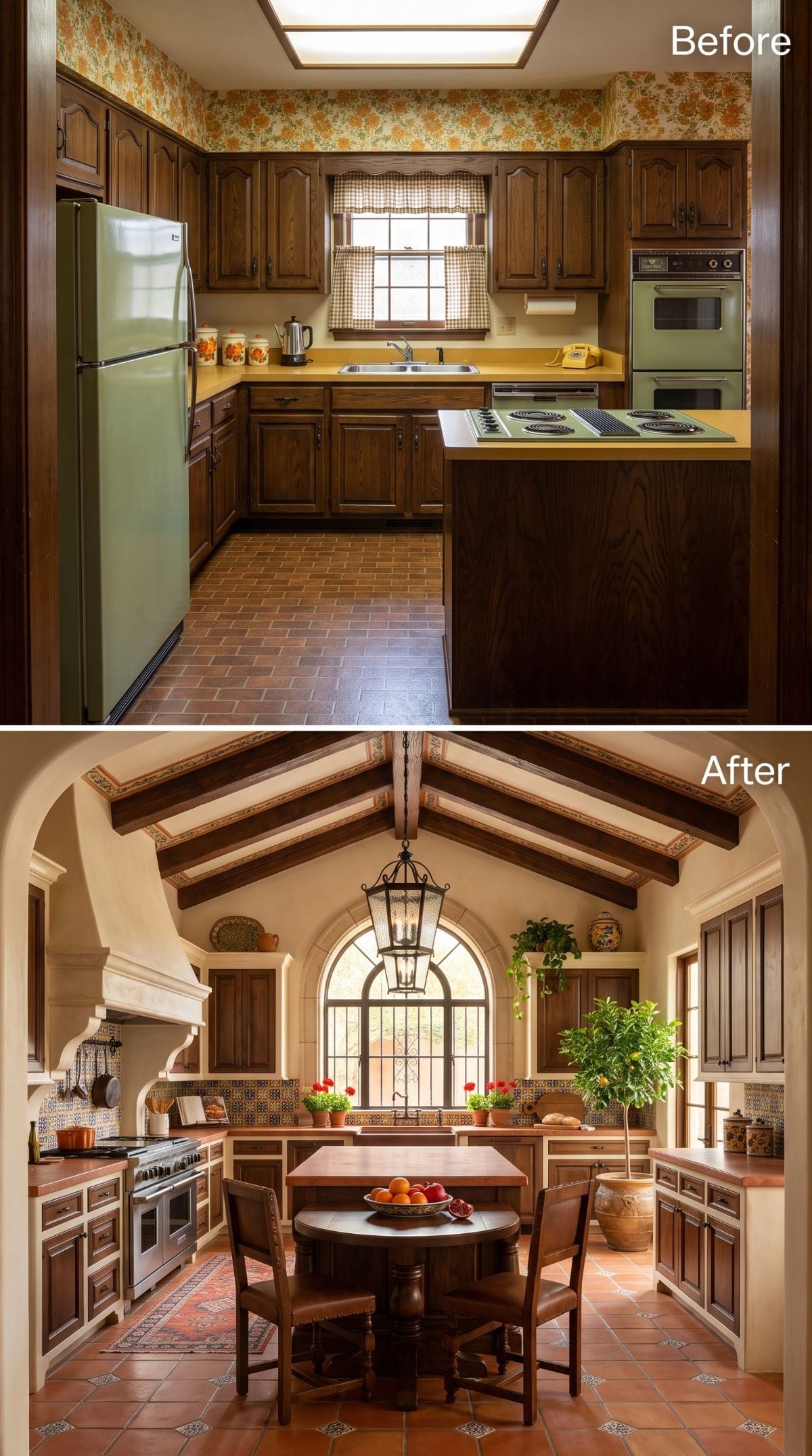
A plaster hood, dark wood cabinetry, wrought-iron details, Saltillo-style tile, exposed beams, and a lantern pendant turn this version into one of the warmer, heavier afters in the series. That’s useful after so many pale oak and white-shaker concepts; not every successful response to a dark 1970s kitchen has to become light and airy.
The arched window becomes an important counterweight to all those earthy surfaces, breaking the darker cabinet run with a large pale opening. A decorative arched surround can echo that shape around an existing rectangular window, but it would be a visual imitation rather than the same architectural and daylight effect as replacing the opening itself.
8. White Cabinets and a Gray Island Show How Quiet the Makeover Can Get
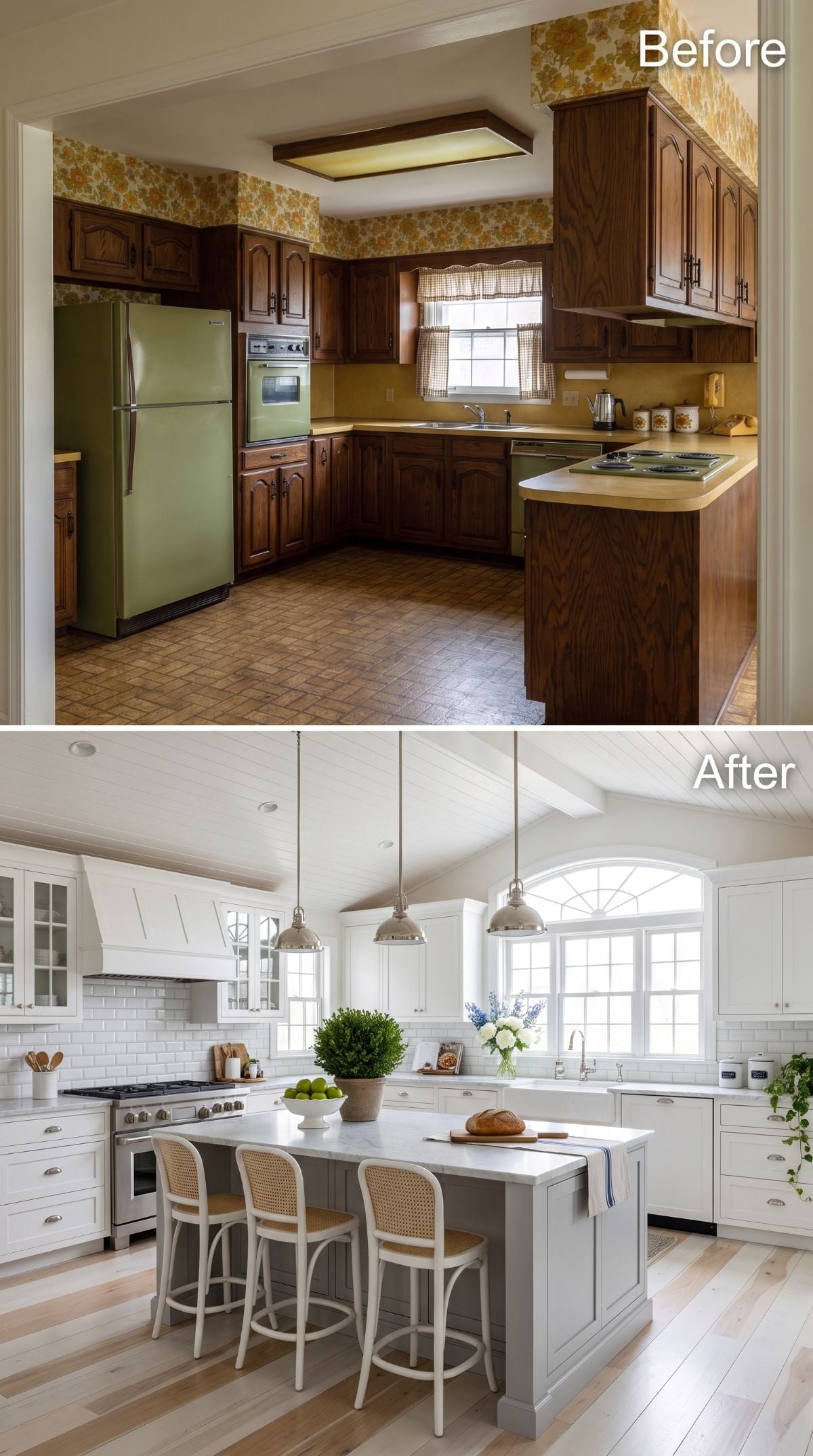
Cane-back stools, a pale gray marble-topped island, white cabinetry, and wall-to-wall subway tile make this one of the least confrontational afters in the gallery. There is no jewel-tone cabinet color or theatrical regional reference trying to win the argument.
That restraint is the point. The gray island separates visually from the white perimeter without becoming a major color statement, while the cane seats introduce warmth and texture at a smaller scale. After medieval trusses and Saltillo tile, understatement gets its turn.
Style Math: A differently colored island can visually separate the center from the perimeter cabinetry without requiring a high-contrast hue. Pale gray does that gently here, leaving texture and material to carry more of the room.
7. Sage, Stone, and a Freestanding Dresser Keep the Farmhouse From Feeling Too Fitted
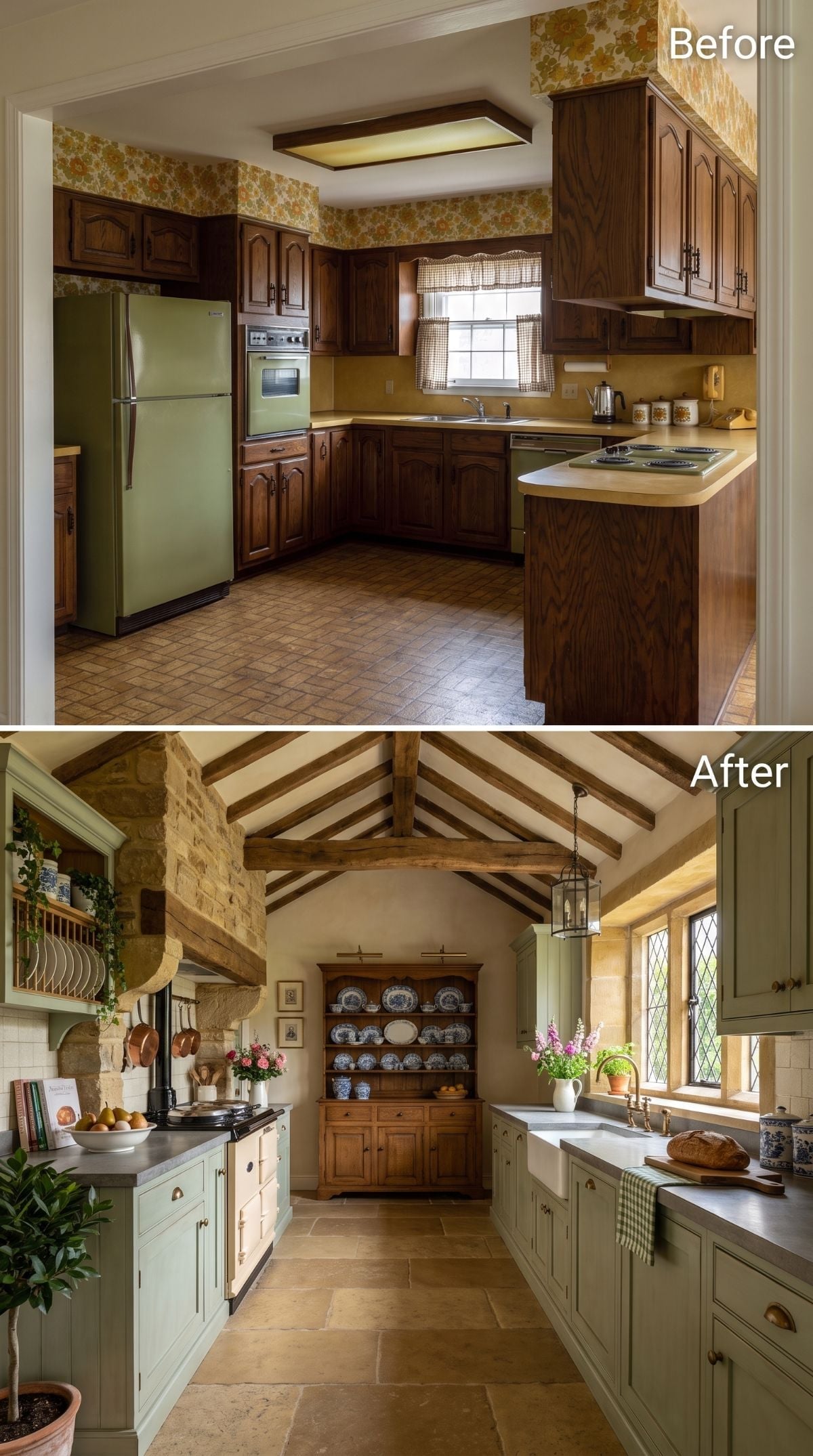
Sage shaker cabinetry appears elsewhere in the gallery, but this concept earns its place through the pieces around it. A stone-textured range wall, apron-front sink, leaded-glass-style windows, and raw oak beams give the room a deliberately older, more collected character.
The freestanding oak dresser at the back is the detail that separates it from the other sage kitchens. Not every inch becomes fitted cabinetry, so one piece can look as if it arrived independently and stayed because it happened to be useful. That small bit of looseness keeps the room from looking manufactured as one giant cabinet order.
Material Matters: Sage can behave very differently as daylight changes, sometimes appearing greener and sometimes grayer depending on undertone and surrounding materials. Test a cabinet color in the actual room rather than assuming a sample will stay visually constant from morning to evening.
6. Raw Beams and Slate-Toned Counters Take the Rustic Route Without Going Pale
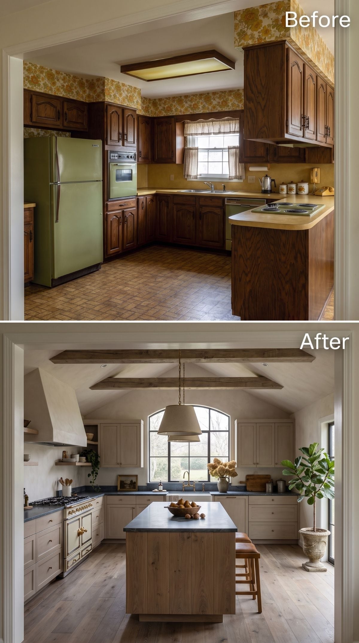
This version uses the familiar vaulted-beam move but changes the rest of the equation. Slate-toned counters run around the perimeter and across the island, giving the room a darker horizontal band beneath the raw wood overhead.
That makes the concept less precious than several of the white-and-marble kitchens around it. If a real renovation could open the ceiling, the change might dramatically alter perceived volume, but whether that is feasible—or worth prioritizing over windows, layout, cabinetry, or lighting—depends entirely on the house rather than a universal renovation rule.
Budget Reality: A vaulted ceiling can change perceived volume dramatically, but it is a structural project rather than a decorating shortcut. Roof framing, insulation, mechanical runs, permits, and engineering can all affect whether the idea makes financial sense.
5. Shiplap and Butcher Block Give the White Kitchen Something to Chew On
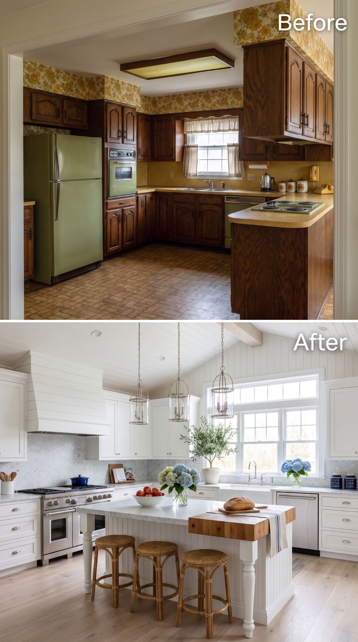
White shaker cabinetry and blonde hardwood could have made this another predictable bright-farmhouse after. The island saves it from that fate by dividing its top between pale stone and a butcher-block section, making the change in material visible from across the room.
Three lantern pendants and a vaulted shiplap ceiling continue the farmhouse language, while the enlarged-looking sink window makes the after feel much less enclosed than the before. The strongest idea here isn’t the white paint. It’s allowing one work surface to behave differently from the rest.
Work-Surface Note: A wood section beside stone gives an island a warmer, more forgiving material for everyday prep and serving. It still needs cutting boards for food-safe chopping where appropriate, but the contrast can be both practical and visually useful.
4. A Live-Edge Island Keeps the Rustic Kitchen From Becoming Too Polite
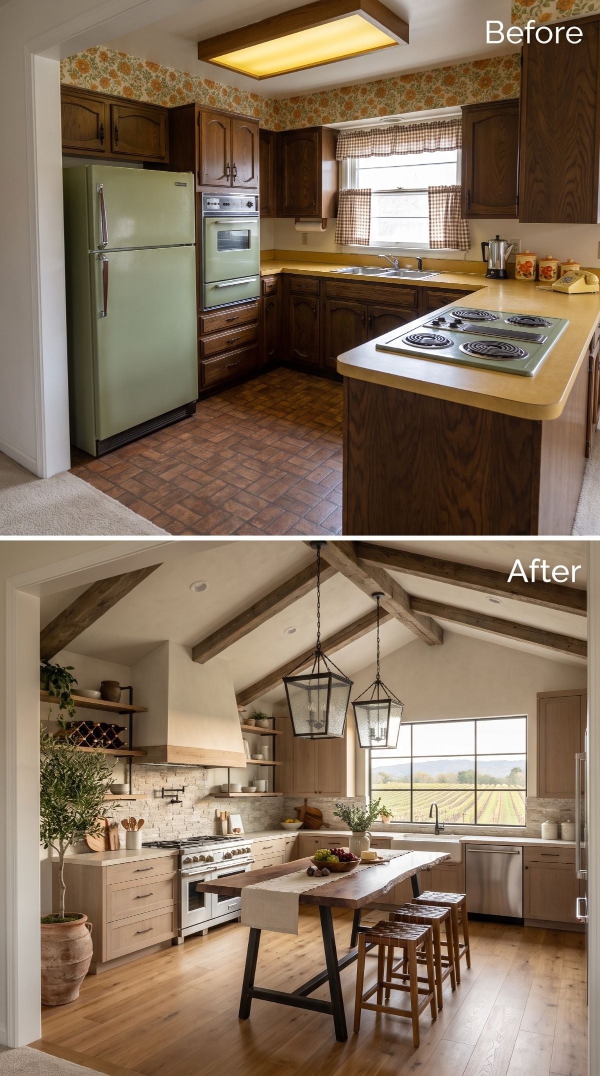
Rough-hewn beams against white plaster set up another rustic ceiling, but the freestanding live-edge island is what gives this concept its own identity. Sitting on sawhorse-like legs, it looks more like a giant worktable than conventional fitted cabinetry.
That looseness cuts through the formality of the stone backsplash and professional-style range. Light oak flooring, open shelves, and a built-in wine rack reinforce the sense that this kitchen is meant to be used rather than merely admired. The AI concept still imagines major architectural change overhead; the furniture-like island is the idea that could translate most easily into a real room.
3. Vaulted Shiplap and Oak Lowers Keep the Palette Almost Effortlessly Quiet
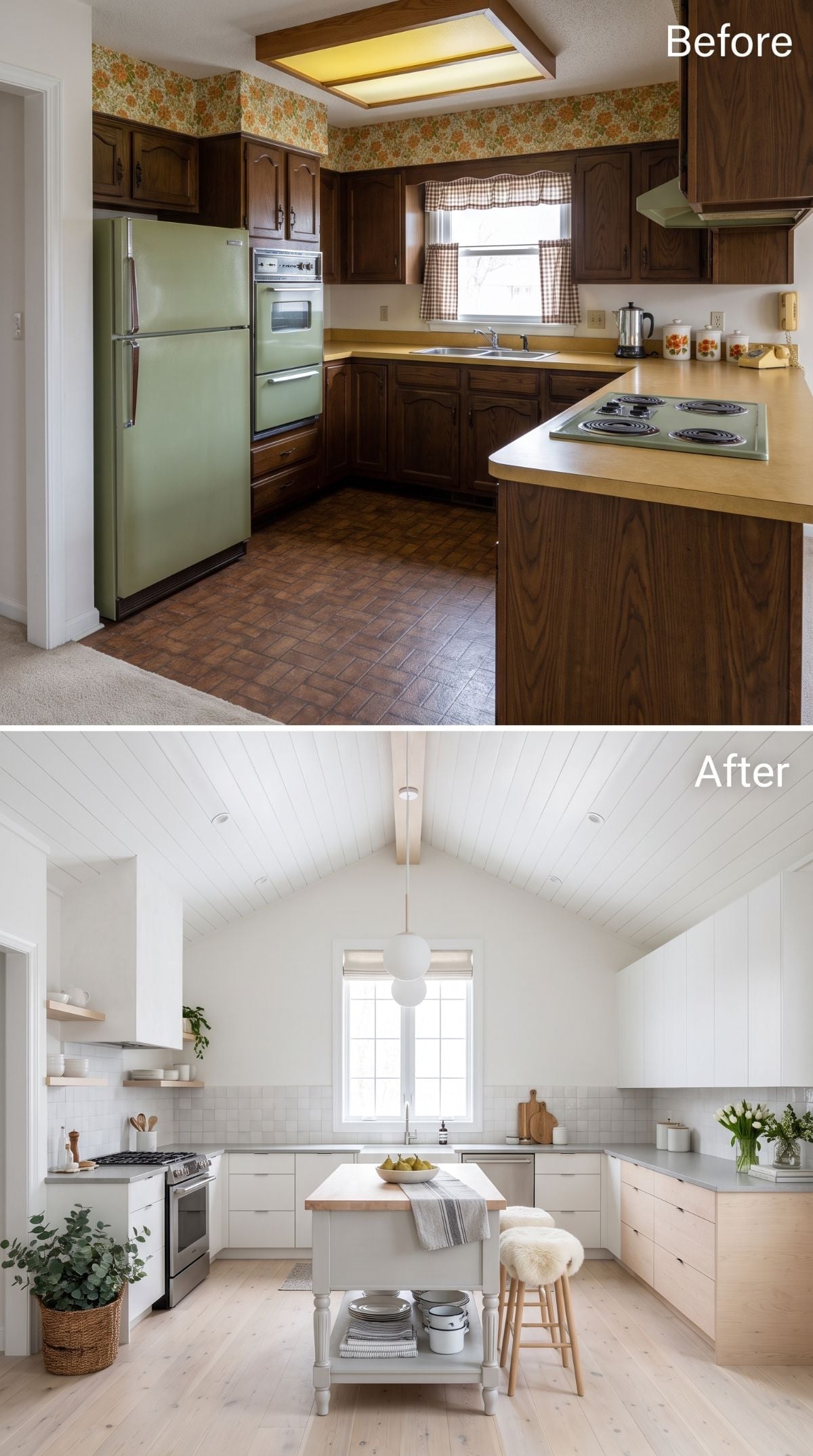
White upper cabinetry and flat-front oak lowers divide the room by weight: pale and quiet overhead, warmer and more substantial below. A small freestanding island adds prep space without repeating the full mass of another large cabinet block.
The vaulted shiplap ceiling is familiar by this point in the gallery, so the more interesting lesson is the cabinet split. Instead of choosing between an all-white kitchen and an all-wood one, this after uses both and assigns each material a different part of the elevation.
2. Cream Shakers and a Vaulted Ceiling Give the 1970s Kitchen the Classic Escape Route
🔥 Would you like to save this?
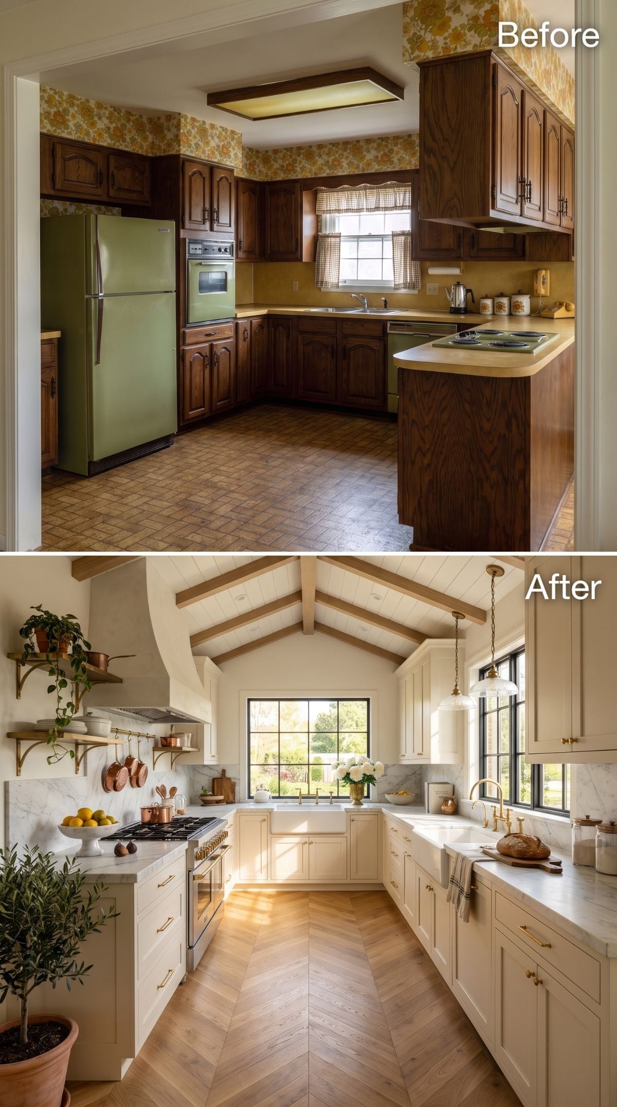
Cream shaker cabinetry, marble counters, herringbone oak flooring, exposed wood beams, and vaulted shiplap form the most recognizable contemporary-farmhouse answer in the entire set. It isn’t surprising, but that is part of its usefulness: this is the version for anyone who wants the 1970s gone without replacing them with another highly specific era.
The warm wood floor keeps the pale cabinetry from becoming chilly, while the ceiling introduces most of the drama above eye level. After toile, Santorini plaster, steel trusses, and medieval arches, the familiarity almost feels radical.
1. Groin Vaults, Brass, and Marble Save the Most Extravagant Answer for Last
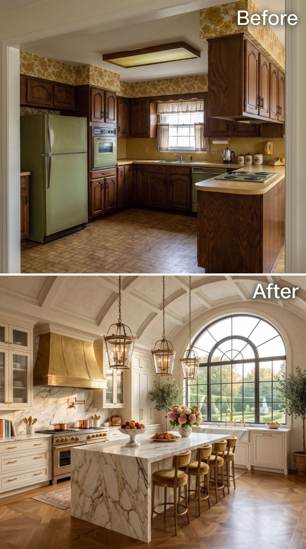
The final AI concept takes the largest possible swing. Groin-vaulted ceilings with ornate plasterwork rise above cream inset cabinetry, glass-front uppers, a brass range hood, and a waterfall island wrapped in Calacatta-style marble. Three lantern pendants hang overhead while an arched window opens the sink wall toward the garden.
Gold-velvet stools could have tipped all that brass into costume, but the herringbone floor gives the warmth a broader material base and the cream cabinetry prevents the room from becoming metallic. After 28 different answers, there still isn’t one “correct” replacement for avocado green and harvest gold—and that’s the useful part. The same dated kitchen can become restrained, regional, industrial, theatrical, rustic, minimal, or gloriously excessive depending on which part of its old identity you decide is actually worth fighting.