🔥 Would you like to save this?
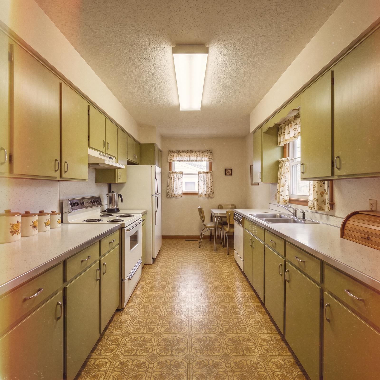
Some kitchens wear their age well. Others look like every surface made the same decision in 1962 and then signed a lifetime contract. This one starts with Formica, linoleum, aging cabinetry, and a narrow galley plan that leaves nowhere for a bad choice to hide.
In order to come up with the very specific design ideas, we create most designs with the assistance of state-of-the-art AI interior design software. Also, assume links that take you off the site are affiliate links such as links to Amazon. this means we may earn a commission if you buy something.
Rather than pretend these are thirty stages of one literal renovation, think of them as thirty different ways the same dated kitchen could be reimagined. One version goes quiet with oak and stone. Another turns the range wall navy. Another brings in plum cabinets, teal tile, brick, checkerboard floors, or enough green to make the original kitchen almost unrecognizable. Same footprint, thirty very different answers.
30. The Curved Island Changes the Entire Traffic Pattern
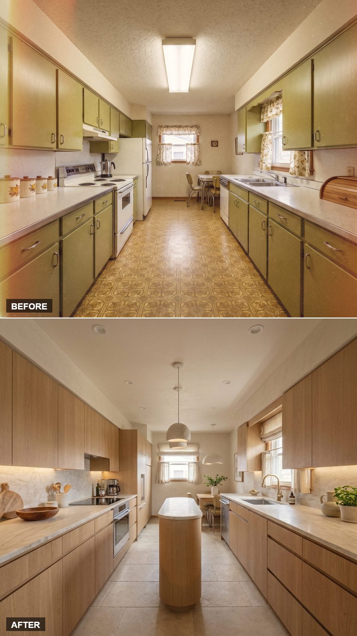
Rift-cut white oak cabinets run floor to ceiling, their grain doing the visual work without hardware breaking the surface. Softly veined stone carries across the counters and backsplash, while under-cabinet lighting warms the whole run.
The real move is the rounded island. Its compact footprint adds prep space without turning the middle of the galley into an obstacle course, and the single dome pendant above it gives the center of the room a clear purpose.
Trend Alert: Handle-free cabinetry has become a common choice in contemporary kitchens, especially when the wood grain is strong enough to carry the wall on its own. Rift-cut oak works particularly well because its linear grain stays relatively consistent across multiple door panels.
29. Deep Green Cabinets and a Copper Hood Take the Room Somewhere Else
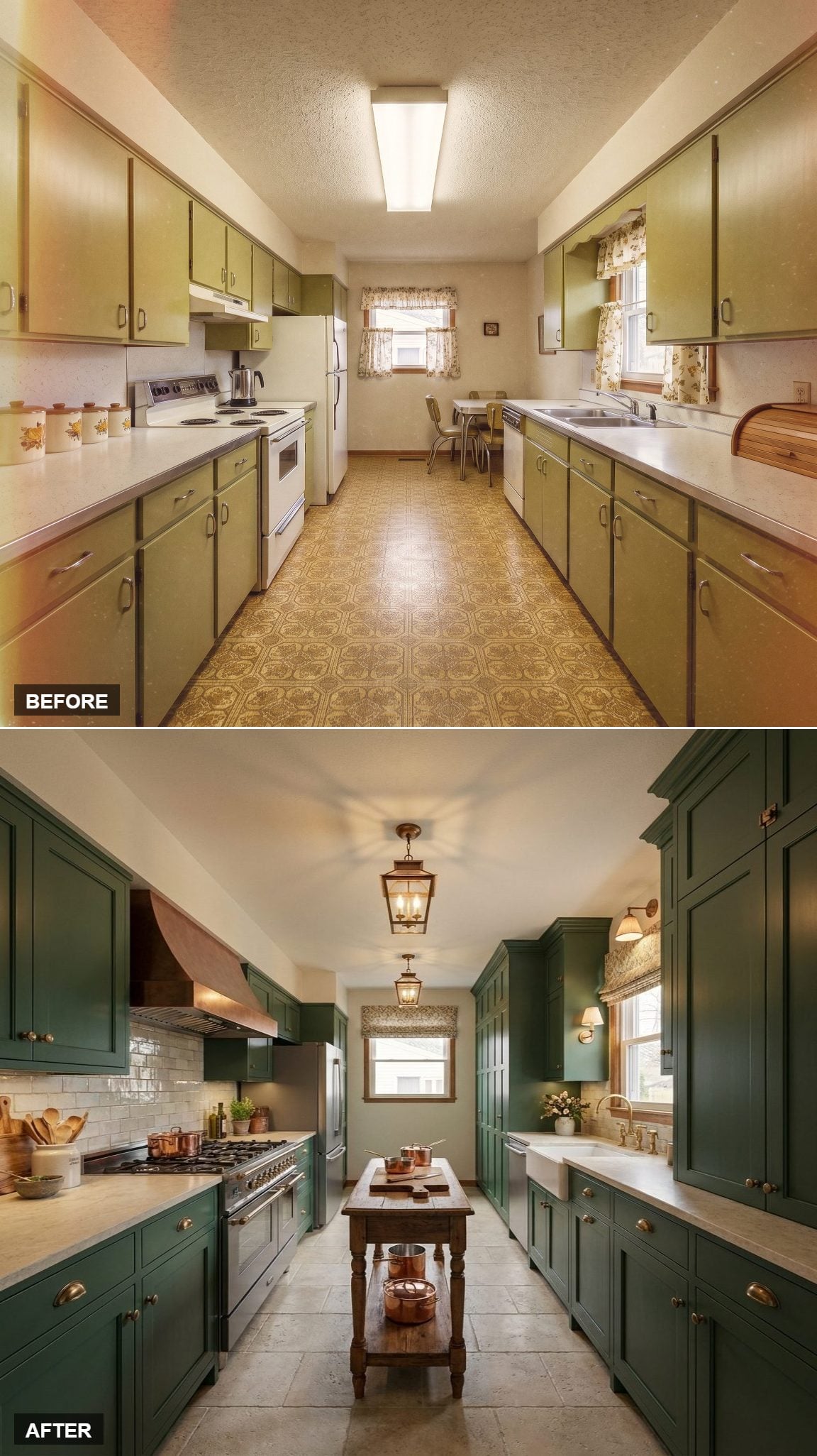
Floor-to-ceiling forest green cabinetry gives the galley immediate depth, while brass cup pulls keep the finish from becoming too heavy. The copper hood turns the range wall into the visual center of the room, with white subway tile giving the metal and paint somewhere clean to land.
A farmhouse sink sits beneath the window, and a small wood island softens all that saturated color. Two lantern-style pendants reinforce the traditional edge without pushing the kitchen into costume.
28. Black-and-White Checker Floors Make the First Big Graphic Move
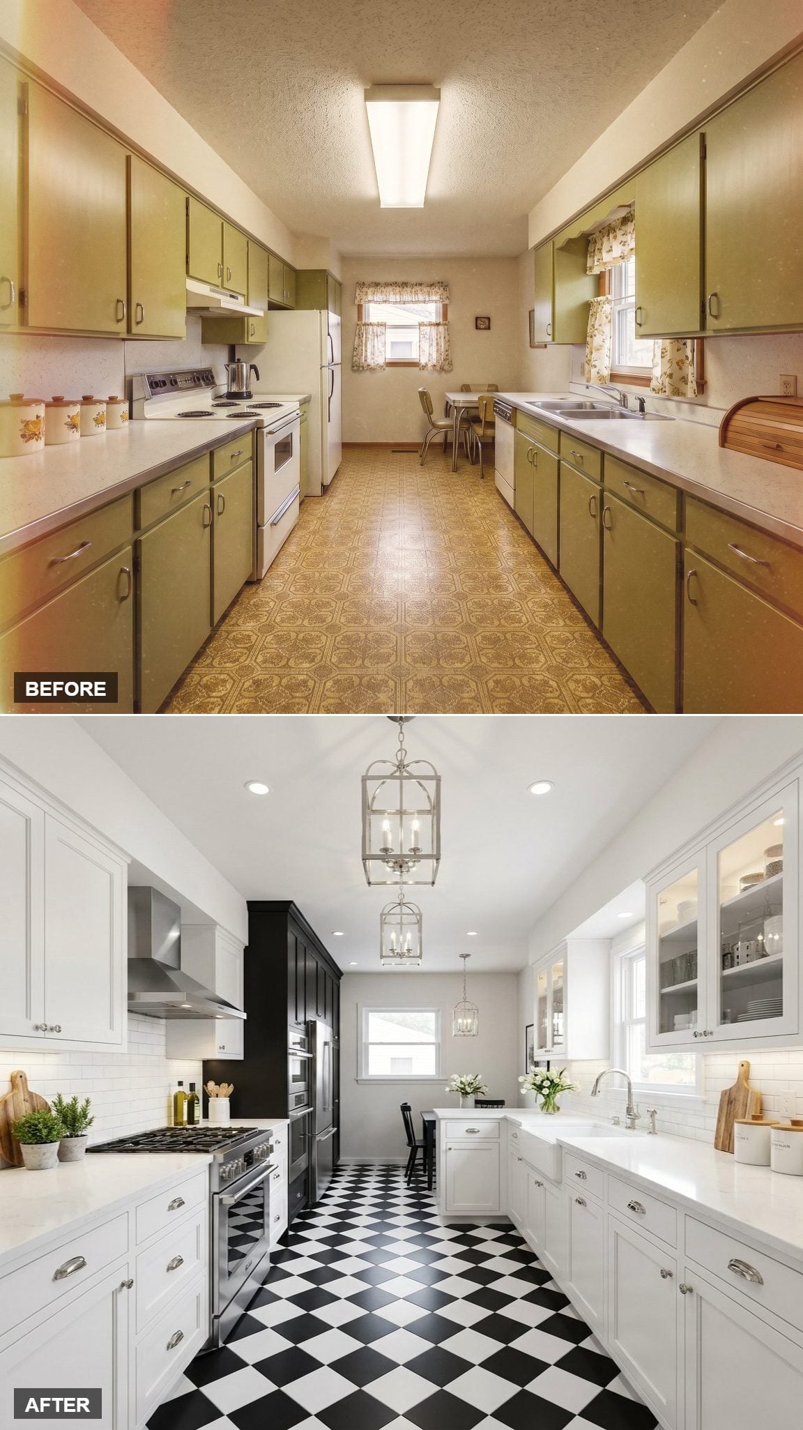
The cabinets stay deliberately simple: white shaker fronts, chrome cup pulls, pale counters, and no upper cabinets crowding the range wall. That restraint leaves room for the floor to take over.
The black-and-white diamond pattern runs the length of the galley with enough scale to feel bold rather than fussy. Three lantern pendants repeat the rhythm overhead, while the darker refrigerator surround keeps the far end from visually disappearing.
27. Mauve, Plum, and Teal Refuse to Play It Safe
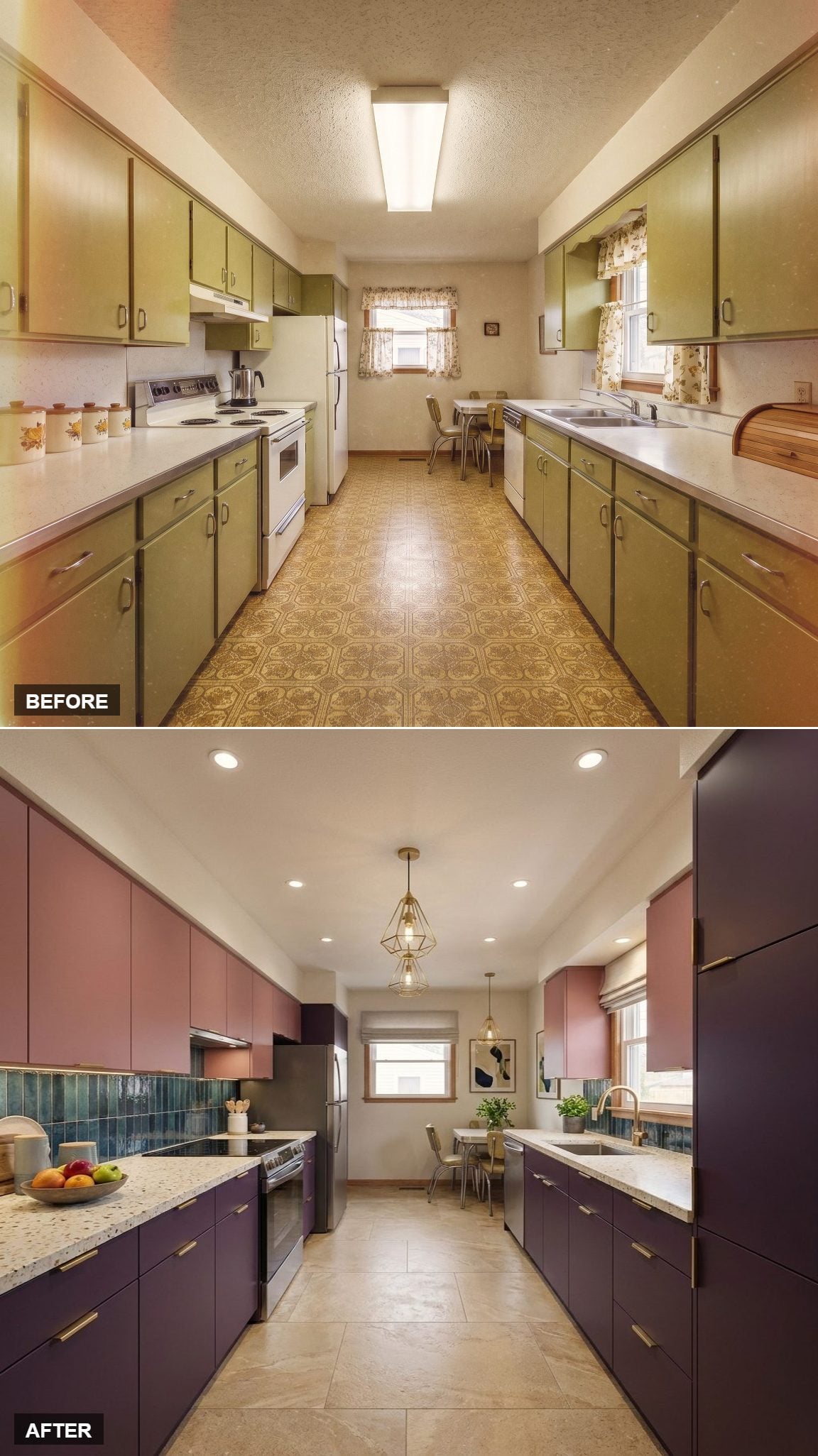
Dusky mauve uppers sit above deep plum lowers, with long brass pulls giving the two colors a common line. A pale terrazzo-style counter keeps the combination from becoming too dense.
Then the teal zellige backsplash arrives and changes the temperature completely. Its uneven surface catches light differently from tile to tile, which gives the wall far more life than a flat subway field. Geometric brass pendants add one more sharp note without trying to tame the color.
26. Light Oak and Woven Pendants Strip the Galley Back to Calm
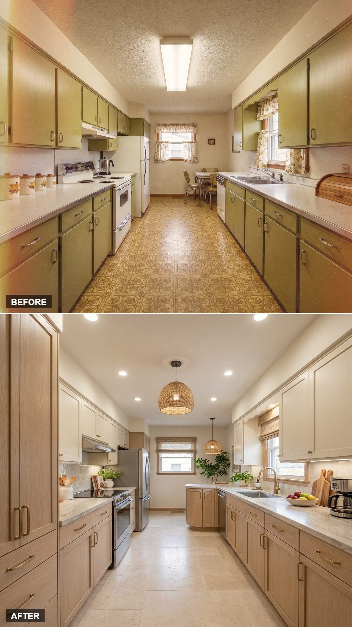
Flat-front oak cabinets in a warm blonde finish replace the visual clutter with a much cleaner rhythm. Pale stone counters and brass hardware add just enough contrast to keep all that wood from blending into one long run.
The woven pendant brings in texture without shouting over the cabinetry. After the stronger color concepts, this one works because almost everything has been edited down to grain, light, and proportion.
25. A Navy Range Wall Gives the Galley a Real Focal Point
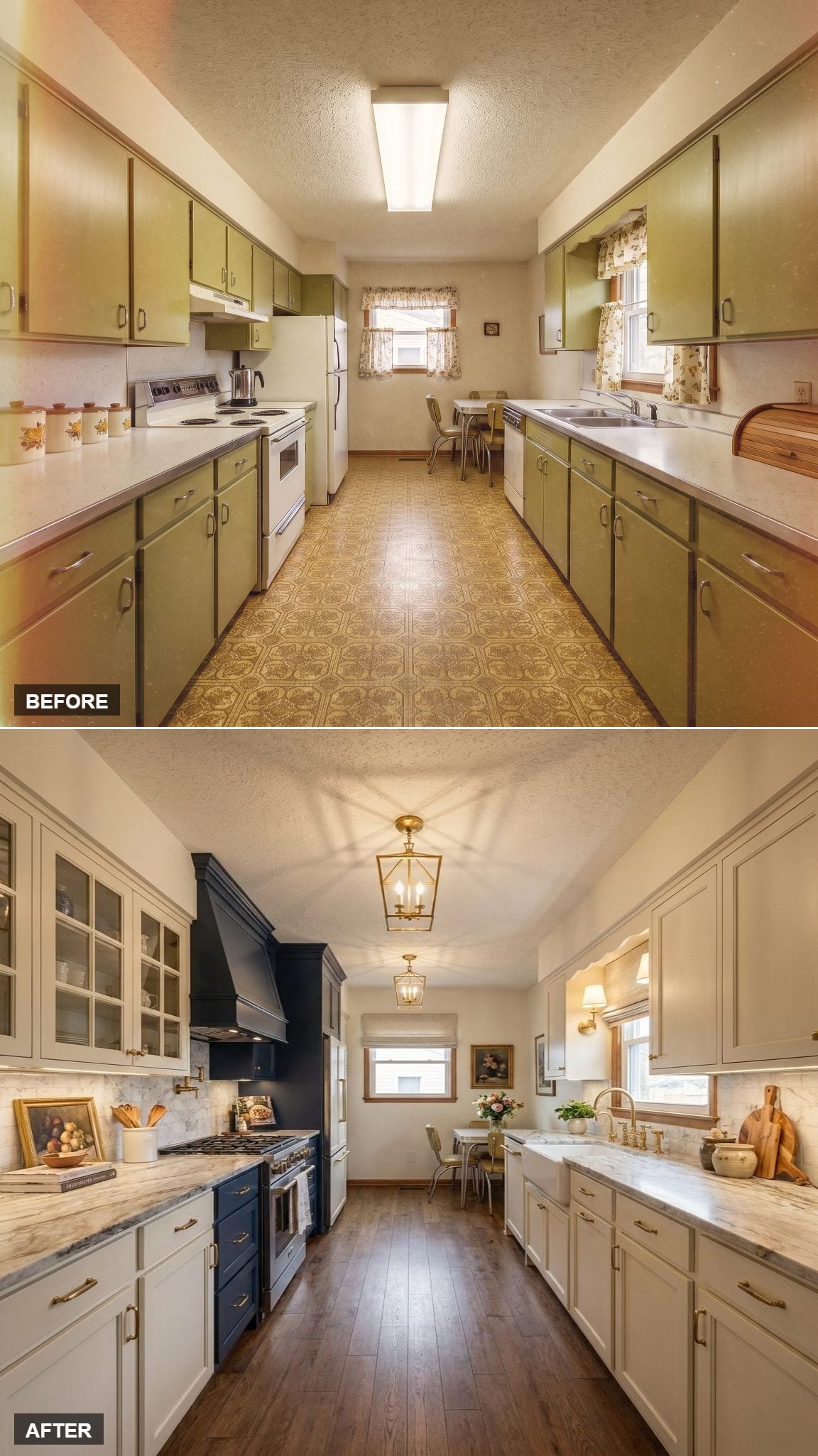
Instead of spreading color everywhere, this concept concentrates it around the range. The navy wall and custom hood create a destination at one end of the kitchen while ivory shaker cabinets keep the rest of the room comparatively light.
Marble-look counters and brass hardware bridge the two tones. Wide-plank wood flooring warms the length of the galley, and a pair of lantern pendants gives the ceiling a little structure without turning it into another focal point.
24. Walnut Lowers and Sage Uppers Break the Cabinet Run Into Layers
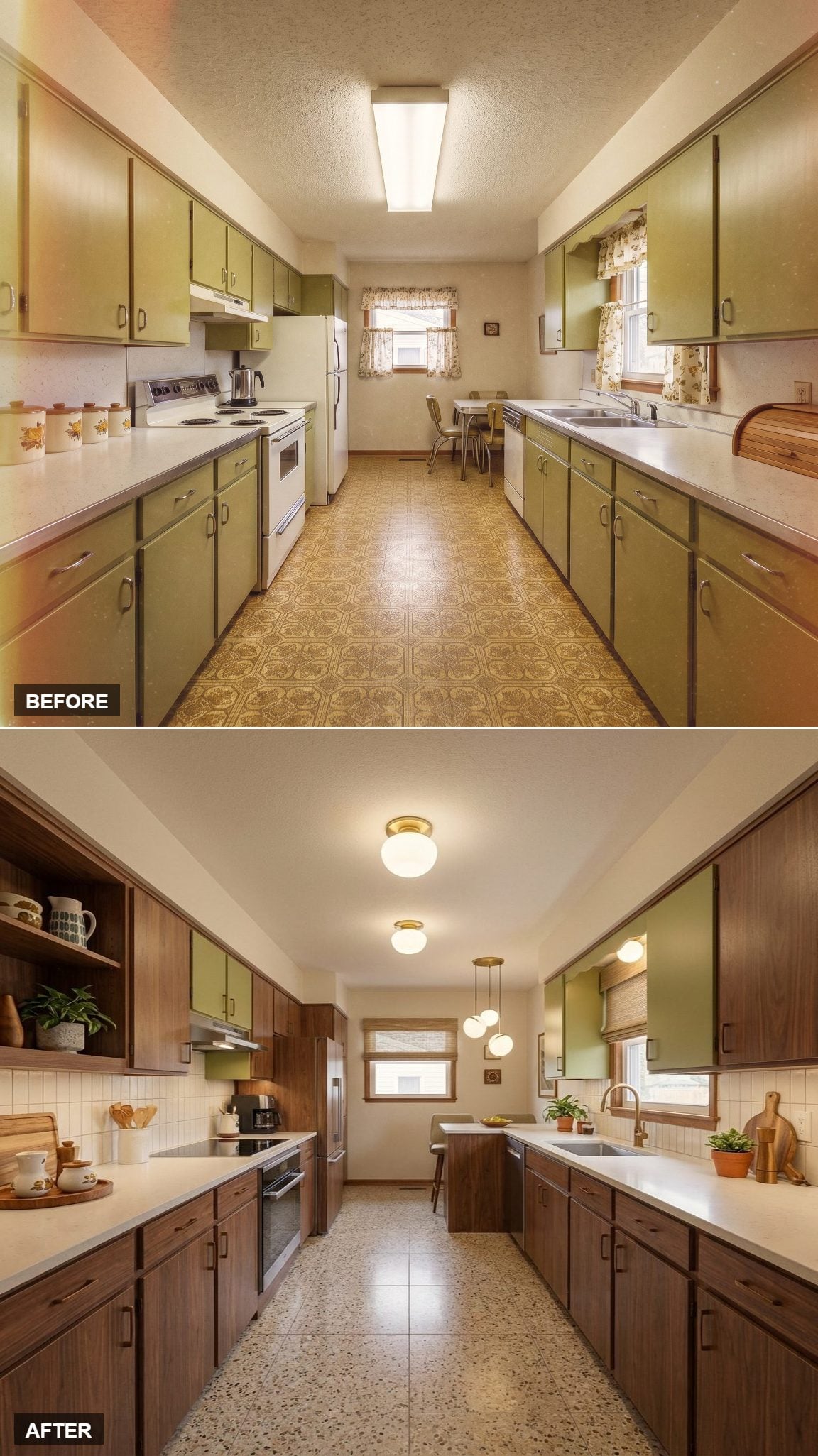
Warm walnut base cabinets sit below sage green uppers, creating enough contrast that the long galley stops feeling like one uninterrupted tunnel. White counters keep the center bright.
Open shelving replaces part of the upper run, giving glassware and everyday pieces some air around them. Terrazzo-style flooring adds soft pattern below, while subway tile keeps the backsplash quiet.
Lighting Note: Three globe pendants cluster near the sink end instead of marching down the exact center of the ceiling. That asymmetry gives the far end of the galley more presence, while simpler flush mounts handle the rest of the room without crowding the low ceiling.
23. Knotty Alder and Stacked Stone Push the Kitchen Into Rustic Territory
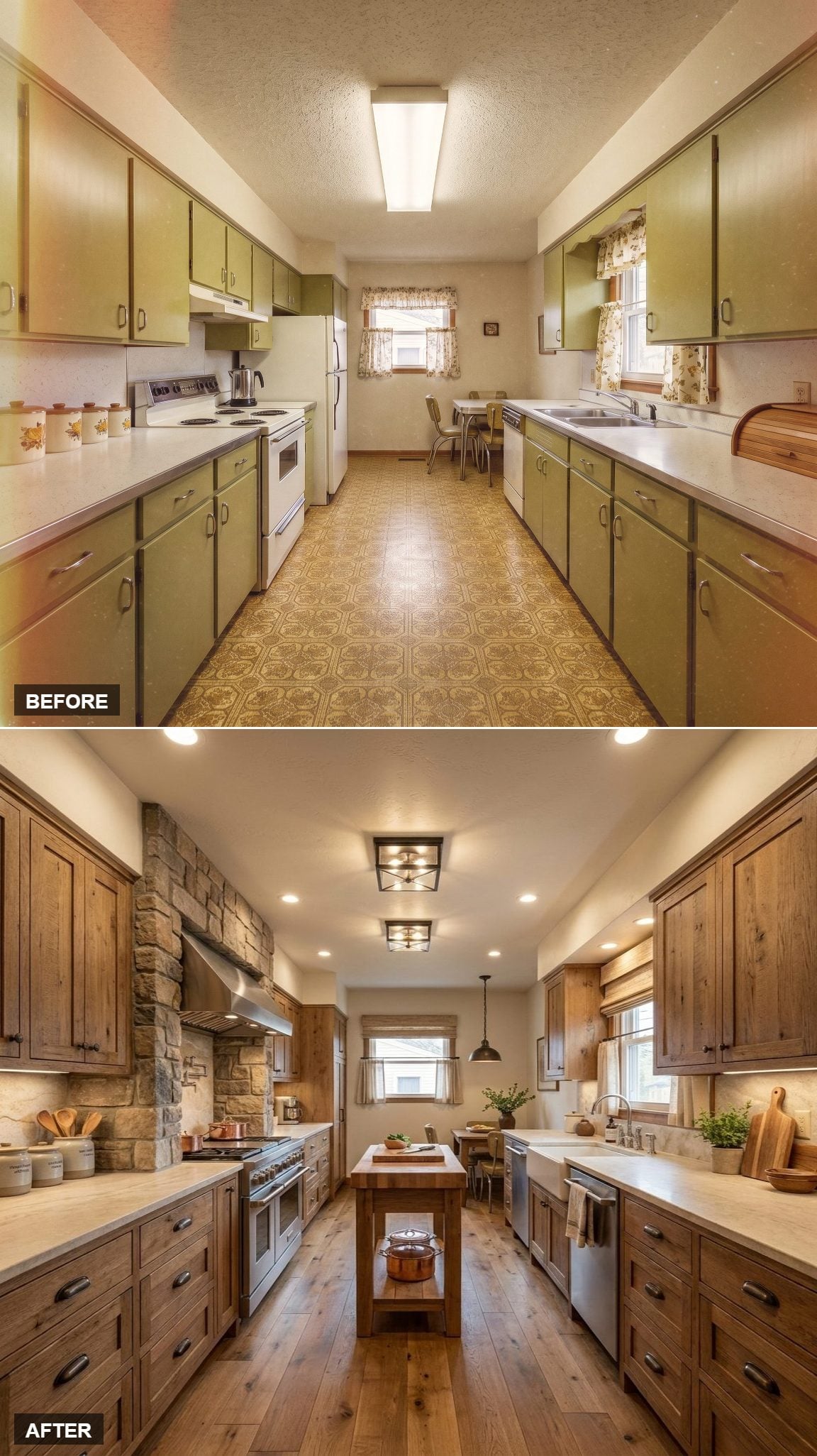
Knotty alder cabinetry brings a much rougher grain into the galley, and the stacked-stone hood surround doubles down on that texture rather than smoothing it out. Cup pulls stay visually quiet because the wood is already doing plenty.
Wide-plank oak flooring and a butcher-block island keep the materials in the same warm family. It is a heavy combination, but the shared undertones keep it from becoming chaotic.
Material Note: Stone, wood, and countertop finishes can carry a lot of visual texture when they share a similar warm undertone. The eye registers the relationship first, which keeps a material-heavy room from breaking into unrelated pieces.
22. Bleached Oak and Flush Mounts Go Almost Silent
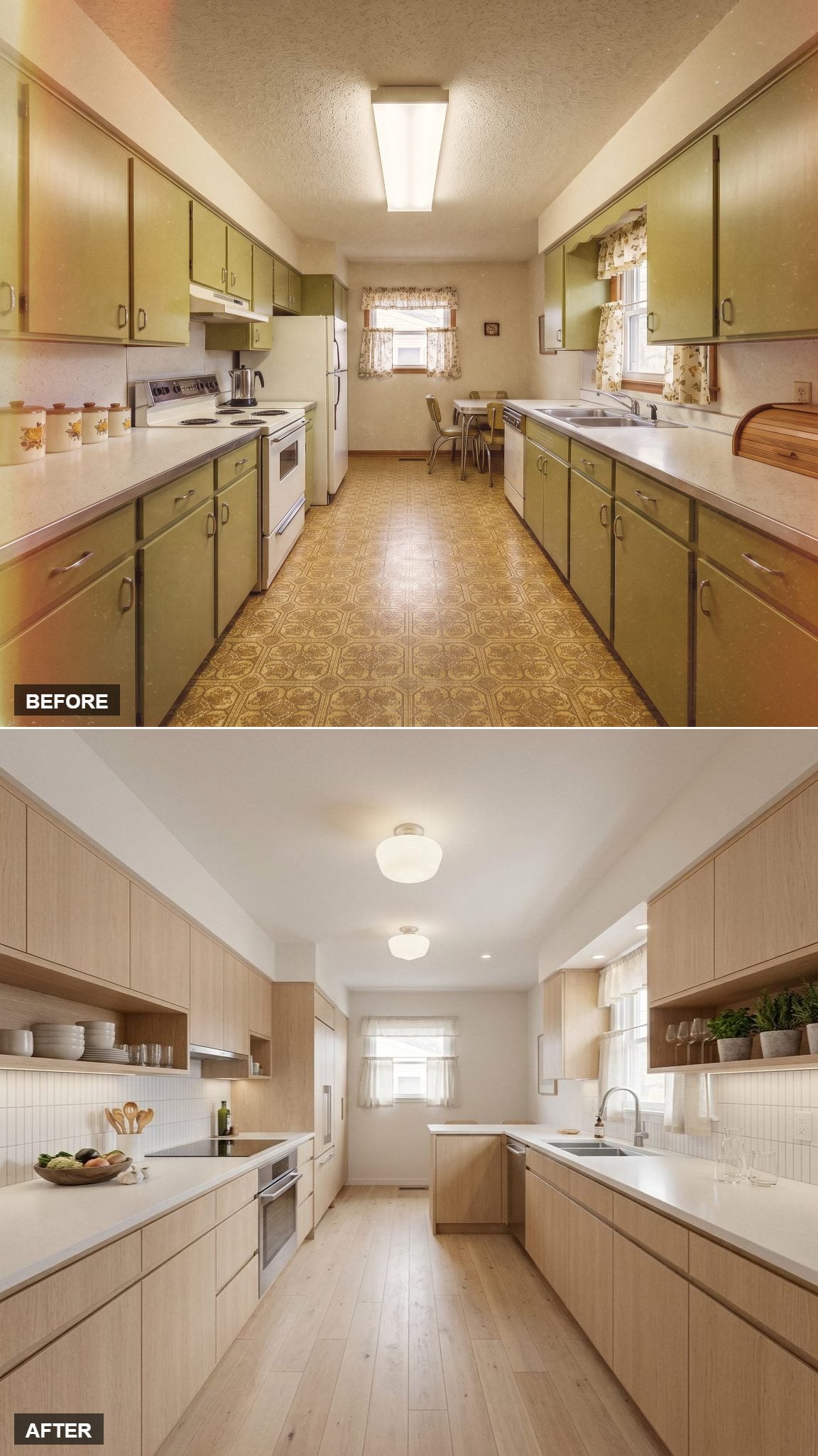
Light-washed oak runs the full length of the galley, paired with white counters and very little visual interruption. Open shelving on one side keeps the upper cabinetry from becoming a continuous wall.
Under-cabinet lighting handles the task light, while a pair of globe flush mounts stays close to the ceiling. Nothing here is trying to become the star, which is precisely why the room feels so controlled.
21. Slate Blue and Herringbone Oak Bring Pattern Without Clutter
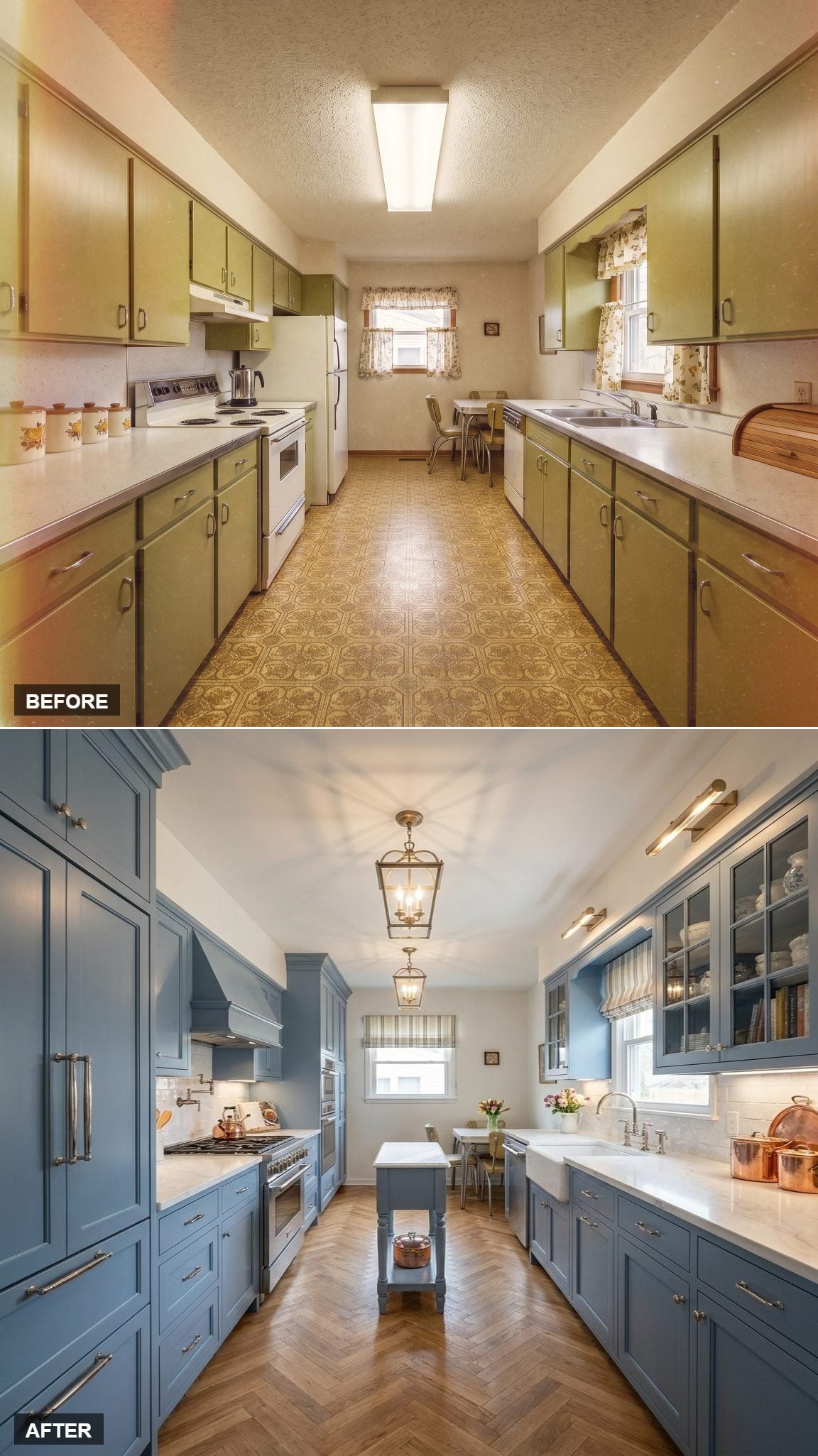
Slate blue shaker cabinets line both sides, with brass hardware warming the cooler paint. Glass-front uppers interrupt the solid door rhythm, while a small furniture-like island adds a softer element at center.
The herringbone wood floor gives the room movement from end to end without introducing another strong color. Lantern pendants repeat overhead in a quieter rhythm, and the farmhouse sink keeps the traditional side of the concept visible.
Designer’s Secret: A directional floor pattern such as herringbone can pull the eye along the length of a narrow galley. The effect depends on scale and orientation, but it is one of the easiest ways to give a long floor more movement without adding another material.
20. Greige Cabinets and Walnut Shelving Turn Lighting Into the Main Event
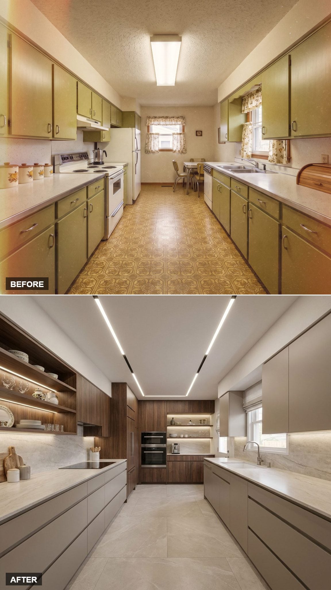
Recessed linear LEDs follow the ceiling from end to end, emphasizing the galley’s length without adding hanging fixtures. Soft greige base cabinets stay handle-free, while open walnut shelving replaces a conventional wall of upper doors.
Large-format stone-look flooring keeps grout lines to a minimum, and the built-in oven tower sits flush at the far end. The result is less about decoration than about making every line feel continuous.
19. Gray Shaker Cabinets Let the Mosaic Floor Take Over
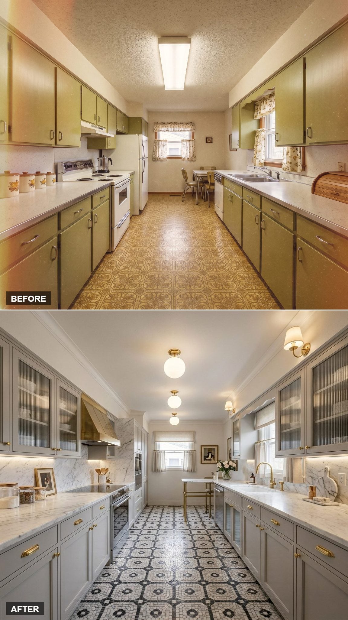
Gray shaker cabinets and brass pulls keep the walls restrained, while reeded glass fronts break up the upper storage. Globe flush mounts and small wall sconces layer the light without turning the ceiling into a parade of fixtures.
The black-and-white octagon-and-dot floor supplies the graphic hit. Marble-look counters and crisp trim keep the rest of the palette disciplined enough that the floor can stay busy without taking over completely.
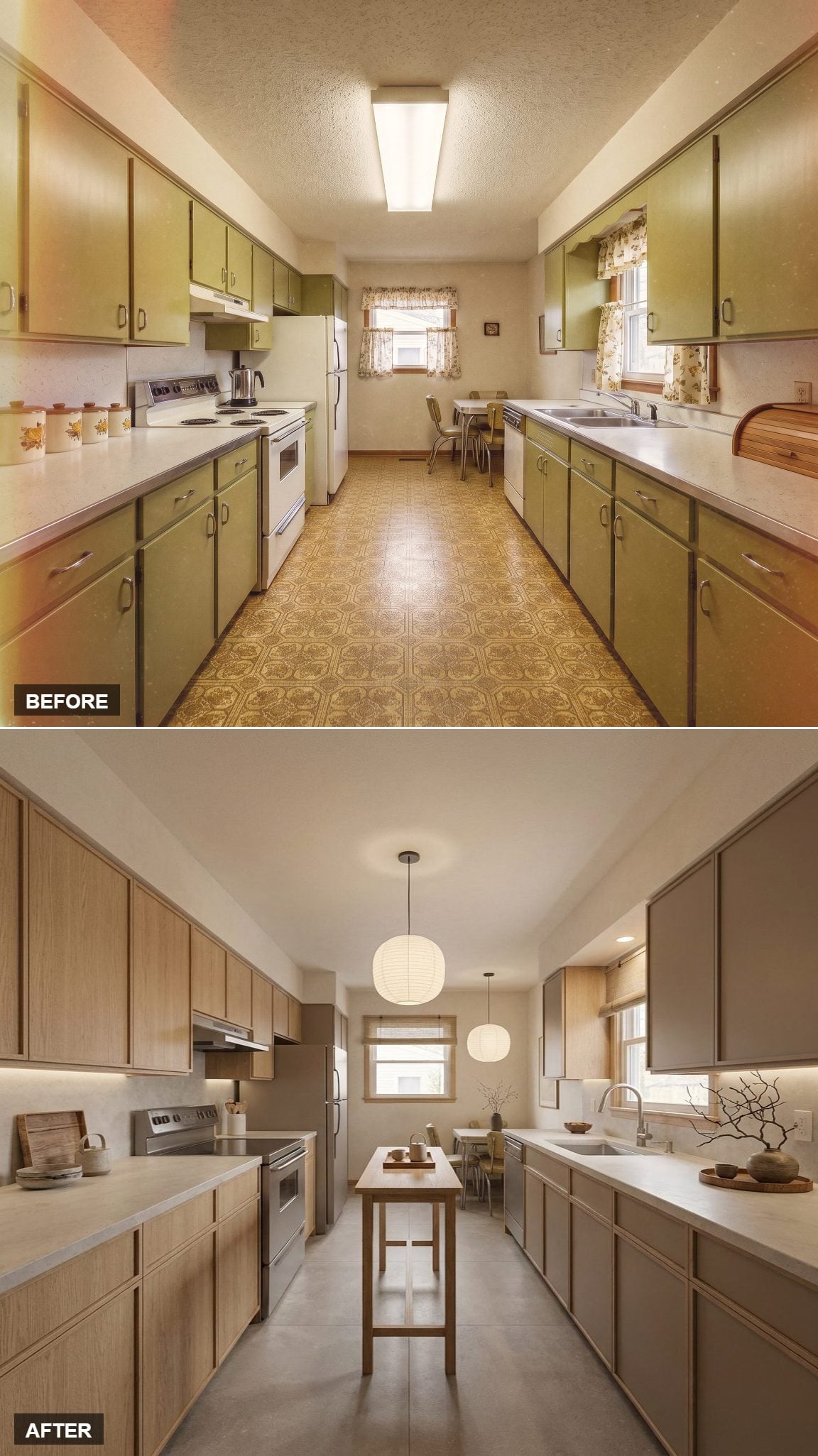
18. Paper Globes and a Slim Island Give This One Breathing Room
🔥 Would you like to save this?
Light oak upper cabinets sit above cooler greige lowers, creating a subtle two-tone effect without strong contrast. Two paper globe pendants soften the ceiling and keep the lighting visually light.
The narrow console-style island is the useful part. It adds prep surface while preserving a clear path through the galley and a direct sightline toward the dining nook.
17. Charcoal Cabinets and Brick Give the Galley a Harder Edge
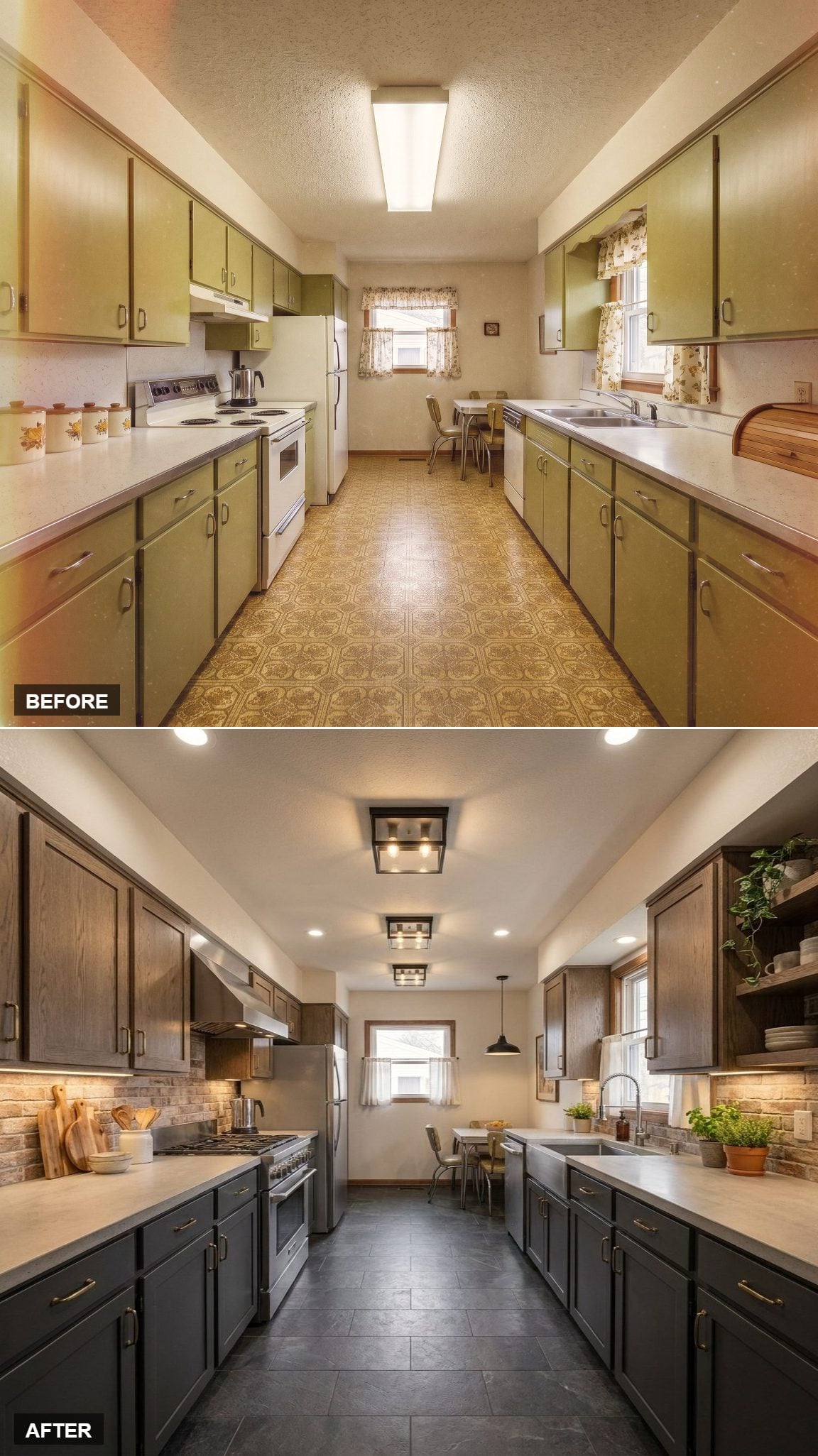
Dark-stained oak lower cabinets bring weight to the base of the room, while brass bar pulls add a narrow warm line across the fronts. A brick-veneer backsplash introduces rough texture without turning the whole kitchen rustic.
Three square black flush mounts keep the ceiling simple and graphic. This one works because it avoids the usual pendant-and-farmhouse-sink formula entirely.
16. Blue-Gray Cabinets and Terracotta Floors Find the Middle Ground
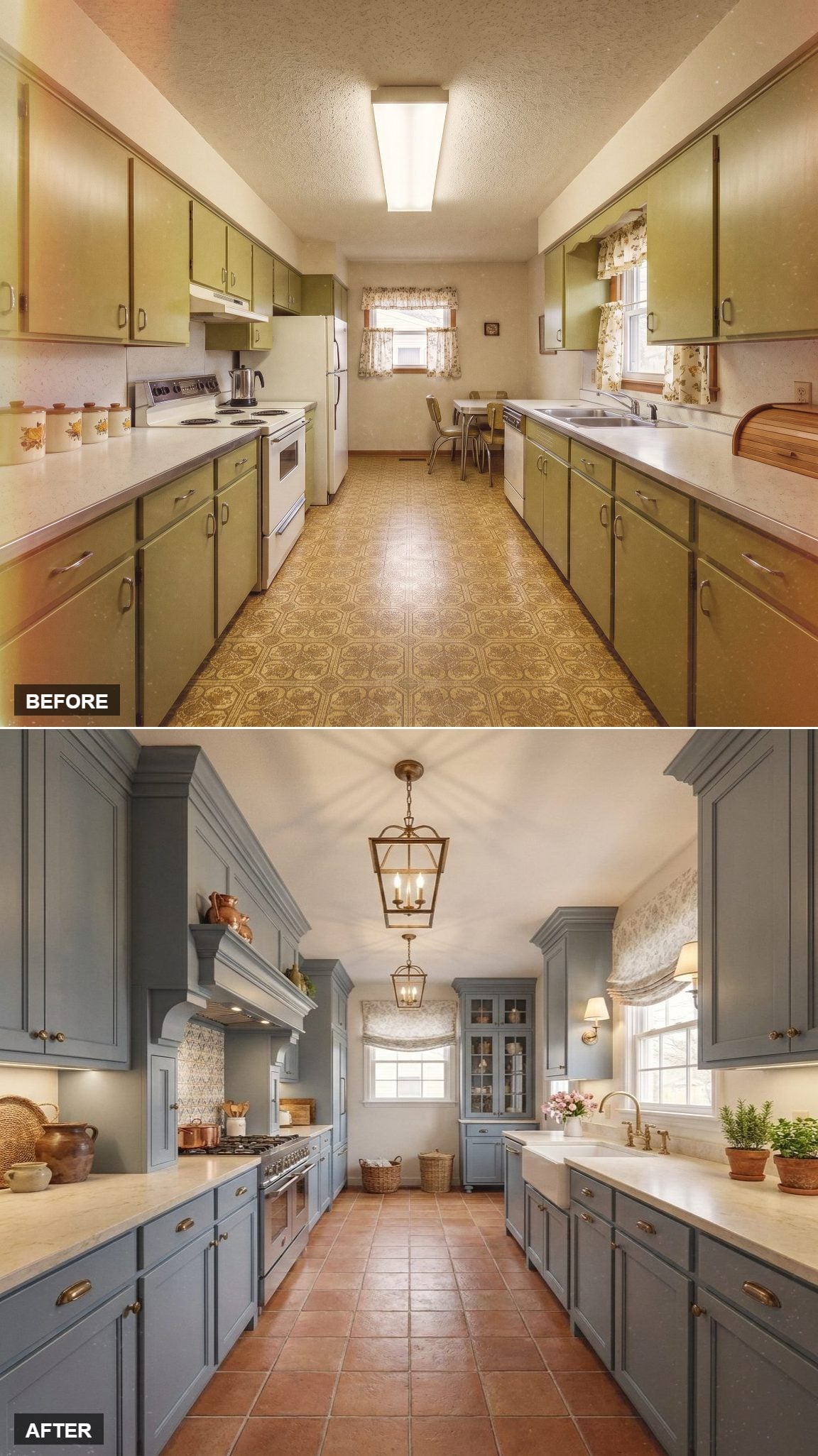
Blue-gray shaker cabinets bring a cool note to both walls, while brass cup pulls and lantern pendants keep the palette from becoming too chilly. Crown molding emphasizes the vertical edge of the cabinetry without demanding much attention.
Terracotta square tile warms the floor considerably, and a decorative panel behind the range introduces just enough pattern to stop the room from feeling overly controlled.
Design Note: In a narrow kitchen, repeating one metal finish across hardware, lighting, and plumbing can reduce visual noise. Terracotta tile adds another advantage: natural color variation tends to disguise everyday wear better than a perfectly uniform surface.
15. Matte Black Cabinetry Turns Veined Stone Into the Decoration
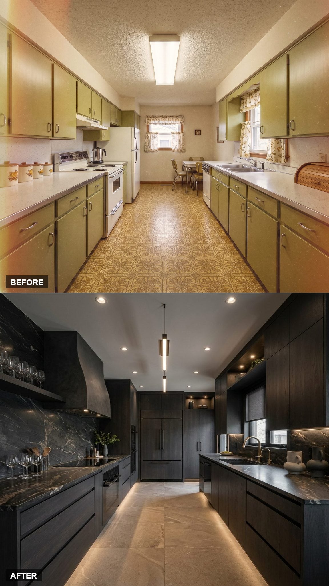
Dark stained cabinetry creates a near-monochrome envelope, leaving the veined stone counters and backsplash to supply the movement. Under-cabinet lighting catches the stone and makes the pattern much more visible after dark.
A single linear pendant stays narrow and direct. There is very little softness here, which gives the room a much sharper personality than the oak and shaker concepts around it.
14. Taupe Shaker Cabinets and Butcher Block Keep the Galley Traditional
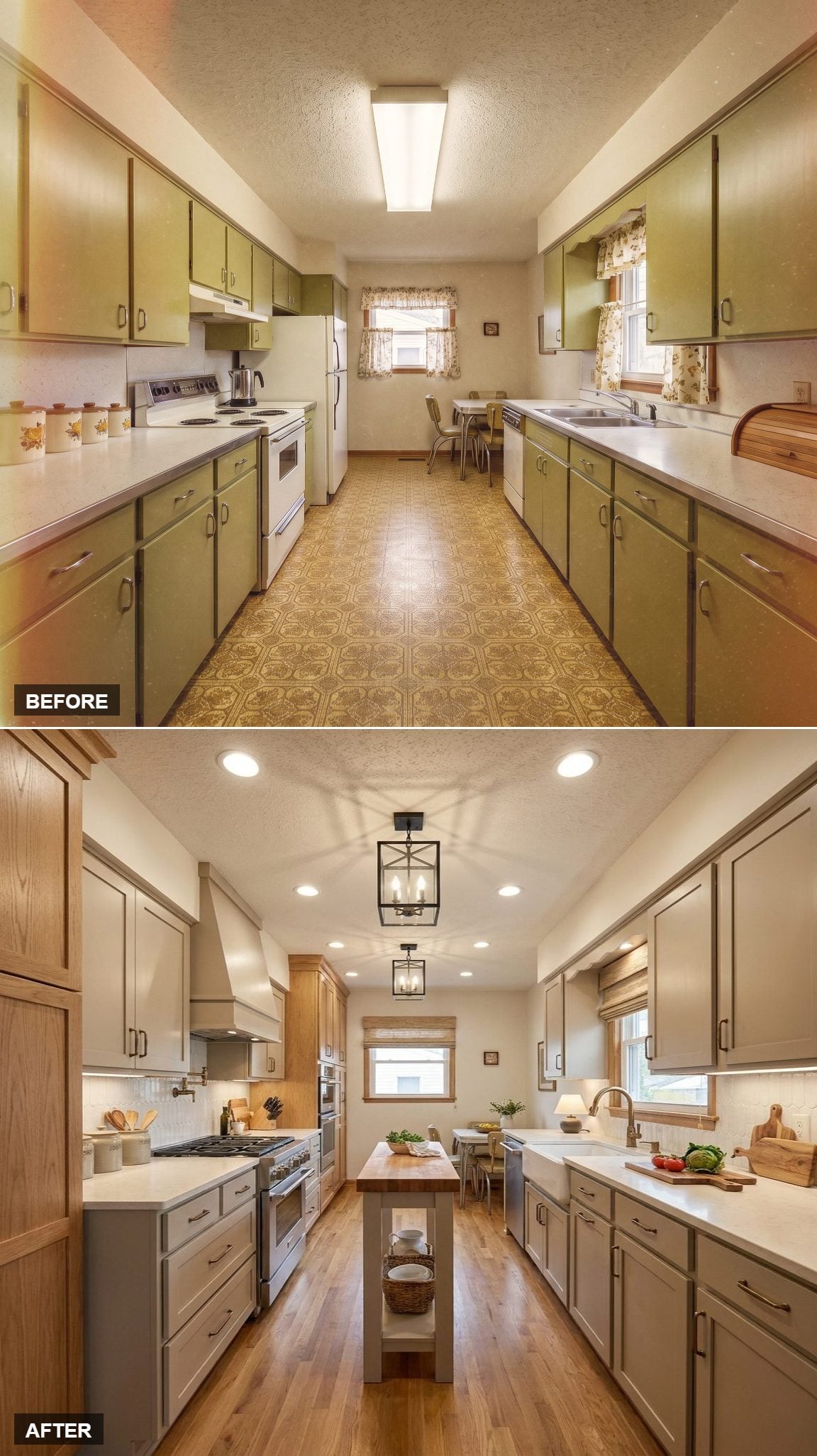
Taupe shaker cabinetry, brushed nickel hardware, and white quartz establish a quiet base. A compact butcher-block island adds a warmer material at center without consuming too much circulation space.
Replacing fluorescent-style overhead lighting with lantern pendants changes the entire character of a narrow kitchen. A wood-trimmed hood repeats the island’s warmth on the range wall, while the two fixtures give the long ceiling a steady rhythm without making it feel crowded.
13. Dark Green and Fluted Glass Push the Galley Toward Drama
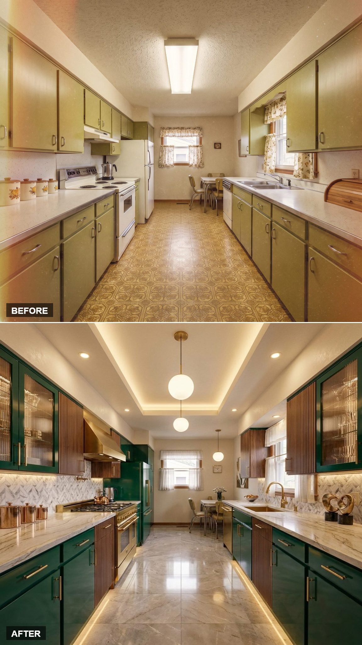
Deep hunter green cabinetry fills both walls, but alternating solid and fluted-glass upper fronts keep the color from becoming one continuous block. Warm wood behind the glass adds another layer without introducing a new hue.
Marble-look counters and a geometric backsplash bring in lighter pattern, while cove lighting washes the tray ceiling and globe pendants drop through the center. The lighting is what keeps such a dark scheme from feeling compressed.
Why It Works: Cove lighting spreads ambient light across the ceiling and upper walls instead of sending it straight down. In a dark galley, that broader wash can reduce harsh shadow pockets and make the room feel less enclosed.
12. Cream and Walnut Split the Galley Into Warm and Light Zones
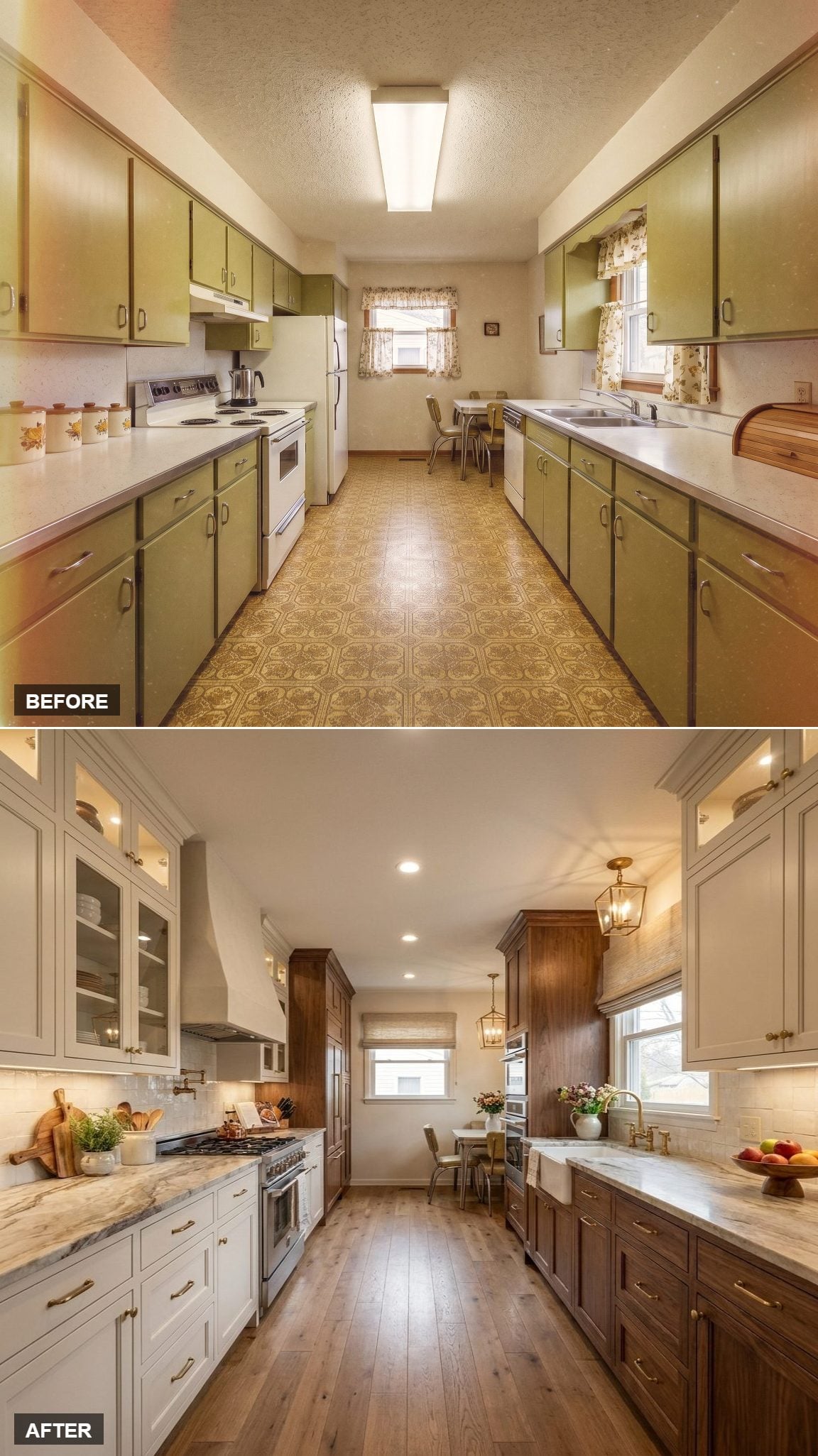
Cream uppers with glass fronts brighten one side while walnut lower cabinetry gives the opposite run more weight. The contrast is noticeable without becoming stark.
Strongly veined stone counters bring movement between the two finishes, while brass pulls and a farmhouse sink add warmer detail. A lantern-style pendant near the dining end makes the transition toward the next room feel deliberate.
11. Powder Blue Cabinets Let the Stone Floor Stay Quiet
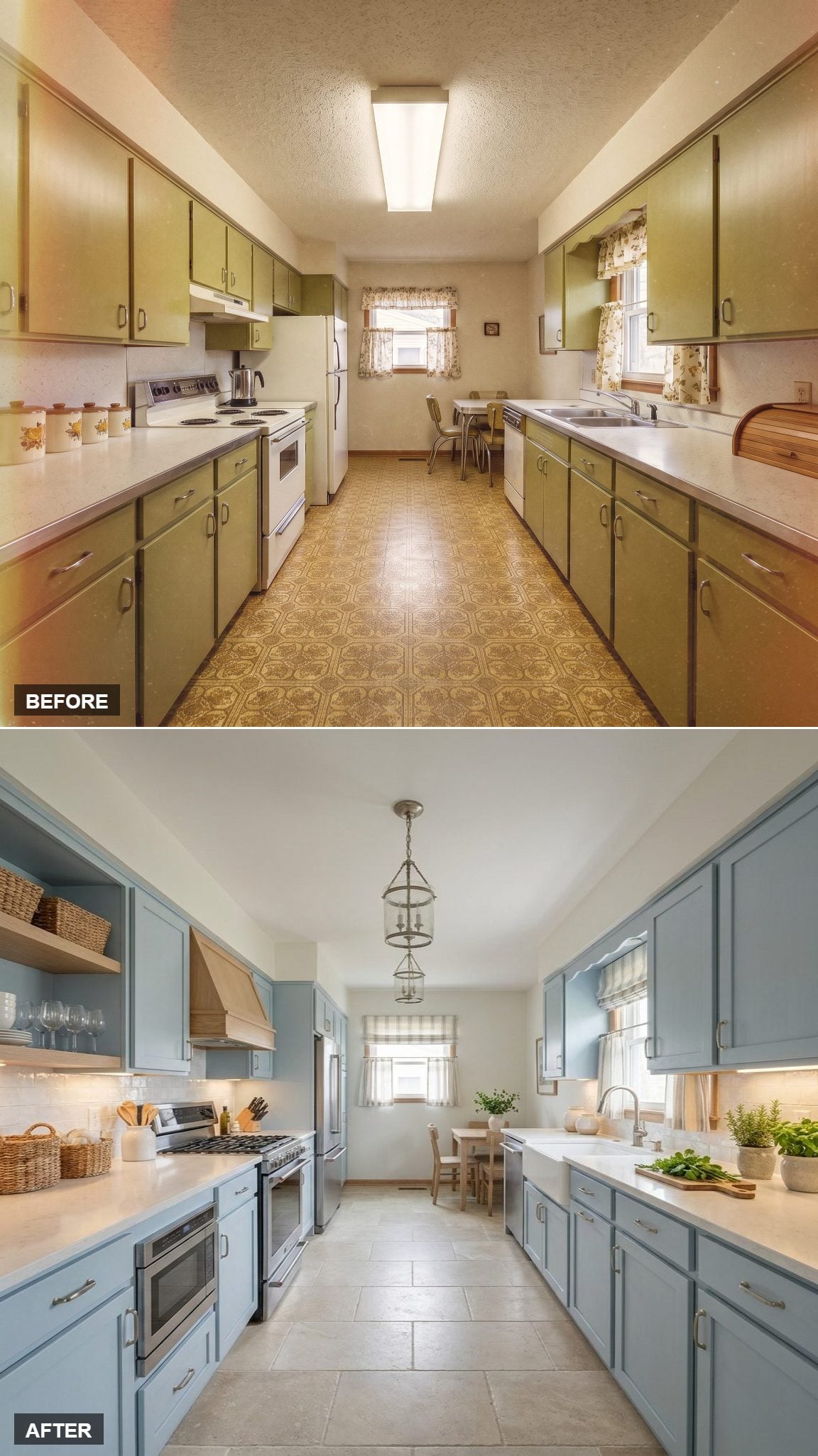
Soft powder blue cabinetry keeps the galley light without defaulting to white. Open shelving interrupts the upper run, with woven baskets adding texture that the painted fronts do not have.
Large-format warm stone tile settles the floor, and a single cage pendant marks the center without blocking the sightline toward the dining area. This one succeeds by keeping almost everything low-key.
10. Whitewashed Oak and Toe-Kick LEDs Make the Floor Seem to Float
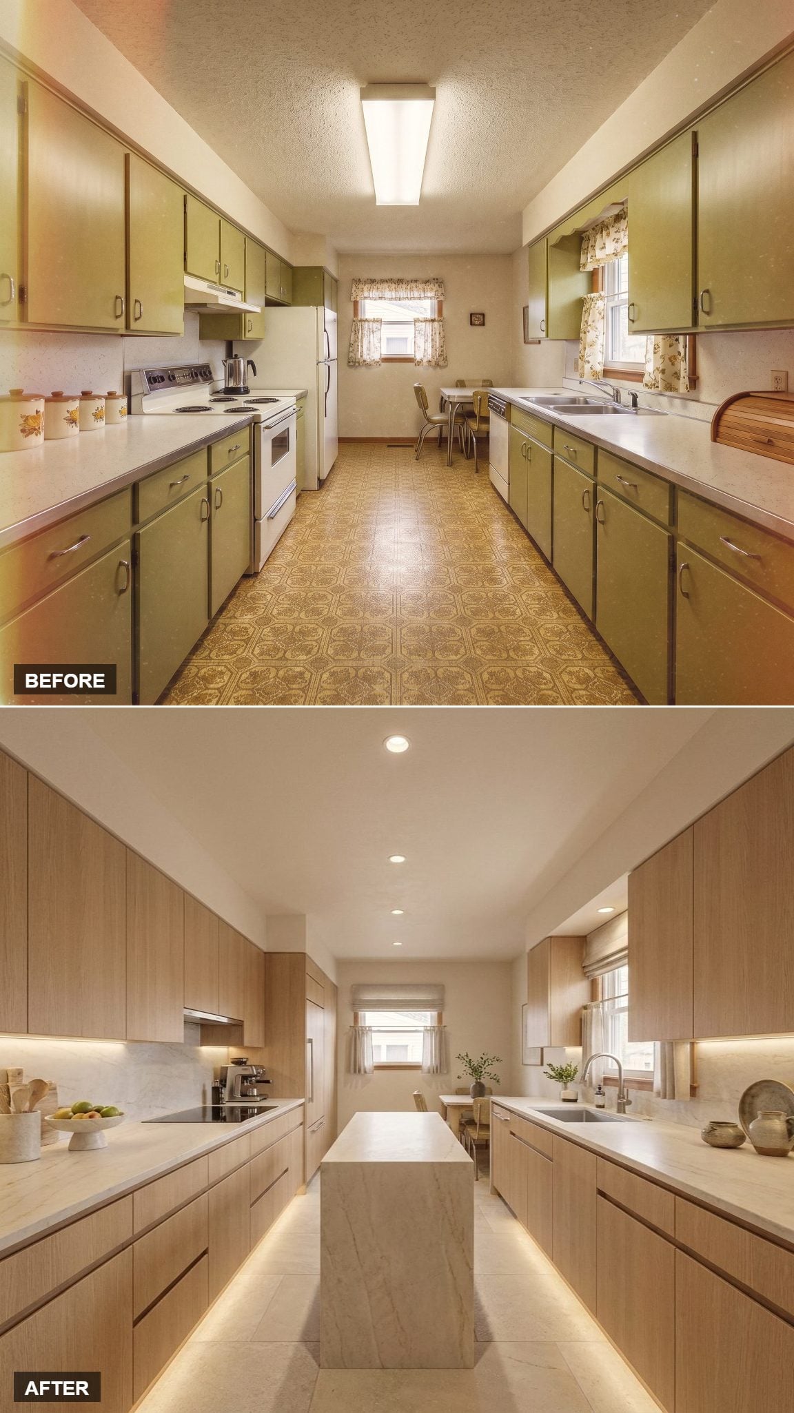
Natural oak cabinetry runs uninterrupted across both sides with no visible hardware, leaving the grain to provide most of the texture. White quartz counters and a waterfall island keep the geometry crisp.
The toe-kick lighting changes the room after dark. A continuous amber line along the cabinet bases separates the cabinetry from the floor and gives the lower half of the galley an almost floating effect.
9. Cream Cabinets and Brick Herringbone Put the Warmth Underfoot
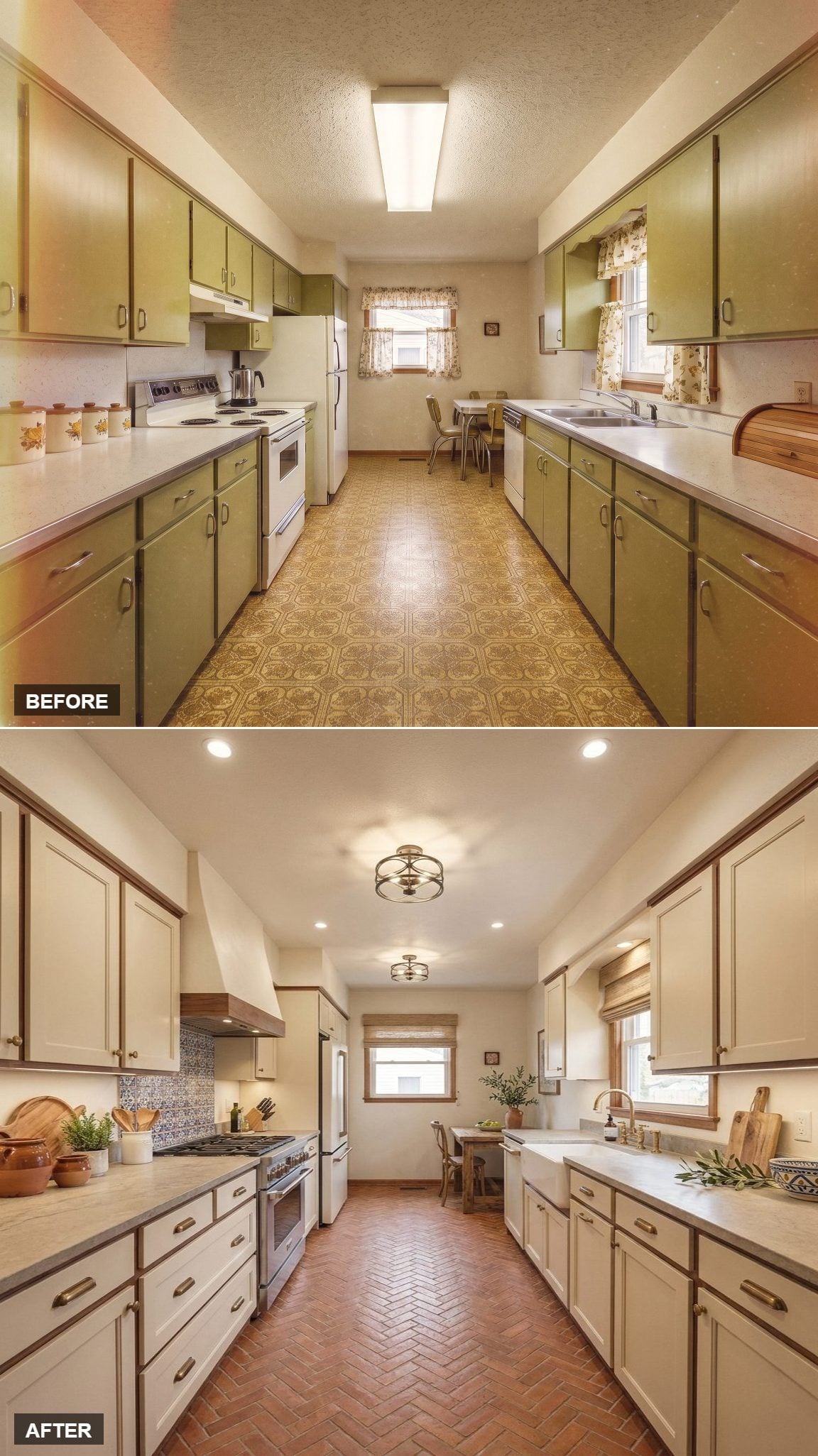
Cream shaker cabinets keep the walls soft and light, with wood-toned trim adding just enough contrast at the top edge.
The floor carries the personality: terracotta brick laid in herringbone introduces deep variation and texture from one end of the galley to the other. Brass pulls and a farmhouse sink stay secondary, which is exactly where they belong here.
8. Greige Uppers and Walnut Lowers Give the Range Wall More Weight
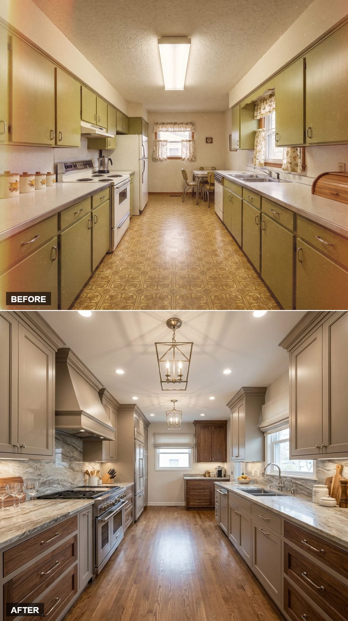
Greige painted uppers sit above walnut base cabinets, creating a warm two-tone scheme that works particularly well in a narrow room. The range hood is wrapped in the same stone family as the counters and backsplash, which gives that wall more visual mass.
Two lantern pendants repeat down the center, and warm wood flooring connects the walnut cabinetry back to the floor plane. The room feels composed without every element needing to match.
7. Slate Blue Lowers and Open Oak Shelves Keep the Top Half Light
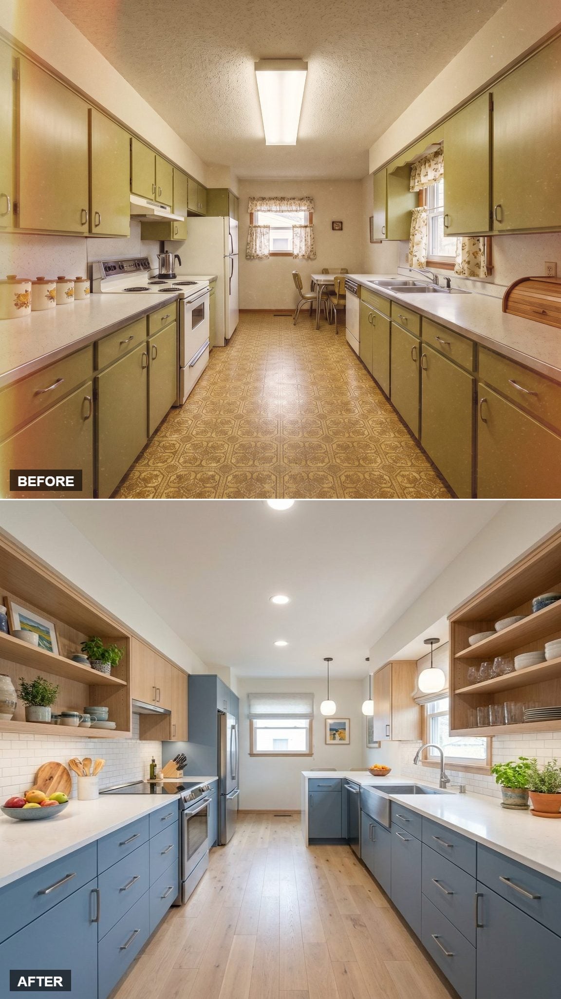
Muted slate blue lower cabinets run along both sides, while open light-oak shelving removes much of the visual weight above counter height. White quartz and subway tile keep the middle band clean.
Light oak flooring continues that warmer note below. Globe pendants gather near the far end, giving the dining side a little more presence and keeping the long galley from fading into one continuous corridor.
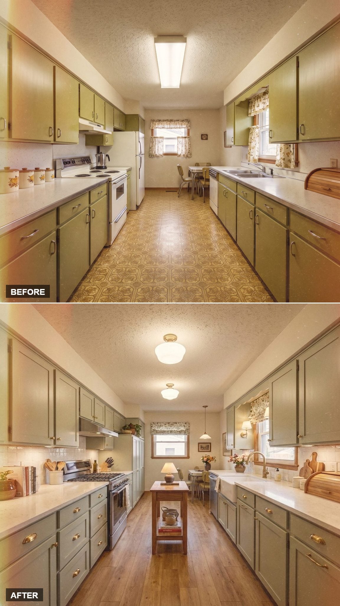
6. Sage Cabinets and Brass Keep the Traditional Formula Simple
🔥 Would you like to save this?
Sage green shaker cabinets bring color without dominating the narrow room. Brass cup pulls add warmth against the paint, while a farmhouse sink introduces a familiar traditional detail.
What helps is restraint. There is no need for another strong pattern or another dramatic fixture because the cabinet color already gives the galley enough identity.
5. Dusty Blue Cabinets and Warm Wood Keep the Palette From Going Cold
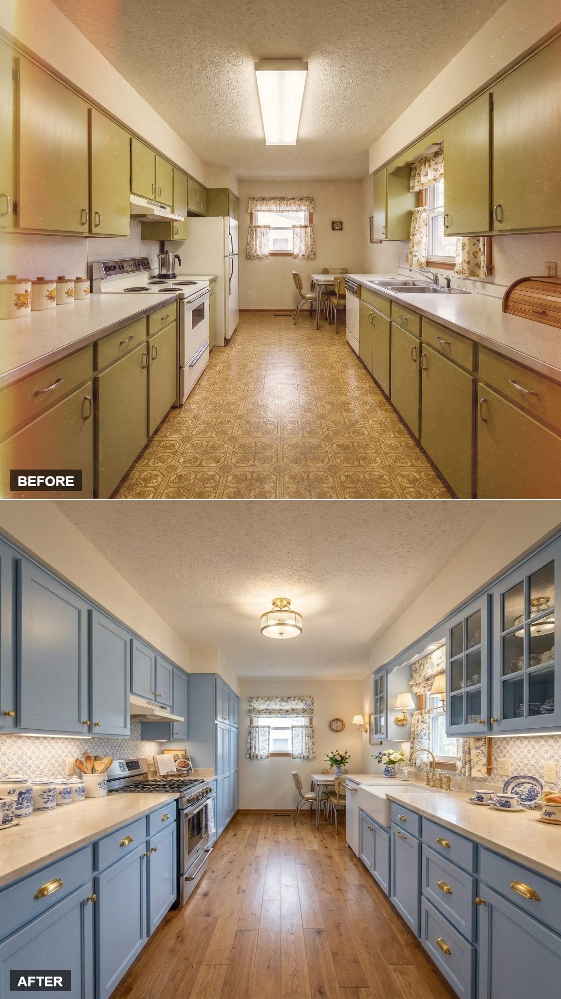
Blue-gray shaker cabinets line both sides, with brass cup pulls and honey-toned wood flooring warming the cooler paint. Glass-front upper cabinets reduce the weight of the storage wall without giving up enclosed space.
A farmhouse sink sits beneath the window, while patterned tile and a floral Roman shade introduce a softer decorative note. Brass wall sconces near the dining end repeat the hardware finish without making the whole room feel coordinated to death.
4. Forest Green and Schoolhouse Globes Give the Galley a Library Mood
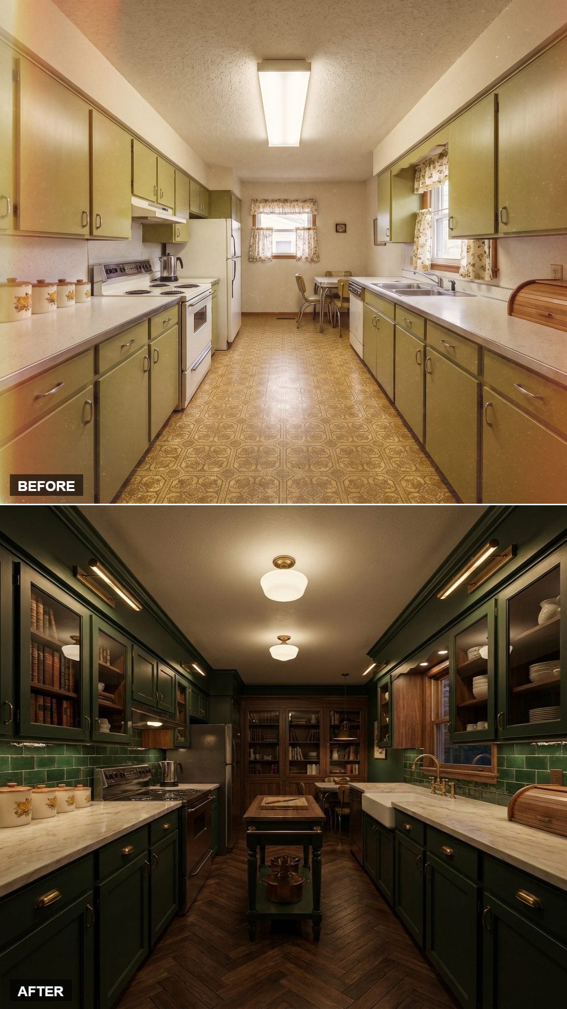
Deep forest green cabinetry runs floor to ceiling, with brass cup pulls punctuating the long door fronts. Open shelving near the back keeps the upper wall from becoming too uniform.
Schoolhouse globe pendants add a softer vintage reference overhead, while herringbone wood flooring supplies movement below. The result feels less like a farmhouse kitchen and more like a compact study that happens to contain a range.
3. Warm Oak and Globe Flush Mounts Make a Case for Keeping Things Simple
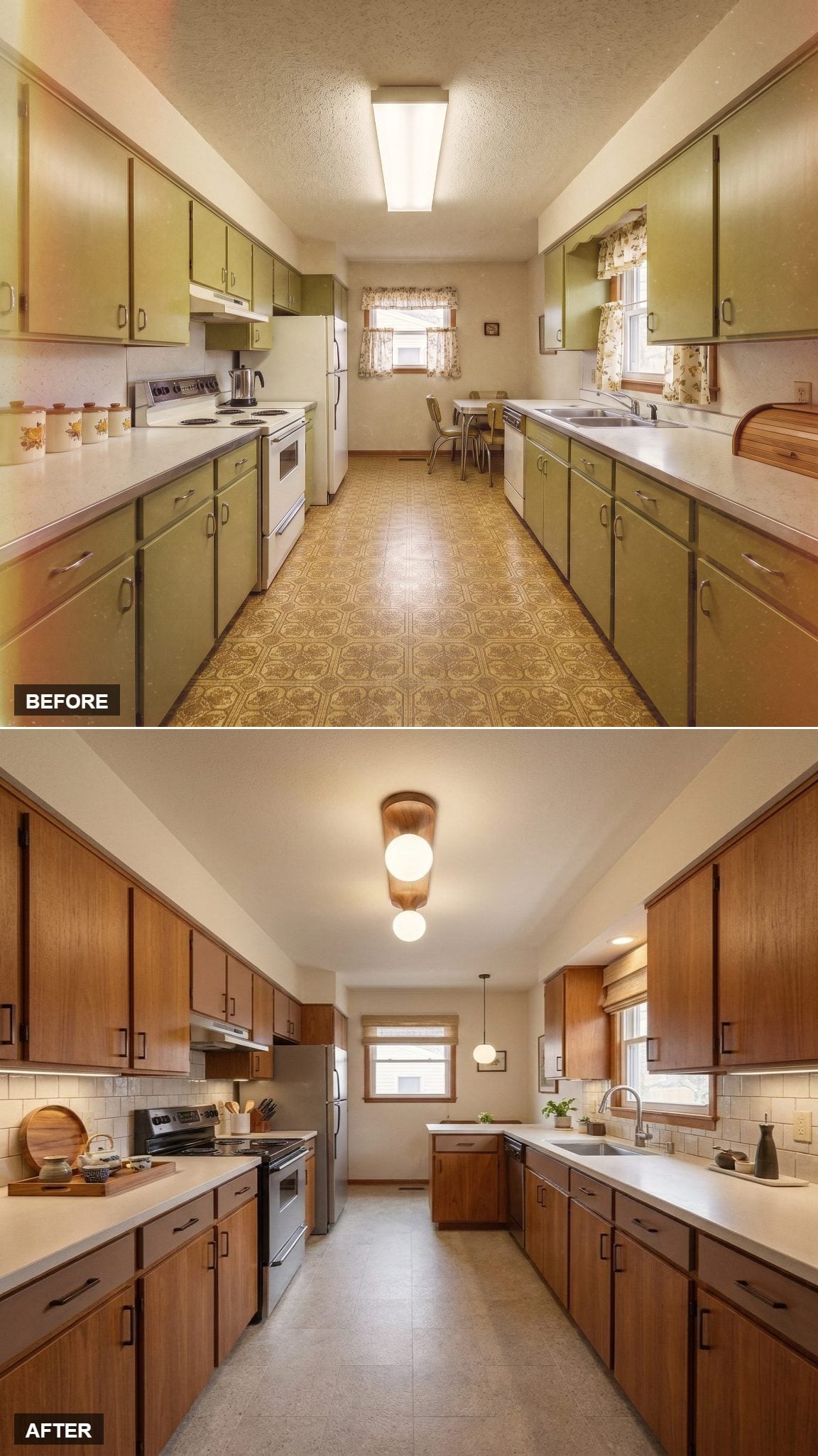
Medium-toned oak cabinets bring enough grain that the flat black hardware can stay almost invisible. White quartz and subway tile brighten the working surfaces without turning the palette stark.
A wood-capped flush mount with staggered globe bulbs gives the ceiling a little personality without requiring pendant clearance. Neutral floor tile keeps the rest of the room steady and practical.
2. Taupe Flat-Fronts Show What Good Recessed Lighting Can Do
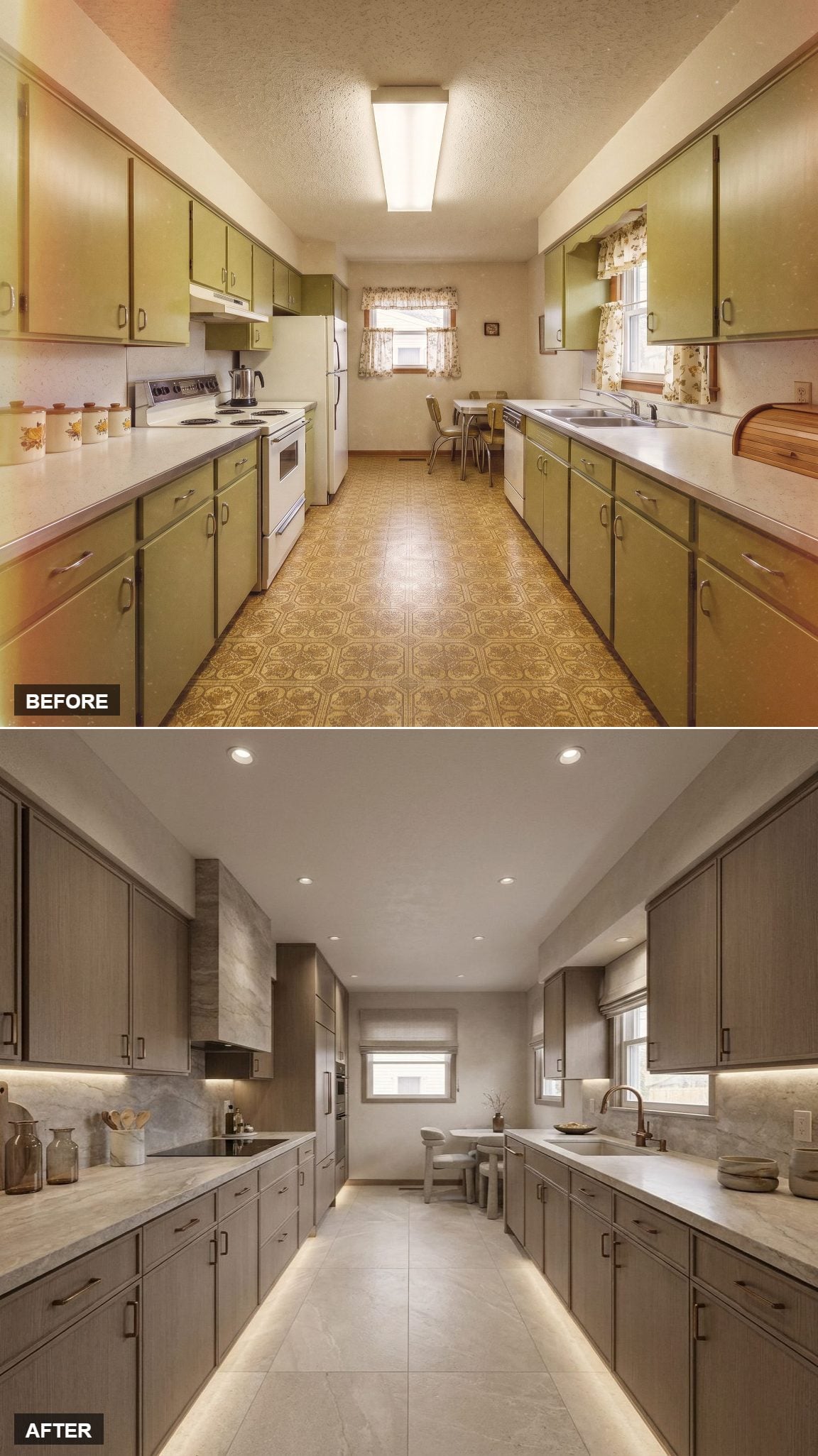
Gray-brown flat-front cabinets give the walls a low-contrast finish, while softly veined stone carries across the counters and backsplash. Under-cabinet LEDs keep the work surface bright without adding visible fixtures.
Evenly spaced recessed cans clean up the ceiling and distribute light more consistently along the galley. Large-format cream floor tile extends the same quiet approach underfoot, with a bronze faucet providing one controlled point of contrast.
1. Teal and Walnut End on a Stronger Note Than Beige Ever Could
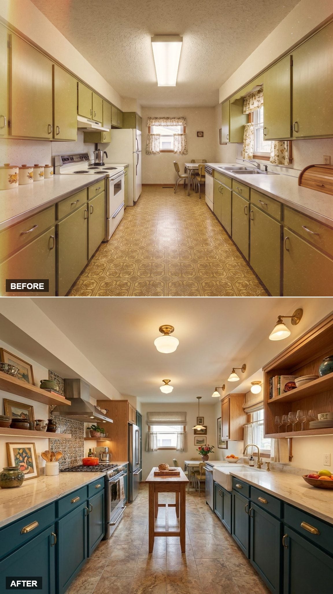
Teal lower cabinets with brass pulls give the long room a saturated base, while open walnut shelving keeps the upper half lighter and more relaxed. Stone tile floors bring the palette back toward neutral.
A slim wood island adds prep space without blocking the corridor, and schoolhouse fixtures introduce a softer period reference overhead. After thirty different directions, that may be the clearest lesson in the whole exercise: the old galley did not need one correct answer. It needed someone willing to stop treating its original choices as permanent.