🔥 Would you like to save this?
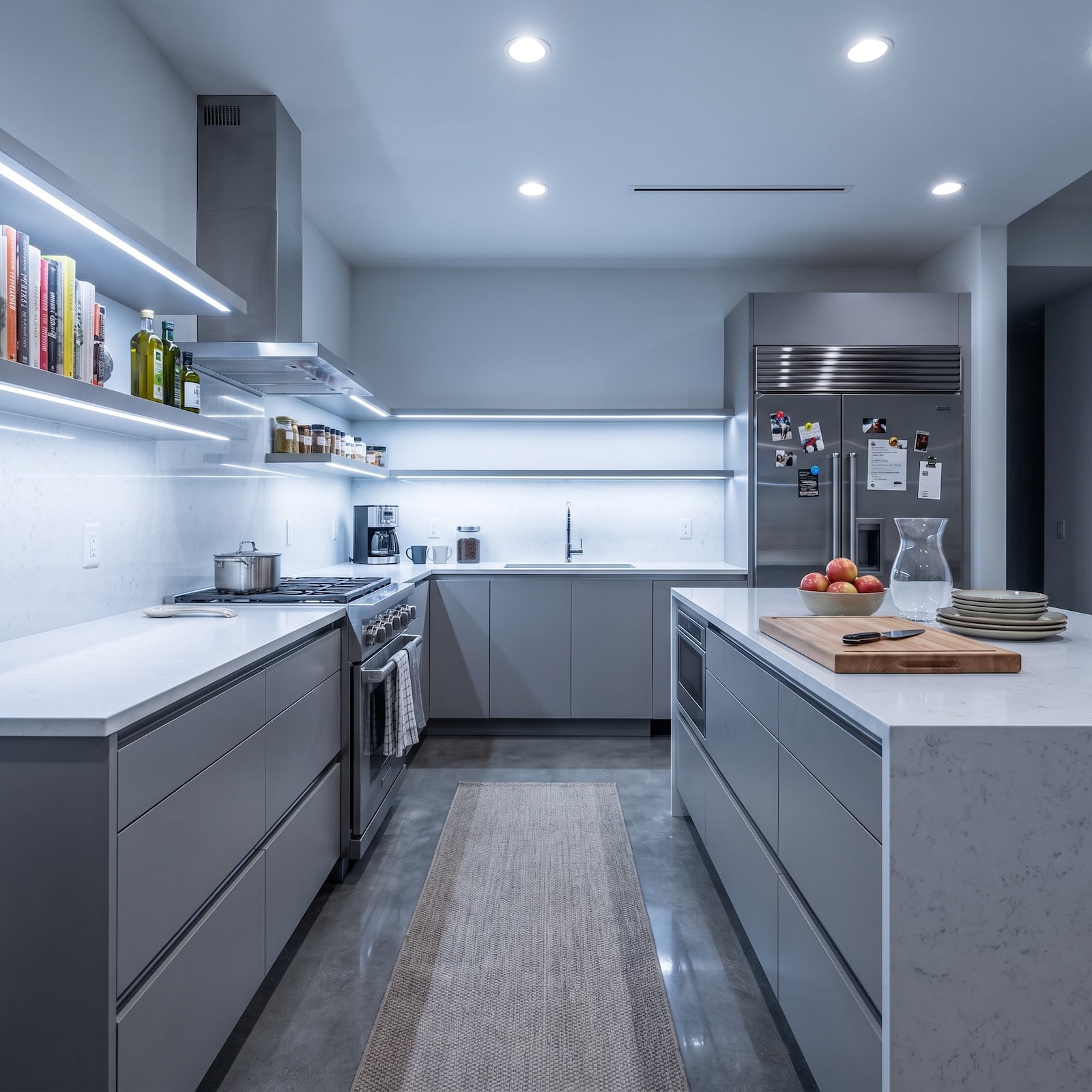
A cold kitchen can be immaculate and still feel like nobody has ever lingered there after dinner. White light ricochets off stainless steel. Gray cabinetry behaves itself. Every surface looks wipeable, expensive, and faintly allergic to fingerprints. Nothing is technically wrong. That’s almost the problem.
In order to come up with the very specific design ideas, we create most designs with the assistance of state-of-the-art AI interior design software. Also, assume links that take you off the site are affiliate links such as links to Amazon. this means we may earn a commission if you buy something.
These 34 AI redesigns attack that chill from different directions. Some bring in walnut, oak, cherry, or figured wood. Others go straight for mustard yellow, plum mosaic, blue stone, floral tile, copper, plaster ornament, or lighting that refuses to behave like an operating room. The interesting part is not simply making everything darker or more expensive. It is watching texture, color, pattern, and shadow give the same basic room an entirely different pulse.
Not every idea would survive a contractor, an engineer, or a budget meeting exactly as rendered. That is part of the fun. The strongest concepts show where warmth actually comes from — contrast, grain, irregularity, softer light, and the occasional decision nobody on a resale spreadsheet would have dared to make.
34. Mustard Cabinets and a Slatted Ceiling Broke the Walnut Monopoly
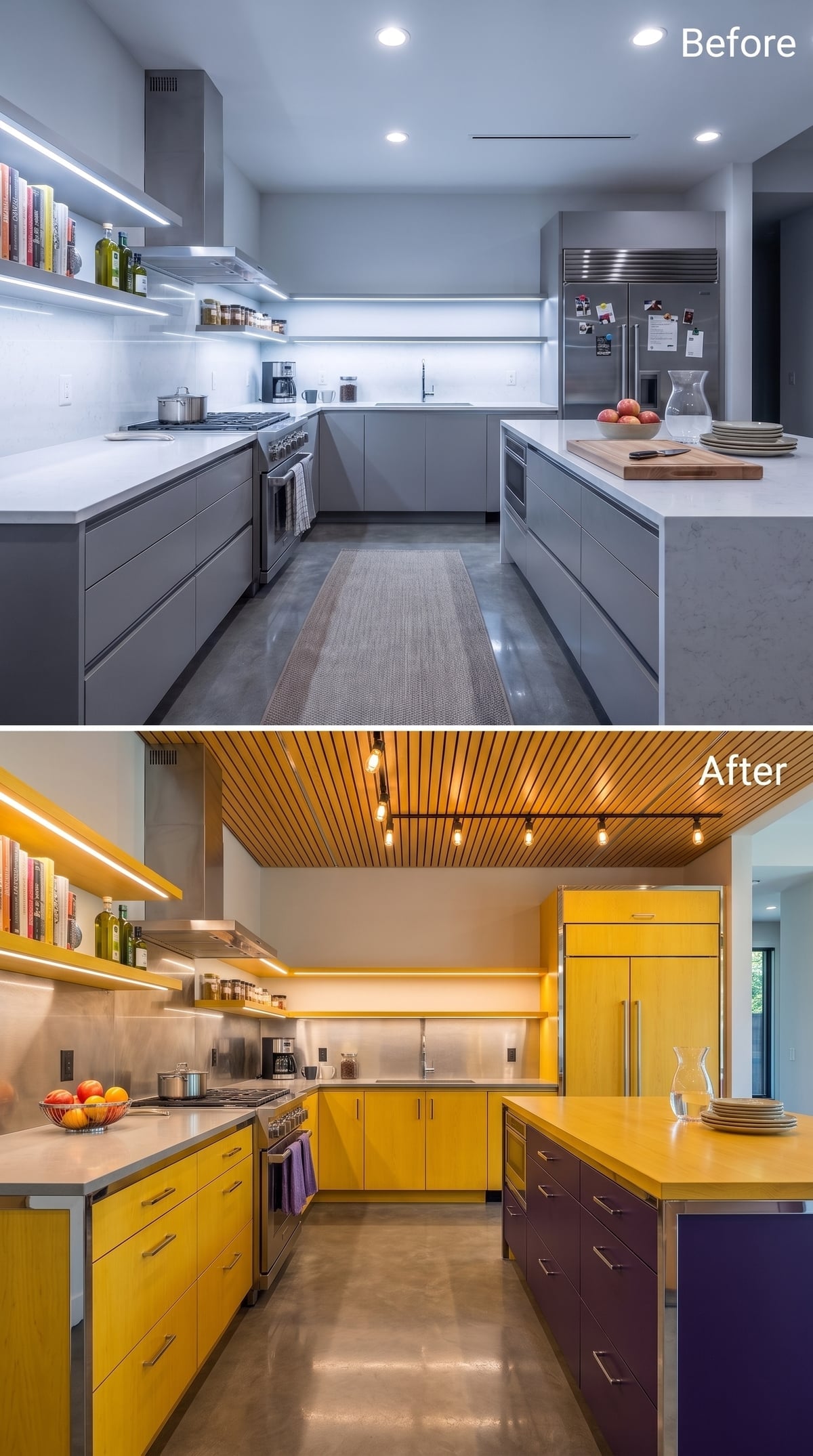
Mustard-yellow cabinetry against stainless steel should feel like two different kitchens arguing across a property line. Instead, the wood-slat ceiling mediates.
Exposed-bulb track lighting throws warmer light downward, while deep plum cabinetry at the island gives the yellow something darker to push against. The result is energetic without becoming confectionery.
Color Note: Yellow can read dramatically different depending on saturation and surrounding materials. Here the muted mustard tone works because stainless steel cools it down while plum and wood keep the palette from drifting into all-over brightness.
33. Navy Walls and Pale Wood Proved Warmth Does Not Require a Brown Room
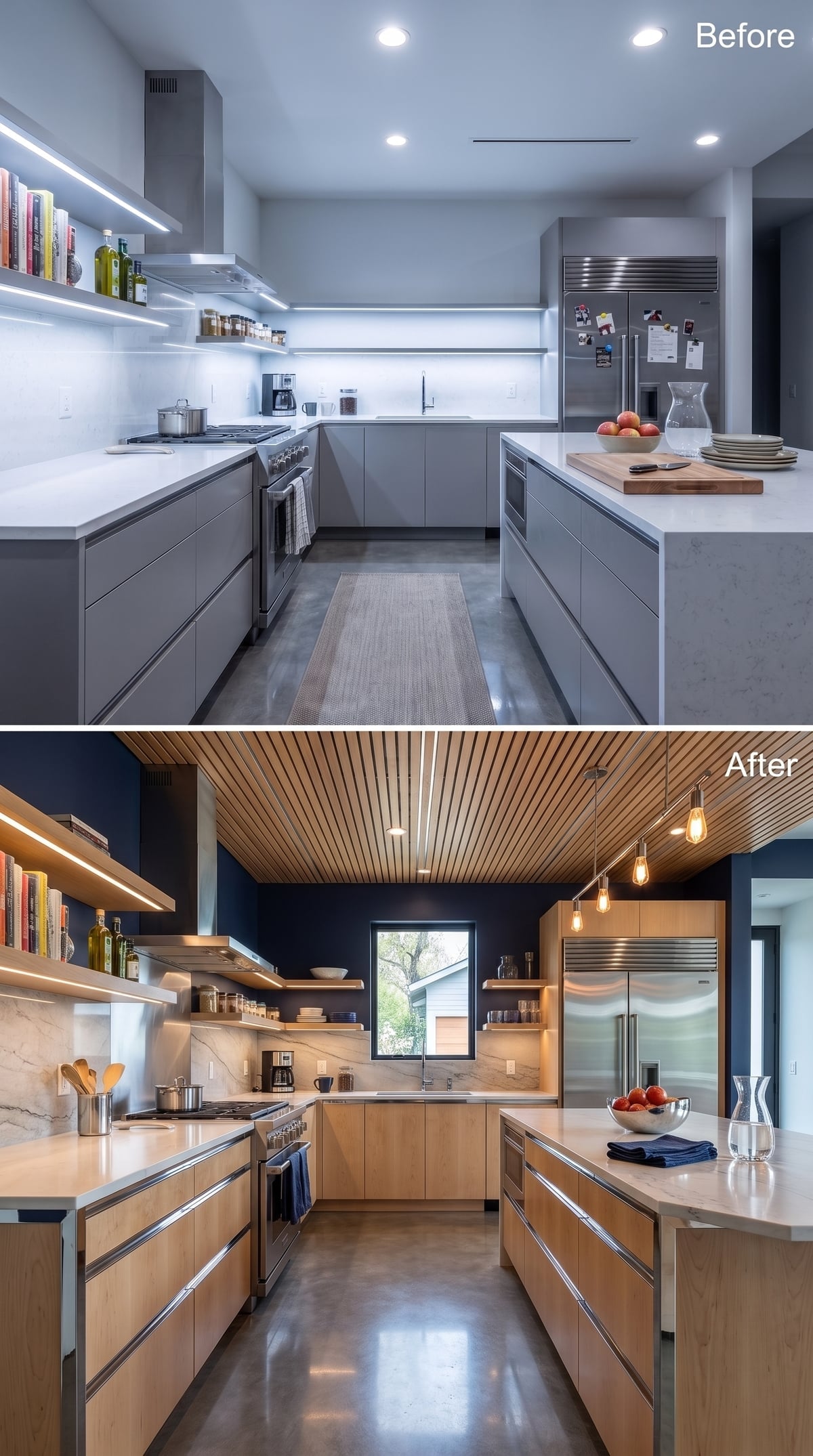
Flat-panel maple-look cabinetry sits against deep navy walls, creating enough contrast that the pale wood seems warmer without changing color at all.
Edison-style pendants drop warmer points of light over the island, but the slatted ceiling is the move that stops the dark walls from making the room feel enclosed. It carries the light wood tone overhead and gives the eye a route through the space.
32. Zebra-Wood-Look Cabinets, Terracotta, and Terrazzo Refused to Pick One Texture
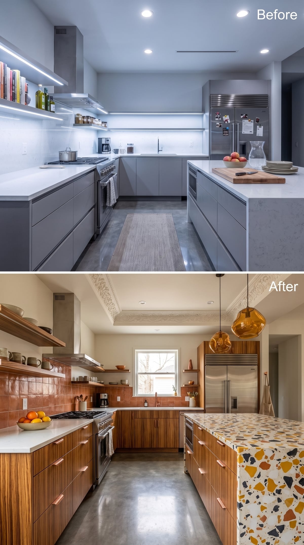
Striped zebra-wood-look cabinetry immediately gives the lower run movement, with copper-toned pulls repeating the horizontal grain instead of interrupting it.
Terracotta-look backsplash tile climbs the wall in an irregular brick pattern while open walnut-toned shelving carries the wood upward. Then the island changes materials completely: pale terrazzo-look surfacing scattered with mustard, rust, and charcoal fragments.
Amber pendants hover above like small sculptures, and ornamental plaster-style crown detailing gives the ceiling one last chance to join the conversation.
31. Malachite-Look Counters and a Crystal Chandelier Went Straight for High Drama
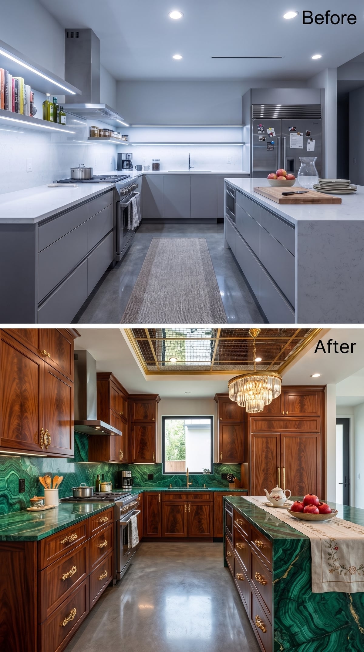
Green malachite-look surfacing covers the counters and waterfall island with enough movement to dominate the room before the chandelier even switches on.
Wood cabinetry and ornate gold-toned hardware keep the green from floating free of the architecture, while a tiered crystal fixture hangs beneath a brass-trimmed recessed ceiling detail.
Material Reality: Real malachite is a specialty decorative material and would be an unusual choice for broad kitchen work surfaces. A buildable version could capture the same swirling green effect with engineered stone, porcelain, printed slab material, or another surface selected for kitchen durability.
30. Cherry-Toned Cabinets and a Copper Hood Put the Warmth Where You Could See It
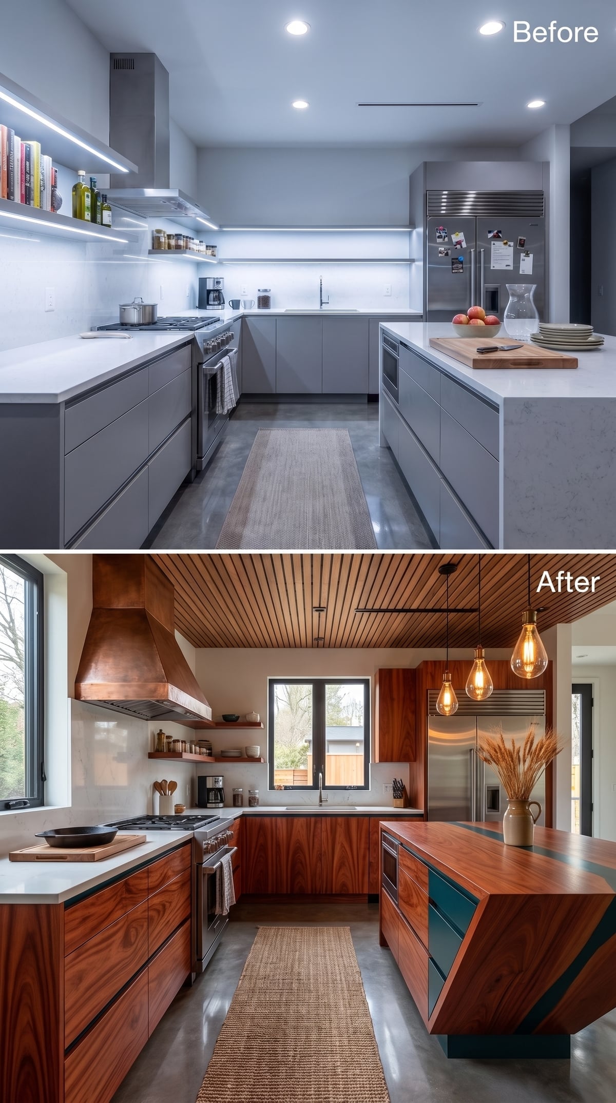
Deep cherry-toned cabinetry covers the walls, but the copper-look range hood is what establishes the center of gravity.
Low pendants hang over an island topped with live-edge-style wood and teal resin-like channels, a combination that could easily become novelty furniture but stays controlled here because the surrounding palette is so dark.
The slatted ceiling repeats the wood overhead without needing another ornamental flourish.
Material Note: Unsealed copper changes color over time as its surface oxidizes, while lacquered or otherwise protected finishes can preserve a more consistent appearance. A real hood would need its finish specified with that aging behavior in mind.
29. Floating Shelves and Brass Porthole Sconces Gave the Walls Some Mischief
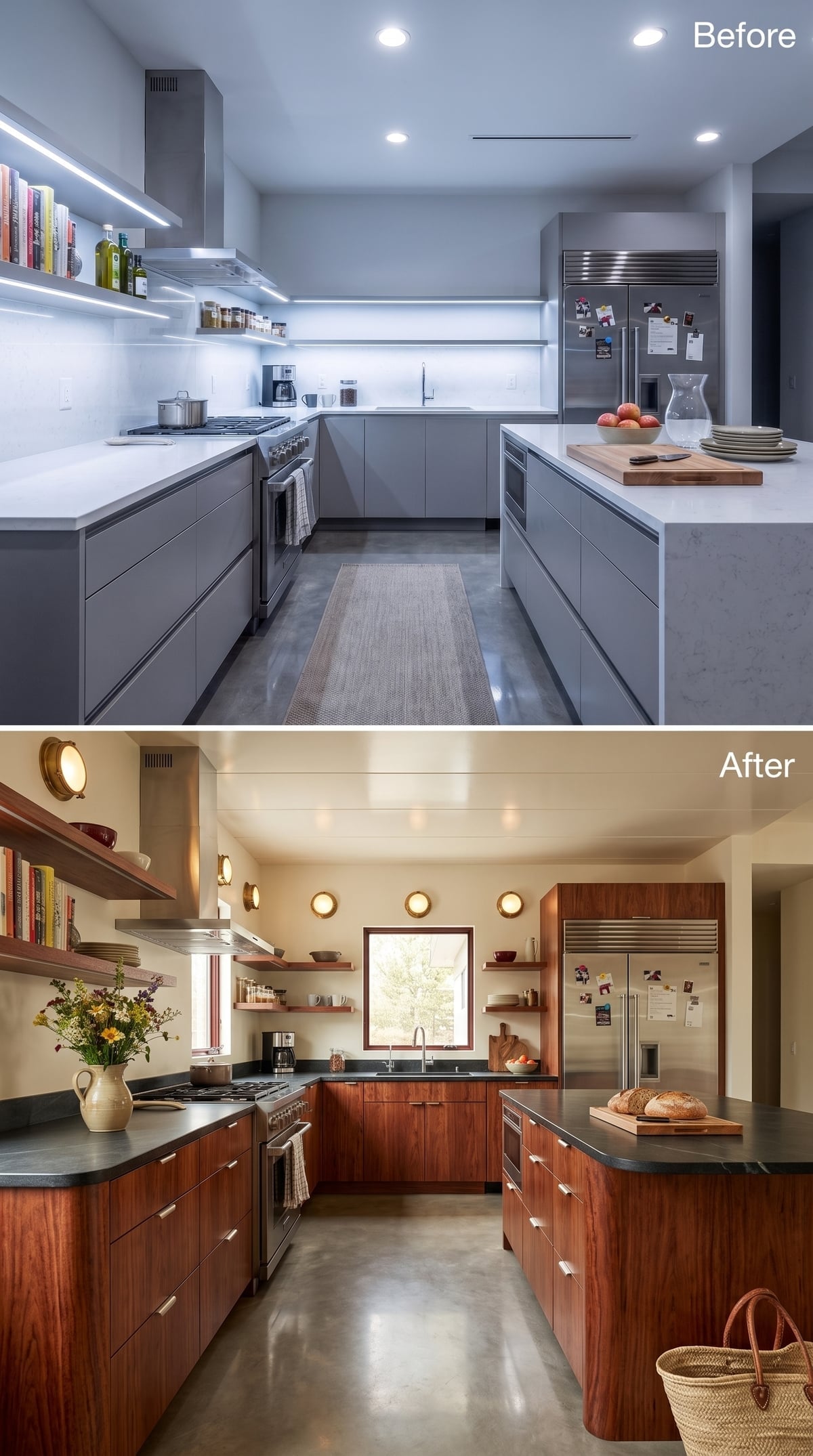
Cherry-toned slab cabinetry and dark slate-look counters create a quieter backdrop than many of the ornate designs here, which gives the round brass sconces room to be weird in peace.
Open shelves bring books, dishes, and small objects onto the wall instead of hiding every trace of daily life behind a door.
- Floating shelves reduce the visual mass of upper cabinetry and give everyday objects a role in the composition.
- Round brass sconces introduce a nautical-looking shape without turning the entire kitchen into a theme.
- Slate-look counters add a matte, mineral contrast to the warmer wood and brass surfaces.
28. Oak and Blue Terrazzo Gave the Room Warmth Without Making It Rustic
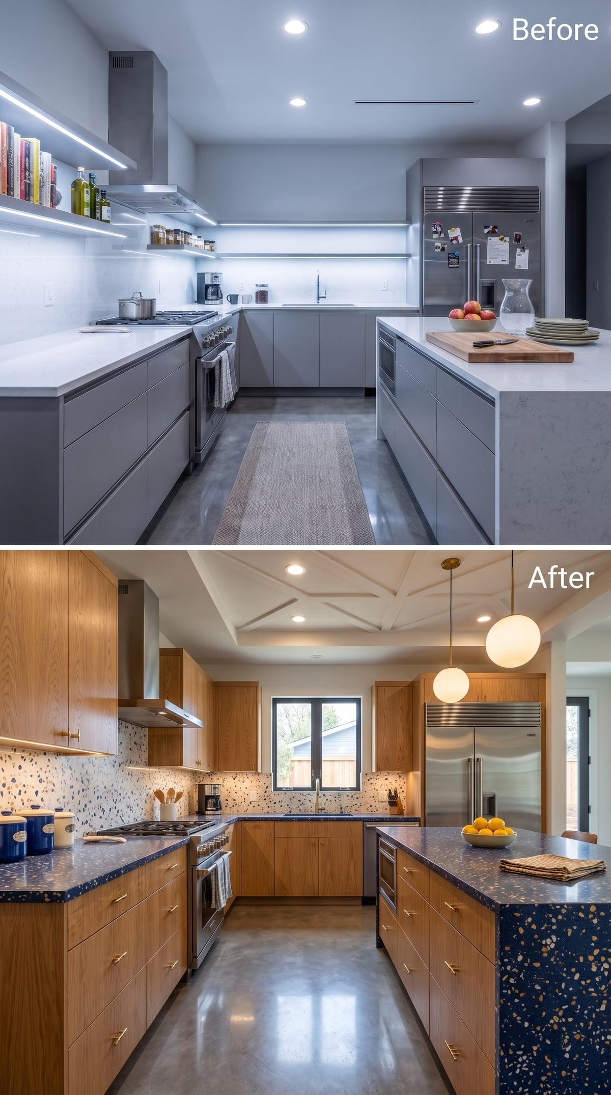
Quarter-sawn-oak-look cabinetry and brass pulls create a warm perimeter, but the navy terrazzo-look counters prevent the design from becoming another brown-on-brown wood study.
Gold and white flecks continue across the island waterfall, while a geometric coffered ceiling gives the upper half of the room a stronger rhythm. Brushed-brass globes finish things without auditioning for centerpiece status.
Did You Know: Terrazzo has centuries-old roots in Italy and traditionally used stone fragments set into a binder. Contemporary versions may use cementitious or resin-based systems, with performance depending on the specific product, sealer, installation, and intended use.
27. Walnut and Hand-Painted-Look Tile Made the Original Gray Kitchen Feel Anonymous
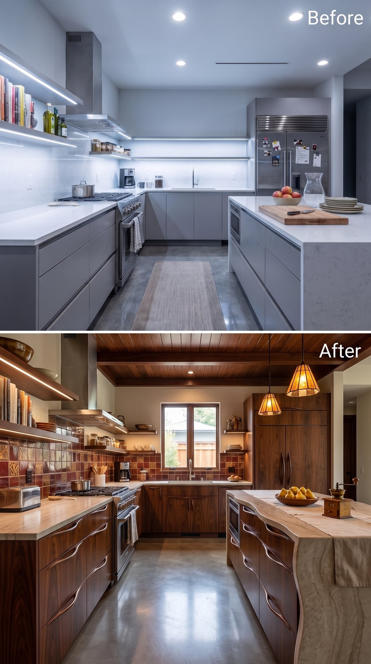
Flat gray fronts give way to walnut-look cabinetry with curved pulls, immediately replacing one uninterrupted cool surface with grain and variation.
Terracotta-and-burgundy botanical tile brings another imperfect-looking layer to the backsplash, while matching open shelving lifts the wood tone onto the wall. A Craftsman-style pendant over the island keeps the light concentrated and warm rather than washing the entire ceiling.
The ceiling boards are the quiet accomplice. Once the wood appears overhead, the room stops feeling like cabinetry was simply swapped and starts reading as a complete material idea.
26. Blue Stone Went Floor to Ceiling and Made the Ceiling Join the Competition
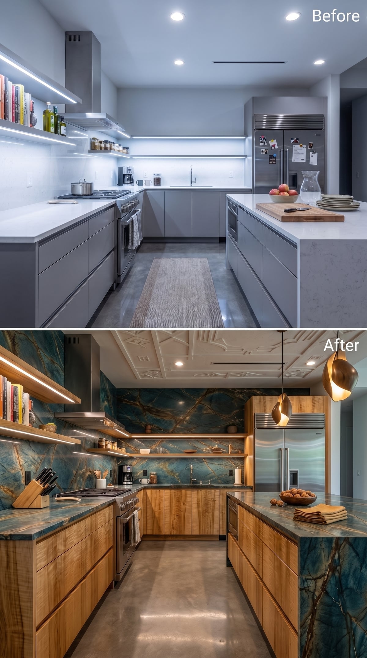
Blue-green stone with gold-toned movement climbs from the counter to the ceiling, turning what would normally be backsplash territory into the dominant surface in the room.
Natural-oak-look cabinetry gives all that color something calm to sit against. Above, a coffered ceiling with raised ornamentation means the eye does not simply stop once it reaches the top of the stone wall.
Gold pendants repeat the warmer veins rather than introducing a fourth palette.
Color Strategy: Teal and blue-green surfaces can bridge warm wood and cool stone because they contain both cooler blue notes and greener, more organic-looking tones. The effect here is visual rather than psychological: the color gives the oak contrast without making the room feel split into separate palettes.
25. A Curved Island Finally Gave All That Walnut Somewhere to Bend
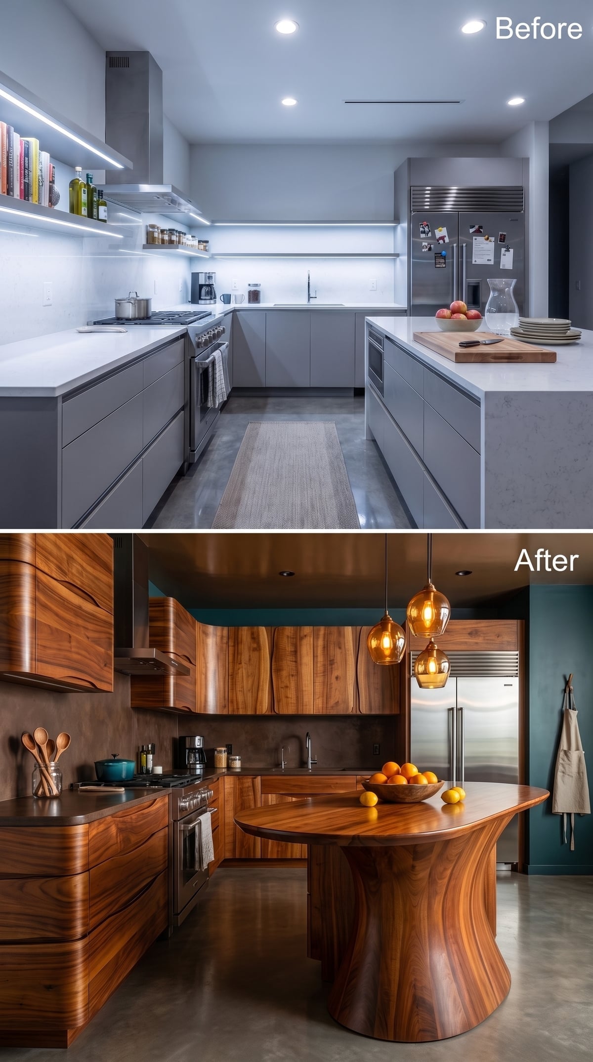
Bookmatched-walnut-look cabinetry runs across the walls with enough grain movement to make every panel behave differently.
Teal walls provide cool contrast, but the island is what separates this concept from the many straight-lined wood kitchens around it. The base pushes outward in a broad curve, closer to furniture than a conventional bank of boxes.
Amber pendants hover above, and even the bowl of oranges seems to understand it has been cast in a very specific production.
24. Macassar-Ebony-Look Grain and Plum Mosaic Went Dark Without Going Dead
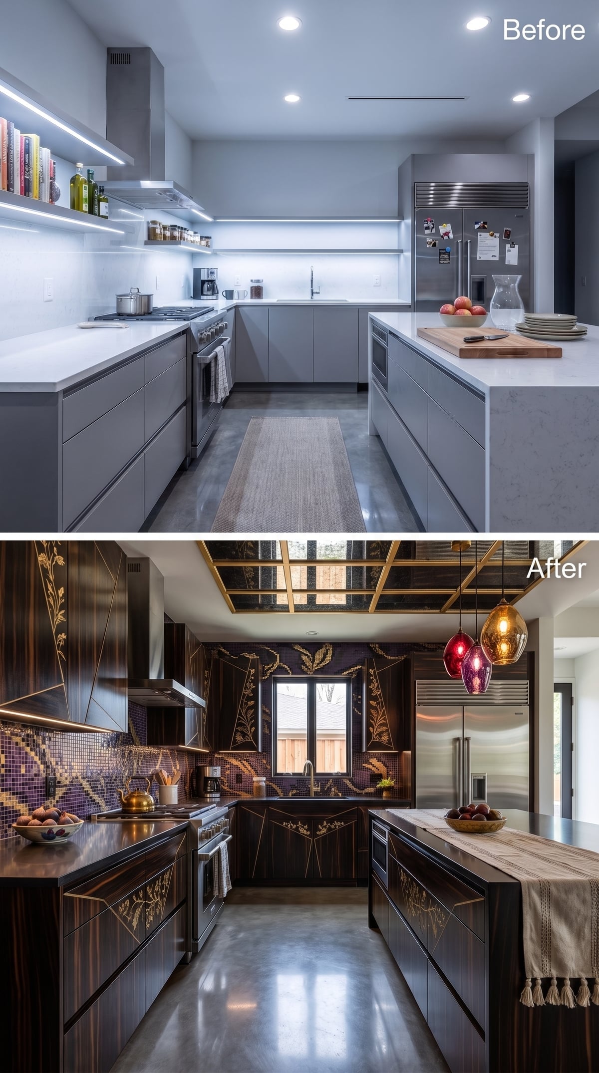
Striped Macassar-ebony-look veneer gives the cabinet fronts a textile-like grain, while gold botanical detailing interrupts the darkness with something far more decorative than standard hardware.
Plum and aubergine mosaic shifts scale behind the range, and ruby plus amber pendants put colored light above the island rather than relying on one uniform fixture.
The brass-and-dark-panel ceiling grid is excessive in exactly the way this concept needs. A restrained ceiling would look like it had wandered into the wrong kitchen.
Lighting Note: Colored or warm-toned glass pendants can tint the light immediately around them. In a real kitchen, decorative warmth works best when it is balanced with enough high-quality task lighting to keep food preparation and color rendering practical.
23. The Live-Edge Island Made the Rest of the Kitchen Look More Precise
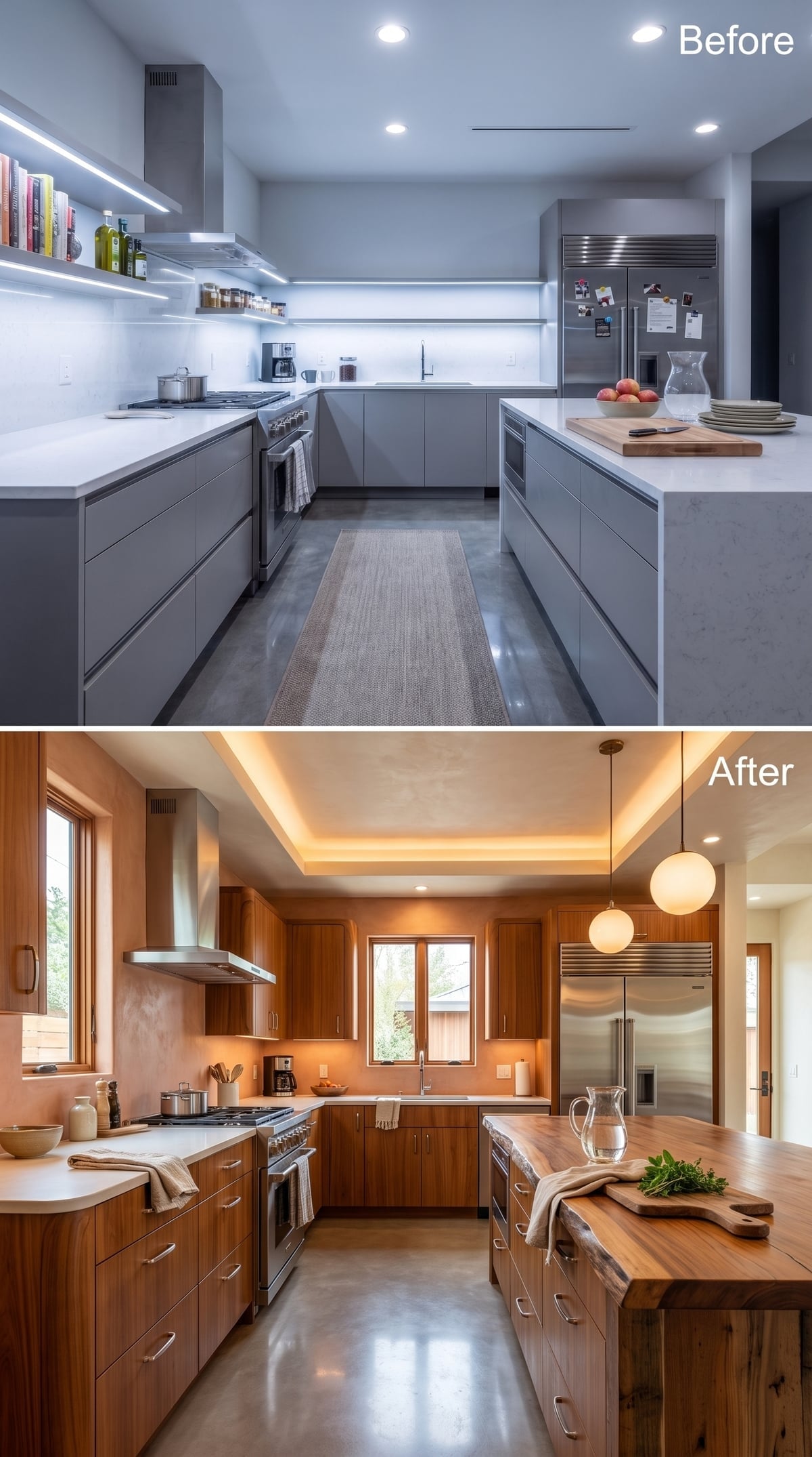
Walnut-look cabinetry wraps three walls while amber cove lighting pushes warmth up into a tray ceiling. The cabinetry itself stays disciplined and rectilinear.
Then the island refuses to cooperate. Its live-edge-style wood top keeps an irregular outer profile against the white perimeter counters, giving the room one element that looks as though it arrived from somewhere other than a cabinet catalog.
Why Live-Edge Slabs Feel Different From Butcher Block
Butcher block is assembled from smaller pieces of wood into a regular surface. A live-edge slab preserves more of the original board’s natural outline and figure. That irregularity is the entire visual point, though a real kitchen installation would still need proper drying, finishing, support, and maintenance.
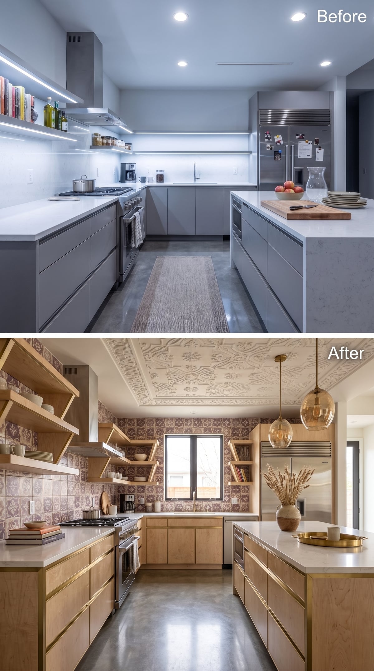
22. Maple, Full-Height Pattern, and Amber Glass Made the Walls Do More
🔥 Would you like to save this?
Maple-look cabinetry with brass-toned trim replaces the flat gray shell, while angled open shelves prevent the upper wall from becoming a continuous run of boxes.
Terracotta-toned patterned tile climbs to the ceiling instead of ending beneath the uppers, turning an ordinarily practical surface into a room-scale graphic element. Amber pendants hang at different heights, but the bigger move is overhead: ornamental plaster-style detailing gives the ceiling a border of its own.
Design Move: Extending tile above the usual backsplash zone can create stronger vertical continuity and make the wall feel intentionally finished rather than divided into cabinetry, backsplash, and leftover paint. Bold pattern makes that decision impossible to miss.
21. Green Stone, Black Tile, and Brass Lines Made Walnut Look Almost Graphic
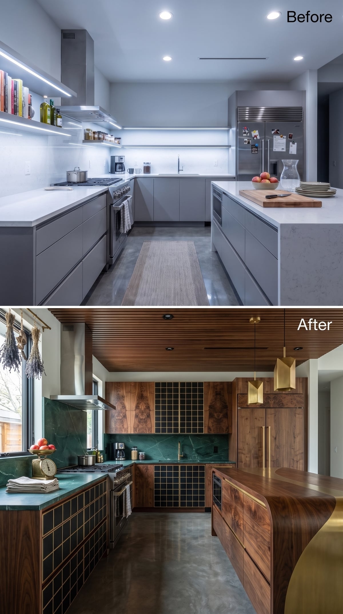
Walnut-look cabinetry covers most of the room, even extending into the slatted ceiling, but the material never gets to operate alone.
Deep green marble-look surfacing runs along the counter, while black square tile and brass-toned joints introduce a much sharper grid below. A faceted brass pendant hangs above like the punctuation mark all those straight lines were waiting for.
Practical Note: Extending durable tile onto vertical cabinet or island surfaces can create a continuous graphic treatment, but detailing matters around edges, doors, hardware, and movement. The visual payoff here comes from repeating the black grid against the wood, not from any universal cleaning advantage.
20. Moroccan-Style Pattern Wrapped the Walls Instead of Behaving Like a Backsplash
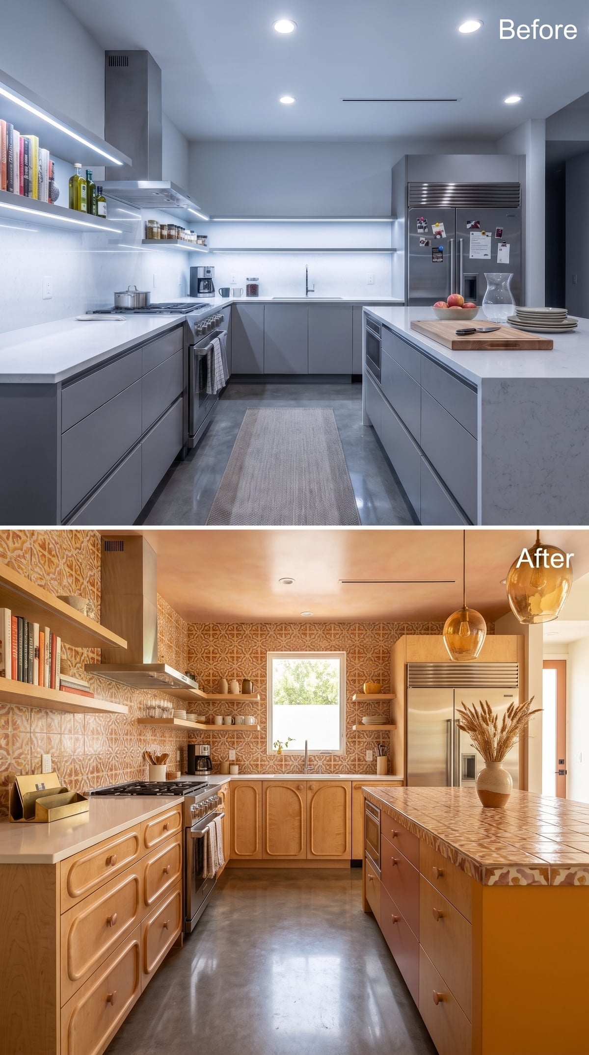
Maple-look cabinet doors use routed arch forms instead of flat or Shaker fronts, which gives the woodwork a decorative silhouette before color enters the room.
Then terracotta-and-cream Moroccan-style pattern takes over nearly every exposed wall. The same motif even appears across the island surface, turning repetition into the organizing device rather than a background accent.
Amber glass pendants provide quieter shapes overhead. With this much pattern underneath, they know better than to compete.
Cabinet Detail: Arched and cathedral-style cabinet fronts require different tooling and profiles than flat doors, but they are not inherently rare or prohibitively difficult. Their impact here is mostly visual: they make the cabinetry feel more like a decorative furnishing than a neutral storage system.
19. Retro Orange Tile and Toe-Kick Glow Made the Kitchen Feel Deliberately After Dark
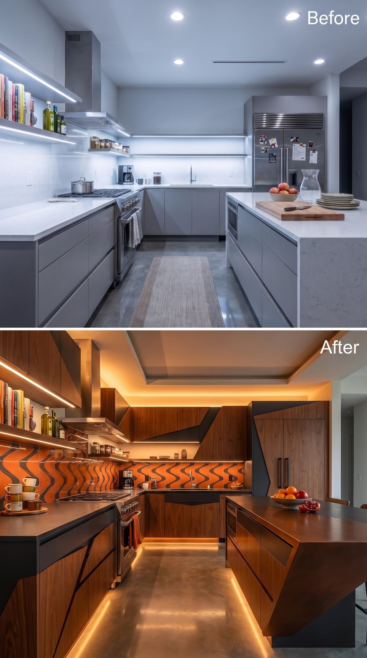
Warm brown cabinetry gets dark geometric insets that already give the doors more visual rhythm than plain slab fronts.
Then the backsplash swerves into orange-and-black wave-pattern tile somewhere between 1970s graphics and contemporary abstraction. Amber cove lighting surrounds the ceiling while toe-kick lighting traces the floor below, sandwiching the cabinetry between two quieter bands of light.
The island stays dark and simple. With the walls and lighting already performing, somebody had to.
Quick Fix: Toe-kick lighting can be relatively straightforward to incorporate when electrical work is already underway. It adds a low ambient layer that ceiling fixtures cannot reproduce, though actual cost depends on wiring access, controls, fixture quality, and installation.
18. Rosewood-Look Grain and Concrete Put Warmth Against Something Severe
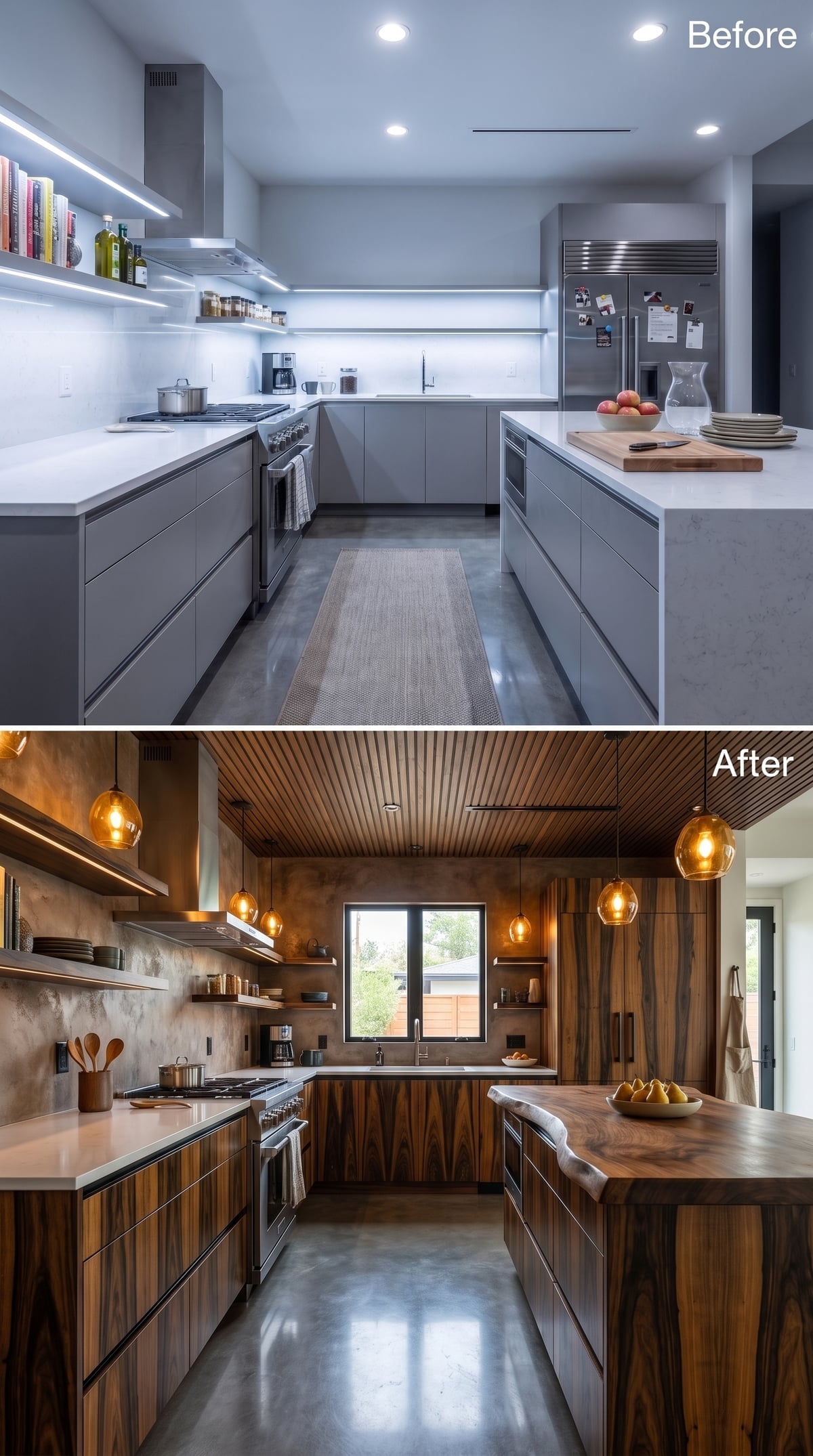
Rosewood-look cabinetry runs along both sides while the same warm tone reappears overhead in a slatted ceiling treatment. Concrete-look walls keep all that wood from turning soft or traditional.
A live-edge-style island adds one irregular shape to an otherwise linear room, and amber globes at varied heights break up the long ceiling plane.
Ceiling Note: Decorative wood slats can add rhythm and visual warmth overhead. Acoustic or ventilation benefits depend on what sits behind the slats and how the ceiling assembly is actually constructed; the slats themselves do not automatically provide either.
17. Geometric Wood Faces Turned the Cabinets Into a Repeating Pattern
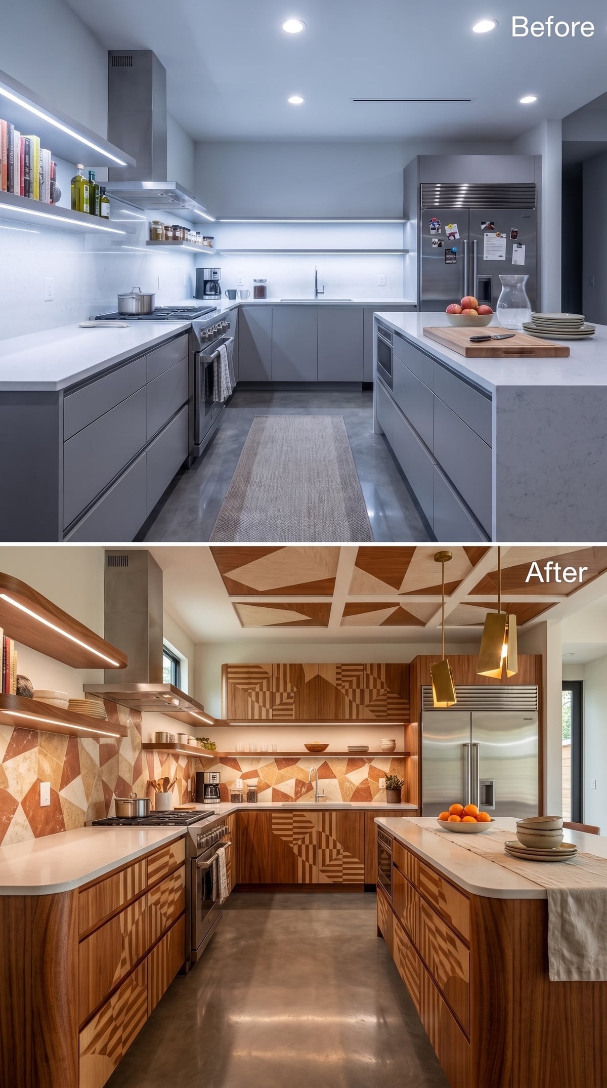
Warm walnut-look doors are routed or detailed with repeating geometric forms, so the storage wall behaves more like a paneled installation than a bank of ordinary cabinets.
A terracotta-toned mosaic backsplash and brass pendants continue the warm palette, while pattern overhead prevents the cabinet treatment from carrying the entire room by itself.
Color Story: Using a darker wood body with lighter geometric detailing gives the cabinet faces depth without introducing another material category. A real fabrication could use routing, veneer, applied trim, paint, or inlay depending on budget and cabinet construction.
By now warmth is no longer a matter of adding wood. It is about deciding how much ornament the room can carry before it starts needing its own orchestra pit.
16. Burl-Look Wood and Malachite Green Took the Jewelry-Box Idea Even Further
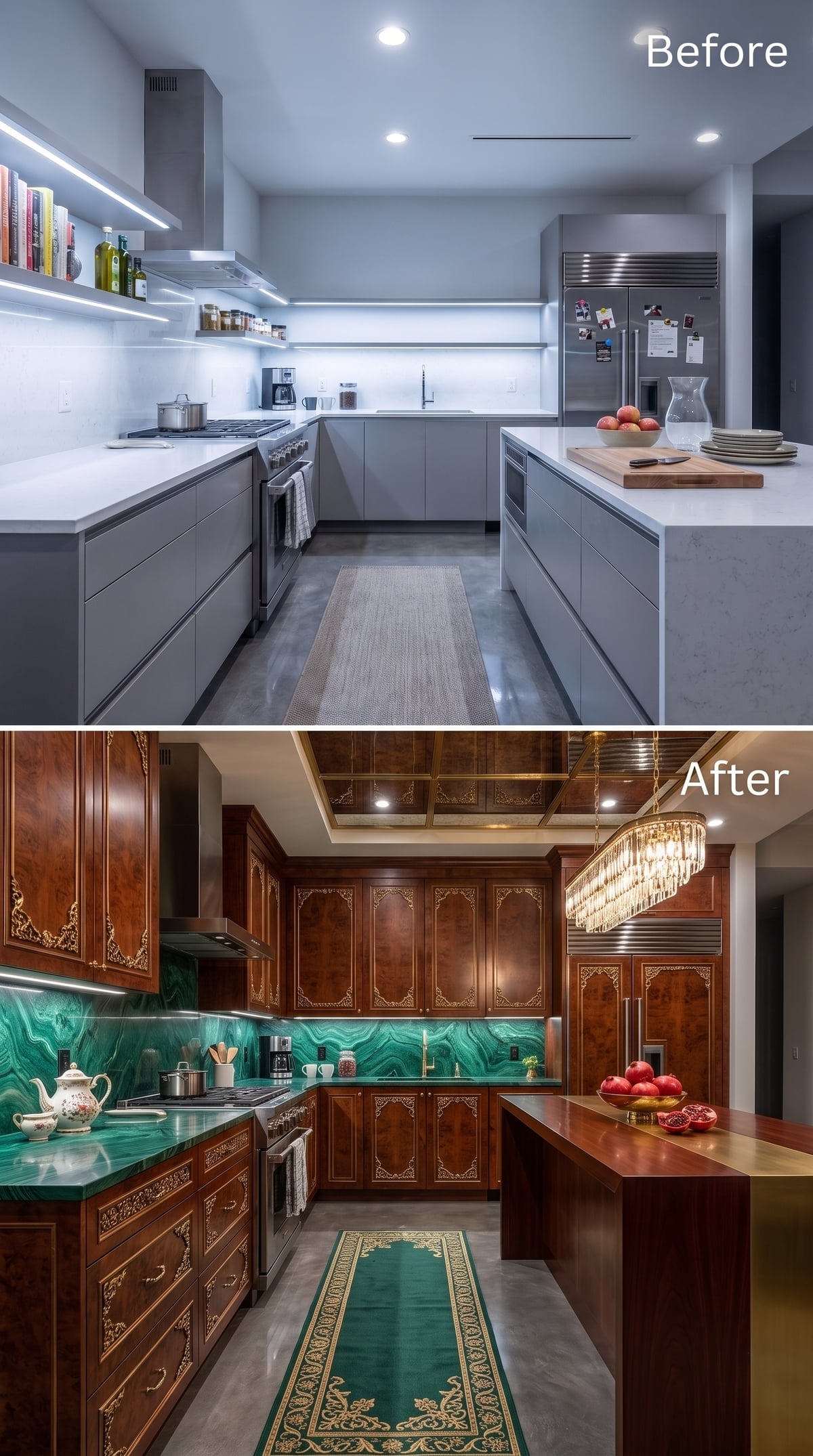
Burl-look cabinet fronts with gold filigree-style detailing bring a much more turbulent grain than straight walnut, while green malachite-look surfacing continues from counter to wall.
A crystal chandelier hangs over the island, and an ornate runner softens the floor below. There is nothing restrained about the composition, but the repetition of green, gold, and warm wood means the excess at least has a filing system.
Burl-style grain is the point here: irregular, swirling, and completely uninterested in behaving like standard cabinet veneer.
15. Terracotta Geometry Turned the Entire Wall Into One Continuous Pattern
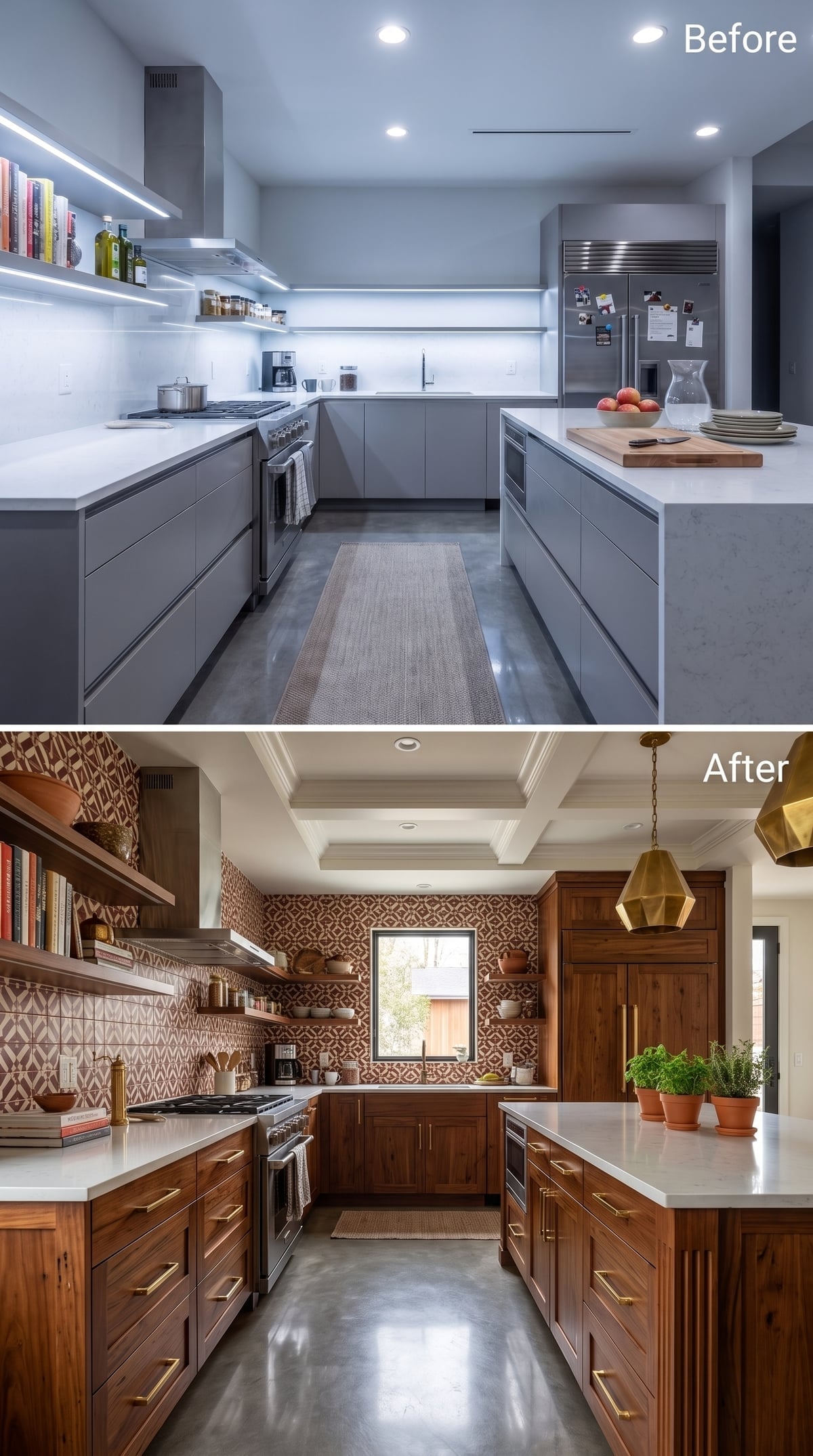
This backsplash does not politely stop beneath the cabinets. It takes the wall.
Dark walnut-look cabinetry with brass bar pulls provides a solid base while terracotta-and-cream geometric tile covers the exposed wall from counter to ceiling.
White quartz-look counters act almost like negative space between the wood and pattern. A coffered ceiling adds structure overhead, but wisely avoids introducing another motif.
14. Burl-Look Cabinetry and Dusty-Rose Florals Made Ornament Feel Domestic Again
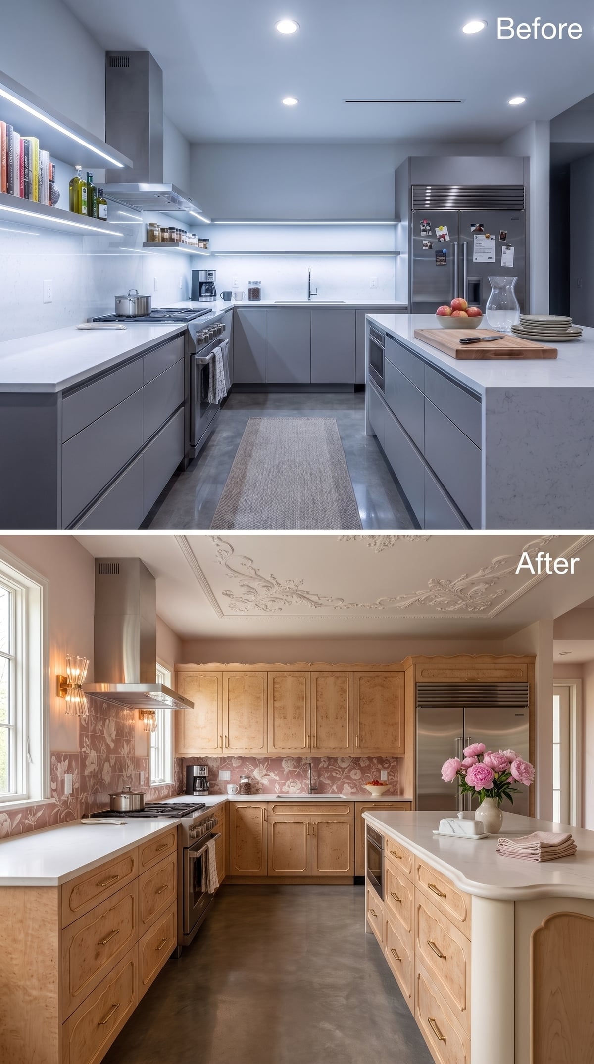
Burl-maple-look fronts with scalloped detailing already give the cabinetry enough movement for an entire room. The dusty-rose and cream floral tile chooses not to be intimidated.
Above, ornamental plaster-style scrollwork gives the ceiling a decorative border that feels closer to a formal interior than a contemporary kitchen.
- Burl-style grain creates natural-looking variation from one cabinet face to the next.
- Dusty rose behaves as a muted warm color here because the wood and lighting share similarly warm undertones.
- Applied or molded ceiling ornament can add detail without requiring a fully coffered or paneled ceiling, though cost depends heavily on material and installation.
13. Sputnik Brass Made the Gold-Inlay Cabinets Look Midcentury Instead of Antique
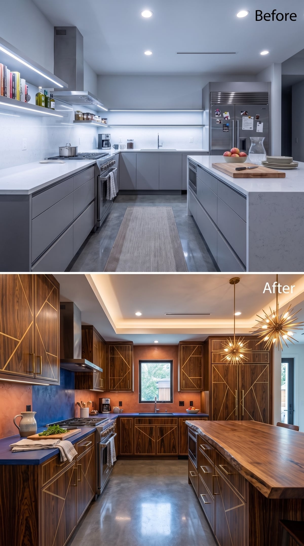
Geometric gold detailing cuts across dark walnut-look cabinet fronts without any attempt to stay quiet.
The surprise is overhead. An aged-brass Sputnik fixture pulls the metallic language away from Art Nouveau and toward midcentury glamour, while blue counters cool the entire composition below.
Cove lighting around the tray ceiling creates a softer perimeter glow, preventing the dark upper cabinetry from disappearing into one heavy band.
In the Details: A tray or recessed ceiling can create a useful location for concealed lighting and add shadow lines overhead. Whether it increases the feeling of height depends on the room proportions and how the ceiling is actually constructed.
12. Cabinet Geometry Met a Pinwheel Floor and Decided Repetition Was the Plan
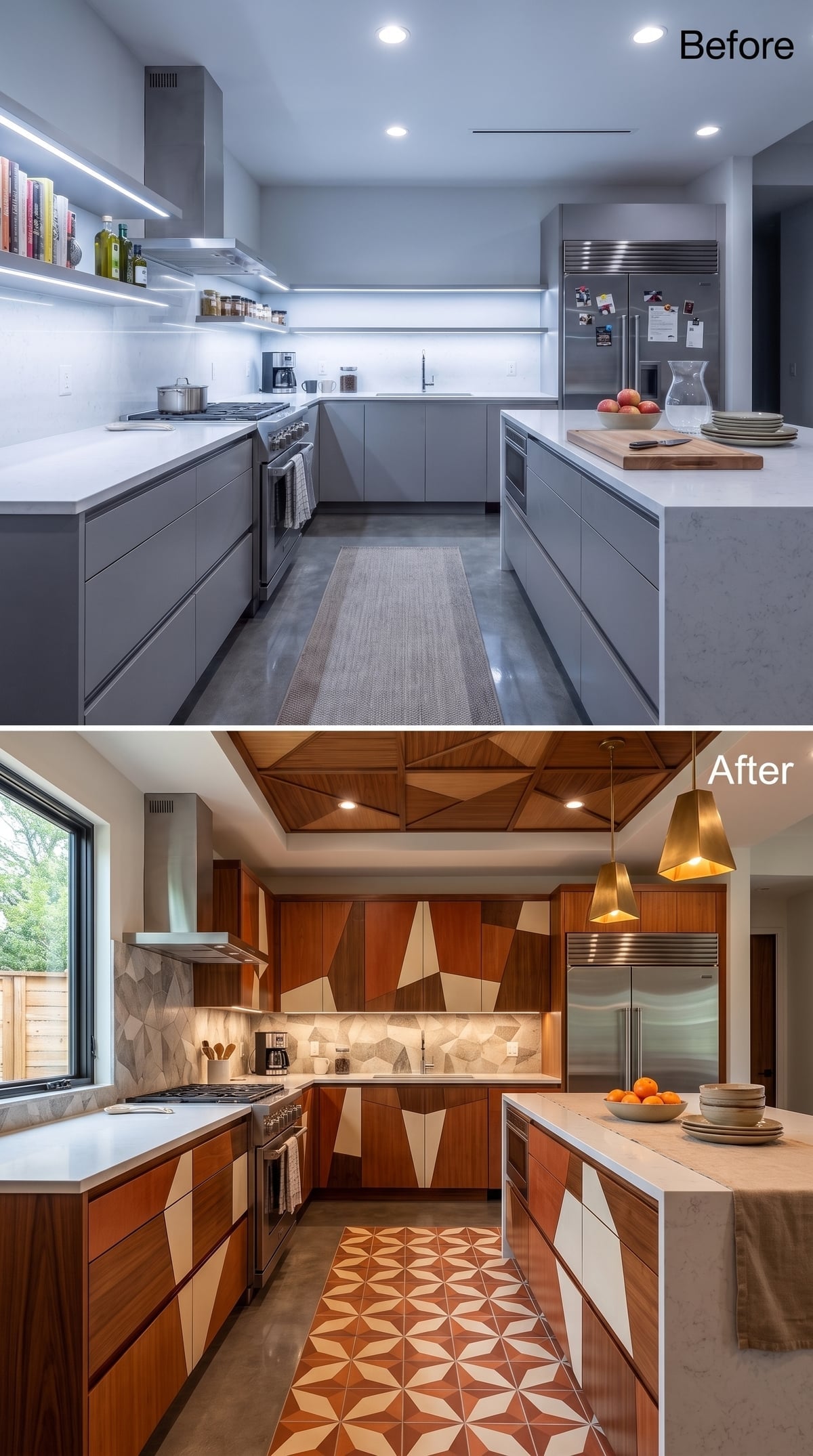
Teak-toned cabinetry carries cream geometric detailing across the door faces while terracotta-and-cream pinwheel tile repeats a related angular rhythm underfoot.
An irregular stone-look backsplash sits between them, giving the eye one less-perfect surface before the pattern resumes above.
Brass pendants hang low over the island, but the strongest move is the repetition itself: cabinet, wall, floor, each speaking geometry with a different accent.
Pro Tip: Decorative cabinet patterns can be produced through several woodworking and finishing methods, and they should be mocked up before a full run is ordered. Here the important design decision is not the fabrication technique but the way the cabinet geometry echoes the floor without copying it exactly.
11. Cove Lighting Did More Than Another Cabinet Color Ever Could
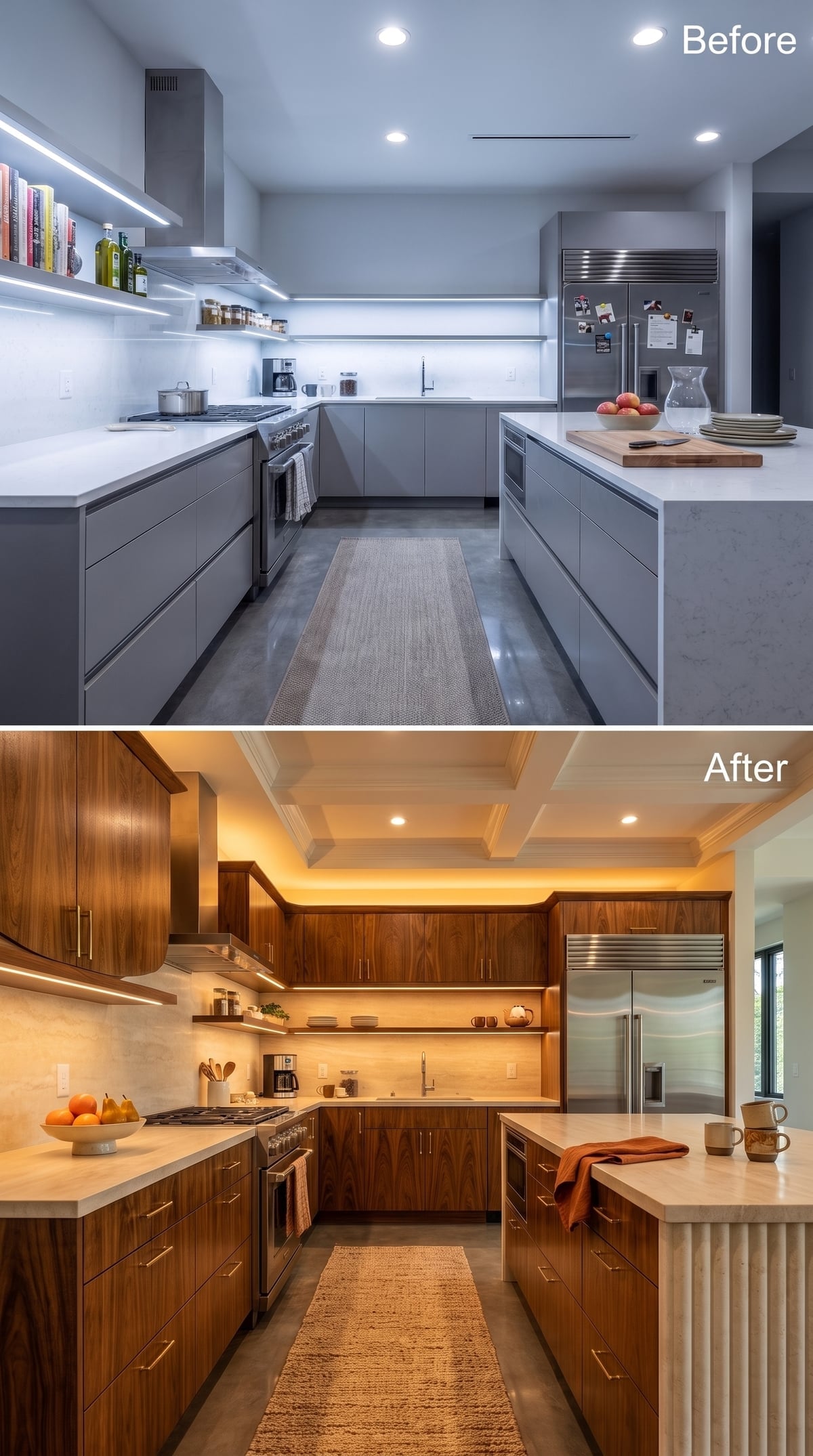
Honey-toned walnut-look cabinetry runs from floor to ceiling with quiet brass pulls, but the most effective change sits above the doors.
Concealed cove lighting washes the coffered ceiling in amber and gives the room a second layer of illumination beyond task light. The wood no longer has to manufacture all the warmth by itself.
The cabinets change the material palette. The light changes the hour of day.
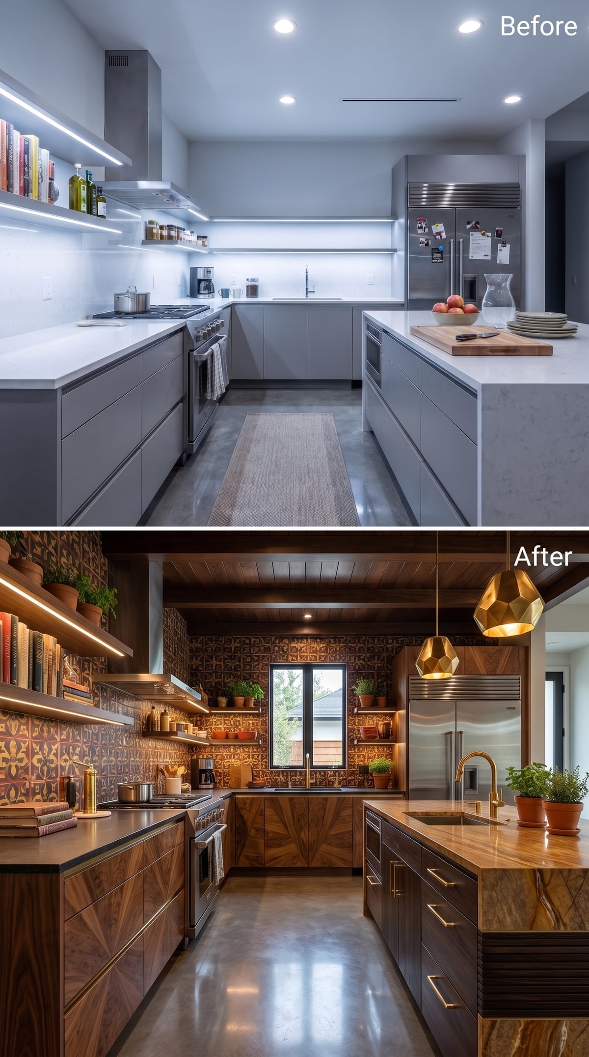
10. Dark Wood and Moroccan-Style Tile Made the Kitchen Look Occupied Before Anyone Entered
🔥 Would you like to save this?
Rust-and-brown geometric tile covers the backsplash wall, while dark wood cabinetry runs with the grain instead of hiding it beneath paint.
Faceted gold pendants and a brass faucet repeat the warm metallic notes without making every fitting match exactly. A honey-toned stone-look island top provides a lighter center.
What really sells the room, though, is the open shelving: books, herbs, terracotta pots, objects that imply somebody has interests beyond maintaining a pristine countertop.
9. Art-Nouveau-Look Walnut Met Concrete and Somehow Neither Backed Down
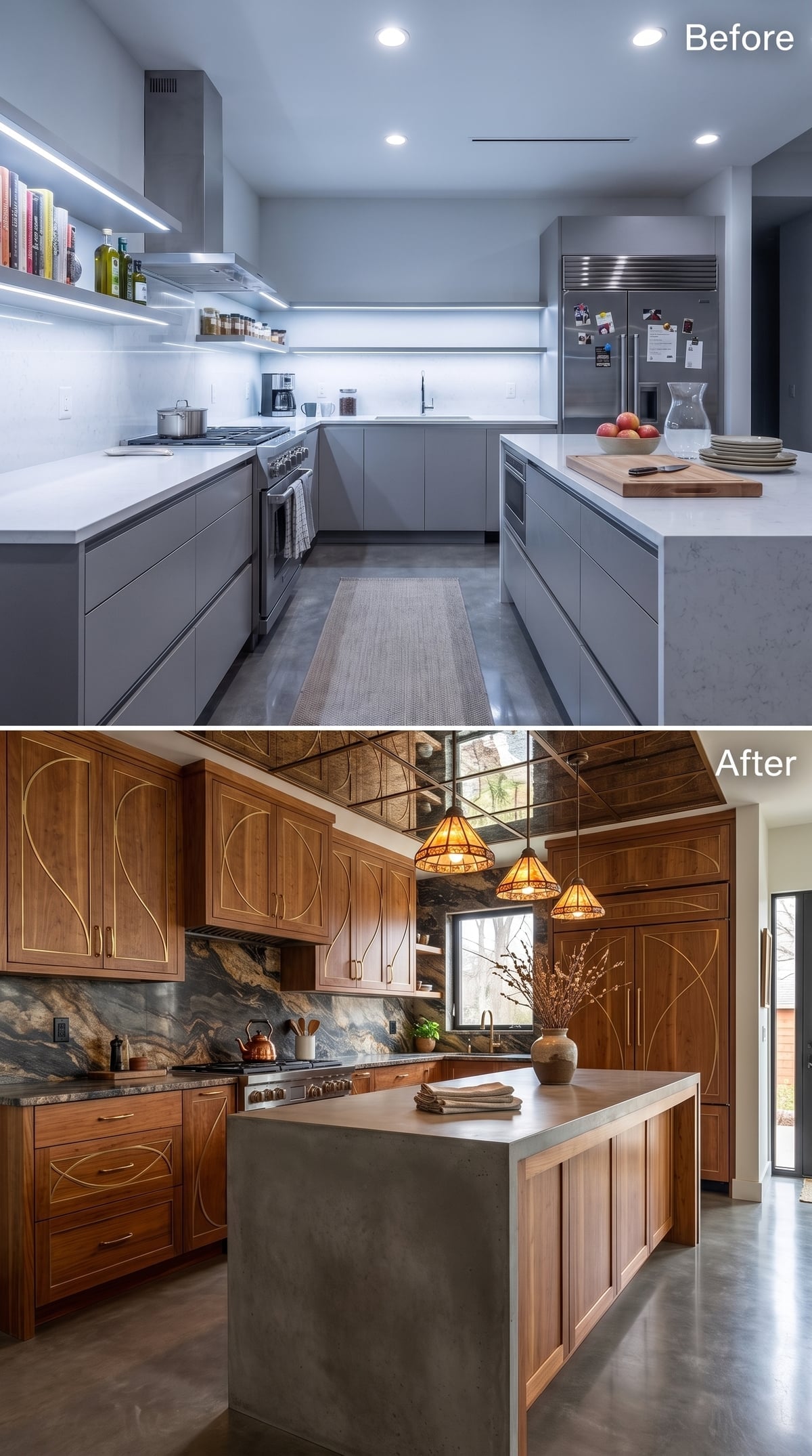
Organic gold lines move across dark walnut-look doors in a pattern that recalls Art Nouveau furniture more than standard cabinetry.
A swirling gray-and-rust stone-look backsplash carries some of that movement onto the wall, while the concrete-look island does the opposite: monolithic, plain, almost brutalist.
Three amber stained-glass-style pendants sit between those two languages and somehow convince them they belong in the same room.
Budget Reality: Cast concrete can be economical in some projects and costly in others because custom forming, reinforcement, finishing, transport, sealing, and installation all affect the price. The useful idea here is strategic contrast: reserve the most visually active material for the wall and let the island stay comparatively quiet.
8. Gold Geometry and Blue Terrazzo Turned Cabinet Doors Into Graphic Art
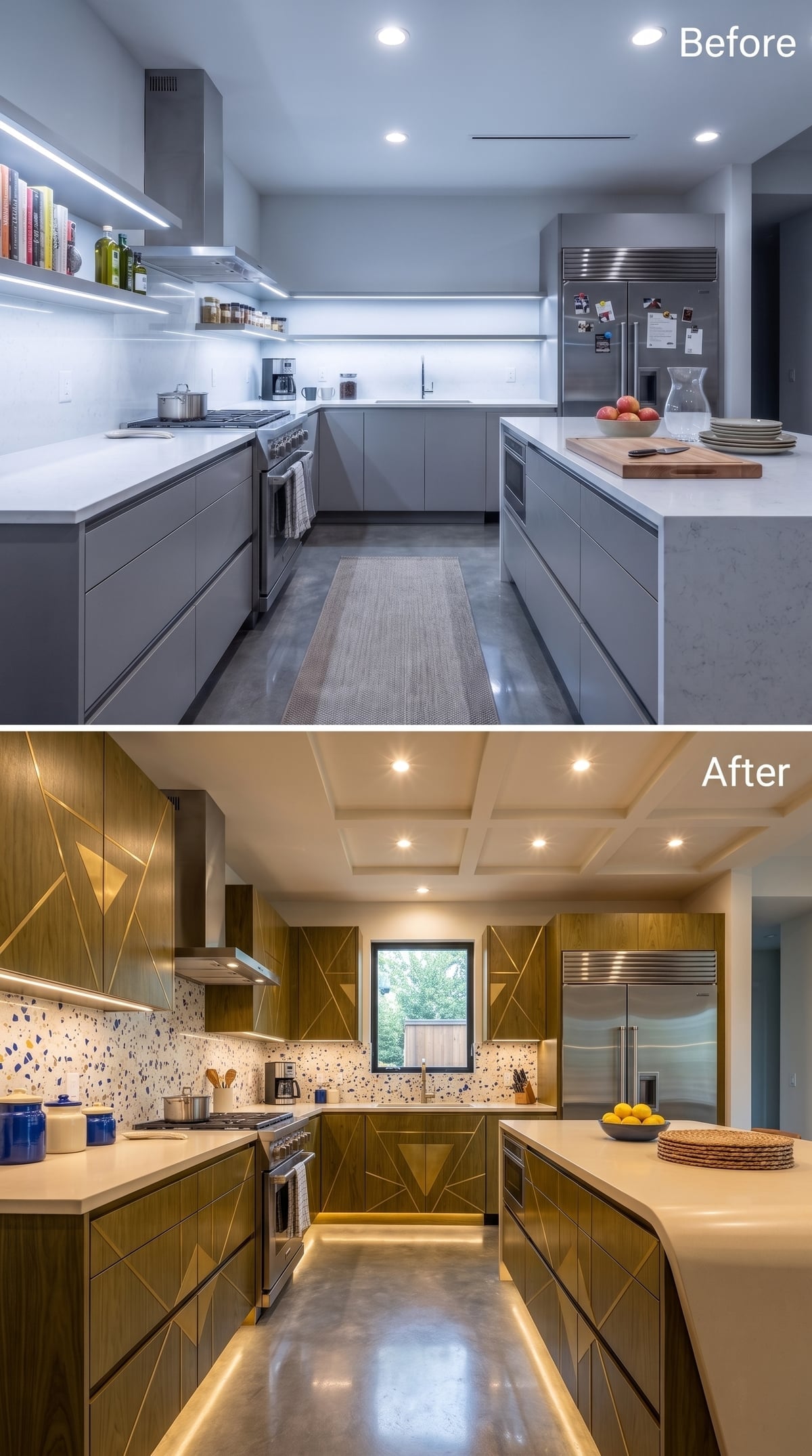
Bold brass-toned diagonals cut across warm wood cabinet fronts, creating a much sharper, more architectural pattern than the botanical inlay used elsewhere.
A blue-chip terrazzo-look backsplash cools the palette and stops the room from becoming an uninterrupted field of wood and gold.
The toe-kick glow at floor level adds one more horizontal line without asking for another pendant, chandelier, or ceiling treatment. Restraint arrives late, but it does arrive.
7. Purple Mosaic and Botanical Cabinetry Took Art Nouveau Into Technicolor
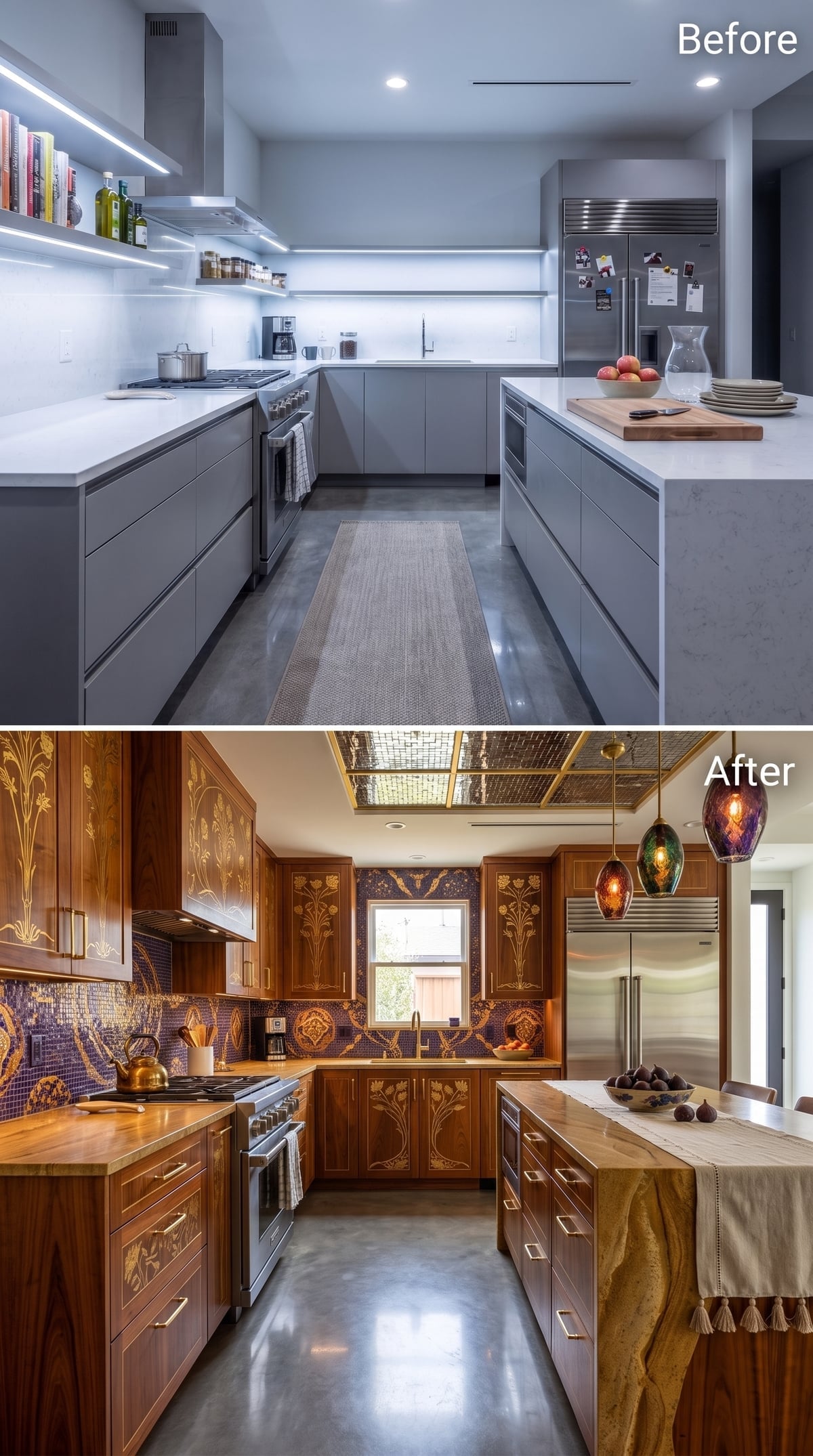
Carved-look walnut doors with gold botanical detailing set an unmistakably decorative tone, then purple mosaic tile refuses to behave like a supporting material.
The pattern climbs behind the sink and appears again across upper fronts, blurring the line between cabinetry and wall treatment.
A mirrored ceiling panel reflects amber, green, and violet pendant glass above the island, while butcher-block-look counters provide the one surface not demanding applause.
History Corner: Art Nouveau flourished around the turn of the twentieth century and frequently brought plant forms, flowing lines, carving, and decorative inlay into furniture and interiors. This kitchen borrows that ornamental spirit rather than reproducing a literal period room.
6. Walnut, Gold Inlay, and Blue Stone Went Full Jewelry Box
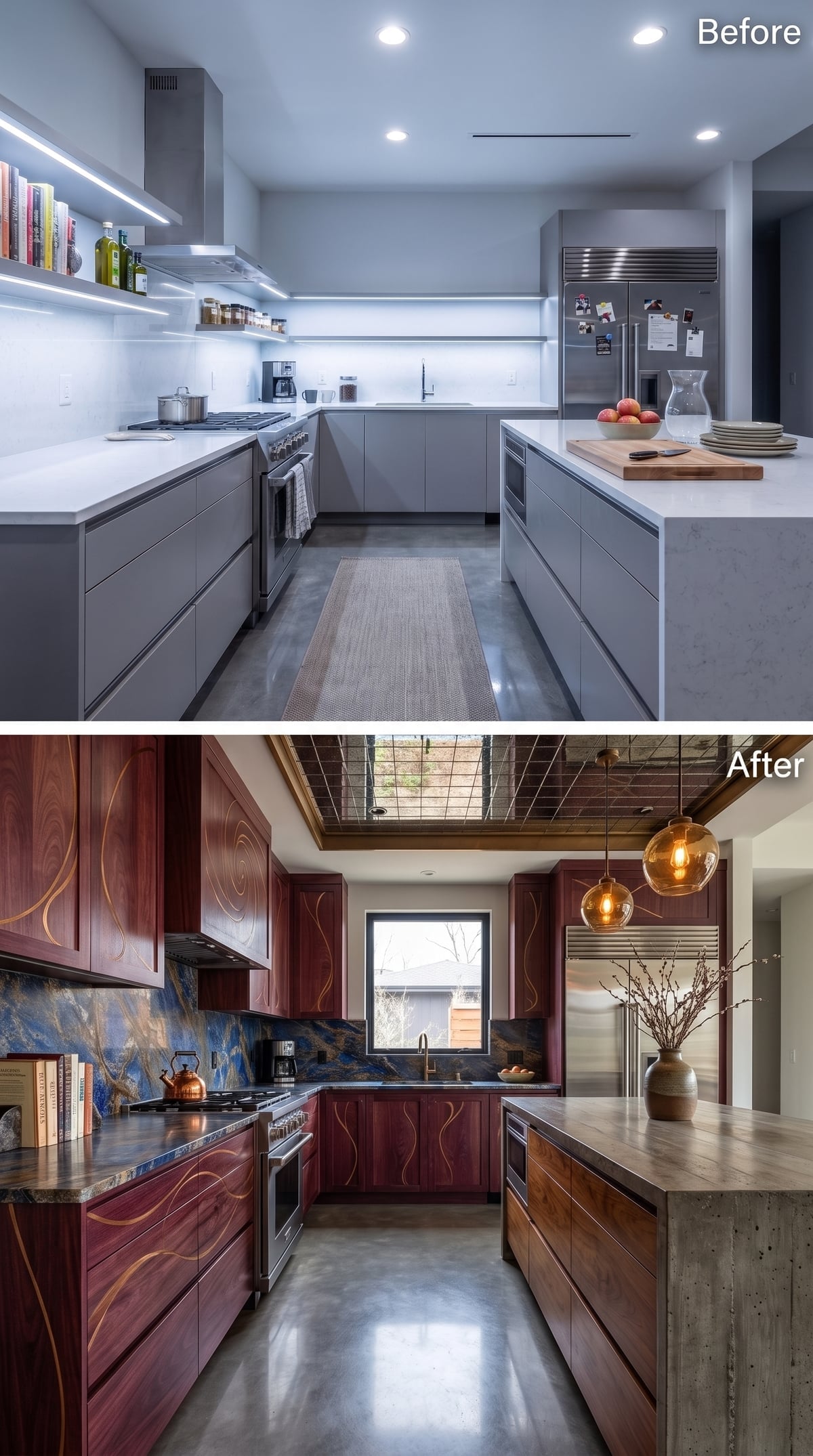
Fluid gold-toned lines trace through walnut-look cabinet faces, while an electric blue-and-bronze stone backsplash supplies the kind of color most kitchens reserve for artwork.
Amber globes overhead pick up the metallic tones and leave the blue to remain the surprise.
The Inlay Is Not a Trim Detail. It Is the Entire Attitude.
The flowing pattern appears to vary across the cabinet fronts rather than repeating as one stock motif. A real version could be routed, veneered, applied, painted, or fabricated another way entirely; the rendering cannot tell us that. What it does show is how dramatically decorative cabinet faces can change a kitchen before the layout moves an inch.
5. Walnut and Copper Went Dark Without Turning Gloomy
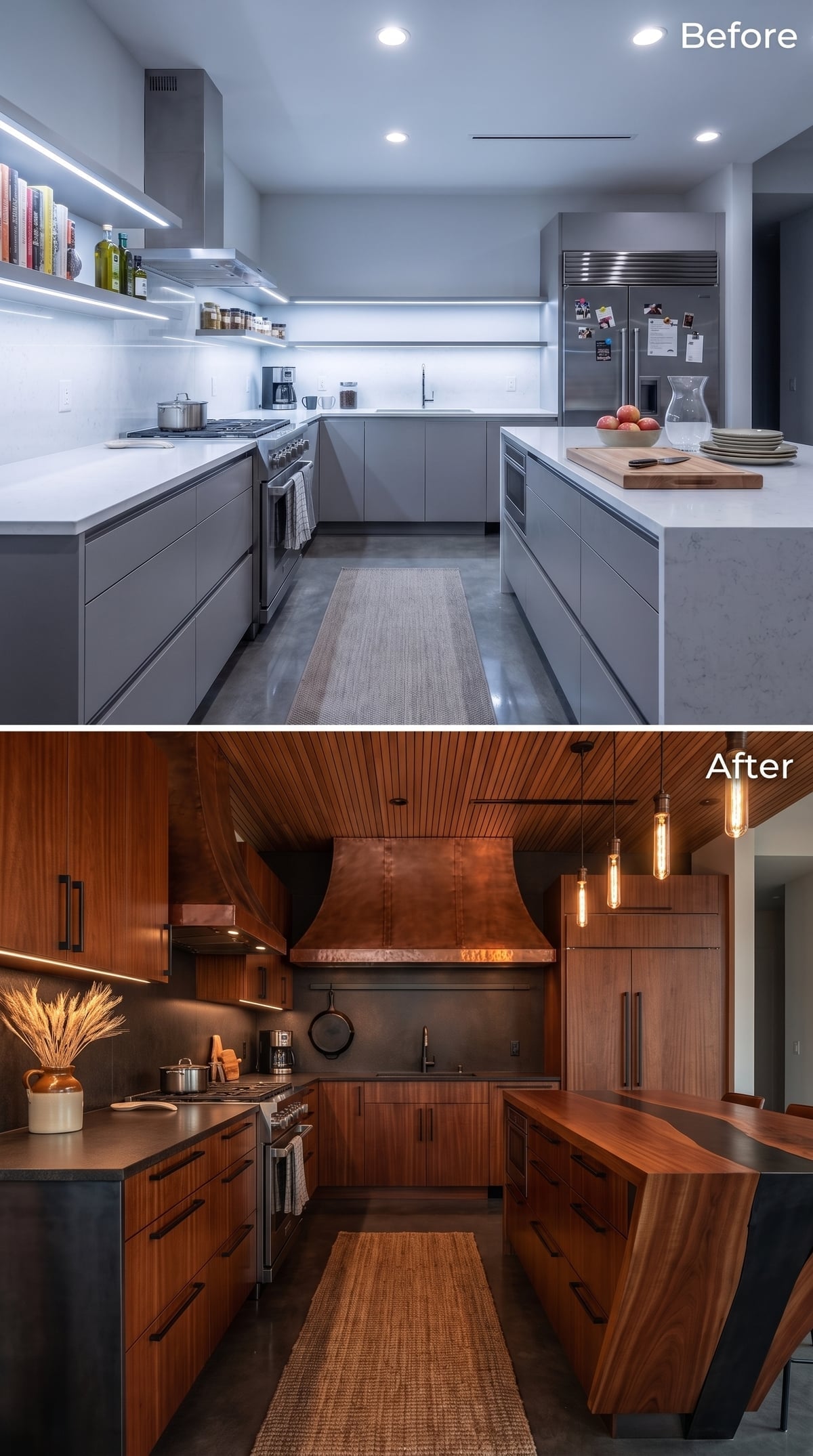
Walnut-look cabinetry runs nearly everywhere, creating one of the darkest schemes in the gallery.
The copper-look hood gives the center of the room a warmer metallic focal point, while exposed-filament pendants break the ceiling into smaller points of light instead of flooding everything uniformly.
The palette is narrow. That is what saves it. Wood, copper, amber light — three notes, played confidently.
4. Cherry, Amber Subway Tile, and Terrazzo Made Warmth Look Almost Effortless
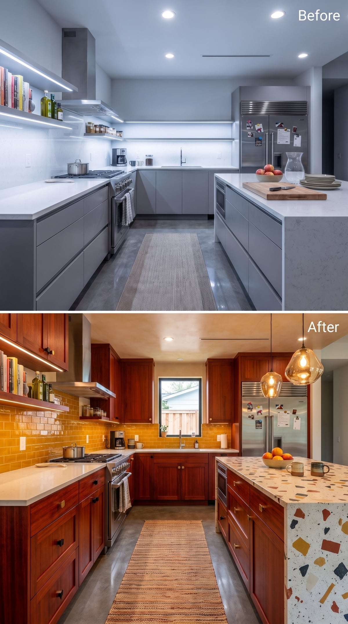
Honey-gold subway tile behind cherry-toned cabinetry sounds like a recipe for too much warmth. The terrazzo saves it.
The Shaker-style cabinets sit beside an island clad in pale terrazzo-look material scattered with rust, navy, and ochre fragments. Those cooler chips interrupt the amber palette before it becomes one continuous glow.
Smoked-glass pendants hover above while the subway tile stretches across the backsplash in a deep golden tone. Nothing here is particularly exotic on its own. The combination is the clever part.
3. Mondrian Color Blocking Turned the Cabinets Into the First Thing You Notice
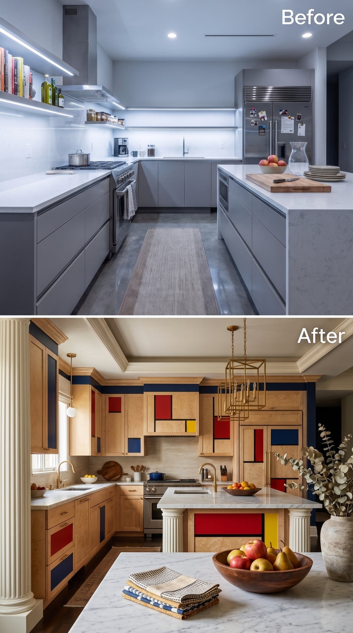
The coldest thing about a neutral kitchen is often its determination not to offend anybody. This concept responds by putting primary red, cobalt, and yellow directly onto light-wood cabinet fronts, divided by dark lines that unmistakably recall De Stijl geometry.
The move works because almost everything around it calms down. Brass pendants supply warmth overhead, while fluted island details add texture without introducing another competing pattern. The cabinetry gets to be the artwork because the rest of the room knows when to leave it alone.
2. Dark Walnut, Floral Tile, and Plaster-Look Ornament Took the Room Somewhere Older
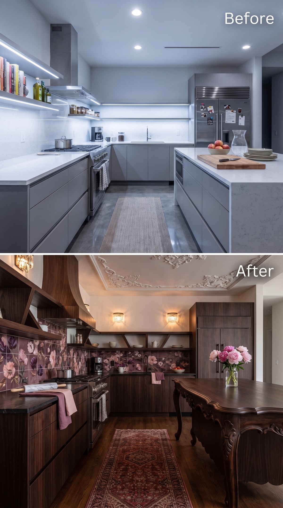
Rich walnut-look cabinetry runs nearly floor to ceiling, immediately replacing the original clinical mood with something deeper and more enveloping. Open shelves interrupt the upper run, while plum and dusty-rose floral tile gives the backsplash the kind of specificity white subway tile spends its life avoiding.
Crystal-drop sconces, ornamental plaster-style detailing at the ceiling, a Persian-style runner, and an antique-inspired dining table push the whole composition toward old-world domesticity. It is not timid about nostalgia. That is exactly why the room has a point of view.
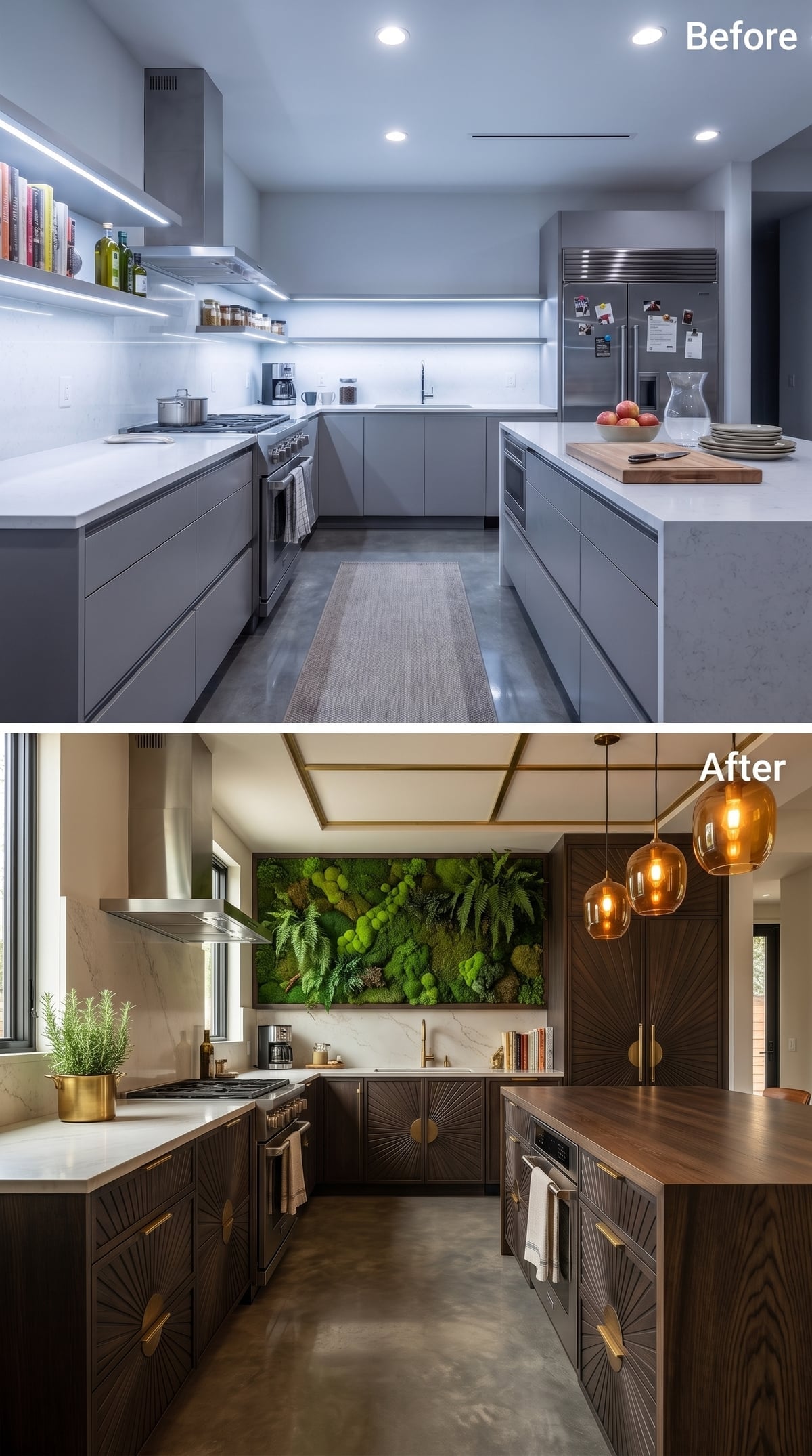
1. Sunburst Doors and a Moss Wall Took the Cold Kitchen Furthest From Where It Started
🔥 Would you like to save this?
The final concept does not merely warm up the original kitchen. It appears to have misplaced the original kitchen entirely.
Dark-stained cabinet fronts are carved with sunburst patterns, brass hardware catches the light, and a moss-covered green wall replaces the expected backsplash treatment with something closer to installation art.
Amber pendants descend over a butcher-block-look island end, adding warm pools of light against all that green.
A real kitchen would need a washable, moisture-tolerant surface anywhere food preparation, grease, or splashing reaches the wall. The green section could be preserved moss, an artificial botanical panel, or another decorative system rather than a living planting surface directly in the splash zone.
That practical caveat does not diminish the design idea. After 35 attempts to cure a sterile kitchen with wood, stone, brass, tile, color, ornament, and light, the last one simply brings in a wall that looks alive.