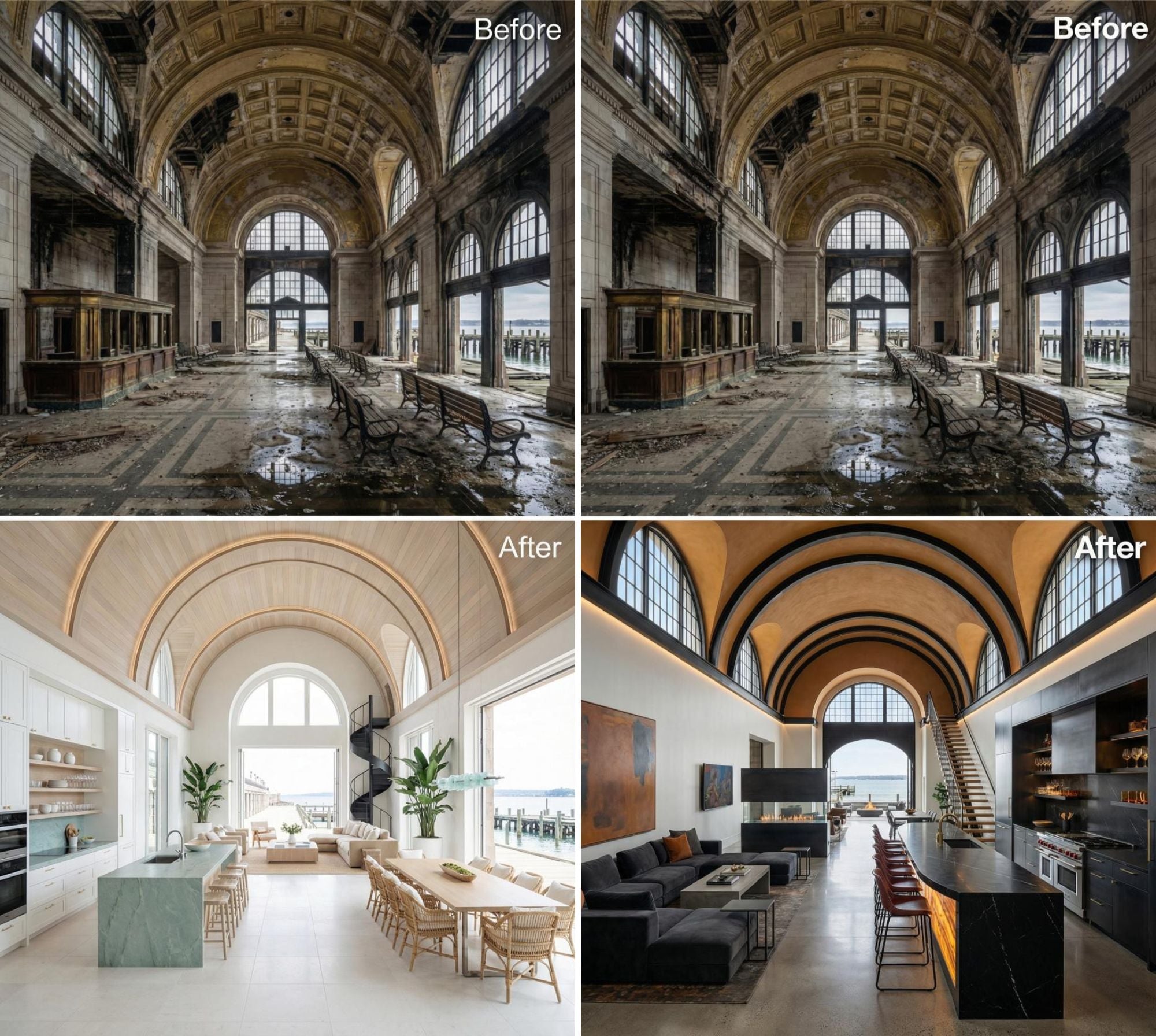
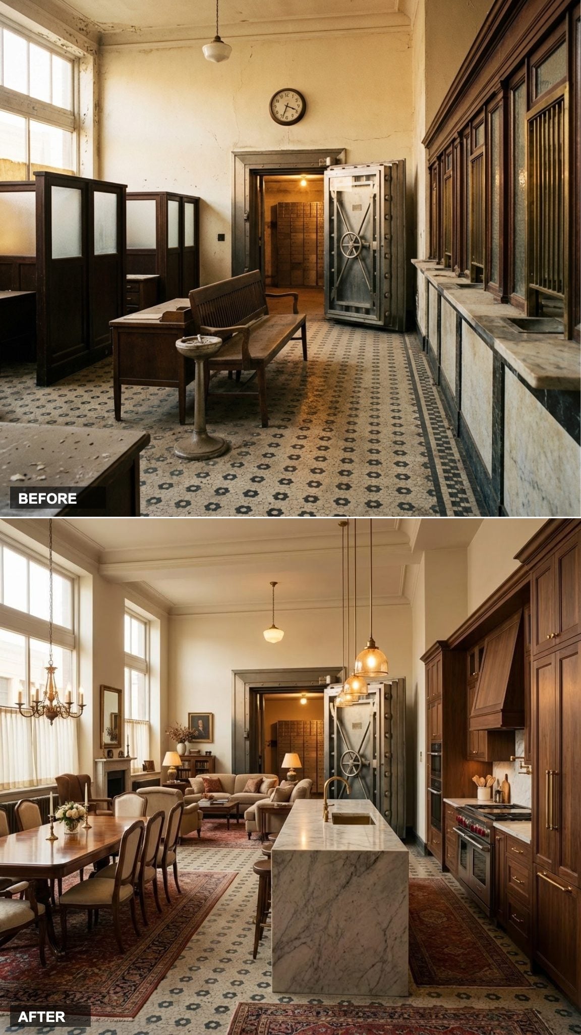
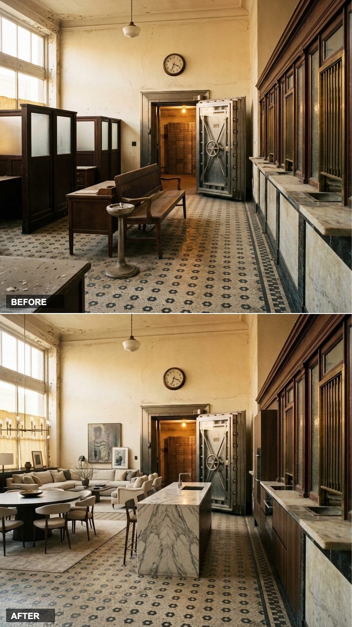
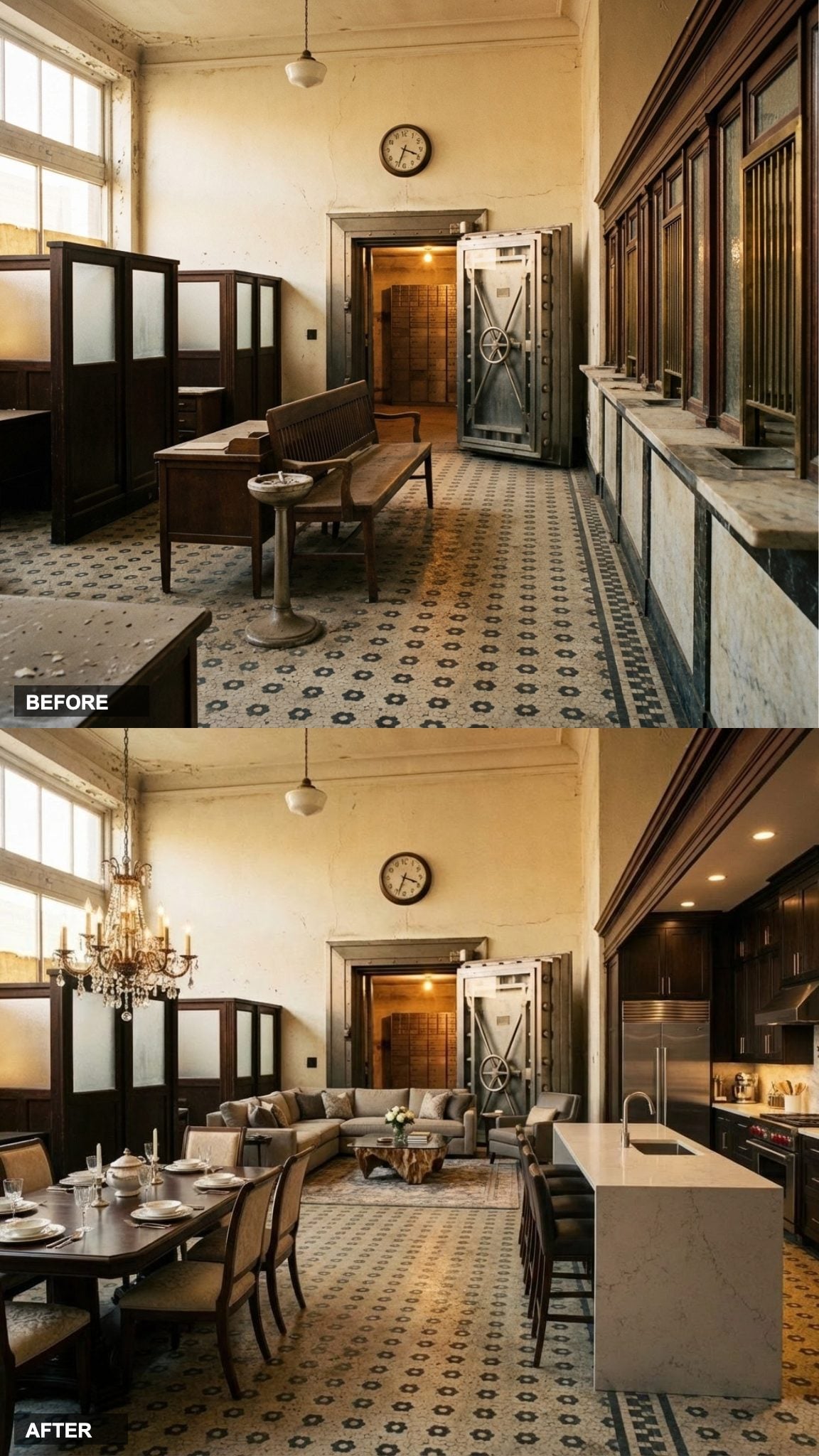
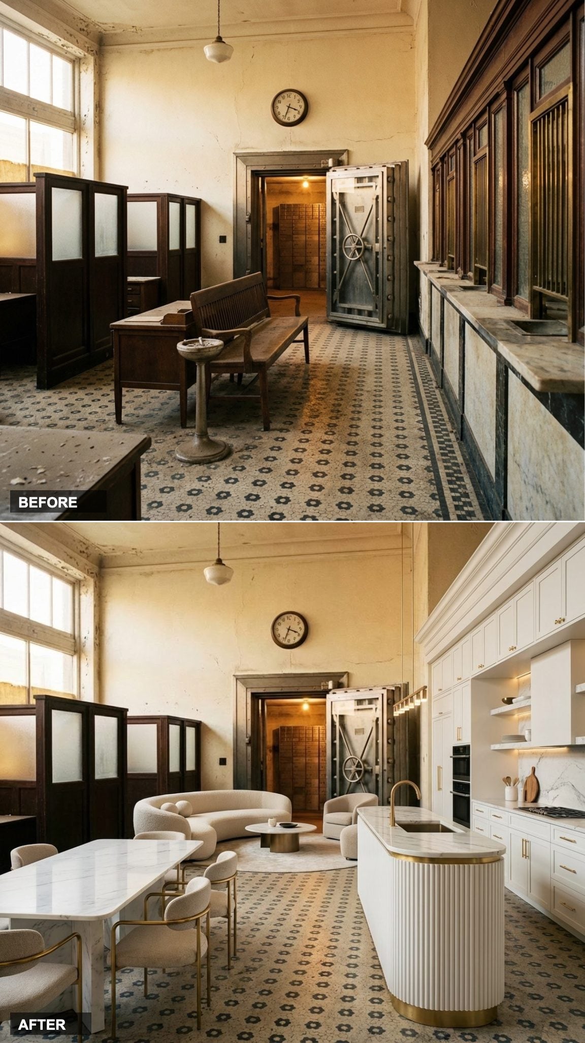
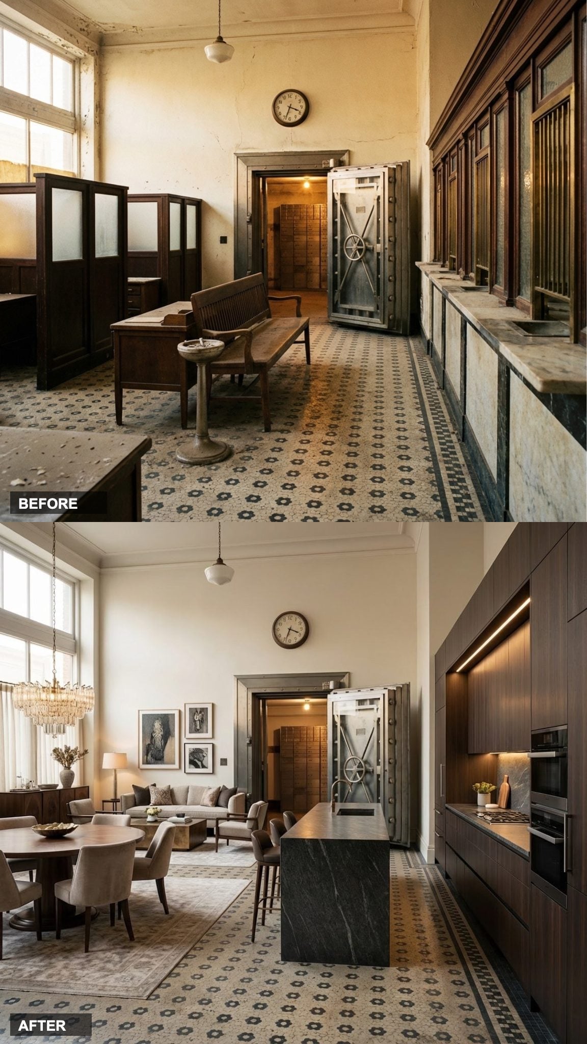
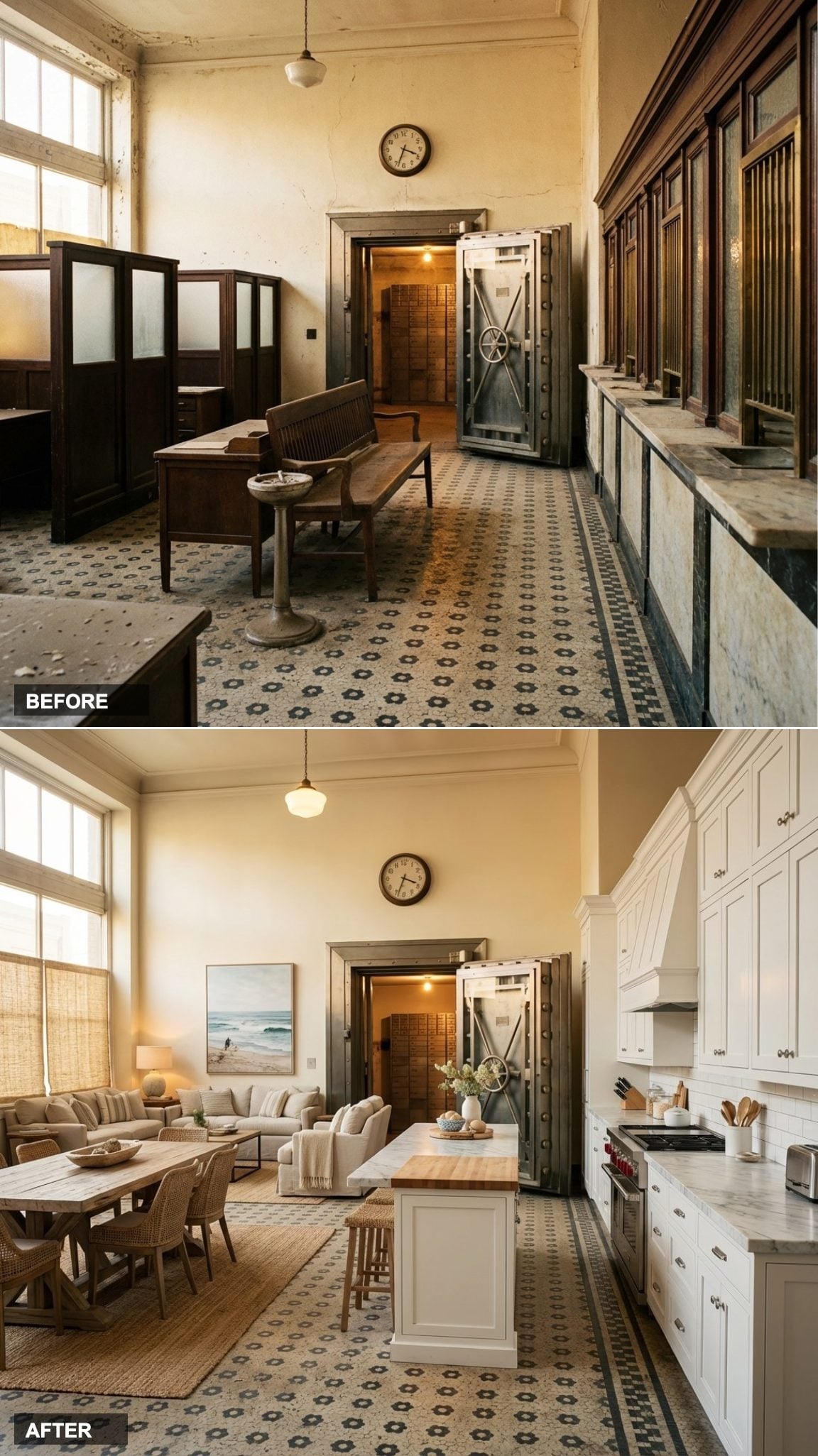
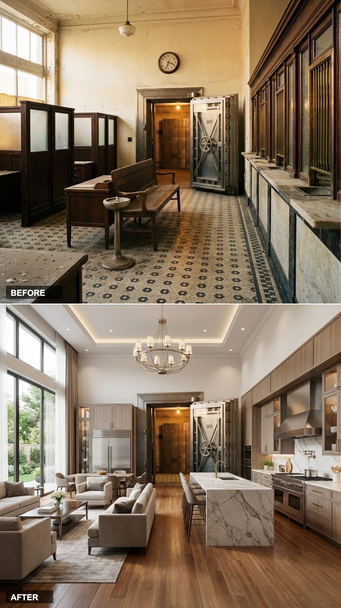
Adaptive reuse is one of the most interesting things happening in residential design right now. Old banks, in particular, have everything a luxury conversion needs: soaring ceilings, thick masonry walls, grand proportions, and a sense of permanence that no new build can fake. This article takes a single forgotten bank interior and runs it through 15 completely different design visions, from Parisian bistro warmth to razor-sharp Milanese minimalism. Each one uses the same bones and does something radically different with them.
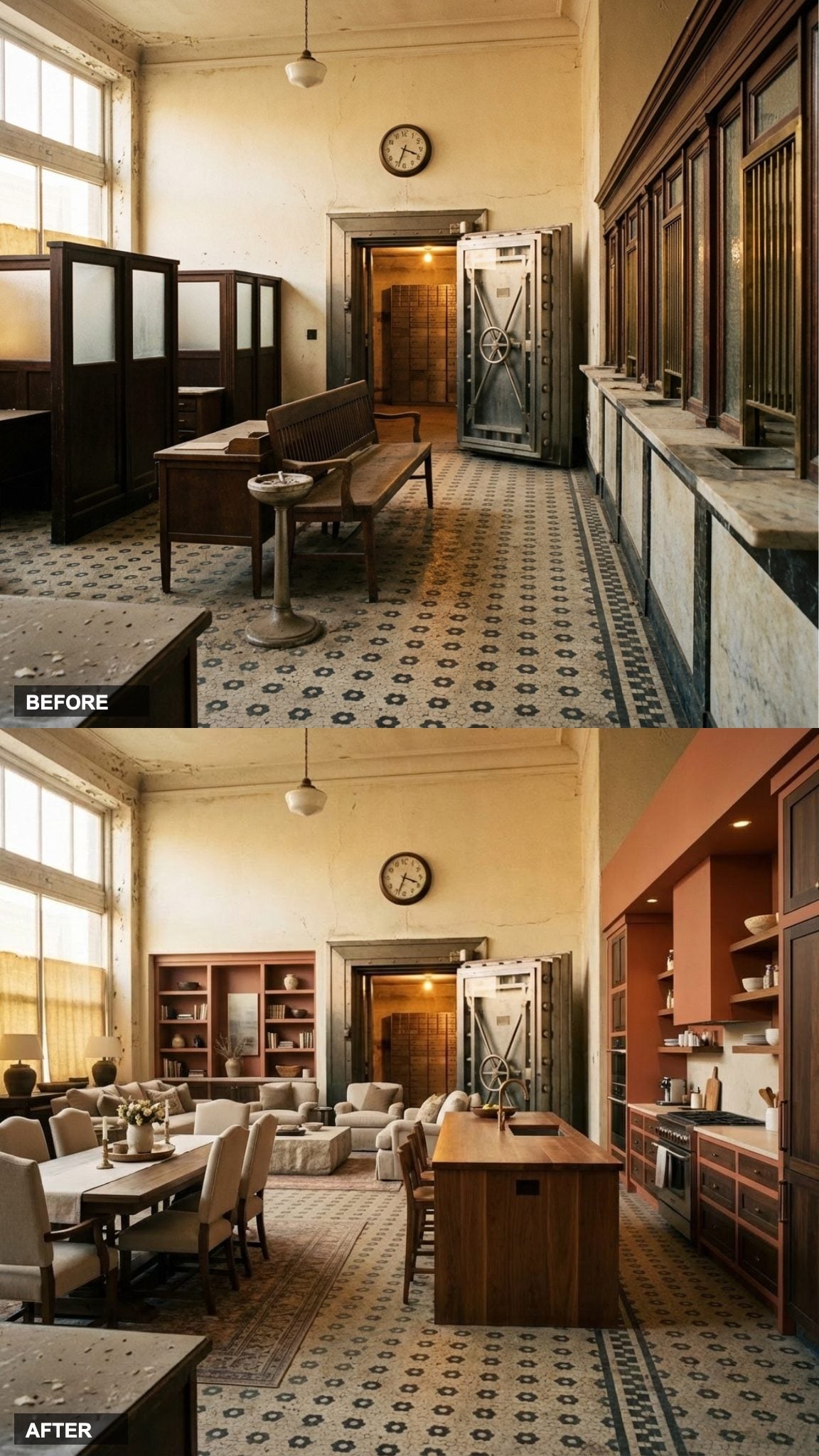
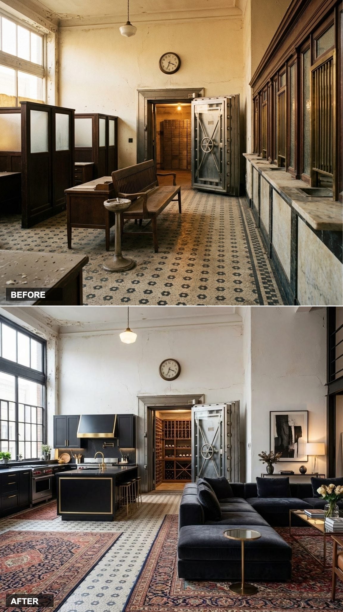
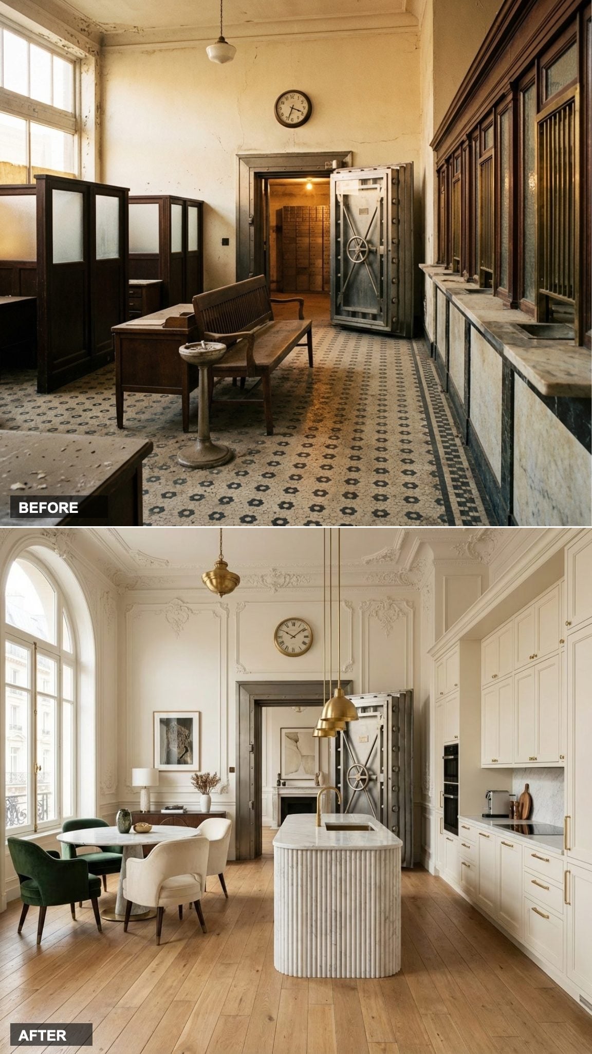
Calacatta Marble and Grand Dining Make This Bank Lobby Nearly Unrecognizable
The wicket wall is the single most defining feature of any bank lobby, and here it becomes the most compelling argument for adaptive reuse: strip the brass grilles, pull the laminate counters, and suddenly you have a perfectly proportioned galley run with ready-made structure. The Calacatta marble island is the axis everything else orbits around, its thick edge catching light the way only real stone does.
In order to come up with the very specific design ideas, we create most designs with the assistance of state-of-the-art AI interior design software. Also, assume links that take you off the site are affiliate links such as links to Amazon. this means we may earn a commission if you buy something.
On the left, the dining area fills the open floor plan with an authority the original carpet never could. The bones were always there. It just took someone willing to see past the fluorescent tubes.
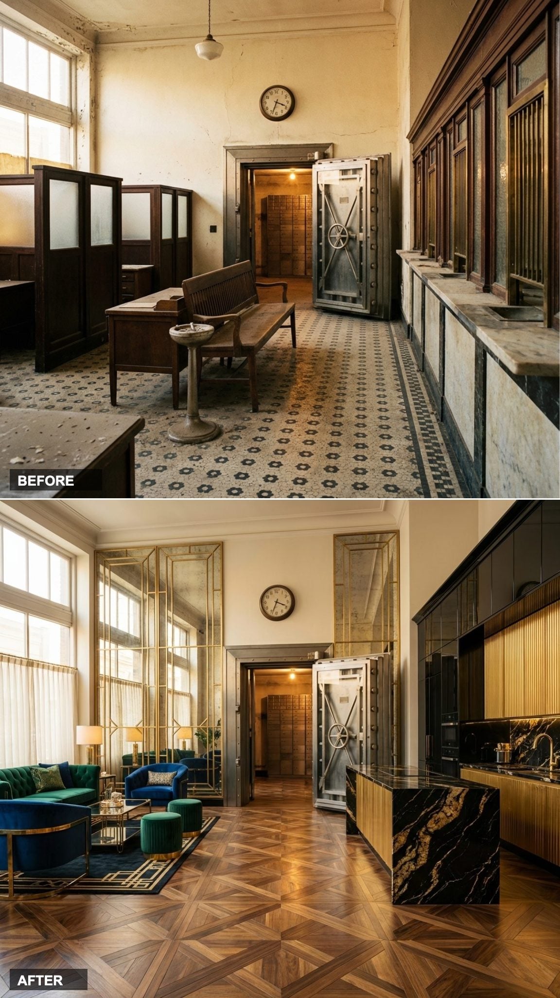
Brass Fixtures and a Stone Island Give This Formal Conversion Real Staying Power
Brass is back, but not the shiny kind your grandparents had. Unlacquered, brushed, or aged brass ages the way good leather does: it develops a patina that reads as intentional rather than neglected. Paired with a thick stone island and a formal dining arrangement, this version of the conversion leans into the bank’s original gravitas rather than fighting it.
- The stone island thickness anchors the kitchen visually without a single upper cabinet to lean on.
- Brass fixtures echo the original teller grilles, so the history of the space stays legible.
- A formal dining setup on the left matches the room’s institutional scale without looking stiff.
Bulthaup Precision and Bookmatched Marble Make the Old Wicket Wall Into Something Else Entirely
Bulthaup kitchens have a particular kind of confidence: they don’t try to be warm or approachable. They are precise, almost severe, and completely at home in a space with this kind of architectural backbone. The bookmatched marble island is where the design earns its cost, two slabs mirrored at the seam so the veining creates a symmetrical pattern that looks custom-designed rather than natural.
A round luxury dining table on the left introduces a classic residential counterpoint. The bank’s proportions can handle both extremes in the same room.
Dark Cabinetry, Oversized Quartz, and a Chandelier Over Dinner, This Version Has Attitude
Dark kitchens polarize people, which is part of why they work so well in spaces with strong architecture. The oversized quartz island reads as a monolith in a good way, heavy and grounding in a room that has enough ceiling height to absorb the drama without feeling claustrophobic.
The chandelier positioned over the dining area on the left is doing the most important work in this design. It drops the eye from that high ceiling to human scale, and suddenly the room has intimacy. One light fixture, correctly placed, resolves the biggest challenge in any large open-plan conversion.
White and Gold With a Fluted Island Turns Teller Windows Into Something Genuinely Glamorous
Fluted stone on a kitchen island has become something of a shorthand for a particular kind of aspirational interior, and in this space it earns that reputation. The vertical ribbing catches light differently than a flat panel would, creating subtle shadow lines that give the island visual texture without pattern or color doing the work.
White and gold as a palette for a bank conversion is a choice that leans into the building’s original pretensions. Banks were built to signal wealth and permanence. This version simply continues that conversation in a residential key, with a marble dining table on the left completing the formal register.
Leathered Granite and a Sleek Integrated Kitchen Make the Case for Texture Over Gloss
Leathered granite is one of those finishes that earns its premium entirely through tactile experience. The surface is honed rather than polished, with a slight texture that absorbs light rather than reflecting it. In a space this large, the absence of gloss keeps the kitchen from visually dominating the dining area on the left.
Integrated appliances, panels aligned with cabinetry, handles eliminated, let the galley run read as a single architectural element rather than a collection of equipment. That matters in a space where the original architecture is already doing a lot of talking.
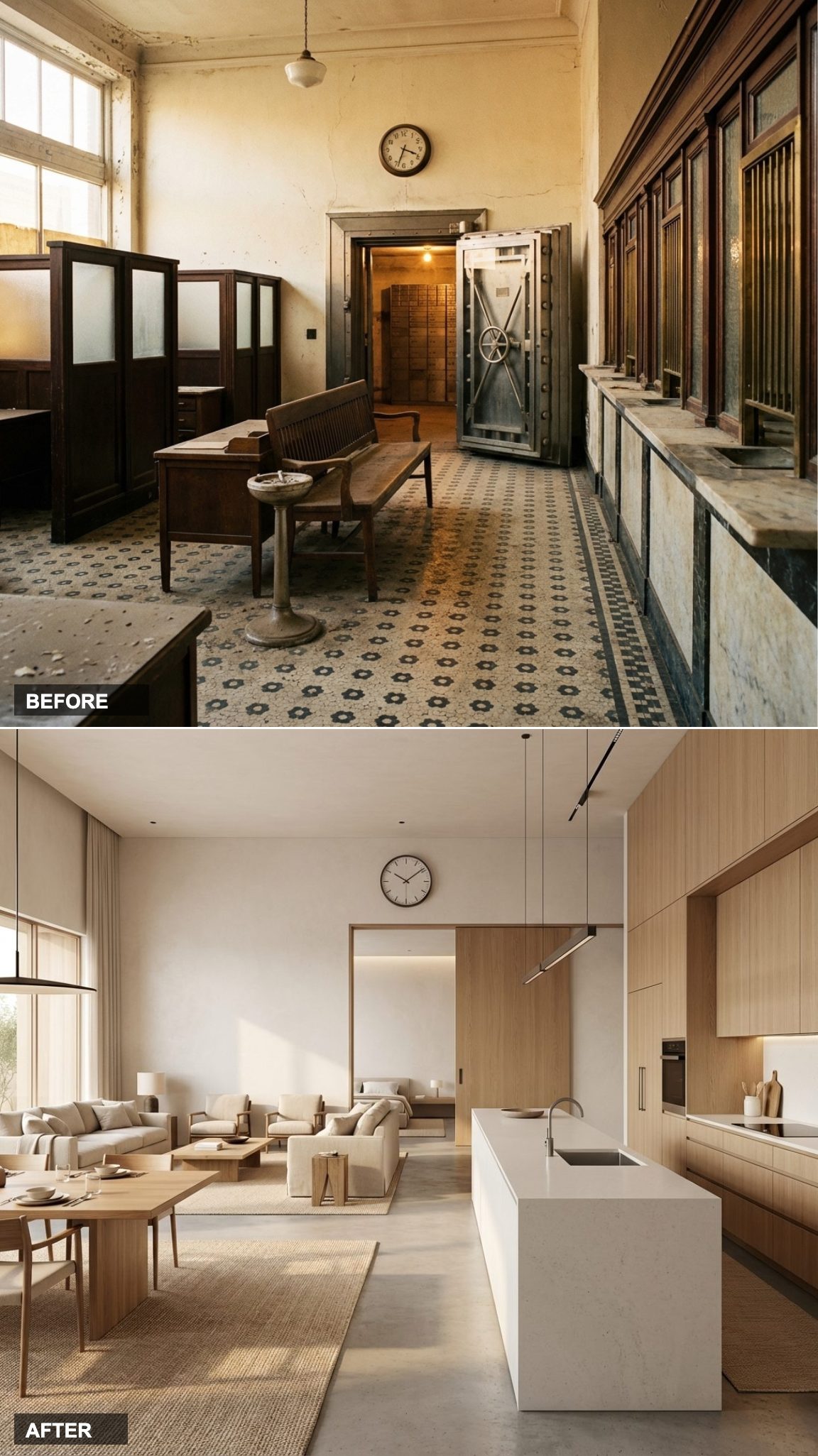
Japandi Minimalism and a Low Dining Table Reframe the Bank’s Grandeur as Meditative Space
When Less Square Footage Would Have Ruined It
Japandi design is a philosophy more than an aesthetic, and it requires space to work at its full potential. The light oak kitchen with a clean-lined stone island and the low dining table on the left are both choices that depend on the ceiling height of this original banking hall to avoid looking sparse. In a normal apartment, the same elements would read as bare. Here, they read as intentional.
The restraint is the luxury in this version. No statement light fixture, no dramatic material contrast. Just considered proportion and natural material.
Restaurant-Grade Kitchen, Black Marble Island, and a Long Dramatic Table: This Is a New York Loft Done Right
There is a specific kind of confidence in New York loft design that this version nails. The restaurant-grade kitchen doesn’t hide its utility behind panel doors. The black marble island is unapologetically bold. The long dining table stretches the full width of the left side, and the whole room reads as a space where serious cooking and serious entertaining happen in the same breath.
The original banking hall ceiling height is the unspoken asset here. Commercial-grade everything reads as industrial chic when you have 16 feet of air above it. Put the same kitchen in a standard 9-foot ceiling and it would feel like a galley in a restaurant kitchen. Here, it feels like a choice.
White Shaker Cabinetry and Driftwood Dining Bring Coastal California Ease to a Landlocked Bank Building
This version makes an interesting argument: you don’t have to honor the architecture’s original formality. White shaker cabinets with a butcher block section alongside marble counters, a driftwood dining table on the left, the whole design relaxes the banking hall rather than dressing up to meet it.
The result is one of the more livable-looking conversions in this series. Not every conversion needs to announce itself.
Terracotta, Warm Wood, and a Farmhouse Table Bring the Old Bank Back Down to Earth
After 14 versions that lean into luxury, this one leans into warmth. Terracotta and wood in a galley kitchen, a generous island designed for actual sitting, a farmhouse table with chairs that look like they’ve been pulled out and pushed back a thousand times. The bank’s bones are still visible, the ceiling height, the original proportions, but the design has domesticated them fully.
This is the version you’d actually want to cook Sunday lunch in. Which, at the end of an exercise like this, feels like the most honest transformation of all.
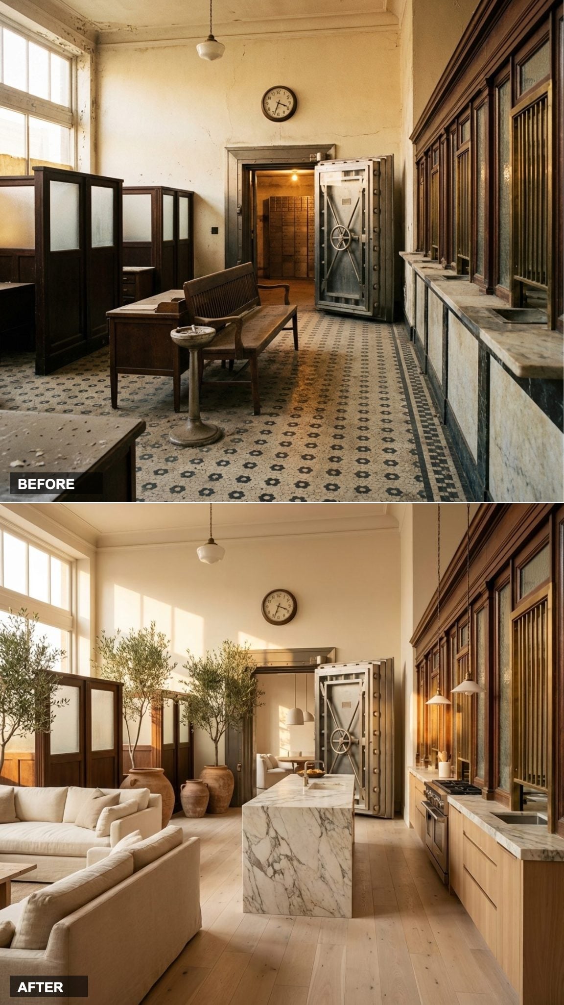
Soaring Ceilings, Marble Waterfall Island, and Light Pouring Through Every Arch
Ripping out that drop ceiling is the single most impactful thing anyone could do to this space. The moment those fluorescent grids come down, you’re suddenly standing in a room with architectural ambitions that the 1990s renovation actively tried to hide. Here, those recovered ceiling heights become the backbone of the whole design.
The marble waterfall island anchors the chef’s kitchen without competing with the room’s bones. Hardwood floors run wall to wall, warm enough to balance all that stone and glass. Floor-to-ceiling windows replace the frosted panels, flooding the space with the kind of natural light that makes every surface look intentional.
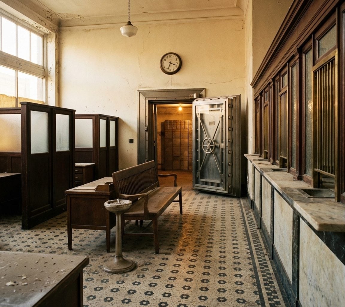
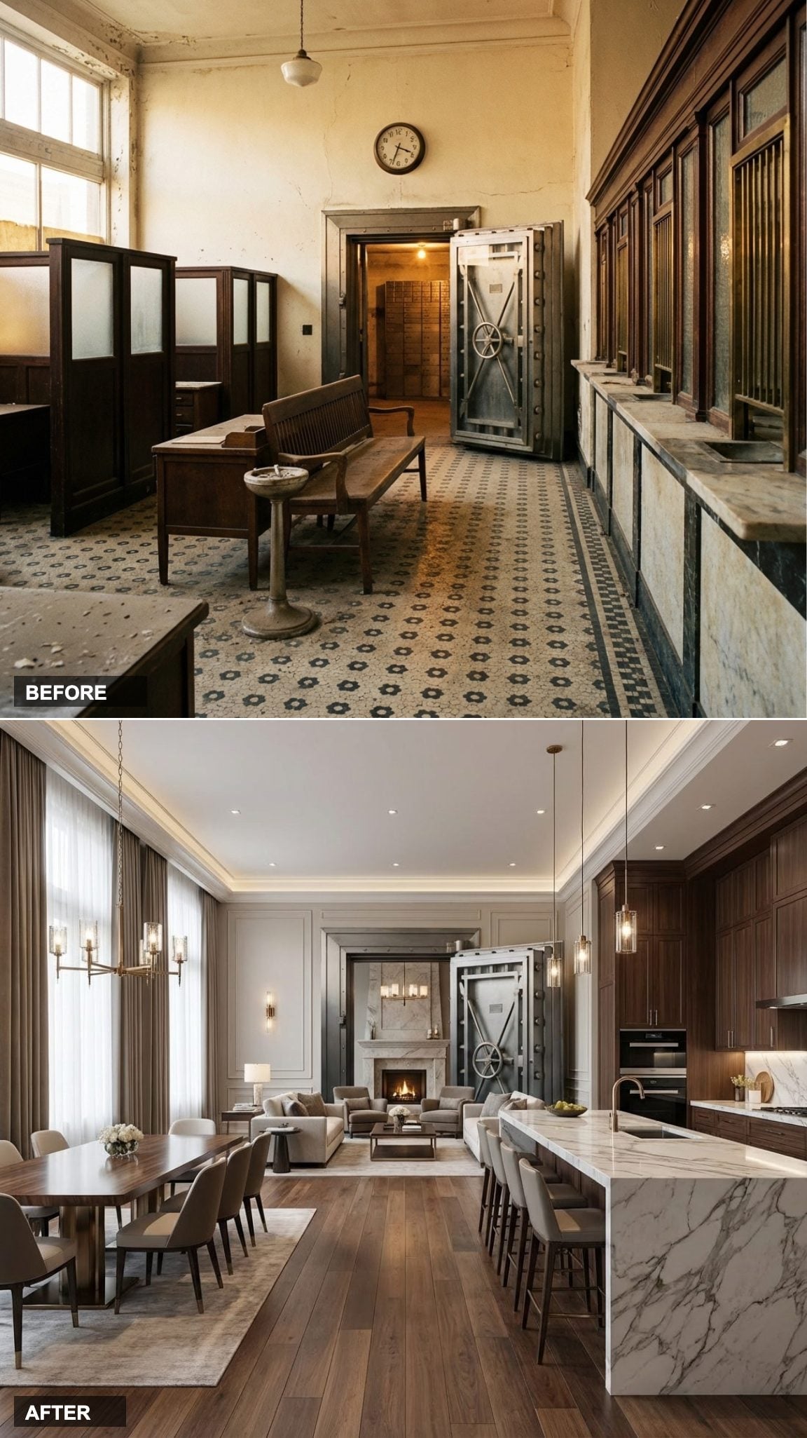
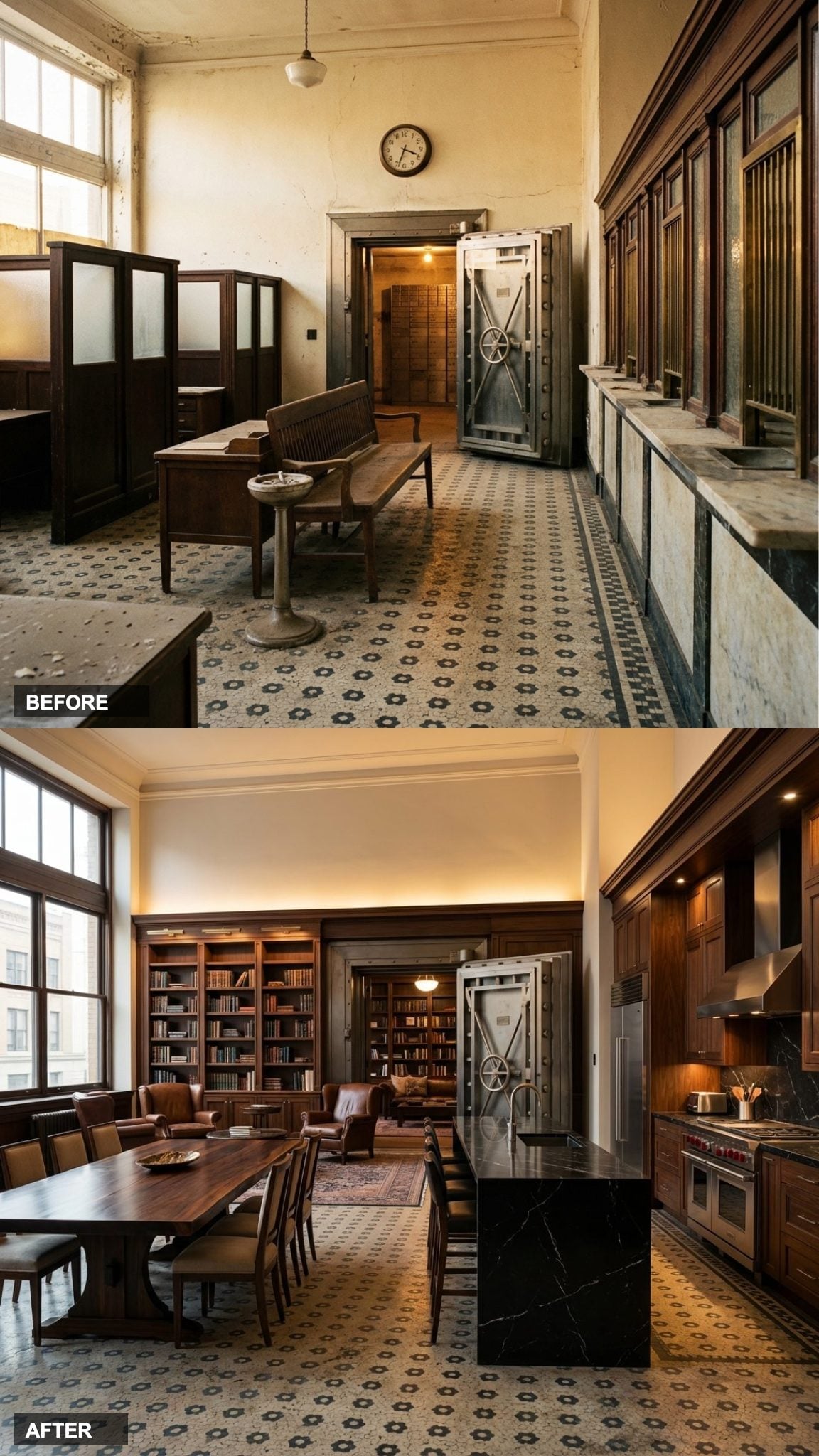
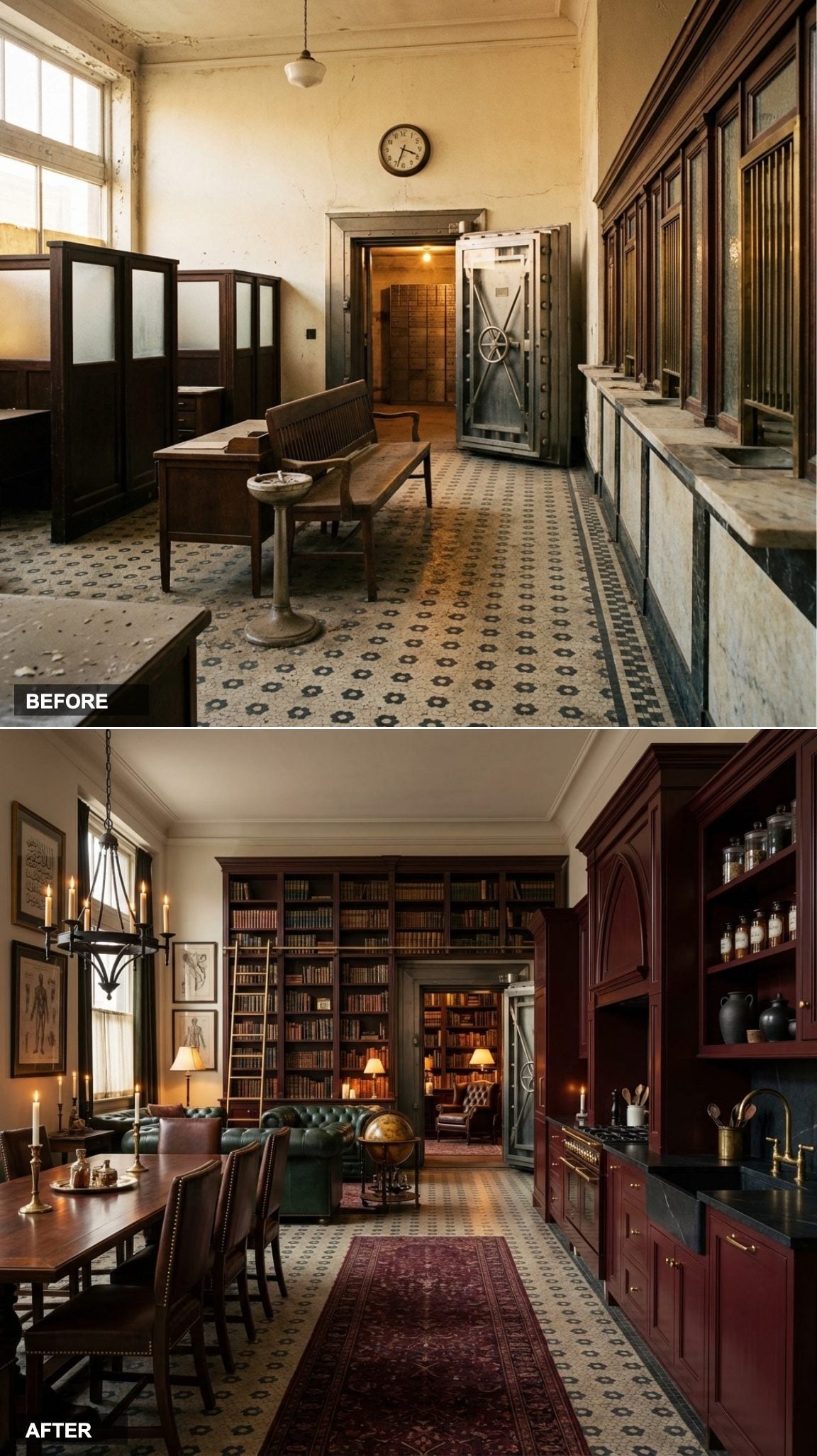
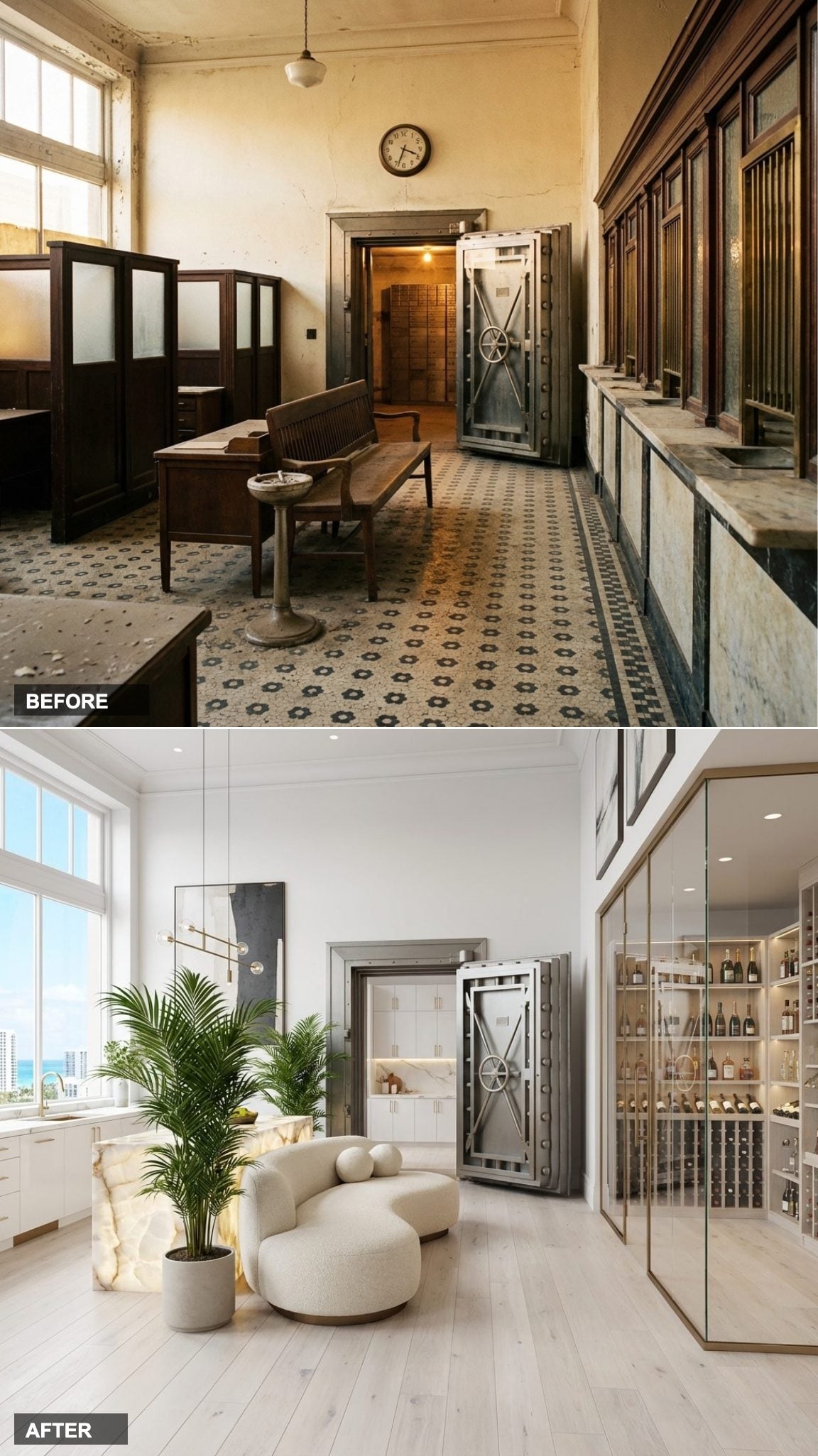
The Vault Door Stays, and It’s Now the Most Talked-About Wall in the Room
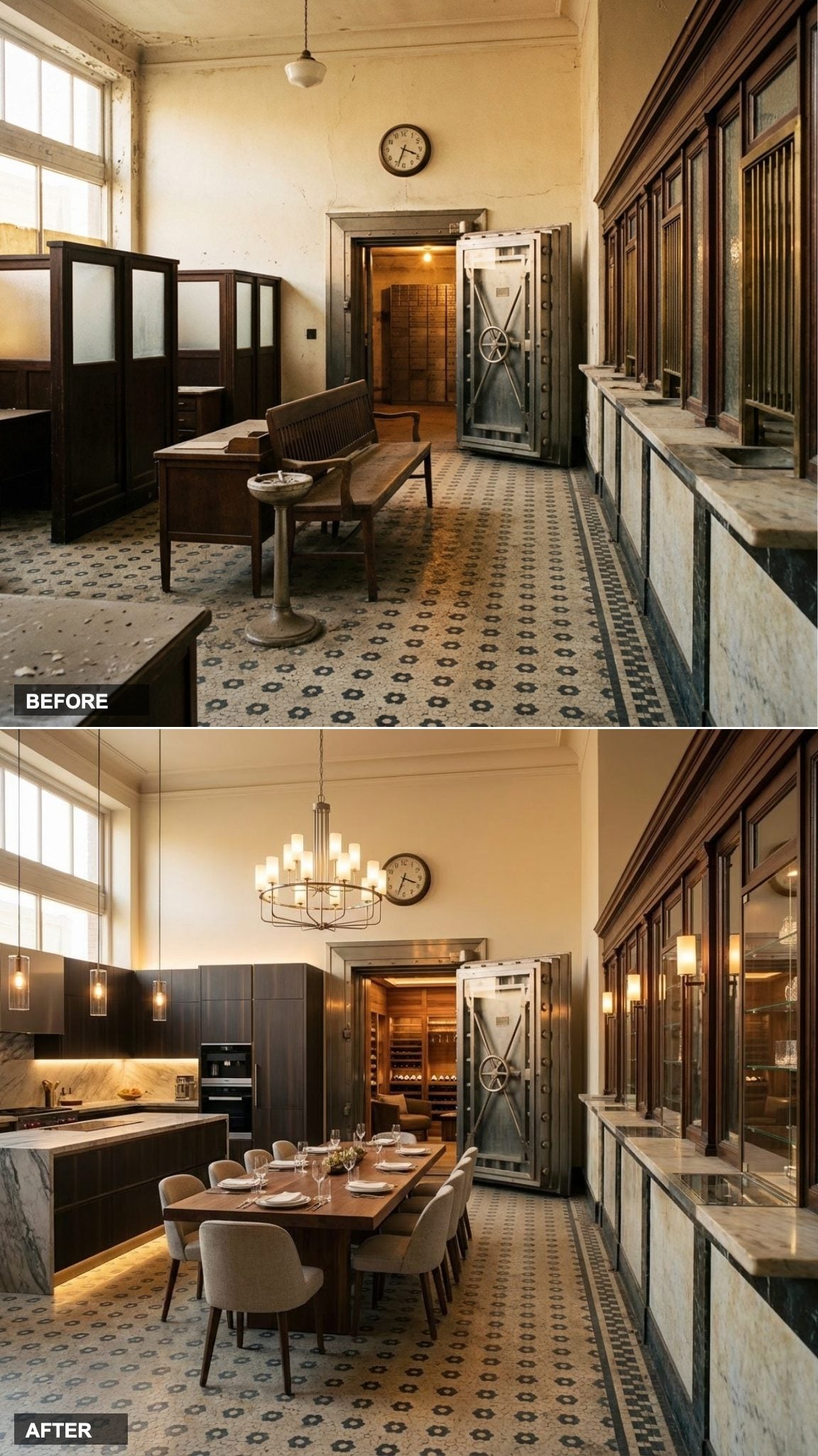
Keeping the exposed vault door as a design element rather than removing it is the kind of decision that separates a good renovation from a great one. It does three things at once: it tells the story of the building, it provides a focal point of serious sculptural weight, and it saves a small fortune in feature wall costs.
The Italian kitchen cabinetry runs sleek and handle-free against the opposite wall, all lacquered surfaces and integrated appliances. A grand dining table holds court in the center, sized for a room that actually deserves it. The contrast between old vault steel and new refined surfaces is exactly as good as it sounds.
Book-Matched Marble Slabs and a Long Oak Table That Fills the Room Like It Was Always There
🔥 Would you like to save this?
Double-height ceilings demand double-height ambition in the furnishings, and this design delivers. The book-matched marble kitchen slabs are the visual centerpiece: two mirrored stone panels flanking the cooking area like a piece of art that also happens to be a backsplash.
The long oak dining table is sized exactly right for the room’s proportions. Too many bank conversions fill large volumes with undersized furniture, which just makes the space feel empty. Here the table grounds the room, and the designer chairs around it reinforce the sense that someone thought carefully about scale.
‘The biggest mistake in high-ceiling spaces isn’t going too big with furniture. It’s going too small.’
White Plasterwork, Black and Gold Kitchen, Persian Rugs: A New York Loft Without the Manhattan Price Tag
Painting the original exposed plasterwork white rather than plastering over it is a choice that preserves texture while modernizing the palette. The imperfections in the walls become intentional, the way patina does in any well-designed space.
The black and gold kitchen reads bold against all that white, and the Persian rugs on what are presumably original terrazzo floors create a layered richness that money alone can’t manufacture. This is the loft aesthetic that everyone pins on mood boards, executed in a building that actually has the bones to support it.
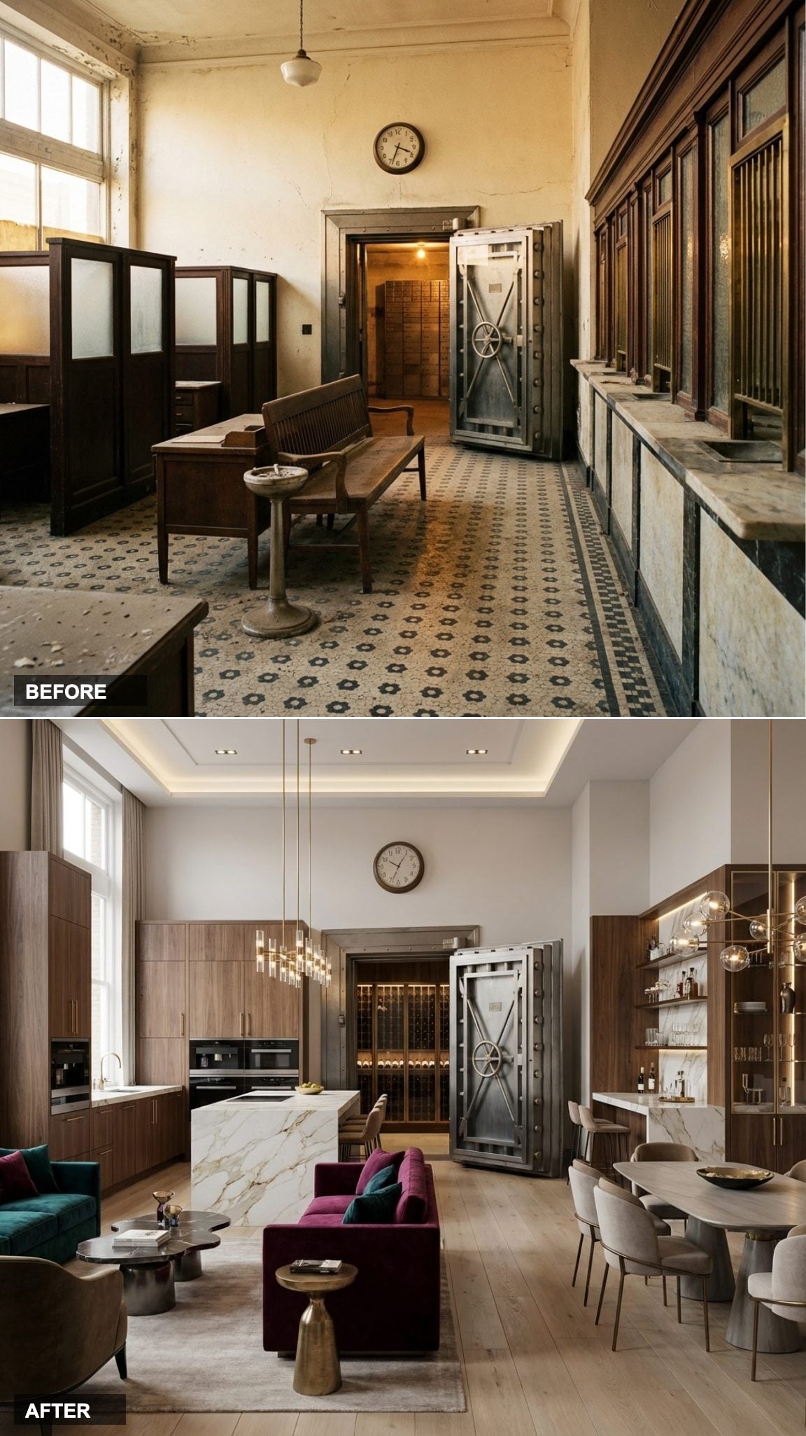
Vault Door as Sculpture, Sunken Living Room, Skylights Cutting Through a Ceiling That Finally Gets to Breathe
The Bulthaup kitchen is the quietest thing in this room, and that’s the point. Fully integrated, almost invisible, it lets the vault door sculpture and the sunken living room’s marble fireplace carry the drama. German kitchen design at this level is built on the philosophy that the cooking infrastructure should disappear into the architecture.
The sunken living room is a spatial move that feels genuinely rare in residential design right now. Dropping the floor even 18 inches creates an intimate pocket inside a vast open volume. The skylights above complete it: natural light finding its way into a space that spent decades under fluorescent tubes.
Dark Stone and Handleless Cabinetry Bring Modern Italian Precision to 1920s Architecture
Italian modernism at its best is about surfaces, not shapes, and this conversion understands that completely. The handleless dark grey cabinetry has the quality of a precision instrument, its grain pattern running floor-to-ceiling in a continuous slab that no residential kitchen from 1993 could have imagined. Against the original plaster cornice, still intact and cream-white, the contrast is the whole point.
“The old and the new don’t need to apologize to each other, they just need to be equally serious about craft.”
Tokyo at Midnight: A Japandi-Inspired Transformation
Japandi is the natural design philosophy for a bank conversion, it was practically invented for spaces where silence and intention already have architectural weight. This version goes darker than the typical light-and-airy interpretation: near-black walls in deep charcoal sumi ink, white oak furniture with visible grain, tatami-inspired area rugs in natural jute.
- The teller counter becomes a low kitchen island in pale ash wood with a matte black stone top.
- The grillwork gets sandblasted and powder-coated matte black, then framed as decorative art panels.
- Single bare Edison bulbs on black cord drops replace every overhead fixture, creating pools of warm light in a dark room.
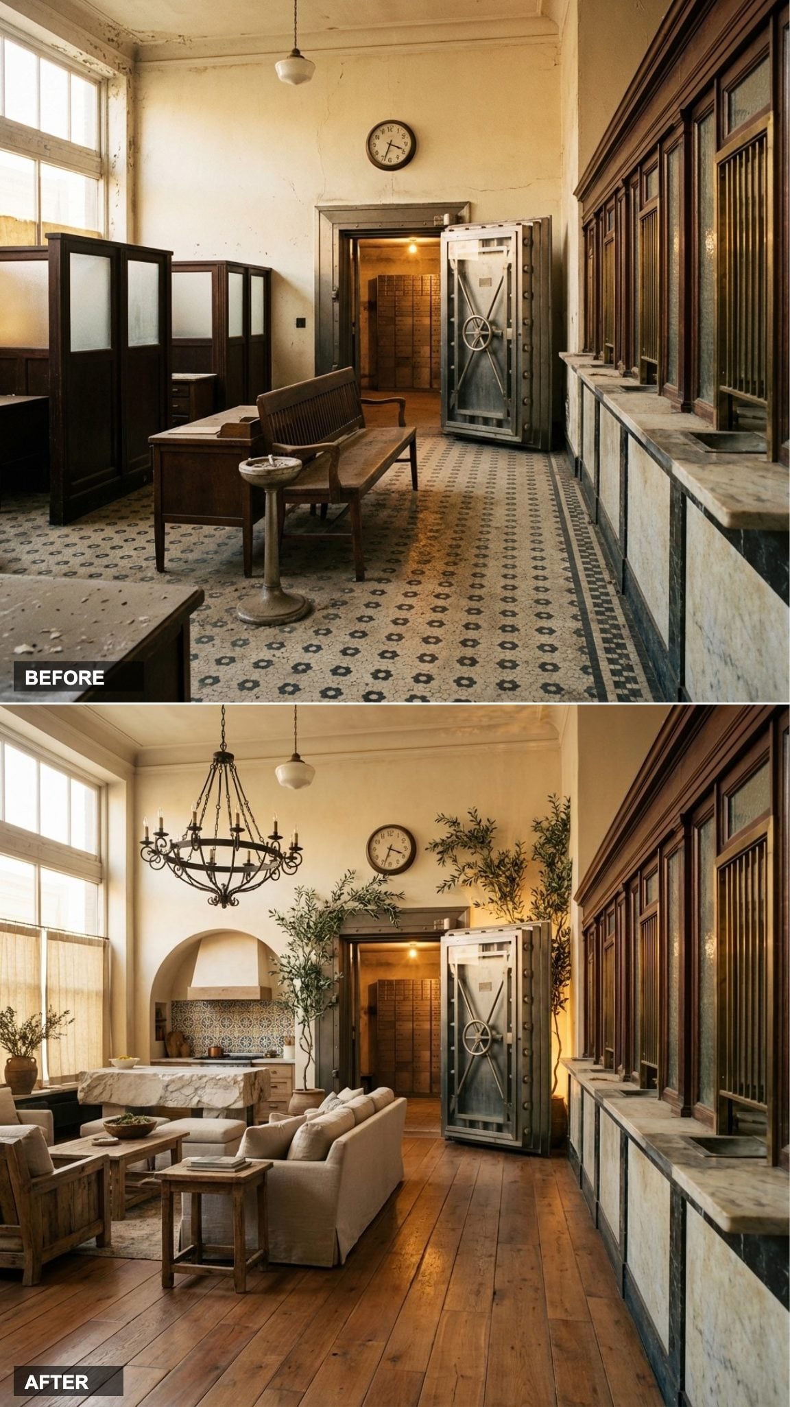
Gilded Age Revival: When the Money Never Really Left
The original bank was built to project wealth, coffered ceilings, marble floors, carved millwork. Then came the drop tiles and the burgundy rope stanchions, and the whole performance collapsed. This conversion simply finishes what the architects started.
True gold leaf on the coffered ceiling panels. Original marble floors restored and resealed. Dark green lacquered walls that read almost black in evening light. A library ladder on brass rails running the full length of the built-in shelving where the teller stations once stood.
The furniture is deliberately sparse because the room itself is doing the work: one large Chesterfield sofa in cognac leather, a George III mahogany writing desk, and a drinks trolley that belonged to someone’s grandfather.
Cool Light, Warm Stone, and the Quiet Confidence of a Space That Knows What It Is
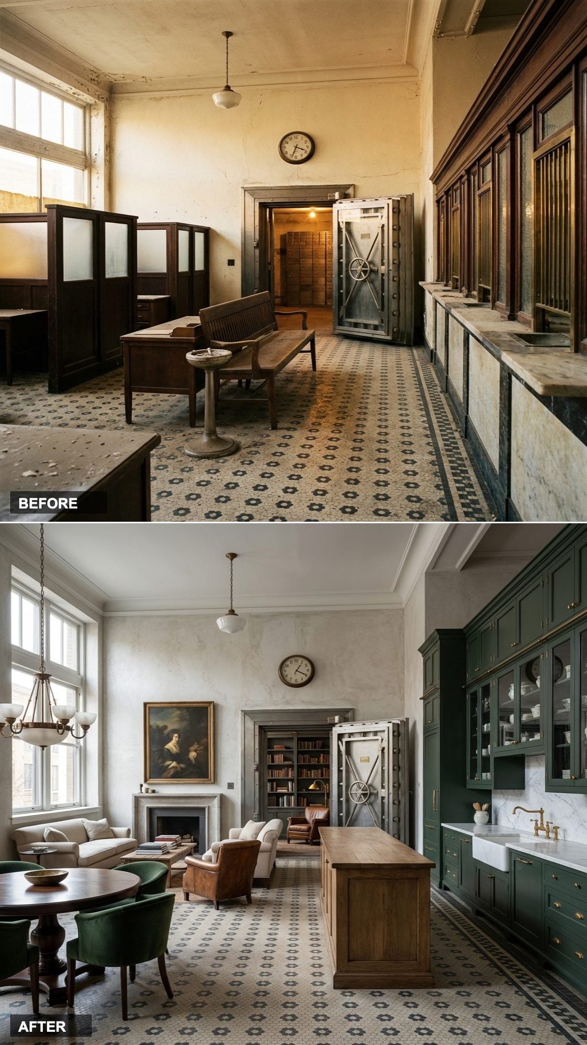
Natural daylight is the material that most designers forget to specify. In this version of the conversion, the original arched windows have been fully uncovered, and the cool northern light they pull in does something no artificial fixture can replicate: it makes the geometric tile floor read as almost luminous, each original inlay crisp and deliberate underfoot.
The open-concept living arrangement respects the scale of the original banking hall without trying to domesticate it into something smaller. Furniture sits low and spare against the volume of the room. Stone and plaster surfaces absorb and reflect the daylight in different registers depending on the hour, which means the room never looks the same twice.
A space this architecturally loaded only needs one thing from its designer: restraint.
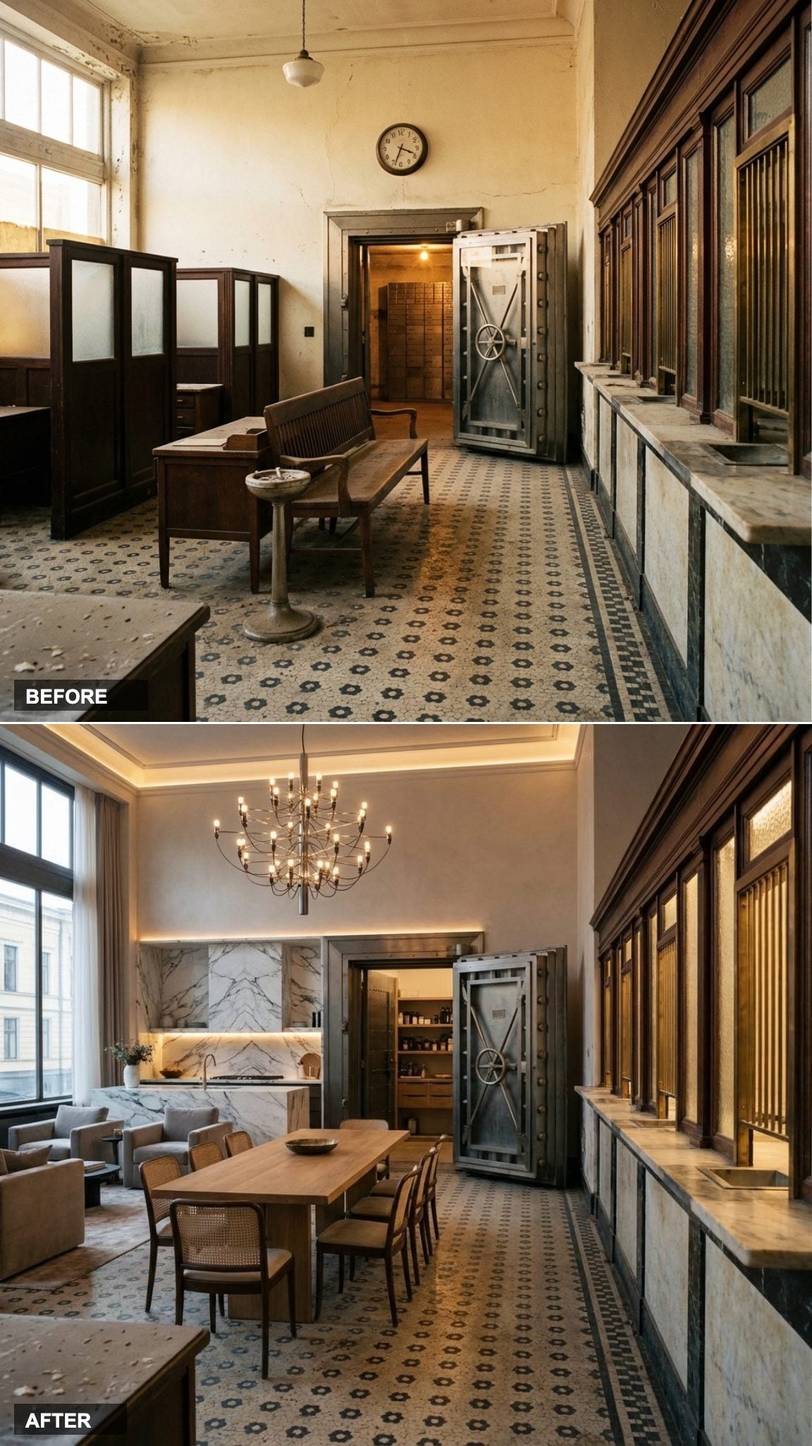
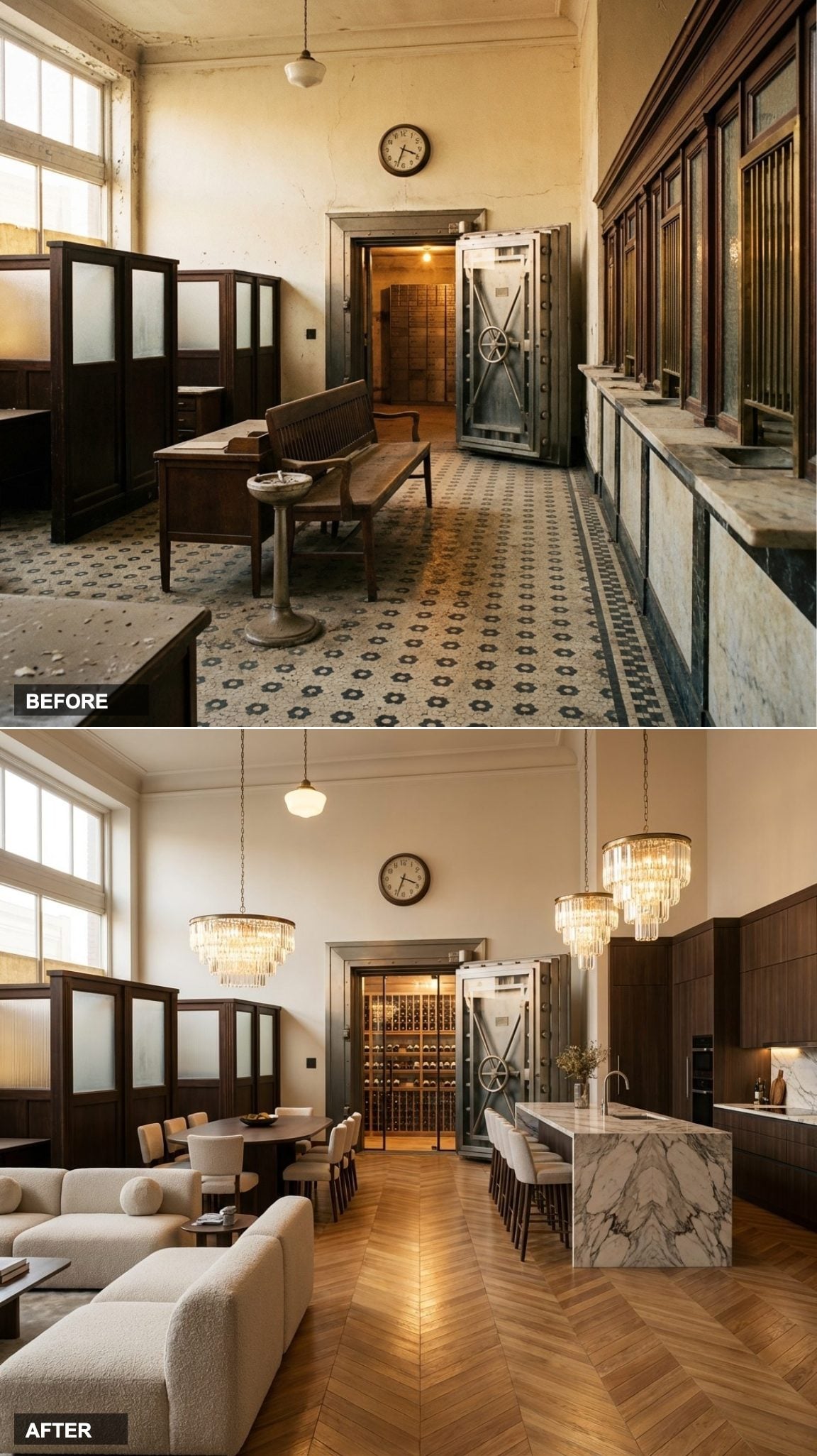
Bare Linoleum and Broken Teller Windows Give Way to a White Oak Showpiece Kitchen
Wide plank white oak floors do most of the heavy lifting here, pulling warmth across a space that once felt like a waiting room with a roped-off line. The four-meter kitchen island, the kind you’d expect in a chef’s restaurant, not a converted bank, anchors the open plan and immediately solves the scale problem that kills most residential kitchens in cavernous spaces.
Everything about this redesign plays to proportion. The ceiling height that made the old teller hall feel cold now works as an asset, giving the custom pendant lighting room to breathe and the cabinetry room to stack high. The original vault door, retained at the rear, functions as the single best piece of art in the room.
Chevron Oak and Bookmatched Marble Turn a Crumbling Lobby Into a Gallery-Worthy Living Space
Bookmatched marble is one of those finishing moves that requires no explanation. Two slabs of the same stone cut and mirrored at the seam produce a Rorschach-like symmetry that feels almost organic, the veining spreads outward like wings. Against chevron-laid oak floors lit by statement pendants, the material conversation in this conversion is genuinely difficult to look away from.
The Bulthaup kitchen integration keeps the lines clean enough that nothing competes with the architecture. This is a space that understood the assignment: let the bones do the talking, and keep the fittings honest.
Ivory Lacquer, Unlacquered Brass, and a Fluted Marble Island Channel Pure Parisian Apartment Energy
Unlacquered brass will tarnish, and that’s precisely the point. The Parisian apartment tradition of allowing metal fixtures to age in place, to pick up the patina of everyday life, is one of the few design philosophies that genuinely improves with time rather than fighting against it.
The fluted marble island is doing serious visual work: the vertical ribbing catches shadow, adds texture to a large smooth surface, and references classical architecture without cosplaying it. Paired with hand-scraped light oak floors, the whole composition feels assembled over decades rather than installed last Tuesday.
Geometric Walnut Inlay Floors and Gold Fluted Cabinetry Deliver Full Art Deco Maximalism
Art Deco never asks permission. Inlaid oak and walnut floors in a geometric pattern, the kind that requires a specialist and a serious lead time, announce this conversion before you’ve registered anything else in the room. The glossy black kitchen with gold fluted cabinetry continues the language of pattern and repetition that is the formal grammar of Deco design.
What makes this interpretation work rather than tip into costume is the scale of the original space. Deco was always meant for grand proportions. A former bank lobby, with its ceremonial ceiling height and formal symmetry, is one of the few residential conversions where the style lands without irony.
Bleached White Oak and a Live-Edge Marble Island Make This Feel Like the Best House in Malibu
Live-edge marble is an interesting design move because it imports the logic of natural wood slabs into stone, preserving the irregular outer edge of the slab rather than cutting it square. In a California-style interior with bleached white oak floors and natural stone surfaces throughout, it reads as the most organic possible version of luxury: no forced formality, no rigid symmetry.
The original bank’s institutional severity completely disappears here. What’s left is something that feels like it was always a home, a very good one, somewhere with year-round light.
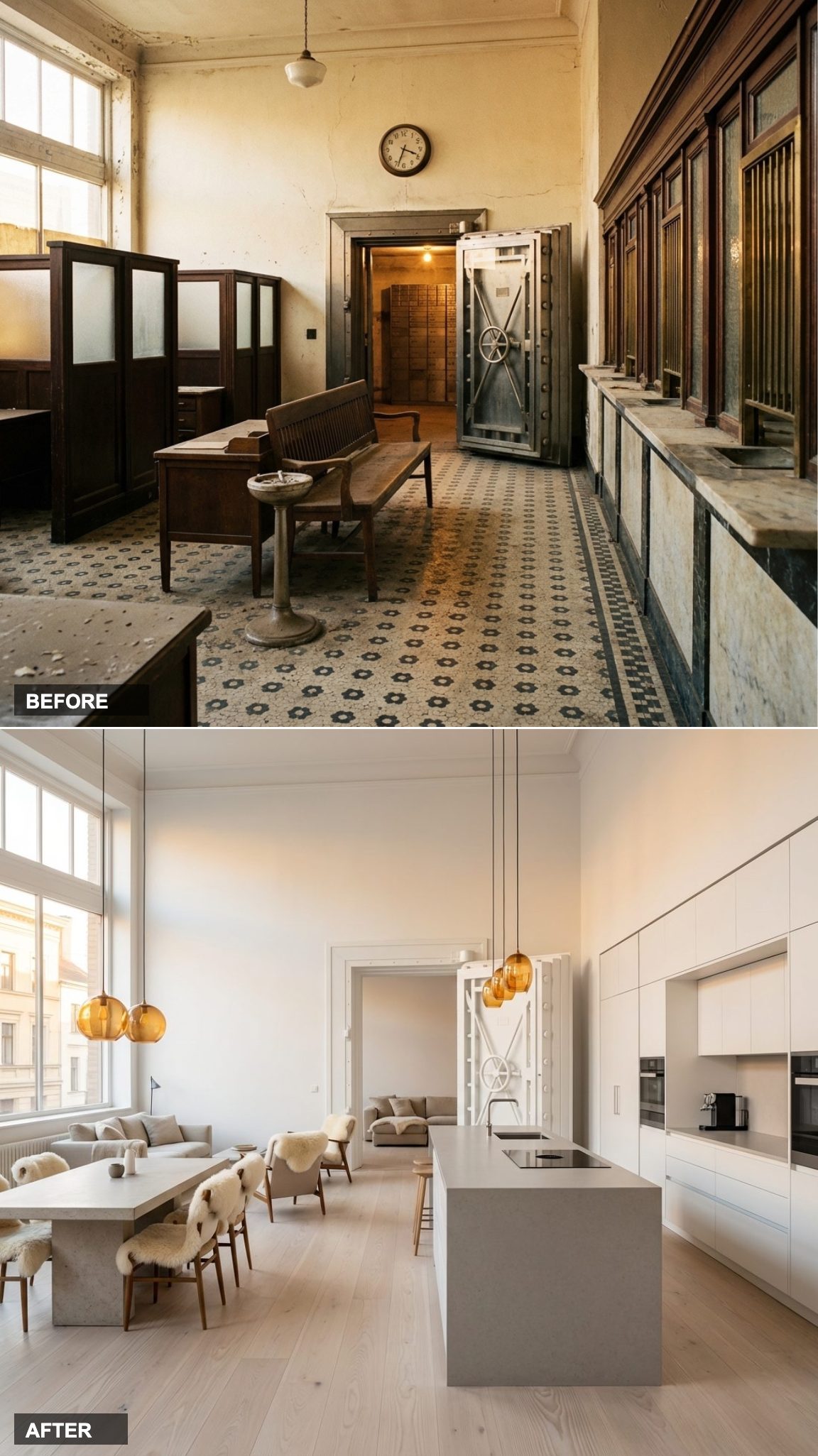
Pale Ash Floors and an All-White Silestone Kitchen Nail the Nordic Minimal Brief
🔥 Would you like to save this?
Scandinavian design operates on the principle that light is the primary material, everything else exists to reflect, diffuse, or respond to it. Pale ash floors and fully integrated white cabinetry in a space with the ceiling height of a former bank lobby create a brightness that isn’t clinical; it’s expansive.
The Silestone island in a soft tone introduces just enough material differentiation to keep the eye moving without breaking the composition’s quiet confidence. This is the version of the conversion that would photograph identically at 9am and 4pm, which is its own kind of achievement.
Whitewashed Oak, Brushed Gold, and a Backlit Onyx Island Deliver a Miami Conversion That Earns Its Drama
Backlit onyx is one of those material choices that transforms after dark. During the day it’s a beautifully veined stone with a translucent quality; at night, when the internal light source activates, it becomes something closer to a sculpture. In a Miami-inspired conversion, where the light shifts dramatically between afternoon sun and nighttime atmosphere, that dual personality is exactly the right call.
Whitewashed oak floors soften what could otherwise read as aggressive, and the white lacquer cabinetry with brushed gold hardware keeps the palette coherent without getting timid. The original bank’s vault door, still present at the rear, takes on an almost theatrical quality in this context.
Reclaimed Oak and a Restaurant-Grade Steel Kitchen Give This Bank Conversion Its Rawest Edge
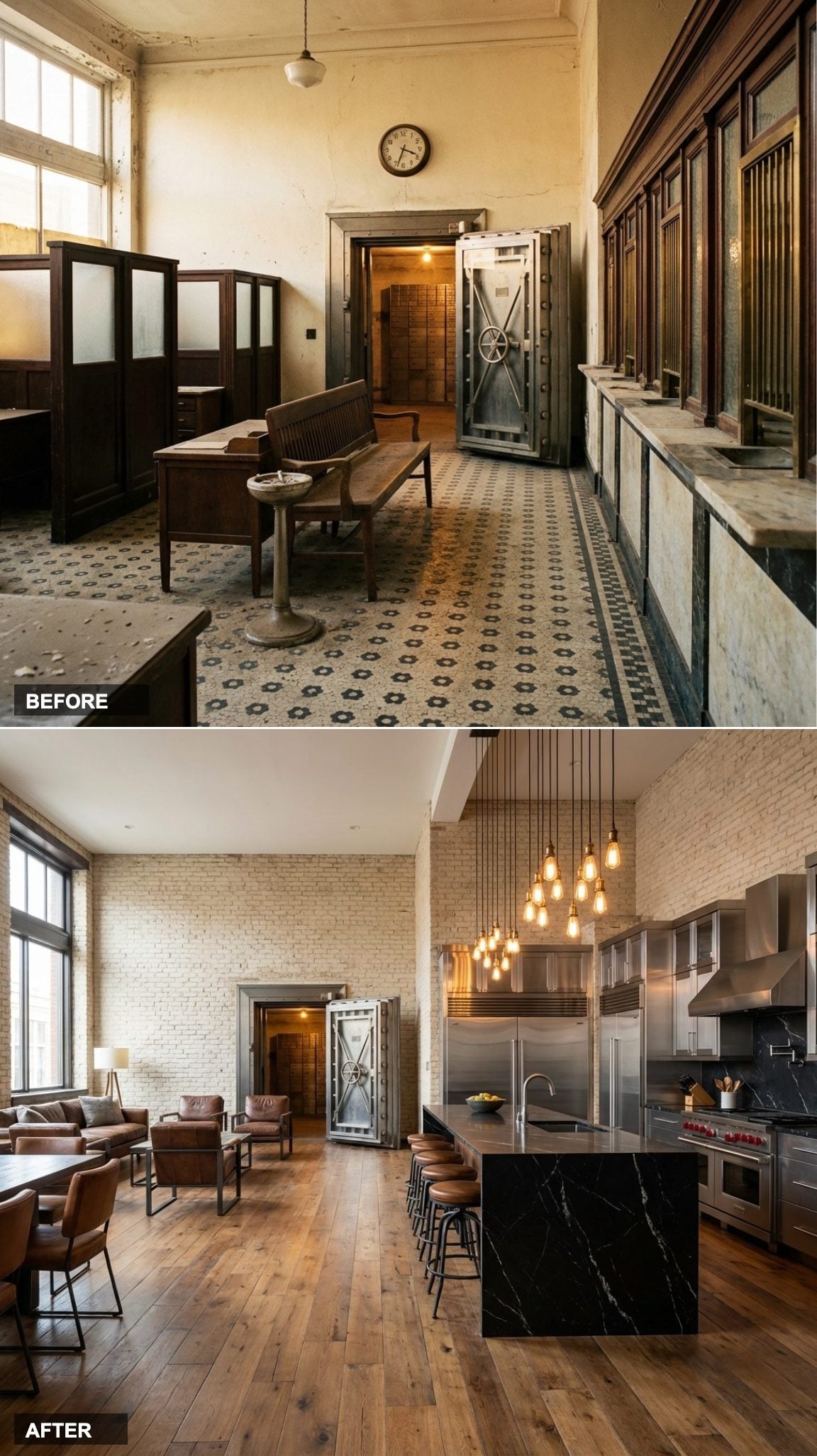
The industrial-refined category is where the bank conversion format makes the most intuitive sense. Reclaimed oak floors, stainless steel kitchen surfaces, black marble, exposed concrete above, these aren’t materials that disguise the history of the space. They work with it, extending the logic of a commercial building into something that still feels residential because of its human scale and the warmth of the wood underfoot.
The enormous central island pulls the restaurant-grade kitchen back into domestic territory. You’re supposed to gather around it. That’s the move.
Hand-Finished Terracotta Oak and Hand-Painted Tile Ceramics Recast the Bank as a Tuscan Farmhouse Fantasy
Terracotta-toned wide plank oak floors and hand-painted ceramic tile backsplash introduce a quality that most contemporary kitchens actively avoid: visible human effort. Each tile is slightly different. Each plank carries a hand-finished imperfection. In a space with the formal structure of a historic bank, that artisanal quality creates a productive friction, the discipline of the architecture meeting the warmth of craft materials.
The warm stone kitchen surfaces and the overall palette pull this squarely into northern Italian farmhouse territory: the kind of home that was clearly built over generations, not delivered in eight weeks.