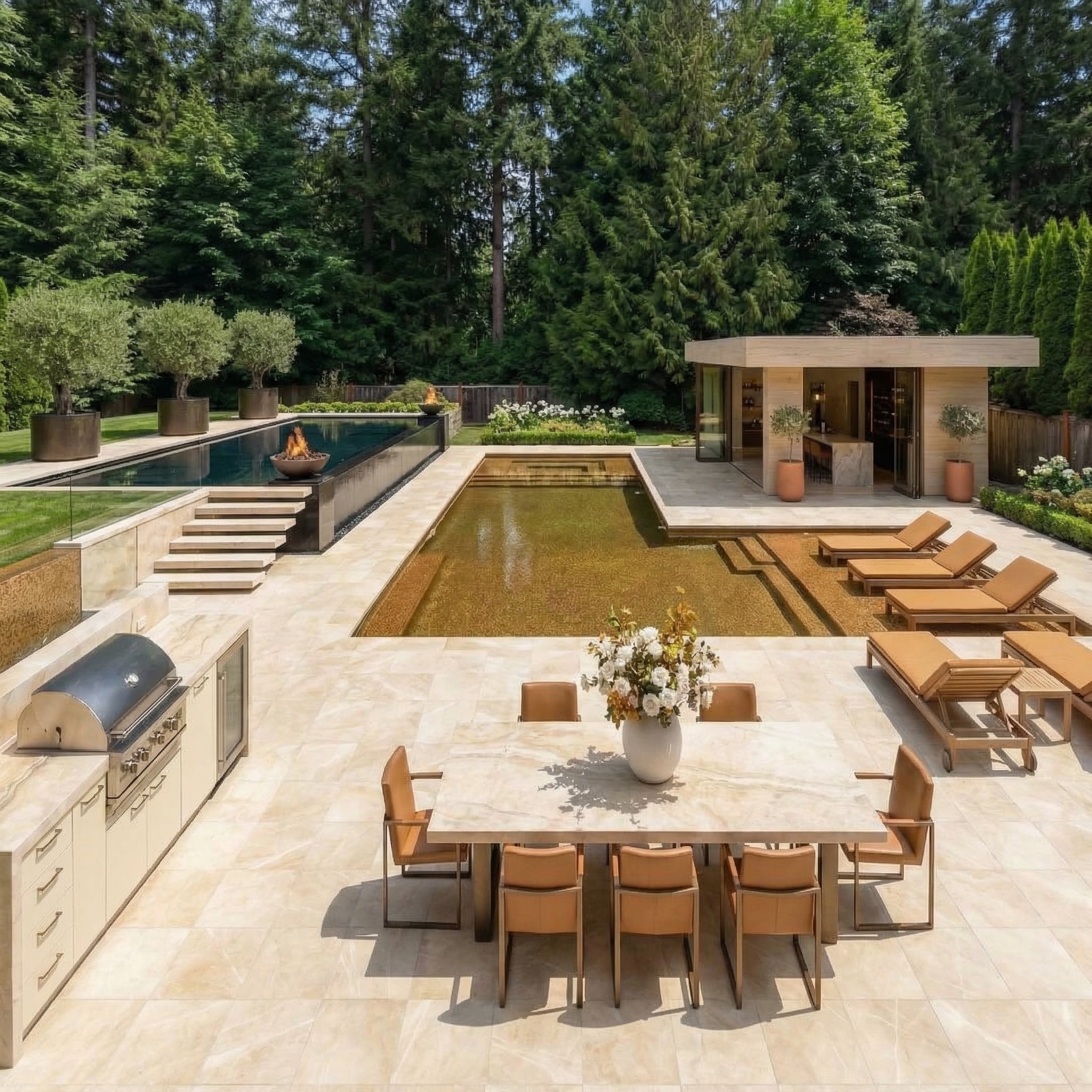
There’s something quietly radical about walking into a converted church and realizing the pews are gone, replaced by a marble island or a leather sectional. These aren’t just renovations, they’re a complete renegotiation of what a space is allowed to be. The soaring ceilings, the arched windows, the original timber bones: all of it stays, but everything around it shifts. These 26 before-and-after transformations show exactly how far that shift can go.
Sunken Living Room, Stone Fireplace, Stained Glass Still Burning Overhead
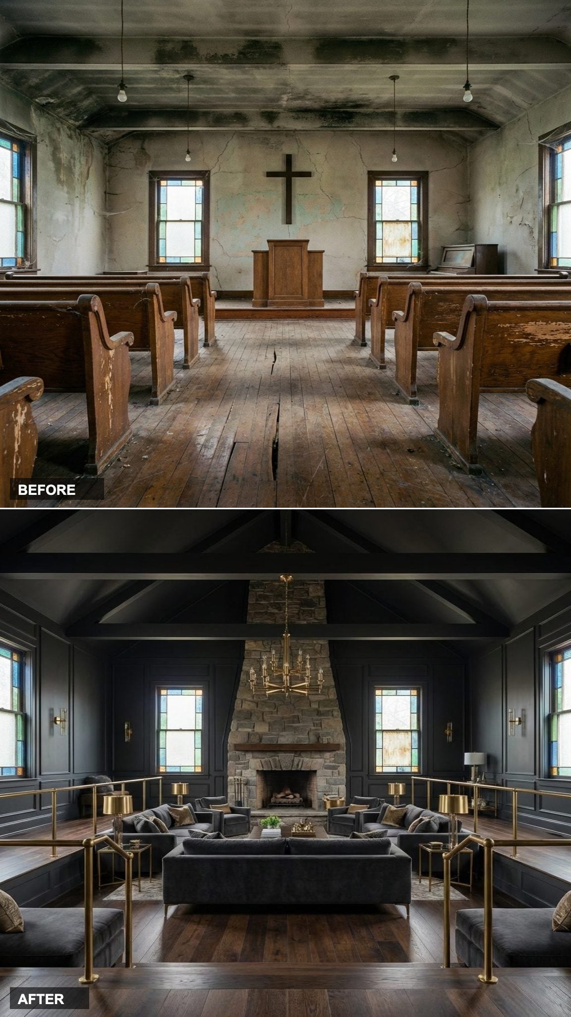
Keeping the original stained glass windows was a non-negotiable here, and you can see why. The deep charcoal walls give those jewel-toned panes something to push against, the colored light that spills across the space at different hours acts like an ever-changing art installation you didn’t have to commission.
In order to come up with the very specific design ideas, we create most designs with the assistance of state-of-the-art AI interior design software. Also, assume links that take you off the site are affiliate links such as links to Amazon. this means we may earn a commission if you buy something.
The sunken living room is a clever move in a space this tall. It creates a zone of human scale beneath a double-height ceiling that might otherwise feel cold, and the stone fireplace gives the room a gravitational center that the old pulpit never quite managed.
Sage Green Cabinetry and a Twelve-Seat Dining Table Beneath the Original Arches
Scale is everything in a church conversion, and this kitchen gets it right. Sage green cabinetry with brass hardware reads as warm rather than precious because the room is large enough to carry it without the color dominating. The warm ivory and gold palette keeps the light feeling generous even as the arched windows frame the dining table below.
That long table for twelve isn’t just a furniture choice, it honors the original function of the building. A space designed for gathering deserves a table worthy of it.
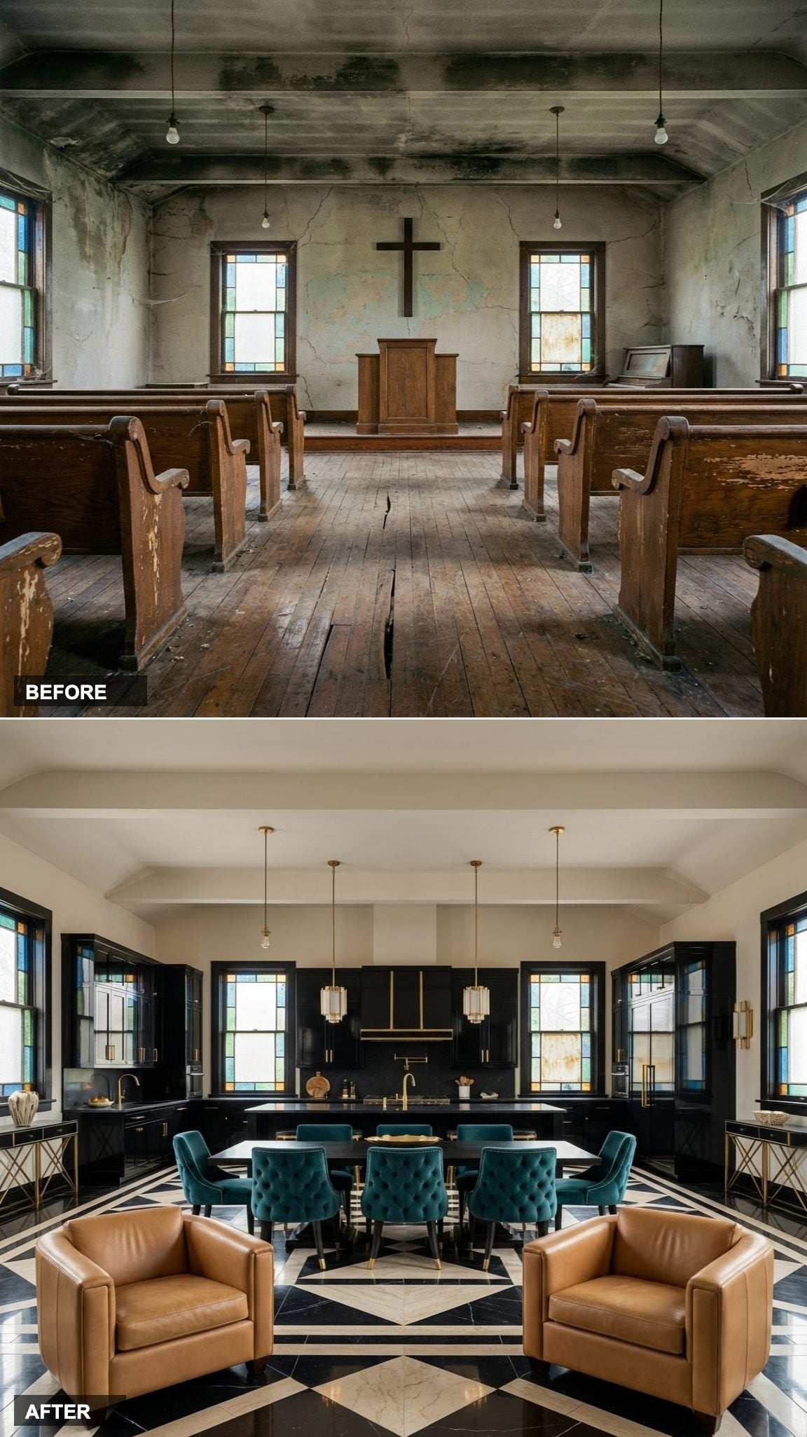
Polished Concrete, Black Steel, and Cognac Leather in a Moody Charcoal Shell
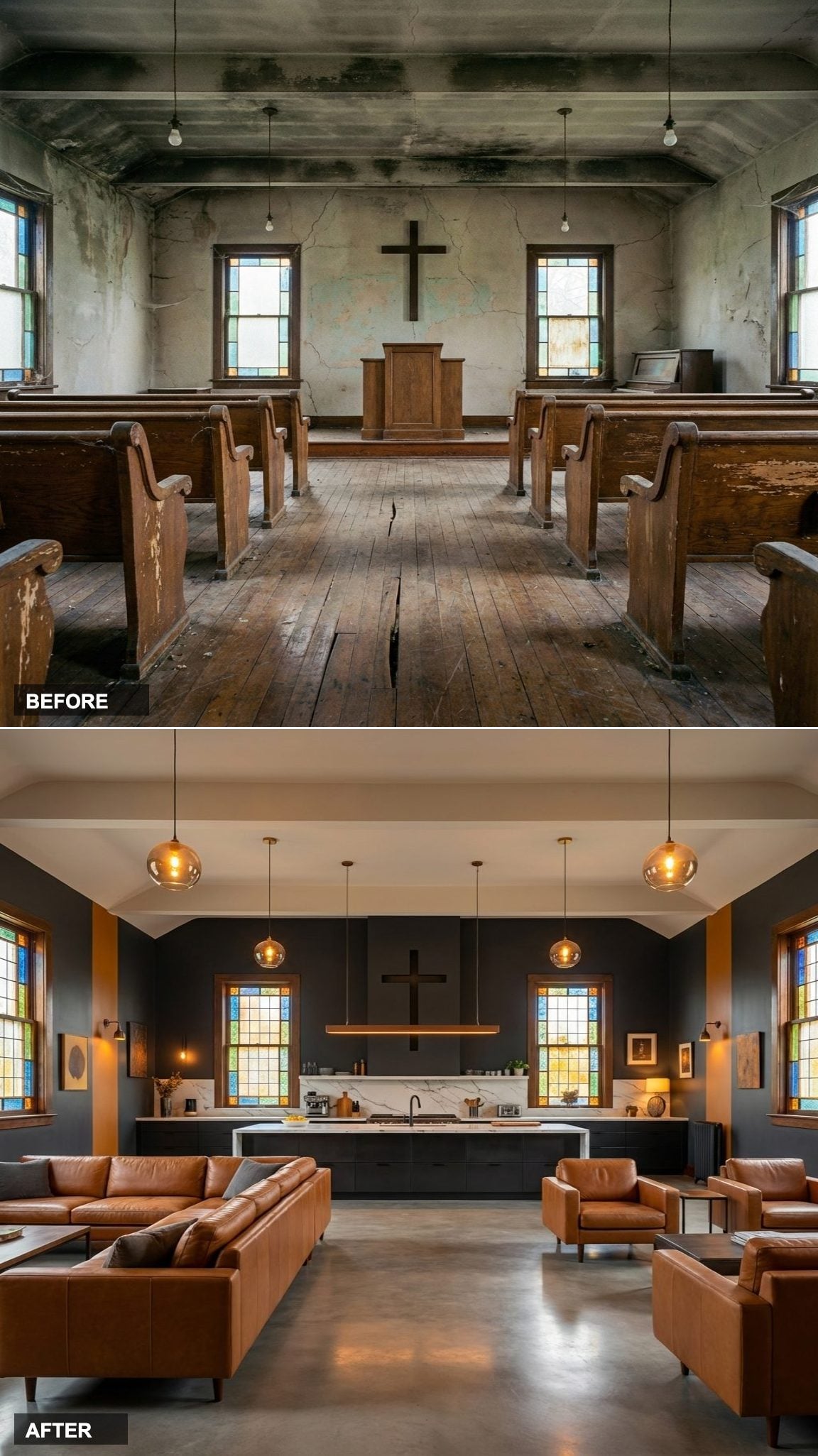
Polished concrete floors in a church conversion feel almost inevitable in retrospect, they’re flat, they’re durable, and they bounce light in a diffused, matte way that carpet never could. Paired with a black steel kitchen and white marble counters, the palette is unapologetically editorial.
The cognac leather seating pulls the room back from the edge of severity. It’s the one warm note in an otherwise cool scheme, and it does a lot of heavy lifting.
Navy Cabinetry, Crystal Chandelier, and a Formal Dining Room with Actual Gravity
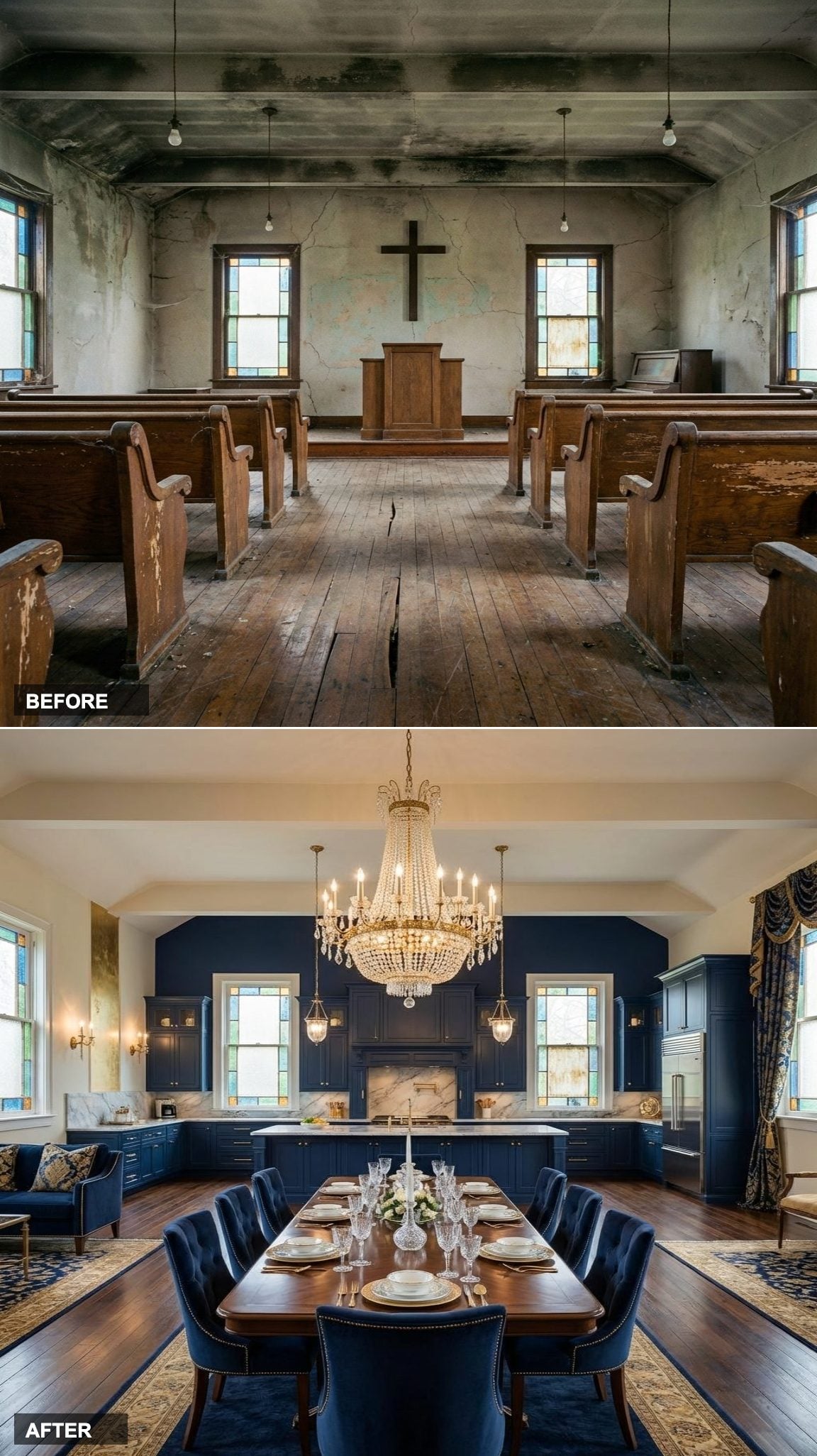
Navy kitchen cabinetry in a space with this much ceiling height avoids the one trap that sinks dark kitchens in small rooms: it never feels heavy because there’s simply too much air above it. The deep navy and antique gold palette references classic European interiors without being derivative, the original arched windows do enough historical work on their own.
The crystal chandelier hanging over the formal dining area is the right kind of obvious. Sometimes the correct move is the expected one, done exceptionally well.
Japandi Stillness Meets Stained Glass Chaos in the Best Possible Way
Here’s the tension that makes this conversion genuinely interesting: Japandi design is built around the idea of visual quiet, of stripping away until what’s left feels necessary. But stained glass is the opposite of quiet, it’s color and story and accumulated meaning, all of it throwing light across the floor in patterns you can’t predict.
Low-profile walnut furniture and natural oak cabinetry do the Japandi work. The stained glass does the church work. Neither backs down, and the room is more interesting for it.
Emerald Velvet Against a Black Kitchen: Drama Delivered Without Apology
This is a room that made a decision and refused to second-guess it. Emerald green velvet seating, black cabinetry with unlacquered brass, and the original arched ceiling intact above it all: the jewel-toned scheme works because the architecture has enough presence to absorb bold color without collapsing under it.
French Country in a Former Nave, Complete with a Lacanche Range
Terracotta tile floors in a vaulted church space carry more visual weight than you’d expect, the terracotta tones warm the stone and plaster that typically dominate ecclesiastical architecture, pulling the room toward Provence rather than austerity.
A cream Lacanche range is a specific choice. It signals that this is a kitchen where food is actually cooked, not just photographed. The warm ivory and soft sage palette keeps everything feeling sun-faded and European in the best possible way, like a French farmhouse that happened to have a very high ceiling.
A Steel Mezzanine Floats Above the Living Room, and a Chandelier Hangs Where the Cross Once Did
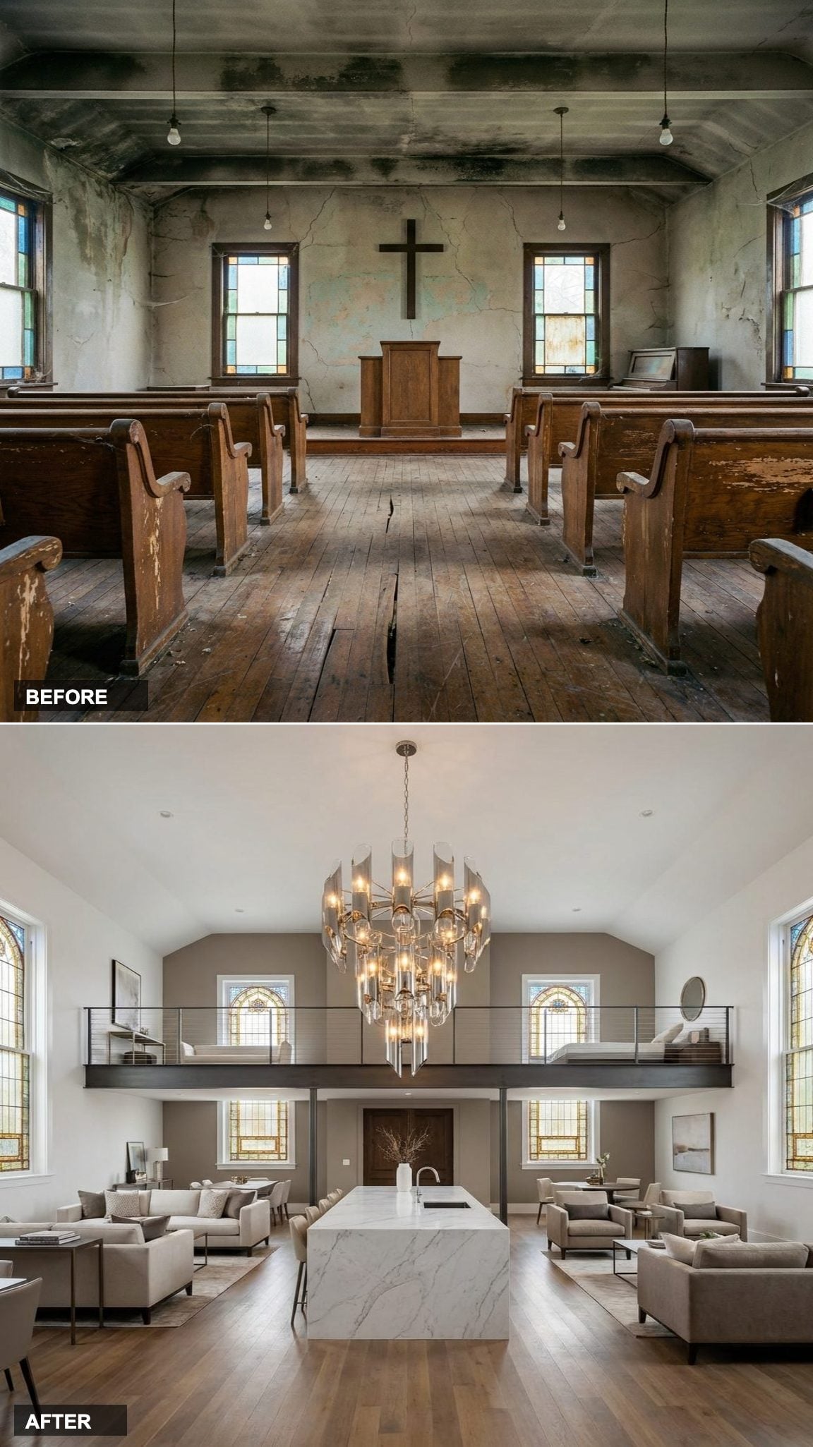
The former cross position on the front wall is now occupied by a sculptural chandelier, and that swap carries more symbolic weight than most design choices ever do. This conversion doesn’t pretend the building wasn’t a church, it acknowledges it directly and makes something new out of it.
The floating steel mezzanine above the living area is the structural move that justifies the double-height space. It creates a second layer without enclosing it, and the white marble kitchen island below anchors the ground floor with quiet precision.
Dark Walnut, Forest Green Built-Ins, and a Library Where the Pulpit Used to Be
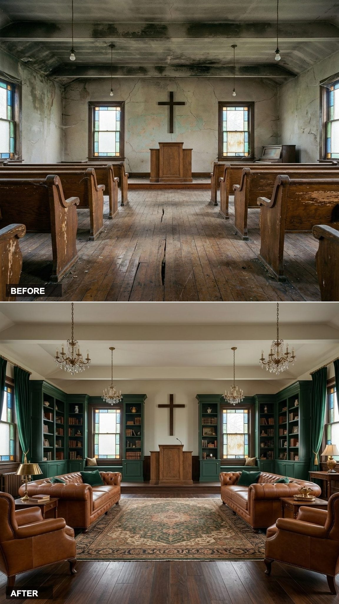
The decision to line the former pulpit wall with floor-to-ceiling built-in shelving is quietly brilliant. The pulpit was always the room’s focal point, the place where authority and attention converged. Turning it into a library maintains that focal energy while replacing sermon with story.
Leather Chesterfield sofas and a rich hunter green and cognac palette keep the room serious without turning it into a period piece. It feels like a private members club that happens to have better architecture than most.
Bouclé, Fluted Oak, and a Terracotta Linen Banquette That Makes the Space Feel Human

Church spaces can read as cold if the furniture choices don’t fight back against all that vertical height. The curved bouclé sectional, the fluted white oak kitchen cabinetry, and the dining banquette upholstered in soft terracotta linen are all tactile, all soft-edged, all doing the work of making a formerly institutional space feel like somewhere you’d actually want to eat dinner and stay.
Exposed Brick, Black Steel, and Edison Pendants: Industrial Conversion Done Right
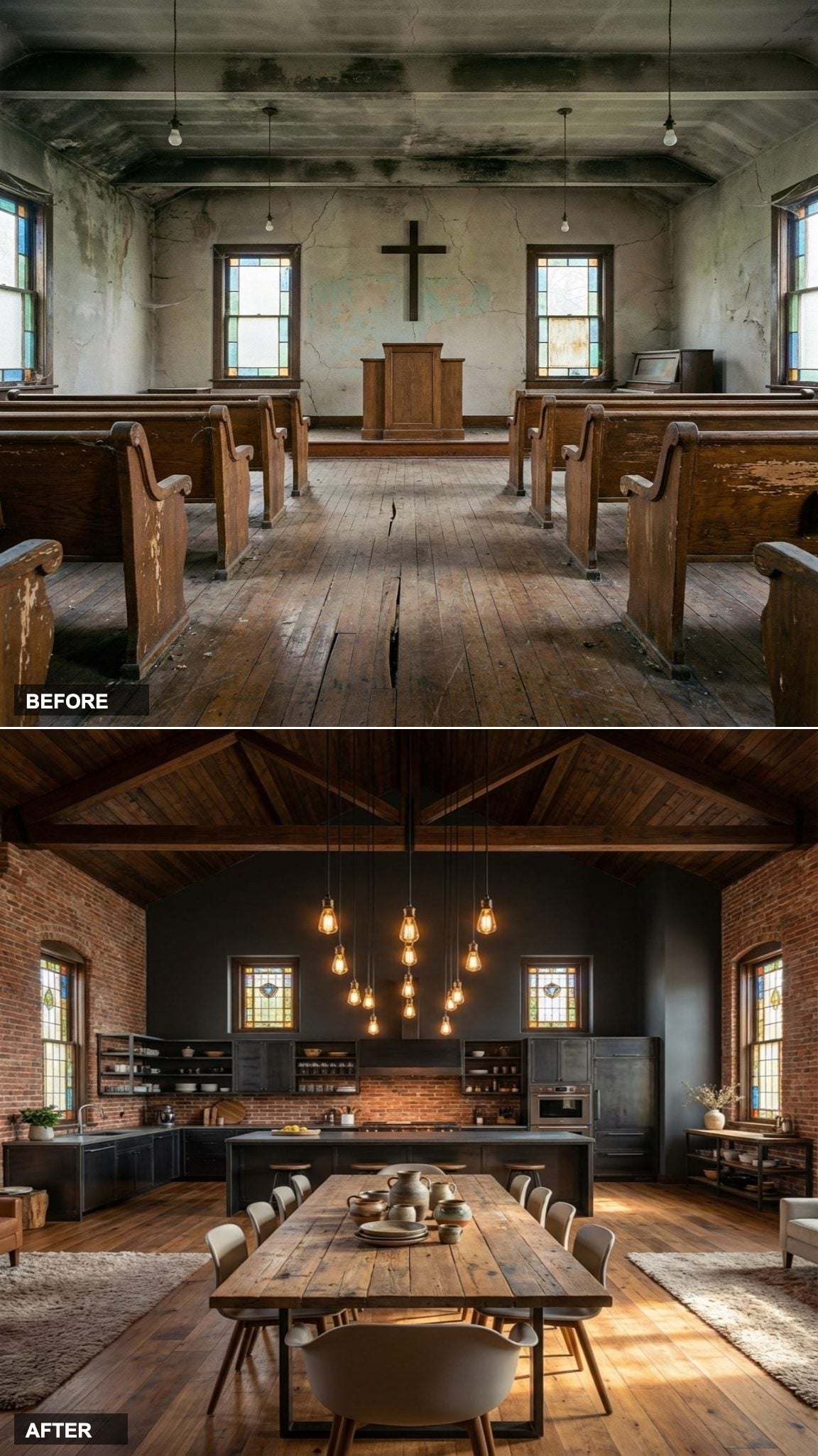
Exposed original brick walls are the kind of feature that gets overclaimed in real estate listings and underutilized in actual design. Not here. The warm brick and charcoal palette lets the industrial black steel kitchen and reclaimed wood dining table settle into the materiality of the original building rather than fighting it.
Edison pendants overhead add warmth without nostalgia. It’s a scheme that would feel forced in a new build and completely natural in a building that’s been here for a hundred years.
Hollywood Regency in a Church, Because Why on Earth Not
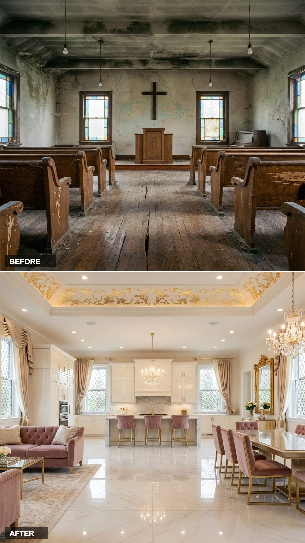
High gloss marble floors, lacquered ivory kitchen, velvet dining chairs in dusty rose, and gold leaf ceiling detail: this is a conversion that decided the sacred and the theatrical were always related. Hollywood Regency as a style emerged in 1930s Los Angeles, a response to austerity that chose excess as its aesthetic philosophy. In a vaulted church ceiling with original arches overhead, it finds its most comfortable home.
The ivory and champagne palette keeps the drama from tipping into pastiche. It’s glamorous without being a costume.
From Cold Stone Sanctuary to Warm Scandinavian Retreat

🔥 Would you like to save this?
Bare stone walls and drafty pews don’t exactly say hygge, but strip away the ecclesiastical clutter and the bones of this space are quietly extraordinary. The height alone, the raw texture of old masonry, the way light falls through narrow gothic windows, it’s all already doing the heavy lifting.
The transformation here leans into whitewashed oak, natural linen, and oversized sheepskin throws layered across low-profile furniture. The palette is winter birch: cream, oat, soft grey, with one deep charcoal accent wall that keeps it from feeling too precious. Candles everywhere. Hundreds of them.
Pews to Plush: The Japanese Wabi-Sabi Overhaul

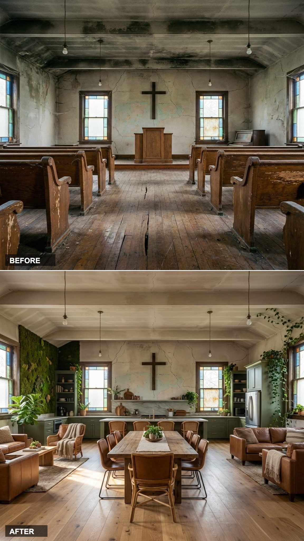
Imperfection, it turns out, is a design philosophy. The cracked plaster and uneven stone floors that made this church feel broken are exactly the elements a wabi-sabi interior celebrates. Instead of smoothing everything over, this redesign leans into every flaw, every rough edge, every shadow.
Gothic Arches, Meet Your New Life as a Collector’s Library
Floor-to-ceiling bookshelves belong in a church more than most people realize. Both are about the slow accumulation of something sacred, arranged with intention, visited for the sake of reflection.
This version of the conversion runs custom oak shelving along every wall, broken only by the original arched windows. A rolling library ladder on a brass track spans the longest wall. The reading chairs are deep green velvet, worn slightly at the arms. There’s a billiards table in the former nave, because why not use the square footage.
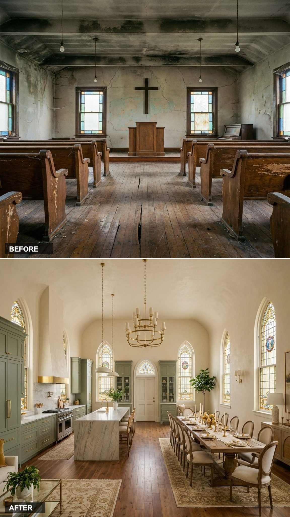
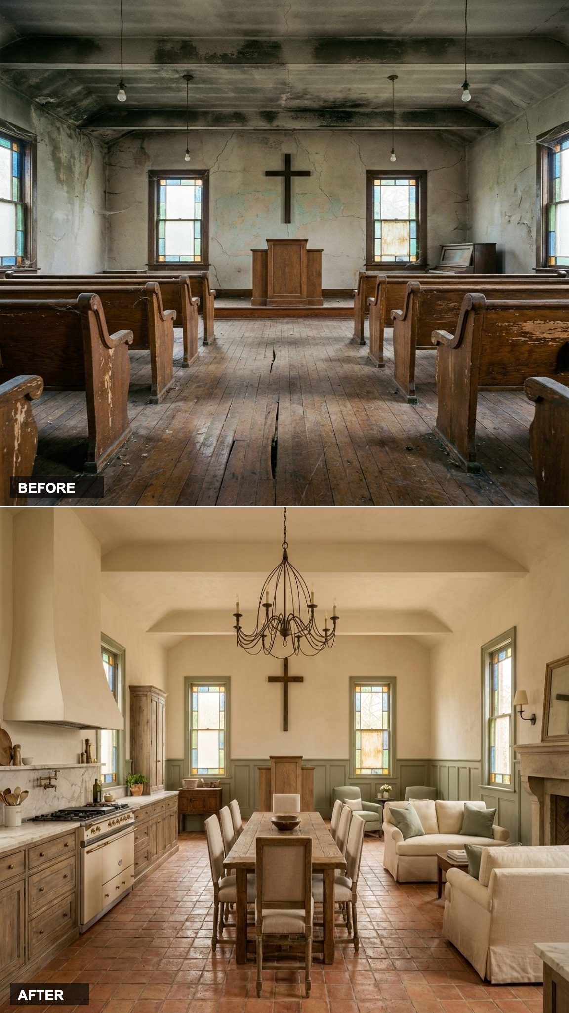
The Pew Ends at the Kitchen Island: A Modern Farmhouse Church That Feels Like Home
Wide plank white oak runs from the entry all the way to where the altar used to be, and that continuity is exactly what makes this conversion feel intentional rather than awkward. The cream shaker kitchen anchors the space without competing with the architecture above it, leathered marble counters add enough texture to keep the palette from going flat.
Upholstered dining benches reference the pews that came before without being precious about it. This is a design that respects the history of the building while making absolutely clear it has moved on.
All Shadow and Brass: A Dark Contemporary Church Conversion That Refuses to Apologize

Smoked oak herringbone floors in a nave that once held Sunday school chairs is one of those combinations that should feel wrong and absolutely does not. The direction of the herringbone pattern pulls the eye toward the kitchen end, which is framed by black walnut flat-front cabinetry and brass fixtures that catch whatever light filters through the original windows.
Oxblood leather on the sofa and deep velvet on the dining chairs make the living and dining zones feel distinct without needing a wall to separate them. Moody is not the same as oppressive when the architecture is this tall.
Limestone and Sea Glass: A Coastal Mediterranean Reinvention of Sacred Space

Large format limestone floors in a converted church make immediate sense, both materials share a geological honesty that feels grounded rather than decorative. Dusty blue cabinetry with unlacquered brass hardware picks up the mineral tone in the stone, and the rattan dining chairs bring in the kind of organic texture that keeps the space from feeling like a showroom.
Soft arched window treatments in linen echo the building’s original geometry without replicating it literally. The whole composition reads as coastal without leaning on any of the clichés that usually come with that label.
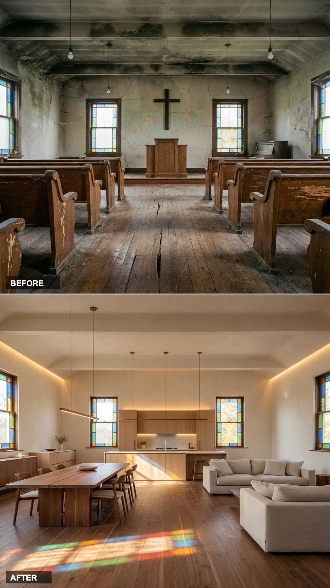
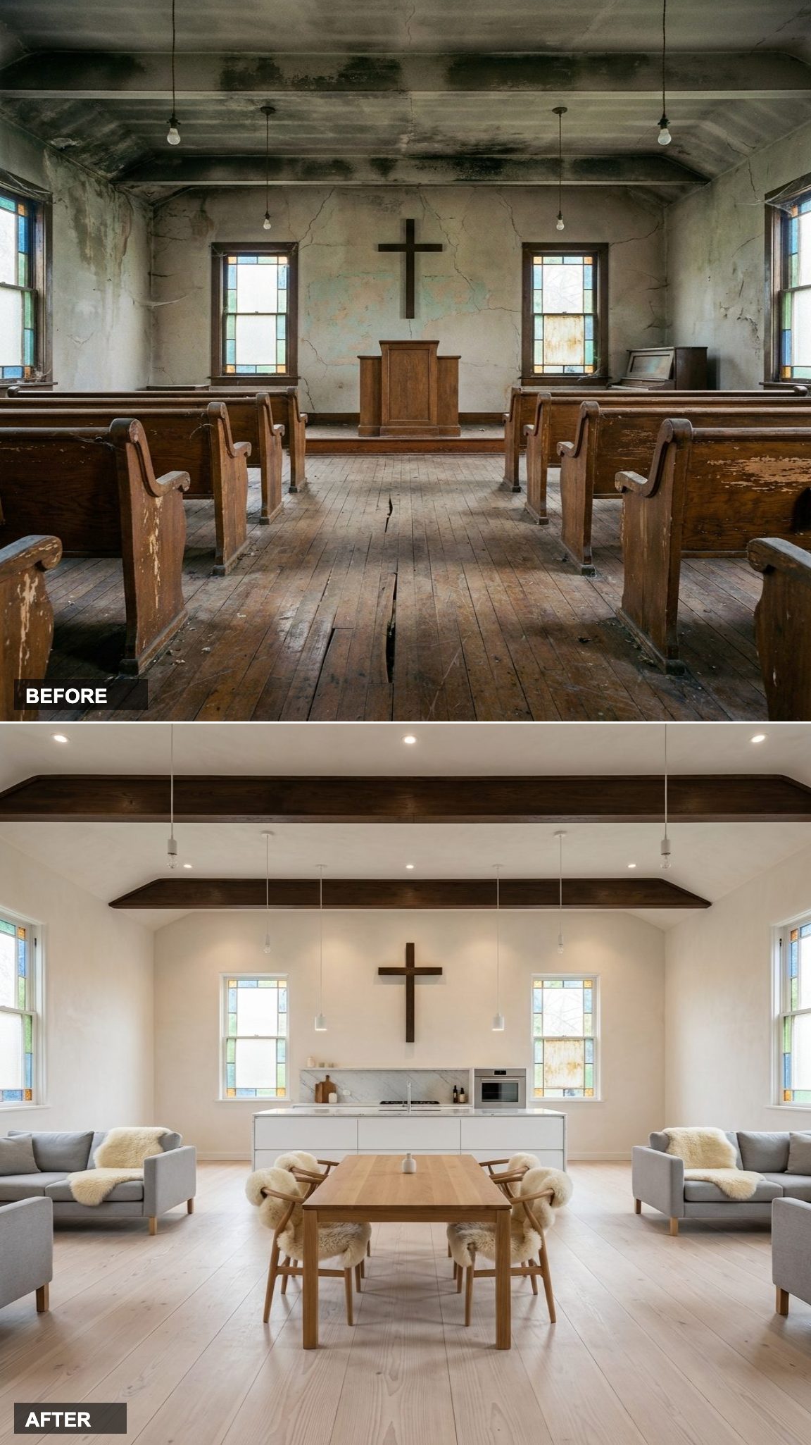
Pale and Perfectly Still: Japandi Minimalism Inside a Converted Nave
Restraint is the entire point here, and it is harder to pull off than it looks. Pale ash floors, natural oak cabinetry without handles, stone counters, and a low-profile walnut sofa, every material is doing exactly one thing and nothing more. The result reads less like a designed room and more like a space that was always this calm.
“The building’s verticality does the decorative work. The interiors only need to step back and let it happen.”
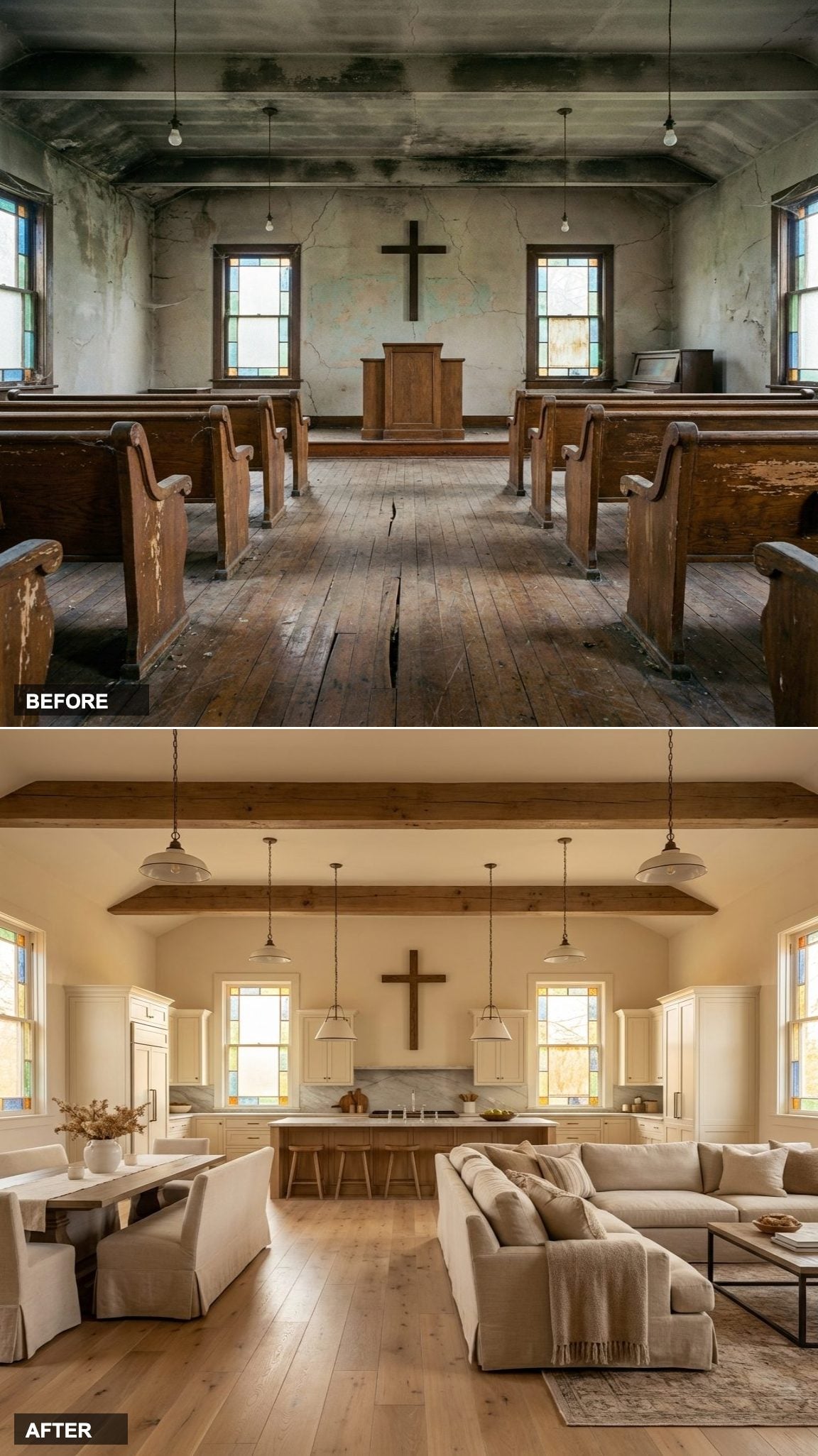
Sage Green and Sunday Roasts: The English Country Conversion That Feels Centuries Old
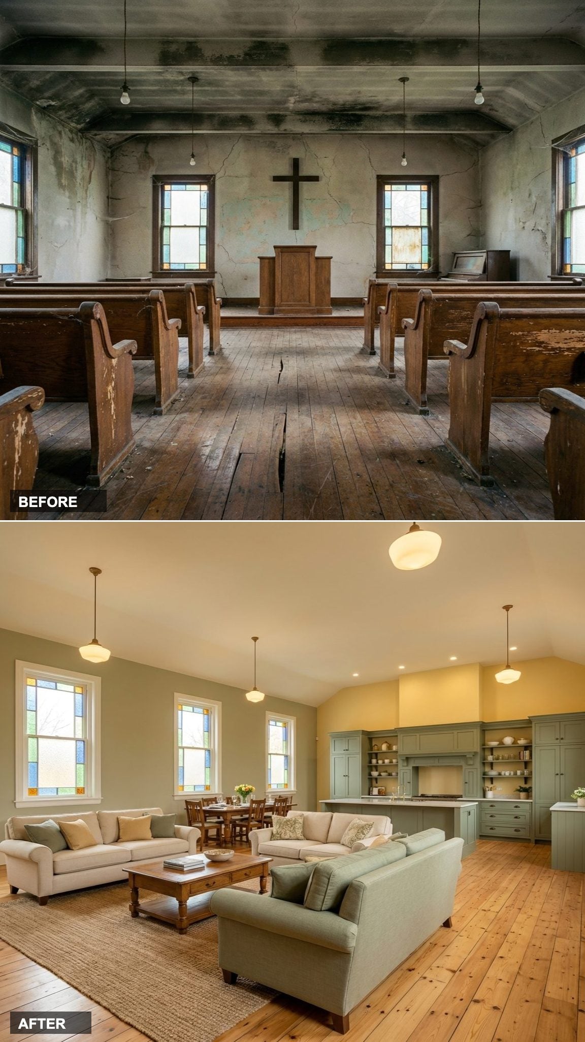
Wide plank pine floors with visible knots, sage green inframe cabinetry, oil-rubbed hardware, rolled-arm linen sofas, this design leans into the building’s age rather than contrasting with it. An antique oak dining table seats twelve without looking like a statement piece because the room is genuinely scaled for it.
Gold Ceiling, Black Lacquer: Art Deco Arrives at the Converted Church and It Brought Champagne
Almost nothing about this combination should work, and almost everything does. Black and cream marble tile on the floor of a former nave, lacquered black kitchen cabinetry, deep teal velvet dining chairs, and caramel club chairs arranged around a low gold accent table. The repetition of black from floor to cabinetry creates a vertical axis that the building’s original geometry can anchor.
Art Deco is fundamentally about theatrical proportion, a design language that was basically invented to match exactly this kind of room. The gold fixtures do not need to be subtle. This entire room was built for the dramatic entrance.
Moss, Leather, and Living Wood: A Biophilic Church Conversion That Breathes
Live edge white oak floors in a space this large read as landscape more than flooring. Moss green cabinetry with stone counters, leather and rattan seating, and a reclaimed wood dining table that looks like it was cut from a single massive tree, the design makes the natural world the entire story.
Earthy, layered, and genuinely unusual. A biophilic approach in a high-ceiling shell like this sidesteps the most common failure of the style, which is feeling cramped with too much greenery. The vertical volume here gives every plant and raw material room to register without crowding the composition.
Forest Green Shakers and Camel Leather: A Modern Rustic Church That Smells Like a Ski Lodge
Reclaimed chestnut hardwood floors set the tone before anything else registers. The warmth in that wood, amber, rust, and brown all at once, pulls every other material choice into alignment: forest green shaker cabinetry with matte black hardware, a camel leather sofa, chunky linen dining chairs that invite long meals. This is a conversion designed for actual living, the kind where a fire would be burning by five o’clock.
High Gloss and High Drama: Hollywood Regency Moves Into a Former Place of Worship
High gloss black herringbone floors in a converted church are the kind of decision that looks reckless on a mood board and correct in person. The lacquered emerald green kitchen with gold hardware runs the full width of the former chancel, and dusty rose velvet dining chairs against that green create the color tension the whole room is built around.
Hollywood Regency has always been about calculated excess, the idea that luxury should be visible, not suggested. In a building where the ceiling is thirty feet tall and the windows are twelve feet high, restraint would have been the actual mistake. The design earns its drama by committing fully.
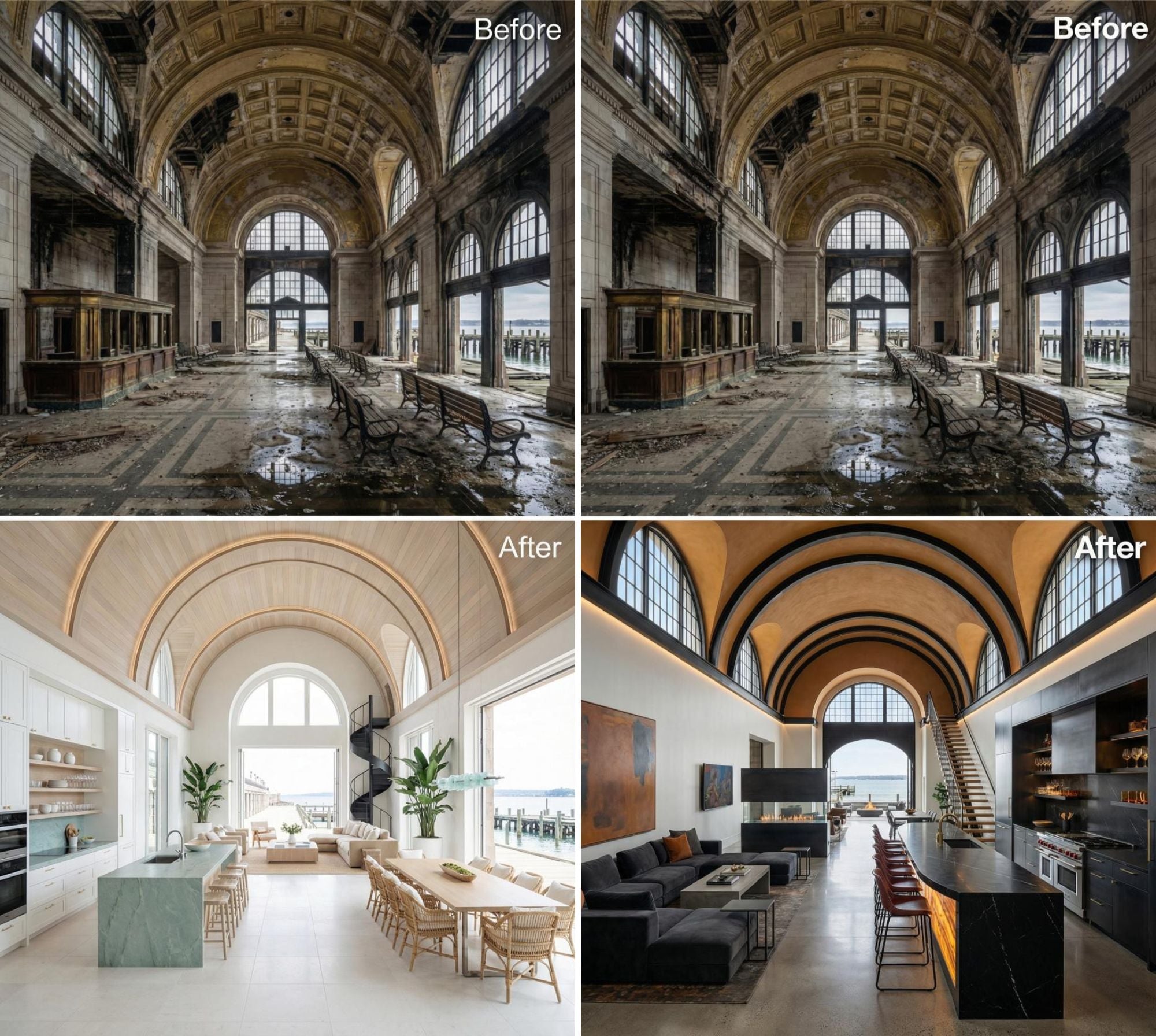
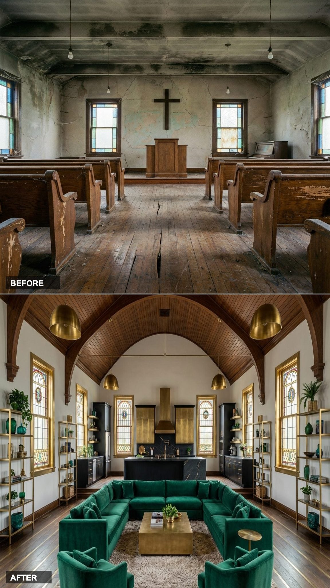
From Sacred to Stunning: A Small Church Transformed into a Luxury Home
🔥 Would you like to save this?
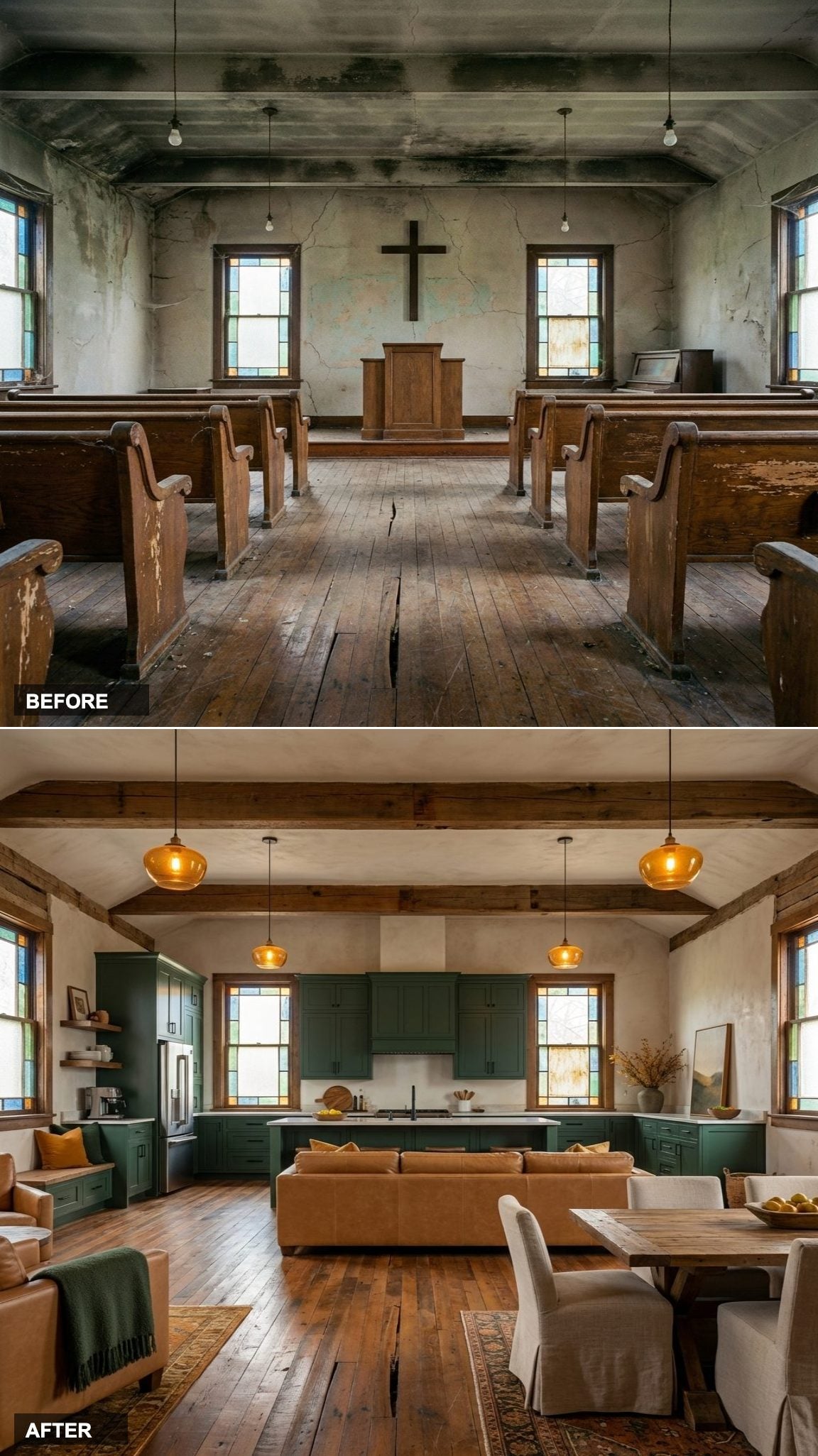
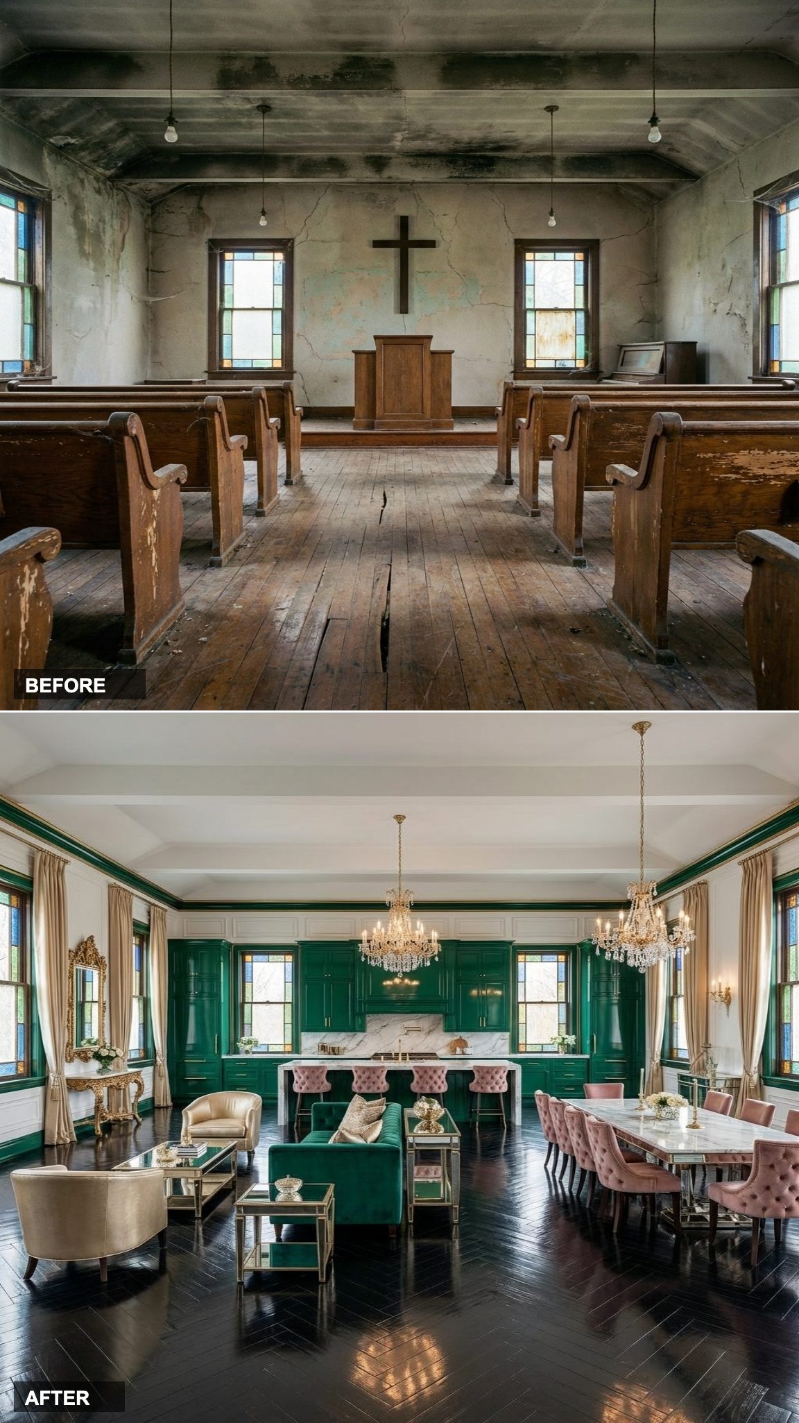
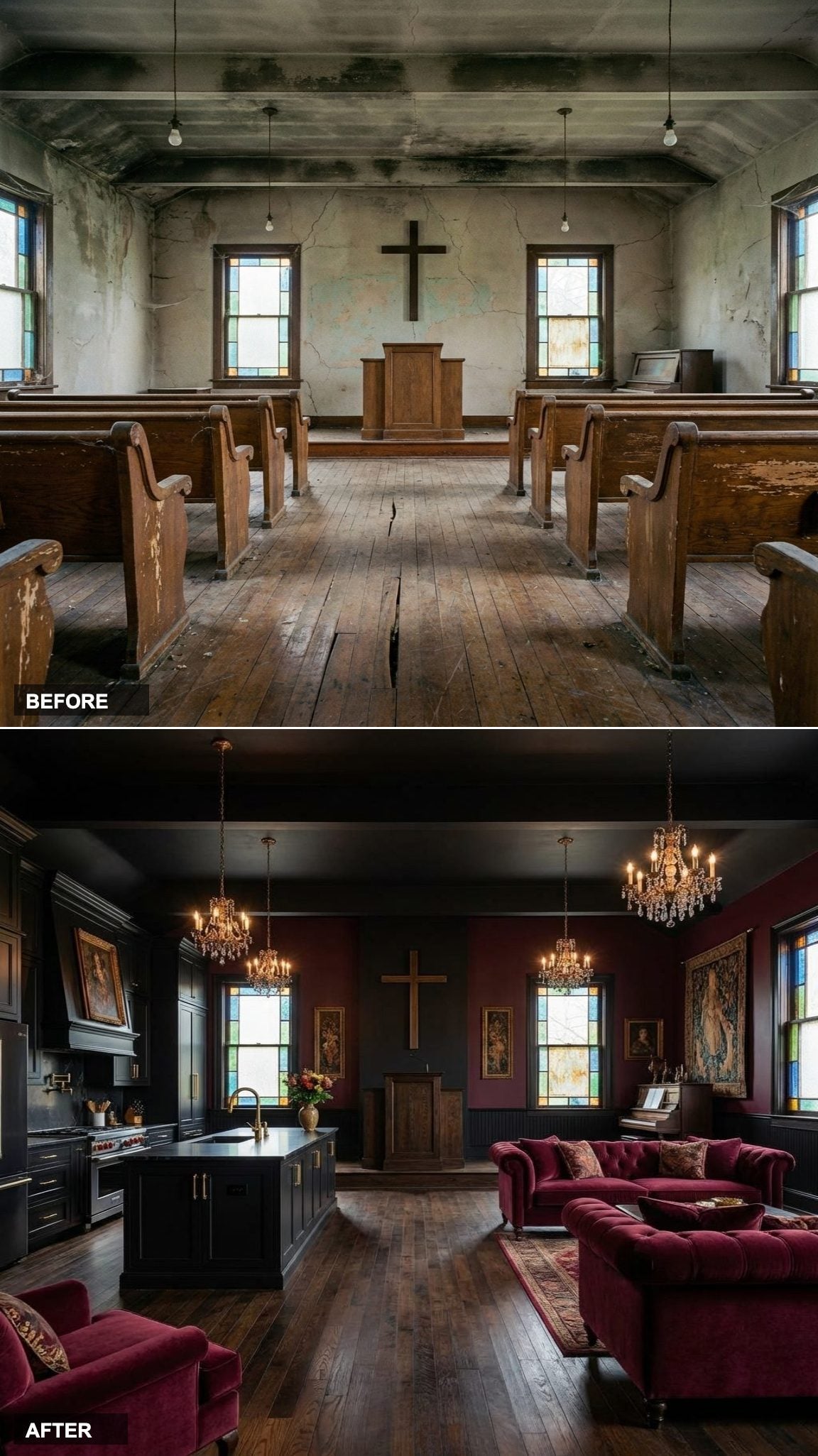
This abandoned rural church sat frozen in time — cracked plaster walls, peeling pews, bare bulbs dangling from a deteriorating ceiling. A beautiful bones property that most would have walked away from, it was quietly waiting for a vision bold enough to match its character.
The transformation is nothing short of dramatic. Moody black cabinetry, crimson velvet chesterfield sofas, crystal chandeliers, and the original stained glass windows all coexist in a space that feels equal parts gothic romance and ultra luxury living. Even the pulpit remains — now a quiet nod to the building’s past anchoring one of the most striking open concept interiors you’ll ever see.
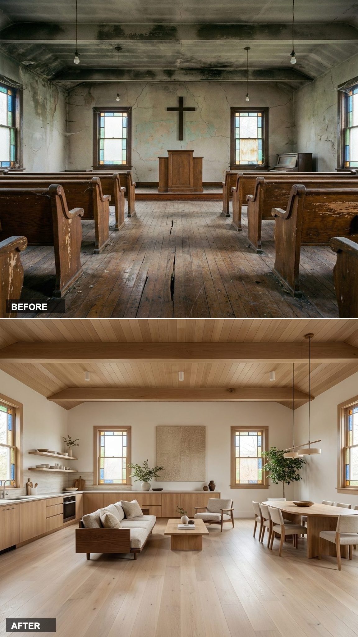
Washed in Light: A Forgotten Church Reborn as a Coastal Dream Home
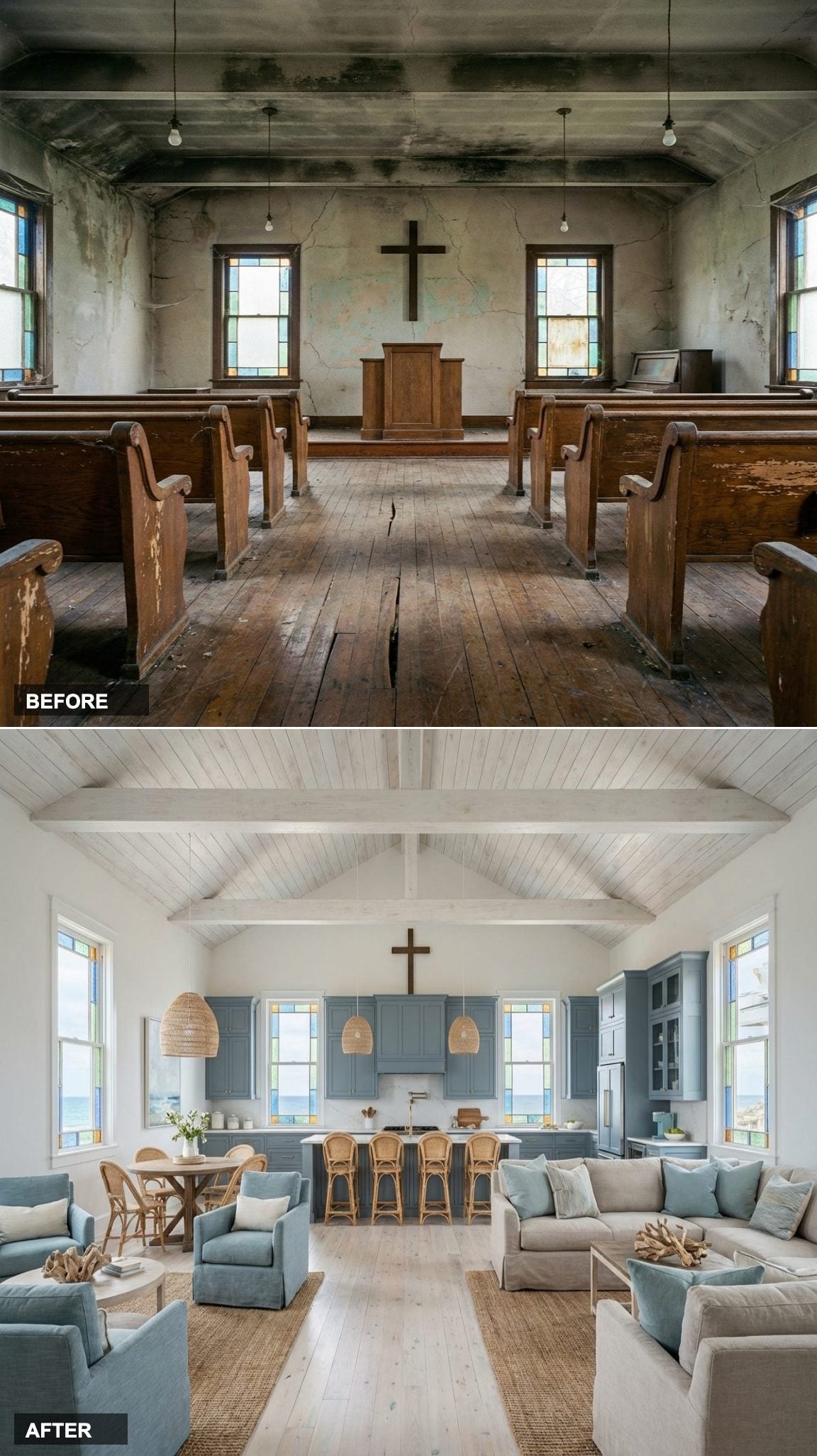
The same crumbling sanctuary — cracked walls, peeling pews, bare bulbs — but this time reimagined in an entirely different direction. Where the bones suggested darkness and decay, the vision here leaned hard into light, air, and a breezy coastal warmth that feels almost impossible given where it started.
The result is breathtaking in its simplicity. Whitewashed shiplap ceiling, bleached oak floors, dusty blue cabinetry, rattan pendants, and linen sofas in every direction — the original cross still hanging as the room’s quiet centerpiece. The stained glass windows now frame what appears to be an ocean view, and the entire space flows effortlessly from kitchen to dining to living in one gorgeous sun-drenched sweep.