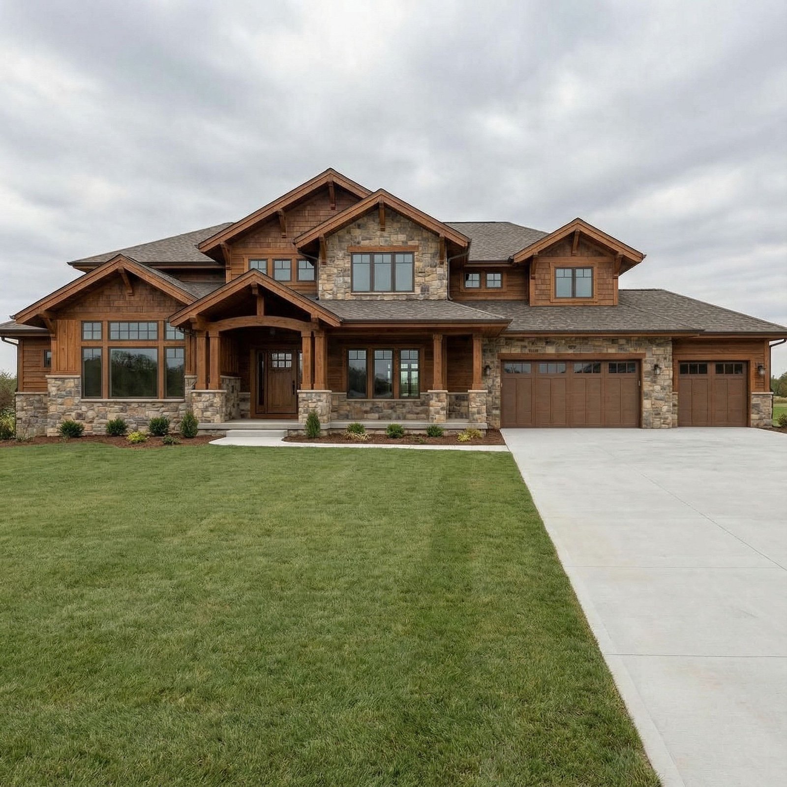
You’ve spent real money. You’ve made careful choices. And yet something feels off, the room doesn’t quite land the way you imagined it would. It doesn’t feel cheap, exactly, but it doesn’t feel expensive either. It feels like a room that’s trying.
Here’s what almost no one tells you: the gap between a room that feels polished and one that doesn’t has almost nothing to do with budget. It has everything to do with a set of perceptual instincts your brain developed long before you ever picked a paint color. Yacht designers work inside spaces where every flaw is visible, every transition is judged, and there’s nowhere to hide anything behind more stuff. That pressure creates a kind of design literacy most homeowners never need, until they realize their beautifully furnished room still doesn’t feel right. These 15 insights explain exactly why.
In order to come up with the very specific design ideas, we create most designs with the assistance of state-of-the-art AI interior design software. Also, assume links that take you off the site are affiliate links such as links to Amazon. this means we may earn a commission if you buy something.
The Tiny Inconsistency Your Brain Detects Before You Even Sit Down
You walk into a room, and something feels slightly off. You can’t name it. You scan the space, looking for a culprit, and find nothing obviously wrong. But the feeling doesn’t leave. That low-grade unease is your brain flagging an inconsistency it registered before your conscious mind had a chance to catch up. Research published in Scientific Reports confirms that (Source), discriminating stimulus identity even when the observer has no explicit knowledge of what they’re detecting. Your visual system is running a background audit of every room you enter, comparing what it sees against an internal model of what “cohesive” looks like.
In interior terms, this manifests as the uncanny sense that a space doesn’t add up, even when individual pieces are perfectly fine on their own. A brushed brass cabinet pull on a door with a chrome hinge. A linen throw pillow on a sofa with polyester cushions. A matte wall paint meeting a high-gloss trim at an unresolved junction. None of these are catastrophic design failures. But your brain catalogues each one as a discrepancy, and those discrepancies accumulate into a vague sense that the room was assembled rather than designed. Yacht interiors never get away with this. The spatial constraints of a vessel demand that every material transition be resolved deliberately, because there is simply no corner large enough to hide a finish-level contradiction.
Why the Most Expensive Rooms Have Less, Not More, And What That Triggers in Your Mind
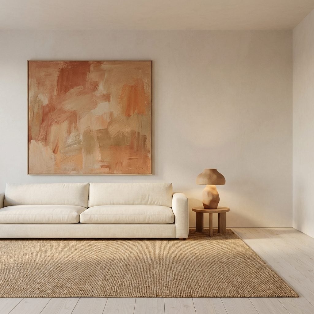
Empty space in a luxury room is not emptiness. It’s confidence. The signal it sends is that whoever designed this space was not trying to fill anything, prove anything, or compensate for anything. And your brain picks that up immediately.
Research from ArchDaily citing multiple environmental psychology studies confirms that (Source), while simplicity fosters a sense of calm and order. But the luxury dimension goes deeper than stress reduction. When a room is sparse, your attention is directed rather than scattered. Each object present becomes a decision, not a default. A single marble side table in a largely empty corner reads as considered. That same table buried among fifteen other pieces reads as coincidence.
Yacht designers have always understood this ratio instinctively, not out of aesthetic preference but out of necessity. Every item on a vessel requires storage, maintenance, and spatial justification. The discipline of deciding what stays and what goes creates interiors where every element carries weight. Most homeowners never develop this muscle because a larger home always offers the option to add more. The result is rooms where nothing commands attention because everything is competing for it.
The Finish-Level Mismatch That Makes a $10,000 Renovation Feel Like $1,000
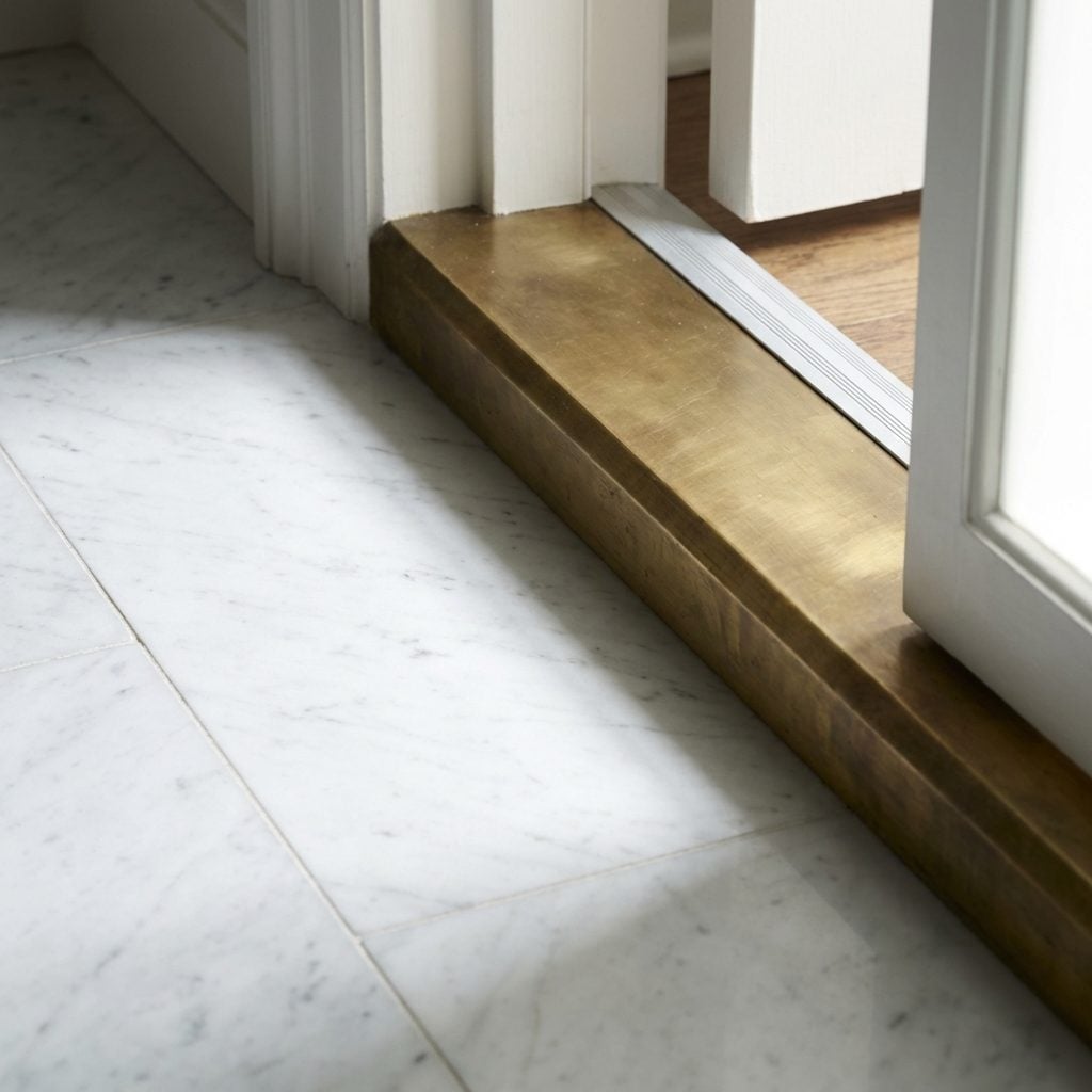
Finish-level mismatch is arguably the single most common reason a renovation that cost real money still reads as budget. You might install a modern bathroom design with a statement freestanding soaking tub, then pair it with standard-gauge chrome fixtures from a home improvement chain. Or you run beautiful marble tile right up to a door threshold finished in a thin aluminum strip that buckles slightly. Each pairing creates a visual discord that your eye reads as incongruence, and incongruence reads as cheap, regardless of what the individual components actually cost.
The principle at play is what designers call “finish hierarchy.” Every surface in a room is communicating its own level of craft and investment. When those levels don’t match, the lowest-quality element pulls the perceived value of the entire room toward it. A 3mm aluminum threshold doesn’t just look out of place next to honed Calacatta marble. It actively devalues the marble. Yacht designers deal with this on every build, on a 60-foot vessel, a single poorly resolved joint between two surface materials is immediately visible and permanently noticeable. So they develop an almost reflexive instinct for finish continuity that most residential designers only approach after years of expensive mistakes.
What Yacht Designers See in Three Seconds That Most Homeowners Never Notice in Three Years
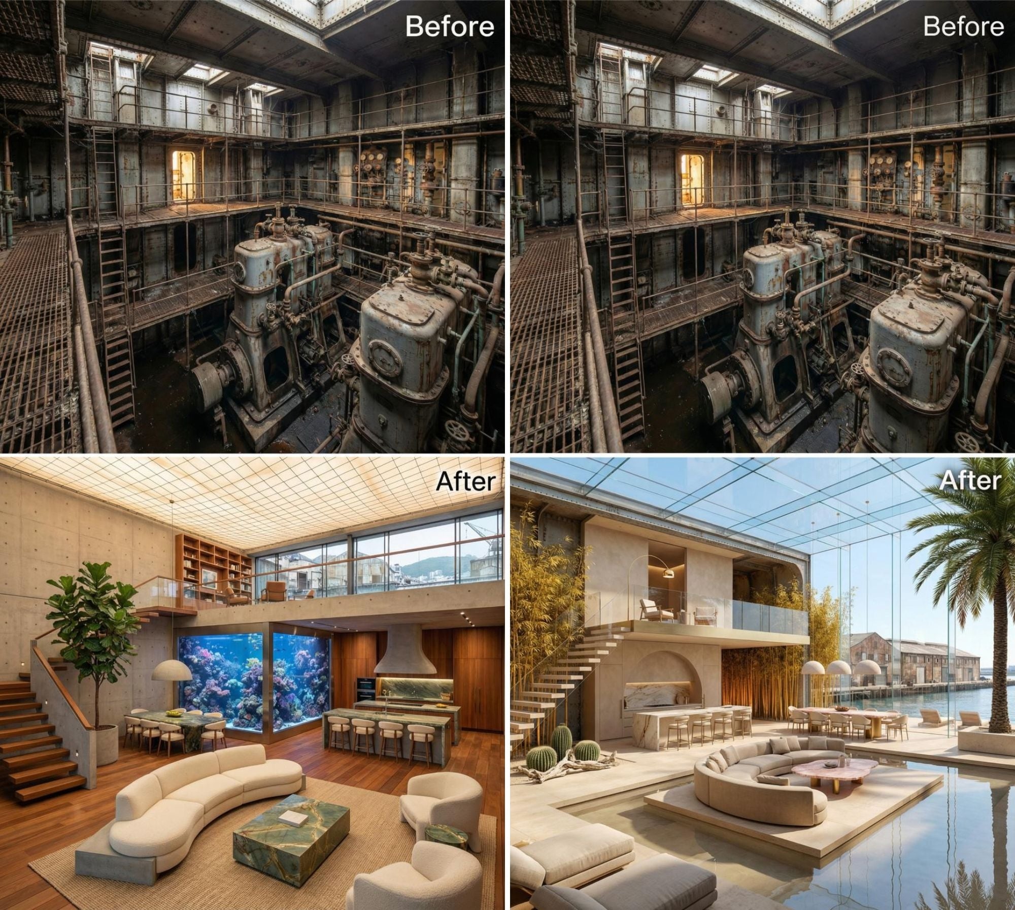
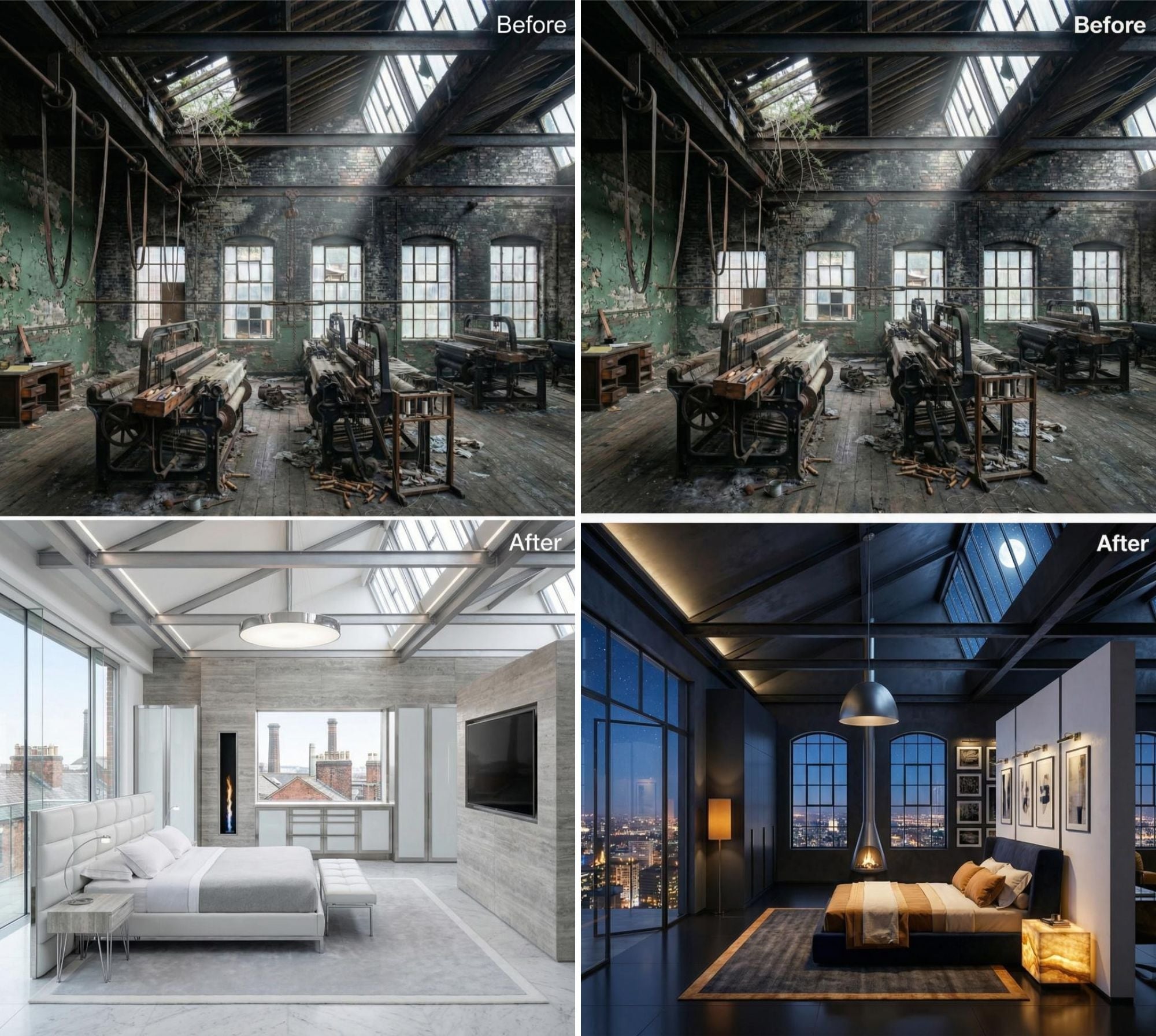
A yacht designer entering a residential space doesn’t look at what you’d expect. They don’t linger on the sofa or the art. Their eye goes straight to the junctions: where the ceiling meets the wall, where the flooring transitions into another material, where the cabinetry meets the countertop, where the window frame meets the plaster reveal. These are the moments a room either resolves or fails, and on a superyacht, unresolved junctions simply don’t exist, because the vibration, humidity, and structural movement of a vessel at sea would expose them within months.
What they’re reading in those first three seconds is a room’s structural honesty. Does each transition feel like it was considered, or does it feel like two contractors who never spoke to each other happened to work in adjacent areas? A floating walnut floating shelf that meets a plaster wall with a hairline gap, no caulk, no trim, just a clean reveal, communicates that someone made a decision about that meeting. A shelf that caulked and painted over the gap communicates that someone hoped you wouldn’t look too closely.
“The quality of a space is most visible in the decisions no one asked to see.”
The Psychological Weight of a Surface That Doesn’t Know What It’s Trying to Be
There’s a category of material that appears in many homes that has no clear identity. It’s not warm, not cold, not natural, not synthetic. It’s a laminate trying to look like wood, or a vinyl tile trying to look like stone, or a painted MDF edge trying to look like solid timber. These materials trigger a specific, low-level discomfort that psychologists would recognize as a cousin of the uncanny valley effect, the same unease you feel when something almost-but-not-quite resembles something familiar.
Research on building material perception at the (Source), and that certain components of a material’s personality are tied directly to its sensory authenticity. When a surface reads as ambiguous, trying to be two things at once, it fails to deliver the psychological payoff of either. The material equivalent of a hedge, it commits to nothing and communicates nothing.
Yacht designers avoid imitation materials almost entirely, not out of aesthetic snobbery, but because the confined geometry of a boat interior means your eye and your hand are constantly close to every surface. You’d feel the hollow knock of fake timber within a day. That proximity enforces a honesty of material choice that residential design, with its generous footage and convenient corner, rarely demands.
Why Your Eye Keeps Moving and Never Rests, The Cognitive Load Secret Behind Cheap-Feeling Rooms
Cognitive Load Theory, developed by psychologist John Sweller, describes the limited processing capacity of working memory and what happens when it gets overwhelmed. In instructional design, the concern is too much information competing for mental bandwidth. In interior design, the same principle governs how a room feels to occupy. According to (Source), the average person can hold only around seven items in working memory at once, and a visually complex space pushes that limit constantly.
A cheap-feeling room typically has too many competing focal points, too many surface patterns, too many finish changes, too many objects at eye level simultaneously demanding attention. Your eye has nowhere to rest. It keeps scanning, searching for a hierarchy that would tell it what to look at first, what matters most. When that hierarchy is absent, the brain reads the space as unresolved, which, at a gut level, translates to anxiety. And anxiety, however faintly, reads as “this doesn’t feel right.”
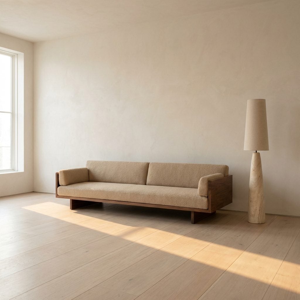
An oversized den design with clear visual anchors, a large linen sectional sofa, a single statement oversized round rug, one piece of large-scale wall art, gives the eye a sequence to follow. The brain exhales. That exhale is what we call “feeling expensive.”
The Transition No One Talks About That Separates a Designer Room From a Decorated One
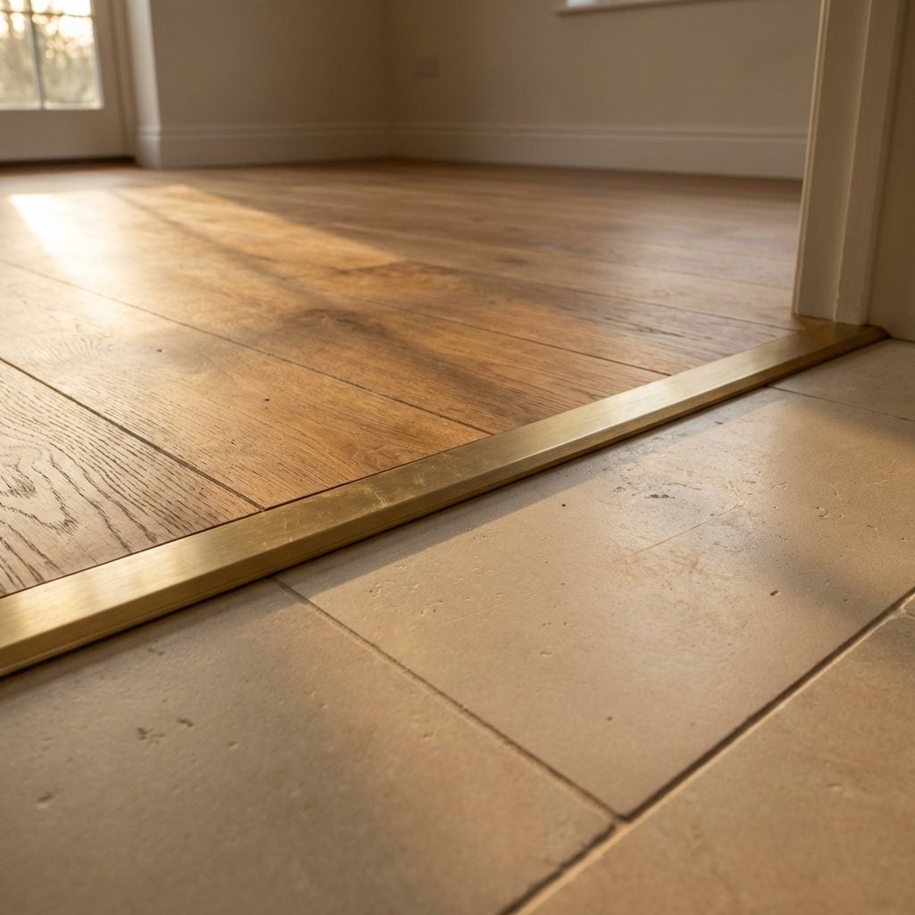
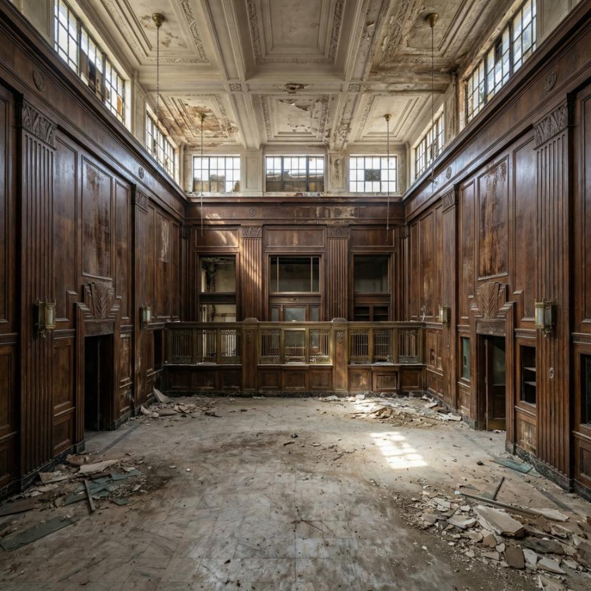
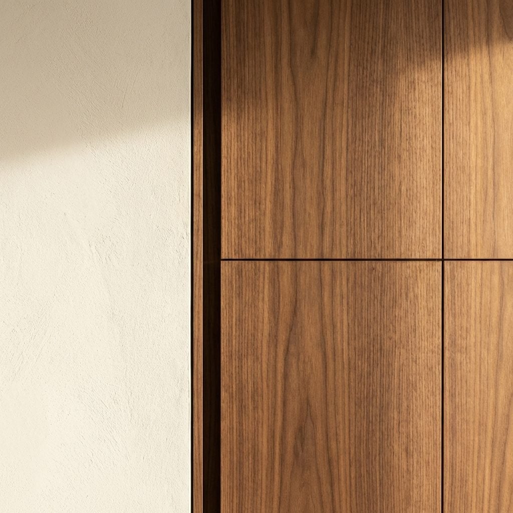
A decorated room has great objects. A designed room has great transitions. The difference lives in the moments between things: how the flooring changes from room to room, how a painted wall meets a tiled surface, how a built-in bookcase connects to the ceiling, how skirting boards resolve at a door architrave. These micro-decisions are invisible when they’re right. They’re deeply visible when they’re wrong.
Consider the most common residential transition failure: the floating narrow bathroom design where beautiful floor tile meets the hallway hardwood via a standard-issue T-bar threshold from a flat-pack supplier. That threshold tells you everything about the hierarchy of decisions in the space. Someone spent real money on the tile. Someone forgot to finish the thought.
Designer rooms treat transitions as design moments, not practical afterthoughts. A brass threshold that matches the bathroom fixtures. A recessed step that lets two floor materials meet at a shared horizontal plane. A shadow gap instead of a caulk joint. These solutions cost more in thought than in money, but they’re what a visitor absorbs unconsciously as the room’s coherence. Research on architectural material perception confirms that (Source), and visual logic must be continuous to register as high quality.
Why Your Brain Assigns Dollar Signs to Thickness Before You’ve Touched Anything
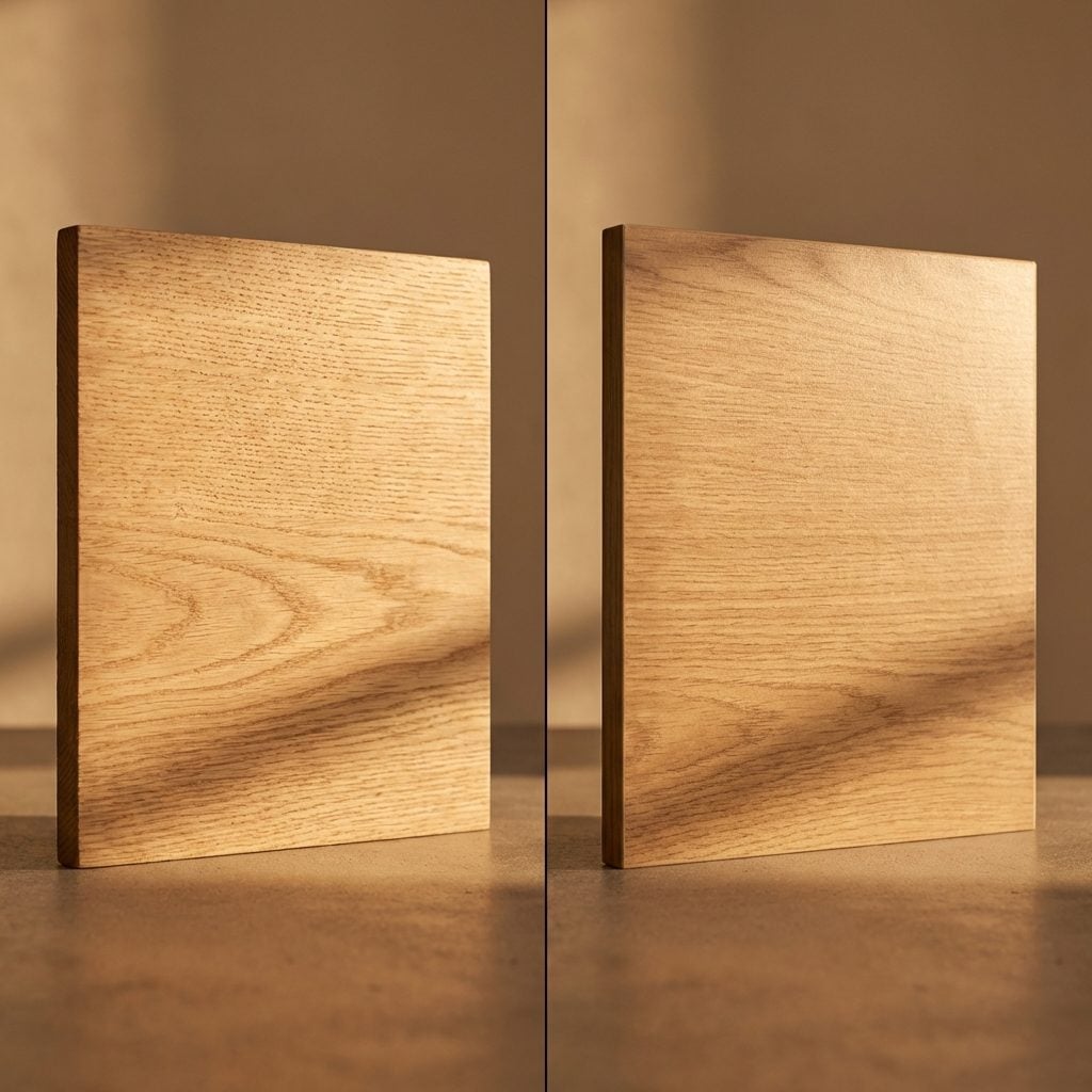
Before you reach for a door handle, you’ve already formed a judgment about it. The same applies to a countertop edge, a drawer front, a stair tread, a window sill. The human visual system is extraordinarily skilled at reading mass and material density from optical cues alone. According to research on haptic perception of material properties, perceiving material properties through touch is generally superior to perception of shape, but vision, critically, anticipates touch. You pre-feel a surface before you touch it, and thickness is one of the primary cues your visual system uses to predict quality.
A 30mm stone countertop edge reads differently from a 20mm one. A door that swings with a slight delay and a solid click communicates weight. A stair nosing in solid brass, with visible thickness, versus a thin overlay strip, these distinctions happen at the level of visual mass, and your brain translates mass into permanence, and permanence into value. Architects have known this for centuries: the thickness of a wall, a column, a lintel was always partly structural and partly psychological.
Yacht designers encounter this principle as a hard technical constraint. Every gram on a vessel has a cost, in fuel, in balance, in structural engineering. So the decision to use a heavy, solid material is never casual. It’s considered. And that considered weight reads, in finished interiors, as deliberate luxury, the exact quality that most residential design accidentally skips by choosing the thinnest, cheapest version of a good idea.
The One Proportion Error That Makes Every Room Feel Like a Hotel Corridor
There’s a specific aspect ratio your brain considers ‘habitable’, and when a room misses it, something registers as off before you can name it. It isn’t about square footage. Two rooms with identical floor areas can feel completely different: Source a 12×20 foot room feels like a bowling alley, while a 15×16 foot room of the same 240 square feet reads as generous, balanced, and usable. The corridor effect isn’t about length, it’s about the ratio of length to width, and the way it collapses your spatial options down to one: move forward, or move backward. Nothing else is available to you.
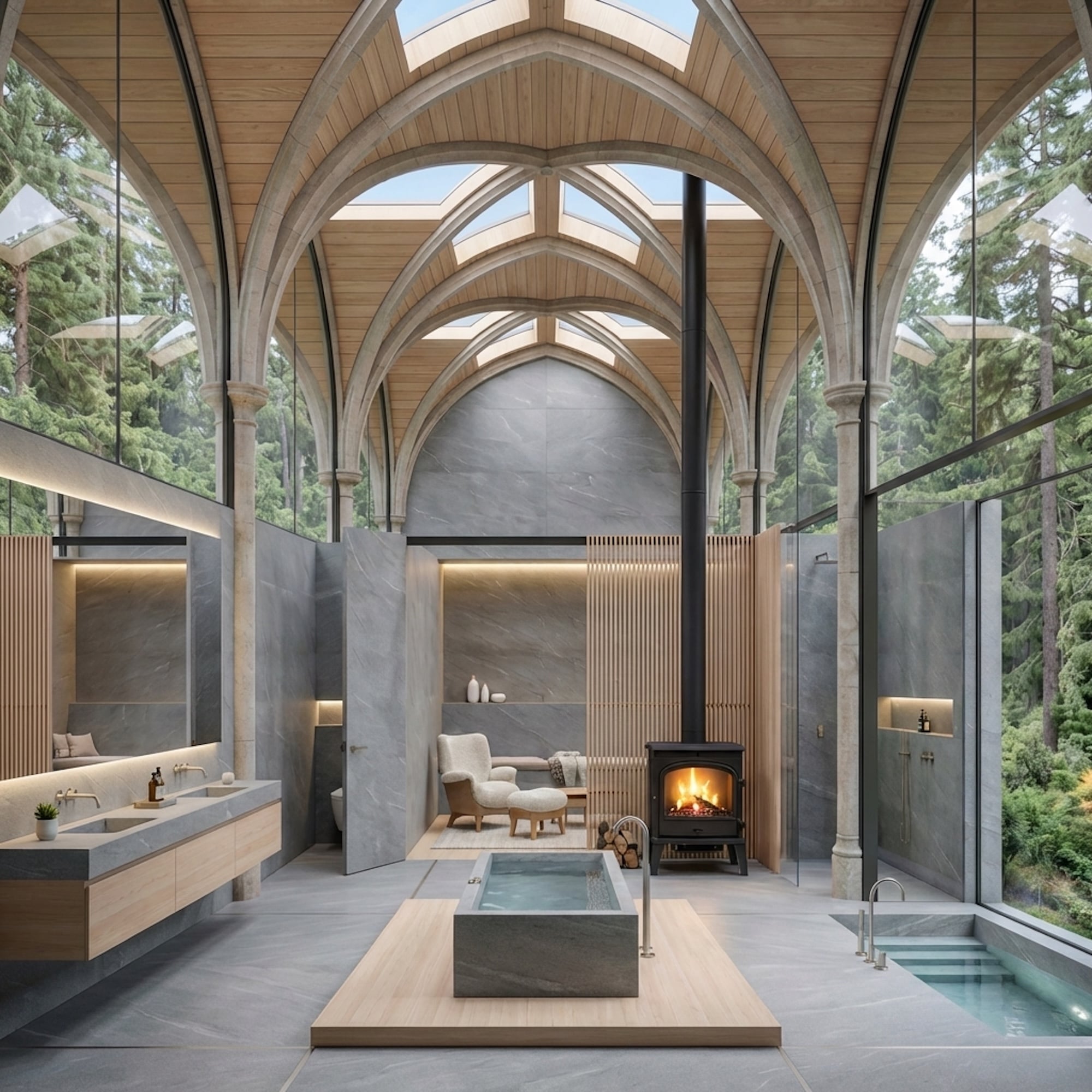
Yacht designers encounter this proportion problem at an extreme. A superyacht saloon is often narrow by any residential standard, yet the best ones feel deliberate and considered, never cramped. The trick they’ve mastered is that proportion must be managed on every axis simultaneously, floor, wall height, ceiling, and the furniture within it all have to agree on what kind of space this is. Source Research published in PMC confirms that rectangular room geometry can elicit increased negative mood states compared to more balanced spatial configurations. When the walls are too dominant relative to the floor area, the room tells your nervous system it’s a passage, not a destination.
The proportion error most homeowners make isn’t the room’s architecture, it’s furniture scaled to compensate for it. A long, narrow living room filled with long, narrow furniture is a corridor with seating. A low-profile sectional floating at an angle across the short axis, anchored by a round coffee table, starts to fight back against the corridor read. Shape, not size, is doing the psychological work here.
What ‘Somewhere to Hide’ Does to a Room, And Why Boats Exposed the Truth About It
Geographer Jay Appleton argued in 1975 that humans carry a deep, evolutionarily-baked preference for spaces that let them observe without being observed, what he called prospect and refuge. The prospect is the view; the refuge is the sheltered position from which you take it in. Source The original theory suggests that we find environments more desirable when both conditions are met simultaneously: we can see, and we feel covered.
In residential design, this plays out in ways most homeowners never consciously identify. The chair tucked into a bay window alcove always gets chosen first. The reading nook under the stairs draws you in. The booth at the back of a restaurant fills before the open tables. Source A meta-analysis of 34 quantitative studies on prospect-refuge theory found that open views were consistently associated with higher spatial preference ratings, but the refuge element added something the prospect alone couldn’t provide: a sense that it was safe to relax your vigilance.
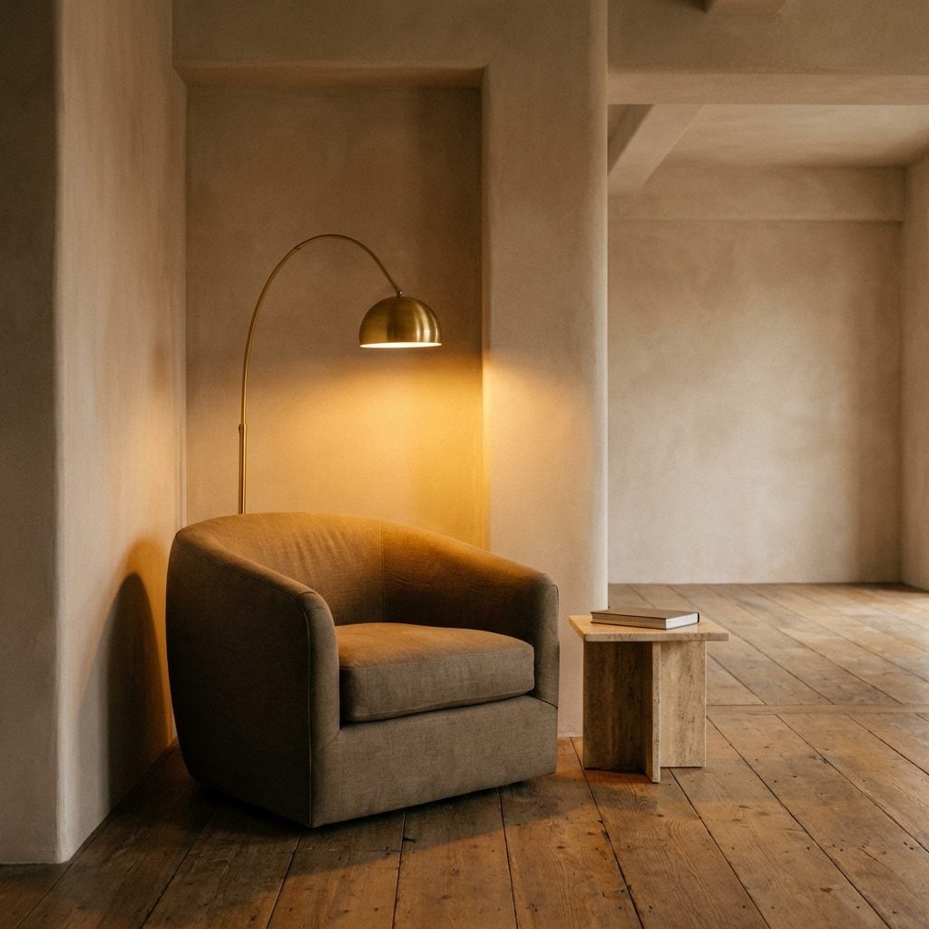
On a boat, every seating position is essentially a refuge by default, the hull curves around you, the overhead is close, and the view is the sea. Yacht designers don’t have to manufacture the refuge condition; the boat itself provides it. What they must do instead is create enough prospect, enough openness, enough view, enough visual reach, to prevent the space from reading as a container. The balance they’re forced to strike is exactly what most living rooms get wrong in the opposite direction: too much open, nowhere to hide, furniture floating in a void with no architecture giving it shelter. A curved accent chair in a corner with a arched floor lamp overhead isn’t just a decorating choice, it’s refuge-making.
The Reason Symmetry Alone Doesn’t Feel Expensive, And What Has to Happen Instead
Symmetry is easy. Two matching lamps flanking a bed. Identical nightstands. A sofa centered on a rug centered on a room. Source The symmetry of a space is connected to ‘perceptual fluency’, the more fluently the brain can process what it sees, the more positive its aesthetic response. That’s the good news about symmetry. The bad news is that fluent doesn’t mean interesting. It means easy. And easy reads as cheap.
The rooms that genuinely register as expensive hold a tension the brain has to work slightly harder to resolve. Source According to IMI Design, overreliance on symmetry can drain a room of personality, when each element is mirrored and every object is paired, the initial calm can quickly veer into something that feels formulaic and static. The space starts to resemble a showroom rather than a sanctuary.
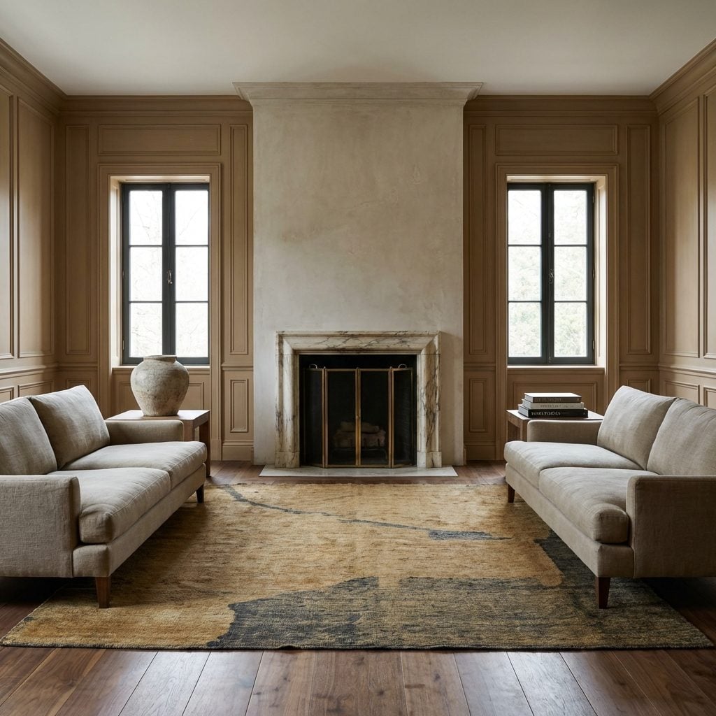
What yacht designers understand intuitively is that a symmetrical structure can carry asymmetrical detail. The hull is symmetrical. The placement of windows, joinery runs, and hardware has rhythm. But within that framework, the material choices, the grain direction of the teak, the slight variation in panel widths, these introduce a controlled irregularity that prevents the eye from processing everything in a single pass. Expensive rooms do the same: they establish a symmetrical skeleton, then populate it with things that have enough variation to reward sustained looking. A walnut console table with irregular grain against perfectly symmetrical wall paneling. A handwoven wool rug with visible texture variation under geometrically precise furniture. The tension between order and incident is exactly what the brain labels as ‘quality.’
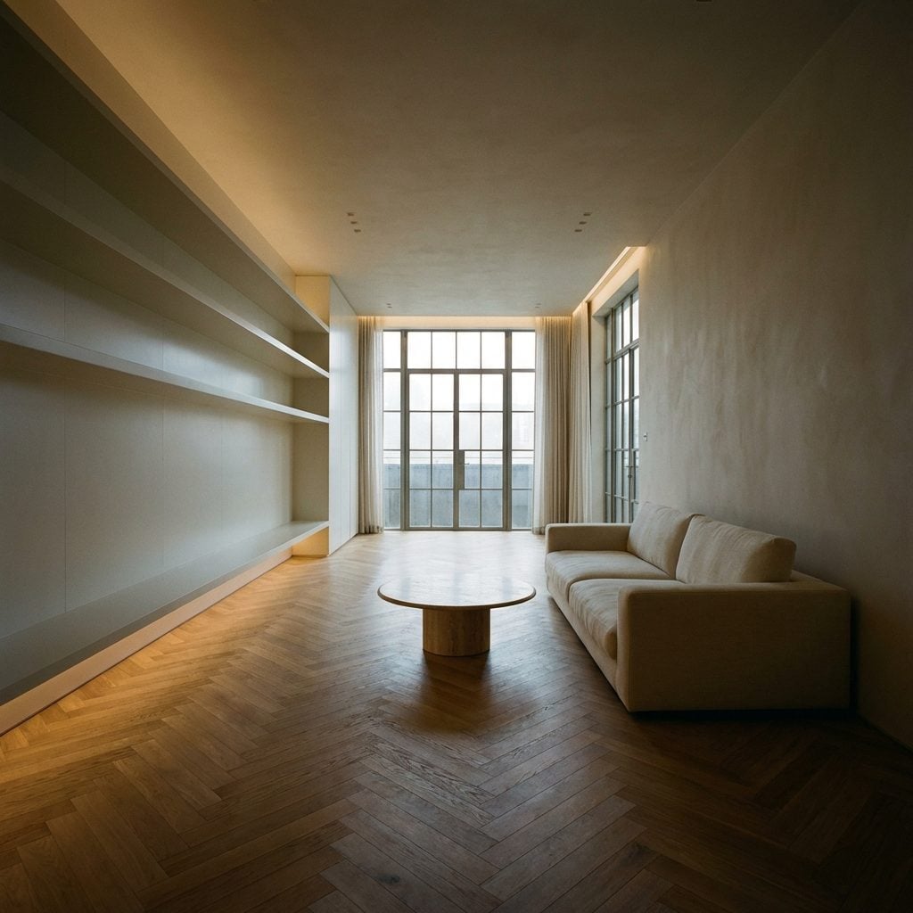
Why the Most Psychologically Satisfying Rooms Feel Like They Were Built, Not Assembled
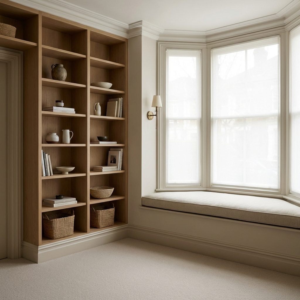
You’ve walked into that room. The one where you don’t know what to look at first because everything seems to belong, not to a collection of furniture, but to the room itself. The window seat fits the bay exactly. The shelving reaches the ceiling without a gap. The radiator cover is flush with the baseboard profile. Nothing is sitting in front of something else to hide it. Source Dr. Joel Frank, a licensed clinical psychologist, puts it plainly: a well-designed environment can help us relax and restore, but the key is that items in a room feel right if balanced and appropriately sized, not cramped or cluttered in ways that promote anxiety.
What the brain is actually registering when a room feels ‘built’ rather than assembled is the absence of unresolved transitions. Every joint, every edge, every place where one surface meets another has been considered. On a yacht, there is nowhere to route a cable visibly. There is no acceptable gap between the teak deck and the stainless toe rail. The standard of finish is absolute because the sea will find every weakness. This constraint produces interiors that feel coherent at a molecular level, and that coherence is something human perception detects and labels as quality, even when a person couldn’t explain why.
In a residential living room, the equivalent is whether your skirting board profile matches your door architrave, whether your light switches align with your door handles in height, whether the gap between your sofa arm and the wall reads as intentional or accidental. None of these are expensive to get right. They require decisions, not budget. But most homeowners fill space with objects without ever resolving the room’s architecture, and the brain registers the gap.
The Material Conversation Your Eye Is Having Right Now Without Telling You

🔥 Would you like to save this?
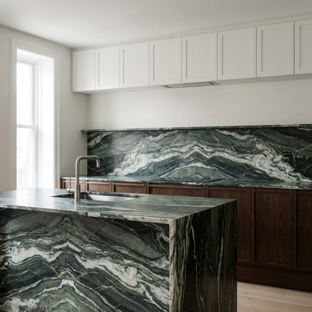
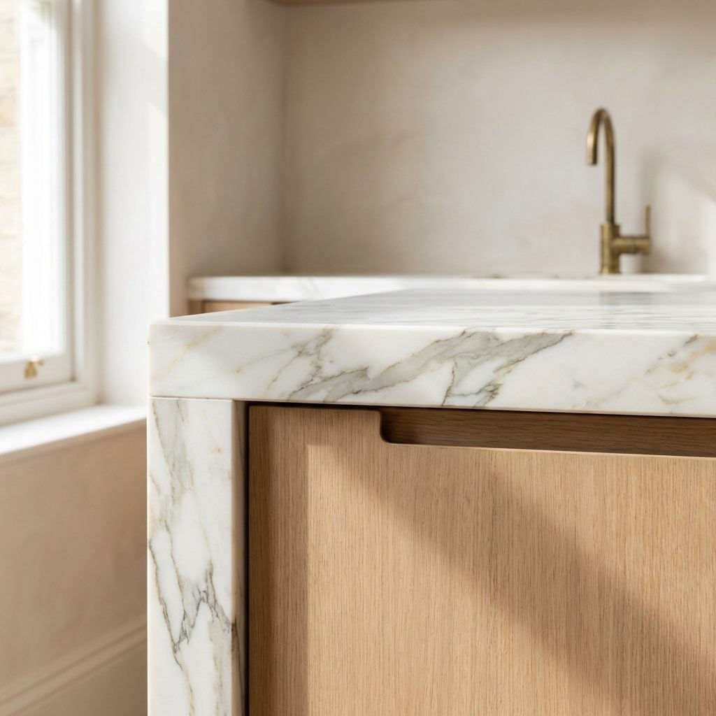
Every room contains a silent dialogue between its surfaces, and your brain is following every word of it. Marble next to brushed brass next to linen next to oak, the eye is constantly checking: do these materials belong in the same world? Do they agree on the level of quality they’re signaling? Source High-end homes feature luxurious materials chosen not just for their individual quality, but for their ability to coexist, to speak the same finish language.
The breakdown happens when materials from different finish ‘registers’ share a room without mediation. Chrome hardware next to rough-sawn timber. High-gloss laminate cabinets next to hand-thrown ceramic vessels. Each material is perfectly good on its own. Together, they’re having an argument the room can’t resolve, and your nervous system picks it up as vague discomfort without being able to name the source.
Yacht designers work with this problem constantly because a boat’s interior combines industrial-grade engineering hardware with bespoke joinery, and making those two registers coexist is a skill in itself. The answer is almost always mediation: a third material that bridges the gap in finish level. Brushed stainless next to raw teak needs a fourth element, sealed leather, perhaps, or matte lacquer, that speaks to both. In a kitchen where the modern bathroom design thinking of adjacent surfaces hasn’t been applied, the result is a space that feels unresolved even if every individual element is expensive. The matte black cabinet hardware, the brushed brass faucet, and the veined marble countertop all have to agree they’re in the same conversation.
What Happens in Your Brain When a Room Has One Finish Too Many
The number is almost always one. Not five too many, not a complete mess, just one material, one finish, one hardware choice that doesn’t belong to the same visual family as everything else. And that single outlier is enough to make the whole room feel unresolved. The psychology behind this is related to what Leon Festinger described as cognitive dissonance: Source our brains experience genuine discomfort when they encounter conflicting information and can’t resolve the contradiction. In a room context, the contradicting information is a finish that doesn’t belong, and the brain keeps returning to it, trying to make sense of it, generating low-level unease that the occupant experiences as a vague sense that something is ‘off.’
Consider what happens when a well-resolved room in warm neutrals, linen, plaster, oak, aged brass, contains a single piece of furniture in cold chrome and high-gloss black lacquer. Nothing about that piece is wrong in isolation. But it’s broadcasting from a different design channel, and the rest of the room can’t receive its signal. Source Research in design psychology confirms that uncoordinated designs provoke stress or discomfort, with chaotic layouts creating cognitive overload.
The yacht designer’s version of this problem is finish creep: a boat that started as warm teak and brushed nickel, then acquired a polished stainless fitting here, a gloss lacquer panel there, a chrome hinge where brushed should have been. No individual decision was catastrophic. The accumulated effect is a boat that feels like it was finished by several different people who never spoke to each other, which, in residential design, is exactly what often happens. The solution isn’t expensive. It’s editorial. Remove the one outlier, or commit to it and adjust the surrounding palette to meet it.
The Spatial Lie That Makes Small Rooms Feel Cheap, And the Constraint That Forces Designers to Tell the Truth
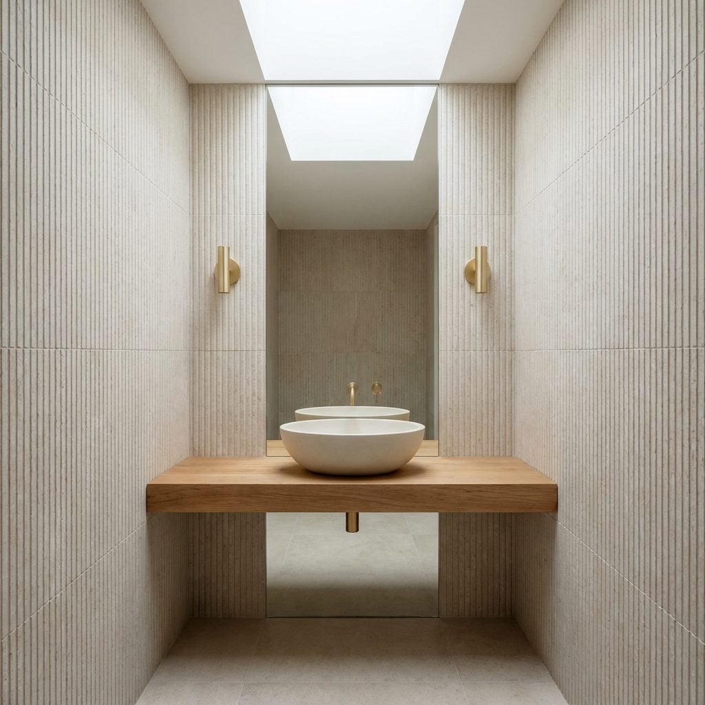
Small rooms feel cheap for a specific reason: they usually contain too many compromises, and the brain reads compromise. Furniture that’s slightly too small because ‘it fits.’ Ceiling heights that could have been used but weren’t. Windows that stop before they should. Every scaled-down decision in a small room is a visible apology, a signal that the room knows it’s inadequate and is trying to minimize the embarrassment.
The counter-intuitive truth is that Source materiality has a significant effect on perceived spaciousness, specifically, that natural and textured materials are perceived as more spacious than smooth concrete surfaces, even in identically sized rooms. The implication for small-room design is profound: a small room finished in materials that have inherent quality and presence doesn’t read as a compromised version of a larger room. It reads as something intentional. Something that decided to be what it is.
This is exactly the lesson forced on designers who work in constrained spaces. A narrow bathroom design that uses full-height stone cladding, a deep vessel basin in genuine ceramic, and a single large-format mirror from counter to ceiling doesn’t feel small. It feels considered. The constraint removed the option of faking scale with cheap volume, instead, it forced investment in surface quality, and surface quality is what the eye actually reads as expensive. A small room finished with the confidence of a much larger one is one of the most psychologically satisfying spaces in residential design, and it almost never happens by accident.
The Bottom Line
The answer is finish coherence, the silent agreement between every surface, edge, material, and transition in a room that they belong to the same intentional story. Yacht designers solve it in 60 seconds because confined space leaves nowhere to hide contradiction, and contradiction is exactly what your brain has been registering as “cheap” every time you’ve walked into a room that felt slightly off but couldn’t explain why. Walk through your home right now and ask not whether each thing is nice, but whether each thing is speaking to the same room, that single question will show you more than any renovation budget ever could.