
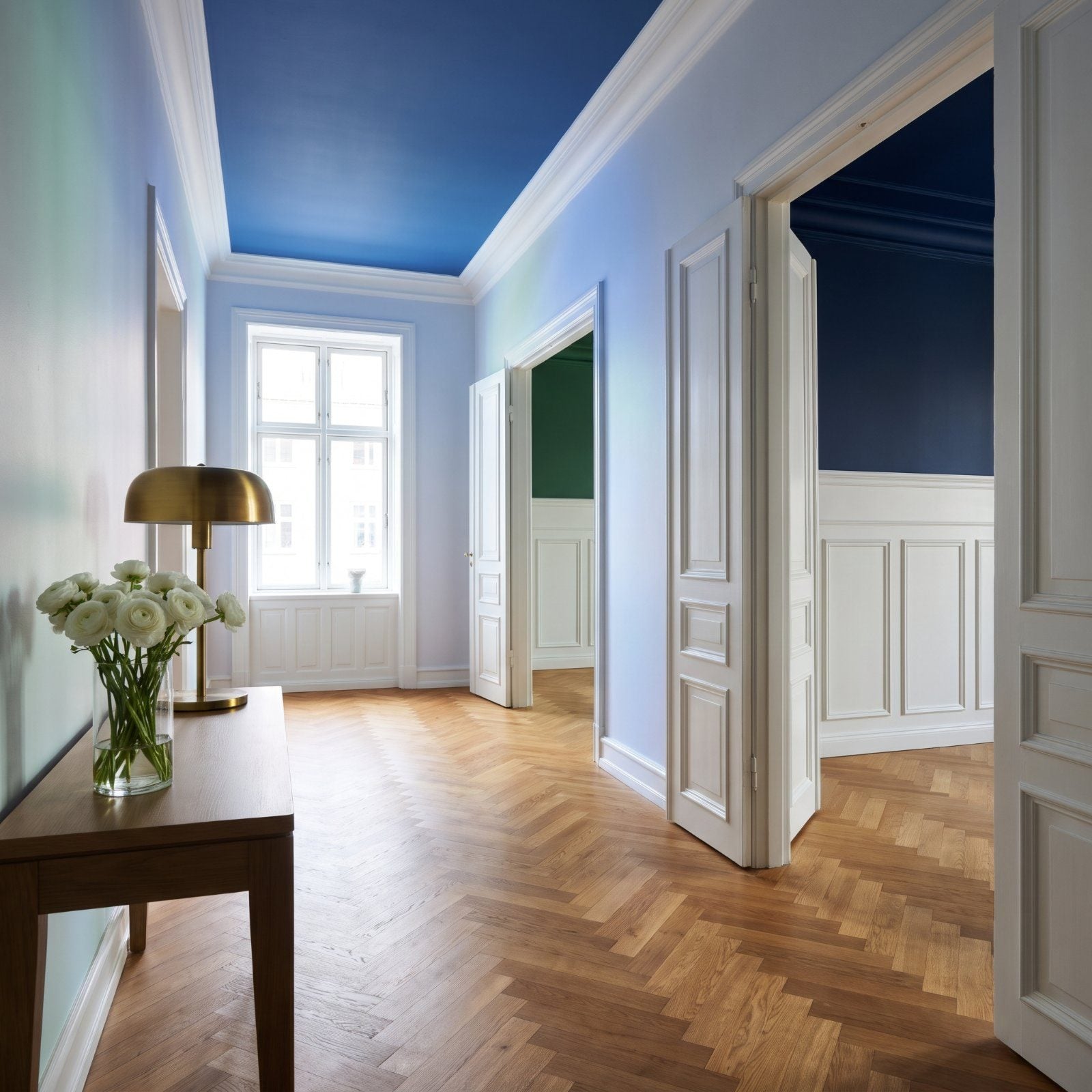
White ceiling. Every room. That’s the default, and nobody ever questions it. Builders do it because it’s cheap and nobody complains, and you do it because that’s just what ceilings are.
But the fifth wall is the most overlooked surface in your house, and color up there pulls off tricks the walls simply can’t. It lowers a room that feels cavernous, warms a space with no windows, and makes a hallway feel like somewhere instead of a corridor between somewheres. Look at these before you reach for the white.
In order to come up with the very specific design ideas, we create most designs with the assistance of state-of-the-art AI interior design software. Also, assume links that take you off the site are affiliate links such as links to Amazon. this means we may earn a commission if you buy something.
49. A Navy Ceiling Anchors an Airy Coastal Living Room
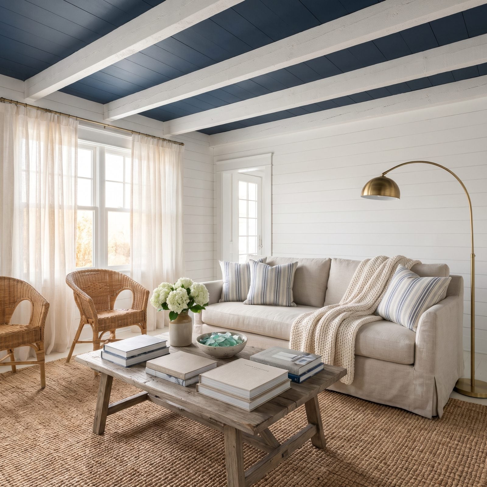
Everyone paints a coastal room white and then wonders why it feels like a hotel lobby. A navy ceiling fixes that, giving all that pale shiplap something to push against, and suddenly the room reads intentional instead of blank.
The trick is the white beams breaking the navy into panels. Without them, a dark ceiling just sits there like a lid; with them, it looks like it was always meant to be there. Pair it with a brass arc floor lamp and the warm metal glows against the cool blue overhead.
48. A Glossy Black Ceiling Gives a Powder Room Drama
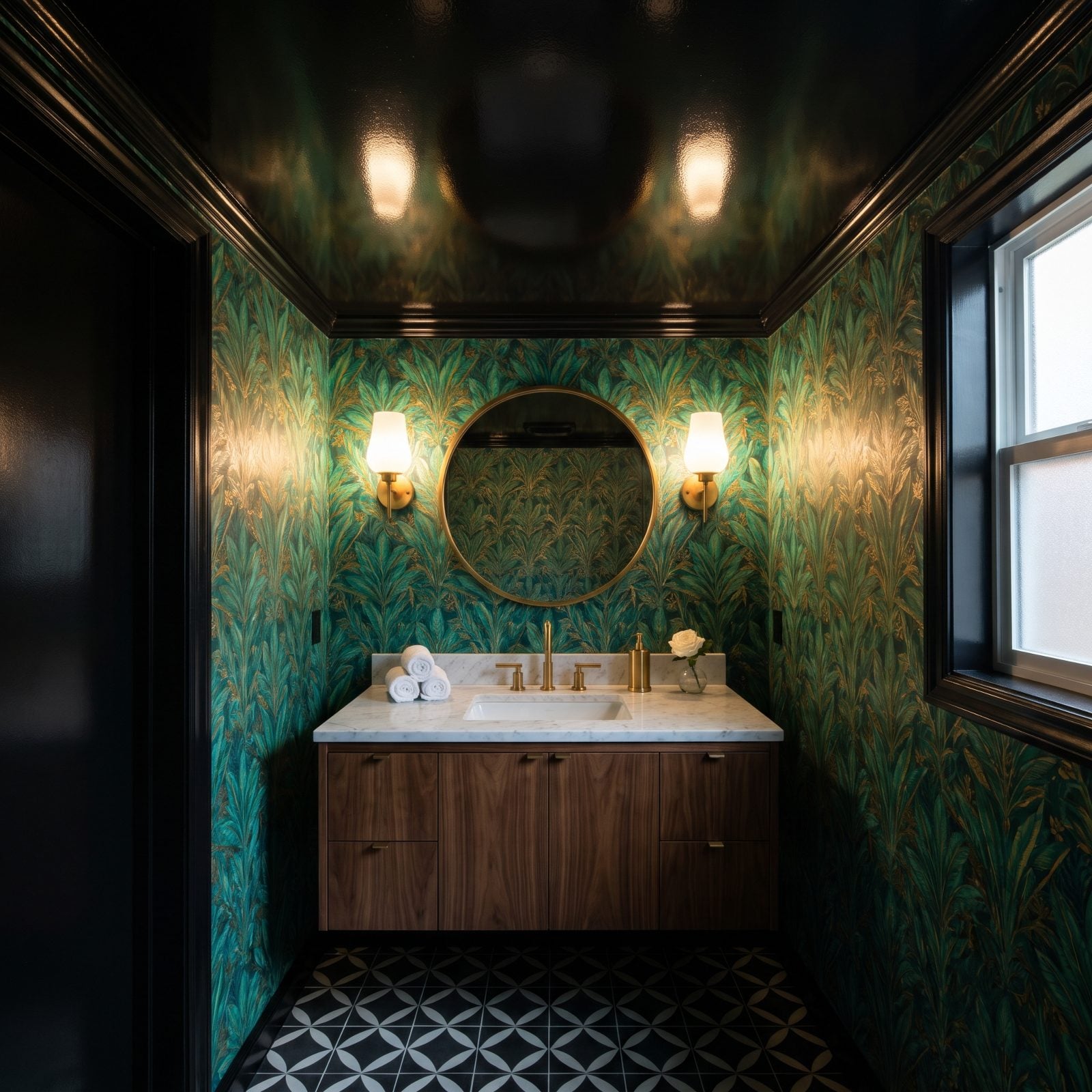
A powder room is the one place you can go all in. Nobody lives in it, so make it a jolt. Gloss black up top turns the smallest room in the house into the one everyone talks about.
And the gloss carries the whole thing. A flat black ceiling would just feel low and heavy, but high-gloss reflects every bit of sconce light and the wallpaper pattern below, so the ceiling reads like dark water instead of a cave. In a tiny room, even one with a window, that reflection buys you depth you don’t actually have.
47. A Forest-Green Ceiling Cocoons a Book-Lined Library
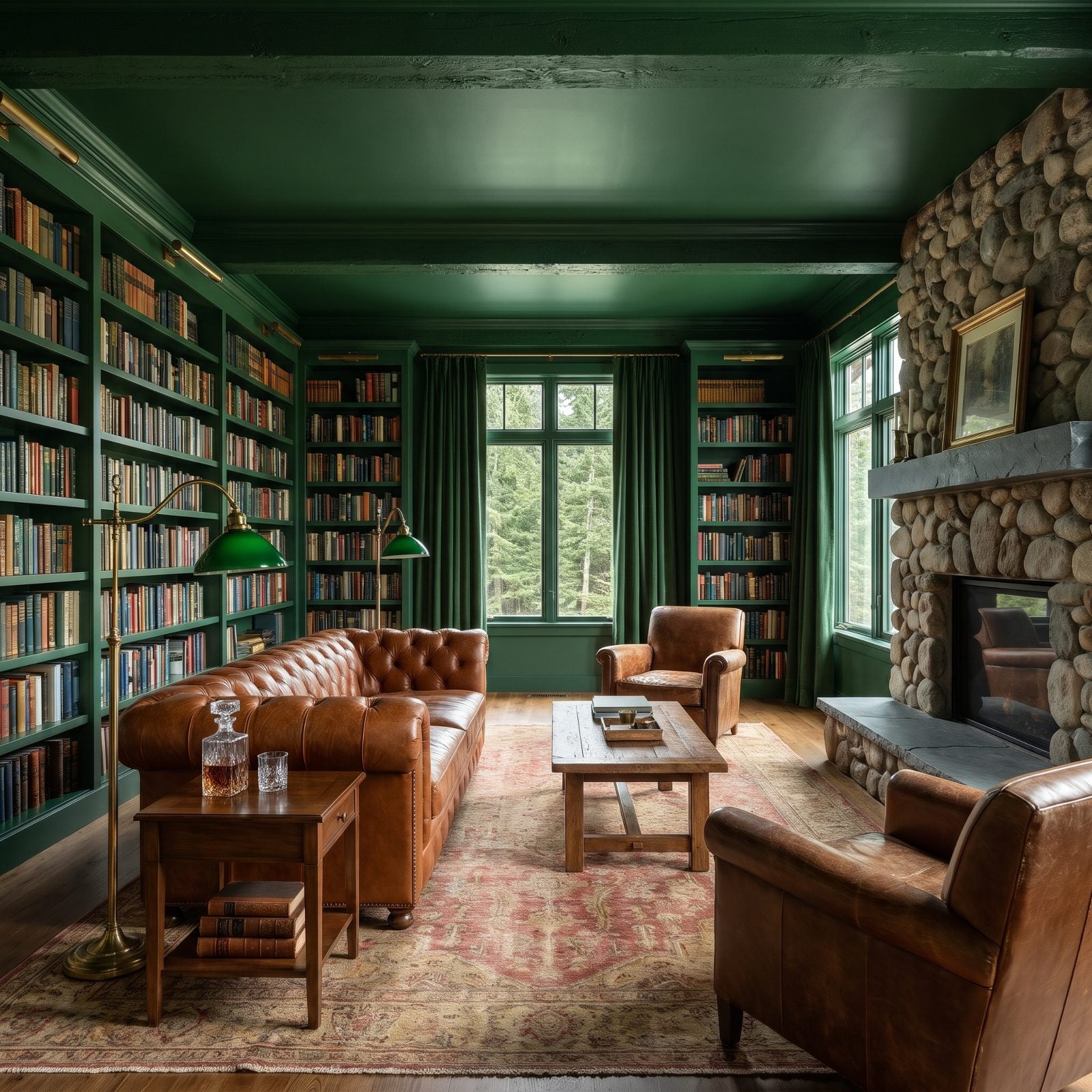
Paint the ceiling the same green as the shelves and the walls, and the room loses its edges. There’s no line where wall becomes ceiling, so you can’t tell where the space ends, and the whole color-drenched library suddenly feels bigger and smaller at once. Sounds impossible until you stand in one.
The cognac leather Chesterfield is doing quiet work here too. Warm tan leather against all that cool green is the kind of contrast that makes a room feel collected over decades rather than ordered in a weekend.
46. A Terracotta Ceiling Warms a Plaster-Walled Bedroom
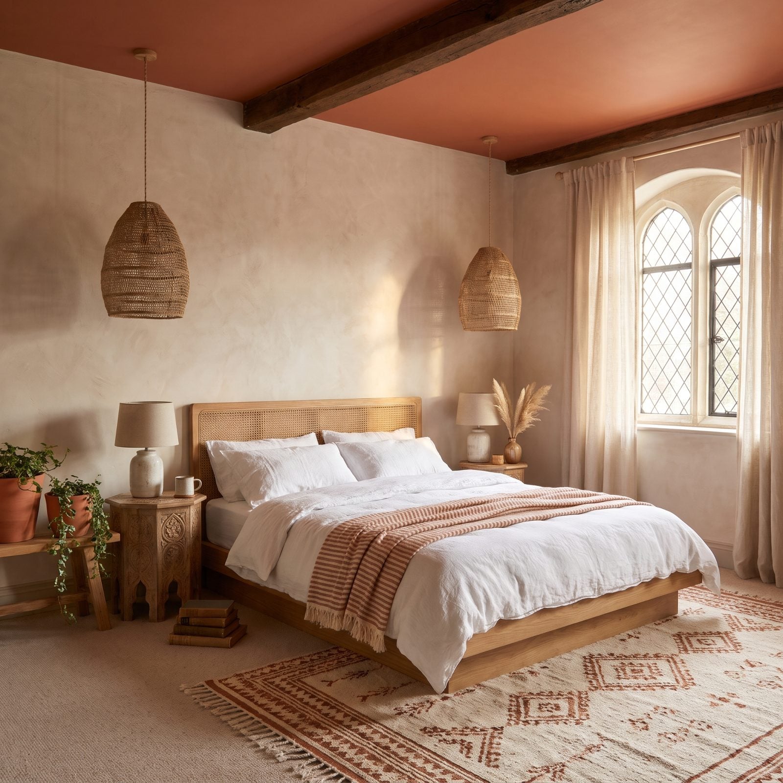
That terracotta overhead does something the walls can’t: it throws warm light back down onto everything. Morning sun hits the ceiling, the ceiling bounces a soft clay-colored glow across the plaster, and the whole room feels like late afternoon all day long.
It pairs best with limewash walls because both finishes are matte and chalky. No competing shine, just two soft surfaces having a conversation. A high-gloss anything would wreck it.
45. A Cobalt Ceiling Turns a Plain Hallway Into a Destination
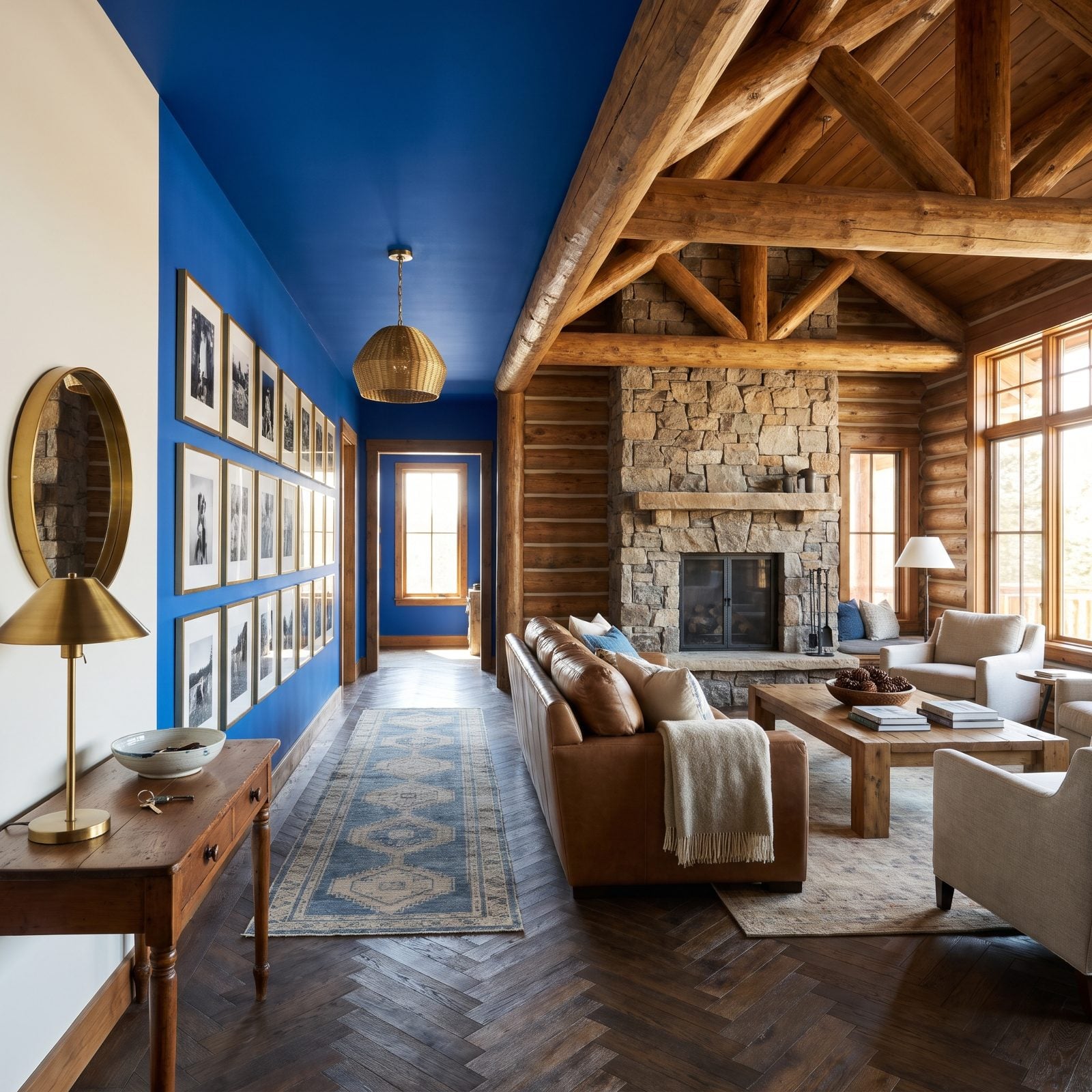
Hallways are where decorating goes to die. You walk through, you don’t stop, you give it nothing. A cobalt ceiling flips that, and suddenly the hall is the surprise you weren’t expecting, the stretch of the house people actually slow down in.
Running the color the full length does two things. It pulls your eye toward the window at the end, and it unifies a space that’s usually just interrupted by doorways. A woven brass pendant hanging from that blue is the kind of small decision that makes a corridor feel designed.
44. A Butter-Yellow Ceiling Brightens a Windowless Laundry Room
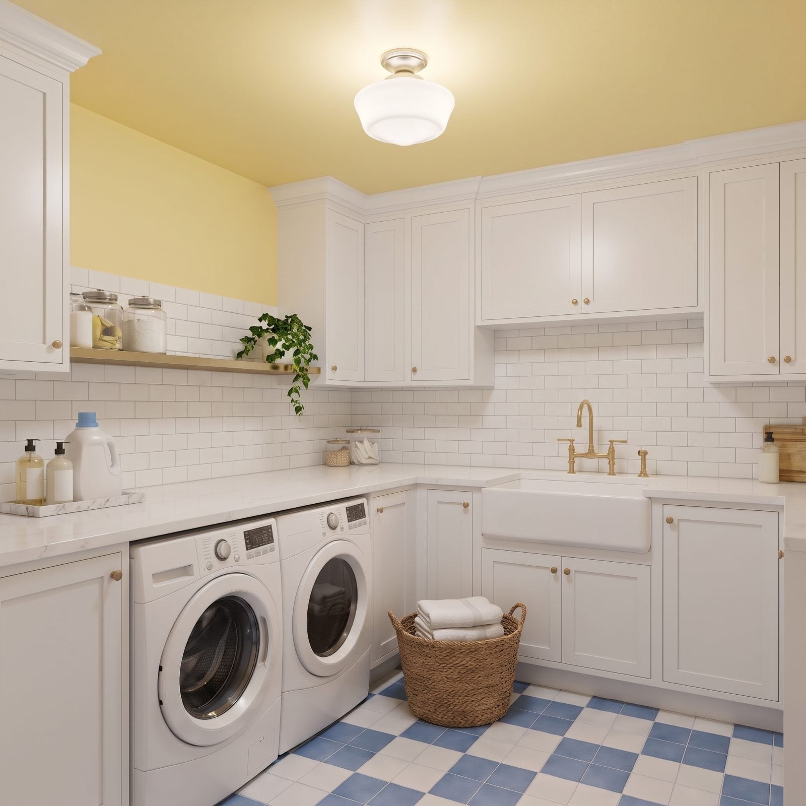
No window, no problem. A windowless room’s biggest enemy is that flat, bluish overhead-light gloom, and a warm yellow ceiling kills it. The paint catches whatever light the fixture throws and bounces it back golden, so the room reads sunny even with no sun.
Butter yellow over white cabinets is a laundry room’s best shot at being a place you don’t dread. We’ve folded enough laundry under dead fluorescent light to appreciate this more than we’d like to admit.
43. A Peacock-Blue Ceiling Frames an Art Deco Bedroom
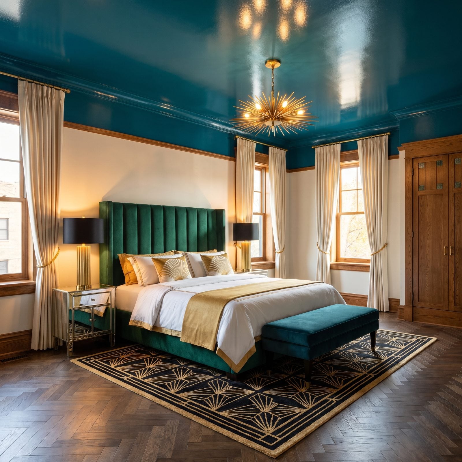
Peacock blue is the color Art Deco was made for. It sits right between green and blue, which is exactly the register this whole look lives in. Lacquer it up top and the ceiling becomes the prime surface those designers always treated it as.
The gloss finish matters as much as the color. A matte peacock ceiling would still look good, but lacquered, it reflects the brass sunburst chandelier and the lamplight and gives you that liquid, jewel-box depth the period obsessed over.
42. A Pale Aqua Ceiling Gives a Covered Porch an Open-Sky Feeling
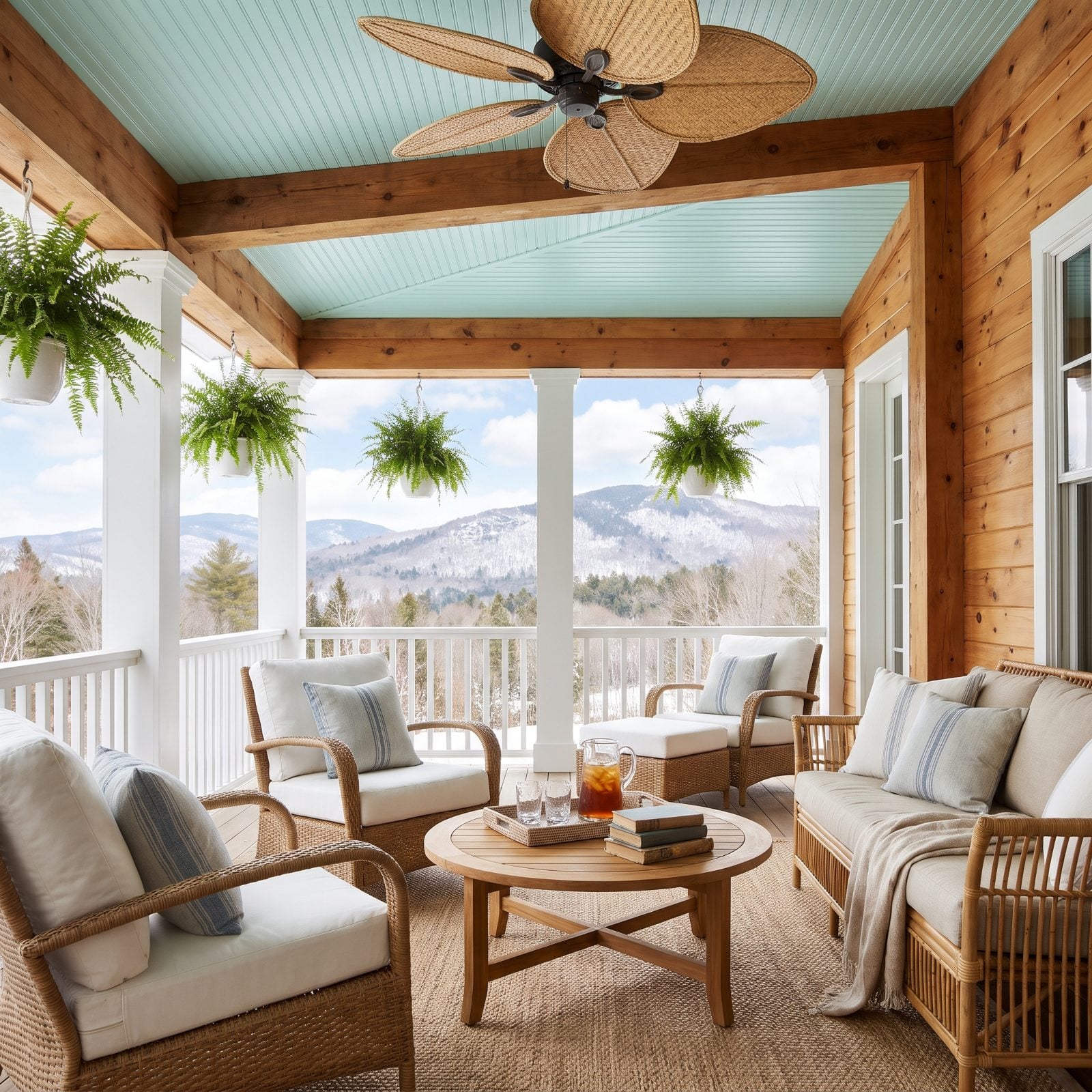
The old porch-ceiling blue trick, done right. Pale aqua on beadboard reads as sky, so even under a solid roof the porch feels open to the air above. Your brain registers “outside” before you’ve thought about it.
Keep the rest of the palette soft and faded, white wicker, worn stripes, a little green from the ferns, so the ceiling stays the cue your eye follows up. Of everything on this list, this is the one color choice that works on instinct more than taste.
41. A Charcoal Ceiling Sharpens an Industrial Loft Kitchen
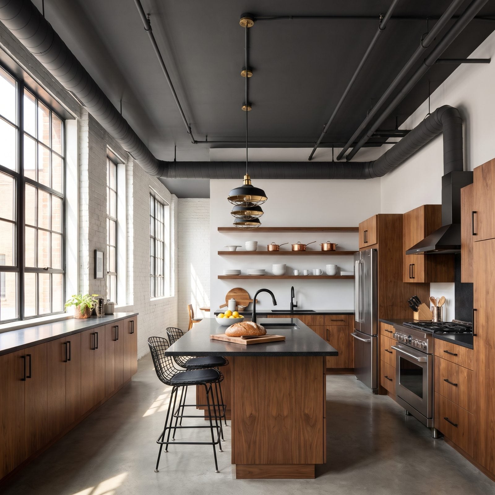
Exposed ductwork is the whole industrial look, but white paint makes it shout. Charcoal makes it recede. Paint the ceiling and the pipes the same dark gray and all that mechanical clutter reads as one calm shadow instead of a tangle fighting for attention.
Against it, the walnut cabinets and brass pendants warm right up. That’s the payoff with a dark ceiling in a kitchen: it lets wood and metal glow in a way they never do under white. Black-framed factory windows and black wire counter stools finish the line this kitchen is drawing.
40. A Blush-Pink Ceiling Softens a Formal Dining Room
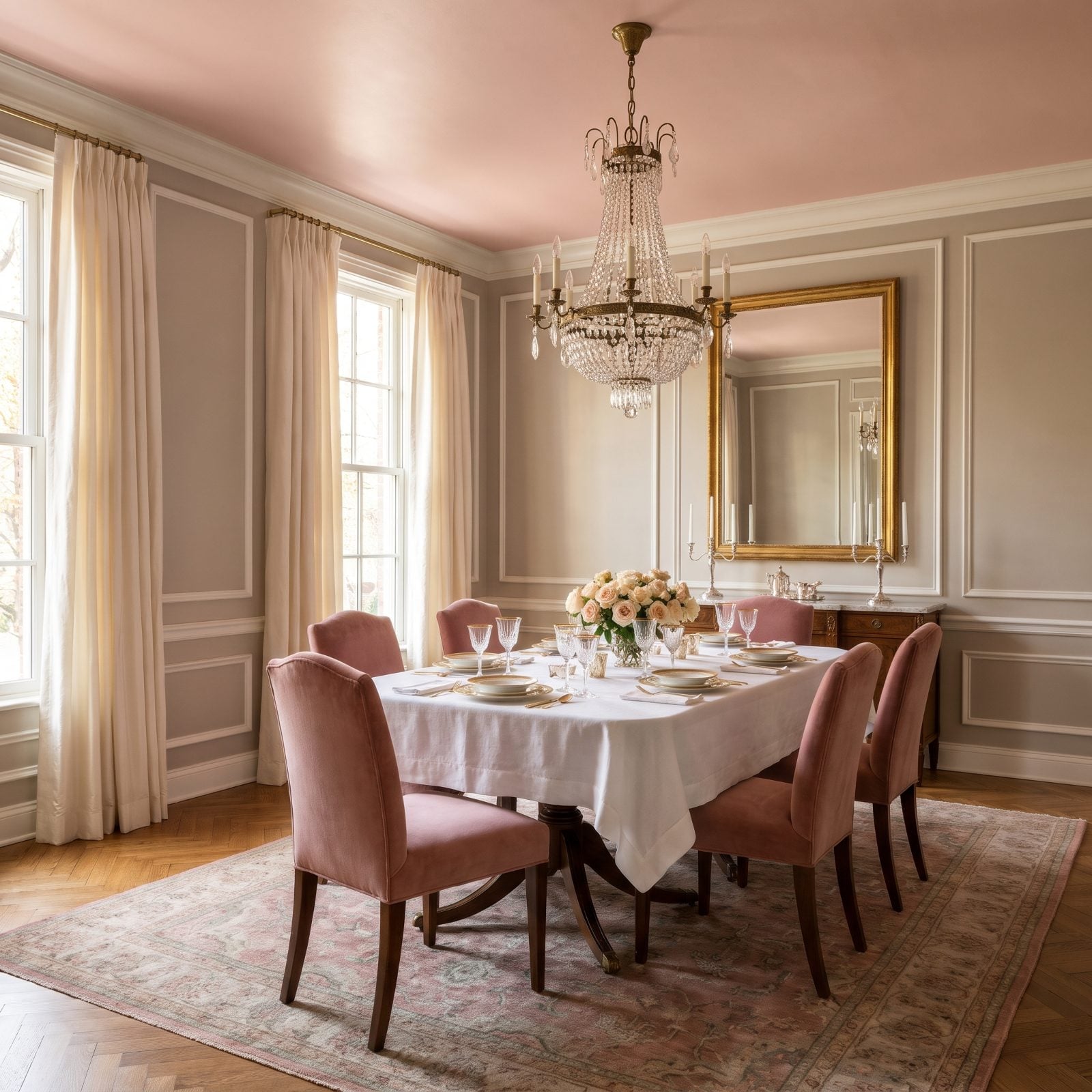
Formal dining rooms have a stiffness problem. Everyone’s a little too upright, the china’s a little too precious. A blush ceiling takes the starch out without touching the elegance.
There’s a reason it works at dinner. Warm pink light is flattering light. The ceiling catches the chandelier’s glow and washes a faint rose tint down over the whole table, which happens to be the most forgiving thing you can do to faces across a candlelit meal. I’d put that near the top of any dining room’s job description.
39. An Ink-Blue Ceiling Disguises a Home Theater’s Low Height
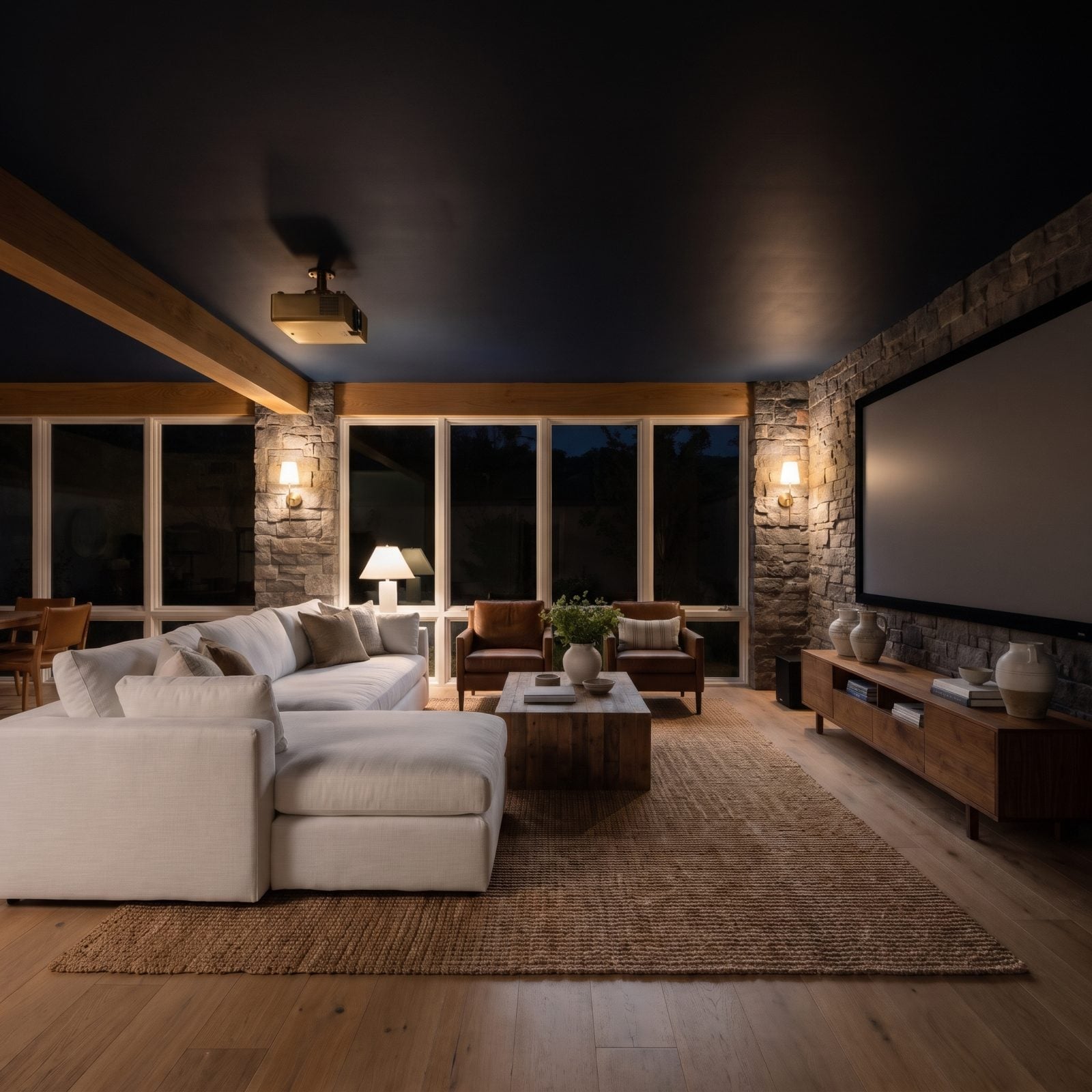
In a low-ceilinged media room, a broad white ceiling hovers overhead like a lid, and white makes sure you notice. Ink blue makes that ceiling stop announcing itself. Once the lights dim, the edges of the room blur into the dark and your eye has no clean line to measure the height against.
It also works for the movie, not just the room. A white ceiling catches spill from the screen and bounces it right back into the picture, washing out the blacks. A deep ink blue swallows that stray light, so the image stays crisp and the room feels like it goes on forever overhead.
38. A Mint-Green Ceiling Freshens a Retro Kitchen
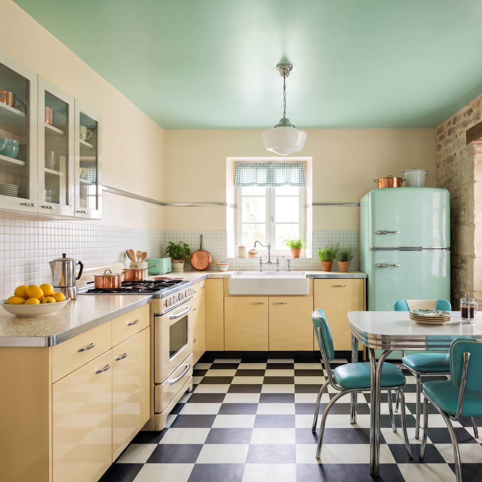
Soft green has long been at home in 1950s diner-style kitchens, on everything from rounded refrigerators to the pastel bowls stacked behind glass-front cabinets. Putting it on a smooth, flat ceiling is a smart way to borrow that heritage without turning the whole room into a period set.
The walls and buttery yellow cabinets can stay soft and simple while the mint overhead does the time-traveling. Chrome bar handles, a black-and-white checkerboard floor, a gingham curtain, a turquoise dinette and copper pots on the stove and fridge pick up the theme, and the cool, pale green keeps the room feeling clean and bright, which is exactly what you want in the room where the cooking happens.
37. A Deep Teal Ceiling Enriches a Brass-Accented Bathroom
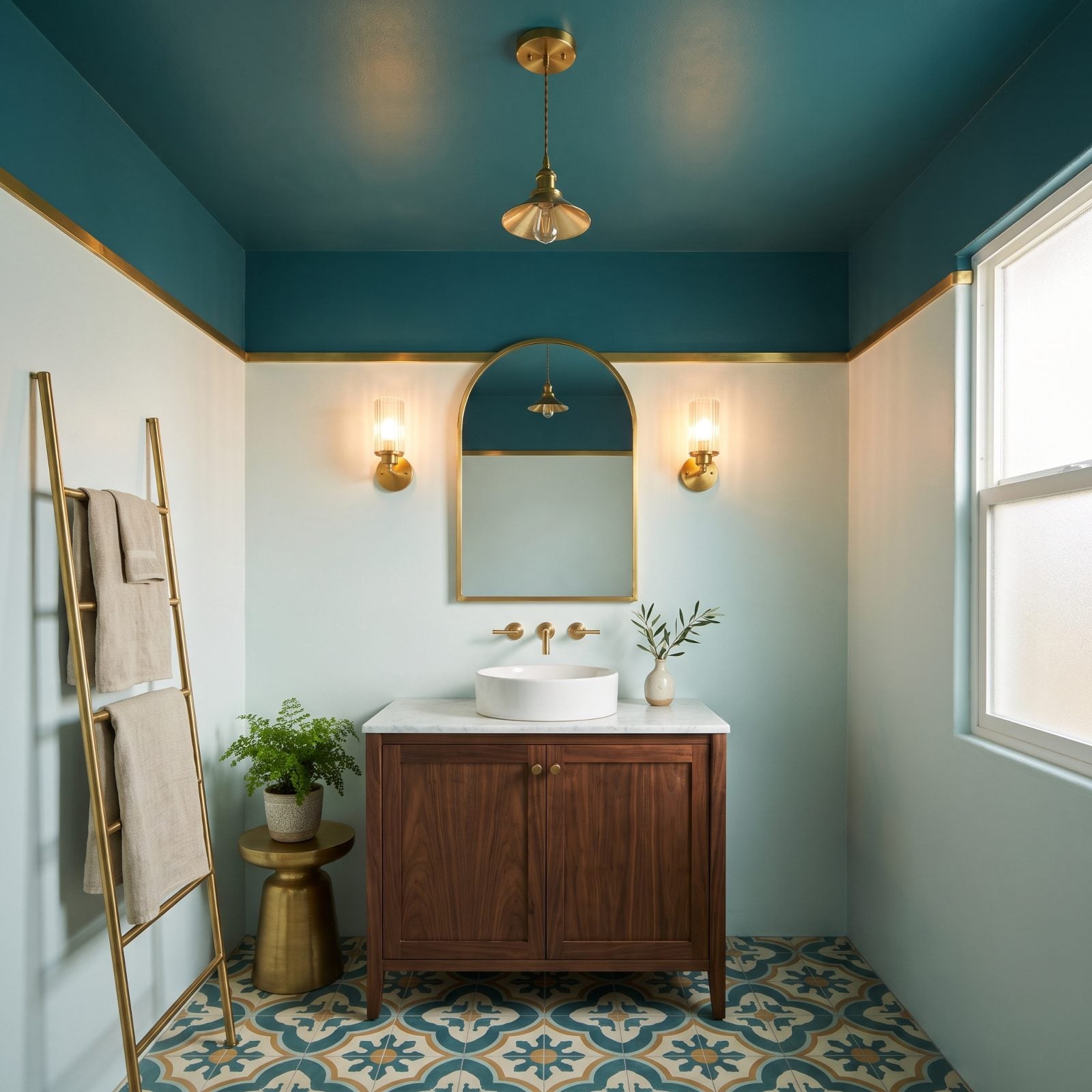
Brass looks best against something deep, and deep teal is about as good a backdrop as it gets. Blue-green is cool, brass is warm, and putting them together makes every faucet, mirror frame and sconce look like it was polished five minutes ago.
Taking the teal onto the ceiling is what makes the room feel enveloping instead of just accented. In a small bathroom, a dark ceiling doesn’t shrink the space so much as wrap it, especially once the warm light from the brass fixtures starts bouncing around. Just use a paint rated for bathrooms so the steam doesn’t win.
36. A Coral Ceiling Energizes a Palm-Print Sunroom
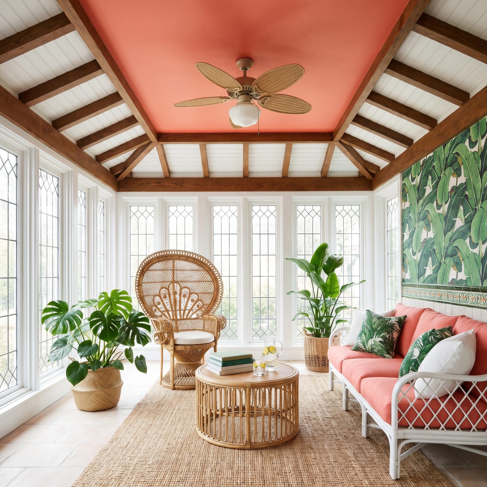
A sunroom is the one place in the house where you can go loud overhead without worrying about it feeling heavy. All that glass floods the room with daylight, so a coral ceiling reads as cheerful rather than overpowering.
Coral and leafy green sit nearly opposite each other on the color wheel, which is why the palm-print fabric and the coral ceiling make each other pop. The warm tone overhead also catches the afternoon sun and throws a peachy glow back down, so the whole room feels like a long vacation even on a gray day.
35. An Olive Ceiling Highlights the Beams in a Mediterranean Living Room
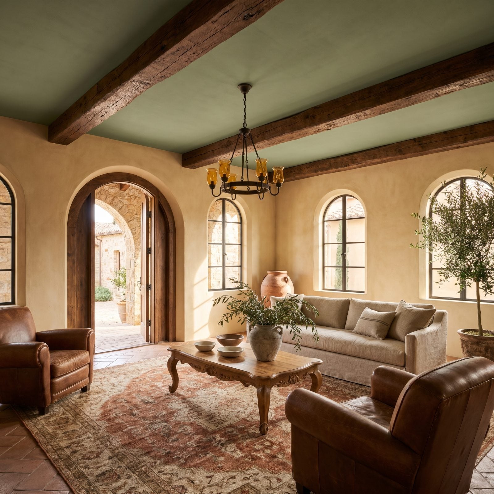
Dark wood beams against a stark white ceiling can look like stripes painted on a sheet of paper. Olive fixes that. It sits close enough to the earthy tones of the wood that the beams read as rich, solid structure instead of harsh lines.
The color also belongs here. Olive is the green of the groves that define Mediterranean landscapes, and it pairs naturally with terracotta tile, rough plaster and wrought iron. Go with a limewash or flat finish and the slight texture makes the ceiling feel old and sun-baked in the best way.
34. A Raspberry Ceiling Makes a Walk-In Closet Feel Boutique-Like
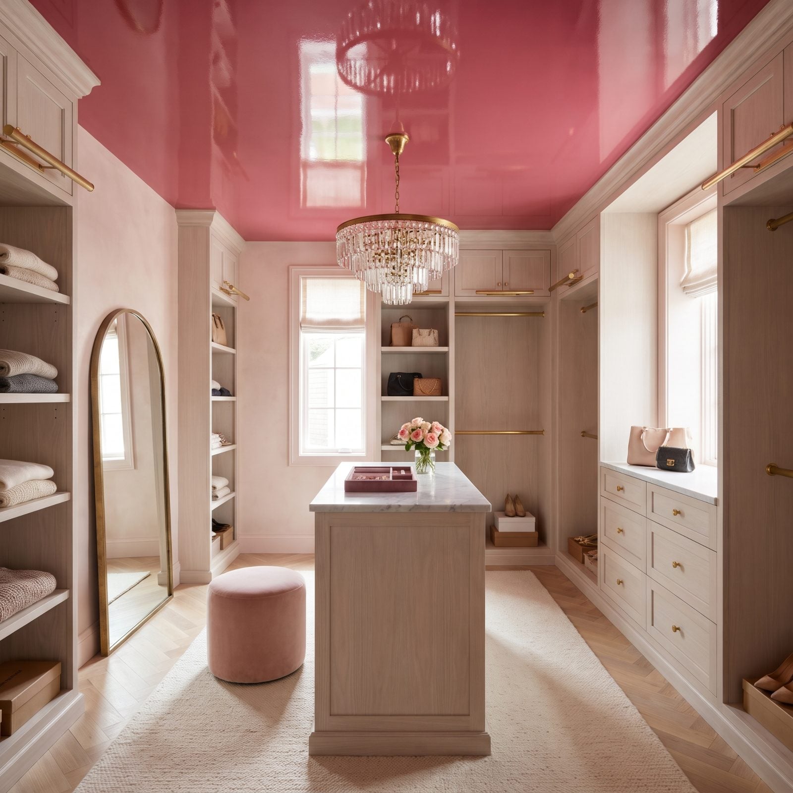
A walk-in closet is the perfect place to take a color risk. It’s small, nobody spends hours in it, and it’s usually hidden behind a door. So why not make it the most fun room in the house?
A raspberry ceiling turns a storage room into something that feels like a high-end dressing room. Against white shelving, the color makes every row of shoes and folded sweater look curated. Pinkish reflected light is also kind to skin tones, which counts for a lot when you’re checking an outfit in the mirror.
33. A Powder-Blue Ceiling Lightens a Vaulted Farmhouse Kitchen
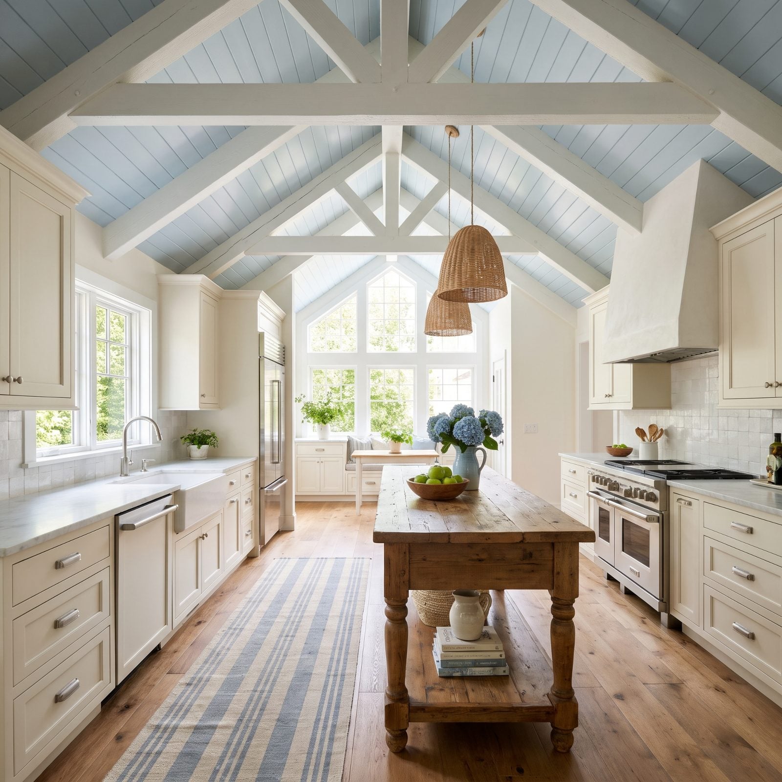
Vaulted ceilings are gorgeous, but in a farmhouse kitchen all that height can start to feel like an empty barn. Powder blue gives the ceiling some presence without weighing it down.
Because it’s so pale, the blue still bounces plenty of light around the room, and the soft color reads almost like open sky overhead. Run it across planked boards and between exposed beams, and the vault becomes a feature you actually look up at. It plays nicely with butcher block, natural oak cabinets and anything in galvanized metal.
32. A Plum Ceiling Creates Intimacy in a Cocktail Lounge
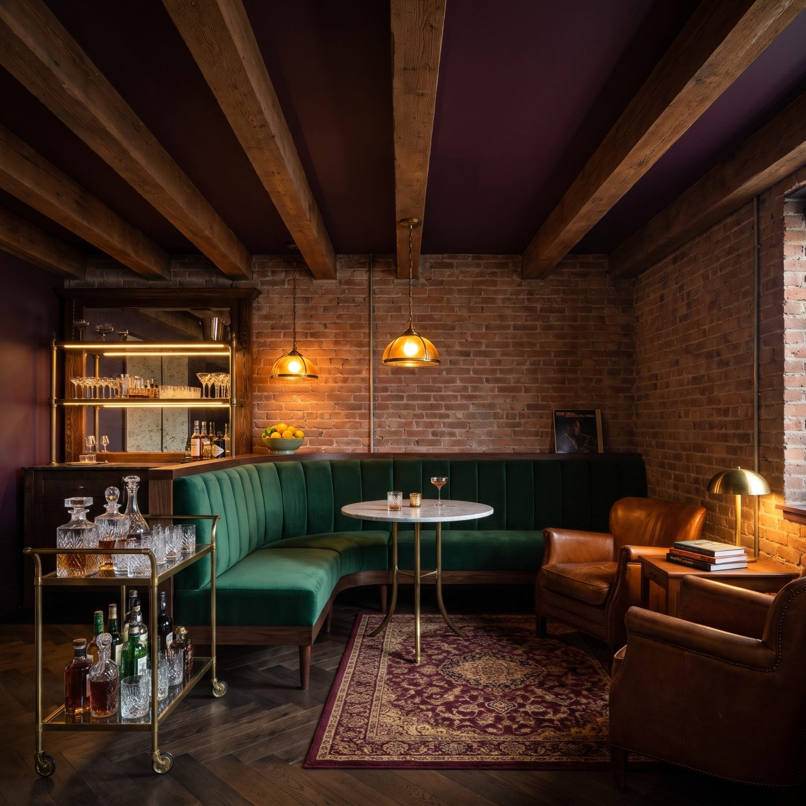
A cocktail lounge is supposed to feel close and a little secretive. A white ceiling works against that by making the room feel open and lit up. Plum pulls the ceiling down and closes the space in around you, in a good way.
Plum is also one of the most flexible deep colors you can choose. By day it reads rich and purple. After dark, under low lamps, it falls almost to black and gives the room that after-hours glow. Velvet seating, brass details and a bar cart full of amber bottles finish the mood.
31. A Sky-Blue Ceiling Opens Up a Narrow Entryway
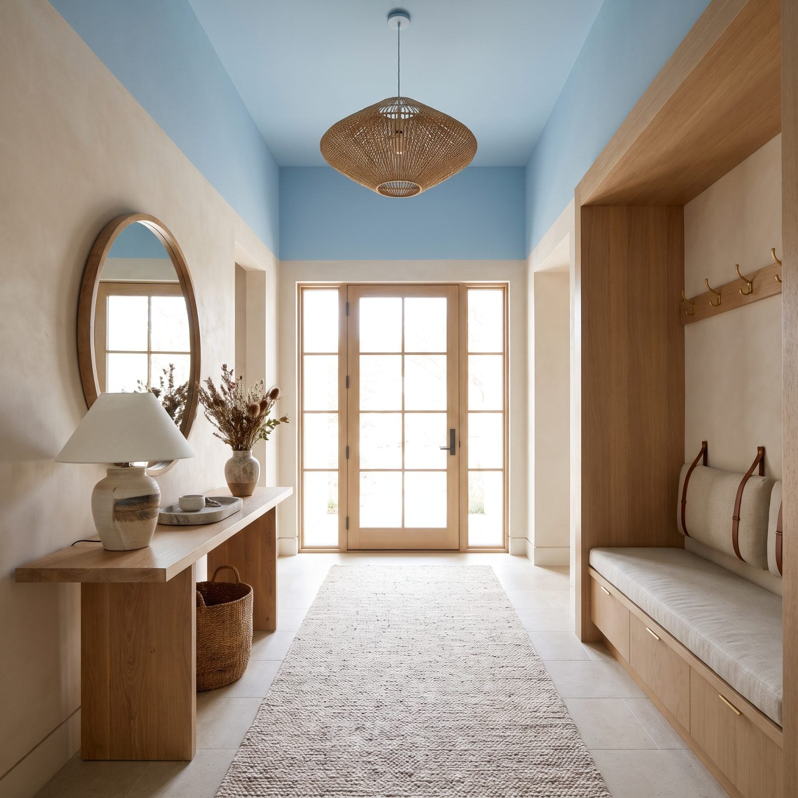
A narrow entryway gives your eye nowhere to go but straight ahead, right into the far wall. A sky-blue ceiling gives it another direction: up.
Pale, cool colors tend to recede, so the ceiling feels higher and the whole entry feels less pinched. And since this is the first thing anyone sees when they walk in, the blue sets a fresh, welcoming tone right away. Keep the walls light and add a simple pendant, and that tight hallway starts to feel like a real entrance.
30. A Deep Emerald Ceiling Turns a Butler’s Pantry Into a Jewel Box
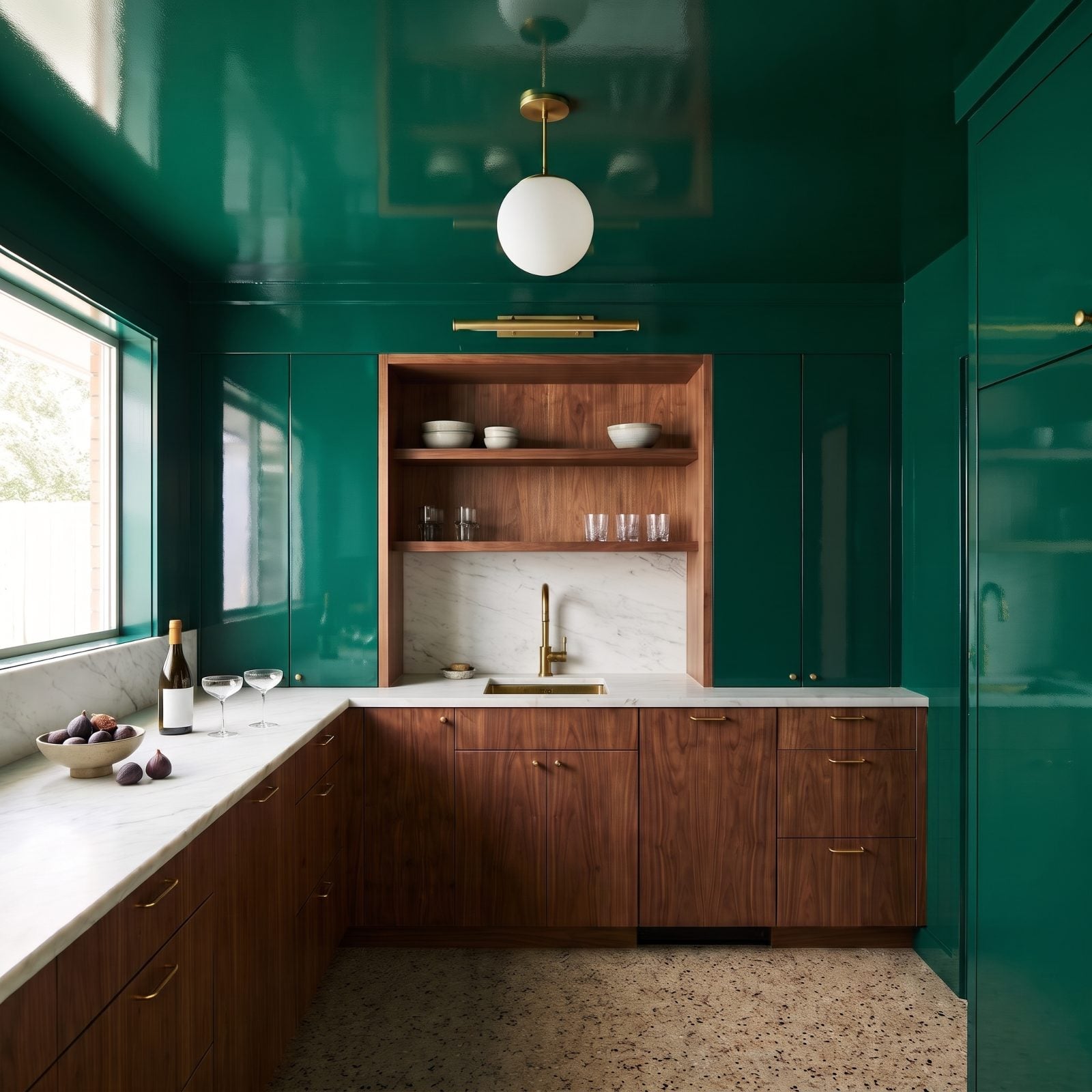
A butler’s pantry is a small room that’s often overlooked, and that’s exactly why it can handle a color this bold. Deep emerald from ceiling to cabinetry turns a pass-through space into the room guests poke their heads into on purpose.
The move that makes it a jewel box is wrapping the color everywhere. When high-gloss green covers the ceiling, walls and upper cabinets, with warm walnut kept to the base cabinets and an open shelving niche, the lacquered finish bounces light around and the space feels rich instead of cramped. Brass knobs, a brass-capped globe pendant and stacked ceramic bowls pop against all that green.
29. A Copper Ceiling Makes a Craftsman Dining Room Glow
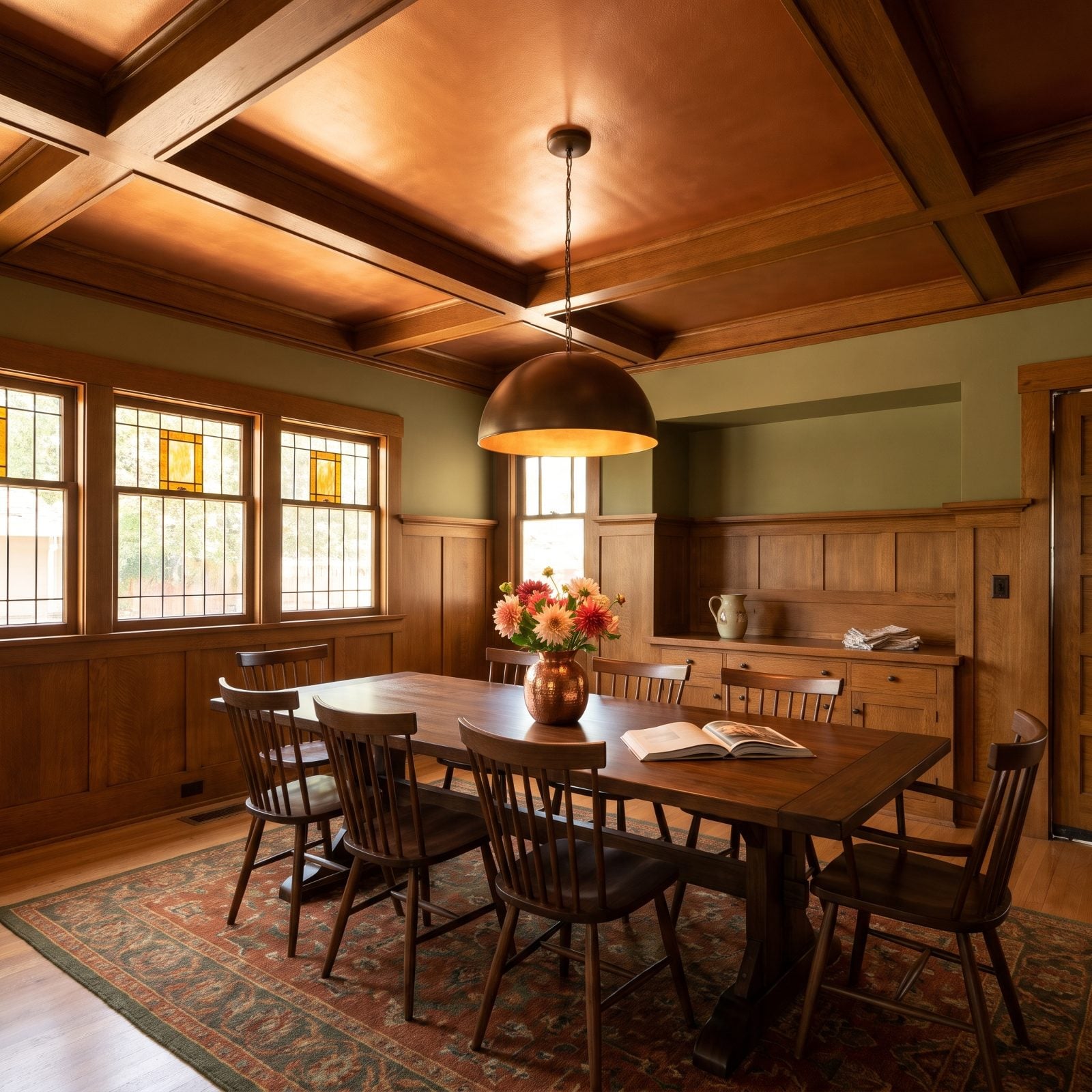
The copper up top is doing something sneaky. It catches the pendant light and throws it back down softer and warmer, so the whole room reads like late afternoon even at noon. Craftsman rooms already run dark with all that oak, and a copper ceiling keeps them from feeling like a cave.
What makes it land is the restraint everywhere else — olive walls, walnut table, one bronze dome pendant. The ceiling gets to be the one metallic moment, and the oak beams frame it like a painting.
28. A Dusty-Rose Ceiling Humanizes a Concrete Loft
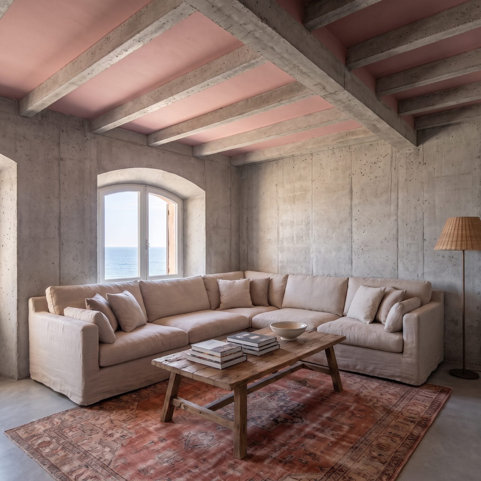
Most people misread concrete lofts. The hardness isn’t the problem — the lack of warmth is. A dusty-rose ceiling pulls the whole cold-grey box into human territory without softening a single surface below it.
Rose against raw concrete shouldn’t work. It does because the pink is muted and dusty, closer to clay than cotton candy. Reads as earth, not frosting. The cream linen slipcovered L-shaped sectional and the faded red Persian-style rug pick up that warmth and carry it down to the floor, which is the quiet bit of choreography that keeps the pink from looking like an accident someone painted over.
27. A Malachite Ceiling Makes a Marble Bathroom Feel Opulent
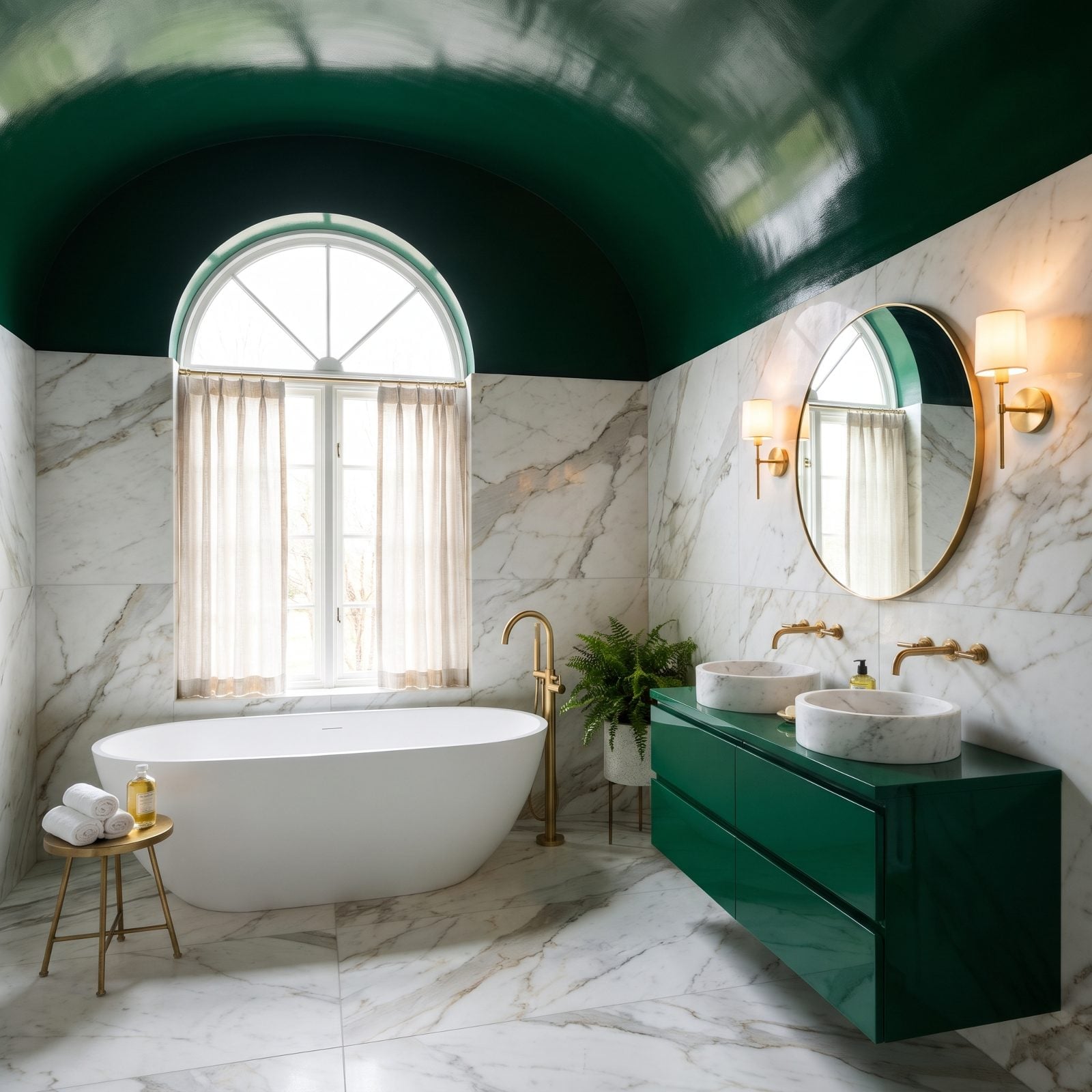
A white marble bathroom is lovely and also a little expected. You’ve seen fifty of them. The malachite ceiling is what makes this one stop you at the door.
Gloss is the whole game. A flat green ceiling would just sit there, while a lacquered one acts like a dark mirror, doubling the sconce light and giving the room a depth that makes the marble look even pricier than it is. The unlacquered brass faucets and the emerald vanity tie the green to the green, so nothing floats loose.
26. A Brick-Red Ceiling Brings Character to a Rustic Mudroom
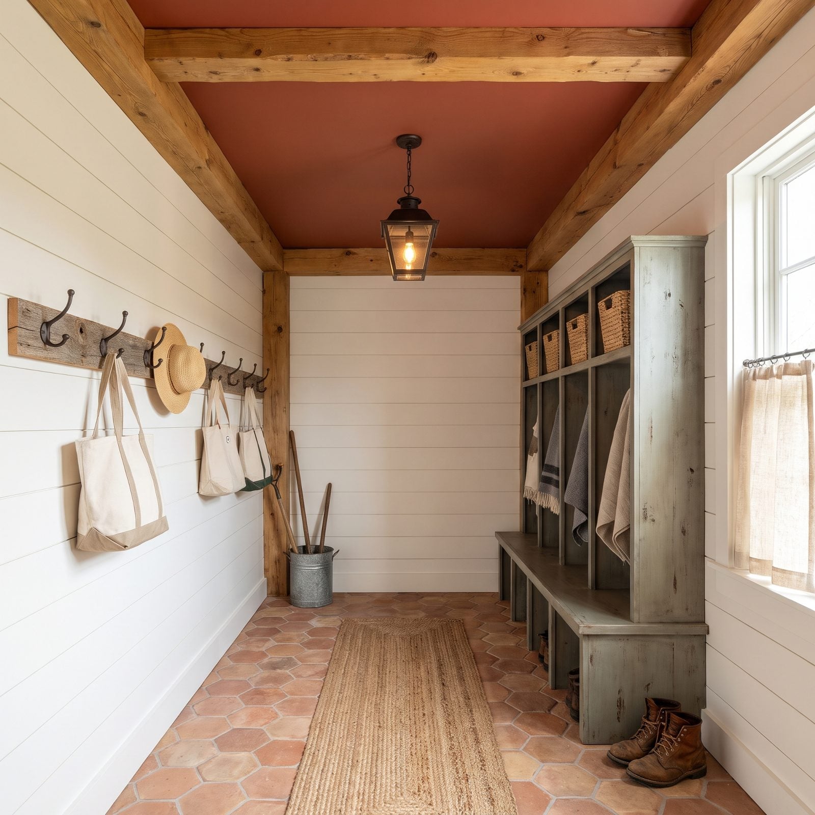
Mudrooms are where houses stop trying. They’re utility rooms, so they usually get the boring treatment. A brick-red ceiling says otherwise.
The red works because it talks to the terracotta floor tile and the reclaimed barnwood — same earth palette, just lifted overhead where you don’t expect it. Matte finish, not gloss, so it stays rustic instead of going slick. You walk in from outside and the ceiling meets you like a warm handshake.
25. A Periwinkle Ceiling Makes a Nursery Feel Dreamy
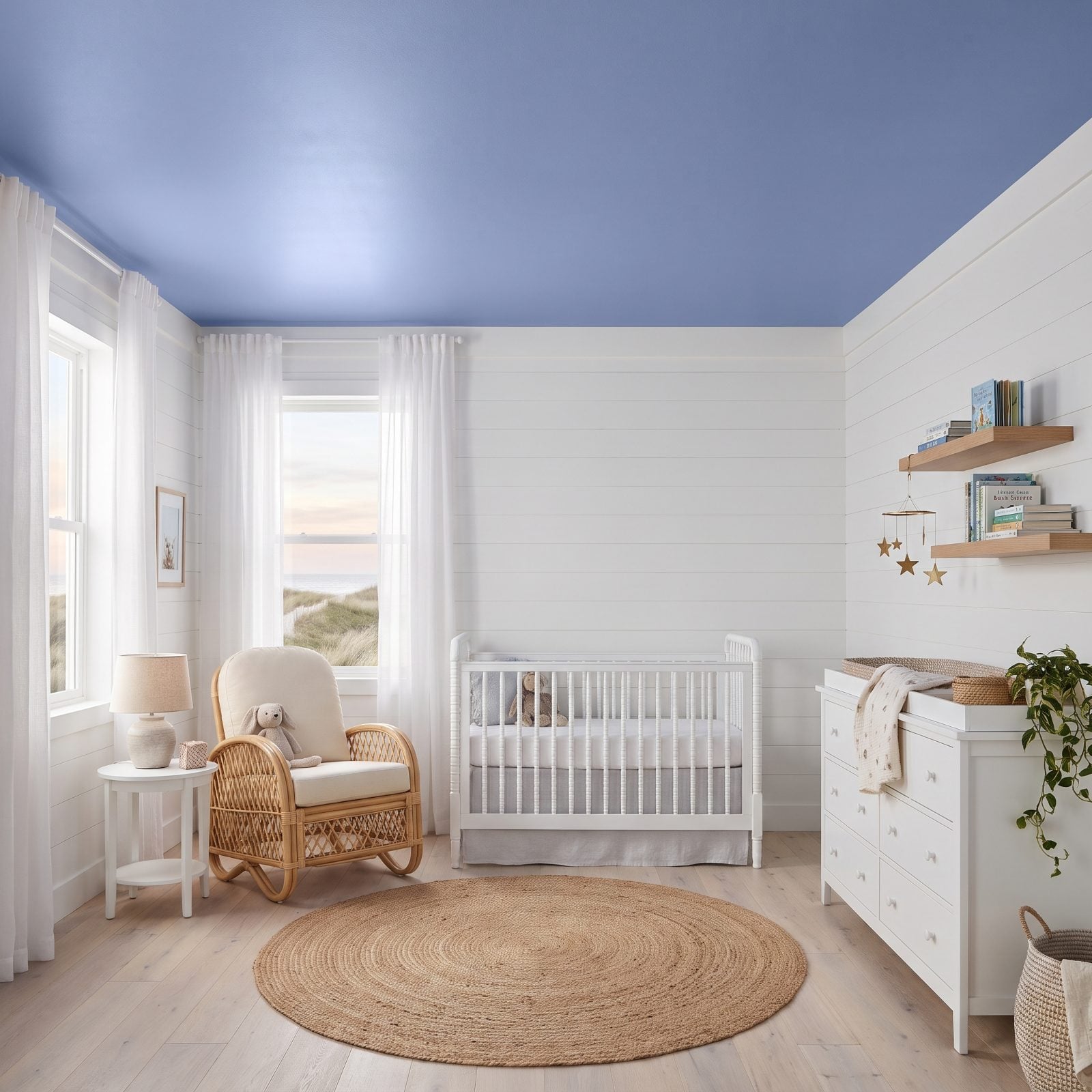
Painting a nursery ceiling the color of early morning sky is one of those ideas that sounds twee until you see it done right. Periwinkle lands between blue and lavender, calm without tipping into either baby-boy blue or sugary lilac.
Looking up from a crib, that’s the whole world. A soft sky overhead beats a flat white rectangle every time. The cream walls and natural rattan glider keep the room grounded so the ceiling gets to float.
24. A Mustard Ceiling Adds Vintage Warmth to a Midcentury Office
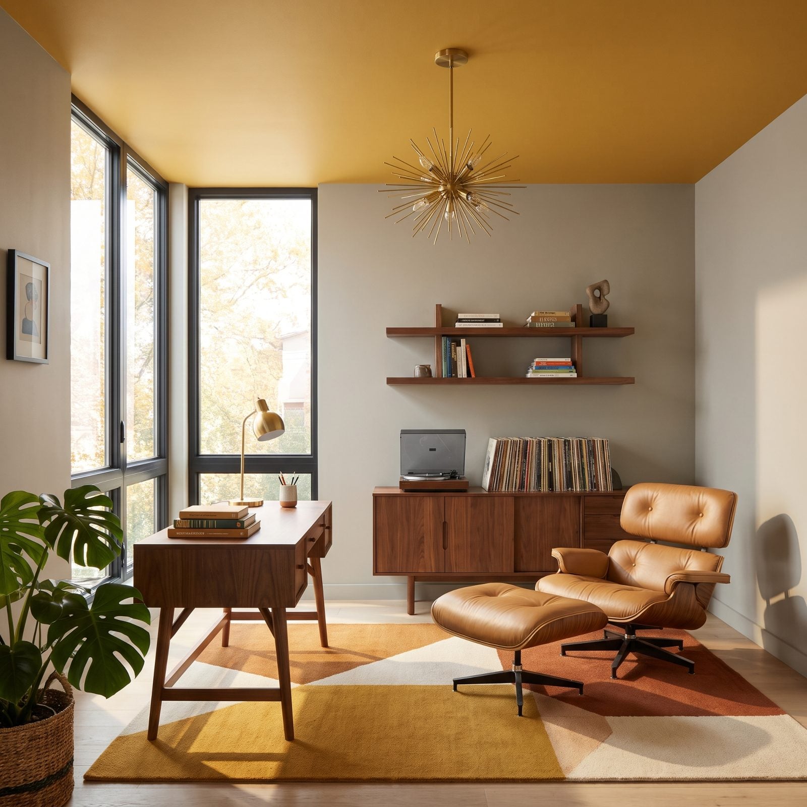
Mustard is a commitment. Put it on the walls and the room shouts. Put it on the ceiling and it hums instead, giving you all that vintage warmth without the room closing in on you.
Spirit-wise it’s a cousin to this contemporary game room, but tuned for focus rather than fun. The putty-grey walls keep things calm, the walnut credenza and sputnik brass pendant handle the midcentury credentials, and the ceiling adds the one note of personality. A room that wants you to stay and actually finish something.
23. A Seafoam Ceiling Refreshes a White Coastal Bathroom
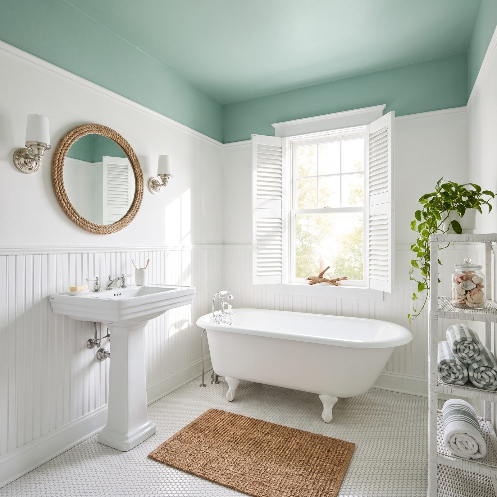
An all-white coastal bathroom is clean and also a bit of a blank. The seafoam ceiling fixes that without touching the breezy, bright thing that made you want white in the first place.
Seafoam reads as water and sea glass, so it belongs here instantly. Kept matte and soft, it lifts the whole room a few degrees cooler and a few degrees calmer. The polished nickel and penny-round tile stay the stars — the ceiling just tells you which beach you’re at.
22. A Golden-Ochre Ceiling Warms a Desert-Inspired Great Room

That vaulted ceiling could have swallowed the room whole. White plaster up there would have read as empty air. Golden ochre fills the volume with warmth and makes the height feel like generosity instead of distance.
The ochre pulls directly from the desert outside — sandstone, late sun, baked clay. The travertine table and terracotta floor echo it, so the room feels like it grew out of the ground it sits on.
21. A Celadon Ceiling Completes a Tranquil Spa Bathroom
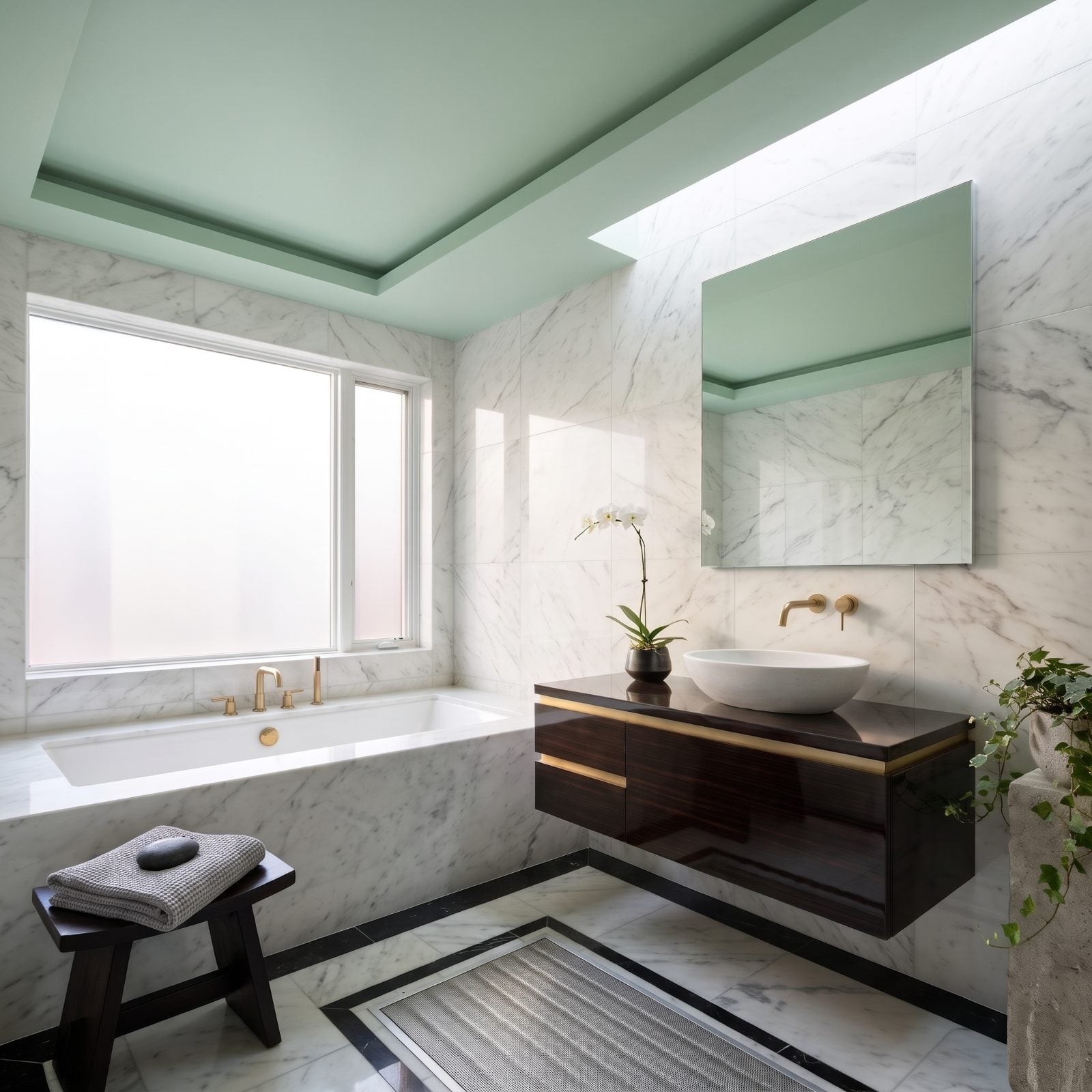
Celadon is the quietest color on this whole list, and that’s the point. A stone spa bathroom is already all hushed marble and dark wood, so you don’t want a ceiling that talks. You want one that exhales.
The low-sheen finish matters. Too glossy and it would break the calm. At eggshell, the celadon barely registers as color and reads instead like a kind of soft daylight that happens to be green — the difference between a room that’s quiet and a room that’s actually restful.
20. A Cherry-Red Ceiling Adds Surprise to a Black-and-White Foyer
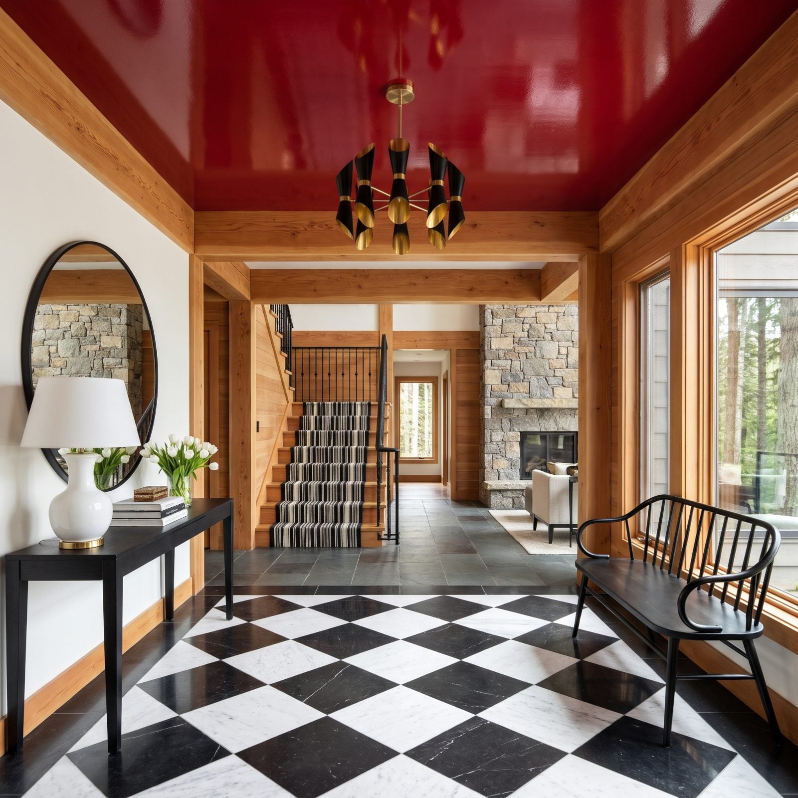
Black and white is safe — classic, graphic, hard to mess up. The cherry-red ceiling is the part that makes you remember the house.
Lacquer is why it works. A flat red ceiling over a monochrome foyer would feel like a mistake, while a high-gloss one feels like a decision. It catches the chandelier, bounces the daylight, and delivers the surprise exactly where no one looks until they’re already inside. First impression, made.
19. A Cinnamon Ceiling Makes a Basement Lounge Feel Cozy
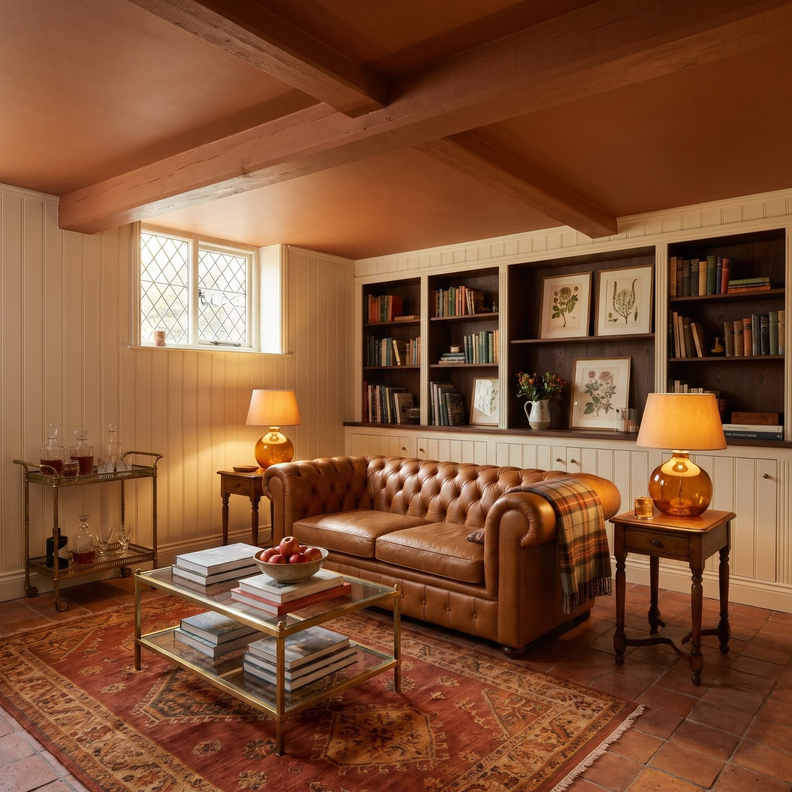
That cinnamon ceiling is the whole trick here. Basements fight low light and lower ceilings, and most people respond by painting everything pale to fake some height. Wrong instinct. A warm reddish-brown overhead quits pretending the room is bigger than it is and leans into the snugness instead.
The color pulls your eye down and makes the space feel held rather than cramped. Paired with the caramel leather chesterfield sofa and amber lamplight, the whole room reads like the inside of a well-aged whiskey.
18. A Marine-Blue Ceiling Emphasizes Coffers in a Formal Living Room
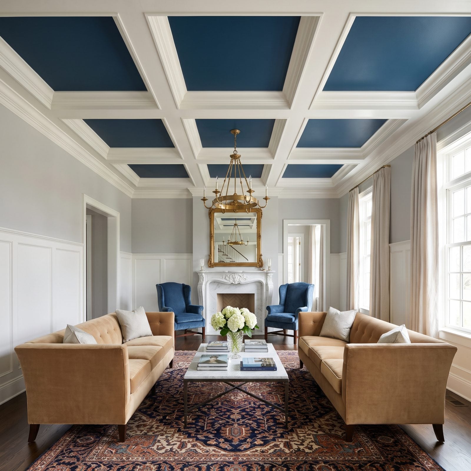
A flat white coffered ceiling is a wasted ceiling. Paint the recessed panels marine blue, leave the beams white, and suddenly all that millwork has somewhere to go. The contrast does the work your eye was already hunting for.
The blue inside each coffer reads like a grid of small night skies while the white beams hold everything crisp, giving the camel sofas and the blue velvet wingback chairs a reason to talk to each other. Formal rooms tip into stiff all the time. A confident ceiling color keeps this one from feeling like a museum where you aren’t allowed to sit down.
17. A Pale Lemon Ceiling Lifts a Cottage Breakfast Room
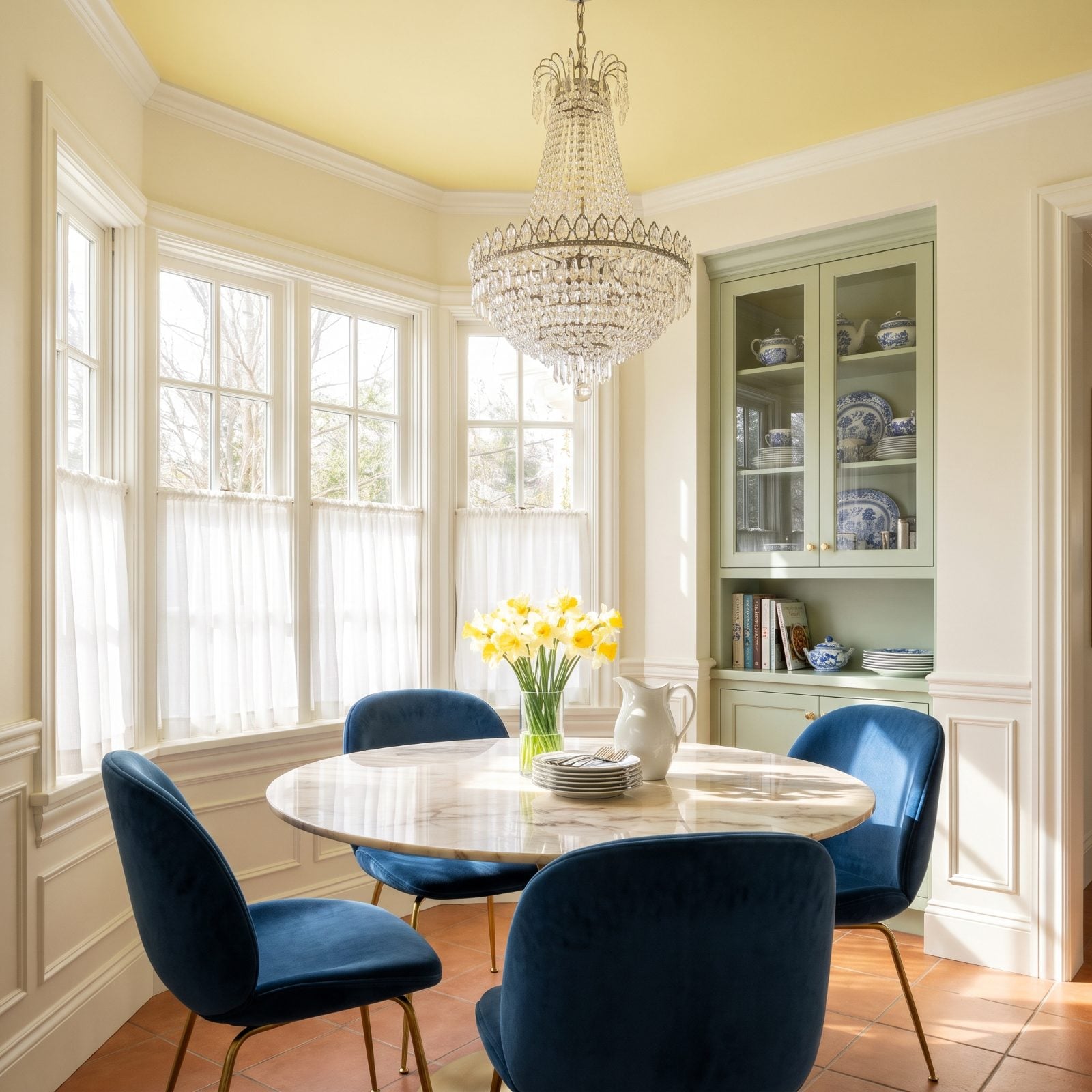
Pale lemon on a breakfast room ceiling is about as close as you’ll get to bottling morning light. It works by amplifying the real sunlight pouring through those multi-pane windows instead of competing with it.
Color psychology earns its keep here. Yellow nudges you toward alertness and a better mood, which is exactly what you need at 7am before coffee has done anything. Keep it pale so it reads as a glow and not a highlighter.
16. An Aubergine Ceiling Elevates a Jewel-Toned Guest Room
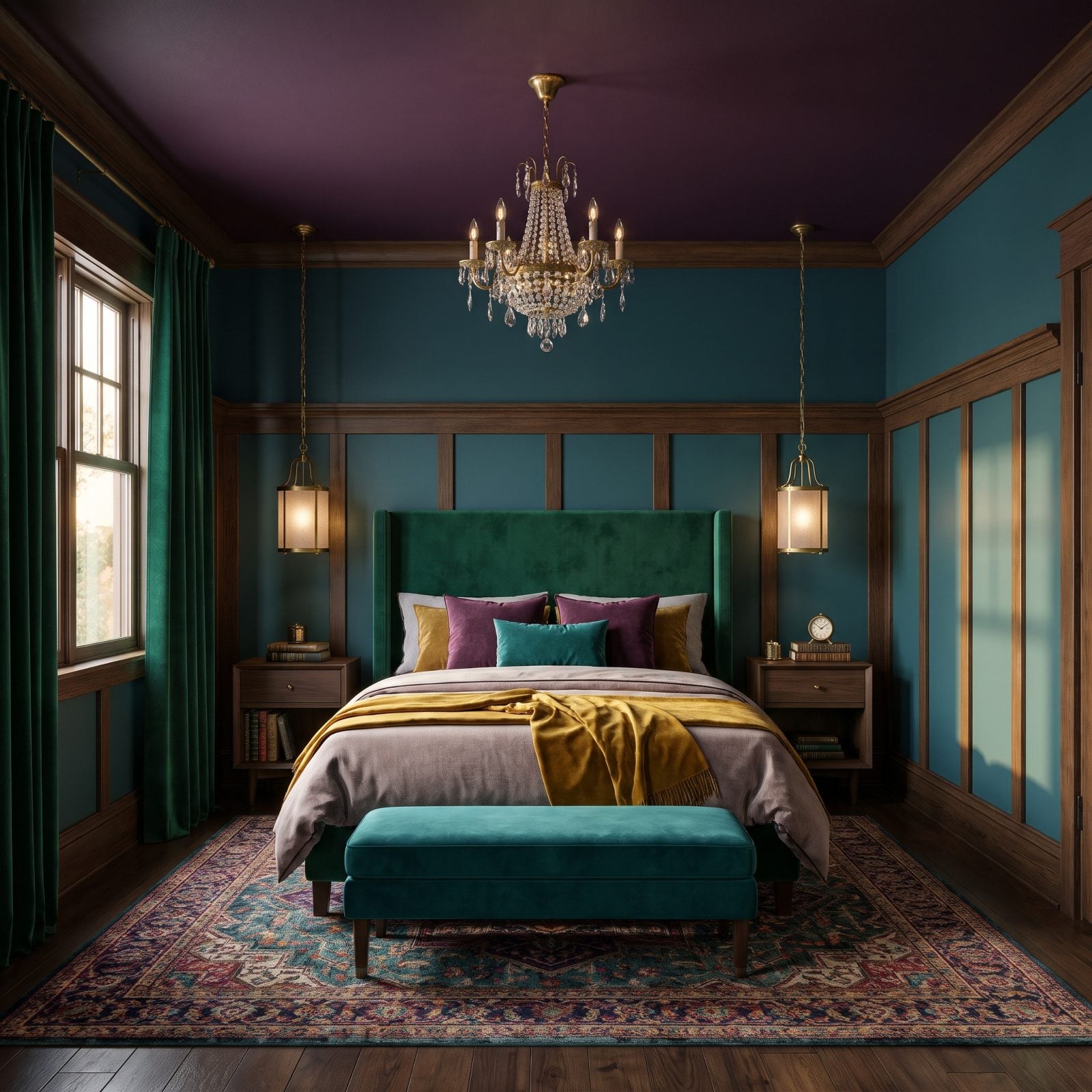
Most guest rooms inherit the leftover furniture and a safe beige. This one went the other way entirely. The aubergine ceiling turns the whole space into a jewel box, and against the teal walls and emerald velvet headboard it comes off as deliberate rather than dim.
Deep colors overhead make the ceiling vanish at night, and oddly enough that makes the room feel more restful. No hard white plane staring back when you can’t sleep. The brass pendant lights glint like jewelry against all that purple.
15. A Moss-Green Ceiling Blends a Screened Porch Into the Landscape
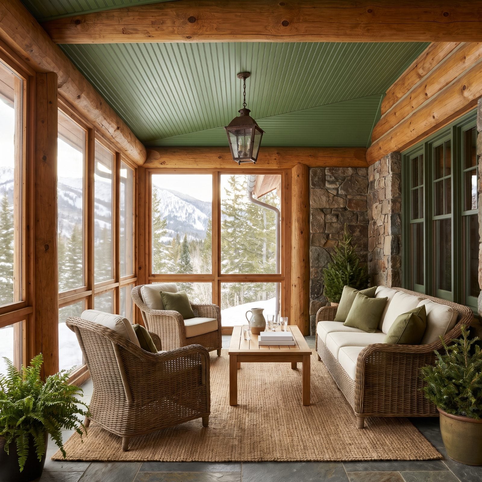
That moss-green ceiling is quietly doing the most important job on the porch. It picks up the exact green of the trees through the screens, and your eye stops registering where the porch ends and the yard begins.
This is biophilia used on purpose. We relax harder in spaces that feel tied to nature, and a green overhead tricks the brain into reading the whole porch as part of the garden. The wicker and bluestone keep it grounded in reality.
14. A Blue-Violet Ceiling Turns a Music Room Into a Creative Retreat
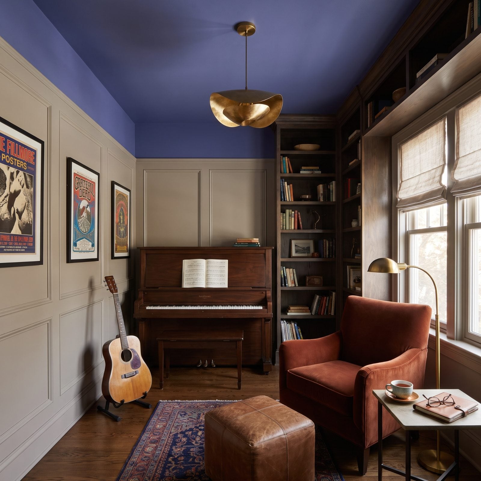
Creative spaces want a ceiling that gets out of your head’s way. Blue-violet overhead does exactly that, calming without being sleepy, reflective without feeling heavy. It’s the color of the hour right after sunset, when the ideas actually show up.
Against the warm greige walls, the periwinkle-indigo never goes cold. The rust velvet chair and the dark walnut piano anchor it with warmth, so the whole thing hums at a thinking frequency. Want the same idea in brighter keys? This blue craft room plays the creative-retreat card with more energy.
13. A Lagoon-Blue Ceiling Intensifies a White Mediterranean Bathroom
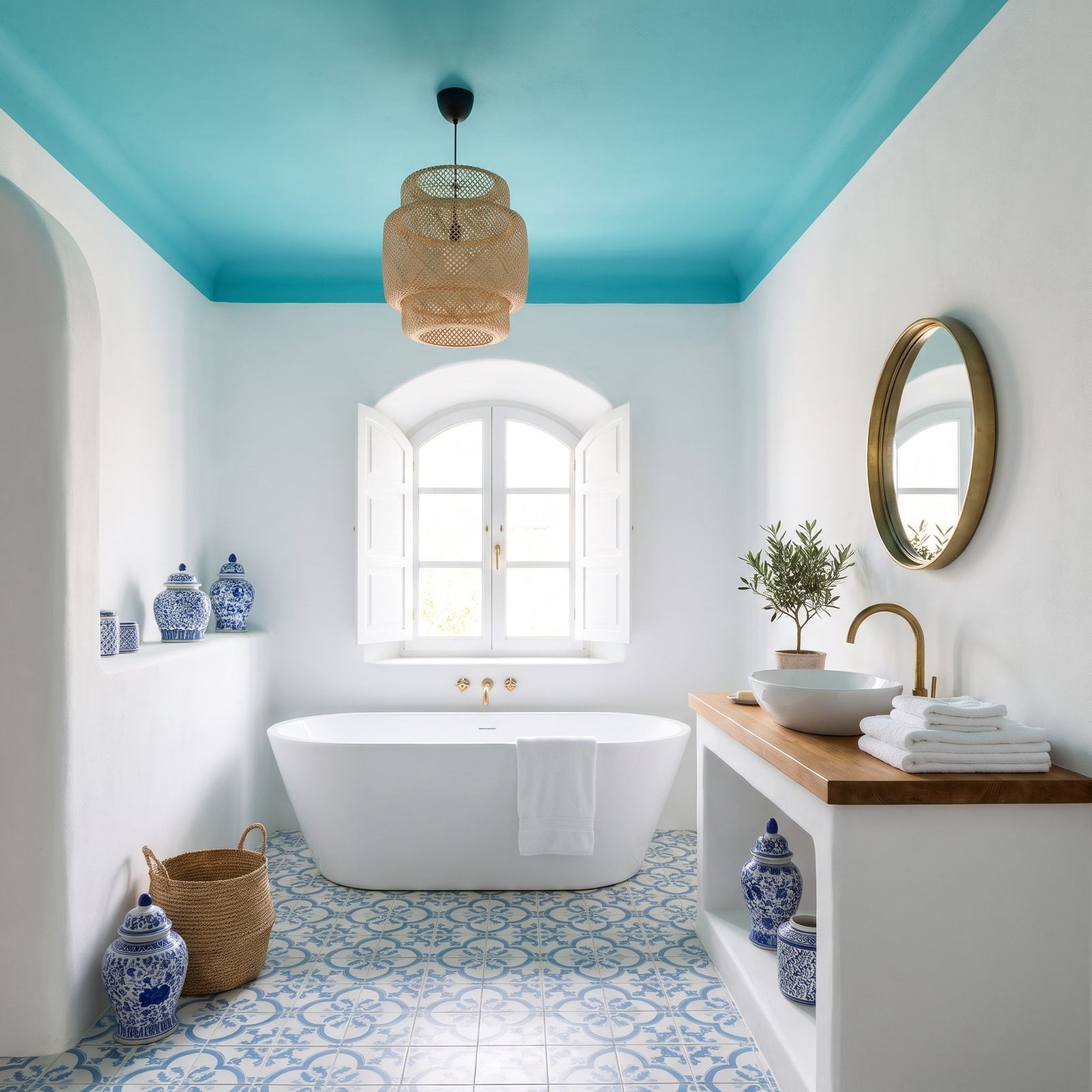
An all-white Mediterranean bathroom is lovely and slightly forgettable. Put lagoon blue on the ceiling and it gets a pulse. The aqua reads brighter than it actually is, because the white room all around it leaves your attention nowhere else to go.
That’s the contrast principle working overtime. Surround one saturated color with nothing but white and the color intensifies. Sea on a ceiling, basically, and the patterned cement floor quietly agrees from below.
12. A Persimmon Ceiling Brings Warmth to a Concrete-Floored Kitchen
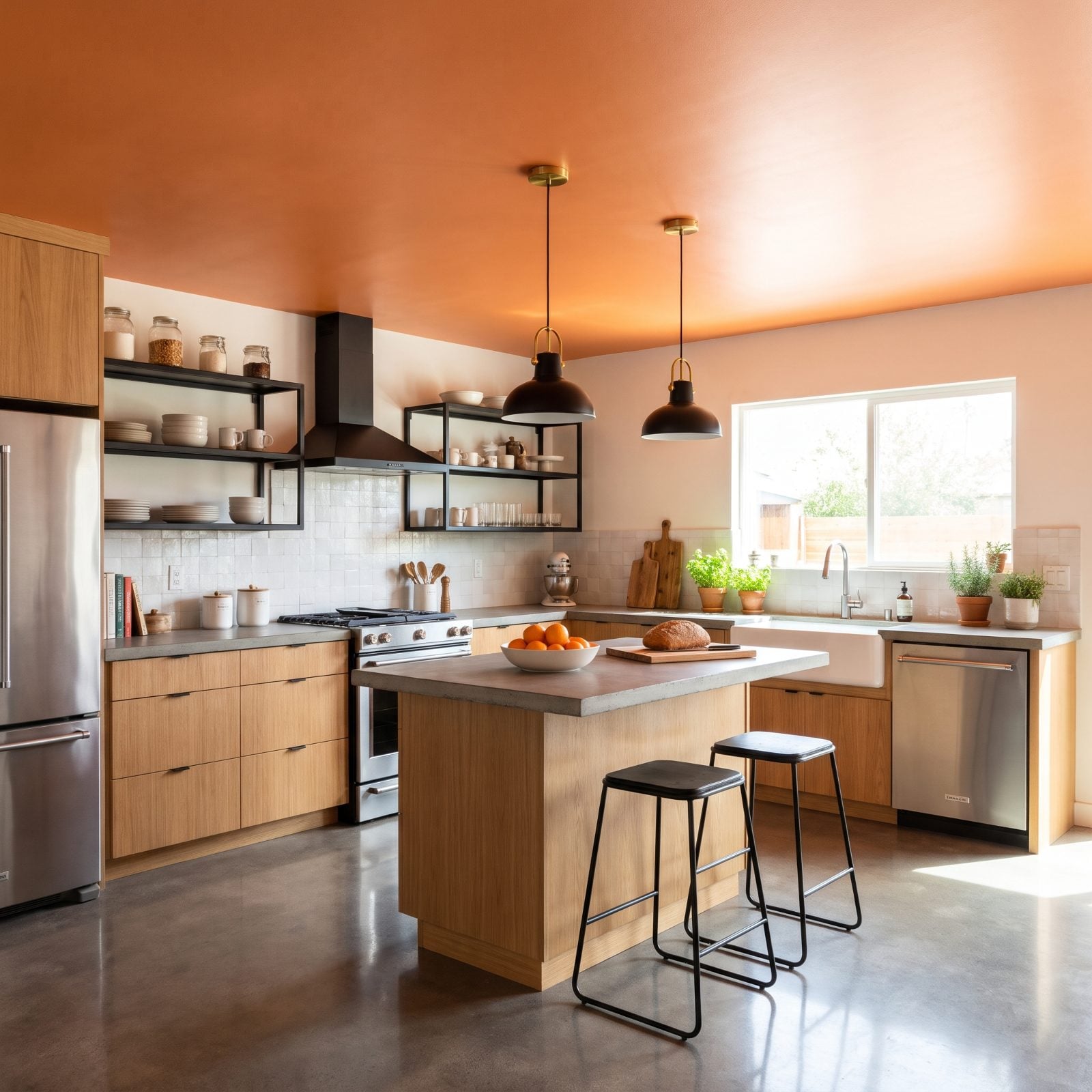
Concrete floors run cold, both literally and visually. The persimmon ceiling fixes both. All that warm orange overhead bounces light down onto the gray concrete and the stainless steel, and the kitchen stops feeling like a parking garage that happens to have a gas range.
Temperature contrast is the smart play here. Cool materials below, warm color above, and the room settles into balance. The oak cabinets and the zellige backsplash meet the persimmon halfway, so nothing’s straining for attention.
11. A Graphite Ceiling Hides Ductwork in a Finished Basement
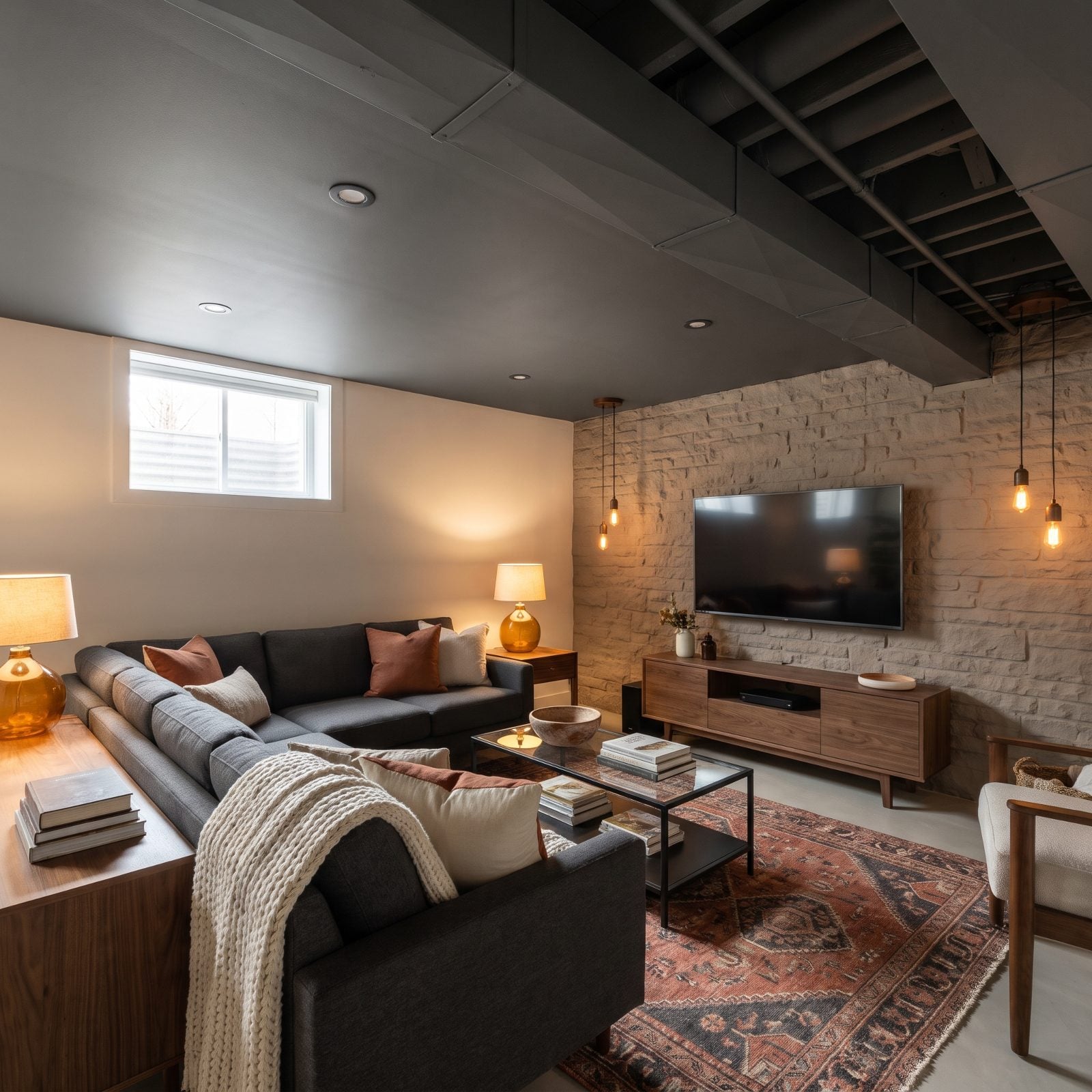
Exposed basement ductwork is the enemy of a finished basement. Here’s the move most people miss: don’t box it in. Paint the whole mess one dark color and let it disappear. Graphite over ducts, pipes, joists, and fixtures turns a jumble into a single flat shadow you stop noticing.
Dark ceilings read as deeper, so your eye doesn’t linger on how low the room actually sits. Add the warm taupe walls and amber lamplight and it goes from utility space to an industrial bonus room you’d actually want to hang out in. Spray paint beats a drop ceiling on price, and it looks ten times better.
10. A Sage-Green Ceiling Connects a Breakfast Nook to the Garden
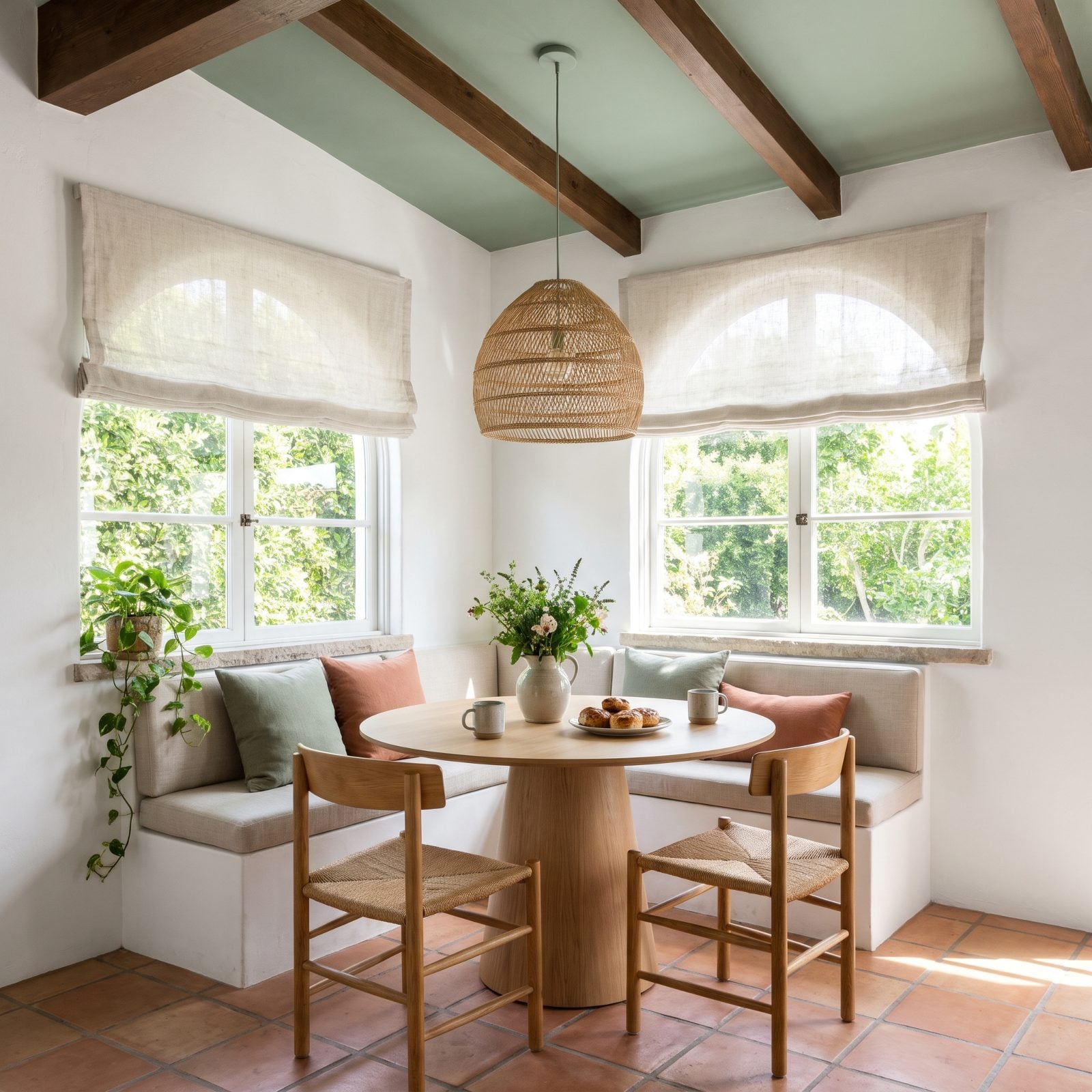
Sage green on a breakfast nook ceiling is about as quiet as a ceiling color gets. It doesn’t shout. It just agrees with the garden on the far side of the glass, so your morning coffee feels like it’s happening half outdoors.
Muted greens sit at the restful end of the spectrum, which is why this nook feels calm rather than busy. The linen banquette and rush-seat chairs stay deliberately low-key, letting the sage ceiling and the real greenery outside carry the room. If there’s one ceiling color I’d hand a nervous first-timer, it’s this one. Sage forgives everything.
9. A Midnight-Purple Ceiling Creates a Celestial Game Room
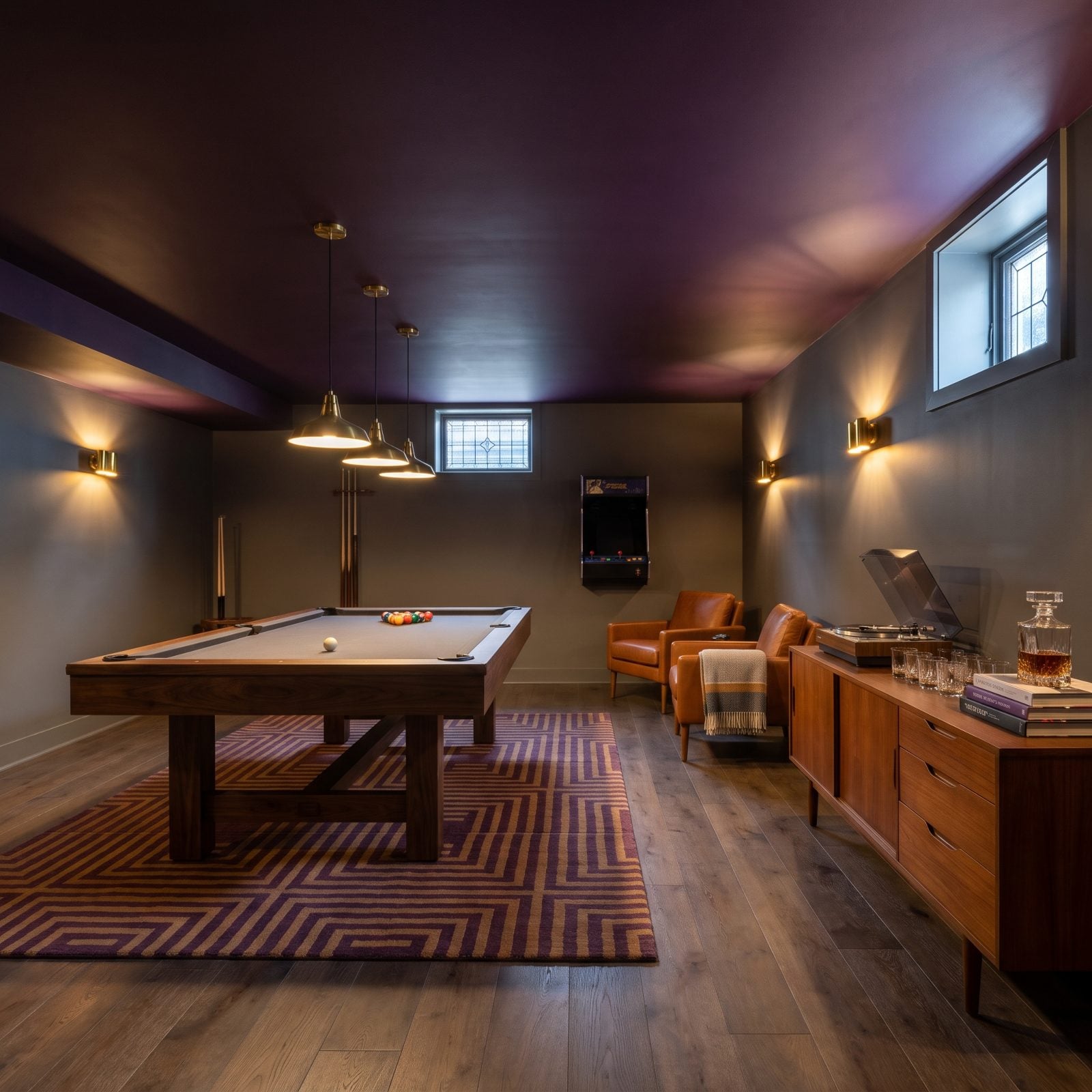
Midnight purple is darker and stranger than navy, and that’s exactly why it works over a game room. Navy says nautical. Black says home theater. Midnight purple says night sky, the deep part of it, well past dusk. That’s the right mood for a room built around late hands of cards and board games that run long.
Add a scatter of tiny star lights or a hand-painted constellation and the ceiling stops being a ceiling. Keep the stars sparse and small so it reads as sky rather than novelty. Low pendant lighting over the table keeps the play area bright while the edges of the room fall away into the dark overhead. That’s what makes it feel like you’re playing outside under an open night.
8. A Champagne-Gold Ceiling Gives a Dining Room Candlelit Warmth
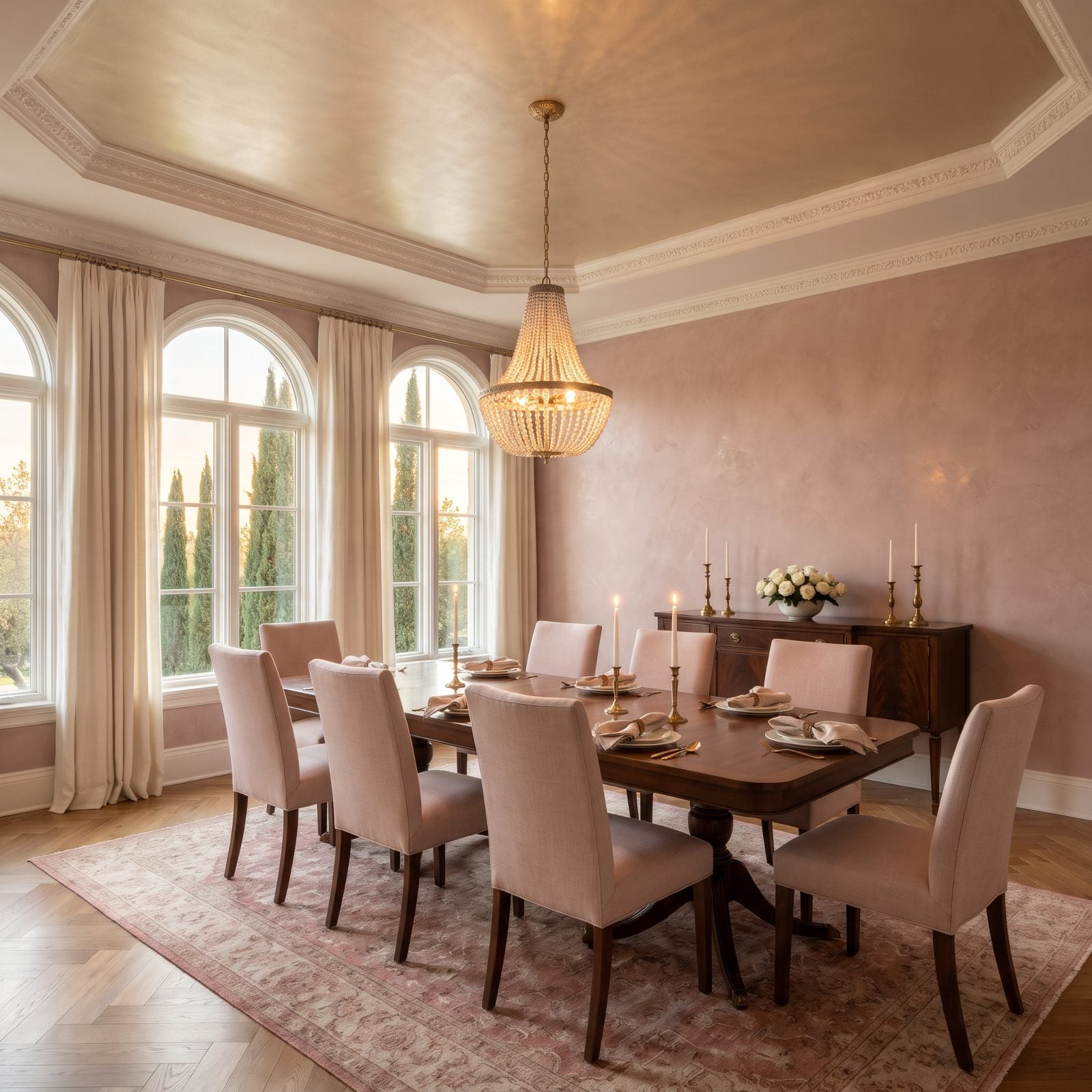
That ceiling is doing something sneaky. Champagne-gold in a soft metallic sheen catches every flicker of the chandelier and throws it right back down, so the whole room sits in a permanent golden hour. Paint it white above a dining table and the light dies up there. Paint it warm metallic and the glow comes home to you.
The dusty-rose walls keep it from tipping into brassy territory. Rose and gold are old friends, and here they let the crystal chandelier and the polished walnut table carry the drama without shouting about it.
7. A Soft Robin’s-Egg Ceiling Revives a Vintage Attic Bedroom
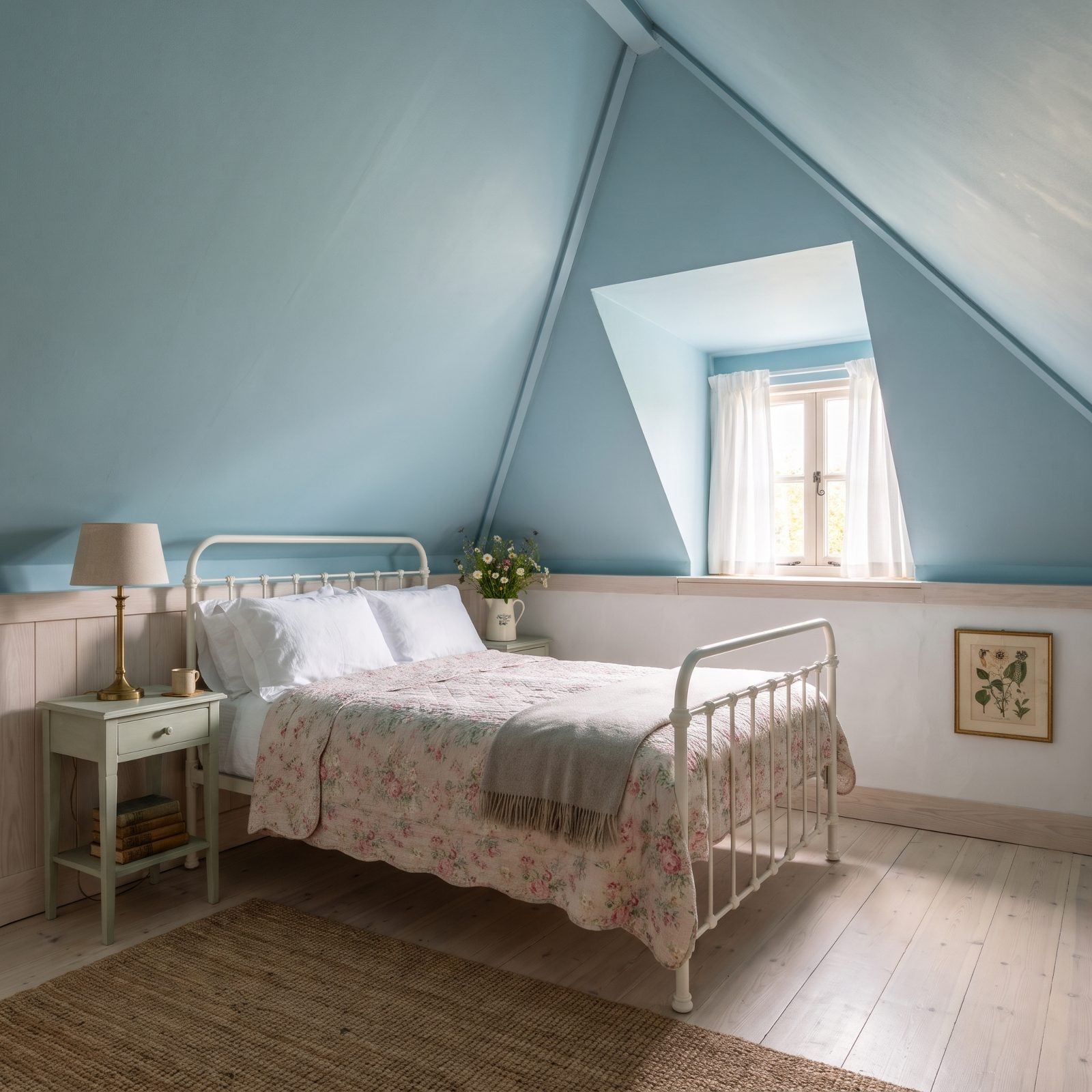
Sloped attic ceilings usually feel like they’re pressing down on you. Paint them robin’s-egg blue and the whole thing lifts, as if someone swapped the roof for open sky, and the angles stop feeling cramped and start feeling like a nest.
Everything else stays quiet on purpose. Creamy white walls, a vintage iron bed, a faded floral quilt. The blue above does all the talking.
6. A Deep Maroon Ceiling Adds Clubby Warmth to a Billiards Room
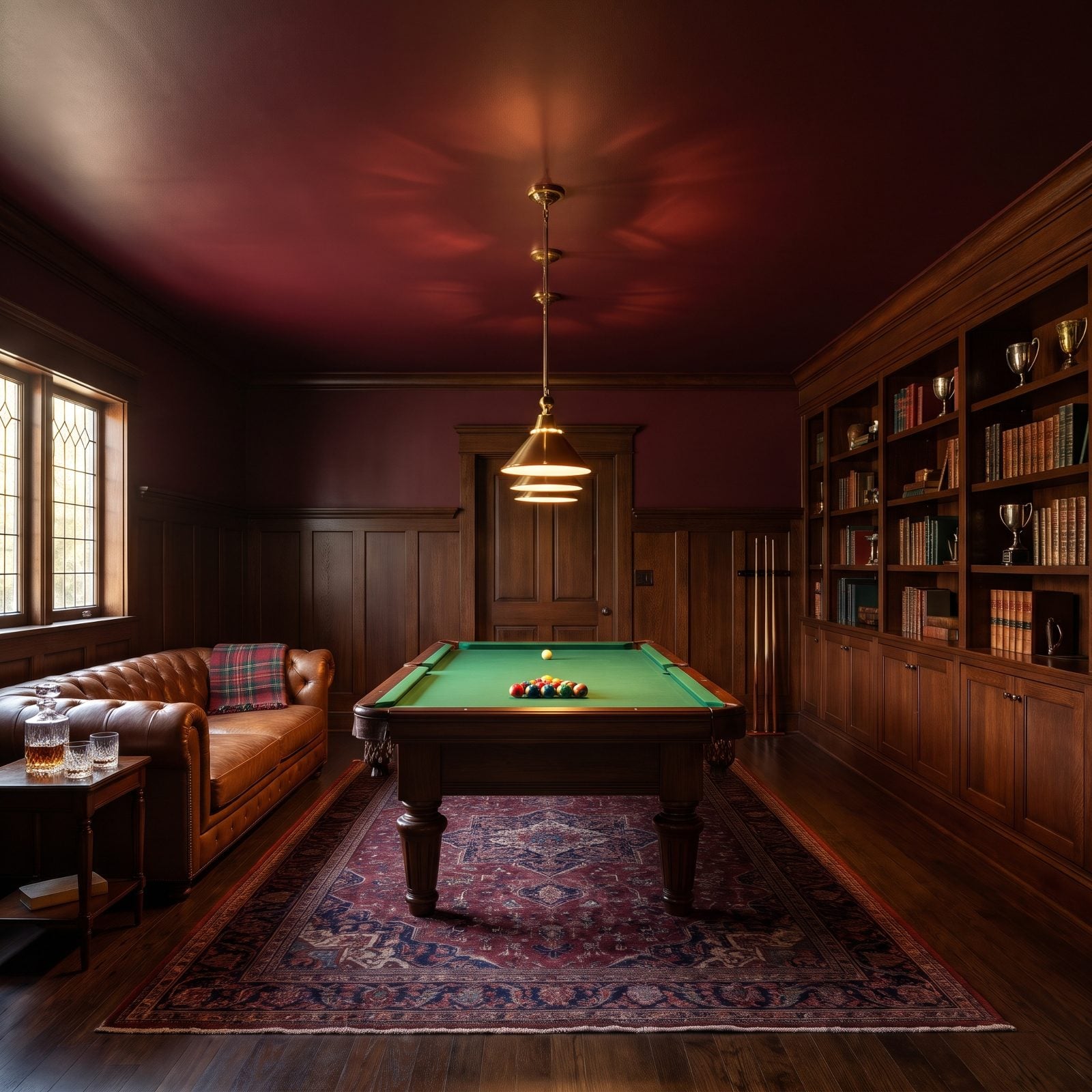
A billiards room should feel like a private club, all leather and wood and low light. A white ceiling undercuts that instantly because it’s too bright, too modern, and too much like a rec room. Deep maroon pulls the ceiling down into the mood and makes the whole space feel like a place you’d stay for one more game.
It also does the table a favor. Red and green sit opposite each other on the color wheel, so the maroon overhead makes the green felt look richer, and the felt makes the maroon look deeper. Keep the finish low-sheen so the pendant above the table doesn’t throw glare back at the players. Let dark wood paneling or tobacco-brown leather fill in the rest.
5. A Turquoise Ceiling Brings Resort Energy to a Pool House
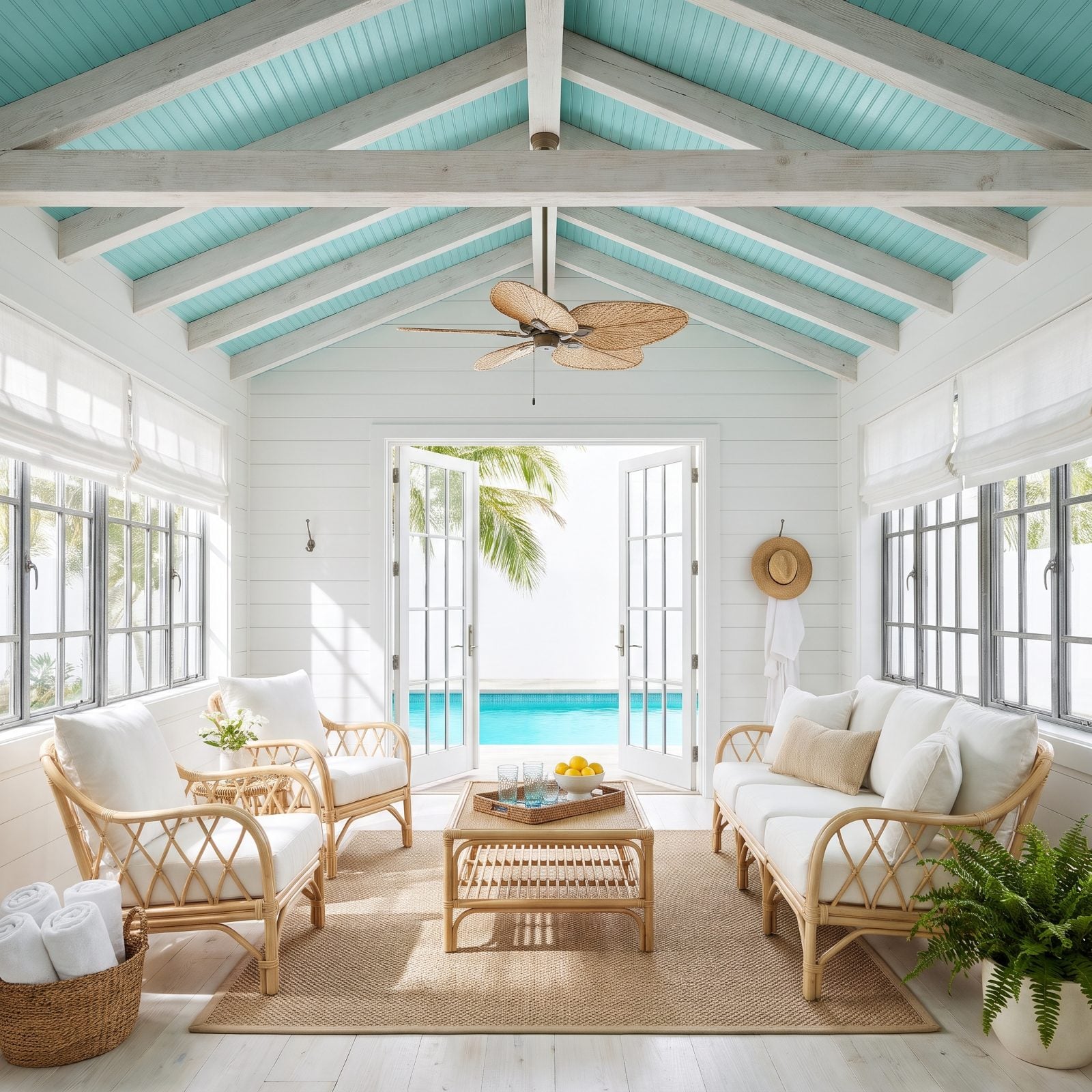
Walk into a pool house with a turquoise ceiling and your shoulders drop two inches. That exact blue-green is the color of water sitting in shade, and painting it overhead fools you into feeling like you’re already in the pool before you’ve touched it.
White shiplap and pale rattan keep everything breezy, so the turquoise gets to be the star with nothing else elbowing for attention. And if you’ve only ever imagined a blue bathroom as a wall color, well, the ceiling is the move you’ve been missing.
4. A Fern-Green Ceiling Brings Botanical Calm to a Home Gym
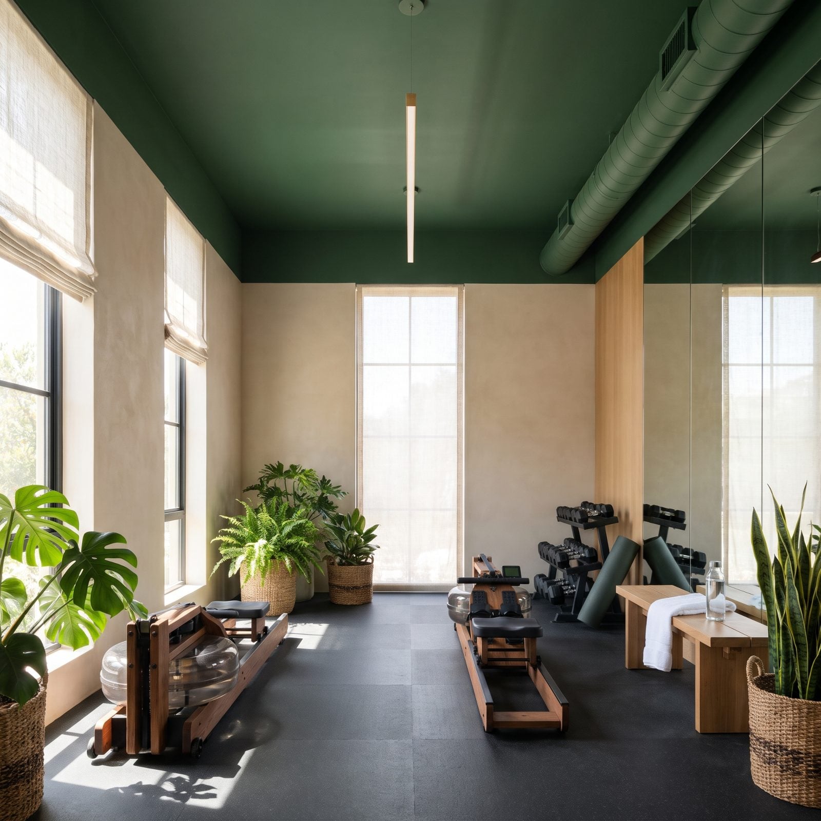
Nobody paints a gym ceiling. That’s exactly why this one works. Fern green overhead turns a room full of rubber flooring and chrome into something closer to a greenhouse, and suddenly a workout feels less like a chore and more like a stroll through a park.
The green plays off warm wood accents and a wall of mirrors, so the color multiplies and the room breathes. I’d take this over the usual gray cave any day of the week.
3. A Pale Turquoise Ceiling Highlights a Barrel-Vaulted Corridor
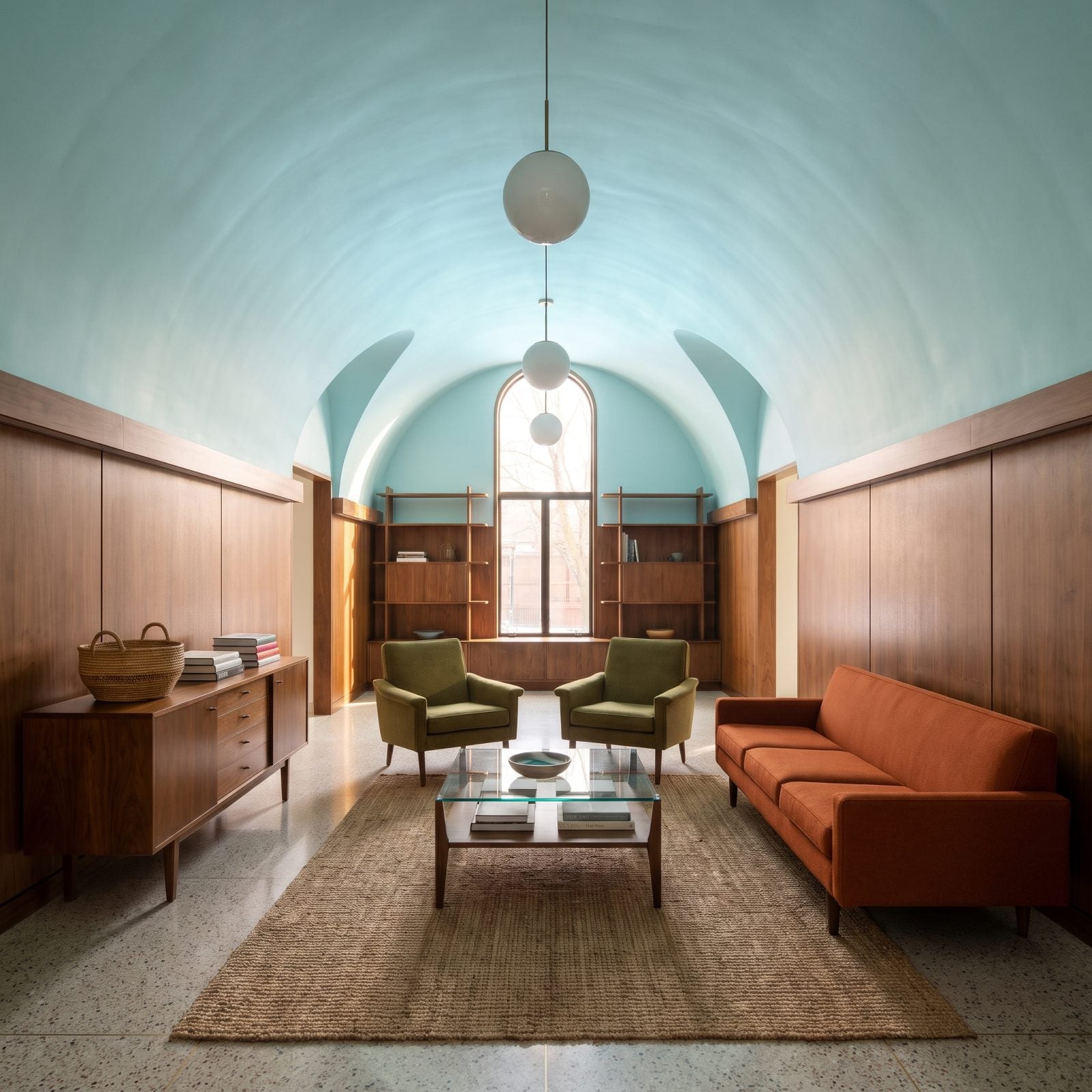
That barrel vault was always the most interesting thing about this hallway. Pale turquoise makes sure nobody misses it. The curve catches light differently at every point along its arc, so the color drifts from near-white at the crown to deeper teal where the shadows pool.
Most hallways are places you rush through. This one asks you to look up.
2. A Burnt-Orange Ceiling Defines a 1970s-Inspired Conversation Pit
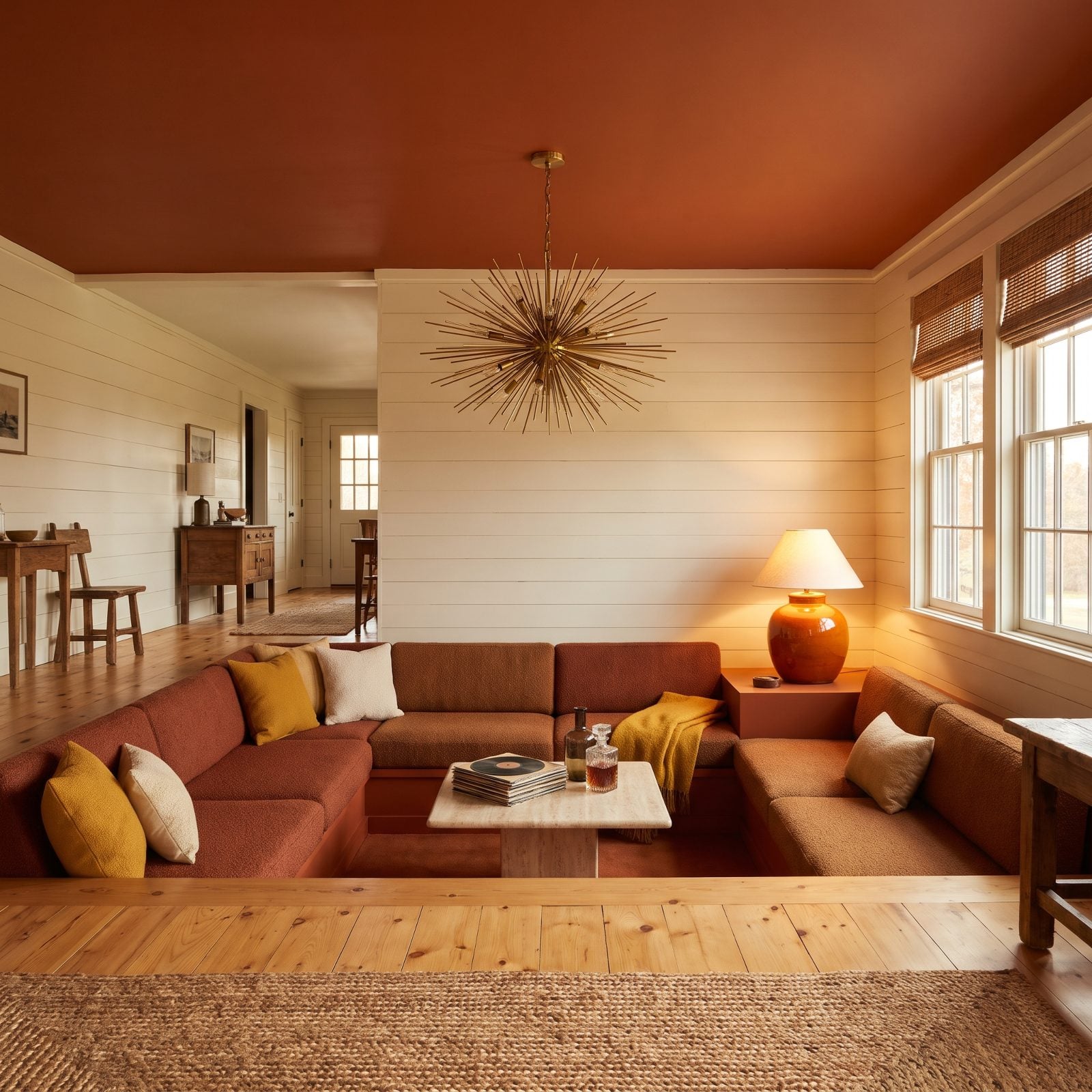
A conversation pit is already a bold move, and a burnt-orange ceiling above it is the exclamation point. The warm terracotta tone hangs over the sunken seating like a sunset you can’t climb above, pulling you down into the whole scene.
Everything in that pit is low, soft, and wrapped in texture: a sectional in rust bouclé, shag underfoot, a chunky ceramic lamp. No glam family room here. This is pure retro swagger, held just shy of too much.
1. A Vermilion Ceiling Electrifies a Contemporary Art Gallery Hall
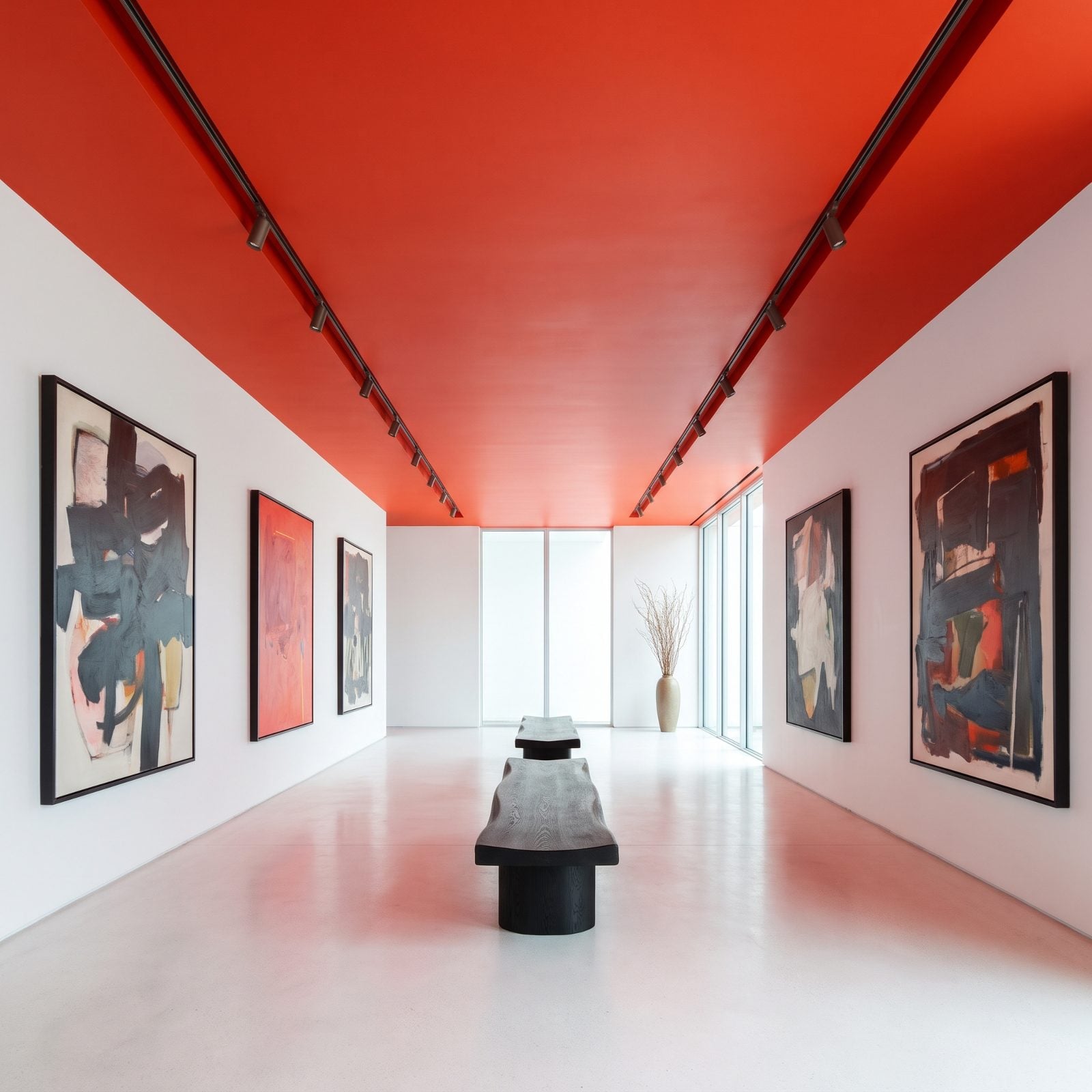
White walls, white everything, and then that vermilion ceiling hits like a slap of pure energy. In a hall built to show off art, the ceiling becomes the one piece that never gets swapped out.
Restraint is what makes it land. Walls stay gallery-white so the paintings read clean, while the saturated red-orange overhead charges the air without ever touching the work. You feel the voltage before you can name where it’s coming from. There’s a reason you don’t look up until, finally, you do.