You’ve spent years arranging, decorating, and adjusting your home to feel like you. But the moment a trained designer walks through your front door, something happens that you never planned for: they start reading you. Not your walls, not your furniture, you. The threshold, the smell, the gap between your sofa and the wall, the bulb temperature in your overhead fixture, these aren’t just aesthetic choices. They’re a psychological portrait, assembled in seconds, without a single question asked.
Interior designers develop a kind of perceptual fluency that most people never realize exists. Here’s exactly what they’re seeing, sensing, and silently diagnosing, before they’ve even taken off their coat.
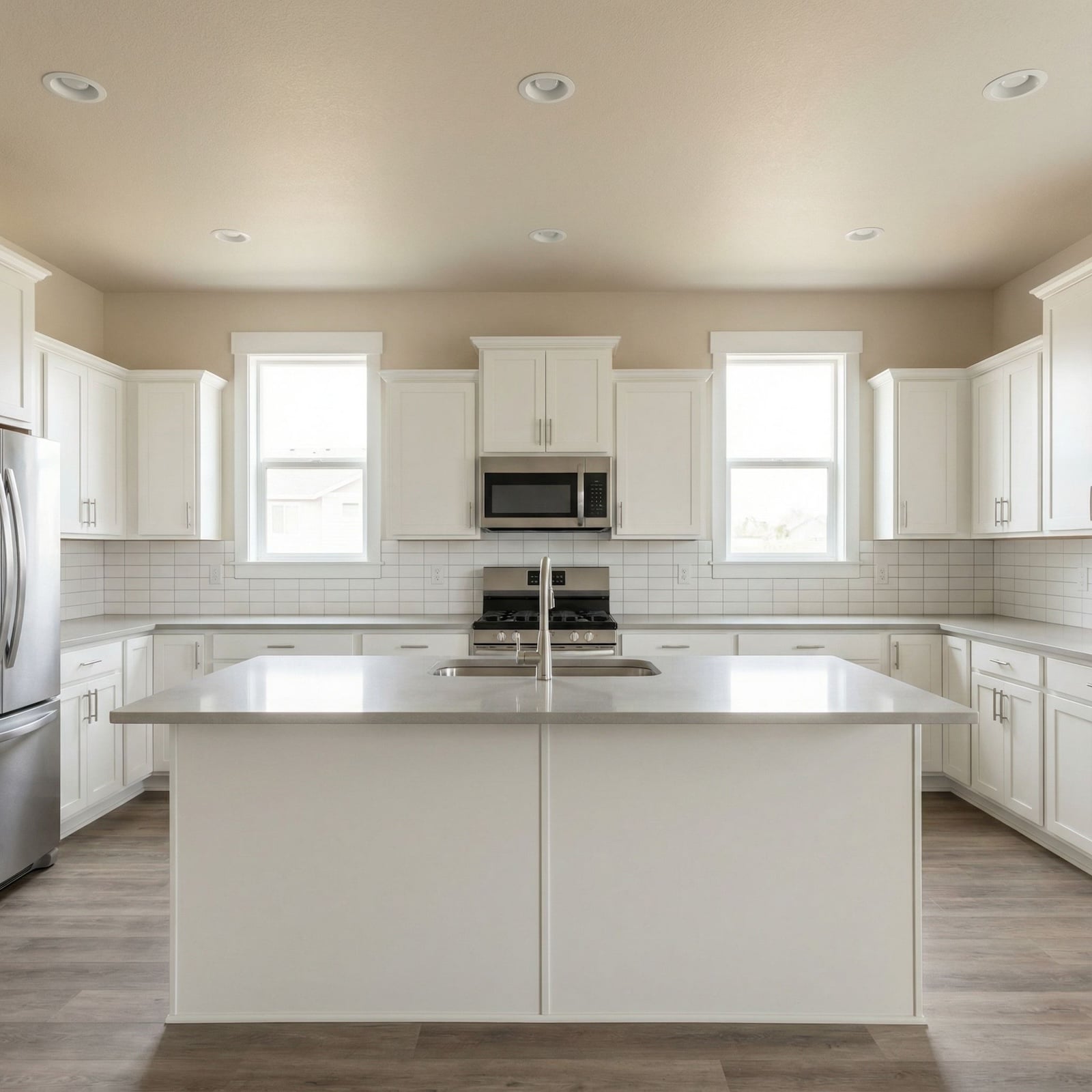
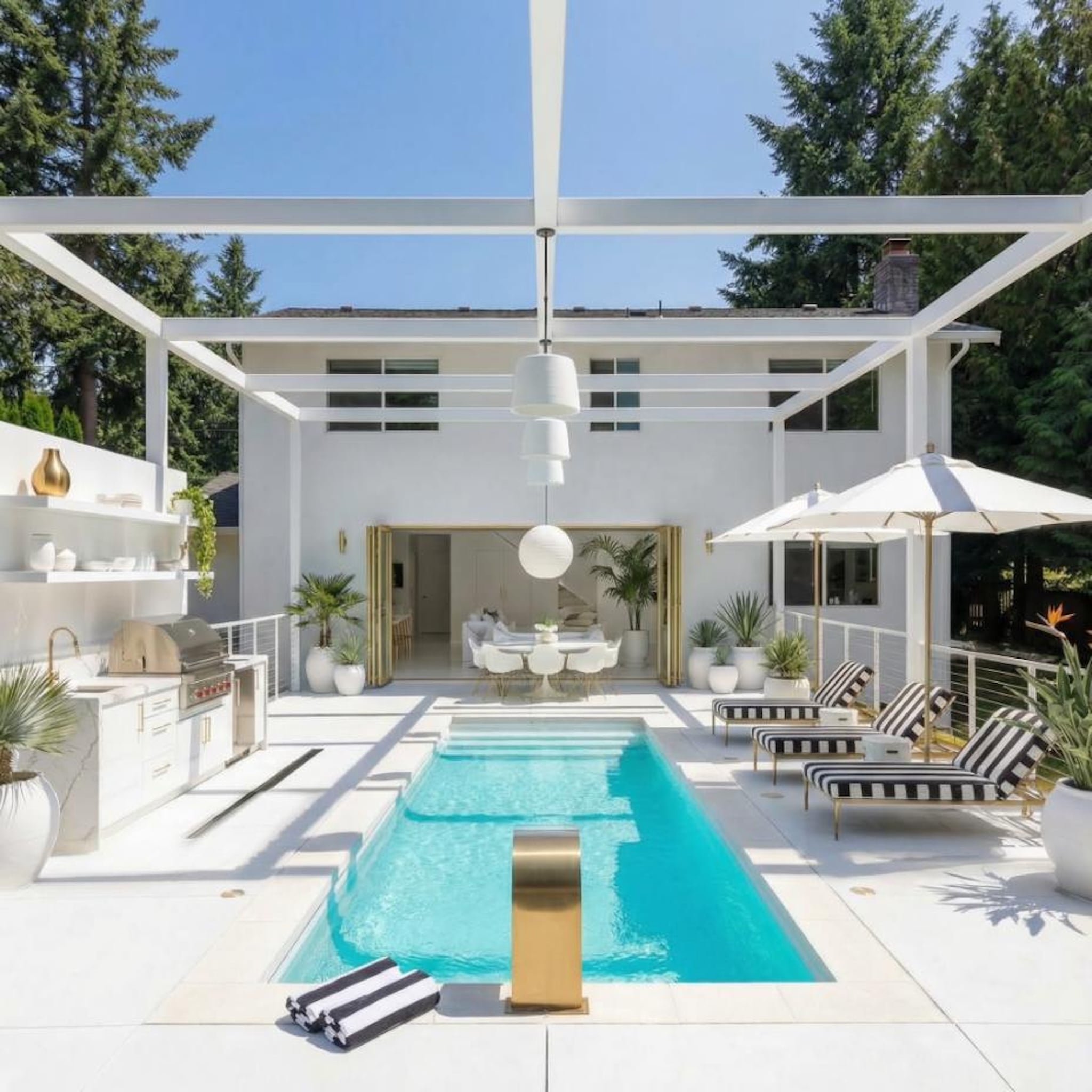
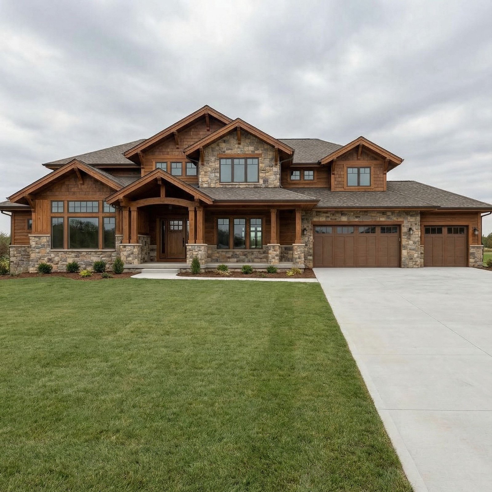
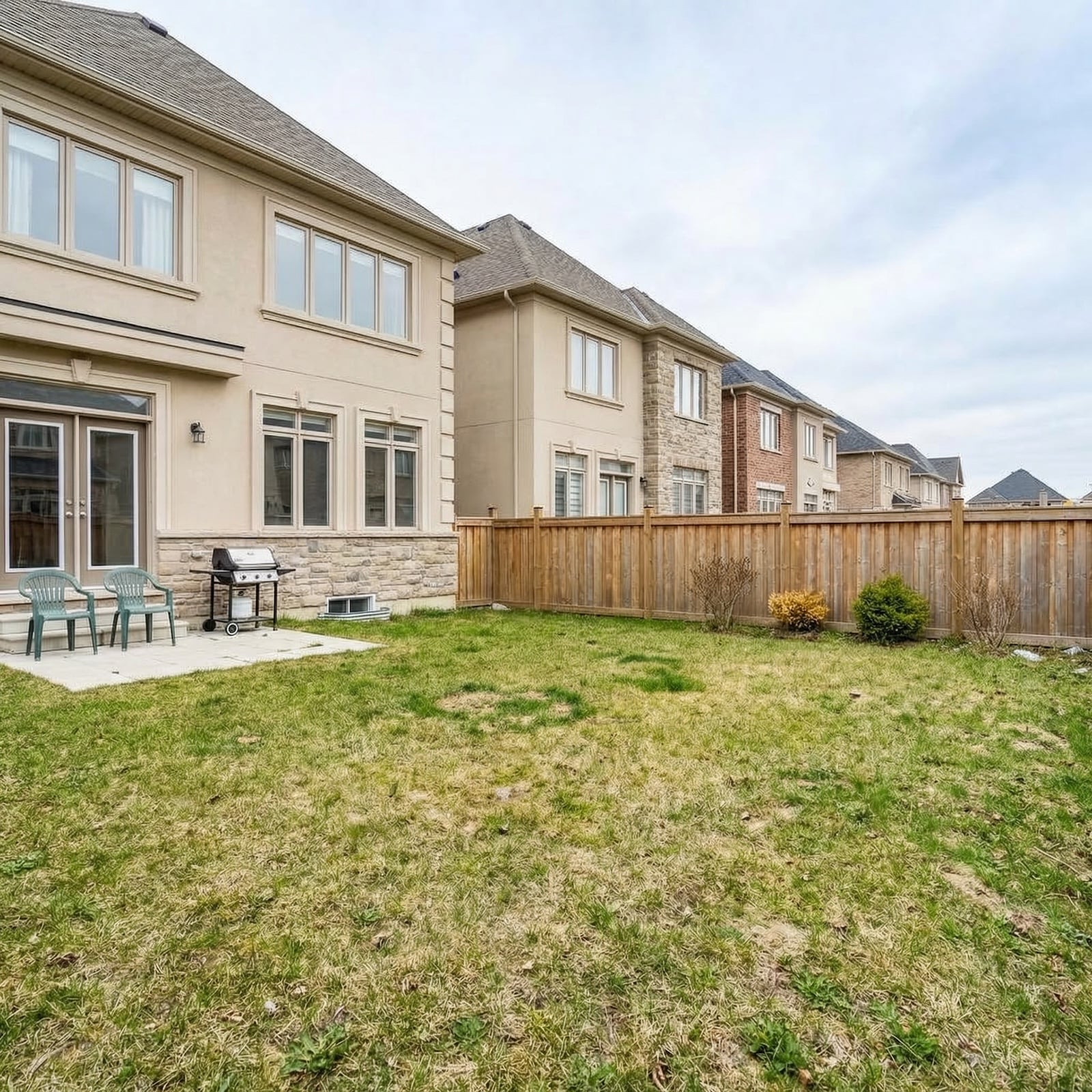
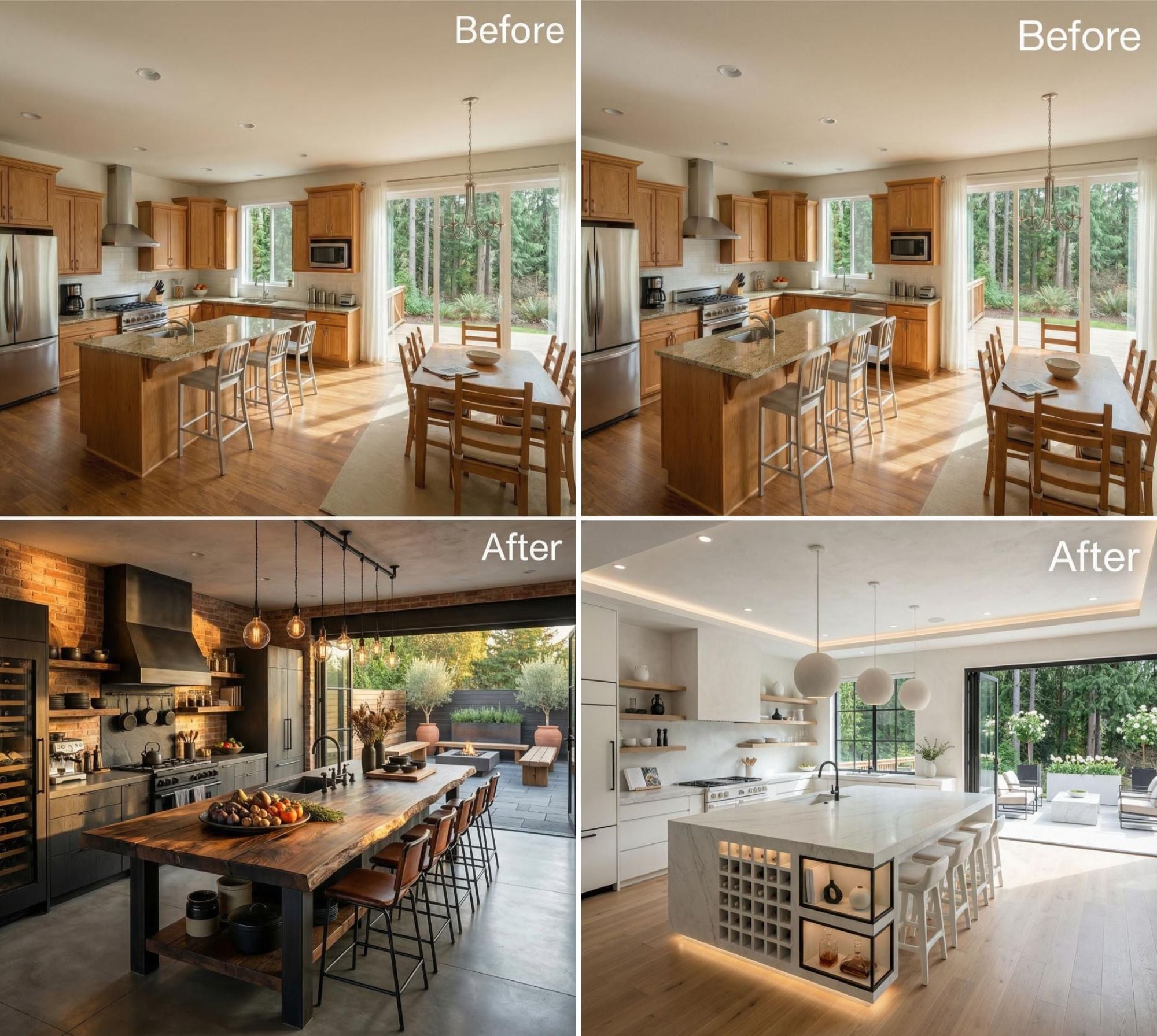
In order to come up with the very specific design ideas, we create most designs with the assistance of state-of-the-art AI interior design software.
The Invisible Threshold Effect That Tells a Designer Everything About Your Relationship With Control
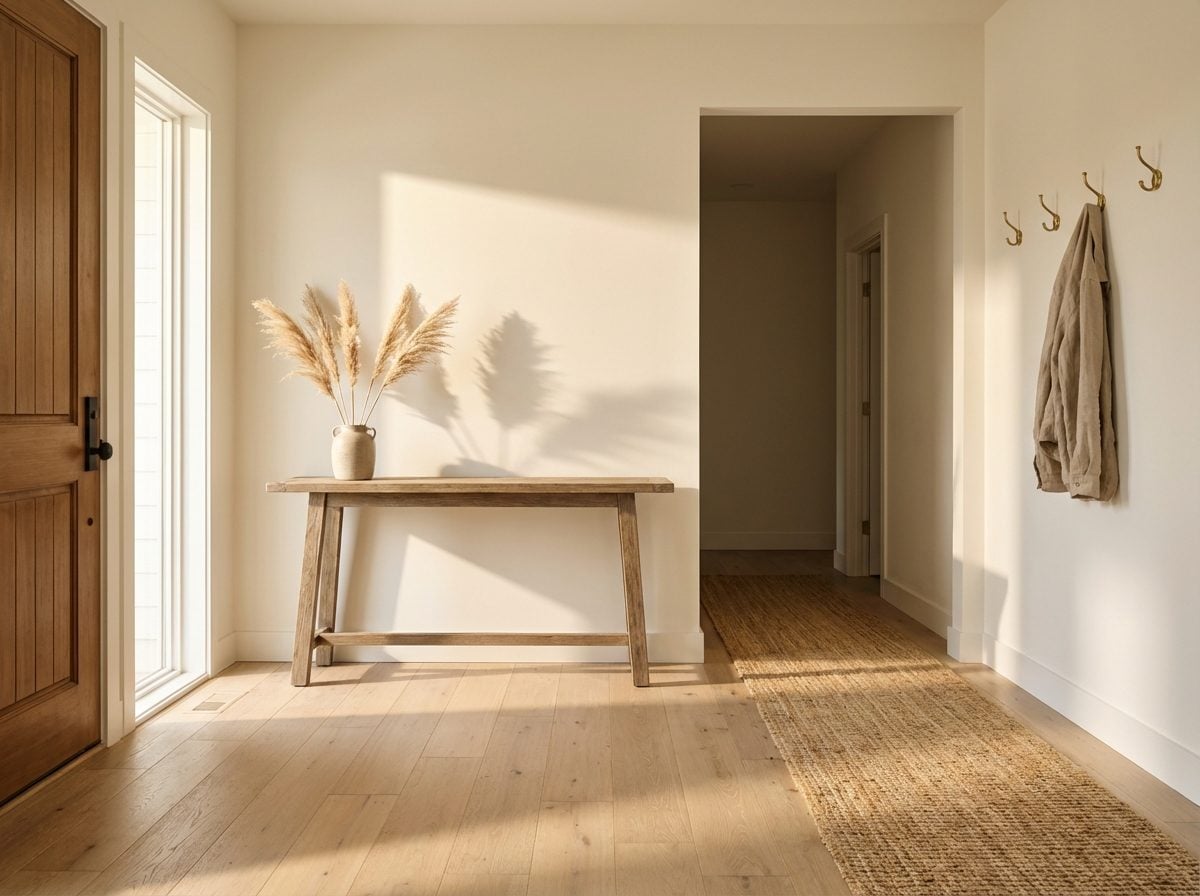
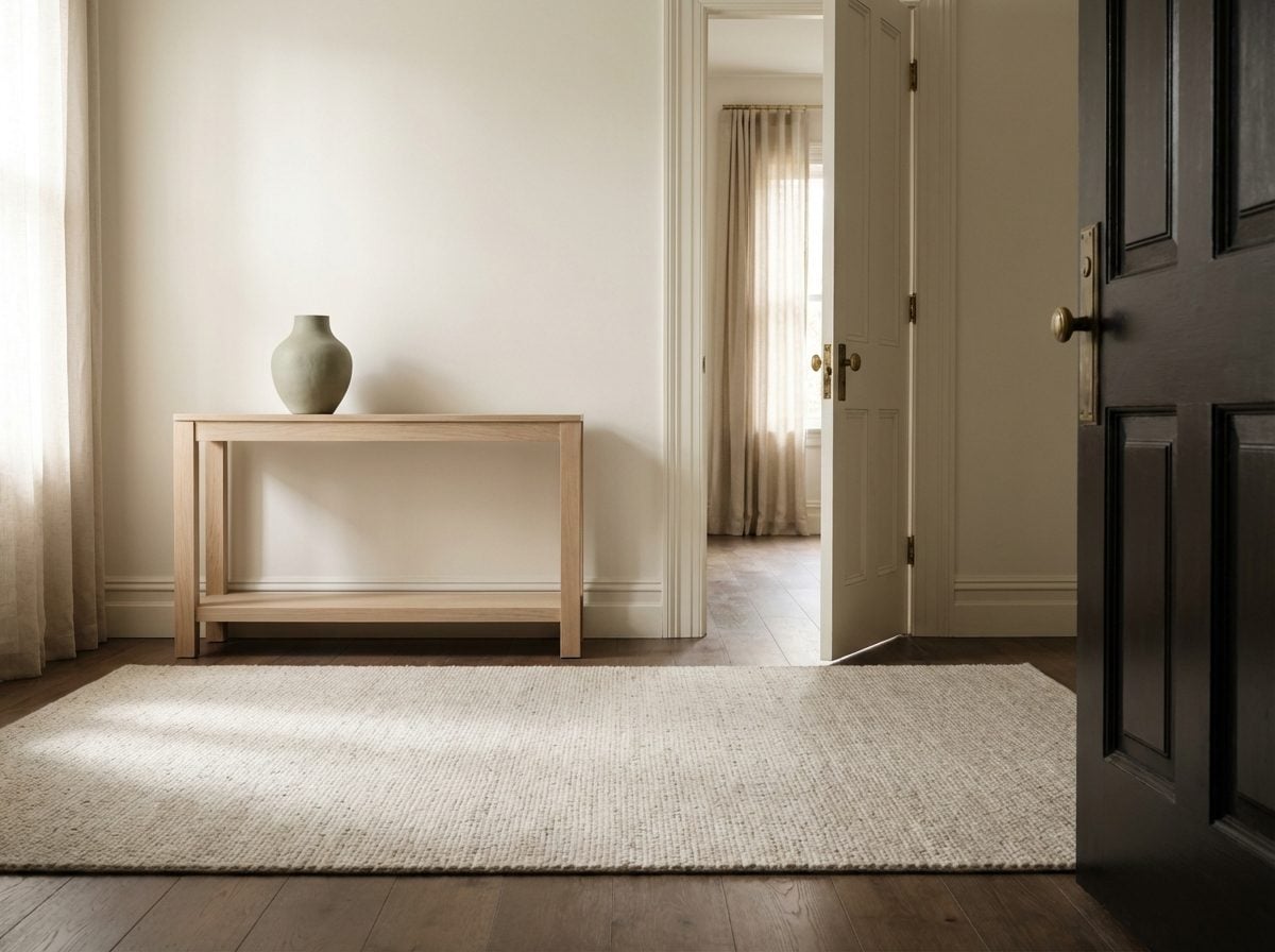
The moment a designer steps into your home, your entryway is already working on their subconscious, and yours. Cognitive scientists call it the “doorway effect” or “location updating effect”: the brain treats every threshold as an event boundary, filing away the mental episode from the previous room and bracing for the next one. As researcher Gabriel Radvansky of the University of Notre Dame put it, crossing a doorway creates an “event boundary” that separates episodes of activity and files them away, which is why memory actually degrades as you pass through.
But here’s what designers clock before the neuroscience even kicks in: the state of your threshold. Is there a rug that anchors the entry or bare floor that rushes you through? Is there a deliberate pause, a console, a hook, a place to land, or does the room just begin abruptly with no ritual of arrival? The physical characteristics of a doorway communicate emotional preparation before you even step through. A home that has invested in this transition often belongs to someone who understands the power of mental decompression. A home that hasn’t? That tells a story too, one that builds piece by piece as you move deeper inside.
Why the First Wall You See Is a Confession You Never Meant to Make
Walk into a room and your eyes don’t politely scan everything at once. They lock onto something, a dominant shape, a high-contrast color, a piece that interrupts the expected. Designers describe this as habituation theory at work: our eyes are constantly searching for stimuli to settle on, and the first wall you face on entry becomes the room’s loudest statement, whether you intended it or not.
What designers read in that first wall is layered. An empty wall with a single nail hole suggests ambition that stalled, or a recent move that hasn’t resolved. A wall covered in family photographs signals roots and emotional priority. A gallery of art prints hung with careful spacing speaks to someone who has thought about how they want to be seen. A bare, freshly painted wall in a deliberate color? That’s either minimalism with purpose or avoidance dressed up as restraint.
The key word is intentionality. Designers aren’t judging the contents of your first wall, they’re reading whether you made a choice at all. Indecision has a distinct visual texture: clutter without hierarchy, groupings that don’t cohere, or conspicuous blankness where something emotional should be. The first wall isn’t just decoration. It’s the opening line of a story about how much agency you feel inside your own four walls.
The Scent Layer Designers Clock Before They Even Sit Down
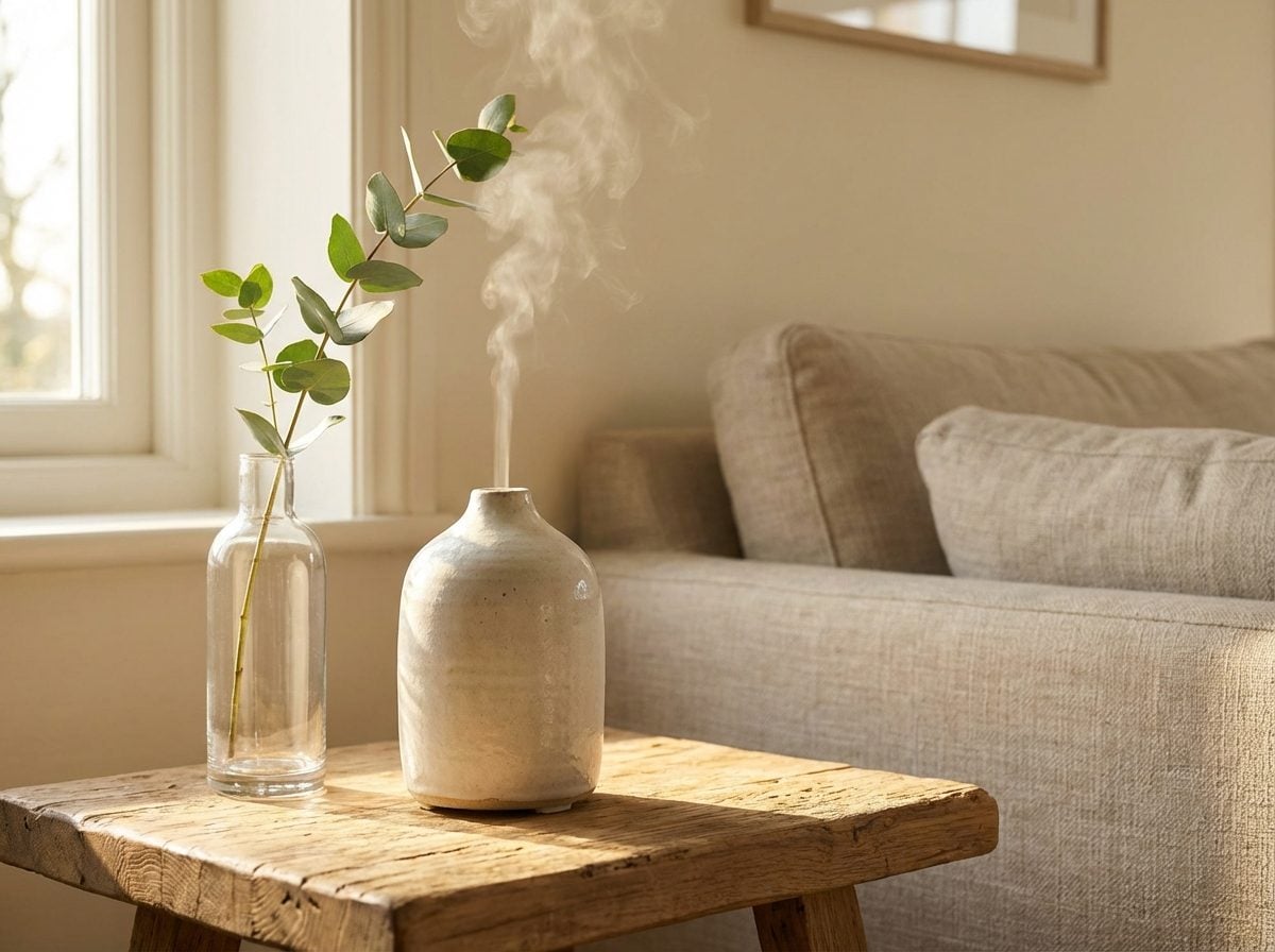
Before a designer has taken in the furniture, the finishes, or the floor plan, something else has already registered, smell. The olfactory system is the only sense with a direct neural pathway to the brain’s limbic region, bypassing the rational cortex entirely. Research published in Cognitive Research: Principles and Implications confirms that ambient odour can influence person perception through mood-induction, semantic priming, and changes in arousal, all before conscious evaluation begins.
In a home, scent tells a designer things that no amount of styling can override. The warm mineral smell of old hardwood floors and beeswax polish reads as age and care. Stale air with a top note of takeaway containers reads as someone in survival mode. A home that smells of nothing, no cooking, no body, no candles, can feel oddly unsettling, like a space that isn’t quite inhabited yet. And the deliberately scented home, with its diffuser misting bergamot into every room, raises its own questions: is this sensory identity, or is it masking something the designer might otherwise notice?
Researchers at Brown University have documented what they call the “Proustian memory effect”, scent-triggered autobiographical memories are among the most emotionally intense humans experience. Which means the smell of a home isn’t just chemistry. It’s a compressed autobiography, arriving in one breath, before anyone has said a word.
What Your Ceiling Height Is Quietly Saying About How You Want to Feel in Your Own Home
Ceiling height does something to the mind that most people feel without ever naming. Researchers have a term for part of it, the “Cathedral Effect”, describing the documented relationship between vertical space and cognition. Research building on work by Joan Meyers-Levy and Rui Juliet Zhu found that high ceilings create a sense of freedom linked to broader, more abstract thinking, while low ceilings trigger detail-focused cognition and feelings of confinement.
But this cuts both ways, and that’s what experienced designers understand. Studies using VR panoramic environments found that ceiling height significantly impacts specific emotions, including joy, with participants in taller spaces reporting noticeably different emotional states than those in compressed ones. What designers read in ceiling height isn’t just square footage. It’s desire. A person who chose the apartment with the lower ceilings over the taller one often chose something else too: warmth, enclosure, the feeling of being held rather than expanded. Neither is wrong. But one is a choice about how you want your nervous system to feel when you come home.
What the Research Doesn’t Fully Agree On
The picture is more nuanced than “tall ceilings good, low ceilings bad.” A 2015 neuroimaging study in the Journal of Environmental Psychology found that preference for high ceilings was more likely linked to enhanced visuospatial exploration than to emotional reward circuits, suggesting the appeal may be cognitive rather than emotional for many people. The ceiling, in other words, is a question: do you want to think broadly when you’re home, or do you want to rest?
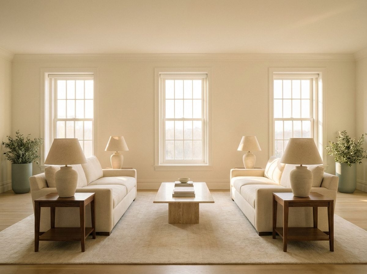
The Floor-to-Furniture Ratio That Reveals Whether You’re Living in Your Space or Just Storing Yourself in It
Too much furniture and the room suffocates. Too little and it echoes. But the ratio between open floor and occupied floor tells a designer something more interesting than square footage math, it tells them about psychological ownership. A room that is densely furnished, with every surface claimed and every corner occupied, often belongs to someone who is filling space rather than inhabiting it. The instinct to fill is real and deeply human, but it can result in rooms that feel held hostage by their own contents.
The reverse is equally revealing. A room with floating furniture arrangements, where pieces have been deliberately pulled off the walls and positioned to create conversation zones in the center of the space, signals someone who has moved past functional thinking into spatial thinking. Design experts note that pushing everything against the walls, while it feels like it opens the space, often creates disconnection in larger rooms. Floating furniture inward creates defined zones that invite engagement rather than transit.
What designers are actually measuring is how much floor you’ve left for yourself. Floor space is psychological breathing room. It’s where visual rest lives. The homes that feel most alive tend to be the ones where someone made the deliberate decision to take something away.
Why Designers Look at Your Light Switches Before Anything Else
Most homeowners never think about light switches. Most designers clock them within seconds. The switch tells you where the designer of the room imagined you would be standing, and whether the person living there has ever questioned that assumption. A single switch by the door with no dimmers means the room operates in one mode, always. A dimmer switch, especially one that’s been used enough to show wear, signals someone who actively manages their environment rather than accepting it as given.
But it goes deeper. Designers aren’t just reading functionality; they’re reading control. How people relate to the light in their home is one of the most telling proxies for how much agency they feel in the space overall. A room where every light source is on the same circuit, blasting everything at the same wattage, reads differently than one where someone has installed multiple switches to layer the room, a lamp here, an accent there, the overhead dimmed to 40% by eight in the evening.
The switch placement also reveals whether a home has been thought about from the inside out, or just built and moved into. Original builder-grade toggle switches, unchanged for fifteen years, tell one story. Replaced plates, smart switches, or even just a dimmer retrofit tells another, that someone cared enough about the quality of their light to do something about it. Lighting is the single most psychologically potent tool in any room, and designers know it. As environmental design educators note, lighting is arguably the most visually impactful aspect of any interior project, and the switch is its grammar.
The One Corner Every Designer Scans First, and What It Exposes About Your Emotional Relationship With Clutter
Every room has a corner that receives the least traffic and the most neglect. Designers find it immediately. It’s the corner where the intentions of a room go to wait, the tote bag that never made it to the car, the exercise mat that’s been leaning against the wall since February, the lamp without a bulb, the stack of things that need to go somewhere else. That corner is a direct window into the gap between how someone imagines their home and how they actually maintain it.
This matters psychologically beyond the visual. Research in environmental psychology consistently links cluttered environments to elevated cortisol levels and a diminished sense of control over one’s life. The neglected corner isn’t just untidy, it’s a low-level stressor that the nervous system has learned to partially tune out but never fully ignores. The brain’s habituation mechanisms mean we stop consciously seeing it, but the ambient stress it generates doesn’t disappear. The American Society of Interior Designers notes that a mismatch between visual appeal and other environmental inputs, including disorder, can cause mental distress even when we’ve stopped registering the specific cause.
What separates designers from everyone else is that they haven’t habituated yet. They walk in with fresh eyes and the corner speaks immediately, loudly, and clearly.
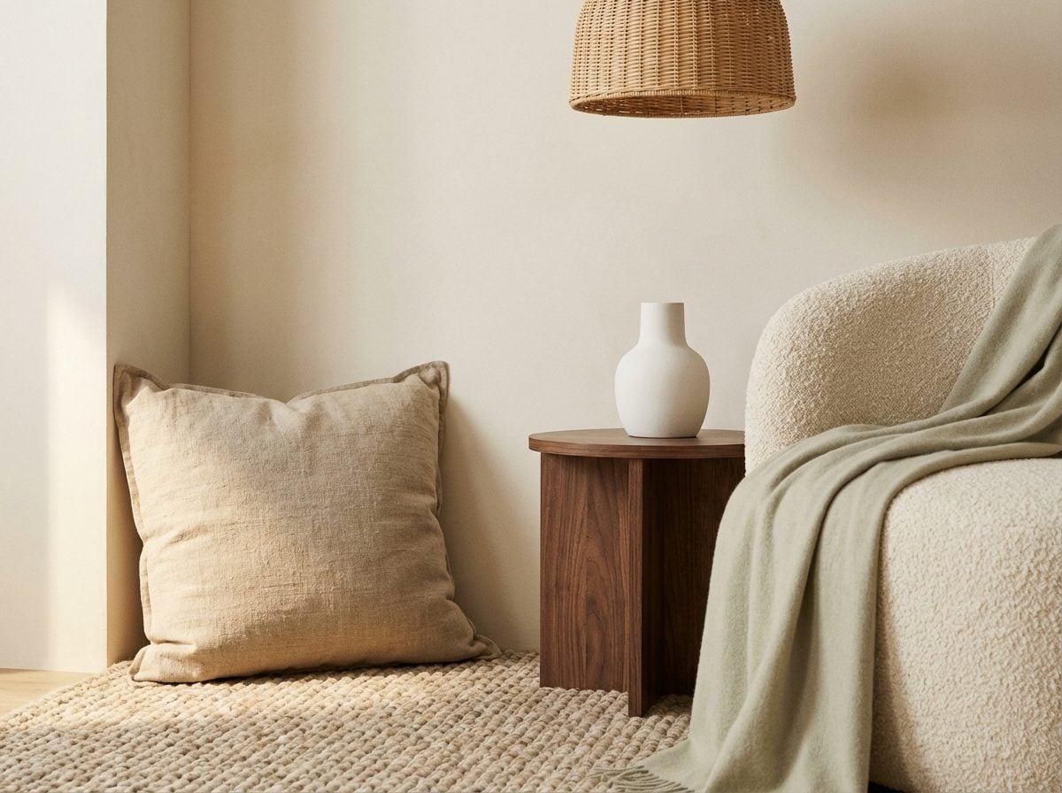
What the Gap Between Your Sofa and the Wall Tells a Trained Eye About Anxiety and Safety
This one is subtle enough that most people don’t consciously register their own preference, but a designer reads it immediately. Is your sofa pushed flat against the wall, or is it floating, even slightly, with open space behind the cushions? The answer touches one of the most fundamental concepts in environmental psychology: prospect-refuge theory.
Originally developed by geographer Jay Appleton in 1975 and later confirmed across multiple environmental psychology studies, prospect-refuge theory holds that humans derive feelings of safety and pleasure from environments offering both open views and a sense of enclosure. A sofa against the wall satisfies the refuge half of that equation, your back is protected, nothing can approach from behind. It’s the furniture equivalent of sitting with your back to the restaurant wall.
But here’s the tension: a sofa floating in the middle of a room with nothing behind it can feel exposed, there’s nothing to provide a sense of protection, which makes you feel vulnerable. The most psychologically resolved spaces balance both instincts: the sofa pulled slightly off the wall (enough to breathe, not enough to feel stranded), often anchored by a console table or low shelving behind it that creates a symbolic refuge boundary. Designers notice the absence of this balance. And they notice what it might suggest about whether the person living there feels safe enough to let their guard down, even at home.
“The most psychologically resolved spaces balance two ancient instincts: the need to see what’s coming, and the need to feel protected from behind.”
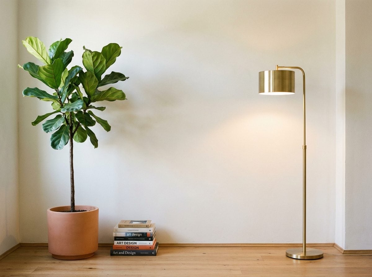
The Color Temperature of Your Bulbs Is Telling Designers Exactly How You Want to Be Perceived
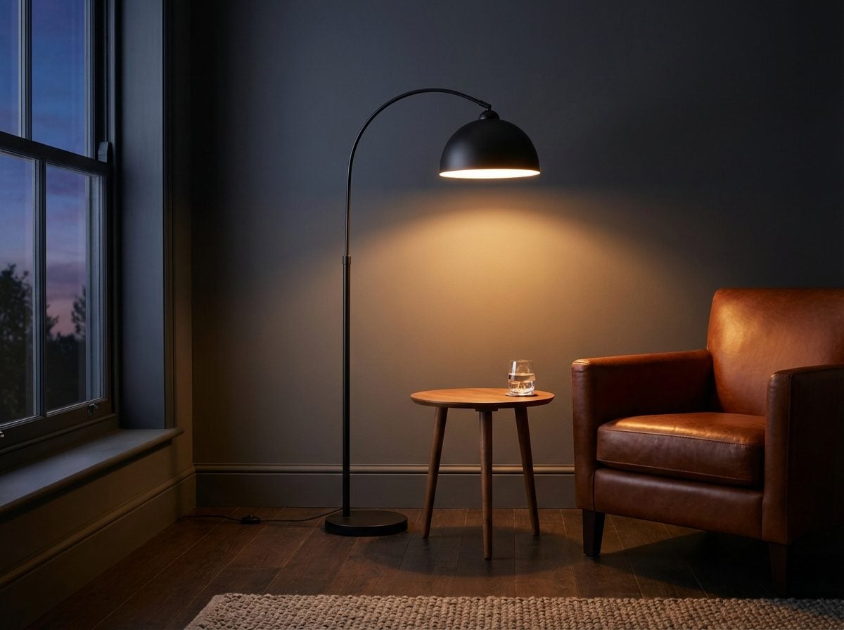
Most homeowners choose light bulbs based on what’s in the box at the hardware store. But the color temperature of every bulb in your home, measured in Kelvin, from warm amber at 2700K to crisp daylight at 5000K and above, is one of the most direct expressions of your emotional agenda for a space, whether you know it or not.
Designers read it as a kind of mood declaration. A home bathed in warm 2700K light signals intimacy, hospitality, the desire to be seen softly. Research on lighting psychology confirms that warm CCT combined with appropriate illuminance makes subjects feel more comfortable and relaxed, it’s an invitation to slow down. A home running on 4000K or higher cool-white throughout reads as functional, task-oriented, possibly clinical. It’s the lighting of someone who treats their home as a place to operate, not to unwind.
The more nuanced reading is in the mismatches. A 2021 study published in Scientific Reports found that lower color temperatures, around 2700K, significantly reduced negative emotional response bias, with participants labeling ambiguous faces as less fearful under warm light versus cool light. Which means: the bulbs in your home aren’t just changing how the space looks. They’re literally changing how you and anyone visiting you perceive the emotions of the people in the room. A designer walking into a 5000K living room is walking into a different emotional atmosphere than one lit at 2700K, and they feel it before they can articulate it.
Why a Designer Can Tell If You Own or Rent Within Seconds of Walking In
It’s not about quality of furniture or price of finishes. A rental home and an owned home can look nearly identical on paper, same square footage, same layout, similar budgets. But designers read the difference almost instantly, and the signal is psychological rather than material.
Environmental psychology research is clear on this: homeowners tend to invest more heavily in personalization and territorial marking of their space than renters do, reflecting a stronger psychological bond to the territory. The visible result is depth. An owned home tends to have layers, objects accumulated across years, modifications to fixtures, paint on the walls that reflects an actual preference rather than the landlord’s. Homeownership allows a level of personalization that renting often doesn’t permit, and this ability to customize is psychologically significant, it creates identity and belonging.
A rented home often has a particular character that designers recognize as psychological withholding. The walls are the landlord’s color. The light fixtures are original to the building. There are no shelves, no nails, no evidence that the space has been argued with. This isn’t about effort or income. It’s about permission, both the legal kind and the internal kind. Many renters hold back from nesting fully not because they can’t afford to, but because committing to a temporary space feels psychologically risky. The designer reading those bare walls and original fixtures isn’t judging, they’re watching the tension between desire and permission play out across an entire home.
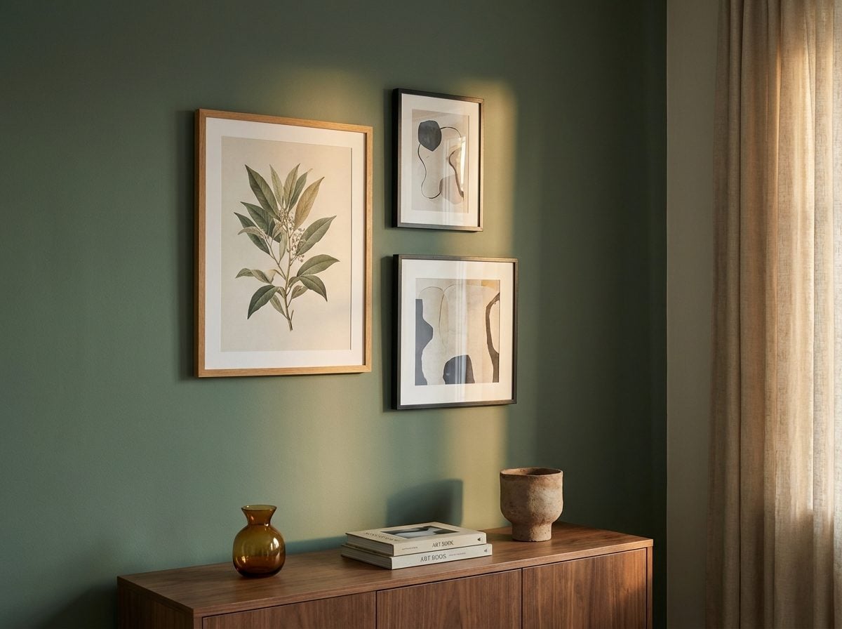
The Symmetry Signal: What Perfectly Matched Decor Reveals That Asymmetry Never Would
Two matching lamps. Identical candlesticks flanking a fireplace. A pair of throw pillows placed with surgical precision. These choices feel intentional, composed, deliberate, and a trained eye picks up on that immediately. But here’s what’s interesting: the deliberateness itself is the tell.
Research in perception psychology has long confirmed that our brains show a general preference for symmetrical arrangements in shapes and objects, registering them faster and associating them with a sense of order and positive affect. A room built on bilateral symmetry communicates control, and by extension, a desire to project control. Interior designers often describe it as the visual equivalent of a firm handshake: reassuring, composed, a little performative.
But asymmetry tells a different story. Studies on creative cognition suggest that individuals with higher divergent thinking scores show stronger preferences for asymmetrical and complex visual patterns, linking compositional imbalance to a comfort with ambiguity. The room that breaks the mirror image, a gallery wall skewed left, a single sculptural lamp instead of two, may be signaling something the homeowner never consciously planned. What a designer notices isn’t just the symmetry. It’s the effort required to maintain it.
What Your Bookshelf Arrangement Exposes About the Identity You’re Performing at Home
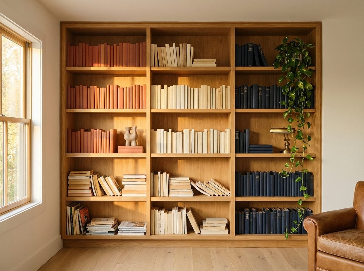
Color-coordinated bookshelves have become the subject of genuine debate. There’s a certain type of reader, or perhaps non-reader, who organizes by spine color rather than subject or author. As one analysis of bookshelf psychology notes, color coordinators are often accused of caring more about the look of their books than what’s inside them, though the truth is usually more nuanced. It’s a prioritization, not a deception. These homeowners are telling you: this object is also decor.
Sociologist Erving Goffman’s concept of impression management, the idea that we’re always curating the version of ourselves we present to others, maps directly onto bookshelf behavior. What’s displayed on the shelf facing the door is rarely accidental. The big philosophy tome at eye level. The award-winning novel spine-out. The half-read self-help book quietly rotated face-in. These are micro-decisions that collectively construct a public-facing identity.
A designer scanning a bookshelf in the first ten seconds isn’t cataloguing titles. They’re reading the shelf’s relationship to the room. Is it integrated into the design, or does it look like an afterthought? Are books arranged for retrieval or for show? Is everything equally accessible, or are some sections clearly more visited than others? The dust patterns alone are a kind of testimony.
The Traffic Flow Pattern Designers Read Like a Personality Test
🔥 Would you like to save this?
The path people cut through a room is written into the room itself, in the worn patch of rug near the kitchen threshold, in the chair that’s been nudged slightly off its original position, in the side table that’s been imperceptibly pushed aside to widen the walking lane. Walk patterns are habitual, and habits are honest.
Designers trained in environmental psychology understand that the balance of prospect, refuge, mystery, and complexity determines how people actually move through and settle into interior spaces, and those patterns often have nothing to do with how the room was intended to be used. When a client says the living room “never gets used,” a designer will look at the traffic flow first. Is the room placed on a thoroughfare, making relaxation feel exposed? Is the furniture arranged in a configuration that forces a choice between watching the door and watching the TV?
The worn path is, in a sense, the most truthful thing in the house. It’s behavior unfiltered by taste or aspiration. How people actually move through their home is how they actually live, not how they imagine they live, not how they planned to live when they arranged the furniture five years ago. The gap between those two things can be a very interesting distance.
Why the Things You’ve Deliberately Hidden Are the Most Revealing Things in the Room
Every home has its concealment strategies. The storage ottoman that doesn’t quite close. The cabinet door that swings slightly ajar. The bathroom cabinet that’s been cleaned out except for one shelf. Designers, when they’re being candid, will tell you that what a homeowner hides reveals just as much as what they display, sometimes more.
The psychology here connects to Goffman’s distinction between “front stage” and “back stage” behavior. Research on self-presentation theory notes that the front stage performance is typically guided by audience expectations and is often highly intentional, while the back stage offers a more comfortable atmosphere where individuals can drop the performance. But homes blur this boundary constantly. A guest bathroom that’s been emptied of all personal care products is a front-stage gesture. A drawer stuffed with tangled charger cables in an otherwise minimalist kitchen is a back-stage slip. Both are informative.
What designers find especially interesting is the category of what’s been hidden but is still visible enough to read. The art leaning against a wall that never got hung. The pile of mail on the floor just behind the door. The box in the corner of the living room that’s been there long enough to become invisible to the homeowner. These aren’t oversights. They’re postponed decisions, and postponed decisions have a psychology of their own.
What the Texture Variety in a Room Tells Designers About How Emotionally Layered Your Life Is
Run your eyes across a room and count the surfaces: smooth plaster walls, a nubby boucle sofa, a polished concrete side table, a rough rattan pendant shade, a silk throw. That layering, or its absence, is something designers register immediately and instinctively. A room with only one or two surface textures reads as either very intentional or quietly impoverished. A room with five or six distinct textures reads as someone who is comfortable with complexity.
The neuroscience behind this is fascinating. Research in neuroaesthetics suggests that interacting with complex, natural textures may stimulate brain plasticity and cognitive function, and that haptically rich environments could be beneficial for brain health. More immediately, a 2024 study modeling the relationship between fabric textures and evoked emotions found that tactile perception, actually touching a surface, produces distinctly different emotional responses than visual perception alone, with soft pile fabrics reliably inducing more positive emotional states.
A room with intentional texture variety signals something about the owner’s emotional range. It suggests a person who is comfortable with contradiction, the smooth next to the rough, the polished next to the matte. A room that’s all the same surface, all the same sheen level, often belongs to someone who prefers emotional tidiness. Neither is a flaw. Both are a choice.
The Dead Zone Phenomenon, and Why Every Home Has One Area the Owner Has Quietly Given Up On

It’s that corner of the dining room that became a dumping ground for things on their way to somewhere else. The landing at the top of the stairs that’s accumulated a chair no one sits in, three framed prints that never got hung, and a lamp with no lightbulb. Or the third bedroom that’s been “almost” a home office for going on four years now.
Every home has one, and designers spot it within the first minute. The dead zone is rarely an accident of layout. It’s almost always an accident of intention, a space that got mentally filed under “deal with later” and then quietly absorbed into the wallpaper of daily life. Psychology research on cluttering and accumulation identifies emotional attachment and decision avoidance as central mechanisms, with objects that resist categorization tending to pile up in spaces that resist definition.
The dead zone is a kind of spatial procrastination. And like all procrastination, it usually has an emotional root: a project that felt too overwhelming to start, a period of transition that the room was supposed to mark the end of, a decision about how to live that hasn’t quite been made yet. A designer reading the room isn’t judging the clutter. They’re reading the hesitation.
Why Designers Always Glance at What’s Right Above Eye Level First

Ask a seasoned interior designer what they look at first when they walk into a room, and they’ll often point to a specific zone: the band of wall between approximately five and seven feet from the floor. It’s the territory of crown molding, art hung at the wrong height, architectural trim, and pendant lighting. And it’s where a room’s compositional intelligence, or lack thereof, tends to announce itself most clearly.
The zone just above eye level is where design ambitions most often collide with practical reality. A painting hung too high is one of the most common tells in a home, it creates a visual disconnect that most people feel without being able to name. The general rule that art should be hung with its center at around 57-60 inches from the floor exists because that’s the average human eye level, the natural focal point of a standing gaze. When artwork climbs above that, the room’s visual logic breaks.
Designers also look there because it’s the most aspirational zone in any space. Crown molding, coffered ceilings, statement pendants, sculptural sconces, these are the moves that signal real intention. Their presence suggests someone who thinks about a room in three dimensions, not just as a collection of furniture on a floor. Their absence, or their approximation, is equally telling.
What Your Window Treatment Choices Are Broadcasting About Trust and Vulnerability
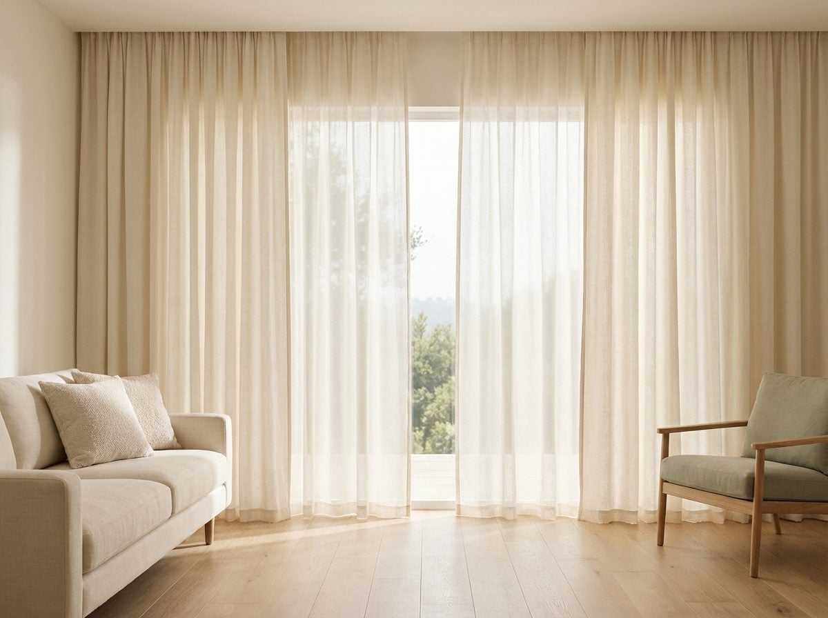
Bare windows in a city apartment. Blackout curtains that block every sliver of light. Plantation shutters kept at a permanent 45-degree angle. Sheer panels that diffuse but don’t conceal. Each of these choices is a negotiation between the inside and the outside, between being seen and being hidden, and that negotiation carries a psychological charge that goes far beyond aesthetics.
Prospect-refuge theory, the foundational framework of spatial psychology, proposes that humans show an evolved preference for environments that offer safety while maintaining the ability to survey their surroundings. Windows are the most literal expression of this tension in any home. A window treatment calibrates exactly how much of each the homeowner gets, and how much they’re comfortable extending to the world outside.
The homeowner who leaves their living room windows completely bare, even in a ground-floor apartment, is making a statement about comfort with visibility, with openness, possibly with a certain defiant ease. The one who layers Roman shades behind blackout drapes behind sheers has built themselves a fortress of gradated privacy. Neither is neurotic. Both are perfectly coherent responses to the same fundamental human tension, the desire to see without being seen. A designer registers it as a mood, a posture, an architectural stance. It shapes everything else they look at in the room.
The Transition Moment Between Rooms That Reveals Whether Your Home Has a Coherent Emotional Narrative
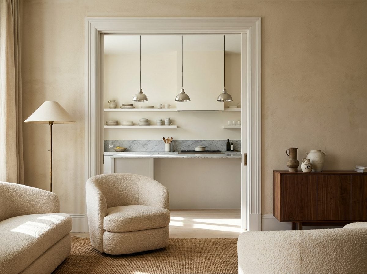
Step from the living room into the kitchen. Then from the kitchen into the hallway. Then into the bedroom. What changes? What stays? If the answer is “everything,” the home may have a coherence problem, not aesthetically, but emotionally. A home where each room tells a completely different story can feel like a collection of moods that never quite cohere into a life.
This is distinct from eclecticism. A home can have rooms of wildly different character and still feel unified, if the transitions are handled with intention. It’s the threshold moments that give it away. The casing around a door, the change in flooring material, the shift in ceiling height, the way the light changes as you move through: these are the connective tissue of a home’s emotional logic. When they feel abrupt or unconsidered, the home reads as assembled rather than designed.
Experienced designers often describe this quality as “narrative”, the sense that the home has a through-line, a voice that speaks consistently even as the subject matter changes. It’s present in homes where the owner has thought carefully about the whole rather than the parts. It’s absent in homes where each room was decorated independently, at different points in life, with different references, without anyone asking what the next room would say in response. The transition moment is where the answer lives.
“The rooms don’t need to match. They need to speak to each other.”
Why the Objects on Your Kitchen Counter Are a More Accurate Self-Portrait Than Anything Hanging on Your Walls
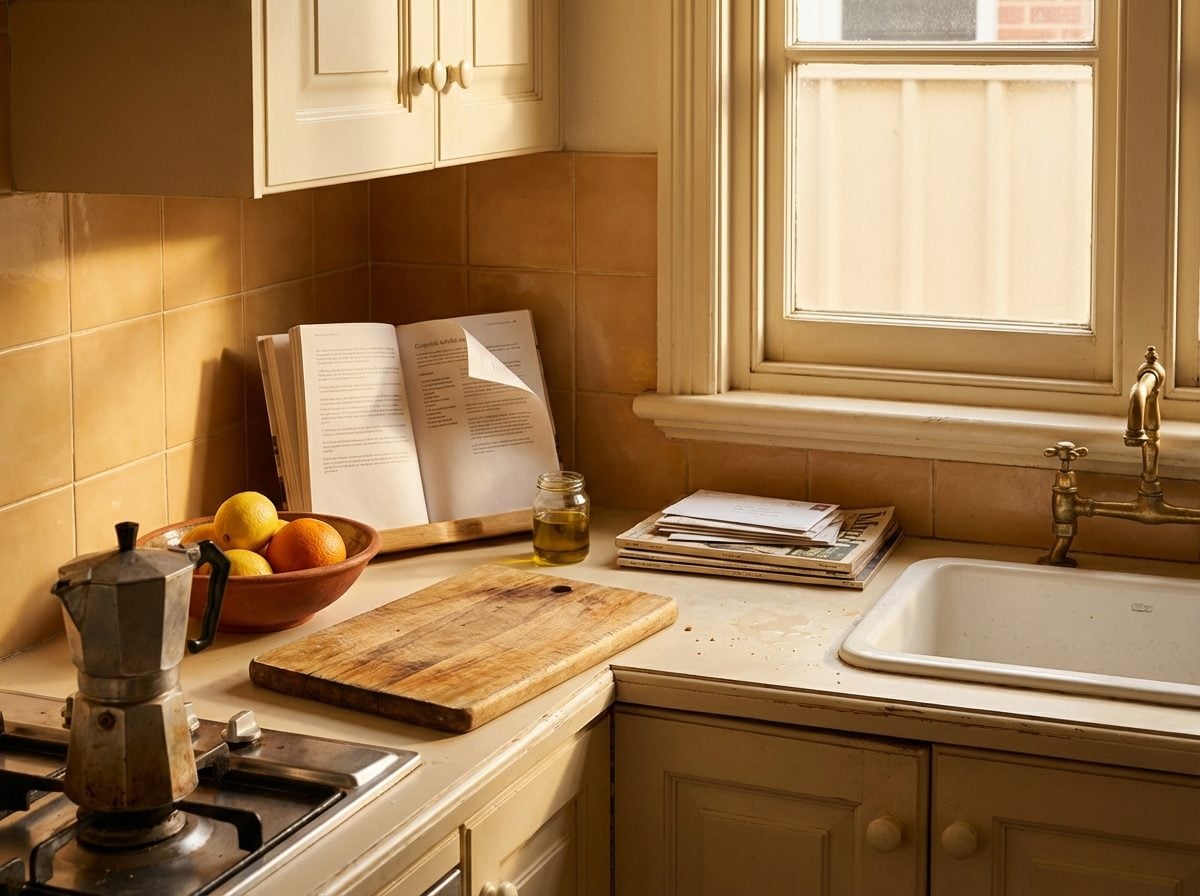
The art on your walls was chosen. The books on your shelf were curated. But the kitchen counter? That’s a live document. The espresso machine you actually use every morning. The fruit bowl that’s always half-empty, or always overflowing, or permanently empty. The stack of mail that’s three weeks old. The protein powder next to the olive oil next to the unread cookbook. This is the archaeology of daily life, and it tells a story that no gallery wall ever could.
Research-backed analyses of kitchen psychology suggest that what lives on your counter reflects where your mental energy naturally goes, and that there’s a clear difference between a counter that’s been staged for the day and one that’s been lived in by the week. Visual clutter on kitchen counters competes for cognitive attention, creating what psychologists describe as cognitive overload in the prefrontal cortex, but the nature of that clutter carries its own distinct signature.
A designer glancing at a kitchen counter will notice the ratio of functional objects to aspirational ones. The blender that’s plugged in versus the juicer that’s slightly dusty. The cookbook propped open with a sticky note versus the three cookbooks stacked and uncracked. These are the objects a homeowner genuinely is, not the objects they intend to be. They’re honest in a way that a styled shelf almost never is, because no one thinks to perform for their kitchen counter.
The Bottom Line
Here is what designers actually walk away knowing after those first ten seconds: whether you feel safe in your own home. Every signal, the clutter, the lighting, the gap behind the sofa, the corner you’ve given up on, adds up to a single, coherent answer to the question you never asked out loud: does this space belong to you, or do you belong to it? Walk back into your home today and look at it like a stranger would, because the story it’s telling has been running on a loop whether you’ve been listening or not.